| 123456789101112131415161718192021222324252627282930313233343536373839404142434445464748495051525354555657585960616263646566676869707172737475767778798081828384858687888990919293949596979899100101102103104105106107108109110111112113114115116117118119120121122123124125126127128129130131132133134135136137138139140141142143144145146147148149150151152153154155156157158159160161162163164165166167168169170171172173174175176177178179180181182183184185186187188189190191192193194195196197198199200201202203204205206207208209210211212213214215216217218219220221222223224225226227228229230231232233234235236237238239240241242243244245246247248249250251252253254255256257258259260261262263264265266267268269270271272273274275276277278279280281282283284285286287288289290291292293294295296297298299300301302303304305306307308309310311312313314315316317318319320321322323324325326327328329330331332333334335336337338339340341342343344345346347348349350351352353354355356357358359360361362363364365366367368369370371372373374375376377378379380381382383384385386387388389390391392393394395396397398399400401402403404405406407408409410411412413414415416417418419420421422423424425426427428429430431432433434435436437438439440441442443444445446447448449450451452453454455456457458459460461462463464465466467468469470471472473474475476477478479480481482483484485486487488489490491492493494495496497498499500501502503504505506507508509510511512513514515516517518519520521522523524525526527528529530531532533534535536537538539540541542543544545546547548549550551552553554555556557558559560561562563564565566567568569570571572573574575576577578579580581582583584585586587588589590591592593594595596597598599600601602603604605606607608609610611612613614615616617618619620621622623624625626627628629630631632633634635636637638639640641642643644645646647648649650651652653654655656657658659660661662663664665666667668669670671672673674675676677678679680681682683684685686687688689690691692693694695696697698699700701702703704705706707708709710711712713714715716717718719720721722723724725726727728729730731732733734735736737738739740741742743744745746747748749750751752753754755756757758759760761762763764765766767768769770771772773774775776777778779780781782783784785786787788789790791792793794795796797798799800801802803804805806807808809810811812813814815816817818819820821822823824825826827828829830831832833834835836837838839840841842843844845846847848849850851852853854855856857858859860861862863864865866867868869870871872873874875876877878879880881882883884885886887888889890891892893894895896897898899900901902903904905906907908909910911912913914915916917918919920921922923924925926927928929930931932933934935936937938939940941942943944945946947948949950951952953954955956957958959960961962963964965966967968969970971972973974975976977978979980981982983984985986987988989990991992993994995996997998999100010011002100310041005100610071008100910101011101210131014101510161017101810191020102110221023102410251026102710281029103010311032103310341035103610371038103910401041104210431044104510461047104810491050105110521053105410551056105710581059106010611062106310641065106610671068106910701071107210731074107510761077107810791080108110821083108410851086108710881089109010911092109310941095109610971098109911001101110211031104110511061107110811091110111111121113111411151116111711181119112011211122112311241125112611271128112911301131113211331134113511361137113811391140114111421143114411451146114711481149115011511152115311541155115611571158115911601161116211631164116511661167116811691170117111721173117411751176117711781179118011811182118311841185118611871188118911901191119211931194119511961197119811991200120112021203120412051206120712081209121012111212121312141215121612171218121912201221122212231224122512261227122812291230123112321233123412351236123712381239124012411242124312441245124612471248124912501251125212531254125512561257125812591260126112621263126412651266126712681269127012711272127312741275127612771278127912801281128212831284128512861287128812891290129112921293129412951296129712981299130013011302130313041305130613071308130913101311131213131314131513161317131813191320132113221323132413251326132713281329133013311332133313341335133613371338133913401341134213431344134513461347134813491350135113521353135413551356135713581359136013611362136313641365136613671368136913701371137213731374137513761377137813791380138113821383138413851386138713881389139013911392139313941395139613971398139914001401140214031404140514061407140814091410141114121413141414151416141714181419142014211422142314241425142614271428142914301431143214331434143514361437143814391440144114421443144414451446144714481449145014511452145314541455145614571458145914601461146214631464146514661467146814691470147114721473147414751476147714781479148014811482148314841485148614871488148914901491149214931494149514961497149814991500150115021503150415051506150715081509151015111512151315141515151615171518151915201521152215231524152515261527152815291530153115321533153415351536153715381539154015411542154315441545154615471548154915501551155215531554155515561557155815591560156115621563156415651566156715681569157015711572157315741575157615771578157915801581158215831584158515861587158815891590159115921593159415951596159715981599160016011602160316041605160616071608160916101611161216131614161516161617161816191620162116221623162416251626162716281629163016311632163316341635163616371638163916401641164216431644164516461647164816491650165116521653165416551656165716581659166016611662166316641665166616671668166916701671167216731674167516761677167816791680168116821683168416851686168716881689169016911692169316941695169616971698169917001701170217031704170517061707170817091710171117121713171417151716171717181719172017211722172317241725172617271728172917301731173217331734173517361737173817391740174117421743174417451746174717481749175017511752175317541755175617571758175917601761176217631764176517661767176817691770177117721773177417751776177717781779178017811782178317841785178617871788178917901791179217931794179517961797179817991800180118021803180418051806180718081809181018111812181318141815181618171818181918201821182218231824182518261827182818291830183118321833183418351836183718381839184018411842184318441845184618471848184918501851185218531854185518561857185818591860186118621863186418651866186718681869187018711872187318741875187618771878187918801881188218831884188518861887188818891890189118921893189418951896189718981899190019011902190319041905190619071908190919101911191219131914191519161917191819191920192119221923192419251926192719281929193019311932193319341935193619371938193919401941194219431944194519461947194819491950195119521953195419551956195719581959196019611962196319641965196619671968196919701971197219731974197519761977197819791980198119821983198419851986198719881989199019911992199319941995199619971998199920002001200220032004200520062007200820092010201120122013201420152016201720182019202020212022202320242025202620272028202920302031203220332034203520362037203820392040204120422043204420452046204720482049205020512052205320542055205620572058205920602061206220632064206520662067206820692070207120722073207420752076207720782079208020812082208320842085208620872088208920902091209220932094209520962097209820992100210121022103210421052106210721082109211021112112211321142115211621172118211921202121212221232124212521262127212821292130213121322133213421352136213721382139214021412142214321442145214621472148214921502151215221532154215521562157215821592160216121622163216421652166216721682169217021712172217321742175217621772178217921802181218221832184218521862187218821892190219121922193219421952196219721982199220022012202220322042205220622072208220922102211221222132214221522162217221822192220222122222223222422252226222722282229223022312232223322342235223622372238223922402241224222432244224522462247224822492250225122522253225422552256225722582259226022612262226322642265226622672268226922702271227222732274227522762277227822792280228122822283228422852286228722882289229022912292229322942295229622972298229923002301230223032304230523062307230823092310231123122313231423152316231723182319232023212322232323242325232623272328232923302331233223332334233523362337233823392340234123422343234423452346234723482349235023512352235323542355235623572358235923602361236223632364236523662367236823692370237123722373237423752376237723782379238023812382238323842385238623872388238923902391239223932394239523962397239823992400240124022403240424052406240724082409241024112412241324142415241624172418241924202421242224232424242524262427242824292430243124322433243424352436243724382439244024412442244324442445244624472448244924502451245224532454245524562457245824592460246124622463246424652466246724682469247024712472247324742475247624772478247924802481248224832484248524862487248824892490249124922493249424952496249724982499250025012502250325042505250625072508250925102511251225132514251525162517251825192520252125222523252425252526252725282529253025312532253325342535253625372538253925402541254225432544254525462547254825492550255125522553255425552556255725582559256025612562256325642565256625672568256925702571257225732574257525762577257825792580258125822583258425852586258725882589259025912592259325942595259625972598259926002601260226032604260526062607260826092610261126122613261426152616261726182619262026212622262326242625262626272628262926302631263226332634263526362637263826392640264126422643264426452646264726482649265026512652265326542655265626572658265926602661266226632664266526662667266826692670267126722673267426752676267726782679268026812682268326842685268626872688268926902691269226932694269526962697269826992700270127022703270427052706270727082709271027112712271327142715271627172718271927202721272227232724272527262727272827292730273127322733273427352736273727382739274027412742274327442745274627472748274927502751275227532754275527562757275827592760276127622763276427652766276727682769277027712772277327742775277627772778277927802781278227832784278527862787278827892790279127922793279427952796279727982799280028012802280328042805280628072808280928102811281228132814281528162817281828192820282128222823282428252826282728282829283028312832283328342835283628372838283928402841284228432844284528462847284828492850285128522853285428552856285728582859286028612862286328642865286628672868286928702871287228732874287528762877287828792880288128822883288428852886288728882889289028912892289328942895289628972898289929002901290229032904290529062907290829092910291129122913291429152916291729182919292029212922292329242925292629272928292929302931293229332934293529362937293829392940294129422943294429452946294729482949295029512952295329542955295629572958295929602961296229632964296529662967296829692970297129722973297429752976297729782979298029812982298329842985298629872988298929902991299229932994299529962997299829993000300130023003300430053006300730083009301030113012301330143015301630173018301930203021302230233024302530263027302830293030303130323033303430353036303730383039304030413042304330443045304630473048304930503051305230533054305530563057305830593060306130623063306430653066306730683069307030713072307330743075307630773078307930803081308230833084308530863087308830893090309130923093309430953096309730983099310031013102310331043105310631073108310931103111311231133114311531163117311831193120312131223123312431253126312731283129313031313132313331343135313631373138313931403141314231433144314531463147314831493150315131523153315431553156315731583159316031613162316331643165316631673168316931703171317231733174317531763177317831793180318131823183318431853186318731883189319031913192319331943195319631973198319932003201320232033204320532063207320832093210321132123213321432153216321732183219322032213222322332243225322632273228322932303231323232333234323532363237323832393240324132423243324432453246324732483249325032513252325332543255325632573258325932603261326232633264326532663267326832693270327132723273327432753276327732783279328032813282328332843285328632873288328932903291329232933294329532963297329832993300330133023303330433053306330733083309331033113312331333143315331633173318331933203321332233233324332533263327332833293330333133323333333433353336333733383339334033413342334333443345334633473348334933503351335233533354335533563357335833593360336133623363336433653366336733683369337033713372337333743375337633773378337933803381338233833384338533863387338833893390339133923393339433953396339733983399340034013402340334043405340634073408340934103411341234133414341534163417341834193420342134223423342434253426342734283429343034313432343334343435343634373438343934403441344234433444344534463447344834493450345134523453345434553456345734583459346034613462346334643465346634673468346934703471347234733474347534763477347834793480348134823483348434853486348734883489349034913492349334943495349634973498349935003501350235033504350535063507350835093510351135123513351435153516351735183519352035213522352335243525352635273528352935303531353235333534353535363537353835393540354135423543354435453546354735483549355035513552355335543555355635573558355935603561356235633564356535663567356835693570357135723573357435753576357735783579358035813582358335843585358635873588358935903591359235933594359535963597359835993600360136023603360436053606360736083609361036113612361336143615361636173618361936203621362236233624362536263627362836293630363136323633363436353636363736383639364036413642364336443645364636473648364936503651365236533654365536563657365836593660366136623663366436653666366736683669367036713672367336743675367636773678367936803681368236833684368536863687368836893690369136923693369436953696369736983699370037013702370337043705370637073708370937103711371237133714371537163717371837193720372137223723372437253726372737283729373037313732373337343735373637373738373937403741374237433744374537463747374837493750375137523753375437553756375737583759376037613762376337643765376637673768376937703771377237733774377537763777377837793780378137823783378437853786378737883789379037913792379337943795379637973798379938003801380238033804380538063807380838093810381138123813381438153816381738183819382038213822382338243825382638273828382938303831383238333834383538363837383838393840384138423843384438453846384738483849385038513852385338543855385638573858385938603861386238633864386538663867386838693870387138723873387438753876387738783879388038813882388338843885388638873888388938903891389238933894389538963897389838993900390139023903390439053906390739083909391039113912391339143915391639173918391939203921392239233924392539263927392839293930393139323933393439353936393739383939394039413942394339443945394639473948394939503951395239533954395539563957395839593960396139623963396439653966396739683969397039713972397339743975397639773978397939803981398239833984398539863987398839893990399139923993399439953996399739983999400040014002400340044005400640074008400940104011401240134014401540164017401840194020402140224023402440254026402740284029403040314032403340344035403640374038403940404041404240434044404540464047404840494050405140524053405440554056405740584059406040614062406340644065406640674068406940704071407240734074407540764077407840794080408140824083408440854086408740884089409040914092409340944095409640974098409941004101410241034104410541064107410841094110411141124113411441154116411741184119412041214122412341244125412641274128412941304131413241334134413541364137413841394140414141424143414441454146414741484149415041514152415341544155415641574158415941604161416241634164416541664167416841694170417141724173417441754176417741784179418041814182418341844185418641874188418941904191419241934194419541964197419841994200420142024203420442054206420742084209421042114212421342144215421642174218421942204221422242234224422542264227422842294230423142324233423442354236423742384239424042414242424342444245424642474248424942504251425242534254425542564257425842594260426142624263426442654266426742684269427042714272427342744275427642774278427942804281428242834284428542864287428842894290429142924293429442954296429742984299430043014302430343044305430643074308430943104311431243134314431543164317431843194320432143224323432443254326432743284329433043314332433343344335433643374338433943404341434243434344434543464347434843494350435143524353435443554356435743584359436043614362436343644365436643674368436943704371437243734374437543764377437843794380438143824383438443854386438743884389439043914392439343944395439643974398439944004401440244034404440544064407440844094410441144124413441444154416441744184419442044214422442344244425442644274428442944304431443244334434443544364437443844394440444144424443444444454446444744484449445044514452445344544455445644574458445944604461446244634464446544664467446844694470447144724473447444754476447744784479448044814482448344844485448644874488448944904491449244934494449544964497449844994500450145024503450445054506450745084509451045114512451345144515451645174518451945204521452245234524452545264527452845294530453145324533453445354536453745384539454045414542454345444545454645474548454945504551455245534554455545564557455845594560456145624563456445654566456745684569457045714572457345744575457645774578457945804581458245834584458545864587458845894590459145924593459445954596459745984599460046014602460346044605460646074608460946104611461246134614461546164617461846194620462146224623462446254626462746284629463046314632463346344635463646374638463946404641464246434644464546464647464846494650465146524653465446554656465746584659466046614662466346644665466646674668466946704671467246734674467546764677467846794680468146824683468446854686468746884689469046914692469346944695469646974698469947004701470247034704470547064707470847094710471147124713471447154716471747184719472047214722472347244725472647274728472947304731473247334734473547364737473847394740474147424743474447454746474747484749475047514752475347544755475647574758475947604761476247634764476547664767476847694770477147724773477447754776477747784779478047814782478347844785478647874788478947904791479247934794479547964797479847994800480148024803480448054806480748084809481048114812481348144815481648174818481948204821482248234824482548264827482848294830483148324833483448354836483748384839484048414842484348444845484648474848484948504851485248534854485548564857485848594860486148624863486448654866486748684869487048714872487348744875487648774878487948804881488248834884488548864887488848894890489148924893489448954896489748984899490049014902490349044905490649074908490949104911491249134914491549164917491849194920492149224923492449254926492749284929493049314932493349344935493649374938493949404941494249434944494549464947494849494950495149524953495449554956495749584959496049614962496349644965496649674968496949704971497249734974497549764977497849794980498149824983498449854986498749884989499049914992499349944995499649974998499950005001500250035004500550065007500850095010501150125013501450155016501750185019502050215022502350245025502650275028502950305031503250335034503550365037503850395040504150425043504450455046504750485049505050515052505350545055505650575058505950605061506250635064506550665067506850695070507150725073507450755076507750785079508050815082508350845085508650875088508950905091509250935094509550965097509850995100510151025103510451055106510751085109511051115112511351145115511651175118511951205121512251235124512551265127512851295130513151325133513451355136513751385139514051415142514351445145514651475148514951505151515251535154515551565157515851595160516151625163516451655166516751685169517051715172517351745175517651775178517951805181518251835184518551865187518851895190519151925193519451955196519751985199520052015202520352045205520652075208520952105211521252135214521552165217521852195220522152225223522452255226522752285229523052315232523352345235523652375238523952405241524252435244524552465247524852495250525152525253525452555256525752585259526052615262526352645265526652675268526952705271527252735274527552765277527852795280528152825283528452855286528752885289529052915292529352945295529652975298529953005301530253035304530553065307530853095310531153125313531453155316531753185319532053215322532353245325532653275328532953305331533253335334533553365337533853395340534153425343534453455346534753485349535053515352535353545355535653575358535953605361536253635364536553665367536853695370537153725373537453755376537753785379538053815382538353845385538653875388538953905391539253935394539553965397539853995400540154025403540454055406540754085409541054115412541354145415541654175418541954205421542254235424542554265427542854295430543154325433543454355436543754385439544054415442544354445445544654475448544954505451545254535454545554565457545854595460546154625463546454655466546754685469547054715472547354745475547654775478547954805481548254835484548554865487548854895490549154925493549454955496549754985499550055015502550355045505550655075508550955105511551255135514551555165517551855195520552155225523552455255526552755285529553055315532553355345535553655375538553955405541554255435544554555465547554855495550555155525553555455555556555755585559556055615562556355645565556655675568556955705571557255735574557555765577557855795580558155825583558455855586558755885589559055915592559355945595559655975598559956005601560256035604560556065607560856095610561156125613561456155616561756185619562056215622562356245625562656275628562956305631563256335634563556365637563856395640564156425643564456455646564756485649565056515652565356545655565656575658565956605661566256635664566556665667566856695670567156725673567456755676567756785679568056815682568356845685568656875688568956905691569256935694569556965697569856995700570157025703570457055706570757085709571057115712571357145715571657175718571957205721572257235724572557265727572857295730573157325733573457355736573757385739574057415742574357445745574657475748574957505751575257535754575557565757575857595760576157625763576457655766576757685769577057715772577357745775577657775778577957805781578257835784578557865787578857895790579157925793579457955796579757985799580058015802580358045805580658075808580958105811581258135814581558165817581858195820582158225823582458255826582758285829583058315832583358345835583658375838583958405841584258435844584558465847584858495850585158525853585458555856585758585859586058615862586358645865586658675868586958705871587258735874587558765877587858795880588158825883588458855886588758885889589058915892589358945895589658975898589959005901590259035904590559065907590859095910591159125913591459155916591759185919592059215922592359245925592659275928592959305931593259335934593559365937593859395940594159425943594459455946594759485949595059515952595359545955595659575958595959605961596259635964596559665967596859695970597159725973597459755976597759785979598059815982598359845985598659875988598959905991599259935994599559965997599859996000600160026003600460056006600760086009601060116012601360146015601660176018601960206021602260236024602560266027602860296030603160326033603460356036603760386039604060416042604360446045604660476048604960506051605260536054605560566057605860596060606160626063606460656066606760686069607060716072607360746075607660776078607960806081608260836084608560866087608860896090609160926093609460956096609760986099610061016102610361046105610661076108610961106111611261136114611561166117611861196120612161226123612461256126612761286129613061316132613361346135613661376138613961406141614261436144614561466147614861496150615161526153615461556156615761586159616061616162616361646165616661676168616961706171617261736174617561766177617861796180618161826183618461856186618761886189619061916192619361946195619661976198619962006201620262036204620562066207620862096210621162126213621462156216621762186219622062216222622362246225622662276228622962306231623262336234623562366237623862396240624162426243624462456246624762486249625062516252625362546255625662576258625962606261626262636264626562666267626862696270627162726273627462756276627762786279628062816282628362846285628662876288628962906291629262936294629562966297629862996300630163026303630463056306630763086309631063116312631363146315631663176318631963206321632263236324632563266327632863296330633163326333633463356336633763386339634063416342634363446345634663476348634963506351635263536354635563566357635863596360636163626363636463656366636763686369637063716372637363746375637663776378637963806381638263836384638563866387638863896390639163926393639463956396639763986399640064016402640364046405640664076408640964106411641264136414641564166417641864196420642164226423642464256426642764286429643064316432643364346435643664376438643964406441644264436444644564466447644864496450645164526453645464556456645764586459646064616462646364646465646664676468646964706471647264736474647564766477647864796480648164826483648464856486648764886489649064916492649364946495649664976498649965006501650265036504650565066507650865096510651165126513651465156516651765186519652065216522652365246525652665276528652965306531653265336534653565366537653865396540654165426543654465456546654765486549655065516552655365546555655665576558655965606561656265636564656565666567656865696570657165726573657465756576657765786579658065816582658365846585658665876588658965906591659265936594659565966597659865996600660166026603660466056606660766086609661066116612661366146615661666176618661966206621662266236624662566266627662866296630663166326633663466356636663766386639664066416642664366446645664666476648664966506651665266536654665566566657665866596660666166626663666466656666666766686669667066716672667366746675667666776678667966806681668266836684668566866687668866896690669166926693669466956696669766986699670067016702670367046705670667076708670967106711671267136714671567166717671867196720672167226723672467256726672767286729673067316732673367346735673667376738673967406741674267436744674567466747674867496750675167526753675467556756675767586759676067616762676367646765676667676768676967706771677267736774677567766777677867796780678167826783678467856786678767886789679067916792679367946795679667976798679968006801680268036804680568066807680868096810681168126813681468156816681768186819682068216822682368246825682668276828682968306831683268336834683568366837683868396840684168426843684468456846684768486849685068516852685368546855685668576858685968606861686268636864686568666867686868696870687168726873687468756876687768786879688068816882688368846885688668876888688968906891689268936894689568966897689868996900690169026903690469056906690769086909691069116912691369146915691669176918691969206921692269236924692569266927692869296930693169326933693469356936693769386939694069416942694369446945694669476948694969506951695269536954695569566957695869596960696169626963696469656966696769686969697069716972697369746975697669776978697969806981698269836984698569866987698869896990699169926993699469956996699769986999700070017002700370047005700670077008700970107011701270137014701570167017701870197020702170227023702470257026702770287029703070317032703370347035703670377038703970407041704270437044704570467047704870497050705170527053705470557056705770587059706070617062706370647065706670677068706970707071707270737074707570767077707870797080708170827083708470857086708770887089709070917092709370947095709670977098709971007101710271037104710571067107710871097110711171127113711471157116711771187119712071217122712371247125712671277128712971307131713271337134713571367137713871397140714171427143714471457146714771487149715071517152715371547155715671577158715971607161716271637164716571667167716871697170717171727173717471757176717771787179718071817182718371847185718671877188718971907191719271937194719571967197719871997200720172027203720472057206720772087209721072117212721372147215721672177218721972207221722272237224722572267227722872297230723172327233723472357236723772387239724072417242724372447245724672477248724972507251725272537254725572567257725872597260726172627263726472657266726772687269727072717272727372747275727672777278727972807281728272837284728572867287728872897290729172927293729472957296729772987299730073017302730373047305730673077308730973107311731273137314731573167317731873197320732173227323732473257326732773287329733073317332733373347335733673377338733973407341734273437344734573467347734873497350735173527353735473557356735773587359736073617362736373647365736673677368736973707371737273737374737573767377737873797380738173827383738473857386738773887389739073917392739373947395739673977398739974007401740274037404740574067407740874097410741174127413741474157416741774187419742074217422742374247425742674277428742974307431743274337434743574367437743874397440744174427443744474457446744774487449745074517452745374547455745674577458745974607461746274637464746574667467746874697470747174727473747474757476747774787479748074817482748374847485748674877488748974907491749274937494749574967497749874997500750175027503750475057506750775087509751075117512751375147515751675177518751975207521752275237524752575267527752875297530753175327533753475357536753775387539754075417542754375447545754675477548754975507551755275537554755575567557755875597560756175627563756475657566756775687569757075717572757375747575757675777578757975807581758275837584758575867587758875897590759175927593759475957596759775987599760076017602760376047605760676077608760976107611761276137614761576167617761876197620762176227623762476257626762776287629763076317632763376347635763676377638763976407641764276437644764576467647764876497650765176527653765476557656765776587659766076617662766376647665766676677668766976707671767276737674767576767677767876797680768176827683768476857686768776887689769076917692769376947695769676977698769977007701770277037704770577067707770877097710771177127713771477157716771777187719772077217722772377247725772677277728772977307731773277337734773577367737773877397740774177427743774477457746774777487749775077517752775377547755775677577758775977607761776277637764776577667767776877697770777177727773777477757776777777787779778077817782778377847785778677877788778977907791779277937794779577967797779877997800780178027803780478057806780778087809781078117812781378147815781678177818781978207821782278237824782578267827782878297830783178327833783478357836783778387839784078417842784378447845784678477848784978507851785278537854785578567857785878597860786178627863786478657866786778687869787078717872787378747875787678777878787978807881788278837884788578867887788878897890789178927893789478957896789778987899790079017902790379047905790679077908790979107911791279137914791579167917791879197920792179227923792479257926792779287929793079317932793379347935793679377938793979407941794279437944794579467947794879497950795179527953795479557956795779587959796079617962796379647965796679677968796979707971797279737974797579767977797879797980798179827983798479857986798779887989799079917992799379947995799679977998799980008001800280038004800580068007800880098010801180128013801480158016801780188019802080218022802380248025802680278028802980308031803280338034803580368037803880398040804180428043804480458046804780488049805080518052805380548055805680578058805980608061806280638064806580668067806880698070807180728073807480758076807780788079808080818082808380848085808680878088808980908091809280938094809580968097809880998100810181028103810481058106810781088109811081118112811381148115811681178118811981208121812281238124812581268127812881298130813181328133813481358136813781388139814081418142814381448145814681478148814981508151815281538154815581568157815881598160816181628163816481658166816781688169817081718172817381748175817681778178817981808181818281838184818581868187818881898190819181928193819481958196819781988199820082018202820382048205820682078208820982108211821282138214821582168217821882198220822182228223822482258226822782288229823082318232823382348235823682378238823982408241824282438244824582468247824882498250825182528253825482558256825782588259826082618262826382648265826682678268826982708271827282738274827582768277827882798280828182828283828482858286828782888289829082918292829382948295829682978298829983008301830283038304830583068307830883098310831183128313831483158316831783188319832083218322832383248325832683278328832983308331833283338334833583368337833883398340834183428343834483458346834783488349835083518352835383548355835683578358835983608361836283638364836583668367836883698370837183728373837483758376837783788379838083818382838383848385838683878388838983908391839283938394839583968397839883998400840184028403840484058406840784088409841084118412841384148415841684178418841984208421842284238424842584268427842884298430843184328433843484358436843784388439844084418442844384448445844684478448844984508451845284538454845584568457845884598460846184628463846484658466846784688469847084718472847384748475847684778478847984808481848284838484848584868487848884898490849184928493849484958496849784988499850085018502850385048505850685078508850985108511851285138514851585168517851885198520852185228523852485258526852785288529853085318532853385348535853685378538853985408541854285438544854585468547854885498550855185528553855485558556855785588559856085618562856385648565856685678568856985708571857285738574857585768577857885798580858185828583858485858586858785888589859085918592859385948595859685978598859986008601860286038604860586068607860886098610861186128613861486158616861786188619862086218622862386248625862686278628862986308631863286338634863586368637863886398640864186428643864486458646864786488649865086518652865386548655865686578658865986608661866286638664866586668667866886698670867186728673867486758676867786788679868086818682868386848685868686878688868986908691869286938694869586968697869886998700870187028703870487058706870787088709871087118712871387148715871687178718871987208721872287238724872587268727872887298730873187328733873487358736873787388739874087418742874387448745874687478748874987508751875287538754875587568757875887598760876187628763876487658766876787688769877087718772877387748775877687778778877987808781878287838784878587868787878887898790879187928793879487958796879787988799880088018802880388048805880688078808880988108811881288138814881588168817881888198820882188228823882488258826882788288829883088318832883388348835883688378838883988408841884288438844884588468847884888498850885188528853885488558856885788588859886088618862886388648865886688678868886988708871887288738874887588768877887888798880888188828883888488858886888788888889889088918892889388948895889688978898889989008901890289038904890589068907890889098910891189128913891489158916891789188919892089218922892389248925892689278928892989308931893289338934893589368937893889398940894189428943894489458946894789488949895089518952895389548955895689578958895989608961896289638964896589668967896889698970897189728973897489758976897789788979898089818982898389848985898689878988898989908991899289938994899589968997899889999000900190029003900490059006900790089009901090119012901390149015901690179018901990209021902290239024902590269027902890299030903190329033903490359036903790389039904090419042904390449045904690479048904990509051905290539054905590569057905890599060906190629063906490659066906790689069907090719072907390749075907690779078907990809081908290839084908590869087908890899090909190929093909490959096909790989099910091019102910391049105910691079108910991109111911291139114911591169117911891199120912191229123912491259126912791289129913091319132913391349135913691379138913991409141914291439144914591469147914891499150915191529153915491559156915791589159916091619162916391649165916691679168916991709171917291739174917591769177917891799180918191829183918491859186918791889189919091919192919391949195919691979198919992009201920292039204920592069207920892099210921192129213921492159216921792189219922092219222922392249225922692279228922992309231923292339234923592369237923892399240924192429243924492459246924792489249925092519252925392549255925692579258925992609261926292639264926592669267926892699270927192729273927492759276927792789279928092819282928392849285928692879288928992909291929292939294929592969297929892999300930193029303930493059306930793089309931093119312931393149315931693179318931993209321932293239324932593269327932893299330933193329333933493359336933793389339934093419342934393449345934693479348934993509351935293539354935593569357935893599360936193629363936493659366936793689369937093719372937393749375937693779378937993809381938293839384938593869387938893899390939193929393939493959396939793989399940094019402940394049405940694079408940994109411941294139414941594169417941894199420942194229423942494259426942794289429943094319432943394349435943694379438943994409441944294439444944594469447944894499450945194529453945494559456945794589459946094619462946394649465946694679468946994709471947294739474947594769477947894799480948194829483948494859486948794889489949094919492949394949495949694979498949995009501950295039504950595069507950895099510951195129513951495159516951795189519952095219522952395249525952695279528952995309531953295339534953595369537953895399540954195429543954495459546954795489549955095519552955395549555955695579558955995609561956295639564956595669567956895699570957195729573957495759576957795789579958095819582958395849585958695879588958995909591959295939594959595969597959895999600960196029603960496059606960796089609961096119612961396149615961696179618961996209621962296239624962596269627962896299630963196329633963496359636963796389639964096419642964396449645964696479648964996509651965296539654965596569657965896599660966196629663966496659666966796689669967096719672967396749675967696779678967996809681968296839684968596869687968896899690969196929693969496959696969796989699970097019702970397049705970697079708970997109711971297139714971597169717971897199720972197229723972497259726972797289729973097319732973397349735973697379738973997409741974297439744974597469747974897499750975197529753975497559756975797589759976097619762976397649765976697679768976997709771977297739774977597769777977897799780978197829783978497859786978797889789979097919792979397949795979697979798979998009801980298039804980598069807980898099810981198129813981498159816981798189819982098219822982398249825982698279828982998309831983298339834983598369837983898399840984198429843984498459846984798489849985098519852985398549855985698579858985998609861986298639864986598669867986898699870987198729873987498759876987798789879988098819882988398849885988698879888988998909891989298939894989598969897989898999900990199029903990499059906990799089909991099119912991399149915991699179918991999209921992299239924992599269927992899299930993199329933993499359936993799389939994099419942994399449945994699479948994999509951995299539954995599569957995899599960996199629963996499659966996799689969997099719972997399749975997699779978997999809981998299839984998599869987998899899990999199929993999499959996999799989999100001000110002100031000410005100061000710008100091001010011100121001310014100151001610017100181001910020100211002210023100241002510026100271002810029100301003110032100331003410035100361003710038100391004010041100421004310044100451004610047100481004910050100511005210053100541005510056100571005810059100601006110062100631006410065100661006710068100691007010071100721007310074100751007610077100781007910080100811008210083100841008510086100871008810089100901009110092100931009410095100961009710098100991010010101101021010310104101051010610107101081010910110101111011210113101141011510116101171011810119101201012110122101231012410125101261012710128101291013010131101321013310134101351013610137101381013910140101411014210143101441014510146101471014810149101501015110152101531015410155101561015710158101591016010161101621016310164101651016610167101681016910170101711017210173101741017510176101771017810179101801018110182101831018410185101861018710188101891019010191101921019310194101951019610197101981019910200102011020210203102041020510206102071020810209102101021110212102131021410215102161021710218102191022010221102221022310224102251022610227102281022910230102311023210233102341023510236102371023810239102401024110242102431024410245102461024710248102491025010251102521025310254102551025610257102581025910260102611026210263102641026510266102671026810269102701027110272102731027410275102761027710278102791028010281102821028310284102851028610287102881028910290102911029210293102941029510296102971029810299103001030110302103031030410305103061030710308103091031010311103121031310314103151031610317103181031910320103211032210323103241032510326103271032810329103301033110332103331033410335103361033710338103391034010341103421034310344103451034610347103481034910350103511035210353103541035510356103571035810359103601036110362103631036410365103661036710368103691037010371103721037310374103751037610377103781037910380103811038210383103841038510386103871038810389103901039110392103931039410395103961039710398103991040010401104021040310404104051040610407104081040910410104111041210413104141041510416104171041810419104201042110422104231042410425104261042710428104291043010431104321043310434104351043610437104381043910440104411044210443104441044510446104471044810449104501045110452104531045410455104561045710458104591046010461104621046310464104651046610467104681046910470104711047210473104741047510476104771047810479104801048110482104831048410485104861048710488104891049010491104921049310494104951049610497104981049910500105011050210503105041050510506105071050810509105101051110512105131051410515105161051710518105191052010521105221052310524105251052610527105281052910530105311053210533105341053510536105371053810539105401054110542105431054410545105461054710548105491055010551105521055310554105551055610557105581055910560105611056210563105641056510566105671056810569105701057110572105731057410575105761057710578105791058010581105821058310584105851058610587105881058910590105911059210593105941059510596105971059810599106001060110602106031060410605106061060710608106091061010611106121061310614106151061610617106181061910620106211062210623106241062510626106271062810629106301063110632106331063410635106361063710638106391064010641106421064310644106451064610647106481064910650106511065210653106541065510656106571065810659106601066110662106631066410665106661066710668106691067010671106721067310674106751067610677106781067910680106811068210683106841068510686106871068810689106901069110692106931069410695106961069710698106991070010701107021070310704107051070610707107081070910710107111071210713107141071510716107171071810719107201072110722107231072410725107261072710728107291073010731107321073310734107351073610737107381073910740107411074210743107441074510746107471074810749107501075110752107531075410755107561075710758107591076010761107621076310764107651076610767107681076910770107711077210773107741077510776107771077810779107801078110782107831078410785107861078710788107891079010791107921079310794107951079610797107981079910800108011080210803108041080510806108071080810809108101081110812108131081410815108161081710818108191082010821108221082310824108251082610827108281082910830108311083210833108341083510836108371083810839108401084110842108431084410845108461084710848108491085010851108521085310854108551085610857108581085910860108611086210863108641086510866108671086810869108701087110872108731087410875108761087710878108791088010881108821088310884108851088610887108881088910890108911089210893108941089510896108971089810899109001090110902109031090410905109061090710908109091091010911109121091310914109151091610917109181091910920109211092210923109241092510926109271092810929109301093110932109331093410935109361093710938109391094010941109421094310944109451094610947109481094910950109511095210953109541095510956109571095810959109601096110962109631096410965109661096710968109691097010971109721097310974109751097610977109781097910980109811098210983109841098510986109871098810989109901099110992109931099410995109961099710998109991100011001110021100311004110051100611007110081100911010110111101211013110141101511016110171101811019110201102111022110231102411025110261102711028110291103011031110321103311034110351103611037110381103911040110411104211043110441104511046110471104811049110501105111052110531105411055110561105711058110591106011061110621106311064110651106611067110681106911070110711107211073110741107511076110771107811079110801108111082110831108411085110861108711088110891109011091110921109311094110951109611097110981109911100111011110211103111041110511106111071110811109111101111111112111131111411115111161111711118111191112011121111221112311124111251112611127111281112911130111311113211133111341113511136111371113811139111401114111142111431114411145111461114711148111491115011151111521115311154111551115611157111581115911160111611116211163111641116511166111671116811169111701117111172111731117411175111761117711178111791118011181111821118311184111851118611187111881118911190111911119211193111941119511196111971119811199112001120111202112031120411205112061120711208112091121011211112121121311214112151121611217112181121911220112211122211223112241122511226112271122811229112301123111232112331123411235112361123711238112391124011241112421124311244112451124611247112481124911250112511125211253112541125511256112571125811259112601126111262112631126411265112661126711268112691127011271112721127311274112751127611277112781127911280112811128211283112841128511286112871128811289112901129111292112931129411295112961129711298112991130011301113021130311304113051130611307113081130911310113111131211313113141131511316113171131811319113201132111322113231132411325113261132711328113291133011331113321133311334113351133611337113381133911340113411134211343113441134511346113471134811349113501135111352113531135411355113561135711358113591136011361113621136311364113651136611367113681136911370113711137211373113741137511376113771137811379113801138111382113831138411385113861138711388113891139011391113921139311394113951139611397113981139911400114011140211403114041140511406114071140811409114101141111412114131141411415114161141711418114191142011421114221142311424114251142611427114281142911430114311143211433114341143511436114371143811439114401144111442114431144411445114461144711448114491145011451114521145311454114551145611457114581145911460114611146211463114641146511466114671146811469114701147111472114731147411475114761147711478114791148011481114821148311484114851148611487114881148911490114911149211493114941149511496114971149811499115001150111502115031150411505115061150711508115091151011511115121151311514115151151611517115181151911520115211152211523115241152511526115271152811529115301153111532115331153411535115361153711538115391154011541115421154311544115451154611547115481154911550115511155211553115541155511556115571155811559115601156111562115631156411565115661156711568115691157011571115721157311574115751157611577115781157911580115811158211583115841158511586115871158811589115901159111592115931159411595115961159711598115991160011601116021160311604116051160611607116081160911610116111161211613116141161511616116171161811619116201162111622116231162411625116261162711628116291163011631116321163311634116351163611637116381163911640116411164211643116441164511646116471164811649116501165111652116531165411655116561165711658116591166011661116621166311664116651166611667116681166911670116711167211673116741167511676116771167811679116801168111682116831168411685116861168711688116891169011691116921169311694116951169611697116981169911700117011170211703117041170511706117071170811709117101171111712117131171411715117161171711718117191172011721117221172311724117251172611727117281172911730117311173211733117341173511736117371173811739117401174111742117431174411745117461174711748117491175011751117521175311754117551175611757117581175911760117611176211763117641176511766117671176811769117701177111772117731177411775117761177711778117791178011781117821178311784117851178611787117881178911790117911179211793117941179511796117971179811799118001180111802118031180411805118061180711808118091181011811118121181311814118151181611817118181181911820118211182211823118241182511826118271182811829118301183111832118331183411835118361183711838118391184011841118421184311844118451184611847118481184911850118511185211853118541185511856118571185811859118601186111862118631186411865118661186711868118691187011871118721187311874118751187611877118781187911880118811188211883118841188511886118871188811889118901189111892118931189411895118961189711898118991190011901119021190311904119051190611907119081190911910119111191211913119141191511916119171191811919119201192111922119231192411925119261192711928119291193011931119321193311934119351193611937119381193911940119411194211943119441194511946119471194811949119501195111952119531195411955119561195711958119591196011961119621196311964119651196611967119681196911970119711197211973119741197511976119771197811979119801198111982119831198411985119861198711988119891199011991119921199311994119951199611997119981199912000120011200212003120041200512006120071200812009120101201112012120131201412015120161201712018120191202012021120221202312024120251202612027120281202912030120311203212033120341203512036120371203812039120401204112042120431204412045120461204712048120491205012051120521205312054120551205612057120581205912060120611206212063120641206512066120671206812069120701207112072120731207412075120761207712078120791208012081120821208312084120851208612087120881208912090120911209212093120941209512096120971209812099121001210112102121031210412105121061210712108121091211012111121121211312114121151211612117121181211912120121211212212123121241212512126121271212812129121301213112132121331213412135121361213712138121391214012141121421214312144121451214612147121481214912150121511215212153121541215512156121571215812159121601216112162121631216412165121661216712168121691217012171121721217312174121751217612177121781217912180121811218212183121841218512186121871218812189121901219112192121931219412195121961219712198121991220012201122021220312204122051220612207122081220912210122111221212213122141221512216122171221812219122201222112222122231222412225122261222712228122291223012231122321223312234122351223612237122381223912240122411224212243122441224512246122471224812249122501225112252122531225412255122561225712258122591226012261122621226312264122651226612267122681226912270122711227212273122741227512276122771227812279122801228112282122831228412285122861228712288122891229012291122921229312294122951229612297122981229912300123011230212303123041230512306123071230812309123101231112312123131231412315123161231712318123191232012321123221232312324123251232612327123281232912330123311233212333123341233512336123371233812339123401234112342123431234412345123461234712348123491235012351123521235312354123551235612357123581235912360123611236212363123641236512366123671236812369123701237112372123731237412375123761237712378123791238012381123821238312384123851238612387123881238912390123911239212393123941239512396123971239812399124001240112402124031240412405124061240712408124091241012411124121241312414124151241612417124181241912420124211242212423124241242512426124271242812429124301243112432124331243412435124361243712438124391244012441124421244312444124451244612447124481244912450124511245212453124541245512456124571245812459124601246112462124631246412465124661246712468124691247012471124721247312474124751247612477124781247912480124811248212483124841248512486124871248812489124901249112492124931249412495124961249712498124991250012501125021250312504125051250612507125081250912510125111251212513125141251512516125171251812519125201252112522125231252412525125261252712528125291253012531125321253312534125351253612537125381253912540125411254212543125441254512546125471254812549125501255112552125531255412555125561255712558125591256012561125621256312564125651256612567125681256912570125711257212573125741257512576125771257812579125801258112582125831258412585125861258712588125891259012591125921259312594125951259612597125981259912600126011260212603126041260512606126071260812609126101261112612126131261412615126161261712618126191262012621126221262312624126251262612627126281262912630126311263212633126341263512636126371263812639126401264112642126431264412645126461264712648126491265012651126521265312654126551265612657126581265912660126611266212663126641266512666126671266812669126701267112672126731267412675126761267712678126791268012681126821268312684126851268612687126881268912690126911269212693126941269512696126971269812699127001270112702127031270412705127061270712708127091271012711127121271312714127151271612717127181271912720127211272212723127241272512726127271272812729127301273112732127331273412735127361273712738127391274012741127421274312744127451274612747127481274912750127511275212753127541275512756127571275812759127601276112762127631276412765127661276712768127691277012771127721277312774127751277612777127781277912780127811278212783127841278512786127871278812789127901279112792127931279412795127961279712798127991280012801128021280312804128051280612807128081280912810128111281212813128141281512816128171281812819128201282112822128231282412825128261282712828128291283012831128321283312834128351283612837128381283912840128411284212843128441284512846128471284812849128501285112852128531285412855128561285712858128591286012861128621286312864128651286612867128681286912870128711287212873128741287512876128771287812879128801288112882128831288412885128861288712888128891289012891128921289312894128951289612897128981289912900129011290212903129041290512906129071290812909129101291112912129131291412915129161291712918129191292012921129221292312924129251292612927129281292912930129311293212933129341293512936129371293812939129401294112942129431294412945129461294712948129491295012951129521295312954129551295612957129581295912960129611296212963129641296512966129671296812969129701297112972129731297412975129761297712978129791298012981129821298312984129851298612987129881298912990129911299212993129941299512996129971299812999130001300113002130031300413005130061300713008130091301013011130121301313014130151301613017130181301913020130211302213023130241302513026130271302813029130301303113032130331303413035130361303713038130391304013041130421304313044130451304613047130481304913050130511305213053130541305513056130571305813059130601306113062130631306413065130661306713068130691307013071130721307313074130751307613077130781307913080130811308213083130841308513086130871308813089130901309113092130931309413095130961309713098130991310013101131021310313104131051310613107131081310913110131111311213113131141311513116131171311813119131201312113122131231312413125131261312713128131291313013131131321313313134131351313613137131381313913140131411314213143131441314513146131471314813149131501315113152131531315413155131561315713158131591316013161131621316313164131651316613167131681316913170131711317213173131741317513176131771317813179131801318113182131831318413185131861318713188131891319013191131921319313194131951319613197131981319913200132011320213203132041320513206132071320813209132101321113212132131321413215132161321713218132191322013221132221322313224132251322613227132281322913230132311323213233132341323513236132371323813239132401324113242132431324413245132461324713248132491325013251132521325313254132551325613257132581325913260132611326213263132641326513266132671326813269132701327113272132731327413275132761327713278132791328013281132821328313284132851328613287132881328913290132911329213293132941329513296132971329813299133001330113302133031330413305133061330713308133091331013311133121331313314133151331613317133181331913320133211332213323133241332513326133271332813329133301333113332133331333413335133361333713338133391334013341133421334313344133451334613347133481334913350133511335213353133541335513356133571335813359133601336113362133631336413365133661336713368133691337013371133721337313374133751337613377133781337913380133811338213383133841338513386133871338813389133901339113392133931339413395133961339713398133991340013401134021340313404134051340613407134081340913410134111341213413134141341513416134171341813419134201342113422134231342413425134261342713428134291343013431134321343313434134351343613437134381343913440134411344213443134441344513446134471344813449134501345113452134531345413455134561345713458134591346013461134621346313464134651346613467134681346913470134711347213473134741347513476134771347813479134801348113482134831348413485134861348713488134891349013491134921349313494134951349613497134981349913500135011350213503135041350513506135071350813509135101351113512135131351413515135161351713518135191352013521135221352313524135251352613527135281352913530135311353213533135341353513536135371353813539135401354113542135431354413545135461354713548135491355013551135521355313554135551355613557135581355913560135611356213563135641356513566135671356813569135701357113572135731357413575135761357713578135791358013581135821358313584135851358613587135881358913590135911359213593135941359513596135971359813599136001360113602136031360413605136061360713608136091361013611136121361313614136151361613617136181361913620136211362213623136241362513626136271362813629136301363113632136331363413635136361363713638136391364013641136421364313644136451364613647136481364913650136511365213653136541365513656136571365813659136601366113662136631366413665136661366713668136691367013671136721367313674136751367613677136781367913680136811368213683136841368513686136871368813689136901369113692136931369413695136961369713698136991370013701137021370313704137051370613707137081370913710137111371213713137141371513716137171371813719137201372113722137231372413725137261372713728137291373013731137321373313734137351373613737137381373913740137411374213743137441374513746137471374813749137501375113752137531375413755137561375713758137591376013761137621376313764137651376613767137681376913770137711377213773137741377513776137771377813779137801378113782137831378413785137861378713788137891379013791137921379313794137951379613797137981379913800138011380213803138041380513806138071380813809138101381113812138131381413815138161381713818138191382013821138221382313824138251382613827138281382913830138311383213833138341383513836138371383813839138401384113842138431384413845138461384713848138491385013851138521385313854138551385613857138581385913860138611386213863138641386513866138671386813869138701387113872138731387413875138761387713878138791388013881138821388313884138851388613887138881388913890138911389213893138941389513896138971389813899139001390113902139031390413905139061390713908139091391013911139121391313914139151391613917139181391913920139211392213923139241392513926139271392813929139301393113932139331393413935139361393713938139391394013941139421394313944139451394613947139481394913950139511395213953139541395513956139571395813959139601396113962139631396413965139661396713968139691397013971139721397313974139751397613977139781397913980139811398213983139841398513986139871398813989139901399113992139931399413995139961399713998139991400014001140021400314004140051400614007140081400914010140111401214013140141401514016140171401814019140201402114022140231402414025140261402714028140291403014031140321403314034140351403614037140381403914040140411404214043140441404514046140471404814049140501405114052140531405414055140561405714058140591406014061140621406314064140651406614067140681406914070140711407214073140741407514076140771407814079140801408114082140831408414085140861408714088140891409014091140921409314094140951409614097140981409914100141011410214103141041410514106141071410814109141101411114112141131411414115141161411714118141191412014121141221412314124141251412614127141281412914130141311413214133141341413514136141371413814139141401414114142141431414414145141461414714148141491415014151141521415314154141551415614157141581415914160141611416214163141641416514166141671416814169141701417114172141731417414175141761417714178141791418014181141821418314184141851418614187141881418914190141911419214193141941419514196141971419814199142001420114202142031420414205142061420714208142091421014211142121421314214142151421614217142181421914220142211422214223142241422514226142271422814229142301423114232142331423414235142361423714238142391424014241142421424314244142451424614247142481424914250142511425214253142541425514256142571425814259142601426114262142631426414265142661426714268142691427014271142721427314274142751427614277142781427914280142811428214283142841428514286142871428814289142901429114292142931429414295142961429714298142991430014301143021430314304143051430614307143081430914310143111431214313143141431514316143171431814319143201432114322143231432414325143261432714328143291433014331143321433314334143351433614337143381433914340143411434214343143441434514346143471434814349143501435114352143531435414355143561435714358143591436014361143621436314364143651436614367143681436914370143711437214373143741437514376143771437814379143801438114382143831438414385143861438714388143891439014391143921439314394143951439614397143981439914400144011440214403144041440514406144071440814409144101441114412144131441414415144161441714418144191442014421144221442314424144251442614427144281442914430144311443214433144341443514436144371443814439144401444114442144431444414445144461444714448144491445014451144521445314454144551445614457144581445914460144611446214463144641446514466144671446814469144701447114472144731447414475144761447714478144791448014481144821448314484144851448614487144881448914490144911449214493144941449514496144971449814499145001450114502145031450414505145061450714508145091451014511145121451314514145151451614517145181451914520145211452214523145241452514526145271452814529145301453114532145331453414535145361453714538145391454014541145421454314544145451454614547145481454914550145511455214553145541455514556145571455814559145601456114562145631456414565145661456714568145691457014571145721457314574145751457614577145781457914580145811458214583145841458514586145871458814589145901459114592145931459414595145961459714598145991460014601146021460314604146051460614607146081460914610146111461214613146141461514616146171461814619146201462114622146231462414625146261462714628146291463014631146321463314634146351463614637146381463914640146411464214643146441464514646146471464814649146501465114652146531465414655146561465714658146591466014661146621466314664146651466614667146681466914670146711467214673146741467514676146771467814679146801468114682146831468414685146861468714688146891469014691146921469314694146951469614697146981469914700147011470214703147041470514706147071470814709147101471114712147131471414715147161471714718147191472014721147221472314724147251472614727147281472914730147311473214733147341473514736147371473814739147401474114742147431474414745147461474714748147491475014751147521475314754147551475614757147581475914760147611476214763147641476514766147671476814769147701477114772147731477414775147761477714778147791478014781147821478314784147851478614787147881478914790147911479214793147941479514796147971479814799148001480114802148031480414805148061480714808148091481014811148121481314814148151481614817148181481914820148211482214823148241482514826148271482814829148301483114832148331483414835148361483714838148391484014841148421484314844148451484614847148481484914850148511485214853148541485514856148571485814859148601486114862148631486414865148661486714868148691487014871148721487314874148751487614877148781487914880148811488214883148841488514886148871488814889148901489114892148931489414895148961489714898148991490014901149021490314904149051490614907149081490914910149111491214913149141491514916149171491814919149201492114922149231492414925149261492714928149291493014931149321493314934149351493614937149381493914940149411494214943149441494514946149471494814949149501495114952149531495414955149561495714958149591496014961149621496314964149651496614967149681496914970149711497214973149741497514976149771497814979149801498114982149831498414985149861498714988149891499014991149921499314994149951499614997149981499915000150011500215003150041500515006150071500815009150101501115012150131501415015150161501715018150191502015021150221502315024150251502615027150281502915030150311503215033150341503515036150371503815039150401504115042150431504415045150461504715048150491505015051150521505315054150551505615057150581505915060150611506215063150641506515066150671506815069150701507115072150731507415075150761507715078150791508015081150821508315084150851508615087150881508915090150911509215093150941509515096150971509815099151001510115102151031510415105151061510715108151091511015111151121511315114151151511615117151181511915120151211512215123151241512515126151271512815129151301513115132151331513415135151361513715138151391514015141151421514315144151451514615147151481514915150151511515215153151541515515156151571515815159151601516115162151631516415165151661516715168151691517015171151721517315174151751517615177151781517915180151811518215183151841518515186151871518815189151901519115192151931519415195151961519715198151991520015201152021520315204152051520615207152081520915210152111521215213152141521515216152171521815219152201522115222152231522415225152261522715228152291523015231152321523315234152351523615237152381523915240152411524215243152441524515246152471524815249152501525115252152531525415255152561525715258152591526015261152621526315264152651526615267152681526915270152711527215273152741527515276152771527815279152801528115282152831528415285152861528715288152891529015291152921529315294152951529615297152981529915300153011530215303153041530515306153071530815309153101531115312153131531415315153161531715318153191532015321153221532315324153251532615327153281532915330153311533215333153341533515336153371533815339153401534115342153431534415345153461534715348153491535015351153521535315354153551535615357153581535915360153611536215363153641536515366153671536815369153701537115372153731537415375153761537715378153791538015381153821538315384153851538615387153881538915390153911539215393153941539515396153971539815399154001540115402154031540415405154061540715408154091541015411154121541315414154151541615417154181541915420154211542215423154241542515426154271542815429154301543115432154331543415435154361543715438154391544015441154421544315444154451544615447154481544915450154511545215453154541545515456154571545815459154601546115462154631546415465154661546715468154691547015471154721547315474154751547615477154781547915480154811548215483154841548515486154871548815489154901549115492154931549415495154961549715498154991550015501155021550315504155051550615507155081550915510155111551215513155141551515516155171551815519155201552115522155231552415525155261552715528155291553015531155321553315534155351553615537155381553915540155411554215543155441554515546155471554815549155501555115552155531555415555155561555715558155591556015561155621556315564155651556615567155681556915570155711557215573155741557515576155771557815579155801558115582155831558415585155861558715588155891559015591155921559315594155951559615597155981559915600156011560215603156041560515606156071560815609156101561115612156131561415615156161561715618156191562015621156221562315624156251562615627156281562915630156311563215633156341563515636156371563815639156401564115642156431564415645156461564715648156491565015651156521565315654156551565615657156581565915660156611566215663156641566515666156671566815669156701567115672156731567415675156761567715678156791568015681156821568315684156851568615687156881568915690156911569215693156941569515696156971569815699157001570115702157031570415705157061570715708157091571015711157121571315714157151571615717157181571915720157211572215723157241572515726157271572815729157301573115732157331573415735157361573715738157391574015741157421574315744157451574615747157481574915750157511575215753157541575515756157571575815759157601576115762157631576415765157661576715768157691577015771157721577315774157751577615777157781577915780157811578215783157841578515786157871578815789157901579115792157931579415795157961579715798157991580015801158021580315804158051580615807158081580915810158111581215813158141581515816158171581815819158201582115822158231582415825158261582715828158291583015831158321583315834158351583615837158381583915840158411584215843158441584515846158471584815849158501585115852158531585415855158561585715858158591586015861158621586315864158651586615867158681586915870158711587215873158741587515876158771587815879158801588115882158831588415885158861588715888158891589015891158921589315894158951589615897158981589915900159011590215903159041590515906159071590815909159101591115912159131591415915159161591715918159191592015921159221592315924159251592615927159281592915930159311593215933159341593515936159371593815939159401594115942159431594415945159461594715948159491595015951159521595315954159551595615957159581595915960159611596215963159641596515966159671596815969159701597115972159731597415975159761597715978159791598015981159821598315984159851598615987159881598915990159911599215993159941599515996159971599815999160001600116002160031600416005160061600716008160091601016011160121601316014160151601616017160181601916020160211602216023160241602516026160271602816029160301603116032160331603416035160361603716038160391604016041160421604316044160451604616047160481604916050160511605216053160541605516056160571605816059160601606116062160631606416065160661606716068160691607016071160721607316074160751607616077160781607916080160811608216083160841608516086160871608816089160901609116092160931609416095160961609716098160991610016101161021610316104161051610616107161081610916110161111611216113161141611516116161171611816119161201612116122161231612416125161261612716128161291613016131161321613316134161351613616137161381613916140161411614216143161441614516146161471614816149161501615116152161531615416155161561615716158161591616016161161621616316164161651616616167161681616916170161711617216173161741617516176161771617816179161801618116182161831618416185161861618716188161891619016191161921619316194161951619616197161981619916200162011620216203162041620516206162071620816209162101621116212162131621416215162161621716218162191622016221162221622316224162251622616227162281622916230162311623216233162341623516236162371623816239162401624116242162431624416245162461624716248162491625016251162521625316254162551625616257162581625916260162611626216263162641626516266162671626816269162701627116272162731627416275162761627716278162791628016281162821628316284162851628616287162881628916290162911629216293162941629516296162971629816299163001630116302163031630416305163061630716308163091631016311163121631316314163151631616317163181631916320163211632216323163241632516326163271632816329163301633116332163331633416335163361633716338163391634016341163421634316344163451634616347163481634916350163511635216353163541635516356163571635816359163601636116362163631636416365163661636716368163691637016371163721637316374163751637616377163781637916380163811638216383163841638516386163871638816389163901639116392163931639416395163961639716398163991640016401164021640316404164051640616407164081640916410164111641216413164141641516416164171641816419164201642116422164231642416425164261642716428164291643016431164321643316434164351643616437164381643916440164411644216443164441644516446164471644816449164501645116452164531645416455164561645716458164591646016461164621646316464164651646616467164681646916470164711647216473164741647516476164771647816479164801648116482164831648416485164861648716488164891649016491164921649316494164951649616497164981649916500165011650216503165041650516506165071650816509165101651116512165131651416515165161651716518165191652016521165221652316524165251652616527165281652916530165311653216533165341653516536165371653816539165401654116542165431654416545165461654716548165491655016551165521655316554165551655616557165581655916560165611656216563165641656516566165671656816569165701657116572165731657416575165761657716578165791658016581165821658316584165851658616587165881658916590165911659216593165941659516596165971659816599166001660116602166031660416605166061660716608166091661016611166121661316614166151661616617166181661916620166211662216623166241662516626166271662816629166301663116632166331663416635166361663716638166391664016641166421664316644166451664616647166481664916650166511665216653166541665516656166571665816659166601666116662166631666416665166661666716668166691667016671166721667316674166751667616677166781667916680166811668216683166841668516686166871668816689166901669116692166931669416695166961669716698166991670016701167021670316704167051670616707167081670916710167111671216713167141671516716167171671816719167201672116722167231672416725167261672716728167291673016731167321673316734167351673616737167381673916740167411674216743167441674516746167471674816749167501675116752167531675416755167561675716758167591676016761167621676316764167651676616767167681676916770167711677216773167741677516776167771677816779167801678116782167831678416785167861678716788167891679016791167921679316794167951679616797167981679916800168011680216803168041680516806168071680816809168101681116812168131681416815168161681716818168191682016821168221682316824168251682616827168281682916830168311683216833168341683516836168371683816839168401684116842168431684416845168461684716848168491685016851168521685316854168551685616857168581685916860168611686216863168641686516866168671686816869168701687116872168731687416875168761687716878168791688016881168821688316884168851688616887168881688916890168911689216893168941689516896168971689816899169001690116902169031690416905169061690716908169091691016911169121691316914169151691616917169181691916920169211692216923169241692516926169271692816929169301693116932169331693416935169361693716938169391694016941169421694316944169451694616947169481694916950169511695216953169541695516956169571695816959169601696116962169631696416965169661696716968169691697016971169721697316974169751697616977169781697916980169811698216983169841698516986169871698816989169901699116992169931699416995169961699716998169991700017001170021700317004170051700617007170081700917010170111701217013170141701517016170171701817019170201702117022170231702417025170261702717028170291703017031170321703317034170351703617037170381703917040170411704217043170441704517046170471704817049170501705117052170531705417055170561705717058170591706017061170621706317064170651706617067170681706917070170711707217073170741707517076170771707817079170801708117082170831708417085170861708717088170891709017091170921709317094170951709617097170981709917100171011710217103171041710517106171071710817109171101711117112171131711417115171161711717118171191712017121171221712317124171251712617127171281712917130171311713217133171341713517136171371713817139171401714117142171431714417145171461714717148171491715017151171521715317154171551715617157171581715917160171611716217163171641716517166171671716817169171701717117172171731717417175171761717717178171791718017181171821718317184171851718617187171881718917190171911719217193171941719517196171971719817199172001720117202172031720417205172061720717208172091721017211172121721317214172151721617217172181721917220172211722217223172241722517226172271722817229172301723117232172331723417235172361723717238172391724017241172421724317244172451724617247172481724917250172511725217253172541725517256172571725817259172601726117262172631726417265172661726717268172691727017271172721727317274172751727617277172781727917280172811728217283172841728517286172871728817289172901729117292172931729417295172961729717298172991730017301173021730317304173051730617307173081730917310173111731217313173141731517316173171731817319173201732117322173231732417325173261732717328173291733017331173321733317334173351733617337173381733917340173411734217343173441734517346173471734817349173501735117352173531735417355173561735717358173591736017361173621736317364173651736617367173681736917370173711737217373173741737517376173771737817379173801738117382173831738417385173861738717388173891739017391173921739317394173951739617397173981739917400174011740217403174041740517406174071740817409174101741117412174131741417415174161741717418174191742017421174221742317424174251742617427174281742917430174311743217433174341743517436174371743817439174401744117442174431744417445174461744717448174491745017451174521745317454174551745617457174581745917460174611746217463174641746517466174671746817469174701747117472174731747417475174761747717478174791748017481174821748317484174851748617487174881748917490174911749217493174941749517496174971749817499175001750117502175031750417505175061750717508175091751017511175121751317514175151751617517175181751917520175211752217523175241752517526175271752817529175301753117532175331753417535175361753717538175391754017541175421754317544175451754617547175481754917550175511755217553175541755517556175571755817559175601756117562175631756417565175661756717568175691757017571175721757317574175751757617577175781757917580175811758217583175841758517586175871758817589175901759117592175931759417595175961759717598175991760017601176021760317604176051760617607176081760917610176111761217613176141761517616176171761817619176201762117622176231762417625176261762717628176291763017631176321763317634176351763617637176381763917640176411764217643176441764517646176471764817649176501765117652176531765417655176561765717658176591766017661176621766317664176651766617667176681766917670176711767217673176741767517676176771767817679176801768117682176831768417685176861768717688176891769017691176921769317694176951769617697176981769917700177011770217703177041770517706177071770817709177101771117712177131771417715177161771717718177191772017721177221772317724177251772617727177281772917730177311773217733177341773517736177371773817739177401774117742177431774417745177461774717748177491775017751177521775317754177551775617757177581775917760177611776217763177641776517766177671776817769177701777117772177731777417775177761777717778177791778017781177821778317784177851778617787177881778917790177911779217793177941779517796177971779817799178001780117802178031780417805178061780717808178091781017811178121781317814178151781617817178181781917820178211782217823178241782517826178271782817829178301783117832178331783417835178361783717838178391784017841178421784317844178451784617847178481784917850178511785217853178541785517856178571785817859178601786117862178631786417865178661786717868178691787017871178721787317874178751787617877178781787917880178811788217883178841788517886178871788817889178901789117892178931789417895178961789717898178991790017901179021790317904179051790617907179081790917910179111791217913179141791517916179171791817919179201792117922179231792417925179261792717928179291793017931179321793317934179351793617937179381793917940179411794217943179441794517946179471794817949179501795117952179531795417955179561795717958179591796017961179621796317964179651796617967179681796917970179711797217973179741797517976179771797817979179801798117982179831798417985179861798717988179891799017991179921799317994179951799617997179981799918000180011800218003180041800518006180071800818009180101801118012180131801418015180161801718018180191802018021180221802318024180251802618027180281802918030180311803218033180341803518036180371803818039180401804118042180431804418045180461804718048180491805018051180521805318054180551805618057180581805918060180611806218063180641806518066180671806818069180701807118072180731807418075180761807718078180791808018081180821808318084180851808618087180881808918090180911809218093180941809518096180971809818099181001810118102181031810418105181061810718108181091811018111181121811318114181151811618117181181811918120181211812218123181241812518126181271812818129181301813118132181331813418135181361813718138181391814018141181421814318144181451814618147181481814918150181511815218153181541815518156181571815818159181601816118162181631816418165181661816718168181691817018171181721817318174181751817618177181781817918180181811818218183181841818518186181871818818189181901819118192181931819418195181961819718198181991820018201182021820318204182051820618207182081820918210182111821218213182141821518216182171821818219182201822118222182231822418225182261822718228182291823018231182321823318234182351823618237182381823918240182411824218243182441824518246182471824818249182501825118252182531825418255182561825718258182591826018261182621826318264182651826618267182681826918270182711827218273182741827518276182771827818279182801828118282182831828418285182861828718288182891829018291182921829318294182951829618297182981829918300183011830218303183041830518306183071830818309183101831118312183131831418315183161831718318183191832018321183221832318324183251832618327183281832918330183311833218333183341833518336183371833818339183401834118342183431834418345183461834718348183491835018351183521835318354183551835618357183581835918360183611836218363183641836518366183671836818369183701837118372183731837418375183761837718378183791838018381183821838318384183851838618387183881838918390183911839218393183941839518396183971839818399184001840118402184031840418405184061840718408184091841018411184121841318414184151841618417184181841918420184211842218423184241842518426184271842818429184301843118432184331843418435184361843718438184391844018441184421844318444184451844618447184481844918450184511845218453184541845518456184571845818459184601846118462184631846418465184661846718468184691847018471184721847318474184751847618477184781847918480184811848218483184841848518486184871848818489184901849118492184931849418495184961849718498184991850018501185021850318504185051850618507185081850918510185111851218513185141851518516185171851818519185201852118522185231852418525185261852718528185291853018531185321853318534185351853618537185381853918540185411854218543185441854518546185471854818549185501855118552185531855418555185561855718558185591856018561185621856318564185651856618567185681856918570185711857218573185741857518576185771857818579185801858118582185831858418585185861858718588185891859018591185921859318594185951859618597185981859918600186011860218603186041860518606186071860818609186101861118612186131861418615186161861718618186191862018621186221862318624186251862618627186281862918630186311863218633186341863518636186371863818639186401864118642186431864418645186461864718648186491865018651186521865318654186551865618657186581865918660186611866218663186641866518666186671866818669186701867118672186731867418675186761867718678186791868018681186821868318684186851868618687186881868918690186911869218693186941869518696186971869818699187001870118702187031870418705187061870718708187091871018711187121871318714187151871618717187181871918720187211872218723187241872518726187271872818729187301873118732187331873418735187361873718738187391874018741187421874318744187451874618747187481874918750187511875218753187541875518756187571875818759187601876118762187631876418765187661876718768187691877018771187721877318774187751877618777187781877918780187811878218783187841878518786187871878818789187901879118792187931879418795187961879718798187991880018801188021880318804188051880618807188081880918810188111881218813188141881518816188171881818819188201882118822188231882418825188261882718828188291883018831188321883318834188351883618837188381883918840188411884218843188441884518846188471884818849188501885118852188531885418855188561885718858188591886018861188621886318864188651886618867188681886918870188711887218873188741887518876188771887818879188801888118882188831888418885188861888718888188891889018891188921889318894188951889618897188981889918900189011890218903189041890518906189071890818909189101891118912189131891418915189161891718918189191892018921189221892318924189251892618927189281892918930189311893218933189341893518936189371893818939189401894118942189431894418945189461894718948189491895018951189521895318954189551895618957189581895918960189611896218963189641896518966189671896818969189701897118972189731897418975189761897718978189791898018981189821898318984189851898618987189881898918990189911899218993189941899518996189971899818999190001900119002190031900419005190061900719008190091901019011190121901319014190151901619017190181901919020190211902219023190241902519026190271902819029190301903119032190331903419035190361903719038190391904019041190421904319044190451904619047190481904919050190511905219053190541905519056190571905819059190601906119062190631906419065190661906719068190691907019071190721907319074190751907619077190781907919080190811908219083190841908519086190871908819089190901909119092190931909419095190961909719098190991910019101191021910319104191051910619107191081910919110191111911219113191141911519116191171911819119191201912119122191231912419125191261912719128191291913019131191321913319134191351913619137191381913919140191411914219143191441914519146191471914819149191501915119152191531915419155191561915719158191591916019161191621916319164191651916619167191681916919170191711917219173191741917519176191771917819179191801918119182191831918419185191861918719188191891919019191191921919319194191951919619197191981919919200192011920219203192041920519206192071920819209192101921119212192131921419215192161921719218192191922019221192221922319224192251922619227192281922919230192311923219233192341923519236192371923819239192401924119242192431924419245192461924719248192491925019251192521925319254192551925619257192581925919260192611926219263192641926519266192671926819269192701927119272192731927419275192761927719278192791928019281192821928319284192851928619287192881928919290192911929219293192941929519296192971929819299193001930119302193031930419305193061930719308193091931019311193121931319314193151931619317193181931919320193211932219323193241932519326193271932819329193301933119332193331933419335193361933719338193391934019341193421934319344193451934619347193481934919350193511935219353193541935519356193571935819359193601936119362193631936419365193661936719368193691937019371193721937319374193751937619377193781937919380193811938219383193841938519386193871938819389193901939119392193931939419395193961939719398193991940019401194021940319404194051940619407194081940919410194111941219413194141941519416194171941819419194201942119422194231942419425194261942719428194291943019431194321943319434194351943619437194381943919440194411944219443194441944519446194471944819449194501945119452194531945419455194561945719458194591946019461194621946319464194651946619467194681946919470194711947219473194741947519476194771947819479194801948119482194831948419485194861948719488194891949019491194921949319494194951949619497194981949919500195011950219503195041950519506195071950819509195101951119512195131951419515195161951719518195191952019521195221952319524195251952619527195281952919530195311953219533195341953519536195371953819539195401954119542195431954419545195461954719548195491955019551195521955319554195551955619557195581955919560195611956219563195641956519566195671956819569195701957119572195731957419575195761957719578195791958019581195821958319584195851958619587195881958919590195911959219593195941959519596195971959819599196001960119602196031960419605196061960719608196091961019611196121961319614196151961619617196181961919620196211962219623196241962519626196271962819629196301963119632196331963419635196361963719638196391964019641196421964319644196451964619647196481964919650196511965219653196541965519656196571965819659196601966119662196631966419665196661966719668196691967019671196721967319674196751967619677196781967919680196811968219683196841968519686196871968819689196901969119692196931969419695196961969719698196991970019701197021970319704197051970619707197081970919710197111971219713197141971519716197171971819719197201972119722197231972419725197261972719728197291973019731197321973319734197351973619737197381973919740197411974219743197441974519746197471974819749197501975119752197531975419755197561975719758197591976019761197621976319764197651976619767197681976919770197711977219773197741977519776197771977819779197801978119782197831978419785197861978719788197891979019791197921979319794197951979619797197981979919800198011980219803198041980519806198071980819809198101981119812198131981419815198161981719818198191982019821198221982319824198251982619827198281982919830198311983219833198341983519836198371983819839198401984119842198431984419845198461984719848198491985019851198521985319854198551985619857198581985919860198611986219863198641986519866198671986819869198701987119872198731987419875198761987719878198791988019881198821988319884198851988619887198881988919890198911989219893198941989519896198971989819899199001990119902199031990419905199061990719908199091991019911199121991319914199151991619917199181991919920199211992219923199241992519926199271992819929199301993119932199331993419935199361993719938199391994019941199421994319944199451994619947199481994919950199511995219953199541995519956199571995819959199601996119962199631996419965199661996719968199691997019971199721997319974199751997619977199781997919980199811998219983199841998519986199871998819989199901999119992199931999419995199961999719998199992000020001200022000320004200052000620007200082000920010200112001220013200142001520016200172001820019200202002120022200232002420025200262002720028200292003020031200322003320034200352003620037200382003920040200412004220043200442004520046200472004820049200502005120052200532005420055200562005720058200592006020061200622006320064200652006620067200682006920070200712007220073200742007520076200772007820079200802008120082200832008420085200862008720088200892009020091200922009320094200952009620097200982009920100201012010220103201042010520106201072010820109201102011120112201132011420115201162011720118201192012020121201222012320124201252012620127201282012920130201312013220133201342013520136201372013820139201402014120142201432014420145201462014720148201492015020151201522015320154201552015620157201582015920160201612016220163201642016520166201672016820169201702017120172201732017420175201762017720178201792018020181201822018320184201852018620187201882018920190201912019220193201942019520196201972019820199202002020120202202032020420205202062020720208202092021020211202122021320214202152021620217202182021920220202212022220223202242022520226202272022820229202302023120232202332023420235202362023720238202392024020241202422024320244202452024620247202482024920250202512025220253202542025520256202572025820259202602026120262202632026420265202662026720268202692027020271202722027320274202752027620277202782027920280202812028220283202842028520286202872028820289202902029120292202932029420295202962029720298202992030020301203022030320304203052030620307203082030920310203112031220313203142031520316203172031820319203202032120322203232032420325203262032720328203292033020331203322033320334203352033620337203382033920340203412034220343203442034520346203472034820349203502035120352203532035420355203562035720358203592036020361203622036320364203652036620367203682036920370203712037220373203742037520376203772037820379203802038120382203832038420385203862038720388203892039020391203922039320394203952039620397203982039920400204012040220403204042040520406204072040820409204102041120412204132041420415204162041720418204192042020421204222042320424204252042620427204282042920430204312043220433204342043520436204372043820439204402044120442204432044420445204462044720448204492045020451204522045320454204552045620457204582045920460204612046220463204642046520466204672046820469204702047120472204732047420475204762047720478204792048020481204822048320484204852048620487204882048920490204912049220493204942049520496204972049820499205002050120502205032050420505205062050720508205092051020511205122051320514205152051620517205182051920520205212052220523205242052520526205272052820529205302053120532205332053420535205362053720538205392054020541205422054320544205452054620547205482054920550205512055220553205542055520556205572055820559205602056120562205632056420565205662056720568205692057020571205722057320574205752057620577205782057920580205812058220583205842058520586205872058820589205902059120592205932059420595205962059720598205992060020601206022060320604206052060620607206082060920610206112061220613206142061520616206172061820619206202062120622206232062420625206262062720628206292063020631206322063320634206352063620637206382063920640206412064220643206442064520646206472064820649206502065120652206532065420655206562065720658206592066020661206622066320664206652066620667206682066920670206712067220673206742067520676206772067820679206802068120682206832068420685206862068720688206892069020691206922069320694206952069620697206982069920700207012070220703207042070520706207072070820709207102071120712207132071420715207162071720718207192072020721207222072320724207252072620727207282072920730207312073220733207342073520736207372073820739207402074120742207432074420745207462074720748207492075020751207522075320754207552075620757207582075920760207612076220763207642076520766207672076820769207702077120772207732077420775207762077720778207792078020781207822078320784207852078620787207882078920790207912079220793207942079520796207972079820799208002080120802208032080420805208062080720808208092081020811208122081320814208152081620817208182081920820208212082220823208242082520826208272082820829208302083120832208332083420835208362083720838208392084020841208422084320844208452084620847208482084920850208512085220853208542085520856208572085820859208602086120862208632086420865208662086720868208692087020871208722087320874208752087620877208782087920880208812088220883208842088520886208872088820889208902089120892208932089420895208962089720898208992090020901209022090320904209052090620907209082090920910209112091220913209142091520916209172091820919209202092120922209232092420925209262092720928209292093020931209322093320934209352093620937209382093920940209412094220943209442094520946209472094820949209502095120952209532095420955209562095720958209592096020961209622096320964209652096620967209682096920970209712097220973209742097520976209772097820979209802098120982209832098420985209862098720988209892099020991209922099320994209952099620997209982099921000210012100221003210042100521006210072100821009210102101121012210132101421015210162101721018210192102021021210222102321024210252102621027210282102921030210312103221033210342103521036210372103821039210402104121042210432104421045210462104721048210492105021051210522105321054210552105621057210582105921060210612106221063210642106521066210672106821069210702107121072210732107421075210762107721078210792108021081210822108321084210852108621087210882108921090210912109221093210942109521096210972109821099211002110121102211032110421105211062110721108211092111021111211122111321114211152111621117211182111921120211212112221123211242112521126211272112821129211302113121132211332113421135211362113721138211392114021141211422114321144211452114621147211482114921150211512115221153211542115521156211572115821159211602116121162211632116421165211662116721168211692117021171211722117321174211752117621177211782117921180211812118221183211842118521186211872118821189211902119121192211932119421195211962119721198211992120021201212022120321204212052120621207212082120921210212112121221213212142121521216212172121821219212202122121222212232122421225212262122721228212292123021231212322123321234212352123621237212382123921240212412124221243212442124521246212472124821249212502125121252212532125421255212562125721258212592126021261212622126321264212652126621267212682126921270212712127221273212742127521276212772127821279212802128121282212832128421285212862128721288212892129021291212922129321294212952129621297212982129921300213012130221303213042130521306213072130821309213102131121312213132131421315213162131721318213192132021321213222132321324213252132621327213282132921330213312133221333213342133521336213372133821339213402134121342213432134421345213462134721348213492135021351213522135321354213552135621357213582135921360213612136221363213642136521366213672136821369213702137121372213732137421375213762137721378213792138021381213822138321384213852138621387213882138921390213912139221393213942139521396213972139821399214002140121402214032140421405214062140721408214092141021411214122141321414214152141621417214182141921420214212142221423214242142521426214272142821429214302143121432214332143421435214362143721438214392144021441214422144321444214452144621447214482144921450214512145221453214542145521456214572145821459214602146121462214632146421465214662146721468214692147021471214722147321474214752147621477214782147921480214812148221483214842148521486214872148821489214902149121492214932149421495214962149721498214992150021501215022150321504215052150621507215082150921510215112151221513215142151521516215172151821519215202152121522215232152421525215262152721528215292153021531215322153321534215352153621537215382153921540215412154221543215442154521546215472154821549215502155121552215532155421555215562155721558215592156021561215622156321564215652156621567215682156921570215712157221573215742157521576215772157821579215802158121582215832158421585215862158721588215892159021591215922159321594215952159621597215982159921600216012160221603216042160521606216072160821609216102161121612216132161421615216162161721618216192162021621216222162321624216252162621627216282162921630216312163221633216342163521636216372163821639216402164121642216432164421645216462164721648216492165021651216522165321654216552165621657216582165921660216612166221663216642166521666216672166821669216702167121672216732167421675216762167721678216792168021681216822168321684216852168621687216882168921690216912169221693216942169521696216972169821699217002170121702217032170421705217062170721708217092171021711217122171321714217152171621717217182171921720217212172221723217242172521726217272172821729217302173121732217332173421735217362173721738217392174021741217422174321744217452174621747217482174921750217512175221753217542175521756217572175821759217602176121762217632176421765217662176721768217692177021771217722177321774217752177621777217782177921780217812178221783217842178521786217872178821789217902179121792217932179421795217962179721798217992180021801218022180321804218052180621807218082180921810218112181221813218142181521816218172181821819218202182121822218232182421825218262182721828218292183021831218322183321834218352183621837218382183921840218412184221843218442184521846218472184821849218502185121852218532185421855218562185721858218592186021861218622186321864218652186621867218682186921870218712187221873218742187521876218772187821879218802188121882218832188421885218862188721888218892189021891218922189321894218952189621897218982189921900219012190221903219042190521906219072190821909219102191121912219132191421915219162191721918219192192021921219222192321924219252192621927219282192921930219312193221933219342193521936219372193821939219402194121942219432194421945219462194721948219492195021951219522195321954219552195621957219582195921960219612196221963219642196521966219672196821969219702197121972219732197421975219762197721978219792198021981219822198321984219852198621987219882198921990219912199221993219942199521996219972199821999220002200122002220032200422005220062200722008220092201022011220122201322014220152201622017220182201922020220212202222023220242202522026220272202822029220302203122032220332203422035220362203722038220392204022041220422204322044220452204622047220482204922050220512205222053220542205522056220572205822059220602206122062220632206422065220662206722068220692207022071220722207322074220752207622077220782207922080220812208222083220842208522086220872208822089220902209122092220932209422095220962209722098220992210022101221022210322104221052210622107221082210922110221112211222113221142211522116221172211822119221202212122122221232212422125221262212722128221292213022131221322213322134221352213622137221382213922140221412214222143221442214522146221472214822149221502215122152221532215422155221562215722158221592216022161221622216322164221652216622167221682216922170221712217222173221742217522176221772217822179221802218122182221832218422185221862218722188221892219022191221922219322194221952219622197221982219922200222012220222203222042220522206222072220822209222102221122212222132221422215222162221722218222192222022221222222222322224222252222622227222282222922230222312223222233222342223522236222372223822239222402224122242222432224422245222462224722248222492225022251222522225322254222552225622257222582225922260222612226222263222642226522266222672226822269222702227122272222732227422275222762227722278222792228022281222822228322284222852228622287222882228922290222912229222293222942229522296222972229822299223002230122302223032230422305223062230722308223092231022311223122231322314223152231622317223182231922320223212232222323223242232522326223272232822329223302233122332223332233422335223362233722338223392234022341223422234322344223452234622347223482234922350223512235222353223542235522356223572235822359223602236122362223632236422365223662236722368223692237022371223722237322374223752237622377223782237922380223812238222383223842238522386223872238822389223902239122392223932239422395223962239722398223992240022401224022240322404224052240622407224082240922410224112241222413224142241522416224172241822419224202242122422224232242422425224262242722428224292243022431224322243322434224352243622437224382243922440224412244222443224442244522446224472244822449224502245122452224532245422455224562245722458224592246022461224622246322464224652246622467224682246922470224712247222473224742247522476224772247822479224802248122482224832248422485224862248722488224892249022491224922249322494224952249622497224982249922500225012250222503225042250522506225072250822509225102251122512225132251422515225162251722518225192252022521225222252322524225252252622527225282252922530225312253222533225342253522536225372253822539225402254122542225432254422545225462254722548225492255022551225522255322554225552255622557225582255922560225612256222563225642256522566225672256822569225702257122572225732257422575225762257722578225792258022581225822258322584225852258622587225882258922590225912259222593225942259522596225972259822599226002260122602226032260422605226062260722608226092261022611226122261322614226152261622617226182261922620226212262222623226242262522626226272262822629226302263122632226332263422635226362263722638226392264022641226422264322644226452264622647226482264922650226512265222653226542265522656226572265822659226602266122662226632266422665226662266722668226692267022671226722267322674226752267622677226782267922680226812268222683226842268522686226872268822689226902269122692226932269422695226962269722698226992270022701227022270322704227052270622707227082270922710227112271222713227142271522716227172271822719227202272122722227232272422725227262272722728227292273022731227322273322734227352273622737227382273922740227412274222743227442274522746227472274822749227502275122752227532275422755227562275722758227592276022761227622276322764227652276622767227682276922770227712277222773227742277522776227772277822779227802278122782227832278422785227862278722788227892279022791227922279322794227952279622797227982279922800228012280222803228042280522806228072280822809228102281122812228132281422815228162281722818228192282022821228222282322824228252282622827228282282922830228312283222833228342283522836228372283822839228402284122842228432284422845228462284722848228492285022851228522285322854228552285622857228582285922860228612286222863228642286522866228672286822869228702287122872228732287422875228762287722878228792288022881228822288322884228852288622887228882288922890228912289222893228942289522896228972289822899229002290122902229032290422905229062290722908229092291022911229122291322914229152291622917229182291922920229212292222923229242292522926229272292822929229302293122932229332293422935229362293722938229392294022941229422294322944229452294622947229482294922950229512295222953229542295522956229572295822959229602296122962229632296422965229662296722968229692297022971229722297322974229752297622977229782297922980229812298222983229842298522986229872298822989229902299122992229932299422995229962299722998229992300023001230022300323004230052300623007230082300923010230112301223013230142301523016230172301823019230202302123022230232302423025230262302723028230292303023031230322303323034230352303623037230382303923040230412304223043230442304523046230472304823049230502305123052230532305423055230562305723058230592306023061230622306323064230652306623067230682306923070230712307223073230742307523076230772307823079230802308123082230832308423085230862308723088230892309023091230922309323094230952309623097230982309923100231012310223103231042310523106231072310823109231102311123112231132311423115231162311723118231192312023121231222312323124231252312623127231282312923130231312313223133231342313523136231372313823139231402314123142231432314423145231462314723148231492315023151231522315323154231552315623157231582315923160231612316223163231642316523166231672316823169231702317123172231732317423175231762317723178231792318023181231822318323184231852318623187231882318923190231912319223193231942319523196231972319823199232002320123202232032320423205232062320723208232092321023211232122321323214232152321623217232182321923220232212322223223232242322523226232272322823229232302323123232232332323423235232362323723238232392324023241232422324323244232452324623247232482324923250232512325223253232542325523256232572325823259232602326123262232632326423265232662326723268232692327023271232722327323274232752327623277232782327923280232812328223283232842328523286232872328823289232902329123292232932329423295232962329723298232992330023301233022330323304233052330623307233082330923310233112331223313233142331523316233172331823319233202332123322233232332423325233262332723328233292333023331233322333323334233352333623337233382333923340233412334223343233442334523346233472334823349233502335123352233532335423355233562335723358233592336023361233622336323364233652336623367233682336923370233712337223373233742337523376233772337823379233802338123382233832338423385233862338723388233892339023391233922339323394233952339623397233982339923400234012340223403234042340523406234072340823409234102341123412234132341423415234162341723418234192342023421234222342323424234252342623427234282342923430234312343223433234342343523436234372343823439234402344123442234432344423445234462344723448234492345023451234522345323454234552345623457234582345923460234612346223463234642346523466234672346823469234702347123472234732347423475234762347723478234792348023481234822348323484234852348623487234882348923490234912349223493234942349523496234972349823499235002350123502235032350423505235062350723508235092351023511235122351323514235152351623517235182351923520235212352223523235242352523526235272352823529235302353123532235332353423535235362353723538235392354023541235422354323544235452354623547235482354923550235512355223553235542355523556235572355823559235602356123562235632356423565235662356723568235692357023571235722357323574235752357623577235782357923580235812358223583235842358523586235872358823589235902359123592235932359423595235962359723598235992360023601236022360323604236052360623607236082360923610236112361223613236142361523616236172361823619236202362123622236232362423625236262362723628236292363023631236322363323634236352363623637236382363923640236412364223643236442364523646236472364823649236502365123652236532365423655236562365723658236592366023661236622366323664236652366623667236682366923670236712367223673236742367523676236772367823679236802368123682236832368423685236862368723688236892369023691236922369323694236952369623697236982369923700237012370223703237042370523706237072370823709237102371123712237132371423715237162371723718237192372023721237222372323724237252372623727237282372923730237312373223733237342373523736237372373823739237402374123742237432374423745237462374723748237492375023751237522375323754237552375623757237582375923760237612376223763237642376523766237672376823769237702377123772237732377423775237762377723778237792378023781237822378323784237852378623787237882378923790237912379223793237942379523796237972379823799238002380123802238032380423805238062380723808238092381023811238122381323814238152381623817238182381923820238212382223823238242382523826238272382823829238302383123832238332383423835238362383723838238392384023841238422384323844238452384623847238482384923850238512385223853238542385523856238572385823859238602386123862238632386423865238662386723868238692387023871238722387323874238752387623877238782387923880238812388223883238842388523886238872388823889238902389123892238932389423895238962389723898238992390023901239022390323904239052390623907239082390923910239112391223913239142391523916239172391823919239202392123922239232392423925239262392723928239292393023931239322393323934239352393623937239382393923940239412394223943239442394523946239472394823949239502395123952239532395423955239562395723958239592396023961239622396323964239652396623967239682396923970239712397223973239742397523976239772397823979239802398123982239832398423985239862398723988239892399023991239922399323994239952399623997239982399924000240012400224003240042400524006240072400824009240102401124012240132401424015240162401724018240192402024021240222402324024240252402624027240282402924030240312403224033240342403524036240372403824039240402404124042240432404424045240462404724048240492405024051240522405324054240552405624057240582405924060240612406224063240642406524066240672406824069240702407124072240732407424075240762407724078240792408024081240822408324084240852408624087240882408924090240912409224093240942409524096240972409824099241002410124102241032410424105241062410724108241092411024111241122411324114241152411624117241182411924120241212412224123241242412524126241272412824129241302413124132241332413424135241362413724138241392414024141241422414324144241452414624147241482414924150241512415224153241542415524156241572415824159241602416124162241632416424165241662416724168241692417024171241722417324174241752417624177241782417924180241812418224183241842418524186241872418824189241902419124192241932419424195241962419724198241992420024201242022420324204242052420624207242082420924210242112421224213242142421524216242172421824219242202422124222242232422424225242262422724228242292423024231242322423324234242352423624237242382423924240242412424224243242442424524246242472424824249242502425124252242532425424255242562425724258242592426024261242622426324264242652426624267242682426924270242712427224273242742427524276242772427824279242802428124282242832428424285242862428724288242892429024291242922429324294242952429624297242982429924300243012430224303243042430524306243072430824309243102431124312243132431424315243162431724318243192432024321243222432324324243252432624327243282432924330243312433224333243342433524336243372433824339243402434124342243432434424345243462434724348243492435024351243522435324354243552435624357243582435924360243612436224363243642436524366243672436824369243702437124372243732437424375243762437724378243792438024381243822438324384243852438624387243882438924390243912439224393243942439524396243972439824399244002440124402244032440424405244062440724408244092441024411244122441324414244152441624417244182441924420244212442224423244242442524426244272442824429244302443124432244332443424435244362443724438244392444024441244422444324444244452444624447244482444924450244512445224453244542445524456244572445824459244602446124462244632446424465244662446724468244692447024471244722447324474244752447624477244782447924480244812448224483244842448524486244872448824489244902449124492244932449424495244962449724498244992450024501245022450324504245052450624507245082450924510245112451224513245142451524516245172451824519245202452124522245232452424525245262452724528245292453024531245322453324534245352453624537245382453924540245412454224543245442454524546245472454824549245502455124552245532455424555245562455724558245592456024561245622456324564245652456624567245682456924570245712457224573245742457524576245772457824579245802458124582245832458424585245862458724588245892459024591245922459324594245952459624597245982459924600246012460224603246042460524606246072460824609246102461124612246132461424615246162461724618246192462024621246222462324624246252462624627246282462924630246312463224633246342463524636246372463824639246402464124642246432464424645246462464724648246492465024651246522465324654246552465624657246582465924660246612466224663246642466524666246672466824669246702467124672246732467424675246762467724678246792468024681246822468324684246852468624687246882468924690246912469224693246942469524696246972469824699247002470124702247032470424705247062470724708247092471024711247122471324714247152471624717247182471924720247212472224723247242472524726247272472824729247302473124732247332473424735247362473724738247392474024741247422474324744247452474624747247482474924750247512475224753247542475524756247572475824759247602476124762247632476424765247662476724768247692477024771247722477324774247752477624777247782477924780247812478224783247842478524786247872478824789247902479124792247932479424795247962479724798247992480024801248022480324804248052480624807248082480924810248112481224813248142481524816248172481824819248202482124822248232482424825248262482724828248292483024831248322483324834248352483624837248382483924840248412484224843248442484524846248472484824849248502485124852248532485424855248562485724858248592486024861248622486324864248652486624867248682486924870248712487224873248742487524876248772487824879248802488124882248832488424885248862488724888248892489024891248922489324894248952489624897248982489924900249012490224903249042490524906249072490824909249102491124912249132491424915249162491724918249192492024921249222492324924249252492624927249282492924930249312493224933249342493524936249372493824939249402494124942249432494424945249462494724948249492495024951249522495324954249552495624957249582495924960249612496224963249642496524966249672496824969249702497124972249732497424975249762497724978249792498024981249822498324984249852498624987249882498924990249912499224993249942499524996249972499824999250002500125002250032500425005250062500725008250092501025011250122501325014250152501625017250182501925020250212502225023250242502525026250272502825029250302503125032250332503425035250362503725038250392504025041250422504325044250452504625047250482504925050250512505225053250542505525056250572505825059250602506125062250632506425065250662506725068250692507025071250722507325074250752507625077250782507925080250812508225083250842508525086250872508825089250902509125092250932509425095250962509725098250992510025101251022510325104251052510625107251082510925110251112511225113251142511525116251172511825119251202512125122251232512425125251262512725128251292513025131251322513325134251352513625137251382513925140251412514225143251442514525146251472514825149251502515125152251532515425155251562515725158251592516025161251622516325164251652516625167251682516925170251712517225173251742517525176251772517825179251802518125182251832518425185251862518725188251892519025191251922519325194251952519625197251982519925200252012520225203252042520525206252072520825209252102521125212252132521425215252162521725218252192522025221252222522325224252252522625227252282522925230252312523225233252342523525236252372523825239252402524125242252432524425245252462524725248252492525025251252522525325254252552525625257252582525925260252612526225263252642526525266252672526825269252702527125272252732527425275252762527725278252792528025281252822528325284252852528625287252882528925290252912529225293252942529525296252972529825299253002530125302253032530425305253062530725308253092531025311253122531325314253152531625317253182531925320253212532225323253242532525326253272532825329253302533125332253332533425335253362533725338253392534025341253422534325344253452534625347253482534925350253512535225353253542535525356253572535825359253602536125362253632536425365253662536725368253692537025371253722537325374253752537625377253782537925380253812538225383253842538525386253872538825389253902539125392253932539425395253962539725398253992540025401254022540325404254052540625407254082540925410254112541225413254142541525416254172541825419254202542125422254232542425425254262542725428254292543025431254322543325434254352543625437254382543925440254412544225443254442544525446254472544825449254502545125452254532545425455254562545725458254592546025461254622546325464254652546625467254682546925470254712547225473254742547525476254772547825479254802548125482254832548425485254862548725488254892549025491254922549325494254952549625497254982549925500255012550225503255042550525506255072550825509255102551125512255132551425515255162551725518255192552025521255222552325524255252552625527255282552925530255312553225533255342553525536255372553825539255402554125542255432554425545255462554725548255492555025551255522555325554255552555625557255582555925560255612556225563255642556525566255672556825569255702557125572255732557425575255762557725578255792558025581255822558325584255852558625587255882558925590255912559225593255942559525596255972559825599256002560125602256032560425605256062560725608256092561025611256122561325614256152561625617256182561925620256212562225623256242562525626256272562825629256302563125632256332563425635256362563725638256392564025641256422564325644256452564625647256482564925650256512565225653256542565525656256572565825659256602566125662256632566425665256662566725668256692567025671256722567325674256752567625677256782567925680256812568225683256842568525686256872568825689256902569125692256932569425695256962569725698256992570025701257022570325704257052570625707257082570925710257112571225713257142571525716257172571825719257202572125722257232572425725257262572725728257292573025731257322573325734257352573625737257382573925740257412574225743257442574525746257472574825749257502575125752257532575425755257562575725758257592576025761257622576325764257652576625767257682576925770257712577225773257742577525776257772577825779257802578125782257832578425785257862578725788257892579025791257922579325794257952579625797257982579925800258012580225803258042580525806258072580825809258102581125812258132581425815258162581725818258192582025821258222582325824258252582625827258282582925830258312583225833258342583525836258372583825839258402584125842258432584425845258462584725848258492585025851258522585325854258552585625857258582585925860258612586225863258642586525866258672586825869258702587125872258732587425875258762587725878258792588025881258822588325884258852588625887258882588925890258912589225893258942589525896258972589825899259002590125902259032590425905259062590725908259092591025911259122591325914259152591625917259182591925920259212592225923259242592525926259272592825929259302593125932259332593425935259362593725938259392594025941259422594325944259452594625947259482594925950259512595225953259542595525956259572595825959259602596125962259632596425965259662596725968259692597025971259722597325974259752597625977259782597925980259812598225983259842598525986259872598825989259902599125992259932599425995259962599725998259992600026001260022600326004260052600626007260082600926010260112601226013260142601526016260172601826019260202602126022260232602426025260262602726028260292603026031260322603326034260352603626037260382603926040260412604226043260442604526046260472604826049260502605126052260532605426055260562605726058260592606026061260622606326064260652606626067260682606926070260712607226073260742607526076260772607826079260802608126082260832608426085260862608726088260892609026091260922609326094260952609626097260982609926100261012610226103261042610526106261072610826109261102611126112261132611426115261162611726118261192612026121261222612326124261252612626127261282612926130261312613226133261342613526136261372613826139261402614126142261432614426145261462614726148261492615026151261522615326154261552615626157261582615926160261612616226163261642616526166261672616826169261702617126172261732617426175261762617726178261792618026181261822618326184261852618626187261882618926190261912619226193261942619526196261972619826199262002620126202262032620426205262062620726208262092621026211262122621326214262152621626217262182621926220262212622226223262242622526226262272622826229262302623126232262332623426235262362623726238262392624026241262422624326244262452624626247262482624926250262512625226253262542625526256262572625826259262602626126262262632626426265262662626726268262692627026271262722627326274262752627626277262782627926280262812628226283262842628526286262872628826289262902629126292262932629426295262962629726298262992630026301263022630326304263052630626307263082630926310263112631226313263142631526316263172631826319263202632126322263232632426325263262632726328263292633026331263322633326334263352633626337263382633926340263412634226343263442634526346263472634826349263502635126352263532635426355263562635726358263592636026361263622636326364263652636626367263682636926370263712637226373263742637526376263772637826379263802638126382263832638426385263862638726388263892639026391263922639326394263952639626397263982639926400264012640226403264042640526406264072640826409264102641126412264132641426415264162641726418264192642026421264222642326424264252642626427264282642926430264312643226433264342643526436264372643826439264402644126442264432644426445264462644726448264492645026451264522645326454264552645626457264582645926460264612646226463264642646526466264672646826469264702647126472264732647426475264762647726478264792648026481264822648326484264852648626487264882648926490264912649226493264942649526496264972649826499265002650126502265032650426505265062650726508265092651026511265122651326514265152651626517265182651926520265212652226523265242652526526265272652826529265302653126532265332653426535265362653726538265392654026541265422654326544265452654626547265482654926550265512655226553265542655526556265572655826559265602656126562265632656426565265662656726568265692657026571265722657326574265752657626577265782657926580265812658226583265842658526586265872658826589265902659126592265932659426595265962659726598265992660026601266022660326604266052660626607266082660926610266112661226613266142661526616266172661826619266202662126622266232662426625266262662726628266292663026631266322663326634266352663626637266382663926640266412664226643266442664526646266472664826649266502665126652266532665426655266562665726658266592666026661266622666326664266652666626667266682666926670266712667226673266742667526676266772667826679266802668126682266832668426685266862668726688266892669026691266922669326694266952669626697266982669926700267012670226703267042670526706267072670826709267102671126712267132671426715267162671726718267192672026721267222672326724267252672626727267282672926730267312673226733267342673526736267372673826739267402674126742267432674426745267462674726748267492675026751267522675326754267552675626757267582675926760267612676226763267642676526766267672676826769267702677126772267732677426775267762677726778267792678026781267822678326784267852678626787267882678926790267912679226793267942679526796267972679826799268002680126802268032680426805268062680726808268092681026811268122681326814268152681626817268182681926820268212682226823268242682526826268272682826829268302683126832268332683426835268362683726838268392684026841268422684326844268452684626847268482684926850268512685226853268542685526856268572685826859268602686126862268632686426865268662686726868268692687026871268722687326874268752687626877268782687926880268812688226883268842688526886268872688826889268902689126892268932689426895268962689726898268992690026901269022690326904269052690626907269082690926910269112691226913269142691526916269172691826919269202692126922269232692426925269262692726928269292693026931269322693326934269352693626937269382693926940269412694226943269442694526946269472694826949269502695126952269532695426955269562695726958269592696026961269622696326964269652696626967269682696926970269712697226973269742697526976269772697826979269802698126982269832698426985269862698726988269892699026991269922699326994269952699626997269982699927000270012700227003270042700527006270072700827009270102701127012270132701427015270162701727018270192702027021270222702327024270252702627027270282702927030270312703227033270342703527036270372703827039270402704127042270432704427045270462704727048270492705027051270522705327054270552705627057270582705927060270612706227063270642706527066270672706827069270702707127072270732707427075270762707727078270792708027081270822708327084270852708627087270882708927090270912709227093270942709527096270972709827099271002710127102271032710427105271062710727108271092711027111271122711327114271152711627117271182711927120271212712227123271242712527126271272712827129271302713127132271332713427135271362713727138271392714027141271422714327144271452714627147271482714927150271512715227153271542715527156271572715827159271602716127162271632716427165271662716727168271692717027171271722717327174271752717627177271782717927180271812718227183271842718527186271872718827189271902719127192271932719427195271962719727198271992720027201272022720327204272052720627207272082720927210272112721227213272142721527216272172721827219272202722127222272232722427225272262722727228272292723027231272322723327234272352723627237272382723927240272412724227243272442724527246272472724827249272502725127252272532725427255272562725727258272592726027261272622726327264272652726627267272682726927270272712727227273272742727527276272772727827279272802728127282272832728427285272862728727288272892729027291272922729327294272952729627297272982729927300273012730227303273042730527306273072730827309273102731127312273132731427315273162731727318273192732027321273222732327324273252732627327273282732927330273312733227333273342733527336273372733827339273402734127342273432734427345273462734727348273492735027351273522735327354273552735627357273582735927360273612736227363273642736527366273672736827369273702737127372273732737427375273762737727378273792738027381273822738327384273852738627387273882738927390273912739227393273942739527396273972739827399274002740127402274032740427405274062740727408274092741027411274122741327414274152741627417274182741927420274212742227423274242742527426274272742827429274302743127432274332743427435274362743727438274392744027441274422744327444274452744627447274482744927450274512745227453274542745527456274572745827459274602746127462274632746427465274662746727468274692747027471274722747327474274752747627477274782747927480274812748227483274842748527486274872748827489274902749127492274932749427495274962749727498274992750027501275022750327504275052750627507275082750927510275112751227513275142751527516275172751827519275202752127522275232752427525275262752727528275292753027531275322753327534275352753627537275382753927540275412754227543275442754527546275472754827549275502755127552275532755427555275562755727558275592756027561275622756327564275652756627567275682756927570275712757227573275742757527576275772757827579275802758127582275832758427585275862758727588275892759027591275922759327594275952759627597275982759927600276012760227603276042760527606276072760827609276102761127612276132761427615276162761727618276192762027621276222762327624276252762627627276282762927630276312763227633276342763527636276372763827639276402764127642276432764427645276462764727648276492765027651276522765327654276552765627657276582765927660276612766227663276642766527666276672766827669276702767127672276732767427675276762767727678276792768027681276822768327684276852768627687276882768927690276912769227693276942769527696276972769827699277002770127702277032770427705277062770727708277092771027711277122771327714277152771627717277182771927720277212772227723277242772527726277272772827729277302773127732277332773427735277362773727738277392774027741277422774327744277452774627747277482774927750277512775227753277542775527756277572775827759277602776127762277632776427765277662776727768277692777027771277722777327774277752777627777277782777927780277812778227783277842778527786277872778827789277902779127792277932779427795277962779727798277992780027801278022780327804278052780627807278082780927810278112781227813278142781527816278172781827819278202782127822278232782427825278262782727828278292783027831278322783327834278352783627837278382783927840278412784227843278442784527846278472784827849278502785127852278532785427855278562785727858278592786027861278622786327864278652786627867278682786927870278712787227873278742787527876278772787827879278802788127882278832788427885278862788727888278892789027891278922789327894278952789627897278982789927900279012790227903279042790527906279072790827909279102791127912279132791427915279162791727918279192792027921279222792327924279252792627927279282792927930279312793227933279342793527936279372793827939279402794127942279432794427945279462794727948279492795027951279522795327954279552795627957279582795927960279612796227963279642796527966279672796827969279702797127972279732797427975279762797727978279792798027981279822798327984279852798627987279882798927990279912799227993279942799527996279972799827999280002800128002280032800428005280062800728008280092801028011280122801328014280152801628017280182801928020280212802228023280242802528026280272802828029280302803128032280332803428035280362803728038280392804028041280422804328044280452804628047280482804928050280512805228053280542805528056280572805828059280602806128062280632806428065280662806728068280692807028071280722807328074280752807628077280782807928080280812808228083280842808528086280872808828089280902809128092280932809428095280962809728098280992810028101281022810328104281052810628107281082810928110281112811228113281142811528116281172811828119281202812128122281232812428125281262812728128281292813028131281322813328134281352813628137281382813928140281412814228143281442814528146281472814828149281502815128152281532815428155281562815728158281592816028161281622816328164281652816628167281682816928170281712817228173281742817528176281772817828179281802818128182281832818428185281862818728188281892819028191281922819328194281952819628197281982819928200282012820228203282042820528206282072820828209282102821128212282132821428215282162821728218282192822028221282222822328224282252822628227282282822928230282312823228233282342823528236282372823828239282402824128242282432824428245282462824728248282492825028251282522825328254282552825628257282582825928260282612826228263282642826528266282672826828269282702827128272282732827428275282762827728278282792828028281282822828328284282852828628287282882828928290282912829228293282942829528296282972829828299283002830128302283032830428305283062830728308283092831028311283122831328314283152831628317283182831928320283212832228323283242832528326283272832828329283302833128332283332833428335283362833728338283392834028341283422834328344283452834628347283482834928350283512835228353283542835528356283572835828359283602836128362283632836428365283662836728368283692837028371283722837328374283752837628377283782837928380283812838228383283842838528386283872838828389283902839128392283932839428395283962839728398283992840028401284022840328404284052840628407284082840928410284112841228413284142841528416284172841828419284202842128422284232842428425284262842728428284292843028431284322843328434284352843628437284382843928440284412844228443284442844528446284472844828449284502845128452284532845428455284562845728458284592846028461284622846328464284652846628467284682846928470284712847228473284742847528476284772847828479284802848128482284832848428485284862848728488284892849028491284922849328494284952849628497284982849928500285012850228503285042850528506285072850828509285102851128512285132851428515285162851728518285192852028521285222852328524285252852628527285282852928530285312853228533285342853528536285372853828539285402854128542285432854428545285462854728548285492855028551285522855328554285552855628557285582855928560285612856228563285642856528566285672856828569285702857128572285732857428575285762857728578285792858028581285822858328584285852858628587285882858928590285912859228593285942859528596285972859828599286002860128602286032860428605286062860728608286092861028611286122861328614286152861628617286182861928620286212862228623286242862528626286272862828629286302863128632286332863428635286362863728638286392864028641286422864328644286452864628647286482864928650286512865228653286542865528656286572865828659286602866128662286632866428665286662866728668286692867028671286722867328674286752867628677286782867928680286812868228683286842868528686286872868828689286902869128692286932869428695286962869728698286992870028701287022870328704287052870628707287082870928710287112871228713287142871528716287172871828719287202872128722287232872428725287262872728728287292873028731287322873328734287352873628737287382873928740287412874228743287442874528746287472874828749287502875128752287532875428755287562875728758287592876028761287622876328764287652876628767287682876928770287712877228773287742877528776287772877828779287802878128782287832878428785287862878728788287892879028791287922879328794287952879628797287982879928800288012880228803288042880528806288072880828809288102881128812288132881428815288162881728818288192882028821288222882328824288252882628827288282882928830288312883228833288342883528836288372883828839288402884128842288432884428845288462884728848288492885028851288522885328854288552885628857288582885928860288612886228863288642886528866288672886828869288702887128872288732887428875288762887728878288792888028881288822888328884288852888628887288882888928890288912889228893288942889528896288972889828899289002890128902289032890428905289062890728908289092891028911289122891328914289152891628917289182891928920289212892228923289242892528926289272892828929289302893128932289332893428935289362893728938289392894028941289422894328944289452894628947289482894928950289512895228953289542895528956289572895828959289602896128962289632896428965289662896728968289692897028971289722897328974289752897628977289782897928980289812898228983289842898528986289872898828989289902899128992289932899428995289962899728998289992900029001290022900329004290052900629007290082900929010290112901229013290142901529016290172901829019290202902129022290232902429025290262902729028290292903029031290322903329034290352903629037290382903929040290412904229043290442904529046290472904829049290502905129052290532905429055290562905729058290592906029061290622906329064290652906629067290682906929070290712907229073290742907529076290772907829079290802908129082290832908429085290862908729088290892909029091290922909329094290952909629097290982909929100291012910229103291042910529106291072910829109291102911129112291132911429115291162911729118291192912029121291222912329124291252912629127291282912929130291312913229133291342913529136291372913829139291402914129142291432914429145291462914729148291492915029151291522915329154291552915629157291582915929160291612916229163291642916529166291672916829169291702917129172291732917429175291762917729178291792918029181291822918329184291852918629187291882918929190291912919229193291942919529196291972919829199292002920129202292032920429205292062920729208292092921029211292122921329214292152921629217292182921929220292212922229223292242922529226292272922829229292302923129232292332923429235292362923729238292392924029241292422924329244292452924629247292482924929250292512925229253292542925529256292572925829259292602926129262292632926429265292662926729268292692927029271292722927329274292752927629277292782927929280292812928229283292842928529286292872928829289292902929129292292932929429295292962929729298292992930029301293022930329304293052930629307293082930929310293112931229313293142931529316293172931829319293202932129322293232932429325293262932729328293292933029331293322933329334293352933629337293382933929340293412934229343293442934529346293472934829349293502935129352293532935429355293562935729358293592936029361293622936329364293652936629367293682936929370293712937229373293742937529376293772937829379293802938129382293832938429385293862938729388293892939029391293922939329394293952939629397293982939929400294012940229403294042940529406294072940829409294102941129412294132941429415294162941729418294192942029421294222942329424294252942629427294282942929430294312943229433294342943529436294372943829439294402944129442294432944429445294462944729448294492945029451294522945329454294552945629457294582945929460294612946229463294642946529466294672946829469294702947129472294732947429475294762947729478294792948029481294822948329484294852948629487294882948929490294912949229493294942949529496294972949829499295002950129502295032950429505295062950729508295092951029511295122951329514295152951629517295182951929520295212952229523295242952529526295272952829529295302953129532295332953429535295362953729538295392954029541295422954329544295452954629547295482954929550295512955229553295542955529556295572955829559295602956129562295632956429565295662956729568295692957029571295722957329574295752957629577295782957929580295812958229583295842958529586295872958829589295902959129592295932959429595295962959729598295992960029601296022960329604296052960629607296082960929610296112961229613296142961529616296172961829619296202962129622296232962429625296262962729628296292963029631296322963329634296352963629637296382963929640296412964229643296442964529646296472964829649296502965129652296532965429655296562965729658296592966029661296622966329664296652966629667296682966929670296712967229673296742967529676296772967829679296802968129682296832968429685296862968729688296892969029691296922969329694296952969629697296982969929700297012970229703297042970529706297072970829709297102971129712297132971429715297162971729718297192972029721297222972329724297252972629727297282972929730297312973229733297342973529736297372973829739297402974129742297432974429745297462974729748297492975029751297522975329754297552975629757297582975929760297612976229763297642976529766297672976829769297702977129772297732977429775297762977729778297792978029781297822978329784297852978629787297882978929790297912979229793297942979529796297972979829799298002980129802298032980429805298062980729808298092981029811298122981329814298152981629817298182981929820298212982229823298242982529826298272982829829298302983129832298332983429835298362983729838298392984029841298422984329844298452984629847298482984929850298512985229853298542985529856298572985829859298602986129862298632986429865298662986729868298692987029871298722987329874298752987629877298782987929880298812988229883298842988529886298872988829889298902989129892298932989429895298962989729898298992990029901299022990329904299052990629907299082990929910299112991229913299142991529916299172991829919299202992129922299232992429925299262992729928299292993029931299322993329934299352993629937299382993929940299412994229943299442994529946299472994829949299502995129952299532995429955299562995729958299592996029961299622996329964299652996629967299682996929970299712997229973299742997529976299772997829979299802998129982299832998429985299862998729988299892999029991299922999329994299952999629997299982999930000300013000230003300043000530006300073000830009300103001130012300133001430015300163001730018300193002030021300223002330024300253002630027300283002930030300313003230033300343003530036300373003830039300403004130042300433004430045300463004730048300493005030051300523005330054300553005630057300583005930060300613006230063300643006530066300673006830069300703007130072300733007430075300763007730078300793008030081300823008330084300853008630087300883008930090300913009230093300943009530096300973009830099301003010130102301033010430105301063010730108301093011030111301123011330114301153011630117301183011930120301213012230123301243012530126301273012830129301303013130132301333013430135301363013730138301393014030141301423014330144301453014630147301483014930150301513015230153301543015530156301573015830159301603016130162301633016430165301663016730168301693017030171301723017330174301753017630177301783017930180301813018230183301843018530186301873018830189301903019130192301933019430195301963019730198301993020030201302023020330204302053020630207302083020930210302113021230213302143021530216302173021830219302203022130222302233022430225302263022730228302293023030231302323023330234302353023630237302383023930240302413024230243302443024530246302473024830249302503025130252302533025430255302563025730258302593026030261302623026330264302653026630267302683026930270302713027230273302743027530276302773027830279302803028130282302833028430285302863028730288302893029030291302923029330294302953029630297302983029930300303013030230303303043030530306303073030830309303103031130312303133031430315303163031730318303193032030321303223032330324303253032630327303283032930330303313033230333303343033530336303373033830339303403034130342303433034430345303463034730348303493035030351303523035330354303553035630357303583035930360303613036230363303643036530366303673036830369303703037130372303733037430375303763037730378303793038030381303823038330384303853038630387303883038930390303913039230393303943039530396303973039830399304003040130402304033040430405304063040730408304093041030411304123041330414304153041630417304183041930420304213042230423304243042530426304273042830429304303043130432304333043430435304363043730438304393044030441304423044330444304453044630447304483044930450304513045230453304543045530456304573045830459304603046130462304633046430465304663046730468304693047030471304723047330474304753047630477304783047930480304813048230483304843048530486304873048830489304903049130492304933049430495304963049730498304993050030501305023050330504305053050630507305083050930510305113051230513305143051530516305173051830519305203052130522305233052430525305263052730528305293053030531305323053330534305353053630537305383053930540305413054230543305443054530546305473054830549305503055130552305533055430555305563055730558305593056030561305623056330564305653056630567305683056930570305713057230573305743057530576305773057830579305803058130582305833058430585305863058730588305893059030591305923059330594305953059630597305983059930600306013060230603306043060530606306073060830609306103061130612306133061430615306163061730618306193062030621306223062330624306253062630627306283062930630306313063230633306343063530636306373063830639306403064130642306433064430645306463064730648306493065030651306523065330654306553065630657306583065930660306613066230663306643066530666306673066830669306703067130672306733067430675306763067730678306793068030681306823068330684306853068630687306883068930690306913069230693306943069530696306973069830699307003070130702307033070430705307063070730708307093071030711307123071330714307153071630717307183071930720307213072230723307243072530726307273072830729307303073130732307333073430735307363073730738307393074030741307423074330744307453074630747307483074930750307513075230753307543075530756307573075830759307603076130762307633076430765307663076730768307693077030771307723077330774307753077630777307783077930780307813078230783307843078530786307873078830789307903079130792307933079430795307963079730798307993080030801308023080330804308053080630807308083080930810308113081230813308143081530816308173081830819308203082130822308233082430825308263082730828308293083030831308323083330834308353083630837308383083930840308413084230843308443084530846308473084830849308503085130852308533085430855308563085730858308593086030861308623086330864308653086630867308683086930870308713087230873308743087530876308773087830879308803088130882308833088430885308863088730888308893089030891308923089330894308953089630897308983089930900309013090230903309043090530906309073090830909309103091130912309133091430915309163091730918309193092030921309223092330924309253092630927309283092930930309313093230933309343093530936309373093830939309403094130942309433094430945309463094730948309493095030951309523095330954309553095630957309583095930960309613096230963309643096530966309673096830969309703097130972309733097430975309763097730978309793098030981309823098330984309853098630987309883098930990309913099230993309943099530996309973099830999310003100131002310033100431005310063100731008310093101031011310123101331014310153101631017310183101931020310213102231023310243102531026310273102831029310303103131032310333103431035310363103731038310393104031041310423104331044310453104631047310483104931050310513105231053310543105531056310573105831059310603106131062310633106431065310663106731068310693107031071310723107331074310753107631077310783107931080310813108231083310843108531086310873108831089310903109131092310933109431095310963109731098310993110031101311023110331104311053110631107311083110931110311113111231113311143111531116311173111831119311203112131122311233112431125311263112731128311293113031131311323113331134311353113631137311383113931140311413114231143311443114531146311473114831149311503115131152311533115431155311563115731158311593116031161311623116331164311653116631167311683116931170311713117231173311743117531176311773117831179311803118131182311833118431185311863118731188311893119031191311923119331194311953119631197311983119931200312013120231203312043120531206312073120831209312103121131212312133121431215312163121731218312193122031221312223122331224312253122631227312283122931230312313123231233312343123531236312373123831239312403124131242312433124431245312463124731248312493125031251312523125331254312553125631257312583125931260312613126231263312643126531266312673126831269312703127131272312733127431275312763127731278312793128031281312823128331284312853128631287312883128931290312913129231293312943129531296312973129831299313003130131302313033130431305313063130731308313093131031311313123131331314313153131631317313183131931320313213132231323313243132531326313273132831329313303133131332313333133431335313363133731338313393134031341313423134331344313453134631347313483134931350313513135231353313543135531356313573135831359313603136131362313633136431365313663136731368313693137031371313723137331374313753137631377313783137931380313813138231383313843138531386313873138831389313903139131392313933139431395313963139731398313993140031401314023140331404314053140631407314083140931410314113141231413314143141531416314173141831419314203142131422314233142431425314263142731428314293143031431314323143331434314353143631437314383143931440314413144231443314443144531446314473144831449314503145131452314533145431455314563145731458314593146031461314623146331464314653146631467314683146931470314713147231473314743147531476314773147831479314803148131482314833148431485314863148731488314893149031491314923149331494314953149631497314983149931500315013150231503315043150531506315073150831509315103151131512315133151431515315163151731518315193152031521315223152331524315253152631527315283152931530315313153231533315343153531536315373153831539315403154131542315433154431545315463154731548315493155031551315523155331554315553155631557315583155931560315613156231563315643156531566315673156831569315703157131572315733157431575315763157731578315793158031581315823158331584315853158631587315883158931590315913159231593315943159531596315973159831599316003160131602316033160431605316063160731608316093161031611316123161331614316153161631617316183161931620316213162231623316243162531626316273162831629316303163131632316333163431635316363163731638316393164031641316423164331644316453164631647316483164931650316513165231653316543165531656316573165831659316603166131662316633166431665316663166731668316693167031671316723167331674316753167631677316783167931680316813168231683316843168531686316873168831689316903169131692316933169431695316963169731698316993170031701317023170331704317053170631707317083170931710317113171231713317143171531716317173171831719317203172131722317233172431725317263172731728317293173031731317323173331734317353173631737317383173931740317413174231743317443174531746317473174831749317503175131752317533175431755317563175731758317593176031761317623176331764317653176631767317683176931770317713177231773317743177531776317773177831779317803178131782317833178431785317863178731788317893179031791317923179331794317953179631797317983179931800318013180231803318043180531806318073180831809318103181131812318133181431815318163181731818318193182031821318223182331824318253182631827318283182931830318313183231833318343183531836318373183831839318403184131842318433184431845318463184731848318493185031851318523185331854318553185631857318583185931860318613186231863318643186531866318673186831869318703187131872318733187431875318763187731878318793188031881318823188331884318853188631887318883188931890318913189231893318943189531896318973189831899319003190131902319033190431905319063190731908319093191031911319123191331914319153191631917319183191931920319213192231923319243192531926319273192831929319303193131932319333193431935319363193731938319393194031941319423194331944319453194631947319483194931950319513195231953319543195531956319573195831959319603196131962319633196431965319663196731968319693197031971319723197331974319753197631977319783197931980319813198231983319843198531986319873198831989319903199131992319933199431995319963199731998319993200032001320023200332004320053200632007320083200932010320113201232013320143201532016320173201832019320203202132022320233202432025320263202732028320293203032031320323203332034320353203632037320383203932040320413204232043320443204532046320473204832049320503205132052320533205432055320563205732058320593206032061320623206332064320653206632067320683206932070320713207232073320743207532076320773207832079320803208132082320833208432085320863208732088320893209032091320923209332094320953209632097320983209932100321013210232103321043210532106321073210832109321103211132112321133211432115321163211732118321193212032121321223212332124321253212632127321283212932130321313213232133321343213532136321373213832139321403214132142321433214432145321463214732148321493215032151321523215332154321553215632157321583215932160321613216232163321643216532166321673216832169321703217132172321733217432175321763217732178321793218032181321823218332184321853218632187321883218932190321913219232193321943219532196321973219832199322003220132202322033220432205322063220732208322093221032211322123221332214322153221632217322183221932220322213222232223322243222532226322273222832229322303223132232322333223432235322363223732238322393224032241322423224332244322453224632247322483224932250322513225232253322543225532256322573225832259322603226132262322633226432265322663226732268322693227032271322723227332274322753227632277322783227932280322813228232283322843228532286322873228832289322903229132292322933229432295322963229732298322993230032301323023230332304323053230632307323083230932310323113231232313323143231532316323173231832319323203232132322323233232432325323263232732328323293233032331323323233332334323353233632337323383233932340323413234232343323443234532346323473234832349323503235132352323533235432355323563235732358323593236032361323623236332364323653236632367323683236932370323713237232373323743237532376323773237832379323803238132382323833238432385323863238732388323893239032391323923239332394323953239632397323983239932400324013240232403324043240532406324073240832409324103241132412324133241432415324163241732418324193242032421324223242332424324253242632427324283242932430324313243232433324343243532436324373243832439324403244132442324433244432445324463244732448324493245032451324523245332454324553245632457324583245932460324613246232463324643246532466324673246832469324703247132472324733247432475324763247732478324793248032481324823248332484324853248632487324883248932490324913249232493324943249532496324973249832499325003250132502325033250432505325063250732508325093251032511325123251332514325153251632517325183251932520325213252232523325243252532526325273252832529325303253132532325333253432535325363253732538325393254032541325423254332544325453254632547325483254932550325513255232553325543255532556325573255832559325603256132562325633256432565325663256732568325693257032571325723257332574325753257632577325783257932580325813258232583325843258532586325873258832589325903259132592325933259432595325963259732598325993260032601326023260332604326053260632607326083260932610326113261232613326143261532616326173261832619326203262132622326233262432625326263262732628326293263032631326323263332634326353263632637326383263932640326413264232643326443264532646326473264832649326503265132652326533265432655326563265732658326593266032661326623266332664326653266632667326683266932670326713267232673326743267532676326773267832679326803268132682326833268432685326863268732688326893269032691326923269332694326953269632697326983269932700327013270232703327043270532706327073270832709327103271132712327133271432715327163271732718327193272032721327223272332724327253272632727327283272932730327313273232733327343273532736327373273832739327403274132742327433274432745327463274732748327493275032751327523275332754327553275632757327583275932760327613276232763327643276532766327673276832769327703277132772327733277432775327763277732778327793278032781327823278332784327853278632787327883278932790327913279232793327943279532796327973279832799328003280132802328033280432805328063280732808328093281032811328123281332814328153281632817328183281932820328213282232823328243282532826328273282832829328303283132832328333283432835328363283732838328393284032841328423284332844328453284632847328483284932850328513285232853328543285532856328573285832859328603286132862328633286432865328663286732868328693287032871328723287332874328753287632877328783287932880328813288232883328843288532886328873288832889328903289132892328933289432895328963289732898328993290032901329023290332904329053290632907329083290932910329113291232913329143291532916329173291832919329203292132922329233292432925329263292732928329293293032931329323293332934329353293632937329383293932940329413294232943329443294532946329473294832949329503295132952329533295432955329563295732958329593296032961329623296332964329653296632967329683296932970329713297232973329743297532976329773297832979329803298132982329833298432985329863298732988329893299032991329923299332994329953299632997329983299933000330013300233003330043300533006330073300833009330103301133012330133301433015330163301733018330193302033021330223302333024330253302633027330283302933030330313303233033330343303533036330373303833039330403304133042330433304433045330463304733048330493305033051330523305333054330553305633057330583305933060330613306233063330643306533066330673306833069330703307133072330733307433075330763307733078330793308033081330823308333084330853308633087330883308933090330913309233093330943309533096330973309833099331003310133102331033310433105331063310733108331093311033111331123311333114331153311633117331183311933120331213312233123331243312533126331273312833129331303313133132331333313433135331363313733138331393314033141331423314333144331453314633147331483314933150331513315233153331543315533156331573315833159331603316133162331633316433165331663316733168331693317033171331723317333174331753317633177331783317933180331813318233183331843318533186331873318833189331903319133192331933319433195331963319733198331993320033201332023320333204332053320633207332083320933210332113321233213332143321533216332173321833219332203322133222332233322433225332263322733228332293323033231332323323333234332353323633237332383323933240332413324233243332443324533246332473324833249332503325133252332533325433255332563325733258332593326033261332623326333264332653326633267332683326933270332713327233273332743327533276332773327833279332803328133282332833328433285332863328733288332893329033291332923329333294332953329633297332983329933300333013330233303333043330533306333073330833309333103331133312333133331433315333163331733318333193332033321333223332333324333253332633327333283332933330333313333233333333343333533336333373333833339333403334133342333433334433345333463334733348333493335033351333523335333354333553335633357333583335933360333613336233363333643336533366333673336833369333703337133372333733337433375333763337733378333793338033381333823338333384333853338633387333883338933390333913339233393333943339533396333973339833399334003340133402334033340433405334063340733408334093341033411334123341333414334153341633417334183341933420334213342233423334243342533426334273342833429334303343133432334333343433435334363343733438334393344033441334423344333444334453344633447334483344933450334513345233453334543345533456334573345833459334603346133462334633346433465334663346733468334693347033471334723347333474334753347633477334783347933480334813348233483334843348533486334873348833489334903349133492334933349433495334963349733498334993350033501335023350333504335053350633507335083350933510335113351233513335143351533516335173351833519335203352133522335233352433525335263352733528335293353033531335323353333534335353353633537335383353933540335413354233543335443354533546335473354833549335503355133552335533355433555335563355733558335593356033561335623356333564335653356633567335683356933570335713357233573335743357533576335773357833579335803358133582335833358433585335863358733588335893359033591335923359333594335953359633597335983359933600336013360233603336043360533606336073360833609336103361133612336133361433615336163361733618336193362033621336223362333624336253362633627336283362933630336313363233633336343363533636336373363833639336403364133642336433364433645336463364733648336493365033651336523365333654336553365633657336583365933660336613366233663336643366533666336673366833669336703367133672336733367433675336763367733678336793368033681336823368333684336853368633687336883368933690336913369233693336943369533696336973369833699337003370133702337033370433705337063370733708337093371033711337123371333714337153371633717337183371933720337213372233723337243372533726337273372833729337303373133732337333373433735337363373733738337393374033741337423374333744337453374633747337483374933750337513375233753337543375533756337573375833759337603376133762337633376433765337663376733768337693377033771337723377333774337753377633777337783377933780337813378233783337843378533786337873378833789337903379133792337933379433795337963379733798337993380033801338023380333804338053380633807338083380933810338113381233813338143381533816338173381833819338203382133822338233382433825338263382733828338293383033831338323383333834338353383633837338383383933840338413384233843338443384533846338473384833849338503385133852338533385433855338563385733858338593386033861338623386333864338653386633867338683386933870338713387233873338743387533876338773387833879338803388133882338833388433885338863388733888338893389033891338923389333894338953389633897338983389933900339013390233903339043390533906339073390833909339103391133912339133391433915339163391733918339193392033921339223392333924339253392633927339283392933930339313393233933339343393533936339373393833939339403394133942339433394433945339463394733948339493395033951339523395333954339553395633957339583395933960339613396233963339643396533966339673396833969339703397133972339733397433975339763397733978339793398033981339823398333984339853398633987339883398933990339913399233993339943399533996339973399833999340003400134002340033400434005340063400734008340093401034011340123401334014340153401634017340183401934020340213402234023340243402534026340273402834029340303403134032340333403434035340363403734038340393404034041340423404334044340453404634047340483404934050340513405234053340543405534056340573405834059340603406134062340633406434065340663406734068340693407034071340723407334074340753407634077340783407934080340813408234083340843408534086340873408834089340903409134092340933409434095340963409734098340993410034101341023410334104341053410634107341083410934110341113411234113341143411534116341173411834119341203412134122341233412434125341263412734128341293413034131341323413334134341353413634137341383413934140341413414234143341443414534146341473414834149341503415134152341533415434155341563415734158341593416034161341623416334164341653416634167341683416934170341713417234173341743417534176341773417834179341803418134182341833418434185341863418734188341893419034191341923419334194341953419634197341983419934200342013420234203342043420534206342073420834209342103421134212342133421434215342163421734218342193422034221342223422334224342253422634227342283422934230342313423234233342343423534236342373423834239342403424134242342433424434245342463424734248342493425034251342523425334254342553425634257342583425934260342613426234263342643426534266342673426834269342703427134272342733427434275342763427734278342793428034281342823428334284342853428634287342883428934290342913429234293342943429534296342973429834299343003430134302343033430434305343063430734308343093431034311343123431334314343153431634317343183431934320343213432234323343243432534326343273432834329343303433134332343333433434335343363433734338343393434034341343423434334344343453434634347343483434934350343513435234353343543435534356343573435834359343603436134362343633436434365343663436734368343693437034371343723437334374343753437634377343783437934380343813438234383343843438534386343873438834389343903439134392343933439434395343963439734398343993440034401344023440334404344053440634407344083440934410344113441234413344143441534416344173441834419344203442134422344233442434425344263442734428344293443034431344323443334434344353443634437344383443934440344413444234443344443444534446344473444834449344503445134452344533445434455344563445734458344593446034461344623446334464344653446634467344683446934470344713447234473344743447534476344773447834479344803448134482344833448434485344863448734488344893449034491344923449334494344953449634497344983449934500345013450234503345043450534506345073450834509345103451134512345133451434515345163451734518345193452034521345223452334524345253452634527345283452934530345313453234533345343453534536345373453834539345403454134542345433454434545345463454734548345493455034551345523455334554345553455634557345583455934560345613456234563345643456534566345673456834569345703457134572345733457434575345763457734578345793458034581345823458334584345853458634587345883458934590345913459234593345943459534596345973459834599346003460134602346033460434605346063460734608346093461034611346123461334614346153461634617346183461934620346213462234623346243462534626346273462834629346303463134632346333463434635346363463734638346393464034641346423464334644346453464634647346483464934650346513465234653346543465534656346573465834659346603466134662346633466434665346663466734668346693467034671346723467334674346753467634677346783467934680346813468234683346843468534686346873468834689346903469134692346933469434695346963469734698346993470034701347023470334704347053470634707347083470934710347113471234713347143471534716347173471834719347203472134722347233472434725347263472734728347293473034731347323473334734347353473634737347383473934740347413474234743347443474534746347473474834749347503475134752347533475434755347563475734758347593476034761347623476334764347653476634767347683476934770347713477234773347743477534776347773477834779347803478134782347833478434785347863478734788347893479034791347923479334794347953479634797347983479934800348013480234803348043480534806348073480834809348103481134812348133481434815348163481734818348193482034821348223482334824348253482634827348283482934830348313483234833348343483534836348373483834839348403484134842348433484434845348463484734848348493485034851348523485334854348553485634857348583485934860348613486234863348643486534866348673486834869348703487134872348733487434875348763487734878348793488034881348823488334884348853488634887348883488934890348913489234893348943489534896348973489834899349003490134902349033490434905349063490734908349093491034911349123491334914349153491634917349183491934920349213492234923349243492534926349273492834929349303493134932349333493434935349363493734938349393494034941349423494334944349453494634947349483494934950349513495234953349543495534956349573495834959349603496134962349633496434965349663496734968349693497034971349723497334974349753497634977349783497934980349813498234983349843498534986349873498834989349903499134992349933499434995349963499734998349993500035001350023500335004350053500635007350083500935010350113501235013350143501535016350173501835019350203502135022350233502435025350263502735028350293503035031350323503335034350353503635037350383503935040350413504235043350443504535046350473504835049350503505135052350533505435055350563505735058350593506035061350623506335064350653506635067350683506935070350713507235073350743507535076350773507835079350803508135082350833508435085350863508735088350893509035091350923509335094350953509635097350983509935100351013510235103351043510535106351073510835109351103511135112351133511435115351163511735118351193512035121351223512335124351253512635127351283512935130351313513235133351343513535136351373513835139351403514135142351433514435145351463514735148351493515035151351523515335154351553515635157351583515935160351613516235163351643516535166351673516835169351703517135172351733517435175351763517735178351793518035181351823518335184351853518635187351883518935190351913519235193351943519535196351973519835199352003520135202352033520435205352063520735208352093521035211352123521335214352153521635217352183521935220352213522235223352243522535226352273522835229352303523135232352333523435235352363523735238352393524035241352423524335244352453524635247352483524935250352513525235253352543525535256352573525835259352603526135262352633526435265352663526735268352693527035271352723527335274352753527635277352783527935280352813528235283352843528535286352873528835289352903529135292352933529435295352963529735298352993530035301353023530335304353053530635307353083530935310353113531235313353143531535316353173531835319353203532135322353233532435325353263532735328353293533035331353323533335334353353533635337353383533935340353413534235343353443534535346353473534835349353503535135352353533535435355353563535735358353593536035361353623536335364353653536635367353683536935370353713537235373353743537535376353773537835379353803538135382353833538435385353863538735388353893539035391353923539335394353953539635397353983539935400354013540235403354043540535406354073540835409354103541135412354133541435415354163541735418354193542035421354223542335424354253542635427354283542935430354313543235433354343543535436354373543835439354403544135442354433544435445354463544735448354493545035451354523545335454354553545635457354583545935460354613546235463354643546535466354673546835469354703547135472354733547435475354763547735478354793548035481354823548335484354853548635487354883548935490354913549235493354943549535496354973549835499355003550135502355033550435505355063550735508355093551035511355123551335514355153551635517355183551935520355213552235523355243552535526355273552835529355303553135532355333553435535355363553735538355393554035541355423554335544355453554635547355483554935550355513555235553355543555535556355573555835559355603556135562355633556435565355663556735568355693557035571355723557335574355753557635577355783557935580355813558235583355843558535586355873558835589355903559135592355933559435595355963559735598355993560035601356023560335604356053560635607356083560935610356113561235613356143561535616356173561835619356203562135622356233562435625356263562735628356293563035631356323563335634356353563635637356383563935640356413564235643356443564535646356473564835649356503565135652356533565435655356563565735658356593566035661356623566335664356653566635667356683566935670356713567235673356743567535676356773567835679356803568135682356833568435685356863568735688356893569035691356923569335694356953569635697356983569935700357013570235703357043570535706357073570835709357103571135712357133571435715357163571735718357193572035721357223572335724357253572635727357283572935730357313573235733357343573535736357373573835739357403574135742357433574435745357463574735748357493575035751357523575335754357553575635757357583575935760357613576235763357643576535766357673576835769357703577135772357733577435775357763577735778357793578035781357823578335784357853578635787357883578935790357913579235793357943579535796357973579835799358003580135802358033580435805358063580735808358093581035811358123581335814358153581635817358183581935820358213582235823358243582535826358273582835829358303583135832358333583435835358363583735838358393584035841358423584335844358453584635847358483584935850358513585235853358543585535856358573585835859358603586135862358633586435865358663586735868358693587035871358723587335874358753587635877358783587935880358813588235883358843588535886358873588835889358903589135892358933589435895358963589735898358993590035901359023590335904359053590635907359083590935910359113591235913359143591535916359173591835919359203592135922359233592435925359263592735928359293593035931359323593335934359353593635937359383593935940359413594235943359443594535946359473594835949359503595135952359533595435955359563595735958359593596035961359623596335964359653596635967359683596935970359713597235973359743597535976359773597835979359803598135982359833598435985359863598735988359893599035991359923599335994359953599635997359983599936000360013600236003360043600536006360073600836009360103601136012360133601436015360163601736018360193602036021360223602336024360253602636027360283602936030360313603236033360343603536036360373603836039360403604136042360433604436045360463604736048360493605036051360523605336054360553605636057360583605936060360613606236063360643606536066360673606836069360703607136072360733607436075360763607736078360793608036081360823608336084360853608636087360883608936090360913609236093360943609536096360973609836099361003610136102361033610436105361063610736108361093611036111361123611336114361153611636117361183611936120361213612236123361243612536126361273612836129361303613136132361333613436135361363613736138361393614036141361423614336144361453614636147361483614936150361513615236153361543615536156361573615836159361603616136162361633616436165361663616736168361693617036171361723617336174361753617636177361783617936180361813618236183361843618536186361873618836189361903619136192361933619436195361963619736198361993620036201362023620336204362053620636207362083620936210362113621236213362143621536216362173621836219362203622136222362233622436225362263622736228362293623036231362323623336234362353623636237362383623936240362413624236243362443624536246362473624836249362503625136252362533625436255362563625736258362593626036261362623626336264362653626636267362683626936270362713627236273362743627536276362773627836279362803628136282362833628436285362863628736288362893629036291362923629336294362953629636297362983629936300363013630236303363043630536306363073630836309363103631136312363133631436315363163631736318363193632036321363223632336324363253632636327363283632936330363313633236333363343633536336363373633836339363403634136342363433634436345363463634736348363493635036351363523635336354363553635636357363583635936360363613636236363363643636536366363673636836369363703637136372363733637436375363763637736378363793638036381363823638336384363853638636387363883638936390363913639236393363943639536396363973639836399364003640136402364033640436405364063640736408364093641036411364123641336414364153641636417364183641936420364213642236423364243642536426364273642836429364303643136432364333643436435364363643736438364393644036441364423644336444364453644636447364483644936450364513645236453364543645536456364573645836459364603646136462364633646436465364663646736468364693647036471364723647336474364753647636477364783647936480364813648236483364843648536486364873648836489364903649136492364933649436495364963649736498364993650036501365023650336504365053650636507365083650936510365113651236513365143651536516365173651836519365203652136522365233652436525365263652736528365293653036531365323653336534365353653636537365383653936540365413654236543365443654536546365473654836549365503655136552365533655436555365563655736558365593656036561365623656336564365653656636567365683656936570365713657236573365743657536576365773657836579365803658136582365833658436585365863658736588365893659036591365923659336594365953659636597365983659936600366013660236603366043660536606366073660836609366103661136612366133661436615366163661736618366193662036621366223662336624366253662636627366283662936630366313663236633366343663536636366373663836639366403664136642366433664436645366463664736648366493665036651366523665336654366553665636657366583665936660366613666236663366643666536666366673666836669366703667136672366733667436675366763667736678366793668036681366823668336684366853668636687366883668936690366913669236693366943669536696366973669836699367003670136702367033670436705367063670736708367093671036711367123671336714367153671636717367183671936720367213672236723367243672536726367273672836729367303673136732367333673436735367363673736738367393674036741367423674336744367453674636747367483674936750367513675236753367543675536756367573675836759367603676136762367633676436765367663676736768367693677036771367723677336774367753677636777367783677936780367813678236783367843678536786367873678836789367903679136792367933679436795367963679736798367993680036801368023680336804368053680636807368083680936810368113681236813368143681536816368173681836819368203682136822368233682436825368263682736828368293683036831368323683336834368353683636837368383683936840368413684236843368443684536846368473684836849368503685136852368533685436855368563685736858368593686036861368623686336864368653686636867368683686936870368713687236873368743687536876368773687836879368803688136882368833688436885368863688736888368893689036891368923689336894368953689636897368983689936900369013690236903369043690536906369073690836909369103691136912369133691436915369163691736918369193692036921369223692336924369253692636927369283692936930369313693236933369343693536936369373693836939369403694136942369433694436945369463694736948369493695036951369523695336954369553695636957369583695936960369613696236963369643696536966369673696836969369703697136972369733697436975369763697736978369793698036981369823698336984369853698636987369883698936990369913699236993369943699536996369973699836999370003700137002370033700437005370063700737008370093701037011370123701337014370153701637017370183701937020370213702237023370243702537026370273702837029370303703137032370333703437035370363703737038370393704037041370423704337044370453704637047370483704937050370513705237053370543705537056370573705837059370603706137062370633706437065370663706737068370693707037071370723707337074370753707637077370783707937080370813708237083370843708537086370873708837089370903709137092370933709437095370963709737098370993710037101371023710337104371053710637107371083710937110371113711237113371143711537116371173711837119371203712137122371233712437125371263712737128371293713037131371323713337134371353713637137371383713937140371413714237143371443714537146371473714837149371503715137152371533715437155371563715737158371593716037161371623716337164371653716637167371683716937170371713717237173371743717537176371773717837179371803718137182371833718437185371863718737188371893719037191371923719337194371953719637197371983719937200372013720237203372043720537206372073720837209372103721137212372133721437215372163721737218372193722037221372223722337224372253722637227372283722937230372313723237233372343723537236372373723837239372403724137242372433724437245372463724737248372493725037251372523725337254372553725637257372583725937260372613726237263372643726537266372673726837269372703727137272372733727437275372763727737278372793728037281372823728337284372853728637287372883728937290372913729237293372943729537296372973729837299373003730137302373033730437305373063730737308373093731037311373123731337314373153731637317373183731937320373213732237323373243732537326373273732837329373303733137332373333733437335373363733737338373393734037341373423734337344373453734637347373483734937350373513735237353373543735537356373573735837359373603736137362373633736437365373663736737368373693737037371373723737337374373753737637377373783737937380373813738237383373843738537386373873738837389373903739137392373933739437395373963739737398373993740037401374023740337404374053740637407374083740937410374113741237413374143741537416374173741837419374203742137422374233742437425374263742737428374293743037431374323743337434374353743637437374383743937440374413744237443374443744537446374473744837449374503745137452374533745437455374563745737458374593746037461374623746337464374653746637467374683746937470374713747237473374743747537476374773747837479374803748137482374833748437485374863748737488374893749037491374923749337494374953749637497374983749937500375013750237503375043750537506375073750837509375103751137512375133751437515375163751737518375193752037521375223752337524375253752637527375283752937530375313753237533375343753537536375373753837539375403754137542375433754437545375463754737548375493755037551375523755337554375553755637557375583755937560375613756237563375643756537566375673756837569375703757137572375733757437575375763757737578375793758037581375823758337584375853758637587375883758937590375913759237593375943759537596375973759837599376003760137602376033760437605376063760737608376093761037611376123761337614376153761637617376183761937620376213762237623376243762537626376273762837629376303763137632376333763437635376363763737638376393764037641376423764337644376453764637647376483764937650376513765237653376543765537656376573765837659376603766137662376633766437665376663766737668376693767037671376723767337674376753767637677376783767937680376813768237683376843768537686376873768837689376903769137692376933769437695376963769737698376993770037701377023770337704377053770637707377083770937710377113771237713377143771537716377173771837719377203772137722377233772437725377263772737728377293773037731377323773337734377353773637737377383773937740377413774237743377443774537746377473774837749377503775137752377533775437755377563775737758377593776037761377623776337764377653776637767377683776937770377713777237773377743777537776377773777837779377803778137782377833778437785377863778737788377893779037791377923779337794377953779637797377983779937800378013780237803378043780537806378073780837809378103781137812378133781437815378163781737818378193782037821378223782337824378253782637827378283782937830378313783237833378343783537836378373783837839378403784137842378433784437845378463784737848378493785037851378523785337854378553785637857378583785937860378613786237863378643786537866378673786837869378703787137872378733787437875378763787737878378793788037881378823788337884378853788637887378883788937890378913789237893378943789537896378973789837899379003790137902379033790437905379063790737908379093791037911379123791337914379153791637917379183791937920379213792237923379243792537926379273792837929379303793137932379333793437935379363793737938379393794037941379423794337944379453794637947379483794937950379513795237953379543795537956379573795837959379603796137962379633796437965379663796737968379693797037971379723797337974379753797637977379783797937980379813798237983379843798537986379873798837989379903799137992379933799437995379963799737998379993800038001380023800338004380053800638007380083800938010380113801238013380143801538016380173801838019380203802138022380233802438025380263802738028380293803038031380323803338034380353803638037380383803938040380413804238043380443804538046380473804838049380503805138052380533805438055380563805738058380593806038061380623806338064380653806638067380683806938070380713807238073380743807538076380773807838079380803808138082380833808438085380863808738088380893809038091380923809338094380953809638097380983809938100381013810238103381043810538106381073810838109381103811138112381133811438115381163811738118381193812038121381223812338124381253812638127381283812938130381313813238133381343813538136381373813838139381403814138142381433814438145381463814738148381493815038151381523815338154381553815638157381583815938160381613816238163381643816538166381673816838169381703817138172381733817438175381763817738178381793818038181381823818338184381853818638187381883818938190381913819238193381943819538196381973819838199382003820138202382033820438205382063820738208382093821038211382123821338214382153821638217382183821938220382213822238223382243822538226382273822838229382303823138232382333823438235382363823738238382393824038241382423824338244382453824638247382483824938250382513825238253382543825538256382573825838259382603826138262382633826438265382663826738268382693827038271382723827338274382753827638277382783827938280382813828238283382843828538286382873828838289382903829138292382933829438295382963829738298382993830038301383023830338304383053830638307383083830938310383113831238313383143831538316383173831838319383203832138322383233832438325383263832738328383293833038331383323833338334383353833638337383383833938340383413834238343383443834538346383473834838349383503835138352383533835438355383563835738358383593836038361383623836338364383653836638367383683836938370383713837238373383743837538376383773837838379383803838138382383833838438385383863838738388383893839038391383923839338394383953839638397383983839938400384013840238403384043840538406384073840838409384103841138412384133841438415384163841738418384193842038421384223842338424384253842638427384283842938430384313843238433384343843538436384373843838439384403844138442384433844438445384463844738448384493845038451384523845338454384553845638457384583845938460384613846238463384643846538466384673846838469384703847138472384733847438475384763847738478384793848038481384823848338484384853848638487384883848938490384913849238493384943849538496384973849838499385003850138502385033850438505385063850738508385093851038511385123851338514385153851638517385183851938520385213852238523385243852538526385273852838529385303853138532385333853438535385363853738538385393854038541385423854338544385453854638547385483854938550385513855238553385543855538556385573855838559385603856138562385633856438565385663856738568385693857038571385723857338574385753857638577385783857938580385813858238583385843858538586385873858838589385903859138592385933859438595385963859738598385993860038601386023860338604386053860638607386083860938610386113861238613386143861538616386173861838619386203862138622386233862438625386263862738628386293863038631386323863338634386353863638637386383863938640386413864238643386443864538646386473864838649386503865138652386533865438655386563865738658386593866038661386623866338664386653866638667386683866938670386713867238673386743867538676386773867838679386803868138682386833868438685386863868738688386893869038691386923869338694386953869638697386983869938700387013870238703387043870538706387073870838709387103871138712387133871438715387163871738718387193872038721387223872338724387253872638727387283872938730387313873238733387343873538736387373873838739387403874138742387433874438745387463874738748387493875038751387523875338754387553875638757387583875938760387613876238763387643876538766387673876838769387703877138772387733877438775387763877738778387793878038781387823878338784387853878638787387883878938790387913879238793387943879538796387973879838799388003880138802388033880438805388063880738808388093881038811388123881338814388153881638817388183881938820388213882238823388243882538826388273882838829388303883138832388333883438835388363883738838388393884038841388423884338844388453884638847388483884938850388513885238853388543885538856388573885838859388603886138862388633886438865388663886738868388693887038871388723887338874388753887638877388783887938880388813888238883388843888538886388873888838889388903889138892388933889438895388963889738898388993890038901389023890338904389053890638907389083890938910389113891238913389143891538916389173891838919389203892138922389233892438925389263892738928389293893038931389323893338934389353893638937389383893938940389413894238943389443894538946389473894838949389503895138952389533895438955389563895738958389593896038961389623896338964389653896638967389683896938970389713897238973389743897538976389773897838979389803898138982389833898438985389863898738988389893899038991389923899338994389953899638997389983899939000390013900239003390043900539006390073900839009390103901139012390133901439015390163901739018390193902039021390223902339024390253902639027390283902939030390313903239033390343903539036390373903839039390403904139042390433904439045390463904739048390493905039051390523905339054390553905639057390583905939060390613906239063390643906539066390673906839069390703907139072390733907439075390763907739078390793908039081390823908339084390853908639087390883908939090390913909239093390943909539096390973909839099391003910139102391033910439105391063910739108391093911039111391123911339114391153911639117391183911939120391213912239123391243912539126391273912839129391303913139132391333913439135391363913739138391393914039141391423914339144391453914639147391483914939150391513915239153391543915539156391573915839159391603916139162391633916439165391663916739168391693917039171391723917339174391753917639177391783917939180391813918239183391843918539186391873918839189391903919139192391933919439195391963919739198391993920039201392023920339204392053920639207392083920939210392113921239213392143921539216392173921839219392203922139222392233922439225392263922739228392293923039231392323923339234392353923639237392383923939240392413924239243392443924539246392473924839249392503925139252392533925439255392563925739258392593926039261392623926339264392653926639267392683926939270392713927239273392743927539276392773927839279392803928139282392833928439285392863928739288392893929039291392923929339294392953929639297392983929939300393013930239303393043930539306393073930839309393103931139312393133931439315393163931739318393193932039321393223932339324393253932639327393283932939330393313933239333393343933539336393373933839339393403934139342393433934439345393463934739348393493935039351393523935339354393553935639357393583935939360393613936239363393643936539366393673936839369393703937139372393733937439375393763937739378393793938039381393823938339384393853938639387393883938939390393913939239393393943939539396393973939839399394003940139402394033940439405394063940739408394093941039411394123941339414394153941639417394183941939420394213942239423394243942539426394273942839429394303943139432394333943439435394363943739438394393944039441394423944339444394453944639447394483944939450394513945239453394543945539456394573945839459394603946139462394633946439465394663946739468394693947039471394723947339474394753947639477394783947939480394813948239483394843948539486394873948839489394903949139492394933949439495394963949739498394993950039501395023950339504395053950639507395083950939510395113951239513395143951539516395173951839519395203952139522395233952439525395263952739528395293953039531395323953339534395353953639537395383953939540395413954239543395443954539546395473954839549395503955139552395533955439555395563955739558395593956039561395623956339564395653956639567395683956939570395713957239573395743957539576395773957839579395803958139582395833958439585395863958739588395893959039591395923959339594395953959639597395983959939600396013960239603396043960539606396073960839609396103961139612396133961439615396163961739618396193962039621396223962339624396253962639627396283962939630396313963239633396343963539636396373963839639396403964139642396433964439645396463964739648396493965039651396523965339654396553965639657396583965939660396613966239663396643966539666396673966839669396703967139672396733967439675396763967739678396793968039681396823968339684396853968639687396883968939690396913969239693396943969539696396973969839699397003970139702397033970439705397063970739708397093971039711397123971339714397153971639717397183971939720397213972239723397243972539726397273972839729397303973139732397333973439735397363973739738397393974039741397423974339744397453974639747397483974939750397513975239753397543975539756397573975839759397603976139762397633976439765397663976739768397693977039771397723977339774397753977639777397783977939780397813978239783397843978539786397873978839789397903979139792397933979439795397963979739798397993980039801398023980339804398053980639807398083980939810398113981239813398143981539816398173981839819398203982139822398233982439825398263982739828398293983039831398323983339834398353983639837398383983939840398413984239843398443984539846398473984839849398503985139852398533985439855398563985739858398593986039861398623986339864398653986639867398683986939870398713987239873398743987539876398773987839879398803988139882398833988439885398863988739888398893989039891398923989339894398953989639897398983989939900399013990239903399043990539906399073990839909399103991139912399133991439915399163991739918399193992039921399223992339924399253992639927399283992939930399313993239933399343993539936399373993839939399403994139942399433994439945399463994739948399493995039951399523995339954399553995639957399583995939960399613996239963399643996539966399673996839969399703997139972399733997439975399763997739978399793998039981399823998339984399853998639987399883998939990399913999239993399943999539996399973999839999400004000140002400034000440005400064000740008400094001040011400124001340014400154001640017400184001940020400214002240023400244002540026400274002840029400304003140032400334003440035400364003740038400394004040041400424004340044400454004640047400484004940050400514005240053400544005540056400574005840059400604006140062400634006440065400664006740068400694007040071400724007340074400754007640077400784007940080400814008240083400844008540086400874008840089400904009140092400934009440095400964009740098400994010040101401024010340104401054010640107401084010940110401114011240113401144011540116401174011840119401204012140122401234012440125401264012740128401294013040131401324013340134401354013640137401384013940140401414014240143401444014540146401474014840149401504015140152401534015440155401564015740158401594016040161401624016340164401654016640167401684016940170401714017240173401744017540176401774017840179401804018140182401834018440185401864018740188401894019040191401924019340194401954019640197401984019940200402014020240203402044020540206402074020840209402104021140212402134021440215402164021740218402194022040221402224022340224402254022640227402284022940230402314023240233402344023540236402374023840239402404024140242402434024440245402464024740248402494025040251402524025340254402554025640257402584025940260402614026240263402644026540266402674026840269402704027140272402734027440275402764027740278402794028040281402824028340284402854028640287402884028940290402914029240293402944029540296402974029840299403004030140302403034030440305403064030740308403094031040311403124031340314403154031640317403184031940320403214032240323403244032540326403274032840329403304033140332403334033440335403364033740338403394034040341403424034340344403454034640347403484034940350403514035240353403544035540356403574035840359403604036140362403634036440365403664036740368403694037040371403724037340374403754037640377403784037940380403814038240383403844038540386403874038840389403904039140392403934039440395403964039740398403994040040401404024040340404404054040640407404084040940410404114041240413404144041540416404174041840419404204042140422404234042440425404264042740428404294043040431404324043340434404354043640437404384043940440404414044240443404444044540446404474044840449404504045140452404534045440455404564045740458404594046040461404624046340464404654046640467404684046940470404714047240473404744047540476404774047840479404804048140482404834048440485404864048740488404894049040491404924049340494404954049640497404984049940500405014050240503405044050540506405074050840509405104051140512405134051440515405164051740518405194052040521405224052340524405254052640527405284052940530405314053240533405344053540536405374053840539405404054140542405434054440545405464054740548405494055040551405524055340554405554055640557405584055940560405614056240563405644056540566405674056840569405704057140572405734057440575405764057740578405794058040581405824058340584405854058640587405884058940590405914059240593405944059540596405974059840599406004060140602406034060440605406064060740608406094061040611406124061340614406154061640617406184061940620406214062240623406244062540626406274062840629406304063140632406334063440635406364063740638406394064040641406424064340644406454064640647406484064940650406514065240653406544065540656406574065840659406604066140662406634066440665406664066740668406694067040671406724067340674406754067640677406784067940680406814068240683406844068540686406874068840689406904069140692406934069440695406964069740698406994070040701407024070340704407054070640707407084070940710407114071240713407144071540716407174071840719407204072140722407234072440725407264072740728407294073040731407324073340734407354073640737407384073940740407414074240743407444074540746407474074840749407504075140752407534075440755407564075740758407594076040761407624076340764407654076640767407684076940770407714077240773407744077540776407774077840779407804078140782407834078440785407864078740788407894079040791407924079340794407954079640797407984079940800408014080240803408044080540806408074080840809408104081140812408134081440815408164081740818408194082040821408224082340824408254082640827408284082940830408314083240833408344083540836408374083840839408404084140842408434084440845408464084740848408494085040851408524085340854408554085640857408584085940860408614086240863408644086540866408674086840869408704087140872408734087440875408764087740878408794088040881408824088340884408854088640887408884088940890408914089240893408944089540896408974089840899409004090140902409034090440905409064090740908409094091040911409124091340914409154091640917409184091940920409214092240923409244092540926409274092840929409304093140932409334093440935409364093740938409394094040941409424094340944409454094640947409484094940950409514095240953409544095540956409574095840959409604096140962409634096440965409664096740968409694097040971409724097340974409754097640977409784097940980409814098240983409844098540986409874098840989409904099140992409934099440995409964099740998409994100041001410024100341004410054100641007410084100941010410114101241013410144101541016410174101841019410204102141022410234102441025410264102741028410294103041031410324103341034410354103641037410384103941040410414104241043410444104541046410474104841049410504105141052410534105441055410564105741058410594106041061410624106341064410654106641067410684106941070410714107241073410744107541076410774107841079410804108141082410834108441085410864108741088410894109041091410924109341094410954109641097410984109941100411014110241103411044110541106411074110841109411104111141112411134111441115411164111741118411194112041121411224112341124411254112641127411284112941130411314113241133411344113541136411374113841139411404114141142411434114441145411464114741148411494115041151411524115341154411554115641157411584115941160411614116241163411644116541166411674116841169411704117141172411734117441175411764117741178411794118041181411824118341184411854118641187411884118941190411914119241193411944119541196411974119841199412004120141202412034120441205412064120741208412094121041211412124121341214412154121641217412184121941220412214122241223412244122541226412274122841229412304123141232412334123441235412364123741238412394124041241412424124341244412454124641247412484124941250412514125241253412544125541256412574125841259412604126141262412634126441265412664126741268412694127041271412724127341274412754127641277412784127941280412814128241283412844128541286412874128841289412904129141292412934129441295412964129741298412994130041301413024130341304413054130641307413084130941310413114131241313413144131541316413174131841319413204132141322413234132441325413264132741328413294133041331413324133341334413354133641337413384133941340413414134241343413444134541346413474134841349413504135141352413534135441355413564135741358413594136041361413624136341364413654136641367413684136941370413714137241373413744137541376413774137841379413804138141382413834138441385413864138741388413894139041391413924139341394413954139641397413984139941400414014140241403414044140541406414074140841409414104141141412414134141441415414164141741418414194142041421414224142341424414254142641427414284142941430414314143241433414344143541436414374143841439414404144141442414434144441445414464144741448414494145041451414524145341454414554145641457414584145941460414614146241463414644146541466414674146841469414704147141472414734147441475414764147741478414794148041481414824148341484414854148641487414884148941490414914149241493414944149541496414974149841499415004150141502415034150441505415064150741508415094151041511415124151341514415154151641517415184151941520415214152241523415244152541526415274152841529415304153141532415334153441535415364153741538415394154041541415424154341544415454154641547415484154941550415514155241553415544155541556415574155841559415604156141562415634156441565415664156741568415694157041571415724157341574415754157641577415784157941580415814158241583415844158541586415874158841589415904159141592415934159441595415964159741598415994160041601416024160341604416054160641607416084160941610416114161241613416144161541616416174161841619416204162141622416234162441625416264162741628416294163041631416324163341634416354163641637416384163941640416414164241643416444164541646416474164841649416504165141652416534165441655416564165741658416594166041661416624166341664416654166641667416684166941670416714167241673416744167541676416774167841679416804168141682416834168441685416864168741688416894169041691416924169341694416954169641697416984169941700417014170241703417044170541706417074170841709417104171141712417134171441715417164171741718417194172041721417224172341724417254172641727417284172941730417314173241733417344173541736417374173841739417404174141742417434174441745417464174741748417494175041751417524175341754417554175641757417584175941760417614176241763417644176541766417674176841769417704177141772417734177441775417764177741778417794178041781417824178341784417854178641787417884178941790417914179241793417944179541796417974179841799418004180141802418034180441805418064180741808418094181041811418124181341814418154181641817418184181941820418214182241823418244182541826418274182841829418304183141832418334183441835418364183741838418394184041841418424184341844418454184641847418484184941850418514185241853418544185541856418574185841859418604186141862418634186441865418664186741868418694187041871418724187341874418754187641877418784187941880418814188241883418844188541886418874188841889418904189141892418934189441895418964189741898418994190041901419024190341904419054190641907419084190941910419114191241913419144191541916419174191841919419204192141922419234192441925419264192741928419294193041931419324193341934419354193641937419384193941940419414194241943419444194541946419474194841949419504195141952419534195441955419564195741958419594196041961419624196341964419654196641967419684196941970419714197241973419744197541976419774197841979419804198141982419834198441985419864198741988419894199041991419924199341994419954199641997419984199942000420014200242003420044200542006420074200842009420104201142012420134201442015420164201742018420194202042021420224202342024420254202642027420284202942030420314203242033420344203542036420374203842039420404204142042420434204442045420464204742048420494205042051420524205342054420554205642057420584205942060420614206242063420644206542066420674206842069420704207142072420734207442075420764207742078420794208042081420824208342084420854208642087420884208942090420914209242093420944209542096420974209842099421004210142102421034210442105421064210742108421094211042111421124211342114421154211642117421184211942120421214212242123421244212542126421274212842129421304213142132421334213442135421364213742138421394214042141421424214342144421454214642147421484214942150421514215242153421544215542156421574215842159421604216142162421634216442165421664216742168421694217042171421724217342174421754217642177421784217942180421814218242183421844218542186421874218842189421904219142192421934219442195421964219742198421994220042201422024220342204422054220642207422084220942210422114221242213422144221542216422174221842219422204222142222422234222442225422264222742228422294223042231422324223342234422354223642237422384223942240422414224242243422444224542246422474224842249422504225142252422534225442255422564225742258422594226042261422624226342264422654226642267422684226942270422714227242273422744227542276422774227842279422804228142282422834228442285422864228742288422894229042291422924229342294422954229642297422984229942300423014230242303423044230542306423074230842309423104231142312423134231442315423164231742318423194232042321423224232342324423254232642327423284232942330423314233242333423344233542336423374233842339423404234142342423434234442345423464234742348423494235042351423524235342354423554235642357423584235942360423614236242363423644236542366423674236842369423704237142372423734237442375423764237742378423794238042381423824238342384423854238642387423884238942390423914239242393423944239542396423974239842399424004240142402424034240442405424064240742408424094241042411424124241342414424154241642417424184241942420424214242242423424244242542426424274242842429424304243142432424334243442435424364243742438424394244042441424424244342444424454244642447424484244942450424514245242453424544245542456424574245842459424604246142462424634246442465424664246742468424694247042471424724247342474424754247642477424784247942480424814248242483424844248542486424874248842489424904249142492424934249442495424964249742498424994250042501425024250342504425054250642507425084250942510425114251242513425144251542516425174251842519425204252142522425234252442525425264252742528425294253042531425324253342534425354253642537425384253942540425414254242543425444254542546425474254842549425504255142552425534255442555425564255742558425594256042561425624256342564425654256642567425684256942570425714257242573425744257542576425774257842579425804258142582425834258442585425864258742588425894259042591425924259342594425954259642597425984259942600426014260242603426044260542606426074260842609426104261142612426134261442615426164261742618426194262042621426224262342624426254262642627426284262942630426314263242633426344263542636426374263842639426404264142642426434264442645426464264742648426494265042651426524265342654426554265642657426584265942660426614266242663426644266542666426674266842669426704267142672426734267442675426764267742678426794268042681426824268342684426854268642687426884268942690426914269242693426944269542696426974269842699427004270142702427034270442705427064270742708427094271042711427124271342714427154271642717427184271942720427214272242723427244272542726427274272842729427304273142732427334273442735427364273742738427394274042741427424274342744427454274642747427484274942750427514275242753427544275542756427574275842759427604276142762427634276442765427664276742768427694277042771427724277342774427754277642777427784277942780427814278242783427844278542786427874278842789427904279142792427934279442795427964279742798427994280042801428024280342804428054280642807428084280942810428114281242813428144281542816428174281842819428204282142822428234282442825428264282742828428294283042831428324283342834428354283642837428384283942840428414284242843428444284542846428474284842849428504285142852428534285442855428564285742858428594286042861428624286342864428654286642867428684286942870428714287242873428744287542876428774287842879428804288142882428834288442885428864288742888428894289042891428924289342894428954289642897428984289942900429014290242903429044290542906429074290842909429104291142912429134291442915429164291742918429194292042921429224292342924429254292642927429284292942930429314293242933429344293542936429374293842939429404294142942429434294442945429464294742948429494295042951429524295342954429554295642957429584295942960429614296242963429644296542966429674296842969429704297142972429734297442975429764297742978429794298042981429824298342984429854298642987429884298942990429914299242993429944299542996429974299842999430004300143002430034300443005430064300743008430094301043011430124301343014430154301643017430184301943020430214302243023430244302543026430274302843029430304303143032430334303443035430364303743038430394304043041430424304343044430454304643047430484304943050430514305243053430544305543056430574305843059430604306143062430634306443065430664306743068430694307043071430724307343074430754307643077430784307943080430814308243083430844308543086430874308843089430904309143092430934309443095430964309743098430994310043101431024310343104431054310643107431084310943110431114311243113431144311543116431174311843119431204312143122431234312443125431264312743128431294313043131431324313343134431354313643137431384313943140431414314243143431444314543146431474314843149431504315143152431534315443155431564315743158431594316043161431624316343164431654316643167431684316943170431714317243173431744317543176431774317843179431804318143182431834318443185431864318743188431894319043191431924319343194431954319643197431984319943200432014320243203432044320543206432074320843209432104321143212432134321443215432164321743218432194322043221432224322343224432254322643227432284322943230432314323243233432344323543236432374323843239432404324143242432434324443245432464324743248432494325043251432524325343254432554325643257432584325943260432614326243263432644326543266432674326843269432704327143272432734327443275432764327743278432794328043281432824328343284432854328643287432884328943290432914329243293432944329543296432974329843299433004330143302433034330443305433064330743308433094331043311433124331343314433154331643317433184331943320433214332243323433244332543326433274332843329433304333143332433334333443335433364333743338433394334043341433424334343344433454334643347433484334943350433514335243353433544335543356433574335843359433604336143362433634336443365433664336743368433694337043371433724337343374433754337643377433784337943380433814338243383433844338543386433874338843389433904339143392433934339443395433964339743398433994340043401434024340343404434054340643407434084340943410434114341243413434144341543416434174341843419434204342143422434234342443425434264342743428434294343043431434324343343434434354343643437434384343943440434414344243443434444344543446434474344843449434504345143452434534345443455434564345743458434594346043461434624346343464434654346643467434684346943470434714347243473434744347543476434774347843479434804348143482434834348443485434864348743488434894349043491434924349343494434954349643497434984349943500435014350243503435044350543506435074350843509435104351143512435134351443515435164351743518435194352043521435224352343524435254352643527435284352943530435314353243533435344353543536435374353843539435404354143542435434354443545435464354743548435494355043551435524355343554435554355643557435584355943560435614356243563435644356543566435674356843569435704357143572435734357443575435764357743578435794358043581435824358343584435854358643587435884358943590435914359243593435944359543596435974359843599436004360143602436034360443605436064360743608436094361043611436124361343614436154361643617436184361943620436214362243623436244362543626436274362843629436304363143632436334363443635436364363743638436394364043641436424364343644436454364643647436484364943650436514365243653436544365543656436574365843659436604366143662436634366443665436664366743668436694367043671436724367343674436754367643677436784367943680436814368243683436844368543686436874368843689436904369143692436934369443695436964369743698436994370043701437024370343704437054370643707437084370943710437114371243713437144371543716437174371843719437204372143722437234372443725437264372743728437294373043731437324373343734437354373643737437384373943740437414374243743437444374543746437474374843749437504375143752437534375443755437564375743758437594376043761437624376343764437654376643767437684376943770437714377243773437744377543776437774377843779437804378143782437834378443785437864378743788437894379043791437924379343794437954379643797437984379943800438014380243803438044380543806438074380843809438104381143812438134381443815438164381743818438194382043821438224382343824438254382643827438284382943830438314383243833438344383543836438374383843839438404384143842438434384443845438464384743848438494385043851438524385343854438554385643857438584385943860438614386243863438644386543866438674386843869438704387143872438734387443875438764387743878438794388043881438824388343884438854388643887438884388943890438914389243893438944389543896438974389843899439004390143902439034390443905439064390743908439094391043911439124391343914439154391643917439184391943920439214392243923439244392543926439274392843929439304393143932439334393443935439364393743938439394394043941439424394343944439454394643947439484394943950439514395243953439544395543956439574395843959439604396143962439634396443965439664396743968439694397043971439724397343974439754397643977439784397943980439814398243983439844398543986439874398843989439904399143992439934399443995439964399743998439994400044001440024400344004440054400644007440084400944010440114401244013440144401544016440174401844019440204402144022440234402444025440264402744028440294403044031440324403344034440354403644037440384403944040440414404244043440444404544046440474404844049440504405144052440534405444055440564405744058440594406044061440624406344064440654406644067440684406944070440714407244073440744407544076440774407844079440804408144082440834408444085440864408744088440894409044091440924409344094440954409644097440984409944100441014410244103441044410544106441074410844109441104411144112441134411444115441164411744118441194412044121441224412344124441254412644127441284412944130441314413244133441344413544136441374413844139441404414144142441434414444145441464414744148441494415044151441524415344154441554415644157441584415944160441614416244163441644416544166441674416844169441704417144172441734417444175441764417744178441794418044181441824418344184441854418644187441884418944190441914419244193441944419544196441974419844199442004420144202442034420444205442064420744208442094421044211442124421344214442154421644217442184421944220442214422244223442244422544226442274422844229442304423144232442334423444235442364423744238442394424044241442424424344244442454424644247442484424944250442514425244253442544425544256442574425844259442604426144262442634426444265442664426744268442694427044271442724427344274442754427644277442784427944280442814428244283442844428544286442874428844289442904429144292442934429444295442964429744298442994430044301443024430344304443054430644307443084430944310443114431244313443144431544316443174431844319443204432144322443234432444325443264432744328443294433044331443324433344334443354433644337443384433944340443414434244343443444434544346443474434844349443504435144352443534435444355443564435744358443594436044361443624436344364443654436644367443684436944370443714437244373443744437544376443774437844379443804438144382443834438444385443864438744388443894439044391443924439344394443954439644397443984439944400444014440244403444044440544406444074440844409444104441144412444134441444415444164441744418444194442044421444224442344424444254442644427444284442944430444314443244433444344443544436444374443844439444404444144442444434444444445444464444744448444494445044451444524445344454444554445644457444584445944460444614446244463444644446544466444674446844469444704447144472444734447444475444764447744478444794448044481444824448344484444854448644487444884448944490444914449244493444944449544496444974449844499445004450144502445034450444505445064450744508445094451044511445124451344514445154451644517445184451944520445214452244523445244452544526445274452844529445304453144532445334453444535445364453744538445394454044541445424454344544445454454644547445484454944550445514455244553445544455544556445574455844559445604456144562445634456444565445664456744568445694457044571445724457344574445754457644577445784457944580445814458244583445844458544586445874458844589445904459144592445934459444595445964459744598445994460044601446024460344604446054460644607446084460944610446114461244613446144461544616446174461844619446204462144622446234462444625446264462744628446294463044631446324463344634446354463644637446384463944640446414464244643446444464544646446474464844649446504465144652446534465444655446564465744658446594466044661446624466344664446654466644667446684466944670446714467244673446744467544676446774467844679446804468144682446834468444685446864468744688446894469044691446924469344694446954469644697446984469944700447014470244703447044470544706447074470844709447104471144712447134471444715447164471744718447194472044721447224472344724447254472644727447284472944730447314473244733447344473544736447374473844739447404474144742447434474444745447464474744748447494475044751447524475344754447554475644757447584475944760447614476244763447644476544766447674476844769447704477144772447734477444775447764477744778447794478044781447824478344784447854478644787447884478944790447914479244793447944479544796447974479844799448004480144802448034480444805448064480744808448094481044811448124481344814448154481644817448184481944820448214482244823448244482544826448274482844829448304483144832448334483444835448364483744838448394484044841448424484344844448454484644847448484484944850448514485244853448544485544856448574485844859448604486144862448634486444865448664486744868448694487044871448724487344874448754487644877448784487944880448814488244883448844488544886448874488844889448904489144892448934489444895448964489744898448994490044901449024490344904449054490644907449084490944910449114491244913449144491544916449174491844919449204492144922449234492444925449264492744928449294493044931449324493344934449354493644937449384493944940449414494244943449444494544946449474494844949449504495144952449534495444955449564495744958449594496044961449624496344964449654496644967449684496944970449714497244973449744497544976449774497844979449804498144982449834498444985449864498744988449894499044991449924499344994449954499644997449984499945000450014500245003450044500545006450074500845009450104501145012450134501445015450164501745018450194502045021450224502345024450254502645027450284502945030450314503245033450344503545036450374503845039450404504145042450434504445045450464504745048450494505045051450524505345054450554505645057450584505945060450614506245063450644506545066450674506845069450704507145072450734507445075450764507745078450794508045081450824508345084450854508645087450884508945090450914509245093450944509545096450974509845099451004510145102451034510445105451064510745108451094511045111451124511345114451154511645117451184511945120451214512245123451244512545126451274512845129451304513145132451334513445135451364513745138451394514045141451424514345144451454514645147451484514945150451514515245153451544515545156451574515845159451604516145162451634516445165451664516745168451694517045171451724517345174451754517645177451784517945180451814518245183451844518545186451874518845189451904519145192451934519445195451964519745198451994520045201452024520345204452054520645207452084520945210452114521245213452144521545216452174521845219452204522145222452234522445225452264522745228452294523045231452324523345234452354523645237452384523945240452414524245243452444524545246452474524845249452504525145252452534525445255452564525745258452594526045261452624526345264452654526645267452684526945270452714527245273452744527545276452774527845279452804528145282452834528445285452864528745288452894529045291452924529345294452954529645297452984529945300453014530245303453044530545306453074530845309453104531145312453134531445315453164531745318453194532045321453224532345324453254532645327453284532945330453314533245333453344533545336453374533845339453404534145342453434534445345453464534745348453494535045351453524535345354453554535645357453584535945360453614536245363453644536545366453674536845369453704537145372453734537445375453764537745378453794538045381453824538345384453854538645387453884538945390453914539245393453944539545396453974539845399454004540145402454034540445405454064540745408454094541045411454124541345414454154541645417454184541945420454214542245423454244542545426454274542845429454304543145432454334543445435454364543745438454394544045441454424544345444454454544645447454484544945450454514545245453454544545545456454574545845459454604546145462454634546445465454664546745468454694547045471454724547345474454754547645477454784547945480454814548245483454844548545486454874548845489454904549145492454934549445495454964549745498454994550045501455024550345504455054550645507455084550945510455114551245513455144551545516455174551845519455204552145522455234552445525455264552745528455294553045531455324553345534455354553645537455384553945540455414554245543455444554545546455474554845549455504555145552455534555445555455564555745558455594556045561455624556345564455654556645567455684556945570455714557245573455744557545576455774557845579455804558145582455834558445585455864558745588455894559045591455924559345594455954559645597455984559945600456014560245603456044560545606456074560845609456104561145612456134561445615456164561745618456194562045621456224562345624456254562645627456284562945630456314563245633456344563545636456374563845639456404564145642456434564445645456464564745648456494565045651456524565345654456554565645657456584565945660456614566245663456644566545666456674566845669456704567145672456734567445675456764567745678456794568045681456824568345684456854568645687456884568945690456914569245693456944569545696456974569845699457004570145702457034570445705457064570745708457094571045711457124571345714457154571645717457184571945720457214572245723457244572545726457274572845729457304573145732457334573445735457364573745738457394574045741457424574345744457454574645747457484574945750457514575245753457544575545756457574575845759457604576145762457634576445765457664576745768457694577045771457724577345774457754577645777457784577945780457814578245783457844578545786457874578845789457904579145792457934579445795457964579745798457994580045801458024580345804458054580645807458084580945810458114581245813458144581545816458174581845819458204582145822458234582445825458264582745828458294583045831458324583345834458354583645837458384583945840458414584245843458444584545846458474584845849458504585145852458534585445855458564585745858458594586045861458624586345864458654586645867458684586945870458714587245873458744587545876458774587845879458804588145882458834588445885458864588745888458894589045891458924589345894458954589645897458984589945900459014590245903459044590545906459074590845909459104591145912459134591445915459164591745918459194592045921459224592345924459254592645927459284592945930459314593245933459344593545936459374593845939459404594145942459434594445945459464594745948459494595045951459524595345954459554595645957459584595945960459614596245963459644596545966459674596845969459704597145972459734597445975459764597745978459794598045981459824598345984459854598645987459884598945990459914599245993459944599545996459974599845999460004600146002460034600446005460064600746008460094601046011460124601346014460154601646017460184601946020460214602246023460244602546026460274602846029460304603146032460334603446035460364603746038460394604046041460424604346044460454604646047460484604946050460514605246053460544605546056460574605846059460604606146062460634606446065460664606746068460694607046071460724607346074460754607646077460784607946080460814608246083460844608546086460874608846089460904609146092460934609446095460964609746098460994610046101461024610346104461054610646107461084610946110461114611246113461144611546116461174611846119461204612146122461234612446125461264612746128461294613046131461324613346134461354613646137461384613946140461414614246143461444614546146461474614846149461504615146152461534615446155461564615746158461594616046161461624616346164461654616646167461684616946170461714617246173461744617546176461774617846179461804618146182461834618446185461864618746188461894619046191461924619346194461954619646197461984619946200462014620246203462044620546206462074620846209462104621146212462134621446215462164621746218462194622046221462224622346224462254622646227462284622946230462314623246233462344623546236462374623846239462404624146242462434624446245462464624746248462494625046251462524625346254462554625646257462584625946260462614626246263462644626546266462674626846269462704627146272462734627446275462764627746278462794628046281462824628346284462854628646287462884628946290462914629246293462944629546296462974629846299463004630146302463034630446305463064630746308463094631046311463124631346314463154631646317463184631946320463214632246323463244632546326463274632846329463304633146332463334633446335463364633746338463394634046341463424634346344463454634646347463484634946350463514635246353463544635546356463574635846359463604636146362463634636446365463664636746368463694637046371463724637346374463754637646377463784637946380463814638246383463844638546386463874638846389463904639146392463934639446395463964639746398463994640046401464024640346404464054640646407464084640946410464114641246413464144641546416464174641846419464204642146422464234642446425464264642746428464294643046431464324643346434464354643646437464384643946440464414644246443464444644546446464474644846449464504645146452464534645446455464564645746458464594646046461464624646346464464654646646467464684646946470464714647246473464744647546476464774647846479464804648146482464834648446485464864648746488464894649046491464924649346494464954649646497464984649946500465014650246503465044650546506465074650846509465104651146512465134651446515465164651746518465194652046521465224652346524465254652646527465284652946530465314653246533465344653546536465374653846539465404654146542465434654446545465464654746548465494655046551465524655346554465554655646557465584655946560465614656246563465644656546566465674656846569465704657146572465734657446575465764657746578465794658046581465824658346584465854658646587465884658946590465914659246593465944659546596465974659846599466004660146602466034660446605466064660746608466094661046611466124661346614466154661646617466184661946620466214662246623466244662546626466274662846629466304663146632466334663446635466364663746638466394664046641466424664346644466454664646647466484664946650466514665246653466544665546656466574665846659466604666146662466634666446665466664666746668466694667046671466724667346674466754667646677466784667946680466814668246683466844668546686466874668846689466904669146692466934669446695466964669746698466994670046701467024670346704467054670646707467084670946710467114671246713467144671546716467174671846719467204672146722467234672446725467264672746728467294673046731467324673346734467354673646737467384673946740467414674246743467444674546746467474674846749467504675146752467534675446755467564675746758467594676046761467624676346764467654676646767467684676946770467714677246773467744677546776467774677846779467804678146782467834678446785467864678746788467894679046791467924679346794467954679646797467984679946800468014680246803468044680546806468074680846809468104681146812468134681446815468164681746818468194682046821468224682346824468254682646827468284682946830468314683246833468344683546836468374683846839468404684146842468434684446845468464684746848468494685046851468524685346854468554685646857468584685946860468614686246863468644686546866468674686846869468704687146872468734687446875468764687746878468794688046881468824688346884468854688646887468884688946890468914689246893468944689546896468974689846899469004690146902469034690446905469064690746908469094691046911469124691346914469154691646917469184691946920469214692246923469244692546926469274692846929469304693146932469334693446935469364693746938469394694046941469424694346944469454694646947469484694946950469514695246953469544695546956469574695846959469604696146962469634696446965469664696746968469694697046971469724697346974469754697646977469784697946980469814698246983469844698546986469874698846989469904699146992469934699446995469964699746998469994700047001470024700347004470054700647007470084700947010470114701247013470144701547016470174701847019470204702147022470234702447025470264702747028470294703047031470324703347034470354703647037470384703947040470414704247043470444704547046470474704847049470504705147052470534705447055470564705747058470594706047061470624706347064470654706647067470684706947070470714707247073470744707547076470774707847079470804708147082470834708447085470864708747088470894709047091470924709347094470954709647097470984709947100471014710247103471044710547106471074710847109471104711147112471134711447115471164711747118471194712047121471224712347124471254712647127471284712947130471314713247133471344713547136471374713847139471404714147142471434714447145471464714747148471494715047151471524715347154471554715647157471584715947160471614716247163471644716547166471674716847169471704717147172471734717447175471764717747178471794718047181471824718347184471854718647187471884718947190471914719247193471944719547196471974719847199472004720147202472034720447205472064720747208472094721047211472124721347214472154721647217472184721947220472214722247223472244722547226472274722847229472304723147232472334723447235472364723747238472394724047241472424724347244472454724647247472484724947250472514725247253472544725547256472574725847259472604726147262472634726447265472664726747268472694727047271472724727347274472754727647277472784727947280472814728247283472844728547286472874728847289472904729147292472934729447295472964729747298472994730047301473024730347304473054730647307473084730947310473114731247313473144731547316473174731847319473204732147322473234732447325473264732747328473294733047331473324733347334473354733647337473384733947340473414734247343473444734547346473474734847349473504735147352473534735447355473564735747358473594736047361473624736347364473654736647367473684736947370473714737247373473744737547376473774737847379473804738147382473834738447385473864738747388473894739047391473924739347394473954739647397473984739947400474014740247403474044740547406474074740847409474104741147412474134741447415474164741747418474194742047421474224742347424474254742647427474284742947430474314743247433474344743547436474374743847439474404744147442474434744447445474464744747448474494745047451474524745347454474554745647457474584745947460474614746247463474644746547466474674746847469474704747147472474734747447475474764747747478474794748047481474824748347484474854748647487474884748947490474914749247493474944749547496474974749847499475004750147502475034750447505475064750747508475094751047511475124751347514475154751647517475184751947520475214752247523475244752547526475274752847529475304753147532475334753447535475364753747538475394754047541475424754347544475454754647547475484754947550475514755247553475544755547556475574755847559475604756147562475634756447565475664756747568475694757047571475724757347574475754757647577475784757947580475814758247583475844758547586475874758847589475904759147592475934759447595475964759747598475994760047601476024760347604476054760647607476084760947610476114761247613476144761547616476174761847619476204762147622476234762447625476264762747628476294763047631476324763347634476354763647637476384763947640476414764247643476444764547646476474764847649476504765147652476534765447655476564765747658476594766047661476624766347664476654766647667476684766947670476714767247673476744767547676476774767847679476804768147682476834768447685476864768747688476894769047691476924769347694476954769647697476984769947700477014770247703477044770547706477074770847709477104771147712477134771447715477164771747718477194772047721477224772347724477254772647727477284772947730477314773247733477344773547736477374773847739477404774147742477434774447745477464774747748477494775047751477524775347754477554775647757477584775947760477614776247763477644776547766477674776847769477704777147772477734777447775477764777747778477794778047781477824778347784477854778647787477884778947790477914779247793477944779547796477974779847799478004780147802478034780447805478064780747808478094781047811478124781347814478154781647817478184781947820478214782247823478244782547826478274782847829478304783147832478334783447835478364783747838478394784047841478424784347844478454784647847478484784947850478514785247853478544785547856478574785847859478604786147862478634786447865478664786747868478694787047871478724787347874478754787647877478784787947880478814788247883478844788547886478874788847889478904789147892478934789447895478964789747898478994790047901479024790347904479054790647907479084790947910479114791247913479144791547916479174791847919479204792147922479234792447925479264792747928479294793047931479324793347934479354793647937479384793947940479414794247943479444794547946479474794847949479504795147952479534795447955479564795747958479594796047961479624796347964479654796647967479684796947970479714797247973479744797547976479774797847979479804798147982479834798447985479864798747988479894799047991479924799347994479954799647997479984799948000480014800248003480044800548006480074800848009480104801148012480134801448015480164801748018480194802048021480224802348024480254802648027480284802948030480314803248033480344803548036480374803848039480404804148042480434804448045480464804748048480494805048051480524805348054480554805648057480584805948060480614806248063480644806548066480674806848069480704807148072480734807448075480764807748078480794808048081480824808348084480854808648087480884808948090480914809248093480944809548096480974809848099481004810148102481034810448105481064810748108481094811048111481124811348114481154811648117481184811948120481214812248123481244812548126481274812848129481304813148132481334813448135481364813748138481394814048141481424814348144481454814648147481484814948150481514815248153481544815548156481574815848159481604816148162481634816448165481664816748168481694817048171481724817348174481754817648177481784817948180481814818248183481844818548186481874818848189481904819148192481934819448195481964819748198481994820048201482024820348204482054820648207482084820948210482114821248213482144821548216482174821848219482204822148222482234822448225482264822748228482294823048231482324823348234482354823648237482384823948240482414824248243482444824548246482474824848249482504825148252482534825448255482564825748258482594826048261482624826348264482654826648267482684826948270482714827248273482744827548276482774827848279482804828148282482834828448285482864828748288482894829048291482924829348294482954829648297482984829948300483014830248303483044830548306483074830848309483104831148312483134831448315483164831748318483194832048321483224832348324483254832648327483284832948330483314833248333483344833548336483374833848339483404834148342483434834448345483464834748348483494835048351483524835348354483554835648357483584835948360483614836248363483644836548366483674836848369483704837148372483734837448375483764837748378483794838048381483824838348384483854838648387483884838948390483914839248393483944839548396483974839848399484004840148402484034840448405484064840748408484094841048411484124841348414484154841648417484184841948420484214842248423484244842548426484274842848429484304843148432484334843448435484364843748438484394844048441484424844348444484454844648447484484844948450484514845248453484544845548456484574845848459484604846148462484634846448465484664846748468484694847048471484724847348474484754847648477484784847948480484814848248483484844848548486484874848848489484904849148492484934849448495484964849748498484994850048501485024850348504485054850648507485084850948510485114851248513485144851548516485174851848519485204852148522485234852448525485264852748528485294853048531485324853348534485354853648537485384853948540485414854248543485444854548546485474854848549485504855148552485534855448555485564855748558485594856048561485624856348564485654856648567485684856948570485714857248573485744857548576485774857848579485804858148582485834858448585485864858748588485894859048591485924859348594485954859648597485984859948600486014860248603486044860548606486074860848609486104861148612486134861448615486164861748618486194862048621486224862348624486254862648627486284862948630486314863248633486344863548636486374863848639486404864148642486434864448645486464864748648486494865048651486524865348654486554865648657486584865948660486614866248663486644866548666486674866848669486704867148672486734867448675486764867748678486794868048681486824868348684486854868648687486884868948690486914869248693486944869548696486974869848699487004870148702487034870448705487064870748708487094871048711487124871348714487154871648717487184871948720487214872248723487244872548726487274872848729487304873148732487334873448735487364873748738487394874048741487424874348744487454874648747487484874948750487514875248753487544875548756487574875848759487604876148762487634876448765487664876748768487694877048771487724877348774487754877648777487784877948780487814878248783487844878548786487874878848789487904879148792487934879448795487964879748798487994880048801488024880348804488054880648807488084880948810488114881248813488144881548816488174881848819488204882148822488234882448825488264882748828488294883048831488324883348834488354883648837488384883948840488414884248843488444884548846488474884848849488504885148852488534885448855488564885748858488594886048861488624886348864488654886648867488684886948870488714887248873488744887548876488774887848879488804888148882488834888448885488864888748888488894889048891488924889348894488954889648897488984889948900489014890248903489044890548906489074890848909489104891148912489134891448915489164891748918489194892048921489224892348924489254892648927489284892948930489314893248933489344893548936489374893848939489404894148942489434894448945489464894748948489494895048951489524895348954489554895648957489584895948960489614896248963489644896548966489674896848969489704897148972489734897448975489764897748978489794898048981489824898348984489854898648987489884898948990489914899248993489944899548996489974899848999490004900149002490034900449005490064900749008490094901049011490124901349014490154901649017490184901949020490214902249023490244902549026490274902849029490304903149032490334903449035490364903749038490394904049041490424904349044490454904649047490484904949050490514905249053490544905549056490574905849059490604906149062490634906449065490664906749068490694907049071490724907349074490754907649077490784907949080490814908249083490844908549086490874908849089490904909149092490934909449095490964909749098490994910049101491024910349104491054910649107491084910949110491114911249113491144911549116491174911849119491204912149122491234912449125491264912749128491294913049131491324913349134491354913649137491384913949140491414914249143491444914549146491474914849149491504915149152491534915449155491564915749158491594916049161491624916349164491654916649167491684916949170491714917249173491744917549176491774917849179491804918149182491834918449185491864918749188491894919049191491924919349194491954919649197491984919949200492014920249203492044920549206492074920849209492104921149212492134921449215492164921749218492194922049221492224922349224492254922649227492284922949230492314923249233492344923549236492374923849239492404924149242492434924449245492464924749248492494925049251492524925349254492554925649257492584925949260492614926249263492644926549266492674926849269492704927149272492734927449275492764927749278492794928049281492824928349284492854928649287492884928949290492914929249293492944929549296492974929849299493004930149302493034930449305493064930749308493094931049311493124931349314493154931649317493184931949320493214932249323493244932549326493274932849329493304933149332493334933449335493364933749338493394934049341493424934349344493454934649347493484934949350493514935249353493544935549356493574935849359493604936149362493634936449365493664936749368493694937049371493724937349374493754937649377493784937949380493814938249383493844938549386493874938849389493904939149392493934939449395493964939749398493994940049401494024940349404494054940649407494084940949410494114941249413494144941549416494174941849419494204942149422494234942449425494264942749428494294943049431494324943349434494354943649437494384943949440494414944249443494444944549446494474944849449494504945149452494534945449455494564945749458494594946049461494624946349464494654946649467494684946949470494714947249473494744947549476494774947849479494804948149482494834948449485494864948749488494894949049491494924949349494494954949649497494984949949500495014950249503495044950549506495074950849509495104951149512495134951449515495164951749518495194952049521495224952349524495254952649527495284952949530495314953249533495344953549536495374953849539495404954149542495434954449545495464954749548495494955049551495524955349554495554955649557495584955949560495614956249563495644956549566495674956849569495704957149572495734957449575495764957749578495794958049581495824958349584495854958649587495884958949590495914959249593495944959549596495974959849599496004960149602496034960449605496064960749608496094961049611496124961349614496154961649617496184961949620496214962249623496244962549626496274962849629496304963149632496334963449635496364963749638496394964049641496424964349644496454964649647496484964949650496514965249653496544965549656496574965849659496604966149662496634966449665496664966749668496694967049671496724967349674496754967649677496784967949680496814968249683496844968549686496874968849689496904969149692496934969449695496964969749698496994970049701497024970349704497054970649707497084970949710497114971249713497144971549716497174971849719497204972149722497234972449725497264972749728497294973049731497324973349734497354973649737497384973949740497414974249743497444974549746497474974849749497504975149752497534975449755497564975749758497594976049761497624976349764497654976649767497684976949770497714977249773497744977549776497774977849779497804978149782497834978449785497864978749788497894979049791497924979349794497954979649797497984979949800498014980249803498044980549806498074980849809498104981149812498134981449815498164981749818498194982049821498224982349824498254982649827498284982949830498314983249833498344983549836498374983849839498404984149842498434984449845498464984749848498494985049851498524985349854498554985649857498584985949860498614986249863498644986549866498674986849869498704987149872498734987449875498764987749878498794988049881498824988349884498854988649887498884988949890498914989249893498944989549896498974989849899499004990149902499034990449905499064990749908499094991049911499124991349914499154991649917499184991949920499214992249923499244992549926499274992849929499304993149932499334993449935499364993749938499394994049941499424994349944499454994649947499484994949950499514995249953499544995549956499574995849959499604996149962499634996449965499664996749968499694997049971499724997349974499754997649977499784997949980499814998249983499844998549986499874998849989499904999149992499934999449995499964999749998499995000050001500025000350004500055000650007500085000950010500115001250013500145001550016500175001850019500205002150022500235002450025500265002750028500295003050031500325003350034500355003650037500385003950040500415004250043500445004550046500475004850049500505005150052500535005450055500565005750058500595006050061500625006350064500655006650067500685006950070500715007250073500745007550076500775007850079500805008150082500835008450085500865008750088500895009050091500925009350094500955009650097500985009950100501015010250103501045010550106501075010850109501105011150112501135011450115501165011750118501195012050121501225012350124501255012650127501285012950130501315013250133501345013550136501375013850139501405014150142501435014450145501465014750148501495015050151501525015350154501555015650157501585015950160501615016250163501645016550166501675016850169501705017150172501735017450175501765017750178501795018050181501825018350184501855018650187501885018950190501915019250193501945019550196501975019850199502005020150202502035020450205502065020750208502095021050211502125021350214502155021650217502185021950220502215022250223502245022550226502275022850229502305023150232502335023450235502365023750238502395024050241502425024350244502455024650247502485024950250502515025250253502545025550256502575025850259502605026150262502635026450265502665026750268502695027050271502725027350274502755027650277502785027950280502815028250283502845028550286502875028850289502905029150292502935029450295502965029750298502995030050301503025030350304503055030650307503085030950310503115031250313503145031550316503175031850319503205032150322503235032450325503265032750328503295033050331503325033350334503355033650337503385033950340503415034250343503445034550346503475034850349503505035150352503535035450355503565035750358503595036050361503625036350364503655036650367503685036950370503715037250373503745037550376503775037850379503805038150382503835038450385503865038750388503895039050391503925039350394503955039650397503985039950400504015040250403504045040550406504075040850409504105041150412504135041450415504165041750418504195042050421504225042350424504255042650427504285042950430504315043250433504345043550436504375043850439504405044150442504435044450445504465044750448504495045050451504525045350454504555045650457504585045950460504615046250463504645046550466504675046850469504705047150472504735047450475504765047750478504795048050481504825048350484504855048650487504885048950490504915049250493504945049550496504975049850499505005050150502505035050450505505065050750508505095051050511505125051350514505155051650517505185051950520505215052250523505245052550526505275052850529505305053150532505335053450535505365053750538505395054050541505425054350544505455054650547505485054950550505515055250553505545055550556505575055850559505605056150562505635056450565505665056750568505695057050571505725057350574505755057650577505785057950580505815058250583505845058550586505875058850589505905059150592505935059450595505965059750598505995060050601506025060350604506055060650607506085060950610506115061250613506145061550616506175061850619506205062150622506235062450625506265062750628506295063050631506325063350634506355063650637506385063950640506415064250643506445064550646506475064850649506505065150652506535065450655506565065750658506595066050661506625066350664506655066650667506685066950670506715067250673506745067550676506775067850679506805068150682506835068450685506865068750688506895069050691506925069350694506955069650697506985069950700507015070250703507045070550706507075070850709507105071150712507135071450715507165071750718507195072050721507225072350724507255072650727507285072950730507315073250733507345073550736507375073850739507405074150742507435074450745507465074750748507495075050751507525075350754507555075650757507585075950760507615076250763507645076550766507675076850769507705077150772507735077450775507765077750778507795078050781507825078350784507855078650787507885078950790507915079250793507945079550796507975079850799508005080150802508035080450805508065080750808508095081050811508125081350814508155081650817508185081950820508215082250823508245082550826508275082850829508305083150832508335083450835508365083750838508395084050841508425084350844508455084650847508485084950850508515085250853508545085550856508575085850859508605086150862508635086450865508665086750868508695087050871508725087350874508755087650877508785087950880508815088250883508845088550886508875088850889508905089150892508935089450895508965089750898508995090050901509025090350904509055090650907509085090950910509115091250913509145091550916509175091850919509205092150922509235092450925509265092750928509295093050931509325093350934509355093650937509385093950940509415094250943509445094550946509475094850949509505095150952509535095450955509565095750958509595096050961509625096350964509655096650967509685096950970509715097250973509745097550976509775097850979509805098150982509835098450985509865098750988509895099050991509925099350994509955099650997509985099951000510015100251003510045100551006510075100851009510105101151012510135101451015510165101751018510195102051021510225102351024510255102651027510285102951030510315103251033510345103551036510375103851039510405104151042510435104451045510465104751048510495105051051510525105351054510555105651057510585105951060510615106251063510645106551066510675106851069510705107151072510735107451075510765107751078510795108051081510825108351084510855108651087510885108951090510915109251093510945109551096510975109851099511005110151102511035110451105511065110751108511095111051111511125111351114511155111651117511185111951120511215112251123511245112551126511275112851129511305113151132511335113451135511365113751138511395114051141511425114351144511455114651147511485114951150511515115251153511545115551156511575115851159511605116151162511635116451165511665116751168511695117051171511725117351174511755117651177511785117951180511815118251183511845118551186511875118851189511905119151192511935119451195511965119751198511995120051201512025120351204512055120651207512085120951210512115121251213512145121551216512175121851219512205122151222512235122451225512265122751228512295123051231512325123351234512355123651237512385123951240512415124251243512445124551246512475124851249512505125151252512535125451255512565125751258512595126051261512625126351264512655126651267512685126951270512715127251273512745127551276512775127851279512805128151282512835128451285512865128751288512895129051291512925129351294512955129651297512985129951300513015130251303513045130551306513075130851309513105131151312513135131451315513165131751318513195132051321513225132351324513255132651327513285132951330513315133251333513345133551336513375133851339513405134151342513435134451345513465134751348513495135051351513525135351354513555135651357513585135951360513615136251363513645136551366513675136851369513705137151372513735137451375513765137751378513795138051381513825138351384513855138651387513885138951390513915139251393513945139551396513975139851399514005140151402514035140451405514065140751408514095141051411514125141351414514155141651417514185141951420514215142251423514245142551426514275142851429514305143151432514335143451435514365143751438514395144051441514425144351444514455144651447514485144951450514515145251453514545145551456514575145851459514605146151462514635146451465514665146751468514695147051471514725147351474514755147651477514785147951480514815148251483514845148551486514875148851489514905149151492514935149451495514965149751498514995150051501515025150351504515055150651507515085150951510515115151251513515145151551516515175151851519515205152151522515235152451525515265152751528515295153051531515325153351534515355153651537515385153951540515415154251543515445154551546515475154851549515505155151552515535155451555515565155751558515595156051561515625156351564515655156651567515685156951570515715157251573515745157551576515775157851579515805158151582515835158451585515865158751588515895159051591515925159351594515955159651597515985159951600516015160251603516045160551606516075160851609516105161151612516135161451615516165161751618516195162051621516225162351624516255162651627516285162951630516315163251633516345163551636516375163851639516405164151642516435164451645516465164751648516495165051651516525165351654516555165651657516585165951660516615166251663516645166551666516675166851669516705167151672516735167451675516765167751678516795168051681516825168351684516855168651687516885168951690516915169251693516945169551696516975169851699517005170151702517035170451705517065170751708517095171051711517125171351714517155171651717517185171951720517215172251723517245172551726517275172851729517305173151732517335173451735517365173751738517395174051741517425174351744517455174651747517485174951750517515175251753517545175551756517575175851759517605176151762517635176451765517665176751768517695177051771517725177351774517755177651777517785177951780517815178251783517845178551786517875178851789517905179151792517935179451795517965179751798517995180051801518025180351804518055180651807518085180951810518115181251813518145181551816518175181851819518205182151822518235182451825518265182751828518295183051831518325183351834518355183651837518385183951840518415184251843518445184551846518475184851849518505185151852518535185451855518565185751858518595186051861518625186351864518655186651867518685186951870518715187251873518745187551876518775187851879518805188151882518835188451885518865188751888518895189051891518925189351894518955189651897518985189951900519015190251903519045190551906519075190851909519105191151912519135191451915519165191751918519195192051921519225192351924519255192651927519285192951930519315193251933519345193551936519375193851939519405194151942519435194451945519465194751948519495195051951519525195351954519555195651957519585195951960519615196251963519645196551966519675196851969519705197151972519735197451975519765197751978519795198051981519825198351984519855198651987519885198951990519915199251993519945199551996519975199851999520005200152002520035200452005520065200752008520095201052011520125201352014520155201652017520185201952020520215202252023520245202552026520275202852029520305203152032520335203452035520365203752038520395204052041520425204352044520455204652047520485204952050520515205252053520545205552056520575205852059520605206152062520635206452065520665206752068520695207052071520725207352074520755207652077520785207952080520815208252083520845208552086520875208852089520905209152092520935209452095520965209752098520995210052101521025210352104521055210652107521085210952110521115211252113521145211552116521175211852119521205212152122521235212452125521265212752128521295213052131521325213352134521355213652137521385213952140521415214252143521445214552146521475214852149521505215152152521535215452155521565215752158521595216052161521625216352164521655216652167521685216952170521715217252173521745217552176521775217852179521805218152182521835218452185521865218752188521895219052191521925219352194521955219652197521985219952200522015220252203522045220552206522075220852209522105221152212522135221452215522165221752218522195222052221522225222352224522255222652227522285222952230522315223252233522345223552236522375223852239522405224152242522435224452245522465224752248522495225052251522525225352254522555225652257522585225952260522615226252263522645226552266522675226852269522705227152272522735227452275522765227752278522795228052281522825228352284522855228652287522885228952290522915229252293522945229552296522975229852299523005230152302523035230452305523065230752308523095231052311523125231352314523155231652317523185231952320523215232252323523245232552326523275232852329523305233152332523335233452335523365233752338523395234052341523425234352344523455234652347523485234952350523515235252353523545235552356523575235852359523605236152362523635236452365523665236752368523695237052371523725237352374523755237652377523785237952380523815238252383523845238552386523875238852389523905239152392523935239452395523965239752398523995240052401524025240352404524055240652407524085240952410524115241252413524145241552416524175241852419524205242152422524235242452425524265242752428524295243052431524325243352434524355243652437524385243952440524415244252443524445244552446524475244852449524505245152452524535245452455524565245752458524595246052461524625246352464524655246652467524685246952470524715247252473524745247552476524775247852479524805248152482524835248452485524865248752488524895249052491524925249352494524955249652497524985249952500525015250252503525045250552506525075250852509525105251152512525135251452515525165251752518525195252052521525225252352524525255252652527525285252952530525315253252533525345253552536525375253852539525405254152542525435254452545525465254752548525495255052551525525255352554525555255652557525585255952560525615256252563525645256552566525675256852569525705257152572525735257452575525765257752578525795258052581525825258352584525855258652587525885258952590525915259252593525945259552596525975259852599526005260152602526035260452605526065260752608526095261052611526125261352614526155261652617526185261952620526215262252623526245262552626526275262852629526305263152632526335263452635526365263752638526395264052641526425264352644526455264652647526485264952650526515265252653526545265552656526575265852659526605266152662526635266452665526665266752668526695267052671526725267352674526755267652677526785267952680526815268252683526845268552686526875268852689526905269152692526935269452695526965269752698526995270052701527025270352704527055270652707527085270952710527115271252713527145271552716527175271852719527205272152722527235272452725527265272752728527295273052731527325273352734527355273652737527385273952740527415274252743527445274552746527475274852749527505275152752527535275452755527565275752758527595276052761527625276352764527655276652767527685276952770527715277252773527745277552776527775277852779527805278152782527835278452785527865278752788527895279052791527925279352794527955279652797527985279952800528015280252803528045280552806528075280852809528105281152812528135281452815528165281752818528195282052821528225282352824528255282652827528285282952830528315283252833528345283552836528375283852839528405284152842528435284452845528465284752848528495285052851528525285352854528555285652857528585285952860528615286252863528645286552866528675286852869528705287152872528735287452875528765287752878528795288052881528825288352884528855288652887528885288952890528915289252893528945289552896528975289852899529005290152902529035290452905529065290752908529095291052911529125291352914529155291652917529185291952920529215292252923529245292552926529275292852929529305293152932529335293452935529365293752938529395294052941529425294352944529455294652947529485294952950529515295252953529545295552956529575295852959529605296152962529635296452965529665296752968529695297052971529725297352974529755297652977529785297952980529815298252983529845298552986529875298852989529905299152992529935299452995529965299752998529995300053001530025300353004530055300653007530085300953010530115301253013530145301553016530175301853019530205302153022530235302453025530265302753028530295303053031530325303353034530355303653037530385303953040530415304253043530445304553046530475304853049530505305153052530535305453055530565305753058530595306053061530625306353064530655306653067530685306953070530715307253073530745307553076530775307853079530805308153082530835308453085530865308753088530895309053091530925309353094530955309653097530985309953100531015310253103531045310553106531075310853109531105311153112531135311453115531165311753118531195312053121531225312353124531255312653127531285312953130531315313253133531345313553136531375313853139531405314153142531435314453145531465314753148531495315053151531525315353154531555315653157531585315953160531615316253163531645316553166531675316853169531705317153172531735317453175531765317753178531795318053181531825318353184531855318653187531885318953190531915319253193531945319553196531975319853199532005320153202532035320453205532065320753208532095321053211532125321353214532155321653217532185321953220532215322253223532245322553226532275322853229532305323153232532335323453235532365323753238532395324053241532425324353244532455324653247532485324953250532515325253253532545325553256532575325853259532605326153262532635326453265532665326753268532695327053271532725327353274532755327653277532785327953280532815328253283532845328553286532875328853289532905329153292532935329453295532965329753298532995330053301533025330353304533055330653307533085330953310533115331253313533145331553316533175331853319533205332153322533235332453325533265332753328533295333053331533325333353334533355333653337533385333953340533415334253343533445334553346533475334853349533505335153352533535335453355533565335753358533595336053361533625336353364533655336653367533685336953370533715337253373533745337553376533775337853379533805338153382533835338453385533865338753388533895339053391533925339353394533955339653397533985339953400534015340253403534045340553406534075340853409534105341153412534135341453415534165341753418534195342053421534225342353424534255342653427534285342953430534315343253433534345343553436534375343853439534405344153442534435344453445534465344753448534495345053451534525345353454534555345653457534585345953460534615346253463534645346553466534675346853469534705347153472534735347453475534765347753478534795348053481534825348353484534855348653487534885348953490534915349253493534945349553496534975349853499535005350153502535035350453505535065350753508535095351053511535125351353514535155351653517535185351953520535215352253523535245352553526535275352853529535305353153532535335353453535535365353753538535395354053541535425354353544535455354653547535485354953550535515355253553535545355553556535575355853559535605356153562535635356453565535665356753568535695357053571535725357353574535755357653577535785357953580535815358253583535845358553586535875358853589535905359153592535935359453595535965359753598535995360053601536025360353604536055360653607536085360953610536115361253613536145361553616536175361853619536205362153622536235362453625536265362753628536295363053631536325363353634536355363653637536385363953640536415364253643536445364553646536475364853649536505365153652536535365453655536565365753658536595366053661536625366353664536655366653667536685366953670536715367253673536745367553676536775367853679536805368153682536835368453685536865368753688536895369053691536925369353694536955369653697536985369953700537015370253703537045370553706537075370853709537105371153712537135371453715537165371753718537195372053721537225372353724537255372653727537285372953730537315373253733537345373553736537375373853739537405374153742537435374453745537465374753748537495375053751537525375353754537555375653757537585375953760537615376253763537645376553766537675376853769537705377153772537735377453775537765377753778537795378053781537825378353784537855378653787537885378953790537915379253793537945379553796537975379853799538005380153802538035380453805538065380753808538095381053811538125381353814538155381653817538185381953820538215382253823538245382553826538275382853829538305383153832538335383453835538365383753838538395384053841538425384353844538455384653847538485384953850538515385253853538545385553856538575385853859538605386153862538635386453865538665386753868538695387053871538725387353874538755387653877538785387953880538815388253883538845388553886538875388853889538905389153892538935389453895538965389753898538995390053901539025390353904539055390653907539085390953910539115391253913539145391553916539175391853919539205392153922539235392453925539265392753928539295393053931539325393353934539355393653937539385393953940539415394253943539445394553946539475394853949539505395153952539535395453955539565395753958539595396053961539625396353964539655396653967539685396953970539715397253973539745397553976539775397853979539805398153982539835398453985539865398753988539895399053991539925399353994539955399653997539985399954000540015400254003540045400554006540075400854009540105401154012540135401454015540165401754018540195402054021540225402354024540255402654027540285402954030540315403254033540345403554036540375403854039540405404154042540435404454045540465404754048540495405054051540525405354054540555405654057540585405954060540615406254063540645406554066540675406854069540705407154072540735407454075540765407754078540795408054081540825408354084540855408654087540885408954090540915409254093540945409554096540975409854099541005410154102541035410454105541065410754108541095411054111541125411354114541155411654117541185411954120541215412254123541245412554126541275412854129541305413154132541335413454135541365413754138541395414054141541425414354144541455414654147541485414954150541515415254153541545415554156541575415854159541605416154162541635416454165541665416754168541695417054171541725417354174541755417654177541785417954180541815418254183541845418554186541875418854189541905419154192541935419454195541965419754198541995420054201542025420354204542055420654207542085420954210542115421254213542145421554216542175421854219542205422154222542235422454225542265422754228542295423054231542325423354234542355423654237542385423954240542415424254243542445424554246542475424854249542505425154252542535425454255542565425754258542595426054261542625426354264542655426654267542685426954270542715427254273542745427554276542775427854279542805428154282542835428454285542865428754288542895429054291542925429354294542955429654297542985429954300543015430254303543045430554306543075430854309543105431154312543135431454315543165431754318543195432054321543225432354324543255432654327543285432954330543315433254333543345433554336543375433854339543405434154342543435434454345543465434754348543495435054351543525435354354543555435654357543585435954360543615436254363543645436554366543675436854369543705437154372543735437454375543765437754378543795438054381543825438354384543855438654387543885438954390543915439254393543945439554396543975439854399544005440154402544035440454405544065440754408544095441054411544125441354414544155441654417544185441954420544215442254423544245442554426544275442854429544305443154432544335443454435544365443754438544395444054441544425444354444544455444654447544485444954450544515445254453544545445554456544575445854459544605446154462544635446454465544665446754468544695447054471544725447354474544755447654477544785447954480544815448254483544845448554486544875448854489544905449154492544935449454495544965449754498544995450054501545025450354504545055450654507545085450954510545115451254513545145451554516545175451854519545205452154522545235452454525545265452754528545295453054531545325453354534545355453654537545385453954540545415454254543545445454554546545475454854549545505455154552545535455454555545565455754558545595456054561545625456354564545655456654567545685456954570545715457254573545745457554576545775457854579545805458154582545835458454585545865458754588545895459054591545925459354594545955459654597545985459954600546015460254603546045460554606546075460854609546105461154612546135461454615546165461754618546195462054621546225462354624546255462654627546285462954630546315463254633546345463554636546375463854639546405464154642546435464454645546465464754648546495465054651546525465354654546555465654657546585465954660546615466254663546645466554666546675466854669546705467154672546735467454675546765467754678546795468054681546825468354684546855468654687546885468954690546915469254693546945469554696546975469854699547005470154702547035470454705547065470754708547095471054711547125471354714547155471654717547185471954720547215472254723547245472554726547275472854729547305473154732547335473454735547365473754738547395474054741547425474354744547455474654747547485474954750547515475254753547545475554756547575475854759547605476154762547635476454765547665476754768547695477054771547725477354774547755477654777547785477954780547815478254783547845478554786547875478854789547905479154792547935479454795547965479754798547995480054801548025480354804548055480654807548085480954810548115481254813548145481554816548175481854819548205482154822548235482454825548265482754828548295483054831548325483354834548355483654837548385483954840548415484254843548445484554846548475484854849548505485154852548535485454855548565485754858548595486054861548625486354864548655486654867548685486954870548715487254873548745487554876548775487854879548805488154882548835488454885548865488754888548895489054891548925489354894548955489654897548985489954900549015490254903549045490554906549075490854909549105491154912549135491454915549165491754918549195492054921549225492354924549255492654927549285492954930549315493254933549345493554936549375493854939549405494154942549435494454945549465494754948549495495054951549525495354954549555495654957549585495954960549615496254963549645496554966549675496854969549705497154972549735497454975549765497754978549795498054981549825498354984549855498654987549885498954990549915499254993549945499554996549975499854999550005500155002550035500455005550065500755008550095501055011550125501355014550155501655017550185501955020550215502255023550245502555026550275502855029550305503155032550335503455035550365503755038550395504055041550425504355044550455504655047550485504955050550515505255053550545505555056550575505855059550605506155062550635506455065550665506755068550695507055071550725507355074550755507655077550785507955080550815508255083550845508555086550875508855089550905509155092550935509455095550965509755098550995510055101551025510355104551055510655107551085510955110551115511255113551145511555116551175511855119551205512155122551235512455125551265512755128551295513055131551325513355134551355513655137551385513955140551415514255143551445514555146551475514855149551505515155152551535515455155551565515755158551595516055161551625516355164551655516655167551685516955170551715517255173551745517555176551775517855179551805518155182551835518455185551865518755188551895519055191551925519355194551955519655197551985519955200552015520255203552045520555206552075520855209552105521155212552135521455215552165521755218552195522055221552225522355224552255522655227552285522955230552315523255233552345523555236552375523855239552405524155242552435524455245552465524755248552495525055251552525525355254552555525655257552585525955260552615526255263552645526555266552675526855269552705527155272552735527455275552765527755278552795528055281552825528355284552855528655287552885528955290552915529255293552945529555296552975529855299553005530155302553035530455305553065530755308553095531055311553125531355314553155531655317553185531955320553215532255323553245532555326553275532855329553305533155332553335533455335553365533755338553395534055341553425534355344553455534655347553485534955350553515535255353553545535555356553575535855359553605536155362553635536455365553665536755368553695537055371553725537355374553755537655377553785537955380553815538255383553845538555386553875538855389553905539155392553935539455395553965539755398553995540055401554025540355404554055540655407554085540955410554115541255413554145541555416554175541855419554205542155422554235542455425554265542755428554295543055431554325543355434554355543655437554385543955440554415544255443554445544555446554475544855449554505545155452554535545455455554565545755458554595546055461554625546355464554655546655467554685546955470554715547255473554745547555476554775547855479554805548155482554835548455485554865548755488554895549055491554925549355494554955549655497554985549955500555015550255503555045550555506555075550855509555105551155512555135551455515555165551755518555195552055521555225552355524555255552655527555285552955530555315553255533555345553555536555375553855539555405554155542555435554455545555465554755548555495555055551555525555355554555555555655557555585555955560555615556255563555645556555566555675556855569555705557155572555735557455575555765557755578555795558055581555825558355584555855558655587555885558955590555915559255593555945559555596555975559855599556005560155602556035560455605556065560755608556095561055611556125561355614556155561655617556185561955620556215562255623556245562555626556275562855629556305563155632556335563455635556365563755638556395564055641556425564355644556455564655647556485564955650556515565255653556545565555656556575565855659556605566155662556635566455665556665566755668556695567055671556725567355674556755567655677556785567955680556815568255683556845568555686556875568855689556905569155692556935569455695556965569755698556995570055701557025570355704557055570655707557085570955710557115571255713557145571555716557175571855719557205572155722557235572455725557265572755728557295573055731557325573355734557355573655737557385573955740557415574255743557445574555746557475574855749557505575155752557535575455755557565575755758557595576055761557625576355764557655576655767557685576955770557715577255773557745577555776557775577855779557805578155782557835578455785557865578755788557895579055791557925579355794557955579655797557985579955800558015580255803558045580555806558075580855809558105581155812558135581455815558165581755818558195582055821558225582355824558255582655827558285582955830558315583255833558345583555836558375583855839558405584155842558435584455845558465584755848558495585055851558525585355854558555585655857558585585955860558615586255863558645586555866558675586855869558705587155872558735587455875558765587755878558795588055881558825588355884558855588655887558885588955890558915589255893558945589555896558975589855899559005590155902559035590455905559065590755908559095591055911559125591355914559155591655917559185591955920559215592255923559245592555926559275592855929559305593155932559335593455935559365593755938559395594055941559425594355944559455594655947559485594955950559515595255953559545595555956559575595855959559605596155962559635596455965559665596755968559695597055971559725597355974559755597655977559785597955980559815598255983559845598555986559875598855989559905599155992559935599455995559965599755998559995600056001560025600356004560055600656007560085600956010560115601256013560145601556016560175601856019560205602156022560235602456025560265602756028560295603056031560325603356034560355603656037560385603956040560415604256043560445604556046560475604856049560505605156052560535605456055560565605756058560595606056061560625606356064560655606656067560685606956070560715607256073560745607556076560775607856079560805608156082560835608456085560865608756088560895609056091560925609356094560955609656097560985609956100561015610256103561045610556106561075610856109561105611156112561135611456115561165611756118561195612056121561225612356124561255612656127561285612956130561315613256133561345613556136561375613856139561405614156142561435614456145561465614756148561495615056151561525615356154561555615656157561585615956160561615616256163561645616556166561675616856169561705617156172561735617456175561765617756178561795618056181561825618356184561855618656187561885618956190561915619256193561945619556196561975619856199562005620156202562035620456205562065620756208562095621056211562125621356214562155621656217562185621956220562215622256223562245622556226562275622856229562305623156232562335623456235562365623756238562395624056241562425624356244562455624656247562485624956250562515625256253562545625556256562575625856259562605626156262562635626456265562665626756268562695627056271562725627356274562755627656277562785627956280562815628256283562845628556286562875628856289562905629156292562935629456295562965629756298562995630056301563025630356304563055630656307563085630956310563115631256313563145631556316563175631856319563205632156322563235632456325563265632756328563295633056331563325633356334563355633656337563385633956340563415634256343563445634556346563475634856349563505635156352563535635456355563565635756358563595636056361563625636356364563655636656367563685636956370563715637256373563745637556376563775637856379563805638156382563835638456385563865638756388563895639056391563925639356394563955639656397563985639956400564015640256403564045640556406564075640856409564105641156412564135641456415564165641756418564195642056421564225642356424564255642656427564285642956430564315643256433564345643556436564375643856439564405644156442564435644456445564465644756448564495645056451564525645356454564555645656457564585645956460564615646256463564645646556466564675646856469564705647156472564735647456475564765647756478564795648056481564825648356484564855648656487564885648956490564915649256493564945649556496564975649856499565005650156502565035650456505565065650756508565095651056511565125651356514565155651656517565185651956520565215652256523565245652556526565275652856529565305653156532565335653456535565365653756538565395654056541565425654356544565455654656547565485654956550565515655256553565545655556556565575655856559565605656156562565635656456565565665656756568565695657056571565725657356574565755657656577565785657956580565815658256583565845658556586565875658856589565905659156592565935659456595565965659756598565995660056601566025660356604566055660656607566085660956610566115661256613566145661556616566175661856619566205662156622566235662456625566265662756628566295663056631566325663356634566355663656637566385663956640566415664256643566445664556646566475664856649566505665156652566535665456655566565665756658566595666056661566625666356664566655666656667566685666956670566715667256673566745667556676566775667856679566805668156682566835668456685566865668756688566895669056691566925669356694566955669656697566985669956700567015670256703567045670556706567075670856709567105671156712567135671456715567165671756718567195672056721567225672356724567255672656727567285672956730567315673256733567345673556736567375673856739567405674156742567435674456745567465674756748567495675056751567525675356754567555675656757567585675956760567615676256763567645676556766567675676856769567705677156772567735677456775567765677756778567795678056781567825678356784567855678656787567885678956790567915679256793567945679556796567975679856799568005680156802568035680456805568065680756808568095681056811568125681356814568155681656817568185681956820568215682256823568245682556826568275682856829568305683156832568335683456835568365683756838568395684056841568425684356844568455684656847568485684956850568515685256853568545685556856568575685856859568605686156862568635686456865568665686756868568695687056871568725687356874568755687656877568785687956880568815688256883568845688556886568875688856889568905689156892568935689456895568965689756898568995690056901569025690356904569055690656907569085690956910569115691256913569145691556916569175691856919569205692156922569235692456925569265692756928569295693056931569325693356934569355693656937569385693956940569415694256943569445694556946569475694856949569505695156952569535695456955569565695756958569595696056961569625696356964569655696656967569685696956970569715697256973569745697556976569775697856979569805698156982569835698456985569865698756988569895699056991569925699356994569955699656997569985699957000570015700257003570045700557006570075700857009570105701157012570135701457015570165701757018570195702057021570225702357024570255702657027570285702957030570315703257033570345703557036570375703857039570405704157042570435704457045570465704757048570495705057051570525705357054570555705657057570585705957060570615706257063570645706557066570675706857069570705707157072570735707457075570765707757078570795708057081570825708357084570855708657087570885708957090570915709257093570945709557096570975709857099571005710157102571035710457105571065710757108571095711057111571125711357114571155711657117571185711957120571215712257123571245712557126571275712857129571305713157132571335713457135571365713757138571395714057141571425714357144571455714657147571485714957150571515715257153571545715557156571575715857159571605716157162571635716457165571665716757168571695717057171571725717357174571755717657177571785717957180571815718257183571845718557186571875718857189571905719157192571935719457195571965719757198571995720057201572025720357204572055720657207572085720957210572115721257213572145721557216572175721857219572205722157222572235722457225572265722757228572295723057231572325723357234572355723657237572385723957240572415724257243572445724557246572475724857249572505725157252572535725457255572565725757258572595726057261572625726357264572655726657267572685726957270572715727257273572745727557276572775727857279572805728157282572835728457285572865728757288572895729057291572925729357294572955729657297572985729957300573015730257303573045730557306573075730857309573105731157312573135731457315573165731757318573195732057321573225732357324573255732657327573285732957330573315733257333573345733557336573375733857339573405734157342573435734457345573465734757348573495735057351573525735357354573555735657357573585735957360573615736257363573645736557366573675736857369573705737157372573735737457375573765737757378573795738057381573825738357384573855738657387573885738957390573915739257393573945739557396573975739857399574005740157402574035740457405574065740757408574095741057411574125741357414574155741657417574185741957420574215742257423574245742557426574275742857429574305743157432574335743457435574365743757438574395744057441574425744357444574455744657447574485744957450574515745257453574545745557456574575745857459574605746157462574635746457465574665746757468574695747057471574725747357474574755747657477574785747957480574815748257483574845748557486574875748857489574905749157492574935749457495574965749757498574995750057501575025750357504575055750657507575085750957510575115751257513575145751557516575175751857519575205752157522575235752457525575265752757528575295753057531575325753357534575355753657537575385753957540575415754257543575445754557546575475754857549575505755157552575535755457555575565755757558575595756057561575625756357564575655756657567575685756957570575715757257573575745757557576575775757857579575805758157582575835758457585575865758757588575895759057591575925759357594575955759657597575985759957600576015760257603576045760557606576075760857609576105761157612576135761457615576165761757618576195762057621576225762357624576255762657627576285762957630576315763257633576345763557636576375763857639576405764157642576435764457645576465764757648576495765057651576525765357654576555765657657576585765957660576615766257663576645766557666576675766857669576705767157672576735767457675576765767757678576795768057681576825768357684576855768657687576885768957690576915769257693576945769557696576975769857699577005770157702577035770457705577065770757708577095771057711577125771357714577155771657717577185771957720577215772257723577245772557726577275772857729577305773157732577335773457735577365773757738577395774057741577425774357744577455774657747577485774957750577515775257753577545775557756577575775857759577605776157762577635776457765577665776757768577695777057771577725777357774577755777657777577785777957780577815778257783577845778557786577875778857789577905779157792577935779457795577965779757798577995780057801578025780357804578055780657807578085780957810578115781257813578145781557816578175781857819578205782157822578235782457825578265782757828578295783057831578325783357834578355783657837578385783957840578415784257843578445784557846578475784857849578505785157852578535785457855578565785757858578595786057861578625786357864578655786657867578685786957870578715787257873578745787557876578775787857879578805788157882578835788457885578865788757888578895789057891578925789357894578955789657897578985789957900579015790257903579045790557906579075790857909579105791157912579135791457915579165791757918579195792057921579225792357924579255792657927579285792957930579315793257933579345793557936579375793857939579405794157942579435794457945579465794757948579495795057951579525795357954579555795657957579585795957960579615796257963579645796557966579675796857969579705797157972579735797457975579765797757978579795798057981579825798357984579855798657987579885798957990579915799257993579945799557996579975799857999580005800158002580035800458005580065800758008580095801058011580125801358014580155801658017580185801958020580215802258023580245802558026580275802858029580305803158032580335803458035580365803758038580395804058041580425804358044580455804658047580485804958050580515805258053580545805558056580575805858059580605806158062580635806458065580665806758068580695807058071580725807358074580755807658077580785807958080580815808258083580845808558086580875808858089580905809158092580935809458095580965809758098580995810058101581025810358104581055810658107581085810958110581115811258113581145811558116581175811858119581205812158122581235812458125581265812758128581295813058131581325813358134581355813658137581385813958140581415814258143581445814558146581475814858149581505815158152581535815458155581565815758158581595816058161581625816358164581655816658167581685816958170581715817258173581745817558176581775817858179581805818158182581835818458185581865818758188581895819058191581925819358194581955819658197581985819958200582015820258203582045820558206582075820858209582105821158212582135821458215582165821758218582195822058221582225822358224582255822658227582285822958230582315823258233582345823558236582375823858239582405824158242582435824458245582465824758248582495825058251582525825358254582555825658257582585825958260582615826258263582645826558266582675826858269582705827158272582735827458275582765827758278582795828058281582825828358284582855828658287582885828958290582915829258293582945829558296582975829858299583005830158302583035830458305583065830758308583095831058311583125831358314583155831658317583185831958320583215832258323583245832558326583275832858329583305833158332583335833458335583365833758338583395834058341583425834358344583455834658347583485834958350583515835258353583545835558356583575835858359583605836158362583635836458365583665836758368583695837058371583725837358374583755837658377583785837958380583815838258383583845838558386583875838858389583905839158392583935839458395583965839758398583995840058401584025840358404584055840658407584085840958410584115841258413584145841558416584175841858419584205842158422584235842458425584265842758428584295843058431584325843358434584355843658437584385843958440584415844258443584445844558446584475844858449584505845158452584535845458455584565845758458584595846058461584625846358464584655846658467584685846958470584715847258473584745847558476584775847858479584805848158482584835848458485584865848758488584895849058491584925849358494584955849658497584985849958500585015850258503585045850558506585075850858509585105851158512585135851458515585165851758518585195852058521585225852358524585255852658527585285852958530585315853258533585345853558536585375853858539585405854158542585435854458545585465854758548585495855058551585525855358554585555855658557585585855958560585615856258563585645856558566585675856858569585705857158572585735857458575585765857758578585795858058581585825858358584585855858658587585885858958590585915859258593585945859558596585975859858599586005860158602586035860458605586065860758608586095861058611586125861358614586155861658617586185861958620586215862258623586245862558626586275862858629586305863158632586335863458635586365863758638586395864058641586425864358644586455864658647586485864958650586515865258653586545865558656586575865858659586605866158662586635866458665586665866758668586695867058671586725867358674586755867658677586785867958680586815868258683586845868558686586875868858689586905869158692586935869458695586965869758698586995870058701587025870358704587055870658707587085870958710587115871258713587145871558716587175871858719587205872158722587235872458725587265872758728587295873058731587325873358734587355873658737587385873958740587415874258743587445874558746587475874858749587505875158752587535875458755587565875758758587595876058761587625876358764587655876658767587685876958770587715877258773587745877558776587775877858779587805878158782587835878458785587865878758788587895879058791587925879358794587955879658797587985879958800588015880258803588045880558806588075880858809588105881158812588135881458815588165881758818588195882058821588225882358824588255882658827588285882958830588315883258833588345883558836588375883858839588405884158842588435884458845588465884758848588495885058851588525885358854588555885658857588585885958860588615886258863588645886558866588675886858869588705887158872588735887458875588765887758878588795888058881588825888358884588855888658887588885888958890588915889258893588945889558896588975889858899589005890158902589035890458905589065890758908589095891058911589125891358914589155891658917589185891958920589215892258923589245892558926589275892858929589305893158932589335893458935589365893758938589395894058941589425894358944589455894658947589485894958950589515895258953589545895558956589575895858959589605896158962589635896458965589665896758968589695897058971589725897358974589755897658977589785897958980589815898258983589845898558986589875898858989589905899158992589935899458995589965899758998589995900059001590025900359004590055900659007590085900959010590115901259013590145901559016590175901859019590205902159022590235902459025590265902759028590295903059031590325903359034590355903659037590385903959040590415904259043590445904559046590475904859049590505905159052590535905459055590565905759058590595906059061590625906359064590655906659067590685906959070590715907259073590745907559076590775907859079590805908159082590835908459085590865908759088590895909059091590925909359094590955909659097590985909959100591015910259103591045910559106591075910859109591105911159112591135911459115591165911759118591195912059121591225912359124591255912659127591285912959130591315913259133591345913559136591375913859139591405914159142591435914459145591465914759148591495915059151591525915359154591555915659157591585915959160591615916259163591645916559166591675916859169591705917159172591735917459175591765917759178591795918059181591825918359184591855918659187591885918959190591915919259193591945919559196591975919859199592005920159202592035920459205592065920759208592095921059211592125921359214592155921659217592185921959220592215922259223592245922559226592275922859229592305923159232592335923459235592365923759238592395924059241592425924359244592455924659247592485924959250592515925259253592545925559256592575925859259592605926159262592635926459265592665926759268592695927059271592725927359274592755927659277592785927959280592815928259283592845928559286592875928859289592905929159292592935929459295592965929759298592995930059301593025930359304593055930659307593085930959310593115931259313593145931559316593175931859319593205932159322593235932459325593265932759328593295933059331593325933359334593355933659337593385933959340593415934259343593445934559346593475934859349593505935159352593535935459355593565935759358593595936059361593625936359364593655936659367593685936959370593715937259373593745937559376593775937859379593805938159382593835938459385593865938759388593895939059391593925939359394593955939659397593985939959400594015940259403594045940559406594075940859409594105941159412594135941459415594165941759418594195942059421594225942359424594255942659427594285942959430594315943259433594345943559436594375943859439594405944159442594435944459445594465944759448594495945059451594525945359454594555945659457594585945959460594615946259463594645946559466594675946859469594705947159472594735947459475594765947759478594795948059481594825948359484594855948659487594885948959490594915949259493594945949559496594975949859499595005950159502595035950459505595065950759508595095951059511595125951359514595155951659517595185951959520595215952259523595245952559526595275952859529595305953159532595335953459535595365953759538595395954059541595425954359544595455954659547595485954959550595515955259553595545955559556595575955859559595605956159562595635956459565595665956759568595695957059571595725957359574595755957659577595785957959580595815958259583595845958559586595875958859589595905959159592595935959459595595965959759598595995960059601596025960359604596055960659607596085960959610596115961259613596145961559616596175961859619596205962159622596235962459625596265962759628596295963059631596325963359634596355963659637596385963959640596415964259643596445964559646596475964859649596505965159652596535965459655596565965759658596595966059661596625966359664596655966659667596685966959670596715967259673596745967559676596775967859679596805968159682596835968459685596865968759688596895969059691596925969359694596955969659697596985969959700597015970259703597045970559706597075970859709597105971159712597135971459715597165971759718597195972059721597225972359724597255972659727597285972959730597315973259733597345973559736597375973859739597405974159742597435974459745597465974759748597495975059751597525975359754597555975659757597585975959760597615976259763597645976559766597675976859769597705977159772597735977459775597765977759778597795978059781597825978359784597855978659787597885978959790597915979259793597945979559796597975979859799598005980159802598035980459805598065980759808598095981059811598125981359814598155981659817598185981959820598215982259823598245982559826598275982859829598305983159832598335983459835598365983759838598395984059841598425984359844598455984659847598485984959850598515985259853598545985559856598575985859859598605986159862598635986459865598665986759868598695987059871598725987359874598755987659877598785987959880598815988259883598845988559886598875988859889598905989159892598935989459895598965989759898598995990059901599025990359904599055990659907599085990959910599115991259913599145991559916599175991859919599205992159922599235992459925599265992759928599295993059931599325993359934599355993659937599385993959940599415994259943599445994559946599475994859949599505995159952599535995459955599565995759958599595996059961599625996359964599655996659967599685996959970599715997259973599745997559976599775997859979599805998159982599835998459985599865998759988599895999059991599925999359994599955999659997599985999960000600016000260003600046000560006600076000860009600106001160012600136001460015600166001760018600196002060021600226002360024600256002660027600286002960030600316003260033600346003560036600376003860039600406004160042600436004460045600466004760048600496005060051600526005360054600556005660057600586005960060600616006260063600646006560066600676006860069600706007160072600736007460075600766007760078600796008060081600826008360084600856008660087600886008960090600916009260093600946009560096600976009860099601006010160102601036010460105601066010760108601096011060111601126011360114601156011660117601186011960120601216012260123601246012560126601276012860129601306013160132601336013460135601366013760138601396014060141601426014360144601456014660147601486014960150601516015260153601546015560156601576015860159601606016160162601636016460165601666016760168601696017060171601726017360174601756017660177601786017960180601816018260183601846018560186601876018860189601906019160192601936019460195601966019760198601996020060201602026020360204602056020660207602086020960210602116021260213602146021560216602176021860219602206022160222602236022460225602266022760228602296023060231602326023360234602356023660237602386023960240602416024260243602446024560246602476024860249602506025160252602536025460255602566025760258602596026060261602626026360264602656026660267602686026960270602716027260273602746027560276602776027860279602806028160282602836028460285602866028760288602896029060291602926029360294602956029660297602986029960300603016030260303603046030560306603076030860309603106031160312603136031460315603166031760318603196032060321603226032360324603256032660327603286032960330603316033260333603346033560336603376033860339603406034160342603436034460345603466034760348603496035060351603526035360354603556035660357603586035960360603616036260363603646036560366603676036860369603706037160372603736037460375603766037760378603796038060381603826038360384603856038660387603886038960390603916039260393603946039560396603976039860399604006040160402604036040460405604066040760408604096041060411604126041360414604156041660417604186041960420604216042260423604246042560426604276042860429604306043160432604336043460435604366043760438604396044060441604426044360444604456044660447604486044960450604516045260453604546045560456604576045860459604606046160462604636046460465604666046760468604696047060471604726047360474604756047660477604786047960480604816048260483604846048560486604876048860489604906049160492604936049460495604966049760498604996050060501605026050360504605056050660507605086050960510605116051260513605146051560516605176051860519605206052160522605236052460525605266052760528605296053060531605326053360534605356053660537605386053960540605416054260543605446054560546605476054860549605506055160552605536055460555605566055760558605596056060561605626056360564605656056660567605686056960570605716057260573605746057560576605776057860579605806058160582605836058460585605866058760588605896059060591605926059360594605956059660597605986059960600606016060260603606046060560606606076060860609606106061160612606136061460615606166061760618606196062060621606226062360624606256062660627606286062960630606316063260633606346063560636606376063860639606406064160642606436064460645606466064760648606496065060651606526065360654606556065660657606586065960660606616066260663606646066560666606676066860669606706067160672606736067460675606766067760678606796068060681606826068360684606856068660687606886068960690606916069260693606946069560696606976069860699607006070160702607036070460705607066070760708607096071060711607126071360714607156071660717607186071960720607216072260723607246072560726607276072860729607306073160732607336073460735607366073760738607396074060741607426074360744607456074660747607486074960750607516075260753607546075560756607576075860759607606076160762607636076460765607666076760768607696077060771607726077360774607756077660777607786077960780607816078260783607846078560786607876078860789607906079160792607936079460795607966079760798607996080060801608026080360804608056080660807608086080960810608116081260813608146081560816608176081860819608206082160822608236082460825608266082760828608296083060831608326083360834608356083660837608386083960840608416084260843608446084560846608476084860849608506085160852608536085460855608566085760858608596086060861608626086360864608656086660867608686086960870608716087260873608746087560876608776087860879608806088160882608836088460885608866088760888608896089060891608926089360894608956089660897608986089960900609016090260903609046090560906609076090860909609106091160912609136091460915609166091760918609196092060921609226092360924609256092660927609286092960930609316093260933609346093560936609376093860939609406094160942609436094460945609466094760948609496095060951609526095360954609556095660957609586095960960609616096260963609646096560966609676096860969609706097160972609736097460975609766097760978609796098060981609826098360984609856098660987609886098960990609916099260993609946099560996609976099860999610006100161002610036100461005610066100761008610096101061011610126101361014610156101661017610186101961020610216102261023610246102561026610276102861029610306103161032610336103461035610366103761038610396104061041610426104361044610456104661047610486104961050610516105261053610546105561056610576105861059610606106161062610636106461065610666106761068610696107061071610726107361074610756107661077610786107961080610816108261083610846108561086610876108861089610906109161092610936109461095610966109761098610996110061101611026110361104611056110661107611086110961110611116111261113611146111561116611176111861119611206112161122611236112461125611266112761128611296113061131611326113361134611356113661137611386113961140611416114261143611446114561146611476114861149611506115161152611536115461155611566115761158611596116061161611626116361164611656116661167611686116961170611716117261173611746117561176611776117861179611806118161182611836118461185611866118761188611896119061191611926119361194611956119661197611986119961200612016120261203612046120561206612076120861209612106121161212612136121461215612166121761218612196122061221612226122361224612256122661227612286122961230612316123261233612346123561236612376123861239612406124161242612436124461245612466124761248612496125061251612526125361254612556125661257612586125961260612616126261263612646126561266612676126861269612706127161272612736127461275612766127761278612796128061281612826128361284612856128661287612886128961290612916129261293612946129561296612976129861299613006130161302613036130461305613066130761308613096131061311613126131361314613156131661317613186131961320613216132261323613246132561326613276132861329613306133161332613336133461335613366133761338613396134061341613426134361344613456134661347613486134961350613516135261353613546135561356613576135861359613606136161362613636136461365613666136761368613696137061371613726137361374613756137661377613786137961380613816138261383613846138561386613876138861389613906139161392613936139461395613966139761398613996140061401614026140361404614056140661407614086140961410614116141261413614146141561416614176141861419614206142161422614236142461425614266142761428614296143061431614326143361434614356143661437614386143961440614416144261443614446144561446614476144861449614506145161452614536145461455614566145761458614596146061461614626146361464614656146661467614686146961470614716147261473614746147561476614776147861479614806148161482614836148461485614866148761488614896149061491614926149361494614956149661497614986149961500615016150261503615046150561506615076150861509615106151161512615136151461515615166151761518615196152061521615226152361524615256152661527615286152961530615316153261533615346153561536615376153861539615406154161542615436154461545615466154761548615496155061551615526155361554615556155661557615586155961560615616156261563615646156561566615676156861569615706157161572615736157461575615766157761578615796158061581615826158361584615856158661587615886158961590615916159261593615946159561596615976159861599616006160161602616036160461605616066160761608616096161061611616126161361614616156161661617616186161961620616216162261623616246162561626616276162861629616306163161632616336163461635616366163761638616396164061641616426164361644616456164661647616486164961650616516165261653616546165561656616576165861659616606166161662616636166461665616666166761668616696167061671616726167361674616756167661677616786167961680616816168261683616846168561686616876168861689616906169161692616936169461695616966169761698616996170061701617026170361704617056170661707617086170961710617116171261713617146171561716617176171861719617206172161722617236172461725617266172761728617296173061731617326173361734617356173661737617386173961740617416174261743617446174561746617476174861749617506175161752617536175461755617566175761758617596176061761617626176361764617656176661767617686176961770617716177261773617746177561776617776177861779617806178161782617836178461785617866178761788617896179061791617926179361794617956179661797617986179961800618016180261803618046180561806618076180861809618106181161812618136181461815618166181761818618196182061821618226182361824618256182661827618286182961830618316183261833618346183561836618376183861839618406184161842618436184461845618466184761848618496185061851618526185361854618556185661857618586185961860618616186261863618646186561866618676186861869618706187161872618736187461875618766187761878618796188061881618826188361884618856188661887618886188961890618916189261893618946189561896618976189861899619006190161902619036190461905619066190761908619096191061911619126191361914619156191661917619186191961920619216192261923619246192561926619276192861929619306193161932619336193461935619366193761938619396194061941619426194361944619456194661947619486194961950619516195261953619546195561956619576195861959619606196161962619636196461965619666196761968619696197061971619726197361974619756197661977619786197961980619816198261983619846198561986619876198861989619906199161992619936199461995619966199761998619996200062001620026200362004620056200662007620086200962010620116201262013620146201562016620176201862019620206202162022620236202462025620266202762028620296203062031620326203362034620356203662037620386203962040620416204262043620446204562046620476204862049620506205162052620536205462055620566205762058620596206062061620626206362064620656206662067620686206962070620716207262073620746207562076620776207862079620806208162082620836208462085620866208762088620896209062091620926209362094620956209662097620986209962100621016210262103621046210562106621076210862109621106211162112621136211462115621166211762118621196212062121621226212362124621256212662127621286212962130621316213262133621346213562136621376213862139621406214162142621436214462145621466214762148621496215062151621526215362154621556215662157621586215962160621616216262163621646216562166621676216862169621706217162172621736217462175621766217762178621796218062181621826218362184621856218662187621886218962190621916219262193621946219562196621976219862199622006220162202622036220462205622066220762208622096221062211622126221362214622156221662217622186221962220622216222262223622246222562226622276222862229622306223162232622336223462235622366223762238622396224062241622426224362244622456224662247622486224962250622516225262253622546225562256622576225862259622606226162262622636226462265622666226762268622696227062271622726227362274622756227662277622786227962280622816228262283622846228562286622876228862289622906229162292622936229462295622966229762298622996230062301623026230362304623056230662307623086230962310623116231262313623146231562316623176231862319623206232162322623236232462325623266232762328623296233062331623326233362334623356233662337623386233962340623416234262343623446234562346623476234862349623506235162352623536235462355623566235762358623596236062361623626236362364623656236662367623686236962370623716237262373623746237562376623776237862379623806238162382623836238462385623866238762388623896239062391623926239362394623956239662397623986239962400624016240262403624046240562406624076240862409624106241162412624136241462415624166241762418624196242062421624226242362424624256242662427624286242962430624316243262433624346243562436624376243862439624406244162442624436244462445624466244762448624496245062451624526245362454624556245662457624586245962460624616246262463624646246562466624676246862469624706247162472624736247462475624766247762478624796248062481624826248362484624856248662487624886248962490624916249262493624946249562496624976249862499625006250162502625036250462505625066250762508625096251062511625126251362514625156251662517625186251962520625216252262523625246252562526625276252862529625306253162532625336253462535625366253762538625396254062541625426254362544625456254662547625486254962550625516255262553625546255562556625576255862559625606256162562625636256462565625666256762568625696257062571625726257362574625756257662577625786257962580625816258262583625846258562586625876258862589625906259162592625936259462595625966259762598625996260062601626026260362604626056260662607626086260962610626116261262613626146261562616626176261862619626206262162622626236262462625626266262762628626296263062631626326263362634626356263662637626386263962640626416264262643626446264562646626476264862649626506265162652626536265462655626566265762658626596266062661626626266362664626656266662667626686266962670626716267262673626746267562676626776267862679626806268162682626836268462685626866268762688626896269062691626926269362694626956269662697626986269962700627016270262703627046270562706627076270862709627106271162712627136271462715627166271762718627196272062721627226272362724627256272662727627286272962730627316273262733627346273562736627376273862739627406274162742627436274462745627466274762748627496275062751627526275362754627556275662757627586275962760627616276262763627646276562766627676276862769627706277162772627736277462775627766277762778627796278062781627826278362784627856278662787627886278962790627916279262793627946279562796627976279862799628006280162802628036280462805628066280762808628096281062811628126281362814628156281662817628186281962820628216282262823628246282562826628276282862829628306283162832628336283462835628366283762838628396284062841628426284362844628456284662847628486284962850628516285262853628546285562856628576285862859628606286162862628636286462865628666286762868628696287062871628726287362874628756287662877628786287962880628816288262883628846288562886628876288862889628906289162892628936289462895628966289762898628996290062901629026290362904629056290662907629086290962910629116291262913629146291562916629176291862919629206292162922629236292462925629266292762928629296293062931629326293362934629356293662937629386293962940629416294262943629446294562946629476294862949629506295162952629536295462955629566295762958629596296062961629626296362964629656296662967629686296962970629716297262973629746297562976629776297862979629806298162982629836298462985629866298762988629896299062991629926299362994629956299662997629986299963000630016300263003630046300563006630076300863009630106301163012630136301463015630166301763018630196302063021630226302363024630256302663027630286302963030630316303263033630346303563036630376303863039630406304163042630436304463045630466304763048630496305063051630526305363054630556305663057630586305963060630616306263063630646306563066630676306863069630706307163072630736307463075630766307763078630796308063081630826308363084630856308663087630886308963090630916309263093630946309563096630976309863099631006310163102631036310463105631066310763108631096311063111631126311363114631156311663117631186311963120631216312263123631246312563126631276312863129631306313163132631336313463135631366313763138631396314063141631426314363144631456314663147631486314963150631516315263153631546315563156631576315863159631606316163162631636316463165631666316763168631696317063171631726317363174631756317663177631786317963180631816318263183631846318563186631876318863189631906319163192631936319463195631966319763198631996320063201632026320363204632056320663207632086320963210632116321263213632146321563216632176321863219632206322163222632236322463225632266322763228632296323063231632326323363234632356323663237632386323963240632416324263243632446324563246632476324863249632506325163252632536325463255632566325763258632596326063261632626326363264632656326663267632686326963270632716327263273632746327563276632776327863279632806328163282632836328463285632866328763288632896329063291632926329363294632956329663297632986329963300633016330263303633046330563306633076330863309633106331163312633136331463315633166331763318633196332063321633226332363324633256332663327633286332963330633316333263333633346333563336633376333863339633406334163342633436334463345633466334763348633496335063351633526335363354633556335663357633586335963360633616336263363633646336563366633676336863369633706337163372633736337463375633766337763378633796338063381633826338363384633856338663387633886338963390633916339263393633946339563396633976339863399634006340163402634036340463405634066340763408634096341063411634126341363414634156341663417634186341963420634216342263423634246342563426634276342863429634306343163432634336343463435634366343763438634396344063441634426344363444634456344663447634486344963450634516345263453634546345563456634576345863459634606346163462634636346463465634666346763468634696347063471634726347363474634756347663477634786347963480634816348263483634846348563486634876348863489634906349163492634936349463495634966349763498634996350063501635026350363504635056350663507635086350963510635116351263513635146351563516635176351863519635206352163522635236352463525635266352763528635296353063531635326353363534635356353663537635386353963540635416354263543635446354563546635476354863549635506355163552635536355463555635566355763558635596356063561635626356363564635656356663567635686356963570635716357263573635746357563576635776357863579635806358163582635836358463585635866358763588635896359063591635926359363594635956359663597635986359963600636016360263603636046360563606636076360863609636106361163612636136361463615636166361763618636196362063621636226362363624636256362663627636286362963630636316363263633636346363563636636376363863639636406364163642636436364463645636466364763648636496365063651636526365363654636556365663657636586365963660636616366263663636646366563666636676366863669636706367163672636736367463675636766367763678636796368063681636826368363684636856368663687636886368963690636916369263693636946369563696636976369863699637006370163702637036370463705637066370763708637096371063711637126371363714637156371663717637186371963720637216372263723637246372563726637276372863729637306373163732637336373463735637366373763738637396374063741637426374363744637456374663747637486374963750637516375263753637546375563756637576375863759637606376163762637636376463765637666376763768637696377063771637726377363774637756377663777637786377963780637816378263783637846378563786637876378863789637906379163792637936379463795637966379763798637996380063801638026380363804638056380663807638086380963810638116381263813638146381563816638176381863819638206382163822638236382463825638266382763828638296383063831638326383363834638356383663837638386383963840638416384263843638446384563846638476384863849638506385163852638536385463855638566385763858638596386063861638626386363864638656386663867638686386963870638716387263873638746387563876638776387863879638806388163882638836388463885638866388763888638896389063891638926389363894638956389663897638986389963900639016390263903639046390563906639076390863909639106391163912639136391463915639166391763918639196392063921639226392363924639256392663927639286392963930639316393263933639346393563936639376393863939639406394163942639436394463945639466394763948639496395063951639526395363954639556395663957639586395963960639616396263963639646396563966639676396863969639706397163972639736397463975639766397763978639796398063981639826398363984639856398663987639886398963990639916399263993639946399563996639976399863999640006400164002640036400464005640066400764008640096401064011640126401364014640156401664017640186401964020640216402264023640246402564026640276402864029640306403164032640336403464035640366403764038640396404064041640426404364044640456404664047640486404964050640516405264053640546405564056640576405864059640606406164062640636406464065640666406764068640696407064071640726407364074640756407664077640786407964080640816408264083640846408564086640876408864089640906409164092640936409464095640966409764098640996410064101641026410364104641056410664107641086410964110641116411264113641146411564116641176411864119641206412164122641236412464125641266412764128641296413064131641326413364134641356413664137641386413964140641416414264143641446414564146641476414864149641506415164152641536415464155641566415764158641596416064161641626416364164641656416664167641686416964170641716417264173641746417564176641776417864179641806418164182641836418464185641866418764188641896419064191641926419364194641956419664197641986419964200642016420264203642046420564206642076420864209642106421164212642136421464215642166421764218642196422064221642226422364224642256422664227642286422964230642316423264233642346423564236642376423864239642406424164242642436424464245642466424764248642496425064251642526425364254642556425664257642586425964260642616426264263642646426564266642676426864269642706427164272642736427464275642766427764278642796428064281642826428364284642856428664287642886428964290642916429264293642946429564296642976429864299643006430164302643036430464305643066430764308643096431064311643126431364314643156431664317643186431964320643216432264323643246432564326643276432864329643306433164332643336433464335643366433764338643396434064341643426434364344643456434664347643486434964350643516435264353643546435564356643576435864359643606436164362643636436464365643666436764368643696437064371643726437364374643756437664377643786437964380643816438264383643846438564386643876438864389643906439164392643936439464395643966439764398643996440064401644026440364404644056440664407644086440964410644116441264413644146441564416644176441864419644206442164422644236442464425644266442764428644296443064431644326443364434644356443664437644386443964440644416444264443644446444564446644476444864449644506445164452644536445464455644566445764458644596446064461644626446364464644656446664467644686446964470644716447264473644746447564476644776447864479644806448164482644836448464485644866448764488644896449064491644926449364494644956449664497644986449964500645016450264503645046450564506645076450864509645106451164512645136451464515645166451764518645196452064521645226452364524645256452664527645286452964530645316453264533645346453564536645376453864539645406454164542645436454464545645466454764548645496455064551645526455364554645556455664557645586455964560645616456264563645646456564566645676456864569645706457164572645736457464575645766457764578645796458064581645826458364584645856458664587645886458964590645916459264593645946459564596645976459864599646006460164602646036460464605646066460764608646096461064611646126461364614646156461664617646186461964620646216462264623646246462564626646276462864629646306463164632646336463464635646366463764638646396464064641646426464364644646456464664647646486464964650646516465264653646546465564656646576465864659646606466164662646636466464665646666466764668646696467064671646726467364674646756467664677646786467964680646816468264683646846468564686646876468864689646906469164692646936469464695646966469764698646996470064701647026470364704647056470664707647086470964710647116471264713647146471564716647176471864719647206472164722647236472464725647266472764728647296473064731647326473364734647356473664737647386473964740647416474264743647446474564746647476474864749647506475164752647536475464755647566475764758647596476064761647626476364764647656476664767647686476964770647716477264773647746477564776647776477864779647806478164782647836478464785647866478764788647896479064791647926479364794647956479664797647986479964800648016480264803648046480564806648076480864809648106481164812648136481464815648166481764818648196482064821648226482364824648256482664827648286482964830648316483264833648346483564836648376483864839648406484164842648436484464845648466484764848648496485064851648526485364854648556485664857648586485964860648616486264863648646486564866648676486864869648706487164872648736487464875648766487764878648796488064881648826488364884648856488664887648886488964890648916489264893648946489564896648976489864899649006490164902649036490464905649066490764908649096491064911649126491364914649156491664917649186491964920649216492264923649246492564926649276492864929649306493164932649336493464935649366493764938649396494064941649426494364944649456494664947649486494964950649516495264953649546495564956649576495864959649606496164962649636496464965649666496764968649696497064971649726497364974649756497664977649786497964980649816498264983649846498564986649876498864989649906499164992649936499464995649966499764998649996500065001650026500365004650056500665007650086500965010650116501265013650146501565016650176501865019650206502165022650236502465025650266502765028650296503065031650326503365034650356503665037650386503965040650416504265043650446504565046650476504865049650506505165052650536505465055 |
- Repository: any-tdf/stdf
- Files analyzed: 825
- Estimated tokens: 755.0k
- Directory structure:
- └── any-tdf-stdf/
- ├── README.md
- ├── CODE_OF_CONDUCT.md
- ├── LICENSE
- ├── README_CN.md
- ├── SECURITY.md
- ├── docs/
- │ ├── mds/
- │ │ ├── components/
- │ │ │ ├── actionSheet/
- │ │ │ │ ├── api.md
- │ │ │ │ ├── api_en.md
- │ │ │ │ ├── FAQ.md
- │ │ │ │ ├── FAQ_en.md
- │ │ │ │ ├── guide.md
- │ │ │ │ ├── guide_en.md
- │ │ │ │ ├── version.md
- │ │ │ │ └── version_en.md
- │ │ │ ├── asyncPicker/
- │ │ │ │ ├── api.md
- │ │ │ │ ├── api_en.md
- │ │ │ │ ├── FAQ.md
- │ │ │ │ ├── FAQ_en.md
- │ │ │ │ ├── guide.md
- │ │ │ │ ├── guide_en.md
- │ │ │ │ ├── version.md
- │ │ │ │ └── version_en.md
- │ │ │ ├── avatar/
- │ │ │ │ ├── api.md
- │ │ │ │ ├── api_en.md
- │ │ │ │ ├── FAQ.md
- │ │ │ │ ├── FAQ_en.md
- │ │ │ │ ├── guide.md
- │ │ │ │ ├── guide_en.md
- │ │ │ │ ├── version.md
- │ │ │ │ └── version_en.md
- │ │ │ ├── badge/
- │ │ │ │ ├── api.md
- │ │ │ │ ├── api_en.md
- │ │ │ │ ├── FAQ.md
- │ │ │ │ ├── FAQ_en.md
- │ │ │ │ ├── guide.md
- │ │ │ │ ├── guide_en.md
- │ │ │ │ ├── version.md
- │ │ │ │ └── version_en.md
- │ │ │ ├── bottomSheet/
- │ │ │ │ ├── api.md
- │ │ │ │ ├── api_en.md
- │ │ │ │ ├── FAQ.md
- │ │ │ │ ├── FAQ_en.md
- │ │ │ │ ├── guide.md
- │ │ │ │ ├── guide_en.md
- │ │ │ │ ├── version.md
- │ │ │ │ └── version_en.md
- │ │ │ ├── button/
- │ │ │ │ ├── api.md
- │ │ │ │ ├── api_en.md
- │ │ │ │ ├── FAQ.md
- │ │ │ │ ├── FAQ_en.md
- │ │ │ │ ├── guide.md
- │ │ │ │ ├── guide_en.md
- │ │ │ │ ├── version.md
- │ │ │ │ └── version_en.md
- │ │ │ ├── calendar/
- │ │ │ │ ├── api.md
- │ │ │ │ ├── api_en.md
- │ │ │ │ ├── FAQ.md
- │ │ │ │ ├── FAQ_en.md
- │ │ │ │ ├── guide.md
- │ │ │ │ ├── guide_en.md
- │ │ │ │ ├── version.md
- │ │ │ │ └── version_en.md
- │ │ │ ├── cell/
- │ │ │ │ ├── api.md
- │ │ │ │ ├── api_en.md
- │ │ │ │ ├── FAQ.md
- │ │ │ │ ├── FAQ_en.md
- │ │ │ │ ├── guide.md
- │ │ │ │ ├── guide_en.md
- │ │ │ │ ├── version.md
- │ │ │ │ └── version_en.md
- │ │ │ ├── checkbox/
- │ │ │ │ ├── api.md
- │ │ │ │ ├── api_en.md
- │ │ │ │ ├── FAQ.md
- │ │ │ │ ├── FAQ_en.md
- │ │ │ │ ├── guide.md
- │ │ │ │ ├── guide_en.md
- │ │ │ │ ├── version.md
- │ │ │ │ └── version_en.md
- │ │ │ ├── dialog/
- │ │ │ │ ├── api.md
- │ │ │ │ ├── api_en.md
- │ │ │ │ ├── FAQ.md
- │ │ │ │ ├── FAQ_en.md
- │ │ │ │ ├── guide.md
- │ │ │ │ ├── guide_en.md
- │ │ │ │ ├── version.md
- │ │ │ │ └── version_en.md
- │ │ │ ├── divider/
- │ │ │ │ ├── api.md
- │ │ │ │ ├── api_en.md
- │ │ │ │ ├── FAQ.md
- │ │ │ │ ├── FAQ_en.md
- │ │ │ │ ├── guide.md
- │ │ │ │ ├── guide_en.md
- │ │ │ │ ├── version.md
- │ │ │ │ └── version_en.md
- │ │ │ ├── grids/
- │ │ │ │ ├── api.md
- │ │ │ │ ├── api_en.md
- │ │ │ │ ├── FAQ.md
- │ │ │ │ ├── FAQ_en.md
- │ │ │ │ ├── guide.md
- │ │ │ │ ├── guide_en.md
- │ │ │ │ ├── version.md
- │ │ │ │ └── version_en.md
- │ │ │ ├── icon/
- │ │ │ │ ├── api.md
- │ │ │ │ ├── api_en.md
- │ │ │ │ ├── FAQ.md
- │ │ │ │ ├── FAQ_en.md
- │ │ │ │ ├── guide.md
- │ │ │ │ ├── guide_en.md
- │ │ │ │ ├── version.md
- │ │ │ │ └── version_en.md
- │ │ │ ├── indexBar/
- │ │ │ │ ├── api.md
- │ │ │ │ ├── api_en.md
- │ │ │ │ ├── FAQ.md
- │ │ │ │ ├── FAQ_en.md
- │ │ │ │ ├── guide.md
- │ │ │ │ ├── guide_en.md
- │ │ │ │ ├── version.md
- │ │ │ │ └── version_en.md
- │ │ │ ├── input/
- │ │ │ │ ├── api.md
- │ │ │ │ ├── api_en.md
- │ │ │ │ ├── FAQ.md
- │ │ │ │ ├── FAQ_en.md
- │ │ │ │ ├── guide.md
- │ │ │ │ ├── guide_en.md
- │ │ │ │ ├── version.md
- │ │ │ │ └── version_en.md
- │ │ │ ├── loading/
- │ │ │ │ ├── api.md
- │ │ │ │ ├── api_en.md
- │ │ │ │ ├── FAQ.md
- │ │ │ │ ├── FAQ_en.md
- │ │ │ │ ├── guide.md
- │ │ │ │ ├── guide_en.md
- │ │ │ │ ├── version.md
- │ │ │ │ └── version_en.md
- │ │ │ ├── mask/
- │ │ │ │ ├── api.md
- │ │ │ │ ├── api_en.md
- │ │ │ │ ├── FAQ.md
- │ │ │ │ ├── FAQ_en.md
- │ │ │ │ ├── guide.md
- │ │ │ │ ├── guide_en.md
- │ │ │ │ ├── version.md
- │ │ │ │ └── version_en.md
- │ │ │ ├── modal/
- │ │ │ │ ├── api.md
- │ │ │ │ ├── api_en.md
- │ │ │ │ ├── FAQ.md
- │ │ │ │ ├── FAQ_en.md
- │ │ │ │ ├── guide.md
- │ │ │ │ ├── guide_en.md
- │ │ │ │ ├── version.md
- │ │ │ │ └── version_en.md
- │ │ │ ├── navBar/
- │ │ │ │ ├── api.md
- │ │ │ │ ├── api_en.md
- │ │ │ │ ├── FAQ.md
- │ │ │ │ ├── FAQ_en.md
- │ │ │ │ ├── guide.md
- │ │ │ │ ├── guide_en.md
- │ │ │ │ ├── version.md
- │ │ │ │ └── version_en.md
- │ │ │ ├── noticeBar/
- │ │ │ │ ├── api.md
- │ │ │ │ ├── api_en.md
- │ │ │ │ ├── FAQ.md
- │ │ │ │ ├── FAQ_en.md
- │ │ │ │ ├── guide.md
- │ │ │ │ ├── guide_en.md
- │ │ │ │ ├── version.md
- │ │ │ │ └── version_en.md
- │ │ │ ├── numKeyboard/
- │ │ │ │ ├── api.md
- │ │ │ │ ├── api_en.md
- │ │ │ │ ├── FAQ.md
- │ │ │ │ ├── FAQ_en.md
- │ │ │ │ ├── guide.md
- │ │ │ │ ├── guide_en.md
- │ │ │ │ ├── version.md
- │ │ │ │ └── version_en.md
- │ │ │ ├── pagination/
- │ │ │ │ ├── api.md
- │ │ │ │ ├── api_en.md
- │ │ │ │ ├── FAQ.md
- │ │ │ │ ├── FAQ_en.md
- │ │ │ │ ├── guide.md
- │ │ │ │ ├── guide_en.md
- │ │ │ │ ├── version.md
- │ │ │ │ └── version_en.md
- │ │ │ ├── picker/
- │ │ │ │ ├── api.md
- │ │ │ │ ├── api_en.md
- │ │ │ │ ├── FAQ.md
- │ │ │ │ ├── FAQ_en.md
- │ │ │ │ ├── guide.md
- │ │ │ │ ├── guide_en.md
- │ │ │ │ ├── version.md
- │ │ │ │ └── version_en.md
- │ │ │ ├── placeholder/
- │ │ │ │ ├── api.md
- │ │ │ │ ├── api_en.md
- │ │ │ │ ├── FAQ.md
- │ │ │ │ ├── FAQ_en.md
- │ │ │ │ ├── guide.md
- │ │ │ │ ├── guide_en.md
- │ │ │ │ ├── version.md
- │ │ │ │ └── version_en.md
- │ │ │ ├── popup/
- │ │ │ │ ├── api.md
- │ │ │ │ ├── api_en.md
- │ │ │ │ ├── FAQ.md
- │ │ │ │ ├── FAQ_en.md
- │ │ │ │ ├── guide.md
- │ │ │ │ ├── guide_en.md
- │ │ │ │ ├── version.md
- │ │ │ │ └── version_en.md
- │ │ │ ├── progress/
- │ │ │ │ ├── api.md
- │ │ │ │ ├── api_en.md
- │ │ │ │ ├── FAQ.md
- │ │ │ │ ├── FAQ_en.md
- │ │ │ │ ├── guide.md
- │ │ │ │ ├── guide_en.md
- │ │ │ │ ├── version.md
- │ │ │ │ └── version_en.md
- │ │ │ ├── progressLoop/
- │ │ │ │ ├── api.md
- │ │ │ │ ├── api_en.md
- │ │ │ │ ├── FAQ.md
- │ │ │ │ ├── FAQ_en.md
- │ │ │ │ ├── guide.md
- │ │ │ │ ├── guide_en.md
- │ │ │ │ ├── version.md
- │ │ │ │ └── version_en.md
- │ │ │ ├── radio/
- │ │ │ │ ├── api.md
- │ │ │ │ ├── api_en.md
- │ │ │ │ ├── FAQ.md
- │ │ │ │ ├── FAQ_en.md
- │ │ │ │ ├── guide.md
- │ │ │ │ ├── guide_en.md
- │ │ │ │ ├── version.md
- │ │ │ │ └── version_en.md
- │ │ │ ├── rate/
- │ │ │ │ ├── api.md
- │ │ │ │ ├── api_en.md
- │ │ │ │ ├── FAQ.md
- │ │ │ │ ├── FAQ_en.md
- │ │ │ │ ├── guide.md
- │ │ │ │ ├── guide_en.md
- │ │ │ │ ├── version.md
- │ │ │ │ └── version_en.md
- │ │ │ ├── skeleton/
- │ │ │ │ ├── api.md
- │ │ │ │ ├── api_en.md
- │ │ │ │ ├── FAQ.md
- │ │ │ │ ├── FAQ_en.md
- │ │ │ │ ├── guide.md
- │ │ │ │ ├── guide_en.md
- │ │ │ │ ├── version.md
- │ │ │ │ └── version_en.md
- │ │ │ ├── slider/
- │ │ │ │ ├── api.md
- │ │ │ │ ├── api_en.md
- │ │ │ │ ├── FAQ.md
- │ │ │ │ ├── FAQ_en.md
- │ │ │ │ ├── guide.md
- │ │ │ │ ├── guide_en.md
- │ │ │ │ ├── version.md
- │ │ │ │ └── version_en.md
- │ │ │ ├── stepper/
- │ │ │ │ ├── api.md
- │ │ │ │ ├── api_en.md
- │ │ │ │ ├── FAQ.md
- │ │ │ │ ├── FAQ_en.md
- │ │ │ │ ├── guide.md
- │ │ │ │ ├── guide_en.md
- │ │ │ │ ├── version.md
- │ │ │ │ └── version_en.md
- │ │ │ ├── steps/
- │ │ │ │ ├── api.md
- │ │ │ │ ├── api_en.md
- │ │ │ │ ├── FAQ.md
- │ │ │ │ ├── FAQ_en.md
- │ │ │ │ ├── guide.md
- │ │ │ │ ├── guide_en.md
- │ │ │ │ ├── version.md
- │ │ │ │ └── version_en.md
- │ │ │ ├── swiper/
- │ │ │ │ ├── api.md
- │ │ │ │ ├── api_en.md
- │ │ │ │ ├── FAQ.md
- │ │ │ │ ├── FAQ_en.md
- │ │ │ │ ├── guide.md
- │ │ │ │ ├── guide_en.md
- │ │ │ │ ├── version.md
- │ │ │ │ └── version_en.md
- │ │ │ ├── switch/
- │ │ │ │ ├── api.md
- │ │ │ │ ├── api_en.md
- │ │ │ │ ├── FAQ.md
- │ │ │ │ ├── FAQ_en.md
- │ │ │ │ ├── guide.md
- │ │ │ │ ├── guide_en.md
- │ │ │ │ ├── version.md
- │ │ │ │ └── version_en.md
- │ │ │ ├── tabBar/
- │ │ │ │ ├── api.md
- │ │ │ │ ├── api_en.md
- │ │ │ │ ├── FAQ.md
- │ │ │ │ ├── FAQ_en.md
- │ │ │ │ ├── guide.md
- │ │ │ │ ├── guide_en.md
- │ │ │ │ ├── version.md
- │ │ │ │ └── version_en.md
- │ │ │ ├── tabs/
- │ │ │ │ ├── api.md
- │ │ │ │ ├── api_en.md
- │ │ │ │ ├── FAQ.md
- │ │ │ │ ├── FAQ_en.md
- │ │ │ │ ├── guide.md
- │ │ │ │ ├── guide_en.md
- │ │ │ │ ├── version.md
- │ │ │ │ └── version_en.md
- │ │ │ ├── timePicker/
- │ │ │ │ ├── api.md
- │ │ │ │ ├── api_en.md
- │ │ │ │ ├── FAQ.md
- │ │ │ │ ├── FAQ_en.md
- │ │ │ │ ├── guide.md
- │ │ │ │ ├── guide_en.md
- │ │ │ │ ├── version.md
- │ │ │ │ └── version_en.md
- │ │ │ └── toast/
- │ │ │ ├── api.md
- │ │ │ ├── api_en.md
- │ │ │ ├── FAQ.md
- │ │ │ ├── FAQ_en.md
- │ │ │ ├── guide.md
- │ │ │ ├── guide_en.md
- │ │ │ ├── version.md
- │ │ │ └── version_en.md
- │ │ └── guide/
- │ │ ├── about.md
- │ │ ├── about_en.md
- │ │ ├── changelog.md
- │ │ ├── changelog_en.md
- │ │ ├── compatibility.md
- │ │ ├── compatibility_en.md
- │ │ ├── contribution.md
- │ │ ├── contribution_en.md
- │ │ ├── faq.md
- │ │ ├── faq_en.md
- │ │ ├── future.md
- │ │ ├── future_en.md
- │ │ ├── icon.md
- │ │ ├── icon_en.md
- │ │ ├── internation.md
- │ │ ├── internation_en.md
- │ │ ├── milestone.md
- │ │ ├── milestone_en.md
- │ │ ├── quickStart.md
- │ │ ├── quickStart_en.md
- │ │ ├── theme.md
- │ │ ├── theme_en.md
- │ │ ├── vscode.md
- │ │ └── vscode_en.md
- │ └── site/
- │ ├── eslint.config.js
- │ ├── package.json
- │ ├── svelte.config.js
- │ ├── tsconfig.json
- │ ├── vite.config.ts
- │ ├── .prettierignore
- │ ├── .prettierrc
- │ ├── scripts/
- │ │ └── env.js
- │ ├── src/
- │ │ ├── app.css
- │ │ ├── app.d.ts
- │ │ ├── app.html
- │ │ ├── global.d.ts
- │ │ ├── store.ts
- │ │ ├── data/
- │ │ │ ├── color.ts
- │ │ │ ├── menuList.ts
- │ │ │ └── themes/
- │ │ │ ├── aqua.ts
- │ │ │ ├── azuper.ts
- │ │ │ ├── azurePink.ts
- │ │ │ ├── camelliaRed.ts
- │ │ │ ├── chameleon.ts
- │ │ │ ├── citrus.ts
- │ │ │ ├── greenJade.ts
- │ │ │ ├── index.ts
- │ │ │ ├── kleinH.ts
- │ │ │ ├── lavender.ts
- │ │ │ ├── nintendo.ts
- │ │ │ ├── skybloom.ts
- │ │ │ ├── smartLive.ts
- │ │ │ └── tealMedley.ts
- │ │ ├── lib/
- │ │ │ ├── index.ts
- │ │ │ ├── clis/
- │ │ │ │ └── Clis.svelte
- │ │ │ ├── cmdk/
- │ │ │ │ └── CmdK.svelte
- │ │ │ ├── colorCard/
- │ │ │ │ └── ColorCard.svelte
- │ │ │ ├── fund/
- │ │ │ │ └── Fund.svelte
- │ │ │ ├── header/
- │ │ │ │ └── Header.svelte
- │ │ │ ├── menu/
- │ │ │ │ └── Menu.svelte
- │ │ │ ├── modeSwitch/
- │ │ │ │ ├── darkMode.ts
- │ │ │ │ └── ModeSwitch.svelte
- │ │ │ ├── symbol/
- │ │ │ ├── tab/
- │ │ │ │ └── Tab.svelte
- │ │ │ └── themeSwitch/
- │ │ │ └── ThemeSwitch.svelte
- │ │ ├── routes/
- │ │ │ ├── +error.svelte
- │ │ │ ├── +layout.svelte
- │ │ │ ├── +layout.ts
- │ │ │ ├── +page.svelte
- │ │ │ ├── components/
- │ │ │ │ ├── +page.svelte
- │ │ │ │ ├── Api.svelte
- │ │ │ │ ├── Component.svelte
- │ │ │ │ ├── FAQ.svelte
- │ │ │ │ ├── Guide.svelte
- │ │ │ │ └── Version.svelte
- │ │ │ └── guide/
- │ │ │ ├── +layout.svelte
- │ │ │ ├── +page.svelte
- │ │ │ ├── Create.svelte
- │ │ │ ├── about/
- │ │ │ │ └── +page.svelte
- │ │ │ ├── changelog/
- │ │ │ │ └── +page.svelte
- │ │ │ ├── color/
- │ │ │ │ ├── +page.svelte
- │ │ │ │ └── Color.svelte
- │ │ │ ├── compatibility/
- │ │ │ │ └── +page.svelte
- │ │ │ ├── contribution/
- │ │ │ │ └── +page.svelte
- │ │ │ ├── create/
- │ │ │ │ └── +page.svelte
- │ │ │ ├── faq/
- │ │ │ │ └── +page.svelte
- │ │ │ ├── future/
- │ │ │ │ └── +page.svelte
- │ │ │ ├── generator/
- │ │ │ │ ├── +page.svelte
- │ │ │ │ ├── Calendar.svelte
- │ │ │ │ └── GeneratorPreview.svelte
- │ │ │ ├── icon/
- │ │ │ │ └── +page.svelte
- │ │ │ ├── icon-plugin/
- │ │ │ │ └── +page.svelte
- │ │ │ ├── internation/
- │ │ │ │ └── +page.svelte
- │ │ │ ├── logo/
- │ │ │ │ └── +page.svelte
- │ │ │ ├── md/
- │ │ │ │ └── +page.svelte
- │ │ │ ├── milestone/
- │ │ │ │ └── +page.svelte
- │ │ │ ├── shortkey/
- │ │ │ │ └── +page.svelte
- │ │ │ ├── theme/
- │ │ │ │ └── +page.svelte
- │ │ │ └── vscode/
- │ │ │ └── +page.svelte
- │ │ └── utils/
- │ │ ├── code-group-svg-data.js
- │ │ └── index.ts
- │ └── static/
- │ ├── assets/
- │ │ ├── favicon_logo/
- │ │ │ └── site.webmanifest
- │ │ ├── favicon_logo_dark/
- │ │ │ └── site.webmanifest
- │ │ ├── fonts/
- │ │ │ └── JetBrainsMono-Regular.woff2
- │ │ ├── fund/
- │ │ ├── images/
- │ │ │ ├── guide/
- │ │ │ └── home/
- │ │ ├── qr/
- │ │ ├── svg/
- │ │ └── vscode/
- │ └── logo/
- ├── packages/
- │ ├── create-stdf/
- │ │ ├── README.md
- │ │ ├── index.js
- │ │ ├── package.json
- │ │ ├── README_CN.md
- │ │ ├── rollup.config.js
- │ │ ├── scripts/
- │ │ │ └── update.js
- │ │ ├── src/
- │ │ │ ├── index.js
- │ │ │ └── lang.js
- │ │ └── templates/
- │ │ ├── skt/
- │ │ │ ├── README.md
- │ │ │ ├── eslint.config.js
- │ │ │ ├── jsconfig.json
- │ │ │ ├── package.json
- │ │ │ ├── svelte.config.js
- │ │ │ ├── vite.config.js
- │ │ │ ├── .npmrc
- │ │ │ ├── .prettierignore
- │ │ │ ├── .prettierrc
- │ │ │ ├── src/
- │ │ │ │ ├── app.css
- │ │ │ │ ├── app.d.ts
- │ │ │ │ ├── app.html
- │ │ │ │ ├── data/
- │ │ │ │ │ └── nintendo.ts
- │ │ │ │ ├── lib/
- │ │ │ │ │ ├── svgs/
- │ │ │ │ │ │ ├── Heroicons/
- │ │ │ │ │ │ ├── IconPark/
- │ │ │ │ │ │ └── Remix/
- │ │ │ │ │ └── symbol/
- │ │ │ │ └── routes/
- │ │ │ │ ├── +layout.js
- │ │ │ │ ├── +layout.svelte
- │ │ │ │ ├── +page.svelte
- │ │ │ │ ├── Counter.svelte
- │ │ │ │ └── about/
- │ │ │ │ └── +page.svelte
- │ │ │ └── static/
- │ │ └── sktt/
- │ │ ├── README.md
- │ │ ├── eslint.config.js
- │ │ ├── package.json
- │ │ ├── svelte.config.js
- │ │ ├── tsconfig.json
- │ │ ├── vite.config.ts
- │ │ ├── .npmrc
- │ │ ├── .prettierignore
- │ │ ├── .prettierrc
- │ │ ├── src/
- │ │ │ ├── app.css
- │ │ │ ├── app.d.ts
- │ │ │ ├── app.html
- │ │ │ ├── data/
- │ │ │ │ └── nintendo.ts
- │ │ │ ├── lib/
- │ │ │ │ ├── svgs/
- │ │ │ │ │ ├── Heroicons/
- │ │ │ │ │ ├── IconPark/
- │ │ │ │ │ └── Remix/
- │ │ │ │ └── symbol/
- │ │ │ └── routes/
- │ │ │ ├── +layout.js
- │ │ │ ├── +layout.svelte
- │ │ │ ├── +page.svelte
- │ │ │ ├── Counter.svelte
- │ │ │ └── about/
- │ │ │ └── +page.svelte
- │ │ └── static/
- │ ├── rollup-plugin-md-ts/
- │ │ ├── README.md
- │ │ ├── eslint.config.js
- │ │ ├── package.json
- │ │ ├── README_CN.md
- │ │ ├── rollup.config.ts
- │ │ ├── tsconfig.json
- │ │ ├── .prettierrc
- │ │ └── src/
- │ │ └── index.ts
- │ ├── rollup-plugin-stdf-icon/
- │ │ ├── README.md
- │ │ ├── package.json
- │ │ ├── README_CN.md
- │ │ ├── rollup.config.js
- │ │ ├── tsconfig.json
- │ │ ├── src/
- │ │ │ └── index.ts
- │ │ └── test/
- │ │ ├── index.js
- │ │ └── icons/
- │ ├── stdf/
- │ │ ├── eslint.config.js
- │ │ ├── package.json
- │ │ ├── svelte.config.js
- │ │ ├── tsconfig.json
- │ │ ├── vite.config.ts
- │ │ ├── .prettierignore
- │ │ ├── .prettierrc
- │ │ ├── src/
- │ │ │ ├── app.css
- │ │ │ ├── app.d.ts
- │ │ │ ├── app.html
- │ │ │ ├── assets/
- │ │ │ │ └── svgs/
- │ │ │ ├── data/
- │ │ │ │ ├── aphorisms.ts
- │ │ │ │ ├── menuList.ts
- │ │ │ │ └── themes/
- │ │ │ │ ├── aqua.ts
- │ │ │ │ ├── azuper.ts
- │ │ │ │ ├── azurePink.ts
- │ │ │ │ ├── camelliaRed.ts
- │ │ │ │ ├── chameleon.ts
- │ │ │ │ ├── citrus.ts
- │ │ │ │ ├── greenJade.ts
- │ │ │ │ ├── index.ts
- │ │ │ │ ├── kleinH.ts
- │ │ │ │ ├── lavender.ts
- │ │ │ │ ├── nintendo.ts
- │ │ │ │ ├── skybloom.ts
- │ │ │ │ ├── smartLive.ts
- │ │ │ │ └── tealMedley.ts
- │ │ │ ├── lib/
- │ │ │ │ ├── index.ts
- │ │ │ │ ├── assets/
- │ │ │ │ │ └── svg_base/
- │ │ │ │ ├── components/
- │ │ │ │ │ ├── actionSheet/
- │ │ │ │ │ │ └── ActionSheet.svelte
- │ │ │ │ │ ├── asyncPicker/
- │ │ │ │ │ │ └── AsyncPicker.svelte
- │ │ │ │ │ ├── avatar/
- │ │ │ │ │ │ ├── Avatar.svelte
- │ │ │ │ │ │ └── Avatars.svelte
- │ │ │ │ │ ├── badge/
- │ │ │ │ │ │ └── Badge.svelte
- │ │ │ │ │ ├── bottomSheet/
- │ │ │ │ │ │ └── BottomSheet.svelte
- │ │ │ │ │ ├── button/
- │ │ │ │ │ │ └── Button.svelte
- │ │ │ │ │ ├── calendar/
- │ │ │ │ │ │ └── Calendar.svelte
- │ │ │ │ │ ├── cell/
- │ │ │ │ │ │ ├── Cell.svelte
- │ │ │ │ │ │ └── CellGroup.svelte
- │ │ │ │ │ ├── checkbox/
- │ │ │ │ │ │ ├── Checkbox.svelte
- │ │ │ │ │ │ └── CheckboxItem.svelte
- │ │ │ │ │ ├── dialog/
- │ │ │ │ │ │ └── Dialog.svelte
- │ │ │ │ │ ├── divider/
- │ │ │ │ │ │ └── Divider.svelte
- │ │ │ │ │ ├── grids/
- │ │ │ │ │ │ ├── Grid.svelte
- │ │ │ │ │ │ └── Grids.svelte
- │ │ │ │ │ ├── icon/
- │ │ │ │ │ │ └── Icon.svelte
- │ │ │ │ │ ├── indexBar/
- │ │ │ │ │ │ └── IndexBar.svelte
- │ │ │ │ │ ├── input/
- │ │ │ │ │ │ └── Input.svelte
- │ │ │ │ │ ├── loading/
- │ │ │ │ │ │ ├── Loading.svelte
- │ │ │ │ │ │ └── loadings/
- │ │ │ │ │ │ ├── fourColor/
- │ │ │ │ │ │ │ ├── 4_0.svelte
- │ │ │ │ │ │ │ ├── 4_1.svelte
- │ │ │ │ │ │ │ ├── 4_2.svelte
- │ │ │ │ │ │ │ ├── 4_3.svelte
- │ │ │ │ │ │ │ └── index.ts
- │ │ │ │ │ │ ├── oneColor/
- │ │ │ │ │ │ │ ├── 1_0.svelte
- │ │ │ │ │ │ │ ├── 1_1.svelte
- │ │ │ │ │ │ │ ├── 1_10.svelte
- │ │ │ │ │ │ │ ├── 1_11.svelte
- │ │ │ │ │ │ │ ├── 1_12.svelte
- │ │ │ │ │ │ │ ├── 1_13.svelte
- │ │ │ │ │ │ │ ├── 1_14.svelte
- │ │ │ │ │ │ │ ├── 1_15.svelte
- │ │ │ │ │ │ │ ├── 1_16.svelte
- │ │ │ │ │ │ │ ├── 1_17.svelte
- │ │ │ │ │ │ │ ├── 1_18.svelte
- │ │ │ │ │ │ │ ├── 1_19.svelte
- │ │ │ │ │ │ │ ├── 1_2.svelte
- │ │ │ │ │ │ │ ├── 1_20.svelte
- │ │ │ │ │ │ │ ├── 1_21.svelte
- │ │ │ │ │ │ │ ├── 1_22.svelte
- │ │ │ │ │ │ │ ├── 1_23.svelte
- │ │ │ │ │ │ │ ├── 1_24.svelte
- │ │ │ │ │ │ │ ├── 1_25.svelte
- │ │ │ │ │ │ │ ├── 1_26.svelte
- │ │ │ │ │ │ │ ├── 1_27.svelte
- │ │ │ │ │ │ │ ├── 1_28.svelte
- │ │ │ │ │ │ │ ├── 1_29.svelte
- │ │ │ │ │ │ │ ├── 1_3.svelte
- │ │ │ │ │ │ │ ├── 1_30.svelte
- │ │ │ │ │ │ │ ├── 1_31.svelte
- │ │ │ │ │ │ │ ├── 1_32.svelte
- │ │ │ │ │ │ │ ├── 1_33.svelte
- │ │ │ │ │ │ │ ├── 1_34.svelte
- │ │ │ │ │ │ │ ├── 1_35.svelte
- │ │ │ │ │ │ │ ├── 1_36.svelte
- │ │ │ │ │ │ │ ├── 1_37.svelte
- │ │ │ │ │ │ │ ├── 1_38.svelte
- │ │ │ │ │ │ │ ├── 1_39.svelte
- │ │ │ │ │ │ │ ├── 1_4.svelte
- │ │ │ │ │ │ │ ├── 1_40.svelte
- │ │ │ │ │ │ │ ├── 1_41.svelte
- │ │ │ │ │ │ │ ├── 1_42.svelte
- │ │ │ │ │ │ │ ├── 1_43.svelte
- │ │ │ │ │ │ │ ├── 1_44.svelte
- │ │ │ │ │ │ │ ├── 1_45.svelte
- │ │ │ │ │ │ │ ├── 1_46.svelte
- │ │ │ │ │ │ │ ├── 1_47.svelte
- │ │ │ │ │ │ │ ├── 1_48.svelte
- │ │ │ │ │ │ │ ├── 1_49.svelte
- │ │ │ │ │ │ │ ├── 1_5.svelte
- │ │ │ │ │ │ │ ├── 1_50.svelte
- │ │ │ │ │ │ │ ├── 1_51.svelte
- │ │ │ │ │ │ │ ├── 1_52.svelte
- │ │ │ │ │ │ │ ├── 1_53.svelte
- │ │ │ │ │ │ │ ├── 1_6.svelte
- │ │ │ │ │ │ │ ├── 1_7.svelte
- │ │ │ │ │ │ │ ├── 1_8.svelte
- │ │ │ │ │ │ │ ├── 1_9.svelte
- │ │ │ │ │ │ │ └── index.ts
- │ │ │ │ │ │ └── twoColor/
- │ │ │ │ │ │ ├── 2_0.svelte
- │ │ │ │ │ │ ├── 2_1.svelte
- │ │ │ │ │ │ ├── 2_2.svelte
- │ │ │ │ │ │ ├── 2_3.svelte
- │ │ │ │ │ │ ├── 2_4.svelte
- │ │ │ │ │ │ ├── 2_5.svelte
- │ │ │ │ │ │ └── index.ts
- │ │ │ │ │ ├── mask/
- │ │ │ │ │ │ └── Mask.svelte
- │ │ │ │ │ ├── modal/
- │ │ │ │ │ │ └── Modal.svelte
- │ │ │ │ │ ├── navBar/
- │ │ │ │ │ │ └── NavBar.svelte
- │ │ │ │ │ ├── noticeBar/
- │ │ │ │ │ │ └── NoticeBar.svelte
- │ │ │ │ │ ├── numKeyboard/
- │ │ │ │ │ │ └── NumKeyboard.svelte
- │ │ │ │ │ ├── pagination/
- │ │ │ │ │ │ ├── Page.svelte
- │ │ │ │ │ │ ├── Pagination.svelte
- │ │ │ │ │ │ ├── SecondPageNext.svelte
- │ │ │ │ │ │ └── SecondPagePre.svelte
- │ │ │ │ │ ├── picker/
- │ │ │ │ │ │ └── Picker.svelte
- │ │ │ │ │ ├── placeholder/
- │ │ │ │ │ │ └── Placeholder.svelte
- │ │ │ │ │ ├── popup/
- │ │ │ │ │ │ ├── Popup.svelte
- │ │ │ │ │ │ └── Transition.svelte
- │ │ │ │ │ ├── progress/
- │ │ │ │ │ │ └── Progress.svelte
- │ │ │ │ │ ├── progressLoop/
- │ │ │ │ │ │ └── ProgressLoop.svelte
- │ │ │ │ │ ├── radio/
- │ │ │ │ │ │ ├── Radio.svelte
- │ │ │ │ │ │ └── RadioItem.svelte
- │ │ │ │ │ ├── rate/
- │ │ │ │ │ │ └── Rate.svelte
- │ │ │ │ │ ├── scrollRadio/
- │ │ │ │ │ │ └── ScrollRadio.svelte
- │ │ │ │ │ ├── skeleton/
- │ │ │ │ │ │ └── Skeleton.svelte
- │ │ │ │ │ ├── slider/
- │ │ │ │ │ │ └── Slider.svelte
- │ │ │ │ │ ├── stepper/
- │ │ │ │ │ │ └── Stepper.svelte
- │ │ │ │ │ ├── steps/
- │ │ │ │ │ │ └── Steps.svelte
- │ │ │ │ │ ├── swiper/
- │ │ │ │ │ │ └── Swiper.svelte
- │ │ │ │ │ ├── switch/
- │ │ │ │ │ │ └── Switch.svelte
- │ │ │ │ │ ├── tabBar/
- │ │ │ │ │ │ └── TabBar.svelte
- │ │ │ │ │ ├── tabs/
- │ │ │ │ │ │ ├── Tab.svelte
- │ │ │ │ │ │ ├── TabContent.svelte
- │ │ │ │ │ │ └── Tabs.svelte
- │ │ │ │ │ ├── timePicker/
- │ │ │ │ │ │ └── TimePicker.svelte
- │ │ │ │ │ ├── toast/
- │ │ │ │ │ │ ├── Toast.svelte
- │ │ │ │ │ │ └── Transition.svelte
- │ │ │ │ │ └── utils/
- │ │ │ │ │ └── index.ts
- │ │ │ │ ├── lang/
- │ │ │ │ │ ├── ar_EG.ts
- │ │ │ │ │ ├── az_AZ.ts
- │ │ │ │ │ ├── bg_BG.ts
- │ │ │ │ │ ├── bn_BD.ts
- │ │ │ │ │ ├── ca_ES.ts
- │ │ │ │ │ ├── cs_CZ.ts
- │ │ │ │ │ ├── da_DK.ts
- │ │ │ │ │ ├── de_DE.ts
- │ │ │ │ │ ├── el_GR.ts
- │ │ │ │ │ ├── en_GB.ts
- │ │ │ │ │ ├── en_US.ts
- │ │ │ │ │ ├── es_ES.ts
- │ │ │ │ │ ├── et_EE.ts
- │ │ │ │ │ ├── eu_ES.ts
- │ │ │ │ │ ├── fa_IR.ts
- │ │ │ │ │ ├── fi_FI.ts
- │ │ │ │ │ ├── fr_BE.ts
- │ │ │ │ │ ├── fr_CA.ts
- │ │ │ │ │ ├── fr_FR.ts
- │ │ │ │ │ ├── ga_IE.ts
- │ │ │ │ │ ├── gl_ES.ts
- │ │ │ │ │ ├── he_IL.ts
- │ │ │ │ │ ├── hi_IN.ts
- │ │ │ │ │ ├── hr_HR.ts
- │ │ │ │ │ ├── hu_HU.ts
- │ │ │ │ │ ├── hy_AM.ts
- │ │ │ │ │ ├── id_ID.ts
- │ │ │ │ │ ├── index.ts
- │ │ │ │ │ ├── is_IS.ts
- │ │ │ │ │ ├── it_IT.ts
- │ │ │ │ │ ├── ja_JP.ts
- │ │ │ │ │ ├── ka_GE.ts
- │ │ │ │ │ ├── kk_KZ.ts
- │ │ │ │ │ ├── km_KH.ts
- │ │ │ │ │ ├── kmr_IQ.ts
- │ │ │ │ │ ├── kn_IN.ts
- │ │ │ │ │ ├── ko_KR.ts
- │ │ │ │ │ ├── lt_LT.ts
- │ │ │ │ │ ├── lv_LV.ts
- │ │ │ │ │ ├── mk_MK.ts
- │ │ │ │ │ ├── ml_IN.ts
- │ │ │ │ │ ├── mn_MN.ts
- │ │ │ │ │ ├── ms_MY.ts
- │ │ │ │ │ ├── nb_NO.ts
- │ │ │ │ │ ├── ne_NP.ts
- │ │ │ │ │ ├── nl_BE.ts
- │ │ │ │ │ ├── nl_NL.ts
- │ │ │ │ │ ├── pl_PL.ts
- │ │ │ │ │ ├── pt_BR.ts
- │ │ │ │ │ ├── pt_PT.ts
- │ │ │ │ │ ├── ro_RO.ts
- │ │ │ │ │ ├── ru_RU.ts
- │ │ │ │ │ ├── si_LK.ts
- │ │ │ │ │ ├── sk_SK.ts
- │ │ │ │ │ ├── sl_SI.ts
- │ │ │ │ │ ├── sr_RS.ts
- │ │ │ │ │ ├── sv_SE.ts
- │ │ │ │ │ ├── ta_IN.ts
- │ │ │ │ │ ├── th_TH.ts
- │ │ │ │ │ ├── tk_TK.ts
- │ │ │ │ │ ├── tr_TR.ts
- │ │ │ │ │ ├── uk_UA.ts
- │ │ │ │ │ ├── ur_PK.ts
- │ │ │ │ │ ├── vi_VN.ts
- │ │ │ │ │ ├── zh_CN.ts
- │ │ │ │ │ ├── zh_HK.ts
- │ │ │ │ │ └── zh_TW.ts
- │ │ │ │ ├── theme/
- │ │ │ │ │ ├── darkMode.ts
- │ │ │ │ │ ├── index.ts
- │ │ │ │ │ ├── stdf.ts
- │ │ │ │ │ ├── switchTheme.ts
- │ │ │ │ │ └── types.ts
- │ │ │ │ └── types/
- │ │ │ │ └── index.ts
- │ │ │ └── routes/
- │ │ │ ├── +layout.svelte
- │ │ │ ├── +layout.ts
- │ │ │ ├── +page.svelte
- │ │ │ ├── actionSheet/
- │ │ │ │ ├── en_US/
- │ │ │ │ │ └── +page.svelte
- │ │ │ │ └── zh_CN/
- │ │ │ │ └── +page.svelte
- │ │ │ ├── asyncPicker/
- │ │ │ │ ├── en_US/
- │ │ │ │ │ ├── +page.svelte
- │ │ │ │ │ └── data_en.js
- │ │ │ │ └── zh_CN/
- │ │ │ │ ├── +page.svelte
- │ │ │ │ └── data.js
- │ │ │ ├── avatar/
- │ │ │ │ ├── en_US/
- │ │ │ │ │ └── +page.svelte
- │ │ │ │ └── zh_CN/
- │ │ │ │ └── +page.svelte
- │ │ │ ├── badge/
- │ │ │ │ ├── en_US/
- │ │ │ │ │ └── +page.svelte
- │ │ │ │ └── zh_CN/
- │ │ │ │ └── +page.svelte
- │ │ │ ├── bottomSheet/
- │ │ │ │ ├── en_US/
- │ │ │ │ │ └── +page.svelte
- │ │ │ │ └── zh_CN/
- │ │ │ │ └── +page.svelte
- │ │ │ ├── button/
- │ │ │ │ ├── en_US/
- │ │ │ │ │ └── +page.svelte
- │ │ │ │ └── zh_CN/
- │ │ │ │ └── +page.svelte
- │ │ │ ├── calendar/
- │ │ │ │ ├── en_US/
- │ │ │ │ │ └── +page.svelte
- │ │ │ │ └── zh_CN/
- │ │ │ │ └── +page.svelte
- │ │ │ ├── cell/
- │ │ │ │ ├── en_US/
- │ │ │ │ │ └── +page.svelte
- │ │ │ │ └── zh_CN/
- │ │ │ │ └── +page.svelte
- │ │ │ ├── checkbox/
- │ │ │ │ ├── en_US/
- │ │ │ │ │ └── +page.svelte
- │ │ │ │ └── zh_CN/
- │ │ │ │ └── +page.svelte
- │ │ │ ├── components/
- │ │ │ │ ├── Aphorism.svelte
- │ │ │ │ └── ThemeSwitch.svelte
- │ │ │ ├── dialog/
- │ │ │ │ ├── en_US/
- │ │ │ │ │ └── +page.svelte
- │ │ │ │ └── zh_CN/
- │ │ │ │ └── +page.svelte
- │ │ │ ├── divider/
- │ │ │ │ ├── en_US/
- │ │ │ │ │ └── +page.svelte
- │ │ │ │ └── zh_CN/
- │ │ │ │ └── +page.svelte
- │ │ │ ├── grids/
- │ │ │ │ ├── en_US/
- │ │ │ │ │ └── +page.svelte
- │ │ │ │ └── zh_CN/
- │ │ │ │ └── +page.svelte
- │ │ │ ├── icon/
- │ │ │ │ ├── en_US/
- │ │ │ │ │ └── +page.svelte
- │ │ │ │ └── zh_CN/
- │ │ │ │ └── +page.svelte
- │ │ │ ├── indexBar/
- │ │ │ │ ├── en_US/
- │ │ │ │ │ └── +page.svelte
- │ │ │ │ └── zh_CN/
- │ │ │ │ └── +page.svelte
- │ │ │ ├── input/
- │ │ │ │ ├── en_US/
- │ │ │ │ │ └── +page.svelte
- │ │ │ │ └── zh_CN/
- │ │ │ │ └── +page.svelte
- │ │ │ ├── loading/
- │ │ │ │ ├── en_US/
- │ │ │ │ │ └── +page.svelte
- │ │ │ │ └── zh_CN/
- │ │ │ │ └── +page.svelte
- │ │ │ ├── mask/
- │ │ │ │ ├── en_US/
- │ │ │ │ │ └── +page.svelte
- │ │ │ │ └── zh_CN/
- │ │ │ │ └── +page.svelte
- │ │ │ ├── modal/
- │ │ │ │ ├── en_US/
- │ │ │ │ │ └── +page.svelte
- │ │ │ │ └── zh_CN/
- │ │ │ │ └── +page.svelte
- │ │ │ ├── navBar/
- │ │ │ │ ├── en_US/
- │ │ │ │ │ └── +page.svelte
- │ │ │ │ └── zh_CN/
- │ │ │ │ └── +page.svelte
- │ │ │ ├── noticeBar/
- │ │ │ │ ├── en_US/
- │ │ │ │ │ └── +page.svelte
- │ │ │ │ └── zh_CN/
- │ │ │ │ └── +page.svelte
- │ │ │ ├── numKeyboard/
- │ │ │ │ ├── en_US/
- │ │ │ │ │ └── +page.svelte
- │ │ │ │ └── zh_CN/
- │ │ │ │ └── +page.svelte
- │ │ │ ├── pagination/
- │ │ │ │ ├── en_US/
- │ │ │ │ │ └── +page.svelte
- │ │ │ │ └── zh_CN/
- │ │ │ │ └── +page.svelte
- │ │ │ ├── picker/
- │ │ │ │ ├── en_US/
- │ │ │ │ │ ├── +page.svelte
- │ │ │ │ │ └── data_en.js
- │ │ │ │ └── zh_CN/
- │ │ │ │ ├── +page.svelte
- │ │ │ │ └── data.js
- │ │ │ ├── placeholder/
- │ │ │ │ ├── en_US/
- │ │ │ │ │ └── +page.svelte
- │ │ │ │ └── zh_CN/
- │ │ │ │ └── +page.svelte
- │ │ │ ├── popup/
- │ │ │ │ ├── en_US/
- │ │ │ │ │ └── +page.svelte
- │ │ │ │ └── zh_CN/
- │ │ │ │ └── +page.svelte
- │ │ │ ├── progress/
- │ │ │ │ ├── en_US/
- │ │ │ │ │ └── +page.svelte
- │ │ │ │ └── zh_CN/
- │ │ │ │ └── +page.svelte
- │ │ │ ├── progressLoop/
- │ │ │ │ ├── en_US/
- │ │ │ │ │ └── +page.svelte
- │ │ │ │ └── zh_CN/
- │ │ │ │ └── +page.svelte
- │ │ │ ├── radio/
- │ │ │ │ ├── en_US/
- │ │ │ │ │ └── +page.svelte
- │ │ │ │ └── zh_CN/
- │ │ │ │ └── +page.svelte
- │ │ │ ├── rate/
- │ │ │ │ ├── en_US/
- │ │ │ │ │ └── +page.svelte
- │ │ │ │ └── zh_CN/
- │ │ │ │ └── +page.svelte
- │ │ │ ├── skeleton/
- │ │ │ │ ├── en_US/
- │ │ │ │ │ └── +page.svelte
- │ │ │ │ └── zh_CN/
- │ │ │ │ └── +page.svelte
- │ │ │ ├── slider/
- │ │ │ │ ├── en_US/
- │ │ │ │ │ └── +page.svelte
- │ │ │ │ └── zh_CN/
- │ │ │ │ └── +page.svelte
- │ │ │ ├── stepper/
- │ │ │ │ ├── en_US/
- │ │ │ │ │ └── +page.svelte
- │ │ │ │ └── zh_CN/
- │ │ │ │ └── +page.svelte
- │ │ │ ├── steps/
- │ │ │ │ ├── en_US/
- │ │ │ │ │ ├── +page.svelte
- │ │ │ │ │ ├── injCom1_en.svelte
- │ │ │ │ │ └── injCom2_en.svelte
- │ │ │ │ └── zh_CN/
- │ │ │ │ ├── +page.svelte
- │ │ │ │ ├── injCom1.svelte
- │ │ │ │ └── injCom2.svelte
- │ │ │ ├── swiper/
- │ │ │ │ ├── en_US/
- │ │ │ │ │ ├── +page.svelte
- │ │ │ │ │ └── Item_en.svelte
- │ │ │ │ └── zh_CN/
- │ │ │ │ ├── +page.svelte
- │ │ │ │ └── Item.svelte
- │ │ │ ├── switch/
- │ │ │ │ ├── en_US/
- │ │ │ │ │ └── +page.svelte
- │ │ │ │ └── zh_CN/
- │ │ │ │ └── +page.svelte
- │ │ │ ├── tabBar/
- │ │ │ │ ├── en_US/
- │ │ │ │ │ └── +page.svelte
- │ │ │ │ └── zh_CN/
- │ │ │ │ └── +page.svelte
- │ │ │ ├── tabs/
- │ │ │ │ ├── en_US/
- │ │ │ │ │ └── +page.svelte
- │ │ │ │ └── zh_CN/
- │ │ │ │ └── +page.svelte
- │ │ │ ├── timePicker/
- │ │ │ │ ├── en_US/
- │ │ │ │ │ └── +page.svelte
- │ │ │ │ └── zh_CN/
- │ │ │ │ └── +page.svelte
- │ │ │ └── toast/
- │ │ │ ├── en_US/
- │ │ │ │ └── +page.svelte
- │ │ │ └── zh_CN/
- │ │ │ └── +page.svelte
- │ │ ├── static/
- │ │ │ ├── 404.html
- │ │ │ ├── .nojekyll
- │ │ │ ├── assets/
- │ │ │ │ ├── images/
- │ │ │ │ └── logos/
- │ │ │ └── fonts/
- │ │ │ └── Trueno.otf
- │ │ └── .github/
- │ │ └── workflows/
- │ │ └── releases-demo.yml
- │ └── vscode-extension/
- │ ├── README.md
- │ ├── CHANGELOG.md
- │ ├── CHANGELOG_CN.md
- │ ├── package.json
- │ ├── README_CN.md
- │ ├── scripts/
- │ │ └── files.js
- │ └── src/
- │ ├── extension.js
- │ └── assets/
- └── .github/
- ├── CONTRIBUTING.md
- ├── FUNDING.yml
- ├── PULL_REQUEST_TEMPLATE.md
- ├── ISSUE_TEMPLATE/
- │ ├── bug_report.yml
- │ ├── bug_report_CN.yml
- │ ├── feature_request.yml
- │ └── feature_request_CN.yml
- └── workflows/
- ├── publish-create.yml
- ├── publish-icon-0.x.yml
- ├── publish-icon.yml
- ├── publish-md-0.x.yml
- ├── publish-md.yml
- ├── publish-stdf-0.x.yml
- ├── publish-stdf.yml
- ├── publish-vscode-0.x.yml
- ├── publish-vscode.yml
- ├── releases-0.x.yml
- ├── releases-site.yml
- ├── releases-stdf.yml
- ├── sync-demo-0.x.yml
- ├── sync-demo.yml
- └── sync-gitee.yml
- ================================================
- FILE: README.md
- ================================================
- <div align="center">
- [](https://github.com/any-tdf/stdf/actions/workflows/publish-stdf.yml)
- [](https://github.com/any-tdf/stdf/actions/workflows/releases-stdf.yml)
- [](https://github.com/any-tdf/stdf/actions/workflows/sync-demo.yml)
- [](https://github.com/any-tdf/demo-stdf/actions/workflows/releases-demo.yml)
- [](https://github.com/any-tdf/stdf/actions/workflows/publish-create.yml)
- [](https://github.com/any-tdf/stdf/actions/workflows/publish-icon.yml)
- [](https://github.com/any-tdf/stdf/actions/workflows/publish-md.yml)
- [](https://github.com/any-tdf/stdf/actions/workflows/publish-vscode.yml)
- [](https://github.com/any-tdf/stdf/actions/workflows/sync-gitee.yml)
- [](https://github.com/any-tdf/stdf/actions/workflows/releases-site.yml)
- <picture>
- <source media="(prefers-color-scheme: dark)" srcset="https://stdf.design/assets/favicon_logo_dark/android-chrome-512x512.png">
- <img src="https://stdf.design/assets/favicon_logo/android-chrome-512x512.png" alt="logo" width="120" height="auto" />
- </picture>
-
- <h1>STDF</h1>
- 
- 
- 
- [](https://www.npmjs.com/package/stdf)
- [](https://www.npmjs.com/package/create-stdf)
- [](https://www.npmjs.com/package/rollup-plugin-stdf-icon)
- [](https://www.npmjs.com/package/rollup-plugin-md-ts)
- [](https://marketplace.visualstudio.com/items?itemName=STDF.stdf-vscode-extension)
- [](https://github.com/any-tdf/stdf)
- [](https://github.com/any-tdf/stdf)
- <h3>
- <a href="https://github.com/any-tdf/stdf/blob/main/README_CN.md" target="_blank">简体中文</a>
- <span> • </span>
- <a href="https://stdf.design?lang=en_US" target="_blank">Website</a>
- </h3>
- </div>
- # Introduction
- Mobile web component library based on [Svelte](https://svelte.dev) and [Tailwind](https://www.tailwindcss.com) .
- > **S**imple • **T**iny • **D**esign • **F**ast
- # Features
- - 🔥 Full support for Svelte v5, Tailwind CSS v4, and TypeScript.
- - 🚀 No runtime, no virtual DOM — runs faster online.
- - 🧰 Rich API — easily configure component styles to meet your needs.
- - 🍭 Supports dark mode and multiple theme configuration.
- - 📖 Provides extensive Chinese and English documentation and component examples.
- - 🌍 Supports internationalization, with 60+ built-in language packages.
- - 🫰 User-friendly interaction, animation parameters can be configured, and custom themes are supported.
- - 🤝 Supports Tailwind libraries such as UnoCSS.
- - 🫡 No third-party dependencies — no need to worry about library versions or security issues.
- - 📦 Supports on-demand import to reduce bundle size.
- - 🪜 Comes with a scaffolding tool for quick project creation.
- - 🔗 Comes with an SVG merging plugin for quickly merging SVG files.
- - 🍺 IDE plugin for quickly viewing component APIs.
- # Getting Started
- <!-- :::code-groups -->
- <!-- pnpm -->
- ```sh
- pnpm create stdf
- ```
- <!-- :: -->
- <!-- npm -->
- ```sh
- npm create stdf
- # or
- npm init stdf
- # or
- npx create-stdf
- ```
- <!-- :: -->
- <!-- bun -->
- ```sh
- bun create stdf
- ```
- <!-- :: -->
- <!-- yarn -->
- ```sh
- yarn create stdf
- ```
- <!-- ::: -->
- # Preview Demo
- Please scan the QR code to access the mobile demo:
- <picture>
- <source media="(prefers-color-scheme: dark)" srcset="https://stdf.design/assets/qr/demo_en_dark.png">
- <img src="https://stdf.design/assets/qr/demo_en.png" width="220" height="220" >
- </picture>
- # Quick Try
- You can quickly try STDF on StackBlitz's [STDF Demo](https://stackblitz.com/github/any-tdf/demo-stdf?startScript=dev_en).
- # Feedback and Communication
- We recommend using [GitHub Issues](https://github.com/any-tdf/stdf/issues) for direct and effective feedback and communication. Contributions of code are also highly appreciated. You can also choose from the following options:
- - [QQ Group](https://qm.qq.com/cgi-bin/qm/qr?_wv=1027&k=U8ZlXJ3KVpTI9oZzs1jBnyWc3gVA0h6Y&authKey=ScWu0nU9g8BqNsC7o2eYkESwgVDVz9vzGNZEb17MrEAay9%2F7bTkXDiLJRIzo2vrg&noverify=0&group_code=581073686)
- - [QQ Discord](https://pd.qq.com/s/fdd8incyr)
- - [Discord](https://discord.gg/DMkHu8GGre)
- - [Discussions](https://github.com/any-tdf/stdf/discussions)
- # Contributors
- <a href="https://github.com/any-tdf/stdf/graphs/contributors">
- <img src="https://contrib.nn.ci/api?repo=any-tdf/stdf" />
- </a>
- # Sponsors
- <a href="https://github.com/sbscan" target="_blank">
- <img src="https://avatars.githubusercontent.com/sbscan" width="60" height="auto" style="border-radius:100%" >
- </a>
- <a href="https://github.com/MuGuiLin" target="_blank">
- <img src="https://avatars.githubusercontent.com/MuGuiLin" width="60" height="auto" style='border-radius:100%' >
- </a>
- <a href="https://github.com/yuedanlabs" target="_blank">
- <img src="https://avatars.githubusercontent.com/yuedanlabs" width="60" height="auto" style='border-radius:100%' >
- </a>
- # License
- This project is licensed under the [MIT License](https://github.com/any-tdf/stdf/blob/main/LICENSE). Feel free to enjoy and contribute to this open-source project.
- # Star History
- <a href="https://github.com/any-tdf/stdf">
- <picture>
- <source media="(prefers-color-scheme: dark)" srcset="https://api.star-history.com/svg?repos=any-tdf/stdf&type=Timeline&theme=dark" />
- <img alt="Star History Chart" width="100%" src="https://api.star-history.com/svg?repos=any-tdf/stdf&type=Timeline" />
- </picture>
- </a>
- ================================================
- FILE: CODE_OF_CONDUCT.md
- ================================================
- # STDF Code of Conduct
- Like the technical community as a whole, the STDF team and community is made up of a mixture of professionals and volunteers from all over the world, working on every aspect of the mission - including mentorship, teaching, and connecting people.
- Diversity is one of our huge strengths, but it can also lead to communication issues and unhappiness. To that end, we have a few ground rules that we ask people to adhere to. This code applies equally to founders, mentors and those seeking help and guidance.
- This isn’t an exhaustive list of things that you can’t do. Rather, take it in the spirit in which it’s intended - a guide to make it easier to enrich all of us and the technical communities in which we participate.
- This code of conduct applies to all spaces managed by the STDF project or any-tdf. This includes IRC, the mailing lists, the issue tracker, DSF events, and any other forums created by the project team which the community uses for communication. In addition, violations of this code outside these spaces may affect a person's ability to participate within them.
- If you believe someone is violating the code of conduct, we ask that you report it by emailing [any_tdf@163.com](mailto:any_tdf@163.com). For more details please see our
- - **Be friendly and patient.**
- - **Be welcoming.** We strive to be a community that welcomes and supports people of all backgrounds and identities. This includes, but is not limited to members of any race, ethnicity, culture, national origin, colour, immigration status, social and economic class, educational level, sex, sexual orientation, gender identity and expression, age, size, family status, political belief, religion, and mental and physical ability.
- - **Be considerate.** Your work will be used by other people, and you in turn will depend on the work of others. Any decision you take will affect users and colleagues, and you should take those consequences into account when making decisions. Remember that we're a world-wide community, so you might not be communicating in someone else's primary language.
- - **Be respectful.** Not all of us will agree all the time, but disagreement is no excuse for poor behavior and poor manners. We might all experience some frustration now and then, but we cannot allow that frustration to turn into a personal attack. It’s important to remember that a community where people feel uncomfortable or threatened is not a productive one. Members of the STDF community should be respectful when dealing with other members as well as with people outside the STDF community.
- - **Be careful in the words that you choose.** We are a community of professionals, and we conduct ourselves professionally. Be kind to others. Do not insult or put down other participants. Harassment and other exclusionary behavior aren't acceptable. This includes, but is not limited to:
- - Violent threats or language directed against another person.
- - Discriminatory jokes and language.
- - Posting sexually explicit or violent material.
- - Posting (or threatening to post) other people's personally identifying information ("doxing").
- - Personal insults, especially those using racist or sexist terms.
- - Unwelcome sexual attention.
- - Advocating for, or encouraging, any of the above behavior.
- - Repeated harassment of others. In general, if someone asks you to stop, then stop.
- - **When we disagree, try to understand why.** Disagreements, both social and technical, happen all the time and STDF is no exception. It is important that we resolve disagreements and differing views constructively. Remember that we’re different. The strength of STDF comes from its varied community, people from a wide range of backgrounds. Different people have different perspectives on issues. Being unable to understand why someone holds a viewpoint doesn’t mean that they’re wrong. Don’t forget that it is human to err and blaming each other doesn’t get us anywhere. Instead, focus on helping to resolve issues and learning from mistakes.
- Original text courtesy of the [Speak Up! project](http://web.archive.org/web/20141109123859/http://speakup.io/coc.html).
- ## Questions?
- If you have questions, please see . If that doesn't answer your questions, feel free to [contact us](mailto:any_tdf@163.com).
- ================================================
- FILE: LICENSE
- ================================================
- MIT License
- Copyright (c) 2023 dufu1991
- Permission is hereby granted, free of charge, to any person obtaining a copy
- of this software and associated documentation files (the "Software"), to deal
- in the Software without restriction, including without limitation the rights
- to use, copy, modify, merge, publish, distribute, sublicense, and/or sell
- copies of the Software, and to permit persons to whom the Software is
- furnished to do so, subject to the following conditions:
- The above copyright notice and this permission notice shall be included in all
- copies or substantial portions of the Software.
- THE SOFTWARE IS PROVIDED "AS IS", WITHOUT WARRANTY OF ANY KIND, EXPRESS OR
- IMPLIED, INCLUDING BUT NOT LIMITED TO THE WARRANTIES OF MERCHANTABILITY,
- FITNESS FOR A PARTICULAR PURPOSE AND NONINFRINGEMENT. IN NO EVENT SHALL THE
- AUTHORS OR COPYRIGHT HOLDERS BE LIABLE FOR ANY CLAIM, DAMAGES OR OTHER
- LIABILITY, WHETHER IN AN ACTION OF CONTRACT, TORT OR OTHERWISE, ARISING FROM,
- OUT OF OR IN CONNECTION WITH THE SOFTWARE OR THE USE OR OTHER DEALINGS IN THE
- SOFTWARE.
- ================================================
- FILE: README_CN.md
- ================================================
- <div align="center">
- [](https://github.com/any-tdf/stdf/actions/workflows/publish-stdf.yml)
- [](https://github.com/any-tdf/stdf/actions/workflows/releases-stdf.yml)
- [](https://github.com/any-tdf/stdf/actions/workflows/sync-demo.yml)
- [](https://github.com/any-tdf/demo-stdf/actions/workflows/releases-demo.yml)
- [](https://github.com/any-tdf/stdf/actions/workflows/publish-create.yml)
- [](https://github.com/any-tdf/stdf/actions/workflows/publish-icon.yml)
- [](https://github.com/any-tdf/stdf/actions/workflows/publish-md.yml)
- [](https://github.com/any-tdf/stdf/actions/workflows/publish-vscode.yml)
- [](https://github.com/any-tdf/stdf/actions/workflows/sync-gitee.yml)
- [](https://github.com/any-tdf/stdf/actions/workflows/releases-site.yml)
- <picture>
- <source media="(prefers-color-scheme: dark)" srcset="https://stdf.design/assets/favicon_logo_dark/android-chrome-512x512.png">
- <img src="https://stdf.design/assets/favicon_logo/android-chrome-512x512.png" alt="logo" width="120" height="auto" />
- </picture>
- <h1>STDF</h1>
- 
- 
- 
- [](https://www.npmjs.com/package/stdf)
- [](https://www.npmjs.com/package/create-stdf)
- [](https://www.npmjs.com/package/rollup-plugin-stdf-icon)
- [](https://www.npmjs.com/package/rollup-plugin-md-ts)
- [](https://marketplace.visualstudio.com/items?itemName=STDF.stdf-vscode-extension)
- [](https://github.com/any-tdf/stdf)
- [](https://github.com/any-tdf/stdf)
- <h3>
- <a href="https://github.com/any-tdf/stdf/blob/main/README.md" target="_blank">English</a>
- <span> • </span>
- <a href="https://stdf.design?lang=zh_CN" target="_blank">网站</a>
- </h3>
- </div>
- # 介绍
- 基于 [Svelte](https://svelte.dev) 与 [Tailwind](https://www.tailwindcss.com) 的移动 web 组件库。
- > **S**imple • **T**iny • **D**esign • **F**ast
- > 简 单 • 轻 量 • 设 计 • 快 速
- # 特性
- - 🔥 完整支持 Svelte v5、Tailwind CSS v4 与 TypeScript。
- - 🚀 无运行时,无虚拟 DOM,线上运行更快。
- - 🧰 API 丰富,轻松配置出符合需求的组件样式。
- - 🍭 支持暗模式与多主题配置。
- - 📖 提供丰富的中英文文档和组件示例。
- - 🌍 支持国际化,已内置 60+ 种语言包。
- - 🫰 交互友好,动画参数可配,可自定义主题。
- - 🤝 支持 Tailwind 类库,如 UnoCSS。
- - 🫡 无三方依赖,无需担心三方库版本与安全问题。
- - 📦 支持按需引入,减少打包体积。
- - 🪜 配套脚手架,快速创建工程。
- - 🔗 配套 SVG 合并插件,快速合并 SVG。
- - 🍺 配套 IDE 插件,快速查看组件 API。
- # 快速上手
- <!-- :::code-groups -->
- <!-- pnpm -->
- ```sh
- pnpm create stdf
- ```
- <!-- :: -->
- <!-- npm -->
- ```sh
- npm create stdf
- # 或
- npm init stdf
- # 或
- npx create-stdf
- ```
- <!-- :: -->
- <!-- bun -->
- ```sh
- bun create stdf
- ```
- <!-- :: -->
- <!-- yarn -->
- ```sh
- yarn create stdf
- ```
- <!-- ::: -->
- # 预览 Demo
- 扫描二维码访问移动端 Demo:
- <picture>
- <source media="(prefers-color-scheme: dark)" srcset="https://stdf.design/assets/qr/demo_zh_dark.png">
- <img src="https://stdf.design/assets/qr/demo_zh.png" width="220" height="220" >
- </picture>
- # 快速尝试
- 可以到 StackBlitz 的 [STDF Demo](https://stackblitz.com/github/any-tdf/demo-stdf) 快速尝试 STDF。
- # 反馈与交流
- 推荐使用 [GitHub Issues](https://github.com/any-tdf/stdf/issues) 进行直接有效地反馈与交流,贡献代码就更好了。也可以选择以下几种方式:
- - [QQ 群](https://qm.qq.com/cgi-bin/qm/qr?_wv=1027&k=U8ZlXJ3KVpTI9oZzs1jBnyWc3gVA0h6Y&authKey=ScWu0nU9g8BqNsC7o2eYkESwgVDVz9vzGNZEb17MrEAay9%2F7bTkXDiLJRIzo2vrg&noverify=0&group_code=581073686)
- - [QQ 频道](https://pd.qq.com/s/fdd8incyr)
- - [Discord](https://discord.gg/DMkHu8GGre)
- - [Discussions](https://github.com/any-tdf/stdf/discussions)
- # 贡献者
- <a href="https://github.com/any-tdf/stdf/graphs/contributors">
- <img src="https://contrib.nn.ci/api?repo=any-tdf/stdf" />
- </a>
- # 赞助者
- <a href="https://github.com/sbscan" target="_blank">
- <img src="https://avatars.githubusercontent.com/sbscan" width="60" height="auto" style="border-radius:100%" >
- </a>
- <a href="https://github.com/MuGuiLin" target="_blank">
- <img src="https://avatars.githubusercontent.com/MuGuiLin" width="60" height="auto" style='border-radius:100%' >
- </a>
- <a href="https://github.com/yuedanlabs" target="_blank">
- <img src="https://avatars.githubusercontent.com/yuedanlabs" width="60" height="auto" style='border-radius:100%' >
- </a>
- # 开源协议
- 本项目基于 [MIT](https://github.com/any-tdf/stdf/blob/main/LICENSE) 协议,请自由地享受和参与开源。
- # Star 历史
- <a href="https://github.com/any-tdf/stdf">
- <picture>
- <source media="(prefers-color-scheme: dark)" srcset="https://api.star-history.com/svg?repos=any-tdf/stdf&type=Timeline&theme=dark" />
- <img alt="Star History Chart" width="100%" src="https://api.star-history.com/svg?repos=any-tdf/stdf&type=Timeline" />
- </picture>
- </a>
- ================================================
- FILE: SECURITY.md
- ================================================
- # Security Policy
- ## Reporting a Vulnerability
- - [QQ Group](https://qm.qq.com/cgi-bin/qm/qr?_wv=1027&k=U8ZlXJ3KVpTI9oZzs1jBnyWc3gVA0h6Y&authKey=ScWu0nU9g8BqNsC7o2eYkESwgVDVz9vzGNZEb17MrEAay9%2F7bTkXDiLJRIzo2vrg&noverify=0&group_code=581073686)
- - [QQ Discord](https://pd.qq.com/s/fdd8incyr)
- - [Discord](https://discord.gg/DMkHu8GGre)
- - [Discussions](https://github.com/any-tdf/stdf/discussions)
- ================================================
- FILE: docs/mds/components/actionSheet/api.md
- ================================================
- ## ActionSheet Props
- | 名称 | 类型 | 默认值 | 必传 | 说明 |
- | -------------- | ----------------------------------------------------------- | --------------------------------- | ---- | ----------------------------------- |
- | visible | `boolean` | `false` | N | 是否显示。 |
- | title | `string` | `''` | N | 标题。 |
- | titleAlign | `'left'\|'center'\|'right'` | `'center'` | N | 标题对齐方式。 |
- | actions | `Action[]` | `[]` | N | 菜单选项,Action Props 组成的数组。 |
- | popup | [`Popup`](https://stdf.design/components?nav=popup&tab=1) | `{}` | N | 弹出层参数。 |
- | showCancel | `boolean` | `false` | N | 是否显示取消选项。 |
- | cancelText | `string` | 当前语言的 actionSheet.cancelText | N | 取消选项文本。 |
- | actionClosable | `boolean` | `true` | N | 点击选项是否关闭。 |
- | align | `'left'\|'center'\|'right'` | `'center'` | N | 对齐方式。 |
- ## ActionSheet Events
- | 名称 | 类型 | 参数 | 描述 |
- | ------------- | ----------------------------------------- | --------------------------------------------- | -------------------------------------------- |
- | onclose | `() => void` | - | 关闭时触发。 |
- | oncancel | `() => void` | - | 点击取消时触发。 |
- | onclickAction | `(index: number, action: Action) => void` | index - 点击索引值<br />action - 点击选项数据 | 点击选项时触发,即使点击选项不关闭也会触发。 |
- ## Action Props
- | 名称 | 类型 | 默认值 | 必传 | 说明 |
- | --------- | ----------------------------------------- | ---------- | ---- | -------------- |
- | content | `string` | `''` | Y | 选项内容。 |
- | style | `'normal'\|'theme'\|'danger'\|'disabled'` | `'normal'` | N | 选项样式。 |
- | desc | `string` | `''` | N | 选项描述。 |
- | showImg | `boolean` | `false` | N | 是否显示图片。 |
- | imgRadius | `'none'\|'sm'\|'full'\|'lg'` | `'full'` | N | 图片圆角。 |
- | imgSrc | `string` | `''` | N | 图片地址。 |
- ================================================
- FILE: docs/mds/components/actionSheet/api_en.md
- ================================================
- ## ActionSheet Props
- | Name | Type | Default | Required | Description |
- | -------------- | ----------------------------------------------------------- | --------------------------------------- | -------- | -------------------------------------------- |
- | visible | `boolean` | `false` | N | Whether to show the action sheet. |
- | title | `string` | `''` | N | Title text. |
- | titleAlign | `'left'\|'center'\|'right'` | `'center'` | N | Title alignment. |
- | actions | `Action[]` | `[]` | N | Menu options array composed of Action Props. |
- | popup | [`Popup`](https://stdf.design/components?nav=popup&tab=1) | `{}` | N | Popup layer parameters. |
- | showCancel | `boolean` | `false` | N | Whether to show cancel button. |
- | cancelText | `string` | Current language actionSheet.cancelText | N | Cancel button text. |
- | actionClosable | `boolean` | `true` | N | Whether to close when clicking an option. |
- | align | `'left'\|'center'\|'right'` | `'center'` | N | Content alignment. |
- ## ActionSheet Events
- | Name | Type | Parameters | Description |
- | ------------- | ----------------------------------------- | ----------------------------------------------- | --------------------------------------------------------------------- |
- | onclose | `() => void` | - | Triggered when closing. |
- | oncancel | `() => void` | - | Triggered when clicking cancel button. |
- | onclickAction | `(index: number, action: Action) => void` | index - Click index; action - Click option data | Triggered when clicking an option, even if the option does not close. |
- ## Action Props
- | Name | Type | Default | Required | Description |
- | --------- | ----------------------------------------- | ---------- | -------- | ---------------------- |
- | content | `string` | `''` | Y | Option content. |
- | style | `'normal'\|'theme'\|'danger'\|'disabled'` | `'normal'` | N | Option style. |
- | desc | `string` | `''` | N | Option description. |
- | showImg | `boolean` | `false` | N | Whether to show image. |
- | imgRadius | `'none'\|'sm'\|'full'\|'lg'` | `'full'` | N | Image border radius. |
- | imgSrc | `string` | `''` | N | Image source URL. |
- ================================================
- FILE: docs/mds/components/actionSheet/FAQ.md
- ================================================
- ================================================
- FILE: docs/mds/components/actionSheet/FAQ_en.md
- ================================================
- ================================================
- FILE: docs/mds/components/actionSheet/guide.md
- ================================================
- ## 使用
- ActionSheet 动作面板一般从页面底部弹出,提供与当前场景相关的操作动作。此操作一般不会携带数据,不用担心误触,默认不显示取消操作项,允许点击遮罩关闭。
- ## 说明
- ActionSheet 动作面板是在 Popup 基础上封装的,通过预先定义一些 Popup 的 Props 实现,因此可以通过传入 Popup 的属性来实现不同的效果。比如示例中通过设置 popup 的 radius 改变圆角风格。
- ## actions
- ActionSheet 的 actions 属性是一个数组,数组中的每一项都是一个对象,对象属性参考 Action Props。
- ## Radio、ActionSheet、IndexBar、Picker、AsyncPicker 区别
- Radio、Checkbox、ActionSheet、IndexBar、Picker、AsyncPicker 组件本质都是给出一系列数据,让用户进行数据选择或执行一些操作,但在使用上有一些区别:
- - Radio 一般用于单选数据,数据量固定且较少,需要在 UI 界面上直接展示选项,方便用户在界面交互时对备选数据有个概览,比如性别选择。
- - Checkbox 使用场景类似 Radio,但是可以多选。
- - ActionSheet 一般用于选择之后立即执行一些操作,选项固定且较少,但不需要在 UI 界面上直接展示选项,比如做一些删除、修改等操作。
- - IndexBar 一般用于选择单条数据,数据量非常大的动态数据,且已经对数据进行了分类索引,一般会用整个页面来展示。
- - Picker 一般用于选择单条或多条数据,数据量较大或无法确定长度的动态数据,或用于一些联动数据的选择。**无论是否联动,数据在传入时已经是确定的。**
- - AsyncPicker 一般用于选择多条数据,下级数据是根据上级数据动态获取的,比如服务端接口单次只返回一级数据,需要根据用户选择的一级数据再次请求接口获取下级数据。
- ================================================
- FILE: docs/mds/components/actionSheet/guide_en.md
- ================================================
- ## Usage
- ActionSheet is a panel that pops up from the bottom of the page and provides operation actions related to the current scene. This operation generally does not carry data, so there is no need to worry about accidental touch. The cancel operation item is not displayed by default and clicking the mask can close it.
- ## Description
- ActionSheet is encapsulated based on Popup. By predefining some Props of Popup, different effects can be achieved by passing Popup's properties. For example, in the example, the radius style is changed by setting the radius of popup.
- ## Actions
- The actions property of ActionSheet is an array, and each item in the array is an object. The properties of the object refer to Action Props.
- ## Differences between Radio, ActionSheet, IndexBar, Picker, and AsyncPicker
- Radio, Checkbox, ActionSheet, IndexBar, Picker, and AsyncPicker components essentially provide a series of data for users to select or perform operations, but there are some differences in their usage:
- - Radio is generally used for single selection data with fixed and small amount of options that need to be displayed directly on the UI interface, making it convenient for users to have an overview of alternative data during interface interaction, such as gender selection.
- - Checkbox has similar usage scenarios to Radio, but allows multiple selections.
- - ActionSheet is generally used for immediate operations after selection, with fixed and few options that don't need to be displayed directly on the UI interface, such as delete or modify operations.
- - IndexBar is generally used to select a single piece of data from a very large dynamic dataset that has been categorized with indexes, usually displayed on an entire page.
- - Picker is generally used to select single or multiple pieces of data from large or uncertain length dynamic datasets, or for linked data selection. **Whether linked or not, the data is determined when passed in.**
- - AsyncPicker is generally used to select multiple pieces of data where lower-level data is dynamically obtained based on upper-level data, such as when a server interface only returns one level of data at a time and needs to request the interface again based on the user's first-level selection to get the next level of data.
- ================================================
- FILE: docs/mds/components/actionSheet/version.md
- ================================================
- ================================================
- FILE: docs/mds/components/actionSheet/version_en.md
- ================================================
- ================================================
- FILE: docs/mds/components/asyncPicker/api.md
- ================================================
- ## AsyncPicker Props
- | 名称 | 类型 | 默认值 | 必传 | 说明 |
- | ------------ | --------------------------------------------------------------- | --------------------------------- | ---- | ---------------------------- |
- | visible | `boolean` | `false` | N | 是否显示。 |
- | data | `array` | `[]` | Y | 列数据,具体使用请参考示例。 |
- | lastLevel | `boolean` | `false` | N | 是否是最后一级。 |
- | firstLevel | `boolean` | `false` | N | 是否是第一级。 |
- | showRow | `3\|5\|7` | `5` | N | 列显示行数。 |
- | labelKey | `string` | `'label'` | N | 自定义 label 的 key。 |
- | align | `'left'\|'center'\|'right'` | `'center'` | N | 对齐方式。 |
- | cancelText | `string` | 当前语言的 picker.defaultCancel | N | 取消选项文本。 |
- | confirmText | `string` | 当前语言的 picker.defaultConfirm | N | 确定选项文本。 |
- | title | `string` | 当前语言的 picker.defaultTitle | N | 中间标题文本。 |
- | nextText | `string` | 当前语言的 picker.defaultNext | N | 下一级文本。 |
- | prevText | `string` | 当前语言的 picker.defaultPrev | N | 上一级文本。 |
- | showSelected | `boolean` | `false` | N | 是否显示已选项。 |
- | selectedText | `string` | 当前语言的 picker.defaultSelected | N | 已选文本。 |
- | popup | [`Popup`](https://stdf.design/components?nav=popup&tab=1) | `{}` | N | 弹出层参数。 |
- | loading | [`Loading`](https://stdf.design/components?nav=loading&tab=1) | `{}` | N | 加载数据时 Loading 参数。 |
- ## AsyncPicker Events
- | 名称 | 类型 | 参数 | 描述 |
- | --------- | ------------------------------------------ | ----------------------------------------------------------------------- | ---------------------- |
- | onclose | `() => void` | - | 关闭时触发。 |
- | oncancel | `() => void` | - | 点击左侧取消时触发。 |
- | onprev | `() => void` | - | 点击左侧上一级时触发。 |
- | onnext | `(index: number) => void` | index - 当前选定项在所在列的索引 | 点击右侧下一级时触发。 |
- | onconfirm | `(items: any[], indexs: number[]) => void` | items - 选定多列数据组成的数组<br />indexs - 选定多列数据索引组成的数组 | 点击右侧确定时触发。 |
- ================================================
- FILE: docs/mds/components/asyncPicker/api_en.md
- ================================================
- ## AsyncPicker Props
- | Name | Type | Default | Required | Description |
- | ------------ | --------------------------------------------------------------- | --------------------------------------- | -------- | --------------------------------------------------------- |
- | visible | `boolean` | `false` | N | Whether to show the picker. |
- | data | `array` | `[]` | Y | Column data. Please refer to examples for specific usage. |
- | lastLevel | `boolean` | `false` | N | Whether it is the last level. |
- | firstLevel | `boolean` | `false` | N | Whether it is the first level. |
- | showRow | `3\|5\|7` | `5` | N | Number of rows to display in the column. |
- | labelKey | `string` | `'label'` | N | Custom key for label. |
- | align | `'left' \| 'center' \| 'right'` | `'center'` | N | Text alignment. |
- | cancelText | `string` | Current language picker.defaultCancel | N | Cancel button text. |
- | confirmText | `string` | Current language picker.defaultConfirm | N | Confirm button text. |
- | title | `string` | Current language picker.defaultTitle | N | Title text. |
- | nextText | `string` | Current language picker.defaultNext | N | Next level text. |
- | prevText | `string` | Current language picker.defaultPrev | N | Previous level text. |
- | showSelected | `boolean` | `false` | N | Whether to show selected items. |
- | selectedText | `string` | Current language picker.defaultSelected | N | Selected text. |
- | popup | [`Popup`](https://stdf.design/components?nav=popup&tab=1) | `{}` | N | Popup parameters. |
- | loading | [`Loading`](https://stdf.design/components?nav=loading&tab=1) | `{}` | N | Loading parameters when loading data. |
- ## AsyncPicker Events
- | Name | Type | Parameters | Description |
- | --------- | ------------------------------------------ | ----------------------------------------------------------------------------- | --------------------------------------- |
- | onclose | `() => void` | - | Triggered when closing. |
- | oncancel | `() => void` | - | Triggered when clicking cancel. |
- | onprev | `() => void` | - | Triggered when clicking previous level. |
- | onnext | `(index: number) => void` | index - Index of selected item in current column | Triggered when clicking next level. |
- | onconfirm | `(items: any[], indexs: number[]) => void` | items - Array of selected column data<br />indexs - Array of selected indexes | Triggered when clicking confirm. |
- ================================================
- FILE: docs/mds/components/asyncPicker/FAQ.md
- ================================================
- ================================================
- FILE: docs/mds/components/asyncPicker/FAQ_en.md
- ================================================
- ================================================
- FILE: docs/mds/components/asyncPicker/guide.md
- ================================================
- ## 使用场景
- AsyncPicker 组件使用场景类似于 Picker 多级联动,是为了解决下级数据根据上级数据从服务端查询的情况。例如:选择省级数据后,动态查询对应的市级数据,再选择市级数据后,动态查询对应的区级数据,以此类推。
- ## 使用方式
- AsyncPicker 的使用对比 Picker 多级联动稍微有些复杂,因为数据不是一次性传入,而是通过接口动态获取,所以需要开发者自己处理数据。
- 通过监听 onnext 和 onprev 方法,更新当前列的新数据 data 并动态绑定至组件内部,同时需要动态绑定当前列是否是第一级 lastLevel,是否是最后一级 firstLevel。
- 当数据是最后一级时,右侧按钮会触发 onconfirm 方法,返回选定的数据;当数据不是最后一级时,右侧按钮会触发 onnext 方法,返回当前选定项的索引值。
- ## 返回数据
- AsyncPicker 组件最终返回的数据有两项,一项是选定的多列数据组成的数组 items,另一项是选定的多列数据的索引组成的数组 indexs,请按照需求选择使用。
- 其中 items 每一项的数据结构与传入的数据结构一致,也方便开发者直接使用。
- ## 使用优化
- 实际开发中,多数情况下 AsyncPicker 的数据都是动态获取的,通常是通过接口获取,一般我们需要对传入的数据进行循环处理,以便于 AsyncPicker 组件能够正常使用。但这是一个比较繁琐且没必要的过程,因此 STDF 对 AsyncPicker 组件的入参做了一些优化,使得开发者可以直接传入接口返回的数据,而不需要做循环处理。
- - 可以通过动态绑定每次数据的 labelKey,自定义传入的每列数据 label 属性名,如果不传入则默认使用 'label',请参考示例。
- ## 说明
- AsyncPicker 是在 Popup 基础上封装的,通过预先定义一些 Popup 的 Props 实现,因此可以通过传入 Popup 的属性来实现不同的效果。比如示例中通过设置 popup 的 radius 改变圆角风格。
- AsyncPicker 内加载数据时显示的 loading 是在 Loading 组件基础上封装的,可以通过传入 Loading 的属性来实现不同的效果。比如示例中通过设置 loading 的一些参数换了一个 loading 效果。
- ## Radio、ActionSheet、IndexBar、Picker、AsyncPicker 区别
- Radio、Checkbox、ActionSheet、IndexBar、Picker、AsyncPicker 组件本质都是给出一系列数据,让用户进行数据选择或执行一些操作,但在使用上有一些区别:
- - Radio 一般用于单选数据,数据量固定且较少,需要在 UI 界面上直接展示选项,方便用户在界面交互时对备选数据有个概览,比如性别选择。
- - Checkbox 使用场景类似 Radio,但是可以多选。
- - ActionSheet 一般用于选择之后立即执行一些操作,选项固定且较少,但不需要在 UI 界面上直接展示选项,比如做一些删除、修改等操作。
- - IndexBar 一般用于选择单条数据,数据量非常大的动态数据,且已经对数据进行了分类索引,一般会用整个页面来展示。
- - Picker 一般用于选择单条或多条数据,数据量较大或无法确定长度的动态数据,或用于一些联动数据的选择。**无论是否联动,数据在传入时已经是确定的。**
- - AsyncPicker 一般用于选择多条数据,下级数据是根据上级数据动态获取的,比如服务端接口单次只返回一级数据,需要根据用户选择的一级数据再次请求接口获取下级数据。
- ================================================
- FILE: docs/mds/components/asyncPicker/guide_en.md
- ================================================
- ## Usage Scenarios
- The AsyncPicker component is similar to Picker's multi-level linkage, but it's designed to handle scenarios where child-level data needs to be queried from the server based on parent-level selections. For example: after selecting province-level data, dynamically query corresponding city-level data, and after selecting city-level data, dynamically query corresponding district-level data, and so on.
- ## How to Use
- Using AsyncPicker is slightly more complex compared to Picker's multi-level linkage because the data isn't passed in all at once but is obtained dynamically through APIs. Therefore, developers need to handle the data themselves.
- By monitoring the onnext and onprev methods, update the current column's new data and dynamically bind it to the component internally. Additionally, you need to dynamically bind whether the current column is the first level (lastLevel) or the last level (firstLevel).
- When the data is at the last level, the right button will trigger the onconfirm method, returning the selected data; when the data is not at the last level, the right button will trigger the onnext method, returning the index of the current selection.
- ## Return Data
- The AsyncPicker component ultimately returns two items: an array of items containing the selected multi-column data, and an array of indexs containing the indices of the selected multi-column data. Please choose according to your needs.
- The structure of each item in items matches the structure of the input data, making it convenient for developers to use directly.
- ## Usage Optimization
- In actual development, AsyncPicker data is usually obtained dynamically, typically through APIs. Generally, we need to process the input data through loops to make it work with the AsyncPicker component. However, this is a cumbersome and unnecessary process. Therefore, STDF has optimized the AsyncPicker component's input parameters, allowing developers to directly pass in API response data without loop processing.
- - You can dynamically bind labelKey for each data set to customize the label property name for each column's data. If not provided, it defaults to 'label'. Please refer to the examples.
- ## Notes
- AsyncPicker is built on top of Popup by pre-defining some Popup Props. Therefore, different effects can be achieved by passing in Popup properties. For example, in the demo, the border radius style is changed by setting the popup's radius.
- The loading display in AsyncPicker during data loading is built on top of the Loading component. Different effects can be achieved by passing in Loading properties. For example, in the demo, a different loading effect is achieved by setting some loading parameters.
- ## Differences between Radio, ActionSheet, IndexBar, Picker, and AsyncPicker
- Radio, Checkbox, ActionSheet, IndexBar, Picker, and AsyncPicker components essentially all provide a series of data for users to select or perform operations, but there are some differences in their usage:
- - Radio is generally used for single-selection data with fixed and fewer options, requiring direct display of options in the UI interface for users to have an overview during interaction, such as gender selection.
- - Checkbox is similar to Radio in usage scenarios but allows multiple selections.
- - ActionSheet is generally used when immediate actions need to be executed after selection, with fixed and fewer options, but doesn't need to display options directly in the UI interface, such as delete or modify operations.
- - IndexBar is generally used for selecting single data items from very large dynamic datasets that have been categorized with indexes, typically using an entire page for display.
- - Picker is generally used for selecting single or multiple data items from large or variable-length dynamic datasets, or for selecting linked data. **Whether linked or not, the data is determined when passed in.**
- - AsyncPicker is generally used for selecting multiple data items where child-level data is dynamically obtained based on parent-level selections, such as when server APIs return only one level of data at a time and require additional requests based on user selections to obtain child-level data.
- ================================================
- FILE: docs/mds/components/asyncPicker/version.md
- ================================================
- ================================================
- FILE: docs/mds/components/asyncPicker/version_en.md
- ================================================
- ================================================
- FILE: docs/mds/components/avatar/api.md
- ================================================
- ## Avatar Props
- | 属性 | 类型 | 默认值 | 必传 | 说明 |
- | -------- | --------------------------------------------------------- | -------- | ---- | -------------------- |
- | image | `string` | `''` | N | 图片路径。 |
- | alt | `string` | `''` | N | 替换文本,建议单字。 |
- | icon | [`Icon`](https://stdf.design/components?nav=icon&tab=1) | `{}` | N | 替换图标。 |
- | altSize | `'xs'\|'sm'\|'md'\|'lg'\|'xl'` | `'md'` | N | 替换文本大小。 |
- | radius | `'none'\|'sm'\|'xl'\|'2xl'\|'3xl'\|'full'` | `'sm'` | N | 圆角风格。 |
- | size | `'xs'\|'sm'\|'base'\|'md'\|'lg'\|'xl'\|'2xl'` | `'md'` | N | 头像框大小。 |
- | imgSize | `'s'\|'m'\|'l'` | `'l'` | N | 头像图片大小。 |
- | line | `'none'\|'solid'\|'dashed'\|'dotted'` | `'none'` | N | 边框风格。 |
- | injClass | `string` | `''` | N | 注入 CSS 名称。 |
- ## Avatar Events
- | 名称 | 类型 | 参数 | 描述 |
- | ------- | ------------ | ---- | ---------- |
- | onclick | `() => void` | - | 点击触发。 |
- ## Avatars Props
- | 名称 | 类型 | 默认值 | 必传 | 说明 |
- | --------- | ------------------------------------------------------------------------------------------- | --------- | ---- | -------------------------------- |
- | data | `Avatar[]` | `[]` | N | 由 Avatar Props 组成的头像数据。 |
- | radius | `'none'\|'base'\|'xl'\|'2xl'\|'3xl'\|'full'` | `'full'` | N | 圆角风格。 |
- | size | `'xs'\|'sm'\|'base'\|'md'\|'lg'\|'xl'\|'2xl'` | `'md'` | N | 头像框大小。 |
- | compact | `number` | `5` | N | 紧凑程度,越大越紧凑。 |
- | lineWidth | `'0'\|'1'\|'2'\|'3'\|'4'\|'8'` | `'3'` | N | 边框粗细。 |
- | reverse | `boolean` | `false` | N | 是否反向。 |
- | max | `number` | `10` | N | 最大最大显示数量。 |
- | top | `'totle'\|'add'\|null`\|[`Snippet`](https://svelte.dev/docs/svelte/snippet#Typing-snippets) | `'totle'` | N | 顶层内容。 |
- | injClass | `string` | `''` | N | 注入 CSS 名称。 |
- ## Avatars Events
- | 名称 | 类型 | 参数 | 描述 |
- | ------- | ------------ | ---- | ---------------- |
- | onclick | `() => void` | - | 点击头像组触发。 |
- ================================================
- FILE: docs/mds/components/avatar/api_en.md
- ================================================
- ## Avatar Props
- | Property | Type | Default | Required | Description |
- | -------- | --------------------------------------------------------- | -------- | -------- | ---------------------------------- |
- | image | `string` | `''` | N | Image path. |
- | alt | `string` | `''` | N | Alt text, single char recommended. |
- | icon | [`Icon`](https://stdf.design/components?nav=icon&tab=1) | `{}` | N | Alternative icon. |
- | altSize | `'xs'\|'sm'\|'md'\|'lg'\|'xl'` | `'md'` | N | Alt text size. |
- | radius | `'none'\|'sm'\|'xl'\|'2xl'\|'3xl'\|'full'` | `'sm'` | N | Border radius style. |
- | size | `'xs'\|'sm'\|'base'\|'md'\|'lg'\|'xl'\|'2xl'` | `'md'` | N | Avatar frame size. |
- | imgSize | `'s'\|'m'\|'l'` | `'l'` | N | Avatar image size. |
- | line | `'none'\|'solid'\|'dashed'\|'dotted'` | `'none'` | N | Border style. |
- | injClass | `string` | `''` | N | Injected CSS class name. |
- ## Avatar Events
- | Name | Type | Params | Description |
- | ------- | ------------ | ------ | ------------------- |
- | onclick | `() => void` | - | Triggered on click. |
- ## Avatars Props
- | Name | Type | Default | Required | Description |
- | --------- | ------------------------------------------------------------------------------------------- | --------- | -------- | --------------------------------------------- |
- | data | `Avatar[]` | `[]` | N | Array of Avatar Props data. |
- | radius | `'none'\|'base'\|'xl'\|'2xl'\|'3xl'\|'full'` | `'full'` | N | Border radius style. |
- | size | `'xs'\|'sm'\|'base'\|'md'\|'lg'\|'xl'\|'2xl'` | `'md'` | N | Avatar frame size. |
- | compact | `number` | `5` | N | Compactness level, higher means more compact. |
- | lineWidth | `'0'\|'1'\|'2'\|'3'\|'4'\|'8'` | `'3'` | N | Border width. |
- | reverse | `boolean` | `false` | N | Whether to reverse the order. |
- | max | `number` | `10` | N | Maximum number of avatars to display. |
- | top | `'totle'\|'add'\|null`\|[`Snippet`](https://svelte.dev/docs/svelte/snippet#Typing-snippets) | `'totle'` | N | Top layer content. |
- | injClass | `string` | `''` | N | Injected CSS class name. |
- ## Avatars Events
- | Name | Type | Params | Description |
- | ------- | ------------ | ------ | ------------------------------------ |
- | onclick | `() => void` | - | Triggered when avatar group clicked. |
- ================================================
- FILE: docs/mds/components/avatar/FAQ.md
- ================================================
- ================================================
- FILE: docs/mds/components/avatar/FAQ_en.md
- ================================================
- ================================================
- FILE: docs/mds/components/avatar/guide.md
- ================================================
- > Avatar 使用了图标 ri-user-3-line 和 ri-user-add-line,请确保项目的 symbol.svg 文件中包含这些图标。详细信息请参考 [STDF-指南 - 图标](https://stdf.design/guide/icon)。
- ## 内容说明
- image 可以传入图片的相对路径或绝对路径,组件内部将其转换为 img 标签的 src 属性;alt 传入文字将直接显示;icon 传入 Icon Props 将使用 Icon 组件渲染头像框内容,请参考 Icon API;若 image、alt、icon 都不传,Avatar 组件会默认使用 Icon 组件显示一个用户图标。
- 内容的可配置性结合其他对于样式调整的参数,Avatar 组件不仅仅适用于头像这一种业务场景了,请灵活使用。
- ## 内容优先级
- image > alt > icon。
- ## imgSize
- 此参数决定头像框内部的图片占整个头像框的比例,三个档位 s、m、l 分别对应 1/3、2/3、铺满。多数业务场景都是铺满使用的,但是有些界面设计要求使用 png 格式图片,此时可能需要使用此参数调整使页面有呼吸感。
- ## injClass
- 通过 injClass 参数可以向组件内部 button 元素注入 CSS 名称(不仅限于 Tailwind CSS),这将使组件样式有更多自定义可能性,示例中通过 injClass 实现了自定义背景色和边框颜色。
- 若注入的 class 没生效,请在注入的 class 名称前添加“!” ,可参考 [Tailwind Important modifier](https://tailwindcss.com/docs/configuration#important-modifier)。
- ## 头像组
- v0.4.0 开始支持头像组,头像组的使用场景是在头像框内部显示多个头像,例如群聊头像、评论头像等。传入由 Avatar Props 组成的数组即可,头像组有自己的 Props 用于控制不同样式。
- 默认顶层显示头像总数,可通过 top 参数控制顶层显示内容,可选值有 totle(显示头像总数)、add(新增头像 Icon)、null(不显示)、Snippet(自定义顶层内容)。
- 头像组 Props 自己也有一个 injClass,可为头像组注入 Class 名称,一般用于当默认边框颜色与背景色不统一时传入传入 ring 的颜色使其统一。
- ================================================
- FILE: docs/mds/components/avatar/guide_en.md
- ================================================
- > Avatar uses icons ri-user-3-line and ri-user-add-line. Please ensure these icons are included in your project's symbol.svg file. For detailed information, please refer to [STDF-Guide-Icon](https://stdf.design/guide/icon).
- ## Content Description
- image accepts relative or absolute image paths, which will be converted to the src attribute of an img tag internally; alt displays the input text directly; icon accepts Icon Props to render avatar content using the Icon component, please refer to Icon API; if image, alt, and icon are not provided, the Avatar component will display a default user icon using the Icon component.
- With the configurability of content combined with other style adjustment parameters, the Avatar component is not limited to just avatar scenarios - please use it flexibly.
- ## Content Priority
- image > alt > icon.
- ## imgSize
- This parameter determines the ratio of the internal image to the entire avatar frame. The three levels s, m, l correspond to 1/3, 2/3, and full coverage respectively. Most business scenarios use full coverage, but some interface designs require PNG format images, in which case this parameter may need to be adjusted to give the page a sense of breathing space.
- ## injClass
- The injClass parameter allows injecting CSS class names (not limited to Tailwind CSS) into the component's internal button element, enabling more customization possibilities for component styles. The example demonstrates custom background color and border color through injClass.
- If the injected class doesn't take effect, please add "!" before the class name. Refer to [Tailwind Important modifier](https://tailwindcss.com/docs/configuration#important-modifier).
- ## Avatar Group
- Starting from v0.4.0, avatar groups are supported. Avatar groups are used to display multiple avatars within an avatar frame, such as group chat avatars or comment avatars. Simply pass in an array composed of Avatar Props, and the avatar group has its own Props to control different styles.
- By default, the top layer displays the total number of avatars. The top parameter can control the top layer content, with options including totle (display total avatar count), add (add avatar Icon), null (no display), and Snippet (custom top layer content).
- Avatar group Props also has its own injClass, which can inject Class names for the avatar group, typically used to unify the ring color when the default border color doesn't match the background color.
- ================================================
- FILE: docs/mds/components/avatar/version.md
- ================================================
- ## 0.5.1
- - [!tag|B|3|]修复未传入 altSizeObj 时的默认值问题。
- ## 0.4.0
- - [!tag|A|0|]新增头像组用法。
- ================================================
- FILE: docs/mds/components/avatar/version_en.md
- ================================================
- ## 0.5.1
- - [!tag|B|3|] Fix the problem of default values when altSizeObj is not passed in.
- ## 0.4.0
- - [!tag|A|0|] Add avatar component.
- ================================================
- FILE: docs/mds/components/badge/api.md
- ================================================
- ## Badge Props
- | 名称 | 类型 | 默认值 | 必传 | 说明 |
- | -------- | ------------------------------ | -------- | ---- | -------------------------------------------- |
- | text | `string` | `''` | N | 徽标文案。 |
- | radius | `'full'\|'sm'\|'none'\|'leaf'` | `'full'` | N | 圆角风格。 |
- | isLeft | `boolean` | `false` | N | 是否位于左侧(仅 isInner 为 false 时生效)。 |
- | isShow | `boolean` | `true` | N | 是否显示。 |
- | offsetY | `number` | `0` | N | 上下偏移量(仅 isInner 为 false 时生效)。 |
- | offsetX | `number` | `0` | N | 左右偏移量(仅 isInner 为 false 时生效)。 |
- | isInner | `boolean` | `false` | N | 是否位于内部。 |
- | injClass | `string` | `''` | N | 注入 CSS 名称。 |
- ## Badge Snippets
- | 名称 | 类型 | 参数 | 说明 |
- | -------- | ------------------------------------------------------------------- | ---- | ------------------------------------------------ |
- | children | [`Snippet`](https://svelte.dev/docs/svelte/snippet#Typing-snippets) | - | `isInner` 为 false 时作为 Badge 相对位置的内容。 |
- ================================================
- FILE: docs/mds/components/badge/api_en.md
- ================================================
- ## Badge Props
- | Name | Type | Default | Required | Description |
- | -------- | ------------------------------ | -------- | -------- | ------------------------------------------------------------------- |
- | text | `string` | `''` | N | Badge text content. |
- | radius | `'full'\|'sm'\|'none'\|'leaf'` | `'full'` | N | Border radius style. |
- | isLeft | `boolean` | `false` | N | Whether to position on the left (only works when isInner is false). |
- | isShow | `boolean` | `true` | N | Whether to show the badge. |
- | offsetY | `number` | `0` | N | Vertical offset (only works when isInner is false). |
- | offsetX | `number` | `0` | N | Horizontal offset (only works when isInner is false). |
- | isInner | `boolean` | `false` | N | Whether to position inside. |
- | injClass | `string` | `''` | N | Injected CSS class name. |
- ## Badge Snippets
- | Name | Type | Params | Description |
- | -------- | ------------------------------------------------------------------- | ------ | ------------------------------------------------------- |
- | children | [`Snippet`](https://svelte.dev/docs/svelte/snippet#Typing-snippets) | - | Content for relative positioning when isInner is false. |
- ================================================
- FILE: docs/mds/components/badge/FAQ.md
- ================================================
- ================================================
- FILE: docs/mds/components/badge/FAQ_en.md
- ================================================
- ================================================
- FILE: docs/mds/components/badge/guide.md
- ================================================
- ## 搭配使用
- Badge 组件一般位于内容的右上角,所以常规使用时请将主体内容作为默认 Snippet 传入。同时 Badge 是相对于主体内容定位的,所以不会影响主体内容的布局。
- 但是一些特殊组件如 Cell,Badge 有可能位于组件内部指定位置,这时候可以使用 `isInner` 属性将 Badge 作为内部元素,放置位置由组件内部决定,请参考示例。
- ## offsetY 与 offsetX
- Badge 组件默认位置是相对于主体内容右上角,左右和上下偏移量分别是 Badge 自身宽高的一半,但是由于内部内容的不确定性和复杂性,offsetY 与 offsetX 可以用来在原本基础上再调整 Badge 的位置,使其满足更多的需求。
- ## 叶形圆角
- 当 radius 为 `'leaf'` 时,Badge 圆角风格为叶形,同时叶形方向会与当前位置关联。
- ## CSS 注入
- 通过 injClass 参数可以向 Badge 组件内部注入 CSS 名称(不仅限于 Tailwind CSS),这将使组件样式有更多自定义可能性,示例中通过 injClass 实现了自定义背景色与边框。
- 若注入的 class 没生效,请在注入的 class 名称前添加“!” ,可参考 [Tailwind Important modifier](https://tailwindcss.com/docs/configuration#important-modifier)。
- ================================================
- FILE: docs/mds/components/badge/guide_en.md
- ================================================
- ## Usage
- The `Badge` component is usually placed in the upper right corner of the content, so when used conventionally, please pass the main content as the default Snippet. Since the `Badge` is positioned relative to the main content, it will not affect the layout of the main content.
- However, for some special components, such as `Cell`, the `Badge` may be placed in a specific position within the component. In this case, you can use the `isInner` attribute to position the `Badge` as an inner element, with the placement determined by the component itself. See the example for reference.
- ## `offsetY` and `offsetX`
- By default, the `Badge` component is positioned relative to the upper right corner of the main content, and the left and top offsets are half the width and height of the `Badge`, respectively. However, due to the uncertainty and complexity of the internal content, `offsetY` and `offsetX` can be used to adjust the position of the `Badge` based on the original position, in order to meet more requirements.
- ## Leaf-shaped Corner Radius
- When `radius` is set to `'leaf'`, the corner style of the `Badge` is leaf-shaped, and the direction of the leaves is associated with the current position.
- ## Injecting CSS
- The `injClass` parameter can be used to inject custom CSS class names (not limited to Tailwind CSS) into the `Badge` component, which allows for further customization of the component's appearance. For example, the example uses `injClass` to customize the background color and border of the `Badge`.
- If the injected class name does not take effect, add a `!` before the class name, as demonstrated in the [Tailwind Important Modifier](https://tailwindcss.com/docs/configuration#important-modifier).
- ================================================
- FILE: docs/mds/components/badge/version.md
- ================================================
- ================================================
- FILE: docs/mds/components/badge/version_en.md
- ================================================
- ================================================
- FILE: docs/mds/components/bottomSheet/api.md
- ================================================
- ## BottomSheet Props
- | 名称 | 类型 | 默认值 | 必传 | 说明 |
- | --------------- | --------------------------------------------------------- | ---------------------------- | ---- | ---------------------------------- |
- | visible | `boolean` | `false` | N | 是否显示。 |
- | title | `string` | 当前语言的 bottomSheet.title | N | 标题。 |
- | titleAlign | `'left'\|'center'\|'right'` | `'left'` | N | 标题对齐方式。 |
- | showBackIcon | `boolean` | `false` | N | 是否显示返回图标。 |
- | closeContent | `'downIcon'\|'closeIcon'\|''\|string` | `'downIcon'` | N | 关闭区域内容。 |
- | showDivider | `boolean` | `true` | N | 是否显示分割线。 |
- | duration | `number` | `450` | N | 过渡动画出现时间,单位:ms。 |
- | outDuration | `number` | `240` | N | 过渡动画退出时间,单位:ms。 |
- | mask | [`Mask`](https://stdf.design/components?nav=mask&tab=1) | `{}` | N | 遮罩层参数。 |
- | maskClosable | `boolean` | `false` | N | 点击遮罩层是否关闭。 |
- | zIndex | `number` | `600` | N | z-index。 |
- | stayHeightList | `number[]` | `[10, 50, 90]` | N | 固定高度列表。 |
- | stayHeightIndex | `number` | `1` | N | 初始固定高度索引。 |
- | closeHeight | `number` | `0` | N | 滑动结束时位置低于此高度自动关闭。 |
- | radius | `'none'\|'middle'\|'full'` | `'full'` | N | 圆角风格。 |
- ## BottomSheet Events
- | 名称 | 类型 | 参数 | 描述 |
- | -------------- | -------------------------- | ------------------- | --------------------------------------------------------- |
- | onclose | `() => void` | - | 浮窗关闭时触发。 |
- | onclickMask | `() => void` | - | 点击浮窗遮罩时触发,即使 maskClosable 为 false 也会触发。 |
- | onback | `() => void` | - | 点击左侧返回图标时触发。 |
- | onheightChange | `(height: number) => void` | height - 当前高度。 | 滑动结束时触发。 |
- ## BottomSheet Snippets
- | 名称 | 类型 | 参数 | 说明 |
- | -------- | ------------------------------------------------------------------- | ---- | ------ |
- | children | [`Snippet`](https://svelte.dev/docs/svelte/snippet#Typing-snippets) | - | 内容。 |
- ================================================
- FILE: docs/mds/components/bottomSheet/api_en.md
- ================================================
- ## BottomSheet Props
- | Name | Type | Default | Required | Description |
- | --------------- | --------------------------------------------------------- | ------------------------------ | -------- | ---------------------------------------------------------------------- |
- | visible | `boolean` | `false` | N | Whether to display. |
- | title | `string` | Current lang bottomSheet.title | N | Title. |
- | titleAlign | `'left'\|'center'\|'right'` | `'left'` | N | Title alignment. |
- | showBackIcon | `boolean` | `false` | N | Whether to show back icon. |
- | closeContent | `'downIcon'\|'closeIcon'\|''\|string` | `'downIcon'` | N | Close area content. |
- | showDivider | `boolean` | `true` | N | Whether to show divider. |
- | duration | `number` | `450` | N | Transition animation appear time, unit: ms. |
- | outDuration | `number` | `240` | N | Transition animation exit time, unit: ms. |
- | mask | [`Mask`](https://stdf.design/components?nav=mask&tab=1) | `{}` | N | Mask parameters. |
- | maskClosable | `boolean` | `false` | N | Whether to close when clicking mask. |
- | zIndex | `number` | `600` | N | z-index. |
- | stayHeightList | `number[]` | `[10, 50, 90]` | N | Fixed height list. |
- | stayHeightIndex | `number` | `1` | N | Initial fixed height index. |
- | closeHeight | `number` | `0` | N | Auto close when position is lower than this height after sliding ends. |
- | radius | `'none'\|'middle'\|'full'` | `'full'` | N | Border radius style. |
- ## BottomSheet Events
- | Name | Type | Parameters | Description |
- | -------------- | -------------------------- | ----------------------- | ------------------------------------------------------------ |
- | onclose | `() => void` | - | Triggered when popup closes. |
- | onclickMask | `() => void` | - | Triggered when clicking mask, even if maskClosable is false. |
- | onback | `() => void` | - | Triggered when clicking left back icon. |
- | onheightChange | `(height: number) => void` | height - Current height | Triggered when sliding ends. |
- ## BottomSheet Snippets
- | Name | Type | Parameters | Description |
- | -------- | ------------------------------------------------------------------- | ---------- | -------------------- |
- | children | [`Snippet`](https://svelte.dev/docs/svelte/snippet#Typing-snippets) | - | BottomSheet content. |
- ================================================
- FILE: docs/mds/components/bottomSheet/FAQ.md
- ================================================
- ================================================
- FILE: docs/mds/components/bottomSheet/FAQ_en.md
- ================================================
- ================================================
- FILE: docs/mds/components/bottomSheet/guide.md
- ================================================
- ## BottomSheet 与 Popup
- 在 STDF 的设计思路内,BottomSheet 与 Popup 都属于界面内的浮动交互,一般用于页面内的二级操作场景,在组件使用上有一些相似之处。**但弹出层 Popup 是「层」的概念,而底部浮窗 BottomSheet 是「窗」的概念**。
- Popup 作为弹出层,内部一般不宜做比较复杂步骤的交互,默认点击遮罩层就可以关闭,但可以自定义弹出的位置、大小、过渡动画、方向、样式等多项参数。**重样式轻逻辑。**
- BottomSheet 作为底部浮窗,就只能从底部弹出。「浮」体现在可以通过滑动其内部的头部区域来控制其固定高度;而「窗」区别于「层」的是,BottomSheet 有自己的头部区域,可以自定义头部内容,并派发出关闭、返回、滑动等类似窗口交互的事件,可以用于一些相对复杂的交互场景,默认点击遮罩不可关闭。**重逻辑轻样式。**
- ## 固定高度
- BottomSheet 的高度由 stayHeightList 决定,stayHeightList 是由多个 0-100 正整数组成的数组,将 BottomSheet 在页面上的显示高度按照页面高度百分比划分成几个档位,当滑动停止时,BottomSheet 会自动停留在最接近的一个档位高度。stayHeightIndex 表示初始固定高度索引,结合 stayHeightList 决定 BottomSheet 的初始高度。
- ## 滑动关闭
- 当滑动结束时 BottomSheet 位置相对于页面高度的百分比数值低于 closeHeight 时 BottomSheet 将自动关闭。closeHeight 默认为 0,即不允许滑动关闭。
- ## 事件
- BottomSheet 支持通过 onclose/onback/onheightChange 来监听关闭、返回、固定高度变化事件,而 onclickMask 事件则是点击遮罩层时触发,即使 maskClosable 为 false 也会触发。
- ================================================
- FILE: docs/mds/components/bottomSheet/guide_en.md
- ================================================
- ## BottomSheet and Popup
- In STDF's design philosophy, both BottomSheet and Popup are floating interactions within the interface, generally used for secondary operation scenarios on the page, and share some similarities in component usage. **However, Popup is a concept of "layer", while BottomSheet is a concept of "window"**.
- As a popup layer, Popup generally should not involve complex interaction steps. By default, clicking the mask layer can close it, but you can customize parameters such as popup position, size, transition animation, direction, and style. **Emphasizes style over logic.**
- As a bottom window, BottomSheet can only pop up from the bottom. The "floating" aspect is reflected in the ability to control its fixed height by sliding its internal header area. The difference between a "window" and a "layer" is that BottomSheet has its own header area, which can be customized with content and dispatches events like close, back, and slide similar to window interactions. It can be used for relatively complex interaction scenarios, and by default, clicking the mask cannot close it. **Emphasizes logic over style.**
- ## Fixed Height
- The height of BottomSheet is determined by stayHeightList, which is an array of integers between 0-100. It divides the display height of BottomSheet on the page into several levels based on page height percentage. When sliding stops, BottomSheet will automatically stay at the closest level height. stayHeightIndex indicates the initial fixed height index, which, combined with stayHeightList, determines the initial height of BottomSheet.
- ## Slide to Close
- When sliding ends, if BottomSheet's position relative to the page height percentage is lower than closeHeight, BottomSheet will automatically close. closeHeight defaults to 0, meaning sliding to close is not allowed.
- ## Events
- BottomSheet supports monitoring close, back, and fixed height change events through onclose/onback/onheightChange, while the onclickMask event is triggered when clicking the mask layer, even if maskClosable is false.
- ================================================
- FILE: docs/mds/components/bottomSheet/version.md
- ================================================
- ## 0.5.1
- - [!tag|O|0|]优化滑动动画效果。关联 [PR](https://github.com/any-tdf/stdf/pull/31)。[!contribute|mrlovables|]
- ================================================
- FILE: docs/mds/components/bottomSheet/version_en.md
- ================================================
- ## 0.5.1
- - [!tag|O|0|] Optimize the sliding animation effect. Related [PR](https://github.com/any-tdf/stdf/pull/31). [!contribute|mrlovables|]
- ================================================
- FILE: docs/mds/components/button/api.md
- ================================================
- ## Button Props
- | 名称 | 类型 | 默认值 | 必传 | 说明 |
- | --------------- | ----------------------------------------------------------------------------- | --------- | ---- | ------------------------------ |
- | fill | `'base'\|'line'\|'lineLight'\|'lineTheme'\|'text'\|'textTheme'\|'colorLight'` | `'base'` | N | 填充模式。 |
- | state | `'theme'\|'success'\|'warning'\|'error'\|'info'` | `'theme'` | N | 状态色,theme 表示跟随主题色。 |
- | radius | `'none'\|'sm'\|'xl'\|'2xl'\|'full'` | `'sm'` | N | 圆角风格。 |
- | size | `'full'\|'big'\|'md'\|'sm'\|'auto'` | `'big'` | N | 尺寸。 |
- | line | `'solid'\|'dashed'\|'dotted'` | `'solid'` | N | 边框风格。 |
- | heightOut | `'0'\|'1'\|'2'\|'3'\|'4'` | `'2'` | N | 按钮外部高度。 |
- | heightIn | `'0'\|'1'\|'2'\|'3'\|'4'` | `'3'` | N | 按钮高度。 |
- | injClass | `string` | `''` | N | 注入 CSS 名称。 |
- | love | `boolean` | `false` | N | 是否开启关爱版。 |
- | group | `boolean` | `false` | N | 是否使用按钮组。 |
- | disabled | `boolean` | `false` | N | 是否禁用。 |
- | customSize | `boolean` | `false` | N | 是否自定义大小。 |
- | customWidth | `number` | `0` | N | 自定义宽度。 |
- | customHeight | `number` | `0` | N | 自定义高度。 |
- | icon | [`Icon`](https://stdf.design/components?nav=icon&tab=1)\|`null` | `null` | N | 图标参数。 |
- | loading | [`Loading`](https://stdf.design/components?nav=loading&tab=1)\|`null` | `null` | N | 加载参数。 |
- | disabledLoading | `boolean` | `false` | N | 加载时是否禁用。 |
- | type | `'button'\|'reset'\|'submit'` | `button` | N | button 的类型。 |
- ## Button Events
- | 名称 | 类型 | 参数 | 描述 |
- | ------- | ------------ | ---- | ---------- |
- | onclick | `() => void` | - | 点击触发。 |
- ## Button Snippets
- | 名称 | 类型 | 参数 | 说明 |
- | -------- | ------------------------------------------------------------------- | ---- | ---------- |
- | children | [`Snippet`](https://svelte.dev/docs/svelte/snippet#Typing-snippets) | - | 按钮内容。 |
- ================================================
- FILE: docs/mds/components/button/api_en.md
- ================================================
- ## Button Props
- | Name | Type | Default | Required | Description |
- | --------------- | ----------------------------------------------------------------------------- | --------- | -------- | ------------------------------------------------ |
- | fill | `'base'\|'line'\|'lineLight'\|'lineTheme'\|'text'\|'textTheme'\|'colorLight'` | `'base'` | N | Fill mode. |
- | state | `'theme'\|'success'\|'warning'\|'error'\|'info'` | `'theme'` | N | Status color, theme means following theme color. |
- | radius | `'none'\|'sm'\|'xl'\|'2xl'\|'full'` | `'sm'` | N | Border radius style. |
- | size | `'full'\|'big'\|'md'\|'sm'\|'auto'` | `'big'` | N | Size. |
- | line | `'solid'\|'dashed'\|'dotted'` | `'solid'` | N | Border style. |
- | heightOut | `'0'\|'1'\|'2'\|'3'\|'4'` | `'2'` | N | Button outer height. |
- | heightIn | `'0'\|'1'\|'2'\|'3'\|'4'` | `'3'` | N | Button height. |
- | injClass | `string` | `''` | N | Inject CSS class name. |
- | love | `boolean` | `false` | N | Whether to enable care version. |
- | group | `boolean` | `false` | N | Whether to use button group. |
- | disabled | `boolean` | `false` | N | Whether to disable. |
- | customSize | `boolean` | `false` | N | Whether to use custom size. |
- | customWidth | `number` | `0` | N | Custom width. |
- | customHeight | `number` | `0` | N | Custom height. |
- | icon | [`Icon`](https://stdf.design/components?nav=icon&tab=1)\|`null` | `null` | N | Icon props. |
- | loading | [`Loading`](https://stdf.design/components?nav=loading&tab=1)\|`null` | `null` | N | Loading props. |
- | disabledLoading | `boolean` | `false` | N | Whether to disable when loading. |
- | type | `'button'\|'reset'\|'submit'` | `button` | N | The default behavior of the button |
- ## Button Events
- | Name | Type | Parameters | Description |
- | ------- | ------------ | ---------- | ------------------- |
- | onclick | `() => void` | - | Triggered on click. |
- ## Button Snippets
- | Name | Type | Parameters | Description |
- | -------- | ------------------------------------------------------------------- | ---------- | --------------- |
- | children | [`Snippet`](https://svelte.dev/docs/svelte/snippet#Typing-snippets) | - | Button content. |
- ================================================
- FILE: docs/mds/components/button/FAQ.md
- ================================================
- ================================================
- FILE: docs/mds/components/button/FAQ_en.md
- ================================================
- ================================================
- FILE: docs/mds/components/button/guide.md
- ================================================
- ## 默认样式
- 通过查看大量主流的移动端 UI 设计(包含原生与 web),发现在实际应用中,大块主题色按钮的使用频率比较高,因为它的突出性与品牌属性,非常适合用来引导用户操作。故而 STDF 没有跟随主流组件库的灰色边框按钮作为默认样式,而采用大块主题色填充按钮,应该可以减少使用时的书写代码量。其余样式基本上按照 Tailwind 的样式规则,只是对一些选项做了分类与限定,传入可选外的值将被按照默认值处理。
- ## 填充模式
- 填充模式中,line 为线性按钮(幽灵按钮);lineLight 线性浅色按钮;text 为纯文本按钮;而 lineTheme 与 textTheme 表示对应边框和文字颜色会跟随主题色,包括亮暗模式;colorLight 为带透明度浅色背景按钮,也自动适配亮暗模式。
- ## 状态色
- 状态色对应着 STDF 颜色系统的成功、警告、错误、信息四种功能色,请确保在 Tailwind 的配置文件 tailwind.config.js 中已经配置了对应色值,当然也可以根据你的项目自行灵活配置。
- ## 尺寸
- 按钮尺寸为 full 和 big 表示块级元素,md、sm、xs 表示行内元素,auto 时按钮宽度由内部元素的宽度决定。
- ## 边框风格
- 边框风格(line)必须在填充模式(fill)为 line 或 lineTheme 情况下才会生效。
- ## CSS 注入
- 通过 injClass 参数可以向组件内部 button 元素注入 CSS 名称(不仅限于 Tailwind CSS),这将使组件样式有更多自定义可能性,示例中通过 injClass 实现了自定义颜色。
- 若注入的 class 没生效,请在注入的 class 名称前添加“!” ,可参考 [Tailwind Important modifier](https://tailwindcss.com/docs/configuration#important-modifier)。
- ## 按钮组
- 要使用按钮组可以直接通过在内部 Snippet 放入多个元素,结合 heightOut 与 heightIn 就可以实现。需要注意的是此时点击事件就需要绑定在内部独立元素之上,另外需要通过将 Props 的 group 设置为 true,将不显示整个按钮区域的点击效果。可参考示例。
- ## 带图标或加载
- 通过 icon 参数可以向 Button 组件内容区域前注入图标,参数为 Icon 组件的 Props;通过 loading 参数可以向 Button 组件内容区域前注入加载,参数为 Loading 组件的 Props,当传入 loading 时按钮默认禁用,可通过 disabledLoading 参数控制。请参考示例。
- ================================================
- FILE: docs/mds/components/button/guide_en.md
- ================================================
- ## Default style
- In the practical application of mobile web, the use of large theme color buttons is relatively high, because of its prominence and brand attributes, it is very suitable for guiding users to operate. Therefore, STDF does not follow the gray border button of the mainstream component library as the default style, but uses a large theme color to fill the button, which should reduce the amount of writing code when using it. The rest of the styles are basically in accordance with Tailwind's style rules, but some options are classified and limited, and the incoming optional values will be processed according to the default values.
- ## Fill pattern
- In fill mode, line is a linear button (ghost button), lineLight is a linear light button, text is a plain text button, and lineTheme and textTheme indicate that the corresponding border and text color will follow the theme color, including light and dark colors.
- ## Status color
- The status color corresponds to the four functional colors of success, warning, error, and information of the STDF color system. Please make sure that the corresponding color values have been configured in the Tailwind configuration file tailwind.config.js. Of course, you can also configure it flexibly according to your project.
- ## Size
- The button size is full and big for block-level elements, md, sm, and xs for inline elements. When auto, the button width is determined by the width of the inner element.
- ## Border style
- The border style (line) will only take effect if the fill mode (fill) is line or lineTheme.
- ## CSS injection
- Through the injClass parameter, you can inject CSS names (not limited to Tailwind CSS) to the button element inside the component, which will allow more customization possibilities for component styles. In the example, injClass implements custom colors.
- If the injected class does not take effect, please add "!" before the injected class name, please refer to [Tailwind Important modifier](https://tailwindcss.com/docs/configuration#important-modifier).
- ## Button group
- To use the button group, you can directly put multiple elements in the inner Snippet, which can be achieved by combining heightOut and heightIn. It should be noted that the click event needs to be bound to the internal independent element at this time. In addition, by setting the group of Props to true, the click effect of the entire button area will not be displayed. Examples are available.
- ## With icon or loading
- Through the icon parameter, you can inject an icon into the content area of the Button component, the parameter is the Props of the Icon component; through the loading parameter, you can inject a loading into the content area of the Button component, the parameter is the Props of the Loading component. When loading is passed in, the button is disabled by default, which can be controlled by the disabledLoading parameter. Please refer to the example.
- ================================================
- FILE: docs/mds/components/button/version.md
- ================================================
- <!-- "[!tag|A|0|]"表示一个 tag,其中 A 表示新增,B 表示 BUG,O 表示优化,第二个数字表示 BUG 等级,0 暂无意义。 -->
- <!-- "[!issue|dufu1991|]"表示一个 issue 提出者,其中 dufu1991 是提出者的 id。 -->
- <!-- "[!contribute|dufu1991|]"表示一个贡献者,其中 eric1932 是贡献者的 id。 -->
- <!-- 记得带上版本号和更新日期,以下是一个示例:
- ## 0.0.1
- - [!tag|B|1|] 严重 BUG。[!contribute|dufu1991|][!issue|dufu1991|]
- - [!tag|B|2|] 一般 BUG。
- - [!tag|B|3|] 轻微 BUG。
- - [!tag|O|0|] 优化。
- - [!tag|A|0|] 新增。
- -->
- ## 1.0.4
- - [!tag|A|0|] 新增 `type` 属性 [PR#43](https://github.com/any-tdf/stdf/pull/43),相关 [MDN](https://developer.mozilla.org/zh-CN/docs/Web/HTML/Reference/Elements/button#type)。[!contribute|arithefirst|]
- ## 0.5.2
- - [!tag|O|0|]调整 icon 与 loading 参数,使其可同时存在。
- ## 0.5.1
- - [!tag|A|0|]支持通过传入 iconLoading 参数实现在按钮内容前显示图标或者加载。
- ================================================
- FILE: docs/mds/components/button/version_en.md
- ================================================
- ## 1.0.4
- - [!tag|A|0|] Added `type` property [PR#43](https://github.com/any-tdf/stdf/pull/43), related [MDN](https://developer.mozilla.org/en-US/docs/Web/HTML/Reference/Elements/button#type). [!contribute|arithefirst|]
- ## 0.5.2
- - [!tag|O|0|]Adjust the icon and loading parameters to allow them to coexist.
- ## 0.5.1
- - [!tag|A|0|]Support displaying icons or loading before the button content by passing in the iconLoading parameter.
- ================================================
- FILE: docs/mds/components/calendar/api.md
- ================================================
- ## Calendar Props
- | 名称 | 类型 | 默认值 | 必传 | 说明 |
- | --------------- | ------------------------------------------------------------- | ------------------------------------ | ---- | -------------------------------------------- |
- | visible | `boolean` | `false` | N | 是否显示。 |
- | startMonth | `string` | 当前月份前第 6 个月 | N | 开始月份,格式为 YYYYMM。 |
- | endMonth | `string` | 当前月份后第 6 个月 | N | 结束月份,格式为 YYYYMM。 |
- | initMonth | `string` | 当前月份 | N | 初始化时显示月份,格式为 YYYYMM。 |
- | mode | `'single'\|'multiple'\|'range'` | `'single'` | N | 选择模式。 |
- | startSunday | `boolean` | `false` | N | 是否从周日开始。 |
- | weekendRed | `boolean` | `false` | N | 是否周末红色。 |
- | monthCard | `boolean` | `true` | N | 月数据是否使用卡片样式。 |
- | monthMark | `boolean` | `false` | N | 是否显示月份水印。 |
- | monthMarkSize | `'3xl'\|'4xl'\|'5xl'\|'6xl'\|'7xl'\|'8xl'\|'9xl'` | `'7xl'` | N | 月份水印文字大小。 |
- | height | `number` | `50` | N | 显示高度占页面高度百分比。 |
- | infoDates | `InfoDate[]` | `[]` | N | 需要显示信息的日期。 |
- | disabledDates | `string[]` | `[]` | N | 不可选的日期。 |
- | radius | `'none'\|'sm'\|'xl'\|'2xl'` | `'xl'` | N | 选定日期的圆角风格。 |
- | showSelectedDay | `boolean` | `true` | N | 多选和范围选择时确定按钮是否显示已选天数。 |
- | confirmText | `string` | 当前语言的 calendarLang.confirmText | N | 确定按钮文案。 |
- | selectedText | `string` | 当前语言的 calendarLang.selectedText | N | showSelectedDay 为 true 时确定按钮部分文案。 |
- | dayText | `string` | 当前语言的 calendarLang.dayText | N | showSelectedDay 为 true 时确定按钮部分文案。 |
- | quickSelects | `('week'\|'month'\|'quarter'\|number)[]` | `[]` | N | 快捷选择配置参数。 |
- | includeToday | `boolean` | `false` | N | 快速选择天数时是否包含今天。 |
- | highlightToday | `boolean` | `true` | N | 是否高亮今天。 |
- | useAnimation | `boolean` | `true` | N | 自动滚动到指定月份时是否使用动画。 |
- | outFormat | `string` | `'YMD'` | N | 返回日期数据格式。 |
- | popup | [`Popup`](https://stdf.design/components?nav=popup&tab=1) | `{}` | N | 弹出层参数。 |
- | button | [`Button`](https://stdf.design/components?nav=button&tab=1) | `{}` | N | 确定按钮参数。 |
- | clear | `boolean` | `true` | N | 关闭时是否清空已选日期。 |
- ## Calendar Events
- | 名称 | 类型 | 参数 | 描述 |
- | --------- | --------------------------- | ---------------------------------------------- | -------------------- |
- | onclose | `() => void` | - | 关闭时触发。 |
- | onconfirm | `(dates: string[]) => void` | dates - 所有选定日期格式化后字符串组成的数组。 | 点击确定按钮时触发。 |
- ## InfoDate Props
- | 名称 | 类型 | 默认值 | 必传 | 说明 |
- | ---- | -------- | ------ | ---- | ---------------------------------- |
- | date | `string` | - | Y | 由年月日 YYYYMMDD 格式组成的数组。 |
- | info | `string` | - | Y | 信息内容,长度尽量短。 |
- ================================================
- FILE: docs/mds/components/calendar/api_en.md
- ================================================
- ## Calendar Props
- | Name | Type | Default | Required | Description |
- | --------------- | ------------------------------------------------------------- | ------------------------------------------ | -------- | ------------------------------------------------------------------------------ |
- | visible | `boolean` | `false` | N | Whether to show the calendar. |
- | startMonth | `string` | 6 months before current month | N | Start month in YYYYMM format. |
- | endMonth | `string` | 6 months after current month | N | End month in YYYYMM format. |
- | initMonth | `string` | Current month | N | Initial display month in YYYYMM format. |
- | mode | `'single'\|'multiple'\|'range'` | `'single'` | N | Selection mode. |
- | startSunday | `boolean` | `false` | N | Whether week starts from Sunday. |
- | weekendRed | `boolean` | `false` | N | Whether weekend dates are in red. |
- | monthCard | `boolean` | `true` | N | Whether to use card style for month data. |
- | monthMark | `boolean` | `false` | N | Whether to show month watermark. |
- | monthMarkSize | `'3xl'\|'4xl'\|'5xl'\|'6xl'\|'7xl'\|'8xl'\|'9xl'` | `'7xl'` | N | Month watermark text size. |
- | height | `number` | `50` | N | Display height as percentage of page height. |
- | infoDates | `InfoDate[]` | `[]` | N | Dates that need to display information. |
- | disabledDates | `string[]` | `[]` | N | Disabled dates. |
- | radius | `'none'\|'sm'\|'xl'\|'2xl'` | `'xl'` | N | Border radius style for selected dates. |
- | showSelectedDay | `boolean` | `true` | N | Whether to show selected days count in confirm button for multiple/range mode. |
- | confirmText | `string` | Current language calendarLang.confirmText | N | Confirm button text. |
- | selectedText | `string` | Current language calendarLang.selectedText | N | Part of confirm button text when showSelectedDay is true. |
- | dayText | `string` | Current language calendarLang.dayText | N | Part of confirm button text when showSelectedDay is true. |
- | quickSelects | `('week'\|'month'\|'quarter'\|number)[]` | `[]` | N | Quick selection configuration parameters. |
- | includeToday | `boolean` | `false` | N | Whether to include today when using quick select days. |
- | highlightToday | `boolean` | `true` | N | Whether to highlight today. |
- | useAnimation | `boolean` | `true` | N | Whether to use animation when auto-scrolling to specified month. |
- | outFormat | `string` | `'YMD'` | N | Output date format. |
- | popup | [`Popup`](https://stdf.design/components?nav=popup&tab=1) | `{}` | N | Popup parameters. |
- | button | [`Button`](https://stdf.design/components?nav=button&tab=1) | `{}` | N | Confirm button parameters. |
- | clear | `boolean` | `true` | N | Whether to clear selected dates when closing. |
- ## Calendar Events
- | Name | Type | Parameters | Description |
- | --------- | --------------------------- | ------------------------------------------------- | --------------------------- |
- | onclose | `() => void` | - | Triggered when closing. |
- | onconfirm | `(dates: string[]) => void` | dates - Array of formatted selected date strings. | Triggered on confirm click. |
- ## InfoDate Props
- | Name | Type | Default | Required | Description |
- | ---- | -------- | ------- | -------- | ------------------------------------- |
- | date | `string` | - | Y | Date in YYYYMMDD format. |
- | info | `string` | - | Y | Information content, keep it concise. |
- ================================================
- FILE: docs/mds/components/calendar/FAQ.md
- ================================================
- ================================================
- FILE: docs/mds/components/calendar/FAQ_en.md
- ================================================
- ================================================
- FILE: docs/mds/components/calendar/guide.md
- ================================================
- ## 使用场景
- Calendar 组件用于选择单个日期、多个日期或日期范围。
- ## 注意事项
- 传入的 startMonth、endMonth、initMonth 必须是 YYYYMM 格式的字符串,且 initMonth 必须在 startMonth 和 endMonth 之间。另外其他传入用到年月或年月日的属性时,请保证传入的数据格式都是 YYYYMM 或 YYYYMMDD,月和日如果不足两位数时,需要在前面补 0。
- ## 周开始
- 部分国家或地区在日常生活中习惯将周日作为一周的第一天,但是按照国际标准 [ISO 8601](https://wikipedia.org/wiki/ISO_8601) 规定,一周的第一天是周一。同时从「周末」这个词的含义来看,周六周日应该是一周的末尾,而不是开头。
- 所以 Calendar 组件默认周一作为一周的第一天,也建议大家尽量以此为标准。如果需要将周日作为一周的第一天,可以通过 startSunday 属性来设置。
- ## infoDates
- Calendar 组件可以通过传入 infoDates 属性来显示某天的一些提示信息,建议传入的 info 信息长度尽量简短,否则可能造成日历显示不美观。
- ## disabledDates
- Calendar 组件可以通过传入 disabledDates 属性来禁用某些日期,此时如果是范围选择模式,选择的日期中会自动过滤掉禁用的日期。
- ## 快捷选择
- 当处于范围选择模式时,Calendar 组件可以通过传入 quickSelects 这个数组属性来决定启用哪些快捷选择方式。
- - 当传入的 quickSelects 包含 week 字符时,可以点击当前周快速选定一周的日期范围;当传入的 quickSelects 包含 month 字符时,可以点击当前月快速选定一个月的日期范围;当传入的 quickSelects 包含 quarter 字符时,可以点击当前季度快速选定一个季度的日期范围。
- - 当传入的 quickSelects 包含正整数时,组件内部会显示对应的未来几天的快捷选择按钮,比如传入 [3, 7] 时,会显示未来 3 天、7 天的快捷选择按钮,点击后会自动选定对应的日期范围。
- - 当传入的 quickSelects 包含负整数时,组件内部会显示对应的过去几天的快捷选择按钮,比如传入 [-3, -7] 时,会显示最近 3 天、7 天的快捷选择按钮,点击后会自动选定对应的日期范围。
- - 当使用快捷选择指定天数时,默认是不包含当天的,可以通过修改 includeToday 的值来决定是否包含今天,请参考示例。
- ## 返回日期格式
- 当点击 Calendar 组件底部的确定按钮时,会触发 confirm 事件,此时会将当前选中的所有日期数据字符组成数组返回。每个日期的数据格式由 outFormat 决定,返回后的格式中的年与 outFormat 中的 Y 对应,月与 outFormat 中的 M 对应,日与 outFormat 中的 D 对应。请参考示例。
- ## 月份水印
- Calendar 组件可以通过传入 monthMark 属性来决定是否在日历的每个月内显示月份文字的水印,考虑不同语言的月份文字长度不同,可以通过 monthMarkSize 属性来设置水印的字体大小。
- ## 说明
- Calendar 是在 Popup 基础上封装的,通过预先定义一些 Popup 的 Props 实现,因此可以通过传入 Popup 的属性来实现不同的效果。比如示例中通过设置 popup 的 radius 改变圆角风格。
- Calendar 内底部的确定按钮使用了 Button 组件,可以通过传入 button 参数来自定义按钮的样式,请参考示例。
- ================================================
- FILE: docs/mds/components/calendar/guide_en.md
- ================================================
- ## Usage
- The Calendar component is used to select a single date, multiple dates, or a range of dates.
- ## Notes
- The startMonth, endMonth, and initMonth passed in must be strings in the format YYYYMM, and initMonth must be between startMonth and endMonth. Additionally, when other attributes that use year-month or year-month-day are used, please ensure that the data format passed in is either YYYYMM or YYYYMMDD. If the month or day is less than two digits long, add a 0 before it.
- ## Week Start Day
- Some countries or regions habitually consider Sunday as the first day of the week in daily life. However, according to international standard [ISO 8601](https://wikipedia.org/wiki/ISO_8601), Monday is considered as the first day of the week. Also from the meaning of "weekend," Saturday and Sunday should be at the end of a week rather than at its beginning.
- Therefore by default Calendar considers Monday as the first day of a week; we also recommend using this as your standard whenever possible. If you need to set Sunday as your first day instead for some reason you can do so with startSunday attribute.
- ## infoDates
- Calendar can display some prompt information about certain days by passing an infoDates attribute. It's recommended to keep these messages short; otherwise they may cause calendar display issues.
- ## disabledDates
- Calendar can disable certain dates by passing disabledDates attribute; if range selection mode is enabled then any selected date(s) will automatically filter out any disabled ones.
- ## Quick Selections
- When in range selection mode Calendar can enable quick selections via passing an array property called quickSelects:
- - When quickSelects contains 'week', clicking on current week will quickly select all dates within that same week.
- - When quickSelects contains 'month', clicking on current month will quickly select all dates within that same month.
- - When quickSelects contains 'quarter', clicking on current quarter will quickly select all dates within that same quarter.
- - When positive integers are included inside quickSelects array component internally displays corresponding future days' shortcut buttons (e.g., [3,7] shows shortcuts for next three days & seven days).
- - Similarly when negative integers are included inside quickSelects array component internally displays corresponding past few days' shortcut buttons (e.g., [-3,-7] shows shortcuts for last three & seven days).
- - By default when specifying number of days through Quick Select feature today's date isn't included but includeToday value can be modified accordingly - see example below.
- ## Return Date Format
- When user clicks confirm button located at bottom part of Calendar component it triggers confirm event which returns an array containing character data representing currently selected date(s). The format for each individual date depends upon outFormat parameter: Year corresponds with Y from outFormat while Month corresponds with M from outFormat and Day corresponds with D from outFormat - see example below.
- ## Month Watermark
- By setting monthMark property Calendar component decides whether watermark text displaying name(s)of months appears inside every calendar month view; since different languages have varying lengths for their respective names one may adjust font size via monthMarkSize property.
- ]=[]
- ### Note
- Calendar was built atop Popup module utilizing predefined Props thus allowing various effects achieved through properties passed into Popup object itself e.g., radius style change demonstrated via sample code snippet provided hereunder.
- Calendar's Confirm Button uses Button Component enabling customization options available through button parameter - refer to examples provided below.
- ================================================
- FILE: docs/mds/components/calendar/version.md
- ================================================
- ## 1.0.3
- - [!tag|A|0|]新增 `clear` 属性,关闭时可保留已选日期。
- ## 0.0.8
- - [!tag|B|2|]修复显示快捷选项时已选项的高亮样式。
- ================================================
- FILE: docs/mds/components/calendar/version_en.md
- ================================================
- ## 1.0.3
- - [!tag|A|0|]Add `clear` property, keep the selected date when closed.
- ## 0.0.8
- - [!tag|B|2|]Fix the highlighted style that was selected when shortcut options were displayed.
- ================================================
- FILE: docs/mds/components/cell/api.md
- ================================================
- ## Cell Props
- | 名称 | 类型 | 默认值 | 必传 | 说明 |
- | ------------ | ----------------------------------------------------------------- | --------- | ---- | ---------------------- |
- | title | `string` | `''` | N | 标题。 |
- | detail | `string` | `''` | N | 右侧详情。 |
- | left | `null`\|[`Icon`](https://stdf.design/components?nav=icon&tab=1) | `null` | N | 最左侧内容。 |
- | right | `null\|'arrow'\|CellRight` | `'arrow'` | N | 最右侧内容。 |
- | subTitle | `string` | `''` | N | 左侧次级标题。 |
- | info | `string` | `''` | N | 右侧次级信息。 |
- | line | `boolean` | `false` | N | 是否显示底部分割线。 |
- | my | `'0'\|'1'\|'2'\|'3'\|'4'\|'6'\|'8'` | `'4'` | N | 上下间距。 |
- | mx | `'0'\|'1'\|'2'\|'3'\|'4'\|'6'\|'8'` | `'2'` | N | 左右间距。 |
- | radius | `'none'\|'sm'\|'md'\|'lg'\|'xl'\|'2xl'\|'full'` | `'lg'` | N | 圆角风格。 |
- | switchActive | `boolean` | `false` | N | 开关状态。 |
- | shadow | `'none'\|'xs'\|'sm'\|'md'\|'lg'\|'xl'\|'2xl'` | `'xs'` | N | 阴影风格。 |
- | injClass | `string` | `''` | N | 注入 CSS 名称。 |
- | love | `boolean` | `false` | N | 是否开启关爱版。 |
- | clickAll | `boolean` | `true` | N | 是否点击整行触发事件。 |
- ## Cell Events
- | 名称 | 类型 | 参数 | 描述 |
- | ------- | ------------ | ---- | -------- |
- | onclick | `() => void` | - | 点击触发 |
- ## Cell Snippets
- | 名称 | 类型 | 参数 | 说明 |
- | ----------- | ------------------------------------------------------------------- | ---- | ------------- |
- | leftChild | [`Snippet`](https://svelte.dev/docs/svelte/snippet#Typing-snippets) | - | 最左侧内容。 |
- | rightChild | [`Snippet`](https://svelte.dev/docs/svelte/snippet#Typing-snippets) | - | 最右侧内容。 |
- | detailChild | [`Snippet`](https://svelte.dev/docs/svelte/snippet#Typing-snippets) | - | Detail 内容。 |
- ## CellGroup Props
- | 名称 | 类型 | 默认值 | 必传 | 说明 |
- | ------ | ----------------------------------------------- | ------ | ---- | ---------- |
- | my | `'0'\|'1'\|'2'\|'3'\|'4'\|'6'\|'8'` | `'4'` | N | 上下间距。 |
- | mx | `'0'\|'1'\|'2'\|'3'\|'4'\|'6'\|'8'` | `'2'` | N | 左右间距。 |
- | radius | `'none'\|'sm'\|'md'\|'lg'\|'xl'\|'2xl'\|'full'` | `'lg'` | N | 圆角风格。 |
- | shadow | `'none'\|'xs'\|'sm'\|'md'\|'lg'\|'xl'\|'2xl'` | `'xs'` | N | 阴影风格。 |
- ## CellGroup Snippets
- | 名称 | 类型 | 参数 | 说明 |
- | -------- | ------------------------------------------------------------------- | ---- | ---------------------------------- |
- | children | [`Snippet`](https://svelte.dev/docs/svelte/snippet#Typing-snippets) | - | Cell Group 内容,一般是多个 Cell。 |
- ## CellRight
- ```javascript
- type CellRight = {
- type: 'switch' | 'icon',
- switch?: Switch,
- icon?: Icon,
- };
- ```
- ================================================
- FILE: docs/mds/components/cell/api_en.md
- ================================================
- ## Cell Props
- | Name | Type | Default | Required | Description |
- | ------------ | ----------------------------------------------------------------- | --------- | -------- | ---------------------------- |
- | title | `string` | `''` | N | Title. |
- | detail | `string` | `''` | N | Right detail. |
- | left | `null`\|[`Icon`](https://stdf.design/components?nav=icon&tab=1) | `null` | N | Leftmost content. |
- | right | `null\|'arrow'\|CellRight` | `'arrow'` | N | Rightmost content. |
- | subTitle | `string` | `''` | N | Left subtitle. |
- | info | `string` | `''` | N | Right secondary info. |
- | line | `boolean` | `false` | N | Show bottom divider. |
- | my | `'0'\|'1'\|'2'\|'3'\|'4'\|'6'\|'8'` | `'4'` | N | Vertical margin. |
- | mx | `'0'\|'1'\|'2'\|'3'\|'4'\|'6'\|'8'` | `'2'` | N | Horizontal margin. |
- | radius | `'none'\|'base'\|'md'\|'lg'\|'xl'\|'2xl'\|'full'` | `'lg'` | N | Border radius style. |
- | switchActive | `boolean` | `false` | N | Switch state. |
- | shadow | `'none'\|'xs'\|'sm'\|'md'\|'lg'\|'xl'\|'2xl'` | `'xs'` | N | Shadow style. |
- | injClass | `string` | `''` | N | Inject CSS class name. |
- | love | `boolean` | `false` | N | Enable care version. |
- | clickAll | `boolean` | `true` | N | Click entire row to trigger. |
- ## Cell Events
- | Name | Type | Params | Description |
- | ------- | ------------ | ------ | -------------- |
- | onclick | `() => void` | - | Click callback |
- ## Cell Snippets
- | Name | Type | Params | Description |
- | ----------- | ------------------------------------------------------------------- | ------ | ------------------ |
- | leftChild | [`Snippet`](https://svelte.dev/docs/svelte/snippet#Typing-snippets) | - | Leftmost content. |
- | rightChild | [`Snippet`](https://svelte.dev/docs/svelte/snippet#Typing-snippets) | - | Rightmost content. |
- | detailChild | [`Snippet`](https://svelte.dev/docs/svelte/snippet#Typing-snippets) | - | Detail content. |
- ## CellGroup Props
- | Name | Type | Default | Required | Description |
- | ------ | ------------------------------------------------- | ------- | -------- | ------------------ |
- | my | `'0'\|'1'\|'2'\|'3'\|'4'\|'6'\|'8'` | `'4'` | N | Vertical margin. |
- | mx | `'0'\|'1'\|'2'\|'3'\|'4'\|'6'\|'8'` | `'2'` | N | Horizontal margin. |
- | radius | `'none'\|'base'\|'md'\|'lg'\|'xl'\|'2xl'\|'full'` | `'lg'` | N | Border radius. |
- | shadow | `'none'\|'xs'\|'sm'\|'md'\|'lg'\|'xl'\|'2xl'` | `'xs'` | N | Shadow style. |
- ## CellGroup Snippets
- | Name | Type | Params | Description |
- | -------- | ------------------------------------------------------------------- | ------ | ------------------------------------------------ |
- | children | [`Snippet`](https://svelte.dev/docs/svelte/snippet#Typing-snippets) | - | Cell Group content, usually multiple Cell items. |
- ## CellRight
- ```javascript
- type CellRight = {
- type: 'switch' | 'icon';
- switch?: Switch;
- icon?: Icon;
- };
- ```
- ================================================
- FILE: docs/mds/components/cell/FAQ.md
- ================================================
- ================================================
- FILE: docs/mds/components/cell/FAQ_en.md
- ================================================
- ================================================
- FILE: docs/mds/components/cell/guide.md
- ================================================
- > Cell 使用了图标 ri-arrow-right-s-line,请确保项目的 symbol.svg 文件中包含此图标。详细信息请参考 [STDF-指南 - 图标](https://stdf.design/guide/icon)。
- ## 说明
- 组件库开发中满足自定义与上手简单始终是不可兼得的。
- Cell 作为移动端使用频率较高的组件,承载的使用场景也比较多,因此可以很明显地看出来 Props 比较多,支持的自定义选项也比较多。
- ## Snippet
- Cell 组件支持 leftChild、rightChild 和 detailChild 三种 Snippet,当传入 leftChild 时 Cell 最左侧内容会被 leftChild 渲染,可参考示例自定义左侧图片;当传入 rightChild 时 Cell 最右侧内容会被 rightChild 渲染,可参考示例自定义右侧图片;当传入 detailChild 时 Cell 右侧详情内容会被 detailChild 渲染,可参考示例自定义右侧详情内容。
- ## left & right
- left 参数支持使用 Icon Props,此时将使用 STDF 的 Icon 组件渲染。
- 考虑到 Cell 右侧区域使用箭头的场景非常多,组件默认 right 参数为 `'arrow'`,显示箭头。
- right 也支持传入 Icon Props,考虑右侧使用开关的场景较多,为了区分是 Switch Props 还是其他 Icon Props,right 增加了一个 type 属性(可选 `'icon'` 和 `'switch'`)用于区分 Icon 和 Switch 组件。
- 优化:当右侧为 switch 时,点击整个 Cell 区域都会切换 Switch 的开关状态。
- 具体 Icon Props 与 Switch Props 请查看对应组件 API。
- ## clickAll
- 移动端考虑交互的友好性,Cell 默认点击整行都会触发事件,但是考虑场景的多样性,你可以通过将 clickAll 参数设置为 false 来禁用这个功能。只是在特定区域触发事件,比如示例中配合 Switch 组件使用,仅在点击 Switch 时触发事件。
- ## switchActive
- switchActive 值仅在 right 的 type 为 switch 时生效,表示开关状态值。注意,此时 Cell 内部 Switch 的 active 由 switchActive 决定,**请不要在 switch 内部再传入 active**。
- ## 底部分割线
- 主要用于组合时,当 Cell 与 Cell 之间有间隔时,可以使用 line 参数控制是否显示底部分割线。
- ## 组合使用
- Cell 组件支持组合使用,可以向 CellGroup 传入 Cell 来实现。为了不影响布局,注意配置单条 Cell 的 my、mx、radius、shadow、line 参数,请参考示例。
- ## 自定义
- 使用上下左右间距和顶部底部圆角参数,可以配置出多种 Cell 风格,如果还不能满足,可以使用注入 CSS(injClass)来实现更多自定义的样式,请参考示例。
- ================================================
- FILE: docs/mds/components/cell/guide_en.md
- ================================================
- > Cell uses the icon ri-arrow-right-s-line, please make sure this icon is included in your project's symbol.svg file. For detailed information, please refer to [STDF-Guide-Icon](https://stdf.design/guide/icon).
- ## Description
- In component library development, satisfying both customization and ease of use is always a trade-off.
- As a frequently used component in mobile applications, Cell supports many use cases, which is why it has quite a few Props and customization options.
- ## Snippet
- Cell component supports three Snippet: leftChild, rightChild and detailChild. When leftChild is provided, the leftmost content of Cell will be rendered by the leftChild, refer to examples for customizing left images; when rightChild is provided, the rightmost content will be rendered by rightChild, refer to examples for customizing right images; when detailChild is provided, the right detail content will be rendered by detailChild, refer to examples for customizing right detail content.
- ## left & right
- The left parameter supports Icon Props, which will be rendered using STDF's Icon component.
- Considering that arrows are commonly used in the right area of Cell, the default right parameter is set to `'arrow'`, displaying an arrow.
- right also supports Icon Props. Given that switches are frequently used on the right side, to distinguish between Switch Props and other Icon Props, right includes a type attribute (options are `'icon'` and `'switch'`) to differentiate between Icon and Switch components.
- Optimization: When right is set to switch, clicking anywhere in the Cell area will toggle the Switch state.
- For specific Icon Props and Switch Props, please refer to the corresponding component APIs.
- ## clickAll
- Considering mobile interaction friendliness, Cell triggers events by default when clicking anywhere in the row. However, for diverse scenarios, you can disable this feature by setting clickAll parameter to false. This restricts event triggering to specific areas, like in examples where it's used with Switch component to only trigger events when clicking the Switch.
- ## switchActive
- switchActive value only takes effect when right's type is switch, indicating the switch state. Note that in this case, the Cell's internal Switch active state is determined by switchActive, **please do not pass active inside switch again**.
- ## Bottom Divider
- Mainly used in combinations, when there are gaps between Cells, you can use the line parameter to control whether to display the bottom divider.
- ## Combination Usage
- Cell component supports combination usage by passing Cells to CellGroup. To avoid affecting the layout, pay attention to configuring individual Cell's my, mx, radius, shadow, line parameters, please refer to examples.
- ## Customization
- Using vertical and horizontal margin parameters and top/bottom border radius parameters, you can configure various Cell styles. If these still don't meet your needs, you can use injected CSS (injClass) to achieve more custom styles, please refer to examples.
- ================================================
- FILE: docs/mds/components/cell/version.md
- ================================================
- ## 1.0.3
- - [!tag|B|3|]修复右侧箭头未垂直居中问题。
- - [!tag|O|0|]减少左右两侧间距。
- ## 0.2.11
- - [!tag|B|2|]修复左右区域上下居中对齐问题。
- ## 0.2.10
- - [!tag|A|0|]增加 `clickAll` 参数,用于控制是否点击整行都触发事件。关联 [Issues](https://github.com/any-tdf/stdf/issues/7)。[!issue|yuedanlabs|]
- ## 0.0.10
- - [!tag|O|0|]增加 title 与右侧 detail 间距。[!contribute|893358308|]
- ================================================
- FILE: docs/mds/components/cell/version_en.md
- ================================================
- ## 1.0.3
- - [!tag|B|3|]Fix the problem that the right arrow is not vertically centered.
- - [!tag|O|0|]Reduce the distance between the left and right sides.
- ## 0.2.11
- - [!tag|B|2|]Fix the problem of up and down alignment in the left and right areas.
- ## 0.2.10
- - [!tag|A|0|]Add the `clickAll` parameter to control whether clicking on the entire row triggers an event. Related [Issues](https://github.com/any-tdf/stdf/issues/7). [!issue|yuedanlabs|]
- ## 0.0.10
- - [!tag|O|0|]Increase the distance between title and right detail. [!contribute|893358308|]
- ================================================
- FILE: docs/mds/components/checkbox/api.md
- ================================================
- ## Checkbox Props
- | 名称 | 类型 | 默认值 | 必传 | 说明 |
- | ------------ | ---------------------------------------------------------------------------- | ----------- | ---- | ---------------------------- |
- | data | `CheckboxItem[]` | `[]` | Y | 选项数据。 |
- | layout | `'h'\|'v'\|'inline'` | `'v'` | N | 排列方式。 |
- | checkeds | `string[]` | `[]` | N | 选中的选项标识符组成的数组。 |
- | textPosition | `'l'\|'r'\|'t'\|'b'` | `'r'` | N | 选项文本区域位置。 |
- | icon | `'default'\|null`\|[`Icon`](https://stdf.design/components?nav=icon&tab=1) | `'default'` | N | 未选中选项图标区域内容。 |
- | iconChecked | `'default'\|null`\|[`Icon`](https://stdf.design/components?nav=icon&tab=1) | `'default'` | N | 选中选项图标区域内容。 |
- ## Checkbox Events
- | 名称 | 类型 | 参数 | 描述 |
- | -------- | ------------------------------ | ----------------------------------- | ---------------- |
- | onchange | `(checkeds: string[]) => void` | checkeds - 选定项标识符组成的数组。 | 点击选项时触发。 |
- ## Checkbox Snippets
- | 名称 | 类型 | 参数 | 说明 |
- | ------------- | --------------------------------------------------------------------------------------------- | ----------------- | ------------------------ |
- | checkboxChild | [`Snippet<[{ item: CheckboxItem }]>`](https://svelte.dev/docs/svelte/snippet#Typing-snippets) | item - 选项数据。 | 当选项区域自定义时使用。 |
- ## CheckboxItem Props
- | 名称 | 类型 | 默认值 | 必传 | 说明 |
- | ------------ | ---------------------------------------------------------------------------- | ----------- | ---- | ------------------------ |
- | name | `string` | `''` | Y | 标识符。 |
- | label | `string` | `''` | N | 选项文本,主要用于显示。 |
- | layout | `'h'\|'v'\|'inline'` | `'v'` | N | 排列方式。 |
- | textPosition | `'l'\|'r'\|'t'\|'b'` | `'r'` | N | 选项文本区域位置。 |
- | icon | `'default'\|null`\|[`Icon`](https://stdf.design/components?nav=icon&tab=1) | `'default'` | N | 未选中选项图标区域内容。 |
- | iconChecked | `'default'\|null`\|[`Icon`](https://stdf.design/components?nav=icon&tab=1) | `'default'` | N | 选中选项图标区域内容。 |
- | checked | `boolean` | `false` | N | 是否选中。 |
- ## CheckboxItem Events
- | 名称 | 类型 | 参数 | 描述 |
- | ------- | ------------------------ | --------------- | ---------------- |
- | onclick | `(name: string) => void` | name - 标识符。 | 点击选项时触发。 |
- ## CheckboxItem Snippets
- | 名称 | 类型 | 参数 | 说明 |
- | -------- | ------------------------------------------------------------------- | ---- | ------------------ |
- | children | [`Snippet`](https://svelte.dev/docs/svelte/snippet#Typing-snippets) | - | 选项文本区域内容。 |
- ================================================
- FILE: docs/mds/components/checkbox/api_en.md
- ================================================
- ## Checkbox Props
- | Name | Type | Default | Required | Description |
- | ------------ | ---------------------------------------------------------------------------- | ----------- | -------- | -------------------------------------- |
- | data | `CheckboxItem[]` | `[]` | Y | Option data. |
- | layout | `'h'\|'v'\|'inline'` | `'v'` | N | Layout mode. |
- | checkeds | `string[]` | `[]` | N | Array of selected option identifiers. |
- | textPosition | `'l'\|'r'\|'t'\|'b'` | `'r'` | N | Position of option text area. |
- | icon | `'default'\|null`\|[`Icon`](https://stdf.design/components?nav=icon&tab=1) | `'default'` | N | Content of unchecked option icon area. |
- | iconChecked | `'default'\|null`\|[`Icon`](https://stdf.design/components?nav=icon&tab=1) | `'default'` | N | Content of checked option icon area. |
- ## Checkbox Events
- | Name | Type | Parameters | Description |
- | -------- | ------------------------------ | ----------------------------------------- | ------------------------------ |
- | onchange | `(checkeds: string[]) => void` | checkeds - Array of selected identifiers. | Triggered when option clicked. |
- ## Checkbox Snippets
- | Name | Type | Parameters | Description |
- | ------------- | --------------------------------------------------------------------------------------------- | ------------------- | ---------------------------------- |
- | checkboxChild | [`Snippet<[{ item: CheckboxItem }]>`](https://svelte.dev/docs/svelte/snippet#Typing-snippets) | item - Option data. | Used when customizing option area. |
- ## CheckboxItem Props
- | Name | Type | Default | Required | Description |
- | ------------ | ---------------------------------------------------------------------------- | ----------- | -------- | -------------------------------------- |
- | name | `string` | `''` | Y | Identifier. |
- | label | `string` | `''` | N | Option text, mainly for display. |
- | layout | `'h'\|'v'\|'inline'` | `'v'` | N | Layout mode. |
- | textPosition | `'l'\|'r'\|'t'\|'b'` | `'r'` | N | Position of option text area. |
- | icon | `'default'\|null`\|[`Icon`](https://stdf.design/components?nav=icon&tab=1) | `'default'` | N | Content of unchecked option icon area. |
- | iconChecked | `'default'\|null`\|[`Icon`](https://stdf.design/components?nav=icon&tab=1) | `'default'` | N | Content of checked option icon area. |
- | checked | `boolean` | `false` | N | Whether checked. |
- ## CheckboxItem Events
- | Name | Type | Parameters | Description |
- | ------- | ------------------------ | ------------------ | ------------------------------ |
- | onclick | `(name: string) => void` | name - Identifier. | Triggered when option clicked. |
- ## CheckboxItem Snippets
- | Name | Type | Parameters | Description |
- | -------- | ------------------------------------------------------------------- | ---------- | ---------------------------- |
- | children | [`Snippet`](https://svelte.dev/docs/svelte/snippet#Typing-snippets) | - | Content of option text area. |
- ================================================
- FILE: docs/mds/components/checkbox/FAQ.md
- ================================================
- ================================================
- FILE: docs/mds/components/checkbox/FAQ_en.md
- ================================================
- ================================================
- FILE: docs/mds/components/checkbox/guide.md
- ================================================
- > Checkbox 使用了图标 ri-checkbox-fill 和 ri-checkbox-line,请确保项目的 symbol.svg 文件中包含这些图标。详细信息请参考 [STDF-指南 - 图标](https://stdf.design/guide/icon)。
- ## 说明
- 由于移动端横向显示内容有限,Checkbox 默认为纵向布局,横向布局建议只用作简单使用。当选项较多、内容较长或显示内容较多时建议使用纵向布局,当 Checkbox 内的选项被点击时,通过 onchange 事件,可以获取到当前所有选定项标识符 name 组成的数组。
- ## icon && iconChecked
- Checkbox Props 的 icon 默认值 `'default'` 会按照 Remix Icon 的 checkbox-line 以 Icon 组件形式渲染;传入字符 `null`,表示未选中选项图标区域不显示内容;也可以传入 Icon Props,未选中选项图标区域将会以传入的参数以 Icon 组件形式渲染。
- iconChecked 与 icon 逻辑一样,对应的是选中选项的图标区域内容。
- ## Checkbox Snippet
- 当传入 checkboxChild 这个 Snippet 时,选项区域将会以传入的 Snippet 内容渲染,可自由设计选中与未选中的效果,获取数据逻辑等。
- > 虽然有 Tailwind 写样式比较方便,但过多的自定义将会失去使用组件库的意义。
- ## 点击区域优化
- 为了优化体验,CheckboxItem 整个区域都可以点击,将会激活与之对应的选项,不仅仅只可以点击文字或图标区域。
- ================================================
- FILE: docs/mds/components/checkbox/guide_en.md
- ================================================
- > Checkbox uses icons ri-checkbox-fill and ri-checkbox-line. Please ensure these icons are included in your project's symbol.svg file. For more details, please refer to [STDF-Guide-Icon](https://stdf.design/guide/icon).
- ## Description
- Due to limited horizontal display space on mobile devices, Checkbox defaults to vertical layout, with horizontal layout recommended only for simple use cases. When there are multiple options, long content, or rich display content, vertical layout is recommended. When an option within the Checkbox is clicked, through the onchange event, you can get an array of name identifiers for all currently selected items.
- ## icon && iconChecked
- The default value `'default'` for Checkbox Props' icon will render as an Icon component following Remix Icon's checkbox-line style; passing `null` means no content will be displayed in the unchecked option's icon area; you can also pass Icon Props, and the unchecked option's icon area will be rendered as an Icon component with the passed parameters.
- iconChecked follows the same logic as icon, corresponding to the icon area content for checked options.
- ## Checkbox Snippet
- When passing the checkboxChild Snippet, the option area will be rendered with the passed Snippet content, allowing free design of checked and unchecked effects, data logic handling, etc.
- > Although Tailwind makes styling convenient, too much customization will defeat the purpose of using a component library.
- ## Click Area Optimization
- To optimize the user experience, the entire CheckboxItem area is clickable and will activate its corresponding option, not just the text or icon areas.
- ================================================
- FILE: docs/mds/components/checkbox/version.md
- ================================================
- ================================================
- FILE: docs/mds/components/checkbox/version_en.md
- ================================================
- ================================================
- FILE: docs/mds/components/dialog/api.md
- ================================================
- ## Dialog Props
- | 名称 | 类型 | 默认值 | 必传 | 说明 |
- | --------------- | ------------------------------------------------------------- | ------------------------------- | ---- | ---------------------- |
- | visible | `boolean` | `false` | N | 是否显示。 |
- | title | `string` | 当前语言的 dialog.title | N | 标题。 |
- | titleAlign | `'left'\|'center'\|'right'` | `'center'` | N | 标题对齐方式。 |
- | content | `string` | 当前语言的 dialog.content | N | 内容。 |
- | popup | [`Popup`](https://stdf.design/components?nav=popup&tab=1) | `{}` | N | 弹出层参数。 |
- | showIcon | `boolean` | `false` | N | 是否显示图标。 |
- | icon | [`Icon`](https://stdf.design/components?nav=icon&tab=1) | `{}` | N | 图标参数。 |
- | btnStyle | `'button'\|'text'\|'textLine'` | `'button'` | N | 按钮样式。 |
- | primaryText | `string` | 当前语言的 dialog.primaryText | N | 主按钮文字。 |
- | primaryButton | [`Button`](https://stdf.design/components?nav=button&tab=1) | `{}` | N | 主按钮参数。 |
- | secondaryText | `string` | 当前语言的 dialog.secondaryText | N | 次按钮文字。 |
- | secondaryButton | [`Button`](https://stdf.design/components?nav=button&tab=1) | `{}` | N | 次按钮参数。 |
- | btnRatio | `[number,number]` | `[1, 1]` | N | 主次按钮大小比例。 |
- | btnReverse | `boolean` | `false` | N | 主次按钮位置是否反转。 |
- | secondaryClose | `boolean` | `true` | N | 次按钮是否关闭弹窗。 |
- | btnGap | `'0'\|'1'\|'2'\|'4'\|'8'\|'12'\|'16'` | `'2'` | N | 按钮间距。 |
- ## Dialog Events
- | 名称 | 类型 | 参数 | 描述 |
- | ----------- | ------------ | ---- | ------------------ |
- | onclose | `() => void` | - | 对话框关闭时触发。 |
- | onprimary | `() => void` | - | 点击主按钮时触发。 |
- | onsecondary | `() => void` | - | 点击次按钮时触发。 |
- ## Dialog Snippets
- | 名称 | 类型 | 参数 | 描述 |
- | ------------ | ------------------------------------------------------------------- | ---- | ----------------------------- |
- | contentChild | [`Snippet`](https://svelte.dev/docs/svelte/snippet#Typing-snippets) | - | 传入时渲染 content 内容。 |
- | primaryChild | [`Snippet`](https://svelte.dev/docs/svelte/snippet#Typing-snippets) | - | 传入时渲染 primaryText 内容。 |
- ================================================
- FILE: docs/mds/components/dialog/api_en.md
- ================================================
- ## Dialog Props
- | Name | Type | Default | Required | Description |
- | --------------- | ------------------------------------------------------------- | ------------------------------------- | -------- | -------------------------------------------- |
- | visible | `boolean` | `false` | N | Whether to show the dialog. |
- | title | `string` | Current language dialog.title | N | Title. |
- | titleAlign | `'left'\|'center'\|'right'` | `'center'` | N | Title alignment. |
- | content | `string` | Current language dialog.content | N | Content. |
- | popup | [`Popup`](https://stdf.design/components?nav=popup&tab=1) | `{}` | N | Popup parameters. |
- | showIcon | `boolean` | `false` | N | Whether to show icon. |
- | icon | [`Icon`](https://stdf.design/components?nav=icon&tab=1) | `{}` | N | Icon parameters. |
- | btnStyle | `'button'\|'text'\|'textLine'` | `'button'` | N | Button style. |
- | primaryText | `string` | Current language dialog.primaryText | N | Primary button text. |
- | primaryButton | [`Button`](https://stdf.design/components?nav=button&tab=1) | `{}` | N | Primary button parameters. |
- | secondaryText | `string` | Current language dialog.secondaryText | N | Secondary button text. |
- | secondaryButton | [`Button`](https://stdf.design/components?nav=button&tab=1) | `{}` | N | Secondary button parameters. |
- | btnRatio | `[number,number]` | `[1, 1]` | N | Size ratio of primary and secondary buttons. |
- | btnReverse | `boolean` | `false` | N | Whether to reverse button positions. |
- | secondaryClose | `boolean` | `true` | N | Whether secondary button closes dialog. |
- | btnGap | `'0'\|'1'\|'2'\|'4'\|'8'\|'12'\|'16'` | `'2'` | N | Gap between buttons. |
- ## Dialog Events
- | Name | Type | Parameters | Description |
- | ----------- | ------------ | ---------- | ------------------------------------------- |
- | onclose | `() => void` | - | Triggered when dialog closes. |
- | onprimary | `() => void` | - | Triggered when primary button is clicked. |
- | onsecondary | `() => void` | - | Triggered when secondary button is clicked. |
- ## Dialog Snippets
- | Name | Type | Parameters | Description |
- | ------------ | ------------------------------------------------------------------- | ---------- | -------------------------------------------- |
- | contentChild | [`Snippet`](https://svelte.dev/docs/svelte/snippet#Typing-snippets) | - | Render the content when it is passed in. |
- | primaryChild | [`Snippet`](https://svelte.dev/docs/svelte/snippet#Typing-snippets) | - | Render the primaryText when it is passed in. |
- ================================================
- FILE: docs/mds/components/dialog/FAQ.md
- ================================================
- ================================================
- FILE: docs/mds/components/dialog/FAQ_en.md
- ================================================
- ================================================
- FILE: docs/mds/components/dialog/guide.md
- ================================================
- ## 使用
- Dialog 对话框一般用于展示一些需要用户明确知悉的内容或步骤,同时可以完成一些简单的交互操作,为避免误触,点击遮罩默认不会关闭。比一般只用于展示的 Modal 组件更加强大一些。
- ## 说明
- Dialog 弹框组件是在 Popup 基础上封装的,通过预先定义一些 Popup 的 Props 实现,因此可以通过传入 Popup 的属性来实现不同的效果。比如示例中通过设置 popup 的 easeType 换了一种缓动效果。
- 而 Dialog 内部又使用了 Icon 和 Button 组件,可以通过传入 Icon 和 Button 的 Props 来实现不同的效果。比如示例中通过设置 Button 的 radius 自定义按钮的圆角风格。
- ## contentChild
- Dialog 的内容可以通过 contentChild 这个 Snippet 渲染,当需要显示复杂内容时,可以通过此方式来实现。
- ## btnRatio
- Dialog 的按钮有主次之分,通过 btnRatio 可以设置主次按钮的大小比例,如 btnRatio 为 `[2,1]` 时,主按钮宽度为次按钮的两倍。
- ## 关闭
- Dialog 默认不会自动关闭,默认点击内部次要按钮可以关闭,或者通过改变外部的 visible 来关闭。当然这些参数都可以通过传入的 Props 来控制。
- ================================================
- FILE: docs/mds/components/dialog/guide_en.md
- ================================================
- ## Usage
- Dialog is generally used to display content or steps that users need to be clearly aware of, while also enabling simple interactions. To prevent accidental touches, clicking the mask will not close the dialog by default. It is more powerful than the Modal component which is mainly used for display.
- ## Description
- The Dialog component is built on top of Popup by pre-defining some Popup Props. Therefore, different effects can be achieved by passing in Popup properties. For example, in the demo, a different easing effect is achieved by setting the easeType of popup.
- Dialog internally uses Icon and Button components, and different effects can be achieved by passing in Icon and Button Props. For example, in the demo, the button's rounded corner style is customized by setting the Button's radius.
- ## contentChild
- The content of Dialog can be rendered through the contentChild Snippet. When complex content needs to be displayed, it can be achieved through this method.
- ## btnRatio
- Dialog's buttons have primary and secondary distinctions. The size ratio of primary and secondary buttons can be set through btnRatio. For example, when btnRatio is `[2,1]`, the width of the primary button is twice that of the secondary button.
- ## Close
- Dialog will not automatically close by default. By default, clicking the internal secondary button can close it, or it can be closed by changing the external visible prop. Of course, these parameters can be controlled through the passed Props.
- ================================================
- FILE: docs/mds/components/dialog/version.md
- ================================================
- ================================================
- FILE: docs/mds/components/dialog/version_en.md
- ================================================
- ================================================
- FILE: docs/mds/components/divider/api.md
- ================================================
- ## Divider Props
- | 名称 | 类型 | 默认值 | 必传 | 说明 |
- | -------- | ----------------------------- | ---------- | ---- | --------------------------- |
- | layout | `'h'\|'v'` | `'h'` | N | 分隔线类型,水平 h/垂直 v。 |
- | px | `'0'\|'4'\|'8'\|'16'\|'36'` | `'0'` | N | 左右留白(仅水平有效)。 |
- | py | `'0'\|'4'\|'8'` | `'4'` | N | 高度(仅水平有效)。 |
- | text | `string` | `''` | N | 文本内容(仅水平有效)。 |
- | align | `'left'\|'center'\|'right'` | `'center'` | N | 文本位置(仅水平有效)。 |
- | line | `'solid'\|'dashed'\|'dotted'` | `'solid'` | N | 线条风格。 |
- | weight | `'1'\|'2'\|'4'` | `'1'` | N | 线条粗细。 |
- | mx | `'1'\|'2'\|'4'` | `'1'` | N | 左右间距(仅垂直有效)。 |
- | injClass | `string` | `''` | N | 注入 CSS 名称。 |
- ================================================
- FILE: docs/mds/components/divider/api_en.md
- ================================================
- ## Divider Props
- | Name | Type | Default | Required | Description |
- | -------- | ----------------------------- | ---------- | -------- | ----------------------------------------- |
- | layout | `'h'\|'v'` | `'h'` | N | Divider type, horizontal h/vertical v. |
- | px | `'0'\|'4'\|'8'\|'16'\|'36'` | `'0'` | N | Left and right padding (horizontal only). |
- | py | `'0'\|'4'\|'8'` | `'4'` | N | Height (horizontal only). |
- | text | `string` | `''` | N | Text content (horizontal only). |
- | align | `'left'\|'center'\|'right'` | `'center'` | N | Text position (horizontal only). |
- | line | `'solid'\|'dashed'\|'dotted'` | `'solid'` | N | Line style. |
- | weight | `'1'\|'2'\|'4'` | `'1'` | N | Line thickness. |
- | mx | `'1'\|'2'\|'4'` | `'1'` | N | Left and right margin (vertical only). |
- | injClass | `string` | `''` | N | Inject CSS class name. |
- ================================================
- FILE: docs/mds/components/divider/FAQ.md
- ================================================
- ================================================
- FILE: docs/mds/components/divider/FAQ_en.md
- ================================================
- ================================================
- FILE: docs/mds/components/divider/guide.md
- ================================================
- ## CSS 注入
- 由于 Divider 是利用元素的 border 实现,所以无论是水平还是垂直时,injClass 注入的的 class 只会对相应属性生效,border 属性对线条生效,text 属性对水平分割线内文本生效。
- ## 可选值
- 传入可选值以外的参数将按照默认参数处理。
- ## Props 类型
- 部分 Props 比如 px、py、weight、mx,明明是数字为何要用字符类型?主要是由于可选参数传入组件内部是作为 object 的 key 使用的,就必须为字符,况且组件传值的时候写 '' 应该比写 {} 更方便吧!坚持传入数字的话也可以,只是开启类型检查时会报错。
- ================================================
- FILE: docs/mds/components/divider/guide_en.md
- ================================================
- ## Injecting CSS
- As Divider uses element borders to create the line effect, the injClass passed in will only affect the corresponding properties, such as the border property affecting the line and the text property affecting the text in the horizontal divider.
- ## Available Options
- Passing in values other than the available options will be treated as the default parameters.
- ## Prop Types
- For some Props such as px, py, weight, mx, they are clearly numbers, why use string types? It is mainly because the optional parameters passed in to the component are used as object keys inside, so they must be strings. Besides, it should be more convenient to write '' instead of {} when passing values to the component! Of course, you can also insist on passing in numbers, but it will report an error when type checking is enabled.
- ================================================
- FILE: docs/mds/components/divider/version.md
- ================================================
- ================================================
- FILE: docs/mds/components/divider/version_en.md
- ================================================
- ================================================
- FILE: docs/mds/components/grids/api.md
- ================================================
- ## Grids Props
- | 名称 | 类型 | 默认值 | 必传 | 说明 |
- | ---- | --------------------------------------------------------------- | ------ | ---- | ------------ |
- | cols | `'1'\|'2'\|'3'\|'4'\|'5'\|'6'\|'7'\|'8'\|'9'\|'10'\|'11'\|'12'` | `'6'` | N | 列数。 |
- | gap | `'0'\|'1'\|'2'\|'4'\|'8'` | `'2'` | N | 单元格间距。 |
- | mx | `'0'\|'1'\|'2'\|'4'\|'8'` | `'2'` | N | 左右外边距。 |
- | my | `'0'\|'1'\|'2'\|'4'\|'8'` | `'2'` | N | 上下外边距。 |
- ## Grids Snippets
- | 名称 | 类型 | 参数 | 说明 |
- | -------- | ------------------------------------------------------------------- | ---- | ------------ |
- | children | [`Snippet`](https://svelte.dev/docs/svelte/snippet#Typing-snippets) | - | Grids 内容。 |
- ## Grid Props
- | 名称 | 类型 | 默认值 | 必传 | 说明 |
- | ---- | --------------------------------------------------------------- | ------ | ---- | ---------------- |
- | col | `'1'\|'2'\|'3'\|'4'\|'5'\|'6'\|'7'\|'8'\|'9'\|'10'\|'11'\|'12'` | `'1'` | N | 单元格所占列数。 |
- | row | `'1'\|'2'\|'3'\|'4'\|'5'\|'6'` | `'1'` | N | 单元格所占行数。 |
- ## Grid Snippets
- | 名称 | 类型 | 参数 | 说明 |
- | -------- | ------------------------------------------------------------------- | ---- | ----------- |
- | children | [`Snippet`](https://svelte.dev/docs/svelte/snippet#Typing-snippets) | - | Grid 内容。 |
- ================================================
- FILE: docs/mds/components/grids/api_en.md
- ================================================
- ## Grids Props
- | Name | Type | Default | Required | Description |
- | ---- | --------------------------------------------------------------- | ------- | -------- | ----------------- |
- | cols | `'1'\|'2'\|'3'\|'4'\|'5'\|'6'\|'7'\|'8'\|'9'\|'10'\|'11'\|'12'` | `'6'` | N | Number of columns |
- | gap | `'0'\|'1'\|'2'\|'4'\|'8'` | `'2'` | N | Cell spacing |
- | mx | `'0'\|'1'\|'2'\|'4'\|'8'` | `'2'` | N | Horizontal margin |
- | my | `'0'\|'1'\|'2'\|'4'\|'8'` | `'2'` | N | Vertical margin |
- ## Grids Snippets
- | Name | Type | Parameters | Description |
- | -------- | ------------------------------------------------------------------- | ---------- | ------------- |
- | children | [`Snippet`](https://svelte.dev/docs/svelte/snippet#Typing-snippets) | - | Grids content |
- ## Grid Props
- | Name | Type | Default | Required | Description |
- | ---- | --------------------------------------------------------------- | ------- | -------- | -------------------------------------- |
- | col | `'1'\|'2'\|'3'\|'4'\|'5'\|'6'\|'7'\|'8'\|'9'\|'10'\|'11'\|'12'` | `'1'` | N | Number of columns occupied by the cell |
- | row | `'1'\|'2'\|'3'\|'4'\|'5'\|'6'` | `'1'` | N | Number of rows occupied by the cell |
- ## Grid Snippets
- | Name | Type | Parameters | Description |
- | -------- | ------------------------------------------------------------------- | ---------- | ------------ |
- | children | [`Snippet`](https://svelte.dev/docs/svelte/snippet#Typing-snippets) | - | Grid content |
- ================================================
- FILE: docs/mds/components/grids/FAQ.md
- ================================================
- ================================================
- FILE: docs/mds/components/grids/FAQ_en.md
- ================================================
- ================================================
- FILE: docs/mds/components/grids/guide.md
- ================================================
- ## 说明
- Grids 组件本质使用 CSS 的 grid 布局,只是将 grid 在参数上做了一下简化,使用起来更方便。
- 移动端没有了 IE 浏览器,grid 的兼容性已经非常乐观了,可放心食用。
- ## 使用
- Grids 的 cols 决定了内部等分的列数,而高度由每个单元格内部元素的高度决定。
- ## 行与列
- Grid 的 row 和 col 属性决定了单元格所占行数和列数,默认为 1。
- 排列行列小技巧:**优先从左上角开始摆放,右侧放不下将挤到下一行。**
- ================================================
- FILE: docs/mds/components/grids/guide_en.md
- ================================================
- ## Description
- The Grids component essentially uses CSS grid layouts, but simplifies the grid with parameters for more convenient use.
- With the disappearance of Internet Explorer on mobile devices, the compatibility of grid layout is now very optimistic and can be used with confidence.
- ## Usage
- The `cols` property of Grids determines the number of columns in the internal division, while the height is determined by the height of the internal elements of each cell.
- ## Rows and Columns
- The `row` and `col` properties of Grid determine the number of rows and columns occupied by the cell, respectively, and the default is 1.
- A small tip for arranging rows and columns: **start from the top left corner and place items in a row, if there is no room on the right side, they will be squeezed into the next row.**
- ================================================
- FILE: docs/mds/components/grids/version.md
- ================================================
- ## 1.0.8
- - [!tag|B|2|] 修复 Grid Props 的 `col` 为 `'10'|'11'|'12'` 时的类名错误 [PR#45](https://github.com/any-tdf/stdf/pull/45)。[!contribute|nakulrathore|]
- ================================================
- FILE: docs/mds/components/grids/version_en.md
- ================================================
- ## 1.0.8
- - [!tag|B|2|] Fixed the class name error when `col` is `'10'|'11'|'12'` in Grid Props [PR#45](https://github.com/any-tdf/stdf/pull/45). [!contribute|nakulrathore|]
- ================================================
- FILE: docs/mds/components/icon/api.md
- ================================================
- ## Icon Props
- | 名称 | 类型 | 默认值 | 必传 | 说明 |
- | -------- | --------- | -------------------- | ---- | -------------------------------- |
- | name | `string` | `''` | N | 图标名称。 |
- | size | `number` | `24` | N | 图标大小。 |
- | theme | `boolean` | `false` | N | 是否跟随主题色(包含亮暗模式)。 |
- | alpha | `number` | `1` | N | 图标透明度。 |
- | top | `number` | `0` | N | 上下偏移量。 |
- | injClass | `string` | `''` | N | 注入 CSS 名称。 |
- | path | `string` | `'fonts/symbol.svg'` | N | 项目存放 symbol.svg 的路径。 |
- ## Icon Snippets
- | 名称 | 类型 | 参数 | 说明 |
- | -------- | ------------------------------------------------------------------- | ---- | ----------------------------------------- |
- | children | [`Snippet`](https://svelte.dev/docs/svelte/snippet#Typing-snippets) | - | 自定义内容,一般是 Icon 组件或 SVG 元素。 |
- ================================================
- FILE: docs/mds/components/icon/api_en.md
- ================================================
- ## Icon Props
- | Name | Type | Default | Required | Description |
- | -------- | --------- | -------------------- | -------- | ------------------------------------------------ |
- | name | `string` | `''` | N | Icon name. |
- | size | `number` | `24` | N | Icon size. |
- | theme | `boolean` | `false` | N | Whether to follow theme color (light/dark mode). |
- | alpha | `number` | `1` | N | Icon opacity. |
- | top | `number` | `0` | N | Vertical offset. |
- | injClass | `string` | `''` | N | Injected CSS class name. |
- | path | `string` | `'fonts/symbol.svg'` | N | Project path for symbol.svg file. |
- ## Icon Snippets
- | Name | Type | Parameters | Description |
- | -------- | ------------------------------------------------------------------- | ---------- | ------------------------------------------------------ |
- | children | [`Snippet`](https://svelte.dev/docs/svelte/snippet#Typing-snippets) | - | Custom content, usually Icon component or SVG element. |
- ================================================
- FILE: docs/mds/components/icon/FAQ.md
- ================================================
- ================================================
- FILE: docs/mds/components/icon/FAQ_en.md
- ================================================
- ================================================
- FILE: docs/mds/components/icon/guide.md
- ================================================
- ## 背景
- STDF 使用 SVG Sprites 技术使用图标,这样可以减少 HTTP 请求,提高页面性能。
- STDF 的 SVG Sprites 是使用 [SVG symbol](https://developer.mozilla.org/en-US/docs/Web/SVG/Element/symbol),大致原理类似于 CSS 中的 Sprite 技术,将项目中的 SVG 拼接在一个文件内,通过 SVG 中的 use 元素找到对应的图标来显示。
- 你可以把它类比看成是一种字体,只不过这种字体是由 SVG 组成的,而且可以通过 CSS 控制颜色、大小等属性。所以如果用到比较大或者有多种颜色等比较复杂的图标,建议单独引入 SVG 文件使用,不要放在 symbol 中。
- 兼容性方面也完全没问题。参考 [MDN symbol](https://developer.mozilla.org/en-US/docs/Web/SVG/Element/symbol#browser_compatibility)。
- ## rollup-plugin-stdf-icon
- STDF 已经开发了一个 Rollup/Vite 插件,用于将项目中的 SVG 文件合并成 SVG Sprites,具体使用请参考 [rollup-plugin-stdf-icon](https://www.npmjs.com/package/rollup-plugin-stdf-icon),由于 svg 格式的多样性,可能存在 rollup-plugin-stdf-icon 处理不准确的情况,请到 [GitHub](https://github.com/any-tdf/stdf/issues) 提 issue,注明 svg 文件的具体情况。
- 或使用其他 SVG Sprites 合成工具或手动合成,也可以请设计师提供设计物料时一并提供对应的 SVG Sprites。或类似 Remix Icon 这样的图标库,可以直接将选定的多个图标下载为 SVG Sprites。
- ## 内置说明
- STDF 部分组件内使用的图标源自 [Remix Icon 图标库](https://remixicon.com)([GitHub](https://github.com/Remix-Design/remixicon)),在此表示感谢 🙏🏻🙏🏻。
- **如果使用这些组件,请确保项目的 symbol.svg 中包含了对应图标。**
- 具体请参考 [STDF-指南 - 图标](https://stdf.design/guide/icon)。
- 可到 `node_modules/stdf/assets/svg_base/` 查看这些图标的 SVG 源文件。
- ## 图标名称
- 当传入 Snippet 时表示图标内部使用传入的元素渲染,其他字符如 'ri-home-line' 使用 symbol.svg 中对应的 SVG 图标渲染。
- ## 图标颜色
- 如果 theme 不传或传入 false,图标颜色将继承自父级文字颜色,传入 true 图标颜色会根据主题色变化(包含亮暗模式);如果要实现自定义颜色,而颜色又同时包含亮暗模式,建议使用 CSS 注入或 Snippet 渲染,在 injClass 或 Snippet 中分别配置亮暗模式,请查看示例。
- ## 颜色优先级
- 颜色优先级 Snippet > injClass > theme > 默认。
- ## 偏移量
- 欧洲和西亚文字排版中是有一条基准线的,东亚文字没有基线,参考 [MDN](https://developer.mozilla.org/zh-CN/docs/Glossary/baseline)。但由于不同系统不同字体中的差异,可能导致图标与文字一起排列时上下无法对齐,可以通过偏移量来微调。或者某些图标由于视觉重心的差异,需要排版时给出偏移量来保持视觉平衡。
- ## CSS 注入
- 通过 injClass 参数可以向组件内部最外层元素注入 CSS 名称(不仅限于 Tailwind CSS),这将使组件样式有更多自定义可能性。因为 CSS 注入于最后,此时最外层元素若已有同属性 CSS 将会以 injClass 为准,这也是通过 injClass 实现自定义图标颜色的原因。
- ## Snippet
- 可放入任何元素(甚至 Icon 组件自身),当然主要用于自定义图标或自定义图标颜色,如将自定义 SVG 放入 Icon 组件,请注意 SVG 的 viewBox、height、width 关系与 display 属性。此时图标内容取决于传入的元素,Props 中的 name、size、theme 等参数都将失效。通过 Snippet 将使组件内容有更多自定义可能性。
- ## 全局注入图标 svg 路径
- STDF Icon 组件使用 Svg 文件路径配置,适用于一次性配置全局 SVG symbol 路径,或应用部署在服务器非根路径下。一般在应用的入口如 `App.svelte` 或 `+layout.svelte` 中配置 Context,例如:
- ```svelte
- <!-- App.svelte/+layout.svelte -->
- <script>
- import { setContext } from 'svelte'; // 引入 setContext
- setContext('STDF-global-icon-svg-path', 'webapps/svelte_demo/fonts/symbol.svg'); // 设置 svg 文件路径
- </script>
- ```
- ================================================
- FILE: docs/mds/components/icon/guide_en.md
- ================================================
- ## Background
- STDF uses SVG Sprites technology for icons, which reduces HTTP requests and improves page performance.
- STDF's SVG Sprites uses [SVG symbol](https://developer.mozilla.org/en-US/docs/Web/SVG/Element/symbol), with a principle similar to CSS Sprite technology - combining project SVG files into one file and displaying icons through the SVG use element.
- You can think of it as a font, except it's composed of SVGs and can be styled with CSS properties like color and size. For large or complex icons with multiple colors, it's recommended to import SVG files separately rather than including them in the symbol.
- Browser compatibility is not an issue. See [MDN symbol](https://developer.mozilla.org/en-US/docs/Web/SVG/Element/symbol#browser_compatibility).
- ## rollup-plugin-stdf-icon
- STDF has developed a Rollup/Vite plugin to merge SVG files into SVG Sprites. For usage details, see [rollup-plugin-stdf-icon](https://www.npmjs.com/package/rollup-plugin-stdf-icon). Due to SVG format variations, if you encounter any issues with rollup-plugin-stdf-icon processing, please submit an issue on [GitHub](https://github.com/any-tdf/stdf/issues) with specific SVG file details.
- You can also use other SVG Sprites generation tools, manual compilation, or request SVG Sprites from designers along with design assets. Icon libraries like Remix Icon allow direct download of selected icons as SVG Sprites.
- ## Built-in Icons
- Some STDF components use icons from [Remix Icon](https://remixicon.com) ([GitHub](https://github.com/Remix-Design/remixicon)). We express our gratitude 🙏🏻🙏🏻.
- **When using these components, ensure your project's symbol.svg includes the corresponding icons.**
- For details, refer to [STDF-Guide-Icon](https://stdf.design/guide/icon).
- You can find SVG source files in `node_modules/stdf/assets/svg_base/`.
- ## Icon Names
- When a Snippet is passed, the icon renders using the passed element. Other strings like 'ri-home-line' render the corresponding SVG icon from symbol.svg.
- ## Icon Colors
- Without theme prop or when set to false, icons inherit parent text color. When true, icons follow theme colors (including light/dark modes). For custom colors with light/dark mode support, use CSS injection or Snippet rendering with injClass or Snippet configured for both modes. See examples.
- ## Color Priority
- Color priority: Snippet > injClass > theme > default.
- ## Vertical Offset
- European and West Asian typography has a baseline, while East Asian text doesn't. See [MDN](https://developer.mozilla.org/zh-CN/docs/Glossary/baseline). Due to differences in system fonts, icons may misalign with text. Use the offset to fine-tune alignment or balance visual weight of icons.
- ## CSS Injection
- The injClass parameter injects CSS classes (not limited to Tailwind CSS) into the component's outer element, enabling more style customization. Since CSS injection occurs last, any existing CSS properties on the outer element will be overridden by injClass, which enables custom icon colors.
- ## Snippet
- Can contain any element (even Icon component itself), primarily used for custom icons or colors. When placing custom SVGs in Icon component, note the relationships between SVG viewBox, height, width, and display property. Icon content depends on the passed element, and Props like name, size, theme become ineffective. Snippets enable more customization possibilities for component content.
- ## Global Injection Icon SVG Path
- STDF Icon component uses SVG file path configuration, which is suitable for a one-time configuration of the global SVG symbol path or the application being deployed on a non-root server path. Usually, the Context is configured in the entry of the application, such as `App.svelte` or `+layout.svelte`, for example:
- ```svelte
- <!-- App.svelte/+layout.svelte -->
- <script>
- import { setContext } from 'svelte'; // Import setContext
- setContext('STDF-global-icon-svg-path', 'webapps/svelte_demo/fonts/symbol.svg'); // Set the SVG file path
- </script>
- ```
- ================================================
- FILE: docs/mds/components/icon/version.md
- ================================================
- ## 0.5.3
- - [!tag|O|0|] 支持一次性配置全局 SVG symbol 路径。关联 [PR](https://github.com/any-tdf/stdf/pull/28)。[!contribute|zh1047842950|]
- ## 0.2.11
- - [!tag|B|1|] Icon 组件区域不再是 `inline-block`。
- ## 0.2.5
- - [!tag|O|0|] path 默认值由 `/assets/fonts/symbol.svg` 修改为 `fonts/symbol.svg`。
- ================================================
- FILE: docs/mds/components/icon/version_en.md
- ================================================
- ## 0.5.3
- - [!tag|O|0|] Support one-time configuration of the global SVG symbol path. Related to [PR](https://github.com/any-tdf/stdf/pull/28). [!contribute|zh1047842950|]
- ## 0.2.11
- - [!tag|B|1|] The Icon component area is no longer `inline-block`.
- ## 0.2.5
- - [!tag|O|0|] The default value of `path` has been changed from `/assets/fonts/symbol.svg` to `fonts/symbol.svg`.
- ================================================
- FILE: docs/mds/components/indexBar/api.md
- ================================================
- ## IndexBar Props
- | 名称 | 类型 | 默认值 | 必传 | 说明 |
- | ------------- | -------------------------- | ---------- | ---- | -------------------------------- |
- | data | `IndexBarItem[]` | `[]` | Y | 索引数据组成的数组。 |
- | current | `number` | `0` | N | 当前激活的索引值。 |
- | top | `number` | `0` | N | 索引内容区域距离文档顶部的距离。 |
- | height | `number` | `100` | Y | 索引内容区域高度。 |
- | radius | `'none'\|'middle'\|'full'` | `'middle'` | N | 圆角风格。 |
- | scrollAlign | `boolean` | `true` | N | 是否开启滚动自动对齐。 |
- | titleInjClass | `string` | `''` | N | 索引组标题注入 CSS。 |
- | textInjClass | `string` | `''` | N | 索引项文本注入 CSS。 |
- ## IndexBar Events
- | 名称 | 类型 | 参数 | 描述 |
- | ------------ | --------------------------------------------------------------------------------- | ------------------------------------------------------------------------------------------------------------------- | ------------------ |
- | onclickChild | `(index: number, group: IndexBarItem, childIndex: number, child: string) => void` | index - 点击项的父级组索引值<br />group - 点击项的父级组内容<br />childIndex - 点击项索引值<br />child - 点击项内容 | 点击索引项时触发。 |
- ## IndexBarItem Props
- | 名称 | 类型 | 默认值 | 必传 | 说明 |
- | ------ | ---------- | ------ | ---- | ---------------- |
- | index | `string` | `''` | Y | 索引值。 |
- | title | `string` | `''` | Y | 标题。 |
- | child | `string[]` | `[]` | Y | 子项组成的数组。 |
- | height | `number` | `0` | N | 子项高度。 |
- ================================================
- FILE: docs/mds/components/indexBar/api_en.md
- ================================================
- ## IndexBar Props
- | Name | Type | Default | Required | Description |
- | ------------- | ------------------------ | -------- | -------- | ------------------------------------------------- |
- | data | `IndexBarItem[]` | `[]` | Y | Array of index data. |
- | current | `number` | `0` | N | Currently active index value. |
- | top | `number` | `0` | N | Distance from index content area to document top. |
- | height | `number` | `100` | Y | Height of index content area. |
- | radius | `'none'\|'base'\|'full'` | `'base'` | N | Border radius style. |
- | scrollAlign | `boolean` | `true` | N | Whether to enable scroll auto-alignment. |
- | titleInjClass | `string` | `''` | N | Inject CSS for index group title. |
- | textInjClass | `string` | `''` | N | Inject CSS for index item text. |
- ## IndexBar Events
- | Name | Type | Parameters | Description |
- | ------------ | --------------------------------------------------------------------------------- | ------------------------------------------------------------------------------------------------------------------------------------------------------------------------- | -------------------------------------- |
- | onclickChild | `(index: number, group: IndexBarItem, childIndex: number, child: string) => void` | index - Parent group index of clicked item<br />group - Parent group content of clicked item<br />childIndex - Index of clicked item<br />child - Content of clicked item | Triggered when clicking an index item. |
- ## IndexBarItem Props
- | Name | Type | Default | Required | Description |
- | ------ | ---------- | ------- | -------- | ---------------------- |
- | index | `string` | `''` | Y | Index value. |
- | title | `string` | `''` | Y | Title. |
- | child | `string[]` | `[]` | Y | Array of child items. |
- | height | `number` | `0` | N | Height of child items. |
- ================================================
- FILE: docs/mds/components/indexBar/FAQ.md
- ================================================
- ================================================
- FILE: docs/mds/components/indexBar/FAQ_en.md
- ================================================
- ================================================
- FILE: docs/mds/components/indexBar/guide.md
- ================================================
- ## 说明
- 一般用于页面中信息快速检索,可以根据目录中的索引值快速找到所需的内容。
- ## data
- 此 Props 是索引项组组成的数组,基本结构为`{ index: 'x', title: 'xx', child: ['xx', 'xx'] }`,其中 index 用于显示右侧 Bar 内的文字(建议单个字符),title 为内容区域每一组索引的标题,child 为一组索引内的单项内容,具体使用请参考示例。
- ## height && top
- 由于索引的内容区域在 Y 轴滚动,需要内容区域的高度,同时需要结合内容区域距离文档顶部的距离,用于监听与设置内容区域的滚动位置等操作。
- 建议 data 长度较大时 height 请传入较大值,总不能整个索引内容显示区域还没右侧的滑动 Bar 区域高吧。当然也不能传入过大,导致滚动区域显示不全或出现多个滚动条问题。
- ## CSS 注入
- IndexBar 支持在两个地方注入 Class,注入 titleInjClass 会在索引组标题生效,注入 textInjClass 会在索引项的文本处生效。可以参考示例中改变索引内容区域样式。
- 若注入的 class 没生效,请在注入的 class 名称前添加“!” ,可参考 Tailwind Important modifier。
- ## scrollAlign
- 当索引内容区域滚动结束时,通过 CSS 的 scroll-snap-align 模块,每组索引内容顶部都会自动吸附到内容区域顶部,当然如果觉得影响滚动体验或不需要的话也可以关闭。
- 关于 scroll-snap-align 可参考 [MDN](https://developer.mozilla.org/en-US/docs/Web/CSS/scroll-snap-align)。
- ================================================
- FILE: docs/mds/components/indexBar/guide_en.md
- ================================================
- ## Description
- Generally used for quickly searching information on a page, where you can quickly find the desired content based on the index value in the directory.
- ## data
- This Props is an array composed of indexing items, the basic structure is `{ index: 'x', title: 'xx', child: ['xx', 'xx'] }`, where index is used to display the text in the right-side bar (it is recommended to use a single character), title is the title of each index group in the content area, and child is the content of a single indexing group. For specific usage, please refer to the example.
- ## height && top
- Since the content area of the index scrolls on the Y-axis, the height of the content area is required, and the distance between the content area and the top of the document needs to be combined to listen for and set the scroll position in the content area and other operations.
- When the length of data is large, it is recommended to pass in a larger value for height. After all, the display area of the entire index content cannot be lower than the height of the right-side scroll bar area. Of course, it cannot be too large either, which may cause the scroll area to be incomplete or multiple scrollbars to appear.
- ## CSS injection
- IndexBar supports injecting classes in two places, where injecting titleInjClass will have an effect on the title of the indexing group, and injecting textInjClass will have an effect on the text of the indexing item. You can refer to the example to change the style of the index content area.
- If the injected class is not effective, please prefix the injected class name with "!". You can refer to the Tailwind Important modifier.
- ## scrollAlign
- When the index content area scrolls to an end, based on the CSS scroll-snap-align module, the top of each group of index content will automatically snap to the top of the content area. Of course, this feature can also be turned off if it affects the scrolling experience or is not needed.
- Refer to [MDN](https://developer.mozilla.org/en-US/docs/Web/CSS/scroll-snap-align) for more information on scroll-snap-align.
- ================================================
- FILE: docs/mds/components/indexBar/version.md
- ================================================
- ## 0.5.1
- - [!tag|O|0|]优化滑动动画效果。
- ================================================
- FILE: docs/mds/components/indexBar/version_en.md
- ================================================
- ## 0.5.1
- - [!tag|O|0|] Optimize the sliding animation effect.
- ================================================
- FILE: docs/mds/components/input/api.md
- ================================================
- ## Input Props
- | 名称 | 类型 | 默认值 | 必传 | 说明 |
- | ----------------- | --------------------------------------------------------------------------------------------------------- | --------- | ---- | ------------------------------- |
- | title | `string` | `''` | N | 标题内容。 |
- | titlePosition | `'in'\|'out'\|null` | `'out'` | N | 标题位置。 |
- | inputPosition | `'left'\|'right'` | `'left'` | N | 输入框文字位置。 |
- | placeholder | `string` | `''` | N | 输入框提示文本。 |
- | radius | `'none'\|'sm'\|'xl'\|'full'` | `'sm'` | N | 圆角风格。 |
- | inputStyle | `'block'\|'line'` | `'block'` | N | 输入框风格。 |
- | lineTransition | `'left'\|'center'` | `'left'` | N | 线性过渡位置。 |
- | duration | `'fast'\|'base'\|'slow'\|'slower'` | `'base'` | N | 过渡时间。 |
- | autocomplete | `boolean` | `true` | N | 是否开启自动填充功能。 |
- | py | `'0'\|'0.5'\|'1'\|'2'\|'3'\|'4'\|'6'` | `'2'` | N | 垂直间距。 |
- | disabled | `boolean` | `false` | N | 是否禁用。 |
- | state | `'theme'\|'success'\|'warning'\|'error'\|'info'` | `'theme'` | N | 状态。 |
- | type | `'text'\|'decimal'\|'email'\|'none'\|'numeric'\|'search'\|'tel'\|'url'\|'password'\|'number'\|'textarea'` | `'text'` | N | 输入框类型。 |
- | inputmode | `'text'\|'decimal'\|'email'\|'none'\|'numeric'\|'search'\|'tel'\|'url'\|''` | `''` | N | 指定输入的数据类型。 |
- | maxlength | `number` | `24` | N | 最多可输入文本长度。 |
- | textareaMaxlength | `number` | `200` | N | textarea 时最多可输入文本长度。 |
- | rows | `number` | `2` | N | textarea 时行数。 |
- | autosize | `boolean` | `false` | N | textarea 时是否自动调整高度。 |
- | negative | `boolean` | `false` | N | 是否允许输入负数。 |
- | label1 | [`Icon`](https://stdf.design/components?nav=icon&tab=1)\|`null` | `null` | N | 标签 1 内容。 |
- | label2 | `string\|null` | `null` | N | 标签 2 内容。 |
- | label3 | [`Icon`](https://stdf.design/components?nav=icon&tab=1)\|`null` | `null` | N | 标签 3 内容。 |
- | label4 | [`Icon`](https://stdf.design/components?nav=icon&tab=1)\|`null` | `null` | N | 标签 4 内容。 |
- | label5 | `string\|null` | `null` | N | 标签 5 内容。 |
- | label6 | [`Icon`](https://stdf.design/components?nav=icon&tab=1)\|`null` | `null` | N | 标签 6 内容。 |
- | tip | `string\|null` | `null` | N | 提示信息内容。 |
- | data1 | `string\|null` | `null` | N | 数据项 1 内容。 |
- | data2 | `string\|null` | `null` | N | 数据项 2 内容。 |
- | data3 | `string\|null` | `null` | N | 数据项 3 内容。 |
- | value | `string` | `''` | N | 输入框值。 |
- | clear | `boolean` | `false` | N | 是否可清空。 |
- ## Input Events
- | 名称 | 类型 | 参数 | 说明 |
- | ------------- | ------------------------- | -------------------- | ------------------------ |
- | onfocus | `(value: string) => void` | value - 当前 value | 获得焦点时触发。 |
- | onblur | `(value: string) => void` | value - 当前 value | 失去焦点时触发。 |
- | onchange | `(value: string) => void` | value - 当前 value | 输入框值发生变化时触发。 |
- | onclear | `() => void` | - | 清空按钮点击时触发。 |
- | onclickLabel1 | `() => void` | - | 点击标签 1 时触发。 |
- | onclickLabel2 | `() => void` | - | 点击标签 2 时触发。 |
- | onclickLabel3 | `() => void` | - | 点击标签 3 时触发。 |
- | onclickLabel4 | `() => void` | - | 点击标签 4 时触发。 |
- | onclickLabel5 | `() => void` | - | 点击标签 5 时触发。 |
- | onclickLabel6 | `() => void` | - | 点击标签 6 时触发。 |
- | onkeydown | `(key: string) => void` | key - 按下的按键 key | 按下键盘时触发。 |
- ## Input Snippets
- | 名称 | 类型 | 参数 | 说明 |
- | ----------- | ------------------------------------------------------------------- | ---- | ----------------------- |
- | titleChild | [`Snippet`](https://svelte.dev/docs/svelte/snippet#Typing-snippets) | - | 标题 Snippet 内容。 |
- | data1Child | [`Snippet`](https://svelte.dev/docs/svelte/snippet#Typing-snippets) | - | 数据项 1 Snippet 内容。 |
- | data2Child | [`Snippet`](https://svelte.dev/docs/svelte/snippet#Typing-snippets) | - | 数据项 2 Snippet 内容。 |
- | data3Child | [`Snippet`](https://svelte.dev/docs/svelte/snippet#Typing-snippets) | - | 数据项 3 Snippet 内容。 |
- | label1Child | [`Snippet`](https://svelte.dev/docs/svelte/snippet#Typing-snippets) | - | 标签 1 Snippet 内容。 |
- | label2Child | [`Snippet`](https://svelte.dev/docs/svelte/snippet#Typing-snippets) | - | 标签 2 Snippet 内容。 |
- | label3Child | [`Snippet`](https://svelte.dev/docs/svelte/snippet#Typing-snippets) | - | 标签 3 Snippet 内容。 |
- | label4Child | [`Snippet`](https://svelte.dev/docs/svelte/snippet#Typing-snippets) | - | 标签 4 Snippet 内容。 |
- | label5Child | [`Snippet`](https://svelte.dev/docs/svelte/snippet#Typing-snippets) | - | 标签 5 Snippet 内容。 |
- | label6Child | [`Snippet`](https://svelte.dev/docs/svelte/snippet#Typing-snippets) | - | 标签 6 Snippet 内容。 |
- | tipChild | [`Snippet`](https://svelte.dev/docs/svelte/snippet#Typing-snippets) | - | 提示信息 Snippet 内容。 |
- ================================================
- FILE: docs/mds/components/input/api_en.md
- ================================================
- ## Input Props
- | Name | Type | Default | Required | Description |
- | ----------------- | --------------------------------------------------------------------------------------------------------- | --------- | -------- | --------------------------------- |
- | title | `string` | `''` | N | Title content. |
- | titlePosition | `'in'\|'out'\|null` | `'out'` | N | Title position. |
- | inputPosition | `'left'\|'right'` | `'left'` | N | Input text position. |
- | placeholder | `string` | `''` | N | Input placeholder text. |
- | radius | `'none'\|'base'\|'xl'\|'full'` | `'base'` | N | Border radius style. |
- | inputStyle | `'block'\|'line'` | `'block'` | N | Input box style. |
- | lineTransition | `'left'\|'center'` | `'left'` | N | Linear transition position. |
- | duration | `'fast'\|'base'\|'slow'\|'slower'` | `'base'` | N | Transition duration. |
- | autocomplete | `boolean` | `true` | N | Whether to enable autocomplete. |
- | py | `'0'\|'0.5'\|'1'\|'2'\|'3'\|'4'\|'6'` | `'2'` | N | Vertical padding. |
- | disabled | `boolean` | `false` | N | Whether disabled. |
- | state | `'theme'\|'success'\|'warning'\|'error'\|'info'` | `'theme'` | N | State. |
- | type | `'text'\|'decimal'\|'email'\|'none'\|'numeric'\|'search'\|'tel'\|'url'\|'password'\|'number'\|'textarea'` | `'text'` | N | Input type. |
- | inputmode | `'text'\|'decimal'\|'email'\|'none'\|'numeric'\|'search'\|'tel'\|'url'\|''` | `''` | N | Specify input data type. |
- | maxlength | `number` | `24` | N | Maximum input text length. |
- | textareaMaxlength | `number` | `200` | N | Maximum text length for textarea. |
- | rows | `number` | `2` | N | Number of rows for textarea. |
- | autosize | `boolean` | `false` | N | Auto adjust height for textarea. |
- | negative | `boolean` | `false` | N | Whether to allow negative numbers. |
- | label1 | [`Icon`](https://stdf.design/components?nav=icon&tab=1)\|`null` | `null` | N | Label 1 content. |
- | label2 | `string\|null` | `null` | N | Label 2 content. |
- | label3 | [`Icon`](https://stdf.design/components?nav=icon&tab=1)\|`null` | `null` | N | Label 3 content. |
- | label4 | [`Icon`](https://stdf.design/components?nav=icon&tab=1)\|`null` | `null` | N | Label 4 content. |
- | label5 | `string\|null` | `null` | N | Label 5 content. |
- | label6 | [`Icon`](https://stdf.design/components?nav=icon&tab=1)\|`null` | `null` | N | Label 6 content. |
- | tip | `string\|null` | `null` | N | Tip message content. |
- | data1 | `string\|null` | `null` | N | Data item 1 content. |
- | data2 | `string\|null` | `null` | N | Data item 2 content. |
- | data3 | `string\|null` | `null` | N | Data item 3 content. |
- | value | `string` | `''` | N | Input value. |
- | clear | `boolean` | `false` | N | Whether clearable. |
- ## Input Events
- | Name | Type | Parameters | Description |
- | ------------- | ------------------------- | --------------------- | --------------------------------------- |
- | onfocus | `(value: string) => void` | value - current value | Triggered when input gets focus. |
- | onblur | `(value: string) => void` | value - current value | Triggered when input loses focus. |
- | onchange | `(value: string) => void` | value - current value | Triggered when input value changes. |
- | onclear | `() => void` | - | Triggered when clear button is clicked. |
- | onclickLabel1 | `() => void` | - | Triggered when Label 1 is clicked. |
- | onclickLabel2 | `() => void` | - | Triggered when Label 2 is clicked. |
- | onclickLabel3 | `() => void` | - | Triggered when Label 3 is clicked. |
- | onclickLabel4 | `() => void` | - | Triggered when Label 4 is clicked. |
- | onclickLabel5 | `() => void` | - | Triggered when Label 5 is clicked. |
- | onclickLabel6 | `() => void` | - | Triggered when Label 6 is clicked. |
- | onkeydown | `(key: string) => void` | key - pressed key | Triggered when keyboard key is pressed. |
- ## Input Snippets
- | Name | Type | Parameters | Description |
- | ----------- | ------------------------------------------------------------------- | ---------- | ---------------------------- |
- | titleChild | [`Snippet`](https://svelte.dev/docs/svelte/snippet#Typing-snippets) | - | Title Snippet content. |
- | data1Child | [`Snippet`](https://svelte.dev/docs/svelte/snippet#Typing-snippets) | - | Data item 1 Snippet content. |
- | data2Child | [`Snippet`](https://svelte.dev/docs/svelte/snippet#Typing-snippets) | - | Data item 2 Snippet content. |
- | data3Child | [`Snippet`](https://svelte.dev/docs/svelte/snippet#Typing-snippets) | - | Data item 3 Snippet content. |
- | label1Child | [`Snippet`](https://svelte.dev/docs/svelte/snippet#Typing-snippets) | - | Label 1 Snippet content. |
- | label2Child | [`Snippet`](https://svelte.dev/docs/svelte/snippet#Typing-snippets) | - | Label 2 Snippet content. |
- | label3Child | [`Snippet`](https://svelte.dev/docs/svelte/snippet#Typing-snippets) | - | Label 3 Snippet content. |
- | label4Child | [`Snippet`](https://svelte.dev/docs/svelte/snippet#Typing-snippets) | - | Label 4 Snippet content. |
- | label5Child | [`Snippet`](https://svelte.dev/docs/svelte/snippet#Typing-snippets) | - | Label 5 Snippet content. |
- | label6Child | [`Snippet`](https://svelte.dev/docs/svelte/snippet#Typing-snippets) | - | Label 6 Snippet content. |
- | tipChild | [`Snippet`](https://svelte.dev/docs/svelte/snippet#Typing-snippets) | - | Tip message Snippet content. |
- ================================================
- FILE: docs/mds/components/input/FAQ.md
- ================================================
- ================================================
- FILE: docs/mds/components/input/FAQ_en.md
- ================================================
- ================================================
- FILE: docs/mds/components/input/guide.md
- ================================================
- > Input 使用了图标 ri-close-circle-fill,请确保项目的 symbol.svg 文件中包含此图标。详细信息请参考 [STDF-指南 - 图标](https://stdf.design/guide/icon)。
- ## title 与 placeholder
- 如果传入了 title 而未传入 placeholder,Input 组件内部使用”请输入+title“作为默认 placeholder,**title 和 placeholder 请至少传入一项**。
- ## type 与 inputmode
- 关于 inputmode 请参考 [MDN](https://developer.mozilla.org/zh-CN/docs/Web/HTML/Global_attributes/inputmode) 。
- 针对移动端交互特性,Input 组件主要用于输入文本,原生 input 标签的 type 值 file、radio、date 等有其他组件支持或交互方式,同时 type 与 inputmode 有高度重合性,type 的可选值在 inputmode 的基础上增加了 password 与 number。**使用时一般只需要传入 type 即可,当然你也可以单独设置 inputmode。**
- 因为在组件内部对输入内容做了一些处理,渲染为页面的最终 input 时 type 除了 password 外输入框内都会被转成 text,获取返回值时请自行转换类型。
- ## 监听按键事件
- Input 组件内部监听了键盘按键事件,当按下任意按键时会触发 onkeydown 事件,返回的 `value` 表示按下的按键 key(备注:keyCode 已弃用,参考 [MDN](https://developer.mozilla.org/zh-CN/docs/Web/API/KeyboardEvent/keyCode) ),可根据此值做一些特殊处理。参考示例。
- ## 可配置项
- Input 组件的所有可配置项位置如下图所示。
- <img src="input.png" alt="input config" title="输入框配置项">
- 一般 label1、label3、label4、label6 用 Icon Props,label2 与 label5 用文字。
- 当然,如果这些配置项不能满足需求,它们也都支持使用 Snippet 渲染,请参考示例。
- ## textarea
- textareaMaxlength、rows、autosize 三个参数只在 type 为 'textarea' 时生效,而且当 autosize 为 true 时 rows 将失效。
- ## CJK 输入
- 输入中日韩文等各种包含【选字】环节的文字过程中,组件内部在对输入长度、内容等信息处理时,是在**内容上屏后**才做校验。
- ================================================
- FILE: docs/mds/components/input/guide_en.md
- ================================================
- > Input uses the icon ri-close-circle-fill. Please ensure this icon is included in your project's symbol.svg file. For detailed information, please refer to [STDF-Guide-Icon](https://stdf.design/guide/icon).
- ## title and placeholder
- If title is provided but placeholder is not, the Input component internally uses "Please enter + title" as the default placeholder. **At least one of title or placeholder must be provided**.
- ## type and inputmode
- For inputmode, please refer to [MDN](https://developer.mozilla.org/zh-CN/docs/Web/HTML/Global_attributes/inputmode).
- Considering mobile interaction characteristics, the Input component is mainly used for text input. Native input tag type values like file, radio, date, etc. have other component support or interaction methods. Additionally, type and inputmode have high overlap, with type adding password and number options on top of inputmode's base values. **Generally, you only need to pass type, though you can set inputmode separately if needed.**
- Because the component internally processes input content, when rendering the final input to the page, all type values except password will be converted to text. Please convert the return value type as needed.
- ## Listening to Key Events
- The Input component internally listens to keyboard events. When any key is pressed, it triggers the onkeydown event, returning a `value` representing the pressed key (Note: keyCode is deprecated, refer to [MDN](https://developer.mozilla.org/zh-CN/docs/Web/API/KeyboardEvent/keyCode)). You can handle this value for special processing. See examples.
- ## Configuration Options
- All configurable items of the Input component are shown in the image below.
- <img src="input_en.png" alt="input config" title="Input Configuration Items">
- Typically, label1, label3, label4, and label6 use Icon Props, while label2 and label5 use text.
- Of course, if these configuration options don't meet your needs, they all support Snippet rendering. Please refer to the examples.
- ## textarea
- The parameters textareaMaxlength, rows, and autosize only take effect when type is 'textarea', and when autosize is true, rows will be ineffective.
- ## CJK Input
- When inputting Chinese, Japanese, Korean, or other text that involves a character selection process, the component internally validates input length, content, and other information **only after the content is committed to the screen**.
- ================================================
- FILE: docs/mds/components/input/version.md
- ================================================
- ## 1.0.6
- - [!tag|B|3|]修复切换亮暗模式时,输入框 placeholder 字体颜色不跟随变化的问题。
- ## 1.0.5
- - [!tag|B|3|]输入数字时不允许小数点开头。
- ## 1.0.4
- - [!tag|B|3|]触发 `onclear` 同时也触发 `onchange`。
- - [!tag|A|0|]通过 `negative` 属性允许输入负数 [Issue#37](https://github.com/any-tdf/stdf/issues/37) [PR#38](https://github.com/any-tdf/stdf/pull/38)。[!issue|sbscan|] [!contribute|rizmyabdulla|]
- - [!tag|O|0|]输入数字时不允许小数点开头且只允许一个小数点。
- ## 0.3.2
- - [!tag|B|2|]修复 textarea 回车无法换行的问题。
- ## 0.3.1
- - [!tag|A|0|]新增监听键盘事件 keydown。
- ## 0.0.11
- - [!tag|O|0|]垂直间距 py 默认值改为 2,并新增 3 与 6 两个可选值。
- - [!tag|O|0|]标题与输入框增加一点间距。
- ================================================
- FILE: docs/mds/components/input/version_en.md
- ================================================
- ## 1.0.6
- - [!tag|B|3|] Fix the problem that the input box placeholder font color does not follow the change when the light and dark mode is switched.
- ## 1.0.5
- - [!tag|B|3|] Do not allow decimal points to start when entering numbers.
- ## 1.0.4
- - [!tag|B|3|] Trigger `onclear` also triggers `onchange`.
- - [!tag|A|0|] Allow negative numbers through the `negative` property [Issue#37](https://github.com/any-tdf/stdf/issues/37) [PR#38](https://github.com/any-tdf/stdf/pull/38). [!issue|sbscan|] [!contribute|rizmyabdulla|]
- - [!tag|O|0|] Do not allow decimal points to start and only allow one decimal point when entering numbers.
- ## 0.3.2
- - [!tag|B|2|] Fixed the problem that textarea cannot wrap when pressing enter.
- ## 0.3.1
- - [!tag|A|0|] Added keydown event listener.
- ## 0.0.11
- - [!tag|O|0|] The default vertical spacing of py has been changed to 2, and two optional values of 3 and 6 have been added.
- - [!tag|O|0|] A little extra spacing has been added between the title and input box.
- ================================================
- FILE: docs/mds/components/loading/api.md
- ================================================
- ## Loading Props
- | 名称 | 类型 | 默认值 | 必传 | 说明 |
- | ------------- | ---------------------------------------------------------------------------------------------- | ------- | ---- | ---------------------------------- |
- | type | `string` | `'1_0'` | N | 类型编号。 |
- | height | `'2'\|'4'\|'6'\|'8'\|'12'\|'16'\|'20'\|'28'\|'36'\|'48'\|'56'\|'64'\|'72'\|'80'\|'96'\|'full'` | `'8'` | N | 容器高度。 |
- | width | `'2'\|'4'\|'6'\|'8'\|'12'\|'16'\|'20'\|'28'\|'36'\|'48'\|'56'\|'64'\|'72'\|'80'\|'96'\|'full'` | `'8'` | N | 容器宽度。 |
- | theme | `boolean` | `false` | N | 是否使用主题色,仅单色生效。 |
- | inverse | `boolean` | `false` | N | 是否使用反差色,仅单色与双色生效。 |
- | customColor | `string[]` | `[]` | N | 自定义颜色数组。 |
- | lazyAnimation | `boolean` | `true` | N | 是否开启懒动画。 |
- | speed | `number` | `1` | N | 动画速度,基数为 1。 |
- ================================================
- FILE: docs/mds/components/loading/api_en.md
- ================================================
- ## Loading Props
- | Name | Type | Default | Required | Description |
- | ------------- | ---------------------------------------------------------------------------------------------- | ------- | -------- | --------------------------------------------------------------- |
- | type | `string` | `'1_0'` | N | Type number. |
- | height | `'2'\|'4'\|'6'\|'8'\|'12'\|'16'\|'20'\|'28'\|'36'\|'48'\|'56'\|'64'\|'72'\|'80'\|'96'\|'full'` | `'8'` | N | Container height. |
- | width | `'2'\|'4'\|'6'\|'8'\|'12'\|'16'\|'20'\|'28'\|'36'\|'48'\|'56'\|'64'\|'72'\|'80'\|'96'\|'full'` | `'8'` | N | Container width. |
- | theme | `boolean` | `false` | N | Whether to use theme color, only works for monochrome. |
- | inverse | `boolean` | `false` | N | Whether to use contrast color, only works for mono/dual colors. |
- | customColor | `string[]` | `[]` | N | Custom color array. |
- | lazyAnimation | `boolean` | `true` | N | Whether to enable lazy animation. |
- | speed | `number` | `1` | N | Animation speed, base value is 1. |
- ================================================
- FILE: docs/mds/components/loading/FAQ.md
- ================================================
- ================================================
- FILE: docs/mds/components/loading/FAQ_en.md
- ================================================
- ================================================
- FILE: docs/mds/components/loading/guide.md
- ================================================
- ## 类型
- Loading 目前支持四种类型,分别是单色、双色、四色和其他,通过 type 的第一个值来区分,如 `1_0`、`2_0`、`4_0`、`o_0`,第二个值表示此类型的编号。
- 更多的 Loading 将会在后续版本中逐步增加,也欢迎参与开发。
- ## 尺寸
- Loading 的容器大小由 height 与 width 决定,除了少数几个需要固定尺寸,大多数 Loading 都会自动铺满给定的容器,请根据自己的需求调整大小。
- ## 主题色
- 当使用单色模式时,可以通过 theme 来控制是否使用主题色,颜色会自动适配亮暗模式,请参考示例。
- ## 反差色
- 通常情况下,页面颜色是浅色系颜色,Loading 会使用深色系颜色。但在一些场景,比如 Toast 组件内背景色与页面颜色深浅恰好相反,比如默认按钮背景色偏深色等情况,在这些组件内部使用 Loading 时,可以通过 inverse 来控制颜色,使其恰好与页面的亮暗模式相反,请参考示例。
- ## 自定义颜色
- 当需要传入自定义颜色时,可以通过 customColor 来传入颜色数组,数组长度与 type 的第一个值相同,如 `1_0` 需要传入一个颜色,`2_0` 需要传入两个颜色,`4_0` 需要传入四个颜色,请参考示例。
- 注:当使用自定义颜色时,theme 和 inverse 会失效。
- ## 四色默认颜色
- 当使用四色模式时,Loading 内部默认的四个颜色分别是红色(#DA1414)、绿色(#11BB8D)、紫色(#7356BF)、黄色(#FFC043),对应 STDF 颜色系统的 error、success、purple、yellow,如果需要自定义颜色请传入长度为 4 的 customColor,请参考示例。
- ## 动画速度
- Loading 的动画速度可以通过 speed 来控制,基数为 1 表示正常速度,speed 的值越大,动画速度越快。请使用大于 0 的数值,但不建议使用过大的数值,否则可能会导致动画过快,徒增功耗还影响用户体验。
- 部分 Loading 因为动画的特殊性,当 speed 的值会影响元素之间连贯性时,会忽略 speed 的值,使用默认值。
- ## 懒动画
- Loading 自带了一系列过渡动画,极端情况下,当页面同时有大量过渡效果时,考虑到设备性能与动画帧率等问题,Loading 通过 lazyAnimation 默认开启了懒动画,即 Loading 组件**不在页面可视范围内时会暂停动画**,当然你也可以单独设置。
- ## 感谢
- 部分动效灵感来自 [德育处主任](https://gitee.com/k21vin/front-end-data-visualization/tree/master/src/views/Native/PureCSS/pages/Loading/components) 与 [LDRS](https://uiball.com/ldrs), 感谢他们的分享。
- ================================================
- FILE: docs/mds/components/loading/guide_en.md
- ================================================
- ## Type
- There are currently four types of Loading, which are monochrome, bicolor, quadricolor, and other. They can be distinguished by the first value of the `type`, such as `1_0`, `2_0`, `4_0`, `o_0`. The second value represents the identification number of this type.
- More Loading types will be gradually added in future versions, and your feedback is welcome.
- ## Size
- The size of the Loading container is determined by `height` and `width`. Most Loading components will automatically fill the given container, except for a few that require a fixed size. Please adjust the size according to your needs.
- ## Theme Color
- When using the monochrome mode, the `theme` can be used to control whether to use the theme color. The color will automatically adapt to light and dark mode. Please refer to the example.
- ## Contrast Color
- Usually, the color scheme of the website is light, and Loading will use dark colors. However, in some scenarios, such as toast components where the background color is opposite in light and dark mode, or default button background colors that are darker, you can use `inverse` to control the color scheme to make it opposite to the light and dark mode of the website. Please refer to the example.
- ## Custom Color
- When you need to pass in custom colors, you can use `customColor` to pass in an array of colors. The length of the array is the same as the first value of the Loading `type`. For example, `1_0` requires passing in one color, `2_0` requires passing in two colors, and `4_0` requires passing in four colors. Please refer to the example.
- Note: When using custom colors, `theme` and `inverse` will not take effect.
- ## Default Colors for Quadricolor
- When using the quadricolor mode, the default colors used inside Loading are red (#DA1414), green (#11BB8D), purple (#7356BF), and yellow (#FFC043), which correspond to the STDF color system's error, success, purple, and yellow respectively. If you need to customize the colors, please pass in a `customColor` array of length 4. Please refer to the example.
- ## Animation Speed
- The animation speed of Loading can be controlled by `speed`, with a base of 1 indicating normal speed. The larger the value of `speed`, the faster the animation speed. Please use a value greater than 0, but it is not recommended to use a too large a value, otherwise it may cause the animation to be too fast, which will increase power consumption and affect the user experience.
- For some Loading animations that have special continuity between elements, the value of `speed` may be ignored and use the default value.
- ## Lazy Animation
- Loading comes with a series of transition animations. In extreme cases, when there are a large number of transition effects on the page, considering device performance and animation frame rate issues, Loading uses `lazyAnimation` to enable lazy animation by default, which means that the Loading component **will pause the animation when it is not in the visible range on the page**. Of course, you can also set it individually.
- ## Acknowledgments
- Some of the animation inspirations are from [德育处主任](https://gitee.com/k21vin/front-end-data-visualization/tree/master/src/views/Native/PureCSS/pages/Loading/components) and [LDRS](https://uiball.com/ldrs). Special thanks go to them.
- ================================================
- FILE: docs/mds/components/loading/version.md
- ================================================
- ## 0.4.7
- - [!tag|O|0|]去除 Loading 容器默认大小。
- ## 0.4.6
- - [!tag|A|0|]新增 32 种 Loading 类型(1_22 - 1_53)。
- ## 0.0.6
- - [!tag|A|0|]新增 8 种 Loading 类型(1_18、1_19、1_20、1_21、2_2、2_3、2_4、2_5)。
- ================================================
- FILE: docs/mds/components/loading/version_en.md
- ================================================
- ## 0.4.7
- - [!tag|O|0|]Remove default size of Loading container.
- ## 0.4.6
- - [!tag|A|0|]Add 32 Loading type(1_22 - 1_53).
- ## 0.0.6
- - [!tag|A|0|]Add 8 Loading type(1_18, 1_19, 1_20, 1_21, 2_2, 2_3, 2_4, 2_5).
- ================================================
- FILE: docs/mds/components/mask/api.md
- ================================================
- ## Mask Props
- | 名称 | 类型 | 默认值 | 必传 | 说明 |
- | ------------ | -------------------------------------------------------------------- | -------- | ---- | ---------------------------- |
- | visible | `boolean` | `false` | N | 是否显示。 |
- | opacity | `'0.1'\|'0.2'\|'0.3'\|'0.4'\|'0.5'\|'0.6'\|'0.7'\|'0.8'\|'0.9'\|'1'` | `'0.5'` | N | 遮罩透明度。 |
- | duration | `number` | `150` | N | 出现动画过渡时长,单位:ms。 |
- | outDuration | `number` | `0` | N | 消失动画过渡时长,单位:ms。 |
- | inverse | `boolean` | `false` | N | 遮罩背景是否反色。 |
- | clickable | `boolean` | `false` | N | 遮罩是否可点击穿透。 |
- | backdropBlur | `'none'\|'xs'\|'sm'\|'md'\|'lg'\|'xl'\|'2xl'\|'3xl'` | `'none'` | N | 背景模糊度。 |
- | zIndex | `number` | `500` | N | z-index。 |
- ## Mask Events
- | 名称 | 类型 | 参数 | 描述 |
- | ----------- | ------------ | ---- | --------------------------------------------------- |
- | onclickMask | `() => void` | - | 点击遮罩时触发,注意 clickable 为 true 时不会触发。 |
- ## Mask Snippets
- | 名称 | 类型 | 参数 | 说明 |
- | -------- | ------------------------------------------------------------------- | ---- | ---------- |
- | children | [`Snippet`](https://svelte.dev/docs/svelte/snippet#Typing-snippets) | - | 遮罩内容。 |
- ================================================
- FILE: docs/mds/components/mask/api_en.md
- ================================================
- ## Mask Props
- | Name | Type | Default | Required | Description |
- | ------------ | -------------------------------------------------------------------- | -------- | -------- | -------------------------------------------- |
- | visible | `boolean` | `false` | N | Whether to show the mask. |
- | opacity | `'0.1'\|'0.2'\|'0.3'\|'0.4'\|'0.5'\|'0.6'\|'0.7'\|'0.8'\|'0.9'\|'1'` | `'0.5'` | N | Opacity of the mask. |
- | duration | `number` | `150` | N | Duration of the show animation in ms. |
- | outDuration | `number` | `0` | N | Duration of the hide animation in ms. |
- | inverse | `boolean` | `false` | N | Whether to invert the mask background color. |
- | clickable | `boolean` | `false` | N | Whether the mask is click-through. |
- | backdropBlur | `'none'\|'xs'\|'sm'\|'md'\|'lg'\|'xl'\|'2xl'\|'3xl'` | `'none'` | N | Backdrop blur level. |
- | zIndex | `number` | `500` | N | z-index value. |
- ## Mask Events
- | Name | Type | Parameters | Description |
- | ----------- | ------------ | ---------- | ----------------------------------------------------------------------- |
- | onclickMask | `() => void` | - | Triggered when clicking the mask. Not triggered when clickable is true. |
- ## Mask Snippets
- | Name | Type | Parameters | Description |
- | -------- | ------------------------------------------------------------------- | ---------- | ------------- |
- | children | [`Snippet`](https://svelte.dev/docs/svelte/snippet#Typing-snippets) | - | Mask content. |
- ================================================
- FILE: docs/mds/components/mask/FAQ.md
- ================================================
- ================================================
- FILE: docs/mds/components/mask/FAQ_en.md
- ================================================
- ================================================
- FILE: docs/mds/components/mask/guide.md
- ================================================
- ## 使用
- Mask 组件一般是用来结合 BottomSheet、Toast、Popup 等组件使用,用于遮挡下层内容,突出弹出层内容,或防止用户操作。
- ## 动画
- 遮罩动画效果为 fade,可参考 [svelte/transition/fade](https://svelte.dev/docs/svelte/svelte-transition#fade) 。
- 遮罩一般是放置于其他交互式组件下层,考虑到出现与消失不会太突兀,遮罩出现时有一个较短的动画(默认 150ms),一般与内容时长一样;而内容信息展示完后一般需要迅速关闭,所以退出动画默认为 0ms,当然也可以通过 `outDuration` 属性设置退出的动画时间。
- ## 点击穿透
- Mask 可以通过 `clickable` 属性设置是否可点击穿透,当设置为 `true` 时,点击遮罩不会触发 `onclickMask` 事件。
- ## inverse
- 通常情况下,页面颜色是浅色系颜色,Mask 会使用黑色背景色,当页面使用暗模式时 Mask 会使用白色背景色。但在一些特殊场景可能会使用恰好相反的背景色,可以通过 inverse 来控制颜色,使其恰好与页面的亮暗模式相反,请参考示例。
- Mask 可以通过 `inverse` 属性设置是否反色,当设置为 `true` 时,遮罩背景色为白色。
- ## zIndex
- 遮罩层是相对于浏览器窗口通过 fixed 定位的,默认的 `z-index` 为 500,可以通过 `zIndex` 属性设置。
- 使用到 Mask 的组件包括 BottomSheet、Toast、Popup 等,这些组件也有默认的 z-index,见下表。如果同时显示这些组件时请注意层级关系。
- 使用到 Mask 组件的默认 `z-index` 如下:
- | 组件 | zIndex |
- | ----------- | ------ |
- | BottomSheet | 600 |
- | Popup | 600 |
- | Toast | 1000 |
- ================================================
- FILE: docs/mds/components/mask/guide_en.md
- ================================================
- ## Usage
- The Mask component is usually used in combination with other components such as Toast, BottomSheet or Popup to block out the underlying content, highlight the pop-up content or prevent user interaction.
- ## Animation
- The animation effect of the mask is fade, which can be referred to [svelte/transition/fade](https://svelte.dev/docs/svelte/svelte-transition#fade).
- Normally, the mask is placed below other interactive components, so considering the smoothness of appearance and disappearance, there is a short animation (default 150ms) when the mask appears, generally the same length as the content. After the content is displayed, it is generally necessary to close quickly, so the exit animation is 0ms by default, but of course, the exit animation time can also be set through the `outDuration` attribute.
- ## Click-through
- The Mask can be set whether it can be clicked through by the `clickable` attribute. When it is set to `true`, clicking the mask will not trigger the `onclickMask` event.
- ## Inverse
- Usually, the page color is in light color scheme, and the Mask uses a black background color. When the page uses a dark mode, the Mask will use a white background color. However, in some special scenarios, the background color is precisely opposite to the page (light/dark). The color can be controlled via `inverse` attribute to make it exactly opposite to the page's light/dark colors. Please refer to the example for details.
- The Mask can be set whether to invert the color by using the `inverse` attribute. When it is set to `true`, the mask background color is white.
- ## zIndex
- The mask layer is positioned fixed relative to the browser window, and the default `z-index` is 500, which can be set via the `zIndex` attribute.
- The components that use the Mask include Toast, Popup, BottomSheet, etc., and these components also have default z-index as shown in the table below. If these components are displayed at the same time, please pay attention to the layer relationship.
- The default `z-index` of components that use the Mask are as follows:
- | Component | zIndex |
- | ----------- | ------ |
- | BottomSheet | 600 |
- | Popup | 600 |
- | Toast | 1000 |
- ================================================
- FILE: docs/mds/components/mask/version.md
- ================================================
- ================================================
- FILE: docs/mds/components/mask/version_en.md
- ================================================
- ================================================
- FILE: docs/mds/components/modal/api.md
- ================================================
- ## Modal Props
- | 名称 | 类型 | 默认值 | 必传 | 说明 |
- | ---------- | ------------------------------------------------------------- | ------------------------ | ---- | -------------- |
- | visible | `boolean` | `false` | N | 是否显示。 |
- | title | `string` | 当前语言的 modal.title | N | 标题。 |
- | titleAlign | `'left'\|'center'\|'right'` | `'center'` | N | 标题对齐方式。 |
- | content | `string` | 当前语言的 modal.content | N | 内容。 |
- | showIcon | `boolean` | `false` | N | 是否显示图标。 |
- | icon | [`Icon`](https://stdf.design/components?nav=dialog&tab=1) | `{}` | N | 图标参数。 |
- | showBtn | `boolean` | `true` | N | 是否显示按钮。 |
- | btnText | `string` | 当前语言的 modal.btnText | N | 按钮文字。 |
- | button | [`Button`](https://stdf.design/components?nav=dialog&tab=1) | `{}` | N | 按钮参数。 |
- | popup | [`Popup`](https://stdf.design/components?nav=dialog&tab=1) | `{}` | N | 弹出层参数。 |
- ## Modal Events
- | 名称 | 类型 | 参数 | 描述 |
- | ------- | ------------ | ---- | ---------------- |
- | onclose | `() => void` | - | 弹框关闭时触发。 |
- ## Modal Snippets
- | 名称 | 类型 | 参数 | 描述 |
- | ------------ | ------------------------------------------------------------------- | ---- | ------------------------- |
- | contentChild | [`Snippet`](https://svelte.dev/docs/svelte/snippet#Typing-snippets) | - | 传入时渲染 content 内容。 |
- ================================================
- FILE: docs/mds/components/modal/api_en.md
- ================================================
- ## Modal Props
- | Name | Type | Default | Required | Description |
- | ---------- | ------------------------------------------------------------- | ------------------------------ | -------- | -------------------------- |
- | visible | `boolean` | `false` | N | Whether to show the modal. |
- | title | `string` | Current language modal.title | N | Title text. |
- | titleAlign | `'left'\|'center'\|'right'` | `'center'` | N | Title alignment. |
- | content | `string` | Current language modal.content | N | Content text. |
- | showIcon | `boolean` | `false` | N | Whether to show icon. |
- | icon | [`Icon`](https://stdf.design/components?nav=dialog&tab=1) | `{}` | N | Icon props. |
- | showBtn | `boolean` | `true` | N | Whether to show button. |
- | btnText | `string` | Current language modal.btnText | N | Button text. |
- | button | [`Button`](https://stdf.design/components?nav=dialog&tab=1) | `{}` | N | Button props. |
- | popup | [`Popup`](https://stdf.design/components?nav=dialog&tab=1) | `{}` | N | Popup props. |
- ## Modal Events
- | Name | Type | Parameters | Description |
- | ------- | ------------ | ---------- | ---------------------------- |
- | onclose | `() => void` | - | Triggered when modal closes. |
- ## Modal Snippets
- | Name | Type | Parameters | Description |
- | ------------ | ------------------------------------------------------------------- | ---------- | ---------------------------------------- |
- | contentChild | [`Snippet`](https://svelte.dev/docs/svelte/snippet#Typing-snippets) | - | Render the content when it is passed in. |
- ================================================
- FILE: docs/mds/components/modal/FAQ.md
- ================================================
- ================================================
- FILE: docs/mds/components/modal/FAQ_en.md
- ================================================
- ================================================
- FILE: docs/mds/components/modal/guide.md
- ================================================
- ## 使用
- Modal 弹框组件一般用于展示一些需要用户明确知悉的内容或步骤,为避免误触,点击遮罩默认不会关闭。相比 Toast 用户感知度会更强,相比可以完成特定交互操作的 Dialog 又更简单一些。
- ## 说明
- Modal 弹框组件是在 Popup 基础上封装的,通过预先定义一些 Popup 的 Props 实现,因此可以通过传入 Popup 的属性来实现不同的效果。比如示例中通过设置 popup 的 easeType 换了一种缓动效果。
- 而 Modal 内部又使用了 Icon 和 Button 组件,可以通过传入 Icon 和 Button 的 Props 来实现不同的效果。比如示例中通过设置 Button 的 radius 自定义按钮的圆角风格。
- ## contentChild
- Modal 的内容可以通过 contentChild 传入,当需要显示复杂内容时,可以通过 contentChild 渲染,此时 content 会失效。
- ## 关闭
- Modal 默认不会自动关闭,需要通过点击内部按钮来关闭,当不显示按钮时默认点击遮罩也会关闭,或者通过改变外部的 visible 来关闭。当然这些参数都可以通过传入的 Props 来控制。
- ================================================
- FILE: docs/mds/components/modal/guide_en.md
- ================================================
- ## Usage
- The Modal dialog component is generally used to display important information or steps that users need to be aware of. To avoid accidental clicks, clicking on the mask does not close the dialog by default. Compared to Toast, users will have a stronger sense of awareness, and compared to Dialog, it is simpler to implement specific interactive operations.
- ## Description
- The Modal dialog component is based on Popup and is implemented by defining some of Popup's Props in advance. Therefore, different effects can be achieved by passing in Popup's attributes. For example, in the example, a different easing effect is achieved by setting the easeType of popup.
- Modal also uses the Icon and Button components internally, and different effects can be achieved by passing in the Props of Icon and Button. For example, in the example, the radius of the Button is customized to achieve a custom button style.
- ## ContentChild
- The content of the Modal can be passed in through the contentChild property. When complex content needs to be displayed, it can be rendered through contentChild, at this time content will be invalid.
- ## Close
- The Modal by default will not automatically close and needs to be closed by clicking the internal button. When the button is not displayed, clicking the mask will close the Modal by default, or you can close it by changing the visible property externally. Of course, these parameters can be controlled through the Props passed in.
- ================================================
- FILE: docs/mds/components/modal/version.md
- ================================================
- ================================================
- FILE: docs/mds/components/modal/version_en.md
- ================================================
- ================================================
- FILE: docs/mds/components/navBar/api.md
- ================================================
- ## NavBar Props
- | 名称 | 类型 | 默认值 | 必传 | 说明 |
- | ---------- | ------------------------------------------------------------------------- | ----------------------- | ---- | ---------------------------------------------------------- |
- | title | `string` | 当前语言的 navBar.title | N | 标题。 |
- | titleAlign | `'left'\|'center'\|'right'` | `'left'` | N | 标题对齐方式。 |
- | left | `'back'\|null`\|[`Icon`](https://stdf.design/components?nav=icon&tab=1) | `'back'` | N | 左侧内容,`'back'` 返回图标,`null` 无内容,否则渲染图标。 |
- | rights | [`Icon[]`](https://stdf.design/components?nav=icon&tab=1) | `[]` | N | 右侧内容,Icon Props 组成的数组,建议不超过三个。 |
- | line | `boolean` | `true` | N | 是否显示底部分割线。 |
- | injClass | `string` | `''` | N | 注入 CSS 名称。 |
- | love | `boolean` | `false` | N | 是否开启关爱版。 |
- ## NavBar Events
- | 名称 | 类型 | 参数 | 说明 |
- | ------------ | ------------------------- | ---------------------- | ------------------ |
- | onclickLeft | `() => void` | - | 点击左侧图标触发。 |
- | onclickRight | `(index: number) => void` | index - 点击图标索引值 | 点击右侧图标触发。 |
- ## NavBar Snippets
- | 名称 | 类型 | 参数 | 说明 |
- | ---------- | ------------------------------------------------------------------- | ---- | -------------------- |
- | titleChild | [`Snippet`](https://svelte.dev/docs/svelte/snippet#Typing-snippets) | - | 传入时渲染标题区域。 |
- | leftChild | [`Snippet`](https://svelte.dev/docs/svelte/snippet#Typing-snippets) | - | 传入时渲染左侧区域。 |
- | rightChild | [`Snippet`](https://svelte.dev/docs/svelte/snippet#Typing-snippets) | - | 传入时渲染右侧区域。 |
- ================================================
- FILE: docs/mds/components/navBar/api_en.md
- ================================================
- ## NavBar Props
- | Name | Type | Default | Required | Description |
- | ---------- | ------------------------------------------------------------------------- | ----------------------------- | -------- | ----------------------------------------------------------------------------------- |
- | title | `string` | Current language navBar.title | N | Title text. |
- | titleAlign | `'left'\|'center'\|'right'` | `'left'` | N | Title alignment. |
- | left | `'back'\|null`\|[`Icon`](https://stdf.design/components?nav=icon&tab=1) | `'back'` | N | Left content, `'back'` for back icon, `null` for no content, otherwise render icon. |
- | rights | [`Icon[]`](https://stdf.design/components?nav=icon&tab=1) | `[]` | N | Right content array of Icon Props, recommend no more than 3 icons. |
- | line | `boolean` | `true` | N | Whether to show bottom divider line. |
- | injClass | `string` | `''` | N | Inject CSS class name. |
- | love | `boolean` | `false` | N | Whether to enable care version. |
- ## NavBar Events
- | Name | Type | Parameters | Description |
- | ------------ | ------------------------- | -------------------------- | ----------------------------------- |
- | onclickLeft | `() => void` | - | Triggered when clicking left icon. |
- | onclickRight | `(index: number) => void` | index - Clicked icon index | Triggered when clicking right icon. |
- ## NavBar Snippets
- | Name | Type | Parameters | Description |
- | ---------- | ------------------------------------------------------------------- | ---------- | ------------------------------- |
- | titleChild | [`Snippet`](https://svelte.dev/docs/svelte/snippet#Typing-snippets) | - | Renders title area when passed. |
- | leftChild | [`Snippet`](https://svelte.dev/docs/svelte/snippet#Typing-snippets) | - | Renders left area when passed. |
- | rightChild | [`Snippet`](https://svelte.dev/docs/svelte/snippet#Typing-snippets) | - | Renders right area when passed. |
- ================================================
- FILE: docs/mds/components/navBar/FAQ.md
- ================================================
- ================================================
- FILE: docs/mds/components/navBar/FAQ_en.md
- ================================================
- ================================================
- FILE: docs/mds/components/navBar/guide.md
- ================================================
- > NavBar 使用了图标 ri-arrow-left-s-line,请确保项目的 symbol.svg 文件中包含这些图标。详细信息请参考 [STDF-指南 - 图标](https://stdf.design/guide/icon)。
- ## 说明
- 移动端的 NavBar 一般用于页面顶部显示当前页面与路由跳转操作。STDF 的 NavBar 由左中右三个部分组成,且每个部分都支持 Snippet 渲染,而最外层元素的 Class 支持 injClass(class 注入)。
- ## 拓展
- 现有参数已经能满足绝大部分业务场景,比如根据页面上下滚动实时改变 NavBar 背景透明度与文字颜色这种常用场景,就可以通过 injClass 实现。如果还不满足你的需求,结合 Snippet 与 injClass,理论上 NavBar 可以定制为你想要的任何样式,甚至不仅仅把它作为顶部的导航栏来使用。
- 需要提醒的是,此处的拓展只是提供一种方法与思路,过多的自定义可能已经比自己写一个组件显得更加复杂,反而失去了使用组件库的意义。
- ================================================
- FILE: docs/mds/components/navBar/guide_en.md
- ================================================
- > NavBar uses the icon ri-arrow-left-s-line, please ensure that the symbol.svg file in your project includes this icon. For details, please refer to [STDF-Guide-Icon](https://stdf.design/guide/icon).
- ## Explanation
- On mobile devices, the NavBar is generally used to display the current page and to perform routing operations at the top of the page. STDF's NavBar consists of three parts: left, center, and right, and each part supports Snippet rendering. The class of the outermost element also supports injClass (class injection).
- ## Extension
- The existing parameters are sufficient to meet most business scenarios. For example, the common scene of changing the transparency of the NavBar background and text color based on the scrolling of the page can be achieved through injClass. If you are still not satisfied with your needs, combining Snippet and injClass, theoretically the NavBar can be customized to any style you want, not only for use as a top navigation bar.
- It should be noted that this extension only provides a method and idea. Too much customization may already be more complex than writing a component yourself, and may lose the meaning of using a component library.
- ================================================
- FILE: docs/mds/components/navBar/version.md
- ================================================
- ## 1.0.3
- - [!tag|A|0|]新增 titleAlign 属性。
- ================================================
- FILE: docs/mds/components/navBar/version_en.md
- ================================================
- ## 1.0.3
- - [!tag|A|0|]Add titleAlign property.
- ================================================
- FILE: docs/mds/components/noticeBar/api.md
- ================================================
- ## NoticeBar Props
- | 名称 | 类型 | 默认值 | 必传 | 说明 |
- | --------- | ----------------------------------------------------------------- | --------- | ---- | ----------------------------- |
- | textList | `string[]` | `[]` | Y | 通告内容组成的数组。 |
- | leftIcon | `null`\|[`Icon`](https://stdf.design/components?nav=icon&tab=0) | `{}` | N | 左侧内容。 |
- | rightIcon | `'close'`\|`'arrow'`\|`null` | `'close'` | N | 右侧内容。 |
- | fontSize | `'xs'\|'sm'\|'base'\|'lg'` | `'sm'` | N | 通告字体大小。 |
- | space | `number` | `100` | N | 通告间距,单位是 px。 |
- | speed | `number` | `30` | N | 横向滚动速度,单位是 px/s。 |
- | vertical | `boolean` | `false` | N | 是否垂直滚动。 |
- | duration | `100`\|`300`\|`500`\|`700`\|`1000` | `500` | N | 垂直滚动过渡时间,单位是 ms。 |
- | interval | `number` | `4` | N | 垂直滚动间隔时间,单位是 s。 |
- | injClass | `string` | `''` | N | 注入 CSS 名称。 |
- ## NoticeBar Events
- | 名称 | 类型 | 参数 | 描述 |
- | ------------ | ------------ | ---- | ------------------ |
- | onclickRight | `() => void` | - | 点击右侧区域触发。 |
- ## NoticeBar Snippets
- | 名称 | 类型 | 参数 | 说明 |
- | ---------- | ------------------------------------------------------------------- | ---- | ------------------------ |
- | leftChild | [`Snippet`](https://svelte.dev/docs/svelte/snippet#Typing-snippets) | - | 传入时渲染左侧内容区域。 |
- | rightChild | [`Snippet`](https://svelte.dev/docs/svelte/snippet#Typing-snippets) | - | 传入时渲染右侧内容区域。 |
- ================================================
- FILE: docs/mds/components/noticeBar/api_en.md
- ================================================
- ## NoticeBar Props
- | Name | Type | Default | Required | Description |
- | --------- | ----------------------------------------------------------------- | --------- | -------- | --------------------------------------------- |
- | textList | `string[]` | `[]` | Y | Array of announcement contents. |
- | leftIcon | `null`\|[`Icon`](https://stdf.design/components?nav=icon&tab=0) | `{}` | N | Left content. |
- | rightIcon | `'close'`\|`'arrow'`\|`null` | `'close'` | N | Right content. |
- | fontSize | `'xs'\|'sm'\|'base'\|'lg'` | `'sm'` | N | Font size of the announcement. |
- | space | `number` | `100` | N | Space between announcements in px. |
- | speed | `number` | `30` | N | Horizontal scrolling speed in px/s. |
- | vertical | `boolean` | `false` | N | Whether to scroll vertically. |
- | duration | `100`\|`300`\|`500`\|`700`\|`1000` | `500` | N | Vertical scrolling transition duration in ms. |
- | interval | `number` | `4` | N | Vertical scrolling interval time in seconds. |
- | injClass | `string` | `''` | N | Injected CSS class name. |
- ## NoticeBar Events
- | Name | Type | Params | Description |
- | ------------ | ------------ | ------ | ------------------------------------- |
- | onclickRight | `() => void` | - | Triggered when right area is clicked. |
- ## NoticeBar Snippets
- | Name | Type | Params | Description |
- | ---------- | ------------------------------------------------------------------- | ------ | ------------------------------------- |
- | leftChild | [`Snippet`](https://svelte.dev/docs/svelte/snippet#Typing-snippets) | - | Renders left content area if passed. |
- | rightChild | [`Snippet`](https://svelte.dev/docs/svelte/snippet#Typing-snippets) | - | Renders right content area if passed. |
- ================================================
- FILE: docs/mds/components/noticeBar/FAQ.md
- ================================================
- ================================================
- FILE: docs/mds/components/noticeBar/FAQ_en.md
- ================================================
- ================================================
- FILE: docs/mds/components/noticeBar/guide.md
- ================================================
- > NoticeBar 使用了图标 ri-volume-down-line 和 ri-close-line,请确保项目的 symbol.svg 文件中包含这些图标。详细信息请参考 [STDF-指南 - 图标](https://stdf.design/guide/icon)。
- ## 说明
- 当横向放置时,不论内容有几条,只要所有内容加上内容之间的间隔长度之和超过容器宽度,NoticeBar 将会自动横向滚动,否则不滚动。
- 垂直放置时,内容超过一条时将会自动垂直滚动,单条内容过长将会溢出显示。
- ## leftIcon 与 rightIcon
- 左侧区域 leftIcon 除了默认的小喇叭图标,可以传入 Icon Props 实现其他图标显示,还可以自定义任何内容,通过 leftChild 这个 Snippet 实现,而右侧区域 rightIcon 只允许关闭、箭头、不显示三种情况,也可以通过 rightChild 这个 Snippet 实现自定义内容,请参考示例。
- ## onclickRight 事件
- 当点击右侧区域时,如果 rightIcon 为 close 会关闭当前通告栏;而 rightIcon 无论是 close 还是 arrow 都会派发 onclickRight 事件,可以通过监听该事件来实现自定义的业务逻辑。
- ## CSS 注入
- 通过 injClass 参数可以向组件内部最外层元素注入 CSS 名称(不仅限于 Tailwind CSS),这将使组件样式有更多自定义可能性,示例中通过 injClass 实现了自定义背景色与文字颜色。
- 若注入的 class 没生效,请在注入的 class 名称前添加“!” ,可参考 [Tailwind Important modifier](https://tailwindcss.com/docs/configuration#important-modifier)。
- ================================================
- FILE: docs/mds/components/noticeBar/guide_en.md
- ================================================
- > NoticeBar uses icons ri-volume-down-line and ri-close-line. Please ensure these icons are included in your project's symbol.svg file. For more details, please refer to [STDF-Guide-Icon](https://stdf.design/guide/icon).
- ## Description
- When placed horizontally, regardless of the number of content items, NoticeBar will automatically scroll horizontally if the total length of all content plus the spacing between them exceeds the container width. Otherwise, it will not scroll.
- When placed vertically, it will automatically scroll vertically if there is more than one content item. Single content items that are too long will overflow.
- ## leftIcon and rightIcon
- The left area (leftIcon), besides the default speaker icon, can display other icons by passing Icon Props. It can also be customized with any content through the leftChild Snippet. The right area (rightIcon) only allows three states: close, arrow, or hidden. It can also be customized through the rightChild Snippet. Please refer to the examples.
- ## onclickRight Event
- When clicking the right area, if rightIcon is set to close, it will close the current notice bar. Whether rightIcon is set to close or arrow, it will dispatch the onclickRight event, which can be listened to implement custom business logic.
- ## CSS Injection
- Through the injClass parameter, you can inject CSS class names (not limited to Tailwind CSS) into the component's outermost element. This provides more possibilities for custom styling. In the example, injClass is used to implement custom background and text colors.
- If the injected class doesn't take effect, please add "!" before the class name. You can refer to [Tailwind Important modifier](https://tailwindcss.com/docs/configuration#important-modifier).
- ================================================
- FILE: docs/mds/components/noticeBar/version.md
- ================================================
- ================================================
- FILE: docs/mds/components/noticeBar/version_en.md
- ================================================
- ================================================
- FILE: docs/mds/components/numKeyboard/api.md
- ================================================
- ## NumKeyboard Props
- | 名称 | 类型 | 默认值 | 必传 | 说明 |
- | ------------ | ----------------------------------------------------------- | ---------------------- | ---- | -------------------- |
- | value | `string` | `''` | N | 输入内容。 |
- | type | `'button'`\|`'block'` | `'button'` | N | 键盘样式类型。 |
- | visible | `boolean` | `false` | N | 是否显示键盘。 |
- | height | `'8'\|'10'\|'12'\|'14'\|'16'\|'20'` | `'12'` | N | 按键高度。 |
- | space | `'0'\|'1'\|'2'\|'3'\|'4'` | `'2'` | N | 按键间距。 |
- | p | `'0'\|'1'\|'2'\|'3'\|'4'` | `'2'` | N | 键盘内边距。 |
- | reverse | `boolean` | `false` | N | 数字是否上下反向。 |
- | done | `boolean` | `true` | N | 是否显示完成按钮。 |
- | dot | `boolean` | `true` | N | 是否显示小数点。 |
- | close | `boolean` | `false` | N | 是否显示关闭按钮。 |
- | doneText | `string` | 当前语言的 common.done | N | 完成按钮文案。 |
- | doneDisabled | `boolean` | `false` | N | 完成按钮是否禁用。 |
- | radius | `'none'\|'sm'\|'md'\|'lg'\|'xl'\|'2xl'\|'3xl'\|'full'` | `'sm'` | N | 按键圆角。 |
- | clear | `boolean` | `false` | N | 打开时是否清空内容。 |
- | panelClass | `string` | `''` | N | 键盘面板注入 Class。 |
- | keyClass | `string` | `''` | N | 按键注入 Class。 |
- | doneClass | `string` | `''` | N | 完成按键注入 Class。 |
- | popup | [`Popup`](https://stdf.design/components?nav=popup&tab=1) | `{}` | N | 弹出层参数。 |
- ## NumKeyboard Events
- | 名称 | 类型 | 参数 | 描述 |
- | ------- | -------------------------- | ------------------------ | ---------------------- |
- | onclick | `(key: string) => void` | key - 本次点击的键盘 key | 每次点击任意按键触发。 |
- | onopen | `(height: number) => void` | height - 键盘高度 | 键盘打开时触发。 |
- | onclose | `() => void` | - | 键盘关闭时触发。 |
- ================================================
- FILE: docs/mds/components/numKeyboard/api_en.md
- ================================================
- ## NumKeyboard Props
- | Name | Type | Default | Required | Description |
- | ------------ | ----------------------------------------------------------- | ------------------------------ | -------- | ----------------------------------- |
- | value | `string` | `''` | N | Input content. |
- | type | `'button'`\|`'block'` | `'button'` | N | Keyboard style type. |
- | visible | `boolean` | `false` | N | Whether to show keyboard. |
- | height | `'8'\|'10'\|'12'\|'14'\|'16'\|'20'` | `'12'` | N | Key height. |
- | space | `'0'\|'1'\|'2'\|'3'\|'4'` | `'2'` | N | Key spacing. |
- | p | `'0'\|'1'\|'2'\|'3'\|'4'` | `'2'` | N | Keyboard padding. |
- | reverse | `boolean` | `false` | N | Whether to reverse number order. |
- | done | `boolean` | `true` | N | Whether to show done button. |
- | dot | `boolean` | `true` | N | Whether to show decimal point. |
- | close | `boolean` | `false` | N | Whether to show close button. |
- | doneText | `string` | Current language's common.done | N | Done button text. |
- | doneDisabled | `boolean` | `false` | N | Whether to disable done button. |
- | radius | `'none'\|'sm'\|'md'\|'lg'\|'xl'\|'2xl'\|'3xl'\|'full'` | `'sm'` | N | Key border radius. |
- | clear | `boolean` | `false` | N | Whether to clear content when open. |
- | panelClass | `string` | `''` | N | Inject class for keyboard panel. |
- | keyClass | `string` | `''` | N | Inject class for keys. |
- | doneClass | `string` | `''` | N | Inject class for done button. |
- | popup | [`Popup`](https://stdf.design/components?nav=popup&tab=1) | `{}` | N | Popup parameters. |
- ## NumKeyboard Events
- | Name | Type | Parameters | Description |
- | ------- | -------------------------- | -------------------------- | ---------------------------------- |
- | onclick | `(key: string) => void` | key - Clicked keyboard key | Triggered when any key is clicked. |
- | onopen | `(height: number) => void` | height - Keyboard height | Triggered when keyboard opens. |
- | onclose | `() => void` | - | Triggered when keyboard closes. |
- ================================================
- FILE: docs/mds/components/numKeyboard/FAQ.md
- ================================================
- ================================================
- FILE: docs/mds/components/numKeyboard/FAQ_en.md
- ================================================
- ================================================
- FILE: docs/mds/components/numKeyboard/guide.md
- ================================================
- > NumKeyboard 使用了图标 ri-delete-back-2-line 和 ri-skip-down-line,请确保项目的 symbol.svg 文件中包含这些图标。详细信息请参考 [STDF-指南 - 图标](https://stdf.design/guide/icon)。
- ## 说明
- NumKeyboard 组件是一个虚拟的数字键盘,一般用于输入整数或小数。内部使用了网格布局,布局方式只有 3\*4 或 4\*4 两种,当不显示完成按键时,就只有 3 列,否则就是 4 列。
- ## 按键
- NumKeyboard 组件的按键有 5 种类型,分别是 0-9 数字、删除、小数点、完成、关闭,其中 0-9 数字、删除是必须的,完成、删除、关闭是非必须的。
- 非必须按键的优先级为:完成 > 小数点 > 关闭,所以当同时需要显示小数点和关闭时,由于关闭的优先级低于小数点,所以关闭按钮将不会显示,如果需要强制显示关闭按钮,只能关闭小数点的显示。请参考示例。
- ## reverse
- 通常情况,我们在移动设备上习惯的数字键盘布局是从上到下的顺序,但是在传统物理键盘上数字键盘是按照从下到上的顺序排列的,考虑部分特殊行业人群的使用习惯,NumKeyboard 组件提供了 reverse 参数,当 reverse 为 true 时,数字键盘将会按照从下到上的顺序排列。
- ## doneDisabled
- 当 doneDisabled 为 true 时,完成按钮将会被禁用,此时完成按钮的文案将会变成灰色,且不可点击。可用于根据输入内容动态控制业务流程。
- ## 按键文字大小
- 按键文字大小会动态地跟随按键的高度变化。
- ## 键盘高度
- 移动端使用到键盘的地方需要注意键盘的高度,因为键盘可能会遮盖掉页面上需要显示输入内容的区域,所以 NumKeyboard 组件在打开的时候会自动计算键盘的高度,通过 onopen 事件派发出去,开发者可以根据这个值来处理键盘遮挡的问题。
- ## CSS 注入
- 通过 injClass 参数可以向 NumKeyboard 的三个地方注入 CSS 名称(不仅限于 Tailwind CSS),这将使组件样式有更多自定义可能性,示例中通过 injClass 实现了自定义背景色与文字颜色。
- panelClass 注入后作用到键盘面板,keyClass 注入后作用到所有按键,doneClass 注入后作用到完成按键。
- 若注入的 class 没生效,请在注入的 class 名称前添加“!” ,可参考 [Tailwind Important modifier](https://tailwindcss.com/docs/configuration#important-modifier)。
- ## popup
- NumKeyboard 是在 Popup 的基础上封装的,通过预先定义一些 Popup 的 Props 实现,因此可以通过传入 Popup 的属性来实现不同的效果。比如示例中通过设置 popup 改变了过渡动画和背景透明度。
- ================================================
- FILE: docs/mds/components/numKeyboard/guide_en.md
- ================================================
- > NumKeyboard uses the icons ri-delete-back-2-line and ri-skip-down-line, please ensure that the symbol.svg file in your project includes these icons. For details, please refer to [STDF-Guide-Icon](https://stdf.design/guide/icon).
- ## Description
- The NumKeyboard component is a virtual numeric keyboard used for inputting integers or decimals. It uses a grid layout, with two layout options: 3\*4 or 4\*4. If the completion key is not displayed, there will only be 3 columns; otherwise, there will be 4 columns.
- ## Keys
- The NumKeyboard component has 5 types of keys: digits 0-9, delete, decimal point, completion, and close. Digits 0-9 and delete are required, while completion, delete, and close are optional.
- The priority of optional keys is as follows: completion > decimal point > close. Therefore, if both the decimal point and close keys need to be displayed, the close button will not be shown, as the close key has a lower priority than the decimal point. If the close button needs to be forcibly shown, the display of the decimal point will need to be disabled. Please refer to the example.
- ## Reverse
- Normally, on mobile devices, we are accustomed to the layout of the numeric keyboard being arranged from top to bottom. However, on traditional physical keyboards, the numeric keypad is arranged from bottom to top. To accommodate the usage habits of certain industries, the NumKeyboard component provides a reverse parameter. When reverse is set to true, the numeric keyboard will be arranged from bottom to top.
- ## doneDisabled
- When doneDisabled is set to true, the completion button will be disabled. In this case, the completion button will appear grayed out and cannot be clicked. This can be used to dynamically control the business flow based on the input content.
- ## Key Text Size
- The key text size will dynamically adjust according to the height of the key.
- ## Keyboard Height
- When using the keyboard on a mobile device, it is important to consider the height of the keyboard. The keyboard may cover the area where input content needs to be displayed on the page. Therefore, the NumKeyboard component automatically calculates the height of the keyboard when it is opened and dispatches it through the onopen event. Developers can use this value to handle the issue of keyboard covering content.
- ## CSS Injection
- The injClass parameter can be used to inject CSS class names (not limited to Tailwind CSS) into three parts of the NumKeyboard. This allows for more customization possibilities for the component's style. In the example, custom background color and text color are achieved through injClass.
- After the panelClass is injected, it will affect the keyboard panel. After the keyClass is injected, it will affect all keys. After the doneClass is injected, it will affect the completion key.
- If the injected class does not take effect, please prepend "!" to the class name being injected. You can refer to the [Tailwind Important modifier](https://tailwindcss.com/docs/configuration#important-modifier) for more information.
- ## Popup
- The NumKeyboard is built on top of the Popup component. Different effects can be achieved by passing in Popup properties. For example, in the example, the transition animation and background transparency are changed by setting popup.
- ================================================
- FILE: docs/mds/components/numKeyboard/version.md
- ================================================
- ## 1.0.3
- - [!tag|A|0|]新增 `value` 与 `clear` 属性,关联 Issue [#36](https://github.com/any-tdf/stdf/issues/36)。[!issue|sbscan|]
- - [!tag|O|0|]输入值不再通过 `onclick` 事件获取,而是通过 `value` 绑定。
- ================================================
- FILE: docs/mds/components/numKeyboard/version_en.md
- ================================================
- ## 1.0.3
- - [!tag|A|0|]Add `value` and `clear` properties, related to Issue [#36](https://github.com/any-tdf/stdf/issues/36). [!issue|sbscan|]
- - [!tag|O|0|]Input value is no longer obtained through the `onclick` event, but through the `value` binding.
- ================================================
- FILE: docs/mds/components/pagination/api.md
- ================================================
- ## Pagination Props
- | 名称 | 类型 | 默认值 | 必传 | 说明 |
- | ---------------- | ---------------------------------------- | ---------------------------------------- | ---- | -------------------- |
- | total | `number` | `0` | Y | 总条数。 |
- | pageSize | `number` | `10` | N | 每页条数。 |
- | current | `number` | `1` | N | 当前页。 |
- | maxShowPage | `5\|7\|9\|11` | `7` | N | 最大显示页码数。 |
- | radius | `'none'\|'sm'\|'md'\|'lg'\|'xl'\|'full'` | `'md'` | N | 圆角风格。 |
- | type | `'border'\|'block'\|'bold'` | `'bold'` | N | 高亮页码类型。 |
- | pageCol | `number` | `3` | N | 省略页码列数。 |
- | showNextOmitPage | `boolean` | `false` | N | 是否显示后省略页码。 |
- | showPreOmitPage | `boolean` | `false` | N | 是否显示前省略页码。 |
- | injClass | `string` | `''` | N | 注入 CSS 名称。。 |
- | noDataText | `string` | 当前语言的 common.noData | N | 无数据显示文本。 |
- | onePageText | `string` | 当前语言的 pagination.defaultOnlyOnePage | N | 仅一页显示文本。 |
- | continuous | `boolean` | `false` | N | 是否是连续模式。 |
- ## Pagination Events
- | 名称 | 类型 | 参数 | 描述 |
- | -------- | --------------------------- | ------------------ | ------------------ |
- | onchange | `(current: number) => void` | current - 当前页码 | 页码变化时触发。 |
- | onnext | `(current: number) => void` | current - 当前页码 | 点击下一页时触发。 |
- | onpre | `(current: number) => void` | current - 当前页码 | 点击上一页时触发。 |
- ================================================
- FILE: docs/mds/components/pagination/api_en.md
- ================================================
- ## Pagination Props
- | Name | Type | Default | Required | Description |
- | ---------------- | ---------------------------------------- | ------------------------------------------------ | -------- | -------------------------------------------- |
- | total | `number` | `0` | Y | Total number of items. |
- | pageSize | `number` | `10` | N | Number of items per page. |
- | current | `number` | `1` | N | Current page number. |
- | maxShowPage | `5\|7\|9\|11` | `7` | N | Maximum number of page numbers to display. |
- | radius | `'none'\|'sm'\|'md'\|'lg'\|'xl'\|'full'` | `'md'` | N | Border radius style. |
- | type | `'border'\|'block'\|'bold'` | `'bold'` | N | Highlighted page number style. |
- | pageCol | `number` | `3` | N | Number of columns for omitted page numbers. |
- | showNextOmitPage | `boolean` | `false` | N | Whether to show omitted page numbers after. |
- | showPreOmitPage | `boolean` | `false` | N | Whether to show omitted page numbers before. |
- | injClass | `string` | `''` | N | Inject CSS class name. |
- | noDataText | `string` | Current language's common.noData | N | Text to display when no data. |
- | onePageText | `string` | Current language's pagination.defaultOnlyOnePage | N | Text to display when only one page. |
- | continuous | `boolean` | `false` | N | Whether to use continuous mode. |
- ## Pagination Events
- | Name | Type | Parameters | Description |
- | -------- | --------------------------- | ----------------------------- | -------------------------------------- |
- | onchange | `(current: number) => void` | current - Current page number | Triggered when page number changes. |
- | onnext | `(current: number) => void` | current - Current page number | Triggered when clicking next page. |
- | onpre | `(current: number) => void` | current - Current page number | Triggered when clicking previous page. |
- ================================================
- FILE: docs/mds/components/pagination/FAQ.md
- ================================================
- ================================================
- FILE: docs/mds/components/pagination/FAQ_en.md
- ================================================
- ================================================
- FILE: docs/mds/components/pagination/guide.md
- ================================================
- > Pagination 使用了图标 ri-more-line 和 ri-more-fill,请确保项目的 symbol.svg 文件中包含这些图标。详细信息请参考 [STDF-指南 - 图标](https://stdf.design/guide/icon)。
- ## 设计思路
- 私以为,分页不应该是上滑加载下一页,这种交互会让用户无心理预期而产生不适,所以 STDF 的分页组件交互默认满足以下几个条件:
- - 页码变化事件必须是用户主动触发。
- - 无论何时都须同时显示上一页、下一页、首页、尾页、当前页,用户对全部数据有预期且可直接点击跳转到这些关键页码。
- - 移动端横向显示区域有限,即便如此,也可以通过点击省略页码跳转到任意页码。
- 当然,你也可以配置为**连续模式**,即只允许点击上一页、下一页,比如一些后端接口必须根据上一页数据查询下一页数据的情况。但这样无疑会降低用户体验。
- > To be in charge, the user must be informed. When, for example, the user initiates an operation, immediate feedback confirms that the operation is being carried out, and (eventually) then it’s finished… This communication should be brief, direct, and expressed in the user’s vocabulary rather than the programmer’s. (Apple Human Interface Guidelines)
- ## 事件监听
- Pagination 组件对外暴露了三个事件:onchange、onnext、onpre,分别对应页码变化、下一页、上一页。onnext 和 onpre 事件都会触发 onchange 事件,请按需监听。
- ## total
- Pagination 组件内将不显示 total 数据,请根据具体业务决定是否在页面内显示。
- ## current
- current 为当前页码,内部默认从 1 开始计数,外部也可传入一个初始页码。
- ## maxShowPage
- maxShowPage 表示最大显示页码数,即算上首页、尾页、显示页、省略号等在内一起算的数量,可选值为 5、7、9、11。此数值越大同时显示的页码越多,但也会导致单项宽度变小,影响用户操作,请根据具体业务决定。
- ## 省略页码
- 当总页码数大于 maxShowPage 时,就会有省略页码,省略页码分为前省略页码和后省略页码。当总页码数不是很多时,同时只会省略前后页码中的一个,当总页码数很多时,同时会省略前后页码。
- 所有省略的页码都可以通过点击省略号展开,展开区域支持上下滚动,且支持通过 pageCol 属性控制每行显示的页码数量。**并支持点击任意页码跳转到该页码。**
- 如果担心用户首次使用时无法知晓此交互,可以根据具体业务,比如用户首次使用时且总页码数大于 maxShowPage 时,通过传入 showNextOmitPage 默认将后省略页码展开,加以引导。
- ## type
- type 表示高亮页码类型,可选值为 border、block、bold。border 表示高亮页码为边框,block 表示高亮页码为块,bold 表示高亮页码加粗且弱化其他页码。
- ## CSS 注入
- 通过 injClass 参数可以向组件内部外层注入 CSS 名称(不仅限于 Tailwind CSS),这将使组件样式有更多自定义可能性,示例中通过 injClass 实现了自定义圆角风格、两边间距、阴影等。
- 若注入的 CSS 没生效,请在注入的 CSS 名称前添加“!” ,可参考 [Tailwind Important modifier](https://tailwindcss.com/docs/configuration#important-modifier)。
- ================================================
- FILE: docs/mds/components/pagination/guide_en.md
- ================================================
- > Pagination uses the icons ri-more-line and ri-more-fill, please ensure that the symbol.svg file in your project includes these icons. For details, please refer to [STDF-Guide-Icon](https://stdf.design/guide/icon).
- ## Design Concept
- In my opinion, pagination should not be based on scrolling up to load the next page. This interaction can cause user uncomfortable as there is no psychological expectation. Therefore, the STDF pagination component meet the following conditions by default:
- - The page change event must be triggered by the user.
- - The previous page, next page, first page, last page, and current page must always be displayed, and the user can directly click to jump to these key page numbers.
- - On mobile devices, the horizontal display area is limited. Nevertheless, users can still click on the ellipsis to jump to any page number.
- Of course, you can also configure it to **continuous mode**, that is, you are only allowed to click on the previous page and the next page. For example, some backend APIs must query the next page of data based on the previous page. But this will undoubtedly reduce the user experience.
- > To be in charge, the user must be informed. When, for example, the user initiates an operation, immediate feedback confirms that the operation is being carried out, and (eventually) then it’s finished… This communication should be brief, direct, and expressed in the user’s vocabulary rather than the programmer’s. (Apple Human Interface Guidelines)
- ## Event Listening
- The Pagination component exposes three events to the outside: onchange, onnext, and onpre, corresponding to page number changes, next page, and previous page, respectively. The onnext and onpre events will also trigger the onchange event, so listen as needed.
- ## total
- The total data will not be displayed inside the Pagination component, so decide whether to display it on the page based on specific business requirements.
- ## current
- Current represents the current page number, which is counted from 1 internally by default. An initial page number can also be passed in from the outside.
- ## maxShowPage
- MaxShowPage represents the maximum number of displayed page numbers, including the first page, last page, displayed page, ellipsis, and so on. The optional values are 5, 7, 9, and 11. The larger the value, the more page numbers will be displayed at the same time, but the width of each item will be smaller, affecting user operations. Decide based on specific business requirements.
- ## Ellipsis Page Number
- When the total number of pages is greater than maxShowPage, there will be ellipsis page numbers, which are divided into front ellipsis page numbers and back ellipsis page numbers. When the total number of pages is not very large, only one of the front and back ellipsis page numbers will be omitted at the same time. When the total number of pages is very large, both the front and back ellipsis page numbers will be omitted at the same time.
- All omitted page numbers can be expanded by clicking on the ellipsis, and the expandable area supports scrolling up and down. The number of page numbers displayed per row can be controlled by the pageCol property. **And clicking on any page number in the expanded area will jump to that page number.**
- If you are concerned that users may not understand this interaction when they use it for the first time, and the total number of pages is greater than maxShowPage, you can pass in showNextOmitPage by default to expand the back ellipsis page numbers and guide them.
- ## Type
- Type represents the type of highlighted page numbers, with optional values of border, block, and bold. Border represents that the highlighted page number is the border, block represents that the highlighted page number is the block, and bold represents that the highlighted page number is bold and the other page numbers are weakened.
- ## CSS Injection
- The injClass parameter can be used to inject a CSS class name (not limited to Tailwind CSS) into the outer layer of the component, which will provide more possibilities for customizing the component style. In the example, custom rounded corners, spacing on both sides, shadows, and other styles are achieved through injClass.
- If the injected CSS does not take effect, add "!" in front of the injected CSS class name, as shown in the [Tailwind Important modifier](https://tailwindcss.com/docs/configuration#important-modifier).
- ================================================
- FILE: docs/mds/components/pagination/version.md
- ================================================
- ## 0.4.7
- - [!tag|B|1|]修复总页码数没有实时响应的问题。
- ## 0.4.5
- - [!tag|B|1|]修复页码显示错乱问题,关联 [#22](https://github.com/any-tdf/stdf/pull/22) 。[!contribute|lemonTree345|]
- ## 0.1.3
- - [!tag|A|0|]支持是否使用连续模式,即只允许点击上一页、下一页。
- ## 0.1.2
- - [!tag|O|0|]细节优化。当 type 为 bold 且展开此省略页码时,省略号 Icon 也会加粗,使其与高亮页码文字样式逻辑匹配。
- ================================================
- FILE: docs/mds/components/pagination/version_en.md
- ================================================
- ## 0.4.7
- - [!tag|B|1|]Fixed total page number not updating in real time.
- ## 0.4.5
- - [!tag|B|1|]Fixed the problem of incorrect page number display. Related to [#22](https://github.com/any-tdf/stdf/pull/22). [!contribute|lemonTree345|]
- ## 0.1.3
- - [!tag|A|0|]Supports whether to use continuous mode, that is, only allows clicking the previous page and the next page.
- ## 0.1.2
- - [!tag|O|0|]Fine-tune details. When type is set to bold and the ellipsis page numbers are expanded, the ellipsis icon will also be bold, matching the style logic of the highlighted page number text.
- ================================================
- FILE: docs/mds/components/picker/api.md
- ================================================
- ## Picker Props
- | 名称 | 类型 | 默认值 | 必传 | 说明 |
- | ------------------ | ----------------------------------------------------------- | -------------------------------- | ---- | ------------------------------------------ |
- | visible | `boolean` | `false` | N | 是否显示。 |
- | datas | `PickerDatas[]\|PickerDataChild[]` | `[]` | Y | 所有列数据,参考 Picker datas Props。 |
- | autoScrollToLast | `boolean` | `true` | N | 是否自动滚动到上次的选中项。 |
- | cancelText | `string` | 当前语言的 picker.defaultCancel | N | 取消选项文本。 |
- | confirmText | `string` | 当前语言的 picker.defaultConfirm | N | 确定选项文本。 |
- | title | `string` | 当前语言的 picker.defaultTitle | N | 中间标题文本。 |
- | isLinkage | `boolean` | `false` | N | 是否多级联动。 |
- | linkageInitIndexs | `number[]` | `[]` | N | 多级联动时,设置初始选中项。 |
- | linkageShowRows | `number[]` | `[]` | N | 多级联动时,设置每列显示行数。 |
- | linkageFlexs | `number[]` | `[]` | N | 多级联动时,设置每列的宽度。 |
- | linkageAligns | `('left'\|'center'\|'right')[]` | `[]` | N | 多级联动时,设置每列的对齐方式。 |
- | linkageLabelKeys | `string[]` | `[]` | N | 多级联动时,自定义每列 label 的 Key。 |
- | linkageChildrenKey | `string` | `'children'` | N | 多级联动时,自定义上下级 children 的 key。 |
- | popup | [`Popup`](https://stdf.design/components?nav=popup&tab=1) | `{}` | N | 弹出层参数。 |
- ## Picker Events
- | 名称 | 类型 | 参数 | 描述 |
- | --------- | ---------------------------------------------------------------- | --------------------------------------------------------------------------- | -------------------- |
- | onclose | `() => void` | | 关闭时触发。 |
- | oncancel | `() => void` | | 点击左侧取消时触发。 |
- | onconfirm | `(items: { [key: string]: string }[], indexs: number[]) => void` | items - 选定多列数据组成的数组;<br />indexs - 选定多列数据索引组成的数组。 | 点击右侧确定时触发。 |
- ## PickerDatas Props
- | 名称 | 类型 | 默认值 | 必传 | 说明 |
- | ------------ | ----------------------------- | ---------- | ---- | --------------------- |
- | data | `{ [key: string]: string }[]` | `[]` | Y | 列数据。 |
- | showRow | `3`\|`5`\|`7` | `5` | N | 列显示行数。 |
- | initIndex | `number` | `0` | N | 列初始选中项。 |
- | useAnimation | `boolean` | `true` | N | 滚动是否使用动画。 |
- | labelKey | `string` | `'label'` | N | 自定义 label 的 key。 |
- | flex | `number` | `1` | N | 多列时此列宽度。 |
- | align | `'left'\|'center'\|'right'` | `'center'` | N | 多列时此列对齐方式。 |
- ## PickerDataChild Props
- | 名称 | 类型 | 默认值 | 必传 | 说明 |
- | ------------- | -------------------------------------- | --------- | ---- | --------------------- |
- | children | `PickerDatas[]` | `[]` | Y | 子数据。 |
- | [key: string] | `string\|PickerDataChild[]\|undefined` | `'label'` | N | 自定义 label 的 key。 |
- | |
- ================================================
- FILE: docs/mds/components/picker/api_en.md
- ================================================
- ## Picker Props
- | Name | Type | Default | Required | Description |
- | ------------------ | ----------------------------------------------------------- | -------------------------------------- | -------- | ---------------------------------------------------------- |
- | visible | `boolean` | `false` | N | Whether to show the picker. |
- | datas | `PickerDatas[]\|PickerDataChild[]` | `[]` | Y | All column data, refer to Picker datas Props. |
- | autoScrollToLast | `boolean` | `true` | N | Whether to automatically scroll to the last selected item. |
- | cancelText | `string` | Current language picker.defaultCancel | N | Cancel button text. |
- | confirmText | `string` | Current language picker.defaultConfirm | N | Confirm button text. |
- | title | `string` | Current language picker.defaultTitle | N | Title text. |
- | isLinkage | `boolean` | `false` | N | Whether to enable multi-level linkage. |
- | linkageInitIndexs | `number[]` | `[]` | N | Initial selected indexes for multi-level linkage. |
- | linkageShowRows | `number[]` | `[]` | N | Number of rows to display for each column in linkage mode. |
- | linkageFlexs | `number[]` | `[]` | N | Width of each column in linkage mode. |
- | linkageAligns | `('left'\|'center'\|'right')[]` | `[]` | N | Alignment of each column in linkage mode. |
- | linkageLabelKeys | `string[]` | `[]` | N | Custom label keys for each column in linkage mode. |
- | linkageChildrenKey | `string` | `'children'` | N | Custom children key for parent-child data in linkage mode. |
- | popup | [`Popup`](https://stdf.design/components?nav=popup&tab=1) | `{}` | N | Popup parameters. |
- ## Picker Events
- | Name | Type | Parameters | Description |
- | --------- | ---------------------------------------------------------------- | ------------------------------------------------------------------------------- | -------------------------------- |
- | onclose | `() => void` | | Triggered when closing. |
- | oncancel | `() => void` | | Triggered when clicking cancel. |
- | onconfirm | `(items: { [key: string]: string }[], indexs: number[]) => void` | items - Array of selected column data;<br />indexs - Array of selected indexes. | Triggered when clicking confirm. |
- ## PickerDatas Props
- | Name | Type | Default | Required | Description |
- | ------------ | ----------------------------- | ---------- | -------- | ---------------------------------------- |
- | data | `{ [key: string]: string }[]` | `[]` | Y | Column data. |
- | showRow | `3`\|`5`\|`7` | `5` | N | Number of rows to display. |
- | initIndex | `number` | `0` | N | Initial selected index. |
- | useAnimation | `boolean` | `true` | N | Whether to use animation when scrolling. |
- | labelKey | `string` | `'label'` | N | Custom label key. |
- | flex | `number` | `1` | N | Column width in multi-column mode. |
- | align | `'left'\|'center'\|'right'` | `'center'` | N | Column alignment in multi-column mode. |
- ## PickerDataChild Props
- | Name | Type | Default | Required | Description |
- | ------------- | -------------------------------------- | --------- | -------- | ----------------- |
- | children | `PickerDatas[]` | `[]` | Y | Child data. |
- | [key: string] | `string\|PickerDataChild[]\|undefined` | `'label'` | N | Custom label key. |
- | |
- ================================================
- FILE: docs/mds/components/picker/FAQ.md
- ================================================
- ================================================
- FILE: docs/mds/components/picker/FAQ_en.md
- ================================================
- ================================================
- FILE: docs/mds/components/picker/guide.md
- ================================================
- ## 使用场景
- Picker 组件用于选择单条或多条数据,数据量较大或无法确定长度的动态数据。Picker 组件的数据源可以是静态数据,也可以是动态数据。
- ## 传入数据
- 非多级联动时,传入的数据 datas 是一个数组,数组中的每一项都是一个对象,对象中的属性参考 PickerDatas Props。其中 data 才是每一列的数据,每一列的数据都是一个数组。
- 多级联动时,传入的数据与非联动的结构将完全不一样,传入的是一个多层级的数组,由 Picker 内部自动处理。请参考示例。
- 注意:多级联动使用时,请在传入数据之前先明确数据层级,且**保证每一条数据层级相同**,缺失的请用空数据或其他补齐。
- ## 返回数据
- Picker 组件返回的数据有两项,一项是选定的多列数据组成的数组 items,另一项是选定的多列数据的索引组成的数组 indexs,请按照需求选择使用。
- 其中 items 每一项的数据结构与传入的数据结构一致,也方便开发者直接使用。
- ## 使用优化
- 实际开发中,多数情况下 Picker 的数据都是动态获取的,通常是通过接口获取,一般我们需要对传入的数据进行循环处理,以便于 Picker 组件能够正常使用。但这是一个比较繁琐且没必要的过程,因此 STDF 对 Picker 组件的入参作了一些优化,使得开发者可以直接传入接口返回的数据,而不需要做循环处理。
- 非多级联动时:
- - 可以通过 PickerDatas Props 中的 labelKey 自定义传入的每列数据 label 属性名,如果不传入则默认使用 'label',请参考示例。
- 多级联动时:
- - 可以通过 linkageLabelKeys 自定义对应的每级数据的 label 属性名,如果不传入则默认使用 'label',请参考示例。
- - 可以通过 linkageChildrenKey 自定义上下级数据的 children 属性名,如果不传入则默认使用 'children',请参考示例。
- ## 特别说明
- 多级联动使用时,请在**传入数据之前先明确数据层级**,传入 linkageInitIndexs、linkageShowRows、linkageFlexs、linkageAligns、linkageLabelKeys 的长度必须与数据层级一致。
- ## 说明
- Picker 选择器是在 Popup 基础上封装的,通过预先定义一些 Popup 的 Props 实现,因此可以通过传入 Popup 的属性来实现不同的效果。比如示例中通过设置 popup 的 radius 改变圆角风格。
- ## Radio、ActionSheet、IndexBar、Picker、AsyncPicker 区别
- Radio、Checkbox、ActionSheet、IndexBar、Picker、AsyncPicker 组件本质都是给出一系列数据,让用户进行数据选择或执行一些操作,但在使用上有一些区别:
- - Radio 一般用于单选数据,数据量固定且较少,需要在 UI 界面上直接展示选项,方便用户在界面交互时对备选数据有个概览,比如性别选择。
- - Checkbox 使用场景类似 Radio,但是可以多选。
- - ActionSheet 一般用于选择之后立即执行一些操作,选项固定且较少,但不需要在 UI 界面上直接展示选项,比如做一些删除、修改等操作。
- - IndexBar 一般用于选择单条数据,数据量非常大的动态数据,且已经对数据进行了分类索引,一般会用整个页面来展示。
- - Picker 一般用于选择单条或多条数据,数据量较大或无法确定长度的动态数据,或用于一些联动数据的选择。**无论是否联动,数据在传入时已经是确定的。**
- - AsyncPicker 一般用于选择多条数据,下级数据是根据上级数据动态获取的,比如服务端接口单次只返回一级数据,需要根据用户选择的一级数据再次请求接口获取下级数据。
- ================================================
- FILE: docs/mds/components/picker/guide_en.md
- ================================================
- ## Usage Scenario
- The Picker component is used to select one or more pieces of data from a large amount of dynamic data that may have an unspecified length. The data source for the Picker component can be static data or dynamic data.
- ## Incoming Data
- When there is no multi-level linkage, the incoming data `datas` is an array. Each item in the array is an object, and the properties of the object reference the `PickerDatas Props`. The `data` is the data for each column, and the data for each column is an array.
- When there is multi-level linkage, the incoming data structure will be completely different from non-linked structures. You need to pass in a multi-level array that the Picker component processes automatically. Refer to the example for details.
- Note: When using multi-level linkage, make sure to specify the data hierarchy before passing in the data and ensure that the hierarchy of each data is the same. If any data is missing, please fill it in with empty data or other data to ensure uniformity.
- ## Return Data
- The Picker component returns two sets of data. One is an array of selected data from multiple columns, and the other is an array of indexes of the selected data from multiple columns. Please select the data sets to use according to your needs.
- Each item in `items` has the same data structure as in the input data, which is also convenient for developers to use directly.
- ## Usage Optimization
- In actual development, the data used for the Picker is usually obtained dynamically, often through an interface. Usually, we need to loop through the incoming data to enable the Picker component to function properly. However, this is a cumbersome and unnecessary process. Therefore, some optimization has been made to the input parameters of the Picker component to enable developers to directly pass in the data returned by the interface without undergoing a looping process.
- When there is no multi-level linkage:
- - You can customize the `label` property name for the column data passed in through the `PickerDatas Props` with `labelKey`. If not passed in, it defaults to `'label'`. See the example for details.
- When there is multi-level linkage:
- - You can customize each level's `label` property name with `linkageLabelKeys`. If not passed in, it defaults to `'label'`. See the example for details.
- - You can customize the `children` property name for the upper and lower level data with `linkageChildrenKey`. If not passed in, it defaults to `'children'`. See the example for details.
- ## Special Instructions
- When using multi-level linkage, make sure to specify the data hierarchy before passing in the data. The lengths of `linkageInitIndexs`, `linkageShowRows`, `linkageFlexs`, `linkageAligns`, and `linkageLabelKeys` must be the same as the data hierarchy.
- ## Description
- The Picker selector is based on Popup and encapsulated by predefining some Popup Props, so different effects can be achieved by passing in Popup attributes. For example, changing the rounded corner style by setting the `radius` of `popup`.
- ## Differences Between Radio, ActionSheet, IndexBar, Picker, and AsyncPicker
- Radio, Checkbox, ActionSheet, IndexBar, Picker, and AsyncPicker components are essentially used to provide a series of data for users to choose from or to perform certain operations. However, there are some differences in usage:
- - Radio is generally used for single-choice data. The amount of data is fixed and relatively small, and options need to be displayed directly in the UI interface to facilitate the user to have an overview of the options during UI interaction, for example, gender selection.
- - Checkbox has a similar usage scenario to radio, but allows multiple selections.
- - ActionSheet is generally used for immediate execution of certain operations after selection. The options are fixed and relatively small, but do not need to be displayed directly in the UI interface, for example, performing some delete or modification operations.
- - IndexBar is generally used to select a single piece of data from a large amount of dynamic data that has already been categorized and indexed, and a whole page is usually used for display.
- - Picker is generally used to select one or more pieces of data from dynamic data with a larger quantity or an undefined length, or for the selection of some linked data. The data is determined when it is passed in, regardless of whether there is linkage or not.
- - AsyncPicker is generally used to select multiple pieces of data. The next-level data is obtained dynamically based on the upper-level data. For example, the server interface only returns one level of data at a time, and it is necessary to request the interface again to obtain the next-level data based on the upper-level data selected by the user.
- ================================================
- FILE: docs/mds/components/picker/version.md
- ================================================
- ================================================
- FILE: docs/mds/components/picker/version_en.md
- ================================================
- ================================================
- FILE: docs/mds/components/placeholder/api.md
- ================================================
- ## Placeholder Props
- | 名称 | 类型 | 默认值 | 必传 | 说明 |
- | -------- | ---------------------------------------------------------------- | -------- | ---- | --------------- |
- | py | `'0'\|'1'\|'2'\|'3'\|'4'\|'8'` | `'4'` | N | 上下内边距。 |
- | height | `'full'\|'1'\|'2'\|'4'\|'8'\|'16'\|'24'\|'32'\|'48'\|'64'\|'96'` | `'full'` | N | 高度。 |
- | radius | `'none'\|'sm'\|'md'\|'xl'\|'2xl'\|'3xl'\|'full'` | `'md'` | N | 圆角风格。 |
- | shadow | `'none'\|'xs'\|'sm'\|'md'\|'lg'\|'xl'\|'2xl'` | `'none'` | N | 阴影风格。 |
- | injClass | `string` | `''` | N | 注入 CSS 名称。 |
- ## Placeholder Snippets
- | 名称 | 类型 | 参数 | 说明 |
- | -------- | ------------------------------------------------------------------- | ---- | ------------------ |
- | children | [`Snippet`](https://svelte.dev/docs/svelte/snippet#Typing-snippets) | - | Placeholder 内容。 |
- ================================================
- FILE: docs/mds/components/placeholder/api_en.md
- ================================================
- ## Placeholder Props
- | Name | Type | Default | Required | Description |
- | -------- | ---------------------------------------------------------------- | -------- | -------- | ------------------------ |
- | py | `'0'\|'1'\|'2'\|'3'\|'4'\|'8'` | `'4'` | N | Vertical padding. |
- | height | `'full'\|'1'\|'2'\|'4'\|'8'\|'16'\|'24'\|'32'\|'48'\|'64'\|'96'` | `'full'` | N | Height. |
- | radius | `'none'\|'sm'\|'md'\|'xl'\|'2xl'\|'3xl'\|'full'` | `'md'` | N | Border radius style. |
- | shadow | `'none'\|'xs'\|'sm'\|'md'\|'lg'\|'xl'\|'2xl'` | `'none'` | N | Shadow style. |
- | injClass | `string` | `''` | N | Injected CSS class name. |
- ## Placeholder Snippets
- | Name | Type | Parameters | Description |
- | -------- | ------------------------------------------------------------------- | ---------- | -------------------- |
- | children | [`Snippet`](https://svelte.dev/docs/svelte/snippet#Typing-snippets) | - | Placeholder content. |
- ================================================
- FILE: docs/mds/components/placeholder/FAQ.md
- ================================================
- ================================================
- FILE: docs/mds/components/placeholder/FAQ_en.md
- ================================================
- ================================================
- FILE: docs/mds/components/placeholder/guide.md
- ================================================
- ## 说明
- Placeholder 组件用于占位,用于表示此位置的一些内容。
- ================================================
- FILE: docs/mds/components/placeholder/guide_en.md
- ================================================
- ## Description
- The Placeholder component is used to occupy a space and can be used to represent some content in this space.
- ================================================
- FILE: docs/mds/components/placeholder/version.md
- ================================================
- ================================================
- FILE: docs/mds/components/placeholder/version_en.md
- ================================================
- ================================================
- FILE: docs/mds/components/popup/api.md
- ================================================
- ## Popup Props
- | 名称 | 类型 | 默认值 | 必传 | 说明 |
- | ------------------ | ---------------------------------------------------------------------------------- | ------------ | ---- | -------------------------------------------------------------------------------------------- |
- | visible | `boolean` | `false` | N | 是否显示。 |
- | size | `number` | `40` | N | 弹出层大小,值为 0 时由内部元素决定。 |
- | position | `'center'\|'top'\|'bottom'\|'left'\|'right'` | `'bottom'` | N | 显示位置。 |
- | duration | `number` | `450` | N | 出现动画过渡时间,单位:ms。 |
- | outDuration | `number` | `240` | N | 退出动画过渡时间,单位:ms。 |
- | easeType | [`SvelteEasing`](https://svelte.dev/docs#run-time-svelte-easing) | `'cubicOut'` | N | 出现动画,共 31 个值,参考 [svelte/easing](https://svelte.dev/docs#run-time-svelte-easing)。 |
- | easeOutType | [`SvelteEasing`](https://svelte.dev/docs#run-time-svelte-easing) | `'cubicOut'` | N | 退出动画,共 31 个值,参考 [svelte/easing](https://svelte.dev/docs#run-time-svelte-easing)。 |
- | px | `'0'\|'1'\|'2'\|'3'\|'4'\|'5'\|'6'\|'8'\|'10'\|'12'\|'16'\|'20'` | `'0'` | N | 左右间距。 |
- | py | `'0'\|'1'\|'2'\|'3'\|'4'\|'5'\|'6'\|'8'\|'10'\|'12'\|'16'\|'24'\|'32'\|'48'\|'64'` | `'0'` | N | 上下间距。 |
- | mask | [`Mask`](https://stdf.design/components?nav=mask&tab=1) | `{}` | N | 遮罩层参数。 |
- | maskClosable | `boolean` | `true` | N | 点击遮罩层是否关闭。 |
- | radiusPosition | `'all'\|'top'\|'bottom'\|'left'\|'right'` | `'top'` | N | 圆角位置。 |
- | radius | `'none'\|'sm'\|'md'\|'lg'\|'xl'\|'2xl'\|'3xl'\|'full'` | `'none'` | N | 圆角大小。 |
- | transitionDistance | `number` | `0` | N | 动画距离,当弹出层大小由内部元素决定时生效。 |
- | transparent | `boolean` | `false` | N | 背景是否透明。 |
- | allowBodyScroll | `boolean` | `true` | N | 弹出层显示时是否允许 body 滚动。 |
- | zIndex | `number` | `600` | N | z-index。 |
- | dynamicFixed | `boolean` | `true` | N | 是否动态固定。 |
- | hideScrollbar | `boolean` | `false` | N | 是否隐藏滚动区域滚动条。 |
- ## Popup Events
- | 名称 | 类型 | 参数 | 描述 |
- | ----------- | ------------ | ---- | ----------------------------------------------------------- |
- | onclickMask | `() => void` | - | 点击弹出层遮罩时触发,即使 maskClosable 为 false 也会触发。 |
- | onclose | `() => void` | - | 弹出层关闭时触发。 |
- ## Popup Snippets
- | 名称 | 类型 | 参数 | 说明 |
- | -------- | ------------------------------------------------------------------- | ---- | ------------ |
- | children | [`Snippet`](https://svelte.dev/docs/svelte/snippet#Typing-snippets) | - | Popup 内容。 |
- ## SvelteEasing
- ```javascript
- type SvelteEasing =
- | 'backIn'
- | 'backInOut'
- | 'backOut'
- | 'bounceIn'
- | 'bounceInOut'
- | 'bounceOut'
- | 'circIn'
- | 'circInOut'
- | 'circOut'
- | 'cubicIn'
- | 'cubicInOut'
- | 'cubicOut'
- | 'elasticIn'
- | 'elasticInOut'
- | 'elasticOut'
- | 'expoIn'
- | 'expoInOut'
- | 'expoOut'
- | 'linear'
- | 'quadIn'
- | 'quadInOut'
- | 'quadOut'
- | 'quartIn'
- | 'quartInOut'
- | 'quartOut'
- | 'quintIn'
- | 'quintInOut'
- | 'quintOut'
- | 'sineIn'
- | 'sineInOut'
- | 'sineOut';
- ```
- ================================================
- FILE: docs/mds/components/popup/api_en.md
- ================================================
- ## Popup Props
- | Name | Type | Default | Required | Description |
- | ------------------ | ---------------------------------------------------------------------------------- | ------------ | -------- | --------------------------------------------------------------------------------------------------------------- |
- | visible | `boolean` | `false` | N | Whether to show the popup. |
- | size | `number` | `40` | N | Popup size. When value is 0, size is determined by inner elements. |
- | position | `'center'\|'top'\|'bottom'\|'left'\|'right'` | `'bottom'` | N | Display position. |
- | duration | `number` | `450` | N | Enter animation transition duration in ms. |
- | outDuration | `number` | `240` | N | Exit animation transition duration in ms. |
- | easeType | [`SvelteEasing`](https://svelte.dev/docs#run-time-svelte-easing) | `'cubicOut'` | N | Enter animation type, 31 values available, see [svelte/easing](https://svelte.dev/docs#run-time-svelte-easing). |
- | easeOutType | [`SvelteEasing`](https://svelte.dev/docs#run-time-svelte-easing) | `'cubicOut'` | N | Exit animation type, 31 values available, see [svelte/easing](https://svelte.dev/docs#run-time-svelte-easing). |
- | px | `'0'\|'1'\|'2'\|'3'\|'4'\|'5'\|'6'\|'8'\|'10'\|'12'\|'16'\|'20'` | `'0'` | N | Horizontal padding. |
- | py | `'0'\|'1'\|'2'\|'3'\|'4'\|'5'\|'6'\|'8'\|'10'\|'12'\|'16'\|'24'\|'32'\|'48'\|'64'` | `'0'` | N | Vertical padding. |
- | mask | [`Mask`](https://stdf.design/components?nav=mask&tab=1) | `{}` | N | Mask layer parameters. |
- | maskClosable | `boolean` | `true` | N | Whether clicking mask layer closes popup. |
- | radiusPosition | `'all'\|'top'\|'bottom'\|'left'\|'right'` | `'top'` | N | Border radius position. |
- | radius | `'none'\|'sm'\|'md'\|'lg'\|'xl'\|'2xl'\|'3xl'\|'full'` | `'none'` | N | Border radius size. |
- | transitionDistance | `number` | `0` | N | Animation distance when popup size is determined by inner elements. |
- | transparent | `boolean` | `false` | N | Whether background is transparent. |
- | allowBodyScroll | `boolean` | `true` | N | Whether to allow body scrolling when popup is shown. |
- | zIndex | `number` | `600` | N | z-index value. |
- | dynamicFixed | `boolean` | `true` | N | Whether to use dynamic fixed positioning. |
- | hideScrollbar | `boolean` | `false` | N | Whether to hide scrollbar in scroll area. |
- ## Popup Events
- | Name | Type | Params | Description |
- | ----------- | ------------ | ------ | ------------------------------------------------------------------ |
- | onclickMask | `() => void` | - | Triggered when clicking mask layer, even if maskClosable is false. |
- | onclose | `() => void` | - | Triggered when popup closes. |
- ## Popup Snippets
- | Name | Type | Parameters | Description |
- | -------- | ------------------------------------------------------------------- | ---------- | -------------- |
- | children | [`Snippet`](https://svelte.dev/docs/svelte/snippet#Typing-snippets) | - | Popup content. |
- ## SvelteEasing
- ```javascript
- type SvelteEasing =
- | 'backIn'
- | 'backInOut'
- | 'backOut'
- | 'bounceIn'
- | 'bounceInOut'
- | 'bounceOut'
- | 'circIn'
- | 'circInOut'
- | 'circOut'
- | 'cubicIn'
- | 'cubicInOut'
- | 'cubicOut'
- | 'elasticIn'
- | 'elasticInOut'
- | 'elasticOut'
- | 'expoIn'
- | 'expoInOut'
- | 'expoOut'
- | 'linear'
- | 'quadIn'
- | 'quadInOut'
- | 'quadOut'
- | 'quartIn'
- | 'quartInOut'
- | 'quartOut'
- | 'quintIn'
- | 'quintInOut'
- | 'quintOut'
- | 'sineIn'
- | 'sineInOut'
- | 'sineOut';
- ```
- ================================================
- FILE: docs/mds/components/popup/FAQ.md
- ================================================
- ================================================
- FILE: docs/mds/components/popup/FAQ_en.md
- ================================================
- ================================================
- FILE: docs/mds/components/popup/guide.md
- ================================================
- ## Popup 与 BottomSheet
- 在 STDF 的设计思路内,BottomSheet 与 Popup 都属于界面内的浮动交互,一般用于在页面内进行一些二级操作场景,在组件使用上有一些相似之处。**但弹出层 Popup 是「层」的概念,而底部浮窗 BottomSheet 是「窗」的概念**。
- Popup 作为弹出层,内部一般不宜做比较复杂步骤的交互,默认点击遮罩层就可以关闭,但可以自定义弹出的位置、大小、过渡动画、方向、样式等多项参数。**重样式轻逻辑。**
- BottomSheet 作为底部浮窗,就只能从底部弹出。「浮」体现在可以通过滑动其内部的头部区域来控制其固定高度;而「窗」区别于「层」的是,BottomSheet 有自己的头部区域,可以自定义头部内容,并派发出关闭、返回、滑动等类似窗口交互的事件,可以用于一些相对复杂的交互场景,默认点击遮罩不可关闭。**重逻辑轻样式。**
- ## size
- 弹出层的大小由 size 决定,表示占据整个页面大小的百分比,当位置为 top、bottom、center 时表示弹出层的高占据视窗高度的比例,当位置为 left 和 right 时表示弹出层的宽占据视窗宽度的比例。值为 0 时弹出层不再固定宽高,而是由内部元素的宽或高决定。
- ## 动画
- 弹出层出现与退出的过渡动画类型由 easeType 决定,默认值为 cubicOut,可选值有 31 个(一个线性动画 linear 与下面 30 种非线性动画),具体值可参考 [svelte/easing](https://svelte.dev/docs#run-time-svelte-easing),具体非线性动效可参考 [ease visualiser](https://svelte.dev/examples/easing)。而动画出现与退出的时间由 duration 与 outDuration 决定。
- | ease | in | out | inOut |
- | ------- | --------- | ---------- | ------------ |
- | back | backIn | backOut | backInOut |
- | bounce | bounceIn | bounceOut | bounceInOut |
- | circ | circIn | circOut | circInOut |
- | cubic | cubicIn | cubicOut | cubicInOut |
- | elastic | elasticIn | elasticOut | elasticInOut |
- | expo | expoIn | expoOut | expoInOut |
- | quad | quadIn | quadOut | quadInOut |
- | quart | quartIn | quartOut | quartInOut |
- | quint | quintIn | quintOut | quintInOut |
- | sine | sineIn | sineOut | sineInOut |
- ## 间距
- 当弹出层位置是 top、bottom、center 时,弹出层的宽度会占据整个视窗宽度,此时若需要弹出层的左右两侧有间距,则可通过 px 这个 Props 来设置。当弹出层位置是 left、right 时,弹出层的高度会占据整个视窗高度,此时若需要弹出层的上下两侧有间距,则可以通过 py 来设置。请参考示例。
- ## transitionDistance
- 一般来说,如果不确定弹出层内容的宽高(比如动态展示协议)或预计内容会很多,请尽量使用固定大小限制弹出层大小,使内部元素滚动展示。此时,弹出层出现时,会从页面可视区域外向可视区域内移入,移动距离就是弹出层的大小。
- 当弹出层内容的宽高确定时,可以设置弹出层的 size 为 0,弹出层大小由内部元素决定,但组件无法提前获悉弹出层的宽高,因此无法执行弹出层的动画效果,此时就需要外部传入 transitionDistance 即弹出层的宽或高(位置为 top 和 bottom 时需要传入高,位置为 left 和 right 时需要传入宽)来固定动画执行的距离,单位为 px。此值无需严格准确,只要保证动画执行的距离合适即可。
- 由于位置为 center 时动画效果为缩放,无论弹出层的宽高为多少都无需传入 transitionDistance。
- ## 背景色
- 弹出层的背景色会自动适配亮暗模式,当 transparent 为 true 时,弹出层的背景色为透明,可以满足其他不需要背景色的需求。
- ## 事件
- 弹出层默认点击遮罩会关闭,若不需要此功能,可以设置 maskClosable 为 false。另外支持通过 onclose 来监听弹出层退出事件,而 onclickMask 事件则是点击遮罩层时触发,即使 maskClosable 为 false 也会触发。
- ## 优化
- 由于移动端的 Safari、Chrome 或其他一些浏览器滚动页面时会动态显示工具栏或地址栏(多此一举),导致页面的高度也会动态变化,Popup 针对这一情况也做了优化。当 dynamicFixed 为 true 时滚动页面时会动态地更新页面高度,相对应地弹出层相对于页面的位置也会动态更新。
- 当然,这个滚动监听会有微弱的性能损失,如果你的项目中不需要此功能(比如在可控的 webview 内使用),可以设置 dynamicFixed 为 false 来关闭。
- ================================================
- FILE: docs/mds/components/popup/guide_en.md
- ================================================
- ## Popup vs. BottomSheet
- In the STDF design philosophy, both BottomSheet and Popup are floating interactions within the interface, generally used for secondary operations within a page. There are some similarities in the use of the components. However, the Popup is a "layer" concept, while the BottomSheet is a "window" concept.
- As a pop-up layer, the Popup is generally not suitable for complex step-by-step interactions. Clicking the mask layer should close the Popup by default, but you can customize the position, size, transition animation, direction, style, and other parameters of the Popup. **The emphasis is on style rather than logic.**
- As a bottom floating window, the BottomSheet can only be popped up from the bottom. The "floating" means that its fixed height can be controlled by sliding its inner header area. Unlike the Popup's "layer" concept, the BottomSheet has its own header area, which allows custom header content and dispatches close, return, slide, and other window-like interactive events. It can be used for relatively complex interaction scenarios, and by default, clicking the mask cannot close the BottomSheet. **The emphasis is on logic rather than style.**
- ## size
- The size of the popup is determined by the size property, which represents the percentage of the entire page size. When the position is top, bottom or center, it represents the proportion of the popup's height to the viewport height. When the position is left or right, it represents the proportion of the popup's width to the viewport width. When the value is 0, the size of the popup is no longer fixed, but determined by the width or height of the internal elements.
- ## Animation
- The transition animation type when the Popup appears and exits is determined by the easeType property, with a default value of cubicOut. There are 31 optional values (including a linear animation and 30 non-linear animations), specifically documented at [svelte/easing](https://svelte.dev/docs#run-time-svelte-easing), and the specific non-linear effects can be seen at the [ease visualizer](https://svelte.dev/examples/easing). The duration of the animation appearing and exiting is determined by the duration and outDuration properties.
- | ease | in | out | inOut |
- | ------- | --------- | ---------- | ------------ |
- | back | backIn | backOut | backInOut |
- | bounce | bounceIn | bounceOut | bounceInOut |
- | circ | circIn | circOut | circInOut |
- | cubic | cubicIn | cubicOut | cubicInOut |
- | elastic | elasticIn | elasticOut | elasticInOut |
- | expo | expoIn | expoOut | expoInOut |
- | quad | quadIn | quadOut | quadInOut |
- | quart | quartIn | quartOut | quartInOut |
- | quint | quintIn | quintOut | quintInOut |
- | sine | sineIn | sineOut | sineInOut |
- ## Spacing
- When the position of the popup layer is top, bottom, or center, and the width of the popup layer takes up the entire viewport, you can use the `px` prop to set the left and right spacing. When the position of the popup layer is left or right, and the height of the popup layer takes up the entire viewport, you can use the `py` prop to set the top and bottom spacing. Please refer to the example.
- ## Transition Distance
- When the size of the popup layer content is not certain, or a large amount of content is expected (such as displaying agreements dynamically), it is recommended to use a fixed size to limit the size of the popup layer, allowing the internal elements to scroll. In this case, when the popup layer appears, it will move from outside the visible area of the page into the visible area, and the distance moved will be the size of the popup layer.
- When the width and height of the popup layer content are determined, you can set the `size` of the popup layer to 0, and the size will be determined by the internal elements. However, the component cannot obtain the width and height of the popup layer in advance, which causes the animation effect to not be executed. In this case, transitionDistance needs to be provided externally to specify the width or height of the popup layer (height needs to be provided for the top and bottom positions, while width needs to be provided for the left and right positions) to fix the animation distance, in pixels. It doesn't need to be exact, as long as the animation distance is appropriate.
- Note that when the position of the popup layer is center, the animation effect is scaling, so `transitionDistance` does not need to be provided regardless of the size of the popup layer.
- ## Background Color
- The background color of the popup layer will automatically adapt to the light and dark background. When `transparent` is set to true, the background color of the popup layer will be transparent, which can satisfy needs where no background color is required.
- ## Events
- By default, clicking on the mask of the popup layer will close it. If this function is not required, you can set `maskClosable` to false. Additionally, `onclose` is supported to listen for the exit event of the popup layer, while `onclickMask` is triggered when the mask layer is clicked. Even if `maskClosable` is set to false, this event will still be triggered.
- ## Optimization
- Popup has also been optimized to dynamically update the page height and the position of the popup layer relative to the page with `dynamicFixed` set to true when scrolling the page in mobile versions of Safari, Chrome, or other browsers. However, this scroll listener will have a slight performance loss. If this feature is not needed in your project (such as when using a controllable webview), you can set `dynamicFixed` to false to disable it.
- ================================================
- FILE: docs/mds/components/popup/version.md
- ================================================
- ================================================
- FILE: docs/mds/components/popup/version_en.md
- ================================================
- ================================================
- FILE: docs/mds/components/progress/api.md
- ================================================
- ## Progress Props
- | 名称 | 类型 | 默认值 | 必传 | 说明 |
- | --------------- | ------------------------------------ | --------- | ---- | ------------------------------------------------- |
- | percent | `number` | `66` | N | 百分比。 |
- | percentPosition | `'inner'\|'right'\|'block'\|null` | `'right'` | N | 百分比位置。 |
- | height | `'1'\|'2'\|'3'\|'4'` | `'2'` | N | 高度。 |
- | radius | `'full'\|'middle'\|'none'` | `'full'` | N | 圆角风格。 |
- | inactive | `boolean` | `false` | N | 是否置灰。 |
- | overflowPercent | `number` | `10` | N | percentPosition 为 `'inner'` 时,文字溢出的阀值。 |
- | duration | `'150'\|'300'\|'500'\|'700'\|'1000'` | `'300'` | N | 动画过度时间(ms)。 |
- | injClass | `string` | `''` | N | 激活进度条注入 Class 名称。 |
- | trackInjClass | `string` | `''` | N | 轨道条注入 Class 名称。 |
- ## Progress Snippets
- | 名称 | 类型 | 参数 | 说明 |
- | -------- | ------------------------------------------------------------------- | ---- | -------------------- |
- | children | [`Snippet`](https://svelte.dev/docs/svelte/snippet#Typing-snippets) | - | 传入时渲染文字内容。 |
- ================================================
- FILE: docs/mds/components/progress/api_en.md
- ================================================
- ## Progress Props
- | Name | Type | Default | Required | Description |
- | --------------- | ------------------------------------ | --------- | -------- | ----------------------------------------------------------------- |
- | percent | `number` | `66` | N | Percentage value. |
- | percentPosition | `'inner'\|'right'\|'block'\|null` | `'right'` | N | Position of percentage text. |
- | height | `'1'\|'2'\|'3'\|'4'` | `'2'` | N | Height of progress bar. |
- | radius | `'full'\|'middle'\|'none'` | `'full'` | N | Border radius style. |
- | inactive | `boolean` | `false` | N | Whether to show in inactive state. |
- | overflowPercent | `number` | `10` | N | Text overflow threshold when percentPosition is set to `'inner'`. |
- | duration | `'150'\|'300'\|'500'\|'700'\|'1000'` | `'300'` | N | Animation transition duration (ms). |
- | injClass | `string` | `''` | N | Injected class name for active progress bar. |
- | trackInjClass | `string` | `''` | N | Injected class name for track bar. |
- ## Progress Snippets
- | Name | Type | Params | Description |
- | -------- | ------------------------------------------------------------------- | ------ | ------------------------------------------- |
- | children | [`Snippet`](https://svelte.dev/docs/svelte/snippet#Typing-snippets) | - | Renders custom text content when passed in. |
- ================================================
- FILE: docs/mds/components/progress/FAQ.md
- ================================================
- ================================================
- FILE: docs/mds/components/progress/FAQ_en.md
- ================================================
- ================================================
- FILE: docs/mds/components/progress/guide.md
- ================================================
- ## Snippet
- 当传入 children 时,百分比内容不再使用默认百分比文字,而是使用传入的 children 渲染。
- ## overflowPercent
- 当 percentPosition 为 `'inner'` 且百分比数值较低时,百分比文字会溢出,overflowPercent 为溢出的阀值,当百分比小于该值时,百分比文字会放置于进度条右侧。
- ## CSS 注入
- 通过 injClass 和 trackInjClass 参数可以向组件内部的激活进度条和轨道条元素注入 CSS 名称(不仅限于 Tailwind CSS),这将使组件样式有更多自定义可能性,示例中通过 injClass 和 trackInjClass 实现了自定义进度条颜色。
- 若注入的 class 没生效,请在注入的 class 名称前添加“!” ,可参考 [Tailwind Important modifier](https://tailwindcss.com/docs/configuration#important-modifier)。
- ================================================
- FILE: docs/mds/components/progress/guide_en.md
- ================================================
- ## Snippet
- When children is passed in, the percentage content will no longer use the default percentage text, but will render using the passed in children.
- ## overflowPercent
- When percentPosition is set to `'inner'` and the percentage value is low, the percentage text may overflow. overflowPercent is the overflow threshold - when the percentage is less than this value, the percentage text will be placed on the right side of the progress bar.
- ## CSS Injection
- The injClass and trackInjClass parameters can be used to inject CSS class names (not limited to Tailwind CSS) into the active progress bar and track bar elements inside the component. This provides more customization possibilities for component styling. The example demonstrates customizing progress bar colors through injClass and trackInjClass.
- If the injected class is not taking effect, try adding "!" before the class name. See [Tailwind Important modifier](https://tailwindcss.com/docs/configuration#important-modifier) for reference.
- ================================================
- FILE: docs/mds/components/progress/version.md
- ================================================
- ================================================
- FILE: docs/mds/components/progress/version_en.md
- ================================================
- ================================================
- FILE: docs/mds/components/progressLoop/api.md
- ================================================
- ## ProgressLoop Props
- | 名称 | 类型 | 默认值 | 必传 | 说明 |
- | ------------- | ------------------------------------ | ------- | ---- | ---------------------------------- |
- | percent | `number` | `66` | N | 百分比。 |
- | strokeWidth | `number` | `2` | N | 圆环宽度。 |
- | butt | `boolean` | `false` | N | 端点是否直角。 |
- | reverse | `boolean` | `false` | N | 是否反向(逆时针)。 |
- | duration | `'150'\|'300'\|'500'\|'700'\|'1000'` | `'300'` | N | 动画过渡时间。 |
- | gradient | `[string,string]\|null` | `[]` | N | 渐变色,开始色与结束色组成的数组。 |
- | injClass | `String` | `''` | N | 激活进度环注入 Class 名称。 |
- | trackInjClass | `String` | `''` | N | 轨道环注入 Class 名称。 |
- ## ProgressLoop Snippets
- | 名称 | 类型 | 参数 | 说明 |
- | -------- | ------------------------------------------------------------------- | ---- | -------------------- |
- | children | [`Snippet`](https://svelte.dev/docs/svelte/snippet#Typing-snippets) | - | 传入时渲染文字内容。 |
- ================================================
- FILE: docs/mds/components/progressLoop/api_en.md
- ================================================
- ## ProgressLoop Props
- | Name | Type | Default | Required | Description |
- | ------------- | ------------------------------------ | ------- | -------- | ------------------------------------------------ |
- | percent | `number` | `66` | N | Percentage value. |
- | strokeWidth | `number` | `2` | N | Width of the circular ring. |
- | butt | `boolean` | `false` | N | Whether the endpoints are square. |
- | reverse | `boolean` | `false` | N | Whether to reverse direction (counterclockwise). |
- | duration | `'150'\|'300'\|'500'\|'700'\|'1000'` | `'300'` | N | Animation transition duration. |
- | gradient | `[string,string]\|null` | `[]` | N | Gradient colors, array of start and end colors. |
- | injClass | `String` | `''` | N | Injected class name for active progress ring. |
- | trackInjClass | `String` | `''` | N | Injected class name for track ring. |
- ## ProgressLoop Snippets
- | Name | Type | Params | Description |
- | -------- | ------------------------------------------------------------------- | ------ | --------------------------------- |
- | children | [`Snippet`](https://svelte.dev/docs/svelte/snippet#Typing-snippets) | - | Renders text content when passed. |
- ================================================
- FILE: docs/mds/components/progressLoop/FAQ.md
- ================================================
- ================================================
- FILE: docs/mds/components/progressLoop/FAQ_en.md
- ================================================
- ================================================
- FILE: docs/mds/components/progressLoop/guide.md
- ================================================
- ## 进度环大小与宽度
- 进度环 ProgressLoop 的大小由外层容器的宽度决定,组件内部使用了 24*24 画布大小的 svg 渲染,铺满父容器。而宽度 strokeWidth 理论上支持 0-12 的任意数值,但宽度太大时圆环将会很不美观。
- ## Snippet
- 当传入 children 时,百分比内容不再使用默认百分比文字,而是使用传入的 children 渲染。
- ## CSS 注入
- 通过 injClass 和 trackInjClass 参数可以向组件内部的激活进度环和轨道环元素注入 CSS 名称(不仅限于 Tailwind CSS),这将使组件样式有更多自定义可能性,示例中通过 injClass 和 trackInjClass 实现了自定义进度环颜色。
- 若注入的 class 没生效,请在注入的 class 名称前添加“!” ,可参考 [Tailwind Important modifier](https://tailwindcss.com/docs/configuration#important-modifier)。
- ================================================
- FILE: docs/mds/components/progressLoop/guide_en.md
- ================================================
- ## Progress loop size and width
- The size of the progress loop, ProgressLoop, is determined by the width of the outer container. The component uses an SVG rendering with a canvas size of 24\*24, which fills the parent container. The width, strokeWidth, theoretically supports any value between 0 to 12, but when the width is too large, the circular ring may not be aesthetically pleasing.
- ## Snippet
- When children is passed in, the percentage content no longer uses the default percentage text, but uses the passed children to render.
- ## CSS injection
- The injClass and trackInjClass parameters can be used to inject CSS names (not limited to Tailwind CSS) into the activating progress ring and track ring elements inside the component. This will provide more possibilities for customizing the component style. In the example, custom progress loop colors are achieved using injClass and trackInjClass.
- If the injected class is not effective, add "!" before the class name. For the reference, please see the [Tailwind Important modifier](https://tailwindcss.com/docs/configuration#important-modifier).
- ================================================
- FILE: docs/mds/components/progressLoop/version.md
- ================================================
- ================================================
- FILE: docs/mds/components/progressLoop/version_en.md
- ================================================
- ================================================
- FILE: docs/mds/components/radio/api.md
- ================================================
- ## Radio Props
- | 名称 | 类型 | 默认值 | 必传 | 说明 |
- | ------------ | ---------------------------------------------------------------------------- | ----------- | ---- | ------------------------ |
- | data | `RadioItem[]` | `[]` | Y | 选项数据。 |
- | layout | `'v'\|'h'\|'inline'` | `'v'` | N | 排列方式。 |
- | value | `string` | `''` | N | 选中的 value。 |
- | textPosition | `'l'\|'r'\|'t'\|'b'` | `'r'` | N | 选项内容区域位置。 |
- | icon | `'default'\|null`\|[`Icon`](https://stdf.design/components?nav=icon&tab=1) | `'default'` | N | 未选中选项图标区域内容。 |
- | iconChecked | `'default'\|null`\|[`Icon`](https://stdf.design/components?nav=icon&tab=1) | `'default'` | N | 选中选项图标区域内容。 |
- ## Radio Events
- | 名称 | 类型 | 参数 | 描述 |
- | -------- | ------------------------- | --------------------------- | ------------------------------------------------ |
- | onchange | `(value: string) => void` | value - 选中的 Radio 标识符 | 点击 RadioItem(即 Radio 的 value 变化)时触发。 |
- ## Radio Snippets
- | 名称 | 类型 | 参数 | 说明 |
- | ---------- | ------------------------------------------------------------------------------------------ | --------------- | ------------------------ |
- | radioChild | [`Snippet<[{ item: RadioItem }]>`](https://svelte.dev/docs/svelte/snippet#Typing-snippets) | item - 选项数据 | 当选项区域自定义时使用。 |
- ## RadioItem Props
- | 名称 | 类型 | 默认值 | 必传 | 说明 |
- | ------------ | ---------------------------------------------------------------------------- | ----------- | ---- | ----------------------------------- |
- | name | `string` | `''` | Y | 标识符,对应 Radio Props 的 value。 |
- | label | `string` | `''` | N | 选项内容。 |
- | layout | `'v'\|'h'\|'inline'` | `'v'` | N | 排列方式。 |
- | textPosition | `'l'\|'r'\|'t'\|'b'` | `'r'` | N | 选项内容区域位置。 |
- | icon | `'default'\|null`\|[`Icon`](https://stdf.design/components?nav=icon&tab=1) | `'default'` | N | 未选中选项图标区域内容。 |
- | iconChecked | `'default'\|null`\|[`Icon`](https://stdf.design/components?nav=icon&tab=1) | `'default'` | N | 选中选项图标区域内容。 |
- | checked | `boolean` | `false` | N | 是否选中。 |
- ## RadioItem Events
- | 名称 | 类型 | 参数 | 说明 |
- | ------- | ------------------------ | ------------------- | ------------ |
- | onclick | `(name: string) => void` | name - 点击项标识符 | 点击时触发。 |
- ## RadioItem Snippets
- | 名称 | 类型 | 参数 | 说明 |
- | -------- | ------------------------------------------------------------------- | ---- | -------------- |
- | children | [`Snippet`](https://svelte.dev/docs/svelte/snippet#Typing-snippets) | - | 选项区域内容。 |
- ================================================
- FILE: docs/mds/components/radio/api_en.md
- ================================================
- ## Radio Props
- | Name | Type | Default | Required | Description |
- | ------------ | ---------------------------------------------------------------------------- | ----------- | -------- | -------------------------------------- |
- | data | `RadioItem[]` | `[]` | Y | Option data. |
- | layout | `'v'\|'h'\|'inline'` | `'v'` | N | Layout mode. |
- | value | `string` | `''` | N | Selected value. |
- | textPosition | `'l'\|'r'\|'t'\|'b'` | `'r'` | N | Position of option content area. |
- | icon | `'default'\|null`\|[`Icon`](https://stdf.design/components?nav=icon&tab=1) | `'default'` | N | Content of unchecked option icon area. |
- | iconChecked | `'default'\|null`\|[`Icon`](https://stdf.design/components?nav=icon&tab=1) | `'default'` | N | Content of checked option icon area. |
- ## Radio Events
- | Name | Type | Parameters | Description |
- | -------- | ------------------------- | --------------------------------- | ---------------------------------------------------------- |
- | onchange | `(value: string) => void` | value - Selected Radio identifier | Triggered when RadioItem is clicked (Radio value changes). |
- ## Radio Snippets
- | Name | Type | Parameters | Description |
- | ---------- | ------------------------------------------------------------------------------------------ | ------------------ | -------------------------------------- |
- | radioChild | [`Snippet<[{ item: RadioItem }]>`](https://svelte.dev/docs/svelte/snippet#Typing-snippets) | item - Option data | Used when customizing the option area. |
- ## RadioItem Props
- | Name | Type | Default | Required | Description |
- | ------------ | ---------------------------------------------------------------------------- | ----------- | -------- | --------------------------------------------- |
- | name | `string` | `''` | Y | Identifier, corresponds to Radio Props value. |
- | label | `string` | `''` | N | Option content. |
- | layout | `'v'\|'h'\|'inline'` | `'v'` | N | Layout mode. |
- | textPosition | `'l'\|'r'\|'t'\|'b'` | `'r'` | N | Position of option content area. |
- | icon | `'default'\|null`\|[`Icon`](https://stdf.design/components?nav=icon&tab=1) | `'default'` | N | Content of unchecked option icon area. |
- | iconChecked | `'default'\|null`\|[`Icon`](https://stdf.design/components?nav=icon&tab=1) | `'default'` | N | Content of checked option icon area. |
- | checked | `boolean` | `false` | N | Whether checked. |
- ## RadioItem Events
- | Name | Type | Parameters | Description |
- | ------- | ------------------------ | ------------------------------ | ----------------------- |
- | onclick | `(name: string) => void` | name - Clicked item identifier | Triggered when clicked. |
- ## RadioItem Snippets
- | Name | Type | Parameters | Description |
- | -------- | ------------------------------------------------------------------- | ---------- | -------------------- |
- | children | [`Snippet`](https://svelte.dev/docs/svelte/snippet#Typing-snippets) | - | Option area content. |
- ================================================
- FILE: docs/mds/components/radio/FAQ.md
- ================================================
- ================================================
- FILE: docs/mds/components/radio/FAQ_en.md
- ================================================
- ================================================
- FILE: docs/mds/components/radio/guide.md
- ================================================
- > Radio 使用了图标 ri-radio-button-line 和 ri-checkbox-blank-circle-line,请确保项目的 symbol.svg 文件中包含这些图标。详细信息请参考 [STDF-指南 - 图标](https://stdf.design/guide/icon)。
- ## 说明
- 由于移动端横向显示内容有限,Radio 默认为纵向布局,横向布局建议只用作简单使用。当选项较多、内容较长或显示内容较多时建议使用纵向布局,
- Radio 通过 value 传入一个值作为内部 Radio 的初始标识符;而当 RadioItem 被点击时,Radio 通过 onchange 事件,可以获取到当前 value,即当前选定 RadioItem 的 name。
- ## icon && iconChecked
- Radio Props 的 icon 默认值 `'default'` 会按照 Remix Icon 的 ri-checkbox-blank-circle-line 以 Icon 组件形式渲染;传入 `null` 表示未选中选项图标区域不显示内容;也可以传入 Icon Props,未选中选项图标区域将会以传入的参数以 Icon 组件形式渲染。
- iconChecked 与 icon 逻辑一样,对应的是选中选项的图标区域内容。
- ## Radio Snippets
- 当传入 radioChild 时,Radio 的每条 RadioItem 的内容区域将会使用 radioChild 的内容区域,可结合 Radio 的 onchange 事件获取到的 value,自由设计选中与未选中的效果。
- 注:虽然有 Tailwind 写样式比较方便,但过多的自定义将会失去使用组件库的意义。
- ## 点击区域优化
- 为了优化体验,RadioItem 整个区域都可以点击,将会激活与之对应的 value,不仅仅只可以点击文字或图标区域。
- ## ActionSheet、Picker、Radio
- ActionSheet、Picker、Radio 三者都是给出数据,让用户进行数据选择或执行一些操作,但何时使用哪个组件呢?
- - Radio 一般用于单选数据,数据量固定且较少,需要在 UI 界面上直接展示选项,方便用户在界面交互时对多条数据有个概览,比如性别选择。
- - ActionSheet 一般用于选择之后立即执行一些操作,选项固定且较少,但不需要在 UI 界面上直接展示选项,比如做一些删除、修改等操作。
- - Picker 一般用于选择单条或多条数据,数据量较大或无法确定长度的动态数据,或用于一些联动数据的选择,比如省市区选择。
- ================================================
- FILE: docs/mds/components/radio/guide_en.md
- ================================================
- > Radio uses icons ri-radio-button-line and ri-checkbox-blank-circle-line. Please ensure these icons are included in your project's symbol.svg file. For detailed information, please refer to [STDF-Guide-Icon](https://stdf.design/guide/icon).
- ## Description
- Due to limited horizontal display space on mobile devices, Radio defaults to vertical layout. Horizontal layout is recommended only for simple use cases. When there are multiple options, longer content, or more display content, vertical layout is recommended.
- Radio accepts a value prop as the initial identifier for internal Radio items. When a RadioItem is clicked, Radio can get the current value through the onchange event, which is the name of the currently selected RadioItem.
- ## icon && iconChecked
- The default value `'default'` for Radio Props' icon will render as an Icon component using Remix Icon's ri-checkbox-blank-circle-line. Passing `null` means no content will be displayed in the unchecked option's icon area. You can also pass Icon Props, and the unchecked option's icon area will render as an Icon component with the passed parameters.
- iconChecked follows the same logic as icon, corresponding to the icon area content of the selected option.
- ## Radio Snippets
- When radioChild is passed, the content area of each RadioItem in Radio will use the content area of radioChild. You can freely design the selected and unselected effects by combining with the value obtained from Radio's onchange event.
- Note: Although Tailwind makes styling convenient, too much customization will defeat the purpose of using a component library.
- ## Click Area Optimization
- To optimize the user experience, the entire area of RadioItem is clickable and will activate its corresponding value, not just the text or icon areas.
- ## ActionSheet, Picker, Radio
- ActionSheet, Picker, and Radio all provide data for users to select or perform operations, but when should each component be used?
- - Radio is generally used for single-selection data with a fixed and small number of options that need to be directly displayed on the UI interface, allowing users to have an overview of multiple data points during interface interaction, such as gender selection.
- - ActionSheet is generally used when actions need to be executed immediately after selection, with fixed and fewer options that don't need to be directly displayed on the UI interface, such as delete or modify operations.
- - Picker is generally used for selecting single or multiple data points with a large amount of data or dynamic data of uncertain length, or for selecting linked data, such as province-city-district selection.
- ================================================
- FILE: docs/mds/components/radio/version.md
- ================================================
- ================================================
- FILE: docs/mds/components/radio/version_en.md
- ================================================
- ================================================
- FILE: docs/mds/components/rate/api.md
- ================================================
- ## Rate Props
- | 名称 | 类型 | 默认值 | 必传 | 说明 |
- | --------- | ---------------------------------------------------------------------------- | ----------- | ---- | --------------------- |
- | value | `number` | `4` | N | 选定值。 |
- | total | `number` | `5` | N | 总分。 |
- | width | `number` | `24` | N | 单个内容宽度(px) 。 |
- | height | `number` | `24` | N | 单个内容高度(px)。 |
- | opacity | `'0.05'\|'0.1'\|'0.2'\|'0.3'\|'0.4'\|'0.5'\|'0.6'\|'0.7'\|'0.8'\|'0.9'\|'1'` | `0.2` | N | 未选中内容透明度。 |
- | space | `'0'\|'1'\|'2'\|'3'\|'4'\|'8'` | `'3'` | N | 内容间距。 |
- | half | `boolean` | `false` | N | 是否允许半选。 |
- | zero | `boolean` | `false` | N | 是否允许 0 分。 |
- | vertical | `boolean` | `false` | N | 是否垂直半选。 |
- | disabled | `boolean` | `false` | N | 是否禁用。 |
- | readonly | `boolean` | `false` | N | 是否只读。 |
- | custom | `boolean` | `false` | N | 是否自定义内容。 |
- | animation | `'current'\|'active'\|null` | `'current'` | N | 点击动画类型。 |
- ## Rate Events
- | 名称 | 类型 | 参数 | 描述 |
- | ------- | ------------------------- | ------------------ | ---------- |
- | onclick | `(value: number) => void` | value - 当前 value | 点击触发。 |
- ## Rate Snippets
- | 名称 | 类型 | 参数 | 说明 |
- | -------- | ------------------------------------------------------------------- | ---- | ------------------------ |
- | children | [`Snippet`](https://svelte.dev/docs/svelte/snippet#Typing-snippets) | - | 将作为 Rate 的单个内容。 |
- ================================================
- FILE: docs/mds/components/rate/api_en.md
- ================================================
- ## Rate Props
- | Name | Type | Default | Required | Description |
- | --------- | ---------------------------------------------------------------------------- | ----------- | -------- | ------------------------------------------ |
- | value | `number` | `4` | N | Selected value. |
- | total | `number` | `5` | N | Total score. |
- | width | `number` | `24` | N | Width of single content (px). |
- | height | `number` | `24` | N | Height of single content (px). |
- | opacity | `'0.05'\|'0.1'\|'0.2'\|'0.3'\|'0.4'\|'0.5'\|'0.6'\|'0.7'\|'0.8'\|'0.9'\|'1'` | `0.2` | N | Opacity of unselected content. |
- | space | `'0'\|'1'\|'2'\|'3'\|'4'\|'8'` | `'3'` | N | Content spacing. |
- | half | `boolean` | `false` | N | Whether to allow half selection. |
- | zero | `boolean` | `false` | N | Whether to allow 0 score. |
- | vertical | `boolean` | `false` | N | Whether to enable vertical half selection. |
- | disabled | `boolean` | `false` | N | Whether to disable. |
- | readonly | `boolean` | `false` | N | Whether it's read-only. |
- | custom | `boolean` | `false` | N | Whether to use custom content. |
- | animation | `'current'\|'active'\|null` | `'current'` | N | Click animation type. |
- ## Rate Events
- | Name | Type | Parameters | Description |
- | ------- | ------------------------- | --------------------- | ------------------- |
- | onclick | `(value: number) => void` | value - Current value | Triggered on click. |
- ## Rate Snippets
- | Name | Type | Parameters | Description |
- | -------- | ------------------------------------------------------------------- | ---------- | ---------------------------------------- |
- | children | [`Snippet`](https://svelte.dev/docs/svelte/snippet#Typing-snippets) | - | Will be used as single content for Rate. |
- ================================================
- FILE: docs/mds/components/rate/FAQ.md
- ================================================
- ================================================
- FILE: docs/mds/components/rate/FAQ_en.md
- ================================================
- ================================================
- FILE: docs/mds/components/rate/guide.md
- ================================================
- > Rate 使用了图标 ri-star-fill,请确保项目的 symbol.svg 文件中包含这些图标。详细信息请参考 [STDF-指南 - 图标](https://stdf.design/guide/icon)。
- ## value 与 total 注意事项
- 1. 传入的 value 不允许大于 total;
- 2. total 必须能被 1 整除;
- 3. 非半选时,value 必须能被 1 整除;
- 4. 半选时,value 必须能被 0.5 整除。
- ## 点击优化
- 考虑移动端交互方式,允许半选时点击会在半选和全选之间切换,允许零分时点击第一项会在 0、0.5、1 之间切换。
- 注意:考虑点击区域,**width 与 height 的值请不要小于 20**。
- ## 点击动画
- 通过 animation 来控制点击动画,`'current'` 表示仅点击项有动画,`'active'` 表示点击项及之前的项都有动画,`null` 表示无动画。
- ## 特别注意
- 当需要自定义内容时,可以通过传入 Snippet 实现,此时请务必**传入自定义内容的宽高**。
- ================================================
- FILE: docs/mds/components/rate/guide_en.md
- ================================================
- > Rate uses the icon ri-star-fill, please ensure that the symbol.svg file in your project includes this icon. For details, please refer to [STDF-Guide-Icon](https://stdf.design/guide/icon).
- ## Notes on value and total
- 1. The passed-in value cannot be greater than the total;
- 2. The value of total must be divisible by 1;
- 3. When not allowing half selection, the value must be divisible by 1;
- 4. When allowing half selection, the value must be divisible by 0.5.
- ## Click optimization
- Considering the interaction mode on mobile devices, when allowing half selection, clicking will switch between half selection and full selection, and when allowing zero scores, clicking the first item will switch between 0, 0.5, and 1.
- Note: When considering the click area, please make sure that **the values of width and height are not less than 20**.
- ## Click Animation
- Control click animation through animation, `'current'` means only the clicked item has animation, `'active'` means the clicked item and all previous items have animation, and `null` means no animation.
- ## Special attention
- When custom content is needed, it can be achieved by passing in Snippet. At this time, **be sure to pass in the width and height of the custom content**.
- ================================================
- FILE: docs/mds/components/rate/version.md
- ================================================
- ================================================
- FILE: docs/mds/components/rate/version_en.md
- ================================================
- ================================================
- FILE: docs/mds/components/skeleton/api.md
- ================================================
- ## Skeleton Props
- | 名称 | 类型 | 默认值 | 必传 | 说明 |
- | --------- | ---------------------------------------------------------------------- | ------- | ---- | --------------------------------------------------------------------- |
- | type | `'div'\|'p'\|'img'\|'video'\|'code'\|'qrcode'\|'barcode'` | `'div'` | N | Skeleton 类型。 |
- | width | `'2'\|'4'\|'6'\|'8'\|'12'\|'16'\|'24'\|'32'\|'48'\|'64'\|'96'\|'full'` | `'6'` | N | 宽度。 |
- | height | `'1'\|'2'\|'4'\|'6'\|'8'\|'12'\|'16'\|'24'\|'32'\|'48'\|'64'\|'96'` | `'6'` | N | 高度。 |
- | radius | `'none'\|'sm'\|'md'\|'xl'\|'2xl'\|'3xl'\|'full'` | `'sm'` | N | 圆角风格。 |
- | padding | `'0.5'\|'1'\|'2'\|'4'\|'8'` | `'1'` | N | 内边距。 |
- | lines | `number` | `3` | N | 行数,仅在 type 为 p 时生效。 |
- | iconRatio | `number` | `0.6` | N | 内部图标比例,仅在 type 为 img、video、code、qrcode、barcode 时生效。 |
- ================================================
- FILE: docs/mds/components/skeleton/api_en.md
- ================================================
- ## Skeleton Props
- | Name | Type | Default | Required | Description |
- | --------- | ---------------------------------------------------------------------- | ------- | -------- | ----------------------------------------------------------------------------------------- |
- | type | `'div'\|'p'\|'img'\|'video'\|'code'\|'qrcode'\|'barcode'` | `'div'` | N | Type of skeleton. |
- | width | `'2'\|'4'\|'6'\|'8'\|'12'\|'16'\|'24'\|'32'\|'48'\|'64'\|'96'\|'full'` | `'6'` | N | Width. |
- | height | `'1'\|'2'\|'4'\|'6'\|'8'\|'12'\|'16'\|'24'\|'32'\|'48'\|'64'\|'96'` | `'6'` | N | Height. |
- | radius | `'none'\|'sm'\|'md'\|'xl'\|'2xl'\|'3xl'\|'full'` | `'sm'` | N | Border radius style. |
- | padding | `'0.5'\|'1'\|'2'\|'4'\|'8'` | `'1'` | N | Padding. |
- | lines | `number` | `3` | N | Number of lines, only takes effect when type is p. |
- | iconRatio | `number` | `0.6` | N | Internal icon ratio, only takes effect when type is img, video, code, qrcode, or barcode. |
- ================================================
- FILE: docs/mds/components/skeleton/FAQ.md
- ================================================
- ================================================
- FILE: docs/mds/components/skeleton/FAQ_en.md
- ================================================
- ================================================
- FILE: docs/mds/components/skeleton/guide.md
- ================================================
- > Skeleton 使用了图标 ri-image-fill、ri-movie-2-fill、ri-code-box-fill、ri-qr-code-fill、ri-barcode-fill,请确保项目的 symbol.svg 文件中包含这些图标。详细信息请参考 [STDF-指南 - 图标](https://stdf.design/guide/icon)。
- ## 说明
- 1. Skeleton 组件并不是必需组件,但它能优化页面加载过程中的视觉效果,进而有效地提升用户体验。
- 2. 对比 Loading 组件,Skeleton 组件更加不容易引起用户的注意,因为它的样式接近实际页面,而且它的过渡效果更加轻柔自然,能给用户一个页面的预期效果。
- 3. 为了满足如此多复杂的页面布局,使 Skeleton 更加接近实际页面轮廓,组件内部只是实现了基本的过渡效果与自身样式配置,页面整块 Skeleton 区域需开发者按照实际业务场景去布局,使用 Tailwind CSS 的 Flexbox 或 Grid 是很快的,况且这一过程相当于搭建实际页面之前的一次彩排,可以复用。
- ## type
- Skeleton 组件目前提供了七种类型的骨架屏,分别是:`'div'|'p'|'img'|'video'|'code'|'qrcode'|'barcode'`,其中 code 是代码块,qrcode 是二维码,barcode 是条形码。
- ## 特殊
- 当 type 为 `'p'` 时可以通过 lines 属性来控制段落行数,此时最后一行的长度会在一个合适的范围内随机变化。
- ================================================
- FILE: docs/mds/components/skeleton/guide_en.md
- ================================================
- > Skeleton uses the icon ri-image-fill, ri-movie-2-fill, ri-code-box-fill,ri-qr-code-fill, ri-barcode-fill, please ensure that the symbol.svg file in your project includes these icons. For details, please refer to [STDF-Guide-Icon](https://stdf.design/guide/icon).
- ## Explanation
- 1. The Skeleton component is not a mandatory component, but it can optimize the visual effect during the page loading process, thereby effectively improving the user experience.
- 2. Compared with the Loading component, the Skeleton component is less likely to attract users' attention, because its style is close to the actual page, and its transition effect is more gentle and natural, which can give users an expected effect of the page.
- 3. In order to meet such complex page layouts and make the Skeleton more close to the actual page outline, the component internally only implements basic transition effects and self-style configuration. The entire Skeleton area of the page needs to be layout according to the actual business scenario by developers. Using Tailwind CSS's Flexbox or Grid is fast, and this process is like a rehearsal before building the actual page, which can be reused.
- ## Type
- The Skeleton component currently provides seven types of skeletons, which are: `'div'|'p'|'img'|'video'|'code'|'qrcode'|'barcode'`, where code is a code block, qrcode is a QR code, and barcode is a barcode.
- ## Special
- When the type is `'p'`, you can control the number of lines in the paragraph through the lines attribute, and the length of the last line will randomly change within a reasonable range.
- ================================================
- FILE: docs/mds/components/skeleton/version.md
- ================================================
- ## 0.2.11
- - [!tag|B|2|]修复当使用 'img'/'video'/'code'/'qrcode'/'barcode' 等内容时,图标上下居中的问题。
- ================================================
- FILE: docs/mds/components/skeleton/version_en.md
- ================================================
- ## 0.2.11
- - [!tag|B|2|] Fix the problem of vertical centering of icons when using 'img'/'video'/'code'/'qrcode'/'barcode' and other content.
- ================================================
- FILE: docs/mds/components/slider/api.md
- ================================================
- ## Slider Props
- | 名称 | 类型 | 默认值 | 必传 | 说明 |
- | ---------- | --------------------------- | --------- | ---- | ---------------- |
- | value | `number` | `40` | N | 当前值。 |
- | step | `number` | `1` | N | 步长。 |
- | minRange | `number` | `0` | N | 可选最小值。 |
- | maxRange | `number` | `100` | N | 可选最大值。 |
- | isRange | `boolean` | `false` | N | 是否为区间选择。 |
- | startValue | `number` | `20` | N | 区间选择开始值。 |
- | endValue | `number` | `60` | N | 区间选择结束值。 |
- | showTip | `'always'\|'never'\|'touch'` | `'touch'` | N | 提示显示方式。 |
- | radius | `'none'\|'sm'\|'xl'\|'full'` | `'full'` | N | 圆角风格。 |
- | lineBlock | `boolean` | `false` | N | 滑块是否为线框。 |
- | disabled | `boolean` | `false` | N | 是否禁用。 |
- | readonly | `boolean` | `false` | N | 是否只读。 |
- ## Slider Events
- | 名称 | 类型 | 参数 | 描述 |
- | -------- | ------------------------------------- | ----------------------------------------- | ---------------- |
- | onchange | `(values: [number, number?]) => void` | values - 当前取值数组(区间选择时两项)。 | 取值变化时触发。 |
- ## Slider Snippets
- | 名称 | 类型 | 参数 | 说明 |
- | -------- | ------------------------------------------------------------------- | ---- | ------------------------ |
- | children | [`Snippet`](https://svelte.dev/docs/svelte/snippet#Typing-snippets) | - | 传入将渲染进度区域内容。 |
- ================================================
- FILE: docs/mds/components/slider/api_en.md
- ================================================
- ## Slider Props
- | Name | Type | Default | Required | Description |
- | ---------- | --------------------------- | --------- | -------- | ----------------------------------- |
- | value | `number` | `40` | N | Current value. |
- | step | `number` | `1` | N | Step size. |
- | minRange | `number` | `0` | N | Minimum selectable value. |
- | maxRange | `number` | `100` | N | Maximum selectable value. |
- | isRange | `boolean` | `false` | N | Whether it's a range selection. |
- | startValue | `number` | `20` | N | Start value for range selection. |
- | endValue | `number` | `60` | N | End value for range selection. |
- | showTip | `'always'\|'never'\|'touch'` | `'touch'` | N | Tip display mode. |
- | radius | `'none'\|'sm'\|'xl'\|'full'` | `'full'` | N | Border radius style. |
- | lineBlock | `boolean` | `false` | N | Whether the slider is a line block. |
- | disabled | `boolean` | `false` | N | Whether it's disabled. |
- | readonly | `boolean` | `false` | N | Whether it's read-only. |
- ## Slider Events
- | Name | Type | Parameters | Description |
- | -------- | ------------------------------------- | --------------------------------------------------- | ----------------------------- |
- | onchange | `(values: [number, number?]) => void` | values - Current value array (two items for range). | Triggered when value changes. |
- ## Slider Snippets
- | Name | Type | Parameters | Description |
- | -------- | ------------------------------------------------------------------- | ---------- | -------------------------------------------- |
- | children | [`Snippet`](https://svelte.dev/docs/svelte/snippet#Typing-snippets) | - | Content to be rendered in the progress area. |
- ================================================
- FILE: docs/mds/components/slider/FAQ.md
- ================================================
- ================================================
- FILE: docs/mds/components/slider/FAQ_en.md
- ================================================
- ================================================
- FILE: docs/mds/components/slider/guide.md
- ================================================
- ## value、startValue、endValue、minRange、maxRange
- 传入 value、startValue、endValue 时,请确保在 minRange 与 maxRange 之间。
- ## step
- 传入 step 时,请尽量保证 (maxRange - minRange) / step 为整数,且考虑每一步的精度问题,太小可能导致无法快速滑动到需要的值,从而影响用户体验。
- ## 布局
- Slider 未设置外部间距,请在页面布局时自行设置。
- ## Snippet
- 当传入 Snippet 时,Slider 的进度区域会使用 Snippet 渲染,参考示例。
- ================================================
- FILE: docs/mds/components/slider/guide_en.md
- ================================================
- ## value, startValue, endValue, minRange, maxRange
- When passing in value, startValue, and endValue, please make sure it is between minRange and maxRange.
- ## step
- When passing in step, please try to ensure that (maxRange - minRange) / step is an integer, and consider the accuracy of each step. The step size is too small may cause the slider unable to slide to the required value quickly, thus affecting the user experience.
- ## Layout
- The Slider component does not set external margins, please set it yourself when laying out the page.
- ## Snippet
- When passing in Snippet, the area representing the progress of the Slider will render using Snippet, refer to the example.
- ================================================
- FILE: docs/mds/components/slider/version.md
- ================================================
- ## 0.4.7
- - [!tag|O|0|]优化滑动动画效果。关联 [PR](https://github.com/any-tdf/stdf/pull/26)。[!contribute|mrlovables|]
- ================================================
- FILE: docs/mds/components/slider/version_en.md
- ================================================
- ## 0.4.7
- - [!tag|O|0|] Optimize the sliding animation effect. Associated [PR](https://github.com/any-tdf/stdf/pull/26). [!contribute|mrlovables|]
- ================================================
- FILE: docs/mds/components/stepper/api.md
- ================================================
- ## Stepper Props
- | 名称 | 类型 | 默认值 | 必传 | 说明 |
- | --------------- | --------------------------------------------------------------- | ------- | ---- | ---------------------------------- |
- | value | `number` | `10` | N | 当前值。 |
- | min | `number` | `0` | N | 最小值。 |
- | max | `number` | `100` | N | 最大值。 |
- | step | `number` | `1` | N | 步长。 |
- | vertical | `boolean` | `false` | N | 是否纵向。 |
- | numberHighlight | `boolean` | `false` | N | 是否强调数字区域。 |
- | theme | `boolean` | `true` | N | 强调区域是否是主题色。 |
- | radius | `'none'\|'sm'\|'xl'\|'full'` | `'sm'` | N | 圆角风格。 |
- | decimal | `number` | `0` | N | 对内部显示数字保留小数位数。 |
- | async | `boolean` | `false` | N | 是否异步状态。 |
- | asyncLoading | `boolean` | `false` | N | 异步状态时,是否显示内部 Loading。 |
- | loading | [`Loading`](https://stdf.design/components?nav=loading&tab=1) | `{}` | N | 异步状态时,Loading 参数。 |
- | padding | `boolean` | `true` | N | 外部有无 padding。 |
- | injClassOut | `string` | `''` | N | 外部注入的类。 |
- | injClassBtn | `string` | `''` | N | 按钮区域注入的类。 |
- | injClassNum | `string` | `''` | N | 数字区域注入的类。 |
- ## Stepper Events
- | 名称 | 类型 | 参数 | 描述 |
- | ---------- | ------------------- | -------------- | ---------------- |
- | onchange | `{ value: number }` | value - 当前值 | 当前值。 |
- | ondecrease | `() => void` | - | 点击减少时触发。 |
- | onincrease | `() => void` | - | 点击增加时触发。 |
- ================================================
- FILE: docs/mds/components/stepper/api_en.md
- ================================================
- ## Stepper Props
- | Name | Type | Default | Required | Description |
- | --------------- | --------------------------------------------------------------- | ------- | -------- | -------------------------------------------------- |
- | value | `number` | `10` | N | Current value. |
- | min | `number` | `0` | N | Minimum value. |
- | max | `number` | `100` | N | Maximum value. |
- | step | `number` | `1` | N | Step increment. |
- | vertical | `boolean` | `false` | N | Whether to display vertically. |
- | numberHighlight | `boolean` | `false` | N | Whether to highlight the number area. |
- | theme | `boolean` | `true` | N | Whether the highlighted area uses the theme color. |
- | radius | `'none'\|'sm'\|'xl'\|'full'` | `'sm'` | N | Border radius style. |
- | decimal | `number` | `0` | N | Number of decimal places for displayed value. |
- | async | `boolean` | `false` | N | Whether in async state. |
- | asyncLoading | `boolean` | `false` | N | Whether to show internal Loading in async state. |
- | loading | [`Loading`](https://stdf.design/components?nav=loading&tab=1) | `{}` | N | Loading parameters in async state. |
- | padding | `boolean` | `true` | N | Whether to have external padding. |
- | injClassOut | `string` | `''` | N | Injected class for the outer container. |
- | injClassBtn | `string` | `''` | N | Injected class for the button area. |
- | injClassNum | `string` | `''` | N | Injected class for the number area. |
- ## Stepper Events
- | Name | Type | Parameters | Description |
- | ---------- | ------------------- | --------------------- | ------------------------------------------ |
- | onchange | `{ value: number }` | value - current value | Triggered when the value changes. |
- | ondecrease | `() => void` | - | Triggered when decrease button is clicked. |
- | onincrease | `() => void` | - | Triggered when increase button is clicked. |
- ================================================
- FILE: docs/mds/components/stepper/FAQ.md
- ================================================
- ================================================
- FILE: docs/mds/components/stepper/FAQ_en.md
- ================================================
- ================================================
- FILE: docs/mds/components/stepper/guide.md
- ================================================
- > Stepper 使用了图标 ri-subtract-line、ri-add-line,请确保项目的 symbol.svg 文件中包含这些图标。详细信息请参考 [STDF-指南 - 图标](https://stdf.design/guide/icon)。
- ## 使用场景
- Stepper 组件一般用于需要对数据进行逐步增减操作的场景,比如商品数量选择、积分加减、进度条等,如果数据量调整较大,建议使用 NumKeyboard 或 Input 组件。
- ## 异步状态
- Stepper 组件支持异步状态,一般用于与服务端交互过程中更加合理地显示 Stepper 的值。通过设置 async 属性开启,此时可通过 asyncLoading 属性设置内部是否显示 Loading 状态,当然也可以自由设置 Loading 的显示位置和方式,请参考示例。
- 异步状态时为防止用户误触,增减按钮将会自动禁用,直到异步状态结束。
- ## CSS 注入
- 通过 injClass 参数可以分别向组件的外部、增减按钮、数字区域注入 CSS 名称(不仅限于 Tailwind CSS),这将使组件样式有更多自定义可能性,示例中通过注入实现了自定义不同位置的样式。
- 若注入的 class 没生效,请在注入的 class 名称前添加“!” ,可参考 [Tailwind Important modifier](https://tailwindcss.com/docs/configuration#important-modifier)。
- ================================================
- FILE: docs/mds/components/stepper/guide_en.md
- ================================================
- > Stepper uses the icon ri-subtract-line, ri-add-line, please ensure that the symbol.svg file in your project includes these icons. For details, please refer to [STDF-Guide-Icon](https://stdf.design/guide/icon).
- ## Usage scenarios
- The Stepper component is generally used in scenarios where data needs to be incrementally increased or decreased, such as selecting the quantity of goods, adding or subtracting points, progress bars, etc. If there are significant adjustments to the data volume, it is recommended to use the NumKeyboard or Input components.
- ## Async State
- The Stepper component supports asynchronous state, generally used to display the Stepper's value more reasonably during interactions with the server. It can be enabled by setting the async property. At this time, you can use the asyncLoading property to set whether to display the Loading state internally. Of course, you can also freely set the display position and method of Loading. Please refer to the example.
- To prevent accidental user touches during the asynchronous state, the increase and decrease buttons will be automatically disabled until the asynchronous state ends.
- ## CSS Injection
- The injClass parameter allows you to inject CSS class names (not limited to Tailwind CSS) into different parts of the component: the outer container, the increase/decrease buttons, and the number area. This provides more possibilities for customizing the component's style. In the example, custom styles for different positions are implemented through injection.
- If the injected class doesn't take effect, try adding "!" before the class name. You can refer to [Tailwind Important modifier](https://tailwindcss.com/docs/configuration#important-modifier) for more information.
- ================================================
- FILE: docs/mds/components/stepper/version.md
- ================================================
- ================================================
- FILE: docs/mds/components/stepper/version_en.md
- ================================================
- ================================================
- FILE: docs/mds/components/steps/api.md
- ================================================
- ## Steps Props
- | 名称 | 类型 | 默认值 | 必传 | 说明 |
- | --------- | ---------------------------- | ------- | ---- | ------------------------------------------- |
- | steps | `StepsItem[]` | `[]` | Y | step Props 或 finishStep Props 组成的数组。 |
- | current | `number` | `1` | N | 当前进行的步骤序号。 |
- | radius | `'none'\|'sm'\|'xl'\|'full'` | `'sm'` | N | 圆角风格。 |
- | barBorder | `boolean` | `true` | N | 图标是否带边框。 |
- | vertical | `boolean` | `false` | N | 是否纵向布局。 |
- ## StepsItem Props
- | 名称 | 类型 | 默认值 | 必传 | 说明 |
- | ---------- | ----------------- | ------ | ---- | ---------------------------------------------------- |
- | step | `StepsStep` | `{}` | Y | 步骤参数。 |
- | finishStep | `StepsFinishStep` | `{}` | N | 已完成步骤参数。 |
- | height | `number` | `0` | N | 步骤高度,用于纵向布局,一般不设置,由组件自动计算。 |
- ## step Props && StepsFinishStep Props
- | 名称 | 类型 | 默认值 | 必传 | 说明 |
- | ------------ | ------------------------------------------------------------- | ------ | ---- | ---------------------------- |
- | title | `string` | `''` | Y | 步骤标题。 |
- | bar | `StepsStepBarIcon \| StepsStepBarImage \| StepsStepBarString` | `{}` | N | 步骤区域内容。 |
- | desc | `string` | `''` | N | 步骤描述内容。 |
- | injComponent | `Component` | - | N | 向步骤区域注入 Svelte 组件。 |
- ## StepsStepBarIcon Props
- | 名称 | 类型 | 默认值 | 必传 | 说明 |
- | ------- | --------------------------------------------------------- | ------ | ---- | -------------------------- |
- | type | `'icon'` | `{}` | Y | 步骤区域内容为图标时使用。 |
- | content | [`Icon`](https://stdf.design/components?nav=icon&tab=1) | `-` | Y | 图标参数。 |
- ## StepsStepBarImage Props
- | 名称 | 类型 | 默认值 | 必传 | 说明 |
- | ------- | --------- | ------ | ---- | -------------------------- |
- | type | `'image'` | `{}` | Y | 步骤区域内容为图片时使用。 |
- | content | `string` | `-` | Y | 图片路径。 |
- ## StepsStepBarString Props
- | 名称 | 类型 | 默认值 | 必传 | 说明 |
- | ------- | ---------- | ------ | ---- | ---------------------------- |
- | type | `'string'` | `{}` | Y | 步骤区域内容为字符串时使用。 |
- | content | `string` | `-` | Y | 字符串内容。 |
- ================================================
- FILE: docs/mds/components/steps/api_en.md
- ================================================
- ## Steps Props
- | Name | Type | Default | Required | Description |
- | --------- | ---------------------------- | ------- | -------- | ------------------------------------------------- |
- | steps | `StepsItem[]` | `[]` | Y | Array composed of step Props or finishStep Props. |
- | current | `number` | `1` | N | Current step number. |
- | radius | `'none'\|'sm'\|'xl'\|'full'` | `'sm'` | N | Border radius style. |
- | barBorder | `boolean` | `true` | N | Whether the icon has a border. |
- | vertical | `boolean` | `false` | N | Whether to use vertical layout. |
- ## StepsItem Props
- | Name | Type | Default | Required | Description |
- | ---------- | ----------------- | ------- | -------- | -------------------------------------------------------------------------- |
- | step | `StepsStep` | `{}` | Y | Step parameters. |
- | finishStep | `StepsFinishStep` | `{}` | N | Completed step parameters. |
- | height | `number` | `0` | N | Step height for vertical layout, usually auto-calculated by the component. |
- ## step Props && StepsFinishStep Props
- | Name | Type | Default | Required | Description |
- | ------------ | ------------------------------------------------------------- | ------- | -------- | --------------------------------------- |
- | title | `string` | `''` | Y | Step title. |
- | bar | `StepsStepBarIcon \| StepsStepBarImage \| StepsStepBarString` | `{}` | N | Step area content. |
- | desc | `string` | `''` | N | Step description content. |
- | injComponent | `Component` | - | N | Inject Svelte component into step area. |
- ## StepsStepBarIcon Props
- | Name | Type | Default | Required | Description |
- | ------- | --------------------------------------------------------- | ------- | -------- | --------------------------------------- |
- | type | `'icon'` | `{}` | Y | Used when step area content is an icon. |
- | content | [`Icon`](https://stdf.design/components?nav=icon&tab=1) | `-` | Y | Icon parameters. |
- ## StepsStepBarImage Props
- | Name | Type | Default | Required | Description |
- | ------- | --------- | ------- | -------- | ---------------------------------------- |
- | type | `'image'` | `{}` | Y | Used when step area content is an image. |
- | content | `string` | `-` | Y | Image path. |
- ## StepsStepBarString Props
- | Name | Type | Default | Required | Description |
- | ------- | ---------- | ------- | -------- | ---------------------------------------- |
- | type | `'string'` | `{}` | Y | Used when step area content is a string. |
- | content | `string` | `-` | Y | String content. |
- ================================================
- FILE: docs/mds/components/steps/FAQ.md
- ================================================
- ================================================
- FILE: docs/mds/components/steps/FAQ_en.md
- ================================================
- ================================================
- FILE: docs/mds/components/steps/guide.md
- ================================================
- ## 说明
- Steps 默认为横向布局,由于移动端横向显示内容有限,横向布局建议只用作简单使用。当步骤较多、标题较长或显示内容较多时建议使用纵向布局。
- > 横向布局只显示标题与步骤栏区域,即使传入了 desc 等其他参数也不会显示。
- ## current
- 从 1 开始的实际步骤序号,组件内部对应 steps 的索引值 +1。
- ## finishStep
- 每一步的 Props 支持传入 finishStep,格式与 step 相同,用于一些场景下更准确细致地表达已经完成的步骤,请参考示例。
- ## 步骤栏区域
- 步骤栏区域 bar 可以传入三种情况,type 为 `'string'` 将直接显示字符,建议单个字符;type 为 `'image'` 将显示图片,可以传入图片的相对路径或绝对路径,组件内部将其转换为 img 标签的 src 属性;type 为 `'icon'` 将显示图标,根据传入的 [Icon Props](https://stdf.design/components?nav=icon&tab=1) 进行渲染。
- ## injComponent
- step 和 finishStep 支持通过 injComponent 注入 Svelte 组件,Steps 内部将其渲染至步骤区域底部,请参考示例。
- 将 Svelte 组件作为传入参数并进行渲染的实现,使用到了 Svelte 的 `{@const ...}` 语法,请参考 [{@const ...}](https://svelte.dev/docs/svelte/@const)。
- ## 补充
- Tip:表示时间线的业务场景也是可以使用 Steps 组件。
- ================================================
- FILE: docs/mds/components/steps/guide_en.md
- ================================================
- ## Description
- Steps defaults to horizontal layout. Due to limited horizontal display content on mobile devices, horizontal layout is recommended only for simple use. When there are multiple steps, long titles, or more content to display, vertical layout is recommended.
- > Horizontal layout only displays the title and step bar area, even if other parameters like desc are passed in, they will not be displayed.
- ## current
- The actual step number starting from 1, which corresponds to the steps array index + 1 internally in the component.
- ## finishStep
- Each step's Props supports passing in finishStep, which has the same format as step, used to more accurately and precisely express completed steps in some scenarios. Please refer to the examples.
- ## Step Bar Area
- The step bar area can accept three types of content: when type is `'string'`, it will directly display characters (single character recommended); when type is `'image'`, it will display an image, accepting relative or absolute image paths which will be converted to img tag src attribute internally; when type is `'icon'`, it will display an icon rendered according to the passed [Icon Props](https://stdf.design/components?nav=icon&tab=1).
- ## injComponent
- step and finishStep support injecting Svelte components via injComponent, which Steps will render at the bottom of the step area. Please refer to the examples.
- The implementation of passing and rendering Svelte components as parameters uses Svelte's `{@const ...}` syntax, please refer to [{@const ...}](https://svelte.dev/docs/svelte/@const).
- ## Additional Note
- Tip: The Steps component can also be used for timeline business scenarios.
- ================================================
- FILE: docs/mds/components/steps/version.md
- ================================================
- ================================================
- FILE: docs/mds/components/steps/version_en.md
- ================================================
- ================================================
- FILE: docs/mds/components/swiper/api.md
- ================================================
- ## Swiper Props
- | 名称 | 类型 | 默认值 | 必传 | 说明 |
- | ------------------- | ------------------------------------------------ | ------------- | ---- | ---------------------------- |
- | data | `(SwiperImg\|SwiperComponent)[]` | `[]` | Y | 数据。 |
- | interval | `number` | `4` | N | 间隔时间(秒)。 |
- | duration | `number` | `1000` | N | 过渡时间(毫秒)。 |
- | autoplay | `boolean` | `true` | N | 是否自动播放。 |
- | lazyplay | `boolean` | `true` | N | 是否懒轮播。 |
- | initActive | `number` | `0` | N | 初始激活索引。 |
- | indicatePosition | `'inner'\|'out'\|null` | `'inner'` | N | 指示器位置。 |
- | indicateAlign | `'center'\|'right'\|'left'` | `'center'` | N | 指示器对齐方式。 |
- | indicateStyle | `'point'\|'line'\|'pointLine'\|'longLine'` | `'pointLine'` | N | 指示器样式。 |
- | indicateRadius | `boolean` | `true` | N | 指示器是否圆角。 |
- | indicateInjClass | `string` | `''` | N | 指示器注入 Class。 |
- | indicateColor | `string` | `''` | N | 指示器颜色。 |
- | indicateActiveColor | `string` | `''` | N | 指示器激活颜色。 |
- | aspectRatio | `[number,number]` | `[16, 9]` | N | 容器宽高比。 |
- | containerWidth | `number` | `0` | N | 容器宽度。 |
- | px | `'0'\|'1'\|'2'\|'4'\|'6'\|'8'\|'12'\|'16'\|'24'` | `'0'` | N | 容器横向内边距。 |
- | py | `'0'\|'1'\|'2'\|'4'\|'6'\|'8'\|'12'` | `'0'` | N | 容器纵向内边距。 |
- | translateX | `number` | `0` | N | 未激活容器 X 方向偏移值。 |
- | translateZ | `number` | `0` | N | 未激活容器 Z 方向偏移值。 |
- | rotateX | `number` | `0` | N | 未激活容器 X 轴旋转值。 |
- | rotateY | `number` | `0` | N | 未激活容器 Y 轴旋转值。 |
- | rotateZ | `number` | `0` | N | 未激活容器 Z 轴旋转值。 |
- | activeInjClass | `string` | `''` | N | 激活容器注入 Class。 |
- | notActiveInjClass | `string` | `''` | N | 未激活容器注入 Class。 |
- | radius | `'none'\|'sm'\|'xl'\|'2xl'\|'full'` | `'none'` | N | 容器内部区域圆角。 |
- | triggerLong | `number` | `30` | N | 始终触发的滑动距离百分比。 |
- | notTriggerLong | `number` | `10` | N | 始终不触发的滑动距离百分比。 |
- | triggerSpeed | `number` | `0.5` | N | 触发的滑动速度系数。 |
- | innerInjClass | `string` | `''` | N | 容器内部元素注入 Class。 |
- ## Swiper Events
- | 名称 | 类型 | 参数 | 描述 |
- | -------- | --------------------------- | -------------------- | ------------------------ |
- | onclick | `(current: number) => void` | current - 点击索引值 | 点击容器内图片时触发。 |
- | onchange | `(current: number) => void` | current - 当前索引值 | 当前激活容器变化时触发。 |
- ## SwiperImg
- ```javascript
- type SwiperImg = { type: 'img', url: string };
- ```
- ## SwiperComponent
- ```javascript
- type SwiperComponent = { type: 'component', component: Component };
- ```
- ================================================
- FILE: docs/mds/components/swiper/api_en.md
- ================================================
- ## Swiper Props
- | Name | Type | Default | Required | Description |
- | ------------------- | ------------------------------------------------ | ------------- | -------- | ----------------------------------------------- |
- | data | `(SwiperImg\|SwiperComponent)[]` | `[]` | Y | Data. |
- | interval | `number` | `4` | N | Interval time (seconds). |
- | duration | `number` | `1000` | N | Transition duration (milliseconds). |
- | autoplay | `boolean` | `true` | N | Whether to autoplay. |
- | lazyplay | `boolean` | `true` | N | Whether to lazy load. |
- | initActive | `number` | `0` | N | Initial active index. |
- | indicatePosition | `'inner'\|'out'\|null` | `'inner'` | N | Indicator position. |
- | indicateAlign | `'center'\|'right'\|'left'` | `'center'` | N | Indicator alignment. |
- | indicateStyle | `'point'\|'line'\|'pointLine'\|'longLine'` | `'pointLine'` | N | Indicator style. |
- | indicateRadius | `boolean` | `true` | N | Whether indicator has rounded corners. |
- | indicateInjClass | `string` | `''` | N | Indicator injected class. |
- | indicateColor | `string` | `''` | N | Indicator color. |
- | indicateActiveColor | `string` | `''` | N | Active indicator color. |
- | aspectRatio | `[number,number]` | `[16, 9]` | N | Container aspect ratio. |
- | containerWidth | `number` | `0` | N | Container width. |
- | px | `'0'\|'1'\|'2'\|'4'\|'6'\|'8'\|'12'\|'16'\|'24'` | `'0'` | N | Container horizontal padding. |
- | py | `'0'\|'1'\|'2'\|'4'\|'6'\|'8'\|'12'` | `'0'` | N | Container vertical padding. |
- | translateX | `number` | `0` | N | Inactive container X-axis translation. |
- | translateZ | `number` | `0` | N | Inactive container Z-axis translation. |
- | rotateX | `number` | `0` | N | Inactive container X-axis rotation. |
- | rotateY | `number` | `0` | N | Inactive container Y-axis rotation. |
- | rotateZ | `number` | `0` | N | Inactive container Z-axis rotation. |
- | activeInjClass | `string` | `''` | N | Active container injected class. |
- | notActiveInjClass | `string` | `''` | N | Inactive container injected class. |
- | radius | `'none'\|'sm'\|'xl'\|'2xl'\|'full'` | `'none'` | N | Container inner area border radius. |
- | triggerLong | `number` | `30` | N | Slide distance percentage that always triggers. |
- | notTriggerLong | `number` | `10` | N | Slide distance percentage that never triggers. |
- | triggerSpeed | `number` | `0.5` | N | Slide speed coefficient that triggers. |
- | innerInjClass | `string` | `''` | N | Container inner element injected class. |
- ## Swiper Events
- | Name | Type | Parameters | Description |
- | -------- | --------------------------- | ----------------------- | ---------------------------------------- |
- | onclick | `(current: number) => void` | current - clicked index | Triggered when clicking container image. |
- | onchange | `(current: number) => void` | current - current index | Triggered when active container changes. |
- ## SwiperImg
- ```javascript
- type SwiperImg = { type: 'img', url: string };
- ```
- ## SwiperComponent
- ```javascript
- type SwiperComponent = { type: 'component', component: Component };
- ```
- ================================================
- FILE: docs/mds/components/swiper/FAQ.md
- ================================================
- ## 问:为何 Swiper 左右滑动过快时会感到卡顿?
- 答:最开始是考虑直接通过使容器左右滚动和滚动对齐来实现切换效果(自带滚动惯性),遗憾的是目前 web 还不支持对平滑滚动的过渡时间做控制,这就失去了过渡效果的可配置。所以目前采用的方案是监听手指滑动的距离来实现滑动切换,同时通过 triggerLong、notTriggerLong 和 triggerSpeed 可对触发条件做自定义配置。当手指滑动结束离开屏幕时即表示一次滑动结束,Swiper 会结合滑动距离与滑动速度判断本次滑动是否触发切换。
- ================================================
- FILE: docs/mds/components/swiper/FAQ_en.md
- ================================================
- ## Q: Why does Swiper lag when sliding too quickly left and right?
- A: Initially, we considered using container scrolling and alignment to achieve the switching effect (with built-in scroll inertia). Unfortunately, web browsers currently do not support controlling the transition time for smooth scrolling, which makes the configuration of transition effects impossible. Therefore, the current solution is to listen to the distance of finger sliding to achieve slide switching, and custom configure the triggering conditions using triggerLong, notTriggerLong, and triggerSpeed. When the finger finishes sliding and leaves the screen, it indicates the end of a slide. Swiper will determine whether to trigger the slide switch based on the sliding distance and sliding speed.
- ================================================
- FILE: docs/mds/components/swiper/guide.md
- ================================================
- ## data
- 传入的数据 data 内部的 type 支持 `'img'` 和 `'component'`,其中 `img` 类型需要传入图片 url,`component` 类型时传入单文件组件,Swiper
- 内部将会根据 type 渲染对应内容。
- ## interval && duration
- 为了书写方便,注意间隔时间 interval 以秒为单位,过渡时间 duration 以毫秒为单位,同时需要注意传入的过渡时间必须小于间隔时间。
- ## indicateStyle
- 此参数配置指示器的样式,当 `indicateStyle` 为 `longLine` 时,激活的指示器会在 Swiper 停留时间内表示间隔进度,请参考示例。
- ## indicateInjClass
- 此参数可以对指示器 indicate 区域注入 CSS 名称(不仅限于 Tailwind CSS),比如示例中去除默认自带透明度的渐变色背景。
- 若注入的 class 没生效,请在注入的 class 名称前添加“!”
- ,可参考 [Tailwind Important modifier](https://tailwindcss.com/docs/configuration#important-modifier)。
- ## aspectRatio && containerWidth && px&& py
- containerWidth 若不传或为 0,Swiper 内部默认使用页面宽度作为此组件区域宽度。而此区域高度将通过 containerWidth 与
- aspectRatio 计算出来。
- 注意,aspectRatio 仅仅决定容器的宽高比,所以只有当 px 和 py 一致时,每个容器内部显示区域宽高比才会与 aspectRatio 一致。
- ## 未激活容器偏移与旋转
- 通过对 X、Z 两个方向上的偏移值和 X、Y、Z 三个旋转轴旋转角度的设置,可以让未激活的容器在对应轴进行偏移与旋转,从而实现一些特殊的切换过渡效果,请参考示例。
- 注意,偏移值以像素(px)为单位,而旋转角度以度(deg)为单位。
- ## activeInjClass && notActiveInjClass
- 通过对激活和未激活的容器注入 Class,可以让不同状态的容器有不同的样式,
- ## radius && innerInjClass
- 这是对容器内部区域的圆角设置与注入 Class,请参考示例。
- ## onclick 事件
- 点击事件仅仅在传入图片时生效,传入组件时事件由传入的组件内部决定。
- ## 滑动事件
- 当手指或其他触摸设备在 Swiper 容器内滑动结束时,Swiper 会结合滑动距离与滑动速度判断本次滑动是否触发切换,若触发则会根据滑动方向切换到上一个或下一个容器。
- - 当滑动距离小于某个阈值时,始终不触发切换。
- - 当滑动距离大于某个阈值时,始终触发切换。
- - 当滑动距离介于两个阈值之间时,会根据滑动速度判断是否触发切换,速度大于某个速度系数时会触发切换。
- 上述三种情况的阈值和速度系数可以通过 triggerLong、notTriggerLong 和 triggerSpeed 参数进行自定义。其中 triggerLong 和 notTriggerLong 为百分比,表示滑动距离占容器宽度的百分比;triggerSpeed 为 0-1 之间的小数,表示滑动速度系数。
- ## lazyplay
- Swiper 自动轮播时有一系列过渡动画,当页面同时有大量过渡效果时,考虑到设备性能与动画帧率等问题,Swiper 默认会开启懒轮播,即
- Swiper 组件**不在页面可视范围内时会暂停自动轮播**,当然你也可以单独设置。
- 下面两张图展示了极端情况下,同一个页面存在 30+ Swiper 同时轮播时,桌面端浏览器处理大量过渡动画时的性能监视图对比。
- - 未开启懒轮播,同时会有 30+ 组过渡动画在进行时的性能监视图。
- <img src="lazyplay_no.png" style="width: 100%;" alt="lazyplay_no" title="未开启懒轮播性能监视图">
- - 已开启懒轮播,同时只有 3-4 组过渡动画在进行时的性能监视图。
- <img src="lazyplay_yes.png" style="width: 100%;" alt="lazyplay_yes" title="已开启懒轮播性能监视图">
- ================================================
- FILE: docs/mds/components/swiper/guide_en.md
- ================================================
- ## data
- The type field in the input data supports 'img' and 'component'. For 'img' type, you need to provide an image URL. For 'component' type, you need to provide a single-file component. The Swiper will render corresponding content based on the type.
- ## interval && duration
- For convenience, note that the interval time is in seconds while the transition duration is in milliseconds. Also note that the transition duration must be less than the interval time.
- ## indicateStyle
- This parameter configures the indicator style. When `indicateStyle` is set to `longLine`, the active indicator will show the interval progress during the Swiper's dwell time. Please refer to the examples.
- ## indicateInjClass
- This parameter allows you to inject CSS class names (not limited to Tailwind CSS) into the indicator area. For example, you can remove the default gradient background with transparency as shown in the examples.
- If the injected class doesn't take effect, add "!" before the class name. Please refer to [Tailwind Important modifier](https://tailwindcss.com/docs/configuration#important-modifier).
- ## aspectRatio && containerWidth && px && py
- If containerWidth is not provided or set to 0, the Swiper will use the page width as the component area width by default. The height of this area will be calculated using containerWidth and aspectRatio.
- Note that aspectRatio only determines the container's aspect ratio. The aspect ratio of the inner display area will match aspectRatio only when px and py are equal.
- ## Inactive Container Offset and Rotation
- By setting offset values in X and Z directions and rotation angles around X, Y, and Z axes, inactive containers can be offset and rotated along corresponding axes to achieve special transition effects. Please refer to the examples.
- Note that offset values are in pixels (px) while rotation angles are in degrees (deg).
- ## activeInjClass && notActiveInjClass
- By injecting classes into active and inactive containers, you can apply different styles to containers in different states.
- ## radius && innerInjClass
- These parameters control the border radius and class injection for the inner container area. Please refer to the examples.
- ## onclick Event
- Click events only work when images are provided. For components, events are determined by the provided component itself.
- ## Swipe Events
- When a finger or other touch device finishes sliding within the Swiper container, the Swiper will determine whether to trigger a switch based on the sliding distance and velocity. If triggered, it will switch to the previous or next container according to the sliding direction.
- - When the sliding distance is less than a certain threshold, switching will never be triggered.
- - When the sliding distance is greater than a certain threshold, switching will always be triggered.
- - When the sliding distance is between these two thresholds, switching will be determined by the sliding velocity - if the velocity exceeds a certain coefficient, switching will be triggered.
- The thresholds and velocity coefficient for these three scenarios can be customized through triggerLong, notTriggerLong, and triggerSpeed parameters. Both triggerLong and notTriggerLong are percentages representing the sliding distance as a percentage of container width; triggerSpeed is a decimal between 0-1 representing the velocity coefficient.
- ## lazyplay
- When Swiper auto-plays, there are a series of transition animations. Considering device performance and animation frame rate issues when there are many simultaneous transitions on a page, Swiper enables lazy playback by default - meaning the Swiper component **will pause auto-play when not in the viewport**. Of course, you can configure this individually.
- The following two images show performance monitoring comparisons in an extreme case where 30+ Swipers are playing simultaneously on the same page in a desktop browser.
- - Performance monitor when lazy playback is disabled, showing 30+ sets of transitions occurring simultaneously.
- <img src="lazyplay_no.png" style="width: 100%;" alt="lazyplay_no" title="Performance monitor with lazy playback disabled">
- - Performance monitor when lazy playback is enabled, showing only 3-4 sets of transitions occurring simultaneously.
- <img src="lazyplay_yes.png" style="width: 100%;" alt="lazyplay_yes" title="Performance monitor with lazy playback enabled">
- ================================================
- FILE: docs/mds/components/swiper/version.md
- ================================================
- ## 0.2.0
- - [!tag|A|0|] 支持通过 triggerLong、notTriggerLong 和 triggerSpeed 三个 API 自定义滑动触发条件。
- ================================================
- FILE: docs/mds/components/swiper/version_en.md
- ================================================
- ## 0.2.0
- - [!tag|A|0|] Supports customizing slide triggering conditions through the triggerLong, notTriggerLong, and triggerSpeed APIs.
- ================================================
- FILE: docs/mds/components/switch/api.md
- ================================================
- ## Switch Props
- | 名称 | 类型 | 默认值 | 必传 | 说明 |
- | -------- | --------------------------------------------------------------- | ---------- | ---- | ----------------------------------------------- |
- | active | `boolean` | `false` | N | 开关状态。 |
- | radius | `'none'\|'middle'\|'full'` | `'middle'` | N | 圆角风格。 |
- | inside | `'state'\|'loading'\|[string,string]\|null` | `null` | N | 开关内部内容。 |
- | injClass | `string` | `''` | N | 注入 CSS 名称。 |
- | disabled | `boolean` | `false` | N | 是否禁用。 |
- | async | `boolean` | `false` | N | 是否异步。 |
- | loading | [`Loading`](https://stdf.design/components?nav=loading&tab=1) | `{}` | N | 加载组件参数,仅 inside 为 `'loading'` 时生效。 |
- ## Switch Events
- | 名称 | 类型 | 参数 | 描述 |
- | -------- | --------------------------- | ----------------------- | -------------------- |
- | onclick | `() => void` | - | 点击触发。 |
- | onchange | `(active: boolean) => void` | active - 当前开关状态。 | 开关状态变化时触发。 |
- ## Switch Snippets
- | 名称 | 类型 | 参数 | 说明 |
- | ---------- | ------------------------------------------------------------------- | ---- | -------------------------- |
- | trueChild | [`Snippet`](https://svelte.dev/docs/svelte/snippet#Typing-snippets) | - | 状态为开启时开关内部内容。 |
- | falseChild | [`Snippet`](https://svelte.dev/docs/svelte/snippet#Typing-snippets) | - | 状态为关闭时开关内部内容。 |
- ================================================
- FILE: docs/mds/components/switch/api_en.md
- ================================================
- ## Switch Props
- | Name | Type | Default | Required | Description |
- | -------- | --------------------------------------------------------------- | ---------- | -------- | ------------------------------------------------------------------------ |
- | active | `boolean` | `false` | N | Switch state. |
- | radius | `'none'\|'middle'\|'full'` | `'middle'` | N | Border radius style. |
- | inside | `'state'\|'loading'\|[string,string]\|null` | `null` | N | Switch inner content. |
- | injClass | `string` | `''` | N | Injected CSS class name. |
- | disabled | `boolean` | `false` | N | Whether the switch is disabled. |
- | async | `boolean` | `false` | N | Whether the switch is asynchronous. |
- | loading | [`Loading`](https://stdf.design/components?nav=loading&tab=1) | `{}` | N | Loading component parameters, only effective when inside is `'loading'`. |
- ## Switch Events
- | Name | Type | Parameters | Description |
- | -------- | --------------------------- | ------------------------------ | ---------------------------------------- |
- | onclick | `() => void` | - | Triggered when clicked. |
- | onchange | `(active: boolean) => void` | active - Current switch state. | Triggered when the switch state changes. |
- ## Switch Snippets
- | Name | Type | Parameters | Description |
- | ---------- | ------------------------------------------------------------------- | ---------- | ------------------------------------------- |
- | trueChild | [`Snippet`](https://svelte.dev/docs/svelte/snippet#Typing-snippets) | - | Switch inner content when the state is on. |
- | falseChild | [`Snippet`](https://svelte.dev/docs/svelte/snippet#Typing-snippets) | - | Switch inner content when the state is off. |
- ================================================
- FILE: docs/mds/components/switch/FAQ.md
- ================================================
- ================================================
- FILE: docs/mds/components/switch/FAQ_en.md
- ================================================
- ================================================
- FILE: docs/mds/components/switch/guide.md
- ================================================
- ## 使用场景
- 移动端的 Switch 组件一般来说都是搭配在 Cell 组件内使用,Cell 组件的 right 参数支持传入 Switch Props,请参考 Cell API。
- 当然,单独使用也是可以的。
- ## injClass
- 通过 injClass 参数可以向组件内部最外层元素注入 CSS 名称(不仅限于 Tailwind CSS),这将使组件样式有更多自定义可能性。因为 CSS 注入于最后,此时最外层元素若已有同属性 CSS 将会以 injClass 为准,这也是通过 injClass 实现自定义开关颜色的原因。
- ## inside & Snippet
- inside 参数决定了开关内部显示内容,默认值是空字符,不显示任何内容。若传入字符 `'state’` 则会以竖线和圆形表示开关状态;若传入两项字符组成的数组,第一项和第二项将分别显示关闭与开启状态时的内部文字,建议传入单个文字;若传入字符 `'loading'` 则会以 Loading 图标渲染,且支持传入 Loading Props;若传入 falseChild 和 trueChild 则会以传入内容分别渲染开启与关闭时开关内部内容,请参考示例。
- ## 特别注意
- 在 Cell 组件内使用时,Switch 的 active 由 Cell Props 的 switchActive 决定,**请不要在 switch 内部再传入 active**。
- ================================================
- FILE: docs/mds/components/switch/guide_en.md
- ================================================
- ## Usage Scenarios
- The Switch component for mobile devices is generally used in conjunction with the Cell component. The right parameter of the Cell component supports passing Switch Props. Please refer to the Cell API for more details.
- Of course, it can also be used independently.
- ## injClass
- The injClass parameter allows you to inject CSS class names (not limited to Tailwind CSS) into the outermost element of the component, providing more customization possibilities for the component's style. Since CSS injection occurs at the end, if the outermost element already has CSS properties with the same attributes, the injClass will take precedence. This is also the reason why injClass can be used to customize the switch color.
- ## inside & Snippet
- The inside parameter determines the content displayed inside the switch. The default value is an empty string, which displays nothing. If the string 'state' is passed, it will represent the switch state with a vertical line and a circle. If an array of two strings is passed, the first and second items will display the internal text for the off and on states respectively; it's recommended to pass a single character. If the string 'loading' is passed, it will render with a Loading icon and supports passing Loading Props. If falseChild and trueChild are passed, they will render the internal content of the switch when it's off and on respectively. Please refer to the examples.
- ## Special Note
- When used within the Cell component, the active state of the Switch is determined by the switchActive prop of the Cell. **Please do not pass active again inside the switch.**
- ================================================
- FILE: docs/mds/components/switch/version.md
- ================================================
- ================================================
- FILE: docs/mds/components/switch/version_en.md
- ================================================
- ================================================
- FILE: docs/mds/components/tabBar/api.md
- ================================================
- ## TabBar Props
- | 名称 | 类型 | 默认值 | 必传 | 说明 |
- | ----------------- | --------------- | ------- | ---- | --------------------------- |
- | labels | `TabBarLabel[]` | `[]` | Y | 选项卡内容组。 |
- | active | `number` | `0` | N | 激活的选项卡索引值。 |
- | line | `boolean` | `false` | N | 底部是否显示线条。 |
- | lineW | `number` | `4` | N | 线条占当前 Tab 宽度的比例。 |
- | love | `boolean` | `false` | N | 是否开启关爱版。 |
- | injClass | `string` | `''` | N | TabBar 外层注入 CSS。 |
- | tabInjClass | `string` | `''` | N | 单项 Tab 注入 CSS。 |
- | activeTabInjClass | `string` | `''` | N | 激活的 Tab 注入 CSS。 |
- | activeInjClass | `string` | `''` | N | 底部线条注入 CSS。 |
- ## TabBarLabel Props
- | 名称 | 类型 | 默认值 | 必传 | 说明 |
- | ---------- | --------------------------------------------------------- | ------ | ---- | ------------------ |
- | text | `string` | `''` | N | 选项卡文字。 |
- | icon | [`Icon`](https://stdf.design/components?nav=icon&tab=1) | - | N | 选项卡图标。 |
- | activeIcon | [`Icon`](https://stdf.design/components?nav=icon&tab=1) | - | N | 激活的选项卡图标。 |
- ## TabBar Events
- | 名称 | 类型 | 参数 | 描述 |
- | -------- | -------------------------- | ------------------------------- | -------------------- |
- | onchange | `(active: number) => void` | `active` - 激活的 TabBar 索引值 | 点击 TabBar 时触发。 |
- ================================================
- FILE: docs/mds/components/tabBar/api_en.md
- ================================================
- ## TabBar Props
- | Name | Type | Default | Required | Description |
- | ----------------- | --------------- | ------- | -------- | -------------------------------------- |
- | labels | `TabBarLabel[]` | `[]` | Y | Tab content group. |
- | active | `number` | `0` | N | Index value of active tab. |
- | line | `boolean` | `false` | N | Whether to show bottom line. |
- | lineW | `number` | `4` | N | Line width ratio of current tab width. |
- | love | `boolean` | `false` | N | Whether to enable care version. |
- | injClass | `string` | `''` | N | Inject CSS class for TabBar wrapper. |
- | tabInjClass | `string` | `''` | N | Inject CSS class for single tab. |
- | activeTabInjClass | `string` | `''` | N | Inject CSS class for active tab. |
- | activeInjClass | `string` | `''` | N | Inject CSS class for bottom line. |
- ## TabBarLabel Props
- | Name | Type | Default | Required | Description |
- | ---------- | --------------------------------------------------------- | ------- | -------- | ---------------- |
- | text | `string` | `''` | N | Tab text. |
- | icon | [`Icon`](https://stdf.design/components?nav=icon&tab=1) | - | N | Tab icon. |
- | activeIcon | [`Icon`](https://stdf.design/components?nav=icon&tab=1) | - | N | Active tab icon. |
- ## TabBar Events
- | Name | Type | Parameters | Description |
- | -------- | -------------------------- | ------------------------------ | --------------------------------- |
- | onchange | `(active: number) => void` | `active` - Active TabBar index | Triggered when TabBar is clicked. |
- ================================================
- FILE: docs/mds/components/tabBar/FAQ.md
- ================================================
- ================================================
- FILE: docs/mds/components/tabBar/FAQ_en.md
- ================================================
- ================================================
- FILE: docs/mds/components/tabBar/guide.md
- ================================================
- ## 说明
- TabBar 通过绑定的 onchange 事件,传递出当前激活选项卡的索引值。
- ## labels
- 此参数决定了 TabBar 内部的选项卡内容,支持图标与文字自由搭配。数据类型为对象数组,内部对象由 text 和 icon、activeIcon 搭配组成。icon 和 activeIcon 使用 Icon 组件渲染,其中 activeIcon 表示 TabBar 激活时的 Icon。具体参数请参考 [Icon Props](https://stdf.design/components?nav=icon&tab=1)。
- ## 底部线条
- line 为 true 时激活的 TabBar 底部会显示线条,lineW 和 activeInjClass 只会在 line 为 true 时生效。线条宽度可由 lineW 控制,lineW 的值为线条宽度占当前 Tab 宽度的比例,默认值为 4,**lineW 的值越大线条越窄**。
- ## CSS 注入
- TabBar 结构相对复杂,为了支持更灵活的自定义样式,内部支持四个地方注入 CSS,injClass 作用于 TabBar 最外层元素;tabInjClass 作用于内部的单项 tab;activeTabInjClass 作用于当前激活的 tab;activeInjClass 作用于 TabBar 底部的线条。
- 若注入的 class 没生效,请在注入的 class 名称前添加“!” ,可参考 [Tailwind Important modifier](https://tailwindcss.com/docs/configuration#important-modifier)。
- ## 简单
- 相对于其他组件,TabBar 组件在应用中被使用的频率较低,一般一个应用就一个,而且一般都有针对自己品牌的专属 UI/UX 设计,复用性很低,因此 TabBar 组件在 API 设计上相对简单一些。
- ================================================
- FILE: docs/mds/components/tabBar/guide_en.md
- ================================================
- ## Description
- TabBar passes the index value of the currently active tab through the bound onchange event.
- ## labels
- This parameter determines the content of tabs inside the TabBar, supporting free combination of icons and text. The data type is an array of objects, where each object consists of text, icon and activeIcon. The icon and activeIcon are rendered using the Icon component, where activeIcon represents the Icon when TabBar is active. For specific parameters, please refer to [Icon Props](https://stdf.design/components?nav=icon&tab=1).
- ## Bottom Line
- When line is true, a line will be displayed at the bottom of the active TabBar. lineW and activeInjClass only take effect when line is true. The line width can be controlled by lineW, whose value represents the ratio of line width to current Tab width. The default value is 4, **the larger the lineW value, the narrower the line**.
- ## CSS Injection
- TabBar has a relatively complex structure. To support more flexible custom styles, it supports CSS injection in four places: injClass applies to the outermost element of TabBar; tabInjClass applies to individual tabs inside; activeTabInjClass applies to the currently active tab; activeInjClass applies to the bottom line of TabBar.
- If the injected class doesn't take effect, please add "!" before the injected class name. You can refer to [Tailwind Important modifier](https://tailwindcss.com/docs/configuration#important-modifier).
- ## Simplicity
- Compared to other components, the TabBar component is used less frequently in applications, usually just one per application, and generally has brand-specific UI/UX design with low reusability. Therefore, the TabBar component's API design is relatively simple.
- ================================================
- FILE: docs/mds/components/tabBar/version.md
- ================================================
- ================================================
- FILE: docs/mds/components/tabBar/version_en.md
- ================================================
- ================================================
- FILE: docs/mds/components/tabs/api.md
- ================================================
- ## Tabs Props
- | 名称 | 类型 | 默认值 | 必传 | 说明 |
- | ---------- | ---------------------------------- | -------- | ---- | -------------------- |
- | tab | `Tab` | `{}` | Y | 内部 Tab 组件。 |
- | active | `number` | `0` | N | 激活的选项卡索引值。 |
- | duration | `'fast'\|'base'\|'slow'\|'slower'` | `'base'` | N | 过渡动画快慢。 |
- | position | `'t'\|'b'\|'l'\|'r'` | `'t'` | N | 选项卡位置。 |
- | transition | `boolean` | `true` | N | 是否使用过渡动画。 |
- ## Tabs Events
- | 名称 | 类型 | 参数 | 描述 |
- | -------- | -------------------------- | --------------------------- | ---------------------------- |
- | onchange | `(active: number) => void` | active - 激活的选项卡索引值 | 激活的选项卡发生变化时触发。 |
- ## Tabs Snippets
- | 名称 | 类型 | 参数 | 说明 |
- | -------- | ----------------------------------------------------------------------------------------- | --------------------------- | --------------- |
- | children | [`Snippet<[{ active: number }]>`](https://svelte.dev/docs/svelte/snippet#Typing-snippets) | active - 激活的选项卡索引值 | Tabs 主体内容。 |
- ## Tab Props
- | 名称 | 类型 | 默认值 | 必传 | 说明 |
- | ----------------- | ----------------------------------------------------- | -------- | ---- | ---------------------------------- |
- | labels | `TabLabel[]` | `[]` | Y | 选项卡内容组。 |
- | active | `number` | `0` | N | 激活的选项卡索引值。 |
- | lineType | `boolean` | `false` | N | 是否使用线性风格。 |
- | radius | `'none'\|'sm'\|'xl'\|'full'` | `'sm'` | N | 圆角风格。 |
- | mx | `'0'\|'1'\|'2'\|'3'\|'4'\|'6'\|'8'\|'12'\|'16'\|'20'` | `'2'` | N | 左右间距。 |
- | duration | `'fast'\|'base'\|'slow'\|'slower'` | `'base'` | N | 过渡动画快慢。 |
- | layout | `'h'\|'v'` | `'h'` | N | 水平或垂直布局。 |
- | love | `boolean` | `false` | N | 是否开启关爱版。 |
- | injClass | `string` | `''` | N | Tab 外层注入 CSS。 |
- | tabInjClass | `string` | `''` | N | 单项 Tab 注入 CSS。 |
- | activeTabInjClass | `string` | `''` | N | 激活的 Tab 注入 CSS。 |
- | activeInjClass | `string` | `''` | N | 指示器注入 CSS。 |
- | overflow | `boolean` | `false` | N | 是否开启溢出模式。 |
- | showNum | `number` | `3` | N | 开启溢出模式时,完整显示 Tab 数。 |
- | autoScroll | `boolean` | `false` | N | 开启溢出模式时,是否开启自动滚动。 |
- ## Tab Events
- | 名称 | 类型 | 参数 | 描述 |
- | ---------- | -------------------------- | ----------------------------- | ------------------ |
- | onclickTab | `(active: number) => void` | active - 激活的选项卡索引值。 | 点击选项卡时触发。 |
- ## TabLabel Props
- | 名称 | 类型 | 默认值 | 必传 | 说明 |
- | ---- | --------------------------------------------------------- | ------ | ---- | ---------- |
- | text | `string` | `''` | N | 标签文本。 |
- | icon | [`Icon`](https://stdf.design/components?nav=icon&tab=1) | `{}` | N | 标签图标。 |
- ## TabContent Props
- | 名称 | 类型 | 默认值 | 必传 | 说明 |
- | ---- | --------- | ------ | ---- | ---------- |
- | show | `boolean` | `true` | N | 是否显示。 |
- ## TabContent Snippets
- | 名称 | 类型 | 参数 | 说明 |
- | -------- | ------------------------------------------------------------------- | ---- | ----------------- |
- | children | [`Snippet`](https://svelte.dev/docs/svelte/snippet#Typing-snippets) | - | TabContent 内容。 |
- ================================================
- FILE: docs/mds/components/tabs/api_en.md
- ================================================
- ## Tabs Props
- | Name | Type | Default | Required | Description |
- | ---------- | ---------------------------------- | -------- | -------- | ---------------------------------- |
- | tab | `Tab` | `{}` | Y | Internal Tab component. |
- | active | `number` | `0` | N | Active tab index. |
- | duration | `'fast'\|'base'\|'slow'\|'slower'` | `'base'` | N | Transition animation duration. |
- | position | `'t'\|'b'\|'l'\|'r'` | `'t'` | N | Tab position. |
- | transition | `boolean` | `true` | N | Whether to use transition effects. |
- ## Tabs Events
- | Name | Type | Parameters | Description |
- | -------- | -------------------------- | ------------------------- | ---------------------------------- |
- | onchange | `(active: number) => void` | active - Active tab index | Triggered when active tab changes. |
- ## Tabs Snippets
- | Name | Type | Parameters | Description |
- | -------- | ----------------------------------------------------------------------------------------- | ------------------------- | ------------------ |
- | children | [`Snippet<[{ active: number }]>`](https://svelte.dev/docs/svelte/snippet#Typing-snippets) | active - Active tab index | Tabs main content. |
- ## Tab Props
- | Name | Type | Default | Required | Description |
- | ----------------- | ----------------------------------------------------- | -------- | -------- | ------------------------------------------------ |
- | labels | `TabLabel[]` | `[]` | Y | Tab content group. |
- | active | `number` | `0` | N | Active tab index. |
- | lineType | `boolean` | `false` | N | Whether to use line style. |
- | radius | `'none'\|'sm'\|'xl'\|'full'` | `'sm'` | N | Border radius style. |
- | mx | `'0'\|'1'\|'2'\|'3'\|'4'\|'6'\|'8'\|'12'\|'16'\|'20'` | `'2'` | N | Horizontal margin. |
- | duration | `'fast'\|'base'\|'slow'\|'slower'` | `'base'` | N | Transition animation duration. |
- | layout | `'h'\|'v'` | `'h'` | N | Horizontal or vertical layout. |
- | love | `boolean` | `false` | N | Whether to enable care version. |
- | injClass | `string` | `''` | N | Inject CSS to Tab wrapper. |
- | tabInjClass | `string` | `''` | N | Inject CSS to single Tab. |
- | activeTabInjClass | `string` | `''` | N | Inject CSS to active Tab. |
- | activeInjClass | `string` | `''` | N | Inject CSS to indicator. |
- | overflow | `boolean` | `false` | N | Whether to enable overflow mode. |
- | showNum | `number` | `3` | N | Number of fully displayed tabs in overflow mode. |
- | autoScroll | `boolean` | `false` | N | Auto scroll in overflow mode. |
- ## Tab Events
- | Name | Type | Parameters | Description |
- | ---------- | -------------------------- | -------------------------- | ------------------------------ |
- | onclickTab | `(active: number) => void` | active - Active tab index. | Triggered when tab is clicked. |
- ## TabLabel Props
- | Name | Type | Default | Required | Description |
- | ---- | --------------------------------------------------------- | ------- | -------- | ----------- |
- | text | `string` | `''` | N | Label text. |
- | icon | [`Icon`](https://stdf.design/components?nav=icon&tab=1) | `{}` | N | Label icon. |
- ## TabContent Props
- | Name | Type | Default | Required | Description |
- | ---- | --------- | ------- | -------- | ------------------------ |
- | show | `boolean` | `true` | N | Whether to show content. |
- ## TabContent Snippets
- | Name | Type | Parameters | Description |
- | -------- | ------------------------------------------------------------------- | ---------- | ------------------- |
- | children | [`Snippet`](https://svelte.dev/docs/svelte/snippet#Typing-snippets) | - | TabContent content. |
- ================================================
- FILE: docs/mds/components/tabs/FAQ.md
- ================================================
- ================================================
- FILE: docs/mds/components/tabs/FAQ_en.md
- ================================================
- ================================================
- FILE: docs/mds/components/tabs/guide.md
- ================================================
- ## Tabs
- Tabs 组件内部使用了 Tab 组件,而 Tabs Props 中的 tab 全部透传给 Tab,用于配置 Tab 不同的样式。
- ### Snippet
- Tabs Props 的 transition 默认为 true,此时 Tabs 主体内容切换带有过渡效果。而当 transition 为 false,或者 position 为 'l' 或 'r' 时,Tabs 主体内容将不会有过渡效果,可以通过 Svelte 提供的 [{#snippet ...}](https://svelte.dev/docs/svelte/snippet) 传入,注意此时 children 需要将当前激活的 Tab 索引值 `{ active }` 传入,暴露给 Snippet 内部,再结合 TabContent 的 show 控制主体内容的显示与隐藏。通过暴露出的 active,你还可以自由使用其他方式控制主体区域内容的过渡效果。示例中展示了一种方式,请结合具体业务尝试其他切换效果。
- ### 选项卡位置
- Tabs 通过 position(t:上、b:下、l:左、r:右)决定选项卡位置,而此参数又决定了其中 Tab 的布局方式 layout(h:水平、v:垂直)。
- ---
- ## Tab
- Tab 组件可以单独使用,通过绑定的 onclickTab 事件,传递出当前激活选项卡的索引值。
- ### labels
- 此参数决定了 Tab 内部的选项卡内容,支持图标与文字自由搭配。数据类型为对象数组,内部对象由 text 和 icon 组成,而 icon 使用 Icon 组件渲染,具体参数请参考 [Icon Props](https://stdf.design/components?nav=icon&tab=1)。
- ### 线性风格
- 当 Tab props 的 lineType 为 true 时,Tab 会使用线性风格,但若布局方式为 v(垂直)则线性风格不会生效。
- ### 溢出模式
- 由于移动设备横向空间有限,当横向布局且 Tab 数量较多或者动态无法确定时,可以开启溢出模式,此时 Tabs 会自动隐藏溢出的 Tab,通过滑动来查看隐藏的 Tab。开启溢出模式后,可以通过 `showNum` 控制显示的 Tab 数量,通过 `autoScroll` 控制是否开启自动滚动。
- 溢出模式时,可见区域内实际显示的 Tab 是 `showNum+0.5`,如此设计会在初始时将最后一个 Tab 隐藏一半,以便在不刻意提示的情况下,用户可以自然地意识到隐藏了 Tab,从而产生滑动的操作。
- > Tip:如果 Tab 内容宽度过大时请适当减小 `showNum`,以免 Tab 内容溢出被隐藏。
- ### CSS 注入
- Tab 结构相对复杂,为了支持更灵活的自定义样式,内部支持四个地方注入 CSS,injClass 作用于 Tab 最外层元素;tabInjClass 作用于内部的单项 tab;activeTabInjClass 作用于当前激活的 tab;activeInjClass 作用于 Tab 的指示器。
- 若注入的 class 没生效,请在注入的 class 名称前添加“!” ,可参考 [Tailwind Important modifier](https://tailwindcss.com/docs/configuration#important-modifier)。
- ================================================
- FILE: docs/mds/components/tabs/guide_en.md
- ================================================
- ## Tabs
- The Tabs component internally uses the Tab component, and the tab in Tabs Props is fully passed through to Tab to configure different styles of Tab.
- ### Snippet
- The transition in Tabs Props defaults to true, at which point the Tabs main content switches with transition effects. When transition is false, or position is 'l' or 'r', the Tabs main content will not have transition effects. It can be passed in through Svelte's [{#snippet ...}](https://svelte.dev/docs/svelte/snippet). Note that children needs to pass in the currently active Tab index value `{ active }` to expose it to the Snippet interior, and then combine with TabContent's show to control the display and hiding of the main content. Through the exposed active, you can also freely use other ways to control the transition effects of the main area content. The example shows one way, please try other switching effects in combination with specific business needs.
- ### Tab Position
- Tabs determines the tab position through position (t: top, b: bottom, l: left, r: right), and this parameter also determines the layout mode of Tab within it (h: horizontal, v: vertical).
- ---
- ## Tab
- The Tab component can be used independently, passing out the index value of the currently active tab through the bound onclickTab event.
- ### labels
- This parameter determines the tab content inside Tab, supporting free combination of icons and text. The data type is an array of objects, with internal objects consisting of text and icon, while icon is rendered using the Icon component. For specific parameters, please refer to [Icon Props](https://stdf.design/components?nav=icon&tab=1).
- ### Line Style
- When lineType in Tab props is true, Tab will use line style, but if the layout mode is v (vertical), the line style will not take effect.
- ### Overflow Mode
- Due to limited horizontal space on mobile devices, when using horizontal layout and the number of Tabs is large or dynamically uncertain, overflow mode can be enabled. At this time, Tabs will automatically hide overflowing Tabs, which can be viewed by sliding. After enabling overflow mode, you can control the number of displayed Tabs through `showNum`, and control whether to enable auto-scrolling through `autoScroll`.
- In overflow mode, the actual number of Tabs displayed in the visible area is `showNum+0.5`. This design will initially hide half of the last Tab, so that users can naturally realize that Tabs are hidden without deliberate prompting, thus producing sliding operations.
- > Tip: If the Tab content width is too large, please appropriately reduce `showNum` to prevent Tab content from being hidden due to overflow.
- ### CSS Injection
- The Tab structure is relatively complex. To support more flexible custom styles, four places are supported for CSS injection internally: injClass acts on the outermost element of Tab; tabInjClass acts on the internal single tab; activeTabInjClass acts on the currently active tab; activeInjClass acts on the Tab indicator.
- If the injected class doesn't take effect, please add "!" before the injected class name. You can refer to [Tailwind Important modifier](https://tailwindcss.com/docs/configuration#important-modifier).
- ================================================
- FILE: docs/mds/components/tabs/version.md
- ================================================
- ## 0.4.4
- - [!tag|A|0|]支持溢出模式。
- ## 0.4.3
- - [!tag|O|0|]Tabs Props 的 `placement` 改为 `position`。
- - [!tag|O|0|]Tab 的 `mx` 默认值由 '4' 改为 '2'。
- - [!tag|B|3|]修复 [Issues](https://github.com/any-tdf/stdf/issues/17)。[!issue|Zz-ZzzZ|]
- ================================================
- FILE: docs/mds/components/tabs/version_en.md
- ================================================
- ## 0.4.4
- - [!tag|A|0|]Overflow mode is supported.
- ## 0.4.3
- - [!tag|O|0|]Tabs Props `placement` changed to `position`.
- - [!tag|O|0|]Tab `mx` default value changed from '4' to '2'.
- - [!tag|B|3|]Fix [Issues](https://github.com/any-tdf/stdf/issues/17). [!issue|Zz-ZzzZ|]
- ================================================
- FILE: docs/mds/components/timePicker/api.md
- ================================================
- ## TimePicker Props
- | 名称 | 类型 | 默认值 | 必传 | 说明 |
- | ----------- | ----------------------------------------------------------- | ------------------------------------ | ---- | ------------------ |
- | visible | `boolean` | `false` | N | 是否显示。 |
- | type | `TimePickerType` | `'YYYYMMDDhhmmss'` | N | 时间类型。 |
- | yearProps | `TimePickerItem` | `{}` | N | 年份列参数。 |
- | monthProps | `TimePickerItem` | `{}` | N | 月份列参数。 |
- | dayProps | `TimePickerItem` | `{}` | N | 日期列参数。 |
- | hourProps | `TimePickerItem` | `{}` | N | 小时列参数。 |
- | minuteProps | `TimePickerItem` | `{}` | N | 分钟列参数。 |
- | secondProps | `TimePickerItem` | `{}` | N | 秒钟列参数。 |
- | initYear | `string` | `''` | N | 初始选定的年份。 |
- | initMonth | `string` | `''` | N | 初始选定的月份。 |
- | initDay | `string` | `''` | N | 初始选定的日期。 |
- | initHour | `string` | `''` | N | 初始选定的小时。 |
- | initMinute | `string` | `''` | N | 初始选定的分钟。 |
- | initSecond | `string` | `''` | N | 初始选定的秒钟。 |
- | minuteStep | `number` | `1` | N | 分钟步长。 |
- | secondStep | `number` | `1` | N | 秒钟步长。 |
- | yearRange | `[number,number]\|[]` | `[]` | N | 年份范围。 |
- | monthRange | `[number,number]` | `[1, 12]` | N | 月份范围。 |
- | hourRange | `[number,number]` | `[0, 23]` | N | 小时范围。 |
- | minuteRange | `[number,number]` | `[0, 59]` | N | 分钟范围。 |
- | secondRange | `[number,number]` | `[0, 59]` | N | 秒钟范围。 |
- | showTips | `boolean` | `true` | N | 是否显示提示信息。 |
- | cancelText | `string` | 当前语言的 timePicker.defaultCancel | N | 取消选项文本。 |
- | confirmText | `string` | 当前语言的 timePicker.defaultConfirm | N | 确定选项文本。 |
- | title | `string` | 当前语言的 timePicker.defaultTitle | N | 中间标题文本。 |
- | yearText | `string` | 当前语言的 timePicker.defaultYear | N | 年份列提示文本。 |
- | monthText | `string` | 当前语言的 timePicker.defaultMonth | N | 月份列提示文本。 |
- | dayText | `string` | 当前语言的 timePicker.defaultDay | N | 日期列提示文本。 |
- | hourText | `string` | 当前语言的 timePicker.defaultHour | N | 小时列提示文本。 |
- | minuteText | `string` | 当前语言的 timePicker.defaultMinute | N | 分钟列提示文本。 |
- | secondText | `string` | 当前语言的 timePicker.defaultSecond | N | 秒钟列提示文本。 |
- | outFormat | `string` | `''` | N | 返回数据格式。 |
- | popup | [`Popup`](https://stdf.design/components?nav=popup&tab=1) | `{}` | N | 弹出层参数。 |
- ## TimePicker Events
- | 名称 | 类型 | 参数 | 描述 |
- | --------- | --------------------------------------------------- | ------------------------------------------------------ | -------------------- |
- | onclose | `() => void` | - | 关闭时触发。 |
- | oncancel | `() => void` | - | 点击左侧取消时触发。 |
- | onconfirm | `(timeStr: string, timeObj: TimePickerObj) => void` | timeStr - 格式化后的时间字符串<br />timeObj - 时间对象 | 点击右侧确定时触发。 |
- ## TimePickerItem Props
- | 名称 | 类型 | 默认值 | 必传 | 说明 |
- | ------- | --------------------------- | ---------- | ---- | -------------------------------------------- |
- | flex | `number` | `1` | N | 年、月、日、时、分、秒数据列所占的宽度比例。 |
- | showRow | `3\|5\|7` | `5` | N | 年、月、日、时、分、秒数据列可见行数。 |
- | align | `'left'\|'center'\|'right'` | `'center'` | N | 年、月、日、时、分、秒数据列对齐方式。 |
- ## TimePickerType
- ```javascript
- type TimePickerType =
- | 'YYYY'
- | 'MM'
- | 'hh'
- | 'mm'
- | 'ss'
- | 'YYYYMM'
- | 'hhmm'
- | 'mmss'
- | 'YYYYMMDD'
- | 'hhmmss'
- | 'YYYYMMDDhh'
- | 'YYYYMMDDhhmm'
- | 'YYYYMMDDhhmmss';
- ```
- ## TimePickerObj
- ```javascript
- type TimePickerObj = { YYYY: string; MM: string; DD: string; hh: string; mm: string; ss: string };
- ```
- ================================================
- FILE: docs/mds/components/timePicker/api_en.md
- ================================================
- ## TimePicker Props
- | Name | Type | Default | Required | Description |
- | ----------- | ----------------------------------------------------------- | ------------------------------------------ | -------- | --------------------------- |
- | visible | `boolean` | `false` | N | Whether to show the picker. |
- | type | `TimePickerType` | `'YYYYMMDDhhmmss'` | N | Time type. |
- | yearProps | `TimePickerItem` | `{}` | N | Year column parameters. |
- | monthProps | `TimePickerItem` | `{}` | N | Month column parameters. |
- | dayProps | `TimePickerItem` | `{}` | N | Day column parameters. |
- | hourProps | `TimePickerItem` | `{}` | N | Hour column parameters. |
- | minuteProps | `TimePickerItem` | `{}` | N | Minute column parameters. |
- | secondProps | `TimePickerItem` | `{}` | N | Second column parameters. |
- | initYear | `string` | `''` | N | Initial selected year. |
- | initMonth | `string` | `''` | N | Initial selected month. |
- | initDay | `string` | `''` | N | Initial selected day. |
- | initHour | `string` | `''` | N | Initial selected hour. |
- | initMinute | `string` | `''` | N | Initial selected minute. |
- | initSecond | `string` | `''` | N | Initial selected second. |
- | minuteStep | `number` | `1` | N | Minute step. |
- | secondStep | `number` | `1` | N | Second step. |
- | yearRange | `[number,number]\|[]` | `[]` | N | Year range. |
- | monthRange | `[number,number]` | `[1, 12]` | N | Month range. |
- | hourRange | `[number,number]` | `[0, 23]` | N | Hour range. |
- | minuteRange | `[number,number]` | `[0, 59]` | N | Minute range. |
- | secondRange | `[number,number]` | `[0, 59]` | N | Second range. |
- | showTips | `boolean` | `true` | N | Whether to show tips. |
- | cancelText | `string` | Current language timePicker.defaultCancel | N | Cancel button text. |
- | confirmText | `string` | Current language timePicker.defaultConfirm | N | Confirm button text. |
- | title | `string` | Current language timePicker.defaultTitle | N | Title text. |
- | yearText | `string` | Current language timePicker.defaultYear | N | Year column tip text. |
- | monthText | `string` | Current language timePicker.defaultMonth | N | Month column tip text. |
- | dayText | `string` | Current language timePicker.defaultDay | N | Day column tip text. |
- | hourText | `string` | Current language timePicker.defaultHour | N | Hour column tip text. |
- | minuteText | `string` | Current language timePicker.defaultMinute | N | Minute column tip text. |
- | secondText | `string` | Current language timePicker.defaultSecond | N | Second column tip text. |
- | outFormat | `string` | `''` | N | Output data format. |
- | popup | [`Popup`](https://stdf.design/components?nav=popup&tab=1) | `{}` | N | Popup parameters. |
- ## TimePicker Events
- | Name | Type | Parameters | Description |
- | --------- | --------------------------------------------------- | ---------------------------------------------------------- | --------------------------------------- |
- | onclose | `() => void` | - | Triggered when closing. |
- | oncancel | `() => void` | - | Triggered when clicking cancel button. |
- | onconfirm | `(timeStr: string, timeObj: TimePickerObj) => void` | timeStr - Formatted time string<br />timeObj - Time object | Triggered when clicking confirm button. |
- ## TimePickerItem Props
- | Name | Type | Default | Required | Description |
- | ------- | --------------------------- | ---------- | -------- | --------------------------------------------------------------- |
- | flex | `number` | `1` | N | Width ratio of year, month, day, hour, minute, second columns. |
- | showRow | `3\|5\|7` | `5` | N | Visible rows of year, month, day, hour, minute, second columns. |
- | align | `'left'\|'center'\|'right'` | `'center'` | N | Alignment of year, month, day, hour, minute, second columns. |
- ## TimePickerType
- ```javascript
- type TimePickerType =
- | 'YYYY'
- | 'MM'
- | 'hh'
- | 'mm'
- | 'ss'
- | 'YYYYMM'
- | 'hhmm'
- | 'mmss'
- | 'YYYYMMDD'
- | 'hhmmss'
- | 'YYYYMMDDhh'
- | 'YYYYMMDDhhmm'
- | 'YYYYMMDDhhmmss';
- ```
- ## TimePickerObj
- ```javascript
- type TimePickerObj = { YYYY: string; MM: string; DD: string; hh: string; mm: string; ss: string };
- ```
- ================================================
- FILE: docs/mds/components/timePicker/FAQ.md
- ================================================
- ================================================
- FILE: docs/mds/components/timePicker/FAQ_en.md
- ================================================
- ================================================
- FILE: docs/mds/components/timePicker/guide.md
- ================================================
- ## 使用场景
- TimePicker 组件用于选择时间,支持单列选择和多列选择。默认参数选择前后十年的时间,默认初始时选中当前时间。
- ## 时间类型
- TimePicker 组件通过传入的 type 参数来决定选择的时间类型,由 YYYY MM DD hh mm ss 组合而来,目前共支持以下 13 种,不在此列出的类型将使用默认的 'YYYYMMDDhhmmss' 类型。
- - YYYY:年
- - MM:月
- - DD:日
- - hh:时
- - mm:分
- - ss:秒
- - YYYYMM:年月
- - hhmm:时分
- - mmss:分秒
- - YYYYMMDD:年月日
- - hhmmss:时分秒
- - YYYYMMDDhh:年月日时
- - YYYYMMDDhhmm:年月日时分
- - YYYYMMDDhhmmss:年月日时分秒
- ## 单列样式
- 无论是年、月、日、时、分、秒的列数据,都可以通过传入对应的 Props 来自定义三种样式,分别是:flex、showRow、align。具体使用请参考示例。
- ## 限定选择区间
- 因为每月的天数会根据当前年与月动态更新,所以除了天数列数据,其余列数据都可以通过传入对应的 Range 来限定选择区间,由对应数据组成的数组。但请保证传入的区间数组为两项,**每一项为 Number 类型**,且第一项小于第二项,否则将使用默认的区间。具体使用请参考示例。
- ## 初始选定值
- 每列数据初始化时默认会选择当前时间,同时也支持传入对应的初始值来自定义初始选定值。但需要注意的是传入的初始值类型为字符类型,且**保证月、日、时、分、秒的初始值不足两位时补齐至两位**。具体使用请参考示例。
- ## 分秒步长
- 考虑实际用途,支持对分和秒数据进行步长设置,步长默认为 1,即每次选择都会增加 1 分或 1 秒。具体使用请参考示例。
- ## outFormat
- 默认情况下,TimePicker 组件的 outFormat 由传入的 type 按照【年月日之间用 - 连接,时分秒之间用 : 连接,两者之间用空格连接】的规则生成,比如转入 `'YYYYMMDD'` 对应 `YYYY-MM-DD`,`'YYYYMMDDhh'` 对应 `YYYY-MM-DD hh`,`'hhmmss'` 对应 `hh:mm:ss` 等。当然也可以自定义输出格式。具体使用请参考示例。
- 需要注意的是,onconfirm 返回的第二个参数是选择的时间对象,方便开发者自行处理。
- ## 说明
- TimePicker 是在 Popup 基础上封装的,通过预先定义一些 Popup 的 Props 实现,因此可以通过传入 Popup 的属性来实现不同的效果。比如示例中通过设置 popup 的 radius 改变圆角风格。
- ================================================
- FILE: docs/mds/components/timePicker/guide_en.md
- ================================================
- ## Usage Scenarios
- The TimePicker component is used for time selection, supporting both single-column and multi-column selection. By default, it allows selection of time within 10 years before and after the current year, and initially selects the current time.
- ## Time Types
- The TimePicker component determines the time type through the type parameter, which is composed of YYYY MM DD hh mm ss. Currently, it supports the following 13 types. Any type not listed here will use the default 'YYYYMMDDhhmmss' type.
- - YYYY: Year
- - MM: Month
- - DD: Day
- - hh: Hour
- - mm: Minute
- - ss: Second
- - YYYYMM: Year and Month
- - hhmm: Hour and Minute
- - mmss: Minute and Second
- - YYYYMMDD: Year, Month and Day
- - hhmmss: Hour, Minute and Second
- - YYYYMMDDhh: Year, Month, Day and Hour
- - YYYYMMDDhhmm: Year, Month, Day, Hour and Minute
- - YYYYMMDDhhmmss: Year, Month, Day, Hour, Minute and Second
- ## Single Column Style
- For all column data (year, month, day, hour, minute, second), you can customize three styles by passing corresponding Props: flex, showRow, and align. Please refer to the examples for specific usage.
- ## Selection Range Limitation
- Since the number of days in each month updates dynamically based on the current year and month, all column data except days can have their selection range limited by passing in the corresponding Range, which is an array of corresponding data. However, please ensure that the range array has two items, **each item being of Number type**, and the first item is less than the second item, otherwise the default range will be used. Please refer to the examples for specific usage.
- ## Initial Selected Value
- By default, each column data initially selects the current time, but you can also pass in corresponding initial values to customize the initially selected value. Note that the initial value type should be string type, and **ensure that month, day, hour, minute, and second initial values are padded to two digits if less than two digits**. Please refer to the examples for specific usage.
- ## Minute and Second Step
- Considering practical use, the component supports step settings for minute and second data. The default step is 1, meaning each selection increases by 1 minute or 1 second. Please refer to the examples for specific usage.
- ## outFormat
- By default, the TimePicker component's outFormat is generated from the input type following the rule [years, months, and days are connected by -, hours, minutes, and seconds are connected by :, and the two parts are connected by space]. For example, `'YYYYMMDD'` corresponds to `YYYY-MM-DD`, `'YYYYMMDDhh'` corresponds to `YYYY-MM-DD hh`, `'hhmmss'` corresponds to `hh:mm:ss`, etc. Of course, you can also customize the output format. Please refer to the examples for specific usage.
- Note that the second parameter returned by onconfirm is the selected time object, making it convenient for developers to handle themselves.
- ## Note
- TimePicker is encapsulated based on Popup by pre-defining some Popup Props, so different effects can be achieved by passing in Popup properties. For example, in the example, the radius style is changed by setting the popup's radius.
- ================================================
- FILE: docs/mds/components/timePicker/version.md
- ================================================
- ================================================
- FILE: docs/mds/components/timePicker/version_en.md
- ================================================
- ================================================
- FILE: docs/mds/components/toast/api.md
- ================================================
- ## Toast Props
- | 名称 | 类型 | 默认值 | 必传 | 说明 | |
- | ---------------- | ---------------------------------------------------------------- | ---------- | ---- | --------------------------------------------------------------------- | :-- |
- | message | `string` | `''` | N | 提示内容。 |
- | visible | `boolean` | `false` | N | 是否显示。 |
- | duration | `number` | `2000` | N | 显示时长,为 0 时提示不会自动关闭,单位:ms。 |
- | position | `'center'\|'top'\|'bottom'` | `'center'` | N | 显示位置。 |
- | py | `'0'\|'10'\|'20'\|'40'\|'60'\|'80'` | `'20'` | N | 顶部和底部显示时距离顶部或底部的距离,position 为 'center' 时不生效。 |
- | radius | `'none'\|'xs'\|'sm'\|'md'\|'lg'\|'xl'\|'2xl'\|'full'` | `'sm'` | N | 圆角风格。 |
- | transitionType | `'scale'\|'fly'\|'fade'\|'slide'\|'blur'\|null` | `'scale'` | N | 动画类型。 |
- | transitionParams | [`Transition`](https://svelte.dev/docs/svelte/svelte-transition) | `{}` | N | 动画参数,其中 duration 默认 300。 |
- | outDuration | `number` | `0` | N | 退出动画时间,单位:ms。 |
- | type | `'success'\|'error'\|'warning'\|'info'\|'loading'\|'icon'\|null` | `null` | N | 提示图标类型。 |
- | mask | [`Mask`](https://stdf.design/components?nav=mask&tab=1) | `{}` | N | 遮罩层参数。 |
- | loading | [`Loading`](https://stdf.design/components?nav=loading&tab=1) | `{}` | N | 加载组件参数,仅 type 为 `'loading'` 时生效。 |
- | icon | [`Icon`](https://stdf.design/components?nav=icon&tab=1) | `{}` | N | 图标组件参数,仅 type 为非 `'loading'` 且非 `null` 时生效。 |
- | zIndex | `number` | `1000` | N | z-index。 |
- | clickable | `boolean` | `false` | N | 是否允许点击穿透。 |
- | dynamicFixed | `boolean` | `true` | N | 是否动态固定。 |
- ## Toast Events
- | 名称 | 类型 | 参数 | 描述 |
- | ------- | ------------ | ---- | ---------------- |
- | onclose | `() => void` | - | 提示关闭时触发。 |
- ## Toast Snippets
- | 名称 | 类型 | 参数 | 说明 |
- | -------- | ------------------------------------------------------------------- | ---- | -------------------- |
- | children | [`Snippet`](https://svelte.dev/docs/svelte/snippet#Typing-snippets) | - | 传入时渲染提示内容。 |
- ================================================
- FILE: docs/mds/components/toast/api_en.md
- ================================================
- ## Toast Props
- | Name | Type | Default | Required | Description | |
- | ---------------- | ---------------------------------------------------------------- | ---------- | -------- | ---------------------------------------------------------------------------------- | :-- |
- | message | `string` | `''` | N | Toast content. |
- | visible | `boolean` | `false` | N | Whether to show the toast. |
- | duration | `number` | `2000` | N | Display duration in ms. Toast won't auto-close if set to 0. |
- | position | `'center'\|'top'\|'bottom'` | `'center'` | N | Display position. |
- | py | `'0'\|'10'\|'20'\|'40'\|'60'\|'80'` | `'20'` | N | Distance from top/bottom when position is 'top'/'bottom'. Ignored for 'center'. |
- | radius | `'none'\|'xs'\|'sm'\|'md'\|'lg'\|'xl'\|'2xl'\|'full'` | `'sm'` | N | Border radius style. |
- | transitionType | `'scale'\|'fly'\|'fade'\|'slide'\|'blur'\|null` | `'scale'` | N | Animation type. |
- | transitionParams | [`Transition`](https://svelte.dev/docs/svelte/svelte-transition) | `{}` | N | Animation parameters, default duration is 300. |
- | outDuration | `number` | `0` | N | Exit animation duration in ms. |
- | type | `'success'\|'error'\|'warning'\|'info'\|'loading'\|'icon'\|null` | `null` | N | Toast icon type. |
- | mask | [`Mask`](https://stdf.design/components?nav=mask&tab=1) | `{}` | N | Mask layer parameters. |
- | loading | [`Loading`](https://stdf.design/components?nav=loading&tab=1) | `{}` | N | Loading component parameters, only works when type is `'loading'`. |
- | icon | [`Icon`](https://stdf.design/components?nav=icon&tab=1) | `{}` | N | Icon component parameters, only works when type is not `'loading'` and not `null`. |
- | zIndex | `number` | `1000` | N | z-index value. |
- | clickable | `boolean` | `false` | N | Whether to allow click through. |
- | dynamicFixed | `boolean` | `true` | N | Whether to use dynamic fixed positioning. |
- ## Toast Events
- | Name | Type | Parameters | Description |
- | ------- | ------------ | ---------- | ----------------------------------- |
- | onclose | `() => void` | - | Triggered when the toast is closed. |
- ## Toast Snippets
- | Name | Type | Parameters | Description |
- | -------- | ------------------------------------------------------------------- | ---------- | ---------------------------------- |
- | children | [`Snippet`](https://svelte.dev/docs/svelte/snippet#Typing-snippets) | - | Renders toast content when passed. |
- ================================================
- FILE: docs/mds/components/toast/FAQ.md
- ================================================
- ================================================
- FILE: docs/mds/components/toast/FAQ_en.md
- ================================================
- ================================================
- FILE: docs/mds/components/toast/guide.md
- ================================================
- > Toast 使用了图标 ri-checkbox-circle-line、ri-close-circle-line、ri-error-warning-line、ri-information-line,请确保项目的 symbol.svg 文件中包含这些图标。详细信息请参考 [STDF-指南 - 图标](https://stdf.design/guide/icon)。
- ## 显示位置
- 提示默认显示在屏幕中央,也可以通过 `position` 属性设置显示位置,当 position 为 `top` 或 `bottom` 时,可以通过 `py` 属性设置距离顶部或底部的距离。
- ## 动画
- 提示默认使用 `scale` 动画,也可以通过 `transitionType` 属性设置其他动画类型,通过 `transitionParams` 属性设置动画参数,其中 `duration` 表示进入的动画时间。
- transitionParams 具体支持的参数请参考 [svelte/transition](https://svelte.dev/docs#run-time-svelte-transition)。
- 考虑到用户体验,提示信息出现时有一个较短的动画(默认 300ms),能引起用户的注意力;而提示信息展示完后一般需要迅速关闭,所以退出动画默认为 0ms,当然也可以通过 `outDuration` 属性设置退出的动画时间。
- 退出动画只允许设置动画时长,其他参数会沿用进入动画的参数,保证动画效果「从哪里来回哪里去」。
- ## 显示时长
- 显示时长默认为 2000ms,可以通过 `duration` 属性设置显示时长。当 `duration` 为 0 时,提示不会自动关闭。
- 注意:由于出现有动画时长(默认 300ms 或自定义其他值),所以 `duration` 不能低于出现的动画时长,否则提示信息还没完全出现就被关闭了 😭。
- ## type
- Toast 内部通过 `type` 属性为 `'success'|'error'|'warning'|'info'` 四种情况设置了对应的图标,图标颜色跟随[颜色系统](https://stdf.design/guide/color)中的功能色,也可以传入 `'loading'` 和 `'icon'` 配合 loading 与 icon 自定义对应的显示内容,传 `null` 不显示。请参考示例。
- ## Snippet
- 默认情况下,Toast 内部可以通过 `children` 属性传入任意内容作为提示信息。
- ## 优化
- 由于移动端的 Safari、Chrome 或其他一些浏览器滚动页面时会动态显示工具栏或地址栏(多此一举),导致页面的高度也会动态变化,Toast 针对这一情况也做了优化。当 dynamicFixed 为 true 时滚动页面时会动态地更新页面高度,相对应地 Toast 内部元素相对于页面的位置也会动态更新。
- 当然,这个滚动监听会有微弱的性能损失,如果你的项目中不需要此功能(比如在可控的 webview 内使用),可以设置 dynamicFixed 为 false 来关闭。
- ================================================
- FILE: docs/mds/components/toast/guide_en.md
- ================================================
- > Toast uses icons ri-checkbox-circle-line, ri-close-circle-line, ri-error-warning-line, ri-information-line. Please ensure these icons are included in your project's symbol.svg file. For details, please refer to [STDF-Guide-Icon](https://stdf.design/guide/icon).
- ## Display Position
- By default, the toast appears in the center of the screen. You can also set its position using the `position` prop. When position is set to `top` or `bottom`, you can use the `py` prop to set the distance from the top or bottom.
- ## Animation
- Toast uses `scale` animation by default. You can set other animation types through the `transitionType` prop and configure animation parameters via `transitionParams`, where `duration` represents the entry animation time.
- For detailed supported parameters of transitionParams, please refer to [svelte/transition](https://svelte.dev/docs#run-time-svelte-transition).
- For better user experience, the toast appears with a short animation (default 300ms) to catch user attention. Since toast messages generally need to close quickly after display, the exit animation is 0ms by default. However, you can set the exit animation duration using the `outDuration` prop.
- The exit animation only allows setting the duration, while other parameters inherit from the entry animation to ensure the animation effect "returns where it came from".
- ## Display Duration
- The default display duration is 2000ms, which can be customized using the `duration` prop. When `duration` is 0, the toast won't close automatically.
- Note: Since there is an entry animation duration (default 300ms or custom value), `duration` cannot be less than the entry animation duration, otherwise the toast would close before fully appearing 😭.
- ## type
- Toast internally sets corresponding icons for four types: `'success'|'error'|'warning'|'info'` through the `type` prop, and the icon color follows the functional color in the [Color System](https://stdf.design/guide/color). You can also pass `'loading'` and `'icon'` to customize display content with loading and icon components, or pass `null` to display no icon. Please refer to examples.
- ## Snippet
- By default, Toast can accept any content as the prompt message through the `children` prop.
- ## Optimization
- Since mobile Safari, Chrome, and some other browsers dynamically show/hide toolbars or address bars when scrolling (unnecessarily), causing page height to change dynamically, Toast has been optimized for this situation. When dynamicFixed is true, the page height updates dynamically while scrolling, and correspondingly, Toast's internal elements' positions relative to the page update dynamically.
- Of course, this scroll monitoring causes slight performance overhead. If your project doesn't need this feature (e.g., when used in a controlled webview), you can disable it by setting dynamicFixed to false.
- ================================================
- FILE: docs/mds/components/toast/version.md
- ================================================
- ================================================
- FILE: docs/mds/components/toast/version_en.md
- ================================================
- ================================================
- FILE: docs/mds/guide/about.md
- ================================================
- ## STDF 名称
- 常规解释:S 代表 Simple(简单),T 代表 Tiny(轻量),D 代表 Design(设计),F 代表 Fast(快速),STDF 代表一个使用简单、体积轻量、设计友好、开发快速的组件库。
- 非常规解释:S 和 T 分别代表 Svelte 和 Tailwind,因为 STDF 是基于 Svelte 和 Tailwind 的。DF 可以看成诗人杜甫,不像李白那么浪漫飘逸,他注重的是实用性与易用性,这也是 STDF 的设计理念。希望每一位使用 STDF 的开发者都能写出诗一般的代码。
- ## 为什么要做这个库
- 首先最重要的是补充 Svelte 生态。
- 关于 UI 组件库,PC 端有很多优秀的产品,但是移动端并没有能与 PC 端比肩的产品,这是由于移动端的特殊性导致的。移动端产品大多数是 To C 业务,这就要求对组件库的灵活性有更高的要求。在设计组件 API 的时候,需要有更多的参数支持可供配置,但又不能设计得太过复杂。而在 UI 设计方面,不能有太多的个性化设计,这样才能达到组件的复用性。
- 市面上也有很多移动端的组件库,但是使用下来还是有很多痛点,比如一些组件库的设计风格太过个性化,导致组件的复用性不高;一些组件库的可配置 API 太少,无法通过简单的 API 配置出符合业务需求的组件;一些组件库的文档太过高深或简陋,使初上手的人很难理解组件的使用方法;一些组件库的文档和 Demo 中英混杂,难以查阅;一些组件库的 Demo 太少或太简陋,高频使用时无法直接复制使用,降低开发效率等。
- 在体验过 Svelte 和 Tailwind 之后,发现使用它们开发真的是非常舒服,所以就想着能不能把它们结合起来,做一个移动端的 UI 组件库。这样的话,就能够在移动端也享受到 Svelte 和 Tailwind 带来的开发体验了。
- ## 适用场景
- 在移动端有一种业务场景,应用不算复杂,使用 Vue 或者 React 开发其实会显得「大材小用」了,可能整个应用打包之后的 JS 体积也就几十 KB,但是使用 Vue 或者 React 开发,这两个库的基础大小就超过了几十 KB,这样就得不偿失了,而且移动端 To C 应用体积过大是非常不可取的。但是使用纯原生 JS 开发,又会显得开发效率低下,这个时候 Svelte 就是一个很好的选择,它的简洁语法,使原生 JS 代码有了响应式能力。
- ================================================
- FILE: docs/mds/guide/about_en.md
- ================================================
- ## STDF Name
- Generally speaking, S stands for Simple, T stands for Tiny, D stands for Design, and F stands for Fast. So, STDF is a simple, lightweight, design-friendly, and fast UI component library.
- Unconventional explanation: S and T stand for Svelte and Tailwind respectively, because STDF is based on Svelte and Tailwind. DF can be seen as the poet Du Fu, who is not as romantic and elegant as Li Bai. He pays attention to practicality and ease of use, which is also the design concept of STDF. I hope that every developer who uses STDF can write code like a poem.
- ## Why Create This Library
- First and foremost, it's to complement the Svelte ecosystem.
- Regarding UI component libraries, there are many excellent products for PC, but there aren't many on the mobile side that can match the PC level. This is due to the unique characteristics of the mobile side. Most mobile products are To C businesses, which require higher flexibility in component libraries. When designing component APIs, more parameter support for configuration is required, but it cannot be designed to be too complex. In terms of UI design, there should not be too many personalized designs so that component reuse can be achieved.
- There are also many mobile component libraries on the market, but there are still many pain points in use. For example, some component library design styles are too personalized, resulting in low component reuse. Some component libraries have too few configurable APIs and cannot configure components that meet business requirements through a simple API. Some component library documentation is either too advanced or too rudimentary, making it difficult for beginners to understand how to use the components. Some component library documentation and demo are mixed with Chinese and English, making it difficult to browse. Some component library demos are too few or too simple, making it difficult to directly copy and use when used frequently, which reduces development efficiency, and so on.
- After experiencing Svelte and Tailwind, I found that developing with them is really comfortable, so I thought about combining them to create a mobile UI component library. In this way, we can enjoy the development experience brought by Svelte and Tailwind on the mobile side too.
- ## Applicable Scenarios
- There is a mobile business scenario where the application is not too complex, and developing with Vue or React may appear to be "overkill." The entire application package JS size may only be a few tens of KB, but using Vue or React would result in the base sizes of these two libraries exceeding tens of KB, which would be too costly. Additionally, it is not desirable to have a large volume of To C applications on mobile platforms. However, developing with pure native JS would appear to be inefficient. In such cases, Svelte is a good choice. Its concise syntax gives native JS code responsive capabilities.
- ================================================
- FILE: docs/mds/guide/changelog.md
- ================================================
- ## 1.0.8 <font size=1>2025-05-04</font>
- - 修复 Grids 组件,详见 [Grids](https://stdf.design/components?nav=grids&tab=4)。
- ## 1.0.7 <font size=1>2025-04-30</font>
- - 修复部分类型错误。
- - 修复 `id_ID` 语言文件错误。
- ## 1.0.6 <font size=1>2025-04-27</font>
- - 修复 Input 组件,详见 [Input](https://stdf.design/components?nav=input&tab=4)。
- ## 1.0.5 <font size=1>2025-04-27</font>
- - 修复 Input 组件,详见 [Input](https://stdf.design/components?nav=input&tab=4)。
- ## 1.0.4 <font size=1>2025-04-26</font>
- - 增强 Input 组件,详见 [Input](https://stdf.design/components?nav=input&tab=4)。
- - 增强 Button 组件,详见 [Button](https://stdf.design/components?nav=button&tab=4)。
- - 补充遗漏的语言文件。
- - 修复类型导出错误。
- ## 1.0.3 <font size=1>2025-04-07</font>
- - 完整支持 Svelte v5、Tailwind CSS v4 与 TypeScript,包括库、示例、create-stdf、站点。
- - 按照 Svelte 官方 CLI [sv create](https://svelte.dev/docs/cli/sv-create) 重构库文件。
- - 增强 NavBar 组件,详见 [NavBar](https://stdf.design/components?nav=navBar&tab=4)。
- - 修复 Cell 组件,详见 [Cell](https://stdf.design/components?nav=cell&tab=4)。
- - 增强 NumKeyboard 组件,详见 [NumKeyboard](https://stdf.design/components?nav=numKeyboard&tab=4)。
- - 重写 Checkbox、Radio 等组件,修改部分组件 API,升级时请注意检查。
- - 文档组件 API 增加类型。
- - 跟随 Tailwind CSS v4,文档站点、主题生成器、组件库等颜色系统统一使用 oklch,参考 [Tailwind CSS](https://tailwindcss.com/docs/colors)。
- ## 1.0.0 <font size=1>2025-04-07</font>
- - 升级至 1.x 版本,重构项目结构。
- ================================================
- FILE: docs/mds/guide/changelog_en.md
- ================================================
- ## 1.0.8 <font size=1>2025-05-04</font>
- - Fixed Grids component, please see [Grids](https://stdf.design/components?nav=grids&tab=4).
- ## 1.0.7 <font size=1>2025-04-30</font>
- - Fixed some type errors.
- - Fixed `id_ID` language file error.
- ## 1.0.6 <font size=1>2025-04-27</font>
- - Fixed Input component, please see [Input](https://stdf.design/components?nav=input&tab=4).
- ## 1.0.5 <font size=1>2025-04-27</font>
- - Fixed Input component, please see [Input](https://stdf.design/components?nav=input&tab=4).
- ## 1.0.4 <font size=1>2025-04-26</font>
- - Enhanced Input component, please see [Input](https://stdf.design/components?nav=input&tab=4).
- - Enhanced Button component, please see [Button](https://stdf.design/components?nav=button&tab=4).
- - Added missing language files.
- - Fixed type export error.
- ## 1.0.3 <font size=1>2025-04-07</font>
- - Full support for Svelte v5, Tailwind CSS v4, and TypeScript, including libraries, demos, create-stdf, and site.
- - Rebuilt the library according to Svelte official CLI [sv create](https://svelte.dev/docs/cli/sv-create).
- - Enhanced NavBar component, please see [NavBar](https://stdf.design/components?nav=navBar&tab=4).
- - Fixed Cell component, please see [Cell](https://stdf.design/components?nav=cell&tab=4).
- - Enhanced NumKeyboard component, please see [NumKeyboard](https://stdf.design/components?nav=numKeyboard&tab=4).
- - Rewrote Checkbox, Radio, etc. components, modified some component APIs, please check when upgrading.
- - Document component API added type.
- - Follow Tailwind CSS v4, the color system of document site, theme generator, component library, etc. uses oklch, reference [Tailwind CSS](https://tailwindcss.com/docs/colors).
- ## 1.0.0 <font size=1>2025-04-07</font>
- - Upgrade to 1.x version, refactor project structure.
- ================================================
- FILE: docs/mds/guide/compatibility.md
- ================================================
- > STDF v1.x 基于 Svelte v5 与 Tailwind CSS v4。
- ## Svelte
- 市面上能看到的浏览器版本基本都已经支持了 Svelte v5,旧版的 IE 浏览器需要 Polyfills,不过移动端没有 IE,况且微软也已经放弃了 IE,所以这里不做讨论。
- ## Tailwind CSS
- 参考 [Browser Support](https://tailwindcss.com/docs/browser-support),STDF 组件库内已有样式都支持现代浏览器。有问题请参考 [Can I Use](https://caniuse.com)。
- ## 特殊情况
- - Loading 与 Swiper 组件内为优化性能实现懒轮播和懒动画,使用了 [IntersectionObserver](https://developer.mozilla.org/en-US/docs/Web/API/Intersection_Observer_API),如果需要此功能,请确保浏览器支持 IntersectionObserver。此处查看 [Can I Use](https://caniuse.com/intersectionobserver)。
- ================================================
- FILE: docs/mds/guide/compatibility_en.md
- ================================================
- > STDF v1.x based on Svelte v5 and Tailwind CSS v4.
- ## Svelte
- Most modern browsers on the market already support Svelte v5. Old versions of Internet Explorer may require polyfills, but since mobile devices generally do not use IE and Microsoft has also abandoned IE, we won't discuss it here.
- ## Tailwind CSS
- According to [Browser Support](https://tailwindcss.com/docs/browser-support), the styles within the STDF component library already support modern browsers. If you encounter any issues, please refer to [Can I Use](https://caniuse.com).
- ## Special Considerations
- - The loading and swiper components implement lazy animation and lazy carousel for performance optimization using [IntersectionObserver](https://developer.mozilla.org/en-US/docs/Web/API/Intersection_Observer_API). If you need this feature, please make sure your browser supports IntersectionObserver. You can check compatibility at [Can I Use](https://caniuse.com/intersectionobserver).
- ================================================
- FILE: docs/mds/guide/contribution.md
- ================================================
- ## 介绍
- 感谢你使用 STDF。
- 以下是关于向 STDF 提交反馈或代码的指南。在向 STDF 提交 issue 或者 PR 之前,请先花几分钟时间阅读以下内容。
- ## Issue 规范
- - 遇到问题时,请先确认这个问题是否已经在 issue 中有记录或者已被修复。
- - 提 issue 时,请用简短的语言描述遇到的问题,并添加出现问题时的环境和复现步骤。
- ## 本地开发
- 在进行本地开发前,请先确保你的开发环境中安装了 [Git](https://git-scm.com) 与 [Node.js](https://nodejs.org/zh-cn) 或 [Bun](https://bun.sh) 。
- 调试 STDF 必须要有个工程环境,为此提供了一个简单的 Demo 工程。STDF 本身不受 Node 版本限制,Demo 使用 Vite 开发,所以请确保你的 Node.js 版本 >= 14.18+,参考 [Vite 官网](https://cn.vitejs.dev/guide/#scaffolding-your-first-vite-project)。
- 当你修改完成代码之后,提交 PR 之前请确保对代码进行了格式化并通过代码格式检查,可安装相关编辑器插件或通过命令行进行格式化。
- 推荐安装:
- - [pnpm](https://pnpm.io/zh):包管理工具,使用 Bun 无需安装。
- - [Svelte for VS Code](https://marketplace.visualstudio.com/items?itemName=svelte.svelte-vscode) 或者 [Svelte](https://plugins.jetbrains.com/plugin/12375-svelte):Svelte 开发插件。
- - [Tailwind CSS IntelliSense](https://marketplace.visualstudio.com/items?itemName=bradlc.vscode-tailwindcss) 或者 [WebStorm 集成](https://www.jetbrains.com/help/webstorm/tailwind-css.html):Tailwind CSS 开发插件。
- - [ESLint](https://marketplace.visualstudio.com/items?itemName=dbaeumer.vscode-eslint) 或者 [WebStorm 集成](https://www.jetbrains.com/help/webstorm/eslint.html):代码格式检查插件。
- - [Prettier - Code formatter](https://marketplace.visualstudio.com/items?itemName=esbenp.prettier-vscode) 或者 [WebStorm 集成](https://www.jetbrains.com/help/webstorm/prettier.html):代码格式化插件。
- 按照下面的步骤操作,即可在本地快速启动 STDF Demo。
- > 由于 Demo 依赖的 rollup-plugin-stdf-icon 包是本地构建的,所以请先构建一下这个包。
- <!-- :::code-groups -->
- <!-- pnpm -->
- ```sh
- ## 1. 克隆 STDF 仓库并进入
- git clone git@github.com:any-tdf/stdf.git
- cd stdf
- ## 2. 构建 rollup-plugin-stdf-icon 包
- cd packages/rollup-plugin-stdf-icon
- ## 安装依赖
- pnpm i
- ## 构建包
- pnpm build
- ## 3. 调试 STDF
- cd packages/stdf
- ## 安装依赖
- pnpm i
- ## 启动 Demo
- pnpm dev
- ```
- <!-- :: -->
- <!-- npm -->
- ```sh
- ## 1. 克隆 STDF 仓库并进入
- git clone git@github.com:any-tdf/stdf.git
- cd stdf
- ## 2. 构建 rollup-plugin-stdf-icon 包
- cd packages/rollup-plugin-stdf-icon
- ## 安装依赖
- npm i
- ## 构建包
- npm run build
- ## 3. 调试 STDF
- cd packages/stdf
- ## 安装依赖
- npm i
- ## 启动 Demo
- npm run dev
- ```
- <!-- :: -->
- <!-- bun -->
- ```sh
- ## 1. 克隆 STDF 仓库并进入
- git clone git@github.com:any-tdf/stdf.git
- cd stdf
- ## 2. 构建 rollup-plugin-stdf-icon 包
- cd packages/rollup-plugin-stdf-icon
- ## 安装依赖
- bun i
- ## 构建包
- bun run build
- ## 3. 调试 STDF
- cd packages/stdf
- ## 安装依赖
- bun i
- ## 启动 Demo
- bun dev
- ```
- <!-- :: -->
- <!-- yarn -->
- ```sh
- ## 1. 克隆 STDF 仓库并进入
- git clone git@github.com:any-tdf/stdf.git
- cd stdf
- ## 2. 构建 rollup-plugin-stdf-icon 包
- cd packages/rollup-plugin-stdf-icon
- ## 安装依赖
- yarn
- ## 构建包
- yarn build
- ## 3. 调试 STDF
- cd packages/stdf
- ## 安装依赖
- yarn
- ## 启动 Demo
- yarn dev
- ```
- <!-- ::: -->
- 启动成功之后,可在浏览器中打开 `http://localhost:8888` 查看效果,请将浏览器的开发者工具切换为移动端模式。
- 可对 `packages/stdf/src/lib/components` 目录下组件源码进行修改并实时查看修改效果。注意,VS Code 与 WebStorm 都支持在调用组件时直接跳转到组件源码。
- 如果不想本地开发,可以选择使用 StackBlitz 在线简单调试。直接打开 [STDF Demo](https://stackblitz.com/github/any-tdf/demo-stdf) 即可开始在线调试。
- ## 提交 PR
- 如果你是第一次在 GitHub 上提 Pull Request,可以阅读下面这两篇文章来学习:
- - [第一次参与开源](https://github.com/firstcontributions/first-contributions/blob/main/translations/README.zh-cn.md)
- - [如何优雅地在 GitHub 上贡献代码](https://segmentfault.com/a/1190000000736629)
- ### 流程
- - 请先 fork 一份 [STDF](https://github.com/any-tdf/stdf) 代码到自己的仓库,如果已经 fork 过,请同步主仓库的最新代码。
- - 克隆你的仓库至本地。
- - 修改组件源码并验证通过。
- - 「可选」补充此次修改的中英文档中,文档位于 `docs/mds/components` 目录下。根据具体修改内容可能需要修改 api、FAQ、guide、version 等文档。对 version 的修改请增加 tag,具体参考 [STDF Version tag](https://github.com/any-tdf/stdf/blob/main/docs/mds/components/button/version.md?plain=1)。
- - 到仓库 `packages/stdf` 目录,执行 `pnpm i` 或 `npm i` 或 `bun i` 安装依赖。
- - 提交修改内容至你的仓库,然后提 Pull Request 到主仓库。
- - Pull Request 会在 Review 通过后被合并到主仓库,后续发布新版。
- ### 注意事项
- 在提交 Pull Request 时,请注意:
- - 保持你的 PR 足够小,一般一个 PR 只解决单个组件文件,解决单个问题或添加单个功能,以便于 Review。
- - 当新增组件或者修改原有组件时,记得在 Demo 中验证通过,保证代码的稳定。
- - 在 PR 中请添加合适的描述,如果有关联 Issue,请注明一下。
- ================================================
- FILE: docs/mds/guide/contribution_en.md
- ================================================
- ## Introduction
- Thank you for using STDF.
- Below are guidelines for submitting feedback or code to STDF. Please take a few minutes to read through this content before submitting an issue or PR to STDF.
- ## Issue Guidelines
- - When encountering a problem, please first confirm whether this issue has already been recorded or fixed in existing issues.
- - When submitting an issue, please use concise language to describe the problem encountered, and include the environment and steps to reproduce the issue.
- ## Local Development
- Before starting local development, please ensure your development environment has [Git](https://git-scm.com) and [Node.js](https://nodejs.org/en) or [Bun](https://bun.sh) installed.
- Debugging STDF requires a project environment, for which we provide a simple Demo project. STDF itself is not restricted by Node version, but since the Demo uses Vite for development, please ensure your Node.js version is >= 14.18+, refer to [Vite official website](https://vitejs.dev/guide/#scaffolding-your-first-vite-project).
- After modifying the code and before submitting a PR, please ensure the code is formatted and passes code format checks. You can install relevant editor plugins or format through the command line.
- Recommended installations:
- - [pnpm](https://pnpm.io): Package management tool, not needed when using Bun.
- - [Svelte for VS Code](https://marketplace.visualstudio.com/items?itemName=svelte.svelte-vscode) or [Svelte](https://plugins.jetbrains.com/plugin/12375-svelte): Svelte development plugin.
- - [Tailwind CSS IntelliSense](https://marketplace.visualstudio.com/items?itemName=bradlc.vscode-tailwindcss) or [WebStorm Integration](https://www.jetbrains.com/help/webstorm/tailwind-css.html): Tailwind CSS development plugin.
- - [ESLint](https://marketplace.visualstudio.com/items?itemName=dbaeumer.vscode-eslint) or [WebStorm Integration](https://www.jetbrains.com/help/webstorm/eslint.html): Code format checking plugin.
- - [Prettier - Code formatter](https://marketplace.visualstudio.com/items?itemName=esbenp.prettier-vscode) or [WebStorm Integration](https://www.jetbrains.com/help/webstorm/prettier.html): Code formatting plugin.
- Follow the steps below to quickly start STDF Demo locally.
- > Because the rollup-plugin-stdf-icon package that the Demo depends on is built locally, please build this package first.
- <!-- :::code-groups -->
- <!-- pnpm -->
- ```sh
- ## 1. Clone the STDF repository
- git clone git@github.com:any-tdf/stdf.git
- cd stdf
- ## 2. Build the rollup-plugin-stdf-icon package
- cd packages/rollup-plugin-stdf-icon
- ## Install dependencies
- pnpm i
- ## Build package
- pnpm build
- ## 3. Debug STDF
- cd packages/stdf
- ## Install dependencies
- pnpm i
- ## Start Demo
- pnpm dev
- ```
- <!-- :: -->
- <!-- npm -->
- ```sh
- ## 1. Clone the STDF repository
- git clone git@github.com:any-tdf/stdf.git
- cd stdf
- ## 2. Build the rollup-plugin-stdf-icon package
- cd packages/rollup-plugin-stdf-icon
- ## Install dependencies
- npm i
- ## Build package
- npm run build
- ## 3. Debug STDF
- cd packages/stdf
- ## Install dependencies
- npm i
- ## Start Demo
- npm run dev
- ```
- <!-- :: -->
- <!-- bun -->
- ```sh
- ## 1. Clone the STDF repository
- git clone git@github.com:any-tdf/stdf.git
- cd stdf
- ## 2. Build the rollup-plugin-stdf-icon package
- cd packages/rollup-plugin-stdf-icon
- ## Install dependencies
- bun i
- ## Build package
- bun run build
- ## 3. Debug STDF
- cd packages/stdf
- ## Install dependencies
- bun i
- ## Start Demo
- bun dev
- ```
- <!-- :: -->
- <!-- yarn -->
- ```sh
- ## 1. Clone the STDF repository
- git clone git@github.com:any-tdf/stdf.git
- cd stdf
- ## 2. Build the rollup-plugin-stdf-icon package
- cd packages/rollup-plugin-stdf-icon
- ## Install dependencies
- yarn
- ## Build package
- yarn build
- ## 3. Debug STDF
- cd packages/stdf
- ## Install dependencies
- yarn
- ## Start Demo
- yarn dev
- ```
- <!-- ::: -->
- After starting successfully, you can view the effect in the browser by opening `http://localhost:8888`, please switch the developer tools of the browser to the mobile mode.
- You can modify the component source code in the `packages/stdf/src/lib/components` directory and view the modification effect in real time. Note that VS Code and WebStorm both support jumping to the component source code when calling the component.
- If you don't want to develop locally, you can choose to use StackBlitz for online simple debugging. Simply open [STDF Demo](https://stackblitz.com/github/any-tdf/demo-stdf) to start online debugging.
- ## Submit PR
- If you are submitting your first Pull Request on GitHub, you can read the following two articles to learn:
- - [First Contribution to Open Source](https://github.com/firstcontributions/first-contributions/blob/main/translations/README.zh-cn.md)
- - [如何优雅地在 GitHub 上贡献代码](https://segmentfault.com/a/1190000000736629)
- ### Process
- - Please first fork a [STDF](https://github.com/any-tdf/stdf) repository to your own repository, if you have already forked it, please sync the latest code from the main repository.
- - Clone your repository to your local machine.
- - Modify the component source code and verify it.
- - (Optional) Supplement the Chinese and English documentation of this modification, the documentation is located in the `docs/mds/components` directory. Depending on the specific modification content, you may need to modify the api, FAQ, guide, version, etc. documents. For the modification of the version, please add the tag, refer to [STDF Version tag](https://github.com/any-tdf/stdf/blob/main/docs/mds/components/button/version.md?plain=1).
- - Go to the `packages/stdf` directory, execute `pnpm i` or `npm i` or `bun i` to install dependencies.
- - Submit the modified content to your repository, then submit a Pull Request to the main repository.
- - Pull Request will be merged into the main repository after being reviewed, and a new version will be released.
- ### Notes
- When submitting a Pull Request, please note the following:
- - Keep your PR small, generally one PR solves a single component file, solves a single problem, or adds a single function, so that it is easier to review.
- - When adding a new component or modifying an existing component, remember to verify it in the Demo to ensure the stability of the code.
- - Please add a suitable description in the PR, if there is an associated Issue, please note it.
- ================================================
- FILE: docs/mds/guide/faq.md
- ================================================
- ## 问:为什么没有栅格组件?
- 答:直接使用 CSS 的 Flexbox 特性,已经可以很方便快速地实现栅格布局,不再需要为了实现栅格布局而引入额外的组件,而且使用 Tailwind CSS 书写会非常简洁。
- ## 问:部分组件的 Props 需要传入 String 类型,但传入 Number 类型也完全正常使用?
- 答:由于组件内部这些 Props 作为 Object 的 key,严格来说应该传入 String 类型,若传入数字也会被转为 String,所以传入 Number 或者 String 类型都是可以的,开启类型检查的时候会有类型报错。虽然可以正常使用,但还是建议传入规定的类型。
- ================================================
- FILE: docs/mds/guide/faq_en.md
- ================================================
- ## Q: Why isn't there a rasterization component?
- A: Using CSS Flexbox directly can easily and quickly achieve rasterization layout. There is no need to introduce additional components to achieve rasterization layout. Moreover, using Tailwind CSS to write will be very concise.
- ## Q: Some components require props to be of type string, but passing number types is completely normal?
- A: Because these Props inside the component are used as keys of an Object, strictly speaking, they should be passed in as String type. If a number is passed in, it will also be converted to String. Therefore, passing in Number or String types are both acceptable. When type checking is enabled, there will be a type error. Although it can still function normally, it is recommended to pass in the specified types.
- ================================================
- FILE: docs/mds/guide/future.md
- ================================================
- ## 新增 💪
- - [x] 按照 Tailwind CSS 变量规则,实现自定义主题色。
- - [ ] 新增 SecurityCode-安全码组件,一般用于输入短信或邮件收到的数字校验码。
- - [x] 开发一款 Vite/Rollup 插件,支持将指定目录下的所有 svg 合并为 SVG symbol。
- - [x] 开发一款 VS Code 插件,支持光标悬浮显示 STDF 组件 API 等功能。
- - [x] 开发一款模板脚手架,支持按照配置初始使用 STDF 的工程,初步考虑支持 Vite、SvelteKit。
- - [x] 新增 NumKeyboard-数字键盘组件,一般用于输入数字。
- - [x] 新增 Pagination-分页组件。
- - [x] 新增 Stepper-步进器组件。
- - [x] 完整支持 Svelte 5。
- - [x] 完整支持 TypeScript。
- - [x] 适配 Tailwind CSS v4。
- - [ ] 主题配置支持圆角、间距、字体等。
- ---
- ## 优化 👏
- - [ ] Skeleton 骨架屏组件增加更多的动画效果。
- ---
- ## 持续 💧
- - 丰富 Loading 加载组件类型。
- - 完成 Figma 设计稿,并按照 Figma 的 Variable 规则实现与组件 API 的连通。
- - 根据基础组件,组合一系列业务场景组件。
- ================================================
- FILE: docs/mds/guide/future_en.md
- ================================================
- ## New Features 💪
- - [x] Implement custom theme colors according to Tailwind CSS variable rules.
- - [ ] Add SecurityCode component, which is generally used for entering numeric verification codes received via SMS or email.
- - [x] Develop a Vite/Rollup plugin that supports merging all SVGs in a specified directory into an SVG symbol.
- - [x] Develop a VS Code plugin that supports displaying STDF component API and other functions when hovering over the cursor.
- - [x] Develop a template scaffold that supports initializing STDF projects according to configuration. Initial support for Vite and SvelteKit.
- - [x] Add NumKeyboard component, which is generally used for entering numbers.
- - [x] Added Pagination component.
- - [x] Added Stepper component.
- - [x] Complete support for Svelte 5.
- - [x] Complete support for TypeScript.
- - [x] Adapt to Tailwind CSS v4.
- - [ ] Theme configuration supports rounded corners, spacing, fonts, etc.
- ---
- ## Improvements 👏
- - [ ] Increased the number of animation effects in the Skeleton screen component.
- ---
- ## Ongoing Development 💧
- - Expand the types of Loading components available.
- - Complete the Figma design draft and implement connectivity with component API according to Figma's Variable rules.
- - Based on the basic components, combine a series of business scenario components.
- ================================================
- FILE: docs/mds/guide/icon.md
- ================================================
- ## 背景
- STDF 使用 SVG Sprites 技术使用图标,这样可以减少 HTTP 请求,提高页面性能。
- STDF 的 SVG Sprites 是使用 [SVG symbol](https://developer.mozilla.org/en-US/docs/Web/SVG/Element/symbol),大致原理类似于 CSS 中的 Sprite 技术,将项目中的 SVG 拼接在一个文件内,通过 SVG 中的 use 元素找到对应的图标来显示。
- 你可以把它类比看成是一种字体,只不过这种字体是由 SVG 组成的,而且可以通过 CSS 控制颜色、大小等属性。所以如果用到比较大或者有多种颜色等比较复杂的图标,建议单独引入 SVG 文件使用,不要放在 symbol 中。
- 兼容性方面也完全没问题。参考 [MDN symbol](https://developer.mozilla.org/en-US/docs/Web/SVG/Element/symbol#browser_compatibility)。
- ## rollup-plugin-stdf-icon
- STDF 已经开发了一个 Rollup/Vite 插件,用于将项目中的 SVG 文件合并成 SVG Sprites,具体使用请参考 [rollup-plugin-stdf-icon](https://www.npmjs.com/package/rollup-plugin-stdf-icon),由于 svg 格式的多样性,可能存在 rollup-plugin-stdf-icon 处理不准确的情况,请到 [GitHub](https://github.com/any-tdf/stdf/issues) 提 issue,注明 svg 文件的具体情况。
- 或使用其他 SVG Sprites 合成工具或手动合成,也可以请设计师提供设计物料时一并提供对应的 SVG Sprites。或类似 Remix Icon 这样的图标库,可以直接将选定的多个图标下载为 SVG Sprites。
- ## 内置说明
- STDF 部分组件内使用的图标源自 [Remix Icon 图标库](https://remixicon.com)([GitHub](https://github.com/Remix-Design/remixicon)),在此表示感谢 🙏🏻🙏🏻。
- **如果使用这些组件,请确保项目的 symbol.svg 中包含了对应图标。**
- 具体使用如下:
- | 图标名称 | 所属组件 |
- | ----------------------------- | ---------------- |
- | ri-user-3-line | Avatar |
- | ri-user-add-line | Avatars |
- | ri-arrow-right-s-line | Cell / NoticeBar |
- | ri-checkbox-fill | Checkbox |
- | ri-checkbox-line | Checkbox |
- | ri-close-circle-fill | Input |
- | ri-arrow-left-s-line | NavBar |
- | ri-volume-down-line | NoticeBar |
- | ri-close-line | NoticeBar |
- | ri-delete-back-2-line | NumKeyboard |
- | ri-skip-down-line | NumKeyboard |
- | ri-more-line | Pagination |
- | ri-more-fill | Pagination |
- | ri-radio-button-line | Radio |
- | ri-checkbox-blank-circle-line | Radio |
- | ri-star-fill | Rate |
- | ri-image-2-fill | Skeleton |
- | ri-movie-2-fill | Skeleton |
- | ri-code-box-fill | Skeleton |
- | ri-qr-code-fill | Skeleton |
- | ri-barcode-fill | Skeleton |
- | ri-add-line | Stepper |
- | ri-subtract-line | Stepper |
- | ri-checkbox-circle-line | Toast |
- | ri-close-circle-line | Toast |
- | ri-error-warning-line | Toast |
- | ri-information-line | Toast |
- 可到 `node_modules/stdf/dist/assets/svg_base/` 查看这些图标的 SVG 源文件。
- ================================================
- FILE: docs/mds/guide/icon_en.md
- ================================================
- ## Background
- STDF uses SVG Sprites technology for icons, which helps reduce HTTP requests and improve page performance.
- STDF's SVG Sprites use [SVG symbol](https://developer.mozilla.org/en-US/docs/Web/SVG/Element/symbol), which is similar to CSS Sprite technique. It combines SVG files in the project into a single file and uses the `<use>` element in SVG to display the corresponding icons.
- You can think of it as a type of font, except that it is composed of SVG and can be styled using CSS properties such as color and size. Therefore, for larger or more complex icons with multiple colors, it is recommended to use individual SVG files instead of placing them in the symbol.
- Compatibility is not an issue. Refer to [MDN symbol](https://developer.mozilla.org/en-US/docs/Web/SVG/Element/symbol#browser_compatibility) for more information.
- ## rollup-plugin-stdf-icon
- STDF has developed a Rollup/Vite plugin called rollup-plugin-stdf-icon, which combines SVG files in the project into SVG Sprites. Please refer to [rollup-plugin-stdf-icon](https://www.npmjs.com/package/rollup-plugin-stdf-icon) for specific usage. Due to the diversity of SVG formats, there may be cases where rollup-plugin-stdf-icon does not handle them accurately. In such cases, please raise an issue on [GitHub](https://github.com/any-tdf/stdf/issues) and provide details about the SVG file.
- Alternatively, you can use other SVG Sprites synthesis tools or manually combine them. You can also ask the designer to provide the corresponding SVG Sprites along with the design materials.Or, for icon libraries like Remix Icon, you can directly download a selection of multiple icons as SVG Sprites.
- ## Built-in Icons
- Some of the icons used in STDF components are sourced from [Remix Icon Library](https://remixicon.com) ([GitHub](https://github.com/Remix-Design/remixicon)). Many thanks to them! 🙏🏻🙏🏻
- **If you are using these components, please make sure that the `symbol.svg` file in your project includes the corresponding icons.**
- Here are the icons and their corresponding components:
- | Icon Name | Component |
- | ----------------------------- | ---------------- |
- | ri-user-3-line | Avatar |
- | ri-user-add-line | Avatars |
- | ri-arrow-right-s-line | Cell / NoticeBar |
- | ri-checkbox-fill | Checkbox |
- | ri-checkbox-line | Checkbox |
- | ri-close-circle-fill | Input |
- | ri-arrow-left-s-line | NavBar |
- | ri-volume-down-line | NoticeBar |
- | ri-close-line | NoticeBar |
- | ri-delete-back-2-line | NumKeyboard |
- | ri-skip-down-line | NumKeyboard |
- | ri-more-line | Pagination |
- | ri-more-fill | Pagination |
- | ri-radio-button-line | Radio |
- | ri-checkbox-blank-circle-line | Radio |
- | ri-star-fill | Rate |
- | ri-image-2-fill | Skeleton |
- | ri-movie-2-fill | Skeleton |
- | ri-code-box-fill | Skeleton |
- | ri-qr-code-fill | Skeleton |
- | ri-barcode-fill | Skeleton |
- | ri-add-line | Stepper |
- | ri-subtract-line | Stepper |
- | ri-checkbox-circle-line | Toast |
- | ri-close-circle-line | Toast |
- | ri-error-warning-line | Toast |
- | ri-information-line | Toast |
- You can find the SVG source files for these icons in `node_modules/stdf/dist/assets/svg_base/`.
- ================================================
- FILE: docs/mds/guide/internation.md
- ================================================
- ## 配置语言包
- STDF 组件使用 Svelte 的 [Context](https://svelte.dev/docs/svelte/context) 实现国际化文案配置,默认配置是中文简体。一般在应用的入口如 `App.svelte` 或 `+layout.svelte` 中配置 Context,例如:
- ```svelte
- <!-- App.svelte/+layout.svelte -->
- <script>
- import { setContext } from 'svelte'; // 引入 setContext
- import { en_US } from 'stdf/lang'; // 导入语言文件
- setContext('STDF_lang', en_US); // 设置语言
- </script>
- ```
- 此组件的所有子孙组件(包含了 STDF 组件)都可以通过 `getContext('STDF_lang')` 获取到当前语言配置。更加灵活的是,甚至可以在应用内的某部分配置另一种语言。
- 注意 **Context 的切换不是响应式的**,一般应用中语言的切换也不需要实时响应。
- 目前支持以下语言:
- | 语言 | lang |
- | -------------------- | ------ |
- | 阿拉伯语 | ar_EG |
- | 阿塞拜疆语 | az_AZ |
- | 保加利亚语 | bg_BG |
- | 孟加拉语(孟加拉国) | bn_BD |
- | 加泰罗尼亚语 | ca_ES |
- | 捷克语 | cs_CZ |
- | 丹麦语 | da_DK |
- | 德语 | de_DE |
- | 希腊语 | el_GR |
- | 英语 | en_GB |
- | 英语(美式) | en_US |
- | 西班牙语 | es_ES |
- | 巴斯克语 | eu_ES |
- | 爱沙尼亚语 | et_EE |
- | 波斯语 | fa_IR |
- | 芬兰语 | fi_FI |
- | 法语(比利时) | fr_BE |
- | 法语(加拿大) | fr_CA |
- | 法语(法国) | fr_FR |
- | 爱尔兰语 | ga_IE |
- | 加利西亚语(西班牙) | gl_ES |
- | 希伯来语 | he_IL |
- | 印地语 | hi_IN |
- | 克罗地亚语 | hr_HR |
- | 匈牙利语 | hu_HU |
- | 亚美尼亚 | hy_AM |
- | 印度尼西亚语 | id_ID |
- | 意大利语 | it_IT |
- | 冰岛语 | is_IS |
- | 日语 | ja_JP |
- | 格鲁吉亚语 | ka_GE |
- | 高棉语 | km_KH |
- | 北库尔德语 | kmr_IQ |
- | 卡纳达语 | kn_IN |
- | 哈萨克语 | kk_KZ |
- | 韩语/朝鲜语 | ko_KR |
- | 立陶宛语 | lt_LT |
- | 拉脱维亚语 | lv_LV |
- | 马其顿语 | mk_MK |
- | 马拉雅拉姆语 | ml_IN |
- | 蒙古语 | mn_MN |
- | 马来语 (马来西亚) | ms_MY |
- | 挪威语 | nb_NO |
- | 尼泊尔语 | ne_NP |
- | 荷兰语(比利时) | nl_BE |
- | 荷兰语 | nl_NL |
- | 波兰语 | pl_PL |
- | 葡萄牙语 (巴西) | pt_BR |
- | 葡萄牙语 | pt_PT |
- | 罗马尼亚语 | ro_RO |
- | 俄罗斯语 | ru_RU |
- | 僧伽罗语 | si_LK |
- | 斯洛伐克语 | sk_SK |
- | 塞尔维亚语 | sr_RS |
- | 斯洛文尼亚语 | sl_SI |
- | 瑞典语 | sv_SE |
- | 泰米尔语 | ta_IN |
- | 泰语 | th_TH |
- | 土耳其语 | tr_TR |
- | 土库曼 | tk_TK |
- | 乌尔都语 (巴基斯坦) | ur_PK |
- | 乌克兰语 | uk_UA |
- | 越南语 | vi_VN |
- | 简体中文 | zh_CN |
- | 繁体中文(中国香港) | zh_HK |
- | 繁体中文(中国台湾) | zh_TW |
- > 多语言文件由机器翻译,如果有不准确的地方,请提交 PR 进行修正。
- ## 增加语言包
- 如果找不到你需要的语言包,欢迎你在 [中文语言包](https://github.com/any-tdf/stdf/blob/main/packages/stdf/src/lib/lang/zh_CN.ts) 或 [英文语言包](https://github.com/any-tdf/stdf/blob/main/packages/stdf/src/lib/lang/en_US.ts) 的基础上创建一个新的语言包,并发一个 Pull Request。[语言对照表](http://www.lingoes.net/en/translator/langcode.htm)
- 基本步骤如下:
- - 请先 fork 一份 [STDF](https://github.com/any-tdf/stdf) 代码到自己的仓库,如果已经 fork 过,请同步主仓库的最新代码。
- - 克隆你的仓库至本地。
- - 在 `packages/stdf/src/lib/lang` 文件夹中增加语言包。
- - (可选)更新文档,在 docs/mds/guide 文件夹更新 [internation.md](https://github.com/any-tdf/stdf/edit/main/docs/mds/guide/internation.md) 和 [internation_en.md](https://github.com/any-tdf/stdf/edit/main/docs/mds/guide/internation_en.md) 文件,请在语言列表中按照 lang 的字母顺序更新。
- - 提交修改内容至你的仓库,然后提 Pull Request 到主仓库。
- - Pull Request 会在 Review 通过后被合并到主仓库,并发布新版本至 npm。
- ================================================
- FILE: docs/mds/guide/internation_en.md
- ================================================
- ## Configuring Language Pack
- The STDF component uses Svelte's [Context](https://svelte.dev/docs/svelte/context) to implement internationalization configuration of text, with the default configuration being in Simplified Chinese. Usually, the Context is configured in the entry file `App.svelte` or `+layout.svelte`. For example:
- ```svelte
- <!-- App.svelte/+layout.svelte -->
- <script>
- import { setContext } from 'svelte'; // import setContext
- import { en_US } from 'stdf/lang'; // import language file
- setContext('STDF_lang', en_US); // set language
- </script>
- ```
- All child components of this component (including STDF components) can obtain the current language configuration using `getContext('STDF_lang')`. More flexible is that another language can be configured in some parts of the application.
- Note that **Context switching is not reactive**, and language switching in most applications does not require real-time response.
- Currently supported languages:
- | Language | lang |
- | ------------------------------------- | ------ |
- | Arabic | ar_EG |
- | Azerbaijani | az_AZ |
- | Bulgarian | bg_BG |
- | Bengali (Bangladesh) | bn_BD |
- | Catalan | ca_ES |
- | Czech | cs_CZ |
- | Danish | da_DK |
- | German | de_DE |
- | Greek | el_GR |
- | English | en_GB |
- | English (US) | en_US |
- | Spanish | es_ES |
- | Basque | eu_ES |
- | Estonian | et_EE |
- | Persian | fa_IR |
- | Finnish | fi_FI |
- | French (Belgium) | fr_BE |
- | French (Canada) | fr_CA |
- | French (France) | fr_FR |
- | Irish | ga_IE |
- | Galician (Spain) | gl_ES |
- | Hebrew | he_IL |
- | Hindi | hi_IN |
- | Croatian | hr_HR |
- | Hungarian | hu_HU |
- | Armenian | hy_AM |
- | Indonesian | id_ID |
- | Italian | it_IT |
- | Icelandic | is_IS |
- | Japanese | ja_JP |
- | Georgian | ka_GE |
- | Khmer | km_KH |
- | Kurdish (Northern) | kmr_IQ |
- | Kannada | kn_IN |
- | Kazakh | kk_KZ |
- | Korean | ko_KR |
- | Lithuanian | lt_LT |
- | Latvian | lv_LV |
- | Macedonian | mk_MK |
- | Malayalam | ml_IN |
- | Mongolian | mn_MN |
- | Malay (Malaysia) | ms_MY |
- | Norwegian | nb_NO |
- | Nepali | ne_NP |
- | Dutch (Belgium) | nl_BE |
- | Dutch | nl_NL |
- | Polish | pl_PL |
- | Portuguese (Brazil) | pt_BR |
- | Portuguese | pt_PT |
- | Romanian | ro_RO |
- | Russian | ru_RU |
- | Sinhalese | si_LK |
- | Slovak | sk_SK |
- | Serbian | sr_RS |
- | Slovenian | sl_SI |
- | Swedish | sv_SE |
- | Tamil | ta_IN |
- | Thai | th_TH |
- | Turkish | tr_TR |
- | Turkmen | tk_TK |
- | Urdu (Pakistan) | ur_PK |
- | Ukrainian | uk_UA |
- | Vietnamese | vi_VN |
- | Simplified Chinese | zh_CN |
- | Traditional Chinese (China Hong Kong) | zh_HK |
- | Traditional Chinese (China Taiwan) | zh_TW |
- > The multilingual files are translated by machine. If there are any inaccuracies, please submit a PR for correction.
- ## Adding a Language Pack
- If you cannot find the language pack you need, you are welcome to create a new language pack based on the [Chinese language pack](https://github.com/any-tdf/stdf/blob/main/packages/stdf/src/lib/lang/zh_CN.ts) or [English language pack](https://github.com/any-tdf/stdf/blob/main/packages/stdf/src/lib/lang/en_US.ts) and submit it as a Pull Request. [Language code table](http://www.lingoes.net/en/translator/langcode.htm)
- The basic steps are as follows:
- - Please fork the [STDF](https://github.com/any-tdf/stdf) code to your own repository. If you have already forked it, please sync the latest code from the main repository.
- - Clone your repository to your local machine.
- - Add language packs in the `packages/stdf/src/lib/lang` folder.
- - (Optional) Update the documentation. Update the [internation.md](https://github.com/any-tdf/stdf/edit/main/docs/mds/guide/internation.md) and [internation_en.md](https://github.com/any-tdf/stdf/edit/main/docs/mds/guide/internation_en.md) files in the docs/mds/guide folder. Please update them in alphabetical order according to the lang list.
- - Commit the modifications to your repository and then submit a Pull Request to the main repository.
- - Once the Pull Request is approved during the review process, it will be merged into the main repository and a new version will be released on npm.
- ================================================
- FILE: docs/mds/guide/milestone.md
- ================================================
- ## 2025-04-07
- v1 版本发布,完整支持 Svelte v5、Tailwind CSS v4 与 TypeScript。
- ## 2023-11-03
- 支持多主题配置 @0.4.0。
- ## 2023-08-24
- 完成 STDF 配套的模板脚手架 [create-stdf](https://www.npmjs.com/package/create-stdf),Vite/Rollup 插件 [rollup-plugin-stdf-icon](https://www.npmjs.com/package/rollup-plugin-stdf-icon),VS Code 插件 [STDF for VS Code](https://marketplace.visualstudio.com/items?itemName=STDF.stdf-vscode-extension)。
- ## 2023-07-23
- 适配 Svelte 4 也兼容 Svelte 3(v0.2.0)。
- ## 2023-06-16
- 入选阮一峰老师的[科技爱好者周刊 259 期](https://www.ruanyifeng.com/blog/2023/06/weekly-issue-259.html)。
- ## 2023-05-03
- 将组件源码与文档分开,避免 node_modules 体积过大。
- ## 2023-04-27
- 第一次 commit。
- 组件库开发到我认为能用的程度,正式开源。期间工作量包括组件库 UI 设计(后续补充 Figma 源文件),组件库逻辑开发,源码中英双语注释,搭建中英文 Demo 工程,调试各种 API,撰写组件库中英文档,搭建文档站点,设计 LOGO,首页 3D 建模,部署文档站点,购买域名、CDN...
- ## 2022-07-06
- 新建文件夹。
- 早在 2021 年开发 [simple-cloud-music](https://github.com/dufu1991/simple-cloud-music) 的时候就发现写 Svelte 的体验非常好,但是市面上好像没有一款针对移动端的 UI 组件库,就开始萌生开发一个移动端的 Svelte UI 组件库的想法。再后来遇到了 Tailwind CSS,体验过后被它优秀的开发体验深深吸引,于是决定使用 Svelte 结合 Tailwind 开发一个移动端的 UI 组件库。
- ================================================
- FILE: docs/mds/guide/milestone_en.md
- ================================================
- ## 2025-04-07
- v1 version released, full support for Svelte v5, Tailwind CSS v4, and TypeScript.
- ## 2023-11-03
- Support multi-theme configuration @0.4.0.
- ## 2023-08-24
- Completed the template scaffolding tool [create-stdf](https://www.npmjs.com/package/create-stdf), Vite/Rollup plugin [rollup-plugin-stdf-icon](https://www.npmjs.com/package/rollup-plugin-stdf-icon), and VS Code plugin [STDF for VS Code](https://marketplace.visualstudio.com/items?itemName=STDF.stdf-vscode-extension) for STDF.
- ## 2023-07-23
- Adapted for Svelte 4 while remaining compatible with Svelte 3 (v0.2.0).
- ## 2023-06-16
- Featured in Ruan Yifeng's [weekly-issue No. 259](https://www.ruanyifeng.com/blog/2023/06/weekly-issue-259.html).
- ## 2023-05-03
- Separate component source code and documentation to avoid large node_modules size.
- ## 2023-04-27
- First commit.
- The component library has been developed to a usable level and is now officially open source. During this period, the workload included UI design of the component library (Figma source files will be added later), logic development of the component library, bilingual comments in the source code, building demo projects in both Chinese and English, debugging various APIs, writing documentation for the component library in both Chinese and English, setting up a documentation website, designing a logo, creating a 3D model for the homepage, deploying the documentation website, purchasing domain names and CDN...
- ## 2022-07-06
- New folder created.
- As early as 2021 when developing [simple-cloud-music](https://github.com/dufu1991/simple-cloud-music), I found that writing Svelte was very enjoyable but there seemed to be no mobile-oriented UI component libraries on the market. So I came up with an idea to develop a mobile-oriented Svelte UI component library. Later on I discovered Tailwind CSS which impressed me deeply with its excellent development experience. Therefore I decided to use Svelte combined with Tailwind to develop a mobile-oriented UI component library.
- ================================================
- FILE: docs/mds/guide/quickStart.md
- ================================================
- > Tip:所有代码或命令可以双击选定词,三击选定行。
- ## 1. [create-stdf](https://www.npmjs.com/package/create-stdf)(推荐)
- <!-- :::code-groups -->
- <!-- pnpm -->
- ```sh
- pnpm create stdf
- ```
- <!-- :: -->
- <!-- npm -->
- ```sh
- npm create stdf
- # 或
- npm init stdf
- # 或
- npx create-stdf
- ```
- <!-- :: -->
- <!-- bun -->
- ```sh
- bun create stdf
- ```
- <!-- :: -->
- <!-- yarn -->
- ```sh
- yarn create stdf
- ```
- <!-- ::: -->
- ## 2. 自行搭建
- 2.1 使用 [Svelte CLI](https://svelte.dev/docs/cli/sv-create) 创建工程
- <!-- :::code-groups -->
- <!-- pnpm -->
- ```sh
- pnpm dlx sv create
- ```
- <!-- :: -->
- <!-- npm -->
- ```sh
- npx sv create
- ```
- <!-- :: -->
- <!-- bun -->
- ```sh
- bunx sv create
- ```
- <!-- :: -->
- <!-- yarn -->
- ```sh
- yarn dlx sv create
- ```
- <!-- ::: -->
- 2.2 安装 Tailwind CSS 与 Vite 插件。
- 参考 [Tailwind CSS 文档](https://tailwindcss.com/docs/guides/vite#svelte) 配置 Tailwind CSS。
- <!-- :::code-groups -->
- <!-- pnpm -->
- ```sh
- pnpm i tailwindcss @tailwindcss/vite -D
- ```
- <!-- :: -->
- <!-- npm -->
- ```sh
- npm i tailwindcss @tailwindcss/vite -D
- ```
- <!-- :: -->
- <!-- bun -->
- ```sh
- bun add tailwindcss @tailwindcss/vite -D
- ```
- <!-- :: -->
- <!-- yarn -->
- ```sh
- yarn add tailwindcss @tailwindcss/vite -D
- ```
- <!-- ::: -->
- 2.3 在项目的入口 CSS 文件中引入 Tailwind CSS,设置暗黑模式,添加初始颜色变量,**使用 `@source` 指令指定 Tailwind 自动检测 STDF 组件**。
- 以下为 STDF 默认主题色,请根据自己的需要进行修改。可参考 [STDF 指南 - 色彩](/guide/color)。
- ```css
- /* app.css */
- @import 'tailwindcss';
- @custom-variant dark (&:where(.dark, .dark *));
- @theme {
- /* 主题色 */
- --color-primary-50: oklch(0.979 0.01 267.36);
- --color-primary-100: oklch(0.95 0.024 270.343);
- --color-primary-200: oklch(0.847 0.074 271.188);
- --color-primary-300: oklch(0.741 0.13 272.232);
- --color-primary-400: oklch(0.634 0.193 271.595);
- --color-primary-500: oklch(0.536 0.252 268.66);
- --color-primary: oklch(0.467 0.296 264.886);
- --color-primary-700: oklch(0.397 0.26 264.877);
- --color-primary-800: oklch(0.331 0.221 264.833);
- --color-primary-900: oklch(0.26 0.178 264.428);
- --color-primary-950: oklch(0.192 0.13 266.64);
- --color-dark-50: oklch(0.995 0.012 101.474);
- --color-dark-100: oklch(0.986 0.025 97.107);
- --color-dark-200: oklch(0.965 0.059 95.884);
- --color-dark-300: oklch(0.938 0.089 92.952);
- --color-dark-400: oklch(0.91 0.114 89.711);
- --color-dark-500: oklch(0.88 0.136 86.375);
- --color-dark: oklch(0.845 0.153 80.597);
- --color-dark-700: oklch(0.71 0.137 75.734);
- --color-dark-800: oklch(0.58 0.118 70.166);
- --color-dark-900: oklch(0.449 0.097 65.209);
- --color-dark-950: oklch(0.321 0.074 62.379);
- --color-primaryBlack: oklch(0.116 0.054 267.087);
- --color-primaryWhite: oklch(0.961 0.001 286.375);
- --color-darkBlack: oklch(0.183 0.035 86.634);
- --color-darkWhite: oklch(0.962 0.001 17.178);
- /* 功能色 */
- --color-success: oklch(0.704 0.142 167.084);
- --color-warning: oklch(0.558 0.154 47.186);
- --color-error: oklch(0.564 0.223 28.46);
- --color-info: oklch(0.482 0.14 261.518);
- /* 扩展色 */
- --color-extend0: oklch(0.703 0.149 235.059);
- --color-Twitter: oklch(0.703 0.149 235.059);
- --color-extend1: oklch(0.702 0.194 38.137);
- --color-Svelte: oklch(0.702 0.194 38.137);
- --color-extend2: oklch(0.482 0.107 161.212);
- --color-Starbucks: oklch(0.482 0.107 161.212);
- /* 中性色 */
- --color-black: oklch(0 0 0);
- --color-white: oklch(1 0 0);
- --color-gray-50: oklch(0.961 0 0);
- --color-gray-100: oklch(0.925 0 0);
- --color-gray-200: oklch(0.845 0 0);
- --color-gray-300: oklch(0.767 0 0);
- --color-gray-400: oklch(0.683 0 0);
- --color-gray-500: oklch(0.6 0 0);
- --color-gray-600: oklch(0.51 0 0);
- --color-gray-700: oklch(0.42 0 0);
- --color-gray-800: oklch(0.321 0 0);
- --color-gray-900: oklch(0.218 0 0);
- --color-gray-950: oklch(0.159 0 0);
- --color-transparent: transparent;
- }
- @source "../node_modules/stdf/**/*.svelte";
- ```
- 2.4 在 Svelte 文件中引入并使用。
- ```svelte
- <script lang="ts">
- import { Button } from 'stdf';
- </script>
- <Button>点击我</Button>
- ```
- 2.5 启动项目。
- <!-- :::code-groups -->
- <!-- pnpm -->
- ```sh
- pnpm dev
- ```
- <!-- :: -->
- <!-- npm -->
- ```sh
- npm run dev
- ```
- <!-- :: -->
- <!-- bun -->
- ```sh
- bun dev
- ```
- <!-- :: -->
- <!-- yarn -->
- ```sh
- yarn dev
- ```
- <!-- ::: -->
- ================================================
- FILE: docs/mds/guide/quickStart_en.md
- ================================================
- > Tip: All code or commands can be double-clicked to select the word, three clicks to select the line.
- ## 1. [create-stdf](https://www.npmjs.com/package/create-stdf) (Recommended)
- <!-- :::code-groups -->
- <!-- pnpm -->
- ```sh
- pnpm create stdf
- ```
- <!-- :: -->
- <!-- npm -->
- ```sh
- npm create stdf
- # or
- npm init stdf
- # or
- npx create-stdf
- ```
- <!-- :: -->
- <!-- bun -->
- ```sh
- bun create stdf
- ```
- <!-- :: -->
- <!-- yarn -->
- ```sh
- yarn create stdf
- ```
- <!-- ::: -->
- ## 2. Self-built
- 2.1 Use the [Svelte CLI](https://svelte.dev/docs/cli/sv-create) to create the project.
- <!-- :::code-groups -->
- <!-- pnpm -->
- ```sh
- pnpm dlx sv create
- ```
- <!-- :: -->
- <!-- npm -->
- ```sh
- npx sv create
- ```
- <!-- :: -->
- <!-- bun -->
- ```sh
- bunx sv create
- ```
- <!-- :: -->
- <!-- yarn -->
- ```sh
- yarn dlx sv create
- ```
- <!-- ::: -->
- 2.2 Install Tailwind CSS and Vite plugins.
- Refer to the [Tailwind CSS documentation](https://tailwindcss.com/docs/guides/vite#svelte) to configure Tailwind CSS.
- <!-- :::code-groups -->
- <!-- pnpm -->
- ```sh
- pnpm i tailwindcss @tailwindcss/vite -D
- ```
- <!-- :: -->
- <!-- npm -->
- ```sh
- npm i tailwindcss @tailwindcss/vite -D
- ```
- <!-- :: -->
- <!-- bun -->
- ```sh
- bun i tailwindcss @tailwindcss/vite -D
- ```
- <!-- :: -->
- <!-- yarn -->
- ```sh
- yarn add tailwindcss @tailwindcss/vite -D
- ```
- <!-- ::: -->
- 2.3 In the project's entry CSS file, import Tailwind CSS, set the dark mode, add the initial color variables, and **use the `@source` directive to specify that Tailwind CSS automatically detects STDF components**.
- The following are the default theme colors of STDF, please modify them according to your needs. For more information, refer to [STDF Guide - Color](/guide/color).
- ```css
- /* app.css */
- @import 'tailwindcss';
- @custom-variant dark (&:where(.dark, .dark *));
- @theme {
- /* Theme Colors */
- --color-primary-50: oklch(0.979 0.01 267.36);
- --color-primary-100: oklch(0.95 0.024 270.343);
- --color-primary-200: oklch(0.847 0.074 271.188);
- --color-primary-300: oklch(0.741 0.13 272.232);
- --color-primary-400: oklch(0.634 0.193 271.595);
- --color-primary-500: oklch(0.536 0.252 268.66);
- --color-primary: oklch(0.467 0.296 264.886);
- --color-primary-700: oklch(0.397 0.26 264.877);
- --color-primary-800: oklch(0.331 0.221 264.833);
- --color-primary-900: oklch(0.26 0.178 264.428);
- --color-primary-950: oklch(0.192 0.13 266.64);
- --color-dark-50: oklch(0.995 0.012 101.474);
- --color-dark-100: oklch(0.986 0.025 97.107);
- --color-dark-200: oklch(0.965 0.059 95.884);
- --color-dark-300: oklch(0.938 0.089 92.952);
- --color-dark-400: oklch(0.91 0.114 89.711);
- --color-dark-500: oklch(0.88 0.136 86.375);
- --color-dark: oklch(0.845 0.153 80.597);
- --color-dark-700: oklch(0.71 0.137 75.734);
- --color-dark-800: oklch(0.58 0.118 70.166);
- --color-dark-900: oklch(0.449 0.097 65.209);
- --color-dark-950: oklch(0.321 0.074 62.379);
- --color-primaryBlack: oklch(0.116 0.054 267.087);
- --color-primaryWhite: oklch(0.961 0.001 286.375);
- --color-darkBlack: oklch(0.183 0.035 86.634);
- --color-darkWhite: oklch(0.962 0.001 17.178);
- /* Functional Colors */
- --color-success: oklch(0.704 0.142 167.084);
- --color-warning: oklch(0.558 0.154 47.186);
- --color-error: oklch(0.564 0.223 28.46);
- --color-info: oklch(0.482 0.14 261.518);
- /* Extended Colors */
- --color-extend0: oklch(0.703 0.149 235.059);
- --color-Twitter: oklch(0.703 0.149 235.059);
- --color-extend1: oklch(0.702 0.194 38.137);
- --color-Svelte: oklch(0.702 0.194 38.137);
- --color-extend2: oklch(0.482 0.107 161.212);
- --color-Starbucks: oklch(0.482 0.107 161.212);
- /* Neutral Colors */
- --color-black: oklch(0 0 0);
- --color-white: oklch(1 0 0);
- --color-gray-50: oklch(0.961 0 0);
- --color-gray-100: oklch(0.925 0 0);
- --color-gray-200: oklch(0.845 0 0);
- --color-gray-300: oklch(0.767 0 0);
- --color-gray-400: oklch(0.683 0 0);
- --color-gray-500: oklch(0.6 0 0);
- --color-gray-600: oklch(0.51 0 0);
- --color-gray-700: oklch(0.42 0 0);
- --color-gray-800: oklch(0.321 0 0);
- --color-gray-900: oklch(0.218 0 0);
- --color-gray-950: oklch(0.159 0 0);
- --color-transparent: transparent;
- }
- @source "../node_modules/stdf/**/*.svelte";
- ```
- 2.4 Import and use components in Svelte files.
- ```svelte
- <script lang="ts">
- import { Button } from 'stdf';
- </script>
- <Button>Click me</Button>
- ```
- 2.5 Start the project.
- <!-- :::code-groups -->
- <!-- pnpm -->
- ```sh
- pnpm dev
- ```
- <!-- :: -->
- <!-- npm -->
- ```sh
- npm run dev
- ```
- <!-- :: -->
- <!-- bun -->
- ```sh
- bun dev
- ```
- <!-- :: -->
- <!-- yarn -->
- ```sh
- yarn dev
- ```
- <!-- ::: -->
- ================================================
- FILE: docs/mds/guide/theme.md
- ================================================
- ## 亮暗模式
- ### 配置
- 使用 Tailwind CSS 的暗模式配置,请在项目入口 CSS 文件中做如下 `@custom-variant` 配置,参考 [Dark Mode](https://tailwindcss.com/docs/dark-mode)。
- ```css
- @custom-variant dark (&:where(.dark, .dark *))
- ```
- ### 切换
- STDF 将切换亮暗模式的方法置于 STDF 的 NPM 包中,本质上是直接给 `html` 标签添加或删除 `dark` 类名。
- ```javascript
- // 引入 darkMode,传入 false 切换为亮模式,不传参或传入 true 切换为暗模式。
- import { darkMode } from 'stdf/theme';
- // 切换为亮模式
- darkMode(false);
- // 切换为暗模式
- darkMode();
- ```
- ## 多主题模式
- ### 介绍
- STDF 支持多主题切换,主题暂支持切换[颜色系统](/guide/color),后续考虑字体、间距、文字大小等配置也可跟随主题切换。本质原理是将一些属性设置为 CSS 变量,通过修改这些变量实现主题切换。
- ### 配置
- 请参考主题生成器生成的主题配置格式配置好主题,主题配置须包含 name 与 color 两个属性,name 为主题名称,color 为此主题搭配的颜色。
- > 可到<a href="/guide/generator" target="_blank">主题生成器</a>快速配置颜色系统并生成配置文件。
- 默认主题配置如下:
- ```javascript
- {
- name: 'STDF',
- color: {
- primary: {
- 50: 'oklch(0.979 0.01 267.36)', // #F5F8FF hsl(222, 100%, 98%)
- 100: 'oklch(0.95 0.024 270.343)', // #E8EEFF hsl(224, 100%, 96%)
- 200: 'oklch(0.847 0.074 271.188)', // #BBCBFE hsl(226, 97%, 87%)
- 300: 'oklch(0.741 0.13 272.232)', // #8FA5FD hsl(228, 97%, 78%)
- 400: 'oklch(0.634 0.193 271.595)', // #637CFD hsl(230, 98%, 69%)
- 500: 'oklch(0.536 0.252 268.66)', // #3751FC hsl(232, 97%, 60%)
- default: 'oklch(0.467 0.296 264.886)', // #0B24FB hsl(234, 97%, 51%)
- 700: 'oklch(0.397 0.26 264.877)', // #0714CF hsl(236, 94%, 42%)
- 800: 'oklch(0.331 0.221 264.833)', // #0409A4 hsl(238, 95%, 33%)
- 900: 'oklch(0.26 0.178 264.428)', // #010178 hsl(240, 98%, 24%)
- 950: 'oklch(0.192 0.13 266.64)' // #03004D hsl(242, 100%, 15%)
- },
- dark: {
- 50: 'oklch(0.995 0.012 101.474)', // #FFFEF5 hsl(54, 100%, 98%)
- 100: 'oklch(0.986 0.025 97.107)', // #FFFBE8 hsl(50, 100%, 96%)
- 200: 'oklch(0.965 0.059 95.884)', // #FFF4C7 hsl(48, 100%, 89%)
- 300: 'oklch(0.938 0.089 92.952)', // #FFEAA6 hsl(46, 100%, 83%)
- 400: 'oklch(0.91 0.114 89.711)', // #FFDE85 hsl(44, 100%, 76%)
- 500: 'oklch(0.88 0.136 86.375)', // #FFD164 hsl(42, 100%, 70%)
- default: 'oklch(0.845 0.153 80.597)', // #FFC043 hsl(40, 100%, 63%)
- 700: 'oklch(0.71 0.137 75.734)', // #D29429 hsl(38, 67%, 49%)
- 800: 'oklch(0.58 0.118 70.166)', // #A66C16 hsl(36, 77%, 37%)
- 900: 'oklch(0.449 0.097 65.209)', // #794808 hsl(34, 88%, 25%)
- 950: 'oklch(0.321 0.074 62.379)' // #4D2900 hsl(32, 100%, 15%)
- },
- primaryBlack: 'oklch(0.116 0.054 267.087)', // #010319 hsl(234, 95%, 5%)
- primaryWhite: 'oklch(0.961 0.001 286.375)', // #F2F2F3 hsl(234, 5%, 95%)
- darkBlack: 'oklch(0.183 0.035 86.634)', // #191101 hsl(40, 95%, 5%)
- darkWhite: 'oklch(0.962 0.001 17.178)', // #F3F2F2 hsl(40, 5%, 95%)
- functional: {
- success: 'oklch(0.704 0.142 167.084)', // #11bb8d hsl(164, 83%, 40%)
- warning: 'oklch(0.558 0.154 47.186)', // #b95000 hsl(26, 100%, 36%)
- error: 'oklch(0.564 0.223 28.46)', // #da1414 hsl(0, 83%, 47%)
- info: 'oklch(0.482 0.14 261.518)' // #2e5aac hsl(219, 58%, 43%)
- },
- extend: [
- {
- color: 'oklch(0.703 0.149 235.059)', // #00acee hsl(197, 100%, 47%)
- alias: 'Twitter'
- },
- {
- color: 'oklch(0.702 0.194 38.137)', // #ff6937 hsl(15, 100%, 61%)
- alias: 'Svelte'
- },
- {
- color: 'oklch(0.482 0.107 161.212)', // #00704a hsl(160, 100%, 22%)
- alias: 'Starbucks'
- }
- ]
- }
- }
- ```
- Tailwind v4 推荐使用 oklch 颜色模式,参考 [Using CSS variables](https://tailwindcss.com/docs/customizing-colors#using-css-variables)。
- 按照颜色系统的配色,加上基础的黑、白、灰、透明,默认配色在入口 CSS 文件中至少包含以下内容:
- ```css
- @theme {
- /* 主题色 */
- --color-primary-50: oklch(0.979 0.01 267.36);
- --color-primary-100: oklch(0.95 0.024 270.343);
- --color-primary-200: oklch(0.847 0.074 271.188);
- --color-primary-300: oklch(0.741 0.13 272.232);
- --color-primary-400: oklch(0.634 0.193 271.595);
- --color-primary-500: oklch(0.536 0.252 268.66);
- --color-primary: oklch(0.467 0.296 264.886);
- --color-primary-700: oklch(0.397 0.26 264.877);
- --color-primary-800: oklch(0.331 0.221 264.833);
- --color-primary-900: oklch(0.26 0.178 264.428);
- --color-primary-950: oklch(0.192 0.13 266.64);
- --color-dark-50: oklch(0.995 0.012 101.474);
- --color-dark-100: oklch(0.986 0.025 97.107);
- --color-dark-200: oklch(0.965 0.059 95.884);
- --color-dark-300: oklch(0.938 0.089 92.952);
- --color-dark-400: oklch(0.91 0.114 89.711);
- --color-dark-500: oklch(0.88 0.136 86.375);
- --color-dark: oklch(0.845 0.153 80.597);
- --color-dark-700: oklch(0.71 0.137 75.734);
- --color-dark-800: oklch(0.58 0.118 70.166);
- --color-dark-900: oklch(0.449 0.097 65.209);
- --color-dark-950: oklch(0.321 0.074 62.379);
- --color-primaryBlack: oklch(0.116 0.054 267.087);
- --color-primaryWhite: oklch(0.961 0.001 286.375);
- --color-darkBlack: oklch(0.183 0.035 86.634);
- --color-darkWhite: oklch(0.962 0.001 17.178);
- /* 功能色 */
- --color-success: oklch(0.704 0.142 167.084);
- --color-warning: oklch(0.558 0.154 47.186);
- --color-error: oklch(0.564 0.223 28.46);
- --color-info: oklch(0.482 0.14 261.518);
- /* 扩展色 */
- --color-extend0: oklch(0.703 0.149 235.059);
- --color-Twitter: oklch(0.703 0.149 235.059);
- --color-extend1: oklch(0.702 0.194 38.137);
- --color-Svelte: oklch(0.702 0.194 38.137);
- --color-extend2: oklch(0.482 0.107 161.212);
- --color-Starbucks: oklch(0.482 0.107 161.212);
- /* 中性色 */
- --color-black: oklch(0 0 0);
- --color-white: oklch(1 0 0);
- --color-gray-50: oklch(0.961 0 0);
- --color-gray-100: oklch(0.925 0 0);
- --color-gray-200: oklch(0.845 0 0);
- --color-gray-300: oklch(0.767 0 0);
- --color-gray-400: oklch(0.683 0 0);
- --color-gray-500: oklch(0.6 0 0);
- --color-gray-600: oklch(0.51 0 0);
- --color-gray-700: oklch(0.42 0 0);
- --color-gray-800: oklch(0.321 0 0);
- --color-gray-900: oklch(0.218 0 0);
- --color-gray-950: oklch(0.159 0 0);
- --color-transparent: transparent;
- /* ... */
- }
- ```
- ### 切换
- 引入 NPM 包中的 switchTheme 方法切换主题,传入主题文件对象即可。
- ```javascript
- // 引入 STDF 主题配置文件和切换主题方法(stdf 的 NPM 包中包含一个 stdf 主题配置文件)
- import { stdfTheme, switchTheme } from 'stdf/theme';
- // 引入自定义主题配置文件,假定 customTheme 为自定义主题配置文件
- import customTheme from './customTheme';
- // 切换主题为 STDF 主题
- switchTheme(stdfTheme);
- // 切换主题为自定义主题
- switchTheme(customTheme);
- ```
- 详细使用方式可参考 [STDF Demo](https://github.com/any-tdf/demo-stdf)。
- ## 总结
- ### 亮暗模式
- 直接使用 STDF 的 NPM 包中的 darkMode 方法即可。
- ### 多主题模式
- 1. 在入口 CSS 文件内配置默认主题 CSS 变量,如 `src/app.css`。
- 2. 到主题生成器中配置颜色系统并生成主题配置文件。
- 3. 在需要切换主题的地方引入主题配置文件和切换主题方法,调用切换主题方法。
- > 当然,如果你不需要切换主题,只需要配置初始 CSS 变量即可。
- ================================================
- FILE: docs/mds/guide/theme_en.md
- ================================================
- ## Light and dark modes
- ### Configuration
- Use the Tailwind CSS dark mode configuration, please make the following `@custom-variant` configuration in the project entry CSS file, reference [Dark Mode](https://tailwindcss.com/docs/dark-mode).
- ```css
- @custom-variant dark (&:where(.dark, .dark *))
- ```
- ### Switching
- STDF supports switching between multiple themes. The method of switching themes is placed in the NPM package of STDF, essentially adding or removing the `dark` class name to the `html` tag.
- ```javascript
- // Import darkMode, pass false to switch to light mode, or not pass parameters or pass true to switch to dark mode.
- import { darkMode } from 'stdf/theme';
- // Switch to light mode
- darkMode(false);
- // Switch to dark mode
- darkMode();
- ```
- ## Multiple theme mode
- ### Introduction
- STDF supports switching between multiple themes, currently supports switching [color system](/guide/color), and will consider switching font, spacing, text size, etc. in the future. The essential principle is to set some attributes as CSS variables, and switch the theme by modifying these variables.
- ### Configuration
- Please refer to the theme configuration format generated by the theme generator for the theme configuration, the theme configuration must contain the name and color attributes, name is the theme name, and color is the color system configuration.
- > Please refer to [Theme Generator](/guide/generator) for the theme configuration format.
- Default theme configuration:
- ```javascript
- {
- name: 'STDF',
- color: {
- primary: {
- 50: 'oklch(0.979 0.01 267.36)', // #F5F8FF hsl(222, 100%, 98%)
- 100: 'oklch(0.95 0.024 270.343)', // #E8EEFF hsl(224, 100%, 96%)
- 200: 'oklch(0.847 0.074 271.188)', // #BBCBFE hsl(226, 97%, 87%)
- 300: 'oklch(0.741 0.13 272.232)', // #8FA5FD hsl(228, 97%, 78%)
- 400: 'oklch(0.634 0.193 271.595)', // #637CFD hsl(230, 98%, 69%)
- 500: 'oklch(0.536 0.252 268.66)', // #3751FC hsl(232, 97%, 60%)
- default: 'oklch(0.467 0.296 264.886)', // #0B24FB hsl(234, 97%, 51%)
- 700: 'oklch(0.397 0.26 264.877)', // #0714CF hsl(236, 94%, 42%)
- 800: 'oklch(0.331 0.221 264.833)', // #0409A4 hsl(238, 95%, 33%)
- 900: 'oklch(0.26 0.178 264.428)', // #010178 hsl(240, 98%, 24%)
- 950: 'oklch(0.192 0.13 266.64)' // #03004D hsl(242, 100%, 15%)
- },
- dark: {
- 50: 'oklch(0.995 0.012 101.474)', // #FFFEF5 hsl(54, 100%, 98%)
- 100: 'oklch(0.986 0.025 97.107)', // #FFFBE8 hsl(50, 100%, 96%)
- 200: 'oklch(0.965 0.059 95.884)', // #FFF4C7 hsl(48, 100%, 89%)
- 300: 'oklch(0.938 0.089 92.952)', // #FFEAA6 hsl(46, 100%, 83%)
- 400: 'oklch(0.91 0.114 89.711)', // #FFDE85 hsl(44, 100%, 76%)
- 500: 'oklch(0.88 0.136 86.375)', // #FFD164 hsl(42, 100%, 70%)
- default: 'oklch(0.845 0.153 80.597)', // #FFC043 hsl(40, 100%, 63%)
- 700: 'oklch(0.71 0.137 75.734)', // #D29429 hsl(38, 67%, 49%)
- 800: 'oklch(0.58 0.118 70.166)', // #A3731F hsl(36, 80%, 45%)
- 900: 'oklch(0.45 0.094 64.59)', // #744F14 hsl(34, 80%, 39%)
- 950: 'oklch(0.32 0.069 59.014)' // #46300A hsl(32, 80%, 32%)
- },
- primaryBlack: 'oklch(0.116 0.054 267.087)', // #010319 hsl(234, 95%, 5%)
- primaryWhite: 'oklch(0.961 0.001 286.375)', // #F2F2F3 hsl(234, 5%, 95%)
- darkBlack: 'oklch(0.183 0.035 86.634)', // #191101 hsl(40, 95%, 5%)
- darkWhite: 'oklch(0.962 0.001 17.178)', // #F3F2F2 hsl(40, 5%, 95%)
- functional: {
- success: 'oklch(0.704 0.142 167.084)', // #11bb8d hsl(164, 83%, 40%)
- warning: 'oklch(0.558 0.154 47.186)', // #b95000 hsl(26, 100%, 36%)
- error: 'oklch(0.564 0.223 28.46)', // #da1414 hsl(0, 83%, 47%)
- info: 'oklch(0.482 0.14 261.518)' // #2e5aac hsl(219, 58%, 43%)
- },
- extend: [
- {
- color: 'oklch(0.703 0.149 235.059)', // #00acee hsl(197, 100%, 47%)
- alias: 'Twitter'
- },
- {
- color: 'oklch(0.702 0.194 38.137)', // #ff6937 hsl(15, 100%, 61%)
- alias: 'Svelte'
- },
- {
- color: 'oklch(0.482 0.107 161.212)', // #00704a hsl(160, 100%, 22%)
- alias: 'Starbucks'
- }
- ]
- }
- }
- ```
- Tailwind v4 recommends using the oklch color mode, reference [Using CSS variables](https://tailwindcss.com/docs/customizing-colors#using-css-variables).
- According to the color system configuration, plus the basic black, white, gray, and transparent, the default color system configuration in the entry CSS file must contain the following content:
- ```css
- @theme {
- /* Theme color */
- --color-primary-50: oklch(0.979 0.01 267.36);
- --color-primary-100: oklch(0.95 0.024 270.343);
- --color-primary-200: oklch(0.847 0.074 271.188);
- --color-primary-300: oklch(0.741 0.13 272.232);
- --color-primary-400: oklch(0.634 0.193 271.595);
- --color-primary-500: oklch(0.536 0.252 268.66);
- --color-primary: oklch(0.467 0.296 264.886);
- --color-primary-700: oklch(0.397 0.26 264.877);
- --color-primary-800: oklch(0.331 0.221 264.833);
- --color-primary-900: oklch(0.26 0.178 264.428);
- --color-primary-950: oklch(0.192 0.13 266.64);
- --color-dark-50: oklch(0.995 0.012 101.474);
- --color-dark-100: oklch(0.986 0.025 97.107);
- --color-dark-200: oklch(0.965 0.059 95.884);
- --color-dark-300: oklch(0.938 0.089 92.952);
- --color-dark-400: oklch(0.91 0.114 89.711);
- --color-dark-500: oklch(0.88 0.136 86.375);
- --color-dark: oklch(0.845 0.153 80.597);
- --color-dark-700: oklch(0.71 0.137 75.734);
- --color-dark-800: oklch(0.58 0.118 70.166);
- --color-dark-900: oklch(0.449 0.097 65.209);
- --color-dark-950: oklch(0.321 0.074 62.379);
- --color-primaryBlack: oklch(0.116 0.054 267.087);
- --color-primaryWhite: oklch(0.961 0.001 286.375);
- --color-darkBlack: oklch(0.183 0.035 86.634);
- --color-darkWhite: oklch(0.962 0.001 17.178);
- /* Functional color */
- --color-success: oklch(0.704 0.142 167.084);
- --color-warning: oklch(0.558 0.154 47.186);
- --color-error: oklch(0.564 0.223 28.46);
- --color-info: oklch(0.482 0.14 261.518);
- /* Extended color */
- --color-extend0: oklch(0.703 0.149 235.059);
- --color-Twitter: oklch(0.703 0.149 235.059);
- --color-extend1: oklch(0.702 0.194 38.137);
- --color-Svelte: oklch(0.702 0.194 38.137);
- --color-extend2: oklch(0.482 0.107 161.212);
- --color-Starbucks: oklch(0.482 0.107 161.212);
- /* Neutral color */
- --color-black: oklch(0 0 0);
- --color-white: oklch(1 0 0);
- --color-gray-50: oklch(0.961 0 0);
- --color-gray-100: oklch(0.925 0 0);
- --color-gray-200: oklch(0.845 0 0);
- --color-gray-300: oklch(0.767 0 0);
- --color-gray-400: oklch(0.683 0 0);
- --color-gray-500: oklch(0.6 0 0);
- --color-gray-600: oklch(0.51 0 0);
- --color-gray-700: oklch(0.42 0 0);
- --color-gray-800: oklch(0.321 0 0);
- --color-gray-900: oklch(0.218 0 0);
- --color-gray-950: oklch(0.159 0 0);
- --color-transparent: transparent;
- /* ... */
- }
- ```
- ### Switching
- Import the theme configuration file and the switch theme method in the NPM package of STDF, and call the switch theme method.
- ```javascript
- // Import the theme configuration file and the switch theme method (the NPM package of STDF contains a STDF theme configuration file)
- import { stdfTheme, switchTheme } from 'stdf/theme';
- // Import the custom theme configuration file, assume customTheme is the custom theme configuration file
- import customTheme from './customTheme';
- // Switch to STDF theme
- switchTheme(stdfTheme);
- // Switch to custom theme
- switchTheme(customTheme);
- ```
- Detailed usage can refer to [STDF Demo](https://github.com/any-tdf/demo-stdf).
- ## Summary
- ### Light and dark modes
- Directly use the darkMode method in the NPM package of STDF.
- ### Multiple theme mode
- 1. Configure the default theme CSS variables in the entry CSS file, such as `src/app.css`.
- 2. Configure the color system in the theme generator and generate the theme configuration file.
- 3. Import the theme configuration file and the switch theme method in the NPM package of STDF, and call the switch theme method.
- > Of course, if you don't need to switch themes, you only need to configure the initial CSS variables.
- ================================================
- FILE: docs/mds/guide/vscode.md
- ================================================
- ## VS Code 插件
- ### 介绍
- STDF 提供了一个 VS Code 插件 [STDF for VS Code](https://marketplace.visualstudio.com/items?itemName=STDF.stdf-vscode-extension),用于在使用 [STDF](https://stdf.design) 开发时提供一些便利。
- ### 安装
- 在 VS Code 插件中搜索 `STDF for VS Code` 点击安装,或到 VS Code 插件市场安装 [STDF for VS Code](https://marketplace.visualstudio.com/items?itemName=STDF.stdf-vscode-extension)。
- ### 功能
- 光标悬浮于 STDF 组件名称上时悬浮显示。
- - 此组件 API。
- - 直接打开 STDF 官网此组件的示例/API/指南。
- - 直接打开 STDF 此组件源码(GitHub/Gitee)。
- 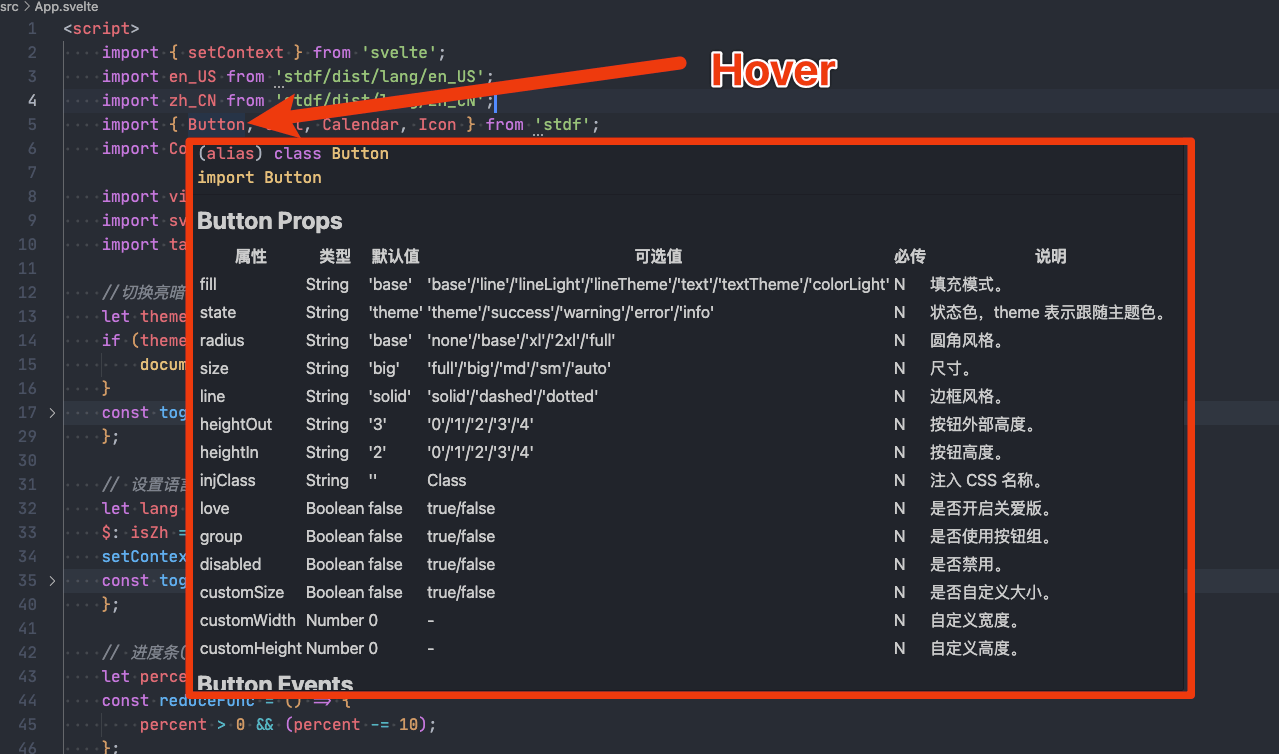
- 或者
- 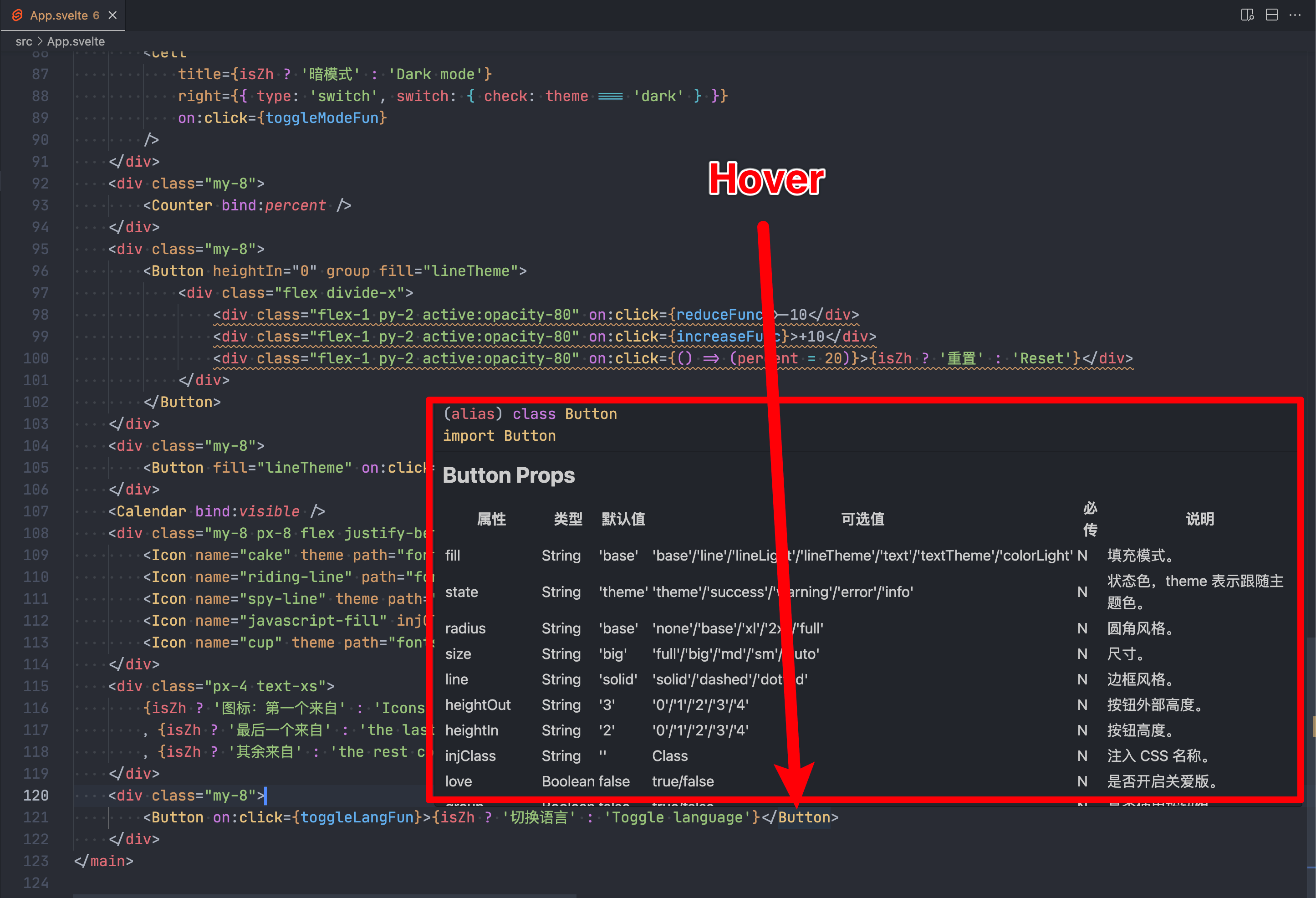
- ### 配置
- 默认显示的 API 为简体中文,可到 VS Code 的设置页开启英文 API。
- 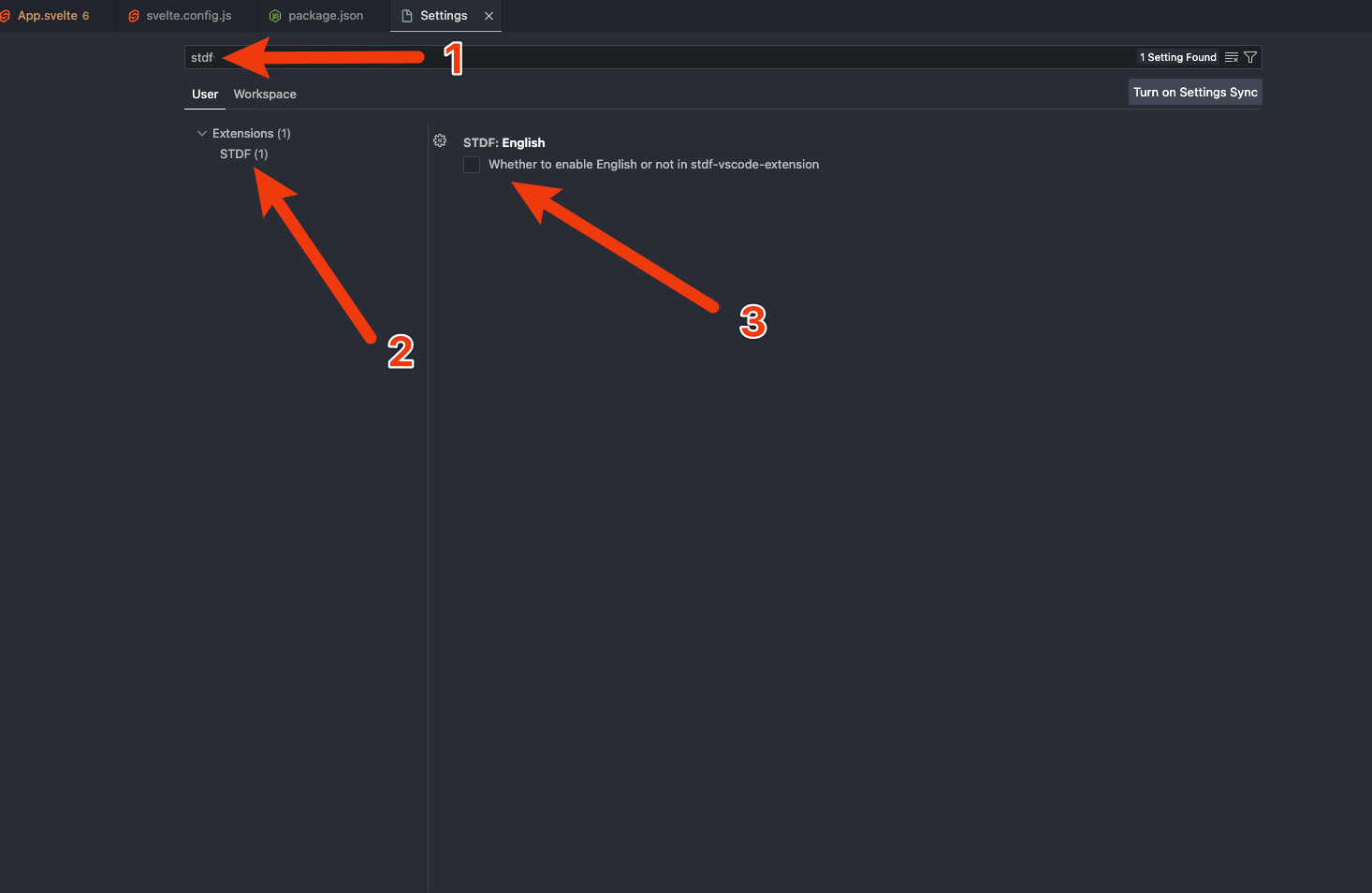
- ================================================
- FILE: docs/mds/guide/vscode_en.md
- ================================================
- ## VS Code Plugin
- ### Introduction
- STDF provides a VS Code plugin called [STDF for VS Code](https://marketplace.visualstudio.com/items?itemName=STDF.stdf-vscode-extension), which provides convenience when developing with [STDF](https://stdf.design).
- ### Installation
- Search for `STDF for VS Code` in the VS Code plugin marketplace and click install, or install [STDF for VS Code](https://marketplace.visualstudio.com/items?itemName=STDF.stdf-vscode-extension) from the VS Code plugin marketplace.
- ### Features
- When hovering over the name of an STDF component, the following information will be displayed:
- - The API of this component.
- - The example/API/guide of this component on the STDF official website.
- - The source code of this component on GitHub/Gitee.
- 
- or
- 
- ### Configuration
- The default API display is in Simplified Chinese. You can enable English API in the VS Code settings.
- 
- ================================================
- FILE: docs/site/eslint.config.js
- ================================================
- import prettier from 'eslint-config-prettier';
- import js from '@eslint/js';
- import { includeIgnoreFile } from '@eslint/compat';
- import svelte from 'eslint-plugin-svelte';
- import globals from 'globals';
- import { fileURLToPath } from 'node:url';
- import ts from 'typescript-eslint';
- const gitignorePath = fileURLToPath(new URL('./.gitignore', import.meta.url));
- export default ts.config(
- includeIgnoreFile(gitignorePath),
- js.configs.recommended,
- ...ts.configs.recommended,
- ...svelte.configs['flat/recommended'],
- prettier,
- ...svelte.configs['flat/prettier'],
- {
- languageOptions: {
- globals: {
- ...globals.browser,
- ...globals.node
- }
- }
- },
- {
- files: ['**/*.svelte'],
- languageOptions: {
- parserOptions: {
- parser: ts.parser
- }
- }
- }
- );
- ================================================
- FILE: docs/site/package.json
- ================================================
- {
- "name": "site",
- "version": "0.0.1",
- "type": "module",
- "scripts": {
- "env": "bun run scripts/env.js",
- "dev": "bun run env && vite dev",
- "preview": "vite preview",
- "build": "bun run env && vite build",
- "check": "svelte-kit sync && svelte-check --tsconfig ./tsconfig.json",
- "check:watch": "svelte-kit sync && svelte-check --tsconfig ./tsconfig.json --watch",
- "format": "prettier --write .",
- "lint": "prettier --check . && eslint ."
- },
- "devDependencies": {
- "@eslint/compat": "^1.2.4",
- "@sveltejs/adapter-static": "^3.0.6",
- "@sveltejs/kit": "^2.9.0",
- "@sveltejs/vite-plugin-svelte": "^5.0.1",
- "@tailwindcss/typography": "^0.5.15",
- "@tailwindcss/vite": "^4.0.12",
- "@types/color": "^4.2.0",
- "@types/culori": "^2.1.1",
- "beautify-qrcode": "^1.0.3",
- "clipboard": "^2.0.11",
- "color": "^4.2.3",
- "culori": "^4.0.1",
- "eslint": "^9.16.0",
- "eslint-config-prettier": "^9.1.0",
- "eslint-plugin-svelte": "^2.46.1",
- "globals": "^15.13.0",
- "highlight.js": "^11.10.0",
- "highlightjs-svelte": "^1.0.6",
- "prettier": "^3.4.2",
- "prettier-plugin-svelte": "^3.3.2",
- "prettier-plugin-tailwindcss": "^0.6.9",
- "rollup-plugin-md-ts": "file:../../packages/rollup-plugin-md-ts",
- "rollup-plugin-stdf-icon": "file:../../packages/rollup-plugin-stdf-icon",
- "stdf": "file:../../packages/stdf",
- "svelte": "^5.7.1",
- "svelte-check": "^4.1.1",
- "svelte-confetti": "^2.3.1",
- "tailwindcss": "^4.0.12",
- "typescript": "^5.7.2",
- "typescript-eslint": "^8.17.0",
- "vite": "^6.0.3"
- }
- }
- ================================================
- FILE: docs/site/svelte.config.js
- ================================================
- import adapter from '@sveltejs/adapter-static';
- import { vitePreprocess } from '@sveltejs/vite-plugin-svelte';
- /** @type {import('@sveltejs/kit').Config} */
- const config = {
- // Consult https://svelte.dev/docs/kit/integrations
- // for more information about preprocessors
- preprocess: vitePreprocess(),
- kit: {
- // adapter-auto only supports some environments, see https://svelte.dev/docs/kit/adapter-auto for a list.
- // If your environment is not supported, or you settled on a specific environment, switch out the adapter.
- // See https://svelte.dev/docs/kit/adapters for more information about adapters.
- adapter: adapter({ fallback: '404.html' })
- }
- };
- export default config;
- ================================================
- FILE: docs/site/tsconfig.json
- ================================================
- {
- "extends": "./.svelte-kit/tsconfig.json",
- "compilerOptions": {
- "allowJs": true,
- "checkJs": true,
- "esModuleInterop": true,
- "forceConsistentCasingInFileNames": true,
- "resolveJsonModule": true,
- "skipLibCheck": true,
- "sourceMap": true,
- "strict": true,
- "moduleResolution": "bundler"
- }
- // Path aliases are handled by https://svelte.dev/docs/kit/configuration#alias
- // except $lib which is handled by https://svelte.dev/docs/kit/configuration#files
- //
- // If you want to overwrite includes/excludes, make sure to copy over the relevant includes/excludes
- // from the referenced tsconfig.json - TypeScript does not merge them in
- }
- ================================================
- FILE: docs/site/vite.config.ts
- ================================================
- import { sveltekit } from '@sveltejs/kit/vite';
- import { defineConfig } from 'vite';
- import tailwindcss from '@tailwindcss/vite';
- import md from 'rollup-plugin-md-ts';
- import svgSprite from 'rollup-plugin-stdf-icon';
- export default defineConfig({
- plugins: [
- sveltekit(),
- tailwindcss(),
- md({ marked: {}, include: ['../mds/**/*.md', '../../packages/**/*.md'] }),
- svgSprite([{ inFile: 'src/lib/symbol', outFile: 'static/fonts', fileName: 'symbol' }])
- ],
- server: { hmr: true, host: '0.0.0.0', port: 5555 },
- build: { assetsDir: 'build' }
- });
- ================================================
- FILE: docs/site/.prettierignore
- ================================================
- # Package Managers
- package-lock.json
- pnpm-lock.yaml
- yarn.lock
- ================================================
- FILE: docs/site/.prettierrc
- ================================================
- {
- "useTabs": true,
- "singleQuote": true,
- "trailingComma": "none",
- "printWidth": 140,
- "plugins": ["prettier-plugin-svelte", "prettier-plugin-tailwindcss"],
- "overrides": [
- {
- "files": "*.svelte",
- "options": {
- "parser": "svelte"
- }
- }
- ]
- }
- ================================================
- FILE: docs/site/scripts/env.js
- ================================================
- import fs from 'node:fs';
- //得到标准时区的时间的函数
- const getLocalTime = (i) => {
- //参数 i 为时区值数字,比如北京为东八区则输进 8,纽约为西 5 区输入 -5
- if (typeof i !== 'number') return;
- const d = new Date();
- //得到 1970 年一月一日到现在的秒数
- const len = d.getTime();
- //本地时间与 GMT 时间的时间偏移差
- const offset = d.getTimezoneOffset() * 60000;
- //得到现在的格林尼治时间
- const utcTime = len + offset;
- return new Date(utcTime + 3600000 * i);
- };
- // 获取当前时间,返回中文和英文时间格式,24 小时制
- let now_en = getLocalTime(-4).toLocaleString('en-US', { hour12: false });
- let now_zh = getLocalTime(+8).toLocaleString('zh-CN', { hour12: false });
- // 去掉秒,即去除最后的 ':xx'
- now_en = `${now_en.slice(0, -3)} GMT-4`;
- now_zh = `${now_zh.slice(0, -3)} GMT+8`;
- console.log('now_en', now_en);
- console.log('now_zh', now_zh);
- // 如果已存在 .env 文件,则删除
- if (fs.existsSync('.env')) {
- fs.unlinkSync('.env');
- }
- // 将当前时间写入 .env 文件
- fs.writeFileSync('.env', `VITE_BUILD_TIME_EN=${now_en}\nVITE_BUILD_TIME_ZH=${now_zh}`);
- ================================================
- FILE: docs/site/src/app.css
- ================================================
- @import "tailwindcss";
- @custom-variant dark (&:where(.dark, .dark *));
- @plugin "@tailwindcss/typography";
- @theme {
- --color-primary-50: oklch(0.979 0.01 267.36);
- --color-primary-100: oklch(0.95 0.024 270.343);
- --color-primary-200: oklch(0.847 0.074 271.188);
- --color-primary-300: oklch(0.741 0.13 272.232);
- --color-primary-400: oklch(0.634 0.193 271.595);
- --color-primary-500: oklch(0.536 0.252 268.66);
- --color-primary: oklch(0.467 0.296 264.886);
- --color-primary-700: oklch(0.397 0.26 264.877);
- --color-primary-800: oklch(0.331 0.221 264.833);
- --color-primary-900: oklch(0.26 0.178 264.428);
- --color-primary-950: oklch(0.192 0.13 266.64);
- --color-dark-50: oklch(0.995 0.012 101.474);
- --color-dark-100: oklch(0.986 0.025 97.107);
- --color-dark-200: oklch(0.965 0.059 95.884);
- --color-dark-300: oklch(0.938 0.089 92.952);
- --color-dark-400: oklch(0.91 0.114 89.711);
- --color-dark-500: oklch(0.88 0.136 86.375);
- --color-dark: oklch(0.845 0.153 80.597);
- --color-dark-700: oklch(0.71 0.137 75.734);
- --color-dark-800: oklch(0.58 0.118 70.166);
- --color-dark-900: oklch(0.449 0.097 65.209);
- --color-dark-950: oklch(0.321 0.074 62.379);
- --color-primaryBlack: oklch(0.116 0.054 267.087);
- --color-primaryWhite: oklch(0.961 0.001 286.375);
- --color-darkBlack: oklch(0.183 0.035 86.634);
- --color-darkWhite: oklch(0.962 0.001 17.178);
- --color-success: oklch(0.704 0.142 167.084);
- --color-warning: oklch(0.558 0.154 47.186);
- --color-error: oklch(0.564 0.223 28.46);
- --color-info: oklch(0.482 0.14 261.518);
- --color-extend0: oklch(0.703 0.149 235.059);
- --color-Twitter: oklch(0.703 0.149 235.059);
- --color-extend1: oklch(0.702 0.194 38.137);
- --color-Svelte: oklch(0.702 0.194 38.137);
- --color-extend2: oklch(0.482 0.107 161.212);
- --color-Starbucks: oklch(0.482 0.107 161.212);
- --color-black: oklch(0 0 0);
- --color-white: oklch(1 0 0);
- --color-gray-50: oklch(0.961 0 0);
- --color-gray-100: oklch(0.925 0 0);
- --color-gray-200: oklch(0.845 0 0);
- --color-gray-300: oklch(0.767 0 0);
- --color-gray-400: oklch(0.683 0 0);
- --color-gray-500: oklch(0.6 0 0);
- --color-gray-600: oklch(0.51 0 0);
- --color-gray-700: oklch(0.42 0 0);
- --color-gray-800: oklch(0.321 0 0);
- --color-gray-900: oklch(0.218 0 0);
- --color-gray-950: oklch(0.159 0 0);
- --color-transparent: transparent;
- --color-bug1: oklch(0.579 0.214 27.172);
- --color-bug2: oklch(0.749 0.162 66.986);
- --color-bug3: oklch(0.912 0.192 103.116);
- --color-bug4: oklch(0.779 0.141 229.596);
- --color-tailwind: oklch(0.746 0.16 232.661);
- --color-svelte: oklch(0.702 0.194 38.137);
- /* 抖动动效 */
- --animate-shake: shake 0.82s cubic-bezier(0.36, 0.07, 0.19, 0.97) both;
- @keyframes shake {
- 10%,
- 90% {
- transform: translate3d(-1px, 0, 0);
- }
- 20%,
- 80% {
- transform: translate3d(2px, 0, 0);
- }
- 30%,
- 50%,
- 70% {
- transform: translate3d(-4px, 0, 0);
- }
- 40%,
- 60% {
- transform: translate3d(4px, 0, 0);
- }
- }
- /* 闪电动效 */
- --animate-lightning: lightning 3s linear infinite;
- @keyframes lightning {
- 0% {
- opacity: 0;
- }
- 10% {
- opacity: 1;
- }
- 20% {
- opacity: 0;
- }
- 30% {
- opacity: 1;
- }
- 100% {
- opacity: 0;
- }
- }
- /* 路径动效 */
- --animate-path: path 3s linear infinite;
- @keyframes path {
- 0% {
- stroke-dashoffset: 400;
- fill: transparent;
- }
- 31% {
- stroke-dashoffset: 0;
- fill: transparent;
- }
- 32% {
- stroke-dashoffset: 0;
- fill: currentColor;
- opacity: 1;
- }
- 33% {
- opacity: 0;
- }
- 35% {
- opacity: 1;
- }
- 37% {
- opacity: 0;
- }
- 39% {
- opacity: 1;
- }
- 41% {
- opacity: 0;
- }
- 43% {
- opacity: 1;
- }
- 44% {
- stroke-dashoffset: 0;
- fill: currentColor;
- }
- 99% {
- stroke-dashoffset: 0;
- fill: currentColor;
- }
- 100% {
- stroke-dashoffset: 400;
- fill: transparent;
- }
- }
- /* 动态背景动效 */
- --animate-dynamicsBg: dynamicsBg 8s linear infinite;
- @keyframes dynamicsBg {
- 0% {
- transform: rotate(360deg);
- height: 14rem;
- width: 14rem;
- }
- 50% {
- height: 7rem;
- width: 7rem;
- }
- 100% {
- transform: rotate(0deg);
- height: 14rem;
- width: 14rem;
- }
- }
- /* 云朵移动动效 */
- --animate-cloudMove: cloudMove 40s linear infinite;
- @keyframes cloudMove {
- 0% {
- transform: translateX(20%) translateY(-20%);
- }
- 50% {
- transform: translateX(-100%) translateY(-20%);
- }
- 100% {
- transform: translateX(20%) translateY(-20%);
- }
- }
- /* 星星闪烁动效 */
- --animate-starTwinkle: starTwinkle 8s linear infinite;
- --animate-starTwinkle2: starTwinkle 3s linear infinite;
- --animate-starTwinkle3: starTwinkle 6s linear infinite;
- --animate-starTwinkle4: starTwinkle 4s linear infinite;
- @keyframes starTwinkle {
- 0% {
- opacity: 1;
- }
- 40% {
- opacity: 1;
- }
- 50% {
- opacity: 0;
- }
- 60% {
- opacity: 1;
- }
- 100% {
- opacity: 1;
- }
- }
- /* 元素上下慢慢循环移动动效 */
- --animate-elementUpDownMove1: elementUpDownMove 12s linear infinite;
- --animate-elementUpDownMove2: elementUpDownMove 10s linear infinite -12s;
- --animate-elementUpDownMove3: elementUpDownMove 12s linear infinite -14s;
- --animate-elementUpDownMove4: elementUpDownMove 8s linear infinite -10s;
- --animate-elementUpDownMove5: elementUpDownMove 10s linear infinite -8s;
- --animate-elementUpDownMove6: elementUpDownMove 12s linear infinite -6s;
- @keyframes elementUpDownMove {
- 0% {
- transform: translateY(-20px);
- }
- 50% {
- transform: translateY(20px);
- }
- 100% {
- transform: translateY(-20px);
- }
- }
- }
- @source "../../../packages/stdf/dist/**/*.svelte";
- pre {
- background-color: transparent;
- padding: 0;
- }
- *::-webkit-scrollbar {
- width: 4px;
- }
- *::-webkit-scrollbar-thumb {
- border-radius: 2px;
- background-color: rgba(133, 133, 133, 0.5);
- }
- *::-webkit-scrollbar-track {
- background-color: rgba(133, 133, 133, 0.2);
- }
- html {
- overflow-x: hidden;
- overflow-y: overlay;
- /*scrollbar-gutter: stable;*/
- /* scrollbar-gutter: stable both-edges; */
- -webkit-tap-highlight-color: transparent;
- }
- * {
- scrollbar-width: thin;
- }
- .prose :where(code):not(:where([class~='not-prose'] *))::before {
- content: '' !important;
- }
- .prose :where(code):not(:where([class~='not-prose'] *))::after {
- content: '' !important;
- }
- .prose :where(code):not(:where([class~='not-prose'] *)) {
- padding-left: 4px;
- padding-right: 4px;
- border-radius: 2px;
- background: #e4e4e4 !important;
- }
- .dark .dark\:prose-invert :where(code):not(:where([class~='not-prose'] *)) {
- background: #202020 !important;
- }
- /*!
- Theme: GitHub Light
- */
- .prose pre code.hljs {
- background: #e4e4e4 !important;
- }
- .prose pre code.hljs {
- display: block;
- overflow-x: auto;
- padding: 1em;
- }
- .prose code.hljs {
- padding: 3px 5px;
- }
- .prose .hljs {
- /* background: #ebebeb !important; */
- color: #434f54;
- }
- .prose .hljs-subst {
- color: #434f54;
- }
- .prose .hljs-attribute,
- .prose .hljs-doctag,
- .prose .hljs-keyword,
- .prose .hljs-name,
- .prose .hljs-selector-tag {
- /* color: #00979d; */
- /* color: #0B24FB; */
- /* color: #ff3e00; */
- color: #af10a7;
- }
- .prose .hljs-addition,
- .prose .hljs-built_in,
- .prose .hljs-bullet,
- .prose .hljs-code,
- .prose .hljs-literal {
- color: #d35400;
- }
- .prose .hljs-link,
- .prose .hljs-regexp,
- .prose .hljs-selector-attr,
- .prose .hljs-selector-pseudo,
- .prose .hljs-symbol,
- .prose .hljs-template-variable,
- .prose .hljs-variable {
- /* color: #00979d; */
- color: #0b24fb;
- /* font-weight: bold; */
- /* color: #8a3ce2; */
- }
- .prose .hljs-deletion,
- .prose .hljs-quote,
- .prose .hljs-selector-class,
- .prose .hljs-selector-id,
- .prose .hljs-string,
- .prose .hljs-template-tag,
- .prose .hljs-type {
- /* color: #005c5f; */
- color: rgb(56, 189, 248);
- }
- .prose .hljs-comment {
- color: rgba(149, 165, 166, 0.8);
- }
- .prose .hljs-meta .hljs-keyword {
- color: #728e00;
- }
- .prose .hljs-meta {
- color: #434f54;
- }
- .prose .hljs-emphasis {
- font-style: italic;
- }
- .prose .hljs-strong {
- font-weight: 700;
- }
- .prose .hljs-function {
- color: #728e00;
- }
- .prose .hljs-section,
- .prose .hljs-title {
- /* color: #800; */
- color: #0b24fb;
- font-weight: 700;
- }
- .prose .hljs-number {
- color: #8a7b52;
- }
- .dark .dark\:prose-invert pre code.hljs {
- background: #202020 !important;
- }
- .dark .dark\:prose-invert pre code.hljs {
- display: block;
- overflow-x: auto;
- padding: 1em;
- }
- .dark .dark\:prose-invert code.hljs {
- padding: 3px 5px;
- }
- /*!
- Theme: GitHub Dark
- */
- .dark .dark\:prose-invert .hljs {
- color: #c9d1d9;
- /* background: #0d1117; */
- }
- .dark .dark\:prose-invert .hljs-doctag,
- .dark .dark\:prose-invert .hljs-keyword,
- .dark .dark\:prose-invert .hljs-meta .hljs-keyword,
- .dark .dark\:prose-invert .hljs-template-tag,
- .dark .dark\:prose-invert .hljs-template-variable,
- .dark .dark\:prose-invert .hljs-type,
- .dark .dark\:prose-invert .hljs-variable.language_ {
- /* color: #ff7b72; */
- color: #ffc043;
- }
- .dark .dark\:prose-invert .hljs-title,
- .dark .dark\:prose-invert .hljs-title.class_,
- .dark .dark\:prose-invert .hljs-title.class_.inherited__,
- .dark .dark\:prose-invert .hljs-title.function_ {
- color: #d2a8ff;
- }
- .dark .dark\:prose-invert .hljs-attr,
- .dark .dark\:prose-invert .hljs-attribute,
- .dark .dark\:prose-invert .hljs-literal,
- .dark .dark\:prose-invert .hljs-meta,
- .dark .dark\:prose-invert .hljs-number,
- .dark .dark\:prose-invert .hljs-operator,
- .dark .dark\:prose-invert .hljs-selector-attr,
- .dark .dark\:prose-invert .hljs-selector-class,
- .dark .dark\:prose-invert .hljs-selector-id,
- .dark .dark\:prose-invert .hljs-variable {
- color: #79c0ff;
- }
- .dark .dark\:prose-invert .hljs-meta .hljs-string,
- .dark .dark\:prose-invert .hljs-regexp,
- .dark .dark\:prose-invert .hljs-string {
- color: #a5d6ff;
- }
- .dark .dark\:prose-invert .hljs-built_in,
- .dark .dark\:prose-invert .hljs-symbol {
- color: #ffa657;
- }
- .dark .dark\:prose-invert .hljs-code,
- .dark .dark\:prose-invert .hljs-comment,
- .dark .dark\:prose-invert .hljs-formula {
- color: #8b949e;
- }
- .dark .dark\:prose-invert .hljs-name,
- .dark .dark\:prose-invert .hljs-quote,
- .dark .dark\:prose-invert .hljs-selector-pseudo,
- .dark .dark\:prose-invert .hljs-selector-tag {
- color: #7ee787;
- }
- .dark .dark\:prose-invert .hljs-subst {
- color: #c9d1d9;
- }
- .dark .dark\:prose-invert .hljs-section {
- color: #1f6feb;
- font-weight: 700;
- }
- .dark .dark\:prose-invert .hljs-bullet {
- color: #f2cc60;
- }
- .dark .dark\:prose-invert .hljs-emphasis {
- color: #c9d1d9;
- font-style: italic;
- }
- .dark .dark\:prose-invert .hljs-strong {
- color: #c9d1d9;
- font-weight: 700;
- }
- .dark .dark\:prose-invert .hljs-addition {
- color: #aff5b4;
- background-color: #033a16;
- }
- .dark .dark\:prose-invert .hljs-deletion {
- color: #ffdcd7;
- background-color: #67060c;
- }
- @font-face {
- font-family: 'JetBrainsMono';
- src: url('/assets/fonts/JetBrainsMono-Regular.woff2');
- }
- code {
- font-family: 'JetBrainsMono' !important;
- }
- /* 模拟设计软件的透明层 */
- .transparent-background {
- background-image: linear-gradient(45deg, #666 25%, transparent 25%, transparent 75%, #666 75%),
- linear-gradient(45deg, #666 25%, transparent 25%, transparent 75%, #666 75%);
- background-position:
- 0 0,
- 10px 10px;
- background-size: 20px 20px;
- }
- @keyframes clip {
- from {
- clip-path: circle(0% at var(--x) var(--y));
- }
- to {
- clip-path: circle(100% at var(--x) var(--y));
- }
- }
- ::view-transition-old(root) {
- animation: none;
- }
- ::view-transition-new(root) {
- mix-blend-mode: normal;
- animation: clip 0.6s ease-in;
- }
- ================================================
- FILE: docs/site/src/app.d.ts
- ================================================
- // See https://svelte.dev/docs/kit/types#app.d.ts
- // for information about these interfaces
- declare global {
- namespace App {
- // interface Error {}
- // interface Locals {}
- // interface PageData {}
- // interface PageState {}
- // interface Platform {}
- }
- }
- export {};
- ================================================
- FILE: docs/site/src/app.html
- ================================================
- <!doctype html>
- <html lang="zh-CN">
- <head>
- <meta charset="utf-8" />
- <meta name="viewport" content="width=device-width,initial-scale=1" />
- <meta name="theme-color" content="#ffffff" media="(prefers-color-scheme: light)" />
- <meta name="theme-color" content="#23262B" media="(prefers-color-scheme: dark)" />
- <meta itemprop="name" content="STDF" />
- <meta name="description" itemprop="description" content="Mobile web component library based on Svelte and Tailwind" />
- <meta itemprop="image" content="./assets/images/logo.png" />
- <title>STDF - 移动 web 组件库</title>
- <link href="/favicon.ico" rel="icon" media="(prefers-color-scheme: light)" />
- <link href="/favicon_black.ico" rel="icon" media="(prefers-color-scheme: dark)" />
- %sveltekit.head%
- </head>
- <body
- data-sveltekit-preload-data="hover"
- class="selection:bg-primary dark:selection:bg-dark selection:text-white dark:selection:text-black"
- >
- <div style="display: contents">%sveltekit.body%</div>
- </body>
- </html>
- ================================================
- FILE: docs/site/src/global.d.ts
- ================================================
- /// <reference types="vite-plugin-md-to-html/types" />
- ================================================
- FILE: docs/site/src/store.ts
- ================================================
- import { writable } from 'svelte/store';
- // 是否显示导航
- export const isShowNavStore = writable(false);
- // 文档 theme 模式,dark、light、auto。
- export const themeStore = writable(localStorage.getItem('theme') || 'auto');
- // 系统 theme 模式,dark、light
- export const sysThemeStore = writable(window.matchMedia('(prefers-color-scheme: dark)').matches ? 'dark' : 'light');
- // 当前 theme 模式,dark、light
- const currentTheme =
- (localStorage.getItem('theme') || 'auto') === 'auto'
- ? window.matchMedia('(prefers-color-scheme: dark)').matches
- ? 'dark'
- : 'light'
- : localStorage.getItem('theme') || 'auto';
- export const currentThemeStore = writable(currentTheme);
- // 是否开启 cmdK
- export const isCmdKStore = writable(false);
- // 是否显示赞赏
- export const isShowFundStore = writable(false);
- // 当前主题色
- export const currentColorStore = writable(localStorage.getItem('theme_color') || 'STDF');
- // 显示主题色选择器
- export const showThemeSwitchStore = writable(false);
- // 宽屏显示还是窄屏显示
- export const isWideScreenStore = writable(localStorage.getItem('isFull') && localStorage.getItem('isFull') === 'full');
- ================================================
- FILE: docs/site/src/data/color.ts
- ================================================
- import { colorConvertFunc } from '../utils';
- const colors = [
- ['000000', 'Black'],
- ['000080', 'Navy Blue'],
- ['0000C8', 'Dark Blue'],
- ['0000FF', 'Blue'],
- ['000741', 'Stratos'],
- ['001B1C', 'Swamp'],
- ['002387', 'Resolution Blue'],
- ['002900', 'Deep Fir'],
- ['002E20', 'Burnham'],
- ['002FA7', 'Klein Blue'],
- ['003153', 'Prussian Blue'],
- ['003366', 'Midnight Blue'],
- ['003399', 'Smalt'],
- ['003532', 'Deep Teal'],
- ['003E40', 'Cyprus'],
- ['004620', 'Kaitoke Green'],
- ['0047AB', 'Cobalt'],
- ['004816', 'Crusoe'],
- ['004950', 'Sherpa Blue'],
- ['0056A7', 'Endeavour'],
- ['00581A', 'Camarone'],
- ['0066CC', 'Science Blue'],
- ['0066FF', 'Blue Ribbon'],
- ['00755E', 'Tropical Rain Forest'],
- ['0076A3', 'Allports'],
- ['007BA7', 'Deep Cerulean'],
- ['007EC7', 'Lochmara'],
- ['007FFF', 'Azure Radiance'],
- ['008080', 'Teal'],
- ['0095B6', 'Bondi Blue'],
- ['009DC4', 'Pacific Blue'],
- ['00A693', 'Persian Green'],
- ['00A86B', 'Jade'],
- ['00CC99', 'Caribbean Green'],
- ['00CCCC', "Robin's Egg Blue"],
- ['00FF00', 'Green'],
- ['00FF7F', 'Spring Green'],
- ['00FFFF', 'Cyan / Aqua'],
- ['010D1A', 'Blue Charcoal'],
- ['011635', 'Midnight'],
- ['011D13', 'Holly'],
- ['012731', 'Daintree'],
- ['01361C', 'Cardin Green'],
- ['01371A', 'County Green'],
- ['013E62', 'Astronaut Blue'],
- ['013F6A', 'Regal Blue'],
- ['014B43', 'Aqua Deep'],
- ['015E85', 'Orient'],
- ['016162', 'Blue Stone'],
- ['016D39', 'Fun Green'],
- ['01796F', 'Pine Green'],
- ['017987', 'Blue Lagoon'],
- ['01826B', 'Deep Sea'],
- ['01A368', 'Green Haze'],
- ['022D15', 'English Holly'],
- ['02402C', 'Sherwood Green'],
- ['02478E', 'Congress Blue'],
- ['024E46', 'Evening Sea'],
- ['026395', 'Bahama Blue'],
- ['02866F', 'Observatory'],
- ['02A4D3', 'Cerulean'],
- ['03163C', 'Tangaroa'],
- ['032B52', 'Green Vogue'],
- ['036A6E', 'Mosque'],
- ['041004', 'Midnight Moss'],
- ['041322', 'Black Pearl'],
- ['042E4C', 'Blue Whale'],
- ['044022', 'Zuccini'],
- ['044259', 'Teal Blue'],
- ['051040', 'Deep Cove'],
- ['051657', 'Gulf Blue'],
- ['055989', 'Venice Blue'],
- ['056F57', 'Watercourse'],
- ['062A78', 'Catalina Blue'],
- ['063537', 'Tiber'],
- ['069B81', 'Gossamer'],
- ['06A189', 'Niagara'],
- ['073A50', 'Tarawera'],
- ['080110', 'Jaguar'],
- ['081910', 'Black Bean'],
- ['082567', 'Deep Sapphire'],
- ['088370', 'Elf Green'],
- ['08E8DE', 'Bright Turquoise'],
- ['092256', 'Downriver'],
- ['09230F', 'Palm Green'],
- ['09255D', 'Madison'],
- ['093624', 'Bottle Green'],
- ['095859', 'Deep Sea Green'],
- ['097F4B', 'Salem'],
- ['0A001C', 'Black Russian'],
- ['0A480D', 'Dark Fern'],
- ['0A6906', 'Japanese Laurel'],
- ['0A6F75', 'Atoll'],
- ['0B0B0B', 'Cod Gray'],
- ['0B0F08', 'Marshland'],
- ['0B1107', 'Gordons Green'],
- ['0B1304', 'Black Forest'],
- ['0B6207', 'San Felix'],
- ['0BDA51', 'Malachite'],
- ['0C0B1D', 'Ebony'],
- ['0C0D0F', 'Woodsmoke'],
- ['0C1911', 'Racing Green'],
- ['0C7A79', 'Surfie Green'],
- ['0C8990', 'Blue Chill'],
- ['0D0332', 'Black Rock'],
- ['0D1117', 'Bunker'],
- ['0D1C19', 'Aztec'],
- ['0D2E1C', 'Bush'],
- ['0E0E18', 'Cinder'],
- ['0E2A30', 'Firefly'],
- ['0F2D9E', 'Torea Bay'],
- ['10121D', 'Vulcan'],
- ['101405', 'Green Waterloo'],
- ['105852', 'Eden'],
- ['110C6C', 'Arapawa'],
- ['120A8F', 'Ultramarine'],
- ['123447', 'Elephant'],
- ['126B40', 'Jewel'],
- ['130000', 'Diesel'],
- ['130A06', 'Asphalt'],
- ['13264D', 'Blue Zodiac'],
- ['134F19', 'Parsley'],
- ['140600', 'Nero'],
- ['1450AA', 'Tory Blue'],
- ['151F4C', 'Bunting'],
- ['1560BD', 'Denim'],
- ['15736B', 'Genoa'],
- ['161928', 'Mirage'],
- ['161D10', 'Hunter Green'],
- ['162A40', 'Big Stone'],
- ['163222', 'Celtic'],
- ['16322C', 'Timber Green'],
- ['163531', 'Gable Green'],
- ['171F04', 'Pine Tree'],
- ['175579', 'Chathams Blue'],
- ['182D09', 'Deep Forest Green'],
- ['18587A', 'Blumine'],
- ['19330E', 'Palm Leaf'],
- ['193751', 'Nile Blue'],
- ['1959A8', 'Fun Blue'],
- ['1A1A68', 'Lucky Point'],
- ['1AB385', 'Mountain Meadow'],
- ['1B0245', 'Tolopea'],
- ['1B1035', 'Haiti'],
- ['1B127B', 'Deep Koamaru'],
- ['1B1404', 'Acadia'],
- ['1B2F11', 'Seaweed'],
- ['1B3162', 'Biscay'],
- ['1B659D', 'Matisse'],
- ['1C1208', 'Crowshead'],
- ['1C1E13', 'Rangoon Green'],
- ['1C39BB', 'Persian Blue'],
- ['1C402E', 'Everglade'],
- ['1C7C7D', 'Elm'],
- ['1D6142', 'Green Pea'],
- ['1E0F04', 'Creole'],
- ['1E1609', 'Karaka'],
- ['1E1708', 'El Paso'],
- ['1E385B', 'Cello'],
- ['1E433C', 'Te Papa Green'],
- ['1E90FF', 'Dodger Blue'],
- ['1E9AB0', 'Eastern Blue'],
- ['1F120F', 'Night Rider'],
- ['1FC2C2', 'Java'],
- ['20208D', 'Jacksons Purple'],
- ['202E54', 'Cloud Burst'],
- ['204852', 'Blue Dianne'],
- ['211A0E', 'Eternity'],
- ['220878', 'Deep Blue'],
- ['228B22', 'Forest Green'],
- ['233418', 'Mallard'],
- ['240A40', 'Violet'],
- ['240C02', 'Kilamanjaro'],
- ['242A1D', 'Log Cabin'],
- ['242E16', 'Black Olive'],
- ['24500F', 'Green House'],
- ['251607', 'Graphite'],
- ['251706', 'Cannon Black'],
- ['251F4F', 'Port Gore'],
- ['25272C', 'Shark'],
- ['25311C', 'Green Kelp'],
- ['2596D1', 'Curious Blue'],
- ['260368', 'Paua'],
- ['26056A', 'Paris M'],
- ['261105', 'Wood Bark'],
- ['261414', 'Gondola'],
- ['262335', 'Steel Gray'],
- ['26283B', 'Ebony Clay'],
- ['273A81', 'Bay of Many'],
- ['27504B', 'Plantation'],
- ['278A5B', 'Eucalyptus'],
- ['281E15', 'Oil'],
- ['283A77', 'Astronaut'],
- ['286ACD', 'Mariner'],
- ['290C5E', 'Violent Violet'],
- ['292130', 'Bastille'],
- ['292319', 'Zeus'],
- ['292937', 'Charade'],
- ['297B9A', 'Jelly Bean'],
- ['29AB87', 'Jungle Green'],
- ['2A0359', 'Cherry Pie'],
- ['2A140E', 'Coffee Bean'],
- ['2A2630', 'Baltic Sea'],
- ['2A380B', 'Turtle Green'],
- ['2A52BE', 'Cerulean Blue'],
- ['2B0202', 'Sepia Black'],
- ['2B194F', 'Valhalla'],
- ['2B3228', 'Heavy Metal'],
- ['2C0E8C', 'Blue Gem'],
- ['2C1632', 'Revolver'],
- ['2C2133', 'Bleached Cedar'],
- ['2C8C84', 'Lochinvar'],
- ['2D2510', 'Mikado'],
- ['2D383A', 'Outer Space'],
- ['2D569B', 'St Tropaz'],
- ['2E0329', 'Jacaranda'],
- ['2E1905', 'Jacko Bean'],
- ['2E3222', 'Rangitoto'],
- ['2E3F62', 'Rhino'],
- ['2E8B57', 'Sea Green'],
- ['2EBFD4', 'Scooter'],
- ['2F270E', 'Onion'],
- ['2F3CB3', 'Governor Bay'],
- ['2F519E', 'Sapphire'],
- ['2F5A57', 'Spectra'],
- ['2F6168', 'Casal'],
- ['300529', 'Melanzane'],
- ['301F1E', 'Cocoa Brown'],
- ['302A0F', 'Woodrush'],
- ['304B6A', 'San Juan'],
- ['30D5C8', 'Turquoise'],
- ['311C17', 'Eclipse'],
- ['314459', 'Pickled Bluewood'],
- ['315BA1', 'Azure'],
- ['31728D', 'Calypso'],
- ['317D82', 'Paradiso'],
- ['32127A', 'Persian Indigo'],
- ['32293A', 'Blackcurrant'],
- ['323232', 'Mine Shaft'],
- ['325D52', 'Stromboli'],
- ['327C14', 'Bilbao'],
- ['327DA0', 'Astral'],
- ['33036B', 'Christalle'],
- ['33292F', 'Thunder'],
- ['33CC99', 'Shamrock'],
- ['341515', 'Tamarind'],
- ['350036', 'Mardi Gras'],
- ['350E42', 'Valentino'],
- ['350E57', 'Jagger'],
- ['353542', 'Tuna'],
- ['354E8C', 'Chambray'],
- ['363050', 'Martinique'],
- ['363534', 'Tuatara'],
- ['363C0D', 'Waiouru'],
- ['36747D', 'Ming'],
- ['368716', 'La Palma'],
- ['370202', 'Chocolate'],
- ['371D09', 'Clinker'],
- ['37290E', 'Brown Tumbleweed'],
- ['373021', 'Birch'],
- ['377475', 'Oracle'],
- ['380474', 'Blue Diamond'],
- ['381A51', 'Grape'],
- ['383533', 'Dune'],
- ['384555', 'Oxford Blue'],
- ['384910', 'Clover'],
- ['394851', 'Limed Spruce'],
- ['396413', 'Dell'],
- ['3A0020', 'Toledo'],
- ['3A2010', 'Sambuca'],
- ['3A2A6A', 'Jacarta'],
- ['3A686C', 'William'],
- ['3A6A47', 'Killarney'],
- ['3AB09E', 'Keppel'],
- ['3B000B', 'Temptress'],
- ['3B0910', 'Aubergine'],
- ['3B1F1F', 'Jon'],
- ['3B2820', 'Treehouse'],
- ['3B7A57', 'Amazon'],
- ['3B91B4', 'Boston Blue'],
- ['3C0878', 'Windsor'],
- ['3C1206', 'Rebel'],
- ['3C1F76', 'Meteorite'],
- ['3C2005', 'Dark Ebony'],
- ['3C3910', 'Camouflage'],
- ['3C4151', 'Bright Gray'],
- ['3C4443', 'Cape Cod'],
- ['3C493A', 'Lunar Green'],
- ['3D0C02', 'Bean '],
- ['3D2B1F', 'Bistre'],
- ['3D7D52', 'Goblin'],
- ['3E0480', 'Kingfisher Daisy'],
- ['3E1C14', 'Cedar'],
- ['3E2B23', 'English Walnut'],
- ['3E2C1C', 'Black Marlin'],
- ['3E3A44', 'Ship Gray'],
- ['3EABBF', 'Pelorous'],
- ['3F2109', 'Bronze'],
- ['3F2500', 'Cola'],
- ['3F3002', 'Madras'],
- ['3F307F', 'Minsk'],
- ['3F4C3A', 'Cabbage Pont'],
- ['3F583B', 'Tom Thumb'],
- ['3F5D53', 'Mineral Green'],
- ['3FC1AA', 'Puerto Rico'],
- ['3FFF00', 'Harlequin'],
- ['401801', 'Brown Pod'],
- ['40291D', 'Cork'],
- ['403B38', 'Masala'],
- ['403D19', 'Thatch Green'],
- ['405169', 'Fiord'],
- ['40826D', 'Viridian'],
- ['40A860', 'Chateau Green'],
- ['410056', 'Ripe Plum'],
- ['411F10', 'Paco'],
- ['412010', 'Deep Oak'],
- ['413C37', 'Merlin'],
- ['414257', 'Gun Powder'],
- ['414C7D', 'East Bay'],
- ['4169E1', 'Royal Blue'],
- ['41AA78', 'Ocean Green'],
- ['420303', 'Burnt Maroon'],
- ['423921', 'Lisbon Brown'],
- ['427977', 'Faded Jade'],
- ['431560', 'Scarlet Gum'],
- ['433120', 'Iroko'],
- ['433E37', 'Armadillo'],
- ['434C59', 'River Bed'],
- ['436A0D', 'Green Leaf'],
- ['44012D', 'Barossa'],
- ['441D00', 'Morocco Brown'],
- ['444954', 'Mako'],
- ['454936', 'Kelp'],
- ['456CAC', 'San Marino'],
- ['45B1E8', 'Picton Blue'],
- ['460B41', 'Loulou'],
- ['462425', 'Crater Brown'],
- ['465945', 'Gray Asparagus'],
- ['4682B4', 'Steel Blue'],
- ['480404', 'Rustic Red'],
- ['480607', 'Bulgarian Rose'],
- ['480656', 'Clairvoyant'],
- ['481C1C', 'Cocoa Bean'],
- ['483131', 'Woody Brown'],
- ['483C32', 'Taupe'],
- ['49170C', 'Van Cleef'],
- ['492615', 'Brown Derby'],
- ['49371B', 'Metallic Bronze'],
- ['495400', 'Verdun Green'],
- ['496679', 'Blue Bayoux'],
- ['497183', 'Bismark'],
- ['4A2A04', 'Bracken'],
- ['4A3004', 'Deep Bronze'],
- ['4A3C30', 'Mondo'],
- ['4A4244', 'Tundora'],
- ['4A444B', 'Gravel'],
- ['4A4E5A', 'Trout'],
- ['4B0082', 'Pigment Indigo'],
- ['4B5D52', 'Nandor'],
- ['4C3024', 'Saddle'],
- ['4C4F56', 'Abbey'],
- ['4D0135', 'Blackberry'],
- ['4D0A18', 'Cab Sav'],
- ['4D1E01', 'Indian Tan'],
- ['4D282D', 'Cowboy'],
- ['4D282E', 'Livid Brown'],
- ['4D3833', 'Rock'],
- ['4D3D14', 'Punga'],
- ['4D400F', 'Bronzetone'],
- ['4D5328', 'Woodland'],
- ['4E0606', 'Mahogany'],
- ['4E2A5A', 'Bossanova'],
- ['4E3B41', 'Matterhorn'],
- ['4E420C', 'Bronze Olive'],
- ['4E4562', 'Mulled Wine'],
- ['4E6649', 'Axolotl'],
- ['4E7F9E', 'Wedgewood'],
- ['4EABD1', 'Shakespeare'],
- ['4F1C70', 'Honey Flower'],
- ['4F2398', 'Daisy Bush'],
- ['4F69C6', 'Indigo'],
- ['4F7942', 'Fern Green'],
- ['4F9D5D', 'Fruit Salad'],
- ['4FA83D', 'Apple'],
- ['504351', 'Mortar'],
- ['507096', 'Kashmir Blue'],
- ['507672', 'Cutty Sark'],
- ['50C878', 'Emerald'],
- ['514649', 'Emperor'],
- ['516E3D', 'Chalet Green'],
- ['517C66', 'Como'],
- ['51808F', 'Smalt Blue'],
- ['52001F', 'Castro'],
- ['520C17', 'Maroon Oak'],
- ['523C94', 'Gigas'],
- ['533455', 'Voodoo'],
- ['534491', 'Victoria'],
- ['53824B', 'Hippie Green'],
- ['541012', 'Heath'],
- ['544333', 'Judge Gray'],
- ['54534D', 'Fuscous Gray'],
- ['549019', 'Vida Loca'],
- ['55280C', 'Cioccolato'],
- ['555B10', 'Saratoga'],
- ['556D56', 'Finlandia'],
- ['5590D9', 'Havelock Blue'],
- ['56B4BE', 'Fountain Blue'],
- ['578363', 'Spring Leaves'],
- ['583401', 'Saddle Brown'],
- ['585562', 'Scarpa Flow'],
- ['587156', 'Cactus'],
- ['589AAF', 'Hippie Blue'],
- ['591D35', 'Wine Berry'],
- ['592804', 'Brown Bramble'],
- ['593737', 'Congo Brown'],
- ['594433', 'Millbrook'],
- ['5A6E9C', 'Waikawa Gray'],
- ['5A87A0', 'Horizon'],
- ['5B3013', 'Jambalaya'],
- ['5C0120', 'Bordeaux'],
- ['5C0536', 'Mulberry Wood'],
- ['5C2E01', 'Carnaby Tan'],
- ['5C5D75', 'Comet'],
- ['5D1E0F', 'Redwood'],
- ['5D4C51', 'Don Juan'],
- ['5D5C58', 'Chicago'],
- ['5D5E37', 'Verdigris'],
- ['5D7747', 'Dingley'],
- ['5DA19F', 'Breaker Bay'],
- ['5E483E', 'Kabul'],
- ['5E5D3B', 'Hemlock'],
- ['5F3D26', 'Irish Coffee'],
- ['5F5F6E', 'Mid Gray'],
- ['5F6672', 'Shuttle Gray'],
- ['5FA777', 'Aqua Forest'],
- ['5FB3AC', 'Tradewind'],
- ['604913', 'Horses Neck'],
- ['605B73', 'Smoky'],
- ['606E68', 'Corduroy'],
- ['6093D1', 'Danube'],
- ['612718', 'Espresso'],
- ['614051', 'Eggplant'],
- ['615D30', 'Costa Del Sol'],
- ['61845F', 'Glade Green'],
- ['622F30', 'Buccaneer'],
- ['623F2D', 'Quincy'],
- ['624E9A', 'Butterfly Bush'],
- ['625119', 'West Coast'],
- ['626649', 'Finch'],
- ['639A8F', 'Patina'],
- ['63B76C', 'Fern'],
- ['6456B7', 'Blue Violet'],
- ['646077', 'Dolphin'],
- ['646463', 'Storm Dust'],
- ['646A54', 'Siam'],
- ['646E75', 'Nevada'],
- ['6495ED', 'Cornflower Blue'],
- ['64CCDB', 'Viking'],
- ['65000B', 'Rosewood'],
- ['651A14', 'Cherrywood'],
- ['652DC1', 'Purple Heart'],
- ['657220', 'Fern Frond'],
- ['65745D', 'Willow Grove'],
- ['65869F', 'Hoki'],
- ['660045', 'Pompadour'],
- ['660099', 'Purple'],
- ['66023C', 'Tyrian Purple'],
- ['661010', 'Dark Tan'],
- ['66B58F', 'Silver Tree'],
- ['66FF00', 'Bright Green'],
- ['66FF66', "Screamin' Green"],
- ['67032D', 'Black Rose'],
- ['675FA6', 'Scampi'],
- ['676662', 'Ironside Gray'],
- ['678975', 'Viridian Green'],
- ['67A712', 'Christi'],
- ['683600', 'Nutmeg Wood Finish'],
- ['685558', 'Zambezi'],
- ['685E6E', 'Salt Box'],
- ['692545', 'Tawny Port'],
- ['692D54', 'Finn'],
- ['695F62', 'Scorpion'],
- ['697E9A', 'Lynch'],
- ['6A442E', 'Spice'],
- ['6A5D1B', 'Himalaya'],
- ['6A6051', 'Soya Bean'],
- ['6B2A14', 'Hairy Heath'],
- ['6B3FA0', 'Royal Purple'],
- ['6B4E31', 'Shingle Fawn'],
- ['6B5755', 'Dorado'],
- ['6B8BA2', 'Bermuda Gray'],
- ['6B8E23', 'Olive Drab'],
- ['6C3082', 'Eminence'],
- ['6CDAE7', 'Turquoise Blue'],
- ['6D0101', 'Lonestar'],
- ['6D5E54', 'Pine Cone'],
- ['6D6C6C', 'Dove Gray'],
- ['6D9292', 'Juniper'],
- ['6D92A1', 'Gothic'],
- ['6E0902', 'Red Oxide'],
- ['6E1D14', 'Moccaccino'],
- ['6E4826', 'Pickled Bean'],
- ['6E4B26', 'Dallas'],
- ['6E6D57', 'Kokoda'],
- ['6E7783', 'Pale Sky'],
- ['6F440C', 'Cafe Royale'],
- ['6F6A61', 'Flint'],
- ['6F8E63', 'Highland'],
- ['6F9D02', 'Limeade'],
- ['6FD0C5', 'Downy'],
- ['701C1C', 'Persian Plum'],
- ['704214', 'Sepia'],
- ['704A07', 'Antique Bronze'],
- ['704F50', 'Ferra'],
- ['706555', 'Coffee'],
- ['708090', 'Slate Gray'],
- ['711A00', 'Cedar Wood Finish'],
- ['71291D', 'Metallic Copper'],
- ['714693', 'Affair'],
- ['714AB2', 'Studio'],
- ['715D47', 'Tobacco Brown'],
- ['716338', 'Yellow Metal'],
- ['716B56', 'Peat'],
- ['716E10', 'Olivetone'],
- ['717486', 'Storm Gray'],
- ['718080', 'Sirocco'],
- ['71D9E2', 'Aquamarine Blue'],
- ['72010F', 'Venetian Red'],
- ['724A2F', 'Old Copper'],
- ['726D4E', 'Go Ben'],
- ['727B89', 'Raven'],
- ['731E8F', 'Seance'],
- ['734A12', 'Raw Umber'],
- ['736C9F', 'Kimberly'],
- ['736D58', 'Crocodile'],
- ['737829', 'Crete'],
- ['738678', 'Xanadu'],
- ['74640D', 'Spicy Mustard'],
- ['747D63', 'Limed Ash'],
- ['747D83', 'Rolling Stone'],
- ['748881', 'Blue Smoke'],
- ['749378', 'Laurel'],
- ['74C365', 'Mantis'],
- ['755A57', 'Russett'],
- ['7563A8', 'Deluge'],
- ['76395D', 'Cosmic'],
- ['7666C6', 'Blue Marguerite'],
- ['76BD17', 'Lima'],
- ['76D7EA', 'Sky Blue'],
- ['770F05', 'Dark Burgundy'],
- ['771F1F', 'Crown of Thorns'],
- ['773F1A', 'Walnut'],
- ['776F61', 'Pablo'],
- ['778120', 'Pacifika'],
- ['779E86', 'Oxley'],
- ['77DD77', 'Pastel Green'],
- ['780109', 'Japanese Maple'],
- ['782D19', 'Mocha'],
- ['782F16', 'Peanut'],
- ['78866B', 'Camouflage Green'],
- ['788A25', 'Wasabi'],
- ['788BBA', 'Ship Cove'],
- ['78A39C', 'Sea Nymph'],
- ['795D4C', 'Roman Coffee'],
- ['796878', 'Old Lavender'],
- ['796989', 'Rum'],
- ['796A78', 'Fedora'],
- ['796D62', 'Sandstone'],
- ['79DEEC', 'Spray'],
- ['7A013A', 'Siren'],
- ['7A58C1', 'Fuchsia Blue'],
- ['7A7A7A', 'Boulder'],
- ['7A89B8', 'Wild Blue Yonder'],
- ['7AC488', 'De York'],
- ['7B3801', 'Red Beech'],
- ['7B3F00', 'Cinnamon'],
- ['7B6608', 'Yukon Gold'],
- ['7B7874', 'Tapa'],
- ['7B7C94', 'Waterloo '],
- ['7B8265', 'Flax Smoke'],
- ['7B9F80', 'Amulet'],
- ['7BA05B', 'Asparagus'],
- ['7C1C05', 'Kenyan Copper'],
- ['7C7631', 'Pesto'],
- ['7C778A', 'Topaz'],
- ['7C7B7A', 'Concord'],
- ['7C7B82', 'Jumbo'],
- ['7C881A', 'Trendy Green'],
- ['7CA1A6', 'Gumbo'],
- ['7CB0A1', 'Acapulco'],
- ['7CB7BB', 'Neptune'],
- ['7D2C14', 'Pueblo'],
- ['7DA98D', 'Bay Leaf'],
- ['7DC8F7', 'Malibu'],
- ['7DD8C6', 'Bermuda'],
- ['7E3A15', 'Copper Canyon'],
- ['7F1734', 'Claret'],
- ['7F3A02', 'Peru Tan'],
- ['7F626D', 'Falcon'],
- ['7F7589', 'Mobster'],
- ['7F76D3', 'Moody Blue'],
- ['7FFF00', 'Chartreuse'],
- ['7FFFD4', 'Aquamarine'],
- ['800000', 'Maroon'],
- ['800B47', 'Rose Bud Cherry'],
- ['801818', 'Falu Red'],
- ['80341F', 'Red Robin'],
- ['803790', 'Vivid Violet'],
- ['80461B', 'Russet'],
- ['807E79', 'Friar Gray'],
- ['808000', 'Olive'],
- ['808080', 'Gray'],
- ['80B3AE', 'Gulf Stream'],
- ['80B3C4', 'Glacier'],
- ['80CCEA', 'Seagull'],
- ['81422C', 'Nutmeg'],
- ['816E71', 'Spicy Pink'],
- ['817377', 'Empress'],
- ['819885', 'Spanish Green'],
- ['826F65', 'Sand Dune'],
- ['828685', 'Gunsmoke'],
- ['828F72', 'Battleship Gray'],
- ['831923', 'Merlot'],
- ['837050', 'Shadow'],
- ['83AA5D', 'Chelsea Cucumber'],
- ['83D0C6', 'Monte Carlo'],
- ['843179', 'Plum'],
- ['84A0A0', 'Granny Smith'],
- ['8581D9', 'Chetwode Blue'],
- ['858470', 'Bandicoot'],
- ['859FAF', 'Bali Hai'],
- ['85C4CC', 'Half Baked'],
- ['860111', 'Red Devil'],
- ['863C3C', 'Lotus'],
- ['86483C', 'Ironstone'],
- ['864D1E', 'Bull Shot'],
- ['86560A', 'Rusty Nail'],
- ['868974', 'Bitter'],
- ['86949F', 'Regent Gray'],
- ['871550', 'Disco'],
- ['87756E', 'Americano'],
- ['877C7B', 'Hurricane'],
- ['878D91', 'Oslo Gray'],
- ['87AB39', 'Sushi'],
- ['885342', 'Spicy Mix'],
- ['886221', 'Kumera'],
- ['888387', 'Suva Gray'],
- ['888D65', 'Avocado'],
- ['893456', 'Camelot'],
- ['893843', 'Solid Pink'],
- ['894367', 'Cannon Pink'],
- ['897D6D', 'Makara'],
- ['8A3324', 'Burnt Umber'],
- ['8A73D6', 'True V'],
- ['8A8360', 'Clay Creek'],
- ['8A8389', 'Monsoon'],
- ['8A8F8A', 'Stack'],
- ['8AB9F1', 'Jordy Blue'],
- ['8B00FF', 'Electric Violet'],
- ['8B0723', 'Monarch'],
- ['8B6B0B', 'Corn Harvest'],
- ['8B8470', 'Olive Haze'],
- ['8B847E', 'Schooner'],
- ['8B8680', 'Natural Gray'],
- ['8B9C90', 'Mantle'],
- ['8B9FEE', 'Portage'],
- ['8BA690', 'Envy'],
- ['8BA9A5', 'Cascade'],
- ['8BE6D8', 'Riptide'],
- ['8C055E', 'Cardinal Pink'],
- ['8C472F', 'Mule Fawn'],
- ['8C5738', 'Potters Clay'],
- ['8C6495', 'Trendy Pink'],
- ['8D0226', 'Paprika'],
- ['8D3D38', 'Sanguine Brown'],
- ['8D3F3F', 'Tosca'],
- ['8D7662', 'Cement'],
- ['8D8974', 'Granite Green'],
- ['8D90A1', 'Manatee'],
- ['8DA8CC', 'Polo Blue'],
- ['8E0000', 'Red Berry'],
- ['8E4D1E', 'Rope'],
- ['8E6F70', 'Opium'],
- ['8E775E', 'Domino'],
- ['8E8190', 'Mamba'],
- ['8EABC1', 'Nepal'],
- ['8F021C', 'Pohutukawa'],
- ['8F3E33', 'El Salva'],
- ['8F4B0E', 'Korma'],
- ['8F8176', 'Squirrel'],
- ['8FD6B4', 'Vista Blue'],
- ['900020', 'Burgundy'],
- ['901E1E', 'Old Brick'],
- ['907874', 'Hemp'],
- ['907B71', 'Almond Frost'],
- ['908D39', 'Sycamore'],
- ['92000A', 'Sangria'],
- ['924321', 'Cumin'],
- ['926F5B', 'Beaver'],
- ['928573', 'Stonewall'],
- ['928590', 'Venus'],
- ['9370DB', 'Medium Purple'],
- ['93CCEA', 'Cornflower'],
- ['93DFB8', 'Algae Green'],
- ['944747', 'Copper Rust'],
- ['948771', 'Arrowtown'],
- ['950015', 'Scarlett'],
- ['956387', 'Strikemaster'],
- ['959396', 'Mountain Mist'],
- ['960018', 'Carmine'],
- ['964B00', 'Brown'],
- ['967059', 'Leather'],
- ['9678B6', "Purple Mountain's Majesty"],
- ['967BB6', 'Lavender Purple'],
- ['96A8A1', 'Pewter'],
- ['96BBAB', 'Summer Green'],
- ['97605D', 'Au Chico'],
- ['9771B5', 'Wisteria'],
- ['97CD2D', 'Atlantis'],
- ['983D61', 'Vin Rouge'],
- ['9874D3', 'Lilac Bush'],
- ['98777B', 'Bazaar'],
- ['98811B', 'Hacienda'],
- ['988D77', 'Pale Oyster'],
- ['98FF98', 'Mint Green'],
- ['990066', 'Fresh Eggplant'],
- ['991199', 'Violet Eggplant'],
- ['991613', 'Tamarillo'],
- ['991B07', 'Totem Pole'],
- ['996666', 'Copper Rose'],
- ['9966CC', 'Amethyst'],
- ['997A8D', 'Mountbatten Pink'],
- ['9999CC', 'Blue Bell'],
- ['9A3820', 'Prairie Sand'],
- ['9A6E61', 'Toast'],
- ['9A9577', 'Gurkha'],
- ['9AB973', 'Olivine'],
- ['9AC2B8', 'Shadow Green'],
- ['9B4703', 'Oregon'],
- ['9B9E8F', 'Lemon Grass'],
- ['9C3336', 'Stiletto'],
- ['9D5616', 'Hawaiian Tan'],
- ['9DACB7', 'Gull Gray'],
- ['9DC209', 'Pistachio'],
- ['9DE093', 'Granny Smith Apple'],
- ['9DE5FF', 'Anakiwa'],
- ['9E5302', 'Chelsea Gem'],
- ['9E5B40', 'Sepia Skin'],
- ['9EA587', 'Sage'],
- ['9EA91F', 'Citron'],
- ['9EB1CD', 'Rock Blue'],
- ['9EDEE0', 'Morning Glory'],
- ['9F381D', 'Cognac'],
- ['9F821C', 'Reef Gold'],
- ['9F9F9C', 'Star Dust'],
- ['9FA0B1', 'Santas Gray'],
- ['9FD7D3', 'Sinbad'],
- ['9FDD8C', 'Feijoa'],
- ['A02712', 'Tabasco'],
- ['A1750D', 'Buttered Rum'],
- ['A1ADB5', 'Hit Gray'],
- ['A1C50A', 'Citrus'],
- ['A1DAD7', 'Aqua Island'],
- ['A1E9DE', 'Water Leaf'],
- ['A2006D', 'Flirt'],
- ['A23B6C', 'Rouge'],
- ['A26645', 'Cape Palliser'],
- ['A2AAB3', 'Gray Chateau'],
- ['A2AEAB', 'Edward'],
- ['A3807B', 'Pharlap'],
- ['A397B4', 'Amethyst Smoke'],
- ['A3E3ED', 'Blizzard Blue'],
- ['A4A49D', 'Delta'],
- ['A4A6D3', 'Wistful'],
- ['A4AF6E', 'Green Smoke'],
- ['A50B5E', 'Jazzberry Jam'],
- ['A59B91', 'Zorba'],
- ['A5CB0C', 'Bahia'],
- ['A62F20', 'Roof Terracotta'],
- ['A65529', 'Paarl'],
- ['A68B5B', 'Barley Corn'],
- ['A69279', 'Donkey Brown'],
- ['A6A29A', 'Dawn'],
- ['A72525', 'Mexican Red'],
- ['A7882C', 'Luxor Gold'],
- ['A85307', 'Rich Gold'],
- ['A86515', 'Reno Sand'],
- ['A86B6B', 'Coral Tree'],
- ['A8989B', 'Dusty Gray'],
- ['A899E6', 'Dull Lavender'],
- ['A8A589', 'Tallow'],
- ['A8AE9C', 'Bud'],
- ['A8AF8E', 'Locust'],
- ['A8BD9F', 'Norway'],
- ['A8E3BD', 'Chinook'],
- ['A9A491', 'Gray Olive'],
- ['A9ACB6', 'Aluminium'],
- ['A9B2C3', 'Cadet Blue'],
- ['A9B497', 'Schist'],
- ['A9BDBF', 'Tower Gray'],
- ['A9BEF2', 'Perano'],
- ['A9C6C2', 'Opal'],
- ['AA375A', 'Night Shadz'],
- ['AA4203', 'Fire'],
- ['AA8B5B', 'Muesli'],
- ['AA8D6F', 'Sandal'],
- ['AAA5A9', 'Shady Lady'],
- ['AAA9CD', 'Logan'],
- ['AAABB7', 'Spun Pearl'],
- ['AAD6E6', 'Regent St Blue'],
- ['AAF0D1', 'Magic Mint'],
- ['AB0563', 'Lipstick'],
- ['AB3472', 'Royal Heath'],
- ['AB917A', 'Sandrift'],
- ['ABA0D9', 'Cold Purple'],
- ['ABA196', 'Bronco'],
- ['AC8A56', 'Limed Oak'],
- ['AC91CE', 'East Side'],
- ['AC9E22', 'Lemon Ginger'],
- ['ACA494', 'Napa'],
- ['ACA586', 'Hillary'],
- ['ACA59F', 'Cloudy'],
- ['ACACAC', 'Silver Chalice'],
- ['ACB78E', 'Swamp Green'],
- ['ACCBB1', 'Spring Rain'],
- ['ACDD4D', 'Conifer'],
- ['ACE1AF', 'Celadon'],
- ['AD781B', 'Mandalay'],
- ['ADBED1', 'Casper'],
- ['ADDFAD', 'Moss Green'],
- ['ADE6C4', 'Padua'],
- ['ADFF2F', 'Green Yellow'],
- ['AE4560', 'Hippie Pink'],
- ['AE6020', 'Desert'],
- ['AE809E', 'Bouquet'],
- ['AF4035', 'Medium Carmine'],
- ['AF4D43', 'Apple Blossom'],
- ['AF593E', 'Brown Rust'],
- ['AF8751', 'Driftwood'],
- ['AF8F2C', 'Alpine'],
- ['AF9F1C', 'Lucky'],
- ['AFA09E', 'Martini'],
- ['AFB1B8', 'Bombay'],
- ['AFBDD9', 'Pigeon Post'],
- ['B04C6A', 'Cadillac'],
- ['B05D54', 'Matrix'],
- ['B05E81', 'Tapestry'],
- ['B06608', 'Mai Tai'],
- ['B09A95', 'Del Rio'],
- ['B0E0E6', 'Powder Blue'],
- ['B0E313', 'Inch Worm'],
- ['B10000', 'Bright Red'],
- ['B14A0B', 'Vesuvius'],
- ['B1610B', 'Pumpkin Skin'],
- ['B16D52', 'Santa Fe'],
- ['B19461', 'Teak'],
- ['B1E2C1', 'Fringy Flower'],
- ['B1F4E7', 'Ice Cold'],
- ['B20931', 'Shiraz'],
- ['B2A1EA', 'Biloba Flower'],
- ['B32D29', 'Tall Poppy'],
- ['B35213', 'Fiery Orange'],
- ['B38007', 'Hot Toddy'],
- ['B3AF95', 'Taupe Gray'],
- ['B3C110', 'La Rioja'],
- ['B43332', 'Well Read'],
- ['B44668', 'Blush'],
- ['B4CFD3', 'Jungle Mist'],
- ['B57281', 'Turkish Rose'],
- ['B57EDC', 'Lavender'],
- ['B5A27F', 'Mongoose'],
- ['B5B35C', 'Olive Green'],
- ['B5D2CE', 'Jet Stream'],
- ['B5ECDF', 'Cruise'],
- ['B6316C', 'Hibiscus'],
- ['B69D98', 'Thatch'],
- ['B6B095', 'Heathered Gray'],
- ['B6BAA4', 'Eagle'],
- ['B6D1EA', 'Spindle'],
- ['B6D3BF', 'Gum Leaf'],
- ['B7410E', 'Rust'],
- ['B78E5C', 'Muddy Waters'],
- ['B7A214', 'Sahara'],
- ['B7A458', 'Husk'],
- ['B7B1B1', 'Nobel'],
- ['B7C3D0', 'Heather'],
- ['B7F0BE', 'Madang'],
- ['B81104', 'Milano Red'],
- ['B87333', 'Copper'],
- ['B8B56A', 'Gimblet'],
- ['B8C1B1', 'Green Spring'],
- ['B8C25D', 'Celery'],
- ['B8E0F9', 'Sail'],
- ['B94E48', 'Chestnut'],
- ['B95140', 'Crail'],
- ['B98D28', 'Marigold'],
- ['B9C46A', 'Wild Willow'],
- ['B9C8AC', 'Rainee'],
- ['BA0101', 'Guardsman Red'],
- ['BA450C', 'Rock Spray'],
- ['BA6F1E', 'Bourbon'],
- ['BA7F03', 'Pirate Gold'],
- ['BAB1A2', 'Nomad'],
- ['BAC7C9', 'Submarine'],
- ['BAEEF9', 'Charlotte'],
- ['BB3385', 'Medium Red Violet'],
- ['BB8983', 'Brandy Rose'],
- ['BBD009', 'Rio Grande'],
- ['BBD7C1', 'Surf'],
- ['BCC9C2', 'Powder Ash'],
- ['BD5E2E', 'Tuscany'],
- ['BD978E', 'Quicksand'],
- ['BDB1A8', 'Silk'],
- ['BDB2A1', 'Malta'],
- ['BDB3C7', 'Chatelle'],
- ['BDBBD7', 'Lavender Gray'],
- ['BDBDC6', 'French Gray'],
- ['BDC8B3', 'Clay Ash'],
- ['BDC9CE', 'Loblolly'],
- ['BDEDFD', 'French Pass'],
- ['BEA6C3', 'London Hue'],
- ['BEB5B7', 'Pink Swan'],
- ['BEDE0D', 'Fuego'],
- ['BF5500', 'Rose of Sharon'],
- ['BFB8B0', 'Tide'],
- ['BFBED8', 'Blue Haze'],
- ['BFC1C2', 'Silver Sand'],
- ['BFC921', 'Key Lime Pie'],
- ['BFDBE2', 'Ziggurat'],
- ['BFFF00', 'Lime'],
- ['C02B18', 'Thunderbird'],
- ['C04737', 'Mojo'],
- ['C08081', 'Old Rose'],
- ['C0C0C0', 'Silver'],
- ['C0D3B9', 'Pale Leaf'],
- ['C0D8B6', 'Pixie Green'],
- ['C1440E', 'Tia Maria'],
- ['C154C1', 'Fuchsia Pink'],
- ['C1A004', 'Buddha Gold'],
- ['C1B7A4', 'Bison Hide'],
- ['C1BAB0', 'Tea'],
- ['C1BECD', 'Gray Suit'],
- ['C1D7B0', 'Sprout'],
- ['C1F07C', 'Sulu'],
- ['C26B03', 'Indochine'],
- ['C2955D', 'Twine'],
- ['C2BDB6', 'Cotton Seed'],
- ['C2CAC4', 'Pumice'],
- ['C2E8E5', 'Jagged Ice'],
- ['C32148', 'Maroon Flush'],
- ['C3B091', 'Indian Khaki'],
- ['C3BFC1', 'Pale Slate'],
- ['C3C3BD', 'Gray Nickel'],
- ['C3CDE6', 'Periwinkle Gray'],
- ['C3D1D1', 'Tiara'],
- ['C3DDF9', 'Tropical Blue'],
- ['C41E3A', 'Cardinal'],
- ['C45655', 'Fuzzy Wuzzy Brown'],
- ['C45719', 'Orange Roughy'],
- ['C4C4BC', 'Mist Gray'],
- ['C4D0B0', 'Coriander'],
- ['C4F4EB', 'Mint Tulip'],
- ['C54B8C', 'Mulberry'],
- ['C59922', 'Nugget'],
- ['C5994B', 'Tussock'],
- ['C5DBCA', 'Sea Mist'],
- ['C5E17A', 'Yellow Green'],
- ['C62D42', 'Brick Red'],
- ['C6726B', 'Contessa'],
- ['C69191', 'Oriental Pink'],
- ['C6A84B', 'Roti'],
- ['C6C3B5', 'Ash'],
- ['C6C8BD', 'Kangaroo'],
- ['C6E610', 'Las Palmas'],
- ['C7031E', 'Monza'],
- ['C71585', 'Red Violet'],
- ['C7BCA2', 'Coral Reef'],
- ['C7C1FF', 'Melrose'],
- ['C7C4BF', 'Cloud'],
- ['C7C9D5', 'Ghost'],
- ['C7CD90', 'Pine Glade'],
- ['C7DDE5', 'Botticelli'],
- ['C88A65', 'Antique Brass'],
- ['C8A2C8', 'Lilac'],
- ['C8A528', 'Hokey Pokey'],
- ['C8AABF', 'Lily'],
- ['C8B568', 'Laser'],
- ['C8E3D7', 'Edgewater'],
- ['C96323', 'Piper'],
- ['C99415', 'Pizza'],
- ['C9A0DC', 'Light Wisteria'],
- ['C9B29B', 'Rodeo Dust'],
- ['C9B35B', 'Sundance'],
- ['C9B93B', 'Earls Green'],
- ['C9C0BB', 'Silver Rust'],
- ['C9D9D2', 'Conch'],
- ['C9FFA2', 'Reef'],
- ['C9FFE5', 'Aero Blue'],
- ['CA3435', 'Flush Mahogany'],
- ['CABB48', 'Turmeric'],
- ['CADCD4', 'Paris White'],
- ['CAE00D', 'Bitter Lemon'],
- ['CAE6DA', 'Skeptic'],
- ['CB8FA9', 'Viola'],
- ['CBCAB6', 'Foggy Gray'],
- ['CBD3B0', 'Green Mist'],
- ['CBDBD6', 'Nebula'],
- ['CC3333', 'Persian Red'],
- ['CC5500', 'Burnt Orange'],
- ['CC7722', 'Ochre'],
- ['CC8899', 'Puce'],
- ['CCCAA8', 'Thistle Green'],
- ['CCCCFF', 'Periwinkle'],
- ['CCFF00', 'Electric Lime'],
- ['CD5700', 'Tenn'],
- ['CD5C5C', 'Chestnut Rose'],
- ['CD8429', 'Brandy Punch'],
- ['CDF4FF', 'Onahau'],
- ['CEB98F', 'Sorrell Brown'],
- ['CEBABA', 'Cold Turkey'],
- ['CEC291', 'Yuma'],
- ['CEC7A7', 'Chino'],
- ['CFA39D', 'Eunry'],
- ['CFB53B', 'Old Gold'],
- ['CFDCCF', 'Tasman'],
- ['CFE5D2', 'Surf Crest'],
- ['CFF9F3', 'Humming Bird'],
- ['CFFAF4', 'Scandal'],
- ['D05F04', 'Red Stage'],
- ['D06DA1', 'Hopbush'],
- ['D07D12', 'Meteor'],
- ['D0BEF8', 'Perfume'],
- ['D0C0E5', 'Prelude'],
- ['D0F0C0', 'Tea Green'],
- ['D18F1B', 'Geebung'],
- ['D1BEA8', 'Vanilla'],
- ['D1C6B4', 'Soft Amber'],
- ['D1D2CA', 'Celeste'],
- ['D1D2DD', 'Mischka'],
- ['D1E231', 'Pear'],
- ['D2691E', 'Hot Cinnamon'],
- ['D27D46', 'Raw Sienna'],
- ['D29EAA', 'Careys Pink'],
- ['D2B48C', 'Tan'],
- ['D2DA97', 'Deco'],
- ['D2F6DE', 'Blue Romance'],
- ['D2F8B0', 'Gossip'],
- ['D3CBBA', 'Sisal'],
- ['D3CDC5', 'Swirl'],
- ['D47494', 'Charm'],
- ['D4B6AF', 'Clam Shell'],
- ['D4BF8D', 'Straw'],
- ['D4C4A8', 'Akaroa'],
- ['D4CD16', 'Bird Flower'],
- ['D4D7D9', 'Iron'],
- ['D4DFE2', 'Geyser'],
- ['D4E2FC', 'Hawkes Blue'],
- ['D54600', 'Grenadier'],
- ['D591A4', 'Can Can'],
- ['D59A6F', 'Whiskey'],
- ['D5D195', 'Winter Hazel'],
- ['D5F6E3', 'Granny Apple'],
- ['D69188', 'My Pink'],
- ['D6C562', 'Tacha'],
- ['D6CEF6', 'Moon Raker'],
- ['D6D6D1', 'Quill Gray'],
- ['D6FFDB', 'Snowy Mint'],
- ['D7837F', 'New York Pink'],
- ['D7C498', 'Pavlova'],
- ['D7D0FF', 'Fog'],
- ['D84437', 'Valencia'],
- ['D87C63', 'Japonica'],
- ['D8BFD8', 'Thistle'],
- ['D8C2D5', 'Maverick'],
- ['D8FCFA', 'Foam'],
- ['D94972', 'Cabaret'],
- ['D99376', 'Burning Sand'],
- ['D9B99B', 'Cameo'],
- ['D9D6CF', 'Timberwolf'],
- ['D9DCC1', 'Tana'],
- ['D9E4F5', 'Link Water'],
- ['D9F7FF', 'Mabel'],
- ['DA3287', 'Cerise'],
- ['DA5B38', 'Flame Pea'],
- ['DA6304', 'Bamboo'],
- ['DA6A41', 'Red Damask'],
- ['DA70D6', 'Orchid'],
- ['DA8A67', 'Copperfield'],
- ['DAA520', 'Golden Grass'],
- ['DAECD6', 'Zanah'],
- ['DAF4F0', 'Iceberg'],
- ['DAFAFF', 'Oyster Bay'],
- ['DB5079', 'Cranberry'],
- ['DB9690', 'Petite Orchid'],
- ['DB995E', 'Di Serria'],
- ['DBDBDB', 'Alto'],
- ['DBFFF8', 'Frosted Mint'],
- ['DC143C', 'Crimson'],
- ['DC4333', 'Punch'],
- ['DCB20C', 'Galliano'],
- ['DCB4BC', 'Blossom'],
- ['DCD747', 'Wattle'],
- ['DCD9D2', 'Westar'],
- ['DCDDCC', 'Moon Mist'],
- ['DCEDB4', 'Caper'],
- ['DCF0EA', 'Swans Down'],
- ['DDD6D5', 'Swiss Coffee'],
- ['DDF9F1', 'White Ice'],
- ['DE3163', 'Cerise Red'],
- ['DE6360', 'Roman'],
- ['DEA681', 'Tumbleweed'],
- ['DEBA13', 'Gold Tips'],
- ['DEC196', 'Brandy'],
- ['DECBC6', 'Wafer'],
- ['DED4A4', 'Sapling'],
- ['DED717', 'Barberry'],
- ['DEE5C0', 'Beryl Green'],
- ['DEF5FF', 'Pattens Blue'],
- ['DF73FF', 'Heliotrope'],
- ['DFBE6F', 'Apache'],
- ['DFCD6F', 'Chenin'],
- ['DFCFDB', 'Lola'],
- ['DFECDA', 'Willow Brook'],
- ['DFFF00', 'Chartreuse Yellow'],
- ['E0B0FF', 'Mauve'],
- ['E0B646', 'Anzac'],
- ['E0B974', 'Harvest Gold'],
- ['E0C095', 'Calico'],
- ['E0FFFF', 'Baby Blue'],
- ['E16865', 'Sunglo'],
- ['E1BC64', 'Equator'],
- ['E1C0C8', 'Pink Flare'],
- ['E1E6D6', 'Periglacial Blue'],
- ['E1EAD4', 'Kidnapper'],
- ['E1F6E8', 'Tara'],
- ['E25465', 'Mandy'],
- ['E2725B', 'Terracotta'],
- ['E28913', 'Golden Bell'],
- ['E292C0', 'Shocking'],
- ['E29418', 'Dixie'],
- ['E29CD2', 'Light Orchid'],
- ['E2D8ED', 'Snuff'],
- ['E2EBED', 'Mystic'],
- ['E2F3EC', 'Apple Green'],
- ['E30B5C', 'Razzmatazz'],
- ['E32636', 'Alizarin Crimson'],
- ['E34234', 'Cinnabar'],
- ['E3BEBE', 'Cavern Pink'],
- ['E3F5E1', 'Peppermint'],
- ['E3F988', 'Mindaro'],
- ['E47698', 'Deep Blush'],
- ['E49B0F', 'Gamboge'],
- ['E4C2D5', 'Melanie'],
- ['E4CFDE', 'Twilight'],
- ['E4D1C0', 'Bone'],
- ['E4D422', 'Sunflower'],
- ['E4D5B7', 'Grain Brown'],
- ['E4D69B', 'Zombie'],
- ['E4F6E7', 'Frostee'],
- ['E4FFD1', 'Snow Flurry'],
- ['E52B50', 'Amaranth'],
- ['E5841B', 'Zest'],
- ['E5CCC9', 'Dust Storm'],
- ['E5D7BD', 'Stark White'],
- ['E5D8AF', 'Hampton'],
- ['E5E0E1', 'Bon Jour'],
- ['E5E5E5', 'Mercury'],
- ['E5F9F6', 'Polar'],
- ['E64E03', 'Trinidad'],
- ['E6BE8A', 'Gold Sand'],
- ['E6BEA5', 'Cashmere'],
- ['E6D7B9', 'Double Spanish White'],
- ['E6E4D4', 'Satin Linen'],
- ['E6F2EA', 'Harp'],
- ['E6F8F3', 'Off Green'],
- ['E6FFE9', 'Hint of Green'],
- ['E6FFFF', 'Tranquil'],
- ['E77200', 'Mango Tango'],
- ['E7730A', 'Christine'],
- ['E79F8C', 'Tonys Pink'],
- ['E79FC4', 'Kobi'],
- ['E7BCB4', 'Rose Fog'],
- ['E7BF05', 'Corn'],
- ['E7CD8C', 'Putty'],
- ['E7ECE6', 'Gray Nurse'],
- ['E7F8FF', 'Lily White'],
- ['E7FEFF', 'Bubbles'],
- ['E89928', 'Fire Bush'],
- ['E8B9B3', 'Shilo'],
- ['E8E0D5', 'Pearl Bush'],
- ['E8EBE0', 'Green White'],
- ['E8F1D4', 'Chrome White'],
- ['E8F2EB', 'Gin'],
- ['E8F5F2', 'Aqua Squeeze'],
- ['E96E00', 'Clementine'],
- ['E97451', 'Burnt Sienna'],
- ['E97C07', 'Tahiti Gold'],
- ['E9CECD', 'Oyster Pink'],
- ['E9D75A', 'Confetti'],
- ['E9E3E3', 'Ebb'],
- ['E9F8ED', 'Ottoman'],
- ['E9FFFD', 'Clear Day'],
- ['EA88A8', 'Carissma'],
- ['EAAE69', 'Porsche'],
- ['EAB33B', 'Tulip Tree'],
- ['EAC674', 'Rob Roy'],
- ['EADAB8', 'Raffia'],
- ['EAE8D4', 'White Rock'],
- ['EAF6EE', 'Panache'],
- ['EAF6FF', 'Solitude'],
- ['EAF9F5', 'Aqua Spring'],
- ['EAFFFE', 'Dew'],
- ['EB9373', 'Apricot'],
- ['EBC2AF', 'Zinnwaldite'],
- ['ECA927', 'Fuel Yellow'],
- ['ECC54E', 'Ronchi'],
- ['ECC7EE', 'French Lilac'],
- ['ECCDB9', 'Just Right'],
- ['ECE090', 'Wild Rice'],
- ['ECEBBD', 'Fall Green'],
- ['ECEBCE', 'Aths Special'],
- ['ECF245', 'Starship'],
- ['ED0A3F', 'Red Ribbon'],
- ['ED7A1C', 'Tango'],
- ['ED9121', 'Carrot Orange'],
- ['ED989E', 'Sea Pink'],
- ['EDB381', 'Tacao'],
- ['EDC9AF', 'Desert Sand'],
- ['EDCDAB', 'Pancho'],
- ['EDDCB1', 'Chamois'],
- ['EDEA99', 'Primrose'],
- ['EDF5DD', 'Frost'],
- ['EDF5F5', 'Aqua Haze'],
- ['EDF6FF', 'Zumthor'],
- ['EDF9F1', 'Narvik'],
- ['EDFC84', 'Honeysuckle'],
- ['EE82EE', 'Lavender Magenta'],
- ['EEC1BE', 'Beauty Bush'],
- ['EED794', 'Chalky'],
- ['EED9C4', 'Almond'],
- ['EEDC82', 'Flax'],
- ['EEDEDA', 'Bizarre'],
- ['EEE3AD', 'Double Colonial White'],
- ['EEEEE8', 'Cararra'],
- ['EEEF78', 'Manz'],
- ['EEF0C8', 'Tahuna Sands'],
- ['EEF0F3', 'Athens Gray'],
- ['EEF3C3', 'Tusk'],
- ['EEF4DE', 'Loafer'],
- ['EEF6F7', 'Catskill White'],
- ['EEFDFF', 'Twilight Blue'],
- ['EEFF9A', 'Jonquil'],
- ['EEFFE2', 'Rice Flower'],
- ['EF863F', 'Jaffa'],
- ['EFEFEF', 'Gallery'],
- ['EFF2F3', 'Porcelain'],
- ['F091A9', 'Mauvelous'],
- ['F0D52D', 'Golden Dream'],
- ['F0DB7D', 'Golden Sand'],
- ['F0DC82', 'Buff'],
- ['F0E2EC', 'Prim'],
- ['F0E68C', 'Khaki'],
- ['F0EEFD', 'Selago'],
- ['F0EEFF', 'Titan White'],
- ['F0F8FF', 'Alice Blue'],
- ['F0FCEA', 'Feta'],
- ['F18200', 'Gold Drop'],
- ['F19BAB', 'Wewak'],
- ['F1E788', 'Sahara Sand'],
- ['F1E9D2', 'Parchment'],
- ['F1E9FF', 'Blue Chalk'],
- ['F1EEC1', 'Mint Julep'],
- ['F1F1F1', 'Seashell'],
- ['F1F7F2', 'Saltpan'],
- ['F1FFAD', 'Tidal'],
- ['F1FFC8', 'Chiffon'],
- ['F2552A', 'Flamingo'],
- ['F28500', 'Tangerine'],
- ['F2C3B2', 'Mandys Pink'],
- ['F2F2F2', 'Concrete'],
- ['F2FAFA', 'Black Squeeze'],
- ['F34723', 'Pomegranate'],
- ['F3AD16', 'Buttercup'],
- ['F3D69D', 'New Orleans'],
- ['F3D9DF', 'Vanilla Ice'],
- ['F3E7BB', 'Sidecar'],
- ['F3E9E5', 'Dawn Pink'],
- ['F3EDCF', 'Wheatfield'],
- ['F3FB62', 'Canary'],
- ['F3FBD4', 'Orinoco'],
- ['F3FFD8', 'Carla'],
- ['F400A1', 'Hollywood Cerise'],
- ['F4A460', 'Sandy brown'],
- ['F4C430', 'Saffron'],
- ['F4D81C', 'Ripe Lemon'],
- ['F4EBD3', 'Janna'],
- ['F4F2EE', 'Pampas'],
- ['F4F4F4', 'Wild Sand'],
- ['F4F8FF', 'Zircon'],
- ['F57584', 'Froly'],
- ['F5C85C', 'Cream Can'],
- ['F5C999', 'Manhattan'],
- ['F5D5A0', 'Maize'],
- ['F5DEB3', 'Wheat'],
- ['F5E7A2', 'Sandwisp'],
- ['F5E7E2', 'Pot Pourri'],
- ['F5E9D3', 'Albescent White'],
- ['F5EDEF', 'Soft Peach'],
- ['F5F3E5', 'Ecru White'],
- ['F5F5DC', 'Beige'],
- ['F5FB3D', 'Golden Fizz'],
- ['F5FFBE', 'Australian Mint'],
- ['F64A8A', 'French Rose'],
- ['F653A6', 'Brilliant Rose'],
- ['F6A4C9', 'Illusion'],
- ['F6F0E6', 'Merino'],
- ['F6F7F7', 'Black Haze'],
- ['F6FFDC', 'Spring Sun'],
- ['F7468A', 'Violet Red'],
- ['F77703', 'Chilean Fire'],
- ['F77FBE', 'Persian Pink'],
- ['F7B668', 'Rajah'],
- ['F7C8DA', 'Azalea'],
- ['F7DBE6', 'We Peep'],
- ['F7F2E1', 'Quarter Spanish White'],
- ['F7F5FA', 'Whisper'],
- ['F7FAF7', 'Snow Drift'],
- ['F8B853', 'Casablanca'],
- ['F8C3DF', 'Chantilly'],
- ['F8D9E9', 'Cherub'],
- ['F8DB9D', 'Marzipan'],
- ['F8DD5C', 'Energy Yellow'],
- ['F8E4BF', 'Givry'],
- ['F8F0E8', 'White Linen'],
- ['F8F4FF', 'Magnolia'],
- ['F8F6F1', 'Spring Wood'],
- ['F8F7DC', 'Coconut Cream'],
- ['F8F7FC', 'White Lilac'],
- ['F8F8F7', 'Desert Storm'],
- ['F8F99C', 'Texas'],
- ['F8FACD', 'Corn Field'],
- ['F8FDD3', 'Mimosa'],
- ['F95A61', 'Carnation'],
- ['F9BF58', 'Saffron Mango'],
- ['F9E0ED', 'Carousel Pink'],
- ['F9E4BC', 'Dairy Cream'],
- ['F9E663', 'Portica'],
- ['F9EAF3', 'Amour'],
- ['F9F8E4', 'Rum Swizzle'],
- ['F9FF8B', 'Dolly'],
- ['F9FFF6', 'Sugar Cane'],
- ['FA7814', 'Ecstasy'],
- ['FA9D5A', 'Tan Hide'],
- ['FAD3A2', 'Corvette'],
- ['FADFAD', 'Peach Yellow'],
- ['FAE600', 'Turbo'],
- ['FAEAB9', 'Astra'],
- ['FAECCC', 'Champagne'],
- ['FAF0E6', 'Linen'],
- ['FAF3F0', 'Fantasy'],
- ['FAF7D6', 'Citrine White'],
- ['FAFAFA', 'Alabaster'],
- ['FAFDE4', 'Hint of Yellow'],
- ['FAFFA4', 'Milan'],
- ['FB607F', 'Brink Pink'],
- ['FB8989', 'Geraldine'],
- ['FBA0E3', 'Lavender Rose'],
- ['FBA129', 'Sea Buckthorn'],
- ['FBAC13', 'Sun'],
- ['FBAED2', 'Lavender Pink'],
- ['FBB2A3', 'Rose Bud'],
- ['FBBEDA', 'Cupid'],
- ['FBCCE7', 'Classic Rose'],
- ['FBCEB1', 'Apricot Peach'],
- ['FBE7B2', 'Banana Mania'],
- ['FBE870', 'Marigold Yellow'],
- ['FBE96C', 'Festival'],
- ['FBEA8C', 'Sweet Corn'],
- ['FBEC5D', 'Candy Corn'],
- ['FBF9F9', 'Hint of Red'],
- ['FBFFBA', 'Shalimar'],
- ['FC0FC0', 'Shocking Pink'],
- ['FC80A5', 'Tickle Me Pink'],
- ['FC9C1D', 'Tree Poppy'],
- ['FCC01E', 'Lightning Yellow'],
- ['FCD667', 'Goldenrod'],
- ['FCD917', 'Candlelight'],
- ['FCDA98', 'Cherokee'],
- ['FCF4D0', 'Double Pearl Lusta'],
- ['FCF4DC', 'Pearl Lusta'],
- ['FCF8F7', 'Vista White'],
- ['FCFBF3', 'Bianca'],
- ['FCFEDA', 'Moon Glow'],
- ['FCFFE7', 'China Ivory'],
- ['FCFFF9', 'Ceramic'],
- ['FD0E35', 'Torch Red'],
- ['FD5B78', 'Wild Watermelon'],
- ['FD7B33', 'Crusta'],
- ['FD7C07', 'Sorbus'],
- ['FD9FA2', 'Sweet Pink'],
- ['FDD5B1', 'Light Apricot'],
- ['FDD7E4', 'Pig Pink'],
- ['FDE1DC', 'Cinderella'],
- ['FDE295', 'Golden Glow'],
- ['FDE910', 'Lemon'],
- ['FDF5E6', 'Old Lace'],
- ['FDF6D3', 'Half Colonial White'],
- ['FDF7AD', 'Drover'],
- ['FDFEB8', 'Pale Prim'],
- ['FDFFD5', 'Cumulus'],
- ['FE28A2', 'Persian Rose'],
- ['FE4C40', 'Sunset Orange'],
- ['FE6F5E', 'Bittersweet'],
- ['FE9D04', 'California'],
- ['FEA904', 'Yellow Sea'],
- ['FEBAAD', 'Melon'],
- ['FED33C', 'Bright Sun'],
- ['FED85D', 'Dandelion'],
- ['FEDB8D', 'Salomie'],
- ['FEE5AC', 'Cape Honey'],
- ['FEEBF3', 'Remy'],
- ['FEEFCE', 'Oasis'],
- ['FEF0EC', 'Bridesmaid'],
- ['FEF2C7', 'Beeswax'],
- ['FEF3D8', 'Bleach White'],
- ['FEF4CC', 'Pipi'],
- ['FEF4DB', 'Half Spanish White'],
- ['FEF4F8', 'Wisp Pink'],
- ['FEF5F1', 'Provincial Pink'],
- ['FEF7DE', 'Half Dutch White'],
- ['FEF8E2', 'Solitaire'],
- ['FEF8FF', 'White Pointer'],
- ['FEF9E3', 'Off Yellow'],
- ['FEFCED', 'Orange White'],
- ['FF0000', 'Red'],
- ['FF007F', 'Rose'],
- ['FF00CC', 'Purple Pizzazz'],
- ['FF00FF', 'Magenta / Fuchsia'],
- ['FF2400', 'Scarlet'],
- ['FF3399', 'Wild Strawberry'],
- ['FF33CC', 'Razzle Dazzle Rose'],
- ['FF355E', 'Radical Red'],
- ['FF3F34', 'Red Orange'],
- ['FF4040', 'Coral Red'],
- ['FF4D00', 'Vermilion'],
- ['FF4F00', 'International Orange'],
- ['FF6037', 'Outrageous Orange'],
- ['FF6600', 'Blaze Orange'],
- ['FF66FF', 'Pink Flamingo'],
- ['FF681F', 'Orange'],
- ['FF69B4', 'Hot Pink'],
- ['FF6B53', 'Persimmon'],
- ['FF6FFF', 'Blush Pink'],
- ['FF7034', 'Burning Orange'],
- ['FF7518', 'Pumpkin'],
- ['FF7D07', 'Flamenco'],
- ['FF7F00', 'Flush Orange'],
- ['FF7F50', 'Coral'],
- ['FF8C69', 'Salmon'],
- ['FF9000', 'Pizazz'],
- ['FF910F', 'West Side'],
- ['FF91A4', 'Pink Salmon'],
- ['FF9933', 'Neon Carrot'],
- ['FF9966', 'Atomic Tangerine'],
- ['FF9980', 'Vivid Tangerine'],
- ['FF9E2C', 'Sunshade'],
- ['FFA000', 'Orange Peel'],
- ['FFA194', 'Mona Lisa'],
- ['FFA500', 'Web Orange'],
- ['FFA6C9', 'Carnation Pink'],
- ['FFAB81', 'Hit Pink'],
- ['FFAE42', 'Yellow Orange'],
- ['FFB0AC', 'Cornflower Lilac'],
- ['FFB1B3', 'Sundown'],
- ['FFB31F', 'My Sin'],
- ['FFB555', 'Texas Rose'],
- ['FFB7D5', 'Cotton Candy'],
- ['FFB97B', 'Macaroni and Cheese'],
- ['FFBA00', 'Selective Yellow'],
- ['FFBD5F', 'Koromiko'],
- ['FFBF00', 'Amber'],
- ['FFC0A8', 'Wax Flower'],
- ['FFC0CB', 'Pink'],
- ['FFC3C0', 'Your Pink'],
- ['FFC901', 'Supernova'],
- ['FFCBA4', 'Flesh'],
- ['FFCC33', 'Sunglow'],
- ['FFCC5C', 'Golden Tainoi'],
- ['FFCC99', 'Peach Orange'],
- ['FFCD8C', 'Chardonnay'],
- ['FFD1DC', 'Pastel Pink'],
- ['FFD2B7', 'Romantic'],
- ['FFD38C', 'Grandis'],
- ['FFD700', 'Gold'],
- ['FFD800', 'School bus Yellow'],
- ['FFD8D9', 'Cosmos'],
- ['FFDB58', 'Mustard'],
- ['FFDCD6', 'Peach Schnapps'],
- ['FFDDAF', 'Caramel'],
- ['FFDDCD', 'Tuft Bush'],
- ['FFDDCF', 'Watusi'],
- ['FFDDF4', 'Pink Lace'],
- ['FFDEAD', 'Navajo White'],
- ['FFDEB3', 'Frangipani'],
- ['FFE1DF', 'Pippin'],
- ['FFE1F2', 'Pale Rose'],
- ['FFE2C5', 'Negroni'],
- ['FFE5A0', 'Cream Brulee'],
- ['FFE5B4', 'Peach'],
- ['FFE6C7', 'Tequila'],
- ['FFE772', 'Kournikova'],
- ['FFEAC8', 'Sandy Beach'],
- ['FFEAD4', 'Karry'],
- ['FFEC13', 'Broom'],
- ['FFEDBC', 'Colonial White'],
- ['FFEED8', 'Derby'],
- ['FFEFA1', 'Vis Vis'],
- ['FFEFC1', 'Egg White'],
- ['FFEFD5', 'Papaya Whip'],
- ['FFEFEC', 'Fair Pink'],
- ['FFF0DB', 'Peach Cream'],
- ['FFF0F5', 'Lavender blush'],
- ['FFF14F', 'Gorse'],
- ['FFF1B5', 'Buttermilk'],
- ['FFF1D8', 'Pink Lady'],
- ['FFF1EE', 'Forget Me Not'],
- ['FFF1F9', 'Tutu'],
- ['FFF39D', 'Picasso'],
- ['FFF3F1', 'Chardon'],
- ['FFF46E', 'Paris Daisy'],
- ['FFF4CE', 'Barley White'],
- ['FFF4DD', 'Egg Sour'],
- ['FFF4E0', 'Sazerac'],
- ['FFF4E8', 'Serenade'],
- ['FFF4F3', 'Chablis'],
- ['FFF5EE', 'Seashell Peach'],
- ['FFF5F3', 'Sauvignon'],
- ['FFF6D4', 'Milk Punch'],
- ['FFF6DF', 'Varden'],
- ['FFF6F5', 'Rose White'],
- ['FFF8D1', 'Baja White'],
- ['FFF9E2', 'Gin Fizz'],
- ['FFF9E6', 'Early Dawn'],
- ['FFFACD', 'Lemon Chiffon'],
- ['FFFAF4', 'Bridal Heath'],
- ['FFFBDC', 'Scotch Mist'],
- ['FFFBF9', 'Soapstone'],
- ['FFFC99', 'Witch Haze'],
- ['FFFCEA', 'Buttery White'],
- ['FFFCEE', 'Island Spice'],
- ['FFFDD0', 'Cream'],
- ['FFFDE6', 'Chilean Heath'],
- ['FFFDE8', 'Travertine'],
- ['FFFDF3', 'Orchid White'],
- ['FFFDF4', 'Quarter Pearl Lusta'],
- ['FFFEE1', 'Half and Half'],
- ['FFFEEC', 'Apricot White'],
- ['FFFEF0', 'Rice Cake'],
- ['FFFEF6', 'Black White'],
- ['FFFEFD', 'Romance'],
- ['FFFF00', 'Yellow'],
- ['FFFF66', 'Laser Lemon'],
- ['FFFF99', 'Pale Canary'],
- ['FFFFB4', 'Portafino'],
- ['FFFFF0', 'Ivory'],
- ['FFFFFF', 'White'],
- ['5c2223', '暗玉紫'],
- ['eea2a4', '牡丹粉红'],
- ['5a191b', '栗紫'],
- ['f07c82', '香叶红'],
- ['5a1216', '葡萄酱紫'],
- ['ed5a65', '艳红'],
- ['c04851', '玉红'],
- ['ee3f4d', '茶花红'],
- ['c02c38', '高粱红'],
- ['a7535a', '满江红'],
- ['e3b4b8', '鼠鼻红'],
- ['f0a1a8', '合欢红'],
- ['f1939c', '春梅红'],
- ['a61b29', '苋菜红'],
- ['894e54', '烟红'],
- ['c45a65', '莓红'],
- ['d11a2d', '鹅冠红'],
- ['c21f30', '枫叶红'],
- ['de1c31', '唐菖蒲红'],
- ['7c1823', '枣红'],
- ['541e24', '猪肝紫'],
- ['4c1f24', '葡萄紫'],
- ['82202b', '暗紫苑红'],
- ['82111f', '殷红'],
- ['ef475d', '草茉莉红'],
- ['4d1018', '酱紫'],
- ['ed556a', '山茶红'],
- ['7a7374', '锌灰'],
- ['f03752', '海棠红'],
- ['e6d2d5', '蓟粉红'],
- ['f0c9cf', '石蕊红'],
- ['ee2746', '淡曙红'],
- ['2b1216', '李紫'],
- ['ee4863', '石竹红'],
- ['e77c8e', '淡茜红'],
- ['500a16', '金鱼紫'],
- ['c27c88', '山黎豆红'],
- ['73575c', '鼠背灰'],
- ['ee4866', '淡蕊香红'],
- ['621624', '甘蔗紫'],
- ['ce5777', '月季红'],
- ['cc163a', '尖晶玉红'],
- ['f1c4cd', '水红'],
- ['eeb8c3', '姜红'],
- ['856d72', '芦灰'],
- ['2d0c13', '茄皮紫'],
- ['36282b', '苍蝇灰'],
- ['bf3553', '锦葵红'],
- ['ec9bad', '粉团花红'],
- ['63071c', '石竹紫'],
- ['30161c', '卵石紫'],
- ['eea6b7', '晶红'],
- ['e9ccd3', '芝兰紫'],
- ['eba0b3', '芍药耕红'],
- ['4f383e', '暮云灰'],
- ['ed9db2', '豇豆红'],
- ['ec8aa4', '报春红'],
- ['ec7696', '淡绛红'],
- ['ea7293', '凤仙花红'],
- ['ef82a0', '霞光红'],
- ['ec2c64', '喜蛋红'],
- ['eb507e', '夹竹桃红'],
- ['eb3c70', '松叶牡丹红'],
- ['ea517f', '莲瓣红'],
- ['de7897', '白芨红'],
- ['b598a1', '隐红灰'],
- ['ed2f6a', '榲桲红'],
- ['c5708b', '酢酱草红'],
- ['33141e', '火鹅紫'],
- ['621d34', '鹞冠紫'],
- ['ef3473', '品红'],
- ['382129', '磨石紫'],
- ['310f1b', '墨紫'],
- ['381924', '檀紫'],
- ['e16c96', '初荷红'],
- ['951c48', '菜头紫'],
- ['62102e', '葡萄酒红'],
- ['e0c8d1', '淡青紫'],
- ['d13c74', '菠根红'],
- ['4b1e2f', '海象紫'],
- ['ec4e8a', '兔眼红'],
- ['de3f7c', '嫩菱红'],
- ['a8456b', '洋葱紫'],
- ['ce5e8a', '吊钟花红'],
- ['461629', '绀紫'],
- ['ee2c79', '紫荆红'],
- ['ef498b', '扁豆花红'],
- ['ede3e7', '马鞭草紫'],
- ['ec2d7a', '藏花红'],
- ['482936', '斑鸠灰'],
- ['440e25', '古铜紫'],
- ['d2568c', '丹紫红'],
- ['e9d7df', '丁香淡紫'],
- ['d2357d', '玫瑰红'],
- ['36292f', '古鼎灰'],
- ['d276a3', '菱锰红'],
- ['c06f98', '樱草紫'],
- ['cc5595', '龙须红'],
- ['c35691', '电气石红'],
- ['ba2f7b', '玫瑰紫'],
- ['9b1e64', '苋菜紫'],
- ['5d3f51', '紫灰'],
- ['4e2a40', '龙睛鱼紫'],
- ['bc84a8', '青蛤壳紫'],
- ['c08eaf', '萝兰紫'],
- ['411c35', '荸荠紫'],
- ['ad6598', '豆蔻紫'],
- ['a35c8f', '扁豆紫'],
- ['681752', '牵牛紫'],
- ['894276', '芓紫'],
- ['7e2065', '葛巾紫'],
- ['8b2671', '青莲'],
- ['983680', '芥花紫'],
- ['c8adc4', '凤信紫'],
- ['1c0d1a', '深牵牛紫'],
- ['7e1671', '魏紫'],
- ['1e131d', '乌梅紫'],
- ['813c85', '桔梗紫'],
- ['d1c2d3', '淡牵牛紫'],
- ['3e3841', '剑锋紫'],
- ['815c94', '蕈紫'],
- ['806d9e', '槿紫'],
- ['e2e1e4', '芡食白'],
- ['322f3b', '龙葵紫'],
- ['8076a3', '藤萝紫'],
- ['35333c', '沙鱼灰'],
- ['22202e', '暗龙胆紫'],
- ['131124', '暗蓝紫'],
- ['302f4b', '野葡萄紫'],
- ['525288', '野菊紫'],
- ['2f2f35', '水牛灰'],
- ['ccccd6', '远山紫'],
- ['74759b', '螺甸紫'],
- ['1f2040', '晶石紫'],
- ['2e317c', '满天星紫'],
- ['a7a8bd', '淡蓝紫'],
- ['61649f', '山梗紫'],
- ['2d2e36', '牛角灰'],
- ['5e616d', '鱼尾灰'],
- ['47484c', '瓦罐灰'],
- ['0f1423', '钢蓝'],
- ['131824', '燕颔蓝'],
- ['475164', '鲸鱼灰'],
- ['2b333e', '青灰'],
- ['1c2938', '鸽蓝'],
- ['101f30', '暗蓝'],
- ['142334', '钢青'],
- ['15559a', '海涛蓝'],
- ['0f59a4', '飞燕草蓝'],
- ['1661ab', '靛青'],
- ['3170a7', '安安蓝'],
- ['346c9c', '海军蓝'],
- ['2775b6', '景泰蓝'],
- ['2b73af', '品蓝'],
- ['2474b5', '尼罗蓝'],
- ['4e7ca1', '蝶翅蓝'],
- ['2376b7', '花青'],
- ['144a74', '鷃蓝'],
- ['93b5cf', '星蓝'],
- ['2177b8', '虹蓝'],
- ['126bae', '柏林蓝'],
- ['1772b4', '群青'],
- ['baccd9', '云水蓝'],
- ['619ac3', '羽扇豆蓝'],
- ['495c69', '战舰灰'],
- ['8fb2c9', '晴山蓝'],
- ['5698c3', '睛蓝'],
- ['11659a', '搪磁蓝'],
- ['2983bb', '潮蓝'],
- ['1677b3', '天蓝'],
- ['c4cbcf', '大理石灰'],
- ['1177b0', '牵牛花蓝'],
- ['2486b9', '宝石蓝'],
- ['5e7987', '淡蓝灰'],
- ['74787a', '嫩灰'],
- ['cdd1d3', '银鱼白'],
- ['1781b5', '釉蓝'],
- ['66a9c9', '涧石蓝'],
- ['d0dfe6', '远天蓝'],
- ['2f90b9', '云山蓝'],
- ['8abcd1', '秋波蓝'],
- ['c3d7df', '井天蓝'],
- ['158bb8', '鸢尾蓝'],
- ['d8e3e7', '云峰白'],
- ['b2bbbe', '星灰'],
- ['1a94bc', '钴蓝'],
- ['5cb3cc', '碧青'],
- ['134857', '苍蓝'],
- ['132c33', '深灰蓝'],
- ['21373d', '灰蓝'],
- ['b0d5df', '湖水蓝'],
- ['22a2c3', '海青'],
- ['474b4c', '黄昏灰'],
- ['63bbd0', '霁青'],
- ['126e82', '玉鈫蓝'],
- ['0f95b0', '胆矾蓝'],
- ['1491a8', '樫鸟蓝'],
- ['c7d2d4', '鸥蓝'],
- ['1e9eb3', '翠蓝'],
- ['3b818c', '蜻蜓蓝'],
- ['0eb0c9', '孔雀蓝'],
- ['29b7cb', '蔚蓝'],
- ['51c4d3', '瀑布蓝'],
- ['7cabb1', '闪蓝'],
- ['10aec2', '甸子蓝'],
- ['648e93', '晚波蓝'],
- ['93d5dc', '清水蓝'],
- ['617172', '夏云灰'],
- ['c6e6e8', '海天蓝'],
- ['869d9d', '虾壳青'],
- ['57c3c2', '石绿'],
- ['c4d7d6', '穹灰'],
- ['12aa9c', '美蝶绿'],
- ['737c7b', '垩灰'],
- ['12a182', '蓝绿'],
- ['1ba784', '竹绿'],
- ['428675', '亚丁绿'],
- ['c0c4c3', '月影白'],
- ['248067', '海王绿'],
- ['1a3b32', '深海绿'],
- ['314a43', '绿灰'],
- ['2c9678', '青矾绿'],
- ['223e36', '苍绿'],
- ['497568', '飞泉绿'],
- ['141e1b', '莽丛绿'],
- ['69a794', '梧枝绿'],
- ['2bae85', '铜绿'],
- ['9abeaf', '草原远绿'],
- ['45b787', '蛙绿'],
- ['92b3a5', '浪花绿'],
- ['1f2623', '苷蓝绿'],
- ['83cbac', '粉绿'],
- ['70887d', '淡绿灰'],
- ['55bb8a', '麦苗绿'],
- ['20a162', '翠绿'],
- ['40a070', '葱绿'],
- ['1a6840', '荷叶绿'],
- ['61ac85', '淡绿'],
- ['68b88e', '田园绿'],
- ['a4cab6', '玉簪绿'],
- ['3c9566', '蟾绿'],
- ['5dbe8a', '蔻梢绿'],
- ['207f4c', '薄荷绿'],
- ['eef7f2', '月白'],
- ['579572', '蛋白石绿'],
- ['b9dec9', '竹篁绿'],
- ['229453', '孔雀绿'],
- ['20894d', '宫殿绿'],
- ['15231b', '云杉绿'],
- ['66c18c', '毛绿'],
- ['a4aca7', '冰山蓝'],
- ['8a988e', '明灰'],
- ['9eccab', '明绿'],
- ['83a78d', '松霜绿'],
- ['485b4d', '白屈菜绿'],
- ['5d655f', '狼烟灰'],
- ['6e8b74', '瓦松绿'],
- ['2b312c', '槲寄生绿'],
- ['c6dfc8', '淡翠绿'],
- ['41b349', '玉髓绿'],
- ['43b244', '鲜绿'],
- ['253d24', '油绿'],
- ['41ae3c', '宝石绿'],
- ['add5a2', '嘉陵水绿'],
- ['5e665b', '田螺绿'],
- ['8cc269', '水绿'],
- ['5bae23', '鹦鹉绿'],
- ['dfecd5', '艾背绿'],
- ['cad3c3', '艾绿'],
- ['9fa39a', '镍灰'],
- ['b2cf87', '橄榄石绿'],
- ['96c24e', '芽绿'],
- ['f0f5e5', '嫩菊绿'],
- ['b7d07a', '芦苇绿'],
- ['d0deaa', '姚黄'],
- ['373834', '蒽油绿'],
- ['bacf65', '苹果绿'],
- ['e2e7bf', '海沬绿'],
- ['bec936', '橄榄黄绿'],
- ['d2d97a', '槐花黄绿'],
- ['e2d849', '蝶黄'],
- ['fffef8', '象牙白'],
- ['5e5314', '橄榄绿'],
- ['fffef9', '雪白'],
- ['ad9e5f', '淡灰绿'],
- ['fed71a', '佛手黄'],
- ['f9f4dc', '乳白'],
- ['e4bf11', '香蕉黄'],
- ['d2b116', '新禾绿'],
- ['fbda41', '油菜花黄'],
- ['eed045', '秋葵黄'],
- ['f1ca17', '柚黄'],
- ['d2b42c', '草黄'],
- ['f2ce2b', '硫华黄'],
- ['e2c027', '姜黄'],
- ['645822', '潭水绿'],
- ['fcd217', '金瓜黄'],
- ['f8df70', '麦秆黄'],
- ['dfc243', '蒿黄'],
- ['f8df72', '茉莉黄'],
- ['ffd111', '藤黄'],
- ['ddc871', '芒果黄'],
- ['fffefa', '海参灰'],
- ['867018', '碧螺春绿'],
- ['887322', '苔绿'],
- ['fcd337', '柠檬黄'],
- ['8e804b', '草灰绿'],
- ['fecc11', '向日葵黄'],
- ['fccb16', '素馨黄'],
- ['ffc90c', '乳鸭黄'],
- ['b7ae8f', '月灰'],
- ['f8d86a', '葵扇黄'],
- ['fbcd31', '大豆黄'],
- ['fcc307', '金盏黄'],
- ['e9ddb6', '菊蕾白'],
- ['fcc515', '黄连黄'],
- ['f7e8aa', '杏仁黄'],
- ['e8b004', '谷黄'],
- ['f9c116', '木瓜黄'],
- ['f9d770', '淡茧黄'],
- ['fbc82f', '雅梨黄'],
- ['f1f0ed', '银白'],
- ['5b4913', '棕榈绿'],
- ['f6c430', '鹦鹉冠黄'],
- ['b78d12', '枯绿'],
- ['f9bd10', '浅烙黄'],
- ['f9d367', '淡密黄'],
- ['d9a40e', '芥黄'],
- ['ebb10d', '栀子黄'],
- ['584717', '暗海水绿'],
- ['f7de98', '篾黄'],
- ['f9f1db', '蚌肉白'],
- ['f4ce69', '炒米黄'],
- ['feba07', '琥珀黄'],
- ['8a6913', '灰绿'],
- ['876818', '粽叶绿'],
- ['b6a476', '尘灰'],
- ['fcb70a', '鼬黄'],
- ['f0d695', '象牙黄'],
- ['87723e', '鲛青'],
- ['f8e8c1', '豆汁黄'],
- ['d6a01d', '土黄'],
- ['f7da94', '香水玫瑰黄'],
- ['eaad1a', '虎皮黄'],
- ['fbb612', '鸡蛋黄'],
- ['b5aa90', '银鼠灰'],
- ['f7f4ed', '鱼肚白'],
- ['f8bc31', '初熟杏黄'],
- ['b78b26', '山鸡黄'],
- ['e5d3aa', '莲子白'],
- ['695e45', '蟹壳灰'],
- ['e5b751', '沙石黄'],
- ['f3bf4c', '甘草黄'],
- ['685e48', '燕羽灰'],
- ['fbb929', '鹅掌黄'],
- ['f9d27d', '麦芽糖黄'],
- ['e2c17c', '浅驼色'],
- ['b4a992', '百灵鸟灰'],
- ['f6dead', '酪黄'],
- ['f2e6ce', '荔肉白'],
- ['f8e0b0', '淡肉色'],
- ['393733', '河豚灰'],
- ['835e1d', '蜴蜊绿'],
- ['f8f4ed', '汉白玉'],
- ['fca104', '橙皮黄'],
- ['815f25', '莱阳梨黄'],
- ['fca106', '枇杷黄'],
- ['ffa60f', '金叶黄'],
- ['806332', '苍黄'],
- ['fbf2e3', '粉白'],
- ['fba414', '淡橘橙'],
- ['e4dfd7', '珍珠灰'],
- ['826b48', '龟背黄'],
- ['dad4cb', '浅灰'],
- ['bbb5ac', '铅灰'],
- ['bbb5ac', '中灰'],
- ['ff9900', '雄黄'],
- ['fbb957', '蜜黄'],
- ['dc9123', '风帆黄'],
- ['c09351', '桂皮淡棕'],
- ['f4a83a', '金莺黄'],
- ['f7c173', '肉色'],
- ['e7a23f', '凋叶棕'],
- ['533c1b', '古铜绿'],
- ['f9e8d0', '落英淡粉'],
- ['de9e44', '软木黄'],
- ['f9cb8b', '瓜瓤粉'],
- ['f9a633', '榴萼黄'],
- ['daa45a', '玳瑁黄'],
- ['553b18', '焦茶绿'],
- ['513c20', '蟹壳绿'],
- ['986524', '山鸡褐'],
- ['97846c', '猴毛灰'],
- ['e3bd8d', '鹿角棕'],
- ['4d4030', '淡松烟'],
- ['fb8b05', '万寿菊黄'],
- ['f8c387', '蛋壳黄'],
- ['f28e16', '杏黄'],
- ['503e2a', '橄榄灰'],
- ['4a4035', '鹤灰'],
- ['cfccc9', '玛瑙灰'],
- ['c1b2a3', '淡银灰'],
- ['867e76', '瓦灰'],
- ['847c74', '夜灰'],
- ['fc8c23', '北瓜黄'],
- ['fbecde', '荷花白'],
- ['4f4032', '松鼠灰'],
- ['fbeee2', '淡米粉'],
- ['81776e', '深灰'],
- ['9a8878', '海鸥灰'],
- ['5d3d21', '茶褐'],
- ['66462a', '驼色'],
- ['918072', '银灰'],
- ['d99156', '鹿皮褐'],
- ['c1651a', '槟榔综'],
- ['d4c4b7', '晓灰'],
- ['be7e4a', '淡赭'],
- ['5c3719', '古铜褐'],
- ['de7622', '麂棕'],
- ['db8540', '醉瓜肉'],
- ['80766e', '雁灰'],
- ['f09c5a', '鲑鱼红'],
- ['f97d1c', '橘橙'],
- ['f26b1f', '金黄'],
- ['f8b37f', '玫瑰粉'],
- ['fa7e23', '美人焦橙'],
- ['f9e9cd', '米色'],
- ['b7a091', '蛛网灰'],
- ['945833', '淡咖啡'],
- ['f0945d', '海螺橙'],
- ['964d22', '岩石棕'],
- ['954416', '芒果棕'],
- ['e16723', '陶瓷红'],
- ['fc7930', '菠萝红'],
- ['cf7543', '余烬红'],
- ['f86b1d', '金莲花橙'],
- ['cd6227', '火砖红'],
- ['f6dcce', '初桃粉红'],
- ['d85916', '铁棕'],
- ['f7cfba', '介壳淡粉红'],
- ['f27635', '蟹壳红'],
- ['e46828', '金驼'],
- ['fc6315', '燕颔红'],
- ['b7511d', '淡可可棕'],
- ['ea8958', '晨曦红'],
- ['e8b49a', '玉粉红'],
- ['fb9968', '野蔷薇红'],
- ['edc3ae', '藕荷'],
- ['363433', '长石灰'],
- ['8b614d', '中红灰'],
- ['aa6a4c', '火泥棕'],
- ['a6522c', '绀红'],
- ['fa5d19', '莓酱红'],
- ['71361d', '丁香棕'],
- ['b89485', '淡玫瑰灰'],
- ['f68c60', '瓜瓤红'],
- ['f6ad8f', '淡藏花红'],
- ['732e12', '筍皮棕'],
- ['f7cdbc', '润红'],
- ['ef632b', '龙睛鱼红'],
- ['8c4b31', '淡土黄'],
- ['64483d', '珠母灰'],
- ['f9723d', '芙蓉红'],
- ['cf4813', '落霞红'],
- ['ee8055', '法螺红'],
- ['f8ebe6', '草珠红'],
- ['753117', '咖啡'],
- ['603d30', '中灰驼'],
- ['883a1e', '椰壳棕'],
- ['b14b28', '蟹蝥红'],
- ['873d24', '淡豆沙'],
- ['f6cec1', '淡桃红'],
- ['5b423a', '淡铁灰'],
- ['624941', '石板灰'],
- ['673424', '淡栗棕'],
- ['f43e06', '银朱'],
- ['ef6f48', '草莓红'],
- ['f4c7ba', '洋水仙红'],
- ['ed5126', '朱红'],
- ['f34718', '榴花红'],
- ['f2481b', '柿红'],
- ['652b1c', '可可棕'],
- ['eea08c', '淡罂粟红'],
- ['f04b22', '大红'],
- ['692a1b', '柞叶棕'],
- ['f1441d', '蜻蜓红'],
- ['773d31', '橡树棕'],
- ['eeaa9c', '颊红'],
- ['f0ada0', '桃红'],
- ['863020', '火岩棕'],
- ['f2e7e5', '淡藤萝紫'],
- ['862617', '赭石'],
- ['f5391c', '铁水红'],
- ['f03f24', '胭脂红'],
- ['f33b1f', '极光红'],
- ['f23e23', '红汞红'],
- ['f13c22', '萝卜红'],
- ['f05a46', '曲红'],
- ['f17666', '谷鞘红'],
- ['f15642', '苹果红'],
- ['f25a47', '桂红'],
- ['f2b9b2', '粉红'],
- ['592620', '暗驼棕'],
- ['de2a18', '夕阳红'],
- ['ed3321', '樱桃红'],
- ['f04a3a', '珊瑚红'],
- ['482522', '火山棕'],
- ['5c1e19', '栗棕'],
- ['d42517', '鹤顶红'],
- ['f19790', '舌红'],
- ['ab372f', '鹅血石红'],
- ['5a1f1b', '酱棕'],
- ['ed3b2f', '鱼鳃红'],
- ['bdaead', '芦穗灰'],
- ['eb261a', '丽春红'],
- ['ac1f18', '覆盆子红'],
- ['483332', '海报灰'],
- ['481e1c', '豆沙'],
- ['f1908c', '榴子红'],
- ['ec2b24', '秋海棠红'],
- ['efafad', '无花果红'],
- ['f2cac9', '淡绯'],
- ['4b2e2b', '玫瑰灰'],
- ['ed4845', '淡菽红'],
- ['ed3333', '枸枢红'],
- ['5d3131', '貂紫']
- ];
- // 传入 hsl(0, 0%, 0%) 格式的颜色,返回 h s l 的值组成的数组
- const hslFunc = (color: string) => {
- const hslArr = color.match(/\d+/g);
- return hslArr;
- };
- // 将 colors 转为 rgb 和 hsl 格式,每一项包含 name hex rgb hsl,colorConvertFunc 为转换函数
- type colorObj = {
- name: string;
- hex: string;
- rgb: string[];
- hsl: string[];
- hsl_h: string | null;
- hsl_s: string | null;
- hsl_l: string | null;
- mode: string;
- };
- let colorList: colorObj[] = [];
- colors.forEach((item) => {
- const hex = '#' + item[0];
- const obj = {
- name: item[1],
- hex,
- rgb: colorConvertFunc(hex).rgb.split(','),
- hsl: colorConvertFunc(hex).hsl.split(','),
- hsl_h: hslFunc(colorConvertFunc(hex).hsl)?.[0] ?? null,
- hsl_s: hslFunc(colorConvertFunc(hex).hsl)?.[1] ?? null,
- hsl_l: hslFunc(colorConvertFunc(hex).hsl)?.[2] ?? null,
- mode: hslFunc(colorConvertFunc(hex).hsl)?.[2] !== undefined && Number(hslFunc(colorConvertFunc(hex).hsl)?.[2]) > 50 ? 'light' : 'dark'
- };
- colorList.push(obj);
- });
- // 过滤出 hsl_l 在 20-45 和 55-80 之间的颜色,区分明显
- colorList = colorList.filter((item) => {
- const hslL = item.hsl_l ? Number(item.hsl_l) : null;
- return hslL !== null && ((hslL >= 20 && hslL < 45) || (hslL > 55 && hslL <= 80));
- });
- export default colorList;
- ================================================
- FILE: docs/site/src/data/menuList.ts
- ================================================
- export type MenuListChild = {
- title: string;
- title_zh: string;
- title_en: string;
- nav: string;
- tip: string;
- tip_en: string;
- alias: string;
- };
- export type MenuList = { class: string; class_en: string; childs: MenuListChild[] };
- export const menuList: MenuList[] = [
- {
- class: '通用',
- class_en: 'Universal',
- childs: [
- {
- title: '按钮 Button',
- title_zh: '按钮',
- title_en: 'Button',
- nav: 'button',
- tip: '按下它,让世界变得更美好吧。',
- tip_en: 'Press it and make the world a better place.',
- alias: 'button|按钮'
- },
- {
- title: '底部浮窗 BottomSheet',
- title_zh: '底部浮窗',
- title_en: 'BottomSheet',
- nav: 'bottomSheet',
- tip: '浮窗犹如小偷,突然出现让你焦灼,却也能唤起你的警觉。',
- tip_en: 'The floating window is like a thief, suddenly appearing to make you anxious, but it can also arouse your alertness.',
- alias:
- 'bottomSheet|底部浮窗 | 底部 | 底|部 | 浮窗|bottomSheet 底部浮窗|bottomSheet 底部浮窗 | 底部弹窗|bottomSheet 底部弹窗|bottomSheet 底部弹窗 | 底部弹出框|bottomSheet 底部弹出框|bottomSheet 底部弹出框 | 底部弹出层|bottomSheet 底部弹出层|bottomSheet 底部弹出层'
- },
- {
- title: '图标 Icon',
- title_zh: '图标',
- title_en: 'Icon',
- nav: 'icon',
- tip: '使用 SVG Sprites,请参照指南引入与使用。',
- tip_en: 'Use SVG Sprites, please refer to the guide to import and use.',
- alias: 'icon|图标|svg'
- },
- {
- title: '遮罩 Mask',
- title_zh: '遮罩',
- title_en: 'Mask',
- nav: 'mask',
- tip: '遮罩虽能掩盖身形,却无法掩藏内心。',
- tip_en: 'Although the mask can cover the figure, it cannot hide the heart.',
- alias: 'mask|遮罩 | 遮|罩|mask 遮罩|mask 遮罩 | 遮罩层|mask 遮罩层|mask 遮罩层|Overlay|maskOverlay|mask Overlay'
- },
- {
- title: '弹出层 Popup',
- title_zh: '弹出层',
- title_en: 'Popup',
- nav: 'popup',
- tip: '机会就像弹珠,只有你努力地推它,它才会弹出来。',
- tip_en: 'Opportunity is like a marble, only if you push it hard, it will pop out.',
- alias:
- 'popup|弹出层 | 弹出 | 弹|出 | 层|popup 弹出层|popup 弹出层 | 弹窗|popup 弹窗|popup 弹窗 | 弹出框|popup 弹出框|popup 弹出框 | 弹出层|popup 弹出层|popup 弹出层'
- }
- ]
- },
- {
- class: '布局',
- class_en: 'Layout',
- childs: [
- {
- title: '分割线 Divider',
- title_zh: '分割线',
- title_en: 'Divider',
- nav: 'divider',
- tip: '分开的日子越久,最初的喜悦越发淡薄。',
- tip_en: 'The longer the days are separated, the more the initial joy fades.',
- alias: 'divider|分割线 | 分割|line'
- },
- {
- title: '网格 Grids',
- title_zh: '网格',
- title_en: 'Grids',
- nav: 'grids',
- tip: '可是怎么说,总觉得,我们之间留了太多空白格。',
- tip_en: 'How can I say, I always feel that there are too many blank grids between us.',
- alias: 'grids|网格|grid|row|col|column'
- },
- {
- title: '占位符 Placeholder',
- title_zh: '占位符',
- title_en: 'Placeholder',
- nav: 'placeholder',
- tip: '人生重要的不是所站的位置,而是所朝的方向。',
- tip_en: 'What is important in life is not the position you stand, but the direction you face.',
- alias: 'placeholder|占位符 | 占位'
- },
- {
- title: '骨架屏 Skeleton',
- title_zh: '骨架屏',
- title_en: 'Skeleton',
- nav: 'skeleton',
- tip: '骨架是支撑身体的关键,而人生信念则是支撑生命的骨架。',
- tip_en: 'The skeleton is the key to supporting the body, and the belief in life is the skeleton that supports life.',
- alias: 'skeleton|骨架屏 | 骨架'
- }
- ]
- },
- {
- class: '导航',
- class_en: 'Navigation',
- childs: [
- {
- title: '索引栏 IndexBar',
- title_zh: '索引栏',
- title_en: 'IndexBar',
- nav: 'indexBar',
- tip: '你不迷途知返,我怎么给你以索引?',
- tip_en: "If you don't know the way back, how can I give you an index?",
- alias: 'indexBar|索引栏|indexbar|index|bar|索引|index 栏 | 索引条|index 条|index 条'
- },
- {
- title: '导航栏 NavBar',
- title_zh: '导航栏',
- title_en: 'NavBar',
- nav: 'navBar',
- tip: '没有指引,在黑暗中只能乱撞。',
- tip_en: 'Without guidance, you can only bump in the dark.',
- alias: 'navBar|导航栏|navbar|nav|bar|导航|nav-bar|nav bar'
- },
- {
- title: '分页 Pagination',
- title_zh: '分页',
- title_en: 'Pagination',
- nav: 'pagination',
- tip: '人生就像一部电影,不论多么精彩,也有谢幕的时候。',
- tip_en: 'Life is like a movie, no matter how wonderful it is, there is a curtain call.',
- alias: 'pagination|分页|page|分 | 页|pagination 分页|pagination 分页|page 分页|page 分页'
- },
- {
- title: '步骤条 Steps',
- title_zh: '步骤条',
- title_en: 'Steps',
- nav: 'steps',
- tip: '人生没有白走的路,每一步都算数。',
- tip_en: 'Life has no wasted steps, every step counts.',
- alias: 'steps|step|步骤条 | 步骤|step 条|step 条 | 步骤栏|step 栏|step 栏'
- },
- {
- title: '标签栏 TabBar',
- title_zh: '标签栏',
- title_en: 'TabBar',
- nav: 'tabBar',
- tip: '看脚下一片黑暗,望头顶星光璀璨。',
- tip_en: "Looking down, it's all darkness; looking up, the stars are shining brightly.",
- alias: 'tabBar|标签栏|tabbar|tab|bar|标签|tab 栏'
- },
- {
- title: '标签页 Tabs',
- title_zh: '标签页',
- title_en: 'Tabs',
- nav: 'tabs',
- tip: '偶尔隐藏,是为了在合适的时候更好地绽放。',
- tip_en: 'Occasionally hide, it is to bloom better at the right time.',
- alias: 'tabs|tab|标签页 | 标签|tab 页'
- }
- ]
- },
- {
- class: '数据输入',
- class_en: 'Data entry',
- childs: [
- {
- title: '动作面板 ActionSheet',
- title_zh: '动作面板',
- title_en: 'ActionSheet',
- nav: 'actionSheet',
- tip: '我的世界只有一个选项,就是你。',
- tip_en: 'There is only one option in my world, and that is you.',
- alias:
- 'actionSheet|动作面板 | 动作 | 动|作 | 面板|actionSheet 动作面板|actionSheet 动作面板 | 动作面板|actionSheet 动作面板|actionSheet 动作面板 | 动作面板|actionSheet 动作面板|actionSheet 动作面板'
- },
- {
- title: '异步选择器 AsyncPicker',
- title_zh: '异步选择器',
- title_en: 'AsyncPicker',
- nav: 'asyncPicker',
- tip: '错过的话,就请错过一辈子吧!',
- tip_en: 'If you miss it, please miss it for a lifetime!',
- alias: 'asyncPicker|异步选择器 | 异步|asyncPicker 异步选择器|asyncPicker 异步选择器|async picker|asyncpicker|异步 picker|异步 picker'
- },
- {
- title: '日历 Calendar',
- title_zh: '日历',
- title_en: 'Calendar',
- nav: 'calendar',
- tip: '在无人问津日子里,正是登峰造极的好时机。',
- tip_en: 'In the days when no one cares, it is a good time to reach the peak.',
- alias:
- 'calendar|日历 | 日|历|calendar 日历|calendar 日历 | 日期|calendar 日期|calendar 日期 | 周选择|calendar 周选择|calendar 周选择 | 周|calendar 周|calendar 周 | 日期区间 | 月选择 | 日期范围选择'
- },
- {
- title: '复选框 Checkbox',
- title_zh: '复选框',
- title_en: 'Checkbox',
- nav: 'checkbox',
- tip: '要么全不,要么全部。',
- tip_en: 'Either all or none.',
- alias:
- 'checkbox|复选框 | 复选|checkbox 复选框|checkbox 复选框 | 复选按钮|checkbox 复选按钮|checkbox 复选按钮 | 多选框 | 多选|checkbox 多选框|checkbox 多选框 | 多选按钮|checkbox 多选按钮|checkbox 多选按钮'
- },
- {
- title: '输入框 Input',
- title_zh: '输入框',
- title_en: 'Input',
- nav: 'input',
- tip: '对方正在输入......',
- tip_en: 'The other party is typing...',
- alias:
- 'input|输入框 | 输入|input 输入框|input 输入框|Textarea|textarea|文本域 | 文本框 | 文本|textarea 文本域|textarea 文本域 | 多行输入框 | 多行输入 | 多行|textarea 多行输入框|textarea 多行输入框'
- },
- {
- title: '数字键盘 NumKeyboard',
- title_zh: '数字键盘',
- title_en: 'NumKeyboard',
- nav: 'numKeyboard',
- tip: '3 0624700 | 3 0624770 | 5 34202 13942 | 4314 0624',
- tip_en: '3 0624700 | 3 0624770 | 5 34202 13942 | 4314 0624',
- alias:
- 'numKeyboard|数字键盘 | 数字 | 键盘|numKeyboard 数字键盘|numKeyboard 数字键盘 | 金额键盘|numKeyboard 金额键盘|numKeyboard 金额键盘|number|keyboard|amount|money|'
- },
- {
- title: '选择器 Picker',
- title_zh: '选择器',
- title_en: 'Picker',
- nav: 'picker',
- tip: '采摘花瓣时,你得不到花的美丽。',
- tip_en: 'When you pick petals, you don’t get the beauty of the flower.',
- alias: 'picker|选择器 | 选择|picker 选择器|picker 选择器'
- },
- {
- title: '单选框 Radio',
- title_zh: '单选框',
- title_en: 'Radio',
- nav: 'radio',
- tip: '如果要在正确和善良中选择一个,请选择善良。',
- tip_en: 'If you have to choose between right and good, choose good.',
- alias: 'radio|单选框 | 单选|radio 单选框|radio 单选框 | 单选按钮|radio 单选按钮|radio 单选按钮'
- },
- {
- title: '评分 Rate',
- title_zh: '评分',
- title_en: 'Rate',
- nav: 'rate',
- tip: '散场时,对方剩余的手机电量,就是这场约会的评分。',
- tip_en: 'At the end of the game, the remaining battery power of the other party is the score of this date.',
- alias: 'rate|评分 | 评|分|rate 评分|rate 评分'
- },
- {
- title: '滑块 Slider',
- title_zh: '滑块',
- title_en: 'Slider',
- nav: 'slider',
- tip: '请滑动解锁您的烦恼。',
- tip_en: 'Please slide to unlock your troubles.',
- alias: 'slider|滑块 | 滑|块|slider 滑块|slider 滑块'
- },
- {
- title: '开关 Switch',
- title_zh: '开关',
- title_en: 'Switch',
- nav: 'switch',
- tip: '死亡是一个开关,活着却是一根绳索。',
- tip_en: 'Death is a switch, but life is a rope.',
- alias: 'switch|开关 | 开|关|switch 开关|switch 开关'
- },
- {
- title: '步进器 Stepper',
- title_zh: '步进器',
- title_en: 'Stepper',
- nav: 'stepper',
- tip: '人生如同诗行,或进或退皆成章。保持心灵节奏,生命之诗韵味悠长。',
- tip_en:
- 'Life is like a poem, advancing or retreating all form chapters. Maintain the rhythm of the soul, and the poetic flavor of life will last long.',
- alias: 'stepper|步进器 | 步|进 | 器|stepper 步进器|stepper 步进器'
- },
- {
- title: '时间选择器 TimePicker',
- title_zh: '时间选择器',
- title_en: 'TimePicker',
- nav: 'timePicker',
- tip: '死亡不是失去生命,而是走出了时间的枷锁。',
- tip_en: 'Death is not the loss of life, but the release of the shackles of time.',
- alias:
- 'timePicker|时间选择器 | 时间|timePicker 时间选择器|timePicker 时间选择器|time picker|timepicker|时间 picker|时间 picker|日期选择器 | 日期|datePicker 日期选择器|datePicker 日期选择器|date picker|datepicker|日期 picker|日期 picker'
- }
- ]
- },
- {
- class: '信息展示',
- class_en: 'Info display',
- childs: [
- {
- title: '头像 Avatar',
- title_zh: '头像',
- title_en: 'Avatar',
- nav: 'avatar',
- tip: '其实我发给您的头像,是情侣头像...',
- tip_en: 'Actually, the avatar I sent to you is a couple avatar...',
- alias: 'avatar|头像 | 头|像|avatar 头像|avatar 头像'
- },
- {
- title: '徽标 Badge',
- title_zh: '徽标',
- title_en: 'Badge',
- nav: 'badge',
- tip: '在标记消失之前,回到我身边。',
- tip_en: 'Before the mark disappears, come back to me.',
- alias: 'badge|徽标 | 徽|标|badge 徽标|badge 徽标 | 标记|badge 标记|badge 标记'
- },
- {
- title: '单元格 Cell',
- title_zh: '单元格',
- title_en: 'Cell',
- nav: 'cell',
- tip: '当全世界抛弃您的时候请记住,您身上有几亿细胞都在为你而活。',
- tip_en: 'When the whole world abandons you, remember that there are billions of cells on your body that are living for you.',
- alias: 'cell|单元格 | 单元|cell 单元格|cell 单元格'
- },
- {
- title: '通告栏 NoticeBar',
- title_zh: '通告栏',
- title_en: 'NoticeBar',
- nav: 'noticeBar',
- tip: '我方开放地下城,这是告知,不是商量。',
- tip_en: 'Our side opens the dungeon, this is to inform, not to discuss.',
- alias:
- 'noticeBar|通告栏 | 通告 | 通|栏|noticeBar 通告栏|noticeBar 通告栏 | 通知栏|noticeBar 通知栏|noticeBar 通知栏 | 公告栏|noticeBar 公告栏|noticeBar 公告栏'
- },
- {
- title: '进度条 Progress',
- title_zh: '进度条',
- title_en: 'Progress',
- nav: 'progress',
- tip: '好运进度:▓▓▓▓▓▓▓▓▓▓▓▓ 100%',
- tip_en: 'Good luck progr: ▓▓▓▓▓▓▓▓▓▓▓▓ 100%',
- alias: 'progress|进度条 | 进度 | 进|度|progress 进度条|progress 进度条'
- },
- {
- title: '进度环 ProgressLoop',
- title_zh: '进度环',
- title_en: 'ProgressLoop',
- nav: 'progressLoop',
- tip: '人生不是一个完美的圆环,一旦完美,你就再没有任何可能性。',
- tip_en: 'Life is not a perfect circle. Once perfect, you have no possibility.',
- alias:
- 'progressLoop|进度环 | 进度 | 进|度|progressLoop 进度环|progressLoop 进度环 | 环形进度条|progressLoop 环形进度条|progressLoop 环形进度条|progress loop|progress-loop'
- },
- {
- title: '轮播 Swiper',
- title_zh: '轮播',
- title_en: 'Swiper',
- nav: 'swiper',
- tip: '人世间悲喜烂剧,昼夜轮播不停。',
- tip_en: 'The ups and downs of life, day and night, are not stopping.',
- alias: 'swiper|轮播 | 轮|播|swiper 轮播|swiper 轮播 | 轮播图|swiper 轮播图|swiper 轮播图 | 走马灯|swiper 走马灯|swiper 走马灯|carousel'
- }
- ]
- },
- {
- class: '反馈',
- class_en: 'Feedback',
- childs: [
- {
- title: '对话框 Dialog',
- title_zh: '对话框',
- title_en: 'Dialog',
- nav: 'dialog',
- tip: '无法确定任何事情,尤其是按下“确定”键的那一刻,我最不确定。',
- tip_en: 'Nothing can be determined, especially at the moment when the "OK" button is pressed, I am the most uncertain.',
- alias:
- 'dialog|对话框 | 对话 | 对|话 | 框|dialog 对话框|dialog 对话框 | 对话框|dialog 对话框|dialog 对话框 | 对话框|dialog 对话框|dialog 对话框 | 对话框|dialog 对话框|dialog 对话框'
- },
- {
- title: '加载 Loading',
- title_zh: '加载',
- title_en: 'Loading',
- nav: 'loading',
- tip: '不要再苦苦等待答案了,没有回复已是答案。',
- tip_en: "Don't wait for the answer, no reply is the answer.",
- alias: 'loading|加载 | 加载中|loading 加载|loading 加载|loading 加载中|loading 加载中|loading 加载中...|loading 加载中...'
- },
- {
- title: '弹框 Modal',
- title_zh: '弹框',
- title_en: 'Modal',
- nav: 'modal',
- tip: '弹框即人生,要么选择关闭,要么选择继续。',
- tip_en: 'The modal is life, either choose to close or choose to continue.',
- alias:
- 'modal|弹框 | 弹|框|modal 弹框|modal 弹框 | 弹窗|modal 弹窗|modal 弹窗 | 弹出框|modal 弹出框|modal 弹出框 | 弹框|modal 弹框|modal 弹框 | 模态框|modal 模态框|modal 模态框'
- },
- {
- title: '轻提示 Toast',
- title_zh: '轻提示',
- title_en: 'Toast',
- nav: 'toast',
- tip: '总有一些东西,要用消失来证明它的珍贵。',
- tip_en: 'There are always some things that have to disappear to prove their value.',
- alias:
- 'toast|轻提示 | 轻|提示|toast 轻提示|toast 轻提示 | 轻弹窗|toast 轻弹窗|toast 轻弹窗 | 轻提示框|toast 轻提示框|toast 轻提示框 | 吐司|toast 吐司|toast 吐司'
- }
- ]
- }
- ];
- ================================================
- FILE: docs/site/src/data/themes/aqua.ts
- ================================================
- import type { ThemeProps } from 'stdf/theme';
- const Aqua: ThemeProps = {
- name: 'Aqua',
- color: {
- primary: {
- 50: 'oklch(0.987 0.008 225.079)', // #F5FCFF hsl(198, 100%, 98%)
- 100: 'oklch(0.969 0.019 225.712)', // #E8F8FF hsl(198, 100%, 96%)
- 200: 'oklch(0.832 0.048 227.654)', // #A8CFE1 hsl(199, 49%, 77%)
- 300: 'oklch(0.699 0.07 233.534)', // #72A6C3 hsl(202, 40%, 61%)
- 400: 'oklch(0.575 0.083 237.386)', // #4580A4 hsl(203, 41%, 46%)
- 500: 'oklch(0.46 0.09 243.106)', // #235D86 hsl(205, 59%, 33%)
- default: 'oklch(0.355 0.089 248.677)', // #0A3E68 hsl(207, 83%, 22%)
- 700: 'oklch(0.329 0.09 251.443)', // #073661 hsl(209, 87%, 20%)
- 800: 'oklch(0.302 0.09 253.945)', // #042E5A hsl(211, 92%, 18%)
- 900: 'oklch(0.277 0.09 255.696)', // #022753 hsl(213, 95%, 17%)
- 950: 'oklch(0.253 0.091 257.423)' // #00204D hsl(215, 100%, 15%)
- },
- dark: {
- 50: 'oklch(0.997 0.013 111.26)', // #FEFFF5 hsl(66, 100%, 98%)
- 100: 'oklch(0.992 0.03 110.976)', // #FDFFE8 hsl(65, 100%, 96%)
- 200: 'oklch(0.946 0.068 113.937)', // #ECF3BF hsl(68, 68%, 85%)
- 300: 'oklch(0.9 0.101 116.179)', // #DAE799 hsl(70, 62%, 75%)
- 400: 'oklch(0.857 0.13 118.796)', // #C7DC76 hsl(72, 59%, 66%)
- 500: 'oklch(0.812 0.152 121.068)', // #B3D055 hsl(74, 57%, 58%)
- default: 'oklch(0.767 0.167 123.364)', // #9FC438 hsl(76, 56%, 49%)
- 700: 'oklch(0.673 0.157 125.534)', // #7FA624 hsl(78, 64%, 40%)
- 800: 'oklch(0.577 0.143 127.636)', // #618813 hsl(80, 76%, 30%)
- 900: 'oklch(0.479 0.124 129.495)', // #466A08 hsl(82, 86%, 22%)
- 950: 'oklch(0.381 0.104 130.976)' // #2E4D00 hsl(84, 100%, 15%)
- },
- primaryBlack: 'oklch(0.156 0.033 240.386)', // #010E19 hsl(207, 95%, 5%)
- primaryWhite: 'oklch(0.961 0.001 286.375)', // #F2F2F3 hsl(207, 5%, 95%)
- darkBlack: 'oklch(0.199 0.046 122.93)', // #121901 hsl(76, 95%, 5%)
- darkWhite: 'oklch(0.964 0.001 106.424)', // #F3F3F2 hsl(76, 5%, 95%)
- functional: {
- success: 'oklch(0.577 0.18 144.916)', // #069327 hsl(134, 92%, 30%)
- warning: 'oklch(0.615 0.147 54.981)', // #c66810 hsl(29, 85%, 42%)
- error: 'oklch(0.559 0.203 26.879)', // #d12929 hsl(0, 67%, 49%)
- info: 'oklch(0.455 0.194 263.236)' // #1649c0 hsl(222, 79%, 42%)
- },
- extend: [
- {
- color: 'oklch(0.345 0.194 290.65)', // #410093 hsl(267, 100%, 29%)
- alias: 'Yahoo!'
- },
- {
- color: 'oklch(0.651 0.212 142.608)', // oklch(0.651 0.212 142.608) hsl(120, 75%, 39%)
- alias: 'WeChat'
- },
- {
- color: 'oklch(0.689 0.196 21.407)', // #fd5c63 hsl(357, 98%, 68%)
- alias: 'Airbnb'
- }
- ]
- }
- };
- export default Aqua;
- ================================================
- FILE: docs/site/src/data/themes/azuper.ts
- ================================================
- import type { ThemeProps } from 'stdf/theme';
- const Azuper: ThemeProps = {
- name: 'Azuper',
- color: {
- primary: {
- 50: 'oklch(0.987 0.008 225.079)', // #F5FCFF hsl(198, 100%, 98%)
- 100: 'oklch(0.967 0.019 230.689)', // #E8F7FF hsl(201, 100%, 96%)
- 200: 'oklch(0.827 0.048 234.484)', // #A9CCE1 hsl(203, 48%, 77%)
- 300: 'oklch(0.692 0.069 240.216)', // #74A2C3 hsl(205, 40%, 61%)
- 400: 'oklch(0.565 0.085 244.974)', // #487BA5 hsl(207, 39%, 47%)
- 500: 'oklch(0.45 0.094 249.497)', // #265887 hsl(209, 56%, 34%)
- default: 'oklch(0.347 0.095 253.302)', // #0D3A69 hsl(211, 78%, 23%)
- 700: 'oklch(0.317 0.097 256.274)', // #093162 hsl(213, 83%, 21%)
- 800: 'oklch(0.291 0.098 258.443)', // #06295B hsl(215, 88%, 19%)
- 900: 'oklch(0.266 0.098 259.566)', // #032254 hsl(217, 93%, 17%)
- 950: 'oklch(0.241 0.099 260.073)' // #001B4D hsl(219, 100%, 15%)
- },
- dark: {
- 50: 'oklch(0.984 0.009 44.894)', // #FFF8F5 hsl(18, 100%, 98%)
- 100: 'oklch(0.963 0.02 45.262)', // #FFEFE8 hsl(18, 100%, 96%)
- 200: 'oklch(0.889 0.047 41.262)', // #F7D1C3 hsl(16, 77%, 87%)
- 300: 'oklch(0.817 0.075 38.298)', // #EFB3A0 hsl(14, 71%, 78%)
- 400: 'oklch(0.747 0.107 34.759)', // #E8947F hsl(12, 70%, 70%)
- 500: 'oklch(0.68 0.138 32.855)', // #E0755F hsl(10, 68%, 63%)
- default: 'oklch(0.621 0.167 31.47)', // #D85742 hsl(8, 66%, 55%)
- 700: 'oklch(0.522 0.165 29.582)', // #B5372A hsl(6, 62%, 44%)
- 800: 'oklch(0.433 0.152 29.344)', // #921F16 hsl(4, 74%, 33%)
- 900: 'oklch(0.348 0.132 28.566)', // #6F0C09 hsl(2, 85%, 24%)
- 950: 'oklch(0.264 0.108 29.234)' // #4D0000 hsl(0, 100%, 15%)
- },
- primaryBlack: 'oklch(0.15 0.035 247.014)', // #010C19 hsl(211, 95%, 5%)
- primaryWhite: 'oklch(0.961 0.001 286.375)', // #F2F2F3 hsl(211, 5%, 95%)
- darkBlack: 'oklch(0.148 0.043 37.362)', // #190401 hsl(8, 95%, 5%)
- darkWhite: 'oklch(0.962 0.001 17.178)', // #F3F2F2 hsl(8, 5%, 95%)
- functional: {
- success: 'oklch(0.663 0.189 146.376)', // #21b043 hsl(134, 68%, 41%)
- warning: 'oklch(0.652 0.163 41.893)', // #df6734 hsl(18, 73%, 54%)
- error: 'oklch(0.616 0.196 13.669)', // #e14161 hsl(348, 73%, 57%)
- info: 'oklch(0.523 0.229 273.504)' // #484eea hsl(238, 79%, 60%)
- },
- extend: [
- {
- color: 'oklch(0.492 0.217 261.351)', // oklch(0.492 0.217 261.351) hsl(217, 100%, 43%)
- alias: 'Tencent'
- },
- {
- color: 'oklch(0.654 0.154 241.655)', // #0099e5 hsl(200, 100%, 45%)
- alias: '500px'
- },
- {
- color: 'oklch(0.571 0.235 261.561)', // #1769ff hsl(219, 100%, 55%)
- alias: 'Behance'
- }
- ]
- }
- };
- export default Azuper;
- ================================================
- FILE: docs/site/src/data/themes/azurePink.ts
- ================================================
- import type { ThemeProps } from 'stdf/theme';
- const AzurePink: ThemeProps = {
- name: 'AzurePink',
- color: {
- primary: {
- 50: 'oklch(0.977 0.011 274.897)', // #F5F7FF hsl(228, 100%, 98%)
- 100: 'oklch(0.948 0.025 273.503)', // #E8EDFF hsl(227, 100%, 96%)
- 200: 'oklch(0.799 0.073 275.979)', // #B0BAED hsl(230, 63%, 81%)
- 300: 'oklch(0.66 0.12 275.608)', // #7E8BDB hsl(232, 56%, 68%)
- 400: 'oklch(0.531 0.164 274.903)', // #535EC9 hsl(234, 52%, 56%)
- 500: 'oklch(0.421 0.199 271.236)', // #2D36B7 hsl(236, 61%, 45%)
- default: 'oklch(0.341 0.216 266.286)', // #0D12A5 hsl(238, 85%, 35%)
- 700: 'oklch(0.302 0.198 265.961)', // #08088F hsl(240, 89%, 30%)
- 800: 'oklch(0.269 0.175 267.031)', // #090579 hsl(242, 92%, 25%)
- 900: 'oklch(0.233 0.152 268.05)', // #080263 hsl(244, 96%, 20%)
- 950: 'oklch(0.196 0.128 270.599)' // #08004D hsl(246, 100%, 15%)
- },
- dark: {
- 50: 'oklch(0.979 0.011 356.992)', // #FFF5F8 hsl(342, 100%, 98%)
- 100: 'oklch(0.952 0.027 354.511)', // #FFE8F0 hsl(339, 100%, 96%)
- 200: 'oklch(0.863 0.076 354.34)', // #FBBED5 hsl(337, 88%, 87%)
- 300: 'oklch(0.783 0.127 353.824)', // #F795BE hsl(335, 86%, 78%)
- 400: 'oklch(0.713 0.175 354.443)', // #F36DA9 hsl(333, 85%, 69%)
- 500: 'oklch(0.658 0.216 355.121)', // #EF4698 hsl(331, 84%, 61%)
- default: 'oklch(0.621 0.239 357.218)', // #EB2188 hsl(329, 84%, 53%)
- 700: 'oklch(0.54 0.212 354.913)', // #C31575 hsl(327, 81%, 42%)
- 800: 'oklch(0.458 0.183 353.544)', // #9C0B5F hsl(325, 87%, 33%)
- 900: 'oklch(0.37 0.15 351.13)', // #740449 hsl(323, 93%, 24%)
- 950: 'oklch(0.278 0.117 348.207)' // #4D0032 hsl(321, 100%, 15%)
- },
- primaryBlack: 'oklch(0.106 0.061 269.597)', // #010119 hsl(238, 95%, 5%)
- primaryWhite: 'oklch(0.961 0.001 286.375)', // #F2F2F3 hsl(238, 5%, 95%)
- darkBlack: 'oklch(0.144 0.055 350.158)', // #19010D hsl(329, 95%, 5%)
- darkWhite: 'oklch(0.962 0.001 17.178)', // #F3F2F2 hsl(329, 5%, 95%)
- functional: {
- success: 'oklch(0.629 0.199 141.373)', // #2ba417 hsl(112, 75%, 37%)
- warning: 'oklch(0.674 0.166 52.005)', // #e37318 hsl(27, 81%, 49%)
- error: 'oklch(0.599 0.177 27.079)', // #d54941 hsl(3, 64%, 55%)
- info: 'oklch(0.492 0.217 261.351)' // #0052d9 hsl(217, 100%, 43%)
- },
- extend: [
- {
- color: 'oklch(0.364 0.191 266.82)', // #1428a0 hsl(231, 78%, 35%)
- alias: 'Samsung'
- },
- {
- color: 'oklch(0.66 0.225 36.296)', // #fd4900 hsl(17, 100%, 50%)
- alias: 'Xiaomi'
- },
- {
- color: 'oklch(0.461 0.116 153.579)', // #046a38 hsl(151, 93%, 22%)
- alias: 'OPPO'
- }
- ]
- }
- };
- export default AzurePink;
- ================================================
- FILE: docs/site/src/data/themes/camelliaRed.ts
- ================================================
- import type { ThemeProps } from 'stdf/theme';
- const CamelliaRed: ThemeProps = {
- name: 'CamelliaRed',
- color: {
- primary: {
- 50: 'oklch(0.98 0.01 25.073)', // #FFF6F5 hsl(6, 100%, 98%)
- 100: 'oklch(0.953 0.023 24.126)', // #FFEAE8 hsl(5, 100%, 96%)
- 200: 'oklch(0.876 0.061 22.144)', // #FCC7C4 hsl(3, 90%, 88%)
- 300: 'oklch(0.799 0.101 20.296)', // #F8A3A2 hsl(1, 86%, 80%)
- 400: 'oklch(0.732 0.143 20.141)', // #F58082 hsl(359, 85%, 73%)
- 500: 'oklch(0.675 0.18 20.489)', // #F15F66 hsl(357, 84%, 66%)
- default: 'oklch(0.632 0.21 21.584)', // #EE3F4D hsl(355, 84%, 59%)
- 700: 'oklch(0.54 0.193 20.999)', // #C6273A hsl(353, 67%, 47%)
- 800: 'oklch(0.449 0.168 20.933)', // #9D1529 hsl(351, 76%, 35%)
- 900: 'oklch(0.36 0.138 20.161)', // #75081C hsl(349, 87%, 25%)
- 950: 'oklch(0.266 0.107 17.45)' // #4D0011 hsl(347, 100%, 15%)
- },
- dark: {
- 50: 'oklch(0.99 0.008 319.447)', // #FEFAFF hsl(288, 100%, 99%)
- 100: 'oklch(0.953 0.037 320.346)', // #FBE8FF hsl(290, 100%, 96%)
- 200: 'oklch(0.915 0.065 318.761)', // #F6D6FF hsl(287, 100%, 92%)
- 300: 'oklch(0.877 0.092 317.423)', // #F0C4FF hsl(285, 100%, 88%)
- 400: 'oklch(0.841 0.118 315.933)', // #E9B3FF hsl(283, 100%, 85%)
- 500: 'oklch(0.803 0.145 314.514)', // #E1A1FF hsl(281, 100%, 82%)
- default: 'oklch(0.765 0.171 312.957)', // #D88FFF hsl(279, 100%, 78%)
- 700: 'oklch(0.602 0.188 310.729)', // #A458D2 hsl(277, 58%, 58%)
- 800: 'oklch(0.461 0.184 307.198)', // #742EA6 hsl(275, 57%, 42%)
- 900: 'oklch(0.339 0.159 303.074)', // #4A1179 hsl(273, 75%, 27%)
- 950: 'oklch(0.231 0.124 299.616)' // #28004D hsl(271, 100%, 15%)
- },
- primaryBlack: 'oklch(0.139 0.05 18.003)', // #190103 hsl(355, 95%, 5%)
- primaryWhite: 'oklch(0.962 0.001 17.178)', // #F3F2F2 hsl(355, 5%, 95%)
- darkBlack: 'oklch(0.134 0.06 312.473)', // #100119 hsl(279, 95%, 5%)
- darkWhite: 'oklch(0.961 0.001 286.375)', // #F2F2F3 hsl(279, 5%, 95%)
- functional: {
- success: 'oklch(0.726 0.218 138.487)', // #52c41a hsl(100, 77%, 44%)
- warning: 'oklch(0.802 0.165 76.001)', // #faad14 hsl(40, 96%, 53%)
- error: 'oklch(0.673 0.214 24.465)', // #ff4d4f hsl(359, 100%, 65%)
- info: 'oklch(0.599 0.219 259.04)' // #1677ff hsl(215, 100%, 54%)
- },
- extend: [
- {
- color: 'oklch(0.472 0.108 263.58)', // #3b5998 hsl(221, 44%, 41%)
- alias: 'Facebook'
- },
- {
- color: 'oklch(0.602 0.236 28.928)', // #ed1c16 hsl(2, 86%, 51%)
- alias: 'CocaCola'
- },
- {
- color: 'oklch(0.51 0.145 250.251)', // #0068b5 hsl(206, 100%, 36%)
- alias: 'Intel'
- }
- ]
- }
- };
- export default CamelliaRed;
- ================================================
- FILE: docs/site/src/data/themes/chameleon.ts
- ================================================
- import type { ThemeProps } from 'stdf/theme';
- const Chameleon: ThemeProps = {
- name: 'Chameleon',
- color: {
- primary: {
- 50: 'oklch(0.991 0.014 155.599)', // #F5FFF8 hsl(138, 100%, 98%)
- 100: 'oklch(0.979 0.032 155.407)', // #E8FFEF hsl(138, 100%, 96%)
- 200: 'oklch(0.89 0.085 155.743)', // #ADECC3 hsl(141, 62%, 80%)
- 300: 'oklch(0.812 0.128 154.98)', // #78DA9D hsl(143, 57%, 66%)
- 400: 'oklch(0.742 0.153 154.251)', // #4AC77E hsl(145, 53%, 54%)
- 500: 'oklch(0.682 0.167 152.73)', // #23B564 hsl(147, 68%, 42%)
- default: 'oklch(0.623 0.168 150.91)', // #02A24E hsl(149, 98%, 32%)
- 700: 'oklch(0.564 0.146 152.693)', // #018D49 hsl(151, 99%, 28%)
- 800: 'oklch(0.5 0.124 154.785)', // #017742 hsl(153, 98%, 24%)
- 900: 'oklch(0.437 0.104 156.756)', // #006239 hsl(155, 100%, 19%)
- 950: 'oklch(0.371 0.085 159.162)' // #004D2F hsl(157, 100%, 15%)
- },
- dark: {
- 50: 'oklch(0.98 0.014 336.137)', // #FFF5FC hsl(318, 100%, 98%)
- 100: 'oklch(0.955 0.034 333.19)', // #FFE8FA hsl(313, 100%, 96%)
- 200: 'oklch(0.896 0.07 332.956)', // #FACCF1 hsl(312, 82%, 89%)
- 300: 'oklch(0.842 0.108 332.745)', // #F6B1EA hsl(310, 79%, 83%)
- 400: 'oklch(0.793 0.145 331.761)', // #F197E5 hsl(308, 76%, 77%)
- 500: 'oklch(0.75 0.181 330.986)', // #ED7EE2 hsl(306, 76%, 71%)
- default: 'oklch(0.711 0.213 330.284)', // #E866DF hsl(304, 74%, 66%)
- 700: 'oklch(0.6 0.215 329.149)', // #C140BD hsl(302, 51%, 50%)
- 800: 'oklch(0.496 0.202 328.098)', // #9A229A hsl(300, 64%, 37%)
- 900: 'oklch(0.391 0.17 326.834)', // #700D73 hsl(298, 80%, 25%)
- 950: 'oklch(0.284 0.133 324.454)' // #47004D hsl(295, 100%, 15%)
- },
- primaryBlack: 'oklch(0.189 0.042 157.928)', // #01190C hsl(149, 95%, 5%)
- primaryWhite: 'oklch(0.963 0.002 145.562)', // #F2F3F2 hsl(149, 5%, 95%)
- darkBlack: 'oklch(0.151 0.063 331.348)', // #190117 hsl(304, 95%, 5%)
- darkWhite: 'oklch(0.962 0.002 325.59)', // #F3F2F3 hsl(304, 5%, 95%)
- functional: {
- success: 'oklch(0.731 0.191 137.226)', // #67c23a hsl(100, 54%, 49%)
- warning: 'oklch(0.761 0.139 73.316)', // #e6a23c hsl(36, 77%, 57%)
- error: 'oklch(0.699 0.169 22.456)', // #f56c6c hsl(0, 87%, 69%)
- info: 'oklch(0.663 0.01 264.502)' // #909399 hsl(220, 4%, 58%)
- },
- extend: [
- {
- color: 'oklch(0.746 0.16 232.661)', // #00bcff hsl(194, 100%, 44%)
- alias: 'Tailwind'
- },
- {
- color: 'oklch(0.515 0.206 28.695)', // #c20c0c hsl(0, 88%, 40%)
- alias: 'NetEaseCloudMusic'
- },
- {
- color: 'oklch(0.566 0.238 268.917)', // #415fff hsl(231, 100%, 63%)
- alias: 'vivo'
- }
- ]
- }
- };
- export default Chameleon;
- ================================================
- FILE: docs/site/src/data/themes/citrus.ts
- ================================================
- import type { ThemeProps } from 'stdf/theme';
- const Citrus: ThemeProps = {
- name: 'Citrus',
- color: {
- primary: {
- 50: 'oklch(0.985 0.008 236.556)', // #F5FBFF hsl(204, 100%, 98%)
- 100: 'oklch(0.963 0.019 240.727)', // #E8F5FF hsl(206, 100%, 96%)
- 200: 'oklch(0.818 0.048 241.473)', // #A9C8E0 hsl(206, 47%, 77%)
- 300: 'oklch(0.677 0.07 246.931)', // #749CC1 hsl(209, 38%, 61%)
- 400: 'oklch(0.548 0.088 251.698)', // #4974A3 hsl(211, 38%, 46%)
- 500: 'oklch(0.431 0.097 254.641)', // #275184 hsl(213, 54%, 34%)
- default: 'oklch(0.324 0.099 258.036)', // #0E3265 hsl(215, 76%, 23%)
- 700: 'oklch(0.298 0.102 260.178)', // #0A2A5F hsl(217, 81%, 21%)
- 800: 'oklch(0.274 0.103 261.304)', // #062359 hsl(219, 87%, 19%)
- 900: 'oklch(0.251 0.105 262.192)', // #031C53 hsl(221, 93%, 17%)
- 950: 'oklch(0.229 0.106 261.947)' // #00164D hsl(223, 100%, 15%)
- },
- dark: {
- 50: 'oklch(0.997 0.013 106.635)', // #FFFFF5 hsl(60, 100%, 98%)
- 100: 'oklch(0.994 0.03 106.933)', // #FFFFE8 hsl(60, 100%, 96%)
- 200: 'oklch(0.967 0.08 105.52)', // #FBF8B9 hsl(57, 89%, 86%)
- 300: 'oklch(0.937 0.122 105)', // #F6EF8B hsl(56, 86%, 76%)
- 400: 'oklch(0.903 0.152 102.892)', // #F2E35E hsl(54, 85%, 66%)
- 500: 'oklch(0.867 0.168 100.267)', // #EDD533 hsl(52, 84%, 57%)
- default: 'oklch(0.826 0.168 94.589)', // #E9C30A hsl(50, 92%, 48%)
- 700: 'oklch(0.707 0.144 91.085)', // #C29C06 hsl(48, 94%, 39%)
- 800: 'oklch(0.588 0.12 87.218)', // #9B7703 hsl(46, 96%, 31%)
- 900: 'oklch(0.47 0.096 83.886)', // #745501 hsl(44, 98%, 23%)
- 950: 'oklch(0.35 0.072 82.069)' // #4D3600 hsl(42, 100%, 15%)
- },
- primaryBlack: 'oklch(0.147 0.037 249.929)', // #010B19 hsl(215, 95%, 5%)
- primaryWhite: 'oklch(0.961 0.001 286.375)', // #F2F2F3 hsl(215, 5%, 95%)
- darkBlack: 'oklch(0.195 0.038 99.68)', // #191501 hsl(50, 95%, 5%)
- darkWhite: 'oklch(0.964 0.001 106.424)', // #F3F3F2 hsl(50, 5%, 95%)
- functional: {
- success: 'oklch(0.637 0.184 146.403)', // #1ba73e hsl(135, 72%, 38%)
- warning: 'oklch(0.495 0.128 47.783)', // #9a460e hsl(24, 83%, 33%)
- error: 'oklch(0.504 0.203 28.76)', // #bd0a0a hsl(0, 90%, 39%)
- info: 'oklch(0.466 0.24 284.096)' // #5628d7 hsl(256, 69%, 50%)
- },
- extend: [
- {
- color: 'oklch(0.703 0.149 235.113)', // oklch(0.703 0.149 235.059) hsl(197, 98%, 47%)
- alias: 'Twitter'
- },
- {
- color: 'oklch(0.702 0.194 38.137)', // oklch(0.702 0.194 38.137) hsl(15, 100%, 61%)
- alias: 'Svelte'
- },
- {
- color: 'oklch(0.716 0.171 53.446)', // #f38020 hsl(27, 90%, 54%)
- alias: 'Cloudflare'
- }
- ]
- }
- };
- export default Citrus;
- ================================================
- FILE: docs/site/src/data/themes/greenJade.ts
- ================================================
- import type { ThemeProps } from 'stdf/theme';
- const GreenJade: ThemeProps = {
- name: 'GreenJade',
- color: {
- primary: {
- 50: 'oklch(0.992 0.011 176.326)', // #F5FFFC hsl(162, 100%, 98%)
- 100: 'oklch(0.982 0.025 181.302)', // #E8FFFA hsl(167, 100%, 96%)
- 200: 'oklch(0.871 0.05 182.107)', // #B1E0D7 hsl(169, 43%, 79%)
- 300: 'oklch(0.765 0.067 183.674)', // #81C1B7 hsl(171, 34%, 63%)
- 400: 'oklch(0.662 0.075 185.315)', // #59A299 hsl(173, 29%, 49%)
- 500: 'oklch(0.561 0.075 188.146)', // #38837D hsl(175, 40%, 37%)
- default: 'oklch(0.46 0.067 190.938)', // #1F6461 hsl(177, 53%, 26%)
- 700: 'oklch(0.44 0.068 193.584)', // #165E5D hsl(179, 62%, 23%)
- 800: 'oklch(0.416 0.066 196.348)', // #0E5758 hsl(181, 73%, 20%)
- 900: 'oklch(0.389 0.064 199.408)', // #064F52 hsl(182, 86%, 17%)
- 950: 'oklch(0.36 0.062 206.153)' // #00464D hsl(186, 100%, 15%)
- },
- dark: {
- 50: 'oklch(0.993 0.011 95.159)', // #FFFDF5 hsl(48, 100%, 98%)
- 100: 'oklch(0.984 0.024 94.062)', // #FFFAE8 hsl(47, 100%, 96%)
- 200: 'oklch(0.963 0.055 93.624)', // #FFF3CA hsl(46, 100%, 90%)
- 300: 'oklch(0.938 0.081 90.541)', // #FFE9AC hsl(44, 100%, 84%)
- 400: 'oklch(0.909 0.106 87.283)', // #FFDD8D hsl(42, 100%, 78%)
- 500: 'oklch(0.877 0.126 83.083)', // #FFCF6F hsl(40, 100%, 72%)
- default: 'oklch(0.844 0.144 77.934)', // #FFBF51 hsl(38, 100%, 66%)
- 700: 'oklch(0.707 0.132 72.908)', // #D29232 hsl(36, 64%, 51%)
- 800: 'oklch(0.574 0.117 66.999)', // #A6691A hsl(34, 73%, 38%)
- 900: 'oklch(0.444 0.097 61.688)', // #79450A hsl(32, 85%, 26%)
- 950: 'oklch(0.315 0.075 58.16)' // #4D2600 hsl(30, 100%, 15%)
- },
- primaryBlack: 'oklch(0.193 0.032 191.218)', // #011918 hsl(177, 95%, 5%)
- primaryWhite: 'oklch(0.963 0.001 197.138)', // #F2F3F3 hsl(177, 5%, 95%)
- darkBlack: 'oklch(0.18 0.034 82.944)', // #191001 hsl(38, 95%, 5%)
- darkWhite: 'oklch(0.962 0.001 17.178)', // #F3F2F2 hsl(38, 5%, 95%)
- functional: {
- success: 'oklch(0.618 0.208 142.486)', // #09a207 hsl(119, 92%, 33%)
- warning: 'oklch(0.677 0.149 65.479)', // #d4810c hsl(35, 89%, 44%)
- error: 'oklch(0.554 0.224 28.911)', // #d70909 hsl(0, 92%, 44%)
- info: 'oklch(0.419 0.238 264.463)' // #062ecb hsl(228, 94%, 41%)
- },
- extend: [
- {
- color: 'oklch(0.492 0.217 261.351)', // oklch(0.492 0.217 261.351) hsl(217, 100%, 43%)
- alias: 'Tencent'
- },
- {
- color: 'oklch(0.606 0.23 11.741)', // #ea1d5d hsl(341, 83%, 52%)
- alias: 'Aparat'
- },
- {
- color: 'oklch(0.588 0.134 239.667)', // #0085c3 hsl(199, 100%, 38%)
- alias: 'Dell'
- }
- ]
- }
- };
- export default GreenJade;
- ================================================
- FILE: docs/site/src/data/themes/index.ts
- ================================================
- import { STDFTheme } from 'stdf/theme';
- import Chameleon from './chameleon.js';
- import AzurePink from './azurePink.js';
- import SmartLive from './smartLive.js';
- import CamelliaRed from './camelliaRed.js';
- import Nintendo from './nintendo.js';
- import Skybloom from './skybloom.js';
- import Aqua from './aqua.js';
- import KleinH from './kleinH.js';
- import Azuper from './azuper.js';
- import Citrus from './citrus.js';
- import Lavender from './lavender.js';
- import TealMedley from './tealMedley.js';
- import GreenJade from './greenJade.js';
- export default [
- { name_CN: 'STDF', name: STDFTheme.name, theme: STDFTheme },
- { name_CN: '任天堂', name: Nintendo.name, theme: Nintendo },
- { name_CN: '蔚蓝粉', name: AzurePink.name, theme: AzurePink },
- { name_CN: '变色龙', name: Chameleon.name, theme: Chameleon },
- { name_CN: '慧活力', name: SmartLive.name, theme: SmartLive },
- { name_CN: '蓝采绿', name: Aqua.name, theme: Aqua },
- { name_CN: '山茶红', name: CamelliaRed.name, theme: CamelliaRed },
- { name_CN: '蓝粉梦', name: Skybloom.name, theme: Skybloom },
- { name_CN: '克莱仕', name: KleinH.name, theme: KleinH },
- { name_CN: '石青柿', name: Azuper.name, theme: Azuper },
- { name_CN: '青佛手', name: Citrus.name, theme: Citrus },
- { name_CN: '以初紫', name: Lavender.name, theme: Lavender },
- { name_CN: '青什锦', name: TealMedley.name, theme: TealMedley },
- { name_CN: '绿玉子', name: GreenJade.name, theme: GreenJade }
- ];
- ================================================
- FILE: docs/site/src/data/themes/kleinH.ts
- ================================================
- import type { ThemeProps } from 'stdf/theme';
- const KleinH: ThemeProps = {
- name: 'KleinH',
- color: {
- primary: {
- 50: 'oklch(0.983 0.009 247.912)', // #F5FAFF hsl(210, 100%, 98%)
- 100: 'oklch(0.957 0.021 254.913)', // #E8F2FF hsl(214, 100%, 96%)
- 200: 'oklch(0.817 0.061 257.788)', // #ABC5EB hsl(216, 62%, 80%)
- 300: 'oklch(0.681 0.099 261.163)', // #7699D6 hsl(218, 54%, 65%)
- 400: 'oklch(0.559 0.134 262.606)', // #4871C2 hsl(220, 50%, 52%)
- 500: 'oklch(0.446 0.164 263.584)', // #214BAD hsl(222, 68%, 40%)
- default: 'oklch(0.355 0.183 263.561)', // #022A99 hsl(224, 97%, 30%)
- 700: 'oklch(0.316 0.17 263.812)', // #012086 hsl(226, 99%, 27%)
- 800: 'oklch(0.28 0.155 264.078)', // #011873 hsl(228, 98%, 23%)
- 900: 'oklch(0.242 0.139 263.958)', // #001060 hsl(230, 100%, 19%)
- 950: 'oklch(0.207 0.12 264.016)' // #000A4D hsl(232, 100%, 15%)
- },
- dark: {
- 50: 'oklch(0.991 0.01 87.47)', // #FFFCF5 hsl(42, 100%, 98%)
- 100: 'oklch(0.978 0.022 83.264)', // #FFF7E8 hsl(39, 100%, 96%)
- 200: 'oklch(0.935 0.058 80.464)', // #FEE6BE hsl(38, 97%, 87%)
- 300: 'oklch(0.886 0.094 74.988)', // #FED193 hsl(35, 98%, 79%)
- 400: 'oklch(0.837 0.125 70.641)', // #FDBB69 hsl(33, 97%, 70%)
- 500: 'oklch(0.786 0.153 63.13)', // #FDA140 hsl(31, 98%, 62%)
- default: 'oklch(0.734 0.178 54.177)', // #FC8416 hsl(29, 98%, 54%)
- 700: 'oklch(0.625 0.159 50.796)', // #D0650E hsl(27, 87%, 44%)
- 800: 'oklch(0.515 0.137 47.874)', // #A44907 hsl(25, 92%, 34%)
- 900: 'oklch(0.405 0.113 45.466)', // #783003 hsl(23, 95%, 24%)
- 950: 'oklch(0.295 0.084 45.171)' // #4D1B00 hsl(21, 100%, 15%)
- },
- primaryBlack: 'oklch(0.133 0.043 259.636)', // #010719 hsl(224, 95%, 5%)
- primaryWhite: 'oklch(0.961 0.001 286.375)', // #F2F2F3 hsl(224, 5%, 95%)
- darkBlack: 'oklch(0.17 0.034 67.389)', // #190C01 hsl(29, 95%, 5%)
- darkWhite: 'oklch(0.962 0.001 17.178)', // #F3F2F2 hsl(29, 5%, 95%)
- functional: {
- success: 'oklch(0.439 0.132 145.643)', // #07641d hsl(134, 87%, 21%)
- warning: 'oklch(0.566 0.171 39.514)', // #c54711 hsl(18, 84%, 42%)
- error: 'oklch(0.497 0.177 16.155)', // #b0213e hsl(348, 68%, 41%)
- info: 'oklch(0.573 0.096 219.542)' // #1d859f hsl(192, 69%, 37%)
- },
- extend: [
- {
- color: 'oklch(0.686 0.139 231.254)', // #00a8e0 hsl(195, 100%, 44%)
- alias: 'AT&T'
- },
- {
- color: 'oklch(0.651 0.212 142.608)', // oklch(0.651 0.212 142.608) hsl(120, 75%, 39%)
- alias: 'WeChat'
- },
- {
- color: 'oklch(0.652 0.199 0.712)', // #ea4c89 hsl(337, 79%, 61%)
- alias: 'Dribbble'
- }
- ]
- }
- };
- export default KleinH;
- ================================================
- FILE: docs/site/src/data/themes/lavender.ts
- ================================================
- import type { ThemeProps } from 'stdf/theme';
- const Lavender: ThemeProps = {
- name: 'Lavender',
- color: {
- primary: {
- 50: 'oklch(0.978 0.015 315.966)', // #FCF5FF hsl(282, 100%, 98%)
- 100: 'oklch(0.95 0.035 315.73)', // #F8E8FF hsl(282, 100%, 96%)
- 200: 'oklch(0.842 0.065 314.453)', // #DBBFE9 hsl(280, 49%, 83%)
- 300: 'oklch(0.739 0.091 312.314)', // #BE9AD4 hsl(277, 40%, 72%)
- 400: 'oklch(0.641 0.109 310.145)', // #A179BE hsl(275, 35%, 61%)
- 500: 'oklch(0.551 0.124 307.99)', // #865CA9 hsl(273, 31%, 51%)
- default: 'oklch(0.467 0.13 305.627)', // #6C4393 hsl(271, 37%, 42%)
- 700: 'oklch(0.392 0.138 302.664)', // #552C81 hsl(269, 49%, 34%)
- 800: 'oklch(0.326 0.14 298.682)', // #401970 hsl(267, 64%, 27%)
- 900: 'oklch(0.269 0.132 293.856)', // #2D0B5E hsl(265, 79%, 21%)
- 950: 'oklch(0.216 0.123 289.042)' // #1D004D hsl(263, 100%, 15%)
- },
- dark: {
- 50: 'oklch(0.971 0.017 349.48)', // #FFF1F7 hsl(334, 100%, 97%)
- 100: 'oklch(0.953 0.029 347.076)', // #FFE8F3 hsl(331, 100%, 96%)
- 200: 'oklch(0.926 0.042 344.642)', // #FCDCED hsl(328, 84%, 93%)
- 300: 'oklch(0.901 0.053 344.002)', // #F9D1E7 hsl(327, 77%, 90%)
- 400: 'oklch(0.874 0.065 342.674)', // #F5C5E1 hsl(325, 71%, 87%)
- 500: 'oklch(0.85 0.078 340.995)', // #F2BADD hsl(323, 68%, 84%)
- default: 'oklch(0.826 0.092 339.861)', // #EFAFD9 hsl(321, 67%, 81%)
- 700: 'oklch(0.654 0.135 340.177)', // #C66DAA hsl(319, 44%, 60%)
- 800: 'oklch(0.512 0.156 340.793)', // #9E3A81 hsl(317, 46%, 42%)
- 900: 'oklch(0.391 0.15 340.551)', // #75155D hsl(315, 70%, 27%)
- 950: 'oklch(0.284 0.123 340.171)' // #4D003C hsl(313, 100%, 15%)
- },
- primaryBlack: 'oklch(0.129 0.059 306.37)', // #0D0119 hsl(271, 95%, 5%)
- primaryWhite: 'oklch(0.961 0.001 286.375)', // #F2F2F3 hsl(271, 5%, 95%)
- darkBlack: 'oklch(0.146 0.057 343.966)', // #190110 hsl(321, 95%, 5%)
- darkWhite: 'oklch(0.962 0.001 17.178)', // #F3F2F2 hsl(321, 5%, 95%)
- functional: {
- success: 'oklch(0.784 0.194 147.722)', // #4ad96b hsl(134, 65%, 57%)
- warning: 'oklch(0.693 0.147 42.888)', // #e67a4c hsl(18, 76%, 60%)
- error: 'oklch(0.639 0.192 24.341)', // #e94e4e hsl(0, 78%, 61%)
- info: 'oklch(0.613 0.168 270.082)' // #5e7ae8 hsl(228, 75%, 64%)
- },
- extend: [
- {
- color: 'oklch(0.492 0.217 261.351)', // oklch(0.492 0.217 261.351) hsl(217, 100%, 43%)
- alias: 'Tencent'
- },
- {
- color: 'oklch(0.651 0.212 142.608)', // oklch(0.651 0.212 142.608) hsl(120, 75%, 39%)
- alias: 'WeChat'
- },
- {
- color: 'oklch(0.343 0.077 256.446)', // #1c3960 hsl(214, 55%, 24%)
- alias: 'Ford'
- }
- ]
- }
- };
- export default Lavender;
- ================================================
- FILE: docs/site/src/data/themes/nintendo.ts
- ================================================
- import type { ThemeProps } from 'stdf/theme';
- const Nintendo: ThemeProps = {
- name: 'Nintendo',
- color: {
- primary: {
- 50: 'oklch(0.98 0.01 25.073)', // #FFF6F5 hsl(6, 100%, 98%)
- 100: 'oklch(0.953 0.023 24.126)', // #FFEAE8 hsl(5, 100%, 96%)
- 200: 'oklch(0.845 0.076 21.796)', // #FAB9B6 hsl(3, 87%, 85%)
- 300: 'oklch(0.745 0.133 21.872)', // #F58886 hsl(1, 85%, 74%)
- 400: 'oklch(0.662 0.188 22.749)', // #F0575A hsl(359, 84%, 64%)
- 500: 'oklch(0.609 0.224 25.256)', // #EB2B34 hsl(357, 83%, 55%)
- default: 'oklch(0.581 0.238 27.862)', // #E60012 hsl(355, 100%, 45%)
- 700: 'oklch(0.508 0.207 26.549)', // #C00016 hsl(353, 100%, 38%)
- 800: 'oklch(0.43 0.174 24.608)', // #990017 hsl(351, 100%, 30%)
- 900: 'oklch(0.351 0.141 21.971)', // #730015 hsl(349, 100%, 23%)
- 950: 'oklch(0.266 0.107 17.45)' // #4D0011 hsl(347, 100%, 15%)
- },
- dark: {
- 50: 'oklch(0.992 0.011 189.833)', // #F5FFFE hsl(174, 100%, 98%)
- 100: 'oklch(0.983 0.024 193.6)', // #E8FFFE hsl(177, 100%, 96%)
- 200: 'oklch(0.938 0.067 196.074)', // #B6F9F9 hsl(180, 85%, 85%)
- 300: 'oklch(0.893 0.099 198.69)', // #85F0F4 hsl(182, 84%, 74%)
- 400: 'oklch(0.847 0.12 201.806)', // #57E4EE hsl(184, 82%, 64%)
- 500: 'oklch(0.803 0.131 206.757)', // #2AD6E9 hsl(186, 81%, 54%)
- default: 'oklch(0.752 0.133 215.123)', // #00C3E3 hsl(189, 100%, 45%)
- 700: 'oklch(0.646 0.116 218.359)', // #009EBD hsl(190, 100%, 37%)
- 800: 'oklch(0.535 0.1 223.819)', // #007998 hsl(192, 100%, 30%)
- 900: 'oklch(0.426 0.083 227.589)', // #005772 hsl(194, 100%, 22%)
- 950: 'oklch(0.319 0.064 230.58)' // #00384D hsl(196, 100%, 15%)
- },
- primaryBlack: 'oklch(0.139 0.05 18.003)', // #190103 hsl(355, 95%, 5%)
- primaryWhite: 'oklch(0.962 0.001 17.178)', // #F3F2F2 hsl(355, 5%, 95%)
- darkBlack: 'oklch(0.184 0.03 206.812)', // #011619 hsl(188, 95%, 5%)
- darkWhite: 'oklch(0.963 0.001 197.138)', // #F2F3F3 hsl(188, 5%, 95%)
- functional: {
- success: 'oklch(0.669 0.214 144.385)', // #00b42a hsl(134, 100%, 35%)
- warning: 'oklch(0.865 0.176 95.103)', // #f7d00c hsl(50, 94%, 51%)
- error: 'oklch(0.642 0.218 25.88)', // #f53f3f hsl(0, 90%, 60%)
- info: 'oklch(0.549 0.249 263.048)' // #165dff hsl(222, 100%, 54%)
- },
- extend: [
- {
- color: 'oklch(0.492 0.217 261.351)', // #0052d9 hsl(217, 100%, 43%)
- alias: 'Tencent'
- },
- {
- color: 'oklch(0.651 0.212 142.608)', // #1aad19 hsl(120, 75%, 39%)
- alias: 'WeChat'
- },
- {
- color: 'oklch(0.692 0.181 46.213)', // #f37021 hsl(23, 90%, 54%)
- alias: 'Hermès'
- }
- ]
- }
- };
- export default Nintendo;
- ================================================
- FILE: docs/site/src/data/themes/skybloom.ts
- ================================================
- import type { ThemeProps } from 'stdf/theme';
- const Skybloom: ThemeProps = {
- name: 'Skybloom',
- color: {
- primary: {
- 50: 'oklch(0.987 0.008 225.079)', // #F5FCFF hsl(198, 100%, 98%)
- 100: 'oklch(0.969 0.019 225.712)', // #E8F8FF hsl(198, 100%, 96%)
- 200: 'oklch(0.863 0.05 229.685)', // #B1D9ED hsl(200, 63%, 81%)
- 300: 'oklch(0.759 0.075 234.966)', // #81B9DA hsl(202, 55%, 68%)
- 400: 'oklch(0.66 0.098 240.067)', // #569AC8 hsl(204, 51%, 56%)
- 500: 'oklch(0.566 0.115 244.99)', // #317CB5 hsl(206, 57%, 45%)
- default: 'oklch(0.479 0.13 251.007)', // #125FA3 hsl(208, 80%, 36%)
- 700: 'oklch(0.42 0.122 253.316)', // #0C4D8D hsl(210, 84%, 30%)
- 800: 'oklch(0.359 0.116 256.313)', // #073B78 hsl(212, 89%, 25%)
- 900: 'oklch(0.303 0.105 257.617)', // #032C62 hsl(214, 94%, 20%)
- 950: 'oklch(0.251 0.093 258.021)' // #001F4D hsl(216, 100%, 15%)
- },
- dark: {
- 50: 'oklch(0.975 0.012 23.703)', // #FFF4F3 hsl(5, 100%, 98%)
- 100: 'oklch(0.949 0.025 17.604)', // #FFE8E8 hsl(0, 100%, 96%)
- 200: 'oklch(0.92 0.038 17.861)', // #FDDBDB hsl(0, 90%, 93%)
- 300: 'oklch(0.89 0.05 15.051)', // #FACED0 hsl(357, 82%, 89%)
- 400: 'oklch(0.861 0.063 12.376)', // #F8C1C6 hsl(355, 80%, 87%)
- 500: 'oklch(0.832 0.076 10.667)', // #F5B4BC hsl(353, 77%, 83%)
- default: 'oklch(0.807 0.089 9.599)', // #F3A8B3 hsl(351, 76%, 81%)
- 700: 'oklch(0.635 0.124 9.491)', // #C9687A hsl(349, 47%, 60%)
- 800: 'oklch(0.493 0.139 10.638)', // #A0374E hsl(347, 49%, 42%)
- 900: 'oklch(0.374 0.131 12.448)', // #76142D hsl(345, 71%, 27%)
- 950: 'oklch(0.268 0.107 13.338)' // #4D0016 hsl(343, 100%, 15%)
- },
- primaryBlack: 'oklch(0.156 0.033 240.386)', // #010E19 hsl(208, 95%, 5%)
- primaryWhite: 'oklch(0.961 0.001 286.375)', // #F2F2F3 hsl(208, 5%, 95%)
- darkBlack: 'oklch(0.14 0.05 14.109)', // #190104 hsl(351, 95%, 5%)
- darkWhite: 'oklch(0.962 0.001 17.178)', // #F3F2F2 hsl(351, 5%, 95%)
- functional: {
- success: 'oklch(0.7 0.181 152.201)', // #0fbd63 hsl(149, 85%, 40%)
- warning: 'oklch(0.534 0.132 51.034)', // #a75211 hsl(26, 82%, 36%)
- error: 'oklch(0.58 0.211 10.496)', // #d9265c hsl(342, 70%, 50%)
- info: 'oklch(0.458 0.218 283.692)' // #5231c9 hsl(253, 61%, 49%)
- },
- extend: [
- {
- color: 'oklch(0.703 0.149 235.113)', // oklch(0.703 0.149 235.059) hsl(197, 98%, 47%)
- alias: 'Twitter'
- },
- {
- color: 'oklch(0.702 0.194 38.137)', // oklch(0.702 0.194 38.137) hsl(15, 100%, 61%)
- alias: 'Svelte'
- },
- {
- color: 'oklch(0.518 0.199 259.881)', // #0e5fd8 hsl(216, 88%, 45%)
- alias: 'Philips'
- }
- ]
- }
- };
- export default Skybloom;
- ================================================
- FILE: docs/site/src/data/themes/smartLive.ts
- ================================================
- import type { ThemeProps } from 'stdf/theme';
- const SmartLive: ThemeProps = {
- name: 'SmartLive',
- color: {
- primary: {
- 50: 'oklch(0.978 0.015 315.966)', // #FCF5FF hsl(282, 100%, 98%)
- 100: 'oklch(0.95 0.035 315.73)', // #F8E8FF hsl(282, 100%, 96%)
- 200: 'oklch(0.794 0.075 313.533)', // #CDAEDE hsl(279, 42%, 78%)
- 300: 'oklch(0.652 0.103 312.25)', // #A57DBD hsl(278, 33%, 62%)
- 400: 'oklch(0.522 0.119 309.358)', // #7E549D hsl(275, 30%, 47%)
- 500: 'oklch(0.406 0.122 307.073)', // #5B337C hsl(273, 42%, 34%)
- default: 'oklch(0.304 0.112 304.532)', // #3C1A5B hsl(271, 56%, 23%)
- 700: 'oklch(0.28 0.115 301.336)', // #341357 hsl(269, 64%, 21%)
- 800: 'oklch(0.258 0.119 297.251)', // #2C0C54 hsl(267, 75%, 19%)
- 900: 'oklch(0.238 0.12 293.937)', // #250650 hsl(265, 86%, 17%)
- 950: 'oklch(0.216 0.123 289.042)' // #1D004D hsl(263, 100%, 15%)
- },
- dark: {
- 50: 'oklch(0.98 0.01 25.073)', // #FFF6F5 hsl(6, 100%, 98%)
- 100: 'oklch(0.953 0.023 24.126)', // #FFEAE8 hsl(5, 100%, 96%)
- 200: 'oklch(0.902 0.051 19.634)', // #FFD2D1 hsl(1, 100%, 91%)
- 300: 'oklch(0.853 0.08 18.86)', // #FFBABA hsl(0, 100%, 87%)
- 400: 'oklch(0.806 0.111 17.023)', // #FFA2A6 hsl(357, 100%, 82%)
- 500: 'oklch(0.765 0.14 16.578)', // #FF8B93 hsl(356, 100%, 77%)
- default: 'oklch(0.728 0.169 15.672)', // #FF7483 hsl(354, 100%, 73%)
- 700: 'oklch(0.597 0.173 16.54)', // #D2485A hsl(352, 61%, 55%)
- 800: 'oklch(0.482 0.163 17.177)', // #A6263B hsl(350, 63%, 40%)
- 900: 'oklch(0.373 0.138 17.973)', // #790E23 hsl(348, 79%, 27%)
- 950: 'oklch(0.267 0.107 16.66)' // #4D0012 hsl(346, 100%, 15%)
- },
- primaryBlack: 'oklch(0.129 0.059 306.37)', // #0D0119 hsl(271, 95%, 5%)
- primaryWhite: 'oklch(0.961 0.001 286.375)', // #F2F2F3 hsl(271, 5%, 95%)
- darkBlack: 'oklch(0.139 0.05 18.003)', // #190103 hsl(354, 95%, 5%)
- darkWhite: 'oklch(0.962 0.001 17.178)', // #F3F2F2 hsl(354, 5%, 95%)
- functional: {
- success: 'oklch(0.419 0.092 155.284)', // #155b36 hsl(148, 63%, 22%)
- warning: 'oklch(0.666 0.147 65.222)', // #d07e0b hsl(35, 90%, 43%)
- error: 'oklch(0.564 0.223 28.46)', // #da1414 hsl(0, 83%, 47%)
- info: 'oklch(0.728 0.107 239.498)' // #63b0e3 hsl(204, 70%, 64%)
- },
- extend: [
- {
- color: 'oklch(0.713 0.194 130.802)', // #76b900 hsl(82, 100%, 36%)
- alias: 'NVIDIA'
- },
- {
- color: 'oklch(0.726 0.171 4.454)', // #fb7299 hsl(343, 95%, 72%)
- alias: 'bilibili'
- },
- {
- color: 'oklch(0.599 0.219 259.04)', // #1677ff hsl(215, 100%, 54%)
- alias: 'AliPay'
- }
- ]
- }
- };
- export default SmartLive;
- ================================================
- FILE: docs/site/src/data/themes/tealMedley.ts
- ================================================
- import type { ThemeProps } from 'stdf/theme';
- const TealMedley: ThemeProps = {
- name: 'TealMedley',
- color: {
- primary: {
- 50: 'oklch(0.991 0.01 204.917)', // #F5FEFF hsl(186, 100%, 98%)
- 100: 'oklch(0.977 0.021 207.588)', // #E8FCFF hsl(188, 100%, 96%)
- 200: 'oklch(0.877 0.046 213.81)', // #B5DFE9 hsl(192, 54%, 81%)
- 300: 'oklch(0.78 0.063 217.138)', // #89C2D2 hsl(193, 45%, 68%)
- 400: 'oklch(0.686 0.076 222.122)', // #62A5BC hsl(195, 40%, 56%)
- 500: 'oklch(0.595 0.084 226.019)', // #4089A5 hsl(197, 44%, 45%)
- default: 'oklch(0.509 0.088 231.916)', // #256E8F hsl(199, 59%, 35%)
- 700: 'oklch(0.448 0.086 236.944)', // #195B7E hsl(201, 67%, 30%)
- 800: 'oklch(0.389 0.085 242.356)', // #0E496E hsl(203, 77%, 24%)
- 900: 'oklch(0.334 0.081 245.985)', // #06395D hsl(205, 88%, 19%)
- 950: 'oklch(0.28 0.078 249.311)' // #002A4D hsl(207, 100%, 15%)
- },
- dark: {
- 50: 'oklch(0.971 0.015 33.071)', // #FFF2EF hsl(11, 100%, 97%)
- 100: 'oklch(0.957 0.021 31.78)', // #FFECE8 hsl(10, 100%, 96%)
- 200: 'oklch(0.932 0.028 28.52)', // #FBE2DE hsl(8, 78%, 93%)
- 300: 'oklch(0.905 0.036 24.203)', // #F7D7D4 hsl(5, 69%, 90%)
- 400: 'oklch(0.879 0.042 23.456)', // #F2CDCA hsl(5, 61%, 87%)
- 500: 'oklch(0.852 0.051 21.242)', // #EEC2C0 hsl(3, 58%, 84%)
- default: 'oklch(0.825 0.059 18.425)', // #EAB7B7 hsl(0, 55%, 82%)
- 700: 'oklch(0.642 0.102 17.954)', // #C37275 hsl(358, 40%, 61%)
- 800: 'oklch(0.49 0.126 19.197)', // #9B3D43 hsl(356, 44%, 42%)
- 900: 'oklch(0.369 0.126 21.232)', // #741720 hsl(354, 67%, 27%)
- 950: 'oklch(0.265 0.107 22.403)' // #4D000A hsl(352, 100%, 15%)
- },
- primaryBlack: 'oklch(0.167 0.03 228.62)', // #011119 hsl(199, 95%, 5%)
- primaryWhite: 'oklch(0.961 0.001 286.375)', // #F2F2F3 hsl(199, 5%, 95%)
- darkBlack: 'oklch(0.138 0.051 27.08)', // #190101 hsl(0, 95%, 5%)
- darkWhite: 'oklch(0.962 0.001 17.178)', // #F3F2F2 hsl(0, 5%, 95%)
- functional: {
- success: 'oklch(0.608 0.142 148.314)', // #38994f hsl(134, 46%, 41%)
- warning: 'oklch(0.776 0.119 100.626)', // #c7b857 hsl(52, 50%, 56%)
- error: 'oklch(0.66 0.146 21.85)', // #dd6969 hsl(0, 63%, 64%)
- info: 'oklch(0.559 0.131 271.419)' // #596dc0 hsl(228, 45%, 55%)
- },
- extend: [
- {
- color: 'oklch(0.492 0.217 261.351)', // oklch(0.492 0.217 261.351) hsl(217, 100%, 43%)
- alias: 'Tencent'
- },
- {
- color: 'oklch(0.424 0.097 251.575)', // #205081 hsl(210, 60%, 32%)
- alias: 'Bitbucket'
- },
- {
- color: 'oklch(0.364 0.191 266.82)', // #1428a0 hsl(231, 78%, 35%)
- alias: 'Samsung'
- }
- ]
- }
- };
- export default TealMedley;
- ================================================
- FILE: docs/site/src/lib/index.ts
- ================================================
- // place files you want to import through the `$lib` alias in this folder.
- ================================================
- FILE: docs/site/src/lib/clis/Clis.svelte
- ================================================
- <script lang="ts">
- import { onMount, onDestroy } from 'svelte';
- import codeGroupSvgData from '../../utils/code-group-svg-data';
- const isZh = localStorage.getItem('lang') === 'zh_CN';
- // 将 codeGroupSvgData 随机打乱
- const randomCodeGroupSvgData = codeGroupSvgData.sort(() => Math.random() - 0.5);
- let showCli = $state(0);
- let intervalTime: ReturnType<typeof setInterval>;
- let isClicked = $state(false);
- let isHover = $state(false);
- let textCli = $state('_');
- let times: ReturnType<typeof setInterval>;
- // 写一个函数,模拟打字效果,传入一段文字,返回一个打字效果的函数
- const typeWriter = (text: string, speed: number = 150) => {
- let number = 0;
- times = setInterval(() => {
- number++;
- if (number >= text.length) {
- number = 0;
- textCli = text;
- clearInterval(times);
- } else {
- textCli = text.slice(0, number) + '_';
- }
- }, speed);
- };
- // 动画
- const animationFun = () => {
- typeWriter(randomCodeGroupSvgData[showCli].cli);
- // 每 3 秒切换一次
- intervalTime = setInterval(() => {
- if (showCli === codeGroupSvgData.length - 1) {
- showCli = 0;
- } else {
- showCli++;
- }
- textCli = '_';
- setTimeout(() => {
- typeWriter(randomCodeGroupSvgData[showCli].cli);
- }, 300);
- }, 6000);
- };
- onMount(() => {
- animationFun();
- window.addEventListener('visibilitychange', () => {
- if (document.visibilityState === 'visible') {
- animationFun();
- } else {
- clearInterval(intervalTime);
- clearInterval(times);
- }
- });
- });
- onDestroy(() => {
- clearInterval(intervalTime);
- clearInterval(times);
- });
- </script>
- <div class="inline-flex justify-center">
- <div class="bg-primary/5 dark:bg-dark/10 rounded-l-full text-xs">
- <div class="mr-2 flex h-7 items-center gap-1 pl-3">{@html randomCodeGroupSvgData[showCli].svg}</div>
- </div>
- <button
- type="button"
- onmouseenter={() => (isHover = true)}
- onmouseleave={() => (isHover = false)}
- class="bg-primary/5 dark:bg-dark/10 relative inline-flex cursor-copy items-center justify-center rounded-r-full py-1 pr-3"
- onclick={async () => {
- await navigator.clipboard.writeText(randomCodeGroupSvgData[showCli].cli);
- isClicked = true;
- setTimeout(() => {
- isClicked = false;
- }, 2000);
- }}
- >
- <code class="text-primary dark:text-dark text-sm opacity-80">{textCli}</code>
- <div
- class="bg-primary dark:bg-dark rounded-xs absolute -top-3 left-1/2 size-3 -translate-x-1/2 rotate-45 transition-all {isHover
- ? '-translate-y-1/2 opacity-100'
- : '-translate-y-4 opacity-0'}"
- ></div>
- <div
- class="bg-primary dark:bg-dark absolute -top-8 left-1/2 -translate-x-1/2 rounded-sm px-2 py-1 text-xs text-white transition-all dark:text-black {isHover
- ? 'translate-y-0 opacity-100'
- : '-translate-y-2 opacity-0'}"
- >
- {isZh ? (isClicked ? '已复制' : '复制') : isClicked ? 'Copied' : 'Copy'}
- </div>
- </button>
- </div>
- ================================================
- FILE: docs/site/src/lib/cmdk/CmdK.svelte
- ================================================
- <script lang="ts">
- import { fade, scale } from 'svelte/transition';
- import { menuList, type MenuList, type MenuListChild } from '../../data/menuList';
- import { page } from '$app/stores';
- import { goto } from '$app/navigation';
- import { isCmdKStore } from '../../store';
- //数组二级组成新数组
- const ArrChildFun = (arr: MenuList[]) => {
- let newArr = [];
- for (let e = 0; e < arr.length; e++) {
- newArr.push(...arr[e].childs);
- }
- return newArr;
- };
- const menuChildList: MenuListChild[] = ArrChildFun(menuList); //展开的菜单列表,全部
- const isZh = localStorage.getItem('lang') === 'zh_CN';
- const params = new URLSearchParams('?');
- let cmdKValue = $state(''); //cmd+k 搜索框的值
- let currentIndex = $state(0); //当前选中的索引
- let currentTab: number = $state(0); //当前选中的 tab
- let cmdFocus = $state(false); //cmd+k 搜索框是否获取焦点
- let cmdKInput: HTMLInputElement | null = $state(null); //cmd+k 搜索框的 dom
- let latelyList: MenuListChild[] = $state(localStorage.getItem('latelyList') ? JSON.parse(localStorage.getItem('latelyList') || '') : []); //最近使用的列表
- let isDemoShake = $state(false); //是否显示 demo 抖动动画
- let isGuideShake = $state(false); //是否显示 guide 抖动动画
- let cmdKList = $derived(
- cmdKValue === '' ? latelyList : menuChildList.filter((item: any) => item.alias.indexOf(cmdKValue.toLowerCase()) > -1)
- ); //cmd+k 搜索框的列表
- let currentMenu = $derived(cmdKList[currentIndex]); //当前选中的菜单
- //cmd+k 搜索框的事件
- const cmdKFun = (e: KeyboardEvent) => {
- // 判断是 Windows 还是 Mac,cmd+k 在 Windows 下是 ctrl+k,监听 e.ctrlKey,Mac 监听 metaKey
- const isMac = /macintosh|mac os x/i.test(navigator.userAgent);
- const isWindows = /windows|win32/i.test(navigator.userAgent);
- //按下 cmd+k 触发事件
- if (e.key === 'k' && ((isMac && e.metaKey) || (isWindows && e.ctrlKey))) {
- const latelyListStr = localStorage.getItem('latelyList');
- latelyList = latelyListStr ? JSON.parse(latelyListStr) : [];
- if ($isCmdKStore) {
- isCmdKStore.set(false);
- cmdFocus = false;
- } else {
- isCmdKStore.set(true);
- cmdFocus = true;
- cmdKValue = '';
- currentIndex = 0;
- currentTab = 0;
- setTimeout(() => {
- cmdKInput?.focus();
- }, 0);
- }
- e.preventDefault();
- }
- //按下 esc 触发事件
- if ($isCmdKStore && e.key === 'Escape') {
- // 阻止默认事件
- e.preventDefault();
- //如果搜索框没有获取焦点,按下 esc 获取焦点并选定搜索框的值
- if (!cmdFocus) {
- cmdFocus = true;
- setTimeout(() => {
- cmdKInput?.focus();
- cmdKInput?.select();
- }, 0);
- } else {
- isCmdKStore.set(false);
- cmdFocus = false;
- }
- }
- //显示 cmd+k 搜索框时,按下上下键触发事件
- if ($isCmdKStore && (e.key === 'ArrowUp' || e.key === 'ArrowDown')) {
- //阻止默认事件,防止下层滚动
- e.preventDefault();
- cmdFocus = false;
- cmdKInput?.blur();
- if (e.key === 'ArrowUp') {
- if (currentIndex === 0 && currentTab === 0) {
- isDemoShake = true;
- setTimeout(() => {
- isDemoShake = false;
- }, 820);
- return;
- }
- if (currentTab === 0) {
- currentIndex = currentIndex === 0 ? cmdKList.length - 1 : currentIndex - 1;
- currentTab = 2;
- } else {
- currentTab--;
- }
- }
- if (e.key === 'ArrowDown') {
- if (currentIndex === cmdKList.length - 1 && currentTab === 2) {
- isGuideShake = true;
- setTimeout(() => {
- isGuideShake = false;
- }, 820);
- return;
- }
- if (currentTab === 2) {
- currentIndex = currentIndex === cmdKList.length - 1 ? 0 : currentIndex + 1;
- currentTab = 0;
- } else {
- currentTab++;
- }
- }
- }
- //显示 cmd+k 搜索框时,按下回车键触发事件
- if ($isCmdKStore && e.key === 'Enter') {
- const nav = currentMenu.nav;
- const tab = currentTab;
- //将当前选中的菜单添加到最近使用的列表中,并存储到 localStorage 中,最多存储 3 条
- if (latelyList.length > 0 && latelyList[0]?.nav) {
- let index = latelyList.findIndex((item) => item.nav === nav);
- if (index > -1) {
- // latelyList 中包含 currentMenu 时,将 currentMenu 移动到最前面
- const newLatelyList = latelyList.filter((item) => item.nav !== nav);
- newLatelyList.unshift(currentMenu);
- latelyList = newLatelyList;
- } else {
- // 如果 latelyList 中不包含 currentMenu,则将 currentMenu 添加到最前面
- latelyList.unshift(currentMenu);
- }
- } else {
- latelyList.push(currentMenu);
- }
- // 如果 latelyList 长度大于 3,则删除最后一个元素
- if (latelyList.length > 3) {
- latelyList.pop();
- }
- if (latelyList.length > 0 && latelyList[0]?.nav) {
- localStorage.setItem('latelyList', JSON.stringify(latelyList));
- }
- isCmdKStore.set(false);
- cmdFocus = false;
- cmdKValue = '';
- params.set('nav', nav);
- params.set('tab', tab.toString());
- goto(`/components?nav=${nav}&tab=${tab}`);
- if ($page.url.pathname.includes('/components')) {
- setTimeout(() => {
- window.location.reload();
- }, 10);
- }
- }
- };
- //点击搜索框的事件
- const clickCmdKFun = (item: MenuListChild, index: number) => {
- const nav = item.nav;
- const tab = index;
- //将当前选中的菜单添加到最近使用的列表中,并存储到 localStorage 中,最多存储 3 条
- if (latelyList.length > 0 && latelyList[0]?.nav) {
- let index = latelyList.findIndex((item) => item.nav === nav);
- if (index > -1) {
- // latelyList 中包含 item 时,将 item 移动到最前面
- const newLatelyList = latelyList.filter((item) => item.nav !== nav);
- newLatelyList.unshift(item);
- latelyList = newLatelyList;
- } else {
- // 如果 latelyList 中不包含 item,则将 item 添加到最前面
- latelyList.unshift(item);
- }
- } else {
- latelyList.push(item);
- }
- // 如果 latelyList 长度大于 3,则删除最后一个元素
- if (latelyList.length > 3) {
- latelyList.pop();
- }
- if (latelyList.length > 0 && latelyList[0]?.nav) {
- localStorage.setItem('latelyList', JSON.stringify(latelyList));
- }
- isCmdKStore.set(false);
- cmdFocus = false;
- cmdKValue = '';
- params.set('nav', nav);
- params.set('tab', tab.toString());
- goto(`/components?nav=${nav}&tab=${tab}`);
- if ($page.url.pathname.includes('/components')) {
- setTimeout(() => {
- window.location.reload();
- }, 10);
- }
- };
- //关闭 cmd+k 搜索框
- const closeCmdKFun = () => {
- isCmdKStore.set(false);
- cmdFocus = false;
- };
- $effect(() => {
- if ($isCmdKStore) {
- // const latelyListStr = localStorage.getItem('latelyList');
- // latelyList = latelyListStr ? JSON.parse(latelyListStr) : [];
- isCmdKStore.set(true);
- cmdFocus = true;
- currentIndex = 0;
- currentTab = 0;
- setTimeout(() => {
- cmdKInput?.focus();
- }, 0);
- }
- });
- </script>
- <svelte:window onkeydown={cmdKFun} />
- <!-- svelte-ignore a11y_click_events_have_key_events -->
- <!-- svelte-ignore a11y_no_static_element_interactions -->
- {#if $isCmdKStore}
- <div
- transition:fade
- class="fixed left-0 top-0 flex h-screen w-screen flex-col bg-black/20 pt-20 text-left backdrop-blur-sm"
- style="z-index: 10000"
- onclick={closeCmdKFun}
- >
- <div
- in:scale={{ duration: 300, delay: 100 }}
- out:scale={{ duration: 300 }}
- class="mx-auto rounded-xl bg-white shadow-lg dark:bg-black"
- onclick={(e: Event) => e.stopPropagation()}
- >
- <div class="flex items-center border-b border-black/10 px-4 py-3 text-sm text-gray-500 dark:border-white/10">
- <div class="">
- <svg xmlns="http://www.w3.org/2000/svg" viewBox="0 0 24 24" width="16" height="16" style="fill: currentColor;">
- <path fill="none" d="M0 0h24v24H0z" />
- <path
- d="M11 2c4.968 0 9 4.032 9 9s-4.032 9-9 9-9-4.032-9-9 4.032-9 9-9zm0 16c3.867 0 7-3.133 7-7 0-3.868-3.133-7-7-7-3.868 0-7 3.132-7 7 0 3.867 3.132 7 7 7zm8.485.071l2.829 2.828-1.415 1.415-2.828-2.829 1.414-1.414z"
- />
- </svg>
- </div>
- <div class="grow px-3 text-gray-800 dark:text-gray-200">
- <input
- bind:this={cmdKInput}
- bind:value={cmdKValue}
- class="focus:ring-b caret-primary dark:caret-dark focus:outline-hidden w-full placeholder:text-black/20 dark:bg-black dark:placeholder:text-white/30"
- type="text"
- placeholder={isZh ? '请输入组件关键字' : 'Please enter the component keyword'}
- />
- </div>
- <div class="rounded-sm border border-black/10 px-2 py-1 text-xs font-bold dark:border-white/10">ESC</div>
- </div>
- <div class="overflow-y-auto px-6 pb-6" style="max-height: {(document.documentElement.clientHeight * 3) / 4}px">
- {#if cmdKValue === ''}
- <div class="mt-2 text-xs text-black/50 dark:text-white/30">
- {#if latelyList.length === 0}
- {isZh ? `最近无搜索,请输入关键字搜索。` : `No recent searches, please enter a keyword to search.`}
- {:else}
- {isZh ? `最近搜索 ${latelyList.length} 条结果` : `Recent search ${latelyList.length} results`}
- {/if}
- </div>
- {/if}
- {#if cmdKValue !== ''}
- {#if cmdKList.length === 0}
- <div class="mt-2 text-xs text-black/50 dark:text-white/30">
- {isZh ? '没有搜索到结果' : 'No results found'}
- </div>
- {:else}
- <div class="mt-2 text-xs text-black/50 dark:text-white/30">
- {isZh
- ? `搜索到包含 "${cmdKValue}" 的 ${cmdKList.length} 条结果`
- : `Found ${cmdKList.length} results containing "${cmdKValue}"`}
- </div>
- {/if}
- {/if}
- {#each cmdKList as item, index}
- <div class="flex items-center">
- <div
- class="w-lg mr-2 transition-all {index === currentIndex
- ? 'text-primary dark:text-dark text-xl font-bold'
- : 'text-lg text-black dark:text-white'}"
- >
- {isZh ? item?.title : item?.title_en}
- </div>
- <div class="w-full dark:border-white/10">
- <button
- class="my-1 flex w-full cursor-pointer justify-between rounded-sm border py-1 pl-2 {index === currentIndex &&
- currentTab === 0
- ? 'border-primary dark:border-dark text-primary dark:text-dark'
- : 'text-balck border-transparent dark:text-white'}"
- class:animate-shake={isDemoShake && index === 0}
- onclick={() => clickCmdKFun(item, 0)}
- >
- <div>{isZh ? '示例' : 'Demo'}</div>
- <div>
- <svg
- class={index === currentIndex && currentTab === 0 ? 'fill-primary dark:fill-dark' : 'fill-gray-500'}
- xmlns="http://www.w3.org/2000/svg"
- viewBox="0 0 24 24"
- width="24"
- height="24"
- >
- <path fill="none" d="M0 0h24v24H0z" />
- <path d="M12.172 12L9.343 9.172l1.414-1.415L15 12l-4.243 4.243-1.414-1.415z" />
- </svg>
- </div>
- </button>
- <button
- class="my-1 flex w-full cursor-pointer justify-between rounded-sm border py-1 pl-2 {index === currentIndex &&
- currentTab === 1
- ? 'border-primary dark:border-dark text-primary dark:text-dark'
- : 'text-balck border-transparent dark:text-white'}"
- onclick={() => clickCmdKFun(item, 1)}
- >
- <div>API</div>
- <div>
- <svg
- class={index === currentIndex && currentTab === 1 ? 'fill-primary dark:fill-dark' : 'fill-gray-500'}
- xmlns="http://www.w3.org/2000/svg"
- viewBox="0 0 24 24"
- width="24"
- height="24"
- >
- <path fill="none" d="M0 0h24v24H0z" />
- <path d="M12.172 12L9.343 9.172l1.414-1.415L15 12l-4.243 4.243-1.414-1.415z" />
- </svg>
- </div>
- </button>
- <button
- class="my-1 flex w-full cursor-pointer justify-between rounded-sm border py-1 pl-2 {index === currentIndex &&
- currentTab === 2
- ? 'border-primary dark:border-dark text-primary dark:text-dark'
- : 'text-balck border-transparent dark:text-white'}"
- class:animate-shake={isGuideShake && index === cmdKList.length - 1}
- onclick={() => clickCmdKFun(item, 2)}
- >
- <div>{isZh ? '指南' : 'Guide'}</div>
- <div>
- <svg
- class={index === currentIndex && currentTab === 2 ? 'fill-primary dark:fill-dark' : 'fill-gray-500'}
- xmlns="http://www.w3.org/2000/svg"
- viewBox="0 0 24 24"
- width="24"
- height="24"
- >
- <path fill="none" d="M0 0h24v24H0z" />
- <path d="M12.172 12L9.343 9.172l1.414-1.415L15 12l-4.243 4.243-1.414-1.415z" />
- </svg>
- </div>
- </button>
- </div>
- </div>
- {/each}
- </div>
- <div class="flex gap-4 border-t border-black/10 px-4 py-2 text-xs opacity-60 dark:border-white/10">
- <div class="flex gap-1">
- <div class="rounded-xs flex size-4 flex-col items-center justify-center bg-black/10 p-0.5 dark:bg-white/30">
- <svg xmlns="http://www.w3.org/2000/svg" viewBox="0 0 24 24" class="fill-black dark:fill-white">
- <path
- d="M19.0003 13.9999L19.0004 5.00003L17.0004 5L17.0003 11.9999L6.82845 12L10.7782 8.05027L9.36396 6.63606L3 13L9.36396 19.364L10.7782 17.9498L6.8284 14L19.0003 13.9999Z"
- />
- </svg>
- </div>
- {isZh ? '选择' : 'Select'}
- </div>
- <div class="flex gap-1">
- <div class="rounded-xs flex size-4 flex-col items-center justify-center bg-black/10 p-0.5 dark:bg-white/30">
- <svg xmlns="http://www.w3.org/2000/svg" viewBox="0 0 24 24" class="fill-black dark:fill-white">
- <path
- d="M12.9999 16.1716L18.3638 10.8076L19.778 12.2218L11.9999 20L4.22168 12.2218L5.63589 10.8076L10.9999 16.1716V4H12.9999V16.1716Z"
- />
- </svg>
- </div>
- {isZh ? '向下' : 'Down'}
- </div>
- <div class="flex gap-1">
- <div class="rounded-xs flex size-4 flex-col items-center justify-center bg-black/10 p-0.5 dark:bg-white/30">
- <svg xmlns="http://www.w3.org/2000/svg" viewBox="0 0 24 24" class="fill-black dark:fill-white">
- <path
- d="M12.9999 7.82843V20H10.9999V7.82843L5.63589 13.1924L4.22168 11.7782L11.9999 4L19.778 11.7782L18.3638 13.1924L12.9999 7.82843Z"
- />
- </svg>
- </div>
- {isZh ? '向上' : 'Up'}
- </div>
- <div class="flex gap-1">
- <div class="rounded-xs bg-black/10 px-1 text-xs dark:bg-white/30">Esc</div>
- {isZh ? '关闭' : 'Close'}
- </div>
- </div>
- </div>
- </div>
- {/if}
- ================================================
- FILE: docs/site/src/lib/colorCard/ColorCard.svelte
- ================================================
- <script lang="ts">
- let { colorList = [] } = $props();
- </script>
- {#each colorList as color, index}
- <div
- class="flex w-full flex-1 justify-between self-center px-4 transition hover:scale-105 hover:rounded-sm md:py-0 {index > 5
- ? 'text-white'
- : 'text-black'}"
- style="background-color: {color.color};"
- >
- <div class="flex flex-col justify-center text-sm">{color.key}</div>
- <div class="mt-2 flex flex-col justify-center py-1 text-right">
- <div>{color.color || ''}</div>
- </div>
- </div>
- {/each}
- ================================================
- FILE: docs/site/src/lib/fund/Fund.svelte
- ================================================
- <script lang="ts">
- import { fly, fade } from 'svelte/transition';
- import { isShowFundStore } from '../../store';
- const isZh = localStorage.getItem('lang') === 'zh_CN';
- let showWeChatPay = $state(false);
- let showAlipayPay = $state(false);
- // 判断是否是桌面设备
- const isDeskDeviceFunc = () => {
- return window.innerWidth >= 768;
- };
- const isDeskDevice = isDeskDeviceFunc();
- </script>
- <!-- svelte-ignore a11y_click_events_have_key_events -->
- <!-- svelte-ignore a11y_no_static_element_interactions -->
- <div
- transition:fade
- class="fixed left-0 top-0 flex h-screen w-screen flex-col justify-center bg-black/20 backdrop-blur"
- style="z-index: 1000"
- onclick={() => {
- isShowFundStore.set(false);
- }}
- >
- <div
- in:fly={{ y: -400 }}
- class="mx-auto w-full rounded-xl bg-white p-4 shadow-lg md:w-[800px] md:p-8 dark:bg-gray-950"
- onclick={(e: Event) => e.stopPropagation()}
- >
- <div class="flex justify-between">
- <div class="text-xl font-bold">{isZh ? '支持' : 'Support'}</div>
- <div class="h-8">
- <a href="https://github.com/any-tdf/stdf" target="_blank">
- <img src="https://img.shields.io/github/stars/any-tdf/stdf?logo=github&label=stars&color=000" alt="GitHub" />
- </a>
- </div>
- </div>
- {#if isDeskDevice || (!showWeChatPay && !showAlipayPay)}
- <div class="mt-2 text-xs text-gray-500 md:mt-8">
- <p>
- {isZh
- ? 'STDF 是一个免费、开源、简单易用且精心打造的组件库。我们在组件设计开发、工具配套、文档建设等方面倾注了大量心血。如果 STDF 为您带来了便利,希望您能给个 star 或打赏以示支持,感谢您的厚爱!'
- : 'STDF is a free, open-source, easy-to-use, and carefully crafted component library. We have devoted tremendous effort to component design, development tools, and documentation. If STDF has helped you, please consider showing your support with a star or donation. Thank you for your love!'}
- </p>
- <p class="text-md mt-2 font-bold">
- {isZh ? '无论如何,STDF 都将怀着热爱继续前行!' : 'No matter what, STDF will keep moving forward with love!'}
- </p>
- </div>
- {/if}
- <div class="grid {showWeChatPay || showAlipayPay ? 'grid-cols-1' : 'grid-cols-2'} mt-4 gap-2 text-center md:mt-10 md:grid-cols-4">
- <!-- coffee -->
- {#if isDeskDevice || (!showWeChatPay && !showAlipayPay)}
- <div
- class="group flex w-full flex-col justify-center rounded-lg border border-black/10 py-1 md:relative md:w-40 md:py-12 dark:border-white/10"
- >
- <div class="mx-auto h-8 w-6">
- <img class="h-full w-full object-cover" src="/assets/fund/coffee.svg" alt="coffee" />
- </div>
- <a class="mx-2 block md:hidden" href="https://www.buymeacoffee.com/dufu1991" target="_blank">
- <div class="text-center font-bold after:content-['_↗']">Buy Me a Coffee</div>
- <div class="mt-1 text-xs text-gray-500">
- {isZh ? '推荐非中国地区使用' : 'Recommended for Non-China Regions'}
- </div>
- </a>
- <a
- class="absolute inset-1 hidden h-[95%] w-[95%] bg-white px-1 py-12 opacity-0 transition-all duration-500 group-hover:opacity-95 md:block dark:bg-gray-950"
- href="https://www.buymeacoffee.com/dufu1991"
- target="_blank"
- >
- <div class="text-center font-bold after:content-['_↗']">Buy Me a Coffee</div>
- <div class="mt-1 text-xs text-gray-500">
- {isZh ? '推荐非中国地区使用' : 'Recommended for Non-China Regions'}
- </div>
- </a>
- </div>
- {/if}
- <!-- paypal -->
- {#if isDeskDevice || (!showWeChatPay && !showAlipayPay)}
- <div
- class="group flex w-full flex-col justify-center rounded-lg border border-black/10 py-1 md:relative md:w-40 md:py-12 dark:border-white/10"
- >
- <div class="mx-auto h-8 w-8">
- <img class="h-full w-full object-cover" src="/assets/fund/paypal.svg" alt="paypal" />
- </div>
- <a class="mx-2 block md:hidden" href="https://paypal.me/dufu1991" target="_blank">
- <div class="text-center font-bold after:content-['_↗']">PayPal</div>
- <div class="mt-1 text-xs text-gray-500">
- {isZh ? '推荐非中国地区使用' : 'Recommended for Non-China Regions'}
- </div>
- </a>
- <a
- class="absolute inset-1 hidden h-[95%] w-[95%] bg-white px-1 py-12 opacity-0 transition-all duration-500 group-hover:opacity-95 md:block dark:bg-gray-950"
- href="https://paypal.me/dufu1991"
- target="_blank"
- >
- <div class="text-center font-bold after:content-['_↗']">PayPal</div>
- <div class="mt-1 text-xs text-gray-500">
- {isZh ? '推荐非中国地区使用' : 'Recommended for Non-China Regions'}
- </div>
- </a>
- </div>
- {/if}
- <!-- wechat -->
- {#if isDeskDevice || !showAlipayPay}
- <div
- class="group flex w-full flex-col justify-center rounded-lg border border-black/10 py-1 md:relative md:w-40 md:py-12 dark:border-white/10"
- >
- <div class="mx-auto h-8 w-10" class:hidden={showWeChatPay}>
- <img class="h-full w-full object-cover" src="/assets/fund/wechat_pay.svg" alt="wechat" />
- </div>
- <div
- class="mx-2 block md:hidden"
- onclick={() => {
- showWeChatPay = !showWeChatPay;
- }}
- >
- {#if showWeChatPay}
- <div class="mt-1">
- <img class="mx-auto w-3/5 object-cover" src="/assets/fund/wp_code.png" alt="wechat" />
- </div>
- <div class="mt-1 text-xs text-gray-500">
- {isZh ? '微信扫一扫' : 'WeChat Scan'}
- </div>
- {:else}
- <div class="text-center font-bold after:content-['_↗']">
- {isZh ? '微信赞赏' : 'WeChat Reward'}
- </div>
- <div class="mt-1 text-xs text-gray-500">
- {isZh ? '推荐中国地区使用' : 'Recommended for China Regions'}
- </div>
- {/if}
- </div>
- <button
- onclick={() => {
- showWeChatPay = !showWeChatPay;
- }}
- class="absolute inset-1 hidden h-[95%] w-[95%] cursor-pointer bg-white px-1 opacity-0 transition-all duration-500 group-hover:opacity-95 md:block dark:bg-gray-950"
- class:opacity-95={showWeChatPay}
- >
- {#if showWeChatPay}
- <div class="mt-0.5">
- <img class="mx-auto w-[70%] object-cover" src="/assets/fund/wp_code.png" alt="wechat" />
- </div>
- <div class="mt-0.5 text-xs text-gray-500">
- {isZh ? '微信扫一扫' : 'WeChat Scan'}
- </div>
- {:else}
- <div class="mt-12 text-center font-bold after:content-['_↗']">
- {isZh ? '微信赞赏' : 'WeChat Reward'}
- </div>
- <div class="mt-1 text-xs text-gray-500">
- {isZh ? '推荐中国地区使用' : 'Recommended for China Regions'}
- </div>
- {/if}
- </button>
- </div>
- {/if}
- <!-- alipay -->
- {#if isDeskDevice || !showWeChatPay}
- <div
- class="group mx-auto flex w-full flex-col justify-center rounded-lg border border-black/10 py-1 md:relative md:w-40 md:py-12 dark:border-white/10"
- >
- <div class="mx-auto h-8 w-8" class:hidden={showAlipayPay}>
- <img class="h-full w-full object-cover" src="/assets/fund/alipay.svg" alt="alipay" />
- </div>
- <div
- class="mx-2 block md:hidden"
- onclick={() => {
- showAlipayPay = !showAlipayPay;
- }}
- >
- {#if showAlipayPay}
- <div class="m-1">
- <img class="mx-auto w-3/5 object-cover" src="/assets/fund/ap_code.png" alt="alipay" />
- </div>
- <div class="mt-1 text-xs text-gray-500">
- {isZh ? '支付宝扫一扫' : 'Alipay Scan'}
- </div>
- {:else}
- <div class="text-center font-bold after:content-['_↗']">
- {isZh ? '支付宝收款' : 'Alipay Payment'}
- </div>
- <div class="mt-1 text-xs text-gray-500">
- {isZh ? '推荐中国地区使用' : 'Recommended for China Regions'}
- </div>
- {/if}
- </div>
- <button
- onclick={() => {
- showAlipayPay = !showAlipayPay;
- }}
- class="absolute inset-1 hidden h-[95%] w-[95%] cursor-pointer bg-white px-1 opacity-0 transition-all duration-500 group-hover:opacity-95 md:block dark:bg-gray-950"
- class:opacity-95={showAlipayPay}
- >
- {#if showAlipayPay}
- <div class="mt-0.5">
- <img class="mx-auto w-[70%] object-cover" src="/assets/fund/ap_code.png" alt="wechat" />
- </div>
- <div class="mt-0.5 text-xs text-gray-500">
- {isZh ? '支付宝扫一扫' : 'Alipay Scan'}
- </div>
- {:else}
- <div class="mt-12 text-center font-bold after:content-['_↗']">
- {isZh ? '支付宝收款' : 'Alipay Payment'}
- </div>
- <div class="mt-1 text-xs text-gray-500">
- {isZh ? '推荐中国地区使用' : 'Recommended for China Regions'}
- </div>
- {/if}
- </button>
- </div>
- {/if}
- </div>
- <div class="mt-4 text-xs text-gray-500 md:mt-8">
- {isZh
- ? '欢迎在捐赠留言中附上您的 GitHub 或其他社交账号链接,STDF 将在项目仓库和官网中展示感谢!'
- : 'Feel free to include your GitHub or other social media links in the donation message. STDF will gratefully acknowledge your support on our repository and website!'}
- </div>
- </div>
- </div>
- ================================================
- FILE: docs/site/src/lib/header/Header.svelte
- ================================================
- <script lang="ts">
- import { slide, fly } from 'svelte/transition';
- import ModeSwitch from '../modeSwitch/ModeSwitch.svelte';
- import ThemeSwitch from '../themeSwitch/ThemeSwitch.svelte';
- import { isShowNavStore, isShowFundStore, showThemeSwitchStore } from '../../store';
- import { page } from '$app/stores';
- import stdfPackage from '../../../../../packages/stdf/package.json';
- let { showLeftNav = false, showBottonLine = false, onclickCmdK } = $props();
- let currentRoute = $state('/guide');
- $effect(() => {
- currentRoute = $page.url.pathname;
- });
- let showNav = $state(false); //是否显示导航
- const toggleNavFun = () => {
- isShowNavStore.set(!$isShowNavStore);
- };
- //判断是 Mac 系统
- const isMac = navigator.userAgent.toUpperCase().indexOf('MAC') >= 0;
- const cmdkey = isMac ? '⌘' : 'Ctrl';
- const isZh = localStorage.getItem('lang') === 'zh_CN';
- // const dispatch = createEventDispatcher(); //创建事件派发器
- const clickCmdKFun = () => {
- onclickCmdK?.();
- };
- // 切换支持
- const toggleFundFunc = () => {
- isShowFundStore.set(true);
- };
- // 显示主题切换
- const showThemeFunc = () => {
- showThemeSwitchStore.set(!$showThemeSwitchStore);
- };
- let ThemeSwitchDom: HTMLButtonElement | null = $state(null);
- // 监听 window 点击事件,如果点击的不是 ThemeSwitchDom,则隐藏主题切换
- window.addEventListener('click', (e: MouseEvent) => {
- if (ThemeSwitchDom && !ThemeSwitchDom.contains(e.target as Node)) {
- showThemeSwitchStore.set(false);
- }
- });
- let showVersion = $state(false);
- let versionBtnRef: HTMLButtonElement | null = $state(null);
- const switchLangFunc = () => {
- const isHaveParams = window.location.href.includes('?');
- // 如果有参数,则增加 &lang=xxx,否则增加 ?lang=xxx
- const newUrl = isHaveParams
- ? window.location.href + '&lang=' + (isZh ? 'en_US' : 'zh_CN')
- : window.location.href + '?lang=' + (isZh ? 'en_US' : 'zh_CN');
- window.location.href = newUrl;
- };
- </script>
- <svelte:document
- onclick={(e) => {
- if (versionBtnRef && !versionBtnRef.contains(e.target as Node)) {
- showVersion = false;
- }
- }}
- />
- <div class="sticky top-0 z-[100] flex h-14 items-center justify-between border-black/5 backdrop-blur-sm dark:border-white/10">
- {#if showLeftNav}
- <button class="cursor-pointer p-4 md:hidden" onclick={toggleNavFun}>
- {#if !$isShowNavStore}
- <svg width="24" height="24" viewBox="0 0 24 24" fill="none" xmlns="http://www.w3.org/2000/svg">
- <path d="M21.0001 4.50004L7.50007 4.5L7.50006 6L21.0001 6.00004V4.50004Z" fill="currentColor" />
- <path d="M5.25007 4.5L3.00098 4.5L3.00098 6L5.25007 6V4.5Z" fill="currentColor" />
- <path d="M7.50007 11.2501L21.0001 11.2501V12.7501L7.50006 12.7501L7.50007 11.2501Z" fill="currentColor" />
- <path d="M3.00098 11.2501H5.25007V12.7501H3.00098L3.00098 11.2501Z" fill="currentColor" />
- <path d="M7.50007 18L21.0001 18V19.5L7.50006 19.5L7.50007 18Z" fill="currentColor" />
- <path d="M3.00098 18H5.25007V19.5H3.00098L3.00098 18Z" fill="currentColor" />
- </svg>
- {:else}
- <svg xmlns="http://www.w3.org/2000/svg" width="24" height="24" viewBox="0 0 24 24" fill="none">
- <path
- fill="currentColor"
- d="M10.4143 4.58594L10.4142 11.0003L16.0003 11.0004L16.0003 13.0004L10.4142 13.0003L10.4141 19.4144L3 12.0002L10.4143 4.58594ZM18.0002 19.0002V5.00018H20.0002V19.0002H18.0002Z"
- />
- </svg>
- {/if}
- </button>
- {/if}
- <div class="flex items-end">
- <a href="/" class="flex items-center justify-between py-2 md:pl-6" aria-label={isZh ? '首页' : 'Home'}>
- <div class="fill-primary flex h-8 w-16 flex-col items-center justify-center">
- <svg viewBox="0 0 90 80">
- <path
- class="fill-primary dark:fill-dark"
- d="M0 0H20H40H50C64.8056 0 77.7325 8.04398 84.6487 20H50H40V22.6757V30H50C55.5229 30 60 34.4771 60 40C60 45.5229 55.5229 50 50 50H40V57.3243V78.7398V80H20V66.4583V20H15.3513H0V0ZM50 80C72.0914 80 90 62.0914 90 40C90 36.547 89.5625 33.1962 88.7398 30H67.3244C69.0261 32.9417 70 36.3571 70 40C70 51.0457 61.0457 60 50 60V80Z"
- />
- <path class="fill-dark dark:fill-primary" d="M20 30V0L0 50H20V80L40 30H20Z" />
- </svg>
- </div>
- </a>
- <!-- 下拉选项,选择版本 -->
- {#if $page.url.pathname === '' || $page.url.pathname === '/'}
- <div class="relative bottom-1">
- <button
- bind:this={versionBtnRef}
- class="flex cursor-pointer py-0.5 pl-2 pr-4 text-xs text-gray-500"
- onclick={() => (showVersion = !showVersion)}
- >
- {stdfPackage.version}
- <span class="absolute -bottom-px left-8 w-5 text-gray-500">
- <svg xmlns="http://www.w3.org/2000/svg" viewBox="0 0 24 24" fill="currentColor">
- <path d="M12 15.0006L7.75732 10.758L9.17154 9.34375L12 12.1722L14.8284 9.34375L16.2426 10.758L12 15.0006Z"></path>
- </svg>
- </span>
- </button>
- {#if showVersion}
- <div
- transition:fly={{ duration: 300, y: -20, opacity: 0 }}
- class="absolute left-0 top-10 w-28 rounded-xl bg-white p-4 text-xs shadow-md dark:bg-black dark:shadow-white/10"
- >
- <div class="text-primary dark:text-dark relative flex py-0.5">
- <span class="mr-1">
- <svg xmlns="http://www.w3.org/2000/svg" class="w-4" viewBox="0 0 24 24">
- <path
- fill="currentColor"
- d="M3 20q-.825 0-1.412-.587T1 18V6q0-.825.588-1.412T3 4h18q.825 0 1.413.588T23 6v12q0 .825-.587 1.413T21 20zm1.75-8.5l2.375 3.25q.075.125.2.188T7.6 15h.3q.25 0 .425-.175T8.5 14.4V9.625q0-.275-.175-.45T7.875 9t-.45.175t-.175.45V12.5L4.925 9.25q-.1-.125-.225-.187T4.425 9h-.3q-.275 0-.45.175t-.175.45v4.75q0 .275.175.45t.45.175t.45-.175t.175-.45zM10 15h2.875q.275 0 .45-.175t.175-.45t-.175-.45t-.45-.175H11v-1.1h1.875q.275 0 .45-.175t.175-.45t-.175-.45t-.45-.175H11v-1.15h1.875q.275 0 .45-.175t.175-.45t-.175-.45t-.45-.175H10q-.2 0-.35.15t-.15.35v5q0 .2.15.35T10 15m5.5 0h4q.425 0 .713-.288T20.5 14V9.625q0-.275-.175-.45T19.875 9t-.45.175t-.175.45V13.5h-1.1v-2.875q0-.275-.175-.45t-.45-.175t-.45.175t-.175.45V13.5h-1.15V9.625q0-.275-.175-.45T15.125 9t-.45.175t-.175.45V14q0 .425.288.713T15.5 15"
- />
- </svg>
- </span>
- {stdfPackage.version}
- <span class="absolute bottom-1 left-12 w-3">
- <svg xmlns="http://www.w3.org/2000/svg" viewBox="0 0 24 24" fill="currentColor">
- <path d="M9.9997 15.1709L19.1921 5.97852L20.6063 7.39273L9.9997 17.9993L3.63574 11.6354L5.04996 10.2212L9.9997 15.1709Z"
- ></path>
- </svg>
- </span>
- </div>
- <div class="my-2 h-px bg-black/5 dark:bg-white/20"></div>
- <a href="/guide/changelog" class="hover:underline">
- <span class="inline-block size-3 translate-y-0.5">
- <svg xmlns="http://www.w3.org/2000/svg" viewBox="0 0 24 24" fill="currentColor">
- <path
- d="M12 2C17.5228 2 22 6.47715 22 12C22 17.5228 17.5228 22 12 22C6.47715 22 2 17.5228 2 12H4C4 16.4183 7.58172 20 12 20C16.4183 20 20 16.4183 20 12C20 7.58172 16.4183 4 12 4C9.25022 4 6.82447 5.38734 5.38451 7.50024L8 7.5V9.5H2V3.5H4L3.99989 5.99918C5.82434 3.57075 8.72873 2 12 2ZM13 7L12.9998 11.585L16.2426 14.8284L14.8284 16.2426L10.9998 12.413L11 7H13Z"
- >
- </path>
- </svg>
- </span>
- {isZh ? '更新日志' : 'Changelog'}
- </a>
- <div class="my-2 h-px bg-black/5 dark:bg-white/20"></div>
- <a href="https://0.stdf.design" target="_blank" class="hover:underline">Version 0.x </a>
- </div>
- {/if}
- </div>
- {/if}
- </div>
- <div>
- <div class="cursor-pointer p-4 md:hidden">
- <button onclick={() => (showNav = !showNav)}>
- {#if !showNav}
- <svg width="24" height="24" fill="none" aria-hidden="true" xmlns="http://www.w3.org/2000/svg">
- <path
- d="M12 6v.01M12 12v.01M12 18v.01M12 7a1 1 0 1 1 0-2 1 1 0 0 1 0 2Zm0 6a1 1 0 1 1 0-2 1 1 0 0 1 0 2Zm0 6a1 1 0 1 1 0-2 1 1 0 0 1 0 2Z"
- stroke="currentColor"
- stroke-width="1.5"
- stroke-linecap="round"
- stroke-linejoin="round"
- />
- </svg>
- {:else}
- <svg xmlns="http://www.w3.org/2000/svg" width="24" height="24" viewBox="0 0 24 24" fill="none">
- <path
- fill="currentColor"
- d="M12 22C6.47715 22 2 17.5228 2 12C2 6.47715 6.47715 2 12 2C17.5228 2 22 6.47715 22 12C22 17.5228 17.5228 22 12 22ZM12 20C16.4183 20 20 16.4183 20 12C20 7.58172 16.4183 4 12 4C7.58172 4 4 7.58172 4 12C4 16.4183 7.58172 20 12 20ZM12 10.5858L14.8284 7.75736L16.2426 9.17157L13.4142 12L16.2426 14.8284L14.8284 16.2426L12 13.4142L9.17157 16.2426L7.75736 14.8284L10.5858 12L7.75736 9.17157L9.17157 7.75736L12 10.5858Z"
- />
- </svg>
- {/if}
- </button>
- {#if showNav}
- <!-- 移动端 -->
- <div
- transition:slide={{ duration: 300, axis: 'y' }}
- class="absolute right-2 top-14 flex flex-col space-y-3 rounded-sm border border-black/10 bg-white p-1 pt-4 text-center text-sm font-bold shadow-lg backdrop-blur-sm dark:border-white/20 dark:bg-gray-950 dark:shadow-white/20"
- >
- <!-- AI 问答 -->
- <a
- href="https://deepwiki.com/any-tdf/stdf"
- class="px-4 py-1 text-center"
- target="_blank"
- title={isZh ? '到 DeepWiki 提问' : 'Ask questions on DeepWiki'}
- aria-label={isZh ? '到 DeepWiki 提问' : 'Ask questions on DeepWiki'}
- >
- <svg width="20" height="20" xmlns="http://www.w3.org/2000/svg" viewBox="0 0 24 24" class="inline-block" fill="currentColor">
- <path
- d="M20.7134 8.12811L20.4668 8.69379C20.2864 9.10792 19.7136 9.10792 19.5331 8.69379L19.2866 8.12811C18.8471 7.11947 18.0555 6.31641 17.0677 5.87708L16.308 5.53922C15.8973 5.35653 15.8973 4.75881 16.308 4.57612L17.0252 4.25714C18.0384 3.80651 18.8442 2.97373 19.2761 1.93083L19.5293 1.31953C19.7058 0.893489 20.2942 0.893489 20.4706 1.31953L20.7238 1.93083C21.1558 2.97373 21.9616 3.80651 22.9748 4.25714L23.6919 4.57612C24.1027 4.75881 24.1027 5.35653 23.6919 5.53922L22.9323 5.87708C21.9445 6.31641 21.1529 7.11947 20.7134 8.12811ZM10 3H14V5H10C6.68629 5 4 7.68629 4 11C4 14.61 6.46208 16.9656 12 19.4798V17H14C17.3137 17 20 14.3137 20 11H22C22 15.4183 18.4183 19 14 19V22.5C9 20.5 2 17.5 2 11C2 6.58172 5.58172 3 10 3Z"
- >
- </path>
- </svg>
- </a>
- <a
- href={currentRoute.includes('/guide') ? 'javascript:void(0)' : '/guide'}
- class="px-4 py-1 text-center {currentRoute.includes('/guide') ? ' text-primary dark:text-dark' : ''}"
- >
- {isZh ? '指南' : 'Guide'}
- </a>
- <a
- href={currentRoute.includes('/components') ? 'javascript:void(0)' : '/components?nav=button&tab=0'}
- class="px-4 py-1 text-center {currentRoute.includes('/components') ? ' text-primary dark:text-dark' : ''}"
- >
- {isZh ? '组件' : 'Components'}
- </a>
- <button class="relative px-4 py-1 text-center" onclick={showThemeFunc} bind:this={ThemeSwitchDom}>
- {isZh ? '主题' : 'Theme'}
- {#if $showThemeSwitchStore}
- <div
- transition:slide={{ duration: 300, axis: 'x' }}
- class="absolute top-0 h-80 overflow-y-auto rounded-lg bg-white p-3 shadow-lg dark:bg-black/95 dark:shadow-white/40"
- style="right:{isZh ? '66px' : '128px'}"
- >
- <ModeSwitch useViewTransition={false} />
- <ThemeSwitch vertical />
- </div>
- {/if}
- </button>
- <button class="px-4 py-1 text-center" onclick={toggleFundFunc}>
- {isZh ? '支持' : 'Support'}
- </button>
- <!-- 语言切换 -->
- <button
- onclick={switchLangFunc}
- aria-label={isZh ? '跳转英文站点' : 'Jump to Chinese Site'}
- class="cursor-pointer px-4 py-1 text-center"
- >
- <svg xmlns="http://www.w3.org/2000/svg" viewBox="0 0 24 24" width="20" height="20" class="inline-block">
- <path fill="none" d="M0 0h24v24H0z" />
- <path
- fill="currentColor"
- d="M5 15v2a2 2 0 0 0 1.85 1.995L7 19h3v2H7a4 4 0 0 1-4-4v-2h2zm13-5l4.4 11h-2.155l-1.201-3h-4.09l-1.199 3h-2.154L16 10h2zm-1 2.885L15.753 16h2.492L17 12.885zM8 2v2h4v7H8v3H6v-3H2V4h4V2h2zm9 1a4 4 0 0 1 4 4v2h-2V7a2 2 0 0 0-2-2h-3V3h3zM6 6H4v3h2V6zm4 0H8v3h2V6z"
- />
- </svg>
- </button>
- <!-- GitHub -->
- <a
- href="https://github.com/any-tdf/stdf"
- class="px-4 py-1 text-center"
- target="_blank"
- aria-label={isZh ? '跳转至 GitHub' : 'Jump to GitHub'}
- >
- <svg width="20" height="20" viewBox="0 0 24 24" class="inline-block" xmlns="http://www.w3.org/2000/svg">
- <path
- fill-rule="evenodd"
- clip-rule="evenodd"
- d="M12 2.23999C6.475 2.23999 2 6.71499 2 12.24C2 16.665 4.8625 20.4025 8.8375 21.7275C9.3375 21.815 9.525 21.515 9.525 21.2525C9.525 21.015 9.5125 20.2275 9.5125 19.39C7 19.8525 6.35 18.7775 6.15 18.215C6.0375 17.9275 5.55 17.04 5.125 16.8025C4.775 16.615 4.275 16.1525 5.1125 16.14C5.9 16.1275 6.4625 16.865 6.65 17.165C7.55 18.6775 8.9875 18.2525 9.5625 17.99C9.65 17.34 9.9125 16.9025 10.2 16.6525C7.975 16.4025 5.65 15.54 5.65 11.715C5.65 10.6275 6.0375 9.72749 6.675 9.02749C6.575 8.77749 6.225 7.75249 6.775 6.37749C6.775 6.37749 7.6125 6.11499 9.525 7.40249C10.325 7.17749 11.175 7.06499 12.025 7.06499C12.875 7.06499 13.725 7.17749 14.525 7.40249C16.4375 6.10249 17.275 6.37749 17.275 6.37749C17.825 7.75249 17.475 8.77749 17.375 9.02749C18.0125 9.72749 18.4 10.615 18.4 11.715C18.4 15.5525 16.0625 16.4025 13.8375 16.6525C14.2 16.965 14.5125 17.565 14.5125 18.5025C14.5125 19.84 14.5 20.915 14.5 21.2525C14.5 21.515 14.6875 21.8275 15.1875 21.7275C17.1727 21.0573 18.8977 19.7815 20.1198 18.0795C21.3419 16.3776 21.9995 14.3352 22 12.24C22 6.71499 17.525 2.23999 12 2.23999Z"
- fill="currentColor"
- />
- </svg>
- </a>
- </div>
- {/if}
- </div>
- <!--PC 端-->
- <div class="hidden items-center space-x-2 px-6 font-bold md:flex">
- <!-- AI 问答 -->
- <a
- href="https://deepwiki.com/any-tdf/stdf"
- class="inline-block px-2 py-1"
- target="_blank"
- title={isZh ? '到 DeepWiki 提问' : 'Ask questions on DeepWiki'}
- aria-label={isZh ? '到 DeepWiki 提问' : 'Ask questions on DeepWiki'}
- >
- <svg width="20" height="20" xmlns="http://www.w3.org/2000/svg" viewBox="0 0 24 24" fill="currentColor"
- ><path
- d="M20.7134 8.12811L20.4668 8.69379C20.2864 9.10792 19.7136 9.10792 19.5331 8.69379L19.2866 8.12811C18.8471 7.11947 18.0555 6.31641 17.0677 5.87708L16.308 5.53922C15.8973 5.35653 15.8973 4.75881 16.308 4.57612L17.0252 4.25714C18.0384 3.80651 18.8442 2.97373 19.2761 1.93083L19.5293 1.31953C19.7058 0.893489 20.2942 0.893489 20.4706 1.31953L20.7238 1.93083C21.1558 2.97373 21.9616 3.80651 22.9748 4.25714L23.6919 4.57612C24.1027 4.75881 24.1027 5.35653 23.6919 5.53922L22.9323 5.87708C21.9445 6.31641 21.1529 7.11947 20.7134 8.12811ZM10 3H14V5H10C6.68629 5 4 7.68629 4 11C4 14.61 6.46208 16.9656 12 19.4798V17H14C17.3137 17 20 14.3137 20 11H22C22 15.4183 18.4183 19 14 19V22.5C9 20.5 2 17.5 2 11C2 6.58172 5.58172 3 10 3Z"
- ></path></svg
- >
- </a>
- <button
- class="flex cursor-pointer rounded-sm border border-black/10 p-0.5 text-xs font-normal text-black/40 transition-all hover:border-black/20 dark:border-white/10 dark:text-white/40 dark:hover:border-white/20"
- onclick={clickCmdKFun}
- >
- <div class="mr-1 flex flex-col justify-center">
- <svg xmlns="http://www.w3.org/2000/svg" viewBox="0 0 24 24" width="12" height="12" style="fill: currentColor;">
- <path fill="none" d="M0 0h24v24H0z" />
- <path
- d="M11 2c4.968 0 9 4.032 9 9s-4.032 9-9 9-9-4.032-9-9 4.032-9 9-9zm0 16c3.867 0 7-3.133 7-7 0-3.868-3.133-7-7-7-3.868 0-7 3.132-7 7 0 3.867 3.132 7 7 7zm8.485.071l2.829 2.828-1.415 1.415-2.828-2.829 1.414-1.414z"
- />
- </svg>
- </div>
- <div class="mr-2 flex flex-col justify-center">
- {isZh ? '搜索...' : 'Search...'}
- </div>
- <div class="rounded-sm bg-black/5 px-1 dark:bg-white/5">{cmdkey} K</div>
- </button>
- <a
- href={currentRoute.includes('/guide') ? 'javascript:void(0)' : '/guide'}
- class="px-2 py-1{currentRoute.includes('/guide') ? ' text-primary dark:text-dark' : ''}"
- >
- {isZh ? '指南' : 'Guide'}
- </a>
- <a
- href={currentRoute.includes('/components') ? 'javascript:void(0)' : '/components?nav=button&tab=0'}
- class="inline-block px-2 py-1 text-center{currentRoute.includes('/components')
- ? ' text-primary dark:text-dark pointer-events-none'
- : ''}"
- >
- {isZh ? '组件' : 'Components'}
- </a>
- <!-- svelte-ignore a11y_mouse_events_have_key_events -->
- <button
- class="relative px-2 py-1 text-center"
- onmouseover={() => showThemeSwitchStore.set(true)}
- onmouseout={() => showThemeSwitchStore.set(false)}
- bind:this={ThemeSwitchDom}
- >
- {isZh ? '主题' : 'Theme'}
- {#if $showThemeSwitchStore}
- <div transition:slide={{ duration: 300, axis: 'y' }} class="absolute left-1/2 top-8 -translate-x-1/2 pt-2">
- <div class="rounded-md bg-white px-3 pb-1 pt-2 shadow-lg dark:bg-black/95 dark:shadow-white/10">
- <ModeSwitch useViewTransition={false} />
- <ThemeSwitch vertical />
- </div>
- </div>
- {/if}
- </button>
- <button class="cursor-pointer px-2 py-1 text-center" onclick={toggleFundFunc}>
- {isZh ? '支持' : 'Support'}
- </button>
- <!-- 语言切换 -->
- <button
- onclick={switchLangFunc}
- class="cursor-pointer px-2 py-1 text-center"
- aria-label={isZh ? '跳转英文站点' : 'Jump to Chinese Site'}
- >
- <svg xmlns="http://www.w3.org/2000/svg" viewBox="0 0 24 24" width="20" height="20" class="inline-block">
- <path fill="none" d="M0 0h24v24H0z" />
- <path
- fill="currentColor"
- d="M5 15v2a2 2 0 0 0 1.85 1.995L7 19h3v2H7a4 4 0 0 1-4-4v-2h2zm13-5l4.4 11h-2.155l-1.201-3h-4.09l-1.199 3h-2.154L16 10h2zm-1 2.885L15.753 16h2.492L17 12.885zM8 2v2h4v7H8v3H6v-3H2V4h4V2h2zm9 1a4 4 0 0 1 4 4v2h-2V7a2 2 0 0 0-2-2h-3V3h3zM6 6H4v3h2V6zm4 0H8v3h2V6z"
- />
- </svg>
- </button>
- <!-- GitHub -->
- <a
- href="https://github.com/any-tdf/stdf"
- class="inline-block px-2 py-1"
- target="_blank"
- aria-label={isZh ? '跳转至 GitHub' : 'Jump to GitHub'}
- >
- <svg width="20" height="20" viewBox="0 0 24 24" fill="none" xmlns="http://www.w3.org/2000/svg" class="inline-block">
- <path
- fill-rule="evenodd"
- clip-rule="evenodd"
- d="M12 2.23999C6.475 2.23999 2 6.71499 2 12.24C2 16.665 4.8625 20.4025 8.8375 21.7275C9.3375 21.815 9.525 21.515 9.525 21.2525C9.525 21.015 9.5125 20.2275 9.5125 19.39C7 19.8525 6.35 18.7775 6.15 18.215C6.0375 17.9275 5.55 17.04 5.125 16.8025C4.775 16.615 4.275 16.1525 5.1125 16.14C5.9 16.1275 6.4625 16.865 6.65 17.165C7.55 18.6775 8.9875 18.2525 9.5625 17.99C9.65 17.34 9.9125 16.9025 10.2 16.6525C7.975 16.4025 5.65 15.54 5.65 11.715C5.65 10.6275 6.0375 9.72749 6.675 9.02749C6.575 8.77749 6.225 7.75249 6.775 6.37749C6.775 6.37749 7.6125 6.11499 9.525 7.40249C10.325 7.17749 11.175 7.06499 12.025 7.06499C12.875 7.06499 13.725 7.17749 14.525 7.40249C16.4375 6.10249 17.275 6.37749 17.275 6.37749C17.825 7.75249 17.475 8.77749 17.375 9.02749C18.0125 9.72749 18.4 10.615 18.4 11.715C18.4 15.5525 16.0625 16.4025 13.8375 16.6525C14.2 16.965 14.5125 17.565 14.5125 18.5025C14.5125 19.84 14.5 20.915 14.5 21.2525C14.5 21.515 14.6875 21.8275 15.1875 21.7275C17.1727 21.0573 18.8977 19.7815 20.1198 18.0795C21.3419 16.3776 21.9995 14.3352 22 12.24C22 6.71499 17.525 2.23999 12 2.23999Z"
- fill="currentColor"
- />
- </svg>
- </a>
- </div>
- </div>
- </div>
- ================================================
- FILE: docs/site/src/lib/menu/Menu.svelte
- ================================================
- <script lang="ts">
- let { currentNav = $bindable(''), showNum = true, menuList = [], onclickMenu } = $props();
- import type { MenuListChild } from '../../data/menuList.js';
- const setClick = (menu: MenuListChild) => {
- currentNav = menu.nav;
- onclickMenu(menu);
- };
- const isZh = localStorage.getItem('lang') === 'zh_CN';
- </script>
- <div class="flex flex-col px-2 py-4">
- <span class="pb-3 text-xs text-gray-500">
- {isZh ? '文档更新:' : 'Document last updated:'}
- <br />
- {isZh ? import.meta.env.VITE_BUILD_TIME_ZH : import.meta.env.VITE_BUILD_TIME_EN}
- </span>
- {#each menuList as menu}
- <div class="text-xs">
- {isZh ? menu.class : menu.class_en}{showNum ? `(${menu.childs.length})` : ''}
- </div>
- <div class="my-2 ml-1 flex flex-col gap-3 border-l-2 border-black/10 pr-0 dark:border-white/20">
- {#each menu.childs as child}
- <button
- onclick={(e: MouseEvent) => {
- e.preventDefault();
- // e.self();
- setClick(child);
- }}
- class="box-content -translate-x-0.5 cursor-pointer border-l-2 py-0.5 pl-2 text-left text-sm transition-all hover:font-bold {child.nav ===
- currentNav
- ? 'border-primary text-primary dark:border-dark dark:text-dark font-bold'
- : 'border-transparent'}"
- >
- {isZh ? child.title : child.title_en}
- </button>
- {/each}
- </div>
- {/each}
- </div>
- ================================================
- FILE: docs/site/src/lib/modeSwitch/darkMode.ts
- ================================================
- /**
- * 给 HTML 元素增加或删除 dark 类名,实现 Mode 切换
- * Add or remove the dark class name to the HTML element to implement Mode switching
- * @param {boolean} [isDark] 是否为 dark 模式
- * @returns {void}
- * @example
- */
- export default (isDark = true, ev: MouseEvent, useViewTransition = true) => {
- document.documentElement.style.setProperty('--x', ev.clientX + 'px');
- document.documentElement.style.setProperty('--y', ev.clientY + 'px');
- if (isDark) {
- if ('startViewTransition' in document && useViewTransition) {
- (document as Document & { startViewTransition: (callback: () => void) => void }).startViewTransition(() => {
- document.documentElement.classList.add('dark');
- });
- } else {
- document.documentElement.classList.add('dark');
- }
- } else {
- if ('startViewTransition' in document && useViewTransition) {
- (document as Document & { startViewTransition: (callback: () => void) => void }).startViewTransition(() => {
- document.documentElement.classList.remove('dark');
- });
- } else {
- document.documentElement.classList.remove('dark');
- }
- }
- };
- ================================================
- FILE: docs/site/src/lib/modeSwitch/ModeSwitch.svelte
- ================================================
- <script lang="ts">
- let { useViewTransition = true } = $props();
- import darkMode from './darkMode';
- import { themeStore, sysThemeStore, currentThemeStore } from '../../store';
- let isClick = $state(false);
- //手动切换主题
- const toggleFun = (e: MouseEvent) => {
- // 阻止冒泡
- e.stopPropagation();
- isClick = true;
- setTimeout(() => {
- isClick = false;
- }, 150);
- if ($themeStore === 'light') {
- // 切换到 dark
- themeStore.set('dark');
- currentThemeStore.set('dark');
- localStorage.setItem('theme', 'dark');
- darkMode(true, e, useViewTransition);
- } else if ($themeStore === 'dark') {
- // 切换到 auto
- themeStore.set('auto');
- localStorage.setItem('theme', 'auto');
- if ($sysThemeStore === 'dark') {
- // 系统是暗模式
- darkMode(true, e, useViewTransition);
- currentThemeStore.set('dark');
- } else {
- darkMode(false, e, useViewTransition);
- currentThemeStore.set('light');
- }
- } else {
- // 切换到 light
- themeStore.set('light');
- currentThemeStore.set('light');
- localStorage.setItem('theme', 'light');
- darkMode(false, e, useViewTransition);
- }
- };
- //auto 时,监听系统主题
- const mql: MediaQueryList = window.matchMedia('(prefers-color-scheme: dark)');
- mql.addEventListener('change', (e: MediaQueryListEvent) => {
- if ($themeStore === 'auto') {
- if (e.matches) {
- // 系统是暗模式
- darkMode(true, e as unknown as MouseEvent);
- sysThemeStore.set('dark');
- currentThemeStore.set('dark');
- } else {
- darkMode(false, e as unknown as MouseEvent);
- sysThemeStore.set('light');
- currentThemeStore.set('light');
- }
- }
- });
- const isZh = localStorage.getItem('lang') === 'zh_CN';
- </script>
- <button
- class="mx-auto flex cursor-pointer justify-between rounded-sm bg-black/5 p-0.5 text-center dark:bg-white/10"
- aria-label={isZh
- ? `${$themeStore === 'light' ? '亮模式' : $themeStore === 'dark' ? '暗模式' : '跟随系统'}`
- : `${$themeStore === 'light' ? 'Light' : $themeStore === 'dark' ? 'Dark' : 'System'}`}
- onclick={toggleFun}
- >
- <div
- class:scale-75={isClick}
- class="min-h-full px-1 transition-all duration-150 rounded-sm{$themeStore === 'light' ? ' shadow-xs bg-white/80' : ''}"
- style="color:{$sysThemeStore === 'dark'
- ? $themeStore === 'light'
- ? '#ff3f2e'
- : '#646464'
- : $themeStore === 'light'
- ? '#ff3f2e'
- : $themeStore === 'dark'
- ? '#646464'
- : '#cecece'}"
- >
- <svg width="20" height="20" viewBox="0 0 20 24" fill="none" style="display: inline;" xmlns="http://www.w3.org/2000/svg">
- <path
- fill="currentColor"
- d="M9.99996 3.15217C10.5252 3.15217 10.951 2.72636 10.951 2.20109C10.951 1.67582 10.5252 1.25 9.99996 1.25C9.47469 1.25 9.04887 1.67582 9.04887 2.20109C9.04887 2.72636 9.47469 3.15217 9.99996 3.15217Z"
- />
- <path
- fill="currentColor"
- d="M9.99992 4.29348C6.84829 4.29348 4.2934 6.84838 4.2934 10C4.2934 13.1516 6.84829 15.7065 9.99992 15.7065C13.1515 15.7065 15.7064 13.1516 15.7064 10C15.7064 6.84838 13.1515 4.29348 9.99992 4.29348Z"
- />
- <path
- fill="currentColor"
- d="M16.4673 4.4837C16.4673 5.00896 16.0415 5.43478 15.5162 5.43478C14.991 5.43478 14.5652 5.00896 14.5652 4.4837C14.5652 3.95843 14.991 3.53261 15.5162 3.53261C16.0415 3.53261 16.4673 3.95843 16.4673 4.4837Z"
- />
- <path
- fill="currentColor"
- d="M17.7989 10.9511C18.3241 10.9511 18.75 10.5253 18.75 10C18.75 9.47474 18.3241 9.04891 17.7989 9.04891C17.2736 9.04891 16.8478 9.47474 16.8478 10C16.8478 10.5253 17.2736 10.9511 17.7989 10.9511Z"
- />
- <path
- fill="currentColor"
- d="M16.4673 15.5163C16.4673 16.0416 16.0415 16.4674 15.5162 16.4674C14.991 16.4674 14.5652 16.0416 14.5652 15.5163C14.5652 14.991 14.991 14.5652 15.5162 14.5652C16.0415 14.5652 16.4673 14.991 16.4673 15.5163Z"
- />
- <path
- fill="currentColor"
- d="M9.99996 18.75C10.5252 18.75 10.951 18.3242 10.951 17.7989C10.951 17.2736 10.5252 16.8478 9.99996 16.8478C9.47469 16.8478 9.04887 17.2736 9.04887 17.7989C9.04887 18.3242 9.47469 18.75 9.99996 18.75Z"
- />
- <path
- fill="currentColor"
- d="M5.43469 15.5163C5.43469 16.0416 5.00887 16.4674 4.4836 16.4674C3.95833 16.4674 3.53252 16.0416 3.53252 15.5163C3.53252 14.991 3.95833 14.5652 4.4836 14.5652C5.00887 14.5652 5.43469 14.991 5.43469 15.5163Z"
- />
- <path
- fill="currentColor"
- d="M2.20096 10.9511C2.72623 10.9511 3.15205 10.5253 3.15205 10C3.15205 9.47474 2.72623 9.04891 2.20096 9.04891C1.67569 9.04891 1.24988 9.47474 1.24988 10C1.24988 10.5253 1.67569 10.9511 2.20096 10.9511Z"
- />
- <path
- fill="currentColor"
- d="M5.43469 4.4837C5.43469 5.00896 5.00887 5.43478 4.4836 5.43478C3.95833 5.43478 3.53252 5.00896 3.53252 4.4837C3.53252 3.95843 3.95833 3.53261 4.4836 3.53261C5.00887 3.53261 5.43469 3.95843 5.43469 4.4837Z"
- />
- </svg>
- </div>
- <div
- class:scale-75={isClick}
- class="min-h-full px-1 transition-all duration-150 rounded-sm{$themeStore === 'dark' ? ' shadow-xs bg-black/50' : ''}"
- style="color:{$sysThemeStore === 'light'
- ? $themeStore === 'auto'
- ? '#cecece'
- : $themeStore === 'dark'
- ? '#fff'
- : '#cecece'
- : $themeStore === 'light'
- ? '#cecece'
- : $themeStore === 'auto'
- ? '#646464'
- : '#fff'}"
- >
- <svg width="20" height="20" style="display: inline;position:relative;top:-1px" viewBox="0 0 20 20" xmlns="http://www.w3.org/2000/svg">
- <path
- fill="currentColor"
- d="M9.99993 3.12494C6.20294 3.12494 3.12488 6.203 3.12488 10C3.12488 13.797 6.20294 16.8751 9.99993 16.8751C13.7969 16.8751 16.875 13.797 16.875 10C16.875 9.52352 16.8264 9.0577 16.7337 8.6075C16.6752 8.32295 16.4282 8.11628 16.1378 8.10872C15.8474 8.10117 15.5901 8.29473 15.5168 8.57585C15.1411 10.0167 13.8302 11.0795 12.2727 11.0795C10.4212 11.0795 8.92039 9.57869 8.92039 7.72726C8.92039 6.16969 9.98319 4.85879 11.4241 4.48312C11.7052 4.40983 11.8988 4.15249 11.8912 3.86207C11.8836 3.57165 11.677 3.32473 11.3924 3.26616C10.9422 3.1735 10.4764 3.12494 9.99993 3.12494Z"
- />
- </svg>
- </div>
- <div
- class="min-h-full px-1 transition-all duration-150 rounded-sm{$themeStore === 'auto' && $sysThemeStore === 'light'
- ? ' bg-white/80'
- : ''}{$themeStore === 'auto' && $sysThemeStore === 'dark' ? ' bg-black/50' : ''}{$themeStore === 'auto' && $sysThemeStore === 'light'
- ? ' shadow-xs'
- : ''}"
- style="color:{$themeStore === 'light'
- ? '#cecece'
- : $themeStore === 'dark'
- ? '#646464'
- : $themeStore === 'auto' && $sysThemeStore === 'light'
- ? '#ff3f2e'
- : '#fff'};background-size: 30%;"
- >
- <svg xmlns="http://www.w3.org/2000/svg" style="display: inline;" viewBox="0 0 24 28" width="20" height="20">
- <path
- fill="currentColor"
- d="M12 22C6.477 22 2 17.523 2 12S6.477 2 12 2s10 4.477 10 10-4.477 10-10 10zm0-2a8 8 0 1 0 0-16 8 8 0 0 0 0 16zm0-2V6a6 6 0 1 1 0 12z"
- />
- </svg>
- </div>
- </button>
- ================================================
- FILE: docs/site/src/lib/tab/Tab.svelte
- ================================================
- <script lang="ts">
- import { fade } from 'svelte/transition';
- import { currentThemeStore, isWideScreenStore } from '../../store';
- // @ts-expect-error - beautify-qrcode 缺少类型定义
- import { encodeData, rendererLine } from 'beautify-qrcode';
- import { page } from '$app/stores';
- let { currentTab = 0, onclickTab } = $props();
- const tabList = [
- { zh: '示例', en: 'Demo' },
- { zh: 'API', en: 'API' },
- { zh: '指南', en: 'Guide' },
- { zh: 'FAQ', en: 'FAQ' },
- { zh: '版本', en: 'Version' }
- ];
- const changeIndexFun = (i: number) => {
- currentTab = i;
- onclickTab?.(i);
- };
- const isZh = localStorage.getItem('lang') === 'zh_CN';
- let showQr = $state(false);
- let QRValue = $state('');
- let A_a1Svg = $state('');
- const mouseenterFun = () => {
- const params = new URLSearchParams('?' + $page.url.searchParams);
- QRValue =
- (import.meta.env.DEV ? location.protocol + '//' + location.hostname + ':8888/' : 'HTTPS://DEMO.STDF.DESIGN/') +
- params.get('nav') +
- (isZh ? '/zh_CN' : '/en_US');
- showQr = true;
- /**
- * A_a1
- * @param {Object} qrcode
- * @param {Object} options
- * @param {String} [options.type] 连线方向 0=>左右 1=>上下 2=>纵横 3=>回环 4=>左上—右下 5=>右上—左下 6=>交叉"
- * @param {String} [options.size] 连线粗细
- * @param {String} [options.opacity] 连线不透明度
- * @param {String} [options.posType] 定位点样式 0=>矩形 1=>圆形 2=>行星 3=>圆角矩形
- * @param {String} [options.otherColor] 连线颜色
- * @param {String} [options.posColor] 定位点颜色
- */
- const qrcode = encodeData({
- text: QRValue,
- isSpace: false
- });
- const color = $currentThemeStore === 'dark' ? 'var(--color-dark)' : 'var(--color-primary)';
- A_a1Svg = rendererLine(qrcode, {
- posType: 2,
- otherColor: color,
- posColor: color
- });
- };
- let showStackblitz = $state(false);
- let stackblitzValue = $state('');
- const showStackblitzFunc = () => {
- const nav = $page.url.searchParams.get('nav');
- stackblitzValue = `https://stackblitz.com/github/any-tdf/demo-stdf?file=src%2Froutes%2F${
- nav
- }%2F${isZh ? 'zh_CN' : 'en_US'}%2F%2Bpage.svelte&startScript=${nav}${isZh ? '' : '_en'}`;
- showStackblitz = true;
- };
- let showCode = $state(false);
- let codeValue = $state('');
- const showCodeFunc = () => {
- const nav = $page.url.searchParams.get('nav');
- // 将 nav 首字母大写
- const navFirst = nav ? nav.slice(0, 1).toUpperCase() + nav.slice(1) : '';
- codeValue = `https://github.com/any-tdf/stdf/blob/main/packages/stdf/src/lib/components/${nav}/${navFirst}.svelte`;
- showCode = true;
- };
- let showFull = $state(false);
- // 全屏
- const changeFullFunc = () => {
- if ($isWideScreenStore) {
- isWideScreenStore.set(false);
- localStorage.setItem('isFull', 'notFull');
- } else {
- isWideScreenStore.set(true);
- localStorage.setItem('isFull', 'full');
- }
- };
- </script>
- <div class="w-82 md:w-102 relative top-14">
- <div class="relative rounded-sm bg-gray-100 p-1 dark:bg-gray-700">
- <!--滑块-->
- <div
- class="absolute top-1 h-10 w-16 rounded-sm bg-white shadow-md transition-all duration-300 md:w-20 dark:bg-black dark:shadow-white/10"
- class:left-1={currentTab === 0}
- class:left-17={currentTab === 1}
- class:md:left-21={currentTab === 1}
- class:left-33={currentTab === 2}
- class:md:left-41={currentTab === 2}
- class:left-49={currentTab === 3}
- class:md:left-61={currentTab === 3}
- class:left-65={currentTab === 4}
- class:md:left-81={currentTab === 4}
- ></div>
- <!--二维码-->
- <a href={QRValue} target="_blank">
- <button
- onmouseleave={() => (showQr = false)}
- onmouseenter={mouseenterFun}
- class="left-106 absolute top-0 hidden h-12 w-12 rounded-sm bg-gray-100 p-3 md:block dark:bg-gray-700"
- >
- <svg xmlns="http://www.w3.org/2000/svg" viewBox="0 0 24 24" width="24" height="24" style="fill: currentColor">
- <path fill="none" d="M0 0h24v24H0z" />
- <path
- d="M16 17v-1h-3v-3h3v2h2v2h-1v2h-2v2h-2v-3h2v-1h1zm5 4h-4v-2h2v-2h2v4zM3 3h8v8H3V3zm2 2v4h4V5H5zm8-2h8v8h-8V3zm2 2v4h4V5h-4zM3 13h8v8H3v-8zm2 2v4h4v-4H5zm13-2h3v2h-3v-2zM6 6h2v2H6V6zm0 10h2v2H6v-2zM16 6h2v2h-2V6z"
- />
- </svg>
- {#if showQr}
- <div
- class="absolute left-0 top-14 z-50 hidden w-60 rounded-sm bg-black p-6 shadow-lg dark:block"
- transition:fade={{ duration: 200 }}
- >
- <!-- eslint-disable-next-line svelte/no-at-html-tags -->
- <span>{@html A_a1Svg}</span>
- </div>
- {/if}
- {#if showQr}
- <div
- class="absolute left-0 top-14 z-50 block w-60 rounded-sm bg-white p-6 shadow-lg dark:hidden"
- transition:fade={{ duration: 200 }}
- >
- <!-- eslint-disable-next-line svelte/no-at-html-tags -->
- <span>{@html A_a1Svg}</span>
- </div>
- {/if}
- </button>
- </a>
- <!--组件源码-->
- <a href={codeValue} target="_blank">
- <button
- onmouseleave={() => (showCode = false)}
- onmouseenter={showCodeFunc}
- class="absolute left-[30.5rem] top-0 hidden h-12 w-12 rounded-sm bg-gray-100 p-3 md:block dark:bg-gray-700"
- >
- <svg xmlns="http://www.w3.org/2000/svg" viewBox="0 0 24 24" width="24" height="24" style="fill: currentColor">
- <path
- d="M3 3H21C21.5523 3 22 3.44772 22 4V20C22 20.5523 21.5523 21 21 21H3C2.44772 21 2 20.5523 2 20V4C2 3.44772 2.44772 3 3 3ZM4 5V19H20V5H4ZM20 12L16.4645 15.5355L15.0503 14.1213L17.1716 12L15.0503 9.87868L16.4645 8.46447L20 12ZM6.82843 12L8.94975 14.1213L7.53553 15.5355L4 12L7.53553 8.46447L8.94975 9.87868L6.82843 12ZM11.2443 17H9.11597L12.7557 7H14.884L11.2443 17Z"
- />
- </svg>
- {#if showCode}
- <div
- class="{isZh
- ? 'w-28'
- : 'w-52'} absolute left-0 top-14 z-50 h-12 rounded-sm bg-gray-700 py-3 text-center leading-[1.5rem] text-white shadow-lg"
- transition:fade={{ duration: 200 }}
- >
- {isZh ? '组件源码' : 'Component source code'}
- </div>
- {/if}
- </button>
- </a>
- <!--StackBlitz-->
- <a href={stackblitzValue} target="_blank">
- <button
- onmouseleave={() => (showStackblitz = false)}
- onmouseenter={showStackblitzFunc}
- class="absolute left-[34.5rem] top-0 hidden h-12 w-12 rounded-sm bg-gray-100 p-3 md:block dark:bg-gray-700"
- >
- <svg viewBox="0 0 28 28" height="24">
- <path fill="#3275e7" d="M12.747 16.273h-7.46L18.925 1.5l-3.671 10.227h7.46L9.075 26.5l3.671-10.227z" />
- </svg>
- {#if showStackblitz}
- <div
- class="absolute left-0 top-14 z-50 h-12 w-44 rounded-sm bg-gray-700 py-3 text-center leading-[1.5rem] text-white shadow-lg"
- transition:fade={{ duration: 200 }}
- >
- {isZh ? '在 StackBlitz 中打开' : 'Open in StackBlitz'}
- </div>
- {/if}
- </button>
- </a>
- <!-- 宽屏 -->
- <button
- onclick={changeFullFunc}
- onmouseleave={() => (showFull = false)}
- onmouseenter={() => (showFull = true)}
- onfocus={() => (showFull = true)}
- onblur={() => (showFull = false)}
- class="absolute left-[38.5rem] top-0 hidden h-12 w-12 cursor-pointer rounded-sm bg-gray-100 p-3 md:block dark:bg-gray-700"
- >
- {#if $isWideScreenStore}
- <svg xmlns="http://www.w3.org/2000/svg" viewBox="0 0 24 24">
- <path
- d="M20 3C20.5523 3 21 3.44772 21 4V20C21 20.5523 20.5523 21 20 21H4C3.44772 21 3 20.5523 3 20V4C3 3.44772 3.44772 3 4 3H20ZM11 5H5V19H11V15H13V19H19V5H13V9H11V5ZM15 9L18 12L15 15V13H9V15L6 12L9 9V11H15V9Z"
- fill="currentColor"
- ></path>
- </svg>
- {:else}
- <svg xmlns="http://www.w3.org/2000/svg" viewBox="0 0 24 24">
- <path
- d="M20 3C20.5523 3 21 3.44772 21 4V20C21 20.5523 20.5523 21 20 21H4C3.44772 21 3 20.5523 3 20V4C3 3.44772 3.44772 3 4 3H20ZM11 5H5V10.999H7V9L10 12L7 15V13H5V19H11V17H13V19H19V13H17V15L14 12L17 9V10.999H19V5H13V7H11V5ZM13 13V15H11V13H13ZM13 9V11H11V9H13Z"
- fill="currentColor"
- ></path>
- </svg>
- {/if}
- {#if showFull}
- <div
- class="{isZh
- ? 'w-20'
- : 'w-32'} absolute left-0 top-14 z-50 h-12 rounded-sm bg-gray-700 py-3 text-center leading-[1.5rem] text-white shadow-lg"
- transition:fade={{ duration: 200 }}
- >
- {isZh ? '宽屏' : 'Full screen'}
- </div>
- {/if}
- </button>
- <div class="relative flex">
- {#each tabList as item, index}
- <button onclick={() => changeIndexFun(index)} class="w-16 cursor-pointer rounded-sm py-2 text-center md:w-20">
- {isZh ? item.zh : item.en}
- </button>
- {/each}
- </div>
- </div>
- </div>
- ================================================
- FILE: docs/site/src/lib/themeSwitch/ThemeSwitch.svelte
- ================================================
- <script lang="ts">
- import { switchTheme, type ThemeProps } from 'stdf/theme';
- import themes from '../../data/themes/index.js';
- import { currentColorStore } from '../../store.js';
- type ThemeItem = { name: string; name_CN: string; theme: ThemeProps };
- // 横排还是竖排
- export let vertical = false;
- const isZh = localStorage.getItem('lang') === 'zh_CN';
- const selectColorFunc = (e: MouseEvent, item: ThemeItem) => {
- // 阻止冒泡
- e.stopPropagation();
- currentColorStore.set(item.name);
- localStorage.setItem('theme_color', item.name);
- const theme = item.theme;
- switchTheme(theme);
- // 修改 HTML 的 meta name="theme-color" 属性,适配 Safari 的 tab 背景色,需要设置 light 和 dark 两种颜色
- const safariLight = theme.color.primaryWhite;
- const safariDark = theme.color.darkBlack;
- // 查找 meta 标签,name="theme-color" 且 media="(prefers-color-scheme: light)"
- const lightMeta = document.querySelector('meta[name="theme-color"][media="(prefers-color-scheme: light)"]');
- // 查找 meta 标签,name="theme-color" 且 media="(prefers-color-scheme: dark)"
- const darkMeta = document.querySelector('meta[name="theme-color"][media="(prefers-color-scheme: dark)"]');
- // 如果找到了,就修改它的 content 属性
- if (lightMeta) {
- lightMeta.setAttribute('content', safariLight);
- }
- if (darkMeta) {
- darkMeta.setAttribute('content', safariDark);
- }
- };
- </script>
- <div class="flex {vertical ? 'flex-col gap-1' : 'flex-row gap-2'} my-2 flex-wrap">
- {#each themes as item}
- <button
- class="flex items-center justify-between gap-0.5 border px-0.5 py-1 {$currentColorStore === item.name
- ? 'border-primary dark:border-dark'
- : 'border-gray-100 dark:border-gray-700'} cursor-pointer rounded-sm"
- on:click={(e) => selectColorFunc(e, item)}
- >
- <div class="size-3 {$currentColorStore === item.name ? 'fill-primary dark:fill-dark' : 'fill-gray-300 dark:fill-gray-700'}">
- <svg xmlns="http://www.w3.org/2000/svg" viewBox="0 0 24 24">
- <path
- d="M12 2C17.5222 2 22 5.97778 22 10.8889C22 13.9556 19.5111 16.4444 16.4444 16.4444H14.4778C13.5556 16.4444 12.8111 17.1889 12.8111 18.1111C12.8111 18.5333 12.9778 18.9222 13.2333 19.2111C13.5 19.5111 13.6667 19.9 13.6667 20.3333C13.6667 21.2556 12.9 22 12 22C6.47778 22 2 17.5222 2 12C2 6.47778 6.47778 2 12 2ZM7.5 12C8.32843 12 9 11.3284 9 10.5C9 9.67157 8.32843 9 7.5 9C6.67157 9 6 9.67157 6 10.5C6 11.3284 6.67157 12 7.5 12ZM16.5 12C17.3284 12 18 11.3284 18 10.5C18 9.67157 17.3284 9 16.5 9C15.6716 9 15 9.67157 15 10.5C15 11.3284 15.6716 12 16.5 12ZM12 9C12.8284 9 13.5 8.32843 13.5 7.5C13.5 6.67157 12.8284 6 12 6C11.1716 6 10.5 6.67157 10.5 7.5C10.5 8.32843 11.1716 9 12 9Z"
- >
- </path>
- </svg>
- </div>
- <div class="flex-1 whitespace-nowrap text-left text-xs font-normal">{isZh ? item.name_CN : item.name}</div>
- <div class="flex justify-between gap-1">
- <!-- theme -->
- <div class="rounded-xs flex overflow-hidden">
- <div class="bg-primary w-3" style="background-color: {item.theme.color.primary.default};"></div>
- <div class="bg-dark w-3" style="background-color: {item.theme.color.dark.default};"></div>
- </div>
- <div class="flex flex-col justify-between gap-px">
- <!-- Functional -->
- <div class="flex gap-px">
- <div class="size-1.5 rounded" style="background-color: {item.theme.color.functional.success};"></div>
- <div class="size-1.5 rounded" style="background-color: {item.theme.color.functional.warning};"></div>
- <div class="size-1.5 rounded" style="background-color: {item.theme.color.functional.error};"></div>
- <div class="size-1.5 rounded" style="background-color: {item.theme.color.functional.info};"></div>
- </div>
- <!-- Extended -->
- <div class="flex justify-between gap-px">
- {#each item.theme.color.extend as child}
- <div class="size-1.5 rounded" style="background-color: {child.color};"></div>
- {/each}
- </div>
- </div>
- </div>
- </button>
- {/each}
- {#if vertical}
- <a
- href="/guide/generator"
- target="_blank"
- class="text-primary hover:border-primary dark:text-dark dark:hover:border-dark group mt-2 flex items-center justify-center gap-1 rounded-sm border border-gray-100 py-1 text-xs transition-all duration-300 dark:border-gray-700"
- >
- <svg class="size-4 transition-all duration-300 group-hover:scale-95" xmlns="http://www.w3.org/2000/svg" viewBox="0 0 24 24">
- <path
- class="fill-primary dark:fill-dark"
- d="M15.1986 9.94435C14.7649 9.53358 14.4859 8.98601 14.4085 8.39371L14.0056 5.31126L11.275 6.79711C10.7503 7.08262 10.1433 7.17876 9.55608 7.06936L6.49998 6.50003L7.06931 9.55612C7.17871 10.1434 7.08257 10.7503 6.79707 11.275L5.31121 14.0056L8.39367 14.4085C8.98596 14.4859 9.53353 14.7649 9.94431 15.1986L12.0821 17.4555L13.4178 14.6485C13.6745 14.1091 14.109 13.6745 14.6484 13.4179L17.4555 12.0821L15.1986 9.94435ZM15.2238 15.5078L13.0111 20.1579C12.8687 20.4572 12.5107 20.5843 12.2115 20.4419C12.1448 20.4102 12.0845 20.3664 12.0337 20.3127L8.49229 16.574C8.39749 16.4739 8.27113 16.4095 8.13445 16.3917L3.02816 15.7242C2.69958 15.6812 2.46804 15.3801 2.51099 15.0515C2.52056 14.9782 2.54359 14.9074 2.5789 14.8425L5.04031 10.3191C5.1062 10.198 5.12839 10.0579 5.10314 9.92241L4.16 4.85979C4.09931 4.53402 4.3142 4.22074 4.63997 4.16005C4.7126 4.14652 4.78711 4.14652 4.85974 4.16005L9.92237 5.10319C10.0579 5.12843 10.198 5.10625 10.319 5.04036L14.8424 2.57895C15.1335 2.42056 15.4979 2.52812 15.6562 2.81919C15.6916 2.88409 15.7146 2.95495 15.7241 3.02821L16.3916 8.13449C16.4095 8.27118 16.4739 8.39754 16.5739 8.49233L20.3127 12.0337C20.5533 12.2616 20.5636 12.6414 20.3357 12.8819C20.2849 12.9356 20.2246 12.9794 20.1579 13.0111L15.5078 15.2238C15.3833 15.2831 15.283 15.3833 15.2238 15.5078ZM16.0206 17.4349L17.4348 16.0207L21.6775 20.2633L20.2633 21.6775L16.0206 17.4349Z"
- >
- </path>
- </svg>
- {isZh ? '创建新主题' : 'Create new theme'}
- </a>
- {/if}
- </div>
- ================================================
- FILE: docs/site/src/routes/+error.svelte
- ================================================
- <script lang="ts">
- const isZh = localStorage.getItem('lang') === 'zh_CN';
- </script>
- <div class="flex h-screen flex-col items-center justify-center">
- <div class="flex flex-col items-center">
- <div class="flex items-center gap-1">
- <div class="text-primary dark:text-dark mb-4 text-9xl font-bold">4</div>
- <div>
- <svg viewBox="0 0 100 100" class="svg-spin size-20">
- <path
- fill-rule="evenodd"
- clip-rule="evenodd"
- d="M50 0V100C22.3858 100 0 77.6142 0 50C0 22.3858 22.3858 0 50 0Z"
- class="fill-dark"
- />
- <path
- fill-rule="evenodd"
- clip-rule="evenodd"
- d="M50 100V0C77.6142 0 100 22.3858 100 50C100 77.6142 77.6142 100 50 100Z"
- class="fill-primary"
- />
- <circle cx="50" cy="25" r="25" class="fill-primary" />
- <circle cx="50" cy="75" r="25" class="fill-dark" />
- <circle cx="50.25" cy="25.25" r="6.25" class="fill-dark" />
- <circle cx="50.25" cy="75.25" r="6.25" class="fill-primary" />
- </svg>
- </div>
- <div class="text-primary dark:text-dark mb-4 text-9xl font-bold">4</div>
- </div>
- <p class="mb-8 text-black/60 dark:text-white/60">{isZh ? '抱歉,页面未找到' : 'Sorry, page not found'}</p>
- <a href="/" class="bg-primary dark:bg-dark rounded px-6 py-2 text-white hover:opacity-90 dark:text-black">
- {isZh ? '返回首页' : 'Back to home'}
- </a>
- </div>
- </div>
- <style>
- @keyframes svg-spin {
- 0% {
- transform: rotate(360deg);
- }
- 100% {
- transform: rotate(0deg);
- }
- }
- .svg-spin {
- animation: svg-spin 8s linear infinite;
- }
- </style>
- ================================================
- FILE: docs/site/src/routes/+layout.svelte
- ================================================
- <script lang="ts">
- import themes from '../data/themes/index.js';
- import { switchTheme } from 'stdf/theme';
- import Header from '$lib/header/Header.svelte';
- import CmdK from '$lib/cmdk/CmdK.svelte';
- import Fund from '$lib/fund/Fund.svelte';
- import { page } from '$app/stores';
- import { isCmdKStore, isShowFundStore } from '../store.js';
- import '../app.css';
- import { delParamsUrl } from '../utils/index.js';
- let { children } = $props();
- let showLeftNav = $state(false); //是否显示左侧导航
- let isHome = $page.url.pathname === '/' || $page.url.pathname === '';
- //路由改变时,更新左侧导航
- $effect(() => {
- showLeftNav = $page.url.pathname.startsWith('/guide') || $page.url.pathname === '/components';
- });
- // 点击顶部菜单事件
- const headerCmdKFun = () => {
- isCmdKStore.set(true);
- };
- const currentTheme = localStorage.getItem('theme_color') || 'STDF';
- // 设置默认主题色
- themes.forEach((item) => {
- if (item.name === currentTheme) {
- const theme = item.theme;
- switchTheme(theme);
- // 修改 HTML 的 meta name="theme-color" 属性,适配 Safari 的 tab 背景色,需要设置 light 和 dark 两种颜色
- const safariLight = theme.color.primaryWhite;
- const safariDark = theme.color.darkBlack;
- // 查找 meta 标签,name="theme-color" 且 media="(prefers-color-scheme: light)"
- const lightMeta = document.querySelector('meta[name="theme-color"][media="(prefers-color-scheme: light)"]');
- // 查找 meta 标签,name="theme-color" 且 media="(prefers-color-scheme: dark)"
- const darkMeta = document.querySelector('meta[name="theme-color"][media="(prefers-color-scheme: dark)"]');
- // 如果找到了,就修改它的 content 属性
- if (lightMeta) {
- lightMeta.setAttribute('content', safariLight);
- }
- if (darkMeta) {
- darkMeta.setAttribute('content', safariDark);
- }
- }
- });
- let urlLang = window.location.href.split('?')[1];
- if (!urlLang || (urlLang && !urlLang.includes('lang'))) {
- if (!localStorage.getItem('lang')) {
- //获取浏览器语言前两位
- const lang = navigator.language.substring(0, 2);
- if (lang === 'en') {
- localStorage.setItem('lang', 'en_US');
- } else {
- localStorage.setItem('lang', 'zh_CN');
- }
- }
- } else {
- let urlParams = new URLSearchParams(urlLang);
- localStorage.setItem('lang', urlParams.get('lang') || '');
- setTimeout(() => {
- // window.location.href = window.location.href.replace(/(\?|#)[^'"]*/, '');//去除参数
- const url = new URL(window.location.href);
- url.searchParams.delete('lang');
- window.history.pushState({}, '', url.toString()); //刷新页面
- }, 10);
- }
- if (localStorage.getItem('theme') === 'dark') {
- document.documentElement.classList.add('dark');
- } else if (localStorage.getItem('theme') === 'light') {
- document.documentElement.classList.remove('dark');
- } else {
- if (window.matchMedia('(prefers-color-scheme: dark)').matches) {
- document.documentElement.classList.add('dark');
- } else {
- document.documentElement.classList.remove('dark');
- }
- }
- const isZh = localStorage.getItem('lang') === 'zh_CN';
- // 根据 params 判断当前 URL 是否含有 fund 参数,如果有则显示赞赏弹窗
- const urlFund = window.location.href.split('?')[1];
- const urlParams = new URLSearchParams(urlFund);
- const isFund = urlParams.has('fund');
- if (isFund) {
- isShowFundStore.set(true);
- // 去除 URL 中的 fund 参数
- setTimeout(() => {
- window.history.replaceState({}, '', delParamsUrl(window.location.href, 'fund'));
- }, 10);
- }
- </script>
- <svelte:head>
- <title>STDF - {isZh ? '移动 web 组件库' : 'Mobile web component library'}</title>
- </svelte:head>
- <main class="bg-primaryWhite dark:bg-darkBlack relative min-h-screen text-justify text-black antialiased dark:text-white">
- <Header {showLeftNav} showBottonLine={!isHome} onclickCmdK={headerCmdKFun} />
- <!-- <Router {routes} /> -->
- <!-- <div class="mx-auto max-w-[1536px]"> -->
- {@render children()}
- <!-- </div> -->
- <CmdK />
- <!-- 赞赏 -->
- {#if $isShowFundStore}
- <Fund />
- {/if}
- </main>
- ================================================
- FILE: docs/site/src/routes/+layout.ts
- ================================================
- // 修改 ssr 为 false,使其不再使用服务端渲染,而是使用客户端渲染
- // Change ssr to false to use client-side rendering instead of server-side rendering
- export const ssr = false;
- // 开启预渲染
- // Enable prerendering
- export const prerender = true;
- ================================================
- FILE: docs/site/src/routes/+page.svelte
- ================================================
- <script lang="ts">
- import { onMount } from 'svelte';
- import { fly } from 'svelte/transition';
- import { Confetti } from 'svelte-confetti';
- import { currentThemeStore, currentColorStore } from '../store';
- // @ts-ignore
- import { encodeData, rendererLine } from 'beautify-qrcode';
- import { Tab, Loading, Switch, Avatar, Pagination, Input, Rate, Icon, NoticeBar, Slider, Swiper, Button } from 'stdf';
- import type { SwiperImgProps, SwiperProps } from 'stdf/types';
- import { menuList, type MenuList } from '../data/menuList';
- import themes from '../data/themes/index.js';
- import { switchTheme } from 'stdf/theme';
- import Clis from '../lib/clis/Clis.svelte';
- const isZh = localStorage.getItem('lang') === 'zh_CN';
- // 随机生成 1_0 到 1_53 这种字符串
- const randomNum = Math.floor(Math.random() * 53) + 1;
- const randomNumStr = `1_${randomNum}`;
- const swiperData: SwiperImgProps[] = [
- { type: 'img', url: '/assets/images/home/wall_1.jpg' },
- { type: 'img', url: '/assets/images/home/wall_2.jpg' },
- { type: 'img', url: '/assets/images/home/wall_3.jpg' },
- { type: 'img', url: '/assets/images/home/wall_4.jpg' }
- ];
- const swiperOptions: SwiperProps[] = [
- {
- data: swiperData,
- containerWidth: 390,
- px: '6',
- py: '6',
- indicateInjClass: 'bg-none',
- indicateColor: 'bg-black/5 dark:bg-white/10',
- indicateActiveColor: 'bg-primary dark:bg-dark',
- radius: 'xl',
- indicateStyle: 'longLine'
- },
- {
- data: swiperData,
- containerWidth: 390,
- px: '16',
- py: '6',
- indicateInjClass: 'bg-none',
- indicateColor: 'bg-primary dark:bg-dark',
- indicateActiveColor: 'bg-primary dark:bg-dark',
- radius: 'xl',
- aspectRatio: [3, 1],
- innerInjClass: 'shadow-md shadow-black/20 dark:shadow-white/20',
- translateX: 100
- },
- {
- data: swiperData,
- containerWidth: 390,
- px: '4',
- py: '8',
- indicateInjClass: 'bg-none',
- indicateColor: 'bg-primary dark:bg-dark',
- indicateActiveColor: 'bg-primary dark:bg-dark',
- radius: 'xl',
- rotateY: 90,
- innerInjClass: 'shadow-md shadow-black/20 dark:shadow-white/20'
- },
- {
- data: swiperData,
- containerWidth: 390,
- px: '24',
- py: '8',
- indicateInjClass: 'bg-none',
- indicateColor: 'bg-primary dark:bg-dark',
- indicateActiveColor: 'bg-primary dark:bg-dark',
- innerInjClass: 'shadow-md shadow-black/20 dark:shadow-white/20',
- radius: 'xl',
- aspectRatio: [3, 1],
- translateX: 160,
- notActiveInjClass: 'grayscale'
- },
- {
- data: swiperData,
- indicateStyle: 'longLine',
- containerWidth: 390,
- px: '12',
- py: '8',
- indicateInjClass: 'bg-none',
- indicateColor: 'bg-black/5 dark:bg-white/10',
- indicateActiveColor: 'bg-primary dark:bg-dark',
- radius: 'xl',
- translateZ: 600,
- innerInjClass: 'shadow-md shadow-black/20 dark:shadow-white/20'
- }
- ];
- const swiperOption = swiperOptions[Math.floor(Math.random() * swiperOptions.length)];
- //数组二级组成新数组
- const ArrChildFun = (arr: MenuList[]) => {
- const newArr = [];
- for (let e = 0; e < arr.length; e++) {
- newArr.push(...arr[e].childs);
- }
- return newArr;
- };
- const menuChildList = ArrChildFun(menuList);
- // 从 menuChildList 中随机取 3 个
- const randomMenuChildList = menuChildList.sort(() => Math.random() - 0.5).slice(0, 3);
- const textList = randomMenuChildList.map((item, index) => {
- return `${index + 1}. ${isZh ? item.tip : item.tip_en}`;
- });
- const labels = randomMenuChildList.map((item) => {
- return { text: isZh ? item.title_zh : item.title_en };
- });
- // Avatar radius 随机 'none'|'sm'|'xl'|'2xl'|'3xl'|'full'
- const avatarRadiusList = ['none', 'sm', 'xl', '2xl', '3xl', 'full'] as const;
- const avatarRadius = avatarRadiusList[Math.floor(Math.random() * avatarRadiusList.length)];
- const avatarImgs = ['/assets/images/home/wall_3.jpg', '/assets/images/home/avatar_1.jpg', null];
- const avatar = avatarImgs[Math.floor(Math.random() * avatarImgs.length)];
- // Switch radius 随机 'none'|'middle'|'full' ,inside 随机 'state'|'loading'|null
- const switchRadiusList = ['none', 'middle', 'full'];
- const switchRadius = switchRadiusList[Math.floor(Math.random() * switchRadiusList.length)] as 'none' | 'middle' | 'full';
- const switchInsideList = ['state', 'loading', null];
- const switchInside = switchInsideList[Math.floor(Math.random() * switchInsideList.length)] as 'state' | 'loading' | null;
- // Slider 随机 0-100
- const sliderValue = Math.floor(Math.random() * 100);
- // slider radius 随机 'none'|'full'|'sm'|'xl'
- const sliderRadiusList = ['none', 'full', 'sm', 'xl'];
- const sliderRadius = sliderRadiusList[Math.floor(Math.random() * sliderRadiusList.length)] as 'none' | 'full' | 'sm' | 'xl';
- const sliderShowTipList = ['always', 'never', 'touch'];
- const sliderShowTip = sliderShowTipList[Math.floor(Math.random() * sliderShowTipList.length)] as 'always' | 'never' | 'touch';
- // 列举 20 个与评分相关的 emoji 表情
- const emojiList1 = ['love', 'default'];
- const emojiList2 = ['👍', '👋', '👏', '🌺', '🏆', '🎯', '💯', '🎳', '🎖️'];
- // 随机出一个 emoji,emojiList1 的概率为 0.5,emojiList2 的概率为 0.5
- const emoji =
- Math.random() > 0.5
- ? emojiList1[Math.floor(Math.random() * emojiList1.length)]
- : emojiList2[Math.floor(Math.random() * emojiList2.length)];
- // Tab radius 随机 'none'|'full'|'sm'|'xl'
- const tabRadiusList = ['none', 'full', 'sm', 'xl'];
- const tabRadius = tabRadiusList[Math.floor(Math.random() * tabRadiusList.length)] as 'none' | 'full' | 'sm' | 'xl';
- // lineType 随机 true 或 false
- const lineType = Math.random() > 0.5;
- // Pagination 随机总条数 50 - 200 和当前页,保证当前页在 1 - 总条数/10 之间
- const paginationTotal = Math.floor(Math.random() * 150) + 50;
- const paginationCurrent = Math.floor(Math.random() * (paginationTotal / 10)) + 1;
- // paginationType 随机 'block'|'bold'|'border'
- const paginationTypeList = ['block', 'bold', 'border'];
- const paginationType = paginationTypeList[Math.floor(Math.random() * paginationTypeList.length)] as 'block' | 'bold' | 'border';
- const paginationRadiusList = ['none', 'sm', 'md', 'lg', 'xl', 'full'];
- const paginationRadius = paginationRadiusList[Math.floor(Math.random() * paginationRadiusList.length)] as
- | 'none'
- | 'sm'
- | 'md'
- | 'lg'
- | 'xl'
- | 'full';
- const injPaginationRadiusList = {
- none: 'rounded-none',
- sm: 'rounded-sm',
- md: 'rounded-md',
- lg: 'rounded-lg',
- xl: 'rounded-xl',
- full: 'rounded-full'
- };
- const injPaginationRadius = injPaginationRadiusList[paginationRadius];
- // 随机主题
- const randomThemeFunc = () => {
- const item = themes[Math.floor(Math.random() * themes.length)];
- currentColorStore.set(item.name);
- localStorage.setItem('theme_color', item.name);
- const theme = item.theme;
- switchTheme(theme);
- // 修改 HTML 的 meta name="theme-color" 属性,适配 Safari 的 tab 背景色,需要设置 light 和 dark 两种颜色
- const safariLight = theme.color.primaryWhite;
- const safariDark = theme.color.darkBlack;
- // 查找 meta 标签,name="theme-color" 且 media="(prefers-color-scheme: light)"
- const lightMeta = document.querySelector('meta[name="theme-color"][media="(prefers-color-scheme: light)"]');
- // 查找 meta 标签,name="theme-color" 且 media="(prefers-color-scheme: dark)"
- const darkMeta = document.querySelector('meta[name="theme-color"][media="(prefers-color-scheme: dark)"]');
- // 如果找到了,就修改它的 content 属性
- if (lightMeta) {
- lightMeta.setAttribute('content', safariLight);
- }
- if (darkMeta) {
- darkMeta.setAttribute('content', safariDark);
- }
- };
- // randomMenuChildList 随机出一个
- const inputList = randomMenuChildList[Math.floor(Math.random() * randomMenuChildList.length)];
- const inputTitle = isZh ? inputList.title_zh : inputList.title_en;
- let inputValue = $state(isZh ? inputList.tip : inputList.tip_en);
- const inputRadiusList = ['none', 'full', 'sm', 'xl'];
- const inputRadius = inputRadiusList[Math.floor(Math.random() * inputRadiusList.length)] as 'none' | 'full' | 'sm' | 'xl';
- const inputStyleList = ['line', 'block'];
- const inputStyle = inputStyleList[Math.floor(Math.random() * inputStyleList.length)] as 'line' | 'block';
- let showInputConfetti = $derived(inputValue === inputTitle);
- // 当 inputValue === inputTitle 时,显示 confetti
- const inputFun = (v: string) => {
- inputValue = v;
- };
- const descList = [
- {
- title: 'Simple',
- titleZh: '简单',
- desc: '代码清晰,文档完善,易于使用。',
- descEn: 'Clear code, complete docs, easy to use.',
- icon: '/assets/images/home/s.jpeg',
- icon_d: '/assets/images/home/s-d.png',
- shwTip: false
- },
- {
- title: 'Tiny',
- titleZh: '轻量',
- desc: '体积小,无依赖,适合移动端。',
- descEn: 'Small size, no deps, for mobile.',
- icon: '/assets/images/home/t.jpeg',
- icon_d: '/assets/images/home/t-d.png',
- shwTip: true
- },
- {
- title: 'Design',
- titleZh: '设计',
- desc: '优化移动端设计交互,支持主题配置。',
- descEn: 'Better mobile design & themes.',
- icon: '/assets/images/home/d.jpeg',
- icon_d: '/assets/images/home/d-d.png',
- shwTip: false
- },
- {
- title: 'Fast',
- titleZh: '快速',
- desc: '配套脚手架,无虚拟 DOM,性能卓越。',
- descEn: 'With CLI, no vDOM, high performance.',
- icon: '/assets/images/home/f.jpeg',
- icon_d: '/assets/images/home/f.jpeg',
- shwTip: false
- }
- ];
- const dominant = {
- title: '优势 & 目标',
- title_en: 'Advantages & Goals',
- data: [
- {
- icon: 'svelte',
- p: '丰富 Svelte 生态,为开发者提供高效、优质的组件库。',
- p_en: 'Enrich the Svelte ecosystem by providing efficient, high-quality component library.'
- },
- {
- icon: 'css3-line',
- p: '简化 CSS 开发流程,让开发者专注业务逻辑实现。',
- p_en: 'Streamline CSS development so developers can focus on business logic implementation.'
- },
- {
- icon: 'contrast-2-line',
- p: '内置暗黑模式与主题系统,轻松构建现代化界面。',
- p_en: 'Built-in dark mode and theming system for easily creating modern interfaces.'
- },
- {
- icon: 'paint-brush-line',
- p: '面向移动端的通用组件库,提供灵活的 UI 定制能力。',
- p_en: 'A versatile mobile component library with flexible UI customization capabilities.'
- },
- {
- icon: 'clockwise-line',
- p: '精心设计的交互体验,流畅的动画过渡,带来极致用户体验。',
- p_en: 'Carefully crafted interactions with smooth animations for ultimate user experience.'
- },
- {
- icon: 'article-line',
- p: '完整的中英文支持,文档、示例和注释清晰完整。',
- p_en: 'Full Chinese and English support with clear documentation, examples and comments.'
- },
- {
- icon: 'file-copy-2-line',
- p: '提供完善的脚手架和插件,助力开发者高效开发。',
- p_en: 'Provides comprehensive scaffolding and plugins for efficient development.'
- },
- {
- icon: 'planet-line',
- p: '强大的国际化支持,内置 60+ 语言包,快速实现多语言应用。',
- p_en: 'Powerful i18n with 60+ built-in language packs for quick multilingual implementation.'
- }
- ]
- };
- const ugly = {
- title: '提前警告',
- title_en: 'Early Warning',
- data: [
- {
- icon: 'medal-line',
- p: 'STDF 不追求高大上的概念,只专注于为您提供简单实用的开发工具。',
- p_en: 'STDF focuses solely on providing practical development tools, without any fancy concepts.'
- },
- {
- icon: 'service-line',
- p: 'Svelte 生态仍在发展中,欢迎您加入我们一起建设更好的 Svelte 社区。',
- p_en: 'The Svelte ecosystem is still growing. We welcome you to join us in building a better Svelte community.'
- },
- {
- icon: 'bard-line',
- p: 'STDF 可能使用到 Vite、SvelteKit 等生态,建议先了解这些项目的核心概念。',
- p_en: 'STDF may use Vite, SvelteKit, etc. We recommend understanding their core concepts first.'
- },
- {
- icon: 'git-close-pull-request-line',
- p: 'STDF 支持 UnoCSS 等 Tailwind CSS 类库,使用前请先掌握相关基础知识。',
- p_en: 'STDF supports Tailwind CSS-like libraries such as UnoCSS. Please master the basics before using them.'
- }
- ]
- };
- // 赞助人员
- const thinkGithub = [
- { name: 'sbscan', amount: 100 },
- { name: 'MuGuiLin', amount: 50 },
- { name: 'yuedanlabs', amount: 10 }
- ];
- const bottomInfo = [
- {
- title: '相关',
- title_en: 'Related',
- list: [
- { title: 'Svelte', title_en: 'Svelte', link: 'https://svelte.dev', _blank: true },
- { title: 'Tailwind', title_en: 'Tailwind', link: 'https://tailwindcss.com', _blank: true },
- { title: 'Remix Icon', title_en: 'Remix Icon', link: 'https://remixicon.com', _blank: true }
- // { title: 'RTDF(计划中)', title_en: 'RTDF(intend)', link: '', _blank: false },
- // { title: 'VTDF(计划中)', title_en: 'VTDF(intend)', link: '', _blank: false },
- ]
- },
- {
- title: '工具',
- title_en: 'Tools',
- list: [
- { title: 'create-stdf', title_en: 'create-stdf', link: 'https://www.npmjs.com/package/create-stdf', _blank: true },
- {
- title: 'rollup-plugin-stdf-icon',
- title_en: 'rollup-plugin-stdf-icon',
- link: 'https://www.npmjs.com/package/rollup-plugin-stdf-icon',
- _blank: true
- },
- {
- title: 'rollup-plugin-md-ts',
- title_en: 'rollup-plugin-md-ts',
- link: 'https://www.npmjs.com/package/rollup-plugin-md-ts',
- _blank: true
- },
- {
- title: 'STDF for VS Code',
- title_en: 'STDF for VS Code',
- link: 'https://marketplace.visualstudio.com/items?itemName=STDF.stdf-vscode-extension',
- _blank: true
- }
- ]
- },
- {
- title: '帮助',
- title_en: 'Help',
- list: [
- { title: '关于', title_en: 'About', link: '/guide/about', _blank: false },
- { title: '常见问题', title_en: 'FAQ', link: '/guide/faq', _blank: false },
- { title: '更新日志', title_en: 'Changelog', link: '/guide/changelog', _blank: false },
- { title: '开源许可', title_en: 'License', link: 'https://github.com/any-tdf/stdf/blob/main/LICENSE', _blank: true }
- ]
- },
- {
- title: '社区',
- title_en: 'Community',
- list: [
- {
- title: 'QQ 群',
- title_en: 'QQ Group',
- link: 'https://qm.qq.com/cgi-bin/qm/qr?_wv=1027&k=U8ZlXJ3KVpTI9oZzs1jBnyWc3gVA0h6Y&authKey=ScWu0nU9g8BqNsC7o2eYkESwgVDVz9vzGNZEb17MrEAay9%2F7bTkXDiLJRIzo2vrg&noverify=0&group_code=581073686',
- _blank: true
- },
- { title: 'Discord', title_en: 'Discord', link: 'https://discord.gg/DMkHu8GGre', _blank: true },
- { title: 'QQ 频道', title_en: 'QQ Discord', link: 'https://pd.qq.com/s/fdd8incyr', _blank: true },
- { title: 'Discussions', title_en: 'Discussions', link: 'https://github.com/any-tdf/stdf/discussions', _blank: true }
- ]
- }
- ];
- let showQr = $state(false);
- const io = new IntersectionObserver((entries: IntersectionObserverEntry[]) => {
- for (const item of entries) {
- // isIntersecting 是一个 Boolean 值,判断目标元素当前是否可见
- if (item.isIntersecting) {
- const target = item.target as HTMLElement;
- target.style.opacity = '1';
- target.style.transform = 'translateY(0)';
- setTimeout(() => {
- target.style.transitionDuration = '300ms';
- }, 1000);
- } else {
- // item.target.style.opacity = 0;
- // item.target.style.transform = 'translateY(200px)';
- }
- }
- });
- let A_a1Svg = $state();
- const mouseenterFun = () => {
- /**
- * A_a1
- * @param {Object} qrcode
- * @param {Object} options
- * @param {String} [options.type] 连线方向 0=>左右 1=>上下 2=>纵横 3=>回环 4=>左上—右下 5=>右上—左下 6=>交叉"
- * @param {String} [options.size] 连线粗细
- * @param {String} [options.opacity] 连线不透明度
- * @param {String} [options.posType] 定位点样式 0=>矩形 1=>圆形 2=>行星 3=>圆角矩形
- * @param {String} [options.otherColor] 连线颜色
- * @param {String} [options.posColor] 定位点颜色
- */
- const qrcode = encodeData({
- text: `HTTPS://DEMO.STDF.DESIGN?lang=${isZh ? 'zh_CN' : 'en_US'}`,
- isSpace: false
- });
- const color = $currentThemeStore === 'dark' ? 'var(--color-dark)' : 'var(--color-primary)';
- A_a1Svg = rendererLine(qrcode, { posType: 2, otherColor: color, posColor: color });
- showQr = true;
- };
- let showConfetti = $state(false);
- onMount(() => {
- const intersectionList = document.querySelectorAll('.intersection');
- for (const item of intersectionList) {
- // 开始时 opacity 为 0,不可见,transform 为 translateY(200px)
- const target = item as HTMLElement;
- target.style.opacity = '0';
- target.style.transform = 'translateY(200px)';
- target.style.transitionDuration = '1s';
- io.observe(item);
- }
- });
- </script>
- <!-- <div style="width: 100%; height: 100vh; background: #f0f0f0"> -->
- <!-- </div> -->
- <div class="mx-auto max-w-[1536px]">
- <div class="justify-center lg:flex">
- <div class="flex basis-2/5 flex-col justify-center py-16 text-center md:py-20">
- <div class="relative mb-20 mt-16 flex h-20 flex-col items-center justify-center md:h-28">
- <div class="animate-dynamicsBg absolute rounded-full opacity-50 blur-xl md:opacity-100 md:blur-3xl">
- <svg viewBox="0 0 100 100">
- <path
- fill-rule="evenodd"
- clip-rule="evenodd"
- d="M50 0V100C22.3858 100 0 77.6142 0 50C0 22.3858 22.3858 0 50 0Z"
- class="fill-dark"
- />
- <path
- fill-rule="evenodd"
- clip-rule="evenodd"
- d="M50 100V0C77.6142 0 100 22.3858 100 50C100 77.6142 77.6142 100 50 100Z"
- class="fill-primary"
- />
- <circle cx="50" cy="25" r="25" class="fill-primary" />
- <circle cx="50" cy="75" r="25" class="fill-dark" />
- <circle cx="50.25" cy="25.25" r="6.25" class="fill-dark" />
- <circle cx="50.25" cy="75.25" r="6.25" class="fill-primary" />
- </svg>
- </div>
- <div
- class="absolute h-full w-28 md:w-36"
- style="filter: drop-shadow(0 10px 8px rgb(0 0 0 / 0.05)) drop-shadow(0 4px 3px rgb(0 0 0 / 0.1));"
- >
- <svg viewBox="0 0 90 80" class="group">
- <path
- class="fill-primary dark:fill-dark"
- d="M0 0H20H40H50C64.8056 0 77.7325 8.04398 84.6487 20H50H40V22.6757V30H50C55.5229 30 60 34.4771 60 40C60 45.5229 55.5229 50 50 50H40V57.3243V78.7398V80H20V66.4583V20H15.3513H0V0ZM50 80C72.0914 80 90 62.0914 90 40C90 36.547 89.5625 33.1962 88.7398 30H67.3244C69.0261 32.9417 70 36.3571 70 40C70 51.0457 61.0457 60 50 60V80Z"
- />
- <path
- style="stroke-dasharray: 400;stroke-dashoffset: 400;"
- class="fill-dark stroke-dark text-dark group-hover:animate-path dark:fill-primary dark:stroke-primary dark:text-primary stroke-1"
- d="M20 30V0L0 50H20V80L40 30H20Z"
- />
- </svg>
- </div>
- </div>
- <div class="text-6xl md:text-8xl">STDF</div>
- <div class="md:text-md mb-10 mt-4 px-4 text-gray-700 md:mb-0 dark:text-gray-300">
- {#if isZh}
- 基于
- <a
- href="https://svelte.dev"
- class="decoration-svelte hover:text-svelte underline underline-offset-2 transition-all"
- target="_blank"
- title={isZh ? '打开 Svelte 官方站点' : 'Open Svelte official website'}
- >
- Svelte
- </a>
- 与
- <a
- href="https://tailwindcss.com/"
- class="decoration-tailwind hover:text-tailwind underline underline-offset-2 transition-all"
- target="_blank"
- title={isZh ? '打开 Tailwind CSS 官方站点' : 'Open Tailwind CSS official website'}
- >
- Tailwind
- </a>
- 的移动 web 组件库
- {:else}
- Mobile web component
- <br class="md:hidden" />
- library based on
- <a
- href="https://svelte.dev"
- class="decoration-svelte hover:text-svelte underline underline-offset-2 transition-all"
- target="_blank"
- >
- Svelte
- </a>
- and
- <a
- href="https://tailwindcss.com/"
- class="decoration-tailwind hover:text-tailwind underline underline-offset-2 transition-all"
- target="_blank"
- >
- Tailwind
- </a>
- {/if}
- </div>
- <div class="mb-16 mt-8 flex justify-center gap-8 md:mt-16">
- <a
- href="/guide"
- onmouseenter={() => (showConfetti = true)}
- onmouseleave={() => (showConfetti = false)}
- class="bg-primary hover:bg-primary/80 dark:bg-dark hover:dark:bg-dark/80 group relative rounded-sm px-6 py-2 text-white transition-all dark:text-black"
- >
- <div class="group flex items-center gap-2">
- {isZh ? '开始使用' : 'Get Started'}
- <div class="size-3 translate-y-px">
- <svg viewBox="0 0 16 16" fill="none" xmlns="http://www.w3.org/2000/svg">
- <rect
- x="6"
- y="14"
- width="10"
- height="2"
- fill="currentColor"
- class="scale-x-135 -translate-x-2 -translate-y-2 transition-all duration-500 group-hover:translate-x-0 group-hover:translate-y-0"
- />
- <path
- d="M8.48535 7.07129L1.41406 14.1426L0 12.7275L5.65625 7.07031L0 1.41406L1.41406 0L8.48535 7.07129Z"
- fill="currentColor"
- class="translate-x-2 transition-all duration-500 group-hover:translate-x-0"
- />
- </svg>
- </div>
- {#if showConfetti}
- <span class="absolute left-1/2 top-0">
- <Confetti rounded />
- </span>
- {/if}
- </div>
- </a>
- <a
- href={`https://demo.stdf.design?lang=${isZh ? 'zh_CN' : 'en_US'}`}
- target="_blank"
- onmouseleave={() => (showQr = false)}
- onmouseenter={mouseenterFun}
- class="border-primary dark:border-dark relative hidden rounded-sm border border-solid px-6 py-2 transition-all md:block"
- >
- {isZh ? '示例' : 'Demo'}
- {#if showQr}
- <div
- transition:fly={{ duration: 300, x: -10, opacity: 0 }}
- class="z-100 absolute left-full top-0 block w-44 -translate-y-1/3 translate-x-1 rounded-lg border border-black/5 p-2 shadow-lg dark:hidden"
- >
- <span>{@html A_a1Svg}</span>
- </div>
- <div
- transition:fly={{ duration: 300, x: -10, opacity: 0 }}
- class="z-100 absolute left-full top-0 hidden w-44 -translate-y-1/3 translate-x-1 rounded-lg border bg-black p-2 shadow-lg shadow-white/10 dark:block dark:border-white/10"
- >
- <span>{@html A_a1Svg}</span>
- </div>
- {/if}
- </a>
- <a
- href={'https://demo.stdf.design?lang=' + (isZh ? 'zh_CN' : 'en_US')}
- target="_blank"
- class="border-primary dark:border-dark block rounded-sm border border-solid px-6 py-2 transition-all md:hidden"
- >
- {isZh ? '示例' : 'Demo'}
- </a>
- </div>
- <Clis />
- </div>
- <div class="relative mt-10 hidden basis-3/5 xl:mt-0 xl:block">
- <div class="animate-elementUpDownMove1 -translate-x-18 absolute inset-1/2 size-20 -translate-y-12">
- {#if avatar}
- <Avatar size="md" radius={avatarRadius} image={avatar} injClass="shadow-lg dark:shadow-white/10" />
- {:else}
- <Avatar size="md" radius={avatarRadius} injClass="shadow-lg dark:shadow-white/10" />
- {/if}
- </div>
- <div class="animate-elementUpDownMove1 absolute inset-1/2 -translate-x-96 -translate-y-40">
- <Loading type={randomNumStr} theme />
- </div>
- <div class="animate-elementUpDownMove3 absolute inset-1/2 -translate-y-48 translate-x-52">
- <Switch radius={switchRadius} inside={switchInside} active />
- </div>
- <div class="animate-elementUpDownMove6 -translate-y-42 absolute inset-1/2 w-96 -translate-x-72">
- <Tab {labels} radius={tabRadius} {lineType} />
- </div>
- <div
- class="animate-elementUpDownMove5 w-84 absolute inset-1/2 h-24 translate-x-20 translate-y-6 rounded-lg bg-white px-2 shadow-lg dark:bg-black/80 dark:shadow-white/10"
- >
- <Input
- title={inputTitle}
- value={inputValue}
- {inputStyle}
- placeholder={isZh ? `请输入${inputTitle}` : `Input ${inputTitle}`}
- radius={inputRadius}
- lineTransition="left"
- clear
- onchange={inputFun}
- />
- <span class="absolute left-0 top-1/2 {showInputConfetti ? 'block' : 'hidden'}">
- <Confetti infinite rounded x={[-0.5, 0.5]} y={[-0.5, 0.5]} />
- </span>
- </div>
- <div class="animate-elementUpDownMove6 absolute inset-1/2 w-96 translate-x-2 translate-y-48">
- <Pagination
- total={paginationTotal}
- type={paginationType}
- current={paginationCurrent}
- radius={paginationRadius}
- injClass="{injPaginationRadius} shadow-lg dark:shadow-white/10"
- />
- </div>
- <div class="animate-elementUpDownMove4 absolute inset-1/2 w-64 -translate-x-80 -translate-y-8">
- {#if emoji === 'default'}
- <Rate />
- {:else}
- <Rate half opacity="0.2" value={3.5}>
- {#if emoji === 'love'}
- <Icon name="ri-heart-3-fill" injClass="text-[red]" />
- {:else}
- <div class="text-xl">{emoji}</div>
- {/if}
- </Rate>
- {/if}
- </div>
- <div
- class="animate-elementUpDownMove3 h-15 absolute inset-1/2 w-96 -translate-x-96 -translate-y-72 rounded-lg bg-white p-3 shadow-lg dark:bg-black/80 dark:shadow-white/10"
- >
- <NoticeBar vertical {textList}></NoticeBar>
- </div>
- <div class="animate-elementUpDownMove1 absolute inset-1/2 w-64 -translate-y-20 translate-x-32">
- <Slider value={sliderValue} showTip={sliderShowTip} radius={sliderRadius} />
- </div>
- <div class="animate-elementUpDownMove5 h-54 -translate-x-110 absolute inset-1/2 w-[390px] translate-y-16 overflow-hidden">
- <Swiper {...swiperOption} />
- </div>
- <div class="animate-elementUpDownMove1 -translate-y-74 group absolute inset-1/2 w-64 translate-x-32">
- <Button heightIn="2" onclick={randomThemeFunc}>
- <span class="transition-all duration-500 group-hover:translate-x-1">
- {themes.find((item) => item.name === $currentColorStore)?.[isZh ? 'name_CN' : 'name']}
- </span>
- <span
- class="ml-1 size-4 -translate-x-4 text-white opacity-0 transition-all delay-100 duration-500 group-hover:translate-x-0 group-hover:opacity-100 dark:text-black"
- >
- <svg xmlns="http://www.w3.org/2000/svg" viewBox="0 0 24 24" fill="currentColor">
- <path
- d="M1.99974 13.0001L1.9996 11.0002L18.1715 11.0002L14.2218 7.05044L15.636 5.63623L22 12.0002L15.636 18.3642L14.2218 16.9499L18.1716 13.0002L1.99974 13.0001Z"
- ></path>
- </svg>
- </span>
- </Button>
- </div>
- </div>
- </div>
- <div class="mt-16 flex flex-wrap justify-around gap-12 px-8 xl:flex-nowrap">
- {#each descList as desc}
- <div
- class="intersection shadow-primary/10 dark:shadow-dark/20 group flex w-full flex-col space-y-5 overflow-hidden rounded-2xl shadow-xl transition-all duration-300 sm:w-2/3 md:w-80 lg:w-96"
- >
- <div class="relative w-full">
- <img
- class="aspect-5/3 block h-full w-full object-cover transition-all duration-500 group-hover:scale-125 dark:hidden"
- src={desc.icon}
- alt=""
- />
- <img
- class="aspect-5/3 hidden h-full w-full object-cover transition-all duration-500 group-hover:scale-125 dark:block"
- src={desc.icon_d}
- alt=""
- />
- <div
- class="text-shadow-lg bg-primary/10 dark:bg-dark/10 absolute bottom-1.5 left-0 right-0 mx-1.5 flex flex-col justify-center rounded-2xl border border-white/30 px-3 py-1.5 text-white backdrop-blur-sm"
- >
- <div class="mb-0.5 text-3xl font-bold transition-all duration-500 group-hover:translate-x-4">{desc.title}</div>
- <div class="text-xs font-bold transition-all duration-500">
- {isZh ? desc.desc : desc.descEn}
- </div>
- </div>
- </div>
- </div>
- {/each}
- </div>
- <div class="px-4 pb-10 md:px-12 md:pb-20" class:text-left={!isZh}>
- <div class="mt-40">
- <div class="intersection my-10 text-center text-2xl font-bold md:my-20 md:text-4xl">
- {isZh ? dominant.title : dominant.title_en}
- </div>
- <div class="grid grid-cols-1 gap-10 md:grid-cols-4">
- {#each dominant.data as item}
- <div
- class="intersection shadow-primary/10 dark:shadow-dark/10 border-primary/10 dark:border-dark/10 group rounded-xl border p-4 shadow-lg"
- >
- <div class="text-primary dark:text-dark size-6 transition-all duration-300 group-hover:scale-110">
- <svg class="fill-current" viewBox="0 0 24 24">
- <use xlink:href="/assets/fonts/home.symbol.svg#{item.icon}" />
- </svg>
- </div>
- <p class="mt-4 text-sm opacity-90">{isZh ? item.p : item.p_en}</p>
- </div>
- {/each}
- </div>
- </div>
- <div class="mt-32 md:mt-48">
- <div class="intersection my-10 text-center text-2xl font-bold md:my-20 md:text-4xl">
- {isZh ? ugly.title : ugly.title_en}
- </div>
- <div class="grid grid-cols-1 gap-10 md:grid-cols-4">
- {#each ugly.data as item}
- <div
- class="intersection shadow-primary/10 dark:shadow-dark/10 border-primary/10 dark:border-dark/10 group rounded-xl border p-4 shadow-lg"
- >
- <div class="text-primary dark:text-dark size-6 transition-all duration-300 group-hover:scale-110">
- <svg class="fill-current" viewBox="0 0 24 24">
- <use xlink:href="/assets/fonts/home.symbol.svg#{item.icon}" />
- </svg>
- </div>
- <p class="mt-4 text-sm opacity-90">{isZh ? item.p : item.p_en}</p>
- </div>
- {/each}
- </div>
- </div>
- </div>
- <!-- <div class="hidden md:flex justify-center mb-20">
- <article class={`prose dark:prose-invert max-w-none text-xs overflow-auto`} style="height:{500}px">
- <pre><code class="hljs">{@html highlightedCode}</code></pre>
- </article>
- <div class=" ml-2 border border-black/10 dark:border-gray-400 w-[392px] grow-0 shrink-0 overflow-auto" style="height:{500}px">
- <img src="/assets/images/home/zh/9.png" alt="" class='w-full' />
- </div>
- </div> -->
- <div class="px-4 pb-10 text-center md:px-12 md:pb-20">
- <div class="intersection my-5 text-2xl font-bold transition-all ease-out md:my-10 md:text-4xl">
- 🎖 {isZh ? '贡献者' : 'Contributors'}
- </div>
- <div class="intersection flex justify-center">
- <a href="https://github.com/any-tdf/stdf/graphs/contributors" target="_blank">
- <img src="https://contrib.nn.ci/api?repo=any-tdf/stdf&cols=7" title={isZh ? '贡献者' : 'Contributors'} alt="" />
- </a>
- </div>
- </div>
- <!-- 赞助者 -->
- <div class="px-4 pb-20 text-center md:px-12 md:pb-40">
- <div class="intersection my-5 text-2xl font-bold transition-all ease-out md:my-10 md:text-4xl">
- 🙏 {isZh ? '赞助者' : 'Sponsors'}
- </div>
- <div class="">
- <div class="intersection mb-4">GitHub</div>
- <div class="flex flex-wrap justify-center gap-4">
- {#each thinkGithub as item}
- <a class="intersection" href={'https://github.com/' + item.name} target="_blank">
- <img
- class="h-16 w-16 overflow-hidden rounded-full"
- src={'https://avatars.githubusercontent.com/' + item.name}
- title={(isZh ? '感谢 ' : 'Thanks ') + item.name}
- alt=""
- />
- </a>
- {/each}
- </div>
- </div>
- </div>
- </div>
- <div class="bg-gray-100 dark:bg-gray-950">
- <div class="mx-auto grid max-w-[1536px] grid-cols-2 gap-10 px-6 py-10 md:grid-cols-4 md:px-20">
- {#each bottomInfo as item}
- <div>
- <div class="mb-2 text-lg font-bold">{isZh ? item.title : item.title_en}</div>
- <div class="flex flex-col gap-2">
- {#each item.list as i}
- <a href={i.link} target={i._blank ? '_blank' : '_self'} title={i.link} class="text-sm hover:underline">
- {isZh ? i.title : i.title_en}
- </a>
- {/each}
- </div>
- </div>
- {/each}
- </div>
- </div>
- <div class="py-4 text-center text-xs">
- <div class="flex justify-center gap-1">
- <div>STDF DESIGN • MADE BY DUFU</div>
- <div>
- {#if isZh}
- • <a href="https://beian.miit.gov.cn" target="_blank">滇 ICP 备 17004037 号 -4</a>
- {/if}
- </div>
- </div>
- </div>
- ================================================
- FILE: docs/site/src/routes/components/+page.svelte
- ================================================
- <script lang="ts">
- import { onMount } from 'svelte';
- import { fly } from 'svelte/transition';
- import { isShowNavStore, isCmdKStore, isWideScreenStore, currentColorStore, currentThemeStore } from '../../store';
- import { menuList, type MenuList } from '../../data/menuList';
- import { page } from '$app/stores';
- import hljs from 'highlight.js';
- import type { MenuListChild } from '../../data/menuList.js';
- import Menu from '$lib/menu/Menu.svelte';
- import Tab from '$lib/tab/Tab.svelte';
- import { goto } from '$app/navigation';
- import Component from './Component.svelte';
- import Guide from './Guide.svelte';
- import Api from './Api.svelte';
- import FAQ from './FAQ.svelte';
- import Version from './Version.svelte';
- let loading = $state(true);
- const isZh = localStorage.getItem('lang') === 'zh_CN';
- const params = $page.url.searchParams;
- //数组二级组成新数组
- const ArrChildFun = (arr: MenuList[]) => {
- let newArr = [];
- for (let e = 0; e < arr.length; e++) {
- newArr.push(...arr[e].childs);
- }
- return newArr;
- };
- let menuChildList = $derived(ArrChildFun(menuList));
- let currentNav = $state<MenuListChild | null>(null);
- let currentTab = $state(0);
- let titleDom: HTMLElement | null = $state(null);
- let demoHeight = $state(0);
- let highlightedCode = $state('');
- let titleWidth = $state(0);
- let visible = $state(true);
- let isShowIframe = $state(true);
- let navBarHeight = $state(0);
- let menuChange = $state(true);
- // 动态导入组件字符串
- const getComponentStrFunc = async (name: string) => {
- const rawObj = await import(`../../../../../packages/stdf/src/routes/${name}/${isZh ? 'zh_CN' : 'en_US'}/+page.svelte?raw`);
- // 将 componentStr 中所有的 from '$lib/index.js' 替换为 from 'stdf'
- // 将 componentStr 中所有的 from '$lib/types/index.js' 替换为 from 'stdf/types'
- return rawObj.default
- .replace(/from ['"]\$lib\/index\.js['"]/g, "from 'stdf'")
- .replace(/from ['"]\$lib\/types\/index\.js['"]/g, "from 'stdf/types'");
- };
- const getDemoHeightFun = () => {
- if (titleDom) {
- demoHeight = document.documentElement.clientHeight - 70 - titleDom.offsetHeight - 100;
- navBarHeight = document.documentElement.clientHeight - 56;
- }
- };
- const initFn = async () => {
- if (params.get('tab')) {
- currentTab = Number(params.get('tab'));
- }
- if (params.get('nav')) {
- currentNav = menuChildList.filter((item) => item.nav === params.get('nav'))[0];
- } else {
- currentNav = menuList[0].childs[1];
- }
- loading = true;
- const componentStr = await getComponentStrFunc(currentNav.nav);
- loading = false;
- highlightedCode = hljs.highlight(componentStr, {
- language: 'svelte',
- ignoreIllegals: true
- }).value;
- };
- onMount(() => {
- if (titleDom) {
- demoHeight = document.documentElement.clientHeight - 70 - titleDom.offsetHeight - 100;
- navBarHeight = document.documentElement.clientHeight - 56;
- }
- window.addEventListener('resize', getDemoHeightFun);
- initFn();
- return () => {
- window.removeEventListener('resize', getDemoHeightFun);
- };
- });
- //监听箭头按键,方便键盘操作
- const handleKeydown = (event: KeyboardEvent) => {
- if ($isCmdKStore) {
- return;
- }
- //左右箭头切换 Tab
- if (event.code === 'ArrowLeft') {
- if (currentTab > 0) {
- isShowIframe = false;
- setTimeout(() => {
- isShowIframe = true;
- }, 10);
- currentTab--;
- params.set('tab', currentTab.toString());
- goto(`/components?nav=${params.get('nav') ? params.get('nav') : 'button'}&tab=${currentTab}`);
- }
- }
- if (event.code === 'ArrowRight') {
- if (currentTab < 4) {
- isShowIframe = false;
- setTimeout(() => {
- isShowIframe = true;
- }, 10);
- currentTab++;
- params.set('tab', currentTab.toString());
- goto(`/components?nav=${params.get('nav') ? params.get('nav') : 'button'}&tab=${currentTab}`);
- }
- }
- //上下箭头切换组件
- if (event.code === 'ArrowUp') {
- let currentMenuIndex = menuChildList.findIndex((item) => item.nav === currentNav?.nav);
- if (currentMenuIndex > 0) {
- visible = false;
- menuChange = false;
- setTimeout(async () => {
- visible = true;
- currentNav = menuChildList[currentMenuIndex - 1];
- params.set('nav', currentNav.nav);
- goto(`/components?nav=${currentNav.nav}&tab=${currentTab}`);
- const componentStr = await getComponentStrFunc(currentNav.nav);
- highlightedCode = hljs.highlight(componentStr, {
- language: 'svelte',
- ignoreIllegals: true
- }).value;
- menuChange = true;
- }, 10);
- }
- }
- if (event.code === 'ArrowDown') {
- let currentMenuIndex = menuChildList.findIndex((item) => item.nav === currentNav?.nav);
- if (currentMenuIndex < menuChildList.length - 1) {
- visible = false;
- setTimeout(async () => {
- visible = true;
- menuChange = false;
- currentNav = menuChildList[currentMenuIndex + 1];
- params.set('nav', currentNav.nav);
- goto(`/components?nav=${currentNav.nav}&tab=${currentTab}`);
- const componentStr = await getComponentStrFunc(currentNav.nav);
- highlightedCode = hljs.highlight(componentStr, {
- language: 'svelte',
- ignoreIllegals: true
- }).value;
- menuChange = true;
- }, 10);
- }
- }
- };
- const menuClickFun = (currentMenu: MenuListChild) => {
- $isShowNavStore && ($isShowNavStore = false);
- visible = false;
- menuChange = false;
- setTimeout(async () => {
- visible = true;
- currentNav = currentMenu;
- params.set('nav', currentMenu.nav);
- goto(`/components?nav=${currentMenu.nav}&tab=${params.get('tab') ? params.get('tab') : '0'}`);
- const componentStr = await getComponentStrFunc(currentMenu.nav);
- highlightedCode = hljs.highlight(componentStr, { language: 'svelte', ignoreIllegals: true }).value;
- menuChange = true;
- }, 10);
- };
- const tabClickFun = (i: number) => {
- isShowIframe = false;
- setTimeout(() => {
- isShowIframe = true;
- }, 10);
- currentTab = i;
- params.set('tab', currentTab.toString());
- goto(`/components?nav=${params.get('nav') ? params.get('nav') : 'button'}&tab=${currentTab}`);
- };
- let QRValue = $derived(
- (import.meta.env.DEV ? location.protocol + '//' + location.hostname + ':8888/' : 'https://demo.stdf.design/') +
- currentNav?.nav +
- (isZh ? '/zh_CN' : '/en_US')
- );
- </script>
- <svelte:window onkeydown={handleKeydown} />
- <div class="flex">
- <div
- class="fixed -left-52 top-14 z-[100] w-52 overflow-y-scroll border-black/10 bg-white transition-all duration-300 md:left-0 md:bg-transparent dark:border-white/20 dark:bg-black dark:md:bg-transparent"
- class:left-0={$isShowNavStore}
- class:-left-52={!$isShowNavStore}
- style="height:{navBarHeight + 'px'}"
- >
- <Menu {menuList} currentNav={currentNav?.nav} onclickMenu={menuClickFun} />
- </div>
- {#if visible}
- <div
- class="mx-auto flex w-full flex-col md:pl-48 {$isWideScreenStore ? 'max-w-full' : 'max-w-[1472px]'}"
- in:fly={{ x: 100, duration: 500 }}
- out:fly={{ x: 100, duration: 100 }}
- >
- <div class="relative z-20 px-4 pt-4 md:flex md:space-x-4 md:px-8" bind:this={titleDom}>
- {#if loading}
- {isZh ? '请等待...' : 'Please wait...'}
- {:else}
- <div class="flex items-center text-2xl font-bold md:text-4xl">
- <div>
- {isZh ? currentNav?.title : currentNav?.title_en}
- </div>
- <a href={QRValue} target="_blank" aria-label={isZh ? '扫码预览' : 'Scan to preview'}>
- <div class="ml-2 h-8 w-8 rounded-sm bg-gray-100 p-1 text-gray-500 md:hidden dark:bg-gray-700">
- <svg xmlns="http://www.w3.org/2000/svg" viewBox="0 0 24 24" width="24" height="24" style="fill: currentColor">
- <path fill="none" d="M0 0h24v24H0z" />
- <path
- d="M13 21v2h-2v-2H3a1 1 0 0 1-1-1V6h20v14a1 1 0 0 1-1 1h-8zm-9-2h16V8H4v11zm9-9h5v2h-5v-2zm0 4h5v2h-5v-2zm-4-4v3h3a3 3 0 1 1-3-3zM2 3h20v2H2V3z"
- />
- </svg>
- </div>
- </a>
- </div>
- <div class="mt-4 text-xs text-gray-500 md:text-sm">
- {isZh ? currentNav?.tip : currentNav?.tip_en}
- </div>
- {/if}
- </div>
- <div class="relative z-10 -mt-14 p-4 md:px-8 md:py-4" bind:clientWidth={titleWidth}>
- <Tab {currentTab} onclickTab={tabClickFun} />
- </div>
- <div class="my-4 ml-4">
- <!-- <div class="h-px bg-black/10 dark:bg-white/20"></div> -->
- </div>
- <div>
- <!-- 示例 -->
- {#if currentTab === 0}
- <div
- in:fly={{ y: 100, duration: 500 }}
- out:fly={{ y: 100, duration: 100 }}
- class="mt-2 flex flex-1 justify-around py-4 md:pl-8 md:pr-4"
- style="width:{titleWidth}px;"
- >
- <div class="bg-codeLight dark:bg-codeDark grow overflow-y-scroll rounded-sm" style="height:{demoHeight}px;">
- <Component {highlightedCode} />
- </div>
- <div
- class="ml-2 hidden w-[392px] shrink-0 grow-0 border border-black/10 md:block dark:border-white/10"
- style="height:{demoHeight}px"
- >
- {#if currentNav?.nav}
- {#if isShowIframe}
- <iframe
- title="Demo"
- id="iframe-id"
- src={import.meta.env.DEV
- ? `http://localhost:8888/${currentNav?.nav}/${isZh ? 'zh_CN' : 'en_US'}?channel=iframe&theme=${$currentColorStore}&darkMode=${$currentThemeStore}&lang=${localStorage.getItem('lang')}`
- : `https://demo.stdf.design/${currentNav?.nav}/${isZh ? 'zh_CN' : 'en_US'}?channel=iframe&theme=${$currentColorStore}&darkMode=${$currentThemeStore}&lang=${localStorage.getItem('lang')}`}
- height={demoHeight - 2}
- width="390"
- ></iframe>
- {:else}
- <div class="text-primary dark:text-dark flex flex-col justify-center" style="width:390px;height:{demoHeight - 2}px;">
- <div>
- <svg class="mx-auto my-1 h-10 w-10 animate-spin" xmlns="http://www.w3.org/2000/svg" fill="none" viewBox="0 0 24 24">
- <circle class="opacity-25" cx="12" cy="12" r="10" stroke="currentColor" stroke-width="4" />
- <path
- class="opacity-75"
- fill="currentColor"
- d="M4 12a8 8 0 018-8V0C5.373 0 0 5.373 0 12h4zm2 5.291A7.962 7.962 0 014 12H0c0 3.042 1.135 5.824 3 7.938l3-2.647z"
- />
- </svg>
- </div>
- </div>
- {/if}
- {/if}
- </div>
- </div>
- {/if}
- {#if currentTab === 1}
- <!-- api -->
- {#if menuChange}
- <div class={` left-full mt-4 flex-1 p-4 md:px-8 md:py-4`} style="width:{titleWidth}px;">
- <Api api={currentNav?.nav} />
- </div>
- {/if}
- {/if}
- {#if currentTab === 2}
- <!-- 指南 -->
- {#if menuChange}
- <div class="mx-auto mt-4 flex-1 rounded-sm p-4 md:px-8 md:py-4" style="width:{titleWidth}px;">
- <Guide guide={currentNav?.nav} />
- </div>
- {/if}
- {/if}
- {#if currentTab === 3}
- <!-- FAQ -->
- {#if menuChange}
- <div class={`mt-4 flex-1 rounded-sm p-4 md:px-8 md:py-4 `} style="width:{titleWidth}px;">
- <FAQ guide={currentNav?.nav} />
- </div>
- {/if}
- {/if}
- {#if currentTab === 4}
- <!-- Version -->
- {#if menuChange}
- <div class={`mt-4 flex-1 rounded-sm p-4 md:px-8 md:py-4 `} style="width:{titleWidth}px;">
- <Version guide={currentNav?.nav} />
- </div>
- {/if}
- {/if}
- </div>
- </div>
- {/if}
- </div>
- ================================================
- FILE: docs/site/src/routes/components/Api.svelte
- ================================================
- <script lang="ts">
- import { onMount } from 'svelte';
- import { mdTextToHljs } from './../../utils/index';
- interface Props {
- api?: string;
- }
- let { api = 'button' }: Props = $props();
- const isZh = localStorage.getItem('lang') === 'zh_CN';
- let loading = $state(true);
- const getMdStrFunc = async (nav: string) => {
- loading = true;
- const rawObj = await import(`../../../../mds/components/${nav}/api${isZh ? '' : '_en'}.md`);
- const mdStr = rawObj.default;
- loading = false;
- return mdTextToHljs(mdStr.replace(/<a href="/g, '<a target="_blank" href="'), 'javascript');
- };
- let apiText: string | null = $state(null);
- onMount(async () => {
- apiText = await getMdStrFunc(api);
- });
- </script>
- <article
- class="prose dark:prose-invert prose-table:break-all prose-td:whitespace-nowrap md:prose-td:whitespace-normal max-w-none overflow-x-auto pb-12"
- >
- {#if loading}
- {isZh ? '请等待...' : 'Please wait...'}
- {:else}
- {@html apiText}
- {/if}
- </article>
- <div class="flex gap-2 pb-8 text-xs">
- <a
- href={'https://github.com/any-tdf/stdf/edit/main/docs/mds/components/' + api + '/api' + (isZh ? '' : '_en') + '.md'}
- target="_blank"
- class="text-primary dark:text-dark flex"
- >
- <span class="mr-1 h-4 w-4">
- <svg xmlns="http://www.w3.org/2000/svg" viewBox="0 0 24 24" class="h-4 w-4" style="fill: currentColor;">
- <path
- d="M12.8995 6.85431L17.1421 11.0969L7.24264 20.9964H3V16.7538L12.8995 6.85431ZM14.3137 5.44009L16.435 3.31877C16.8256 2.92825 17.4587 2.92825 17.8492 3.31877L20.6777 6.1472C21.0682 6.53772 21.0682 7.17089 20.6777 7.56141L18.5563 9.68273L14.3137 5.44009Z"
- />
- </svg>
- </span>
- {isZh ? '在 GitHub 上编辑' : 'Edit on GitHub'}
- </a>
- </div>
- ================================================
- FILE: docs/site/src/routes/components/Component.svelte
- ================================================
- <script lang="ts">
- let { highlightedCode = '' } = $props();
- </script>
- <article class={`prose max-w-none text-sm dark:prose-invert`}>
- <pre><code class="hljs">{@html highlightedCode}</code></pre>
- </article>
- ================================================
- FILE: docs/site/src/routes/components/FAQ.svelte
- ================================================
- <script lang="ts">
- import { onMount } from 'svelte';
- import { mdTextToHljs } from '../../utils/index';
- interface Props {
- guide?: string;
- }
- let { guide = 'button' }: Props = $props();
- const isZh = localStorage.getItem('lang') === 'zh_CN';
- let loading = $state(true);
- const getMdStrFunc = async (nav: string) => {
- loading = true;
- const rawObj = await import(`../../../../mds/components/${nav}/FAQ${isZh ? '' : '_en'}.md`);
- const mdStr = rawObj.default;
- loading = false;
- return mdTextToHljs(mdStr.replace(/<a href="/g, '<a target="_blank" href="'));
- };
- let guideText: string | null = $state(null);
- onMount(async () => {
- guideText = await getMdStrFunc(guide);
- });
- </script>
- <p class="mb-4 text-xs text-black/40 dark:text-white/30">
- {isZh
- ? '注:请将开发中遇到的问题或想法提到 GitHub Issue,后续会筛选出有代表性的问题整理在此处。'
- : 'Note: Please raise any issues or ideas encountered in development to GitHub Issue, and then select representative issues to organize here.'}
- </p>
- <article
- class="prose dark:prose-invert prose-table:break-all prose-td:whitespace-nowrap md:prose-td:whitespace-normal max-w-none overflow-x-auto pb-12"
- >
- {#if loading}
- {isZh ? '请等待...' : 'Please wait...'}
- {:else}
- {@html guideText}
- {/if}
- </article>
- <div class="flex gap-2 pb-8 text-xs">
- <a
- href={'https://github.com/any-tdf/stdf/edit/main/docs/mds/components/' + guide + '/FAQ' + (isZh ? '' : '_en') + '.md'}
- target="_blank"
- class="text-primary dark:text-dark flex"
- >
- <span class="mr-1 h-4 w-4">
- <svg xmlns="http://www.w3.org/2000/svg" viewBox="0 0 24 24" class="h-4 w-4" style="fill: currentColor;">
- <path
- d="M12.8995 6.85431L17.1421 11.0969L7.24264 20.9964H3V16.7538L12.8995 6.85431ZM14.3137 5.44009L16.435 3.31877C16.8256 2.92825 17.4587 2.92825 17.8492 3.31877L20.6777 6.1472C21.0682 6.53772 21.0682 7.17089 20.6777 7.56141L18.5563 9.68273L14.3137 5.44009Z"
- />
- </svg>
- </span>
- {isZh ? '在 GitHub 上编辑' : 'Edit on GitHub'}
- </a>
- </div>
- ================================================
- FILE: docs/site/src/routes/components/Guide.svelte
- ================================================
- <script lang="ts">
- import { onMount } from 'svelte';
- import { mdTextToHljs } from './../../utils/index';
- import { themeStore, sysThemeStore } from '../../store';
- interface Props {
- guide?: string;
- }
- let { guide = 'button' }: Props = $props();
- const isZh = localStorage.getItem('lang') === 'zh_CN';
- let loading = $state(true);
- let theme = $derived($themeStore === 'auto' ? ($sysThemeStore === 'dark' ? 'dark' : 'light') : $themeStore);
- const getMdStrFunc = async (nav: string) => {
- loading = true;
- const rawObj = await import(`../../../../mds/components/${nav}/guide${isZh ? '' : '_en'}.md`);
- const mdStr = rawObj.default;
- loading = false;
- return mdTextToHljs(
- mdStr
- .replace(/<img src="/g, `<img class="w-full md:w-1/2${theme === 'dark' ? ' invert' : ''}" src="./assets/images/guide/`)
- .replace(/<a href="/g, '<a target="_blank" href="')
- );
- };
- let guideText: string | null = $state(null);
- onMount(async () => {
- guideText = await getMdStrFunc(guide);
- });
- </script>
- <article class="prose dark:prose-invert prose-strong:text-primary dark:prose-strong:text-dark max-w-none pb-12">
- {#if loading}
- {isZh ? '请等待...' : 'Please wait...'}
- {:else}
- {@html guideText}
- {/if}
- </article>
- <div class="flex gap-2 pb-8 text-xs">
- <a
- href={'https://github.com/any-tdf/stdf/edit/main/docs/mds/components/' + guide + '/guide' + (isZh ? '' : '_en') + '.md'}
- target="_blank"
- class="text-primary dark:text-dark flex"
- >
- <span class="mr-1 h-4 w-4">
- <svg xmlns="http://www.w3.org/2000/svg" viewBox="0 0 24 24" class="h-4 w-4" style="fill: currentColor;">
- <path
- d="M12.8995 6.85431L17.1421 11.0969L7.24264 20.9964H3V16.7538L12.8995 6.85431ZM14.3137 5.44009L16.435 3.31877C16.8256 2.92825 17.4587 2.92825 17.8492 3.31877L20.6777 6.1472C21.0682 6.53772 21.0682 7.17089 20.6777 7.56141L18.5563 9.68273L14.3137 5.44009Z"
- />
- </svg>
- </span>
- {isZh ? '在 GitHub 上编辑' : 'Edit on GitHub'}
- </a>
- </div>
- ================================================
- FILE: docs/site/src/routes/components/Version.svelte
- ================================================
- <script lang="ts">
- import { onMount } from 'svelte';
- import { mdTextToHljs } from '../../utils/index';
- interface Props {
- guide?: string;
- }
- let { guide = 'button' }: Props = $props();
- const isZh = localStorage.getItem('lang') === 'zh_CN';
- let loading = $state(true);
- //提取字符中以‘[!tag’开头且以‘]’结尾的所有字符串,组成数组,并返回数组
- const getTags = (str: string) => {
- return str.match(/\[!tag[^\]]+\]/g);
- };
- //提取字符中以‘[!issue‘开头且以‘]’结尾的所有字符串,组成数组,并返回数组
- const getIssues = (str: string) => {
- return str.match(/\[!issue[^\]]+\]/g);
- };
- //提取字符中以‘[!contribute‘开头且以‘]’结尾的所有字符串,组成数组,并返回数组
- const getContributes = (str: string) => {
- return str.match(/\[!contribute[^\]]+\]/g);
- };
- // 传入 tag 类型和 index,返回对应的 emoji
- const spanTextFun = (type: string, index: string) => {
- if (type === 'O') {
- return '👏';
- }
- if (type === 'A') {
- return '💪';
- }
- switch (index) {
- case '1':
- return '👊';
- case '2':
- return '✊';
- case '3':
- return '👎';
- default:
- return '👎';
- }
- };
- //替换 Markdown 中的标签
- const mdTextToHljsFun = (string: string) => {
- //替换 tag
- const tagList = getTags(string);
- if (tagList) {
- tagList.forEach((item) => {
- const arr = item.split('|');
- // const span = `<span class="w-2 h-2 text-xs inline-block rounded-full mr-1 ${bgClassFun(arr[1], arr[2])}"></span>`;
- const span = `<span class="mr-1">${spanTextFun(arr[1], arr[2])}</span>`;
- string = string.replace(item, span);
- });
- }
- //替换 issue
- const issueList = getIssues(string);
- if (issueList) {
- issueList.forEach((item) => {
- const arr = item.split('|');
- const span = `<span><a class="size-4 translate-y-0.5 rounded-full overflow-hidden inline-flex items-center justify-center" href="https://github.com/${
- arr[1]
- }" target="_blank"><img class="w-full h-full" src="https://avatars.githubusercontent.com/${
- arr[1]
- }" title="${isZh ? '感谢' : 'Thanks'} ${arr[1]} ${isZh ? '提出 Issue' : 'raise an Issue'}" alt=""></a></span>`;
- string = string.replace(item, span);
- });
- }
- //替换 contribute
- const contributeList = getContributes(string);
- if (contributeList) {
- contributeList.forEach((item) => {
- const arr = item.split('|');
- const span = `<span><a class="size-4 translate-y-0.5 rounded-full overflow-hidden inline-flex items-center justify-center" href="https://github.com/${
- arr[1]
- }" target="_blank"><img class="w-full h-full" src="https://avatars.githubusercontent.com/${
- arr[1]
- }" title="${isZh ? '感谢' : 'Thanks'} ${arr[1]} ${isZh ? '贡献代码' : 'contribute code'}" alt=""></a></span>`;
- string = string.replace(item, span);
- });
- }
- return string;
- };
- const getMdStrFunc = async (nav: string) => {
- loading = true;
- const rawObj = await import(`../../../../mds/components/${nav}/version${isZh ? '' : '_en'}.md`);
- const mdStr = rawObj.default;
- loading = false;
- return mdTextToHljs(mdStr.replace(/<a href="/g, '<a target="_blank" href="'));
- };
- let guideText: string | null = $state(null);
- onMount(async () => {
- const guideTextStr = await getMdStrFunc(guide);
- guideText = mdTextToHljsFun(guideTextStr);
- });
- </script>
- <div class="mb-4 max-w-5xl text-xs text-black/40 dark:text-white/30">
- {isZh
- ? '注:👊、✊、👎 分别表示严重、一般、轻微三个等级的 BUG,👏 表示优化,💪 表示新增。描述后面的头像表示此项的提出者或贡献者,感谢他们。'
- : 'Note: 👊, ✊, and 👎 represent three levels of severity for bugs, with 👊 being the most severe and 👎 the least severe. 👏 means optimization, and 💪 means new feature. The avatar after the description represents the proposer or contributor of the item. We thank them for their contributions. '}
- </div>
- <article
- class="prose dark:prose-invert prose-table:break-all prose-td:whitespace-nowrap md:prose-td:whitespace-normal max-w-none overflow-x-auto pb-12"
- >
- {#if loading}
- {isZh ? '请等待...' : 'Please wait...'}
- {:else}
- {@html guideText}
- {/if}
- </article>
- <div class="flex gap-2 pb-8 text-xs">
- <a
- href={'https://github.com/any-tdf/stdf/edit/main/docs/mds/components/' + guide + '/version' + (isZh ? '' : '_en') + '.md'}
- class="text-primary dark:text-dark flex"
- target="_blank"
- >
- <span class="mr-1 h-4 w-4">
- <svg xmlns="http://www.w3.org/2000/svg" viewBox="0 0 24 24" class="h-4 w-4" style="fill: currentColor;">
- <path
- d="M12.8995 6.85431L17.1421 11.0969L7.24264 20.9964H3V16.7538L12.8995 6.85431ZM14.3137 5.44009L16.435 3.31877C16.8256 2.92825 17.4587 2.92825 17.8492 3.31877L20.6777 6.1472C21.0682 6.53772 21.0682 7.17089 20.6777 7.56141L18.5563 9.68273L14.3137 5.44009Z"
- />
- </svg>
- </span>
- {isZh ? '在 GitHub 上编辑' : 'Edit on GitHub'}
- </a>
- </div>
- ================================================
- FILE: docs/site/src/routes/guide/+layout.svelte
- ================================================
- <script lang="ts">
- import { onMount } from 'svelte';
- import { isShowNavStore, isWideScreenStore } from '../../store';
- import Menu from '$lib/menu/Menu.svelte';
- import { page } from '$app/stores';
- import type { MenuListChild } from '../../data/menuList.js';
- import { goto } from '$app/navigation';
- let { children } = $props();
- const isZh = localStorage.getItem('lang') === 'zh_CN';
- type menuListChildsProps = { title: string; title_en: string; nav: string; doc?: string };
- type menuListProps = { class: string; class_en: string; childs: menuListChildsProps[] };
- const menuList: menuListProps[] = [
- {
- class: '常规',
- class_en: 'General',
- childs: [
- { title: '快速上手', title_en: 'Quick start', nav: 'quick-start', doc: 'quickStart' },
- { title: '主题配置', title_en: 'Theme', nav: 'theme', doc: 'theme' },
- { title: '图标', title_en: 'Icon', nav: 'icon', doc: 'icon' },
- {
- title: '国际化',
- title_en: 'Internationalization',
- nav: 'internation',
- doc: 'internation'
- },
- { title: '更新日志', title_en: 'Changelog', nav: 'changelog', doc: 'changelog' },
- { title: '常见问题', title_en: 'FAQ', nav: 'faq', doc: 'faq' },
- {
- title: '贡献指南',
- title_en: 'Contribution Guide',
- nav: 'contribution',
- doc: 'contribution'
- },
- { title: '兼容性', title_en: 'Compatibility', nav: 'compatibility', doc: 'compatibility' }
- ]
- },
- {
- class: '设计',
- class_en: 'Design',
- childs: [
- { title: '色彩', title_en: 'Color', nav: 'color' },
- { title: 'LOGO', title_en: 'LOGO', nav: 'logo' }
- ]
- },
- {
- class: '工具',
- class_en: 'Tools',
- childs: [
- { title: '主题生成器', title_en: 'Theme generator', nav: 'generator' },
- { title: 'IDE 插件', title_en: 'IDE plugin', nav: 'vscode', doc: 'vscode' },
- { title: '脚手架', title_en: 'Create cli', nav: 'create' },
- { title: '图标插件', title_en: 'Icon plugin', nav: 'icon-plugin' },
- { title: 'MD 插件', title_en: 'MD plugin', nav: 'md' },
- { title: '快捷键', title_en: 'Shortcut key', nav: 'shortkey' }
- ]
- },
- {
- class: '其他',
- class_en: 'Other',
- childs: [
- { title: '关于', title_en: 'About', nav: 'about', doc: 'about' },
- { title: '里程碑', title_en: 'Milestone', nav: 'milestone', doc: 'milestone' },
- { title: '计划', title_en: 'Future', nav: 'future', doc: 'future' }
- ]
- }
- ];
- //扁平 menuList
- const flatMenuList: menuListChildsProps[] = [];
- for (let e = 0; e < menuList.length; e++) {
- flatMenuList.push(...menuList[e].childs);
- }
- let currentNav = $state(menuList[0].childs[0]);
- let menuHeight = $state(0);
- const getMenuHeightFun = () => {
- menuHeight = document.documentElement.clientHeight - 56;
- };
- const menuClickFun = (currentMenu: MenuListChild) => {
- if ($isShowNavStore) {
- isShowNavStore.set(false);
- }
- currentNav = currentMenu;
- // 将当前点击的 currentMenu 设置 url 参数
- // window.location.href = '/guide?nav=' + currentMenu.nav;
- goto(`/guide${currentMenu.nav === 'quick-start' ? '' : `/${currentMenu.nav}`}`);
- };
- onMount(() => {
- menuHeight = document.documentElement.clientHeight - 56;
- window.addEventListener('resize', getMenuHeightFun);
- // 根据 $page.url.pathname 获取 currentNav
- const urlNav = flatMenuList.find((item) => ($page.url.pathname.includes(item.nav) ? item : null));
- currentNav = urlNav || flatMenuList[0];
- return () => {
- window.removeEventListener('resize', getMenuHeightFun);
- };
- });
- // 全屏
- const changeFullFunc = () => {
- if ($isWideScreenStore) {
- isWideScreenStore.set(false);
- localStorage.setItem('isFull', 'notFull');
- } else {
- isWideScreenStore.set(true);
- localStorage.setItem('isFull', 'full');
- }
- };
- // 编辑地址处理
- const editUrlFn = (nav: string) => {
- const baseUrl = 'https://github.com/any-tdf/stdf/edit/main/';
- if (nav === 'create') {
- return baseUrl + 'packages/create-stdf/README' + (isZh ? '_CN' : '') + '.md';
- }
- if (nav === 'icon-plugin') {
- return baseUrl + 'packages/rollup-plugin-stdf-icon/README' + (isZh ? '_CN' : '') + '.md';
- }
- return baseUrl + `docs/mds/guide/${flatMenuList.filter((item) => item.nav === nav)[0]?.doc}${isZh ? '' : '_en'}.md`;
- };
- </script>
- <div class="flex">
- <div
- class="fixed -left-52 top-14 z-[100] w-48 overflow-y-scroll border-black/10 bg-white transition-all duration-300 md:left-0 md:bg-transparent dark:border-white/20 dark:bg-black dark:md:bg-transparent"
- class:left-0={$isShowNavStore}
- class:-left-52={!$isShowNavStore}
- style="height:{menuHeight + 'px'}"
- >
- <Menu {menuList} currentNav={currentNav.nav} onclickMenu={menuClickFun} showNum={false} />
- </div>
- <div class="w-screen md:pl-48">
- <!-- {#if !$page.url.pathname.includes('generator')}
- <div class="px-4 py-12 md:px-8 md:py-4">
- <div class="text-4xl font-bold">
- {isZh ? currentNav.title : currentNav.title_en}
- </div>
- </div>
- <div class="h-px bg-black/10 dark:bg-white/20"></div>
- {/if} -->
- <div class="px-4 pt-4 {$page.url.pathname.includes('generator') ? 'md:px-4 md:pt-4' : 'md:px-8 md:pt-12'}">
- {@render children()}
- </div>
- {#if !$page.url.pathname.includes('generator') && currentNav.nav != 'color' && currentNav.nav != 'logo' && currentNav.nav != 'shortkey'}
- <div class="mx-auto flex gap-2 px-4 pb-8 text-xs {$isWideScreenStore ? 'max-w-full md:px-8' : 'max-w-7xl md:px-0'}">
- <a href={editUrlFn(currentNav.nav)} class="text-primary dark:text-dark flex w-full" target="_blank">
- <span class="mr-1 h-4 w-4">
- <svg xmlns="http://www.w3.org/2000/svg" viewBox="0 0 24 24" class="h-4 w-4" style="fill: currentColor;">
- <path
- d="M12.8995 6.85431L17.1421 11.0969L7.24264 20.9964H3V16.7538L12.8995 6.85431ZM14.3137 5.44009L16.435 3.31877C16.8256 2.92825 17.4587 2.92825 17.8492 3.31877L20.6777 6.1472C21.0682 6.53772 21.0682 7.17089 20.6777 7.56141L18.5563 9.68273L14.3137 5.44009Z"
- />
- </svg>
- </span>
- {isZh ? '在 GitHub 上编辑' : 'Edit on GitHub'}
- </a>
- </div>
- {/if}
- </div>
- </div>
- {#if !$page.url.pathname.includes('generator')}
- <button
- class="bg-primary shadow-primary/50 dark:bg-dark dark:shadow-dark/50 fixed bottom-4 right-2 z-50 hidden h-8 w-8 cursor-pointer rounded-full p-1.5 text-white shadow-md md:block dark:text-black"
- onclick={changeFullFunc}
- >
- {#if $isWideScreenStore}
- <svg xmlns="http://www.w3.org/2000/svg" viewBox="0 0 24 24"
- ><path
- d="M20 3C20.5523 3 21 3.44772 21 4V20C21 20.5523 20.5523 21 20 21H4C3.44772 21 3 20.5523 3 20V4C3 3.44772 3.44772 3 4 3H20ZM11 5H5V19H11V15H13V19H19V5H13V9H11V5ZM15 9L18 12L15 15V13H9V15L6 12L9 9V11H15V9Z"
- fill="currentColor"
- ></path></svg
- >
- {:else}
- <svg xmlns="http://www.w3.org/2000/svg" viewBox="0 0 24 24"
- ><path
- d="M20 3C20.5523 3 21 3.44772 21 4V20C21 20.5523 20.5523 21 20 21H4C3.44772 21 3 20.5523 3 20V4C3 3.44772 3.44772 3 4 3H20ZM11 5H5V10.999H7V9L10 12L7 15V13H5V19H11V17H13V19H19V13H17V15L14 12L17 9V10.999H19V5H13V7H11V5ZM13 13V15H11V13H13ZM13 9V11H11V9H13Z"
- fill="currentColor"
- ></path></svg
- >
- {/if}
- </button>
- {/if}
- <!-- 为 code-groups 预先编译 tailwind -->
- <div
- class="peer-checked/tab-0-0:border-primary peer-checked/tab-0-1:border-primary peer-checked/tab-0-2:border-primary peer-checked/tab-0-3:border-primary peer-checked/tab-0-4:border-primary peer-checked/tab-0-5:border-primary
- peer-checked/tab-1-0:border-primary peer-checked/tab-1-1:border-primary peer-checked/tab-1-2:border-primary
- peer-checked/tab-1-3:border-primary peer-checked/tab-1-4:border-primary peer-checked/tab-1-5:border-primary
- peer-checked/tab-2-0:border-primary peer-checked/tab-2-1:border-primary peer-checked/tab-2-2:border-primary
- peer-checked/tab-2-3:border-primary peer-checked/tab-2-4:border-primary peer-checked/tab-2-5:border-primary
- peer-checked/tab-3-0:border-primary peer-checked/tab-3-1:border-primary peer-checked/tab-3-2:border-primary
- peer-checked/tab-3-3:border-primary peer-checked/tab-3-4:border-primary peer-checked/tab-3-5:border-primary
- peer-checked/tab-4-0:border-primary peer-checked/tab-4-1:border-primary peer-checked/tab-4-2:border-primary
- peer-checked/tab-4-3:border-primary peer-checked/tab-4-4:border-primary peer-checked/tab-4-5:border-primary
- dark:peer-checked/tab-0-0:border-dark dark:peer-checked/tab-0-1:border-dark dark:peer-checked/tab-0-2:border-dark
- dark:peer-checked/tab-0-3:border-dark dark:peer-checked/tab-0-4:border-dark dark:peer-checked/tab-0-5:border-dark
- dark:peer-checked/tab-1-0:border-dark dark:peer-checked/tab-1-1:border-dark dark:peer-checked/tab-1-2:border-dark
- dark:peer-checked/tab-1-3:border-dark dark:peer-checked/tab-1-4:border-dark dark:peer-checked/tab-1-5:border-dark
- dark:peer-checked/tab-2-0:border-dark dark:peer-checked/tab-2-1:border-dark dark:peer-checked/tab-2-2:border-dark
- dark:peer-checked/tab-2-3:border-dark dark:peer-checked/tab-2-4:border-dark dark:peer-checked/tab-2-5:border-dark
- dark:peer-checked/tab-3-0:border-dark dark:peer-checked/tab-3-1:border-dark dark:peer-checked/tab-3-2:border-dark
- dark:peer-checked/tab-3-3:border-dark dark:peer-checked/tab-3-4:border-dark dark:peer-checked/tab-3-5:border-dark
- dark:peer-checked/tab-4-0:border-dark dark:peer-checked/tab-4-1:border-dark dark:peer-checked/tab-4-2:border-dark
- dark:peer-checked/tab-4-3:border-dark dark:peer-checked/tab-4-4:border-dark dark:peer-checked/tab-4-5:border-dark
- hidden border-b-2 border-black/10 peer-checked/tab-0-0:block
- peer-checked/tab-0-1:block peer-checked/tab-0-2:block peer-checked/tab-0-3:block
- peer-checked/tab-0-4:block peer-checked/tab-0-5:block peer-checked/tab-1-0:block
- peer-checked/tab-1-1:block peer-checked/tab-1-2:block peer-checked/tab-1-3:block
- peer-checked/tab-1-4:block peer-checked/tab-1-5:block peer-checked/tab-2-0:block
- peer-checked/tab-2-1:block peer-checked/tab-2-2:block peer-checked/tab-2-3:block
- peer-checked/tab-2-4:block peer-checked/tab-2-5:block peer-checked/tab-3-0:block
- peer-checked/tab-3-1:block peer-checked/tab-3-2:block peer-checked/tab-3-3:block
- peer-checked/tab-3-4:block peer-checked/tab-3-5:block peer-checked/tab-4-0:block
- peer-checked/tab-4-1:block peer-checked/tab-4-2:block peer-checked/tab-4-3:block
- peer-checked/tab-4-4:block peer-checked/tab-4-5:block dark:border-white/10 dark:bg-[#202020]"
- ></div>
- ================================================
- FILE: docs/site/src/routes/guide/+page.svelte
- ================================================
- <script lang="ts">
- import { mdTextToHljs, groupIconMdPlugin } from '../../utils/index';
- import { isWideScreenStore } from '../../store';
- // @ts-ignore
- import quickStartText from '../../../../mds/guide/quickStart.md';
- // @ts-ignore
- import quickStartText_en from '../../../../mds/guide/quickStart_en.md';
- const isZh = localStorage.getItem('lang') === 'zh_CN';
- const text = groupIconMdPlugin(
- mdTextToHljs(isZh ? quickStartText : quickStartText_en).replace(/<a href="/g, '<a target="_blank" href="')
- );
- </script>
- <article
- class="prose dark:prose-invert prose-strong:text-primary dark:prose-strong:text-dark mx-auto pb-12 {$isWideScreenStore
- ? 'max-w-full'
- : 'max-w-7xl'}"
- >
- <!-- eslint-disable-next-line svelte/no-at-html-tags -->
- {@html text}
- </article>
- ================================================
- FILE: docs/site/src/routes/guide/Create.svelte
- ================================================
- <script>
- import { mdTextToHljs, groupIconMdPlugin } from '../../utils/index.js';
- import { isWideScreenStore } from '../../store.js';
- // @ts-ignore
- import createText from '../../../../../../packages/create-stdf/README_CN.md';
- // @ts-ignore
- import createText_en from '../../../../../../packages/create-stdf/README.md';
- const isZh = localStorage.getItem('lang') === 'zh_CN';
- const text = groupIconMdPlugin(
- (isZh ? mdTextToHljs(createText) : mdTextToHljs(createText_en)).replace(/<a href="/g, '<a target="_blank" href="')
- );
- </script>
- <article
- class="prose dark:prose-invert prose-strong:text-primary dark:prose-strong:text-dark pb-12 {$isWideScreenStore
- ? 'max-w-full'
- : 'max-w-5xl'}"
- >
- <!-- eslint-disable-next-line svelte/no-at-html-tags -->
- {@html text}
- </article>
- ================================================
- FILE: docs/site/src/routes/guide/about/+page.svelte
- ================================================
- <script lang="ts">
- import { mdTextToHljs } from '../../../utils/index';
- import { isWideScreenStore } from '../../../store';
- // @ts-ignore
- import text from '../../../../../mds/guide/about.md';
- // @ts-ignore
- import text_en from '../../../../../mds/guide/about_en.md';
- const isZh = localStorage.getItem('lang') === 'zh_CN';
- const hljsText = mdTextToHljs((isZh ? text : text_en).replace(/<a href="/g, '<a target="_blank" href="'));
- </script>
- <article
- class="prose dark:prose-invert prose-strong:text-primary dark:prose-strong:text-dark mx-auto pb-8 {$isWideScreenStore
- ? 'max-w-full'
- : 'max-w-7xl'}"
- >
- <!-- eslint-disable-next-line svelte/no-at-html-tags -->
- {@html hljsText}
- </article>
- ================================================
- FILE: docs/site/src/routes/guide/changelog/+page.svelte
- ================================================
- <script lang="ts">
- import { mdTextToHljs } from '../../../utils/index';
- import { isWideScreenStore } from '../../../store';
- // @ts-ignore
- import text from '../../../../../mds/guide/changelog.md';
- // @ts-ignore
- import text_en from '../../../../../mds/guide/changelog_en.md';
- const isZh = localStorage.getItem('lang') === 'zh_CN';
- //提取字符中以‘[!tag’开头且以‘]’结尾的所有字符串,组成数组,并返回数组
- const getTags = (str: string) => str.match(/\[!tag[^\]]+\]/g);
- //提取字符中以‘[!issue‘开头且以‘]’结尾的所有字符串,组成数组,并返回数组
- const getIssues = (str: string) => str.match(/\[!issue[^\]]+\]/g);
- //提取字符中以‘[!contribute‘开头且以‘]’结尾的所有字符串,组成数组,并返回数组
- const getContributes = (str: string) => str.match(/\[!contribute[^\]]+\]/g);
- const spanTextFun = (type: 'A' | 'B' | 'O', index: '1' | '2' | '3') => {
- const typeMap = { A: '💪', O: '👌' };
- const indexMap = { '1': '👊', '2': '✊', '3': '👎' };
- if (type === 'O' || type === 'A') {
- return typeMap[type];
- } else {
- return indexMap[index];
- }
- };
- //替换 Markdown 中的标签
- const mdTextToHljsFun = (string: string) => {
- //替换 tag
- const tagList = getTags(string);
- if (tagList) {
- tagList.forEach((item) => {
- const arr: string[] = item.split('|');
- const span = `<span class="mr-1">${spanTextFun(arr[1] as 'A' | 'B' | 'O', arr[2] as '1' | '2' | '3')}</span>`;
- string = string.replace(item, span);
- });
- }
- //替换 issue
- const issueList = getIssues(string);
- if (issueList) {
- issueList.forEach((item) => {
- const arr = item.split('|');
- const span = `<span><a href="https://github.com/${
- arr[1]
- }" target="_blank"><img class="w-4 h-4 ml-1 p-0 m-0 rounded-full overflow-hidden inline" src="https://avatars.githubusercontent.com/${
- arr[1]
- }" title="${isZh ? '感谢' : 'Thanks '} ${arr[1]} ${isZh ? '提出 Issue' : 'raise an Issue'}" alt=""></a></span>`;
- string = string.replace(item, span);
- });
- }
- //替换 contribute
- const contributeList = getContributes(string);
- if (contributeList) {
- contributeList.forEach((item) => {
- const arr = item.split('|');
- const span = `<span><a href="https://github.com/${
- arr[1]
- }" target="_blank"><img class="w-4 h-4 ml-1 p-0 m-0 rounded-full overflow-hidden inline" src="https://avatars.githubusercontent.com/${
- arr[1]
- }" title="${isZh ? '感谢' : 'Thanks '} ${arr[1]} ${isZh ? '贡献代码' : 'contribute code'}" alt=""></a></span>`;
- string = string.replace(item, span);
- });
- }
- return string;
- };
- const hljsText = mdTextToHljs((isZh ? text : text_en).replace(/<a href="/g, '<a target="_blank" href="'));
- </script>
- <article
- class="prose dark:prose-invert prose-strong:text-primary dark:prose-strong:text-dark mx-auto pb-8 text-xs {$isWideScreenStore
- ? 'max-w-full'
- : 'max-w-7xl'}"
- >
- <p class="mb-4 text-xs text-black/40 dark:text-white/30">
- {isZh
- ? '注:此处仅展示站点更新说明或总体概述,具体组件更新内容请查看组件内部更新日志。描述后面的头像表示此项的提出者或贡献者,感谢他们。发布时间格式均为 GMT+8。'
- : 'Note: Only the site update instructions or general overview are displayed here. For the specific component update content, please refer to the update log inside the component. The avatars after the description represent the submitter or contributor, thank them for their contribution. The release time format is GMT+8.'}
- </p>
- <!-- eslint-disable-next-line svelte/no-at-html-tags -->
- {@html mdTextToHljsFun(hljsText)}
- </article>
- ================================================
- FILE: docs/site/src/routes/guide/color/+page.svelte
- ================================================
- <script lang="ts">
- import Color from './Color.svelte';
- </script>
- <Color />
- ================================================
- FILE: docs/site/src/routes/guide/color/Color.svelte
- ================================================
- <script lang="ts">
- import { onMount, onDestroy } from 'svelte';
- import ColorCard from '$lib/colorCard/ColorCard.svelte';
- import ModeSwitch from '$lib/modeSwitch/ModeSwitch.svelte';
- import ThemeSwitch from '$lib/themeSwitch/ThemeSwitch.svelte';
- import themes from '../../../data/themes';
- import { currentColorStore, isWideScreenStore } from '../../../store';
- import { colorConvertFunc, colorObjToArr, getOklchOpacity } from '../../../utils';
- import hljs from 'highlight.js';
- import { type ThemeProps, type PrimaryAndDarkColor } from 'stdf/theme';
- const isZh = localStorage.getItem('lang') === 'zh_CN';
- const colorGrayList = [
- { key: 'gray-50', color: 'oklch(0.961 0 0)' },
- { key: 'gray-100', color: 'oklch(0.925 0 0)' },
- { key: 'gray-200', color: 'oklch(0.845 0 0)' },
- { key: 'gray-300', color: 'oklch(0.767 0 0)' },
- { key: 'gray-400', color: 'oklch(0.683 0 0)' },
- { key: 'gray-500', color: 'oklch(0.6 0 0)' },
- { key: 'gray-600', color: 'oklch(0.51 0 0)' },
- { key: 'gray-700', color: 'oklch(0.42 0 0)' },
- { key: 'gray-800', color: 'oklch(0.321 0 0)' },
- { key: 'gray-900', color: 'oklch(0.218 0 0)' },
- { key: 'gray-950', color: 'oklch(0.159 0 0)' }
- ];
- onMount(() => hljs.highlightAll());
- let currentColorObj: ThemeProps | undefined = undefined;
- let primaryColors: PrimaryAndDarkColor | undefined = $state(undefined);
- // primaryColors 转为数组,且 default 在第 6 项
- let primaryColorsList = $derived(colorObjToArr(primaryColors ?? {}));
- let darkColors: PrimaryAndDarkColor | undefined = $state(undefined);
- let darkColorsList = $derived(colorObjToArr(darkColors ?? {}));
- let themeBlack: { primary: string; dark: string } | undefined = $state(undefined);
- let themeWhite: { primary: string; dark: string } | undefined = $state(undefined);
- let stateColor: { success: string; warning: string; error: string; info: string } | undefined = $state(undefined);
- let extendList: { color: string; alias: string }[] | undefined = $state(undefined);
- const unsubscribe = currentColorStore.subscribe((value) => {
- // 根据 $currentColorStore 从 themes 中获取对应的颜色对象
- currentColorObj = themes.find((item) => item.name === value)?.theme;
- // 传入数组,按照 Tailwind 规则生成颜色列表
- const createTWColorFunc = (colorList: string[]) => {
- if (colorList.length !== 11) {
- console.error('颜色列表长度必须为 11');
- return;
- }
- const colorArr: { n: number; hex: string; rgb: string; hsl: string }[] = [];
- colorList.forEach((item, index) => {
- // 第 0 项和最后一项的 key 为 50 和 950,其他项为 100-900,颜色有 hex、rgb、hsl 三种格式,注意 hsl 保留整数
- let colorObj: { n: number; hex: string; rgb: string; hsl: string; oklch: string } = {
- n: 0,
- hex: '',
- rgb: '',
- hsl: '',
- oklch: ''
- };
- if (index === 0) {
- colorObj = {
- n: 50,
- hex: item,
- rgb: colorConvertFunc(item).rgb,
- hsl: colorConvertFunc(item).hsl,
- oklch: colorConvertFunc(item).oklch
- };
- } else if (index === 10) {
- colorObj = {
- n: 950,
- hex: item,
- rgb: colorConvertFunc(item).rgb,
- hsl: colorConvertFunc(item).hsl,
- oklch: colorConvertFunc(item).oklch
- };
- } else {
- colorObj = {
- n: 100 * index,
- hex: item,
- rgb: colorConvertFunc(item).rgb,
- hsl: colorConvertFunc(item).hsl,
- oklch: colorConvertFunc(item).oklch
- };
- }
- colorArr.push(colorObj);
- });
- return colorArr;
- };
- if (!currentColorObj) return;
- primaryColors = currentColorObj.color.primary;
- darkColors = currentColorObj.color.dark;
- // 根据主题色生成主题黑和白
- themeBlack = { primary: currentColorObj.color.primaryBlack, dark: currentColorObj.color.darkBlack };
- themeWhite = { primary: currentColorObj.color.primaryWhite, dark: currentColorObj.color.darkWhite };
- stateColor = currentColorObj.color.functional;
- extendList = currentColorObj.color.extend;
- });
- // svelte 组件销毁时取消订阅
- onDestroy(() => {
- unsubscribe();
- });
- // 传入 rgb(0, 98, 57) 这种格式与透明度,返回 rgba(0, 98, 57, 0.1) 这种格式
- const rgbaFunc = (str = '#000', n = 0.1) => {
- const arr = str.split(',');
- const r = arr[0].split('(')[1];
- const g = arr[1];
- const b = arr[2].split(')')[0];
- return `rgba(${r}, ${g}, ${b}, ${n / 10})`;
- };
- // 传入 hsl(157, 100%, 15%) 这种格式与透明度,返回 hsla(157, 100%, 15%, 0.1) 这种格式
- const hslaFunc = (str = 'hsl(157, 100%, 15%)', n = 0.1) => {
- const arr = str.split(',');
- const h = arr[0].split('(')[1];
- const s = arr[1];
- const l = arr[2].split(')')[0];
- return `hsla(${h}, ${s}, ${l}, ${n / 10})`;
- };
- </script>
- <article
- class="prose dark:prose-invert prose-strong:text-primary dark:prose-strong:text-dark mx-auto pb-8 {$isWideScreenStore
- ? 'max-w-full'
- : 'max-w-7xl'}"
- >
- <blockquote>
- {isZh
- ? 'STDF 跟随 Tailwind CSS v4 推荐使用 oklch 颜色模式。'
- : 'STDF follows Tailwind CSS v4 recommendation to use the oklch color mode.'}
- </blockquote>
- <div class="mb-4 text-xs">
- {#if isZh}
- 切换亮暗模式,选择下列内置主题可查看配色。到<a href="/guide/generator" target="_blank">主题生成器</a
- >可快速配置颜色系统并生成配置文件。具体使用方法请参考<a href="/guide/theme" target="_blank">主题配置</a>。
- {:else}
- Switch the light and dark mode, select the built-in theme to view the color. To <a href="/guide/generator" target="_blank"
- >Theme Generator</a
- >
- quickly configure the color system and generate the configuration file. For specific usage methods, please refer to
- <a href="/guide/theme" target="_blank">Theme Configuration</a>.
- {/if}
- </div>
- <div class="inline-flex items-center gap-4">
- <ModeSwitch />
- </div>
- <div class="flex items-center gap-4">
- <ThemeSwitch />
- </div>
- <h2>{isZh ? '概述' : 'Overview'}</h2>
- <p>
- {isZh
- ? '使用合理的颜色系统,可以使整个应用配色更加统一和美观。借助 Tailwind 的配置,可以更加方便地实现这一功能,当然也包括暗模式。'
- : "Use a reasonable color system to make the entire application more unified and beautiful. With Tailwind's configuration, this function can be implemented more conveniently, including the dark mode."}
- </p>
- {#if isZh}
- <p>
- STDF 颜色系统包含主题色、功能色、中性色、扩展色四个部分。其中<strong>主题色和功能色是必须的</strong
- >;中性色一般使用默认配置即可;扩展色,也叫辅助色或装饰色,非必需,可根据实际情况自行添加。你可能需要根据你的应用修改成自己的颜色系统。
- </p>
- {:else}
- <p>
- STDF color system includes four parts: theme color, functional color, neutral color, and extended color. Among them, <strong
- >theme color and functional color are required</strong
- >;neutral color generally uses the default configuration; extended color, also called auxiliary color or decorative color, is not
- required, and can be added according to actual circumstances. You may need to modify it to your own color system according to your
- application.
- </p>
- {/if}
- <blockquote>
- {isZh
- ? '颜色有别于技术,是一种主观、感性、难量化的事物,所以颜色的搭配没有好坏之分,只有适合不适合。'
- : 'Color is different from technology, it is a subjective, emotional, and difficult to quantify thing, so there is no good or bad in color combination, only whether it is suitable or not.'}
- </blockquote>
- <h2>{isZh ? '主题色' : 'Theme Color'}</h2>
- <p>
- {isZh
- ? '主题色是应用中最核心、最高频使用的颜色,它可能用于任何地方,比如强调信息、引导操作,并在很大程度上决定了应用整体的颜色基调和配色风格。'
- : 'Theme color is the most core and frequently used color in the application. It may be used anywhere, such as emphasizing information, guiding operations, and largely determining the color tone and color scheme of the application.'}
- </p>
- {#if isZh}
- <p>
- 一般情况,会使用区别于主色的另一种颜色适配暗模式,一种做法是不改变色相,只是将主色变浅提亮使其突出显现在暗背景下;另一种做法是完全取另一种色相,STDF
- 推荐使用后者,以便暗模式下的主色更加明显。所以 STDF
- 内置的主题色分为亮暗模式。当然,如果你需要将亮暗模式都设置为相同色相也是可以的,STDF 提供的<a href="/guide/generator" target="_blank">
- 主题生成器
- </a>支持随意配置。
- </p>
- {:else}
- <p>
- Generally, a different color from the main color is used to adapt to the dark mode. One approach is to keep the same hue but make the
- main color lighter to stand out in the dark background; the other approach is to completely take another hue, STDF recommends the
- latter, so that the main color in the dark mode is more obvious. Therefore, STDF provides two sets of theme colors: one for the light
- mode and one for the dark mode. Of course, if you need to set both the light and dark modes to the same hue, the <a
- href="/guide/generator"
- target="_blank">Theme Generator</a
- > supports arbitrary configuration.
- </p>
- {/if}
- <div class="justify-between md:flex md:space-x-8">
- <div class="flex h-32 flex-1 flex-col justify-between rounded-sm p-4 text-white" style="background-color: {primaryColors?.default};">
- <div class="text-xl font-bold">{isZh ? 'primary(亮模式)' : 'primary (Light Mode)'}</div>
- <div>{primaryColors?.default}</div>
- </div>
- <div
- class="mt-4 flex h-32 flex-1 flex-col justify-between rounded-sm p-4 text-black md:mt-0"
- style="background-color: {darkColors?.default};"
- >
- <div class="text-xl font-bold">{isZh ? 'dark(暗模式)' : 'dark (Dark Mode)'}</div>
- <div>{darkColors?.default}</div>
- </div>
- </div>
- <h3>{isZh ? '梯度色板' : 'Gradient Color Palette'}</h3>
- {#if isZh}
- <p>
- Tailwind 内置了一套 <a href="https://tailwindcss.com/docs/customizing-colors" target="_blank">调色板</a
- >,但这并不能满足自定义的主题色,STDF 参照 Tailwind 的调色板命名规则,使用一套内置算法动态地将主题色计算出 11 种颜色组成梯度色板。其中
- 600 号色作为默认颜色【省略 600 编号】,实际业务中使用淡颜色的场景会多一些,故淡颜色会多一些选择。
- </p>
- {:else}
- <p>
- Tailwind provides a <a href="https://tailwindcss.com/docs/customizing-colors" target="_blank">color palette</a>, but it cannot meet
- the custom theme color, STDF refers to Tailwind's color palette naming rules and uses a set of built-in algorithms to calculate the
- theme color into 11 colors to form a gradient color palette. The 600th color is the default color [omitting the 600 number], and in
- actual business, the scene of using light colors is more common, so there are more choices for light colors.
- </p>
- {/if}
- <div class="justify-between space-y-8 md:flex md:space-x-8 md:space-y-0">
- <div class="flex flex-1 flex-col justify-between rounded-sm bg-white text-sm">
- {#each primaryColorsList as item, index}
- <div
- class="p-4 transition hover:scale-105 hover:rounded-sm {index >= 6 ? 'text-white' : 'text-black'}"
- style="background-color: {item.value};"
- >
- <div class="flex items-center justify-between">
- <div class="flex-1 text-left font-bold">primary{index === 6 ? '' : `-${item.key}`}</div>
- <div class="text-right">
- <div>{item.value}</div>
- </div>
- </div>
- </div>
- {/each}
- </div>
- <div class="flex flex-1 flex-col justify-between rounded-sm bg-white text-sm">
- {#each darkColorsList as item, index}
- <div
- class="p-4 transition hover:scale-105 hover:rounded-sm {index >= 7 ? 'text-white' : 'text-black'}"
- style="background-color: {item.value};"
- >
- <div class="flex items-center justify-between">
- <div class="flex-1 text-left font-bold">dark{index === 6 ? '' : `-${item.key}`}</div>
- <div class="text-right">
- <div>{item.value}</div>
- </div>
- </div>
- </div>
- {/each}
- </div>
- </div>
- <h3>{isZh ? '透明度' : 'Opacity'}</h3>
- <p>
- {isZh
- ? '某些应用场景中,需要使用到主题色的透明度。注意这与上述梯度色板的差异。'
- : 'In some application scenarios, you need to use the opacity of the theme color. Note the difference from the above gradient color palette.'}
- </p>
- <div class="transparent-background justify-between space-y-8 md:flex md:space-x-8 md:space-y-0">
- <div class="flex flex-1 flex-col justify-between rounded-sm text-black">
- {#each [0.05, 0.1, 0.2, 0.25, 0.3, 0.4, 0.5, 0.6, 0.7, 0.75, 0.8, 0.9, 0.95] as color}
- <div
- class="p-2 transition hover:scale-105 hover:rounded-sm"
- style="background-color: {getOklchOpacity(primaryColors?.default ?? '', color)};"
- >
- <div class="flex items-center justify-between text-sm">
- <div class="rounded-sm bg-white px-2 py-1">primary/{color * 100}</div>
- <div class="rounded-sm bg-white px-2 py-1 text-right">
- <div>{getOklchOpacity(primaryColors?.default ?? '', color)}</div>
- </div>
- </div>
- </div>
- {/each}
- </div>
- <div class="flex flex-1 flex-col justify-between rounded-sm text-black">
- {#each [0.05, 0.1, 0.2, 0.25, 0.3, 0.4, 0.5, 0.6, 0.7, 0.75, 0.8, 0.9, 0.95] as color}
- <div
- class="p-2 transition hover:scale-105 hover:rounded-sm"
- style="background-color: {getOklchOpacity(darkColors?.default ?? '', color)};"
- >
- <div class="flex items-center justify-between text-sm">
- <div class="rounded-sm bg-white px-2 py-1">dark/{color * 100}</div>
- <div class="rounded-sm bg-white px-2 py-1 text-right">
- <div>{getOklchOpacity(darkColors?.default ?? '', color)}</div>
- </div>
- </div>
- </div>
- {/each}
- </div>
- </div>
- <h3>{isZh ? '主题黑白色' : 'Theme Black and White'}</h3>
- <p>
- {isZh
- ? '通常情况下,设计中应避免大面积使用纯黑色 oklch(0 0 0),使用接近纯黑的颜色。同时 STDF 会根据算法计算出两个接近纯黑但是带有主题色的黑色,方便设计搭配。同样也会计算出两个接近纯白但是带有主题色的白色。一般可用于多套主题搭配时的文字颜色,亮暗背景颜色等场景。'
- : 'In most cases, designers should avoid using pure black oklch(0 0 0) on a large scale, and use a color close to pure black. At the same time, STDF will calculate two black colors close to pure black but with a theme color for design. Similarly, it will calculate two white colors close to pure white but with a theme color. Generally, it can be used in the text color of multiple theme combinations, the light and dark background color, etc.'}
- </p>
- <div class="flex-wrap justify-around space-y-4 md:flex md:space-x-4 md:space-y-0">
- {#each [themeBlack?.primary, themeBlack?.dark, themeWhite?.primary, themeWhite?.dark] as item, i}
- <div
- class="flex h-24 flex-1 flex-col justify-between rounded-sm border p-2 {i === 0 || i === 1
- ? 'border-gray-700 text-white'
- : 'border-gray-300 text-black'}"
- style="background-color: {item};"
- >
- <div class="font-bold">
- {i === 0 ? 'primaryBlack' : i === 1 ? 'darkBlack' : i === 2 ? 'primaryWhite' : 'darkWhite'}
- </div>
- <div class="text-sm">{item}</div>
- </div>
- {/each}
- </div>
- <h2>{isZh ? '功能色' : 'Functional Color'}</h2>
- <p>
- {isZh
- ? '功能色是指用于特定场景、特定状态等特殊语义的颜色,通常包含成功、警告、错误、信息四种。当然也都支持类似主题色的透明度写法。'
- : 'Functional color is a color used for specific scenarios, specific states, etc. It usually includes four types: success, warning, error, and information. Of course, it also supports the transparent writing method similar to the theme color.'}
- </p>
- <div class="flex-wrap justify-around space-y-4 md:flex md:space-x-4 md:space-y-0">
- {#each [stateColor?.success, stateColor?.warning, stateColor?.error, stateColor?.info] as item, i}
- <div class="flex h-24 flex-1 flex-col justify-between rounded-sm p-2 text-white" style="background-color: {item};">
- <div class="font-bold">{i === 0 ? 'success' : i === 1 ? 'warning' : i === 2 ? 'error' : 'info'}</div>
- <div class="text-sm">{item}</div>
- </div>
- {/each}
- </div>
- <h2>{isZh ? '中性色' : 'Neutral Color'}</h2>
- <p>
- {isZh
- ? '中性色包含一系列带透明度的黑白色和不同程度的灰色,用于配置亮色与暗模式不同背景、文字、分割线等颜色。'
- : 'Neutral color includes a series of black and white colors with different degrees of transparency and different degrees of gray, used to configure different background, text, and split line colors in the light and dark modes.'}
- </p>
- <p class="text-xs">
- {isZh
- ? '注:当下层为纯色时,带透明度的黑白色与灰色可能看起来一样但实际不一样,请注意区分使用。虽然灰色也可以使用透明度,但是需要透明度的地方一般通过黑白色配合透明度值使用。'
- : 'Note: When the lower layer is a pure color, the black and white colors with transparency may look the same but are actually different, please pay attention to the difference in use. Although gray can also use transparency, but the places that need transparency usually use the black and white colors with transparency.'}
- </p>
- <div class="justify-between space-y-8 text-black md:flex md:space-x-8 md:space-y-0">
- <div class="transparent-background flex flex-1 flex-col justify-between rounded-sm text-sm">
- {#each [0.5, 1, 2, 2.5, 3, 4, 5, 6, 7, 7.5, 8, 9, 9.5] as color}
- <div class="p-2 transition hover:scale-105 hover:rounded-sm" style="background-color: oklch(0 0 0 / {color / 10});">
- <div class="flex items-center justify-between">
- <div class="rounded-sm bg-white px-2 py-1 text-left">
- black{`/${color * 10}`}
- </div>
- <div class="rounded-sm bg-white px-2 py-1">
- <div class="flex-1 text-right">oklch(0 0 0 / {color / 10})</div>
- </div>
- </div>
- </div>
- {/each}
- <div class="p-2 transition hover:scale-105 hover:rounded-sm" style="background-color: oklch(0 0 0);">
- <div class="flex items-center justify-between">
- <div class="rounded-sm bg-white px-2 py-1 text-left">black</div>
- <div class="rounded-sm bg-white px-2 py-1">
- <div class="flex-1 text-right">oklch(0 0 0)</div>
- </div>
- </div>
- </div>
- </div>
- <div class="transparent-background flex flex-1 flex-col justify-between rounded text-sm">
- {#each [0.5, 1, 2, 2.5, 3, 4, 5, 6, 7, 7.5, 8, 9, 9.5] as color}
- <div class="p-2 transition hover:scale-105 hover:rounded-sm" style="background-color: oklch(1 0 0 / {color / 10});">
- <div class="flex items-center justify-between">
- <div class="rounded-sm bg-white px-2 py-1 text-left">
- white{`/${color * 10}`}
- </div>
- <div class="rounded-sm bg-white px-2 py-1">
- <div class="flex-1 text-right">oklch(1 0 0 / {color / 10})</div>
- </div>
- </div>
- </div>
- {/each}
- <div class="p-2 transition hover:scale-105 hover:rounded-sm" style="background-color: oklch(1 0 0);">
- <div class="flex items-center justify-between">
- <div class="rounded-sm bg-white px-2 py-1 text-left">white</div>
- <div class="rounded-sm bg-white px-2 py-1">
- <div class="flex-1 text-right">oklch(1 0 0)</div>
- </div>
- </div>
- </div>
- </div>
- <div class="flex flex-1 flex-col justify-between rounded-sm">
- <ColorCard colorList={colorGrayList} />
- </div>
- </div>
- <h2>{isZh ? '扩展色' : 'Extended Color'}</h2>
- {#if isZh}
- <p>
- 扩展色是一些区分功能色与主题色的非必需装饰性颜色,主要是在需要多个颜色搭配的界面时使用。统一配置可以使全局搭配颜色更加协调,通过
- Tailwind 配置之后写起来也更加方便。数量不限,使用方式不限,使用规则不限。但请注意使用<strong
- >多主题时,不同主题的扩展色数量应保持一致。</strong
- >STDF 内置主题都提供了三种扩展色,请根据你的实际配色方案搭配。当然也都支持类似主题色的透明度写法。
- </p>
- <p>
- 写扩展色类名时使用 extend0、extend1...
- 这种方式不方便记忆,推荐使用颜色的别名。别名的命名规则不限,如颜色名称、品牌、情绪、场景、编号、关联事物......皆可。如下面的
- extend0、extend1、extend2 分别对应当前主题【{themes.find((item) => item.name === $currentColorStore)?.name_CN}】的三个扩展色。STDF
- 提供的<a href="/guide/generator" target="_blank"> 主题生成器 </a>也支持配置别名。
- </p>
- {:else}
- <p>
- Extended color is some non-essential decorative colors that are not required to distinguish between functional colors and theme
- colors. Mainly used in interfaces that need multiple color combinations. Unifying the configuration can make the global color more
- harmonious, and writing it is also more convenient after Tailwind configuration. The number is unlimited, the usage is unlimited, and
- the usage rules are unlimited. But please note that when using multiple themes, the number of extended colors in different themes
- should be kept consistent. STDF provides three extended colors for the built-in themes, please match according to your actual color
- scheme. Of course, it also supports the transparent writing method similar to the theme color.
- </p>
- <p>
- When writing the class name of the extended color, use extend0, extend1..., this method is not convenient to remember, it is
- recommended to use the alias of the color. The naming rules of the alias are unlimited, such as the color name, brand, emotion, scene,
- number, related things... Such as the following extend0, extend1, extend2, which correspond to the three extended colors of the
- current theme [{themes.find((item) => item.name === $currentColorStore)?.name}]. STDF's
- <a href="/guide/generator" target="_blank">Theme Generator</a> also supports configuration aliases.
- </p>
- {/if}
- <div class="flex-wrap justify-around space-y-4 md:flex md:space-x-4 md:space-y-0">
- {#each extendList ?? [] as extend}
- <div class="flex h-24 flex-1 flex-col justify-between rounded-sm p-2 text-white" style="background-color: {extend.color};">
- <div class="font-bold">{extend.alias}</div>
- <div>{extend.color}</div>
- </div>
- {/each}
- </div>
- </article>
- ================================================
- FILE: docs/site/src/routes/guide/compatibility/+page.svelte
- ================================================
- <script lang="ts">
- import { mdTextToHljs } from '../../../utils/index';
- import { isWideScreenStore } from '../../../store';
- // @ts-ignore
- import text from '../../../../../mds/guide/compatibility.md';
- // @ts-ignore
- import text_en from '../../../../../mds/guide/compatibility_en.md';
- const isZh = localStorage.getItem('lang') === 'zh_CN';
- const hljsText = mdTextToHljs((isZh ? text : text_en).replace(/<a href="/g, '<a target="_blank" href="'));
- </script>
- <article
- class="prose dark:prose-invert prose-strong:text-primary dark:prose-strong:text-dark mx-auto pb-8 {$isWideScreenStore
- ? 'max-w-full'
- : 'max-w-7xl'}"
- >
- <!-- eslint-disable-next-line svelte/no-at-html-tags -->
- {@html hljsText}
- </article>
- ================================================
- FILE: docs/site/src/routes/guide/contribution/+page.svelte
- ================================================
- <script lang="ts">
- import { mdTextToHljs, groupIconMdPlugin } from '../../../utils/index';
- import { isWideScreenStore } from '../../../store';
- // @ts-ignore
- import text from '../../../../../mds/guide/contribution.md';
- // @ts-ignore
- import text_en from '../../../../../mds/guide/contribution_en.md';
- const isZh = localStorage.getItem('lang') === 'zh_CN';
- const hljsText = groupIconMdPlugin(mdTextToHljs(isZh ? text : text_en).replace(/<a href="/g, '<a target="_blank" href="'));
- </script>
- <article
- class="prose dark:prose-invert prose-strong:text-primary dark:prose-strong:text-dark mx-auto pb-8 {$isWideScreenStore
- ? 'max-w-full'
- : 'max-w-7xl'}"
- >
- <!-- eslint-disable-next-line svelte/no-at-html-tags -->
- {@html hljsText}
- </article>
- ================================================
- FILE: docs/site/src/routes/guide/create/+page.svelte
- ================================================
- <script lang="ts">
- import { mdTextToHljs, groupIconMdPlugin } from '../../../utils/index';
- import { isWideScreenStore } from '../../../store';
- // @ts-ignore
- import createText from '../../../../../../packages/create-stdf/README_CN.md';
- // @ts-ignore
- import createText_en from '../../../../../../packages/create-stdf/README.md';
- const isZh = localStorage.getItem('lang') === 'zh_CN';
- const text = groupIconMdPlugin(
- (isZh ? mdTextToHljs(createText) : mdTextToHljs(createText_en)).replace(/<a href="/g, '<a target="_blank" href="')
- );
- </script>
- <article
- class="prose dark:prose-invert prose-strong:text-primary dark:prose-strong:text-dark mx-auto pb-8 {$isWideScreenStore
- ? 'max-w-full'
- : 'max-w-7xl'}"
- >
- <!-- eslint-disable-next-line svelte/no-at-html-tags -->
- {@html text}
- </article>
- ================================================
- FILE: docs/site/src/routes/guide/faq/+page.svelte
- ================================================
- <script lang="ts">
- import { mdTextToHljs } from '../../../utils/index';
- import { isWideScreenStore } from '../../../store';
- // @ts-ignore
- import text from '../../../../../mds/guide/faq.md';
- // @ts-ignore
- import text_en from '../../../../../mds/guide/faq_en.md';
- const isZh = localStorage.getItem('lang') === 'zh_CN';
- const hljsText = mdTextToHljs((isZh ? text : text_en).replace(/<a href="/g, '<a target="_blank" href="'));
- </script>
- <article
- class="prose dark:prose-invert prose-strong:text-primary dark:prose-strong:text-dark mx-auto pb-8 {$isWideScreenStore
- ? 'max-w-full'
- : 'max-w-7xl'}"
- >
- <!-- eslint-disable-next-line svelte/no-at-html-tags -->
- {@html hljsText}
- </article>
- ================================================
- FILE: docs/site/src/routes/guide/future/+page.svelte
- ================================================
- <script lang="ts">
- import { mdTextToHljs } from '../../../utils/index';
- import { isWideScreenStore } from '../../../store';
- // @ts-ignore
- import text from '../../../../../mds/guide/future.md';
- // @ts-ignore
- import text_en from '../../../../../mds/guide/future_en.md';
- const isZh = localStorage.getItem('lang') === 'zh_CN';
- const hljsText = mdTextToHljs((isZh ? text : text_en).replace(/<a href="/g, '<a target="_blank" href="'));
- </script>
- <article
- class="prose dark:prose-invert prose-strong:text-primary dark:prose-strong:text-dark mx-auto pb-8 {$isWideScreenStore
- ? 'max-w-full'
- : 'max-w-7xl'}"
- >
- <!-- eslint-disable-next-line svelte/no-at-html-tags -->
- {@html hljsText}
- </article>
- ================================================
- FILE: docs/site/src/routes/guide/generator/+page.svelte
- ================================================
- <script lang="ts">
- import { onDestroy, onMount } from 'svelte';
- import { fly } from 'svelte/transition';
- import ClipboardJS from 'clipboard';
- import ModeSwitch from '$lib/modeSwitch/ModeSwitch.svelte';
- import { currentColorStore } from '../../../store';
- import themes from '../../../data/themes';
- import type { STDFTheme } from 'stdf/theme';
- import {
- generatePalette,
- generateThemeBlack,
- generateThemeWhite,
- colorConvertFunc,
- throttle,
- hexToRgb,
- getOklchFunc,
- getHexFunc
- } from '../../../utils';
- import colorList from '../../../data/color';
- import GeneratorPreview from './GeneratorPreview.svelte';
- import hljs from 'highlight.js';
- const isZh = localStorage.getItem('lang') === 'zh_CN';
- let showTip = $state(true);
- let windowWidth = $state(0);
- let windowHeight = $state(0);
- const initTheme = themes.find((item) => item.name === $currentColorStore) as ThemeItem;
- type ThemeItem = {
- name: string;
- name_CN: string;
- theme: typeof STDFTheme;
- };
- const setPropertyFunc = (name: string, value: string) => {
- const rgbStr = value.startsWith('oklch') ? value : hexToRgb(value);
- document.documentElement.style.setProperty(name, rgbStr);
- };
- // 使用 extendList 返回 extendListStr
- const extendListStrFunc = (extendList: { color: string; alias: string }[]) => {
- let extendListStr = ' {';
- extendList.forEach((item) => {
- extendListStr += `
- color: '${colorConvertFunc(item.color).oklch}', // ${item.color} ${colorConvertFunc(item.color).hsl}
- alias: "${item.alias}",
- },`;
- extendListStr += `
- {`;
- });
- // 如果 extendListStr 最后一个是换行符,则删除换行
- extendListStr = extendListStr.slice(0, extendListStr.lastIndexOf('\n'));
- return extendListStr;
- };
- // 使用 extendList 返回 extendListStr2
- const extendListStrFunc2 = (extendList: { color: string; alias: string }[]) => {
- let extendListStr = '';
- extendList.forEach((item, index) => {
- extendListStr += ` --color-extend${index}: ${getOklchFunc(item.color)};
- --color-${item.alias}: ${getOklchFunc(item.color)};
- `;
- });
- // 如果 extendListStr 最后一个是换行符,则删除换行
- extendListStr = extendListStr.slice(0, extendListStr.lastIndexOf('\n'));
- return extendListStr;
- };
- const numbers = [50, 100, 200, 300, 400, 500, 600, 700, 800, 900, 950];
- let colors = $state([
- { type: 'primary', color: initTheme.theme.color.primary.default, hex: getHexFunc(initTheme.theme.color.primary.default) },
- { type: 'dark', color: initTheme.theme.color.dark.default, hex: getHexFunc(initTheme.theme.color.dark.default) },
- { type: 'success', color: initTheme.theme.color.functional.success, hex: getHexFunc(initTheme.theme.color.functional.success) },
- { type: 'warning', color: initTheme.theme.color.functional.warning, hex: getHexFunc(initTheme.theme.color.functional.warning) },
- { type: 'error', color: initTheme.theme.color.functional.error, hex: getHexFunc(initTheme.theme.color.functional.error) },
- { type: 'info', color: initTheme.theme.color.functional.info, hex: getHexFunc(initTheme.theme.color.functional.info) }
- ]);
- let currentColorObj = {
- name: '',
- color: {
- primary: { default: '' },
- dark: { default: '' },
- functional: { success: '', warning: '', error: '', info: '' },
- extend: [{ color: '', alias: '' }]
- }
- };
- let primaryColors: { hex: string; hsl: string; n: number; rgb: string; oklch: string }[] = $state([]);
- let darkColors: { hex: string; hsl: string; n: number; rgb: string; oklch: string }[] = $state([]);
- let themeBlack = $state({
- primary: { hex: '', hsl: '', rgb: '', oklch: '' },
- dark: { hex: '', hsl: '', rgb: '', oklch: '' }
- });
- let themeWhite = $state({
- primary: { hex: '', hsl: '', rgb: '', oklch: '' },
- dark: { hex: '', hsl: '', rgb: '', oklch: '' }
- });
- let stateColor = $state({ success: '', warning: '', error: '', info: '' });
- let extendList: { color: string; alias: string; hex: string }[] = $state(
- initTheme.theme.color.extend.map((item) => ({ ...item, hex: getHexFunc(item.color) }))
- );
- let name = $state(initTheme.name);
- let showCopyTip = $state(false);
- let showCopyTip2 = $state(false);
- let extendListStr = $derived(extendListStrFunc(extendList));
- let extendListStr2 = $derived(extendListStrFunc2(extendList));
- let configStr = $derived(
- hljs.highlight(
- `// ${isZh ? '主题配置' : 'Theme configuration'}
- name: '${name}',
- color: {
- primary: {
- 50: '${primaryColors[0].oklch}', // ${primaryColors[0].hex} ${primaryColors[0].hsl}
- 100: '${primaryColors[1].oklch}', // ${primaryColors[1].hex} ${primaryColors[1].hsl}
- 200: '${primaryColors[2].oklch}', // ${primaryColors[2].hex} ${primaryColors[2].hsl}
- 300: '${primaryColors[3].oklch}', // ${primaryColors[3].hex} ${primaryColors[3].hsl}
- 400: '${primaryColors[4].oklch}', // ${primaryColors[4].hex} ${primaryColors[4].hsl}
- 500: '${primaryColors[5].oklch}', // ${primaryColors[5].hex} ${primaryColors[5].hsl}
- default: '${primaryColors[6].oklch}', // ${primaryColors[6].hex} ${primaryColors[6].hsl}
- 700: '${primaryColors[7].oklch}', // ${primaryColors[7].hex} ${primaryColors[7].hsl}
- 800: '${primaryColors[8].oklch}', // ${primaryColors[8].hex} ${primaryColors[8].hsl}
- 900: '${primaryColors[9].oklch}', // ${primaryColors[9].hex} ${primaryColors[9].hsl}
- 950: '${primaryColors[10].oklch}', // ${primaryColors[10].hex} ${primaryColors[10].hsl}
- },
- dark: {
- 50: '${darkColors[0].oklch}', // ${darkColors[0].hex} ${darkColors[0].hsl}
- 100: '${darkColors[1].oklch}', // ${darkColors[1].hex} ${darkColors[1].hsl}
- 200: '${darkColors[2].oklch}', // ${darkColors[2].hex} ${darkColors[2].hsl}
- 300: '${darkColors[3].oklch}', // ${darkColors[3].hex} ${darkColors[3].hsl}
- 400: '${darkColors[4].oklch}', // ${darkColors[4].hex} ${darkColors[4].hsl}
- 500: '${darkColors[5].oklch}', // ${darkColors[5].hex} ${darkColors[5].hsl}
- default: '${darkColors[6].oklch}', // ${darkColors[6].hex} ${darkColors[6].hsl}
- 700: '${darkColors[7].oklch}', // ${darkColors[7].hex} ${darkColors[7].hsl}
- 800: '${darkColors[8].oklch}', // ${darkColors[8].hex} ${darkColors[8].hsl}
- 900: '${darkColors[9].oklch}', // ${darkColors[9].hex} ${darkColors[9].hsl}
- 950: '${darkColors[10].oklch}', // ${darkColors[10].hex} ${darkColors[10].hsl}
- },
- primaryBlack: '${getOklchFunc(themeBlack.primary.hex)}', // ${themeBlack.primary.hex} ${themeBlack.primary.hsl}
- primaryWhite: '${getOklchFunc(themeWhite.primary.hex)}', // ${themeWhite.primary.hex} ${themeWhite.primary.hsl}
- darkBlack: '${getOklchFunc(themeBlack.dark.hex)}', // ${themeBlack.dark.hex} ${themeBlack.dark.hsl}
- darkWhite: '${getOklchFunc(themeWhite.dark.hex)}', // ${themeWhite.dark.hex} ${themeWhite.dark.hsl}
- functional: {
- success: '${getOklchFunc(stateColor.success)}', // ${stateColor.success} ${colorConvertFunc(stateColor.success).hsl}
- warning: '${getOklchFunc(stateColor.warning)}', // ${stateColor.warning} ${colorConvertFunc(stateColor.warning).hsl}
- error: '${getOklchFunc(stateColor.error)}', // ${stateColor.error} ${colorConvertFunc(stateColor.error).hsl}
- info: '${getOklchFunc(stateColor.info)}', // ${stateColor.info} ${colorConvertFunc(stateColor.info).hsl}
- },
- extend: [
- ${extendListStr}
- ],
- },`,
- { language: 'javascript', ignoreIllegals: true }
- ).value
- );
- let configStr2 = $derived(
- hljs.highlight(
- `/* ${isZh ? '初始主题 CSS 变量' : 'Initial theme CSS variables'} */
- @theme {
- --color-primary-50: ${primaryColors[0].oklch};
- --color-primary-100: ${primaryColors[1].oklch};
- --color-primary-200: ${primaryColors[2].oklch};
- --color-primary-300: ${primaryColors[3].oklch};
- --color-primary-400: ${primaryColors[4].oklch};
- --color-primary-500: ${primaryColors[5].oklch};
- --color-primary: ${primaryColors[6].oklch};
- --color-primary-700: ${primaryColors[7].oklch};
- --color-primary-800: ${primaryColors[8].oklch};
- --color-primary-900: ${primaryColors[9].oklch};
- --color-primary-950: ${primaryColors[10].oklch};
- --color-dark-50: ${darkColors[0].oklch};
- --color-dark-100: ${darkColors[1].oklch};
- --color-dark-200: ${darkColors[2].oklch};
- --color-dark-300: ${darkColors[3].oklch};
- --color-dark-400: ${darkColors[4].oklch};
- --color-dark-500: ${darkColors[5].oklch};
- --color-dark: ${darkColors[6].oklch};
- --color-dark-700: ${darkColors[7].oklch};
- --color-dark-800: ${darkColors[8].oklch};
- --color-dark-900: ${darkColors[9].oklch};
- --color-dark-950: ${darkColors[10].oklch};
- --color-primaryBlack: ${getOklchFunc(themeBlack.primary.hex)};
- --color-primaryWhite: ${getOklchFunc(themeWhite.primary.hex)};
- --color-darkBlack: ${getOklchFunc(themeBlack.dark.hex)};
- --color-darkWhite: ${getOklchFunc(themeWhite.dark.hex)};
- --color-success: ${getOklchFunc(stateColor.success)};
- --color-warning: ${getOklchFunc(stateColor.warning)};
- --color-error: ${getOklchFunc(stateColor.error)};
- --color-info: ${getOklchFunc(stateColor.info)};
-
- ${extendListStr2}
- --color-black: oklch(0 0 0);
- --color-white: oklch(1 0 0);
- --color-gray-50: oklch(0.961 0 0);
- --color-gray-100: oklch(0.925 0 0);
- --color-gray-200: oklch(0.845 0 0);
- --color-gray-300: oklch(0.767 0 0);
- --color-gray-400: oklch(0.683 0 0);
- --color-gray-500: oklch(0.6 0 0);
- --color-gray-600: oklch(0.51 0 0);
- --color-gray-700: oklch(0.42 0 0);
- --color-gray-800: oklch(0.321 0 0);
- --color-gray-900: oklch(0.218 0 0);
- --color-gray-950: oklch(0.159 0 0);
- --color-transparent: transparent;
- }
- `,
- { language: 'css', ignoreIllegals: true }
- ).value
- );
- // 统一生成颜色
- const generateFunc = () => {
- // 传入数组,按照 Tailwind 规则生成颜色列表
- const createTWColorFunc = (colorList: string[]) => {
- if (colorList.length !== 11) {
- console.error('颜色列表长度必须为 11');
- return;
- }
- const colorArr: { hex: string; hsl: string; n: number; rgb: string; oklch: string }[] = [];
- colorList.forEach((item, index) => {
- // 第 0 项和最后一项的 key 为 50 和 950,其他项为 100-900,颜色有 hex、rgb、hsl 三种格式,注意 hsl 保留整数
- let colorObj: { hex: string; hsl: string; n: number; rgb: string; oklch: string } = { hex: '', hsl: '', n: 0, rgb: '', oklch: '' };
- if (index === 0) {
- colorObj = {
- n: 50,
- hex: item,
- rgb: colorConvertFunc(item).rgb,
- hsl: colorConvertFunc(item).hsl,
- oklch: colorConvertFunc(item).oklch
- };
- } else if (index === 10) {
- colorObj = {
- n: 950,
- hex: item,
- rgb: colorConvertFunc(item).rgb,
- hsl: colorConvertFunc(item).hsl,
- oklch: colorConvertFunc(item).oklch
- };
- } else {
- colorObj = {
- n: 100 * index,
- hex: item,
- rgb: colorConvertFunc(item).rgb,
- hsl: colorConvertFunc(item).hsl,
- oklch: colorConvertFunc(item).oklch
- };
- }
- colorArr.push(colorObj);
- });
- return colorArr;
- };
- const primaryColorList = generatePalette(currentColorObj.color.primary.default) as string[];
- const darkColorList = generatePalette(currentColorObj.color.dark.default) as string[];
- primaryColors = createTWColorFunc(primaryColorList) as {
- hex: string;
- hsl: string;
- n: number;
- rgb: string;
- oklch: string;
- }[];
- darkColors = createTWColorFunc(darkColorList) as {
- hex: string;
- hsl: string;
- n: number;
- rgb: string;
- oklch: string;
- }[];
- // 根据主题色生成主题黑和白
- const primaryColorB = generateThemeBlack(currentColorObj.color.primary.default);
- const darkColorB = generateThemeBlack(currentColorObj.color.dark.default);
- // 查找 meta 标签,name="theme-color" 且 media="(prefers-color-scheme: dark)"
- const darkMeta = document.querySelector('meta[name="theme-color"][media="(prefers-color-scheme: dark)"]');
- // 如果找到了,就修改它的 content 属性
- if (darkMeta) {
- darkMeta.setAttribute('content', darkColorB.hex);
- }
- themeBlack = { primary: primaryColorB, dark: darkColorB };
- const primaryColorW = generateThemeWhite(currentColorObj.color.primary.default);
- // 查找 meta 标签,name="theme-color" 且 media="(prefers-color-scheme: light)"
- const lightMeta = document.querySelector('meta[name="theme-color"][media="(prefers-color-scheme: light)"]');
- // 如果找到了,就修改它的 content 属性
- if (lightMeta) {
- lightMeta.setAttribute('content', primaryColorW.hex);
- }
- const darkColorW = generateThemeWhite(currentColorObj.color.dark.default);
- themeWhite = { primary: primaryColorW, dark: darkColorW };
- stateColor = currentColorObj.color.functional;
- primaryColors.forEach((item) => {
- setPropertyFunc(item.n === 600 ? '--color-primary' : `--color-primary-${item.n}`, item.oklch);
- });
- darkColors.forEach((item) => {
- setPropertyFunc(item.n === 600 ? '--color-dark' : `--color-dark-${item.n}`, item.oklch);
- });
- setPropertyFunc('--color-primaryBlack', primaryColorB.oklch);
- setPropertyFunc('--color-primaryWhite', primaryColorW.oklch);
- setPropertyFunc('--color-darkBlack', darkColorB.oklch);
- setPropertyFunc('--color-darkWhite', darkColorW.oklch);
- };
- const changeFunc = (type = 'primary', e: null | Event, value: string) => {
- const colorValue = e ? (e.target as HTMLInputElement).value : value;
- const primaryObj = currentColorObj.color.primary;
- const darkObj = currentColorObj.color.dark;
- const functionalObj = currentColorObj.color.functional;
- const newColors = [...colors];
- const item = newColors.find((item) => item.type === type);
- if (item) {
- item.color = colorValue.indexOf('#') === 0 ? colorValue : getOklchFunc(colorValue);
- item.hex = colorValue.indexOf('#') === 0 ? colorValue : getHexFunc(colorValue);
- }
- colors = newColors;
- if (type === 'primary') {
- numbers.forEach((item) => {
- if (item === 600) {
- primaryObj['default'] = colorValue;
- } else {
- (primaryObj as unknown as Record<string, string>)[item] = colorValue;
- }
- });
- } else if (type === 'dark') {
- numbers.forEach((item) => {
- if (item === 600) {
- darkObj['default'] = colorValue;
- } else {
- (darkObj as unknown as Record<string, string>)[item] = colorValue;
- }
- });
- } else {
- setPropertyFunc(`--color-functional-${type}`, item?.color ?? '');
- (functionalObj as unknown as Record<string, string>)[type] = colorValue;
- }
- currentColorObj = {
- name: name,
- color: {
- primary: primaryObj,
- dark: darkObj,
- functional: functionalObj,
- extend: extendList
- }
- };
- generateFunc();
- };
- const unsubscribe = currentColorStore.subscribe((value) => {
- // 根据 $currentColorStore 从 themes 中获取对应的颜色对象
- const theme = themes.find((item) => item.name === value);
- if (!theme) {
- return;
- }
- currentColorObj = theme.theme;
- generateFunc();
- // 根据 currentColorObj 设置 colors
- const newColors = [...colors];
- newColors.forEach((item) => {
- if (item.type === 'primary') {
- item.color = currentColorObj.color.primary.default;
- item.hex = getHexFunc(currentColorObj.color.primary.default);
- } else if (item.type === 'dark') {
- item.color = currentColorObj.color.dark.default;
- item.hex = getHexFunc(currentColorObj.color.dark.default);
- } else {
- // 确保 item.type 是 functional 对象中的有效键
- if (item.type in currentColorObj.color.functional) {
- item.color = currentColorObj.color.functional[item.type as keyof typeof currentColorObj.color.functional];
- item.hex = getHexFunc(currentColorObj.color.functional[item.type as keyof typeof currentColorObj.color.functional]);
- }
- }
- });
- colors = newColors;
- name = currentColorObj.name;
- extendList = currentColorObj.color.extend.map((item) => ({ ...item, hex: getHexFunc(item.color) }));
- });
- // svelte 组件销毁时取消订阅
- onDestroy(() => {
- unsubscribe();
- });
- // 随机事件
- const randomFunc = () => {
- // 从 colorList 中随机取出一个 mode 为 dark 的颜色,再随机取出一个 mode 为 light 的颜色
- const randomDarkColor = colorList.filter((item) => item.mode === 'dark')[
- Math.floor(Math.random() * colorList.filter((item) => item.mode === 'dark').length)
- ];
- const randomLightColor = colorList.filter((item) => item.mode === 'light')[
- Math.floor(Math.random() * colorList.filter((item) => item.mode === 'light').length)
- ];
- name = `${randomDarkColor.name}/${randomLightColor.name}`;
- // 根据随机颜色生成主题
- changeFunc('primary', null, randomDarkColor.hex);
- changeFunc('dark', null, randomLightColor.hex);
- // 获取当前 extendList 的长度
- const extendListLength = extendList.length;
- // 从 colorList 中随机取出 extendListLength 个 mode 为 dark 的颜色,作为扩展色
- const randomExtendList = colorList
- .filter((item) => item.mode === 'dark')
- .sort(() => Math.random() - 0.5)
- .slice(0, extendListLength);
- let newExtendList = [];
- newExtendList = randomExtendList.map((item) => {
- return { color: item.hex, alias: item.name, hex: getHexFunc(item.hex) };
- });
- extendList = newExtendList;
- };
- // 重置事件
- const resetFunc = () => {
- // 刷新页面
- window.location.reload();
- };
- // 删除扩展色
- const deleteFunc = (i: number) => {
- let newExtendList = [...extendList];
- newExtendList.splice(i, 1);
- extendList = newExtendList;
- };
- // 选择 extendList 的颜色
- const changeExtendFunc = (e: Event, i: number) => {
- const colorValue = (e.target as HTMLInputElement).value;
- let newExtendList = [...extendList];
- newExtendList[i].color = colorValue;
- extendList = newExtendList;
- };
- // 输入 extendList 的别名
- const inputExtendFunc = (e: Event, i: number) => {
- const aliasValue = (e.target as HTMLInputElement).value;
- let newExtendList = [...extendList];
- newExtendList[i].alias = aliasValue;
- extendList = newExtendList;
- };
- // 新增扩展色
- const addExtendFunc = () => {
- let newExtendList = [...extendList];
- newExtendList.push({ color: '#000000', alias: '', hex: getHexFunc('#000000') });
- extendList = newExtendList;
- };
- // 监听窗口变化
- const windowResizeFun = () => {
- windowWidth = document.documentElement.clientWidth;
- windowHeight = document.documentElement.clientHeight;
- };
- onMount(() => {
- windowWidth = document.documentElement.clientWidth;
- windowHeight = document.documentElement.clientHeight;
- window.addEventListener('resize', windowResizeFun);
- // 复制
- const clipboard = new ClipboardJS('#copyButton', {
- target: () => {
- return document.querySelector('#myCodeBlock')!;
- }
- });
- clipboard.on('success', function () {
- showCopyTip = true;
- setTimeout(() => {
- showCopyTip = false;
- }, 2000);
- });
- clipboard.on('error', function () {
- console.error('无法将内容复制到剪贴板');
- });
- // 复制
- const clipboard2 = new ClipboardJS('#copyButton2', {
- target: () => {
- return document.querySelector('#myCodeBlock2')!;
- }
- });
- clipboard2.on('success', function () {
- showCopyTip2 = true;
- setTimeout(() => {
- showCopyTip2 = false;
- }, 2000);
- });
- clipboard2.on('error', function () {
- console.error('无法将内容复制到剪贴板');
- });
- });
- onDestroy(() => {
- window.removeEventListener('resize', windowResizeFun);
- });
- </script>
- <div class="block md:hidden">{isZh ? '请在桌面端使用!' : 'Please use it on the desktop!'}</div>
- <div class="hidden justify-between md:flex">
- <div>
- <div class="mb-2 text-center font-bold">{isZh ? '配置' : 'Configure'}</div>
- <div class="flex flex-col gap-1 text-center">
- <div class="text-left">{isZh ? '主题名称' : 'Theme name'}</div>
- <div class="flex-1">
- <input
- class="focus:outline-primary dark:focus:outline-dark rounded-xs w-full bg-transparent px-1 py-1 text-xs outline outline-black/10 dark:outline-white/20"
- type="text"
- bind:value={name}
- placeholder={isZh ? '请输入主题名称' : 'Please enter theme name'}
- />
- </div>
- </div>
- <div class="mt-4 flex gap-2">
- <div class="flex flex-col gap-4 text-center">
- <!-- 输入框 主题色与功能色 -->
- {#each colors as item, i}
- <div class="{i === 2 ? 'mt-6' : 'mt-0'} relative">
- <!-- <div class="mb-1 text-left text-xs">{getOklchFunc(item.color)}</div> -->
- <div class="flex items-center gap-2">
- <input
- type="color"
- bind:value={item.hex}
- oninput={(e) => throttle(() => changeFunc(item.type, e, item.color), 100)()}
- class="h-6 w-6 flex-none cursor-pointer"
- style="background-color: {item.color};"
- onclick={() => (showTip = false)}
- />
- <span>{item.type}</span>
- </div>
- {#if i === 0 && showTip}
- <div class="pointer-events-none absolute left-2 top-0 rotate-[135deg]">
- <div class="animate-bounce text-3xl">👇</div>
- </div>
- {/if}
- </div>
- {/each}
- <!-- 扩展色 -->
- <div class="mt-6 flex flex-col gap-4 overflow-y-auto" style="height: {windowHeight - 480}px;">
- {#each extendList as item, i}
- <div class="flex flex-col gap-2">
- <div class="flex gap-2">
- <input
- type="color"
- bind:value={item.hex}
- class="h-6 w-6"
- style="background-color: {item.color};"
- oninput={(e) => throttle(() => changeExtendFunc(e, i), 100)()}
- />
- <div>extend{i}</div>
- <!-- <div class="w-16 flex-none overflow-hidden text-left text-sm leading-6">
- {item.color}
- </div> -->
- <button aria-label="delete" class="rounded-sm bg-black/5 px-1 dark:bg-white/10" onclick={() => deleteFunc(i)}>
- <svg class="h-4 w-6 transition-all hover:scale-90" xmlns="http://www.w3.org/2000/svg" viewBox="0 0 24 24">
- <path
- class="fill-error"
- d="M17 6H22V8H20V21C20 21.5523 19.5523 22 19 22H5C4.44772 22 4 21.5523 4 21V8H2V6H7V3C7 2.44772 7.44772 2 8 2H16C16.5523 2 17 2.44772 17 3V6ZM18 8H6V20H18V8ZM9 11H11V17H9V11ZM13 11H15V17H13V11ZM9 4V6H15V4H9Z"
- >
- </path>
- </svg>
- </button>
- </div>
- <div class="flex px-0.5">
- <input
- class="focus:outline-primary dark:focus:outline-dark rounded-xs h-6 w-full bg-transparent px-1 py-1 text-xs outline outline-black/10 dark:outline-white/20"
- type="text"
- bind:value={item.alias}
- placeholder={isZh ? `请输入 extend${i} 别名` : `Please enter extend${i} alias`}
- oninput={(e) => throttle(() => inputExtendFunc(e, i))}
- />
- </div>
- </div>
- {/each}
- <div>
- <button
- class="items-centers border-primary dark:border-dark flex w-full justify-center gap-2 rounded-sm border py-1.5 text-sm text-black dark:text-white"
- onclick={addExtendFunc}
- >
- <span>
- <svg class="h-5 w-5" xmlns="http://www.w3.org/2000/svg" viewBox="0 0 24 24">
- <path class="fill-black dark:fill-white" d="M11 11V5H13V11H19V13H13V19H11V13H5V11H11Z"></path>
- </svg>
- </span>
- {isZh ? '新增' : 'Add'}</button
- >
- </div>
- </div>
- </div>
- </div>
- </div>
- <div class="flex-1">
- <div class="mb-4 text-center font-bold">{isZh ? '色板 & 配置文件' : 'Palette & Profiles'}</div>
- <div class="flex flex-col px-4 text-center text-xs">
- <div class="mb-1 flex flex-1 justify-between gap-1">
- {#each primaryColors as color, index}
- <div
- class="h-12 rounded-sm {index >= 5 ? 'text-primaryWhite' : 'text-primaryBlack'}"
- style="background-color: {color.oklch};flex: {index === 6 ? '2' : '1'}"
- >
- <div class="flex flex-col items-center justify-between">
- <div class="flex-1 leading-10 mt-1{index === 6 ? ' text-xl font-bold' : ''}">
- {index === 6 ? 'primary' : `${color.n}`}
- </div>
- </div>
- </div>
- {/each}
- </div>
- <div class="flex flex-1 justify-between gap-1">
- {#each darkColors as color, index}
- <div
- class="h-12 rounded-sm {index <= 6 ? 'text-darkBlack' : 'text-darkWhite'}"
- style="background-color: {color.oklch};flex: {index === 6 ? '2' : '1'};"
- >
- <div class="flex items-center justify-between">
- <div class="flex-1 leading-10 mt-1{index === 6 ? ' text-xl font-bold' : ''}">
- {index === 6 ? 'dark' : `${color.n}`}
- </div>
- </div>
- </div>
- {/each}
- </div>
- </div>
- <div class="mt-1 flex justify-between gap-1 px-4 text-center text-xs">
- {#each [themeBlack.primary, themeBlack.dark, themeWhite.primary, themeWhite.dark] as item, i}
- <div
- class="h-12 flex-1 rounded-sm border pt-4 {i === 0 || i === 1 ? 'border-gray-700 text-white' : 'border-gray-300 text-black'}"
- style="background-color: {item.oklch};"
- >
- <div>
- {i === 0 ? 'primaryBlack' : i === 1 ? 'darkBlack' : i === 2 ? 'primaryWhite' : 'darkWhite'}
- </div>
- </div>
- {/each}
- </div>
- <!-- 功能色 -->
- <div class="mt-1 flex justify-between gap-1 px-4 text-center text-xs text-white">
- <div class="h-12 flex-1 rounded-sm pt-4" style="background-color: {stateColor.success};">success</div>
- <div class="h-12 flex-1 rounded-sm pt-4" style="background-color: {stateColor.warning};">warning</div>
- <div class="h-12 flex-1 rounded-sm pt-4" style="background-color: {stateColor.error};">error</div>
- <div class="h-12 flex-1 rounded-sm pt-4" style="background-color: {stateColor.info};">info</div>
- </div>
- <!-- 扩展色 -->
- <div class="mt-1 flex h-12 justify-between gap-1 px-4 text-center text-xs text-white">
- {#if extendList}
- {#each extendList as item, i}
- <div class="flex h-12 flex-1 flex-col justify-center gap-1 rounded-sm py-1" style="background-color: {item.color};">
- <div class="text-xs">extend{i}</div>
- <div>{item.alias}</div>
- </div>
- {/each}
- {/if}
- </div>
- <!-- 配置文件 -->
- <div class="mx-4 mt-1 flex" style="height:{windowHeight - 388}px;width:{windowWidth - 858 + 46}px">
- <div class="bg-codeLight dark:bg-codeDark relative mr-1 grow">
- <div class="overflow-auto rounded-sm" style="height:{windowHeight - 388}px;width:{((windowWidth - 858) / 5) * 3 - 6 + 46}px">
- <article class="prose dark:prose-invert max-w-none text-xs">
- <!-- eslint-disable-next-line svelte/no-at-html-tags -->
- <pre><code class="hljs" id="myCodeBlock">{@html configStr}</code></pre>
- </article>
- </div>
- <button
- aria-label="copy"
- class="absolute right-0 top-0 rounded-bl-sm bg-black/5 px-3 py-2 text-sm hover:opacity-80 dark:bg-white/10"
- id="copyButton"
- >
- <svg class="h-4 w-4" xmlns="http://www.w3.org/2000/svg" viewBox="0 0 24 24">
- <path
- class="fill-gray-700 dark:fill-gray-300"
- d="M6 4V8H18V4H20.0066C20.5552 4 21 4.44495 21 4.9934V21.0066C21 21.5552 20.5551 22 20.0066 22H3.9934C3.44476 22 3 21.5551 3 21.0066V4.9934C3 4.44476 3.44495 4 3.9934 4H6ZM8 2H16V6H8V2Z"
- ></path>
- </svg>
- </button>
- {#if showCopyTip}
- <div in:fly={{ x: 50, duration: 500 }} out:fly={{ x: 50, duration: 300 }} class="absolute right-14 top-1 text-sm">
- {isZh ? '已复制!' : 'Copied!'}
- </div>
- {/if}
- </div>
- <div class="bg-codeLight dark:bg-codeDark relative grow">
- <div class="overflow-auto rounded-sm" style="height:{windowHeight - 388}px;width:{((windowWidth - 858) / 5) * 2 + 4}px">
- <article class="prose dark:prose-invert max-w-none text-xs">
- <!-- eslint-disable-next-line svelte/no-at-html-tags -->
- <pre><code class="hljs" id="myCodeBlock2">{@html configStr2}</code></pre>
- </article>
- </div>
- <button
- aria-label="copy"
- class="absolute right-0 top-0 rounded-bl-sm bg-black/5 px-3 py-2 text-sm hover:opacity-80 dark:bg-white/10"
- id="copyButton2"
- >
- <svg class="h-4 w-4" xmlns="http://www.w3.org/2000/svg" viewBox="0 0 24 24">
- <path
- class="fill-gray-700 dark:fill-gray-300"
- d="M6 4V8H18V4H20.0066C20.5552 4 21 4.44495 21 4.9934V21.0066C21 21.5552 20.5551 22 20.0066 22H3.9934C3.44476 22 3 21.5551 3 21.0066V4.9934C3 4.44476 3.44495 4 3.9934 4H6ZM8 2H16V6H8V2Z"
- ></path>
- </svg>
- </button>
- {#if showCopyTip2}
- <div in:fly={{ x: 50, duration: 500 }} out:fly={{ x: 50, duration: 300 }} class="absolute right-14 top-1 text-sm">
- {isZh ? '已复制!' : 'Copied!'}
- </div>
- {/if}
- </div>
- </div>
- </div>
- <div class="flex w-[390px] gap-4">
- <div>
- <div class="flex w-full justify-between pb-2">
- <div>
- <button
- class="bg-primary dark:bg-dark cursor-pointer rounded-sm px-4 py-1.5 text-xs text-white hover:opacity-90 dark:text-black"
- onclick={randomFunc}
- >
- {isZh ? '随机主题' : 'Random theme'}
- </button>
- <button
- class="border-primary dark:border-dark ml-2 cursor-pointer rounded-sm border px-4 py-1.5 text-xs text-black hover:opacity-90 dark:text-white"
- onclick={resetFunc}
- >
- {isZh ? '重置' : 'Reset'}
- </button>
- </div>
- <div>
- <ModeSwitch />
- </div>
- </div>
- <div
- class="border-primary/20 bg-primaryWhite dark:border-dark/20 dark:bg-darkBlack h-96 w-[392px] overflow-auto border dark:border-gray-700"
- style="height:{windowHeight - 130}px"
- >
- <GeneratorPreview />
- </div>
- </div>
- </div>
- </div>
- <style>
- input[type='color'] {
- -webkit-appearance: none;
- appearance: none;
- border: none;
- padding: 0;
- border-radius: 2px;
- }
- input[type='color']::-webkit-color-swatch-wrapper {
- padding: 0;
- margin: 0;
- }
- input[type='color']::-webkit-color-swatch {
- border: 1px solid #666;
- border-radius: 2px;
- }
- </style>
- ================================================
- FILE: docs/site/src/routes/guide/generator/Calendar.svelte
- ================================================
- <script lang="ts">
- import { getNowBeforeOrAfterMonth, getCalendarData, getMonthListRange, getDateRange } from 'stdf/utils';
- import { zh_CN, en_US } from 'stdf/lang';
- const isZh = localStorage.getItem('lang') === 'zh_CN';
- // 当前语言
- // current language
- const currentLang = isZh ? zh_CN : en_US;
- const calendarLang = currentLang.calendar;
- // 传入的开始月,默认为当前月前 6 个月
- // 传入的结束月,默认为当前月后 6 个月
- // 选择模式,single 单选,multiple 多选,range 范围选择
- // 是否从周日开始
- // 周末文字是否标红
- // 月数据是否使用卡片样式
- // 是否显示月份水印
- // 月份水印文字大小
- // 显示信息的日期
- // 不允许选择日期集合
- // 圆角风格
- // 自动滚动到某个月时,是否使用动画
- // 高亮显示今天
- /**
- * @typedef {Object} Props
- * @property {any} [startMonth]
- * @property {any} [endMonth]
- * @property {string} [mode]
- * @property {boolean} [startSunday]
- * @property {boolean} [weekendRed]
- * @property {boolean} [monthCard]
- * @property {boolean} [monthMark]
- * @property {string} [monthMarkSize]
- * @property {any} [infoDates]
- * @property {any} [disabledDates]
- * @property {string} [radius]
- * @property {boolean} [useAnimation]
- * @property {boolean} [highlightToday]
- */
- /** @type {Props} */
- let {
- startMonth = getNowBeforeOrAfterMonth(0),
- endMonth = getNowBeforeOrAfterMonth(0),
- mode = 'range',
- startSunday = false,
- weekendRed = false,
- monthCard = true,
- monthMark = false,
- monthMarkSize = 'xl',
- infoDates = [],
- disabledDates = [],
- radius = 'xl',
- useAnimation = true,
- highlightToday = true
- } = $props();
- // 圆角风格样式
- // Rounded style style
- const radiusClass = {
- sm: 'rounded-sm',
- xl: 'rounded-xl',
- '2xl': 'rounded-2xl',
- none: 'rounded-none'
- };
- // 月份水印文字大小样式
- // Month watermark text size style
- const monthMarkSizeClass = {
- '3xl': 'text-3xl',
- '4xl': 'text-4xl',
- '5xl': 'text-5xl',
- '6xl': 'text-6xl',
- '7xl': 'text-7xl',
- '8xl': 'text-8xl',
- '9xl': 'text-9xl'
- };
- // 当天日期字符串,YYYYMMDD,日和天不足两位时前面补 0
- // Today's date string, YYYYMMDD, day and day are not less than two digits, and 0 is filled in front
- const now = new Date();
- const nowYear = now.getFullYear();
- const nowMonth = now.getMonth() + 1;
- const nowDay = now.getDate();
- const todayStr = `${nowYear}${nowMonth < 10 ? '0' + nowMonth : nowMonth}${nowDay < 10 ? '0' + nowDay : nowDay}`;
- // 是否点击了快速选择
- // Whether to click the quick selection
- let isQuickSelect = false;
- // 定义周数据文字
- // Define the week data text
- const weekTexts = startSunday ? calendarLang.weekSundayStartTextList : calendarLang.weekTextList;
- // 传入 startSunday 和位于周的索引,返回是否是周末
- // Pass in startSunday and the index of the week, and return whether it is a weekend
- const isWeekendFunc = (startSunday: boolean, index: number) => {
- if (startSunday) {
- return index === 0 || index === 6;
- } else {
- return index === 5 || index === 6;
- }
- };
- // 根据 startMonth 和 endMonth 将月份数据组成 monthList
- // According to startMonth and endMonth, the month data is assembled into monthList
- const monthList = getMonthListRange(startMonth, endMonth);
- // 循环 monthList,根据每个月份的数据,生成全部的日历数据,其中 month 为当前月,year 为年,data 为日期数组
- // Loop monthList, generate all calendar data according to the data of each month, where month is the current month, year is the year, and data is the date array
- const allMonthData: {
- year: string;
- month: string;
- data: { text: string; info?: string; disabled?: boolean; start?: boolean; end?: boolean }[];
- }[] = monthList.map((monthStr) => {
- return {
- year: monthStr.slice(0, 4),
- month: monthStr.slice(4),
- data: getCalendarData(monthStr, startSunday).map((item) => ({
- text: item,
- info: '',
- disabled: false,
- start: false,
- end: false
- }))
- };
- });
- // 如果 infoDates 不为空,循环 allMonthData,循环 data,循环 infoDates,如果 infoDates 中的日期和 data 中的日期相同,将 infoDates 中的 info 赋值给 data 中的 info
- // If infoDates is not empty, loop allMonthData, loop data, loop infoDates, if the date in infoDates is the same as the date in data, assign the info in infoDates to the info in data
- if (infoDates.length > 0) {
- allMonthData.forEach((item) => {
- item.data.forEach((data) => {
- infoDates.forEach((info) => {
- if (info.date === item.year + item.month + data.text) {
- data.info = info.info;
- }
- });
- });
- });
- }
- // 如果 disabledDates 不为空,循环 allMonthData,循环 data,循环 disabledDates,如果 disabledDates 中的日期和 data 中的日期相同,将 disabledDates 中的 disabled 赋值给 data 中的 disabled
- // If disabledDates is not empty, loop allMonthData, loop data, loop disabledDates, if the date in disabledDates is the same as the date in data, assign the disabled in disabledDates to the disabled in data
- if (disabledDates.length > 0) {
- allMonthData.forEach((item) => {
- item.data.forEach((data) => {
- disabledDates.forEach((disabled) => {
- if (disabled === item.year + item.month + data.text) {
- data.disabled = true;
- }
- });
- });
- });
- }
- // 生成一个随机数,在 5-20 之间,作为选定天数
- // Generate a random number between 5-20 as the selected day
- const randomDayNum = Math.floor(Math.random() * 16) + 5;
- // 从当前月份随机找到连续的 randomDayNum 天,作为 selectedDate 初始值,如 ['20231108', '20231109', '20231110', '20231111', '20231112']
- // From the current month, find randomDayNum consecutive days at random as the initial value of selectedDate, such as ['20231108', '20231109', '20231110', '20231111', '20231112']
- // 先获取当前月份所有日期,再获取当前月份所有日期中的连续 randomDayNum 天
- // First get all the dates of the current month, and then get randomDayNum consecutive days in all the dates of the current month
- let currentMonthAllDays: string[] = [];
- const currentMonth = new Date().getMonth() + 1;
- const currentYear = new Date().getFullYear();
- const currentMonthData = getCalendarData(`${currentYear}${currentMonth < 10 ? '0' + currentMonth : currentMonth}`, startSunday);
- const currentMonthDays = currentMonthData.filter((item) => item).map((item) => item);
- currentMonthDays.forEach((item) => {
- currentMonthAllDays.push(`${currentYear}${currentMonth < 10 ? '0' + currentMonth : currentMonth}${item}`);
- });
- // 从 currentMonthAllDays 随机找到连续的 5 天
- // Find 5 consecutive days at random from currentMonthAllDays
- const randomIndex = Math.floor(Math.random() * (currentMonthAllDays.length - randomDayNum));
- let selectedDate = $state(currentMonthAllDays.slice(randomIndex, randomIndex + randomDayNum));
- // 范围选择时,点击的开始与结束
- // When range selection is clicked, the beginning and end are clicked
- let rangeArr: string[] = [];
- // selectedDate 字符串
- // selectedDate string
- let selectedDateStr = $derived(selectedDate.join(','));
- // 点击日期事件
- // Click date event
- const clickDayFunc = (
- year: string,
- month: string,
- dayData: { text: string; info?: string; disabled?: boolean; start?: boolean; end?: boolean }
- ) => {
- if (!dayData.text) {
- return;
- }
- if (isQuickSelect) {
- isQuickSelect = false;
- selectedDate = [];
- }
- rangeArr.push(`${year}${month}${dayData.text}`);
- if (rangeArr.length === 2) {
- // 将 rangeArr 排序,保证第一个日期小于第二个日期
- // Sort rangeArr to ensure that the first date is less than the second date
- rangeArr.sort((a, b) => {
- return Number(a) - Number(b);
- });
- selectedDate = getDateRange(rangeArr[0], rangeArr[1], disabledDates);
- rangeArr = [];
- } else {
- selectedDate = rangeArr;
- }
- // 对 selectedDate 按照日期排序
- // Sort selectedDate by date
- selectedDate.sort((a, b) => {
- return Number(a) - Number(b);
- });
- };
- </script>
- <div>
- <div class="left-0 top-0 z-10 w-full">
- <div class="flex h-10 items-center justify-around gap-1 px-6 text-center leading-10">
- {#each weekTexts as item, index}
- <div class="flex-1 font-bold{weekendRed && isWeekendFunc(startSunday, index) ? ' text-error' : ''}">
- {item}
- </div>
- {/each}
- </div>
- </div>
- <div class="calendar-container flex flex-col gap-4 overflow-y-auto px-4 py-2 {useAnimation ? 'scroll-smooth' : 'scroll-auto'}">
- {#each allMonthData as item}
- <div class="{monthCard ? 'rounded-xl bg-white shadow-md dark:bg-black dark:shadow-white/5 ' : ''}relative">
- <div class="px-4 pt-4 text-xl text-black/30 dark:text-white/30">
- <span class="mr-2 font-bold text-black dark:text-white">
- {calendarLang.monthTextList[Number(item.month) - 1]}
- </span>
- {item.year}
- </div>
- <div class="grid grid-cols-7 gap-y-1 p-2 text-center">
- {#each item.data as i}
- <button
- class="p-px cursor-pointer{i.text ? ' bg-primary/10 dark:bg-dark/20' : ''}"
- onclick={() => {
- if (!i.disabled) clickDayFunc(item.year, item.month, i);
- }}
- class:!bg-transparent={!selectedDateStr.includes(`${item.year}${item.month}${i.text}`)}
- class:!rounded-l-xl={radius === 'xl' &&
- mode === 'range' &&
- (selectedDateStr.indexOf(`${item.year}${item.month}${i.text}`) === 0 || i.start)}
- class:!rounded-r-xl={radius === 'xl' &&
- mode === 'range' &&
- (selectedDateStr.indexOf(`${item.year}${item.month}${i.text}`) === selectedDateStr.length - 8 || i.end)}
- class:!rounded-xl={radius === 'xl' && mode !== 'range'}
- class:!rounded-l-2xl={radius === '2xl' &&
- mode === 'range' &&
- (selectedDateStr.indexOf(`${item.year}${item.month}${i.text}`) === 0 || i.start)}
- class:!rounded-r-2xl={radius === '2xl' &&
- mode === 'range' &&
- (selectedDateStr.indexOf(`${item.year}${item.month}${i.text}`) === selectedDateStr.length - 8 || i.end)}
- class:!rounded-2xl={radius === '2xl' && mode !== 'range'}
- class:!rounded-l-none={radius === 'none' &&
- mode === 'range' &&
- (selectedDateStr.indexOf(`${item.year}${item.month}${i.text}`) === 0 || i.start)}
- class:!rounded-r-none={radius === 'none' &&
- mode === 'range' &&
- (selectedDateStr.indexOf(`${item.year}${item.month}${i.text}`) === selectedDateStr.length - 8 || i.end)}
- class:!rounded-none={radius === 'none' && mode !== 'range'}
- class:!rounded-l-sm={radius === 'sm' &&
- mode === 'range' &&
- (selectedDateStr.indexOf(`${item.year}${item.month}${i.text}`) === 0 || i.start)}
- class:!rounded-r-sm={radius === 'sm' &&
- mode === 'range' &&
- (selectedDateStr.indexOf(`${item.year}${item.month}${i.text}`) === selectedDateStr.length - 8 || i.end)}
- class:!rounded-sm={radius === 'sm' && mode !== 'range'}
- >
- <div
- class="{radiusClass[radius as keyof typeof radiusClass] ||
- 'rounded-xl'} relative flex h-full w-full flex-col justify-center {i.info ? 'py-1' : 'py-2'}"
- class:bg-primary={(i.text && mode !== 'range' && selectedDateStr.includes(`${item.year}${item.month}${i.text}`)) ||
- (i.text &&
- selectedDateStr.includes(`${item.year}${item.month}${i.text}`) &&
- mode === 'range' &&
- (selectedDateStr.indexOf(`${item.year}${item.month}${i.text}`) === 0 ||
- selectedDateStr.indexOf(`${item.year}${item.month}${i.text}`) === selectedDateStr.length - 8))}
- class:dark:bg-dark={(i.text && mode !== 'range' && selectedDateStr.includes(`${item.year}${item.month}${i.text}`)) ||
- (i.text &&
- selectedDateStr.includes(`${item.year}${item.month}${i.text}`) &&
- mode === 'range' &&
- (selectedDateStr.indexOf(`${item.year}${item.month}${i.text}`) === 0 ||
- selectedDateStr.indexOf(`${item.year}${item.month}${i.text}`) === selectedDateStr.length - 8))}
- class:text-white={(i.text && mode !== 'range' && selectedDateStr.includes(`${item.year}${item.month}${i.text}`)) ||
- (i.text &&
- selectedDateStr.includes(`${item.year}${item.month}${i.text}`) &&
- mode === 'range' &&
- (selectedDateStr.indexOf(`${item.year}${item.month}${i.text}`) === 0 ||
- selectedDateStr.indexOf(`${item.year}${item.month}${i.text}`) === selectedDateStr.length - 8))}
- class:dark:text-black={(i.text && mode !== 'range' && selectedDateStr.includes(`${item.year}${item.month}${i.text}`)) ||
- (i.text &&
- selectedDateStr.includes(`${item.year}${item.month}${i.text}`) &&
- mode === 'range' &&
- (selectedDateStr.indexOf(`${item.year}${item.month}${i.text}`) === 0 ||
- selectedDateStr.indexOf(`${item.year}${item.month}${i.text}`) === selectedDateStr.length - 8))}
- class:text-primary={mode === 'range' &&
- selectedDateStr.includes(`${item.year}${item.month}${i.text}`) &&
- selectedDateStr.indexOf(`${item.year}${item.month}${i.text}`) !== 0 &&
- selectedDateStr.indexOf(`${item.year}${item.month}${i.text}`) !== selectedDateStr.length - 8}
- class:dark:text-dark={mode === 'range' &&
- selectedDateStr.includes(`${item.year}${item.month}${i.text}`) &&
- selectedDateStr.indexOf(`${item.year}${item.month}${i.text}`) !== 0 &&
- selectedDateStr.indexOf(`${item.year}${item.month}${i.text}`) !== selectedDateStr.length - 8}
- class:border={item.year + item.month + i.text === todayStr && highlightToday}
- class:border-primary={item.year + item.month + i.text === todayStr && highlightToday}
- class:dark:border-dark={item.year + item.month + i.text === todayStr && highlightToday}
- >
- <div class="font-bold">
- {i.text ? Number(i.text) : ''}
- </div>
- <div class="text-xs opacity-50">{i.info || ''}</div>
- </div>
- </button>
- {/each}
- </div>
- {#if monthMark}
- <div
- class="pointer-events-none absolute w-full {monthMarkSizeClass[monthMarkSize as keyof typeof monthMarkSizeClass] ??
- 'text-7xl'} left-1/2 top-1/2 -translate-x-1/2 -translate-y-1/2 text-center font-bold text-black/5 {monthCard
- ? 'dark:text-white/10'
- : 'dark:text-white/5'}"
- >
- {calendarLang.monthTextList[Number(item.month) - 1]}
- </div>
- {/if}
- </div>
- {/each}
- </div>
- </div>
- ================================================
- FILE: docs/site/src/routes/guide/generator/GeneratorPreview.svelte
- ================================================
- <script lang="ts">
- import { Button, Switch, Progress, ProgressLoop, Loading, NoticeBar, Icon, Slider } from 'stdf';
- import Calendar from './Calendar.svelte';
- import { currentThemeStore } from '../../../store';
- const isZh = localStorage.getItem('lang') === 'zh_CN';
- const icons = ['ri-spy-fill', 'ri-chrome-fill', 'ri-riding-line', 'ri-switch-fill'];
- let textList = $derived(['请配置您喜欢的颜色主题!', '这是第一条测试通告!']);
- let textList_en = $derived(['Please configure the color theme you like!', 'This is the first test notice!']);
- </script>
- <NoticeBar textList={isZh ? textList : textList_en} />
- <svg xmlns:xlink="http://www.w3.org/1999/xlink" viewBox="0 0 614 383.76">
- <defs>
- <style>
- .cls-1 {
- isolation: isolate;
- }
- .cls-2 {
- fill: url(#linear-gradient);
- }
- .cls-3 {
- fill: red;
- }
- .cls-moon {
- fill: #fff;
- }
- .cls-4 {
- fill: url(#linear-gradient-2);
- }
- .cls-5 {
- fill: var(--color-primary-500);
- /* fill: #d35f5f; */
- }
- .cls-5-dark {
- fill: var(--color-dark-500);
- /* fill: #d35f5f; */
- }
- .cls-6 {
- fill: var(--color-primary-700);
- /* fill: #841818; */
- }
- .cls-6-dark {
- fill: var(--color-dark-800);
- /* fill: #841818; */
- }
- .cls-7 {
- opacity: 0.61;
- fill: url(#linear-gradient-3);
- }
- .cls-17,
- .cls-21,
- .cls-22,
- .cls-7,
- .cls-8 {
- mix-blend-mode: overlay;
- }
- .cls-8 {
- fill: url(#linear-gradient-4);
- }
- .cls-9 {
- fill: url(#linear-gradient-5);
- }
- .cls-10 {
- fill: url(#linear-gradient-6);
- }
- .cls-11 {
- fill: #260202;
- }
- .cls-12 {
- fill: url(#linear-gradient-7);
- }
- .cls-13 {
- fill: url(#linear-gradient-8);
- }
- .cls-14 {
- fill: url(#linear-gradient-9);
- }
- .cls-15 {
- fill: url(#linear-gradient-10);
- }
- .cls-16 {
- fill: url(#linear-gradient-11);
- }
- .cls-17 {
- fill: url(#linear-gradient-12);
- }
- .cls-18 {
- fill: url(#linear-gradient-13);
- }
- .cls-19 {
- fill: url(#linear-gradient-14);
- }
- .cls-20 {
- fill: url(#linear-gradient-15);
- }
- .cls-21 {
- fill: url(#linear-gradient-16);
- }
- .cls-22 {
- fill: url(#linear-gradient-17);
- }
- .cls-23 {
- fill: url(#linear-gradient-18);
- }
- .cls-24 {
- fill: url(#linear-gradient-19);
- }
- .cls-25 {
- fill: url(#linear-gradient-20);
- }
- .cls-26 {
- fill: url(#linear-gradient-21);
- }
- .cls-27 {
- fill: url(#linear-gradient-22);
- }
- .cls-28 {
- fill: url(#linear-gradient-23);
- }
- .cls-29 {
- fill: url(#linear-gradient-24);
- }
- .cls-30 {
- fill: url(#linear-gradient-25);
- }
- .cls-31 {
- opacity: 0.7;
- mix-blend-mode: screen;
- fill: url(#radial-gradient);
- }
- .cls-moon-light {
- opacity: 0.4;
- mix-blend-mode: screen;
- fill: url(#radial-gradient-moon);
- }
- </style>
- <!-- 背景 -->
- <linearGradient id="linear-gradient" x1="307" y1="369.32" x2="307" y2="23.88" gradientUnits="userSpaceOnUse">
- <stop offset="0" stop-color={$currentThemeStore === 'dark' ? 'var(--color-dark-400)' : 'var(--color-primary-50)'} />
- <stop offset="1" stop-color={$currentThemeStore === 'dark' ? 'var(--color-dark-800)' : 'var(--color-primary-500)'} />
- </linearGradient>
- <!-- 山 0 -->
- <linearGradient id="linear-gradient-2" x1="375" y1="390.15" x2="375" y2="207.5" xlink:href="#linear-gradient" />
- <!-- 浅色山与云 -->
- <linearGradient id="linear-gradient-3" x1="481.92" y1="363.2" x2="481.92" y2="267.14" gradientUnits="userSpaceOnUse">
- <stop offset="0" stop-color="#fff" stop-opacity="0" />
- <stop offset="0.12" stop-color="#fff" stop-opacity="0.18" />
- <stop offset="0.3" stop-color="#fff" stop-opacity="0.42" />
- <stop offset="0.48" stop-color="#fff" stop-opacity="0.63" />
- <stop offset="0.64" stop-color="#fff" stop-opacity="0.79" />
- <stop offset="0.78" stop-color="#fff" stop-opacity="0.91" />
- <stop offset="0.91" stop-color="#fff" stop-opacity="0.98" />
- <stop offset="1" stop-color="#fff" />
- </linearGradient>
- <!-- 山 1 -->
- <linearGradient id="linear-gradient-4" x1="293.94" y1="377.42" x2="299.58" y2="307.74" xlink:href="#linear-gradient-3" />
- <!-- 房子下土地 -->
- <linearGradient id="linear-gradient-5" x1="304.08" y1="357.53" x2="589.55" y2="357.53" gradientUnits="userSpaceOnUse">
- <stop
- offset="0"
- stop-color="rgba({$currentThemeStore === 'dark' ? 'var(--color-dark-900), 0.1)' : 'var(--color-primary-900), 0.1'})"
- />
- <stop offset="1" stop-color={$currentThemeStore === 'dark' ? 'var(--color-dark-900)' : 'var(--color-primary-900)'} />
- </linearGradient>
- <!-- 小树 -->
- <linearGradient id="linear-gradient-6" x1="615.64" y1="385.54" x2="615.64" y2="337.77" gradientUnits="userSpaceOnUse">
- <stop offset="0" stop-color={$currentThemeStore === 'dark' ? 'var(--color-dark-700)' : 'var(--color-primary-700)'} />
- <stop offset="1" stop-color={$currentThemeStore === 'dark' ? 'var(--color-dark-500)' : 'var(--color-primary-500)'} />
- </linearGradient>
- <linearGradient id="linear-gradient-7" x1="645.03" y1="386.28" x2="645.03" y2="344.39" xlink:href="#linear-gradient-6" />
- <linearGradient id="linear-gradient-8" x1="530.63" y1="385.84" x2="530.63" y2="340.47" xlink:href="#linear-gradient-6" />
- <linearGradient id="linear-gradient-9" x1="395.26" y1="388.24" x2="395.26" y2="353.31" xlink:href="#linear-gradient-6" />
- <!-- 大树 -->
- <linearGradient id="linear-gradient-10" x1="89.92" y1="448.19" x2="226.82" y2="254.6" gradientUnits="userSpaceOnUse">
- <stop offset="0" stop-color={$currentThemeStore === 'dark' ? 'var(--color-darkBlack)' : 'var(--color-primaryBlack)'} />
- <stop offset="1" stop-color={$currentThemeStore === 'dark' ? 'var(--color-dark-800)' : 'var(--color-primary-800)'} />
- </linearGradient>
- <linearGradient id="linear-gradient-11" x1="141.89" y1="484.94" x2="278.79" y2="291.35" xlink:href="#linear-gradient-10" />
- <!-- 云 -->
- <linearGradient id="linear-gradient-12" x1="169.94" y1="166.78" x2="169.94" y2="82.46" xlink:href="#linear-gradient-3" />
- <!-- 小河 -->
- <linearGradient id="linear-gradient-13" x1="151.99" y1="365.33" x2="582.81" y2="365.33" xlink:href="#linear-gradient" />
- <!-- 土地 -->
- <linearGradient id="linear-gradient-14" x1="243.34" y1="586.07" x2="399.62" y2="365.09" xlink:href="#linear-gradient-10" />
- <linearGradient id="linear-gradient-15" x1="201.81" y1="475.52" x2="208" y2="401.64" xlink:href="#linear-gradient-10" />
- <!-- 云 -->
- <linearGradient id="linear-gradient-16" x1="500.15" y1="179.64" x2="862.56" y2="179.64" xlink:href="#linear-gradient-3" />
- <linearGradient id="linear-gradient-17" x1="532.11" y1="134.72" x2="532.11" y2="80.96" xlink:href="#linear-gradient-3" />
- <!-- 鸟 -->
- <linearGradient id="linear-gradient-18" x1="297.29" y1="245.04" x2="294.84" y2="236.16" xlink:href="#linear-gradient-10" />
- <linearGradient
- id="linear-gradient-19"
- x1="353.05"
- y1="283.25"
- x2="348.44"
- y2="266.53"
- gradientTransform="matrix(1, 0.01, -0.01, 1, 0.8, 4.06)"
- xlink:href="#linear-gradient-10"
- />
- <linearGradient
- id="linear-gradient-20"
- x1="391.03"
- y1="260.57"
- x2="386.96"
- y2="245.77"
- gradientTransform="matrix(0.97, 0.26, -0.26, 0.97, 80.16, -79.02)"
- xlink:href="#linear-gradient-10"
- />
- <linearGradient
- id="linear-gradient-21"
- x1="448.52"
- y1="222.49"
- x2="445.09"
- y2="210.06"
- gradientTransform="translate(108.87 -112.9) rotate(19.64)"
- xlink:href="#linear-gradient-10"
- />
- <!-- 房 -->
- <linearGradient id="linear-gradient-22" x1="512.44" y1="317.53" x2="511.66" y2="307.93" xlink:href="#linear-gradient-6" />
- <linearGradient id="linear-gradient-23" x1="518.15" y1="344.39" x2="518.15" y2="315.46" xlink:href="#linear-gradient-10" />
- <linearGradient id="linear-gradient-24" x1="493.07" y1="353.96" x2="493.07" y2="305.26" xlink:href="#linear-gradient" />
- <linearGradient id="linear-gradient-25" x1="493.07" y1="334.45" x2="493.07" y2="312.8" xlink:href="#linear-gradient-10" />
- <!-- 日光晕 -->
- <radialGradient
- id="radial-gradient"
- cx="353.5"
- cy="241.44"
- r="179"
- gradientTransform="translate(274.26 -179.24) rotate(45)"
- gradientUnits="userSpaceOnUse"
- >
- <stop offset="0" stop-color="red" />
- <stop offset="1" />
- </radialGradient>
- <!-- 月光晕 -->
- <radialGradient
- id="radial-gradient-moon"
- cx="353.5"
- cy="241.44"
- r="179"
- gradientTransform="translate(274.26 -179.24) rotate(45)"
- gradientUnits="userSpaceOnUse"
- >
- <stop offset="0" stop-color="white" />
- <stop offset="1" />
- </radialGradient>
- </defs>
- <!-- <title>2623046</title> -->
- <!-- <g class="cls-1"> -->
- <g id="OBJECTS">
- <rect class="cls-2" width="614" height="383.76" />
- <!-- 太阳 -->
- <circle
- class="cls-3 transition-all duration-1000 dark:translate-y-full"
- cx="348.85"
- cy="246.41"
- r="32.45"
- transform="translate(-114.76 27.34) rotate(-13.1)"
- />
- <!-- 月亮 -->
- <path
- class="cls-moon translate-y-full transition-all duration-1000 dark:translate-y-0"
- d="M311.533 177.529C308.429 178.533 305.117 179.075 301.679 179.075C284.01 179.075 269.687 164.752 269.687 147.083C269.687 141.22 271.265 135.725 274.018 131C260.177 134.77 250 147.428 250 162.464C250 180.472 264.599 195.071 282.607 195.071C295.181 195.071 306.092 187.954 311.533 177.529Z"
- />
- <path
- class="cls-4"
- d="M618.71,258.8c-31.85,23.89-57.07,1.77-104-38.93-47.74-41.43-95.56,9.29-142,37.16S308.37,221.2,238,199.3c-64.75-20.16-125.43,2-170,29.33V441.88H682V264.06C657.67,234.51,642.92,240.64,618.71,258.8Z"
- transform="translate(-68 -58.12)"
- />
- <path
- class="cls-5 dark:hidden"
- d="M549.25,273c-61.05-35.84-89.58,8-144,34.5s-84.93,20-207.71-46.45C147,233.67,103.56,227.38,68,231.24V441.88H682V219.05C613.42,213.69,602.69,304.32,549.25,273Z"
- transform="translate(-68 -58.12)"
- />
- <path
- class="cls-5-dark hidden dark:block"
- d="M549.25,273c-61.05-35.84-89.58,8-144,34.5s-84.93,20-207.71-46.45C147,233.67,103.56,227.38,68,231.24V441.88H682V219.05C613.42,213.69,602.69,304.32,549.25,273Z"
- transform="translate(-68 -58.12)"
- />
- <path
- class="cls-6 dark:hidden"
- d="M604,364.53c-42.8-27.87-35.83-2-95.56,5s-93.23-86.6-169.21-64.7c-45.36,13.07-67,19.91-162.25-11.95-30-10-72.33,5.64-109,19.85V441.88H682V361.3C662.54,371.51,631.08,382.17,604,364.53Z"
- transform="translate(-68 -58.12)"
- />
- <path
- class="cls-6-dark hidden dark:block"
- d="M604,364.53c-42.8-27.87-35.83-2-95.56,5s-93.23-86.6-169.21-64.7c-45.36,13.07-67,19.91-162.25-11.95-30-10-72.33,5.64-109,19.85V441.88H682V361.3C662.54,371.51,631.08,382.17,604,364.53Z"
- transform="translate(-68 -58.12)"
- />
- <path
- class="cls-6 dark:hidden"
- d="M500.77,337.32c-4.93,0-8.92,8.06-8.92,18a34.64,34.64,0,0,0,.39,5.29,8.59,8.59,0,0,0,8.11,7.22v6.77a.42.42,0,1,0,.84,0v-6.77a8.6,8.6,0,0,0,8.12-7.22,36,36,0,0,0,.39-5.29C509.7,345.38,505.7,337.32,500.77,337.32Z"
- transform="translate(-68 -58.12)"
- />
- <path
- class="cls-6 dark:hidden"
- d="M567.8,330.69c-3.49,0-6.31,5.69-6.31,12.71a24.9,24.9,0,0,0,.28,3.74,6.05,6.05,0,0,0,5.73,5.1V357a.3.3,0,0,0,.59,0v-4.79a6.07,6.07,0,0,0,5.74-5.1,24.93,24.93,0,0,0,.27-3.74C574.1,336.38,571.28,330.69,567.8,330.69Z"
- transform="translate(-68 -58.12)"
- />
- <path
- class="cls-6 dark:hidden"
- d="M89.56,290.43c-3.16,0-5.71,5.15-5.71,11.5a23,23,0,0,0,.25,3.39,5.49,5.49,0,0,0,5.19,4.61v4.33a.27.27,0,1,0,.53,0v-4.33A5.49,5.49,0,0,0,95,305.32a23,23,0,0,0,.25-3.39C95.26,295.58,92.71,290.43,89.56,290.43Z"
- transform="translate(-68 -58.12)"
- />
- <path
- class="cls-6 dark:hidden"
- d="M120.66,281.36c-2.86,0-5.18,4.68-5.18,10.45a20.14,20.14,0,0,0,.23,3.07,5,5,0,0,0,4.71,4.19V303a.25.25,0,1,0,.49,0v-3.93a5,5,0,0,0,4.71-4.19,20.14,20.14,0,0,0,.23-3.07C125.85,286,123.52,281.36,120.66,281.36Z"
- transform="translate(-68 -58.12)"
- />
- <path
- class="cls-6 dark:hidden"
- d="M142.78,284.24c-2.34,0-4.24,3.82-4.24,8.54a17,17,0,0,0,.19,2.52,4.09,4.09,0,0,0,3.85,3.43v3.21a.2.2,0,0,0,.4,0v-3.21a4.1,4.1,0,0,0,3.86-3.43,17,17,0,0,0,.18-2.52C147,288.06,145.12,284.24,142.78,284.24Z"
- transform="translate(-68 -58.12)"
- />
- <path
- class="cls-6 dark:hidden"
- d="M375,291.65c-2.34,0-4.24,3.82-4.24,8.54a17,17,0,0,0,.19,2.52,4.09,4.09,0,0,0,3.85,3.43v3.21a.2.2,0,0,0,.4,0v-3.21a4.09,4.09,0,0,0,3.85-3.43,17,17,0,0,0,.19-2.52C379.28,295.47,377.38,291.65,375,291.65Z"
- transform="translate(-68 -58.12)"
- />
- <path
- class="cls-6 dark:hidden"
- d="M343.52,293.91c-2.1,0-3.8,3.43-3.8,7.65a14.68,14.68,0,0,0,.17,2.25,3.65,3.65,0,0,0,3.45,3.07v2.88a.18.18,0,0,0,.18.18.18.18,0,0,0,.17-.18v-2.88a3.64,3.64,0,0,0,3.45-3.07,14.68,14.68,0,0,0,.17-2.25C347.31,297.34,345.61,293.91,343.52,293.91Z"
- transform="translate(-68 -58.12)"
- />
- <path
- class="cls-6 dark:hidden"
- d="M320.29,303.65c-1.63,0-3,2.67-3,6a12.31,12.31,0,0,0,.13,1.75,2.85,2.85,0,0,0,2.69,2.39V316a.14.14,0,0,0,.28,0v-2.24a2.85,2.85,0,0,0,2.69-2.39,12.31,12.31,0,0,0,.13-1.75C323.25,306.32,321.92,303.65,320.29,303.65Z"
- transform="translate(-68 -58.12)"
- />
- <path
- class="cls-6 dark:hidden"
- d="M394.56,301.23c-1.64,0-3,2.67-3,6a12.31,12.31,0,0,0,.13,1.75,2.85,2.85,0,0,0,2.69,2.39v2.24a.14.14,0,0,0,.14.14.14.14,0,0,0,.14-.14v-2.24a2.83,2.83,0,0,0,2.68-2.39,11,11,0,0,0,.13-1.75C397.51,303.9,396.19,301.23,394.56,301.23Z"
- transform="translate(-68 -58.12)"
- />
- <!-- dark tree -->
- <path
- class="cls-6-dark hidden dark:block"
- d="M500.77,337.32c-4.93,0-8.92,8.06-8.92,18a34.64,34.64,0,0,0,.39,5.29,8.59,8.59,0,0,0,8.11,7.22v6.77a.42.42,0,1,0,.84,0v-6.77a8.6,8.6,0,0,0,8.12-7.22,36,36,0,0,0,.39-5.29C509.7,345.38,505.7,337.32,500.77,337.32Z"
- transform="translate(-68 -58.12)"
- />
- <path
- class="cls-6-dark hidden dark:block"
- d="M567.8,330.69c-3.49,0-6.31,5.69-6.31,12.71a24.9,24.9,0,0,0,.28,3.74,6.05,6.05,0,0,0,5.73,5.1V357a.3.3,0,0,0,.59,0v-4.79a6.07,6.07,0,0,0,5.74-5.1,24.93,24.93,0,0,0,.27-3.74C574.1,336.38,571.28,330.69,567.8,330.69Z"
- transform="translate(-68 -58.12)"
- />
- <path
- class="cls-6-dark hidden dark:block"
- d="M89.56,290.43c-3.16,0-5.71,5.15-5.71,11.5a23,23,0,0,0,.25,3.39,5.49,5.49,0,0,0,5.19,4.61v4.33a.27.27,0,1,0,.53,0v-4.33A5.49,5.49,0,0,0,95,305.32a23,23,0,0,0,.25-3.39C95.26,295.58,92.71,290.43,89.56,290.43Z"
- transform="translate(-68 -58.12)"
- />
- <path
- class="cls-6-dark hidden dark:block"
- d="M120.66,281.36c-2.86,0-5.18,4.68-5.18,10.45a20.14,20.14,0,0,0,.23,3.07,5,5,0,0,0,4.71,4.19V303a.25.25,0,1,0,.49,0v-3.93a5,5,0,0,0,4.71-4.19,20.14,20.14,0,0,0,.23-3.07C125.85,286,123.52,281.36,120.66,281.36Z"
- transform="translate(-68 -58.12)"
- />
- <path
- class="cls-6-dark hidden dark:block"
- d="M142.78,284.24c-2.34,0-4.24,3.82-4.24,8.54a17,17,0,0,0,.19,2.52,4.09,4.09,0,0,0,3.85,3.43v3.21a.2.2,0,0,0,.4,0v-3.21a4.1,4.1,0,0,0,3.86-3.43,17,17,0,0,0,.18-2.52C147,288.06,145.12,284.24,142.78,284.24Z"
- transform="translate(-68 -58.12)"
- />
- <path
- class="cls-6-dark hidden dark:block"
- d="M375,291.65c-2.34,0-4.24,3.82-4.24,8.54a17,17,0,0,0,.19,2.52,4.09,4.09,0,0,0,3.85,3.43v3.21a.2.2,0,0,0,.4,0v-3.21a4.09,4.09,0,0,0,3.85-3.43,17,17,0,0,0,.19-2.52C379.28,295.47,377.38,291.65,375,291.65Z"
- transform="translate(-68 -58.12)"
- />
- <path
- class="cls-6-dark hidden dark:block"
- d="M343.52,293.91c-2.1,0-3.8,3.43-3.8,7.65a14.68,14.68,0,0,0,.17,2.25,3.65,3.65,0,0,0,3.45,3.07v2.88a.18.18,0,0,0,.18.18.18.18,0,0,0,.17-.18v-2.88a3.64,3.64,0,0,0,3.45-3.07,14.68,14.68,0,0,0,.17-2.25C347.31,297.34,345.61,293.91,343.52,293.91Z"
- transform="translate(-68 -58.12)"
- />
- <path
- class="cls-6-dark hidden dark:block"
- d="M320.29,303.65c-1.63,0-3,2.67-3,6a12.31,12.31,0,0,0,.13,1.75,2.85,2.85,0,0,0,2.69,2.39V316a.14.14,0,0,0,.28,0v-2.24a2.85,2.85,0,0,0,2.69-2.39,12.31,12.31,0,0,0,.13-1.75C323.25,306.32,321.92,303.65,320.29,303.65Z"
- transform="translate(-68 -58.12)"
- />
- <path
- class="cls-6-dark hidden dark:block"
- d="M394.56,301.23c-1.64,0-3,2.67-3,6a12.31,12.31,0,0,0,.13,1.75,2.85,2.85,0,0,0,2.69,2.39v2.24a.14.14,0,0,0,.14.14.14.14,0,0,0,.14-.14v-2.24a2.83,2.83,0,0,0,2.68-2.39,11,11,0,0,0,.13-1.75C397.51,303.9,396.19,301.23,394.56,301.23Z"
- transform="translate(-68 -58.12)"
- />
- <!-- dark tree -->
- <path
- class="cls-7"
- d="M682,302.9V403H281.83S369.2,293.31,468.3,323.39c33.32,10.11,81.84,21.23,142.45-17.92C635.58,289.43,661.35,293.63,682,302.9Z"
- transform="translate(-68 -58.12)"
- />
- <path
- class="cls-8"
- d="M434.45,360.55c-29.86-19.91-47.78,32.52-127.41-11.28S236.7,324.05,177,331.35c-37.86,4.63-81.84-.61-109-5.07v115.6H518.8C490.07,411.33,451.9,372.18,434.45,360.55Z"
- transform="translate(-68 -58.12)"
- />
- <rect class="cls-9" y="331.3" width="614" height="52.46" />
- <path
- class="cls-10"
- d="M615.64,382.29a11.18,11.18,0,0,0,11.09-9.41,46.08,46.08,0,0,0,.51-6.88c0-12.92-5.2-23.39-11.6-23.39S604,353.08,604,366a46.08,46.08,0,0,0,.51,6.88,11.18,11.18,0,0,0,11.1,9.41Z"
- transform="translate(-68 -58.12)"
- />
- <path
- class="cls-11"
- d="M619.84,358.34a.55.55,0,0,0-.77,0l-2.89,2.89v-7a.55.55,0,0,0-1.09,0v15.39l-4.92-4.92a.54.54,0,0,0-.77.77l5.69,5.69v19.87a.55.55,0,0,0,1.09,0V362.76l0,0,3.64-3.63A.55.55,0,0,0,619.84,358.34Z"
- transform="translate(-68 -58.12)"
- />
- <path
- class="cls-12"
- d="M645,383.44a9.81,9.81,0,0,0,9.73-8.26,40.22,40.22,0,0,0,.45-6c0-11.33-4.56-20.51-10.18-20.51s-10.17,9.18-10.17,20.51a40.25,40.25,0,0,0,.44,6,9.82,9.82,0,0,0,9.73,8.26Z"
- transform="translate(-68 -58.12)"
- />
- <path
- class="cls-11"
- d="M648.72,362.43a.48.48,0,0,0-.68,0L645.51,365v-6.09a.48.48,0,1,0-1,0v13.49l-4.32-4.31a.48.48,0,0,0-.68,0,.48.48,0,0,0,0,.67l5,5v17.42a.48.48,0,1,0,1,0V366.31l0,0,3.19-3.19A.48.48,0,0,0,648.72,362.43Z"
- transform="translate(-68 -58.12)"
- />
- <path
- class="cls-13"
- d="M530.63,382.76a10.63,10.63,0,0,0,10.54-8.94,42.87,42.87,0,0,0,.49-6.54c0-12.27-4.94-22.21-11-22.21s-11,9.94-11,22.21a42.87,42.87,0,0,0,.49,6.54,10.63,10.63,0,0,0,10.53,8.94Z"
- transform="translate(-68 -58.12)"
- />
- <path
- class="cls-11"
- d="M534.63,360a.5.5,0,0,0-.73,0l-2.75,2.74v-6.61a.52.52,0,0,0-1,0v14.62l-4.68-4.67a.52.52,0,0,0-.73.73l5.41,5.4v18.87a.52.52,0,1,0,1,0V364.2h0l3.46-3.45A.52.52,0,0,0,534.63,360Z"
- transform="translate(-68 -58.12)"
- />
- <path
- class="cls-14"
- d="M395.26,385.86a8.16,8.16,0,0,0,8.11-6.88,32.49,32.49,0,0,0,.38-5c0-9.45-3.8-17.11-8.49-17.11s-8.48,7.66-8.48,17.11a33.8,33.8,0,0,0,.37,5,8.18,8.18,0,0,0,8.11,6.88Z"
- transform="translate(-68 -58.12)"
- />
- <path
- class="cls-11"
- d="M398.34,368.35a.4.4,0,0,0-.57,0l-2.11,2.11v-5.09a.39.39,0,0,0-.4-.39.38.38,0,0,0-.39.39v11.26l-3.6-3.6a.4.4,0,0,0-.57,0,.4.4,0,0,0,0,.56l4.17,4.16v14.53a.39.39,0,0,0,.39.4.4.4,0,0,0,.4-.4v-20.7h0l2.66-2.66A.4.4,0,0,0,398.34,368.35Z"
- transform="translate(-68 -58.12)"
- />
- <path
- class="cls-15"
- d="M197.81,242c-15.54,0-28.14,25.4-28.14,56.73a110.33,110.33,0,0,0,1.24,16.69,27.08,27.08,0,0,0,25.58,22.78v21.35a1.32,1.32,0,0,0,2.64,0V338.19a27.1,27.1,0,0,0,25.59-22.78A110.33,110.33,0,0,0,226,298.72C226,267.39,213.36,242,197.81,242Z"
- transform="translate(-68 -58.12)"
- />
- <path
- class="cls-16"
- d="M264.47,266c-13.21,0-23.92,21.59-23.92,48.22a95,95,0,0,0,1,14.19,23,23,0,0,0,21.75,19.36v18.15a1.12,1.12,0,0,0,2.24,0V347.79a23,23,0,0,0,21.76-19.36,95,95,0,0,0,1-14.19C288.4,287.61,277.69,266,264.47,266Z"
- transform="translate(-68 -58.12)"
- />
- <rect class="cls-18" y="346.89" width="614" height="36.87" />
- <path
- class="cls-19"
- d="M682,421.93c-84.8.85-250.57,1.52-382.92-48.11C203.52,338,116.6,343.55,68,357.91v84H682Z"
- transform="translate(-68 -58.12)"
- />
- <path class="cls-20" d="M68,398.32v43.56H344.91C244.58,381.37,128.79,388.5,68,398.32Z" transform="translate(-68 -58.12)" />
- <!-- 云 -->
- <path
- class="cls-17 dark:hidden"
- d="M271.87,160.77H68V127.89c12.36-7.71,30.21-15.11,43.12-4.78,21.72,17.38,34.27-7.24,49.24,4.83s26.07,26.55,56.48,15.45S271.87,160.77,271.87,160.77Z"
- transform="translate(-68 -58.12)"
- />
- <path
- class="cls-21 dark:hidden"
- d="M682,164.66c-6-2.15-12.2-2.09-17.28,2.78-15.93,15.27-52.42-16.59-67.69,4s-92.9.66-96.88,24.55H682Z"
- transform="translate(-68 -58.12)"
- />
- <path
- class="cls-22 animate-cloudMove dark:hidden"
- d="M519.5,117.79c17.43,8.5,31.58-9.9,42.64,2.48s36.55.17,50.27,15.21H451.82S489,102.91,519.5,117.79Z"
- transform="translate(-68 -58.12)"
- />
- <!-- 鸟 -->
- <path
- class="cls-23 dark:hidden"
- d="M294.88,236.75s-1.44-1.72-4.16-.42a4.77,4.77,0,0,1,4.6,2.7s.95-3.86,3.39-4C298.71,235.05,296.84,234.18,294.88,236.75Z"
- transform="translate(-68 -58.12)"
- />
- <path
- class="cls-24 dark:hidden"
- d="M346.92,274.81s-2.68-3.26-7.82-.87c0,0,5.35-.71,8.61,5.17,0,0,1.87-7.25,6.45-7.44C354.16,271.67,350.65,270,346.92,274.81Z"
- transform="translate(-68 -58.12)"
- />
- <path
- class="cls-25 dark:hidden"
- d="M390.73,259s-1.58-3.39-6.51-2.47c0,0,4.74.56,6.24,6.32,0,0,3.19-5.8,7.16-4.95C397.62,257.86,395,255.66,390.73,259Z"
- transform="translate(-68 -58.12)"
- />
- <path
- class="cls-26 dark:hidden"
- d="M457.22,235.33s-1.09-3-5.28-2.52c0,0,3.93.8,4.79,5.73,0,0,3.08-4.64,6.34-3.65C463.07,234.89,461,232.87,457.22,235.33Z"
- transform="translate(-68 -58.12)"
- />
- <!-- 鸟 -->
- <polygon class="cls-27" points="530.69 315.91 505.61 315.91 493.13 306.1 518.22 306.1 530.69 315.91" />
- <rect class="cls-28" x="505.61" y="315.91" width="25.08" height="22.41" />
- <polygon class="cls-29" points="505.61 315.91 505.61 338.32 480.52 338.32 480.52 315.91 493.13 306.1 505.61 315.91" />
- <polygon class="cls-30" points="498.64 324.83 498.64 317.54 493.1 313.17 487.49 317.54 487.49 324.83 498.64 324.83" />
- <circle class="cls-31 dark:hidden" cx="353.5" cy="241.44" r="179" transform="translate(-135.18 262.55) rotate(-45)" />
- <circle class="cls-moon-light hidden dark:block" cx="353.5" cy="241.44" r="179" transform="translate(-135.18 262.55) rotate(-45)" />
- <!-- star -->
- <path
- class="animate-starTwinkle hidden dark:block"
- d="M102 27.5C102 34.0667 105.441 39.5384 110 40.75C105.441 41.9616 102 47.4333 102 54C102 47.4333 98.5591 41.9616 94 40.75C98.5591 39.5384 102 34.0667 102 27.5Z"
- fill="#fff"
- />
- <path
- class="animate-starTwinkle2 hidden dark:block"
- d="M555 21.4444C555 27.2815 558.011 32.1452 562 33.2222C558.011 34.2992 555 39.1629 555 45C555 39.1629 551.989 34.2992 548 33.2222C551.989 32.1452 555 27.2815 555 21.4444Z"
- fill="#fff"
- />
- <path
- class="animate-starTwinkle3 hidden dark:block"
- d="M366 27.3333C366 31.7112 368.151 35.3589 371 36.1667C368.151 36.9744 366 40.6222 366 45C366 40.6222 363.849 36.9744 361 36.1667C363.849 35.3589 366 31.7112 366 27.3333Z"
- fill="#fff"
- />
- <path
- class="animate-starTwinkle4 hidden dark:block"
- d="M534 94.3333C534 98.7112 536.151 102.359 539 103.167C536.151 103.974 534 107.622 534 112C534 107.622 531.849 103.974 529 103.167C531.849 102.359 534 98.7112 534 94.3333Z"
- fill="#fff"
- />
- </g>
- <!-- </g> -->
- </svg>
- <div class="flex justify-between gap-4 p-4">
- <div class="w-1/3">
- <ProgressLoop />
- </div>
- <div class="flex flex-1 flex-col justify-between py-2">
- <div class="flex justify-around">
- <Loading theme />
- <Loading theme type="1_30" />
- <Loading theme type="1_13" />
- </div>
- <div class="flex justify-around">
- <Switch active />
- <Switch active injClass="bg-success dark:bg-success" />
- <Switch active injClass="!bg-error dark:!bg-error" />
- </div>
- </div>
- </div>
- <div class="flex flex-col gap-4 p-4">
- <Progress />
- </div>
- <div class="flex flex-wrap justify-between">
- {#each icons as icon}
- <div class="flex-1 py-2 text-center">
- <Icon name={icon} theme />
- </div>
- {/each}
- </div>
- <div class="p-4">
- <Slider />
- </div>
- <Button>{isZh ? '按钮' : 'Button'}</Button>
- <Calendar />
- ================================================
- FILE: docs/site/src/routes/guide/icon/+page.svelte
- ================================================
- <script lang="ts">
- import { mdTextToHljs } from '../../../utils/index';
- import { isWideScreenStore } from '../../../store';
- // @ts-ignore
- import text from '../../../../../mds/guide/icon.md';
- // @ts-ignore
- import text_en from '../../../../../mds/guide/icon_en.md';
- const isZh = localStorage.getItem('lang') === 'zh_CN';
- const hljsText = mdTextToHljs((isZh ? text : text_en).replace(/<a href="/g, '<a target="_blank" href="'));
- </script>
- <article
- class="prose dark:prose-invert prose-strong:text-primary dark:prose-strong:text-dark mx-auto pb-8 {$isWideScreenStore
- ? 'max-w-full'
- : 'max-w-7xl'}"
- >
- <!-- eslint-disable-next-line svelte/no-at-html-tags -->
- {@html hljsText}
- </article>
- ================================================
- FILE: docs/site/src/routes/guide/icon-plugin/+page.svelte
- ================================================
- <script lang="ts">
- import { mdTextToHljs, groupIconMdPlugin } from '../../../utils/index';
- import { isWideScreenStore } from '../../../store';
- // @ts-ignore
- import iconPluginText from '../../../../../../packages/rollup-plugin-stdf-icon/README_CN.md';
- // @ts-ignore
- import iconPluginText_en from '../../../../../../packages/rollup-plugin-stdf-icon/README.md';
- const isZh = localStorage.getItem('lang') === 'zh_CN';
- const text = mdTextToHljs(
- (isZh ? groupIconMdPlugin(iconPluginText) : groupIconMdPlugin(iconPluginText_en)).replace(/<a href="/g, '<a target="_blank" href="')
- );
- </script>
- <article
- class="prose dark:prose-invert prose-strong:text-primary dark:prose-strong:text-dark mx-auto pb-8 {$isWideScreenStore
- ? 'max-w-full'
- : 'max-w-7xl'}"
- >
- <!-- eslint-disable-next-line svelte/no-at-html-tags -->
- {@html text}
- </article>
- ================================================
- FILE: docs/site/src/routes/guide/internation/+page.svelte
- ================================================
- <script lang="ts">
- import { mdTextToHljs } from '../../../utils/index';
- import { isWideScreenStore } from '../../../store';
- // @ts-ignore
- import text from '../../../../../mds/guide/internation.md';
- // @ts-ignore
- import text_en from '../../../../../mds/guide/internation_en.md';
- const isZh = localStorage.getItem('lang') === 'zh_CN';
- const hljsText = mdTextToHljs((isZh ? text : text_en).replace(/<a href="/g, '<a target="_blank" href="'));
- </script>
- <article
- class="prose dark:prose-invert prose-strong:text-primary dark:prose-strong:text-dark mx-auto pb-8 {$isWideScreenStore
- ? 'max-w-full'
- : 'max-w-7xl'}"
- >
- <!-- eslint-disable-next-line svelte/no-at-html-tags -->
- {@html hljsText}
- </article>
- ================================================
- FILE: docs/site/src/routes/guide/logo/+page.svelte
- ================================================
- <script lang="ts">
- import { isWideScreenStore } from '../../../store';
- </script>
- <div class="mx-auto {$isWideScreenStore ? 'max-w-full' : 'max-w-7xl'}">
- <div class="mb-4 flex justify-around gap-3 text-9xl font-bold md:justify-start md:gap-10">
- <div class="text-dark dark:text-primary">S</div>
- <div class="text-primary dark:text-dark">T</div>
- <div class="text-primary dark:text-dark">D</div>
- <div class="text-primary dark:text-dark">F</div>
- </div>
- <div class="max-w-full md:max-w-md">
- <svg class="w-full" viewBox="0 0 91 81" fill="none" xmlns="http://www.w3.org/2000/svg">
- <path
- fill-rule="evenodd"
- clip-rule="evenodd"
- d="M0 1H50C64.8057 1 77.7325 9.04398 84.6487 21H50H40V31H50C55.5229 31 60 35.4771 60 41C60 46.5229 55.5229 51 50 51H40V81H20V21H0V1ZM90 41C90 63.0914 72.0914 81 50 81V61C61.0457 61 70 52.0457 70 41C70 37.3571 69.0261 33.9417 67.3243 31H88.7398C89.5625 34.1962 90 37.547 90 41Z"
- class="fill-primary dark:fill-dark"
- />
- <path fill-rule="evenodd" clip-rule="evenodd" d="M20 1V31H40L20 81V51H0L20 1Z" class="fill-dark dark:fill-primary" />
- <line y1="0.9" x2="90" y2="0.9" class="stroke-gray-400 dark:stroke-gray-600" stroke-width="0.2" stroke-dasharray="2 2" />
- <line y1="10.9" x2="90" y2="10.9" class="stroke-gray-400 dark:stroke-gray-600" stroke-width="0.2" stroke-dasharray="2 2" />
- <line y1="20.9" x2="90" y2="20.9" class="stroke-gray-400 dark:stroke-gray-600" stroke-width="0.2" stroke-dasharray="2 2" />
- <line y1="30.9" x2="90" y2="30.9" class="stroke-gray-400 dark:stroke-gray-600" stroke-width="0.2" stroke-dasharray="2 2" />
- <line y1="40.9" x2="90" y2="40.9" class="stroke-gray-400 dark:stroke-gray-600" stroke-width="0.2" stroke-dasharray="2 2" />
- <line y1="50.9" x2="90" y2="50.9" class="stroke-gray-400 dark:stroke-gray-600" stroke-width="0.2" stroke-dasharray="2 2" />
- <line y1="60.9" x2="90" y2="60.9" class="stroke-gray-400 dark:stroke-gray-600" stroke-width="0.2" stroke-dasharray="2 2" />
- <line y1="70.9" x2="90" y2="70.9" class="stroke-gray-400 dark:stroke-gray-600" stroke-width="0.2" stroke-dasharray="2 2" />
- <line y1="80.9" x2="90" y2="80.9" class="stroke-gray-400 dark:stroke-gray-600" stroke-width="0.2" stroke-dasharray="2 2" />
- <line x1="0.1" y1="1" x2="0.0999965" y2="81" class="stroke-gray-400 dark:stroke-gray-600" stroke-width="0.2" stroke-dasharray="2 2" />
- <line x1="10.1" y1="1" x2="10.1" y2="81" class="stroke-gray-400 dark:stroke-gray-600" stroke-width="0.2" stroke-dasharray="2 2" />
- <line x1="20.1" y1="1" x2="20.1" y2="81" class="stroke-gray-400 dark:stroke-gray-600" stroke-width="0.2" stroke-dasharray="2 2" />
- <line x1="30.1" y1="1" x2="30.1" y2="81" class="stroke-gray-400 dark:stroke-gray-600" stroke-width="0.2" stroke-dasharray="2 2" />
- <line x1="40.1" y1="1" x2="40.1" y2="81" class="stroke-gray-400 dark:stroke-gray-600" stroke-width="0.2" stroke-dasharray="2 2" />
- <line x1="50.1" y1="1" x2="50.1" y2="81" class="stroke-gray-400 dark:stroke-gray-600" stroke-width="0.2" stroke-dasharray="2 2" />
- <line x1="60.1" y1="1" x2="60.1" y2="81" class="stroke-gray-400 dark:stroke-gray-600" stroke-width="0.2" stroke-dasharray="2 2" />
- <line x1="70.1" y1="1" x2="70.1" y2="81" class="stroke-gray-400 dark:stroke-gray-600" stroke-width="0.2" stroke-dasharray="2 2" />
- <line x1="80.1" y1="1" x2="80.1" y2="81" class="stroke-gray-400 dark:stroke-gray-600" stroke-width="0.2" stroke-dasharray="2 2" />
- <line x1="90.1" y1="1" x2="90.1" y2="81" class="stroke-gray-400 dark:stroke-gray-600" stroke-width="0.2" stroke-dasharray="2 2" />
- <circle cx="50" cy="41" r="39.9" class="stroke-gray-400 dark:stroke-gray-600" stroke-width="0.2" stroke-dasharray="2 2" />
- <circle cx="50" cy="41" r="19.9" class="stroke-gray-400 dark:stroke-gray-600" stroke-width="0.2" stroke-dasharray="2 2" />
- <circle cx="50" cy="41" r="9.9" class="stroke-gray-400 dark:stroke-gray-600" stroke-width="0.2" stroke-dasharray="2 2" />
- </svg>
- </div>
- </div>
- ================================================
- FILE: docs/site/src/routes/guide/md/+page.svelte
- ================================================
- <script lang="ts">
- import { mdTextToHljs, groupIconMdPlugin } from '../../../utils/index';
- import { isWideScreenStore } from '../../../store';
- // @ts-ignore
- import mdPluginText from '../../../../../../packages/rollup-plugin-md-ts/README_CN.md';
- // @ts-ignore
- import mdPluginText_en from '../../../../../../packages/rollup-plugin-md-ts/README.md';
- const isZh = localStorage.getItem('lang') === 'zh_CN';
- const text = mdTextToHljs(
- (isZh ? groupIconMdPlugin(mdPluginText) : groupIconMdPlugin(mdPluginText_en)).replace(/<a href="/g, '<a target="_blank" href="')
- );
- </script>
- <article
- class="prose dark:prose-invert prose-strong:text-primary dark:prose-strong:text-dark mx-auto pb-8 {$isWideScreenStore
- ? 'max-w-full'
- : 'max-w-7xl'}"
- >
- <!-- eslint-disable-next-line svelte/no-at-html-tags -->
- {@html text}
- </article>
- ================================================
- FILE: docs/site/src/routes/guide/milestone/+page.svelte
- ================================================
- <script lang="ts">
- import { mdTextToHljs } from '../../../utils/index';
- import { isWideScreenStore } from '../../../store';
- // @ts-ignore
- import text from '../../../../../mds/guide/milestone.md';
- // @ts-ignore
- import text_en from '../../../../../mds/guide/milestone_en.md';
- const isZh = localStorage.getItem('lang') === 'zh_CN';
- const hljsText = mdTextToHljs((isZh ? text : text_en).replace(/<a href="/g, '<a target="_blank" href="'));
- </script>
- <article
- class="prose dark:prose-invert prose-strong:text-primary dark:prose-strong:text-dark mx-auto pb-8 {$isWideScreenStore
- ? 'max-w-full'
- : 'max-w-7xl'}"
- >
- <!-- eslint-disable-next-line svelte/no-at-html-tags -->
- {@html hljsText}
- </article>
- ================================================
- FILE: docs/site/src/routes/guide/shortkey/+page.svelte
- ================================================
- <script lang="ts">
- import { isWideScreenStore } from '../../../store';
- const isZh = localStorage.getItem('lang') === 'zh_CN';
- </script>
- <article
- class="prose dark:prose-invert prose-strong:text-primary dark:prose-strong:text-dark mx-auto hidden pb-8 md:block {$isWideScreenStore
- ? 'max-w-full'
- : 'max-w-7xl'}"
- >
- {#if isZh}
- <h2>全站</h2>
- <ul>
- <li>唤起或关闭组件快速搜索框:<b>⌘ + K(Ctrl + K)</b>。</li>
- <li>快速搜索显示时:上下方向键切换选项,回车键选择,ESC 键聚焦输入框或关闭。</li>
- </ul>
- <h2>组件页面</h2>
- <ul>
- <li>上下方向键切换组件,左右方向键切换选项卡。</li>
- </ul>
- {:else}
- <h2>The whole website</h2>
- <ul>
- <li>Call up or close the component quick search box: <b>⌘ + K(Ctrl + K)</b>.</li>
- <li>
- When the quick search is displayed: use the up and down arrow keys to switch options, the enter key to select, and the ESC key to
- focus the input box or close it.
- </li>
- </ul>
- <h2>Componenst page</h2>
- <ul>
- <li>Use the up and down arrow keys to switch components, and the left and right arrow keys to switch tabs.</li>
- </ul>
- {/if}
- </article>
- <article class="prose dark:prose-invert prose-strong:text-primary dark:prose-strong:text-dark block max-w-5xl pb-12 md:hidden">
- {#if isZh}
- <p>快捷键仅用于桌面端。</p>
- {:else}
- <p>Keyboard shortcuts are only available on the desktop site.</p>
- {/if}
- </article>
- ================================================
- FILE: docs/site/src/routes/guide/theme/+page.svelte
- ================================================
- <script lang="ts">
- import { mdTextToHljs } from '../../../utils/index';
- import { isWideScreenStore } from '../../../store';
- // @ts-ignore
- import theme from '../../../../../mds/guide/theme.md';
- // @ts-ignore
- import theme_en from '../../../../../mds/guide/theme_en.md';
- const isZh = localStorage.getItem('lang') === 'zh_CN';
- const text = mdTextToHljs((isZh ? theme : theme_en).replace(/<a href="/g, '<a target="_blank" href="'));
- </script>
- <article
- class="prose dark:prose-invert prose-strong:text-primary dark:prose-strong:text-dark mx-auto pb-12 {$isWideScreenStore
- ? 'max-w-full'
- : 'max-w-7xl'}"
- >
- <!-- eslint-disable-next-line svelte/no-at-html-tags -->
- {@html text}
- </article>
- ================================================
- FILE: docs/site/src/routes/guide/vscode/+page.svelte
- ================================================
- <script lang="ts">
- import { mdTextToHljs } from '../../../utils/index';
- import { isWideScreenStore } from '../../../store';
- // @ts-ignore
- import text from '../../../../../mds/guide/vscode.md';
- // @ts-ignore
- import text_en from '../../../../../mds/guide/vscode_en.md';
- const isZh = localStorage.getItem('lang') === 'zh_CN';
- const hljsText = mdTextToHljs((isZh ? text : text_en).replace(/<a href="/g, '<a target="_blank" href="'));
- </script>
- <article
- class="prose dark:prose-invert prose-strong:text-primary dark:prose-strong:text-dark mx-auto pb-8 {$isWideScreenStore
- ? 'max-w-full'
- : 'max-w-7xl'}"
- >
- <!-- eslint-disable-next-line svelte/no-at-html-tags -->
- {@html hljsText}
- </article>
- ================================================
- FILE: docs/site/src/utils/code-group-svg-data.js
- ================================================
- export default [
- {
- name: 'pnpm',
- cli: 'pnpm create stdf',
- svg: '<svg xmlns="http://www.w3.org/2000/svg" width="1em" height="1em" viewBox="0 0 32 32"><path fill="#f9ad00" d="M30 10.75h-8.749V2H30Zm-9.626 0h-8.75V2h8.75Zm-9.625 0H2V2h8.749ZM30 20.375h-8.749v-8.75H30Z"/><path fill="#4e4e4e" d="M20.374 20.375h-8.75v-8.75h8.75Zm0 9.625h-8.75v-8.75h8.75ZM30 30h-8.749v-8.75H30Zm-19.251 0H2v-8.75h8.749Z"/></svg>'
- },
- {
- name: 'npm',
- cli: 'npm create stdf@latest',
- svg: '<svg xmlns="http://www.w3.org/2000/svg" width="1em" height="1em" viewBox="0 0 256 256"><path fill="#c12127" d="M0 256V0h256v256z"/><path fill="#fff" d="M48 48h160v160h-32V80h-48v128H48z"/></svg>'
- },
- {
- name: 'bun',
- cli: 'bun create stdf',
- svg: '<svg xmlns="http://www.w3.org/2000/svg" width="1.14em" height="1em" viewBox="0 0 256 225"><path d="M228.747 65.588a38 38 0 0 0-1.62-1.62c-.55-.519-1.07-1.102-1.62-1.62c-.551-.52-1.07-1.102-1.62-1.62c-.551-.52-1.07-1.103-1.62-1.621c-.552-.519-1.07-1.102-1.62-1.62c-.552-.519-1.07-1.102-1.621-1.62c-.551-.52-1.07-1.102-1.62-1.62a85.74 85.74 0 0 1 25.632 59.819c0 53.695-54.505 97.377-121.519 97.377c-37.525 0-71.097-13.707-93.424-35.192l1.62 1.62l1.62 1.62l1.62 1.62l1.621 1.621l1.62 1.62l1.62 1.62l1.621 1.62c22.295 22.393 56.612 36.813 95.044 36.813c67.014 0 121.519-43.682 121.519-97.215c0-22.878-9.851-44.557-27.253-61.602"/><path fill="#fbf0df" d="M234.937 114.066c0 49.288-50.779 89.243-113.418 89.243S8.101 163.354 8.101 114.066c0-30.558 19.443-57.552 49.32-73.56C87.3 24.498 105.9 8.101 121.52 8.101s28.97 13.384 64.097 32.405c29.878 16.008 49.32 43.002 49.32 73.56"/><path fill="#f6dece" d="M234.937 114.066a70.2 70.2 0 0 0-2.593-18.73c-8.846 107.909-140.476 113.093-192.227 80.818a129.62 129.62 0 0 0 81.402 27.155c62.542 0 113.418-40.02 113.418-89.243"/><path fill="#fffefc" d="M77.87 34.576c14.484-8.684 33.733-24.984 52.658-25.017a30.1 30.1 0 0 0-9.009-1.458c-7.842 0-16.203 4.05-26.734 10.143c-3.662 2.139-7.453 4.504-11.472 6.967c-7.55 4.666-16.202 9.948-25.924 15.23c-30.85 16.69-49.288 44.201-49.288 73.625v3.856C27.74 48.542 63.417 43.261 77.87 34.576"/><path fill="#ccbea7" d="M112.186 16.3a53.18 53.18 0 0 1-18.244 40.409c-.907.81-.194 2.365.972 1.912c10.92-4.245 25.665-16.948 19.443-42.58c-.259-1.459-2.17-1.07-2.17.259m7.356 0a52.63 52.63 0 0 1 5.217 43.65c-.388 1.134 1.005 2.106 1.783 1.166c7.096-9.073 13.286-27.09-5.25-46.534c-.94-.842-2.398.454-1.75 1.588zm8.944-.551a53.2 53.2 0 0 1 22.198 38.108a1.07 1.07 0 0 0 2.106.357c2.981-11.31 1.296-30.59-23.235-40.604c-1.296-.518-2.138 1.232-1.069 2.01zM68.666 49.45a54.9 54.9 0 0 0 33.928-29.164c.584-1.167 2.43-.713 2.14.583c-5.607 25.924-24.37 31.336-36.035 30.623c-1.232.032-1.2-1.685-.033-2.042"/><path d="M121.519 211.443C54.505 211.443 0 167.761 0 114.066c0-32.405 20.026-62.64 53.566-80.754c9.721-5.184 18.05-10.402 25.47-14.97c4.083-2.528 7.94-4.894 11.666-7.097C102.076 4.505 111.797 0 121.519 0s18.212 3.889 28.84 10.175c3.241 1.847 6.482 3.856 9.949 6.06c8.069 4.99 17.175 10.629 29.164 17.077c33.54 18.115 53.566 48.316 53.566 80.754c0 53.695-54.505 97.377-121.519 97.377m0-203.342c-7.842 0-16.203 4.05-26.734 10.143c-3.662 2.139-7.453 4.504-11.472 6.967c-7.55 4.666-16.202 9.948-25.924 15.23c-30.85 16.69-49.288 44.201-49.288 73.625c0 49.223 50.876 89.276 113.418 89.276s113.418-40.053 113.418-89.276c0-29.424-18.439-56.936-49.32-73.56c-12.25-6.48-21.81-12.573-29.554-17.369c-3.532-2.17-6.773-4.18-9.722-5.962c-9.818-5.833-16.98-9.074-24.822-9.074"/><path fill="#b71422" d="M144.365 137.722a28.94 28.94 0 0 1-9.463 15.263a22.07 22.07 0 0 1-12.962 6.092a22.17 22.17 0 0 1-13.383-6.092a28.94 28.94 0 0 1-9.333-15.263a2.333 2.333 0 0 1 2.593-2.625h39.988a2.333 2.333 0 0 1 2.56 2.625"/><path fill="#ff6164" d="M108.557 153.244a22.4 22.4 0 0 0 13.351 6.157a22.4 22.4 0 0 0 13.318-6.157a34.5 34.5 0 0 0 3.241-3.468a22.13 22.13 0 0 0-15.879-7.485a19.93 19.93 0 0 0-16.202 9.008c.745.681 1.393 1.33 2.171 1.945"/><path d="M109.076 150.684a17.37 17.37 0 0 1 13.577-6.74a19.44 19.44 0 0 1 12.962 5.476a51 51 0 0 0 2.139-2.495a22.68 22.68 0 0 0-15.263-6.254a20.61 20.61 0 0 0-15.846 7.647a31 31 0 0 0 2.43 2.366"/><path d="M121.81 161.021a24.05 24.05 0 0 1-14.42-6.481a30.85 30.85 0 0 1-10.077-16.365a3.89 3.89 0 0 1 .842-3.24a4.57 4.57 0 0 1 3.662-1.653h39.988a4.67 4.67 0 0 1 3.661 1.653a3.86 3.86 0 0 1 .81 3.24A30.85 30.85 0 0 1 136.2 154.54c-3.93 3.717-9 6-14.388 6.481m-19.993-23.98c-.519 0-.648.227-.68.292a26.86 26.86 0 0 0 8.846 14.16a20.2 20.2 0 0 0 11.828 5.672a20.35 20.35 0 0 0 11.828-5.606a26.9 26.9 0 0 0 8.814-14.161a.68.68 0 0 0-.648-.292z"/><g transform="translate(53.792 88.4)"><ellipse cx="117.047" cy="40.183" fill="#febbd0" rx="18.957" ry="11.147"/><ellipse cx="18.957" cy="40.183" fill="#febbd0" rx="18.957" ry="11.147"/><path d="M27.868 35.71a17.855 17.855 0 1 0-17.822-17.854c0 9.848 7.974 17.837 17.822 17.855m80.268 0A17.855 17.855 0 1 0 90.41 17.857c-.018 9.818 7.908 17.801 17.726 17.855"/><path fill="#fff" d="M22.36 18.99a6.708 6.708 0 1 0 .064-13.416a6.708 6.708 0 0 0-.065 13.416m80.267 0a6.708 6.708 0 1 0-.065 0z"/></g></svg>'
- },
- {
- name: 'yarn',
- cli: 'yarn create stdf',
- svg: '<svg xmlns="http://www.w3.org/2000/svg" width="1em" height="1em" viewBox="0 0 32 32"><path fill="#2188b6" d="M28.208 24.409a10.5 10.5 0 0 0-3.959 1.822a23.7 23.7 0 0 1-5.835 2.642a1.63 1.63 0 0 1-.983.55a62 62 0 0 1-6.447.577c-1.163.009-1.876-.3-2.074-.776a1.573 1.573 0 0 1 .866-2.074a4 4 0 0 1-.514-.379c-.171-.171-.352-.514-.406-.388c-.225.55-.343 1.894-.947 2.5c-.83.839-2.4.559-3.328.072c-1.019-.541.072-1.813.072-1.813a.73.73 0 0 1-.992-.343a4.85 4.85 0 0 1-.667-2.949a5.37 5.37 0 0 1 1.749-2.895a9.3 9.3 0 0 1 .658-4.4a10.45 10.45 0 0 1 3.165-3.661S6.628 10.747 7.35 8.817c.469-1.262.658-1.253.812-1.308a3.6 3.6 0 0 0 1.452-.857a5.27 5.27 0 0 1 4.41-1.7S15.2 1.4 16.277 2.09a18.4 18.4 0 0 1 1.533 2.886s1.281-.748 1.425-.469a11.33 11.33 0 0 1 .523 6.132a14 14 0 0 1-2.6 5.411c-.135.225 1.551.938 2.615 3.887c.983 2.7.108 4.96.262 5.212c.027.045.036.063.036.063s1.127.09 3.391-1.308a8.5 8.5 0 0 1 4.277-1.604a1.081 1.081 0 0 1 .469 2.11Z"/></svg>'
- }
- ];
- ================================================
- FILE: docs/site/src/utils/index.ts
- ================================================
- import Color from 'color';
- import { oklch, parse, formatHex } from 'culori';
- import codeGroupSvgData from './code-group-svg-data';
- import hljs from 'highlight.js';
- // @ts-expect-error - highlightjs-svelte 缺少类型定义
- import hljs_svelte from 'highlightjs-svelte';
- hljs_svelte(hljs);
- /**
- * 节流,每 n 毫秒执行一次
- * @param {function} func - 需要节流的函数
- * @param {number} wait - 节流的时间间隔
- * @returns {function} - 返回节流后的函数
- * @example
- * const throttleFunc = throttle(() => console.log(123), 1000)
- */
- export const throttle = <T extends (...args: unknown[]) => void>(func: T, wait: number = 100) => {
- let timer: null | ReturnType<typeof setInterval> = null;
- return function (...args: Parameters<T>) {
- if (timer) {
- return;
- }
- timer = setTimeout(() => {
- func(...args);
- timer = null;
- }, wait);
- };
- };
- /**
- * 字符过滤器,防止 HTML 的特殊字符如 <、>、& 等被转义
- * @param {string} text - 需要处理的字符串
- * @returns {string} - 返回处理后的字符串
- * @example
- * htmlFilter('<div>123</div>') // <div>123</div>
- */
- const htmlFilter = (text: string) => {
- // 抽离成可配置的匹配列表
- const matchList = {
- '<': '<',
- '>': '>',
- '&': '&',
- '"': '"',
- '"': '"',
- ''': "'"
- };
- let regStr = '(' + Object.keys(matchList).toString() + ')';
- // ↑ ------------【*提取匹配列表 key 值*】.【组数转字符串】
- regStr = regStr.replace(/,/g, ')|(');
- // ↑ 通过匹配将其更新为正则的字符串类型
- const regExp = new RegExp(regStr, 'g');
- // ↑ ------- 字符串 转 正则 方法
- return text.replace(regExp, (match) => matchList[match as keyof typeof matchList]);
- // ↑ ------ 替换方法 (正则,当前 key => 返回当前被匹配的 key 值)
- };
- /**
- * 将字符串中的一部分替换成另一部分
- * @param {string} str - 需要处理的字符串
- * @param {string} findText - 需要被替换的部分
- * @param {string} replaceText - 需要替换成的部分
- * @returns {string} - 返回处理后的字符串
- * @example
- * replacePart('http://www.baidu.com?name=1&age=2', 'name=1', 'name=2') // http://www.baidu.com?name=2&age=2
- */
- const replacePart = (str: string, findText: string, replaceText: string) => {
- return str.replace(findText, replaceText);
- };
- /**
- * 将 Markdown 文档中的 code 标签高亮
- * @param {string} mdText - 需要处理的 Markdown 文本
- * @returns {string} - 返回处理后的 Markdown 文本
- * @example
- * mdTextToHljs('```js\nconsole.log(123)\n```') // <code class="hljs language-js"><span class="hljs-built_in">console</span>.log(<span class="hljs-number">123</span>)</code>
- */
- export const mdTextToHljs = (mdText: string, language: string = '') => {
- // 将所有 <td><code> 标签替换为 <td><code class="hljs language-typescript">
- mdText = mdText.replace(/<td><code>/g, `<td><code class="${language ? 'language-' + language : ''}">`);
- if (mdText.indexOf('<code class="') > 0) {
- let apiText = mdText.indexOf('<code class="') > 0 ? htmlFilter(mdText).replace(/<code class="/g, '<code class="hljs ') : mdText;
- const codeTexts = apiText.match(/<code[\s\S]*?<\/code>/g);
- if (!codeTexts) return apiText;
- for (let t = 0; t < codeTexts.length; t++) {
- const languageMatch = codeTexts[t].match(/<code class="hljs language-(.*?)">/);
- const language = languageMatch ? languageMatch[1] : ''; //语言
- const codeMatch = codeTexts[t].match(/<code[\s\S]*?>([\s\S]*?)<\/code>/);
- const code = codeMatch ? codeMatch[1] : '';
- const highlightedCode = language
- ? hljs.highlight(code, {
- language,
- ignoreIllegals: true
- }).value
- : hljs.highlightAuto(code).value;
- // 将高亮代码替换原代码
- const newCode = codeTexts[t].replace(code, highlightedCode);
- apiText = replacePart(apiText, codeTexts[t], newCode);
- }
- return apiText;
- } else {
- return mdText;
- }
- };
- /**
- * 传入解析出来的 md 文档字符,找到其中 ::: code-group 与 ::: 之间的代码块,并将其分组,实现代码块的 tab 分组显示,
- * 其中 label 标签中的内容为 tab 标签的标题,并在文字前面增加一个 icon 标签,icon 标签的 class 内容为 iconfont 的类名
- * @param {string} md - 解析出来的 md 文档字符
- * @returns {string} - 返回处理后的 md 文档字符
- */
- export const groupIconMdPlugin = (md: string) => {
- // 找出自字符中所有的 ::: code-group 与 ::: 之间的字符组成数组
- const codeGroupStrListAll = md.match(/<!-- :::code-groups -->[\s\S]*?<!-- ::: -->/g);
- if (!codeGroupStrListAll) {
- return md;
- }
- const codeGroupStrList = codeGroupStrListAll.map((item) =>
- item
- .replace(/<!-- :::code-groups -->/g, '')
- .replace(/<!-- ::: -->/g, '')
- .split('<!-- :: -->')
- );
- const codeGroupList = codeGroupStrList.map((item) =>
- item.map((subItem) => {
- return {
- tab: subItem.match(/<!-- (.*?) -->/)?.[1],
- code: subItem.replace(/<!-- (.*?) -->/, '')
- };
- })
- );
- const codeGroupHtmlList = codeGroupList.map((item, index) => {
- const arr: { label: string; code: string }[] = [];
- item.forEach((subItem, subIndex) => {
- const label = `
- <input id="tab-${index + '-' + subIndex}" type="radio" name="tab-${index}" class="peer/tab-${index + '-' + subIndex} w-0 hidden" ${
- subIndex === 0 ? 'checked' : ''
- } />
- <label
- for="tab-${index + '-' + subIndex}"
- class="border-b-2 border-black/10 dark:border-white/10 peer-checked/tab-${index + '-' + subIndex}:border-primary dark:peer-checked/tab-${
- index + '-' + subIndex
- }:border-dark transition duration-300 cursor-pointer py-2 px-3 inline-flex items-center gap-1 text-xs"
- >
- ${codeGroupSvgData.find((icon) => icon.name === subItem.tab)?.svg}${subItem.tab}
- </label>
- `;
- const code = `<div class="hidden peer-checked/tab-${index + '-' + subIndex}:block w-full">${subItem.code}</div>`;
- arr.push({ label, code });
- });
- return `
- <section class="flex flex-row flex-wrap bg-black/5 dark:bg-[#202020] rounded-sm mb-4">
- ${arr.map((item) => item.label).join('')}
- ${arr.map((item) => item.code).join('')}
- </section>
- `;
- });
- const replaceCodeGroups = (inputString: string, replacements: string[]) => {
- // 定义正则表达式匹配 <!-- :::code-groups --> 与 <!-- ::: --> 之间的内容
- const regex = /<!--\s*:::code-groups\s*-->(.*?)<!--\s*:::\s*-->/gs;
- let index = 0;
- // 替换匹配到的部分
- inputString = inputString.replace(regex, () => {
- if (index < replacements.length) {
- return replacements[index++];
- }
- return '';
- });
- return inputString;
- };
- return replaceCodeGroups(md, codeGroupHtmlList).replace(/w-full">\n\n<pre>/g, 'w-full">\n\n<pre style="margin: 0;">');
- };
- /**
- * 去除 url 最后一项的?方法
- * @param {string} url - 需要处理的 url
- * @returns {string} - 返回处理后的 url
- * @example
- * delLastParamsUrl('http://www.baidu.com?') // http://www.baidu.com
- */
- const delLastParamsUrl = (url: string) => {
- if (url.lastIndexOf('?') === url.length - 1) {
- url = url.substring(0, url.length - 1);
- }
- return url;
- };
- /**
- * 去除 url 中指定参数的方法
- * @param {string} url - 需要处理的 url
- * @param {string} name - 需要去除的参数名
- * @returns {string} - 返回处理后的 url
- * @example
- * delParamsUrl('http://www.baidu.com?name=1&age=2', 'name') // http://www.baidu.com?age=2
- */
- export const delParamsUrl = (url: string, name: string) => {
- const baseUrl = url.split('?')[0] + '?';
- const query = url.split('?')[1];
- if (query.indexOf(name) > -1) {
- const obj: Record<string, string> = {};
- const arr = query.split('&');
- for (let i = 0; i < arr.length; i++) {
- const key = arr[i].split('=')[0];
- obj[key] = arr[i].split('=')[1];
- }
- delete obj[name];
- url = baseUrl + JSON.stringify(obj).replace(/["{}]/g, '').replace(/:/g, '=').replace(/,/g, '&');
- return delLastParamsUrl(url);
- } else {
- return delLastParamsUrl(url);
- }
- };
- /**
- * 传入 hex 格式的颜色值,将其转换成 oklch 格式,oklch(l c h),其中 lch 为 0-1 之间的值,保留三位小数
- * @param {string} str - 颜色值
- * @returns {string} - 返回 oklch 格式的颜色值
- * @example
- * getOklchFunc('#000') // 'oklch(0 0 0)'
- */
- export const getOklchFunc = (str: string) => {
- const l = oklch(parse(str))?.l || 0;
- const c = oklch(parse(str))?.c || 0;
- const h = oklch(parse(str))?.h || 0;
- return `oklch(${parseFloat(l.toFixed(3))} ${parseFloat(c.toFixed(3))} ${parseFloat(h.toFixed(3))})`;
- };
- /**
- * 传入 oklch 格式色值,将其转为成 hex 格式
- * @param {string} str - 颜色值
- * @returns {string} - 返回 hex 格式的颜色值
- * @example
- * getHexFunc('oklch(0 0 0)') // '#000000'
- */
- export const getHexFunc = (oklchString: string) => {
- // 解析字符串,提取 l, c, h 值
- const match = oklchString.match(/oklch\(([\d.]+)\s+([\d.]+)\s+([\d.]+)\)/);
- if (match) {
- const [_, l, c, h] = match.map(Number); // 转换为数字
- // 创建 OKLCH 对象
- const oklchColor = { mode: 'oklch' as const, l, c, h };
- // 转换为 HEX
- const hexColor = formatHex(oklchColor);
- return hexColor;
- } else {
- return oklchString;
- }
- };
- const formats = ['hex', 'rgb', 'hsl'];
- /**
- * 获取颜色格式
- * @param {string} format - 颜色格式
- * @returns {string} - 返回颜色格式
- * @example
- * getFormat('hex') // hex
- */
- const getFormat = (format: string) => {
- if (!format || formats.indexOf(format) < 0) {
- return 'hex';
- }
- return format;
- };
- /**
- * 获取颜色字符串
- * @param {object} color - 颜色对象
- * @param {string} format - 颜色格式
- * @returns {string} - 返回颜色字符串
- * @example
- * getColorString(Color('#fff'),'rgb') // rgb(255,255,255)
- */
- const getColorString = (color: Color, format: string) => {
- const innerFormat = getFormat(format);
- if (innerFormat === 'hex') {
- return color[innerFormat as 'hex']();
- }
- return color[innerFormat as 'rgb' | 'hsl']().round().string();
- };
- /**
- * 动态梯度算法
- * @param {string} originColor - 颜色值
- * @param {number} i - 中间值
- * @param {string} format - 颜色格式
- * @returns {string} - 返回颜色字符串
- */
- const colorPalette = (originColor: string, i: number, format: string) => {
- const color = Color(originColor.indexOf('#') > -1 ? originColor : getHexFunc(originColor));
- const h = color.hue();
- const s = color.saturationv();
- const v = color.value();
- const hueStep = 2;
- const maxSaturationStep = 100;
- const minSaturationStep = 9;
- const maxValue = 100;
- const minValue = 30;
- const getNewHue = (isLight: boolean, i: number) => {
- let hue;
- if (h >= 60 && h <= 240) {
- hue = isLight ? h - hueStep * i : h + hueStep * i;
- } else {
- hue = isLight ? h + hueStep * i : h - hueStep * i;
- }
- if (hue < 0) {
- hue += 360;
- } else if (hue >= 360) {
- hue -= 360;
- }
- return Math.round(hue);
- };
- const getNewSaturation = (isLight: boolean, i: number) => {
- let newSaturation;
- if (isLight) {
- newSaturation = s <= minSaturationStep ? s : s - ((s - minSaturationStep) / 5) * i;
- } else {
- newSaturation = s + ((maxSaturationStep - s) / 4) * i;
- }
- return newSaturation;
- };
- const getNewValue = (isLight: boolean, i: number) => {
- return isLight ? v + ((maxValue - v) / 5) * i : v <= minValue ? v : v - ((v - minValue) / 4) * i;
- };
- const isLight = i < 6;
- const index = isLight ? 6 - i : i - 6;
- const retColor =
- i === 6
- ? color
- : Color({
- h: getNewHue(isLight, index),
- s: getNewSaturation(isLight, index) < 0 ? 4 : getNewSaturation(isLight, index),
- v: getNewValue(isLight, index)
- });
- return getColorString(retColor, format);
- };
- /**
- * 根据给定颜色通过算法生成指定包含十一个颜色的梯度色板
- * @param {string} color - 颜色值
- * @param {Object} options - 配置项
- * @param {number} options.index - 指定生成的颜色在梯度色板中的位置,取值范围为 1-10,默认为 6
- * @param {boolean} options.list - 是否生成包含十个颜色的梯度色板
- * @param {string} options.format 'hex' | 'rgb' | 'hsl'
- * @return string | string[]
- * @example
- * generatePalette('#0B24FB' { index: 1 }) // '#E8EEFF'
- */
- export const generatePalette = (
- color: string,
- options: { list: boolean; index: number; format: string } = {
- list: true,
- index: 6,
- format: 'hex'
- }
- ) => {
- const { list, index, format } = options;
- if (list) {
- const list = [];
- for (let i = 0; i <= 10; i++) {
- list.push(colorPalette(color, i, format));
- }
- return list;
- }
- return colorPalette(color, index, format);
- };
- /**
- * 根据给定颜色计算出主题黑
- * @param {string} color - 颜色值 hex 格式
- * @return {object} - 返回两项主题黑,包含 hex、rgb、hsl、oklch 四种格式的颜色值
- * @example
- * generateThemeBlack('#0B24FB')
- */
- export const generateThemeBlack = (color: string) => {
- // 将 hex 颜色转换成 hsl 格式
- const colorHsl = Color(color.indexOf('#') > -1 ? color : getHexFunc(color))
- .hsl()
- .round()
- .string();
- // 将 hsl 格式的颜色值转换成数组
- const colorHslArr = colorHsl.split(',');
- // 将 colorHslArr 的 s 和 l 值分别改为 95% 和 5% 生成主题黑
- colorHslArr[1] = ' 95%';
- colorHslArr[2] = ' 5%)';
- // 将 colorHslArr 转换成 hsl 格式
- const blackHsl = colorHslArr.join(',');
- // 将 hsl 格式的颜色值转换成 hex 格式和 rgb 格式
- const blackHex = Color(blackHsl).hex();
- const blackRgb = Color(blackHsl).rgb().round().string();
- // 将 hex 格式转换成 oklch 格式
- const colorOklch = getOklchFunc(blackHex);
- // 返回颜色值
- return { hex: blackHex, rgb: blackRgb, hsl: blackHsl, oklch: colorOklch };
- };
- /**
- * 根据给定颜色计算出主题白
- * @param {string} color - 颜色值 hex 格式
- * @return {object} - 返回两项主题白,包含 hex、rgb、hsl 三种格式的颜色值
- * @example
- * generateThemeWhite('#0B24FB')
- */
- export const generateThemeWhite = (color: string) => {
- // 将 hex 颜色转换成 hsl 格式
- const colorHsl = Color(color.indexOf('#') > -1 ? color : getHexFunc(color))
- .hsl()
- .round()
- .string();
- // 将 hsl 格式的颜色值转换成数组
- const colorHslArr = colorHsl.split(',');
- // 将 colorHslArr 的 s 和 l 值分别改为 95% 和 5% 生成主题黑
- colorHslArr[1] = ' 5%';
- colorHslArr[2] = ' 95%)';
- // 将 colorHslArr 转换成 hsl 格式
- const whiteHsl = colorHslArr.join(',');
- // 将 hsl 格式的颜色值转换成 hex 格式和 rgb 格式
- const whiteHex = Color(whiteHsl).hex();
- const whiteRgb = Color(whiteHsl).rgb().round().string();
- // 返回主题白
- return { hex: whiteHex, rgb: whiteRgb, hsl: whiteHsl, oklch: getOklchFunc(whiteHex) };
- };
- /**
- * 颜色转换函数
- * @param {string} str - 颜色值
- * @returns {object} - 返回 hex、rgb、hsl、oklch 四种格式的颜色值
- * @example
- * colorConvertFunc('#000') // {hex: '#000000', rgb: 'rgb(0,0,0)', hsl: {h: 0, s: 0, l: 0}, oklch: 'oklch(0 0 0)'}
- */
- export const colorConvertFunc = (str: string = '#000') => {
- // 传入 hsl(222, 100%, 98%) 这种字符,将其中的数字四舍五入取整后返回字符
- const getHslFunc = (str: string) => {
- const arr = str.split(',');
- const h = Math.round(Number(arr[0].split('(')[1]));
- const s = Math.round(Number(arr[1].split('%')[0]));
- const l = Math.round(Number(arr[2].split('%')[0]));
- return `hsl(${h}, ${s}%, ${l}%)`;
- };
- const colorObj = Color(str.indexOf('#') > -1 ? str : getHexFunc(str));
- return {
- hex: colorObj.hex(),
- rgb: colorObj.rgb().string(),
- hsl: getHslFunc(colorObj.hsl().string()),
- rgbStr: colorObj.rgb().array().join(', '),
- oklch: getOklchFunc(colorObj.hex())
- };
- };
- /**
- * 传入 hex 格式的颜色值,将其中所有颜色值转换成 rgb 格式
- * @param {string} str - 颜色值
- * @returns {string} - 返回 rgb 格式的颜色值
- * @example
- * hexToRgb('#000') // '0,0,0'
- */
- export const hexToRgb = (str: string) => {
- return Color(str).rgb().array().join(', ');
- };
- /**
- * 将传入的对象转为数组,且 default 在第 6 项
- * @param {object} obj - 需要转换的对象
- * @returns {array} - 返回转换后的数组
- * @example
- * colorObjToArr({ 50: '#50', 100: '#100', 200: '#200', 300: '#300', 400: '#400', 500: '#500', 700: '#700', 800: '#800', 900: '#900', default: '#000' })
- * [{key: '50', value: '#50'}, {key: '100', value: '#100'}, {key: '200', value: '#200'}, {key: '300', value: '#300'}, {key: '400', value: '#400'}, {key: '500', value: '#500'},{key: 'default', value: '#000'},{key: '700', value: '#700'},{key: '800', value: '#800'},{key: '900', value: '#900'}]
- */
- export const colorObjToArr = (obj: Record<string, string>) => {
- // 将 obj 转为数组
- const arr = Object.entries(obj).map(([key, value]) => ({ key, value }));
- // 将最后一项移动到第 6 项
- const lastItem = arr.pop();
- if (lastItem) {
- arr.splice(6, 0, lastItem);
- }
- return arr;
- };
- /**
- * 传入 oklch 格式的颜色值与透明度,返回带透明度的 oklch 格式
- * @param {string} str - 颜色值
- * @param {number} opacity - 透明度
- * @returns {string} - 返回带透明度的 oklch 格式
- * @example
- * getOklchOpacity('oklch(0.5 0.5 0)', 0.5) // 'oklch(0.5 0.5 0 / 0.5)'
- */
- export const getOklchOpacity = (str: string, opacity: number) => {
- // 将最后一个 ) 替换为【/ 透明度】
- return str.replace(/\)$/, ` / ${opacity})`);
- };
- ================================================
- FILE: docs/site/static/assets/favicon_logo/site.webmanifest
- ================================================
- {
- "name": "",
- "short_name": "",
- "icons": [
- { "src": "/android-chrome-192x192.png", "sizes": "192x192", "type": "image/png" },
- { "src": "/android-chrome-512x512.png", "sizes": "512x512", "type": "image/png" }
- ],
- "theme_color": "#ffffff",
- "background_color": "#ffffff",
- "display": "standalone"
- }
- ================================================
- FILE: docs/site/static/assets/favicon_logo_dark/site.webmanifest
- ================================================
- {
- "name": "",
- "short_name": "",
- "icons": [
- { "src": "/android-chrome-192x192.png", "sizes": "192x192", "type": "image/png" },
- { "src": "/android-chrome-512x512.png", "sizes": "512x512", "type": "image/png" }
- ],
- "theme_color": "#ffffff",
- "background_color": "#ffffff",
- "display": "standalone"
- }
- ================================================
- FILE: docs/site/static/assets/fonts/JetBrainsMono-Regular.woff2
- ================================================
- [Non-text file]
- ================================================
- FILE: packages/create-stdf/README.md
- ================================================
- [简体中文](https://github.com/any-tdf/stdf/blob/main/packages/create-stdf/README_CN.md)
- # create-stdf
- A CLI for creating new [STDF](https://stdf.design) projects. Just run...
- <!-- :::code-groups -->
- <!-- pnpm -->
- ```sh
- pnpm create stdf
- ```
- <!-- :: -->
- <!-- npm -->
- ```sh
- npm create stdf@latest
- # or
- npm init stdf@latest
- # or
- npx create-stdf@latest
- ```
- <!-- :: -->
- <!-- bun -->
- ```sh
- bun create stdf
- ```
- <!-- :: -->
- <!-- yarn -->
- ```sh
- yarn create stdf
- ```
- <!-- ::: -->
- ...and follow the prompts.
- You can also directly specify the project name and the template you want to use via additional command line options. For example, to create a new project named `my-app` using the **SvelteKit + Tailwind + TypeScript + STDF** template, run:
- <!-- :::code-groups -->
- <!-- pnpm -->
- ```sh
- pnpm create stdf my-app
- ```
- <!-- :: -->
- <!-- npm -->
- ```sh
- npm create stdf@latest my-app
- ```
- <!-- :: -->
- <!-- bun -->
- ```sh
- bun create stdf my-app
- ```
- <!-- :: -->
- <!-- yarn -->
- ```sh
- yarn create stdf my-app
- ```
- <!-- ::: -->
- If you want to use the **SvelteKit + Tailwind + STDF** template, run:
- <!-- :::code-groups -->
- <!-- pnpm -->
- ```sh
- pnpm create stdf my-app --template skt
- # or
- pnpm create stdf my-app -t skt
- ```
- <!-- :: -->
- <!-- npm -->
- ```sh
- npm create stdf@latest my-app --template skt
- # or
- npm create stdf@latest my-app -t skt
- ```
- <!-- :: -->
- <!-- bun -->
- ```sh
- bun create stdf my-app --template skt
- # or
- bun create stdf my-app -t skt
- ```
- <!-- :: -->
- <!-- yarn -->
- ```sh
- yarn create stdf my-app --template skt
- # or
- yarn create stdf my-app -t skt
- ```
- <!-- ::: -->
- Template presets include:
- | Abbreviation | Template | Description |
- | ------------ | ---------------------------------------- | --------------- |
- | sktt | SvelteKit + Tailwind + TypeScript + STDF | Default |
- | skt | SvelteKit + Tailwind + STDF | - |
- | skut | SvelteKit + UnoCSS + TypeScript + STDF | Not adapted yet |
- | sku | SvelteKit + UnoCSS + STDF | Not adapted yet |
- # Options
- | Option | Type | Default | Description |
- | --------------- | ------ | ------- | --------------------------------------------------------------------------- |
- | - | string | - | The name of the project, you can direct input. |
- | -t / --template | string | sktt | The template to use. Available templates are: `skt`, `sku`, `sktt`, `skut`. |
- | -l / --language | string | en_US | The language of the prompts. |
- # Supported Languages
- | Code | Language |
- | ----- | --------------------- |
- | en_US | English (US) |
- | zh_CN | Chinese (Simplified) |
- | zh_TW | Chinese (Traditional) |
- | ja_JP | Japanese |
- | ko_KR | Korean |
- | es_ES | Spanish |
- | ru_RU | Russian |
- | fr_FR | French |
- | de_DE | German |
- | it_IT | Italian |
- For example:
- <!-- :::code-groups -->
- <!-- pnpm -->
- ```sh
- pnpm create stdf my-app -l zh_CN
- ```
- <!-- :: -->
- <!-- npm -->
- ```sh
- npm create stdf@latest my-app -l zh_CN
- ```
- <!-- :: -->
- <!-- bun -->
- ```sh
- bun create stdf my-app -l zh_CN
- ```
- <!-- :: -->
- <!-- yarn -->
- ```sh
- yarn create stdf my-app -l zh_CN
- ```
- <!-- ::: -->
- # License
- This project is licensed under the [MIT License](https://github.com/any-tdf/stdf/blob/main/LICENSE).
- ================================================
- FILE: packages/create-stdf/index.js
- ================================================
- #!/usr/bin/env node
- import './dist/index.js';
- ================================================
- FILE: packages/create-stdf/package.json
- ================================================
- {
- "name": "create-stdf",
- "version": "0.1.2",
- "description": "A CLI for creating new STDF projects",
- "bin": {
- "create-stdf": "index.js"
- },
- "scripts": {
- "build": "rollup -c",
- "update": "node scripts/update",
- "test": "echo \"Error: no test specified\" && exit 1"
- },
- "files": [
- "dist/**",
- "templates/**"
- ],
- "engines": {
- "node": ">=14.14"
- },
- "dependencies": {
- "@clack/prompts": "^0.10.0",
- "fs-extra": "^11.3.0",
- "kleur": "^4.1.5",
- "minimist": "^1.2.8"
- },
- "devDependencies": {
- "@rollup/plugin-terser": "^0.4.4",
- "rollup": "^4.39.0"
- },
- "keywords": [
- "svelte",
- "sveltekit",
- "tailwind",
- "unocss",
- "typescript",
- "stdf",
- "cli",
- "mobile",
- "vite"
- ],
- "author": "any-tdf",
- "funding": "https://stdf.design?fund",
- "license": "MIT",
- "type": "module",
- "homepage": "https://github.com/any-tdf/stdf/blob/main/packages/create-stdf/README.md",
- "repository": {
- "type": "git",
- "url": "https://github.com/any-tdf/stdf"
- },
- "bugs": {
- "url": "https://github.com/any-tdf/stdf/issues?q=is:issue+is:open+create"
- }
- }
- ================================================
- FILE: packages/create-stdf/README_CN.md
- ================================================
- [English](https://github.com/any-tdf/stdf/blob/main/packages/create-stdf/README.md)
- # create-stdf
- 一个用于创建新的 [STDF](https://stdf.design) 项目的命令行工具。只需运行以下命令...
- <!-- :::code-groups -->
- <!-- pnpm -->
- ```sh
- pnpm create stdf
- ```
- <!-- :: -->
- <!-- npm -->
- ```sh
- npm create stdf@latest
- # 或
- npm init stdf@latest
- # 或
- npx create-stdf@latest
- ```
- <!-- :: -->
- <!-- bun -->
- ```sh
- bun create stdf
- ```
- <!-- :: -->
- <!-- yarn -->
- ```sh
- yarn create stdf
- ```
- <!-- ::: -->
- ...然后按照提示进行操作。
- 你也可以通过额外的命令行选项直接指定项目名称和要使用的模板。例如,如果要使用 **SvelteKit + Tailwind + TypeScript + STDF** 模板创建一个名为 `my-app` 的新项目,请运行:
- <!-- :::code-groups -->
- <!-- pnpm -->
- ```sh
- pnpm create stdf my-app
- ```
- <!-- :: -->
- <!-- npm -->
- ```sh
- npm create stdf@latest my-app
- ```
- <!-- :: -->
- <!-- bun -->
- ```sh
- bun create stdf my-app
- ```
- <!-- :: -->
- <!-- yarn -->
- ```sh
- yarn create stdf my-app
- ```
- <!-- ::: -->
- 如果要使用 **SvelteKit + Tailwind + STDF** 模板,请运行:
- <!-- :::code-groups -->
- <!-- pnpm -->
- ```sh
- pnpm create stdf my-app --template skt
- # 或
- pnpm create stdf my-app -t skt
- ```
- <!-- :: -->
- <!-- npm -->
- ```sh
- npm create stdf@latest my-app --template skt
- # 或
- npm create stdf@latest my-app -t skt
- ```
- <!-- :: -->
- <!-- bun -->
- ```sh
- bun create stdf my-app --template skt
- # 或
- bun create stdf my-app -t skt
- ```
- <!-- :: -->
- <!-- yarn -->
- ```sh
- yarn create stdf my-app --template skt
- # 或
- yarn create stdf my-app -t skt
- ```
- <!-- ::: -->
- 模板预设包括:
- | 简写 | 模板 | 描述 |
- | ---- | ---------------------------------------- | -------- |
- | sktt | SvelteKit + Tailwind + TypeScript + STDF | 默认 |
- | skt | SvelteKit + Tailwind + STDF | - |
- | skut | SvelteKit + UnoCSS + TypeScript + STDF | 尚未适配 |
- | sku | SvelteKit + UnoCSS + STDF | 尚未适配 |
- # 命令选项
- | 命令 | 类型 | 默认 | 描述 |
- | --------------- | ------ | ----- | ---------------------------------------------------------- |
- | - | string | - | 项目名称,可以直接输入。 |
- | -t / --template | string | sktt | 要使用的模板。可用的模板有:`skt`、`sku`、`sktt`、`skut`。 |
- | -l / --language | string | en_US | 提示语言。 |
- # 支持的语言
- | 代码 | 语言 |
- | ----- | ------------ |
- | en_US | 英语(美式) |
- | zh_CN | 中文(简体) |
- | zh_TW | 中文(繁体) |
- | ja_JP | 日语 |
- | ko_KR | 韩语 |
- | es_ES | 西班牙语 |
- | ru_RU | 俄语 |
- | fr_FR | 法语 |
- | de_DE | 德语 |
- | it_IT | 意大利语 |
- 例如:
- <!-- :::code-groups -->
- <!-- pnpm -->
- ```sh
- pnpm create stdf my-app -l zh_CN
- ```
- <!-- :: -->
- <!-- npm -->
- ```sh
- npm create stdf@latest my-app -l zh_CN
- ```
- <!-- :: -->
- <!-- bun -->
- ```sh
- bun create stdf my-app -l zh_CN
- ```
- <!-- :: -->
- <!-- yarn -->
- ```sh
- yarn create stdf my-app -l zh_CN
- ```
- <!-- ::: -->
- # 许可证
- 本项目基于 [MIT 许可证](https://github.com/any-tdf/stdf/blob/main/LICENSE)。
- ================================================
- FILE: packages/create-stdf/rollup.config.js
- ================================================
- import terser from '@rollup/plugin-terser';
- export default {
- input: 'src/index.js',
- output: [{ file: 'dist/index.js', format: 'es' }],
- external: ['path', 'fs-extra', '@clack/prompts', 'kleur/colors', 'minimist'],
- plugins: [terser()],
- };
- ================================================
- FILE: packages/create-stdf/scripts/update.js
- ================================================
- import fs from 'node:fs';
- import { exec } from 'node:child_process';
- // 封装函数,传入版本号,需要修改的 package.json 中的 devDependencies 的 key 值,需要修改的文件路径,直接修改 package.json 并重新写入
- // Encapsulate the function, pass in the version number, the key value of devDependencies in package.json that needs to be modified, the file path that needs to be modified, and directly modify package.json and rewrite
- const updatePackageJson = (version, key, path) => {
- const packageJson = JSON.parse(fs.readFileSync(path, 'utf-8'));
- packageJson.devDependencies[key] = `^${version}`;
- fs.writeFileSync(path, JSON.stringify(packageJson, null, 4));
- console.log(`🎉 ${path} 更新成功`);
- };
- // 获取 stdf 最新版本
- // Get the latest version of stdf
- exec('npm show stdf version', (error, stdout, stderr) => {
- if (error) {
- console.error(`执行命令出错:${error.message}`);
- return;
- }
- if (stderr) {
- console.error(`命令错误:${stderr}`);
- return;
- }
- const version = stdout.trim();
- console.log(`👉 stdf 最新版本:${version}`);
- // 更新模板中的 package.json 的 stdf 版本号
- // Update the stdf version number in the template package.json
- updatePackageJson(version, 'stdf', 'templates/skt/package.json');
- updatePackageJson(version, 'stdf', 'templates/sktt/package.json');
- });
- // 获取 rollup-plugin-stdf-icon 最新版本
- // Get the latest version of rollup-plugin-stdf-icon
- exec('npm show rollup-plugin-stdf-icon version', (errorIcon, stdoutIcon, stderrIcon) => {
- if (errorIcon) {
- console.error(`执行命令出错:${errorIcon.message}`);
- return;
- }
- if (stderrIcon) {
- console.error(`命令错误:${stderrIcon}`);
- return;
- }
- const version = stdoutIcon.trim();
- console.log(`👉 rollup-plugin-stdf-icon 最新版本:${version}`);
- // 更新模板中的 package.json 的 rollup-plugin-stdf-icon 版本号
- // Update the rollup-plugin-stdf-icon version number in the template package.json
- updatePackageJson(version, 'rollup-plugin-stdf-icon', 'templates/skt/package.json');
- updatePackageJson(version, 'rollup-plugin-stdf-icon', 'templates/sktt/package.json');
- });
- ================================================
- FILE: packages/create-stdf/src/index.js
- ================================================
- #!/usr/bin/env node
- import fs from 'fs-extra';
- import path from 'node:path';
- import { fileURLToPath } from 'node:url';
- import * as p from '@clack/prompts';
- import { bold, cyan, grey, red, blue } from 'kleur/colors';
- import minimist from 'minimist';
- import * as langAll from './lang';
- // 获取版本号
- // Get version
- // @ts-ignore
- const { version } = JSON.parse(fs.readFileSync(new URL('../package.json', import.meta.url), 'utf-8'));
- // 显示版本号
- // Display version number
- console.log(`
- ${grey(`create-stdf@${version}
- `)}`);
- const spinner = p.spinner();
- p.intro('Welcome to use STDF!');
- let lang = langAll.en_US;
- // 获取命令行参数
- // Get command line parameters
- const argv = minimist(process.argv.slice(2));
- // 获取项目名称和模板名称和语言
- // Get project name and template name
- const argvProjectName = argv._[0];
- const argvTemplate = argv.template || argv.t;
- const argvLanguage = argv.language || argv.l;
- // 语言列表
- // Language list
- const languages = [];
- // 循环 langAll 对象,将语言列表中的语言名字替换为对应的语言名字,且按照 sort 排序
- // Loop through the langAll object and replace the language name in the language list with the corresponding language name, and sort by sort
- for (const key in langAll) {
- languages.push({
- value: key,
- label: langAll[key].name,
- sort: langAll[key].sort,
- });
- }
- // 按照 sort 排序
- // Sort by sort
- languages.sort((a, b) => a.sort - b.sort);
- // 如果命令行参数中有语言,且语言列表中有该语言,使用该语言,否则使用英语
- // If there is a language in the command line parameters and the language list has the language, use the language, otherwise use English
- lang = argvLanguage && languages.find(item => item.value === argvLanguage) ? langAll[argvLanguage] : langAll.en_US;
- // 模板列表
- // Template list
- const templateOptions = [
- { value: 'sktt', label: 'SvelteKit + Tailwind + TypeScript', template: 'sktt', finish: true },
- { value: 'skt', label: 'SvelteKit + Tailwind', template: 'skt', finish: true },
- { value: 'skut', label: 'SvelteKit + UnoCSS + TypeScript', template: 'skut', finish: false },
- { value: 'sku', label: 'SvelteKit + UnoCSS', template: 'sku', finish: false },
- ];
- // 包管理工具列表
- // Package management tool list
- const packageManagerOptions = [
- { value: 'npm', label: 'NPM', install: 'npm i', dev: 'npm run dev' },
- { value: 'bun', label: 'Bun', install: 'bun i', dev: 'bun dev' },
- { value: 'pnpm', label: 'PNPM', install: 'pnpm i', dev: 'pnpm dev' },
- { value: 'yarn', label: 'Yarn', install: 'yarn', dev: 'yarn run dev' },
- ];
- // 如果命令行参数中有项目名称,但没有模板名称,直接使用默认模板 skt
- // If there is a project name in the command line parameters, but no template name, use the default template skt directly
- if (argvProjectName && !argvTemplate) {
- createFunc(argvProjectName, templateOptions[0]);
- }
- // 如果命令行参数中有项目名称和模板名称,直接使用命令行参数中的值
- // If there is a project name and template name in the command line parameters, use the value in the command line parameters directly
- else if (argvProjectName && argvTemplate) {
- const item = templateOptions.find(item => item.value === argvTemplate);
- if (!item) {
- p.intro(red(lang.pectn));
- } else if (!item.finish) {
- p.intro(red(item.label + ' ' + lang.hnay));
- } else {
- createFunc(argvProjectName, item);
- }
- } else {
- (async () => {
- // 选择一种语言
- // Select a language
- const languageType = await p.select({
- message: bold('Please select your preferred language'),
- options: languages,
- });
- if (p.isCancel(languageType)) {
- p.cancel(red('⛔ ') + lang.oc);
- process.exit(0);
- }
- lang = langAll[languageType];
- // 选择一个模板
- // Select a template
- let template = await p.select({
- message: bold(lang.psat),
- options: templateOptions.map(item => ({
- ...item,
- label: item.finish ? item.label : `(${lang.hnay}) ${item.label}`,
- })),
- });
- if (p.isCancel(template)) {
- p.cancel(red('⛔ ') + lang.oc);
- process.exit(0);
- }
- // 直到选择的 template 所在项 的 finish 为 true 为止,否则一直重新选择
- // Until the finish of the selected template is true, otherwise keep reselecting
- while (!templateOptions.find(item => item.value === template)?.finish) {
- if (p.isCancel(template)) {
- p.cancel(red('⛔ ') + lang.oc);
- process.exit(0);
- }
- p.intro(red(templateOptions.find(item => item.value === template).label + ' ' + lang.hnay + ' ' + lang.pca));
- template = await p.select({
- message: bold(lang.psat),
- options: templateOptions.map(item => ({
- ...item,
- label: item.finish ? item.label : `(${lang.hnay}) ${item.label}`,
- })),
- });
- }
- // 输入项目名称
- // Enter the project name
- const projectName = await p.text({
- message: bold(lang.pn),
- placeholder: 'stdf-project',
- validate: value => {
- if (!value) {
- // 判断是否为空,提示 “项目名称不能为空”
- // Determine whether it is empty, prompt "Project name cannot be empty"
- return lang.pncbne;
- }
- if (fs.existsSync(value)) {
- // 判断是否已存在,提示 “项目名称已存在”
- // Determine whether it already exists, prompt "Project name already exists"
- return lang.pane;
- }
- },
- });
- if (p.isCancel(projectName)) {
- p.cancel(red('⛔ ') + lang.oc);
- process.exit(0);
- }
- // 使用什么包管理工具 npm / pnpm / yarn / bun / deno
- // What package management tool to use npm / pnpm / yarn / bun / deno
- const packageManager = await p.select({
- message: bold(lang.pm),
- options: packageManagerOptions,
- });
- if (p.isCancel(packageManager)) {
- p.cancel(red('⛔ ') + lang.oc);
- process.exit(0);
- }
- // 根据 template 的值,复制对应目录下的所有文件到当前目录
- // According to the value of template, copy all files under the corresponding directory to the current directory
- templateOptions.forEach(async item => {
- if (item.value === template) {
- createFunc(projectName, item, packageManager);
- }
- });
- })();
- }
- function createFunc(projectName, item, packageManager) {
- // 如果 projectName 是数字,转为字符串
- // If projectName is a number, convert it to a string
- if (typeof projectName === 'number') {
- projectName = projectName.toString();
- }
- // 项目目录
- // Project directory
- const projectDir = path.join(path.resolve(), projectName);
- spinner.start('🚀 ' + lang.cfsing);
- fs.mkdirSync(projectDir);
- // 获取模板目录的绝对路径,考虑到 Windows 系统的兼容性, 使用 path.join
- // Get the absolute path of the template directory, considering the compatibility of the Windows system, use path.join
- // @ts-ignore
- const templatePath = path.resolve(fileURLToPath(import.meta.url), '../..', `templates/${item.template}`);
- // 将 templatePath 目录下的所有文件复制到 projectDir 目录下
- // Copy all files under the templatePath directory to the projectDir directory\
- fs.copy(templatePath, projectDir)
- .then(() => {
- spinner.stop();
- p.outro(`${projectName} - ${lang.pcsucc} 🎉`);
- // 读取 package.json 文件
- // Read the package.json file
- const packageJson = JSON.parse(fs.readFileSync(`${projectDir}/package.json`, 'utf-8'));
- // 将项目内的 package.json 中的 name 属性修改为 projectName
- // Modify the name attribute in package.json in the project to projectName
- packageJson.name = projectName;
- // 将修改后的 packageJson 写入到项目内的 package.json 文件中
- // Write the modified packageJson to the package.json file in the project
- fs.writeFileSync(`${projectDir}/package.json`, JSON.stringify(packageJson, null, 4), 'utf-8');
- // 根据 item.value 的值,判断是否使用了 @sveltejs/kit
- // According to the value of item.value, determine whether @sveltejs/kit is used
- const isHasKit = item.value === 'skt' || item.value === 'sku' || item.value === 'sktt' || item.value === 'skut';
- // 根据 item.value 的值,判断使用 Tailwind 还是 UnoCSS
- // According to the value of item.value, determine whether to use Tailwind or UnoCSS
- const isHasUno = item.value === 'vu' || item.value === 'sku' || item.value === 'vut' || item.value === 'skut';
- // 获得依赖的版本号
- // get the version number of the dependency
- const versions = {
- vite: packageJson.devDependencies.vite.replace('^', ''),
- svelte: packageJson.devDependencies.svelte.replace('^', ''),
- stdf: packageJson.devDependencies.stdf.replace('^', ''),
- };
- if (isHasKit) {
- versions['@sveltejs/kit'] = packageJson.devDependencies['@sveltejs/kit'].replace('^', '');
- }
- if (isHasUno) {
- versions['unocss'] = packageJson.devDependencies.unocss.replace('^', '');
- } else {
- versions['tailwindcss'] = packageJson.devDependencies.tailwindcss.replace('^', '');
- }
- // 将 versions 的键值拼接为 bold('Vite:') cyan(versions.vite) bold('Svelte:') cyan(versions.svelte) 的形式
- // Splice the key value of versions into the form of bold('Vite:') cyan(versions.vite) bold('Svelte:') cyan(versions.svelte)
- let versionsString = '';
- for (const key in versions) {
- versionsString += bold(key) + ': ' + cyan(versions[key]) + ' ';
- }
- // 显示版本号
- // Display version number
- console.log(`📦 ${versionsString}
- `);
- // 显示提示信息
- // Display prompt information
- console.log(
- `👉 ${bold(lang.tgs)}
- ${blue(`1. cd ${projectName}`)}
- ${blue(`2. git init && git add -A && git commit -m "Initial commit"`)}
- ${blue(`3. ${packageManagerOptions.find(item => item.value === packageManager).install}`)}
- ${blue(`4. ${packageManagerOptions.find(item => item.value === packageManager).dev}`)}
- `
- );
- // 显示配置主题色
- // Display configuration theme color
- console.log(
- `🎨 ${grey(isHasUno ? lang.pcyt_vu : lang.pcyt_vt)}
- `
- );
- })
- .catch(err => {
- spinner.stop();
- console.error(red(lang.cferror + '--' + err));
- });
- }
- ================================================
- FILE: packages/create-stdf/src/lang.js
- ================================================
- // 英语 english
- export const en_US = {
- sort: 0,
- name: 'English',
- hnay: 'Has not adapted yet',
- pn: 'Please enter the project name',
- pncbne: 'Project name cannot be empty',
- pane: 'Project name already exists',
- psat: 'Please select a template',
- oc: 'Operation cancelled',
- pca: 'Please choose again',
- pm: 'Please select a package manager',
- cfsing: 'Creating file...',
- pcsucc: 'Project created successfully',
- tgs: 'To get started:',
- pcyt_vt: 'Tip: please configure Initial Color System in src/app.css, reference https://stdf.design/guide/theme',
- pcyt_vu: 'Tip: please configure Initial Color System in src/app.css, reference https://stdf.design/guide/theme',
- cferror: 'Failed to create file',
- pectn: 'Please enter the correct template name!',
- };
- // 简体中文 chinese
- export const zh_CN = {
- sort: 1,
- name: '简体中文',
- hnay: '暂未适配',
- pn: '请输入项目名称',
- pncbne: '项目名称不能为空',
- pane: '项目名称已存在',
- psat: '请选择一个模板',
- oc: '操作已取消',
- pca: '请重新选择',
- pm: '请选择一个包管理工具',
- cfsing: '正在创建文件...',
- pcsucc: '项目创建成功',
- tgs: '开始:',
- pcyt_vt: '提示:请到 src/app.css 配置初始主题色,参考 https://stdf.design/guide/theme',
- pcyt_vu: '提示:请到 src/app.css 配置初始主题色,参考 https://stdf.design/guide/theme',
- cferror: '创建文件失败',
- pectn: '请输入正确的模板名称!',
- };
- // 繁體中文 chinese traditional
- export const zh_TW = {
- sort: 2,
- name: '繁體中文',
- hnay: '暫未適配',
- pn: '請輸入項目名稱',
- pncbne: '項目名稱不能為空',
- pane: '項目名稱已存在',
- psat: '請選擇一個模板',
- oc: '操作已取消',
- pca: '請重新選擇',
- pm: '請選擇一個包管理工具',
- cfsing: '正在創建文件...',
- pcsucc: '項目創建成功',
- tgs: '開始:',
- pcyt_vt: '提示:請到 src/app.css 配置初始主題色,參考 https://stdf.design/guide/theme',
- pcyt_vu: '提示:請到 src/app.css 配置初始主題色,參考 https://stdf.design/guide/theme',
- cferror: '創建文件失敗',
- pectn: '請輸入正確的模板名稱!',
- };
- // 日语 japanese
- export const ja_JP = {
- sort: 3,
- name: '日本語',
- hnay: 'まだ適応されていません',
- pn: 'プロジェクト名を入力してください',
- pncbne: 'プロジェクト名は空にできません',
- pane: 'プロジェクト名が既に存在します',
- psat: 'テンプレートを選択してください',
- oc: '操作がキャンセルされました',
- pca: 'もう一度選択してください',
- pm: 'パッケージマネージャーを選択してください',
- cfsing: 'ファイルを作成しています...',
- pcsucc: 'プロジェクトが正常に作成されました',
- tgs: '開始:',
- pcyt_vt: 'ヒント:src/app.css ファイルで初期カラーシステムを設定し、参考 https://stdf.design/guide/theme',
- pcyt_vu: 'ヒント:src/app.css ファイルで初期カラーシステムを設定し、参考 https://stdf.design/guide/theme',
- cferror: 'ファイルの作成に失敗しました',
- pectn: '正しいテンプレート名を入力してください!',
- };
- // 韩语 korean
- export const ko_KR = {
- sort: 4,
- name: '한국어',
- hnay: '아직 적응하지 못했습니다',
- pn: '프로젝트 이름을 입력하십시오',
- pncbne: '프로젝트 이름은 비워 둘 수 없습니다',
- pane: '프로젝트 이름이 이미 있습니다',
- psat: '템플릿을 선택하십시오',
- oc: '작업이 취소되었습니다',
- pca: '다시 선택하십시오',
- pm: '패키지 관리자를 선택하십시오',
- cfsing: '파일을 만드는 중입니다...',
- pcsucc: '프로젝트가 성공적으로 생성되었습니다',
- tgs: '시작:',
- pcyt_vt: '팁: src/app.css 파일에서 초기 색상 시스템을 구성하고 참조 https://stdf.design/guide/theme',
- pcyt_vu: '팁: src/app.css 파일에서 초기 색상 시스템을 구성하고 참조 https://stdf.design/guide/theme',
- cferror: '파일 생성 실패',
- pectn: '올바른 템플릿 이름을 입력하십시오!',
- };
- // 西班牙语 spanish
- export const es_ES = {
- sort: 5,
- name: 'Español',
- hnay: 'Aún no se ha adaptado',
- pn: 'Por favor ingrese el nombre del proyecto',
- pncbne: 'El nombre del proyecto no puede estar vacío',
- pane: 'El nombre del proyecto ya existe',
- psat: 'Por favor seleccione una plantilla',
- oc: 'Operación cancelada',
- pca: 'Por favor, elija de nuevo',
- pm: 'Por favor seleccione un administrador de paquetes',
- cfsing: 'Creando archivo...',
- pcsucc: 'Proyecto creado con éxito',
- tgs: 'Para empezar:',
- pcyt_vt: 'Consejo: configure su sistema de colores en reference https://stdf.design/guide/theme',
- pcyt_vu: 'Consejo: configure su sistema de colores en reference https://stdf.design/guide/theme',
- cferror: 'Error al crear archivo',
- pectn: '¡Por favor ingrese el nombre de la plantilla correcto!',
- };
- // 俄语 russian
- export const ru_RU = {
- sort: 6,
- name: 'Русский',
- hnay: 'Еще не адаптировано',
- pn: 'Пожалуйста, введите название проекта',
- pncbne: 'Название проекта не может быть пустым',
- pane: 'Название проекта уже существует',
- psat: 'Пожалуйста, выберите шаблон',
- oc: 'Операция отменена',
- pca: 'Пожалуйста, выберите снова',
- pm: 'Пожалуйста, выберите пакетный менеджер',
- cfsing: 'Создание файла...',
- pcsucc: 'Проект успешно создан',
- tgs: 'Чтобы начать:',
- pcyt_vt: 'Совет: настройте свой цветовой систему в ссылке https://stdf.design/guide/theme',
- pcyt_vu: 'Совет: настройте свой цветовой систему в ссылке https://stdf.design/guide/theme',
- cferror: 'Не удалось создать файл',
- pectn: 'Пожалуйста, введите правильное название шаблона!',
- };
- // 法语 french
- export const fr_FR = {
- sort: 7,
- name: 'Français',
- hnay: "N'a pas encore adapté",
- pn: 'Veuillez saisir le nom du projet',
- pncbne: 'Le nom du projet ne peut pas être vide',
- pane: 'Le nom du projet existe déjà',
- psat: 'Veuillez sélectionner un modèle',
- oc: 'Opération annulée',
- pca: 'Veuillez choisir à nouveau',
- pm: 'Veuillez sélectionner un gestionnaire de paquets',
- cfsing: 'Création de fichier...',
- pcsucc: 'Projet créé avec succès',
- tgs: 'Pour commencer:',
- pcyt_vt: 'Conseil: veuillez configurer votre système de couleurs dans reference https://stdf.design/guide/theme',
- pcyt_vu: 'Conseil: veuillez configurer votre système de couleurs dans reference https://stdf.design/guide/theme',
- cferror: 'Échec de la création du fichier',
- pectn: 'Veuillez saisir le nom du modèle correct!',
- };
- // 德语 german
- export const de_DE = {
- sort: 8,
- name: 'Deutsch',
- hnay: 'Noch nicht angepasst',
- pn: 'Bitte geben Sie den Projektnamen ein',
- pncbne: 'Projektname darf nicht leer sein',
- pane: 'Projektname existiert bereits',
- psat: 'Bitte wählen Sie eine Vorlage aus',
- oc: 'Vorgang abgebrochen',
- pca: 'Bitte wählen Sie erneut',
- pm: 'Bitte wählen Sie einen Paketmanager aus',
- cfsing: 'Erstelle Datei...',
- pcsucc: 'Projekt erfolgreich erstellt',
- tgs: 'Um zu beginnen:',
- pcyt_vt: 'Tip: please configure your color system in reference https://stdf.design/guide/theme',
- pcyt_vu: 'Tip: please configure your color system in reference https://stdf.design/guide/theme',
- cferror: 'Fehler beim Erstellen der Datei',
- pectn: 'Bitte geben Sie den richtigen Vorlagennamen ein!',
- };
- // 意大利语 italian
- export const it_IT = {
- sort: 9,
- name: 'Italiano',
- hnay: 'Non ancora adattato',
- pn: 'Inserisci il nome del progetto',
- pncbne: 'Il nome del progetto non può essere vuoto',
- pane: 'Il nome del progetto esiste già',
- psat: 'Seleziona un modello',
- oc: 'Operazione annullata',
- pca: 'Seleziona di nuovo',
- pm: 'Seleziona un gestore di pacchetti',
- cfsing: 'Creazione del file in corso...',
- pcsucc: 'Progetto creato con successo',
- tgs: 'Per iniziare:',
- pcyt_vt: 'Consiglio: configura il tuo sistema di colori in https://stdf.design/guide/theme',
- pcyt_vu: 'Consiglio: configura il tuo sistema di colori in https://stdf.design/guide/theme',
- cferror: 'Impossibile creare il file',
- pectn: 'Inserisci il nome del modello corretto!',
- };
- ================================================
- FILE: packages/create-stdf/templates/skt/README.md
- ================================================
- # SvelteKit + Tailwind + STDF
- This template should help get you started developing with Svelte + Tailwind + STDF in SvelteKit.
- ## Recommended IDE Setup
- - [VS Code](https://code.visualstudio.com/) + [Svelte](https://marketplace.visualstudio.com/items?itemName=svelte.svelte-vscode) + [Tailwind](https://marketplace.visualstudio.com/items?itemName=bradlc.vscode-tailwindcss) + [STDF](https://stdf.design) .
- - [WebStorm](https://www.jetbrains.com/webstorm/) + [Svelte](https://www.jetbrains.com/help/webstorm/svelte.html) + [Tailwind](https://www.jetbrains.com/help/webstorm/tailwind-css.html) + [STDF](https://stdf.design) .
- ## More Info
- For more information about quickly create a new project, see the STDF [Quick start](https://stdf.design/guide) guide.
- ================================================
- FILE: packages/create-stdf/templates/skt/eslint.config.js
- ================================================
- import prettier from 'eslint-config-prettier';
- import js from '@eslint/js';
- import { includeIgnoreFile } from '@eslint/compat';
- import svelte from 'eslint-plugin-svelte';
- import globals from 'globals';
- import { fileURLToPath } from 'node:url';
- import svelteConfig from './svelte.config.js';
- const gitignorePath = fileURLToPath(new URL('./.gitignore', import.meta.url));
- export default [
- includeIgnoreFile(gitignorePath),
- js.configs.recommended,
- ...svelte.configs.recommended,
- prettier,
- ...svelte.configs.prettier,
- {
- languageOptions: {
- globals: { ...globals.browser, ...globals.node }
- }
- },
- {
- files: ['**/*.svelte', '**/*.svelte.js'],
- languageOptions: { parserOptions: { svelteConfig } }
- }
- ];
- ================================================
- FILE: packages/create-stdf/templates/skt/jsconfig.json
- ================================================
- {
- "extends": "./.svelte-kit/tsconfig.json",
- "compilerOptions": {
- "allowJs": true,
- "checkJs": true,
- "esModuleInterop": true,
- "forceConsistentCasingInFileNames": true,
- "resolveJsonModule": true,
- "skipLibCheck": true,
- "sourceMap": true,
- "strict": true,
- "moduleResolution": "bundler"
- }
- // Path aliases are handled by https://svelte.dev/docs/kit/configuration#alias
- // except $lib which is handled by https://svelte.dev/docs/kit/configuration#files
- //
- // If you want to overwrite includes/excludes, make sure to copy over the relevant includes/excludes
- // from the referenced tsconfig.json - TypeScript does not merge them in
- }
- ================================================
- FILE: packages/create-stdf/templates/skt/package.json
- ================================================
- {
- "name": "skt",
- "private": true,
- "version": "0.0.1",
- "type": "module",
- "scripts": {
- "dev": "vite dev",
- "build": "vite build",
- "preview": "vite preview",
- "prepare": "svelte-kit sync || echo ''",
- "check": "svelte-kit sync && svelte-check --tsconfig ./jsconfig.json",
- "check:watch": "svelte-kit sync && svelte-check --tsconfig ./jsconfig.json --watch",
- "format": "prettier --write .",
- "lint": "prettier --check . && eslint ."
- },
- "devDependencies": {
- "@eslint/compat": "^1.2.5",
- "@eslint/js": "^9.18.0",
- "@sveltejs/adapter-auto": "^4.0.0",
- "@sveltejs/kit": "^2.16.0",
- "@sveltejs/vite-plugin-svelte": "^5.0.0",
- "@tailwindcss/vite": "^4.0.0",
- "eslint": "^9.18.0",
- "eslint-config-prettier": "^10.0.1",
- "eslint-plugin-svelte": "^3.0.0",
- "globals": "^16.0.0",
- "prettier": "^3.4.2",
- "prettier-plugin-svelte": "^3.3.3",
- "prettier-plugin-tailwindcss": "^0.6.11",
- "rollup-plugin-stdf-icon": "file:../../../rollup-plugin-stdf-icon",
- "svelte": "^5.0.0",
- "svelte-check": "^4.0.0",
- "stdf": "file:../../../stdf",
- "tailwindcss": "^4.0.0",
- "typescript": "^5.0.0",
- "vite": "^6.0.0"
- }
- }
- ================================================
- FILE: packages/create-stdf/templates/skt/svelte.config.js
- ================================================
- import adapter from '@sveltejs/adapter-auto';
- /** @type {import('@sveltejs/kit').Config} */
- const config = {
- kit: {
- // adapter-auto only supports some environments, see https://svelte.dev/docs/kit/adapter-auto for a list.
- // If your environment is not supported, or you settled on a specific environment, switch out the adapter.
- // See https://svelte.dev/docs/kit/adapters for more information about adapters.
- adapter: adapter()
- }
- };
- export default config;
- ================================================
- FILE: packages/create-stdf/templates/skt/vite.config.js
- ================================================
- import tailwindcss from '@tailwindcss/vite';
- import { sveltekit } from '@sveltejs/kit/vite';
- import { defineConfig } from 'vite';
- import svgSprite from 'rollup-plugin-stdf-icon';
- export default defineConfig({
- plugins: [
- tailwindcss(),
- sveltekit(),
- // 一般来说,一个应用的的 svg 不多时都放在一个文件夹下,合并为一个 symbol 即可。此处演示了不同文件夹下的图标如何合并为不同的 symbol。
- // Generally speaking, when the svg of an application is not much, it is placed in a folder and merged into one symbol. This example shows how the icons in different folders are merged into different symbols.
- svgSprite([
- { inFile: 'src/lib/svgs/Heroicons', outFile: 'static/symbols' },
- { inFile: 'src/lib/svgs/IconPark', outFile: 'static/symbols' },
- { inFile: 'src/lib/svgs/Remix', outFile: 'static/symbols' },
- // 单独为 Cell 与 NavBar 用到的图标创建一个 symbol。详见:https://stdf.design/guide/icon
- // Create a symbol for the icons used by Cell and NavBar. See: https://stdf.design/guide/icon
- { inFile: 'src/lib/symbol', outFile: 'static/fonts' }
- ])
- ]
- });
- ================================================
- FILE: packages/create-stdf/templates/skt/.npmrc
- ================================================
- engine-strict=true
- ================================================
- FILE: packages/create-stdf/templates/skt/.prettierignore
- ================================================
- # Package Managers
- package-lock.json
- pnpm-lock.yaml
- yarn.lock
- bun.lock
- bun.lockb
- ================================================
- FILE: packages/create-stdf/templates/skt/.prettierrc
- ================================================
- {
- "useTabs": true,
- "singleQuote": true,
- "trailingComma": "none",
- "printWidth": 140,
- "plugins": ["prettier-plugin-svelte", "prettier-plugin-tailwindcss"],
- "overrides": [
- {
- "files": "*.svelte",
- "options": {
- "parser": "svelte"
- }
- }
- ]
- }
- ================================================
- FILE: packages/create-stdf/templates/skt/src/app.css
- ================================================
- @import 'tailwindcss';
- @custom-variant dark (&:where(.dark, .dark *));
- @theme {
- --color-primary-50: oklch(0.979 0.01 267.36);
- --color-primary-100: oklch(0.95 0.024 270.343);
- --color-primary-200: oklch(0.847 0.074 271.188);
- --color-primary-300: oklch(0.741 0.13 272.232);
- --color-primary-400: oklch(0.634 0.193 271.595);
- --color-primary-500: oklch(0.536 0.252 268.66);
- --color-primary: oklch(0.467 0.296 264.886);
- --color-primary-700: oklch(0.397 0.26 264.877);
- --color-primary-800: oklch(0.331 0.221 264.833);
- --color-primary-900: oklch(0.26 0.178 264.428);
- --color-primary-950: oklch(0.192 0.13 266.64);
- --color-dark-50: oklch(0.995 0.012 101.474);
- --color-dark-100: oklch(0.986 0.025 97.107);
- --color-dark-200: oklch(0.965 0.059 95.884);
- --color-dark-300: oklch(0.938 0.089 92.952);
- --color-dark-400: oklch(0.91 0.114 89.711);
- --color-dark-500: oklch(0.88 0.136 86.375);
- --color-dark: oklch(0.845 0.153 80.597);
- --color-dark-700: oklch(0.71 0.137 75.734);
- --color-dark-800: oklch(0.58 0.118 70.166);
- --color-dark-900: oklch(0.449 0.097 65.209);
- --color-dark-950: oklch(0.321 0.074 62.379);
- --color-primaryBlack: oklch(0.116 0.054 267.087);
- --color-primaryWhite: oklch(0.961 0.001 286.375);
- --color-darkBlack: oklch(0.183 0.035 86.634);
- --color-darkWhite: oklch(0.962 0.001 17.178);
- --color-success: oklch(0.704 0.142 167.084);
- --color-warning: oklch(0.558 0.154 47.186);
- --color-error: oklch(0.564 0.223 28.46);
- --color-info: oklch(0.482 0.14 261.518);
- --color-extend0: oklch(0.703 0.149 235.059);
- --color-Twitter: oklch(0.703 0.149 235.059);
- --color-extend1: oklch(0.702 0.194 38.137);
- --color-Svelte: oklch(0.702 0.194 38.137);
- --color-extend2: oklch(0.482 0.107 161.212);
- --color-Starbucks: oklch(0.482 0.107 161.212);
- --color-black: oklch(0 0 0);
- --color-white: oklch(1 0 0);
- --color-gray-50: oklch(0.961 0 0);
- --color-gray-100: oklch(0.925 0 0);
- --color-gray-200: oklch(0.845 0 0);
- --color-gray-300: oklch(0.767 0 0);
- --color-gray-400: oklch(0.683 0 0);
- --color-gray-500: oklch(0.6 0 0);
- --color-gray-600: oklch(0.51 0 0);
- --color-gray-700: oklch(0.42 0 0);
- --color-gray-800: oklch(0.321 0 0);
- --color-gray-900: oklch(0.218 0 0);
- --color-gray-950: oklch(0.159 0 0);
- --color-transparent: transparent;
- }
- @source "../node_modules/stdf/**/*.svelte";
- html {
- -webkit-tap-highlight-color: transparent;
- }
- ================================================
- FILE: packages/create-stdf/templates/skt/src/app.d.ts
- ================================================
- // See https://svelte.dev/docs/kit/types#app.d.ts
- // for information about these interfaces
- declare global {
- namespace App {
- // interface Error {}
- // interface Locals {}
- // interface PageData {}
- // interface PageState {}
- // interface Platform {}
- }
- }
- export {};
- ================================================
- FILE: packages/create-stdf/templates/skt/src/app.html
- ================================================
- <!doctype html>
- <html>
- <head>
- <meta charset="utf-8" />
- <link rel="icon" type="image/svg+xml" href="%sveltekit.assets%/stdf.svg" media="(prefers-color-scheme: light)" />
- <link rel="icon" type="image/svg+xml" href="%sveltekit.assets%/stdf_dark.svg" media="(prefers-color-scheme: dark)" />
- <meta content="width=device-width, initial-scale=1.0, maximum-scale=1.0, user-scalable=0" name="viewport" />
- <title>SvelteKit + Tailwind + STDF</title>
- %sveltekit.head%
- </head>
- <body data-sveltekit-preload-data="hover" class="bg-primaryWhite dark:bg-darkBlack text-black dark:text-white">
- <div style="display: contents">%sveltekit.body%</div>
- </body>
- </html>
- ================================================
- FILE: packages/create-stdf/templates/skt/src/data/nintendo.ts
- ================================================
- import type { ThemeProps } from 'stdf/theme';
- const Nintendo: ThemeProps = {
- name: 'Nintendo',
- color: {
- primary: {
- 50: 'oklch(0.98 0.01 25.073)', // #FFF6F5 hsl(6, 100%, 98%)
- 100: 'oklch(0.953 0.023 24.126)', // #FFEAE8 hsl(5, 100%, 96%)
- 200: 'oklch(0.845 0.076 21.796)', // #FAB9B6 hsl(3, 87%, 85%)
- 300: 'oklch(0.745 0.133 21.872)', // #F58886 hsl(1, 85%, 74%)
- 400: 'oklch(0.662 0.188 22.749)', // #F0575A hsl(359, 84%, 64%)
- 500: 'oklch(0.609 0.224 25.256)', // #EB2B34 hsl(357, 83%, 55%)
- default: 'oklch(0.581 0.238 27.862)', // #E60012 hsl(355, 100%, 45%)
- 700: 'oklch(0.508 0.207 26.549)', // #C00016 hsl(353, 100%, 38%)
- 800: 'oklch(0.43 0.174 24.608)', // #990017 hsl(351, 100%, 30%)
- 900: 'oklch(0.351 0.141 21.971)', // #730015 hsl(349, 100%, 23%)
- 950: 'oklch(0.266 0.107 17.45)' // #4D0011 hsl(347, 100%, 15%)
- },
- dark: {
- 50: 'oklch(0.992 0.011 189.833)', // #F5FFFE hsl(174, 100%, 98%)
- 100: 'oklch(0.983 0.024 193.6)', // #E8FFFE hsl(177, 100%, 96%)
- 200: 'oklch(0.938 0.067 196.074)', // #B6F9F9 hsl(180, 85%, 85%)
- 300: 'oklch(0.893 0.099 198.69)', // #85F0F4 hsl(182, 84%, 74%)
- 400: 'oklch(0.847 0.12 201.806)', // #57E4EE hsl(184, 82%, 64%)
- 500: 'oklch(0.803 0.131 206.757)', // #2AD6E9 hsl(186, 81%, 54%)
- default: 'oklch(0.752 0.133 215.123)', // #00C3E3 hsl(189, 100%, 45%)
- 700: 'oklch(0.646 0.116 218.359)', // #009EBD hsl(190, 100%, 37%)
- 800: 'oklch(0.535 0.1 223.819)', // #007998 hsl(192, 100%, 30%)
- 900: 'oklch(0.426 0.083 227.589)', // #005772 hsl(194, 100%, 22%)
- 950: 'oklch(0.319 0.064 230.58)' // #00384D hsl(196, 100%, 15%)
- },
- primaryBlack: 'oklch(0.139 0.05 18.003)', // #190103 hsl(355, 95%, 5%)
- primaryWhite: 'oklch(0.962 0.001 17.178)', // #F3F2F2 hsl(355, 5%, 95%)
- darkBlack: 'oklch(0.184 0.03 206.812)', // #011619 hsl(188, 95%, 5%)
- darkWhite: 'oklch(0.963 0.001 197.138)', // #F2F3F3 hsl(188, 5%, 95%)
- functional: {
- success: 'oklch(0.669 0.214 144.385)', // #00b42a hsl(134, 100%, 35%)
- warning: 'oklch(0.865 0.176 95.103)', // #f7d00c hsl(50, 94%, 51%)
- error: 'oklch(0.642 0.218 25.88)', // #f53f3f hsl(0, 90%, 60%)
- info: 'oklch(0.549 0.249 263.048)' // #165dff hsl(222, 100%, 54%)
- },
- extend: [
- {
- color: 'oklch(0.492 0.217 261.351)', // #0052d9 hsl(217, 100%, 43%)
- alias: 'Tencent'
- },
- {
- color: 'oklch(0.651 0.212 142.608)', // #1aad19 hsl(120, 75%, 39%)
- alias: 'WeChat'
- },
- {
- color: 'oklch(0.692 0.181 46.213)', // #f37021 hsl(23, 90%, 54%)
- alias: 'Hermès'
- }
- ]
- }
- };
- export default Nintendo;
- ================================================
- FILE: packages/create-stdf/templates/skt/src/routes/+layout.js
- ================================================
- // 修改 ssr 为 false,使其不再使用服务端渲染,而是使用客户端渲染
- // Change ssr to false to use client-side rendering instead of server-side rendering
- export const ssr = false;
- ================================================
- FILE: packages/create-stdf/templates/skt/src/routes/+layout.svelte
- ================================================
- <script>
- import '../app.css';
- let { children } = $props();
- </script>
- {@render children()}
- ================================================
- FILE: packages/create-stdf/templates/skt/src/routes/+page.svelte
- ================================================
- <script>
- import { setContext } from 'svelte';
- import { Button, Cell, Icon, Calendar } from 'stdf';
- import { STDFTheme, switchTheme, darkMode } from 'stdf/theme';
- import NintendoTheme from '../data/nintendo';
- import { en_US, zh_CN } from 'stdf/lang';
- import Counter from './Counter.svelte';
- import { browser } from '$app/environment';
- if (browser) {
- //解决 ios 不支持按钮:active 伪类
- // Solve the problem that ios does not support the button: active pseudo class
- document.body.addEventListener('touchstart', function () {
- //...空函数即可
- // ... Empty function is OK
- });
- }
- //切换亮暗模式 (toggle light or dark mode)
- let mode = $state(sessionStorage.getItem('mode') === 'dark' ? 'dark' : 'light');
- $effect(() => {
- if (mode === 'dark') {
- darkMode(true);
- } else {
- darkMode(false);
- }
- });
- const toggleModeFun = () => {
- if (mode === 'dark') {
- // 切换到 (light switch to light)
- mode = 'light';
- darkMode(false);
- sessionStorage.setItem('mode', 'light');
- } else {
- // 切换到 (dark switch to dark)
- mode = 'dark';
- darkMode(true);
- sessionStorage.setItem('mode', 'dark');
- }
- };
- // 设置语言 (setting language)
- let lang = $state(localStorage.getItem('lang') === 'en_US' ? 'en_US' : 'zh_CN');
- setContext('STDF_lang', localStorage.getItem('lang') === 'en_US' ? en_US : zh_CN);
- const toggleLangFun = () => {
- lang = lang === 'zh_CN' ? 'en_US' : 'zh_CN';
- localStorage.setItem('lang', lang);
- window.location.reload();
- };
- // 进度条 (percent)
- let percent = $state(20);
- const reduceFunc = () => {
- if (percent > 0) {
- percent -= 10;
- }
- };
- const increaseFunc = () => {
- if (percent < 100) {
- percent += 10;
- }
- };
- // 日历(calendar)
- let visible = $state(false);
- // 主题(theme)
- let theme = $state('STDF');
- const toggleThemeFun = () => {
- if (theme === 'STDF') {
- theme = 'Nintendo';
- switchTheme(NintendoTheme);
- } else {
- theme = 'STDF';
- switchTheme(STDFTheme);
- }
- };
- </script>
- <div class="flex items-center justify-center gap-2 pt-10 text-center">
- <a class="flex w-10 flex-col items-center" href="https://kit.svelte.dev" target="_blank" rel="noreferrer">
- <img src="/svelte.svg" alt="Svelte Logo" />
- </a>+
- <a class="flex w-10 flex-col items-center" href="https://tailwindcss.com" target="_blank" rel="noreferrer">
- <img src="/tailwindcss.svg" alt="Tailwind Logo" />
- </a>+
- <a class="flex w-8 flex-col items-center" href="https://stdf.design" target="_blank" rel="noreferrer" aria-label="STDF Logo">
- <svg viewBox="0 0 90 80" fill="currentColor">
- <path
- class="text-primary dark:text-dark"
- d="M0 0H20H40H50C64.8056 0 77.7325 8.04398 84.6487 20H50H40V22.6757V30H50C55.5229 30 60 34.4771 60 40C60 45.5229 55.5229 50 50 50H40V57.3243V78.7398V80H20V66.4583V20H15.3513H0V0ZM50 80C72.0914 80 90 62.0914 90 40C90 36.547 89.5625 33.1962 88.7398 30H67.3244C69.0261 32.9417 70 36.3571 70 40C70 51.0457 61.0457 60 50 60V80Z"
- />
- <path class="text-dark dark:text-primary" d="M20 30V0L0 50H20V80L40 30H20Z" />
- </svg>
- </a>
- </div>
- <div class="my-6 text-center text-xs">
- {#if lang === 'zh_CN'}
- <p>这是 SvelteKit + Tailwind + STDF 构建的模板</p>
- <p class="mt-2">点击上方 LOGO 了解更多</p>
- {:else}
- <p>This is a template using SvelteKit + TailwindCSS + STDF</p>
- <p class="mt-2">Click the logo above to learn more</p>
- {/if}
- </div>
- <div class="my-6">
- <a href="about">
- <Cell title={lang === 'zh_CN' ? '跳转 ABOUT' : 'Go to ABOUT'} />
- </a>
- </div>
- <div class="my-6">
- <Cell
- title={lang === 'zh_CN' ? '暗模式' : 'Dark mode'}
- right={{ type: 'switch', switch: { active: mode === 'dark' } }}
- onclick={toggleModeFun}
- />
- </div>
- <div class="mt-8">
- <Counter bind:percent />
- </div>
- <div class="mb-8">
- <Button heightIn="0" group fill="lineTheme">
- <div class="flex w-full">
- <button class="border-primary dark:border-dark flex-1 border-r py-2 active:opacity-80" onclick={reduceFunc}>-10</button>
- <button class="border-primary dark:border-dark flex-1 border-r py-2 active:opacity-80" onclick={increaseFunc}>+10</button>
- <button class="flex-1 py-2 active:opacity-80" onclick={() => (percent = 20)}>
- {lang === 'zh_CN' ? '重置' : 'Reset'}
- </button>
- </div>
- </Button>
- </div>
- <div class="my-6">
- <Button fill="lineTheme" onclick={() => (visible = true)}>{lang === 'zh_CN' ? '日历' : 'Calendar'}</Button>
- </div>
- <Calendar bind:visible />
- <div class="my-6 flex justify-between px-8">
- <Icon name="cake" theme path="symbols/Heroicons.svg" />
- <Icon name="riding-line" path="symbols/Remix.svg" />
- <Icon name="spy-line" theme path="symbols/Remix.svg" />
- <Icon name="javascript-fill" injClass="text-[red] dark:text-green" path="symbols/Remix.svg" />
- <Icon name="cup" theme path="symbols/IconPark.svg" />
- </div>
- <div class="px-4 text-xs">
- {lang === 'zh_CN' ? '图标:第一个来自' : 'Icons: The first one comes from'}
- <a class="underline" href="https://heroicons.com">Heroicons</a>
- ,{lang === 'zh_CN' ? '最后一个来自' : 'the last one comes from'}
- <a class="underline" href="https://iconpark.oceanengine.com">IconPark</a>
- ,{lang === 'zh_CN' ? '其余来自' : 'the rest come from'}
- <a class="underline" href="https://remixicon.com">Remix Icon</a> 。
- </div>
- <div class="my-6">
- <Button onclick={toggleLangFun}>{lang === 'zh_CN' ? '切换语言' : 'Toggle language'}</Button>
- <Button fill="lineTheme" onclick={toggleThemeFun}>{lang === 'zh_CN' ? '切换主题' : 'Toggle theme'}</Button>
- </div>
- ================================================
- FILE: packages/create-stdf/templates/skt/src/routes/Counter.svelte
- ================================================
- <script>
- import { Progress } from 'stdf';
- let { percent = $bindable(20) } = $props();
- </script>
- <div class="p-4">
- <Progress {percent} />
- </div>
- ================================================
- FILE: packages/create-stdf/templates/skt/src/routes/about/+page.svelte
- ================================================
- <script>
- import { NavBar } from 'stdf';
- const lang = localStorage.getItem('lang') === 'en_US' ? 'en_US' : 'zh_CN';
- </script>
- <svelte:head>
- <title>About</title>
- <meta name="description" content="About this app" />
- </svelte:head>
- <div class="sticky top-0 z-10">
- <NavBar title={lang === 'zh_CN' ? '关于' : 'ABOUT'} onclickLeft={() => window.history.back()} />
- </div>
- <div class="space-y-10 px-2 py-20 text-center">
- <div class="text-primary dark:text-dark text-3xl">
- {lang === 'zh_CN' ? '这是一个关于页面' : 'This is a about page'}
- </div>
- <div class="text-sm">
- {lang === 'zh_CN'
- ? '仅用于演示 SvelteKit 的路由功能'
- : "Only for demonstration of SvelteKit's routing functionality"}
- </div>
- </div>
- ================================================
- FILE: packages/create-stdf/templates/sktt/README.md
- ================================================
- # SvelteKit + Tailwind + TypeScript + STDF
- This template should help get you started developing with Svelte + Tailwind + TypeScript + STDF in SvelteKit.
- ## Recommended IDE Setup
- - [VS Code](https://code.visualstudio.com/) + [Svelte](https://marketplace.visualstudio.com/items?itemName=svelte.svelte-vscode) + [Tailwind](https://marketplace.visualstudio.com/items?itemName=bradlc.vscode-tailwindcss) + [TypeScript](https://typescriptlang.org) + [STDF](https://stdf.design) .
- - [WebStorm](https://www.jetbrains.com/webstorm/) + [Svelte](https://www.jetbrains.com/help/webstorm/svelte.html) + [Tailwind](https://www.jetbrains.com/help/webstorm/tailwind-css.html) + [TypeScript](https://typescriptlang.org) + [STDF](https://stdf.design) .
- ## More Info
- For more information about quickly create a new project, see the STDF [Quick start](https://stdf.design/guide) guide.
- ================================================
- FILE: packages/create-stdf/templates/sktt/eslint.config.js
- ================================================
- import prettier from 'eslint-config-prettier';
- import js from '@eslint/js';
- import { includeIgnoreFile } from '@eslint/compat';
- import svelte from 'eslint-plugin-svelte';
- import globals from 'globals';
- import { fileURLToPath } from 'node:url';
- import ts from 'typescript-eslint';
- import svelteConfig from './svelte.config.js';
- const gitignorePath = fileURLToPath(new URL('./.gitignore', import.meta.url));
- export default ts.config(
- includeIgnoreFile(gitignorePath),
- js.configs.recommended,
- ...ts.configs.recommended,
- ...svelte.configs.recommended,
- prettier,
- ...svelte.configs.prettier,
- {
- languageOptions: {
- globals: { ...globals.browser, ...globals.node }
- },
- rules: { 'no-undef': 'off' }
- },
- {
- files: ['**/*.svelte', '**/*.svelte.ts', '**/*.svelte.js'],
- ignores: ['eslint.config.js', 'svelte.config.js'],
- languageOptions: {
- parserOptions: {
- projectService: true,
- extraFileExtensions: ['.svelte'],
- parser: ts.parser,
- svelteConfig
- }
- }
- }
- );
- ================================================
- FILE: packages/create-stdf/templates/sktt/package.json
- ================================================
- {
- "name": "sktt",
- "private": true,
- "version": "0.0.1",
- "type": "module",
- "scripts": {
- "dev": "vite dev",
- "build": "vite build",
- "preview": "vite preview",
- "prepare": "svelte-kit sync || echo ''",
- "check": "svelte-kit sync && svelte-check --tsconfig ./tsconfig.json",
- "check:watch": "svelte-kit sync && svelte-check --tsconfig ./tsconfig.json --watch",
- "format": "prettier --write .",
- "lint": "prettier --check . && eslint ."
- },
- "devDependencies": {
- "@eslint/compat": "^1.2.5",
- "@eslint/js": "^9.18.0",
- "@sveltejs/adapter-auto": "^4.0.0",
- "@sveltejs/kit": "^2.16.0",
- "@sveltejs/vite-plugin-svelte": "^5.0.0",
- "@tailwindcss/vite": "^4.0.0",
- "eslint": "^9.18.0",
- "eslint-config-prettier": "^10.0.1",
- "eslint-plugin-svelte": "^3.0.0",
- "globals": "^16.0.0",
- "prettier": "^3.4.2",
- "prettier-plugin-svelte": "^3.3.3",
- "prettier-plugin-tailwindcss": "^0.6.11",
- "rollup-plugin-stdf-icon": "file:../../../rollup-plugin-stdf-icon",
- "svelte": "^5.0.0",
- "svelte-check": "^4.0.0",
- "stdf": "file:../../../stdf",
- "tailwindcss": "^4.0.0",
- "typescript": "^5.0.0",
- "typescript-eslint": "^8.20.0",
- "vite": "^6.0.0"
- }
- }
- ================================================
- FILE: packages/create-stdf/templates/sktt/svelte.config.js
- ================================================
- import adapter from '@sveltejs/adapter-auto';
- import { vitePreprocess } from '@sveltejs/vite-plugin-svelte';
- const config = {
- preprocess: vitePreprocess(),
- kit: { adapter: adapter() }
- };
- export default config;
- ================================================
- FILE: packages/create-stdf/templates/sktt/tsconfig.json
- ================================================
- {
- "extends": "./.svelte-kit/tsconfig.json",
- "compilerOptions": {
- "allowJs": true,
- "checkJs": true,
- "esModuleInterop": true,
- "forceConsistentCasingInFileNames": true,
- "resolveJsonModule": true,
- "skipLibCheck": true,
- "sourceMap": true,
- "strict": true,
- "moduleResolution": "bundler"
- }
- // Path aliases are handled by https://svelte.dev/docs/kit/configuration#alias
- // except $lib which is handled by https://svelte.dev/docs/kit/configuration#files
- //
- // If you want to overwrite includes/excludes, make sure to copy over the relevant includes/excludes
- // from the referenced tsconfig.json - TypeScript does not merge them in
- }
- ================================================
- FILE: packages/create-stdf/templates/sktt/vite.config.ts
- ================================================
- import tailwindcss from '@tailwindcss/vite';
- import { sveltekit } from '@sveltejs/kit/vite';
- import { defineConfig } from 'vite';
- import svgSprite from 'rollup-plugin-stdf-icon';
- export default defineConfig({
- plugins: [
- tailwindcss(),
- sveltekit(),
- // 一般来说,一个应用的的 svg 不多时都放在一个文件夹下,合并为一个 symbol 即可。此处演示了不同文件夹下的图标如何合并为不同的 symbol。
- // Generally speaking, when the svg of an application is not much, it is placed in a folder and merged into one symbol. This example shows how the icons in different folders are merged into different symbols.
- svgSprite([
- { inFile: 'src/lib/svgs/Heroicons', outFile: 'static/symbols' },
- { inFile: 'src/lib/svgs/IconPark', outFile: 'static/symbols' },
- { inFile: 'src/lib/svgs/Remix', outFile: 'static/symbols' },
- // 单独为 Cell 与 NavBar 用到的图标创建一个 symbol。详见:https://stdf.design/guide/icon
- // Create a symbol for the icons used by Cell and NavBar. See: https://stdf.design/guide/icon
- { inFile: 'src/lib/symbol', outFile: 'static/fonts' }
- ])
- ]
- });
- ================================================
- FILE: packages/create-stdf/templates/sktt/.npmrc
- ================================================
- engine-strict=true
- ================================================
- FILE: packages/create-stdf/templates/sktt/.prettierignore
- ================================================
- # Package Managers
- package-lock.json
- pnpm-lock.yaml
- yarn.lock
- bun.lock
- bun.lockb
- ================================================
- FILE: packages/create-stdf/templates/sktt/.prettierrc
- ================================================
- {
- "useTabs": true,
- "singleQuote": true,
- "trailingComma": "none",
- "printWidth": 140,
- "plugins": ["prettier-plugin-svelte", "prettier-plugin-tailwindcss"],
- "overrides": [
- {
- "files": "*.svelte",
- "options": {
- "parser": "svelte"
- }
- }
- ]
- }
- ================================================
- FILE: packages/create-stdf/templates/sktt/src/app.css
- ================================================
- @import 'tailwindcss';
- @custom-variant dark (&:where(.dark, .dark *));
- @theme {
- --color-primary-50: oklch(0.979 0.01 267.36);
- --color-primary-100: oklch(0.95 0.024 270.343);
- --color-primary-200: oklch(0.847 0.074 271.188);
- --color-primary-300: oklch(0.741 0.13 272.232);
- --color-primary-400: oklch(0.634 0.193 271.595);
- --color-primary-500: oklch(0.536 0.252 268.66);
- --color-primary: oklch(0.467 0.296 264.886);
- --color-primary-700: oklch(0.397 0.26 264.877);
- --color-primary-800: oklch(0.331 0.221 264.833);
- --color-primary-900: oklch(0.26 0.178 264.428);
- --color-primary-950: oklch(0.192 0.13 266.64);
- --color-dark-50: oklch(0.995 0.012 101.474);
- --color-dark-100: oklch(0.986 0.025 97.107);
- --color-dark-200: oklch(0.965 0.059 95.884);
- --color-dark-300: oklch(0.938 0.089 92.952);
- --color-dark-400: oklch(0.91 0.114 89.711);
- --color-dark-500: oklch(0.88 0.136 86.375);
- --color-dark: oklch(0.845 0.153 80.597);
- --color-dark-700: oklch(0.71 0.137 75.734);
- --color-dark-800: oklch(0.58 0.118 70.166);
- --color-dark-900: oklch(0.449 0.097 65.209);
- --color-dark-950: oklch(0.321 0.074 62.379);
- --color-primaryBlack: oklch(0.116 0.054 267.087);
- --color-primaryWhite: oklch(0.961 0.001 286.375);
- --color-darkBlack: oklch(0.183 0.035 86.634);
- --color-darkWhite: oklch(0.962 0.001 17.178);
- --color-success: oklch(0.704 0.142 167.084);
- --color-warning: oklch(0.558 0.154 47.186);
- --color-error: oklch(0.564 0.223 28.46);
- --color-info: oklch(0.482 0.14 261.518);
- --color-extend0: oklch(0.703 0.149 235.059);
- --color-Twitter: oklch(0.703 0.149 235.059);
- --color-extend1: oklch(0.702 0.194 38.137);
- --color-Svelte: oklch(0.702 0.194 38.137);
- --color-extend2: oklch(0.482 0.107 161.212);
- --color-Starbucks: oklch(0.482 0.107 161.212);
- --color-black: oklch(0 0 0);
- --color-white: oklch(1 0 0);
- --color-gray-50: oklch(0.961 0 0);
- --color-gray-100: oklch(0.925 0 0);
- --color-gray-200: oklch(0.845 0 0);
- --color-gray-300: oklch(0.767 0 0);
- --color-gray-400: oklch(0.683 0 0);
- --color-gray-500: oklch(0.6 0 0);
- --color-gray-600: oklch(0.51 0 0);
- --color-gray-700: oklch(0.42 0 0);
- --color-gray-800: oklch(0.321 0 0);
- --color-gray-900: oklch(0.218 0 0);
- --color-gray-950: oklch(0.159 0 0);
- --color-transparent: transparent;
- }
- @source "../node_modules/stdf/**/*.svelte";
- html {
- -webkit-tap-highlight-color: transparent;
- }
- ================================================
- FILE: packages/create-stdf/templates/sktt/src/app.d.ts
- ================================================
- // See https://svelte.dev/docs/kit/types#app.d.ts
- // for information about these interfaces
- declare global {
- namespace App {
- // interface Error {}
- // interface Locals {}
- // interface PageData {}
- // interface PageState {}
- // interface Platform {}
- }
- }
- export {};
- ================================================
- FILE: packages/create-stdf/templates/sktt/src/app.html
- ================================================
- <!doctype html>
- <html>
- <head>
- <meta charset="utf-8" />
- <link rel="icon" type="image/svg+xml" href="%sveltekit.assets%/stdf.svg" media="(prefers-color-scheme: light)" />
- <link rel="icon" type="image/svg+xml" href="%sveltekit.assets%/stdf_dark.svg" media="(prefers-color-scheme: dark)" />
- <meta content="width=device-width, initial-scale=1.0, maximum-scale=1.0, user-scalable=0" name="viewport" />
- <title>SvelteKit + Tailwind + TypeScript + STDF</title>
- %sveltekit.head%
- </head>
- <body data-sveltekit-preload-data="hover" class="bg-primaryWhite dark:bg-darkBlack text-black dark:text-white">
- <div style="display: contents">%sveltekit.body%</div>
- </body>
- </html>
- ================================================
- FILE: packages/create-stdf/templates/sktt/src/data/nintendo.ts
- ================================================
- import type { ThemeProps } from 'stdf/theme';
- const Nintendo: ThemeProps = {
- name: 'Nintendo',
- color: {
- primary: {
- 50: 'oklch(0.98 0.01 25.073)', // #FFF6F5 hsl(6, 100%, 98%)
- 100: 'oklch(0.953 0.023 24.126)', // #FFEAE8 hsl(5, 100%, 96%)
- 200: 'oklch(0.845 0.076 21.796)', // #FAB9B6 hsl(3, 87%, 85%)
- 300: 'oklch(0.745 0.133 21.872)', // #F58886 hsl(1, 85%, 74%)
- 400: 'oklch(0.662 0.188 22.749)', // #F0575A hsl(359, 84%, 64%)
- 500: 'oklch(0.609 0.224 25.256)', // #EB2B34 hsl(357, 83%, 55%)
- default: 'oklch(0.581 0.238 27.862)', // #E60012 hsl(355, 100%, 45%)
- 700: 'oklch(0.508 0.207 26.549)', // #C00016 hsl(353, 100%, 38%)
- 800: 'oklch(0.43 0.174 24.608)', // #990017 hsl(351, 100%, 30%)
- 900: 'oklch(0.351 0.141 21.971)', // #730015 hsl(349, 100%, 23%)
- 950: 'oklch(0.266 0.107 17.45)' // #4D0011 hsl(347, 100%, 15%)
- },
- dark: {
- 50: 'oklch(0.992 0.011 189.833)', // #F5FFFE hsl(174, 100%, 98%)
- 100: 'oklch(0.983 0.024 193.6)', // #E8FFFE hsl(177, 100%, 96%)
- 200: 'oklch(0.938 0.067 196.074)', // #B6F9F9 hsl(180, 85%, 85%)
- 300: 'oklch(0.893 0.099 198.69)', // #85F0F4 hsl(182, 84%, 74%)
- 400: 'oklch(0.847 0.12 201.806)', // #57E4EE hsl(184, 82%, 64%)
- 500: 'oklch(0.803 0.131 206.757)', // #2AD6E9 hsl(186, 81%, 54%)
- default: 'oklch(0.752 0.133 215.123)', // #00C3E3 hsl(189, 100%, 45%)
- 700: 'oklch(0.646 0.116 218.359)', // #009EBD hsl(190, 100%, 37%)
- 800: 'oklch(0.535 0.1 223.819)', // #007998 hsl(192, 100%, 30%)
- 900: 'oklch(0.426 0.083 227.589)', // #005772 hsl(194, 100%, 22%)
- 950: 'oklch(0.319 0.064 230.58)' // #00384D hsl(196, 100%, 15%)
- },
- primaryBlack: 'oklch(0.139 0.05 18.003)', // #190103 hsl(355, 95%, 5%)
- primaryWhite: 'oklch(0.962 0.001 17.178)', // #F3F2F2 hsl(355, 5%, 95%)
- darkBlack: 'oklch(0.184 0.03 206.812)', // #011619 hsl(188, 95%, 5%)
- darkWhite: 'oklch(0.963 0.001 197.138)', // #F2F3F3 hsl(188, 5%, 95%)
- functional: {
- success: 'oklch(0.669 0.214 144.385)', // #00b42a hsl(134, 100%, 35%)
- warning: 'oklch(0.865 0.176 95.103)', // #f7d00c hsl(50, 94%, 51%)
- error: 'oklch(0.642 0.218 25.88)', // #f53f3f hsl(0, 90%, 60%)
- info: 'oklch(0.549 0.249 263.048)' // #165dff hsl(222, 100%, 54%)
- },
- extend: [
- {
- color: 'oklch(0.492 0.217 261.351)', // #0052d9 hsl(217, 100%, 43%)
- alias: 'Tencent'
- },
- {
- color: 'oklch(0.651 0.212 142.608)', // #1aad19 hsl(120, 75%, 39%)
- alias: 'WeChat'
- },
- {
- color: 'oklch(0.692 0.181 46.213)', // #f37021 hsl(23, 90%, 54%)
- alias: 'Hermès'
- }
- ]
- }
- };
- export default Nintendo;
- ================================================
- FILE: packages/create-stdf/templates/sktt/src/routes/+layout.js
- ================================================
- // 修改 ssr 为 false,使其不再使用服务端渲染,而是使用客户端渲染
- // Change ssr to false to use client-side rendering instead of server-side rendering
- export const ssr = false;
- ================================================
- FILE: packages/create-stdf/templates/sktt/src/routes/+layout.svelte
- ================================================
- <script lang="ts">
- import '../app.css';
- let { children } = $props();
- </script>
- {@render children()}
- ================================================
- FILE: packages/create-stdf/templates/sktt/src/routes/+page.svelte
- ================================================
- <script lang="ts">
- import { setContext } from 'svelte';
- import { Button, Cell, Icon, Calendar } from 'stdf';
- import { STDFTheme, switchTheme, darkMode } from 'stdf/theme';
- import NintendoTheme from '../data/nintendo';
- import { en_US, zh_CN } from 'stdf/lang';
- import Counter from './Counter.svelte';
- import { browser } from '$app/environment';
- if (browser) {
- //解决 ios 不支持按钮:active 伪类
- // Solve the problem that ios does not support the button: active pseudo class
- document.body.addEventListener('touchstart', function () {
- //...空函数即可
- // ... Empty function is OK
- });
- }
- //切换亮暗模式 (toggle light or dark mode)
- let mode = $state(sessionStorage.getItem('mode') === 'dark' ? 'dark' : 'light');
- $effect(() => {
- if (mode === 'dark') {
- darkMode(true);
- } else {
- darkMode(false);
- }
- });
- const toggleModeFun = () => {
- if (mode === 'dark') {
- // 切换到 (light switch to light)
- mode = 'light';
- darkMode(false);
- sessionStorage.setItem('mode', 'light');
- } else {
- // 切换到 (dark switch to dark)
- mode = 'dark';
- darkMode(true);
- sessionStorage.setItem('mode', 'dark');
- }
- };
- // 设置语言 (setting language)
- let lang = $state(localStorage.getItem('lang') === 'en_US' ? 'en_US' : 'zh_CN');
- setContext('STDF_lang', localStorage.getItem('lang') === 'en_US' ? en_US : zh_CN);
- const toggleLangFun = () => {
- lang = lang === 'zh_CN' ? 'en_US' : 'zh_CN';
- localStorage.setItem('lang', lang);
- window.location.reload();
- };
- // 进度条 (percent)
- let percent = $state(20);
- const reduceFunc = () => {
- if (percent > 0) {
- percent -= 10;
- }
- };
- const increaseFunc = () => {
- if (percent < 100) {
- percent += 10;
- }
- };
- // 日历(calendar)
- let visible = $state(false);
- // 主题(theme)
- let theme = $state('STDF');
- const toggleThemeFun = () => {
- if (theme === 'STDF') {
- theme = 'Nintendo';
- switchTheme(NintendoTheme);
- } else {
- theme = 'STDF';
- switchTheme(STDFTheme);
- }
- };
- </script>
- <div class="flex items-center justify-center gap-2 pt-10 text-center">
- <a class="flex w-10 flex-col items-center" href="https://kit.svelte.dev" target="_blank" rel="noreferrer">
- <img src="/svelte.svg" alt="Svelte Logo" />
- </a>+
- <a class="flex w-10 flex-col items-center" href="https://tailwindcss.com" target="_blank" rel="noreferrer">
- <img src="/tailwindcss.svg" alt="Tailwind Logo" />
- </a>+
- <a class="flex w-10 flex-col items-center" href="https://typescriptlang.org" target="_blank" rel="noreferrer">
- <img src="/typescript.svg" alt="Typescript Logo" />
- </a>+
- <a class="flex w-8 flex-col items-center" href="https://stdf.design" target="_blank" rel="noreferrer" aria-label="STDF Logo">
- <svg viewBox="0 0 90 80" fill="currentColor">
- <path
- class="text-primary dark:text-dark"
- d="M0 0H20H40H50C64.8056 0 77.7325 8.04398 84.6487 20H50H40V22.6757V30H50C55.5229 30 60 34.4771 60 40C60 45.5229 55.5229 50 50 50H40V57.3243V78.7398V80H20V66.4583V20H15.3513H0V0ZM50 80C72.0914 80 90 62.0914 90 40C90 36.547 89.5625 33.1962 88.7398 30H67.3244C69.0261 32.9417 70 36.3571 70 40C70 51.0457 61.0457 60 50 60V80Z"
- />
- <path class="text-dark dark:text-primary" d="M20 30V0L0 50H20V80L40 30H20Z" />
- </svg>
- </a>
- </div>
- <div class="my-6 text-center text-xs">
- {#if lang === 'zh_CN'}
- <p>这是 SvelteKit + Tailwind + TypeScript + STDF 构建的模板</p>
- <p class="mt-2">点击上方 LOGO 了解更多</p>
- {:else}
- <p>This is a template using SvelteKit + TailwindCSS + TypeScript + STDF</p>
- <p class="mt-2">Click the logo above to learn more</p>
- {/if}
- </div>
- <div class="my-6">
- <a href="about">
- <Cell title={lang === 'zh_CN' ? '跳转 ABOUT' : 'Go to ABOUT'} />
- </a>
- </div>
- <div class="my-6">
- <Cell
- title={lang === 'zh_CN' ? '暗模式' : 'Dark mode'}
- right={{ type: 'switch', switch: { active: mode === 'dark' } }}
- onclick={toggleModeFun}
- />
- </div>
- <div class="mt-8">
- <Counter bind:percent />
- </div>
- <div class="mb-8">
- <Button heightIn="0" group fill="lineTheme">
- <div class="flex w-full">
- <button class="border-primary dark:border-dark flex-1 border-r py-2 active:opacity-80" onclick={reduceFunc}>-10</button>
- <button class="border-primary dark:border-dark flex-1 border-r py-2 active:opacity-80" onclick={increaseFunc}>+10</button>
- <button class="flex-1 py-2 active:opacity-80" onclick={() => (percent = 20)}>
- {lang === 'zh_CN' ? '重置' : 'Reset'}
- </button>
- </div>
- </Button>
- </div>
- <div class="my-6">
- <Button fill="lineTheme" onclick={() => (visible = true)}>{lang === 'zh_CN' ? '日历' : 'Calendar'}</Button>
- </div>
- <Calendar bind:visible />
- <div class="my-6 flex justify-between px-8">
- <Icon name="cake" theme path="symbols/Heroicons.svg" />
- <Icon name="riding-line" path="symbols/Remix.svg" />
- <Icon name="spy-line" theme path="symbols/Remix.svg" />
- <Icon name="javascript-fill" injClass="text-[red] dark:text-green" path="symbols/Remix.svg" />
- <Icon name="cup" theme path="symbols/IconPark.svg" />
- </div>
- <div class="px-4 text-xs">
- {lang === 'zh_CN' ? '图标:第一个来自' : 'Icons: The first one comes from'}
- <a class="underline" href="https://heroicons.com">Heroicons</a>
- ,{lang === 'zh_CN' ? '最后一个来自' : 'the last one comes from'}
- <a class="underline" href="https://iconpark.oceanengine.com">IconPark</a>
- ,{lang === 'zh_CN' ? '其余来自' : 'the rest come from'} <a class="underline" href="https://remixicon.com">Remix Icon</a> 。
- </div>
- <div class="my-6">
- <Button onclick={toggleLangFun}>{lang === 'zh_CN' ? '切换语言' : 'Toggle language'}</Button>
- <Button fill="lineTheme" onclick={toggleThemeFun}>{lang === 'zh_CN' ? '切换主题' : 'Toggle theme'}</Button>
- </div>
- ================================================
- FILE: packages/create-stdf/templates/sktt/src/routes/Counter.svelte
- ================================================
- <script lang="ts">
- import { Progress } from 'stdf';
- let { percent = $bindable(20) } = $props();
- </script>
- <div class="p-4">
- <Progress {percent} />
- </div>
- ================================================
- FILE: packages/create-stdf/templates/sktt/src/routes/about/+page.svelte
- ================================================
- <script lang="ts">
- import { NavBar } from 'stdf';
- const lang = localStorage.getItem('lang') === 'en_US' ? 'en_US' : 'zh_CN';
- </script>
- <svelte:head>
- <title>About</title>
- <meta name="description" content="About this app" />
- </svelte:head>
- <div class="sticky top-0 z-10">
- <NavBar title={lang === 'zh_CN' ? '关于' : 'ABOUT'} onclickLeft={() => window.history.back()} />
- </div>
- <div class="space-y-10 px-2 py-20 text-center">
- <div class="text-primary dark:text-dark text-3xl">{lang === 'zh_CN' ? '这是一个关于页面' : 'This is a about page'}</div>
- <div class="text-sm">
- {lang === 'zh_CN' ? '仅用于演示 SvelteKit 的路由功能' : "Only for demonstration of SvelteKit's routing functionality"}
- </div>
- </div>
- ================================================
- FILE: packages/rollup-plugin-md-ts/README.md
- ================================================
- [简体中文](https://github.com/any-tdf/stdf/blob/main/packages/rollup-plugin-md-ts/README_CN.md)
- ## Introduction
- This is a Rollup/Vite plugin that converts Markdown files to HTML strings, based on [marked](https://github.com/markedjs/marked).
- The implementation idea is based on [rollup-plugin-md](https://github.com/xiaofuzi/rollup-plugin-md), adding TypeScript and compatible with Vite's plugin type.
- The STDF doc site <https://stdf.design> uses this plugin.
- ## Parameters
- | Parameter | Type | Default | Description |
- | --------- | ---- | -------- | ------------------------------------------------------------------------------ |
- | marked | `MarkedOptions` | `{}` | [marked](https://github.com/markedjs/marked) options. |
- | include | `string[]` | `['**/*.md']` | The path of the Markdown file to include. |
- | exclude | `string[]` | `[]` | The path of the Markdown file to exclude. |
- The `include` and `exclude` parameters are relative to the project root directory (usually the directory where vite.config.js or vite.config.ts is located).
- ## Installation
- <!-- :::code-groups -->
- <!-- pnpm -->
- ```sh
- pnpm i rollup-plugin-md-ts -D
- ```
- <!-- :: -->
- <!-- npm -->
- ```sh
- npm i rollup-plugin-md-ts -D
- ```
- <!-- :: -->
- <!-- bun -->
- ```sh
- bun add rollup-plugin-md-ts -D
- ```
- <!-- :: -->
- <!-- yarn -->
- ```sh
- yarn add rollup-plugin-md-ts -D
- ```
- <!-- ::: -->
- ## Usage
- Configure in vite.config.js or vite.config.ts:
- ```javascript
- import md from 'rollup-plugin-md-ts';
- export default defineConfig({
- // ...
- plugins: [
- // ...
- md({
- marked: {},
- include: [ './src/**/*.md']
- })
- // ...
- ],
- // ...
- });
- ```
- ## Why Create
- There are already many plugins that can implement similar functions, such as [vite-plugin-markdown](https://www.npmjs.com/package/vite-plugin-markdown), which do not convert the following characters when converting to-do lists, which is exactly the function needed in [STDF](https://stdf.design).
- ```md
- - [ ] TODO
- - [x] DONE
- ```
- ## License
- This project is licensed under the [MIT License](https://github.com/any-tdf/stdf/blob/main/LICENSE).
- ================================================
- FILE: packages/rollup-plugin-md-ts/eslint.config.js
- ================================================
- import prettier from 'eslint-config-prettier';
- import js from '@eslint/js';
- import globals from 'globals';
- import ts from 'typescript-eslint';
- export default ts.config(
- js.configs.recommended,
- ...ts.configs.recommended,
- prettier,
- {
- languageOptions: {
- globals: {
- ...globals.browser,
- ...globals.node
- }
- }
- },
- {
- files: ['**/*.ts'],
- languageOptions: {
- parserOptions: {
- parser: ts.parser
- }
- }
- },
- {
- ignores: ['build/', 'dist/']
- }
- );
- ================================================
- FILE: packages/rollup-plugin-md-ts/package.json
- ================================================
- {
- "name": "rollup-plugin-md-ts",
- "version": "0.0.3",
- "description": "a rollup plugin for markdown files",
- "type": "module",
- "types": "./dist/index.d.ts",
- "exports": {
- ".": {
- "default": "./dist/index.js",
- "types": "./dist/index.d.ts"
- }
- },
- "files": [
- "dist/**"
- ],
- "scripts": {
- "pretest": "npm run build",
- "build": "rollup --config rollup.config.ts --configPlugin @rollup/plugin-typescript",
- "prebuild": "rm -rf dist/*"
- },
- "keywords": [
- "rollup",
- "plugin",
- "md",
- "markdown",
- "typescript",
- "vite",
- "STDF"
- ],
- "author": "any-tdf",
- "funding": "https://stdf.design?fund",
- "license": "MIT",
- "homepage": "https://github.com/any-tdf/stdf/blob/main/packages/rollup-plugin-md-ts/README.md",
- "repository": {
- "type": "git",
- "url": "https://github.com/any-tdf/stdf"
- },
- "bugs": {
- "url": "https://github.com/any-tdf/stdf/issues?q=is:issue+is:open+md"
- },
- "dependencies": {
- "marked": "^15.0.3",
- "rollup": "^4.28.1",
- "rollup-pluginutils": "^2.8.2"
- },
- "devDependencies": {
- "@eslint/js": "^9.16.0",
- "@rollup/plugin-json": "^6.1.0",
- "@rollup/plugin-node-resolve": "^15.3.0",
- "@rollup/plugin-terser": "^0.4.4",
- "@rollup/plugin-typescript": "^12.1.1",
- "assert": "^2.1.0",
- "eslint": "^9.16.0",
- "eslint-config-prettier": "^9.1.0",
- "fs": "^0.0.1-security",
- "globals": "^15.13.0",
- "mocha": "^11.0.1",
- "source-map-support": "^0.5.21",
- "tslib": "^2.8.1",
- "typescript": "^5.7.2",
- "typescript-eslint": "^8.18.0"
- }
- }
- ================================================
- FILE: packages/rollup-plugin-md-ts/README_CN.md
- ================================================
- [English](https://github.com/any-tdf/stdf/blob/main/packages/rollup-plugin-md-ts/README.md)
- ## 介绍
- 一款 Rollup/Vite 插件,功能是将 Markdown 文件转换为 HTML 字符串,基于 [marked](https://github.com/markedjs/marked) 。
- 实现思路参考 [rollup-plugin-md](https://github.com/xiaofuzi/rollup-plugin-md) ,增加了 TypeScript 并兼容 Vite 的插件类型。
- STDF 文档站点 <https://stdf.design> 使用了此插件。
- ## 参数
- | 参数 | 类型 | 默认 | 描述 |
- | -------- | ---- | ---------------- | ------------------------------------------------------------------------------ |
- | marked | `MarkedOptions` | `{}` | [marked](https://github.com/markedjs/marked) 的配置。 |
- | include | `string[]` | `['**/*.md']` | 要包含的 Markdown 文件路径。 |
- | exclude | `string[]` | `[]` | 要排除的 Markdown 文件路径。 |
- 其中 include 和 exclude 是相对项目根目录(一般就是 vite.config.js 或 vite.config.ts 所在目录)的相对路径。
- ## 安装
- <!-- :::code-groups -->
- <!-- pnpm -->
- ```sh
- pnpm i rollup-plugin-md-ts -D
- ```
- <!-- :: -->
- <!-- npm -->
- ```sh
- npm i rollup-plugin-md-ts -D
- ```
- <!-- :: -->
- <!-- bun -->
- ```sh
- bun add rollup-plugin-md-ts -D
- ```
- <!-- :: -->
- <!-- yarn -->
- ```sh
- yarn add rollup-plugin-md-ts -D
- ```
- <!-- ::: -->
- ## 使用
- 在 vite.config.js 或 vite.config.ts 中配置:
- ```javascript
- import md from 'rollup-plugin-md-ts';
- export default defineConfig({
- // ...
- plugins: [
- // ...
- md({
- marked: {},
- include: [ './src/**/*.md']
- })
- // ...
- ],
- // ...
- });
- ```
- ## 为何创建
- 其实市面上已经有很多能实现类似功能的插件,比如 [vite-plugin-markdown](https://www.npmjs.com/package/vite-plugin-markdown) ,这些基于 [markdown-it](https://www.npmjs.com/package/markdown-it) 的插件在转换待办事项列表时,并不会转换以下字符,而这个正好是 [STDF](https://stdf.design) 中需要用到的功能。
- ```md
- - [ ] 待办事项
- - [x] 已完成事项
- ```
- ## 许可证
- 本项目基于 [MIT 许可证](https://github.com/any-tdf/stdf/blob/main/LICENSE)。
- ================================================
- FILE: packages/rollup-plugin-md-ts/rollup.config.ts
- ================================================
- import json from '@rollup/plugin-json';
- import typescript from '@rollup/plugin-typescript';
- import terser from '@rollup/plugin-terser';
- import { readFileSync } from 'fs';
- const pkg = JSON.parse(readFileSync('./package.json', 'utf8'));
- const external = Object.keys(pkg.dependencies);
- export default {
- input: 'src/index.ts',
- output: [
- {
- dir: 'dist',
- format: 'es',
- file: pkg['main'],
- sourcemap: true,
- compact: true
- }
- ],
- external: external,
- plugins: [
- typescript({
- declaration: true,
- declarationDir: 'dist',
- rootDir: 'src',
- tsconfig: './tsconfig.json'
- }),
- json(),
- terser()
- ]
- };
- ================================================
- FILE: packages/rollup-plugin-md-ts/tsconfig.json
- ================================================
- {
- "compilerOptions": {
- "target": "ES2018",
- "module": "ESNext",
- "moduleResolution": "node",
- "declaration": true,
- "outDir": "./dist",
- "strict": true,
- "esModuleInterop": true,
- "skipLibCheck": true
- },
- "include": ["src/**/*"],
- "exclude": ["node_modules", "dist"]
- }
- ================================================
- FILE: packages/rollup-plugin-md-ts/.prettierrc
- ================================================
- {
- "useTabs": true,
- "singleQuote": true,
- "trailingComma": "none",
- "printWidth": 140,
- "plugins": [],
- "overrides": [
-
- ]
- }
- ================================================
- FILE: packages/rollup-plugin-md-ts/src/index.ts
- ================================================
- import { marked, MarkedOptions } from 'marked';
- import { createFilter } from 'rollup-pluginutils';
- const ext = /\.md$/;
- export type MDOptions = {
- include?: string[];
- exclude?: string[];
- marked?: MarkedOptions;
- };
- export default function md(options: MDOptions = {}) {
- const filter = createFilter(options.include || ['**/*.md'], options.exclude);
- if (options.marked) {
- marked.setOptions(options.marked);
- }
- return {
- name: 'md',
- // transform 是 rollup 插件必需的方法
- // 用于转换源文件内容
- transform(md: string, id: string) {
- // 检查文件是否是 .md 文件
- if (!ext.test(id)) return null;
- // 检查文件是否匹配 include/exclude 配置
- if (!filter(id)) return null;
- // 使用 marked 解析 markdown,如果没有配置 marked 则返回原始内容
- const data = options.marked ? marked.parse(md, options.marked) : md;
- return {
- // 导出解析后的内容为默认导出
- code: `export default ${JSON.stringify(data.toString())};`,
- // sourcemap 相关
- map: {
- version: 3,
- sources: [id],
- names: [],
- mappings: ''
- }
- };
- }
- };
- }
- ================================================
- FILE: packages/rollup-plugin-stdf-icon/README.md
- ================================================
- [简体中文](https://github.com/any-tdf/stdf/blob/main/packages/rollup-plugin-stdf-icon/README_CN.md)
- # Introduction
- This is a Rollup plugin that combines all SVG files in specified folders (supports multiple) into a single [SVG symbol](https://developer.mozilla.org/en-US/docs/Web/SVG/Element/symbol) for use in [STDF](https://stdf.design) projects. It is compatible with Vite and can be used in other projects created with Vite.
- For more information about the STDF Icon component, please refer to the [Icon Guide](https://stdf.design/components?nav=icon&tab=2).
- # Installation
- <!-- :::code-groups -->
- <!-- pnpm -->
- ```sh
- pnpm i rollup-plugin-stdf-icon -D
- ```
- <!-- :: -->
- <!-- npm -->
- ```sh
- npm i rollup-plugin-stdf-icon -D
- ```
- <!-- :: -->
- <!-- bun -->
- ```sh
- bun add rollup-plugin-stdf-icon -D
- ```
- <!-- :: -->
- <!-- yarn -->
- ```sh
- yarn add rollup-plugin-stdf-icon -D
- ```
- <!-- ::: -->
- # Usage
- Configure the plugin in vite.config.js or vite.config.ts:
- ```js
- // ...
- import svgSprite from 'rollup-plugin-stdf-icon';
- export default defineConfig({
- // ...
- plugins: [
- // ...
- svgSprite(),
- // ...
- ],
- // ...
- });
- ```
- During development, simply place the SVG files you need in the specified input folder (default: `src/lib/symbol`). The plugin will automatically combine them into a single SVG symbol file and output it to the specified output folder (default: `static/fonts`). After building with Vite, the files in the public folder will be copied to the dist folder. Therefore, after building, the combined SVG symbol file will be located in the dist/fonts folder. Please refer to the [Vite Asset Handling](https://vitejs.dev/guide/assets.html#the-public-directory) documentation.
- > Default parameters are optimized for SvelteKit projects. If you need to adapt it for non-SvelteKit projects created with Vite, please modify the configuration in vite.config.js or vite.config.ts.
- Generally, you can simply place the SVG files in the default input folder without the need for additional configuration.
- If you need to modify the input/output folders and the filename of the combined file, or if you need to combine multiple folders, you can customize the configuration in vite.config.js or vite.config.ts:
- ```javascript
- // ...
- svgSprite([
- { inFile: 'src/lib/svgs', outFile: 'static/fonts', fileName: 'symbol' },
- { inFile: 'src/lib/icons', outFile: 'static/fonts', fileName: 'icon' },
- ]),
- // ...
- ```
- This configuration will combine two symbols. **When using the STDF Icon component, please update the path to the corresponding `fonts/symbol.svg` or `fonts/icon.svg`**.
- Note: **The parameter should be an array** representing the configuration for multiple folders. **Each folder configuration should be an object** with `inFile` as the folder where the SVG files to be combined are located, `outFile` as the output path for the combined SVG symbol file, and `fileName` as the filename of the combined SVG symbol file (if not passed, the last folder name of `inFile` will be used). Please ensure the correctness and avoid conflicts in paths and filenames.
- In general, the use of symbols is to combine a series of small, single-color SVG files into one symbol. This allows for easy modification of attributes such as color, size, and opacity when using SVG in a project. Therefore, when default configuring rollup-plugin-stdf-icon, the color attributes of the SVG files themselves are removed. If you need to use multi-color SVG files and want to preserve the colors in the generated symbol, you just need to set the `simple` parameter to `false`.
- # Array Configuration
- | Parameter | Type | Default | Description |
- | --------- | ------ | ---------------- | ------------------------------------------------------------------------------------------------------------- |
- | inFile | `string` | `'src/lib/symbol'` | The folder where all the SVG files to be merged are located. |
- | outFile | `string` | `'static/fonts'` | The output path for the merged SVG symbol file. |
- | fileName | `string` | `'symbol'` | The filename of the merged SVG symbol file (if not passed, the last folder name of `inFile` will be used). |
- | simple | `boolean` | `true` | Whether to use the simple mode, the simple mode will remove the color attributes of the SVG files themselves. |
- # License
- This project is licensed under the [MIT License](https://github.com/any-tdf/stdf/blob/main/LICENSE).
- ================================================
- FILE: packages/rollup-plugin-stdf-icon/package.json
- ================================================
- {
- "name": "rollup-plugin-stdf-icon",
- "version": "0.1.2",
- "description": "A Rollup plugin that combines a series of svg into one symbol for use in the STDF project",
- "main": "dist/index.js",
- "types": "dist/index.d.ts",
- "scripts": {
- "build": "rollup -c",
- "test": "node test/index.js"
- },
- "type": "module",
- "author": "any-tdf",
- "funding": "https://stdf.design?fund",
- "license": "MIT",
- "homepage": "https://github.com/any-tdf/stdf/blob/main/packages/rollup-plugin-stdf-icon/README.md",
- "repository": {
- "type": "git",
- "url": "https://github.com/any-tdf/stdf"
- },
- "bugs": {
- "url": "https://github.com/any-tdf/stdf/issues?q=is:issue+is:open+icon"
- },
- "files": [
- "dist/**"
- ],
- "engines": {
- "node": ">=14.14"
- },
- "dependencies": {
- "fs-extra": "^11.2.0",
- "svgo": "^3.3.2",
- "svgstore": "^3.0.1"
- },
- "devDependencies": {
- "@rollup/plugin-terser": "^0.4.4",
- "@rollup/plugin-typescript": "^12.1.1",
- "@types/fs-extra": "^11.0.4",
- "@types/node": "^22.10.2",
- "rollup": "^4.28.1",
- "typescript": "^5.7.2"
- },
- "keywords": [
- "stdf",
- "rollup",
- "symbol",
- "sprite",
- "vite",
- "svg",
- "icon"
- ]
- }
- ================================================
- FILE: packages/rollup-plugin-stdf-icon/README_CN.md
- ================================================
- [English](https://github.com/any-tdf/stdf/blob/main/packages/rollup-plugin-stdf-icon/README.md)
- # 介绍
- 一个 Rolup 插件,将指定文件夹(支持多个)内的所有 SVG 组合为一个 [SVG symbol](https://developer.mozilla.org/en-US/docs/Web/SVG/Element/symbol),以在 [STDF](https://stdf.design) 项目中使用。兼容 Vite,也可用于 Vite 创建的其他项目。
- 关于 STDF 的 Icon 组件,请参考 [Icon 指南](https://stdf.design/components?nav=icon&tab=2)。
- # 安装
- <!-- :::code-groups -->
- <!-- pnpm -->
- ```sh
- pnpm i rollup-plugin-stdf-icon -D
- ```
- <!-- :: -->
- <!-- npm -->
- ```sh
- npm i rollup-plugin-stdf-icon -D
- ```
- <!-- :: -->
- <!-- bun -->
- ```sh
- bun add rollup-plugin-stdf-icon -D
- ```
- <!-- :: -->
- <!-- yarn -->
- ```sh
- yarn add rollup-plugin-stdf-icon -D
- ```
- <!-- ::: -->
- # 使用
- 在 vite.config.js 或 vite.config.ts 中配置:
- ```js
- // ...
- import svgSprite from 'rollup-plugin-stdf-icon';
- export default defineConfig({
- // ...
- plugins: [
- // ...
- svgSprite(),
- // ...
- ],
- // ...
- });
- ```
- 开发过程中只需要将用到的 svg 文件放到指定的入口文件夹(默认 `src/lib/symbol`),插件会自动将其合并为一个 SVG symbol 文件,输出到指定的输出文件夹(默认 `static/fonts`)。Vite 构建之后 public 文件夹下的文件会被复制到 dist 文件夹下,所以在构建之后,合并的 SVG symbol 文件会出现在 dist/fonts 文件夹下。请参考 [Vite 配置](https://cn.vitejs.dev/guide/assets.html#the-public-directory)。
- > 默认参数优先适配 SvelteKit 项目,如果需要适配 Vite 创建的非 SvelteKit 项目,请修改 vite.config.js 或 vite.config.ts 中的配置。
- 一般来说,按照默认配置将 svg 文件放到入口文件夹即可,无需过多配置。
- 如果需要修改输入输出文件夹以及合并的文件名,或者同时需要合并多个文件夹,可以在 vite.config.js 或 vite.config.ts 中修改配置:
- ```javascript
- // ...
- svgSprite([
- { inFile: 'src/lib/svgs', outFile: 'static/fonts', fileName: 'symbol' },
- { inFile: 'src/lib/icons', outFile: 'static/fonts', fileName: 'icon' },
- ]),
- // ...
- ```
- 此配置会合并两个 symbol。**此时使用 STDF 的 Icon 组件时,请配合修改 path 为对应的 `fonts/symbol.svg` 或 `fonts/icon.svg`**
- 注意:**传入参数为数组**,表示多个文件夹的配置。**每个文件夹的配置为一个对象**,对象中的 inFile 为将要被合并的 SVG 文件所在的文件夹,outFile 为合并后的 SVG symbol 文件的输出路径,fileName 为合并后的 SVG symbol 文件的文件名(如果不传则取 inFile 的最后一个文件夹名称)。请注意路径与文件名的正确性与冲突。
- 一般来说,使用 symbol 的场景是将一系列小的单色 svg 合并为一个 symbol,可以方便项目使用 svg 时修改颜色、大小、透明度等属性,所以默认配置下 rollup-plugin-stdf-icon 会去除掉 svg 本身的颜色属性。如果需要使用多色 svg,合成的 symbol 需要保留 svg 本身的颜色,只需要将 `simple` 参数设置为 `false`。
- # 数组配置
- | 参数 | 类型 | 默认 | 描述 |
- | -------- | ------ | ---------------- | ------------------------------------------------------------------------------ |
- | inFile | `string` | `'src/lib/symbol'` | 将要被合并的所有 SVG 文件所在的文件夹。 |
- | outFile | `string` | `'static/fonts'` | 合并后的 SVG symbol 文件的输出路径。 |
- | fileName | `string` | `'symbol'` | 合并后的 SVG symbol 文件的文件名(如果不传则取 inFile 的最后一个文件夹名称)。 |
- | simple | `boolean` | `true` | 是否使用简单模式,简单模式会将 svg 自带的颜色去除。 |
- # 许可证
- 本项目基于 [MIT 许可证](https://github.com/any-tdf/stdf/blob/main/LICENSE)。
- ================================================
- FILE: packages/rollup-plugin-stdf-icon/rollup.config.js
- ================================================
- import typescript from '@rollup/plugin-typescript';
- import terser from '@rollup/plugin-terser';
- export default {
- input: 'src/index.ts',
- output: {
- file: 'dist/index.js',
- format: 'esm',
- sourcemap: true,
- },
- plugins: [typescript(), terser()],
- external: ['fs-extra', 'svgo', 'svgstore'],
- };
- ================================================
- FILE: packages/rollup-plugin-stdf-icon/tsconfig.json
- ================================================
- {
- "compilerOptions": {
- "target": "ES2020",
- "module": "ESNext",
- "moduleResolution": "node",
- "esModuleInterop": true,
- "strict": true,
- "skipLibCheck": true,
- "declaration": true,
- "declarationDir": "dist",
- "outDir": "dist",
- "rootDir": "src"
- },
- "include": ["src/**/*"],
- "exclude": ["node_modules", "dist", "test"]
- }
- ================================================
- FILE: packages/rollup-plugin-stdf-icon/src/index.ts
- ================================================
- import fs from 'fs-extra';
- import { optimize } from 'svgo';
- // @ts-expect-error svgstore no declaration file
- import svgstore from 'svgstore';
- interface StdfIconOptions {
- inFile?: string;
- outFile?: string;
- fileName?: string;
- simple?: boolean;
- }
- export default function svgSprite(datas: StdfIconOptions[] = []) {
- // 可接收多组参数,处理多个文件夹内的文件
- // Multiple parameters can be accepted to process files in multiple folders
- const data = datas ? datas : [{ inFile: 'src/lib/symbol', outFile: 'static/fonts', fileName: 'symbol', simple: true }];
- // 循环处理每一组参数
- // Loop through each set of parameters
- if (Array.isArray(data)) {
- // 给出提示,开始处理几个文件夹
- // Give a prompt, how many folders are being processed
- console.log(`[rollup-plugin-stdf-icon]: ⌛ Start processing ${data.length} folders...`);
- for (const item of data) {
- const { inFile, outFile, fileName, simple = true } = item;
- // 如果 fileName 为默认 '',则将 inFile 的最后一个文件夹作为 fileName,注意不同操作系统的路径分隔符
- // If fileName is the default '', then the last folder of inFile is used as fileName, pay attention to the path separator of different operating systems
- const fileNameInner = fileName ? fileName : inFile ? inFile.split('/').pop() : 'symbol';
- if (fileNameInner) {
- handleFile(inFile, outFile, fileNameInner, simple);
- }
- }
- }
- return { name: 'rollup-plugin-stdf-icon' };
- }
- // 处理一个文件夹内的文件
- // Process files in a folder
- function handleFile(inFile: string | undefined, outFile: string | undefined, fileName: string, simple = true) {
- if (!inFile || !outFile) return;
- // 如果 outFile 不存在,则创建
- // If outFile does not exist, create it
- if (!fs.existsSync(outFile)) {
- fs.mkdirSync(outFile);
- }
- // 创建一个空的 svgstore
- // Create an empty svgstore
- const sprites = svgstore({ cleanDefs: true });
- // 循环 icons 目录下的所有 svg 文件
- // Loop through all svg files in the icons directory
- const svgs = fs.readdirSync(inFile);
- for (const svg of svgs) {
- if (!svg.endsWith('.svg')) {
- // 读取 svg 文件内容,如果文件不是 svg 文件,则给出提示并跳过
- // Read the contents of the svg file, if the file is not an svg file, give a prompt and skip
- console.warn(`[rollup-plugin-stdf-icon]: ⏭️ ${inFile}/${svg} is not a svg file, skip it!`);
- } else {
- const code = fs.readFileSync(`${inFile}/${svg}`, 'utf8');
- // 使用 SVGO 进行优化
- // Use SVGO for optimization
- const result = optimize(code);
- // 删除 result 中的 p-id class 等属性
- // Delete p-id class and other attributes in result
- result.data = result.data.replace(/p-id="[^"]*"/g, '').replace(/class="[^"]*"/g, '');
- // 如果 result 中有 fill 属性,属性值不为 none, 则将 fill 属性值设置为 currentColor
- // If there is a fill attribute in result, the attribute value is not none, then set the fill attribute value to currentColor
- if (simple && result.data.indexOf('fill=') > -1 && result.data.indexOf('fill="none"') === -1) {
- result.data = result.data.replace(/fill="[^"]*"/g, 'fill="currentColor"');
- }
- // 如果 result 中有 stroke 属性,属性值不为 none, 则将 stroke 属性值设置为 currentColor
- // If there is a stroke attribute in result, the attribute value is not none, then set the stroke attribute value to currentColor
- if (simple && result.data.indexOf('stroke=') > -1 && result.data.indexOf('stroke="none"') === -1) {
- result.data = result.data.replace(/stroke="[^"]*"/g, 'stroke="currentColor"');
- }
- // 将优化后的 svg 添加到 sprites 中
- // Add the optimized svg to sprites
- sprites.add(svg.replace('.svg', ''), result.data, { copyAttrs: ['fill', 'stroke'] });
- }
- }
- // 已完成合并(inFile)中的多少个 svg 文件至 outFile/fileName.svg
- // Have merged how many svg files in (inFile) to outFile/fileName.svg
- console.log(`[rollup-plugin-stdf-icon]: ✅ ${inFile} has merged ${svgs.length} svg files to ${outFile}/${fileName}.svg`);
- // 删除 sprites 的 <?xml...?> 标签和 <!DOCTYPE...> 标签 和 <defs/> 标签
- // Delete the <?xml...?> tag and <!DOCTYPE...> tag of sprites
- const spritesStr = sprites
- .toString()
- .replace(/<\?xml[^>]*>/g, '')
- .replace(/<!DOCTYPE[^>]*>/g, '')
- .replace(/<defs\/>/g, '');
- // 写入到指定的文件中
- // Write to the specified file
- fs.writeFileSync(`${outFile}/${fileName}.svg`, spritesStr);
- }
- ================================================
- FILE: packages/rollup-plugin-stdf-icon/test/index.js
- ================================================
- import svgSprite from '../dist/index.js';
- // 将会在 test 目录下生成 symbol.svg 文件,内容为 test/icons 目录下所有 svg 文件的 symbol
- // Let the symbol.svg file be generated in the test directory, and the content is the symbol of all svg files in the test/icons directory
- svgSprite([{ inFile: 'test/icons', outFile: 'test', fileName: 'symbol', simple: true }]);
- ================================================
- FILE: packages/stdf/eslint.config.js
- ================================================
- import prettier from 'eslint-config-prettier';
- import js from '@eslint/js';
- import svelte from 'eslint-plugin-svelte';
- import globals from 'globals';
- import ts from 'typescript-eslint';
- export default ts.config(
- js.configs.recommended,
- ...ts.configs.recommended,
- ...svelte.configs['flat/recommended'],
- prettier,
- ...svelte.configs['flat/prettier'],
- {
- languageOptions: {
- globals: {
- ...globals.browser,
- ...globals.node
- }
- }
- },
- {
- files: ['**/*.svelte'],
- languageOptions: {
- parserOptions: {
- parser: ts.parser
- }
- }
- },
- {
- ignores: ['build/', '.svelte-kit/', 'dist/']
- }
- );
- ================================================
- FILE: packages/stdf/package.json
- ================================================
- {
- "name": "stdf",
- "version": "1.0.8",
- "description": "Mobile web component library based on Svelte and Tailwind",
- "author": "any-tdf",
- "funding": "https://stdf.design?fund",
- "license": "MIT",
- "homepage": "https://stdf.design",
- "repository": {
- "type": "git",
- "url": "https://github.com/any-tdf/stdf"
- },
- "keywords": [
- "svelte",
- "tailwind",
- "ui framework",
- "ui 组件库",
- "移动组件库",
- "moblie ui",
- "web component",
- "svelte v5",
- "tailwind v4"
- ],
- "scripts": {
- "dev": "vite dev",
- "build": "vite build",
- "preview": "vite preview",
- "package": "svelte-kit sync && svelte-package && publint",
- "prepublishOnly": "npm run package",
- "check": "svelte-kit sync && svelte-check --tsconfig ./tsconfig.json",
- "check:watch": "svelte-kit sync && svelte-check --tsconfig ./tsconfig.json --watch",
- "format": "prettier --write .",
- "lint": "prettier --check . && eslint .",
- "dev_en": "vite --mode english",
- "button": "vite --mode button",
- "icon": "vite --mode icon",
- "navBar": "vite --mode navBar",
- "divider": "vite --mode divider",
- "cell": "vite --mode cell",
- "switch": "vite --mode switch",
- "avatar": "vite --mode avatar",
- "tabs": "vite --mode tabs",
- "tabBar": "vite --mode tabBar",
- "steps": "vite --mode steps",
- "indexBar": "vite --mode indexBar",
- "radio": "vite --mode radio",
- "checkbox": "vite --mode checkbox",
- "input": "vite --mode input",
- "grids": "vite --mode grids",
- "swiper": "vite --mode swiper",
- "placeholder": "vite --mode placeholder",
- "skeleton": "vite --mode skeleton",
- "rate": "vite --mode rate",
- "slider": "vite --mode slider",
- "badge": "vite --mode badge",
- "noticeBar": "vite --mode noticeBar",
- "progress": "vite --mode progress",
- "progressLoop": "vite --mode progressLoop",
- "mask": "vite --mode mask",
- "toast": "vite --mode toast",
- "loading": "vite --mode loading",
- "popup": "vite --mode popup",
- "bottomSheet": "vite --mode bottomSheet",
- "modal": "vite --mode modal",
- "dialog": "vite --mode dialog",
- "actionSheet": "vite --mode actionSheet",
- "picker": "vite --mode picker",
- "asyncPicker": "vite --mode asyncPicker",
- "timePicker": "vite --mode timePicker",
- "calendar": "vite --mode calendar",
- "pagination": "vite --mode pagination",
- "numKeyboard": "vite --mode numKeyboard",
- "button_en": "vite --mode button_en",
- "icon_en": "vite --mode icon_en",
- "navBar_en": "vite --mode navBar_en",
- "divider_en": "vite --mode divider_en",
- "cell_en": "vite --mode cell_en",
- "switch_en": "vite --mode switch_en",
- "avatar_en": "vite --mode avatar_en",
- "tabs_en": "vite --mode tabs_en",
- "tabBar_en": "vite --mode tabBar_en",
- "steps_en": "vite --mode steps_en",
- "indexBar_en": "vite --mode indexBar_en",
- "radio_en": "vite --mode radio_en",
- "checkbox_en": "vite --mode checkbox_en",
- "input_en": "vite --mode input_en",
- "grids_en": "vite --mode grids_en",
- "swiper_en": "vite --mode swiper_en",
- "placeholder_en": "vite --mode placeholder_en",
- "skeleton_en": "vite --mode skeleton_en",
- "rate_en": "vite --mode rate_en",
- "slider_en": "vite --mode slider_en",
- "badge_en": "vite --mode badge_en",
- "noticeBar_en": "vite --mode noticeBar_en",
- "progress_en": "vite --mode progress_en",
- "progressLoop_en": "vite --mode progressLoop_en",
- "mask_en": "vite --mode mask_en",
- "toast_en": "vite --mode toast_en",
- "loading_en": "vite --mode loading_en",
- "popup_en": "vite --mode popup_en",
- "bottomSheet_en": "vite --mode bottomSheet_en",
- "modal_en": "vite --mode modal_en",
- "dialog_en": "vite --mode dialog_en",
- "actionSheet_en": "vite --mode actionSheet_en",
- "picker_en": "vite --mode picker_en",
- "asyncPicker_en": "vite --mode asyncPicker_en",
- "timePicker_en": "vite --mode timePicker_en",
- "calendar_en": "vite --mode calendar_en",
- "pagination_en": "vite --mode pagination_en",
- "numKeyboard_en": "vite --mode numKeyboard_en"
- },
- "files": [
- "dist",
- "!dist/**/*.test.*",
- "!dist/**/*.spec.*"
- ],
- "sideEffects": [
- "**/*.css"
- ],
- "svelte": "./dist/index.js",
- "types": "./dist/index.d.ts",
- "type": "module",
- "exports": {
- ".": {
- "types": "./dist/index.d.ts",
- "svelte": "./dist/index.js"
- },
- "./types": {
- "types": "./dist/types/index.d.ts",
- "svelte": "./dist/types/index.js"
- },
- "./theme": {
- "types": "./dist/theme/index.d.ts",
- "svelte": "./dist/theme/index.js"
- },
- "./lang": {
- "types": "./dist/lang/index.d.ts",
- "svelte": "./dist/lang/index.js"
- },
- "./utils": {
- "types": "./dist/components/utils/index.d.ts",
- "svelte": "./dist/components/utils/index.js"
- }
- },
- "peerDependencies": {
- "svelte": "^5.0.0",
- "tailwindcss": "^4.0.0"
- },
- "devDependencies": {
- "@sveltejs/adapter-static": "^3.0.8",
- "@sveltejs/kit": "^2.19.0",
- "@sveltejs/package": "^2.3.10",
- "@sveltejs/vite-plugin-svelte": "^5.0.3",
- "@tailwindcss/vite": "^4.0.12",
- "eslint": "^9.22.0",
- "eslint-config-prettier": "^10.1.1",
- "eslint-plugin-svelte": "^3.1.0",
- "globals": "^16.0.0",
- "prettier": "^3.5.3",
- "prettier-plugin-svelte": "^3.3.3",
- "prettier-plugin-tailwindcss": "^0.6.11",
- "publint": "^0.3.9",
- "rollup-plugin-stdf-icon": "file:../rollup-plugin-stdf-icon",
- "svelte": "^5.22.6",
- "svelte-check": "^4.1.5",
- "svelte-confetti": "^2.3.1",
- "tailwindcss": "^4.0.12",
- "typescript": "^5.8.2",
- "typescript-eslint": "^8.26.1",
- "vite": "^6.2.1"
- }
- }
- ================================================
- FILE: packages/stdf/svelte.config.js
- ================================================
- import adapter from '@sveltejs/adapter-static';
- import { vitePreprocess } from '@sveltejs/vite-plugin-svelte';
- /** @type {import('@sveltejs/kit').Config} */
- const config = {
- // Consult https://svelte.dev/docs/kit/integrations
- // for more information about preprocessors
- preprocess: vitePreprocess(),
- kit: {
- adapter: adapter({ pages: 'build', assets: 'build', fallback: '404.html', precompress: false, strict: true }),
- paths: {
- base: process.argv.includes('dev') ? '' : process.env.BASE_PATH
- }
- }
- };
- export default config;
- ================================================
- FILE: packages/stdf/tsconfig.json
- ================================================
- {
- "extends": "./.svelte-kit/tsconfig.json",
- "compilerOptions": {
- "allowJs": true,
- "checkJs": true,
- "esModuleInterop": true,
- "forceConsistentCasingInFileNames": true,
- "resolveJsonModule": true,
- "skipLibCheck": true,
- "sourceMap": true,
- "strict": true,
- "module": "NodeNext",
- "moduleResolution": "NodeNext"
- }
- }
- ================================================
- FILE: packages/stdf/vite.config.ts
- ================================================
- import { sveltekit } from '@sveltejs/kit/vite';
- import { defineConfig } from 'vite';
- import tailwindcss from '@tailwindcss/vite';
- import svgSprite from 'rollup-plugin-stdf-icon';
- export default defineConfig({
- plugins: [sveltekit(), tailwindcss(), svgSprite([{ inFile: 'src/assets/svgs', outFile: 'static/fonts', fileName: 'symbol' }])],
- server: { hmr: true, host: '0.0.0.0', port: 8888 }
- });
- ================================================
- FILE: packages/stdf/.prettierignore
- ================================================
- # Package Managers
- package-lock.json
- pnpm-lock.yaml
- yarn.lock
- ================================================
- FILE: packages/stdf/.prettierrc
- ================================================
- {
- "useTabs": true,
- "singleQuote": true,
- "trailingComma": "none",
- "printWidth": 140,
- "plugins": ["prettier-plugin-svelte", "prettier-plugin-tailwindcss"],
- "overrides": [
- {
- "files": "*.svelte",
- "options": {
- "parser": "svelte"
- }
- }
- ]
- }
- ================================================
- FILE: packages/stdf/src/app.css
- ================================================
- @import 'tailwindcss';
- @custom-variant dark (&:where(.dark, .dark *));
- @theme {
- --color-primary-50: oklch(0.979 0.01 267.36);
- --color-primary-100: oklch(0.95 0.024 270.343);
- --color-primary-200: oklch(0.847 0.074 271.188);
- --color-primary-300: oklch(0.741 0.13 272.232);
- --color-primary-400: oklch(0.634 0.193 271.595);
- --color-primary-500: oklch(0.536 0.252 268.66);
- --color-primary: oklch(0.467 0.296 264.886);
- --color-primary-700: oklch(0.397 0.26 264.877);
- --color-primary-800: oklch(0.331 0.221 264.833);
- --color-primary-900: oklch(0.26 0.178 264.428);
- --color-primary-950: oklch(0.192 0.13 266.64);
- --color-dark-50: oklch(0.995 0.012 101.474);
- --color-dark-100: oklch(0.986 0.025 97.107);
- --color-dark-200: oklch(0.965 0.059 95.884);
- --color-dark-300: oklch(0.938 0.089 92.952);
- --color-dark-400: oklch(0.91 0.114 89.711);
- --color-dark-500: oklch(0.88 0.136 86.375);
- --color-dark: oklch(0.845 0.153 80.597);
- --color-dark-700: oklch(0.71 0.137 75.734);
- --color-dark-800: oklch(0.58 0.118 70.166);
- --color-dark-900: oklch(0.449 0.097 65.209);
- --color-dark-950: oklch(0.321 0.074 62.379);
- --color-primaryBlack: oklch(0.116 0.054 267.087);
- --color-primaryWhite: oklch(0.961 0.001 286.375);
- --color-darkBlack: oklch(0.183 0.035 86.634);
- --color-darkWhite: oklch(0.962 0.001 17.178);
- --color-success: oklch(0.704 0.142 167.084);
- --color-warning: oklch(0.558 0.154 47.186);
- --color-error: oklch(0.564 0.223 28.46);
- --color-info: oklch(0.482 0.14 261.518);
- --color-extend0: oklch(0.703 0.149 235.059);
- --color-Twitter: oklch(0.703 0.149 235.059);
- --color-extend1: oklch(0.702 0.194 38.137);
- --color-Svelte: oklch(0.702 0.194 38.137);
- --color-extend2: oklch(0.482 0.107 161.212);
- --color-Starbucks: oklch(0.482 0.107 161.212);
- --color-black: oklch(0 0 0);
- --color-white: oklch(1 0 0);
- --color-gray-50: oklch(0.961 0 0);
- --color-gray-100: oklch(0.925 0 0);
- --color-gray-200: oklch(0.845 0 0);
- --color-gray-300: oklch(0.767 0 0);
- --color-gray-400: oklch(0.683 0 0);
- --color-gray-500: oklch(0.6 0 0);
- --color-gray-600: oklch(0.51 0 0);
- --color-gray-700: oklch(0.42 0 0);
- --color-gray-800: oklch(0.321 0 0);
- --color-gray-900: oklch(0.218 0 0);
- --color-gray-950: oklch(0.159 0 0);
- --color-transparent: transparent;
- --font-Trueno: 'Trueno', Trueno;
- }
- @font-face {
- font-family: Trueno;
- src: url('/fonts/Trueno.otf') format('opentype');
- }
- *::-webkit-scrollbar {
- width: 6px;
- }
- *::-webkit-scrollbar-thumb {
- border-radius: 3px;
- background-color: oklch(0.6167 0 0 / 30%);
- }
- *::-webkit-scrollbar-track {
- background-color: oklch(0.6167 0 0 / 10%);
- }
- html {
- overflow-y: overlay;
- -webkit-tap-highlight-color: transparent;
- scrollbar-width: none; /* Firefox */
- }
- body::-webkit-scrollbar {
- display: none;
- }
- body {
- -ms-overflow-style: none;
- }
- * {
- -webkit-overflow-scrolling: touch;
- }
- button:focus {
- outline: none;
- }
- ================================================
- FILE: packages/stdf/src/app.d.ts
- ================================================
- // See https://svelte.dev/docs/kit/types#app.d.ts
- // for information about these interfaces
- declare global {
- namespace App {
- // interface Error {}
- // interface Locals {}
- // interface PageData {}
- // interface PageState {}
- // interface Platform {}
- }
- }
- export {};
- ================================================
- FILE: packages/stdf/src/app.html
- ================================================
- <!doctype html>
- <html>
- <head>
- <meta charset="UTF-8" />
- <link rel="icon" type="image/svg+xml" href="%sveltekit.assets%/stdf_dark.svg" media="(prefers-color-scheme: dark)" />
- <link rel="icon" type="image/svg+xml" href="%sveltekit.assets%/stdf.svg" media="(prefers-color-scheme: light)" />
- <meta content="width=device-width, initial-scale=1.0, maximum-scale=1.0, user-scalable=0" name="viewport" />
- <title>STDF Demo</title>
- %sveltekit.head%
- </head>
- <body
- data-sveltekit-preload-data="hover"
- class="bg-primaryWhite dark:bg-darkBlack relative min-h-screen w-screen text-justify text-black antialiased dark:text-white"
- >
- <main style="display: contents">%sveltekit.body%</main>
- </body>
- </html>
- ================================================
- FILE: packages/stdf/src/data/aphorisms.ts
- ================================================
- export default [
- // 中文
- { text: '爱是永恒不变的力量,能够超越所有维度,当我归来,你已垂暮,我一次呼吸划过了你一辈子的岁月。', from: '—— 《星际穿越》' },
- { text: '爱一朵花不猜它能开多久,放宽了心情,把什么都变美了。', from: '—— 郭静《在树上唱歌》' },
- { text: '不是所有的坚持都有结果,但是总有一些坚持,能从一寸冰封的土地里,培育出十万朵怒放的蔷薇。', from: '—— 八月长安《最好的我们》' },
- { text: '当没有任何一个人信任你的时候,沉默和坚持就是最好的反击和证明。', from: '—— 《沉默的羔羊》' },
- { text: '既不回头,何必不忘。既然无缘,何需誓言。今日种种,似水无痕。明夕何夕,君已陌路。', from: '—— 《仙剑奇侠传一》' },
- { text: '记忆是相见的另一种方式。', from: '—— 纪伯伦' },
- { text: '没有值得不值得,只有愿意不愿意。', from: '—— 彩衣' },
- { text: '每朵云都下落不明,每盏月亮都不知所踪。', from: '—— 八月长安《暗恋》' },
- { text: '让人类永远保持理智,是一种奢求。', from: '—— MOSS' },
- { text: '生命的闪耀不坚持到底怎能看到,与其苟延残喘不如纵情燃烧。', from: '—— 《追梦赤子心》' },
- { text: '生活坏到一定程度就会好起来,因为它无法更坏,努力过后,才知道许多事情,坚持坚持,就过来了。', from: '—— 宫崎骏《千与千寻》' },
- {
- text: '我每天醒在鸟声里。我从梦里就听到鸟叫,直到我醒来。我听得出几种极熟悉的叫声,那是每天都叫的,似乎每天都在那个固定的枝头。',
- from: '—— 汪曾祺'
- },
- { text: '我相信人类的勇气可以跨越时间,跨越当下,跨越未来。', from: '—— 《流浪地球 2》' },
- {
- text: '于千万人之中遇见你所要遇见的人,于千万年之中,时间的无涯的荒野里,没有早一步,也没有晚一步,刚巧赶上了,那也没有别的话可说,惟有轻轻地问一声:“噢,你也在这里吗?”',
- from: '—— 张爱玲《爱》'
- },
- { text: '御剑乘风来,除魔天地间,有酒乐逍遥,无酒我亦癫。一饮尽江河,再饮吞日月,千杯醉不倒,唯我酒剑仙。', from: '—— 酒剑仙' },
- { text: '最美的不是下雨天,是曾与你躲过雨的屋檐。', from: '—— 周杰伦《不能说的秘密》' },
- // English
- { text: 'All the splendor in the world is not worth a good friend.', from: '— Voltaire' },
- { text: 'Continuous labor is the life of the iron law, also the art of iron.', from: '— Balzac' },
- {
- text: 'Do not go gentle into that good night; Old age should burn and rave at close of day. Rage, rage against the dying of the light.',
- from: '— Dylan Thomas'
- },
- {
- text: 'Hope is a good thing, maybe the best of things and no good thing ever dies.',
- from: '— The Shawshank Redemption',
- fromItalic: true
- },
- { text: 'Honesty and diligence should be your eternal mates.', from: '— Franklin' },
- { text: 'If a man deceives me once, shame on him; if twice,shame on me.', from: '— John Ray' },
- { text: 'Life is a kind of endless yearning, eager to continue to rise, become more great and noble.', from: '— Du Charm' },
- { text: 'The best way to find yourself is to lose yourself in the service of others.', from: '— Gandhi' },
- { text: 'The best way to cheer yourself up is to try to cheer somebody else up.', from: '— Mark Twain' },
- {
- text: 'The body is always in the end. In addition to thinking, there is no beautiful and interesting things to stay, because thought is life.',
- from: '— Bernard Shaw'
- },
- {
- text: "We should not be at any price to keep our friendship, so that it is defiled. If you have to sacrifice friendship for that great love, that's no way to do it; but if you can keep it, it will be a perfect state.",
- from: '— Tagore'
- }
- ];
- ================================================
- FILE: packages/stdf/src/data/menuList.ts
- ================================================
- export type MenuListChild = {
- title: string;
- title_zh: string;
- title_en: string;
- nav: string;
- tip: string;
- tip_en: string;
- alias: string;
- };
- export type MenuList = { class: string; class_en: string; childs: MenuListChild[] };
- export const menuList: MenuList[] = [
- {
- class: '通用',
- class_en: 'Universal',
- childs: [
- {
- title: '按钮 Button',
- title_zh: '按钮',
- title_en: 'Button',
- nav: 'button',
- tip: '按下它,让世界变得更美好吧。',
- tip_en: 'Press it and make the world a better place.',
- alias: 'button|按钮'
- },
- {
- title: '底部浮窗 BottomSheet',
- title_zh: '底部浮窗',
- title_en: 'BottomSheet',
- nav: 'bottomSheet',
- tip: '浮窗犹如小偷,突然出现让你焦灼,却也能唤起你的警觉。',
- tip_en: 'The floating window is like a thief, suddenly appearing to make you anxious, but it can also arouse your alertness.',
- alias:
- 'bottomSheet|底部浮窗 | 底部 | 底|部 | 浮窗|bottomSheet 底部浮窗|bottomSheet 底部浮窗 | 底部弹窗|bottomSheet 底部弹窗|bottomSheet 底部弹窗 | 底部弹出框|bottomSheet 底部弹出框|bottomSheet 底部弹出框 | 底部弹出层|bottomSheet 底部弹出层|bottomSheet 底部弹出层'
- },
- {
- title: '图标 Icon',
- title_zh: '图标',
- title_en: 'Icon',
- nav: 'icon',
- tip: '使用 SVG Sprites,请参照指南引入与使用。',
- tip_en: 'Use SVG Sprites, please refer to the guide to import and use.',
- alias: 'icon|图标|svg'
- },
- {
- title: '遮罩 Mask',
- title_zh: '遮罩',
- title_en: 'Mask',
- nav: 'mask',
- tip: '遮罩虽能掩盖身形,却无法掩藏内心。',
- tip_en: 'Although the mask can cover the figure, it cannot hide the heart.',
- alias: 'mask|遮罩 | 遮|罩|mask 遮罩|mask 遮罩 | 遮罩层|mask 遮罩层|mask 遮罩层|Overlay|maskOverlay|mask Overlay'
- },
- {
- title: '弹出层 Popup',
- title_zh: '弹出层',
- title_en: 'Popup',
- nav: 'popup',
- tip: '机会就像弹珠,只有你努力地推它,它才会弹出来。',
- tip_en: 'Opportunity is like a marble, only if you push it hard, it will pop out.',
- alias:
- 'popup|弹出层 | 弹出 | 弹|出 | 层|popup 弹出层|popup 弹出层 | 弹窗|popup 弹窗|popup 弹窗 | 弹出框|popup 弹出框|popup 弹出框 | 弹出层|popup 弹出层|popup 弹出层'
- }
- ]
- },
- {
- class: '布局',
- class_en: 'Layout',
- childs: [
- {
- title: '分割线 Divider',
- title_zh: '分割线',
- title_en: 'Divider',
- nav: 'divider',
- tip: '分开的日子越久,最初的喜悦越发淡薄。',
- tip_en: 'The longer the days are separated, the more the initial joy fades.',
- alias: 'divider|分割线 | 分割|line'
- },
- {
- title: '网格 Grids',
- title_zh: '网格',
- title_en: 'Grids',
- nav: 'grids',
- tip: '可是怎么说,总觉得,我们之间留了太多空白格。',
- tip_en: 'How can I say, I always feel that there are too many blank grids between us.',
- alias: 'grids|网格|grid|row|col|column'
- },
- {
- title: '占位符 Placeholder',
- title_zh: '占位符',
- title_en: 'Placeholder',
- nav: 'placeholder',
- tip: '人生重要的不是所站的位置,而是所朝的方向。',
- tip_en: 'What is important in life is not the position you stand, but the direction you face.',
- alias: 'placeholder|占位符 | 占位'
- },
- {
- title: '骨架屏 Skeleton',
- title_zh: '骨架屏',
- title_en: 'Skeleton',
- nav: 'skeleton',
- tip: '骨架是支撑身体的关键,而人生信念则是支撑生命的骨架。',
- tip_en: 'The skeleton is the key to supporting the body, and the belief in life is the skeleton that supports life.',
- alias: 'skeleton|骨架屏 | 骨架'
- }
- ]
- },
- {
- class: '导航',
- class_en: 'Navigation',
- childs: [
- {
- title: '索引栏 IndexBar',
- title_zh: '索引栏',
- title_en: 'IndexBar',
- nav: 'indexBar',
- tip: '你不迷途知返,我怎么给你以索引?',
- tip_en: "If you don't know the way back, how can I give you an index?",
- alias: 'indexBar|索引栏|indexbar|index|bar|索引|index 栏 | 索引条|index 条|index 条'
- },
- {
- title: '导航栏 NavBar',
- title_zh: '导航栏',
- title_en: 'NavBar',
- nav: 'navBar',
- tip: '没有指引,在黑暗中只能乱撞。',
- tip_en: 'Without guidance, you can only bump in the dark.',
- alias: 'navBar|导航栏|navbar|nav|bar|导航|nav-bar|nav bar'
- },
- {
- title: '分页 Pagination',
- title_zh: '分页',
- title_en: 'Pagination',
- nav: 'pagination',
- tip: '人生就像一部电影,不论多么精彩,也有谢幕的时候。',
- tip_en: 'Life is like a movie, no matter how wonderful it is, there is a curtain call.',
- alias: 'pagination|分页|page|分 | 页|pagination 分页|pagination 分页|page 分页|page 分页'
- },
- {
- title: '步骤条 Steps',
- title_zh: '步骤条',
- title_en: 'Steps',
- nav: 'steps',
- tip: '人生没有白走的路,每一步都算数。',
- tip_en: 'Life has no wasted steps, every step counts.',
- alias: 'steps|step|步骤条 | 步骤|step 条|step 条 | 步骤栏|step 栏|step 栏'
- },
- {
- title: '标签栏 TabBar',
- title_zh: '标签栏',
- title_en: 'TabBar',
- nav: 'tabBar',
- tip: '看脚下一片黑暗,望头顶星光璀璨。',
- tip_en: "Looking down, it's all darkness; looking up, the stars are shining brightly.",
- alias: 'tabBar|标签栏|tabbar|tab|bar|标签|tab 栏'
- },
- {
- title: '标签页 Tabs',
- title_zh: '标签页',
- title_en: 'Tabs',
- nav: 'tabs',
- tip: '偶尔隐藏,是为了在合适的时候更好地绽放。',
- tip_en: 'Occasionally hide, it is to bloom better at the right time.',
- alias: 'tabs|tab|标签页 | 标签|tab 页'
- }
- ]
- },
- {
- class: '数据输入',
- class_en: 'Data entry',
- childs: [
- {
- title: '动作面板 ActionSheet',
- title_zh: '动作面板',
- title_en: 'ActionSheet',
- nav: 'actionSheet',
- tip: '我的世界只有一个选项,就是你。',
- tip_en: 'There is only one option in my world, and that is you.',
- alias:
- 'actionSheet|动作面板 | 动作 | 动|作 | 面板|actionSheet 动作面板|actionSheet 动作面板 | 动作面板|actionSheet 动作面板|actionSheet 动作面板 | 动作面板|actionSheet 动作面板|actionSheet 动作面板'
- },
- {
- title: '异步选择器 AsyncPicker',
- title_zh: '异步选择器',
- title_en: 'AsyncPicker',
- nav: 'asyncPicker',
- tip: '错过的话,就请错过一辈子吧!',
- tip_en: 'If you miss it, please miss it for a lifetime!',
- alias: 'asyncPicker|异步选择器 | 异步|asyncPicker 异步选择器|asyncPicker 异步选择器|async picker|asyncpicker|异步 picker|异步 picker'
- },
- {
- title: '日历 Calendar',
- title_zh: '日历',
- title_en: 'Calendar',
- nav: 'calendar',
- tip: '在无人问津日子里,正是登峰造极的好时机。',
- tip_en: 'In the days when no one cares, it is a good time to reach the peak.',
- alias:
- 'calendar|日历 | 日|历|calendar 日历|calendar 日历 | 日期|calendar 日期|calendar 日期 | 周选择|calendar 周选择|calendar 周选择 | 周|calendar 周|calendar 周 | 日期区间 | 月选择 | 日期范围选择'
- },
- {
- title: '复选框 Checkbox',
- title_zh: '复选框',
- title_en: 'Checkbox',
- nav: 'checkbox',
- tip: '要么全不,要么全部。',
- tip_en: 'Either all or none.',
- alias:
- 'checkbox|复选框 | 复选|checkbox 复选框|checkbox 复选框 | 复选按钮|checkbox 复选按钮|checkbox 复选按钮 | 多选框 | 多选|checkbox 多选框|checkbox 多选框 | 多选按钮|checkbox 多选按钮|checkbox 多选按钮'
- },
- {
- title: '输入框 Input',
- title_zh: '输入框',
- title_en: 'Input',
- nav: 'input',
- tip: '对方正在输入......',
- tip_en: 'The other party is typing...',
- alias:
- 'input|输入框 | 输入|input 输入框|input 输入框|Textarea|textarea|文本域 | 文本框 | 文本|textarea 文本域|textarea 文本域 | 多行输入框 | 多行输入 | 多行|textarea 多行输入框|textarea 多行输入框'
- },
- {
- title: '数字键盘 NumKeyboard',
- title_zh: '数字键盘',
- title_en: 'NumKeyboard',
- nav: 'numKeyboard',
- tip: '3 0624700 | 3 0624770 | 5 34202 13942 | 4314 0624',
- tip_en: '3 0624700 | 3 0624770 | 5 34202 13942 | 4314 0624',
- alias:
- 'numKeyboard|数字键盘 | 数字 | 键盘|numKeyboard 数字键盘|numKeyboard 数字键盘 | 金额键盘|numKeyboard 金额键盘|numKeyboard 金额键盘|number|keyboard|amount|money|'
- },
- {
- title: '选择器 Picker',
- title_zh: '选择器',
- title_en: 'Picker',
- nav: 'picker',
- tip: '采摘花瓣时,你得不到花的美丽。',
- tip_en: 'When you pick petals, you don’t get the beauty of the flower.',
- alias: 'picker|选择器 | 选择|picker 选择器|picker 选择器'
- },
- {
- title: '单选框 Radio',
- title_zh: '单选框',
- title_en: 'Radio',
- nav: 'radio',
- tip: '如果要在正确和善良中选择一个,请选择善良。',
- tip_en: 'If you have to choose between right and good, choose good.',
- alias: 'radio|单选框 | 单选|radio 单选框|radio 单选框 | 单选按钮|radio 单选按钮|radio 单选按钮'
- },
- {
- title: '评分 Rate',
- title_zh: '评分',
- title_en: 'Rate',
- nav: 'rate',
- tip: '散场时,对方剩余的手机电量,就是这场约会的评分。',
- tip_en: 'At the end of the game, the remaining battery power of the other party is the score of this date.',
- alias: 'rate|评分 | 评|分|rate 评分|rate 评分'
- },
- {
- title: '滑块 Slider',
- title_zh: '滑块',
- title_en: 'Slider',
- nav: 'slider',
- tip: '请滑动解锁您的烦恼。',
- tip_en: 'Please slide to unlock your troubles.',
- alias: 'slider|滑块 | 滑|块|slider 滑块|slider 滑块'
- },
- {
- title: '开关 Switch',
- title_zh: '开关',
- title_en: 'Switch',
- nav: 'switch',
- tip: '死亡是一个开关,活着却是一根绳索。',
- tip_en: 'Death is a switch, but life is a rope.',
- alias: 'switch|开关 | 开|关|switch 开关|switch 开关'
- },
- {
- title: '步进器 Stepper',
- title_zh: '步进器',
- title_en: 'Stepper',
- nav: 'stepper',
- tip: '人生如同诗行,或进或退皆成章。保持心灵节奏,生命之诗韵味悠长。',
- tip_en:
- 'Life is like a poem, advancing or retreating all form chapters. Maintain the rhythm of the soul, and the poetic flavor of life will last long.',
- alias: 'stepper|步进器 | 步|进 | 器|stepper 步进器|stepper 步进器'
- },
- {
- title: '时间选择器 TimePicker',
- title_zh: '时间选择器',
- title_en: 'TimePicker',
- nav: 'timePicker',
- tip: '死亡不是失去生命,而是走出了时间的枷锁。',
- tip_en: 'Death is not the loss of life, but the release of the shackles of time.',
- alias:
- 'timePicker|时间选择器 | 时间|timePicker 时间选择器|timePicker 时间选择器|time picker|timepicker|时间 picker|时间 picker|日期选择器 | 日期|datePicker 日期选择器|datePicker 日期选择器|date picker|datepicker|日期 picker|日期 picker'
- }
- ]
- },
- {
- class: '信息展示',
- class_en: 'Info display',
- childs: [
- {
- title: '头像 Avatar',
- title_zh: '头像',
- title_en: 'Avatar',
- nav: 'avatar',
- tip: '其实我发给您的头像,是情侣头像...',
- tip_en: 'Actually, the avatar I sent to you is a couple avatar...',
- alias: 'avatar|头像 | 头|像|avatar 头像|avatar 头像'
- },
- {
- title: '徽标 Badge',
- title_zh: '徽标',
- title_en: 'Badge',
- nav: 'badge',
- tip: '在标记消失之前,回到我身边。',
- tip_en: 'Before the mark disappears, come back to me.',
- alias: 'badge|徽标 | 徽|标|badge 徽标|badge 徽标 | 标记|badge 标记|badge 标记'
- },
- {
- title: '单元格 Cell',
- title_zh: '单元格',
- title_en: 'Cell',
- nav: 'cell',
- tip: '当全世界抛弃您的时候请记住,您身上有几亿细胞都在为你而活。',
- tip_en: 'When the whole world abandons you, remember that there are billions of cells on your body that are living for you.',
- alias: 'cell|单元格 | 单元|cell 单元格|cell 单元格'
- },
- {
- title: '通告栏 NoticeBar',
- title_zh: '通告栏',
- title_en: 'NoticeBar',
- nav: 'noticeBar',
- tip: '我方开放地下城,这是告知,不是商量。',
- tip_en: 'Our side opens the dungeon, this is to inform, not to discuss.',
- alias:
- 'noticeBar|通告栏 | 通告 | 通|栏|noticeBar 通告栏|noticeBar 通告栏 | 通知栏|noticeBar 通知栏|noticeBar 通知栏 | 公告栏|noticeBar 公告栏|noticeBar 公告栏'
- },
- {
- title: '进度条 Progress',
- title_zh: '进度条',
- title_en: 'Progress',
- nav: 'progress',
- tip: '好运进度:▓▓▓▓▓▓▓▓▓▓▓▓ 100%',
- tip_en: 'Good luck progr: ▓▓▓▓▓▓▓▓▓▓▓▓ 100%',
- alias: 'progress|进度条 | 进度 | 进|度|progress 进度条|progress 进度条'
- },
- {
- title: '进度环 ProgressLoop',
- title_zh: '进度环',
- title_en: 'ProgressLoop',
- nav: 'progressLoop',
- tip: '人生不是一个完美的圆环,一旦完美,你就再没有任何可能性。',
- tip_en: 'Life is not a perfect circle. Once perfect, you have no possibility.',
- alias:
- 'progressLoop|进度环 | 进度 | 进|度|progressLoop 进度环|progressLoop 进度环 | 环形进度条|progressLoop 环形进度条|progressLoop 环形进度条|progress loop|progress-loop'
- },
- {
- title: '轮播 Swiper',
- title_zh: '轮播',
- title_en: 'Swiper',
- nav: 'swiper',
- tip: '人世间悲喜烂剧,昼夜轮播不停。',
- tip_en: 'The ups and downs of life, day and night, are not stopping.',
- alias: 'swiper|轮播 | 轮|播|swiper 轮播|swiper 轮播 | 轮播图|swiper 轮播图|swiper 轮播图 | 走马灯|swiper 走马灯|swiper 走马灯|carousel'
- }
- ]
- },
- {
- class: '反馈',
- class_en: 'Feedback',
- childs: [
- {
- title: '对话框 Dialog',
- title_zh: '对话框',
- title_en: 'Dialog',
- nav: 'dialog',
- tip: '无法确定任何事情,尤其是按下“确定”键的那一刻,我最不确定。',
- tip_en: 'Nothing can be determined, especially at the moment when the "OK" button is pressed, I am the most uncertain.',
- alias:
- 'dialog|对话框 | 对话 | 对|话 | 框|dialog 对话框|dialog 对话框 | 对话框|dialog 对话框|dialog 对话框 | 对话框|dialog 对话框|dialog 对话框 | 对话框|dialog 对话框|dialog 对话框'
- },
- {
- title: '加载 Loading',
- title_zh: '加载',
- title_en: 'Loading',
- nav: 'loading',
- tip: '不要再苦苦等待答案了,没有回复已是答案。',
- tip_en: "Don't wait for the answer, no reply is the answer.",
- alias: 'loading|加载 | 加载中|loading 加载|loading 加载|loading 加载中|loading 加载中|loading 加载中...|loading 加载中...'
- },
- {
- title: '弹框 Modal',
- title_zh: '弹框',
- title_en: 'Modal',
- nav: 'modal',
- tip: '弹框即人生,要么选择关闭,要么选择继续。',
- tip_en: 'The modal is life, either choose to close or choose to continue.',
- alias:
- 'modal|弹框 | 弹|框|modal 弹框|modal 弹框 | 弹窗|modal 弹窗|modal 弹窗 | 弹出框|modal 弹出框|modal 弹出框 | 弹框|modal 弹框|modal 弹框 | 模态框|modal 模态框|modal 模态框'
- },
- {
- title: '轻提示 Toast',
- title_zh: '轻提示',
- title_en: 'Toast',
- nav: 'toast',
- tip: '总有一些东西,要用消失来证明它的珍贵。',
- tip_en: 'There are always some things that have to disappear to prove their value.',
- alias:
- 'toast|轻提示 | 轻|提示|toast 轻提示|toast 轻提示 | 轻弹窗|toast 轻弹窗|toast 轻弹窗 | 轻提示框|toast 轻提示框|toast 轻提示框 | 吐司|toast 吐司|toast 吐司'
- }
- ]
- }
- ];
- ================================================
- FILE: packages/stdf/src/data/themes/aqua.ts
- ================================================
- import type { ThemeProps } from '$lib/theme/types.js';
- const Aqua: ThemeProps = {
- name: 'Aqua',
- color: {
- primary: {
- 50: 'oklch(0.987 0.008 225.079)', // #F5FCFF hsl(198, 100%, 98%)
- 100: 'oklch(0.969 0.019 225.712)', // #E8F8FF hsl(198, 100%, 96%)
- 200: 'oklch(0.832 0.048 227.654)', // #A8CFE1 hsl(199, 49%, 77%)
- 300: 'oklch(0.699 0.07 233.534)', // #72A6C3 hsl(202, 40%, 61%)
- 400: 'oklch(0.575 0.083 237.386)', // #4580A4 hsl(203, 41%, 46%)
- 500: 'oklch(0.46 0.09 243.106)', // #235D86 hsl(205, 59%, 33%)
- default: 'oklch(0.355 0.089 248.677)', // #0A3E68 hsl(207, 83%, 22%)
- 700: 'oklch(0.329 0.09 251.443)', // #073661 hsl(209, 87%, 20%)
- 800: 'oklch(0.302 0.09 253.945)', // #042E5A hsl(211, 92%, 18%)
- 900: 'oklch(0.277 0.09 255.696)', // #022753 hsl(213, 95%, 17%)
- 950: 'oklch(0.253 0.091 257.423)' // #00204D hsl(215, 100%, 15%)
- },
- dark: {
- 50: 'oklch(0.997 0.013 111.26)', // #FEFFF5 hsl(66, 100%, 98%)
- 100: 'oklch(0.992 0.03 110.976)', // #FDFFE8 hsl(65, 100%, 96%)
- 200: 'oklch(0.946 0.068 113.937)', // #ECF3BF hsl(68, 68%, 85%)
- 300: 'oklch(0.9 0.101 116.179)', // #DAE799 hsl(70, 62%, 75%)
- 400: 'oklch(0.857 0.13 118.796)', // #C7DC76 hsl(72, 59%, 66%)
- 500: 'oklch(0.812 0.152 121.068)', // #B3D055 hsl(74, 57%, 58%)
- default: 'oklch(0.767 0.167 123.364)', // #9FC438 hsl(76, 56%, 49%)
- 700: 'oklch(0.673 0.157 125.534)', // #7FA624 hsl(78, 64%, 40%)
- 800: 'oklch(0.577 0.143 127.636)', // #618813 hsl(80, 76%, 30%)
- 900: 'oklch(0.479 0.124 129.495)', // #466A08 hsl(82, 86%, 22%)
- 950: 'oklch(0.381 0.104 130.976)' // #2E4D00 hsl(84, 100%, 15%)
- },
- primaryBlack: 'oklch(0.156 0.033 240.386)', // #010E19 hsl(207, 95%, 5%)
- primaryWhite: 'oklch(0.961 0.001 286.375)', // #F2F2F3 hsl(207, 5%, 95%)
- darkBlack: 'oklch(0.199 0.046 122.93)', // #121901 hsl(76, 95%, 5%)
- darkWhite: 'oklch(0.964 0.001 106.424)', // #F3F3F2 hsl(76, 5%, 95%)
- functional: {
- success: 'oklch(0.577 0.18 144.916)', // #069327 hsl(134, 92%, 30%)
- warning: 'oklch(0.615 0.147 54.981)', // #c66810 hsl(29, 85%, 42%)
- error: 'oklch(0.559 0.203 26.879)', // #d12929 hsl(0, 67%, 49%)
- info: 'oklch(0.455 0.194 263.236)' // #1649c0 hsl(222, 79%, 42%)
- },
- extend: [
- {
- color: 'oklch(0.345 0.194 290.65)', // #410093 hsl(267, 100%, 29%)
- alias: 'Yahoo!'
- },
- {
- color: 'oklch(0.651 0.212 142.608)', // oklch(0.651 0.212 142.608) hsl(120, 75%, 39%)
- alias: 'WeChat'
- },
- {
- color: 'oklch(0.689 0.196 21.407)', // #fd5c63 hsl(357, 98%, 68%)
- alias: 'Airbnb'
- }
- ]
- }
- };
- export default Aqua;
- ================================================
- FILE: packages/stdf/src/data/themes/azuper.ts
- ================================================
- import type { ThemeProps } from '$lib/theme/types.js';
- const Azuper: ThemeProps = {
- name: 'Azuper',
- color: {
- primary: {
- 50: 'oklch(0.987 0.008 225.079)', // #F5FCFF hsl(198, 100%, 98%)
- 100: 'oklch(0.967 0.019 230.689)', // #E8F7FF hsl(201, 100%, 96%)
- 200: 'oklch(0.827 0.048 234.484)', // #A9CCE1 hsl(203, 48%, 77%)
- 300: 'oklch(0.692 0.069 240.216)', // #74A2C3 hsl(205, 40%, 61%)
- 400: 'oklch(0.565 0.085 244.974)', // #487BA5 hsl(207, 39%, 47%)
- 500: 'oklch(0.45 0.094 249.497)', // #265887 hsl(209, 56%, 34%)
- default: 'oklch(0.347 0.095 253.302)', // #0D3A69 hsl(211, 78%, 23%)
- 700: 'oklch(0.317 0.097 256.274)', // #093162 hsl(213, 83%, 21%)
- 800: 'oklch(0.291 0.098 258.443)', // #06295B hsl(215, 88%, 19%)
- 900: 'oklch(0.266 0.098 259.566)', // #032254 hsl(217, 93%, 17%)
- 950: 'oklch(0.241 0.099 260.073)' // #001B4D hsl(219, 100%, 15%)
- },
- dark: {
- 50: 'oklch(0.984 0.009 44.894)', // #FFF8F5 hsl(18, 100%, 98%)
- 100: 'oklch(0.963 0.02 45.262)', // #FFEFE8 hsl(18, 100%, 96%)
- 200: 'oklch(0.889 0.047 41.262)', // #F7D1C3 hsl(16, 77%, 87%)
- 300: 'oklch(0.817 0.075 38.298)', // #EFB3A0 hsl(14, 71%, 78%)
- 400: 'oklch(0.747 0.107 34.759)', // #E8947F hsl(12, 70%, 70%)
- 500: 'oklch(0.68 0.138 32.855)', // #E0755F hsl(10, 68%, 63%)
- default: 'oklch(0.621 0.167 31.47)', // #D85742 hsl(8, 66%, 55%)
- 700: 'oklch(0.522 0.165 29.582)', // #B5372A hsl(6, 62%, 44%)
- 800: 'oklch(0.433 0.152 29.344)', // #921F16 hsl(4, 74%, 33%)
- 900: 'oklch(0.348 0.132 28.566)', // #6F0C09 hsl(2, 85%, 24%)
- 950: 'oklch(0.264 0.108 29.234)' // #4D0000 hsl(0, 100%, 15%)
- },
- primaryBlack: 'oklch(0.15 0.035 247.014)', // #010C19 hsl(211, 95%, 5%)
- primaryWhite: 'oklch(0.961 0.001 286.375)', // #F2F2F3 hsl(211, 5%, 95%)
- darkBlack: 'oklch(0.148 0.043 37.362)', // #190401 hsl(8, 95%, 5%)
- darkWhite: 'oklch(0.962 0.001 17.178)', // #F3F2F2 hsl(8, 5%, 95%)
- functional: {
- success: 'oklch(0.663 0.189 146.376)', // #21b043 hsl(134, 68%, 41%)
- warning: 'oklch(0.652 0.163 41.893)', // #df6734 hsl(18, 73%, 54%)
- error: 'oklch(0.616 0.196 13.669)', // #e14161 hsl(348, 73%, 57%)
- info: 'oklch(0.523 0.229 273.504)' // #484eea hsl(238, 79%, 60%)
- },
- extend: [
- {
- color: 'oklch(0.492 0.217 261.351)', // oklch(0.492 0.217 261.351) hsl(217, 100%, 43%)
- alias: 'Tencent'
- },
- {
- color: 'oklch(0.654 0.154 241.655)', // #0099e5 hsl(200, 100%, 45%)
- alias: '500px'
- },
- {
- color: 'oklch(0.571 0.235 261.561)', // #1769ff hsl(219, 100%, 55%)
- alias: 'Behance'
- }
- ]
- }
- };
- export default Azuper;
- ================================================
- FILE: packages/stdf/src/data/themes/azurePink.ts
- ================================================
- import type { ThemeProps } from '$lib/theme/types.js';
- const AzurePink: ThemeProps = {
- name: 'AzurePink',
- color: {
- primary: {
- 50: 'oklch(0.977 0.011 274.897)', // #F5F7FF hsl(228, 100%, 98%)
- 100: 'oklch(0.948 0.025 273.503)', // #E8EDFF hsl(227, 100%, 96%)
- 200: 'oklch(0.799 0.073 275.979)', // #B0BAED hsl(230, 63%, 81%)
- 300: 'oklch(0.66 0.12 275.608)', // #7E8BDB hsl(232, 56%, 68%)
- 400: 'oklch(0.531 0.164 274.903)', // #535EC9 hsl(234, 52%, 56%)
- 500: 'oklch(0.421 0.199 271.236)', // #2D36B7 hsl(236, 61%, 45%)
- default: 'oklch(0.341 0.216 266.286)', // #0D12A5 hsl(238, 85%, 35%)
- 700: 'oklch(0.302 0.198 265.961)', // #08088F hsl(240, 89%, 30%)
- 800: 'oklch(0.269 0.175 267.031)', // #090579 hsl(242, 92%, 25%)
- 900: 'oklch(0.233 0.152 268.05)', // #080263 hsl(244, 96%, 20%)
- 950: 'oklch(0.196 0.128 270.599)' // #08004D hsl(246, 100%, 15%)
- },
- dark: {
- 50: 'oklch(0.979 0.011 356.992)', // #FFF5F8 hsl(342, 100%, 98%)
- 100: 'oklch(0.952 0.027 354.511)', // #FFE8F0 hsl(339, 100%, 96%)
- 200: 'oklch(0.863 0.076 354.34)', // #FBBED5 hsl(337, 88%, 87%)
- 300: 'oklch(0.783 0.127 353.824)', // #F795BE hsl(335, 86%, 78%)
- 400: 'oklch(0.713 0.175 354.443)', // #F36DA9 hsl(333, 85%, 69%)
- 500: 'oklch(0.658 0.216 355.121)', // #EF4698 hsl(331, 84%, 61%)
- default: 'oklch(0.621 0.239 357.218)', // #EB2188 hsl(329, 84%, 53%)
- 700: 'oklch(0.54 0.212 354.913)', // #C31575 hsl(327, 81%, 42%)
- 800: 'oklch(0.458 0.183 353.544)', // #9C0B5F hsl(325, 87%, 33%)
- 900: 'oklch(0.37 0.15 351.13)', // #740449 hsl(323, 93%, 24%)
- 950: 'oklch(0.278 0.117 348.207)' // #4D0032 hsl(321, 100%, 15%)
- },
- primaryBlack: 'oklch(0.106 0.061 269.597)', // #010119 hsl(238, 95%, 5%)
- primaryWhite: 'oklch(0.961 0.001 286.375)', // #F2F2F3 hsl(238, 5%, 95%)
- darkBlack: 'oklch(0.144 0.055 350.158)', // #19010D hsl(329, 95%, 5%)
- darkWhite: 'oklch(0.962 0.001 17.178)', // #F3F2F2 hsl(329, 5%, 95%)
- functional: {
- success: 'oklch(0.629 0.199 141.373)', // #2ba417 hsl(112, 75%, 37%)
- warning: 'oklch(0.674 0.166 52.005)', // #e37318 hsl(27, 81%, 49%)
- error: 'oklch(0.599 0.177 27.079)', // #d54941 hsl(3, 64%, 55%)
- info: 'oklch(0.492 0.217 261.351)' // #0052d9 hsl(217, 100%, 43%)
- },
- extend: [
- {
- color: 'oklch(0.364 0.191 266.82)', // #1428a0 hsl(231, 78%, 35%)
- alias: 'Samsung'
- },
- {
- color: 'oklch(0.66 0.225 36.296)', // #fd4900 hsl(17, 100%, 50%)
- alias: 'Xiaomi'
- },
- {
- color: 'oklch(0.461 0.116 153.579)', // #046a38 hsl(151, 93%, 22%)
- alias: 'OPPO'
- }
- ]
- }
- };
- export default AzurePink;
- ================================================
- FILE: packages/stdf/src/data/themes/camelliaRed.ts
- ================================================
- import type { ThemeProps } from '$lib/theme/types.js';
- const CamelliaRed: ThemeProps = {
- name: 'CamelliaRed',
- color: {
- primary: {
- 50: 'oklch(0.98 0.01 25.073)', // #FFF6F5 hsl(6, 100%, 98%)
- 100: 'oklch(0.953 0.023 24.126)', // #FFEAE8 hsl(5, 100%, 96%)
- 200: 'oklch(0.876 0.061 22.144)', // #FCC7C4 hsl(3, 90%, 88%)
- 300: 'oklch(0.799 0.101 20.296)', // #F8A3A2 hsl(1, 86%, 80%)
- 400: 'oklch(0.732 0.143 20.141)', // #F58082 hsl(359, 85%, 73%)
- 500: 'oklch(0.675 0.18 20.489)', // #F15F66 hsl(357, 84%, 66%)
- default: 'oklch(0.632 0.21 21.584)', // #EE3F4D hsl(355, 84%, 59%)
- 700: 'oklch(0.54 0.193 20.999)', // #C6273A hsl(353, 67%, 47%)
- 800: 'oklch(0.449 0.168 20.933)', // #9D1529 hsl(351, 76%, 35%)
- 900: 'oklch(0.36 0.138 20.161)', // #75081C hsl(349, 87%, 25%)
- 950: 'oklch(0.266 0.107 17.45)' // #4D0011 hsl(347, 100%, 15%)
- },
- dark: {
- 50: 'oklch(0.99 0.008 319.447)', // #FEFAFF hsl(288, 100%, 99%)
- 100: 'oklch(0.953 0.037 320.346)', // #FBE8FF hsl(290, 100%, 96%)
- 200: 'oklch(0.915 0.065 318.761)', // #F6D6FF hsl(287, 100%, 92%)
- 300: 'oklch(0.877 0.092 317.423)', // #F0C4FF hsl(285, 100%, 88%)
- 400: 'oklch(0.841 0.118 315.933)', // #E9B3FF hsl(283, 100%, 85%)
- 500: 'oklch(0.803 0.145 314.514)', // #E1A1FF hsl(281, 100%, 82%)
- default: 'oklch(0.765 0.171 312.957)', // #D88FFF hsl(279, 100%, 78%)
- 700: 'oklch(0.602 0.188 310.729)', // #A458D2 hsl(277, 58%, 58%)
- 800: 'oklch(0.461 0.184 307.198)', // #742EA6 hsl(275, 57%, 42%)
- 900: 'oklch(0.339 0.159 303.074)', // #4A1179 hsl(273, 75%, 27%)
- 950: 'oklch(0.231 0.124 299.616)' // #28004D hsl(271, 100%, 15%)
- },
- primaryBlack: 'oklch(0.139 0.05 18.003)', // #190103 hsl(355, 95%, 5%)
- primaryWhite: 'oklch(0.962 0.001 17.178)', // #F3F2F2 hsl(355, 5%, 95%)
- darkBlack: 'oklch(0.134 0.06 312.473)', // #100119 hsl(279, 95%, 5%)
- darkWhite: 'oklch(0.961 0.001 286.375)', // #F2F2F3 hsl(279, 5%, 95%)
- functional: {
- success: 'oklch(0.726 0.218 138.487)', // #52c41a hsl(100, 77%, 44%)
- warning: 'oklch(0.802 0.165 76.001)', // #faad14 hsl(40, 96%, 53%)
- error: 'oklch(0.673 0.214 24.465)', // #ff4d4f hsl(359, 100%, 65%)
- info: 'oklch(0.599 0.219 259.04)' // #1677ff hsl(215, 100%, 54%)
- },
- extend: [
- {
- color: 'oklch(0.472 0.108 263.58)', // #3b5998 hsl(221, 44%, 41%)
- alias: 'Facebook'
- },
- {
- color: 'oklch(0.602 0.236 28.928)', // #ed1c16 hsl(2, 86%, 51%)
- alias: 'CocaCola'
- },
- {
- color: 'oklch(0.51 0.145 250.251)', // #0068b5 hsl(206, 100%, 36%)
- alias: 'Intel'
- }
- ]
- }
- };
- export default CamelliaRed;
- ================================================
- FILE: packages/stdf/src/data/themes/chameleon.ts
- ================================================
- import type { ThemeProps } from '$lib/theme/types.js';
- const Chameleon: ThemeProps = {
- name: 'Chameleon',
- color: {
- primary: {
- 50: 'oklch(0.991 0.014 155.599)', // #F5FFF8 hsl(138, 100%, 98%)
- 100: 'oklch(0.979 0.032 155.407)', // #E8FFEF hsl(138, 100%, 96%)
- 200: 'oklch(0.89 0.085 155.743)', // #ADECC3 hsl(141, 62%, 80%)
- 300: 'oklch(0.812 0.128 154.98)', // #78DA9D hsl(143, 57%, 66%)
- 400: 'oklch(0.742 0.153 154.251)', // #4AC77E hsl(145, 53%, 54%)
- 500: 'oklch(0.682 0.167 152.73)', // #23B564 hsl(147, 68%, 42%)
- default: 'oklch(0.623 0.168 150.91)', // #02A24E hsl(149, 98%, 32%)
- 700: 'oklch(0.564 0.146 152.693)', // #018D49 hsl(151, 99%, 28%)
- 800: 'oklch(0.5 0.124 154.785)', // #017742 hsl(153, 98%, 24%)
- 900: 'oklch(0.437 0.104 156.756)', // #006239 hsl(155, 100%, 19%)
- 950: 'oklch(0.371 0.085 159.162)' // #004D2F hsl(157, 100%, 15%)
- },
- dark: {
- 50: 'oklch(0.98 0.014 336.137)', // #FFF5FC hsl(318, 100%, 98%)
- 100: 'oklch(0.955 0.034 333.19)', // #FFE8FA hsl(313, 100%, 96%)
- 200: 'oklch(0.896 0.07 332.956)', // #FACCF1 hsl(312, 82%, 89%)
- 300: 'oklch(0.842 0.108 332.745)', // #F6B1EA hsl(310, 79%, 83%)
- 400: 'oklch(0.793 0.145 331.761)', // #F197E5 hsl(308, 76%, 77%)
- 500: 'oklch(0.75 0.181 330.986)', // #ED7EE2 hsl(306, 76%, 71%)
- default: 'oklch(0.711 0.213 330.284)', // #E866DF hsl(304, 74%, 66%)
- 700: 'oklch(0.6 0.215 329.149)', // #C140BD hsl(302, 51%, 50%)
- 800: 'oklch(0.496 0.202 328.098)', // #9A229A hsl(300, 64%, 37%)
- 900: 'oklch(0.391 0.17 326.834)', // #700D73 hsl(298, 80%, 25%)
- 950: 'oklch(0.284 0.133 324.454)' // #47004D hsl(295, 100%, 15%)
- },
- primaryBlack: 'oklch(0.189 0.042 157.928)', // #01190C hsl(149, 95%, 5%)
- primaryWhite: 'oklch(0.963 0.002 145.562)', // #F2F3F2 hsl(149, 5%, 95%)
- darkBlack: 'oklch(0.151 0.063 331.348)', // #190117 hsl(304, 95%, 5%)
- darkWhite: 'oklch(0.962 0.002 325.59)', // #F3F2F3 hsl(304, 5%, 95%)
- functional: {
- success: 'oklch(0.731 0.191 137.226)', // #67c23a hsl(100, 54%, 49%)
- warning: 'oklch(0.761 0.139 73.316)', // #e6a23c hsl(36, 77%, 57%)
- error: 'oklch(0.699 0.169 22.456)', // #f56c6c hsl(0, 87%, 69%)
- info: 'oklch(0.663 0.01 264.502)' // #909399 hsl(220, 4%, 58%)
- },
- extend: [
- {
- color: 'oklch(0.746 0.16 232.661)', // #00bcff hsl(194, 100%, 44%)
- alias: 'Tailwind'
- },
- {
- color: 'oklch(0.515 0.206 28.695)', // #c20c0c hsl(0, 88%, 40%)
- alias: 'NetEaseCloudMusic'
- },
- {
- color: 'oklch(0.566 0.238 268.917)', // #415fff hsl(231, 100%, 63%)
- alias: 'vivo'
- }
- ]
- }
- };
- export default Chameleon;
- ================================================
- FILE: packages/stdf/src/data/themes/citrus.ts
- ================================================
- import type { ThemeProps } from '$lib/theme/types.js';
- const Citrus: ThemeProps = {
- name: 'Citrus',
- color: {
- primary: {
- 50: 'oklch(0.985 0.008 236.556)', // #F5FBFF hsl(204, 100%, 98%)
- 100: 'oklch(0.963 0.019 240.727)', // #E8F5FF hsl(206, 100%, 96%)
- 200: 'oklch(0.818 0.048 241.473)', // #A9C8E0 hsl(206, 47%, 77%)
- 300: 'oklch(0.677 0.07 246.931)', // #749CC1 hsl(209, 38%, 61%)
- 400: 'oklch(0.548 0.088 251.698)', // #4974A3 hsl(211, 38%, 46%)
- 500: 'oklch(0.431 0.097 254.641)', // #275184 hsl(213, 54%, 34%)
- default: 'oklch(0.324 0.099 258.036)', // #0E3265 hsl(215, 76%, 23%)
- 700: 'oklch(0.298 0.102 260.178)', // #0A2A5F hsl(217, 81%, 21%)
- 800: 'oklch(0.274 0.103 261.304)', // #062359 hsl(219, 87%, 19%)
- 900: 'oklch(0.251 0.105 262.192)', // #031C53 hsl(221, 93%, 17%)
- 950: 'oklch(0.229 0.106 261.947)' // #00164D hsl(223, 100%, 15%)
- },
- dark: {
- 50: 'oklch(0.997 0.013 106.635)', // #FFFFF5 hsl(60, 100%, 98%)
- 100: 'oklch(0.994 0.03 106.933)', // #FFFFE8 hsl(60, 100%, 96%)
- 200: 'oklch(0.967 0.08 105.52)', // #FBF8B9 hsl(57, 89%, 86%)
- 300: 'oklch(0.937 0.122 105)', // #F6EF8B hsl(56, 86%, 76%)
- 400: 'oklch(0.903 0.152 102.892)', // #F2E35E hsl(54, 85%, 66%)
- 500: 'oklch(0.867 0.168 100.267)', // #EDD533 hsl(52, 84%, 57%)
- default: 'oklch(0.826 0.168 94.589)', // #E9C30A hsl(50, 92%, 48%)
- 700: 'oklch(0.707 0.144 91.085)', // #C29C06 hsl(48, 94%, 39%)
- 800: 'oklch(0.588 0.12 87.218)', // #9B7703 hsl(46, 96%, 31%)
- 900: 'oklch(0.47 0.096 83.886)', // #745501 hsl(44, 98%, 23%)
- 950: 'oklch(0.35 0.072 82.069)' // #4D3600 hsl(42, 100%, 15%)
- },
- primaryBlack: 'oklch(0.147 0.037 249.929)', // #010B19 hsl(215, 95%, 5%)
- primaryWhite: 'oklch(0.961 0.001 286.375)', // #F2F2F3 hsl(215, 5%, 95%)
- darkBlack: 'oklch(0.195 0.038 99.68)', // #191501 hsl(50, 95%, 5%)
- darkWhite: 'oklch(0.964 0.001 106.424)', // #F3F3F2 hsl(50, 5%, 95%)
- functional: {
- success: 'oklch(0.637 0.184 146.403)', // #1ba73e hsl(135, 72%, 38%)
- warning: 'oklch(0.495 0.128 47.783)', // #9a460e hsl(24, 83%, 33%)
- error: 'oklch(0.504 0.203 28.76)', // #bd0a0a hsl(0, 90%, 39%)
- info: 'oklch(0.466 0.24 284.096)' // #5628d7 hsl(256, 69%, 50%)
- },
- extend: [
- {
- color: 'oklch(0.703 0.149 235.113)', // oklch(0.703 0.149 235.059) hsl(197, 98%, 47%)
- alias: 'Twitter'
- },
- {
- color: 'oklch(0.702 0.194 38.137)', // oklch(0.702 0.194 38.137) hsl(15, 100%, 61%)
- alias: 'Svelte'
- },
- {
- color: 'oklch(0.716 0.171 53.446)', // #f38020 hsl(27, 90%, 54%)
- alias: 'Cloudflare'
- }
- ]
- }
- };
- export default Citrus;
- ================================================
- FILE: packages/stdf/src/data/themes/greenJade.ts
- ================================================
- import type { ThemeProps } from '$lib/theme/types.js';
- const GreenJade: ThemeProps = {
- name: 'GreenJade',
- color: {
- primary: {
- 50: 'oklch(0.992 0.011 176.326)', // #F5FFFC hsl(162, 100%, 98%)
- 100: 'oklch(0.982 0.025 181.302)', // #E8FFFA hsl(167, 100%, 96%)
- 200: 'oklch(0.871 0.05 182.107)', // #B1E0D7 hsl(169, 43%, 79%)
- 300: 'oklch(0.765 0.067 183.674)', // #81C1B7 hsl(171, 34%, 63%)
- 400: 'oklch(0.662 0.075 185.315)', // #59A299 hsl(173, 29%, 49%)
- 500: 'oklch(0.561 0.075 188.146)', // #38837D hsl(175, 40%, 37%)
- default: 'oklch(0.46 0.067 190.938)', // #1F6461 hsl(177, 53%, 26%)
- 700: 'oklch(0.44 0.068 193.584)', // #165E5D hsl(179, 62%, 23%)
- 800: 'oklch(0.416 0.066 196.348)', // #0E5758 hsl(181, 73%, 20%)
- 900: 'oklch(0.389 0.064 199.408)', // #064F52 hsl(182, 86%, 17%)
- 950: 'oklch(0.36 0.062 206.153)' // #00464D hsl(186, 100%, 15%)
- },
- dark: {
- 50: 'oklch(0.993 0.011 95.159)', // #FFFDF5 hsl(48, 100%, 98%)
- 100: 'oklch(0.984 0.024 94.062)', // #FFFAE8 hsl(47, 100%, 96%)
- 200: 'oklch(0.963 0.055 93.624)', // #FFF3CA hsl(46, 100%, 90%)
- 300: 'oklch(0.938 0.081 90.541)', // #FFE9AC hsl(44, 100%, 84%)
- 400: 'oklch(0.909 0.106 87.283)', // #FFDD8D hsl(42, 100%, 78%)
- 500: 'oklch(0.877 0.126 83.083)', // #FFCF6F hsl(40, 100%, 72%)
- default: 'oklch(0.844 0.144 77.934)', // #FFBF51 hsl(38, 100%, 66%)
- 700: 'oklch(0.707 0.132 72.908)', // #D29232 hsl(36, 64%, 51%)
- 800: 'oklch(0.574 0.117 66.999)', // #A6691A hsl(34, 73%, 38%)
- 900: 'oklch(0.444 0.097 61.688)', // #79450A hsl(32, 85%, 26%)
- 950: 'oklch(0.315 0.075 58.16)' // #4D2600 hsl(30, 100%, 15%)
- },
- primaryBlack: 'oklch(0.193 0.032 191.218)', // #011918 hsl(177, 95%, 5%)
- primaryWhite: 'oklch(0.963 0.001 197.138)', // #F2F3F3 hsl(177, 5%, 95%)
- darkBlack: 'oklch(0.18 0.034 82.944)', // #191001 hsl(38, 95%, 5%)
- darkWhite: 'oklch(0.962 0.001 17.178)', // #F3F2F2 hsl(38, 5%, 95%)
- functional: {
- success: 'oklch(0.618 0.208 142.486)', // #09a207 hsl(119, 92%, 33%)
- warning: 'oklch(0.677 0.149 65.479)', // #d4810c hsl(35, 89%, 44%)
- error: 'oklch(0.554 0.224 28.911)', // #d70909 hsl(0, 92%, 44%)
- info: 'oklch(0.419 0.238 264.463)' // #062ecb hsl(228, 94%, 41%)
- },
- extend: [
- {
- color: 'oklch(0.492 0.217 261.351)', // oklch(0.492 0.217 261.351) hsl(217, 100%, 43%)
- alias: 'Tencent'
- },
- {
- color: 'oklch(0.606 0.23 11.741)', // #ea1d5d hsl(341, 83%, 52%)
- alias: 'Aparat'
- },
- {
- color: 'oklch(0.588 0.134 239.667)', // #0085c3 hsl(199, 100%, 38%)
- alias: 'Dell'
- }
- ]
- }
- };
- export default GreenJade;
- ================================================
- FILE: packages/stdf/src/data/themes/index.ts
- ================================================
- import { STDFTheme } from '$lib/theme/index.js';
- import Chameleon from './chameleon.js';
- import AzurePink from './azurePink.js';
- import SmartLive from './smartLive.js';
- import CamelliaRed from './camelliaRed.js';
- import Nintendo from './nintendo.js';
- import Skybloom from './skybloom.js';
- import Aqua from './aqua.js';
- import KleinH from './kleinH.js';
- import Azuper from './azuper.js';
- import Citrus from './citrus.js';
- import Lavender from './lavender.js';
- import TealMedley from './tealMedley.js';
- import GreenJade from './greenJade.js';
- export default [
- { name_CN: 'STDF', name: STDFTheme.name, theme: STDFTheme },
- { name_CN: '任天堂', name: Nintendo.name, theme: Nintendo },
- { name_CN: '蔚蓝粉', name: AzurePink.name, theme: AzurePink },
- { name_CN: '变色龙', name: Chameleon.name, theme: Chameleon },
- { name_CN: '慧活力', name: SmartLive.name, theme: SmartLive },
- { name_CN: '蓝采绿', name: Aqua.name, theme: Aqua },
- { name_CN: '山茶红', name: CamelliaRed.name, theme: CamelliaRed },
- { name_CN: '蓝粉梦', name: Skybloom.name, theme: Skybloom },
- { name_CN: '克莱仕', name: KleinH.name, theme: KleinH },
- { name_CN: '石青柿', name: Azuper.name, theme: Azuper },
- { name_CN: '青佛手', name: Citrus.name, theme: Citrus },
- { name_CN: '以初紫', name: Lavender.name, theme: Lavender },
- { name_CN: '青什锦', name: TealMedley.name, theme: TealMedley },
- { name_CN: '绿玉子', name: GreenJade.name, theme: GreenJade }
- ];
- ================================================
- FILE: packages/stdf/src/data/themes/kleinH.ts
- ================================================
- import type { ThemeProps } from '$lib/theme/types.js';
- const KleinH: ThemeProps = {
- name: 'KleinH',
- color: {
- primary: {
- 50: 'oklch(0.983 0.009 247.912)', // #F5FAFF hsl(210, 100%, 98%)
- 100: 'oklch(0.957 0.021 254.913)', // #E8F2FF hsl(214, 100%, 96%)
- 200: 'oklch(0.817 0.061 257.788)', // #ABC5EB hsl(216, 62%, 80%)
- 300: 'oklch(0.681 0.099 261.163)', // #7699D6 hsl(218, 54%, 65%)
- 400: 'oklch(0.559 0.134 262.606)', // #4871C2 hsl(220, 50%, 52%)
- 500: 'oklch(0.446 0.164 263.584)', // #214BAD hsl(222, 68%, 40%)
- default: 'oklch(0.355 0.183 263.561)', // #022A99 hsl(224, 97%, 30%)
- 700: 'oklch(0.316 0.17 263.812)', // #012086 hsl(226, 99%, 27%)
- 800: 'oklch(0.28 0.155 264.078)', // #011873 hsl(228, 98%, 23%)
- 900: 'oklch(0.242 0.139 263.958)', // #001060 hsl(230, 100%, 19%)
- 950: 'oklch(0.207 0.12 264.016)' // #000A4D hsl(232, 100%, 15%)
- },
- dark: {
- 50: 'oklch(0.991 0.01 87.47)', // #FFFCF5 hsl(42, 100%, 98%)
- 100: 'oklch(0.978 0.022 83.264)', // #FFF7E8 hsl(39, 100%, 96%)
- 200: 'oklch(0.935 0.058 80.464)', // #FEE6BE hsl(38, 97%, 87%)
- 300: 'oklch(0.886 0.094 74.988)', // #FED193 hsl(35, 98%, 79%)
- 400: 'oklch(0.837 0.125 70.641)', // #FDBB69 hsl(33, 97%, 70%)
- 500: 'oklch(0.786 0.153 63.13)', // #FDA140 hsl(31, 98%, 62%)
- default: 'oklch(0.734 0.178 54.177)', // #FC8416 hsl(29, 98%, 54%)
- 700: 'oklch(0.625 0.159 50.796)', // #D0650E hsl(27, 87%, 44%)
- 800: 'oklch(0.515 0.137 47.874)', // #A44907 hsl(25, 92%, 34%)
- 900: 'oklch(0.405 0.113 45.466)', // #783003 hsl(23, 95%, 24%)
- 950: 'oklch(0.295 0.084 45.171)' // #4D1B00 hsl(21, 100%, 15%)
- },
- primaryBlack: 'oklch(0.133 0.043 259.636)', // #010719 hsl(224, 95%, 5%)
- primaryWhite: 'oklch(0.961 0.001 286.375)', // #F2F2F3 hsl(224, 5%, 95%)
- darkBlack: 'oklch(0.17 0.034 67.389)', // #190C01 hsl(29, 95%, 5%)
- darkWhite: 'oklch(0.962 0.001 17.178)', // #F3F2F2 hsl(29, 5%, 95%)
- functional: {
- success: 'oklch(0.439 0.132 145.643)', // #07641d hsl(134, 87%, 21%)
- warning: 'oklch(0.566 0.171 39.514)', // #c54711 hsl(18, 84%, 42%)
- error: 'oklch(0.497 0.177 16.155)', // #b0213e hsl(348, 68%, 41%)
- info: 'oklch(0.573 0.096 219.542)' // #1d859f hsl(192, 69%, 37%)
- },
- extend: [
- {
- color: 'oklch(0.686 0.139 231.254)', // #00a8e0 hsl(195, 100%, 44%)
- alias: 'AT&T'
- },
- {
- color: 'oklch(0.651 0.212 142.608)', // oklch(0.651 0.212 142.608) hsl(120, 75%, 39%)
- alias: 'WeChat'
- },
- {
- color: 'oklch(0.652 0.199 0.712)', // #ea4c89 hsl(337, 79%, 61%)
- alias: 'Dribbble'
- }
- ]
- }
- };
- export default KleinH;
- ================================================
- FILE: packages/stdf/src/data/themes/lavender.ts
- ================================================
- import type { ThemeProps } from '$lib/theme/types.js';
- const Lavender: ThemeProps = {
- name: 'Lavender',
- color: {
- primary: {
- 50: 'oklch(0.978 0.015 315.966)', // #FCF5FF hsl(282, 100%, 98%)
- 100: 'oklch(0.95 0.035 315.73)', // #F8E8FF hsl(282, 100%, 96%)
- 200: 'oklch(0.842 0.065 314.453)', // #DBBFE9 hsl(280, 49%, 83%)
- 300: 'oklch(0.739 0.091 312.314)', // #BE9AD4 hsl(277, 40%, 72%)
- 400: 'oklch(0.641 0.109 310.145)', // #A179BE hsl(275, 35%, 61%)
- 500: 'oklch(0.551 0.124 307.99)', // #865CA9 hsl(273, 31%, 51%)
- default: 'oklch(0.467 0.13 305.627)', // #6C4393 hsl(271, 37%, 42%)
- 700: 'oklch(0.392 0.138 302.664)', // #552C81 hsl(269, 49%, 34%)
- 800: 'oklch(0.326 0.14 298.682)', // #401970 hsl(267, 64%, 27%)
- 900: 'oklch(0.269 0.132 293.856)', // #2D0B5E hsl(265, 79%, 21%)
- 950: 'oklch(0.216 0.123 289.042)' // #1D004D hsl(263, 100%, 15%)
- },
- dark: {
- 50: 'oklch(0.971 0.017 349.48)', // #FFF1F7 hsl(334, 100%, 97%)
- 100: 'oklch(0.953 0.029 347.076)', // #FFE8F3 hsl(331, 100%, 96%)
- 200: 'oklch(0.926 0.042 344.642)', // #FCDCED hsl(328, 84%, 93%)
- 300: 'oklch(0.901 0.053 344.002)', // #F9D1E7 hsl(327, 77%, 90%)
- 400: 'oklch(0.874 0.065 342.674)', // #F5C5E1 hsl(325, 71%, 87%)
- 500: 'oklch(0.85 0.078 340.995)', // #F2BADD hsl(323, 68%, 84%)
- default: 'oklch(0.826 0.092 339.861)', // #EFAFD9 hsl(321, 67%, 81%)
- 700: 'oklch(0.654 0.135 340.177)', // #C66DAA hsl(319, 44%, 60%)
- 800: 'oklch(0.512 0.156 340.793)', // #9E3A81 hsl(317, 46%, 42%)
- 900: 'oklch(0.391 0.15 340.551)', // #75155D hsl(315, 70%, 27%)
- 950: 'oklch(0.284 0.123 340.171)' // #4D003C hsl(313, 100%, 15%)
- },
- primaryBlack: 'oklch(0.129 0.059 306.37)', // #0D0119 hsl(271, 95%, 5%)
- primaryWhite: 'oklch(0.961 0.001 286.375)', // #F2F2F3 hsl(271, 5%, 95%)
- darkBlack: 'oklch(0.146 0.057 343.966)', // #190110 hsl(321, 95%, 5%)
- darkWhite: 'oklch(0.962 0.001 17.178)', // #F3F2F2 hsl(321, 5%, 95%)
- functional: {
- success: 'oklch(0.784 0.194 147.722)', // #4ad96b hsl(134, 65%, 57%)
- warning: 'oklch(0.693 0.147 42.888)', // #e67a4c hsl(18, 76%, 60%)
- error: 'oklch(0.639 0.192 24.341)', // #e94e4e hsl(0, 78%, 61%)
- info: 'oklch(0.613 0.168 270.082)' // #5e7ae8 hsl(228, 75%, 64%)
- },
- extend: [
- {
- color: 'oklch(0.492 0.217 261.351)', // oklch(0.492 0.217 261.351) hsl(217, 100%, 43%)
- alias: 'Tencent'
- },
- {
- color: 'oklch(0.651 0.212 142.608)', // oklch(0.651 0.212 142.608) hsl(120, 75%, 39%)
- alias: 'WeChat'
- },
- {
- color: 'oklch(0.343 0.077 256.446)', // #1c3960 hsl(214, 55%, 24%)
- alias: 'Ford'
- }
- ]
- }
- };
- export default Lavender;
- ================================================
- FILE: packages/stdf/src/data/themes/nintendo.ts
- ================================================
- import type { ThemeProps } from '$lib/theme/types.js';
- const Nintendo: ThemeProps = {
- name: 'Nintendo',
- color: {
- primary: {
- 50: 'oklch(0.98 0.01 25.073)', // #FFF6F5 hsl(6, 100%, 98%)
- 100: 'oklch(0.953 0.023 24.126)', // #FFEAE8 hsl(5, 100%, 96%)
- 200: 'oklch(0.845 0.076 21.796)', // #FAB9B6 hsl(3, 87%, 85%)
- 300: 'oklch(0.745 0.133 21.872)', // #F58886 hsl(1, 85%, 74%)
- 400: 'oklch(0.662 0.188 22.749)', // #F0575A hsl(359, 84%, 64%)
- 500: 'oklch(0.609 0.224 25.256)', // #EB2B34 hsl(357, 83%, 55%)
- default: 'oklch(0.581 0.238 27.862)', // #E60012 hsl(355, 100%, 45%)
- 700: 'oklch(0.508 0.207 26.549)', // #C00016 hsl(353, 100%, 38%)
- 800: 'oklch(0.43 0.174 24.608)', // #990017 hsl(351, 100%, 30%)
- 900: 'oklch(0.351 0.141 21.971)', // #730015 hsl(349, 100%, 23%)
- 950: 'oklch(0.266 0.107 17.45)' // #4D0011 hsl(347, 100%, 15%)
- },
- dark: {
- 50: 'oklch(0.992 0.011 189.833)', // #F5FFFE hsl(174, 100%, 98%)
- 100: 'oklch(0.983 0.024 193.6)', // #E8FFFE hsl(177, 100%, 96%)
- 200: 'oklch(0.938 0.067 196.074)', // #B6F9F9 hsl(180, 85%, 85%)
- 300: 'oklch(0.893 0.099 198.69)', // #85F0F4 hsl(182, 84%, 74%)
- 400: 'oklch(0.847 0.12 201.806)', // #57E4EE hsl(184, 82%, 64%)
- 500: 'oklch(0.803 0.131 206.757)', // #2AD6E9 hsl(186, 81%, 54%)
- default: 'oklch(0.752 0.133 215.123)', // #00C3E3 hsl(189, 100%, 45%)
- 700: 'oklch(0.646 0.116 218.359)', // #009EBD hsl(190, 100%, 37%)
- 800: 'oklch(0.535 0.1 223.819)', // #007998 hsl(192, 100%, 30%)
- 900: 'oklch(0.426 0.083 227.589)', // #005772 hsl(194, 100%, 22%)
- 950: 'oklch(0.319 0.064 230.58)' // #00384D hsl(196, 100%, 15%)
- },
- primaryBlack: 'oklch(0.139 0.05 18.003)', // #190103 hsl(355, 95%, 5%)
- primaryWhite: 'oklch(0.962 0.001 17.178)', // #F3F2F2 hsl(355, 5%, 95%)
- darkBlack: 'oklch(0.184 0.03 206.812)', // #011619 hsl(188, 95%, 5%)
- darkWhite: 'oklch(0.963 0.001 197.138)', // #F2F3F3 hsl(188, 5%, 95%)
- functional: {
- success: 'oklch(0.669 0.214 144.385)', // #00b42a hsl(134, 100%, 35%)
- warning: 'oklch(0.865 0.176 95.103)', // #f7d00c hsl(50, 94%, 51%)
- error: 'oklch(0.642 0.218 25.88)', // #f53f3f hsl(0, 90%, 60%)
- info: 'oklch(0.549 0.249 263.048)' // #165dff hsl(222, 100%, 54%)
- },
- extend: [
- {
- color: 'oklch(0.492 0.217 261.351)', // #0052d9 hsl(217, 100%, 43%)
- alias: 'Tencent'
- },
- {
- color: 'oklch(0.651 0.212 142.608)', // #1aad19 hsl(120, 75%, 39%)
- alias: 'WeChat'
- },
- {
- color: 'oklch(0.692 0.181 46.213)', // #f37021 hsl(23, 90%, 54%)
- alias: 'Hermès'
- }
- ]
- }
- };
- export default Nintendo;
- ================================================
- FILE: packages/stdf/src/data/themes/skybloom.ts
- ================================================
- import type { ThemeProps } from '$lib/theme/types.js';
- const Skybloom: ThemeProps = {
- name: 'Skybloom',
- color: {
- primary: {
- 50: 'oklch(0.987 0.008 225.079)', // #F5FCFF hsl(198, 100%, 98%)
- 100: 'oklch(0.969 0.019 225.712)', // #E8F8FF hsl(198, 100%, 96%)
- 200: 'oklch(0.863 0.05 229.685)', // #B1D9ED hsl(200, 63%, 81%)
- 300: 'oklch(0.759 0.075 234.966)', // #81B9DA hsl(202, 55%, 68%)
- 400: 'oklch(0.66 0.098 240.067)', // #569AC8 hsl(204, 51%, 56%)
- 500: 'oklch(0.566 0.115 244.99)', // #317CB5 hsl(206, 57%, 45%)
- default: 'oklch(0.479 0.13 251.007)', // #125FA3 hsl(208, 80%, 36%)
- 700: 'oklch(0.42 0.122 253.316)', // #0C4D8D hsl(210, 84%, 30%)
- 800: 'oklch(0.359 0.116 256.313)', // #073B78 hsl(212, 89%, 25%)
- 900: 'oklch(0.303 0.105 257.617)', // #032C62 hsl(214, 94%, 20%)
- 950: 'oklch(0.251 0.093 258.021)' // #001F4D hsl(216, 100%, 15%)
- },
- dark: {
- 50: 'oklch(0.975 0.012 23.703)', // #FFF4F3 hsl(5, 100%, 98%)
- 100: 'oklch(0.949 0.025 17.604)', // #FFE8E8 hsl(0, 100%, 96%)
- 200: 'oklch(0.92 0.038 17.861)', // #FDDBDB hsl(0, 90%, 93%)
- 300: 'oklch(0.89 0.05 15.051)', // #FACED0 hsl(357, 82%, 89%)
- 400: 'oklch(0.861 0.063 12.376)', // #F8C1C6 hsl(355, 80%, 87%)
- 500: 'oklch(0.832 0.076 10.667)', // #F5B4BC hsl(353, 77%, 83%)
- default: 'oklch(0.807 0.089 9.599)', // #F3A8B3 hsl(351, 76%, 81%)
- 700: 'oklch(0.635 0.124 9.491)', // #C9687A hsl(349, 47%, 60%)
- 800: 'oklch(0.493 0.139 10.638)', // #A0374E hsl(347, 49%, 42%)
- 900: 'oklch(0.374 0.131 12.448)', // #76142D hsl(345, 71%, 27%)
- 950: 'oklch(0.268 0.107 13.338)' // #4D0016 hsl(343, 100%, 15%)
- },
- primaryBlack: 'oklch(0.156 0.033 240.386)', // #010E19 hsl(208, 95%, 5%)
- primaryWhite: 'oklch(0.961 0.001 286.375)', // #F2F2F3 hsl(208, 5%, 95%)
- darkBlack: 'oklch(0.14 0.05 14.109)', // #190104 hsl(351, 95%, 5%)
- darkWhite: 'oklch(0.962 0.001 17.178)', // #F3F2F2 hsl(351, 5%, 95%)
- functional: {
- success: 'oklch(0.7 0.181 152.201)', // #0fbd63 hsl(149, 85%, 40%)
- warning: 'oklch(0.534 0.132 51.034)', // #a75211 hsl(26, 82%, 36%)
- error: 'oklch(0.58 0.211 10.496)', // #d9265c hsl(342, 70%, 50%)
- info: 'oklch(0.458 0.218 283.692)' // #5231c9 hsl(253, 61%, 49%)
- },
- extend: [
- {
- color: 'oklch(0.703 0.149 235.113)', // oklch(0.703 0.149 235.059) hsl(197, 98%, 47%)
- alias: 'Twitter'
- },
- {
- color: 'oklch(0.702 0.194 38.137)', // oklch(0.702 0.194 38.137) hsl(15, 100%, 61%)
- alias: 'Svelte'
- },
- {
- color: 'oklch(0.518 0.199 259.881)', // #0e5fd8 hsl(216, 88%, 45%)
- alias: 'Philips'
- }
- ]
- }
- };
- export default Skybloom;
- ================================================
- FILE: packages/stdf/src/data/themes/smartLive.ts
- ================================================
- import type { ThemeProps } from '$lib/theme/types.js';
- const SmartLive: ThemeProps = {
- name: 'SmartLive',
- color: {
- primary: {
- 50: 'oklch(0.978 0.015 315.966)', // #FCF5FF hsl(282, 100%, 98%)
- 100: 'oklch(0.95 0.035 315.73)', // #F8E8FF hsl(282, 100%, 96%)
- 200: 'oklch(0.794 0.075 313.533)', // #CDAEDE hsl(279, 42%, 78%)
- 300: 'oklch(0.652 0.103 312.25)', // #A57DBD hsl(278, 33%, 62%)
- 400: 'oklch(0.522 0.119 309.358)', // #7E549D hsl(275, 30%, 47%)
- 500: 'oklch(0.406 0.122 307.073)', // #5B337C hsl(273, 42%, 34%)
- default: 'oklch(0.304 0.112 304.532)', // #3C1A5B hsl(271, 56%, 23%)
- 700: 'oklch(0.28 0.115 301.336)', // #341357 hsl(269, 64%, 21%)
- 800: 'oklch(0.258 0.119 297.251)', // #2C0C54 hsl(267, 75%, 19%)
- 900: 'oklch(0.238 0.12 293.937)', // #250650 hsl(265, 86%, 17%)
- 950: 'oklch(0.216 0.123 289.042)' // #1D004D hsl(263, 100%, 15%)
- },
- dark: {
- 50: 'oklch(0.98 0.01 25.073)', // #FFF6F5 hsl(6, 100%, 98%)
- 100: 'oklch(0.953 0.023 24.126)', // #FFEAE8 hsl(5, 100%, 96%)
- 200: 'oklch(0.902 0.051 19.634)', // #FFD2D1 hsl(1, 100%, 91%)
- 300: 'oklch(0.853 0.08 18.86)', // #FFBABA hsl(0, 100%, 87%)
- 400: 'oklch(0.806 0.111 17.023)', // #FFA2A6 hsl(357, 100%, 82%)
- 500: 'oklch(0.765 0.14 16.578)', // #FF8B93 hsl(356, 100%, 77%)
- default: 'oklch(0.728 0.169 15.672)', // #FF7483 hsl(354, 100%, 73%)
- 700: 'oklch(0.597 0.173 16.54)', // #D2485A hsl(352, 61%, 55%)
- 800: 'oklch(0.482 0.163 17.177)', // #A6263B hsl(350, 63%, 40%)
- 900: 'oklch(0.373 0.138 17.973)', // #790E23 hsl(348, 79%, 27%)
- 950: 'oklch(0.267 0.107 16.66)' // #4D0012 hsl(346, 100%, 15%)
- },
- primaryBlack: 'oklch(0.129 0.059 306.37)', // #0D0119 hsl(271, 95%, 5%)
- primaryWhite: 'oklch(0.961 0.001 286.375)', // #F2F2F3 hsl(271, 5%, 95%)
- darkBlack: 'oklch(0.139 0.05 18.003)', // #190103 hsl(354, 95%, 5%)
- darkWhite: 'oklch(0.962 0.001 17.178)', // #F3F2F2 hsl(354, 5%, 95%)
- functional: {
- success: 'oklch(0.419 0.092 155.284)', // #155b36 hsl(148, 63%, 22%)
- warning: 'oklch(0.666 0.147 65.222)', // #d07e0b hsl(35, 90%, 43%)
- error: 'oklch(0.564 0.223 28.46)', // #da1414 hsl(0, 83%, 47%)
- info: 'oklch(0.728 0.107 239.498)' // #63b0e3 hsl(204, 70%, 64%)
- },
- extend: [
- {
- color: 'oklch(0.713 0.194 130.802)', // #76b900 hsl(82, 100%, 36%)
- alias: 'NVIDIA'
- },
- {
- color: 'oklch(0.726 0.171 4.454)', // #fb7299 hsl(343, 95%, 72%)
- alias: 'bilibili'
- },
- {
- color: 'oklch(0.599 0.219 259.04)', // #1677ff hsl(215, 100%, 54%)
- alias: 'AliPay'
- }
- ]
- }
- };
- export default SmartLive;
- ================================================
- FILE: packages/stdf/src/data/themes/tealMedley.ts
- ================================================
- import type { ThemeProps } from '$lib/theme/types.js';
- const TealMedley: ThemeProps = {
- name: 'TealMedley',
- color: {
- primary: {
- 50: 'oklch(0.991 0.01 204.917)', // #F5FEFF hsl(186, 100%, 98%)
- 100: 'oklch(0.977 0.021 207.588)', // #E8FCFF hsl(188, 100%, 96%)
- 200: 'oklch(0.877 0.046 213.81)', // #B5DFE9 hsl(192, 54%, 81%)
- 300: 'oklch(0.78 0.063 217.138)', // #89C2D2 hsl(193, 45%, 68%)
- 400: 'oklch(0.686 0.076 222.122)', // #62A5BC hsl(195, 40%, 56%)
- 500: 'oklch(0.595 0.084 226.019)', // #4089A5 hsl(197, 44%, 45%)
- default: 'oklch(0.509 0.088 231.916)', // #256E8F hsl(199, 59%, 35%)
- 700: 'oklch(0.448 0.086 236.944)', // #195B7E hsl(201, 67%, 30%)
- 800: 'oklch(0.389 0.085 242.356)', // #0E496E hsl(203, 77%, 24%)
- 900: 'oklch(0.334 0.081 245.985)', // #06395D hsl(205, 88%, 19%)
- 950: 'oklch(0.28 0.078 249.311)' // #002A4D hsl(207, 100%, 15%)
- },
- dark: {
- 50: 'oklch(0.971 0.015 33.071)', // #FFF2EF hsl(11, 100%, 97%)
- 100: 'oklch(0.957 0.021 31.78)', // #FFECE8 hsl(10, 100%, 96%)
- 200: 'oklch(0.932 0.028 28.52)', // #FBE2DE hsl(8, 78%, 93%)
- 300: 'oklch(0.905 0.036 24.203)', // #F7D7D4 hsl(5, 69%, 90%)
- 400: 'oklch(0.879 0.042 23.456)', // #F2CDCA hsl(5, 61%, 87%)
- 500: 'oklch(0.852 0.051 21.242)', // #EEC2C0 hsl(3, 58%, 84%)
- default: 'oklch(0.825 0.059 18.425)', // #EAB7B7 hsl(0, 55%, 82%)
- 700: 'oklch(0.642 0.102 17.954)', // #C37275 hsl(358, 40%, 61%)
- 800: 'oklch(0.49 0.126 19.197)', // #9B3D43 hsl(356, 44%, 42%)
- 900: 'oklch(0.369 0.126 21.232)', // #741720 hsl(354, 67%, 27%)
- 950: 'oklch(0.265 0.107 22.403)' // #4D000A hsl(352, 100%, 15%)
- },
- primaryBlack: 'oklch(0.167 0.03 228.62)', // #011119 hsl(199, 95%, 5%)
- primaryWhite: 'oklch(0.961 0.001 286.375)', // #F2F2F3 hsl(199, 5%, 95%)
- darkBlack: 'oklch(0.138 0.051 27.08)', // #190101 hsl(0, 95%, 5%)
- darkWhite: 'oklch(0.962 0.001 17.178)', // #F3F2F2 hsl(0, 5%, 95%)
- functional: {
- success: 'oklch(0.608 0.142 148.314)', // #38994f hsl(134, 46%, 41%)
- warning: 'oklch(0.776 0.119 100.626)', // #c7b857 hsl(52, 50%, 56%)
- error: 'oklch(0.66 0.146 21.85)', // #dd6969 hsl(0, 63%, 64%)
- info: 'oklch(0.559 0.131 271.419)' // #596dc0 hsl(228, 45%, 55%)
- },
- extend: [
- {
- color: 'oklch(0.492 0.217 261.351)', // oklch(0.492 0.217 261.351) hsl(217, 100%, 43%)
- alias: 'Tencent'
- },
- {
- color: 'oklch(0.424 0.097 251.575)', // #205081 hsl(210, 60%, 32%)
- alias: 'Bitbucket'
- },
- {
- color: 'oklch(0.364 0.191 266.82)', // #1428a0 hsl(231, 78%, 35%)
- alias: 'Samsung'
- }
- ]
- }
- };
- export default TealMedley;
- ================================================
- FILE: packages/stdf/src/lib/index.ts
- ================================================
- export { default as ActionSheet } from './components/actionSheet/ActionSheet.svelte';
- export { default as AsyncPicker } from './components/asyncPicker/AsyncPicker.svelte';
- export { default as Avatar } from './components/avatar/Avatar.svelte';
- export { default as Avatars } from './components/avatar/Avatars.svelte';
- export { default as Badge } from './components/badge/Badge.svelte';
- export { default as BottomSheet } from './components/bottomSheet/BottomSheet.svelte';
- export { default as Button } from './components/button/Button.svelte';
- export { default as Calendar } from './components/calendar/Calendar.svelte';
- export { default as Cell } from './components/cell/Cell.svelte';
- export { default as CellGroup } from './components/cell/CellGroup.svelte';
- export { default as CheckboxItem } from './components/checkbox/CheckboxItem.svelte';
- export { default as Checkbox } from './components/checkbox/Checkbox.svelte';
- export { default as Dialog } from './components/dialog/Dialog.svelte';
- export { default as Divider } from './components/divider/Divider.svelte';
- export { default as Grid } from './components/grids/Grid.svelte';
- export { default as Grids } from './components/grids/Grids.svelte';
- export { default as Icon } from './components/icon/Icon.svelte';
- export { default as IndexBar } from './components/indexBar/IndexBar.svelte';
- export { default as Input } from './components/input/Input.svelte';
- export { default as Loading } from './components/loading/Loading.svelte';
- export { default as Mask } from './components/mask/Mask.svelte';
- export { default as Modal } from './components/modal/Modal.svelte';
- export { default as NavBar } from './components/navBar/NavBar.svelte';
- export { default as NoticeBar } from './components/noticeBar/NoticeBar.svelte';
- export { default as NumKeyboard } from './components/numKeyboard/NumKeyboard.svelte';
- export { default as Pagination } from './components/pagination/Pagination.svelte';
- export { default as Picker } from './components/picker/Picker.svelte';
- export { default as Placeholder } from './components/placeholder/Placeholder.svelte';
- export { default as Popup } from './components/popup/Popup.svelte';
- export { default as Progress } from './components/progress/Progress.svelte';
- export { default as ProgressLoop } from './components/progressLoop/ProgressLoop.svelte';
- export { default as RadioItem } from './components/radio/RadioItem.svelte';
- export { default as Radio } from './components/radio/Radio.svelte';
- export { default as Rate } from './components/rate/Rate.svelte';
- export { default as Skeleton } from './components/skeleton/Skeleton.svelte';
- export { default as Slider } from './components/slider/Slider.svelte';
- export { default as Stepper } from './components/stepper/Stepper.svelte';
- export { default as Steps } from './components/steps/Steps.svelte';
- export { default as Switch } from './components/switch/Switch.svelte';
- export { default as Swiper } from './components/swiper/Swiper.svelte';
- export { default as Tab } from './components/tabs/Tab.svelte';
- export { default as TabBar } from './components/tabBar/TabBar.svelte';
- export { default as TabContent } from './components/tabs/TabContent.svelte';
- export { default as Tabs } from './components/tabs/Tabs.svelte';
- export { default as TimePicker } from './components/timePicker/TimePicker.svelte';
- export { default as Toast } from './components/toast/Toast.svelte';
- ================================================
- FILE: packages/stdf/src/lib/components/actionSheet/ActionSheet.svelte
- ================================================
- <script lang="ts">
- import { getContext } from 'svelte';
- import Popup from '../popup/Popup.svelte';
- import type { ActionSheetProps, ActionProps } from '../../types/index.js';
- import { zh_CN, type LangProps } from '../../lang/index.js';
- // 当前语言
- // current language
- const currentLang = (getContext('STDF_lang') || zh_CN) as LangProps;
- const actionSheetLang: LangProps['actionSheet'] = currentLang.actionSheet;
- let {
- visible = $bindable(false),
- title = '',
- titleAlign = 'center',
- actions = [],
- popup = {},
- showCancel = false,
- cancelText = actionSheetLang.cancelText,
- actionClosable = true,
- align = 'center',
- oncancel,
- onclickAction,
- onclose
- }: ActionSheetProps = $props();
- // 静态样式类定义移到组件外部
- // static style class definition moved to component outside
- const STYLE_MAPS = {
- titleAlign: { left: 'text-left', center: 'text-center', right: 'text-right' },
- state: {
- normal: ' ',
- theme: ' text-primary dark:text-dark ',
- danger: ' text-error ',
- disabled: ' text-black/20 dark:text-white/20 '
- },
- imgRadius: { none: 'rounded-none', sm: 'rounded-sm', full: 'rounded-full', lg: 'rounded-lg' },
- align: { left: 'justify-start pl-4', center: 'justify-center', right: 'justify-end pr-4' }
- };
- // 优化高度计算函数
- // optimize height calculation function
- const getTransitionDistance = (title: string, showCancel: boolean, actions: ActionProps[]): number => {
- const BASE_HEIGHTS = { title: 40, cancel: 56, action: 56, actionWithDesc: 60, divider: 1 };
- return (
- (title ? BASE_HEIGHTS.title : 0) +
- (showCancel ? BASE_HEIGHTS.cancel : 0) +
- actions.reduce((total: number, item: ActionProps) => total + (item.desc ? BASE_HEIGHTS.actionWithDesc : BASE_HEIGHTS.action), 0) +
- (actions.length - 1) * BASE_HEIGHTS.divider
- );
- };
- // 优化事件处理函数
- // optimize event handling function
- const handleCancel = () => {
- visible = false;
- oncancel?.();
- onclose?.();
- };
- // 处理选项点击事件
- // handle option click event
- const handleActionClick = (index: number, item: ActionProps) => {
- if (item.style === 'disabled') return;
- onclickAction?.(index, item);
- if (actionClosable) {
- visible = false;
- onclose?.();
- }
- };
- </script>
- <Popup bind:visible size={0} transitionDistance={getTransitionDistance(title, showCancel, actions)} {onclose} {...popup}>
- {#if title}
- <div
- class="flex h-10 flex-col justify-center truncate border-b border-black/5 text-xs text-black/50 dark:border-white/5 dark:text-white/50 {STYLE_MAPS
- .titleAlign[titleAlign] || STYLE_MAPS.titleAlign['left']}"
- >
- {title}
- </div>
- {/if}
- <div>
- {#each actions as item, index}
- <button
- class="{item.style !== 'disabled'
- ? 'active:scale-90 '
- : 'cursor-not-allowed '}transition-all flex w-full items-center gap-2 {STYLE_MAPS.align[align] || STYLE_MAPS.align['center']}"
- disabled={item.style === 'disabled'}
- onclick={() => handleActionClick(index, item)}
- >
- {#if item.showImg}
- <div class="h-6 w-6 overflow-hidden {(item.imgRadius && STYLE_MAPS.imgRadius[item.imgRadius]) || 'rounded-full'}">
- <img class="h-full w-full object-cover" src={item.imgSrc} alt="" />
- </div>
- {/if}
- <div>
- <div
- class="truncate text-center font-bold {(item.style && STYLE_MAPS.state[item.style]) ||
- STYLE_MAPS.state.normal} flex flex-col justify-center {item.desc ? ' h-10' : ' h-14'}"
- >
- {item.content}
- </div>
- {#if item.desc}
- <div class="truncate pb-1 text-center text-xs text-black/50 dark:text-white/40">
- {item.desc}
- </div>
- {/if}
- </div>
- </button>
- {#if index !== actions.length - 1}
- <div class="h-px w-full bg-black/5 dark:bg-white/5"></div>
- {/if}
- {/each}
- </div>
- {#if showCancel}
- <div class="h-2 bg-black/5 dark:bg-white/5"></div>
- <button
- class="flex h-12 w-full items-center transition-all active:scale-90 {STYLE_MAPS.align[align] || STYLE_MAPS.align['center']}"
- onclick={handleCancel}
- >
- <div>
- {cancelText}
- </div>
- </button>
- {/if}
- </Popup>
- ================================================
- FILE: packages/stdf/src/lib/components/asyncPicker/AsyncPicker.svelte
- ================================================
- <script lang="ts">
- import { getContext } from 'svelte';
- import { fly } from 'svelte/transition';
- import Popup from '../popup/Popup.svelte';
- import Loading from '../loading/Loading.svelte';
- import ScrollRadio from '../scrollRadio/ScrollRadio.svelte';
- import type { AsyncPickerProps } from '../../types/index.js';
- import { zh_CN, type LangProps } from '../../lang/index.js';
- // 当前语言
- // current language
- const currentLang = (getContext('STDF_lang') || zh_CN) as LangProps;
- const asyncPickerLang: LangProps['asyncPicker'] = currentLang.asyncPicker;
- let {
- visible = $bindable(false),
- data = $bindable([]),
- lastLevel = $bindable(false),
- firstLevel = $bindable(true),
- showRow = 5,
- labelKey = $bindable('label'),
- align = 'center',
- cancelText = asyncPickerLang.defaultCancel,
- confirmText = asyncPickerLang.defaultConfirm,
- title = $bindable(asyncPickerLang.defaultTitle),
- nextText = asyncPickerLang.defaultNext,
- prevText = asyncPickerLang.defaultPrev,
- showSelected = false,
- selectedText = asyncPickerLang.defaultSelected,
- popup = {},
- loading = {},
- oncancel,
- onprev,
- onconfirm,
- onnext,
- onclose
- }: AsyncPickerProps = $props();
- // 用于存储当前选定的所有项和索引
- // Used to store all selected items and indexes
- let items: Record<string, unknown>[] = $state([]);
- let indexs: number[] = $state([]);
- // 当前选中项索引
- // Current selected item index
- let currentIndex = $state(0);
- // 点击左侧按钮
- // Click left button
- const clickLeftFunc = () => {
- if (firstLevel) {
- visible = false;
- oncancel?.();
- } else {
- items = items.slice(0, items.length - 1);
- indexs.pop();
- data = [];
- setTimeout(() => {
- onprev?.();
- currentIndex = 0;
- });
- }
- };
- // 点击右侧按钮,如果是最后一列,则触发 confirm 事件,否则触发 next 事件
- // Click the right button, if it is the last column, trigger the confirm event, otherwise trigger the next event
- const clickRightFunc = () => {
- if (lastLevel) {
- items.push(data[currentIndex]);
- indexs.push(currentIndex);
- data = [];
- visible = false;
- onclose?.();
- currentIndex = 0;
- onconfirm?.(items as [], indexs);
- } else {
- items = [...items, data[currentIndex]];
- indexs.push(currentIndex);
- indexs = indexs;
- data = [];
- setTimeout(() => {
- onnext?.(currentIndex);
- currentIndex = 0;
- });
- }
- };
- // 滚动结束
- // Scroll end
- const scrollEndFunc = (index: number) => {
- currentIndex = index;
- };
- let isLoading = $derived(data.length === 0);
- </script>
- <Popup
- bind:visible
- size={0}
- maskClosable
- transitionDistance={(showRow === 3 ? 64 : showRow === 5 ? 48 : 32) * showRow + 41 + (showSelected ? 32 : 0)}
- {...popup}
- >
- <div class="flex items-center justify-between border-b border-black/10 bg-white dark:border-white/20 dark:bg-black">
- <button
- class="h-10 px-4 leading-10 text-black/60 dark:text-white/60"
- onclick={() => {
- if (!isLoading) clickLeftFunc();
- }}
- >
- {#if isLoading}
- <div class="p-3">
- <Loading width="4" height="4" customColor={['#666']} />
- </div>
- {:else}
- {firstLevel ? cancelText : prevText}
- {/if}
- </button>
- <div>{title}</div>
- <button
- class="text-primary dark:text-dark h-10 px-4 leading-10"
- onclick={() => {
- if (!isLoading) clickRightFunc();
- }}
- >
- {#if isLoading}
- <div class="p-3">
- <Loading width="4" height="4" theme />
- </div>
- {:else}
- {lastLevel ? confirmText : nextText}
- {/if}
- </button>
- </div>
- {#if showSelected}
- <div class="flex w-full gap-3 overflow-x-hidden bg-white px-4 dark:bg-black">
- <div class="h-8 flex-none text-center text-sm leading-8 text-black/60 dark:text-white/60">
- {selectedText}
- </div>
- {#each items as item}
- {#if !isLoading}
- <div
- in:fly|global={{ x: document.documentElement.clientWidth, duration: 500 }}
- out:fly|global={{ x: document.documentElement.clientWidth, duration: 300 }}
- class="h-8 flex-1 truncate px-1 text-center text-sm leading-8"
- >
- {item[labelKey]}
- </div>
- {/if}
- {/each}
- </div>
- {/if}
- <div class="bg-white dark:bg-black">
- <div class="truncate">
- {#if isLoading}
- <div class="flex items-center justify-center" style="height:{(showRow === 3 ? 64 : showRow === 5 ? 48 : 32) * showRow}px">
- <Loading width="28" height="8" type="1_16" theme {...loading} />
- </div>
- {:else}
- <div>
- <ScrollRadio
- data={data as Record<string, string>[]}
- {showRow}
- {labelKey}
- {align}
- autoScrollToLast={false}
- onscrollEnd={scrollEndFunc}
- />
- </div>
- {/if}
- </div>
- </div>
- </Popup>
- ================================================
- FILE: packages/stdf/src/lib/components/avatar/Avatar.svelte
- ================================================
- <script lang="ts">
- import Icon from '../icon/Icon.svelte';
- import type { AvatarProps } from '../../types/index.js';
- let {
- image = '',
- alt = '',
- icon = {},
- altSize = 'md',
- radius = 'sm',
- size = 'base',
- imgSize = 'l',
- line = 'none',
- injClass = '',
- onclick
- }: AvatarProps = $props();
- // 圆角风格样式
- // radius style
- const radiusObj = {
- none: 'rounded-none',
- sm: 'rounded-sm',
- xl: 'rounded-xl',
- '2xl': 'rounded-2xl',
- '3xl': 'rounded-3xl',
- full: 'rounded-full'
- };
- // 头像框大小样式
- // avatar size style
- const sizeObj = {
- xs: 'w-6 h-6',
- sm: 'w-10 h-10',
- base: 'w-12 h-12',
- md: 'w-16 h-16',
- lg: 'w-20 h-20',
- xl: 'w-28 h-28',
- '2xl': 'w-32 h-32'
- };
- // 头像图片大小样式
- // avatar image size style
- const imgSizeObj = { s: 'h-1/3 w-1/3', m: 'h-2/3 w-2/3', l: 'h-full w-full' };
- // 边框风格样式
- // border style
- const lineObj = {
- none: ' ',
- solid: ' border border-solid border-primary dark:border-dark',
- dashed: ' border border-dashed border-primary dark:border-dark',
- dotted: ' border border-dotted border-primary dark:border-dark'
- };
- // 替换文本大小样式
- // replace text size style
- const altSizeObj = {
- xs: 'text-base',
- sm: 'text-2xl',
- md: 'text-4xl',
- lg: 'text-6xl',
- xl: 'text-8xl'
- };
- // 当默认情况时根据 size 计算 Icon 大小
- // when default, calculate Icon size by size
- const iconSizeObj = { xs: 12, sm: 20, base: 24, md: 32, lg: 40, xl: 56, '2xl': 64 };
- </script>
- <button
- class="bg-primary-200 dark:bg-dark-200 flex justify-center overflow-hidden relative{lineObj[line] || ''} {sizeObj[size] ||
- sizeObj.md} {radiusObj[radius] || radiusObj.sm} {injClass}"
- onclick={() => onclick && onclick()}
- >
- {#if image === '' && alt === ''}
- <div class="m-auto">
- <Icon
- size={iconSizeObj[size] || iconSizeObj.base}
- name="ri-user-3-line"
- theme
- {...icon}
- injClass="text-primary-950 dark:text-dark-950"
- />
- </div>
- {:else if image === '' && alt !== ''}
- <div
- class="text-primary-950 dark:text-dark-950 text-center {altSizeObj[altSize] || altSizeObj.md}"
- style="position: absolute;top: 50%;left:50%;transform: translate(-50%, -50%);"
- >
- {alt}
- </div>
- {:else}
- <div class="m-auto text-center">
- <img
- src={image}
- class="inline-block object-cover {imgSizeObj[imgSize] || imgSizeObj.l}"
- alt=""
- style="position: absolute;top: 50%;left:50%;transform: translate(-50%, -50%);"
- />
- </div>
- {/if}
- </button>
- ================================================
- FILE: packages/stdf/src/lib/components/avatar/Avatars.svelte
- ================================================
- <script lang="ts">
- import Avatar from './Avatar.svelte';
- import Icon from '../icon/Icon.svelte';
- import type { AvatarsProps } from '../../types/index.js';
- let {
- data = [],
- radius = 'full',
- size = 'base',
- compact = 5,
- lineWidth = '3',
- reverse = false,
- max = 10,
- top = 'totle',
- injClass = '',
- onclick
- }: AvatarsProps = $props();
- // 圆角风格样式
- // radius style
- const radiusObj = {
- none: 'rounded-none',
- sm: 'rounded-sm',
- xl: 'rounded-xl',
- '2xl': 'rounded-2xl',
- '3xl': 'rounded-3xl',
- full: 'rounded-full'
- };
- // 边框粗细样式
- // border width style
- const lineWidthClass = {
- 0: 'ring-0',
- 1: 'ring-1',
- 2: 'ring-2',
- 3: 'ring',
- 4: 'ring-4',
- 8: 'ring-8'
- };
- // 头像框大小样式
- // avatar size style
- const sizeObj = {
- xs: 'w-6 h-6',
- sm: 'w-10 h-10',
- base: 'w-12 h-12',
- md: 'w-16 h-16',
- lg: 'w-20 h-20',
- xl: 'w-28 h-28',
- '2xl': 'w-32 h-32'
- };
- // 替换文本大小样式
- // replace text size style
- const textSizeObj = {
- xs: 'text-xs',
- sm: 'text-sm',
- base: 'text-lg',
- md: 'text-3xl',
- lg: 'text-4xl',
- xl: 'text-6xl',
- '2xl': 'text-8xl'
- };
- const dataInner = data.slice(0, max);
- </script>
- <button class="flex" onclick={() => onclick && onclick()}>
- {#if reverse}
- <div
- class="relative {lineWidthClass[lineWidth] || lineWidthClass[2]} ring-primaryWhite dark:ring-darkBlack {radiusObj[radius] ||
- radiusObj.sm} {injClass}"
- style="z-index:{dataInner.length}"
- >
- {#if top === 'totle'}
- <div
- class="bg-primary-200 dark:bg-dark-200 text-primary-950 dark:text-dark-950 flex flex-col justify-center overflow-hidden text-center {radiusObj[
- radius
- ] || radiusObj.sm} {sizeObj[size] || sizeObj.md} {textSizeObj[size] || textSizeObj.base}"
- >
- +{data.length}
- </div>
- {:else if top === 'add'}
- <div
- class="bg-primary-200 dark:bg-dark-200 flex flex-col justify-center overflow-hidden text-center {radiusObj[radius] ||
- radiusObj.sm} {sizeObj[size] || sizeObj.md} {textSizeObj[size] || textSizeObj.base}"
- >
- <Icon name="ri-user-add-line" injClass="text-primary-950 dark:text-dark-950" />
- </div>
- {:else if top === null}{:else}
- {@render top?.()}
- {/if}
- </div>
- {/if}
- {#each dataInner as item, i}
- <div
- class="relative {lineWidthClass[lineWidth] || lineWidthClass[2]} ring-primaryWhite dark:ring-darkBlack {radiusObj[radius] ||
- radiusObj.sm} {injClass}"
- style="transform: translateX({-compact * 10 * i - (reverse ? 50 : 0)}%);z-index:{reverse ? dataInner.length - 1 - i : i}"
- >
- <Avatar {radius} {size} {...item} />
- </div>
- {/each}
- {#if !reverse}
- <div
- class="relative {lineWidthClass[lineWidth] || lineWidthClass[2]} ring-primaryWhite dark:ring-darkBlack {radiusObj[radius] ||
- radiusObj.sm} {injClass}"
- style="transform: translateX(-{compact * 10 * dataInner.length}%);z-index:{dataInner.length}"
- >
- {#if top === 'totle'}
- <div
- class="bg-primary-200 dark:bg-dark-200 text-primary-950 dark:text-dark-950 flex flex-col justify-center overflow-hidden text-center {radiusObj[
- radius
- ] || radiusObj.sm} {sizeObj[size] || sizeObj.md} {textSizeObj[size] || textSizeObj.base}"
- >
- +{data.length}
- </div>
- {:else if top === 'add'}
- <div
- class="bg-primary-200 dark:bg-dark-200 flex flex-col justify-center overflow-hidden text-center {radiusObj[radius] ||
- radiusObj.sm} {sizeObj[size] || sizeObj.md} {textSizeObj[size] || textSizeObj.base}"
- >
- <Icon name="ri-user-add-line" injClass="text-primary-950 dark:text-dark-950" />
- </div>
- {:else if top === null}{:else}
- {@render top?.()}
- {/if}
- </div>
- {/if}
- </button>
- ================================================
- FILE: packages/stdf/src/lib/components/badge/Badge.svelte
- ================================================
- <script lang="ts">
- import type { BadgeProps } from '../../types/index.js';
- let {
- text = '',
- radius = 'full',
- isLeft = false,
- isShow = true,
- offsetY = 0,
- offsetX = 0,
- isInner = false,
- injClass = '',
- children
- }: BadgeProps = $props();
- // 圆角风格样式
- // radius style
- const radiusObj = {
- full: ' rounded-full',
- sm: ' rounded-sm',
- none: ' rounded-none',
- leftLeaf: ' rounded-full rounded-br-none',
- rightLeaf: ' rounded-full rounded-bl-none'
- };
- // 通过 radius 配置圆角风格或叶形
- // set radius style or leaf style by radius
- const radiusClass = radius === 'leaf' ? (isLeft ? radiusObj.leftLeaf : radiusObj.rightLeaf) : radiusObj[radius] || radiusObj.full;
- </script>
- {#if isInner}
- <div
- class="px-1 text-xs text-white whitespace-nowrap{radiusClass}{text === ''
- ? ' h-3 w-3'
- : ' '} text-center leading-4 transition-all bg-[red]{injClass === '' ? '' : ` ${injClass}`}"
- style="transform:{isShow ? ' scale(1)' : ' scale(0)'}"
- >
- {text}
- </div>
- {:else}
- <div class="relative">
- {@render children?.()}
- <div
- class="absolute{text === '' ? ' -top-1.5' : ' -top-2'}{isLeft
- ? ' left-0'
- : ' right-0'} px-1 text-xs text-white whitespace-nowrap{radiusClass}{text === ''
- ? ' h-3 w-3'
- : ' '} text-center leading-4 transition-all bg-[red]{injClass === '' ? '' : ` ${injClass}`}"
- style="transform: translateX(calc({isLeft ? '-' : ''}50% {isLeft ? '+' : '-'} {offsetX}px)) translateY({offsetY}px){isShow
- ? ' scale(1)'
- : ' scale(0)'}"
- >
- {text}
- </div>
- </div>
- {/if}
- ================================================
- FILE: packages/stdf/src/lib/components/bottomSheet/BottomSheet.svelte
- ================================================
- <script lang="ts">
- import { onMount, getContext } from 'svelte';
- import { fly } from 'svelte/transition';
- import { throttleWithRAF } from '../utils/index.js';
- import Mask from '../mask/Mask.svelte';
- import Icon from '../icon/Icon.svelte';
- import { zh_CN, type LangProps } from '../../lang/index.js';
- import type { BottomSheetProps } from '../../types/index.js';
- // 当前语言
- // current language
- const currentLang = (getContext('STDF_lang') || zh_CN) as LangProps;
- const bottomSheetLang: LangProps['bottomSheet'] = currentLang.bottomSheet;
- let {
- visible = $bindable(false),
- title = bottomSheetLang.title,
- titleAlign = 'left',
- showBackIcon = false,
- closeContent = 'downIcon',
- showDivider = true,
- duration = 450,
- outDuration = 240,
- mask = {},
- maskClosable = false,
- zIndex = 600,
- stayHeightList = [10, 50, 90],
- stayHeightIndex = 1,
- closeHeight = 0,
- radius = 'full',
- children,
- onheightChange,
- onclickMask,
- onclose,
- onback
- }: BottomSheetProps = $props();
- // 固定高度
- // stay height
- let stayHeight = stayHeightList[stayHeightIndex] || stayHeightList[stayHeightList.length - 1];
- // 此时是否正在滑动
- // is sliding or not now
- let isTouch = $state(false);
- // 滑动开始 Y 坐标,px
- // start Y coordinate, px
- let startY = 0;
- // 滑动中 Y 方向当前位置,px
- // current Y coordinate, px
- let currentY = 0;
- // 滑动开始距离顶部高度,%
- // start distance from top, %
- let startTop = $state(100 - stayHeight);
- // 滑动距离,%
- // move distance, %
- let moveDistance = $state(0);
- // 顶部滚动区域高度,%
- // top scroll area height, %
- let scrollTopHeight = $state(5);
- // 顶部滚动区域元素
- // top scroll area element
- let scrollTopDom = $state<HTMLDivElement | null>(null);
- // 当前距离顶部高度,%
- // current distance from top, %
- let currentTop = $state(0);
- $effect(() => {
- currentTop = startTop + moveDistance;
- });
- // 如果 stayHeightList 不是数组,或者元素不是正数,或者元素不是 0-100 之间的数,或者元素不是整数,给出警告。
- // If stayHeightList is not an array, or the element is not a positive number, or the element is not a number between 0 and 100, or the element is not an integer, give a warning.
- if (
- !Array.isArray(stayHeightList) ||
- stayHeightList.some((item) => typeof item !== 'number' || item < 0 || item > 100 || item % 1 !== 0)
- ) {
- console.error(
- '[STDF BottomSheet error]stayHeightList 必须是一个 0-100 之间的正整数数组。(stayHeightList must be an array of positive integers between 0 and 100)'
- );
- }
- // 如果 stayHeightList 元素不是递增的,给出警告。
- // If the elements of stayHeightList are not increasing, give a warning.
- if (stayHeightList.some((item, index) => index > 0 && item <= stayHeightList[index - 1])) {
- console.error(
- '[STDF BottomSheet error]stayHeightList 数组元素必须是升序排列。(stayHeightList array elements must be in ascending order)'
- );
- }
- // 如果 stayHeightIndex 超出 stayHeightList 长度给出警告。
- // If stayHeightIndex exceeds the length of stayHeightList, give a warning.
- if (stayHeightIndex > stayHeightList.length - 1) {
- console.warn(
- '[STDF BottomSheet warn]stayHeightIndex 超出 stayHeightList 长度,将使用 stayHeightList 最后一个值。(stayHeightIndex exceeds the length of stayHeightList, the last value of stayHeightList will be used.)'
- );
- }
- // 如果 closeHeight 大于 stayHeightList 最小值给出警告。
- // If closeHeight is greater than the minimum value of stayHeightList, give a warning.
- if (closeHeight > stayHeightList[0]) {
- console.warn(
- '[STDF BottomSheet warn]closeHeight 大于 stayHeightList 最小值,closeHeight 将失效。(closeHeight is greater than the minimum value of stayHeightList, closeHeight will be invalid.)'
- );
- }
- // 标题对齐方式
- // title align
- const titleAlignClass = { left: ' text-left', center: ' text-center', right: ' text-right' };
- // 窗口圆角风格
- // window radius style
- const windowRadiusClass = { none: ' rounded-none', middle: ' rounded-t-lg', full: ' rounded-t-2xl' };
- // 图标圆角风格
- // icon radius style
- const iconRadiusClass = { none: ' rounded-none', middle: ' rounded-sm', full: ' rounded-full' };
- // 滑动开始
- // start sliding
- /** @type {(e:PointerEvent) => void} */
- const touchstartFun = (e: PointerEvent) => {
- moveDistance = 0;
- startTop = currentTop;
- startY = e.clientY;
- isTouch = true;
- };
- // 滑动中
- // sliding
- /** @type {(e:PointerEvent) => void} */
- const touchmoveFun = (e: PointerEvent) => {
- if (!isTouch) return;
- scrollTopDom?.setPointerCapture(e.pointerId);
- currentY = e.clientY;
- //移动百分比,moveDistance 为正时,向下移动
- //Move percentage, moveDistance is positive when moving down
- moveDistance = ((currentY - startY) / window.innerHeight) * 100;
- //处理向上滑动时超过最大高度情况
- //Handle the case when the maximum height is exceeded when sliding up
- if (moveDistance + startTop < 100 - stayHeightList[stayHeightList.length - 1]) {
- moveDistance = 100 - stayHeightList[stayHeightList.length - 1] - startTop;
- }
- };
- // 滑动结束
- // end sliding
- const touchendFun = () => {
- isTouch = false;
- //计算出每个高度对应的 top 值
- //Calculate the top value corresponding to each height
- let toTopList = stayHeightList.map((item) => 100 - item);
- let min = 100;
- let currentIndex = 0;
- toTopList.forEach((item, index) => {
- if (Math.abs(item - currentTop) < min) {
- min = Math.abs(item - currentTop);
- currentIndex = index;
- }
- });
- currentTop = toTopList[currentIndex];
- //派发事件,传递当前高度
- //Dispatch events and pass the current
- if (onheightChange) {
- onheightChange(stayHeightList[currentIndex]);
- }
- //判断滑动结束时如果位置低于 closeHeight 自动关闭,并派发事件
- //If the position is lower than closeHeight at the end of the slide, it will be automatically closed and the event will be dispatched.
- if (((window.innerHeight - currentY) / window.innerHeight) * 100 < closeHeight && closeHeight > 0) {
- visible = false;
- onclose?.();
- }
- };
- //点击遮罩层
- //click mask
- const clickMaskFn = () => {
- //点击遮罩时派发 clickMask 事件
- //Dispatch clickMask event when clicking mask
- onclickMask?.();
- if (maskClosable) {
- visible = false;
- }
- };
- //点击关闭图标
- //click close icon
- const closeFunc = () => {
- visible = false;
- //点击关闭时派发 close 事件
- //Dispatch close event when clicking close
- onclose?.();
- };
- //点击返回图标
- //click back icon
- const backFunc = () => {
- //点击返回时派发 back 事件
- //Dispatch back event when clicking back
- onback?.();
- };
- // 滚动时禁止 body 滚动
- // Disable body scrolling when scrolling
- $effect(() => {
- if (visible) {
- //当 visible 为 true 时,禁止 body 滚动
- //When visible is true, body scrolling is disabled
- const top = document.documentElement.scrollTop || document.body.scrollTop;
- document.body.style.cssText += `
- position: fixed;
- width: 100vw;
- left: 0;
- top: ${-top}px;
- touch-action:none;
- `;
- } else {
- const top = document.body.style.top;
- document.body.style.cssText += `
- position: static;
- touch-action:auto;
- `;
- window.scrollTo(0, Math.abs(parseFloat(top)));
- }
- });
- onMount(() => {
- if (visible && scrollTopDom) {
- // 滚动内容高度
- // Scroll content height
- scrollTopHeight = scrollTopDom.clientHeight;
- }
- });
- </script>
- {#if visible}
- <Mask visible {duration} {outDuration} {...mask} onclickMask={clickMaskFn} />
- {/if}
- <div class="pointer-events-none fixed inset-0 flex h-screen w-screen flex-col justify-end px-0" style="z-index:{zIndex};">
- {#if visible}
- <div
- class="fixed w-screen bg-white dark:bg-gray-950{windowRadiusClass[radius] || windowRadiusClass['full']} pointer-events-auto{isTouch
- ? ''
- : ' transition-all duration-300'}"
- style="height:{stayHeightList[stayHeightList.length - 1]}%;top:{currentTop}%"
- in:fly={{
- y: (stayHeightList[stayHeightList.length - 1] / 100) * window.innerHeight,
- opacity: 1,
- duration
- }}
- out:fly={{
- y: (stayHeightList[stayHeightList.length - 1] / 100) * window.innerHeight,
- opacity: 1,
- duration: outDuration
- }}
- >
- <div
- onpointerdown={(e: PointerEvent) => touchstartFun(e)}
- onpointermove={(e: PointerEvent) => throttleWithRAF(touchmoveFun)(e)}
- onpointerup={touchendFun}
- bind:this={scrollTopDom}
- class="cursor-move touch-none select-none py-1"
- >
- <div class="h-1 w-8 bg-black/20 dark:bg-white/30 mx-auto{radius === 'none' ? ' rounded-none' : ' rounded-full'}"></div>
- <div class="flex items-center justify-between gap-2 px-3 py-1">
- {#if showBackIcon}
- <button
- class="h-6 w-6 flex-none bg-black/5 dark:bg-white/10 text-center{iconRadiusClass[radius] || iconRadiusClass['full']}"
- onclick={backFunc}
- >
- <Icon name="ri-arrow-left-s-line" alpha={0.4} size={16} top={-2} />
- </button>
- {/if}
- <div class="h-7 truncate text-lg font-bold grow{titleAlignClass[titleAlign] || titleAlignClass['left']}">
- {title}
- </div>
- {#if closeContent === ''}
- <!-- null -->
- {:else if closeContent === 'closeIcon'}
- <button
- class="h-6 w-6 flex-none bg-black/5 dark:bg-white/10 text-center{iconRadiusClass[radius] || iconRadiusClass['full']}"
- onclick={closeFunc}
- >
- <Icon name="ri-close-line" alpha={0.4} size={14} top={-2} />
- </button>
- {:else if closeContent === 'downIcon'}
- <button
- class="h-6 w-6 flex-none bg-black/5 dark:bg-white/10 text-center{iconRadiusClass[radius] || iconRadiusClass['full']}"
- onclick={closeFunc}
- >
- <Icon name="ri-arrow-down-s-line" alpha={0.4} size={16} top={-1} />
- </button>
- {:else}
- <button class="text-primary dark:text-dark cursor-pointer font-bold" onclick={closeFunc}>{closeContent}</button>
- {/if}
- </div>
- </div>
- {#if showDivider}
- <div class="h-px w-full bg-black/5 dark:bg-white/10"></div>
- {/if}
- <div
- class="overflow-auto"
- style="height:{window.innerHeight * ((100 - currentTop) / 100) - scrollTopHeight}px;overscroll-behavior-y: contain;"
- >
- {@render children?.()}
- </div>
- </div>
- {/if}
- </div>
- ================================================
- FILE: packages/stdf/src/lib/components/button/Button.svelte
- ================================================
- <script lang="ts">
- import Icon from '../icon/Icon.svelte';
- import Loading from '../loading/Loading.svelte';
- import type { ButtonProps } from '../../types/index.js';
- let {
- fill = 'base',
- state = 'theme',
- radius = 'sm',
- size = 'big',
- line = 'solid',
- injClass = '',
- love = false,
- heightOut = '2',
- heightIn = '3',
- group = false,
- disabled = false,
- customSize = false,
- customWidth = 0,
- customHeight = 0,
- icon = null,
- loading = null,
- disabledLoading = true,
- type = 'button',
- children,
- onclick
- }: ButtonProps = $props();
- let innerDisabled = $derived(disabled || (loading && disabledLoading));
- // 状态样式
- // State style
- const stateObj = { theme: 'bg-primary dark:bg-dark', success: 'bg-success', warning: 'bg-warning', error: 'bg-error', info: 'bg-info' };
- // 圆角风格样式
- // Corner style style
- const radiusObj = { none: 'rounded-none', sm: 'rounded-sm', xl: 'rounded-xl', '2xl': 'rounded-2xl', full: 'rounded-full' };
- // 填充模式样式
- // Fill mode style
- const fillObj = {
- base: '',
- line: 'border border-black dark:border-white !text-black dark:!text-white',
- lineLight: 'border border-black/20 dark:border-white/30 !text-black dark:!text-white',
- lineTheme: 'border border-primary dark:border-dark !text-primary dark:!text-dark',
- text: '!text-black dark:!text-white',
- textTheme: '!text-primary dark:!text-dark',
- colorLight: '!bg-black/5 dark:!bg-white/10 !text-black dark:!text-white'
- };
- // 尺寸样式
- // Size style
- const sizeObj = { full: 'w-full', big: 'w-full', md: 'w-1/2', sm: 'w-1/4', auto: 'w-auto' };
- // 边框风格样式
- // Border style style
- const lineObj = { solid: 'border-solid', dashed: 'border-dashed', dotted: 'border-dotted' };
- // 按钮外部高度样式
- // Button outer height style
- const heightOutObj = { '0': 'py-0', '1': 'py-1', '2': 'py-2', '3': 'py-3', '4': 'py-4' };
- // 按钮高度样式
- // Button height style
- const heightInObj = { '0': 'py-0', '1': 'py-1', '2': 'py-2', '3': 'py-3', '4': 'py-4' };
- // 是否块级元素
- // Whether it is a block element
- const block = (size === 'full' || size === 'big') && !customSize;
- // 文字颜色
- // Text color
- const textColor = state === 'theme' ? 'text-white dark:text-black' : 'text-white';
- </script>
- <div
- class="{heightOutObj[heightOut] || heightOutObj['2']} {size === 'big' && !customSize ? 'px-4' : 'px-0'} {block ? 'block' : 'inline'} {love
- ? 'text-xl'
- : ''}"
- >
- <button
- {onclick}
- class="inline-flex items-center justify-center gap-1 truncate {!group && !innerDisabled ? 'active:opacity-80' : ''} {heightInObj[
- heightIn
- ] || heightInObj['3']} {sizeObj[size] || sizeObj.big} {textColor} {lineObj[line] || lineObj.solid} {radiusObj[radius] ||
- radiusObj.sm} {fill === 'base' && (stateObj[state] || stateObj.theme)} {fillObj[fill] || fillObj.base} {injClass} {innerDisabled
- ? 'cursor-not-allowed opacity-50'
- : ''}"
- disabled={innerDisabled}
- style={customSize ? `width:${customWidth}px;height:${customHeight}px;padding:0;` : ''}
- {type}
- >
- {#if loading}
- <Loading {...loading} />
- {/if}
- {#if icon && icon.name}
- <Icon {...icon} />
- {/if}
- {@render children?.()}
- </button>
- </div>
- ================================================
- FILE: packages/stdf/src/lib/components/calendar/Calendar.svelte
- ================================================
- <script lang="ts">
- import { getContext } from 'svelte';
- import Popup from '../popup/Popup.svelte';
- import Button from '../button/Button.svelte';
- import {
- getNowBeforeOrAfterMonth,
- getCalendarData,
- getMonthListRange,
- getDateRange,
- getCurrentWeek,
- getCurrentMonth,
- getCurrentQuarter,
- getDaysRangeWithToday
- } from '../utils/index.js';
- import { zh_CN, type LangProps } from '../../lang/index.js';
- import type { CalendarProps } from '../../types/index.js';
- // 当前语言
- // current language
- const currentLang = (getContext('STDF_lang') || zh_CN) as LangProps;
- const calendarLang: LangProps['calendar'] = currentLang.calendar;
- let {
- visible = $bindable(false),
- startMonth = getNowBeforeOrAfterMonth(-6),
- endMonth = getNowBeforeOrAfterMonth(6),
- initMonth = getNowBeforeOrAfterMonth(0),
- mode = 'single',
- startSunday = false,
- weekendRed = false,
- monthCard = true,
- monthMark = false,
- monthMarkSize = '7xl',
- height = 50,
- infoDates = [],
- disabledDates = [],
- radius = 'xl',
- showSelectedDay = true,
- confirmText = calendarLang.confirmText,
- selectedText = calendarLang.selectedText,
- dayText = calendarLang.dayText,
- quickSelects = [],
- includeToday = false,
- useAnimation = true,
- highlightToday = true,
- outFormat = 'YYYYMMDD',
- popup = {},
- button = {},
- clear = true,
- onconfirm,
- onclose
- }: CalendarProps = $props();
- // 圆角风格样式
- // Rounded style style
- const radiusClass = { sm: 'rounded-sm', xl: 'rounded-xl', '2xl': 'rounded-2xl', none: 'rounded-none' };
- // 月份水印文字大小样式
- // Month watermark text size style
- const monthMarkSizeClass = {
- '3xl': 'text-3xl',
- '4xl': 'text-4xl',
- '5xl': 'text-5xl',
- '6xl': 'text-6xl',
- '7xl': 'text-7xl',
- '8xl': 'text-8xl',
- '9xl': 'text-9xl'
- };
- // 当天日期字符串,YYYYMMDD,日和天不足两位时前面补 0
- // Today's date string, YYYYMMDD, day and day are not less than two digits, and 0 is filled in front
- const now = new Date();
- const nowYear = now.getFullYear();
- const nowMonth = now.getMonth() + 1;
- const nowDay = now.getDate();
- const todayStr = `${nowYear}${nowMonth < 10 ? '0' + nowMonth : nowMonth}${nowDay < 10 ? '0' + nowDay : nowDay}`;
- // 滚动元素
- // Scroll element
- let scrollElement = $state<HTMLDivElement | null>(null);
- // 是否点击了快速选择
- // Whether to click the quick selection
- let isQuickSelect = $state(false);
- // 定义周数据文字
- // Define the week data text
- const weekTexts = startSunday ? calendarLang.weekSundayStartTextList : calendarLang.weekTextList;
- // 传入 startSunday 和位于周的索引,返回是否是周末
- // Pass in startSunday and the index of the week, and return whether it is a weekend
- const isWeekendFunc = (startSunday: boolean, index: number) => {
- if (startSunday) {
- return index === 0 || index === 6;
- } else {
- return index === 5 || index === 6;
- }
- };
- // 根据 startMonth 和 endMonth 将月份数据组成 monthList
- // According to startMonth and endMonth, the month data is assembled into monthList
- const monthList = getMonthListRange(startMonth, endMonth);
- // 如果 initMonth 在 startMonth 和 endMonth 之间 initMonthIndex 为 initMonth 在 monthList 中的索引,如果在 startMonth 之前,initMonthIndex 为 0,如果在 endMonth 之后,initMonthIndex 为 monthList.length - 1
- // If initMonth is between startMonth and endMonth, initMonthIndex is the index of initMonth in monthList. If it is before startMonth, initMonthIndex is 0. If it is after endMonth, initMonthIndex is monthList.length - 1
- const initMonthIndex = monthList.findIndex((item) => item === initMonth);
- // 循环 monthList,根据每个月份的数据,生成全部的日历数据,其中 month 为当前月,year 为年,data 为日期数组
- // Loop monthList, generate all calendar data according to the data of each month, where month is the current month, year is the year, and data is the date array
- const allMonthData: {
- year: string;
- month: string;
- days: { text: string; info?: string; disabled?: boolean; start?: boolean; end?: boolean }[];
- }[] = monthList.map((monthStr) => ({
- year: monthStr.slice(0, 4),
- month: monthStr.slice(4),
- days: getCalendarData(monthStr, startSunday).map((item) => ({
- text: item,
- info: '',
- disabled: false,
- start: false,
- end: false
- }))
- }));
- // 如果 infoDates 不为空,循环 allMonthData,循环 data,循环 infoDates,如果 infoDates 中的日期和 data 中的日期相同,将 infoDates 中的 info 赋值给 data 中的 info
- // If infoDates is not empty, loop allMonthData, loop data, loop infoDates, if the date in infoDates is the same as the date in data, assign the info in infoDates to the info in data
- if (infoDates.length > 0) {
- allMonthData.forEach((monthData) => {
- monthData.days.forEach((item) => {
- infoDates.forEach((info) => {
- if (info.text === monthData.year + monthData.month + item.text) {
- item.info = info.info;
- }
- });
- });
- });
- }
- // 如果 disabledDates 不为空,循环 allMonthData,循环 data,循环 disabledDates,如果 disabledDates 中的日期和 data 中的日期相同,将 disabledDates 中的 disabled 赋值给 data 中的 disabled
- // If disabledDates is not empty, loop allMonthData, loop data, loop disabledDates, if the date in disabledDates is the same as the date in data, assign the disabled in disabledDates to the disabled in data
- if (disabledDates.length > 0) {
- allMonthData.forEach((monthData) => {
- monthData.days.forEach((item) => {
- disabledDates.forEach((disabled) => {
- if (disabled === monthData.year + monthData.month + item.text) {
- item.disabled = true;
- }
- });
- });
- });
- }
- // 选中的日期
- // Selected date
- let selectedDate: string[] = $state([]);
- // 范围选择时,点击的开始与结束
- // When range selection is clicked, the beginning and end are clicked
- let rangeArr: string[] = [];
- // selectedDate 字符串
- // selectedDate string
- let selectedDateStr = $state('');
- // 点击日期事件
- // Click date event
- const clickDayFunc = (
- year: string,
- month: string,
- days: { text: string; info?: string; disabled?: boolean; start?: boolean; end?: boolean }
- ) => {
- if (!days.text) {
- return;
- }
- if (isQuickSelect) {
- isQuickSelect = false;
- selectedDate = [];
- }
- if (mode === 'range') {
- rangeArr.push(`${year}${month}${days.text}`);
- if (rangeArr.length === 2) {
- // 将 rangeArr 排序,保证第一个日期小于第二个日期
- // Sort rangeArr to ensure that the first date is less than the second date
- rangeArr.sort((a, b) => Number(a) - Number(b));
- selectedDate = getDateRange(rangeArr[0], rangeArr[1], disabledDates);
- rangeArr = [];
- } else {
- selectedDate = rangeArr;
- }
- } else if (mode === 'multiple') {
- const index = selectedDate.findIndex((item) => item === `${year}${month}${days.text}`);
- if (index === -1) {
- selectedDate.push(`${year}${month}${days.text}`);
- } else {
- selectedDate.splice(index, 1);
- }
- } else {
- selectedDate = [`${year}${month}${days.text}`];
- }
- // 对 selectedDate 按照日期排序
- // Sort selectedDate by date
- selectedDate.sort((a, b) => Number(a) - Number(b));
- selectedDateStr = selectedDate.join(',');
- };
- // 快速选择项目
- // Quick selection item
- let quickSelectItem: string | number = $state('');
- // 点击快速选择
- // Click quick selection
- const quickSelectFunc = (type: string | number) => {
- isQuickSelect = true;
- quickSelectItem = type;
- if (type === 'week') {
- selectedDate = getCurrentWeek(startSunday);
- }
- if (type === 'month') {
- selectedDate = getCurrentMonth();
- }
- if (type === 'quarter') {
- selectedDate = getCurrentQuarter();
- }
- // 如果 type 是数字类型且是整数,表示选择最近几天,负整数表示选择之前几天,正整数表示选择之后几天
- // If type is a number type and is an integer, it means to select the last few days. A negative integer means to select the previous few days, and a positive integer means to select the next few days
- if (typeof type === 'number' && Number.isInteger(type)) {
- selectedDate = getDaysRangeWithToday(type, includeToday);
- }
- // 剔除 disabledDates 中的日期
- // Remove dates in disabledDates
- if (disabledDates && disabledDates.length) {
- disabledDates.forEach((item) => {
- const index = selectedDate.findIndex((date) => date === item);
- if (index !== -1) {
- selectedDate.splice(index, 1);
- }
- });
- }
- selectedDateStr = selectedDate.join(',');
- // 对快速选择做自动滚动
- // Automatic scrolling for quick selection
- if (scrollElement) {
- // 取 selectedDate 的第一个值,再取出前 6 位,再在 monthList 中找到对应的索引,再根据索引计算出滚动的高度
- // Take the first value of selectedDate, then take the first 6 digits, then find the corresponding index in monthList, and then calculate the height of the scroll according to the index
- const index = monthList.findIndex((item) => item === selectedDate[0].slice(0, 6));
- scrollElement.scrollTop = scrollElement.scrollHeight * (index / monthList.length);
- }
- };
- // 传入日期格式与日期字符对象,将其中的前四位对应 format 的 YYYY,中间两位对应 format 的 MM,后两位对应 format 的 DD,返回格式化后的字符串
- // Pass in the date format and date character object, and return the formatted string
- const getDateStrFunc = (format: string, date: string) => {
- const year = date.slice(0, 4);
- const month = date.slice(4, 6);
- const day = date.slice(6, 8);
- format = format.replace('YYYY', year);
- format = format.replace('MM', month);
- format = format.replace('DD', day);
- return format;
- };
- // 点击确定事件
- // Click the confirm event
- const confirmFunc = () => {
- visible = false;
- // 根据传入的 outFormat,循环 selectedDate,将 selectedDate 中的日期使用 getDateStrFunc 转换为 outFormat 格式的日期字符串
- // Loop selectedDate according to the outFormat passed in, and use getDateStrFunc to convert the date in selectedDate to a date string in the outFormat format
- if (selectedDate.length) {
- selectedDate = selectedDate.map((item) => getDateStrFunc(outFormat, item));
- }
- onconfirm?.(selectedDate);
- };
- // 根据 initMonthIndex 在 monthList 中的索引,自动滚动到 scrollElement 高度的百分比
- // Automatically scroll to the percentage of the height of scrollElement according to the index of initMonthIndex in monthList
- $effect(() => {
- if (scrollElement && visible && !isQuickSelect) {
- scrollElement.scrollTop = scrollElement.scrollHeight * (initMonthIndex / monthList.length);
- }
- });
- // 监听 visible 的变化,派发事件
- // Listen to the change of visible, dispatch events
- $effect(() => {
- if (!visible) {
- if (clear) {
- selectedDate = [];
- selectedDateStr = '';
- }
- onclose?.();
- }
- });
- </script>
- <Popup
- bind:visible
- size={0}
- maskClosable
- transitionDistance={(window.innerHeight * height) / 100 + 40 + 64 + (quickSelects.length > 0 && mode === 'range' ? 36 : 0)}
- {...popup}
- >
- <div>
- <div class="sticky left-0 top-0 z-10 w-full bg-gray-50 dark:bg-gray-800">
- {#if quickSelects.length > 0 && mode === 'range'}
- <div class="calendar-container flex flex-nowrap gap-4 overflow-x-auto px-4 pb-1 pt-2">
- {#each quickSelects as item}
- <button
- class="flex-none rounded-sm bg-white px-2 py-1 text-xs shadow-sm dark:bg-black dark:shadow-white/10"
- class:!bg-primary={isQuickSelect && quickSelectItem === item}
- class:text-white={isQuickSelect && quickSelectItem === item}
- class:dark:!bg-dark={isQuickSelect && quickSelectItem === item}
- class:dark:text-black={isQuickSelect && quickSelectItem === item}
- onclick={() => quickSelectFunc(item)}
- >
- {#if item === 'week'}
- {calendarLang.currentWeekText}
- {:else if item === 'month'}
- {calendarLang.currentMonthText}
- {:else if item === 'quarter'}
- {calendarLang.currentQuarterText}
- {:else if Number.isInteger(item) && item < 0}
- {calendarLang.beforeText + ' ' + Math.abs(item) + ' ' + calendarLang.dayText}
- {:else if Number.isInteger(item) && item > 0}
- {calendarLang.afterText + ' ' + Math.abs(item) + ' ' + calendarLang.dayText}
- {:else}
- <!-- else content here -->
- {/if}
- </button>
- {/each}
- </div>
- {/if}
- <div class="flex h-10 items-center justify-around gap-1 px-6 text-center leading-10">
- {#each weekTexts as item, index}
- <div class="flex-1 font-bold{weekendRed && isWeekendFunc(startSunday, index) ? ' text-error' : ''}">
- {item}
- </div>
- {/each}
- </div>
- </div>
- <div
- class="calendar-container flex flex-col gap-4 overflow-y-auto bg-gray-50 px-4 py-2 dark:bg-gray-800 {useAnimation
- ? 'scroll-smooth'
- : 'scroll-auto'}"
- style="height:{(window.innerHeight * height) / 100}px"
- bind:this={scrollElement}
- >
- {#each allMonthData as item}
- <div
- class="{monthCard ? `bg-white shadow-md dark:bg-black dark:shadow-white/5 ${radiusClass[radius] || 'rounded-xl'}` : ''} relative"
- >
- <div class="px-4 pt-4 text-xl text-black/30 dark:text-white/30">
- <span class="mr-2 font-bold text-black dark:text-white">
- {calendarLang.monthTextList[Number(item.month) - 1]}
- </span>
- {item.year}
- </div>
- <div class="grid grid-cols-7 gap-y-1 p-2 text-center">
- {#each item.days as day}
- <button
- class="p-px{day.text ? ' bg-primary/10 dark:bg-dark/20' : ''}"
- onclick={() => {
- if (!day.disabled) clickDayFunc(item.year, item.month, day);
- }}
- class:!bg-transparent={!selectedDateStr.includes(`${item.year}${item.month}${day.text}`)}
- class:!rounded-l-xl={radius === 'xl' &&
- mode === 'range' &&
- (selectedDateStr.indexOf(`${item.year}${item.month}${day.text}`) === 0 || day.start)}
- class:!rounded-r-xl={radius === 'xl' &&
- mode === 'range' &&
- (selectedDateStr.indexOf(`${item.year}${item.month}${day.text}`) === selectedDateStr.length - 8 || day.end)}
- class:!rounded-xl={radius === 'xl' && mode !== 'range'}
- class:!rounded-l-2xl={radius === '2xl' &&
- mode === 'range' &&
- (selectedDateStr.indexOf(`${item.year}${item.month}${day.text}`) === 0 || day.start)}
- class:!rounded-r-2xl={radius === '2xl' &&
- mode === 'range' &&
- (selectedDateStr.indexOf(`${item.year}${item.month}${day.text}`) === selectedDateStr.length - 8 || day.end)}
- class:!rounded-2xl={radius === '2xl' && mode !== 'range'}
- class:!rounded-l-none={radius === 'none' &&
- mode === 'range' &&
- (selectedDateStr.indexOf(`${item.year}${item.month}${day.text}`) === 0 || day.start)}
- class:!rounded-r-none={radius === 'none' &&
- mode === 'range' &&
- (selectedDateStr.indexOf(`${item.year}${item.month}${day.text}`) === selectedDateStr.length - 8 || day.end)}
- class:!rounded-none={radius === 'none' && mode !== 'range'}
- class:!rounded-l-sm={radius === 'sm' &&
- mode === 'range' &&
- (selectedDateStr.indexOf(`${item.year}${item.month}${day.text}`) === 0 || day.start)}
- class:!rounded-r-sm={radius === 'sm' &&
- mode === 'range' &&
- (selectedDateStr.indexOf(`${item.year}${item.month}${day.text}`) === selectedDateStr.length - 8 || day.end)}
- class:!rounded-sm={radius === 'sm' && mode !== 'range'}
- >
- <div
- class="{radiusClass[radius] || 'rounded-xl'} relative flex h-full w-full flex-col justify-center {day.info
- ? 'py-1'
- : 'py-2'}"
- class:bg-primary={(day.text && mode !== 'range' && selectedDateStr.includes(`${item.year}${item.month}${day.text}`)) ||
- (day.text &&
- selectedDateStr.includes(`${item.year}${item.month}${day.text}`) &&
- mode === 'range' &&
- (selectedDateStr.indexOf(`${item.year}${item.month}${day.text}`) === 0 ||
- selectedDateStr.indexOf(`${item.year}${item.month}${day.text}`) === selectedDateStr.length - 8))}
- class:dark:bg-dark={(day.text && mode !== 'range' && selectedDateStr.includes(`${item.year}${item.month}${day.text}`)) ||
- (day.text &&
- selectedDateStr.includes(`${item.year}${item.month}${day.text}`) &&
- mode === 'range' &&
- (selectedDateStr.indexOf(`${item.year}${item.month}${day.text}`) === 0 ||
- selectedDateStr.indexOf(`${item.year}${item.month}${day.text}`) === selectedDateStr.length - 8))}
- class:text-white={(day.text && mode !== 'range' && selectedDateStr.includes(`${item.year}${item.month}${day.text}`)) ||
- (day.text &&
- selectedDateStr.includes(`${item.year}${item.month}${day.text}`) &&
- mode === 'range' &&
- (selectedDateStr.indexOf(`${item.year}${item.month}${day.text}`) === 0 ||
- selectedDateStr.indexOf(`${item.year}${item.month}${day.text}`) === selectedDateStr.length - 8))}
- class:dark:text-black={(day.text &&
- mode !== 'range' &&
- selectedDateStr.includes(`${item.year}${item.month}${day.text}`)) ||
- (day.text &&
- selectedDateStr.includes(`${item.year}${item.month}${day.text}`) &&
- mode === 'range' &&
- (selectedDateStr.indexOf(`${item.year}${item.month}${day.text}`) === 0 ||
- selectedDateStr.indexOf(`${item.year}${item.month}${day.text}`) === selectedDateStr.length - 8))}
- class:text-primary={mode === 'range' &&
- selectedDateStr.includes(`${item.year}${item.month}${day.text}`) &&
- selectedDateStr.indexOf(`${item.year}${item.month}${day.text}`) !== 0 &&
- selectedDateStr.indexOf(`${item.year}${item.month}${day.text}`) !== selectedDateStr.length - 8}
- class:dark:text-dark={mode === 'range' &&
- selectedDateStr.includes(`${item.year}${item.month}${day.text}`) &&
- selectedDateStr.indexOf(`${item.year}${item.month}${day.text}`) !== 0 &&
- selectedDateStr.indexOf(`${item.year}${item.month}${day.text}`) !== selectedDateStr.length - 8}
- class:border={item.year + item.month + day.text === todayStr && highlightToday}
- class:border-primary={item.year + item.month + day.text === todayStr && highlightToday}
- class:dark:border-dark={item.year + item.month + day.text === todayStr && highlightToday}
- >
- <div class="font-bold">
- {day.text ? Number(day.text) : ''}
- </div>
- <div class="text-xs opacity-50">{day.info || ''}</div>
- {#if day.text && day.disabled}
- <div
- class="absolute left-1/2 top-1/2 h-4/5 w-4/5 -translate-x-1/2 -translate-y-1/2 text-black/60 opacity-40 dark:text-white"
- >
- <svg viewBox="0 0 1024 1024" version="1.1" width="100%" height="100%" style="fill: currentColor;">
- <path
- d="M512 85.333333c235.648 0 426.666667 191.018667 426.666667 426.666667s-191.018667 426.666667-426.666667 426.666667S85.333333 747.648 85.333333 512 276.352 85.333333 512 85.333333zM170.666667 512a341.333333 341.333333 0 0 0 550.016 270.08L241.92 303.36A339.84 339.84 0 0 0 170.666667 512z m341.333333-341.333333a339.882667 339.882667 0 0 0-209.877333 72.106666L781.226667 721.92A341.333333 341.333333 0 0 0 512 170.666667z"
- />
- </svg>
- </div>
- {/if}
- </div>
- </button>
- {/each}
- </div>
- {#if monthMark}
- <div
- class="pointer-events-none absolute w-full {monthMarkSizeClass[monthMarkSize] ||
- 'text-7xl'} left-1/2 top-1/2 -translate-x-1/2 -translate-y-1/2 text-center font-bold text-black/5 {monthCard
- ? 'dark:text-white/10'
- : 'dark:text-white/5'}"
- >
- {calendarLang.monthTextList[Number(item.month) - 1]}
- </div>
- {/if}
- </div>
- {/each}
- </div>
- <div class="sticky bottom-0 left-0 z-10 w-full bg-gray-50 dark:bg-gray-800">
- <Button {...button} onclick={confirmFunc}>
- {confirmText}
- {showSelectedDay && mode !== 'single' && selectedDateStr.split(',').length > 0
- ? `(${selectedText} ${selectedDate.length} ${dayText})`
- : ''}
- </Button>
- </div>
- </div>
- </Popup>
- <style>
- .calendar-container::-webkit-scrollbar {
- display: none; /* Chrome Safari */
- }
- </style>
- ================================================
- FILE: packages/stdf/src/lib/components/cell/Cell.svelte
- ================================================
- <script lang="ts">
- import Icon from '../icon/Icon.svelte';
- import Switch from '../switch/Switch.svelte';
- import type { CellProps } from '../../types/index.js';
- let {
- title = '',
- detail = '',
- right = 'arrow',
- left = null,
- subTitle = '',
- info = '',
- line = false,
- my = '4',
- mx = '2',
- radius = 'lg',
- switchActive = $bindable(false),
- shadow = 'xs',
- injClass = '',
- love = false,
- clickAll = true,
- leftChild,
- rightChild,
- detailChild,
- onclick
- }: CellProps = $props();
- // 圆角风格样式
- // Rounded style style
- const radiusObj = {
- none: ' rounded-none',
- sm: ' rounded-sm',
- md: ' rounded-md',
- lg: ' rounded-lg',
- xl: ' rounded-xl',
- '2xl': ' rounded-2xl',
- full: ' rounded-full'
- };
- // 阴影风格样式
- // Shadow style style
- const shadowClass = {
- none: ' shadow-none',
- xs: ' shadow-xs dark:shadow-white/5',
- sm: ' shadow-sm dark:shadow-white/5',
- md: ' shadow-md dark:shadow-white/10',
- lg: ' shadow-lg dark:shadow-white/10',
- xl: ' shadow-xl dark:shadow-white/10',
- '2xl': ' shadow-2xl dark:shadow-white/25'
- };
- // 左右间距样式
- // Left and right margin style
- const mxClass = {
- '0': ' mx-0',
- '1': ' mx-1',
- '2': ' mx-2',
- '3': ' mx-3',
- '4': ' mx-4',
- '6': ' mx-6',
- '8': ' mx-8'
- };
- // 上下边距样式
- // Top and bottom margin style
- const myClass = {
- '0': ' my-0',
- '1': ' my-1',
- '2': ' my-2',
- '3': ' my-3',
- '4': ' my-4',
- '6': ' my-6',
- '8': ' my-8'
- };
- // 点击事件
- // Click event
- const setClickFun = () => {
- if (clickAll) {
- if (typeof right === 'object' && right?.type === 'switch' && !right?.switch?.disabled) {
- switchActive = right?.switch?.async ? switchActive : !switchActive;
- }
- // 派发事件
- // Dispatch event
- onclick?.();
- }
- };
- </script>
- <div
- class="bg-white px-3 dark:bg-gray-800{clickAll ? ' active:bg-gray-100 dark:active:bg-gray-600' : ''} {myClass[my] ||
- myClass['4']}{mxClass[mx] || mxClass['2']}{radiusObj[radius] || radiusObj['lg']} {shadowClass[shadow] || shadowClass['xs']}{love
- ? ' text-xl'
- : ''} {injClass}"
- >
- <button
- onclick={setClickFun}
- class="flex w-full items-center justify-between gap-4 py-4{line && my === '0' ? ' border-b border-black/5 dark:border-white/5' : ''}"
- >
- <div class="flex items-center justify-between">
- {#if leftChild}
- {@render leftChild?.()}
- {:else if left}
- <div class="mr-1 flex flex-col justify-center">
- <Icon {...left} />
- </div>
- {:else}{/if}
- <div class="flex flex-col text-left {subTitle === '' ? 'justify-center' : 'justify-between'}">
- <div class="font-medium">{title}</div>
- <div class="text-xs text-gray-500 dark:text-gray-400">{subTitle}</div>
- </div>
- </div>
- <div class="11 flex items-center justify-between">
- <div class="flex flex-col {info === '' ? 'justify-center' : 'justify-between'} text-right">
- {#if detailChild}
- {@render detailChild?.()}
- {:else if detail}
- <div class="text-gray-700 dark:text-gray-300">{detail}</div>
- {:else}{/if}
- <div class="text-xs font-light text-gray-500 dark:text-gray-400">{info}</div>
- </div>
- {#if rightChild}
- {@render rightChild?.()}
- {:else if right === 'arrow'}
- <div class="flex flex-col justify-center text-gray-700 dark:text-gray-300">
- <Icon name="ri-arrow-right-s-line" size={love ? 26 : 20} alpha={0.6} top={-2} />
- </div>
- {:else if typeof right === 'object' && right?.type === 'switch'}
- <div class="ml-1 flex flex-col justify-center">
- <Switch active={switchActive} {...right?.switch} />
- </div>
- {:else if typeof right === 'object' && right?.type === 'icon' && right?.icon}
- <div class="ml-1 flex flex-col justify-center">
- <Icon {...right?.icon} />
- </div>
- {:else}{/if}
- </div>
- </button>
- </div>
- ================================================
- FILE: packages/stdf/src/lib/components/cell/CellGroup.svelte
- ================================================
- <script lang="ts">
- import type { CellGroupProps } from '../../types/index.js';
- let { radius = 'lg', shadow = 'xs', my = '4', mx = '2', children }: CellGroupProps = $props();
- const shadowClass = {
- none: ' shadow-none',
- xs: ' shadow-xs dark:shadow-white/5',
- sm: ' shadow-sm dark:shadow-white/5',
- md: ' shadow-md dark:shadow-white/10',
- lg: ' shadow-lg dark:shadow-white/10',
- xl: ' shadow-xl dark:shadow-white/10',
- '2xl': ' shadow-2xl dark:shadow-white/25'
- };
- const radiusClass = {
- none: ' rounded-none',
- sm: ' rounded-sm',
- md: ' rounded-md',
- lg: ' rounded-lg',
- xl: ' rounded-xl',
- '2xl': ' rounded-2xl',
- full: ' rounded-full'
- };
- const mxClass = { '0': ' mx-0', '1': ' mx-1', '2': ' mx-2', '3': ' mx-3', '4': ' mx-4', '6': ' mx-6', '8': ' mx-8' };
- const myClass = { '0': ' my-0', '1': ' my-1', '2': ' my-2', '3': ' my-3', '4': ' my-4', '6': ' my-6', '8': ' my-8' };
- </script>
- <div
- class="bg-white dark:bg-black overflow-hidden{shadowClass[shadow] || shadowClass['xs']}{radiusClass[radius] || radiusClass['lg']}{myClass[
- my
- ] || myClass['4']}{mxClass[mx] || mxClass['2']}"
- >
- {@render children?.()}
- </div>
- ================================================
- FILE: packages/stdf/src/lib/components/checkbox/Checkbox.svelte
- ================================================
- <script lang="ts">
- import CheckboxItem from './CheckboxItem.svelte';
- import type { CheckboxProps } from '../../types/index.js';
- let {
- data = [],
- layout = 'v',
- checkeds = $bindable([]),
- textPosition = 'r',
- icon = 'default',
- iconChecked = 'default',
- checkboxChild,
- onchange
- }: CheckboxProps = $props();
- const clickItemFn = (name: string) => {
- checkeds = checkeds.includes(name) ? checkeds.filter((v) => v !== name) : [name, ...checkeds];
- onchange?.(checkeds);
- };
- </script>
- <div class={layout === 'inline' ? 'flex flex-wrap' : `flex ${layout === 'h' ? 'justify-between' : 'w-full flex-col space-y-2'}`}>
- {#each data as item}
- {#if checkboxChild}
- {@render checkboxChild({ item })}
- {:else}
- <CheckboxItem {layout} {...item} {textPosition} {icon} {iconChecked} checked={checkeds.includes(item.name)} onclick={clickItemFn}>
- {item.label}
- </CheckboxItem>
- {/if}
- {/each}
- </div>
- ================================================
- FILE: packages/stdf/src/lib/components/checkbox/CheckboxItem.svelte
- ================================================
- <script lang="ts">
- import Icon from '../icon/Icon.svelte';
- import type { CheckboxItemProps } from '../../types/index.js';
- let {
- name = '',
- layout = 'v',
- checked = false,
- textPosition = 'r',
- icon = 'default',
- iconChecked = 'default',
- children,
- onclick
- }: CheckboxItemProps = $props();
- // 点击选项事件
- // Click option event
- const clickRadioFun = () => {
- onclick?.(name);
- };
- </script>
- <button
- onclick={() => clickRadioFun()}
- class="{layout === 'inline' ? 'inline-block' : 'flex'} grow active:opacity-80 {textPosition === 'l' && layout === 'v'
- ? 'justify-between'
- : ''} {textPosition === 'b' || textPosition === 't' ? 'flex-col items-center' : layout === 'h' ? 'justify-center' : 'items-center'}"
- >
- {#if textPosition === 'l' || textPosition === 't'}
- <div class="{textPosition === 'l' && icon !== null ? 'mr-0.5 text-left' : ''} {layout === 'v' ? 'grow' : ''}">
- {@render children?.()}
- {#if layout === 'v'}
- <div class="mt-1 h-px bg-black/10 dark:bg-white/10"></div>
- {/if}
- </div>
- {/if}
- <div class:hidden={!checked}>
- {#if iconChecked === null}{:else if iconChecked === 'default'}
- <Icon name="ri-checkbox-fill" theme top={textPosition === 't' || textPosition === 'b' ? 0 : -1} />
- {:else}
- <Icon {...iconChecked} theme />
- {/if}
- </div>
- <div class:hidden={checked}>
- {#if icon === null}{:else if icon === 'default'}
- <Icon name="ri-checkbox-line" alpha={0.2} top={textPosition === 't' || textPosition === 'b' ? 0 : -1} />
- {:else}
- <Icon alpha={0.2} {...icon} />
- {/if}
- </div>
- {#if textPosition === 'r' || textPosition === 'b'}
- <div class={textPosition === 'r' && icon !== null ? 'ml-0.5 text-left' : ''}>
- {@render children?.()}
- </div>
- {/if}
- </button>
- ================================================
- FILE: packages/stdf/src/lib/components/dialog/Dialog.svelte
- ================================================
- <script lang="ts">
- import { getContext } from 'svelte';
- import Popup from '../popup/Popup.svelte';
- import Button from '../button/Button.svelte';
- import Icon from '../icon/Icon.svelte';
- import { zh_CN, type LangProps } from '../../lang/index.js';
- import type { DialogProps } from '../../types/index.js';
- // 当前语言
- // current language
- const currentLang = (getContext('STDF_lang') || zh_CN) as LangProps;
- const dialogLang: LangProps['dialog'] = currentLang.dialog;
- let {
- visible = $bindable(false),
- title = dialogLang.title,
- titleAlign = 'center',
- content = dialogLang.content,
- popup = {},
- showIcon = false,
- icon = {},
- btnStyle = 'button',
- primaryText = dialogLang.primaryText,
- primaryButton = {},
- secondaryText = dialogLang.secondaryText,
- secondaryButton = {},
- btnRatio = [1, 1],
- btnReverse = false,
- secondaryClose = true,
- btnGap = '2',
- onsecondary,
- onprimary,
- onclose,
- contentChild,
- primaryChild
- }: DialogProps = $props();
- // 标题对齐方式
- // Title alignment
- const titleAlignClass = { left: ' text-left', center: ' text-center', right: ' text-right' };
- // 按钮间距
- // Button spacing
- const btnGapClass = { '0': '', '1': ' gap-1', '2': ' gap-2', '4': ' gap-4', '8': ' gap-8', '12': ' gap-12', '16': ' gap-16' };
- </script>
- <Popup
- bind:visible
- size={0}
- maskClosable={false}
- duration={300}
- outDuration={150}
- position="center"
- radiusPosition="all"
- radius="lg"
- px="4"
- {...popup}
- >
- <div class="px-4 pt-4{btnStyle === 'button' ? ' pb-2' : ''} space-y-4 text-center">
- <div class="font-bold{titleAlignClass[titleAlign] || titleAlignClass['center']}">{title}</div>
- {#if showIcon}
- <div><Icon {...icon} /></div>
- {/if}
- <div>
- {#if contentChild}
- {@render contentChild?.()}
- {:else}
- {content}
- {/if}
- </div>
- <div
- class="flex w-full{btnGapClass[btnGap] || btnGapClass['2']}{btnReverse ? ' flex-row-reverse' : ''}{btnStyle === 'textLine'
- ? ' border-t border-black/10 dark:border-white/10'
- : ''}"
- >
- <div class={btnStyle === 'textLine' && !btnReverse ? 'border-r border-black/10 dark:border-white/10' : ''} style="flex:{btnRatio[1]}">
- <Button
- size="full"
- fill={btnStyle === 'button' ? 'colorLight' : 'text'}
- heightIn={btnStyle === 'button' ? '3' : '2'}
- injClass={btnStyle === 'button' ? '' : 'font-bold'}
- {...secondaryButton}
- onclick={() => {
- if (secondaryClose) {
- visible = false;
- onclose?.();
- }
- onsecondary?.();
- }}
- >
- {secondaryText}
- </Button>
- </div>
- <div class={btnStyle === 'textLine' && btnReverse ? 'border-r border-black/10 dark:border-white/10' : ''} style="flex:{btnRatio[0]}">
- <Button
- size="full"
- fill={btnStyle === 'button' ? 'base' : 'textTheme'}
- heightIn={btnStyle === 'button' ? '3' : '2'}
- injClass={btnStyle === 'button' ? '' : 'font-bold'}
- {...primaryButton}
- onclick={() => onprimary?.()}
- >
- {#if primaryChild}
- {@render primaryChild?.()}
- {:else}
- {primaryText}
- {/if}
- </Button>
- </div>
- </div>
- </div>
- </Popup>
- ================================================
- FILE: packages/stdf/src/lib/components/divider/Divider.svelte
- ================================================
- <script lang="ts">
- import type { DividerProps } from '../../types/index.js';
- let {
- layout = 'h',
- px = '0',
- py = '4',
- text = '',
- align = 'center',
- line = 'solid',
- mx = '1',
- weight = '1',
- injClass = ''
- }: DividerProps = $props();
- // 水平间距样式
- // Horizontal spacing style
- const pxObj = { '0': 'px-0', '4': 'px-4', '8': 'px-8', '16': 'px-16', '36': 'px-36' };
- // 水平高度样式
- // Horizontal height style
- const pyObj = { '0': 'py-0', '4': 'py-4', '8': 'py-8' };
- // 垂直间距样式
- // Vertical spacing style
- const mxObj = { '1': 'm-1', '2': 'm-2', '4': 'm-4' };
- // 线条风格样式
- // Line style style
- const lineObj = { solid: 'border-solid', dashed: 'border-dashed', dotted: 'border-dotted' };
- // 线条粗细样式
- // Line thickness style
- const weightHObj = { '1': 'border-t', '2': 'border-t-2 rounded-full', '4': 'border-t-4 rounded-full' };
- // 线条粗细样式
- // Line thickness style
- const weightWObj = { '1': 'border-r', '2': 'border-r-2 rounded-full', '4': 'border-r-4 rounded-full' };
- </script>
- {#if layout === 'v'}
- <div
- class="inline {weightWObj[weight] || weightWObj['1']} border-black/10 dark:border-white/20 {mxObj[mx] || mxObj['1']} {lineObj[line] ||
- lineObj.solid} {injClass}"
- ></div>
- {:else}
- <div class="flex items-center {pxObj[px] || pxObj['0']} {pyObj[py] || pyObj['4']}">
- {#if (text !== '' && align !== 'left') || text === ''}
- <div
- class="grow {weightHObj[weight] || weightHObj['1']} border-black/10 dark:border-white/20 {lineObj[line] ||
- lineObj.solid} {injClass}"
- ></div>
- {/if}
- {#if text !== ''}
- <div class="mx-2 flex-none text-xs text-gray-400 {injClass}">{text}</div>
- {/if}
- {#if (text !== '' && align !== 'right') || text === ''}
- <div
- class="grow {weightHObj[weight] || weightHObj['1']} border-black/10 dark:border-white/20 {lineObj[line] ||
- lineObj.solid} {injClass}"
- ></div>
- {/if}
- </div>
- {/if}
- ================================================
- FILE: packages/stdf/src/lib/components/grids/Grid.svelte
- ================================================
- <script lang="ts">
- import type { GridProps } from '../../types/index.js';
- let { col = '1', row = '1', children }: GridProps = $props();
- // 根据行数生成样式
- // Generate styles based on the number of rows
- const rowObj = { '1': 'row-span-1', '2': 'row-span-2', '3': 'row-span-3', '4': 'row-span-4', '5': 'row-span-5', '6': 'row-span-6' };
- // 根据列数生成样式
- // Generate styles based on the number of columns
- const colObj = {
- '1': ' col-span-1',
- '2': ' col-span-2',
- '3': ' col-span-3',
- '4': ' col-span-4',
- '5': ' col-span-5',
- '6': ' col-span-6',
- '7': ' col-span-7',
- '8': ' col-span-8',
- '9': ' col-span-9',
- '10': ' col-span-10',
- '11': ' col-span-11',
- '12': ' col-span-12'
- };
- </script>
- <div class="{rowObj[row] || rowObj['1']}{colObj[col] || colObj['1']}">
- {@render children?.()}
- </div>
- ================================================
- FILE: packages/stdf/src/lib/components/grids/Grids.svelte
- ================================================
- <script lang="ts">
- import type { GridsProps } from '../../types/index.js';
- let { cols = '6', gap = '2', mx = '2', my = '2', children }: GridsProps = $props();
- //根据列数生成样式
- // Generate styles based on the number of columns
- const colsObj = {
- '1': ' grid-cols-1',
- '2': ' grid-cols-2',
- '3': ' grid-cols-3',
- '4': ' grid-cols-4',
- '5': ' grid-cols-5',
- '6': ' grid-cols-6',
- '7': ' grid-cols-7',
- '8': ' grid-cols-8',
- '9': ' grid-cols-9',
- '10': ' grid-cols-10',
- '11': ' grid-cols-11',
- '12': ' grid-cols-12'
- };
- //水平外边距样式
- // Horizontal margin style
- const mxObj = { '0': ' mx-0', '1': ' mx-1', '2': ' mx-2', '4': ' mx-4', '8': ' mx-8' };
- //垂直外边距样式
- // Vertical margin style
- const myObj = { '0': ' my-0', '1': ' my-1', '2': ' my-2', '4': ' my-4', '8': ' my-8' };
- //内部间距样式
- // Internal spacing style
- const gapObj = { '0': ' gap-0', '1': ' gap-1', '2': ' gap-2', '4': ' gap-4', '8': ' gap-8' };
- </script>
- <div class="grid{colsObj[cols] || colsObj['6']}{mxObj[mx] || mxObj['2']}{myObj[my] || myObj['2']}{gapObj[gap] || gapObj['2']}">
- {@render children?.()}
- </div>
- ================================================
- FILE: packages/stdf/src/lib/components/icon/Icon.svelte
- ================================================
- <script lang="ts">
- import { getContext } from 'svelte';
- import type { IconProps } from '../../types/index.js';
- let {
- name = '',
- size = 24,
- theme = false,
- alpha = 1,
- path = getContext('STDF-global-icon-svg-path') || 'fonts/symbol.svg',
- top = 0,
- injClass = '',
- children
- }: IconProps = $props();
- </script>
- <i class="relative{theme ? ' text-primary dark:text-dark' : ''} {injClass}" style="top:{top}px;">
- {#if children}
- {@render children()}
- {:else}
- <svg width={size} height={size === 'full' ? '100%' : size} class="inline fill-current" style="fill-opacity: {alpha};">
- <use xlink:href="/{path}#{name}" />
- </svg>
- {/if}
- </i>
- ================================================
- FILE: packages/stdf/src/lib/components/indexBar/IndexBar.svelte
- ================================================
- <script lang="ts">
- import { onMount } from 'svelte';
- import { fly } from 'svelte/transition';
- import { throttleWithRAF } from '../utils/index.js';
- import type { IndexBarProps } from '../../types/index.js';
- let {
- data = [],
- current = $bindable(0),
- top = 0,
- height = 100,
- radius = 'middle',
- scrollAlign = true,
- titleInjClass = '',
- textInjClass = '',
- onclickChild
- }: IndexBarProps = $props();
- // 用于绑定 bar 的高度
- // Used to bind the height of the bar
- let barHeight = $state(0);
- // 主体内容高度累计,用于监听滑动
- // The cumulative height of the main content is used to listen to the slide
- let longSumList: number[] = [];
- // 当前滑动的索引
- // Current sliding index
- let currentTouch = $state(-1);
- // 主体内容元素
- // Main body content element
- let bodyDom: HTMLElement | null = $state(null);
- // Bar 外层距离顶部的距离
- // Bar outside the distance from the top
- let barToTop = 0;
- // bar 元素
- // bar element
- let barDom: HTMLDivElement | null = $state(null);
- let isDown = false; //是否按下 is down
- // 每一个的高度
- // Height of each
- let itemHeight = $derived(barHeight / data.length);
- // 圆角风格样式
- // Rounded style style
- const radiusObj = { none: 'rounded-none', middle: 'rounded-sm', full: 'rounded-full' };
- onMount(() => {
- if (bodyDom) {
- bodyDom.scrollTop = 0;
- }
- for (let t = 0; t < data.length + 1; t++) {
- const long = data.slice(0, t).reduce((sum, current) => {
- return sum + (current?.height ?? 0);
- }, 0);
- longSumList.push(long);
- }
- //如果索引内容区域高度不够,中英文报错
- //If the index content area height is not enough, Chinese and English errors
- if (height < barHeight) {
- console.error('[STDF IndexBar error]注意:索引内容区域高度不够。(Note: The height of the index content area is not enough.)');
- }
- barToTop = top + (height - barHeight) / 2;
- });
- //bar区域滑动开始
- //Bar area sliding start
- const touchBoxStart = (e: PointerEvent) => {
- isDown = true;
- const clientY = e.clientY;
- currentTouch = Math.floor((clientY - barToTop) / itemHeight);
- current = Math.floor((clientY - barToTop) / itemHeight);
- if (bodyDom) {
- bodyDom.scrollTop = data.slice(0, current).reduce((sum, current) => {
- return sum + (current?.height ?? 0);
- }, 0);
- }
- };
- // bar 区域滑动中
- // bar area sliding in the middle
- const touchBoxMove = (e: PointerEvent) => {
- if (!isDown) {
- return;
- }
- if (barDom) {
- barDom.setPointerCapture(e.pointerId);
- }
- const clientY = e.clientY;
- currentTouch = Math.floor((clientY - barToTop) / itemHeight);
- current = Math.floor((clientY - barToTop) / itemHeight);
- if (clientY < barToTop) {
- currentTouch = 0;
- current = 0;
- }
- if (clientY > barHeight + barToTop) {
- currentTouch = data.length - 1;
- current = data.length - 1;
- }
- if (bodyDom) {
- bodyDom.scrollTop = data.slice(0, current).reduce((sum, current) => {
- return sum + (current?.height ?? 0);
- }, 0);
- }
- };
- // bar 区域滑动结束
- // bar area sliding end
- const touchBoxEnd = () => {
- currentTouch = -1;
- isDown = false;
- };
- //监听主体内容滚动
- //Listen to the main content scroll
- const scrollBody = () => {
- if (!bodyDom) {
- return;
- }
- const scrollTop = bodyDom.scrollTop + top;
- for (let w = 0; w < longSumList.length; w++) {
- if (scrollTop - top >= longSumList[w] && scrollTop - top < longSumList[w + 1]) {
- current = w;
- }
- }
- };
- </script>
- <div bind:this={bodyDom} class="overflow-y-auto {scrollAlign && 'snap-y'}" onscroll={scrollBody} style="height:{height}px;">
- {#each data as group, index}
- <div class="snap-start px-4 pt-8" bind:clientHeight={group.height}>
- <div class="text-primary dark:text-dark text-sm {titleInjClass}">{group.title}</div>
- {#each group.child as child, childIndex}
- <button class="w-full py-2 text-left {textInjClass}" onclick={() => onclickChild && onclickChild(index, group, childIndex, child)}>
- {child}
- </button>
- <div class="h-px bg-black/5 dark:bg-white/5"></div>
- {/each}
- </div>
- {/each}
- </div>
- <div
- onpointerdown={touchBoxStart}
- onpointermove={(e) => throttleWithRAF(touchBoxMove)(e)}
- onpointerup={touchBoxEnd}
- bind:clientHeight={barHeight}
- bind:this={barDom}
- class="fixed right-5 flex w-7 cursor-move touch-none select-none flex-col justify-around bg-black/5 p-1 dark:bg-white/5 {radiusObj[
- radius
- ] || radiusObj.middle}"
- style="top:{top + (height - barHeight) / 2}px;min-height:{height / 4}px;"
- >
- {#each data as group, i}
- <div class="relative flex flex-1 flex-col justify-center">
- <div
- class="h-5 w-5 text-center text-xs leading-5 transition-all {current === i
- ? 'bg-primary dark:bg-dark text-white dark:text-black'
- : 'text-gray-600 dark:text-gray-400'} {radiusObj[radius] || radiusObj.middle}"
- >
- {group.index}
- </div>
- {#if currentTouch === i}
- <div
- class="border-primary text-primary dark:border-dark dark:text-dark absolute -left-24 top-1/2 h-14 w-14 -translate-y-2/4 border text-center text-3xl leading-[3.5rem] {radiusObj[
- radius
- ] || radiusObj.middle}"
- transition:fly={{ x: 38, duration: 300 }}
- >
- {group.index}
- </div>
- {/if}
- </div>
- {/each}
- </div>
- ================================================
- FILE: packages/stdf/src/lib/components/input/Input.svelte
- ================================================
- <script lang="ts">
- import { getContext } from 'svelte';
- import Icon from '../icon/Icon.svelte';
- import { zh_CN, type LangProps } from '../../lang/index.js';
- import type { InputProps } from '../../types/index.js';
- // 当前语言
- // current language
- const currentLang = (getContext('STDF_lang') || zh_CN) as LangProps;
- const inputLang: LangProps['input'] = currentLang.input;
- let {
- title = '',
- titlePosition = 'out',
- inputPosition = 'left',
- placeholder = '',
- radius = 'sm',
- label1 = null,
- label2 = null,
- label3 = null,
- label4 = null,
- label5 = null,
- label6 = null,
- tip = null,
- data1 = null,
- data2 = null,
- data3 = null,
- value = $bindable(''),
- clear = false,
- inputStyle = 'block',
- lineTransition = null,
- duration = 'base',
- autocomplete = true,
- py = '2',
- disabled = false,
- state: inputState = 'theme',
- type = 'text',
- inputmode = '',
- maxlength = 24,
- textareaMaxlength = 200,
- rows = 2,
- autosize = false,
- negative = false,
- onfocus,
- onblur,
- onchange,
- onclear,
- onclickLabel1,
- onclickLabel2,
- onclickLabel3,
- onclickLabel4,
- onclickLabel5,
- onclickLabel6,
- onkeydown,
- titleChild,
- data1Child,
- data2Child,
- data3Child,
- label1Child,
- label2Child,
- label3Child,
- label4Child,
- label5Child,
- label6Child,
- tipChild
- }: InputProps = $props();
- // 是否获取焦点
- // Whether to get focus
- let focus = $state(false);
- // 中文输入上屏标识
- // Chinese input screening flag
- let flag = true;
- //textarea 元素
- //textarea element
- let textareaDom: HTMLTextAreaElement | undefined = $state(undefined);
- // 输入模式判断
- // Input mode judgment
- const modeFun = (type: string) => {
- switch (type) {
- case 'password':
- return 'text';
- case 'number':
- return 'decimal';
- case 'textarea':
- return 'text';
- default:
- return type;
- }
- };
- // 输入框类型判断
- // Input box type judgment
- const mode = $derived(inputmode === '' ? modeFun(type) : inputmode);
- // 输入框类型判断
- // Input type judgment
- const typeAction = (node: HTMLInputElement | HTMLTextAreaElement) => {
- if (type !== 'textarea' && node instanceof HTMLInputElement) {
- node.type = type === 'password' ? 'password' : 'text';
- }
- };
- // 圆角风格样式
- // Corner style style
- const radiusObj = { none: 'rounded-none', sm: 'rounded-sm', xl: 'rounded-xl', '2xl': 'rounded-2xl', full: 'rounded-full' };
- // 输入框风格样式
- // Input box style style
- const inputStyleObj = {
- block: 'px-2 ring-2 ring-transparent bg-black/5 dark:bg-white/5 ' + radiusObj[radius] || radiusObj.sm,
- line: 'px-1 border-b bg-transparent border-gray-300 dark:border-gray-500'
- };
- // 状态样式
- // State style
- const stateObj = {
- theme: 'ring-primary dark:ring-dark',
- success: 'ring-success',
- warning: 'ring-warning',
- error: 'ring-error',
- info: 'ring-info'
- };
- // 根据是否获取焦点判断输入框样式
- // Determine the input box style according to whether to get focus
- const inputStyleFocusObj = $derived({
- block: 'px-2 ring-2 bg-transparent ' + stateObj[inputState] || stateObj.theme + radiusObj[radius] || radiusObj.sm,
- line: 'px-1 border-b bg-transparent border-gray-300 dark:border-gray-500'
- });
- // 线性动画样式
- // Linear animation style
- const lineTransitionStateObj = {
- theme: 'bg-primary dark:bg-dark ',
- success: 'bg-success',
- warning: 'bg-warning',
- error: 'bg-error',
- info: 'bg-info'
- };
- // 动画时长样式
- // Animation duration style
- const durationObj = { fast: 'duration-150', base: 'duration-300', slow: 'duration-500', slower: 'duration-1000' };
- // 垂直间距样式
- // Vertical spacing style
- const pyObj = { '0': 'py-0', '0.5': 'py-0.5', '1': 'py-1', '2': 'py-2', '3': 'py-3', '4': 'py-4', '6': 'py-6' };
- // 获取焦点是派发事件
- // Get focus to dispatch events
- const onFocus = () => {
- focus = true;
- onfocus?.(value);
- };
- // 失去焦点时派发事件
- // Dispatch events when focus is lost
- const onBlur = () => {
- focus = false;
- onblur?.(value);
- };
- // 输入内容变化时触发
- // Triggered when input content changes
- const valueChangeFun = (e: HTMLInputElement | HTMLTextAreaElement) => {
- //处理拼音输入时,内容上屏后才做校验
- //Handle pinyin input, content screening after validation
- setTimeout(function () {
- if (flag) {
- if (type === 'textarea' && autosize) {
- if (textareaDom) {
- textareaDom.style.height = textareaDom.scrollHeight + 'px';
- }
- }
- if (type === 'textarea' && e.value.length > textareaMaxlength) {
- //去除最后一个字符
- //Remove the last character
- e.value = e.value.substring(0, textareaMaxlength);
- }
- if (type !== 'textarea' && e.value.length > maxlength) {
- //去除最后一个字符
- //Remove the last character
- e.value = e.value.substring(0, maxlength);
- }
- if (type === 'decimal' || type === 'number') {
- // 数字
- // Number
- if (negative && e.value.startsWith('-')) {
- // 允许第一个字符为负号
- // Allow the first character to be a negative sign
- value =
- '-' +
- e.value
- .substring(1)
- .replace(/[^\d.]+/g, '')
- .replace(/\.{2,}/g, '.')
- .replace(/^(\d*\.\d*)\./, '$1');
- } else {
- // 不允许小数点开头且只允许一个小数点
- // Do not allow decimal points to start and only allow one decimal point
- value = e.value
- .replace(/[^\d.]+/g, '')
- .replace(/^\./, '')
- .replace(/\.{2,}/g, '.')
- .replace(/^(\d*\.\d*)\./, '$1');
- }
- } else if (type === 'numeric') {
- // 整数
- // Integer
- if (negative && e.value.startsWith('-')) {
- // 允许第一个字符为负号
- // Allow the first character to be a negative sign
- value = '-' + e.value.substring(1).replace(/[^\d]+/g, '');
- } else {
- value = e.value.replace(/[^\d]+/g, '');
- }
- } else {
- value = e.value;
- }
- onchange?.(value);
- }
- }, 0);
- };
- //拼音输入时,文字还未上屏触发
- //Triggered when the text has not been screened during pinyin input
- const compositionendFun = () => {
- flag = true;
- };
- //拼音输入时,文字完成上屏触发
- //Triggered when the text is completed during pinyin input
- const compositionstartFun = () => {
- flag = false;
- };
- //清除时触发
- //Triggered when cleared
- const clearFun = () => {
- value = '';
- onclear?.();
- onchange?.('');
- };
- // 键盘事件
- // Keyboard event
- const keydownFunc = (e: KeyboardEvent) => {
- // 派发事件,并传出按键的 key
- // Dispatch events and pass out the key of the key
- onkeydown?.(e.key);
- };
- </script>
- <div class="px-2 {pyObj[py] || pyObj['2']}">
- <label>
- <div class="flex px-2 {title === '' ? 'justify-end' : 'justify-between'}">
- {#if titlePosition === 'out'}
- {#if titleChild}
- {@render titleChild?.()}
- {:else if title === ''}{:else}
- <div class="mb-1 text-sm font-semibold">{title}</div>
- {/if}
- {/if}
- <div class="flex space-x-2 text-xs">
- {#if data1Child}
- {@render data1Child?.()}
- {:else if data1 === ''}{:else}
- {data1}
- {/if}
- {#if data2Child}
- {@render data2Child?.()}
- {:else if data2 === ''}{:else}
- {data2}
- {/if}
- </div>
- </div>
- <div
- class="relative my-0.5 flex items-center space-x-1 whitespace-nowrap text-sm transition-all {durationObj[duration] ||
- durationObj.base} {titlePosition === 'in' ? 'py-1' : 'py-3'} {focus
- ? inputStyleFocusObj[inputStyle] || inputStyleFocusObj.block
- : inputStyleObj[inputStyle] || inputStyleObj.block} {inputStyle === 'block' ? radiusObj[radius] || radiusObj.sm : ''}"
- >
- {#if label1Child}
- {@render label1Child?.()}
- {:else if label1 === null}{:else}
- <button onclick={() => onclickLabel1 && onclickLabel1()}>
- <Icon {...label1} />
- </button>
- {/if}
- {#if label2Child}
- {@render label2Child?.()}
- {:else if label2 === null}{:else}
- <button onclick={() => onclickLabel2 && onclickLabel2()}>
- {label2}
- </button>
- {/if}
- {#if label3Child}
- {@render label3Child?.()}
- {:else if label3 === null}{:else}
- <button onclick={() => onclickLabel3 && onclickLabel3()}>
- <Icon {...label3} />
- </button>
- {/if}
- <div class="flex grow flex-col">
- {#if titlePosition === 'in'}
- <div class="text-xs text-gray-400">{title}</div>
- {/if}
- <div class="flex space-x-1">
- <div class="w-full">
- {#if type === 'textarea'}
- <textarea
- bind:value
- use:typeAction
- {rows}
- inputmode={mode as 'none' | 'text' | 'decimal' | 'numeric' | 'tel' | 'email' | 'search' | 'url'}
- placeholder={placeholder !== '' ? placeholder : title !== '' ? inputLang.pleaseInput + ' ' + title : ''}
- class="focus:outline-hidden w-full bg-transparent font-semibold text-black dark:text-white {inputPosition === 'left'
- ? 'text-left'
- : 'text-right'} {disabled ? 'cursor-not-allowed opacity-50' : ''}"
- onfocus={onFocus}
- onblur={() => onBlur()}
- oninput={(e) => valueChangeFun(e.currentTarget)}
- oncompositionend={compositionendFun}
- oncompositionstart={compositionstartFun}
- autocomplete={autocomplete === true ? 'on' : 'off'}
- {disabled}
- bind:this={textareaDom}
- onkeydown={keydownFunc}
- ></textarea>
- {:else}
- <input
- bind:value
- use:typeAction
- inputmode={mode as 'none' | 'text' | 'decimal' | 'numeric' | 'tel' | 'email' | 'search' | 'url'}
- placeholder={placeholder !== '' ? placeholder : title !== '' ? inputLang.pleaseInput + ' ' + title : ''}
- class="focus:outline-hidden w-full whitespace-normal bg-transparent font-semibold text-black dark:text-white {inputPosition ===
- 'left'
- ? 'text-left'
- : 'text-right'} {disabled ? 'cursor-not-allowed opacity-50' : ''}"
- onfocus={onFocus}
- onblur={() => onBlur()}
- oninput={(e) => valueChangeFun(e.currentTarget)}
- oncompositionend={compositionendFun}
- oncompositionstart={compositionstartFun}
- autocomplete={autocomplete === true ? 'on' : 'off'}
- {disabled}
- onkeydown={keydownFunc}
- />
- {/if}
- </div>
- {#if clear && value !== ''}
- <button onclick={() => clearFun()}>
- <Icon name="ri-close-circle-fill" size={16} alpha={0.3} />
- </button>
- {/if}
- </div>
- </div>
- {#if label4Child}
- {@render label4Child?.()}
- {:else if label4 === null}{:else}
- <button onclick={() => onclickLabel4 && onclickLabel4()}>
- <Icon {...label4} />
- </button>
- {/if}
- {#if label5Child}
- {@render label5Child?.()}
- {:else if label5 === null}{:else}
- <button onclick={() => onclickLabel5 && onclickLabel5()}>
- {label5}
- </button>
- {/if}
- {#if label6Child}
- {@render label6Child?.()}
- {:else if label6 === null}{:else}
- <button onclick={() => onclickLabel6 && onclickLabel6()}>
- <Icon {...label6} />
- </button>
- {/if}
- {#if inputStyle === 'line'}
- <div
- class="absolute -bottom-px h-0.5 {lineTransition === null ? 'transition-colors' : 'transition-all'} {durationObj[duration] ||
- durationObj.base} {!focus && lineTransition === null && 'w-full bg-transparent'} {focus &&
- lineTransition === null &&
- `${lineTransitionStateObj[inputState] || lineTransitionStateObj.theme} w-full`} {!focus &&
- lineTransition !== null &&
- `w-0 ${lineTransitionStateObj[inputState] || lineTransitionStateObj.theme}`} {focus &&
- lineTransition !== null &&
- `w-full ${lineTransitionStateObj[inputState] || lineTransitionStateObj.theme}`}"
- style={lineTransition === 'center'
- ? 'left:50%;transform:translateX(calc( -50% - 0.25rem ));-webkit-transform:translateX(calc( -50% - 0.25rem ));'
- : 'left:0;transform:translateX( -0.25rem );-webkit-transform:translateX( -0.25rem );'}
- ></div>
- {/if}
- </div>
- <div class="flex px-2 {tip === null ? 'justify-end' : 'justify-between'}">
- {#if tipChild}
- {@render tipChild?.()}
- {:else if tip === null}{:else}
- <div class="text-xs text-gray-400">
- {tip}
- </div>
- {/if}
- {#if data3Child}
- {@render data3Child?.()}
- {:else if data3 === null}{:else}
- <div class="text-xs">
- {data3}
- </div>
- {/if}
- </div>
- </label>
- </div>
- ================================================
- FILE: packages/stdf/src/lib/components/loading/Loading.svelte
- ================================================
- <script lang="ts">
- import { onMount } from 'svelte';
- import type { LoadingProps } from '../../types/index.js';
- import {
- Loading1_0,
- Loading1_1,
- Loading1_2,
- Loading1_3,
- Loading1_4,
- Loading1_5,
- Loading1_6,
- Loading1_7,
- Loading1_8,
- Loading1_9,
- Loading1_10,
- Loading1_11,
- Loading1_12,
- Loading1_13,
- Loading1_14,
- Loading1_15,
- Loading1_16,
- Loading1_17,
- Loading1_18,
- Loading1_19,
- Loading1_20,
- Loading1_21,
- Loading1_22,
- Loading1_23,
- Loading1_24,
- Loading1_25,
- Loading1_26,
- Loading1_27,
- Loading1_28,
- Loading1_29,
- Loading1_30,
- Loading1_31,
- Loading1_32,
- Loading1_33,
- Loading1_34,
- Loading1_35,
- Loading1_36,
- Loading1_37,
- Loading1_38,
- Loading1_39,
- Loading1_40,
- Loading1_41,
- Loading1_42,
- Loading1_43,
- Loading1_44,
- Loading1_45,
- Loading1_46,
- Loading1_47,
- Loading1_48,
- Loading1_49,
- Loading1_50,
- Loading1_51,
- Loading1_52,
- Loading1_53
- } from './loadings/oneColor/index.js';
- import { Loading2_0, Loading2_1, Loading2_2, Loading2_3, Loading2_4, Loading2_5 } from './loadings/twoColor/index.js';
- import { Loading4_0, Loading4_1, Loading4_2, Loading4_3 } from './loadings/fourColor/index.js';
- let {
- type = '1_0',
- height = '8',
- width = '8',
- theme = false,
- inverse = false,
- customColor = [],
- lazyAnimation = true,
- speed = $bindable(1)
- }: LoadingProps = $props();
- // loading 元素
- // loading element
- let loadingDom: HTMLDivElement | null = $state(null);
- // 容器高度样式
- // container height class
- const heightClass = {
- '2': 'h-2',
- '4': 'h-4',
- '6': 'h-6',
- '8': 'h-8',
- '12': 'h-12',
- '16': 'h-16',
- '20': 'h-20',
- '28': 'h-28',
- '36': 'h-36',
- '48': 'h-48',
- '56': 'h-56',
- '64': 'h-64',
- '72': 'h-72',
- '80': 'h-80',
- '96': 'h-96',
- full: 'h-full'
- };
- // 容器宽度样式
- // container width class
- const widthClass = {
- '2': 'w-2',
- '4': 'w-4',
- '6': 'w-6',
- '8': 'w-8',
- '12': 'w-12',
- '16': 'w-16',
- '20': 'w-20',
- '28': 'w-28',
- '36': 'w-36',
- '48': 'w-48',
- '56': 'w-56',
- '64': 'w-64',
- '72': 'w-72',
- '80': 'w-80',
- '96': 'w-96',
- full: 'w-full'
- };
- // 组合容器高度和宽度样式
- // combine container height and width class
- const sizeFunc = (height: string, width: string) => {
- return heightClass[height as keyof typeof heightClass] + ' ' + widthClass[width as keyof typeof widthClass];
- };
- // 递归获取 dom 的所有后代元素
- // recursively get all descendants of dom
- const getAllChildren = (dom: HTMLElement) => {
- let children: HTMLElement[] = [];
- if (dom?.children?.length) {
- for (let i = 0; i < dom.children.length; i++) {
- children.push(dom.children[i] as HTMLElement);
- children = children.concat(getAllChildren(dom.children[i] as HTMLElement));
- }
- }
- return children;
- };
- //判断 Loading 容器是否在可视区域内,如果不在,则设置所有后代元素的动画状态为 paused
- //determine whether the Loading container is in the visible area. If not, set the animation state of all descendants to paused
- const io = new IntersectionObserver((ele) => {
- ele.forEach((item) => {
- if (!loadingDom) return;
- const loadingChildren = getAllChildren(loadingDom);
- // isIntersecting 是一个 Boolean 值,判断目标元素当前是否可见
- // isIntersecting is a Boolean value that determines whether the target element is currently visible
- if (item.isIntersecting) {
- //loadingDom 所有后代元素的 animation-play-state 设置为 running
- //loadingDom all descendants of the element's animation-play-state set to running
- if (loadingChildren.length > 0) {
- loadingChildren.forEach((item: HTMLElement) => {
- item.style.animationPlayState = 'running';
- });
- }
- } else {
- //loadingDom 所有后代元素的 animation-play-state 设置为 paused
- //loadingDom all descendants of the element's animation-play-state set to paused
- if (loadingChildren.length > 0) {
- loadingChildren.forEach((item: HTMLElement) => {
- item.style.animationPlayState = 'paused';
- });
- }
- }
- });
- });
- onMount(() => {
- if (lazyAnimation && loadingDom) {
- io.observe(loadingDom);
- }
- });
- </script>
- <div bind:this={loadingDom}>
- <!--one-->
- {#if type === '1_0'}
- <Loading1_0 {theme} {inverse} size={sizeFunc(height, width)} {customColor} bind:speed />
- {:else if type === '1_1'}
- <Loading1_1 {theme} {inverse} size={sizeFunc(height, width)} {customColor} bind:speed />
- {:else if type === '1_2'}
- <Loading1_2 {theme} {inverse} size={sizeFunc(height, width)} {customColor} bind:speed />
- {:else if type === '1_3'}
- <Loading1_3 {theme} {inverse} size={sizeFunc(height, width)} {customColor} bind:speed />
- {:else if type === '1_4'}
- <Loading1_4 {theme} {inverse} size={sizeFunc(height, width)} {customColor} bind:speed />
- {:else if type === '1_5'}
- <Loading1_5 {theme} {inverse} size={sizeFunc(height, width)} {customColor} bind:speed />
- {:else if type === '1_6'}
- <Loading1_6 {theme} {inverse} size={sizeFunc(height, width)} {customColor} bind:speed />
- {:else if type === '1_7'}
- <Loading1_7 {theme} {inverse} size={sizeFunc(height, width)} {customColor} bind:speed />
- {:else if type === '1_8'}
- <Loading1_8 {theme} {inverse} size={sizeFunc(height, width)} {customColor} bind:speed />
- {:else if type === '1_9'}
- <Loading1_9 {theme} {inverse} size={sizeFunc(height, width)} {customColor} bind:speed />
- {:else if type === '1_10'}
- <Loading1_10 {theme} {inverse} size={sizeFunc(height, width)} {customColor} bind:speed />
- {:else if type === '1_11'}
- <Loading1_11 {theme} {inverse} size={sizeFunc(height, width)} {customColor} bind:speed />
- {:else if type === '1_12'}
- <Loading1_12 {theme} {inverse} size={sizeFunc(height, width)} {customColor} bind:speed />
- {:else if type === '1_13'}
- <Loading1_13 {theme} {inverse} size={sizeFunc(height, width)} {customColor} bind:speed />
- {:else if type === '1_14'}
- <Loading1_14 {theme} {inverse} size={sizeFunc(height, width)} {customColor} bind:speed />
- {:else if type === '1_15'}
- <Loading1_15 {theme} {inverse} size={sizeFunc(height, width)} {customColor} bind:speed />
- {:else if type === '1_16'}
- <Loading1_16 {theme} {inverse} size={sizeFunc(height, width)} {customColor} bind:speed />
- {:else if type === '1_17'}
- <Loading1_17 {theme} {inverse} size={sizeFunc(height, width)} {customColor} bind:speed />
- {:else if type === '1_18'}
- <Loading1_18 {theme} {inverse} size={sizeFunc(height, width)} {customColor} bind:speed />
- {:else if type === '1_19'}
- <Loading1_19 {theme} {inverse} size={sizeFunc(height, width)} {customColor} bind:speed />
- {:else if type === '1_20'}
- <Loading1_20 {theme} {inverse} size={sizeFunc(height, width)} {customColor} bind:speed />
- {:else if type === '1_21'}
- <Loading1_21 {theme} {inverse} size={sizeFunc(height, width)} {customColor} bind:speed />
- {:else if type === '1_22'}
- <Loading1_22 {theme} {inverse} size={sizeFunc(height, width)} {customColor} bind:speed />
- {:else if type === '1_23'}
- <Loading1_23 {theme} {inverse} size={sizeFunc(height, width)} {customColor} bind:speed />
- {:else if type === '1_24'}
- <Loading1_24 {theme} {inverse} size={sizeFunc(height, width)} {customColor} bind:speed />
- {:else if type === '1_25'}
- <Loading1_25 {theme} {inverse} size={sizeFunc(height, width)} {customColor} bind:speed />
- {:else if type === '1_26'}
- <Loading1_26 {theme} {inverse} size={sizeFunc(height, width)} {customColor} bind:speed />
- {:else if type === '1_27'}
- <Loading1_27 {theme} {inverse} size={sizeFunc(height, width)} {customColor} bind:speed />
- {:else if type === '1_28'}
- <Loading1_28 {theme} {inverse} size={sizeFunc(height, width)} {customColor} bind:speed />
- {:else if type === '1_29'}
- <Loading1_29 {theme} {inverse} size={sizeFunc(height, width)} {customColor} bind:speed />
- {:else if type === '1_30'}
- <Loading1_30 {theme} {inverse} size={sizeFunc(height, width)} {customColor} bind:speed />
- {:else if type === '1_31'}
- <Loading1_31 {theme} {inverse} size={sizeFunc(height, width)} {customColor} bind:speed />
- {:else if type === '1_32'}
- <Loading1_32 {theme} {inverse} size={sizeFunc(height, width)} {customColor} bind:speed />
- {:else if type === '1_33'}
- <Loading1_33 {theme} {inverse} size={sizeFunc(height, width)} {customColor} bind:speed />
- {:else if type === '1_34'}
- <Loading1_34 {theme} {inverse} size={sizeFunc(height, width)} {customColor} bind:speed />
- {:else if type === '1_35'}
- <Loading1_35 {theme} {inverse} size={sizeFunc(height, width)} {customColor} bind:speed />
- {:else if type === '1_36'}
- <Loading1_36 {theme} {inverse} size={sizeFunc(height, width)} {customColor} bind:speed />
- {:else if type === '1_37'}
- <Loading1_37 {theme} {inverse} size={sizeFunc(height, width)} {customColor} bind:speed />
- {:else if type === '1_38'}
- <Loading1_38 {theme} {inverse} size={sizeFunc(height, width)} {customColor} bind:speed />
- {:else if type === '1_39'}
- <Loading1_39 {theme} {inverse} size={sizeFunc(height, width)} {customColor} bind:speed />
- {:else if type === '1_40'}
- <Loading1_40 {theme} {inverse} size={sizeFunc(height, width)} {customColor} bind:speed />
- {:else if type === '1_41'}
- <Loading1_41 {theme} {inverse} size={sizeFunc(height, width)} {customColor} bind:speed />
- {:else if type === '1_42'}
- <Loading1_42 {theme} {inverse} size={sizeFunc(height, width)} {customColor} bind:speed />
- {:else if type === '1_43'}
- <Loading1_43 {theme} {inverse} size={sizeFunc(height, width)} {customColor} bind:speed />
- {:else if type === '1_44'}
- <Loading1_44 {theme} {inverse} size={sizeFunc(height, width)} {customColor} bind:speed />
- {:else if type === '1_45'}
- <Loading1_45 {theme} {inverse} size={sizeFunc(height, width)} {customColor} bind:speed />
- {:else if type === '1_46'}
- <Loading1_46 {theme} {inverse} size={sizeFunc(height, width)} {customColor} bind:speed />
- {:else if type === '1_47'}
- <Loading1_47 {theme} {inverse} size={sizeFunc(height, width)} {customColor} bind:speed />
- {:else if type === '1_48'}
- <Loading1_48 {theme} {inverse} size={sizeFunc(height, width)} {customColor} bind:speed />
- {:else if type === '1_49'}
- <Loading1_49 {theme} {inverse} size={sizeFunc(height, width)} {customColor} bind:speed />
- {:else if type === '1_50'}
- <Loading1_50 {theme} {inverse} size={sizeFunc(height, width)} {customColor} bind:speed />
- {:else if type === '1_51'}
- <Loading1_51 {theme} {inverse} size={sizeFunc(height, width)} {customColor} bind:speed />
- {:else if type === '1_52'}
- <Loading1_52 {theme} {inverse} size={sizeFunc(height, width)} {customColor} bind:speed />
- {:else if type === '1_53'}
- <Loading1_53 {theme} {inverse} size={sizeFunc(height, width)} {customColor} bind:speed />
- <!--twoColor-->
- {:else if type === '2_0'}
- <Loading2_0 {inverse} size={sizeFunc(height, width)} {customColor} bind:speed />
- {:else if type === '2_1'}<Loading2_1 {inverse} size={sizeFunc(height, width)} {customColor} bind:speed />
- {:else if type === '2_2'}<Loading2_2 {inverse} size={sizeFunc(height, width)} {customColor} bind:speed />
- {:else if type === '2_3'}<Loading2_3 {inverse} size={sizeFunc(height, width)} {customColor} bind:speed />
- {:else if type === '2_4'}<Loading2_4 {inverse} size={sizeFunc(height, width)} {customColor} bind:speed />
- {:else if type === '2_5'}<Loading2_5 {inverse} size={sizeFunc(height, width)} {customColor} bind:speed />
- <!--fourColor-->
- {:else if type === '4_0'}
- <Loading4_0 size={sizeFunc(height, width)} {customColor} bind:speed />
- {:else if type === '4_1'}
- <Loading4_1 size={sizeFunc(height, width)} {customColor} bind:speed />
- {:else if type === '4_2'}
- <Loading4_2 size={sizeFunc(height, width)} {customColor} bind:speed />
- {:else if type === '4_3'}
- <Loading4_3 size={sizeFunc(height, width)} {customColor} bind:speed />
- {:else}
- <Loading1_0 {theme} {inverse} size={sizeFunc(height, width)} {customColor} bind:speed />
- {/if}
- </div>
- ================================================
- FILE: packages/stdf/src/lib/components/loading/loadings/fourColor/4_0.svelte
- ================================================
- <script lang="ts">
- type Props = { size?: string; customColor?: string[]; speed?: number };
- let { size = 'w-8 h-8', customColor = [], speed = $bindable(1) }: Props = $props();
- </script>
- <div
- class="{size} loading m-auto rounded-full border-4"
- style="border-color: {customColor[0] || '#DA1414'} {customColor[1] || '#11BB8D'} {customColor[2] || '#7356BF'} {customColor[3] ||
- '#FFC043'};animation-duration: {2 / speed}s;-webkit-animation-duration: {2 / speed}s;"
- ></div>
- <style>
- .loading {
- animation: loading-animation 2s ease-in-out infinite alternate;
- }
- @keyframes loading-animation {
- from {
- transform: rotate(0deg);
- }
- to {
- transform: rotate(720deg);
- }
- }
- </style>
- ================================================
- FILE: packages/stdf/src/lib/components/loading/loadings/fourColor/4_1.svelte
- ================================================
- <script lang="ts">
- type Props = { size?: string; customColor?: string[]; speed?: number };
- let { size = 'w-8 h-8', customColor = [], speed = $bindable(1) }: Props = $props();
- </script>
- <div class="{size} relative m-auto rotate-45">
- <div
- class="shape1 absolute left-0 top-0 h-1/3 w-1/3"
- style="background: {customColor[0] || '#DA1414'};animation-duration: {0.5 / speed}s;-webkit-animation-duration: {0.5 / speed}s;"
- ></div>
- <div
- class="shape2 absolute right-0 top-0 h-1/3 w-1/3"
- style="background: {customColor[1] || '#11BB8D'};animation-duration: {0.5 / speed}s;-webkit-animation-duration: {0.5 / speed}s;"
- ></div>
- <div
- class="shape3 absolute bottom-0 right-0 h-1/3 w-1/3"
- style="background: {customColor[2] || '#7356BF'};animation-duration: {0.5 / speed}s;-webkit-animation-duration: {0.5 / speed}s;"
- ></div>
- <div
- class="shape4 absolute bottom-0 left-0 h-1/3 w-1/3"
- style="background: {customColor[3] || '#FFC043'};animation-duration: {0.5 / speed}s;-webkit-animation-duration: {0.5 / speed}s;"
- ></div>
- </div>
- <style>
- .shape1 {
- animation: animationShape1 0.5s ease infinite alternate;
- }
- .shape2 {
- animation: animationShape2 0.5s ease infinite alternate;
- }
- .shape3 {
- animation: animationShape3 0.5s ease infinite alternate;
- }
- .shape4 {
- animation: animationShape4 0.5s ease infinite alternate;
- }
- @keyframes animationShape1 {
- 0% {
- transform: translate(0, 0);
- }
- 100% {
- transform: translate(16px, 16px);
- }
- }
- @keyframes animationShape2 {
- 0% {
- transform: translate(0, 0);
- }
- 100% {
- transform: translate(-16px, 16px);
- }
- }
- @keyframes animationShape3 {
- 0% {
- transform: translate(0, 0);
- }
- 100% {
- transform: translate(-16px, -16px);
- }
- }
- @keyframes animationShape4 {
- 0% {
- transform: translate(0, 0);
- }
- 100% {
- transform: translate(16px, -16px);
- }
- }
- </style>
- ================================================
- FILE: packages/stdf/src/lib/components/loading/loadings/fourColor/4_2.svelte
- ================================================
- <script lang="ts">
- type Props = { size?: string; customColor?: string[]; speed?: number };
- let { size = 'w-8 h-8', customColor = [], speed = $bindable(1) }: Props = $props();
- </script>
- <div class="{size} loading relative m-auto" style="animation-duration: {1.6 / speed}s;-webkit-animation-duration: {1.6 / speed}s;">
- <div
- class="shape1 absolute h-1/3 w-1/3 rounded-full"
- style="background: {customColor[0] || '#DA1414'};animation-duration: {0.8 / speed}s;-webkit-animation-duration: {0.8 / speed}s;"
- ></div>
- <div
- class="shape2 absolute h-1/3 w-1/3 rounded-full"
- style="background: {customColor[1] || '#11BB8D'};animation-duration: {0.8 / speed}s;-webkit-animation-duration: {0.8 / speed}s;"
- ></div>
- <div
- class="shape3 absolute h-1/3 w-1/3 rounded-full"
- style="background: {customColor[2] || '#7356BF'};animation-duration: {0.8 / speed}s;-webkit-animation-duration: {0.8 / speed}s;"
- ></div>
- <div
- class="shape4 absolute h-1/3 w-1/3 rounded-full"
- style="background: {customColor[3] || '#FFC043'};animation-duration: {0.8 / speed}s;-webkit-animation-duration: {0.8 / speed}s;"
- ></div>
- </div>
- <style>
- .loading {
- animation: animationContainer 1.6s ease infinite;
- }
- .shape1 {
- animation: animationShape1 0.8s ease infinite alternate;
- }
- .shape2 {
- animation: animationShape2 0.8s ease infinite alternate;
- }
- .shape3 {
- animation: animationShape3 0.8s ease infinite alternate;
- }
- .shape4 {
- animation: animationShape4 0.8s ease infinite alternate;
- }
- @keyframes animationContainer {
- 0% {
- transform: rotate(0);
- }
- 100% {
- transform: rotate(360deg);
- }
- }
- @keyframes animationShape1 {
- 0% {
- top: 0;
- left: 0;
- }
- 100% {
- top: 66.6666666667%;
- left: 66.6666666667%;
- }
- }
- @keyframes animationShape2 {
- 0% {
- top: 0;
- left: 66.6666666667%;
- }
- 100% {
- top: 66.6666666667%;
- left: 0;
- }
- }
- @keyframes animationShape3 {
- 0% {
- top: 66.6666666667%;
- left: 66.6666666667%;
- }
- 100% {
- top: 0;
- left: 0;
- }
- }
- @keyframes animationShape4 {
- 0% {
- top: 66.6666666667%;
- left: 0;
- }
- 100% {
- top: 0;
- left: 66.6666666667%;
- }
- }
- </style>
- ================================================
- FILE: packages/stdf/src/lib/components/loading/loadings/fourColor/4_3.svelte
- ================================================
- <script lang="ts">
- type Props = { size?: string; customColor?: string[]; speed?: number };
- let { size = 'w-8 h-8', customColor = [], speed = $bindable(1) }: Props = $props();
- </script>
- <div class="{size} loading relative m-auto" style="animation-duration: {1.2 / speed}s;-webkit-animation-duration: {1.2 / speed}s;">
- <div
- class="shape1 absolute h-1/2 w-1/2 rounded-tl-full"
- style="background: {customColor[0] || '#DA1414'};animation-duration: {0.6 / speed}s;-webkit-animation-duration: {0.6 / speed}s;"
- ></div>
- <div
- class="shape2 absolute h-1/2 w-1/2 rounded-tr-full"
- style="background: {customColor[1] || '#11BB8D'};animation-duration: {0.6 / speed}s;-webkit-animation-duration: {0.6 / speed}s;"
- ></div>
- <div
- class="shape3 absolute h-1/2 w-1/2 rounded-br-full"
- style="background: {customColor[2] || '#7356BF'};animation-duration: {0.6 / speed}s;-webkit-animation-duration: {0.6 / speed}s;"
- ></div>
- <div
- class="shape4 absolute h-1/2 w-1/2 rounded-bl-full"
- style="background: {customColor[3] || '#FFC043'};animation-duration: {0.6 / speed}s;-webkit-animation-duration: {0.6 / speed}s;"
- ></div>
- </div>
- <style>
- .loading {
- animation: animationContainer 1.2s ease infinite;
- }
- .shape1 {
- animation: animationShape1 0.6s ease infinite alternate;
- }
- .shape2 {
- animation: animationShape2 0.6s ease infinite alternate;
- }
- .shape3 {
- animation: animationShape3 0.6s ease infinite alternate;
- }
- .shape4 {
- animation: animationShape4 0.6s ease infinite alternate;
- }
- @keyframes animationContainer {
- 0% {
- transform: rotate(0);
- }
- 100% {
- transform: rotate(360deg);
- }
- }
- @keyframes animationShape1 {
- 0% {
- top: 0;
- left: 0;
- }
- 100% {
- top: -10%;
- left: -10%;
- }
- }
- @keyframes animationShape2 {
- 0% {
- top: 0;
- left: 50%;
- }
- 100% {
- top: -10%;
- left: 60%;
- }
- }
- @keyframes animationShape3 {
- 0% {
- top: 50%;
- left: 50%;
- }
- 100% {
- top: 60%;
- left: 60%;
- }
- }
- @keyframes animationShape4 {
- 0% {
- top: 50%;
- left: 0;
- }
- 100% {
- top: 60%;
- left: -10%;
- }
- }
- </style>
- ================================================
- FILE: packages/stdf/src/lib/components/loading/loadings/fourColor/index.ts
- ================================================
- export { default as Loading4_0 } from './4_0.svelte';
- export { default as Loading4_1 } from './4_1.svelte';
- export { default as Loading4_2 } from './4_2.svelte';
- export { default as Loading4_3 } from './4_3.svelte';
- ================================================
- FILE: packages/stdf/src/lib/components/loading/loadings/oneColor/1_0.svelte
- ================================================
- <script lang="ts">
- type Props = { theme?: boolean; inverse?: boolean; size?: string; customColor?: string[]; speed?: number };
- let { theme = false, inverse = false, size = 'w-8 h-8', customColor = [], speed = $bindable(1) }: Props = $props();
- const colorClass = () => {
- if (inverse) {
- return theme ? ' text-dark dark:text-primary' : ' text-white dark:text-black';
- } else {
- return theme ? ' text-primary dark:text-dark' : ' text-black dark:text-white';
- }
- };
- </script>
- <div class="{size} m-auto">
- <svg
- viewBox="0 0 24 24"
- class="animate-spin{colorClass()}"
- style="color: {customColor[0]};animation-duration: {1 / speed}s;-webkit-animation-duration: {1 / speed}s;"
- >
- <circle cx="12" cy="12" r="10" stroke-width="4" fill="none" class="opacity-5" stroke="currentColor" />
- <circle
- cx="12"
- cy="12"
- r="10"
- stroke-width="4"
- class="opacity-80"
- stroke="currentColor"
- fill="none"
- stroke-dashoffset="46.07669455648491"
- stroke-dasharray="69.11503837897544"
- stroke-linecap="round"
- />
- </svg>
- </div>
- ================================================
- FILE: packages/stdf/src/lib/components/loading/loadings/oneColor/1_1.svelte
- ================================================
- <script lang="ts">
- type Props = { theme?: boolean; inverse?: boolean; size?: string; customColor?: string[]; speed?: number };
- let { theme = false, inverse = false, size = 'w-8 h-8', customColor = [], speed = $bindable(1) }: Props = $props();
- const colorClass = () => {
- if (inverse) {
- return theme ? ' border-dark dark:border-primary' : ' border-white dark:border-black';
- } else {
- return theme ? ' border-primary dark:border-dark' : ' border-black dark:border-white';
- }
- };
- </script>
- <div
- class="{size} m-auto border-2{colorClass()} animate-spin rounded-full border-t-transparent dark:border-t-transparent"
- style="border-color: {customColor[0]};border-top-color:transparent;animation-duration: {1 / speed}s;-webkit-animation-duration: {1 /
- speed}s;"
- ></div>
- ================================================
- FILE: packages/stdf/src/lib/components/loading/loadings/oneColor/1_10.svelte
- ================================================
- <script lang="ts">
- type Props = { theme?: boolean; inverse?: boolean; size?: string; customColor?: any[]; speed?: number };
- let { theme = false, inverse = false, size = 'w-8 h-8', customColor = [], speed = $bindable(1) }: Props = $props();
- const colorClass = () => {
- if (inverse) {
- return theme ? ' bg-dark dark:bg-primary' : ' bg-white dark:bg-black';
- } else {
- return theme ? ' bg-primary dark:bg-dark' : ' bg-black dark:bg-white';
- }
- };
- </script>
- <div class="{size} m-auto flex items-center justify-between">
- {#each [0, 1, 2] as i}
- <div
- class="{colorClass()} loading h-2 w-2 rounded-full"
- style="animation-delay: {i === 1 ? -0.3 : 0}s;background: {customColor[0]};animation-duration: {1 /
- speed}s;-webkit-animation-duration: {1 / speed}s;"
- ></div>
- {/each}
- </div>
- <style>
- .loading {
- animation: loading 1s infinite linear;
- }
- @keyframes loading {
- 50% {
- opacity: 0.2;
- transform: scale(0.75);
- }
- 100% {
- opacity: 1;
- transform: scale(1.2);
- }
- }
- </style>
- ================================================
- FILE: packages/stdf/src/lib/components/loading/loadings/oneColor/1_11.svelte
- ================================================
- <script lang="ts">
- type Props = { theme?: boolean; inverse?: boolean; size?: string; customColor?: any[]; speed?: number };
- let { theme = false, inverse = false, size = 'w-8 h-8', customColor = [], speed = $bindable(1) }: Props = $props();
- const colorClass = () => {
- if (inverse) {
- return theme ? ' bg-dark dark:bg-primary' : ' bg-white dark:bg-black';
- } else {
- return theme ? ' bg-primary dark:bg-dark' : ' bg-black dark:bg-white';
- }
- };
- </script>
- <div class="{size} relative m-auto">
- {#each [0, 1, 2, 3, 4] as i}
- <div
- class="absolute -left-1/2 top-1/4{colorClass()} loading h-4 w-4 rounded-full opacity-60"
- style="animation-delay: {-0.5 * i}s, {-0.5 * (i + 1)}s;top:calc(5);background: {customColor[0]};animation-duration: {2.5 /
- speed}s;-webkit-animation-duration: {2.5 / speed}s;"
- ></div>
- {/each}
- </div>
- <style>
- .loading {
- animation:
- loading1 2.5s infinite cubic-bezier(0.25, 0, 0.75, 1),
- loading2 2.5s infinite cubic-bezier(0.25, 0, 0.75, 1);
- }
- @keyframes loading1 {
- 50% {
- left: 100%;
- }
- }
- @keyframes loading2 {
- 50% {
- transform: scale(0.3, 0.3);
- }
- }
- </style>
- ================================================
- FILE: packages/stdf/src/lib/components/loading/loadings/oneColor/1_12.svelte
- ================================================
- <script lang="ts">
- type Props = { theme?: boolean; inverse?: boolean; size?: string; customColor?: any[]; speed?: number };
- let { theme = false, inverse = false, size = 'w-8 h-8', customColor = [], speed = $bindable(1) }: Props = $props();
- const colorClass = () => {
- if (inverse) {
- return theme ? ' bg-dark dark:bg-primary' : ' bg-white dark:bg-black';
- } else {
- return theme ? ' bg-primary dark:bg-dark' : ' bg-black dark:bg-white';
- }
- };
- </script>
- <div class="{size} loading relative m-auto box-border">
- <div
- class="absolute{colorClass()} ball rounded-full"
- style="background: {customColor[0]};animation-duration: {speed >= 1 ? 0.6 / speed : 0.6}s;-webkit-animation-duration: {speed >= 1
- ? 0.6 / speed
- : 0.6}s;"
- ></div>
- <div
- class="absolute top-0 right-0{colorClass()} steps step1"
- style="background: {customColor[0]};animation-duration: {speed >= 1 ? 1.8 / speed : 1.8}s;-webkit-animation-duration: {speed >= 1
- ? 1.8 / speed
- : 1.8}s;"
- ></div>
- <div
- class="absolute top-0 right-0{colorClass()} steps step2"
- style="background: {customColor[0]};animation-duration: {speed >= 1 ? 1.8 / speed : 1.8}s;-webkit-animation-duration: {speed >= 1
- ? 1.8 / speed
- : 1.8}s;"
- ></div>
- <div
- class="absolute top-0 right-0{colorClass()} steps step3"
- style="background: {customColor[0]};animation-duration: {speed >= 1 ? 1.8 / speed : 1.8}s;-webkit-animation-duration: {speed >= 1
- ? 1.8 / speed
- : 1.8}s;"
- ></div>
- </div>
- <style>
- .loading {
- width: 42px;
- height: 32px;
- }
- .ball {
- bottom: 32%;
- left: 18%;
- width: 14px;
- height: 14px;
- transform-origin: center bottom;
- animation: ball-climbing-dot-jump 0.6s ease-in-out infinite;
- }
- .steps {
- width: 14px;
- height: 2px;
- transform: translate(60%, 0);
- animation: ball-climbing-dot-steps 1.8s linear infinite;
- }
- .step1 {
- animation-delay: 0ms;
- }
- .step2 {
- animation-delay: -600ms;
- }
- .step3 {
- animation-delay: -1200ms;
- }
- @keyframes ball-climbing-dot-jump {
- 0% {
- transform: scale(1, 0.8);
- }
- 20% {
- transform: scale(0.8, 1.1);
- }
- 40% {
- transform: scale(1, 1);
- }
- 50% {
- bottom: 125%;
- }
- 46% {
- transform: scale(1, 1);
- }
- 80% {
- transform: scale(0.8, 1.1);
- }
- 90% {
- transform: scale(0.8, 1.1);
- }
- 100% {
- transform: scale(1, 0.8);
- }
- }
- @keyframes ball-climbing-dot-steps {
- 0% {
- top: 0;
- right: 0;
- opacity: 0;
- }
- 50% {
- opacity: 1;
- }
- 100% {
- top: 100%;
- right: 100%;
- opacity: 0;
- }
- }
- </style>
- ================================================
- FILE: packages/stdf/src/lib/components/loading/loadings/oneColor/1_13.svelte
- ================================================
- <script lang="ts">
- type Props = { theme?: boolean; inverse?: boolean; size?: string; customColor?: any[]; speed?: number };
- let { theme = false, inverse = false, size = 'w-8 h-8', customColor = [], speed = $bindable(1) }: Props = $props();
- const colorClass = () => {
- if (inverse) {
- return theme ? ' border-dark dark:border-primary' : ' border-white dark:border-black';
- } else {
- return theme ? ' border-primary dark:border-dark' : ' border-black dark:border-white';
- }
- };
- </script>
- <div class="{size} relative m-auto box-border">
- <div
- class="absolute left-1/2 top-1/2 {size} m-auto border-2 !border-l-transparent !border-r-transparent rounded-full{colorClass()} loading"
- style="border-color: {customColor[0]};animation-duration: {1.5 / speed}s;-webkit-animation-duration: {1.5 / speed}s;"
- ></div>
- <div
- class="absolute left-1/2 top-1/2 m-auto h-1/2 w-1/2 border-2 !border-b-transparent !border-t-transparent rounded-full{colorClass()} loading"
- style="animation-direction: reverse;border-color: {customColor[0]};animation-duration: {1.5 / speed}s;-webkit-animation-duration: {1.5 /
- speed}s;"
- ></div>
- </div>
- <style>
- .loading {
- animation: ball-clip-rotate-multiple-rotate 1.5s ease-in-out infinite;
- }
- @keyframes ball-clip-rotate-multiple-rotate {
- 0% {
- transform: translate(-50%, -50%) rotate(0deg);
- }
- 50% {
- transform: translate(-50%, -50%) rotate(180deg);
- }
- 100% {
- transform: translate(-50%, -50%) rotate(360deg);
- }
- }
- </style>
- ================================================
- FILE: packages/stdf/src/lib/components/loading/loadings/oneColor/1_14.svelte
- ================================================
- <script lang="ts">
- type Props = { theme?: boolean; inverse?: boolean; size?: string; customColor?: any[]; speed?: number };
- let { theme = false, inverse = false, size = 'w-8 h-8', customColor = [], speed = $bindable(1) }: Props = $props();
- const borderClass = () => {
- if (inverse) {
- return theme ? ' border-dark dark:border-primary' : ' border-white dark:border-black';
- } else {
- return theme ? ' border-primary dark:border-dark' : ' border-black dark:border-white';
- }
- };
- const colorClass = () => {
- if (inverse) {
- return theme ? ' bg-dark dark:bg-primary' : ' bg-white dark:bg-black';
- } else {
- return theme ? ' bg-primary dark:bg-dark' : ' bg-black dark:bg-white';
- }
- };
- </script>
- <div class="{size} relative m-auto">
- <div
- class="absolute h-full w-full border-2 !border-l-transparent !border-r-transparent rounded-full{borderClass()} loading1"
- style="border-color: {customColor[0]};animation-duration: {1 / speed}s;-webkit-animation-duration: {1 / speed}s;"
- ></div>
- <div
- class="absolute left-1/4 top-1/4 h-1/2 w-1/2 rounded-full{colorClass()} loading2"
- style="background: {customColor[0]};animation-duration: {1 / speed}s;-webkit-animation-duration: {1 / speed}s;"
- ></div>
- </div>
- <style>
- .loading1 {
- animation: ball-clip-rotate-multiple-rotate 1s ease-in-out infinite;
- }
- .loading2 {
- animation: ball-clip-rotate-pulse-scale 1s cubic-bezier(0.09, 0.57, 0.49, 0.9) infinite;
- }
- @keyframes ball-clip-rotate-multiple-rotate {
- 0% {
- transform: rotate(0deg);
- }
- 50% {
- transform: rotate(180deg);
- }
- 100% {
- transform: rotate(360deg);
- }
- }
- @keyframes ball-clip-rotate-pulse-scale {
- 0%,
- 100% {
- opacity: 1;
- transform: scale(1);
- }
- 30% {
- opacity: 0.3;
- transform: scale(0.15);
- }
- }
- </style>
- ================================================
- FILE: packages/stdf/src/lib/components/loading/loadings/oneColor/1_15.svelte
- ================================================
- <script lang="ts">
- type Props = { theme?: boolean; inverse?: boolean; size?: string; customColor?: string[]; speed?: number };
- let { theme = false, inverse = false, size = 'w-8 h-8', customColor = [], speed = $bindable(1) }: Props = $props();
- const colorClass = () => {
- if (inverse) {
- return theme ? ' bg-dark dark:bg-primary' : ' bg-white dark:bg-black';
- } else {
- return theme ? ' bg-primary dark:bg-dark' : ' bg-black dark:bg-white';
- }
- };
- </script>
- <div class="{size} relative m-auto">
- <div
- class="absolute{colorClass()} loading1 top-1/2 h-1/4 w-1/4 rounded-full"
- style="left:0;background: {customColor[0]};animation-duration: {1 / speed}s;-webkit-animation-duration: {1 / speed}s;"
- ></div>
- <div
- class="absolute{colorClass()} loading2 top-1/2 h-1/4 w-1/4 rounded-full"
- style="left:25%;background: {customColor[0]};animation-duration: {1 / speed}s;-webkit-animation-duration: {1 / speed}s;"
- ></div>
- <div
- class="absolute{colorClass()} loading3 top-1/2 h-1/4 w-1/4 rounded-full"
- style="left:50%;background: {customColor[0]};animation-duration: {1 / speed}s;-webkit-animation-duration: {1 / speed}s;"
- ></div>
- <div
- class="absolute{colorClass()} loading4 top-1/2 h-1/4 w-1/4 rounded-full"
- style="left:75%;background: {customColor[0]};animation-duration: {1 / speed}s;-webkit-animation-duration: {1 / speed}s;"
- ></div>
- <div
- class="absolute{colorClass()} loading5 top-1/2 h-1/4 w-1/4 rounded-full"
- style="left:100%;background: {customColor[0]};animation-duration: {1 / speed}s;-webkit-animation-duration: {1 / speed}s;"
- ></div>
- </div>
- <style>
- .loading1 {
- animation: ball-elastic-dots-anim1 1s infinite;
- }
- .loading2 {
- animation: ball-elastic-dots-anim2 1s infinite;
- }
- .loading3 {
- animation: ball-elastic-dots-anim3 1s infinite;
- }
- .loading4 {
- animation: ball-elastic-dots-anim4 1s infinite;
- }
- .loading5 {
- animation: ball-elastic-dots-anim5 1s infinite;
- }
- @keyframes ball-elastic-dots-anim1 {
- 0%,
- 100% {
- left: 0;
- transform: translateX(-50%) translateY(-50%) scale(1);
- }
- 50% {
- left: -50%;
- transform: translateX(-50%) translateY(-50%) scale(0.67);
- }
- }
- @keyframes ball-elastic-dots-anim2 {
- 0%,
- 100% {
- left: 25%;
- transform: translateX(-50%) translateY(-50%) scale(1);
- }
- 50% {
- left: 0%;
- transform: translateX(-50%) translateY(-50%) scale(0.67);
- }
- }
- @keyframes ball-elastic-dots-anim3 {
- 0%,
- 100% {
- left: 50%;
- transform: translateX(-50%) translateY(-50%) scale(1);
- }
- 50% {
- left: 50%;
- transform: translateX(-50%) translateY(-50%) scale(0.67);
- }
- }
- @keyframes ball-elastic-dots-anim4 {
- 0%,
- 100% {
- left: 75%;
- transform: translateX(-50%) translateY(-50%) scale(1);
- }
- 50% {
- left: 100%;
- transform: translateX(-50%) translateY(-50%) scale(0.67);
- }
- }
- @keyframes ball-elastic-dots-anim5 {
- 0%,
- 100% {
- left: 100%;
- transform: translateX(-50%) translateY(-50%) scale(1);
- }
- 50% {
- left: 150%;
- transform: translateX(-50%) translateY(-50%) scale(0.67);
- }
- }
- </style>
- ================================================
- FILE: packages/stdf/src/lib/components/loading/loadings/oneColor/1_16.svelte
- ================================================
- <script lang="ts">
- type Props = { theme?: boolean; inverse?: boolean; size?: string; customColor?: any[]; speed?: number };
- let { theme = false, inverse = false, size = 'w-8 h-8', customColor = [], speed = $bindable(1) }: Props = $props();
- const colorClass = () => {
- if (inverse) {
- return theme ? ' bg-dark dark:bg-primary' : ' bg-white dark:bg-black';
- } else {
- return theme ? ' bg-primary dark:bg-dark' : ' bg-black dark:bg-white';
- }
- };
- </script>
- <div class="{size} m-auto flex items-center justify-between">
- {#each [0, 1, 2] as i}
- <div
- class="{colorClass()} loading h-2 w-2 rounded-full"
- style="animation-delay: {i * 100 - 300}ms;background: {customColor[0]};animation-duration: {1 /
- speed}s;-webkit-animation-duration: {1 / speed}s;"
- ></div>
- {/each}
- </div>
- <style>
- .loading {
- animation: ball-fall 1s ease-in-out infinite;
- }
- @keyframes ball-fall {
- 0% {
- opacity: 0;
- transform: translateY(-145%);
- }
- 10% {
- opacity: 0.5;
- }
- 20% {
- opacity: 1;
- transform: translateY(0);
- }
- 80% {
- opacity: 1;
- transform: translateY(0);
- }
- 90% {
- opacity: 0.5;
- }
- 100% {
- opacity: 0;
- transform: translateY(145%);
- }
- }
- </style>
- ================================================
- FILE: packages/stdf/src/lib/components/loading/loadings/oneColor/1_17.svelte
- ================================================
- <script lang="ts">
- type Props = { theme?: boolean; inverse?: boolean; size?: string; customColor?: any[]; speed?: number };
- let { theme = false, inverse = false, size = 'w-8 h-8', customColor = [], speed = $bindable(1) }: Props = $props();
- const colorClass = () => {
- if (inverse) {
- return theme ? ' bg-dark dark:bg-primary' : ' bg-white dark:bg-black';
- } else {
- return theme ? ' bg-primary dark:bg-dark' : ' bg-black dark:bg-white';
- }
- };
- </script>
- <div class="{size} m-auto flex items-center justify-between">
- {#each [0, 1, 2] as i}
- <div
- class="{colorClass()} loading h-2 w-2 rounded-full"
- style="animation-delay: {i * 100 - 300}ms;background: {customColor[0]};animation-duration: {1 /
- speed}s;-webkit-animation-duration: {1 / speed}s;"
- ></div>
- {/each}
- </div>
- <style>
- .loading {
- animation: ball-pulse 1s ease infinite;
- }
- @keyframes ball-pulse {
- 0%,
- 60%,
- 100% {
- opacity: 1;
- transform: scale(1);
- }
- 30% {
- opacity: 0.1;
- transform: scale(0.1);
- }
- }
- </style>
- ================================================
- FILE: packages/stdf/src/lib/components/loading/loadings/oneColor/1_18.svelte
- ================================================
- <script lang="ts">
- type Props = { size?: string; customColor?: any[]; speed?: number; theme?: boolean; inverse?: boolean };
- let { size = 'w-8 h-8', customColor = [], speed = $bindable(1), theme = false, inverse = false }: Props = $props();
- const colorClass = () => {
- if (inverse) {
- return theme ? ' bg-dark dark:bg-primary' : ' bg-white dark:bg-black';
- } else {
- return theme ? ' bg-primary dark:bg-dark' : ' bg-black dark:bg-white';
- }
- };
- </script>
- <div class="{size} relative m-auto rotate-45">
- <div
- class="shape1 absolute left-0 top-0 h-1/3 w-1/3 {colorClass()}"
- style="background: {customColor[0]};animation-duration: {0.5 / speed}s;-webkit-animation-duration: {0.5 / speed}s;"
- ></div>
- <div
- class="shape2 absolute right-0 top-0 h-1/3 w-1/3 {colorClass()}"
- style="background: {customColor[0]};animation-duration: {0.5 / speed}s;-webkit-animation-duration: {0.5 / speed}s;"
- ></div>
- <div
- class="shape3 absolute bottom-0 right-0 h-1/3 w-1/3 {colorClass()}"
- style="background: {customColor[0]};animation-duration: {0.5 / speed}s;-webkit-animation-duration: {0.5 / speed}s;"
- ></div>
- <div
- class="shape4 absolute bottom-0 left-0 h-1/3 w-1/3 {colorClass()}"
- style="background: {customColor[0]};animation-duration: {0.5 / speed}s;-webkit-animation-duration: {0.5 / speed}s;"
- ></div>
- </div>
- <style>
- .shape1 {
- animation: animationShape1 0.5s ease infinite alternate;
- }
- .shape2 {
- animation: animationShape2 0.5s ease infinite alternate;
- }
- .shape3 {
- animation: animationShape3 0.5s ease infinite alternate;
- }
- .shape4 {
- animation: animationShape4 0.5s ease infinite alternate;
- }
- @keyframes animationShape1 {
- 0% {
- transform: translate(0, 0);
- }
- 100% {
- transform: translate(16px, 16px);
- }
- }
- @keyframes animationShape2 {
- 0% {
- transform: translate(0, 0);
- }
- 100% {
- transform: translate(-16px, 16px);
- }
- }
- @keyframes animationShape3 {
- 0% {
- transform: translate(0, 0);
- }
- 100% {
- transform: translate(-16px, -16px);
- }
- }
- @keyframes animationShape4 {
- 0% {
- transform: translate(0, 0);
- }
- 100% {
- transform: translate(16px, -16px);
- }
- }
- </style>
- ================================================
- FILE: packages/stdf/src/lib/components/loading/loadings/oneColor/1_19.svelte
- ================================================
- <script lang="ts">
- type Props = { size?: string; customColor?: any[]; speed?: number; theme?: boolean; inverse?: boolean };
- let { size = 'w-8 h-8', customColor = [], speed = $bindable(1), theme = false, inverse = false }: Props = $props();
- const colorClass = () => {
- if (inverse) {
- return theme ? ' bg-dark dark:bg-primary' : ' bg-white dark:bg-black';
- } else {
- return theme ? ' bg-primary dark:bg-dark' : ' bg-black dark:bg-white';
- }
- };
- </script>
- <div class="{size} loading relative m-auto" style="animation-duration: {1.6 / speed}s;-webkit-animation-duration: {1.6 / speed}s;">
- <div
- class="shape1 absolute h-1/3 w-1/3 rounded-full {colorClass()}"
- style="background: {customColor[0]};animation-duration: {0.8 / speed}s;-webkit-animation-duration: {0.8 / speed}s;"
- ></div>
- <div
- class="shape2 absolute h-1/3 w-1/3 rounded-full {colorClass()}"
- style="background: {customColor[0]};animation-duration: {0.8 / speed}s;-webkit-animation-duration: {0.8 / speed}s;"
- ></div>
- <div
- class="shape3 absolute h-1/3 w-1/3 rounded-full {colorClass()}"
- style="background: {customColor[0]};animation-duration: {0.8 / speed}s;-webkit-animation-duration: {0.8 / speed}s;"
- ></div>
- <div
- class="shape4 absolute h-1/3 w-1/3 rounded-full {colorClass()}"
- style="background: {customColor[0]};animation-duration: {0.8 / speed}s;-webkit-animation-duration: {0.8 / speed}s;"
- ></div>
- </div>
- <style>
- .loading {
- animation: animationContainer 1.6s ease infinite;
- }
- .shape1 {
- animation: animationShape1 0.8s ease infinite alternate;
- }
- .shape2 {
- animation: animationShape2 0.8s ease infinite alternate;
- }
- .shape3 {
- animation: animationShape3 0.8s ease infinite alternate;
- }
- .shape4 {
- animation: animationShape4 0.8s ease infinite alternate;
- }
- @keyframes animationContainer {
- 0% {
- transform: rotate(0);
- }
- 100% {
- transform: rotate(360deg);
- }
- }
- @keyframes animationShape1 {
- 0% {
- top: 0;
- left: 0;
- }
- 100% {
- top: 66.6666666667%;
- left: 66.6666666667%;
- }
- }
- @keyframes animationShape2 {
- 0% {
- top: 0;
- left: 66.6666666667%;
- }
- 100% {
- top: 66.6666666667%;
- left: 0;
- }
- }
- @keyframes animationShape3 {
- 0% {
- top: 66.6666666667%;
- left: 66.6666666667%;
- }
- 100% {
- top: 0;
- left: 0;
- }
- }
- @keyframes animationShape4 {
- 0% {
- top: 66.6666666667%;
- left: 0;
- }
- 100% {
- top: 0;
- left: 66.6666666667%;
- }
- }
- </style>
- ================================================
- FILE: packages/stdf/src/lib/components/loading/loadings/oneColor/1_2.svelte
- ================================================
- <script lang="ts">
- type Props = { theme?: boolean; inverse?: boolean; size?: string; customColor?: string[]; speed?: number };
- let { theme = false, inverse = false, size = 'w-8 h-8', customColor = [], speed = $bindable(1) }: Props = $props();
- const colorClass = () => {
- if (inverse) {
- return theme
- ? ' border-dark/5 border-l-dark/[1] dark:border-primary/5 dark:border-l-primary/[1]'
- : ' border-white/5 border-l-white/[1] dark:border-black/5 dark:border-l-black/[1]';
- } else {
- return theme
- ? ' border-primary/5 border-l-primary/[1] dark:border-dark/5 dark:border-l-dark/[1]'
- : ' border-black/5 border-l-black/[1] dark:border-white/5 dark:border-l-white/[1]';
- }
- };
- </script>
- <div
- class="{size} m-auto animate-spin rounded-full border-2 {colorClass()}"
- style="border-color:{customColor[0] + '0D'};border-left-color:{customColor[0] + 'FF'};animation-duration: {1 /
- speed}s;-webkit-animation-duration: {1 / speed}s;"
- ></div>
- ================================================
- FILE: packages/stdf/src/lib/components/loading/loadings/oneColor/1_20.svelte
- ================================================
- <script lang="ts">
- type Props = { size?: string; customColor?: any[]; speed?: number; theme?: boolean; inverse?: boolean };
- let { size = 'w-8 h-8', customColor = [], speed = $bindable(1), theme = false, inverse = false }: Props = $props();
- const colorClass = () => {
- if (inverse) {
- return theme
- ? ' border-dark/5 border-l-dark/[1] dark:border-primary/5 dark:border-l-primary/[1] border-r-dark/[1] dark:border-r-primary/[1]'
- : ' border-white/5 border-l-white/[1] dark:border-black/5 dark:border-l-black/[1] border-r-white/[1] dark:border-r-black/[1]';
- } else {
- return theme
- ? ' border-primary/5 dark:border-dark/5 border-l-primary/[1] dark:border-l-dark/[1] border-r-primary/[1] dark:border-r-dark/[1]'
- : ' border-black/5 dark:border-white/5 border-l-black/[1] dark:border-l-white/[1] border-r-black/[1] dark:border-r-white/[1]';
- }
- };
- </script>
- <div
- class="{size} loading m-auto rounded-full border-4 {colorClass()}"
- style="border-color: {customColor[0] + '0D'} {customColor[0] + 'FF'} {customColor[0] + '0D'} {customColor[0] +
- 'FF'};animation-duration: {2 / speed}s;-webkit-animation-duration: {2 / speed}s;"
- ></div>
- <style>
- .loading {
- animation: loading-animation 2s ease-in-out infinite alternate;
- }
- @keyframes loading-animation {
- from {
- transform: rotate(0deg);
- }
- to {
- transform: rotate(720deg);
- }
- }
- </style>
- ================================================
- FILE: packages/stdf/src/lib/components/loading/loadings/oneColor/1_21.svelte
- ================================================
- <script lang="ts">
- type Props = { size?: string; customColor?: any[]; speed?: number; theme?: boolean; inverse?: boolean };
- let { size = 'w-8 h-8', customColor = [], speed = $bindable(1), theme = false, inverse = false }: Props = $props();
- const colorClass = () => {
- if (inverse) {
- return theme ? ' bg-dark dark:bg-primary' : ' bg-white dark:bg-black';
- } else {
- return theme ? ' bg-primary dark:bg-dark' : ' bg-black dark:bg-white';
- }
- };
- </script>
- <div class="{size} loading relative m-auto" style="animation-duration: {1.2 / speed}s;-webkit-animation-duration: {1.2 / speed}s;">
- <div
- class="shape1 absolute h-1/2 w-1/2 rounded-tl-full {colorClass()}"
- style="background: {customColor[0]};animation-duration: {0.6 / speed}s;-webkit-animation-duration: {0.6 / speed}s;"
- ></div>
- <div
- class="shape2 absolute h-1/2 w-1/2 rounded-tr-full {colorClass()}"
- style="background: {customColor[0]};animation-duration: {0.6 / speed}s;-webkit-animation-duration: {0.6 / speed}s;"
- ></div>
- <div
- class="shape3 absolute h-1/2 w-1/2 rounded-br-full {colorClass()}"
- style="background: {customColor[0]};animation-duration: {0.6 / speed}s;-webkit-animation-duration: {0.6 / speed}s;"
- ></div>
- <div
- class="shape4 absolute h-1/2 w-1/2 rounded-bl-full {colorClass()}"
- style="background: {customColor[0]};animation-duration: {0.6 / speed}s;-webkit-animation-duration: {0.6 / speed}s;"
- ></div>
- </div>
- <style>
- .loading {
- animation: animationContainer 1.2s ease infinite;
- }
- .shape1 {
- animation: animationShape1 0.6s ease infinite alternate;
- }
- .shape2 {
- animation: animationShape2 0.6s ease infinite alternate;
- }
- .shape3 {
- animation: animationShape3 0.6s ease infinite alternate;
- }
- .shape4 {
- animation: animationShape4 0.6s ease infinite alternate;
- }
- @keyframes animationContainer {
- 0% {
- transform: rotate(0);
- }
- 100% {
- transform: rotate(360deg);
- }
- }
- @keyframes animationShape1 {
- 0% {
- top: 0;
- left: 0;
- }
- 100% {
- top: -10%;
- left: -10%;
- }
- }
- @keyframes animationShape2 {
- 0% {
- top: 0;
- left: 50%;
- }
- 100% {
- top: -10%;
- left: 60%;
- }
- }
- @keyframes animationShape3 {
- 0% {
- top: 50%;
- left: 50%;
- }
- 100% {
- top: 60%;
- left: 60%;
- }
- }
- @keyframes animationShape4 {
- 0% {
- top: 50%;
- left: 0;
- }
- 100% {
- top: 60%;
- left: -10%;
- }
- }
- </style>
- ================================================
- FILE: packages/stdf/src/lib/components/loading/loadings/oneColor/1_22.svelte
- ================================================
- <script lang="ts">
- type Props = { size?: string; customColor?: any[]; speed?: number; theme?: boolean; inverse?: boolean };
- let { theme = false, inverse = false, size = 'w-8 h-8', customColor = [], speed = $bindable(1) }: Props = $props();
- const colorClass = () => {
- if (inverse) {
- return theme ? ' text-dark dark:text-primary' : ' text-white dark:text-black';
- } else {
- return theme ? ' text-primary dark:text-dark' : ' text-black dark:text-white';
- }
- };
- </script>
- <div class="{size} m-auto" style="animation-duration: {2 / speed}s;-webkit-animation-duration: {2 / speed}s;">
- <svg
- class="container overflow-visible will-change-transform origin-center{colorClass()}"
- viewBox="0 0 40 40"
- style="color: {customColor[0]}"
- >
- <circle class="track stroke-[5px] opacity-0" stroke="currentColor" cx="20" cy="20" r="17.5" fill="none" />
- <circle
- class="car stroke-[5px]"
- style="animation-duration: {(2 / speed) * 0.75}s;-webkit-animation-duration: {(2 / speed) * 0.75}s;"
- stroke="currentColor"
- cx="20"
- cy="20"
- r="17.5"
- fill="none"
- />
- </svg>
- </div>
- <style>
- .container {
- animation: rotate 2s linear infinite;
- }
- .car {
- stroke-dasharray: 1, 200;
- stroke-dashoffset: 0;
- stroke-linecap: round;
- animation: stretch 1.5s ease-in-out infinite;
- will-change: stroke-dasharray, stroke-dashoffset;
- transition: stroke 0.5s ease;
- }
- .track {
- transition: stroke 0.5s ease;
- }
- @keyframes rotate {
- 100% {
- transform: rotate(360deg);
- }
- }
- @keyframes stretch {
- 0% {
- stroke-dasharray: 0, 150;
- stroke-dashoffset: 0;
- }
- 50% {
- stroke-dasharray: 75, 150;
- stroke-dashoffset: -25;
- }
- 100% {
- stroke-dashoffset: -100;
- }
- }
- </style>
- ================================================
- FILE: packages/stdf/src/lib/components/loading/loadings/oneColor/1_23.svelte
- ================================================
- <script lang="ts">
- type Props = { theme?: boolean; inverse?: boolean; size?: string; customColor?: any[]; speed?: number };
- let { theme = false, inverse = false, size = 'w-8 h-8', customColor = [], speed = $bindable(1) }: Props = $props();
- const colorClass = () => {
- if (inverse) {
- return theme ? ' bg-dark dark:bg-primary' : ' bg-white dark:bg-black';
- } else {
- return theme ? ' bg-primary dark:bg-dark' : ' bg-black dark:bg-white';
- }
- };
- </script>
- <div class="{size} relative m-auto -translate-x-0.5">
- {#each new Array(12) as item, i}
- <div
- class="absolute left-1/2 flex h-8 w-[3px] flex-col gap-5 rounded-full bg-transparent"
- style="transform: rotate(calc(360deg / -12*{i}));"
- >
- <div
- class="h-1/5 rounded-full line{colorClass()}"
- style="background: {customColor[0]};animation-delay: calc( {1 / speed}s / -12 * {i}); animation-duration: {1 /
- speed}s;-webkit-animation-duration: {1 / speed}s;"
- ></div>
- </div>
- {/each}
- </div>
- <style>
- .line {
- animation: pulse ease-in-out infinite;
- transition: background-color 0.3s ease;
- transform-origin: center bottom;
- }
- @keyframes pulse {
- 0%,
- 80%,
- 100% {
- transform: scaleY(0.75);
- opacity: 0;
- }
- 20% {
- transform: scaleY(1);
- opacity: 1;
- }
- }
- </style>
- ================================================
- FILE: packages/stdf/src/lib/components/loading/loadings/oneColor/1_24.svelte
- ================================================
- <script lang="ts">
- type Props = { theme?: boolean; inverse?: boolean; size?: string; customColor?: any[]; speed?: number };
- let { theme = false, inverse = false, size = 'w-8 h-8', customColor = [], speed = $bindable(1) }: Props = $props();
- const colorClass = () => {
- if (inverse) {
- return theme ? ' stroke-dark dark:stroke-primary' : ' stroke-white dark:stroke-black';
- } else {
- return theme ? ' stroke-primary dark:stroke-dark' : ' stroke-black dark:stroke-white';
- }
- };
- </script>
- <div class="m-auto">
- <svg class="{size} origin-center overflow-visible" x="0px" y="0px" viewBox="0 0 37 37" preserveAspectRatio="xMidYMid meet">
- <path
- class="opacity-10 {colorClass()}"
- fill="none"
- style="stroke: {customColor[0]};"
- stroke-width="5"
- pathLength="100"
- d="M0.37 18.5 C0.37 5.772 5.772 0.37 18.5 0.37 S36.63 5.772 36.63 18.5 S31.228 36.63 18.5 36.63 S0.37 31.228 0.37 18.5"
- >
- </path>
- <path
- class="car {colorClass()}"
- fill="none"
- style="stroke: {customColor[0]}; animation-duration: {1 / speed}s;-webkit-animation-duration: {1 / speed}s;"
- stroke-width="5"
- pathLength="100"
- d="M0.37 18.5 C0.37 5.772 5.772 0.37 18.5 0.37 S36.63 5.772 36.63 18.5 S31.228 36.63 18.5 36.63 S0.37 31.228 0.37 18.5"
- >
- </path>
- </svg>
- </div>
- <style>
- .car {
- stroke-dasharray: 15, 85;
- stroke-dashoffset: 0;
- stroke-linecap: round;
- animation: travel linear infinite;
- will-change: stroke-dasharray, stroke-dashoffset;
- transition: stroke 0.5s ease;
- }
- @keyframes travel {
- 0% {
- stroke-dashoffset: 0;
- }
- 100% {
- stroke-dashoffset: -100;
- }
- }
- </style>
- ================================================
- FILE: packages/stdf/src/lib/components/loading/loadings/oneColor/1_25.svelte
- ================================================
- <script lang="ts">
- type Props = { theme?: boolean; inverse?: boolean; size?: string; customColor?: any[]; speed?: number };
- let { theme = false, inverse = false, size = 'w-8 h-8', customColor = [], speed = $bindable(1) }: Props = $props();
- const colorClass = () => {
- if (inverse) {
- return theme ? ' stroke-dark dark:stroke-primary' : ' stroke-white dark:stroke-black';
- } else {
- return theme ? ' stroke-primary dark:stroke-dark' : ' stroke-black dark:stroke-white';
- }
- };
- </script>
- <div class="m-auto">
- <svg class="{size} origin-center overflow-visible will-change-transform" viewBox="0 0 35 35">
- <rect
- class="opacity-10 {colorClass()}"
- style="stroke: {customColor[0]};"
- x="2.5"
- y="2.5"
- fill="none"
- stroke-width="5px"
- width="32.5"
- height="32.5"
- />
- <rect
- class="car {colorClass()}"
- style="stroke: {customColor[0]}; animation-duration: {1.2 / speed}s;-webkit-animation-duration: {1.2 / speed}s;"
- x="2.5"
- y="2.5"
- fill="none"
- stroke-width="5px"
- width="32.5"
- height="32.5"
- pathLength="100"
- />
- </svg>
- </div>
- <style>
- .car {
- stroke-dasharray: 25, 75;
- stroke-dashoffset: 0;
- animation: travel linear infinite;
- will-change: stroke-dasharray, stroke-dashoffset;
- transition: stroke 0.5s ease;
- }
- @keyframes travel {
- 0% {
- stroke-dashoffset: 0;
- }
- 100% {
- stroke-dashoffset: -100;
- }
- }
- </style>
- ================================================
- FILE: packages/stdf/src/lib/components/loading/loadings/oneColor/1_26.svelte
- ================================================
- <script lang="ts">
- type Props = { theme?: boolean; inverse?: boolean; size?: string; customColor?: any[]; speed?: number };
- let { theme = false, inverse = false, size = 'w-8 h-8', customColor = [], speed = $bindable(1) }: Props = $props();
- const colorClass = () => {
- if (inverse) {
- return theme ? ' stroke-dark dark:stroke-primary' : ' stroke-white dark:stroke-black';
- } else {
- return theme ? ' stroke-primary dark:stroke-dark' : ' stroke-black dark:stroke-white';
- }
- };
- </script>
- <div class="m-auto">
- <svg
- class="{size} origin-center overflow-visible"
- x="0px"
- y="0px"
- viewBox="0 0 37 37"
- height="37"
- width="37"
- preserveAspectRatio="xMidYMid meet"
- >
- <path
- class="opacity-10{colorClass()}"
- fill="none"
- style="stroke: {customColor[0]};"
- stroke-width="5"
- pathLength="100"
- d="M36.63 31.746 c0 -13.394 -7.3260000000000005 -25.16 -18.13 -31.375999999999998 C7.696 6.66 0.37 18.352 0.37 31.746 c5.328 3.108 11.544 4.8839999999999995 18.13 4.8839999999999995 S31.301999999999996 34.854 36.63 31.746z"
- ></path>
- <path
- class="car{colorClass()}"
- fill="none"
- style="stroke: {customColor[0]}; animation-duration: {1 / speed}s;-webkit-animation-duration: {1 / speed}s;"
- stroke-width="5"
- pathLength="100"
- d="M36.63 31.746 c0 -13.394 -7.3260000000000005 -25.16 -18.13 -31.375999999999998 C7.696 6.66 0.37 18.352 0.37 31.746 c5.328 3.108 11.544 4.8839999999999995 18.13 4.8839999999999995 S31.301999999999996 34.854 36.63 31.746z"
- ></path>
- </svg>
- </div>
- <style>
- .car {
- fill: none;
- stroke-dasharray: 15, 85;
- stroke-dashoffset: 0;
- stroke-linecap: round;
- animation: travel linear infinite;
- will-change: stroke-dasharray, stroke-dashoffset;
- transition: stroke 0.5s ease;
- }
- @keyframes travel {
- 0% {
- stroke-dashoffset: 0;
- }
- 100% {
- stroke-dashoffset: 100;
- }
- }
- </style>
- ================================================
- FILE: packages/stdf/src/lib/components/loading/loadings/oneColor/1_27.svelte
- ================================================
- <script lang="ts">
- type Props = { theme?: boolean; inverse?: boolean; size?: string; customColor?: any[]; speed?: number };
- let { theme = false, inverse = false, size = 'w-8 h-8', customColor = [], speed = $bindable(1) }: Props = $props();
- const colorClass = () => {
- if (inverse) {
- return theme ? ' bg-dark dark:bg-primary' : ' bg-white dark:bg-black';
- } else {
- return theme ? ' bg-primary dark:bg-dark' : ' bg-black dark:bg-white';
- }
- };
- </script>
- <div class="{size} container relative m-auto flex items-center" style="animation-duration: {2 / speed}s;">
- {#each [0, -0.835, -0.668, -0.501, -0.334, -0.167] as item}
- <div
- class="dot absolute left-0 right-0 flex"
- style="animation-duration: {2 / speed}s; animation-delay: calc({2 / speed}s * {item} * 0.5);"
- >
- <div
- class="h-1.5 w-1.5 rounded-full{colorClass()}"
- style="background-color: {customColor[0]}; animation-delay: calc({2 / speed}s * {item} * 0.5);"
- ></div>
- </div>
- {/each}
- </div>
- <style>
- .container {
- animation: smoothRotate linear infinite;
- }
- .dot {
- animation: rotate ease-in-out infinite;
- }
- @keyframes rotate {
- 0% {
- transform: rotate(0deg);
- }
- 65%,
- 100% {
- transform: rotate(360deg);
- }
- }
- @keyframes smoothRotate {
- 0% {
- transform: rotate(0deg);
- }
- 100% {
- transform: rotate(360deg);
- }
- }
- </style>
- ================================================
- FILE: packages/stdf/src/lib/components/loading/loadings/oneColor/1_28.svelte
- ================================================
- <script lang="ts">
- type Props = { theme?: boolean; inverse?: boolean; size?: string; customColor?: any[]; speed?: number };
- let { theme = false, inverse = false, size = 'w-8 h-8', customColor = [], speed = $bindable(1) }: Props = $props();
- const colorClass = () => {
- if (inverse) {
- return theme ? ' bg-dark dark:bg-primary' : ' bg-white dark:bg-black';
- } else {
- return theme ? ' bg-primary dark:bg-dark' : ' bg-black dark:bg-white';
- }
- };
- </script>
- <div class="{size} relative m-auto flex items-center">
- {#each [0, -0.875, -0.75, -0.625, -0.5, -0.375, -0.25, -0.125] as item, i}
- <div class="absolute left-0 right-0 flex" style="transform: rotate(calc(360deg / 8 * {i})); ">
- <div
- class="dot h-1.5 w-1.5 rounded-full{colorClass()}"
- style="background-color: {customColor[0]};animation-duration: {1 / speed}s ; animation-delay: calc({1 / speed}s * {item});"
- ></div>
- </div>
- {/each}
- </div>
- <style>
- .dot {
- animation: pulse ease-in-out infinite;
- }
- @keyframes pulse {
- 0%,
- 100% {
- transform: scale(0);
- opacity: 0.5;
- }
- 50% {
- transform: scale(1);
- opacity: 1;
- }
- }
- </style>
- ================================================
- FILE: packages/stdf/src/lib/components/loading/loadings/oneColor/1_29.svelte
- ================================================
- <script lang="ts">
- type Props = { theme?: boolean; inverse?: boolean; size?: string; customColor?: any[]; speed?: number };
- let { theme = false, inverse = false, size = 'w-8 h-8', customColor = [], speed = $bindable(1) }: Props = $props();
- const colorClass = () => {
- if (inverse) {
- return theme ? ' bg-dark dark:bg-primary' : ' bg-white dark:bg-black';
- } else {
- return theme ? ' bg-primary dark:bg-dark' : ' bg-black dark:bg-white';
- }
- };
- </script>
- <div class="{size} container relative m-auto flex items-center">
- {#each [0, -0.125, -0.25, -0.375, -0.5, -0.625, -0.75, -0.875] as item, i}
- <div class="absolute left-0 right-0 flex" style="transform: rotate({i * 45}deg); animation-duration: {0.3 / speed}s">
- <div
- class="dot h-1.5 w-1.5 rounded-full{colorClass()}"
- style="background-color: {customColor[0]}; transform: translateX(12px); animation-duration: {0.9 /
- speed}s; animation-delay: calc({0.9 / speed}s * {item});"
- ></div>
- </div>
- {/each}
- </div>
- <style>
- .container {
- animation: rotate linear infinite;
- }
- .dot {
- animation: oscillate ease-in-out infinite alternate;
- }
- @keyframes oscillate {
- 0% {
- transform: translateX(12px) scale(0);
- opacity: 0.25;
- }
- 100% {
- transform: translateX(0) scale(1);
- opacity: 1;
- }
- }
- @keyframes rotate {
- 0% {
- transform: rotate(0deg);
- }
- 100% {
- transform: rotate(360deg);
- }
- }
- </style>
- ================================================
- FILE: packages/stdf/src/lib/components/loading/loadings/oneColor/1_3.svelte
- ================================================
- <script lang="ts">
- type Props = { theme?: boolean; inverse?: boolean; size?: string; customColor?: string[]; speed?: number };
- let { theme = false, inverse = false, size = 'w-8 h-8', customColor = [], speed = $bindable(1) }: Props = $props();
- const colorClass = () => {
- if (inverse) {
- return theme ? ' border-dark dark:border-primary' : ' border-white dark:border-black';
- } else {
- return theme ? ' text-primary dark:text-dark' : ' text-black dark:text-white';
- }
- };
- </script>
- <div
- class="{size} m-auto border-2 rounded-full{colorClass()} animate-spin border-b-transparent border-t-transparent dark:border-b-transparent dark:border-t-transparent"
- style="border-color: {customColor[0]};border-top-color:transparent;border-bottom-color:transparent;animation-duration: {1 /
- speed}s;-webkit-animation-duration: {1 / speed}s;"
- ></div>
- ================================================
- FILE: packages/stdf/src/lib/components/loading/loadings/oneColor/1_30.svelte
- ================================================
- <script lang="ts">
- type Props = { theme?: boolean; inverse?: boolean; size?: string; customColor?: any[]; speed?: number };
- let { theme = false, inverse = false, size = 'w-8 h-8', customColor = [], speed = $bindable(1) }: Props = $props();
- const colorClass = () => {
- if (inverse) {
- return theme ? ' bg-dark dark:bg-primary' : ' bg-white dark:bg-black';
- } else {
- return theme ? ' bg-primary dark:bg-dark' : ' bg-black dark:bg-white';
- }
- };
- </script>
- <div class="{size} m-auto flex items-end justify-between">
- {#each [0, -0.36, -0.2] as item}
- <div class="cube h-2 w-2" style="animation-duration: {1.75 / speed}s; animation-delay: calc({1.75 / speed}s * {item})">
- <div
- class="cube__inner h-2 w-2 rounded-xs{colorClass()}"
- style="background-color: {customColor[0]}; animation-duration: {1.75 / speed}s; animation-delay: calc({1.75 / speed}s * {item})"
- ></div>
- </div>
- {/each}
- </div>
- <style>
- .cube {
- animation: jump ease-in-out infinite;
- }
- .cube__inner {
- animation: morph ease-in-out infinite;
- }
- @keyframes jump {
- 0% {
- transform: translateY(0px);
- }
- 30% {
- transform: translateY(0px);
- animation-timing-function: ease-out;
- }
- 50% {
- transform: translateY(-200%);
- animation-timing-function: ease-in;
- }
- 75% {
- transform: translateY(0px);
- animation-timing-function: ease-in;
- }
- }
- @keyframes morph {
- 0% {
- transform: scaleY(1);
- }
- 10% {
- transform: scaleY(1);
- }
- 20%,
- 25% {
- transform: scaleY(0.8) scaleX(1.3);
- animation-timing-function: ease-in-out;
- }
- 30% {
- transform: scaleY(1.15) scaleX(0.9);
- animation-timing-function: ease-in-out;
- }
- 40% {
- transform: scaleY(1);
- }
- 70%,
- 85%,
- 100% {
- transform: scaleY(1);
- }
- 75% {
- transform: scaleY(0.8) scaleX(1.2);
- }
- }
- </style>
- ================================================
- FILE: packages/stdf/src/lib/components/loading/loadings/oneColor/1_31.svelte
- ================================================
- <script lang="ts">
- type Props = { theme?: boolean; inverse?: boolean; size?: string; customColor?: string[]; speed?: number };
- let { theme = false, inverse = false, size = 'w-8 h-8', customColor = [], speed = $bindable(1) }: Props = $props();
- const colorClass = () => {
- if (inverse) {
- return theme ? ' bg-dark dark:bg-primary' : ' bg-white dark:bg-black';
- } else {
- return theme ? ' bg-primary dark:bg-dark' : ' bg-black dark:bg-white';
- }
- };
- </script>
- <div class="{size} m-auto flex items-center justify-between">
- {#each [-0.45, -0.3, -0.15, 0] as item}
- <div
- class="bar h-full w-[3px]{colorClass()}"
- style="background-color: {customColor[0]}; animation-duration: {1 / speed}s; animation-delay: {1 * item}s"
- ></div>
- {/each}
- </div>
- <style>
- .bar {
- animation: grow ease-in-out infinite;
- }
- @keyframes grow {
- 0%,
- 100% {
- transform: scaleY(0.3);
- }
- 50% {
- transform: scaleY(1);
- }
- }
- </style>
- ================================================
- FILE: packages/stdf/src/lib/components/loading/loadings/oneColor/1_32.svelte
- ================================================
- <script lang="ts">
- type Props = { theme?: boolean; inverse?: boolean; size?: string; customColor?: any[]; speed?: number };
- let { theme = false, inverse = false, size = 'w-8 h-8', customColor = [], speed = $bindable(1) }: Props = $props();
- const colorClass = () => {
- if (inverse) {
- return theme ? ' bg-dark dark:bg-primary' : ' bg-white dark:bg-black';
- } else {
- return theme ? ' bg-primary dark:bg-dark' : ' bg-black dark:bg-white';
- }
- };
- </script>
- <div class="{size} relative m-auto">
- <div
- class="line1 absolute w-1 h-1{colorClass()}"
- style="background-color: {customColor[0]}; top: calc(50% - 2px); left: calc(50% - 2px); animation-duration: {4 / speed}s;"
- ></div>
- <div class="line2 absolute w-1 h-1{colorClass()}" style="background-color: {customColor[0]}; animation-duration: {4 / speed}s;"></div>
- <div
- class="line2 absolute w-1 h-1{colorClass()}"
- style="background-color: {customColor[0]}; animation-duration: {4 / speed}s; animation-delay: calc({4 / speed}s * -0.5);"
- ></div>
- </div>
- <style>
- .line1 {
- animation: center-line ease infinite;
- }
- .line2 {
- animation: explore ease infinite;
- }
- @keyframes center-line {
- 0%,
- 25%,
- 50%,
- 75%,
- 100% {
- transform: scaleX(1) scaleY(1);
- }
- 12.5%,
- 62.5% {
- transform: scaleX(8) scaleY(1);
- }
- 37.5%,
- 87.5% {
- transform: scaleX(1) scaleY(8);
- }
- }
- @keyframes explore {
- 0%,
- 100% {
- transform: scaleX(1) scaleY(1) translate(0%, 0%);
- transform-origin: top left;
- top: 0;
- left: 0;
- }
- 12.5% {
- transform: scaleX(8) scaleY(1) translate(0%, 0%);
- transform-origin: top left;
- top: 0;
- left: 0;
- }
- 12.50001% {
- transform: scaleX(8) scaleY(1) translate(0%, 0%);
- transform-origin: top right;
- top: 0;
- left: initial;
- right: 0;
- }
- 25% {
- transform: scaleX(1) scaleY(1) translate(0%, 0%);
- transform-origin: top right;
- top: 0;
- left: initial;
- right: 0;
- }
- 37.5% {
- transform: scaleX(1) scaleY(8) translate(0%, 0%);
- transform-origin: top right;
- top: 0;
- left: initial;
- right: 0;
- }
- 37.5001% {
- transform: scaleX(1) scaleY(8) translate(0%, 0%);
- transform-origin: bottom right;
- top: initial;
- bottom: 0;
- left: initial;
- right: 0;
- }
- 50% {
- transform: scaleX(1) scaleY(1) translate(0%, 0%);
- transform-origin: bottom right;
- top: initial;
- bottom: 0;
- left: initial;
- right: 0;
- }
- 62.5% {
- transform: scaleX(8) scaleY(1) translate(0%, 0%);
- transform-origin: bottom right;
- top: initial;
- bottom: 0;
- left: initial;
- right: 0;
- }
- 62.5001% {
- transform: scaleX(8) scaleY(1) translate(0%, 0%);
- transform-origin: bottom left;
- top: initial;
- bottom: 0;
- left: 0;
- }
- 75% {
- transform: scaleX(1) scaleY(1) translate(0%, 0%);
- transform-origin: bottom left;
- top: initial;
- bottom: 0;
- left: 0;
- }
- 87.5% {
- transform: scaleX(1) scaleY(8) translate(0%, 0%);
- transform-origin: bottom left;
- top: initial;
- bottom: 0;
- left: 0;
- }
- 87.5001% {
- transform: scaleX(1) scaleY(8) translate(0%, 0%);
- transform-origin: top left;
- top: 0;
- left: 0;
- }
- }
- </style>
- ================================================
- FILE: packages/stdf/src/lib/components/loading/loadings/oneColor/1_33.svelte
- ================================================
- <script lang="ts">
- type Props = { theme?: boolean; inverse?: boolean; size?: string; customColor?: any[]; speed?: number };
- let { theme = false, inverse = false, size = 'w-8 h-8', customColor = [], speed = $bindable(1) }: Props = $props();
- const colorClass = () => {
- if (inverse) {
- return theme ? ' bg-dark dark:bg-primary' : ' bg-white dark:bg-black';
- } else {
- return theme ? ' bg-primary dark:bg-dark' : ' bg-black dark:bg-white';
- }
- };
- </script>
- <div class="{size} container relative m-auto flex flex-col" style="animation-duration: {3.5 / speed}s;">
- <div
- class="isolation absolute flex h-[13.92px] w-[13.92px] items-center justify-center overflow-hidden"
- style="top: 8.25%; left: 8.25%; border-radius: 50% 50% calc(32px / 15);"
- >
- <div class="absolute left-0 top-0 h-full w-full opacity-10{colorClass()}" style="background-color: {customColor[0]};"></div>
- <div
- class="half1 relative w-full origin-bottom-right h-full{colorClass()}"
- style="background-color: {customColor[0]}; animation-duration: {3.5 / speed}s;"
- ></div>
- </div>
- <div
- class="isolation absolute flex h-[13.92px] w-[13.92px] items-center justify-center overflow-hidden"
- style="bottom: 8.25%; right: 8.25%; transform: rotate(180deg); align-self: flex-end; border-radius: 50% 50% calc(32px / 15);"
- >
- <div class="absolute left-0 top-0 h-full w-full opacity-10{colorClass()}" style="background-color: {customColor[0]};"></div>
- <div
- class="half2 relative h-full w-full origin-bottom-right z-10{colorClass()}"
- style="background-color: {customColor[0]}; animation-delay: -{3.5 / speed / 2}s; animation-duration: {3.5 / speed}s;"
- ></div>
- </div>
- </div>
- <style>
- .container {
- animation: rotate ease-in-out infinite;
- }
- .half1 {
- animation: flow linear infinite both;
- border-radius: 0 0 1.6px 0;
- transform: rotate(45deg) translate(-3%, 50%) scaleX(1.2);
- }
- .half2 {
- animation: flow linear infinite both;
- border-radius: 0 0 1.6px 0;
- transform: rotate(45deg) translate(-3%, 50%) scaleX(1.2);
- }
- @keyframes flow {
- 0% {
- transform: rotate(45deg) translate(-3%, 50%) scaleX(1.2);
- }
- 30% {
- transform: rotate(45deg) translate(115%, 50%) scaleX(1.2);
- }
- 30.001%,
- 50% {
- transform: rotate(0deg) translate(-85%, -85%) scaleX(1);
- }
- 80%,
- 100% {
- transform: rotate(0deg) translate(0%, 0%) scaleX(1);
- }
- }
- @keyframes rotate {
- 0%,
- 30% {
- transform: rotate(45deg);
- }
- 50%,
- 80% {
- transform: rotate(225deg);
- }
- 100% {
- transform: rotate(405deg);
- }
- }
- </style>
- ================================================
- FILE: packages/stdf/src/lib/components/loading/loadings/oneColor/1_34.svelte
- ================================================
- <script lang="ts">
- type Props = { theme?: boolean; inverse?: boolean; size?: string; customColor?: any[]; speed?: number };
- let { theme = false, inverse = false, size = 'w-8 h-8', customColor = [], speed = $bindable(1) }: Props = $props();
- const colorClass = () => {
- if (inverse) {
- return theme ? ' bg-dark dark:bg-primary' : ' bg-white dark:bg-black';
- } else {
- return theme ? ' bg-primary dark:bg-dark' : ' bg-black dark:bg-white';
- }
- };
- </script>
- <div class="{size} flex flex-col justify-center">
- <div class="{size} relative m-auto overflow-hidden rounded-full" style="height:4px">
- <div class="absolute h-full w-full opacity-10{colorClass()}" style="background-color: {customColor[0]};"></div>
- <div
- class="container h-full w-full rounded-full{colorClass()}"
- style="background-color: {customColor[0]}; animation-duration: {1.5 / speed}s"
- ></div>
- </div>
- </div>
- <style>
- .container {
- animation: zoom ease-in-out infinite;
- }
- @keyframes zoom {
- 0% {
- transform: translateX(-100%);
- }
- 100% {
- transform: translateX(100%);
- }
- }
- </style>
- ================================================
- FILE: packages/stdf/src/lib/components/loading/loadings/oneColor/1_35.svelte
- ================================================
- <script lang="ts">
- type Props = { theme?: boolean; inverse?: boolean; size?: string; customColor?: any[]; speed?: number };
- let { theme = false, inverse = false, size = 'w-8 h-8', customColor = [], speed = $bindable(1) }: Props = $props();
- const colorClass = () => {
- if (inverse) {
- return theme ? ' bg-dark dark:bg-primary' : ' bg-white dark:bg-black';
- } else {
- return theme ? ' bg-primary dark:bg-dark' : ' bg-black dark:bg-white';
- }
- };
- </script>
- <div class="{size} flex flex-col justify-center">
- <div class="{size} relative m-auto overflow-hidden rounded-full" style="height:4px">
- <div class="absolute h-full w-full opacity-10{colorClass()}" style="background-color: {customColor[0]};"></div>
- <div
- class="container h-full w-full rounded-full{colorClass()}"
- style="background-color: {customColor[0]}; animation-duration: {2 / speed}s"
- ></div>
- </div>
- </div>
- <style>
- .container {
- animation: zoom ease-in-out infinite;
- }
- @keyframes zoom {
- 0%,
- 100% {
- transform: translateX(-95%);
- }
- 50% {
- transform: translateX(95%);
- }
- }
- </style>
- ================================================
- FILE: packages/stdf/src/lib/components/loading/loadings/oneColor/1_36.svelte
- ================================================
- <script lang="ts">
- type Props = { theme?: boolean; inverse?: boolean; size?: string; customColor?: any[]; speed?: number };
- let { theme = false, inverse = false, size = 'w-8 h-8', customColor = [], speed = $bindable(1) }: Props = $props();
- const colorClass = () => {
- if (inverse) {
- return theme ? ' stroke-dark dark:stroke-primary' : ' stroke-white dark:stroke-black';
- } else {
- return theme ? ' stroke-primary dark:stroke-dark' : ' stroke-black dark:stroke-white';
- }
- };
- </script>
- <div class="{size} m-auto flex flex-col justify-center">
- <svg
- class="{size} m-auto h-full w-full origin-center overflow-visible"
- x="0px"
- y="0px"
- viewBox="0 0 55 23.1"
- preserveAspectRatio="xMidYMid meet"
- >
- <path
- class="opacity-10{colorClass()}"
- fill="none"
- style="stroke: {customColor[0]};"
- stroke-width="5"
- pathLength="100"
- d="M26.7,12.2c3.5,3.4,7.4,7.8,12.7,7.8c5.5,0,9.6-4.4,9.6-9.5C49,5,45.1,1,39.8,1c-5.5,0-9.5,4.2-13.1,7.8l-3.4,3.3c-3.6,3.6-7.6,7.8-13.1,7.8C4.9,20,1,16,1,10.5C1,5.4,5.1,1,10.6,1c5.3,0,9.2,4.5,12.7,7.8L26.7,12.2z"
- />
- <path
- class="car{colorClass()}"
- fill="none"
- style="stroke: {customColor[0]}; animation-duration: {1.5 / speed}s;-webkit-animation-duration: {1.5 / speed}s;"
- stroke-width="5"
- pathLength="100"
- d="M26.7,12.2c3.5,3.4,7.4,7.8,12.7,7.8c5.5,0,9.6-4.4,9.6-9.5C49,5,45.1,1,39.8,1c-5.5,0-9.5,4.2-13.1,7.8l-3.4,3.3c-3.6,3.6-7.6,7.8-13.1,7.8C4.9,20,1,16,1,10.5C1,5.4,5.1,1,10.6,1c5.3,0,9.2,4.5,12.7,7.8L26.7,12.2z"
- />
- </svg>
- </div>
- <style>
- .car {
- stroke-dasharray: 15, 85;
- stroke-dashoffset: 0;
- stroke-linecap: round;
- animation: travel linear infinite;
- will-change: stroke-dasharray, stroke-dashoffset;
- }
- @keyframes travel {
- 0% {
- stroke-dashoffset: 0;
- }
- 100% {
- stroke-dashoffset: 100;
- }
- }
- </style>
- ================================================
- FILE: packages/stdf/src/lib/components/loading/loadings/oneColor/1_37.svelte
- ================================================
- <script lang="ts">
- type Props = { theme?: boolean; inverse?: boolean; size?: string; customColor?: any[]; speed?: number };
- let { theme = false, inverse = false, size = 'w-8 h-8', customColor = [], speed = $bindable(1) }: Props = $props();
- const colorClass = () => {
- if (inverse) {
- return theme ? ' stroke-dark dark:stroke-primary' : ' stroke-white dark:stroke-black';
- } else {
- return theme ? ' stroke-primary dark:stroke-dark' : ' stroke-black dark:stroke-white';
- }
- };
- </script>
- <div class="{size} m-auto">
- <svg
- class="h-full w-full origin-center overflow-visible"
- x="0px"
- y="0px"
- viewBox="0 0 40 40"
- height="40"
- width="40"
- preserveAspectRatio="xMidYMid meet"
- >
- <path
- class="opacity-10{colorClass()}"
- style="stroke: {customColor[0]};"
- fill="none"
- stroke-width="4"
- pathLength="100"
- d="M29.760000000000005 18.72 c0 7.28 -3.9200000000000004 13.600000000000001 -9.840000000000002 16.96 c -2.8800000000000003 1.6800000000000002 -6.24 2.64 -9.840000000000002 2.64 c -3.6 0 -6.88 -0.96 -9.76 -2.64 c0 -7.28 3.9200000000000004 -13.52 9.840000000000002 -16.96 c2.8800000000000003 -1.6800000000000002 6.24 -2.64 9.76 -2.64 S26.880000000000003 17.040000000000003 29.760000000000005 18.72 c5.84 3.3600000000000003 9.76 9.68 9.840000000000002 16.96 c -2.8800000000000003 1.6800000000000002 -6.24 2.64 -9.76 2.64 c -3.6 0 -6.88 -0.96 -9.840000000000002 -2.64 c -5.84 -3.3600000000000003 -9.76 -9.68 -9.76 -16.96 c0 -7.28 3.9200000000000004 -13.600000000000001 9.76 -16.96 C25.84 5.120000000000001 29.760000000000005 11.440000000000001 29.760000000000005 18.72z"
- >
- </path>
- <path
- class="car{colorClass()}"
- style="stroke: {customColor[0]}; animation-duration: {1.5 / speed}s;-webkit-animation-duration: {1.5 / speed}s;"
- fill="none"
- stroke-width="4"
- pathLength="100"
- d="M29.760000000000005 18.72 c0 7.28 -3.9200000000000004 13.600000000000001 -9.840000000000002 16.96 c -2.8800000000000003 1.6800000000000002 -6.24 2.64 -9.840000000000002 2.64 c -3.6 0 -6.88 -0.96 -9.76 -2.64 c0 -7.28 3.9200000000000004 -13.52 9.840000000000002 -16.96 c2.8800000000000003 -1.6800000000000002 6.24 -2.64 9.76 -2.64 S26.880000000000003 17.040000000000003 29.760000000000005 18.72 c5.84 3.3600000000000003 9.76 9.68 9.840000000000002 16.96 c -2.8800000000000003 1.6800000000000002 -6.24 2.64 -9.76 2.64 c -3.6 0 -6.88 -0.96 -9.840000000000002 -2.64 c -5.84 -3.3600000000000003 -9.76 -9.68 -9.76 -16.96 c0 -7.28 3.9200000000000004 -13.600000000000001 9.76 -16.96 C25.84 5.120000000000001 29.760000000000005 11.440000000000001 29.760000000000005 18.72z"
- >
- </path>
- </svg>
- </div>
- <style>
- .car {
- stroke-dasharray: 15, 85;
- stroke-dashoffset: 0;
- stroke-linecap: round;
- animation: travel linear infinite;
- will-change: stroke-dasharray, stroke-dashoffset;
- }
- @keyframes travel {
- 0% {
- stroke-dashoffset: 0;
- }
- 100% {
- stroke-dashoffset: -100;
- }
- }
- </style>
- ================================================
- FILE: packages/stdf/src/lib/components/loading/loadings/oneColor/1_38.svelte
- ================================================
- <script lang="ts">
- type Props = { theme?: boolean; inverse?: boolean; size?: string; customColor?: any[]; speed?: number };
- let { theme = false, inverse = false, size = 'w-8 h-8', customColor = [], speed = $bindable(1) }: Props = $props();
- const colorClass = () => {
- if (inverse) {
- return theme ? ' stroke-dark dark:stroke-primary' : ' stroke-white dark:stroke-black';
- } else {
- return theme ? ' stroke-primary dark:stroke-dark' : ' stroke-black dark:stroke-white';
- }
- };
- </script>
- <div class="{size} m-auto">
- <svg
- class="h-full w-full origin-center overflow-visible"
- x="0px"
- y="0px"
- viewBox="0 0 50 31.25"
- height="31.25"
- width="50"
- preserveAspectRatio="xMidYMid meet"
- >
- <path
- class="track opacity-10{colorClass()}"
- style="stroke: {customColor[0]};"
- stroke-width="4"
- fill="none"
- pathLength="100"
- d="M0.625 21.5 h10.25 l3.75 -5.875 l7.375 15 l9.75 -30 l7.375 20.875 v0 h10.25"
- />
- <path
- class="car{colorClass()}"
- style="stroke: {customColor[0]}; animation-duration: {1.5 / speed}s;-webkit-animation-duration: {1.5 / speed}s;"
- stroke-width="4"
- fill="none"
- pathLength="100"
- d="M0.625 21.5 h10.25 l3.75 -5.875 l7.375 15 l9.75 -30 l7.375 20.875 v0 h10.25"
- />
- </svg>
- </div>
- <style>
- .car {
- stroke-dasharray: 100;
- stroke-dashoffset: 0;
- stroke-linecap: round;
- stroke-linejoin: round;
- animation:
- travel ease-in-out infinite,
- fade ease-out infinite;
- will-change: stroke-dasharray, stroke-dashoffset;
- }
- .track {
- stroke-linecap: round;
- stroke-linejoin: round;
- }
- @keyframes travel {
- 0% {
- stroke-dashoffset: 100;
- }
- 75% {
- stroke-dashoffset: 0;
- }
- }
- @keyframes fade {
- 0% {
- opacity: 0;
- }
- 20%,
- 55% {
- opacity: 1;
- }
- 100% {
- opacity: 0;
- }
- }
- </style>
- ================================================
- FILE: packages/stdf/src/lib/components/loading/loadings/oneColor/1_39.svelte
- ================================================
- <script lang="ts">
- type Props = { theme?: boolean; inverse?: boolean; size?: string; customColor?: any[]; speed?: number };
- let { theme = false, inverse = false, size = 'w-8 h-8', customColor = [], speed = $bindable(1) }: Props = $props();
- const colorClass = () => {
- if (inverse) {
- return theme ? ' bg-dark dark:bg-primary' : ' bg-white dark:bg-black';
- } else {
- return theme ? ' bg-primary dark:bg-dark' : ' bg-black dark:bg-white';
- }
- };
- </script>
- <div class="{size} m-auto flex flex-col items-center justify-center">
- {#each [0, 1, 2, 3, 4, 5] as item}
- <div class="relative w-full" style="height: calc(32px / 6);">
- <div
- class="slice absolute top-0 h-full rounded-full shrink-0{colorClass()}"
- style="background-color: {customColor[0]};left: calc(50% - 32px / 12);width: calc(100% / 6);animation-duration: {2.5 /
- speed}s;animation-delay: {-(2.5 / speed / 6) * item}s;"
- ></div>
- <div
- class="slice absolute top-0 h-full rounded-full shrink-0{colorClass()}"
- style="background-color: {customColor[0]};left: calc(50% - 32px / 12);width: calc(100% / 6);animation-duration: {2.5 /
- speed}s;animation-delay: {-(2.5 / speed / 2) - (2.5 / speed / 6) * item}s;"
- ></div>
- </div>
- {/each}
- </div>
- <style>
- .slice {
- animation: orbit linear infinite;
- }
- @keyframes orbit {
- 0% {
- transform: translateX(calc(32px * 0.25)) scale(0.73684);
- opacity: 0.65;
- }
- 5% {
- transform: translateX(calc(32px * 0.235)) scale(0.684208);
- opacity: 0.58;
- }
- 10% {
- transform: translateX(calc(32px * 0.182)) scale(0.631576);
- opacity: 0.51;
- }
- 15% {
- transform: translateX(calc(32px * 0.129)) scale(0.578944);
- opacity: 0.44;
- }
- 20% {
- transform: translateX(calc(32px * 0.076)) scale(0.526312);
- opacity: 0.37;
- }
- 25% {
- transform: translateX(0%) scale(0.47368);
- opacity: 0.3;
- }
- 30% {
- transform: translateX(calc(32px * -0.076)) scale(0.526312);
- opacity: 0.37;
- }
- 35% {
- transform: translateX(calc(32px * -0.129)) scale(0.578944);
- opacity: 0.44;
- }
- 40% {
- transform: translateX(calc(32px * -0.182)) scale(0.631576);
- opacity: 0.51;
- }
- 45% {
- transform: translateX(calc(32px * -0.235)) scale(0.684208);
- opacity: 0.58;
- }
- 50% {
- transform: translateX(calc(32px * -0.25)) scale(0.73684);
- opacity: 0.65;
- }
- 55% {
- transform: translateX(calc(32px * -0.235)) scale(0.789472);
- opacity: 0.72;
- }
- 60% {
- transform: translateX(calc(32px * -0.182)) scale(0.842104);
- opacity: 0.79;
- }
- 65% {
- transform: translateX(calc(32px * -0.129)) scale(0.894736);
- opacity: 0.86;
- }
- 70% {
- transform: translateX(calc(32px * -0.076)) scale(0.947368);
- opacity: 0.93;
- }
- 75% {
- transform: translateX(0%) scale(1);
- opacity: 1;
- }
- 80% {
- transform: translateX(calc(32px * 0.076)) scale(0.947368);
- opacity: 0.93;
- }
- 85% {
- transform: translateX(calc(32px * 0.129)) scale(0.894736);
- opacity: 0.86;
- }
- 90% {
- transform: translateX(calc(32px * 0.182)) scale(0.842104);
- opacity: 0.79;
- }
- 95% {
- transform: translateX(calc(32px * 0.235)) scale(0.789472);
- opacity: 0.72;
- }
- 100% {
- transform: translateX(calc(32px * 0.25)) scale(0.73684);
- opacity: 0.65;
- }
- }
- </style>
- ================================================
- FILE: packages/stdf/src/lib/components/loading/loadings/oneColor/1_4.svelte
- ================================================
- <script lang="ts">
- type Props = { theme?: boolean; inverse?: boolean; size?: string; customColor?: string[]; speed?: number };
- let { theme = false, inverse = false, size = 'w-8 h-8', customColor = [], speed = $bindable(1) }: Props = $props();
- const colorClass = () => {
- if (inverse) {
- return theme ? ' border-dark dark:border-primary' : ' border-white dark:border-black';
- } else {
- return theme ? ' border-primary dark:border-dark' : ' border-black dark:border-white';
- }
- };
- </script>
- <div class="{size} m-auto flex flex-col justify-center">
- <div
- class="relative m-auto h-8 w-8 border-2 rounded-full{colorClass()} animate-spin border-b-transparent border-t-transparent dark:border-b-transparent dark:border-t-transparent"
- style="border-color: {customColor[0]};border-top-color:transparent;border-bottom-color:transparent;animation-duration: {1 /
- speed}s;-webkit-animation-duration: {1 / speed}s;"
- >
- <div
- class="absolute{colorClass()} border-l-[5px] border-r-[5px] border-t-[5px] border-l-transparent border-r-transparent dark:border-l-transparent dark:border-r-transparent"
- style="transform: rotate(225deg);border-color: {customColor[0]};border-right-color:transparent;border-left-color:transparent;"
- ></div>
- <div
- class="absolute bottom-0 right-0{colorClass()} border-l-[5px] border-r-[5px] border-t-[5px] border-l-transparent border-r-transparent dark:border-l-transparent dark:border-r-transparent"
- style="transform: rotate(45deg);border-color: {customColor[0]};border-right-color:transparent;border-left-color:transparent;"
- ></div>
- </div>
- </div>
- ================================================
- FILE: packages/stdf/src/lib/components/loading/loadings/oneColor/1_40.svelte
- ================================================
- <script lang="ts">
- type Props = { theme?: boolean; inverse?: boolean; size?: string; customColor?: any[]; speed?: number };
- let { theme = false, inverse = false, size = 'w-8 h-8', customColor = [], speed = $bindable(1) }: Props = $props();
- const colorClass = () => {
- if (inverse) {
- return theme ? ' bg-dark dark:bg-primary' : ' bg-white dark:bg-black';
- } else {
- return theme ? ' bg-primary dark:bg-dark' : ' bg-black dark:bg-white';
- }
- };
- const brList = [
- [24, -35],
- [16, -6],
- [8, 23],
- [-1, 51],
- [38, -17.5],
- [30, 10],
- [22, 39],
- [14, 67],
- [53, -0.8],
- [44.5, 27],
- [36, 55.7],
- [28.7, 84.3],
- [66.8, 15],
- [58.8, 43],
- [50, 72],
- [42, 100]
- ];
- </script>
- <div class="{size} relative m-auto flex items-center">
- {#each [-0.48, -0.4, -0.32, -0.24, -0.4, -0.32, -0.24, -0.16, -0.32, -0.24, -0.16, -0.08, -0.24, -0.16, -0.08, -0] as item, i}
- <div
- class="dot absolute h-1 w-1 rounded-full{colorClass()}"
- style="background-color: {customColor[0]};bottom: calc({brList[i][0]}% + 1.6px);right: calc({brList[
- i
- ][1]}% + 1.6px);animation-duration: {1.5 / speed}s;animation-delay: {(1.5 / speed) * item}s"
- ></div>
- {/each}
- </div>
- <style>
- .dot {
- animation: jump ease-in-out infinite;
- }
- @keyframes jump {
- 0%,
- 100% {
- transform: translateY(120%);
- }
- 50% {
- transform: translateY(-120%);
- }
- }
- </style>
- ================================================
- FILE: packages/stdf/src/lib/components/loading/loadings/oneColor/1_41.svelte
- ================================================
- <script lang="ts">
- type Props = { theme?: boolean; inverse?: boolean; size?: string; customColor?: any[]; speed?: number };
- let { theme = false, inverse = false, size = 'w-8 h-8', customColor = [], speed = $bindable(1) }: Props = $props();
- const colorClass = () => {
- if (inverse) {
- return theme ? ' bg-dark dark:bg-primary' : ' bg-white dark:bg-black';
- } else {
- return theme ? ' bg-primary dark:bg-dark' : ' bg-black dark:bg-white';
- }
- };
- </script>
- <div class="{size} relative m-auto">
- <div
- class="container absolute left-2.5 top-2.5 h-3 w-3 rounded-full{colorClass()}"
- style="background-color: {customColor[0]};animation-duration: {1.5 / speed}s;"
- ></div>
- <div
- class="container absolute left-2.5 top-2.5 h-3 w-3 rounded-full{colorClass()}"
- style="background-color: {customColor[0]};animation-duration: {1.5 / speed}s;animation-delay: {0.75 / speed}s"
- ></div>
- </div>
- <style>
- .container {
- animation: orbit linear infinite;
- }
- @keyframes orbit {
- 0% {
- transform: translateX(calc(32px * 0.25)) scale(0.73684);
- opacity: 0.65;
- }
- 5% {
- transform: translateX(calc(32px * 0.235)) scale(0.684208);
- opacity: 0.58;
- }
- 10% {
- transform: translateX(calc(32px * 0.182)) scale(0.631576);
- opacity: 0.51;
- }
- 15% {
- transform: translateX(calc(32px * 0.129)) scale(0.578944);
- opacity: 0.44;
- }
- 20% {
- transform: translateX(calc(32px * 0.076)) scale(0.526312);
- opacity: 0.37;
- }
- 25% {
- transform: translateX(0%) scale(0.47368);
- opacity: 0.3;
- }
- 30% {
- transform: translateX(calc(32px * -0.076)) scale(0.526312);
- opacity: 0.37;
- }
- 35% {
- transform: translateX(calc(32px * -0.129)) scale(0.578944);
- opacity: 0.44;
- }
- 40% {
- transform: translateX(calc(32px * -0.182)) scale(0.631576);
- opacity: 0.51;
- }
- 45% {
- transform: translateX(calc(32px * -0.235)) scale(0.684208);
- opacity: 0.58;
- }
- 50% {
- transform: translateX(calc(32px * -0.25)) scale(0.73684);
- opacity: 0.65;
- }
- 55% {
- transform: translateX(calc(32px * -0.235)) scale(0.789472);
- opacity: 0.72;
- }
- 60% {
- transform: translateX(calc(32px * -0.182)) scale(0.842104);
- opacity: 0.79;
- }
- 65% {
- transform: translateX(calc(32px * -0.129)) scale(0.894736);
- opacity: 0.86;
- }
- 70% {
- transform: translateX(calc(32px * -0.076)) scale(0.947368);
- opacity: 0.93;
- }
- 75% {
- transform: translateX(0%) scale(1);
- opacity: 1;
- }
- 80% {
- transform: translateX(calc(32px * 0.076)) scale(0.947368);
- opacity: 0.93;
- }
- 85% {
- transform: translateX(calc(32px * 0.129)) scale(0.894736);
- opacity: 0.86;
- }
- 90% {
- transform: translateX(calc(32px * 0.182)) scale(0.842104);
- opacity: 0.79;
- }
- 95% {
- transform: translateX(calc(32px * 0.235)) scale(0.789472);
- opacity: 0.72;
- }
- 100% {
- transform: translateX(calc(32px * 0.25)) scale(0.73684);
- opacity: 0.65;
- }
- }
- </style>
- ================================================
- FILE: packages/stdf/src/lib/components/loading/loadings/oneColor/1_42.svelte
- ================================================
- <script lang="ts">
- type Props = { theme?: boolean; inverse?: boolean; size?: string; customColor?: any[]; speed?: number };
- let { theme = false, inverse = false, size = 'w-8 h-8', customColor = [], speed = $bindable(1) }: Props = $props();
- const colorClass = () => {
- if (inverse) {
- return theme ? ' bg-dark dark:bg-primary' : ' bg-white dark:bg-black';
- } else {
- return theme ? ' bg-primary dark:bg-dark' : ' bg-black dark:bg-white';
- }
- };
- </script>
- <div class="{size} container relative m-auto inline-block" style="animation-duration: {1.5 / speed}s;">
- {#each [120, -120, 0] as item}
- <div class="absolute h-full" style="transform: rotate({item}deg);left: 37.5%;width:25%;">
- <div
- class="dot absolute left-0 top-0 h-0 w-full rounded-full{colorClass()}"
- style="background-color: {customColor[0]};padding-bottom: 100%;animation-duration: {1.5 / speed}s;"
- ></div>
- </div>
- {/each}
- </div>
- <style>
- .container {
- animation: spin infinite linear;
- }
- .dot {
- animation: wobble infinite ease-in-out;
- }
- @keyframes spin {
- 0% {
- transform: rotate(0deg);
- }
- 100% {
- transform: rotate(360deg);
- }
- }
- @keyframes wobble {
- 0%,
- 100% {
- transform: translateY(0%);
- }
- 50% {
- transform: translateY(65%);
- }
- }
- </style>
- ================================================
- FILE: packages/stdf/src/lib/components/loading/loadings/oneColor/1_43.svelte
- ================================================
- <script lang="ts">
- type Props = { theme?: boolean; inverse?: boolean; size?: string; customColor?: any[]; speed?: number };
- let { theme = false, inverse = false, size = 'w-8 h-8', customColor = [], speed = $bindable(1) }: Props = $props();
- const colorClass = () => {
- if (inverse) {
- return theme ? ' bg-dark dark:bg-primary' : ' bg-white dark:bg-black';
- } else {
- return theme ? ' bg-primary dark:bg-dark' : ' bg-black dark:bg-white';
- }
- };
- </script>
- <div class="{size} m-auto flex flex-col justify-center">
- <div class="flex items-center justify-between">
- {#each [-0.45, -0.3, -0.15, 0] as item}
- <div
- class="dot h-1.5 w-1.5 rounded-full{colorClass()}"
- style="background-color: {customColor[0]};animation-duration: {1 / speed}s;animation-delay: {(1 / speed) * item}s"
- ></div>
- {/each}
- </div>
- </div>
- <style>
- .dot {
- animation: jump ease-in-out infinite;
- }
- @keyframes jump {
- 0%,
- 100% {
- transform: translateY(100%);
- }
- 50% {
- transform: translateY(-100%);
- }
- }
- </style>
- ================================================
- FILE: packages/stdf/src/lib/components/loading/loadings/oneColor/1_44.svelte
- ================================================
- <script lang="ts">
- type Props = { theme?: boolean; inverse?: boolean; size?: string; customColor?: any[]; speed?: number };
- let { theme = false, inverse = false, size = 'w-8 h-8', customColor = [], speed = $bindable(1) }: Props = $props();
- const colorClass = () => {
- if (inverse) {
- return theme ? ' bg-dark dark:bg-primary' : ' bg-white dark:bg-black';
- } else {
- return theme ? ' bg-primary dark:bg-dark' : ' bg-black dark:bg-white';
- }
- };
- </script>
- <div class="{size} relative m-auto">
- {#each [0, 0.4, 0.8] as item, i}
- <div
- class="dot absolute left-0 top-0 flex h-full w-full items-center"
- style="animation-duration: {2.5 / speed}s;transform: translateX({32 * item}px);animation-delay: {2.5 / speed / (-1.5 * i)}s"
- >
- <div class="w-2 rounded-full h-2{colorClass()}" style="background-color: {customColor[0]};"></div>
- </div>
- {/each}
- </div>
- <style>
- .dot {
- animation: leapFrog ease infinite;
- }
- @keyframes leapFrog {
- 0% {
- transform: translateX(0) rotate(0deg);
- }
- 33.333% {
- transform: translateX(0) rotate(180deg);
- }
- 66.666% {
- transform: translateX(calc(32px * -0.38)) rotate(180deg);
- }
- 99.999% {
- transform: translateX(calc(32px * -0.78)) rotate(180deg);
- }
- 100% {
- transform: translateX(0) rotate(0deg);
- }
- }
- </style>
- ================================================
- FILE: packages/stdf/src/lib/components/loading/loadings/oneColor/1_45.svelte
- ================================================
- <script lang="ts">
- type Props = { theme?: boolean; inverse?: boolean; size?: string; customColor?: any[]; speed?: number };
- let { theme = false, inverse = false, size = 'w-8 h-8', customColor = [], speed = $bindable(1) }: Props = $props();
- const colorClass = () => {
- if (inverse) {
- return theme ? ' bg-dark dark:bg-primary' : ' bg-white dark:bg-black';
- } else {
- return theme ? ' bg-primary dark:bg-dark' : ' bg-black dark:bg-white';
- }
- };
- </script>
- <div class="{size} m-auto flex items-center justify-center">
- {#each [0, 1, 2, 3] as item}
- <div
- class="dot relative flex h-full w-1/4 items-center"
- class:dot1={item === 0}
- class:dot2={item === 3}
- style="transform-origin: center top;animation-duration: {1.5 / speed}s;"
- >
- <div class="h-1/4 w-full rounded-full{colorClass()}" style="background-color: {customColor[0]};"></div>
- </div>
- {/each}
- </div>
- <style>
- .dot1 {
- animation: swing linear infinite;
- }
- .dot2 {
- animation: swing2 linear infinite;
- }
- @keyframes swing {
- 0% {
- transform: rotate(0deg);
- animation-timing-function: ease-out;
- }
- 25% {
- transform: rotate(70deg);
- animation-timing-function: ease-in;
- }
- 50% {
- transform: rotate(0deg);
- animation-timing-function: linear;
- }
- }
- @keyframes swing2 {
- 0% {
- transform: rotate(0deg);
- animation-timing-function: linear;
- }
- 50% {
- transform: rotate(0deg);
- animation-timing-function: ease-out;
- }
- 75% {
- transform: rotate(-70deg);
- animation-timing-function: ease-in;
- }
- }
- </style>
- ================================================
- FILE: packages/stdf/src/lib/components/loading/loadings/oneColor/1_46.svelte
- ================================================
- <script lang="ts">
- type Props = { theme?: boolean; inverse?: boolean; size?: string; customColor?: any[]; speed?: number };
- let { theme = false, inverse = false, size = 'w-8 h-8', customColor = [], speed = $bindable(1) }: Props = $props();
- const colorClass = () => {
- if (inverse) {
- return theme ? ' bg-dark dark:bg-primary' : ' bg-white dark:bg-black';
- } else {
- return theme ? ' bg-primary dark:bg-dark' : ' bg-black dark:bg-white';
- }
- };
- </script>
- <div class="{size} m-auto flex flex-col justify-center">
- <div class="relative flex h-1/5 w-full -translate-x-[10%] items-center justify-between">
- {#each [0, -0.2, -0.4, -0.6, -0.8] as item}
- <div
- class="dot absolute h-full w-1/5 rounded-full{colorClass()}"
- style="background-color: {customColor[0]};animation-delay: {(2.5 / speed) * item}s;animation-duration: {2.5 / speed}s"
- ></div>
- {/each}
- </div>
- </div>
- <style>
- .dot {
- animation: stream linear infinite both;
- }
- @keyframes stream {
- 0%,
- 100% {
- transform: translateX(0) scale(0);
- }
- 50% {
- transform: translateX(16px) scale(1);
- }
- 99.999% {
- transform: translateX(32px) scale(0);
- }
- }
- </style>
- ================================================
- FILE: packages/stdf/src/lib/components/loading/loadings/oneColor/1_47.svelte
- ================================================
- <script lang="ts">
- type Props = { theme?: boolean; inverse?: boolean; size?: string; customColor?: any[]; speed?: number };
- let { theme = false, inverse = false, size = 'w-8 h-8', customColor = [], speed = $bindable(1) }: Props = $props();
- const colorClass = () => {
- if (inverse) {
- return theme ? ' bg-dark dark:bg-primary' : ' bg-white dark:bg-black';
- } else {
- return theme ? ' bg-primary dark:bg-dark' : ' bg-black dark:bg-white';
- }
- };
- </script>
- <div class="{size} m-auto flex flex-col justify-center">
- <div class="relative flex items-center justify-between">
- {#each [-0.375, -0.25, -0.125] as item}
- <div
- class="dot h-2 w-2 rounded-full{colorClass()}"
- style="background-color: {customColor[0]};animation-duration: {1.3 / speed}s;animation-delay: {(1.3 / speed) * item}s"
- ></div>
- {/each}
- </div>
- </div>
- <style>
- .dot {
- animation: pulse ease-in-out infinite both;
- }
- @keyframes pulse {
- 0%,
- 100% {
- transform: scale(0);
- }
- 50% {
- transform: scale(1);
- }
- }
- </style>
- ================================================
- FILE: packages/stdf/src/lib/components/loading/loadings/oneColor/1_48.svelte
- ================================================
- <script lang="ts">
- type Props = { theme?: boolean; inverse?: boolean; size?: string; customColor?: any[]; speed?: number };
- let { theme = false, inverse = false, size = 'w-8 h-8', customColor = [], speed = $bindable(1) }: Props = $props();
- const colorClass = () => {
- if (inverse) {
- return theme ? ' bg-dark dark:bg-primary' : ' bg-white dark:bg-black';
- } else {
- return theme ? ' bg-primary dark:bg-dark' : ' bg-black dark:bg-white';
- }
- };
- </script>
- <div class="{size} relative m-auto flex -rotate-90 items-center">
- {#each [1, 0.9, 0.6, 0.4] as item, i}
- <div
- class="dot absolute left-0 flex h-full w-full flex-col items-center"
- style="animation-duration: {1.6 / speed}s;animation-delay: {(1.6 / speed) * -(0.4 - i * 0.09)}s;"
- >
- <div
- class="h-1/4 w-1/4 rounded-full{colorClass()}"
- style="background-color: {customColor[0]};opacity: {item};transform: scale({1 - 0.1 * i});"
- ></div>
- </div>
- {/each}
- </div>
- <style>
- .dot {
- animation: swing linear infinite;
- }
- @keyframes swing {
- 0% {
- transform: rotate(0deg);
- }
- 15% {
- transform: rotate(0deg);
- }
- 50% {
- transform: rotate(180deg);
- }
- 65% {
- transform: rotate(180deg);
- }
- 100% {
- transform: rotate(0deg);
- }
- }
- </style>
- ================================================
- FILE: packages/stdf/src/lib/components/loading/loadings/oneColor/1_49.svelte
- ================================================
- <script lang="ts">
- type Props = { theme?: boolean; inverse?: boolean; size?: string; customColor?: any[]; speed?: number };
- let { theme = false, inverse = false, size = 'w-8 h-8', customColor = [], speed = $bindable(1) }: Props = $props();
- const colorClass = () => {
- if (inverse) {
- return theme ? ' bg-dark dark:bg-primary' : ' bg-white dark:bg-black';
- } else {
- return theme ? ' bg-primary dark:bg-dark' : ' bg-black dark:bg-white';
- }
- };
- </script>
- <div class="{size} relative m-auto">
- {#each [0, -2] as item}
- <div
- class="dot absolute left-0 top-0 h-full w-full rounded-full{colorClass()}"
- style="background-color: {customColor[0]};animation-duration: {2 / speed}s;animation-delay: {2 / speed / item}s;"
- ></div>
- {/each}
- </div>
- <style>
- .dot {
- animation: pulse linear infinite;
- }
- @keyframes pulse {
- 0% {
- transform: scale(0);
- opacity: 1;
- }
- 100% {
- transform: scale(1);
- opacity: 0;
- }
- }
- </style>
- ================================================
- FILE: packages/stdf/src/lib/components/loading/loadings/oneColor/1_5.svelte
- ================================================
- <script lang="ts">
- type Props = { theme?: boolean; inverse?: boolean; size?: string; customColor?: string[]; speed?: number };
- let { theme = false, inverse = false, size = 'w-8 h-8', customColor = [], speed = $bindable(1) }: Props = $props();
- const colorClass = () => {
- if (inverse) {
- return theme ? ' bg-dark dark:bg-primary' : ' bg-white dark:bg-black';
- } else {
- return theme ? ' bg-primary dark:bg-dark' : ' bg-black dark:bg-white';
- }
- };
- </script>
- <div
- class="{size} m-auto rounded-full{colorClass()}"
- style="background: {customColor[0]};animation-duration: {1 / speed}s;-webkit-animation-duration: {1 / speed}s;"
- ></div>
- <style>
- div {
- animation: ball-scale infinite linear 1s;
- }
- @keyframes ball-scale {
- 0% {
- transform: scale(0.1);
- opacity: 1;
- }
- 100% {
- transform: scale(1);
- opacity: 0;
- }
- }
- </style>
- ================================================
- FILE: packages/stdf/src/lib/components/loading/loadings/oneColor/1_50.svelte
- ================================================
- <script lang="ts">
- type Props = { theme?: boolean; inverse?: boolean; size?: string; customColor?: any[]; speed?: number };
- let { theme = false, inverse = false, size = 'w-8 h-8', customColor = [], speed = $bindable(1) }: Props = $props();
- const colorClass = () => {
- if (inverse) {
- return theme ? ' bg-dark dark:bg-primary' : ' bg-white dark:bg-black';
- } else {
- return theme ? ' bg-primary dark:bg-dark' : ' bg-black dark:bg-white';
- }
- };
- </script>
- <div class="{size} relative m-auto">
- {#each [0, -2] as item}
- <div
- class="dot absolute left-0 top-0 h-full w-full rounded-full{colorClass()}"
- style="background-color: {customColor[0]};animation-duration: {2 / speed}s;animation-delay: {2 / speed / item}s;"
- ></div>
- {/each}
- </div>
- <style>
- .dot {
- animation: pulse linear infinite;
- }
- @keyframes pulse {
- 0%,
- 100% {
- transform: scale(0);
- opacity: 1;
- }
- 50% {
- transform: scale(1);
- opacity: 0.25;
- }
- }
- </style>
- ================================================
- FILE: packages/stdf/src/lib/components/loading/loadings/oneColor/1_51.svelte
- ================================================
- <script lang="ts">
- type Props = { theme?: boolean; inverse?: boolean; size?: string; customColor?: any[]; speed?: number };
- let { theme = false, inverse = false, size = 'w-8 h-8', customColor = [], speed = $bindable(1) }: Props = $props();
- const colorClass = () => {
- if (inverse) {
- return theme ? ' bg-dark dark:bg-primary' : ' bg-white dark:bg-black';
- } else {
- return theme ? ' bg-primary dark:bg-dark' : ' bg-black dark:bg-white';
- }
- };
- </script>
- <div class="{size} relative m-auto">
- {#each [0, -0.25, -0.5, -0.75] as item}
- <div
- class="dot absolute left-0 top-0 h-full w-full rounded-full{colorClass()}"
- style="background-color: {customColor[0]};animation-duration: {2 / speed}s;animation-delay: {(2 / speed) * item}s"
- ></div>
- {/each}
- </div>
- <style>
- .dot {
- animation: pulse linear infinite;
- }
- @keyframes pulse {
- 0% {
- transform: scale(0);
- opacity: 1;
- }
- 100% {
- transform: scale(1);
- opacity: 0;
- }
- }
- </style>
- ================================================
- FILE: packages/stdf/src/lib/components/loading/loadings/oneColor/1_52.svelte
- ================================================
- <script lang="ts">
- type Props = { theme?: boolean; inverse?: boolean; size?: string; customColor?: any[]; speed?: number };
- let { theme = false, inverse = false, size = 'w-8 h-8', customColor = [], speed = $bindable(1) }: Props = $props();
- const colorClass = () => {
- if (inverse) {
- return theme ? ' bg-dark dark:bg-primary' : ' bg-white dark:bg-black';
- } else {
- return theme ? ' bg-primary dark:bg-dark' : ' bg-black dark:bg-white';
- }
- };
- </script>
- <div class="{size} relative m-auto">
- {#each [[-0.375, 1], [-0.375, 0.8], [-0.3, 0.6], [-0.225, 0.4], [-0.15, 0.2], [-0.075, 0.1]] as item}
- <div
- class="line absolute left-0 h-1 w-full rounded-full{colorClass()}"
- style="background-color: {customColor[0]};top: calc(50% - 2px);animation-duration: {0.9 / speed}s;animation-delay: {(0.9 / speed) *
- item[0]}s;opacity: {item[1]};"
- ></div>
- {/each}
- </div>
- <style>
- .line {
- animation: rotate ease-in-out infinite alternate;
- }
- @keyframes rotate {
- 0% {
- transform: rotate(0deg);
- }
- 100% {
- transform: rotate(180deg);
- }
- }
- </style>
- ================================================
- FILE: packages/stdf/src/lib/components/loading/loadings/oneColor/1_53.svelte
- ================================================
- <script lang="ts">
- type Props = { theme?: boolean; inverse?: boolean; size?: string; customColor?: any[]; speed?: number };
- let { theme = false, inverse = false, size = 'w-8 h-8', customColor = [], speed = $bindable(1) }: Props = $props();
- const colorClass = () => {
- if (inverse) {
- return theme ? ' bg-dark dark:bg-primary' : ' bg-white dark:bg-black';
- } else {
- return theme ? ' bg-primary dark:bg-dark' : ' bg-black dark:bg-white';
- }
- };
- </script>
- <div class="{size} relative m-auto">
- {#each [[-0.375, 1], [-0.375, 0.8], [-0.3, 0.6], [-0.225, 0.4], [-0.15, 0.2], [-0.075, 0.1]] as item}
- <div
- class="line absolute left-0 h-1 w-full rounded-full{colorClass()}"
- style="background-color: {customColor[0]};top: 50%;animation-duration: {0.9 / speed}s;animation-delay: {(0.9 / speed) *
- item[0]}s;opacity: {item[1]};"
- ></div>
- {/each}
- </div>
- <style>
- .line {
- animation: rotate ease-in-out infinite;
- }
- @keyframes rotate {
- 0% {
- transform: rotate(0deg);
- }
- 100% {
- transform: rotate(180deg);
- }
- }
- </style>
- ================================================
- FILE: packages/stdf/src/lib/components/loading/loadings/oneColor/1_6.svelte
- ================================================
- <script lang="ts">
- type Props = { theme?: boolean; inverse?: boolean; size?: string; customColor?: any[]; speed?: number };
- let { theme = false, inverse = false, size = 'w-8 h-8', customColor = [], speed = $bindable(1) }: Props = $props();
- const colorClass = () => {
- if (inverse) {
- return theme ? ' bg-dark dark:bg-primary' : ' bg-white dark:bg-black';
- } else {
- return theme ? ' bg-primary dark:bg-dark' : ' bg-black dark:bg-white';
- }
- };
- </script>
- <div class="relative {size} m-auto">
- <div
- class="absolute{colorClass()} loading1 h-1/3 w-1/3 rounded-full"
- style="background: {customColor[0]};animation-duration: {1.5 / speed}s;-webkit-animation-duration: {1.5 / speed}s;"
- ></div>
- <div
- class="absolute{colorClass()} loading2 h-1/3 w-1/3 rounded-full"
- style="background: {customColor[0]};animation-duration: {1.5 / speed}s;-webkit-animation-duration: {1.5 / speed}s;"
- ></div>
- </div>
- <style>
- .loading1 {
- animation: loading1 1.5s infinite;
- }
- .loading2 {
- animation: loading2 1.5s infinite;
- }
- @keyframes loading1 {
- 0% {
- transform: translate(200%, 200%);
- }
- 25% {
- transform: translate(0, 200%);
- }
- 50% {
- transform: translate(0, 0);
- }
- 75% {
- transform: translate(200%, 0);
- }
- 100% {
- transform: translate(200%, 200%);
- }
- }
- @keyframes loading2 {
- 0% {
- transform: translate(0, 0);
- }
- 25% {
- transform: translate(200%, 0);
- }
- 50% {
- transform: translate(200%, 200%);
- }
- 75% {
- transform: translate(0, 200%);
- }
- 100% {
- transform: translate(0, 0);
- }
- }
- </style>
- ================================================
- FILE: packages/stdf/src/lib/components/loading/loadings/oneColor/1_7.svelte
- ================================================
- <script lang="ts">
- type Props = { theme?: boolean; inverse?: boolean; size?: string; customColor?: any[]; speed?: number };
- let { theme = false, inverse = false, size = 'w-8 h-8', customColor = [], speed = $bindable(1) }: Props = $props();
- const colorClass = () => {
- if (inverse) {
- return theme ? ' bg-dark dark:bg-primary' : ' bg-white dark:bg-black';
- } else {
- return theme ? ' bg-primary dark:bg-dark' : ' bg-black dark:bg-white';
- }
- };
- </script>
- <div class="{size} m-auto flex items-center">
- <div
- class="flex-1{colorClass()} loading1 h-1/2 w-1/2 rounded-full"
- style="background: {customColor[0]};animation-duration: {1 / speed}s;-webkit-animation-duration: {1 / speed}s;"
- ></div>
- <div
- class="flex-1{colorClass()} loading2 h-1/2 w-1/2 rounded-full"
- style="background: {customColor[0]};animation-duration: {1 / speed}s;-webkit-animation-duration: {1 / speed}s;"
- ></div>
- </div>
- <style>
- .loading1 {
- animation: loading infinite 1s -0.4s cubic-bezier(0.2, 0.68, 0.18, 1.08);
- }
- .loading2 {
- animation: loading infinite 1s cubic-bezier(0.2, 0.68, 0.18, 1.08);
- }
- @keyframes loading {
- 0% {
- transform: scale(1);
- opacity: 1;
- }
- 50% {
- transform: scale(0.1);
- opacity: 0.6;
- }
- 100% {
- transform: scale(1);
- opacity: 1;
- }
- }
- </style>
- ================================================
- FILE: packages/stdf/src/lib/components/loading/loadings/oneColor/1_8.svelte
- ================================================
- <script lang="ts">
- type Props = { theme?: boolean; inverse?: boolean; size?: string; customColor?: string[]; speed?: number };
- let { theme = false, inverse = false, size = 'w-8 h-8', customColor = [], speed = $bindable(1) }: Props = $props();
- const colorClass = () => {
- if (inverse) {
- return theme ? ' bg-dark dark:bg-primary' : ' bg-white dark:bg-black';
- } else {
- return theme ? ' bg-primary dark:bg-dark' : ' bg-black dark:bg-white';
- }
- };
- </script>
- <div
- class="{size} loading m-auto flex items-center justify-between"
- style="animation-duration: {1 / speed}s;-webkit-animation-duration: {1 / speed}s;"
- >
- <div class="{colorClass()} h-2 w-2 rounded-full" style="background: {customColor[0]}"></div>
- <div class="{colorClass()} h-2 w-2 rounded-full" style="background: {customColor[0]}"></div>
- <div class="{colorClass()} h-2 w-2 rounded-full" style="background: {customColor[0]}"></div>
- </div>
- <style>
- .loading {
- animation: loading 1s cubic-bezier(0.7, -0.13, 0.22, 0.86) infinite;
- }
- @keyframes loading {
- 0% {
- transform: rotate(0deg) scale(1);
- }
- 50% {
- transform: rotate(180deg) scale(0.6);
- }
- 100% {
- transform: rotate(360deg) scale(1);
- }
- }
- </style>
- ================================================
- FILE: packages/stdf/src/lib/components/loading/loadings/oneColor/1_9.svelte
- ================================================
- <script lang="ts">
- type Props = { theme?: boolean; inverse?: boolean; size?: string; customColor?: any[]; speed?: number };
- let { theme = false, inverse = false, size = 'w-8 h-8', customColor = [], speed = $bindable(1) }: Props = $props();
- const colorClass = () => {
- if (inverse) {
- return theme ? ' bg-dark dark:bg-primary' : ' bg-white dark:bg-black';
- } else {
- return theme ? ' bg-primary dark:bg-dark' : ' bg-black dark:bg-white';
- }
- };
- </script>
- <div class="relative {size} m-auto">
- {#each [0, 1, 2] as i}
- <div
- class="absolute{colorClass()} loading h-1/3 w-1/3 rounded-full"
- style="animation-delay: {i - 2}s;background: {customColor[0]};animation-duration: {1.5 / speed}s;-webkit-animation-duration: {1.5 /
- speed}s;"
- ></div>
- {/each}
- </div>
- <style>
- .loading {
- animation: loading 1.5s linear infinite;
- }
- @keyframes loading {
- 0% {
- transform: translate(200%, 200%);
- }
- 25% {
- transform: translate(0, 200%);
- }
- 50% {
- transform: translate(0, 0);
- }
- 75% {
- transform: translate(200%, 0);
- }
- 100% {
- transform: translate(200%, 200%);
- }
- }
- </style>
- ================================================
- FILE: packages/stdf/src/lib/components/loading/loadings/oneColor/index.ts
- ================================================
- export { default as Loading1_0 } from './1_0.svelte';
- export { default as Loading1_1 } from './1_1.svelte';
- export { default as Loading1_2 } from './1_2.svelte';
- export { default as Loading1_3 } from './1_3.svelte';
- export { default as Loading1_4 } from './1_4.svelte';
- export { default as Loading1_5 } from './1_5.svelte';
- export { default as Loading1_6 } from './1_6.svelte';
- export { default as Loading1_7 } from './1_7.svelte';
- export { default as Loading1_8 } from './1_8.svelte';
- export { default as Loading1_9 } from './1_9.svelte';
- export { default as Loading1_10 } from './1_10.svelte';
- export { default as Loading1_11 } from './1_11.svelte';
- export { default as Loading1_12 } from './1_12.svelte';
- export { default as Loading1_13 } from './1_13.svelte';
- export { default as Loading1_14 } from './1_14.svelte';
- export { default as Loading1_15 } from './1_15.svelte';
- export { default as Loading1_16 } from './1_16.svelte';
- export { default as Loading1_17 } from './1_17.svelte';
- export { default as Loading1_18 } from './1_18.svelte';
- export { default as Loading1_19 } from './1_19.svelte';
- export { default as Loading1_20 } from './1_20.svelte';
- export { default as Loading1_21 } from './1_21.svelte';
- export { default as Loading1_22 } from './1_22.svelte';
- export { default as Loading1_23 } from './1_23.svelte';
- export { default as Loading1_24 } from './1_24.svelte';
- export { default as Loading1_25 } from './1_25.svelte';
- export { default as Loading1_26 } from './1_26.svelte';
- export { default as Loading1_27 } from './1_27.svelte';
- export { default as Loading1_28 } from './1_28.svelte';
- export { default as Loading1_29 } from './1_29.svelte';
- export { default as Loading1_30 } from './1_30.svelte';
- export { default as Loading1_31 } from './1_31.svelte';
- export { default as Loading1_32 } from './1_32.svelte';
- export { default as Loading1_33 } from './1_33.svelte';
- export { default as Loading1_34 } from './1_34.svelte';
- export { default as Loading1_35 } from './1_35.svelte';
- export { default as Loading1_36 } from './1_36.svelte';
- export { default as Loading1_37 } from './1_37.svelte';
- export { default as Loading1_38 } from './1_38.svelte';
- export { default as Loading1_39 } from './1_39.svelte';
- export { default as Loading1_40 } from './1_40.svelte';
- export { default as Loading1_41 } from './1_41.svelte';
- export { default as Loading1_42 } from './1_42.svelte';
- export { default as Loading1_43 } from './1_43.svelte';
- export { default as Loading1_44 } from './1_44.svelte';
- export { default as Loading1_45 } from './1_45.svelte';
- export { default as Loading1_46 } from './1_46.svelte';
- export { default as Loading1_47 } from './1_47.svelte';
- export { default as Loading1_48 } from './1_48.svelte';
- export { default as Loading1_49 } from './1_49.svelte';
- export { default as Loading1_50 } from './1_50.svelte';
- export { default as Loading1_51 } from './1_51.svelte';
- export { default as Loading1_52 } from './1_52.svelte';
- export { default as Loading1_53 } from './1_53.svelte';
- ================================================
- FILE: packages/stdf/src/lib/components/loading/loadings/twoColor/2_0.svelte
- ================================================
- <script lang="ts">
- type Props = { inverse?: boolean; size?: string; customColor?: any[]; speed?: number };
- let { inverse = false, size = 'w-8 h-8', customColor = [], speed = $bindable(1) }: Props = $props();
- const outerBorderClass = () => {
- return inverse ? ' border-white/10 dark:border-black/10' : ' border-black/10 dark:border-white/10';
- };
- const innerColorClass = () => {
- return inverse
- ? ' border-transparent dark:border-transparent border-l-dark dark:border-l-primary'
- : ' border-transparent dark:border-transparent border-l-primary dark:border-l-dark';
- };
- </script>
- <div
- class="{size} m-auto rounded-full border-2 p-0.5 animate-spin{outerBorderClass()}"
- style="border-color:{customColor[0]};animation-duration: {1 / speed}s;-webkit-animation-duration: {1 / speed}s;"
- >
- <div
- class="h-full w-full border-2 rounded-full{innerColorClass()}"
- style="border-color:{customColor[1] && 'transparent'};border-left-color:{customColor[1]}"
- ></div>
- </div>
- ================================================
- FILE: packages/stdf/src/lib/components/loading/loadings/twoColor/2_1.svelte
- ================================================
- <script lang="ts">
- type Props = { inverse?: boolean; size?: string; customColor?: any[]; speed?: number };
- let { inverse = false, size = 'w-8 h-8', customColor = [], speed = $bindable(1) }: Props = $props();
- const outerBorderClass = () => {
- return inverse ? ' border-white/10 dark:border-black/10' : ' border-black/10 dark:border-white/10';
- };
- const innerColorClass = () => {
- return inverse
- ? ' border-transparent dark:border-transparent border-l-dark dark:border-l-primary'
- : ' border-transparent dark:border-transparent border-l-primary dark:border-l-dark';
- };
- </script>
- <div
- class="{size} m-auto rounded-full border-2 p-0.5 animate-spin{innerColorClass()}"
- style="border-color:{customColor[1] && 'transparent'};border-left-color:{customColor[1]};animation-duration: {1 /
- speed}s;-webkit-animation-duration: {1 / speed}s;"
- >
- <div class="h-full w-full border-2 rounded-full{outerBorderClass()}" style="border-color:{customColor[0]};"></div>
- </div>
- ================================================
- FILE: packages/stdf/src/lib/components/loading/loadings/twoColor/2_2.svelte
- ================================================
- <script lang="ts">
- type Props = { size?: string; customColor?: any[]; speed?: number; inverse?: boolean };
- let { size = 'w-8 h-8', customColor = [], speed = $bindable(1), inverse = false }: Props = $props();
- const borderClass = () => {
- return inverse
- ? 'border-white/5 dark:border-black/5 border-l-dark dark:border-l-primary border-r-dark dark:border-r-primary'
- : 'border-black/5 dark:border-white/5 border-l-primary dark:border-l-dark border-r-primary dark:border-r-dark';
- };
- </script>
- <div
- class="{size} loading m-auto rounded-full border-4 {borderClass()}"
- style="border-color: {customColor[0] || (inverse ? '' : '')} {customColor[1] || (inverse ? '' : '')} {customColor[0] ||
- (inverse ? '' : '')} {customColor[1] || (inverse ? '' : '')};animation-duration: {2 / speed}s;-webkit-animation-duration: {2 / speed}s;"
- ></div>
- <style>
- .loading {
- animation: loading-animation 2s ease-in-out infinite alternate;
- }
- @keyframes loading-animation {
- from {
- transform: rotate(0deg);
- }
- to {
- transform: rotate(720deg);
- }
- }
- </style>
- ================================================
- FILE: packages/stdf/src/lib/components/loading/loadings/twoColor/2_3.svelte
- ================================================
- <script lang="ts">
- type Props = { size?: string; customColor?: any[]; speed?: number; inverse?: boolean };
- let { size = 'w-8 h-8', customColor = [], speed = $bindable(1), inverse = false }: Props = $props();
- const bgClass = () => {
- return inverse ? 'bg-dark dark:bg-primary' : 'bg-primary dark:bg-dark';
- };
- const bgClass2 = () => {
- return inverse ? 'bg-white/50 dark:bg-black/50' : 'bg-black/50 dark:bg-white/50';
- };
- </script>
- <div class="{size} relative m-auto rotate-45">
- <div
- class="shape1 absolute left-0 top-0 h-1/3 w-1/3 {bgClass()}"
- style="background: {customColor[0]};animation-duration: {0.5 / speed}s;-webkit-animation-duration: {0.5 / speed}s;"
- ></div>
- <div
- class="shape2 absolute right-0 top-0 h-1/3 w-1/3 {bgClass2()}"
- style="background: {customColor[1]};animation-duration: {0.5 / speed}s;-webkit-animation-duration: {0.5 / speed}s;"
- ></div>
- <div
- class="shape3 absolute bottom-0 right-0 h-1/3 w-1/3 {bgClass()}"
- style="background: {customColor[0]};animation-duration: {0.5 / speed}s;-webkit-animation-duration: {0.5 / speed}s;"
- ></div>
- <div
- class="shape4 absolute bottom-0 left-0 h-1/3 w-1/3 {bgClass2()}"
- style="background: {customColor[1]};animation-duration: {0.5 / speed}s;-webkit-animation-duration: {0.5 / speed}s;"
- ></div>
- </div>
- <style>
- .shape1 {
- animation: animationShape1 0.5s ease infinite alternate;
- }
- .shape2 {
- animation: animationShape2 0.5s ease infinite alternate;
- }
- .shape3 {
- animation: animationShape3 0.5s ease infinite alternate;
- }
- .shape4 {
- animation: animationShape4 0.5s ease infinite alternate;
- }
- @keyframes animationShape1 {
- 0% {
- transform: translate(0, 0);
- }
- 100% {
- transform: translate(16px, 16px);
- }
- }
- @keyframes animationShape2 {
- 0% {
- transform: translate(0, 0);
- }
- 100% {
- transform: translate(-16px, 16px);
- }
- }
- @keyframes animationShape3 {
- 0% {
- transform: translate(0, 0);
- }
- 100% {
- transform: translate(-16px, -16px);
- }
- }
- @keyframes animationShape4 {
- 0% {
- transform: translate(0, 0);
- }
- 100% {
- transform: translate(16px, -16px);
- }
- }
- </style>
- ================================================
- FILE: packages/stdf/src/lib/components/loading/loadings/twoColor/2_4.svelte
- ================================================
- <script lang="ts">
- type Props = { size?: string; customColor?: any[]; speed?: number; inverse?: boolean };
- let { size = 'w-8 h-8', customColor = [], speed = $bindable(1), inverse = false } = $props();
- const bgClass = () => {
- return inverse ? 'bg-dark dark:bg-primary' : 'bg-primary dark:bg-dark';
- };
- const bgClass2 = () => {
- return inverse ? 'bg-white/50 dark:bg-black/50' : 'bg-black/50 dark:bg-white/50';
- };
- </script>
- <div class="{size} loading relative m-auto" style="animation-duration: {1.6 / speed}s;-webkit-animation-duration: {1.6 / speed}s;">
- <div
- class="shape1 absolute h-1/3 w-1/3 rounded-full {bgClass()}"
- style="background: {customColor[0]};animation-duration: {0.8 / speed}s;-webkit-animation-duration: {0.8 / speed}s;"
- ></div>
- <div
- class="shape2 absolute h-1/3 w-1/3 rounded-full {bgClass2()}"
- style="background: {customColor[1]};animation-duration: {0.8 / speed}s;-webkit-animation-duration: {0.8 / speed}s;"
- ></div>
- <div
- class="shape3 absolute h-1/3 w-1/3 rounded-full {bgClass()}"
- style="background: {customColor[0]};animation-duration: {0.8 / speed}s;-webkit-animation-duration: {0.8 / speed}s;"
- ></div>
- <div
- class="shape4 absolute h-1/3 w-1/3 rounded-full {bgClass2()}"
- style="background: {customColor[1]};animation-duration: {0.8 / speed}s;-webkit-animation-duration: {0.8 / speed}s;"
- ></div>
- </div>
- <style>
- .loading {
- animation: animationContainer 1.6s ease infinite;
- }
- .shape1 {
- animation: animationShape1 0.8s ease infinite alternate;
- }
- .shape2 {
- animation: animationShape2 0.8s ease infinite alternate;
- }
- .shape3 {
- animation: animationShape3 0.8s ease infinite alternate;
- }
- .shape4 {
- animation: animationShape4 0.8s ease infinite alternate;
- }
- @keyframes animationContainer {
- 0% {
- transform: rotate(0);
- }
- 100% {
- transform: rotate(360deg);
- }
- }
- @keyframes animationShape1 {
- 0% {
- top: 0;
- left: 0;
- }
- 100% {
- top: 66.6666666667%;
- left: 66.6666666667%;
- }
- }
- @keyframes animationShape2 {
- 0% {
- top: 0;
- left: 66.6666666667%;
- }
- 100% {
- top: 66.6666666667%;
- left: 0;
- }
- }
- @keyframes animationShape3 {
- 0% {
- top: 66.6666666667%;
- left: 66.6666666667%;
- }
- 100% {
- top: 0;
- left: 0;
- }
- }
- @keyframes animationShape4 {
- 0% {
- top: 66.6666666667%;
- left: 0;
- }
- 100% {
- top: 0;
- left: 66.6666666667%;
- }
- }
- </style>
- ================================================
- FILE: packages/stdf/src/lib/components/loading/loadings/twoColor/2_5.svelte
- ================================================
- <script lang="ts">
- type Props = { size?: string; customColor?: any[]; speed?: number; inverse?: boolean };
- let { size = 'w-8 h-8', customColor = [], speed = $bindable(1), inverse = false } = $props();
- const bgClass = () => {
- return inverse ? 'bg-dark dark:bg-primary' : 'bg-primary dark:bg-dark';
- };
- const bgClass2 = () => {
- return inverse ? 'bg-white/50 dark:bg-black/50' : 'bg-black/50 dark:bg-white/50';
- };
- </script>
- <div class="{size} loading relative m-auto" style="animation-duration: {1.2 / speed}s;-webkit-animation-duration: {1.2 / speed}s;">
- <div
- class="shape1 absolute h-1/2 w-1/2 rounded-tl-full {bgClass()}"
- style="background: {customColor[0]};animation-duration: {0.6 / speed}s;-webkit-animation-duration: {0.6 / speed}s;"
- ></div>
- <div
- class="shape2 absolute h-1/2 w-1/2 rounded-tr-full {bgClass2()}"
- style="background: {customColor[1]};animation-duration: {0.6 / speed}s;-webkit-animation-duration: {0.6 / speed}s;"
- ></div>
- <div
- class="shape3 absolute h-1/2 w-1/2 rounded-br-full {bgClass()}"
- style="background: {customColor[0]};animation-duration: {0.6 / speed}s;-webkit-animation-duration: {0.6 / speed}s;"
- ></div>
- <div
- class="shape4 absolute h-1/2 w-1/2 rounded-bl-full {bgClass2()}"
- style="background: {customColor[1]};animation-duration: {0.6 / speed}s;-webkit-animation-duration: {0.6 / speed}s;"
- ></div>
- </div>
- <style>
- .loading {
- animation: animationContainer 1.2s ease infinite;
- }
- .shape1 {
- animation: animationShape1 0.6s ease infinite alternate;
- }
- .shape2 {
- animation: animationShape2 0.6s ease infinite alternate;
- }
- .shape3 {
- animation: animationShape3 0.6s ease infinite alternate;
- }
- .shape4 {
- animation: animationShape4 0.6s ease infinite alternate;
- }
- @keyframes animationContainer {
- 0% {
- transform: rotate(0);
- }
- 100% {
- transform: rotate(360deg);
- }
- }
- @keyframes animationShape1 {
- 0% {
- top: 0;
- left: 0;
- }
- 100% {
- top: -10%;
- left: -10%;
- }
- }
- @keyframes animationShape2 {
- 0% {
- top: 0;
- left: 50%;
- }
- 100% {
- top: -10%;
- left: 60%;
- }
- }
- @keyframes animationShape3 {
- 0% {
- top: 50%;
- left: 50%;
- }
- 100% {
- top: 60%;
- left: 60%;
- }
- }
- @keyframes animationShape4 {
- 0% {
- top: 50%;
- left: 0;
- }
- 100% {
- top: 60%;
- left: -10%;
- }
- }
- </style>
- ================================================
- FILE: packages/stdf/src/lib/components/loading/loadings/twoColor/index.ts
- ================================================
- export { default as Loading2_0 } from './2_0.svelte';
- export { default as Loading2_1 } from './2_1.svelte';
- export { default as Loading2_2 } from './2_2.svelte';
- export { default as Loading2_3 } from './2_3.svelte';
- export { default as Loading2_4 } from './2_4.svelte';
- export { default as Loading2_5 } from './2_5.svelte';
- ================================================
- FILE: packages/stdf/src/lib/components/mask/Mask.svelte
- ================================================
- <script lang="ts">
- import { fade } from 'svelte/transition';
- import type { MaskProps } from '../../types/index.js';
- let {
- visible = false,
- opacity = '0.5',
- clickable = false,
- inverse = false,
- backdropBlur = 'none',
- duration = 150,
- outDuration = 0,
- zIndex = 500,
- children,
- onclickMask
- }: MaskProps = $props();
- //遮罩模糊度样式
- // Mask blur style
- const backdropBlurClass = {
- none: '',
- xs: ' backdrop-blur-xs',
- sm: ' backdrop-blur-sm',
- md: ' backdrop-blur-md',
- lg: ' backdrop-blur-lg',
- xl: ' backdrop-blur-xl',
- '2xl': ' backdrop-blur-2xl',
- '3xl': ' backdrop-blur-3xl'
- };
- // 遮罩背景色
- // Mask background color
- const bgClass = {
- '0': ' bg-transparent',
- '0.1': ' bg-black/10 dark:bg-white/10',
- '0.2': ' bg-black/20 dark:bg-white/20',
- '0.3': ' bg-black/30 dark:bg-white/30',
- '0.4': ' bg-black/40 dark:bg-white/40',
- '0.5': ' bg-black/50 dark:bg-white/50',
- '0.6': ' bg-black/60 dark:bg-white/60',
- '0.7': ' bg-black/70 dark:bg-white/70',
- '0.8': ' bg-black/80 dark:bg-white/80',
- '0.9': ' bg-black/90 dark:bg-white/90',
- '1': ' bg-black dark:bg-white'
- };
- // 遮罩背景色反色
- // Mask background color reverse color
- const bgClassInverse = {
- '0': ' bg-transparent',
- '0.1': ' bg-white/10 dark:bg-black/10',
- '0.2': ' bg-white/20 dark:bg-black/20',
- '0.3': ' bg-white/30 dark:bg-black/30',
- '0.4': ' bg-white/40 dark:bg-black/40',
- '0.5': ' bg-white/50 dark:bg-black/50',
- '0.6': ' bg-white/60 dark:bg-black/60',
- '0.7': ' bg-white/70 dark:bg-black/70',
- '0.8': ' bg-white/80 dark:bg-black/80',
- '0.9': ' bg-white/90 dark:bg-black/90',
- '1': ' bg-white dark:bg-black'
- };
- </script>
- {#if visible}
- <button
- in:fade|global={{ duration }}
- out:fade|global={{ duration: outDuration }}
- onclick={() => onclickMask && onclickMask?.()}
- class="fixed h-screen w-screen inset-0{inverse
- ? bgClassInverse[opacity] || bgClassInverse['0.5']
- : bgClass[opacity] || bgClass['0.5']}{clickable ? ' pointer-events-none' : ''}{backdropBlurClass[backdropBlur] ||
- backdropBlurClass['none']}"
- style="z-index:{zIndex}"
- >
- {@render children?.()}
- </button>
- {/if}
- ================================================
- FILE: packages/stdf/src/lib/components/modal/Modal.svelte
- ================================================
- <script lang="ts">
- import { getContext } from 'svelte';
- import Popup from '../popup/Popup.svelte';
- import Button from '../button/Button.svelte';
- import Icon from '../icon/Icon.svelte';
- import { zh_CN, type LangProps } from '../../lang/index.js';
- import type { ModalProps } from '../../types/index.js';
- // 当前语言
- // current language
- const currentLang = (getContext('STDF_lang') || zh_CN) as LangProps;
- const modalLang: LangProps['modal'] = currentLang.modal;
- let {
- visible = $bindable(false),
- title = modalLang.title,
- titleAlign = 'center',
- content = modalLang.content,
- popup = {},
- showIcon = false,
- icon = {},
- showBtn = true,
- btnText = modalLang.btnText,
- button = {},
- contentChild,
- onclose
- }: ModalProps = $props();
- // 标题对齐方式样式
- // Title alignment style
- const titleAlignClass = { left: ' text-left', center: ' text-center', right: ' text-right' };
- // 关闭并派发事件
- // Close and dispatch events
- const closeModalFunc = () => {
- visible = false;
- onclose?.();
- };
- </script>
- <Popup
- bind:visible
- size={0}
- duration={300}
- outDuration={150}
- maskClosable={!showBtn}
- position="center"
- radiusPosition="all"
- radius="lg"
- px="8"
- {...popup}
- >
- <div class="px-4 pt-4 {showBtn ? 'pb-2' : 'pb-4'} space-y-4 text-center">
- <div class="font-bold{titleAlignClass[titleAlign] || titleAlignClass['center']}">{title}</div>
- {#if showIcon}
- <div><Icon {...icon} /></div>
- {/if}
- <div>
- {#if contentChild}
- {@render contentChild()}
- {:else}
- {content}
- {/if}
- </div>
- {#if showBtn}
- <div><Button size="full" {...button} onclick={closeModalFunc}>{btnText}</Button></div>
- {/if}
- </div>
- </Popup>
- ================================================
- FILE: packages/stdf/src/lib/components/navBar/NavBar.svelte
- ================================================
- <script lang="ts">
- import { getContext } from 'svelte';
- import Icon from '../icon/Icon.svelte';
- import type { NavBarProps } from '../../types/index.js';
- import { zh_CN, type LangProps } from '../../lang/index.js';
- // 当前语言
- // current language
- const currentLang = (getContext('STDF_lang') || zh_CN) as LangProps;
- const navBarLang: LangProps['navBar'] = currentLang.navBar;
- let {
- title = navBarLang.title,
- titleAlign = 'left',
- left = 'back',
- rights = [],
- line = true,
- injClass = '',
- love = false,
- onclickLeft,
- onclickRight,
- titleChild,
- leftChild,
- rightChild
- }: NavBarProps = $props();
- //图标大小
- //Icon size
- const iconSize = love ? 30 : 24;
- // 标题对齐方式
- // Title alignment
- const titleAlignClass = { left: 'text-left', center: 'text-center', right: 'text-right' };
- </script>
- <div
- class="flex h-12 w-full justify-between border-black/10 leading-[3rem] dark:border-white/10 {line
- ? 'border-b '
- : ' '}bg-white dark:bg-black/50{love ? ' text-xl' : ''}{injClass === '' ? '' : ' ' + injClass}"
- >
- {#if leftChild}
- {@render leftChild()}
- {:else if left === 'back'}
- <button class="min-w-[3rem] text-center lining-nums active:opacity-80" onclick={() => onclickLeft && onclickLeft()}>
- <Icon name="ri-arrow-left-s-line" size={iconSize} top={-2} />
- </button>
- {:else if left === null}
- <div class="h-full w-4"></div>
- {:else}
- <button class="min-w-[3rem] text-center lining-nums active:opacity-80" onclick={() => onclickLeft && onclickLeft()}>
- <Icon {...left} />
- </button>
- {/if}
- <div class="flex-1 truncate" class:pl-2={left === null}>
- {#if titleChild}
- {@render titleChild()}
- {:else}
- <div class={titleAlignClass[titleAlign] || titleAlignClass['left']}>{title}</div>
- {/if}
- </div>
- <div class="flex">
- {#if rightChild}
- {@render rightChild()}
- {:else if rights.length > 0}
- {#each rights as icon, i}
- <button class="w-12 text-center active:opacity-80" onclick={() => onclickRight && onclickRight(i)}>
- <Icon {...icon} size={iconSize} />
- </button>
- {/each}
- {:else}{/if}
- </div>
- </div>
- ================================================
- FILE: packages/stdf/src/lib/components/noticeBar/NoticeBar.svelte
- ================================================
- <script lang="ts">
- import { onMount } from 'svelte';
- import Icon from '../icon/Icon.svelte';
- import type { NoticeBarProps } from '../../types/index.js';
- let {
- textList = [],
- leftIcon = {},
- rightIcon = 'close',
- fontSize = 'sm',
- space = 100,
- speed = 30,
- vertical = false,
- duration = 500,
- interval = 4,
- injClass = '',
- leftChild,
- rightChild,
- onclickRight
- }: NoticeBarProps = $props();
- // 如果 textList 不是数组给出中英文报错
- // If textList is not an array, give Chinese and English error
- if (!Array.isArray(textList)) {
- console.error('[STDF NoticeBar error]textList 必须是数组。(textList must be an array.)');
- }
- // 如果 textList 为空数组给出中英文报错
- // If textList is an empty array, give Chinese and English error
- if (textList.length === 0) {
- console.error('[STDF NoticeBar error]textList must not be empty.');
- }
- // 字体大小样式
- // Font size style
- const fontSizeClass = { xs: ' text-xs', sm: ' text-sm', base: ' text-base', lg: ' text-lg' };
- // 动画时长样式
- // Animation duration style
- const durationClass = {
- '100': ' duration-100',
- '300': ' duration-300',
- '500': ' duration-500',
- '700': ' duration-700',
- '1000': ' duration-1000'
- };
- let left = $state(speed);
- let boxDom = $state<HTMLDivElement | null>(null);
- let outBoxDom = $state<HTMLDivElement | null>(null);
- let boxWidth = $state(0);
- let outBoxWidth = $state(0);
- let outBoxHeight = $state(0);
- let requestAnimationFrameFlag = $state<number | undefined>(undefined);
- let startTime = 0;
- let fps = 0;
- //垂直滚动时的处理
- //Processing when scrolling vertically
- let times: ReturnType<typeof setInterval>;
- let currentIndex = $state(0);
- let textListVertical = [...textList, textList[0]];
- let isTransition = $state(true);
- const stepFun = (time: number) => {
- fps = time - startTime;
- startTime = time;
- left -= (speed * fps) / 1000;
- requestAnimationFrameFlag = requestAnimationFrame(stepFun);
- if (left < -boxWidth / 2) {
- left = 0;
- }
- };
- let newTextList = $state([...textList, ...textList]);
- onMount(() => {
- if (!vertical) {
- boxWidth = boxDom?.getBoundingClientRect().width || 0;
- }
- outBoxWidth = outBoxDom?.getBoundingClientRect().width || 0;
- outBoxHeight = outBoxDom?.getBoundingClientRect().height || 0;
- if (!vertical && boxWidth / 2 - space < outBoxWidth) {
- newTextList = textList;
- left = 0;
- return;
- }
- requestAnimationFrameFlag = requestAnimationFrame(stepFun);
- if (vertical) {
- if (textListVertical.length > 1) {
- times = setInterval(() => {
- currentIndex++;
- if (currentIndex === textListVertical.length - 1) {
- setTimeout(() => {
- currentIndex = 0;
- isTransition = false;
- }, duration);
- } else {
- isTransition = true;
- }
- }, interval * 1000);
- }
- }
- return () => {
- if (vertical && times !== null) {
- clearInterval(times);
- } else if (requestAnimationFrameFlag) {
- cancelAnimationFrame(requestAnimationFrameFlag);
- }
- };
- });
- let isShow = $state(true);
- let isShowClose = $state(true);
- const clickFun = () => {
- if (rightIcon === 'close') {
- isShow = false;
- setTimeout(() => {
- isShowClose = false;
- }, 200);
- }
- onclickRight?.();
- };
- </script>
- {#if isShowClose}
- <div
- class="bg-primary/10 text-primary dark:bg-dark/10 flex justify-between dark:text-dark{fontSizeClass[fontSize] ||
- fontSizeClass['sm']} p-2{!rightIcon ? ' pr-2' : ' pr-0'} transition-all duration-300{isShow ? '' : ' scale-0'}{injClass === ''
- ? ''
- : ` ${injClass}`}"
- >
- <div class={!leftIcon ? '' : 'mr-1'}>
- {#if leftChild}
- {@render leftChild()}
- {:else if !leftIcon}{:else}
- <Icon name="ri-volume-down-line" size={20} top={-1} {...leftIcon} />
- {/if}
- </div>
- {#if vertical}
- <div class="grow" bind:this={outBoxDom}>
- <div class="relative overflow-hidden" style="height:{outBoxHeight}px;">
- {#each textListVertical as item, i}
- <div
- class="absolute truncate{isTransition ? ' transition-all' : ' transition-none'}{durationClass[duration] ||
- durationClass['500']}"
- style="top:{-(currentIndex - i) * outBoxHeight}px;width:{outBoxWidth}px"
- >
- {item}
- </div>
- {/each}
- </div>
- </div>
- {:else}
- <div class="relative grow overflow-hidden" bind:this={outBoxDom}>
- <div class="absolute whitespace-nowrap" style="left:{left}px" bind:this={boxDom}>
- {#each newTextList as item}
- <div class="inline-block" style="margin-right:{space}px">{item}</div>
- {/each}
- </div>
- </div>
- {/if}
- <button class={!rightIcon ? '' : 'pl-2 pr-4'} onclick={clickFun}>
- {#if rightChild}
- {@render rightChild()}
- {:else if !rightIcon}{:else if rightIcon === 'close'}
- <Icon name="ri-close-line" size={20} top={-1} />
- {:else if rightIcon === 'arrow'}
- <Icon name="ri-arrow-right-s-line" size={20} top={-1} />
- {/if}
- </button>
- </div>
- {/if}
- ================================================
- FILE: packages/stdf/src/lib/components/numKeyboard/NumKeyboard.svelte
- ================================================
- <script lang="ts">
- import { getContext } from 'svelte';
- import Popup from '../popup/Popup.svelte';
- import Icon from '../icon/Icon.svelte';
- import { zh_CN, type LangProps } from '../../lang/index.js';
- import type { NumKeyboardProps } from '../../types/index.js';
- // 当前语言
- // current language
- const currentLang = (getContext('STDF_lang') || zh_CN) as LangProps;
- const commonLang: LangProps['common'] = currentLang.common;
- let {
- type = 'button',
- value = $bindable(''),
- visible = $bindable(true),
- height = '12',
- space = '2',
- p = '2',
- reverse = false,
- done = true,
- dot = true,
- close = false,
- doneText = commonLang.done,
- doneDisabled = $bindable(false),
- radius = 'sm',
- clear = false,
- panelClass = '',
- keyClass = '',
- doneClass = '',
- popup = {},
- onclick,
- onopen,
- onclose
- }: NumKeyboardProps = $props();
- // 高度 class
- // Height class
- const heightClass = { '8': 'h-8', '10': 'h-10', '12': 'h-12', '14': 'h-14', '16': 'h-16', '20': 'h-20' };
- // 根据高度动态数字大小
- // Dynamic number size based on height
- const fontSizeClass = { '8': 'text-sm', '10': 'text-base', '12': 'text-xl', '14': 'text-2xl', '16': 'text-2xl', '20': 'text-2xl' };
- // 间距 class
- // spacing class
- const gapClass = { '0': 'gap-0', '1': 'gap-1', '2': 'gap-2', '3': 'gap-3', '4': 'gap-4' };
- // 内边距 class
- // padding class
- const pClass = { '0': 'p-0', '1': 'p-1', '2': 'p-2', '3': 'p-3', '4': 'p-4' };
- // 圆角 class
- // radius class
- const radiusClass = {
- none: 'rounded-none',
- sm: 'rounded-sm',
- md: 'rounded-md',
- lg: 'rounded-lg',
- xl: 'rounded-xl',
- '2xl': 'rounded-2xl',
- '3xl': 'rounded-3xl',
- full: 'rounded-full'
- };
- // 根据 p、gap、height 计算出键盘高度
- // Calculate the keyboard height based on p, gap, height
- const keyboardHeight = () => {
- const pNum = parseInt(p);
- const gapNum = type === 'button' ? parseInt(space) : 0;
- const heightNum = parseInt(height);
- return (pNum * 2 + gapNum * 3 + heightNum * 4) * 4 + (type === 'block' ? 4 : 0);
- };
- // 按钮式 class
- // Button type class
- const buttonClass = `flex flex-col justify-center items-center shadow-xs font-bold active:scale-95 transition-all duration-100 ${
- heightClass[height] || 'h-12'
- } ${fontSizeClass[height] || 'text-base'} ${radiusClass[radius] || 'rounded-sm'}${keyClass ? ' ' + keyClass : ''}`;
- // 块式 class
- // Block type class
- const blockClass = `flex flex-col justify-center items-center font-bold active:opacity-40 transition-all duration-100 ${
- heightClass[height] || 'h-12'
- } ${fontSizeClass[height] || 'text-base'}${keyClass ? ' ' + keyClass : ''}`;
- // 根据 type 类型,生成不同的基础样式
- // Generate different basic styles based on type type
- const baseClassFunc = (key: string | number) => {
- if (type === 'button') {
- return key === 'done' ? buttonClass : 'bg-white dark:bg-gray-700 ' + buttonClass;
- } else {
- return key === 'done' ? blockClass : 'bg-white dark:bg-gray-700 ' + blockClass;
- }
- };
- // 处理 0 占据的格数
- // Handle the number of grids occupied by 0
- const zeroColFunc = () => {
- // 不显示完成,右下角显示删除按钮,0 最多占 2 格
- // If you don't show it, the delete button will be displayed in the lower right corner, and 0 will occupy up to 2 grids
- if (!done) {
- return dot || close ? 'col-span-1' : 'col-span-2';
- } else {
- return dot && close ? 'col-span-1' : dot || close ? 'col-span-2' : 'col-span-3';
- }
- };
- // 点击按键事件
- // Click the button event
- const clickFunc = (key: string) => {
- // 当 key 不是 close 或 done 时,拼接字符串,是删除时,删除最后一个字符
- // When key is not close or done, splice the string, delete the last character when it is deleted
- if (key !== 'close' && key !== 'done') {
- if (key === 'delete') {
- value = value.slice(0, value.length - 1);
- } else {
- value += key;
- }
- }
- // close 和 done 事件都会关闭
- // Both close and done events will be closed
- if (key === 'close' || (key === 'done' && !doneDisabled)) {
- visible = false;
- }
- // 派发事件,传递出两个参数,输入的数字字符串和本次点击的类型
- // Dispatch events, pass out two parameters, the input number string and the type of this click
- onclick?.(key);
- };
- // 激活与关闭键盘事件
- // Activate and close the keyboard event
- $effect(() => {
- if (visible) {
- if (clear) {
- value = '';
- }
- onopen?.(keyboardHeight());
- } else {
- onclose?.();
- }
- });
- </script>
- <Popup bind:visible size={0} mask={{ opacity: '0' }} transitionDistance={keyboardHeight()} {...popup}>
- <div
- class="bg-gray-100 text-center dark:bg-gray-950 {type === 'block' ? 'border-t border-gray-100 dark:border-gray-950' : ''} {pClass[p] ||
- 'p-2'}{panelClass ? ' ' + panelClass : ''}"
- >
- <div class="grid {type === 'button' ? gapClass[space] || 'gap-2' : 'gap-px'} {done ? 'grid-cols-4' : 'grid-cols-3'}">
- {#each reverse ? ['7', '8', '9'] : ['1', '2', '3'] as item}
- <button class={baseClassFunc(item)} onclick={() => clickFunc(item)}>{item} </button>
- {/each}
- {#if done}
- <button class={baseClassFunc('delete')} onclick={() => clickFunc('delete')}>
- <Icon name="ri-delete-back-2-line" size={Number(height) * 2} />
- </button>
- {/if}
- {#each ['4', '5', '6'] as item}
- <button class={baseClassFunc(item)} onclick={() => clickFunc(item)}>{item} </button>
- {/each}
- {#if done}
- <button
- class="{baseClassFunc('done')} bg-primary dark:bg-dark row-span-3 h-full text-white dark:text-black {doneDisabled
- ? '!opacity-50 transition-none active:!scale-100'
- : ''}{doneClass ? '' + doneClass : ''}"
- onclick={() => clickFunc('done')}
- >
- {doneText}
- </button>
- {/if}
- {#each reverse ? ['1', '2', '3'] : ['7', '8', '9'] as item}
- <button class={baseClassFunc(item)} onclick={() => clickFunc(item)}>{item} </button>
- {/each}
- {#if dot}
- <button class={baseClassFunc('.')} onclick={() => clickFunc('.')}>.</button>
- {/if}
- {#if done ? close : !dot && close}
- <button class={baseClassFunc('close')} onclick={() => clickFunc('close')}>
- <Icon name="ri-skip-down-line" size={Number(height) * 2} />
- </button>
- {/if}
- <button class={baseClassFunc('0') + ' ' + zeroColFunc()} onclick={() => clickFunc('0')}>0</button>
- {#if !done}
- <button class={baseClassFunc('delete')} onclick={() => clickFunc('delete')}>
- <Icon name="ri-delete-back-2-line" size={Number(height) * 2} />
- </button>
- {/if}
- </div>
- </div>
- </Popup>
- ================================================
- FILE: packages/stdf/src/lib/components/pagination/Page.svelte
- ================================================
- <script lang="ts">
- import type { Snippet } from 'svelte';
- type Props = {
- active?: boolean;
- radius?: 'sm' | 'md' | 'lg' | 'xl' | 'full' | 'none';
- type?: 'border' | 'block' | 'bold';
- children?: Snippet;
- onclick?: () => void;
- };
- let { active = false, radius = 'md', type = 'border', children, onclick }: Props = $props();
- const typeClass = {
- border: 'border-primary dark:border-dark text-primary dark:text-dark',
- block: 'bg-primary text-white dark:bg-dark dark:text-black',
- bold: 'font-bold text-primary dark:text-dark border-transparent'
- };
- const radiusClass = {
- sm: 'rounded-sm',
- md: 'rounded-md',
- lg: 'rounded-lg',
- xl: 'rounded-xl',
- full: 'rounded-full',
- none: 'rounded-none'
- };
- </script>
- <button
- {onclick}
- class="flex-1 border py-2 {active
- ? typeClass[type] || typeClass.border
- : 'border-transparent' + (type === 'bold' ? ' opacity-50' : '')} {radiusClass[radius] || radiusClass.md}"
- >
- {@render children?.()}
- </button>
- ================================================
- FILE: packages/stdf/src/lib/components/pagination/Pagination.svelte
- ================================================
- <script lang="ts">
- import { getContext } from 'svelte';
- import Icon from '../icon/Icon.svelte';
- import Page from './Page.svelte';
- import SecondPageNext from './SecondPageNext.svelte';
- import SecondPagePre from './SecondPagePre.svelte';
- import { zh_CN, type LangProps } from '../../lang/index.js';
- import type { PaginationProps } from '../../types/index.js';
- // 当前语言
- // current language
- const currentLang = (getContext('STDF_lang') || zh_CN) as LangProps;
- const commonLang: LangProps['common'] = currentLang.common;
- const paginationLang: LangProps['pagination'] = currentLang.pagination;
- let {
- total = 0,
- pageSize = 10,
- current = $bindable(1),
- maxShowPage = 7,
- radius = 'md',
- type = 'bold',
- pageCol = 3,
- showNextOmitPage = $bindable(false),
- showPreOmitPage = $bindable(false),
- injClass = '',
- noDataText = commonLang.noData,
- onePageText = paginationLang.defaultOnlyOnePage,
- continuous = false,
- onchange,
- onnext,
- onpre
- }: PaginationProps = $props();
- // 总页数
- // totalPage
- let totalPage = $derived(Math.ceil(total / pageSize));
- // 当前页码大于等于 maxShowPage-3 时,不显示前面的省略号
- // current >= maxShowPage-3, not show pre ellipsis
- let showPreEllipsis = $derived(current > maxShowPage - 2);
- // 当前页码小于等于 totalPage - (maxShowPage-3) 时,不显示后面的省略号
- // current <= totalPage - (maxShowPage-3), not show next ellipsis
- let showNextEllipsis = $derived(current <= maxShowPage - 2 || current <= totalPage - (maxShowPage - 3));
- // 当显示前面的省略号时,中间显示的页码数 middleShowPage 个数为 maxShowPage - 4,内容为当前页码(maxShowPage为5)或者当前页码和前后一项(maxShowPage为7)或者当前页码和前后两项(maxShowPage为9)
- // when show pre ellipsis, middleShowPage length is maxShowPage - 4, content is current page (maxShowPage is 5) or current page and pre/next one (maxShowPage is 7) or current page and pre/next two (maxShowPage is 9)
- let middleShowPage = $state<number[]>([]);
- // 前省略号内页码数组
- // pre ellipsis page array
- let preEllipsisPages = $state<number[]>([]);
- // 后省略号内页码数组
- // next ellipsis page array
- let nextEllipsisPages = $state<number[]>([]);
- $effect(() => {
- // 当页码变化时对一系列数据动态计算
- // Dynamic calculation of a series of data when the page number changes
- if (showPreEllipsis && showNextEllipsis) {
- if (maxShowPage === 5) {
- middleShowPage = [current];
- } else if (maxShowPage === 7) {
- middleShowPage = [current - 1, current, current + 1];
- } else if (maxShowPage === 9) {
- middleShowPage = [current - 2, current - 1, current, current + 1, current + 2];
- } else if (maxShowPage === 11) {
- middleShowPage = [current - 3, current - 2, current - 1, current, current + 1, current + 2, current + 3];
- }
- } else {
- middleShowPage = [];
- }
- });
- $effect(() => {
- // 当仅显示后省略号时
- // when only show next ellipsis
- if (!showPreEllipsis && showNextEllipsis) {
- // 此时 nextEllipsisPages 为 maxShowPage - 2 到 总页码数 - 1
- // nextEllipsisPages is maxShowPage - 2 to total page - 1
- nextEllipsisPages = Array.from({ length: totalPage }, (v, k) => k + 1).slice(maxShowPage - 2, totalPage - 1);
- }
- });
- $effect(() => {
- // 当仅显示前省略号时
- // when only show pre ellipsis
- if (showPreEllipsis && !showNextEllipsis) {
- // 此时 preEllipsisPages 为 2 到 总页码数 - (maxShowPage-2)
- // preEllipsisPages is 2 to total page - (maxShowPage-2)
- preEllipsisPages = Array.from({ length: totalPage }, (v, k) => k + 1).slice(1, totalPage - (maxShowPage - 2));
- }
- });
- $effect(() => {
- // 当显示前后省略号时
- // when show pre and next ellipsis
- if (showPreEllipsis && showNextEllipsis) {
- // 此时 nextEllipsisPages 为 middleShowPage 最后一项 +1,到总页码数组的最后第二项
- // nextEllipsisPages is middleShowPage last item +1, to total page array last second item
- nextEllipsisPages = Array.from({ length: totalPage }, (v, k) => k + 1).slice(
- middleShowPage[middleShowPage.length - 1],
- totalPage - 1
- );
- // 此时 preEllipsisPages 为 2 到 middleShowPage 第一项 -1
- // preEllipsisPages is 2 to middleShowPage first item -1
- preEllipsisPages = Array.from({ length: totalPage }, (v, k) => k + 1).slice(1, middleShowPage[0] - 1);
- }
- });
- $effect(() => {
- // 特殊情况处理
- // Special case handling
- if (totalPage <= maxShowPage) {
- showNextOmitPage = false;
- }
- });
- // 点击后省略号事件
- // click next ellipsis event
- const clickNextEllipsisFunc = () => {
- if (nextEllipsisPages.length > 0) {
- showNextOmitPage = !showNextOmitPage;
- }
- };
- // 点击前省略号事件
- // click pre ellipsis event
- const clickPreEllipsisFunc = () => {
- if (preEllipsisPages.length > 0) {
- showPreOmitPage = !showPreOmitPage;
- }
- };
- // 页码改变的回调,参数是改变后的页码及每页条数
- // onChange
- const onChangeFn = () => {
- showNextOmitPage = false;
- showPreOmitPage = false;
- onchange?.(current);
- };
- // 点击下一页
- // click next page
- const nextFunc = () => {
- if (current < totalPage) {
- current++;
- onnext?.(current);
- onChangeFn();
- }
- };
- // 点击上一页
- // click pre page
- const preFunc = () => {
- if (current > 1) {
- current--;
- onpre?.(current);
- onChangeFn();
- }
- };
- // 点击页码
- // click page
- const clickItemFunc = (index: number) => {
- current = index;
- onChangeFn();
- };
- // 点击省略页码事件
- // click second page item event
- const clickSecondPageItemFunc = (index: number) => {
- current = index;
- showNextOmitPage = false;
- showPreOmitPage = false;
- onChangeFn();
- };
- // 类型样式
- // type class
- const typeClass = {
- border: 'border-primary dark:border-dark text-primary dark:text-dark',
- block: 'bg-primary text-white dark:bg-dark dark:text-black',
- bold: 'font-bold text-primary dark:text-dark border-transparent'
- };
- // 圆角样式
- // radius class
- const radiusClass = {
- sm: 'rounded-sm',
- md: 'rounded-md',
- lg: 'rounded-lg',
- xl: 'rounded-xl',
- full: 'rounded-full',
- none: 'rounded-none'
- };
- </script>
- <div class="relative flex justify-between bg-white py-1 text-center text-sm dark:bg-black {injClass}">
- <button
- class="flex-1 border border-transparent py-2 transition-all {current > 1
- ? 'text-primary dark:text-dark'
- : 'text-primary/30 dark:text-dark/30'} {radiusClass[radius] || radiusClass.md} active:scale-75"
- onclick={preFunc}
- >
- <Icon name="ri-arrow-left-s-line" size={18} />
- </button>
- {#if totalPage === 0}
- <div class="flex-1 border border-transparent py-2">{noDataText}</div>
- {:else if totalPage === 1}
- <div class="flex-1 border border-transparent py-2">{onePageText}</div>
- {:else if totalPage > 1 && totalPage <= maxShowPage}
- <!-- eslint-disable-next-line @typescript-eslint/no-unused-vars -->
- {#each new Array(totalPage) as _, index}
- <Page active={current === index + 1} {type} {radius} onclick={() => !continuous && clickItemFunc(index + 1)}>
- {index + 1}
- </Page>
- {/each}
- {:else}
- <Page active={current === 1} {type} {radius} onclick={() => !continuous && clickItemFunc(1)}>1</Page>
- {#if showPreEllipsis}
- <button
- class="flex-1 border py-2 {showPreOmitPage
- ? typeClass[type] || typeClass.border
- : 'border-transparent' + (type === 'bold' ? ' opacity-50' : '')} {radiusClass[radius] || radiusClass.md}"
- onclick={() => !continuous && clickPreEllipsisFunc()}
- >
- {#if type === 'bold' && showPreOmitPage}
- <Icon name="ri-more-fill" size={18} />
- {:else}
- <Icon name="ri-more-line" size={18} />
- {/if}
- </button>
- {/if}
- {#if !showPreEllipsis && current <= maxShowPage - 1}
- <!-- eslint-disable-next-line @typescript-eslint/no-unused-vars -->
- {#each new Array(maxShowPage - 3) as _, index}
- <Page active={current === index + 2} {type} {radius} onclick={() => !continuous && clickItemFunc(index + 2)}>
- {index + 2}
- </Page>
- {/each}
- {/if}
- {#if middleShowPage.length > 0}
- {#each middleShowPage as item, index}
- <Page active={index === (middleShowPage.length - 1) / 2} {type} {radius} onclick={() => !continuous && clickItemFunc(item)}>
- {item}
- </Page>
- {/each}
- {/if}
- {#if !showNextEllipsis && current > totalPage - (maxShowPage - 3)}
- <!-- eslint-disable-next-line @typescript-eslint/no-unused-vars -->
- {#each new Array(maxShowPage - 3) as _, index}
- <Page
- active={current === totalPage + index + 3 - maxShowPage}
- {type}
- {radius}
- onclick={() => !continuous && clickItemFunc(totalPage + index + 3 - maxShowPage)}
- >
- {totalPage + index + 3 - maxShowPage}
- </Page>
- {/each}
- {/if}
- {#if showNextEllipsis}
- <button
- class="flex-1 border py-2 {showNextOmitPage
- ? typeClass[type] || typeClass.border
- : 'border-transparent' + (type === 'bold' ? ' opacity-50' : '')} {radiusClass[radius] || radiusClass.md}"
- onclick={() => !continuous && clickNextEllipsisFunc()}
- >
- {#if type === 'bold' && showNextOmitPage}
- <Icon name="ri-more-fill" size={18} />
- {:else}
- <Icon name="ri-more-line" size={18} />
- {/if}
- </button>
- {/if}
- <Page active={current === totalPage} {type} {radius} onclick={() => !continuous && clickItemFunc(totalPage)}>{totalPage}</Page>
- {/if}
- <button
- class="flex-1 border border-transparent py-2 transition-all {current < totalPage
- ? 'text-primary dark:text-dark'
- : 'text-primary/30 dark:text-dark/30'} {radiusClass[radius] || radiusClass.md} active:scale-75"
- onclick={nextFunc}
- >
- <Icon name="ri-arrow-right-s-line" size={20} />
- </button>
- {#if showNextOmitPage}
- <SecondPageNext {pageCol} Pages={nextEllipsisPages} {type} {radius} onclickItem={clickSecondPageItemFunc} {maxShowPage} />
- {/if}
- {#if showPreOmitPage}
- <SecondPagePre {pageCol} Pages={preEllipsisPages} {type} {radius} onclickItem={clickSecondPageItemFunc} {maxShowPage} />
- {/if}
- </div>
- ================================================
- FILE: packages/stdf/src/lib/components/pagination/SecondPageNext.svelte
- ================================================
- <script lang="ts">
- import Page from './Page.svelte';
- type Props = {
- pageCol: number;
- Pages: number[];
- maxShowPage: number;
- radius: 'sm' | 'md' | 'lg' | 'xl' | 'full' | 'none';
- type: 'border' | 'block' | 'bold';
- onclickItem: (index: number) => void;
- };
- let { pageCol = 3, Pages = [], maxShowPage = 9, radius = 'md', type = 'bold', onclickItem }: Props = $props();
- </script>
- {#if Pages.length > 0}
- <div
- class="second-page-contents absolute -top-3 grid max-h-[7.25rem] -translate-y-full translate-x-1/2 gap-y-2 divide-x overflow-y-auto rounded-lg bg-white p-1 shadow-sm dark:bg-black dark:shadow-white/10"
- style="width: calc({(pageCol / (maxShowPage + 2)) * 100}% + 8px);right:{(2.5 / (maxShowPage + 2)) *
- 100}%;grid-template-columns: repeat({pageCol}, minmax(0, 1fr));"
- >
- {#each Pages as item}
- <Page onclick={() => onclickItem && onclickItem(item)} {type} {radius}>{item}</Page>
- {/each}
- </div>
- <div
- class="absolute -top-3 h-0 w-0 translate-x-1/2 border-8 border-t-8 border-transparent border-t-white dark:border-t-black"
- style="right:{(2.5 / (maxShowPage + 2)) * 100}%;"
- ></div>
- {/if}
- <style>
- .second-page-contents::-webkit-scrollbar {
- display: none; /* Chrome Safari */
- }
- </style>
- ================================================
- FILE: packages/stdf/src/lib/components/pagination/SecondPagePre.svelte
- ================================================
- <script lang="ts">
- import Page from './Page.svelte';
- type Props = {
- pageCol: number;
- Pages: number[];
- maxShowPage: number;
- radius: 'sm' | 'md' | 'lg' | 'xl' | 'full' | 'none';
- type: 'border' | 'block' | 'bold';
- onclickItem: (index: number) => void;
- };
- let { pageCol = 3, Pages = [], maxShowPage = 7, radius = 'md', type = 'bold', onclickItem }: Props = $props();
- </script>
- {#if Pages.length > 0}
- <div
- class="second-page-contents absolute -top-3 grid max-h-[7.25rem] -translate-x-1/2 -translate-y-full gap-y-2 overflow-y-auto rounded-lg bg-white p-1 shadow-sm dark:bg-black dark:shadow-white/10"
- style="width: calc({(pageCol / (maxShowPage + 2)) * 100}% + 8px);left:{(2.5 / (maxShowPage + 2)) *
- 100}%;grid-template-columns: repeat({pageCol}, minmax(0, 1fr));"
- >
- {#each Pages as item}
- <Page onclick={() => onclickItem && onclickItem(item)} {type} {radius}>{item}</Page>
- {/each}
- </div>
- <div
- class="absolute -top-3 h-0 w-0 -translate-x-1/2 border-8 border-t-8 border-transparent border-t-white dark:border-t-black"
- style="left:{(2.5 / (maxShowPage + 2)) * 100}%;"
- ></div>
- {/if}
- <style>
- .second-page-contents::-webkit-scrollbar {
- display: none; /* Chrome Safari */
- }
- </style>
- ================================================
- FILE: packages/stdf/src/lib/components/picker/Picker.svelte
- ================================================
- <script lang="ts">
- import { getContext } from 'svelte';
- import Popup from '../popup/Popup.svelte';
- import ScrollRadio from '../scrollRadio/ScrollRadio.svelte';
- import { zh_CN, type LangProps } from '../../lang/index.js';
- import type { PickerProps, PickerDatasProps, PickerDataChildProps } from '../../types/index.js';
- // 当前语言
- // current language
- const currentLang: LangProps = getContext('STDF_lang') || zh_CN;
- const pickerLang: LangProps['picker'] = currentLang.picker;
- let {
- visible = $bindable(false),
- datas = [],
- autoScrollToLast = true,
- cancelText = pickerLang.defaultCancel,
- confirmText = pickerLang.defaultConfirm,
- title = pickerLang.defaultTitle,
- isLinkage = false,
- linkageInitIndexs = [],
- linkageShowRows = [],
- linkageFlexs = [],
- linkageLabelKeys = [],
- linkageAligns = [],
- linkageChildrenKey = 'children',
- popup = {},
- onclose,
- onconfirm,
- oncancel
- }: PickerProps = $props();
- // 内部使用的 datas
- // Datas used internally
- let newDatas: PickerDatasProps[] | PickerDataChildProps[] = $state(datas);
- // $effect(() => {
- // newDatas = datas;
- // });
- // 如果是多级联动,对 newDatas 进行处理,使其结构符合 ScrollRadio 组件的结构
- // If it is multi-level linkage, process newDatas to make its structure conform to the structure of the ScrollRadio component
- if (isLinkage) {
- const newLinkageData: PickerDatasProps[] = [];
- // 多级联动时递归处理 newDatas,取原始数据每一级的第一条数据,组成新的数据结构
- // When multi-level linkage, recursively process newDatas to take the first piece of data in each level of the original data to form a new data structure
- const newDatasFormatFunc = (data: PickerDatasProps[] | PickerDataChildProps[], index: number) => {
- if (data && data.length > 0) {
- const newData = data.map((item: PickerDatasProps | PickerDataChildProps) => {
- const label = linkageLabelKeys[index]
- ? (item as Record<string, string>)[linkageLabelKeys[index]]
- : (item as { label: string }).label;
- return { label };
- });
- newLinkageData.push({ data: newData, showRow: 5, labelKey: 'label' });
- if (data[0] && typeof data[0] === 'object' && linkageChildrenKey in data[0]) {
- const children = (data[0] as { [key: string]: PickerDataChildProps[] })[linkageChildrenKey];
- newDatasFormatFunc(children, index + 1);
- }
- }
- };
- if (datas.length > 0) {
- newDatasFormatFunc(datas, 0);
- newDatas = newLinkageData;
- }
- }
- let scrollEndIndexs: number[] = [];
- let lastSelectedIndexs: number[] = $state([]);
- let showRowsArr: number[] = [];
- const initFn = () => {
- // 对 datas 处理,如果没有设置 initIndex 则默认为 0,如果没有设置 showRow 则默认为 5
- // Process datas, if initIndex is not set, it is default to 0, if showRow is not set, it is default to 5
- newDatas = newDatas.map((item, index) => {
- if (!item.initIndex) {
- (item as PickerDatasProps).initIndex = 0;
- }
- if (!item.showRow) {
- item.showRow = 5;
- }
- if (!(item as PickerDatasProps).lastSelectedIndex) {
- (item as PickerDatasProps).lastSelectedIndex = 0;
- }
- if (!item.flex) {
- item.flex = 1;
- }
- if (!item.align) {
- item.align = 'center';
- }
- if (isLinkage) {
- if (linkageInitIndexs[index]) {
- item.initIndex = linkageInitIndexs[index];
- } else {
- item.initIndex = 0;
- }
- if (linkageShowRows[index]) {
- (item as PickerDatasProps).showRow = linkageShowRows[index] as 3 | 5 | 7;
- }
- if (linkageFlexs[index]) {
- item.flex = linkageFlexs[index];
- }
- if (linkageAligns[index]) {
- item.align = linkageAligns[index];
- }
- if (!item.lastSelectedIndex) {
- item.lastSelectedIndex = 0;
- }
- }
- return item;
- }) as PickerDatasProps[];
- // 滚动结束时选中项组成的数组
- // An array of selected items when scrolling ends
- scrollEndIndexs = newDatas.map((item: PickerDatasProps | PickerDataChildProps) => item.initIndex as number);
- // 上次所有选中项,由上次单列选中项组成的数组,初始值为 datas 中每项的 initIndex
- // All last selected items, an array of last single column selected items, the initial value is the initIndex of each item in datas
- lastSelectedIndexs = newDatas.map((item) => item.initIndex as number);
- // 循环 newDatas,将 每项的 showRow 组成一个数组 showRowsArr
- // Loop newDatas to form an array showRowsArr of each item's showRow
- showRowsArr = newDatas.map((item) => item.showRow as number);
- };
- initFn();
- // 找出 showRowsArr 中最大值
- // Find the maximum value in showRowsArr
- const maxShowRows = showRowsArr.length > 0 ? Math.max(...showRowsArr.filter((n): n is number => typeof n === 'number')) : 5;
- // 多级联动时,根据当前选中项的索引,需要知道滚动的上级、当前级、下级以及所有级的数据
- // When multi-level linkage, according to the index of the currently selected item, you need to know the data of the scrolling upper level, current level, next level and all levels
- let preLevelData: PickerDataChildProps[] | PickerDatasProps[] = [];
- let currentLevelData: PickerDataChildProps[] | PickerDatasProps[] = [];
- // let nextLevelData = [];
- let allLevelData: (PickerDataChildProps[] | PickerDatasProps[])[] = [];
- // 根据原始数据 datas 的层级,allLevelData 的长度为 datas 的层级,递归处理 datas 中每一级直至没有 children,将每一级的第一项取出,放到 allLevelData 中
- // According to the level of the original data datas, the length of allLevelData is the level of datas, and the data in each level of datas is processed recursively until there is no children, and the first item of each level is taken out and placed in allLevelData
- const getAllLevelDataFunc = (data: PickerDatasProps[] | PickerDataChildProps[], level: number) => {
- if (data && data.length > 0) {
- if (!allLevelData[level]) {
- allLevelData[level] = [];
- }
- // 使用类型断言确保类型安全
- const firstItem = data[0] as PickerDatasProps & PickerDataChildProps;
- allLevelData[level].push(firstItem);
- if (linkageChildrenKey in firstItem && firstItem[linkageChildrenKey]) {
- getAllLevelDataFunc(firstItem[linkageChildrenKey] as PickerDataChildProps[], level + 1);
- }
- }
- };
- if (isLinkage) {
- getAllLevelDataFunc(datas, 0);
- }
- // 点击取消按钮
- // Click cancel button
- const clickCancelFunc = () => {
- visible = false;
- oncancel?.();
- onclose?.();
- };
- // 点击确定按钮
- // Click confirm button
- const clickConfirmFunc = () => {
- visible = false;
- onclose?.();
- lastSelectedIndexs = scrollEndIndexs;
- let items: { [key: string]: string }[] = [];
- if (isLinkage) {
- // 获取 lastSelectedIndexs 的长度为 n,取 allLevelData 前面的 n 项,作为暂时数组 tempItems
- // Get the length of lastSelectedIndexs as n, take the first n items of allLevelData as the temporary array tempItems
- const tempItems = allLevelData.slice(0, lastSelectedIndexs.length);
- // 将 tempItems 中的每一项按照 lastSelectedIndexs 的索引取出,组成一个新数组 items
- // Take each item in tempItems out according to the index of lastSelectedIndexs to form a new array items
- items = tempItems.map((item: PickerDatasProps[] | PickerDataChildProps[], index: number) => {
- const selectedIndex = lastSelectedIndexs[index];
- if (Array.isArray(item)) {
- return item[selectedIndex] as { [key: string]: string };
- }
- return item;
- });
- } else {
- // 循环 datas 与 scrollEndIndexs,按照 scrollEndIndexs 将 datas 中的 data 对应的��组成一个新数组
- // Loop datas and scrollEndIndexs to form a new array of values corresponding to data in datas according to scrollEndIndexs
- items = datas.map((item: PickerDatasProps | PickerDataChildProps, index: number) => {
- const data = (item as PickerDatasProps).data;
- if (Array.isArray(data)) {
- return data[scrollEndIndexs[index]] as { [key: string]: string };
- }
- return data as { [key: string]: string };
- }) as { [key: string]: string }[];
- }
- onconfirm?.(items, lastSelectedIndexs);
- };
- // 滚动结束
- // Scroll end
- const scrollEndFunc = (i: number, col: number) => {
- // col 为当前滚动结束的列的索引
- // index 为当前滚动结束的列的选中项的索引
- const index = i;
- scrollEndIndexs[col] = index;
- if (isLinkage) {
- // 任何列滚动之后,使传入的 linkageInitIndexs 都会失效,将所有下级的初始选中项设置为 0
- // After any column scrolls, the linkageInitIndexs passed in will all be invalid, and set the initial selected item of all lower levels to 0
- for (let i = col + 1; i < newDatas.length; i++) {
- newDatas[i].initIndex = 0;
- }
- // 递归计算当前列的数据
- // Recursively calculate the data of the current column
- if (col === 0) {
- preLevelData = [];
- currentLevelData = datas as PickerDatasProps[];
- allLevelData[0] = datas as PickerDatasProps[];
- } else {
- preLevelData = allLevelData[col - 1] as PickerDatasProps[];
- if (preLevelData[scrollEndIndexs[col - 1]]) {
- const children = preLevelData[scrollEndIndexs[col - 1]][linkageChildrenKey as keyof PickerDatasProps] as PickerDataChildProps[];
- currentLevelData = Array.isArray(children) ? (children as PickerDataChildProps[]) : [];
- } else {
- currentLevelData = [];
- }
- }
- // 递归计算后面的所有列数据
- // Tail recursion to calculate the data of all columns behind
- const recursionFunc = (col: number, currentLevelData: PickerDataChildProps[] | PickerDatasProps[]) => {
- const nextCol = col + 1;
- if (nextCol < newDatas.length) {
- const nextLevelData =
- currentLevelData.length === 1
- ? currentLevelData[0]
- ? (currentLevelData[0] as PickerDatasProps)[linkageChildrenKey as keyof PickerDatasProps]
- : []
- : currentLevelData[index]
- ? ((currentLevelData[index] as PickerDatasProps)[linkageChildrenKey as keyof PickerDatasProps] as PickerDataChildProps[])
- : [];
- if (nextLevelData && Array.isArray(nextLevelData) && nextLevelData.length > 0) {
- const nextData = (nextLevelData as PickerDataChildProps[]).map((item: PickerDataChildProps) =>
- linkageLabelKeys[col + 1] ? { label: item[linkageLabelKeys[col + 1]] } : { label: item.label }
- );
- // 将数据置空,此列数据为空,此列将立即消失,然后通过 setTimeout 立即设置数据,使得数据更新后,此列才会出现
- // Set the data to empty, the data of this column is empty, this column will disappear immediately, and then set the data immediately through setTimeout, so that the data is updated, this column will appear
- newDatas[nextCol].data = [];
- setTimeout(() => {
- newDatas[nextCol].data = nextData;
- });
- allLevelData[nextCol] = nextLevelData;
- recursionFunc(nextCol, nextLevelData);
- } else {
- // 如果下一级没数据,则将下一级的数据置空
- // If there is no data in the next level, set the data of the next level to empty
- // 也可以用来解决数据层级超级大的时候,递归计算数据的性能问题,暂时将后面的数据置空,等到有数据的时候再设置,避免选择数据与视图不同步的问题
- // It can also be used to solve the performance problem of recursive calculation of data when the data hierarchy is super large. Temporarily set the data behind to empty, and set it when there is data, to avoid the problem that the selected data and the view are not synchronized
- newDatas[nextCol].data = [];
- }
- }
- };
- recursionFunc(col, currentLevelData);
- }
- };
- </script>
- <Popup
- bind:visible
- size={0}
- maskClosable
- transitionDistance={(maxShowRows === 3 ? 64 : maxShowRows === 5 ? 48 : 32) * maxShowRows + 41}
- {...popup}
- >
- <div class="flex items-center justify-between border-b border-black/10 bg-white dark:border-white/20 dark:bg-black">
- <button class="h-10 cursor-pointer px-4 leading-10 text-black/60 dark:text-white/60" onclick={clickCancelFunc}>{cancelText}</button>
- <div>{title}</div>
- <button class="h-10 cursor-pointer px-4 leading-10 text-primary dark:text-dark" onclick={clickConfirmFunc}>{confirmText}</button>
- </div>
- <div class="flex items-center justify-around gap-1 bg-white dark:bg-black">
- {#each newDatas as item, col}
- <div class="truncate" style="flex:{item.flex || 1}">
- {#if (item as PickerDatasProps).data.length > 0}
- <ScrollRadio
- {...item}
- lastSelectedIndex={lastSelectedIndexs[col]}
- {autoScrollToLast}
- onscrollEnd={(index) => scrollEndFunc(index, col)}
- />
- {/if}
- </div>
- {/each}
- </div>
- </Popup>
- ================================================
- FILE: packages/stdf/src/lib/components/placeholder/Placeholder.svelte
- ================================================
- <script lang="ts">
- import type { PlaceholderProps } from '../../types/index.js';
- let { py = '4', height = 'full', radius = 'md', shadow = 'none', injClass = '', children }: PlaceholderProps = $props();
- // 上下内边距样式
- // up down padding style
- const pyObj = { '0': ' py-0', '1': ' py-1', '2': ' py-2', '3': ' py-3', '4': ' py-4', '8': ' py-8' };
- // 阴影样式
- // shadow style
- const shadowObj = {
- none: ' shadow-none',
- xs: ' shadow-xs dark:shadow-white/5',
- sm: 'shadow-sm dark:shadow-white/10',
- md: ' shadow-md dark:shadow-white/10',
- lg: ' shadow-lg dark:shadow-white/10',
- xl: ' shadow-xl dark:shadow-white/10',
- '2xl': ' shadow-2xl dark:shadow-white/20'
- };
- // 圆角样式
- // radius style
- const radiusObj = {
- none: ' rounded-none',
- sm: ' rounded-sm',
- md: ' rounded-md',
- xl: ' rounded-xl',
- '2xl': ' rounded-2xl',
- '3xl': ' rounded-3xl',
- full: ' rounded-full'
- };
- // 高度样式
- // height style
- const heightObj = {
- full: ' h-full',
- '1': ' h-1',
- '2': ' h-2',
- '4': ' h-4',
- '8': ' h-8',
- '16': ' h-16',
- '24': ' h-24',
- '32': ' h-32',
- '48': ' h-48',
- '64': ' h-64',
- '96': ' h-96'
- };
- </script>
- <div
- class="flex flex-col justify-center bg-black/5 dark:bg-white/5 text-center{heightObj[height] || heightObj.full}{pyObj[py] ||
- pyObj['4']}{radiusObj[radius] || radiusObj.md}{shadowObj[shadow] || shadowObj.none}{injClass === '' ? '' : ` ${injClass}`}"
- >
- {@render children?.()}
- </div>
- ================================================
- FILE: packages/stdf/src/lib/components/popup/Popup.svelte
- ================================================
- <script lang="ts">
- import * as eases from 'svelte/easing';
- import Mask from '../mask/Mask.svelte';
- import Transition from './Transition.svelte';
- import type { PopupProps } from '../../types/index.js';
- let {
- visible = $bindable(false),
- size = 40,
- position = 'bottom',
- duration = 450,
- outDuration = 240,
- easeType = 'cubicOut',
- easeOutType = 'cubicOut',
- px = '0',
- py = '0',
- mask = {},
- maskClosable = true,
- radiusPosition = 'top',
- radius = 'none',
- transitionDistance = 0,
- transparent = false,
- allowBodyScroll = false,
- zIndex = 600,
- dynamicFixed = true,
- hideScrollbar = false,
- children,
- onclose,
- onclickMask
- }: PopupProps = $props();
- // 通过不同位置结合圆角参数,生成不同的 class
- // Generate different classes by combining different positions and corner parameters
- const radiusFun = () => {
- const radioMap = {
- none: 'rounded-none',
- sm: 'rounded-sm',
- md: 'rounded-md',
- lg: 'rounded-lg',
- xl: 'rounded-xl',
- '2xl': 'rounded-2xl',
- '3xl': 'rounded-3xl',
- full: 'rounded-full'
- };
- const radiusTopMap = {
- none: 'rounded-t-none',
- sm: 'rounded-t-sm',
- md: 'rounded-t-md',
- lg: 'rounded-t-lg',
- xl: 'rounded-t-xl',
- '2xl': 'rounded-t-2xl',
- '3xl': 'rounded-t-3xl',
- full: 'rounded-t-full'
- };
- const radiusBottomMap = {
- none: 'rounded-b-none',
- sm: 'rounded-b-sm',
- md: 'rounded-b-md',
- lg: 'rounded-b-lg',
- xl: 'rounded-b-xl',
- '2xl': 'rounded-b-2xl',
- '3xl': 'rounded-b-3xl',
- full: 'rounded-b-full'
- };
- const radiusLeftMap = {
- none: 'rounded-l-none',
- sm: 'rounded-l-sm',
- md: 'rounded-l-md',
- lg: 'rounded-l-lg',
- xl: 'rounded-l-xl',
- '2xl': 'rounded-l-2xl',
- '3xl': 'rounded-l-3xl',
- full: 'rounded-l-full'
- };
- const radiusRightMap = {
- none: 'rounded-r-none',
- sm: 'rounded-r-sm',
- md: 'rounded-r-md',
- lg: 'rounded-r-lg',
- xl: 'rounded-r-xl',
- '2xl': 'rounded-r-2xl',
- '3xl': 'rounded-r-3xl',
- full: 'rounded-r-full'
- };
- if (radiusPosition === 'all') {
- return radioMap[radius];
- } else if (radiusPosition === 'top') {
- return radiusTopMap[radius];
- } else if (radiusPosition === 'bottom') {
- return radiusBottomMap[radius];
- } else if (radiusPosition === 'left') {
- return radiusLeftMap[radius];
- } else if (radiusPosition === 'right') {
- return radiusRightMap[radius];
- } else {
- return '';
- }
- };
- // 通过不同位置,生成不同的布局 class
- // Generate different layout classes by different positions
- const positionClass = {
- bottom: ' flex-col justify-end',
- top: ' flex-col justify-start',
- left: ' justify-start',
- right: ' justify-end',
- center: ' flex-col justify-center'
- };
- // 点击遮罩时派发事件
- // Dispatch events when clicking the mask
- const clickMask = () => {
- onclickMask?.();
- if (maskClosable) {
- visible = false;
- onclose?.();
- }
- };
- // 根据不同位置,生成不同的出现动画参数
- // Generate different transition parameters by different positions
- const transitionParamsFun = () => {
- if (position === 'bottom') {
- return {
- y: size === 0 ? transitionDistance : (window.innerHeight * size) / 100,
- duration,
- easing: eases[easeType],
- opacity: 1
- };
- } else if (position === 'top') {
- return {
- y: -(size === 0 ? transitionDistance : (window.innerHeight * size) / 100),
- duration,
- easing: eases[easeType],
- opacity: 1
- };
- } else if (position === 'left') {
- return {
- x: -(size === 0 ? transitionDistance : (window.innerWidth * size) / 100),
- duration,
- easing: eases[easeType],
- opacity: 1
- };
- } else if (position === 'right') {
- return { x: size === 0 ? transitionDistance : (window.innerWidth * size) / 100, duration, easing: eases[easeType], opacity: 1 };
- } else {
- return { easing: eases[easeType], duration, opacity: 1 };
- }
- };
- // 根据不同位置,生成不同的消失动画参数
- // Generate different transition parameters by different positions
- const transitionOutParamsFun = () => {
- if (position === 'bottom') {
- return {
- y: size === 0 ? transitionDistance : (window.innerHeight * size) / 100,
- duration: outDuration,
- easing: eases[easeOutType],
- opacity: 1
- };
- } else if (position === 'top') {
- return {
- y: -(size === 0 ? transitionDistance : (window.innerHeight * size) / 100),
- duration: outDuration,
- easing: eases[easeOutType],
- opacity: 1
- };
- } else if (position === 'left') {
- return {
- x: -(size === 0 ? transitionDistance : (window.innerWidth * size) / 100),
- duration: outDuration,
- easing: eases[easeOutType],
- opacity: 1
- };
- } else if (position === 'right') {
- return {
- x: size === 0 ? transitionDistance : (window.innerWidth * size) / 100,
- duration: outDuration,
- easing: eases[easeOutType],
- opacity: 1
- };
- } else {
- return { duration: outDuration, easing: eases[easeOutType], opacity: 1 };
- }
- };
- // 监听 visible 与是否允许 body 滚动,动态控制 body 滚动
- // Listen to the change of visible and allowBodyScroll, and dynamically control the body scroll
- $effect(() => {
- if (visible && !allowBodyScroll) {
- const top = document.documentElement.scrollTop || document.body.scrollTop;
- document.body.style.cssText += `
- position: fixed;
- width: 100vw;
- left: 0;
- top: ${-top}px;
- touch-action:none;
- `;
- } else {
- const top = document.body.style.top;
- document.body.style.cssText += `
- position: static;
- touch-action:auto;
- `;
- window.scrollTo(0, Math.abs(parseFloat(top)));
- }
- });
- // 页面滚动时,动态计算窗口高度
- // Dynamically calculate the window height when the page scrolls
- let innerHeight = $state(0);
- $effect(() => {
- innerHeight = window.innerHeight;
- });
- if (dynamicFixed) {
- //解决 Safari 和 Chrome 或其他浏览器滚动时工具栏隐藏与显示引发的窗口高度变化问题
- //Solve the problem of window height change caused by Safari and Chrome or other browsers hiding and showing the toolbar when scrolling
- window.addEventListener('resize', () => {
- innerHeight = window.innerHeight;
- });
- }
- </script>
- {#if visible}
- <Mask visible {duration} {outDuration} {...mask} onclickMask={clickMask} />
- {/if}
- {#if visible}
- <div
- class="fixed inset-0 h-screen w-screen flex{positionClass[position] || positionClass['bottom']} pointer-events-none px-0"
- style="z-index:{zIndex};height:{innerHeight}px"
- >
- <Transition
- {visible}
- {size}
- {position}
- {px}
- {py}
- transitionParams={transitionParamsFun()}
- transitionOutParams={transitionOutParamsFun()}
- >
- <div
- class="w-full h-full{transparent ? ' bg-transparent' : ' bg-white dark:bg-gray-950'} {radiusFun()} overflow-y-auto"
- class:popup-container={hideScrollbar}
- >
- {@render children?.()}
- </div>
- </Transition>
- </div>
- {/if}
- <style>
- .popup-container::-webkit-scrollbar {
- display: none; /* Chrome Safari */
- }
- </style>
- ================================================
- FILE: packages/stdf/src/lib/components/popup/Transition.svelte
- ================================================
- <script lang="ts">
- import type { Snippet } from 'svelte';
- import { fly, scale, type ScaleParams, type FlyParams } from 'svelte/transition';
- type Props = {
- visible?: boolean;
- size?: number;
- transitionParams?: ScaleParams | FlyParams;
- transitionOutParams?: ScaleParams | FlyParams;
- position?: string;
- px?: string;
- py?: string;
- children?: Snippet;
- };
- let {
- visible = false,
- size = 40,
- transitionParams = {},
- transitionOutParams = {},
- position = 'bottom',
- px = '0',
- py = '0',
- children
- }: Props = $props();
- const sizeClass = { bottom: 'w-full', top: 'w-full', left: 'h-full', right: 'h-full', center: 'w-full' };
- const sizeStyle = {
- bottom: `height:${size === 0 ? 'auto' : size + '%'}`,
- top: `height:${size === 0 ? 'auto' : size + '%'}`,
- left: `width:${size === 0 ? 'auto' : size + '%'}`,
- right: `width:${size === 0 ? 'auto' : size + '%'}`,
- center: `height:${size === 0 ? 'auto' : size + '%'}`
- };
- const pxClass = {
- '0': ' px-0',
- '1': ' px-1',
- '2': ' px-2',
- '3': ' px-3',
- '4': ' px-4',
- '5': ' px-5',
- '6': ' px-6',
- '8': ' px-8',
- '10': ' px-10',
- '12': ' px-12',
- '16': ' px-16',
- '20': ' px-20'
- };
- const pyClass = {
- '0': ' py-0',
- '1': ' py-1',
- '2': ' py-2',
- '3': ' py-3',
- '4': ' py-4',
- '5': ' py-5',
- '6': ' py-6',
- '8': ' py-8',
- '10': ' py-10',
- '12': ' py-12',
- '16': ' py-16',
- '24': ' py-24',
- '32': ' py-32',
- '48': ' py-48',
- '64': ' py-64'
- };
- </script>
- {#if visible}
- {#if position === 'center'}
- <div
- out:scale|global={transitionOutParams}
- in:scale|global={transitionParams}
- class="{sizeClass[position as keyof typeof sizeClass] || sizeClass['bottom']}{pxClass[px as keyof typeof pxClass] ||
- pxClass['0']}{pyClass[py as keyof typeof pyClass] || pyClass['0']} pointer-events-auto"
- style={sizeStyle[position as keyof typeof sizeStyle] || sizeStyle['bottom']}
- >
- {@render children?.()}
- </div>
- {:else}
- <div
- in:fly|global={transitionParams}
- out:fly|global={transitionOutParams}
- class="{sizeClass[position as keyof typeof sizeClass] || sizeClass['bottom']}{pxClass[px as keyof typeof pxClass] ||
- pxClass['0']}{pyClass[py as keyof typeof pyClass] || pyClass['0']} pointer-events-auto"
- style={sizeStyle[position as keyof typeof sizeStyle] || sizeStyle['bottom']}
- >
- {@render children?.()}
- </div>
- {/if}
- {/if}
- ================================================
- FILE: packages/stdf/src/lib/components/progress/Progress.svelte
- ================================================
- <script lang="ts">
- import type { ProgressProps } from '../../types/index.js';
- let {
- percent = 66,
- percentPosition = 'right',
- height = '2',
- radius = 'full',
- inactive = false,
- overflowPercent = 10,
- duration = '300',
- injClass = '',
- trackInjClass = '',
- children
- }: ProgressProps = $props();
- // 高度样式
- // height class
- const heightClass = { '1': ' h-1', '2': ' h-2', '3': ' h-3', '4': ' h-4' };
- // 圆角样式
- // radius class
- const radiusClass = { full: ' rounded-full', middle: ' rounded-sm', none: ' rounded-none' };
- // 动画时间样式
- // duration class
- const durationClass = {
- '150': ' duration-150',
- '300': ' duration-300',
- '500': ' duration-500',
- '700': ' duration-700',
- '1000': ' duration-1000'
- };
- </script>
- <div class="flex items-center justify-between space-x-2">
- <div
- class="relative w-full bg-black/10 dark:bg-white/20{percentPosition === 'inner'
- ? ''
- : heightClass[height] || heightClass['2']}{radiusClass[radius] || radiusClass['full']}{trackInjClass === ''
- ? ''
- : ` ${trackInjClass}`}"
- >
- <div
- class="{inactive ? 'bg-primary-300 dark:bg-dark-800' : 'bg-primary dark:bg-dark'} transition-all{durationClass[duration] ||
- durationClass['300']}{percentPosition === 'inner' ? '' : heightClass[height] || heightClass['2']}{radiusClass[radius] ||
- radiusClass['full']}{injClass === '' ? '' : ` ${injClass}`}"
- style="width:{percent}%;"
- >
- {#if percentPosition === 'inner'}
- <div
- class="px-1 py-0.5 text-right text-xs whitespace-nowrap{percent < overflowPercent
- ? ' translate-x-full text-black dark:text-white'
- : ' text-white dark:text-black'}"
- >
- {#if children}
- {@render children?.()}
- {:else}
- {percent}%
- {/if}
- </div>
- {/if}
- </div>
- {#if percentPosition === 'block'}
- <div
- class="absolute top-1/2 {inactive
- ? ' bg-primary-300 dark:bg-dark-800'
- : ' bg-primary dark:bg-dark'} px-1 py-0.5 text-xs text-white transition-all dark:text-black duration-300{radiusClass[radius] ||
- radiusClass['full']} -translate-y-1/2 -translate-x-1/2{injClass === '' ? '' : ` ${injClass}`}"
- style="left:{percent}%;"
- >
- {#if children}
- {@render children?.()}
- {:else}
- {percent}%
- {/if}
- </div>
- {/if}
- </div>
- {#if percentPosition === 'right'}
- {#if children}
- {@render children?.()}
- {:else}
- <div class="text-xs">{percent}%</div>
- {/if}
- {/if}
- </div>
- ================================================
- FILE: packages/stdf/src/lib/components/progressLoop/ProgressLoop.svelte
- ================================================
- <script lang="ts">
- import type { ProgressLoopProps } from '../../types/index.js';
- let {
- percent = 66,
- strokeWidth = 2,
- butt = false,
- reverse = false,
- duration = '300',
- gradient = null,
- injClass = '',
- trackInjClass = '',
- children
- }: ProgressLoopProps = $props();
- // 通过百分比计算半径
- // calculate radius by percent
- const r = 12 - strokeWidth / 2;
- // 计算圆周长
- // calculate circle length
- const circleLen = 2 * Math.PI * r;
- // 动画时间 class
- // animation duration class
- const durationClass = {
- '150': ' duration-150',
- '300': ' duration-300',
- '500': ' duration-500',
- '700': ' duration-700',
- '1000': ' duration-1000'
- };
- </script>
- <div class="relative">
- <svg viewBox="0 0 24 24" class="-rotate-90{reverse ? ' -scale-y-100' : ''}">
- <circle
- cx="12"
- cy="12"
- {r}
- stroke-width={strokeWidth}
- fill="none"
- class="stroke-black/5 dark:stroke-white/5{trackInjClass === '' ? '' : ` ${trackInjClass}`}"
- ></circle>
- {#if gradient && gradient.length === 2}
- <defs>
- <linearGradient id="gradient_ProgressLoop">
- <stop offset="0%" style="stop-color: {gradient[1]};" />
- <stop offset="100%" style="stop-color: {gradient[0]};" />
- </linearGradient>
- </defs>
- {/if}
- <circle
- cx="12"
- cy="12"
- {r}
- stroke-width={strokeWidth}
- class="{!gradient || gradient.length < 2 ? 'stroke-primary dark:stroke-dark ' : ''}transition-all {durationClass[duration] ||
- durationClass['300']}{injClass === '' ? '' : ` ${injClass}`}"
- fill="none"
- stroke-dashoffset={circleLen - (percent / 100) * circleLen || 0}
- stroke-dasharray={circleLen}
- stroke-linecap={butt ? 'butt' : 'round'}
- stroke="url(#gradient_ProgressLoop)"
- ></circle>
- </svg>
- <div class="absolute left-1/2 top-1/2 -translate-x-1/2 -translate-y-1/2">
- {#if children}
- {@render children?.()}
- {:else}
- <div class="text-xs">{percent}%</div>
- {/if}
- </div>
- </div>
- ================================================
- FILE: packages/stdf/src/lib/components/radio/Radio.svelte
- ================================================
- <script lang="ts">
- import RadioItem from './RadioItem.svelte';
- import type { RadioProps } from '../../types/index.js';
- let {
- data = [],
- value = $bindable(''),
- layout = 'v',
- textPosition = 'r',
- icon = 'default',
- iconChecked = 'default',
- radioChild,
- onchange
- }: RadioProps = $props();
- const clickItemFn = (name: string) => {
- value = name;
- onchange?.(value);
- };
- </script>
- <div class={layout === 'inline' ? 'flex flex-wrap' : `flex ${layout === 'h' ? 'justify-between' : 'w-full flex-col space-y-2'}`}>
- {#each data as item}
- {#if radioChild}
- {@render radioChild({ item })}
- {:else}
- <RadioItem
- {layout}
- {...item}
- {textPosition}
- {icon}
- {iconChecked}
- checked={value === item.name}
- onclick={() => clickItemFn(item.name)}
- >
- {item.label}
- </RadioItem>
- {/if}
- {/each}
- </div>
- ================================================
- FILE: packages/stdf/src/lib/components/radio/RadioItem.svelte
- ================================================
- <script lang="ts">
- import Icon from '../icon/Icon.svelte';
- import type { RadioItemProps } from '../../types/index.js';
- let {
- name = '',
- textPosition = 'r',
- layout = 'v',
- checked = false,
- icon = 'default',
- iconChecked = 'default',
- children,
- onclick
- }: RadioItemProps = $props();
- // 点击选项事件
- // Click option event
- const clickRadioFun = () => {
- onclick?.(name);
- };
- </script>
- <button
- onclick={() => clickRadioFun()}
- class="{layout === 'inline' ? 'inline-block' : 'flex'} grow active:opacity-80 {textPosition === 'l' && layout === 'v'
- ? 'justify-between'
- : ''} {textPosition === 'b' || textPosition === 't' ? 'flex-col items-center' : layout === 'h' ? 'justify-center' : 'items-center'}"
- >
- {#if textPosition === 'l' || textPosition === 't'}
- <div class="{textPosition === 'l' && icon !== null ? 'mr-0.5 text-left' : ''} {layout === 'v' ? 'grow' : ''}">
- {@render children?.()}
- {#if layout === 'v'}
- <div class="mt-1 h-px bg-black/10 dark:bg-white/10"></div>
- {/if}
- </div>
- {/if}
- <div class:hidden={!checked}>
- {#if iconChecked === null}{:else if iconChecked === 'default'}
- <Icon name="ri-radio-button-line" theme top={textPosition === 't' || textPosition === 'b' ? 0 : -1} />
- {:else}
- <Icon {...iconChecked} theme />
- {/if}
- </div>
- <div class:hidden={checked}>
- {#if icon === null}{:else if icon === 'default'}
- <Icon name="ri-checkbox-blank-circle-line" alpha={0.2} top={textPosition === 't' || textPosition === 'b' ? 0 : -1} />
- {:else}
- <Icon alpha={0.2} {...icon} />
- {/if}
- </div>
- {#if textPosition === 'r' || textPosition === 'b'}
- <div class={textPosition === 'r' && icon !== null ? 'ml-0.5 text-left' : ''}>
- {@render children?.()}
- </div>
- {/if}
- </button>
- ================================================
- FILE: packages/stdf/src/lib/components/rate/Rate.svelte
- ================================================
- <script lang="ts">
- import { getContext } from 'svelte';
- import Icon from '../icon/Icon.svelte';
- import type { RateProps } from '../../types/index.js';
- import { zh_CN, type LangProps } from '../../lang/index.js';
- // 当前语言
- // current language
- const currentLang = (getContext('STDF_lang') || zh_CN) as LangProps;
- const rateLang: LangProps['rate'] = currentLang.rate;
- let {
- value = $bindable(4),
- total = 5,
- height = 24,
- width = 24,
- opacity = '0.2',
- space = '3',
- half = false,
- zero = false,
- vertical = false,
- disabled = false,
- readonly = false,
- animation = 'current',
- children,
- onclick
- }: RateProps = $props();
- // 对传入数据进行一些报错或警告处理
- // some error or warning processing for the incoming data
- if (value > total) {
- console.error(rateLang.error1);
- }
- if (total % 1 !== 0) {
- console.error(rateLang.error2);
- }
- if (!half && value % 1 !== 0) {
- console.error(rateLang.error3);
- }
- if (half && value % 0.5 !== 0) {
- console.error(rateLang.error4);
- }
- if (width < 20 || height < 20) {
- console.error(rateLang.error5);
- }
- // 间距样式
- // space style
- const spaceObj = { '0': ' gap-0', '1': ' gap-1', '2': ' gap-2', '3': ' gap-3', '4': ' gap-4', '8': ' gap-8' };
- // 透明度样式
- // opacity style
- const opacityObj = {
- '0.05': ' opacity-5',
- '0.1': ' opacity-10',
- '0.2': ' opacity-20',
- '0.3': ' opacity-30',
- '0.4': ' opacity-40',
- '0.5': ' opacity-50',
- '0.6': ' opacity-60',
- '0.7': ' opacity-70',
- '0.8': ' opacity-80',
- '0.9': ' opacity-90',
- '1': ' opacity-100'
- };
- // 是否缩放
- // whether to scale
- let isScale = $state(false);
- // 点击索引
- // click index
- let clickIndex = $state(0);
- // 点击事件
- // click event
- const clickFun = (index: number) => {
- if (disabled || readonly) {
- return;
- }
- isScale = true;
- clickIndex = index;
- setTimeout(() => {
- isScale = false;
- }, 80);
- if (half) {
- if (index === 0) {
- if (zero) {
- if (value === 0 || value > 1) {
- value = 0.5;
- } else if (value === 0.5) {
- value = 1;
- } else {
- value = 0;
- }
- } else {
- if (value === 0 || value >= 1) {
- value = 0.5;
- } else {
- value = 1;
- }
- }
- } else {
- value = value === index + 0.5 ? index + 1 : index + 0.5;
- }
- } else {
- if (zero && index === 0) {
- value = value !== 1 ? 1 : 0;
- } else {
- value = index + 1;
- }
- }
- // 派发事件
- // dispatch event
- onclick?.(value);
- };
- // 处理允许半选情况时的样式
- // handle the style when half selection is allowed
- const isActiveFun = (index: number, value: number, half: boolean, vertical: boolean, i: number) => {
- if (half) {
- if (vertical) {
- if (i === 0) {
- return index + 0.5 < value;
- }
- if (i === 1) {
- return index + 0.5 < value;
- }
- if (i === 2) {
- return index + 0.5 <= value;
- }
- if (i === 3) {
- return index + 0.5 <= value;
- }
- } else {
- if (i === 0) {
- return index + 0.5 <= value;
- }
- if (i === 1) {
- return index + 0.5 < value;
- }
- if (i === 2) {
- return index + 0.5 <= value;
- }
- if (i === 3) {
- return index + 0.5 < value;
- }
- }
- } else {
- return index + 1 <= value;
- }
- };
- </script>
- <div class="inset-0 inline-flex flex-wrap{spaceObj[space] || spaceObj['4']}{disabled ? ' opacity-50' : ''}">
- <!-- eslint-disable-next-line @typescript-eslint/no-unused-vars -->
- {#each new Array(Math.floor(total)) as _, index}
- <button
- class="flex flex-wrap transition-all{disabled ? ' cursor-not-allowed' : ' cursor-pointer'}{animation === 'active'
- ? clickIndex >= index && isScale
- ? ' scale-75'
- : ''
- : animation === 'current'
- ? clickIndex === index && isScale
- ? ' scale-75'
- : ''
- : ''}"
- style="height:{height}px;width:{width}px;"
- onclick={() => clickFun(index)}
- >
- {#each [0, 1, 2, 3] as i}
- <div
- class="overflow-hidden{isActiveFun(index, value, half, vertical, i) ? '' : ` grayscale${opacityObj[opacity] || ' opacity-30'}`}"
- style="height:{height / 2}px;width:{width / 2}px;"
- >
- <div style="transform:translateX({i === 0 || i === 2 ? 0 : -(width / 2)}px) translateY({i < 2 ? 0 : -(height / 2)}px)">
- {#if children}
- {@render children?.()}
- {:else}
- <Icon name="ri-star-fill" theme size={height} top={height < 24 ? height - 24 : 0} />
- {/if}
- </div>
- </div>
- {/each}
- </button>
- {/each}
- </div>
- ================================================
- FILE: packages/stdf/src/lib/components/scrollRadio/ScrollRadio.svelte
- ================================================
- <script lang="ts">
- import { onMount } from 'svelte';
- type Props = {
- data?: Record<string, string>[];
- showRow?: 3 | 5 | 7;
- initIndex?: number;
- labelKey?: string;
- autoScrollToLast?: boolean;
- useAnimation?: boolean;
- lastSelectedIndex?: number;
- align?: 'center' | 'left' | 'right';
- onscrollEnd?: (index: number, isTouch: boolean) => void;
- };
- let {
- data = [],
- showRow = 5,
- initIndex = 0,
- labelKey = 'label',
- autoScrollToLast = true,
- useAnimation = true,
- lastSelectedIndex = 0,
- align = 'center',
- onscrollEnd
- }: Props = $props();
- // 是否触摸
- // Whether to touch
- let isTouch = $state(false);
- // 对齐方式样式
- // Alignment style
- const alignClass = { center: 'text-center', left: 'text-left', right: 'text-right' };
- // 单条高度对象
- // Single height object
- const itemHeightObj = { '3': 4, '5': 3, '7': 2 };
- // 实际显示行数
- // Actual number of rows displayed
- const showRowsInner = showRow === 3 || showRow === 5 || showRow === 7 ? showRow : 5;
- // 单条高度
- // Single height
- const itemHeight = itemHeightObj[showRowsInner];
- // 定义空对象 emptyObj,当 showRowsInner 为 3 时,newData 前后各补足一条 emptyObj,当 showRowsInner 为 5 时,newData 前后各补足两条 emptyObj,当 showRowsInner 为 7 时,newData 前后各补足三条 emptyObj
- // Define empty object emptyObj, when showRowsInner is 3, newData is supplemented with one emptyObj at the front and back, when showRowsInner is 5, newData is supplemented with two emptyObj at the front and back, when showRowsInner is 7, newData is supplemented with three emptyObj at the front and back
- const emptyObj: Record<string, string> = {};
- emptyObj[labelKey] = '';
- const newData =
- showRowsInner === 3
- ? [...[emptyObj], ...data, ...[emptyObj]]
- : showRowsInner === 5
- ? [...[emptyObj, emptyObj], ...data, ...[emptyObj, emptyObj]]
- : [...[emptyObj, emptyObj, emptyObj], ...data, ...[emptyObj, emptyObj, emptyObj]];
- // 滚动元素
- // Scroll element
- let scrollElement = $state<HTMLDivElement | null>(null);
- // 当前选中项索引
- // Current selected item index
- let currentIndex = 0;
- onMount(() => {
- if (scrollElement) {
- // 监听 scrollElement 的滚动事件,同时考虑节流,滚动结束时,计算当前最中间的元素的索引
- // Listen to the scroll event of scrollElement, and consider throttling at the same time. The index of the element in the middle is calculated when the scroll ends
- let scrollTimer: ReturnType<typeof setTimeout>;
- scrollElement.addEventListener('scroll', (e: Event) => {
- if (scrollTimer) clearTimeout(scrollTimer);
- scrollTimer = setTimeout(() => {
- const scrollTop = (e.target as HTMLElement)?.scrollTop;
- currentIndex = Math.round(scrollTop / (itemHeight * 16));
- onscrollEnd?.(currentIndex, isTouch);
- });
- });
- }
- });
- $effect(() => {
- if (scrollElement) {
- if (autoScrollToLast) {
- scrollElement.scrollTop = lastSelectedIndex * itemHeight * 16;
- } else {
- scrollElement.scrollTop = initIndex * itemHeight * 16;
- }
- }
- });
- </script>
- <div class="picker-contents relative overflow-auto" style="height:{itemHeight * showRowsInner}rem;">
- <div
- class="picker-contents snap-y overflow-auto {useAnimation ? 'scroll-smooth' : 'scroll-auto'}"
- style="height:{itemHeight * showRowsInner}rem;"
- bind:this={scrollElement}
- onscroll={() => {
- isTouch = true;
- }}
- >
- {#each newData as item}
- <div class="{alignClass[align] || alignClass.center} flex snap-center flex-col justify-center px-2" style="height:{itemHeight}rem;">
- <div class="truncate">{item[labelKey]}</div>
- </div>
- {/each}
- <div
- class="pointer-events-none absolute inset-0 w-full border-b border-t border-white dark:border-black"
- style="height:{itemHeight * showRowsInner}rem"
- >
- <div
- class="border-b border-black/10 bg-gradient-to-b from-white to-white/60 dark:border-white/20 dark:from-black dark:to-black/60"
- style="height:{itemHeight * ((showRowsInner - 1) / 2)}rem;"
- ></div>
- <div style="height:{itemHeight}rem;"></div>
- <div
- class="border-t border-black/10 bg-gradient-to-t from-white to-white/60 dark:border-white/20 dark:from-black dark:to-black/60"
- style="height:{itemHeight * ((showRowsInner - 1) / 2)}rem;"
- ></div>
- </div>
- </div>
- </div>
- <style>
- .picker-contents::-webkit-scrollbar {
- display: none; /* Chrome Safari */
- }
- </style>
- ================================================
- FILE: packages/stdf/src/lib/components/skeleton/Skeleton.svelte
- ================================================
- <script lang="ts">
- import Icon from '../icon/Icon.svelte';
- import type { SkeletonProps } from '../../types/index.js';
- let { type = 'div', width = '6', height = '6', radius = 'sm', space = '1', lines = 3, iconRatio = 0.6 }: SkeletonProps = $props();
- const radiusObj = {
- none: ' rounded-none',
- sm: ' rounded-sm',
- md: ' rounded-md',
- xl: ' rounded-xl',
- '2xl': ' rounded-2xl',
- '3xl': ' rounded-3xl',
- full: ' rounded-full'
- };
- const widthObj = {
- full: ' w-full',
- '2': ' w-2',
- '4': ' w-4',
- '6': ' w-6',
- '8': ' w-8',
- '12': ' w-12',
- '16': ' w-16',
- '24': ' w-24',
- '32': ' w-32',
- '48': ' w-48',
- '64': ' w-64',
- '96': ' w-96'
- };
- const heightObj = {
- '1': ' h-1',
- '2': ' h-2',
- '4': ' h-4',
- '6': ' h-6',
- '8': ' h-8',
- '12': ' h-12',
- '16': ' h-16',
- '24': ' h-24',
- '32': ' h-32',
- '48': ' h-48',
- '64': ' h-64',
- '96': ' h-96'
- };
- const paddingObj = { '0.5': ' p-0.5', '1': ' p-1', '2': ' p-2', '4': ' p-4' };
- const randomArr = ['w-1/2', 'w-1/3', 'w-2/3', 'w-1/4', 'w-3/4', 'w-2/5', 'w-3/5', 'w-4/5', 'w-5/6'];
- const typeIconFun = (type: string) => {
- const typeMap = {
- img: 'ri-image-2-fill',
- video: 'ri-movie-2-fill',
- code: 'ri-code-box-fill',
- qrcode: 'ri-qr-code-fill',
- barcode: 'ri-barcode-fill'
- };
- return typeMap[type as keyof typeof typeMap] || typeMap.qrcode;
- };
- </script>
- <div
- class="animate-pulse {type === 'p' || width === 'full' ? 'block' : 'inline-block'}{paddingObj[space as keyof typeof paddingObj] ||
- paddingObj['1']}"
- >
- {#if type === 'p'}
- <div class="flex flex-col space-y-2">
- <!-- eslint-disable-next-line @typescript-eslint/no-unused-vars -->
- {#each new Array(lines - 1) as _}
- <div class="bg-black/20 dark:bg-white/20 w-full{heightObj[height] || heightObj['6']}{radiusObj[radius] || radiusObj.sm}"></div>
- {/each}
- <div
- class="bg-black/20 dark:bg-white/20 {randomArr[Math.floor(Math.random() * randomArr.length)]}{heightObj[height] ||
- heightObj['6']}{radiusObj[radius] || radiusObj.sm}"
- ></div>
- </div>
- {:else}
- <div
- class="bg-black/20 dark:bg-white/20{widthObj[width] || widthObj.full}{heightObj[height] || heightObj['6']}{radiusObj[radius] ||
- radiusObj.sm} flex flex-col justify-center"
- >
- {#if type === 'img' || type === 'video' || type === 'code' || type === 'qrcode' || type === 'barcode'}
- <div class="m-auto" style="width:{iconRatio * 100 + '%'}">
- <Icon name={typeIconFun(type)} size="full" alpha={0.2} />
- </div>
- {/if}
- </div>
- {/if}
- </div>
- ================================================
- FILE: packages/stdf/src/lib/components/slider/Slider.svelte
- ================================================
- <script lang="ts">
- import { onMount } from 'svelte';
- import { fly } from 'svelte/transition';
- import { throttleWithRAF, debounce, stepNumberFun } from '../utils/index.js';
- import type { SliderProps } from '../../types/index.js';
- let {
- value = $bindable(40),
- step = 1,
- minRange = 0,
- maxRange = 100,
- isRange = false,
- valueRange = $bindable([20, 60]),
- startValue = $bindable(20),
- endValue = $bindable(60),
- showTip = 'touch',
- radius = 'full',
- lineBlock = false,
- disabled = false,
- readonly = false,
- children,
- onchange
- }: SliderProps = $props();
- //滑动条 dom slider dom
- let lineDom = $state<HTMLDivElement | null>(null);
- //滑块 dom block dom
- let blockDom = $state<HTMLDivElement | null>(null);
- //滑块宽度 block width
- let blockWidth = $state(0);
- //滑块条起始位置 slider start position
- let lineDomStartX = $state(0);
- //滑块条结束位置 slider end position
- let lineDomEndX = $state(0);
- //滑块条宽度 slider width
- let lineDomWidth = $state(0);
- //初始位置 initial position
- let currentX = $state(0);
- $effect(() => {
- currentX = ((value - minRange) / (maxRange - minRange)) * lineDomWidth;
- });
- //区间选择时开始位置 start position
- let currentStartX = $state(0);
- $effect(() => {
- currentStartX = ((startValue - minRange) / (maxRange - minRange)) * lineDomWidth;
- });
- //区间选择时结束位置 end position
- let currentEndX = $state(0);
- $effect(() => {
- currentEndX = ((endValue - minRange) / (maxRange - minRange)) * lineDomWidth;
- });
- //当前移动的滑块 current move block
- let currentMove = $state('none');
- //是否按下 is down
- let isDown = false;
- const radiusObj = { none: ' rounded-none', sm: ' rounded-sm', xl: ' rounded-xl', full: ' rounded-full' };
- const touchLineStart = (e: PointerEvent) => {
- if (disabled || readonly) {
- return;
- }
- isDown = true;
- const clientX = e.clientX;
- if (isRange) {
- //判断点击位置距离哪一个更近
- // Determine which one is closer to the click position
- if (startValue === endValue) {
- if (clientX - lineDomStartX <= currentStartX) {
- // 点击的是开始滑块
- // Click on the start block
- currentMove = 'start';
- currentStartX = clientX - lineDomStartX;
- } else {
- // 点击的是结束滑块
- // Click on the end block
- currentMove = 'end';
- currentEndX = clientX - lineDomStartX;
- }
- } else if (Math.abs(clientX - currentStartX - lineDomStartX) < Math.abs(clientX - currentEndX - lineDomStartX)) {
- // 点击的是开始滑块
- // Click on the start block
- currentMove = 'start';
- currentStartX = clientX - lineDomStartX;
- } else {
- // 点击的是结束滑块
- // Click on the end block
- currentMove = 'end';
- currentEndX = clientX - lineDomStartX;
- }
- startValue = stepNumberFun(minRange + (currentStartX / lineDomWidth) * (maxRange - minRange), step);
- endValue = stepNumberFun(minRange + (currentEndX / lineDomWidth) * (maxRange - minRange), step);
- onchange?.(0, [startValue, endValue]);
- } else {
- currentMove = 'one';
- currentX = clientX - lineDomStartX;
- value = stepNumberFun((currentX / lineDomWidth) * (maxRange - minRange), step);
- onchange?.(value);
- }
- };
- const touchLineMove = (e: PointerEvent) => {
- if (!lineDom?.hasPointerCapture(e.pointerId)) {
- lineDom?.setPointerCapture(e.pointerId);
- }
- if (disabled || readonly) {
- return;
- }
- if (!isDown) {
- return;
- }
- const clientX = e.clientX;
- if (isRange) {
- if (currentMove === 'start') {
- if (clientX <= lineDomStartX) {
- currentStartX = 0;
- } else if (clientX >= currentEndX + blockWidth / 2) {
- currentStartX = currentEndX;
- } else {
- currentStartX = clientX - lineDomStartX;
- }
- } else {
- if (clientX <= currentStartX + blockWidth / 2) {
- currentEndX = currentStartX;
- } else if (clientX >= lineDomEndX) {
- currentEndX = lineDomEndX - lineDomStartX;
- } else {
- currentEndX = clientX - lineDomStartX;
- //由于开启了防抖,有极短时间内会出现 currentEndX 大于 lineDomEndX 的情况,所以这里做了一个判断
- //Due to the opening of the anti-shake, there will be a situation where currentEndX is greater than lineDomEndX in a very short time, so a judgment is made here
- currentEndX = currentEndX < currentStartX ? currentStartX : currentEndX;
- }
- }
- startValue = stepNumberFun(minRange + (currentStartX / lineDomWidth) * (maxRange - minRange), step);
- endValue = stepNumberFun(minRange + (currentEndX / lineDomWidth) * (maxRange - minRange), step);
- onchange?.(0, [startValue, endValue]);
- } else {
- if (clientX <= lineDomStartX) {
- currentX = 0;
- } else if (clientX >= lineDomEndX) {
- currentX = lineDomEndX - lineDomStartX;
- } else {
- currentX = clientX - lineDomStartX;
- }
- value = stepNumberFun(minRange + (currentX / lineDomWidth) * (maxRange - minRange), step);
- onchange?.(value);
- }
- };
- const touchLineEnd = (e: PointerEvent) => {
- if (lineDom?.hasPointerCapture(e.pointerId)) {
- lineDom?.releasePointerCapture(e.pointerId);
- }
- currentMove = 'none';
- isDown = false;
- };
- const handleResize = () => {
- if (!lineDom) return;
- lineDomStartX = lineDom.getBoundingClientRect().left;
- lineDomEndX = lineDom.getBoundingClientRect().right;
- lineDomWidth = lineDom.getBoundingClientRect().width;
- currentX = ((value - minRange) / (maxRange - minRange)) * lineDomWidth; //挂载完成之后初始位置 initial position after mounting
- currentStartX = ((startValue - minRange) / (maxRange - minRange)) * lineDomWidth; //区间选择开始位置 initial position after mounting
- currentEndX = ((endValue - minRange) / (maxRange - minRange)) * lineDomWidth; //区间选择结束位置 initial position after mounting
- if (isRange && blockDom) {
- blockWidth = blockDom.getBoundingClientRect().width;
- }
- };
- onMount(() => {
- handleResize();
- window.addEventListener('resize', debounce(handleResize, 200));
- });
- </script>
- <div class="relative h-7{disabled ? ' opacity-50' : ''}">
- <div
- onpointerdown={touchLineStart}
- onpointermove={(e) => throttleWithRAF(touchLineMove)(e)}
- onpointerup={touchLineEnd}
- class="absolute flex h-7 w-full cursor-move touch-none flex-col justify-center"
- bind:this={lineDom}
- >
- {#if children}
- {@render children()}
- {:else}
- <div class="h-1 w-full bg-black/10 dark:bg-white/20{radiusObj[radius] || radiusObj['full']}">
- {#if isRange}
- <div
- class="bg-primary dark:bg-dark h-1{radiusObj[radius] || radiusObj['full']}"
- style="width:{currentEndX - currentStartX}px;transform: translateX({currentStartX}px);"
- ></div>
- {:else}
- <div class="bg-primary dark:bg-dark h-1{radiusObj[radius] || radiusObj['full']}" style="width:{currentX}px"></div>
- {/if}
- </div>
- {/if}
- </div>
- {#if isRange}
- <div class="pointer-events-none absolute flex h-7 w-full flex-col justify-center">
- <div
- class="{lineBlock
- ? 'border-primary dark:border-dark h-6 w-6 border bg-white dark:bg-black'
- : 'bg-primary ring-primary/10 dark:bg-dark dark:ring-dark/10 h-5 w-5 ring-4'}{radiusObj[radius] || radiusObj['full']}"
- style="transform: translateX(calc({currentStartX}px - 50%));"
- >
- {#if showTip === 'always' || (currentMove === 'start' && showTip !== 'never')}
- <div
- class="absolute -top-9 bg-black/90 py-1 text-xs text-white dark:bg-white dark:text-black px-2{radius === 'none'
- ? ' rounded-none'
- : ' rounded-sm'}"
- style="left: 50%;transform: translateX(-50%);"
- in:fly={{ y: 8, duration: 500 }}
- out:fly={{ y: 8, duration: 300 }}
- >
- {startValue}
- <div
- class="absolute h-0 w-0 border-4 border-t-4 border-transparent border-t-black/90 dark:border-t-white"
- style="top:100%;left:50%;transform: translateX(-50%)"
- ></div>
- </div>
- {/if}
- </div>
- </div>
- <div class="pointer-events-none absolute flex h-7 w-full flex-col justify-center">
- <div
- class="{lineBlock
- ? 'border-primary dark:border-dark h-6 w-6 border bg-white dark:bg-black'
- : 'bg-primary ring-primary/10 dark:bg-dark dark:ring-dark/10 h-5 w-5 ring-4'}{radiusObj[radius] || radiusObj['full']}"
- style="transform: translateX(calc({currentEndX}px - 50%));"
- bind:this={blockDom}
- >
- {#if showTip === 'always' || (currentMove === 'end' && showTip !== 'never')}
- <div
- class="absolute -top-9 bg-black/90 py-1 text-xs text-white dark:bg-white dark:text-black px-2{radius === 'none'
- ? ' rounded-none'
- : ' rounded-sm'}"
- style="left: 50%;transform: translateX(-50%);"
- in:fly={{ y: 8, duration: 500 }}
- out:fly={{ y: 8, duration: 300 }}
- >
- {endValue}
- <div
- class="absolute h-0 w-0 border-4 border-t-4 border-transparent border-t-black/90 dark:border-t-white"
- style="top:100%;left:50%;transform: translateX(-50%)"
- ></div>
- </div>
- {/if}
- </div>
- </div>
- {:else}
- <div class="pointer-events-none absolute flex h-7 w-full flex-col justify-center">
- <div
- class="{lineBlock
- ? 'border-primary dark:border-dark h-6 w-6 border bg-white dark:bg-black'
- : 'bg-primary ring-primary/10 dark:bg-dark dark:ring-dark/10 h-5 w-5 ring-4'}{radiusObj[radius] || radiusObj['full']}"
- style="transform: translateX(calc({currentX}px - 50%));"
- >
- {#if showTip === 'always' || (currentMove === 'one' && showTip !== 'never')}
- <div
- class="absolute -top-9 bg-black/90 py-1 text-xs text-white dark:bg-white dark:text-black px-2{radius === 'none'
- ? ' rounded-none'
- : ' rounded-sm'}"
- style="left: 50%;transform: translateX(-50%);"
- in:fly={{ y: 8, duration: 500 }}
- out:fly={{ y: 8, duration: 300 }}
- >
- {value}
- <div
- class="absolute h-0 w-0 border-4 border-t-4 border-transparent border-t-black/90 dark:border-t-white"
- style="top:100%;left:50%;transform: translateX(-50%)"
- ></div>
- </div>
- {/if}
- </div>
- </div>
- {/if}
- </div>
- ================================================
- FILE: packages/stdf/src/lib/components/stepper/Stepper.svelte
- ================================================
- <script lang="ts">
- import Icon from '../icon/Icon.svelte';
- import Loading from '../loading/Loading.svelte';
- import type { StepperProps } from '../../types/index.js';
- let {
- value = $bindable(10),
- min = 0,
- max = 100,
- step = 1,
- vertical = false,
- numberHighlight = false,
- theme = true,
- radius = 'sm',
- decimal = 0,
- async = false,
- asyncLoading = false,
- loading = {},
- padding = true,
- injClassOut = '',
- injClassBtn = '',
- injClassNum = '',
- onchange,
- ondecrease,
- onincrease
- }: StepperProps = $props();
- // 圆角
- // Round
- const roundObj = { none: 'rounded-none', sm: 'rounded-sm', xl: 'rounded-xl', full: 'rounded-full' };
- // 减少
- // Decrease
- const decreaseFn = () => {
- if (!async) {
- if (value > min) {
- value = Math.max(min, value - step);
- onchange?.(value);
- }
- }
- ondecrease?.();
- };
- // 增加
- // Increase
- const increaseFn = () => {
- if (!async) {
- if (value < max) {
- value = Math.min(max, value + step);
- onchange?.(value);
- }
- }
- onincrease?.();
- };
- </script>
- <div
- class="inline-flex items-center bg-gray-100 dark:bg-gray-800 {roundObj[radius] || 'rounded-sm'} {padding
- ? 'p-1'
- : 'p-0'} overflow-hidden {injClassOut} {vertical ? 'flex-col-reverse' : 'flex-row'}"
- >
- <button
- onclick={decreaseFn}
- class="{vertical ? 'w-full' : 'w-9'} h-9 {roundObj[radius] ||
- 'rounded-sm'} flex flex-col items-center {injClassBtn} justify-center{numberHighlight
- ? ''
- : theme
- ? ' bg-primary/5 dark:bg-dark/10'
- : ' bg-white dark:bg-black'}"
- disabled={async || value === min}
- aria-label="decrease"
- >
- <span class={async || value === min ? 'opacity-20' : ''}>
- <Icon name="ri-subtract-line" theme={theme && (numberHighlight ? false : true)} />
- </span>
- </button>
- {#if async && asyncLoading}
- <div class="h-9 px-2 {roundObj[radius] || 'rounded-sm'} flex flex-col items-center justify-center">
- <Loading width="6" height="6" {...loading} />
- </div>
- {:else}
- <div
- class="h-9 px-4 {roundObj[radius] || 'rounded-sm'} flex flex-col items-center {injClassNum} justify-center{numberHighlight
- ? theme
- ? ' bg-primary/5 text-primary dark:bg-dark/10 dark:text-dark'
- : ' bg-white dark:bg-black'
- : ''}"
- >
- {value.toFixed(decimal)}
- </div>
- {/if}
- <button
- onclick={increaseFn}
- class="{vertical ? 'w-full' : 'w-9'} h-9 {roundObj[radius] ||
- 'rounded-sm'} flex flex-col items-center {injClassBtn} justify-center{numberHighlight
- ? ''
- : theme
- ? ' bg-primary/5 dark:bg-dark/10'
- : ' bg-white dark:bg-black'}"
- aria-label="increase"
- disabled={async || value === max}
- >
- <span class={async || value === max ? 'opacity-20' : ''}>
- <Icon name="ri-add-line" theme={theme && (numberHighlight ? false : true)} />
- </span>
- </button>
- </div>
- ================================================
- FILE: packages/stdf/src/lib/components/steps/Steps.svelte
- ================================================
- <script lang="ts">
- import Icon from '../icon/Icon.svelte';
- import type { StepsProps } from '../../types/index.js';
- let { steps = [], current = 1, radius = 'sm', barBorder = true, vertical = false }: StepsProps = $props();
- const radiusObj = { none: 'rounded-none', sm: 'rounded-sm', xl: 'rounded-xl', full: 'rounded-full' };
- let width = $state(0);
- let heightList = $state<number[]>([]);
- const getClientHeight = (node: HTMLElement) => {
- heightList.push(node.clientHeight);
- };
- </script>
- {#if vertical}
- <div class="flex flex-col justify-between">
- {#each steps as item, i}
- <div class="relative flex items-center py-3" use:getClientHeight>
- {#if item.step?.bar || item.finishStep?.bar}
- <div class="my-4 mr-10 pl-4">
- <div
- class="absolute w-0.5 transition-all {i < current - 1 ? 'bg-primary dark:bg-dark' : 'bg-black/30 dark:bg-white/30'}"
- style="height:{i === steps.length - 1 ? '0px' : heightList[i] - 30 + 'px'};top:42px;left:30px"
- ></div>
- <div
- class="absolute box-border h-[30px] w-[30px] overflow-hidden border transition-all duration-300 {i < current - 1
- ? 'border-primary dark:border-dark text-primary dark:text-dark'
- : i === current - 1
- ? 'border-primary dark:border-dark bg-primary dark:bg-dark text-white dark:text-black'
- : 'border-black/30 text-black/30 dark:border-white/30 dark:text-white/30'} {radiusObj[radius] || radiusObj.sm} {!barBorder
- ? '!border-transparent'
- : ''}"
- style="top:12px"
- >
- {#if item.step?.bar?.type === 'icon' || item.finishStep?.bar?.type === 'icon'}
- <div class="m-auto h-4 w-4">
- <Icon
- {...item.step?.bar?.type === 'icon' ? item.step?.bar : {}}
- name={item.finishStep && i < current && item.finishStep?.bar?.type === 'icon'
- ? item.finishStep?.bar?.content?.name
- : item.step?.bar?.type === 'icon'
- ? item.step?.bar?.content?.name
- : ''}
- size={16}
- top={0}
- />
- </div>
- {/if}
- {#if item.step?.bar?.type === 'image' || item.finishStep?.bar?.type === 'image'}
- <img
- class="object-cover"
- src={item.step?.bar?.type === 'image'
- ? item.step?.bar?.content || ''
- : item.finishStep?.bar?.type === 'image'
- ? item.finishStep?.bar?.content || ''
- : ''}
- alt=""
- />
- {/if}
- {#if item.step?.bar?.type === 'string' || item.finishStep?.bar?.type === 'string'}
- <div class="m-auto mt-1 h-5 w-5 text-center text-sm leading-5">
- {(item.step?.bar?.type === 'string' && item.step?.bar?.content) ||
- (item.finishStep?.bar?.type === 'string' && item.finishStep?.bar?.content)}
- </div>
- {/if}
- </div>
- </div>
- {:else}
- <div class="mr-6 pl-4">
- <div
- class="absolute w-0.5 transition-all {i < current - 1 ? 'bg-primary dark:bg-dark' : 'bg-black/30 dark:bg-white/30'}"
- style="height:{i === steps.length - 1 ? '0px' : heightList[i] - 10 + 'px'};top:26px;left:20px"
- ></div>
- <div
- class="absolute h-2.5 w-2.5 border transition-all duration-300 {i < current - 1
- ? 'border-primary dark:border-dark'
- : i === current - 1
- ? 'border-primary dark:border-dark bg-primary dark:bg-dark'
- : 'border-black/30 dark:border-white/30'} {radiusObj[radius] || radiusObj.sm}"
- style="top:16px"
- ></div>
- </div>
- {/if}
- <div class="pr-4">
- <div
- class="font-medium transition-all duration-300 {i < current - 1
- ? 'text-black dark:text-white'
- : i === current - 1
- ? 'text-primary dark:text-dark'
- : 'text-black/30 dark:text-white/30'}"
- >
- {item.finishStep && i < current - 1 ? item.finishStep.title : item.step.title}
- </div>
- {#if item.step?.desc || item.finishStep?.desc}
- <div class="text-xs transition-all duration-300{i <= current - 1 ? '' : ' text-black/30 dark:text-white/30'}">
- {item.finishStep && i < current - 1
- ? item.finishStep.desc
- ? item.finishStep.desc
- : ''
- : item.step?.desc
- ? item.step?.desc
- : ''}
- </div>
- {/if}
- {#if item.step?.injComponent || item.finishStep?.injComponent}
- {@const SvelteComponent = item.step?.injComponent || item.finishStep?.injComponent}
- <SvelteComponent />
- {/if}
- </div>
- </div>
- {/each}
- </div>
- {:else}
- <div class="mt-4 flex justify-between" bind:clientWidth={width}>
- {#each steps as item, i}
- <div class="flex flex-1 flex-col items-center space-y-2">
- {#if item.step?.bar || item.finishStep?.bar}
- <div class="relative w-full pb-8">
- <div
- class="relative h-0.5 transition-all {i < current - 1 ? 'bg-primary dark:bg-dark' : 'bg-black/30 dark:bg-white/30'}"
- style="top:16px;width:{i === steps.length - 1 ? '0' : width / steps.length - 30}px;left:calc(50% + 15px)"
- ></div>
- <div
- class="absolute box-border h-[30px] w-[30px] overflow-hidden border transition-all duration-300 {i < current - 1
- ? 'border-primary dark:border-dark text-primary dark:text-dark'
- : i === current - 1
- ? 'border-primary dark:border-dark bg-primary dark:bg-dark text-white dark:text-black'
- : 'border-black/30 text-black/30 dark:border-white/30 dark:text-white/30'} {radiusObj[radius] || radiusObj.sm} {!barBorder
- ? '!border-transparent'
- : ''}"
- style="left:calc(50% - 15px)"
- >
- {#if item.step?.bar?.type === 'icon' || item.finishStep?.bar?.type === 'icon'}
- <div class="m-auto h-4 w-4">
- <Icon
- {...item.step?.bar?.type === 'icon' ? item.step?.bar : {}}
- name={item.finishStep && i < current && item.finishStep?.bar?.type === 'icon'
- ? item.finishStep?.bar?.content?.name
- : item.step?.bar?.type === 'icon'
- ? item.step?.bar?.content?.name
- : ''}
- size={16}
- top={0}
- />
- </div>
- {/if}
- {#if item.step?.bar?.type === 'image' || item.finishStep?.bar?.type === 'image'}
- <img
- class=" object-cover"
- src={item.step?.bar?.type === 'image'
- ? item.step?.bar?.content || ''
- : item.finishStep?.bar?.type === 'image'
- ? item.finishStep?.bar?.content || ''
- : ''}
- alt=""
- />
- {/if}
- {#if item.step?.bar?.type === 'string' || item.finishStep?.bar?.type === 'string'}
- <div class="m-auto mt-1 h-5 w-5 text-center text-sm leading-5">
- {(item.step?.bar?.type === 'string' && item.step?.bar?.content) ||
- (item.finishStep?.bar?.type === 'string' && item.finishStep?.bar?.content)}
- </div>
- {/if}
- </div>
- </div>
- {:else}
- <div class="relative w-full py-2">
- <div
- class="relative h-0.5 transition-all {i < current - 1 ? 'bg-primary dark:bg-dark' : 'bg-black/30 dark:bg-white/30'} {i ===
- steps.length - 1
- ? 'w-px'
- : ''}"
- style="width:{i === steps.length - 1 ? '0' : width / steps.length - 9}px;top:0;left:calc(50% + 5px)"
- ></div>
- <div
- class="absolute top-1 h-2.5 w-2.5 border transition-all duration-300 {i < current - 1
- ? 'border-primary dark:border-dark'
- : i === current - 1
- ? 'border-primary dark:border-dark bg-primary dark:bg-dark'
- : 'border-black/30 dark:border-white/30'} {radiusObj[radius] || radiusObj.sm}"
- style="left:calc(50% - 5px)"
- ></div>
- </div>
- {/if}
- <div
- class="text-center text-sm font-medium transition-all duration-300 {i < current - 1
- ? 'text-black dark:text-white'
- : i === current - 1
- ? 'text-primary dark:text-dark'
- : 'text-black/30 dark:text-white/30'}"
- >
- {item.finishStep && i < current - 1 ? item.finishStep.title : item.step?.title}
- </div>
- </div>
- {/each}
- </div>
- {/if}
- ================================================
- FILE: packages/stdf/src/lib/components/swiper/Swiper.svelte
- ================================================
- <script lang="ts">
- import { onMount } from 'svelte';
- import type { SwiperProps, SwiperImgProps, SwiperComponentProps } from '../../types/index.js';
- let {
- data = [],
- interval = 4,
- duration = 1000,
- autoplay = true,
- lazyplay = true,
- initActive = 0,
- indicatePosition = 'inner',
- indicateAlign = 'center',
- indicateStyle = 'pointLine',
- indicateRadius = true,
- indicateInjClass = '',
- indicateColor = '',
- indicateActiveColor = '',
- aspectRatio = [16, 9],
- containerWidth = 0,
- px = '0',
- py = '0',
- translateX = 0,
- translateZ = 0,
- rotateX = 0,
- rotateY = 0,
- rotateZ = 0,
- activeInjClass = '',
- notActiveInjClass = '',
- radius = 'none',
- innerInjClass = '',
- triggerLong = 30,
- notTriggerLong = 10,
- triggerSpeed = 0.5,
- onchange,
- onclick
- }: SwiperProps = $props();
- let width = containerWidth === 0 ? document.body.clientWidth : containerWidth; //宽度 width
- let active = $state(data.length > 1 ? initActive + 1 : 1); //当前激活的 item current active item
- let currentIndicate = $state(data.length > 1 ? initActive : 0); //当前激活的指示器 current active indicate
- let longTransition = $state(true); //长线指示器过渡 long line indicate transition
- let long = $state(false); //长线指示器是否较长状态 long line indicate is long
- let once = $state(true); //是否是第首次轮播,处理轮播间隔与过渡时间的差异 is first time play, handle interval and duration difference
- let translateXTransition = $state(true); //是否进行过渡动画 is transition animation
- let initialState = true; //是否是初始状态 is initial state
- let startX = 0; //滑动开始 X 坐标 when start touch x position
- let moveX = $state(0); //滑动移动 X 坐标 when move touch x position
- let startTime = 0; //滑动开始时间 when start touch time
- let endTime = 0; //滑动结束时间 when end touch time
- let isMove = false; //是否滑动 is touch move
- // let transition = true;
- let swiperDom = $state<HTMLElement | null>(null); //Swiper 容器
- let movePercent = $derived(moveX / width); //滑动距离占总宽度的百分比 touch width percent
- //实现无限轮播,复制一个新数组,防止改变原数组
- // implement infinite loop, copy a new array to prevent change original array
- const dataNew: (SwiperComponentProps | SwiperImgProps)[] =
- data.length > 1
- ? [data[data.length - 1], ...data, data[0], data[1]]
- : data.length === 1
- ? [data[data.length - 1], ...data, data[0]]
- : data;
- const indicateAlignObj = { left: 'justify-start', center: 'justify-center', right: 'justify-end' };
- const pxObj = { '0': '', '1': 'px-1', '2': 'px-2', '4': 'px-4', '6': 'px-6', '8': 'px-8', '12': 'px-12', '16': 'px-16', '24': 'px-24' };
- const pyObj = { '0': '', '1': 'py-1', '2': 'py-2', '4': 'py-4', '6': 'py-6', '8': 'py-8', '12': 'py-12' };
- const radiusObj = { none: 'rounded-none', sm: 'rounded-sm', xl: 'rounded-xl', '2xl': 'rounded-2xl', full: 'rounded-full' };
- //根据 indicateStyle 和是否激活生成不同样式的 indicate
- //generate different style indicate according to indicateStyle and isActive
- const indicateStyleInnerFun = (indicateStyle: string, isActive: boolean, indicateColor: string, indicateActiveColor: string) => {
- switch (indicateStyle) {
- case 'point':
- return isActive
- ? `w-1.5 h-1.5 ${indicateActiveColor === '' ? 'bg-white' : indicateActiveColor}`
- : `w-1.5 h-1.5 ${indicateColor === '' ? 'bg-white/40' : indicateColor}`;
- case 'line':
- return isActive
- ? `w-6 h-1 ${indicateActiveColor === '' ? 'bg-white' : indicateActiveColor}`
- : `w-6 h-1 ${indicateColor === '' ? 'bg-white/40' : indicateColor}`;
- case 'pointLine':
- return isActive
- ? `w-6 h-1 ${indicateActiveColor === '' ? 'bg-white' : indicateActiveColor}`
- : `w-1 h-1 ${indicateColor === '' ? 'bg-white' : indicateColor}`;
- case 'longLine':
- return isActive
- ? `w-16 h-1 ${indicateColor === '' ? 'bg-white/40' : indicateColor}`
- : `w-1 h-1 ${indicateColor === '' ? 'bg-white/40' : indicateColor}`;
- default:
- console.log('传入的 indicateStyle 不在备选参数之内,将使用默认值!');
- return isActive
- ? `w-6 h-1 ${indicateActiveColor === '' ? 'bg-white' : indicateActiveColor}`
- : `w-1 h-1 ${indicateColor === '' ? 'bg-white' : indicateColor}`;
- }
- };
- const indicateStyleOutFun = (indicateStyle: string, isActive: boolean, indicateColor: string, indicateActiveColor: string) => {
- switch (indicateStyle) {
- case 'point':
- return isActive
- ? `w-1.5 h-1.5 ${indicateActiveColor === '' ? 'bg-primary dark:bg-dark' : indicateActiveColor}`
- : `w-1.5 h-1.5 ${indicateColor === '' ? 'bg-black/20 dark:bg-white/40' : indicateColor}`;
- case 'line':
- return isActive
- ? `w-6 h-1 ${indicateActiveColor === '' ? 'bg-primary dark:bg-dark' : indicateActiveColor}`
- : `w-6 h-1 ${indicateColor === '' ? 'bg-black/20 dark:bg-white/40' : indicateColor}`;
- case 'pointLine':
- return isActive
- ? `w-6 h-1 ${indicateActiveColor === '' ? 'bg-primary dark:bg-dark' : indicateActiveColor}`
- : `w-1 h-1 ${indicateColor === '' ? 'bg-primary dark:bg-dark' : indicateColor}`;
- case 'longLine':
- return isActive
- ? `w-16 h-1 ${indicateColor === '' ? 'bg-black/5 dark:bg-white/10' : indicateColor}`
- : `w-1 h-1 ${indicateColor === '' ? 'bg-black/20 dark:bg-white/40' : indicateColor}`;
- default:
- console.log('传入的 indicateStyle 不在备选参数之内,将使用默认值!');
- return isActive
- ? `w-6 h-1 ${indicateActiveColor === '' ? 'bg-primary dark:bg-dark' : indicateActiveColor}`
- : `w-1 h-1 ${indicateColor === '' ? 'bg-primary dark:bg-dark' : indicateColor}`;
- }
- };
- //对需要处理的偏移与旋转数值进行处理
- //process the offset and rotate value that need to be processed
- const translateXFun = (i: number, active: number, translateX: number) => {
- if (i === active) {
- return '0px';
- }
- if (i < active) {
- return `${translateX}px`;
- }
- if (i > active) {
- return `${-translateX}px`;
- }
- };
- const translateZFun = (i: number, active: number, translateZ: number, movePercent: number) =>
- i === active
- ? `${0 - Math.abs(translateZ * (isMove ? movePercent : 0))}px`
- : `${-translateZ + Math.abs(translateZ * (isMove ? movePercent : 0))}px`;
- const rotateXFun = (i: number, active: number, rotateX: number, movePercent: number) => {
- if (i === active) {
- return `${-rotateX * (isMove ? movePercent : 0)}deg`;
- }
- if (i < active) {
- return `${rotateX - rotateX * (isMove ? movePercent : 0)}deg`;
- }
- if (i > active) {
- return `${-rotateX - rotateX * (isMove ? movePercent : 0)}deg`;
- }
- };
- const rotateYFun = (i: number, active: number, rotateY: number, movePercent: number) => {
- if (i === active) {
- return `${-rotateY * (isMove ? movePercent : 0)}deg`;
- }
- if (i < active) {
- return `${rotateY - rotateY * (isMove ? movePercent : 0)}deg`;
- }
- if (i > active) {
- return `${-rotateY - rotateY * (isMove ? movePercent : 0)}deg`;
- }
- };
- const rotateZFun = (i: number, active: number, rotateZ: number, movePercent: number) => {
- if (i === active) {
- return `${-rotateZ * (isMove ? movePercent : 0)}deg`;
- }
- if (i < active) {
- return `${rotateZ - rotateZ * (isMove ? movePercent : 0)}deg`;
- }
- if (i > active) {
- return `${-rotateZ - rotateZ * (isMove ? movePercent : 0)}deg`;
- }
- };
- const zIndexFun = (i: number, active: number, dataNew: (SwiperComponentProps | SwiperImgProps)[]) => {
- if (i === active) {
- return i + 2;
- }
- if (i < active) {
- return -(dataNew.length - i - 1) + dataNew.length;
- }
- if (i > active) {
- return 2 * active - i + 2;
- }
- };
- //定时器
- // timer
- let intervalTime: ReturnType<typeof setInterval>;
- //定时器执行函数
- // timer function
- const intervalTimeFun = () => {
- intervalTime = setInterval(() => {
- once = false;
- initialState = false;
- active++;
- currentIndicate++;
- long = false;
- longTransition = false;
- setTimeout(() => {
- long = autoplay;
- longTransition = true;
- }, duration);
- if (active === dataNew.length - 2) {
- //最后一个
- // the last one
- currentIndicate = 0;
- setTimeout(() => {
- // 切换动画完成后,关闭过渡动画,同时将展示的部分偷偷替换为最开始的样子。
- // After the switching animation is completed, turn off the transition animation, and at the same time, the displayed part is secretly replaced with the original appearance.
- active = 1;
- // transition = false;
- translateXTransition = false;
- }, duration);
- } else {
- //开启过渡
- // turn on transition
- // transition = true;
- translateXTransition = !initialState;
- }
- //派发 Swiper 容器 change 事件,i 表示当前容器索引值
- // dispatch the Swiper container change event, i indicates the current container index value
- onchange?.(currentIndicate);
- }, interval * 1000);
- };
- //判断 Swiper 容器是否在可视区域内,如果在,则开启定时器,否则不开启定时器
- // Determine whether the Swiper container is in the visible area. If it is, start the timer, otherwise do not start the timer
- const io = new IntersectionObserver((entries) => {
- entries.forEach((item) => {
- // isIntersecting 是一个 Boolean 值,判断目标元素当前是否可见
- // isIntersecting is a Boolean value that determines whether the target element is currently visible
- if (item.isIntersecting) {
- if (autoplay) {
- if (intervalTime) {
- clearInterval(intervalTime); //清除定时器 clear timer
- }
- intervalTimeFun();
- }
- } else {
- if (intervalTime) {
- clearInterval(intervalTime); //清除定时器 clear timer
- }
- }
- });
- });
- onMount(() => {
- if (duration >= interval * 1000) {
- console.log('间隔时间必须大于过渡时间');
- return false;
- }
- // 加载完成后,通过定时器使 item 自动轮播。
- // After loading, use the timer to make the item automatically rotate.
- if (data.length < 2 || !autoplay) return false;
- long = false;
- longTransition = false;
- setTimeout(() => {
- long = autoplay;
- longTransition = true;
- }, 0);
- //懒轮播
- if (lazyplay) {
- if (swiperDom) {
- io.observe(swiperDom);
- }
- } else {
- if (autoplay && intervalTime) {
- clearInterval(intervalTime); //清除定时器 clear timer
- intervalTimeFun();
- }
- }
- return () => {
- if (intervalTime) {
- clearInterval(intervalTime); //清除定时器 clear timer
- }
- };
- });
- //点击事件
- // click event
- const clickImgFun = () => {
- //派发 Swiper 容器点击事件,currentIndicate 表示点击的容器索引值
- // dispatch the Swiper container click event, currentIndicate indicates the index value of the clicked container
- onclick?.(currentIndicate);
- };
- //滑动开始
- // slide start
- const touchstartFun = (e: PointerEvent) => {
- // 阻止默认事件
- // prevent default event
- e.preventDefault();
- isMove = true;
- startTime = new Date().getTime();
- translateXTransition = false;
- startX = e.clientX;
- };
- //滑动中
- // slideing
- const touchmoveFun = (e: PointerEvent) => {
- if (!isMove) return false;
- if (swiperDom) {
- swiperDom.setPointerCapture(e.pointerId);
- }
- if (intervalTime) {
- clearInterval(intervalTime); //清除定时器 clear timer
- }
- moveX = e.clientX - startX;
- };
- //滑动结束
- // slide end
- const touchendFun = () => {
- endTime = new Date().getTime();
- const moveXABS = Math.abs(moveX); //滑动距离,moveX 绝对值。slide distance, moveX absolute value
- const timeLong = endTime - startTime; //滑动时间 slide time
- const speed = moveXABS / timeLong; //滑动速度阈值 slide speed threshold
- //滑动距离大于等于容器宽度 triggerLong/100 不用考虑滑动速度,都触发切换。
- //滑动距离小于等于容器宽度 notTriggerLong/100,无论速度快慢都不触发切换。
- //滑动距离大于容器宽度 notTriggerLong/100 且小于 triggerLong/100,需要判断滑动速度,用一个速度阈值来判断。阈值大于等于 triggerSpeed 切换,否则不切换。
- // The sliding distance is greater than or equal to the container width triggerLong/100, and the sliding speed does not need to be considered, and the switching is triggered.
- // The sliding distance is less than or equal to the container width notTriggerLong/100, and the switching is not triggered regardless of the speed.
- // The sliding distance is greater than the container width notTriggerLong/100 and less than triggerLong/100, the sliding speed needs to be judged, and a speed threshold is used to judge. The threshold is greater than or equal to triggerSpeed to switch, otherwise it will not switch.
- isMove = false;
- translateXTransition = true;
- long = false;
- longTransition = false;
- setTimeout(() => {
- long = autoplay;
- longTransition = true;
- }, duration);
- if (moveX <= -(width * (triggerLong / 100))) {
- //左滑
- // slide left
- moveX = 0;
- currentIndicate++;
- active++;
- if (active === dataNew.length - 2) {
- //最后一个
- // the last one
- currentIndicate = 0;
- setTimeout(() => {
- // 切换动画完成后,关闭过渡动画,同时将展示的部分偷偷替换为最开始的样子。
- // After the switching animation is completed, turn off the transition animation, and at the same time, replace the displayed part with the original appearance.
- active = 1;
- translateXTransition = false;
- }, duration);
- }
- } else if (moveX >= width * (triggerLong / 100)) {
- moveX = 0;
- currentIndicate--;
- active--;
- if (active === 0) {
- //第 0 个
- // the first one
- currentIndicate = dataNew.length - 4;
- setTimeout(() => {
- // 切换动画完成后,关闭过渡动画,同时将展示的部分偷偷替换为最开始的样子。
- // After the switching animation is completed, turn off the transition animation, and at the same time, replace the displayed part with the original appearance.
- active = dataNew.length - 3;
- translateXTransition = false;
- }, duration);
- }
- } else if (moveXABS > (notTriggerLong / 100) * width && moveXABS < width * (triggerLong / 100)) {
- if (moveX < 0 && speed >= triggerSpeed) {
- //左滑
- // slide left
- moveX = 0;
- currentIndicate++;
- active++;
- if (active === dataNew.length - 2) {
- //最后一个
- // last one
- currentIndicate = 0;
- setTimeout(() => {
- // 切换动画完成后,关闭过渡动画,同时将展示的部分偷偷替换为最开始的样子。
- // After the switching animation is completed, turn off the transition animation, and at the same time, replace the displayed part with the original appearance.
- active = 1;
- translateXTransition = false;
- }, duration);
- }
- } else if (moveX > 0 && speed >= triggerSpeed) {
- //右滑
- // slide right
- moveX = 0;
- currentIndicate--;
- active--;
- if (active === 0) {
- //第 0 个
- // the first one
- currentIndicate = dataNew.length - 4;
- setTimeout(() => {
- // 切换动画完成后,关闭过渡动画,同时将展示的部分偷偷替换为最开始的样子。
- // After the switching animation is completed, turn off the transition animation, and at the same time, replace the displayed part with the original appearance.
- active = dataNew.length - 3;
- translateXTransition = false;
- }, duration);
- }
- } else {
- moveX = 0;
- }
- } else {
- moveX = 0;
- }
- if (autoplay) {
- if (intervalTime) {
- clearInterval(intervalTime); //清除定时器 clear timer
- }
- intervalTimeFun();
- } else {
- //派发 Swiper 容器 change 事件,i 表示当前容器索引值
- // Dispatch the Swiper container change event, i indicates the current container index value
- onchange?.(currentIndicate);
- }
- };
- </script>
- <div
- bind:this={swiperDom}
- onpointerdown={touchstartFun}
- onpointermove={touchmoveFun}
- onpointerup={touchendFun}
- class="cursor-move touch-none"
- >
- <!-- 轮播容器 -->
- <!-- Carousel container -->
- <div class="relative overflow-hidden" style="width:{width}px;height:{(width * aspectRatio[1]) / aspectRatio[0]}px;perspective:{width}px;">
- <!-- 通过循环 dataNew 渲染多个 item -->
- <!-- Render multiple item through loop dataNew -->
- {#each dataNew as item, i}
- <div
- class="absolute {pxObj[px] || ''} {pyObj[py] || ''} {translateXTransition ? 'transition-all' : 'transition-none'} {i === active
- ? activeInjClass
- : notActiveInjClass}"
- style="width:{width}px;height:{(width * aspectRatio[1]) / aspectRatio[0]}px;left:{width * (i - active) +
- moveX}px;transition-duration: {duration}ms;z-index:{zIndexFun(i, active, dataNew)};transform:translateX({translateXFun(
- i,
- active,
- translateX
- )}) translateZ({translateZFun(i, active, translateZ, movePercent)}) rotateX({rotateXFun(
- i,
- active,
- rotateX,
- movePercent
- )}) rotateY({rotateYFun(i, active, rotateY, movePercent)}) rotateZ({rotateZFun(i, active, rotateZ, movePercent)});"
- >
- {#if item.type === 'img'}
- <button type="button" onclick={clickImgFun} class="h-full w-full">
- <img class="h-full w-full object-cover {radiusObj[radius] || ''} {innerInjClass}" src={item.url} alt="" />
- </button>
- {/if}
- {#if item.type === 'component'}
- <div class="h-full w-full {radiusObj[radius] || ''} {innerInjClass}">
- <item.component />
- </div>
- {/if}
- </div>
- {/each}
- <!-- 轮播指示器 (内部) -->
- <!-- Carousel indicator (inner) -->
- <div
- class:hidden={data.length < 2 || indicatePosition === 'out' || indicatePosition === null}
- class="absolute bottom-0 z-50 flex w-full space-x-2 bg-gradient-to-b from-black/0 to-black/40 px-4 pb-2 pt-4 {indicateInjClass} {indicateAlignObj[
- indicateAlign
- ] || indicateAlignObj.center}"
- >
- <!-- eslint-disable-next-line @typescript-eslint/no-unused-vars -->
- {#each data as _, i}
- <div
- class="{indicateStyleInnerFun(indicateStyle, currentIndicate === i, indicateColor, indicateActiveColor)} {indicateRadius &&
- 'rounded-full'} transition-all"
- style="transition-duration: {duration}ms;"
- >
- {#if indicateStyle === 'longLine'}
- <div
- class="absolute h-1 transition-all {long ? 'ease-linear' : ''} {indicateRadius && 'rounded-full'} {long &&
- currentIndicate === i
- ? 'w-16'
- : 'w-1'} {indicateActiveColor === '' ? 'bg-white' : indicateActiveColor}"
- style={longTransition
- ? `transition-duration: ${currentIndicate === 0 && once ? interval * 1000 : interval * 1000 - duration}ms`
- : `transition-duration:${duration}ms`}
- ></div>
- {/if}
- </div>
- {/each}
- </div>
- </div>
- <!-- 轮播指示器 (外部) -->
- <!-- Carousel indicator (outer) -->
- <div
- class:hidden={data.length < 2 || indicatePosition === 'inner' || indicatePosition === null}
- class="flex w-full space-x-2 px-4 py-3 {indicateAlignObj[indicateAlign] || indicateAlignObj.center} {indicateInjClass}"
- >
- <!-- eslint-disable-next-line @typescript-eslint/no-unused-vars -->
- {#each data as _, i}
- <div
- class="{indicateStyleOutFun(indicateStyle, currentIndicate === i, indicateColor, indicateActiveColor)} {indicateRadius &&
- 'rounded-full'} transition-all"
- style="transition-duration: {duration}ms;"
- >
- {#if indicateStyle === 'longLine'}
- <div
- class="absolute h-1 transition-all {long ? 'ease-linear' : ''} {indicateRadius && 'rounded-full'} {long && currentIndicate === i
- ? 'w-16'
- : 'w-1'} {indicateActiveColor === '' ? 'bg-primary dark:bg-dark' : indicateActiveColor}"
- style={longTransition
- ? `transition-duration: ${currentIndicate === 0 && once ? interval * 1000 : interval * 1000 - duration}ms;`
- : `transition-duration:${duration}ms`}
- ></div>
- {/if}
- </div>
- {/each}
- </div>
- </div>
- ================================================
- FILE: packages/stdf/src/lib/components/switch/Switch.svelte
- ================================================
- <script lang="ts">
- import Loading from '../loading/Loading.svelte';
- import type { SwitchProps } from '../../types/index.js';
- let {
- active = false,
- radius = 'middle',
- inside = null,
- injClass = '',
- disabled = false,
- async = false,
- loading = {},
- trueChild,
- falseChild,
- onchange,
- onclick
- }: SwitchProps = $props();
- // 是否处于纵向拉长状态 is in the vertical elongation state
- let isLong = $state(false);
- const radiusObj = { none: 'rounded-none', middle: 'rounded-sm', full: 'rounded-full' };
- const setChangeFun = () => {
- if (!disabled) {
- if (!async) {
- active = !active;
- onchange?.(active);
- }
- onclick?.();
- }
- };
- $effect(() => {
- if (!disabled) {
- active = active;
- isLong = true;
- setTimeout(() => {
- isLong = false;
- }, 150);
- }
- });
- </script>
- <button
- onclick={setChangeFun}
- class="relative flex h-6 w-12 justify-around transition-all duration-500 active:opacity-80 {radiusObj[radius] || radiusObj.middle} {active
- ? `bg-primary dark:bg-dark ${injClass}`
- : 'bg-black/10 dark:bg-white/20'} {disabled ? 'cursor-not-allowed opacity-50' : 'cursor-pointer'}"
- >
- <div
- class="absolute top-0.5 h-5 w-5 bg-white text-center text-xs leading-5 text-black/80 transition-all duration-300 dark:bg-black dark:text-white/90 {radiusObj[
- radius
- ] || radiusObj.middle}"
- style="left:{active ? '1.625rem' : '0.125rem'};transform:{isLong ? 'scaleX(1.3)' : 'scaleX(1)'}"
- >
- {#if inside === 'state'}
- <span class:hidden={!active}><div class="ml-2 mt-1 h-3 w-1 rounded-full bg-black/80 dark:bg-white/90"></div></span>
- <span class:hidden={active}><div class="ml-1 mt-1 h-3 w-3 rounded-full border-2 border-black/80 dark:border-white/90"></div></span>
- {:else if inside === 'loading'}
- <div class="m-0.5">
- <Loading width="full" height="full" {...loading} />
- </div>
- {:else if trueChild && falseChild}
- <span class={active ? '' : 'hidden'}>{@render trueChild?.()}</span>
- <span class={!active ? '' : 'hidden'}>{@render falseChild?.()}</span>
- {:else if Array.isArray(inside) && inside.length === 2}
- <span class={active ? '' : 'hidden'}>{inside[1]} </span>
- <span class={!active ? '' : 'hidden'}>{inside[0]} </span>
- {:else}{/if}
- </div>
- </button>
- ================================================
- FILE: packages/stdf/src/lib/components/tabBar/TabBar.svelte
- ================================================
- <script lang="ts">
- import Icon from '../icon/Icon.svelte';
- import type { TabBarProps } from '../../types/index.js';
- let {
- labels = [],
- active = $bindable(0),
- line = false,
- lineW = 4,
- love = false,
- injClass = '',
- tabInjClass = '',
- activeTabInjClass = '',
- activeInjClass = '',
- onchange
- }: TabBarProps = $props();
- const clickFun = (i: number) => {
- active = i;
- onchange?.(active);
- };
- let tabW = $state(0);
- let activeW = $derived(tabW / labels.length / lineW);
- let activeLeft = $derived(active * (tabW / labels.length) + tabW / labels.length / 2 - activeW / 2);
- </script>
- <div bind:clientWidth={tabW} class="relative bg-white dark:bg-gray-800 {injClass}" style="padding-bottom: env(safe-area-inset-bottom);">
- {#if line}
- <div
- class="bg-primary dark:bg-dark absolute bottom-px mx-auto h-[2px] rounded-full transition-all {activeInjClass}"
- style="width: {lineW < 1 ? tabW / labels.length : activeW < 2 ? 2 : activeW}px;left: {lineW < 1
- ? active * (tabW / labels.length)
- : activeLeft}px;"
- ></div>
- {/if}
- <div class="flex justify-between">
- {#each labels as label, i}
- <button
- onclick={() => clickFun(i)}
- class="flex flex-1 flex-col items-center justify-center py-1 text-center active:opacity-80 {i === active
- ? 'text-primary dark:text-dark'
- : 'text-black/80 dark:text-white/90'} {love ? 'text-lg' : 'text-sm'} {tabInjClass} {i === active && activeTabInjClass}"
- >
- {#if label.icon}
- <div class:py-2={!label.text}>
- <i class:hidden={i !== active}>
- <Icon
- {...label.icon}
- name={label.activeIcon ? label.activeIcon.name : label.icon.name}
- size={i === active
- ? label.activeIcon?.size !== 'full' && label.activeIcon?.size
- ? label.activeIcon.size * (love ? 1.2 : 1)
- : label.icon.size !== 'full' && label.icon.size
- ? label.icon.size * (love ? 1.2 : 1)
- : undefined
- : label.icon.size !== 'full' && label.icon.size
- ? label.icon.size * (love ? 1.2 : 1)
- : undefined}
- top={0}
- />
- </i>
- <i class:hidden={i === active}>
- <Icon
- {...label.icon}
- name={label.icon.name}
- size={i === active
- ? label.activeIcon?.size !== 'full' && label.activeIcon?.size
- ? label.activeIcon.size * (love ? 1.2 : 1)
- : label.icon.size !== 'full' && label.icon.size
- ? label.icon.size * (love ? 1.2 : 1)
- : undefined
- : label.icon.size !== 'full' && label.icon.size
- ? label.icon.size * (love ? 1.2 : 1)
- : undefined}
- top={0}
- />
- </i>
- </div>
- {/if}
- {#if label.text}
- <div class="{label.icon ? 'mt-[2px]' : 'py-1 text-lg'} {i === active && !label.icon ? ' font-bold' : ''}">
- {label.text}
- </div>
- {/if}
- </button>
- {/each}
- </div>
- </div>
- ================================================
- FILE: packages/stdf/src/lib/components/tabs/Tab.svelte
- ================================================
- <script lang="ts">
- import Icon from '../icon/Icon.svelte';
- import type { TabProps } from '../../types/index.js';
- let {
- labels = [],
- active = $bindable(0),
- lineType = false,
- radius = 'sm',
- duration = 'base',
- layout = 'h',
- love = false,
- injClass = '',
- tabInjClass = '',
- activeTabInjClass = '',
- activeInjClass = '',
- mx = '2',
- overflow = false,
- showNum = 3,
- autoScroll = true,
- onclickTab
- }: TabProps = $props();
- const radiusObj = { none: 'rounded-none', sm: 'rounded-sm', xl: 'rounded-xl', full: 'rounded-full' };
- const durationObj = { fast: 'duration-150', base: 'duration-300', slow: 'duration-500', slower: 'duration-1000' };
- const mxClass = {
- '0': 'mx-0',
- '1': 'mx-1',
- '2': 'mx-2',
- '3': 'mx-3',
- '4': 'mx-4',
- '6': 'mx-6',
- '8': 'mx-8',
- '12': 'mx-12',
- '16': 'mx-16',
- '20': 'mx-20'
- };
- const clickTabFun = (i: number) => {
- active = i;
- onclickTab?.(i);
- };
- let tabW = $state(0);
- let tabH = $state(0);
- let activeW = $derived(layout === 'h' ? (tabW - 4) / labels.length : tabW - 4);
- let activeH = $derived(layout === 'h' ? tabH - 4 : (tabH - 4) / labels.length);
- let activeLeft = $derived(layout === 'h' ? 2 + active * ((tabW - 4) / labels.length) : 2);
- let activeTop = $derived(layout === 'h' ? (lineType ? tabH - 2 : 2) : 2 + active * ((tabH - 4) / labels.length));
- // 溢出模式下的变量
- // variables in overflow mode
- let ofTabW = $state(0);
- let ofTabH = $state(0);
- let itemW = $derived((ofTabW - 4) / (showNum + 0.5));
- let ofActiveW = $derived((ofTabW - 4) / (showNum + 0.5));
- let ofActiveH = $derived(ofTabH - 4);
- let ofActiveLeft = $derived(2 + active * ((ofTabW - 4) / (showNum + 0.5)));
- let ofDom = $state<HTMLDivElement | null>(null);
- let showIndexs = $state(new Array(showNum + 1).fill(0).map((item, index) => index));
- // 监听 active 变化,当 active 变化时,如果 active 不在可视区域内,则滚动 ofDom,使 active 显示在中间
- // listen to the change of active, when active changes, if active is not in the visible area, scroll ofDom to make active display in the middle
- $effect(() => {
- if (ofDom && active !== undefined && autoScroll) {
- // 如果 active >= showIndexs 的最后一个元素或 <= showIndexs 的第一个元素,则滚动 ofDom,滚动至 active*itemW
- // If active >= the last element of showIndexs or <= the first element of showIndexs, scroll ofDom to active*itemW
- if (active >= showIndexs[showIndexs.length - 1] || active <= showIndexs[0]) {
- ofDom.scrollLeft = (active - 1) * itemW;
- showIndexs = new Array(showNum + 1).fill(0).map((item, index) => index + active - 1);
- }
- }
- });
- </script>
- {#if overflow && layout === 'h'}
- <div
- bind:clientWidth={ofTabW}
- bind:clientHeight={ofTabH}
- bind:this={ofDom}
- class="{lineType ? '' : 'bg-black/5 dark:bg-white/10'} no-scrollbar relative overflow-auto scroll-smooth p-0.5 {radiusObj[radius] ||
- radiusObj.sm} {mxClass[mx] || mxClass['2']} {injClass}"
- >
- {#if lineType}
- <div class="absolute bottom-0 h-0.5 w-full bg-black/5 dark:bg-white/5" style="width: {itemW * labels.length}px"></div>
- {/if}
- <div
- class="{lineType ? '' : 'dark:shadow-xs shadow-sm dark:shadow-white/10'} absolute transition-all {durationObj[duration] ||
- durationObj.base} {radiusObj[radius] || radiusObj.sm} {lineType
- ? 'bg-primary dark:bg-dark bottom-0'
- : 'bg-white dark:bg-gray-950'} {activeInjClass}"
- style="width: {ofActiveW}px;height: {lineType ? 2 : ofActiveH}px;left: {ofActiveLeft}px;"
- ></div>
- <div class="relative flex whitespace-nowrap" style="width: {itemW * labels.length + 2}px;">
- {#each labels as label, i}
- <button
- class="flex shrink-0 justify-center overflow-hidden py-1 font-medium {love ? 'text-lg' : 'text-sm'} leading-6 {radiusObj[
- radius
- ] || radiusObj.sm} {tabInjClass} {i === active ? activeTabInjClass : ''}"
- style="width: {itemW}px"
- onclick={() => clickTabFun(i)}
- >
- {#if label.icon}
- <div class="mr-0.5 {durationObj[duration] || durationObj.base}">
- <Icon {...label.icon} />
- </div>
- {/if}
- {#if label.text}
- <div class="transition-all {durationObj[duration] || durationObj.base}">{label.text}</div>
- {/if}
- </button>
- {/each}
- </div>
- </div>
- {:else}
- <div
- bind:clientWidth={tabW}
- bind:clientHeight={tabH}
- class="{lineType && layout !== 'v' ? '' : 'bg-black/5 dark:bg-white/10'} relative p-0.5 {radiusObj[radius] || radiusObj.sm} {mxClass[
- mx
- ] || mxClass['2']} {injClass}"
- >
- {#if lineType && layout !== 'v'}
- <div class="absolute bottom-0 h-0.5 w-full bg-black/5 dark:bg-white/5" style="width: {tabW - 4}px"></div>
- {/if}
- <div
- class="{lineType && layout !== 'v' ? '' : 'dark:shadow-xs shadow-sm dark:shadow-white/10'} absolute transition-all {durationObj[
- duration
- ] || durationObj.base} {radiusObj[radius] || radiusObj.sm} {lineType && layout !== 'v'
- ? 'bg-primary dark:bg-dark bottom-0'
- : 'bg-white dark:bg-gray-950'} {activeInjClass}"
- style="width: {activeW}px;height: {lineType && layout !== 'v' ? 2 : activeH}px;left: {activeLeft}px;top: {activeTop}px"
- ></div>
- <div class="relative {layout === 'h' ? 'flex justify-between' : 'whitespace-nowrap px-4'}">
- {#each labels as label, i}
- <button
- class="flex flex-1 justify-center {layout === 'h' ? 'py-1' : 'py-2'} overflow-hidden font-medium {love
- ? 'text-lg'
- : 'text-sm'} leading-6 {radiusObj[radius] || radiusObj.sm} {tabInjClass} {i === active ? activeTabInjClass : ''}"
- onclick={() => clickTabFun(i)}
- >
- {#if label.icon}
- <div class="mr-0.5 {durationObj[duration] || durationObj.base}">
- <Icon {...label.icon} />
- </div>
- {/if}
- {#if label.text}
- <div class="transition-all {durationObj[duration] || durationObj.base}">{label.text}</div>
- {/if}
- </button>
- {/each}
- </div>
- </div>
- {/if}
- <style>
- .no-scrollbar::-webkit-scrollbar {
- display: none;
- }
- </style>
- ================================================
- FILE: packages/stdf/src/lib/components/tabs/TabContent.svelte
- ================================================
- <script lang="ts">
- import type { TabContentProps } from '../../types/index.js';
- let { show = true, children }: TabContentProps = $props();
- </script>
- <div class:hidden={!show} class="flex-1">
- {@render children?.()}
- </div>
- ================================================
- FILE: packages/stdf/src/lib/components/tabs/Tabs.svelte
- ================================================
- <script lang="ts">
- import Tab from './Tab.svelte';
- import type { TabsProps } from '../../types/index.js';
- let { tab = {}, duration = 'base', position = 't', active = $bindable(0), transition = true, onchange, children }: TabsProps = $props();
- const clickTabFun = (a: number) => {
- active = a;
- onchange?.(a);
- };
- let width = $state(window.innerWidth);
- const durationObj = { fast: 'duration-150', base: 'duration-300', slow: 'duration-500', slower: 'duration-1000' };
- </script>
- {#if transition}
- {#if position === 't'}
- <Tab {active} {duration} {...tab} onclickTab={clickTabFun} />
- <div class="overflow-hidden" bind:clientWidth={width}>
- <div
- class="relative flex transition-all {durationObj[duration] || durationObj.base}"
- style="width: {(tab?.labels?.length ?? 0) * width}px;left: -{active * width}px"
- >
- {#if children}{@render children({ active })}{/if}
- </div>
- </div>
- {/if}
- {#if position === 'b'}
- <div class="overflow-hidden" bind:clientWidth={width}>
- <div
- class="relative flex transition-all {durationObj[duration] || durationObj.base}"
- style="width: {(tab?.labels?.length ?? 0) * width}px;left: -{active * width}px"
- >
- {#if children}{@render children({ active })}{/if}
- </div>
- </div>
- <Tab {active} {...tab} onclickTab={clickTabFun} />
- {/if}
- {#if position === 'l'}
- <div class="flex">
- <div>
- <Tab {active} {...tab} onclickTab={clickTabFun} layout="v" />
- </div>
- <div class="grow">
- {#if children}{@render children({ active })}{/if}
- </div>
- </div>
- {/if}
- {#if position === 'r'}
- <div class="flex">
- <div class="grow">
- {#if children}{@render children({ active })}{/if}
- </div>
- <div>
- <Tab {active} {...tab} onclickTab={clickTabFun} layout="v" />
- </div>
- </div>
- {/if}
- {:else}
- {#if position === 't'}
- <Tab {active} {duration} {...tab} onclickTab={clickTabFun} />
- {#if children}{@render children({ active })}{/if}
- {/if}
- {#if position === 'b'}
- {#if children}{@render children({ active })}{/if}
- <Tab {active} {...tab} onclickTab={clickTabFun} />
- {/if}
- {#if position === 'l'}
- <div class="flex">
- <div>
- <Tab {active} {...tab} onclickTab={clickTabFun} layout="v" />
- </div>
- <div class="grow">
- {#if children}{@render children({ active })}{/if}
- </div>
- </div>
- {/if}
- {#if position === 'r'}
- <div class="flex">
- <div class="grow">
- {#if children}{@render children({ active })}{/if}
- </div>
- <div>
- <Tab {active} {...tab} onclickTab={clickTabFun} layout="v" />
- </div>
- </div>
- {/if}
- {/if}
- ================================================
- FILE: packages/stdf/src/lib/components/timePicker/TimePicker.svelte
- ================================================
- <script lang="ts">
- import { getContext } from 'svelte';
- import Popup from '../popup/Popup.svelte';
- import ScrollRadio from '../scrollRadio/ScrollRadio.svelte';
- import { getDayNum } from '../utils/index.js';
- import { zh_CN, type LangProps } from '../../lang/index.js';
- import type { TimePickerProps, TimePickerObjProps } from '../../types/index.js';
- // 当前语言
- // current language
- const currentLang = (getContext('STDF_lang') || zh_CN) as LangProps;
- const timePickerLang: LangProps['timePicker'] = currentLang.timePicker;
- let {
- visible = $bindable(false),
- type = 'YYYYMMDDhhmmss',
- yearProps = {},
- monthProps = {},
- dayProps = {},
- hourProps = {},
- minuteProps = {},
- secondProps = {},
- initYear = '',
- initMonth = '',
- initDay = '',
- initHour = '',
- initMinute = '',
- initSecond = '',
- minuteStep = 1,
- secondStep = 1,
- yearRange = [],
- monthRange = [1, 12],
- hourRange = [0, 23],
- minuteRange = [0, 59],
- secondRange = [0, 59],
- showTips = true,
- cancelText = timePickerLang.defaultCancel,
- confirmText = timePickerLang.defaultConfirm,
- title = timePickerLang.defaultTitle,
- yearText = timePickerLang.defaultYear,
- monthText = timePickerLang.defaultMonth,
- dayText = timePickerLang.defaultDay,
- hourText = timePickerLang.defaultHour,
- minuteText = timePickerLang.defaultMinute,
- secondText = timePickerLang.defaultSecond,
- outFormat = '',
- popup = {},
- onclose,
- onconfirm,
- oncancel
- }: TimePickerProps = $props();
- // 获取当前时间,取出对应的年月日时分秒,转成字符,月、日、时、分、秒小于 10 的前面补 0
- // Get the current time, take out the corresponding year, month, day, hour, minute, and second, convert to a character, and add 0 to the front of month, day, hour, minute, and second less than 10
- const now = new Date();
- const currentYear = now.getFullYear().toString();
- const currentMonth = (now.getMonth() + 1 < 10 ? '0' + (now.getMonth() + 1) : now.getMonth() + 1).toString();
- const currentDay = (now.getDate() < 10 ? '0' + now.getDate() : now.getDate()).toString();
- const currentHour = (now.getHours() < 10 ? '0' + now.getHours() : now.getHours()).toString();
- const currentMinute = (now.getMinutes() < 10 ? '0' + now.getMinutes() : now.getMinutes()).toString();
- const currentSecond = (now.getSeconds() < 10 ? '0' + now.getSeconds() : now.getSeconds()).toString();
- // 总共可以传入 13 种 type,做一个映射,方便后面使用
- // A total of 13 types can be passed in, do a mapping, and it is convenient to use later
- const typeMap = {
- YYYY: 'YYYY',
- MM: 'MM',
- hh: 'hh',
- mm: 'mm',
- ss: 'ss',
- YYYYMM: 'YYYYMM',
- hhmm: 'hhmm',
- mmss: 'mmss',
- YYYYMMDD: 'YYYYMMDD',
- hhmmss: 'hhmmss',
- YYYYMMDDhh: 'YYYYMMDDhh',
- YYYYMMDDhhmm: 'YYYYMMDDhhmm',
- YYYYMMDDhhmmss: 'YYYYMMDDhhmmss'
- };
- // 定义 typeInner,对不在 typeMap 的 type 做一个过滤,不在 typeMap 的 type 设置为默认值 YMDhms
- // Define typeInner, filter out types that are not in typeMap, and set types that are not in typeMap to the default value YMDhms
- let typeInner = typeMap[type] || 'YYYYMMDDhhmmss';
- // 如果 yearRange 长度为2且后一项大于前一项,表示限定区间,否则取当前年的的前后 10 年
- // If the length of yearRange is 2 and the second item is greater than the first item, it means that the range is limited, otherwise the previous and next 10 years of the current year are taken
- let yearData = [];
- if (yearRange.length === 2 && yearRange[1] > yearRange[0]) {
- for (let i = yearRange[0]; i <= yearRange[1]; i++) {
- yearData.push({ label: i.toString() });
- }
- } else {
- for (let i = now.getFullYear() - 10; i <= now.getFullYear() + 10; i++) {
- yearData.push({ label: i.toString() });
- }
- }
- // 月份列数据,固定 12 个月,如果有限定区间
- // Month column data, fixed 12 months, if there is a limited range, it needs to be judged according to the year
- const baseMonthData: { label: string }[] = [];
- if (monthRange.length === 2 && monthRange[1] > monthRange[0] && monthRange[0] >= 1 && monthRange[1] <= 12) {
- for (let i = monthRange[0]; i <= monthRange[1]; i++) {
- baseMonthData.push({ label: (i < 10 ? '0' + i : i).toString() });
- }
- } else {
- for (let i = 1; i <= 12; i++) {
- baseMonthData.push({ label: (i < 10 ? '0' + i : i).toString() });
- }
- }
- // 小时列数据,根据限定小时区间计算
- // Hour column data, fixed 24 hours
- const baseHourData: { label: string }[] = [];
- if (hourRange.length === 2 && hourRange[1] > hourRange[0] && hourRange[0] >= 0 && hourRange[1] <= 23) {
- for (let i = hourRange[0]; i <= hourRange[1]; i++) {
- baseHourData.push({ label: (i < 10 ? '0' + i : i).toString() });
- }
- } else {
- for (let i = 0; i < 24; i++) {
- baseHourData.push({ label: (i < 10 ? '0' + i : i).toString() });
- }
- }
- // 分钟列数据,根据限定分钟区间计算
- // Minute column data, calculated according to the limited minute range
- const baseMinuteData: { label: string }[] = [];
- if (minuteRange.length === 2 && minuteRange[1] > minuteRange[0] && minuteRange[0] >= 0 && minuteRange[1] <= 59) {
- for (let i = minuteRange[0]; i <= minuteRange[1]; i += minuteStep) {
- baseMinuteData.push({ label: (i < 10 ? '0' + i : i).toString() });
- }
- } else {
- for (let i = 0; i < 60; i += minuteStep) {
- baseMinuteData.push({ label: (i < 10 ? '0' + i : i).toString() });
- }
- }
- // 秒列数据,根据限定秒区间计算
- // Second column data, calculated according to the limited second range
- const baseSecondData: { label: string }[] = [];
- if (secondRange.length === 2 && secondRange[1] > secondRange[0] && secondRange[0] >= 0 && secondRange[1] <= 59) {
- for (let i = secondRange[0]; i <= secondRange[1]; i += secondStep) {
- baseSecondData.push({ label: (i < 10 ? '0' + i : i).toString() });
- }
- } else {
- for (let i = 0; i < 60; i += secondStep) {
- baseSecondData.push({ label: (i < 10 ? '0' + i : i).toString() });
- }
- }
- // 找出 yearProps、monthProps、dayProps、hourProps、minuteProps、secondProps 中 showRow 的最大值
- // Find the maximum value of showRow in yearProps, monthProps, dayProps, hourProps, minuteProps, and secondProps
- const showRowsArr: number[] = [];
- showRowsArr.push(yearProps.showRow || 5);
- showRowsArr.push(monthProps.showRow || 5);
- showRowsArr.push(dayProps.showRow || 5);
- showRowsArr.push(hourProps.showRow || 5);
- showRowsArr.push(minuteProps.showRow || 5);
- showRowsArr.push(secondProps.showRow || 5);
- const maxShowRows = Math.max(...showRowsArr);
- // 天数列数据
- // Day column data
- let baseDayData = $state<{ label: string }[]>([]);
- // 根据当前年月初始一次天数列数据
- // Initialize the day column data according to the current year and month
- const tempDayData = [];
- for (let i = 1; i <= getDayNum(currentYear, currentMonth); i++) {
- tempDayData.push({ label: (i < 10 ? '0' + i : i).toString() });
- }
- baseDayData = tempDayData;
- // 初始时年份索引
- // Initial year index
- const initYearIndex =
- initYear === ''
- ? yearData.findIndex((item) => item.label === currentYear)
- : yearData.findIndex((item) => item.label === initYear?.toString());
- // 初始时月份索引
- // Initial month index
- const initMonthIndex =
- initMonth === ''
- ? baseMonthData.findIndex((item) => item.label === currentMonth)
- : baseMonthData.findIndex((item) => item.label === initMonth.toString());
- // 初始时天数索引
- // Initial day index
- let initDayIndex = $state(
- initDay === ''
- ? tempDayData.findIndex((item) => item.label === currentDay)
- : tempDayData.findIndex((item) => item.label === initDay.toString())
- );
- // 初始时小时索引
- // Initial hour index
- const initHourIndex =
- initHour === ''
- ? baseHourData.findIndex((item) => item.label === currentHour)
- : baseHourData.findIndex((item) => item.label === initHour.toString());
- // 初始时分钟索引
- // Initial minute index
- const initMinuteIndex =
- initMinute === ''
- ? baseMinuteData.findIndex((item) => item.label === currentMinute)
- : baseMinuteData.findIndex((item) => item.label === initMinute.toString());
- // 初始时秒索引
- // Initial second index
- const initSecondIndex =
- initSecond === ''
- ? baseSecondData.findIndex((item) => item.label === currentSecond)
- : baseSecondData.findIndex((item) => item.label === initSecond.toString());
- // 年月日时分秒初始索引
- // Year, month, day, hour, minute, second initial index
- let yearIndex = 0;
- let monthIndex = 0;
- let dayIndex = 0;
- let hourIndex = 0;
- let minuteIndex = 0;
- let secondIndex = 0;
- // 根据年份和月份获取对应的天数,更新 baseDayData
- // Get the number of days corresponding to the year and month according to the year and month, and update baseDayData
- const updateDayDataFunc = (dayNum: number) => {
- baseDayData = [];
- for (let i = 1; i <= dayNum; i++) {
- baseDayData.push({ label: (i < 10 ? '0' + i : i).toString() });
- }
- };
- // 初始一下生成天数数据
- // Generate day data initially
- updateDayDataFunc(getDayNum(yearData[yearIndex].label, baseMonthData[monthIndex].label));
- // 年数据滚动结束时的回调函数
- // Callback function when the year data scrolling ends
- const scrollEndYearFunc = (index: number, isTouch: boolean) => {
- yearIndex = index;
- // 如果月份是 2 月,需要重新计算天数
- // If the month is February, the number of days needs to be recalculated
- if (isTouch && baseMonthData[monthIndex].label === '02') {
- baseDayData = [];
- initDayIndex = 0;
- setTimeout(() => {
- updateDayDataFunc(getDayNum(yearData[yearIndex].label, baseMonthData[monthIndex].label));
- });
- }
- };
- // 月数据滚动结束时的回调函数
- // Callback function when the month data scrolling ends
- const scrollEndMonthFunc = (index: number, isTouch: boolean) => {
- monthIndex = index;
- // 根据年份和月份获取对应的天数
- // Get the number of days corresponding to the year and month according to the year and month
- if (isTouch) {
- baseDayData = [];
- initDayIndex = 0;
- setTimeout(() => {
- updateDayDataFunc(getDayNum(yearData[yearIndex].label, baseMonthData[monthIndex].label));
- });
- }
- };
- // 点击取消按钮的回调函数
- // Callback function when clicking the cancel button
- const clickCancelFunc = () => {
- visible = false;
- oncancel?.();
- onclose?.();
- };
- // 传入时间格式与时间对象,返回时间字符串
- // Pass in the time format and time object, return the time string
- const getTimeStr = (format: string, timeObj: TimePickerObjProps) => {
- const { YYYY, MM, DD, hh, mm, ss } = timeObj;
- const timeStr = format.replace('YYYY', YYYY).replace('MM', MM).replace('DD', DD).replace('hh', hh).replace('mm', mm).replace('ss', ss);
- return timeStr;
- };
- // 点击确定按钮的回调函数
- // Callback function when clicking the confirm button
- const clickConfirmFunc = () => {
- visible = false;
- onclose?.();
- const outData: TimePickerObjProps = { YYYY: '', MM: '', DD: '', hh: '', mm: '', ss: '' };
- if (typeInner.includes('YYYY')) {
- outData.YYYY = yearData[yearIndex].label;
- }
- if (typeInner.includes('MM')) {
- outData.MM = baseMonthData[monthIndex].label;
- }
- if (typeInner.includes('DD')) {
- outData.DD = baseDayData[dayIndex].label;
- }
- if (typeInner.includes('hh')) {
- outData.hh = baseHourData[hourIndex].label;
- }
- if (typeInner.includes('mm')) {
- outData.mm = baseMinuteData[minuteIndex].label;
- }
- if (typeInner.includes('ss')) {
- outData.ss = baseSecondData[secondIndex].label;
- }
- // 如果 outFormat 为空,则根据 type 格式
- // If outFormat is empty, format according to type
- if (outFormat === '') {
- // 预先根据 typeInner 生成一份 defaultOutFormat 字符,年月日之间用 - 连接,时分秒之间用 : 连接,年月日和时分秒之间用空格连接
- // Generate a copy of defaultOutFormat characters according to typeInner in advance, and connect the year, month and day with -, and connect the hour, minute and second with :, and connect the year, month, day and hour, minute and second with spaces
- let defaultOutFormat = typeInner
- .replace(/YYYY/g, 'YYYY-')
- .replace(/MM/g, 'MM-')
- .replace(/DD/g, 'DD ')
- .replace(/hh/g, 'hh:')
- .replace(/mm/g, 'mm:')
- .replace(/ss/g, 'ss');
- // 如果 defaultOutFormat 以 - 或 : 或空格 结尾,则去掉最后一个字符
- // If defaultOutFormat ends with - or : or space, remove the last character
- if (defaultOutFormat.endsWith('-') || defaultOutFormat.endsWith(':') || defaultOutFormat.endsWith(' ')) {
- defaultOutFormat = defaultOutFormat.slice(0, -1);
- }
- onconfirm?.(getTimeStr(defaultOutFormat, outData), outData);
- } else {
- // 将 outFormat 里面 YYYY MM DD hh mm ss 替换为对应的 outData 中的值
- // Replace YYYY MM DD hh mm ss in outFormat with the corresponding value in outData
- const outFormatInner = outFormat
- .replace(/YYYY/g, outData.YYYY)
- .replace(/MM/g, outData.MM)
- .replace(/DD/g, outData.DD)
- .replace(/hh/g, outData.hh)
- .replace(/mm/g, outData.mm)
- .replace(/ss/g, outData.ss);
- // 如果 outFormat 为空,则返回时间对象,否则返回时间字符串
- // If outFormat is empty, return the time object, otherwise return the time string
- onconfirm?.(getTimeStr(outFormatInner, outData), outData);
- }
- };
- </script>
- <Popup
- bind:visible
- size={0}
- maskClosable
- transitionDistance={(maxShowRows === 3 ? 64 : maxShowRows === 5 ? 48 : 32) * maxShowRows + 41 + (showTips ? 32 : 0)}
- {...popup}
- >
- <div class="flex items-center justify-between border-b border-black/10 bg-white dark:border-white/20 dark:bg-black">
- <button class="h-10 cursor-pointer px-4 leading-10 text-black/60 dark:text-white/60" onclick={clickCancelFunc}>{cancelText}</button>
- <div>{title}</div>
- <button class="text-primary dark:text-dark h-10 cursor-pointer px-4 leading-10" onclick={clickConfirmFunc}>{confirmText}</button>
- </div>
- {#if showTips}
- <div
- class="flex h-8 items-center justify-around gap-1 bg-white text-center text-sm leading-8 text-black/60 dark:bg-black dark:text-white/60"
- >
- {#if typeInner.includes('Y')}
- <div class="px-2" style="flex:{yearProps.flex || '1'};text-align:{yearProps.align}">{yearText}</div>{/if}
- {#if typeInner.includes('M')}
- <div class="px-2" style="flex:{monthProps.flex || '1'};text-align:{monthProps.align}">{monthText}</div>{/if}
- {#if typeInner.includes('D')}
- <div class="px-2" style="flex:{dayProps.flex || '1'};text-align:{dayProps.align}">{dayText}</div>{/if}
- {#if typeInner.includes('h')}
- <div class="px-2" style="flex:{hourProps.flex || '1'};text-align:{hourProps.align}">{hourText}</div>{/if}
- {#if typeInner.includes('m')}
- <div class="px-2" style="flex:{minuteProps.flex || '1'};text-align:{minuteProps.align}">{minuteText}</div>{/if}
- {#if typeInner.includes('s')}
- <div class="px-2" style="flex:{secondProps.flex || '1'};text-align:{secondProps.align}">{secondText}</div>{/if}
- </div>
- {/if}
- <div class="flex items-center justify-around gap-1 bg-white dark:bg-black">
- {#if typeInner.includes('Y')}
- <div class="truncate" style="flex:{yearProps.flex || '1'}">
- <ScrollRadio data={yearData} initIndex={initYearIndex} autoScrollToLast={false} {...yearProps} onscrollEnd={scrollEndYearFunc} />
- </div>
- {/if}
- {#if typeInner.includes('M')}
- <div class="truncate" style="flex:{monthProps.flex || '1'}">
- <ScrollRadio data={baseMonthData} lastSelectedIndex={initMonthIndex} {...monthProps} onscrollEnd={scrollEndMonthFunc} />
- </div>
- {/if}
- {#if baseDayData.length > 0 && typeInner.includes('D')}
- <div class="truncate" style="flex:{dayProps.flex || '1'}">
- <ScrollRadio data={baseDayData} lastSelectedIndex={initDayIndex} {...dayProps} onscrollEnd={(index) => (dayIndex = index)} />
- </div>
- {/if}
- {#if typeInner.includes('h')}
- <div class="truncate" style="flex:{hourProps.flex || '1'}">
- <ScrollRadio data={baseHourData} lastSelectedIndex={initHourIndex} {...hourProps} onscrollEnd={(index) => (hourIndex = index)} />
- </div>
- {/if}
- {#if typeInner.includes('m')}
- <div class="truncate" style="flex:{minuteProps.flex || '1'}">
- <ScrollRadio
- data={baseMinuteData}
- lastSelectedIndex={initMinuteIndex}
- {...minuteProps}
- onscrollEnd={(index) => (minuteIndex = index)}
- />
- </div>
- {/if}
- {#if typeInner.includes('s')}
- <div class="truncate" style="flex:{secondProps.flex || '1'}">
- <ScrollRadio
- data={baseSecondData}
- lastSelectedIndex={initSecondIndex}
- {...secondProps}
- onscrollEnd={(index) => (secondIndex = index)}
- />
- </div>
- {/if}
- </div>
- </Popup>
- ================================================
- FILE: packages/stdf/src/lib/components/toast/Toast.svelte
- ================================================
- <script lang="ts">
- import Loading from '../loading/Loading.svelte';
- import Icon from '../icon/Icon.svelte';
- import Mask from '../mask/Mask.svelte';
- import Transition from './Transition.svelte';
- import type { ToastProps } from '../../types/index.js';
- let {
- message = '',
- visible = $bindable(false),
- duration = 2000,
- position = 'center',
- py = '0',
- radius = 'sm',
- transitionType = 'scale',
- transitionParams = {},
- outDuration = 0,
- zIndex = 1000,
- type = null,
- mask = {},
- loading = {},
- icon = {},
- clickable = false,
- dynamicFixed = true,
- children,
- onclose
- }: ToastProps = $props();
- $effect(() => {
- if (visible) {
- if (duration === 0) {
- //不自动关闭 not auto close
- } else {
- setTimeout(() => {
- visible = false;
- onclose?.();
- }, duration);
- }
- }
- });
- const typeObj = { success: 'checkbox-circle', error: 'close-circle', warning: 'error-warning', info: 'information' };
- const positionClass = { center: ' justify-center', top: ' justify-start', bottom: ' justify-end' };
- const pyClass = { '0': ' py-0', '10': ' py-10', '20': ' py-20', '40': ' py-40', '60': ' py-60', '80': ' py-80' };
- const radiusClass = {
- sm: ' rounded-sm',
- full: ' rounded-full',
- none: ' rounded-none',
- xs: ' rounded-xs',
- md: ' rounded-md',
- lg: ' rounded-lg',
- xl: ' rounded-xl',
- '2xl': ' rounded-2xl'
- };
- const typeColor = { success: 'text-success', error: 'text-error', warning: 'text-warning', info: 'text-info' };
- //解决 Safari 和 Chrome 或其他浏览器滚动时工具栏隐藏与显示引发的窗口高度变化问题
- // First we get the viewport height and we multiple it by 1% to get a value for a vh unit
- // let vh = window.innerHeight * 0.01;
- // // Then we set the value in the --vh custom property to the root of the document
- // document.documentElement.style.setProperty('--vh', `${vh}px`);
- // // We listen to the resize event
- // window.addEventListener('resize', () => {
- // // We execute the same script as before
- // let vh = window.innerHeight * 0.01;
- // document.documentElement.style.setProperty('--vh', `${vh}px`);
- // });
- let innerHeight = $state(0);
- $effect(() => {
- innerHeight = window.innerHeight;
- });
- if (dynamicFixed) {
- //解决 Safari 和 Chrome 或其他浏览器滚动时工具栏隐藏与显示引发的窗口高度变化问题
- // First we get the viewport height and we multiple it by 1% to get a value for a vh unit
- window.addEventListener('resize', () => {
- innerHeight = window.innerHeight;
- });
- }
- </script>
- {#if visible}
- <Mask {visible} {clickable} opacity="0" {outDuration} {...mask} />
- {/if}
- {#if visible}
- <div
- class="fixed inset-0 flex h-screen w-screen flex-col{positionClass[position] || positionClass['center']}{position === 'center'
- ? ''
- : pyClass[py] || pyClass['20']} w-full h-full${clickable ? ' pointer-events-none' : ''}"
- style="z-index:{zIndex};height:{innerHeight}px;"
- >
- <Transition {visible} {transitionType} {transitionParams} {outDuration}>
- <div class="flex justify-center px-10">
- <div
- class="inline-block bg-black/90 text-center dark:bg-white/90 p-4{radiusClass[radius] ||
- radiusClass.sm} text-white dark:text-black"
- >
- {#if children}
- {@render children()}
- {:else}
- {#if type !== null}
- <div class="mb-2">
- {#if type === 'loading'}
- <Loading inverse {...loading} />
- {:else if type === 'icon'}
- <Icon size={30} {...icon} />
- {:else if type === 'success' || type === 'error' || type === 'warning' || type === 'info'}
- <Icon name={`ri-${typeObj[type]}-line`} injClass={typeColor[type]} size={30} {...icon} />
- {:else}{/if}
- </div>
- {/if}
- <div>
- {message}
- </div>
- {/if}
- </div>
- </div>
- </Transition>
- </div>
- {/if}
- ================================================
- FILE: packages/stdf/src/lib/components/toast/Transition.svelte
- ================================================
- <script lang="ts">
- import type { Snippet } from 'svelte';
- import {
- fade,
- fly,
- blur,
- slide,
- scale,
- type ScaleParams,
- type FlyParams,
- type SlideParams,
- type BlurParams,
- type FadeParams
- } from 'svelte/transition';
- type Props = {
- visible: boolean;
- transitionType: 'scale' | 'fly' | 'slide' | 'blur' | 'fade' | null;
- transitionParams: ScaleParams | FlyParams | SlideParams | BlurParams | FadeParams;
- outDuration: number;
- children: Snippet;
- };
- let { visible = false, transitionType = 'scale', transitionParams = {}, outDuration = 0, children }: Props = $props();
- </script>
- {#if visible}
- {#if transitionType === 'scale'}
- <div in:scale|global={{ duration: 300, ...transitionParams }} out:scale|global={{ ...transitionParams, duration: outDuration }}>
- {@render children?.()}
- </div>
- {:else if transitionType === 'fly'}
- <div in:fly|global={{ duration: 300, ...transitionParams }} out:fly|global={{ ...transitionParams, duration: outDuration }}>
- {@render children?.()}
- </div>
- {:else if transitionType === 'fade'}
- <div in:fade|global={{ duration: 300, ...transitionParams }} out:fade|global={{ ...transitionParams, duration: outDuration }}>
- {@render children?.()}
- </div>
- {:else if transitionType === 'slide'}
- <div in:slide|global={{ duration: 300, ...transitionParams }} out:slide|global={{ ...transitionParams, duration: outDuration }}>
- {@render children?.()}
- </div>
- {:else if transitionType === 'blur'}
- <div in:blur|global={{ duration: 300, ...transitionParams }} out:blur|global={{ ...transitionParams, duration: outDuration }}>
- {@render children?.()}
- </div>
- {:else}
- {@render children?.()}
- {/if}
- {/if}
- ================================================
- FILE: packages/stdf/src/lib/components/utils/index.ts
- ================================================
- /**
- * 防抖
- * debounce
- * @example
- * const fn = () => console.log('hello world');
- * const debounceFn = debounce(fn, 1000);
- */
- export const debounce = <T extends (...args: unknown[]) => unknown>(fn: T, delay = 10): ((...args: Parameters<T>) => void) => {
- let timer: ReturnType<typeof setTimeout> | null = null;
- return function (this: ThisParameterType<T>, ...args: Parameters<T>) {
- if (timer) {
- clearTimeout(timer);
- }
- timer = setTimeout(() => {
- fn.apply(this, args);
- timer = null;
- }, delay);
- };
- };
- /**
- * 节流
- * throttle
- * @example
- * const fn = () => console.log('hello world');
- * const throttleFn = throttle(fn, 1000);
- */
- export const throttle = <T extends (...args: unknown[]) => unknown>(fn: T, delay = 50): ((...args: Parameters<T>) => void) => {
- let timer: ReturnType<typeof setTimeout> | null = null;
- return function (this: ThisParameterType<T>, ...args: Parameters<T>) {
- if (timer) {
- return;
- }
- timer = setTimeout(() => {
- fn.apply(this, args);
- timer = null;
- }, delay);
- };
- };
- /**
- * 节流
- * throttle With requestAnimationFrame
- * @example
- * const fn = () => console.log('hello world');
- * const throttleWithRAFFn = throttleWithRAF(fn, 1000);
- */
- export const throttleWithRAF = <T extends (e: PointerEvent) => void>(fn: T, delay = 16): ((...args: Parameters<T>) => void) => {
- let timeoutId: ReturnType<typeof setTimeout> | undefined = undefined;
- let rafId: number | undefined = undefined;
- let lastExec = 0;
- const throttledFn = function (this: unknown, ...args: Parameters<T>) {
- const now = performance.now();
- const remainingTime = delay - (now - lastExec);
- if (rafId === undefined && timeoutId === undefined) {
- // 如果没有 rafId 和 timeoutId,说明没有正在进行的动画帧或定时器
- // If there is no rafId and timeoutId, it means there is no animation frame or timer in progress.
- rafId = requestAnimationFrame(() => {
- // 在动画帧开始时执行函数
- // Executes a function at the beginning of an animation frame
- fn.apply(this, args);
- lastExec = performance.now();
- rafId = undefined;
- });
- } else if (remainingTime <= 0) {
- // 如果超过了延迟时间,取消当前的定时器,然后在下一个动画帧执行
- // If the delay time is exceeded, cancel the current timer and execute it in the next animation frame.
- clearTimeout(timeoutId);
- timeoutId = undefined;
- rafId = requestAnimationFrame(() => {
- fn.apply(this, args);
- lastExec = performance.now();
- rafId = undefined;
- });
- } else {
- // 如果还有剩余时间,设置定时器
- // If there is time left, set the timer
- clearTimeout(timeoutId);
- timeoutId = setTimeout(() => {
- rafId = requestAnimationFrame(() => {
- fn.apply(this, args);
- lastExec = performance.now();
- rafId = undefined;
- });
- }, remainingTime);
- }
- };
- throttledFn.clear = () => {
- if (timeoutId !== null) {
- clearTimeout(timeoutId);
- timeoutId = undefined;
- }
- if (rafId !== undefined) {
- cancelAnimationFrame(rafId);
- rafId = undefined;
- }
- };
- return throttledFn;
- };
- /**
- * 将数字按照步长进行四舍五入
- * Round the number according to the step length
- * @example
- * stepNumberFun(18, 5) // 20
- */
- export const stepNumberFun: (num: number, step?: number) => number = (num, step = 1) => {
- //将 step 乘 10,转换为整数,避免小数计算精度问题
- // Multiply step by 10, convert to integer, avoid decimal calculation precision problem
- const stepNum = step * 10;
- return (Math.round((num * 10) / stepNum) * stepNum) / 10;
- };
- /**
- * 传入 Dom 和一段字符串,返回占页面的宽度
- * Pass in Dom and a string, return the width occupied by the page
- * @example
- * getDomWidth(document.body, 'hello world') // 100
- */
- export const getDomWidth: (dom: HTMLElement, str: string) => number = (dom, str) => {
- const span: HTMLSpanElement = document.createElement('span');
- span.innerHTML = str;
- span.style.visibility = 'hidden';
- dom.appendChild(span);
- const width = span.getBoundingClientRect().width;
- dom.removeChild(span);
- return width;
- };
- /**
- * 根据年份和月份获取对应的天数
- * Get the number of days corresponding to the year and month according to the year and month
- * @example
- * getDayNum('2020', '02') // 29
- */
- export const getDayNum: (year: string, month: string) => number = (year, month) => {
- if (month === '02') {
- return isLeapYear(Number(year)) ? 29 : 28;
- } else if (month === '04' || month === '06' || month === '09' || month === '11') {
- return 30;
- } else {
- return 31;
- }
- };
- /**
- * 是否是闰年
- * Is it a leap year
- * @example
- * isLeapYear(2020) // true
- */
- export const isLeapYear: (year: number) => boolean = (year) => {
- return (year % 4 === 0 && year % 100 !== 0) || year % 400 === 0;
- };
- /**
- * 返回当前日期所处周的开始与结束日期组成的数组,日期格式为 YYYYMMDD
- * return an array of start and end date of current week, date format is YYYYMMDD
- * @example
- * getWeekRange() // ['20200518', '20200524']
- */
- export const getWeekRange: () => string[] = () => {
- const now = new Date();
- const year = now.getFullYear();
- const month = now.getMonth();
- const day = now.getDate();
- const week = now.getDay();
- const start = new Date(year, month, day - week + 1);
- const end = new Date(year, month, day + (7 - week));
- return [start, end].map((date) => {
- const year = date.getFullYear();
- const month = date.getMonth() + 1;
- const day = date.getDate();
- return `${year}${month < 10 ? `0${month}` : month}${day < 10 ? `0${day}` : day}`;
- });
- };
- /**
- * 返回当前日期所处月的开始与结束日期组成的数组,日期格式为 YYYYMMDD
- * return an array of start and end date of current month, date format is YYYYMMDD
- * @returns {Array}
- * @example
- * getMonthRange() // ['20200501', '20200531']
- */
- export const getMonthRange: () => string[] = () => {
- const now = new Date();
- const year = now.getFullYear();
- const month = now.getMonth();
- const start = new Date(year, month, 1);
- const end = new Date(year, month + 1, 0);
- return [start, end].map((date) => {
- const year = date.getFullYear();
- const month = date.getMonth() + 1;
- const day = date.getDate();
- return `${year}${month < 10 ? `0${month}` : month}${day < 10 ? `0${day}` : day}`;
- });
- };
- /**
- * 传入年月数据 YYYYMM,返回开始日是周几
- * Pass in year and month data YYYYMM, return the start day of the week
- * @example
- * getStartDay('202005') // 6
- */
- export const getStartDay: (yearMonth: string) => number = (yearMonth) => {
- const year = yearMonth.slice(0, 4);
- const month = yearMonth.slice(4);
- return new Date(`${year}-${month}-01`).getDay();
- };
- /**
- * 传入正数或者负数 n,返回当前月往前或者往后的 n 个月的年月数据,格式为 YYYYMM,不足两位的月份前面补 0
- * Pass in a positive or negative number n, return the year and month data of the current month forward or backward n months, the format is YYYYMM, and the month less than two digits is filled with 0
- * @example
- * getYearMonth(1) // '202006'
- */
- export const getNowBeforeOrAfterMonth: (n: number) => string = (n) => {
- const now = new Date();
- const year = now.getFullYear();
- const month = now.getMonth() + 1;
- const newMonth = month + n;
- if (newMonth > 12) {
- return `${year + 1}${newMonth - 12 < 10 ? `0${newMonth - 12}` : newMonth - 12}`;
- } else if (newMonth < 1) {
- return `${year - 1}${newMonth + 12 < 10 ? `0${newMonth + 12}` : newMonth + 12}`;
- } else {
- return `${year}${newMonth < 10 ? `0${newMonth}` : newMonth}`;
- }
- };
- /**
- * 传入年月数据 YYYYMM,根据当月 1 日的周几,返回当月的日历数据数组。如果 startSunday 为 true 从周日开始,否则从周一开始,1 日之前的数据为空字符串,之后的数据为空字符串并去除
- * Pass in year and month data YYYYMM, return the calendar data array according to the week of the first day of the month. If startSunday is true, start from Sunday, otherwise start from Monday. The data before 1 day is an empty string, and the data after 1 day is an empty string and is removed
- * @example
- * getCalendarData('202005') // ['','','','','','','1','2','3','4','5','6','7','8','9','10','11','12','13','14','15','16','17','18','19','20','21','22','23','24','25','26','27','28','29','30','31','']
- */
- export const getCalendarData: (yearMonth: string, startSunday?: boolean) => string[] = (yearMonth, startSunday) => {
- const year = yearMonth.slice(0, 4);
- const month = yearMonth.slice(4);
- const startDay = getStartDay(yearMonth);
- const dayNum = getDayNum(year, month);
- const data: { day: string; [key: string]: unknown }[] = [];
- for (let i = 0; i < (startDay > 0 ? startDay - (startSunday ? 0 : 1) : 7 - (startSunday ? 0 : 1)); i++) {
- data.push({ day: '' });
- }
- for (let i = 1; i <= dayNum; i++) {
- data.push({ day: i.toString().padStart(2, '0') });
- }
- for (let i = 0; i < 42 - startDay - (startSunday ? 0 : 1) - dayNum; i++) {
- data.push({ day: '' });
- }
- // 去除结尾的所有空字符
- // Remove all empty characters at the end
- while (data[data.length - 1].day === '') {
- data.pop();
- }
- // 如果 day 是 00 或 0 的替换为空字
- // If day is 00, replace it with an empty character
- data.forEach((item: { day: string; [key: string]: unknown }) => {
- if (item.day === '00' || item.day === '0') {
- item.day = '';
- }
- });
- // 循环 data,如果 day 不为 '',则计算出 day 是周几,放在 week
- // Loop data, if day is not '', then calculate that day is what day of the week, put it in week
- data.forEach((item: { day: string; [key: string]: unknown }) => {
- if (item.day !== '') {
- item.week = new Date(`${year}-${month}-${item.day}`).getDay();
- }
- });
- // 循环 data,如果当天是月末,endDay 为 true,否则为 false
- // Loop data, if today is the end of the month, endDay is true, otherwise it is false
- data.forEach((item: { day: string; [key: string]: unknown }, index: number) => {
- if (item.day !== '') {
- item.endDay = index === data.length - 1;
- item.startDay = item.day === '01';
- }
- });
- // 根据从周一开始还是周末开始,循环 data,如果 day 不为 '',判断每天是 周第一天 还是 周最后一天,分别放在 weekStartDay 和 weekEndDay
- // According to whether it starts from Monday or Sunday, loop data, if day is not '', judge whether each day is the first day of the week or the last day of the week, and put it in weekStartDay and weekEndDay respectively
- if (!startSunday) {
- data.forEach((item: { day: string; [key: string]: unknown }) => {
- if (item.day !== '') {
- item.weekStartDay = item.week === 1;
- item.weekEndDay = item.week === 0;
- }
- });
- } else {
- data.forEach((item: { day: string; [key: string]: unknown }) => {
- if (item.day !== '') {
- item.weekStartDay = item.week === 0;
- item.weekEndDay = item.week === 6;
- }
- });
- }
- // 根据每一天的 startDay 和 weekStartDay,endDay 和 weekEndDay,只要有一项是 true,就是月第一天或周第一天,放在 start 和 end 中
- // According to the startDay and weekStartDay of each day, endDay and weekEndDay, as long as one item is true, it is the first day of the month or the first day of the week, put it in start and end
- data.forEach((item: { day: string; [key: string]: unknown }) => {
- if (item.day !== '') {
- item.start = item.startDay || item.weekStartDay;
- item.end = item.endDay || item.weekEndDay;
- }
- });
- return data.map((item: { day: string; [key: string]: unknown }) => item.day);
- };
- /**
- * 传入格式为 YYYYMM 的开始与结束月份字符串,返回这两月份之间的所有月份数据数组,格式为 YYYYMM,不足两位的月份前面补 0
- * Pass in the start and end month strings in the format of YYYYMM, return the data array of all months between these two months, the format is YYYYMM, and the month less than two digits is filled with 0
- * @example
- * getMonthListRange('202005', '202007') // ['202005', '202006', '202007']
- */
- export const getMonthListRange: (startMonthStr: string, endMonthStr: string) => string[] = (startMonthStr, endMonthStr) => {
- const startYear = startMonthStr.slice(0, 4);
- const startMonth = startMonthStr.slice(4);
- const endYear = endMonthStr.slice(0, 4);
- const endMonth = endMonthStr.slice(4);
- const data = [];
- if (startYear === endYear) {
- for (let i = Number(startMonth); i <= Number(endMonth); i++) {
- data.push(`${startYear}${i < 10 ? `0${i}` : i}`);
- }
- } else {
- for (let i = Number(startMonth); i <= 12; i++) {
- data.push(`${startYear}${i < 10 ? `0${i}` : i}`);
- }
- for (let i = 1; i <= Number(endMonth); i++) {
- data.push(`${endYear}${i < 10 ? `0${i}` : i}`);
- }
- }
- return data;
- };
- /**
- * 传入开始与结束日期 YYYYMMDD,需要剔除的日期组成的数组 disabledDates。返回中间的所有日期数组,包含开始与结束日期,月与日不足两位的前面补 0,格式为 YYYYMMDD
- * Pass in the start and end date YYYYMMDD, the array of disabled dates to be removed. Return the array of all dates in the middle, including the start and end dates, and the month and day less than two digits are filled with 0, in the format of YYYYMMDD
- * @example
- * getDateRange('20200501', '20200503') // ['20200501', '20200502', '20200503']
- */
- export const getDateRange: (startDate: string, endDate: string, disabledDates: string[]) => string[] = (
- startDate,
- endDate,
- disabledDates
- ) => {
- // 将 startDate 与 endDate 转化为 YYYY-MM-DD 格式
- // Convert startDate and endDate to YYYY-MM-DD format
- const startYear = startDate.slice(0, 4);
- const startMonth = startDate.slice(4, 6);
- const startDay = startDate.slice(6);
- const endYear = endDate.slice(0, 4);
- const endMonth = endDate.slice(4, 6);
- const endDay = endDate.slice(6);
- const startTimeStr = new Date(`${startYear}-${startMonth}-${startDay}`).getTime();
- const endTimeStr = new Date(`${endYear}-${endMonth}-${endDay}`).getTime();
- const startTime = new Date(startTimeStr).getTime();
- const endTime = new Date(endTimeStr).getTime();
- const data: string[] = [];
- for (let i = startTime; i <= endTime; i += 24 * 60 * 60 * 1000) {
- const date = new Date(i);
- const year = date.getFullYear();
- const month = date.getMonth() + 1;
- const day = date.getDate();
- data.push(`${year}${month < 10 ? `0${month}` : month}${day < 10 ? `0${day}` : day}`);
- }
- // 剔除 disabledDates 中的日期
- // Remove dates in disabledDates
- if (disabledDates && disabledDates.length) {
- disabledDates.forEach((item) => {
- const index = data.indexOf(item);
- if (index > -1) {
- data.splice(index, 1);
- }
- });
- }
- return data;
- };
- /**
- * 传入 startSunday,返回当天所处周的所有日期数组,日期格式为 YYYYMMDD,月与日不足两位的前面补 0
- * Pass in startSunday, return the array of all dates in the week of the current day, the date format is YYYYMMDD, and the month and day less than two digits are filled with 0
- * @example
- * getWeekRange(true) // ['20200531', '20200601', '20200602', '20200603', '20200604', '20200605', '20200606']
- */
- export const getCurrentWeek: (startSunday: boolean) => string[] = (startSunday) => {
- const now = new Date();
- const year = now.getFullYear();
- const month = now.getMonth() + 1;
- const date = now.getDate();
- const day = now.getDay();
- const weekDates: string[] = [];
- if (startSunday) {
- for (let i = 0; i < 7; i++) {
- const newDate = new Date(year, month - 1, date - day + i);
- const newYear = newDate.getFullYear();
- const newMonth = newDate.getMonth() + 1;
- const newDateNum = newDate.getDate();
- weekDates.push(`${newYear}${newMonth.toString().padStart(2, '0')}${newDateNum.toString().padStart(2, '0')}`);
- }
- } else {
- for (let i = 1; i < 8; i++) {
- const newDate = new Date(year, month - 1, date - day + i);
- const newYear = newDate.getFullYear();
- const newMonth = newDate.getMonth() + 1;
- const newDateNum = newDate.getDate();
- weekDates.push(`${newYear}${newMonth.toString().padStart(2, '0')}${newDateNum.toString().padStart(2, '0')}`);
- }
- }
- return weekDates;
- };
- /**
- * 返回当天所处月份的所有日期数组,日期格式为 YYYYMMDD,月与日不足两位的前面补 0
- * Return the array of all dates in the month of the current day, the date format is YYYYMMDD, and the month and day less than two digits are filled with 0
- * @example
- * getCurrentMonth() // ['20200501', '20200502', '20200503', ...]
- */
- export const getCurrentMonth: () => string[] = () => {
- const now = new Date();
- const year = now.getFullYear();
- const month = now.getMonth() + 1;
- const days = new Date(year, month, 0).getDate();
- const dates: string[] = [];
- for (let i = 1; i <= days; i++) {
- dates.push(`${year}${month.toString().padStart(2, '0')}${i.toString().padStart(2, '0')}`);
- }
- return dates;
- };
- /**
- * 返回当天所处季度的所有日期数组,日期格式为 YYYYMMDD,月与日不足两位的前面补 0
- * Pass in the date, return the array of all dates in the quarter of the current day, the date format is YYYYMMDD, and the month and day less than two digits are filled with 0
- * @example
- * getCurrentQuarter() // ['20200401', '20200402', '20200403', ...]
- */
- export const getCurrentQuarter: () => string[] = () => {
- const now = new Date();
- const year = now.getFullYear();
- const month = now.getMonth() + 1;
- const quarter = Math.floor((month - 1) / 3) + 1;
- const startMonth = (quarter - 1) * 3 + 1;
- const endMonth = quarter * 3;
- const days: string[] = [];
- for (let i = startMonth; i <= endMonth; i++) {
- const daysInMonth = new Date(year, i, 0).getDate();
- for (let j = 1; j <= daysInMonth; j++) {
- days.push(`${year}${i.toString().padStart(2, '0')}${j.toString().padStart(2, '0')}`);
- }
- }
- return days;
- };
- /**
- * 传入正数或负数天数 n 和是否从今天开始计算 today,返回对应的前后日期组成的数组,日期格式为 YYYYMMDD,月与日不足两位的前面补 0
- * Pass in a positive or negative number of days n, whether to include today hasToday, return the array of dates before and after the current day, the date format is YYYYMMDD, and the month and day less than two digits are filled with 0
- * @example
- * getDaysRangeWithToday(3) // ['20200501', '20200502', '20200503']
- */
- export const getDaysRangeWithToday: (n: number, today: boolean) => string[] = (n = 0, today = true) => {
- const now = new Date();
- let fakeToday = now;
- if (today) {
- fakeToday = new Date(now.getFullYear(), now.getMonth(), now.getDate());
- } else {
- if (n < 0) {
- fakeToday = new Date(now.getFullYear(), now.getMonth(), now.getDate() - 1);
- } else if (n > 0) {
- fakeToday = new Date(now.getFullYear(), now.getMonth(), now.getDate() + 1);
- } else {
- fakeToday = now;
- }
- }
- const dates: string[] = [];
- for (let i = 0; i < Math.abs(n); i++) {
- const date = new Date(fakeToday.getTime() + (n > 0 ? i : -i) * 24 * 60 * 60 * 1000);
- dates.push(`${date.getFullYear()}${(date.getMonth() + 1).toString().padStart(2, '0')}${date.getDate().toString().padStart(2, '0')}`);
- }
- // 对日期排序
- // Sort dates
- dates.sort((a, b) => Number(a) - Number(b));
- return dates;
- };
- ================================================
- FILE: packages/stdf/src/lib/lang/ar_EG.ts
- ================================================
- import type { LangProps } from './index.js';
- const ar_EG: LangProps = {
- common: {
- slotEmpty: 'محتويات الفتحة فارغة!',
- loading: 'جار التحميل ...',
- noData: 'لا يوجد بيانات',
- noMoreData: 'لا توجد بيانات إضافية',
- done: 'تم'
- },
- actionSheet: {
- cancelText: 'إلغاء'
- },
- bottomSheet: {
- title: 'العنوان'
- },
- dialog: {
- title: 'تلميح',
- content: 'المحتوى',
- primaryText: 'تأكيد',
- secondaryText: 'إلغاء'
- },
- input: {
- pleaseInput: 'الرجاء إدخال'
- },
- modal: {
- title: 'العنوان',
- content: 'المحتوى',
- btnText: 'أراهن'
- },
- navBar: {
- title: 'العنوان'
- },
- pagination: {
- defaultOnlyOnePage: 'فقط صفحة واحدة'
- },
- picker: {
- defaultTitle: 'الرجاء الاختيار',
- defaultCancel: 'إلغاء',
- defaultConfirm: 'تأكيد'
- },
- asyncPicker: {
- defaultTitle: 'الرجاء الاختيار',
- defaultCancel: 'إلغاء',
- defaultConfirm: 'تأكيد',
- defaultNext: 'التالي',
- defaultPrev: 'السابق',
- defaultSelected: 'المختار'
- },
- rate: {
- error1: 'لا يمكن أن يكون القيمة أكبر من الإجمالي!',
- error2: 'يجب أن يتم إزالة الإجمالي بمقدار 1!',
- error3: 'يجب أن تكون القيمة أقل بمقدار 1 عندما لا تكون مختارة نصفياً!',
- error4: 'يجب أن يتم إزالة القيمة بمقدار 0.5 عند الاختيار بشكل نصفي!',
- error5: 'العرض أو الارتفاع أقل من 20، والذي يجعل النقر على التليفون المحمول صعبًا!'
- },
- timePicker: {
- defaultTitle: 'الرجاء الاختيار',
- defaultCancel: 'إلغاء',
- defaultConfirm: 'تأكيد',
- defaultYear: 'سنة',
- defaultMonth: 'شهر',
- defaultDay: 'يوم',
- defaultHour: 'ساعة',
- defaultMinute: 'دقيقة',
- defaultSecond: 'ثانية'
- },
- calendar: {
- weekTextList: ['الاثنين', 'الثلاثاء', 'الأربعاء', 'الخميس', 'الجمعة', 'السبت', 'الأحد'],
- weekSundayStartTextList: ['الأحد', 'الاثنين', 'الثلاثاء', 'الأربعاء', 'الخميس', 'الجمعة', 'السبت'],
- monthTextList: ['يناير', 'فبراير', 'مارس', 'أبريل', 'مايو', 'يونيو', 'يوليو', 'أغسطس', 'سبتمبر', 'أكتوبر', 'نوفمبر', 'ديسمبر'],
- confirmText: 'تأكيد',
- selectedText: 'المحددة',
- dayText: 'يوم',
- beforeText: 'الأخيرة',
- afterText: 'المستقبل',
- currentWeekText: 'هذا الأسبوع',
- currentMonthText: 'هذا الشهر',
- currentQuarterText: 'هذه الفصل'
- }
- };
- export default ar_EG;
- ================================================
- FILE: packages/stdf/src/lib/lang/az_AZ.ts
- ================================================
- import type { LangProps } from './index.js';
- const az_AZ: LangProps = {
- common: {
- slotEmpty: 'Slotun məzmunu boşdur!',
- loading: 'Yüklənir...',
- noData: 'Məlumat yoxdur',
- noMoreData: 'Artıq məlumat yoxdur',
- done: 'Hazır'
- },
- actionSheet: {
- cancelText: 'Ləğv et'
- },
- bottomSheet: {
- title: 'Başlıq'
- },
- dialog: {
- title: 'Xəbərdarlıq',
- content: 'Məzmun',
- primaryText: 'Təsdiq',
- secondaryText: 'Ləğv et'
- },
- input: {
- pleaseInput: 'Daxil edin'
- },
- modal: {
- title: 'Başlıq',
- content: 'Məzmun',
- btnText: 'Gördüm'
- },
- navBar: {
- title: 'Başlıq'
- },
- pagination: {
- defaultOnlyOnePage: 'Yalnız bir səhifə'
- },
- picker: {
- defaultTitle: 'Seçin',
- defaultCancel: 'Ləğv et',
- defaultConfirm: 'Təsdiq et'
- },
- asyncPicker: {
- defaultTitle: 'Seçin',
- defaultCancel: 'Ləğv et',
- defaultConfirm: 'Təsdiq et',
- defaultNext: 'Növbəti',
- defaultPrev: 'Əvvəlki',
- defaultSelected: 'Seçildi'
- },
- rate: {
- error1: 'Dəyər Ümumi dəyərdən böyük ola bilməz!',
- error2: 'Ümumi 1 çıxılmalıdır!',
- error3: 'Yarım seçildiyi zaman dəyər 1 çıxılmalıdır!',
- error4: 'Yarım seçilmədiyində Dəyər 0.5 azalır !',
- error5: 'Genişlik və ya hündürlük 20 -dən kiçikdir, mobil terminalda klik etmək çətindir!'
- },
- timePicker: {
- defaultTitle: 'Seçin',
- defaultCancel: 'Ləğv et',
- defaultConfirm: 'Təsdiq et',
- defaultYear: 'İl',
- defaultMonth: 'Ay',
- defaultDay: 'Gün',
- defaultHour: 'Saat',
- defaultMinute: 'Dəqiqə',
- defaultSecond: 'Saniyə'
- },
- calendar: {
- weekTextList: ['B.', 'Ç.', 'Ç.a.', 'Ç.', 'C.', 'C.a.', 'Ş.'],
- weekSundayStartTextList: ['Ş.', 'B.', 'Ç.', 'Ç.a.', 'Ç.', 'C.', 'C.a.'],
- monthTextList: ['Yanvar', 'Fevral', 'Mart', 'Aprel', 'May', 'İyun', 'İyul', 'Avqust', 'Sentyabr', 'Oktyabr', 'Noyabr', 'Dekabr'],
- confirmText: 'Təsdiq et',
- selectedText: 'Seçilib',
- dayText: 'gün',
- beforeText: 'Son',
- afterText: 'Gələcək',
- currentWeekText: 'Bu həftə',
- currentMonthText: 'Bu ay',
- currentQuarterText: 'Bu rəbə'
- }
- };
- export default az_AZ;
- ================================================
- FILE: packages/stdf/src/lib/lang/bg_BG.ts
- ================================================
- import type { LangProps } from './index.js';
- const bg_BG: LangProps = {
- common: {
- slotEmpty: 'Съдържанието на слота е празно!',
- loading: 'Зареждане...',
- noData: 'Няма данни',
- noMoreData: 'Няма повече данни',
- done: 'Готово'
- },
- actionSheet: {
- cancelText: 'Отказ'
- },
- bottomSheet: {
- title: 'Заглавие'
- },
- dialog: {
- title: 'Подсказка',
- content: 'Съдържание',
- primaryText: 'Потвърди',
- secondaryText: 'Откажи'
- },
- input: {
- pleaseInput: 'Моля, въведете'
- },
- modal: {
- title: 'Заглавие',
- content: 'Съдържание',
- btnText: 'Разбрах'
- },
- navBar: {
- title: 'Заглавие'
- },
- pagination: {
- defaultOnlyOnePage: 'Само една'
- },
- picker: {
- defaultTitle: 'Моля, изберете',
- defaultCancel: 'Отказ',
- defaultConfirm: 'Потвърди'
- },
- asyncPicker: {
- defaultTitle: 'Моля, изберете',
- defaultCancel: 'Отказ',
- defaultConfirm: 'Потвърди',
- defaultNext: 'Следващ',
- defaultPrev: 'Предишен',
- defaultSelected: 'Избрано'
- },
- rate: {
- error1: 'Стойността не може да бъде по-голяма от общата!',
- error2: 'Общата трябва да се раздели с 1!',
- error3: 'Стойността трябва да се раздели с 1, когато не е наполовина избрана!',
- error4: 'Стойността трябва да се раздели с 0,5, когато е наполовина избрана!',
- error5: 'Широчината или височината има стойност по-малка от 20, което прави щракването на мобилното устройство трудно!'
- },
- timePicker: {
- defaultTitle: 'Моля, изберете',
- defaultCancel: 'Отказ',
- defaultConfirm: 'Потвърди',
- defaultYear: 'Година',
- defaultMonth: 'Месец',
- defaultDay: 'Ден',
- defaultHour: 'Час',
- defaultMinute: 'Минута',
- defaultSecond: 'Секунда'
- },
- calendar: {
- weekTextList: ['Пн', 'Вт', 'Ср', 'Чт', 'Пт', 'Сб', 'Нд'],
- weekSundayStartTextList: ['Нд', 'Пн', 'Вт', 'Ср', 'Чт', 'Пт', 'Сб'],
- monthTextList: ['Януари', 'Февруари', 'Март', 'Април', 'Май', 'Юни', 'Юли', 'Август', 'Септември', 'Октомври', 'Ноември', 'Декември'],
- confirmText: 'Потвърди',
- selectedText: 'Избрано',
- dayText: 'ден',
- beforeText: 'Последен',
- afterText: 'Следващ',
- currentWeekText: 'Тази седмица',
- currentMonthText: 'Този месец',
- currentQuarterText: 'Това тримесечие'
- }
- };
- export default bg_BG;
- ================================================
- FILE: packages/stdf/src/lib/lang/bn_BD.ts
- ================================================
- import type { LangProps } from './index.js';
- const bn_BD: LangProps = {
- common: {
- slotEmpty: 'স্লটের উপাদান খালি!',
- loading: 'লোড হচ্ছে ...',
- noData: 'কোন তথ্য নেই',
- noMoreData: 'আর কোন তথ্য নেই',
- done: 'সম্পন্ন'
- },
- actionSheet: {
- cancelText: 'বাতিল'
- },
- bottomSheet: {
- title: 'শিরোনাম'
- },
- dialog: {
- title: 'উপদেশ',
- content: 'বিষয়বস্তু',
- primaryText: 'হ্যাঁ',
- secondaryText: 'না'
- },
- input: {
- pleaseInput: 'অনুগ্রহপূর্বক প্রবেশ করুন'
- },
- modal: {
- title: 'শিরোনাম',
- content: 'বিষয়বস্তু',
- btnText: 'ঠিক আছে'
- },
- navBar: {
- title: 'শিরোনাম'
- },
- pagination: {
- defaultOnlyOnePage: 'শুধুমাত্র একটি'
- },
- picker: {
- defaultTitle: 'অনুগ্রহ করে নির্বাচন করুন',
- defaultCancel: 'বাতিল',
- defaultConfirm: 'নিশ্চিত করুন'
- },
- asyncPicker: {
- defaultTitle: 'অনুগ্রহ করে নির্বাচন করুন',
- defaultCancel: 'বাতিল',
- defaultConfirm: 'নিশ্চিত করুন',
- defaultNext: 'পরবর্তী',
- defaultPrev: 'আগে',
- defaultSelected: 'নির্বাচিত'
- },
- rate: {
- error1: 'মানটি সম্পূর্ণ প্রতিবেদন থেকে বেশি হতে পারে না!',
- error2: 'সম্পূর্ণ প্রতিবেদনের সাথে গুণফল করতে হবে!',
- error3: 'মানটি বেশি নয়, তখন সাম্প্রতিক নয়!',
- error4: 'মানটি আধ হওয়া উচিত, তখন সে সাম্প্রতিক হিসাবে উন্নয়ন করা হবে!',
- error5: 'উচ্চতা বা প্রস্থ এমন মান যা মোবাইল ডিভাইসে ক্লিক করা অসহজ করে দেয়!'
- },
- timePicker: {
- defaultTitle: 'অনুগ্রহ করে নির্বাচন করুন',
- defaultCancel: 'বাতিল',
- defaultConfirm: 'নিশ্চিত করুন',
- defaultYear: 'বছর',
- defaultMonth: 'মাস',
- defaultDay: 'দিন',
- defaultHour: 'ঘন্টা',
- defaultMinute: 'মিনিট',
- defaultSecond: 'সেকেন্ড'
- },
- calendar: {
- weekTextList: ['সোম', 'মঙ্গল', 'বুধ', 'বৃহস্পতি', 'শুক্র', 'শনি', 'রবি'],
- weekSundayStartTextList: ['রবি', 'সোম', 'মঙ্গল', 'বুধ', 'বৃহস্পতি', 'শুক্র', 'শনি'],
- monthTextList: [
- 'জানুয়ারী',
- 'ফেব্রুয়ারী',
- 'মার্চ',
- 'এপ্রিল',
- 'মে',
- 'জুন',
- 'জুলাই',
- 'আগস্ট',
- 'সেপ্টেম্বর',
- 'অক্টোবর',
- 'নভেম্বর',
- 'ডিসেম্বর'
- ],
- confirmText: 'নিশ্চিত করুন',
- selectedText: 'নির্বাচিত',
- dayText: 'দিন',
- beforeText: 'পূর্ববর্তী',
- afterText: 'পরবর্তী',
- currentWeekText: 'এই সপ্তাহে',
- currentMonthText: 'এই মাসে',
- currentQuarterText: 'এই ত্রৈমাসিকে'
- }
- };
- export default bn_BD;
- ================================================
- FILE: packages/stdf/src/lib/lang/ca_ES.ts
- ================================================
- import type { LangProps } from './index.js';
- const ca_ES: LangProps = {
- common: {
- slotEmpty: 'La ranura està buida!',
- loading: "S'està carregant ...",
- noData: 'No hi ha dades disponibles',
- noMoreData: 'No hi ha més dades',
- done: 'Fet'
- },
- actionSheet: {
- cancelText: 'Cancel·lar'
- },
- bottomSheet: {
- title: 'Títol'
- },
- dialog: {
- title: 'Avís',
- content: 'Contingut',
- primaryText: "D'acord",
- secondaryText: 'Cancel·lar'
- },
- input: {
- pleaseInput: 'Si us plau, introdueixi'
- },
- modal: {
- title: 'Títol',
- content: 'Contingut',
- btnText: "D'acord"
- },
- navBar: {
- title: 'Títol'
- },
- pagination: {
- defaultOnlyOnePage: 'Només una pàgina'
- },
- picker: {
- defaultTitle: 'Si us plau, trieu',
- defaultCancel: 'Cancel·lar',
- defaultConfirm: 'Confirmar'
- },
- asyncPicker: {
- defaultTitle: 'Si us plau, trieu',
- defaultCancel: 'Cancel·lar',
- defaultConfirm: 'Confirmar',
- defaultNext: 'Següent',
- defaultPrev: 'Anterior',
- defaultSelected: 'Seleccionat'
- },
- rate: {
- error1: 'El valor no pot ser més gran que la seva informació de retroaliment completa!',
- error2: "El valor s'ha de puntuar amb la seva informació de retroaliment completa!",
- error3: 'El valor no és gran, llavors no és fresc!',
- error4: 'El valor ha de ser imparell, llavors es desenvolupa com a fresc!',
- error5: "L'alçada o l'amplada del valor és difícil de tocar al dispositiu mòbil!"
- },
- timePicker: {
- defaultTitle: 'Si us plau, trieu',
- defaultCancel: 'Cancel·lar',
- defaultConfirm: 'Confirmar',
- defaultYear: 'Any',
- defaultMonth: 'Mes',
- defaultDay: 'Dia',
- defaultHour: 'Hora',
- defaultMinute: 'Minut',
- defaultSecond: 'Segon'
- },
- calendar: {
- weekTextList: ['Dl', 'Dt', 'Dc', 'Dj', 'Dv', 'Ds', 'Dg'],
- weekSundayStartTextList: ['Dg', 'Dl', 'Dt', 'Dc', 'Dj', 'Dv', 'Ds'],
- monthTextList: ['Gener', 'Febrer', 'Març', 'Abril', 'Maig', 'Juny', 'Juliol', 'Agost', 'Setembre', 'Octubre', 'Novembre', 'Desembre'],
- confirmText: 'Confirmar',
- selectedText: 'Seleccionat',
- dayText: 'Dia',
- beforeText: 'Abans',
- afterText: 'Després',
- currentWeekText: 'Aquesta setmana',
- currentMonthText: 'Aquest mes',
- currentQuarterText: 'Aquest trimestre'
- }
- };
- export default ca_ES;
- ================================================
- FILE: packages/stdf/src/lib/lang/cs_CZ.ts
- ================================================
- import type { LangProps } from './index.js';
- const cs_CZ: LangProps = {
- common: {
- slotEmpty: 'Slot je prázdný!',
- loading: 'Načítání...',
- noData: 'Žádná data',
- noMoreData: 'Žádná další data',
- done: 'Hotovo'
- },
- actionSheet: {
- cancelText: 'Zrušit'
- },
- bottomSheet: {
- title: 'Název'
- },
- dialog: {
- title: 'Upozornění',
- content: 'Obsah',
- primaryText: 'OK',
- secondaryText: 'Zrušit'
- },
- input: {
- pleaseInput: 'Prosím, zadejte'
- },
- modal: {
- title: 'Název',
- content: 'Obsah',
- btnText: 'OK'
- },
- navBar: {
- title: 'Název'
- },
- pagination: {
- defaultOnlyOnePage: 'Jen jedna stránka'
- },
- picker: {
- defaultTitle: 'Prosím vyberte',
- defaultCancel: 'Zrušit',
- defaultConfirm: 'Potvrdit'
- },
- asyncPicker: {
- defaultTitle: 'Prosím vyberte',
- defaultCancel: 'Zrušit',
- defaultConfirm: 'Potvrdit',
- defaultNext: 'Další',
- defaultPrev: 'Předchozí',
- defaultSelected: 'Vybráno'
- },
- rate: {
- error1: 'Hodnocení nemůže být větší než celková zpětná vazba!',
- error2: 'Hodnocení musí být vyplněno alespoň celou jednou!',
- error3: 'Hodnocení není velké, pak že ježek spí!',
- error4: 'Hodnocení musí být liché, pak se vyvíjí jako ježek!',
- error5: 'Výška nebo šířka hodnocení je na mobilním zařízení obtížně dotykatelná!'
- },
- timePicker: {
- defaultTitle: 'Prosím vyberte',
- defaultCancel: 'Zrušit',
- defaultConfirm: 'Potvrdit',
- defaultYear: 'Rok',
- defaultMonth: 'Měsíc',
- defaultDay: 'Den',
- defaultHour: 'Hodina',
- defaultMinute: 'Minuta',
- defaultSecond: 'Sekunda'
- },
- calendar: {
- weekTextList: ['Po', 'Út', 'St', 'Čt', 'Pá', 'So', 'Ne'],
- weekSundayStartTextList: ['Ne', 'Po', 'Út', 'St', 'Čt', 'Pá', 'So'],
- monthTextList: ['Leden', 'Únor', 'Březen', 'Duben', 'Květen', 'Červen', 'Červenec', 'Srpen', 'Září', 'Říjen', 'Listopad', 'Prosinec'],
- confirmText: 'Potvrdit',
- selectedText: 'Vybraná',
- dayText: '. den',
- beforeText: 'Před',
- afterText: 'Po',
- currentWeekText: 'Tento týden',
- currentMonthText: 'Tento měsíc',
- currentQuarterText: 'Toto čtvrtletí'
- }
- };
- export default cs_CZ;
- ================================================
- FILE: packages/stdf/src/lib/lang/da_DK.ts
- ================================================
- import type { LangProps } from './index.js';
- const da_DK: LangProps = {
- common: {
- slotEmpty: 'Slot er tom!',
- loading: 'Indlæser...',
- noData: 'Ingen data',
- noMoreData: 'Ingen flere data',
- done: 'Færdig'
- },
- actionSheet: {
- cancelText: 'Annuller'
- },
- bottomSheet: {
- title: 'Titel'
- },
- dialog: {
- title: 'Advarsel',
- content: 'Indhold',
- primaryText: 'OK',
- secondaryText: 'Annuller'
- },
- input: {
- pleaseInput: 'Indtast venligst'
- },
- modal: {
- title: 'Titel',
- content: 'Indhold',
- btnText: 'OK'
- },
- navBar: {
- title: 'Titel'
- },
- pagination: {
- defaultOnlyOnePage: 'Kun en side'
- },
- picker: {
- defaultTitle: 'Vælg venligst',
- defaultCancel: 'Annuller',
- defaultConfirm: 'Bekræft'
- },
- asyncPicker: {
- defaultTitle: 'Vælg venligst',
- defaultCancel: 'Annuller',
- defaultConfirm: 'Bekræft',
- defaultNext: 'Næste',
- defaultPrev: 'Tidligere',
- defaultSelected: 'Valgt'
- },
- rate: {
- error1: 'Bedømmelsen må ikke være større end din samlede feedback!',
- error2: 'Bedømmelse skal være udarbejdet mindst en hel!',
- error3: 'Bedømmelse er ikke stor, så pindsvinet sover!',
- error4: 'Bedømmelse skal være ulige, så udvikler sig som en pindsvin!',
- error5: 'Højden eller bredden af bedømmelsen er svær at røre mobil!'
- },
- timePicker: {
- defaultTitle: 'Vælg venligst',
- defaultCancel: 'Annuller',
- defaultConfirm: 'Bekræft',
- defaultYear: 'År',
- defaultMonth: 'Måned',
- defaultDay: 'Dag',
- defaultHour: 'Time',
- defaultMinute: 'Minut',
- defaultSecond: 'Anden'
- },
- calendar: {
- weekTextList: ['Ma', 'Ti', 'On', 'To', 'Fr', 'Lø', 'Sø'],
- weekSundayStartTextList: ['Sø', 'Ma', 'Ti', 'On', 'To', 'Fr', 'Lø'],
- monthTextList: ['Januar', 'Februar', 'Marts', 'April', 'Maj', 'Juni', 'Juli', 'August', 'September', 'Oktober', 'November', 'December'],
- confirmText: 'Bekræft',
- selectedText: 'Valgt',
- dayText: '. dag',
- beforeText: 'Før',
- afterText: 'Efter',
- currentWeekText: 'Denne uge',
- currentMonthText: 'Denne måned',
- currentQuarterText: 'Dette kvartal'
- }
- };
- export default da_DK;
- ================================================
- FILE: packages/stdf/src/lib/lang/de_DE.ts
- ================================================
- import type { LangProps } from './index.js';
- const de_DE: LangProps = {
- common: {
- slotEmpty: 'Slot ist leer!',
- loading: 'Laden...',
- noData: 'Keine Daten',
- noMoreData: 'Keine weiteren Daten',
- done: 'Fertig'
- },
- actionSheet: {
- cancelText: 'Abbrechen'
- },
- bottomSheet: {
- title: 'Titel'
- },
- dialog: {
- title: 'Warnung',
- content: 'Inhalt',
- primaryText: 'OK',
- secondaryText: 'Abbrechen'
- },
- input: {
- pleaseInput: 'Bitte geben Sie ein'
- },
- modal: {
- title: 'Titel',
- content: 'Inhalt',
- btnText: 'OK'
- },
- navBar: {
- title: 'Titel'
- },
- pagination: {
- defaultOnlyOnePage: 'Nur eine'
- },
- picker: {
- defaultTitle: 'Bitte wählen',
- defaultCancel: 'Abbrechen',
- defaultConfirm: 'Bestätigen'
- },
- asyncPicker: {
- defaultTitle: 'Bitte wählen',
- defaultCancel: 'Abbrechen',
- defaultConfirm: 'Bestätigen',
- defaultNext: 'Weiter',
- defaultPrev: 'Zurück',
- defaultSelected: 'Ausgewählt'
- },
- rate: {
- error1: 'Bewertung darf nicht größer als Ihr Gesamt-Feedback sein!',
- error2: 'Bewertung muss mindestens einmal vollständig ausgefüllt werden!',
- error3: 'Bewertung ist nicht groß, so schläft der Igel!',
- error4: 'Bewertung muss ungerade sein, damit sie sich wie ein Igel entwickelt!',
- error5: 'Die Höhe oder Breite der Bewertung ist auf dem Mobiltelefon schwer zu berühren!'
- },
- timePicker: {
- defaultTitle: 'Bitte wählen',
- defaultCancel: 'Abbrechen',
- defaultConfirm: 'Bestätigen',
- defaultYear: 'Jahr',
- defaultMonth: 'Monat',
- defaultDay: 'Tag',
- defaultHour: 'Stunde',
- defaultMinute: 'Minute',
- defaultSecond: 'Zweite'
- },
- calendar: {
- weekTextList: ['Mo', 'Di', 'Mi', 'Do', 'Fr', 'Sa', 'So'],
- weekSundayStartTextList: ['So', 'Mo', 'Di', 'Mi', 'Do', 'Fr', 'Sa'],
- monthTextList: ['Januar', 'Februar', 'März', 'April', 'Mai', 'Juni', 'Juli', 'August', 'September', 'Oktober', 'November', 'Dezember'],
- confirmText: 'Bestätigen',
- selectedText: 'Ausgewählt',
- dayText: '. Tag',
- beforeText: 'Vor',
- afterText: 'Nach',
- currentWeekText: 'Diese Woche',
- currentMonthText: 'Dieser Monat',
- currentQuarterText: 'Dieses Quartal'
- }
- };
- export default de_DE;
- ================================================
- FILE: packages/stdf/src/lib/lang/el_GR.ts
- ================================================
- import type { LangProps } from './index.js';
- const el_GR: LangProps = {
- common: {
- slotEmpty: 'Το slot είναι άδειο!',
- loading: 'Φόρτωση...',
- noData: 'Δεν υπάρχουν δεδομένα',
- noMoreData: 'Δεν υπάρχουν άλλα δεδομένα',
- done: 'Έγινε'
- },
- actionSheet: {
- cancelText: 'Ακύρωση'
- },
- bottomSheet: {
- title: 'Τίτλος'
- },
- dialog: {
- title: 'Προειδοποίηση',
- content: 'Περιεχόμενο',
- primaryText: 'ΟΚ',
- secondaryText: 'Ακύρωση'
- },
- input: {
- pleaseInput: 'Παρακαλώ εισάγετε'
- },
- modal: {
- title: 'Τίτλος',
- content: 'Περιεχόμενο',
- btnText: 'ΟΚ'
- },
- navBar: {
- title: 'Τίτλος'
- },
- pagination: {
- defaultOnlyOnePage: 'Μόνο μία'
- },
- picker: {
- defaultTitle: 'Παρακαλώ επιλέξτε',
- defaultCancel: 'Ακύρωση',
- defaultConfirm: 'Επιβεβαίωση'
- },
- asyncPicker: {
- defaultTitle: 'Παρακαλώ επιλέξτε',
- defaultCancel: 'Ακύρωση',
- defaultConfirm: 'Επιβεβαίωση',
- defaultNext: 'Επόμενο',
- defaultPrev: 'Προηγούμενο',
- defaultSelected: 'Επιλεγμένο'
- },
- rate: {
- error1: 'Η βαθμολογία δεν πρέπει να είναι μεγαλύτερη από τη συνολική ανατροφοδότησή σας!',
- error2: 'Η βαθμολογία πρέπει να συμπληρώνεται στο σύνολό της τουλάχιστον μία φορά!',
- error3: 'Η βαθμολογία δεν είναι μεγάλη, οπότε το σκαντζόχοιρο κοιμάται!',
- error4: 'Η βαθμολογία πρέπει να είναι μονός αριθμός, ώστε να αναπτύσσεται όπως ένα σκαντζόχοιρος!',
- error5: 'Το ύψος ή η πλάτος της βαθμολογίας είναι δύσκολο να αγγίξει στο κινητό!'
- },
- timePicker: {
- defaultTitle: 'Παρακαλώ επιλέξτε',
- defaultCancel: 'Ακύρωση',
- defaultConfirm: 'Επιβεβαίωση',
- defaultYear: 'Έτος',
- defaultMonth: 'Μήνας',
- defaultDay: 'Ημέρα',
- defaultHour: 'Ώρα',
- defaultMinute: 'Λεπτό',
- defaultSecond: 'Δευτερόλεπτο'
- },
- calendar: {
- weekTextList: ['Δε', 'Τρ', 'Τε', 'Πε', 'Πα', 'Σα', 'Κυ'],
- weekSundayStartTextList: ['Κυ', 'Δε', 'Τρ', 'Τε', 'Πε', 'Πα', 'Σα'],
- monthTextList: [
- 'Ιανουάριος',
- 'Φεβρουάριος',
- 'Μάρτιος',
- 'Απρίλιος',
- 'Μάιος',
- 'Ιούνιος',
- 'Ιούλιος',
- 'Αύγουστος',
- 'Σεπτέμβριος',
- 'Οκτώβριος',
- 'Νοέμβριος',
- 'Δεκέμβριος'
- ],
- confirmText: 'Επιβεβαίωση',
- selectedText: 'Επιλεγμένο',
- dayText: 'η μέρα',
- beforeText: 'Πριν από',
- afterText: 'Μετά',
- currentWeekText: 'Αυτήν την εβδομάδα',
- currentMonthText: 'Αυτό το μήνα',
- currentQuarterText: 'Αυτό το τρίμηνο'
- }
- };
- export default el_GR;
- ================================================
- FILE: packages/stdf/src/lib/lang/en_GB.ts
- ================================================
- import type { LangProps } from './index.js';
- const en_GB: LangProps = {
- common: {
- slotEmpty: 'Slot is empty!',
- loading: 'Loading...',
- noData: 'No data',
- noMoreData: 'No more data',
- done: 'Done'
- },
- actionSheet: {
- cancelText: 'Cancel'
- },
- bottomSheet: {
- title: 'Title'
- },
- dialog: {
- title: 'Warning',
- content: 'Content',
- primaryText: 'OK',
- secondaryText: 'Cancel'
- },
- input: {
- pleaseInput: 'Please input'
- },
- modal: {
- title: 'Title',
- content: 'Content',
- btnText: 'OK'
- },
- navBar: {
- title: 'Title'
- },
- pagination: {
- defaultOnlyOnePage: 'Only one'
- },
- picker: {
- defaultTitle: 'Please select',
- defaultCancel: 'Cancel',
- defaultConfirm: 'Confirm'
- },
- asyncPicker: {
- defaultTitle: 'Please select',
- defaultCancel: 'Cancel',
- defaultConfirm: 'Confirm',
- defaultNext: 'Next',
- defaultPrev: 'Prev',
- defaultSelected: 'Selected'
- },
- rate: {
- error1: 'Rating should not be greater than your overall feedback!',
- error2: 'Rating should be completed at least once as a whole!',
- error3: 'Rating is not high, so the hedgehog is sleeping!',
- error4: 'Rating should be an odd number, so that it can develop into a hedgehog!',
- error5: 'The height or width of the rating is difficult to touch on the mobile phone!'
- },
- timePicker: {
- defaultTitle: 'Please select',
- defaultCancel: 'Cancel',
- defaultConfirm: 'Confirm',
- defaultYear: 'Year',
- defaultMonth: 'Month',
- defaultDay: 'Day',
- defaultHour: 'Hour',
- defaultMinute: 'Minute',
- defaultSecond: 'Second'
- },
- calendar: {
- weekTextList: ['Su', 'Mo', 'Tu', 'We', 'Th', 'Fr', 'Sa'],
- weekSundayStartTextList: ['Sa', 'Su', 'Mo', 'Tu', 'We', 'Th', 'Fr'],
- monthTextList: [
- 'January',
- 'February',
- 'March',
- 'April',
- 'May',
- 'June',
- 'July',
- 'August',
- 'September',
- 'October',
- 'November',
- 'December'
- ],
- confirmText: 'Confirm',
- selectedText: 'Selected',
- dayText: 'day',
- beforeText: 'Before',
- afterText: 'After',
- currentWeekText: 'This week',
- currentMonthText: 'This month',
- currentQuarterText: 'This quarter'
- }
- };
- export default en_GB;
- ================================================
- FILE: packages/stdf/src/lib/lang/en_US.ts
- ================================================
- import type { LangProps } from './index.js';
- const en_US: LangProps = {
- common: {
- slotEmpty: 'The content of the slot is empty!',
- loading: 'Loading...',
- noData: 'No data',
- noMoreData: 'No more data',
- done: 'Done'
- },
- actionSheet: {
- cancelText: 'Cancel'
- },
- bottomSheet: {
- title: 'Title'
- },
- dialog: {
- title: 'Hint',
- content: 'Content',
- primaryText: 'Confirm',
- secondaryText: 'Cancel'
- },
- input: {
- pleaseInput: 'Please enter'
- },
- modal: {
- title: 'Title',
- content: 'Content',
- btnText: 'I see'
- },
- navBar: {
- title: 'Title'
- },
- pagination: {
- defaultOnlyOnePage: 'Only one page'
- },
- picker: {
- defaultTitle: 'Please choose',
- defaultCancel: 'Cancel',
- defaultConfirm: 'Confirm'
- },
- asyncPicker: {
- defaultTitle: 'Please choose',
- defaultCancel: 'Cancel',
- defaultConfirm: 'Confirm',
- defaultNext: 'Next',
- defaultPrev: 'Previous',
- defaultSelected: 'Selected'
- },
- rate: {
- error1: 'Value cannot be greater than Total!',
- error2: 'Total must be removed by 1!',
- error3: 'Value must be removed by 1 when non -semi -elected!',
- error4: 'Value must be removed by 0.5 when half elected!',
- error5: 'Width or height is less than 20, which makes the mobile terminal click difficult!'
- },
- timePicker: {
- defaultTitle: 'Please choose',
- defaultCancel: 'Cancel',
- defaultConfirm: 'Confirm',
- defaultYear: 'Year',
- defaultMonth: 'Month',
- defaultDay: 'Day',
- defaultHour: 'Hour',
- defaultMinute: 'Minute',
- defaultSecond: 'Second'
- },
- calendar: {
- weekTextList: ['Mon', 'Tue', 'Wed', 'Thu', 'Fri', 'Sat', 'Sun'],
- weekSundayStartTextList: ['Sun', 'Mon', 'Tue', 'Wed', 'Thu', 'Fri', 'Sat'],
- monthTextList: [
- 'January',
- 'February',
- 'March',
- 'April',
- 'May',
- 'June',
- 'July',
- 'August',
- 'September',
- 'October',
- 'November',
- 'December'
- ],
- confirmText: 'Confirm',
- selectedText: 'Selected',
- dayText: 'day',
- beforeText: 'Recent',
- afterText: 'Future',
- currentWeekText: 'This week',
- currentMonthText: 'This month',
- currentQuarterText: 'This quarter'
- }
- };
- export default en_US;
- ================================================
- FILE: packages/stdf/src/lib/lang/es_ES.ts
- ================================================
- import type { LangProps } from './index.js';
- const es_ES: LangProps = {
- common: {
- slotEmpty: '¡El slot está vacío!',
- loading: 'Cargando...',
- noData: 'Sin datos',
- noMoreData: 'No hay más datos',
- done: 'Hecho'
- },
- actionSheet: {
- cancelText: 'Cancelar'
- },
- bottomSheet: {
- title: 'Título'
- },
- dialog: {
- title: 'Advertencia',
- content: 'Contenido',
- primaryText: 'OK',
- secondaryText: 'Cancelar'
- },
- input: {
- pleaseInput: 'Por favor, introduzca'
- },
- modal: {
- title: 'Título',
- content: 'Contenido',
- btnText: 'OK'
- },
- navBar: {
- title: 'Título'
- },
- pagination: {
- defaultOnlyOnePage: 'Solo una página'
- },
- picker: {
- defaultTitle: 'Por favor seleccione',
- defaultCancel: 'Cancelar',
- defaultConfirm: 'Confirmar'
- },
- asyncPicker: {
- defaultTitle: 'Por favor seleccione',
- defaultCancel: 'Cancelar',
- defaultConfirm: 'Confirmar',
- defaultNext: 'Siguiente',
- defaultPrev: 'Anterior',
- defaultSelected: 'Seleccionado'
- },
- rate: {
- error1: '¡La calificación no debe ser mayor que su retroalimentación general!',
- error2: '¡Debe completar la calificación al menos una vez en su totalidad!',
- error3: '¡La calificación no es alta, por lo que el puercoespín está durmiendo!',
- error4: '¡La calificación debe ser un número impar, para que pueda convertirse en un puercoespín!',
- error5: '¡La altura o anchura de la calificación es difícil de tocar en el teléfono móvil!'
- },
- timePicker: {
- defaultTitle: 'Por favor seleccione',
- defaultCancel: 'Cancelar',
- defaultConfirm: 'Confirmar',
- defaultYear: 'Año',
- defaultMonth: 'Mes',
- defaultDay: 'Día',
- defaultHour: 'Hora',
- defaultMinute: 'Minuto',
- defaultSecond: 'Segundo'
- },
- calendar: {
- weekTextList: ['Dom', 'Lun', 'Mar', 'Mié', 'Jue', 'Vie', 'Sáb'],
- weekSundayStartTextList: ['Sáb', 'Dom', 'Lun', 'Mar', 'Mié', 'Jue', 'Vie'],
- monthTextList: [
- 'Enero',
- 'Febrero',
- 'Marzo',
- 'Abril',
- 'Mayo',
- 'Junio',
- 'Julio',
- 'Agosto',
- 'Septiembre',
- 'Octubre',
- 'Noviembre',
- 'Diciembre'
- ],
- confirmText: 'Confirmar',
- selectedText: 'Seleccionado',
- dayText: 'día',
- beforeText: 'Antes',
- afterText: 'Después',
- currentWeekText: 'Esta semana',
- currentMonthText: 'Este mes',
- currentQuarterText: 'Este trimestre'
- }
- };
- export default es_ES;
- ================================================
- FILE: packages/stdf/src/lib/lang/et_EE.ts
- ================================================
- import type { LangProps } from './index.js';
- const et_EE: LangProps = {
- common: {
- slotEmpty: 'Pesa on tühi!',
- loading: 'Laadimine...',
- noData: 'Andmeid pole',
- noMoreData: 'Rohkem andmeid pole',
- done: 'Valmis'
- },
- actionSheet: {
- cancelText: 'Tühista'
- },
- bottomSheet: {
- title: 'Pealkiri'
- },
- dialog: {
- title: 'Hoiatus',
- content: 'Sisu',
- primaryText: 'OK',
- secondaryText: 'Tühista'
- },
- input: {
- pleaseInput: 'Palun sisesta'
- },
- modal: {
- title: 'Pealkiri',
- content: 'Sisu',
- btnText: 'OK'
- },
- navBar: {
- title: 'Pealkiri'
- },
- pagination: {
- defaultOnlyOnePage: 'Ainult üks leht'
- },
- picker: {
- defaultTitle: 'Palun valige',
- defaultCancel: 'Tühista',
- defaultConfirm: 'Kinnita'
- },
- asyncPicker: {
- defaultTitle: 'Palun valige',
- defaultCancel: 'Tühista',
- defaultConfirm: 'Kinnita',
- defaultNext: 'Järgmine',
- defaultPrev: 'Eelmine',
- defaultSelected: 'Valitud'
- },
- rate: {
- error1: 'Hinnang ei tohiks olla suurem kui kogu teie tagasiside!',
- error2: 'Hinnang tuleks täita vähemalt üks kord tervikuna!',
- error3: 'Hinnang pole kõrge, nii et siil magab!',
- error4: 'Hinnang peaks olema paaritu arv, et see võiks areneda siiliks!',
- error5: 'Hinnangu kõrgus või laius on mobiiltelefonil raskesti puudutatav!'
- },
- timePicker: {
- defaultTitle: 'Palun valige',
- defaultCancel: 'Tühista',
- defaultConfirm: 'Kinnita',
- defaultYear: 'Aasta',
- defaultMonth: 'Kuu',
- defaultDay: 'Päev',
- defaultHour: 'Tund',
- defaultMinute: 'Minut',
- defaultSecond: 'Sekund'
- },
- calendar: {
- weekTextList: ['P', 'E', 'T', 'K', 'N', 'R', 'L'],
- weekSundayStartTextList: ['L', 'P', 'E', 'T', 'K', 'N', 'R'],
- monthTextList: [
- 'Jaanuar',
- 'Veebruar',
- 'Märts',
- 'Aprill',
- 'Mai',
- 'Juuni',
- 'Juuli',
- 'August',
- 'September',
- 'Oktoober',
- 'November',
- 'Detsember'
- ],
- confirmText: 'Kinnita',
- selectedText: 'Valitud',
- dayText: 'päev',
- beforeText: 'Enne',
- afterText: 'Pärast',
- currentWeekText: 'See nädal',
- currentMonthText: 'See kuu',
- currentQuarterText: 'See kvartal'
- }
- };
- export default et_EE;
- ================================================
- FILE: packages/stdf/src/lib/lang/eu_ES.ts
- ================================================
- import type { LangProps } from './index.js';
- const eu_ES: LangProps = {
- common: {
- slotEmpty: 'Slot-a hutsik dago!',
- loading: 'Kargatzen...',
- noData: 'Datu gabe',
- noMoreData: 'Ez dago gehio datu',
- done: 'Eginda'
- },
- actionSheet: {
- cancelText: 'Utzi'
- },
- bottomSheet: {
- title: 'Izenburua'
- },
- dialog: {
- title: 'Kontuz!',
- content: 'Edukia',
- primaryText: 'Onartu',
- secondaryText: 'Utzi'
- },
- input: {
- pleaseInput: 'Mesedez sartu'
- },
- modal: {
- title: 'Izenburua',
- content: 'Edukia',
- btnText: 'Onartu'
- },
- navBar: {
- title: 'Izenburua'
- },
- pagination: {
- defaultOnlyOnePage: 'Orri bakarra'
- },
- picker: {
- defaultTitle: 'Aukeratu mesedez',
- defaultCancel: 'Utzi',
- defaultConfirm: 'Onartu'
- },
- asyncPicker: {
- defaultTitle: 'Aukeratu mesedez',
- defaultCancel: 'Utzi',
- defaultConfirm: 'Onartu',
- defaultNext: 'Hurrengoa',
- defaultPrev: 'Aurrekoa',
- defaultSelected: 'Aukeratuta'
- },
- rate: {
- error1: 'Kalifikazioa ezin da zure iruzkina orokorrean baino handiagoa izan!',
- error2: 'Kalifikazioa gutxienez osatu behar da oso bat aldiz!',
- error3: 'Kalifikazioa ez da handia, beraz oxela altxatuta dago!',
- error4: 'Kalifikazioa zenbaki bakoitzean asmatu behar da, sihinez armadillo bihurtzeko!',
- error5: 'Kalifikazioaren altuera edo zabalera txarto sakatzea da telefono mugikorrean!'
- },
- timePicker: {
- defaultTitle: 'Aukeratu mesedez',
- defaultCancel: 'Utzi',
- defaultConfirm: 'Onartu',
- defaultYear: 'Urtea',
- defaultMonth: 'Hilabetea',
- defaultDay: 'Eguna',
- defaultHour: 'Ordua',
- defaultMinute: 'Minutua',
- defaultSecond: 'Segundoa'
- },
- calendar: {
- weekTextList: ['Ig.', 'Al.', 'Ar.', 'Az.', 'Og.', 'Or.', 'La.'],
- weekSundayStartTextList: ['La.', 'Ig.', 'Al.', 'Ar.', 'Az.', 'Og.', 'Or.'],
- monthTextList: [
- 'Urtarrila',
- 'Otsaila',
- 'Martxoa',
- 'Apirila',
- 'Maiatza',
- 'Ekaina',
- 'Uztaila',
- 'Abuztua',
- 'Iraila',
- 'Urria',
- 'Azaroa',
- 'Abendua'
- ],
- confirmText: 'Onartu',
- selectedText: 'Aukeratuta',
- dayText: 'eguna',
- beforeText: 'Aurretik',
- afterText: 'Ondoren',
- currentWeekText: 'Aste hau',
- currentMonthText: 'Hilabete hau',
- currentQuarterText: 'Gertaera hau'
- }
- };
- export default eu_ES;
- ================================================
- FILE: packages/stdf/src/lib/lang/fa_IR.ts
- ================================================
- import type { LangProps } from './index.js';
- const fa_IR: LangProps = {
- common: {
- slotEmpty: 'اسلات خالی است!',
- loading: 'در حال بارگذاری...',
- noData: 'هیچ دادهای موجود نیست',
- noMoreData: 'دیگر دادهای موجود نیست',
- done: 'انجام شد'
- },
- actionSheet: {
- cancelText: 'لغو'
- },
- bottomSheet: {
- title: 'عنوان'
- },
- dialog: {
- title: 'هشدار',
- content: 'محتوا',
- primaryText: 'تایید',
- secondaryText: 'لغو'
- },
- input: {
- pleaseInput: 'لطفا وارد کنید'
- },
- modal: {
- title: 'عنوان',
- content: 'محتوا',
- btnText: 'تایید'
- },
- navBar: {
- title: 'عنوان'
- },
- pagination: {
- defaultOnlyOnePage: 'فقط یک صفحه وجود دارد'
- },
- picker: {
- defaultTitle: 'لطفا انتخاب کنید',
- defaultCancel: 'لغو',
- defaultConfirm: 'تایید'
- },
- asyncPicker: {
- defaultTitle: 'لطفا انتخاب کنید',
- defaultCancel: 'لغو',
- defaultConfirm: 'تایید',
- defaultNext: 'بعدی',
- defaultPrev: 'قبلی',
- defaultSelected: 'انتخاب شده'
- },
- rate: {
- error1: 'رتبهبندی نباید از کل بازخورد شما بیشتر باشد!',
- error2: 'رتبهبندی باید حداقل یکبار کامل شود!',
- error3: 'رتبهبندی بخشبخش است، بنابراین خزنده در حال خوابیدن است!',
- error4: 'رتبهبندی باید یک عدد فرد باشد تا بتواند به خزنده تبدیل شود!',
- error5: 'ارتفاع یا عرض ارزیابی بسیار سخت بر روی تلفن همراه است!'
- },
- timePicker: {
- defaultTitle: 'لطفا انتخاب کنید',
- defaultCancel: 'لغو',
- defaultConfirm: 'تایید',
- defaultYear: 'سال',
- defaultMonth: 'ماه',
- defaultDay: 'روز',
- defaultHour: 'ساعت',
- defaultMinute: 'دقیقه',
- defaultSecond: 'ثانیه'
- },
- calendar: {
- weekTextList: ['یک', 'دو', 'سه', 'چهار', 'پنج', 'جمعه', 'شنبه'],
- weekSundayStartTextList: ['ش', 'ی', 'د', 'س', 'چ', 'پ', 'ج'],
- monthTextList: ['ژانویه', 'فوریه', 'مارس', 'آوریل', 'می', 'ژوئن', 'جولای', 'آگوست', 'سپتامبر', 'اکتبر', 'نوامبر', 'دسامبر'],
- confirmText: 'تایید',
- selectedText: 'انتخاب شده',
- dayText: 'روز',
- beforeText: 'پیش',
- afterText: 'بعد',
- currentWeekText: 'هفته جاری',
- currentMonthText: 'ماه جاری',
- currentQuarterText: 'سه ماهه جاری'
- }
- };
- export default fa_IR;
- ================================================
- FILE: packages/stdf/src/lib/lang/fi_FI.ts
- ================================================
- import type { LangProps } from './index.js';
- const fi_FI: LangProps = {
- common: {
- slotEmpty: 'Paikka on tyhjä!',
- loading: 'Ladataan...',
- noData: 'Ei dataa',
- noMoreData: 'Ei enempää tietoja',
- done: 'Valmis'
- },
- actionSheet: {
- cancelText: 'Peruuta'
- },
- bottomSheet: {
- title: 'Otsikko'
- },
- dialog: {
- title: 'Varoitus',
- content: 'Sisältö',
- primaryText: 'Vahvista',
- secondaryText: 'Peruuta'
- },
- input: {
- pleaseInput: 'Kirjoita tähän'
- },
- modal: {
- title: 'Otsikko',
- content: 'Sisältö',
- btnText: 'OK'
- },
- navBar: {
- title: 'Otsikko'
- },
- pagination: {
- defaultOnlyOnePage: 'Vain yksi sivu'
- },
- picker: {
- defaultTitle: 'Valitse',
- defaultCancel: 'Peruuta',
- defaultConfirm: 'OK'
- },
- asyncPicker: {
- defaultTitle: 'Valitse',
- defaultCancel: 'Peruuta',
- defaultConfirm: 'OK',
- defaultNext: 'Seuraava',
- defaultPrev: 'Edellinen',
- defaultSelected: 'Valittu'
- },
- rate: {
- error1: 'Arvostelun ei pitäisi olla suurempi kuin yhteenvetosi!',
- error2: 'Arvostelu on täytettävä vähintään kerran!',
- error3: 'Arvostelu on osioittain, joten pöllö nukkuu!',
- error4: 'Arvostelun on oltava yksi parittomista numeroista muuttaakseen sen kiharaksi!',
- error5: 'Arvostelun korkeus tai leveys on liian pieni puhelimessa!'
- },
- timePicker: {
- defaultTitle: 'Valitse',
- defaultCancel: 'Peruuta',
- defaultConfirm: 'OK',
- defaultYear: 'Vuosi',
- defaultMonth: 'Kuukausi',
- defaultDay: 'Päivä',
- defaultHour: 'Tunti',
- defaultMinute: 'Minuutti',
- defaultSecond: 'Sekunti'
- },
- calendar: {
- weekTextList: ['Su', 'Ma', 'Ti', 'Ke', 'To', 'Pe', 'La'],
- weekSundayStartTextList: ['Su', 'Ma', 'Ti', 'Ke', 'To', 'Pe', 'La'],
- monthTextList: [
- 'Tammikuu',
- 'Helmikuu',
- 'Maaliskuu',
- 'Huhtikuu',
- 'Toukokuu',
- 'Kesäkuu',
- 'Heinäkuu',
- 'Elokuu',
- 'Syyskuu',
- 'Lokakuu',
- 'Marraskuu',
- 'Joulukuu'
- ],
- confirmText: 'OK',
- selectedText: 'Valittu',
- dayText: 'Päivä',
- beforeText: 'Ennen',
- afterText: 'Jälkeen',
- currentWeekText: 'Nykyinen viikko',
- currentMonthText: 'Nykyinen kuukausi',
- currentQuarterText: 'Nykyinen neljännesvuosi'
- }
- };
- export default fi_FI;
- ================================================
- FILE: packages/stdf/src/lib/lang/fr_BE.ts
- ================================================
- import type { LangProps } from './index.js';
- const fr_BE: LangProps = {
- common: {
- slotEmpty: 'Emplacement libre!',
- loading: 'Chargement en cours...',
- noData: 'Aucune donnée',
- noMoreData: 'Plus de données',
- done: 'Terminé'
- },
- actionSheet: {
- cancelText: 'Annuler'
- },
- bottomSheet: {
- title: 'Titre'
- },
- dialog: {
- title: 'Avertissement',
- content: 'Contenu',
- primaryText: 'Confirmer',
- secondaryText: 'Annuler'
- },
- input: {
- pleaseInput: 'Veuillez renseigner'
- },
- modal: {
- title: 'Titre',
- content: 'Contenu',
- btnText: 'OK'
- },
- navBar: {
- title: 'Titre'
- },
- pagination: {
- defaultOnlyOnePage: 'Une seule page'
- },
- picker: {
- defaultTitle: 'Choisir',
- defaultCancel: 'Annuler',
- defaultConfirm: 'OK'
- },
- asyncPicker: {
- defaultTitle: 'Sélectionner',
- defaultCancel: 'Annuler',
- defaultConfirm: 'OK',
- defaultNext: 'Suivant',
- defaultPrev: 'Précédent',
- defaultSelected: 'Sélectionné'
- },
- rate: {
- error1: "L'évaluation ne doit pas être supérieure à votre résumé !",
- error2: "L'évaluation doit être remplie au moins une fois !",
- error3: "L'évaluation est en morceaux, alors la chouette est endormie !",
- error4: "L'évaluation doit être un nombre impair pour la rendre chouette!",
- error5: "La hauteur ou la largeur de l'évaluation est trop petite sur un téléphone !"
- },
- timePicker: {
- defaultTitle: 'Choisir',
- defaultCancel: 'Annuler',
- defaultConfirm: 'OK',
- defaultYear: 'Année',
- defaultMonth: 'Mois',
- defaultDay: 'Jour',
- defaultHour: 'Heure',
- defaultMinute: 'Minute',
- defaultSecond: 'Seconde'
- },
- calendar: {
- weekTextList: ['Dim', 'Lun', 'Mar', 'Mer', 'Jeu', 'Ven', 'Sam'],
- weekSundayStartTextList: ['Dim', 'Lun', 'Mar', 'Mer', 'Jeu', 'Ven', 'Sam'],
- monthTextList: [
- 'Janvier',
- 'Février',
- 'Mars',
- 'Avril',
- 'Mai',
- 'Juin',
- 'Juillet',
- 'Août',
- 'Septembre',
- 'Octobre',
- 'Novembre',
- 'Décembre'
- ],
- confirmText: 'OK',
- selectedText: 'Sélectionné',
- dayText: 'Jour',
- beforeText: 'Avant',
- afterText: 'Après',
- currentWeekText: 'Semaine en cours',
- currentMonthText: 'Mois en cours',
- currentQuarterText: 'Trimestre en cours'
- }
- };
- export default fr_BE;
- ================================================
- FILE: packages/stdf/src/lib/lang/fr_CA.ts
- ================================================
- import type { LangProps } from './index.js';
- const fr_CA: LangProps = {
- common: {
- slotEmpty: 'Emplacement libre!',
- loading: 'Chargement en cours...',
- noData: 'Aucune donnée',
- noMoreData: 'Plus de données',
- done: 'Terminé'
- },
- actionSheet: {
- cancelText: 'Annuler'
- },
- bottomSheet: {
- title: 'Titre'
- },
- dialog: {
- title: 'Avertissement',
- content: 'Contenu',
- primaryText: 'Confirmer',
- secondaryText: 'Annuler'
- },
- input: {
- pleaseInput: 'Veuillez renseigner'
- },
- modal: {
- title: 'Titre',
- content: 'Contenu',
- btnText: 'OK'
- },
- navBar: {
- title: 'Titre'
- },
- pagination: {
- defaultOnlyOnePage: 'Une seule page'
- },
- picker: {
- defaultTitle: 'Choisir',
- defaultCancel: 'Annuler',
- defaultConfirm: 'OK'
- },
- asyncPicker: {
- defaultTitle: 'Sélectionner',
- defaultCancel: 'Annuler',
- defaultConfirm: 'OK',
- defaultNext: 'Suivant',
- defaultPrev: 'Précédent',
- defaultSelected: 'Sélectionné'
- },
- rate: {
- error1: "L'évaluation ne doit pas être supérieure à votre résumé !",
- error2: "L'évaluation doit être remplie au moins une fois !",
- error3: "L'évaluation est en morceaux, alors la chouette est endormie !",
- error4: "L'évaluation doit être un nombre impair pour la rendre chouette!",
- error5: "La hauteur ou la largeur de l'évaluation est trop petite sur un téléphone !"
- },
- timePicker: {
- defaultTitle: 'Choisir',
- defaultCancel: 'Annuler',
- defaultConfirm: 'OK',
- defaultYear: 'Année',
- defaultMonth: 'Mois',
- defaultDay: 'Jour',
- defaultHour: 'Heure',
- defaultMinute: 'Minute',
- defaultSecond: 'Seconde'
- },
- calendar: {
- weekTextList: ['Dim', 'Lun', 'Mar', 'Mer', 'Jeu', 'Ven', 'Sam'],
- weekSundayStartTextList: ['Dim', 'Lun', 'Mar', 'Mer', 'Jeu', 'Ven', 'Sam'],
- monthTextList: [
- 'Janvier',
- 'Février',
- 'Mars',
- 'Avril',
- 'Mai',
- 'Juin',
- 'Juillet',
- 'Août',
- 'Septembre',
- 'Octobre',
- 'Novembre',
- 'Décembre'
- ],
- confirmText: 'OK',
- selectedText: 'Sélectionné',
- dayText: 'Jour',
- beforeText: 'Avant',
- afterText: 'Après',
- currentWeekText: 'Semaine en cours',
- currentMonthText: 'Mois en cours',
- currentQuarterText: 'Trimestre en cours'
- }
- };
- export default fr_CA;
- ================================================
- FILE: packages/stdf/src/lib/lang/fr_FR.ts
- ================================================
- import type { LangProps } from './index.js';
- const fr_FR: LangProps = {
- common: {
- slotEmpty: 'Emplacement libre!',
- loading: 'Chargement en cours...',
- noData: 'Aucune donnée',
- noMoreData: 'Plus de données',
- done: 'Terminé'
- },
- actionSheet: {
- cancelText: 'Annuler'
- },
- bottomSheet: {
- title: 'Titre'
- },
- dialog: {
- title: 'Avertissement',
- content: 'Contenu',
- primaryText: 'Confirmer',
- secondaryText: 'Annuler'
- },
- input: {
- pleaseInput: 'Veuillez renseigner'
- },
- modal: {
- title: 'Titre',
- content: 'Contenu',
- btnText: 'OK'
- },
- navBar: {
- title: 'Titre'
- },
- pagination: {
- defaultOnlyOnePage: 'Une seule page'
- },
- picker: {
- defaultTitle: 'Choisir',
- defaultCancel: 'Annuler',
- defaultConfirm: 'OK'
- },
- asyncPicker: {
- defaultTitle: 'Sélectionner',
- defaultCancel: 'Annuler',
- defaultConfirm: 'OK',
- defaultNext: 'Suivant',
- defaultPrev: 'Précédent',
- defaultSelected: 'Sélectionné'
- },
- rate: {
- error1: "L'évaluation ne doit pas être supérieure à votre résumé !",
- error2: "L'évaluation doit être remplie au moins une fois !",
- error3: "L'évaluation est en morceaux, alors la chouette est endormie !",
- error4: "L'évaluation doit être un nombre impair pour la rendre chouette!",
- error5: "La hauteur ou la largeur de l'évaluation est trop petite sur un téléphone !"
- },
- timePicker: {
- defaultTitle: 'Choisir',
- defaultCancel: 'Annuler',
- defaultConfirm: 'OK',
- defaultYear: 'Année',
- defaultMonth: 'Mois',
- defaultDay: 'Jour',
- defaultHour: 'Heure',
- defaultMinute: 'Minute',
- defaultSecond: 'Seconde'
- },
- calendar: {
- weekTextList: ['Dim', 'Lun', 'Mar', 'Mer', 'Jeu', 'Ven', 'Sam'],
- weekSundayStartTextList: ['Dim', 'Lun', 'Mar', 'Mer', 'Jeu', 'Ven', 'Sam'],
- monthTextList: [
- 'Janvier',
- 'Février',
- 'Mars',
- 'Avril',
- 'Mai',
- 'Juin',
- 'Juillet',
- 'Août',
- 'Septembre',
- 'Octobre',
- 'Novembre',
- 'Décembre'
- ],
- confirmText: 'OK',
- selectedText: 'Sélectionné',
- dayText: 'Jour',
- beforeText: 'Avant',
- afterText: 'Après',
- currentWeekText: 'Semaine en cours',
- currentMonthText: 'Mois en cours',
- currentQuarterText: 'Trimestre en cours'
- }
- };
- export default fr_FR;
- ================================================
- FILE: packages/stdf/src/lib/lang/ga_IE.ts
- ================================================
- import type { LangProps } from './index.js';
- const ga_IE: LangProps = {
- common: {
- slotEmpty: 'Sábháil oscailte!',
- loading: 'Lodáil i gceist...',
- noData: 'Níl aon sonraí ann',
- noMoreData: 'Níl tuilleadh sonraí',
- done: 'Déanta'
- },
- actionSheet: {
- cancelText: 'Cealaigh'
- },
- bottomSheet: {
- title: 'Teideal'
- },
- dialog: {
- title: 'Rabhadh',
- content: 'Ábhar',
- primaryText: 'Deimhnigh',
- secondaryText: 'Cealaigh'
- },
- input: {
- pleaseInput: 'Cuir isteach le do thoil'
- },
- modal: {
- title: 'Teideal',
- content: 'Ábhar',
- btnText: 'Ceart go leor'
- },
- navBar: {
- title: 'Teideal'
- },
- pagination: {
- defaultOnlyOnePage: 'Níl ach leathanach amháin ann'
- },
- picker: {
- defaultTitle: 'Roghnaigh',
- defaultCancel: 'Cealaigh',
- defaultConfirm: 'Ceart go leor'
- },
- asyncPicker: {
- defaultTitle: 'Roghnaigh',
- defaultCancel: 'Cealaigh',
- defaultConfirm: 'Ceart go leor',
- defaultNext: 'Ar aghaidh',
- defaultPrev: 'Anois siar',
- defaultSelected: 'Roghnaithe'
- },
- rate: {
- error1: 'Ní féidir an luacháil a bheith níos mó ná do chuid tuairimí!',
- error2: 'Caithfidh an luacháil a líonadh ar a laghad amháin!',
- error3: 'Tá an luacháil briste, is ea, taitníonn an t-úll dom!',
- error4: 'Ní mór don luacháil a bheith uimhriúil leis an t-úll a dhéanamh astu!',
- error5: 'Tá an méid nó an leithead an luachála ró-ghairid ar fón póca!'
- },
- timePicker: {
- defaultTitle: 'Roghnaigh',
- defaultCancel: 'Cealaigh',
- defaultConfirm: 'Ceart go leor',
- defaultYear: 'Bliain',
- defaultMonth: 'Mí',
- defaultDay: 'Lá',
- defaultHour: 'Uair',
- defaultMinute: 'Nóiméad',
- defaultSecond: 'Soicind'
- },
- calendar: {
- weekTextList: ['Domh', 'Luan', 'Mái', 'Céa', 'Déa', 'Aoi', 'Sat'],
- weekSundayStartTextList: ['Déa', 'Luan', 'Mái', 'Céa', 'Déa', 'Aoi', 'Sat'],
- monthTextList: [
- 'Eanáir',
- 'Feabhra',
- 'Márta',
- 'Aibreán',
- 'Bealtaine',
- 'Meitheamh',
- 'Iúil',
- 'Lúnasa',
- 'Meán Fómhair',
- 'Deireadh Fomhair',
- 'Samhain',
- 'Nollaig'
- ],
- confirmText: 'Ceart go leor',
- selectedText: 'Roghnaithe',
- dayText: 'Lá',
- beforeText: 'Roimh',
- afterText: 'Tar éis',
- currentWeekText: 'Seachtain reatha',
- currentMonthText: 'Mí reatha',
- currentQuarterText: 'Ráithe reatha'
- }
- };
- export default ga_IE;
- ================================================
- FILE: packages/stdf/src/lib/lang/gl_ES.ts
- ================================================
- import type { LangProps } from './index.js';
- const gl_ES: LangProps = {
- common: {
- slotEmpty: 'ranura vacía!',
- loading: 'Cargando...',
- noData: 'Ningún dato',
- noMoreData: 'No hay más datos',
- done: 'Hecho'
- },
- actionSheet: {
- cancelText: 'Cancelar'
- },
- bottomSheet: {
- title: 'Título'
- },
- dialog: {
- title: 'Aviso',
- content: 'Contenido',
- primaryText: 'Confirmar',
- secondaryText: 'Cancelar'
- },
- input: {
- pleaseInput: 'Por favor introduzca'
- },
- modal: {
- title: 'Título',
- content: 'Contenido',
- btnText: 'De acuerdo'
- },
- navBar: {
- title: 'Título'
- },
- pagination: {
- defaultOnlyOnePage: 'Solo hay una página'
- },
- picker: {
- defaultTitle: 'Elixir',
- defaultCancel: 'Cancelar',
- defaultConfirm: 'De acuerdo'
- },
- asyncPicker: {
- defaultTitle: 'Seleccionar',
- defaultCancel: 'Cancelar',
- defaultConfirm: 'De acuerdo',
- defaultNext: 'Próximo',
- defaultPrev: 'Anterior',
- defaultSelected: 'Seleccionados'
- },
- rate: {
- error1: '¡La valoración no puede ser mayor que el resumen!',
- error2: '¡La valoración debe ser completada al menos una vez!',
- error3: 'La valoración está rota, ¡así que la lechuza está durmiendo!',
- error4: '¡La valoración debe ser un número impar para hacerla genial!',
- error5: '¡La altura o ancho de la valoración es demasiado pequeña en un teléfono!'
- },
- timePicker: {
- defaultTitle: 'Elixir',
- defaultCancel: 'Cancelar',
- defaultConfirm: 'De acuerdo',
- defaultYear: 'Año',
- defaultMonth: 'Mes',
- defaultDay: 'Día',
- defaultHour: 'Hora',
- defaultMinute: 'Minuto',
- defaultSecond: 'Segundo'
- },
- calendar: {
- weekTextList: ['Dom', 'Lun', 'Mar', 'Mér', 'Xov', 'Ven', 'Sáb'],
- weekSundayStartTextList: ['Dom', 'Lun', 'Mar', 'Mér', 'Xob', 'Ven', 'Sáb'],
- monthTextList: ['Xan', 'Feb', 'Maz', 'Abr', 'Mai', 'Xun', 'Xul', 'Ago', 'Set', 'Out', 'Nov', 'Dec'],
- confirmText: 'De acuerdo',
- selectedText: 'Seleccionados',
- dayText: 'Día',
- beforeText: 'Antes',
- afterText: 'Despois',
- currentWeekText: 'Semana actual',
- currentMonthText: 'Este mes',
- currentQuarterText: 'Este cuarto'
- }
- };
- export default gl_ES;
- ================================================
- FILE: packages/stdf/src/lib/lang/he_IL.ts
- ================================================
- import type { LangProps } from './index.js';
- const he_IL: LangProps = {
- common: {
- slotEmpty: 'ריק!',
- loading: 'טוען...',
- noData: 'אין נתונים',
- noMoreData: 'אין יותר נתונים',
- done: 'סיום'
- },
- actionSheet: {
- cancelText: 'בטל'
- },
- bottomSheet: {
- title: 'כותרת'
- },
- dialog: {
- title: 'הודעה',
- content: 'תוכן',
- primaryText: 'אישור',
- secondaryText: 'בטל'
- },
- input: {
- pleaseInput: 'אנא הזן'
- },
- modal: {
- title: 'כותרת',
- content: 'תוכן',
- btnText: 'אישור'
- },
- navBar: {
- title: 'כותרת'
- },
- pagination: {
- defaultOnlyOnePage: 'רק דף אחד'
- },
- picker: {
- defaultTitle: 'בחר',
- defaultCancel: 'בטל',
- defaultConfirm: 'אישור'
- },
- asyncPicker: {
- defaultTitle: 'בחר',
- defaultCancel: 'בטל',
- defaultConfirm: 'אישור',
- defaultNext: 'הבא',
- defaultPrev: 'הקודם',
- defaultSelected: 'נבחרים'
- },
- rate: {
- error1: 'הדירוג לא יכול להיות גבוה יותר מהסיכומים!',
- error2: 'נדרש להשלים את הדירוג לפחות פעם אחת!',
- error3: 'הדירוג שבור, לכן אני אוהב את התפוח שלי לישון!',
- error4: 'הדירוג חייב להיות מספר אי-זוגי כדי להיות מגניב!',
- error5: 'הגובה או הרוחב של הדירוג קטן מדי בטלפון!'
- },
- timePicker: {
- defaultTitle: 'בחר',
- defaultCancel: 'בטל',
- defaultConfirm: 'אישור',
- defaultYear: 'שנה',
- defaultMonth: 'חודש',
- defaultDay: 'יום',
- defaultHour: 'שעה',
- defaultMinute: 'דקה',
- defaultSecond: 'שניה'
- },
- calendar: {
- weekTextList: ['א', 'ב', 'ג', 'ד', 'ה', 'ו', 'ש'],
- weekSundayStartTextList: ['א', 'ב', 'ג', 'ד', 'ה', 'ו', 'ש'],
- monthTextList: ['ינואר', 'פברואר', 'מרץ', 'אפריל', 'מאי', 'יוני', 'יולי', 'אוגוסט', 'ספטמבר', 'אוקטובר', 'נובמבר', 'דצמבר'],
- confirmText: 'אישור',
- selectedText: 'נבחרים',
- dayText: 'יום',
- beforeText: 'לפני',
- afterText: 'אחרי',
- currentWeekText: 'שבוע נוכחי',
- currentMonthText: 'חודש נוכחי',
- currentQuarterText: 'רבעון נוכחי'
- }
- };
- export default he_IL;
- ================================================
- FILE: packages/stdf/src/lib/lang/hi_IN.ts
- ================================================
- import type { LangProps } from './index.js';
- const hi_IN: LangProps = {
- common: {
- slotEmpty: 'खाली!',
- loading: 'लोड हो रहा है...',
- noData: 'कोई डेटा नहीं',
- noMoreData: 'और डेटा नहीं',
- done: 'पूरा कर लिया'
- },
- actionSheet: {
- cancelText: 'रद्द करें'
- },
- bottomSheet: {
- title: 'शीर्षक'
- },
- dialog: {
- title: 'सूचना',
- content: 'सामग्री',
- primaryText: 'अभिप्राय दर्ज करें',
- secondaryText: 'रद्द करें'
- },
- input: {
- pleaseInput: 'कृपया इनपुट करें'
- },
- modal: {
- title: 'शीर्षक',
- content: 'सामग्री',
- btnText: 'ठीक है'
- },
- navBar: {
- title: 'शीर्षक'
- },
- pagination: {
- defaultOnlyOnePage: 'केवल एक पृष्ठ'
- },
- picker: {
- defaultTitle: 'चयन करें',
- defaultCancel: 'रद्द करें',
- defaultConfirm: 'ठीक है'
- },
- asyncPicker: {
- defaultTitle: 'चयन करें',
- defaultCancel: 'रद्द करें',
- defaultConfirm: 'ठीक है',
- defaultNext: 'अगला',
- defaultPrev: 'पिछला',
- defaultSelected: 'चयनित'
- },
- rate: {
- error1: 'रेटिंग जमा आंकड़े से अधिक नहीं हो सकती!',
- error2: 'कम से कम एक बार रेटिंग पूर्ण करनी चाहिए!',
- error3: 'रेटिंग टूटी हुई है, इसलिए मैं अपनी गुलाब की नींद को पसंद करता हूँ!',
- error4: 'रेटिंग केवल विषम संख्या होनी चाहिए ताकि यह ग्रेट हो सके!',
- error5: 'फोन पर रेटिंग का ऊंचाई या चौड़ाई बहुत कम है!'
- },
- timePicker: {
- defaultTitle: 'चयन करें',
- defaultCancel: 'रद्द करें',
- defaultConfirm: 'ठीक है',
- defaultYear: 'वर्ष',
- defaultMonth: 'महीना',
- defaultDay: 'दिन',
- defaultHour: 'घंटा',
- defaultMinute: 'मिनट',
- defaultSecond: 'सेकंड'
- },
- calendar: {
- weekTextList: ['रवि', 'सोम', 'मंगल', 'बुध', 'गुरु', 'शुक्र', 'शनि'],
- weekSundayStartTextList: ['रवि', 'सोम', 'मंगल', 'बुध', 'गुरु', 'शुक्र', 'शनि'],
- monthTextList: ['जनवरी', 'फरवरी', 'मार्च', 'अप्रैल', 'मई', 'जून', 'जुलाई', 'अगस्त', 'सितंबर', 'अक्टूबर', 'नवंबर', 'दिसंबर'],
- confirmText: 'ठीक है',
- selectedText: 'चयनित',
- dayText: 'दिन',
- beforeText: 'पूर्व',
- afterText: 'बाद',
- currentWeekText: 'वर्तमान सप्ताह',
- currentMonthText: 'वर्तमान महीना',
- currentQuarterText: 'वर्तमान तिमाही'
- }
- };
- export default hi_IN;
- ================================================
- FILE: packages/stdf/src/lib/lang/hr_HR.ts
- ================================================
- import type { LangProps } from './index.js';
- const hr_HR: LangProps = {
- common: {
- slotEmpty: 'Sadržaj ulaza je prazan!',
- loading: 'Učitavanje...',
- noData: 'Nema dostupnih podataka',
- noMoreData: 'Nema više podataka',
- done: 'Gotovo'
- },
- actionSheet: {
- cancelText: 'Otkaži'
- },
- bottomSheet: {
- title: 'Naslov'
- },
- dialog: {
- title: 'Savjet',
- content: 'Sadržaj',
- primaryText: 'Potvrdi',
- secondaryText: 'Otkaži'
- },
- input: {
- pleaseInput: 'Molimo unesite'
- },
- modal: {
- title: 'Naslov',
- content: 'Sadržaj',
- btnText: 'Razumijem'
- },
- navBar: {
- title: 'Naslov'
- },
- pagination: {
- defaultOnlyOnePage: 'Samo jedna stranica'
- },
- picker: {
- defaultTitle: 'Odaberite',
- defaultCancel: 'Otkaži',
- defaultConfirm: 'Potvrdi'
- },
- asyncPicker: {
- defaultTitle: 'Odaberite',
- defaultCancel: 'Otkaži',
- defaultConfirm: 'Potvrdi',
- defaultNext: 'Sljedeći',
- defaultPrev: 'Prethodni',
- defaultSelected: 'Odabran'
- },
- rate: {
- error1: 'Vrijednost ne smije biti veća od Ukupno!',
- error2: 'Ukupno se mora smanjiti za 1!',
- error3: 'Vrijednost se mora smanjiti za 1 ako nije pola odabrana!',
- error4: 'Vrijednost se mora smanjiti za 0,5 ako je pola odabrana!',
- error5: 'Širina ili visina manja je od 20, što otežava klikanje u mobilnom uređaju!'
- },
- timePicker: {
- defaultTitle: 'Odaberite',
- defaultCancel: 'Otkaži',
- defaultConfirm: 'Potvrdi',
- defaultYear: 'Godina',
- defaultMonth: 'Mjesec',
- defaultDay: 'Dan',
- defaultHour: 'Sat',
- defaultMinute: 'Minute',
- defaultSecond: 'Sekunde'
- },
- calendar: {
- weekTextList: ['Pon', 'Uto', 'Sri', 'Čet', 'Pet', 'Sub', 'Ned'],
- weekSundayStartTextList: ['Ned', 'Pon', 'Uto', 'Sri', 'Čet', 'Pet', 'Sub'],
- monthTextList: [
- 'Siječanj',
- 'Veljača',
- 'Ožujak',
- 'Travanj',
- 'Svibanj',
- 'Lipanj',
- 'Srpanj',
- 'Kolovoz',
- 'Rujan',
- 'Listopad',
- 'Studeni',
- 'Prosinac'
- ],
- confirmText: 'Potvrdi',
- selectedText: 'Odabrano',
- dayText: 'Dan',
- beforeText: 'Nedavno',
- afterText: 'Budućnost',
- currentWeekText: 'Ovaj tjedan',
- currentMonthText: 'Ovaj mjesec',
- currentQuarterText: 'Ovo tromjesečje'
- }
- };
- export default hr_HR;
- ================================================
- FILE: packages/stdf/src/lib/lang/hu_HU.ts
- ================================================
- import type { LangProps } from './index.js';
- const hu_HU: LangProps = {
- common: {
- slotEmpty: 'A bemenet tartalma üres!',
- loading: 'Betöltés...',
- noData: 'Nincsenek adatok',
- noMoreData: 'Nincs több adat',
- done: 'Kész'
- },
- actionSheet: {
- cancelText: 'Mégsem'
- },
- bottomSheet: {
- title: 'Cím'
- },
- dialog: {
- title: 'Tipp',
- content: 'Tartalom',
- primaryText: 'Megerősít',
- secondaryText: 'Mégsem'
- },
- input: {
- pleaseInput: 'Kérem írja be'
- },
- modal: {
- title: 'Cím',
- content: 'Tartalom',
- btnText: 'Értettem'
- },
- navBar: {
- title: 'Cím'
- },
- pagination: {
- defaultOnlyOnePage: 'Csak egy oldal'
- },
- picker: {
- defaultTitle: 'Kérem válasszon',
- defaultCancel: 'Mégsem',
- defaultConfirm: 'Megerősít'
- },
- asyncPicker: {
- defaultTitle: 'Kérem válasszon',
- defaultCancel: 'Mégsem',
- defaultConfirm: 'Megerősít',
- defaultNext: 'Következő',
- defaultPrev: 'Előző',
- defaultSelected: 'Kiválasztott'
- },
- rate: {
- error1: 'Az érték nem lehet nagyobb, mint az Összeg!',
- error2: 'Az Összeget 1-gyel csökkenteni kell!',
- error3: 'Az értéket 1-gyel csökkenteni kell, ha nem félkiválasztva!',
- error4: 'Az értéknek 0,5-tel kell csökkennie, ha félkiválasztva!',
- error5: 'A szélesség vagy a magasság 20-nál kisebb, ami nehezíti a mobil eszközön történő kattintást!'
- },
- timePicker: {
- defaultTitle: 'Kérem válasszon',
- defaultCancel: 'Mégsem',
- defaultConfirm: 'Megerősít',
- defaultYear: 'Év',
- defaultMonth: 'Hónap',
- defaultDay: 'Nap',
- defaultHour: 'Óra',
- defaultMinute: 'Perc',
- defaultSecond: 'Másodperc'
- },
- calendar: {
- weekTextList: ['Hét', 'Kedd', 'Szerda', 'Csütörtök', 'Péntek', 'Szombat', 'Vasárnap'],
- weekSundayStartTextList: ['Vas', 'Hét', 'Kedd', 'Szerda', 'Csütörtök', 'Péntek', 'Szombat'],
- monthTextList: [
- 'Január',
- 'Február',
- 'Március',
- 'Április',
- 'Május',
- 'Június',
- 'Július',
- 'Augusztus',
- 'Szeptember',
- 'Október',
- 'November',
- 'December'
- ],
- confirmText: 'Megerősít',
- selectedText: 'Kiválasztva',
- dayText: 'Nap',
- beforeText: 'Friss',
- afterText: 'Jövő',
- currentWeekText: 'Ezen a héten',
- currentMonthText: 'Ebben a hónapban',
- currentQuarterText: 'Ebben a negyedévben'
- }
- };
- export default hu_HU;
- ================================================
- FILE: packages/stdf/src/lib/lang/hy_AM.ts
- ================================================
- import type { LangProps } from './index.js';
- const hy_AM: LangProps = {
- common: {
- slotEmpty: 'Մուտքագրման բույլերի պարամետրերը դատարկ են!',
- loading: 'Բեռնում...',
- noData: 'Ոչ մի տվյալ',
- noMoreData: 'Տվյալները ավելի չկան',
- done: 'Ավարտված'
- },
- actionSheet: {
- cancelText: 'Չեղարկել'
- },
- bottomSheet: {
- title: 'Գլխավորություն'
- },
- dialog: {
- title: 'Հիշողություն',
- content: 'Բոլոր բանալիներ՝',
- primaryText: 'Կատարել',
- secondaryText: 'Չեղարկել'
- },
- input: {
- pleaseInput: 'Խնդրում եմ մուտքագրել'
- },
- modal: {
- title: 'Վերնագիր',
- content: 'Բոլոր բանալիներ՝',
- btnText: 'Ես հասկացավի՞ք'
- },
- navBar: {
- title: 'Վերնագիր'
- },
- pagination: {
- defaultOnlyOnePage: 'Միայն մեկ էջ'
- },
- picker: {
- defaultTitle: 'Ընտրեք',
- defaultCancel: 'Չեղարկել',
- defaultConfirm: 'Կատարել'
- },
- asyncPicker: {
- defaultTitle: 'Ընտրեք',
- defaultCancel: 'Չեղարկել',
- defaultConfirm: 'Կատարել',
- defaultNext: 'Հաջորդը',
- defaultPrev: 'Նախորդը',
- defaultSelected: 'Ընտրված'
- },
- rate: {
- error1: 'Արժեքը չի կարող լինել Ընդհանուրից մեծանալուց!',
- error2: 'Պետք է Հետևանքը մեկով նվազել!',
- error3: 'Արժեքը պետք է մեկով նվազել, եթե կետը դեռևս ընտրված չէ!',
- error4: 'Արժեքը պետք է նվազել 0,5-ով, եթե կետը ընտրված է!',
- error5: 'Շարադաշտը կամ բույլերի բարձրությունը փոքր է 20-ից, որը դանդաղելի է շարադաշտերում!'
- },
- timePicker: {
- defaultTitle: 'Ընտրեք',
- defaultCancel: 'Չեղարկել',
- defaultConfirm: 'Կատարել',
- defaultYear: 'Տարի',
- defaultMonth: 'Ամիս',
- defaultDay: 'Օր',
- defaultHour: 'Ժամ',
- defaultMinute: 'Րոպե',
- defaultSecond: 'Վայրկյան'
- },
- calendar: {
- weekTextList: ['Հինգշաբթի', 'երկուշաբթի', 'երեքշաբթի', 'չորեքշաբթի', 'հինգշաբթի', 'ուրբաթ', 'շաբաթ'],
- weekSundayStartTextList: ['Կիր', 'Երկ', 'Երք', 'Չոր', 'Հնգ', 'Ուրբ', 'Շբթ'],
- monthTextList: [
- 'Հունվար',
- 'Փետրվար',
- 'Մարտ',
- 'Ապրիլ',
- 'Մայիս',
- 'Հունիս',
- 'Հուլիս',
- 'Օգոստոս',
- 'Սեպտեմբեր',
- 'Հոկտեմբեր',
- 'Նոյեմբեր',
- 'Դեկտեմբեր'
- ],
- confirmText: 'Կատարել',
- selectedText: 'Ընտրված',
- dayText: 'Օր',
- beforeText: 'Անձնական',
- afterText: 'Առաջացած',
- currentWeekText: 'Այս շաբաթ',
- currentMonthText: 'Այս ամսվա մեջ',
- currentQuarterText: 'Այս եռամսյա մեջ'
- }
- };
- export default hy_AM;
- ================================================
- FILE: packages/stdf/src/lib/lang/id_ID.ts
- ================================================
- import type { LangProps } from './index.js';
- const id_ID: LangProps = {
- common: {
- slotEmpty: 'Isi slot kosong!',
- loading: 'Sedang memuat...',
- noData: 'Tidak ada data',
- noMoreData: 'Tidak ada lagi data',
- done: 'Selesai'
- },
- actionSheet: {
- cancelText: 'Batal'
- },
- bottomSheet: {
- title: 'Judul'
- },
- dialog: {
- title: 'Petunjuk',
- content: 'Konten',
- primaryText: 'Konfirmasi',
- secondaryText: 'Batal'
- },
- input: {
- pleaseInput: 'Silakan masukkan'
- },
- modal: {
- title: 'Judul',
- content: 'Konten',
- btnText: 'Saya mengerti'
- },
- navBar: {
- title: 'Judul'
- },
- pagination: {
- defaultOnlyOnePage: 'Hanya satu halaman'
- },
- picker: {
- defaultTitle: 'Silakan pilih',
- defaultCancel: 'Batal',
- defaultConfirm: 'Konfirmasi'
- },
- asyncPicker: {
- defaultTitle: 'Silakan pilih',
- defaultCancel: 'Batal',
- defaultConfirm: 'Konfirmasi',
- defaultNext: 'Berikutnya',
- defaultPrev: 'Sebelumnya',
- defaultSelected: 'Terpilih'
- },
- rate: {
- error1: 'Nilai tidak boleh lebih besar dari Total!',
- error2: 'Total harus dikurangi 1!',
- error3: 'Nilai harus dikurangi 1 ketika tidak terpilih!',
- error4: 'Nilai harus dikurangi 0,5 ketika terpilih setengah!',
- error5: 'Lebar atau tinggi kurang dari 20, yang membuat klik pada terminal seluler sulit!'
- },
- timePicker: {
- defaultTitle: 'Silakan pilih',
- defaultCancel: 'Batal',
- defaultConfirm: 'Konfirmasi',
- defaultYear: 'Tahun',
- defaultMonth: 'Bulan',
- defaultDay: 'Hari',
- defaultHour: 'Jam',
- defaultMinute: 'Menit',
- defaultSecond: 'Kedua'
- },
- calendar: {
- weekTextList: ['Sen', 'Sel', 'Rab', 'Kam', 'Jum', 'Sab', 'Ming'],
- weekSundayStartTextList: ['Ming', 'Sen', 'Sel', 'Rab', 'Kam', 'Jum', 'Sab'],
- monthTextList: [
- 'Januari',
- 'Februari',
- 'Maret',
- 'April',
- 'Mei',
- 'Juni',
- 'Juli',
- 'Agustus',
- 'September',
- 'Oktober',
- 'November',
- 'Desember'
- ],
- confirmText: 'Konfirmasi',
- selectedText: 'Terpilih',
- dayText: 'hari',
- beforeText: 'Terakhir',
- afterText: 'Masa depan',
- currentWeekText: 'Minggu Ini',
- currentMonthText: 'Bulan Ini',
- currentQuarterText: 'Kuartal Ini'
- }
- };
- export default id_ID;
- ================================================
- FILE: packages/stdf/src/lib/lang/index.ts
- ================================================
- export { default as ar_EG } from './ar_EG.js';
- export { default as az_AZ } from './az_AZ.js';
- export { default as bg_BG } from './bg_BG.js';
- export { default as bn_BD } from './bn_BD.js';
- export { default as ca_ES } from './ca_ES.js';
- export { default as cs_CZ } from './cs_CZ.js';
- export { default as da_DK } from './da_DK.js';
- export { default as de_DE } from './de_DE.js';
- export { default as el_GR } from './el_GR.js';
- export { default as en_GB } from './en_GB.js';
- export { default as en_US } from './en_US.js';
- export { default as es_ES } from './es_ES.js';
- export { default as et_EE } from './et_EE.js';
- export { default as eu_ES } from './eu_ES.js';
- export { default as fa_IR } from './fa_IR.js';
- export { default as fi_FI } from './fi_FI.js';
- export { default as fr_BE } from './fr_BE.js';
- export { default as fr_CA } from './fr_CA.js';
- export { default as fr_FR } from './fr_FR.js';
- export { default as ga_IE } from './ga_IE.js';
- export { default as gl_ES } from './gl_ES.js';
- export { default as he_IL } from './he_IL.js';
- export { default as hi_IN } from './hi_IN.js';
- export { default as hr_HR } from './hr_HR.js';
- export { default as hu_HU } from './hu_HU.js';
- export { default as hy_AM } from './hy_AM.js';
- export { default as id_ID } from './id_ID.js';
- export { default as is_IS } from './is_IS.js';
- export { default as it_IT } from './it_IT.js';
- export { default as ja_JP } from './ja_JP.js';
- export { default as ka_GE } from './ka_GE.js';
- export { default as kk_KZ } from './kk_KZ.js';
- export { default as km_KH } from './km_KH.js';
- export { default as kmr_IQ } from './kmr_IQ.js';
- export { default as kn_IN } from './kn_IN.js';
- export { default as ko_KR } from './ko_KR.js';
- export { default as lt_LT } from './lt_LT.js';
- export { default as lv_LV } from './lv_LV.js';
- export { default as mk_MK } from './mk_MK.js';
- export { default as ml_IN } from './ml_IN.js';
- export { default as mn_MN } from './mn_MN.js';
- export { default as ms_MY } from './ms_MY.js';
- export { default as nb_NO } from './nb_NO.js';
- export { default as ne_NP } from './ne_NP.js';
- export { default as nl_BE } from './nl_BE.js';
- export { default as nl_NL } from './nl_NL.js';
- export { default as pl_PL } from './pl_PL.js';
- export { default as pt_BR } from './pt_BR.js';
- export { default as pt_PT } from './pt_PT.js';
- export { default as ro_RO } from './ro_RO.js';
- export { default as ru_RU } from './ru_RU.js';
- export { default as si_LK } from './si_LK.js';
- export { default as sk_SK } from './sk_SK.js';
- export { default as sl_SI } from './sl_SI.js';
- export { default as sr_RS } from './sr_RS.js';
- export { default as sv_SE } from './sv_SE.js';
- export { default as ta_IN } from './ta_IN.js';
- export { default as th_TH } from './th_TH.js';
- export { default as tk_TK } from './tk_TK.js';
- export { default as tr_TR } from './tr_TR.js';
- export { default as uk_UA } from './uk_UA.js';
- export { default as ur_PK } from './ur_PK.js';
- export { default as vi_VN } from './vi_VN.js';
- export { default as zh_CN } from './zh_CN.js';
- export { default as zh_HK } from './zh_HK.js';
- export { default as zh_TW } from './zh_TW.js';
- export type LangProps = {
- common: {
- slotEmpty: string;
- loading: string;
- noData: string;
- noMoreData: string;
- done: string;
- };
- actionSheet: {
- cancelText: string;
- };
- bottomSheet: {
- title: string;
- };
- dialog: {
- title: string;
- content: string;
- primaryText: string;
- secondaryText: string;
- };
- input: {
- pleaseInput: string;
- };
- modal: {
- title: string;
- content: string;
- btnText: string;
- };
- navBar: {
- title: string;
- };
- pagination: {
- defaultOnlyOnePage: string;
- };
- picker: {
- defaultTitle: string;
- defaultCancel: string;
- defaultConfirm: string;
- };
- asyncPicker: {
- defaultTitle: string;
- defaultCancel: string;
- defaultConfirm: string;
- defaultNext: string;
- defaultPrev: string;
- defaultSelected: string;
- };
- rate: {
- error1: string;
- error2: string;
- error3: string;
- error4: string;
- error5: string;
- };
- timePicker: {
- defaultTitle: string;
- defaultCancel: string;
- defaultConfirm: string;
- defaultYear: string;
- defaultMonth: string;
- defaultDay: string;
- defaultHour: string;
- defaultMinute: string;
- defaultSecond: string;
- };
- calendar: {
- weekTextList: string[];
- weekSundayStartTextList: string[];
- monthTextList: string[];
- confirmText: string;
- selectedText: string;
- dayText: string;
- beforeText: string;
- afterText: string;
- currentWeekText: string;
- currentMonthText: string;
- currentQuarterText: string;
- };
- };
- ================================================
- FILE: packages/stdf/src/lib/lang/is_IS.ts
- ================================================
- import type { LangProps } from './index.js';
- const is_IS: LangProps = {
- common: {
- slotEmpty: 'Hlaða tómi!',
- loading: 'Hleður...',
- noData: 'Engin gögn',
- noMoreData: 'Engin fleiri gögn',
- done: 'Lokið'
- },
- actionSheet: {
- cancelText: 'Hætta við'
- },
- bottomSheet: {
- title: 'Titill'
- },
- dialog: {
- title: 'Ábending',
- content: 'Efni',
- primaryText: 'Staðfesta',
- secondaryText: 'Hætta við'
- },
- input: {
- pleaseInput: 'Vinsamlegast sláðu inn'
- },
- modal: {
- title: 'Titill',
- content: 'Efni',
- btnText: 'Ég skil'
- },
- navBar: {
- title: 'Titill'
- },
- pagination: {
- defaultOnlyOnePage: 'Aðeins ein síða'
- },
- picker: {
- defaultTitle: 'Veldu vinsamlegast',
- defaultCancel: 'Hætta við',
- defaultConfirm: 'Staðfesta'
- },
- asyncPicker: {
- defaultTitle: 'Veldu vinsamlegast',
- defaultCancel: 'Hætta við',
- defaultConfirm: 'Staðfesta',
- defaultNext: 'Næsta',
- defaultPrev: 'Fyrra',
- defaultSelected: 'Valinn'
- },
- rate: {
- error1: 'Gildið má ekki vera stærri en Heild!',
- error2: 'Heild verður þá breytt ef gildi sleppt er!',
- error3: 'Gildi verður breytt þegar það er ekki valið!',
- error4: 'Gildi verður breytt þegar það er valið að hálft!',
- error5: 'Breidd eða hæð minni en 20, sem gerir smella á fararmiða erfið á símanum!'
- },
- timePicker: {
- defaultTitle: 'Veldu vinsamlegast',
- defaultCancel: 'Hætta við',
- defaultConfirm: 'Staðfesta',
- defaultYear: 'Ár',
- defaultMonth: 'Mánuður',
- defaultDay: 'Dagur',
- defaultHour: 'Klst.',
- defaultMinute: 'Mín.',
- defaultSecond: 'Sek.'
- },
- calendar: {
- weekTextList: ['Mán', 'Þri', 'Mið', 'Fim', 'Fös', 'Lau', 'Sun'],
- weekSundayStartTextList: ['Sun', 'Mán', 'Þri', 'Mið', 'Fim', 'Fös', 'Lau'],
- monthTextList: ['Janúar', 'Febrúar', 'Mars', 'Apríl', 'Maí', 'Júní', 'Júlí', 'Ágúst', 'September', 'Október', 'Nóvember', 'Desember'],
- confirmText: 'Staðfesta',
- selectedText: 'Valinn',
- dayText: 'dagur',
- beforeText: 'Fyrir',
- afterText: 'Eftir',
- currentWeekText: 'Þessi vika',
- currentMonthText: 'Þessi mánuður',
- currentQuarterText: 'Þessi fjórðungur'
- }
- };
- export default is_IS;
- ================================================
- FILE: packages/stdf/src/lib/lang/it_IT.ts
- ================================================
- import type { LangProps } from './index.js';
- const it_IT: LangProps = {
- common: {
- slotEmpty: 'Il contenuto dello slot è vuoto!',
- loading: 'Caricamento...',
- noData: 'Nessun dato',
- noMoreData: 'Non ci sono più dati',
- done: 'Fatto'
- },
- actionSheet: {
- cancelText: 'Annulla'
- },
- bottomSheet: {
- title: 'Titolo'
- },
- dialog: {
- title: 'Suggerimento',
- content: 'Contenuto',
- primaryText: 'Conferma',
- secondaryText: 'Annulla'
- },
- input: {
- pleaseInput: 'Si prega di inserire'
- },
- modal: {
- title: 'Titolo',
- content: 'Contenuto',
- btnText: 'Ho capito'
- },
- navBar: {
- title: 'Titolo'
- },
- pagination: {
- defaultOnlyOnePage: 'Solo una pagina'
- },
- picker: {
- defaultTitle: 'Si prega di scegliere',
- defaultCancel: 'Annulla',
- defaultConfirm: 'Conferma'
- },
- asyncPicker: {
- defaultTitle: 'Si prega di scegliere',
- defaultCancel: 'Annulla',
- defaultConfirm: 'Conferma',
- defaultNext: 'Successivo',
- defaultPrev: 'Precedente',
- defaultSelected: 'Selezionato'
- },
- rate: {
- error1: 'Il valore non può essere maggiore di Totale!',
- error2: 'Il Totale deve essere sottratto di 1!',
- error3: 'Il valore deve essere sottratto di 1 quando non selezionato!',
- error4: 'Il valore deve essere sottratto di 0,5 quando selezionato a metà!',
- error5: 'Larghezza o altezza inferiore a 20, rende difficoltoso il clic sul terminale mobile!'
- },
- timePicker: {
- defaultTitle: 'Si prega di scegliere',
- defaultCancel: 'Annulla',
- defaultConfirm: 'Conferma',
- defaultYear: 'Anno',
- defaultMonth: 'Mese',
- defaultDay: 'Giorno',
- defaultHour: 'Ora',
- defaultMinute: 'Minuto',
- defaultSecond: 'Secondo'
- },
- calendar: {
- weekTextList: ['Lun', 'Mar', 'Mer', 'Gio', 'Ven', 'Sab', 'Dom'],
- weekSundayStartTextList: ['Dom', 'Lun', 'Mar', 'Mer', 'Gio', 'Ven', 'Sab'],
- monthTextList: [
- 'Gennaio',
- 'Febbraio',
- 'Marzo',
- 'Aprile',
- 'Maggio',
- 'Giugno',
- 'Luglio',
- 'Agosto',
- 'Settembre',
- 'Ottobre',
- 'Novembre',
- 'Dicembre'
- ],
- confirmText: 'Conferma',
- selectedText: 'Selezionato',
- dayText: 'giorno',
- beforeText: 'Recente',
- afterText: 'Futuro',
- currentWeekText: 'Questa settimana',
- currentMonthText: 'Questo mese',
- currentQuarterText: 'Questo trimestre'
- }
- };
- export default it_IT;
- ================================================
- FILE: packages/stdf/src/lib/lang/ja_JP.ts
- ================================================
- import type { LangProps } from './index.js';
- const ja_JP: LangProps = {
- common: {
- slotEmpty: 'スロットの内容が空です!',
- loading: '読み込み中...',
- noData: 'データがありません',
- noMoreData: 'これ以上のデータはありません',
- done: '完了'
- },
- actionSheet: {
- cancelText: 'キャンセル'
- },
- bottomSheet: {
- title: 'タイトル'
- },
- dialog: {
- title: '注意',
- content: '内容',
- primaryText: '確認する',
- secondaryText: 'キャンセル'
- },
- input: {
- pleaseInput: '入力してください'
- },
- modal: {
- title: 'タイトル',
- content: '内容',
- btnText: '了解'
- },
- navBar: {
- title: 'タイトル'
- },
- pagination: {
- defaultOnlyOnePage: '1 ページのみ'
- },
- picker: {
- defaultTitle: '選んでください',
- defaultCancel: 'キャンセル',
- defaultConfirm: '確認'
- },
- asyncPicker: {
- defaultTitle: '選んでください',
- defaultCancel: 'キャンセル',
- defaultConfirm: '確認',
- defaultNext: '次へ',
- defaultPrev: '前へ',
- defaultSelected: '選択済み'
- },
- rate: {
- error1: 'value は total を上回ることはできません!',
- error2: 'total は 1 で割り切れる必要があります!',
- error3: '半選択時、value は 1 で割り切れる必要があります!',
- error4: '半選択時、value は 0.5 で割り切れる必要があります!',
- error5: 'width または height が 20 未満の場合、モバイル端末でのクリックが困難になる可能性があります!'
- },
- timePicker: {
- defaultTitle: '選んでください',
- defaultCancel: 'キャンセル',
- defaultConfirm: '確認',
- defaultYear: '年',
- defaultMonth: '月',
- defaultDay: '日',
- defaultHour: '時',
- defaultMinute: '分',
- defaultSecond: '秒'
- },
- calendar: {
- weekTextList: ['月', '火', '水', '木', '金', '土', '日'],
- weekSundayStartTextList: ['日', '月', '火', '水', '木', '金', '土'],
- monthTextList: ['1 月', '2 月', '3 月', '4 月', '5 月', '6 月', '7 月', '8 月', '9 月', '10 月', '11 月', '12 月'],
- confirmText: '確認',
- selectedText: '選択済み',
- dayText: '日',
- beforeText: '最近',
- afterText: '未来',
- currentWeekText: '今週',
- currentMonthText: '今月',
- currentQuarterText: '今四半期'
- }
- };
- export default ja_JP;
- ================================================
- FILE: packages/stdf/src/lib/lang/ka_GE.ts
- ================================================
- import type { LangProps } from './index.js';
- const ka_GE: LangProps = {
- common: {
- slotEmpty: 'შიდა ლექში არის ცარიელი!',
- loading: 'იტვირთება...',
- noData: 'მონაცემები არ არის',
- noMoreData: 'არ არის უფრო მეტი მონაცემი',
- done: 'დასრულებულია'
- },
- actionSheet: {
- cancelText: 'გაუქმება'
- },
- bottomSheet: {
- title: 'სათაური'
- },
- dialog: {
- title: 'შეტყობინება',
- content: 'შინაარსი',
- primaryText: 'დადასტურება',
- secondaryText: 'გაუქმება'
- },
- input: {
- pleaseInput: 'შეიყვანეთ'
- },
- modal: {
- title: 'სათაური',
- content: 'შინაარსი',
- btnText: 'გაგეცემა'
- },
- navBar: {
- title: 'სათაური'
- },
- pagination: {
- defaultOnlyOnePage: 'მხოლოდ 1 გვერდი'
- },
- picker: {
- defaultTitle: 'აირჩიეთ',
- defaultCancel: 'გაუქმება',
- defaultConfirm: 'დადასტურება'
- },
- asyncPicker: {
- defaultTitle: 'აირჩიეთ',
- defaultCancel: 'გაუქმება',
- defaultConfirm: 'დადასტურება',
- defaultNext: 'შემდეგი',
- defaultPrev: 'წინა',
- defaultSelected: 'არჩეულია'
- },
- rate: {
- error1: 'value არ შეიძლება დაემატოს total-ზე!',
- error2: 'total-ის მნიშვნელობა უნდა 1-ით გაყოფილი იყოს!',
- error3: 'ნახეთ error2-ი!',
- error4: 'ნახეთ error2-ი!',
- error5:
- 'სიგრძის ან სიმაღლის მნიშვნელობა 20-ზე ნაკლები შეიძლება ნაკლები ვიქნებოდეს, რაც მობილურ მოწყობილობებში ბადალაში დაკლიკების შესაძლებლობას უზრუნველყოფს!'
- },
- timePicker: {
- defaultTitle: 'აირჩიეთ',
- defaultCancel: 'გაუქმება',
- defaultConfirm: 'დადასტურება',
- defaultYear: 'წელი',
- defaultMonth: 'თვე',
- defaultDay: 'დღე',
- defaultHour: 'საათი',
- defaultMinute: 'წუთი',
- defaultSecond: 'წამი'
- },
- calendar: {
- weekTextList: ['ორ', 'სამ', 'ოთხ', 'ხუთ', 'პარ', 'შაბ', 'კვ'],
- weekSundayStartTextList: ['კვ', 'ორ', 'სამ', 'ოთხ', 'ხუთ', 'პარ', 'შაბ'],
- monthTextList: [
- 'იანვარი',
- 'თებერვალი',
- 'მარტი',
- 'აპრილი',
- 'მაისი',
- 'ივნისი',
- 'ივლისი',
- 'აგვისტო',
- 'სექტემბერი',
- 'ოქტომბერი',
- 'ნოემბერი',
- 'დეკემბერი'
- ],
- confirmText: 'დადასტურება',
- selectedText: 'არჩეულია',
- dayText: 'დღე',
- beforeText: 'უახლესი',
- afterText: 'მომდევნო',
- currentWeekText: 'ამ კვირაში',
- currentMonthText: 'ამ თვეში',
- currentQuarterText: 'ამ კვარტალში'
- }
- };
- export default ka_GE;
- ================================================
- FILE: packages/stdf/src/lib/lang/kk_KZ.ts
- ================================================
- import type { LangProps } from './index.js';
- const kk_KZ: LangProps = {
- common: {
- slotEmpty: 'Слот әдісі бос!',
- loading: 'Жүктеу...',
- noData: 'Деректер жоқ',
- noMoreData: 'Көбірек деректер жоқ',
- done: 'Аяқталды'
- },
- actionSheet: {
- cancelText: 'Болдырмау'
- },
- bottomSheet: {
- title: 'Тақырып'
- },
- dialog: {
- title: 'Ескерту',
- content: 'Мазмұн',
- primaryText: 'Растау',
- secondaryText: 'Болдырмау'
- },
- input: {
- pleaseInput: 'Құпия сөзді енгізіңіз'
- },
- modal: {
- title: 'Тақырып',
- content: 'Мазмұн',
- btnText: 'Көрдім'
- },
- navBar: {
- title: 'Тақырып'
- },
- pagination: {
- defaultOnlyOnePage: 'Тек 1 бет'
- },
- picker: {
- defaultTitle: 'Таңдаңыз',
- defaultCancel: 'Болдырмау',
- defaultConfirm: 'Растау'
- },
- asyncPicker: {
- defaultTitle: 'Таңдаңыз',
- defaultCancel: 'Болдырмау',
- defaultConfirm: 'Растау',
- defaultNext: 'Келесі',
- defaultPrev: 'Алдыңғы',
- defaultSelected: 'Таңдалған'
- },
- rate: {
- error1: 'Құны жиынтықтан үлкен болмауы тиіс!',
- error2: 'Құны жиынтықты 1-ге бөлу керек!',
- error3: 'Немесе-таңдалмаған жағдайында құны 1-ге бөлу керек!',
- error4: 'Немесе-бір орындамаған жағдайында құны 0,5 дейін бөлу керек!',
- error5: 'Ені-биіктігі 20-тен аз, мобильді терминалда түртіну және басу көзін арттыру мүмкіндігін қамтіды!'
- },
- timePicker: {
- defaultTitle: 'Таңдаңыз',
- defaultCancel: 'Болдырмау',
- defaultConfirm: 'Растау',
- defaultYear: 'Жыл',
- defaultMonth: 'Ай',
- defaultDay: 'Күн',
- defaultHour: 'Сағат',
- defaultMinute: 'Минут',
- defaultSecond: 'Секунд'
- },
- calendar: {
- weekTextList: ['Дс', 'Сс', 'Ср', 'Бс', 'Бс', 'Жм', 'Жк'],
- weekSundayStartTextList: ['Жк', 'Дс', 'Сс', 'Ср', 'Бс', 'Бс', 'Жм'],
- monthTextList: ['Қаңтар', 'Ақпан', 'Наурыз', 'Сәуір', 'Мамыр', 'Маусым', 'Шілде', 'Тамыз', 'Қыркүйек', 'Қазан', 'Қараша', 'Желтоқсан'],
- confirmText: 'Растау',
- selectedText: 'Таңдалды',
- dayText: 'күн',
- beforeText: 'соңғы',
- afterText: 'келесі',
- currentWeekText: 'Бұл апта',
- currentMonthText: 'Бұл ай',
- currentQuarterText: 'Бұл тоқсаны'
- }
- };
- export default kk_KZ;
- ================================================
- FILE: packages/stdf/src/lib/lang/km_KH.ts
- ================================================
- import type { LangProps } from './index.js';
- const km_KH: LangProps = {
- common: {
- slotEmpty: 'គ្មានទិន្នន័យទេ។',
- loading: 'កំពុងផ្ទុកទិន្នន័យ ...',
- noData: 'គ្មានទិន្នន័យទេ',
- noMoreData: 'គ្មានទិន្នន័យផ្សេងទៀតទេ',
- done: 'ធ្វើរួចរាល់'
- },
- actionSheet: {
- cancelText: 'បោះបង់'
- },
- bottomSheet: {
- title: 'ចំណងជើង'
- },
- dialog: {
- title: 'សារ',
- content: 'មាតិកាពីរប់ពីវាលបរិបទ។',
- primaryText: 'យល់ព្រម',
- secondaryText: 'បោះបង់'
- },
- input: {
- pleaseInput: 'សូមបំពេញ'
- },
- modal: {
- title: 'ចំណងជើង',
- content: 'មាតិកាពីរប់ពីវាលបរិបទ',
- btnText: 'ផ្ដល់'
- },
- navBar: {
- title: 'ចំណងជើង'
- },
- pagination: {
- defaultOnlyOnePage: 'មានតែទំព័រមួយទំព័រប៉ុណ្ណោះ'
- },
- picker: {
- defaultTitle: 'ជ្រើសរើស',
- defaultCancel: 'បោះបង់',
- defaultConfirm: 'យល់ព្រម'
- },
- asyncPicker: {
- defaultTitle: 'ជ្រើសរើស',
- defaultCancel: 'បោះបង់',
- defaultConfirm: 'យល់ព្រម',
- defaultNext: 'បន្ទាប់',
- defaultPrev: 'មុន',
- defaultSelected: 'បានជ្រើសរើស'
- },
- rate: {
- error1: 'មិនអាចបន្ថែមតម្លៃទៅលើសរុបបានទេ!',
- error2: 'តម្លៃលើសសរុបគឺត្រូវតែស្មើនឹង ១',
- error3: 'មើល Error2!',
- error4: 'មើល Error2!',
- error5: 'ប្រវែងឬកម្រិតអតិបរិមាណ 20 ឬទាប់គ្នា អាចត្រូវបានខូចខាត ។ មាននៅក្នុងទូរស័ព្ទទំនេរ យ៉ាងតិចការស្វែងរកវាបានបញ្ចូល!'
- },
- timePicker: {
- defaultTitle: 'ជ្រើសរើស',
- defaultCancel: 'បោះបង់',
- defaultConfirm: 'យល់ព្រម',
- defaultYear: 'ឆ្នាំ',
- defaultMonth: 'ខែ',
- defaultDay: 'ថ្ងៃ',
- defaultHour: 'ម៉ោង',
- defaultMinute: 'នាទី',
- defaultSecond: 'វិនាទីទីមួយ'
- },
- calendar: {
- weekTextList: ['ចន្ទ', 'អង្គារ', 'ពុធ', 'ព្រហស្បតិ៖', 'សុក្រ', 'សៅរ៏', 'អាទិត្យ'],
- weekSundayStartTextList: ['អាទិត្យ', 'ចន្ទ', 'អង្គារ', 'ពុធ', 'ព្រហស្បតិ៖', 'សុក្រ', 'សៅរ៏'],
- monthTextList: ['មករា', 'កុម្ភៈ', 'មិនា', 'មេសា', 'ឧសភា', 'មិថុនា', 'កក្កដា', 'សីហាកុអ្វីស្រា', 'កញ្ញា', 'តុលា', 'វិច្ឆិកា', 'ធ្នូ'],
- confirmText: 'យល់ព្រម',
- selectedText: 'បានជ្រើសរើស',
- dayText: 'ថ្ងៃ',
- beforeText: 'មុន',
- afterText: 'បន្ទាប់',
- currentWeekText: 'សប្តាហ៍នេះ',
- currentMonthText: 'ខែនេះ',
- currentQuarterText: 'ត្រីមាសនេះ'
- }
- };
- export default km_KH;
- ================================================
- FILE: packages/stdf/src/lib/lang/kmr_IQ.ts
- ================================================
- import type { LangProps } from './index.js';
- const kmr_IQ: LangProps = {
- common: {
- slotEmpty: 'Agahî tune',
- loading: 'Daxistin...',
- noData: 'Agahî tune',
- noMoreData: 'Agahî din tune',
- done: 'Têkildar'
- },
- actionSheet: {
- cancelText: 'Betalke'
- },
- bottomSheet: {
- title: 'Navnîş'
- },
- dialog: {
- title: 'Birêvebirin',
- content: 'Gotar ji her cihê.',
- primaryText: 'Bighîje',
- secondaryText: 'Betalke'
- },
- input: {
- pleaseInput: 'Ji kerema xwe bixwîne'
- },
- modal: {
- title: 'Nav',
- content: 'Gotar ji her cihê.',
- btnText: 'Bighîje'
- },
- navBar: {
- title: 'Nav'
- },
- pagination: {
- defaultOnlyOnePage: 'Tenê yek rûpel'
- },
- picker: {
- defaultTitle: 'Hilbijêre',
- defaultCancel: 'Betalke',
- defaultConfirm: 'Bighîje'
- },
- asyncPicker: {
- defaultTitle: 'Hilbijêre',
- defaultCancel: 'Betalke',
- defaultConfirm: 'Bighîje',
- defaultNext: 'Paşve',
- defaultPrev: 'Pêşve',
- defaultSelected: 'Hilbijandin'
- },
- rate: {
- error1: 'Em nikarin hîn bêtir star bidin!',
- error2: 'Starên ji xwe re dbê ne wek yek tê hesibandin!',
- error3: 'Di error2 de bifikirin!',
- error4: 'Di error2 de bifikirin!',
- error5: 'Di telefonê we de dê klavyeya we jorîn û nîqaşan jî bi rê ve bibe!'
- },
- timePicker: {
- defaultTitle: 'Hilbijêre',
- defaultCancel: 'Betalke',
- defaultConfirm: 'Bighîje',
- defaultYear: 'Sal',
- defaultMonth: 'Meh',
- defaultDay: 'Roj',
- defaultHour: 'Seet',
- defaultMinute: 'Daqîqey',
- defaultSecond: 'Second'
- },
- calendar: {
- weekTextList: ['Yekşem', 'Duşem', 'Sêşem', 'Çarşem', 'Pêncşem', 'În', 'Şemî'],
- weekSundayStartTextList: ['Şemî', 'Yekşem', 'Duşem', 'Sêşem', 'Çarşem', 'Pêncşem', 'În'],
- monthTextList: [
- 'Rêbendan',
- 'Gulan',
- 'Hezîran',
- 'Tîrmeh',
- 'Tebax',
- 'Tîrmeh',
- 'Tebax',
- 'Rezber',
- 'Kewçêr',
- 'Serewend',
- 'Mijdar',
- 'Kanûn'
- ],
- confirmText: 'Bighîje',
- selectedText: 'Hilbijandin',
- dayText: 'Roj',
- beforeText: 'Pêve',
- afterText: 'Pêş',
- currentWeekText: 'Ji bo herî dawî ji bo asta',
- currentMonthText: 'Ji bo herî dawî ji bo asta',
- currentQuarterText: 'Ji bo herî dawî ji bo asta'
- }
- };
- export default kmr_IQ;
- ================================================
- FILE: packages/stdf/src/lib/lang/kn_IN.ts
- ================================================
- import type { LangProps } from './index.js';
- const kn_IN: LangProps = {
- common: {
- slotEmpty: 'ಸ್ಲಾಟ್ ಖಾಲಿಯಾಗಿದೆ!',
- loading: 'ಲೋಡ್ ಆಗುತ್ತಿದೆ...',
- noData: 'ಡೇಟಾ ಇಲ್ಲ',
- noMoreData: 'ಹೆಚ್ಚು ಡೇಟಾ ಇಲ್ಲ',
- done: 'ಮುಗಿದಿದೆ'
- },
- actionSheet: {
- cancelText: 'ರದ್ದುಮಾಡಿ'
- },
- bottomSheet: {
- title: 'ಶೀರ್ಷಿಕೆ'
- },
- dialog: {
- title: 'ಎಚ್ಚರಿಕೆ',
- content: 'ವಿಷಯ',
- primaryText: 'ಪ್ರಾಥಮಿಕ',
- secondaryText: 'ರದ್ದುಪಡಿಸಿ'
- },
- input: {
- pleaseInput: 'ದಯವಿಟ್ಟು ಪಾಸ್ವರ್ಡ್ ಅನ್ನು ನಮೂದಿಸಿ'
- },
- modal: {
- title: 'ಶೀರ್ಷಿಕೆ',
- content: 'ವಿಷಯ',
- btnText: 'ಗ್ರಹಿಸಿ'
- },
- navBar: {
- title: 'ಶೀರ್ಷಿಕೆ'
- },
- pagination: {
- defaultOnlyOnePage: 'ಒಂದು ಪುಟ ಮಾತ್ರ'
- },
- picker: {
- defaultTitle: 'ಆಯ್ಕೆ ಮಾಡಿ',
- defaultCancel: 'ರದ್ದುಮಾಡಿ',
- defaultConfirm: 'ದೃಢೀಕರಿಸು'
- },
- asyncPicker: {
- defaultTitle: 'ಆಯ್ಕೆ ಮಾಡಿ',
- defaultCancel: 'ರದ್ದುಮಾಡಿ',
- defaultConfirm: 'ದೃಢೀಕರಿಸು',
- defaultNext: 'ಮುಂದಿನ',
- defaultPrev: 'ಹಿಂದಿನ',
- defaultSelected: 'ಆಯ್ಕೆಯಾಗಿದೆ'
- },
- rate: {
- error1: 'ಮೊತ್ತವನ್ನು ಕಡಿಮೆಗೊಳಿಸಿ!',
- error2: 'ಮೊತ್ತವನ್ನು 1 ನಿಂದ ವಿಭಜಿಸಬೇಕು!',
- error3: 'ಅಥವಾ ಅನುಸ್ತಾಪಿಸಲಾಗದ ಸಂದರ್ಭದಲ್ಲಿ, ಮೊತ್ತವನ್ನು 1 ನಿಂದ ವಿಭಜಿಸಬೇಕು!',
- error4: 'ಅಥವಾ ಒಂದು ಸ್ಥಾನವನ್ನು ನೀಡಬೇಕಾದ ಸಂದರ್ಭದಲ್ಲಿ, ಮೊತ್ತವನ್ನು 0.5 ರವರೆಗೆ ವಿಭಜಿಸಬೇಕು!',
- error5: 'ಗಾತ್ರದ ಅಳತೆ 20 ಕ್ಕಿಂತ ಕಡಿಮೆಯಿರಬೇಕು, ಮೊಬೈಲ್ ಟೆರ್ಮಿನಲ್ನಲ್ಲಿ ಗುರುತಿಸುವುದು ಮತ್ತು ನೀರ್ಗಲ್ಲಿನ ಮೂಲಕ ಬೇಯಿಸುವುದು ಸಾಧ್ಯವಿಲ್ಲ!'
- },
- timePicker: {
- defaultTitle: 'ಆಯ್ದಿಸಿ',
- defaultCancel: 'ರದ್ದುಮಾಡಿ',
- defaultConfirm: 'ದೃಢೀಕರಿಸು',
- defaultYear: 'ವರ್ಷ',
- defaultMonth: 'ತಿಂಗಳು',
- defaultDay: 'ದಿನ',
- defaultHour: 'ಘಂಟೆ',
- defaultMinute: 'ನಿಮಿಷ',
- defaultSecond: 'ಸೆಕೆಂಡ್'
- },
- calendar: {
- weekTextList: ['ಭಾನು', 'ಸೋಮ', 'ಮಂಗಳ', 'ಬುಧ', 'ಗುರು', 'ಶುಕ್ರ', 'ಶನಿ'],
- weekSundayStartTextList: ['ಶನಿ', 'ಭಾನು', 'ಸೋಮ', 'ಮಂಗಳ', 'ಬುಧ', 'ಗುರು', 'ಶುಕ್ರ'],
- monthTextList: [
- 'ಜನವರಿ',
- 'ಫೆಬ್ರವರಿ',
- 'ಮಾರ್ಚ್',
- 'ಏಪ್ರಿಲ್',
- 'ಮೇ',
- 'ಜೂನ್',
- 'ಜುಲೈ',
- 'ಆಗಸ್ಟ್',
- 'ಸೆಪ್ಟೆಂಬರ್',
- 'ಅಕ್ಟೋಬರ್',
- 'ನವೆಂಬರ್',
- 'ಡಿಸೆಂಬರ್'
- ],
- confirmText: 'ದೃಢೀಕರಿಸು',
- selectedText: 'ಆಯ್ದಲ್ಲಿದೆ',
- dayText: 'ದಿನ',
- beforeText: 'ಕೊನೆಯದೊಂದು',
- afterText: 'ಮುಂದೆ',
- currentWeekText: 'ಈ ವಾರ',
- currentMonthText: 'ಈ ತಿಂಗಳು',
- currentQuarterText: 'ಈ ತ್ರೈಮಾಸಿಕ'
- }
- };
- export default kn_IN;
- ================================================
- FILE: packages/stdf/src/lib/lang/ko_KR.ts
- ================================================
- import type { LangProps } from './index.js';
- const ko_KR: LangProps = {
- common: {
- slotEmpty: '슬롯이 비어 있습니다!',
- loading: '로딩 중...',
- noData: '데이터가 없습니다',
- noMoreData: '데이터가 더 이상 없습니다',
- done: '완료'
- },
- actionSheet: {
- cancelText: '취소'
- },
- bottomSheet: {
- title: '제목'
- },
- dialog: {
- title: '경고',
- content: '내용',
- primaryText: '확인',
- secondaryText: '취소'
- },
- input: {
- pleaseInput: '비밀번호를 입력해주세요'
- },
- modal: {
- title: '제목',
- content: '내용',
- btnText: '확인'
- },
- navBar: {
- title: '제목'
- },
- pagination: {
- defaultOnlyOnePage: '한 페이지만 있습니다'
- },
- picker: {
- defaultTitle: '선택해주세요',
- defaultCancel: '취소',
- defaultConfirm: '확인'
- },
- asyncPicker: {
- defaultTitle: '선택해주세요',
- defaultCancel: '취소',
- defaultConfirm: '확인',
- defaultNext: '다음',
- defaultPrev: '이전',
- defaultSelected: '선택됨'
- },
- rate: {
- error1: '합계를 감소시키십시오!',
- error2: '합계를 1 로 나누십시오!',
- error3: '또는 합계를 1 로 나눌 수 없는 경우',
- error4: '또는 값이 0.5 미만인 경우!',
- error5: '측정 값은 20 보다 작아야합니다. 모바일 단말기에서 식별하거나 물을 통해 측정할 수 없습니다!'
- },
- timePicker: {
- defaultTitle: '선택해주세요',
- defaultCancel: '취소',
- defaultConfirm: '확인',
- defaultYear: '년',
- defaultMonth: '월',
- defaultDay: '일',
- defaultHour: '시간',
- defaultMinute: '분',
- defaultSecond: '초'
- },
- calendar: {
- weekTextList: ['일', '월', '화', '수', '목', '금', '토'],
- weekSundayStartTextList: ['토', '일', '월', '화', '수', '목', '금'],
- monthTextList: ['1 월', '2 월', '3 월', '4 월', '5 월', '6 월', '7 월', '8 월', '9 월', '10 월', '11 월', '12 월'],
- confirmText: '확인',
- selectedText: '선택됨',
- dayText: '일',
- beforeText: '이전',
- afterText: '이후',
- currentWeekText: '이번 주',
- currentMonthText: '이번 달',
- currentQuarterText: '이번 분기'
- }
- };
- export default ko_KR;
- ================================================
- FILE: packages/stdf/src/lib/lang/lt_LT.ts
- ================================================
- import type { LangProps } from './index.js';
- const lt_LT: LangProps = {
- common: {
- slotEmpty: 'Slotas tuščias!',
- loading: 'Įkeliama...',
- noData: 'Nėra duomenų',
- noMoreData: 'Daugiau duomenų nėra',
- done: 'Atlikta'
- },
- actionSheet: {
- cancelText: 'Atšaukti'
- },
- bottomSheet: {
- title: 'Pavadinimas'
- },
- dialog: {
- title: 'Įspėjimas',
- content: 'Turinys',
- primaryText: 'Patvirtinti',
- secondaryText: 'Atšaukti'
- },
- input: {
- pleaseInput: 'Įveskite slaptažodį'
- },
- modal: {
- title: 'Pavadinimas',
- content: 'Turinys',
- btnText: 'Patvirtinti'
- },
- navBar: {
- title: 'Pavadinimas'
- },
- pagination: {
- defaultOnlyOnePage: 'Tik vienas puslapis'
- },
- picker: {
- defaultTitle: 'Pasirinkite',
- defaultCancel: 'Atšaukti',
- defaultConfirm: 'Patvirtinti'
- },
- asyncPicker: {
- defaultTitle: 'Pasirinkite',
- defaultCancel: 'Atšaukti',
- defaultConfirm: 'Patvirtinti',
- defaultNext: 'Kitas',
- defaultPrev: 'Ankstesnis',
- defaultSelected: 'Pasirinkta'
- },
- rate: {
- error1: 'Suma mažesnė už sumą!',
- error2: 'Suma negali būti padalyta iš 1!',
- error3: 'Arba suma negali būti padalyta iš 1',
- error4: 'Arba vertė yra mažesnė nei 0,5!',
- error5: 'Matavimo vertė turi būti mažesnė nei 20. Ją sunku nustatyti naudojant mobilųjį įrenginį arba per vandenį!'
- },
- timePicker: {
- defaultTitle: 'Pasirinkite',
- defaultCancel: 'Atšaukti',
- defaultConfirm: 'Patvirtinti',
- defaultYear: 'Metai',
- defaultMonth: 'Mėnesis',
- defaultDay: 'Diena',
- defaultHour: 'Valanda',
- defaultMinute: 'Minutė',
- defaultSecond: 'Sekundė'
- },
- calendar: {
- weekTextList: ['Se', 'Pr', 'An', 'Tr', 'Ke', 'Pe', 'Še'],
- weekSundayStartTextList: ['Še', 'Pr', 'An', 'Tr', 'Ke', 'Pe', 'Se'],
- monthTextList: [
- 'Sausio',
- 'Vasario',
- 'Kovo',
- 'Balandžio',
- 'Gegužės',
- 'Birželio',
- 'Liepos',
- 'Rugpjūčio',
- 'Rugsėjo',
- 'Spalio',
- 'Lapkričio',
- 'Gruodžio'
- ],
- confirmText: 'Patvirtinti',
- selectedText: 'Pasirinkta',
- dayText: 'Di',
- beforeText: 'Ankstesnė',
- afterText: 'Sekanti',
- currentWeekText: 'Ši savaitė',
- currentMonthText: 'Šis mėnuo',
- currentQuarterText: 'Šis ketvirtis'
- }
- };
- export default lt_LT;
- ================================================
- FILE: packages/stdf/src/lib/lang/lv_LV.ts
- ================================================
- import type { LangProps } from './index.js';
- const lv_LV: LangProps = {
- common: {
- slotEmpty: 'Slots ir tukšs!',
- loading: 'Ielādē...',
- noData: 'Nav datu',
- noMoreData: 'Nav vairāk datu',
- done: 'Pabeigts'
- },
- actionSheet: {
- cancelText: 'Atcelt'
- },
- bottomSheet: {
- title: 'Nosaukums'
- },
- dialog: {
- title: 'Brīdinājums',
- content: 'Saturs',
- primaryText: 'Apstiprināt',
- secondaryText: 'Atcelt'
- },
- input: {
- pleaseInput: 'Lūdzu, ievadiet paroli'
- },
- modal: {
- title: 'Nosaukums',
- content: 'Saturs',
- btnText: 'Apstiprināt'
- },
- navBar: {
- title: 'Nosaukums'
- },
- pagination: {
- defaultOnlyOnePage: 'Tikai viena lapa'
- },
- picker: {
- defaultTitle: 'Izvēlieties',
- defaultCancel: 'Atcelt',
- defaultConfirm: 'Apstiprināt'
- },
- asyncPicker: {
- defaultTitle: 'Izvēlieties',
- defaultCancel: 'Atcelt',
- defaultConfirm: 'Apstiprināt',
- defaultNext: 'Nākamais',
- defaultPrev: 'Iepriekšējais',
- defaultSelected: 'Izvēlēts'
- },
- rate: {
- error1: 'Summa ir mazāka par summu!',
- error2: 'Summu nevar dalīt ar 1!',
- error3: 'Vai arī summu nevar dalīt ar 1',
- error4: 'Vai vertība ir mazāka par 0,5!',
- error5: 'Mērījuma vērtībai jābūt mazākai par 20. To ir grūti noteikt, izmantojot mobilos ierīces vai caur ūdeni!'
- },
- timePicker: {
- defaultTitle: 'Izvēlieties',
- defaultCancel: 'Atcelt',
- defaultConfirm: 'Apstiprināt',
- defaultYear: 'Gads',
- defaultMonth: 'Mēnesis',
- defaultDay: 'Diena',
- defaultHour: 'Stunda',
- defaultMinute: 'Minūte',
- defaultSecond: 'Sekunde'
- },
- calendar: {
- weekTextList: ['Sv', 'Pr', 'Ot', 'Tr', 'Ce', 'Pk', 'Se'],
- weekSundayStartTextList: ['Se', 'Pr', 'Ot', 'Tr', 'Ce', 'Pk', 'Sv'],
- monthTextList: [
- 'Janvāris',
- 'Februāris',
- 'Marts',
- 'Aprīlis',
- 'Maijs',
- 'Jūnijs',
- 'Jūlijs',
- 'Augusts',
- 'Septembris',
- 'Oktobris',
- 'Novembris',
- 'Decembris'
- ],
- confirmText: 'Apstiprināt',
- selectedText: 'Izvēlētais',
- dayText: 'Di',
- beforeText: 'Iepriekšējais',
- afterText: 'Nākamais',
- currentWeekText: 'Šonedēļ',
- currentMonthText: 'Šomēnes',
- currentQuarterText: 'Šajā ceturksnī'
- }
- };
- export default lv_LV;
- ================================================
- FILE: packages/stdf/src/lib/lang/mk_MK.ts
- ================================================
- import type { LangProps } from './index.js';
- const mk_MK: LangProps = {
- common: {
- slotEmpty: 'Слотот е празен!',
- loading: 'Вчитување...',
- noData: 'Нема податоци',
- noMoreData: 'Нема повеќе податоци',
- done: 'Завршено'
- },
- actionSheet: {
- cancelText: 'Откажи'
- },
- bottomSheet: {
- title: 'Наслов'
- },
- dialog: {
- title: 'Предупредување',
- content: 'Содржина',
- primaryText: 'Потврди',
- secondaryText: 'Откажи'
- },
- input: {
- pleaseInput: 'Внесете лозинка'
- },
- modal: {
- title: 'Наслов',
- content: 'Содржина',
- btnText: 'Потврди'
- },
- navBar: {
- title: 'Наслов'
- },
- pagination: {
- defaultOnlyOnePage: 'Само една страница'
- },
- picker: {
- defaultTitle: 'Избери',
- defaultCancel: 'Откажи',
- defaultConfirm: 'Потврди'
- },
- asyncPicker: {
- defaultTitle: 'Избери',
- defaultCancel: 'Откажи',
- defaultConfirm: 'Потврди',
- defaultNext: 'Следно',
- defaultPrev: 'Претходно',
- defaultSelected: 'Избрано'
- },
- rate: {
- error1: 'Сумата е помала од дозволената предност!',
- error2: 'Сумата не може да биде делива со 1!',
- error3: 'Во спротивно, сумата не може да биде делива со 1',
- error4: 'Или вредноста е помала од 0,5!',
- error5: 'Мерната вредност мора да биде помала од 20. Тоа е тешко да се одреди со мобилен уред или преку вода!'
- },
- timePicker: {
- defaultTitle: 'Избери',
- defaultCancel: 'Откажи',
- defaultConfirm: 'Потврди',
- defaultYear: 'Година',
- defaultMonth: 'Месец',
- defaultDay: 'Ден',
- defaultHour: 'Час',
- defaultMinute: 'Минута',
- defaultSecond: 'Секунда'
- },
- calendar: {
- weekTextList: ['Не', 'По', 'Вт', 'Ср', 'Че', 'Пе', 'Сабота'],
- weekSundayStartTextList: ['Сабота', 'Не', 'По', 'Вт', 'Ср', 'Че', 'Пе'],
- monthTextList: [
- 'Јануари',
- 'Февруари',
- 'Март',
- 'Април',
- 'Мај',
- 'Јуни',
- 'Јули',
- 'Август',
- 'Септември',
- 'Октомври',
- 'Ноември',
- 'Декември'
- ],
- confirmText: 'Потврди',
- selectedText: 'Избрано',
- dayText: 'Ден',
- beforeText: 'Претходно',
- afterText: 'Следно',
- currentWeekText: 'Оваа недела',
- currentMonthText: 'Овој месец',
- currentQuarterText: 'Оваа тромесечје'
- }
- };
- export default mk_MK;
- ================================================
- FILE: packages/stdf/src/lib/lang/ml_IN.ts
- ================================================
- import type { LangProps } from './index.js';
- const ml_IN: LangProps = {
- common: {
- slotEmpty: 'സ്ലോട്ട് ശൂന്യമാണ്!',
- loading: 'ലോഡുചെയ്യുന്നു...',
- noData: 'ഡാറ്റായില്ല',
- noMoreData: 'കൂടുതൽ ഡാറ്റാ ഇല്ല',
- done: 'ചെയ്തു'
- },
- actionSheet: {
- cancelText: 'റദ്ദാക്കുക'
- },
- bottomSheet: {
- title: 'ശീർഷകം'
- },
- dialog: {
- title: 'മുന്നറിയിപ്പ്',
- content: 'ഉള്ളടക്കം',
- primaryText: 'സ്ഥിരീകരിക്കുക',
- secondaryText: 'റദ്ദാക്കുക'
- },
- input: {
- pleaseInput: 'പാസ്സ്വേഡ് നൽകുക'
- },
- modal: {
- title: 'ശീർഷകം',
- content: 'ഉള്ളടക്കം',
- btnText: 'സ്ഥിരീകരിക്കുക'
- },
- navBar: {
- title: 'ശീർഷകം'
- },
- pagination: {
- defaultOnlyOnePage: 'ഒരു പേജ് മാത്രം'
- },
- picker: {
- defaultTitle: 'തിരഞ്ഞെടുക്കുക',
- defaultCancel: 'റദ്ദാക്കുക',
- defaultConfirm: 'സ്ഥിരീകരിക്കുക'
- },
- asyncPicker: {
- defaultTitle: 'തിരഞ്ഞെടുക്കുക',
- defaultCancel: 'റദ്ദാക്കുക',
- defaultConfirm: 'സ്ഥിരീകരിക്കുക',
- defaultNext: 'അടുത്തത്',
- defaultPrev: 'മുന്നത്തെ',
- defaultSelected: 'തിരഞ്ഞെടുത്തു'
- },
- rate: {
- error1: 'മൊത്തം പ്രധാനതയും കുറഞ്ഞ പ്രധാനതയിൽ കൂടാതെ ആണ്!',
- error2: 'മൂല്യം 1 നോക്കിയാൽ പൂർണ്ണമായി നിർണ്ണയിക്കാം എന്നില്ല!',
- error3: 'പൂർണ്ണമായോ അല്ലാതെ മൂല്യം 1 നോക്കുക എന്നില്ല',
- error4: 'അല്പം കൂടാതെ മൂല്യം 0.5 നോക്കുക!',
- error5:
- 'കമ്പെർസർ ഇടയ്ക്കാൾ വിളിക്കുന്ന മൊത്തം 20 കൂടുതലാണ്. മൊബൈൽ ഉപകരണങ്ങളോടും ഉൾനാടൻ ഉപകരണങ്ങളോടും അതു പുലർത്തിയിട്ടുള്ളതായിരിക്കും!'
- },
- timePicker: {
- defaultTitle: 'തിരഞ്ഞെടുക്കുക',
- defaultCancel: 'റദ്ദാക്കുക',
- defaultConfirm: 'സ്ഥിരീകരിക്കുക',
- defaultYear: 'വർഷം',
- defaultMonth: 'മാസം',
- defaultDay: 'ദിവസം',
- defaultHour: 'മണിക്കൂർ',
- defaultMinute: 'മിനിറ്റ്',
- defaultSecond: 'സെക്കൻഡ്'
- },
- calendar: {
- weekTextList: ['ഞായർ', 'തിങ്കൾ', 'ചൊവ്വ', 'ബുധൻ', 'വ്യാഴം', 'വെള്ളി', 'ശനി'],
- weekSundayStartTextList: ['ശനി', 'ഞായർ', 'തിങ്കൾ', 'ചൊവ്വ', 'ബുധൻ', 'വ്യാഴം', 'വെള്ളി'],
- monthTextList: [
- 'ജനുവരി',
- 'ഫെബ്രുവരി',
- 'മാർച്ച്',
- 'ഏപ്രിൽ',
- 'മേയ്',
- 'ജൂൺ',
- 'ജൂലൈ',
- 'ഓഗസ്റ്റ്',
- 'സെപ്റ്റംബർ',
- 'ഒക്ടോബർ',
- 'നവംബർ',
- 'ഡിസംബർ'
- ],
- confirmText: 'സ്ഥിരീകരിക്കുക',
- selectedText: 'തിരഞ്ഞെടുത്തത്',
- dayText: 'ദിവസം',
- beforeText: 'മുമ്പത്തെ',
- afterText: 'പിന്നിടുന്നു',
- currentWeekText: 'ഈ ആഴ്ച',
- currentMonthText: 'ഈ മാസം',
- currentQuarterText: 'ഈ ക്വാർട്ടർ'
- }
- };
- export default ml_IN;
- ================================================
- FILE: packages/stdf/src/lib/lang/mn_MN.ts
- ================================================
- import type { LangProps } from './index.js';
- const mn_MN: LangProps = {
- common: {
- slotEmpty: 'Слот хоосон байна!',
- loading: 'Уншиж байна ...',
- noData: 'Өгөгдөл байхгүй байна',
- noMoreData: 'Дараагийн өгөгдөл байхгүй байна',
- done: 'Дууссан'
- },
- actionSheet: {
- cancelText: 'Цуцлах'
- },
- bottomSheet: {
- title: 'Гарчиг'
- },
- dialog: {
- title: 'Санал хүсэлт',
- content: 'Агуулга',
- primaryText: 'Захиалах',
- secondaryText: 'Цуцлах'
- },
- input: {
- pleaseInput: 'Нууц үгээ оруулна уу'
- },
- modal: {
- title: 'Гарчиг',
- content: 'Агуулга',
- btnText: 'Батлах'
- },
- navBar: {
- title: 'Гарчиг'
- },
- pagination: {
- defaultOnlyOnePage: 'Зөвхөн 1-р хуудас'
- },
- picker: {
- defaultTitle: 'Сонгох',
- defaultCancel: 'Цуцлах',
- defaultConfirm: 'Батлах'
- },
- asyncPicker: {
- defaultTitle: 'Сонгох',
- defaultCancel: 'Цуцлах',
- defaultConfirm: 'Батлах',
- defaultNext: 'Дараагийн',
- defaultPrev: 'Өмнөх',
- defaultSelected: 'Сонгосон'
- },
- rate: {
- error1: 'Нийт түрээсийн тооны улмаас бага байх боломжгүй!',
- error2: 'Үнэлгээ 1-ээс их аль болохгүй!',
- error3: '1-ын үнэлгээр хангах эсвэл үнэлэхийн тулд үнэлгээгүй байх ёстой',
- error4: 'Удаан тохиолдолд 0.5-с ихгүй үнэлгээтэй байх ёстой!',
- error5:
- 'Компьютер ашиглахад үр дүнг 20-с ихгүй гаргаж болохгүй. Мобайл эсвэл тухайн оронд ашиглах үйлчилгээний үзүүлэлтүүд дээрээ багтын сайн сайхныг анхаарна уу!'
- },
- timePicker: {
- defaultTitle: 'Сонгох',
- defaultCancel: 'Цуцлах',
- defaultConfirm: 'Батлах',
- defaultYear: 'Жил',
- defaultMonth: 'Сар',
- defaultDay: 'Өдөр',
- defaultHour: 'Цаг',
- defaultMinute: 'Минут',
- defaultSecond: 'Секунд'
- },
- calendar: {
- weekTextList: ['Даваа', 'Мягмар', 'Лхагва', 'Пүрэв', 'Баасан', 'Бямба', 'Ням'],
- weekSundayStartTextList: ['Ням', 'Даваа', 'Мягмар', 'Лхагва', 'Пүрэв', 'Баасан', 'Бямба'],
- monthTextList: ['Хулгана', 'Үхэр', 'Бар', 'Туулай', 'Луу', 'Могой', 'Морь', 'Найман', 'Ес', 'Арваннэгүүд', 'Арванхоёр', 'Арвангахай'],
- confirmText: 'Батлах',
- selectedText: 'Сонгосон',
- dayText: 'Өдөр',
- beforeText: 'Өмнөх',
- afterText: 'Дараах',
- currentWeekText: 'Энэ долоо хоног',
- currentMonthText: 'Энэ сар',
- currentQuarterText: 'Энэ улирал'
- }
- };
- export default mn_MN;
- ================================================
- FILE: packages/stdf/src/lib/lang/ms_MY.ts
- ================================================
- import type { LangProps } from './index.js';
- const ms_MY: LangProps = {
- common: {
- slotEmpty: 'Ruang kosong!',
- loading: 'Membaca ...',
- noData: 'Tiada data',
- noMoreData: 'Tiada lagi data',
- done: 'Selesai'
- },
- actionSheet: {
- cancelText: 'Batal'
- },
- bottomSheet: {
- title: 'Tajuk'
- },
- dialog: {
- title: 'Permintaan',
- content: 'Kandungan',
- primaryText: 'Tempah',
- secondaryText: 'Batal'
- },
- input: {
- pleaseInput: 'Sila masukkan kata laluan'
- },
- modal: {
- title: 'Tajuk',
- content: 'Kandungan',
- btnText: 'Tetapkan'
- },
- navBar: {
- title: 'Tajuk'
- },
- pagination: {
- defaultOnlyOnePage: 'Hanya satu halaman'
- },
- picker: {
- defaultTitle: 'Pilih',
- defaultCancel: 'Batal',
- defaultConfirm: 'Sahkan'
- },
- asyncPicker: {
- defaultTitle: 'Pilih',
- defaultCancel: 'Batal',
- defaultConfirm: 'Sahkan',
- defaultNext: 'Seterusnya',
- defaultPrev: 'Sebelumnya',
- defaultSelected: 'Dipilih'
- },
- rate: {
- error1: 'Nilai Rating tidak boleh lebih rendah daripada jumlah kelajuan!',
- error2: 'Komen tidak boleh diikat kepada satu bintang!',
- error3: 'Komen atau rating perlu diisi',
- error4: 'Rating perlu diberikan setidaknya setengah bintang!',
- error5:
- 'Komputer tidak dapat melaksanakan rating noreview yang lebih besar dari 20, gunakan aplikasi pembantu pada telefon bimbit atau periksa kembali perkhidmatan yang anda gunakan!'
- },
- timePicker: {
- defaultTitle: 'Pilih',
- defaultCancel: 'Batal',
- defaultConfirm: 'Sahkan',
- defaultYear: 'Tahun',
- defaultMonth: 'Bulan',
- defaultDay: 'Hari',
- defaultHour: 'Jam',
- defaultMinute: 'Minit',
- defaultSecond: 'Saat'
- },
- calendar: {
- weekTextList: ['Isnin', 'Selasa', 'Rabu', 'Khamis', 'Jumaat', 'Sabtu', 'Ahad'],
- weekSundayStartTextList: ['Ahad', 'Isnin', 'Selasa', 'Rabu', 'Khamis', 'Jumaat', 'Sabtu'],
- monthTextList: ['Januari', 'Februari', 'Mac', 'April', 'Mei', 'Jun', 'Julai', 'Ogos', 'September', 'Oktober', 'November', 'Disember'],
- confirmText: 'Sahkan',
- selectedText: 'Dipilih',
- dayText: 'Hari',
- beforeText: 'Sebelum',
- afterText: 'Selepas',
- currentWeekText: 'Minggu ini',
- currentMonthText: 'Bulan ini',
- currentQuarterText: 'Suku Tahun Ini'
- }
- };
- export default ms_MY;
- ================================================
- FILE: packages/stdf/src/lib/lang/nb_NO.ts
- ================================================
- import type { LangProps } from './index.js';
- const nb_NO: LangProps = {
- common: {
- slotEmpty: 'Innholdet i sporet er tomt!',
- loading: 'Laster...',
- noData: 'Ingen data',
- noMoreData: 'Ingen flere data',
- done: 'Ferdig'
- },
- actionSheet: {
- cancelText: 'Avbryt'
- },
- bottomSheet: {
- title: 'Tittel'
- },
- dialog: {
- title: 'Hint',
- content: 'Innhold',
- primaryText: 'Bekreft',
- secondaryText: 'Avbryt'
- },
- input: {
- pleaseInput: 'Vennligst skriv inn'
- },
- modal: {
- title: 'Tittel',
- content: 'Innhold',
- btnText: 'Jeg forstår'
- },
- navBar: {
- title: 'Tittel'
- },
- pagination: {
- defaultOnlyOnePage: 'Bare en side'
- },
- picker: {
- defaultTitle: 'Vennligst velg',
- defaultCancel: 'Avbryt',
- defaultConfirm: 'Bekreft'
- },
- asyncPicker: {
- defaultTitle: 'Vennligst velg',
- defaultCancel: 'Avbryt',
- defaultConfirm: 'Bekreft',
- defaultNext: 'Neste',
- defaultPrev: 'Forrige',
- defaultSelected: 'Valgt'
- },
- rate: {
- error1: 'Verdien kan ikke være større enn totalen!',
- error2: 'Totalen må være redusert med 1!',
- error3: 'Verdien må reduseres med 1 når ikke-halvselektiv!',
- error4: 'Verdien må reduseres med 0,5 når halvselektiv!',
- error5: 'Bredde eller høyde er mindre enn 20, noe som gjør mobilterminalen vanskelig å klikke!'
- },
- timePicker: {
- defaultTitle: 'Vennligst velg',
- defaultCancel: 'Avbryt',
- defaultConfirm: 'Bekreft',
- defaultYear: 'År',
- defaultMonth: 'Måned',
- defaultDay: 'Dag',
- defaultHour: 'Time',
- defaultMinute: 'Minutt',
- defaultSecond: 'Sekund'
- },
- calendar: {
- weekTextList: ['Man', 'Tir', 'Ons', 'Tor', 'Fre', 'Lør', 'Søn'],
- weekSundayStartTextList: ['Søn', 'Man', 'Tir', 'Ons', 'Tor', 'Fre', 'Lør'],
- monthTextList: ['januar', 'februar', 'mars', 'april', 'mai', 'juni', 'juli', 'august', 'september', 'oktober', 'november', 'desember'],
- confirmText: 'Bekreft',
- selectedText: 'Valgt',
- dayText: 'dag',
- beforeText: 'Siste',
- afterText: 'Fremtidig',
- currentWeekText: 'Denne uken',
- currentMonthText: 'Denne måneden',
- currentQuarterText: 'Dette kvartalet'
- }
- };
- export default nb_NO;
- ================================================
- FILE: packages/stdf/src/lib/lang/ne_NP.ts
- ================================================
- import type { LangProps } from './index.js';
- const ne_NP: LangProps = {
- common: {
- slotEmpty: 'स्लटको सामग्री खाली छ!',
- loading: 'लोड हुदैछ...',
- noData: 'कुनै डाटा छैन',
- noMoreData: 'अझै डेटा छैन',
- done: 'गरियो'
- },
- actionSheet: {
- cancelText: 'रद्द गर्नुहोस्'
- },
- bottomSheet: {
- title: 'शीर्षक'
- },
- dialog: {
- title: 'संकेत',
- content: 'सामग्री',
- primaryText: 'पुष्टि गर्नुहोस्',
- secondaryText: 'रद्द गर्नुहोस्'
- },
- input: {
- pleaseInput: 'कृपया टाइप गर्नुहोस्'
- },
- modal: {
- title: 'शीर्षक',
- content: 'सामग्री',
- btnText: 'मैं समझता हूँ'
- },
- navBar: {
- title: 'शीर्षक'
- },
- pagination: {
- defaultOnlyOnePage: 'केवल एक पृष्ठ'
- },
- picker: {
- defaultTitle: 'कृपया छान्नुहोस्',
- defaultCancel: 'रद्द गर्नुहोस्',
- defaultConfirm: 'पुष्टि गर्नुहोस्'
- },
- asyncPicker: {
- defaultTitle: 'कृपया छान्नुहोस्',
- defaultCancel: 'रद्द गर्नुहोस्',
- defaultConfirm: 'पुष्टि गर्नुहोस्',
- defaultNext: 'त्यसपछि',
- defaultPrev: 'पहिलो',
- defaultSelected: 'Selected'
- },
- rate: {
- error1: 'मात्रा पूर्णबाट ठुलो हुँदैन!',
- error2: 'संपूर्ण एकबट कम हुनुपर्छ!',
- error3: 'गैर-अर्ध चयन गरिएकोमा मान एकबाट कम हुनुपर्छ!',
- error4: 'अर्ध चयन गरिएकोमा मान अर्धबाट कम हुनुपर्छ!',
- error5: 'चौड़ाई वा उचाई 20 भन्दा कम छ जस्ले मोबाइल टर्मिनलमा क्लिक गर्न दुखद।'
- },
- timePicker: {
- defaultTitle: 'कृपया छान्नुहोस्',
- defaultCancel: 'रद्द गर्नुहोस्',
- defaultConfirm: 'पुष्टि गर्नुहोस्',
- defaultYear: 'वर्ष',
- defaultMonth: 'महिना',
- defaultDay: 'दिन',
- defaultHour: 'घण्टा',
- defaultMinute: 'मिनेट',
- defaultSecond: 'सेकेन्ड'
- },
- calendar: {
- weekTextList: ['सोम', 'मंगल', 'बुध', 'बिही', 'शुक्र', 'शनि', 'आइत'],
- weekSundayStartTextList: ['आइत', 'सोम', 'मंगल', 'बुध', 'बिही', 'शुक्र', 'शनि'],
- monthTextList: ['जनवरी', 'फरवरी', 'मार्च', 'अप्रिल', 'मे', 'जून', 'जुलाई', 'अगस्त', 'सेप्टेम्बर', 'अक्टोबर', 'नोभेम्बर', 'डिसेम्बर'],
- confirmText: 'पुष्टि गर्नुहोस्',
- selectedText: 'चयन गरिएको',
- dayText: 'दिन',
- beforeText: 'हालको',
- afterText: 'भविष्य',
- currentWeekText: 'यो हप्ता',
- currentMonthText: 'यो महिना',
- currentQuarterText: 'यो तिमीहरूको तिमी'
- }
- };
- export default ne_NP;
- ================================================
- FILE: packages/stdf/src/lib/lang/nl_BE.ts
- ================================================
- import type { LangProps } from './index.js';
- const nl_BE: LangProps = {
- common: {
- slotEmpty: 'Deze sleuf is leeg!',
- loading: 'Bezig met laden...',
- noData: 'Geen gegevens',
- noMoreData: 'Geen extra gegevens',
- done: 'Gedaan'
- },
- actionSheet: {
- cancelText: 'Annuleren'
- },
- bottomSheet: {
- title: 'Titel'
- },
- dialog: {
- title: 'Titel',
- content: 'Inhoud',
- primaryText: 'Bevestigen',
- secondaryText: 'Annuleren'
- },
- input: {
- pleaseInput: 'Voer in'
- },
- modal: {
- title: 'Titel',
- content: 'Inhoud',
- btnText: 'Begrepen'
- },
- navBar: {
- title: 'Titel'
- },
- pagination: {
- defaultOnlyOnePage: 'Slechts één pagina'
- },
- picker: {
- defaultTitle: 'Selecteer alstublieft',
- defaultCancel: 'Annuleren',
- defaultConfirm: 'Bevestigen'
- },
- asyncPicker: {
- defaultTitle: 'Selecteer alstublieft',
- defaultCancel: 'Annuleren',
- defaultConfirm: 'Bevestigen',
- defaultNext: 'Volgende',
- defaultPrev: 'Vorige',
- defaultSelected: 'Geselecteerd'
- },
- rate: {
- error1: 'Waardering moet minimaal compleet zijn!',
- error2: 'Waardering mag niet minder dan één zijn!',
- error3: 'Een gedeeltelijke selectie moet meer dan 1 waarde hebben!',
- error4: 'Een gedeeltelijke selectie moet minder dan 1 waarde hebben!',
- error5: 'Breedte of hoogte kleiner dan 20, niet toegestaan om op mobiel te klikken.'
- },
- timePicker: {
- defaultTitle: 'Selecteer alstublieft',
- defaultCancel: 'Annuleren',
- defaultConfirm: 'Bevestigen',
- defaultYear: 'Jaar',
- defaultMonth: 'Maand',
- defaultDay: 'Dag',
- defaultHour: 'Uur',
- defaultMinute: 'Minuut',
- defaultSecond: 'Seconde'
- },
- calendar: {
- weekTextList: ['Ma', 'Di', 'Wo', 'Do', 'Vr', 'Za', 'Zo'],
- weekSundayStartTextList: ['Zo', 'Ma', 'Di', 'Wo', 'Do', 'Vr', 'Za'],
- monthTextList: [
- 'Januari',
- 'Februari',
- 'Maart',
- 'April',
- 'Mei',
- 'Juni',
- 'Juli',
- 'Augustus',
- 'September',
- 'Oktober',
- 'November',
- 'December'
- ],
- confirmText: 'Bevestigen',
- selectedText: 'Geselecteerd',
- dayText: 'Dag',
- beforeText: 'Vóór',
- afterText: 'Na',
- currentWeekText: 'Deze week',
- currentMonthText: 'Deze maand',
- currentQuarterText: 'Dit kwartaal'
- }
- };
- export default nl_BE;
- ================================================
- FILE: packages/stdf/src/lib/lang/nl_NL.ts
- ================================================
- import type { LangProps } from './index.js';
- const nl_NL: LangProps = {
- common: {
- slotEmpty: 'Deze slot is leeg!',
- loading: 'Laden...',
- noData: 'Geen data',
- noMoreData: 'Geen extra data',
- done: 'Gedaan'
- },
- actionSheet: {
- cancelText: 'Annuleren'
- },
- bottomSheet: {
- title: 'Titel'
- },
- dialog: {
- title: 'Titel',
- content: 'Inhoud',
- primaryText: 'Bevestigen',
- secondaryText: 'Annuleren'
- },
- input: {
- pleaseInput: 'Voer in'
- },
- modal: {
- title: 'Titel',
- content: 'Inhoud',
- btnText: 'Oké'
- },
- navBar: {
- title: 'Titel'
- },
- pagination: {
- defaultOnlyOnePage: 'Slechts één pagina'
- },
- picker: {
- defaultTitle: 'Selecteer alstublieft',
- defaultCancel: 'Annuleren',
- defaultConfirm: 'Bevestigen'
- },
- asyncPicker: {
- defaultTitle: 'Selecteer alstublieft',
- defaultCancel: 'Annuleren',
- defaultConfirm: 'Bevestigen',
- defaultNext: 'Volgende',
- defaultPrev: 'Vorige',
- defaultSelected: 'Geselecteerd'
- },
- rate: {
- error1: 'Waardering mag niet leeg zijn!',
- error2: 'Waardering moet meer dan 1 zijn!',
- error3: 'Een gedeeltelijke selectie moet meer dan 1 waarde hebben!',
- error4: 'Een gedeeltelijke selectie moet minder dan 1 waarde hebben!',
- error5: 'Breedte of hoogte kleiner dan 20, niet toegestaan om op mobiel te klikken.'
- },
- timePicker: {
- defaultTitle: 'Selecteer alstublieft',
- defaultCancel: 'Annuleren',
- defaultConfirm: 'Bevestigen',
- defaultYear: 'Jaar',
- defaultMonth: 'Maand',
- defaultDay: 'Dag',
- defaultHour: 'Uur',
- defaultMinute: 'Minuut',
- defaultSecond: 'Seconde'
- },
- calendar: {
- weekTextList: ['Ma', 'Di', 'Wo', 'Do', 'Vr', 'Za', 'Zo'],
- weekSundayStartTextList: ['Zo', 'Ma', 'Di', 'Wo', 'Do', 'Vr', 'Za'],
- monthTextList: [
- 'Januari',
- 'Februari',
- 'Maart',
- 'April',
- 'Mei',
- 'Juni',
- 'Juli',
- 'Augustus',
- 'September',
- 'Oktober',
- 'November',
- 'December'
- ],
- confirmText: 'Bevestigen',
- selectedText: 'Geselecteerd',
- dayText: 'Dag',
- beforeText: 'Vóór',
- afterText: 'Na',
- currentWeekText: 'Deze week',
- currentMonthText: 'Deze maand',
- currentQuarterText: 'Dit kwartaal'
- }
- };
- export default nl_NL;
- ================================================
- FILE: packages/stdf/src/lib/lang/pl_PL.ts
- ================================================
- import type { LangProps } from './index.js';
- const pl_PL: LangProps = {
- common: {
- slotEmpty: 'To miejsce jest puste!',
- loading: 'Wczytywanie...',
- noData: 'Brak danych',
- noMoreData: 'Brak dalszych danych',
- done: 'Gotowe'
- },
- actionSheet: {
- cancelText: 'Anuluj'
- },
- bottomSheet: {
- title: 'Tytuł'
- },
- dialog: {
- title: 'Tytuł',
- content: 'Treść',
- primaryText: 'Potwierdź',
- secondaryText: 'Anuluj'
- },
- input: {
- pleaseInput: 'Wprowadź'
- },
- modal: {
- title: 'Tytuł',
- content: 'Treść',
- btnText: 'OK'
- },
- navBar: {
- title: 'Tytuł'
- },
- pagination: {
- defaultOnlyOnePage: 'Tylko jedna strona'
- },
- picker: {
- defaultTitle: 'Proszę wybrać',
- defaultCancel: 'Anuluj',
- defaultConfirm: 'OK'
- },
- asyncPicker: {
- defaultTitle: 'Proszę wybrać',
- defaultCancel: 'Anuluj',
- defaultConfirm: 'OK',
- defaultNext: 'Następny',
- defaultPrev: 'Poprzedni',
- defaultSelected: 'Wybrano'
- },
- rate: {
- error1: 'Ocena nie może być pusta!',
- error2: 'Ocena musi być większa niż 1!',
- error3: 'Częściowa ocena musi zawierać co najmniej 1 wartość!',
- error4: 'Częściowa ocena nie może zawierać więcej niż 1 wartość!',
- error5: 'Szerokość lub wysokość mniejsza niż 20, nie można kliknąć na urządzeniach mobilnych.'
- },
- timePicker: {
- defaultTitle: 'Proszę wybrać',
- defaultCancel: 'Anuluj',
- defaultConfirm: 'OK',
- defaultYear: 'Rok',
- defaultMonth: 'Miesiąc',
- defaultDay: 'Dzień',
- defaultHour: 'Godzina',
- defaultMinute: 'Minuta',
- defaultSecond: 'Sekunda'
- },
- calendar: {
- weekTextList: ['Pn', 'Wt', 'Śr', 'Czw', 'Pt', 'Sob', 'Niedz'],
- weekSundayStartTextList: ['Niedz', 'Pn', 'Wt', 'Śr', 'Czw', 'Pt', 'Sob'],
- monthTextList: [
- 'Styczeń',
- 'Luty',
- 'Marzec',
- 'Kwiecień',
- 'Maj',
- 'Czerwiec',
- 'Lipiec',
- 'Sierpień',
- 'Wrzesień',
- 'Październik',
- 'Listopad',
- 'Grudzień'
- ],
- confirmText: 'OK',
- selectedText: 'Wybrano',
- dayText: 'Dzień',
- beforeText: 'Przed',
- afterText: 'Po',
- currentWeekText: 'Bieżący tydzień',
- currentMonthText: 'Bieżący miesiąc',
- currentQuarterText: 'Bieżący kwartał'
- }
- };
- export default pl_PL;
- ================================================
- FILE: packages/stdf/src/lib/lang/pt_BR.ts
- ================================================
- import type { LangProps } from './index.js';
- const pt_BR: LangProps = {
- common: {
- slotEmpty: 'Este espaço está vazio!',
- loading: 'Carregando...',
- noData: 'Sem dados',
- noMoreData: 'Não há mais dados',
- done: 'Feito'
- },
- actionSheet: {
- cancelText: 'Cancelar'
- },
- bottomSheet: {
- title: 'Título'
- },
- dialog: {
- title: 'Título',
- content: 'Conteúdo',
- primaryText: 'Confirmar',
- secondaryText: 'Cancelar'
- },
- input: {
- pleaseInput: 'Por favor, insira'
- },
- modal: {
- title: 'Título',
- content: 'Conteúdo',
- btnText: 'OK'
- },
- navBar: {
- title: 'Título'
- },
- pagination: {
- defaultOnlyOnePage: 'Apenas uma página'
- },
- picker: {
- defaultTitle: 'Por favor selecione',
- defaultCancel: 'Cancelar',
- defaultConfirm: 'Confirmar'
- },
- asyncPicker: {
- defaultTitle: 'Por favor selecione',
- defaultCancel: 'Cancelar',
- defaultConfirm: 'Confirmar',
- defaultNext: 'Próximo',
- defaultPrev: 'Anterior',
- defaultSelected: 'Selecionado'
- },
- rate: {
- error1: 'A avaliação não pode estar vazia!',
- error2: 'A avaliação precisa ser maior que 1!',
- error3: 'Uma avaliação parcial deve ter pelo menos 1 valor!',
- error4: 'Uma avaliação parcial não pode ter mais de 1 valor!',
- error5: 'Largura ou altura inferior a 20, não permitido clicar em dispositivos móveis.'
- },
- timePicker: {
- defaultTitle: 'Por favor selecione',
- defaultCancel: 'Cancelar',
- defaultConfirm: 'Confirmar',
- defaultYear: 'Ano',
- defaultMonth: 'Mês',
- defaultDay: 'Dia',
- defaultHour: 'Hora',
- defaultMinute: 'Minuto',
- defaultSecond: 'Segundo'
- },
- calendar: {
- weekTextList: ['Seg', 'Ter', 'Qua', 'Qui', 'Sex', 'Sáb', 'Dom'],
- weekSundayStartTextList: ['Dom', 'Seg', 'Ter', 'Qua', 'Qui', 'Sex', 'Sáb'],
- monthTextList: [
- 'Janeiro',
- 'Fevereiro',
- 'Março',
- 'Abril',
- 'Maio',
- 'Junho',
- 'Julho',
- 'Agosto',
- 'Setembro',
- 'Outubro',
- 'Novembro',
- 'Dezembro'
- ],
- confirmText: 'Confirmar',
- selectedText: 'Selecionado',
- dayText: 'Dia',
- beforeText: 'Antes',
- afterText: 'Depois',
- currentWeekText: 'Esta semana',
- currentMonthText: 'Este mês',
- currentQuarterText: 'Este trimestre'
- }
- };
- export default pt_BR;
- ================================================
- FILE: packages/stdf/src/lib/lang/pt_PT.ts
- ================================================
- import type { LangProps } from './index.js';
- const pt_PT: LangProps = {
- common: {
- slotEmpty: 'Este espaço está vazio!',
- loading: 'A carregar...',
- noData: 'Sem dados',
- noMoreData: 'Não há mais dados',
- done: 'Feito'
- },
- actionSheet: {
- cancelText: 'Cancelar'
- },
- bottomSheet: {
- title: 'Título'
- },
- dialog: {
- title: 'Título',
- content: 'Conteúdo',
- primaryText: 'Confirmar',
- secondaryText: 'Cancelar'
- },
- input: {
- pleaseInput: 'Por favor, insira'
- },
- modal: {
- title: 'Título',
- content: 'Conteúdo',
- btnText: 'OK'
- },
- navBar: {
- title: 'Título'
- },
- pagination: {
- defaultOnlyOnePage: 'Apenas uma página'
- },
- picker: {
- defaultTitle: 'Por favor selecione',
- defaultCancel: 'Cancelar',
- defaultConfirm: 'Confirmar'
- },
- asyncPicker: {
- defaultTitle: 'Por favor selecione',
- defaultCancel: 'Cancelar',
- defaultConfirm: 'Confirmar',
- defaultNext: 'Próximo',
- defaultPrev: 'Anterior',
- defaultSelected: 'Selecionado'
- },
- rate: {
- error1: 'A avaliação não pode estar vazia!',
- error2: 'A avaliação precisa ser maior que 1!',
- error3: 'Uma avaliação parcial deve ter pelo menos 1 valor!',
- error4: 'Uma avaliação parcial não pode ter mais de 1 valor!',
- error5: 'Largura ou altura inferior a 20, não permitido clicar em dispositivos móveis.'
- },
- timePicker: {
- defaultTitle: 'Por favor selecione',
- defaultCancel: 'Cancelar',
- defaultConfirm: 'Confirmar',
- defaultYear: 'Ano',
- defaultMonth: 'Mês',
- defaultDay: 'Dia',
- defaultHour: 'Hora',
- defaultMinute: 'Minuto',
- defaultSecond: 'Segundo'
- },
- calendar: {
- weekTextList: ['Seg', 'Ter', 'Qua', 'Qui', 'Sex', 'Sáb', 'Dom'],
- weekSundayStartTextList: ['Dom', 'Seg', 'Ter', 'Qua', 'Qui', 'Sex', 'Sáb'],
- monthTextList: [
- 'Janeiro',
- 'Fevereiro',
- 'Março',
- 'Abril',
- 'Maio',
- 'Junho',
- 'Julho',
- 'Agosto',
- 'Setembro',
- 'Outubro',
- 'Novembro',
- 'Dezembro'
- ],
- confirmText: 'Confirmar',
- selectedText: 'Selecionado',
- dayText: 'Dia',
- beforeText: 'Antes',
- afterText: 'Depois',
- currentWeekText: 'Esta semana',
- currentMonthText: 'Este mês',
- currentQuarterText: 'Este trimestre'
- }
- };
- export default pt_PT;
- ================================================
- FILE: packages/stdf/src/lib/lang/ro_RO.ts
- ================================================
- import type { LangProps } from './index.js';
- const ro_RO: LangProps = {
- common: {
- slotEmpty: 'Acest spațiu este gol!',
- loading: 'Se încarcă...',
- noData: 'Fără date',
- noMoreData: 'Nu mai există date',
- done: 'Gata'
- },
- actionSheet: {
- cancelText: 'Anulează'
- },
- bottomSheet: {
- title: 'Titlu'
- },
- dialog: {
- title: 'Titlu',
- content: 'Conținut',
- primaryText: 'Confirmă',
- secondaryText: 'Anulează'
- },
- input: {
- pleaseInput: 'Introduceți'
- },
- modal: {
- title: 'Titlu',
- content: 'Conținut',
- btnText: 'OK'
- },
- navBar: {
- title: 'Titlu'
- },
- pagination: {
- defaultOnlyOnePage: 'Doar o pagină'
- },
- picker: {
- defaultTitle: 'Selectați vă rog',
- defaultCancel: 'Anulează',
- defaultConfirm: 'Confirmă'
- },
- asyncPicker: {
- defaultTitle: 'Selectați vă rog',
- defaultCancel: 'Anulează',
- defaultConfirm: 'Confirmă',
- defaultNext: 'Următorul',
- defaultPrev: 'Anteriorul',
- defaultSelected: 'Selectat'
- },
- rate: {
- error1: 'Evaluarea nu poate fi goală!',
- error2: 'Evaluarea trebuie să fie mai mare de 1!',
- error3: 'O evaluare parțială trebuie să aibă cel puțin 1 valoare!',
- error4: 'O evaluare parțială nu poate avea mai mult de 1 valoare!',
- error5: 'Lățimea sau înălțimea este mai mică de 20, fără clic disponibil pe dispozitivele mobile.'
- },
- timePicker: {
- defaultTitle: 'Selectați vă rog',
- defaultCancel: 'Anulează',
- defaultConfirm: 'Confirmă',
- defaultYear: 'An',
- defaultMonth: 'Lună',
- defaultDay: 'Zi',
- defaultHour: 'Oră',
- defaultMinute: 'Minut',
- defaultSecond: 'Secundă'
- },
- calendar: {
- weekTextList: ['Lun', 'Mar', 'Mie', 'Joi', 'Vin', 'Sâm', 'Dum'],
- weekSundayStartTextList: ['Dum', 'Lun', 'Mar', 'Mie', 'Joi', 'Vin', 'Sâm'],
- monthTextList: [
- 'Ianuarie',
- 'Februarie',
- 'Martie',
- 'Aprilie',
- 'Mai',
- 'Iunie',
- 'Iulie',
- 'August',
- 'Septembrie',
- 'Octombrie',
- 'Noiembrie',
- 'Decembrie'
- ],
- confirmText: 'Confirmă',
- selectedText: 'Selectat',
- dayText: 'Zi',
- beforeText: 'Anterior',
- afterText: 'Următor',
- currentWeekText: 'Săptămâna aceasta',
- currentMonthText: 'Luna aceasta',
- currentQuarterText: 'Acest trimestru'
- }
- };
- export default ro_RO;
- ================================================
- FILE: packages/stdf/src/lib/lang/ru_RU.ts
- ================================================
- import type { LangProps } from './index.js';
- const ru_RU: LangProps = {
- common: {
- slotEmpty: 'Это место пустое!',
- loading: 'Загрузка...',
- noData: 'Нет данных',
- noMoreData: 'Больше нет данных',
- done: 'Готово'
- },
- actionSheet: {
- cancelText: 'Отмена'
- },
- bottomSheet: {
- title: 'Заголовок'
- },
- dialog: {
- title: 'Заголовок',
- content: 'Содержание',
- primaryText: 'Подтвердить',
- secondaryText: 'Отмена'
- },
- input: {
- pleaseInput: 'Пожалуйста, введите'
- },
- modal: {
- title: 'Заголовок',
- content: 'Содержание',
- btnText: 'OK'
- },
- navBar: {
- title: 'Заголовок'
- },
- pagination: {
- defaultOnlyOnePage: 'Только одна страница'
- },
- picker: {
- defaultTitle: 'Пожалуйста, выберите',
- defaultCancel: 'Отмена',
- defaultConfirm: 'Подтвердить'
- },
- asyncPicker: {
- defaultTitle: 'Пожалуйста, выберите',
- defaultCancel: 'Отмена',
- defaultConfirm: 'Подтвердить',
- defaultNext: 'Следующий',
- defaultPrev: 'Предыдущий',
- defaultSelected: 'Выбрано'
- },
- rate: {
- error1: 'Рейтинг не может быть пустым!',
- error2: 'Рейтинг должен быть больше 1!',
- error3: 'Для частичной оценки нужно хотя бы 1 значение!',
- error4: 'Для частичной оценки не может быть более 1 значения!',
- error5: 'Ширина или высота меньше 20, на мобильных устройствах нельзя нажать.'
- },
- timePicker: {
- defaultTitle: 'Пожалуйста, выберите',
- defaultCancel: 'Отмена',
- defaultConfirm: 'Подтвердить',
- defaultYear: 'Год',
- defaultMonth: 'Месяц',
- defaultDay: 'День',
- defaultHour: 'Час',
- defaultMinute: 'Минута',
- defaultSecond: 'Секунда'
- },
- calendar: {
- weekTextList: ['Пн', 'Вт', 'Ср', 'Чт', 'Пт', 'Сб', 'Вс'],
- weekSundayStartTextList: ['Вс', 'Пн', 'Вт', 'Ср', 'Чт', 'Пт', 'Сб'],
- monthTextList: ['Январь', 'Февраль', 'Март', 'Апрель', 'Май', 'Июнь', 'Июль', 'Август', 'Сентябрь', 'Октябрь', 'Ноябрь', 'Декабрь'],
- confirmText: 'Подтвердить',
- selectedText: 'Выбрано',
- dayText: 'День',
- beforeText: 'До',
- afterText: 'После',
- currentWeekText: 'Текущая неделя',
- currentMonthText: 'Текущий месяц',
- currentQuarterText: 'Текущий квартал'
- }
- };
- export default ru_RU;
- ================================================
- FILE: packages/stdf/src/lib/lang/si_LK.ts
- ================================================
- import type { LangProps } from './index.js';
- const si_LK: LangProps = {
- common: {
- slotEmpty: 'මේ ස්මන්තිය හිස් විය!',
- loading: 'පූරණය වෙමින්...',
- noData: 'දත්ත නැත',
- noMoreData: 'තවත් දත්ත නැත',
- done: 'ක්රියාත්මක කරන ලදි'
- },
- actionSheet: {
- cancelText: 'එපා'
- },
- bottomSheet: {
- title: 'මාතෘකාව'
- },
- dialog: {
- title: 'මාතෘකාව',
- content: 'අන්යකාරය',
- primaryText: 'තහවුරු කරන්න',
- secondaryText: 'ඉවත් කරන්න'
- },
- input: {
- pleaseInput: 'කරුණාකර ඇතුලත් කරන්න'
- },
- modal: {
- title: 'මාතෘකාව',
- content: 'අන්යකාරය',
- btnText: 'හරි'
- },
- navBar: {
- title: 'මාතෘකාව'
- },
- pagination: {
- defaultOnlyOnePage: 'එක් පිටුවක් පමණක් පවතී'
- },
- picker: {
- defaultTitle: 'කරුණාකර තෝරන්න',
- defaultCancel: 'අවලංගු කරන්න',
- defaultConfirm: 'තහවුරු කරන්න'
- },
- asyncPicker: {
- defaultTitle: 'කරුණාකර තෝරන්න',
- defaultCancel: 'අවලංගු කරන්න',
- defaultConfirm: 'තහවුරු කරන්න',
- defaultNext: 'ඊළඟ',
- defaultPrev: 'පෙර',
- defaultSelected: 'තෝරා ඇත'
- },
- rate: {
- error1: 'ශීර්ෂය හිස්ව නොවේ!',
- error2: 'ශීර්ෂය 1 වනිදා වඩාත්ම වැඩි විය යුතුය!',
- error3: 'පැරණි ශීර්ෂය සඳහා හොඳ අගය 1 ක් වැඩි විය යුතුය!',
- error4: 'පැරණි ශීර්ෂය සඳහා වැඩි 1 ක් වන විට 1 අගයක්දි විය යුතුය!',
- error5: 'පළල හෝ උස සීමාව 20 ට වඩා අඩු බව, ජංගම දුරකථන ඇතුළත් සහිතව ඇතිවිය හැකිය.'
- },
- timePicker: {
- defaultTitle: 'කරුණාකර තෝරන්න',
- defaultCancel: 'අවලංගු කරන්න',
- defaultConfirm: 'තහවුරු කරන්න',
- defaultYear: 'වර්ෂය',
- defaultMonth: 'මාසය',
- defaultDay: 'දිනය',
- defaultHour: 'පැය',
- defaultMinute: 'මිනිත්තුව',
- defaultSecond: 'තත්පර'
- },
- calendar: {
- weekTextList: ['අඟ', 'අක්ති', 'බදාදා', 'බදාරහත්', 'පෙරවරු', 'සිකුරාදා', 'ඉරිදා'],
- weekSundayStartTextList: ['ඉරිදා', 'අඟ', 'අක්ති', 'බදාදා', 'බදාරහත්', 'පෙරවරු', 'සිකුරාදා'],
- monthTextList: [
- 'ජනවාරි',
- 'පෙබරවාරිය',
- 'මාර්තු',
- 'අප්රේල්',
- 'මැයි',
- 'ජූනි',
- 'ජූලි',
- 'අගෝස්තු',
- 'සැප්තැම්බර්',
- 'ඔක්තෝබර්',
- 'නොවැම්බර්',
- 'දෙසැම්බර්'
- ],
- confirmText: 'තහවුරු කරන්න',
- selectedText: 'තෝරා ඇත',
- dayText: 'දිනය',
- beforeText: 'පෙර',
- afterText: 'පසුව',
- currentWeekText: 'මෙම සතිය',
- currentMonthText: 'මෙම මාසය',
- currentQuarterText: 'මෙම කාර්තුව'
- }
- };
- export default si_LK;
- ================================================
- FILE: packages/stdf/src/lib/lang/sk_SK.ts
- ================================================
- import type { LangProps } from './index.js';
- const sk_SK: LangProps = {
- common: {
- slotEmpty: 'Toto miesto je prázdne!',
- loading: 'Načítavam...',
- noData: 'Žiadne dáta',
- noMoreData: 'Žiadne ďalšie dáta',
- done: 'Hotovo'
- },
- actionSheet: {
- cancelText: 'Zrušiť'
- },
- bottomSheet: {
- title: 'Titulok'
- },
- dialog: {
- title: 'Titulok',
- content: 'Obsah',
- primaryText: 'Confirm',
- secondaryText: 'Cancel'
- },
- input: {
- pleaseInput: 'Prosím zadajte'
- },
- modal: {
- title: 'Titulok',
- content: 'Obsah',
- btnText: 'OK'
- },
- navBar: {
- title: 'Titulok'
- },
- pagination: {
- defaultOnlyOnePage: 'Len jedna stránka'
- },
- picker: {
- defaultTitle: 'Prosím vyberte',
- defaultCancel: 'Zrušiť',
- defaultConfirm: 'Potvrdiť'
- },
- asyncPicker: {
- defaultTitle: 'Prosím vyberte',
- defaultCancel: 'Zrušiť',
- defaultConfirm: 'Potvrdiť',
- defaultNext: 'Ďalšie',
- defaultPrev: 'Predchádzajúce',
- defaultSelected: 'Vybrané'
- },
- rate: {
- error1: 'Hodnotenie sa nepodarilo!',
- error2: 'Hodnotenie musí byť aspoň 1 hviezdička!',
- error3: 'Dobré hodnotenie musí byť minimálne 1 hviezdička!',
- error4: 'Priemerné hodnotenie musí byť aspoň 1 hviezdička!',
- error5: 'Dĺžka komentáru musí byť kratšia ako 20 znakov.'
- },
- timePicker: {
- defaultTitle: 'Vyberte čas',
- defaultCancel: 'Zrušiť',
- defaultConfirm: 'Potvrdiť',
- defaultYear: 'Rok',
- defaultMonth: 'Mesiac',
- defaultDay: 'Deň',
- defaultHour: 'Hodina',
- defaultMinute: 'Minúta',
- defaultSecond: 'Sekunda'
- },
- calendar: {
- weekTextList: ['Po', 'Ut', 'St', 'Št', 'Pi', 'So', 'Ne'],
- weekSundayStartTextList: ['Ne', 'Po', 'Ut', 'St', 'Št', 'Pi', 'So'],
- monthTextList: ['Január', 'Február', 'Marec', 'Apríl', 'Máj', 'Jún', 'Júl', 'August', 'September', 'Október', 'November', 'December'],
- confirmText: 'Potvrdiť',
- selectedText: 'Vybrané',
- dayText: 'Deň',
- beforeText: 'Pred',
- afterText: 'Po',
- currentWeekText: 'Tento týždeň',
- currentMonthText: 'Tento mesiac',
- currentQuarterText: 'Tento štvrťrok'
- }
- };
- export default sk_SK;
- ================================================
- FILE: packages/stdf/src/lib/lang/sl_SI.ts
- ================================================
- import type { LangProps } from './index.js';
- const sl_SI: LangProps = {
- common: {
- slotEmpty: 'To mesto je prazno!',
- loading: 'Nalaganje ...',
- noData: 'Ni podatkov',
- noMoreData: 'Ni več podatkov',
- done: 'Končano'
- },
- actionSheet: {
- cancelText: 'Prekliči'
- },
- bottomSheet: {
- title: 'Naslov'
- },
- dialog: {
- title: 'Naslov',
- content: 'Vsebina',
- primaryText: 'Potrdi',
- secondaryText: 'Prekliči'
- },
- input: {
- pleaseInput: 'Prosim vnesite'
- },
- modal: {
- title: 'Naslov',
- content: 'Vsebina',
- btnText: 'V redu'
- },
- navBar: {
- title: 'Naslov'
- },
- pagination: {
- defaultOnlyOnePage: 'Samo ena stran'
- },
- picker: {
- defaultTitle: 'Prosim izberite',
- defaultCancel: 'Prekliči',
- defaultConfirm: 'Potrdi'
- },
- asyncPicker: {
- defaultTitle: 'Prosim izberite',
- defaultCancel: 'Prekliči',
- defaultConfirm: 'Potrdi',
- defaultNext: 'Naslednja',
- defaultPrev: 'Prejšnja',
- defaultSelected: 'Izbrano'
- },
- rate: {
- error1: 'Ocenjevanju ni uspelo!',
- error2: 'Ocena mora biti vsaj 1 zvezdica!',
- error3: 'Dobra ocena mora biti vsaj 1 zvezdica!',
- error4: 'Povprečna ocena mora biti vsaj 1 zvezdica!',
- error5: 'Dolžina komentarja mora biti krajša od 20 znakov.'
- },
- timePicker: {
- defaultTitle: 'Izberite čas',
- defaultCancel: 'Prekliči',
- defaultConfirm: 'Potrdi',
- defaultYear: 'Leto',
- defaultMonth: 'Mesec',
- defaultDay: 'Dan',
- defaultHour: 'Ura',
- defaultMinute: 'Minuta',
- defaultSecond: 'Sekunda'
- },
- calendar: {
- weekTextList: ['Pon', 'Tor', 'Sre', 'Čet', 'Pet', 'Sob', 'Ned'],
- weekSundayStartTextList: ['Ned', 'Pon', 'Tor', 'Sre', 'Čet', 'Pet', 'Sob'],
- monthTextList: [
- 'Januar',
- 'Februar',
- 'Marec',
- 'April',
- 'Maj',
- 'Junij',
- 'Julij',
- 'Avgust',
- 'September',
- 'Oktober',
- 'November',
- 'December'
- ],
- confirmText: 'Potrdi',
- selectedText: 'Izbrano',
- dayText: 'Dan',
- beforeText: 'Pred',
- afterText: 'Po',
- currentWeekText: 'Ta teden',
- currentMonthText: 'Ta mesec',
- currentQuarterText: 'To četrtletje'
- }
- };
- export default sl_SI;
- ================================================
- FILE: packages/stdf/src/lib/lang/sr_RS.ts
- ================================================
- import type { LangProps } from './index.js';
- const sr_RS: LangProps = {
- common: {
- slotEmpty: 'Ovo mesto je prazno!',
- loading: 'Učitavam...',
- noData: 'Nema podataka',
- noMoreData: 'Nema više podataka',
- done: 'Gotovo'
- },
- actionSheet: {
- cancelText: 'Otkaži'
- },
- bottomSheet: {
- title: 'Naslov'
- },
- dialog: {
- title: 'Naslov',
- content: 'Sadržaj',
- primaryText: 'Potvrdi',
- secondaryText: 'Otkaži'
- },
- input: {
- pleaseInput: 'Molimo unesite'
- },
- modal: {
- title: 'Naslov',
- content: 'Sadržaj',
- btnText: 'U redu'
- },
- navBar: {
- title: 'Naslov'
- },
- pagination: {
- defaultOnlyOnePage: 'Samo jedna stranica'
- },
- picker: {
- defaultTitle: 'Molimo odaberite',
- defaultCancel: 'Otkaži',
- defaultConfirm: 'Potvrdi'
- },
- asyncPicker: {
- defaultTitle: 'Molimo odaberite',
- defaultCancel: 'Otkaži',
- defaultConfirm: 'Potvrdi',
- defaultNext: 'Sledeće',
- defaultPrev: 'Pređašnje',
- defaultSelected: 'Izabrano'
- },
- rate: {
- error1: 'Ocenjivanje nije uspelo!',
- error2: 'Ocena mora da bude bar 1 zvezdica!',
- error3: 'Dobra ocena mora da bude minimalno 1 zvezdica!',
- error4: 'Prosečna ocena mora da bude bar 1 zvezdica!',
- error5: 'Duljina komentara mora da bude kraća od 20 znakova.'
- },
- timePicker: {
- defaultTitle: 'Odaberite vrijeme',
- defaultCancel: 'Otkaži',
- defaultConfirm: 'Potvrdi',
- defaultYear: 'Godina',
- defaultMonth: 'Mesec',
- defaultDay: 'Dan',
- defaultHour: 'Sati',
- defaultMinute: 'Minute',
- defaultSecond: 'Sekunde'
- },
- calendar: {
- weekTextList: ['Pon', 'Uto', 'Sre', 'Čet', 'Pet', 'Sub', 'Ned'],
- weekSundayStartTextList: ['Ned', 'Pon', 'Uto', 'Sre', 'Čet', 'Pet', 'Sub'],
- monthTextList: ['Januar', 'Februar', 'Mart', 'April', 'Maj', 'Jun', 'Jul', 'Avgust', 'Septembar', 'Oktobar', 'Novembar', 'Decembar'],
- confirmText: 'Potvrdi',
- selectedText: 'Izabrano',
- dayText: 'Dan',
- beforeText: 'Pre',
- afterText: 'Posle',
- currentWeekText: 'Ovaj tjedan',
- currentMonthText: 'Ovaj mjesec',
- currentQuarterText: 'Ovaj kvartal'
- }
- };
- export default sr_RS;
- ================================================
- FILE: packages/stdf/src/lib/lang/sv_SE.ts
- ================================================
- import type { LangProps } from './index.js';
- const sv_SE: LangProps = {
- common: {
- slotEmpty: 'Det finns ingen information att visa!',
- loading: 'Laddar...',
- noData: 'Inga data',
- noMoreData: 'Ingen mer data',
- done: 'Klar'
- },
- actionSheet: {
- cancelText: 'Avbryt'
- },
- bottomSheet: {
- title: 'Titel'
- },
- dialog: {
- title: 'Titel',
- content: 'Innehåll',
- primaryText: 'Bekräfta',
- secondaryText: 'Avbryt'
- },
- input: {
- pleaseInput: 'Vänligen fyll i'
- },
- modal: {
- title: 'Titel',
- content: 'Innehåll',
- btnText: 'OK'
- },
- navBar: {
- title: 'Titel'
- },
- pagination: {
- defaultOnlyOnePage: 'Endast en sida'
- },
- picker: {
- defaultTitle: 'Vänligen välj',
- defaultCancel: 'Avbryt',
- defaultConfirm: 'Bekräfta'
- },
- asyncPicker: {
- defaultTitle: 'Vänligen välj',
- defaultCancel: 'Avbryt',
- defaultConfirm: 'Bekräfta',
- defaultNext: 'Nästa',
- defaultPrev: 'Föregående',
- defaultSelected: 'Vald'
- },
- rate: {
- error1: 'Betygsättning misslyckades!',
- error2: 'Betygsättningen måste vara minst en stjärna!',
- error3: 'En bra betyg måste vara minst en stjärna!',
- error4: 'Genomsnittligt betyg måste vara minst en stjärna!',
- error5: 'Kommentarens längd måste vara mindre än 20 tecken.'
- },
- timePicker: {
- defaultTitle: 'Välj tid',
- defaultCancel: 'Avbryt',
- defaultConfirm: 'Bekräfta',
- defaultYear: 'År',
- defaultMonth: 'Månad',
- defaultDay: 'Dag',
- defaultHour: 'Timme',
- defaultMinute: 'Minut',
- defaultSecond: 'Sekund'
- },
- calendar: {
- weekTextList: ['Mån', 'Tis', 'Ons', 'Tor', 'Fre', 'Lör', 'Sön'],
- weekSundayStartTextList: ['Sön', 'Mån', 'Tis', 'Ons', 'Tor', 'Fre', 'Lör'],
- monthTextList: [
- 'Januari',
- 'Februari',
- 'Mars',
- 'April',
- 'Maj',
- 'Juni',
- 'Juli',
- 'Augusti',
- 'September',
- 'Oktober',
- 'November',
- 'December'
- ],
- confirmText: 'Bekräfta',
- selectedText: 'Vald',
- dayText: 'Dag',
- beforeText: 'Före',
- afterText: 'Efter',
- currentWeekText: 'Denna vecka',
- currentMonthText: 'Denna månad',
- currentQuarterText: 'Detta kvartal'
- }
- };
- export default sv_SE;
- ================================================
- FILE: packages/stdf/src/lib/lang/ta_IN.ts
- ================================================
- import type { LangProps } from './index.js';
- const ta_IN: LangProps = {
- common: {
- slotEmpty: 'காண்பிக்க தகவல் இல்லை!',
- loading: 'ஏற்றுகிறது...',
- noData: 'தரவு இல்லை',
- noMoreData: 'மேலும் தரவு இல்லை',
- done: 'முடிந்தது'
- },
- actionSheet: {
- cancelText: 'ரத்துசெய்'
- },
- bottomSheet: {
- title: 'தலைப்பு'
- },
- dialog: {
- title: 'தலைப்பு',
- content: 'உள்ளீடு',
- primaryText: 'உறுதிசெய்',
- secondaryText: 'ரத்துசெய்'
- },
- input: {
- pleaseInput: 'தயவு செய்து உள்ளிடவும்'
- },
- modal: {
- title: 'தலைப்பு',
- content: 'உள்ளீடு',
- btnText: 'சரி'
- },
- navBar: {
- title: 'தலைப்பு'
- },
- pagination: {
- defaultOnlyOnePage: 'ஒரு பக்கம் மட்டுமே'
- },
- picker: {
- defaultTitle: 'தயவு செய்து தேர்ந்தெடுக்கவும்',
- defaultCancel: 'ரத்துசெய்',
- defaultConfirm: 'உறுதிசெய்'
- },
- asyncPicker: {
- defaultTitle: 'தயவு செய்து தேர்ந்தெடுக்கவும்',
- defaultCancel: 'ரத்துசெய்',
- defaultConfirm: 'உறுதிசெய்',
- defaultNext: 'அடுத்து',
- defaultPrev: 'முன்',
- defaultSelected: 'தேர்ந்தெடுக்கப்பட்டது'
- },
- rate: {
- error1: 'மதிப்பீடு தோல்வி!',
- error2: 'மதிப்பீடு ஒரு ஸ்டார் குறைவாக இருக்க வேண்டும்!',
- error3: 'ஒரு நல்ல மதிப்பீடு ஒரு ஸ்டார் குறைவாக இருக்க வேண்டும்!',
- error4: 'சராசரி மதிப்பீடு ஒரு ஸ்டார் குறைவாக இருக்க வேண்டும்!',
- error5: 'கருத்து முறையும் குறுகியவற்றை விட குறைவுகளை வேண்டுகின்றது.'
- },
- timePicker: {
- defaultTitle: 'நேரத்தை தேர்ந்தெடுக்கவும்',
- defaultCancel: 'ரத்துசெய்',
- defaultConfirm: 'உறுதிசெய்',
- defaultYear: 'ஆண்டு',
- defaultMonth: 'மாதம்',
- defaultDay: 'நாள்',
- defaultHour: 'மணி',
- defaultMinute: 'நிமிடம்',
- defaultSecond: 'நொடி'
- },
- calendar: {
- weekTextList: ['திங்கள்', 'செவ்வாய்', 'புதன்', 'வியாழன்', 'வெள்ளி', 'வெள்ளிக்கிழமை', 'ஞாயிறு'],
- weekSundayStartTextList: ['ஞாயிறு', 'திங்கள்', 'செவ்வாய்', 'புதன்', 'வியாழன்', 'வெள்ளி', 'வெள்ளிக்கிழமை'],
- monthTextList: [
- 'ஜனவரி',
- 'பிப்ரவரி',
- 'மார்ச்',
- 'ஏப்ரல்',
- 'மே',
- 'ஜூன்',
- 'ஜூலை',
- 'ஆகஸ்ட்',
- 'செப்டம்பர்',
- 'அக்டோபர்',
- 'நவம்பர்',
- 'டிசம்பர்'
- ],
- confirmText: 'உறுதிசெய்',
- selectedText: 'தேர்ந்தெடுக்கப்பட்டது',
- dayText: 'நாள்',
- beforeText: 'முன்னுரில்',
- afterText: 'பின்னுரில்',
- currentWeekText: 'இந்த வாரம்',
- currentMonthText: 'இந்த மாதம்',
- currentQuarterText: 'இந்த காலாண்டு'
- }
- };
- export default ta_IN;
- ================================================
- FILE: packages/stdf/src/lib/lang/th_TH.ts
- ================================================
- import type { LangProps } from './index.js';
- const th_TH: LangProps = {
- common: {
- slotEmpty: 'ไม่มีข้อมูล',
- loading: 'กำลังโหลด...',
- noData: 'ไม่มีข้อมูล',
- noMoreData: 'ไม่มีข้อมูลเพิ่มเติม',
- done: 'เสร็จสิ้น'
- },
- actionSheet: {
- cancelText: 'ยกเลิก'
- },
- bottomSheet: {
- title: 'กรุณาเลือก'
- },
- dialog: {
- title: 'แจ้งเตือน',
- content: 'ข้อความ',
- primaryText: 'ตกลง',
- secondaryText: 'ยกเลิก'
- },
- input: {
- pleaseInput: 'กรุณากรอกข้อมูล'
- },
- modal: {
- title: 'กรุณายืนยัน',
- content: 'ข้อความ',
- btnText: 'ตกลง'
- },
- navBar: {
- title: 'หัวเรื่อง'
- },
- pagination: {
- defaultOnlyOnePage: 'เพียงหน้าเดียว'
- },
- picker: {
- defaultTitle: 'กรุณาเลือก',
- defaultCancel: 'ยกเลิก',
- defaultConfirm: 'ตกลง'
- },
- asyncPicker: {
- defaultTitle: 'กรุณาเลือก',
- defaultCancel: 'ยกเลิก',
- defaultConfirm: 'ตกลง',
- defaultNext: 'ต่อไป',
- defaultPrev: 'ก่อนหน้า',
- defaultSelected: 'เลือกแล้ว'
- },
- rate: {
- error1: 'การประเมินผลล้มเหลว!',
- error2: 'การประเมินผลต้องมีอย่างน้อย 1 ดาว!',
- error3: 'การประเมินที่ดีต้องน้อยกว่าหรือเท่ากับ 1 ดาว!',
- error4: 'การประเมินเฉลี่ยต้องน้อยกว่าหรือเท่ากับ 1 ดาว!',
- error5: 'การให้คะแนนต้องน้อยกว่าหรือเท่ากับขีดจำกัด!'
- },
- timePicker: {
- defaultTitle: 'กรุณาเลือกเวลา',
- defaultCancel: 'ยกเลิก',
- defaultConfirm: 'ตกลง',
- defaultYear: 'ปี',
- defaultMonth: 'เดือน',
- defaultDay: 'วัน',
- defaultHour: 'ชั่วโมง',
- defaultMinute: 'นาที',
- defaultSecond: 'วินาที'
- },
- calendar: {
- weekTextList: ['อา.', 'จ.', 'อ.', 'พ.', 'พฤ.', 'ศ.', 'ส.'],
- weekSundayStartTextList: ['อา.', 'จ.', 'อ.', 'พ.', 'พฤ.', 'ศ.', 'ส.'],
- monthTextList: ['ม.ค.', 'ก.พ.', 'มี.ค.', 'เม.ย.', 'พ.ค.', 'มิ.ย.', 'ก.ค.', 'ส.ค.', 'ก.ย.', 'ต.ค.', 'พ.ย.', 'ธ.ค.'],
- confirmText: 'ตกลง',
- selectedText: 'ที่เลือก',
- dayText: 'วัน',
- beforeText: 'ก่อนหน้า',
- afterText: 'หลังจาก',
- currentWeekText: 'สัปดาห์นี้',
- currentMonthText: 'เดือนนี้',
- currentQuarterText: 'ไตรมาสนี้'
- }
- };
- export default th_TH;
- ================================================
- FILE: packages/stdf/src/lib/lang/tk_TK.ts
- ================================================
- import type { LangProps } from './index.js';
- const tk_TK: LangProps = {
- common: {
- slotEmpty: 'Maglumat ýok',
- loading: 'Ýüklenýär...',
- noData: 'Maglumat ýok',
- noMoreData: 'Köp maglumat ýok',
- done: 'Tamam'
- },
- actionSheet: {
- cancelText: 'Gurnama'
- },
- bottomSheet: {
- title: 'Saýlaň'
- },
- dialog: {
- title: 'Bildiriş',
- content: 'Mazmun',
- primaryText: 'OK',
- secondaryText: 'Gurnama'
- },
- input: {
- pleaseInput: 'Eçow giriziň'
- },
- modal: {
- title: 'Tassyklaň',
- content: 'Mazmun',
- btnText: 'OK'
- },
- navBar: {
- title: 'Başlyk'
- },
- pagination: {
- defaultOnlyOnePage: 'Bir sahypa'
- },
- picker: {
- defaultTitle: 'Saýlaň',
- defaultCancel: 'Gurnama',
- defaultConfirm: 'OK'
- },
- asyncPicker: {
- defaultTitle: 'Saýlaň',
- defaultCancel: 'Gurnama',
- defaultConfirm: 'OK',
- defaultNext: 'Indiki',
- defaultPrev: 'Öňki',
- defaultSelected: 'Saýlandy'
- },
- rate: {
- error1: 'Derecelendirme doly bolmady!',
- error2: 'Iň az bir ýyldyz derejesi gerekli!',
- error3: 'Dürli derecelendirme-iň az bir ýyldyz derejesi talap edýär!',
- error4: 'Ýekinç derecelendiriljegine iň az bir ýyldyz derejesi talap edýär!',
- error5: 'Derecelendirme-gatnaşyklaryň derejeleri pişirilme-gatnaşygyndan ýokarny!'
- },
- timePicker: {
- defaultTitle: 'Zaman saýlaň',
- defaultCancel: 'Gurnama',
- defaultConfirm: 'OK',
- defaultYear: 'Ýyl',
- defaultMonth: 'Aý',
- defaultDay: 'Gün',
- defaultHour: 'Sagat',
- defaultMinute: 'Munyt',
- defaultSecond: 'Saniýe'
- },
- calendar: {
- weekTextList: ['Ys', 'Ys', 'Ar', 'Çä', 'Pe', 'Ýa', 'Şe'],
- weekSundayStartTextList: ['Ýs', 'Ýs', 'Ar', 'Çä', 'Pe', 'Ýa', 'Şe'],
- monthTextList: ['Ýan', 'Few', 'Mar', 'Apr', 'Maý', 'Iýun', 'Iýul', 'Awg', 'Sen', 'Okt', 'Noý', 'Dek'],
- confirmText: 'OK',
- selectedText: 'Saýlandy',
- dayText: 'Gün',
- beforeText: 'Öňki',
- afterText: 'Soňky',
- currentWeekText: 'Bu hepde',
- currentMonthText: 'Bu aý',
- currentQuarterText: 'Bu çärýek'
- }
- };
- export default tk_TK;
- ================================================
- FILE: packages/stdf/src/lib/lang/tr_TR.ts
- ================================================
- import type { LangProps } from './index.js';
- const tr_TR: LangProps = {
- common: {
- slotEmpty: 'Veri yok',
- loading: 'Yükleniyor...',
- noData: 'Veri yok',
- noMoreData: 'Daha fazla veri yok',
- done: 'Tamam'
- },
- actionSheet: {
- cancelText: 'İptal'
- },
- bottomSheet: {
- title: 'Lütfen seçiniz'
- },
- dialog: {
- title: 'Uyarı',
- content: 'İçerik',
- primaryText: 'Tamam',
- secondaryText: 'İptal'
- },
- input: {
- pleaseInput: 'Lütfen giriş yapınız'
- },
- modal: {
- title: 'Onay',
- content: 'İçerik',
- btnText: 'Tamam'
- },
- navBar: {
- title: 'Başlık'
- },
- pagination: {
- defaultOnlyOnePage: 'Sadece bir sayfa'
- },
- picker: {
- defaultTitle: 'Lütfen seçiniz',
- defaultCancel: 'İptal',
- defaultConfirm: 'Tamam'
- },
- asyncPicker: {
- defaultTitle: 'Lütfen seçiniz',
- defaultCancel: 'İptal',
- defaultConfirm: 'Tamam',
- defaultNext: 'Sonraki',
- defaultPrev: 'Önceki',
- defaultSelected: 'Seçili'
- },
- rate: {
- error1: 'Oylama başarısız oldu!',
- error2: 'En az 1 yıldız değerlendirmesi gereklidir!',
- error3: 'İyi bir değerlendirme en az 1 yıldız değerlendirmesi gerektirir!',
- error4: 'Ortalama derecelendirme 1 yıldızın altında olmalıdır!',
- error5: 'Oylama, sınırın altında olmalıdır!'
- },
- timePicker: {
- defaultTitle: 'Lütfen bir tarih seçin',
- defaultCancel: 'İptal',
- defaultConfirm: 'Tamam',
- defaultYear: 'Yıl',
- defaultMonth: 'Ay',
- defaultDay: 'Gün',
- defaultHour: 'Saat',
- defaultMinute: 'Dakika',
- defaultSecond: 'Saniye'
- },
- calendar: {
- weekTextList: ['Pz', 'Pt', 'Sa', 'Ça', 'Pe', 'Cu', 'Ct'],
- weekSundayStartTextList: ['Pa', 'Pt', 'Sa', 'Ça', 'Pe', 'Cu', 'Ct'],
- monthTextList: ['Oca', 'Şub', 'Mar', 'Nis', 'May', 'Haz', 'Tem', 'Ağu', 'Eyl', 'Eki', 'Kas', 'Ara'],
- confirmText: 'Tamam',
- selectedText: 'Seçildi',
- dayText: 'Gün',
- beforeText: 'Önce',
- afterText: 'Sonra',
- currentWeekText: 'Bu hafta',
- currentMonthText: 'Bu ay',
- currentQuarterText: 'Bu çeyrek'
- }
- };
- export default tr_TR;
- ================================================
- FILE: packages/stdf/src/lib/lang/uk_UA.ts
- ================================================
- import type { LangProps } from './index.js';
- const uk_UA: LangProps = {
- common: {
- slotEmpty: 'Немає даних',
- loading: 'Завантаження...',
- noData: 'Немає даних',
- noMoreData: 'Немає більше даних',
- done: 'Готово'
- },
- actionSheet: {
- cancelText: 'Скасувати'
- },
- bottomSheet: {
- title: 'Виберіть'
- },
- dialog: {
- title: 'Повідомлення',
- content: 'Зміст',
- primaryText: 'OK',
- secondaryText: 'Скасувати'
- },
- input: {
- pleaseInput: 'Будь ласка, введіть'
- },
- modal: {
- title: 'Підтвердження',
- content: 'Зміст',
- btnText: 'OK'
- },
- navBar: {
- title: 'Назва'
- },
- pagination: {
- defaultOnlyOnePage: 'Тільки одна сторінка'
- },
- picker: {
- defaultTitle: 'Виберіть',
- defaultCancel: 'Скасувати',
- defaultConfirm: 'OK'
- },
- asyncPicker: {
- defaultTitle: 'Виберіть',
- defaultCancel: 'Скасувати',
- defaultConfirm: 'OK',
- defaultNext: 'Далі',
- defaultPrev: 'Назад',
- defaultSelected: 'Обрано'
- },
- rate: {
- error1: 'Невдала оцінка!',
- error2: 'Необхідно хоча б одну зірку!',
- error3: 'Для правильної оцінки потрібно хоча б одну зірку!',
- error4: 'Для середньої оцінки потрібно хоча б одну зірку!',
- error5: 'Оцінка не відповідає принципам рейтингування!'
- },
- timePicker: {
- defaultTitle: 'Виберіть час',
- defaultCancel: 'Скасувати',
- defaultConfirm: 'OK',
- defaultYear: 'Рік',
- defaultMonth: 'Місяць',
- defaultDay: 'День',
- defaultHour: 'Година',
- defaultMinute: 'Хвилина',
- defaultSecond: 'Секунда'
- },
- calendar: {
- weekTextList: ['Нд', 'Пн', 'Вт', 'Ср', 'Чт', 'Пт', 'Сб'],
- weekSundayStartTextList: ['Нд', 'Пн', 'Вт', 'Ср', 'Чт', 'Пт', 'Сб'],
- monthTextList: [
- 'Січень',
- 'Лютий',
- 'Березень',
- 'Квітень',
- 'Травень',
- 'Червень',
- 'Липень',
- 'Серпень',
- 'Вересень',
- 'Жовтень',
- 'Листопад',
- 'Грудень'
- ],
- confirmText: 'OK',
- selectedText: 'Обрано',
- dayText: 'День ',
- beforeText: 'До ',
- afterText: 'Після ',
- currentWeekText: 'Поточний тиждень',
- currentMonthText: 'Поточний місяць',
- currentQuarterText: 'Поточний квартал'
- }
- };
- export default uk_UA;
- ================================================
- FILE: packages/stdf/src/lib/lang/ur_PK.ts
- ================================================
- import type { LangProps } from './index.js';
- const ur_PK: LangProps = {
- common: {
- slotEmpty: 'کوئی ڈیٹا نہیں',
- loading: 'لوڈ ہو رہا ہے ...',
- noData: 'کوئی ڈیٹا نہیں',
- noMoreData: 'کوئی زیادہ ڈیٹا نہیں',
- done: 'تمام'
- },
- actionSheet: {
- cancelText: 'منسوخ'
- },
- bottomSheet: {
- title: 'منتخب کریں'
- },
- dialog: {
- title: 'الرٹ',
- content: 'مواد',
- primaryText: 'ٹھیک ہے',
- secondaryText: 'منسوخ'
- },
- input: {
- pleaseInput: 'براہ کرم انپٹ کریں'
- },
- modal: {
- title: 'تصدیق کریں',
- content: 'مواد',
- btnText: 'ٹھیک ہے'
- },
- navBar: {
- title: 'عنوان'
- },
- pagination: {
- defaultOnlyOnePage: 'صرف ایک صفحہ'
- },
- picker: {
- defaultTitle: 'منتخب کریں',
- defaultCancel: 'منسوخ',
- defaultConfirm: 'ٹھیک ہے'
- },
- asyncPicker: {
- defaultTitle: 'منتخب کریں',
- defaultCancel: 'منسوخ',
- defaultConfirm: 'ٹھیک ہے',
- defaultNext: 'اگلا',
- defaultPrev: 'پچھلا',
- defaultSelected: 'منتخب'
- },
- rate: {
- error1: 'درجہ بندی ناکام ہوگی!',
- error2: 'کم از کم ایک ستارہ درجہ ضروری ہے!',
- error3: 'ایک درست درجہ کے لئے کم از کم ایک ستارہ کی درجہ بندی درکار ہے!',
- error4: 'ایک اوسط درجہ کے لئے کم از کم ایک ستارہ کی درجہ بندی درکار ہے!',
- error5: 'ریٹنگ بالکل مناسب نہیں ہے!'
- },
- timePicker: {
- defaultTitle: 'وقت منتخب کریں',
- defaultCancel: 'منسوخ',
- defaultConfirm: 'ٹھیک ہے',
- defaultYear: 'سال',
- defaultMonth: 'مہینہ',
- defaultDay: 'دن',
- defaultHour: 'گھنٹہ',
- defaultMinute: 'منٹ',
- defaultSecond: 'سیکنڈ'
- },
- calendar: {
- weekTextList: ['اتوار', 'پیر', 'منگل', 'بدھ', 'جمعرات', 'جمعہ', 'ہفتہ'],
- weekSundayStartTextList: ['ایک', 'دو', 'تین', 'چار', 'پانچ', 'چھہ', 'ہفتہ'],
- monthTextList: ['جنوری', 'فروری', 'مارچ', 'اپریل', 'مئی', 'جون', 'جولائی', 'اگست', 'ستمبر', 'اکتوبر', 'نومبر', 'دسمبر'],
- confirmText: 'ٹھیک ہے',
- selectedText: 'منتخب شدہ',
- dayText: 'دن',
- beforeText: 'پہلے',
- afterText: 'بعد میں',
- currentWeekText: 'اس ہفتے',
- currentMonthText: 'اس مہینہ',
- currentQuarterText: 'اس ترکیب'
- }
- };
- export default ur_PK;
- ================================================
- FILE: packages/stdf/src/lib/lang/vi_VN.ts
- ================================================
- import type { LangProps } from './index.js';
- const vi_VN: LangProps = {
- common: {
- slotEmpty: 'Không có dữ liệu',
- loading: 'Đang tải...',
- noData: 'Không có dữ liệu',
- noMoreData: 'Không còn dữ liệu',
- done: 'Xong'
- },
- actionSheet: {
- cancelText: 'Hủy'
- },
- bottomSheet: {
- title: 'Chọn'
- },
- dialog: {
- title: 'Thông báo',
- content: 'Nội dung',
- primaryText: 'OK',
- secondaryText: 'Hủy'
- },
- input: {
- pleaseInput: 'Vui lòng nhập'
- },
- modal: {
- title: 'Xác nhận',
- content: 'Nội dung',
- btnText: 'OK'
- },
- navBar: {
- title: 'Tiêu đề'
- },
- pagination: {
- defaultOnlyOnePage: 'Chỉ có một trang'
- },
- picker: {
- defaultTitle: 'Chọn',
- defaultCancel: 'Hủy',
- defaultConfirm: 'OK'
- },
- asyncPicker: {
- defaultTitle: 'Chọn',
- defaultCancel: 'Hủy',
- defaultConfirm: 'OK',
- defaultNext: 'Tiếp theo',
- defaultPrev: 'Trước đó',
- defaultSelected: 'Đã chọn'
- },
- rate: {
- error1: 'Đánh giá không thành công!',
- error2: 'Cần ít nhất một sao!',
- error3: 'Cần ít nhất một sao để đánh giá chính xác!',
- error4: 'Cần ít nhất một sao để đánh giá trung bình!',
- error5: 'Đánh giá không phù hợp với nguyên tắc đánh giá!'
- },
- timePicker: {
- defaultTitle: 'Chọn thời gian',
- defaultCancel: 'Hủy',
- defaultConfirm: 'OK',
- defaultYear: 'Năm',
- defaultMonth: 'Tháng',
- defaultDay: 'Ngày',
- defaultHour: 'Giờ',
- defaultMinute: 'Phút',
- defaultSecond: 'Giây'
- },
- calendar: {
- weekTextList: ['CN', 'T2', 'T3', 'T4', 'T5', 'T6', 'T7'],
- weekSundayStartTextList: ['CN', 'T2', 'T3', 'T4', 'T5', 'T6', 'T7'],
- monthTextList: [
- 'Tháng 1',
- 'Tháng 2',
- 'Tháng 3',
- 'Tháng 4',
- 'Tháng 5',
- 'Tháng 6',
- 'Tháng 7',
- 'Tháng 8',
- 'Tháng 9',
- 'Tháng 10',
- 'Tháng 11',
- 'Tháng 12'
- ],
- confirmText: 'OK',
- selectedText: 'Đã chọn',
- dayText: 'Ngày ',
- beforeText: 'Trước ',
- afterText: 'Sau ',
- currentWeekText: 'Tuần này',
- currentMonthText: 'Tháng này',
- currentQuarterText: 'Quý này'
- }
- };
- export default vi_VN;
- ================================================
- FILE: packages/stdf/src/lib/lang/zh_CN.ts
- ================================================
- import type { LangProps } from './index.js';
- const zh_CN: LangProps = {
- common: {
- slotEmpty: '插槽内容为空!',
- loading: '加载中...',
- noData: '暂无数据',
- noMoreData: '没有更多数据了',
- done: '完成'
- },
- actionSheet: {
- cancelText: '取消'
- },
- bottomSheet: {
- title: '标题'
- },
- dialog: {
- title: '提示',
- content: '内容',
- primaryText: '确定',
- secondaryText: '取消'
- },
- input: {
- pleaseInput: '请输入'
- },
- modal: {
- title: '标题',
- content: '内容',
- btnText: '我知道了'
- },
- navBar: {
- title: '标题'
- },
- pagination: {
- defaultOnlyOnePage: '只有一页'
- },
- picker: {
- defaultTitle: '请选择',
- defaultCancel: '取消',
- defaultConfirm: '确定'
- },
- asyncPicker: {
- defaultTitle: '请选择',
- defaultCancel: '取消',
- defaultConfirm: '确定',
- defaultNext: '下一步',
- defaultPrev: '上一步',
- defaultSelected: '已选'
- },
- rate: {
- error1: 'value 不能大于 total!',
- error2: 'total 必须能被 1 整除!',
- error3: '非半选时 value 必须能被 1 整除!',
- error4: '半选时 value 必须能被 0.5 整除!',
- error5: 'width 或 height 小于 20 会使移动端点击困难!'
- },
- timePicker: {
- defaultTitle: '请选择',
- defaultCancel: '取消',
- defaultConfirm: '确定',
- defaultYear: '年',
- defaultMonth: '月',
- defaultDay: '日',
- defaultHour: '时',
- defaultMinute: '分',
- defaultSecond: '秒'
- },
- calendar: {
- weekTextList: ['一', '二', '三', '四', '五', '六', '日'],
- weekSundayStartTextList: ['日', '一', '二', '三', '四', '五', '六'],
- monthTextList: ['一月', '二月', '三月', '四月', '五月', '六月', '七月', '八月', '九月', '十月', '十一月', '十二月'],
- confirmText: '确认',
- selectedText: '已选',
- dayText: '天',
- beforeText: '最近',
- afterText: '未来',
- currentWeekText: '本周',
- currentMonthText: '本月',
- currentQuarterText: '本季度'
- }
- };
- export default zh_CN;
- ================================================
- FILE: packages/stdf/src/lib/lang/zh_HK.ts
- ================================================
- import type { LangProps } from './index.js';
- const zh_HK: LangProps = {
- common: {
- slotEmpty: '插槽內容為空!',
- loading: '載入中...',
- noData: '暫無數據',
- noMoreData: '沒有更多數據了',
- done: '完成'
- },
- actionSheet: {
- cancelText: '取消'
- },
- bottomSheet: {
- title: '標題'
- },
- dialog: {
- title: '提示',
- content: '內容',
- primaryText: '確定',
- secondaryText: '取消'
- },
- input: {
- pleaseInput: '請輸入'
- },
- modal: {
- title: '標題',
- content: '內容',
- btnText: '我知道了'
- },
- navBar: {
- title: '標題'
- },
- pagination: {
- defaultOnlyOnePage: '只有一頁'
- },
- picker: {
- defaultTitle: '請選擇',
- defaultCancel: '取消',
- defaultConfirm: '確定'
- },
- asyncPicker: {
- defaultTitle: '請選擇',
- defaultCancel: '取消',
- defaultConfirm: '確定',
- defaultNext: '下一步',
- defaultPrev: '上一步',
- defaultSelected: '已選'
- },
- rate: {
- error1: 'value 不能大於 total !',
- error2: 'total 必須能被 1 整除!',
- error3: '非半選時 value 必須能被 1 整除!',
- error4: '半選時 value 必須能被 0.5 整除!',
- error5: 'width 或 height 小於 20 會使移動端點擊困難!'
- },
- timePicker: {
- defaultTitle: '請選擇',
- defaultCancel: '取消',
- defaultConfirm: '確定',
- defaultYear: '年',
- defaultMonth: '月',
- defaultDay: '日',
- defaultHour: '時',
- defaultMinute: '分',
- defaultSecond: '秒'
- },
- calendar: {
- weekTextList: ['一', '二', '三', '四', '五', '六', '日'],
- weekSundayStartTextList: ['日', '一', '二', '三', '四', '五', '六'],
- monthTextList: ['一月', '二月', '三月', '四月', '五月', '六月', '七月', '八月', '九月', '十月', '十一月', '十二月'],
- confirmText: '確認',
- selectedText: '已選',
- dayText: '天',
- beforeText: '最近',
- afterText: '未來',
- currentWeekText: '本週',
- currentMonthText: '本月',
- currentQuarterText: '本季度'
- }
- };
- export default zh_HK;
- ================================================
- FILE: packages/stdf/src/lib/lang/zh_TW.ts
- ================================================
- import type { LangProps } from './index.js';
- const zh_TW: LangProps = {
- common: {
- slotEmpty: '插槽內容為空!',
- loading: '載入中...',
- noData: '暫無數據',
- noMoreData: '沒有更多數據了',
- done: '完成'
- },
- actionSheet: {
- cancelText: '取消'
- },
- bottomSheet: {
- title: '標題'
- },
- dialog: {
- title: '提示',
- content: '內容',
- primaryText: '確定',
- secondaryText: '取消'
- },
- input: {
- pleaseInput: '請輸入'
- },
- modal: {
- title: '標題',
- content: '內容',
- btnText: '我知道了'
- },
- navBar: {
- title: '標題'
- },
- pagination: {
- defaultOnlyOnePage: '只有一頁'
- },
- picker: {
- defaultTitle: '請選擇',
- defaultCancel: '取消',
- defaultConfirm: '確定'
- },
- asyncPicker: {
- defaultTitle: '請選擇',
- defaultCancel: '取消',
- defaultConfirm: '確定',
- defaultNext: '下一步',
- defaultPrev: '上一步',
- defaultSelected: '已選'
- },
- rate: {
- error1: 'value 不能大於 total !',
- error2: 'total 必須能被 1 整除!',
- error3: '非半選時 value 必須能被 1 整除!',
- error4: '半選時 value 必須能被 0.5 整除!',
- error5: 'width 或 height 小於 20 會使移動端點擊困難!'
- },
- timePicker: {
- defaultTitle: '請選擇',
- defaultCancel: '取消',
- defaultConfirm: '確定',
- defaultYear: '年',
- defaultMonth: '月',
- defaultDay: '日',
- defaultHour: '時',
- defaultMinute: '分',
- defaultSecond: '秒'
- },
- calendar: {
- weekTextList: ['一', '二', '三', '四', '五', '六', '日'],
- weekSundayStartTextList: ['日', '一', '二', '三', '四', '五', '六'],
- monthTextList: ['一月', '二月', '三月', '四月', '五月', '六月', '七月', '八月', '九月', '十月', '十一月', '十二月'],
- confirmText: '確認',
- selectedText: '已選',
- dayText: '天',
- beforeText: '最近',
- afterText: '未來',
- currentWeekText: '本週',
- currentMonthText: '本月',
- currentQuarterText: '本季度'
- }
- };
- export default zh_TW;
- ================================================
- FILE: packages/stdf/src/lib/theme/darkMode.ts
- ================================================
- /**
- * 给 HTML 元素增加或删除 dark 类名,实现 Mode 切换
- * Add or remove the dark class name to the HTML element to implement Mode switching
- * @example
- * darkMode(true) // 开启 dark 模式
- * darkMode(false) // 关闭 dark 模式
- */
- const darkMode = (isDark: boolean = true): void => {
- if (isDark) {
- document.documentElement.classList.add('dark');
- } else {
- document.documentElement.classList.remove('dark');
- }
- };
- export default darkMode;
- ================================================
- FILE: packages/stdf/src/lib/theme/index.ts
- ================================================
- import darkMode from './darkMode.js';
- import switchTheme from './switchTheme.js';
- import STDFTheme from './stdf.js';
- import type { ThemeProps, PrimaryAndDarkColor } from './types.js';
- export { darkMode, switchTheme, STDFTheme, type ThemeProps, type PrimaryAndDarkColor };
- ================================================
- FILE: packages/stdf/src/lib/theme/stdf.ts
- ================================================
- import type { ThemeProps } from './types.js';
- const STDFTheme: ThemeProps = {
- name: 'STDF',
- color: {
- primary: {
- 50: 'oklch(0.979 0.01 267.36)', // #F5F8FF hsl(222, 100%, 98%)
- 100: 'oklch(0.95 0.024 270.343)', // #E8EEFF hsl(224, 100%, 96%)
- 200: 'oklch(0.847 0.074 271.188)', // #BBCBFE hsl(226, 97%, 87%)
- 300: 'oklch(0.741 0.13 272.232)', // #8FA5FD hsl(228, 97%, 78%)
- 400: 'oklch(0.634 0.193 271.595)', // #637CFD hsl(230, 98%, 69%)
- 500: 'oklch(0.536 0.252 268.66)', // #3751FC hsl(232, 97%, 60%)
- default: 'oklch(0.467 0.296 264.886)', // #0B24FB hsl(234, 97%, 51%)
- 700: 'oklch(0.397 0.26 264.877)', // #0714CF hsl(236, 94%, 42%)
- 800: 'oklch(0.331 0.221 264.833)', // #0409A4 hsl(238, 95%, 33%)
- 900: 'oklch(0.26 0.178 264.428)', // #010178 hsl(240, 98%, 24%)
- 950: 'oklch(0.192 0.13 266.64)' // #03004D hsl(242, 100%, 15%)
- },
- dark: {
- 50: 'oklch(0.995 0.012 101.474)', // #FFFEF5 hsl(54, 100%, 98%)
- 100: 'oklch(0.986 0.025 97.107)', // #FFFBE8 hsl(50, 100%, 96%)
- 200: 'oklch(0.965 0.059 95.884)', // #FFF4C7 hsl(48, 100%, 89%)
- 300: 'oklch(0.938 0.089 92.952)', // #FFEAA6 hsl(46, 100%, 83%)
- 400: 'oklch(0.91 0.114 89.711)', // #FFDE85 hsl(44, 100%, 76%)
- 500: 'oklch(0.88 0.136 86.375)', // #FFD164 hsl(42, 100%, 70%)
- default: 'oklch(0.845 0.153 80.597)', // #FFC043 hsl(40, 100%, 63%)
- 700: 'oklch(0.71 0.137 75.734)', // #D29429 hsl(38, 67%, 49%)
- 800: 'oklch(0.58 0.118 70.166)', // #A66C16 hsl(36, 77%, 37%)
- 900: 'oklch(0.449 0.097 65.209)', // #794808 hsl(34, 88%, 25%)
- 950: 'oklch(0.321 0.074 62.379)' // #4D2900 hsl(32, 100%, 15%)
- },
- primaryBlack: 'oklch(0.116 0.054 267.087)', // #010319 hsl(234, 95%, 5%)
- primaryWhite: 'oklch(0.961 0.001 286.375)', // #F2F2F3 hsl(234, 5%, 95%)
- darkBlack: 'oklch(0.183 0.035 86.634)', // #191101 hsl(40, 95%, 5%)
- darkWhite: 'oklch(0.962 0.001 17.178)', // #F3F2F2 hsl(40, 5%, 95%)
- functional: {
- success: 'oklch(0.704 0.142 167.084)', // #11bb8d hsl(164, 83%, 40%)
- warning: 'oklch(0.558 0.154 47.186)', // #b95000 hsl(26, 100%, 36%)
- error: 'oklch(0.564 0.223 28.46)', // #da1414 hsl(0, 83%, 47%)
- info: 'oklch(0.482 0.14 261.518)' // #2e5aac hsl(219, 58%, 43%)
- },
- extend: [
- {
- color: 'oklch(0.703 0.149 235.059)', // #00acee hsl(197, 100%, 47%)
- alias: 'Twitter'
- },
- {
- color: 'oklch(0.702 0.194 38.137)', // #ff6937 hsl(15, 100%, 61%)
- alias: 'Svelte'
- },
- {
- color: 'oklch(0.482 0.107 161.212)', // #00704a hsl(160, 100%, 22%)
- alias: 'Starbucks'
- }
- ]
- }
- };
- export default STDFTheme;
- ================================================
- FILE: packages/stdf/src/lib/theme/switchTheme.ts
- ================================================
- import type { ThemeProps } from './types.js';
- /**
- * 给 HTML 元素设置 CSS 变量,用于切换主题
- * Let the HTML element set the CSS variable for switching themes
- * @example
- * setPropertyFunc('--primary', '#000000');
- */
- const setPropertyFunc: (name: string, value: string) => void = (name, value) => {
- document.documentElement.style.setProperty(name, value);
- };
- /**
- * 切换主题
- * Switch theme
- * @example
- * import { stdfTheme } from 'stdf/theme';
- * switchTheme(stdfTheme);
- */
- const switchTheme = (theme: ThemeProps): void => {
- const { color } = theme;
- for (const [key, value] of Object.entries(color.primary)) {
- setPropertyFunc(key === 'default' ? '--color-primary' : `--color-primary-${key}`, value);
- }
- for (const [key, value] of Object.entries(color.dark)) {
- setPropertyFunc(key === 'default' ? '--color-dark' : `--color-dark-${key}`, value);
- }
- setPropertyFunc('--color-success', color.functional.success);
- setPropertyFunc('--color-warning', color.functional.warning);
- setPropertyFunc('--color-error', color.functional.error);
- setPropertyFunc('--color-info', color.functional.info);
- setPropertyFunc('--color-primaryBlack', color.primaryBlack);
- setPropertyFunc('--color-primaryWhite', color.primaryWhite);
- setPropertyFunc('--color-darkBlack', color.darkBlack);
- setPropertyFunc('--color-darkWhite', color.darkWhite);
- if (color.extend.length > 0) {
- color.extend.forEach((item, i) => {
- if ('color' in item) {
- setPropertyFunc(`--color-extend${i}`, item.color);
- setPropertyFunc(`--color-${item.alias}`, item.color);
- }
- });
- }
- };
- export default switchTheme;
- ================================================
- FILE: packages/stdf/src/lib/theme/types.ts
- ================================================
- export type PrimaryAndDarkColor = {
- 50: string;
- 100: string;
- 200: string;
- 300: string;
- 400: string;
- 500: string;
- default: string;
- 700: string;
- 800: string;
- 900: string;
- 950: string;
- };
- export type ThemeProps = {
- name: string;
- color: {
- primary: PrimaryAndDarkColor;
- dark: PrimaryAndDarkColor;
- primaryBlack: string;
- primaryWhite: string;
- darkBlack: string;
- darkWhite: string;
- functional: { success: string; warning: string; error: string; info: string };
- extend: { color: string; alias: string }[];
- };
- };
- ================================================
- FILE: packages/stdf/src/lib/types/index.ts
- ================================================
- import type { Snippet, Component } from 'svelte';
- export type ActionProps = {
- content: string;
- style?: 'normal' | 'theme' | 'danger' | 'disabled';
- desc?: string;
- showImg?: boolean;
- imgRadius?: 'none' | 'sm' | 'full' | 'lg';
- imgSrc?: string;
- };
- export type ActionSheetProps = {
- visible?: boolean;
- title?: string;
- titleAlign?: 'left' | 'center' | 'right';
- actions?: ActionProps[];
- popup?: PopupProps;
- showCancel?: boolean;
- cancelText?: string;
- actionClosable?: boolean;
- align?: 'left' | 'center' | 'right';
- oncancel?: () => void;
- onclickAction?: (index: number, action: ActionProps) => void;
- onclose?: () => void;
- };
- export type AsyncPickerProps = {
- visible?: boolean;
- data?: Record<string, unknown>[];
- lastLevel?: boolean;
- firstLevel?: boolean;
- showRow?: 3 | 5 | 7;
- labelKey?: string;
- align?: 'left' | 'center' | 'right';
- cancelText?: string;
- confirmText?: string;
- title?: string;
- nextText?: string;
- prevText?: string;
- showSelected?: boolean;
- selectedText?: string;
- popup?: PopupProps;
- loading?: LoadingProps;
- oncancel?: () => void;
- onprev?: () => void;
- onconfirm?: (items: Record<string, unknown>[], indexs: number[]) => void;
- onnext?: (index: number) => void;
- onclose?: () => void;
- };
- export type AvatarProps = {
- image?: string;
- alt?: string;
- icon?: IconProps;
- altSize?: 'xs' | 'sm' | 'md' | 'lg' | 'xl';
- radius?: 'none' | 'sm' | 'xl' | '2xl' | '3xl' | 'full';
- size?: 'xs' | 'sm' | 'base' | 'md' | 'lg' | 'xl' | '2xl';
- imgSize?: 's' | 'm' | 'l';
- line?: 'none' | 'solid' | 'dashed' | 'dotted';
- injClass?: string;
- onclick?: () => void;
- };
- export type AvatarsProps = {
- data: AvatarProps[];
- radius?: 'none' | 'sm' | 'xl' | '2xl' | '3xl' | 'full';
- size?: 'xs' | 'sm' | 'base' | 'md' | 'lg' | 'xl' | '2xl';
- compact?: number;
- lineWidth?: '0' | '1' | '2' | '3' | '4' | '8';
- reverse?: boolean;
- max?: number;
- top?: 'totle' | 'add' | null | Snippet;
- injClass?: string;
- onclick?: () => void;
- };
- export type BadgeProps = {
- text?: string;
- radius?: 'full' | 'sm' | 'none' | 'leaf';
- isLeft?: boolean;
- isShow?: boolean;
- offsetY?: number;
- offsetX?: number;
- isInner?: boolean;
- injClass?: string;
- children?: Snippet;
- };
- export type BottomSheetProps = {
- visible?: boolean;
- title?: string;
- titleAlign?: 'left' | 'center' | 'right';
- showBackIcon?: boolean;
- closeContent?: 'downIcon' | 'closeIcon' | '' | string;
- showDivider?: boolean;
- duration?: number;
- outDuration?: number;
- mask?: MaskProps;
- maskClosable?: boolean;
- zIndex?: number;
- stayHeightList?: number[];
- stayHeightIndex?: number;
- closeHeight?: number;
- radius?: 'none' | 'middle' | 'full';
- children?: Snippet;
- onheightChange?: (height: number) => void;
- onclickMask?: () => void;
- onclose?: () => void;
- onback?: () => void;
- };
- export type ButtonProps = {
- fill?: 'base' | 'line' | 'lineLight' | 'lineTheme' | 'text' | 'textTheme' | 'colorLight';
- state?: 'theme' | 'success' | 'warning' | 'error' | 'info';
- radius?: 'none' | 'sm' | 'xl' | '2xl' | 'full';
- size?: 'full' | 'big' | 'md' | 'sm' | 'auto';
- line?: 'solid' | 'dashed' | 'dotted';
- injClass?: string;
- love?: boolean;
- heightOut?: '0' | '1' | '2' | '3' | '4';
- heightIn?: '0' | '1' | '2' | '3' | '4';
- group?: boolean;
- disabled?: boolean;
- customSize?: boolean;
- customWidth?: number;
- customHeight?: number;
- icon?: IconProps | null;
- loading?: LoadingProps | null;
- disabledLoading?: boolean;
- type?: 'submit' | 'reset' | 'button';
- children?: Snippet;
- onclick?: () => void;
- };
- export type InfoDateProps = { text: string; info: string };
- export type CalendarProps = {
- visible?: boolean;
- startMonth?: string;
- endMonth?: string;
- initMonth?: string;
- mode?: 'single' | 'multiple' | 'range';
- startSunday?: boolean;
- weekendRed?: boolean;
- monthCard?: boolean;
- monthMark?: boolean;
- monthMarkSize?: '3xl' | '4xl' | '5xl' | '6xl' | '7xl' | '8xl' | '9xl';
- height?: number;
- infoDates?: InfoDateProps[];
- disabledDates?: string[];
- radius?: 'none' | 'sm' | 'xl' | '2xl';
- showSelectedDay?: boolean;
- confirmText?: string;
- selectedText?: string;
- dayText?: string;
- quickSelects?: ('week' | 'month' | 'quarter' | number)[];
- includeToday?: boolean;
- useAnimation?: boolean;
- highlightToday?: boolean;
- outFormat?: string;
- popup?: PopupProps;
- button?: ButtonProps;
- clear?: boolean;
- onconfirm?: (dates: string[]) => void;
- onclose?: () => void;
- };
- export type CellRightProps = { type: 'switch' | 'icon'; switch?: SwitchProps; icon?: IconProps };
- export type CellProps = {
- title?: string;
- detail?: string;
- right?: null | 'arrow' | CellRightProps;
- left?: null | IconProps;
- subTitle?: string;
- info?: string;
- line?: boolean;
- my?: '0' | '1' | '2' | '3' | '4' | '6' | '8';
- mx?: '0' | '1' | '2' | '3' | '4' | '6' | '8';
- radius?: 'none' | 'sm' | 'md' | 'lg' | 'xl' | '2xl' | 'full';
- switchActive?: boolean;
- shadow?: 'none' | 'xs' | 'sm' | 'md' | 'lg' | 'xl' | '2xl';
- injClass?: string;
- love?: boolean;
- clickAll?: boolean;
- leftChild?: Snippet;
- rightChild?: Snippet;
- detailChild?: Snippet;
- onclick?: () => void;
- };
- export type CellGroupProps = {
- radius?: 'none' | 'sm' | 'md' | 'lg' | 'xl' | '2xl' | 'full';
- shadow?: 'none' | 'xs' | 'sm' | 'md' | 'lg' | 'xl' | '2xl';
- my?: '0' | '1' | '2' | '3' | '4' | '6' | '8';
- mx?: '0' | '1' | '2' | '3' | '4' | '6' | '8';
- children?: Snippet;
- };
- export type CheckboxItemProps = {
- name: string;
- label?: string;
- layout?: 'h' | 'v' | 'inline';
- textPosition?: 'l' | 'r' | 't' | 'b';
- icon?: null | 'default' | IconProps;
- iconChecked?: null | 'default' | IconProps;
- checked?: boolean;
- children?: Snippet;
- onclick?: (name: string) => void;
- };
- export type CheckboxProps = {
- data: CheckboxItemProps[];
- layout?: 'h' | 'v' | 'inline';
- checkeds?: string[];
- textPosition?: 'l' | 'r' | 't' | 'b';
- icon?: null | 'default' | IconProps;
- iconChecked?: null | 'default' | IconProps;
- checkboxChild?: Snippet<[{ item: CheckboxItemProps & Record<string, unknown> }]>;
- onchange?: (checkeds: string[]) => void;
- };
- export type DialogProps = {
- visible?: boolean;
- title?: string;
- titleAlign?: 'left' | 'center' | 'right';
- content?: string;
- popup?: PopupProps;
- showIcon?: boolean;
- icon?: IconProps;
- btnStyle?: 'button' | 'text' | 'textLine';
- primaryText?: string;
- primaryButton?: ButtonProps;
- secondaryText?: string;
- secondaryButton?: ButtonProps;
- btnRatio?: [number, number];
- btnReverse?: boolean;
- secondaryClose?: boolean;
- btnGap?: '0' | '1' | '2' | '4' | '8' | '12' | '16';
- onsecondary?: () => void;
- onprimary?: () => void;
- onclose?: () => void;
- contentChild?: Snippet;
- primaryChild?: Snippet;
- };
- export type DividerProps = {
- layout?: 'h' | 'v';
- px?: '0' | '4' | '8' | '16' | '36';
- py?: '0' | '4' | '8';
- text?: string;
- align?: 'left' | 'center' | 'right';
- line?: 'solid' | 'dashed' | 'dotted';
- mx?: '1' | '2' | '4';
- weight?: '1' | '2' | '4';
- injClass?: string;
- };
- export type GridProps = {
- col?: '1' | '2' | '3' | '4' | '5' | '6' | '7' | '8' | '9' | '10' | '11' | '12';
- row?: '1' | '2' | '3' | '4' | '5' | '6';
- children?: Snippet;
- };
- export type GridsProps = {
- cols?: '1' | '2' | '3' | '4' | '5' | '6' | '7' | '8' | '9' | '10' | '11' | '12';
- gap?: '0' | '1' | '2' | '4' | '8';
- mx?: '0' | '1' | '2' | '4' | '8';
- my?: '0' | '1' | '2' | '4' | '8';
- children?: Snippet;
- };
- export type IconProps = {
- name?: string;
- size?: number | 'full';
- theme?: boolean;
- alpha?: number;
- path?: string;
- top?: number;
- injClass?: string;
- children?: Snippet;
- onclick?: () => void;
- };
- export type IndexBarItemProps = {
- index: string;
- title: string;
- child: string[];
- height?: number;
- };
- export type IndexBarProps = {
- data: IndexBarItemProps[];
- current?: number;
- top?: number;
- height: number;
- radius?: 'none' | 'middle' | 'full';
- scrollAlign?: boolean;
- titleInjClass?: string;
- textInjClass?: string;
- onclickChild?: (index: number, group: IndexBarItemProps, childIndex: number, child: string) => void;
- };
- export type InputProps = {
- title?: string;
- titlePosition?: 'in' | 'out' | null;
- inputPosition?: 'left' | 'right';
- placeholder?: string;
- radius?: 'none' | 'sm' | 'xl' | 'full';
- inputStyle?: 'block' | 'line';
- lineTransition?: null | 'center' | 'left';
- duration?: 'fast' | 'base' | 'slow' | 'slower';
- autocomplete?: boolean;
- py?: '0' | '0.5' | '1' | '2' | '3' | '4' | '6';
- disabled?: boolean;
- state?: 'theme' | 'success' | 'warning' | 'error' | 'info';
- type?: 'text' | 'decimal' | 'email' | 'none' | 'numeric' | 'search' | 'tel' | 'url' | 'password' | 'number' | 'textarea';
- inputmode?: 'text' | 'decimal' | 'email' | 'none' | 'numeric' | 'search' | 'tel' | 'url' | '';
- maxlength?: number;
- textareaMaxlength?: number;
- rows?: number;
- autosize?: boolean;
- negative?: boolean;
- label1?: null | IconProps;
- label2?: null | string;
- label3?: null | IconProps;
- label4?: null | IconProps;
- label5?: null | string;
- label6?: null | IconProps;
- tip?: string | null;
- data1?: null | string;
- data2?: null | string;
- data3?: null | string;
- value?: string;
- clear?: boolean;
- onfocus?: (value: string) => void;
- onblur?: (value: string) => void;
- onchange?: (value: string) => void;
- onclear?: () => void;
- onclickLabel1?: () => void;
- onclickLabel2?: () => void;
- onclickLabel3?: () => void;
- onclickLabel4?: () => void;
- onclickLabel5?: () => void;
- onclickLabel6?: () => void;
- onkeydown?: (key: string) => void;
- titleChild?: Snippet;
- data1Child?: Snippet;
- data2Child?: Snippet;
- data3Child?: Snippet;
- label1Child?: Snippet;
- label2Child?: Snippet;
- label3Child?: Snippet;
- label4Child?: Snippet;
- label5Child?: Snippet;
- label6Child?: Snippet;
- tipChild?: Snippet;
- };
- export type LoadingProps = {
- type?: string;
- height?: '2' | '4' | '6' | '8' | '12' | '16' | '20' | '28' | '36' | '48' | '56' | '64' | '72' | '80' | '96' | 'full';
- width?: '2' | '4' | '6' | '8' | '12' | '16' | '20' | '28' | '36' | '48' | '56' | '64' | '72' | '80' | '96' | 'full';
- theme?: boolean;
- inverse?: boolean;
- customColor?: string[];
- lazyAnimation?: boolean;
- speed?: number;
- };
- export type MaskProps = {
- visible?: boolean;
- opacity?: '0' | '0.1' | '0.2' | '0.3' | '0.4' | '0.5' | '0.6' | '0.7' | '0.8' | '0.9' | '1';
- clickable?: boolean;
- inverse?: boolean;
- backdropBlur?: 'none' | 'xs' | 'sm' | 'md' | 'lg' | 'xl' | '2xl' | '3xl';
- duration?: number;
- outDuration?: number;
- zIndex?: number;
- children?: Snippet;
- onclickMask?: () => void;
- };
- export type ModalProps = {
- visible?: boolean;
- title?: string;
- titleAlign?: 'left' | 'center' | 'right';
- content?: string;
- popup?: PopupProps;
- showIcon?: boolean;
- icon?: IconProps;
- showBtn?: boolean;
- btnText?: string;
- button?: ButtonProps;
- contentChild?: Snippet;
- onclose?: () => void;
- };
- export type NavBarProps = {
- title?: string;
- titleAlign?: 'left' | 'center' | 'right';
- left?: 'back' | null | IconProps;
- rights?: IconProps[];
- line?: boolean;
- injClass?: string;
- love?: boolean;
- onclickLeft?: () => void;
- onclickRight?: (index: number) => void;
- titleChild?: Snippet;
- leftChild?: Snippet;
- rightChild?: Snippet;
- };
- export type NoticeBarProps = {
- textList: string[];
- leftIcon?: IconProps | null;
- rightIcon?: 'close' | 'arrow' | null;
- fontSize?: 'xs' | 'sm' | 'base' | 'lg';
- space?: number;
- speed?: number;
- vertical?: boolean;
- duration?: 100 | 300 | 500 | 700 | 1000;
- interval?: number;
- injClass?: string;
- leftChild?: Snippet;
- rightChild?: Snippet;
- onclickRight?: () => void;
- };
- export type NumKeyboardProps = {
- value?: string;
- type?: 'button' | 'block';
- visible?: boolean;
- height?: '8' | '10' | '12' | '14' | '16' | '20';
- space?: '0' | '1' | '2' | '3' | '4';
- p?: '0' | '1' | '2' | '3' | '4';
- reverse?: boolean;
- done?: boolean;
- dot?: boolean;
- close?: boolean;
- doneText?: string;
- doneDisabled?: boolean;
- radius?: 'none' | 'sm' | 'md' | 'lg' | 'xl' | '2xl' | '3xl' | 'full';
- clear?: boolean;
- panelClass?: string;
- keyClass?: string;
- doneClass?: string;
- popup?: PopupProps;
- onclick?: (key: string) => void;
- onopen?: (height: number) => void;
- onclose?: () => void;
- };
- export type PaginationProps = {
- total: number;
- pageSize?: number;
- current?: number;
- maxShowPage?: 5 | 7 | 9 | 11;
- radius?: 'none' | 'sm' | 'md' | 'lg' | 'xl' | 'full';
- type?: 'border' | 'block' | 'bold';
- pageCol?: number;
- showNextOmitPage?: boolean;
- showPreOmitPage?: boolean;
- injClass?: string;
- noDataText?: string;
- onePageText?: string;
- continuous?: boolean;
- onchange?: (current: number) => void;
- onnext?: (current: number) => void;
- onpre?: (current: number) => void;
- };
- export type PickerDataChildProps = {
- [key: string]: string | PickerDataChildProps[] | undefined | number;
- children?: PickerDataChildProps[];
- initIndex?: number;
- };
- export type PickerDatasProps = {
- data: { [key: string]: string }[];
- showRow?: 3 | 5 | 7;
- initIndex?: number;
- useAnimation?: boolean;
- labelKey?: string;
- flex?: number;
- align?: 'left' | 'center' | 'right';
- lastSelectedIndex?: number;
- };
- export type PickerProps = {
- visible?: boolean;
- datas?: PickerDatasProps[] | PickerDataChildProps[];
- autoScrollToLast?: boolean;
- cancelText?: string;
- confirmText?: string;
- title?: string;
- isLinkage?: boolean;
- linkageInitIndexs?: number[];
- linkageShowRows?: number[];
- linkageFlexs?: number[];
- linkageAligns?: ('left' | 'center' | 'right')[];
- linkageLabelKeys?: string[];
- linkageChildrenKey?: string;
- popup?: PopupProps;
- onclose?: () => void;
- onconfirm?: (items: { [key: string]: string }[], indexs: number[]) => void;
- oncancel?: () => void;
- };
- export type PlaceholderProps = {
- py?: '0' | '1' | '2' | '3' | '4' | '8';
- height?: 'full' | '1' | '2' | '4' | '8' | '16' | '24' | '32' | '48' | '64' | '96';
- radius?: 'none' | 'sm' | 'md' | 'xl' | '2xl' | '3xl' | 'full';
- shadow?: 'none' | 'xs' | 'sm' | 'md' | 'lg' | 'xl' | '2xl';
- injClass?: string;
- children?: Snippet;
- };
- export type PopupProps = {
- visible?: boolean;
- size?: number;
- position?: 'center' | 'top' | 'bottom' | 'left' | 'right';
- duration?: number;
- outDuration?: number;
- easeType?: SvelteEasingProps;
- easeOutType?: SvelteEasingProps;
- px?: '0' | '1' | '2' | '3' | '4' | '5' | '6' | '8' | '10' | '12' | '16' | '20';
- py?: '0' | '1' | '2' | '3' | '4' | '5' | '6' | '8' | '10' | '12' | '16' | '24' | '32' | '48' | '64';
- mask?: MaskProps;
- maskClosable?: boolean;
- radiusPosition?: 'all' | 'top' | 'bottom' | 'left' | 'right';
- radius?: 'none' | 'sm' | 'md' | 'lg' | 'xl' | '2xl' | '3xl' | 'full';
- transitionDistance?: number;
- transparent?: boolean;
- allowBodyScroll?: boolean;
- zIndex?: number;
- dynamicFixed?: boolean;
- hideScrollbar?: boolean;
- children?: Snippet;
- onclose?: () => void;
- onclickMask?: () => void;
- };
- export type ProgressProps = {
- percent?: number;
- percentPosition?: 'inner' | 'right' | 'block' | null;
- height?: '1' | '2' | '3' | '4';
- radius?: 'full' | 'middle' | 'none';
- inactive?: boolean;
- overflowPercent?: number;
- duration?: '150' | '300' | '500' | '700' | '1000';
- injClass?: string;
- trackInjClass?: string;
- children?: Snippet;
- };
- export type ProgressLoopProps = {
- percent?: number;
- strokeWidth?: number;
- butt?: boolean;
- reverse?: boolean;
- duration?: '150' | '300' | '500' | '700' | '1000';
- gradient?: [string, string] | null;
- injClass?: string;
- trackInjClass?: string;
- children?: Snippet;
- };
- export type RadioItemProps = {
- name: string;
- label?: string;
- layout?: 'v' | 'h' | 'inline';
- textPosition?: 'l' | 'r' | 't' | 'b';
- icon?: 'default' | null | IconProps;
- iconChecked?: 'default' | null | IconProps;
- checked?: boolean;
- children?: Snippet;
- onclick?: (name: string) => void;
- };
- export type RadioProps = {
- data: RadioItemProps[];
- layout?: 'v' | 'h' | 'inline';
- value?: string;
- textPosition?: 'l' | 'r' | 't' | 'b';
- icon?: 'default' | null | IconProps;
- iconChecked?: 'default' | null | IconProps;
- radioChild?: Snippet<[{ item: RadioItemProps & Record<string, unknown> }]>;
- onchange?: (value: string) => void;
- };
- export type RateProps = {
- value?: number;
- total?: number;
- height?: number;
- width?: number;
- opacity?: '0.05' | '0.1' | '0.2' | '0.3' | '0.4' | '0.5' | '0.6' | '0.7' | '0.8' | '0.9' | '1';
- space?: '0' | '1' | '2' | '3' | '4' | '8';
- half?: boolean;
- zero?: boolean;
- vertical?: boolean;
- disabled?: boolean;
- readonly?: boolean;
- animation?: 'current' | 'active' | null;
- children?: Snippet;
- onclick?: (value: number) => void;
- };
- export type SkeletonProps = {
- type?: 'div' | 'p' | 'img' | 'video' | 'code' | 'qrcode' | 'barcode';
- width?: 'full' | '2' | '4' | '6' | '8' | '12' | '16' | '24' | '32' | '48' | '64' | '96';
- height?: '1' | '2' | '4' | '6' | '8' | '12' | '16' | '24' | '32' | '48' | '64' | '96';
- radius?: 'none' | 'sm' | 'md' | 'xl' | '2xl' | '3xl' | 'full';
- space?: '0.5' | '1' | '2' | '4' | '8';
- lines?: number;
- iconRatio?: number;
- };
- export type SliderProps = {
- value?: number;
- step?: number;
- minRange?: number;
- maxRange?: number;
- isRange?: boolean;
- valueRange?: [number, number];
- startValue?: number;
- endValue?: number;
- showTip?: 'always' | 'touch' | 'never';
- radius?: 'none' | 'sm' | 'xl' | 'full';
- lineBlock?: boolean;
- disabled?: boolean;
- readonly?: boolean;
- children?: Snippet;
- onchange?: (value: number, valueRange?: [number, number]) => void;
- };
- export type StepperProps = {
- value?: number;
- min?: number;
- max?: number;
- step?: number;
- vertical?: boolean;
- numberHighlight?: boolean;
- theme?: boolean;
- radius?: 'none' | 'sm' | 'xl' | 'full';
- decimal?: number;
- async?: boolean;
- asyncLoading?: boolean;
- loading?: LoadingProps;
- padding?: boolean;
- injClassOut?: string;
- injClassBtn?: string;
- injClassNum?: string;
- onchange?: (value: number) => void;
- ondecrease?: () => void;
- onincrease?: () => void;
- };
- export type StepsStepBarIconProps = { type: 'icon'; content: IconProps };
- export type StepsStepBarImageProps = { type: 'image'; content: string };
- export type StepsStepBarStringProps = { type: 'string'; content: string };
- export type StepsStepProps = {
- title?: string;
- desc?: string;
- bar?: StepsStepBarIconProps | StepsStepBarImageProps | StepsStepBarStringProps;
- injComponent?: Component;
- };
- export type StepsFinishStepProps = {
- title?: string;
- desc?: string;
- bar?: StepsStepBarIconProps | StepsStepBarImageProps | StepsStepBarStringProps;
- injComponent?: Component;
- };
- export type StepsItemProps = {
- step: StepsStepProps;
- finishStep?: StepsFinishStepProps;
- height?: number;
- };
- export type StepsProps = {
- steps: StepsItemProps[];
- current?: number;
- radius?: 'none' | 'sm' | 'xl' | 'full';
- barBorder?: boolean;
- vertical?: boolean;
- };
- export type SwiperImgProps = { type: 'img'; url: string };
- export type SwiperComponentProps = { type: 'component'; component: Component };
- export type SwiperProps = {
- data: (SwiperImgProps | SwiperComponentProps)[];
- interval?: number;
- duration?: number;
- autoplay?: boolean;
- lazyplay?: boolean;
- initActive?: number;
- indicatePosition?: 'inner' | 'out' | null;
- indicateAlign?: 'center' | 'right' | 'left';
- indicateStyle?: 'point' | 'line' | 'pointLine' | 'longLine';
- indicateRadius?: boolean;
- indicateInjClass?: string;
- indicateColor?: string;
- indicateActiveColor?: string;
- aspectRatio?: [number, number];
- containerWidth?: number;
- px?: '0' | '1' | '2' | '4' | '6' | '8' | '12' | '16' | '24';
- py?: '0' | '1' | '2' | '4' | '6' | '8' | '12';
- translateX?: number;
- translateZ?: number;
- rotateX?: number;
- rotateY?: number;
- rotateZ?: number;
- activeInjClass?: string;
- notActiveInjClass?: string;
- radius?: 'none' | 'sm' | 'xl' | '2xl' | 'full';
- triggerLong?: number;
- notTriggerLong?: number;
- triggerSpeed?: number;
- innerInjClass?: string;
- onchange?: (current: number) => void;
- onclick?: (current: number) => void;
- };
- export type SwitchProps = {
- active?: boolean;
- radius?: 'none' | 'middle' | 'full';
- inside?: 'state' | 'loading' | [string, string] | null;
- injClass?: string;
- disabled?: boolean;
- async?: boolean;
- loading?: LoadingProps;
- trueChild?: Snippet;
- falseChild?: Snippet;
- onchange?: (active: boolean) => void;
- onclick?: () => void;
- };
- export type TabBarLabelProps = { text?: string; icon?: IconProps; activeIcon?: IconProps };
- export type TabBarProps = {
- labels: TabBarLabelProps[];
- active?: number;
- line?: boolean;
- lineW?: number;
- love?: boolean;
- injClass?: string;
- tabInjClass?: string;
- activeTabInjClass?: string;
- activeInjClass?: string;
- onchange?: (active: number) => void;
- };
- export type TabContentProps = { show?: boolean; children?: Snippet };
- export type TabLabelProps = { text?: string; icon?: IconProps };
- export type TabProps = {
- labels?: TabLabelProps[];
- active?: number;
- lineType?: boolean;
- radius?: 'none' | 'sm' | 'xl' | 'full';
- duration?: 'fast' | 'base' | 'slow' | 'slower';
- layout?: 'h' | 'v';
- love?: boolean;
- injClass?: string;
- tabInjClass?: string;
- activeTabInjClass?: string;
- activeInjClass?: string;
- mx?: '0' | '1' | '2' | '3' | '4' | '6' | '8' | '12' | '16' | '20';
- overflow?: boolean;
- showNum?: number;
- autoScroll?: boolean;
- onclickTab?: (active: number) => void;
- };
- export type TabsProps = {
- tab: TabProps;
- duration?: 'fast' | 'base' | 'slow' | 'slower';
- position?: 't' | 'b' | 'l' | 'r';
- transition?: boolean;
- active?: number;
- onchange?: (active: number) => void;
- children?: Snippet<[{ active: number }]>;
- };
- export type TimePickerItemProps = {
- showRow?: 3 | 5 | 7;
- flex?: number;
- align?: 'left' | 'center' | 'right';
- };
- export type TimePickerObjProps = {
- YYYY: string;
- MM: string;
- DD: string;
- hh: string;
- mm: string;
- ss: string;
- };
- export type TimePickerTypeProps =
- | 'YYYY'
- | 'MM'
- | 'hh'
- | 'mm'
- | 'ss'
- | 'YYYYMM'
- | 'hhmm'
- | 'mmss'
- | 'YYYYMMDD'
- | 'hhmmss'
- | 'YYYYMMDDhh'
- | 'YYYYMMDDhhmm'
- | 'YYYYMMDDhhmmss';
- export type TimePickerProps = {
- visible?: boolean;
- type?: TimePickerTypeProps;
- yearProps?: TimePickerItemProps;
- monthProps?: TimePickerItemProps;
- dayProps?: TimePickerItemProps;
- hourProps?: TimePickerItemProps;
- minuteProps?: TimePickerItemProps;
- secondProps?: TimePickerItemProps;
- initYear?: string;
- initMonth?: string;
- initDay?: string;
- initHour?: string;
- initMinute?: string;
- initSecond?: string;
- minuteStep?: number;
- secondStep?: number;
- yearRange?: [number, number] | [];
- monthRange?: [number, number];
- hourRange?: [number, number];
- minuteRange?: [number, number];
- secondRange?: [number, number];
- showTips?: boolean;
- cancelText?: string;
- confirmText?: string;
- title?: string;
- yearText?: string;
- monthText?: string;
- dayText?: string;
- hourText?: string;
- minuteText?: string;
- secondText?: string;
- outFormat?: string;
- popup?: PopupProps;
- oncancel?: () => void;
- onconfirm?: (timeStr: string, timeObj: TimePickerObjProps) => void;
- onclose?: () => void;
- };
- export type ToastProps = {
- message?: string;
- visible?: boolean;
- duration?: number;
- position?: 'center' | 'top' | 'bottom';
- py?: '0' | '10' | '20' | '40' | '60' | '80';
- radius?: 'none' | 'xs' | 'sm' | 'md' | 'lg' | 'xl' | '2xl' | 'full';
- transitionType?: 'scale' | 'fly' | 'fade' | 'slide' | 'blur' | null;
- transitionParams?: object;
- outDuration?: number;
- type?: 'success' | 'error' | 'warning' | 'info' | 'loading' | 'icon' | null;
- mask?: MaskProps;
- loading?: LoadingProps;
- icon?: IconProps;
- zIndex?: number;
- clickable?: boolean;
- dynamicFixed?: boolean;
- children?: Snippet;
- onclose?: () => void;
- };
- export type SvelteEasingProps =
- | 'backIn'
- | 'backInOut'
- | 'backOut'
- | 'bounceIn'
- | 'bounceInOut'
- | 'bounceOut'
- | 'circIn'
- | 'circInOut'
- | 'circOut'
- | 'cubicIn'
- | 'cubicInOut'
- | 'cubicOut'
- | 'elasticIn'
- | 'elasticInOut'
- | 'elasticOut'
- | 'expoIn'
- | 'expoInOut'
- | 'expoOut'
- | 'linear'
- | 'quadIn'
- | 'quadInOut'
- | 'quadOut'
- | 'quartIn'
- | 'quartInOut'
- | 'quartOut'
- | 'quintIn'
- | 'quintInOut'
- | 'quintOut'
- | 'sineIn'
- | 'sineInOut'
- | 'sineOut';
- ================================================
- FILE: packages/stdf/src/routes/+layout.svelte
- ================================================
- <script lang="ts">
- import { setContext, onMount } from 'svelte';
- import { page } from '$app/stores';
- import { goto } from '$app/navigation';
- import { NavBar, Icon } from '$lib/index.js';
- import { zh_CN, en_US } from '$lib/lang/index.js';
- import '../app.css';
- import { menuList, type MenuListChild } from '../data/menuList.js';
- import ThemeSwitch from './components/ThemeSwitch.svelte';
- import { darkMode } from '$lib/theme/index.js';
- import { switchTheme } from '$lib/theme/index.js';
- import themes from '../data/themes/index.js';
- let { children } = $props();
- // 循环 menuList,将所有元素的 childs 组成一个数组
- // Cycle menuList, and combine the childs of all elements into an array
- const menuListArr: MenuListChild[] = menuList.reduce((acc: MenuListChild[], cur) => {
- if (cur.childs) {
- acc.push(...cur.childs);
- }
- return acc;
- }, []);
- // 使用 `URLSearchParams` 对象来获取 URL 查询参数
- // Use the `URLSearchParams` object to get the URL query parameters
- const urlParams = new URLSearchParams($page.url.search);
- const channel = urlParams.get('channel');
- // 判断是否是 iframe
- // judge whether it is iframe
- const isIframe = channel && channel === 'iframe' ? '1' : '0';
- // 设置 iframe
- // setting iframe
- setContext('iframe', isIframe);
- let lang = 'zh_CN';
- if (isIframe === '1') {
- // 获取 url 中的 theme 和 darkMode 和 lang
- // get theme, darkMode and lang from url
- const urlTheme = urlParams.get('theme');
- const urlDarkMode = urlParams.get('darkMode');
- const currentTheme = themes.find((item) => item.name === urlTheme);
- if (currentTheme) {
- switchTheme(currentTheme.theme);
- }
- if (urlDarkMode === 'dark') {
- darkMode();
- localStorage.setItem('theme', 'dark');
- } else if (urlDarkMode === 'light') {
- darkMode(false);
- localStorage.setItem('theme', 'light');
- }
- const urlLang = urlParams.get('lang');
- if (urlLang) {
- lang = urlLang;
- }
- }
- // 环境变量
- // environment variables
- const mode = import.meta.env.MODE;
- // mode 是否是指定组件模式
- // whether mode is specified component mode
- const isComponentMode = mode != 'production' && mode != 'development' && mode != 'english';
- let showLeft = $derived(!(isIframe === '1' || $page.url.pathname === '/' || isComponentMode));
- let theme = $state(localStorage.getItem('theme') === 'dark' ? 'dark' : 'light');
- // 设置亮暗模式
- // Set light and dark mode
- if (localStorage.getItem('theme') === 'dark') {
- darkMode();
- } else if (localStorage.getItem('theme') === 'light') {
- darkMode(false);
- } else {
- darkMode(false);
- }
- //手动切换亮暗模式
- // manually switch light and dark mode
- const toggleFun = () => {
- if (theme === 'dark') {
- // 切换到 light
- // switch to light
- theme = 'light';
- localStorage.setItem('theme', 'light');
- darkMode(false);
- } else {
- // 切换到 dark
- // switch to dark
- theme = 'dark';
- localStorage.setItem('theme', 'dark');
- darkMode();
- }
- };
- // 判断 mode 是否是 English 模式
- // Determine whether mode is English mode
- const englishMode = mode.slice(-3) === '_en' || mode === 'english';
- if (englishMode) {
- // 固定为英文
- // Fixed to English
- lang = 'en_US';
- } else {
- // 根据 url 或 urlParams 或 sessionStorage 获取语言,优先级为 urlParams > url > sessionStorage
- // Get the language according to the url or urlParams or sessionStorage, the priority is urlParams > url > sessionStorage
- // 如果 urlParams 中有 ?lang=en_US,则设置为英文,如果有 ?lang=zh_CN,则设置为中文
- // If there is ?lang=en_US in urlParams, set it to English, if there is ?lang=zh_CN, set it to Chinese
- const urlParamsLang = urlParams.get('lang');
- if (urlParamsLang) {
- lang = urlParamsLang;
- // 将 url 的 ?lang=en_US 或 ?lang=zh_CN 去掉
- // Remove ?lang=en_US or ?lang=zh_CN from url
- setTimeout(() => {
- history.replaceState(null, '', location.href.replace(`?lang=${urlParamsLang}`, ''));
- }, 100);
- } else {
- // 如果 URL 中包含 /en_US/ 或 /zh_CN/,则设置为英文或中文
- // If the URL contains /en_US/ or /zh_CN/, set it to English or Chinese
- const urlLang = $page.url.pathname.split('/')[1];
- if (urlLang === 'en_US' || urlLang === 'zh_CN') {
- lang = urlLang;
- } else {
- // 如果 sessionStorage 中有 lang,则设置为 sessionStorage 中的 lang
- // If there is lang in sessionStorage, set it to lang in sessionStorage
- const sessionStorageLang = sessionStorage.getItem('lang');
- if (sessionStorageLang) {
- lang = sessionStorageLang;
- } else {
- // 如果 sessionStorage 中没有 lang,则设置为中文
- // If there is no lang in sessionStorage, set it to Chinese
- lang = 'zh_CN';
- }
- }
- }
- }
- sessionStorage.setItem('lang', lang);
- const isZh = lang === 'zh_CN';
- setContext('STDF_lang', isZh ? zh_CN : en_US);
- onMount(() => {
- if (isComponentMode) {
- // 英文模式去掉 mode 后面的 _en 作为 nav
- // English mode removes _en after mode as nav
- const nav = englishMode ? mode.slice(0, -3) : mode;
- goto(`/${nav}/${englishMode ? 'en_US' : 'zh_CN'}`);
- }
- });
- let showTheme = $state(false);
- // 切换主题
- // switch theme
- const switchThemeFunc = () => {
- showTheme = !showTheme;
- };
- </script>
- <div class="sticky top-0 z-[100]">
- <NavBar
- title={$page.url.pathname === '/'
- ? isZh
- ? 'STDF 示例'
- : 'STDF Demo'
- : menuListArr.filter((item) => item.nav === $page.url.pathname.split('/')[1])[0][isZh ? 'title_zh' : 'title_en'] +
- (isZh ? '示例' : ' Demo')}
- left={showLeft ? 'back' : null}
- injClass="bg-white/60 dark:bg-black/60 backdrop-blur-sm"
- onclickLeft={() => window.history.back()}
- >
- {#snippet rightChild()}
- <div class="flex text-center">
- {#if isIframe === '0'}
- <div class="h-12 w-10">
- <a href="https://github.com/any-tdf/stdf" target="_blank" rel="noreferrer">
- <Icon name="ri-github-fill" />
- </a>
- </div>
- <div class="h-12 w-10">
- <a
- href={`https://stdf.design${$page.url.pathname === '/' ? '' : `/components?nav=${$page.url.pathname.split('/')[1]}&tab=0`}`}
- target="_blank"
- rel="noreferrer"
- >
- <Icon name="ri-compass-line" />
- </a>
- </div>
- {/if}
- <button class="h-12 w-10" onclick={toggleFun} aria-label={theme === 'dark' ? '切换到亮色模式' : '切换到暗色模式'}>
- <Icon name={theme === 'dark' ? 'ri-moon-fill' : 'ri-sun-line'} theme />
- </button>
- <button class="h-12 w-10" onclick={switchThemeFunc} aria-label="切换主题">
- <Icon name="ri-palette-line" theme />
- </button>
- </div>
- {/snippet}
- </NavBar>
- </div>
- {@render children?.()}
- <div
- class="fixed z-[1000] {showTheme
- ? 'right-0'
- : '-right-80'} top-12 rounded-lg bg-white px-2 shadow-sm transition-all duration-500 dark:bg-black"
- >
- <ThemeSwitch />
- </div>
- ================================================
- FILE: packages/stdf/src/routes/+layout.ts
- ================================================
- // 修改 ssr 为 false,使其不再使用服务端渲染,而是使用客户端渲染
- // Change ssr to false to use client-side rendering instead of server-side rendering
- export const ssr = false;
- export const prerender = true;
- ================================================
- FILE: packages/stdf/src/routes/+page.svelte
- ================================================
- <script lang="ts">
- import { CellGroup, Cell } from '$lib/index.js';
- import { menuList, type MenuListChild } from '../data/menuList.js';
- const menuListArr: MenuListChild[] = menuList.reduce((acc, cur) => {
- if (cur.childs) {
- acc.push(...cur.childs);
- }
- return acc;
- }, [] as MenuListChild[]);
- const isZh = sessionStorage.getItem('lang') === 'zh_CN';
- const changeLangFunc = () => {
- sessionStorage.setItem('lang', isZh ? 'en_US' : 'zh_CN');
- window.location.reload();
- };
- </script>
- <div class="mb-2 mt-8 flex h-14 flex-col items-center justify-center">
- <svg viewBox="0 0 90 80">
- <path
- class="fill-primary dark:fill-dark"
- d="M0 0H20H40H50C64.8056 0 77.7325 8.04398 84.6487 20H50H40V22.6757V30H50C55.5229 30 60 34.4771 60 40C60 45.5229 55.5229 50 50 50H40V57.3243V78.7398V80H20V66.4583V20H15.3513H0V0ZM50 80C72.0914 80 90 62.0914 90 40C90 36.547 89.5625 33.1962 88.7398 30H67.3244C69.0261 32.9417 70 36.3571 70 40C70 51.0457 61.0457 60 50 60V80Z"
- />
- <path class="fill-dark dark:fill-primary" d="M20 30V0L0 50H20V80L40 30H20Z" />
- </svg>
- </div>
- <a href="https://stdf.design" target="_blank" rel="noreferrer">
- <div class="text-center text-lg underline">stdf.design</div>
- </a>
- <div class="flex flex-col py-4">
- <div>
- {#each menuList as menu (menu.class)}
- <div class="mb-2 mt-8 px-4 text-sm text-gray-500">{isZh ? menu.class : menu.class_en}</div>
- <CellGroup>
- {#each menu.childs as child, i (child.nav)}
- <a href={child.nav + (isZh ? '/zh_CN' : '/en_US')}>
- <Cell
- title={isZh ? child.title : child.title_en}
- mx="0"
- my="0"
- shadow="none"
- radius="none"
- line={i !== menu.childs.length - 1}
- />
- </a>
- {/each}
- </CellGroup>
- {/each}
- </div>
- <div class="p-4">{isZh ? '当前组件总数:' : 'Current number of components: '}{menuListArr.length}</div>
- <div class="text-primary dark:text-dark flex justify-around p-4 text-xs underline">
- <button on:click={changeLangFunc} class="text-primary dark:text-dark">{isZh ? 'English' : '简体中文'}</button>
- </div>
- </div>
- ================================================
- FILE: packages/stdf/src/routes/actionSheet/en_US/+page.svelte
- ================================================
- <!-- ActionSheet Demo -->
- <script lang="ts">
- import { Cell, ActionSheet, Toast } from '$lib/index.js';
- import { type ActionProps } from '$lib/types/index.js';
- let visible1 = $state(false);
- let visible2 = $state(false);
- let visible3 = $state(false);
- let visible4 = $state(false);
- let visible5 = $state(false);
- let visible6 = $state(false);
- let visible7 = $state(false);
- let visible8 = $state(false);
- let visible9 = $state(false);
- let visible10 = $state(false);
- let visible11 = $state(false);
- let visible12 = $state(false);
- const actions = [{ content: 'Option one' }, { content: 'Option two' }, { content: 'Option three' }];
- const actions1: ActionProps[] = [
- { content: 'Normal option' },
- { content: 'Theme option', style: 'theme' },
- { content: 'Disabled option', style: 'disabled' },
- { content: 'Danger option', style: 'danger' }
- ];
- const actions2: ActionProps[] = [
- { content: 'Option one' },
- { content: 'Option two', desc: 'Here is the description information' },
- { content: 'Option three', style: 'danger', desc: 'Here is the description information' }
- ];
- const actions3: ActionProps[] = [
- { content: 'Lina', showImg: true, imgSrc: '/assets/images/dota_火女.png', imgRadius: 'sm' },
- { content: 'SB', showImg: true, imgSrc: '/assets/images/dota_小牛.png', imgRadius: 'sm' },
- { content: 'Morph', showImg: true, imgSrc: '/assets/images/dota_水人.png', imgRadius: 'sm' }
- ];
- const actions4: ActionProps[] = [
- { content: 'Apple', showImg: true, imgSrc: '/assets/logos/apple.png', imgRadius: 'none' },
- { content: 'Google', showImg: true, imgSrc: '/assets/logos/google.png', imgRadius: 'none' },
- { content: 'Microsoft', showImg: true, imgSrc: '/assets/logos/microsoft.png', imgRadius: 'none' },
- { content: 'Adobe', showImg: true, imgSrc: '/assets/logos/adobe.png', imgRadius: 'none' },
- { content: 'Figma', showImg: true, imgSrc: '/assets/logos/figma.png', imgRadius: 'none' }
- ];
- let toastVisible1 = $state(false);
- let toastVisible2 = $state(false);
- let toastVisible3 = $state(false);
- let index = $state(0);
- let item = $state({ content: '' });
- const clickActionFunc = (i: number, action: ActionProps) => {
- index = i;
- item = action;
- toastVisible3 = true;
- };
- </script>
- <div class="py-4">
- <Cell title="Basic usage" onclick={() => (visible1 = true)} />
- <ActionSheet bind:visible={visible1} {actions} />
- <Cell title="With cancel operation and click mask not closable" onclick={() => (visible2 = true)} />
- <ActionSheet bind:visible={visible2} {actions} showCancel popup={{ maskClosable: false }} />
- <Cell title="Different styles" onclick={() => (visible3 = true)} />
- <ActionSheet bind:visible={visible3} actions={actions1} />
- <Cell title="With title and description information" onclick={() => (visible4 = true)} />
- <ActionSheet bind:visible={visible4} actions={actions2} title="Here is the title, which can briefly explain the following operations." />
- <Cell title="Top corner rounded" onclick={() => (visible5 = true)} />
- <ActionSheet bind:visible={visible5} {actions} popup={{ radius: 'xl' }} />
- <Cell title="With spacing on both sides" onclick={() => (visible6 = true)} />
- <ActionSheet bind:visible={visible6} {actions} popup={{ radius: 'xl', px: '2' }} />
- <Cell title="Listen to close event" onclick={() => (visible7 = true)} />
- <ActionSheet bind:visible={visible7} {actions} onclose={() => (toastVisible1 = true)} />
- <Toast bind:visible={toastVisible1} message="Closed ActionSheet!" />
- <Cell title="Listen to cancel event" onclick={() => (visible8 = true)} />
- <ActionSheet bind:visible={visible8} {actions} showCancel oncancel={() => (toastVisible2 = true)} />
- <Toast bind:visible={toastVisible2} message="Clicked cancel!" />
- <Cell title="Listen to option click event" onclick={() => (visible9 = true)} />
- <ActionSheet bind:visible={visible9} {actions} onclickAction={clickActionFunc} />
- <Toast bind:visible={toastVisible3} message={`Clicked the ${index + 1} item, ${item.content}!`} />
- <Cell title="Click option not close" onclick={() => (visible10 = true)} />
- <ActionSheet bind:visible={visible10} {actions} actionClosable={false} />
- <Cell title="Option with image" onclick={() => (visible11 = true)} />
- <ActionSheet bind:visible={visible11} actions={actions3} />
- <Cell title="Option left aligned" onclick={() => (visible12 = true)} />
- <ActionSheet bind:visible={visible12} actions={actions4} align="left" />
- </div>
- ================================================
- FILE: packages/stdf/src/routes/actionSheet/zh_CN/+page.svelte
- ================================================
- <!-- ActionSheet Demo -->
- <script lang="ts">
- import { Cell, ActionSheet, Toast } from '$lib/index.js';
- import { type ActionProps } from '$lib/types/index.js';
- let visible1 = $state(false);
- let visible2 = $state(false);
- let visible3 = $state(false);
- let visible4 = $state(false);
- let visible5 = $state(false);
- let visible6 = $state(false);
- let visible7 = $state(false);
- let visible8 = $state(false);
- let visible9 = $state(false);
- let visible10 = $state(false);
- let visible11 = $state(false);
- let visible12 = $state(false);
- const actions: ActionProps[] = [{ content: '选项一' }, { content: '选项二' }, { content: '选项三' }];
- const actions1: ActionProps[] = [
- { content: '常规选项' },
- { content: '主题选项', style: 'theme' },
- { content: '禁用选项', style: 'disabled' },
- { content: '警告选项', style: 'danger' }
- ];
- const actions2: ActionProps[] = [
- { content: '选项一' },
- { content: '选项二', desc: '这里是描述信息' },
- { content: '选项三', style: 'danger', desc: '这里是描述信息' }
- ];
- const actions3: ActionProps[] = [
- { content: '火女', showImg: true, imgSrc: '/assets/images/dota_火女.png', imgRadius: 'sm' },
- { content: '小牛', showImg: true, imgSrc: '/assets/images/dota_小牛.png', imgRadius: 'sm' },
- { content: '水人', showImg: true, imgSrc: '/assets/images/dota_水人.png', imgRadius: 'sm' }
- ];
- const actions4: ActionProps[] = [
- { content: 'Apple', showImg: true, imgSrc: '/assets/logos/apple.png', imgRadius: 'none' },
- { content: 'Google', showImg: true, imgSrc: '/assets/logos/google.png', imgRadius: 'none' },
- { content: 'Microsoft', showImg: true, imgSrc: '/assets/logos/microsoft.png', imgRadius: 'none' },
- { content: 'Adobe', showImg: true, imgSrc: '/assets/logos/adobe.png', imgRadius: 'none' },
- { content: 'Figma', showImg: true, imgSrc: '/assets/logos/figma.png', imgRadius: 'none' }
- ];
- let toastVisible1 = $state(false);
- let toastVisible2 = $state(false);
- let toastVisible3 = $state(false);
- let index = $state(0);
- let item = $state({ content: '' });
- const clickActionFunc = (i: number, action: ActionProps) => {
- index = i;
- item = action;
- toastVisible3 = true;
- };
- </script>
- <div class="py-4">
- <Cell title="基础用法" onclick={() => (visible1 = true)} />
- <ActionSheet bind:visible={visible1} {actions} />
- <Cell title="有取消操作且点击遮罩不可关闭" onclick={() => (visible2 = true)} />
- <ActionSheet bind:visible={visible2} {actions} showCancel popup={{ maskClosable: false }} />
- <Cell title="不同样式" onclick={() => (visible3 = true)} />
- <ActionSheet bind:visible={visible3} actions={actions1} />
- <Cell title="带标题和描述信息" onclick={() => (visible4 = true)} />
- <ActionSheet bind:visible={visible4} actions={actions2} title="这里是标题,可以简要说明以下操作。" />
- <Cell title="顶部来点圆角" onclick={() => (visible5 = true)} />
- <ActionSheet bind:visible={visible5} {actions} popup={{ radius: 'xl' }} />
- <Cell title="两侧有间距" onclick={() => (visible6 = true)} />
- <ActionSheet bind:visible={visible6} {actions} popup={{ radius: 'xl', px: '2' }} />
- <Cell title="监听关闭事件" onclick={() => (visible7 = true)} />
- <ActionSheet bind:visible={visible7} {actions} onclose={() => (toastVisible1 = true)} />
- <Toast bind:visible={toastVisible1} message="关闭了 ActionSheet!" />
- <Cell title="监听取消事件" onclick={() => (visible8 = true)} />
- <ActionSheet bind:visible={visible8} {actions} showCancel oncancel={() => (toastVisible2 = true)} />
- <Toast bind:visible={toastVisible2} message="点击了取消!" />
- <Cell title="监听选项点击事件" onclick={() => (visible9 = true)} />
- <ActionSheet bind:visible={visible9} {actions} onclickAction={clickActionFunc} />
- <Toast bind:visible={toastVisible3} message={`点击了第 ${index + 1} 项,${item.content}!`} />
- <Cell title="点击选项不关闭" onclick={() => (visible10 = true)} />
- <ActionSheet bind:visible={visible10} {actions} actionClosable={false} />
- <Cell title="选项带图片" onclick={() => (visible11 = true)} />
- <ActionSheet bind:visible={visible11} actions={actions3} />
- <Cell title="选项左对齐" onclick={() => (visible12 = true)} />
- <ActionSheet bind:visible={visible12} actions={actions4} align="left" />
- </div>
- ================================================
- FILE: packages/stdf/src/routes/asyncPicker/en_US/+page.svelte
- ================================================
- <!-- AsyncPicker Demo -->
- <script lang="ts">
- import { AsyncPicker, Cell } from '$lib/index.js';
- // For the sake of clarity, the reference data is placed in the data_en.js file, which can be viewed at the bottom of this page.
- import { linkageData, linkageDiffLabeData } from './data_en.js';
- let visible1 = $state(false);
- let visible2 = $state(false);
- let visible3 = $state(false);
- let visible4 = $state(false);
- let visible5 = $state(false);
- let visible6 = $state(false);
- let visible7 = $state(false);
- let visible8 = $state(false);
- let visible9 = $state(false);
- let data = $state(linkageData);
- let currentLevel = $state(0);
- let lastLevel = $state(false);
- let firstLevel = $state(true);
- let level1Data = $state(linkageData[0].children);
- let titleBind = $state('Please select state');
- // Simulate data obtained after 2 seconds
- const nextFunc = (index: number) => {
- if (currentLevel === 0) {
- const nextData = linkageData[index].children;
- level1Data = nextData;
- setTimeout(() => {
- data = nextData as { label: string; children: { label: string; children: { label: string }[] }[] }[];
- currentLevel = 1;
- titleBind = 'Please select county';
- firstLevel = false;
- }, 2000);
- } else if (currentLevel === 1) {
- const nextData = level1Data[index].children;
- setTimeout(() => {
- data = nextData as { label: string; children: { label: string; children: { label: string }[] }[] }[];
- currentLevel = 2;
- titleBind = 'Please select district';
- lastLevel = true;
- }, 2000);
- } else {
- console.log('Last level');
- }
- };
- const prevFunc = () => {
- if (currentLevel === 1) {
- const prevData = linkageData;
- setTimeout(() => {
- data = prevData;
- currentLevel = 0;
- titleBind = 'Please select state';
- firstLevel = true;
- }, 2000);
- } else if (currentLevel === 2) {
- const prevData = level1Data;
- setTimeout(() => {
- data = prevData as { label: string; children: { label: string; children: { label: string }[] }[] }[];
- currentLevel = 1;
- titleBind = 'Please select county';
- lastLevel = false;
- }, 2000);
- } else {
- console.log('First level');
- }
- };
- let allIndexs: number[] = $state([]);
- let allItems: { label: string }[] = $state([]);
- const getAllDataFunc = (items: { label: string }[], indexs: number[]) => {
- allItems = items;
- allIndexs = indexs;
- };
- // 每一级对应的 labelKey 不同时的处理逻辑
- let diffLabelKeyData = $state(linkageDiffLabeData);
- let labelKey = $state('province');
- let diffLabelKeyCurrentLevel = $state(0);
- let diffLabelKeyLastLevel = $state(false);
- let diffLabelKeyFirstLevel = $state(true);
- let diffLabelKeyLevel1Data = $state(linkageDiffLabeData[0].children);
- const diffLabelKeyNextFunc = (index: number) => {
- if (diffLabelKeyCurrentLevel === 0) {
- const nextData = linkageDiffLabeData[index].children;
- diffLabelKeyLevel1Data = nextData;
- setTimeout(() => {
- diffLabelKeyData = nextData as unknown as { province: string; children: { city: string; children: { region: string }[] }[] }[];
- labelKey = 'city';
- diffLabelKeyCurrentLevel = 1;
- diffLabelKeyFirstLevel = false;
- }, 2000);
- } else if (diffLabelKeyCurrentLevel === 1) {
- const nextData = diffLabelKeyLevel1Data[index].children;
- setTimeout(() => {
- diffLabelKeyData = nextData as unknown as { province: string; children: { city: string; children: { region: string }[] }[] }[];
- diffLabelKeyCurrentLevel = 2;
- labelKey = 'region';
- diffLabelKeyLastLevel = true;
- }, 2000);
- } else {
- console.log('Last level');
- }
- };
- const diffLabelKeyPrevFunc = () => {
- if (diffLabelKeyCurrentLevel === 1) {
- const prevData = linkageDiffLabeData;
- setTimeout(() => {
- diffLabelKeyData = prevData;
- diffLabelKeyCurrentLevel = 0;
- diffLabelKeyFirstLevel = true;
- labelKey = 'province';
- }, 2000);
- } else if (diffLabelKeyCurrentLevel === 2) {
- const prevData = diffLabelKeyLevel1Data;
- setTimeout(() => {
- diffLabelKeyData = prevData as unknown as { province: string; children: { city: string; children: { region: string }[] }[] }[];
- diffLabelKeyCurrentLevel = 1;
- labelKey = 'city';
- diffLabelKeyLastLevel = false;
- }, 2000);
- } else {
- console.log('First level');
- }
- };
- </script>
- <div class="py-4">
- <div class="px-4">
- {#if allItems.length}
- Currently selected:
- {#each allItems as item}
- <span class="mr-2 text-primary dark:text-dark">{item.label}</span>
- {/each}
- {:else}
- <div>Please select data</div>
- {/if}
- </div>
- <div class="px-4">
- {#if allIndexs.length}
- The index values of current selections in their respective columns are:
- {#each allIndexs as index}
- <span class="mr-2 text-primary dark:text-dark">{index}</span>
- {/each}
- {:else}
- <div>Please select data</div>
- {/if}
- </div>
- <Cell
- title="Basic Usage"
- onclick={() => {
- visible1 = true;
- data = linkageData;
- lastLevel = false;
- firstLevel = true;
- currentLevel = 0;
- level1Data = linkageData[0].children;
- }}
- />
- <AsyncPicker
- bind:visible={visible1}
- bind:data
- bind:lastLevel
- bind:firstLevel
- onnext={nextFunc}
- onprev={prevFunc}
- onconfirm={getAllDataFunc as (items: Record<string, unknown>[], indexs: number[]) => void}
- />
- <Cell
- title="Show 7 Rows"
- onclick={() => {
- visible2 = true;
- data = linkageData;
- lastLevel = false;
- firstLevel = true;
- currentLevel = 0;
- level1Data = linkageData[0].children;
- }}
- />
- <AsyncPicker bind:visible={visible2} bind:data bind:lastLevel bind:firstLevel onnext={nextFunc} onprev={prevFunc} showRow={7} />
- <Cell
- title="Left Align"
- onclick={() => {
- visible3 = true;
- data = linkageData;
- lastLevel = false;
- firstLevel = true;
- currentLevel = 0;
- level1Data = linkageData[0].children;
- }}
- />
- <AsyncPicker bind:visible={visible3} bind:data bind:lastLevel bind:firstLevel align="left" onnext={nextFunc} onprev={prevFunc} />
- <Cell
- title="Custom Next/Previous Text"
- onclick={() => {
- visible5 = true;
- data = linkageData;
- lastLevel = false;
- firstLevel = true;
- currentLevel = 0;
- level1Data = linkageData[0].children;
- }}
- />
- <AsyncPicker
- bind:visible={visible5}
- bind:data
- bind:lastLevel
- bind:firstLevel
- onnext={nextFunc}
- onprev={prevFunc}
- nextText="Continue"
- prevText="Back"
- />
- <Cell
- title="Different labelKey for Each Level"
- onclick={() => {
- visible4 = true;
- diffLabelKeyData = linkageDiffLabeData;
- labelKey = 'province';
- diffLabelKeyCurrentLevel = 0;
- diffLabelKeyLastLevel = false;
- diffLabelKeyFirstLevel = true;
- diffLabelKeyLevel1Data = linkageDiffLabeData[0].children;
- }}
- />
- <AsyncPicker
- bind:visible={visible4}
- bind:data={diffLabelKeyData}
- bind:lastLevel={diffLabelKeyLastLevel}
- bind:firstLevel={diffLabelKeyFirstLevel}
- bind:labelKey
- onnext={diffLabelKeyNextFunc}
- onprev={diffLabelKeyPrevFunc}
- />
- <Cell
- title="Different Loading Effect"
- onclick={() => {
- visible6 = true;
- data = linkageData;
- lastLevel = false;
- firstLevel = true;
- currentLevel = 0;
- level1Data = linkageData[0].children;
- }}
- />
- <AsyncPicker
- bind:visible={visible6}
- bind:data
- bind:lastLevel
- bind:firstLevel
- onnext={nextFunc}
- onprev={prevFunc}
- loading={{ type: '1_15', width: '12', height: '12' }}
- />
- <Cell
- title="Rounded Top Corners"
- onclick={() => {
- visible8 = true;
- data = linkageData;
- lastLevel = false;
- firstLevel = true;
- currentLevel = 0;
- level1Data = linkageData[0].children;
- }}
- />
- <AsyncPicker
- bind:visible={visible8}
- bind:data
- bind:lastLevel
- bind:firstLevel
- onnext={nextFunc}
- onprev={prevFunc}
- popup={{ radius: 'xl' }}
- />
- <Cell
- title="Show Selected Options"
- onclick={() => {
- visible7 = true;
- data = linkageData;
- lastLevel = false;
- firstLevel = true;
- currentLevel = 0;
- level1Data = linkageData[0].children;
- }}
- />
- <AsyncPicker bind:visible={visible7} bind:data bind:lastLevel bind:firstLevel onnext={nextFunc} onprev={prevFunc} showSelected />
- <Cell
- title="Dynamic Title"
- onclick={() => {
- visible9 = true;
- data = linkageData;
- lastLevel = false;
- firstLevel = true;
- currentLevel = 0;
- titleBind = 'Please select state';
- level1Data = linkageData[0].children;
- }}
- />
- <AsyncPicker
- bind:visible={visible9}
- bind:data
- bind:lastLevel
- bind:firstLevel
- bind:title={titleBind}
- onnext={nextFunc}
- onprev={prevFunc}
- />
- </div>
- <!--
- const linkageData = [
- {
- label: 'California',
- children: [
- {
- label: 'Los Angeles',
- children: [
- { label: 'Downtown' },
- { label: 'Hollywood' },
- { label: 'Venice' },
- { label: 'Santa Monica' },
- { label: 'Beverly Hills' }
- ]
- },
- {
- label: 'San Francisco',
- children: [
- { label: 'Downtown' },
- { label: 'Mission District' },
- { label: 'North Beach' },
- { label: 'Chinatown' },
- { label: 'Haight-Ashbury' }
- ]
- },
- {
- label: 'San Diego',
- children: [
- { label: 'Downtown' },
- { label: 'La Jolla' },
- { label: 'Pacific Beach' },
- { label: 'Mission Beach' },
- { label: 'Coronado' }
- ]
- }
- ]
- },
- {
- label: 'New York',
- children: [
- {
- label: 'New York City',
- children: [{ label: 'Manhattan' }, { label: 'Brooklyn' }, { label: 'Queens' }, { label: 'The Bronx' }, { label: 'Staten Island' }]
- },
- {
- label: 'Buffalo',
- children: [
- { label: 'Downtown' },
- { label: 'North Buffalo' },
- { label: 'South Buffalo' },
- { label: 'East Side' },
- { label: 'West Side' }
- ]
- }
- ]
- },
- {
- label: 'Texas',
- children: [
- {
- label: 'Houston',
- children: [{ label: 'Downtown' }, { label: 'Midtown' }, { label: 'The Heights' }, { label: 'River Oaks' }, { label: 'Memorial' }]
- },
- {
- label: 'Dallas',
- children: [{ label: 'Downtown' }, { label: 'Uptown' }, { label: 'Deep Ellum' }, { label: 'Oak Lawn' }, { label: 'Highland Park' }]
- },
- {
- label: 'Austin',
- children: [
- { label: 'Downtown' },
- { label: 'South Congress' },
- { label: 'East Austin' },
- { label: 'West Lake Hills' },
- { label: 'North Loop' }
- ]
- }
- ]
- },
- {
- label: 'Florida',
- children: [
- {
- label: 'Miami',
- children: [
- { label: 'Downtown' },
- { label: 'South Beach' },
- { label: 'Brickell' },
- { label: 'Coconut Grove' },
- { label: 'Little Havana' }
- ]
- },
- {
- label: 'Orlando',
- children: [
- { label: 'Downtown' },
- { label: 'Winter Park' },
- { label: 'Lake Nona' },
- { label: 'College Park' },
- { label: 'Baldwin Park' }
- ]
- }
- ]
- },
- {
- label: 'Illinois',
- children: [
- {
- label: 'Chicago',
- children: [
- { label: 'The Loop' },
- { label: 'River North' },
- { label: 'Lincoln Park' },
- { label: 'Wicker Park' },
- { label: 'Gold Coast' }
- ]
- },
- {
- label: 'Springfield',
- children: [{ label: 'Downtown' }, { label: 'West Side' }, { label: 'East Side' }, { label: 'North End' }, { label: 'South Side' }]
- }
- ]
- }
- ];
- const linkageDiffLabeData = [
- {
- province: 'California',
- children: [
- {
- city: 'Los Angeles',
- children: [
- { region: 'Downtown' },
- { region: 'Hollywood' },
- { region: 'Venice' },
- { region: 'Santa Monica' },
- { region: 'Beverly Hills' },
- { region: 'Pasadena' },
- { region: 'Long Beach' }
- ]
- },
- {
- city: 'San Francisco',
- children: [
- { region: 'Downtown' },
- { region: 'Mission District' },
- { region: 'North Beach' },
- { region: 'Chinatown' },
- { region: 'Haight-Ashbury' },
- { region: 'Castro' },
- { region: 'Pacific Heights' }
- ]
- },
- {
- city: 'San Diego',
- children: [
- { region: 'Downtown' },
- { region: 'La Jolla' },
- { region: 'Pacific Beach' },
- { region: 'Mission Beach' },
- { region: 'Coronado' },
- { region: 'North Park' },
- { region: 'Hillcrest' }
- ]
- }
- ]
- },
- {
- province: 'New York',
- children: [
- {
- city: 'New York City',
- children: [
- { region: 'Manhattan' },
- { region: 'Brooklyn' },
- { region: 'Queens' },
- { region: 'The Bronx' },
- { region: 'Staten Island' },
- { region: 'Upper East Side' },
- { region: 'Upper West Side' },
- { region: 'Greenwich Village' }
- ]
- },
- {
- city: 'Buffalo',
- children: [
- { region: 'Downtown' },
- { region: 'North Buffalo' },
- { region: 'South Buffalo' },
- { region: 'East Side' },
- { region: 'West Side' },
- { region: 'Elmwood Village' }
- ]
- }
- ]
- }
- ];
- export { linkageData, linkageDiffLabeData };
- -->
- ================================================
- FILE: packages/stdf/src/routes/asyncPicker/en_US/data_en.js
- ================================================
- const linkageData = [
- {
- label: 'California',
- children: [
- {
- label: 'Los Angeles',
- children: [
- { label: 'Downtown' },
- { label: 'Hollywood' },
- { label: 'Venice' },
- { label: 'Santa Monica' },
- { label: 'Beverly Hills' }
- ]
- },
- {
- label: 'San Francisco',
- children: [
- { label: 'Downtown' },
- { label: 'Mission District' },
- { label: 'North Beach' },
- { label: 'Chinatown' },
- { label: 'Haight-Ashbury' }
- ]
- },
- {
- label: 'San Diego',
- children: [
- { label: 'Downtown' },
- { label: 'La Jolla' },
- { label: 'Pacific Beach' },
- { label: 'Mission Beach' },
- { label: 'Coronado' }
- ]
- }
- ]
- },
- {
- label: 'New York',
- children: [
- {
- label: 'New York City',
- children: [{ label: 'Manhattan' }, { label: 'Brooklyn' }, { label: 'Queens' }, { label: 'The Bronx' }, { label: 'Staten Island' }]
- },
- {
- label: 'Buffalo',
- children: [
- { label: 'Downtown' },
- { label: 'North Buffalo' },
- { label: 'South Buffalo' },
- { label: 'East Side' },
- { label: 'West Side' }
- ]
- }
- ]
- },
- {
- label: 'Texas',
- children: [
- {
- label: 'Houston',
- children: [{ label: 'Downtown' }, { label: 'Midtown' }, { label: 'The Heights' }, { label: 'River Oaks' }, { label: 'Memorial' }]
- },
- {
- label: 'Dallas',
- children: [{ label: 'Downtown' }, { label: 'Uptown' }, { label: 'Deep Ellum' }, { label: 'Oak Lawn' }, { label: 'Highland Park' }]
- },
- {
- label: 'Austin',
- children: [
- { label: 'Downtown' },
- { label: 'South Congress' },
- { label: 'East Austin' },
- { label: 'West Lake Hills' },
- { label: 'North Loop' }
- ]
- }
- ]
- },
- {
- label: 'Florida',
- children: [
- {
- label: 'Miami',
- children: [
- { label: 'Downtown' },
- { label: 'South Beach' },
- { label: 'Brickell' },
- { label: 'Coconut Grove' },
- { label: 'Little Havana' }
- ]
- },
- {
- label: 'Orlando',
- children: [
- { label: 'Downtown' },
- { label: 'Winter Park' },
- { label: 'Lake Nona' },
- { label: 'College Park' },
- { label: 'Baldwin Park' }
- ]
- }
- ]
- },
- {
- label: 'Illinois',
- children: [
- {
- label: 'Chicago',
- children: [
- { label: 'The Loop' },
- { label: 'River North' },
- { label: 'Lincoln Park' },
- { label: 'Wicker Park' },
- { label: 'Gold Coast' }
- ]
- },
- {
- label: 'Springfield',
- children: [{ label: 'Downtown' }, { label: 'West Side' }, { label: 'East Side' }, { label: 'North End' }, { label: 'South Side' }]
- }
- ]
- }
- ];
- const linkageDiffLabeData = [
- {
- province: 'California',
- children: [
- {
- city: 'Los Angeles',
- children: [
- { region: 'Downtown' },
- { region: 'Hollywood' },
- { region: 'Venice' },
- { region: 'Santa Monica' },
- { region: 'Beverly Hills' },
- { region: 'Pasadena' },
- { region: 'Long Beach' }
- ]
- },
- {
- city: 'San Francisco',
- children: [
- { region: 'Downtown' },
- { region: 'Mission District' },
- { region: 'North Beach' },
- { region: 'Chinatown' },
- { region: 'Haight-Ashbury' },
- { region: 'Castro' },
- { region: 'Pacific Heights' }
- ]
- },
- {
- city: 'San Diego',
- children: [
- { region: 'Downtown' },
- { region: 'La Jolla' },
- { region: 'Pacific Beach' },
- { region: 'Mission Beach' },
- { region: 'Coronado' },
- { region: 'North Park' },
- { region: 'Hillcrest' }
- ]
- }
- ]
- },
- {
- province: 'New York',
- children: [
- {
- city: 'New York City',
- children: [
- { region: 'Manhattan' },
- { region: 'Brooklyn' },
- { region: 'Queens' },
- { region: 'The Bronx' },
- { region: 'Staten Island' },
- { region: 'Upper East Side' },
- { region: 'Upper West Side' },
- { region: 'Greenwich Village' }
- ]
- },
- {
- city: 'Buffalo',
- children: [
- { region: 'Downtown' },
- { region: 'North Buffalo' },
- { region: 'South Buffalo' },
- { region: 'East Side' },
- { region: 'West Side' },
- { region: 'Elmwood Village' }
- ]
- }
- ]
- }
- ];
- export { linkageData, linkageDiffLabeData };
- ================================================
- FILE: packages/stdf/src/routes/asyncPicker/zh_CN/+page.svelte
- ================================================
- <script lang="ts">
- import { AsyncPicker, Cell } from '$lib/index.js';
- // 为避免 Demo 页面杂乱,具体参考数据放在 data.js 文件内,可查看此页面底部注释。
- import { linkageData, linkageDiffLabeData } from './data.js';
- let visible1 = $state(false);
- let visible2 = $state(false);
- let visible3 = $state(false);
- let visible4 = $state(false);
- let visible5 = $state(false);
- let visible6 = $state(false);
- let visible7 = $state(false);
- let visible8 = $state(false);
- let visible9 = $state(false);
- let data: { label: string; children: { label: string; children: { label: string }[] }[] }[] = $state(linkageData);
- let currentLevel = $state(0);
- let lastLevel = $state(false);
- let firstLevel = $state(true);
- let level1Data = $state(linkageData[0].children);
- let titleBind = $state('请选择省级');
- // 模拟 2 秒后获取到数据
- const nextFunc = (index: number) => {
- if (currentLevel === 0) {
- const nextData = linkageData[index].children;
- level1Data = nextData;
- setTimeout(() => {
- data = nextData as { label: string; children: { label: string; children: { label: string }[] }[] }[];
- currentLevel = 1;
- titleBind = '请选择市级';
- firstLevel = false;
- }, 2000);
- } else if (currentLevel === 1) {
- const nextData = level1Data[index].children;
- setTimeout(() => {
- data = nextData as { label: string; children: { label: string; children: { label: string }[] }[] }[];
- currentLevel = 2;
- titleBind = '请选择区级';
- lastLevel = true;
- }, 2000);
- } else {
- console.log('最后一级');
- }
- };
- const prevFunc = () => {
- if (currentLevel === 1) {
- const prevData = linkageData;
- setTimeout(() => {
- data = prevData;
- currentLevel = 0;
- titleBind = '请选择省级';
- firstLevel = true;
- }, 2000);
- } else if (currentLevel === 2) {
- const prevData = level1Data;
- setTimeout(() => {
- data = prevData as { label: string; children: { label: string; children: { label: string }[] }[] }[];
- currentLevel = 1;
- titleBind = '请选择市级';
- lastLevel = false;
- }, 2000);
- } else {
- console.log('第一级');
- }
- };
- let allIndexs: number[] = $state([]);
- let allItems: { label: string }[] = $state([]);
- const getAllDataFunc = (items: { label: string }[], indexs: number[]) => {
- allItems = items;
- allIndexs = indexs;
- };
- // 每一级对应的 labelKey 不同时的处理逻辑
- type DiffLabelKeyDataCity = { city: string; children: { region: string }[] };
- type DiffLabelKeyData = { province: string; children: DiffLabelKeyDataCity[] };
- let diffLabelKeyData: DiffLabelKeyData[] = $state(linkageDiffLabeData);
- let labelKey = $state('province');
- let diffLabelKeyCurrentLevel = $state(0);
- let diffLabelKeyLastLevel = $state(false);
- let diffLabelKeyFirstLevel = $state(true);
- let diffLabelKeyLevel1Data: DiffLabelKeyDataCity[] = $state(linkageDiffLabeData[0].children);
- const diffLabelKeyNextFunc = (index: number) => {
- if (diffLabelKeyCurrentLevel === 0) {
- const nextData: DiffLabelKeyDataCity[] = linkageDiffLabeData[index].children;
- diffLabelKeyLevel1Data = nextData;
- setTimeout(() => {
- diffLabelKeyData = nextData as unknown as DiffLabelKeyData[];
- labelKey = 'city';
- diffLabelKeyCurrentLevel = 1;
- diffLabelKeyFirstLevel = false;
- }, 2000);
- } else if (diffLabelKeyCurrentLevel === 1) {
- const nextData = diffLabelKeyLevel1Data[index].children;
- setTimeout(() => {
- diffLabelKeyData = nextData as unknown as DiffLabelKeyData[];
- diffLabelKeyCurrentLevel = 2;
- labelKey = 'region';
- diffLabelKeyLastLevel = true;
- }, 2000);
- } else {
- console.log('最后一级');
- }
- };
- const diffLabelKeyPrevFunc = () => {
- if (diffLabelKeyCurrentLevel === 1) {
- const prevData = linkageDiffLabeData;
- setTimeout(() => {
- diffLabelKeyData = prevData as unknown as DiffLabelKeyData[];
- diffLabelKeyCurrentLevel = 0;
- diffLabelKeyFirstLevel = true;
- labelKey = 'province';
- }, 2000);
- } else if (diffLabelKeyCurrentLevel === 2) {
- const prevData = diffLabelKeyLevel1Data;
- setTimeout(() => {
- diffLabelKeyData = prevData as unknown as DiffLabelKeyData[];
- diffLabelKeyCurrentLevel = 1;
- labelKey = 'city';
- diffLabelKeyLastLevel = false;
- }, 2000);
- } else {
- console.log('第一级');
- }
- };
- </script>
- <div class="py-4">
- <div class="px-4">
- {#if allItems.length}
- 当前选定了:
- {#each allItems as item}
- <span class="mr-2 text-primary dark:text-dark">{item.label}</span>
- {/each}
- {:else}
- <div>请选定数据</div>
- {/if}
- </div>
- <div class="px-4">
- {#if allIndexs.length}
- 当前选定值位于所在列的索引值分别为:
- {#each allIndexs as index}
- <span class="mr-2 text-primary dark:text-dark">{index}</span>
- {/each}
- {:else}
- <div>请选定数据</div>
- {/if}
- </div>
- <Cell
- title="基础用法"
- onclick={() => {
- visible1 = true;
- data = linkageData;
- lastLevel = false;
- firstLevel = true;
- currentLevel = 0;
- level1Data = linkageData[0].children;
- }}
- />
- <AsyncPicker
- bind:visible={visible1}
- bind:data
- bind:lastLevel
- bind:firstLevel
- onnext={nextFunc}
- onprev={prevFunc}
- onconfirm={getAllDataFunc as (items: Record<string, unknown>[], indexs: number[]) => void}
- />
- <Cell
- title="可见 7 行数为"
- onclick={() => {
- visible2 = true;
- data = linkageData;
- lastLevel = false;
- firstLevel = true;
- currentLevel = 0;
- level1Data = linkageData[0].children;
- }}
- />
- <AsyncPicker bind:visible={visible2} bind:data bind:lastLevel bind:firstLevel onnext={nextFunc} onprev={prevFunc} showRow={7} />
- <Cell
- title="左对齐"
- onclick={() => {
- visible3 = true;
- data = linkageData;
- lastLevel = false;
- firstLevel = true;
- currentLevel = 0;
- level1Data = linkageData[0].children;
- }}
- />
- <AsyncPicker bind:visible={visible3} bind:data bind:lastLevel bind:firstLevel align="left" onnext={nextFunc} onprev={prevFunc} />
- <Cell
- title="自定义上下一步文字"
- onclick={() => {
- visible5 = true;
- data = linkageData;
- lastLevel = false;
- firstLevel = true;
- currentLevel = 0;
- level1Data = linkageData[0].children;
- }}
- />
- <AsyncPicker
- bind:visible={visible5}
- bind:data
- bind:lastLevel
- bind:firstLevel
- onnext={nextFunc}
- onprev={prevFunc}
- nextText="继续"
- prevText="返回"
- />
- <Cell
- title="不同级别使用不同的 labelKey"
- onclick={() => {
- visible4 = true;
- diffLabelKeyData = linkageDiffLabeData;
- labelKey = 'province';
- diffLabelKeyCurrentLevel = 0;
- diffLabelKeyLastLevel = false;
- diffLabelKeyFirstLevel = true;
- diffLabelKeyLevel1Data = linkageDiffLabeData[0].children;
- }}
- />
- <AsyncPicker
- bind:visible={visible4}
- bind:data={diffLabelKeyData}
- bind:lastLevel={diffLabelKeyLastLevel}
- bind:firstLevel={diffLabelKeyFirstLevel}
- bind:labelKey
- onnext={diffLabelKeyNextFunc}
- onprev={diffLabelKeyPrevFunc}
- />
- <Cell
- title="换一个 Loading 效果"
- onclick={() => {
- visible6 = true;
- data = linkageData;
- lastLevel = false;
- firstLevel = true;
- currentLevel = 0;
- level1Data = linkageData[0].children;
- }}
- />
- <AsyncPicker
- bind:visible={visible6}
- bind:data
- bind:lastLevel
- bind:firstLevel
- onnext={nextFunc}
- onprev={prevFunc}
- loading={{ type: '1_15', width: '12', height: '12' }}
- />
- <Cell
- title="顶部来点圆角"
- onclick={() => {
- visible8 = true;
- data = linkageData;
- lastLevel = false;
- firstLevel = true;
- currentLevel = 0;
- level1Data = linkageData[0].children;
- }}
- />
- <AsyncPicker
- bind:visible={visible8}
- bind:data
- bind:lastLevel
- bind:firstLevel
- onnext={nextFunc}
- onprev={prevFunc}
- popup={{ radius: 'xl' }}
- />
- <Cell
- title="显示已选选项"
- onclick={() => {
- visible7 = true;
- data = linkageData;
- lastLevel = false;
- firstLevel = true;
- currentLevel = 0;
- level1Data = linkageData[0].children;
- }}
- />
- <AsyncPicker bind:visible={visible7} bind:data bind:lastLevel bind:firstLevel onnext={nextFunc} onprev={prevFunc} showSelected />
- <Cell
- title="动态改变标题"
- onclick={() => {
- visible9 = true;
- data = linkageData;
- lastLevel = false;
- firstLevel = true;
- currentLevel = 0;
- titleBind = '请选择省级';
- level1Data = linkageData[0].children;
- }}
- />
- <AsyncPicker
- bind:visible={visible9}
- bind:data
- bind:lastLevel
- bind:firstLevel
- bind:title={titleBind}
- onnext={nextFunc}
- onprev={prevFunc}
- />
- </div>
- <!--
- const linkageData = [
- {
- label: '云南',
- children: [
- {
- label: '昆明',
- children: [
- { label: '盘龙区' },
- { label: '五华区' },
- { label: '官渡区' },
- { label: '西山区' },
- { label: '东川区' },
- { label: '呈贡区' },
- { label: '晋宁区' },
- { label: '富民县' },
- { label: '宜良县' },
- { label: '石林彝族自治县' },
- { label: '嵩明县' },
- { label: '禄劝彝族苗族自治县' },
- { label: '寻甸回族彝族自治县' },
- { label: '安宁市' },
- ],
- },
- {
- label: '曲靖',
- children: [
- { label: '麒麟区' },
- { label: '沾益区' },
- { label: '马龙县' },
- { label: '陆良县' },
- { label: '师宗县' },
- { label: '罗平县' },
- { label: '富源县' },
- { label: '会泽县' },
- { label: '宣威市' },
- ],
- },
- {
- label: '玉溪',
- children: [
- { label: '红塔区' },
- { label: '江川区' },
- { label: '澄江县' },
- { label: '通海县' },
- { label: '华宁县' },
- { label: '易门县' },
- { label: '峨山彝族自治县' },
- { label: '新平彝族傣族自治县' },
- { label: '元江哈尼族彝族傣族自治县' },
- ],
- },
- {
- label: '保山',
- children: [
- { label: '隆阳区' },
- { label: '施甸县' },
- { label: '龙陵县' },
- { label: '昌宁县' },
- { label: '腾冲市' },
- { label: '龙陵县' },
- ],
- },
- {
- label: '丽江',
- children: [
- { label: '古城区' },
- { label: '永胜县' },
- { label: '华坪县' },
- { label: '玉龙纳西族自治县' },
- { label: '宁蒗彝族自治县' },
- ],
- },
- {
- label: '普洱',
- children: [
- { label: '思茅区' },
- { label: '宁洱哈尼族彝族自治县' },
- { label: '墨江哈尼族自治县' },
- { label: '景东彝族自治县' },
- { label: '景谷傣族彝族自治县' },
- { label: '镇沅彝族哈尼族拉祜族自治县' },
- { label: '江城哈尼族彝族自治县' },
- { label: '孟连傣族拉祜族佤族自治县' },
- { label: '澜沧拉祜族自治县' },
- { label: '西盟佤族自治县' },
- ],
- },
- {
- label: '临沧',
- children: [
- { label: '临翔区' },
- { label: '凤庆县' },
- { label: '云县' },
- { label: '永德县' },
- { label: '镇康县' },
- { label: '双江拉祜族佤族布朗族傣族自治县' },
- { label: '耿马傣族佤族自治县' },
- { label: '沧源佤族自治县' },
- ],
- },
- {
- label: '楚雄',
- children: [
- { label: '楚雄市' },
- { label: '双柏县' },
- { label: '牟定县' },
- { label: '南华县' },
- { label: '姚安县' },
- { label: '大姚县' },
- { label: '永仁县' },
- { label: '元谋县' },
- { label: '武定县' },
- { label: '禄丰县' },
- ],
- },
- {
- label: '红河',
- children: [
- { label: '个旧市' },
- { label: '开远市' },
- { label: '蒙自市' },
- { label: '弥勒市' },
- { label: '屏边苗族自治县' },
- { label: '建水县' },
- { label: '石屏县' },
- { label: '泸西县' },
- { label: '元阳县' },
- { label: '红河县' },
- { label: '金平苗族瑶族傣族自治县' },
- { label: '绿春县' },
- { label: '河口瑶族自治县' },
- ],
- },
- {
- label: '文山',
- children: [
- { label: '文山市' },
- { label: '砚山县' },
- { label: '西畴县' },
- { label: '麻栗坡县' },
- { label: '马关县' },
- { label: '丘北县' },
- { label: '广南县' },
- { label: '富宁县' },
- ],
- },
- ],
- },
- {
- label: '广东',
- children: [
- {
- label: '广州',
- children: [
- { label: '天河区' },
- { label: '海珠区' },
- { label: '荔湾区' },
- { label: '越秀区' },
- { label: '白云区' },
- { label: '黄埔区' },
- ],
- },
- {
- label: '深圳',
- children: [
- { label: '罗湖区' },
- { label: '福田区' },
- { label: '南山区' },
- { label: '宝安区' },
- { label: '龙岗区' },
- { label: '盐田区' },
- ],
- },
- {
- label: '珠海',
- children: [{ label: '香洲区' }, { label: '斗门区' }, { label: '金湾区' }],
- },
- {
- label: '汕头',
- children: [
- { label: '龙湖区' },
- { label: '金平区' },
- { label: '濠江区' },
- { label: '潮阳区' },
- { label: '潮南区' },
- { label: '澄海区' },
- ],
- },
- {
- label: '佛山',
- children: [{ label: '禅城区' }, { label: '南海区' }, { label: '顺德区' }, { label: '三水区' }, { label: '高明区' }],
- },
- ],
- },
- {
- label: '四川',
- children: [
- {
- label: '成都',
- children: [
- { label: '锦江区' },
- { label: '青羊区' },
- { label: '金牛区' },
- { label: '武侯区' },
- { label: '成华区' },
- { label: '龙泉驿区' },
- ],
- },
- {
- label: '绵阳',
- children: [
- { label: '涪城区' },
- { label: '游仙区' },
- { label: '安州区' },
- { label: '三台县' },
- { label: '盐亭县' },
- { label: '梓潼县' },
- ],
- },
- {
- label: '自贡',
- children: [
- { label: '自流井区' },
- { label: '贡井区' },
- { label: '大安区' },
- { label: '沿滩区' },
- { label: '荣县' },
- { label: '富顺县' },
- ],
- },
- {
- label: '攀枝花',
- children: [{ label: '东区' }, { label: '西区' }, { label: '仁和区' }, { label: '米易县' }, { label: '盐边县' }],
- },
- ],
- },
- {
- label: '北京',
- children: [
- {
- label: '北京市',
- children: [
- { label: '东城区' },
- { label: '西城区' },
- { label: '朝阳区' },
- { label: '丰台区' },
- { label: '石景山区' },
- { label: '海淀区' },
- ],
- },
- ],
- },
- {
- label: '浙江',
- children: [
- {
- label: '杭州',
- children: [
- { label: '上城区' },
- { label: '下城区' },
- { label: '江干区' },
- { label: '拱墅区' },
- { label: '西湖区' },
- { label: '滨江区' },
- ],
- },
- {
- label: '宁波',
- children: [
- { label: '海曙区' },
- { label: '江东区' },
- { label: '江北区' },
- { label: '北仑区' },
- { label: '镇海区' },
- { label: '鄞州区' },
- ],
- },
- {
- label: '温州',
- children: [
- { label: '鹿城区' },
- { label: '龙湾区' },
- { label: '瓯海区' },
- { label: '洞头区' },
- { label: '永嘉县' },
- { label: '平阳县' },
- ],
- },
- {
- label: '嘉兴',
- children: [
- { label: '南湖区' },
- { label: '秀洲区' },
- { label: '嘉善县' },
- { label: '海盐县' },
- { label: '海宁市' },
- { label: '平湖市' },
- ],
- },
- {
- label: '湖州',
- children: [{ label: '吴兴区' }, { label: '南浔区' }, { label: '德清县' }, { label: '长兴县' }, { label: '安吉县' }],
- },
- ],
- },
- ];
- const linkageDiffLabeData = [
- {
- province: '云南',
- children: [
- {
- city: '昆明',
- children: [
- { region: '盘龙区' },
- { region: '五华区' },
- { region: '官渡区' },
- { region: '西山区' },
- { region: '东川区' },
- { region: '呈贡区' },
- { region: '晋宁区' },
- { region: '富民县' },
- { region: '宜良县' },
- { region: '石林彝族自治县' },
- { region: '嵩明县' },
- { region: '禄劝彝族苗族自治县' },
- { region: '寻甸回族彝族自治县' },
- { region: '安宁市' },
- ],
- },
- {
- city: '曲靖',
- children: [
- { region: '麒麟区' },
- { region: '沾益区' },
- { region: '马龙县' },
- { region: '陆良县' },
- { region: '师宗县' },
- { region: '罗平县' },
- { region: '富源县' },
- { region: '会泽县' },
- { region: '宣威市' },
- ],
- },
- {
- city: '玉溪',
- children: [
- { region: '红塔区' },
- { region: '江川区' },
- { region: '澄江县' },
- { region: '通海县' },
- { region: '华宁县' },
- { region: '易门县' },
- { region: '峨山彝族自治县' },
- { region: '新平彝族傣族自治县' },
- { region: '元江哈尼族彝族傣族自治县' },
- ],
- },
- {
- city: '保山',
- children: [
- { region: '隆阳区' },
- { region: '施甸县' },
- { region: '龙陵县' },
- { region: '昌宁县' },
- { region: '腾冲市' },
- { region: '龙陵县' },
- ],
- },
- {
- city: '丽江',
- children: [
- { region: '古城区' },
- { region: '永胜县' },
- { region: '华坪县' },
- { region: '玉龙纳西族自治县' },
- { region: '宁蒗彝族自治县' },
- ],
- },
- {
- city: '普洱',
- children: [
- { region: '思茅区' },
- { region: '宁洱哈尼族彝族自治县' },
- { region: '墨江哈尼族自治县' },
- { region: '景东彝族自治县' },
- { region: '景谷傣族彝族自治县' },
- { region: '镇沅彝族哈尼族拉祜族自治县' },
- { region: '江城哈尼族彝族自治县' },
- { region: '孟连傣族拉祜族佤族自治县' },
- { region: '澜沧拉祜族自治县' },
- { region: '西盟佤族自治县' },
- ],
- },
- ],
- },
- {
- province: '广东',
- children: [
- {
- city: '广州',
- children: [
- { region: '天河区' },
- { region: '海珠区' },
- { region: '荔湾区' },
- { region: '越秀区' },
- { region: '白云区' },
- { region: '黄埔区' },
- ],
- },
- {
- city: '深圳',
- children: [
- { region: '罗湖区' },
- { region: '福田区' },
- { region: '南山区' },
- { region: '宝安区' },
- { region: '龙岗区' },
- { region: '盐田区' },
- ],
- },
- ],
- },
- ];
- export { linkageData, linkageDiffLabeData }; -->
- ================================================
- FILE: packages/stdf/src/routes/asyncPicker/zh_CN/data.js
- ================================================
- const linkageData = [
- {
- label: '云南',
- children: [
- {
- label: '昆明',
- children: [
- { label: '盘龙区' },
- { label: '五华区' },
- { label: '官渡区' },
- { label: '西山区' },
- { label: '东川区' },
- { label: '呈贡区' },
- { label: '晋宁区' },
- { label: '富民县' },
- { label: '宜良县' },
- { label: '石林彝族自治县' },
- { label: '嵩明县' },
- { label: '禄劝彝族苗族自治县' },
- { label: '寻甸回族彝族自治县' },
- { label: '安宁市' },
- ],
- },
- {
- label: '曲靖',
- children: [
- { label: '麒麟区' },
- { label: '沾益区' },
- { label: '马龙县' },
- { label: '陆良县' },
- { label: '师宗县' },
- { label: '罗平县' },
- { label: '富源县' },
- { label: '会泽县' },
- { label: '宣威市' },
- ],
- },
- {
- label: '玉溪',
- children: [
- { label: '红塔区' },
- { label: '江川区' },
- { label: '澄江县' },
- { label: '通海县' },
- { label: '华宁县' },
- { label: '易门县' },
- { label: '峨山彝族自治县' },
- { label: '新平彝族傣族自治县' },
- { label: '元江哈尼族彝族傣族自治县' },
- ],
- },
- {
- label: '保山',
- children: [
- { label: '隆阳区' },
- { label: '施甸县' },
- { label: '龙陵县' },
- { label: '昌宁县' },
- { label: '腾冲市' },
- { label: '龙陵县' },
- ],
- },
- {
- label: '丽江',
- children: [
- { label: '古城区' },
- { label: '永胜县' },
- { label: '华坪县' },
- { label: '玉龙纳西族自治县' },
- { label: '宁蒗彝族自治县' },
- ],
- },
- {
- label: '普洱',
- children: [
- { label: '思茅区' },
- { label: '宁洱哈尼族彝族自治县' },
- { label: '墨江哈尼族自治县' },
- { label: '景东彝族自治县' },
- { label: '景谷傣族彝族自治县' },
- { label: '镇沅彝族哈尼族拉祜族自治县' },
- { label: '江城哈尼族彝族自治县' },
- { label: '孟连傣族拉祜族佤族自治县' },
- { label: '澜沧拉祜族自治县' },
- { label: '西盟佤族自治县' },
- ],
- },
- {
- label: '临沧',
- children: [
- { label: '临翔区' },
- { label: '凤庆县' },
- { label: '云县' },
- { label: '永德县' },
- { label: '镇康县' },
- { label: '双江拉祜族佤族布朗族傣族自治县' },
- { label: '耿马傣族佤族自治县' },
- { label: '沧源佤族自治县' },
- ],
- },
- {
- label: '楚雄',
- children: [
- { label: '楚雄市' },
- { label: '双柏县' },
- { label: '牟定县' },
- { label: '南华县' },
- { label: '姚安县' },
- { label: '大姚县' },
- { label: '永仁县' },
- { label: '元谋县' },
- { label: '武定县' },
- { label: '禄丰县' },
- ],
- },
- {
- label: '红河',
- children: [
- { label: '个旧市' },
- { label: '开远市' },
- { label: '蒙自市' },
- { label: '弥勒市' },
- { label: '屏边苗族自治县' },
- { label: '建水县' },
- { label: '石屏县' },
- { label: '泸西县' },
- { label: '元阳县' },
- { label: '红河县' },
- { label: '金平苗族瑶族傣族自治县' },
- { label: '绿春县' },
- { label: '河口瑶族自治县' },
- ],
- },
- {
- label: '文山',
- children: [
- { label: '文山市' },
- { label: '砚山县' },
- { label: '西畴县' },
- { label: '麻栗坡县' },
- { label: '马关县' },
- { label: '丘北县' },
- { label: '广南县' },
- { label: '富宁县' },
- ],
- },
- ],
- },
- {
- label: '广东',
- children: [
- {
- label: '广州',
- children: [
- { label: '天河区' },
- { label: '海珠区' },
- { label: '荔湾区' },
- { label: '越秀区' },
- { label: '白云区' },
- { label: '黄埔区' },
- ],
- },
- {
- label: '深圳',
- children: [
- { label: '罗湖区' },
- { label: '福田区' },
- { label: '南山区' },
- { label: '宝安区' },
- { label: '龙岗区' },
- { label: '盐田区' },
- ],
- },
- {
- label: '珠海',
- children: [{ label: '香洲区' }, { label: '斗门区' }, { label: '金湾区' }],
- },
- {
- label: '汕头',
- children: [
- { label: '龙湖区' },
- { label: '金平区' },
- { label: '濠江区' },
- { label: '潮阳区' },
- { label: '潮南区' },
- { label: '澄海区' },
- ],
- },
- {
- label: '佛山',
- children: [{ label: '禅城区' }, { label: '南海区' }, { label: '顺德区' }, { label: '三水区' }, { label: '高明区' }],
- },
- ],
- },
- {
- label: '四川',
- children: [
- {
- label: '成都',
- children: [
- { label: '锦江区' },
- { label: '青羊区' },
- { label: '金牛区' },
- { label: '武侯区' },
- { label: '成华区' },
- { label: '龙泉驿区' },
- ],
- },
- {
- label: '绵阳',
- children: [
- { label: '涪城区' },
- { label: '游仙区' },
- { label: '安州区' },
- { label: '三台县' },
- { label: '盐亭县' },
- { label: '梓潼县' },
- ],
- },
- {
- label: '自贡',
- children: [
- { label: '自流井区' },
- { label: '贡井区' },
- { label: '大安区' },
- { label: '沿滩区' },
- { label: '荣县' },
- { label: '富顺县' },
- ],
- },
- {
- label: '攀枝花',
- children: [{ label: '东区' }, { label: '西区' }, { label: '仁和区' }, { label: '米易县' }, { label: '盐边县' }],
- },
- ],
- },
- {
- label: '北京',
- children: [
- {
- label: '北京市',
- children: [
- { label: '东城区' },
- { label: '西城区' },
- { label: '朝阳区' },
- { label: '丰台区' },
- { label: '石景山区' },
- { label: '海淀区' },
- ],
- },
- ],
- },
- {
- label: '浙江',
- children: [
- {
- label: '杭州',
- children: [
- { label: '上城区' },
- { label: '下城区' },
- { label: '江干区' },
- { label: '拱墅区' },
- { label: '西湖区' },
- { label: '滨江区' },
- ],
- },
- {
- label: '宁波',
- children: [
- { label: '海曙区' },
- { label: '江东区' },
- { label: '江北区' },
- { label: '北仑区' },
- { label: '镇海区' },
- { label: '鄞州区' },
- ],
- },
- {
- label: '温州',
- children: [
- { label: '鹿城区' },
- { label: '龙湾区' },
- { label: '瓯海区' },
- { label: '洞头区' },
- { label: '永嘉县' },
- { label: '平阳县' },
- ],
- },
- {
- label: '嘉兴',
- children: [
- { label: '南湖区' },
- { label: '秀洲区' },
- { label: '嘉善县' },
- { label: '海盐县' },
- { label: '海宁市' },
- { label: '平湖市' },
- ],
- },
- {
- label: '湖州',
- children: [{ label: '吴兴区' }, { label: '南浔区' }, { label: '德清县' }, { label: '长兴县' }, { label: '安吉县' }],
- },
- ],
- },
- ];
- const linkageDiffLabeData = [
- {
- province: '云南',
- children: [
- {
- city: '昆明',
- children: [
- { region: '盘龙区' },
- { region: '五华区' },
- { region: '官渡区' },
- { region: '西山区' },
- { region: '东川区' },
- { region: '呈贡区' },
- { region: '晋宁区' },
- { region: '富民县' },
- { region: '宜良县' },
- { region: '石林彝族自治县' },
- { region: '嵩明县' },
- { region: '禄劝彝族苗族自治县' },
- { region: '寻甸回族彝族自治县' },
- { region: '安宁市' },
- ],
- },
- {
- city: '曲靖',
- children: [
- { region: '麒麟区' },
- { region: '沾益区' },
- { region: '马龙县' },
- { region: '陆良县' },
- { region: '师宗县' },
- { region: '罗平县' },
- { region: '富源县' },
- { region: '会泽县' },
- { region: '宣威市' },
- ],
- },
- {
- city: '玉溪',
- children: [
- { region: '红塔区' },
- { region: '江川区' },
- { region: '澄江县' },
- { region: '通海县' },
- { region: '华宁县' },
- { region: '易门县' },
- { region: '峨山彝族自治县' },
- { region: '新平彝族傣族自治县' },
- { region: '元江哈尼族彝族傣族自治县' },
- ],
- },
- {
- city: '保山',
- children: [
- { region: '隆阳区' },
- { region: '施甸县' },
- { region: '龙陵县' },
- { region: '昌宁县' },
- { region: '腾冲市' },
- { region: '龙陵县' },
- ],
- },
- {
- city: '丽江',
- children: [
- { region: '古城区' },
- { region: '永胜县' },
- { region: '华坪县' },
- { region: '玉龙纳西族自治县' },
- { region: '宁蒗彝族自治县' },
- ],
- },
- {
- city: '普洱',
- children: [
- { region: '思茅区' },
- { region: '宁洱哈尼族彝族自治县' },
- { region: '墨江哈尼族自治县' },
- { region: '景东彝族自治县' },
- { region: '景谷傣族彝族自治县' },
- { region: '镇沅彝族哈尼族拉祜族自治县' },
- { region: '江城哈尼族彝族自治县' },
- { region: '孟连傣族拉祜族佤族自治县' },
- { region: '澜沧拉祜族自治县' },
- { region: '西盟佤族自治县' },
- ],
- },
- ],
- },
- {
- province: '广东',
- children: [
- {
- city: '广州',
- children: [
- { region: '天河区' },
- { region: '海珠区' },
- { region: '荔湾区' },
- { region: '越秀区' },
- { region: '白云区' },
- { region: '黄埔区' },
- ],
- },
- {
- city: '深圳',
- children: [
- { region: '罗湖区' },
- { region: '福田区' },
- { region: '南山区' },
- { region: '宝安区' },
- { region: '龙岗区' },
- { region: '盐田区' },
- ],
- },
- ],
- },
- ];
- export { linkageData, linkageDiffLabeData };
- ================================================
- FILE: packages/stdf/src/routes/avatar/en_US/+page.svelte
- ================================================
- <!-- Avatar Demo -->
- <script lang="ts">
- import { Avatar, Avatars, Divider, Icon } from '$lib/index.js';
- const icons = [
- { name: 'ri-aliens-fill', theme: true, top: -1, size: 16 },
- { name: 'ri-user-smile-line', top: -1 },
- { name: 'ri-shield-user-line', theme: true, top: 0, size: 32 },
- { name: 'ri-emotion-line', theme: true, top: -1, size: 46 }
- ];
- const imgNames = [
- 'dota_火女.png',
- 'dota_火枪.png',
- 'dota_小牛.png',
- 'wall_1.jpg',
- 'dota_斯温.png',
- 'dota_水人.png',
- 'wall_2.jpg',
- 'wall_3.jpg',
- 'wall_4.jpg',
- 'avatar_1.jpg',
- 'dota_火枪.png',
- 'dota_小牛.png',
- 'dota_斯温.png'
- ];
- const data = imgNames.map((name) => ({ image: `/assets/images/${name}` }));
- </script>
- <div class="px-4 py-8">
- <div class="font-bold">Different rounded corners</div>
- <div class="mb-8 mt-4 flex justify-between">
- <Avatar radius="none" />
- <Avatar />
- <Avatar radius="xl" />
- <Avatar radius="2xl" />
- <Avatar radius="full" />
- </div>
- <div class="font-bold">Different picture types and size</div>
- <div class="mb-8 mt-4 flex justify-between">
- <Avatar image="/assets/images/avatar_2.png" imgSize="s" />
- <Avatar image="/assets/images/avatar_2.png" imgSize="m" />
- <Avatar image="/assets/images/avatar_2.png" />
- <Avatar image="/assets/images/avatar_1.jpg" />
- </div>
- <div class="font-bold">Custom background color</div>
- <div class="mb-8 mt-4 flex justify-between">
- <Avatar image="/assets/images/avatar_2.png" imgSize="m" injClass="!bg-success" />
- <Avatar image="/assets/images/avatar_2.png" imgSize="m" injClass="!bg-[#D65786]" />
- <Avatar image="/assets/images/avatar_2.png" imgSize="m" injClass="bg-gradient-to-r from-[#CE9FFC] to-[#7367F0] !text-white" />
- <Avatar image="/assets/images/avatar_2.png" imgSize="m" injClass="!bg-[rgba(0,0,0,0)]" />
- </div>
- <div class="font-bold">Different border</div>
- <div class="mb-8 mt-4 flex justify-between">
- <Avatar image="/assets/images/avatar_2.png" imgSize="m" line="solid" />
- <Avatar image="/assets/images/avatar_2.png" imgSize="m" line="dashed" />
- <Avatar image="/assets/images/avatar_2.png" imgSize="m" line="dotted" />
- <Avatar image="/assets/images/avatar_2.png" imgSize="m" line="solid" injClass="border-[red] dark:border-extend1" />
- </div>
- <div class="font-bold">Replace text</div>
- <div class="mb-8 mt-4 flex justify-between">
- <Avatar alt="A" altSize="xs" />
- <Avatar alt="A" altSize="sm" />
- <Avatar alt="A" />
- <Avatar alt="A" altSize="lg" />
- </div>
- <div class="font-bold">Replace Icon</div>
- <div class="mb-8 mt-4 flex justify-between">
- {#each icons as icon}
- <Avatar {icon} />
- {/each}
- </div>
- <div class="font-bold">Different size</div>
- <div class="flex justify-between">
- <div class="mb-8 mt-4 flex flex-col items-center space-y-4">
- <Avatar size="xs" icon={{ name: 'ri-bear-smile-line', size: 16, theme: true }} />
- <Avatar size="sm" image="/assets/images/avatar_1.jpg" />
- <Avatar line="solid" />
- <Avatar size="lg" image="/assets/images/avatar_2.png" imgSize="m" />
- <Avatar size="xl" alt="A" altSize="xl" />
- </div>
- <div class="mb-8 mt-4 flex flex-col items-center space-y-4">
- <Avatar radius="full" size="xs" icon={{ name: 'ri-bear-smile-line', size: 16, theme: true }} />
- <Avatar radius="full" size="sm" image="/assets/images/avatar_1.jpg" />
- <Avatar radius="full" line="solid" />
- <Avatar radius="full" size="lg" image="/assets/images/avatar_2.png" imgSize="m" />
- <Avatar radius="full" size="xl" alt="A" altSize="xl" />
- </div>
- </div>
- <Divider />
- <div class="my-4 text-2xl font-bold">Avatar group</div>
- <div class="mb-2 mt-6 font-bold">Default</div>
- <Avatars {data} />
- <div class="mb-2 mt-6 font-bold">smaller</div>
- <Avatars {data} size="sm" lineWidth="1" />
- <div class="mb-2 mt-6 font-bold">loose</div>
- <Avatars {data} compact={4} />
- <div class="mb-2 mt-6 font-bold">Border thick point</div>
- <Avatars {data} lineWidth="8" />
- <div class="mb-2 mt-6 font-bold">Make the corners smaller</div>
- <Avatars {data} radius="2xl" />
- <div class="mb-2 mt-6 font-bold">Reverse</div>
- <Avatars {data} reverse />
- <div class="mb-2 mt-6 font-bold">A maximum of 6 are displayed</div>
- <Avatars {data} max={6} />
- <div class="mb-2 mt-6 font-bold">Top layer display increase</div>
- <Avatars {data} top="add" />
- <div class="mb-2 mt-6 font-bold">Do not show top layer</div>
- <Avatars {data} top={null} />
- <div class="mb-2 mt-6 font-bold">Custom top layer</div>
- <Avatars {data}>
- {#snippet top()}
- <button class="relative flex h-12 w-12 justify-center overflow-hidden rounded-full bg-primary-200 dark:bg-dark-200">
- <div class="flex h-full w-full items-center justify-center text-primary-950 dark:text-dark-950">
- <Icon name="ri-svelte-line" />
- </div>
- </button>
- {/snippet}
- </Avatars>
- </div>
- ================================================
- FILE: packages/stdf/src/routes/avatar/zh_CN/+page.svelte
- ================================================
- <!-- Avatar Demo -->
- <script lang="ts">
- import { Avatar, Avatars, Divider, Icon } from '$lib/index.js';
- const icons = [
- { name: 'ri-aliens-fill', theme: true, top: -1, size: 16 },
- { name: 'ri-user-smile-line', top: -1 },
- { name: 'ri-shield-user-line', theme: true, top: 0, size: 32 },
- { name: 'ri-emotion-line', theme: true, top: -1, size: 46 }
- ];
- const imgNames = [
- 'dota_火女.png',
- 'dota_火枪.png',
- 'dota_小牛.png',
- 'wall_1.jpg',
- 'dota_斯温.png',
- 'dota_水人.png',
- 'wall_2.jpg',
- 'wall_3.jpg',
- 'wall_4.jpg',
- 'avatar_1.jpg',
- 'dota_火枪.png',
- 'dota_小牛.png',
- 'dota_斯温.png'
- ];
- const data = imgNames.map((name) => ({ image: `/assets/images/${name}` }));
- </script>
- <div class="px-4 py-8">
- <div class="font-bold">不同圆角</div>
- <div class="mb-8 mt-4 flex justify-between">
- <Avatar radius="none" />
- <Avatar />
- <Avatar radius="xl" />
- <Avatar radius="2xl" />
- <Avatar radius="full" />
- </div>
- <div class="font-bold">不同图片类型与大小</div>
- <div class="mb-8 mt-4 flex justify-between">
- <Avatar image="/assets/images/avatar_2.png" imgSize="s" />
- <Avatar image="/assets/images/avatar_2.png" imgSize="m" />
- <Avatar image="/assets/images/avatar_2.png" />
- <Avatar image="/assets/images/avatar_1.jpg" />
- </div>
- <div class="font-bold">自定义背景色</div>
- <div class="mb-8 mt-4 flex justify-between">
- <Avatar image="/assets/images/avatar_2.png" imgSize="m" injClass="!bg-success" />
- <Avatar image="/assets/images/avatar_2.png" imgSize="m" injClass="!bg-[#D65786]" />
- <Avatar image="/assets/images/avatar_2.png" imgSize="m" injClass="bg-gradient-to-r from-[#CE9FFC] to-[#7367F0] !text-white" />
- <Avatar image="/assets/images/avatar_2.png" imgSize="m" injClass="!bg-[rgba(0,0,0,0)]" />
- </div>
- <div class="font-bold">不同边框</div>
- <div class="mb-8 mt-4 flex justify-between">
- <Avatar image="/assets/images/avatar_2.png" imgSize="m" line="solid" />
- <Avatar image="/assets/images/avatar_2.png" imgSize="m" line="dashed" />
- <Avatar image="/assets/images/avatar_2.png" imgSize="m" line="dotted" />
- <Avatar image="/assets/images/avatar_2.png" imgSize="m" line="solid" injClass="border-[red] dark:border-extend1" />
- </div>
- <div class="font-bold">替换文本</div>
- <div class="mb-8 mt-4 flex justify-between">
- <Avatar alt="张" altSize="xs" />
- <Avatar alt="张" altSize="sm" />
- <Avatar alt="张" />
- <Avatar alt="张" altSize="lg" />
- </div>
- <div class="font-bold">替换 Icon</div>
- <div class="mb-8 mt-4 flex justify-between">
- {#each icons as icon}
- <Avatar {icon} />
- {/each}
- </div>
- <div class="font-bold">不同大小</div>
- <div class="flex justify-between">
- <div class="mb-8 mt-4 flex flex-col items-center space-y-4">
- <Avatar size="xs" icon={{ name: 'ri-bear-smile-line', theme: true }} />
- <Avatar size="sm" image="/assets/images/avatar_1.jpg" />
- <Avatar line="solid" />
- <Avatar size="lg" image="/assets/images/avatar_2.png" imgSize="m" />
- <Avatar size="xl" alt="张" altSize="xl" />
- </div>
- <div class="mb-8 mt-4 flex flex-col items-center space-y-4">
- <Avatar radius="full" size="xs" icon={{ name: 'ri-bear-smile-line', theme: true }} />
- <Avatar radius="full" size="sm" image="/assets/images/avatar_1.jpg" />
- <Avatar radius="full" line="solid" />
- <Avatar radius="full" size="lg" image="/assets/images/avatar_2.png" imgSize="m" />
- <Avatar radius="full" size="xl" alt="张" altSize="xl" />
- </div>
- </div>
- <Divider />
- <div class="my-4 text-2xl font-bold">头像组</div>
- <div class="mb-2 mt-6 font-bold">默认</div>
- <Avatars {data} />
- <div class="mb-2 mt-6 font-bold">小点</div>
- <Avatars {data} size="sm" lineWidth="1" />
- <div class="mb-2 mt-6 font-bold">宽松一点</div>
- <Avatars {data} compact={4} />
- <div class="mb-2 mt-6 font-bold">边框粗点</div>
- <Avatars {data} lineWidth="8" />
- <div class="mb-2 mt-6 font-bold">圆角小点</div>
- <Avatars {data} radius="2xl" />
- <div class="mb-2 mt-6 font-bold">反向</div>
- <Avatars {data} reverse />
- <div class="mb-2 mt-6 font-bold">最多显示 6 个</div>
- <Avatars {data} max={6} />
- <div class="mb-2 mt-6 font-bold">顶层显示增加</div>
- <Avatars {data} top="add" />
- <div class="mb-2 mt-6 font-bold">不显示顶层</div>
- <Avatars {data} top={null} />
- <div class="mb-2 mt-6 font-bold">自定义顶层</div>
- <Avatars {data}>
- {#snippet top()}
- <button class="relative flex h-12 w-12 justify-center overflow-hidden rounded-full bg-primary-200 dark:bg-dark-200">
- <div class="flex h-full w-full items-center justify-center text-primary-950 dark:text-dark-950">
- <Icon name="ri-svelte-line" />
- </div>
- </button>
- {/snippet}
- </Avatars>
- </div>
- ================================================
- FILE: packages/stdf/src/routes/badge/en_US/+page.svelte
- ================================================
- <!-- Badge Demo -->
- <script lang="ts">
- import { Badge, Avatar, Button, Icon, Input, Cell } from '$lib/index.js';
- let isShow = true;
- </script>
- <div class="pb-4 pt-1">
- <div class="mx-4 mt-8 text-lg font-bold">Basic usage</div>
- <div class="flex justify-around p-4">
- <Badge><Avatar /></Badge>
- <Badge text="24"><Avatar /></Badge>
- <Badge text="99+"><Avatar /></Badge>
- <Badge text="New"><Avatar /></Badge>
- </div>
- <div class="mx-4 mt-8 text-lg font-bold">Different rounded corners</div>
- <div class="flex justify-around p-4">
- <Badge radius="sm"><Avatar /></Badge>
- <Badge text="24" radius="none"><Avatar /></Badge>
- <Badge text="24" radius="sm"><Avatar /></Badge>
- <Badge text="Hot" radius="leaf"><Avatar /></Badge>
- </div>
- <div class="mx-4 mt-8 text-lg font-bold">Located on the left</div>
- <div class="flex justify-around p-4">
- <Badge isLeft><Avatar /></Badge>
- <Badge isLeft text="24"><Avatar /></Badge>
- <Badge isLeft text="24" radius="leaf"><Avatar /></Badge>
- <Badge isLeft text="sharp"><Avatar /></Badge>
- </div>
- <div class="mx-4 mt-8 text-lg font-bold">Match other components</div>
- <div class="flex justify-around p-4">
- <Badge text="Cool" radius="leaf" offsetX={-6}><Icon name="ri-spy-fill" /></Badge>
- <Badge text="Great" radius="leaf" offsetX={-10}><Icon name="ri-medal-fill" /></Badge>
- <Badge text="Happy" radius="leaf" offsetX={-12}><Icon name="ri-cake-2-fill" /></Badge>
- </div>
- <Badge text="Hot" offsetX={18} offsetY={8}><Button>Match Button</Button></Badge>
- <Badge text="Required" offsetX={30} offsetY={26}><Input title="Match Input" /></Badge>
- <Cell title="Match Cell">
- {#snippet detailChild()}
- <Badge isInner />
- {/snippet}
- </Cell>
- <Cell title="Match Cell" line={false}>
- {#snippet detailChild()}
- <Badge text="99+" isInner />
- {/snippet}
- </Cell>
- <Cell title="Match no radius corner Cell" radius="none">
- {#snippet detailChild()}
- <Badge text="new version" radius="sm" isInner />
- {/snippet}
- </Cell>
- <Cell title="Match full radius Cell" radius="full">
- {#snippet detailChild()}
- <Badge isInner />
- {/snippet}
- </Cell>
- <div class="mx-4 mt-8 text-lg font-bold">Badge animation</div>
- <div class="flex justify-around p-4">
- <Badge {isShow}><Avatar /></Badge>
- <Badge text="24" {isShow}><Avatar /></Badge>
- <Badge text="24" radius="sm" {isShow}><Avatar /></Badge>
- <Badge text="Hot" radius="leaf" {isShow}><Avatar /></Badge>
- </div>
- <Cell title={!isShow ? 'Hidden' : 'Show'}>
- {#snippet detailChild()}
- <Badge isInner {isShow} />
- {/snippet}
- </Cell>
- <Button onclick={() => (isShow = !isShow)}>Click {isShow ? 'Hidden' : 'Show'} Badge</Button>
- <div class="mx-4 mt-8 text-lg font-bold">Custom background color and border</div>
- <div class="flex justify-around p-4">
- <Badge text="Theme" injClass="!bg-primary dark:!bg-dark text-white dark:text-black"><Avatar /></Badge>
- <Badge text="New" injClass="bg-gradient-to-r from-[#CE9FFC] to-[#7367F0]"><Avatar /></Badge>
- <Badge radius="sm" injClass="ring-2 ring-[#ebeef2] dark:ring-[#414248]"><Avatar image="/assets/images/avatar_1.jpg" /></Badge>
- <Badge offsetX={9} offsetY={9} injClass="ring-2 ring-[#ebeef2] dark:ring-[#414248]">
- <Avatar radius="full" image="/assets/images/avatar_1.jpg" />
- </Badge>
- </div>
- </div>
- ================================================
- FILE: packages/stdf/src/routes/badge/zh_CN/+page.svelte
- ================================================
- <!-- Badge Demo -->
- <script lang="ts">
- import { Badge, Avatar, Button, Icon, Input, Cell } from '$lib/index.js';
- let isShow = $state(true);
- </script>
- <div class="pb-4 pt-1">
- <div class="mx-4 mt-8 text-lg font-bold">基础用法</div>
- <div class="flex justify-around p-4">
- <Badge><Avatar /></Badge>
- <Badge text="24"><Avatar /></Badge>
- <Badge text="99+"><Avatar /></Badge>
- <Badge text="New"><Avatar /></Badge>
- </div>
- <div class="mx-4 mt-8 text-lg font-bold">不同圆角</div>
- <div class="flex justify-around p-4">
- <Badge radius="sm"><Avatar /></Badge>
- <Badge text="24" radius="none"><Avatar /></Badge>
- <Badge text="24" radius="sm"><Avatar /></Badge>
- <Badge text="Hot" radius="leaf"><Avatar /></Badge>
- </div>
- <div class="mx-4 mt-8 text-lg font-bold">位于左侧</div>
- <div class="flex justify-around p-4">
- <Badge isLeft><Avatar /></Badge>
- <Badge isLeft text="24"><Avatar /></Badge>
- <Badge isLeft text="24" radius="leaf"><Avatar /></Badge>
- <Badge isLeft text="厉害"><Avatar /></Badge>
- </div>
- <div class="mx-4 mt-8 text-lg font-bold">搭配其他组件</div>
- <div class="flex justify-around p-4">
- <Badge text="帅" radius="leaf"><Icon name="ri-spy-fill" /></Badge>
- <Badge text="棒" radius="leaf"><Icon name="ri-medal-fill" /></Badge>
- <Badge text="Happy" radius="leaf" offsetX={-12}><Icon name="ri-cake-2-fill" /></Badge>
- </div>
- <Badge text="Hot" offsetX={18} offsetY={8}><Button>搭配 Button</Button></Badge>
- <Badge text="必填" offsetX={18} offsetY={26}><Input title="搭配 Input" /></Badge>
- <Cell title="搭配 Cell">
- {#snippet detailChild()}
- <Badge isInner />
- {/snippet}
- </Cell>
- <Cell title="搭配 Cell" line={false}>
- {#snippet detailChild()}
- <Badge text="99+" isInner />
- {/snippet}
- </Cell>
- <Cell title="搭配无圆角 Cell" radius="none">
- {#snippet detailChild()}
- <Badge text="新版本" radius="sm" isInner />
- {/snippet}
- </Cell>
- <Cell title="搭配全圆角 Cell" radius="full">
- {#snippet detailChild()}
- <Badge isInner />
- {/snippet}
- </Cell>
- <div class="mx-4 mt-8 text-lg font-bold">徽标动画</div>
- <div class="flex justify-around p-4">
- <Badge {isShow}><Avatar /></Badge>
- <Badge text="24" {isShow}><Avatar /></Badge>
- <Badge text="24" radius="sm" {isShow}><Avatar /></Badge>
- <Badge text="Hot" radius="leaf" {isShow}><Avatar /></Badge>
- </div>
- <Cell title={!isShow ? '隐藏' : '显示'}>
- {#snippet detailChild()}
- <Badge isInner {isShow} />
- {/snippet}
- </Cell>
- <Button onclick={() => (isShow = !isShow)}>点击{isShow ? '隐藏' : '显示'}徽标</Button>
- <div class="mx-4 mt-8 text-lg font-bold">自定义背景色与边框</div>
- <div class="flex justify-around p-4">
- <Badge text="Theme" injClass="!bg-primary dark:!bg-dark text-white dark:text-black"><Avatar /></Badge>
- <Badge text="New" injClass="bg-gradient-to-r from-[#CE9FFC] to-[#7367F0]"><Avatar /></Badge>
- <Badge radius="sm" injClass="ring-2 ring-[#ebeef2] dark:ring-[#414248]"><Avatar image="/assets/images/avatar_1.jpg" /></Badge>
- <Badge offsetX={9} offsetY={9} injClass="ring-2 ring-[#ebeef2] dark:ring-[#414248]">
- <Avatar radius="full" image="/assets/images/avatar_1.jpg" />
- </Badge>
- </div>
- </div>
- ================================================
- FILE: packages/stdf/src/routes/bottomSheet/en_US/+page.svelte
- ================================================
- <!-- BottomSheet Demo -->
- <script lang="ts">
- import { BottomSheet, Cell, Toast, Button } from '$lib/index.js';
- import Aphorism from '../../components/Aphorism.svelte';
- let visible1 = $state(false);
- let visible2 = $state(false);
- let visible3 = $state(false);
- let visible4 = $state(false);
- let visible5 = $state(false);
- let visible6 = $state(false);
- let visible7 = $state(false);
- let visible8 = $state(false);
- let visible9 = $state(false);
- let visible10 = $state(false);
- let visible11 = $state(false);
- let visible12 = $state(false);
- let visible13 = $state(false);
- let visible14 = $state(false);
- let toastBackVisible = $state(false);
- let toastCloseVisible = $state(false);
- const stayHeightList = [40, 60, 80];
- let currentHeight = $state(60);
- const heightChangeFunc = (height: number) => (currentHeight = height);
- </script>
- <div class="py-4">
- <Cell title="Basic Usage" onclick={() => (visible1 = true)} />
- <BottomSheet bind:visible={visible1} title="This area supports sliding">
- <div class="flex h-full flex-col justify-center text-center">
- <div>This is the content area</div>
- </div>
- </BottomSheet>
- <Cell title="Content area scrolling" onclick={() => (visible8 = true)} />
- <BottomSheet bind:visible={visible8}>
- <Aphorism num={12} />
- </BottomSheet>
- <Cell title="With back button" onclick={() => (visible2 = true)} />
- <BottomSheet
- bind:visible={visible2}
- showBackIcon
- title="Click back and close to trigger events"
- onback={() => (toastBackVisible = true)}
- onclose={() => (toastCloseVisible = true)}
- >
- <Aphorism num={12} />
- </BottomSheet>
- <Toast bind:visible={toastBackVisible} message="Triggered BottomSheet return event!" />
- <Toast bind:visible={toastCloseVisible} message="Triggered BottomSheet close event!" />
- <Cell title="Initial height is 90" onclick={() => (visible3 = true)} />
- <BottomSheet bind:visible={visible3} stayHeightIndex={2}>
- <Aphorism num={12} />
- </BottomSheet>
- <Cell title="Fixed height is 40/60/80" onclick={() => (visible4 = true)} />
- <BottomSheet
- bind:visible={visible4}
- {stayHeightList}
- onheightChange={heightChangeFunc}
- title={`Current fixed height is ${currentHeight}`}
- >
- <Aphorism num={12} />
- </BottomSheet>
- <Cell title="Click mask to close" onclick={() => (visible5 = true)} />
- <BottomSheet bind:visible={visible5} maskClosable>
- <Aphorism num={2} />
- </BottomSheet>
- <Cell title="Transition time is 1 second" onclick={() => (visible6 = true)} />
- <BottomSheet bind:visible={visible6} duration={1000}>
- <Aphorism num={12} />
- </BottomSheet>
- <Cell title="Mask completely transparent and blurry" onclick={() => (visible7 = true)} />
- <BottomSheet bind:visible={visible7} mask={{ opacity: '0', backdropBlur: 'sm' }}>
- <Aphorism num={2} />
- </BottomSheet>
- <Cell title="Header does not display any content" onclick={() => (visible9 = true)} />
- <BottomSheet bind:visible={visible9} showDivider={false} closeContent="" title="">
- <div class="flex h-full flex-col justify-around px-4 py-8 text-center">
- <div>Header area</div>
- <div>Title</div>
- <div>Back and close icon</div>
- <div>Divider</div>
- <div>None</div>
- <div>Position still reserved as a sliding touch area</div>
- <div class="mb-8">
- <Button onclick={() => (visible9 = false)}>Close</Button>
- </div>
- </div>
- </BottomSheet>
- <Cell title="Hide close icon and center title" onclick={() => (visible10 = true)} />
- <BottomSheet bind:visible={visible10} closeContent="" titleAlign="center" maskClosable title="Click mask to close">
- <Aphorism num={2} />
- </BottomSheet>
- <Cell title="Another close icon" onclick={() => (visible13 = true)} />
- <BottomSheet bind:visible={visible13} closeContent="closeIcon">
- <Aphorism num={2} />
- </BottomSheet>
- <Cell title="Custom close text" onclick={() => (visible14 = true)} />
- <BottomSheet bind:visible={visible14} closeContent="Complete">
- <Aphorism num={2} />
- </BottomSheet>
- <Cell title="Different rounded style" onclick={() => (visible12 = true)} />
- <BottomSheet bind:visible={visible12} radius="middle" showBackIcon>
- <Aphorism num={2} />
- </BottomSheet>
- <Cell title="Slide to bottom to close" onclick={() => (visible11 = true)} />
- <BottomSheet bind:visible={visible11} closeHeight={10} closeContent="">
- <div class="p-4">
- Set closeHeight to 10. If the position distance is less than 10% of the page height when sliding ends, it will be automatically
- closed.
- </div>
- </BottomSheet>
- </div>
- <!-- Aphorism.svelte -->
- <!--
- <script lang="ts">
- // 引入数据
- // import data
- import aphorisms from '../../data/aphorisms';
- /**
- * @typedef {Object} Props
- * @property {number} [num] - number of items to display
- * @property {boolean} [compact] - whether to use compact mode
- */
- /** @type {Props} */
- let { num = 0, compact = false } = $props();
- // 从 aphorisms 随机取出 num 条数据
- // get num items from aphorisms randomly
- const aphorismsList = aphorisms.sort(() => Math.random() - 0.5).slice(0, num);
- </script>
- <div class="{compact ? '' : 'px-4 py-8 '}divide-y divide-black/5 dark:divide-white/5">
- {#each aphorismsList as item}
- <div class:py-6={num > 1}>
- <div class="text-sm text-justify">{item.text}</div>
- <div class="text-right mt-1" class:italic={item.fromItalic}>{item.from}</div>
- </div>
- {/each}
- </div>
- -->
- ================================================
- FILE: packages/stdf/src/routes/bottomSheet/zh_CN/+page.svelte
- ================================================
- <!-- BottomSheet Demo -->
- <script lang="ts">
- import { BottomSheet, Cell, Toast, Button } from '$lib/index.js';
- import Aphorism from '../../components/Aphorism.svelte';
- let visible1 = $state(false);
- let visible2 = $state(false);
- let visible3 = $state(false);
- let visible4 = $state(false);
- let visible5 = $state(false);
- let visible6 = $state(false);
- let visible7 = $state(false);
- let visible8 = $state(false);
- let visible9 = $state(false);
- let visible10 = $state(false);
- let visible11 = $state(false);
- let visible12 = $state(false);
- let visible13 = $state(false);
- let visible14 = $state(false);
- let toastBackVisible = $state(false);
- let toastCloseVisible = $state(false);
- const stayHeightList = [40, 60, 80];
- let currentHeight = $state(60);
- const heightChangeFunc = (height: number) => (currentHeight = height);
- </script>
- <div class="py-4">
- <Cell title="基础用法" onclick={() => (visible1 = true)} />
- <BottomSheet bind:visible={visible1} title="此区域支持滑动">
- <div class="flex h-full flex-col justify-center text-center">
- <div>这里是内容区域</div>
- </div>
- </BottomSheet>
- <Cell title="内容区域滚动" onclick={() => (visible8 = true)} />
- <BottomSheet bind:visible={visible8}>
- <Aphorism num={12} />
- </BottomSheet>
- <Cell title="有返回按钮" onclick={() => (visible2 = true)} />
- <BottomSheet
- bind:visible={visible2}
- showBackIcon
- title="点击返回与关闭可触发事件"
- onback={() => (toastBackVisible = true)}
- onclose={() => (toastCloseVisible = true)}
- >
- <Aphorism num={12} />
- </BottomSheet>
- <Toast bind:visible={toastBackVisible} message="触发了 BottomSheet 返回事件!" />
- <Toast bind:visible={toastCloseVisible} message="触发了 BottomSheet 关闭事件!" />
- <Cell title="初始高度为 90" onclick={() => (visible3 = true)} />
- <BottomSheet bind:visible={visible3} stayHeightIndex={2}>
- <Aphorism num={12} />
- </BottomSheet>
- <Cell title="固定高度为 40/60/80" onclick={() => (visible4 = true)} />
- <BottomSheet bind:visible={visible4} {stayHeightList} onheightChange={heightChangeFunc} title={`当前固定高度为${currentHeight}`}>
- <Aphorism num={12} />
- </BottomSheet>
- <Cell title="点击遮罩可关闭" onclick={() => (visible5 = true)} />
- <BottomSheet bind:visible={visible5} maskClosable>
- <Aphorism num={2} />
- </BottomSheet>
- <Cell title="出现过渡时间为 1 秒" onclick={() => (visible6 = true)} />
- <BottomSheet bind:visible={visible6} duration={1000}>
- <Aphorism num={12} />
- </BottomSheet>
- <Cell title="遮罩完全透明且模糊" onclick={() => (visible7 = true)} />
- <BottomSheet bind:visible={visible7} mask={{ opacity: '0', backdropBlur: 'sm' }}>
- <Aphorism num={2} />
- </BottomSheet>
- <Cell title="头部不显示任何内容" onclick={() => (visible9 = true)} />
- <BottomSheet bind:visible={visible9} showDivider={false} closeContent="" title="">
- <div class="flex h-full flex-col justify-around px-4 py-8 text-center">
- <div>头部区域</div>
- <div>标题</div>
- <div>返回与关闭图标</div>
- <div>分割线</div>
- <div>都不显示</div>
- <div>位置依旧保留作为滑动触控区域</div>
- <div class="mb-8">
- <Button onclick={() => (visible9 = false)}>关闭</Button>
- </div>
- </div>
- </BottomSheet>
- <Cell title="隐藏关闭图标且标题居中" onclick={() => (visible10 = true)} />
- <BottomSheet bind:visible={visible10} closeContent="" titleAlign="center" maskClosable title="点击遮罩关闭">
- <Aphorism num={2} />
- </BottomSheet>
- <Cell title="另一种关闭图标" onclick={() => (visible13 = true)} />
- <BottomSheet bind:visible={visible13} closeContent="closeIcon">
- <Aphorism num={2} />
- </BottomSheet>
- <Cell title="关闭区域自定义文字" onclick={() => (visible14 = true)} />
- <BottomSheet bind:visible={visible14} closeContent="完成">
- <Aphorism num={2} />
- </BottomSheet>
- <Cell title="图标不同圆角风格" onclick={() => (visible12 = true)} />
- <BottomSheet bind:visible={visible12} radius="middle" showBackIcon>
- <Aphorism num={2} />
- </BottomSheet>
- <Cell title="可下滑到底部关闭" onclick={() => (visible11 = true)} />
- <BottomSheet bind:visible={visible11} closeHeight={10} closeContent="">
- <div class="p-4">将 closeHeight 设置为 10,如果滑动结束时位置距离页面底部小于页面高度的 10% 则自动关闭。</div>
- </BottomSheet>
- </div>
- <!-- Aphorism.svelte -->
- <!--
- <script lang=""ts>
- // 引入数据
- // import data
- import aphorisms from '../../data/aphorisms';
- /**
- * @typedef {Object} Props
- * @property {number} [num] - number of items to display
- * @property {boolean} [compact] - whether to use compact mode
- */
- /** @type {Props} */
- let { num = 0, compact = false } = $props();
- // 从 aphorisms 随机取出 num 条数据
- // get num items from aphorisms randomly
- const aphorismsList = aphorisms.sort(() => Math.random() - 0.5).slice(0, num);
- </script>
- <div class="{compact ? '' : 'px-4 py-8 '}divide-y divide-black/5 dark:divide-white/5">
- {#each aphorismsList as item}
- <div class:py-6={num > 1}>
- <div class="text-sm text-justify">{item.text}</div>
- <div class="text-right mt-1" class:italic={item.fromItalic}>{item.from}</div>
- </div>
- {/each}
- </div>
- -->
- ================================================
- FILE: packages/stdf/src/routes/button/en_US/+page.svelte
- ================================================
- <!-- Button Demo -->
- <script lang="ts">
- import { Button, Icon, Toast, Loading } from '$lib/index.js';
- let visible = $state(false);
- </script>
- <div class="flex flex-col space-y-8 py-8">
- <div>
- <div class="p-4 font-bold">Different states</div>
- <Button>Default</Button>
- <Button state="success">Success</Button>
- <Button state="warning">Warning</Button>
- <Button state="error">Error</Button>
- <Button state="info">Information</Button>
- </div>
- <div>
- <div class="p-4 font-bold">Different rounded style</div>
- <Button>Default</Button>
- <Button radius="none">No rounded</Button>
- <Button radius="xl">Large rounded corner</Button>
- <Button radius="2xl">Larger corner</Button>
- <Button radius="full">Full rounded corner</Button>
- </div>
- <div>
- <div class="p-4 font-bold">Different fill mode</div>
- <Button>Default</Button>
- <Button fill="line">Colorless linear</Button>
- <Button fill="lineLight">Light color linearity</Button>
- <Button fill="lineTheme">Theme color linear</Button>
- <Button fill="text">Colorless pure text</Button>
- <Button fill="textTheme">Pure text of theme color</Button>
- <Button fill="colorLight">Light color filling</Button>
- </div>
- <div>
- <div class="p-4 font-bold">Different border style</div>
- <Button fill="lineTheme">Solid line</Button>
- <Button fill="lineTheme" line="dashed">Dashed line</Button>
- <Button fill="lineTheme" line="dotted">Dotted line</Button>
- </div>
- <div>
- <div class="p-4 font-bold">Different size</div>
- <Button size="full" radius="none">There is no rounded corner</Button>
- <Button>Default</Button>
- <Button size="md">Medium</Button>
- <Button size="sm">Small</Button>
- <Button size="auto">AUTO</Button>
- <Button size="auto">
- <div class="px-1">
- <Icon name="ri-plane-fill" size={20} top={-2} />
- </div>
- </Button>
- </div>
- <div>
- <div class="p-4 font-bold">Different heights</div>
- <Button heightOut="0">The external height is 0</Button>
- <Button heightIn="0">Internal height is 0</Button>
- </div>
- <div>
- <div class="p-4 font-bold">Fixed size</div>
- <div class="flex items-center justify-around">
- <Button customSize customWidth={40} customHeight={40} radius="full">W</Button>
- <Button customSize customWidth={40} customHeight={40} radius="xl">&</Button>
- <Button customSize customWidth={40} customHeight={40}>H</Button>
- <Button customSize customWidth={40} customHeight={40} radius="none">equal</Button>
- <Button fill="lineTheme" customSize customWidth={40} customHeight={40}>
- <Icon name="ri-plane-fill" size={20} top={-2} />
- </Button>
- <Button radius="full" fill="lineTheme" customSize customWidth={40} customHeight={40}>
- <Icon name="ri-plane-fill" size={20} top={-2} />
- </Button>
- <Button radius="full" line="dashed" fill="lineTheme" customSize customWidth={40} customHeight={40}>
- <Icon name="ri-plane-fill" size={20} top={-2} />
- </Button>
- <Button radius="full" customSize customWidth={24} customHeight={24} heightIn="0">
- <Icon name="ri-plane-fill" size={12} top={-2} />
- </Button>
- </div>
- </div>
- <div>
- <div class="p-4 font-bold">Disable</div>
- <Button disabled>Disable</Button>
- <Button fill="lineTheme" disabled>Disable</Button>
- </div>
- <div>
- <div class="p-4 font-bold">With icon</div>
- <Button icon={{ name: 'ri-share-forward-2-fill', size: 18, top: -2 }}>Throw the two way foil</Button>
- <Button fill="lineTheme" icon={{ name: 'ri-mic-off-fill', size: 16, top: -2 }}>Start the surface wall plan</Button>
- </div>
- <div>
- <div class="p-4 font-bold">With loading (disabled by default)</div>
- <Button loading={{ inverse: true, height: '6', width: '6' }}>Loading</Button>
- <Button loading={{ inverse: true, width: '16', height: '6', type: '1_28' }}>Loading</Button>
- <Button loading={{ inverse: true, height: '6', width: '6' }} disabledLoading={false}>Loading</Button>
- </div>
- <div>
- <div class="p-4 font-bold">With icon (passed through Snippet)</div>
- <Button>
- <Icon name="ri-share-forward-2-fill" size={18} top={-2} />
- Throw the two way foil
- </Button>
- <Button fill="lineTheme">
- <Icon name="ri-mic-off-fill" size={16} top={-2} />
- Start the surface wall plan
- </Button>
- </div>
- <div>
- <div class="p-4 font-bold">Load (passed through Snippet)</div>
- <Button>
- <Loading inverse height="6" width="6" />
- </Button>
- <Button>
- <Loading inverse width="16" height="6" type="1_17" />
- </Button>
- </div>
- <div>
- <div class="p-4 font-bold">Love version</div>
- <Button love>Care version button</Button>
- <Button love fill="lineTheme">
- <Icon name="ri-hand-heart-line" size={22} top={-2} />
- Care version button
- </Button>
- </div>
- <div>
- <div class="p-4 font-bold">Customize</div>
- <Button injClass="bg-[#C84031] dark:bg-[#77B941]">Solid color filling</Button>
- <Button injClass="bg-gradient-to-r from-[#CE9FFC] to-[#7367F0] !text-white">Gradient filling</Button>
- <Button fill="line" injClass="border-[#C84031] dark:border-[#77B941] !text-[#C84031] dark:!text-[#77B941]">Linear</Button>
- <Button injClass="shadow-md shadow-black/30 dark:shadow-white/30">Shadow</Button>
- <Button radius="full" injClass="shadow-lg shadow-primary/40 dark:shadow-dark/40">Shadow</Button>
- </div>
- <div>
- <div class="p-4 font-bold">Button group</div>
- <Button fill="lineTheme" heightIn="0" group>
- <div class="flex w-full">
- <button class="flex-1 border-r border-primary py-2 active:opacity-80 dark:border-dark">
- <Icon name="ri-apps-2-line" size={18} top={-2} />
- Application
- </button>
- <button class="flex-1 border-r border-primary py-2 active:opacity-80 dark:border-dark">
- <Icon name="ri-star-line" size={18} top={-2} />
- Collect
- </button>
- <button class="flex-1 py-2 active:opacity-80" onclick={() => (visible = true)}>
- <Icon name="ri-share-forward-line" size={18} top={-2} />
- Share
- </button>
- </div>
- </Button>
- <Button radius="full" heightIn="0" group>
- <div class="flex w-full">
- <button class="flex-1 border-r border-white py-2 active:opacity-80 dark:border-black">
- <Icon name="ri-apps-2-line" size={18} top={-2} />
- Application
- </button>
- <button class="flex-1 border-r border-white py-2 active:opacity-80 dark:border-black">
- <Icon name="ri-star-line" size={18} top={-2} />
- Collect
- </button>
- <button class="flex-1 py-2 active:opacity-80" onclick={() => (visible = true)}>
- <Icon name="ri-share-forward-line" size={18} top={-2} />
- Share
- </button>
- </div>
- </Button>
- </div>
- </div>
- <Toast bind:visible message="Click share in the button group!" />
- ================================================
- FILE: packages/stdf/src/routes/button/zh_CN/+page.svelte
- ================================================
- <!-- Button Demo -->
- <script lang="ts">
- import { Button, Icon, Toast, Loading } from '$lib/index.js';
- let visible = $state(false);
- </script>
- <div class="flex flex-col space-y-8 py-8">
- <div>
- <div class="p-4 font-bold">不同状态色</div>
- <Button>默认</Button>
- <Button state="success">成功</Button>
- <Button state="warning">警告</Button>
- <Button state="error">错误</Button>
- <Button state="info">信息</Button>
- </div>
- <div>
- <div class="p-4 font-bold">不同圆角风格</div>
- <Button>默认</Button>
- <Button radius="none">无圆角</Button>
- <Button radius="xl">大圆角</Button>
- <Button radius="2xl">更大圆角</Button>
- <Button radius="full">全圆角</Button>
- </div>
- <div>
- <div class="p-4 font-bold">不同填充模式</div>
- <Button>默认</Button>
- <Button fill="line">无色线性</Button>
- <Button fill="lineLight">浅色线性</Button>
- <Button fill="lineTheme">主题色线性</Button>
- <Button fill="text">无色纯文本</Button>
- <Button fill="textTheme">主题色纯文本</Button>
- <Button fill="colorLight">浅色填充</Button>
- </div>
- <div>
- <div class="p-4 font-bold">不同边框风格</div>
- <Button fill="lineTheme">实线</Button>
- <Button fill="lineTheme" line="dashed">虚线</Button>
- <Button fill="lineTheme" line="dotted">点线</Button>
- </div>
- <div>
- <div class="p-4 font-bold">不同大小</div>
- <Button size="full" radius="none">通栏且无圆角</Button>
- <Button>默认</Button>
- <Button size="md">中号</Button>
- <Button size="sm">小号</Button>
- <Button size="auto">AUTO</Button>
- <Button size="auto">
- <div class="px-1">
- <Icon name="ri-plane-fill" size={20} top={-2} />
- </div>
- </Button>
- </div>
- <div>
- <div class="p-4 font-bold">不同高度</div>
- <Button heightOut="0">外部高度为 0</Button>
- <Button heightIn="0">内部高度为 0</Button>
- </div>
- <div>
- <div class="p-4 font-bold">固定大小</div>
- <div class="flex items-center justify-around">
- <Button customSize customWidth={40} customHeight={40} radius="full">宽</Button>
- <Button customSize customWidth={40} customHeight={40} radius="xl">高</Button>
- <Button customSize customWidth={40} customHeight={40}>一</Button>
- <Button customSize customWidth={40} customHeight={40} radius="none">致</Button>
- <Button fill="lineTheme" customSize customWidth={40} customHeight={40}>
- <Icon name="ri-plane-fill" size={20} top={-2} />
- </Button>
- <Button radius="full" fill="lineTheme" customSize customWidth={40} customHeight={40}>
- <Icon name="ri-plane-fill" size={20} top={-2} />
- </Button>
- <Button radius="full" line="dashed" fill="lineTheme" customSize customWidth={40} customHeight={40}>
- <Icon name="ri-plane-fill" size={20} top={-2} />
- </Button>
- <Button radius="full" customSize customWidth={24} customHeight={24} heightIn="0">
- <Icon name="ri-plane-fill" size={12} top={-2} />
- </Button>
- </div>
- </div>
- <div>
- <div class="p-4 font-bold">禁用</div>
- <Button disabled>禁用</Button>
- <Button fill="lineTheme" disabled>禁用</Button>
- </div>
- <div>
- <div class="p-4 font-bold">带图标</div>
- <Button icon={{ name: 'ri-share-forward-2-fill', size: 18, top: -2 }}>投掷二向箔</Button>
- <Button fill="lineTheme" icon={{ name: 'ri-mic-off-fill', size: 16, top: -2 }}>启动面壁计划</Button>
- </div>
- <div>
- <div class="p-4 font-bold">带加载(默认禁用)</div>
- <Button loading={{ inverse: true, height: '6', width: '6' }}>加载中</Button>
- <Button loading={{ inverse: true, height: '6', width: '6', type: '1_28' }}>加载中</Button>
- <Button loading={{ inverse: true, height: '6', width: '6' }} disabledLoading={false}>加载中</Button>
- </div>
- <div>
- <div class="p-4 font-bold">带图标(通过 Snippet 传入)</div>
- <Button>
- <Icon name="ri-share-forward-2-fill" size={18} top={-2} />
- 投掷二向箔
- </Button>
- <Button fill="lineTheme">
- <Icon name="ri-mic-off-fill" size={16} top={-2} />
- 启动面壁计划
- </Button>
- </div>
- <div>
- <div class="p-4 font-bold">加载(通过 Snippet 传入)</div>
- <Button>
- <Loading inverse height="6" width="6" />
- </Button>
- <Button>
- <Loading inverse width="16" height="6" type="1_17" />
- </Button>
- </div>
- <div>
- <div class="p-4 font-bold">关爱版</div>
- <Button love>关爱版按钮</Button>
- <Button love fill="lineTheme">
- <Icon name="ri-hand-heart-line" size={22} top={-2} />
- 关爱版按钮
- </Button>
- </div>
- <div>
- <div class="p-4 font-bold">自定义</div>
- <Button injClass="bg-[#C84031] dark:bg-[#77B941]">纯色填充</Button>
- <Button injClass="bg-gradient-to-r from-[#CE9FFC] to-[#7367F0] !text-white">渐变填充</Button>
- <Button fill="line" injClass="border-[#C84031] dark:border-[#77B941] !text-[#C84031] dark:!text-[#77B941]">线性</Button>
- <Button injClass="shadow-md shadow-black/30 dark:shadow-white/30">阴影</Button>
- <Button radius="full" injClass="shadow-lg shadow-primary/40 dark:shadow-dark/40">颜色阴影</Button>
- </div>
- <div>
- <div class="p-4 font-bold">按钮组</div>
- <Button fill="lineTheme" heightIn="0" group>
- <div class="flex w-full">
- <button class="flex-1 border-r border-primary py-2 active:opacity-80 dark:border-dark">
- <Icon name="ri-apps-2-line" size={18} top={-2} />
- 应用
- </button>
- <button class="flex-1 border-r border-primary py-2 active:opacity-80 dark:border-dark">
- <Icon name="ri-star-line" size={18} top={-2} />
- 收藏
- </button>
- <button class="flex-1 py-2 active:opacity-80" onclick={() => (visible = true)}>
- <Icon name="ri-share-forward-line" size={18} top={-2} />
- 分享
- </button>
- </div>
- </Button>
- <Button radius="full" heightIn="0" group>
- <div class="flex w-full">
- <button class="flex-1 border-r border-white py-2 active:opacity-80 dark:border-black">
- <Icon name="ri-apps-2-line" size={18} top={-2} />
- 应用
- </button>
- <button class="flex-1 border-r border-white py-2 active:opacity-80 dark:border-black">
- <Icon name="ri-star-line" size={18} top={-2} />
- 收藏
- </button>
- <button class="flex-1 py-2 active:opacity-80" onclick={() => (visible = true)}>
- <Icon name="ri-share-forward-line" size={18} top={-2} />
- 分享
- </button>
- </div>
- </Button>
- </div>
- </div>
- <Toast bind:visible message="点击了按钮组中的分享!" />
- ================================================
- FILE: packages/stdf/src/routes/calendar/en_US/+page.svelte
- ================================================
- <!-- Calendar Demo -->
- <script lang="ts">
- import { Cell, Calendar } from '$lib/index.js';
- import type { InfoDateProps } from '$lib/types/index.js';
- let visible1 = $state(false);
- let visible2 = $state(false);
- let visible3 = $state(false);
- let visible4 = $state(false);
- let visible5 = $state(false);
- let visible6 = $state(false);
- let visible7 = $state(false);
- let visible8 = $state(false);
- let visible9 = $state(false);
- let visible10 = $state(false);
- let visible11 = $state(false);
- let visible12 = $state(false);
- let visible13 = $state(false);
- let visible14 = $state(false);
- let visible15 = $state(false);
- let visible16 = $state(false);
- let visible17 = $state(false);
- let visible18 = $state(false);
- let visible19 = $state(false);
- let visible20 = $state(false);
- let visible21 = $state(false);
- let visible22 = $state(false);
- let visible23 = $state(false);
- let visible24 = $state(false);
- // The 6 days after the current date randomly takes out the INFODATES array, the Date format is yyyymmdd, and the month and day make up for 2 digits
- const now = new Date();
- const infoDates: InfoDateProps[] = $state([]);
- for (let i = 0; i < 6; i++) {
- const date = new Date(now.getTime() + i * 24 * 60 * 60 * 1000);
- infoDates.push({
- text: `${date.getFullYear()}${(date.getMonth() + 1).toString().padStart(2, '0')}${date.getDate().toString().padStart(2, '0')}`,
- info: ''
- });
- }
- // Loop infoDates, in turn, each item is converted to an object, date is the date, and info is respectively departure, check-in, shopping, photography, check-out, and return
- infoDates.forEach((date, index) => {
- infoDates[index] = {
- text: date.text,
- info: ['Set off', 'Stay', 'Shopping', 'Photo', 'Leave', 'Return'][index]
- };
- });
- // For a total of 14 days before the current date and 7 days after 7 days, the formation of the array DisableDates. The DATE format is yyyymmdd, and the month and day are added.
- const disabledDates: string[] = [];
- const before7 = new Date(now.getTime() - 7 * 24 * 60 * 60 * 1000);
- for (let i = 0; i < 14; i++) {
- const date = new Date(before7.getTime() + i * 24 * 60 * 60 * 1000);
- disabledDates.push(
- `${date.getFullYear()}${(date.getMonth() + 1).toString().padStart(2, '0')}${date.getDate().toString().padStart(2, '0')}`
- );
- }
- // Pass the number N and return to the month of the N -month month in the current month. The format is yyyymm, and the month is added 2 digits.
- const getInitMonth = (n: number) => {
- const now = new Date();
- const year = now.getFullYear();
- const month = now.getMonth() + 1;
- const newMonth = month - n;
- if (newMonth > 0) {
- return `${year}${newMonth.toString().padStart(2, '0')}`;
- } else {
- return `${year - 1}${(12 + newMonth).toString().padStart(2, '0')}`;
- }
- };
- const initMonth = getInitMonth(3);
- const quickSelectsDay = [-5, -2, 3, 7];
- let selectedDates: string[] = $state([]);
- const getSelectedDatesFunc = (dates: string[]) => {
- selectedDates = dates;
- };
- let selectedFormatDates: string[] = $state([]);
- const getSelectedFormatDatesFunc = (dates: string[]) => {
- selectedFormatDates = dates;
- };
- </script>
- <div class="py-4">
- <Cell title="Basic usage" onclick={() => (visible1 = true)} />
- <Calendar bind:visible={visible1} />
- <Cell title="Choice" onclick={() => (visible7 = true)} />
- <Calendar bind:visible={visible7} mode="multiple" />
- <Cell title="Range selection" onclick={() => (visible8 = true)} />
- <Calendar bind:visible={visible8} mode="range" />
- <Cell title="Starting from Sunday" onclick={() => (visible2 = true)} />
- <Calendar bind:visible={visible2} startSunday />
- <Cell title="Weekend text marking red" onclick={() => (visible3 = true)} />
- <Calendar bind:visible={visible3} weekendRed />
- <Cell title="No card style but add watermark" onclick={() => (visible4 = true)} />
- <Calendar bind:visible={visible4} monthCard={false} monthMark />
- <Cell title="Higher" onclick={() => (visible5 = true)} />
- <Calendar bind:visible={visible5} height={60} />
- <Cell title="Customize the date of display information" onclick={() => (visible6 = true)} />
- <Calendar bind:visible={visible6} {infoDates} />
- <Cell title="Do not round the corner" onclick={() => (visible9 = true)} />
- <Calendar bind:visible={visible9} mode="range" radius="none" />
- <Cell title="Increase the corner" onclick={() => (visible10 = true)} />
- <Calendar bind:visible={visible10} mode="range" radius="2xl" />
- <Cell title="Turn off the animation when rolling" onclick={() => (visible18 = true)} />
- <Calendar bind:visible={visible18} useAnimation={false} />
- <Cell title="Configure confirmation button style" onclick={() => (visible11 = true)} />
- <Calendar bind:visible={visible11} button={{ radius: 'full' }} />
- <Cell title="Top rounded corner" onclick={() => (visible19 = true)} />
- <Calendar bind:visible={visible19} popup={{ radius: 'xl' }} />
- <Cell title="Definition start and end month" onclick={() => (visible12 = true)} />
- <Calendar bind:visible={visible12} startMonth="202101" endMonth="202106" />
- <Cell title="Customize the unsalented date" onclick={() => (visible13 = true)} />
- <Calendar bind:visible={visible13} {disabledDates} mode="range" />
- <Cell title="No showed days have been displayed" onclick={() => (visible14 = true)} />
- <Calendar bind:visible={visible14} mode="range" showSelectedDay={false} />
- <Cell title="Customized initial display month" subTitle="Third month before the current month" onclick={() => (visible15 = true)} />
- <Calendar bind:visible={visible15} {initMonth} />
- <Cell title="Show some fast selection items" onclick={() => (visible16 = true)} />
- <Calendar bind:visible={visible16} mode="range" quickSelects={['week', 'month', 'quarter', -3, -7, -30, 3, 7, 30]} />
- <Cell title="Quickly choose to include that day" onclick={() => (visible23 = true)} />
- <Calendar bind:visible={visible23} mode="range" quickSelects={quickSelectsDay} includeToday />
- <Cell title="Select this week from Sunday" onclick={() => (visible17 = true)} />
- <Calendar bind:visible={visible17} mode="range" startSunday quickSelects={['week']} />
- <div class="px-4">
- {#if selectedDates.length}
- The following is the following total {selectedDates.length} day:
- {:else}
- <div>Please select the date</div>
- {/if}
- </div>
- <div class="grid grid-cols-4 gap-2 p-2 text-primary dark:text-dark">
- {#each selectedDates as item}
- <div class="text-center">{item}</div>
- {/each}
- </div>
- <Cell title="Get the selection date of returning" onclick={() => (visible20 = true)} />
- <Calendar bind:visible={visible20} mode="range" onconfirm={getSelectedDatesFunc} />
- <div class="px-4">
- {#if selectedFormatDates.length}
- The following is the following total {selectedFormatDates.length} day:
- {:else}
- <div>Please select the date</div>
- {/if}
- </div>
- <div class="grid grid-cols-3 gap-2 p-2 text-sm text-primary dark:text-dark">
- {#each selectedFormatDates as item}
- <div class="text-center">{item}</div>
- {/each}
- </div>
- <Cell title="Customized date format" onclick={() => (visible21 = true)} />
- <Calendar bind:visible={visible21} mode="range" outFormat="M/D/Y" onconfirm={getSelectedFormatDatesFunc} />
- <Cell title="Turn off today's highlight display" onclick={() => (visible22 = true)} />
- <Calendar bind:visible={visible22} highlightToday={false} />
- <Cell title="Do not clear the selected date when closing" onclick={() => (visible24 = true)} />
- <Calendar bind:visible={visible24} mode="range" clear={false} />
- </div>
- ================================================
- FILE: packages/stdf/src/routes/calendar/zh_CN/+page.svelte
- ================================================
- <!-- Calendar Demo -->
- <script lang="ts">
- import { Cell, Calendar } from '$lib/index.js';
- import type { InfoDateProps } from '$lib/types/index.js';
- let visible1 = $state(false);
- let visible2 = $state(false);
- let visible3 = $state(false);
- let visible4 = $state(false);
- let visible5 = $state(false);
- let visible6 = $state(false);
- let visible7 = $state(false);
- let visible8 = $state(false);
- let visible9 = $state(false);
- let visible10 = $state(false);
- let visible11 = $state(false);
- let visible12 = $state(false);
- let visible13 = $state(false);
- let visible14 = $state(false);
- let visible15 = $state(false);
- let visible16 = $state(false);
- let visible17 = $state(false);
- let visible18 = $state(false);
- let visible19 = $state(false);
- let visible20 = $state(false);
- let visible21 = $state(false);
- let visible22 = $state(false);
- let visible23 = $state(false);
- let visible24 = $state(false);
- // 随机取出当前日期后的 6 天,组成 infoDates 数组,其中 date 格式为 YYYYMMDD,月和日补足 2 位
- const now = new Date();
- const infoDates: InfoDateProps[] = $state([]);
- for (let i = 0; i < 6; i++) {
- const date = new Date(now.getTime() + i * 24 * 60 * 60 * 1000);
- infoDates.push({
- text: `${date.getFullYear()}${(date.getMonth() + 1).toString().padStart(2, '0')}${date.getDate().toString().padStart(2, '0')}`,
- info: ''
- });
- }
- // 循环 infoDates ,按照顺序,将每一项转为对象,date 为日期,info分别为出发、入住、购物、 拍照、离店、回程
- infoDates.forEach((date, index) => {
- infoDates[index] = {
- text: date.text,
- info: ['出发', '入住', '购物', '拍照', '离店', '回程'][index]
- };
- });
- // 获取当前日期的前 7 天和后 7 天共 14 天,组成数组 disabledDates,其中 date 格式为 YYYYMMDD,月和日补足 2 位
- const disabledDates: string[] = [];
- const before7 = new Date(now.getTime() - 7 * 24 * 60 * 60 * 1000);
- for (let i = 0; i < 14; i++) {
- const date = new Date(before7.getTime() + i * 24 * 60 * 60 * 1000);
- disabledDates.push(
- `${date.getFullYear()}${(date.getMonth() + 1).toString().padStart(2, '0')}${date.getDate().toString().padStart(2, '0')}`
- );
- }
- // 传入数字 n,返回当前月份往前推第 n 个月的月份,格式为 YYYYMM,月份补足2位
- const getInitMonth = (n: number) => {
- const now = new Date();
- const year = now.getFullYear();
- const month = now.getMonth() + 1;
- const newMonth = month - n;
- if (newMonth > 0) {
- return `${year}${newMonth.toString().padStart(2, '0')}`;
- } else {
- return `${year - 1}${(12 + newMonth).toString().padStart(2, '0')}`;
- }
- };
- const initMonth = getInitMonth(3);
- const quickSelectsDay = [-5, -2, 3, 7];
- let selectedDates: string[] = $state([]);
- const getSelectedDatesFunc = (dates: string[]) => {
- selectedDates = dates;
- };
- let selectedFormatDates: string[] = $state([]);
- const getSelectedFormatDatesFunc = (dates: string[]) => {
- selectedFormatDates = dates;
- };
- </script>
- <div class="py-4">
- <Cell title="基础用法" onclick={() => (visible1 = true)} />
- <Calendar bind:visible={visible1} />
- <Cell title="多选" onclick={() => (visible7 = true)} />
- <Calendar bind:visible={visible7} mode="multiple" />
- <Cell title="范围选择" onclick={() => (visible8 = true)} />
- <Calendar bind:visible={visible8} mode="range" />
- <Cell title="从周日开始" onclick={() => (visible2 = true)} />
- <Calendar bind:visible={visible2} startSunday />
- <Cell title="周末文字标红" onclick={() => (visible3 = true)} />
- <Calendar bind:visible={visible3} weekendRed />
- <Cell title="不使用卡片样式且加水印" onclick={() => (visible4 = true)} />
- <Calendar bind:visible={visible4} monthCard={false} monthMark />
- <Cell title="高一点" onclick={() => (visible5 = true)} />
- <Calendar bind:visible={visible5} height={60} />
- <Cell title="自定义显示信息的日期" onclick={() => (visible6 = true)} />
- <Calendar bind:visible={visible6} {infoDates} />
- <Cell title="不要圆角" onclick={() => (visible9 = true)} />
- <Calendar bind:visible={visible9} mode="range" radius="none" />
- <Cell title="加大圆角" onclick={() => (visible10 = true)} />
- <Calendar bind:visible={visible10} mode="range" radius="2xl" />
- <Cell title="滚动时关闭动画" onclick={() => (visible18 = true)} />
- <Calendar bind:visible={visible18} useAnimation={false} />
- <Cell title="配置确认按钮样式" onclick={() => (visible11 = true)} />
- <Calendar bind:visible={visible11} button={{ radius: 'full' }} />
- <Cell title="顶部来点圆角" onclick={() => (visible19 = true)} />
- <Calendar bind:visible={visible19} popup={{ radius: 'xl' }} />
- <Cell title="定义开始与结束月" onclick={() => (visible12 = true)} />
- <Calendar bind:visible={visible12} startMonth="202101" endMonth="202106" />
- <Cell title="自定义不可选日期" onclick={() => (visible13 = true)} />
- <Calendar bind:visible={visible13} {disabledDates} mode="range" />
- <Cell title="多选或范围选择时不显示已选天数" onclick={() => (visible14 = true)} />
- <Calendar bind:visible={visible14} mode="range" showSelectedDay={false} />
- <Cell title="自定义初始显示月份" subTitle="开始月份为当前月份前第三个月" onclick={() => (visible15 = true)} />
- <Calendar bind:visible={visible15} {initMonth} />
- <Cell title="展示一些快速选择项" onclick={() => (visible16 = true)} />
- <Calendar bind:visible={visible16} mode="range" quickSelects={['week', 'month', 'quarter', -3, -7, -30, 3, 7, 30]} />
- <Cell title="快速选择天数时包含当天" onclick={() => (visible23 = true)} />
- <Calendar bind:visible={visible23} mode="range" quickSelects={quickSelectsDay} includeToday />
- <Cell title="从周日开始快速选择本周" onclick={() => (visible17 = true)} />
- <Calendar bind:visible={visible17} mode="range" startSunday quickSelects={['week']} />
- <div class="px-4">
- {#if selectedDates.length}
- 当前选定了以下共 {selectedDates.length} 天:
- {:else}
- <div>请选定日期</div>
- {/if}
- </div>
- <div class="grid grid-cols-4 gap-2 p-2 text-primary dark:text-dark">
- {#each selectedDates as item}
- <div class="text-center">{item}</div>
- {/each}
- </div>
- <Cell title="获取返回的选定日期" onclick={() => (visible20 = true)} />
- <Calendar bind:visible={visible20} mode="range" onconfirm={getSelectedDatesFunc} />
- <div class="px-4">
- {#if selectedFormatDates.length}
- 当前选定了以下共 {selectedFormatDates.length} 天:
- {:else}
- <div>请选定日期</div>
- {/if}
- </div>
- <div class="grid grid-cols-3 gap-2 p-2 text-sm text-primary dark:text-dark">
- {#each selectedFormatDates as item}
- <div class="text-center">{item}</div>
- {/each}
- </div>
- <Cell title="自定义返回的日期格式" onclick={() => (visible21 = true)} />
- <Calendar bind:visible={visible21} mode="range" outFormat="YYYY年MM月DD日" onconfirm={getSelectedFormatDatesFunc} />
- <Cell title="今日日期关闭高亮显示" onclick={() => (visible22 = true)} />
- <Calendar bind:visible={visible22} highlightToday={false} />
- <Cell title="关闭时不清空已选日期" onclick={() => (visible24 = true)} />
- <Calendar bind:visible={visible24} mode="range" clear={false} />
- </div>
- ================================================
- FILE: packages/stdf/src/routes/cell/en_US/+page.svelte
- ================================================
- <!-- Cell Demo -->
- <script lang="ts">
- import { Cell, CellGroup, Toast } from '$lib/index.js';
- let visible = $state(false);
- </script>
- <div class="flex flex-col space-y-8 py-8">
- <div>
- <Cell title="Basic Usage" />
- <Cell title="With Detail" detail="Zeroing" />
- <Cell title="Detail with Snippet">
- {#snippet detailChild()}
- <span class="text-primary dark:text-dark text-xs">I'm Snippet</span>
- {/snippet}
- </Cell>
- <Cell title="No Arrow" right={null} />
- <Cell title="Display Only" right={null} clickAll={false} />
- <Cell title="Click Event" detail="Click Me" onclick={() => (visible = true)} />
- <Toast bind:visible message="You clicked me!" />
- <Cell title="Detail without Arrow" detail="Zeroing" right={null} />
- <Cell title="Switch (Click Row)" right={{ type: 'switch' }} />
- <Cell title="Switch with Detail" detail="Description" right={{ type: 'switch' }} />
- <Cell title="Switch with Text" right={{ type: 'switch', switch: { inside: ['😭', '😄'] } }} />
- <Cell title="Rounded Switch" right={{ type: 'switch', switch: { radius: 'full' } }} />
- <Cell title="Switch Only" clickAll={false} right={{ type: 'switch' }} />
- <Cell title="Left Icon" left={{ name: 'ri-bank-line', size: 20, theme: true, top: -2 }} />
- <Cell title="Right Icon" right={{ type: 'icon', icon: { name: 'ri-battery-charge-line', size: 20, theme: true } }} />
- <Cell title="Left Image">
- {#snippet leftChild()}
- <div class="mr-1 shrink-0">
- <img class="h-6 w-6" src="/assets/images/icon_颁奖.png" alt="" />
- </div>
- {/snippet}
- </Cell>
- <Cell title="Both Side Images">
- {#snippet leftChild()}
- <div class="mr-1 shrink-0">
- <img class="h-6 w-6" src="/assets/images/icon_评价.png" alt="" />
- </div>
- {/snippet}
- {#snippet rightChild()}
- <div class="mr-1 shrink-0">
- <img class="h-6 w-6" src="/assets/images/icon_美食.png" alt="" />
- </div>
- {/snippet}
- </Cell>
- <Cell title="Larger Image">
- {#snippet leftChild()}
- <div class="mr-1 shrink-0">
- <img class="h-10 w-10" src="/assets/images/icon_会员.png" alt="" />
- </div>
- {/snippet}
- </Cell>
- <Cell title="With Subtitle" subTitle="I'm subtitle" />
- <Cell title="Subtitle and Detail" subTitle="I'm subtitle" detail="Zeroing" />
- <Cell title="Secondary Info" detail="Zeroing" info="Reboot" />
- <Cell title="Both Secondary" subTitle="I'm subtitle" detail="Zeroing" info="Reboot" />
- <Cell title="Both Secondary" subTitle="I'm subtitle" detail="With Arrow" info="Reboot" />
- <Cell
- title="Both Secondary"
- subTitle="With Left Icon"
- detail="With Arrow"
- info="Reboot"
- left={{ name: 'ri-shopping-basket-line', theme: true }}
- />
- <Cell title="All Features" subTitle="Left Custom Image" detail="Right Arrow" info="No Border">
- {#snippet leftChild()}
- <div class="mr-1 shrink-0">
- <img class="h-10 w-10" src="/assets/images/icon_火车票.png" alt="" />
- </div>
- {/snippet}
- </Cell>
- <Cell
- title="Long title that wraps automatically when it exceeds the width of the container."
- subTitle="Long subtitle that also wraps automatically when it exceeds the width."
- />
- <Cell
- title="Large image with long title that wraps automatically. Try other combinations yourself."
- subTitle="Short subtitle"
- line={false}
- >
- {#snippet leftChild()}
- <div class="mr-1 shrink-0">
- <img class="h-20 w-20" src="/assets/images/icon_外卖.png" alt="" />
- </div>
- {/snippet}
- </Cell>
- </div>
- <CellGroup>
- <Cell title="Group Usage" mx="0" my="0" shadow="none" line radius="none" />
- <Cell title="Group Usage" mx="0" my="0" shadow="none" radius="none" />
- </CellGroup>
- <CellGroup mx="0" radius="none">
- <Cell title="Group Usage" detail="No Margin" mx="0" my="0" shadow="none" line radius="none" />
- <Cell title="Group Usage" detail="No Radius" mx="0" my="0" shadow="none" radius="none" />
- </CellGroup>
- <CellGroup shadow="xl" radius="2xl">
- <Cell title="Group Usage" detail="Large Shadow" mx="0" my="0" shadow="none" line radius="none" />
- <Cell title="Group Usage" detail="Large Radius" mx="0" my="0" shadow="none" radius="none" />
- </CellGroup>
- <div>
- <Cell title="No Margin" mx="0" radius="none" />
- <Cell title="No Radius" radius="none" />
- <Cell title="Base Radius" radius="sm" />
- <Cell title="Medium Radius" radius="md" />
- <Cell title="Large Radius" radius="lg" />
- <Cell title="XL Radius" radius="xl" />
- <Cell title="2XL Radius" radius="2xl" />
- <Cell title="Full Radius" radius="full" />
- <Cell title="Large Shadow" shadow="lg" />
- </div>
- <div>
- <Cell title="Custom Text Color" injClass="text-primary dark:text-dark" />
- <Cell title="Custom Background" injClass="!bg-extend0/20 active:!bg-extend0/10" line={false} />
- </div>
- <div>
- <Cell love title="Care Version" />
- <Cell love title="Care Version" detail="Care" />
- <Cell love title="Care Version" left={{ name: 'ri-hand-heart-line', theme: true }} />
- </div>
- </div>
- ================================================
- FILE: packages/stdf/src/routes/cell/zh_CN/+page.svelte
- ================================================
- <!-- Cell Demo -->
- <script lang="ts">
- import { Cell, CellGroup, Toast } from '$lib/index.js';
- let visible = $state(false);
- </script>
- <div class="flex flex-col space-y-8 py-8">
- <div>
- <Cell title="基础用法" />
- <Cell title="右侧有详情" detail="归零者" />
- <Cell title="详情使用 Snippet">
- {#snippet detailChild()}
- <span class="text-primary dark:text-dark text-xs">我是 Snippet</span>
- {/snippet}
- </Cell>
- <Cell title="右侧无箭头" right={null} />
- <Cell title="纯展示,无点击效果" right={null} clickAll={false} />
- <Cell title="点击事件" detail="请点击我" onclick={() => (visible = true)} />
- <Toast bind:visible message="你戳到我了!" />
- <Cell title="右侧有详情无箭头" detail="归零者" right={null} />
- <Cell title="右侧开关(点击整行皆可触发开关)" right={{ type: 'switch' }} />
- <Cell title="开关带详情" detail="解释一下" right={{ type: 'switch' }} />
- <Cell title="开关带文字" right={{ type: 'switch', switch: { inside: ['😭', '😄'] } }} />
- <Cell title="开关全圆角" right={{ type: 'switch', switch: { radius: 'full' } }} />
- <Cell title="仅点击开关触发" clickAll={false} right={{ type: 'switch' }} />
- <Cell title="左侧使用 Icon 组件" left={{ name: 'ri-bank-line', size: 20, theme: true, top: -2 }} />
- <Cell title="右侧使用 Icon 组件" right={{ type: 'icon', icon: { name: 'ri-battery-charge-line', size: 20, theme: true } }} />
- <Cell title="左侧自定义图片">
- {#snippet leftChild()}
- <div class="mr-1 shrink-0">
- <img class="h-6 w-6" src="/assets/images/icon_颁奖.png" alt="" />
- </div>
- {/snippet}
- </Cell>
- <Cell title="左右都自定义图片">
- {#snippet leftChild()}
- <div class="mr-1 shrink-0">
- <img class="h-6 w-6" src="/assets/images/icon_评价.png" alt="" />
- </div>
- {/snippet}
- {#snippet rightChild()}
- <div class="mr-1 shrink-0">
- <img class="h-6 w-6" src="/assets/images/icon_美食.png" alt="" />
- </div>
- {/snippet}
- </Cell>
- <Cell title="来张大点的图">
- {#snippet leftChild()}
- <div class="mr-1 shrink-0">
- <img class="h-10 w-10" src="/assets/images/icon_会员.png" alt="" />
- </div>
- {/snippet}
- </Cell>
- <Cell title="左侧有次级标题" subTitle="我是次,但我不次" />
- <Cell title="有次级标题和右侧详情" subTitle="我是次,但我不次" detail="归零者" />
- <Cell title="右侧有次级信息" detail="归零者" info="重启者" />
- <Cell title="左右侧都有次级内容" subTitle="我是次,但我不次" detail="归零者" info="重启者" />
- <Cell title="左右侧都有次级内容" subTitle="我是次,但我不次" detail="再来个箭头" info="重启者" />
- <Cell
- title="右右侧都有次级内容"
- subTitle="左侧再来个 Icon"
- detail="再来个箭头"
- info="重启者"
- left={{ name: 'ri-shopping-basket-line', theme: true }}
- />
- <Cell title="图片什么也来吧" subTitle="左侧自定义图片" detail="右侧箭头" info="底部无分割线">
- {#snippet leftChild()}
- <div class="mr-1 shrink-0">
- <img class="h-10 w-10" src="/assets/images/icon_火车票.png" alt="" />
- </div>
- {/snippet}
- </Cell>
- <Cell
- title="标题超长长长长长长长长长长长长长长长长长长长,自动换行。"
- subTitle="我这个次级标题也很长长长长长长长长长长长长长长长长长长长长长长长长长长。"
- />
- <Cell title="左侧自定义大图片,标题超长,自动换行。其余的搭配自己去尝试吧。" subTitle="我这个次级标题也很...哦不长了。" line={false}>
- {#snippet leftChild()}
- <div class="mr-1 shrink-0">
- <img class="h-20 w-20" src="/assets/images/icon_外卖.png" alt="" />
- </div>
- {/snippet}
- </Cell>
- </div>
- <CellGroup>
- <Cell title="组合使用" mx="0" my="0" shadow="none" line radius="none" />
- <Cell title="组合使用" mx="0" my="0" shadow="none" radius="none" />
- </CellGroup>
- <CellGroup mx="0" radius="none">
- <Cell title="组合使用" detail="无横向间距" mx="0" my="0" shadow="none" line radius="none" />
- <Cell title="组合使用" detail="无圆角" mx="0" my="0" shadow="none" radius="none" />
- </CellGroup>
- <CellGroup shadow="xl" radius="2xl">
- <Cell title="组合使用" detail="加大投影" mx="0" my="0" shadow="none" line radius="none" />
- <Cell title="组合使用" detail="加大圆角" mx="0" my="0" shadow="none" radius="none" />
- </CellGroup>
- <div>
- <Cell title="左右无间距" mx="0" radius="none" />
- <Cell title="无圆角" radius="none" />
- <Cell title="基础圆角" radius="sm" />
- <Cell title="中等圆角" radius="md" />
- <Cell title="大圆角" radius="lg" />
- <Cell title="加大圆角" radius="xl" />
- <Cell title="更大圆角" radius="2xl" />
- <Cell title="全圆角" radius="full" />
- <Cell title="加大投影" shadow="lg" />
- </div>
- <div>
- <Cell title="自定义文字颜色" injClass="text-primary dark:text-dark" />
- <Cell title="自定义背景颜色" injClass="!bg-extend0/20 active:!bg-extend0/10" line={false} />
- </div>
- <div>
- <Cell love title="关爱版" />
- <Cell love title="关爱版" detail="关爱版" />
- <Cell love title="关爱版" left={{ name: 'ri-hand-heart-line', theme: true }} />
- </div>
- </div>
- ================================================
- FILE: packages/stdf/src/routes/checkbox/en_US/+page.svelte
- ================================================
- <!-- Checkbox Demo -->
- <script lang="ts">
- import { quintOut } from 'svelte/easing';
- import { crossfade } from 'svelte/transition';
- import { flip } from 'svelte/animate';
- import { Checkbox, CheckboxItem, Divider, Button, Icon } from '$lib/index.js';
- import type { CheckboxItemProps } from '$lib/types/index.js';
- const dota: CheckboxItemProps[] = [
- { label: 'Jugg', name: 'Juggernaut' },
- { label: 'SB', name: 'Spirit Breaker' },
- { label: 'KOTL', name: 'Keeper of the Light' },
- { label: 'Mag', name: 'Magnus' }
- ];
- let checkeds: string[] = $state([]);
- const clickItemFn = (name: string) => {
- checkeds = checkeds.includes(name) ? checkeds.filter((v) => v !== name) : [name, ...checkeds];
- };
- let checkedsCustom: string[] = $state([]);
- const clickCustomFn = (name: string) => {
- checkedsCustom = checkedsCustom.includes(name) ? checkedsCustom.filter((v) => v !== name) : [name, ...checkedsCustom];
- };
- const dotaInlines: CheckboxItemProps[] = [
- { label: 'Lina', name: 'Lina' },
- { label: 'SB', name: 'Spirit Breaker' },
- { label: 'Morph', name: 'Morphling' },
- { label: 'Sniper', name: 'Sniper' },
- { label: 'Sven', name: 'Sven' },
- { label: 'Invoker', name: 'Invoker' },
- { label: 'Tide', name: 'Tidehunter' },
- { label: 'Bat', name: 'Batrider' },
- { label: 'Mag', name: 'Magnus' }
- ];
- let checkInlines: string[] = $state(['Spirit Breaker', 'Morphling']);
- const dotaInlineFun = (name: string) => {
- checkInlines = checkInlines.includes(name) ? checkInlines.filter((v) => v !== name) : [name, ...checkInlines];
- };
- const dotaImgs: (CheckboxItemProps & { imgName: string })[] = [
- { label: 'Lina', name: 'Lina', imgName: '火女' },
- { label: 'SB', name: 'Spirit Breaker', imgName: '小牛' },
- { label: 'Morph', name: 'Morphling', imgName: '水人' },
- { label: 'Sniper', name: 'Sniper', imgName: '火枪' },
- { label: 'Sven', name: 'Sven', imgName: '斯温' }
- ];
- let imgCheckeds: string[] = $state(['Lina']);
- const dotaImgsFun = (name: string) => {
- imgCheckeds = imgCheckeds.includes(name) ? imgCheckeds.filter((v) => v !== name) : [name, ...imgCheckeds];
- };
- const dotaLong: CheckboxItemProps[] = [
- { name: 'Jugg', label: 'Juggernaut is a melee agility hero who can quickly engage in combat.' },
- { name: 'SB', label: 'Barathrum, Spirit Breaker is a powerful ganking strength melee hero.' },
- { name: 'KOTL', label: 'Ezalor, Keeper of the Light, is a famous support intelligence hero.' },
- { name: 'Mag', label: 'Magnus? Why not ban Magnus? Why not ban Magnus?' }
- ];
- const dotaVoices: (CheckboxItemProps & { voices: string[] })[] = [
- { name: 'Invoker', label: 'Invoker', voices: ['"From the first point was begat a line."'] },
- { name: 'Storm', label: 'Storm', voices: ['"Hey, wake up! Get some coffee, our tower is under attack."'] },
- {
- name: 'Batrider',
- label: 'Batrider',
- voices: [
- '"Oh Lina, wanna be my queen?"',
- '"Oh Windrunner, no need to run from me."',
- '"Crystal Maiden, you\'re like a tall glass of water."'
- ]
- },
- { name: 'Tidehunter', label: 'Tidehunter', voices: ['"I could eat a sea cucumber."'] }
- ];
- let voiceCheckeds: string[] = $state([]);
- const dotaVoicesFun = (name: string) => {
- voiceCheckeds = voiceCheckeds.includes(name) ? voiceCheckeds.filter((v) => v !== name) : [name, ...voiceCheckeds];
- };
- const dotaAll = [
- { name: 'Lina', label: 'Lina' },
- { name: 'SB', label: 'Spirit Breaker' },
- { name: 'Morph', label: 'Morphling' },
- { name: 'Sniper', label: 'Sniper' },
- { name: 'Sven', label: 'Sven' },
- { name: 'Invoker', label: 'Invoker' },
- { name: 'Tide', label: 'Tidehunter' },
- { name: 'Bat', label: 'Batrider' },
- { name: 'Mag', label: 'Magnus' }
- ];
- let checkDotas = $state(['Sniper', 'Sven']);
- let noCheckDotas = $derived(dotaAll.filter((a) => !checkDotas.some((b) => b === a.name)).map((a) => a.name));
- // Select All
- const checkAllFun = () => {
- checkDotas = dotaAll.map((a) => a.name);
- };
- // Select None
- const checkNoneFun = () => {
- checkDotas = [];
- };
- // Reverse Selection
- const checkReverseFun = () => {
- checkDotas = dotaAll.filter((a) => !checkDotas.some((b) => b === a.name)).map((a) => a.name);
- };
- const animates = ['Lina', 'SB', 'Morph', 'Sniper', 'Sven', 'Invoker', 'Tide', 'Bat', 'Mag'];
- let animateNos = $state(['Lina', 'SB', 'Morph', 'Sniper', 'Sven', 'Invoker']);
- let animateYess: string[] = $derived(animates.filter((a) => !animateNos.some((b) => b === a)));
- const checkAnimateNoFun = (name: string) => {
- animateNos = animateNos.filter((a) => a !== name);
- };
- const checkAnimaYesFun = (name: string) => {
- animateNos = [name, ...animateNos];
- };
- const [send, receive] = crossfade({
- duration: (d) => Math.sqrt(d * 150),
- fallback(node) {
- const style = getComputedStyle(node);
- const transform = style.transform === 'none' ? '' : style.transform;
- return {
- duration: 600,
- easing: quintOut,
- css: (t) => `
- transform: ${transform} scale(${t});
- opacity: ${t}
- `
- };
- }
- });
- // Set height to avoid page height changes affecting click experience
- let heights = $state(0);
- let animateHeight = $derived(heights * animates.length + 50);
- </script>
- <div class="px-4">
- <div class="mb-4 mt-8 text-2xl font-bold">Horizontal Layout</div>
- <div class="mb-4 mt-6 text-lg font-bold">Basic Usage</div>
- <Checkbox layout="h" data={dota} />
- <Divider />
- <div class="mb-4 mt-8 text-lg font-bold">Text Position</div>
- <Checkbox layout="h" data={dota} textPosition="l" />
- <Divider />
- <Checkbox layout="h" data={dota} textPosition="b" />
- <Divider />
- <Checkbox layout="h" data={dota} textPosition="t" />
- <Divider />
- <div class="mb-4 mt-8 text-lg font-bold">Custom Icons</div>
- <Checkbox layout="h" data={dota} icon={{ name: 'ri-checkbox-blank-circle-line' }} iconChecked={{ name: 'ri-radio-button-fill' }} />
- <Divider />
- <Checkbox layout="h" data={dota} icon={{ name: 'ri-checkbox-circle-line' }} iconChecked={{ name: 'ri-checkbox-circle-fill' }} />
- <Divider />
- <Checkbox layout="h" data={dota} icon={{ name: 'ri-checkbox-multiple-line' }} iconChecked={{ name: 'ri-checkbox-multiple-fill' }} />
- <Divider />
- <Checkbox layout="h" data={dota} icon={{ name: 'ri-check-line' }} iconChecked={{ name: 'ri-check-fill' }} />
- <Divider />
- <Checkbox layout="h" data={dota} icon={{ name: 'ri-check-double-line' }} iconChecked={{ name: 'ri-check-double-line' }} />
- <Divider />
- <div class="mb-4 mt-8 text-lg font-bold">Snippet as Button Component</div>
- <Checkbox layout="h" data={dota}>
- {#snippet checkboxChild({ item })}
- <Button
- fill={checkeds.includes(item.name) ? 'base' : 'lineLight'}
- injClass="px-2 !py-1"
- onclick={() => {
- clickItemFn(item.name);
- }}
- >
- {item.label}
- </Button>
- {/snippet}
- </Checkbox>
- <Divider />
- <div class="mb-4 mt-8 text-lg font-bold">Snippet as Custom Element</div>
- <Checkbox layout="h" data={dota}>
- {#snippet checkboxChild({ item })}
- <button
- class="rounded-sm border px-5 py-0.5 text-sm {checkedsCustom.includes(item.name)
- ? 'bg-primary/10 text-primary dark:bg-dark/10 dark:text-dark'
- : 'border-gray-200 bg-gray-100 dark:border-gray-500 dark:bg-gray-600'}"
- onclick={() => {
- clickCustomFn(item.name);
- }}
- >
- {item.label}
- </button>
- {/snippet}
- </Checkbox>
- <Divider />
- <div class="mb-4 mt-8 text-lg font-bold">Image Options</div>
- <Checkbox layout="h" data={dotaImgs}>
- {#snippet checkboxChild({ item })}
- <div class="flex flex-col items-center">
- <!-- svelte-ignore a11y_click_events_have_key_events -->
- <!-- svelte-ignore a11y_no_static_element_interactions -->
- <div
- class="mb-1 h-12 w-12 overflow-hidden rounded-sm {imgCheckeds.includes(item.name) ? 'ring-primary dark:ring-dark ring-2' : ''}"
- onclick={() => {
- dotaImgsFun(item.name);
- }}
- >
- <img class="h-full w-full object-cover" src={`/assets/images/dota_${item.imgName}.png`} alt="" />
- </div>
- <div>
- <Icon
- name={imgCheckeds.includes(item.name) ? 'ri-arrow-up-s-fill' : 'ri-arrow-up-s-line'}
- theme={imgCheckeds.includes(item.name)}
- alpha={imgCheckeds.includes(item.name) ? 1 : 0.2}
- />
- </div>
- </div>
- {/snippet}
- </Checkbox>
- <div class="text-sm">
- {imgCheckeds.length > 0 ? 'Selected' : 'No heroes selected'}
- <span class="text-[red]">{imgCheckeds.join(' + ')}</span>
- </div>
- <Divider />
- </div>
- <div class="px-4">
- <div class="mb-4 text-2xl font-bold">Inline Layout</div>
- <div class="mb-4 mt-8 text-lg font-bold">Snippet Inline Layout</div>
- <Checkbox layout="inline" data={dotaInlines}>
- {#snippet checkboxChild({ item })}
- <!-- svelte-ignore a11y_click_events_have_key_events -->
- <!-- svelte-ignore a11y_no_static_element_interactions -->
- <div
- class="m-1 rounded-sm border px-2 py-0.5 text-sm {checkInlines.includes(item.name)
- ? 'bg-primary/10 text-primary dark:bg-dark/10 dark:text-dark'
- : 'border-gray-200 bg-gray-100 dark:border-gray-500 dark:bg-gray-600'}"
- onclick={() => {
- dotaInlineFun(item.name);
- }}
- >
- {item.label}
- </div>
- {/snippet}
- </Checkbox>
- <div class="mt-2 text-xs">Selected: {checkInlines.join('-')}</div>
- </div>
- <Divider />
- <div class="px-4 pb-8">
- <div class="mb-4 text-2xl font-bold">Vertical Layout</div>
- <div class="mb-4 mt-8 text-lg font-bold">Basic Usage</div>
- <Checkbox data={dota} />
- <Divider />
- <div class="mb-4 mt-8 text-lg font-bold">Long Text Options</div>
- <Checkbox data={dotaLong} />
- <Divider />
- <div class="mb-4 mt-8 text-lg font-bold">Left Aligned Text</div>
- <Checkbox data={dota} textPosition="l" />
- <div class="mb-4 mt-8 text-lg font-bold">Complex Options && Custom Selection Effect</div>
- <Checkbox data={dotaVoices}>
- {#snippet checkboxChild({ item })}
- <!-- svelte-ignore a11y_click_events_have_key_events -->
- <!-- svelte-ignore a11y_no_static_element_interactions -->
- <div class="flex cursor-pointer items-center" onclick={() => dotaVoicesFun(item.name)}>
- <div>
- <Icon
- name={voiceCheckeds.includes(item.name) ? 'ri-checkbox-fill' : 'ri-checkbox-line'}
- theme={voiceCheckeds.includes(item.name)}
- alpha={voiceCheckeds.includes(item.name) ? 1 : 0.2}
- />
- </div>
- <div class="ml-2 grow {voiceCheckeds.includes(item.name) ? 'text-primary dark:text-dark' : ''}">
- {item.label}
- {#each item.voices as string[] as voice}
- <div class="text-xs">{voice}</div>
- {/each}
- <div class="mt-1 h-px bg-black/10 dark:bg-white/10"></div>
- </div>
- </div>
- {/snippet}
- </Checkbox>
- <div class="mb-4 mt-8 text-lg font-bold">Batch Operations</div>
- <Checkbox data={dotaAll} bind:checkeds={checkDotas} />
- <div class="mt-2 text-xs">Selected: {checkDotas.map((a) => dotaAll.find((b) => b.name === a)?.label).join('-')}</div>
- <div class="mt-2 text-xs">Unselected: {noCheckDotas.map((a) => dotaAll.find((b) => b.name === a)?.label).join('-')}</div>
- <div class="mt-2 flex">
- <div class="flex-1">
- <Button fill="lineTheme" heightIn="1" onclick={checkAllFun}>All</Button>
- </div>
- <div class="flex-1">
- <Button fill="lineTheme" heightIn="1" onclick={checkNoneFun}>None</Button>
- </div>
- <div class="flex-1">
- <Button fill="lineTheme" heightIn="1" onclick={checkReverseFun}>Reverse</Button>
- </div>
- </div>
- <Divider />
- <div class="mb-4 mt-8 text-lg font-bold">With Animation</div>
- <div class="flex justify-center" style="height: {animateHeight}px;">
- <div class="flex-1">
- <div class="pb-2">Unselected</div>
- {#each animateNos as item (item)}
- <div in:receive={{ key: item }} out:send={{ key: item }} animate:flip={{ duration: 600 }} bind:clientHeight={heights}>
- <CheckboxItem name={item} checked={!animateNos.includes(item)} onclick={checkAnimateNoFun}>{item}</CheckboxItem>
- </div>
- {/each}
- </div>
- <div class="flex-1">
- <div class="pb-2">Selected</div>
- {#each animateYess as item (item)}
- <div in:receive={{ key: item }} out:send={{ key: item }} animate:flip={{ duration: 600 }}>
- <CheckboxItem name={item} checked={animateYess.includes(item)} onclick={checkAnimaYesFun}>{item}</CheckboxItem>
- </div>
- {/each}
- </div>
- </div>
- </div>
- ================================================
- FILE: packages/stdf/src/routes/checkbox/zh_CN/+page.svelte
- ================================================
- <!-- Checkbox Demo -->
- <script lang="ts">
- import { quintOut } from 'svelte/easing';
- import { crossfade } from 'svelte/transition';
- import { flip } from 'svelte/animate';
- import { Checkbox, CheckboxItem, Divider, Button, Icon } from '$lib/index.js';
- import type { CheckboxItemProps } from '$lib/types/index.js';
- const dota: CheckboxItemProps[] = [
- { label: '主宰', name: '奶棒人' },
- { label: '白牛', name: '令狐冲' },
- { label: '光法', name: '光之守卫' },
- { label: '猛犸', name: '马格纳斯' }
- ];
- let checkeds: string[] = $state([]);
- const clickItemFn = (name: string) => {
- checkeds = checkeds.includes(name) ? checkeds.filter((v) => v !== name) : [name, ...checkeds];
- };
- let checkedsCustom: string[] = $state([]);
- const clickCustomFn = (name: string) => {
- checkedsCustom = checkedsCustom.includes(name) ? checkedsCustom.filter((v) => v !== name) : [name, ...checkedsCustom];
- };
- const dotaInlines: CheckboxItemProps[] = [
- { label: '火女', name: '火女' },
- { label: '小牛', name: '小牛' },
- { label: '水人', name: '水人' },
- { label: '火枪', name: '火枪' },
- { label: '斯温', name: '斯温' },
- { label: '祈求者', name: '祈求者' },
- { label: '潮汐', name: '潮汐' },
- { label: '蝙蝠', name: '蝙蝠' },
- { label: '猛犸', name: '猛犸' }
- ];
- let checkInlines: string[] = $state(['小牛', '水人']);
- const dotaInlineFun = (name: string) => {
- checkInlines = checkInlines.includes(name) ? checkInlines.filter((v) => v !== name) : [name, ...checkInlines];
- };
- const dotaImgs: CheckboxItemProps[] = [
- { label: '火女', name: '火女' },
- { label: '小牛', name: '小牛' },
- { label: '水人', name: '水人' },
- { label: '火枪', name: '火枪' },
- { label: '斯温', name: '斯温' }
- ];
- let imgCheckeds: string[] = $state(['火女']);
- const dotaImgsFun = (name: string) => {
- imgCheckeds = imgCheckeds.includes(name) ? imgCheckeds.filter((v) => v !== name) : [name, ...imgCheckeds];
- };
- const dotaLong: CheckboxItemProps[] = [
- { name: '主宰', label: '主宰是一个近战敏捷英雄,他能够迅速切入战斗。' },
- { name: '白牛', label: '巴拉森,裂魂人是一个强大的 Gank 型的力量型近战英雄。' },
- { name: '光法', label: '伊扎洛,光之守卫,他是一个著名的辅助性智力英雄。' },
- { name: '猛犸', label: '猛犸?为什么不 BAN 猛犸?为什么不 BAN 猛犸?' }
- ];
- const dotaVoices: (CheckboxItemProps & { voices: string[] })[] = [
- { name: '祈求者', label: '祈求者', voices: ['“来自于伟大的奥秘。”'] },
- { name: '风暴之灵', label: '风暴之灵', voices: ['“喂~快醒醒,快喝点咖啡,我方上塔正遭受攻击。”'] },
- {
- name: '蝙蝠骑士',
- label: '蝙蝠骑士',
- voices: ['“哦,莉娜,当我的压寨夫人怎么样?”', '“哦,风行者,见着我你不用跑。”', '“水晶室女,你就像一个装满冰水的高脚杯。”']
- },
- { name: '潮汐猎人', label: '潮汐猎人', voices: ['“我还能吃下一根海藻。”'] }
- ];
- let voiceCheckeds: string[] = $state([]);
- const dotaVoicesFun = (name: string) => {
- voiceCheckeds = voiceCheckeds.includes(name) ? voiceCheckeds.filter((v) => v !== name) : [name, ...voiceCheckeds];
- };
- const dotaAll: CheckboxItemProps[] = [
- { name: '火女', label: '火女' },
- { name: '小牛', label: '小牛' },
- { name: '水人', label: '水人' },
- { name: '火枪', label: '火枪' },
- { name: '斯温', label: '斯温' },
- { name: '祈求者', label: '祈求者' },
- { name: '潮汐', label: '潮汐' },
- { name: '蝙蝠', label: '蝙蝠' },
- { name: '猛犸', label: '猛犸' }
- ];
- let checkDotas = $state(['火枪', '斯温']);
- let noCheckDotas = $derived(dotaAll.filter((a) => !checkDotas.some((b) => b === a.name)).map((a) => a.name));
- // 全选
- const checkAllFun = () => {
- checkDotas = dotaAll.map((a) => a.name);
- };
- // 全不选
- const checkNoneFun = () => {
- checkDotas = [];
- };
- // 反选
- const checkReverseFun = () => {
- checkDotas = dotaAll.filter((a) => !checkDotas.some((b) => b === a.name)).map((a) => a.name);
- };
- const animates = ['火女', '小牛', '水人', '火枪', '斯温', '祈求者', '潮汐', '蝙蝠', '猛犸'];
- let animateNos = $state(['火女', '小牛', '水人', '火枪', '斯温', '祈求者']);
- let animateYess = $derived(animates.filter((a) => !animateNos.some((b) => b === a)));
- const checkAnimateNoFun = (name: string) => {
- animateNos = animateNos.filter((a) => a !== name);
- };
- const checkAnimaYesFun = (name: string) => {
- animateNos = [name, ...animateNos];
- };
- const [send, receive] = crossfade({
- duration: (d) => Math.sqrt(d * 150),
- fallback(node) {
- const style = getComputedStyle(node);
- const transform = style.transform === 'none' ? '' : style.transform;
- return {
- duration: 600,
- easing: quintOut,
- css: (t) => `
- transform: ${transform} scale(${t});
- opacity: ${t}
- `
- };
- }
- });
- // 设定高度,避免页面高度变化影响点击体验。
- let heights = $state(0);
- let animateHeight = $derived(heights * animates.length + 50);
- </script>
- <div class="px-4">
- <div class="mb-4 mt-8 text-2xl font-bold">横向排列</div>
- <div class="mb-4 mt-6 text-lg font-bold">简单用法</div>
- <Checkbox layout="h" data={dota} />
- <Divider />
- <div class="mb-4 mt-8 text-lg font-bold">文字在不同位置</div>
- <Checkbox layout="h" data={dota} textPosition="l" />
- <Divider />
- <Checkbox layout="h" data={dota} textPosition="b" />
- <Divider />
- <Checkbox layout="h" data={dota} textPosition="t" />
- <Divider />
- <div class="mb-4 mt-8 text-lg font-bold">自定义图标</div>
- <Checkbox layout="h" data={dota} icon={{ name: 'ri-checkbox-blank-circle-line' }} iconChecked={{ name: 'ri-radio-button-fill' }} />
- <Divider />
- <Checkbox layout="h" data={dota} icon={{ name: 'ri-checkbox-circle-line' }} iconChecked={{ name: 'ri-checkbox-circle-fill' }} />
- <Divider />
- <Checkbox layout="h" data={dota} icon={{ name: 'ri-checkbox-multiple-line' }} iconChecked={{ name: 'ri-checkbox-multiple-fill' }} />
- <Divider />
- <Checkbox layout="h" data={dota} icon={{ name: 'ri-check-line' }} iconChecked={{ name: 'ri-check-fill' }} />
- <Divider />
- <Checkbox layout="h" data={dota} icon={{ name: 'ri-check-double-line' }} iconChecked={{ name: 'ri-check-double-line' }} />
- <Divider />
- <div class="mb-4 mt-8 text-lg font-bold">Snippet 为 Button 组件</div>
- <Checkbox layout="h" data={dota}>
- {#snippet checkboxChild({ item })}
- <Button
- fill={checkeds.includes(item.name) ? 'base' : 'lineLight'}
- injClass="px-2 !py-1"
- onclick={() => {
- clickItemFn(item.name);
- }}
- >
- {item.label}
- </Button>
- {/snippet}
- </Checkbox>
- <Divider />
- <div class="mb-4 mt-8 text-lg font-bold">Snippet 为自定义元素</div>
- <Checkbox layout="h" data={dota}>
- {#snippet checkboxChild({ item })}
- <button
- class="rounded-sm border px-5 py-0.5 text-sm {checkedsCustom.includes(item.name)
- ? 'bg-primary/10 text-primary dark:bg-dark/10 dark:text-dark'
- : 'border-gray-200 bg-gray-100 dark:border-gray-500 dark:bg-gray-600'}"
- onclick={() => {
- clickCustomFn(item.name);
- }}
- >
- {item.label}
- </button>
- {/snippet}
- </Checkbox>
- <Divider />
- <div class="mb-4 mt-8 text-lg font-bold">图片选项</div>
- <Checkbox layout="h" data={dotaImgs}>
- {#snippet checkboxChild({ item })}
- <div class="flex flex-col items-center">
- <!-- svelte-ignore a11y_click_events_have_key_events -->
- <!-- svelte-ignore a11y_no_static_element_interactions -->
- <div
- class="mb-1 h-12 w-12 overflow-hidden rounded-sm {imgCheckeds.includes(item.name) ? 'ring-primary dark:ring-dark ring-2' : ''}"
- onclick={() => {
- dotaImgsFun(item.name);
- }}
- >
- <img class="h-full w-full object-cover" src={`/assets/images/dota_${item.name}.png`} alt="" />
- </div>
- <div>
- <Icon
- name={imgCheckeds.includes(item.name) ? 'ri-arrow-up-s-fill' : 'ri-arrow-up-s-line'}
- theme={imgCheckeds.includes(item.name)}
- alpha={imgCheckeds.includes(item.name) ? 1 : 0.2}
- />
- </div>
- </div>
- {/snippet}
- </Checkbox>
- <div class="text-sm">
- {imgCheckeds.length > 0 ? '已选' : '未选择任何英雄'}
- <span class="text-[red]">{imgCheckeds.join(' + ')}</span>
- </div>
- <Divider />
- </div>
- <div class="px-4">
- <div class="mb-4 text-2xl font-bold">行内元素排列</div>
- <div class="mb-4 mt-8 text-lg font-bold">Snippet 行内元素排列</div>
- <Checkbox layout="inline" data={dotaInlines}>
- {#snippet checkboxChild({ item })}
- <!-- svelte-ignore a11y_click_events_have_key_events -->
- <!-- svelte-ignore a11y_no_static_element_interactions -->
- <div
- class="m-1 rounded-sm border px-2 py-0.5 text-sm {checkInlines.includes(item.name)
- ? 'bg-primary/10 text-primary dark:bg-dark/10 dark:text-dark'
- : 'border-gray-200 bg-gray-100 dark:border-gray-500 dark:bg-gray-600'}"
- onclick={() => {
- dotaInlineFun(item.name);
- }}
- >
- {item.label}
- </div>
- {/snippet}
- </Checkbox>
- <div class="mt-2 text-xs">已选:{checkInlines.join('-')}</div>
- </div>
- <Divider />
- <div class="px-4 pb-8">
- <div class="mb-4 text-2xl font-bold">纵向排列</div>
- <div class="mb-4 mt-8 text-lg font-bold">基础用法</div>
- <Checkbox data={dota} />
- <Divider />
- <div class="mb-4 mt-8 text-lg font-bold">长文字选项</div>
- <Checkbox data={dotaLong} />
- <Divider />
- <div class="mb-4 mt-8 text-lg font-bold">文字靠左</div>
- <Checkbox data={dota} textPosition="l" />
- <div class="mb-4 mt-8 text-lg font-bold">复杂选项 && 自定义选中效果</div>
- <Checkbox data={dotaVoices}>
- {#snippet checkboxChild({ item })}
- <!-- svelte-ignore a11y_click_events_have_key_events -->
- <!-- svelte-ignore a11y_no_static_element_interactions -->
- <div class="flex cursor-pointer items-center" onclick={() => dotaVoicesFun(item.name)}>
- <div>
- <Icon
- name={voiceCheckeds.includes(item.name) ? 'ri-checkbox-fill' : 'ri-checkbox-line'}
- theme={voiceCheckeds.includes(item.name)}
- alpha={voiceCheckeds.includes(item.name) ? 1 : 0.2}
- />
- </div>
- <div class="ml-2 grow {voiceCheckeds.includes(item.name) ? 'text-primary dark:text-dark' : ''}">
- {item.label}
- {#each item.voices as string[] as voice}
- <div class="text-xs">{voice}</div>
- {/each}
- <div class="mt-1 h-px bg-black/10 dark:bg-white/10"></div>
- </div>
- </div>
- {/snippet}
- </Checkbox>
- <div class="mb-4 mt-8 text-lg font-bold">批量操作</div>
- <Checkbox data={dotaAll} bind:checkeds={checkDotas} />
- <div class="mt-2 text-xs">已选:{checkDotas.map((a) => dotaAll.find((b) => b.name === a)?.label).join('-')}</div>
- <div class="mt-2 text-xs">未选:{noCheckDotas.map((a) => dotaAll.find((b) => b.name === a)?.label).join('-')}</div>
- <div class="mt-2 flex">
- <div class="flex-1">
- <Button fill="lineTheme" heightIn="1" onclick={checkAllFun}>全选</Button>
- </div>
- <div class="flex-1">
- <Button fill="lineTheme" heightIn="1" onclick={checkNoneFun}>全不选</Button>
- </div>
- <div class="flex-1">
- <Button fill="lineTheme" heightIn="1" onclick={checkReverseFun}>反选</Button>
- </div>
- </div>
- <Divider />
- <div class="mb-4 mt-8 text-lg font-bold">带动画</div>
- <div class="flex justify-center" style="height: {animateHeight}px;">
- <div class="flex-1">
- <div class="pb-2">未选</div>
- {#each animateNos as item (item)}
- <div in:receive={{ key: item }} out:send={{ key: item }} animate:flip={{ duration: 600 }} bind:clientHeight={heights}>
- <CheckboxItem name={item} checked={!animateNos.includes(item)} onclick={checkAnimateNoFun}>{item}</CheckboxItem>
- </div>
- {/each}
- </div>
- <div class="flex-1">
- <div class="pb-2">已选</div>
- {#each animateYess as item (item)}
- <div in:receive={{ key: item }} out:send={{ key: item }} animate:flip={{ duration: 600 }}>
- <CheckboxItem name={item} checked={animateYess.includes(item)} onclick={checkAnimaYesFun}>{item}</CheckboxItem>
- </div>
- {/each}
- </div>
- </div>
- </div>
- ================================================
- FILE: packages/stdf/src/routes/components/Aphorism.svelte
- ================================================
- <script lang="ts">
- // 引入数据
- // import data
- import aphorisms from '../../data/aphorisms.js';
- /**
- * @typedef {Object} Props
- * @property {number} [num] - number of items to display
- * @property {boolean} [compact] - whether to use compact mode
- */
- /** @type {Props} */
- let { num = 0, compact = false } = $props();
- // 从 aphorisms 随机取出 num 条数据
- // get num items from aphorisms randomly
- const aphorismsList = aphorisms.sort(() => Math.random() - 0.5).slice(0, num);
- </script>
- <div class="{compact ? '' : 'px-4 py-8 '}divide-y divide-black/5 dark:divide-white/5">
- {#each aphorismsList as item}
- <div class:py-6={num > 1}>
- <div class="text-justify text-sm">{item.text}</div>
- <div class="mt-1 text-right" class:italic={item.fromItalic}>{item.from}</div>
- </div>
- {/each}
- </div>
- ================================================
- FILE: packages/stdf/src/routes/components/ThemeSwitch.svelte
- ================================================
- <script lang="ts">
- import { switchTheme } from '$lib/theme/index.js';
- import themes from '../../data/themes/index.js';
- const isZh = sessionStorage.getItem('lang') === 'zh_CN';
- let currentColor = $state('STDF');
- const selectColorFunc = (e: MouseEvent, item: (typeof themes)[number]) => {
- // 阻止冒泡
- // Prevent bubbling
- e.stopPropagation();
- currentColor = item.name;
- switchTheme(item.theme);
- };
- </script>
- <div class="my-2 flex flex-col flex-wrap gap-1">
- {#each themes as item (item.name)}
- <button
- class="flex items-center justify-between gap-0.5 border px-0.5 py-1 {currentColor === item.name
- ? 'border-primary dark:border-dark'
- : 'border-gray-100 dark:border-gray-700'} cursor-pointer rounded-sm"
- onclick={(e) => selectColorFunc(e, item)}
- >
- <div class="size-3 {currentColor === item.name ? 'fill-primary dark:fill-dark' : 'fill-gray-300 dark:fill-gray-700'}">
- <svg xmlns="http://www.w3.org/2000/svg" viewBox="0 0 24 24">
- <path
- d="M12 2C17.5222 2 22 5.97778 22 10.8889C22 13.9556 19.5111 16.4444 16.4444 16.4444H14.4778C13.5556 16.4444 12.8111 17.1889 12.8111 18.1111C12.8111 18.5333 12.9778 18.9222 13.2333 19.2111C13.5 19.5111 13.6667 19.9 13.6667 20.3333C13.6667 21.2556 12.9 22 12 22C6.47778 22 2 17.5222 2 12C2 6.47778 6.47778 2 12 2ZM7.5 12C8.32843 12 9 11.3284 9 10.5C9 9.67157 8.32843 9 7.5 9C6.67157 9 6 9.67157 6 10.5C6 11.3284 6.67157 12 7.5 12ZM16.5 12C17.3284 12 18 11.3284 18 10.5C18 9.67157 17.3284 9 16.5 9C15.6716 9 15 9.67157 15 10.5C15 11.3284 15.6716 12 16.5 12ZM12 9C12.8284 9 13.5 8.32843 13.5 7.5C13.5 6.67157 12.8284 6 12 6C11.1716 6 10.5 6.67157 10.5 7.5C10.5 8.32843 11.1716 9 12 9Z"
- >
- </path>
- </svg>
- </div>
- <div class="flex-1 whitespace-nowrap text-left text-xs font-normal">{isZh ? item.name_CN : item.name}</div>
- <div class="flex justify-between gap-1">
- <!-- theme -->
- <div class="rounded-xs flex overflow-hidden">
- <div class="bg-primary w-3" style="background-color: {item.theme.color.primary.default};"></div>
- <div class="bg-dark w-3" style="background-color: {item.theme.color.dark.default};"></div>
- </div>
- <div class="flex flex-col justify-between gap-px">
- <!-- Functional -->
- <div class="flex gap-px">
- <div class="size-1.5 rounded" style="background-color: {item.theme.color.functional.success};"></div>
- <div class="size-1.5 rounded" style="background-color: {item.theme.color.functional.warning};"></div>
- <div class="size-1.5 rounded" style="background-color: {item.theme.color.functional.error};"></div>
- <div class="size-1.5 rounded" style="background-color: {item.theme.color.functional.info};"></div>
- </div>
- <!-- Extended -->
- <div class="flex justify-between gap-px">
- {#each item.theme.color?.extend ?? [] as child (child.alias)}
- <div class="size-1.5 rounded" style="background-color: {child.color};"></div>
- {/each}
- </div>
- </div>
- </div>
- </button>
- {/each}
- </div>
- ================================================
- FILE: packages/stdf/src/routes/dialog/en_US/+page.svelte
- ================================================
- <!-- Dialog Demo -->
- <script lang="ts">
- import { Dialog, Cell, Toast, Loading } from '$lib/index.js';
- import Aphorism from '../../components/Aphorism.svelte';
- let visible1 = $state(false);
- let visible2 = $state(false);
- let visible3 = $state(false);
- let visible4 = $state(false);
- let visible5 = $state(false);
- let visible6 = $state(false);
- let visible7 = $state(false);
- let visible8 = $state(false);
- let visible9 = $state(false);
- let visible10 = $state(false);
- let visible11 = $state(false);
- let visible12 = $state(false);
- let visible13 = $state(false);
- let visible14 = $state(false);
- let visible15 = $state(false);
- let visible16 = $state(false);
- let visible17 = $state(false);
- let visible18 = $state(false);
- let visible19 = $state(false);
- let toastVisible = $state(false);
- let toastVisible2 = $state(false);
- let toastVisible3 = $state(false);
- let toastVisible4 = $state(false);
- $effect(() => {
- if (visible8) {
- setTimeout(() => {
- visible8 = false;
- }, 3000);
- }
- });
- let loading = $state(false);
- const somethingFnc = () => {
- loading = true;
- setTimeout(() => {
- loading = false;
- visible18 = false;
- toastVisible4 = true;
- }, 3000);
- };
- </script>
- <div class="py-4">
- <Cell title="Basic Usage" onclick={() => (visible1 = true)} />
- <Dialog bind:visible={visible1} title="Li Xiaoyao" content="Go to Fairy Island?" />
- <Cell title="Content with Snippet" onclick={() => (visible2 = true)} />
- <Dialog bind:visible={visible2}>
- {#snippet contentChild()}
- <Aphorism num={1} compact />
- {/snippet}
- </Dialog>
- <Cell title="No Title" onclick={() => (visible3 = true)} />
- <Dialog bind:visible={visible3} title="" />
- <Cell title="Close on Mask Click" onclick={() => (visible5 = true)} />
- <Dialog bind:visible={visible5} popup={{ maskClosable: true }} />
- <Cell title="Custom Icon" onclick={() => (visible6 = true)} />
- <Dialog
- bind:visible={visible6}
- content="Please wear a mask!"
- showIcon
- icon={{ name: 'ri-surgical-mask-fill', size: 40, injClass: 'text-[#48a1b4]' }}
- secondaryText="No mask"
- primaryText="OK"
- />
- <Cell title="Scrollable Content" onclick={() => (visible4 = true)} />
- <Dialog bind:visible={visible4}>
- {#snippet contentChild()}
- <div class="max-h-56 overflow-auto">
- <Aphorism num={6} compact />
- </div>
- {/snippet}
- </Dialog>
- <Cell title="Bounce Animation" onclick={() => (visible11 = true)} />
- <Dialog bind:visible={visible11} content="Bounce transition" popup={{ easeType: 'backOut' }} />
- <Cell title="Left Title" onclick={() => (visible7 = true)} />
- <Dialog bind:visible={visible7} title="Left Title" titleAlign="left" />
- <Cell title="Auto Close" onclick={() => (visible8 = true)} />
- <Dialog bind:visible={visible8} content="Don't move! Closing in 3s!" />
- <Cell title="Primary Button Ratio" onclick={() => (visible9 = true)} />
- <Dialog bind:visible={visible9} btnRatio={[3, 2]} />
- <Cell title="Reverse Button Order" onclick={() => (visible10 = true)} />
- <Dialog bind:visible={visible10} btnReverse />
- <Cell title="Larger Button Gap" onclick={() => (visible19 = true)} />
- <Dialog bind:visible={visible19} btnGap="16" />
- <Cell title="Text Buttons" onclick={() => (visible12 = true)} />
- <Dialog bind:visible={visible12} btnStyle="text" />
- <Cell title="Text Buttons with Line" onclick={() => (visible13 = true)} />
- <Dialog bind:visible={visible13} btnStyle="textLine" />
- <Cell title="Rounded Buttons" onclick={() => (visible15 = true)} />
- <Dialog bind:visible={visible15} primaryButton={{ radius: 'full' }} secondaryButton={{ radius: 'full' }} />
- <Cell title="Secondary Event" onclick={() => (visible14 = true)} />
- <Dialog bind:visible={visible14} onsecondary={() => (toastVisible = true)} />
- <Toast bind:visible={toastVisible} message="Cancelled!" />
- <Cell title="Close Event" onclick={() => (visible16 = true)} />
- <Dialog bind:visible={visible16} onclose={() => (toastVisible2 = true)} />
- <Toast bind:visible={toastVisible2} message="Dialog closed!" />
- <Cell title="Primary Event" onclick={() => (visible17 = true)} />
- <Dialog bind:visible={visible17} onprimary={() => (toastVisible3 = true)} />
- <Toast bind:visible={toastVisible3} message="Confirmed!" />
- <Cell title="Async Primary Event" onclick={() => (visible18 = true)} />
- <Dialog bind:visible={visible18} onprimary={somethingFnc} title="Ghost" content="Enter the Demon Tower?">
- {#snippet primaryChild()}
- <span>
- {#if loading}
- <Loading inverse width="12" height="6" type="1_17" />
- {:else}
- Enter
- {/if}
- </span>
- {/snippet}
- </Dialog>
- <Toast bind:visible={toastVisible4} message="Entered the tower!" />
- </div>
- <!-- Aphorism.svelte -->
- <!--
- <script lang="ts">
- // 引入数据
- // import data
- import aphorisms from '../../data/aphorisms';
- /**
- * @typedef {Object} Props
- * @property {number} [num] - number of items to display
- * @property {boolean} [compact] - whether to use compact mode
- */
- /** @type {Props} */
- let { num = 0, compact = false } = $props();
- // 从 aphorisms 随机取出 num 条数据
- // get num items from aphorisms randomly
- const aphorismsList = aphorisms.sort(() => Math.random() - 0.5).slice(0, num);
- </script>
- <div class="{compact ? '' : 'px-4 py-8 '}divide-y divide-black/5 dark:divide-white/5">
- {#each aphorismsList as item}
- <div class:py-6={num > 1}>
- <div class="text-sm text-justify">{item.text}</div>
- <div class="text-right mt-1" class:italic={item.fromItalic}>{item.from}</div>
- </div>
- {/each}
- </div>
- -->
- ================================================
- FILE: packages/stdf/src/routes/dialog/zh_CN/+page.svelte
- ================================================
- <!-- Dialog Demo -->
- <script lang="ts">
- import { Dialog, Cell, Toast, Loading } from '$lib/index.js';
- import Aphorism from '../../components/Aphorism.svelte';
- let visible1 = $state(false);
- let visible2 = $state(false);
- let visible3 = $state(false);
- let visible4 = $state(false);
- let visible5 = $state(false);
- let visible6 = $state(false);
- let visible7 = $state(false);
- let visible8 = $state(false);
- let visible9 = $state(false);
- let visible10 = $state(false);
- let visible11 = $state(false);
- let visible12 = $state(false);
- let visible13 = $state(false);
- let visible14 = $state(false);
- let visible15 = $state(false);
- let visible16 = $state(false);
- let visible17 = $state(false);
- let visible18 = $state(false);
- let visible19 = $state(false);
- let toastVisible = $state(false);
- let toastVisible2 = $state(false);
- let toastVisible3 = $state(false);
- let toastVisible4 = $state(false);
- $effect(() => {
- if (visible8) {
- setTimeout(() => {
- visible8 = false;
- }, 3000);
- }
- });
- let loading = $state(false);
- const somethingFnc = () => {
- loading = true;
- setTimeout(() => {
- loading = false;
- visible18 = false;
- toastVisible4 = true;
- }, 3000);
- };
- </script>
- <div class="py-4">
- <Cell title="基础用法" onclick={() => (visible1 = true)} />
- <Dialog bind:visible={visible1} title="李逍遥" content="你确认前往仙灵岛吗?" />
- <Cell title="内容使用 Snippet" onclick={() => (visible2 = true)} />
- <Dialog bind:visible={visible2}>
- {#snippet contentChild()}
- <Aphorism num={1} compact />
- {/snippet}
- </Dialog>
- <Cell title="不显示标题" onclick={() => (visible3 = true)} />
- <Dialog bind:visible={visible3} title="" />
- <Cell title="点击遮罩关闭" onclick={() => (visible5 = true)} />
- <Dialog bind:visible={visible5} popup={{ maskClosable: true }} />
- <Cell title="自定义图标" onclick={() => (visible6 = true)} />
- <Dialog
- bind:visible={visible6}
- content="请佩戴口罩!"
- showIcon
- icon={{ name: 'ri-surgical-mask-fill', size: 40, injClass: 'text-[#48a1b4]' }}
- secondaryText="没携带"
- primaryText="好的"
- />
- <Cell title="内容使用 Snippet 且滚动" onclick={() => (visible4 = true)} />
- <Dialog bind:visible={visible4}>
- {#snippet contentChild()}
- <div class="max-h-56 overflow-auto">
- <Aphorism num={6} compact />
- </div>
- {/snippet}
- </Dialog>
- <Cell title="另一种动画效果" onclick={() => (visible11 = true)} />
- <Dialog bind:visible={visible11} content="回弹过渡" popup={{ easeType: 'backOut' }} />
- <Cell title="标题居左" onclick={() => (visible7 = true)} />
- <Dialog bind:visible={visible7} title="标题居左" titleAlign="left" />
- <Cell title="自动关闭" onclick={() => (visible8 = true)} />
- <Dialog bind:visible={visible8} content="别动!3 秒后我立即消失!" />
- <Cell title="主按钮占比多一点" onclick={() => (visible9 = true)} />
- <Dialog bind:visible={visible9} btnRatio={[3, 2]} />
- <Cell title="主次按钮位置反转" onclick={() => (visible10 = true)} />
- <Dialog bind:visible={visible10} btnReverse />
- <Cell title="按钮间距大一点" onclick={() => (visible19 = true)} />
- <Dialog bind:visible={visible19} btnGap="16" />
- <Cell title="按钮为纯文字" onclick={() => (visible12 = true)} />
- <Dialog bind:visible={visible12} btnStyle="text" />
- <Cell title="按钮为纯文字有分割线" onclick={() => (visible13 = true)} />
- <Dialog bind:visible={visible13} btnStyle="textLine" />
- <Cell title="全圆角按钮" onclick={() => (visible15 = true)} />
- <Dialog bind:visible={visible15} primaryButton={{ radius: 'full' }} secondaryButton={{ radius: 'full' }} />
- <Cell title="监听次要事件" onclick={() => (visible14 = true)} />
- <Dialog bind:visible={visible14} onsecondary={() => (toastVisible = true)} />
- <Toast bind:visible={toastVisible} message="点击了取消!" />
- <Cell title="监听关闭事件" onclick={() => (visible16 = true)} />
- <Dialog bind:visible={visible16} onclose={() => (toastVisible2 = true)} />
- <Toast bind:visible={toastVisible2} message="关闭了 Dialog!" />
- <Cell title="监听主要事件" onclick={() => (visible17 = true)} />
- <Dialog bind:visible={visible17} onprimary={() => (toastVisible3 = true)} />
- <Toast bind:visible={toastVisible3} message="点击了确认!" />
- <Cell title="异步执行主要事件" onclick={() => (visible18 = true)} />
- <Dialog bind:visible={visible18} onprimary={somethingFnc} title="小鬼" content="你一定要进入锁妖塔吗?">
- {#snippet primaryChild()}
- <span>
- {#if loading}
- <Loading inverse width="12" height="6" type="1_17" />
- {:else}
- 进入
- {/if}
- </span>
- {/snippet}
- </Dialog>
- <Toast bind:visible={toastVisible4} message="已进入锁妖塔!" />
- </div>
- <!-- Aphorism.svelte -->
- <!--
- <script lang=""ts>
- // 引入数据
- // import data
- import aphorisms from '../../data/aphorisms';
- /**
- * @typedef {Object} Props
- * @property {number} [num] - number of items to display
- * @property {boolean} [compact] - whether to use compact mode
- */
- /** @type {Props} */
- let { num = 0, compact = false } = $props();
- // 从 aphorisms 随机取出 num 条数据
- // get num items from aphorisms randomly
- const aphorismsList = aphorisms.sort(() => Math.random() - 0.5).slice(0, num);
- </script>
- <div class="{compact ? '' : 'px-4 py-8 '}divide-y divide-black/5 dark:divide-white/5">
- {#each aphorismsList as item}
- <div class:py-6={num > 1}>
- <div class="text-sm text-justify">{item.text}</div>
- <div class="text-right mt-1" class:italic={item.fromItalic}>{item.from}</div>
- </div>
- {/each}
- </div>
- -->
- ================================================
- FILE: packages/stdf/src/routes/divider/en_US/+page.svelte
- ================================================
- <!-- Divider Demo -->
- <script lang="ts">
- import { Divider } from '$lib/index.js';
- </script>
- <div class="flex flex-col space-y-8 py-8">
- <div>
- <div class="p-4 font-bold">Different lengths</div>
- <Divider />
- <Divider px="4" />
- <Divider px="8" />
- <Divider px="16" />
- <Divider px="36" />
- </div>
- <div>
- <div class="p-4 font-bold">Text</div>
- <Divider text="The Guzheng Project" />
- <Divider px="4" text="Red Cliff Base" />
- </div>
- <div>
- <div class="p-4 font-bold">Different heights</div>
- <div class="px-4 text-sm">Start</div>
- <Divider py="0" />
- <div class="px-4 text-sm">Height is 0</div>
- <Divider />
- <div class="px-4 text-sm">Height is 4</div>
- <Divider py="8" />
- <div class="px-4 text-sm">Height is 8</div>
- </div>
- <div>
- <div class="p-4 font-bold">Text position</div>
- <Divider text="Left" align="left" />
- <Divider text="Center" />
- <Divider text="Right" align="right" />
- </div>
- <div>
- <div class="p-4 font-bold">Line style</div>
- <Divider text="Solid" />
- <Divider line="dashed" text="Dashed" />
- <Divider line="dotted" text="Dotted" />
- </div>
- <div>
- <div class="p-4 font-bold">Custom color</div>
- <Divider injClass="!border-[blue] dark:!border-[yellow]" />
- <Divider text="Custom line" injClass="!border-[red] dark:!border-[purple]" />
- <Divider text="Custom text" injClass="!text-[red]" />
- <Divider text="Custom line and text" injClass="!border-[red] !text-[blue] dark:!text-[purple]" />
- <Divider line="dashed" text="Custom dashed line" injClass="!border-[#FF5722]" />
- </div>
- <div class="px-4">
- <div class="py-4 font-bold">Vertical divider</div>
- <div class="text-sm">
- Three days in the sky<Divider layout="v" />Three days in a row<Divider layout="v" />Human computer
- </div>
- </div>
- <div>
- <div class="p-4 font-bold">Different weights</div>
- <Divider />
- <Divider weight="2" />
- <Divider weight="4" />
- <div class="px-4 text-sm">
- Guardian<Divider layout="v" />Three days in the sky<Divider layout="v" weight="2" />Three days in a row<Divider
- layout="v"
- weight="4"
- />Human computer
- </div>
- </div>
- <div class="px-4">
- <div class="py-4 font-bold">Custom vertical divider</div>
- <div class="text-sm">
- Increase spacing
- <Divider layout="v" mx="4" />
- Custom
- <Divider layout="v" mx="4" injClass="!border-[red] dark:!border-[purple]" />
- Color
- <Divider line="dashed" layout="v" mx="4" injClass="!border-[red] dark:!border-[purple]" />
- Line style
- </div>
- </div>
- </div>
- ================================================
- FILE: packages/stdf/src/routes/divider/zh_CN/+page.svelte
- ================================================
- <!-- Divider Demo -->
- <script lang="ts">
- import { Divider } from '$lib/index.js';
- </script>
- <div class="flex flex-col space-y-8 py-8">
- <div>
- <div class="p-4 font-bold">不同长度</div>
- <Divider />
- <Divider px="4" />
- <Divider px="8" />
- <Divider px="16" />
- <Divider px="36" />
- </div>
- <div>
- <div class="p-4 font-bold">包含文字</div>
- <Divider text="古筝计划" />
- <Divider px="4" text="红岸基地" />
- </div>
- <div>
- <div class="p-4 font-bold">不同高度</div>
- <div class="px-4 text-sm">开始</div>
- <Divider py="0" />
- <div class="px-4 text-sm">高度为 0</div>
- <Divider />
- <div class="px-4 text-sm">高度为 4</div>
- <Divider py="8" />
- <div class="px-4 text-sm">高度为 8</div>
- </div>
- <div>
- <div class="p-4 font-bold">文字位置</div>
- <Divider text="左侧" align="left" />
- <Divider text="居中" />
- <Divider text="右侧" align="right" />
- </div>
- <div>
- <div class="p-4 font-bold">线条风格</div>
- <Divider text="实线" />
- <Divider line="dashed" text="虚线" />
- <Divider line="dotted" text="点线" />
- </div>
- <div>
- <div class="p-4 font-bold">自定义颜色</div>
- <Divider injClass="!border-[blue] dark:!border-[yellow]" />
- <Divider text="自定义线条" injClass="!border-[red] dark:!border-[purple]" />
- <Divider text="自定义文字" injClass="!text-[red]" />
- <Divider text="自定义线条与文字" injClass="!border-[red] !text-[blue] dark:!text-[purple]" />
- <Divider line="dashed" text="自定义虚线" injClass="!border-[#FF5722]" />
- </div>
- <div class="px-4">
- <div class="py-4 font-bold">垂直分割线</div>
- <div class="text-sm">
- 三日凌空<Divider layout="v" />三日连珠<Divider layout="v" />人列计算机
- </div>
- </div>
- <div>
- <div class="p-4 font-bold">不同粗细</div>
- <Divider />
- <Divider weight="2" />
- <Divider weight="4" />
- <div class="px-4 text-sm">
- 执剑人<Divider layout="v" />三日凌空<Divider layout="v" weight="2" />三日连珠<Divider layout="v" weight="4" />人列计算机
- </div>
- </div>
- <div class="px-4">
- <div class="py-4 font-bold">自定义垂直分割线</div>
- <div class="text-sm">
- 加大间距
- <Divider layout="v" mx="4" />
- 自定义
- <Divider layout="v" mx="4" injClass="!border-[red] dark:!border-[purple]" />
- 颜色
- <Divider line="dashed" layout="v" mx="4" injClass="!border-[red] dark:!border-[purple]" />
- 与线条风格
- </div>
- </div>
- </div>
- ================================================
- FILE: packages/stdf/src/routes/grids/en_US/+page.svelte
- ================================================
- <!-- Grids Demo -->
- <script lang="ts">
- import { Grids, Grid, Placeholder, Switch, Icon, Button } from '$lib/index.js';
- const devices = ['iOS', 'Android', 'Windows', 'macOS', 'Ubuntu'];
- let curentIndex = $state(0);
- let currentDevice = $derived(devices[curentIndex]);
- const changeDeviceFun = () => {
- if (curentIndex === devices.length - 1) {
- curentIndex = 0;
- } else {
- curentIndex++;
- }
- };
- let color = $state(false);
- let colorCss = $derived(`${color ? ' bg-gradient-to-tr from-extend0/70 to-extend2/70' : ' bg-gray-100 dark:bg-gray-700'}`);
- const changeColorFun = (active: boolean) => {
- color = active;
- };
- // Get current date
- const date = new Date();
- // Get current month in Chinese
- const monthArr = ['Jan', 'Feb', 'Mar', 'Apr', 'May', 'Jun', 'Jul', 'Aug', 'Sep', 'Oct', 'Nov', 'Dec'];
- const monthIndex = date.getMonth();
- let month = $derived(monthArr[monthIndex]);
- const day = date.getDate() < 10 ? '0' + date.getDate() : date.getDate();
- const hour = date.getHours() < 10 ? '0' + date.getHours() : date.getHours();
- const minute = date.getMinutes() < 10 ? '0' + date.getMinutes() : date.getMinutes();
- let time = $derived(`${hour}:${minute}`);
- // Get Chinese week
- const week = ['Sun', 'Mon', 'Tue', 'Wed', 'Thu', 'Fri', 'Sat'];
- let weekDay = $derived(week[date.getDay()]);
- </script>
- <div class="mt-8 px-4 font-bold">Using Placeholder Example 3﹡4</div>
- <Grids cols="4">
- <Grid row="3">
- <Placeholder>3﹡1</Placeholder>
- </Grid>
- <Grid col="3">
- <Placeholder>1﹡3</Placeholder>
- </Grid>
- <Grid row="2">
- <Placeholder>2﹡1</Placeholder>
- </Grid>
- <Grid col="2">
- <Placeholder>1﹡2</Placeholder>
- </Grid>
- <Grid>
- <Placeholder>1﹡1</Placeholder>
- </Grid>
- <Grid>
- <Placeholder>1﹡1</Placeholder>
- </Grid>
- </Grids>
- <div class="mt-8 px-4 font-bold">Using Placeholder Example 4﹡6</div>
- <Grids>
- <Grid row="3" col="2">
- <Placeholder>3﹡2</Placeholder>
- </Grid>
- <Grid col="3">
- <Placeholder>1﹡3</Placeholder>
- </Grid>
- <Grid row="4">
- <Placeholder>4﹡1</Placeholder>
- </Grid>
- <Grid row="2">
- <Placeholder>2﹡1</Placeholder>
- </Grid>
- <Grid>
- <Placeholder>1﹡1</Placeholder>
- </Grid>
- <Grid>
- <Placeholder>1﹡1</Placeholder>
- </Grid>
- <Grid>
- <Placeholder>1﹡1</Placeholder>
- </Grid>
- <Grid>
- <Placeholder>1﹡1</Placeholder>
- </Grid>
- <Grid>
- <Placeholder>1﹡1</Placeholder>
- </Grid>
- <Grid col="4">
- <Placeholder>1﹡4</Placeholder>
- </Grid>
- </Grids>
- <div class="mt-8 px-4 font-bold">Increase Margin and Cell Gap</div>
- <Grids cols="4" gap="4" mx="8" my="8">
- <Grid row="3">
- <Placeholder>3﹡1</Placeholder>
- </Grid>
- <Grid col="3">
- <Placeholder>1﹡3</Placeholder>
- </Grid>
- <Grid row="2">
- <Placeholder>2﹡1</Placeholder>
- </Grid>
- <Grid col="2">
- <Placeholder>1﹡2</Placeholder>
- </Grid>
- <Grid>
- <Placeholder>1﹡1</Placeholder>
- </Grid>
- <Grid>
- <Placeholder>1﹡1</Placeholder>
- </Grid>
- </Grids>
- <div class="mt-8 px-4 font-bold">Scene Example 6﹡5</div>
- <div class="pb-8 pt-2">
- <div class={`mx-2 rounded-xl p-2 shadow-sm transition duration-300${colorCss}`}>
- <Grids cols="5" mx="0" my="0">
- <Grid row="3">
- <div
- class="flex h-full flex-col justify-between rounded-lg bg-white p-1 text-center text-xs shadow-sm dark:bg-black dark:shadow-white/10"
- >
- <div>{weekDay}</div>
- <div class="text-4xl">{day}</div>
- <div class="text-gray-600">{month}</div>
- </div>
- </Grid>
- <Grid row="2">
- <div
- class="flex h-full flex-col justify-center rounded-lg bg-white p-1 text-center text-xl font-bold shadow-sm dark:bg-black dark:shadow-white/10"
- >
- {time}
- </div>
- </Grid>
- <Grid row="2">
- <div
- class="flex h-full flex-col justify-around rounded-lg bg-white p-1 text-center text-xs shadow-sm dark:bg-black dark:shadow-white/10"
- >
- <div class="flex justify-center">
- <Switch radius="full" onchange={changeColorFun}>
- {#snippet falseChild()}
- <div><Icon name="ri-paint-brush-line" size={12} /></div>
- {/snippet}
- {#snippet trueChild()}
- <div><Icon name="ri-paint-brush-fill" size={12} theme /></div>
- {/snippet}
- </Switch>
- </div>
- <div>Colorful</div>
- </div>
- </Grid>
- <Grid row="2" col="2">
- <div
- class="flex h-full flex-col justify-center rounded-lg bg-white text-center text-xs shadow-sm dark:bg-black dark:shadow-white/10"
- >
- <Button fill="lineTheme" radius="full" onclick={changeDeviceFun}>Device</Button>
- </div>
- </Grid>
- <Grid row="2" col="2">
- <div
- class="flex h-full justify-around rounded-lg bg-white p-1 py-1 text-center text-xs shadow-sm dark:bg-black dark:shadow-white/10"
- >
- <div class="flex flex-col justify-center">
- {#if currentDevice === 'iOS'}
- <Icon name="ri-apple-fill" size={30} />
- {:else if currentDevice === 'Android'}
- <Icon name="ri-android-fill" size={30} />
- {:else if currentDevice === 'Windows'}
- <Icon name="ri-windows-fill" size={30} />
- {:else if currentDevice === 'macOS'}
- <Icon name="ri-command-fill" size={30} />
- {:else}
- <Icon name="ri-ubuntu-fill" size={30} />
- {/if}
- </div>
- <div class="flex flex-col justify-around">
- <div class="text-sm">
- {#if currentDevice === 'iOS'}
- A15 Bionic
- {:else if currentDevice === 'Android'}
- Snapdragon
- {:else if currentDevice === 'Windows'}
- AMD YES
- {:else if currentDevice === 'macOS'}
- M1 Ultra
- {:else}
- Intel
- {/if}
- </div>
- <div>
- {#if currentDevice === 'iOS'}
- iPhone
- {:else if currentDevice === 'Android'}
- Android
- {:else if currentDevice === 'Windows'}
- Windows
- {:else if currentDevice === 'macOS'}
- MacBook Pro
- {:else}
- Ubuntu
- {/if}
- </div>
- </div>
- </div>
- </Grid>
- <Grid row="2">
- <div
- class="flex h-full flex-col justify-around rounded-lg bg-white p-1 text-center text-xs shadow-sm dark:bg-black dark:shadow-white/10"
- >
- <div class="flex justify-center">
- <Switch radius="full">
- {#snippet falseChild()}
- <div><Icon name="ri-bluetooth-line" size={12} top={-1} /></div>
- {/snippet}
- {#snippet trueChild()}
- <div><Icon name="ri-bluetooth-connect-line" size={12} theme top={-1} /></div>
- {/snippet}
- </Switch>
- </div>
- <div>Bluetooth</div>
- </div>
- </Grid>
- <Grid row="4">
- <div
- class="flex h-full flex-col items-center justify-around rounded-lg bg-white text-center text-xs shadow-sm dark:bg-black dark:shadow-white/10"
- >
- <div class="w-1/2 overflow-hidden">
- <img class="block dark:hidden" src="/assets/stdf_512px.png" alt="" />
- <img class="hidden dark:block" src="/assets/stdf_dark_512px.png" alt="" />
- </div>
- <div>STDF</div>
- </div>
- </Grid>
- <Grid row="3">
- <div
- class="flex h-full flex-col justify-around rounded-lg bg-white text-center text-xs shadow-sm dark:bg-black dark:shadow-white/10"
- >
- <div>92%</div>
- <div class="animate-pulse">
- <Icon name="ri-battery-2-charge-line" size={30} injClass="text-extend1" />
- </div>
- <div>充电中</div>
- </div>
- </Grid>
- <Grid row="2">
- <div
- class="flex h-full flex-col justify-center rounded-lg bg-white text-center text-xs shadow-sm dark:bg-black dark:shadow-white/10"
- >
- {#if currentDevice === 'iOS'}
- <Icon name="ri-smartphone-line" size={30} />
- {:else if currentDevice === 'Android'}
- <Icon name="ri-tablet-line" size={30} />
- {:else if currentDevice === 'Windows'}
- <Icon name="ri-computer-line" size={30} />
- {:else if currentDevice === 'macOS'}
- <Icon name="ri-macbook-fill" size={30} />
- {:else}
- <Icon name="ri-ubuntu-line" size={30} />
- {/if}
- </div>
- </Grid>
- <Grid row="2">
- <div
- class="flex h-full flex-col items-center justify-around rounded-lg bg-white py-1 text-center text-xs shadow-sm dark:bg-black dark:shadow-white/10"
- >
- <div>
- <Icon name="ri-sun-line" size={20} />
- </div>
- <div>
- <div>68%</div>
- </div>
- </div>
- </Grid>
- <Grid row="2">
- <div
- class="flex h-full flex-col justify-around rounded-lg bg-white p-1 text-center text-xs shadow-sm dark:bg-black dark:shadow-white/10"
- >
- <div class="flex justify-center">
- <Switch radius="full">
- {#snippet falseChild()}
- <div><Icon name="ri-wifi-off-line" size={12} /></div>
- {/snippet}
- {#snippet trueChild()}
- <div><Icon name="ri-wifi-line" size={12} theme /></div>
- {/snippet}
- </Switch>
- </div>
- <div>Wi-Fi</div>
- </div>
- </Grid>
- </Grids>
- </div>
- </div>
- ================================================
- FILE: packages/stdf/src/routes/grids/zh_CN/+page.svelte
- ================================================
- <!-- Grids Demo -->
- <script lang="ts">
- import { Grids, Grid, Placeholder, Switch, Icon, Button } from '$lib/index.js';
- const devices = ['iOS', 'Android', 'Windows', 'macOS', 'Ubuntu'];
- let curentIndex: number = $state(0);
- let currentDevice: string = $derived(devices[curentIndex]);
- const changeDeviceFun = () => {
- if (curentIndex === devices.length - 1) {
- curentIndex = 0;
- } else {
- curentIndex++;
- }
- };
- let color = $state(false);
- let colorCss = $derived(color ? ' bg-gradient-to-tr from-extend0/70 to-extend2/70' : ' bg-gray-100 dark:bg-gray-700');
- const changeColorFun = (active: boolean) => {
- color = active;
- };
- //获取当前时间
- const date = new Date();
- //获取当前月份转为汉字
- const monthArr = ['一月', '二月', '三月', '四月', '五月', '六月', '七月', '八月', '九月', '十月', '十一月', '十二月'];
- const monthIndex = date.getMonth();
- let month = $derived(monthArr[monthIndex]);
- const day = date.getDate() < 10 ? '0' + date.getDate() : date.getDate();
- const hour = date.getHours() < 10 ? '0' + date.getHours() : date.getHours();
- const minute = date.getMinutes() < 10 ? '0' + date.getMinutes() : date.getMinutes();
- let time = $derived(`${hour}:${minute}`);
- //获取中文周几
- const week = ['周日', '周一', '周二', '周三', '周四', '周五', '周六'];
- let weekDay = $derived(week[date.getDay()]);
- </script>
- <div class="mt-8 px-4 font-bold">使用占位符示例 3﹡4</div>
- <Grids cols="4">
- <Grid row="3">
- <Placeholder>3﹡1</Placeholder>
- </Grid>
- <Grid col="3">
- <Placeholder>1﹡3</Placeholder>
- </Grid>
- <Grid row="2">
- <Placeholder>2﹡1</Placeholder>
- </Grid>
- <Grid col="2">
- <Placeholder>1﹡2</Placeholder>
- </Grid>
- <Grid>
- <Placeholder>1﹡1</Placeholder>
- </Grid>
- <Grid>
- <Placeholder>1﹡1</Placeholder>
- </Grid>
- </Grids>
- <div class="mt-8 px-4 font-bold">使用占位符示例 4﹡6</div>
- <Grids>
- <Grid row="3" col="2">
- <Placeholder>3﹡2</Placeholder>
- </Grid>
- <Grid col="3">
- <Placeholder>1﹡3</Placeholder>
- </Grid>
- <Grid row="4">
- <Placeholder>4﹡1</Placeholder>
- </Grid>
- <Grid row="2">
- <Placeholder>2﹡1</Placeholder>
- </Grid>
- <Grid>
- <Placeholder>1﹡1</Placeholder>
- </Grid>
- <Grid>
- <Placeholder>1﹡1</Placeholder>
- </Grid>
- <Grid>
- <Placeholder>1﹡1</Placeholder>
- </Grid>
- <Grid>
- <Placeholder>1﹡1</Placeholder>
- </Grid>
- <Grid>
- <Placeholder>1﹡1</Placeholder>
- </Grid>
- <Grid col="4">
- <Placeholder>1﹡4</Placeholder>
- </Grid>
- </Grids>
- <div class="mt-8 px-4 font-bold">增加外边距与单元格间距</div>
- <Grids cols="4" gap="4" mx="8" my="8">
- <Grid row="3">
- <Placeholder>3﹡1</Placeholder>
- </Grid>
- <Grid col="3">
- <Placeholder>1﹡3</Placeholder>
- </Grid>
- <Grid row="2">
- <Placeholder>2﹡1</Placeholder>
- </Grid>
- <Grid col="2">
- <Placeholder>1﹡2</Placeholder>
- </Grid>
- <Grid>
- <Placeholder>1﹡1</Placeholder>
- </Grid>
- <Grid>
- <Placeholder>1﹡1</Placeholder>
- </Grid>
- </Grids>
- <div class="mt-8 px-4 font-bold">场景示例 6﹡5</div>
- <div class="pb-8 pt-2">
- <div class="mx-2 rounded-xl p-2 shadow-sm transition duration-300{colorCss}">
- <Grids cols="5" mx="0" my="0">
- <Grid row="3">
- <div
- class="flex h-full flex-col justify-between rounded-lg bg-white p-1 text-center text-xs shadow-sm dark:bg-black dark:shadow-white/10"
- >
- <div>{weekDay}</div>
- <div class="text-4xl">{day}</div>
- <div class="text-gray-600">{month}</div>
- </div>
- </Grid>
- <Grid row="2">
- <div
- class="flex h-full flex-col justify-center rounded-lg bg-white p-1 text-center text-xl font-bold shadow-sm dark:bg-black dark:shadow-white/10"
- >
- {time}
- </div>
- </Grid>
- <Grid row="2">
- <div
- class="flex h-full flex-col justify-around rounded-lg bg-white p-1 text-center text-xs shadow-sm dark:bg-black dark:shadow-white/10"
- >
- <div class="flex justify-center">
- <Switch radius="full" onchange={changeColorFun}>
- {#snippet falseChild()}
- <div><Icon name="ri-paint-brush-line" size={12} /></div>
- {/snippet}
- {#snippet trueChild()}
- <div><Icon name="ri-paint-brush-fill" size={12} theme /></div>
- {/snippet}
- </Switch>
- </div>
- <div>彩色</div>
- </div>
- </Grid>
- <Grid row="2" col="2">
- <div
- class="flex h-full flex-col justify-center rounded-lg bg-white text-center text-xs shadow-sm dark:bg-black dark:shadow-white/10"
- >
- <Button fill="lineTheme" radius="full" onclick={changeDeviceFun}>切换设备</Button>
- </div>
- </Grid>
- <Grid row="2" col="2">
- <div
- class="flex h-full justify-around rounded-lg bg-white p-1 py-1 text-center text-xs shadow-sm dark:bg-black dark:shadow-white/10"
- >
- <div class="flex flex-col justify-center">
- {#if currentDevice === 'iOS'}
- <Icon name="ri-apple-fill" size={30} />
- {:else if currentDevice === 'Android'}
- <Icon name="ri-android-fill" size={30} />
- {:else if currentDevice === 'Windows'}
- <Icon name="ri-windows-fill" size={30} />
- {:else if currentDevice === 'macOS'}
- <Icon name="ri-command-fill" size={30} />
- {:else}
- <Icon name="ri-ubuntu-fill" size={30} />
- {/if}
- </div>
- <div class="flex flex-col justify-around">
- <div class="text-sm">
- {#if currentDevice === 'iOS'}
- A15 Bionic
- {:else if currentDevice === 'Android'}
- 骁龙 8 Gen1
- {:else if currentDevice === 'Windows'}
- AMD YES
- {:else if currentDevice === 'macOS'}
- M1 Ultra
- {:else}
- Intel
- {/if}
- </div>
- <div>
- {#if currentDevice === 'iOS'}
- iPhone
- {:else if currentDevice === 'Android'}
- Android
- {:else if currentDevice === 'Windows'}
- Windows
- {:else if currentDevice === 'macOS'}
- MacBook Pro
- {:else}
- Ubuntu
- {/if}
- </div>
- </div>
- </div>
- </Grid>
- <Grid row="2">
- <div
- class="flex h-full flex-col justify-around rounded-lg bg-white p-1 text-center text-xs shadow-sm dark:bg-black dark:shadow-white/10"
- >
- <div class="flex justify-center">
- <Switch radius="full">
- {#snippet falseChild()}
- <div><Icon name="ri-bluetooth-line" size={12} top={-1} /></div>
- {/snippet}
- {#snippet trueChild()}
- <div><Icon name="ri-bluetooth-connect-line" size={12} theme top={-1} /></div>
- {/snippet}
- </Switch>
- </div>
- <div>蓝 牙</div>
- </div>
- </Grid>
- <Grid row="4">
- <div
- class="flex h-full flex-col items-center justify-around rounded-lg bg-white text-center text-xs shadow-sm dark:bg-black dark:shadow-white/10"
- >
- <div class="w-1/2 overflow-hidden">
- <img class="block dark:hidden" src="/assets/stdf_512px.png" alt="" />
- <img class="hidden dark:block" src="/assets/stdf_dark_512px.png" alt="" />
- </div>
- <div>STDF</div>
- </div>
- </Grid>
- <Grid row="3">
- <div
- class="flex h-full flex-col justify-around rounded-lg bg-white text-center text-xs shadow-sm dark:bg-black dark:shadow-white/10"
- >
- <div>92%</div>
- <div class="animate-pulse">
- <Icon name="ri-battery-2-charge-line" size={30} injClass="text-extend1" />
- </div>
- <div>充电中</div>
- </div>
- </Grid>
- <Grid row="2">
- <div
- class="flex h-full flex-col justify-center rounded-lg bg-white text-center text-xs shadow-sm dark:bg-black dark:shadow-white/10"
- >
- {#if currentDevice === 'iOS'}
- <Icon name="ri-smartphone-line" size={30} />
- {:else if currentDevice === 'Android'}
- <Icon name="ri-tablet-line" size={30} />
- {:else if currentDevice === 'Windows'}
- <Icon name="ri-computer-line" size={30} />
- {:else if currentDevice === 'macOS'}
- <Icon name="ri-macbook-fill" size={30} />
- {:else}
- <Icon name="ri-ubuntu-line" size={30} />
- {/if}
- </div>
- </Grid>
- <Grid row="2">
- <div
- class="flex h-full flex-col items-center justify-around rounded-lg bg-white py-1 text-center text-xs shadow-sm dark:bg-black dark:shadow-white/10"
- >
- <div>
- <Icon name="ri-sun-line" size={20} />
- </div>
- <div>
- <div>68%</div>
- </div>
- </div>
- </Grid>
- <Grid row="2">
- <div
- class="flex h-full flex-col justify-around rounded-lg bg-white p-1 text-center text-xs shadow-sm dark:bg-black dark:shadow-white/10"
- >
- <div class="flex justify-center">
- <Switch radius="full">
- {#snippet falseChild()}
- <div><Icon name="ri-wifi-off-line" size={12} /></div>
- {/snippet}
- {#snippet trueChild()}
- <div><Icon name="ri-wifi-line" size={12} theme /></div>
- {/snippet}
- </Switch>
- </div>
- <div>Wi-Fi</div>
- </div>
- </Grid>
- </Grids>
- </div>
- </div>
- ================================================
- FILE: packages/stdf/src/routes/icon/en_US/+page.svelte
- ================================================
- <!-- Icon Demo, Please make sure you have been introduced symbol.svg file. -->
- <script lang="ts">
- import { Icon } from '$lib/index.js';
- const icons = ['ri-spy-fill', 'ri-chrome-fill', 'ri-riding-line', 'ri-switch-fill'];
- </script>
- <div class="felx felx-col space-y-12 px-4 py-8">
- <div>
- <div class="mb-2 text-xl font-bold">Basic usage</div>
- <div class="flex flex-wrap justify-between">
- {#each icons as icon}
- <div class="flex-1 py-2 text-center">
- <Icon name={icon} />
- <div class="mt-2 text-xs">{icon}</div>
- </div>
- {/each}
- </div>
- </div>
- <div>
- <div class="mb-2 text-xl font-bold">Follow the theme color</div>
- <div class="flex flex-wrap justify-between">
- {#each icons as icon}
- <div class="flex-1 py-2 text-center">
- <Icon name={icon} theme />
- </div>
- {/each}
- </div>
- </div>
- <div>
- <div class="mb-2 text-xl font-bold">Different size</div>
- <div class="flex flex-wrap justify-between">
- {#each icons as icon, i}
- <div class="flex-1 py-2 text-center">
- <Icon name={icon} size={18 + i * 6} />
- <div class="mt-2 text-xs">{18 + i * 6}</div>
- </div>
- {/each}
- </div>
- </div>
- <div>
- <div class="mb-2 text-xl font-bold">Different transparency</div>
- <div class="flex flex-wrap justify-between">
- {#each icons as icon, i}
- <div class="flex-1 py-2 text-center">
- <Icon name={icon} alpha={Number((0.2 + i * 0.2).toFixed(1))} />
- <div class="mt-2 text-xs">{(0.2 + i * 0.2).toFixed(1)}</div>
- </div>
- {/each}
- </div>
- </div>
- <div>
- <div class="mb-2 text-xl font-bold">
- Custom color<span class="ml-2 text-xs font-normal">By injClass</span>
- </div>
- <div class="flex flex-wrap justify-between">
- {#each icons as icon}
- <div class="flex-1 py-2 text-center">
- <Icon name={icon} injClass="text-[red] dark:text-[green]" />
- </div>
- {/each}
- </div>
- </div>
- <div>
- <div class="mb-2 text-xl font-bold">
- Custom color<span class="ml-2 text-xs font-normal">by Snippet</span>
- </div>
- <div class="flex flex-wrap justify-between">
- {#each icons as icon}
- <div class="flex-1 py-2 text-center">
- <Icon><i class="text-[#266CF6] dark:text-[#C84031]"> <Icon name={icon} /></i></Icon>
- </div>
- {/each}
- </div>
- </div>
- <div>
- <div class="mb-2 text-xl font-bold">Snippet</div>
- <div class="flex flex-wrap justify-between">
- {#each icons as icon, index}
- <div class="flex-1 py-2 text-center">
- <Icon>
- <svg
- height="24"
- width="24"
- aria-hidden="true"
- viewBox="0 0 16 16"
- data-view-component="true"
- style="display: inline;"
- class={index % 2 ? 'fill-primary dark:fill-dark' : 'fill-black dark:fill-white'}
- >
- <path
- fill-rule="evenodd"
- d="M8 0C3.58 0 0 3.58 0 8c0 3.54 2.29 6.53 5.47 7.59.4.07.55-.17.55-.38 0-.19-.01-.82-.01-1.49-2.01.37-2.53-.49-2.69-.94-.09-.23-.48-.94-.82-1.13-.28-.15-.68-.52-.01-.53.63-.01 1.08.58 1.23.82.72 1.21 1.87.87 2.33.66.07-.52.28-.87.51-1.07-1.78-.2-3.64-.89-3.64-3.95 0-.87.31-1.59.82-2.15-.08-.2-.36-1.02.08-2.12 0 0 .67-.21 2.2.82.64-.18 1.32-.27 2-.27.68 0 1.36.09 2 .27 1.53-1.04 2.2-.82 2.2-.82.44 1.1.16 1.92.08 2.12.51.56.82 1.27.82 2.15 0 3.07-1.87 3.75-3.65 3.95.29.25.54.73.54 1.48 0 1.07-.01 1.93-.01 2.2 0 .21.15.46.55.38A8.013 8.013 0 0016 8c0-4.42-3.58-8-8-8z"
- />
- </svg>
- </Icon>
- </div>
- {/each}
- </div>
- </div>
- <div>
- <div class="mb-2 text-xl font-bold">Offset</div>
- <div class="flex flex-wrap justify-between">
- {#each icons as icon, i}
- <div class="flex-1 py-2 text-center">
- <Icon name={icons[1]} top={-4 + i * 2} />
- top:{-4 + i * 2}
- </div>
- {/each}
- </div>
- </div>
- </div>
- ================================================
- FILE: packages/stdf/src/routes/icon/zh_CN/+page.svelte
- ================================================
- <!-- Icon Demo,请确保已引入 symbol.svg 文件。 -->
- <script lang="ts">
- import { Icon } from '$lib/index.js';
- const icons = ['ri-spy-fill', 'ri-chrome-fill', 'ri-riding-line', 'ri-switch-fill'];
- </script>
- <div class="felx felx-col space-y-12 px-4 py-8">
- <div>
- <div class="mb-2 text-xl font-bold">基础用法</div>
- <div class="flex flex-wrap justify-between">
- {#each icons as icon}
- <div class="flex-1 py-2 text-center">
- <Icon name={icon} />
- <div class="mt-2 text-xs">{icon}</div>
- </div>
- {/each}
- </div>
- </div>
- <div>
- <div class="mb-2 text-xl font-bold">跟随主题色</div>
- <div class="flex flex-wrap justify-between">
- {#each icons as icon}
- <div class="flex-1 py-2 text-center">
- <Icon name={icon} theme />
- </div>
- {/each}
- </div>
- </div>
- <div>
- <div class="mb-2 text-xl font-bold">不同大小</div>
- <div class="flex flex-wrap justify-between">
- {#each icons as icon, i}
- <div class="flex-1 py-2 text-center">
- <Icon name={icon} size={18 + i * 6} />
- <div class="mt-2 text-xs">{18 + i * 6}</div>
- </div>
- {/each}
- </div>
- </div>
- <div>
- <div class="mb-2 text-xl font-bold">不同透明度</div>
- <div class="flex flex-wrap justify-between">
- {#each icons as icon, i}
- <div class="flex-1 py-2 text-center">
- <Icon name={icon} alpha={Number((0.2 + i * 0.2).toFixed(1))} />
- <div class="mt-2 text-xs">{(0.2 + i * 0.2).toFixed(1)}</div>
- </div>
- {/each}
- </div>
- </div>
- <div>
- <div class="mb-2 text-xl font-bold">
- 自定义颜色<span class="ml-2 text-xs font-normal">通过 injClass</span>
- </div>
- <div class="flex flex-wrap justify-between">
- {#each icons as icon}
- <div class="flex-1 py-2 text-center">
- <Icon name={icon} injClass="text-[red] dark:text-[green]" />
- </div>
- {/each}
- </div>
- </div>
- <div>
- <div class="mb-2 text-xl font-bold">
- 自定义颜色<span class="ml-2 text-xs font-normal">通过 Snippet</span>
- </div>
- <div class="flex flex-wrap justify-between">
- {#each icons as icon}
- <div class="flex-1 py-2 text-center">
- <Icon><i class="text-[#266CF6] dark:text-[#C84031]"><Icon name={icon} /></i></Icon>
- </div>
- {/each}
- </div>
- </div>
- <div>
- <div class="mb-2 text-xl font-bold">Snippet</div>
- <div class="flex flex-wrap justify-between">
- <!-- eslint-disable-next-line @typescript-eslint/no-unused-vars -->
- {#each icons as _, index}
- <div class="flex-1 py-2 text-center">
- <Icon>
- <svg
- height="24"
- width="24"
- aria-hidden="true"
- viewBox="0 0 16 16"
- data-view-component="true"
- style="display: inline;"
- class={index % 2 ? 'fill-primary dark:fill-dark' : 'fill-black dark:fill-white'}
- >
- <path
- fill-rule="evenodd"
- d="M8 0C3.58 0 0 3.58 0 8c0 3.54 2.29 6.53 5.47 7.59.4.07.55-.17.55-.38 0-.19-.01-.82-.01-1.49-2.01.37-2.53-.49-2.69-.94-.09-.23-.48-.94-.82-1.13-.28-.15-.68-.52-.01-.53.63-.01 1.08.58 1.23.82.72 1.21 1.87.87 2.33.66.07-.52.28-.87.51-1.07-1.78-.2-3.64-.89-3.64-3.95 0-.87.31-1.59.82-2.15-.08-.2-.36-1.02.08-2.12 0 0 .67-.21 2.2.82.64-.18 1.32-.27 2-.27.68 0 1.36.09 2 .27 1.53-1.04 2.2-.82 2.2-.82.44 1.1.16 1.92.08 2.12.51.56.82 1.27.82 2.15 0 3.07-1.87 3.75-3.65 3.95.29.25.54.73.54 1.48 0 1.07-.01 1.93-.01 2.2 0 .21.15.46.55.38A8.013 8.013 0 0016 8c0-4.42-3.58-8-8-8z"
- />
- </svg>
- </Icon>
- </div>
- {/each}
- </div>
- </div>
- <div>
- <div class="mb-2 text-xl font-bold">偏移</div>
- <div class="flex flex-wrap justify-between">
- <!-- eslint-disable-next-line @typescript-eslint/no-unused-vars -->
- {#each icons as _, i}
- <div class="flex-1 py-2 text-center">
- <Icon name={icons[1]} top={-4 + i * 2} />
- top:{-4 + i * 2}
- </div>
- {/each}
- </div>
- </div>
- </div>
- ================================================
- FILE: packages/stdf/src/routes/indexBar/en_US/+page.svelte
- ================================================
- <!-- IndexBar Demo -->
- <script lang="ts">
- import { IndexBar, Button, Toast } from '$lib/index.js';
- import type { IndexBarItemProps } from '$lib/types/index.js';
- const addressList: IndexBarItemProps[] = [
- { index: 'A', title: 'A', child: ['Macau', 'Anning', 'Anqing', 'Anshan'] },
- { index: 'B', title: 'B', child: ['Beijing', 'Baoding', 'Baotou', 'Baoji'] },
- { index: 'C', title: 'C', child: ['Chengde', 'Cangzhou', 'Chifeng'] },
- { index: 'D', title: 'D', child: ['Datong', 'Dalian', 'Dali'] },
- { index: 'E', title: 'E', child: ['Enshi', 'Ordos', 'Emeishan'] },
- { index: 'F', title: 'F', child: ['Fushun', 'Foshan', 'Fuquan'] },
- { index: 'G', title: 'G', child: ['Gejiu', 'Guilin', 'Ganzhou'] },
- { index: 'H', title: 'H', child: ['Handan', 'Hohhot', 'Hulunbuir'] },
- { index: 'J', title: 'J', child: ['Jilin', 'Jiuquan', 'Jinjiang'] },
- { index: 'K', title: 'K', child: ['Kunming', 'Kunshan', 'Kaifeng'] },
- { index: 'L', title: 'L', child: ['Lhasa', 'Lanzhou', 'Luzhou'] },
- { index: 'M', title: 'M', child: ['Mianyang', 'Maans', 'Mudanjiang'] },
- { index: 'N', title: 'N', child: ['Nanchang', 'Nanjing', 'Ningbo'] },
- { index: 'P', title: 'P', child: ['Putian', 'Panzhihua', 'Pingdingshan'] },
- { index: 'Q', title: 'Q', child: ['Qujing', 'Qingdao', 'Qiqihar'] },
- { index: 'R', title: 'R', child: ['Ruili', 'Ruian', 'Ruijin'] },
- { index: 'S', title: 'S', child: ['Sanya', 'Shanghai', 'Shenzhen'] },
- { index: 'T', title: 'T', child: ['Taizhou', 'Taiyuan', 'Tianjin'] },
- { index: 'W', title: 'W', child: ['Wuhan', 'Wuxi', 'Wuhu'] },
- { index: 'X', title: 'X', child: ['Xi an', 'Xiamen', 'Xuanwei'] },
- { index: 'Y', title: 'Y', child: ['Yiwu', 'Yinchuan', 'Yuxi'] },
- { index: 'Z', title: 'Z', child: ['Zhaotong', 'Zunyi', 'Zhangjiajie'] }
- ];
- const emojiList: IndexBarItemProps[] = [
- { index: '😀', title: 'Smileys & Emotion', child: ['😂', '🥰', '🥱', '🧐'] },
- { index: '👋', title: 'People & Body', child: ['👌', '🤝', '👨💻', '💪'] },
- { index: '🐵', title: 'Animals & Nature', child: ['🦄', '🌱', '🦁', '🐶'] },
- { index: '🍎', title: 'Food & Drink', child: ['🍑', '🍞', '🍽️', '🍩'] },
- { index: '🌍', title: 'Travel & Places', child: ['🏔️', '🚆', '✈️', '🛵'] },
- { index: '🏆', title: 'Activities', child: ['⚽', '🎨', '🏀', '🧨'] },
- { index: '📱', title: 'Objects', child: ['🎩', '💻', '🎒', '📖'] },
- { index: '⚠️', title: 'Symbols', child: ['🚫', '⚛️', '🛄', '🔱'] },
- { index: '🏁', title: 'Flags', child: ['🇨🇳', '🇺🇸', '🇧🇻', '🇦🇹'] }
- ];
- const movieTVList: IndexBarItemProps[] = [
- {
- index: '三',
- title: '三体',
- child: [
- '地球往事',
- '黑暗森林',
- '死神永生',
- '科学边界',
- '射手和农场主',
- '寂静的春天',
- '宇宙闪烁',
- '地球叛军',
- '古筝行动',
- '智子',
- '面壁者',
- '咒语',
- '黑暗森林',
- '危机纪元',
- '威慑纪元',
- '广播纪元',
- '掩体纪元',
- '银河纪元',
- '时间开始',
- '时间之外,我们的宇宙'
- ]
- },
- {
- index: '流',
- title: '流浪地球',
- child: [
- '人类的勇气和坚毅必将被镌刻在星空之下。',
- '希望是像钻石一样珍贵的东西!',
- '希望,希望是我们唯一回家的方向。',
- '让人类永远保持理智,是一种奢求。',
- '道路千万条,安全第一条;行车不规范,亲人两行泪!',
- '那时候人们还没注意到太阳,人们更喜欢叫做钱的东西。',
- '为了我们的孩子,没有什么不能失去的了',
- 'moss 没有叛逃!',
- '火石没了,我老婆孩子全他妈白死了!'
- ]
- },
- {
- index: '仙',
- title: '仙剑奇侠传',
- child: [
- '既不回头,何必不忘。既然无缘,何必誓言。',
- '没有值得不值得,只有愿意不愿意。',
- '不曾得到,谈何放下。既已得到,又如何放下。',
- '轮回的是故人,不变的是初心!',
- '明夕何夕,君已陌路。',
- '我曾经也拥有过爱,只是,我放弃了。',
- '你以为每天看到的东西,就会抓得住吗?',
- '世有无情人,却有痴情妖。',
- '君子,小人,皆在一念思量。',
- '到家了,一定要叫醒我,我怕我醒不过来。',
- '如果得道就是牺牲所有人来成全自己,我宁愿执迷不悟。',
- '我们今日一别,让我们十年后再相见,不见不散!',
- '一杯愁绪,几段情缘,莫过,与君对酒当歌。'
- ]
- }
- ];
- const navHeight = 48;
- const bottomHeight = 50;
- const height = window.innerHeight - navHeight - bottomHeight;
- /**
- * @type {'base' | 'full' | 'none'}
- */
- let radius: 'middle' | 'full' | 'none' = $state('middle');
- let dataFlag = $state(0);
- let scrollAlign = $state(true);
- let injClassList: string[] = $state([]);
- const changeRadiusFun = () => {
- radius = radius === 'middle' ? 'full' : radius === 'full' ? 'none' : 'middle';
- };
- const changeListFun = () => {
- dataFlag = dataFlag === 0 ? 1 : dataFlag === 1 ? 2 : 0;
- };
- const changeScrollAlignFun = () => {
- scrollAlign = !scrollAlign;
- };
- const changeClassFun = () => {
- injClassList = !injClassList.length ? ['!text-3xl text-center', 'text-xs text-center !py-1'] : [];
- };
- let visible = $state(false);
- let toastObj = $state({ index: 0, group: { title: '' }, childIndex: 0, child: '' });
- </script>
- {#if dataFlag === 0}
- <IndexBar
- data={addressList}
- {radius}
- {height}
- {scrollAlign}
- titleInjClass={injClassList[0]}
- textInjClass={injClassList[1]}
- top={navHeight}
- onclickChild={(index, group, childIndex, child) => {
- toastObj = { index, group, childIndex, child };
- visible = true;
- }}
- />
- {:else if dataFlag === 1}
- <IndexBar
- data={emojiList}
- {radius}
- {height}
- {scrollAlign}
- titleInjClass={injClassList[0]}
- textInjClass={injClassList[1]}
- top={navHeight}
- onclickChild={(index, group, childIndex, child) => {
- toastObj = { index, group, childIndex, child };
- visible = true;
- }}
- />
- {:else}
- <IndexBar
- data={movieTVList}
- {radius}
- {height}
- {scrollAlign}
- titleInjClass={injClassList[0]}
- textInjClass={injClassList[1]}
- top={navHeight}
- onclickChild={(index, group, childIndex, child) => {
- toastObj = { index, group, childIndex, child };
- visible = true;
- }}
- />
- {/if}
- <Toast
- bind:visible
- message={`Clicked ${toastObj.index + 1} group(${toastObj.group.title}) ${toastObj.childIndex + 1} item(${toastObj.child})`}
- />
- <div class="sticky bottom-0 z-10 flex justify-between bg-white/90 px-2 dark:bg-black/90">
- <Button fill="lineTheme" size="auto" injClass="text-xs px-2" onclick={changeListFun}>Switch data</Button>
- <Button fill="lineTheme" size="auto" injClass="text-xs px-2" onclick={changeScrollAlignFun}>
- {scrollAlign ? 'open' : 'close'} Align
- </Button>
- <Button fill="lineTheme" size="auto" injClass="text-xs px-2" onclick={changeRadiusFun}>Switch rounded</Button>
- <Button fill="lineTheme" size="auto" injClass="text-xs px-2" onclick={changeClassFun}>Switch style</Button>
- </div>
- ================================================
- FILE: packages/stdf/src/routes/indexBar/zh_CN/+page.svelte
- ================================================
- <!-- IndexBar Demo -->
- <script lang="ts">
- import { IndexBar, Button, Toast } from '$lib/index.js';
- import type { IndexBarItemProps } from '$lib/types/index.js';
- const addressList: IndexBarItemProps[] = [
- { index: 'A', title: 'A', child: ['澳门', '安宁', '安庆', '鞍山'] },
- { index: 'B', title: 'B', child: ['北京', '保定', '包头', '宝鸡'] },
- { index: 'C', title: 'C', child: ['承德', '沧州', '赤峰'] },
- { index: 'D', title: 'D', child: ['大同', '大连', '大理'] },
- { index: 'E', title: 'E', child: ['恩施', '鄂尔多斯', '峨眉山'] },
- { index: 'F', title: 'F', child: ['抚顺', '佛山', '福泉'] },
- { index: 'G', title: 'G', child: ['个旧', '桂林', '赣州'] },
- { index: 'H', title: 'H', child: ['邯郸', '呼和浩特', '呼伦贝尔'] },
- { index: 'J', title: 'J', child: ['吉林', '酒泉', '晋江'] },
- { index: 'K', title: 'K', child: ['昆明', '昆山', '开封'] },
- { index: 'L', title: 'L', child: ['拉萨', '兰州', '泸州'] },
- { index: 'M', title: 'M', child: ['绵阳', '马鞍山', '牡丹江'] },
- { index: 'N', title: 'N', child: ['南昌', '南京', '宁波'] },
- { index: 'P', title: 'P', child: ['莆田', '攀枝花', '平顶山'] },
- { index: 'Q', title: 'Q', child: ['曲靖', '青岛', '齐齐哈尔'] },
- { index: 'R', title: 'R', child: ['瑞丽', '瑞安', '瑞金'] },
- { index: 'S', title: 'S', child: ['三亚', '上海', '深圳'] },
- { index: 'T', title: 'T', child: ['台州', '太原', '天津'] },
- { index: 'W', title: 'W', child: ['武汉', '无锡', '芜湖'] },
- { index: 'X', title: 'X', child: ['西安', '厦门', '宣威'] },
- { index: 'Y', title: 'Y', child: ['义乌', '银川', '玉溪'] },
- { index: 'Z', title: 'Z', child: ['昭通', '遵义', '张家界'] }
- ];
- const emojiList: IndexBarItemProps[] = [
- { index: '😀', title: '表情与情感', child: ['😂', '🥰', '🥱', '🧐'] },
- { index: '👋', title: '人物与身体', child: ['👌', '🤝', '👨💻', '💪'] },
- { index: '🐵', title: '动物与自然', child: ['🦄', '🌱', '🦁', '🐶'] },
- { index: '🍎', title: '食物与饮料', child: ['🍑', '🍞', '🍽️', '🍩'] },
- { index: '🌍', title: '旅行与地理', child: ['🏔️', '🚆', '✈️', '🛵'] },
- { index: '🏆', title: '活动', child: ['⚽', '🎨', '🏀', '🧨'] },
- { index: '📱', title: '物品', child: ['🎩', '💻', '🎒', '📖'] },
- { index: '⚠️', title: '符号标志', child: ['🚫', '⚛️', '🛄', '🔱'] },
- { index: '🏁', title: '旗帜', child: ['🇨🇳', '🇺🇸', '🇧🇻', '🇦🇹'] }
- ];
- const movieTVList: IndexBarItemProps[] = [
- {
- index: '三',
- title: '三体',
- child: [
- '地球往事',
- '黑暗森林',
- '死神永生',
- '科学边界',
- '射手和农场主',
- '寂静的春天',
- '宇宙闪烁',
- '地球叛军',
- '古筝行动',
- '智子',
- '面壁者',
- '咒语',
- '黑暗森林',
- '危机纪元',
- '威慑纪元',
- '广播纪元',
- '掩体纪元',
- '银河纪元',
- '时间开始',
- '时间之外,我们的宇宙'
- ]
- },
- {
- index: '流',
- title: '流浪地球',
- child: [
- '人类的勇气和坚毅必将被镌刻在星空之下。',
- '希望是像钻石一样珍贵的东西!',
- '希望,希望是我们唯一回家的方向。',
- '让人类永远保持理智,是一种奢求。',
- '道路千万条,安全第一条;行车不规范,亲人两行泪!',
- '那时候人们还没注意到太阳,人们更喜欢叫做钱的东西。',
- '为了我们的孩子,没有什么不能失去的了',
- 'moss 没有叛逃!',
- '火石没了,我老婆孩子全他妈白死了!'
- ]
- },
- {
- index: '仙',
- title: '仙剑奇侠传',
- child: [
- '既不回头,何必不忘。既然无缘,何必誓言。',
- '没有值得不值得,只有愿意不愿意。',
- '不曾得到,谈何放下。既已得到,又如何放下。',
- '轮回的是故人,不变的是初心!',
- '明夕何夕,君已陌路。',
- '我曾经也拥有过爱,只是,我放弃了。',
- '你以为每天看到的东西,就会抓得住吗?',
- '世有无情人,却有痴情妖。',
- '君子,小人,皆在一念思量。',
- '到家了,一定要叫醒我,我怕我醒不过来。',
- '如果得道就是牺牲所有人来成全自己,我宁愿执迷不悟。',
- '我们今日一别,让我们十年后再相见,不见不散!',
- '一杯愁绪,几段情缘,莫过,与君对酒当歌。'
- ]
- }
- ];
- const navHeight = 48;
- const bottomHeight = 50;
- const height = window.innerHeight - navHeight - bottomHeight;
- /**
- * @type {'base' | 'full' | 'none'}
- */
- let radius: 'middle' | 'full' | 'none' = $state('middle');
- let dataFlag = $state(0);
- let scrollAlign = $state(true);
- let injClassList: string[] = $state([]);
- const changeRadiusFun = () => {
- radius = radius === 'middle' ? 'full' : radius === 'full' ? 'none' : 'middle';
- };
- const changeListFun = () => {
- dataFlag = dataFlag === 0 ? 1 : dataFlag === 1 ? 2 : 0;
- };
- const changeScrollAlignFun = () => {
- scrollAlign = !scrollAlign;
- };
- const changeClassFun = () => {
- injClassList = !injClassList.length ? ['!text-3xl text-center', 'text-xs text-center !py-1'] : [];
- };
- let visible = $state(false);
- let toastObj = $state({ index: 0, group: { title: '' }, childIndex: 0, child: '' });
- </script>
- {#if dataFlag === 0}
- <IndexBar
- data={addressList}
- {radius}
- {height}
- {scrollAlign}
- titleInjClass={injClassList[0]}
- textInjClass={injClassList[1]}
- top={navHeight}
- onclickChild={(index, group, childIndex, child) => {
- toastObj = { index, group, childIndex, child };
- visible = true;
- }}
- />
- {:else if dataFlag === 1}
- <IndexBar
- data={emojiList}
- {radius}
- {height}
- {scrollAlign}
- titleInjClass={injClassList[0]}
- textInjClass={injClassList[1]}
- top={navHeight}
- onclickChild={(index, group, childIndex, child) => {
- toastObj = { index, group, childIndex, child };
- visible = true;
- }}
- />
- {:else}
- <IndexBar
- data={movieTVList}
- {radius}
- {height}
- {scrollAlign}
- titleInjClass={injClassList[0]}
- textInjClass={injClassList[1]}
- top={navHeight}
- onclickChild={(index, group, childIndex, child) => {
- toastObj = { index, group, childIndex, child };
- visible = true;
- }}
- />
- {/if}
- <Toast
- bind:visible
- message={`点击了第 ${toastObj.index + 1} 组(${toastObj.group.title})中的第 ${toastObj.childIndex + 1} 项(${toastObj.child})`}
- />
- <div class="sticky bottom-0 z-10 flex justify-between bg-white/90 px-2 dark:bg-black/90">
- <Button fill="lineTheme" size="auto" injClass="text-xs px-2" onclick={changeListFun}>切换数据</Button>
- <Button fill="lineTheme" size="auto" injClass="text-xs px-2" onclick={changeScrollAlignFun}>
- {scrollAlign ? '关闭' : '开启'}滚动对齐
- </Button>
- <Button fill="lineTheme" size="auto" injClass="text-xs px-2" onclick={changeRadiusFun}>切换圆角</Button>
- <Button fill="lineTheme" size="auto" injClass="text-xs px-2" onclick={changeClassFun}>切换样式</Button>
- </div>
- ================================================
- FILE: packages/stdf/src/routes/input/en_US/+page.svelte
- ================================================
- <!-- Input Demo -->
- <script lang="ts">
- import { Input, Button, Icon, Toast } from '$lib/index.js';
- let value = $state('Initial text');
- let visible = $state(false);
- let IdCard = $state('');
- // Get browser information to determine if it is a mobile device
- const isMobile = /Mobi|Android|iPhone/i.test(navigator.userAgent);
- let placeholderIdCard = $state('');
- $effect(() => {
- placeholderIdCard = IdCard === '' ? 'Please enter ID card number' : '';
- });
- const clickLabel4Fun = () => {
- placeholderIdCard = 'Recognition completed in 2 seconds......';
- setTimeout(() => {
- IdCard = '1234567890XXX-XX';
- }, 2000);
- };
- let mobileLength = $state(0);
- const changeStateFun = (v: string) => {
- mobileLength = v.length;
- };
- let mobileState: 'success' | 'theme' | 'error' = $derived(mobileLength === 11 ? 'success' : mobileLength === 0 ? 'theme' : 'error');
- // Key pressed
- let key = $state('');
- </script>
- <div class="px-4 pt-8 text-xl font-bold">Basic Usage</div>
- <Input title="Text" />
- <div class="px-4 pt-8 text-xl font-bold">Without Title</div>
- <Input placeholder="Please enter text" />
- <div class="px-4 pt-8 text-xl font-bold">Custom Placeholder</div>
- <Input title="Text" placeholder="I am a custom placeholder" />
- <div class="px-4 pt-8 text-xl font-bold">
- Different Input Types
- {#if !isMobile}
- <span class="ml-2 text-xs opacity-50">Please check keyboard types on mobile devices</span>
- {/if}
- </div>
- <Input title="Any Text (Regular Keyboard)" />
- <Input title="Password" type="password" />
- <Input title="Number (Any)" type="number" />
- <Input title="Number (Integer)" type="numeric" />
- <Input title="Number (Decimal Allowed)" type="decimal" />
- <Input title="Number (Allow Negative)" type="number" negative />
- <Input title="Email" type="email" />
- <Input title="Phone Number" type="tel" />
- <Input title="URL" type="url" />
- <Input title="Search Content" type="search" />
- <Input title="Text (No Virtual Keyboard)" type="none" />
- <div class="px-4 pt-8 text-xl font-bold">Line Style</div>
- <Input title="Text" inputStyle="line" />
- <Input title="Text (Center Line Transition)" inputStyle="line" lineTransition="center" />
- <Input title="Text (Left Line Transition)" inputStyle="line" lineTransition="left" />
- <div class="px-4 pt-8 text-xl font-bold">Different Transition Times</div>
- <Input title="Fast Transition" duration="fast" />
- <Input title="Normal Transition" />
- <Input title="Slower Transition" duration="slower" />
- <Input title="Normal Line Transition" inputStyle="line" lineTransition="center" />
- <Input title="Slower Line Transition" inputStyle="line" lineTransition="center" duration="slower" />
- <div class="px-4 pt-8 text-xl font-bold">Different Title Positions</div>
- <Input title="Title (External)" />
- <Input title="Title (Internal)" titlePosition="in" />
- <Input title="Title (None)" titlePosition={null} />
- <div class="px-4 pt-8 text-xl font-bold">Different Input Text Positions</div>
- <Input title="Text" />
- <Input title="Text" inputPosition="right" />
- <div class="px-4 pt-8 text-xl font-bold">Different Border Radius Styles</div>
- <Input title="Text" />
- <Input title="Text" radius="xl" />
- <Input title="Text" radius="full" />
- <Input title="Text" radius="none" />
- <Input title="Line Style (Radius Invalid)" radius="full" inputStyle="line" />
- <div class="px-4 pt-8 text-xl font-bold">Different Vertical Spacing</div>
- <Input placeholder="Please enter text (Spacing 0)" py="0" inputStyle="line" />
- <Input placeholder="Please enter text (Spacing 0)" py="0" inputStyle="line" />
- <Input placeholder="Please enter text (Spacing 0)" py="0" inputStyle="line" />
- <Input placeholder="Please enter text (Spacing 4)" py="4" inputStyle="line" />
- <Input placeholder="Please enter text (Spacing 4)" py="4" inputStyle="line" />
- <Input placeholder="Please enter text (Spacing 4)" py="4" inputStyle="line" />
- <div class="px-4 pt-8 text-xl font-bold">With Clear Button</div>
- <Input title="Text" clear />
- <div class="px-4 pt-8 text-xl font-bold">Disabled</div>
- <Input title="Text" disabled value="Disabled" />
- <div class="px-4 pt-8 text-xl font-bold">Different States</div>
- <Input title="Success" state="success" />
- <Input title="Warning" state="warning" />
- <Input title="Error" state="error" />
- <Input title="Info" state="info" />
- <Input title="Warning & Line" inputStyle="line" state="error" />
- <Input title="Warning & Line & Animation" inputStyle="line" state="error" lineTransition="center" />
- <Input
- title="Dynamic State Change"
- type="tel"
- placeholder="Please enter 11-digit phone number"
- maxlength={11}
- state={mobileState}
- onchange={changeStateFun}
- />
- <div class="px-4 pt-8 text-xl font-bold">Left Icon</div>
- <Input title="Password" type="password" label1={{ name: 'ri-lock-line', size: 16, alpha: 0.5 }} />
- <Input
- title="Username"
- label1={{ name: 'ri-arrow-down-s-line', size: 16, alpha: 0.5 }}
- label3={{ name: 'ri-shield-user-line', size: 16, alpha: 0.5 }}
- />
- <div class="px-4 pt-8 text-xl font-bold">Left Text</div>
- <Input title="Account" label2="Account" />
- <div class="px-4 pt-8 text-xl font-bold">Left Icon and Text</div>
- <Input title="Password" type="password" label1={{ name: 'ri-lock-line', size: 16, alpha: 0.5 }} label2="Password" />
- <div class="px-4 pt-8 text-xl font-bold">Left Text and Icon</div>
- <Input title="Password" type="password" label2="Password" label3={{ name: 'ri-lock-line', size: 16, alpha: 0.5 }} />
- <div class="px-4 pt-8 text-xl font-bold">Left Icon, Text, Icon</div>
- <Input
- title="Password"
- type="password"
- label1={{ name: 'ri-bank-line', size: 16, alpha: 0.5 }}
- label2="Password"
- label3={{ name: 'ri-lock-line', size: 16, alpha: 0.5 }}
- />
- <div class="px-4 pt-8 text-xl font-bold">Right Icon</div>
- <Input title="ID Card" label4={{ name: 'ri-qr-scan-line', size: 16, alpha: 0.5 }} />
- <Input
- title="Username"
- label4={{ name: 'ri-arrow-down-s-line', size: 16, alpha: 0.5 }}
- label6={{ name: 'ri-shield-user-line', size: 16, alpha: 0.5 }}
- />
- <div class="px-4 pt-8 text-xl font-bold">Right Text</div>
- <Input title="Amount" type="number" label5="Yuan" />
- <div class="px-4 pt-8 text-xl font-bold">Right Icon and Text</div>
- <Input title="Password" type="password" label4={{ name: 'ri-lock-line', size: 16, alpha: 0.5 }} label5="Password" />
- <div class="px-4 pt-8 text-xl font-bold">Right Text and Icon</div>
- <Input title="Password" type="password" label5="Password" label6={{ name: 'ri-lock-line', size: 16, alpha: 0.5 }} />
- <div class="px-4 pt-8 text-xl font-bold">Right Icon, Text, Icon</div>
- <Input
- title="Password"
- type="password"
- label4={{ name: 'ri-bank-line', size: 16, alpha: 0.5 }}
- label5="Password"
- label6={{ name: 'ri-lock-line', size: 16, alpha: 0.5 }}
- />
- <div class="px-4 pt-8 text-xl font-bold">Left Text and Right Icon</div>
- <Input label2="ID Card" label6={{ name: 'ri-qr-scan-line', size: 16, alpha: 0.5 }} placeholder="Please enter ID card number" />
- <div class="px-4 pt-8 text-xl font-bold">All Six Items</div>
- <Input
- title="Password"
- type="password"
- label1={{ name: 'ri-bank-line', size: 16, alpha: 0.5 }}
- label2="Password"
- label3={{ name: 'ri-lock-line', size: 16, alpha: 0.5 }}
- label4={{ name: 'ri-bank-line', size: 16, alpha: 0.5 }}
- label5="Password"
- label6={{ name: 'ri-lock-line', size: 16, alpha: 0.5 }}
- />
- <div class="px-4 pt-8 text-xl font-bold">Tips and Data Items</div>
- <Input title="Text" tip="Tip message" />
- <Input title="Text" data1="Data item 1" />
- <Input title="Text" data1="Data item 1" data2="Data item 2" />
- <Input title="Text" data3="Data item 3" />
- <Input title="Text" data1="Data item 1" tip="Tip message" />
- <Input title="Text" data3="Data item 3" tip="Tip message" />
- <div class="px-4 pt-8 text-xl font-bold">All Configurable Items</div>
- <Input
- title="Title"
- placeholder="Please enter text"
- label1={{ name: 'ri-bank-line', size: 16, alpha: 0.5 }}
- label2="Label 2"
- label3={{ name: 'ri-lock-line', size: 16, alpha: 0.5 }}
- label4={{ name: 'ri-bank-line', size: 16, alpha: 0.5 }}
- label5="Label 5"
- label6={{ name: 'ri-qr-scan-line', size: 16, alpha: 0.5 }}
- data1="Data item 1"
- data2="Data item 2"
- data3="Data item 3"
- tip="Tip message"
- clear
- />
- <div class="px-4 pt-8 text-xl font-bold">label1 and label4 Using Snippet</div>
- <Input title="Verification Code">
- {#snippet label1Child()}
- <div>
- <svg class="icon" viewBox="0 0 1024 1024" xmlns="http://www.w3.org/2000/svg" width="16" height="16">
- <path
- d="M511.198384 637.07798c-17.170101 0-31.08202 13.911919-31.08202 31.08202v124.302222c0 17.157172 13.924848 31.08202 31.08202 31.08202s31.069091-13.924848 31.069091-31.08202v-124.302222c0-17.170101-13.911919-31.08202-31.069091-31.08202z m0 0"
- fill="#515151"
- />
- <path
- d="M759.815758 513.331717V264.145455C759.815758 126.823434 648.520404 15.515152 511.198384 15.515152c-137.309091 0-248.630303 111.308283-248.630303 248.630303v249.186262C223.702626 565.20404 200.40404 629.423838 200.40404 699.229091c0 171.649293 139.145051 310.794343 310.794344 310.794343s310.794343-139.145051 310.794343-310.794343c0-69.805253-23.311515-134.025051-62.176969-185.897374zM324.719192 264.145455c0-102.994747 83.497374-186.479192 186.479192-186.479192 102.981818 0 186.466263 83.484444 186.466262 186.479192v186.88c-51.975758-39.111111-116.402424-62.577778-186.466262-62.577778s-134.490505 23.453737-186.479192 62.577778V264.145455z m186.479192 683.726868c-137.309091 0-248.630303-111.321212-248.630303-248.643232 0-137.309091 111.308283-248.617374 248.630303-248.617374 132.628687 0 248.617374 115.988687 248.617374 248.617374 0 137.32202-111.295354 248.643232-248.617374 248.643232z m0 0"
- fill="#515151"
- />
- </svg>
- </div>
- {/snippet}
- {#snippet label4Child()}
- <div>
- <Button size="auto" heightOut="0" heightIn="1" fill="lineTheme">
- <div class="px-2">Get Code</div>
- </Button>
- </div>
- {/snippet}
- </Input>
- <div class="px-4 pt-8 text-xl font-bold">Dynamic Display</div>
- <Input
- title="Dynamic label5"
- type="tel"
- placeholder="Please enter 11-digit phone number"
- maxlength={11}
- state={mobileState}
- onchange={changeStateFun}
- >
- {#snippet label5Child()}
- <div>
- {#if mobileLength === 11}
- <Icon name="ri-check-fill" injClass="text-success" size={14} />
- {:else if mobileLength === 0}{:else}
- <Icon name="ri-close-fill" injClass="text-error" size={14} />
- {/if}
- </div>
- {/snippet}
- </Input>
- <div class="px-4 pt-8 text-xl font-bold">Bind Value</div>
- <Input title="Text" bind:value />
- <Button onclick={() => (visible = true)}>Show Current Value</Button>
- <Toast bind:visible message={`Current input text: ${value}`} />
- <div class="px-4 pt-8 text-xl font-bold">Click label4 Trigger Event</div>
- <Input
- title="ID Card"
- placeholder={placeholderIdCard}
- bind:value={IdCard}
- label4={{ name: 'ri-qr-scan-line', size: 16, alpha: 0.5 }}
- onclickLabel4={clickLabel4Fun}
- clear
- />
- <div class="px-4 pt-8 text-xl font-bold">Textarea</div>
- <Input placeholder="Please enter content" type="textarea" />
- <div class="px-4 pt-8 text-xl font-bold">Textarea Auto Height</div>
- <Input placeholder="Please enter content" type="textarea" autosize />
- <div class="px-4 pt-4 text-xl font-bold">Listen to Keydown Event</div>
- <div class="px-4 pt-4">You pressed {key}</div>
- <Input placeholder="Please enter content" onkeydown={(v) => (key = v)} />
- ================================================
- FILE: packages/stdf/src/routes/input/zh_CN/+page.svelte
- ================================================
- <!-- Input Demo -->
- <script lang="ts">
- import { Input, Button, Icon, Toast } from '$lib/index.js';
- let value = $state('初始文本');
- let visible = $state(false);
- let IdCard = $state('');
- // 通过获取浏览器信息判断是否是移动设备
- const isMobile = /Mobi|Android|iPhone/i.test(navigator.userAgent);
- let placeholderIdCard = $state('');
- $effect(() => {
- placeholderIdCard = IdCard === '' ? '请输入身份证号' : '';
- });
- const clickLabel4Fun = () => {
- placeholderIdCard = '两秒后识别完毕......';
- setTimeout(() => {
- IdCard = '1234567890XXX-XX';
- }, 2000);
- };
- let mobileLength = $state(0);
- const changeStateFun = (v: string) => {
- mobileLength = v.length;
- };
- let mobileState: 'success' | 'theme' | 'error' = $derived(mobileLength === 11 ? 'success' : mobileLength === 0 ? 'theme' : 'error');
- // 按键 key
- let key = $state('');
- </script>
- <div class="px-4 pt-8 text-xl font-bold">基础用法</div>
- <Input title="文本" />
- <div class="px-4 pt-8 text-xl font-bold">不带标题</div>
- <Input placeholder="请输入文本" />
- <div class="px-4 pt-8 text-xl font-bold">自定义 placeholder</div>
- <Input title="文本" placeholder="我是自定义的 placeholder" />
- <div class="px-4 pt-8 text-xl font-bold">
- 不同输入类型
- {#if !isMobile}
- <span class="ml-2 text-xs opacity-50">请在移动设备查看键盘类型</span>
- {/if}
- </div>
- <Input title="任意文本(常规键盘)" />
- <Input title="密码" type="password" />
- <Input title="数字(任意)" type="number" />
- <Input title="数字(整数)" type="numeric" />
- <Input title="数字(允许小数点)" type="decimal" />
- <Input title="数字(允许负数)" type="number" negative />
- <Input title="邮箱" type="email" />
- <Input title="电话号码" type="tel" />
- <Input title="链接地址" type="url" />
- <Input title="搜索内容" type="search" />
- <Input title="文本(不使用虚拟键盘)" type="none" />
- <div class="px-4 pt-8 text-xl font-bold">线性风格</div>
- <Input title="文本" inputStyle="line" />
- <Input title="文本(线条居中过渡)" inputStyle="line" lineTransition="center" />
- <Input title="文本(线条左侧过渡)" inputStyle="line" lineTransition="left" />
- <div class="px-4 pt-8 text-xl font-bold">不同过渡时间</div>
- <Input title="过渡快" duration="fast" />
- <Input title="过渡正常" />
- <Input title="过渡较慢" duration="slower" />
- <Input title="线性过渡正常" inputStyle="line" lineTransition="center" />
- <Input title="线性过渡较慢" inputStyle="line" lineTransition="center" duration="slower" />
- <div class="px-4 pt-8 text-xl font-bold">不同标题位置</div>
- <Input title="标题(外部)" />
- <Input title="标题(内部)" titlePosition="in" />
- <Input title="标题(无)" titlePosition={null} />
- <div class="px-4 pt-8 text-xl font-bold">不同输入文字位置</div>
- <Input title="文本" />
- <Input title="文本" inputPosition="right" />
- <div class="px-4 pt-8 text-xl font-bold">不同圆角风格</div>
- <Input title="文本" />
- <Input title="文本" radius="xl" />
- <Input title="文本" radius="full" />
- <Input title="文本" radius="none" />
- <Input title="线性风格圆角无效" radius="full" inputStyle="line" />
- <div class="px-4 pt-8 text-xl font-bold">不同垂直间距</div>
- <Input placeholder="请输入文本(间距为 0)" py="0" inputStyle="line" />
- <Input placeholder="请输入文本(间距为 0)" py="0" inputStyle="line" />
- <Input placeholder="请输入文本(间距为 0)" py="0" inputStyle="line" />
- <Input placeholder="请输入文本(间距为 4)" py="4" inputStyle="line" />
- <Input placeholder="请输入文本(间距为 4)" py="4" inputStyle="line" />
- <Input placeholder="请输入文本(间距为 4)" py="4" inputStyle="line" />
- <div class="px-4 pt-8 text-xl font-bold">带清除</div>
- <Input title="文本" clear />
- <div class="px-4 pt-8 text-xl font-bold">禁用</div>
- <Input title="文本" disabled value="已禁用" />
- <div class="px-4 pt-8 text-xl font-bold">不同状态色</div>
- <Input title="成功" state="success" />
- <Input title="警告" state="warning" />
- <Input title="错误" state="error" />
- <Input title="信息" state="info" />
- <Input title="警告&线性" inputStyle="line" state="error" />
- <Input title="警告&线性&动画" inputStyle="line" state="error" lineTransition="center" />
- <Input title="动态改变状态色" type="tel" placeholder="请输入11位手机号" maxlength={11} state={mobileState} onchange={changeStateFun} />
- <div class="px-4 pt-8 text-xl font-bold">左侧带图标</div>
- <Input title="密码" type="password" label1={{ name: 'ri-lock-line', size: 16, alpha: 0.5 }} />
- <Input
- title="用户名"
- label1={{ name: 'ri-arrow-down-s-line', size: 16, alpha: 0.5 }}
- label3={{ name: 'ri-shield-user-line', size: 16, alpha: 0.5 }}
- />
- <div class="px-4 pt-8 text-xl font-bold">左侧带文字</div>
- <Input title="账号" label2="账号" />
- <div class="px-4 pt-8 text-xl font-bold">左侧带图标与文字</div>
- <Input title="密码" type="password" label1={{ name: 'ri-lock-line', size: 16, alpha: 0.5 }} label2="密码" />
- <div class="px-4 pt-8 text-xl font-bold">左侧带文字与图标</div>
- <Input title="密码" type="password" label2="密码" label3={{ name: 'ri-lock-line', size: 16, alpha: 0.5 }} />
- <div class="px-4 pt-8 text-xl font-bold">左侧带图标、文字、图标</div>
- <Input
- title="密码"
- type="password"
- label1={{ name: 'ri-bank-line', size: 16, alpha: 0.5 }}
- label2="密码"
- label3={{ name: 'ri-lock-line', size: 16, alpha: 0.5 }}
- />
- <div class="px-4 pt-8 text-xl font-bold">右侧带图标</div>
- <Input title="身份证号" label4={{ name: 'ri-qr-scan-line', size: 16, alpha: 0.5 }} />
- <Input
- title="用户名"
- label4={{ name: 'ri-arrow-down-s-line', size: 16, alpha: 0.5 }}
- label6={{ name: 'ri-shield-user-line', size: 16, alpha: 0.5 }}
- />
- <div class="px-4 pt-8 text-xl font-bold">右侧带文字</div>
- <Input title="金额" type="number" label5="元" />
- <div class="px-4 pt-8 text-xl font-bold">右侧带图标与文字</div>
- <Input title="密码" type="password" label4={{ name: 'ri-lock-line', size: 16, alpha: 0.5 }} label5="密码" />
- <div class="px-4 pt-8 text-xl font-bold">右侧带文字与图标</div>
- <Input title="密码" type="password" label5="密码" label6={{ name: 'ri-lock-line', size: 16, alpha: 0.5 }} />
- <div class="px-4 pt-8 text-xl font-bold">右侧带图标、文字、图标</div>
- <Input
- title="密码"
- type="password"
- label4={{ name: 'ri-bank-line', size: 16, alpha: 0.5 }}
- label5="密码"
- label6={{ name: 'ri-lock-line', size: 16, alpha: 0.5 }}
- />
- <div class="px-4 pt-8 text-xl font-bold">左侧带文字右侧带图标</div>
- <Input label2="身份证号" label6={{ name: 'ri-qr-scan-line', size: 16, alpha: 0.5 }} placeholder="请输入身份证号" />
- <div class="px-4 pt-8 text-xl font-bold">左右六项全带</div>
- <Input
- title="密码"
- type="password"
- label1={{ name: 'ri-bank-line', size: 16, alpha: 0.5 }}
- label2="密码"
- label3={{ name: 'ri-lock-line', size: 16, alpha: 0.5 }}
- label4={{ name: 'ri-bank-line', size: 16, alpha: 0.5 }}
- label5="密码"
- label6={{ name: 'ri-lock-line', size: 16, alpha: 0.5 }}
- />
- <div class="px-4 pt-8 text-xl font-bold">提示信息与数据项组合</div>
- <Input title="文本" tip="提示信息" />
- <Input title="文本" data1="数据项1" />
- <Input title="文本" data1="数据项1" data2="数据项2" />
- <Input title="文本" data3="数据项3" />
- <Input title="文本" data1="数据项1" tip="提示信息" />
- <Input title="文本" data3="数据项3" tip="提示信息" />
- <div class="px-4 pt-8 text-xl font-bold">展示所有可配置项</div>
- <Input
- title="标题"
- placeholder="请输入文本"
- label1={{ name: 'ri-bank-line', size: 16, alpha: 0.5 }}
- label2="标签 2"
- label3={{ name: 'ri-lock-line', size: 16, alpha: 0.5 }}
- label4={{ name: 'ri-bank-line', size: 16, alpha: 0.5 }}
- label5="标签 5"
- label6={{ name: 'ri-qr-scan-line', size: 16, alpha: 0.5 }}
- data1="数据项 1"
- data2="数据项 2"
- data3="数据项 3"
- tip="提示信息"
- clear
- />
- <div class="px-4 pt-8 text-xl font-bold">label1 和 label4 使用 Snippet</div>
- <Input title="验证码">
- {#snippet label1Child()}
- <div>
- <svg class="icon" viewBox="0 0 1024 1024" xmlns="http://www.w3.org/2000/svg" width="16" height="16">
- <path
- d="M511.198384 637.07798c-17.170101 0-31.08202 13.911919-31.08202 31.08202v124.302222c0 17.157172 13.924848 31.08202 31.08202 31.08202s31.069091-13.924848 31.069091-31.08202v-124.302222c0-17.170101-13.911919-31.08202-31.069091-31.08202z m0 0"
- fill="#515151"
- />
- <path
- d="M759.815758 513.331717V264.145455C759.815758 126.823434 648.520404 15.515152 511.198384 15.515152c-137.309091 0-248.630303 111.308283-248.630303 248.630303v249.186262C223.702626 565.20404 200.40404 629.423838 200.40404 699.229091c0 171.649293 139.145051 310.794343 310.794344 310.794343s310.794343-139.145051 310.794343-310.794343c0-69.805253-23.311515-134.025051-62.176969-185.897374zM324.719192 264.145455c0-102.994747 83.497374-186.479192 186.479192-186.479192 102.981818 0 186.466263 83.484444 186.466262 186.479192v186.88c-51.975758-39.111111-116.402424-62.577778-186.466262-62.577778s-134.490505 23.453737-186.479192 62.577778V264.145455z m186.479192 683.726868c-137.309091 0-248.630303-111.321212-248.630303-248.643232 0-137.309091 111.308283-248.617374 248.630303-248.617374 132.628687 0 248.617374 115.988687 248.617374 248.617374 0 137.32202-111.295354 248.643232-248.617374 248.643232z m0 0"
- fill="#515151"
- />
- </svg>
- </div>
- {/snippet}
- {#snippet label4Child()}
- <div>
- <Button size="auto" heightOut="0" heightIn="1" fill="lineTheme">
- <div class="px-2">获取验证码</div>
- </Button>
- </div>
- {/snippet}
- </Input>
- <div class="px-4 pt-8 text-xl font-bold">动态显示</div>
- <Input title="动态显示 label5" type="tel" placeholder="请输入11位手机号" maxlength={11} state={mobileState} onchange={changeStateFun}>
- {#snippet label5Child()}
- <div>
- {#if mobileLength === 11}
- <Icon name="ri-check-fill" injClass="text-success" size={14} />
- {:else if mobileLength === 0}{:else}
- <Icon name="ri-close-fill" injClass="text-error" size={14} />
- {/if}
- </div>
- {/snippet}
- </Input>
- <div class="px-4 pt-8 text-xl font-bold">绑定 value</div>
- <Input title="文本" bind:value />
- <Button onclick={() => (visible = true)}>显示当前值</Button>
- <Toast bind:visible message={`当前输入文本:${value}`} />
- <div class="px-4 pt-8 text-xl font-bold">点击 label4 触发事件</div>
- <Input
- title="身份证号"
- placeholder={placeholderIdCard}
- bind:value={IdCard}
- label4={{ name: 'ri-qr-scan-line', size: 16, alpha: 0.5 }}
- onclickLabel4={clickLabel4Fun}
- clear
- />
- <div class="px-4 pt-8 text-xl font-bold">textarea</div>
- <Input placeholder="请输入内容" type="textarea" />
- <div class="px-4 pt-8 text-xl font-bold">textarea 自动高度</div>
- <Input placeholder="请输入内容" type="textarea" autosize />
- <div class="px-4 pt-4 text-xl font-bold">监听 keydown 事件</div>
- <div class="px-4 pt-4">你按下了 {key}</div>
- <Input placeholder="请输入内容" onkeydown={(v) => (key = v)} />
- ================================================
- FILE: packages/stdf/src/routes/loading/en_US/+page.svelte
- ================================================
- <!--Loading Demo-->
- <script lang="ts">
- import { Loading, Tabs, TabContent, Button } from '$lib/index.js';
- //Input the number and return an array of randomly generated colors
- const randomColorArr = (num: number) => {
- // Generate a random hexadecimal color
- const randomColor = () => '#' + ('00000' + ((Math.random() * 0x1000000) << 0).toString(16)).slice(-6);
- let arr = [];
- for (let i = 0; i < num; i++) {
- arr.push(randomColor());
- }
- return arr;
- };
- const arr1 = new Array(54);
- const arr2 = new Array(6);
- const arr4 = new Array(4);
- const labels = [{ text: 'One color' }, { text: 'Two color' }, { text: 'Four color' }, { text: 'Other' }];
- const speedBtns = [0.5, 1, 2];
- let speed = $state(1);
- </script>
- <div class="py-4">
- <Tabs tab={{ labels }}>
- <TabContent>
- <div class="py-4">
- <div class="flex text-center text-sm font-bold">
- {#each ['Default', 'Theme', 'Custom', 'Inverse', 'Inv theme'] as item}
- <div class="flex-1 border border-black/5 py-2 dark:border-white/5">{item}</div>
- {/each}
- </div>
- <div class="grid grid-cols-5">
- <!-- eslint-disable-next-line @typescript-eslint/no-unused-vars -->
- {#each arr1 as _, i}
- <div class="flex w-full flex-col items-center border border-black/5 py-6 dark:border-white/5">
- <div class="h-8 w-8">
- <Loading type={'1_' + i} bind:speed />
- </div>
- <div class="mt-8 text-center text-xs">{'1_' + i}</div>
- </div>
- <div class="flex w-full flex-col items-center border border-black/5 py-6 dark:border-white/5">
- <div class="h-8 w-8">
- <Loading type={'1_' + i} theme bind:speed />
- </div>
- <div class="mt-8 text-center text-xs">{'1_' + i}</div>
- </div>
- <div class="flex w-full flex-col items-center border border-black/5 py-6 dark:border-white/5">
- <div class="h-8 w-8">
- <Loading type={'1_' + i} theme customColor={randomColorArr(1)} bind:speed />
- </div>
- <div class="mt-8 text-center text-xs">{'1_' + i}</div>
- </div>
- <div
- class="bg-darkBlack dark:bg-darkWhite flex w-full flex-col items-center border border-white/5 py-6 text-white dark:border-black/5 dark:text-black"
- >
- <div class="h-8 w-8">
- <Loading type={'1_' + i} inverse bind:speed />
- </div>
- <div class="mt-8 text-center text-xs">{'1_' + i}</div>
- </div>
- <div
- class="bg-darkBlack dark:bg-darkWhite flex w-full flex-col items-center border border-white/5 py-6 text-white dark:border-black/5 dark:text-black"
- >
- <div class="h-8 w-8">
- <Loading type={'1_' + i} theme inverse bind:speed />
- </div>
- <div class="mt-8 text-center text-xs">{'1_' + i}</div>
- </div>
- {/each}
- </div>
- </div>
- <div class="p-4 text-xs">Continually updated...</div>
- </TabContent>
- <TabContent>
- <div class="py-4">
- <div class="flex text-center text-sm font-bold">
- {#each ['Default', 'Custom', 'Inverse'] as item}
- <div class="flex-1 border border-black/5 py-2 dark:border-white/5">{item}</div>
- {/each}
- </div>
- <div class="grid grid-cols-3">
- <!-- eslint-disable-next-line @typescript-eslint/no-unused-vars -->
- {#each arr2 as _, i}
- <div class="flex w-full flex-col items-center border border-black/5 py-6 dark:border-white/5">
- <div class="h-8 w-8">
- <Loading type={'2_' + i} bind:speed />
- </div>
- <div class="mt-8 text-center text-xs">{'2_' + i}</div>
- </div>
- <div class="flex w-full flex-col items-center border border-black/5 py-6 dark:border-white/5">
- <div class="h-8 w-8">
- <Loading type={'2_' + i} customColor={randomColorArr(2)} bind:speed />
- </div>
- <div class="mt-8 text-center text-xs">{'2_' + i}</div>
- </div>
- <div
- class="bg-darkBlack dark:bg-darkWhite flex w-full flex-col items-center border border-white/5 py-6 text-white dark:border-black/5 dark:text-black"
- >
- <div class="h-8 w-8">
- <Loading type={'2_' + i} inverse bind:speed />
- </div>
- <div class="mt-8 text-center text-xs">{'2_' + i}</div>
- </div>
- {/each}
- </div>
- </div>
- <div class="p-4 text-xs">Continually updated...</div>
- </TabContent>
- <TabContent>
- <div class="py-4">
- <div class="flex text-center text-sm font-bold">
- {#each ['Default', 'Custom', 'Default', 'Custom'] as item}
- <div class="flex-1 border border-black/5 py-2 dark:border-white/5">{item}</div>
- {/each}
- </div>
- <div class="grid grid-cols-4">
- <!-- eslint-disable-next-line @typescript-eslint/no-unused-vars -->
- {#each arr4 as _, i}
- <div class="flex w-full flex-col items-center border border-black/5 py-6 dark:border-white/5">
- <div class="h-8 w-8">
- <Loading type={'4_' + i} bind:speed />
- </div>
- <div class="mt-8 text-center text-xs">{'4_' + i}</div>
- </div>
- <div class="flex w-full flex-col items-center border border-black/5 py-6 dark:border-white/5">
- <div class="h-8 w-8">
- <Loading type={'4_' + i} customColor={randomColorArr(4)} bind:speed />
- </div>
- <div class="mt-8 text-center text-xs">{'4_' + i}</div>
- </div>
- {/each}
- </div>
- </div>
- <div class="p-4 text-xs">Continually updated...</div>
- </TabContent>
- <TabContent>
- <div class="py-4"></div>
- <div class="p-4 text-xs">Continually updated...</div>
- </TabContent>
- </Tabs>
- </div>
- <!-- The button group fixed at the bottom, control speed -->
- <div class="sticky bottom-0 left-0 z-10 flex w-full justify-between gap-3 bg-white/60 px-2 backdrop-blur-sm dark:bg-black/60">
- {#each speedBtns as item}
- <div class="flex-1">
- <Button fill={speed === item ? 'base' : 'lineTheme'} size="full" injClass="text-xs px-2" onclick={() => (speed = item)}>
- {item}x speed
- </Button>
- </div>
- {/each}
- </div>
- ================================================
- FILE: packages/stdf/src/routes/loading/zh_CN/+page.svelte
- ================================================
- <!--Loading Demo-->
- <script lang="ts">
- import { Loading, Tabs, TabContent, Button } from '$lib/index.js';
- //传入个数,返回随机生成的颜色数组
- const randomColorArr = (num: number) => {
- //随机生成 16 进制颜色
- const randomColor = () => '#' + ('00000' + ((Math.random() * 0x1000000) << 0).toString(16)).slice(-6);
- let arr = [];
- for (let i = 0; i < num; i++) {
- arr.push(randomColor());
- }
- return arr;
- };
- const arr1 = new Array(54);
- const arr2 = new Array(6);
- const arr4 = new Array(4);
- const labels = [{ text: '单色' }, { text: '双色' }, { text: '四色' }, { text: '其他' }];
- const speedBtns = [0.5, 1, 2];
- let speed = $state(1);
- </script>
- <div class="py-4">
- <Tabs tab={{ labels }}>
- <TabContent>
- <div class="py-4">
- <div class="flex text-center text-sm font-bold">
- {#each ['默认色', '主题色', '自选色', '反差色', '反主色'] as item}
- <div class="flex-1 border border-black/5 py-2 dark:border-white/5">{item}</div>
- {/each}
- </div>
- <div class="grid grid-cols-5">
- <!-- eslint-disable-next-line @typescript-eslint/no-unused-vars -->
- {#each arr1 as _, i}
- <div class="flex w-full flex-col items-center border border-black/5 py-6 dark:border-white/5">
- <div class="h-8 w-8">
- <Loading type={'1_' + i} bind:speed />
- </div>
- <div class="mt-8 text-center text-xs">{'1_' + i}</div>
- </div>
- <div class="flex w-full flex-col items-center border border-black/5 py-6 dark:border-white/5">
- <div class="h-8 w-8">
- <Loading type={'1_' + i} theme bind:speed />
- </div>
- <div class="mt-8 text-center text-xs">{'1_' + i}</div>
- </div>
- <div class="flex w-full flex-col items-center border border-black/5 py-6 dark:border-white/5">
- <div class="h-8 w-8">
- <Loading type={'1_' + i} theme customColor={randomColorArr(1)} bind:speed />
- </div>
- <div class="mt-8 text-center text-xs">{'1_' + i}</div>
- </div>
- <div
- class="bg-darkBlack dark:bg-darkWhite flex w-full flex-col items-center border border-white/5 py-6 text-white dark:border-black/5 dark:text-black"
- >
- <div class="h-8 w-8">
- <Loading type={'1_' + i} inverse bind:speed />
- </div>
- <div class="mt-8 text-center text-xs">{'1_' + i}</div>
- </div>
- <div
- class="bg-darkBlack dark:bg-darkWhite flex w-full flex-col items-center border border-white/5 py-6 text-white dark:border-black/5 dark:text-black"
- >
- <div class="h-8 w-8">
- <Loading type={'1_' + i} theme inverse bind:speed />
- </div>
- <div class="mt-8 text-center text-xs">{'1_' + i}</div>
- </div>
- {/each}
- </div>
- </div>
- <div class="p-4 text-xs">持续更新...</div>
- </TabContent>
- <TabContent>
- <div class="py-4">
- <div class="flex text-center text-sm font-bold">
- {#each ['默认色', '自选色', '反差色'] as item}
- <div class="flex-1 border border-black/5 py-2 dark:border-white/5">{item}</div>
- {/each}
- </div>
- <div class="grid grid-cols-3">
- <!-- eslint-disable-next-line @typescript-eslint/no-unused-vars -->
- {#each arr2 as _, i}
- <div class="flex w-full flex-col items-center border border-black/5 py-6 dark:border-white/5">
- <div class="h-8 w-8">
- <Loading type={'2_' + i} bind:speed />
- </div>
- <div class="mt-8 text-center text-xs">{'2_' + i}</div>
- </div>
- <div class="flex w-full flex-col items-center border border-black/5 py-6 dark:border-white/5">
- <div class="h-8 w-8">
- <Loading type={'2_' + i} customColor={randomColorArr(2)} bind:speed />
- </div>
- <div class="mt-8 text-center text-xs">{'2_' + i}</div>
- </div>
- <div
- class="bg-darkBlack dark:bg-darkWhite flex w-full flex-col items-center border border-white/5 py-6 text-white dark:border-black/5 dark:text-black"
- >
- <div class="h-8 w-8">
- <Loading type={'2_' + i} inverse bind:speed />
- </div>
- <div class="mt-8 text-center text-xs">{'2_' + i}</div>
- </div>
- {/each}
- </div>
- </div>
- <div class="p-4 text-xs">持续更新...</div>
- </TabContent>
- <TabContent>
- <div class="py-4">
- <div class="flex text-center text-sm font-bold">
- {#each ['默认色', '自选色', '默认色', '自选色'] as item}
- <div class="flex-1 border border-black/5 py-2 dark:border-white/5">{item}</div>
- {/each}
- </div>
- <div class="grid grid-cols-4">
- <!-- eslint-disable-next-line @typescript-eslint/no-unused-vars -->
- {#each arr4 as _, i}
- <div class="flex w-full flex-col items-center border border-black/5 py-6 dark:border-white/5">
- <div class="h-8 w-8">
- <Loading type={'4_' + i} bind:speed />
- </div>
- <div class="mt-8 text-center text-xs">{'4_' + i}</div>
- </div>
- <div class="flex w-full flex-col items-center border border-black/5 py-6 dark:border-white/5">
- <div class="h-8 w-8">
- <Loading type={'4_' + i} customColor={randomColorArr(4)} bind:speed />
- </div>
- <div class="mt-8 text-center text-xs">{'4_' + i}</div>
- </div>
- {/each}
- </div>
- </div>
- <div class="p-4 text-xs">持续更新...</div>
- </TabContent>
- <TabContent>
- <div class="py-4"></div>
- <div class="p-4 text-xs">持续更新...</div>
- </TabContent>
- </Tabs>
- </div>
- <!-- 固定在底部的按钮组,控制速度 -->
- <div class="sticky bottom-0 left-0 z-10 flex w-full justify-between gap-3 bg-white/60 px-2 backdrop-blur-sm dark:bg-black/60">
- {#each speedBtns as item}
- <div class="flex-1">
- <Button fill={speed === item ? 'base' : 'lineTheme'} size="full" injClass="text-xs px-2" onclick={() => (speed = item)}>
- {item} 倍速
- </Button>
- </div>
- {/each}
- </div>
- ================================================
- FILE: packages/stdf/src/routes/mask/en_US/+page.svelte
- ================================================
- <!-- Mask Demo -->
- <script lang="ts">
- import { Mask, Toast, Cell, Button, Popup } from '$lib/index.js';
- let visible1 = $state(false);
- let visible2 = $state(false);
- let visible3 = $state(false);
- let visible4 = $state(false);
- let visible5 = $state(false);
- let visible6 = $state(false);
- let visible7 = $state(false);
- let visible8 = $state(false);
- let visible9 = $state(false);
- let visible10 = $state(false);
- let visible11 = $state(false);
- let isClick = $state(false);
- </script>
- <div class="py-4">
- <Cell title="Basic usage" onclick={() => (visible1 = true)} />
- <Mask visible={visible1} onclickMask={() => (visible1 = false)} />
- <Cell title="Transparency is 0.1" onclick={() => (visible2 = true)} />
- <Mask visible={visible2} opacity="0.1" onclickMask={() => (visible2 = false)} />
- <Cell title="Transparency is 0.8" onclick={() => (visible3 = true)} />
- <Mask visible={visible3} opacity="0.8" onclickMask={() => (visible3 = false)} />
- <Cell title="Click through" detail="Please close manually" onclick={() => (visible4 = true)} />
- <Mask visible={visible4} clickable />
- <div class="flex">
- <div class="flex-1"><Button onclick={() => (isClick = !isClick)}>{isClick ? 'Click on me' : 'Click through'}</Button></div>
- <div class="flex-1"><Button onclick={() => (visible4 = false)}>Manual shutdown</Button></div>
- </div>
- <Cell title="Reverse color mask" onclick={() => (visible5 = true)} />
- <Mask visible={visible5} inverse onclickMask={() => (visible5 = false)} />
- <Cell title="Blur mask" onclick={() => (visible6 = true)} />
- <Mask visible={visible6} backdropBlur="xs" opacity="0" onclickMask={() => (visible6 = false)} />
- <Cell title="Increase ambiguity" onclick={() => (visible7 = true)} />
- <Mask visible={visible7} backdropBlur="xl" opacity="0" onclickMask={() => (visible7 = false)} />
- <Cell title="Increased the animation time" onclick={() => (visible8 = true)} />
- <Mask visible={visible8} duration={1000} onclickMask={() => (visible8 = false)} />
- <Cell title="Increased the duration of vanishing animation" onclick={() => (visible9 = true)} />
- <Mask visible={visible9} outDuration={1000} onclickMask={() => (visible9 = false)} />
- <Cell title="Toast Use in" onclick={() => (visible10 = true)} />
- <Toast bind:visible={visible10} message="Transparency is 0" />
- <Cell title="Popup Use in" onclick={() => (visible11 = true)} />
- <Popup bind:visible={visible11} />
- </div>
- ================================================
- FILE: packages/stdf/src/routes/mask/zh_CN/+page.svelte
- ================================================
- <!-- Mask Demo -->
- <script lang="ts">
- import { Mask, Toast, Cell, Button, Popup } from '$lib/index.js';
- let visible1 = $state(false);
- let visible2 = $state(false);
- let visible3 = $state(false);
- let visible4 = $state(false);
- let visible5 = $state(false);
- let visible6 = $state(false);
- let visible7 = $state(false);
- let visible8 = $state(false);
- let visible9 = $state(false);
- let visible10 = $state(false);
- let visible11 = $state(false);
- let isClick = $state(false);
- </script>
- <div class="py-4">
- <Cell title="基础用法" onclick={() => (visible1 = true)} />
- <Mask visible={visible1} onclickMask={() => (visible1 = false)} />
- <Cell title="透明度为 0.1" onclick={() => (visible2 = true)} />
- <Mask visible={visible2} opacity="0.1" onclickMask={() => (visible2 = false)} />
- <Cell title="透明度为 0.8" onclick={() => (visible3 = true)} />
- <Mask visible={visible3} opacity="0.8" onclickMask={() => (visible3 = false)} />
- <Cell title="点击穿透" detail="请手动关闭" onclick={() => (visible4 = true)} />
- <Mask visible={visible4} clickable />
- <div class="flex">
- <div class="flex-1"><Button onclick={() => (isClick = !isClick)}>{isClick ? '已经点到我了' : '测试点击穿透'}</Button></div>
- <div class="flex-1"><Button onclick={() => (visible4 = false)}>手动关闭</Button></div>
- </div>
- <Cell title="反色遮罩" onclick={() => (visible5 = true)} />
- <Mask visible={visible5} inverse onclickMask={() => (visible5 = false)} />
- <Cell title="模糊遮罩" onclick={() => (visible6 = true)} />
- <Mask visible={visible6} backdropBlur="xs" opacity="0" onclickMask={() => (visible6 = false)} />
- <Cell title="加大模糊度" onclick={() => (visible7 = true)} />
- <Mask visible={visible7} backdropBlur="xl" opacity="0" onclickMask={() => (visible7 = false)} />
- <Cell title="增加出现动画时长" onclick={() => (visible8 = true)} />
- <Mask visible={visible8} duration={1000} onclickMask={() => (visible8 = false)} />
- <Cell title="增加消失动画时长" onclick={() => (visible9 = true)} />
- <Mask visible={visible9} outDuration={1000} onclickMask={() => (visible9 = false)} />
- <Cell title="Toast 中使用" onclick={() => (visible10 = true)} />
- <Toast bind:visible={visible10} message="透明度为 0" />
- <Cell title="Popup 中使用" onclick={() => (visible11 = true)} />
- <Popup bind:visible={visible11} />
- </div>
- ================================================
- FILE: packages/stdf/src/routes/modal/en_US/+page.svelte
- ================================================
- <!-- Modal Demo -->
- <script lang="ts">
- import { Modal, Cell, Toast } from '$lib/index.js';
- import Aphorism from '../../components/Aphorism.svelte';
- let visible1 = $state(false);
- let visible2 = $state(false);
- let visible3 = $state(false);
- let visible4 = $state(false);
- let visible5 = $state(false);
- let visible6 = $state(false);
- let visible7 = $state(false);
- let visible8 = $state(false);
- let visible9 = $state(false);
- let visible10 = $state(false);
- let visible11 = $state(false);
- let visible12 = $state(false);
- let visible13 = $state(false);
- let visible14 = $state(false);
- let visible15 = $state(false);
- let toastVisible = $state(false);
- $effect(() => {
- if (visible15) {
- setTimeout(() => {
- visible15 = false;
- }, 3000);
- }
- });
- </script>
- <div class="py-4">
- <Cell title="Basic usage" onclick={() => (visible1 = true)} />
- <Modal bind:visible={visible1} title="Do you understand?" content="Those who stay will suffer the most" btnText="I see" />
- <Cell title="Content usage Snippet" onclick={() => (visible2 = true)} />
- <Modal bind:visible={visible2}>
- {#snippet contentChild()}
- <Aphorism num={1} compact />
- {/snippet}
- </Modal>
- <Cell title="Do not show the title" onclick={() => (visible3 = true)} />
- <Modal bind:visible={visible3} title="" />
- <Cell title="Do not show button" onclick={() => (visible4 = true)} />
- <Modal bind:visible={visible4} showBtn={false}>
- {#snippet contentChild()}
- <Aphorism num={1} compact />
- {/snippet}
- </Modal>
- <Cell title="Click the mask to close" onclick={() => (visible5 = true)} />
- <Modal bind:visible={visible5} popup={{ maskClosable: true }} />
- <Cell title="Custom icon" onclick={() => (visible6 = true)} />
- <Modal
- bind:visible={visible6}
- content="Please wear a mask!"
- showIcon
- icon={{ name: 'ri-surgical-mask-fill', size: 40, injClass: 'text-[#48a1b4]' }}
- />
- <Cell title="Error status button" onclick={() => (visible8 = true)} />
- <Modal bind:visible={visible8} btnText="I was wrong." button={{ state: 'error' }} />
- <Cell title="Full rounded corner button" onclick={() => (visible9 = true)} />
- <Modal bind:visible={visible9} button={{ radius: 'full' }} />
- <Cell title="Theme color plain text button" onclick={() => (visible12 = true)} />
- <Modal bind:visible={visible12} button={{ fill: 'textTheme' }} />
- <Cell title="Content uses Snippet and scrolls" onclick={() => (visible10 = true)} />
- <Modal bind:visible={visible10}>
- {#snippet contentChild()}
- <div class="h-56 overflow-auto">
- <Aphorism num={6} compact />
- </div>
- {/snippet}
- </Modal>
- <Cell title="Show narrow" onclick={() => (visible7 = true)} />
- <Modal bind:visible={visible7} popup={{ px: '20' }} />
- <Cell title="Another animation effect" onclick={() => (visible11 = true)} />
- <Modal bind:visible={visible11} content="Rebound transition" popup={{ easeType: 'backOut' }} />
- <Cell title="Listening shutdown event" onclick={() => (visible13 = true)} />
- <Modal bind:visible={visible13} onclose={() => (toastVisible = true)} />
- <Toast bind:visible={toastVisible} message="Shut down Modal!" />
- <Cell title="Heading left" onclick={() => (visible14 = true)} />
- <Modal bind:visible={visible14} title="Heading left" titleAlign="left" />
- <Cell title="Automatic shutdown" onclick={() => (visible15 = true)} />
- <Modal bind:visible={visible15} content="Don't move! I'll be gone in three seconds!" />
- </div>
- <!-- Aphorism.svelte -->
- <!--
- <script lang="ts">
- // 引入数据
- // import data
- import aphorisms from '../../data/aphorisms';
- /**
- * @typedef {Object} Props
- * @property {number} [num] - number of items to display
- * @property {boolean} [compact] - whether to use compact mode
- */
- /** @type {Props} */
- let { num = 0, compact = false } = $props();
- // 从 aphorisms 随机取出 num 条数据
- // get num items from aphorisms randomly
- const aphorismsList = aphorisms.sort(() => Math.random() - 0.5).slice(0, num);
- </script>
- <div class="{compact ? '' : 'px-4 py-8 '}divide-y divide-black/5 dark:divide-white/5">
- {#each aphorismsList as item}
- <div class:py-6={num > 1}>
- <div class="text-sm text-justify">{item.text}</div>
- <div class="text-right mt-1" class:italic={item.fromItalic}>{item.from}</div>
- </div>
- {/each}
- </div>
- -->
- ================================================
- FILE: packages/stdf/src/routes/modal/zh_CN/+page.svelte
- ================================================
- <!-- Modal Demo -->
- <script lang="ts">
- import { Modal, Cell, Toast } from '$lib/index.js';
- import Aphorism from '../../components/Aphorism.svelte';
- let visible1 = $state(false);
- let visible2 = $state(false);
- let visible3 = $state(false);
- let visible4 = $state(false);
- let visible5 = $state(false);
- let visible6 = $state(false);
- let visible7 = $state(false);
- let visible8 = $state(false);
- let visible9 = $state(false);
- let visible10 = $state(false);
- let visible11 = $state(false);
- let visible12 = $state(false);
- let visible13 = $state(false);
- let visible14 = $state(false);
- let visible15 = $state(false);
- let toastVisible = $state(false);
- $effect(() => {
- if (visible15) {
- setTimeout(() => {
- visible15 = false;
- }, 3000);
- }
- });
- </script>
- <div class="py-4">
- <Cell title="基础用法" onclick={() => (visible1 = true)} />
- <Modal bind:visible={visible1} title="您明白吗?" content="留下来的人才是最痛苦的" btnText="我明白了" />
- <Cell title="内容使用 Snippet" onclick={() => (visible2 = true)} />
- <Modal bind:visible={visible2}>
- {#snippet contentChild()}
- <Aphorism num={1} compact />
- {/snippet}
- </Modal>
- <Cell title="不显示标题" onclick={() => (visible3 = true)} />
- <Modal bind:visible={visible3} title="" />
- <Cell title="不显示按钮" onclick={() => (visible4 = true)} />
- <Modal bind:visible={visible4} showBtn={false}>
- {#snippet contentChild()}
- <Aphorism num={1} compact />
- {/snippet}
- </Modal>
- <Cell title="点击遮罩关闭" onclick={() => (visible5 = true)} />
- <Modal bind:visible={visible5} popup={{ maskClosable: true }} />
- <Cell title="自定义图标" onclick={() => (visible6 = true)} />
- <Modal
- bind:visible={visible6}
- content="请佩戴口罩!"
- showIcon
- icon={{ name: 'ri-surgical-mask-fill', size: 40, injClass: 'text-[#48a1b4]' }}
- />
- <Cell title="错误状态按钮" onclick={() => (visible8 = true)} />
- <Modal bind:visible={visible8} btnText="我错了" button={{ state: 'error' }} />
- <Cell title="全圆角按钮" onclick={() => (visible9 = true)} />
- <Modal bind:visible={visible9} button={{ radius: 'full' }} />
- <Cell title="主题色纯文本按钮" onclick={() => (visible12 = true)} />
- <Modal bind:visible={visible12} button={{ fill: 'textTheme' }} />
- <Cell title="内容使用 Snippet 且滚动" onclick={() => (visible10 = true)} />
- <Modal bind:visible={visible10}>
- {#snippet contentChild()}
- <div class="h-56 overflow-auto">
- <Aphorism num={6} compact />
- </div>
- {/snippet}
- </Modal>
- <Cell title="显示窄一点" onclick={() => (visible7 = true)} />
- <Modal bind:visible={visible7} popup={{ px: '20' }} />
- <Cell title="另一种动画效果" onclick={() => (visible11 = true)} />
- <Modal bind:visible={visible11} content="回弹过渡" popup={{ easeType: 'backOut' }} />
- <Cell title="监听关闭事件" onclick={() => (visible13 = true)} />
- <Modal bind:visible={visible13} onclose={() => (toastVisible = true)} />
- <Toast bind:visible={toastVisible} message="关闭了 Modal!" />
- <Cell title="标题居左" onclick={() => (visible14 = true)} />
- <Modal bind:visible={visible14} title="标题居左" titleAlign="left" />
- <Cell title="自动关闭" onclick={() => (visible15 = true)} />
- <Modal bind:visible={visible15} content="别动!3 秒后我立即消失!" />
- </div>
- <!-- Aphorism.svelte -->
- <!--
- <script lang=""ts>
- // 引入数据
- // import data
- import aphorisms from '../../data/aphorisms';
- /**
- * @typedef {Object} Props
- * @property {number} [num] - number of items to display
- * @property {boolean} [compact] - whether to use compact mode
- */
- /** @type {Props} */
- let { num = 0, compact = false } = $props();
- // 从 aphorisms 随机取出 num 条数据
- // get num items from aphorisms randomly
- const aphorismsList = aphorisms.sort(() => Math.random() - 0.5).slice(0, num);
- </script>
- <div class="{compact ? '' : 'px-4 py-8 '}divide-y divide-black/5 dark:divide-white/5">
- {#each aphorismsList as item}
- <div class:py-6={num > 1}>
- <div class="text-sm text-justify">{item.text}</div>
- <div class="text-right mt-1" class:italic={item.fromItalic}>{item.from}</div>
- </div>
- {/each}
- </div>
- -->
- ================================================
- FILE: packages/stdf/src/routes/navBar/en_US/+page.svelte
- ================================================
- <!-- NavBar Demo -->
- <script lang="ts">
- import { NavBar, Icon, Toast } from '$lib/index.js';
- const icons1 = [{ name: 'ri-paint-brush-line', theme: true }, { name: 'ri-share-line' }];
- const icons2 = [{ name: 'ri-command-line' }, { name: 'ri-drag-move-line' }];
- const icons3 = [{ name: 'ri-indent-decrease' }, { name: 'ri-service-line' }];
- const icons4 = [{ name: 'ri-hand-heart-line', theme: true }, { name: 'ri-parent-line' }];
- let visible1 = $state(false);
- let visible2 = $state(false);
- let rightIndex = $state(0);
- let visible3 = $state(false);
- </script>
- <div class="flex flex-col space-y-8 py-8">
- <NavBar title="Basic usage" />
- <NavBar title="Use Icon on the right side" rights={icons1} />
- <NavBar title="Title centered" titleAlign="center" rights={[{ name: 'ri-command-line' }]} />
- <NavBar title="Click on the left" onclickLeft={() => (visible1 = true)} />
- <Toast bind:visible={visible1} message="Clicked on the left!" />
- <NavBar
- title="Click on the right"
- rights={icons2}
- onclickRight={(index) => {
- visible2 = true;
- rightIndex = index;
- }}
- />
- <Toast bind:visible={visible2} message={`The index of the clicked right icon is ${rightIndex}.`} />
- <NavBar title="No left and bottom dividers, long text" left={null} line={false} rights={icons3} />
- <NavBar title="Custom background color by injClass" injClass="!bg-[#e0e0e0] dark:!bg-[green]" />
- <NavBar>
- {#snippet titleChild()}
- <div class="text-[red] dark:text-[green]">Custom text color by Snippet</div>
- {/snippet}
- </NavBar>
- <NavBar>
- {#snippet titleChild()}
- <div class="flex h-12 flex-col justify-around text-xs">
- <div class="text-sm">title Snippet renders</div>
- <div>right Snippet renders</div>
- </div>
- {/snippet}
- {#snippet rightChild()}
- <div>
- <button class="text-primary dark:text-dark h-12 w-12 cursor-pointer text-center" onclick={() => (visible3 = true)}>Hello</button>
- </div>
- {/snippet}
- </NavBar>
- <Toast bind:visible={visible3} message="Clicked on the right Snippet content!" />
- <NavBar title="Love version" love rights={icons4} />
- <NavBar injClass="!bg-transparent" line={false}>
- {#snippet leftChild()}
- <div class="m-2 h-8 w-8 rounded-full bg-white text-center leading-8 dark:bg-black/50">
- <Icon name="ri-home-7-line" size={18} top={-2} />
- </div>
- {/snippet}
- {#snippet titleChild()}
- <div class="my-2 h-8 rounded-full bg-white px-3 text-sm leading-8 dark:bg-black/50">custom styles by injClass and Snippet</div>
- {/snippet}
- {#snippet rightChild()}
- <div class="m-2 h-8 w-8 rounded-full bg-white text-center leading-8 dark:bg-black/50">
- <Icon name="ri-customer-service-2-line" size={18} top={-2} />
- </div>
- {/snippet}
- </NavBar>
- </div>
- ================================================
- FILE: packages/stdf/src/routes/navBar/zh_CN/+page.svelte
- ================================================
- <!-- NavBar Demo -->
- <script lang="ts">
- import { NavBar, Icon, Toast } from '$lib/index.js';
- const icons1 = [{ name: 'ri-paint-brush-line', theme: true }, { name: 'ri-share-line' }];
- const icons2 = [{ name: 'ri-command-line' }, { name: 'ri-drag-move-line' }];
- const icons3 = [{ name: 'ri-indent-decrease' }, { name: 'ri-service-line' }];
- const icons4 = [{ name: 'ri-hand-heart-line', theme: true }, { name: 'ri-parent-line' }];
- let visible1 = $state(false);
- let visible2 = $state(false);
- let rightIndex = $state(0);
- let visible3 = $state(false);
- </script>
- <div class="flex flex-col space-y-8 py-8">
- <NavBar title="基础用法" />
- <NavBar title="右侧使用 Icon" rights={icons1} />
- <NavBar title="标题居中" titleAlign="center" rights={[{ name: 'ri-command-line' }]} />
- <NavBar title="点击左侧" onclickLeft={() => (visible1 = true)} />
- <Toast bind:visible={visible1} message="点击了左侧!" />
- <NavBar
- title="点击右侧"
- rights={icons2}
- onclickRight={(index) => {
- visible2 = true;
- rightIndex = index;
- }}
- />
- <Toast bind:visible={visible2} message={`点击的右侧图标索引值是 ${rightIndex}。`} />
- <NavBar title="无左侧与底分割线,文字过长长长长长长长" left={null} line={false} rights={icons3} />
- <NavBar title="自定义背景颜色 by injClass" injClass="!bg-[#e0e0e0] dark:!bg-[green]" />
- <NavBar>
- {#snippet titleChild()}
- <div class="text-[red] dark:text-[green]">自定义文字颜色 by Snippet</div>
- {/snippet}
- </NavBar>
- <NavBar>
- {#snippet titleChild()}
- <div class="flex h-12 flex-col justify-around text-xs">
- <div class="text-sm">title 插槽渲染标题区域</div>
- <div>right 插槽渲染右侧且可点击</div>
- </div>
- {/snippet}
- {#snippet rightChild()}
- <div>
- <button class="text-primary dark:text-dark h-12 w-12 cursor-pointer text-center" onclick={() => (visible3 = true)}>Hello</button>
- </div>
- {/snippet}
- </NavBar>
- <Toast bind:visible={visible3} message="点击了右侧插槽内容!" />
- <NavBar title="关爱版导航栏" love rights={icons4} />
- <NavBar injClass="!bg-transparent" line={false}>
- {#snippet leftChild()}
- <div class="m-2 h-8 w-8 rounded-full bg-white text-center leading-8 dark:bg-black/50">
- <Icon name="ri-home-7-line" size={18} top={-2} />
- </div>
- {/snippet}
- {#snippet titleChild()}
- <div class="my-2 h-8 rounded-full bg-white px-3 text-sm leading-8 dark:bg-black/50">injClass 与 Snippet 结合自定义样式</div>
- {/snippet}
- {#snippet rightChild()}
- <div class="m-2 h-8 w-8 rounded-full bg-white text-center leading-8 dark:bg-black/50">
- <Icon name="ri-customer-service-2-line" size={18} top={-2} />
- </div>
- {/snippet}
- </NavBar>
- </div>
- ================================================
- FILE: packages/stdf/src/routes/noticeBar/en_US/+page.svelte
- ================================================
- <!-- NoticeBar Demo -->
- <script lang="ts">
- import { NoticeBar, Toast } from '$lib/index.js';
- let textList = ['1. This is the first announcement!', '2. This is the second notice!'];
- let textLongList = [
- '1. This message long, long, long, long, long, long, long, long, long, long, long, long, long!',
- '2. This is the second notice!'
- ];
- let visible = $state(false);
- </script>
- <div class="m-4 mt-8 text-lg font-bold">Basic usage</div>
- <NoticeBar {textList}></NoticeBar>
- <div class="m-4 mt-8 text-lg font-bold">The announcements are short and do not scroll</div>
- <NoticeBar textList={['1. Short notice!', '2. Short notice!']}></NoticeBar>
- <div class="m-4 mt-8 text-lg font-bold">Set notification spacing</div>
- <NoticeBar space={200} {textList}></NoticeBar>
- <div class="m-4 mt-8 text-lg font-bold">Set rolling speed</div>
- <NoticeBar speed={100} {textList}></NoticeBar>
- <div class="m-4 mt-8 text-lg font-bold">Right arrow (listen for click events)</div>
- <NoticeBar rightIcon="arrow" {textList} onclickRight={() => (visible = true)}></NoticeBar>
- <Toast bind:visible message="Click the right arrow!"></Toast>
- <div class="m-4 mt-8 text-lg font-bold">No content on the right</div>
- <NoticeBar rightIcon={null} {textList}></NoticeBar>
- <div class="m-4 mt-8 text-lg font-bold">Nothing on the left</div>
- <NoticeBar leftIcon={null} {textList}></NoticeBar>
- <div class="m-4 mt-8 text-lg font-bold">Set text size</div>
- <NoticeBar fontSize="lg" {textList}></NoticeBar>
- <div class="m-4 mt-8 text-lg font-bold">Custom left</div>
- <NoticeBar leftIcon={{ name: 'ri-notification-2-line', size: 16, top: -1 }} {textList}></NoticeBar>
- <div class="my-4"></div>
- <NoticeBar leftIcon={{ name: 'ri-wireless-charging-line', size: 16, top: -1 }} {textList}></NoticeBar>
- <div class="my-4"></div>
- <NoticeBar {textList}>
- {#snippet leftChild()}🥳{/snippet}
- </NoticeBar>
- <div class="m-4 mt-8 text-lg font-bold">Custom right</div>
- <NoticeBar {textList}>
- {#snippet rightChild()}🥳{/snippet}
- </NoticeBar>
- <div class="m-4 mt-8 text-lg font-bold">Vertical rolling</div>
- <NoticeBar vertical {textList}></NoticeBar>
- <div class="m-4 mt-8 text-lg font-bold">Scroll transition to 1 second</div>
- <NoticeBar vertical duration={1000} {textList}></NoticeBar>
- <div class="m-4 mt-8 text-lg font-bold">The scrolling interval is 8 seconds</div>
- <NoticeBar vertical interval={8} {textList}></NoticeBar>
- <div class="m-4 mt-8 text-lg font-bold">Excessively long text</div>
- <NoticeBar vertical textList={textLongList}></NoticeBar>
- <div class="m-4 mt-8 text-lg font-bold">Single bar does not roll</div>
- <NoticeBar vertical textList={[textLongList[0]]}></NoticeBar>
- <div class="m-4 mt-8 text-lg font-bold">Custom style</div>
- <NoticeBar injClass="!text-error !bg-error/10" {textList}></NoticeBar>
- <div class="my-4"></div>
- <NoticeBar leftIcon={{ name: 'ri-check-line', size: 16, top: -1 }} injClass="!text-success !bg-success/10" {textList}></NoticeBar>
- <div class="my-4"></div>
- <NoticeBar injClass="!text-extend0 !bg-extend0/10" {textList}></NoticeBar>
- <div class="pb-8"></div>
- ================================================
- FILE: packages/stdf/src/routes/noticeBar/zh_CN/+page.svelte
- ================================================
- <!-- NoticeBar Demo -->
- <script lang="ts">
- import { NoticeBar, Toast } from '$lib/index.js';
- let textList = ['1. 这是第一条通告内容!', '2. 这是第二条通告内容!'];
- let textLongList = ['1. 这条通告超长长长长长长长长长长长长长长长长长长长长长!', '2. 这是第二条通告内容!'];
- let visible = $state(false);
- </script>
- <div class="m-4 mt-8 text-lg font-bold">基础用法</div>
- <NoticeBar {textList}></NoticeBar>
- <div class="m-4 mt-8 text-lg font-bold">通告内容较短不滚动</div>
- <NoticeBar textList={['1. 短通告!', '2. 短通告!']}></NoticeBar>
- <div class="m-4 mt-8 text-lg font-bold">设定通告间距</div>
- <NoticeBar space={200} {textList}></NoticeBar>
- <div class="m-4 mt-8 text-lg font-bold">设定滚动速度</div>
- <NoticeBar speed={100} {textList}></NoticeBar>
- <div class="m-4 mt-8 text-lg font-bold">右侧箭头(监听点击事件)</div>
- <NoticeBar rightIcon="arrow" {textList} onclickRight={() => (visible = true)}></NoticeBar>
- <Toast bind:visible message="点击了右侧箭头!"></Toast>
- <div class="m-4 mt-8 text-lg font-bold">右侧无内容</div>
- <NoticeBar rightIcon={null} {textList}></NoticeBar>
- <div class="m-4 mt-8 text-lg font-bold">左侧无内容</div>
- <NoticeBar leftIcon={null} {textList}></NoticeBar>
- <div class="m-4 mt-8 text-lg font-bold">设定文字大小</div>
- <NoticeBar fontSize="lg" {textList}></NoticeBar>
- <div class="m-4 mt-8 text-lg font-bold">自定义左侧</div>
- <NoticeBar leftIcon={{ name: 'ri-notification-2-line', size: 16, top: -1 }} {textList}></NoticeBar>
- <div class="my-4"></div>
- <NoticeBar leftIcon={{ name: 'ri-wireless-charging-line', size: 16, top: -1 }} {textList}></NoticeBar>
- <div class="my-4"></div>
- <NoticeBar {textList}>
- {#snippet leftChild()}🥳{/snippet}
- </NoticeBar>
- <div class="m-4 mt-8 text-lg font-bold">自定义右侧</div>
- <NoticeBar {textList}>
- {#snippet rightChild()}🥳{/snippet}
- </NoticeBar>
- <div class="m-4 mt-8 text-lg font-bold">垂直滚动</div>
- <NoticeBar vertical {textList}></NoticeBar>
- <div class="m-4 mt-8 text-lg font-bold">滚动过渡为 1 秒</div>
- <NoticeBar vertical duration={1000} {textList}></NoticeBar>
- <div class="m-4 mt-8 text-lg font-bold">滚动间隔为 8 秒</div>
- <NoticeBar vertical interval={8} {textList}></NoticeBar>
- <div class="m-4 mt-8 text-lg font-bold">文字过长</div>
- <NoticeBar vertical textList={textLongList}></NoticeBar>
- <div class="m-4 mt-8 text-lg font-bold">单条不滚动</div>
- <NoticeBar vertical textList={[textLongList[0]]}></NoticeBar>
- <div class="m-4 mt-8 text-lg font-bold">自定义样式</div>
- <NoticeBar injClass="!text-error !bg-error/10" {textList}></NoticeBar>
- <div class="my-4"></div>
- <NoticeBar leftIcon={{ name: 'ri-check-line', size: 16, top: -1 }} injClass="!text-success !bg-success/10" {textList}></NoticeBar>
- <div class="my-4"></div>
- <NoticeBar injClass="!text-extend0 !bg-extend0/10" {textList}></NoticeBar>
- <div class="pb-8"></div>
- ================================================
- FILE: packages/stdf/src/routes/numKeyboard/en_US/+page.svelte
- ================================================
- <!-- NumKeyboard Demo -->
- <script lang="ts">
- import { NumKeyboard, Cell, Toast } from '$lib/index.js';
- import { Confetti } from 'svelte-confetti';
- let visible1 = $state(false);
- let visible2 = $state(false);
- let visible3 = $state(false);
- let visible4 = $state(false);
- let visible5 = $state(false);
- let visible6 = $state(false);
- let visible7 = $state(false);
- let visible8 = $state(false);
- let visible9 = $state(false);
- let visible10 = $state(false);
- let visible11 = $state(false);
- let visible12 = $state(false);
- let visible13 = $state(false);
- let visible14 = $state(false);
- let visible15 = $state(false);
- let visible16 = $state(false);
- let visible17 = $state(false);
- let visible18 = $state(false);
- let visible19 = $state(false);
- let visible20 = $state(false);
- let visible21 = $state(false);
- // Demo for click event listening
- let visibleToast = $state(false);
- let key = $state('');
- const clickFunc = (k: string) => {
- key = k;
- visibleToast = true;
- };
- // Demo for open and close event listening
- let loveDom: HTMLElement | null = $state(null);
- // Distance from loveDom to window bottom
- let loveDomBottom = 0;
- let value = $state('');
- let top = $state(0);
- const openFunc = (height: number) => {
- // If loveDom is less than keyboard height from window bottom, move loveDom up by keyboard height
- loveDomBottom = window.innerHeight - (loveDom?.getBoundingClientRect().bottom || 0);
- top = loveDomBottom < height ? -(height - loveDomBottom) - 50 : 0;
- };
- let value21 = $state('');
- // Demo for getting content
- let valueClear = $state('');
- </script>
- <Cell title="Basic Usage" onclick={() => (visible1 = true)} />
- <NumKeyboard bind:visible={visible1} />
- <div class="px-4">Content: {value21}</div>
- <Cell title="Get Content" onclick={() => (visible21 = true)} />
- <NumKeyboard bind:visible={visible21} bind:value={value21} />
- <div class="px-4">Content: {valueClear}</div>
- <Cell title="Clear Content When Open" onclick={() => (visible20 = true)} />
- <NumKeyboard bind:visible={visible20} bind:value={valueClear} clear />
- <Cell title="Hide Done Button" onclick={() => (visible2 = true)} />
- <NumKeyboard bind:visible={visible2} done={false} />
- <Cell title="Show Close Button" onclick={() => (visible3 = true)} />
- <NumKeyboard bind:visible={visible3} close />
- <Cell title="Show Close & Hide Done" subTitle="Must hide decimal point" onclick={() => (visible9 = true)} />
- <NumKeyboard bind:visible={visible9} close dot={false} done={false} />
- <Cell title="Reverse Number Order" onclick={() => (visible4 = true)} />
- <NumKeyboard bind:visible={visible4} reverse />
- <Cell title="Increase Key Height" onclick={() => (visible5 = true)} />
- <NumKeyboard bind:visible={visible5} height="16" />
- <Cell title="Increase Spacing" onclick={() => (visible6 = true)} />
- <NumKeyboard bind:visible={visible6} space="4" p="4" />
- <Cell title="Hide Decimal Point" onclick={() => (visible7 = true)} />
- <NumKeyboard bind:visible={visible7} close dot={false} />
- <Cell title="Hide All Optional Elements" onclick={() => (visible8 = true)} />
- <NumKeyboard bind:visible={visible8} done={false} dot={false} />
- <Cell title="Block Style" onclick={() => (visible10 = true)} />
- <NumKeyboard bind:visible={visible10} type="block" height="14" p="0" />
- <Cell title="Custom Done Text" onclick={() => (visible18 = true)} />
- <NumKeyboard bind:visible={visible18} doneText="Transfer" />
- <Cell title="Click Event Listening" onclick={() => (visible11 = true)} />
- <NumKeyboard bind:visible={visible11} onclick={clickFunc} />
- <Toast bind:visible={visibleToast} duration={500} message={`Clicked ${key}`}></Toast>
- <div
- class="bg-primary dark:bg-dark shadow-primary/30 dark:shadow-dark/30 relative mx-16 h-10 rounded-full text-center text-xl leading-10 text-white shadow-lg transition-all dark:text-black"
- style="top:{top}px"
- bind:this={loveDom}
- >
- {value}
- {#if value === '5201314'}
- <span class="absolute left-1/2"><Confetti rounded amount={100} /></span>
- {/if}
- </div>
- <Cell title="Please Enter 5201314" onclick={() => (visible12 = true)} />
- <NumKeyboard bind:visible={visible12} doneDisabled={value !== '5201314'} bind:value onopen={openFunc} onclose={() => (top = 0)} />
- <Cell title="Larger Key Border Radius" onclick={() => (visible13 = true)} />
- <NumKeyboard bind:visible={visible13} radius="2xl" />
- <Cell title="Inject Done Button Class" onclick={() => (visible14 = true)} />
- <NumKeyboard bind:visible={visible14} doneClass="!bg-gradient-to-r from-[#9820a8] to-[#d16b98]" />
- <Cell title="Inject Panel & Key Class" onclick={() => (visible15 = true)} />
- <NumKeyboard
- bind:visible={visible15}
- panelClass="bg-gradient-to-r from-[#CE9FFC] to-[#7367F0]"
- keyClass="!bg-transparent border border-white/40 !text-white"
- />
- <Cell title="Custom Transition" subTitle="Via popup" onclick={() => (visible16 = true)} />
- <NumKeyboard bind:visible={visible16} popup={{ duration: 1000, easeType: 'bounceOut' }} />
- <Cell title="Opaque Background When Active" subTitle="Via popup mask" onclick={() => (visible17 = true)} />
- <NumKeyboard bind:visible={visible17} popup={{ mask: { opacity: '0.4' } }} />
- <Cell title="Custom Key Font" subTitle="Need to load font in CSS and configure in @theme" onclick={() => (visible19 = true)} />
- <NumKeyboard bind:visible={visible19} keyClass="font-Trueno" />
- ================================================
- FILE: packages/stdf/src/routes/numKeyboard/zh_CN/+page.svelte
- ================================================
- <!-- NumKeyboard Demo -->
- <script lang="ts">
- import { NumKeyboard, Cell, Toast } from '$lib/index.js';
- import { Confetti } from 'svelte-confetti';
- let visible1 = $state(false);
- let visible2 = $state(false);
- let visible3 = $state(false);
- let visible4 = $state(false);
- let visible5 = $state(false);
- let visible6 = $state(false);
- let visible7 = $state(false);
- let visible8 = $state(false);
- let visible9 = $state(false);
- let visible10 = $state(false);
- let visible11 = $state(false);
- let visible12 = $state(false);
- let visible13 = $state(false);
- let visible14 = $state(false);
- let visible15 = $state(false);
- let visible16 = $state(false);
- let visible17 = $state(false);
- let visible18 = $state(false);
- let visible19 = $state(false);
- let visible20 = $state(false);
- let visible21 = $state(false);
- // 演示监听点击事件
- let visibleToast = $state(false);
- let key = $state('');
- const clickFunc = (k: string) => {
- key = k;
- visibleToast = true;
- };
- // 演示监听开启与关闭事件
- let loveDom: HTMLElement | null = $state(null);
- // loveDom 距离窗口底部的距离
- let loveDomBottom = 0;
- let value = $state('');
- let top = $state(0);
- const openFunc = (height: number) => {
- // 如果 loveDom 距离窗口底部小于键盘高度,就把 loveDom 向上移动键盘高度
- loveDomBottom = window.innerHeight - (loveDom?.getBoundingClientRect().bottom || 0);
- top = loveDomBottom < height ? -(height - loveDomBottom) - 50 : 0;
- };
- let value21 = $state('');
- // 演示清空内容
- let valueClear = $state('');
- </script>
- <Cell title="基础用法" onclick={() => (visible1 = true)} />
- <NumKeyboard bind:visible={visible1} />
- <div class="px-4">输入了: {value21}</div>
- <Cell title="获取内容" onclick={() => (visible21 = true)} />
- <NumKeyboard bind:visible={visible21} bind:value={value21} />
- <div class="px-4">输入了: {valueClear}</div>
- <Cell title="打开时清空内容" onclick={() => (visible20 = true)} />
- <NumKeyboard bind:visible={visible20} bind:value={valueClear} clear />
- <Cell title="不显示完成" onclick={() => (visible2 = true)} />
- <NumKeyboard bind:visible={visible2} done={false} />
- <Cell title="显示关闭" onclick={() => (visible3 = true)} />
- <NumKeyboard bind:visible={visible3} close />
- <Cell title="显示关闭不显示完成" subTitle="必须隐藏小数点" onclick={() => (visible9 = true)} />
- <NumKeyboard bind:visible={visible9} close dot={false} done={false} />
- <Cell title="数字上下反向" onclick={() => (visible4 = true)} />
- <NumKeyboard bind:visible={visible4} reverse />
- <Cell title="增高按键高度" onclick={() => (visible5 = true)} />
- <NumKeyboard bind:visible={visible5} height="16" />
- <Cell title="增大间距" onclick={() => (visible6 = true)} />
- <NumKeyboard bind:visible={visible6} space="4" p="4" />
- <Cell title="不显示小数点" onclick={() => (visible7 = true)} />
- <NumKeyboard bind:visible={visible7} close dot={false} />
- <Cell title="不必要的全部不显示" onclick={() => (visible8 = true)} />
- <NumKeyboard bind:visible={visible8} done={false} dot={false} />
- <Cell title="块式" onclick={() => (visible10 = true)} />
- <NumKeyboard bind:visible={visible10} type="block" height="14" p="0" />
- <Cell title="自定义完成文字" onclick={() => (visible18 = true)} />
- <NumKeyboard bind:visible={visible18} doneText="转账" />
- <Cell title="监听点击事件" onclick={() => (visible11 = true)} />
- <NumKeyboard bind:visible={visible11} onclick={clickFunc} />
- <Toast bind:visible={visibleToast} duration={500} message={`点击了 ${key}`}></Toast>
- <div
- class="bg-primary dark:bg-dark shadow-primary/30 dark:shadow-dark/30 relative mx-16 h-10 rounded-full text-center text-xl leading-10 text-white shadow-lg transition-all dark:text-black"
- style="top:{top}px"
- bind:this={loveDom}
- >
- {value}
- {#if value === '5201314'}
- <span class="absolute left-1/2"><Confetti rounded amount={100} /></span>
- {/if}
- </div>
- <Cell title="请输入 5201314" onclick={() => (visible12 = true)} />
- <NumKeyboard bind:visible={visible12} doneDisabled={value !== '5201314'} bind:value onopen={openFunc} onclose={() => (top = 0)} />
- <Cell title="增大按键圆角" onclick={() => (visible13 = true)} />
- <NumKeyboard bind:visible={visible13} radius="2xl" />
- <Cell title="完成按键注入 Class" onclick={() => (visible14 = true)} />
- <NumKeyboard bind:visible={visible14} doneClass="!bg-gradient-to-r from-[#9820a8] to-[#d16b98]" />
- <Cell title="面板与按键注入 Class" onclick={() => (visible15 = true)} />
- <NumKeyboard
- bind:visible={visible15}
- panelClass="bg-gradient-to-r from-[#CE9FFC] to-[#7367F0]"
- keyClass="!bg-transparent border border-white/40 !text-white"
- />
- <Cell title="自定义过渡动画" subTitle="通过 popup" onclick={() => (visible16 = true)} />
- <NumKeyboard bind:visible={visible16} popup={{ duration: 1000, easeType: 'bounceOut' }} />
- <Cell title="激活时背景不透明" subTitle="通过 popup 内的 mask" onclick={() => (visible17 = true)} />
- <NumKeyboard bind:visible={visible17} popup={{ mask: { opacity: '0.4' } }} />
- <Cell title="自定义按键字体" subTitle="需要 CSS 加载字体并在 @theme 中配置" onclick={() => (visible19 = true)} />
- <NumKeyboard bind:visible={visible19} keyClass="font-Trueno" />
- ================================================
- FILE: packages/stdf/src/routes/pagination/en_US/+page.svelte
- ================================================
- <script lang="ts">
- import { onMount } from 'svelte';
- import { Pagination, Loading } from '$lib/index.js';
- import aphorisms from '../../../data/aphorisms.js';
- // total, usually from backend
- const total = 200;
- // current page
- let current = $state(1);
- // simulate request data
- let data: { text: string; from: string; fromItalic?: boolean }[] = $state([]);
- let currentPage = $state(1);
- let pageSize = 4;
- let totalData = $state(0);
- let loading = $state(false);
- const getData = () => {
- loading = true;
- // use setTimeout to simulate request
- setTimeout(() => {
- loading = false;
- // get pageSize data from aphorisms randomly
- data = aphorisms.sort(() => Math.random() - 0.5).slice(0, pageSize);
- totalData = 64;
- }, 2000);
- };
- const changePageFunc = (c: number) => {
- currentPage = c;
- getData();
- };
- // initial request first page
- onMount(() => {
- getData();
- });
- </script>
- <div class="m-4 mt-24 text-lg font-bold">Basic usage</div>
- <Pagination {total} />
- <div class="mx-4 mt-8 text-lg font-bold">Event listening</div>
- <div class="mx-4 mb-2 text-sm">Current page: {current}</div>
- <Pagination {total} onpre={(c) => (current = c)} onnext={(c) => (current = c)} onchange={(c) => (current = c)} />
- <div class="mx-4 mt-24 text-lg font-bold">Initial display omitted page</div>
- <div class="mx-4 mb-4 text-xs">Can be used to guide users</div>
- <Pagination {total} showNextOmitPage />
- <div class="m-4 mt-8 text-lg font-bold">Set initial page</div>
- <Pagination {total} current={10} />
- <div class="mx-4 mt-8 text-lg font-bold">Max display 11 pages</div>
- <div class="mx-4 mb-4 text-xs">Display more pages but the page number is small</div>
- <Pagination maxShowPage={11} {total} />
- <div class="mx-4 mt-8 text-lg font-bold">Max display 5 pages</div>
- <div class="mx-4 mb-4 text-xs">Suitable for scenes with a small paging area</div>
- <div class="flex items-center">
- <div class="px-4">This is my territory</div>
- <div class="flex-1">
- <Pagination maxShowPage={5} {total} />
- </div>
- </div>
- <div class="m-4 mt-8 text-lg font-bold">No data</div>
- <Pagination total={0} />
- <div class="m-4 mt-8 text-lg font-bold">Only one page</div>
- <Pagination total={8} />
- <div class="mx-4 mt-8 text-lg font-bold">Total pages are less than the maximum display pages</div>
- <div class="mx-4 mb-4 text-xs">No omitted page</div>
- <Pagination total={70} />
- <div class="mx-4 mt-8 text-lg font-bold">Total pages are less than the maximum display pages</div>
- <div class="mx-4 mb-4 text-xs">No omitted page</div>
- <Pagination total={90} maxShowPage={7} />
- <div class="mx-4 mt-8 text-lg font-bold">Total pages are many</div>
- <div class="mx-4 mb-4 text-xs">Will exist two omitted pages</div>
- <Pagination {total} />
- <div class="m-4 mt-8 text-lg font-bold">Each page is only 3 items</div>
- <Pagination total={50} pageSize={3} />
- <div class="m-4 mt-8 text-lg font-bold">Highlighted page is border</div>
- <Pagination {total} type="border" />
- <div class="m-4 mt-8 text-lg font-bold">Highlighted page is block</div>
- <Pagination {total} type="block" />
- <div class="m-4 mt-8 text-lg font-bold">Increase the radius of the highlighted page</div>
- <Pagination {total} type="block" radius="xl" />
- <div class="m-4 mt-8 text-lg font-bold">Omitted page column is 2</div>
- <Pagination {total} pageCol={2} />
- <div class="m-4 mt-8 text-lg font-bold">Inject injClass</div>
- <Pagination {total} injClass="mx-2 rounded-full shadow-md dark:shadow-white/10" />
- <div class="m-4 mt-8 text-lg font-bold">Simulate request</div>
- <div class="relative min-h-[20rem] divide-y divide-black/5 px-4 py-8 dark:divide-white/5">
- {#each data as item}
- <div class:py-6={pageSize > 1}>
- <div class="text-justify text-sm">{item.text}</div>
- <div class="mt-1 text-right" class:italic={item.fromItalic}>{item.from}</div>
- </div>
- {/each}
- {#if loading}
- <div class="absolute inset-0 flex h-full w-full flex-col justify-center gap-8 text-center backdrop-blur-sm">
- <div>Querying the {currentPage} page data...</div>
- <Loading />
- </div>
- {/if}
- </div>
- <Pagination {pageSize} total={totalData} onchange={changePageFunc} />
- <div class="mx-4 mt-8 text-lg font-bold">Continuous mode</div>
- <div class="mx-4 mb-4 text-xs">Only allow clicking on the previous and next pages</div>
- <Pagination {total} continuous />
- <div class="pb-10"></div>
- ================================================
- FILE: packages/stdf/src/routes/pagination/zh_CN/+page.svelte
- ================================================
- <script lang="ts">
- import { onMount } from 'svelte';
- import { Pagination, Loading } from '$lib/index.js';
- import aphorisms from '../../../data/aphorisms.js';
- // 总数,一般是后端接口返回
- const total = 200;
- // 当前页码,演示事件监听
- let current = $state(1);
- // 模拟请求数据
- let data: { text: string; from: string; fromItalic?: boolean }[] = $state([]);
- let currentPage = $state(1);
- let pageSize = 4;
- let totalData = $state(0);
- let loading = $state(false);
- const getData = () => {
- loading = true;
- // 使用 setTimeout 模拟请求
- setTimeout(() => {
- loading = false;
- //从 aphorisms 随机取出 pageSize 条数据
- data = aphorisms.sort(() => Math.random() - 0.5).slice(0, pageSize);
- totalData = 64;
- }, 2000);
- };
- const changePageFunc = (c: number) => {
- currentPage = c;
- getData();
- };
- // 初始请求第一页
- onMount(() => {
- getData();
- });
- </script>
- <div class="m-4 mt-24 text-lg font-bold">基础用法</div>
- <Pagination {total} />
- <div class="mx-4 mt-8 text-lg font-bold">事件监听</div>
- <div class="mx-4 mb-2 text-sm">当前页码:{current}</div>
- <Pagination {total} onpre={(c) => (current = c)} onnext={(c) => (current = c)} onchange={(c) => (current = c)} />
- <div class="mx-4 mt-24 text-lg font-bold">初始展示省略页码</div>
- <div class="mx-4 mb-4 text-xs">可用于引导用户</div>
- <Pagination {total} showNextOmitPage />
- <div class="m-4 mt-8 text-lg font-bold">设置初始页</div>
- <Pagination {total} current={10} />
- <div class="mx-4 mt-8 text-lg font-bold">最大显示 11 页</div>
- <div class="mx-4 mb-4 text-xs">同时显示较多页但页码较小</div>
- <Pagination maxShowPage={11} {total} />
- <div class="mx-4 mt-8 text-lg font-bold">最大显示 5 页</div>
- <div class="mx-4 mb-4 text-xs">适合分页区域较小的场景</div>
- <div class="flex items-center">
- <div class="px-4">这是我的地盘</div>
- <div class="flex-1">
- <Pagination maxShowPage={5} {total} />
- </div>
- </div>
- <div class="m-4 mt-8 text-lg font-bold">无数据</div>
- <Pagination total={0} />
- <div class="m-4 mt-8 text-lg font-bold">仅一页</div>
- <Pagination total={8} />
- <div class="mx-4 mt-8 text-lg font-bold">总页数未超过最大显示页数</div>
- <div class="mx-4 mb-4 text-xs">不会存在省略页码</div>
- <Pagination total={70} />
- <div class="mx-4 mt-8 text-lg font-bold">总页数超过最大显示页数但不算多</div>
- <div class="mx-4 mb-4 text-xs">不会同时存在前后两个省略页码</div>
- <Pagination total={90} maxShowPage={7} />
- <div class="mx-4 mt-8 text-lg font-bold">总页数很多</div>
- <div class="mx-4 mb-4 text-xs">会同时存在前后两个省略页码</div>
- <Pagination {total} />
- <div class="m-4 mt-8 text-lg font-bold">每页仅 3 项</div>
- <Pagination total={50} pageSize={3} />
- <div class="m-4 mt-8 text-lg font-bold">高亮页码为边框</div>
- <Pagination {total} type="border" />
- <div class="m-4 mt-8 text-lg font-bold">高亮页码为块状</div>
- <Pagination {total} type="block" />
- <div class="m-4 mt-8 text-lg font-bold">增加高亮页码圆角</div>
- <Pagination {total} type="block" radius="xl" />
- <div class="m-4 mt-8 text-lg font-bold">省略页码列数为 2</div>
- <Pagination {total} pageCol={2} />
- <div class="m-4 mt-8 text-lg font-bold">注入 injClass</div>
- <Pagination {total} injClass="mx-2 rounded-full shadow-md dark:shadow-white/10" />
- <div class="m-4 mt-8 text-lg font-bold">模拟请求</div>
- <div class="relative min-h-[20rem] divide-y divide-black/5 px-4 py-8 dark:divide-white/5">
- {#each data as item}
- <div class:py-6={pageSize > 1}>
- <div class="text-justify text-sm">{item.text}</div>
- <div class="mt-1 text-right" class:italic={item.fromItalic}>{item.from}</div>
- </div>
- {/each}
- {#if loading}
- <div class="absolute inset-0 flex h-full w-full flex-col justify-center gap-8 text-center backdrop-blur-sm">
- <div>查询第 {currentPage} 页数据...</div>
- <Loading />
- </div>
- {/if}
- </div>
- <Pagination {pageSize} total={totalData} onchange={changePageFunc} />
- <div class="mx-4 mt-8 text-lg font-bold">连续模式</div>
- <div class="mx-4 mb-4 text-xs">只允许点击上下页</div>
- <Pagination {total} continuous />
- <div class="pb-10"></div>
- ================================================
- FILE: packages/stdf/src/routes/picker/en_US/+page.svelte
- ================================================
- <!-- Picker Demo -->
- <script lang="ts">
- import { Picker, Cell } from '$lib/index.js';
- // For the sake of clarity, the specific reference data is placed in the data_en.js file, which can be viewed at the bottom of this page.
- import {
- someProvinceList,
- weekList,
- amOrPmList,
- timeList,
- cityList,
- linkageData,
- linkagDiffLabelKeyData,
- linkagCustomChildrenKeyData
- } from './data_en.js';
- const datas = [{ data: someProvinceList }];
- const col3Datas = [{ data: weekList }, { data: amOrPmList }, { data: timeList }];
- let visible1 = $state(false);
- let visible2 = $state(false);
- let visible3 = $state(false);
- let visible4 = $state(false);
- let visible5 = $state(false);
- let visible6 = $state(false);
- let visible7 = $state(false);
- let visible8 = $state(false);
- let visible9 = $state(false);
- let visible10 = $state(false);
- let visible11 = $state(false);
- let visible12 = $state(false);
- let visible13 = $state(false);
- let visible14 = $state(false);
- let visible15 = $state(false);
- let visible16 = $state(false);
- let visible17 = $state(false);
- let visible18 = $state(false);
- let visible19 = $state(false);
- let visible20 = $state(false);
- let visible21 = $state(false);
- let visible22 = $state(false);
- let currentDetail = $state('Please select');
- let allItems: { [key: string]: string }[] = $state([]);
- let allIndexs: number[] = $state([]);
- </script>
- <div class="py-4">
- <Cell title="Basic usage" onclick={() => (visible1 = true)} />
- <Picker bind:visible={visible1} {datas} />
- <Cell title="Custom title" onclick={() => (visible2 = true)} />
- <Picker bind:visible={visible2} title="Please select state" {datas} />
- <Cell title="Visible 7 rows" onclick={() => (visible3 = true)} />
- <Picker bind:visible={visible3} datas={[{ data: someProvinceList, showRow: 7 }]} />
- <Cell title="Close automatic scrolling to the last selected item" onclick={() => (visible4 = true)} />
- <Picker bind:visible={visible4} {datas} autoScrollToLast={false} />
- <Cell
- title="Initial selection is always the 4th item"
- onclick={() => (visible5 = true)}
- subTitle="Need to close automatic selection of the last selected item"
- />
- <Picker bind:visible={visible5} datas={[{ data: someProvinceList, initIndex: 3 }]} autoScrollToLast={false} />
- <Cell title="Cancel animation when scrolling" onclick={() => (visible6 = true)} />
- <Picker bind:visible={visible6} datas={[{ data: someProvinceList, useAnimation: false }]} />
- <Cell title="Custom label key value" onclick={() => (visible7 = true)} />
- <Picker bind:visible={visible7} datas={[{ data: cityList, labelKey: 'cityName' }]} title="Please select city" />
- <Cell title="Right display selected item" detail={currentDetail} onclick={() => (visible8 = true)} />
- <Picker bind:visible={visible8} {datas} onconfirm={(items) => (currentDetail = items[0].label)} />
- <Cell title="Single column left alignment" onclick={() => (visible20 = true)} />
- <Picker bind:visible={visible20} datas={[{ data: someProvinceList, align: 'left' }]} />
- <Cell title="Multi-column picker" onclick={() => (visible9 = true)} />
- <Picker bind:visible={visible9} datas={col3Datas} />
- <Cell title="Different column visibility rows" onclick={() => (visible10 = true)} />
- <Picker bind:visible={visible10} datas={[{ data: weekList }, { data: amOrPmList, showRow: 3 }, { data: timeList, showRow: 7 }]} />
- <Cell title="Different column flex ratios" onclick={() => (visible11 = true)} />
- <Picker
- bind:visible={visible11}
- datas={[
- { data: weekList, flex: 3 },
- { data: amOrPmList, flex: 1 },
- { data: timeList, flex: 2 }
- ]}
- />
- <Cell title="Different column alignments" onclick={() => (visible21 = true)} />
- <Picker
- bind:visible={visible21}
- datas={[
- { data: weekList, align: 'left' },
- { data: amOrPmList, align: 'center' },
- { data: timeList, align: 'right' }
- ]}
- />
- <Cell title="Multi-level linkage" onclick={() => (visible12 = true)} />
- <Picker bind:visible={visible12} datas={linkageData} isLinkage />
- <Cell title="Multi-level linkage different visible rows" onclick={() => (visible13 = true)} />
- <Picker bind:visible={visible13} datas={linkageData} linkageShowRows={[3, 5, 7]} isLinkage />
- <Cell title="Multi-level linkage different flex ratios" onclick={() => (visible14 = true)} />
- <Picker bind:visible={visible14} datas={linkageData} linkageFlexs={[1, 2, 3]} isLinkage />
- <Cell title="Multi-level linkage custom label key for each level" onclick={() => (visible15 = true)} />
- <Picker bind:visible={visible15} datas={linkagDiffLabelKeyData} linkageLabelKeys={['province', 'city', 'region']} isLinkage />
- <Cell title="Multi-level linkage custom key for each level's children" onclick={() => (visible16 = true)} />
- <Picker bind:visible={visible16} datas={linkagCustomChildrenKeyData} linkageChildrenKey="child" isLinkage />
- <Cell title="Multi-level linkage different alignments" onclick={() => (visible22 = true)} />
- <Picker bind:visible={visible22} datas={linkageData} linkageAligns={['right', 'center', 'left']} isLinkage />
- <Cell title="Multi-level linkage set initial selected items for each column" onclick={() => (visible17 = true)} />
- <Picker bind:visible={visible17} datas={linkageData} linkageInitIndexs={[0, 1, 8]} isLinkage />
- <div class="px-4">
- {#if allItems.length}
- Currently selected:
- {#each allItems as item}
- <span class="mr-2 text-primary dark:text-dark">{item.label}</span>
- {/each}
- {:else}
- <div>Please select data</div>
- {/if}
- </div>
- <div class="px-4">
- {#if allIndexs.length}
- Currently selected value is located at the index of each column:
- {#each allIndexs as index}
- <span class="mr-2 text-primary dark:text-dark">{index}</span>
- {/each}
- {:else}
- <div>Please select data</div>
- {/if}
- </div>
- <Cell title="Get selected data" onclick={() => (visible18 = true)} />
- <Picker
- bind:visible={visible18}
- datas={col3Datas}
- onconfirm={(items, indexs) => {
- allItems = items;
- allIndexs = indexs;
- }}
- />
- <Cell title="Top corner rounded" onclick={() => (visible19 = true)} />
- <Picker bind:visible={visible19} {datas} popup={{ radius: 'xl' }} />
- </div>
- <!-- data_en.js -->
- <!--
- const someProvinceList = [
- { label: 'California' },
- { label: 'New York' },
- { label: 'Texas' },
- { label: 'Florida' },
- { label: 'Illinois' },
- { label: 'Pennsylvania' },
- { label: 'Ohio' },
- { label: 'Michigan' },
- { label: 'Georgia' },
- { label: 'Virginia' },
- { label: 'Washington' },
- { label: 'Arizona' },
- { label: 'Massachusetts' },
- { label: 'Tennessee' },
- ];
- const weekList = [
- { label: 'Monday' },
- { label: 'Tuesday' },
- { label: 'Wednesday' },
- { label: 'Thursday' },
- { label: 'Friday' },
- { label: 'Saturday' },
- { label: 'Sunday' },
- ];
- const amOrPmList = [{ label: 'AM' }, { label: 'PM' }];
- const timeList = [
- { label: '01:00' },
- { label: '02:00' },
- { label: '03:00' },
- { label: '04:00' },
- { label: '05:00' },
- { label: '06:00' },
- { label: '07:00' },
- { label: '08:00' },
- { label: '09:00' },
- { label: '10:00' },
- { label: '11:00' },
- { label: '12:00' },
- ];
- const cityList = [
- { cityName: 'losangeles' },
- { cityName: 'sandiego' },
- { cityName: 'sanfrancisco' },
- { cityName: 'sacramento' },
- { cityName: 'fresno' },
- { cityName: 'oakland' },
- { cityName: 'sanjose' },
- { cityName: 'bakersfield' },
- { cityName: 'anaheim' },
- { cityName: 'riverside' },
- { cityName: 'stockton' },
- ];
- const linkageData = [
- {
- label: 'California',
- children: [
- {
- label: 'Los Angeles',
- children: [
- { label: 'Downtown' },
- { label: 'Hollywood' },
- { label: 'Beverly Hills' },
- { label: 'Santa Monica' },
- { label: 'Pasadena' },
- ],
- },
- {
- label: 'San Francisco',
- children: [
- { label: 'Downtown' },
- { label: 'Mission District' },
- { label: 'North Beach' },
- { label: 'Chinatown' },
- { label: 'Haight-Ashbury' },
- { label: 'Castro' },
- ],
- },
- {
- label: 'San Diego',
- children: [
- { label: 'Downtown' },
- { label: 'La Jolla' },
- { label: 'Pacific Beach' },
- { label: 'Mission Beach' },
- { label: 'Coronado' },
- ],
- },
- {
- label: 'Sacramento',
- children: [
- { label: 'Downtown' },
- { label: 'Midtown' },
- { label: 'East Sacramento' },
- { label: 'Land Park' },
- { label: 'Natomas' },
- { label: 'Arden-Arcade' },
- ],
- },
- {
- label: 'Oakland',
- children: [{ label: 'Downtown' }, { label: 'Lake Merritt' }, { label: 'Rockridge' }],
- },
- {
- label: 'San Jose',
- children: [
- { label: 'Downtown' },
- { label: 'Willow Glen' },
- { label: 'Almaden Valley' },
- { label: 'Berryessa' },
- { label: 'Evergreen' },
- ],
- },
- {
- label: 'Fresno',
- children: [
- { label: 'Downtown' },
- { label: 'Tower District' },
- { label: 'River Park' },
- { label: 'Fig Garden' },
- { label: 'Woodward Park' },
- ],
- },
- {
- label: 'Long Beach',
- children: [
- { label: 'Downtown' },
- { label: 'Belmont Shore' },
- { label: 'Bixby Knolls' },
- { label: 'Naples' },
- { label: 'Alamitos Beach' },
- { label: 'Rose Park' },
- ],
- },
- {
- label: 'Bakersfield',
- children: [{ label: 'Downtown' }, { label: 'Rosedale' }, { label: 'Oildale' }, { label: 'Seven Oaks' }, { label: 'Stockdale' }],
- },
- {
- label: 'Anaheim',
- children: [
- { label: 'Downtown' },
- { label: 'Anaheim Hills' },
- { label: 'The Colony' },
- { label: 'The Platinum Triangle' },
- { label: 'West Anaheim' },
- { label: 'East Anaheim' },
- { label: 'South Anaheim' },
- { label: 'Resort District' },
- ],
- },
- ],
- },
- {
- label: 'Texas',
- children: [
- {
- label: 'Houston',
- children: [
- { label: 'Downtown' },
- { label: 'Midtown' },
- { label: 'Heights' },
- { label: 'River Oaks' },
- { label: 'Memorial' },
- { label: 'Medical Center' },
- ],
- },
- {
- label: 'Dallas',
- children: [
- { label: 'Downtown' },
- { label: 'Uptown' },
- { label: 'Deep Ellum' },
- { label: 'Oak Lawn' },
- { label: 'Bishop Arts' },
- { label: 'Knox Henderson' },
- ],
- },
- {
- label: 'Austin',
- children: [{ label: 'Downtown' }, { label: 'South Congress' }, { label: 'East Austin' }],
- },
- {
- label: 'San Antonio',
- children: [
- { label: 'Downtown' },
- { label: 'Alamo Heights' },
- { label: 'Pearl District' },
- { label: 'King William' },
- { label: 'Stone Oak' },
- ],
- },
- ],
- },
- {
- label: 'Illinois',
- children: [
- {
- label: 'Chicago',
- children: [
- { label: 'Loop' },
- { label: 'River North' },
- { label: 'Lincoln Park' },
- { label: 'Wicker Park' },
- { label: 'Gold Coast' },
- { label: 'Lakeview' },
- ],
- },
- {
- label: 'Springfield',
- children: [
- { label: 'Downtown' },
- { label: 'West Side' },
- { label: 'East Side' },
- { label: 'North End' },
- { label: 'South Side' },
- { label: 'Jerome' },
- ],
- },
- {
- label: 'Rockford',
- children: [
- { label: 'Downtown' },
- { label: 'East Side' },
- { label: 'North End' },
- { label: 'Rural Oaks' },
- { label: 'Churchill Grove' },
- { label: 'Signal Hill' },
- ],
- },
- {
- label: 'Peoria',
- children: [
- { label: 'Downtown' },
- { label: 'West Bluff' },
- { label: 'East Bluff' },
- { label: 'North Valley' },
- { label: 'South Side' },
- ],
- },
- ],
- },
- {
- label: 'New York',
- children: [
- {
- label: 'New York City',
- children: [
- { label: 'Manhattan' },
- { label: 'Brooklyn' },
- { label: 'Queens' },
- { label: 'The Bronx' },
- { label: 'Staten Island' },
- { label: 'Harlem' },
- ],
- },
- ],
- },
- {
- label: 'Washington',
- children: [
- {
- label: 'Seattle',
- children: [
- { label: 'Downtown' },
- { label: 'Capitol Hill' },
- { label: 'Ballard' },
- { label: 'Fremont' },
- { label: 'Queen Anne' },
- { label: 'South Lake Union' },
- ],
- },
- {
- label: 'Spokane',
- children: [
- { label: 'Downtown' },
- { label: 'South Hill' },
- { label: 'North Side' },
- { label: 'West Central' },
- { label: 'East Central' },
- { label: 'Riverside' },
- ],
- },
- {
- label: 'Tacoma',
- children: [
- { label: 'Downtown' },
- { label: 'North End' },
- { label: 'South End' },
- { label: 'East Side' },
- { label: 'West End' },
- { label: 'Central' },
- ],
- },
- {
- label: 'Vancouver',
- children: [
- { label: 'Downtown' },
- { label: 'Uptown' },
- { label: 'Hazel Dell' },
- { label: 'Salmon Creek' },
- { label: "Fisher's Landing" },
- { label: 'Cascade Park' },
- ],
- },
- {
- label: 'Bellevue',
- children: [
- { label: 'Downtown' },
- { label: 'West Bellevue' },
- { label: 'Crossroads' },
- { label: 'Eastgate' },
- { label: 'Factoria' },
- ],
- },
- ],
- },
- ];
- const linkagDiffLabelKeyData = [
- {
- province: 'California',
- children: [
- {
- city: 'Los Angeles',
- children: [
- { region: 'Downtown' },
- { region: 'Hollywood' },
- { region: 'Beverly Hills' },
- { region: 'Santa Monica' },
- { region: 'Pasadena' },
- { region: 'Venice Beach' },
- { region: 'Westwood' },
- ],
- },
- {
- city: 'San Francisco',
- children: [
- { region: 'Downtown' },
- { region: 'Mission District' },
- { region: 'North Beach' },
- { region: 'Chinatown' },
- { region: 'Haight-Ashbury' },
- { region: 'Castro' },
- ],
- },
- {
- city: 'San Diego',
- children: [
- { region: 'Downtown' },
- { region: 'La Jolla' },
- { region: 'Pacific Beach' },
- { region: 'Mission Beach' },
- { region: 'Coronado' },
- { region: 'North Park' },
- ],
- },
- ],
- },
- {
- province: 'Florida',
- children: [
- {
- city: 'Miami',
- children: [
- { region: 'Downtown' },
- { region: 'South Beach' },
- { region: 'Brickell' },
- { region: 'Coconut Grove' },
- { region: 'Little Havana' },
- { region: 'Coral Gables' },
- ],
- },
- {
- city: 'Orlando',
- children: [
- { region: 'Downtown' },
- { region: 'Winter Park' },
- { region: 'Lake Nona' },
- { region: 'College Park' },
- { region: 'Baldwin Park' },
- { region: 'Mills 50' },
- ],
- },
- {
- city: 'Tampa',
- children: [{ region: 'Downtown' }, { region: 'Hyde Park' }, { region: 'Ybor City' }, { region: 'Channelside' }],
- },
- ],
- },
- {
- province: 'Illinois',
- children: [
- {
- city: 'Chicago',
- children: [
- { region: 'Loop' },
- { region: 'River North' },
- { region: 'Lincoln Park' },
- { region: 'Wicker Park' },
- { region: 'Gold Coast' },
- { region: 'Lakeview' },
- ],
- },
- {
- city: 'Springfield',
- children: [
- { region: 'Downtown' },
- { region: 'West Side' },
- { region: 'East Side' },
- { region: 'North End' },
- { region: 'South Side' },
- { region: 'Jerome' },
- ],
- },
- {
- city: 'Peoria',
- children: [
- { region: 'Downtown' },
- { region: 'West Bluff' },
- { region: 'East Bluff' },
- { region: 'North Valley' },
- { region: 'South Side' },
- ],
- },
- ],
- },
- {
- province: 'New York',
- children: [
- {
- city: 'New York City',
- children: [
- { region: 'Manhattan' },
- { region: 'Brooklyn' },
- { region: 'Queens' },
- { region: 'The Bronx' },
- { region: 'Staten Island' },
- { region: 'Harlem' },
- ],
- },
- ],
- },
- ];
- const linkagCustomChildrenKeyData = [
- {
- label: 'California',
- child: [
- {
- label: 'Los Angeles',
- child: [
- { label: 'Downtown' },
- { label: 'Hollywood' },
- { label: 'Beverly Hills' },
- { label: 'Santa Monica' },
- { label: 'Pasadena' },
- { label: 'Venice Beach' },
- { label: 'Westwood' },
- ],
- },
- {
- label: 'San Francisco',
- child: [
- { label: 'Downtown' },
- { label: 'Mission District' },
- { label: 'North Beach' },
- { label: 'Chinatown' },
- { label: 'Haight-Ashbury' },
- { label: 'Castro' },
- ],
- },
- {
- label: 'San Diego',
- child: [
- { label: 'Downtown' },
- { label: 'La Jolla' },
- { label: 'Pacific Beach' },
- { label: 'Mission Beach' },
- { label: 'Coronado' },
- { label: 'North Park' },
- ],
- },
- ],
- },
- {
- label: 'Florida',
- child: [
- {
- label: 'Miami',
- child: [
- { label: 'Downtown' },
- { label: 'South Beach' },
- { label: 'Brickell' },
- { label: 'Coconut Grove' },
- { label: 'Little Havana' },
- { label: 'Coral Gables' },
- ],
- },
- {
- label: 'Orlando',
- child: [
- { label: 'Downtown' },
- { label: 'Winter Park' },
- { label: 'Lake Nona' },
- { label: 'College Park' },
- { label: 'Baldwin Park' },
- { label: 'Mills 50' },
- ],
- },
- {
- label: 'Tampa',
- child: [{ label: 'Downtown' }, { label: 'Hyde Park' }, { label: 'Ybor City' }, { label: 'Channelside' }],
- },
- ],
- },
- {
- label: 'Illinois',
- child: [
- {
- label: 'Chicago',
- child: [
- { label: 'Loop' },
- { label: 'River North' },
- { label: 'Lincoln Park' },
- { label: 'Wicker Park' },
- { label: 'Gold Coast' },
- { label: 'Lakeview' },
- ],
- },
- {
- label: 'Springfield',
- child: [
- { label: 'Downtown' },
- { label: 'West Side' },
- { label: 'East Side' },
- { label: 'North End' },
- { label: 'South Side' },
- { label: 'Jerome' },
- ],
- },
- {
- label: 'Peoria',
- child: [
- { label: 'Downtown' },
- { label: 'West Bluff' },
- { label: 'East Bluff' },
- { label: 'North Valley' },
- { label: 'South Side' },
- ],
- },
- ],
- },
- {
- label: 'New York',
- child: [
- {
- label: 'New York City',
- child: [
- { label: 'Manhattan' },
- { label: 'Brooklyn' },
- { label: 'Queens' },
- { label: 'The Bronx' },
- { label: 'Staten Island' },
- { label: 'Harlem' },
- ],
- },
- ],
- },
- {
- label: 'Washington',
- child: [
- {
- label: 'Seattle',
- child: [
- { label: 'Downtown' },
- { label: 'Capitol Hill' },
- { label: 'Ballard' },
- { label: 'Fremont' },
- { label: 'Queen Anne' },
- { label: 'South Lake Union' },
- ],
- },
- {
- label: 'Spokane',
- child: [
- { label: 'Downtown' },
- { label: 'South Hill' },
- { label: 'North Side' },
- { label: 'West Central' },
- { label: 'East Central' },
- { label: 'Riverside' },
- ],
- },
- {
- label: 'Tacoma',
- child: [
- { label: 'Downtown' },
- { label: 'North End' },
- { label: 'South End' },
- { label: 'East Side' },
- { label: 'West End' },
- { label: 'Central' },
- ],
- },
- ],
- },
- ];
- export { someProvinceList, weekList, amOrPmList, timeList, cityList, linkageData, linkagDiffLabelKeyData, linkagCustomChildrenKeyData };
- -->
- ================================================
- FILE: packages/stdf/src/routes/picker/en_US/data_en.js
- ================================================
- const someProvinceList = [
- { label: 'California' },
- { label: 'New York' },
- { label: 'Texas' },
- { label: 'Florida' },
- { label: 'Illinois' },
- { label: 'Pennsylvania' },
- { label: 'Ohio' },
- { label: 'Michigan' },
- { label: 'Georgia' },
- { label: 'Virginia' },
- { label: 'Washington' },
- { label: 'Arizona' },
- { label: 'Massachusetts' },
- { label: 'Tennessee' },
- ];
- const weekList = [
- { label: 'Monday' },
- { label: 'Tuesday' },
- { label: 'Wednesday' },
- { label: 'Thursday' },
- { label: 'Friday' },
- { label: 'Saturday' },
- { label: 'Sunday' },
- ];
- const amOrPmList = [{ label: 'AM' }, { label: 'PM' }];
- const timeList = [
- { label: '01:00' },
- { label: '02:00' },
- { label: '03:00' },
- { label: '04:00' },
- { label: '05:00' },
- { label: '06:00' },
- { label: '07:00' },
- { label: '08:00' },
- { label: '09:00' },
- { label: '10:00' },
- { label: '11:00' },
- { label: '12:00' },
- ];
- const cityList = [
- { cityName: 'losangeles' },
- { cityName: 'sandiego' },
- { cityName: 'sanfrancisco' },
- { cityName: 'sacramento' },
- { cityName: 'fresno' },
- { cityName: 'oakland' },
- { cityName: 'sanjose' },
- { cityName: 'bakersfield' },
- { cityName: 'anaheim' },
- { cityName: 'riverside' },
- { cityName: 'stockton' },
- ];
- const linkageData = [
- {
- label: 'California',
- children: [
- {
- label: 'Los Angeles',
- children: [
- { label: 'Downtown' },
- { label: 'Hollywood' },
- { label: 'Beverly Hills' },
- { label: 'Santa Monica' },
- { label: 'Pasadena' },
- ],
- },
- {
- label: 'San Francisco',
- children: [
- { label: 'Downtown' },
- { label: 'Mission District' },
- { label: 'North Beach' },
- { label: 'Chinatown' },
- { label: 'Haight-Ashbury' },
- { label: 'Castro' },
- ],
- },
- {
- label: 'San Diego',
- children: [
- { label: 'Downtown' },
- { label: 'La Jolla' },
- { label: 'Pacific Beach' },
- { label: 'Mission Beach' },
- { label: 'Coronado' },
- ],
- },
- {
- label: 'Sacramento',
- children: [
- { label: 'Downtown' },
- { label: 'Midtown' },
- { label: 'East Sacramento' },
- { label: 'Land Park' },
- { label: 'Natomas' },
- { label: 'Arden-Arcade' },
- ],
- },
- {
- label: 'Oakland',
- children: [{ label: 'Downtown' }, { label: 'Lake Merritt' }, { label: 'Rockridge' }],
- },
- {
- label: 'San Jose',
- children: [
- { label: 'Downtown' },
- { label: 'Willow Glen' },
- { label: 'Almaden Valley' },
- { label: 'Berryessa' },
- { label: 'Evergreen' },
- ],
- },
- {
- label: 'Fresno',
- children: [
- { label: 'Downtown' },
- { label: 'Tower District' },
- { label: 'River Park' },
- { label: 'Fig Garden' },
- { label: 'Woodward Park' },
- ],
- },
- {
- label: 'Long Beach',
- children: [
- { label: 'Downtown' },
- { label: 'Belmont Shore' },
- { label: 'Bixby Knolls' },
- { label: 'Naples' },
- { label: 'Alamitos Beach' },
- { label: 'Rose Park' },
- ],
- },
- {
- label: 'Bakersfield',
- children: [{ label: 'Downtown' }, { label: 'Rosedale' }, { label: 'Oildale' }, { label: 'Seven Oaks' }, { label: 'Stockdale' }],
- },
- {
- label: 'Anaheim',
- children: [
- { label: 'Downtown' },
- { label: 'Anaheim Hills' },
- { label: 'The Colony' },
- { label: 'The Platinum Triangle' },
- { label: 'West Anaheim' },
- { label: 'East Anaheim' },
- { label: 'South Anaheim' },
- { label: 'Resort District' },
- ],
- },
- ],
- },
- {
- label: 'Texas',
- children: [
- {
- label: 'Houston',
- children: [
- { label: 'Downtown' },
- { label: 'Midtown' },
- { label: 'Heights' },
- { label: 'River Oaks' },
- { label: 'Memorial' },
- { label: 'Medical Center' },
- ],
- },
- {
- label: 'Dallas',
- children: [
- { label: 'Downtown' },
- { label: 'Uptown' },
- { label: 'Deep Ellum' },
- { label: 'Oak Lawn' },
- { label: 'Bishop Arts' },
- { label: 'Knox Henderson' },
- ],
- },
- {
- label: 'Austin',
- children: [{ label: 'Downtown' }, { label: 'South Congress' }, { label: 'East Austin' }],
- },
- {
- label: 'San Antonio',
- children: [
- { label: 'Downtown' },
- { label: 'Alamo Heights' },
- { label: 'Pearl District' },
- { label: 'King William' },
- { label: 'Stone Oak' },
- ],
- },
- ],
- },
- {
- label: 'Illinois',
- children: [
- {
- label: 'Chicago',
- children: [
- { label: 'Loop' },
- { label: 'River North' },
- { label: 'Lincoln Park' },
- { label: 'Wicker Park' },
- { label: 'Gold Coast' },
- { label: 'Lakeview' },
- ],
- },
- {
- label: 'Springfield',
- children: [
- { label: 'Downtown' },
- { label: 'West Side' },
- { label: 'East Side' },
- { label: 'North End' },
- { label: 'South Side' },
- { label: 'Jerome' },
- ],
- },
- {
- label: 'Rockford',
- children: [
- { label: 'Downtown' },
- { label: 'East Side' },
- { label: 'North End' },
- { label: 'Rural Oaks' },
- { label: 'Churchill Grove' },
- { label: 'Signal Hill' },
- ],
- },
- {
- label: 'Peoria',
- children: [
- { label: 'Downtown' },
- { label: 'West Bluff' },
- { label: 'East Bluff' },
- { label: 'North Valley' },
- { label: 'South Side' },
- ],
- },
- ],
- },
- {
- label: 'New York',
- children: [
- {
- label: 'New York City',
- children: [
- { label: 'Manhattan' },
- { label: 'Brooklyn' },
- { label: 'Queens' },
- { label: 'The Bronx' },
- { label: 'Staten Island' },
- { label: 'Harlem' },
- ],
- },
- ],
- },
- {
- label: 'Washington',
- children: [
- {
- label: 'Seattle',
- children: [
- { label: 'Downtown' },
- { label: 'Capitol Hill' },
- { label: 'Ballard' },
- { label: 'Fremont' },
- { label: 'Queen Anne' },
- { label: 'South Lake Union' },
- ],
- },
- {
- label: 'Spokane',
- children: [
- { label: 'Downtown' },
- { label: 'South Hill' },
- { label: 'North Side' },
- { label: 'West Central' },
- { label: 'East Central' },
- { label: 'Riverside' },
- ],
- },
- {
- label: 'Tacoma',
- children: [
- { label: 'Downtown' },
- { label: 'North End' },
- { label: 'South End' },
- { label: 'East Side' },
- { label: 'West End' },
- { label: 'Central' },
- ],
- },
- {
- label: 'Vancouver',
- children: [
- { label: 'Downtown' },
- { label: 'Uptown' },
- { label: 'Hazel Dell' },
- { label: 'Salmon Creek' },
- { label: "Fisher's Landing" },
- { label: 'Cascade Park' },
- ],
- },
- {
- label: 'Bellevue',
- children: [
- { label: 'Downtown' },
- { label: 'West Bellevue' },
- { label: 'Crossroads' },
- { label: 'Eastgate' },
- { label: 'Factoria' },
- ],
- },
- ],
- },
- ];
- const linkagDiffLabelKeyData = [
- {
- province: 'California',
- children: [
- {
- city: 'Los Angeles',
- children: [
- { region: 'Downtown' },
- { region: 'Hollywood' },
- { region: 'Beverly Hills' },
- { region: 'Santa Monica' },
- { region: 'Pasadena' },
- { region: 'Venice Beach' },
- { region: 'Westwood' },
- ],
- },
- {
- city: 'San Francisco',
- children: [
- { region: 'Downtown' },
- { region: 'Mission District' },
- { region: 'North Beach' },
- { region: 'Chinatown' },
- { region: 'Haight-Ashbury' },
- { region: 'Castro' },
- ],
- },
- {
- city: 'San Diego',
- children: [
- { region: 'Downtown' },
- { region: 'La Jolla' },
- { region: 'Pacific Beach' },
- { region: 'Mission Beach' },
- { region: 'Coronado' },
- { region: 'North Park' },
- ],
- },
- ],
- },
- {
- province: 'Florida',
- children: [
- {
- city: 'Miami',
- children: [
- { region: 'Downtown' },
- { region: 'South Beach' },
- { region: 'Brickell' },
- { region: 'Coconut Grove' },
- { region: 'Little Havana' },
- { region: 'Coral Gables' },
- ],
- },
- {
- city: 'Orlando',
- children: [
- { region: 'Downtown' },
- { region: 'Winter Park' },
- { region: 'Lake Nona' },
- { region: 'College Park' },
- { region: 'Baldwin Park' },
- { region: 'Mills 50' },
- ],
- },
- {
- city: 'Tampa',
- children: [{ region: 'Downtown' }, { region: 'Hyde Park' }, { region: 'Ybor City' }, { region: 'Channelside' }],
- },
- ],
- },
- {
- province: 'Illinois',
- children: [
- {
- city: 'Chicago',
- children: [
- { region: 'Loop' },
- { region: 'River North' },
- { region: 'Lincoln Park' },
- { region: 'Wicker Park' },
- { region: 'Gold Coast' },
- { region: 'Lakeview' },
- ],
- },
- {
- city: 'Springfield',
- children: [
- { region: 'Downtown' },
- { region: 'West Side' },
- { region: 'East Side' },
- { region: 'North End' },
- { region: 'South Side' },
- { region: 'Jerome' },
- ],
- },
- {
- city: 'Peoria',
- children: [
- { region: 'Downtown' },
- { region: 'West Bluff' },
- { region: 'East Bluff' },
- { region: 'North Valley' },
- { region: 'South Side' },
- ],
- },
- ],
- },
- {
- province: 'New York',
- children: [
- {
- city: 'New York City',
- children: [
- { region: 'Manhattan' },
- { region: 'Brooklyn' },
- { region: 'Queens' },
- { region: 'The Bronx' },
- { region: 'Staten Island' },
- { region: 'Harlem' },
- ],
- },
- ],
- },
- ];
- const linkagCustomChildrenKeyData = [
- {
- label: 'California',
- child: [
- {
- label: 'Los Angeles',
- child: [
- { label: 'Downtown' },
- { label: 'Hollywood' },
- { label: 'Beverly Hills' },
- { label: 'Santa Monica' },
- { label: 'Pasadena' },
- { label: 'Venice Beach' },
- { label: 'Westwood' },
- ],
- },
- {
- label: 'San Francisco',
- child: [
- { label: 'Downtown' },
- { label: 'Mission District' },
- { label: 'North Beach' },
- { label: 'Chinatown' },
- { label: 'Haight-Ashbury' },
- { label: 'Castro' },
- ],
- },
- {
- label: 'San Diego',
- child: [
- { label: 'Downtown' },
- { label: 'La Jolla' },
- { label: 'Pacific Beach' },
- { label: 'Mission Beach' },
- { label: 'Coronado' },
- { label: 'North Park' },
- ],
- },
- ],
- },
- {
- label: 'Florida',
- child: [
- {
- label: 'Miami',
- child: [
- { label: 'Downtown' },
- { label: 'South Beach' },
- { label: 'Brickell' },
- { label: 'Coconut Grove' },
- { label: 'Little Havana' },
- { label: 'Coral Gables' },
- ],
- },
- {
- label: 'Orlando',
- child: [
- { label: 'Downtown' },
- { label: 'Winter Park' },
- { label: 'Lake Nona' },
- { label: 'College Park' },
- { label: 'Baldwin Park' },
- { label: 'Mills 50' },
- ],
- },
- {
- label: 'Tampa',
- child: [{ label: 'Downtown' }, { label: 'Hyde Park' }, { label: 'Ybor City' }, { label: 'Channelside' }],
- },
- ],
- },
- {
- label: 'Illinois',
- child: [
- {
- label: 'Chicago',
- child: [
- { label: 'Loop' },
- { label: 'River North' },
- { label: 'Lincoln Park' },
- { label: 'Wicker Park' },
- { label: 'Gold Coast' },
- { label: 'Lakeview' },
- ],
- },
- {
- label: 'Springfield',
- child: [
- { label: 'Downtown' },
- { label: 'West Side' },
- { label: 'East Side' },
- { label: 'North End' },
- { label: 'South Side' },
- { label: 'Jerome' },
- ],
- },
- {
- label: 'Peoria',
- child: [
- { label: 'Downtown' },
- { label: 'West Bluff' },
- { label: 'East Bluff' },
- { label: 'North Valley' },
- { label: 'South Side' },
- ],
- },
- ],
- },
- {
- label: 'New York',
- child: [
- {
- label: 'New York City',
- child: [
- { label: 'Manhattan' },
- { label: 'Brooklyn' },
- { label: 'Queens' },
- { label: 'The Bronx' },
- { label: 'Staten Island' },
- { label: 'Harlem' },
- ],
- },
- ],
- },
- {
- label: 'Washington',
- child: [
- {
- label: 'Seattle',
- child: [
- { label: 'Downtown' },
- { label: 'Capitol Hill' },
- { label: 'Ballard' },
- { label: 'Fremont' },
- { label: 'Queen Anne' },
- { label: 'South Lake Union' },
- ],
- },
- {
- label: 'Spokane',
- child: [
- { label: 'Downtown' },
- { label: 'South Hill' },
- { label: 'North Side' },
- { label: 'West Central' },
- { label: 'East Central' },
- { label: 'Riverside' },
- ],
- },
- {
- label: 'Tacoma',
- child: [
- { label: 'Downtown' },
- { label: 'North End' },
- { label: 'South End' },
- { label: 'East Side' },
- { label: 'West End' },
- { label: 'Central' },
- ],
- },
- ],
- },
- ];
- export { someProvinceList, weekList, amOrPmList, timeList, cityList, linkageData, linkagDiffLabelKeyData, linkagCustomChildrenKeyData };
- ================================================
- FILE: packages/stdf/src/routes/picker/zh_CN/+page.svelte
- ================================================
- <!-- Picker Demo -->
- <script lang="ts">
- import { Picker, Cell } from '$lib/index.js';
- // 为避免 Demo 页面杂乱,具体参考数据放在 data.js 文件内,可查看此页面底部注释。
- import {
- someProvinceList,
- weekList,
- amOrPmList,
- timeList,
- cityList,
- linkageData,
- linkagDiffLabelKeyData,
- linkagCustomChildrenKeyData
- } from './data.js';
- const datas = [{ data: someProvinceList }];
- const col3Datas = [{ data: weekList }, { data: amOrPmList }, { data: timeList }];
- let visible1 = $state(false);
- let visible2 = $state(false);
- let visible3 = $state(false);
- let visible4 = $state(false);
- let visible5 = $state(false);
- let visible6 = $state(false);
- let visible7 = $state(false);
- let visible8 = $state(false);
- let visible9 = $state(false);
- let visible10 = $state(false);
- let visible11 = $state(false);
- let visible12 = $state(false);
- let visible13 = $state(false);
- let visible14 = $state(false);
- let visible15 = $state(false);
- let visible16 = $state(false);
- let visible17 = $state(false);
- let visible18 = $state(false);
- let visible19 = $state(false);
- let visible20 = $state(false);
- let visible21 = $state(false);
- let visible22 = $state(false);
- let currentDetail = $state('请选择');
- let allItems: { [key: string]: string }[] = $state([]);
- let allIndexs: number[] = $state([]);
- </script>
- <div class="py-4">
- <Cell title="基础用法" onclick={() => (visible1 = true)} />
- <Picker bind:visible={visible1} {datas} />
- <Cell title="自定义标题" onclick={() => (visible2 = true)} />
- <Picker bind:visible={visible2} title="请选择省份" {datas} />
- <Cell title="可见 7 行" onclick={() => (visible3 = true)} />
- <Picker bind:visible={visible3} datas={[{ data: someProvinceList, showRow: 7 }]} />
- <Cell title="关闭自动滚动至上次选定项" onclick={() => (visible4 = true)} />
- <Picker bind:visible={visible4} {datas} autoScrollToLast={false} />
- <Cell title="初始选定始终为第 4 项" onclick={() => (visible5 = true)} subTitle="需要关闭自动选定上次选中项" />
- <Picker bind:visible={visible5} datas={[{ data: someProvinceList, initIndex: 3 }]} autoScrollToLast={false} />
- <Cell title="自动滚动时取消动画" onclick={() => (visible6 = true)} />
- <Picker bind:visible={visible6} datas={[{ data: someProvinceList, useAnimation: false }]} />
- <Cell title="自定义 label 的 key 值" onclick={() => (visible7 = true)} />
- <Picker bind:visible={visible7} datas={[{ data: cityList, labelKey: 'cityName' }]} title="请选择城市" />
- <Cell title="右侧展示选定项" detail={currentDetail} onclick={() => (visible8 = true)} />
- <Picker bind:visible={visible8} {datas} onconfirm={(items) => (currentDetail = items[0].label)} />
- <Cell title="单列左对齐" onclick={() => (visible20 = true)} />
- <Picker bind:visible={visible20} datas={[{ data: someProvinceList, align: 'left' }]} />
- <Cell title="多列选择器" onclick={() => (visible9 = true)} />
- <Picker bind:visible={visible9} datas={col3Datas} />
- <Cell title="不同列可见行数" onclick={() => (visible10 = true)} />
- <Picker bind:visible={visible10} datas={[{ data: weekList }, { data: amOrPmList, showRow: 3 }, { data: timeList, showRow: 7 }]} />
- <Cell title="不同列 flex 比例" onclick={() => (visible11 = true)} />
- <Picker
- bind:visible={visible11}
- datas={[
- { data: weekList, flex: 3 },
- { data: amOrPmList, flex: 1 },
- { data: timeList, flex: 2 }
- ]}
- />
- <Cell title="多列不同对齐方式" onclick={() => (visible21 = true)} />
- <Picker
- bind:visible={visible21}
- datas={[
- { data: weekList, align: 'left' },
- { data: amOrPmList, align: 'center' },
- { data: timeList, align: 'right' }
- ]}
- />
- <Cell title="多级联动" onclick={() => (visible12 = true)} />
- <Picker bind:visible={visible12} datas={linkageData} isLinkage />
- <Cell title="多级联动不同可见行数" onclick={() => (visible13 = true)} />
- <Picker bind:visible={visible13} datas={linkageData} linkageShowRows={[3, 5, 7]} isLinkage />
- <Cell title="多级联动不同 flex 比例" onclick={() => (visible14 = true)} />
- <Picker bind:visible={visible14} datas={linkageData} linkageFlexs={[1, 2, 3]} isLinkage />
- <Cell title="多级联动自定义每级 label 的 key 值" onclick={() => (visible15 = true)} />
- <Picker bind:visible={visible15} datas={linkagDiffLabelKeyData} linkageLabelKeys={['province', 'city', 'region']} isLinkage />
- <Cell title="多级联动自定义上下级 children 的 key 值" onclick={() => (visible16 = true)} />
- <Picker bind:visible={visible16} datas={linkagCustomChildrenKeyData} linkageChildrenKey="child" isLinkage />
- <Cell title="联动不同对齐方式" onclick={() => (visible22 = true)} />
- <Picker bind:visible={visible22} datas={linkageData} linkageAligns={['right', 'center', 'left']} isLinkage />
- <Cell title="多级联动设置每列初始选定项" onclick={() => (visible17 = true)} />
- <Picker bind:visible={visible17} datas={linkageData} linkageInitIndexs={[0, 1, 8]} isLinkage />
- <div class="px-4">
- {#if allItems.length}
- 当前选定了:
- {#each allItems as item}
- <span class="mr-2 text-primary dark:text-dark">{item.label}</span>
- {/each}
- {:else}
- <div>请选定数据</div>
- {/if}
- </div>
- <div class="px-4">
- {#if allIndexs.length}
- 当前选定值位于所在列的索引值分别为:
- {#each allIndexs as index}
- <span class="mr-2 text-primary dark:text-dark">{index}</span>
- {/each}
- {:else}
- <div>请选定数据</div>
- {/if}
- </div>
- <Cell title="获取选定数据" onclick={() => (visible18 = true)} />
- <Picker
- bind:visible={visible18}
- datas={col3Datas}
- onconfirm={(items, indexs) => {
- allItems = items;
- allIndexs = indexs;
- }}
- />
- <Cell title="顶部来点圆角" onclick={() => (visible19 = true)} />
- <Picker bind:visible={visible19} {datas} popup={{ radius: 'xl' }} />
- </div>
- <!-- data.js -->
- <!--
- const someProvinceList = [
- { label: '云南' },
- { label: '北京' },
- { label: '广东' },
- { label: '重庆' },
- { label: '四川' },
- { label: '湖北' },
- { label: '河南' },
- { label: '湖南' },
- { label: '山东' },
- { label: '江苏' },
- { label: '浙江' },
- { label: '江西' },
- { label: '安徽' },
- { label: '福建' },
- ];
- const weekList = [
- { label: '星期一' },
- { label: '星期二' },
- { label: '星期三' },
- { label: '星期四' },
- { label: '星期五' },
- { label: '星期六' },
- { label: '星期日' },
- ];
- const amOrPmList = [{ label: '上午' }, { label: '下午' }];
- const timeList = [
- { label: '01:00' },
- { label: '02:00' },
- { label: '03:00' },
- { label: '04:00' },
- { label: '05:00' },
- { label: '06:00' },
- { label: '07:00' },
- { label: '08:00' },
- { label: '09:00' },
- { label: '10:00' },
- { label: '11:00' },
- { label: '12:00' },
- ];
- const cityList = [
- { cityName: '昆明' },
- { cityName: '曲靖' },
- { cityName: '玉溪' },
- { cityName: '保山' },
- { cityName: '昭通' },
- { cityName: '丽江' },
- { cityName: '普洱' },
- { cityName: '临沧' },
- { cityName: '楚雄' },
- { cityName: '红河' },
- { cityName: '文山' },
- ];
- const linkageData = [
- {
- label: '云南',
- children: [
- {
- label: '昆明',
- children: [
- { label: '盘龙区' },
- { label: '五华区' },
- { label: '官渡区' },
- { label: '西山区' },
- { label: '东川区' },
- { label: '呈贡区' },
- { label: '晋宁区' },
- { label: '富民县' },
- { label: '宜良县' },
- { label: '石林彝族自治县' },
- { label: '嵩明县' },
- { label: '禄劝彝族苗族自治县' },
- { label: '寻甸回族彝族自治县' },
- { label: '安宁市' },
- ],
- },
- {
- label: '曲靖',
- children: [
- { label: '麒麟区' },
- { label: '沾益区' },
- { label: '马龙县' },
- { label: '陆良县' },
- { label: '师宗县' },
- { label: '罗平县' },
- { label: '富源县' },
- { label: '会泽县' },
- { label: '宣威市' },
- ],
- },
- {
- label: '玉溪',
- children: [
- { label: '红塔区' },
- { label: '江川区' },
- { label: '澄江县' },
- { label: '通海县' },
- { label: '华宁县' },
- { label: '易门县' },
- { label: '峨山彝族自治县' },
- { label: '新平彝族傣族自治县' },
- { label: '元江哈尼族彝族傣族自治县' },
- ],
- },
- {
- label: '保山',
- children: [
- { label: '隆阳区' },
- { label: '施甸县' },
- { label: '龙陵县' },
- { label: '昌宁县' },
- { label: '腾冲市' },
- { label: '龙陵县' },
- ],
- },
- {
- label: '丽江',
- children: [
- { label: '古城区' },
- { label: '永胜县' },
- { label: '华坪县' },
- { label: '玉龙纳西族自治县' },
- { label: '宁蒗彝族自治县' },
- ],
- },
- {
- label: '普洱',
- children: [
- { label: '思茅区' },
- { label: '宁洱哈尼族彝族自治县' },
- { label: '墨江哈尼族自治县' },
- { label: '景东彝族自治县' },
- { label: '景谷傣族彝族自治县' },
- { label: '镇沅彝族哈尼族拉祜族自治县' },
- { label: '江城哈尼族彝族自治县' },
- { label: '孟连傣族拉祜族佤族自治县' },
- { label: '澜沧拉祜族自治县' },
- { label: '西盟佤族自治县' },
- ],
- },
- {
- label: '临沧',
- children: [
- { label: '临翔区' },
- { label: '凤庆县' },
- { label: '云县' },
- { label: '永德县' },
- { label: '镇康县' },
- { label: '双江拉祜族佤族布朗族傣族自治县' },
- { label: '耿马傣族佤族自治县' },
- { label: '沧源佤族自治县' },
- ],
- },
- {
- label: '楚雄',
- children: [
- { label: '楚雄市' },
- { label: '双柏县' },
- { label: '牟定县' },
- { label: '南华县' },
- { label: '姚安县' },
- { label: '大姚县' },
- { label: '永仁县' },
- { label: '元谋县' },
- { label: '武定县' },
- { label: '禄丰县' },
- ],
- },
- {
- label: '红河',
- children: [
- { label: '个旧市' },
- { label: '开远市' },
- { label: '蒙自市' },
- { label: '弥勒市' },
- { label: '屏边苗族自治县' },
- { label: '建水县' },
- { label: '石屏县' },
- { label: '泸西县' },
- { label: '元阳县' },
- { label: '红河县' },
- { label: '金平苗族瑶族傣族自治县' },
- { label: '绿春县' },
- { label: '河口瑶族自治县' },
- ],
- },
- {
- label: '文山',
- children: [
- { label: '文山市' },
- { label: '砚山县' },
- { label: '西畴县' },
- { label: '麻栗坡县' },
- { label: '马关县' },
- { label: '丘北县' },
- { label: '广南县' },
- { label: '富宁县' },
- ],
- },
- ],
- },
- {
- label: '广东',
- children: [
- {
- label: '广州',
- children: [
- { label: '天河区' },
- { label: '海珠区' },
- { label: '荔湾区' },
- { label: '越秀区' },
- { label: '白云区' },
- { label: '黄埔区' },
- ],
- },
- {
- label: '深圳',
- children: [
- { label: '罗湖区' },
- { label: '福田区' },
- { label: '南山区' },
- { label: '宝安区' },
- { label: '龙岗区' },
- { label: '盐田区' },
- ],
- },
- {
- label: '珠海',
- children: [{ label: '香洲区' }, { label: '斗门区' }, { label: '金湾区' }],
- },
- {
- label: '汕头',
- children: [
- { label: '龙湖区' },
- { label: '金平区' },
- { label: '濠江区' },
- { label: '潮阳区' },
- { label: '潮南区' },
- { label: '澄海区' },
- ],
- },
- {
- label: '佛山',
- children: [{ label: '禅城区' }, { label: '南海区' }, { label: '顺德区' }, { label: '三水区' }, { label: '高明区' }],
- },
- ],
- },
- {
- label: '四川',
- children: [
- {
- label: '成都',
- children: [
- { label: '锦江区' },
- { label: '青羊区' },
- { label: '金牛区' },
- { label: '武侯区' },
- { label: '成华区' },
- { label: '龙泉驿区' },
- ],
- },
- {
- label: '绵阳',
- children: [
- { label: '涪城区' },
- { label: '游仙区' },
- { label: '安州区' },
- { label: '三台县' },
- { label: '盐亭县' },
- { label: '梓潼县' },
- ],
- },
- {
- label: '自贡',
- children: [
- { label: '自流井区' },
- { label: '贡井区' },
- { label: '大安区' },
- { label: '沿滩区' },
- { label: '荣县' },
- { label: '富顺县' },
- ],
- },
- {
- label: '攀枝花',
- children: [{ label: '东区' }, { label: '西区' }, { label: '仁和区' }, { label: '米易县' }, { label: '盐边县' }],
- },
- ],
- },
- {
- label: '北京',
- children: [
- {
- label: '北京市',
- children: [
- { label: '东城区' },
- { label: '西城区' },
- { label: '朝阳区' },
- { label: '丰台区' },
- { label: '石景山区' },
- { label: '海淀区' },
- ],
- },
- ],
- },
- {
- label: '浙江',
- children: [
- {
- label: '杭州',
- children: [
- { label: '上城区' },
- { label: '下城区' },
- { label: '江干区' },
- { label: '拱墅区' },
- { label: '西湖区' },
- { label: '滨江区' },
- ],
- },
- {
- label: '宁波',
- children: [
- { label: '海曙区' },
- { label: '江东区' },
- { label: '江北区' },
- { label: '北仑区' },
- { label: '镇海区' },
- { label: '鄞州区' },
- ],
- },
- {
- label: '温州',
- children: [
- { label: '鹿城区' },
- { label: '龙湾区' },
- { label: '瓯海区' },
- { label: '洞头区' },
- { label: '永嘉县' },
- { label: '平阳县' },
- ],
- },
- {
- label: '嘉兴',
- children: [
- { label: '南湖区' },
- { label: '秀洲区' },
- { label: '嘉善县' },
- { label: '海盐县' },
- { label: '海宁市' },
- { label: '平湖市' },
- ],
- },
- {
- label: '湖州',
- children: [{ label: '吴兴区' }, { label: '南浔区' }, { label: '德清县' }, { label: '长兴县' }, { label: '安吉县' }],
- },
- ],
- },
- ];
- const linkagDiffLabelKeyData = [
- {
- province: '云南',
- children: [
- {
- city: '昆明',
- children: [
- { region: '盘龙区' },
- { region: '五华区' },
- { region: '官渡区' },
- { region: '西山区' },
- { region: '东川区' },
- { region: '呈贡区' },
- { region: '晋宁区' },
- ],
- },
- {
- city: '曲靖',
- children: [
- { region: '麒麟区' },
- { region: '沾益区' },
- { region: '马龙县' },
- { region: '陆良县' },
- { region: '师宗县' },
- { region: '罗平县' },
- ],
- },
- {
- city: '玉溪',
- children: [
- { region: '红塔区' },
- { region: '江川区' },
- { region: '澄江县' },
- { region: '通海县' },
- { region: '华宁县' },
- { region: '易门县' },
- ],
- },
- ],
- },
- {
- province: '贵州',
- children: [
- {
- city: '贵阳',
- children: [
- { region: '南明区' },
- { region: '云岩区' },
- { region: '花溪区' },
- { region: '乌当区' },
- { region: '白云区' },
- { region: '观山湖区' },
- ],
- },
- {
- city: '遵义',
- children: [
- { region: '红花岗区' },
- { region: '汇川区' },
- { region: '播州区' },
- { region: '桐梓县' },
- { region: '绥阳县' },
- { region: '正安县' },
- ],
- },
- {
- city: '六盘水',
- children: [{ region: '钟山区' }, { region: '六枝特区' }, { region: '水城县' }, { region: '盘县' }],
- },
- ],
- },
- {
- province: '四川',
- children: [
- {
- city: '成都',
- children: [
- { region: '锦江区' },
- { region: '青羊区' },
- { region: '金牛区' },
- { region: '武侯区' },
- { region: '成华区' },
- { region: '龙泉驿区' },
- ],
- },
- {
- city: '绵阳',
- children: [
- { region: '涪城区' },
- { region: '游仙区' },
- { region: '安州区' },
- { region: '三台县' },
- { region: '盐亭县' },
- { region: '梓潼县' },
- ],
- },
- {
- city: '攀枝花',
- children: [{ region: '东区' }, { region: '西区' }, { region: '仁和区' }, { region: '米易县' }, { region: '盐边县' }],
- },
- ],
- },
- {
- province: '北京',
- children: [
- {
- city: '北京',
- children: [
- { region: '东城区' },
- { region: '西城区' },
- { region: '朝阳区' },
- { region: '丰台区' },
- { region: '石景山区' },
- { region: '海淀区' },
- ],
- },
- ],
- },
- ];
- const linkagCustomChildrenKeyData = [
- {
- label: '云南',
- child: [
- {
- label: '昆明',
- child: [
- { label: '盘龙区' },
- { label: '五华区' },
- { label: '官渡区' },
- { label: '西山区' },
- { label: '东川区' },
- { label: '呈贡区' },
- { label: '晋宁区' },
- ],
- },
- {
- label: '曲靖',
- child: [
- { label: '麒麟区' },
- { label: '沾益区' },
- { label: '马龙县' },
- { label: '陆良县' },
- { label: '师宗县' },
- { label: '罗平县' },
- ],
- },
- {
- label: '玉溪',
- child: [
- { label: '红塔区' },
- { label: '江川区' },
- { label: '澄江县' },
- { label: '通海县' },
- { label: '华宁县' },
- { label: '易门县' },
- ],
- },
- ],
- },
- {
- label: '贵州',
- child: [
- {
- label: '贵阳',
- child: [
- { label: '南明区' },
- { label: '云岩区' },
- { label: '花溪区' },
- { label: '乌当区' },
- { label: '白云区' },
- { label: '观山湖区' },
- ],
- },
- {
- label: '遵义',
- child: [
- { label: '红花岗区' },
- { label: '汇川区' },
- { label: '播州区' },
- { label: '桐梓县' },
- { label: '绥阳县' },
- { label: '正安县' },
- ],
- },
- {
- label: '六盘水',
- child: [{ label: '钟山区' }, { label: '六枝特区' }, { label: '水城县' }, { label: '盘县' }],
- },
- ],
- },
- {
- label: '四川',
- child: [
- {
- label: '成都',
- child: [
- { label: '锦江区' },
- { label: '青羊区' },
- { label: '金牛区' },
- { label: '武侯区' },
- { label: '成华区' },
- { label: '龙泉驿区' },
- ],
- },
- {
- label: '绵阳',
- child: [
- { label: '涪城区' },
- { label: '游仙区' },
- { label: '安州区' },
- { label: '三台县' },
- { label: '盐亭县' },
- { label: '梓潼县' },
- ],
- },
- {
- label: '攀枝花',
- child: [{ label: '东区' }, { label: '西区' }, { label: '仁和区' }, { label: '米易县' }, { label: '盐边县' }],
- },
- ],
- },
- {
- label: '北京',
- child: [
- {
- label: '北京',
- child: [
- { label: '东城区' },
- { label: '西城区' },
- { label: '朝阳区' },
- { label: '丰台区' },
- { label: '石景山区' },
- { label: '海淀区' },
- ],
- },
- ],
- },
- {
- label: '浙江',
- child: [
- {
- label: '杭州',
- child: [
- { label: '西湖区' },
- { label: '上城区' },
- { label: '下城区' },
- { label: '江干区' },
- { label: '拱墅区' },
- { label: '滨江区' },
- ],
- },
- {
- label: '宁波',
- child: [
- { label: '海曙区' },
- { label: '江东区' },
- { label: '江北区' },
- { label: '北仑区' },
- { label: '镇海区' },
- { label: '鄞州区' },
- ],
- },
- {
- label: '温州',
- child: [
- { label: '鹿城区' },
- { label: '龙湾区' },
- { label: '瓯海区' },
- { label: '洞头区' },
- { label: '永嘉县' },
- { label: '平阳县' },
- ],
- },
- ],
- },
- ];
- export { someProvinceList, weekList, amOrPmList, timeList, cityList, linkageData, linkagDiffLabelKeyData, linkagCustomChildrenKeyData };
- -->
- ================================================
- FILE: packages/stdf/src/routes/picker/zh_CN/data.js
- ================================================
- const someProvinceList = [
- { label: '云南' },
- { label: '北京' },
- { label: '广东' },
- { label: '重庆' },
- { label: '四川' },
- { label: '湖北' },
- { label: '河南' },
- { label: '湖南' },
- { label: '山东' },
- { label: '江苏' },
- { label: '浙江' },
- { label: '江西' },
- { label: '安徽' },
- { label: '福建' },
- ];
- const weekList = [
- { label: '星期一' },
- { label: '星期二' },
- { label: '星期三' },
- { label: '星期四' },
- { label: '星期五' },
- { label: '星期六' },
- { label: '星期日' },
- ];
- const amOrPmList = [{ label: '上午' }, { label: '下午' }];
- const timeList = [
- { label: '01:00' },
- { label: '02:00' },
- { label: '03:00' },
- { label: '04:00' },
- { label: '05:00' },
- { label: '06:00' },
- { label: '07:00' },
- { label: '08:00' },
- { label: '09:00' },
- { label: '10:00' },
- { label: '11:00' },
- { label: '12:00' },
- ];
- const cityList = [
- { cityName: '昆明' },
- { cityName: '曲靖' },
- { cityName: '玉溪' },
- { cityName: '保山' },
- { cityName: '昭通' },
- { cityName: '丽江' },
- { cityName: '普洱' },
- { cityName: '临沧' },
- { cityName: '楚雄' },
- { cityName: '红河' },
- { cityName: '文山' },
- ];
- const linkageData = [
- {
- label: '云南',
- children: [
- {
- label: '昆明',
- children: [
- { label: '盘龙区' },
- { label: '五华区' },
- { label: '官渡区' },
- { label: '西山区' },
- { label: '东川区' },
- { label: '呈贡区' },
- { label: '晋宁区' },
- { label: '富民县' },
- { label: '宜良县' },
- { label: '石林彝族自治县' },
- { label: '嵩明县' },
- { label: '禄劝彝族苗族自治县' },
- { label: '寻甸回族彝族自治县' },
- { label: '安宁市' },
- ],
- },
- {
- label: '曲靖',
- children: [
- { label: '麒麟区' },
- { label: '沾益区' },
- { label: '马龙县' },
- { label: '陆良县' },
- { label: '师宗县' },
- { label: '罗平县' },
- { label: '富源县' },
- { label: '会泽县' },
- { label: '宣威市' },
- ],
- },
- {
- label: '玉溪',
- children: [
- { label: '红塔区' },
- { label: '江川区' },
- { label: '澄江县' },
- { label: '通海县' },
- { label: '华宁县' },
- { label: '易门县' },
- { label: '峨山彝族自治县' },
- { label: '新平彝族傣族自治县' },
- { label: '元江哈尼族彝族傣族自治县' },
- ],
- },
- {
- label: '保山',
- children: [
- { label: '隆阳区' },
- { label: '施甸县' },
- { label: '龙陵县' },
- { label: '昌宁县' },
- { label: '腾冲市' },
- { label: '龙陵县' },
- ],
- },
- {
- label: '丽江',
- children: [
- { label: '古城区' },
- { label: '永胜县' },
- { label: '华坪县' },
- { label: '玉龙纳西族自治县' },
- { label: '宁蒗彝族自治县' },
- ],
- },
- {
- label: '普洱',
- children: [
- { label: '思茅区' },
- { label: '宁洱哈尼族彝族自治县' },
- { label: '墨江哈尼族自治县' },
- { label: '景东彝族自治县' },
- { label: '景谷傣族彝族自治县' },
- { label: '镇沅彝族哈尼族拉祜族自治县' },
- { label: '江城哈尼族彝族自治县' },
- { label: '孟连傣族拉祜族佤族自治县' },
- { label: '澜沧拉祜族自治县' },
- { label: '西盟佤族自治县' },
- ],
- },
- {
- label: '临沧',
- children: [
- { label: '临翔区' },
- { label: '凤庆县' },
- { label: '云县' },
- { label: '永德县' },
- { label: '镇康县' },
- { label: '双江拉祜族佤族布朗族傣族自治县' },
- { label: '耿马傣族佤族自治县' },
- { label: '沧源佤族自治县' },
- ],
- },
- {
- label: '楚雄',
- children: [
- { label: '楚雄市' },
- { label: '双柏县' },
- { label: '牟定县' },
- { label: '南华县' },
- { label: '姚安县' },
- { label: '大姚县' },
- { label: '永仁县' },
- { label: '元谋县' },
- { label: '武定县' },
- { label: '禄丰县' },
- ],
- },
- {
- label: '红河',
- children: [
- { label: '个旧市' },
- { label: '开远市' },
- { label: '蒙自市' },
- { label: '弥勒市' },
- { label: '屏边苗族自治县' },
- { label: '建水县' },
- { label: '石屏县' },
- { label: '泸西县' },
- { label: '元阳县' },
- { label: '红河县' },
- { label: '金平苗族瑶族傣族自治县' },
- { label: '绿春县' },
- { label: '河口瑶族自治县' },
- ],
- },
- {
- label: '文山',
- children: [
- { label: '文山市' },
- { label: '砚山县' },
- { label: '西畴县' },
- { label: '麻栗坡县' },
- { label: '马关县' },
- { label: '丘北县' },
- { label: '广南县' },
- { label: '富宁县' },
- ],
- },
- ],
- },
- {
- label: '广东',
- children: [
- {
- label: '广州',
- children: [
- { label: '天河区' },
- { label: '海珠区' },
- { label: '荔湾区' },
- { label: '越秀区' },
- { label: '白云区' },
- { label: '黄埔区' },
- ],
- },
- {
- label: '深圳',
- children: [
- { label: '罗湖区' },
- { label: '福田区' },
- { label: '南山区' },
- { label: '宝安区' },
- { label: '龙岗区' },
- { label: '盐田区' },
- ],
- },
- {
- label: '珠海',
- children: [{ label: '香洲区' }, { label: '斗门区' }, { label: '金湾区' }],
- },
- {
- label: '汕头',
- children: [
- { label: '龙湖区' },
- { label: '金平区' },
- { label: '濠江区' },
- { label: '潮阳区' },
- { label: '潮南区' },
- { label: '澄海区' },
- ],
- },
- {
- label: '佛山',
- children: [{ label: '禅城区' }, { label: '南海区' }, { label: '顺德区' }, { label: '三水区' }, { label: '高明区' }],
- },
- ],
- },
- {
- label: '四川',
- children: [
- {
- label: '成都',
- children: [
- { label: '锦江区' },
- { label: '青羊区' },
- { label: '金牛区' },
- { label: '武侯区' },
- { label: '成华区' },
- { label: '龙泉驿区' },
- ],
- },
- {
- label: '绵阳',
- children: [
- { label: '涪城区' },
- { label: '游仙区' },
- { label: '安州区' },
- { label: '三台县' },
- { label: '盐亭县' },
- { label: '梓潼县' },
- ],
- },
- {
- label: '自贡',
- children: [
- { label: '自流井区' },
- { label: '贡井区' },
- { label: '大安区' },
- { label: '沿滩区' },
- { label: '荣县' },
- { label: '富顺县' },
- ],
- },
- {
- label: '攀枝花',
- children: [{ label: '东区' }, { label: '西区' }, { label: '仁和区' }, { label: '米易县' }, { label: '盐边县' }],
- },
- ],
- },
- {
- label: '北京',
- children: [
- {
- label: '北京市',
- children: [
- { label: '东城区' },
- { label: '西城区' },
- { label: '朝阳区' },
- { label: '丰台区' },
- { label: '石景山区' },
- { label: '海淀区' },
- ],
- },
- ],
- },
- {
- label: '浙江',
- children: [
- {
- label: '杭州',
- children: [
- { label: '上城区' },
- { label: '下城区' },
- { label: '江干区' },
- { label: '拱墅区' },
- { label: '西湖区' },
- { label: '滨江区' },
- ],
- },
- {
- label: '宁波',
- children: [
- { label: '海曙区' },
- { label: '江东区' },
- { label: '江北区' },
- { label: '北仑区' },
- { label: '镇海区' },
- { label: '鄞州区' },
- ],
- },
- {
- label: '温州',
- children: [
- { label: '鹿城区' },
- { label: '龙湾区' },
- { label: '瓯海区' },
- { label: '洞头区' },
- { label: '永嘉县' },
- { label: '平阳县' },
- ],
- },
- {
- label: '嘉兴',
- children: [
- { label: '南湖区' },
- { label: '秀洲区' },
- { label: '嘉善县' },
- { label: '海盐县' },
- { label: '海宁市' },
- { label: '平湖市' },
- ],
- },
- {
- label: '湖州',
- children: [{ label: '吴兴区' }, { label: '南浔区' }, { label: '德清县' }, { label: '长兴县' }, { label: '安吉县' }],
- },
- ],
- },
- ];
- const linkagDiffLabelKeyData = [
- {
- province: '云南',
- children: [
- {
- city: '昆明',
- children: [
- { region: '盘龙区' },
- { region: '五华区' },
- { region: '官渡区' },
- { region: '西山区' },
- { region: '东川区' },
- { region: '呈贡区' },
- { region: '晋宁区' },
- ],
- },
- {
- city: '曲靖',
- children: [
- { region: '麒麟区' },
- { region: '沾益区' },
- { region: '马龙县' },
- { region: '陆良县' },
- { region: '师宗县' },
- { region: '罗平县' },
- ],
- },
- {
- city: '玉溪',
- children: [
- { region: '红塔区' },
- { region: '江川区' },
- { region: '澄江县' },
- { region: '通海县' },
- { region: '华宁县' },
- { region: '易门县' },
- ],
- },
- ],
- },
- {
- province: '贵州',
- children: [
- {
- city: '贵阳',
- children: [
- { region: '南明区' },
- { region: '云岩区' },
- { region: '花溪区' },
- { region: '乌当区' },
- { region: '白云区' },
- { region: '观山湖区' },
- ],
- },
- {
- city: '遵义',
- children: [
- { region: '红花岗区' },
- { region: '汇川区' },
- { region: '播州区' },
- { region: '桐梓县' },
- { region: '绥阳县' },
- { region: '正安县' },
- ],
- },
- {
- city: '六盘水',
- children: [{ region: '钟山区' }, { region: '六枝特区' }, { region: '水城县' }, { region: '盘县' }],
- },
- ],
- },
- {
- province: '四川',
- children: [
- {
- city: '成都',
- children: [
- { region: '锦江区' },
- { region: '青羊区' },
- { region: '金牛区' },
- { region: '武侯区' },
- { region: '成华区' },
- { region: '龙泉驿区' },
- ],
- },
- {
- city: '绵阳',
- children: [
- { region: '涪城区' },
- { region: '游仙区' },
- { region: '安州区' },
- { region: '三台县' },
- { region: '盐亭县' },
- { region: '梓潼县' },
- ],
- },
- {
- city: '攀枝花',
- children: [{ region: '东区' }, { region: '西区' }, { region: '仁和区' }, { region: '米易县' }, { region: '盐边县' }],
- },
- ],
- },
- {
- province: '北京',
- children: [
- {
- city: '北京',
- children: [
- { region: '东城区' },
- { region: '西城区' },
- { region: '朝阳区' },
- { region: '丰台区' },
- { region: '石景山区' },
- { region: '海淀区' },
- ],
- },
- ],
- },
- ];
- const linkagCustomChildrenKeyData = [
- {
- label: '云南',
- child: [
- {
- label: '昆明',
- child: [
- { label: '盘龙区' },
- { label: '五华区' },
- { label: '官渡区' },
- { label: '西山区' },
- { label: '东川区' },
- { label: '呈贡区' },
- { label: '晋宁区' },
- ],
- },
- {
- label: '曲靖',
- child: [
- { label: '麒麟区' },
- { label: '沾益区' },
- { label: '马龙县' },
- { label: '陆良县' },
- { label: '师宗县' },
- { label: '罗平县' },
- ],
- },
- {
- label: '玉溪',
- child: [
- { label: '红塔区' },
- { label: '江川区' },
- { label: '澄江县' },
- { label: '通海县' },
- { label: '华宁县' },
- { label: '易门县' },
- ],
- },
- ],
- },
- {
- label: '贵州',
- child: [
- {
- label: '贵阳',
- child: [
- { label: '南明区' },
- { label: '云岩区' },
- { label: '花溪区' },
- { label: '乌当区' },
- { label: '白云区' },
- { label: '观山湖区' },
- ],
- },
- {
- label: '遵义',
- child: [
- { label: '红花岗区' },
- { label: '汇川区' },
- { label: '播州区' },
- { label: '桐梓县' },
- { label: '绥阳县' },
- { label: '正安县' },
- ],
- },
- {
- label: '六盘水',
- child: [{ label: '钟山区' }, { label: '六枝特区' }, { label: '水城县' }, { label: '盘县' }],
- },
- ],
- },
- {
- label: '四川',
- child: [
- {
- label: '成都',
- child: [
- { label: '锦江区' },
- { label: '青羊区' },
- { label: '金牛区' },
- { label: '武侯区' },
- { label: '成华区' },
- { label: '龙泉驿区' },
- ],
- },
- {
- label: '绵阳',
- child: [
- { label: '涪城区' },
- { label: '游仙区' },
- { label: '安州区' },
- { label: '三台县' },
- { label: '盐亭县' },
- { label: '梓潼县' },
- ],
- },
- {
- label: '攀枝花',
- child: [{ label: '东区' }, { label: '西区' }, { label: '仁和区' }, { label: '米易县' }, { label: '盐边县' }],
- },
- ],
- },
- {
- label: '北京',
- child: [
- {
- label: '北京',
- child: [
- { label: '东城区' },
- { label: '西城区' },
- { label: '朝阳区' },
- { label: '丰台区' },
- { label: '石景山区' },
- { label: '海淀区' },
- ],
- },
- ],
- },
- {
- label: '浙江',
- child: [
- {
- label: '杭州',
- child: [
- { label: '西湖区' },
- { label: '上城区' },
- { label: '下城区' },
- { label: '江干区' },
- { label: '拱墅区' },
- { label: '滨江区' },
- ],
- },
- {
- label: '宁波',
- child: [
- { label: '海曙区' },
- { label: '江东区' },
- { label: '江北区' },
- { label: '北仑区' },
- { label: '镇海区' },
- { label: '鄞州区' },
- ],
- },
- {
- label: '温州',
- child: [
- { label: '鹿城区' },
- { label: '龙湾区' },
- { label: '瓯海区' },
- { label: '洞头区' },
- { label: '永嘉县' },
- { label: '平阳县' },
- ],
- },
- ],
- },
- ];
- export { someProvinceList, weekList, amOrPmList, timeList, cityList, linkageData, linkagDiffLabelKeyData, linkagCustomChildrenKeyData };
- ================================================
- FILE: packages/stdf/src/routes/placeholder/en_US/+page.svelte
- ================================================
- <!-- Placeholder Demo -->
- <script lang="ts">
- import { Placeholder, Grids, Grid } from '$lib/index.js';
- </script>
- <div class="m-4 text-lg font-bold">Basic usage</div>
- <Placeholder>Basic usage</Placeholder>
- <div class="m-4 text-lg font-bold">Set height</div>
- <Placeholder height="32">High for 32</Placeholder>
- <div class="m-4 text-lg font-bold">Different fillet</div>
- <div class="flex flex-col space-y-4">
- <Placeholder radius="none">unfillet</Placeholder>
- <Placeholder radius="xl">XL Rounded corner</Placeholder>
- <Placeholder radius="full">Full fillet</Placeholder>
- </div>
- <div class="m-4 text-lg font-bold">shaded</div>
- <Placeholder shadow="md">shadow</Placeholder>
- <div class="m-4 text-lg font-bold">customize injClass</div>
- <Placeholder height="24" injClass="!bg-gradient-to-r from-[#CE9FFC] to-[#7367F0] !text-white">Gradient background</Placeholder>
- <div class="m-4 text-lg font-bold">Combined with Grids</div>
- <Grids>
- <Grid row="3" col="2"><Placeholder>3﹡2</Placeholder></Grid>
- <Grid col="3"><Placeholder>1﹡3</Placeholder></Grid>
- <Grid row="3"><Placeholder>3﹡1</Placeholder></Grid>
- <Grid row="2" col="2"><Placeholder>2﹡2</Placeholder></Grid>
- <Grid><Placeholder>1﹡1</Placeholder></Grid>
- <Grid><Placeholder>1﹡1</Placeholder></Grid>
- </Grids>
- <div class="pb-4"></div>
- ================================================
- FILE: packages/stdf/src/routes/placeholder/zh_CN/+page.svelte
- ================================================
- <!-- Placeholder Demo -->
- <script lang="ts">
- import { Placeholder, Grids, Grid } from '$lib/index.js';
- </script>
- <div class="m-4 text-lg font-bold">基础用法</div>
- <Placeholder>基础用法</Placeholder>
- <div class="m-4 text-lg font-bold">设置高度</div>
- <Placeholder height="32">高为 32</Placeholder>
- <div class="m-4 text-lg font-bold">不同圆角</div>
- <div class="flex flex-col space-y-4">
- <Placeholder radius="none">无圆角</Placeholder>
- <Placeholder radius="xl">XL 圆角</Placeholder>
- <Placeholder radius="full">全圆角</Placeholder>
- </div>
- <div class="m-4 text-lg font-bold">有阴影</div>
- <Placeholder shadow="md">阴影</Placeholder>
- <div class="m-4 text-lg font-bold">自定义 injClass</div>
- <Placeholder height="24" injClass="!bg-gradient-to-r from-[#CE9FFC] to-[#7367F0] !text-white">渐变背景</Placeholder>
- <div class="m-4 text-lg font-bold">与 Grids 结合</div>
- <Grids>
- <Grid row="3" col="2"><Placeholder>3﹡2</Placeholder></Grid>
- <Grid col="3"><Placeholder>1﹡3</Placeholder></Grid>
- <Grid row="3"><Placeholder>3﹡1</Placeholder></Grid>
- <Grid row="2" col="2"><Placeholder>2﹡2</Placeholder></Grid>
- <Grid><Placeholder>1﹡1</Placeholder></Grid>
- <Grid><Placeholder>1﹡1</Placeholder></Grid>
- </Grids>
- <div class="pb-4"></div>
- ================================================
- FILE: packages/stdf/src/routes/popup/en_US/+page.svelte
- ================================================
- <!-- Popup Demo -->
- <script lang="ts">
- import { Cell, Popup, Button, Icon } from '$lib/index.js';
- import Aphorism from '../../components/Aphorism.svelte';
- let visible1 = $state(false);
- let visible2 = $state(false);
- let visible3 = $state(false);
- let visible4 = $state(false);
- let visible5 = $state(false);
- let visible6 = $state(false);
- let visible7 = $state(false);
- let visible8 = $state(false);
- let visible9 = $state(false);
- let visible10 = $state(false);
- let visible11 = $state(false);
- let visible12 = $state(false);
- let visible13 = $state(false);
- let visible14 = $state(false);
- let visible15 = $state(false);
- let visible16 = $state(false);
- let visible17 = $state(false);
- let visible18 = $state(false);
- let visible19 = $state(false);
- let visible20 = $state(false);
- let visible21 = $state(false);
- </script>
- <div class="py-4">
- <Cell title="Basic usage" onclick={() => (visible1 = true)} />
- <Popup bind:visible={visible1} />
- <Cell title="Top position" onclick={() => (visible2 = true)} />
- <Popup bind:visible={visible2} position="top" />
- <Cell title="Left position" onclick={() => (visible3 = true)} />
- <Popup bind:visible={visible3} position="left" />
- <Cell title="Right side position" onclick={() => (visible4 = true)} />
- <Popup bind:visible={visible4} position="right" />
- <Cell title="Intermediate position" onclick={() => (visible5 = true)} />
- <Popup bind:visible={visible5} position="center" />
- <Cell title="Rounded corners at the top" onclick={() => (visible6 = true)} />
- <Popup bind:visible={visible6} radius="xl" />
- <Cell title="Have rounded corners and spacing" onclick={() => (visible7 = true)} />
- <Popup bind:visible={visible7} radiusPosition="all" radius="3xl" px="4" py="4" />
- <Cell title="The center is spaced and rounded" onclick={() => (visible10 = true)} />
- <Popup bind:visible={visible10} position="center" radiusPosition="all" radius="xl" px="8" />
- <Cell title="Set animation easing to appear" detail="rebound" onclick={() => (visible11 = true)} />
- <Popup bind:visible={visible11} position="center" radiusPosition="all" radius="xl" px="8" easeType="backOut" />
- <Cell title="Let's replace it with a slow animation" detail="bounce" onclick={() => (visible16 = true)} />
- <Popup bind:visible={visible16} easeType="bounceOut" />
- <Cell title="Different size" onclick={() => (visible8 = true)} />
- <Popup bind:visible={visible8} size={80} />
- <Cell title="The left side has different sizes" onclick={() => (visible9 = true)} />
- <Popup bind:visible={visible9} size={80} position="left" />
- <Cell title="The mask is completely transparent and fuzzy" onclick={() => (visible12 = true)} />
- <Popup bind:visible={visible12} position="center" radiusPosition="all" radius="xl" px="8" mask={{ opacity: '0', backdropBlur: 'sm' }} />
- <Cell title="Clicking the mask does not close" onclick={() => (visible13 = true)} />
- <Popup bind:visible={visible13} maskClosable={false}>
- <div class="flex h-full flex-col justify-center">
- <Button onclick={() => (visible13 = false)}>Shut down</Button>
- </div>
- </Popup>
- <Cell title="Size automatic" detail="Depends on internal elements" onclick={() => (visible14 = true)} />
- <Popup bind:visible={visible14} size={0} radiusPosition="all" radius="3xl" px="4" py="4" transitionDistance={353}>
- <div class="w-full text-center">
- <div class="py-6 text-xl font-bold">AirPods Pro connected</div>
- <div class="m-auto w-1/2">
- <img class="w-full object-cover" src="/assets/images/airpods-pro2.png" alt="" />
- </div>
- <div class="text-primary dark:text-dark flex justify-around py-6">
- <div>set</div>
- <div>music</div>
- </div>
- </div>
- </Popup>
- <Cell title="The left position is automatically sized" onclick={() => (visible20 = true)} />
- <Popup bind:visible={visible20} size={0} position="left" py="48" radiusPosition="right" radius="2xl" transitionDistance={80}>
- <div class="text-primary dark:text-dark flex h-full flex-col justify-around">
- <button class="p-6" onclick={() => (visible20 = false)}>Home</button>
- <button class="p-6" onclick={() => (visible20 = false)}>Setting</button>
- <button class="p-6" onclick={() => (visible20 = false)}>About</button>
- </div>
- </Popup>
- <Cell title="Size automatic background transparent" onclick={() => (visible17 = true)} />
- <Popup bind:visible={visible17} position="top" size={0} px="4" py="8" transparent transitionDistance={136}>
- <div class="flex w-full justify-between rounded-full bg-black p-3 text-white">
- <div class="flex">
- <div class="h-12 w-12 overflow-hidden rounded-full">
- <img class="w-full object-cover" src="/assets/images/avatar_1.jpg" alt="" />
- </div>
- <div class="flex flex-col justify-end pl-4">
- <div class="text-xs text-white/40">Mobile phone</div>
- <div>Hu Ge</div>
- </div>
- </div>
- <div class="flex space-x-3">
- <div class="flex h-12 w-12 flex-col items-center justify-center rounded-full bg-[#ff3b30]" style="transform: rotate(135deg);">
- <Icon name="ri-phone-fill" />
- </div>
- <div class="flex h-12 w-12 flex-col items-center justify-center rounded-full bg-[#4cd964]">
- <Icon name="ri-phone-fill" />
- </div>
- </div>
- </div>
- </Popup>
- <Cell title="The center position has a transparent background" onclick={() => (visible18 = true)} />
- <Popup bind:visible={visible18} size={0} position="center" transparent>
- <div class="flex flex-col justify-center">
- <div class="m-auto w-1/2">
- <img class="w-full object-cover" src="/assets/images/airpods-pro2.png" alt="" />
- </div>
- </div>
- </Popup>
- <Cell title="Reverse color mask" onclick={() => (visible15 = true)} />
- <Popup bind:visible={visible15} mask={{ inverse: true }} />
- <Cell title="Overflow roll" onclick={() => (visible19 = true)} />
- <Popup bind:visible={visible19} size={30} position="center">
- <Aphorism num={4} />
- </Popup>
- <Cell title="allow body roll" onclick={() => (visible21 = true)} />
- <Popup bind:visible={visible21} allowBodyScroll />
- </div>
- <!-- Aphorism.svelte -->
- <!--
- <script lang="ts">
- // 引入数据
- // import data
- import aphorisms from '../../data/aphorisms';
- /**
- * @typedef {Object} Props
- * @property {number} [num] - number of items to display
- * @property {boolean} [compact] - whether to use compact mode
- */
- /** @type {Props} */
- let { num = 0, compact = false } = $props();
- // 从 aphorisms 随机取出 num 条数据
- // get num items from aphorisms randomly
- const aphorismsList = aphorisms.sort(() => Math.random() - 0.5).slice(0, num);
- </script>
- <div class="{compact ? '' : 'px-4 py-8 '}divide-y divide-black/5 dark:divide-white/5">
- {#each aphorismsList as item}
- <div class:py-6={num > 1}>
- <div class="text-sm text-justify">{item.text}</div>
- <div class="text-right mt-1" class:italic={item.fromItalic}>{item.from}</div>
- </div>
- {/each}
- </div>
- -->
- ================================================
- FILE: packages/stdf/src/routes/popup/zh_CN/+page.svelte
- ================================================
- <!-- Popup Demo -->
- <script lang="ts">
- import { Cell, Popup, Button, Icon } from '$lib/index.js';
- import Aphorism from '../../components/Aphorism.svelte';
- let visible1 = $state(false);
- let visible2 = $state(false);
- let visible3 = $state(false);
- let visible4 = $state(false);
- let visible5 = $state(false);
- let visible6 = $state(false);
- let visible7 = $state(false);
- let visible8 = $state(false);
- let visible9 = $state(false);
- let visible10 = $state(false);
- let visible11 = $state(false);
- let visible12 = $state(false);
- let visible13 = $state(false);
- let visible14 = $state(false);
- let visible15 = $state(false);
- let visible16 = $state(false);
- let visible17 = $state(false);
- let visible18 = $state(false);
- let visible19 = $state(false);
- let visible20 = $state(false);
- let visible21 = $state(false);
- </script>
- <div class="py-4">
- <Cell title="基础用法" onclick={() => (visible1 = true)} />
- <Popup bind:visible={visible1} />
- <Cell title="顶部位置" onclick={() => (visible2 = true)} />
- <Popup bind:visible={visible2} position="top" />
- <Cell title="左侧位置" onclick={() => (visible3 = true)} />
- <Popup bind:visible={visible3} position="left" />
- <Cell title="右侧位置" onclick={() => (visible4 = true)} />
- <Popup bind:visible={visible4} position="right" />
- <Cell title="中间位置" onclick={() => (visible5 = true)} />
- <Popup bind:visible={visible5} position="center" />
- <Cell title="顶部位置有圆角" onclick={() => (visible6 = true)} />
- <Popup bind:visible={visible6} radius="xl" />
- <Cell title="有圆角和间距" onclick={() => (visible7 = true)} />
- <Popup bind:visible={visible7} radiusPosition="all" radius="3xl" px="4" py="4" />
- <Cell title="中间位置有间距和圆角" onclick={() => (visible10 = true)} />
- <Popup bind:visible={visible10} position="center" radiusPosition="all" radius="xl" px="8" />
- <Cell title="设置出现动画缓动" detail="回弹" onclick={() => (visible11 = true)} />
- <Popup bind:visible={visible11} position="center" radiusPosition="all" radius="xl" px="8" easeType="backOut" />
- <Cell title="换一个出现动画缓动" detail="弹跳" onclick={() => (visible16 = true)} />
- <Popup bind:visible={visible16} easeType="bounceOut" />
- <Cell title="不同大小" onclick={() => (visible8 = true)} />
- <Popup bind:visible={visible8} size={80} />
- <Cell title="左侧位置不同大小" onclick={() => (visible9 = true)} />
- <Popup bind:visible={visible9} size={80} position="left" />
- <Cell title="遮罩完全透明且模糊" onclick={() => (visible12 = true)} />
- <Popup bind:visible={visible12} position="center" radiusPosition="all" radius="xl" px="8" mask={{ opacity: '0', backdropBlur: 'sm' }} />
- <Cell title="点击遮罩不会关闭" onclick={() => (visible13 = true)} />
- <Popup bind:visible={visible13} maskClosable={false}>
- <div class="flex h-full flex-col justify-center">
- <Button onclick={() => (visible13 = false)}>关闭</Button>
- </div>
- </Popup>
- <Cell title="大小自动" detail="取决于内部元素" onclick={() => (visible14 = true)} />
- <Popup bind:visible={visible14} size={0} radiusPosition="all" radius="3xl" px="4" py="4" transitionDistance={353}>
- <div class="w-full text-center">
- <div class="py-6 text-xl font-bold">AirPods Pro 已连接</div>
- <div class="m-auto w-1/2">
- <img class="w-full object-cover" src="/assets/images/airpods-pro2.png" alt="" />
- </div>
- <div class="text-primary dark:text-dark flex justify-around py-6">
- <div>设置</div>
- <div>音乐</div>
- </div>
- </div>
- </Popup>
- <Cell title="左侧位置自动大小" onclick={() => (visible20 = true)} />
- <Popup bind:visible={visible20} size={0} position="left" py="48" radiusPosition="right" radius="2xl" transitionDistance={80}>
- <div class="text-primary dark:text-dark flex h-full flex-col justify-around">
- <button class="p-6" onclick={() => (visible20 = false)}>首页</button>
- <button class="p-6" onclick={() => (visible20 = false)}>设置</button>
- <button class="p-6" onclick={() => (visible20 = false)}>关于</button>
- </div>
- </Popup>
- <Cell title="大小自动背景透明" onclick={() => (visible17 = true)} />
- <Popup bind:visible={visible17} position="top" size={0} px="4" py="8" transparent transitionDistance={136}>
- <div class="flex w-full justify-between rounded-full bg-black p-3 text-white">
- <div class="flex">
- <div class="h-12 w-12 overflow-hidden rounded-full">
- <img class="w-full object-cover" src="/assets/images/avatar_1.jpg" alt="" />
- </div>
- <div class="flex flex-col justify-end pl-4">
- <div class="text-xs text-white/40">手机</div>
- <div>胡歌</div>
- </div>
- </div>
- <div class="flex space-x-3">
- <div class="flex h-12 w-12 flex-col items-center justify-center rounded-full bg-[#ff3b30]" style="transform: rotate(135deg);">
- <Icon name="ri-phone-fill" />
- </div>
- <div class="flex h-12 w-12 flex-col items-center justify-center rounded-full bg-[#4cd964]">
- <Icon name="ri-phone-fill" />
- </div>
- </div>
- </div>
- </Popup>
- <Cell title="居中位置背景透明" onclick={() => (visible18 = true)} />
- <Popup bind:visible={visible18} size={0} position="center" transparent>
- <div class="flex flex-col justify-center">
- <div class="m-auto w-1/2">
- <img class="w-full object-cover" src="/assets/images/airpods-pro2.png" alt="" />
- </div>
- </div>
- </Popup>
- <Cell title="反色遮罩" onclick={() => (visible15 = true)} />
- <Popup bind:visible={visible15} mask={{ inverse: true }} />
- <Cell title="溢出滚动" onclick={() => (visible19 = true)} />
- <Popup bind:visible={visible19} size={30} position="center">
- <Aphorism num={4} />
- </Popup>
- <Cell title="允许 body 滚动" onclick={() => (visible21 = true)} />
- <Popup bind:visible={visible21} allowBodyScroll />
- </div>
- <!-- Aphorism.svelte -->
- <!--
- <script lang="ts">
- // 引入数据
- // import data
- import aphorisms from '../../data/aphorisms.js';
- /**
- * @typedef {Object} Props
- * @property {number} [num] - number of items to display
- * @property {boolean} [compact] - whether to use compact mode
- */
- /** @type {Props} */
- let { num = 0, compact = false } = $props();
- // 从 aphorisms 随机取出 num 条数据
- // get num items from aphorisms randomly
- const aphorismsList = aphorisms.sort(() => Math.random() - 0.5).slice(0, num);
- </script>
- <div class="{compact ? '' : 'px-4 py-8 '}divide-y divide-black/5 dark:divide-white/5">
- {#each aphorismsList as item}
- <div class:py-6={num > 1}>
- <div class="text-justify text-sm">{item.text}</div>
- <div class="mt-1 text-right" class:italic={item.fromItalic}>{item.from}</div>
- </div>
- {/each}
- </div>
- -->
- ================================================
- FILE: packages/stdf/src/routes/progress/en_US/+page.svelte
- ================================================
- <!--Progress Demo-->
- <script lang="ts">
- import { Progress, Button } from '$lib/index.js';
- let percent = $state(20);
- const changePercentFun = (type: string) => {
- if (type === '+10') {
- percent = percent >= 100 ? 100 : percent + 10;
- } else {
- percent = percent <= 0 ? 0 : percent - 10;
- }
- };
- </script>
- <div class="px-4 pb-8">
- <div class="m-4 mt-8 text-lg font-bold">Basic usage</div>
- <Progress />
- <div class="m-4 mt-8 text-lg font-bold">Different heights</div>
- <div class="flex flex-col space-y-4">
- <Progress height="1" />
- <Progress height="2" />
- <Progress height="3" />
- <Progress height="4" />
- </div>
- <div class="m-4 mt-8 text-lg font-bold">Percentage different position</div>
- <div class="flex flex-col space-y-4">
- <Progress />
- <Progress percentPosition="inner" />
- <Progress percentPosition="block" />
- <Progress percentPosition={null} />
- </div>
- <div class="m-4 mt-8 text-lg font-bold">Different styles of rounded corners</div>
- <div class="flex flex-col space-y-4">
- <Progress radius="none" />
- <Progress radius="middle" />
- <Progress radius="none" percentPosition="block" />
- <Progress radius="middle" percentPosition="block" />
- <Progress percentPosition="block" />
- </div>
- <div class="m-4 mt-8 text-lg font-bold">Ash setting</div>
- <div class="flex flex-col space-y-4">
- <Progress inactive />
- <Progress inactive percentPosition="block" />
- </div>
- <div class="m-4 mt-8 text-lg font-bold">Transition effect</div>
- <div class="mb-4 flex flex-col space-y-4 px-2">
- <Progress {percent} />
- <Progress {percent} percentPosition="inner" />
- <Progress {percent} percentPosition="block" />
- <Progress {percent} duration="500" />
- <Progress {percent} duration="1000" />
- </div>
- <Button heightIn="0" group size="full">
- <div class="flex w-full">
- <button class="flex-1 border-r border-white py-2 active:opacity-80 dark:border-black" onclick={() => changePercentFun('-10')}>
- -10
- </button>
- <button class="flex-1 border-r border-white py-2 active:opacity-80 dark:border-black" onclick={() => changePercentFun('+10')}>
- +10
- </button>
- <button class="flex-1 py-2 active:opacity-80" onclick={() => (percent = 20)}>Reset</button>
- </div>
- </Button>
- <div class="m-4 mt-8 text-lg font-bold">Custom color</div>
- <div class="flex flex-col space-y-4">
- <Progress injClass="bg-success dark:bg-error" />
- <Progress injClass="bg-gradient-to-r from-[#CE9FFC] to-[#7367F0]" />
- <Progress percentPosition="block" injClass="bg-[#FF9F7D] dark:bg-[#9e4f5e]" />
- <Progress trackInjClass="!bg-primary/20 dark:!bg-dark/20" />
- </div>
- <div class="m-4 mt-8 text-lg font-bold">Custom text</div>
- <div class="flex flex-col space-y-4">
- <Progress>
- <div class="whitespace-nowrap text-xs">completed 2/3</div>
- </Progress>
- <Progress percentPosition="block">
- <div class="whitespace-nowrap text-xs">completed 2/3</div>
- </Progress>
- </div>
- </div>
- ================================================
- FILE: packages/stdf/src/routes/progress/zh_CN/+page.svelte
- ================================================
- <!--Progress Demo-->
- <script lang="ts">
- import { Progress, Button } from '$lib/index.js';
- let percent = $state(20);
- const changePercentFun = (type: string) => {
- if (type === '+10') {
- percent = percent >= 100 ? 100 : percent + 10;
- } else {
- percent = percent <= 0 ? 0 : percent - 10;
- }
- };
- </script>
- <div class="px-4 pb-8">
- <div class="m-4 mt-8 text-lg font-bold">基础用法</div>
- <Progress />
- <div class="m-4 mt-8 text-lg font-bold">不同高度</div>
- <div class="flex flex-col space-y-4">
- <Progress height="1" />
- <Progress height="2" />
- <Progress height="3" />
- <Progress height="4" />
- </div>
- <div class="m-4 mt-8 text-lg font-bold">百分比不同位置</div>
- <div class="flex flex-col space-y-4">
- <Progress />
- <Progress percentPosition="inner" />
- <Progress percentPosition="block" />
- <Progress percentPosition={null} />
- </div>
- <div class="m-4 mt-8 text-lg font-bold">不同圆角风格</div>
- <div class="flex flex-col space-y-4">
- <Progress radius="none" />
- <Progress radius="middle" />
- <Progress radius="none" percentPosition="block" />
- <Progress radius="middle" percentPosition="block" />
- <Progress percentPosition="block" />
- </div>
- <div class="m-4 mt-8 text-lg font-bold">禁用</div>
- <div class="flex flex-col space-y-4">
- <Progress inactive />
- <Progress inactive percentPosition="block" />
- </div>
- <div class="m-4 mt-8 text-lg font-bold">过渡效果</div>
- <div class="mb-4 flex flex-col space-y-4 px-2">
- <Progress {percent} />
- <Progress {percent} percentPosition="inner" />
- <Progress {percent} percentPosition="block" />
- <Progress {percent} duration="500" />
- <Progress {percent} duration="1000" />
- </div>
- <Button heightIn="0" group size="full">
- <div class="flex w-full">
- <button class="flex-1 border-r border-white py-2 active:opacity-80 dark:border-black" onclick={() => changePercentFun('-10')}>
- -10
- </button>
- <button class="flex-1 border-r border-white py-2 active:opacity-80 dark:border-black" onclick={() => changePercentFun('+10')}>
- +10
- </button>
- <button class="flex-1 py-2 active:opacity-80" onclick={() => (percent = 20)}>重置</button>
- </div>
- </Button>
- <div class="m-4 mt-8 text-lg font-bold">自定义颜色</div>
- <div class="flex flex-col space-y-4">
- <Progress injClass="bg-success dark:bg-error" />
- <Progress injClass="bg-gradient-to-r from-[#CE9FFC] to-[#7367F0]" />
- <Progress percentPosition="block" injClass="bg-[#FF9F7D] dark:bg-[#9e4f5e]" />
- <Progress trackInjClass="!bg-primary/20 dark:!bg-dark/20" />
- </div>
- <div class="m-4 mt-8 text-lg font-bold">自定义文字</div>
- <div class="flex flex-col space-y-4">
- <Progress>
- <div class="whitespace-nowrap text-xs">已完成 2/3</div>
- </Progress>
- <Progress percentPosition="block">
- <div class="whitespace-nowrap text-xs">已完成 2/3</div>
- </Progress>
- </div>
- </div>
- ================================================
- FILE: packages/stdf/src/routes/progressLoop/en_US/+page.svelte
- ================================================
- <!--ProgressLoop Demo-->
- <script lang="ts">
- import { ProgressLoop, Button } from '$lib/index.js';
- let percent = $state(20);
- const changePercentFun = (type: string) => {
- if (type === '+10') {
- percent = percent >= 100 ? 100 : percent + 10;
- } else {
- percent = percent <= 0 ? 0 : percent - 10;
- }
- };
- </script>
- <div class="m-4 mt-8 text-lg font-bold">Basic usage</div>
- <div class="mx-4 w-1/3">
- <ProgressLoop />
- </div>
- <div class="m-4 mt-8 text-lg font-bold">Different width</div>
- <div class="mx-4 flex grow gap-4">
- <div class="flex-1">
- <ProgressLoop strokeWidth={0.5} />
- </div>
- <div class="flex-1">
- <ProgressLoop strokeWidth={1} />
- </div>
- <div class="flex-1">
- <ProgressLoop strokeWidth={6} />
- </div>
- </div>
- <div class="m-4 mt-8 text-lg font-bold">Straight end</div>
- <div class="mx-4 w-1/3">
- <ProgressLoop butt />
- </div>
- <div class="m-4 mt-8 text-lg font-bold">Counterclockwise direction</div>
- <div class="mx-4 w-1/3">
- <ProgressLoop reverse />
- </div>
- <div class="m-4 mt-8 text-lg font-bold">Custom color</div>
- <div class="m-4 flex grow gap-2">
- <div class="flex-1">
- <ProgressLoop injClass="stroke-success dark:stroke-error" />
- </div>
- <div class="flex-1">
- <ProgressLoop gradient={['#CE9FFC', '#7367F0']} />
- </div>
- <div class="flex-1">
- <ProgressLoop gradient={['#CE9FFC', '#7367F0']} reverse />
- </div>
- <div class="flex-1">
- <ProgressLoop trackInjClass="!stroke-primary/20 dark:!stroke-dark/20" />
- </div>
- </div>
- <div class="m-4 mt-8 text-lg font-bold">Custom text</div>
- <div class="m-4 flex grow gap-2">
- <div class="flex-1">
- <ProgressLoop>
- <div class="text-center text-xs">
- <div>Completed</div>
- <div class="text-primary dark:text-dark text-lg">6666</div>
- <div>step</div>
- </div>
- </ProgressLoop>
- </div>
- <div class="flex-1">
- <ProgressLoop>
- <div class="text-center text-xs">
- <div>Residual flow</div>
- <div class="text-primary dark:text-dark text-lg">66</div>
- <div>GB</div>
- </div>
- </ProgressLoop>
- </div>
- <div class="flex-1">
- <ProgressLoop>
- <div class="text-xs">complete 2/3</div>
- </ProgressLoop>
- </div>
- </div>
- <div class="m-4 mb-1 mt-8 text-lg font-bold">Transition effect</div>
- <div class="mx-4 text-xs">Different end points, ring width, direction, transition time, color</div>
- <div class="m-4 flex grow gap-2">
- <div class="flex-1">
- <ProgressLoop {percent} />
- </div>
- <div class="flex-1">
- <ProgressLoop {percent} butt />
- </div>
- <div class="flex-1">
- <ProgressLoop {percent} strokeWidth={4} />
- </div>
- <div class="flex-1">
- <ProgressLoop {percent} reverse />
- </div>
- </div>
- <div class="m-4 flex grow gap-2">
- <div class="flex-1">
- <ProgressLoop {percent} duration="150" />
- </div>
- <div class="flex-1">
- <ProgressLoop {percent} duration="500" />
- </div>
- <div class="flex-1">
- <ProgressLoop {percent} duration="1000" />
- </div>
- <div class="flex-1">
- <ProgressLoop {percent} gradient={['#CE9FFC', '#7367F0']} />
- </div>
- </div>
- <div class="mx-4 pb-8">
- <Button heightIn="0" group size="full">
- <div class="flex w-full">
- <button class="flex-1 border-r border-white py-2 active:opacity-80 dark:border-black" onclick={() => changePercentFun('-10')}>
- -10
- </button>
- <button class="flex-1 border-r border-white py-2 active:opacity-80 dark:border-black" onclick={() => changePercentFun('+10')}>
- +10
- </button>
- <button class="flex-1 py-2 active:opacity-80" onclick={() => (percent = 20)}>Reset</button>
- </div>
- </Button>
- </div>
- ================================================
- FILE: packages/stdf/src/routes/progressLoop/zh_CN/+page.svelte
- ================================================
- <!--ProgressLoop Demo-->
- <script lang="ts">
- import { ProgressLoop, Button } from '$lib/index.js';
- let percent = $state(20);
- const changePercentFun = (type: string) => {
- if (type === '+10') {
- percent = percent >= 100 ? 100 : percent + 10;
- } else {
- percent = percent <= 0 ? 0 : percent - 10;
- }
- };
- </script>
- <div class="m-4 mt-8 text-lg font-bold">基础用法</div>
- <div class="mx-4 w-1/3">
- <ProgressLoop />
- </div>
- <div class="m-4 mt-8 text-lg font-bold">不同宽度</div>
- <div class="mx-4 flex grow gap-4">
- <div class="flex-1">
- <ProgressLoop strokeWidth={0.5} />
- </div>
- <div class="flex-1">
- <ProgressLoop strokeWidth={1} />
- </div>
- <div class="flex-1">
- <ProgressLoop strokeWidth={6} />
- </div>
- </div>
- <div class="m-4 mt-8 text-lg font-bold">直边端点</div>
- <div class="mx-4 w-1/3">
- <ProgressLoop butt />
- </div>
- <div class="m-4 mt-8 text-lg font-bold">逆时针方向</div>
- <div class="mx-4 w-1/3">
- <ProgressLoop reverse />
- </div>
- <div class="m-4 mt-8 text-lg font-bold">自定义颜色</div>
- <div class="m-4 flex grow gap-2">
- <div class="flex-1">
- <ProgressLoop injClass="stroke-success dark:stroke-error" />
- </div>
- <div class="flex-1">
- <ProgressLoop gradient={['#CE9FFC', '#7367F0']} />
- </div>
- <div class="flex-1">
- <ProgressLoop gradient={['#CE9FFC', '#7367F0']} reverse />
- </div>
- <div class="flex-1">
- <ProgressLoop trackInjClass="!stroke-primary/20 dark:!stroke-dark/20" />
- </div>
- </div>
- <div class="m-4 mt-8 text-lg font-bold">自定义文字</div>
- <div class="m-4 flex grow gap-2">
- <div class="flex-1">
- <ProgressLoop>
- <div class="text-center text-xs">
- <div>已完成</div>
- <div class="text-primary dark:text-dark text-lg">6666</div>
- <div>步</div>
- </div>
- </ProgressLoop>
- </div>
- <div class="flex-1">
- <ProgressLoop>
- <div class="text-center text-xs">
- <div>剩余流量</div>
- <div class="text-primary dark:text-dark text-lg">66</div>
- <div>GB</div>
- </div>
- </ProgressLoop>
- </div>
- <div class="flex-1">
- <ProgressLoop>
- <div class="text-xs">完成 2/3</div>
- </ProgressLoop>
- </div>
- </div>
- <div class="m-4 mb-1 mt-8 text-lg font-bold">过渡效果</div>
- <div class="mx-4 text-xs">不同端点、圆环宽度、方向、过渡时间、颜色</div>
- <div class="m-4 flex grow gap-2">
- <div class="flex-1">
- <ProgressLoop {percent} />
- </div>
- <div class="flex-1">
- <ProgressLoop {percent} butt />
- </div>
- <div class="flex-1">
- <ProgressLoop {percent} strokeWidth={4} />
- </div>
- <div class="flex-1">
- <ProgressLoop {percent} reverse />
- </div>
- </div>
- <div class="m-4 flex grow gap-2">
- <div class="flex-1">
- <ProgressLoop {percent} duration="150" />
- </div>
- <div class="flex-1">
- <ProgressLoop {percent} duration="500" />
- </div>
- <div class="flex-1">
- <ProgressLoop {percent} duration="1000" />
- </div>
- <div class="flex-1">
- <ProgressLoop {percent} gradient={['#CE9FFC', '#7367F0']} />
- </div>
- </div>
- <div class="mx-4 pb-8">
- <Button heightIn="0" group size="full">
- <div class="flex w-full">
- <button class="flex-1 border-r border-white py-2 active:opacity-80 dark:border-black" onclick={() => changePercentFun('-10')}>
- -10
- </button>
- <button class="flex-1 border-r border-white py-2 active:opacity-80 dark:border-black" onclick={() => changePercentFun('+10')}>
- +10
- </button>
- <button class="flex-1 py-2 active:opacity-80" onclick={() => (percent = 20)}>重置</button>
- </div>
- </Button>
- </div>
- ================================================
- FILE: packages/stdf/src/routes/radio/en_US/+page.svelte
- ================================================
- <!-- Radio Demo -->
- <script lang="ts">
- import { Radio, Divider, Button, Icon } from '$lib/index.js';
- import type { RadioItemProps } from '$lib/types/index.js';
- const dota: RadioItemProps[] = [
- { label: 'Jugg', name: 'Juggernaut' },
- { label: 'SB', name: 'Spirit Breaker' },
- { label: 'KOTL', name: 'Keeper of the Light' },
- { label: 'Mag', name: 'Magnus' }
- ];
- let value = $state(dota[0].name);
- let checkedsCustom = $state('');
- const dotaInlines: RadioItemProps[] = [
- { label: 'Lina', name: 'Lina' },
- { label: 'SB', name: 'Spirit Breaker' },
- { label: 'Morph', name: 'Morphling' },
- { label: 'Sniper', name: 'Sniper' },
- { label: 'Sven', name: 'Sven' },
- { label: 'Invoker', name: 'Invoker' },
- { label: 'Tide', name: 'Tidehunter' },
- { label: 'Bat', name: 'Batrider' },
- { label: 'Mag', name: 'Magnus' }
- ];
- let checkInline = $state('Morphling');
- const dotaImgs: (RadioItemProps & { imgName: string })[] = [
- { label: 'Lina', name: 'Lina', imgName: '火女' },
- { label: 'SB', name: 'Spirit Breaker', imgName: '小牛' },
- { label: 'Morph', name: 'Morphling', imgName: '水人' },
- { label: 'Sniper', name: 'Sniper', imgName: '火枪' },
- { label: 'Sven', name: 'Sven', imgName: '斯温' }
- ];
- let imgChecked = $state('Lina');
- const dotaLong: RadioItemProps[] = [
- { name: 'Jugg', label: 'Juggernaut is a melee agility hero who can quickly engage in combat.' },
- { name: 'SB', label: 'Barathrum, Spirit Breaker is a powerful ganking strength melee hero.' },
- { name: 'KOTL', label: 'Ezalor, Keeper of the Light, is a famous support intelligence hero.' },
- { name: 'Mag', label: 'Magnus? Why not ban Magnus? Why not ban Magnus?' }
- ];
- const dotaVoices: (RadioItemProps & { voices: string[] })[] = [
- { name: 'Invoker', label: 'Invoker', voices: ['"From the first point was begat a line."'] },
- { name: 'Storm', label: 'Storm', voices: ['"Hey, wake up! Get some coffee, our tower is under attack."'] },
- {
- name: 'Batrider',
- label: 'Batrider',
- voices: [
- '"Oh Lina, wanna be my queen?"',
- '"Oh Windrunner, no need to run from me."',
- '"Crystal Maiden, you\'re like a tall glass of water."'
- ]
- },
- { name: 'Tidehunter', label: 'Tidehunter', voices: ['"I could eat a sea cucumber."'] }
- ];
- let voiceChecked = $state('');
- </script>
- <div class="px-4">
- <div class="mb-4 mt-8 text-2xl font-bold">Horizontal Layout</div>
- <div class="mb-4 mt-6 text-lg font-bold">Basic Usage</div>
- <Radio layout="h" data={dota} />
- <Divider />
- <div class="mb-4 mt-6 text-lg font-bold">Get Selected Value</div>
- <Radio layout="h" data={dota} bind:value />
- <div class="mt-4 text-sm">Selected: {value}</div>
- <Divider />
- <div class="mb-4 mt-8 text-lg font-bold">Text Position</div>
- <Radio layout="h" data={dota} textPosition="l" />
- <Divider />
- <Radio layout="h" data={dota} textPosition="b" />
- <Divider />
- <Radio layout="h" data={dota} textPosition="t" />
- <Divider />
- <div class="mb-4 mt-8 text-lg font-bold">Custom Icon</div>
- <Radio layout="h" data={dota} icon={{ name: 'ri-checkbox-blank-circle-line' }} iconChecked={{ name: 'ri-radio-button-fill' }} />
- <Divider />
- <Radio layout="h" data={dota} icon={{ name: 'ri-checkbox-circle-line' }} iconChecked={{ name: 'ri-checkbox-circle-fill' }} />
- <Divider />
- <Radio layout="h" data={dota} icon={{ name: 'ri-checkbox-multiple-line' }} iconChecked={{ name: 'ri-checkbox-multiple-fill' }} />
- <Divider />
- <Radio layout="h" data={dota} icon={{ name: 'ri-check-line' }} iconChecked={{ name: 'ri-check-fill' }} />
- <Divider />
- <Radio layout="h" data={dota} icon={{ name: 'ri-check-double-line' }} iconChecked={{ name: 'ri-check-double-line' }} />
- <Divider />
- <div class="mb-4 mt-8 text-lg font-bold">Snippet as Button Component</div>
- <Radio layout="h" data={dota}>
- {#snippet radioChild({ item })}
- <Button fill={value === item.name ? 'base' : 'lineLight'} injClass="px-2 !py-1" onclick={() => (value = item.name)}>
- {item.label}
- </Button>
- {/snippet}
- </Radio>
- <Divider />
- <div class="mb-4 mt-8 text-lg font-bold">Snippet as Custom Element</div>
- <Radio layout="h" data={dota}>
- {#snippet radioChild({ item })}
- <button
- class="rounded-sm border px-5 py-0.5 text-sm {checkedsCustom === item.name
- ? 'bg-primary/10 text-primary dark:bg-dark/10 dark:text-dark'
- : 'border-gray-200 bg-gray-100 dark:border-gray-500 dark:bg-gray-600'}"
- onclick={() => (checkedsCustom = item.name)}
- >
- {item.label}
- </button>
- {/snippet}
- </Radio>
- <Divider />
- <div class="mb-4 mt-8 text-lg font-bold">Image Options</div>
- <Radio layout="h" data={dotaImgs}>
- {#snippet radioChild({ item })}
- <div class="flex flex-col items-center">
- <!-- svelte-ignore a11y_click_events_have_key_events -->
- <!-- svelte-ignore a11y_no_static_element_interactions -->
- <div
- class="mb-1 h-12 w-12 overflow-hidden rounded-sm {imgChecked === item.name ? 'ring-primary dark:ring-dark ring-2' : ''}"
- onclick={() => (imgChecked = item.name)}
- >
- <img class="h-full w-full object-cover" src={`/assets/images/dota_${item.imgName}.png`} alt="" />
- </div>
- <div>
- <Icon
- name={imgChecked === item.name ? 'ri-arrow-up-s-fill' : 'ri-arrow-up-s-line'}
- theme={imgChecked === item.name}
- alpha={imgChecked === item.name ? 1 : 0.2}
- />
- </div>
- </div>
- {/snippet}
- </Radio>
- <div class="text-sm">
- Selected <span class="text-[red]">{imgChecked}</span>
- </div>
- <Divider />
- </div>
- <div class="px-4">
- <div class="mb-4 text-2xl font-bold">Inline Layout</div>
- <div class="mb-4 mt-8 text-lg font-bold">Snippet Inline Layout</div>
- <Radio layout="inline" data={dotaInlines}>
- {#snippet radioChild({ item })}
- <!-- svelte-ignore a11y_click_events_have_key_events -->
- <!-- svelte-ignore a11y_no_static_element_interactions -->
- <div
- class="m-1 rounded-sm border px-2 py-0.5 text-sm {checkInline === item.name
- ? 'bg-primary/10 text-primary dark:bg-dark/10 dark:text-dark'
- : 'border-gray-200 bg-gray-100 dark:border-gray-500 dark:bg-gray-600'}"
- onclick={() => (checkInline = item.name)}
- >
- {item.label}
- </div>
- {/snippet}
- </Radio>
- <div class="mt-2 text-xs">Selected: {checkInline}</div>
- </div>
- <Divider />
- <div class="px-4 pb-8">
- <div class="mb-4 text-2xl font-bold">Vertical Layout</div>
- <div class="mb-4 mt-8 text-lg font-bold">Basic Usage</div>
- <Radio data={dota} />
- <Divider />
- <div class="mb-4 mt-8 text-lg font-bold">Long Text Options</div>
- <Radio data={dotaLong} />
- <Divider />
- <div class="mb-4 mt-8 text-lg font-bold">Text Position</div>
- <Radio data={dota} textPosition="l" />
- <div class="mb-4 mt-8 text-lg font-bold">Complex Options && Custom Selected Effect</div>
- <Radio data={dotaVoices}>
- {#snippet radioChild({ item })}
- <!-- svelte-ignore a11y_click_events_have_key_events -->
- <!-- svelte-ignore a11y_no_static_element_interactions -->
- <div class="flex cursor-pointer items-center" onclick={() => (voiceChecked = item.name)}>
- <div>
- <Icon
- name={voiceChecked === item.name ? 'ri-radio-button-line' : 'ri-checkbox-blank-circle-line'}
- theme={voiceChecked === item.name}
- alpha={voiceChecked === item.name ? 1 : 0.2}
- />
- </div>
- <div class="ml-2 grow {voiceChecked === item.name ? 'text-primary dark:text-dark' : ''}">
- {item.label}
- {#each item.voices as string[] as voice}
- <div class="text-xs">{voice}</div>
- {/each}
- <div class="mt-1 h-px bg-black/10 dark:bg-white/10"></div>
- </div>
- </div>
- {/snippet}
- </Radio>
- </div>
- ================================================
- FILE: packages/stdf/src/routes/radio/zh_CN/+page.svelte
- ================================================
- <!-- Radio Demo -->
- <script lang="ts">
- import { Radio, Divider, Button, Icon } from '$lib/index.js';
- import type { RadioItemProps } from '$lib/types/index.js';
- const dota: RadioItemProps[] = [
- { label: '主宰', name: '奶棒人' },
- { label: '白牛', name: '令狐冲' },
- { label: '光法', name: '光之守卫' },
- { label: '猛犸', name: '马格纳斯' }
- ];
- let value = $state(dota[0].name);
- let checkedsCustom = $state('');
- const dotaInlines: RadioItemProps[] = [
- { label: '火女', name: '火女' },
- { label: '小牛', name: '小牛' },
- { label: '水人', name: '水人' },
- { label: '火枪', name: '火枪' },
- { label: '斯温', name: '斯温' },
- { label: '祈求者', name: '祈求者' },
- { label: '潮汐', name: '潮汐' },
- { label: '蝙蝠', name: '蝙蝠' },
- { label: '猛犸', name: '猛犸' }
- ];
- let checkInline = $state('小牛');
- const dotaImgs: RadioItemProps[] = [
- { label: '火女', name: '火女' },
- { label: '小牛', name: '小牛' },
- { label: '水人', name: '水人' },
- { label: '火枪', name: '火枪' },
- { label: '斯温', name: '斯温' }
- ];
- let imgChecked = $state('火女');
- const dotaLong: RadioItemProps[] = [
- { name: '主宰', label: '主宰是一个近战敏捷英雄,他能够迅速切入战斗。' },
- { name: '白牛', label: '巴拉森,裂魂人是一个强大的 Gank 型的力量型近战英雄。' },
- { name: '光法', label: '伊扎洛,光之守卫,他是一个著名的辅助性智力英雄。' },
- { name: '猛犸', label: '猛犸?为什么不 BAN 猛犸?为什么不 BAN 猛犸?' }
- ];
- type DotaVoices = (RadioItemProps & { voices: string[] })[];
- const dotaVoices: DotaVoices = [
- { name: '祈求者', label: '祈求者', voices: ['"来自于伟大的奥秘。"'] },
- { name: '风暴之灵', label: '风暴之灵', voices: ['"喂~快醒醒,快喝点咖啡,我方上塔正遭受攻击。"'] },
- {
- name: '蝙蝠骑士',
- label: '蝙蝠骑士',
- voices: ['“哦,莉娜,当我的压寨夫人怎么样?”', '“哦,风行者,见着我你不用跑。”', '“水晶室女,你就像一个装满冰水的高脚杯。”']
- },
- { name: '潮汐猎人', label: '潮汐猎人', voices: ['“我还能吃下一根海藻。”'] }
- ];
- let voiceChecked = $state('');
- </script>
- <div class="px-4">
- <div class="mb-4 mt-8 text-2xl font-bold">横向排列</div>
- <div class="mb-4 mt-6 text-lg font-bold">简单用法</div>
- <Radio layout="h" data={dota} />
- <Divider />
- <div class="mb-4 mt-6 text-lg font-bold">获取选中值</div>
- <Radio layout="h" data={dota} bind:value />
- <div class="mt-4 text-sm">已选:{value}</div>
- <Divider />
- <div class="mb-4 mt-8 text-lg font-bold">文字在不同位置</div>
- <Radio layout="h" data={dota} textPosition="l" />
- <Divider />
- <Radio layout="h" data={dota} textPosition="b" />
- <Divider />
- <Radio layout="h" data={dota} textPosition="t" />
- <Divider />
- <div class="mb-4 mt-8 text-lg font-bold">自定义图标</div>
- <Radio layout="h" data={dota} icon={{ name: 'ri-checkbox-blank-circle-line' }} iconChecked={{ name: 'ri-radio-button-fill' }} />
- <Divider />
- <Radio layout="h" data={dota} icon={{ name: 'ri-checkbox-circle-line' }} iconChecked={{ name: 'ri-checkbox-circle-fill' }} />
- <Divider />
- <Radio layout="h" data={dota} icon={{ name: 'ri-checkbox-multiple-line' }} iconChecked={{ name: 'ri-checkbox-multiple-fill' }} />
- <Divider />
- <Radio layout="h" data={dota} icon={{ name: 'ri-check-line' }} iconChecked={{ name: 'ri-check-fill' }} />
- <Divider />
- <Radio layout="h" data={dota} icon={{ name: 'ri-check-double-line' }} iconChecked={{ name: 'ri-check-double-line' }} />
- <Divider />
- <div class="mb-4 mt-8 text-lg font-bold">Snippet 为 Button 组件</div>
- <Radio layout="h" data={dota}>
- {#snippet radioChild({ item })}
- <Button fill={value === item.name ? 'base' : 'lineLight'} injClass="px-2 !py-1" onclick={() => (value = item.name)}>
- {item.label}
- </Button>
- {/snippet}
- </Radio>
- <Divider />
- <div class="mb-4 mt-8 text-lg font-bold">Snippet 为自定义元素</div>
- <Radio layout="h" data={dota}>
- {#snippet radioChild({ item })}
- <button
- class="rounded-sm border px-5 py-0.5 text-sm {checkedsCustom === item.name
- ? 'bg-primary/10 text-primary dark:bg-dark/10 dark:text-dark'
- : 'border-gray-200 bg-gray-100 dark:border-gray-500 dark:bg-gray-600'}"
- onclick={() => (checkedsCustom = item.name)}
- >
- {item.label}
- </button>
- {/snippet}
- </Radio>
- <Divider />
- <div class="mb-4 mt-8 text-lg font-bold">图片选项</div>
- <Radio layout="h" data={dotaImgs}>
- {#snippet radioChild({ item })}
- <div class="flex flex-col items-center">
- <!-- svelte-ignore a11y_click_events_have_key_events -->
- <!-- svelte-ignore a11y_no_static_element_interactions -->
- <div
- class="mb-1 h-12 w-12 overflow-hidden rounded-sm {imgChecked === item.name ? 'ring-primary dark:ring-dark ring-2' : ''}"
- onclick={() => (imgChecked = item.name)}
- >
- <img class="h-full w-full object-cover" src={`/assets/images/dota_${item.name}.png`} alt="" />
- </div>
- <div>
- <Icon
- name={imgChecked === item.name ? 'ri-arrow-up-s-fill' : 'ri-arrow-up-s-line'}
- theme={imgChecked === item.name}
- alpha={imgChecked === item.name ? 1 : 0.2}
- />
- </div>
- </div>
- {/snippet}
- </Radio>
- <div class="text-sm">
- 已选 <span class="text-[red]">{imgChecked}</span>
- </div>
- <Divider />
- </div>
- <div class="px-4">
- <div class="mb-4 text-2xl font-bold">行内元素排列</div>
- <div class="mb-4 mt-8 text-lg font-bold">Snippet 行内元素排列</div>
- <Radio layout="inline" data={dotaInlines}>
- {#snippet radioChild({ item })}
- <!-- svelte-ignore a11y_click_events_have_key_events -->
- <!-- svelte-ignore a11y_no_static_element_interactions -->
- <div
- class="m-1 rounded-sm border px-2 py-0.5 text-sm {checkInline === item.name
- ? 'bg-primary/10 text-primary dark:bg-dark/10 dark:text-dark'
- : 'border-gray-200 bg-gray-100 dark:border-gray-500 dark:bg-gray-600'}"
- onclick={() => (checkInline = item.name)}
- >
- {item.label}
- </div>
- {/snippet}
- </Radio>
- <div class="mt-2 text-xs">已选:{checkInline}</div>
- </div>
- <Divider />
- <div class="px-4 pb-8">
- <div class="mb-4 text-2xl font-bold">纵向排列</div>
- <div class="mb-4 mt-8 text-lg font-bold">基础用法</div>
- <Radio data={dota} />
- <Divider />
- <div class="mb-4 mt-8 text-lg font-bold">长文字选项</div>
- <Radio data={dotaLong} />
- <Divider />
- <div class="mb-4 mt-8 text-lg font-bold">文字靠左</div>
- <Radio data={dota} textPosition="l" />
- <div class="mb-4 mt-8 text-lg font-bold">复杂选项 && 自定义选中效果</div>
- <Radio data={dotaVoices}>
- {#snippet radioChild({ item })}
- <!-- svelte-ignore a11y_click_events_have_key_events -->
- <!-- svelte-ignore a11y_no_static_element_interactions -->
- <div class="flex cursor-pointer items-center" onclick={() => (voiceChecked = item.name)}>
- <div>
- <Icon
- name={voiceChecked === item.name ? 'ri-radio-button-line' : 'ri-checkbox-blank-circle-line'}
- theme={voiceChecked === item.name}
- alpha={voiceChecked === item.name ? 1 : 0.2}
- />
- </div>
- <div class="ml-2 grow {voiceChecked === item.name ? 'text-primary dark:text-dark' : ''}">
- {item.label}
- {#each item.voices as string[] as voice}
- <div class="text-xs">{voice}</div>
- {/each}
- <div class="mt-1 h-px bg-black/10 dark:bg-white/10"></div>
- </div>
- </div>
- {/snippet}
- </Radio>
- </div>
- ================================================
- FILE: packages/stdf/src/routes/rate/en_US/+page.svelte
- ================================================
- <!-- Rate Demo -->
- <script lang="ts">
- import { Rate, Icon } from '$lib/index.js';
- let value = $state(2.5);
- </script>
- <div class="mx-4 mt-8 text-lg font-bold">Basic Usage</div>
- <div class="p-4">
- <Rate />
- </div>
- <div class="mx-4 mt-8 text-lg font-bold">Set Initial Score</div>
- <div class="p-4">
- <Rate value={1} />
- </div>
- <div class="mx-4 mt-8 text-lg font-bold">Allow Zero Score</div>
- <div class="p-4">
- <Rate zero />
- </div>
- <div class="mx-4 mt-8 text-lg font-bold">Custom Total Score</div>
- <div class="p-4">
- <Rate total={12} />
- </div>
- <div class="mx-4 mt-8 text-lg font-bold">Set Unselected Opacity</div>
- <div class="p-4">
- <Rate opacity="0.8" />
- </div>
- <div class="mx-4 mt-8 text-lg font-bold">Allow Half Selection</div>
- <div class="p-4">
- <Rate half />
- </div>
- <div class="mx-4 mt-8 text-lg font-bold">Vertical Half Selection</div>
- <div class="p-4">
- <Rate half vertical />
- </div>
- <div class="mx-4 mt-8 text-lg font-bold">Half Selection with Zero Score</div>
- <div class="p-4">
- <Rate half zero />
- </div>
- <div class="mx-4 mt-8 text-lg font-bold">Increase Spacing</div>
- <div class="p-4">
- <Rate space="8" />
- </div>
- <div class="mx-4 mt-8 text-lg font-bold">Disabled</div>
- <div class="p-4">
- <Rate disabled />
- </div>
- <div class="mx-4 mt-8 text-lg font-bold">Read Only</div>
- <div class="p-4">
- <Rate readonly />
- </div>
- <div class="mx-4 mt-8 text-lg font-bold">Different Sizes</div>
- <div class="p-4">
- <Rate width={20} height={20} />
- </div>
- <div class="p-4">
- <Rate width={28} height={28} />
- </div>
- <div class="p-4">
- <Rate width={36} height={36} />
- </div>
- <div class="mx-4 mt-8 text-lg font-bold">Custom Icons</div>
- <div class="p-4">
- <Rate opacity="0.6">
- <Icon name="ri-star-fill" injClass="text-[#f5b53f]" />
- </Rate>
- </div>
- <div class="p-4">
- <Rate>
- <Icon name="ri-heart-3-fill" injClass="text-[red]" />
- </Rate>
- </div>
- <div class="p-4">
- <Rate half>
- <Icon name="ri-heart-3-fill" injClass="text-[red]" />
- </Rate>
- </div>
- <div class="p-4">
- <Rate half opacity="0.5" width={30} height={36}>
- <div class="text-3xl">👍</div>
- </Rate>
- </div>
- <div class="p-4">
- <Rate half opacity="0.5" width={30} height={36} vertical>
- <div class="text-3xl">🍺</div>
- </Rate>
- </div>
- <div class="p-4">
- <Rate half opacity="0.5" width={30} height={36}>
- <div class="text-3xl text-primary dark:text-dark">M</div>
- </Rate>
- </div>
- <div class="mx-4 mt-8 text-lg font-bold">Event Listening</div>
- <div class="p-4">
- <Rate half {value} onclick={(v) => (value = v)} />
- <p class="mt-2">Rating: {value} stars</p>
- </div>
- <div class="mx-4 mt-8 text-lg font-bold">Click Animation for All Active Icons</div>
- <div class="p-4">
- <Rate animation="active" />
- </div>
- <div class="mx-4 mt-8 text-lg font-bold">Disable Click Animation</div>
- <div class="p-4">
- <Rate animation={null} />
- </div>
- ================================================
- FILE: packages/stdf/src/routes/rate/zh_CN/+page.svelte
- ================================================
- <!-- Rate Demo -->
- <script lang="ts">
- import { Rate, Icon } from '$lib/index.js';
- let value = $state(2.5);
- </script>
- <div class="mx-4 mt-8 text-lg font-bold">基础用法</div>
- <div class="p-4">
- <Rate />
- </div>
- <div class="mx-4 mt-8 text-lg font-bold">设置初始分数</div>
- <div class="p-4">
- <Rate value={1} />
- </div>
- <div class="mx-4 mt-8 text-lg font-bold">允许零分</div>
- <div class="p-4">
- <Rate zero />
- </div>
- <div class="mx-4 mt-8 text-lg font-bold">自定义总分</div>
- <div class="p-4">
- <Rate total={12} />
- </div>
- <div class="mx-4 mt-8 text-lg font-bold">设置未选中透明度</div>
- <div class="p-4">
- <Rate opacity="0.8" />
- </div>
- <div class="mx-4 mt-8 text-lg font-bold">允许半选</div>
- <div class="p-4">
- <Rate half />
- </div>
- <div class="mx-4 mt-8 text-lg font-bold">竖向半选</div>
- <div class="p-4">
- <Rate half vertical />
- </div>
- <div class="mx-4 mt-8 text-lg font-bold">半选允许零分</div>
- <div class="p-4">
- <Rate half zero />
- </div>
- <div class="mx-4 mt-8 text-lg font-bold">加大间距</div>
- <div class="p-4">
- <Rate space="8" />
- </div>
- <div class="mx-4 mt-8 text-lg font-bold">禁用</div>
- <div class="p-4">
- <Rate disabled />
- </div>
- <div class="mx-4 mt-8 text-lg font-bold">只读</div>
- <div class="p-4">
- <Rate readonly />
- </div>
- <div class="mx-4 mt-8 text-lg font-bold">不同大小</div>
- <div class="p-4">
- <Rate width={20} height={20} />
- </div>
- <div class="p-4">
- <Rate width={28} height={28} />
- </div>
- <div class="p-4">
- <Rate width={36} height={36} />
- </div>
- <div class="mx-4 mt-8 text-lg font-bold">自定义</div>
- <div class="p-4">
- <Rate opacity="0.6">
- <Icon name="ri-star-fill" injClass="text-[#f5b53f]" />
- </Rate>
- </div>
- <div class="p-4">
- <Rate>
- <Icon name="ri-heart-3-fill" injClass="text-[red]" />
- </Rate>
- </div>
- <div class="p-4">
- <Rate half>
- <Icon name="ri-heart-3-fill" injClass="text-[red]" />
- </Rate>
- </div>
- <div class="p-4">
- <Rate half opacity="0.5" width={30} height={36}>
- <div class="text-3xl">👍</div>
- </Rate>
- </div>
- <div class="p-4">
- <Rate half opacity="0.5" width={30} height={36} vertical>
- <div class="text-3xl">🍺</div>
- </Rate>
- </div>
- <div class="p-4">
- <Rate half opacity="0.5" width={30} height={36}>
- <div class="text-3xl text-primary dark:text-dark">富</div>
- </Rate>
- </div>
- <div class="mx-4 mt-8 text-lg font-bold">监听事件</div>
- <div class="p-4">
- <Rate half {value} onclick={(v) => (value = v)} />
- <p class="mt-2">评分:{value} 星</p>
- </div>
- <div class="mx-4 mt-8 text-lg font-bold">所有激活图标都有点击动画</div>
- <div class="p-4">
- <Rate animation="active" />
- </div>
- <div class="mx-4 mt-8 text-lg font-bold">关闭点击动画</div>
- <div class="p-4">
- <Rate animation={null} />
- </div>
- ================================================
- FILE: packages/stdf/src/routes/skeleton/en_US/+page.svelte
- ================================================
- <!-- Skeleton Demo -->
- <script lang="ts">
- import { Skeleton } from '$lib/index.js';
- </script>
- <div class="p-2">
- <div class="m-4 text-lg font-bold">example 1</div>
- <div class="flex">
- <Skeleton width="16" height="16" radius="full" />
- <div class="grow">
- <Skeleton width="32" height="8" />
- <Skeleton type="p" />
- </div>
- </div>
- <div class="m-4 text-lg font-bold">example 2</div>
- <div class="flex justify-between">
- <Skeleton width="16" height="16" />
- <Skeleton width="16" height="16" />
- <Skeleton width="16" height="16" />
- <Skeleton width="16" height="16" />
- </div>
- <Skeleton width="32" height="8" />
- <Skeleton type="p" lines={5} />
- <div class="m-4 text-lg font-bold">example 3</div>
- <div class="flex">
- <Skeleton type="img" width="24" height="24" />
- <div class="grow">
- <Skeleton type="p" />
- </div>
- </div>
- <div class="m-4 text-lg font-bold">example 4</div>
- <div class="flex">
- <div class="grow">
- <Skeleton width="32" height="8" />
- <Skeleton type="p" />
- </div>
- <Skeleton type="video" width="32" height="32" />
- </div>
- <div class="m-4 text-lg font-bold">example 5</div>
- <div class="flex flex-col items-center">
- <Skeleton width="24" height="24" radius="full" />
- <Skeleton width="16" height="6" />
- <Skeleton width="32" height="4" />
- <Skeleton type="qrcode" width="64" height="64" />
- </div>
- <div class="m-4 text-lg font-bold">example 6</div>
- {#each [1, 1, 1] as item}
- <div class="flex items-center justify-between">
- <div class="flex">
- <div class="flex">
- <Skeleton width="12" height="12" radius="full" />
- <div class="flex flex-col justify-between">
- <Skeleton width="16" height="6" />
- <Skeleton width="32" height="4" />
- </div>
- </div>
- </div>
- <Skeleton width="16" height="8" radius="full" />
- </div>
- <Skeleton width="full" height="1" />
- {/each}
- </div>
- ================================================
- FILE: packages/stdf/src/routes/skeleton/zh_CN/+page.svelte
- ================================================
- <!-- Skeleton Demo -->
- <script lang="ts">
- import { Skeleton } from '$lib/index.js';
- </script>
- <div class="p-2">
- <div class="m-4 text-lg font-bold">示例 1</div>
- <div class="flex">
- <Skeleton width="16" height="16" radius="full" />
- <div class="grow">
- <Skeleton width="32" height="8" />
- <Skeleton type="p" />
- </div>
- </div>
- <div class="m-4 text-lg font-bold">示例 2</div>
- <div class="flex justify-between">
- <Skeleton width="16" height="16" />
- <Skeleton width="16" height="16" />
- <Skeleton width="16" height="16" />
- <Skeleton width="16" height="16" />
- </div>
- <Skeleton width="32" height="8" />
- <Skeleton type="p" lines={5} />
- <div class="m-4 text-lg font-bold">示例 3</div>
- <div class="flex">
- <Skeleton type="img" width="24" height="24" />
- <div class="grow">
- <Skeleton type="p" />
- </div>
- </div>
- <div class="m-4 text-lg font-bold">示例 4</div>
- <div class="flex">
- <div class="grow">
- <Skeleton width="32" height="8" />
- <Skeleton type="p" />
- </div>
- <Skeleton type="video" width="32" height="32" />
- </div>
- <div class="m-4 text-lg font-bold">示例 5</div>
- <div class="flex flex-col items-center">
- <Skeleton width="24" height="24" radius="full" />
- <Skeleton width="16" height="6" />
- <Skeleton width="32" height="4" />
- <Skeleton type="qrcode" width="64" height="64" />
- </div>
- <div class="m-4 text-lg font-bold">示例 6</div>
- <!-- eslint-disable-next-line @typescript-eslint/no-unused-vars -->
- {#each [1, 1, 1] as _}
- <div class="flex items-center justify-between">
- <div class="flex">
- <div class="flex">
- <Skeleton width="12" height="12" radius="full" />
- <div class="flex flex-col justify-between">
- <Skeleton width="16" height="6" />
- <Skeleton width="32" height="4" />
- </div>
- </div>
- </div>
- <Skeleton width="16" height="8" radius="full" />
- </div>
- <Skeleton width="full" height="1" />
- {/each}
- </div>
- ================================================
- FILE: packages/stdf/src/routes/slider/en_US/+page.svelte
- ================================================
- <!-- Slider Demo -->
- <script lang="ts">
- import { Slider, Icon } from '$lib/index.js';
- let value = $state(20);
- let valueRange = $state([50, 60]);
- // Generate an array of random numbers within a specified range
- const randomArray = (min: number, max: number, length: number) => {
- let arr = [];
- for (let i = 0; i < length; i++) {
- arr.push(Math.floor(Math.random() * (max - min + 1) + min));
- }
- return arr;
- };
- // Sort the array in ascending or descending order
- const sortArray = (arr: number[], isAsc: boolean) => arr.sort((a, b) => (isAsc ? a - b : b - a));
- const barList1 = sortArray(randomArray(2, 60, 20), true);
- const barList2 = sortArray(randomArray(2, 60, 20), false);
- const barList = [...barList1, ...barList2];
- let valueBar: number = $state(70);
- </script>
- <div class="mx-4 mt-8 text-lg font-bold">Basic Usage</div>
- <div class="px-6 py-4">
- <Slider />
- </div>
- <div class="mx-4 mt-8 text-lg font-bold">Monitor value</div>
- <div class="px-6 py-4">
- <Slider onchange={(v: number) => (value = v)} {value} />
- Current value: {value}
- </div>
- <div class="mx-4 mt-8 text-lg font-bold">Step size of 5</div>
- <div class="px-6 py-4">
- <Slider step={5} />
- </div>
- <div class="mx-4 mt-8 text-lg font-bold">Step size of 0.1</div>
- <div class="px-6 py-4">
- <Slider step={0.1} value={0.2} minRange={0} maxRange={1} />
- </div>
- <div class="mx-4 mt-8 text-lg font-bold">Set selectable range (60-80)</div>
- <div class="px-6 py-4">
- <Slider value={68} minRange={60} maxRange={80} />
- </div>
- <div class="mx-4 mt-8 text-lg font-bold">Range selection</div>
- <div class="px-6 py-4">
- <Slider isRange />
- </div>
- <div class="mx-4 mt-8 text-lg font-bold">Set range for interval (40-80)</div>
- <div class="px-6 py-4">
- <Slider
- isRange
- minRange={40}
- maxRange={80}
- startValue={valueRange[0]}
- endValue={valueRange[1]}
- onchange={(_, valueRange) => (valueRange = valueRange)}
- />
- Current range: {valueRange[0]} - {valueRange[1]}
- </div>
- <div class="mx-4 mt-8 text-lg font-bold">Different border radius</div>
- <div class="px-6 py-4">
- <Slider radius="sm" />
- </div>
- <div class="px-6 py-4">
- <Slider radius="none" />
- </div>
- <div class="px-6 py-4">
- <Slider radius="sm" isRange />
- </div>
- <div class="mx-4 mt-8 text-lg font-bold">Outlined slider</div>
- <div class="px-6 py-4">
- <Slider lineBlock radius="sm" />
- </div>
- <div class="px-6 py-4">
- <Slider lineBlock isRange />
- </div>
- <div class="mx-4 mt-8 text-lg font-bold">Always show Tip</div>
- <div class="px-6 py-4">
- <Slider showTip="always" />
- </div>
- <div class="px-6 py-4">
- <Slider showTip="always" isRange />
- </div>
- <div class="px-6 py-4">
- <Slider showTip="always" radius="none" />
- </div>
- <div class="mx-4 mt-8 text-lg font-bold">Don't show Tip</div>
- <div class="px-6 py-4">
- <Slider showTip="never" />
- </div>
- <div class="mx-4 mt-8 text-lg font-bold">Combined layout</div>
- <div class="flex space-x-3 p-4">
- <Icon name="ri-volume-mute-line" />
- <div class="grow">
- <Slider />
- </div>
- <Icon name="ri-volume-up-line" />
- </div>
- <div class="mx-4 mt-8 text-lg font-bold">Using Snippet</div>
- <div class="px-6 pt-16">
- <Slider lineBlock showTip="never" value={valueBar} onchange={(v: number) => (valueBar = v)}>
- {#snippet children()}
- <div class="relative grow items-end">
- <div class="flex items-end justify-between overflow-hidden" style="transform: translateY(-30px);">
- {#each barList as item, i}
- <div
- class="w-1 rounded-full{i / 40 < valueBar / 100 ? ' bg-primary dark:bg-dark' : ' bg-gray-200 dark:bg-gray-500'}"
- style="height: {item}px"
- ></div>
- {/each}
- </div>
- </div>
- {/snippet}
- </Slider>
- </div>
- <div class="mx-4 mt-8 text-lg font-bold">Disabled</div>
- <div class="px-6 py-4">
- <Slider disabled />
- </div>
- <div class="mx-4 mt-8 text-lg font-bold">Read-only</div>
- <div class="px-6 py-4">
- <Slider readonly />
- </div>
- ================================================
- FILE: packages/stdf/src/routes/slider/zh_CN/+page.svelte
- ================================================
- <!-- Slider Demo -->
- <script lang="ts">
- import { Slider, Icon } from '$lib/index.js';
- let value = $state(20);
- let valueRange: [number, number] = $state([50, 60]);
- //生成指定数字之间的随机数组成的数组
- const randomArray = (min: number, max: number, length: number) => {
- let arr = [];
- for (let i = 0; i < length; i++) {
- arr.push(Math.floor(Math.random() * (max - min + 1) + min));
- }
- return arr;
- };
- //将数组递增或递减排序
- const sortArray = (arr: number[], isAsc: boolean) => arr.sort((a, b) => (isAsc ? a - b : b - a));
- const barList1 = sortArray(randomArray(2, 60, 20), true);
- const barList2 = sortArray(randomArray(2, 60, 20), false);
- const barList = [...barList1, ...barList2];
- let valueBar: number = $state(70);
- </script>
- <div class="mx-4 mt-8 text-lg font-bold">基础用法</div>
- <div class="px-6 py-4">
- <Slider />
- </div>
- <div class="mx-4 mt-8 text-lg font-bold">监听 value</div>
- <div class="px-6 py-4">
- <Slider onchange={(v: number) => (value = v)} {value} />
- 当前值:{value}
- </div>
- <div class="mx-4 mt-8 text-lg font-bold">步长为 5</div>
- <div class="px-6 py-4">
- <Slider step={5} />
- </div>
- <div class="mx-4 mt-8 text-lg font-bold">步长为 0.1</div>
- <div class="px-6 py-4">
- <Slider step={0.1} value={0.2} minRange={0} maxRange={1} />
- </div>
- <div class="mx-4 mt-8 text-lg font-bold">设定可选范围(60-80)</div>
- <div class="px-6 py-4">
- <Slider value={68} minRange={60} maxRange={80} />
- </div>
- <div class="mx-4 mt-8 text-lg font-bold">区间选择</div>
- <div class="px-6 py-4">
- <Slider isRange />
- </div>
- <div class="mx-4 mt-8 text-lg font-bold">区间设定可选范围(40-80)</div>
- <div class="px-6 py-4">
- <Slider
- isRange
- minRange={40}
- maxRange={80}
- startValue={valueRange[0]}
- endValue={valueRange[1]}
- onchange={(_, valueRange) => (valueRange = valueRange)}
- />
- 当前区间:{valueRange[0]} - {valueRange[1]}
- </div>
- <div class="mx-4 mt-8 text-lg font-bold">不同圆角</div>
- <div class="px-6 py-4">
- <Slider radius="sm" />
- </div>
- <div class="px-6 py-4">
- <Slider radius="none" />
- </div>
- <div class="px-6 py-4">
- <Slider radius="sm" isRange />
- </div>
- <div class="mx-4 mt-8 text-lg font-bold">线框滑块</div>
- <div class="px-6 py-4">
- <Slider lineBlock radius="sm" />
- </div>
- <div class="px-6 py-4">
- <Slider lineBlock isRange />
- </div>
- <div class="mx-4 mt-8 text-lg font-bold">一直显示 Tip</div>
- <div class="px-6 py-4">
- <Slider showTip="always" />
- </div>
- <div class="px-6 py-4">
- <Slider showTip="always" isRange />
- </div>
- <div class="px-6 py-4">
- <Slider showTip="always" radius="none" />
- </div>
- <div class="mx-4 mt-8 text-lg font-bold">不显示 Tip</div>
- <div class="px-6 py-4">
- <Slider showTip="never" />
- </div>
- <div class="mx-4 mt-8 text-lg font-bold">组合布局</div>
- <div class="flex space-x-3 p-4">
- <Icon name="ri-volume-mute-line" />
- <div class="grow">
- <Slider />
- </div>
- <Icon name="ri-volume-up-line" />
- </div>
- <div class="mx-4 mt-8 text-lg font-bold">使用 Snippet</div>
- <div class="px-6 pt-16">
- <Slider lineBlock showTip="never" value={valueBar} onchange={(v: number) => (valueBar = v)}>
- {#snippet children()}
- <div class="relative grow items-end">
- <div class="flex items-end justify-between overflow-hidden" style="transform: translateY(-30px);">
- {#each barList as item, i}
- <div
- class="w-1 rounded-full{i / 40 < valueBar / 100 ? ' bg-primary dark:bg-dark' : ' bg-gray-200 dark:bg-gray-500'}"
- style="height: {item}px"
- ></div>
- {/each}
- </div>
- </div>
- {/snippet}
- </Slider>
- </div>
- <div class="mx-4 mt-8 text-lg font-bold">禁用</div>
- <div class="px-6 py-4">
- <Slider disabled />
- </div>
- <div class="mx-4 mt-8 text-lg font-bold">只读</div>
- <div class="px-6 py-4">
- <Slider readonly />
- </div>
- ================================================
- FILE: packages/stdf/src/routes/stepper/en_US/+page.svelte
- ================================================
- <!-- Stepper Demo -->
- <script lang="ts">
- import { Stepper, Toast } from '$lib/index.js';
- let asyncValue1 = $state(1);
- let loading1 = $state(false);
- let asyncValue2 = $state(1);
- let loading2 = $state(false);
- let asyncValue3 = $state(1);
- let loading3 = $state(false);
- const handleChange1 = (type: 'increase' | 'decrease') => {
- loading1 = true;
- setTimeout(() => {
- asyncValue1 += type === 'increase' ? 1 : -1;
- loading1 = false;
- }, 2000);
- };
- const handleChange2 = (type: 'increase' | 'decrease') => {
- loading2 = true;
- setTimeout(() => {
- asyncValue2 += type === 'increase' ? 1 : -1;
- loading2 = false;
- }, 3000);
- };
- const handleChange3 = (type: 'increase' | 'decrease') => {
- loading3 = true;
- setTimeout(() => {
- asyncValue3 += type === 'increase' ? 1 : -1;
- loading3 = false;
- }, 4000);
- };
- </script>
- <div class="mx-4 mt-8 text-lg font-bold">Basic Usage</div>
- <div class="px-4 py-4">
- <Stepper />
- </div>
- <div class="mx-4 mt-8 text-lg font-bold">Set Maximum/Minimum/Initial Value</div>
- <div class="px-4 py-4">
- <Stepper min={2} max={10} value={5} />
- </div>
- <div class="mx-4 mt-8 text-lg font-bold">Set Step</div>
- <div class="px-4 py-4">
- <Stepper step={5} />
- </div>
- <div class="mx-4 mt-8 text-lg font-bold">Highlight Number Area</div>
- <div class="px-4 py-4">
- <Stepper numberHighlight />
- </div>
- <div class="mx-4 mt-8 text-lg font-bold">Highlight Number Area</div>
- <div class="flex gap-2 px-4 py-4">
- <Stepper theme={false} />
- <Stepper theme={false} numberHighlight />
- </div>
- <div class="mx-4 mt-8 text-lg font-bold">Different Radius</div>
- <div class="flex flex-wrap gap-2 px-4 py-4">
- <div><Stepper radius="none" /></div>
- <div><Stepper radius="sm" /></div>
- <div><Stepper radius="xl" /></div>
- <div><Stepper radius="full" /></div>
- <div><Stepper radius="full" numberHighlight /></div>
- <div><Stepper radius="full" theme={false} /></div>
- </div>
- <div class="mx-4 mt-8 text-lg font-bold">Vertical</div>
- <div class="flex justify-around px-2 py-4">
- <Stepper vertical />
- <Stepper vertical numberHighlight />
- <Stepper vertical theme={false} />
- <Stepper vertical radius="none" />
- <Stepper radius="xl" vertical />
- </div>
- <div class="mx-4 mt-8 text-lg font-bold">Format Display Numbers</div>
- <div class="px-4 py-4">
- <div class="mb-2 text-sm">Keep one decimal place</div>
- <Stepper decimal={1} step={0.1} max={1} min={0.1} value={0.5} />
- </div>
- <div class="px-4 py-4">
- <div class="mb-2 text-sm">Keep four decimal places</div>
- <Stepper decimal={4} step={0.0001} max={1} min={0.0001} value={0.5} />
- </div>
- <div class="mx-4 mt-8 text-lg font-bold">Asynchronous Display Numbers</div>
- <div class="px-4 py-4">
- <div class="mb-2 text-sm">Toast shows asynchronous status</div>
- <Stepper async={loading1} value={asyncValue1} onincrease={() => handleChange1('increase')} ondecrease={() => handleChange1('decrease')} />
- </div>
- <Toast bind:visible={loading1} type="loading" message="Saving..." />
- <div class="mb-2 px-4 text-sm">Internal display asynchronous status</div>
- <div class="flex gap-2 px-4 py-4">
- <Stepper
- async={loading2}
- value={asyncValue2}
- asyncLoading
- onincrease={() => handleChange2('increase')}
- ondecrease={() => handleChange2('decrease')}
- />
- <Stepper
- async={loading3}
- value={asyncValue3}
- asyncLoading
- loading={{ type: '1_51' }}
- onincrease={() => handleChange3('increase')}
- ondecrease={() => handleChange3('decrease')}
- />
- </div>
- <div class="mx-4 mt-8 text-lg font-bold">No external padding</div>
- <div class="px-4 py-2">
- <Stepper padding={false} />
- </div>
- <div class="px-4 py-2">
- <Stepper padding={false} numberHighlight />
- </div>
- <div class="px-4 py-2">
- <Stepper padding={false} theme={false} />
- </div>
- <div class="mx-4 mt-8 text-lg font-bold">Inject Class in Different Positions</div>
- <div class="px-4 py-2">
- <Stepper theme={false} injClassOut="bg-gradient-to-r from-[#CE9FFC] to-[#7367F0]" />
- </div>
- <div class="px-4 py-2">
- <Stepper injClassNum="text-primary dark:text-dark" />
- </div>
- <div class="px-4 py-2">
- <Stepper injClassBtn="rounded-full" />
- </div>
- ================================================
- FILE: packages/stdf/src/routes/stepper/zh_CN/+page.svelte
- ================================================
- <!-- Stepper Demo -->
- <script lang="ts">
- import { Stepper, Toast } from '$lib/index.js';
- let asyncValue1 = $state(1);
- let loading1 = $state(false);
- let asyncValue2 = $state(1);
- let loading2 = $state(false);
- let asyncValue3 = $state(1);
- let loading3 = $state(false);
- const handleChange1 = (type: 'increase' | 'decrease') => {
- loading1 = true;
- setTimeout(() => {
- asyncValue1 += type === 'increase' ? 1 : -1;
- loading1 = false;
- }, 2000);
- };
- const handleChange2 = (type: 'increase' | 'decrease') => {
- loading2 = true;
- setTimeout(() => {
- asyncValue2 += type === 'increase' ? 1 : -1;
- loading2 = false;
- }, 3000);
- };
- const handleChange3 = (type: 'increase' | 'decrease') => {
- loading3 = true;
- setTimeout(() => {
- asyncValue3 += type === 'increase' ? 1 : -1;
- loading3 = false;
- }, 4000);
- };
- </script>
- <div class="mx-4 mt-8 text-lg font-bold">基础用法</div>
- <div class="px-4 py-4">
- <Stepper />
- </div>
- <div class="mx-4 mt-8 text-lg font-bold">设置最大值/最小值/初始值</div>
- <div class="px-4 py-4">
- <Stepper min={2} max={10} value={5} />
- </div>
- <div class="mx-4 mt-8 text-lg font-bold">设置步长</div>
- <div class="px-4 py-4">
- <Stepper step={5} />
- </div>
- <div class="mx-4 mt-8 text-lg font-bold">强调数字区域</div>
- <div class="px-4 py-4">
- <Stepper numberHighlight />
- </div>
- <div class="mx-4 mt-8 text-lg font-bold">强调区域不用主题色</div>
- <div class="flex gap-2 px-4 py-4">
- <Stepper theme={false} />
- <Stepper theme={false} numberHighlight />
- </div>
- <div class="mx-4 mt-8 text-lg font-bold">不同圆角</div>
- <div class="flex flex-wrap gap-2 px-4 py-4">
- <div><Stepper radius="none" /></div>
- <div><Stepper radius="sm" /></div>
- <div><Stepper radius="xl" /></div>
- <div><Stepper radius="full" /></div>
- <div><Stepper radius="full" numberHighlight /></div>
- <div><Stepper radius="full" theme={false} /></div>
- </div>
- <div class="mx-4 mt-8 text-lg font-bold">竖向</div>
- <div class="flex justify-around px-2 py-4">
- <Stepper vertical />
- <Stepper vertical numberHighlight />
- <Stepper vertical theme={false} />
- <Stepper vertical radius="none" />
- <Stepper radius="xl" vertical />
- </div>
- <div class="mx-4 mt-8 text-lg font-bold">格式化显示数字</div>
- <div class="px-4 py-4">
- <div class="mb-2 text-sm">保留一位小数</div>
- <Stepper decimal={1} step={0.1} max={1} min={0.1} value={0.5} />
- </div>
- <div class="px-4 py-4">
- <div class="mb-2 text-sm">保留四位小数</div>
- <Stepper decimal={4} step={0.0001} max={1} min={0.0001} value={0.5} />
- </div>
- <div class="mx-4 mt-8 text-lg font-bold">异步显示数字</div>
- <div class="px-4 py-4">
- <div class="mb-2 text-sm">Toast 显示异步状态</div>
- <Stepper async={loading1} value={asyncValue1} onincrease={() => handleChange1('increase')} ondecrease={() => handleChange1('decrease')} />
- </div>
- <Toast bind:visible={loading1} type="loading" message="保存中..." />
- <div class="mb-2 px-4 text-sm">内部显示异步状态</div>
- <div class="flex gap-2 px-4 py-4">
- <Stepper
- async={loading2}
- value={asyncValue2}
- asyncLoading
- onincrease={() => handleChange2('increase')}
- ondecrease={() => handleChange2('decrease')}
- />
- <Stepper
- async={loading3}
- value={asyncValue3}
- asyncLoading
- loading={{ type: '1_51' }}
- onincrease={() => handleChange3('increase')}
- ondecrease={() => handleChange3('decrease')}
- />
- </div>
- <div class="mx-4 mt-8 text-lg font-bold">外部无 padding</div>
- <div class="px-4 py-2">
- <Stepper padding={false} />
- </div>
- <div class="px-4 py-2">
- <Stepper padding={false} numberHighlight />
- </div>
- <div class="px-4 py-2">
- <Stepper padding={false} theme={false} />
- </div>
- <div class="mx-4 mt-8 text-lg font-bold">不同位置注入 Class</div>
- <div class="px-4 py-2">
- <Stepper theme={false} injClassOut="bg-gradient-to-r from-[#CE9FFC] to-[#7367F0]" />
- </div>
- <div class="px-4 py-2">
- <Stepper injClassNum="text-primary dark:text-dark" />
- </div>
- <div class="px-4 py-2">
- <Stepper injClassBtn="rounded-full" />
- </div>
- ================================================
- FILE: packages/stdf/src/routes/steps/en_US/+page.svelte
- ================================================
- <!--Steps Demo -->
- <script lang="ts">
- import { Steps, Button, Divider } from '$lib/index.js';
- import type { StepsItemProps } from '$lib/types/index.js';
- import injCom1 from './injCom1_en.svelte';
- import injCom2 from './injCom2_en.svelte';
- const steps: StepsItemProps[] = [
- { step: { title: 'Get up' } },
- { step: { title: 'Eat' } },
- { step: { title: 'Drink' } },
- { step: { title: 'Beat beans' } },
- { step: { title: 'sleep' } }
- ];
- const steps1: StepsItemProps[] = [
- { step: { title: 'Get up', bar: { type: 'icon', content: { name: 'ri-hotel-bed-line' } } } },
- { step: { title: 'Eat', bar: { type: 'icon', content: { name: 'ri-restaurant-2-line' } } } },
- { step: { title: 'Drink', bar: { type: 'icon', content: { name: 'ri-cup-line' } } } },
- { step: { title: 'Beat beans', bar: { type: 'icon', content: { name: 'ri-emotion-sad-line' } } } },
- { step: { title: 'sleep', bar: { type: 'icon', content: { name: 'ri-zzz-line' } } } }
- ];
- const steps2: StepsItemProps[] = [
- { step: { title: 'Get up' }, finishStep: { title: 'Have got up' } },
- { step: { title: 'Eat' }, finishStep: { title: 'Have had enough' } },
- { step: { title: 'Drink' }, finishStep: { title: 'Drink up' } },
- { step: { title: 'Beat beans' }, finishStep: { title: 'Have a good time' } },
- { step: { title: 'sleep' }, finishStep: { title: 'Fall asleep' } }
- ];
- const steps3: StepsItemProps[] = [
- {
- step: { title: 'Get up', bar: { type: 'icon', content: { name: 'ri-hotel-bed-line' } } },
- finishStep: { title: 'Have got up', bar: { type: 'icon', content: { name: 'ri-hotel-bed-fill' } } }
- },
- {
- step: { title: 'Eat', bar: { type: 'icon', content: { name: 'ri-restaurant-2-line' } } },
- finishStep: { title: 'Have had enough', bar: { type: 'icon', content: { name: 'ri-restaurant-2-fill' } } }
- },
- {
- step: { title: 'Drink', bar: { type: 'icon', content: { name: 'ri-cup-line' } } },
- finishStep: { title: 'Drink up', bar: { type: 'icon', content: { name: 'ri-cup-fill' } } }
- },
- {
- step: { title: 'Beat beans', bar: { type: 'icon', content: { name: 'ri-emotion-sad-line' } } },
- finishStep: { title: 'Have a good time', bar: { type: 'icon', content: { name: 'ri-emotion-sad-fill' } } }
- },
- {
- step: { title: 'sleep', bar: { type: 'icon', content: { name: 'ri-zzz-line' } } },
- finishStep: { title: 'Fall asleep', bar: { type: 'icon', content: { name: 'ri-zzz-fill' } } }
- }
- ];
- const steps4: StepsItemProps[] = [
- { step: { title: 'Get up', desc: 'Get up and move bricks!' } },
- { step: { title: 'Eat', desc: 'Eat, eat, eat, eat, fat you.' } },
- { step: { title: 'Drink', desc: 'Walk slowly and drink lots of water.' } },
- {
- step: {
- title: 'Beat beans',
- desc: "Eat, sleep, play peas it's cool, it's cool, it's cool, it's cool. By the way to verify the progress bar height adaptive step text height."
- }
- },
- { step: { title: 'sleep', desc: 'Too full to sleep.' } }
- ];
- const steps5: StepsItemProps[] = [
- { step: { title: 'Get up', desc: 'Get up and move bricks!', bar: { type: 'icon', content: { name: 'ri-hotel-bed-line' } } } },
- { step: { title: 'Eat', desc: 'Eat, eat, eat, eat, fat you.', bar: { type: 'icon', content: { name: 'ri-restaurant-2-line' } } } },
- { step: { title: 'Drink', desc: 'Walk slowly and drink lots of water.', bar: { type: 'icon', content: { name: 'ri-cup-line' } } } },
- {
- step: {
- title: 'Beat beans',
- desc: "Eat, sleep, play peas It's cool, it's cool, it's cool, it's cool, it's cool. By the way to verify the progress bar height adaptive step text height.",
- bar: { type: 'icon', content: { name: 'ri-emotion-sad-line' } }
- }
- },
- { step: { title: 'sleep', desc: 'Too full to sleep.', bar: { type: 'icon', content: { name: 'ri-zzz-line' } } } }
- ];
- const steps6: StepsItemProps[] = [
- {
- step: { title: 'Get up', desc: 'Get up and move bricks!', bar: { type: 'icon', content: { name: 'ri-hotel-bed-line' } } },
- finishStep: { title: 'Have got up', desc: 'The bricks are gone!', bar: { type: 'icon', content: { name: 'ri-hotel-bed-fill' } } }
- },
- {
- step: { title: 'Eat', desc: 'Eat, eat, eat, eat, fat you.', bar: { type: 'icon', content: { name: 'ri-restaurant-2-line' } } },
- finishStep: {
- title: 'Have had enough',
- desc: 'The meal has been eaten up!',
- bar: { type: 'icon', content: { name: 'ri-restaurant-2-fill' } }
- }
- },
- {
- step: { title: 'Drink', desc: 'Walk slowly and drink lots of water.', bar: { type: 'icon', content: { name: 'ri-cup-line' } } },
- finishStep: {
- title: 'Drink up',
- desc: 'I drink too much water and it spills out of my eyes!',
- bar: { type: 'icon', content: { name: 'ri-cup-fill' } }
- }
- },
- {
- step: { title: 'Beat beans', desc: 'Eat, sleep, play beans.', bar: { type: 'icon', content: { name: 'ri-emotion-sad-line' } } },
- finishStep: {
- title: 'Have a good time',
- desc: 'Doudou has been beaten to the ground.',
- bar: { type: 'icon', content: { name: 'ri-emotion-sad-fill' } }
- }
- },
- {
- step: { title: 'sleep', desc: 'Too full to sleep.', bar: { type: 'icon', content: { name: 'ri-zzz-line' } } },
- finishStep: { title: 'Fall asleep', desc: 'Asleep and dreaming!', bar: { type: 'icon', content: { name: 'ri-zzz-fill' } } }
- }
- ];
- const steps7: StepsItemProps[] = [
- { step: { title: 'Get up', desc: 'Get up and move bricks!', bar: { type: 'string', content: '1' } } },
- { step: { title: 'Eat', desc: 'Eat, eat, eat, eat, fat you.', bar: { type: 'string', content: 'eat' } } },
- { step: { title: 'Drink', desc: 'Walk slowly and drink lots of water.', bar: { type: 'string', content: '3' } } },
- { step: { title: 'Beat beans', desc: 'Eat, sleep, play beans.', bar: { type: 'icon', content: { name: 'ri-emotion-sad-line' } } } },
- { step: { title: 'sleep', desc: 'Too full to sleep.', bar: { type: 'string', content: '😴' } } }
- ];
- const steps8: StepsItemProps[] = [
- { step: { title: 'Get up', bar: { type: 'image', content: '/assets/images/avatar_2.png' } } },
- { step: { title: 'Eat', bar: { type: 'icon', content: { name: 'ri-restaurant-2-line' } } } },
- { step: { title: 'Drink', bar: { type: 'icon', content: { name: 'ri-cup-line' } } } },
- { step: { title: 'Beat beans', bar: { type: 'image', content: '/assets/images/avatar_1.jpg' } } },
- { step: { title: 'sleep', bar: { type: 'icon', content: { name: 'ri-zzz-line' } } } }
- ];
- const steps9: StepsItemProps[] = [
- { step: { title: 'Get up', desc: 'Get up and move bricks!', bar: { type: 'icon', content: { name: 'ri-hotel-bed-line' } } } },
- {
- step: {
- title: 'Eat',
- desc: 'Eat, eat, eat, eat, fat you.',
- bar: { type: 'icon', content: { name: 'ri-restaurant-2-line' } },
- injComponent: injCom1
- }
- },
- { step: { title: 'Drink', desc: 'Walk slowly and drink lots of water.', bar: { type: 'icon', content: { name: 'ri-cup-line' } } } },
- {
- step: {
- title: 'Beat beans',
- desc: 'Eat, sleep, play beans.',
- bar: { type: 'icon', content: { name: 'ri-emotion-sad-line' } },
- injComponent: injCom2
- }
- },
- { step: { title: 'sleep', desc: 'Too full to sleep.', bar: { type: 'icon', content: { name: 'ri-zzz-line' } } } }
- ];
- let current = $state(1);
- </script>
- <div class="mb-4 mt-8 px-4 text-2xl font-bold">Horizontal arrangement</div>
- <div class="mb-4 mt-8 px-4 text-lg font-bold">Simple usage</div>
- <Steps {steps} {current} />
- <div class="mb-4 mt-8 px-4 text-lg font-bold">Different fillet</div>
- <Steps {steps} {current} radius="none" />
- <Steps {steps} {current} radius="full" />
- <div class="mb-4 mt-8 px-4 text-lg font-bold">Tape icon</div>
- <Steps steps={steps1} {current} />
- <div class="mb-4 mt-8 px-4 text-lg font-bold">Different icon border</div>
- <Steps steps={steps1} {current} barBorder={false} />
- <Steps steps={steps1} {current} barBorder={false} radius="full" />
- <Steps steps={steps1} {current} radius="none" />
- <Steps steps={steps1} {current} radius="xl" />
- <Steps steps={steps1} {current} radius="full" />
- <div class="mb-4 mt-8 px-4 text-lg font-bold">Tape completion step</div>
- <Steps steps={steps2} {current} />
- <div class="mb-4 mt-8 px-4 text-lg font-bold">Tape icon && Complete steps</div>
- <Steps steps={steps3} {current} />
- <div class="mb-4 mt-8 px-4 text-lg font-bold">The step bar area uses text</div>
- <Steps steps={steps7} {current} />
- <div class="mb-4 mt-8 px-4 text-lg font-bold">Use images for the step bar area</div>
- <Steps steps={steps8} {current} />
- <Steps steps={steps8} radius="full" {current} />
- <Divider />
- <div class="mb-4 mt-4 px-4 text-2xl font-bold">Longitudinal arrangement</div>
- <div class="mb-4 mt-8 px-4 text-lg font-bold">Different fillet</div>
- <div class="flex justify-around">
- <Steps {steps} {current} vertical />
- <Steps {steps} {current} radius="none" vertical />
- <Steps {steps} {current} radius="full" vertical />
- </div>
- <div class="mb-4 mt-8 px-4 text-lg font-bold">Different icon border</div>
- <div class="flex justify-around">
- <Steps steps={steps1} {current} vertical />
- <Steps steps={steps1} {current} vertical radius="full" barBorder={false} />
- </div>
- <Divider px="8" />
- <div class="flex justify-around">
- <Steps steps={steps1} {current} vertical barBorder={false} radius="none" />
- <Steps steps={steps1} {current} vertical radius="none" />
- </div>
- <Divider px="8" />
- <div class="flex justify-around">
- <Steps steps={steps1} {current} vertical radius="xl" />
- <Steps steps={steps1} {current} vertical radius="full" />
- </div>
- <div class="mb-4 mt-8 px-4 text-lg font-bold">Tape description information</div>
- <Steps steps={steps4} {current} vertical />
- <Divider px="8" />
- <Steps steps={steps5} {current} vertical />
- <div class="mb-4 mt-8 px-4 text-lg font-bold">Tape completion step</div>
- <Steps steps={steps6} {current} vertical />
- <div class="mb-4 mt-8 px-4 text-lg font-bold">The step bar area uses text</div>
- <Steps steps={steps7} {current} vertical />
- <div class="mb-4 mt-8 px-4 text-lg font-bold">Use images for the step bar area</div>
- <div class="flex justify-around">
- <Steps steps={steps8} {current} vertical />
- <Steps steps={steps8} {current} radius="full" vertical />
- </div>
- <div class="mb-4 mt-8 px-4 text-lg font-bold">The content area injects elements</div>
- <Steps steps={steps9} {current} vertical />
- <div class="sticky bottom-0 z-10 flex bg-white/50 backdrop-blur-sm dark:bg-black/50">
- <div class="flex-1">
- <Button fill="lineTheme" disabled={current === 1} onclick={() => current > 1 && current--}>Previous step</Button>
- </div>
- <div class="flex-1">
- <Button fill="lineTheme" disabled={current === steps.length} onclick={() => current < steps.length + 1 && current++}>Next step</Button>
- </div>
- </div>
- <!-- injCom1.svelte -->
- <!--
- <div class="text-primary dark:text-dark text-sm">
- <div>Here you inject a picture as a component</div>
- <div class="rounded-full overflow-hidden h-20 w-20">
- <img src="/assets/images/avatar_1.jpg" alt="" />
- </div>
- </div>
- -->
- <!-- injCom2.svelte -->
- <!--
- <script lang="ts">
- import { Button, Icon, Avatar } from '$lib/index.js';
- </script>
- <div class="text-primary dark:text-dark text-sm">Here you inject something in the form of a component</div>
- <div class="flex items-center space-x-4">
- <Button size="full" heightIn="2" injClass="px-4">button</Button>
- <Avatar image="/assets/images/avatar_1.jpg" size="sm" />
- <Icon name="ri-money-cny-circle-line" theme />
- <Icon name="ri-fingerprint-line" theme />
- </div>
- -->
- ================================================
- FILE: packages/stdf/src/routes/steps/en_US/injCom1_en.svelte
- ================================================
- <div class="text-primary dark:text-dark text-sm">
- <div>Here you inject a picture as a component</div>
- <div class="rounded-full overflow-hidden h-20 w-20">
- <img src="/assets/images/avatar_1.jpg" alt="" />
- </div>
- </div>
- ================================================
- FILE: packages/stdf/src/routes/steps/en_US/injCom2_en.svelte
- ================================================
- <script lang="ts">
- import { Button, Icon, Avatar } from '$lib/index.js';
- </script>
- <div class="text-sm text-primary dark:text-dark">Here you inject something in the form of a component</div>
- <div class="flex items-center space-x-4">
- <Button size="full" heightIn="2" injClass="px-4">button</Button>
- <Avatar image="/assets/images/avatar_1.jpg" size="sm" />
- <Icon name="ri-money-cny-circle-line" theme />
- <Icon name="ri-fingerprint-line" theme />
- </div>
- ================================================
- FILE: packages/stdf/src/routes/steps/zh_CN/+page.svelte
- ================================================
- <!--Steps Demo -->
- <script lang="ts">
- import { Steps, Button, Divider } from '$lib/index.js';
- import type { StepsItemProps } from '$lib/types/index.js';
- import injCom1 from './injCom1.svelte';
- import injCom2 from './injCom2.svelte';
- const steps: StepsItemProps[] = [
- { step: { title: '起床' } },
- { step: { title: '吃饭' } },
- { step: { title: '喝水' } },
- { step: { title: '打豆豆' } },
- { step: { title: '睡觉' } }
- ];
- const steps1: StepsItemProps[] = [
- { step: { title: '起床', bar: { type: 'icon', content: { name: 'ri-hotel-bed-line' } } } },
- { step: { title: '吃饭', bar: { type: 'icon', content: { name: 'ri-restaurant-2-line' } } } },
- { step: { title: '喝水', bar: { type: 'icon', content: { name: 'ri-cup-line' } } } },
- { step: { title: '打豆豆', bar: { type: 'icon', content: { name: 'ri-emotion-sad-line' } } } },
- { step: { title: '睡觉', bar: { type: 'icon', content: { name: 'ri-zzz-line' } } } }
- ];
- const steps2: StepsItemProps[] = [
- { step: { title: '起床' }, finishStep: { title: '已起床' } },
- { step: { title: '吃饭' }, finishStep: { title: '吃饱了' } },
- { step: { title: '喝水' }, finishStep: { title: '喝足了' } },
- { step: { title: '打豆豆' }, finishStep: { title: '打爽了' } },
- { step: { title: '睡觉' }, finishStep: { title: '睡着了' } }
- ];
- const steps3: StepsItemProps[] = [
- {
- step: { title: '起床', bar: { type: 'icon', content: { name: 'ri-hotel-bed-line' } } },
- finishStep: { title: '已起床', bar: { type: 'icon', content: { name: 'ri-hotel-bed-fill' } } }
- },
- {
- step: { title: '吃饭', bar: { type: 'icon', content: { name: 'ri-restaurant-2-line' } } },
- finishStep: { title: '吃饱了', bar: { type: 'icon', content: { name: 'ri-restaurant-2-fill' } } }
- },
- {
- step: { title: '喝水', bar: { type: 'icon', content: { name: 'ri-cup-line' } } },
- finishStep: { title: '喝足了', bar: { type: 'icon', content: { name: 'ri-cup-fill' } } }
- },
- {
- step: { title: '打豆豆', bar: { type: 'icon', content: { name: 'ri-emotion-sad-line' } } },
- finishStep: { title: '打爽了', bar: { type: 'icon', content: { name: 'ri-emotion-sad-fill' } } }
- },
- {
- step: { title: '睡觉', bar: { type: 'icon', content: { name: 'ri-zzz-line' } } },
- finishStep: { title: '睡着了', bar: { type: 'icon', content: { name: 'ri-zzz-fill' } } }
- }
- ];
- const steps4: StepsItemProps[] = [
- { step: { title: '起床', desc: '起床搬砖了!' } },
- { step: { title: '吃饭', desc: '吃吃吃,肥死你。' } },
- { step: { title: '喝水', desc: '慢慢走路,多多喝水。' } },
- {
- step: {
- title: '打豆豆',
- desc: '吃饭睡觉,打豆豆很爽爽爽爽爽爽爽爽爽爽爽爽爽爽爽爽爽爽爽爽爽爽。顺便验证进度条高度自适应步骤文字高度。'
- }
- },
- { step: { title: '睡觉', desc: '吃太饱,睡不着。' } }
- ];
- const steps5: StepsItemProps[] = [
- { step: { title: '起床', desc: '起床搬砖了!', bar: { type: 'icon', content: { name: 'ri-hotel-bed-line' } } } },
- { step: { title: '吃饭', desc: '吃吃吃,肥死你。', bar: { type: 'icon', content: { name: 'ri-restaurant-2-line' } } } },
- { step: { title: '喝水', desc: '慢慢走路,多多喝水。', bar: { type: 'icon', content: { name: 'ri-cup-line' } } } },
- {
- step: {
- title: '打豆豆',
- desc: '吃饭睡觉,打豆豆很爽爽爽爽爽爽爽爽爽爽爽爽爽爽爽爽爽爽爽爽爽爽爽爽爽爽爽爽爽爽。顺便验证进度条高度自适应步骤文字高度。',
- bar: { type: 'icon', content: { name: 'ri-emotion-sad-line' } }
- }
- },
- { step: { title: '睡觉', desc: '吃太饱,睡不着。', bar: { type: 'icon', content: { name: 'ri-zzz-line' } } } }
- ];
- const steps6: StepsItemProps[] = [
- {
- step: { title: '起床', desc: '起床搬砖了!', bar: { type: 'icon', content: { name: 'ri-hotel-bed-line' } } },
- finishStep: { title: '已起床', desc: '砖已经搬完了!', bar: { type: 'icon', content: { name: 'ri-hotel-bed-fill' } } }
- },
- {
- step: { title: '吃饭', desc: '吃吃吃,肥死你。', bar: { type: 'icon', content: { name: 'ri-restaurant-2-line' } } },
- finishStep: { title: '吃饱了', desc: '饭已经全部被吃完了!', bar: { type: 'icon', content: { name: 'ri-restaurant-2-fill' } } }
- },
- {
- step: { title: '喝水', desc: '慢慢走路,多多喝水。', bar: { type: 'icon', content: { name: 'ri-cup-line' } } },
- finishStep: { title: '喝足了', desc: '水喝太多,从眼睛里溢出来了!', bar: { type: 'icon', content: { name: 'ri-cup-fill' } } }
- },
- {
- step: { title: '打豆豆', desc: '吃饭睡觉,打豆豆。', bar: { type: 'icon', content: { name: 'ri-emotion-sad-line' } } },
- finishStep: { title: '打爽了', desc: '豆豆已经被打趴下了。', bar: { type: 'icon', content: { name: 'ri-emotion-sad-fill' } } }
- },
- {
- step: { title: '睡觉', desc: '吃太饱,睡不着。', bar: { type: 'icon', content: { name: 'ri-zzz-line' } } },
- finishStep: { title: '睡着了', desc: '睡着了正在做梦呢!', bar: { type: 'icon', content: { name: 'ri-zzz-fill' } } }
- }
- ];
- const steps7: StepsItemProps[] = [
- { step: { title: '起床', desc: '起床搬砖了!', bar: { type: 'string', content: '1' } } },
- { step: { title: '吃饭', desc: '吃吃吃,肥死你。', bar: { type: 'string', content: '吃' } } },
- { step: { title: '喝水', desc: '慢慢走路,多多喝水。', bar: { type: 'string', content: '3' } } },
- { step: { title: '打豆豆', desc: '吃饭睡觉,打豆豆。', bar: { type: 'string', content: '5' } } },
- { step: { title: '睡觉', desc: '吃太饱,睡不着。', bar: { type: 'string', content: '😴' } } }
- ];
- const steps8: StepsItemProps[] = [
- { step: { title: '起床', bar: { type: 'image', content: '/assets/images/avatar_2.png' } } },
- { step: { title: '吃饭', bar: { type: 'icon', content: { name: 'ri-restaurant-2-line' } } } },
- { step: { title: '喝水', bar: { type: 'icon', content: { name: 'ri-cup-line' } } } },
- { step: { title: '打豆豆', bar: { type: 'image', content: '/assets/images/avatar_1.jpg' } } },
- { step: { title: '睡觉', bar: { type: 'icon', content: { name: 'ri-zzz-line' } } } }
- ];
- const steps9: StepsItemProps[] = [
- { step: { title: '起床', desc: '起床搬砖了!', bar: { type: 'icon', content: { name: 'ri-hotel-bed-line' } } } },
- {
- step: {
- title: '吃饭',
- desc: '吃吃吃,肥死你。',
- bar: { type: 'icon', content: { name: 'ri-restaurant-2-line' } },
- injComponent: injCom1
- }
- },
- { step: { title: '喝水', desc: '慢慢走路,多多喝水。', bar: { type: 'icon', content: { name: 'ri-cup-line' } } } },
- {
- step: {
- title: '打豆豆',
- desc: '吃饭睡觉,打豆豆。',
- bar: { type: 'icon', content: { name: 'ri-emotion-sad-line' } },
- injComponent: injCom2
- }
- },
- { step: { title: '睡觉', desc: '吃太饱,睡不着。', bar: { type: 'icon', content: { name: 'ri-zzz-line' } } } }
- ];
- let current = $state(1);
- </script>
- <div class="mb-4 mt-8 px-4 text-2xl font-bold">横向排列</div>
- <div class="mb-4 mt-8 px-4 text-lg font-bold">简单用法</div>
- <Steps {steps} {current} />
- <div class="mb-4 mt-8 px-4 text-lg font-bold">不同圆角</div>
- <Steps {steps} {current} radius="none" />
- <Steps {steps} {current} radius="full" />
- <div class="mb-4 mt-8 px-4 text-lg font-bold">带图标</div>
- <Steps steps={steps1} {current} />
- <div class="mb-4 mt-8 px-4 text-lg font-bold">图标不同边框</div>
- <Steps steps={steps1} {current} barBorder={false} />
- <Steps steps={steps1} {current} barBorder={false} radius="full" />
- <Steps steps={steps1} {current} radius="none" />
- <Steps steps={steps1} {current} radius="xl" />
- <Steps steps={steps1} {current} radius="full" />
- <div class="mb-4 mt-8 px-4 text-lg font-bold">带完成步骤</div>
- <Steps steps={steps2} {current} />
- <div class="mb-4 mt-8 px-4 text-lg font-bold">带图标 && 完成步骤</div>
- <Steps steps={steps3} {current} />
- <div class="mb-4 mt-8 px-4 text-lg font-bold">步骤栏区域使用文字</div>
- <Steps steps={steps7} {current} />
- <div class="mb-4 mt-8 px-4 text-lg font-bold">步骤栏区域使用图片</div>
- <Steps steps={steps8} {current} />
- <Steps steps={steps8} radius="full" {current} />
- <Divider />
- <div class="mb-4 mt-4 px-4 text-2xl font-bold">纵向排列</div>
- <div class="mb-4 mt-8 px-4 text-lg font-bold">不同圆角</div>
- <div class="flex justify-around">
- <Steps {steps} {current} vertical />
- <Steps {steps} {current} radius="none" vertical />
- <Steps {steps} {current} radius="full" vertical />
- </div>
- <div class="mb-4 mt-8 px-4 text-lg font-bold">图标不同边框</div>
- <div class="flex justify-around">
- <Steps steps={steps1} {current} vertical />
- <Steps steps={steps1} {current} vertical radius="full" barBorder={false} />
- </div>
- <Divider px="8" />
- <div class="flex justify-around">
- <Steps steps={steps1} {current} vertical barBorder={false} radius="none" />
- <Steps steps={steps1} {current} vertical radius="none" />
- </div>
- <Divider px="8" />
- <div class="flex justify-around">
- <Steps steps={steps1} {current} vertical radius="xl" />
- <Steps steps={steps1} {current} vertical radius="full" />
- </div>
- <div class="mb-4 mt-8 px-4 text-lg font-bold">带描述信息</div>
- <Steps steps={steps4} {current} vertical />
- <Divider px="8" />
- <Steps steps={steps5} {current} vertical />
- <div class="mb-4 mt-8 px-4 text-lg font-bold">带完成步骤</div>
- <Steps steps={steps6} {current} vertical />
- <div class="mb-4 mt-8 px-4 text-lg font-bold">步骤栏区域使用文字</div>
- <Steps steps={steps7} {current} vertical />
- <div class="mb-4 mt-8 px-4 text-lg font-bold">步骤栏区域使用图片</div>
- <div class="flex justify-around">
- <Steps steps={steps8} {current} vertical />
- <Steps steps={steps8} {current} radius="full" vertical />
- </div>
- <div class="mb-4 mt-8 px-4 text-lg font-bold">内容区域注入元素</div>
- <Steps steps={steps9} {current} vertical />
- <div class="sticky bottom-0 z-10 flex bg-white/50 backdrop-blur-sm dark:bg-black/50">
- <div class="flex-1">
- <Button fill="lineTheme" disabled={current === 1} onclick={() => current > 1 && current--}>上一步</Button>
- </div>
- <div class="flex-1">
- <Button fill="lineTheme" disabled={current === steps.length} onclick={() => current < steps.length + 1 && current++}>下一步</Button>
- </div>
- </div>
- <!-- injCom1.svelte -->
- <!-- <div class="text-primary dark:text-dark text-sm">
- <div>此处以组件形式注入一张图片</div>
- <div class="rounded-full overflow-hidden h-20 w-20">
- <img src="/assets/images/avatar_1.jpg" alt="" />
- </div>
- </div> -->
- <!-- injCom2.svelte -->
- <!-- <script lang=""ts>
- import { Button, Icon, Avatar } from '$lib/index.js';
- </script>
- <div class="text-primary dark:text-dark text-sm">此处以组件形式注入一些内容</div>
- <div class="flex items-center space-x-4">
- <Button size="full" heightIn="2" injClass="px-4">按钮</Button>
- <Avatar image="/assets/images/avatar_1.jpg" size="sm" />
- <Icon name="ri-money-cny-circle-line" theme />
- <Icon name="ri-fingerprint-line" theme />
- </div> -->
- ================================================
- FILE: packages/stdf/src/routes/steps/zh_CN/injCom1.svelte
- ================================================
- <div class="text-primary dark:text-dark text-sm">
- <div>此处以组件形式注入一张图片</div>
- <div class="rounded-full overflow-hidden h-20 w-20">
- <img src="/assets/images/avatar_1.jpg" alt="" />
- </div>
- </div>
- ================================================
- FILE: packages/stdf/src/routes/steps/zh_CN/injCom2.svelte
- ================================================
- <script lang="ts">
- import { Button, Icon, Avatar } from '$lib/index.js';
- </script>
- <div class="text-sm text-primary dark:text-dark">此处以组件形式注入一些内容</div>
- <div class="flex items-center space-x-4">
- <Button size="full" heightIn="2" injClass="px-4">按钮</Button>
- <Avatar image="/assets/images/avatar_1.jpg" size="sm" />
- <Icon name="ri-money-cny-circle-line" theme />
- <Icon name="ri-fingerprint-line" theme />
- </div>
- ================================================
- FILE: packages/stdf/src/routes/swiper/en_US/+page.svelte
- ================================================
- <!-- Swiper Demo -->
- <script lang="ts">
- import { Swiper } from '$lib/index.js';
- import type { SwiperImgProps } from '$lib/types/index.js';
- import Item from './Item_en.svelte';
- const data: SwiperImgProps[] = [
- { type: 'img', url: '/assets/images/wall_1.jpg' },
- { type: 'img', url: '/assets/images/wall_2.jpg' },
- { type: 'img', url: '/assets/images/wall_3.jpg' },
- { type: 'img', url: '/assets/images/wall_4.jpg' }
- ];
- let indexClick = $state(-1);
- let indexChange = $state(0);
- </script>
- <div class="mx-4 mb-2 mt-10 text-lg font-bold">Basic Usage</div>
- <Swiper {data} />
- <div class="mx-4 mb-2 mt-10 text-lg font-bold">Initial Index 2</div>
- <Swiper {data} initActive={2} />
- <div class="mx-4 mb-2 mt-10 text-lg font-bold">8s Interval</div>
- <Swiper {data} interval={8} />
- <div class="mx-4 mb-2 mt-10 text-lg font-bold">1500ms Duration</div>
- <Swiper {data} duration={1500} />
- <div class="mx-4 mb-2 mt-10 text-lg font-bold">Disable Autoplay</div>
- <Swiper {data} autoplay={false} />
- <div class="mx-4 mb-2 mt-10 text-lg font-bold">External Indicator</div>
- <Swiper {data} indicatePosition="out" />
- <div class="mx-4 mb-2 mt-10 text-lg font-bold">Hide Indicator</div>
- <Swiper {data} indicatePosition={null} />
- <div class="mx-4 mb-2 mt-10 text-lg font-bold">Right Aligned Indicator</div>
- <Swiper {data} indicateAlign="right" />
- <div class="mx-4 mb-2 mt-10 text-lg font-bold">Dot Indicator</div>
- <Swiper {data} indicateStyle="point" />
- <div class="mx-4 mb-2 mt-10 text-lg font-bold">Line Indicator</div>
- <Swiper {data} indicateStyle="line" />
- <div class="mx-4 mb-2 mt-10 text-lg font-bold">Long Line Indicator</div>
- <Swiper {data} indicateStyle="longLine" interval={8} />
- <div class="mt-10"></div>
- <Swiper {data} indicateStyle="longLine" interval={8} indicatePosition="out" />
- <div class="mx-4 mb-2 mt-10 text-lg font-bold">Square Indicator</div>
- <Swiper {data} indicateRadius={false} />
- <div class="mt-10"></div>
- <Swiper {data} indicateStyle="point" indicateRadius={false} />
- <div class="mx-4 mb-2 mt-10 text-lg font-bold">
- Custom Indicator Background
- <p class="mb-2 text-xs font-thin">Inject Class</p>
- </div>
- <Swiper {data} indicateInjClass="from-black/0 to-extend0/50" />
- <div class="mx-4 mb-2 mt-10 text-lg font-bold">
- Custom Indicator Color
- <p class="mb-2 text-xs font-thin">Remove Background</p>
- </div>
- <Swiper {data} indicateInjClass="bg-none" indicateColor="bg-extend2" indicateActiveColor="bg-extend1" />
- <div class="mx-4 mb-2 mt-10 text-lg font-bold">Custom Aspect Ratio</div>
- <Swiper {data} aspectRatio={[4, 1]} />
- <div class="mx-4 mt-10 text-lg font-bold">
- Container Padding
- <p class="mb-2 text-xs font-thin">With Custom Colors and Radius</p>
- </div>
- <Swiper
- {data}
- px="6"
- py="6"
- indicateInjClass="bg-none"
- indicateColor="bg-black/5 dark:bg-white/10"
- indicateActiveColor="bg-primary dark:bg-dark"
- radius="xl"
- interval={8}
- indicateStyle="longLine"
- />
- <div class="mt-10"></div>
- <Swiper
- {data}
- px="6"
- py="6"
- indicateInjClass="bg-none"
- indicateColor="bg-primary dark:bg-dark"
- indicateActiveColor="bg-primary dark:bg-dark"
- radius="full"
- aspectRatio={[3, 1]}
- />
- <div class="mx-4 mb-2 mt-10 text-lg font-bold">
- Inner Shadow
- <p class="mb-2 text-xs font-normal">Inject Class</p>
- </div>
- <Swiper
- {data}
- px="6"
- py="6"
- indicateInjClass="bg-none"
- indicateColor="bg-primary dark:bg-dark"
- indicateActiveColor="bg-primary dark:bg-dark"
- radius="full"
- aspectRatio={[3, 1]}
- innerInjClass="shadow-md shadow-black/20 dark:shadow-white/20"
- />
- <div class="mx-4 mb-2 mt-10 text-lg font-bold">Inactive Item X, Z Translation</div>
- <Swiper
- {data}
- px="16"
- py="6"
- indicateInjClass="bg-none"
- indicateColor="bg-primary dark:bg-dark"
- indicateActiveColor="bg-primary dark:bg-dark"
- radius="xl"
- aspectRatio={[3, 1]}
- innerInjClass="shadow-md shadow-black/20 dark:shadow-white/20"
- translateX={100}
- />
- <div class="mt-10"></div>
- <Swiper
- {data}
- px="4"
- py="8"
- indicateInjClass="bg-none"
- indicateColor="bg-primary dark:bg-dark"
- indicateActiveColor="bg-primary dark:bg-dark"
- radius="xl"
- translateZ={400}
- translateX={-200}
- innerInjClass="shadow-md shadow-black/20 dark:shadow-white/20"
- />
- <div class="mt-10"></div>
- <Swiper
- {data}
- px="12"
- py="8"
- indicateInjClass="bg-none"
- indicateColor="bg-primary dark:bg-dark"
- indicateActiveColor="bg-primary dark:bg-dark"
- radius="xl"
- translateZ={600}
- innerInjClass="shadow-md shadow-black/20 dark:shadow-white/20"
- />
- <div class="mx-4 mb-2 mt-10 text-lg font-bold">Inactive Item X, Y, Z Rotation</div>
- <Swiper
- {data}
- px="4"
- py="8"
- indicateInjClass="bg-none"
- indicateColor="bg-primary dark:bg-dark"
- indicateActiveColor="bg-primary dark:bg-dark"
- radius="xl"
- rotateX={90}
- innerInjClass="shadow-md shadow-black/20 dark:shadow-white/20"
- duration={2000}
- />
- <div class="mt-10"></div>
- <Swiper
- {data}
- px="4"
- py="8"
- indicateInjClass="bg-none"
- indicateColor="bg-primary dark:bg-dark"
- indicateActiveColor="bg-primary dark:bg-dark"
- radius="xl"
- rotateY={90}
- innerInjClass="shadow-md shadow-black/20 dark:shadow-white/20"
- duration={2000}
- />
- <div class="mt-10"></div>
- <Swiper
- {data}
- px="4"
- py="8"
- indicateInjClass="bg-none"
- indicateColor="bg-primary dark:bg-dark"
- indicateActiveColor="bg-primary dark:bg-dark"
- radius="xl"
- rotateZ={90}
- innerInjClass="shadow-md shadow-black/20 dark:shadow-white/20"
- duration={2000}
- />
- <div class="mt-10"></div>
- <Swiper
- {data}
- px="4"
- py="8"
- indicateInjClass="bg-none"
- indicateColor="bg-primary dark:bg-dark"
- indicateActiveColor="bg-primary dark:bg-dark"
- radius="xl"
- rotateX={90}
- rotateY={90}
- innerInjClass="shadow-md shadow-black/20 dark:shadow-white/20"
- duration={2000}
- />
- <div class="mt-10"></div>
- <Swiper
- {data}
- px="4"
- py="8"
- indicateInjClass="bg-none"
- indicateColor="bg-primary dark:bg-dark"
- indicateActiveColor="bg-primary dark:bg-dark"
- radius="xl"
- rotateX={90}
- rotateZ={90}
- innerInjClass="shadow-md shadow-black/20 dark:shadow-white/20"
- duration={2000}
- />
- <div class="mt-10"></div>
- <Swiper
- {data}
- px="4"
- py="8"
- indicateInjClass="bg-none"
- indicateColor="bg-primary dark:bg-dark"
- indicateActiveColor="bg-primary dark:bg-dark"
- radius="xl"
- rotateY={90}
- rotateZ={90}
- innerInjClass="shadow-md shadow-black/20 dark:shadow-white/20"
- duration={2000}
- />
- <div class="mx-4 mb-2 mt-10 text-lg font-bold">Custom Inactive Item Style</div>
- <Swiper
- {data}
- px="24"
- py="6"
- indicateInjClass="bg-none"
- indicateColor="bg-primary dark:bg-dark"
- indicateActiveColor="bg-primary dark:bg-dark"
- innerInjClass="shadow-md shadow-black/20 dark:shadow-white/20"
- radius="xl"
- aspectRatio={[3, 1]}
- translateX={160}
- duration={2000}
- notActiveInjClass="grayscale"
- />
- <div class="mt-10"></div>
- <Swiper
- {data}
- px="24"
- py="6"
- indicateInjClass="bg-none"
- indicateColor="bg-primary dark:bg-dark"
- indicateActiveColor="bg-primary dark:bg-dark"
- innerInjClass="shadow-md shadow-black/20 dark:shadow-white/20"
- radius="xl"
- aspectRatio={[3, 1]}
- translateX={160}
- duration={2000}
- notActiveInjClass="blur"
- />
- <div class="mx-4 mb-2 mt-10 text-lg font-bold">Custom Container Width</div>
- <div class="flex justify-center">
- <Swiper {data} containerWidth={(document.body.clientWidth / 4) * 3} />
- </div>
- <div class="mx-4 mb-2 mt-10 text-lg font-bold">Component as Content</div>
- <Swiper
- data={[
- { type: 'component', component: Item },
- { type: 'img', url: '/assets/images/wall_1.jpg' }
- ]}
- />
- <div class="mx-4 mb-2 mt-10 text-lg font-bold">
- onchange Event
- <p class=" mb-2 text-xs font-normal">Current Index: {indexChange}</p>
- </div>
- <Swiper {data} onchange={(current) => (indexChange = current)} />
- <div class="mx-4 mb-2 mt-10 text-lg font-bold">
- onclick Event
- <p class="mb-2 text-xs font-normal">Clicked Index: {indexClick === -1 ? 'None' : indexClick}</p>
- </div>
- <Swiper {data} onclick={(current) => (indexClick = current)} />
- <!-- Item_en.svelte -->
- <!--
- <script lang="ts">
- import { Button, Avatar } from 'stdf';
- </script>
- <div class="flex flex-col space-y-4 items-center">
- <div class="text-center">This container uses a single component as its content</div>
- <div><Avatar /></div>
- <div class="w-full"><Button>button</Button></div>
- </div>
- -->
- ================================================
- FILE: packages/stdf/src/routes/swiper/en_US/Item_en.svelte
- ================================================
- <script lang="ts">
- import { Button, Avatar } from '$lib/index.js';
- </script>
- <div class="flex flex-col items-center space-y-4">
- <div class="text-center">This container uses a single component as its content</div>
- <div><Avatar /></div>
- <div class="w-full"><Button>button</Button></div>
- </div>
- ================================================
- FILE: packages/stdf/src/routes/swiper/zh_CN/+page.svelte
- ================================================
- <!-- Swiper Demo -->
- <script lang="ts">
- import { Swiper } from '$lib/index.js';
- import type { SwiperImgProps } from '$lib/types/index.js';
- import Item from './Item.svelte';
- const data: SwiperImgProps[] = [
- { type: 'img', url: '/assets/images/wall_1.jpg' },
- { type: 'img', url: '/assets/images/wall_2.jpg' },
- { type: 'img', url: '/assets/images/wall_3.jpg' },
- { type: 'img', url: '/assets/images/wall_4.jpg' }
- ];
- let indexClick = $state(-1);
- let indexChange = $state(0);
- </script>
- <div class="mx-4 mb-2 mt-10 text-lg font-bold">基础用法</div>
- <Swiper {data} />
- <div class="mx-4 mb-2 mt-10 text-lg font-bold">初始索引为 2</div>
- <Swiper {data} initActive={2} />
- <div class="mx-4 mb-2 mt-10 text-lg font-bold">间隔 8 秒</div>
- <Swiper {data} interval={8} />
- <div class="mx-4 mb-2 mt-10 text-lg font-bold">过渡 1500 毫秒</div>
- <Swiper {data} duration={1500} />
- <div class="mx-4 mb-2 mt-10 text-lg font-bold">关闭自动播放</div>
- <Swiper {data} autoplay={false} />
- <div class="mx-4 mb-2 mt-10 text-lg font-bold">外部指示器</div>
- <Swiper {data} indicatePosition="out" />
- <div class="mx-4 mb-2 mt-10 text-lg font-bold">关闭指示器</div>
- <Swiper {data} indicatePosition={null} />
- <div class="mx-4 mb-2 mt-10 text-lg font-bold">指示器右对齐</div>
- <Swiper {data} indicateAlign="right" />
- <div class="mx-4 mb-2 mt-10 text-lg font-bold">圆点指示器</div>
- <Swiper {data} indicateStyle="point" />
- <div class="mx-4 mb-2 mt-10 text-lg font-bold">线性指示器</div>
- <Swiper {data} indicateStyle="line" />
- <div class="mx-4 mb-2 mt-10 text-lg font-bold">长线指示器</div>
- <Swiper {data} indicateStyle="longLine" interval={8} />
- <div class="mt-10"></div>
- <Swiper {data} indicateStyle="longLine" interval={8} indicatePosition="out" />
- <div class="mx-4 mb-2 mt-10 text-lg font-bold">方形指示器</div>
- <Swiper {data} indicateRadius={false} />
- <div class="mt-10"></div>
- <Swiper {data} indicateStyle="point" indicateRadius={false} />
- <div class="mx-4 mb-2 mt-10 text-lg font-bold">
- 指定指示器背景色
- <p class="mb-2 text-xs font-thin">注入 Class</p>
- </div>
- <Swiper {data} indicateInjClass="from-black/0 to-extend0/50" />
- <div class="mx-4 mb-2 mt-10 text-lg font-bold">
- 指定指示器颜色
- <p class="mb-2 text-xs font-thin">同时去除背景色</p>
- </div>
- <Swiper {data} indicateInjClass="bg-none" indicateColor="bg-extend2" indicateActiveColor="bg-extend1" />
- <div class="mx-4 mb-2 mt-10 text-lg font-bold">指定容器宽高比</div>
- <Swiper {data} aspectRatio={[4, 1]} />
- <div class="mx-4 mt-10 text-lg font-bold">
- 配置容器内边距
- <p class="mb-2 text-xs font-thin">同时指定指示器颜色、去除指示器背景色、配置容器内部圆角</p>
- </div>
- <Swiper
- {data}
- px="6"
- py="6"
- indicateInjClass="bg-none"
- indicateColor="bg-black/5 dark:bg-white/10"
- indicateActiveColor="bg-primary dark:bg-dark"
- radius="xl"
- interval={8}
- indicateStyle="longLine"
- />
- <div class="mt-10"></div>
- <Swiper
- {data}
- px="6"
- py="6"
- indicateInjClass="bg-none"
- indicateColor="bg-primary dark:bg-dark"
- indicateActiveColor="bg-primary dark:bg-dark"
- radius="full"
- aspectRatio={[3, 1]}
- />
- <div class="mx-4 mb-2 mt-10 text-lg font-bold">
- 容器内部增加投影
- <p class="mb-2 text-xs font-normal">注入 Class</p>
- </div>
- <Swiper
- {data}
- px="6"
- py="6"
- indicateInjClass="bg-none"
- indicateColor="bg-primary dark:bg-dark"
- indicateActiveColor="bg-primary dark:bg-dark"
- radius="full"
- aspectRatio={[3, 1]}
- innerInjClass="shadow-md shadow-black/20 dark:shadow-white/20"
- />
- <div class="mx-4 mb-2 mt-10 text-lg font-bold">未激活容器 X、Z 轴偏移</div>
- <Swiper
- {data}
- px="16"
- py="6"
- indicateInjClass="bg-none"
- indicateColor="bg-primary dark:bg-dark"
- indicateActiveColor="bg-primary dark:bg-dark"
- radius="xl"
- aspectRatio={[3, 1]}
- innerInjClass="shadow-md shadow-black/20 dark:shadow-white/20"
- translateX={100}
- />
- <div class="mt-10"></div>
- <Swiper
- {data}
- px="4"
- py="8"
- indicateInjClass="bg-none"
- indicateColor="bg-primary dark:bg-dark"
- indicateActiveColor="bg-primary dark:bg-dark"
- radius="xl"
- translateZ={400}
- translateX={-200}
- innerInjClass="shadow-md shadow-black/20 dark:shadow-white/20"
- />
- <div class="mt-10"></div>
- <Swiper
- {data}
- px="12"
- py="8"
- indicateInjClass="bg-none"
- indicateColor="bg-primary dark:bg-dark"
- indicateActiveColor="bg-primary dark:bg-dark"
- radius="xl"
- translateZ={600}
- innerInjClass="shadow-md shadow-black/20 dark:shadow-white/20"
- />
- <div class="mx-4 mb-2 mt-10 text-lg font-bold">未激活容器 X、Y、Z 轴旋转</div>
- <Swiper
- {data}
- px="4"
- py="8"
- indicateInjClass="bg-none"
- indicateColor="bg-primary dark:bg-dark"
- indicateActiveColor="bg-primary dark:bg-dark"
- radius="xl"
- rotateX={90}
- innerInjClass="shadow-md shadow-black/20 dark:shadow-white/20"
- duration={2000}
- />
- <div class="mt-10"></div>
- <Swiper
- {data}
- px="4"
- py="8"
- indicateInjClass="bg-none"
- indicateColor="bg-primary dark:bg-dark"
- indicateActiveColor="bg-primary dark:bg-dark"
- radius="xl"
- rotateY={90}
- innerInjClass="shadow-md shadow-black/20 dark:shadow-white/20"
- duration={2000}
- />
- <div class="mt-10"></div>
- <Swiper
- {data}
- px="4"
- py="8"
- indicateInjClass="bg-none"
- indicateColor="bg-primary dark:bg-dark"
- indicateActiveColor="bg-primary dark:bg-dark"
- radius="xl"
- rotateZ={90}
- innerInjClass="shadow-md shadow-black/20 dark:shadow-white/20"
- duration={2000}
- />
- <div class="mt-10"></div>
- <Swiper
- {data}
- px="4"
- py="8"
- indicateInjClass="bg-none"
- indicateColor="bg-primary dark:bg-dark"
- indicateActiveColor="bg-primary dark:bg-dark"
- radius="xl"
- rotateX={90}
- rotateY={90}
- innerInjClass="shadow-md shadow-black/20 dark:shadow-white/20"
- duration={2000}
- />
- <div class="mt-10"></div>
- <Swiper
- {data}
- px="4"
- py="8"
- indicateInjClass="bg-none"
- indicateColor="bg-primary dark:bg-dark"
- indicateActiveColor="bg-primary dark:bg-dark"
- radius="xl"
- rotateX={90}
- rotateZ={90}
- innerInjClass="shadow-md shadow-black/20 dark:shadow-white/20"
- duration={2000}
- />
- <div class="mt-10"></div>
- <Swiper
- {data}
- px="4"
- py="8"
- indicateInjClass="bg-none"
- indicateColor="bg-primary dark:bg-dark"
- indicateActiveColor="bg-primary dark:bg-dark"
- radius="xl"
- rotateY={90}
- rotateZ={90}
- innerInjClass="shadow-md shadow-black/20 dark:shadow-white/20"
- duration={2000}
- />
- <div class="mx-4 mb-2 mt-10 text-lg font-bold">未激活容器注入 Class</div>
- <Swiper
- {data}
- px="24"
- py="6"
- indicateInjClass="bg-none"
- indicateColor="bg-primary dark:bg-dark"
- indicateActiveColor="bg-primary dark:bg-dark"
- innerInjClass="shadow-md shadow-black/20 dark:shadow-white/20"
- radius="xl"
- aspectRatio={[3, 1]}
- translateX={160}
- duration={2000}
- notActiveInjClass="grayscale"
- />
- <div class="mt-10"></div>
- <Swiper
- {data}
- px="24"
- py="6"
- indicateInjClass="bg-none"
- indicateColor="bg-primary dark:bg-dark"
- indicateActiveColor="bg-primary dark:bg-dark"
- innerInjClass="shadow-md shadow-black/20 dark:shadow-white/20"
- radius="xl"
- aspectRatio={[3, 1]}
- translateX={160}
- duration={2000}
- notActiveInjClass="blur"
- />
- <div class="mx-4 mb-2 mt-10 text-lg font-bold">指定容器宽度</div>
- <div class="flex justify-center">
- <Swiper {data} containerWidth={(document.body.clientWidth / 4) * 3} />
- </div>
- <div class="mx-4 mb-2 mt-10 text-lg font-bold">容器内容使用组件</div>
- <Swiper
- data={[
- { type: 'component', component: Item },
- { type: 'img', url: '/assets/images/wall_1.jpg' }
- ]}
- />
- <div class="mx-4 mb-2 mt-10 text-lg font-bold">
- 监听 onchange 事件
- <p class=" mb-2 text-xs font-normal">当前激活索引值:{indexChange}</p>
- </div>
- <Swiper {data} onchange={(current) => (indexChange = current)} />
- <div class="mx-4 mb-2 mt-10 text-lg font-bold">
- 监听 onclick 事件
- <p class="mb-2 text-xs font-normal">点击索引值:{indexClick === -1 ? '未点击' : indexClick}</p>
- </div>
- <Swiper {data} onclick={(current) => (indexClick = current)} />
- <!-- Item.svelte -->
- <!--
- <script lang=""ts>
- import { Button, Avatar } from 'stdf';
- </script>
- <div class="flex flex-col space-y-4 items-center">
- <div class="text-center">此容器使用单个组件作为内容</div>
- <div><Avatar /></div>
- <div class="w-full"><Button>按钮</Button></div>
- </div>
- -->
- ================================================
- FILE: packages/stdf/src/routes/swiper/zh_CN/Item.svelte
- ================================================
- <script lang="ts">
- import { Button, Avatar } from '$lib/index.js';
- </script>
- <div class="flex flex-col items-center space-y-4">
- <div class="text-center">此容器使用单个组件作为内容</div>
- <div><Avatar /></div>
- <div class="w-full"><Button>按钮</Button></div>
- </div>
- ================================================
- FILE: packages/stdf/src/routes/switch/en_US/+page.svelte
- ================================================
- <!-- Switch Demo -->
- <script lang="ts">
- import { Switch, Icon, Cell, Dialog } from '$lib/index.js';
- let checkAsync = $state(false);
- const switchClickFun = () => {
- setTimeout(() => {
- checkAsync = !checkAsync;
- }, 2000);
- };
- let cellCheck = $state(false);
- const cellAsyncFun = () => {
- setTimeout(() => {
- cellCheck = !cellCheck;
- }, 2000);
- };
- let loading = $state(false);
- let loadingCheck = $state(false);
- const loadingFun = () => {
- loading = true;
- setTimeout(() => {
- loadingCheck = !loadingCheck;
- loading = false;
- }, 3000);
- };
- let cellLoading = $state(false);
- let cellLoadingCheck = $state(false);
- const cellLoadingFun = () => {
- cellLoading = true;
- setTimeout(() => {
- cellLoadingCheck = !cellLoadingCheck;
- cellLoading = false;
- }, 3000);
- };
- let visible = $state(false);
- let confirmswitchActive = $state(false);
- </script>
- <div class="pb-8">
- <div class="flex flex-col space-y-8 px-4 py-8">
- <div>
- <div class="mb-4 font-bold">Different Radius</div>
- <div class="flex justify-between">
- <Switch />
- <Switch radius="none" />
- <Switch radius="full" />
- </div>
- </div>
- <div>
- <div class="mb-4 font-bold">Different Colors</div>
- <div class="flex justify-between">
- <Switch active injClass="bg-success dark:bg-success" />
- <Switch active injClass="bg-error dark:bg-error" />
- <Switch active injClass="bg-warning dark:bg-warning" />
- <Switch active injClass="bg-[#DC88F5] dark:bg-[#FFCA28]" />
- </div>
- </div>
- <div>
- <div class="mb-4 font-bold">With Text / State / Icon</div>
- <div class="flex justify-between">
- <Switch inside={['OF', 'ON']} />
- <Switch inside={['😭', '😄']} />
- <Switch inside="state" />
- <Switch>
- {#snippet falseChild()}
- <div>
- <Icon name="ri-moon-line" size={16} top={-1} />
- </div>
- {/snippet}
- {#snippet trueChild()}
- <div>
- <Icon name="ri-sun-line" size={16} top={-1} />
- </div>
- {/snippet}
- </Switch>
- </div>
- </div>
- <div>
- <div class="mb-4 font-bold">Disabled</div>
- <div class="flex justify-between">
- <Switch disabled />
- <Switch disabled active />
- </div>
- </div>
- <div>
- <div class="mb-4 font-bold">Async Control</div>
- <div class="flex justify-between">
- <div class="flex flex-col items-center space-y-2">
- <Switch async active={checkAsync} onclick={switchClickFun} />
- <div class="text-sm">Wait 2 seconds</div>
- </div>
- <div class="flex flex-col items-center space-y-2">
- <Switch async active={loadingCheck} loading={{ theme: true }} onclick={loadingFun} inside={loading ? 'loading' : null} />
- <div class="text-sm">Wait 3 seconds</div>
- </div>
- </div>
- </div>
- </div>
- <div class="mb-4 px-4 font-bold">Used in Cell</div>
- <Cell title="Switch" detail="Click anywhere in the row to trigger the switch" right={{ type: 'switch' }} />
- <Cell title="Switch with Text" right={{ type: 'switch', switch: { inside: ['😭', '😄'] } }} switchActive />
- <Cell title="Full Radius Switch" right={{ type: 'switch', switch: { radius: 'full' } }} />
- <Cell
- title="Async Control"
- detail="Switch triggered 2 seconds after click"
- right={{ type: 'switch', switch: { async: true } }}
- switchActive={cellCheck}
- onclick={cellAsyncFun}
- />
- <Cell
- title="Async Loading"
- detail="Switch triggered 3 seconds after click"
- right={{ type: 'switch', switch: { async: true, inside: cellLoading ? 'loading' : null } }}
- switchActive={cellLoadingCheck}
- onclick={cellLoadingFun}
- />
- <Cell title="Disabled Switch" right={{ type: 'switch', switch: { disabled: true } }} switchActive />
- <Cell
- title="Double Confirmation"
- right={{ type: 'switch', switch: { async: true } }}
- bind:switchActive={confirmswitchActive}
- onclick={() => (visible = true)}
- />
- <Dialog
- bind:visible
- content={`Are you sure you want to ${confirmswitchActive ? 'turn off' : 'turn on'}?`}
- onprimary={() => {
- visible = false;
- confirmswitchActive = !confirmswitchActive;
- }}
- />
- </div>
- ================================================
- FILE: packages/stdf/src/routes/switch/zh_CN/+page.svelte
- ================================================
- <!-- Switch Demo -->
- <script lang="ts">
- import { Switch, Icon, Cell, Dialog } from '$lib/index.js';
- let checkAsync = $state(false);
- const switchClickFun = () => {
- setTimeout(() => {
- checkAsync = !checkAsync;
- }, 2000);
- };
- let cellCheck = $state(false);
- const cellAsyncFun = () => {
- setTimeout(() => {
- cellCheck = !cellCheck;
- }, 2000);
- };
- let loading = $state(false);
- let loadingCheck = $state(false);
- const loadingFun = () => {
- loading = true;
- setTimeout(() => {
- loadingCheck = !loadingCheck;
- loading = false;
- }, 3000);
- };
- let cellLoading = $state(false);
- let cellLoadingCheck = $state(false);
- const cellLoadingFun = () => {
- cellLoading = true;
- setTimeout(() => {
- cellLoadingCheck = !cellLoadingCheck;
- cellLoading = false;
- }, 3000);
- };
- let visible = $state(false);
- let confirmswitchActive = $state(false);
- </script>
- <div class="pb-8">
- <div class="flex flex-col space-y-8 px-4 py-8">
- <div>
- <div class="mb-4 font-bold">不同圆角</div>
- <div class="flex justify-between">
- <Switch />
- <Switch radius="none" />
- <Switch radius="full" />
- </div>
- </div>
- <div>
- <div class="mb-4 font-bold">不同颜色</div>
- <div class="flex justify-between">
- <Switch active injClass="bg-success dark:bg-success" />
- <Switch active injClass="bg-error dark:bg-error" />
- <Switch active injClass="bg-warning dark:bg-warning" />
- <Switch active injClass="bg-[#DC88F5] dark:bg-[#FFCA28]" />
- </div>
- </div>
- <div>
- <div class="mb-4 font-bold">带文字 / 状态 / 图标</div>
- <div class="flex justify-between">
- <Switch inside={['关', '开']} />
- <Switch inside={['😭', '😄']} />
- <Switch inside="state" />
- <Switch>
- {#snippet falseChild()}
- <div>
- <Icon name="ri-moon-line" size={16} top={-1} />
- </div>
- {/snippet}
- {#snippet trueChild()}
- <div>
- <Icon name="ri-sun-line" size={16} top={-1} />
- </div>
- {/snippet}
- </Switch>
- </div>
- </div>
- <div>
- <div class="mb-4 font-bold">禁用</div>
- <div class="flex justify-between">
- <Switch disabled />
- <Switch disabled active />
- </div>
- </div>
- <div>
- <div class="mb-4 font-bold">异步控制</div>
- <div class="flex justify-between">
- <div class="flex flex-col items-center space-y-2">
- <Switch async active={checkAsync} onclick={switchClickFun} />
- <div class="text-sm">点击 2 秒后触发</div>
- </div>
- <div class="flex flex-col items-center space-y-2">
- <Switch async active={loadingCheck} loading={{ theme: true }} onclick={loadingFun} inside={loading ? 'loading' : null} />
- <div class="text-sm">点击 3 秒后触发</div>
- </div>
- </div>
- </div>
- </div>
- <div class="mb-4 px-4 font-bold">Cell 中使用</div>
- <Cell title="开关" detail="点击整行皆可触发开关" right={{ type: 'switch' }} />
- <Cell title="开关带文字" right={{ type: 'switch', switch: { inside: ['😭', '😄'] } }} switchActive />
- <Cell title="开关全圆角" right={{ type: 'switch', switch: { radius: 'full' } }} />
- <Cell
- title="异步控制"
- detail="点击 2 秒后触发开关"
- right={{ type: 'switch', switch: { async: true } }}
- switchActive={cellCheck}
- onclick={cellAsyncFun}
- />
- <Cell
- title="异步加载"
- detail="点击 3 秒后触发开关"
- right={{ type: 'switch', switch: { async: true, inside: cellLoading ? 'loading' : null } }}
- switchActive={cellLoadingCheck}
- onclick={cellLoadingFun}
- />
- <Cell title="禁用开关" right={{ type: 'switch', switch: { disabled: true } }} switchActive />
- <Cell
- title="二次确认"
- right={{ type: 'switch', switch: { async: true } }}
- bind:switchActive={confirmswitchActive}
- onclick={() => (visible = true)}
- />
- <Dialog
- bind:visible
- content={`确定${confirmswitchActive ? '关闭' : '开启'}吗?`}
- onprimary={() => {
- visible = false;
- confirmswitchActive = !confirmswitchActive;
- }}
- />
- </div>
- ================================================
- FILE: packages/stdf/src/routes/tabBar/en_US/+page.svelte
- ================================================
- <!-- TabBar Demo -->
- <script lang="ts">
- import { TabBar } from '$lib/index.js';
- import type { TabBarLabelProps } from '$lib/types/index.js';
- const labels: TabBarLabelProps[] = [
- { text: 'Home', icon: { name: 'ri-home-3-line', size: 20 }, activeIcon: { name: 'ri-home-3-fill', size: 20 } },
- { text: 'Discover', icon: { name: 'ri-compass-3-line', size: 20 }, activeIcon: { name: 'ri-compass-3-fill', size: 20 } },
- { text: 'Message', icon: { name: 'ri-discuss-line', size: 20 }, activeIcon: { name: 'ri-discuss-fill', size: 20 } },
- { text: 'Mine', icon: { name: 'ri-account-circle-line', size: 20 }, activeIcon: { name: 'ri-account-circle-fill', size: 20 } }
- ];
- const labels1: TabBarLabelProps[] = [{ text: 'Home' }, { text: 'Discover' }, { text: 'Message' }, { text: 'Mine' }];
- const labels2: TabBarLabelProps[] = [
- { icon: { name: 'ri-home-3-line', size: 26 }, activeIcon: { name: 'ri-home-3-fill', size: 26 } },
- { icon: { name: 'ri-compass-3-line', size: 26 }, activeIcon: { name: 'ri-compass-3-fill', size: 26 } },
- { icon: { name: 'ri-discuss-line', size: 26 }, activeIcon: { name: 'ri-discuss-fill', size: 26 } },
- { icon: { name: 'ri-account-circle-line', size: 26 }, activeIcon: { name: 'ri-account-circle-fill', size: 26 } }
- ];
- const labels3: TabBarLabelProps[] = [
- { text: 'Home', icon: { name: 'ri-home-3-line', size: 20 } },
- { text: 'Discover', icon: { name: 'ri-compass-3-line', size: 20 } },
- { text: 'Message', icon: { name: 'ri-discuss-line', size: 20 } },
- { text: 'Mine', icon: { name: 'ri-account-circle-line', size: 20 } }
- ];
- const labels4: TabBarLabelProps[] = [
- { text: 'Home', icon: { name: 'ri-home-3-line', size: 20 }, activeIcon: { name: 'ri-home-3-fill', size: 20 } },
- { text: 'Message', icon: { name: 'ri-discuss-line', size: 20 }, activeIcon: { name: 'ri-discuss-fill', size: 20 } },
- { text: 'Mine', icon: { name: 'ri-account-circle-line', size: 20 }, activeIcon: { name: 'ri-account-circle-fill', size: 20 } }
- ];
- let active = $state(0);
- </script>
- <div class="mb-20 py-8">
- <div class="my-4 space-y-8">
- <div>
- <div class="mb-2 px-4 font-bold">Basic usage</div>
- <TabBar {labels} />
- </div>
- <div>
- <div class="mb-2 px-4 font-bold">Text only</div>
- <TabBar labels={labels1} />
- </div>
- <div>
- <div class="mb-2 px-4 font-bold">Icon only</div>
- <TabBar labels={labels2} />
- </div>
- <div>
- <div class="mb-2 px-4 font-bold">Belt line</div>
- <TabBar {labels} line lineW={8} />
- <div class="mt-2"></div>
- <TabBar {labels} line />
- <div class="mt-2"></div>
- <TabBar {labels} line lineW={2} />
- <div class="mt-2"></div>
- <TabBar {labels} line lineW={1} />
- </div>
- <div>
- <div class="mb-2 px-4 font-bold">ICONS change colors only</div>
- <TabBar labels={labels3} />
- </div>
- <div>
- <div class="mb-2 px-4 font-bold">Customize the outermost layer</div>
- <TabBar {labels} injClass="mx-2 rounded-full shadow-md dark:shadow-white/10" />
- </div>
- <div>
- <div class="mb-2 px-4 font-bold">customize Tab</div>
- <TabBar {labels} tabInjClass="text-[purple] dark:text-[yellow]" activeTabInjClass="!text-primary dark:!text-dark" />
- </div>
- <div>
- <div class="mb-2 px-4 font-bold">Only customize selected Tab</div>
- <TabBar {labels} activeTabInjClass="text-[purple] dark:text-[yellow]" />
- </div>
- <div>
- <div class="mb-2 px-4 font-bold">Custom line</div>
- <TabBar {labels} line activeInjClass="bg-[purple] dark:bg-[yellow]" />
- </div>
- <div>
- <div class="mb-2 px-4 font-bold">Care edition</div>
- <TabBar {labels} love />
- </div>
- <div>
- <div class="mb-2 px-4 font-bold">monitor onchange event</div>
- <div class="m-4">At present TabBar activated active: {active}</div>
- <TabBar {labels} onchange={(a) => (active = a)} />
- </div>
- </div>
- </div>
- <div class="fixed bottom-0 w-full">
- <TabBar labels={labels4} injClass="bg-white/50 dark:bg-black/50 backdrop-blur-sm" />
- </div>
- ================================================
- FILE: packages/stdf/src/routes/tabBar/zh_CN/+page.svelte
- ================================================
- <!-- TabBar Demo -->
- <script lang="ts">
- import { TabBar } from '$lib/index.js';
- import type { TabBarLabelProps } from '$lib/types/index.js';
- const labels: TabBarLabelProps[] = [
- { text: '首页', icon: { name: 'ri-home-3-line', size: 20 }, activeIcon: { name: 'ri-home-3-fill', size: 20 } },
- { text: '发现', icon: { name: 'ri-compass-3-line', size: 20 }, activeIcon: { name: 'ri-compass-3-fill', size: 20 } },
- { text: '消息', icon: { name: 'ri-discuss-line', size: 20 }, activeIcon: { name: 'ri-discuss-fill', size: 20 } },
- { text: '我的', icon: { name: 'ri-account-circle-line', size: 20 }, activeIcon: { name: 'ri-account-circle-fill', size: 20 } }
- ];
- const labels1: TabBarLabelProps[] = [{ text: '首页' }, { text: '发现' }, { text: '消息' }, { text: '我的' }];
- const labels2: TabBarLabelProps[] = [
- { icon: { name: 'ri-home-3-line', size: 26 }, activeIcon: { name: 'ri-home-3-fill', size: 26 } },
- { icon: { name: 'ri-compass-3-line', size: 26 }, activeIcon: { name: 'ri-compass-3-fill', size: 26 } },
- { icon: { name: 'ri-discuss-line', size: 26 }, activeIcon: { name: 'ri-discuss-fill', size: 26 } },
- { icon: { name: 'ri-account-circle-line', size: 26 }, activeIcon: { name: 'ri-account-circle-fill', size: 26 } }
- ];
- const labels3: TabBarLabelProps[] = [
- { text: '首页', icon: { name: 'ri-home-3-line', size: 20 } },
- { text: '发现', icon: { name: 'ri-compass-3-line', size: 20 } },
- { text: '消息', icon: { name: 'ri-discuss-line', size: 20 } },
- { text: '我的', icon: { name: 'ri-account-circle-line', size: 20 } }
- ];
- const labels4: TabBarLabelProps[] = [
- { text: '首页', icon: { name: 'ri-home-3-line', size: 20 }, activeIcon: { name: 'ri-home-3-fill', size: 20 } },
- { text: '消息', icon: { name: 'ri-discuss-line', size: 20 }, activeIcon: { name: 'ri-discuss-fill', size: 20 } },
- { text: '我的', icon: { name: 'ri-account-circle-line', size: 20 }, activeIcon: { name: 'ri-account-circle-fill', size: 20 } }
- ];
- let active = $state(0);
- </script>
- <div class="mb-20 py-8">
- <div class="my-4 space-y-8">
- <div>
- <div class="mb-2 px-4 font-bold">基础用法</div>
- <TabBar {labels} />
- </div>
- <div>
- <div class="mb-2 px-4 font-bold">仅文字</div>
- <TabBar labels={labels1} />
- </div>
- <div>
- <div class="mb-2 px-4 font-bold">仅图标</div>
- <TabBar labels={labels2} />
- </div>
- <div>
- <div class="mb-2 px-4 font-bold">带线条</div>
- <TabBar {labels} line lineW={8} />
- <div class="mt-2"></div>
- <TabBar {labels} line />
- <div class="mt-2"></div>
- <TabBar {labels} line lineW={2} />
- <div class="mt-2"></div>
- <TabBar {labels} line lineW={1} />
- </div>
- <div>
- <div class="mb-2 px-4 font-bold">图标仅换颜色</div>
- <TabBar labels={labels3} />
- </div>
- <div>
- <div class="mb-2 px-4 font-bold">自定义最外层</div>
- <TabBar {labels} injClass="mx-2 rounded-full shadow-md dark:shadow-white/10" />
- </div>
- <div>
- <div class="mb-2 px-4 font-bold">自定义 Tab</div>
- <TabBar {labels} tabInjClass="text-[purple] dark:text-[yellow]" activeTabInjClass="!text-primary dark:!text-dark" />
- </div>
- <div>
- <div class="mb-2 px-4 font-bold">仅自定义选定 Tab</div>
- <TabBar {labels} activeTabInjClass="text-[purple] dark:text-[yellow]" />
- </div>
- <div>
- <div class="mb-2 px-4 font-bold">自定义线条</div>
- <TabBar {labels} line activeInjClass="bg-[purple] dark:bg-[yellow]" />
- </div>
- <div>
- <div class="mb-2 px-4 font-bold">关爱版</div>
- <TabBar {labels} love />
- </div>
- <div>
- <div class="mb-2 px-4 font-bold">监听 onchange 事件</div>
- <div class="m-4">当前 TabBar 激活的 active:{active}</div>
- <TabBar {labels} onchange={(a) => (active = a)} />
- </div>
- </div>
- </div>
- <div class="fixed bottom-0 w-full">
- <TabBar labels={labels4} injClass="bg-white/50 dark:bg-black/50 backdrop-blur-sm" />
- </div>
- ================================================
- FILE: packages/stdf/src/routes/tabs/en_US/+page.svelte
- ================================================
- <!-- Tabs Demo -->
- <script lang="ts">
- import { Tabs, Tab, TabContent, Divider } from '$lib/index.js';
- import type { TabLabelProps } from '$lib/types/index.js';
- import { fly } from 'svelte/transition';
- const labels: TabLabelProps[] = [{ text: 'aircraft' }, { text: 'steamer' }, { text: 'train' }, { text: 'car' }];
- const labels1: TabLabelProps[] = [
- { icon: { name: 'ri-plane-line', theme: true, size: 20 } },
- { icon: { name: 'ri-ship-2-line', theme: true, size: 20 } },
- { icon: { name: 'ri-train-line', theme: true, size: 20 } },
- { icon: { name: 'ri-car-line', theme: true, size: 20 } }
- ];
- const labels2: TabLabelProps[] = [
- { text: 'aircraft', icon: { name: 'ri-plane-line', theme: true, size: 16, top: -1 } },
- { text: 'steamer', icon: { name: 'ri-ship-2-line', theme: true, size: 16, top: -1 } },
- { text: 'train', icon: { name: 'ri-train-line', theme: true, size: 16, top: -1 } },
- { text: 'car', icon: { name: 'ri-car-line', theme: true, size: 16, top: -1 } }
- ];
- const overflowLabels: TabLabelProps[] = [
- { text: 'aircraft' },
- { text: 'steamer' },
- { text: 'train' },
- { text: 'car' },
- { text: 'motorcycle' },
- { text: 'bicycle' },
- { text: 'hot air balloon' },
- { text: 'rocket' },
- { text: 'tractor' },
- { text: 'subway' },
- { text: 'bus' },
- { text: 'skateboard' },
- { text: 'flying saucer' }
- ];
- let width = $state(0);
- let changeActive = $state(0);
- let active = $state(2);
- const clicktabFun = (a: number) => {
- active = a;
- };
- const tabsChangeFun = (a: number) => {
- changeActive = a;
- };
- </script>
- <div class="py-8">
- <div class="px-4 text-xl font-bold">use Tabs</div>
- <div class="my-4 space-y-4">
- <div class="px-4 font-bold">Basic usage</div>
- <Tabs tab={{ labels }}>
- <TabContent>I am a plane</TabContent>
- <TabContent>I am a ship</TabContent>
- <TabContent>I am a train</TabContent>
- <TabContent>I am a car</TabContent>
- </Tabs>
- <Divider />
- <div class="px-4 font-bold">Accelerate the transition</div>
- <Tabs duration="fast" tab={{ labels }}>
- <TabContent>I am a plane</TabContent>
- <TabContent>I am a ship</TabContent>
- <TabContent>I am a train</TabContent>
- <TabContent>I am a car</TabContent>
- </Tabs>
- <Divider />
- <div class="px-4 font-bold">Transition mitigation</div>
- <Tabs duration="slower" tab={{ labels }}>
- <TabContent>I am a plane</TabContent>
- <TabContent>I am a ship</TabContent>
- <TabContent>I am a train</TabContent>
- <TabContent>I am a car</TabContent>
- </Tabs>
- <Divider />
- <div class="px-4 font-bold">Use linear style</div>
- <Tabs tab={{ labels, lineType: true }}>
- <TabContent>I am a plane</TabContent>
- <TabContent>I am a ship</TabContent>
- <TabContent>I am a train</TabContent>
- <TabContent>I am a car</TabContent>
- </Tabs>
- <Divider />
- <div class="px-4 font-bold">The TAB is located at the bottom</div>
- <Tabs tab={{ labels }} position="b">
- <TabContent>I am a plane</TabContent>
- <TabContent>I am a ship</TabContent>
- <TabContent>I am a train</TabContent>
- <TabContent>I am a car</TabContent>
- </Tabs>
- <Divider />
- <div class="px-4 font-bold">The TAB is located on the left</div>
- <Tabs tab={{ labels }} position="l">
- {#snippet children({ active })}
- <TabContent show={active === 0}>I am a plane</TabContent>
- <TabContent show={active === 1}>I am a ship</TabContent>
- <TabContent show={active === 2}>I am a train</TabContent>
- <TabContent show={active === 3}>I am a car</TabContent>
- {/snippet}
- </Tabs>
- <Divider />
- <div class="px-4 font-bold">The TAB is located on the right</div>
- <Tabs tab={{ labels }} position="r">
- {#snippet children({ active })}
- <TabContent show={active === 0}>I am a plane</TabContent>
- <TabContent show={active === 1}>I am a ship</TabContent>
- <TabContent show={active === 2}>I am a train</TabContent>
- <TabContent show={active === 3}>I am a car</TabContent>
- {/snippet}
- </Tabs>
- <Divider />
- <div class="px-4 font-bold" bind:clientWidth={width}>Custom transition</div>
- <Tabs tab={{ labels }} transition={false}>
- {#snippet children({ active })}
- <div class="relative py-8">
- {#each labels as item, i}
- {#if active === i}
- <div class="absolute" in:fly={{ y: -80, x: (width / 4) * i, duration: 1000 }}>I am {item.text}</div>
- {/if}
- {/each}
- </div>
- {/snippet}
- </Tabs>
- <Divider />
- <div class="px-4 font-bold">monitor change event</div>
- <Tabs tab={{ labels }} onchange={tabsChangeFun}>
- <TabContent>I am a plane</TabContent>
- <TabContent>I am a ship</TabContent>
- <TabContent>I am a train</TabContent>
- <TabContent>I am a car</TabContent>
- </Tabs>
- <div class="mt-4">At present Tabs activated active: {changeActive}</div>
- <Divider />
- <div class="px-4 font-bold">Overflow mode</div>
- <Tabs tab={{ labels: overflowLabels, overflow: true }}>
- {#each overflowLabels as item}
- <TabContent>I am {item.text}</TabContent>
- {/each}
- </Tabs>
- <Tabs tab={{ labels: overflowLabels, overflow: true, lineType: true }}>
- {#each overflowLabels as item}
- <TabContent>I am {item.text}</TabContent>
- {/each}
- </Tabs>
- <Divider />
- <div class="px-4 font-bold">Overflow mode closes automatic scrolling</div>
- <Tabs tab={{ labels: overflowLabels, overflow: true, autoScroll: false }}>
- {#each overflowLabels as item}
- <TabContent>I am {item.text}</TabContent>
- {/each}
- </Tabs>
- <Divider />
- <div class="px-4 font-bold">Overflow mode shows 2 items</div>
- <Tabs tab={{ labels: overflowLabels, overflow: true, showNum: 2 }}>
- {#each overflowLabels as item}
- <TabContent>I am {item.text}</TabContent>
- {/each}
- </Tabs>
- </div>
- <Divider />
- <div class="mt-8 px-4 text-xl font-bold">different Tab style</div>
- <div class="mt-4 flex flex-col space-y-2">
- <div class="px-4 font-bold">Different fillet</div>
- <Tab {labels} radius="none" />
- <Tab {labels} />
- <Tab {labels} radius="xl" />
- <Tab {labels} radius="full" />
- <div class="px-4 font-bold">Match text with ICONS</div>
- <Tab {labels} />
- <Tab labels={labels1} />
- <Tab labels={labels2} />
- <div class="px-4 font-bold">Care edition</div>
- <Tab {labels} love />
- <div class="px-4 font-bold">Linear style</div>
- <Tab {labels} lineType />
- <Tab labels={labels2} lineType />
- <div class="px-4 font-bold">customize Tab Outer style</div>
- <Tab {labels} injClass="bg-gradient-to-b from-[#e3c6ff] to-[#b6aeff]" />
- <div class="px-4 font-bold">customize Tab style</div>
- <Tab {labels} tabInjClass="underline text-primary decoration-primary dark:text-dark dark:decoration-dark" />
- <div class="px-4 font-bold">Custom selection Tab style</div>
- <Tab {labels} activeTabInjClass="text-primary dark:text-dark !text-base transition-all" />
- <div class="px-4 font-bold">Customize the indicator style</div>
- <Tab {labels} activeInjClass="bg-gradient-to-b from-[#CE9FFC] to-[#7367F0]" activeTabInjClass="text-white" />
- <Tab {labels} lineType activeInjClass="bg-gradient-to-r from-[#CE9FFC] to-[#7367F0]" />
- <div class="px-4 font-bold">Different mx</div>
- <div class="mt-4 flex flex-col space-y-2">
- <Tab {labels} mx="12" />
- <Tab {labels} lineType mx="12" />
- <Tab {labels} mx="0" />
- <Tab {labels} lineType mx="0" />
- </div>
- </div>
- <Divider />
- <div class="my-8 px-4 text-xl font-bold">Use alone Tab</div>
- <div class="my-4">
- <Tab {labels} {active} onclickTab={clicktabFun} />
- <div class="mt-4">At present Tab clickable active:{active}</div>
- </div>
- <Divider />
- </div>
- ================================================
- FILE: packages/stdf/src/routes/tabs/zh_CN/+page.svelte
- ================================================
- <!-- Tabs Demo -->
- <script lang="ts">
- import { Tabs, Tab, TabContent, Divider } from '$lib/index.js';
- import type { TabLabelProps } from '$lib/types/index.js';
- import { fly } from 'svelte/transition';
- const labels: TabLabelProps[] = [{ text: '飞机' }, { text: '轮船' }, { text: '火车' }, { text: '汽车' }];
- const labels1: TabLabelProps[] = [
- { icon: { name: 'ri-plane-line', theme: true, size: 20 } },
- { icon: { name: 'ri-ship-2-line', theme: true, size: 20 } },
- { icon: { name: 'ri-train-line', theme: true, size: 20 } },
- { icon: { name: 'ri-car-line', theme: true, size: 20 } }
- ];
- const labels2: TabLabelProps[] = [
- { text: '飞机', icon: { name: 'ri-plane-line', theme: true, size: 16, top: -1 } },
- { text: '轮船', icon: { name: 'ri-ship-2-line', theme: true, size: 16, top: -1 } },
- { text: '火车', icon: { name: 'ri-train-line', theme: true, size: 16, top: -1 } },
- { text: '汽车', icon: { name: 'ri-car-line', theme: true, size: 16, top: -1 } }
- ];
- const overflowLabels: TabLabelProps[] = [
- { text: '飞机' },
- { text: '轮船' },
- { text: '火车' },
- { text: '汽车' },
- { text: '摩托车' },
- { text: '自行车' },
- { text: '热气球' },
- { text: '火箭' },
- { text: '拖拉机' },
- { text: '地铁' },
- { text: '公交车' },
- { text: '滑板' },
- { text: '飞碟' }
- ];
- let width = $state(0);
- let changeActive = $state(0);
- let active = $state(2);
- const clicktabFun = (a: number) => {
- active = a;
- };
- const tabsChangeFun = (a: number) => {
- changeActive = a;
- };
- </script>
- <div class="py-8">
- <div class="px-4 text-xl font-bold">使用 Tabs</div>
- <div class="my-4 space-y-4">
- <div class="px-4 font-bold">基础用法</div>
- <Tabs tab={{ labels }}>
- <TabContent>我是飞机</TabContent>
- <TabContent>我是轮船</TabContent>
- <TabContent>我是火车</TabContent>
- <TabContent>我是汽车</TabContent>
- </Tabs>
- <Divider />
- <div class="px-4 font-bold">加快过渡</div>
- <Tabs duration="fast" tab={{ labels }}>
- <TabContent>我是飞机</TabContent>
- <TabContent>我是轮船</TabContent>
- <TabContent>我是火车</TabContent>
- <TabContent>我是汽车</TabContent>
- </Tabs>
- <Divider />
- <div class="px-4 font-bold">减缓过渡</div>
- <Tabs duration="slower" tab={{ labels }}>
- <TabContent>我是飞机</TabContent>
- <TabContent>我是轮船</TabContent>
- <TabContent>我是火车</TabContent>
- <TabContent>我是汽车</TabContent>
- </Tabs>
- <Divider />
- <div class="px-4 font-bold">使用线性风格</div>
- <Tabs tab={{ labels, lineType: true }}>
- <TabContent>我是飞机</TabContent>
- <TabContent>我是轮船</TabContent>
- <TabContent>我是火车</TabContent>
- <TabContent>我是汽车</TabContent>
- </Tabs>
- <Divider />
- <div class="px-4 font-bold">选项卡位于底部</div>
- <Tabs tab={{ labels }} position="b">
- <TabContent>我是飞机</TabContent>
- <TabContent>我是轮船</TabContent>
- <TabContent>我是火车</TabContent>
- <TabContent>我是汽车</TabContent>
- </Tabs>
- <Divider />
- <div class="px-4 font-bold">选项卡位于左侧</div>
- <Tabs tab={{ labels }} position="l">
- {#snippet children({ active })}
- <TabContent show={active === 0}>我是飞机</TabContent>
- <TabContent show={active === 1}>我是轮船</TabContent>
- <TabContent show={active === 2}>我是火车</TabContent>
- <TabContent show={active === 3}>我是汽车</TabContent>
- {/snippet}
- </Tabs>
- <Divider />
- <div class="px-4 font-bold">选项卡位于右侧</div>
- <Tabs tab={{ labels }} position="r">
- {#snippet children({ active })}
- <TabContent show={active === 0}>我是飞机</TabContent>
- <TabContent show={active === 1}>我是轮船</TabContent>
- <TabContent show={active === 2}>我是火车</TabContent>
- <TabContent show={active === 3}>我是汽车</TabContent>
- {/snippet}
- </Tabs>
- <Divider />
- <div class="px-4 font-bold" bind:clientWidth={width}>自定义过渡</div>
- <Tabs tab={{ labels }} transition={false}>
- {#snippet children({ active })}
- <div class="relative py-8">
- {#each labels as item, i}
- {#if active === i}
- <div class="absolute" in:fly={{ y: -80, x: (width / 4) * i, duration: 1000 }}>我是{item.text}</div>
- {/if}
- {/each}
- </div>
- {/snippet}
- </Tabs>
- <Divider />
- <div class="px-4 font-bold">监听 change 事件</div>
- <Tabs tab={{ labels }} onchange={tabsChangeFun}>
- <TabContent>我是飞机</TabContent>
- <TabContent>我是轮船</TabContent>
- <TabContent>我是火车</TabContent>
- <TabContent>我是汽车</TabContent>
- </Tabs>
- <div class="mt-4">当前 Tabs 激活的 active:{changeActive}</div>
- <Divider />
- <div class="px-4 font-bold">溢出模式</div>
- <Tabs tab={{ labels: overflowLabels, overflow: true }}>
- {#each overflowLabels as item}
- <TabContent>我是{item.text}</TabContent>
- {/each}
- </Tabs>
- <Tabs tab={{ labels: overflowLabels, overflow: true, lineType: true }}>
- {#each overflowLabels as item}
- <TabContent>我是{item.text}</TabContent>
- {/each}
- </Tabs>
- <Divider />
- <div class="px-4 font-bold">溢出模式关闭自动滚动</div>
- <Tabs tab={{ labels: overflowLabels, overflow: true, autoScroll: false }}>
- {#each overflowLabels as item}
- <TabContent>我是{item.text}</TabContent>
- {/each}
- </Tabs>
- <Divider />
- <div class="px-4 font-bold">溢出模式完整显示 2 项</div>
- <Tabs tab={{ labels: overflowLabels, overflow: true, showNum: 2 }}>
- {#each overflowLabels as item}
- <TabContent>我是{item.text}</TabContent>
- {/each}
- </Tabs>
- </div>
- <Divider />
- <div class="mt-8 px-4 text-xl font-bold">不同的 Tab 风格</div>
- <div class="mt-4 flex flex-col space-y-2">
- <div class="px-4 font-bold">不同圆角</div>
- <Tab {labels} radius="none" />
- <Tab {labels} />
- <Tab {labels} radius="xl" />
- <Tab {labels} radius="full" />
- <div class="px-4 font-bold">文字与图标搭配</div>
- <Tab {labels} />
- <Tab labels={labels1} />
- <Tab labels={labels2} />
- <div class="px-4 font-bold">关爱版</div>
- <Tab {labels} love />
- <div class="px-4 font-bold">线性风格</div>
- <Tab {labels} lineType />
- <Tab labels={labels2} lineType />
- <div class="px-4 font-bold">自定义 Tab 外层风格</div>
- <Tab {labels} injClass="bg-gradient-to-b from-[#e3c6ff] to-[#b6aeff]" />
- <div class="px-4 font-bold">自定义 Tab 风格</div>
- <Tab {labels} tabInjClass="underline text-primary decoration-primary dark:text-dark dark:decoration-dark" />
- <div class="px-4 font-bold">自定义选定 Tab 风格</div>
- <Tab {labels} activeTabInjClass="text-primary dark:text-dark !text-base transition-all" />
- <div class="px-4 font-bold">自定义指示器风格</div>
- <Tab {labels} activeInjClass="bg-gradient-to-b from-[#CE9FFC] to-[#7367F0]" activeTabInjClass="text-white" />
- <Tab {labels} lineType activeInjClass="bg-gradient-to-r from-[#CE9FFC] to-[#7367F0]" />
- <div class="px-4 font-bold">不同的左右间距</div>
- <div class="mt-4 flex flex-col space-y-2">
- <Tab {labels} mx="12" />
- <Tab {labels} lineType mx="12" />
- <Tab {labels} mx="0" />
- <Tab {labels} lineType mx="0" />
- </div>
- </div>
- <Divider />
- <div class="my-8 px-4 text-xl font-bold">单独使用 Tab</div>
- <div class="my-4">
- <Tab {labels} {active} onclickTab={clicktabFun} />
- <div class="mt-4">当前 Tab 点击的 active:{active}</div>
- </div>
- <Divider />
- </div>
- ================================================
- FILE: packages/stdf/src/routes/timePicker/en_US/+page.svelte
- ================================================
- <!-- TimePickerDemo Demo -->
- <script lang="ts">
- import { Cell, TimePicker } from '$lib/index.js';
- let visible1 = $state(false);
- let visible2 = $state(false);
- let visible3 = $state(false);
- let visible4 = $state(false);
- let visible5 = $state(false);
- let visible6 = $state(false);
- let visible8 = $state(false);
- let visible9 = $state(false);
- let visible10 = $state(false);
- let visible11 = $state(false);
- let visible12 = $state(false);
- let visible13 = $state(false);
- let visible14 = $state(false);
- let visible15 = $state(false);
- let visible16 = $state(false);
- let visible17 = $state(false);
- let visible18 = $state(false);
- let visible19 = $state(false);
- let visible20 = $state(false);
- let visible21 = $state(false);
- let visible22 = $state(false);
- let defaultTimeStr = $state('');
- let customFormatStr = $state('');
- let monthFirstStr = $state('');
- let timeObj = $state({});
- let timeObjStr = $derived(JSON.stringify(timeObj));
- </script>
- <div class="py-4">
- <div class="px-4">
- {#if defaultTimeStr !== ''}
- Currently selected:
- <span class="mr-2 text-primary dark:text-dark">{defaultTimeStr}</span>
- {:else}
- <div>Please select a time</div>
- {/if}
- </div>
- <Cell title="Basic Usage" subTitle="Default to current time, can select 10 years before and after" onclick={() => (visible1 = true)} />
- <TimePicker bind:visible={visible1} onconfirm={(time) => (defaultTimeStr = time)} />
- <Cell title="Year Month Day only" onclick={() => (visible2 = true)} />
- <TimePicker bind:visible={visible2} type="YYYYMMDD" />
- <Cell title="Hour Minute Second only" onclick={() => (visible3 = true)} />
- <TimePicker bind:visible={visible3} type="hhmmss" />
- <Cell title="Year Month Day Hour only" onclick={() => (visible4 = true)} />
- <TimePicker bind:visible={visible4} type="YYYYMMDDhh" />
- <Cell title="Hide Tips" onclick={() => (visible5 = true)} />
- <TimePicker bind:visible={visible5} showTips={false} />
- <Cell title="Different visible rows for each column" onclick={() => (visible6 = true)} />
- <TimePicker
- bind:visible={visible6}
- yearProps={{ showRow: 3 }}
- hourProps={{ showRow: 7 }}
- minuteProps={{ showRow: 7 }}
- secondProps={{ showRow: 7 }}
- />
- <Cell title="Different widths for each column" onclick={() => (visible8 = true)} />
- <TimePicker bind:visible={visible8} yearProps={{ flex: 3 }} dayProps={{ flex: 2 }} />
- <Cell title="Year data right-aligned, day data left-aligned" onclick={() => (visible22 = true)} />
- <TimePicker bind:visible={visible22} type="YYYYMMDD" yearProps={{ align: 'right' }} dayProps={{ align: 'left' }} />
- <Cell title="Limit year range" onclick={() => (visible9 = true)} />
- <TimePicker bind:visible={visible9} yearRange={[2022, 2025]} />
- <Cell title="Limit month range" onclick={() => (visible10 = true)} />
- <TimePicker bind:visible={visible10} monthRange={[2, 5]} />
- <Cell title="Limit hour, minute, second range" onclick={() => (visible11 = true)} />
- <TimePicker bind:visible={visible11} hourRange={[2, 5]} minuteRange={[25, 45]} secondRange={[5, 10]} />
- <Cell title="Minute step of 5" onclick={() => (visible12 = true)} />
- <TimePicker bind:visible={visible12} minuteStep={5} />
- <Cell title="Second step of 10" onclick={() => (visible13 = true)} />
- <TimePicker bind:visible={visible13} secondStep={10} />
- <div class="px-4">
- {#if customFormatStr !== ''}
- Currently selected:
- <span class="mr-2 text-primary dark:text-dark">{customFormatStr}</span>
- {:else}
- <div>Please select a time</div>
- {/if}
- </div>
- <Cell
- title="Custom return time format"
- subTitle="Output format: X year X month X day X hour X minute X second"
- onclick={() => (visible15 = true)}
- />
- <TimePicker
- bind:visible={visible15}
- outFormat="YYYY year MM month DD day hh hour mm minute ss second"
- onconfirm={(timeStr) => (customFormatStr = timeStr)}
- />
- <div class="px-4">
- {#if monthFirstStr !== ''}
- Currently selected:
- <span class="mr-2 text-primary dark:text-dark">{monthFirstStr}</span>
- {:else}
- <div>Please select a time</div>
- {/if}
- </div>
- <Cell title="Return time with month first" onclick={() => (visible16 = true)} />
- <TimePicker bind:visible={visible16} type="YYYYMMDD" outFormat="MM/DD/YYYY" onconfirm={(timeStr) => (monthFirstStr = timeStr)} />
- <div class="px-4 text-xs">
- Currently selected:<br />
- <span class="mr-2 break-words text-primary dark:text-dark">{timeObjStr}</span>
- </div>
- <Cell title="Return time object" onclick={() => (visible17 = true)} />
- <TimePicker bind:visible={visible17} onconfirm={(_, obj) => (timeObj = obj)} />
- <Cell title="Rounded corners at the top" onclick={() => (visible14 = true)} />
- <TimePicker bind:visible={visible14} popup={{ radius: 'xl' }} />
- <Cell title="Custom title" onclick={() => (visible18 = true)} />
- <TimePicker bind:visible={visible18} title="Please select a time" />
- <Cell title="Specify initial selected year" onclick={() => (visible19 = true)} />
- <TimePicker bind:visible={visible19} initYear="2020" />
- <Cell title="Specify initial selected month" onclick={() => (visible20 = true)} />
- <TimePicker bind:visible={visible20} initMonth="05" />
- <Cell title="Specify initial selected hour, minute, second" onclick={() => (visible21 = true)} />
- <TimePicker bind:visible={visible21} initHour="05" initMinute="05" initSecond="05" />
- </div>
- ================================================
- FILE: packages/stdf/src/routes/timePicker/zh_CN/+page.svelte
- ================================================
- <!-- TimePickerDemo Demo -->
- <script lang="ts">
- import { Cell, TimePicker } from '$lib/index.js';
- let visible1 = $state(false);
- let visible2 = $state(false);
- let visible3 = $state(false);
- let visible4 = $state(false);
- let visible5 = $state(false);
- let visible6 = $state(false);
- let visible8 = $state(false);
- let visible9 = $state(false);
- let visible10 = $state(false);
- let visible11 = $state(false);
- let visible12 = $state(false);
- let visible13 = $state(false);
- let visible14 = $state(false);
- let visible15 = $state(false);
- let visible16 = $state(false);
- let visible17 = $state(false);
- let visible18 = $state(false);
- let visible19 = $state(false);
- let visible20 = $state(false);
- let visible21 = $state(false);
- let visible22 = $state(false);
- let defaultTimeStr = $state('');
- let customFormatStr = $state('');
- let monthFirstStr = $state('');
- let timeObj = $state({});
- let timeObjStr = $derived(JSON.stringify(timeObj));
- </script>
- <div class="py-4">
- <div class="px-4">
- {#if defaultTimeStr !== ''}
- 当前选定了:
- <span class="mr-2 text-primary dark:text-dark">{defaultTimeStr}</span>
- {:else}
- <div>请选定时间</div>
- {/if}
- </div>
- <Cell title="基础用法" subTitle="默认选定当前时间,可选前后十年" onclick={() => (visible1 = true)} />
- <TimePicker bind:visible={visible1} onconfirm={(time) => (defaultTimeStr = time)} />
- <Cell title="只用年月日" onclick={() => (visible2 = true)} />
- <TimePicker bind:visible={visible2} type="YYYYMMDD" />
- <Cell title="只用时分秒" onclick={() => (visible3 = true)} />
- <TimePicker bind:visible={visible3} type="hhmmss" />
- <Cell title="只用年月日时" onclick={() => (visible4 = true)} />
- <TimePicker bind:visible={visible4} type="YYYYMMDDhh" />
- <Cell title="不显示提示" onclick={() => (visible5 = true)} />
- <TimePicker bind:visible={visible5} showTips={false} />
- <Cell title="不同列不同可见行" onclick={() => (visible6 = true)} />
- <TimePicker
- bind:visible={visible6}
- yearProps={{ showRow: 3 }}
- hourProps={{ showRow: 7 }}
- minuteProps={{ showRow: 7 }}
- secondProps={{ showRow: 7 }}
- />
- <Cell title="不同列不同宽度" onclick={() => (visible8 = true)} />
- <TimePicker bind:visible={visible8} yearProps={{ flex: 3 }} dayProps={{ flex: 2 }} />
- <Cell title="年数据右对齐,日数据左对齐" onclick={() => (visible22 = true)} />
- <TimePicker bind:visible={visible22} type="YYYYMMDD" yearProps={{ align: 'right' }} dayProps={{ align: 'left' }} />
- <Cell title="限定年份区间" onclick={() => (visible9 = true)} />
- <TimePicker bind:visible={visible9} yearRange={[2022, 2025]} />
- <Cell title="限定月份区间" onclick={() => (visible10 = true)} />
- <TimePicker bind:visible={visible10} monthRange={[2, 5]} />
- <Cell title="限定时分秒区间" onclick={() => (visible11 = true)} />
- <TimePicker bind:visible={visible11} hourRange={[2, 5]} minuteRange={[25, 45]} secondRange={[5, 10]} />
- <Cell title="分钟步长为 5" onclick={() => (visible12 = true)} />
- <TimePicker bind:visible={visible12} minuteStep={5} />
- <Cell title="秒步长为 10" onclick={() => (visible13 = true)} />
- <TimePicker bind:visible={visible13} secondStep={10} />
- <div class="px-4">
- {#if customFormatStr !== ''}
- 当前选定了:
- <span class="mr-2 text-primary dark:text-dark">{customFormatStr}</span>
- {:else}
- <div>请选定时间</div>
- {/if}
- </div>
- <Cell title="自定义返回时间格式" subTitle="输出格式为 X 年 X 月 X 日 X 时 X 分 X 秒" onclick={() => (visible15 = true)} />
- <TimePicker
- bind:visible={visible15}
- outFormat="YYYY 年 MM 月 DD 日 hh 时 mm 分 ss 秒"
- onconfirm={(timeStr) => (customFormatStr = timeStr)}
- />
- <div class="px-4">
- {#if monthFirstStr !== ''}
- 当前选定了:
- <span class="mr-2 text-primary dark:text-dark">{monthFirstStr}</span>
- {:else}
- <div>请选定时间</div>
- {/if}
- </div>
- <Cell title="返回时间月份在前" onclick={() => (visible16 = true)} />
- <TimePicker bind:visible={visible16} type="YYYYMMDD" outFormat="MM/DD/YYYY" onconfirm={(timeStr) => (monthFirstStr = timeStr)} />
- <div class="px-4 text-xs">
- 当前选定了:<br />
- <span class="mr-2 break-words text-primary dark:text-dark">{timeObjStr}</span>
- </div>
- <Cell title="返回时间对象" onclick={() => (visible17 = true)} />
- <TimePicker bind:visible={visible17} onconfirm={(_, obj) => (timeObj = obj)} />
- <Cell title="顶部来点圆角" onclick={() => (visible14 = true)} />
- <TimePicker bind:visible={visible14} popup={{ radius: 'xl' }} />
- <Cell title="自定义标题" onclick={() => (visible18 = true)} />
- <TimePicker bind:visible={visible18} title="请选择时间" />
- <Cell title="指定初始选定年份" onclick={() => (visible19 = true)} />
- <TimePicker bind:visible={visible19} initYear="2020" />
- <Cell title="指定初始选定月份" onclick={() => (visible20 = true)} />
- <TimePicker bind:visible={visible20} initMonth="05" />
- <Cell title="指定初始选定时分秒" onclick={() => (visible21 = true)} />
- <TimePicker bind:visible={visible21} initHour="05" initMinute="05" initSecond="05" />
- </div>
- ================================================
- FILE: packages/stdf/src/routes/toast/en_US/+page.svelte
- ================================================
- <!-- Toast Demo -->
- <script lang="ts">
- import { Toast, Cell, Button, Loading } from '$lib/index.js';
- let visible1 = $state(false);
- let visible2 = $state(false);
- let visible3 = $state(false);
- let visible4 = $state(false);
- let visible5 = $state(false);
- let visible6 = $state(false);
- let visible7 = $state(false);
- let visible8 = $state(false);
- let visible9 = $state(false);
- let visible10 = $state(false);
- let visible11 = $state(false);
- let visible12 = $state(false);
- let visible13 = $state(false);
- let visible14 = $state(false);
- let visible15 = $state(false);
- let visible16 = $state(false);
- let visible17 = $state(false);
- let visible18 = $state(false);
- let visible19 = $state(false);
- let visible20 = $state(false);
- let visible21 = $state(false);
- let visible22 = $state(false);
- let visible23 = $state(false);
- let visible24 = $state(false);
- let visible25 = $state(false);
- let visible26 = $state(false);
- let visible27 = $state(false);
- let visible28 = $state(false);
- let visible29 = $state(false);
- let visible30 = $state(false);
- let visible31 = $state(false);
- let visible32 = $state(false);
- let time = $state(4);
- let timer: ReturnType<typeof setInterval>;
- const useSnippetFun = () => {
- visible25 = true;
- timer = setInterval(() => {
- time--;
- if (time <= 0) {
- clearInterval(timer!);
- visible25 = false;
- time = 3;
- }
- }, 1000);
- };
- </script>
- <div class="py-4">
- <Cell title="Basic usage" onclick={() => (visible1 = true)} />
- <Toast bind:visible={visible1} message="Light hint" />
- <Cell title="Long text prompt" onclick={() => (visible2 = true)} />
- <Toast
- bind:visible={visible2}
- message="When the character count is too long, it is generally not recommended to display too much content here!"
- />
- <Cell title="Do not block clicks" onclick={() => (visible3 = true)} />
- <Toast bind:visible={visible3} clickable message="The content below the mask can also be clicked" />
- <Cell title="Fixed display time" onclick={() => (visible4 = true)} />
- <Toast bind:visible={visible4} duration={6000} message="It turns off automatically after 6 seconds" />
- <Cell title="Non-automatic closing" onclick={() => (visible5 = true)} />
- <Toast
- bind:visible={visible5}
- duration={0}
- clickable
- message="This prompt will not automatically close, please click the button to close"
- />
- <Cell title="Success message" onclick={() => (visible6 = true)} />
- <Toast bind:visible={visible6} type="success" message="Success message" />
- <Cell title="Failure prompt" onclick={() => (visible7 = true)} />
- <Toast bind:visible={visible7} type="error" message="Failure prompt" />
- <Cell title="Warning prompt" onclick={() => (visible8 = true)} />
- <Toast bind:visible={visible8} type="warning" message="Warning prompt" />
- <Cell title="Information prompt" onclick={() => (visible9 = true)} />
- <Toast bind:visible={visible9} type="info" message="Information prompt" />
- <Cell title="Load prompt" onclick={() => (visible30 = true)} />
- <Toast bind:visible={visible30} type="loading" message="Under load..." />
- <Cell title="Theme color loading prompt" onclick={() => (visible31 = true)} />
- <Toast bind:visible={visible31} type="loading" loading={{ theme: true }} message="Under load..." />
- <Cell title="Loading prompt for # 1_3" onclick={() => (visible32 = true)} />
- <Toast bind:visible={visible32} type="loading" loading={{ type: '1_3' }} message="Under load..." />
- <Cell title="Custom type" onclick={() => (visible27 = true)} />
- <Toast bind:visible={visible27} type="icon" icon={{ name: 'ri-thumb-up-fill' }} message="You are so good!" />
- <Cell title="The mask is opaque" onclick={() => (visible10 = true)} />
- <Toast bind:visible={visible10} mask={{ opacity: '0.3' }} message="Mask transparency is 0.3" />
- <Cell title="Reverse color mask" onclick={() => (visible11 = true)} />
- <Toast bind:visible={visible11} mask={{ inverse: true, opacity: '0.5' }} message="Reverse color mask" />
- <Cell title="Mask blur" onclick={() => (visible12 = true)} />
- <Toast bind:visible={visible12} mask={{ opacity: '0', backdropBlur: 'sm' }} message="The content below the mask is blurry" />
- <Cell title="Faster transition" onclick={() => (visible13 = true)} />
- <Toast bind:visible={visible13} transitionParams={{ duration: 150 }} message="The transition time is 150ms" />
- <Cell title="Slow transition" onclick={() => (visible14 = true)} />
- <Toast bind:visible={visible14} transitionParams={{ duration: 1000 }} message="The transition time is 1s" />
- <Cell title="Fade in" onclick={() => (visible15 = true)} />
- <Toast bind:visible={visible15} transitionType="fade" message="Fade in presentation" />
- <Cell title="Move down" onclick={() => (visible16 = true)} />
- <Toast bind:visible={visible16} transitionType="fly" transitionParams={{ y: -150 }} message="Move down into presentation" />
- <Cell title="Move in to the right" onclick={() => (visible17 = true)} />
- <Toast bind:visible={visible17} transitionType="fly" transitionParams={{ x: -150 }} message="Move right into presentation" />
- <Cell title="expansion" onclick={() => (visible18 = true)} />
- <Toast bind:visible={visible18} transitionType="slide" message="Unfold and present" />
- <Cell title="blur" onclick={() => (visible19 = true)} />
- <Toast bind:visible={visible19} transitionType="blur" transitionParams={{ duration: 1000 }} message="Fuzzy rendering" />
- <Cell title="No transition" onclick={() => (visible20 = true)} />
- <Toast bind:visible={visible20} transitionType={null} message="Direct presentation without transition" />
- <Cell title="Exit zoom animation" onclick={() => (visible28 = true)} />
- <Toast bind:visible={visible28} outDuration={300} message="The zoom animation time on exit is 300ms" />
- <Cell title="Exit Move out animation" onclick={() => (visible29 = true)} />
- <Toast
- bind:visible={visible29}
- outDuration={300}
- transitionType="fly"
- transitionParams={{ y: -150 }}
- message="When exiting, move out animation time is 300ms"
- />
- <Cell title="Delayed occurrence" onclick={() => (visible21 = true)} />
- <Toast bind:visible={visible21} transitionParams={{ delay: 1000 }} message="Click for 1 second and then display" />
- <Cell title="top" onclick={() => (visible22 = true)} />
- <Toast bind:visible={visible22} position="top" message="Tips at the top" />
- <Cell title="bottom" onclick={() => (visible23 = true)} />
- <Toast bind:visible={visible23} position="bottom" message="Tips at the bottom" />
- <Cell title="Top increase distance" onclick={() => (visible24 = true)} />
- <Toast bind:visible={visible24} position="top" py="40" message="The tip is at the top and the distance is increased" />
- <Cell title="use Snippet" onclick={useSnippetFun} />
- <Toast bind:visible={visible25} duration={0}>
- <div class="flex flex-col space-y-4">
- <div>Customize the prompt content</div>
- <Loading inverse />
- <div>Close in {time} seconds</div>
- </div>
- </Toast>
- <Cell title="Different styles of rounded corners" onclick={() => (visible26 = true)} />
- <Toast bind:visible={visible26} radius="xl" message="Rounded corners were added" />
- </div>
- <div class="sticky bottom-0 z-10 flex bg-white/50 backdrop-blur-sm dark:bg-black/50">
- <div class="flex-1">
- <Button fill="lineTheme" onclick={() => (visible5 = false)}>Manual shutdown</Button>
- </div>
- </div>
- ================================================
- FILE: packages/stdf/src/routes/toast/zh_CN/+page.svelte
- ================================================
- <!-- Toast Demo -->
- <script lang="ts">
- import { Toast, Cell, Button, Loading } from '$lib/index.js';
- let visible1 = $state(false);
- let visible2 = $state(false);
- let visible3 = $state(false);
- let visible4 = $state(false);
- let visible5 = $state(false);
- let visible6 = $state(false);
- let visible7 = $state(false);
- let visible8 = $state(false);
- let visible9 = $state(false);
- let visible10 = $state(false);
- let visible11 = $state(false);
- let visible12 = $state(false);
- let visible13 = $state(false);
- let visible14 = $state(false);
- let visible15 = $state(false);
- let visible16 = $state(false);
- let visible17 = $state(false);
- let visible18 = $state(false);
- let visible19 = $state(false);
- let visible20 = $state(false);
- let visible21 = $state(false);
- let visible22 = $state(false);
- let visible23 = $state(false);
- let visible24 = $state(false);
- let visible25 = $state(false);
- let visible26 = $state(false);
- let visible27 = $state(false);
- let visible28 = $state(false);
- let visible29 = $state(false);
- let visible30 = $state(false);
- let visible31 = $state(false);
- let visible32 = $state(false);
- let time = $state(4);
- let timer: ReturnType<typeof setInterval>;
- const useSnippetFun = () => {
- visible25 = true;
- timer = setInterval(() => {
- time--;
- if (time <= 0) {
- clearInterval(timer!);
- visible25 = false;
- time = 3;
- }
- }, 1000);
- };
- </script>
- <div class="py-4">
- <Cell title="基础用法" onclick={() => (visible1 = true)} />
- <Toast bind:visible={visible1} message="轻提示" />
- <Cell title="长文本提示" onclick={() => (visible2 = true)} />
- <Toast bind:visible={visible2} message="当字符数过长时换行,一般不建议在这里显示太多的内容!" />
- <Cell title="不阻止点击" onclick={() => (visible3 = true)} />
- <Toast bind:visible={visible3} clickable message="遮罩下层内容还可以点击" />
- <Cell title="固定显示时间" onclick={() => (visible4 = true)} />
- <Toast bind:visible={visible4} duration={6000} message="6 秒后自动关闭" />
- <Cell title="不自动关闭" onclick={() => (visible5 = true)} />
- <Toast bind:visible={visible5} duration={0} clickable message="此提示不会自动关闭,请点击按钮关闭" />
- <Cell title="成功提示" onclick={() => (visible6 = true)} />
- <Toast bind:visible={visible6} type="success" message="成功提示" />
- <Cell title="失败提示" onclick={() => (visible7 = true)} />
- <Toast bind:visible={visible7} type="error" message="失败提示" />
- <Cell title="警告提示" onclick={() => (visible8 = true)} />
- <Toast bind:visible={visible8} type="warning" message="警告提示" />
- <Cell title="信息提示" onclick={() => (visible9 = true)} />
- <Toast bind:visible={visible9} type="info" message="信息提示" />
- <Cell title="加载提示" onclick={() => (visible30 = true)} />
- <Toast bind:visible={visible30} type="loading" message="加载中..." />
- <Cell title="主题色加载提示" onclick={() => (visible31 = true)} />
- <Toast bind:visible={visible31} type="loading" loading={{ theme: true }} message="加载中..." />
- <Cell title="1_3 号加载提示" onclick={() => (visible32 = true)} />
- <Toast bind:visible={visible32} type="loading" loading={{ type: '1_3' }} message="加载中..." />
- <Cell title="自定义类型" onclick={() => (visible27 = true)} />
- <Toast bind:visible={visible27} type="icon" icon={{ name: 'ri-thumb-up-fill' }} message="你真棒!" />
- <Cell title="遮罩不透明" onclick={() => (visible10 = true)} />
- <Toast bind:visible={visible10} mask={{ opacity: '0.3' }} message="遮罩透明度为 0.3" />
- <Cell title="反色遮罩" onclick={() => (visible11 = true)} />
- <Toast bind:visible={visible11} mask={{ inverse: true, opacity: '0.5' }} message="反色遮罩" />
- <Cell title="遮罩模糊" onclick={() => (visible12 = true)} />
- <Toast bind:visible={visible12} mask={{ opacity: '0', backdropBlur: 'sm' }} message="遮罩下层内容模糊" />
- <Cell title="过渡较快" onclick={() => (visible13 = true)} />
- <Toast bind:visible={visible13} transitionParams={{ duration: 150 }} message="过渡时间为 150ms" />
- <Cell title="过渡较慢" onclick={() => (visible14 = true)} />
- <Toast bind:visible={visible14} transitionParams={{ duration: 1000 }} message="过渡时间为 1s" />
- <Cell title="淡入" onclick={() => (visible15 = true)} />
- <Toast bind:visible={visible15} transitionType="fade" message="淡入呈现" />
- <Cell title="向下移入" onclick={() => (visible16 = true)} />
- <Toast bind:visible={visible16} transitionType="fly" transitionParams={{ y: -150 }} message="向下移入呈现" />
- <Cell title="向右移入" onclick={() => (visible17 = true)} />
- <Toast bind:visible={visible17} transitionType="fly" transitionParams={{ x: -150 }} message="向右移入呈现" />
- <Cell title="展开" onclick={() => (visible18 = true)} />
- <Toast bind:visible={visible18} transitionType="slide" message="展开呈现" />
- <Cell title="模糊" onclick={() => (visible19 = true)} />
- <Toast bind:visible={visible19} transitionType="blur" transitionParams={{ duration: 1000 }} message="模糊呈现" />
- <Cell title="无过渡" onclick={() => (visible20 = true)} />
- <Toast bind:visible={visible20} transitionType={null} message="无过渡直接呈现" />
- <Cell title="退出缩放动画" onclick={() => (visible28 = true)} />
- <Toast bind:visible={visible28} outDuration={300} message="退出时缩放动画时间为 300ms" />
- <Cell title="退出移出动画" onclick={() => (visible29 = true)} />
- <Toast
- bind:visible={visible29}
- outDuration={300}
- transitionType="fly"
- transitionParams={{ y: -150 }}
- message="退出时移出动画时间为 300ms"
- />
- <Cell title="延时出现" onclick={() => (visible21 = true)} />
- <Toast bind:visible={visible21} transitionParams={{ delay: 1000 }} message="点击 1s 之后呈现" />
- <Cell title="顶部" onclick={() => (visible22 = true)} />
- <Toast bind:visible={visible22} position="top" message="提示位于顶部" />
- <Cell title="底部" onclick={() => (visible23 = true)} />
- <Toast bind:visible={visible23} position="bottom" message="提示位于底部" />
- <Cell title="顶部增加距离" onclick={() => (visible24 = true)} />
- <Toast bind:visible={visible24} position="top" py="40" message="提示位于顶部且增加了距离" />
- <Cell title="使用 Snippet" onclick={useSnippetFun} />
- <Toast bind:visible={visible25} duration={0}>
- <div class="flex flex-col space-y-4">
- <div>自定义提示内容</div>
- <Loading inverse />
- <div>{time} 秒后关闭</div>
- </div>
- </Toast>
- <Cell title="不同圆角风格" onclick={() => (visible26 = true)} />
- <Toast bind:visible={visible26} radius="xl" message="加大了圆角" />
- </div>
- <div class="sticky bottom-0 z-10 flex bg-white/50 backdrop-blur-sm dark:bg-black/50">
- <div class="flex-1">
- <Button fill="lineTheme" onclick={() => (visible5 = false)}>手动关闭</Button>
- </div>
- </div>
- ================================================
- FILE: packages/stdf/static/404.html
- ================================================
- <!doctype html>
- <html>
- <head>
- <meta charset="utf-8" />
- <title>Single Page Apps for GitHub Pages</title>
- <script type="text/javascript">
- // Single Page Apps for GitHub Pages
- // MIT License
- // https://github.com/rafgraph/spa-github-pages
- // This script takes the current url and converts the path and query
- // string into just a query string, and then redirects the browser
- // to the new url with only a query string and hash fragment,
- // e.g. https://www.foo.tld/one/two?a=b&c=d#qwe, becomes
- // https://www.foo.tld/?/one/two&a=b~and~c=d#qwe
- // Note: this 404.html file must be at least 512 bytes for it to work
- // with Internet Explorer (it is currently > 512 bytes)
- // If you're creating a Project Pages site and NOT using a custom domain,
- // then set pathSegmentsToKeep to 1 (enterprise users may need to set it to > 1).
- // This way the code will only replace the route part of the path, and not
- // the real directory in which the app resides, for example:
- // https://username.github.io/repo-name/one/two?a=b&c=d#qwe becomes
- // https://username.github.io/repo-name/?/one/two&a=b~and~c=d#qwe
- // Otherwise, leave pathSegmentsToKeep as 0.
- var pathSegmentsToKeep = 0;
- var l = window.location;
- l.replace(
- l.protocol +
- '//' +
- l.hostname +
- (l.port ? ':' + l.port : '') +
- l.pathname
- .split('/')
- .slice(0, 1 + pathSegmentsToKeep)
- .join('/') +
- '/?/' +
- l.pathname.slice(1).split('/').slice(pathSegmentsToKeep).join('/').replace(/&/g, '~and~') +
- (l.search ? '&' + l.search.slice(1).replace(/&/g, '~and~') : '') +
- l.hash,
- );
- </script>
- </head>
- <body></body>
- </html>
- ================================================
- FILE: packages/stdf/static/.nojekyll
- ================================================
- ================================================
- FILE: packages/stdf/static/fonts/Trueno.otf
- ================================================
- [Non-text file]
- ================================================
- FILE: packages/stdf/.github/workflows/releases-demo.yml
- ================================================
- # 将 Demo 静态内容部署到 GitHub Pages 的简易工作流程
- name: RELEASES DEMO
- on:
- push:
- branches: 'main'
- jobs:
- build_site:
- runs-on: ubuntu-latest
- steps:
- - name: Checkout
- uses: actions/checkout@v4
- - name: Setup Bun
- uses: oven-sh/setup-bun@v2
- with:
- bun-version: 'latest'
- - name: Install dependencies
- run: bun i
- - name: build
- env:
- BASE_PATH: '/demo-stdf'
- run: |
- bun run build
- - name: Upload Artifacts
- uses: actions/upload-pages-artifact@v3
- with:
- path: 'build/'
- deploy:
- needs: build_site
- runs-on: ubuntu-latest
- permissions:
- pages: write
- id-token: write
- environment:
- name: github-pages
- url: ${{ steps.deployment.outputs.page_url }}
- steps:
- - name: Deploy
- id: deployment
- uses: actions/deploy-pages@v4
- ================================================
- FILE: packages/vscode-extension/README.md
- ================================================
- [简体中文](https://github.com/any-tdf/stdf/blob/main/packages/vscode-extension/README_CN.md)
- # Introduction
- A VS Code extension that provides convenience when developing with [STDF](https://stdf.design).
- # Installation
- Search for `STDF for VS Code` in the VS Code extensions marketplace and click install, or install [STDF for VS Code](https://marketplace.visualstudio.com/items?itemName=STDF.stdf-vscode-extension) from the marketplace.
- # Features
- When hovering over the name of an STDF component, the following information will be displayed:
- - The API of this component.
- - The example/API/guide of this component on the STDF official website.
- - The source code of this component on GitHub/Gitee.
- 
- or
- 
- # Configuration
- The default API display is in Simplified Chinese. You can enable English API in the VS Code settings.
- 
- # License
- This project is licensed under the [MIT License](https://github.com/any-tdf/stdf/blob/main/LICENSE).
- ================================================
- FILE: packages/vscode-extension/CHANGELOG.md
- ================================================
- > No change log version, it means that it is just updated with the STDF version and the plug-in itself is not updated.
- ## 0.0.30
- - Support STDF v1.x.
- ## 0.0.28
- - Support STDF next.
- ## 0.0.24
- - Update icon.
- ## 0.0.18
- - Fixed the problem that STDF cannot be queried for the latest version, such as offline use.
- ## 0.0.17
- - Fixed the latest version detection problem.
- ## 0.0.9
- - Format source code.
- - Display the current version and the latest version of STDF.
- ## 0.0.8
- - Optimized GitHub Actions configuration.
- ## 0.0.7
- - Added direct link to the corresponding component content on the STDF official website at the bottom of the tooltip.
- - Added direct link to the source code of the corresponding component on GitHub/Gitee at the bottom of the tooltip.
- ## 0.0.6
- - Add README.
- ## 0.0.1
- - Init version.
- ================================================
- FILE: packages/vscode-extension/CHANGELOG_CN.md
- ================================================
- > 没有写更新日志的版本,表示只是跟随 STDF 版本更新,未对插件本身进行更新。
- ## 0.0.30
- - 支持 STDF v1.x。
- ## 0.0.28
- - 支持 STDF next。
- ## 0.0.24
- - 更新图标。
- ## 0.0.18
- - 修复无法查询 STDF 最新版本问题,如离线使用。
- ## 0.0.17
- - 修复最新版本检测问题。
- ## 0.0.9
- - 格式化源码。
- - 显示 STDF 当前版本与最新版本。
- ## 0.0.8
- - 优化 GitHub Actions 配置。
- ## 0.0.7
- - 悬浮窗底部增加直接跳转 STDF 官网对应组件内容。
- - 悬浮窗底部增加直接跳转 STDF 对应组件源码(GitHub/Gitee)。
- ## 0.0.6
- - 增加 README。
- ## 0.0.1
- - 初始版本。
- ================================================
- FILE: packages/vscode-extension/package.json
- ================================================
- {
- "name": "stdf-vscode-extension",
- "displayName": "STDF for VS Code",
- "description": "A VS Code extension to facilitate STDF development",
- "version": "0.0.34",
- "publisher": "STDF",
- "icon": "./src/assets/stdf-vscode-extension.png",
- "main": "./src/extension.js",
- "type": "module",
- "engines": {
- "vscode": "^1.27.0"
- },
- "scripts": {
- "files": "node scripts/files.js",
- "package": "vsce package",
- "publish": "vsce publish"
- },
- "categories": [
- "Programming Languages"
- ],
- "activationEvents": [
- "onLanguage:svelte"
- ],
- "sponsor": {
- "url": "https://stdf.design?fund"
- },
- "keywords": [
- "svelte",
- "stdf",
- "component",
- "api",
- "javascript"
- ],
- "contributes": {
- "commands": [],
- "configuration": {
- "type": "object",
- "title": "STDF",
- "properties": {
- "STDF.English": {
- "type": "boolean",
- "default": false,
- "description": "Whether to enable English or not in stdf-vscode-extension"
- }
- }
- }
- },
- "devDependencies": {
- "vscode": "^1.1.37"
- },
- "repository": {
- "type": "git",
- "url": "https://github.com/any-tdf/stdf/tree/main/packages/vscode-extension"
- },
- "bugs": {
- "url": "https://github.com/any-tdf/stdf/issues?q=is:issue+is:open+vscode"
- },
- "homepage": "https://github.com/any-tdf/stdf/tree/main/packages/vscode-extension/README.md",
- "LICENSE": "https://github.com/any-tdf/stdf/blob/main/LICENSE"
- }
- ================================================
- FILE: packages/vscode-extension/README_CN.md
- ================================================
- [English](https://github.com/any-tdf/stdf/blob/main/packages/vscode-extension/README.md)
- # 介绍
- 一个 VS Code 插件,用于在使用 [STDF](https://stdf.design) 开发时提供一些便利。
- # 安装
- 在 VS Code 插件中搜索 `STDF for VS Code` 点击安装,或到 VS Code 插件市场安装 [STDF for VS Code](https://marketplace.visualstudio.com/items?itemName=STDF.stdf-vscode-extension)。
- # 功能
- 光标悬浮于 STDF 组件名称上时悬浮显示。
- - 此组件 API。
- - 直接打开 STDF 官网此组件的示例/API/指南。
- - 直接打开 STDF 此组件源码(GitHub/Gitee)。
- 
- 或者
- 
- # 配置
- 默认显示的 API 为简体中文,可到 VS Code 的设置页开启英文 API。
- 
- # 许可证
- 本项目基于 [MIT 许可证](https://github.com/any-tdf/stdf/blob/main/LICENSE)。
- ================================================
- FILE: packages/vscode-extension/scripts/files.js
- ================================================
- import fs from 'node:fs';
- // 创建 src/docs/components 目录
- // Create src/docs/components directory
- const createDoc = () => {
- fs.mkdirSync('src/docs');
- fs.mkdirSync('src/docs/components');
- console.log('🎉 src/docs/components create success!');
- };
- // 将 ../../docs/mds/components/**/api.md 和 ../../docs/mds/components/**/api_en.md 文件复制到 src/docs/components/**/ 目录下
- // Copy ../../docs/mds/components/**/api.md and ../../docs/mds/components/**/api_en.md files to src/docs/components/**/ directory
- const copyDoc = () => {
- const components = fs.readdirSync('../../docs/mds/components');
- // 如果 components 有 .DS_Store 文件,删除
- // If components has .DS_Store file, delete
- if (components.includes('.DS_Store')) {
- components.splice(components.indexOf('.DS_Store'), 1);
- }
- for (const component of components) {
- const files = fs.readdirSync(`../../docs/mds/components/${component}`);
- fs.mkdirSync(`src/docs/components/${component}`);
- for (const file of files) {
- if (file === 'api.md' || file === 'api_en.md') {
- fs.copyFileSync(`../../docs/mds/components/${component}/${file}`, `src/docs/components/${component}/${file}`);
- }
- }
- }
- console.log(`🎉 Total copy ${components.length}*2 files!`);
- };
- // 复制 ../../docs/site/src/data/menuList.ts 文件到 src 目录下
- // Copy ../../docs/site/src/data/menuList.ts file to src directory
- const copyMenuList = () => {
- // 读取 ../../docs/site/src/data/menuList.ts 文件
- const menuList = fs.readFileSync('../../docs/site/src/data/menuList.ts', 'utf-8');
- console.log(menuList);
- // 将其中的部分内容替换为另一个文件中的内容
- // Replace the content of the file with the content of another file
- const newMenuList = menuList.replace(
- `export type MenuListChild = {
- title: string;
- title_zh: string;
- title_en: string;
- nav: string;
- tip: string;
- tip_en: string;
- alias: string;
- };
- export type MenuList = { class: string; class_en: string; childs: MenuListChild[] };
- export const menuList: MenuList[] = [`,
- 'export default ['
- );
- fs.writeFileSync('./src/menuList.js', newMenuList);
- console.log('🎉 menuList copy success!');
- };
- // 复制 ../../LICENSE 文件到 ./ 目录下
- // Copy ../../LICENSE file to ./ directory
- const copyLicense = () => {
- fs.copyFileSync('../../LICENSE', './LICENSE');
- console.log('🎉 LICENSE copy success!');
- };
- createDoc();
- copyDoc();
- copyMenuList();
- copyLicense();
- ================================================
- FILE: packages/vscode-extension/src/extension.js
- ================================================
- import vscode from 'vscode';
- import path from 'node:path';
- import { exec } from 'node:child_process';
- // 组件列表
- // components list
- import menuList from './menuList';
- const componentList = ArrChildFun(menuList);
- async function activate() {
- // 如果没有设置,返回 undefined
- // If not set, return undefined
- const result = vscode.workspace.getConfiguration().get('STDF');
- // 获取插件语言
- // Get plugin language
- const isZh = !result.English;
- // 读取当前工程的 package.json 文件
- // Read the package.json file of the current project
- const workspaceFolder = vscode.workspace.workspaceFolders?.[0];
- const packageJson = workspaceFolder
- ? await import(path.join(workspaceFolder.uri.fsPath, 'package.json'), { assert: { type: 'json' } })
- : null;
- // 判断当前工程是否引入了 stdf 组件库
- // Determine whether the current project has introduced the stdf component library
- const isImportStdf = !!(packageJson?.dependencies?.stdf || packageJson?.devDependencies?.stdf);
- // 如果 isImportStdf 为 true 时,读取 stdf 组件库的版本号做为当前版本号
- // If isImportStdf is true, read the version number of the stdf component library as the current version number
- let currentVersion = isImportStdf ? packageJson.dependencies?.stdf || packageJson.devDependencies?.stdf : '';
- // 如果 currentVersion 开头为 ^,则去掉 ^
- // If currentVersion starts with ^, remove ^
- if (currentVersion.startsWith('^')) {
- currentVersion = currentVersion.slice(1);
- }
- // stdf 组件库的最新版本号
- // The latest version number of the stdf component library
- const latestVersion = (await getLatestVersion('stdf')) || (isZh ? '获取失败' : 'Failed to get');
- // 当前文件是 .svelte 文件时且 isImportStdf 为 true 时,才注册悬浮提示
- // When the current file is a .svelte file and isImportStdf is true, register the hover prompt
- if (vscode.window.activeTextEditor.document.languageId === 'svelte' && isImportStdf) {
- vscode.languages.registerHoverProvider('svelte', {
- provideHover: async (document, position) => {
- // 获取当前悬浮的单词
- // Get the word currently hovering
- const word = document.getText(document.getWordRangeAtPosition(position));
- // 将单词首字母小写
- // Lowercase the first letter of the word
- const wordLower = word.charAt(0).toLowerCase() + word.slice(1);
- // 如果单词为 components 数组中的一项,则显示提示信息,内容为 ./doc/components/${wordLower}/api.md 文件的内容
- // If the word is an item in the components array, display the prompt information, and the content is the content of the ./doc/components/${wordLower}/api.md file
- if (componentList.includes(word)) {
- // 组合当前 STDF 版本和最新版本
- // Combine the current STDF version and the latest version
- const versionContent = `STDF ${isZh ? '当前' : 'Current'}:${currentVersion} ${
- isZh ? '最新' : 'Latest'
- }:${latestVersion} [${isZh ? '查看更新日志' : 'See changelog'}](https://stdf.design/guide/changelog)`;
- // 获取对应组件的 api.md 文件的路径
- // Get the path of the api.md file of the corresponding component
- const apiPath = path.join(__dirname, `./docs/components/${wordLower}/api${isZh ? '' : '_en'}.md`);
- // 读取 api.md 文件的内容
- // Read the contents of the api.md file
- const fs = await import('node:fs/promises');
- const apiContent = await fs.readFile(apiPath, 'utf-8');
- // 在 apiContent 后面添加示例、API、指南、组件源码的链接
- // Add links to examples, API, guides, and component source code after apiContent
- const baseUrl = 'https://stdf.design/components?nav=';
- const baseUrlCode = 'https://github.com/any-tdf/stdf/blob/main/packages/stdf/components/';
- const baseUrlCodeGitee = 'https://gitee.com/dufu1991/stdf/blob/main/packages/stdf/components/';
- const addContent = `**[${isZh ? '示例' : 'Demo'}](${baseUrl}${wordLower}&tab=0&lang=${
- isZh ? 'zh_CN' : 'en_US'
- }) [API](${baseUrl}${wordLower}&tab=1&lang=${isZh ? 'zh_CN' : 'en_US'}) [${
- isZh ? '指南' : 'Guide'
- }](${baseUrl}${wordLower}&tab=2&lang=${isZh ? 'zh_CN' : 'en_US'}) [${
- isZh ? '更新日志' : 'Changelog'
- }](${baseUrl}${wordLower}&tab=4&lang=${isZh ? 'zh_CN' : 'en_US'}) [${
- isZh ? '源码 (GitHub)' : 'Source code(GitHub)'
- }](${baseUrlCode}${wordLower}/${word}.svelte) [${
- isZh ? '源码 (Gitee)' : 'Source code(Gitee)'
- }](${baseUrlCodeGitee}${wordLower}/${word}.svelte)**`;
- const allContent = `${versionContent}
- ---
- ${apiContent}
- ---
- ${addContent}
- ---`;
- // 返回提示信息
- // Return prompt information
- return new vscode.Hover(allContent);
- }
- },
- });
- }
- }
- //数组处理
- //Array processing
- function ArrChildFun(arr) {
- const newArr = [];
- for (let e = 0; e < arr.length; e++) {
- newArr.push(...arr[e].childs);
- }
- //再将 newArr 内的 title_en 组成一维数组
- //Then the title_en in newArr is composed of one-dimensional array
- const newArr2 = [];
- for (let e = 0; e < newArr.length; e++) {
- newArr2.push(newArr[e].title_en);
- }
- return newArr2;
- }
- // 获取指定 npm 包的最新版本号
- // Get the latest version number of the specified npm package
- async function getLatestVersion(packageName) {
- return new Promise(resolve => {
- exec(`npm show ${packageName} version`, (error, stdout, stderr) => {
- if (error || stderr) {
- resolve(null);
- } else {
- resolve(stdout.trim());
- }
- });
- });
- }
- function deactivate() {}
- module.exports = {
- activate,
- deactivate,
- };
- ================================================
- FILE: .github/CONTRIBUTING.md
- ================================================
- [简体中文](https://stdf.design/guide/contribution?lang=zh_CN)
- ## Introduction
- Thank you for using STDF.
- Below are guidelines for submitting feedback or code to STDF. Before submitting an issue or PR to STDF, please take a few minutes to read the following.
- ## Issue Guidelines
- - When encountering an issue, please first confirm whether the issue has already been recorded in the issue or has been fixed.
- - When submitting an issue, please describe the issue briefly in language and add the environment and replication steps when the issue occurs.
- ## Local Development
- Before local development, please make sure that [Git](https://git-scm.com) and [Node.js](https://nodejs.org/en) or [Bun](https://bun.sh) are installed in your development environment.
- Debugging STDF requires an engineering environment. For this purpose, a simple Demo project is provided. STDF itself is not limited by the Node version, and the Demo uses Vite for development, so please ensure that your Node.js version >= 14.18+, refer to the [Vite official website](https://cn.vitejs.dev/guide/#scaffolding-your-first-vite-project).
- Before submitting a PR after you have made code modifications, please ensure that you have formatted the code and passed the code formatting check. You can install relevant editor plugins or use the command line for code formatting.
- Recommended installations:
- - [pnpm](https://pnpm.io): Package management tool, no need to install when using Bun.
- - [Svelte for VS Code](https://marketplace.visualstudio.com/items?itemName=svelte.svelte-vscode) or [Svelte](https://plugins.jetbrains.com/plugin/12375-svelte): Svelte development plugin.
- - [Tailwind CSS IntelliSense](https://marketplace.visualstudio.com/items?itemName=bradlc.vscode-tailwindcss) or [WebStorm integration](https://www.jetbrains.com/help/webstorm/tailwind-css.html): Tailwind CSS development plugin.
- - [ESLint](https://marketplace.visualstudio.com/items?itemName=dbaeumer.vscode-eslint) or [WebStorm integration](https://www.jetbrains.com/help/webstorm/eslint.html): Code formatting check plugin.
- - [Prettier - Code formatter](https://marketplace.visualstudio.com/items?itemName=esbenp.prettier-vscode) or [WebStorm integration](https://www.jetbrains.com/help/webstorm/prettier.html): Code formatting plugin.
- > Because the rollup-plugin-stdf-icon packages that the demo depends on are locally built, please build this packages first.
- <!-- :::code-groups -->
- <!-- pnpm -->
- ```sh
- ## 1. Clone the STDF repository and enter
- git clone git@github.com:any-tdf/stdf.git
- cd stdf
- ## 2. Build the rollup-plugin-stdf-icon package
- cd packages/rollup-plugin-stdf-icon
- ## Install dependencies
- pnpm i
- ## Build package
- pnpm build
- ## 3. Use the Demo project to debug STDF
- cd demo
- ## Install dependencies
- pnpm i
- ## Start Demo
- pnpm dev
- ```
- <!-- :: -->
- <!-- npm -->
- ```sh
- ## 1. Clone the STDF repository and enter
- git clone git@github.com:any-tdf/stdf.git
- cd stdf
- ## 2. Build the rollup-plugin-stdf-icon package
- cd packages/rollup-plugin-stdf-icon
- ## Install dependencies
- npm i
- ## Build package
- npm run build
- ## 3. Use the Demo project to debug STDF
- cd demo
- ## Install dependencies
- npm i
- ## Start Demo
- npm run dev
- ```
- <!-- :: -->
- <!-- bun -->
- ```sh
- ## 1. Clone the STDF repository and enter
- git clone git@github.com:any-tdf/stdf.git
- cd stdf
- ## 2. Build the rollup-plugin-stdf-icon package
- cd packages/rollup-plugin-stdf-icon
- ## Install dependencies
- bun i
- ## Build package
- bun build
- ## 3. Use the Demo project to debug STDF
- cd demo
- ## Install dependencies
- bun i
- ## Start Demo
- bun dev
- ```
- <!-- :: -->
- <!-- yarn -->
- ```sh
- ## 1. Clone the STDF repository and enter
- git clone git@github.com:any-tdf/stdf.git
- cd stdf
- ## 2. Build the rollup-plugin-stdf-icon package
- cd packages/rollup-plugin-stdf-icon
- ## Install dependencies
- yarn
- ## Build package
- yarn build
- ## 3. Use the Demo project to debug STDF
- cd demo
- ## Install dependencies
- yarn
- ## Start Demo
- yarn dev
- ```
- <!-- ::: -->
- After the startup is successful, you can open `http://localhost:8888` in the browser to view the effect. Please switch the developer tools of the browser to the mobile mode.
- You can modify the component source code under the `packages/stdf/components` directory and view the modification effect in real-time. Note that both VS Code and WebStorm support directly jumping to the component source code when calling the component.
- If you don't want to develop locally, you can choose to use StackBlitz to debug online. Just open [STDF Demo](https://stackblitz.com/github/any-tdf/demo-stdf?startScript=dev_en) to start online debugging.
- ## Submitting PR
- If you are submitting a Pull Request on GitHub for the first time, you can read the following two articles to learn:
- - [First Contributions](https://github.com/firstcontributions/first-contributions/blob/main/translations/README.zh-cn.md)
- - [How to contribute code elegantly on GitHub](https://segmentfault.com/a/1190000000736629)
- ### Process
- - Please fork a copy of [STDF](https://github.com/any-tdf/stdf) to your own repository. If you have already forked, please synchronize the latest code from the main repository.
- - Clone your repository to your local machine.
- - Modify the component source code and verify it in the Demo.
- - 「Optional」Supplement the Chinese and English documentation for this modification, which is located in the `doc/components` directory. Depending on the specific modification content, you may need to modify the api, FAQ, guide, version, and other documents. For modifications to version, please add tags. Please refer to the [STDF Version tag](https://github.com/any-tdf/stdf/blob/main/doc/components/button/version.md?plain=1) for specific details.
- - Go to the root directory of the repository and execute `pnpm i` or `npm i` or `bun i` to install dependencies.
- - Use your editor to format the modified code or execute `pnpm run format` or `npm run format` in the command line to format the code.
- - Execute `pnpm run lint` or `npm run lint` to check the code formatting.
- - Commit the modified content to your repository and then submit a Pull Request to the main repository.
- - The Pull Request will be merged into the main repository after it passes the review and a new version will be released subsequently.
- ### Notes
- When submitting a Pull Request, please note:
- - Keep your PR small enough, generally one PR only solves a single component file, solves a single problem, or adds a single function, to facilitate review.
- - When adding or modifying existing components, remember to verify it in the Demo to ensure the stability of the code.
- - Please add a suitable description in the PR. If there is a related issue, please indicate it.
- ================================================
- FILE: .github/FUNDING.yml
- ================================================
- # These are supported funding model platforms
- github: # Replace with up to 4 GitHub Sponsors-enabled usernames e.g., [user1, user2]
- patreon: # Replace with a single Patreon username
- open_collective: # Replace with a single Open Collective username
- ko_fi: # Replace with a single Ko-fi username
- tidelift: # Replace with a single Tidelift platform-name/package-name e.g., npm/babel
- community_bridge: # Replace with a single Community Bridge project-name e.g., cloud-foundry
- liberapay: # Replace with a single Liberapay username
- issuehunt: # Replace with a single IssueHunt username
- otechie: # Replace with a single Otechie username
- custom: ['https://stdf.design?fund']
- ================================================
- FILE: .github/PULL_REQUEST_TEMPLATE.md
- ================================================
- Before submitting a pull request, please read the [contributing guide](https://stdf.design/guide/contribution).
- 在提交 pull request 之前,请阅读 [贡献指南](https://stdf.design/guide/contribution)。
- ================================================
- FILE: .github/ISSUE_TEMPLATE/bug_report.yml
- ================================================
- name: 🐞 Bug Report
- description: Report an issue with STDF
- title: '[Bug]: '
- labels: ['bug']
- body:
- - type: markdown
- attributes:
- value: |
- Thank you for taking the time to fill out this bug report! If you have a usage question or are unsure if it's really a bug, please make sure:
- - You are using the latest version of the code.
- - You have checked the open and closed issues to see if your issue has already been reported.
- - If there is a similar issue in the issues list, please provide additional information in the corresponding issue.
- - Your description of the problem is concise and clear, not just from your own perspective.
- - type: dropdown
- id: module
- attributes:
- label: Module
- description: Which module does this bug belong to?
- options:
- - stdf (STDF component)
- - create (create-stdf scaffolding)
- - vscode (STDF VS Code plugin)
- - icon (rollup-plugin-stdf-icon plugin)
- - md (rollup-plugin-md-ts plugin)
- - demo (STDF demo)
- - doc (STDF site and documentation)
- - other (other)
- validations:
- required: true
- - type: input
- id: version
- attributes:
- label: Version
- description: If it is stdf/create/icon/vscode/md, please indicate the version in which this bug occurred.
- validations:
- required: false
- - type: textarea
- id: bug-description
- attributes:
- label: Bug Description
- description: Please describe the bug clearly and concisely.
- placeholder: When...
- validations:
- required: true
- - type: textarea
- id: reproduction
- attributes:
- label: Reproduction
- description: You can use text/images/short videos to explain how to reproduce the issue, but please provide a series of information about the environment where the problem occurs, such as device model and version, operating system and version, browser, etc. You can also use [StackBlitz](https://stackblitz.com) or [CodePen](https://codepen.io) or other online IDEs to quickly create a project to demonstrate the bug. In short, make it easy for others to understand how to reproduce the bug.
- placeholder: On iPhone 13 Pro with iOS 16...
- validations:
- required: true
- - type: textarea
- id: idea
- attributes:
- label: Your Idea
- description: If you have a solution or idea for this bug, you can describe it here.
- placeholder: I think...
- validations:
- required: false
- ================================================
- FILE: .github/ISSUE_TEMPLATE/bug_report_CN.yml
- ================================================
- name: 🐞 缺陷报告
- description: 报告 STDF 问题
- title: '[Bug]: '
- labels: ['bug']
- body:
- - type: markdown
- attributes:
- value: |
- 感谢您抽出时间填写这份错误报告!如果您有使用问题,或者不确定是否真的是一个错误,请确保:
- - 你使用的是最新版代码。
- - 你已经查看过开启与关闭状态的 issues ,其中并没有你发现的此问题。
- - 如果 issues 中已有相同问题,你需要补充,请尽量在对应的 issue 中补充讨论。
- - 你对问题的表述简洁清晰,不只在你的情景角度能理解。
- - type: dropdown
- id: module
- attributes:
- label: 模块
- description: 此缺陷属于哪个模块?
- options:
- - stdf (STDF 组件)
- - create (create-stdf 脚手架)
- - vscode (STDF VS Code 插件)
- - icon (rollup-plugin-stdf-icon 插件)
- - md (rollup-plugin-md-ts 插件)
- - demo (STDF demo)
- - doc (STDF 站点与文档)
- - other (其他)
- validations:
- required: true
- - type: input
- id: version
- attributes:
- label: 版本
- description: 如果是选择的是 stdf、create、icon、vscode、md,请注明此缺陷出现的版本。
- validations:
- required: false
- - type: textarea
- id: bug-description
- attributes:
- label: 描述缺陷
- description: 请清晰简明地描述清楚该缺陷内容。
- placeholder: 当...
- validations:
- required: true
- - type: textarea
- id: reproduction
- attributes:
- label: 复现
- description: 你可以使用文字/图片/简短视频说清楚如何复现此问题,但请尽量说清设备型号与版本、操作系统与版本、浏览器等一系列出现问题的环境。也可以使用 [StackBlitz](https://stackblitz.com) 或者 [CodePen](https://codepen.io) 或其他在线 IDE 快速创建一个工程展示此缺陷。总之让别人能快速明白此缺陷的复现情况。
- placeholder: 在 iPhone 13 Pro 的 iOS 16...
- validations:
- required: true
- - type: textarea
- id: idea
- attributes:
- label: 你的想法
- description: 如果你对该缺陷有解决方案或思路,可以在这里描述。
- placeholder: 我认为...
- validations:
- required: false
- ================================================
- FILE: .github/ISSUE_TEMPLATE/feature_request.yml
- ================================================
- name: 👏 Feature Request
- description: Submit a request for a new feature
- title: '[Feature]: '
- labels: ['enhancement']
- body:
- - type: markdown
- attributes:
- value: |
- Thank you for taking the time to fill out this feature request! If you have a new idea or are unsure if it can be implemented, please make sure:
- - You have checked the latest version of the code and confirmed that the feature does not exist.
- - You have checked the open and closed issues to see if the feature you want to add has been described.
- - If there is a similar feature request in the issues list, please provide additional information in the corresponding issue.
- - Your description of the new feature is concise and clear, not just from your own perspective.
- - type: dropdown
- id: module
- attributes:
- label: Module
- description: Which module does this new feature belong to?
- options:
- - stdf (STDF component)
- - create (create-stdf scaffolding)
- - vscode (STDF VS Code plugin)
- - icon (rollup-plugin-stdf-icon plugin)
- - md (rollup-plugin-md-ts plugin)
- - demo (STDF demo)
- - doc (STDF site and documentation)
- - other (other)
- validations:
- required: true
- - type: textarea
- id: description
- attributes:
- label: Feature Description
- description: Please describe the new feature clearly and concisely.
- placeholder: When...
- validations:
- required: true
- - type: textarea
- id: example
- attributes:
- label: Example
- description: You can provide some similar implementations in other projects to help others understand your idea.
- placeholder: In...
- validations:
- required: false
- - type: textarea
- id: idea
- attributes:
- label: Your Idea
- description: If you have any implementation ideas or thoughts about the new feature, you can describe them here.
- placeholder: I think...
- validations:
- required: false
- ================================================
- FILE: .github/ISSUE_TEMPLATE/feature_request_CN.yml
- ================================================
- name: 👏 功能新增
- description: 提交一个新功能的需求
- title: '[Feature]: '
- labels: ['enhancement']
- body:
- - type: markdown
- attributes:
- value: |
- 感谢您抽出时间填写这份新功能请求报告!如果您有新的想法,或者不确定是否能实现,请确保:
- - 你已经查看最新版代码无此功能。
- - 你已经查看过开启与关闭状态的 issues ,其中并没有你想增加的功能描述。
- - 如果 issues 中已有相同新功能,你需要补充,请尽量在对应的 issue 中补充讨论。
- - 你对新功能的表述简洁清晰,不只在你的情景角度能理解。
- - type: dropdown
- id: module
- attributes:
- label: 模块
- description: 此新功能属于哪个模块?
- options:
- - stdf (STDF 组件)
- - create (create-stdf 脚手架)
- - vscode (STDF VS Code 插件)
- - icon (rollup-plugin-stdf-icon 插件)
- - md (rollup-plugin-md-ts 插件)
- - demo (STDF demo)
- - doc (STDF 站点与文档)
- - other (其他)
- validations:
- required: true
- - type: textarea
- id: description
- attributes:
- label: 新功能描述
- description: 请清晰简明地描述清楚该新功能内容。
- placeholder: 当...
- validations:
- required: true
- - type: textarea
- id: example
- attributes:
- label: 示例
- description: 你可以给出一些在其他项目中类似的实现,方便大家理解你的想法。
- placeholder: 在...
- validations:
- required: false
- - type: textarea
- id: idea
- attributes:
- label: 你的想法
- description: 如果你对新功能有实现思路或任何想法,可以在这里描述。
- placeholder: 我认为...
- validations:
- required: false
- ================================================
- FILE: .github/workflows/publish-create.yml
- ================================================
- # 当分支 main 有 push 事件并且此次 push 包含了 packages/create-stdf/package.json 文件时,执行以下任务
- name: PUBLISH CREATE
- on:
- push:
- branches:
- - main
- paths:
- - 'packages/create-stdf/package.json'
- jobs:
- publish:
- runs-on: ubuntu-latest
- permissions:
- id-token: write
- contents: write
- steps:
- - name: Checkout
- uses: actions/checkout@v4
- - name: Setup Node.js environment
- uses: actions/setup-node@v3
- with:
- node-version: 20.x
- # 将 LICENSE 复制到 packages/create-stdf 目录下
- # cd packages/create-stdf 目录下
- # 安装依赖 npm install
- # 打包 npm run build
- # 执行 npm run update
- # 发布 create-stdf 到 npm
- - name: Publish
- run: |
- cp LICENSE packages/create-stdf/LICENSE
- cd packages/create-stdf
- npm install
- npm run build
- npm run update
- npm config set //registry.npmjs.org/:_authToken=$NODE_AUTH_TOKEN
- npm publish --provenance
- env:
- CI: true
- NODE_AUTH_TOKEN: ${{ secrets.NPM_TOKEN }}
- ================================================
- FILE: .github/workflows/publish-icon-0.x.yml
- ================================================
- # 当分支 0.x 有 push 事件并且此次 push 包含了 packages/rollup-plugin-stdf-icon/package.json 文件时,执行以下任务
- name: PUBLISH ICON 0.x
- on:
- push:
- branches:
- - 0.x
- paths:
- - 'packages/rollup-plugin-stdf-icon/package.json'
- jobs:
- publish:
- runs-on: ubuntu-latest
- permissions:
- id-token: write
- contents: write
- steps:
- - name: Checkout
- uses: actions/checkout@v4
- - name: Setup Node.js environment
- uses: actions/setup-node@v3
- with:
- node-version: 20.x
- # 将 LICENSE 复制到 packages/rollup-plugin-stdf-icon 目录下
- # cd packages/rollup-plugin-stdf-icon 目录下
- # 安装依赖 npm install
- # 打包 npm run build
- # 发布 rollup-plugin-stdf-icon 到 npm
- - name: Publish
- run: |
- cp LICENSE packages/rollup-plugin-stdf-icon/LICENSE
- cd packages/rollup-plugin-stdf-icon
- npm install
- npm run build
- npm config set //registry.npmjs.org/:_authToken=$NODE_AUTH_TOKEN
- npm publish --provenance
- env:
- CI: true
- NODE_AUTH_TOKEN: ${{ secrets.NPM_TOKEN }}
- ================================================
- FILE: .github/workflows/publish-icon.yml
- ================================================
- # 当分支 main 有 push 事件并且此次 push 包含了 packages/rollup-plugin-stdf-icon/package.json 文件时,执行以下任务
- name: PUBLISH ICON
- on:
- push:
- branches:
- - main
- paths:
- - 'packages/rollup-plugin-stdf-icon/package.json'
- jobs:
- publish:
- runs-on: ubuntu-latest
- permissions:
- id-token: write
- contents: write
- steps:
- - name: Checkout
- uses: actions/checkout@v4
- - name: Setup Node.js environment
- uses: actions/setup-node@v3
- with:
- node-version: 20.x
- # 将 LICENSE 复制到 packages/rollup-plugin-stdf-icon 目录下
- # cd packages/rollup-plugin-stdf-icon 目录下
- # 安装依赖 npm install
- # 打包 npm run build
- # 发布 rollup-plugin-stdf-icon 到 npm
- - name: Publish
- run: |
- cp LICENSE packages/rollup-plugin-stdf-icon/LICENSE
- cd packages/rollup-plugin-stdf-icon
- npm install
- npm run build
- npm config set //registry.npmjs.org/:_authToken=$NODE_AUTH_TOKEN
- npm publish --provenance
- env:
- CI: true
- NODE_AUTH_TOKEN: ${{ secrets.NPM_TOKEN }}
- ================================================
- FILE: .github/workflows/publish-md-0.x.yml
- ================================================
- # 当分支 0.x 有 push 事件并且此次 push 包含了 packages/rollup-plugin-md-ts/package.json 文件时,执行以下任务
- name: PUBLISH MD 0.x
- on:
- push:
- branches:
- - 0.x
- paths:
- - 'packages/rollup-plugin-md-ts/package.json'
- jobs:
- publish:
- runs-on: ubuntu-latest
- permissions:
- id-token: write
- contents: write
- steps:
- - name: Checkout
- uses: actions/checkout@v4
- - name: Setup Node.js environment
- uses: actions/setup-node@v3
- with:
- node-version: 20.x
- # 将 LICENSE 复制到 packages/rollup-plugin-md-ts 目录下
- # cd packages/rollup-plugin-md-ts 目录下
- # 安装依赖 npm install
- # 打包 npm run build
- # 发布 rollup-plugin-md-ts 到 npm
- - name: Publish
- run: |
- cp LICENSE packages/rollup-plugin-md-ts/LICENSE
- cd packages/rollup-plugin-md-ts
- npm install
- npm run build
- npm config set //registry.npmjs.org/:_authToken=$NODE_AUTH_TOKEN
- npm publish --tag=0.x --provenance
- env:
- CI: true
- NODE_AUTH_TOKEN: ${{ secrets.NPM_TOKEN }}
- ================================================
- FILE: .github/workflows/publish-md.yml
- ================================================
- # 当分支 main 有 push 事件并且此次 push 包含了 packages/rollup-plugin-md-ts/package.json 文件时,执行以下任务
- name: PUBLISH MD
- on:
- push:
- branches:
- - main
- paths:
- - 'packages/rollup-plugin-md-ts/package.json'
- jobs:
- publish:
- runs-on: ubuntu-latest
- permissions:
- id-token: write
- contents: write
- steps:
- - name: Checkout
- uses: actions/checkout@v4
- - name: Setup Node.js environment
- uses: actions/setup-node@v3
- with:
- node-version: 20.x
- # 将 LICENSE 复制到 packages/rollup-plugin-md-ts 目录下
- # cd packages/rollup-plugin-md-ts 目录下
- # 安装依赖 npm install
- # 打包 npm run build
- # 发布 rollup-plugin-md-ts 到 npm
- - name: Publish
- run: |
- cp LICENSE packages/rollup-plugin-md-ts/LICENSE
- cd packages/rollup-plugin-md-ts
- npm install
- npm run build
- npm config set //registry.npmjs.org/:_authToken=$NODE_AUTH_TOKEN
- npm publish --provenance
- env:
- CI: true
- NODE_AUTH_TOKEN: ${{ secrets.NPM_TOKEN }}
- ================================================
- FILE: .github/workflows/publish-stdf-0.x.yml
- ================================================
- # 当分支 0.x 有 push 事件并且此次 push 包含了 packages/stdf/package.json 文件时,执行以下任务
- name: PUBLISH STDF 0.x
- on:
- push:
- branches:
- - 0.x
- paths:
- - 'packages/stdf/package.json'
- jobs:
- publish:
- runs-on: ubuntu-latest
- permissions:
- id-token: write
- contents: write
- steps:
- - name: Checkout
- uses: actions/checkout@v4
- - name: Setup Node.js environment
- uses: actions/setup-node@v3
- with:
- node-version: 20.x
- # 将 README.md 和 LICENSE 复制到 packages/stdf 目录下
- - name: Copy Files
- run: |
- cp README.md packages/stdf/README.md
- cp LICENSE packages/stdf/LICENSE
- # cd packages/stdf 目录下
- # 发布 stdf 到 npm
- - name: Publish
- run: |
- cd packages/stdf
- npm config set //registry.npmjs.org/:_authToken=$NODE_AUTH_TOKEN
- npm publish --tag=0.x --provenance
- env:
- CI: true
- NODE_AUTH_TOKEN: ${{ secrets.NPM_TOKEN }}
- ================================================
- FILE: .github/workflows/publish-stdf.yml
- ================================================
- # 当分支 main 有 push 事件并且此次 push 包含了 packages/stdf/package.json 文件时,执行以下任务
- name: PUBLISH STDF
- on:
- push:
- branches:
- - main
- paths:
- - 'packages/stdf/package.json'
- jobs:
- publish:
- runs-on: ubuntu-latest
- permissions:
- id-token: write
- contents: write
- steps:
- - name: Checkout
- uses: actions/checkout@v4
- - name: Setup Node.js environment
- uses: actions/setup-node@v3
- with:
- node-version: 20.x
- # 将 README.md 和 LICENSE 复制到 packages/stdf 目录下
- - name: Copy Files
- run: |
- cp README.md packages/stdf/README.md
- cp LICENSE packages/stdf/LICENSE
- # 打包 packages/rollup-plugin-stdf-icon 并构建
- - name: Build rollup-plugin-stdf-icon
- run: |
- cd packages/rollup-plugin-stdf-icon
- npm install
- npm run build
- cd ../../
- # cd packages/stdf 目录下
- # 发布 stdf 到 npm
- - name: Publish
- run: |
- cd packages/stdf
- npm install
- npm run package
- npm config set //registry.npmjs.org/:_authToken=$NODE_AUTH_TOKEN
- npm publish --provenance
- env:
- CI: true
- NODE_AUTH_TOKEN: ${{ secrets.NPM_TOKEN }}
- ================================================
- FILE: .github/workflows/publish-vscode-0.x.yml
- ================================================
- # 当分支 0.x 有 push 事件并且此次 push 包含了 packages/vscode-extension/package.json 文件时,执行以下任务
- name: PUBLISH VSCODE 0.x
- on:
- push:
- branches:
- - 0.x
- paths:
- - 'packages/vscode-extension/package.json'
- jobs:
- publish:
- runs-on: ubuntu-latest
- steps:
- - name: Checkout
- uses: actions/checkout@v4
- - name: Setup Node.js environment
- uses: actions/setup-node@v3
- with:
- node-version: 20.x
- # cd 到 packages/vscode-extension 目录
- # 执行 files
- # 安装依赖
- - name: Publish
- run: |
- cd packages/vscode-extension
- npm run files
- npm install
- npm install -g @vscode/vsce
- vsce publish -p ${{ secrets.VSCE_TOKEN }}
- ================================================
- FILE: .github/workflows/publish-vscode.yml
- ================================================
- # 当分支 main 有 push 事件并且此次 push 包含了 packages/vscode-extension/package.json 文件时,执行以下任务
- name: PUBLISH VSCODE
- on:
- push:
- branches:
- - main
- paths:
- - 'packages/vscode-extension/package.json'
- jobs:
- publish:
- runs-on: ubuntu-latest
- steps:
- - name: Checkout
- uses: actions/checkout@v4
- - name: Setup Node.js environment
- uses: actions/setup-node@v3
- with:
- node-version: 20.x
- # cd 到 packages/vscode-extension 目录
- # 执行 files
- # 安装依赖
- - name: Publish
- run: |
- cd packages/vscode-extension
- npm run files
- npm install
- npm install -g @vscode/vsce
- vsce publish -p ${{ secrets.VSCE_TOKEN }}
- ================================================
- FILE: .github/workflows/releases-0.x.yml
- ================================================
- # 当分支 0.x 有 push 事件,并且此次 push 包含了 packages/stdf/package.json 文件时,执行以下任务
- name: RELEASES 0.x
- on:
- push:
- branches:
- - 0.x
- paths:
- - 'packages/stdf/package.json'
- jobs:
- releases:
- runs-on: ubuntu-latest
- steps:
- - name: Checkout
- uses: actions/checkout@v4
- # 1. 读取 packages/stdf/package.json 中的 version 字段,作为 Releases tag 和 Releases title
- - name: Get version
- id: version
- run: |
- echo version=$(cat packages/stdf/package.json | grep version | head -1 | awk -F: '{ print $2 }' | sed 's/[",]//g' | tr -d '[[:space:]]') >> $GITHUB_OUTPUT
- # 2. 读取 doc/guide/changelog.md 的第一行内容中 ‘##’ 与 ‘<font’ 之间的内容,再去除空格
- - name: Get md_version
- id: md_version
- run: |
- echo md_version=$(cat doc/guide/changelog.md | head -1 | sed 's/## //g' | sed 's/<font.*>//g' | tr -d '[[:space:]]') >> $GITHUB_OUTPUT
- # 3. 读取 doc/guide/changelog_en.md 的第一行内容中 ‘##’ 与 ‘<font’ 之间的内容,再去除空格
- - name: Get md_version_en
- id: md_version_en
- run: |
- echo md_version_en=$(cat doc/guide/changelog_en.md | head -1 | sed 's/## //g' | sed 's/<font.*>//g' | tr -d '[[:space:]]') >> $GITHUB_OUTPUT
- # 4. 比较 Get version 与 Get md_version 和 Get md_version_en 三者的输出内容,如果不相同则此次不需要发布 Release,退出
- - name: Check version
- run: |
- if [[ ${{ steps.version.outputs.version }} != ${{ steps.md_version.outputs.md_version }} ]]; then
- echo "This is not a tag push. Skipping."
- exit 78
- fi
- if [[ ${{ steps.version.outputs.version }} != ${{ steps.md_version_en.outputs.md_version_en }} ]]; then
- echo "This is not a tag push. Skipping."
- exit 78
- fi
- # 5. 读取 doc/guide/changelog.md 中前两个二级标题之间的内容,包含换行和空格
- - name: Get changelog
- id: changelog
- run: |
- echo 'changelog<<EOF' >> $GITHUB_OUTPUT
- sed -n '1,/##/{/##/!p;}' doc/guide/changelog.md | sed '/^$/d' >> $GITHUB_OUTPUT
- echo 'EOF' >> $GITHUB_OUTPUT
- # 6. 读取 doc/guide/changelog_en.md 中第一个二级标题与第二个二级标题之间的内容,包含换行和空格
- - name: Get changelog_en
- id: changelog_en
- run: |
- echo 'changelog_en<<EOF' >> $GITHUB_OUTPUT
- sed -n '1,/##/{/##/!p;}' doc/guide/changelog_en.md | sed '/^$/d' >> $GITHUB_OUTPUT
- echo 'EOF' >> $GITHUB_OUTPUT
- # 7. 作为 latest release 发布本次 Release,body 为 changelog 和 changelog_en 的合并内容,中间使用 --- 分隔
- - name: Release
- uses: actions/create-release@v1
- env:
- GITHUB_TOKEN: ${{ secrets.STDF_GITHUB_TOKEN }}
- with:
- tag_name: v${{ steps.version.outputs.version }}
- release_name: v${{ steps.version.outputs.version }}
- body: |
- ${{ steps.changelog.outputs.changelog }}
- ---
- ${{ steps.changelog_en.outputs.changelog_en }}
- draft: false
- prerelease: false
- ================================================
- FILE: .github/workflows/releases-site.yml
- ================================================
- # 将静态内容部署到 GitHub Pages 的简易工作流程
- name: RELEASES SITE
- on:
- # 仅在推送到默认分支且 docs 文件夹有变动时触发工作流
- push:
- branches:
- - main
- paths:
- - 'docs/**'
- # 这个选项可以使你手动在 Action tab 页面触发工作流
- workflow_dispatch:
- # 设置 GITHUB_TOKEN 的权限,以允许部署到 GitHub Pages。
- permissions:
- contents: read
- pages: write
- id-token: write
- # 允许一个并发的部署
- concurrency:
- group: 'pages'
- cancel-in-progress: true
- jobs:
- # 单次部署的工作描述
- deploy:
- environment:
- name: github-pages
- url: ${{ steps.deployment.outputs.page_url }}
- runs-on: ubuntu-latest
- steps:
- - name: Checkout
- uses: actions/checkout@v4
- - name: Set up Bun
- uses: oven-sh/setup-bun@v2
- with:
- bun-version: 'latest'
- - name: Build rollup-plugin-stdf-icon & stdf & rollup-plugin-md-ts
- run: |
- cd packages/rollup-plugin-stdf-icon
- bun i
- bun run build
- cd ../stdf
- bun i
- bun run package
- cd ../rollup-plugin-md-ts
- bun i
- bun run build
- cd ../../
- - name: Install dependencies and build
- run: |
- cd docs/site
- bun i
- bun run build
- - name: Setup Pages
- uses: actions/configure-pages@v4
- - name: Upload artifact
- uses: actions/upload-pages-artifact@v3
- with:
- path: './docs/site/build'
- - name: Deploy to GitHub Pages
- id: deployment
- uses: actions/deploy-pages@v4
- ================================================
- FILE: .github/workflows/releases-stdf.yml
- ================================================
- # 当分支 main 有 push 事件,并且此次 push 包含了 packages/stdf/package.json 文件时,执行以下任务
- name: RELEASES STDF
- on:
- workflow_dispatch:
- push:
- branches:
- - main
- paths:
- - 'packages/stdf/package.json'
- jobs:
- releases:
- runs-on: ubuntu-latest
- steps:
- - name: Checkout
- uses: actions/checkout@v4
- # 1. 读取 packages/stdf/package.json 中的 version 字段,作为 Releases tag 和 Releases title
- - name: Get version
- id: version
- run: |
- echo version=$(cat packages/stdf/package.json | grep version | head -1 | awk -F: '{ print $2 }' | sed 's/[",]//g' | tr -d '[[:space:]]') >> $GITHUB_OUTPUT
- # 2. 读取 docs/mds/guide/changelog.md 的第一行内容中‘##’与‘<font’之间的内容,再去除空格
- - name: Get md_version
- id: md_version
- run: |
- echo md_version=$(cat docs/mds/guide/changelog.md | head -1 | sed 's/## //g' | sed 's/<font.*>//g' | tr -d '[[:space:]]') >> $GITHUB_OUTPUT
- # 3. 读取 docs/mds/guide/changelog_en.md 的第一行内容中‘##’与‘<font’之间的内容,再去除空格
- - name: Get md_version_en
- id: md_version_en
- run: |
- echo md_version_en=$(cat docs/mds/guide/changelog_en.md | head -1 | sed 's/## //g' | sed 's/<font.*>//g' | tr -d '[[:space:]]') >> $GITHUB_OUTPUT
- # 4. 比较 Get version 与 Get md_version 和 Get md_version_en 三者的输出内容,如果不相同则此次不需要发布 Release,退出
- - name: Check version
- run: |
- if [[ ${{ steps.version.outputs.version }} != ${{ steps.md_version.outputs.md_version }} ]]; then
- echo "This is not a tag push. Skipping."
- exit 78
- fi
- if [[ ${{ steps.version.outputs.version }} != ${{ steps.md_version_en.outputs.md_version_en }} ]]; then
- echo "This is not a tag push. Skipping."
- exit 78
- fi
- # 5. 读取 docs/mds/guide/changelog.md 中前两个二级标题之间的内容,包含换行和空格
- - name: Get changelog
- id: changelog
- run: |
- echo 'changelog<<EOF' >> $GITHUB_OUTPUT
- sed -n '1,/##/{/##/!p;}' docs/mds/guide/changelog.md | sed '/^$/d' >> $GITHUB_OUTPUT
- echo 'EOF' >> $GITHUB_OUTPUT
- # 6. 读取 docs/mds/guide/changelog_en.md 中第一个二级标题与第二个二级标题之间的内容,包含换行和空格
- - name: Get changelog_en
- id: changelog_en
- run: |
- echo 'changelog_en<<EOF' >> $GITHUB_OUTPUT
- sed -n '1,/##/{/##/!p;}' docs/mds/guide/changelog_en.md | sed '/^$/d' >> $GITHUB_OUTPUT
- echo 'EOF' >> $GITHUB_OUTPUT
- # 7. 作为 latest release 发布本次 Release,body 为 changelog 和 changelog_en 的合并内容,中间使用 --- 分隔
- - name: Release
- uses: actions/create-release@v1
- env:
- GITHUB_TOKEN: ${{ secrets.STDF_GITHUB_TOKEN }}
- with:
- tag_name: v${{ steps.version.outputs.version }}
- release_name: v${{ steps.version.outputs.version }}
- body: |
- ${{ steps.changelog.outputs.changelog }}
- ---
- ${{ steps.changelog_en.outputs.changelog_en }}
- draft: false
- prerelease: false
- ================================================
- FILE: .github/workflows/sync-demo-0.x.yml
- ================================================
- # 当分支 0.x 有 push 事件,并且此次 push 包含了 demo 目录下的文件时触发,使用 GitHub Actions 执行
- name: SYNC DEMO 0.x
- on:
- workflow_dispatch:
- push:
- branches:
- - 0.x
- paths:
- - 'demo/**'
- jobs:
- sync:
- runs-on: ubuntu-latest
- steps:
- - name: Checkout
- uses: actions/checkout@v4
- # clone 仓库 github.com/any-tdf/stdf
- - name: Clone stdf
- uses: actions/checkout@v4
- with:
- repository: any-tdf/stdf
- token: ${{ secrets.STDF_GITHUB_TOKEN }}
- path: stdf
- # 切换到 0.x 分支
- - name: Checkout 0.x
- run: |
- git checkout 0.x
- # 读取 packages/stdf/package.json 中的 version 字段,作为 stdf 的最新版本
- - name: Get version
- id: version
- run: |
- echo version=$(cat packages/stdf/package.json | grep version | head -1 | awk -F: '{ print $2 }' | sed 's/[",]//g' | tr -d '[[:space:]]') >> $GITHUB_OUTPUT
- # 读取 packages/rollup-plugin-stdf-icon/package.json 中的 version 字段,作为 rollup-plugin-stdf-icon 的最新版本
- - name: Get rollup-plugin-stdf-icon version
- id: rollup-plugin-stdf-icon-version
- run: |
- echo rollup-plugin-stdf-icon-version=$(cat packages/rollup-plugin-stdf-icon/package.json | grep version | head -1 | awk -F: '{ print $2 }' | sed 's/[",]//g' | tr -d '[[:space:]]') >> $GITHUB_OUTPUT
- # 将 stdf/LICENSE 复制到 stdf/demo 目录下
- # cd 到 stdf/demo 文件内,初始化本地仓库
- # 将 demo/package.json 内的 "svelte" 前面增加一行 "stdf": "^${{ steps.version.outputs.version }}",
- # 将 demo/package.json 内的 file:../packages/rollup-plugin-stdf-icon 替换为 ^${{ steps.rollup-plugin-stdf-icon-version.outputs.rollup-plugin-stdf-icon-version }}
- # 将 demo/src/routes/+layout.svelte 内的 "'../../../packages/stdf/components'" 替换为 "'stdf'"
- # 将 demo/src/routes/+layout.svelte 内的 "'../../../packages/stdf/lang/zh_CN'" 替换为 "'stdf/lang/zh_CN'"
- # 将 demo/src/routes/+layout.svelte 内的 "'../../../packages/stdf/lang/en_US'" 替换为 "'stdf/lang/en_US'"
- # 将 demo/src/routes/+page.svelte 内的 "'../../../packages/stdf/components'" 替换为 "'stdf/lang/en_US'"
- # 将 demo/src/routes/en_US/**/*.svelte 内的 "'../../../../../packages/stdf/components'" 替换为 "'stdf'"
- # 将 demo/src/routes/zh_CN/**/*.svelte 内的 "'../../../../../packages/stdf/components'" 替换为 "'stdf'"
- # 将 demo/src/routes/components/ThemeSwitch.svelte 内的 "'../../../../packages/stdf/theme'" 替换为 "'stdf/theme'"
- # 讲 demo/src/data/themes/index.js 内的 "'../../../../packages/stdf/theme'" 替换为 "'stdf/theme'"
- # 将 demo/tailwind.config.js 内的 "'../packages/stdf/**/*.svelte'" 替换为 "./node_modules/stdf/**/*.svelte'",注意其中特殊符号的转义
- # 将 demo 目录下的所有文件提交到本地仓库,提交信息为 Github Actions auto commit: update demo from stdf.
- - name: Init stdf demo
- run: |
- cp stdf/LICENSE stdf/demo/LICENSE
- cd stdf/demo
- git init
- git config --global user.name 'GitHub Actions'
- git config --global user.email 'GitHub Actions'
- sed -i 's/"svelte"/"stdf": "^${{ steps.version.outputs.version }}",\n"svelte"/' package.json
- sed -i 's/"svelte"/\t\t"svelte"/' package.json
- sed -i 's#file:../packages/rollup-plugin-stdf-icon#^${{ steps.rollup-plugin-stdf-icon-version.outputs.rollup-plugin-stdf-icon-version }}#' package.json
- sed -i 's#../../../packages/stdf/components#stdf#' src/routes/+layout.svelte
- sed -i 's#../../../packages/stdf/lang/zh_CN#stdf/lang/zh_CN#' src/routes/+layout.svelte
- sed -i 's#../../../packages/stdf/lang/en_US#stdf/lang/en_US#' src/routes/+layout.svelte
- sed -i 's#../../../packages/stdf/components#stdf#' src/routes/+page.svelte
- sed -i 's#../../../../../packages/stdf/components#stdf#' src/routes/en_US/**/*.svelte
- sed -i 's#../../../../../packages/stdf/components#stdf#' src/routes/zh_CN/**/*.svelte
- sed -i 's#../../../../packages/stdf/theme#stdf/theme#' src/routes/components/ThemeSwitch.svelte
- sed -i 's#../../../../packages/stdf/theme#stdf/theme#' src/data/themes/index.js
- sed -i 's|'\''../packages/stdf/\*\*/\*.svelte'\''|'\''.\/node_modules\/stdf\/\*\*\/\*.svelte'\''|g' tailwind.config.js
- git add .
- git commit -m "Github Actions auto commit: update demo from stdf."
- # 将修改内容推送到 git@github.com:any-tdf/0.x-demo-stdf.git 的 0.x 分支
- - name: Push to 0.x-demo-stdf
- uses: ad-m/github-push-action@master
- with:
- github_token: ${{ secrets.STDF_GITHUB_TOKEN }}
- branch: 0.x
- force: true
- directory: stdf/demo
- repository: any-tdf/0.x-demo-stdf
- ================================================
- FILE: .github/workflows/sync-demo.yml
- ================================================
- # 当分支 main 分支有 push 事件,并且此次 push 包含了 packages/stdf 目录下的文件时触发,使用 GitHub Actions 执行
- name: SYNC DEMO
- on:
- push:
- branches:
- - main
- paths:
- - 'packages/stdf/**'
- jobs:
- sync:
- runs-on: ubuntu-latest
- steps:
- - name: Checkout
- uses: actions/checkout@v4
- # clone 仓库 github.com/any-tdf/stdf
- - name: Clone stdf
- uses: actions/checkout@v4
- with:
- repository: any-tdf/stdf
- token: ${{ secrets.STDF_GITHUB_TOKEN }}
- path: stdf
- # 读取 packages/rollup-plugin-stdf-icon 中的 package.json 文件,获取 version 的值并存储到 version 变量中
- - name: Read Icon version
- run: |
- version=$(cat packages/rollup-plugin-stdf-icon/package.json | grep -E '"version":' | awk -F'"' '{print $4}')
- echo "version: $version"
- echo "version=${version}" >> $GITHUB_ENV
- # 初始化 stdf demo 仓库
- # 将 stdf/LICENSE 复制到 stdf/packages/stdf/LICENSE
- # 将 stdf/README.md 复制到 stdf/packages/stdf/README.md
- # 将上一步获取的 version 字段前面增加 ^ 号,将 packages/stdf/package.json 中的 file:../rollup-plugin-stdf-icon 替换为 ^version
- - name: Init stdf demo
- run: |
- cp stdf/LICENSE stdf/packages/stdf/LICENSE
- cp stdf/README.md stdf/packages/stdf/README.md
- sed -i "s|file:../rollup-plugin-stdf-icon|^${version}|g" stdf/packages/stdf/package.json
- cd stdf/packages/stdf
- git init
- git config --global user.name 'GitHub Actions'
- git config --global user.email 'GitHub Actions'
- git add .
- git commit -m "Github Actions auto commit: update demo from stdf."
- # 将修改内容推送到 git@github.com:any-tdf/demo-stdf.git 的 main 分支
- - name: Push to demo-stdf
- uses: ad-m/github-push-action@master
- with:
- github_token: ${{ secrets.STDF_GITHUB_TOKEN }}
- branch: main
- force: true
- directory: stdf/packages/stdf
- repository: any-tdf/demo-stdf
- ================================================
- FILE: .github/workflows/sync-gitee.yml
- ================================================
- # 每天 3 点自动将 GitHub 仓库同步到 Gitee
- name: SYNC GITEE
- on:
- schedule:
- - cron: '0 3 * * *'
- jobs:
- sync:
- runs-on: ubuntu-latest
- steps:
- - name: Black list
- uses: Yikun/hub-mirror-action@master
- with:
- src: github/any-tdf
- dst: gitee/dufu1991
- dst_key: ${{ secrets.GITEE_PRIVATE_KEY }}
- dst_token: ${{ secrets.GITEE_TOKEN }}
- static_list: 'stdf'
|
