# Introduction
Mobile web component library based on [Svelte](https://svelte.dev) and [Tailwind](https://www.tailwindcss.com) .
> **S**imple • **T**iny • **D**esign • **F**ast
# Features
- 🔥 Full support for Svelte v5, Tailwind CSS v4, and TypeScript.
- 🚀 No runtime, no virtual DOM — runs faster online.
- 🧰 Rich API — easily configure component styles to meet your needs.
- 🍭 Supports dark mode and multiple theme configuration.
- 📖 Provides extensive Chinese and English documentation and component examples.
- 🌍 Supports internationalization, with 60+ built-in language packages.
- 🫰 User-friendly interaction, animation parameters can be configured, and custom themes are supported.
- 🤝 Supports Tailwind libraries such as UnoCSS.
- 🫡 No third-party dependencies — no need to worry about library versions or security issues.
- 📦 Supports on-demand import to reduce bundle size.
- 🪜 Comes with a scaffolding tool for quick project creation.
- 🔗 Comes with an SVG merging plugin for quickly merging SVG files.
- 🍺 IDE plugin for quickly viewing component APIs.
# Getting Started
```sh
pnpm create stdf
```
```sh
npm create stdf
# or
npm init stdf
# or
npx create-stdf
```
```sh
bun create stdf
```
```sh
yarn create stdf
```
# Preview Demo
Please scan the QR code to access the mobile demo:
# Quick Try
You can quickly try STDF on StackBlitz's [STDF Demo](https://stackblitz.com/github/any-tdf/demo-stdf?startScript=dev_en).
# Feedback and Communication
We recommend using [GitHub Issues](https://github.com/any-tdf/stdf/issues) for direct and effective feedback and communication. Contributions of code are also highly appreciated. You can also choose from the following options:
- [QQ Group](https://qm.qq.com/cgi-bin/qm/qr?_wv=1027&k=U8ZlXJ3KVpTI9oZzs1jBnyWc3gVA0h6Y&authKey=ScWu0nU9g8BqNsC7o2eYkESwgVDVz9vzGNZEb17MrEAay9%2F7bTkXDiLJRIzo2vrg&noverify=0&group_code=581073686)
- [QQ Discord](https://pd.qq.com/s/fdd8incyr)
- [Discord](https://discord.gg/DMkHu8GGre)
- [Discussions](https://github.com/any-tdf/stdf/discussions)
# Contributors
# Sponsors
# License
This project is licensed under the [MIT License](https://github.com/any-tdf/stdf/blob/main/LICENSE). Feel free to enjoy and contribute to this open-source project.
# Star History
================================================
FILE: CODE_OF_CONDUCT.md
================================================
# STDF Code of Conduct
Like the technical community as a whole, the STDF team and community is made up of a mixture of professionals and volunteers from all over the world, working on every aspect of the mission - including mentorship, teaching, and connecting people.
Diversity is one of our huge strengths, but it can also lead to communication issues and unhappiness. To that end, we have a few ground rules that we ask people to adhere to. This code applies equally to founders, mentors and those seeking help and guidance.
This isn’t an exhaustive list of things that you can’t do. Rather, take it in the spirit in which it’s intended - a guide to make it easier to enrich all of us and the technical communities in which we participate.
This code of conduct applies to all spaces managed by the STDF project or any-tdf. This includes IRC, the mailing lists, the issue tracker, DSF events, and any other forums created by the project team which the community uses for communication. In addition, violations of this code outside these spaces may affect a person's ability to participate within them.
If you believe someone is violating the code of conduct, we ask that you report it by emailing [any_tdf@163.com](mailto:any_tdf@163.com). For more details please see our
- **Be friendly and patient.**
- **Be welcoming.** We strive to be a community that welcomes and supports people of all backgrounds and identities. This includes, but is not limited to members of any race, ethnicity, culture, national origin, colour, immigration status, social and economic class, educational level, sex, sexual orientation, gender identity and expression, age, size, family status, political belief, religion, and mental and physical ability.
- **Be considerate.** Your work will be used by other people, and you in turn will depend on the work of others. Any decision you take will affect users and colleagues, and you should take those consequences into account when making decisions. Remember that we're a world-wide community, so you might not be communicating in someone else's primary language.
- **Be respectful.** Not all of us will agree all the time, but disagreement is no excuse for poor behavior and poor manners. We might all experience some frustration now and then, but we cannot allow that frustration to turn into a personal attack. It’s important to remember that a community where people feel uncomfortable or threatened is not a productive one. Members of the STDF community should be respectful when dealing with other members as well as with people outside the STDF community.
- **Be careful in the words that you choose.** We are a community of professionals, and we conduct ourselves professionally. Be kind to others. Do not insult or put down other participants. Harassment and other exclusionary behavior aren't acceptable. This includes, but is not limited to:
- Violent threats or language directed against another person.
- Discriminatory jokes and language.
- Posting sexually explicit or violent material.
- Posting (or threatening to post) other people's personally identifying information ("doxing").
- Personal insults, especially those using racist or sexist terms.
- Unwelcome sexual attention.
- Advocating for, or encouraging, any of the above behavior.
- Repeated harassment of others. In general, if someone asks you to stop, then stop.
- **When we disagree, try to understand why.** Disagreements, both social and technical, happen all the time and STDF is no exception. It is important that we resolve disagreements and differing views constructively. Remember that we’re different. The strength of STDF comes from its varied community, people from a wide range of backgrounds. Different people have different perspectives on issues. Being unable to understand why someone holds a viewpoint doesn’t mean that they’re wrong. Don’t forget that it is human to err and blaming each other doesn’t get us anywhere. Instead, focus on helping to resolve issues and learning from mistakes.
Original text courtesy of the [Speak Up! project](http://web.archive.org/web/20141109123859/http://speakup.io/coc.html).
## Questions?
If you have questions, please see . If that doesn't answer your questions, feel free to [contact us](mailto:any_tdf@163.com).
================================================
FILE: LICENSE
================================================
MIT License
Copyright (c) 2023 dufu1991
Permission is hereby granted, free of charge, to any person obtaining a copy
of this software and associated documentation files (the "Software"), to deal
in the Software without restriction, including without limitation the rights
to use, copy, modify, merge, publish, distribute, sublicense, and/or sell
copies of the Software, and to permit persons to whom the Software is
furnished to do so, subject to the following conditions:
The above copyright notice and this permission notice shall be included in all
copies or substantial portions of the Software.
THE SOFTWARE IS PROVIDED "AS IS", WITHOUT WARRANTY OF ANY KIND, EXPRESS OR
IMPLIED, INCLUDING BUT NOT LIMITED TO THE WARRANTIES OF MERCHANTABILITY,
FITNESS FOR A PARTICULAR PURPOSE AND NONINFRINGEMENT. IN NO EVENT SHALL THE
AUTHORS OR COPYRIGHT HOLDERS BE LIABLE FOR ANY CLAIM, DAMAGES OR OTHER
LIABILITY, WHETHER IN AN ACTION OF CONTRACT, TORT OR OTHERWISE, ARISING FROM,
OUT OF OR IN CONNECTION WITH THE SOFTWARE OR THE USE OR OTHER DEALINGS IN THE
SOFTWARE.
================================================
FILE: README_CN.md
================================================
# 介绍
基于 [Svelte](https://svelte.dev) 与 [Tailwind](https://www.tailwindcss.com) 的移动 web 组件库。
> **S**imple • **T**iny • **D**esign • **F**ast
> 简 单 • 轻 量 • 设 计 • 快 速
# 特性
- 🔥 完整支持 Svelte v5、Tailwind CSS v4 与 TypeScript。
- 🚀 无运行时,无虚拟 DOM,线上运行更快。
- 🧰 API 丰富,轻松配置出符合需求的组件样式。
- 🍭 支持暗模式与多主题配置。
- 📖 提供丰富的中英文文档和组件示例。
- 🌍 支持国际化,已内置 60+ 种语言包。
- 🫰 交互友好,动画参数可配,可自定义主题。
- 🤝 支持 Tailwind 类库,如 UnoCSS。
- 🫡 无三方依赖,无需担心三方库版本与安全问题。
- 📦 支持按需引入,减少打包体积。
- 🪜 配套脚手架,快速创建工程。
- 🔗 配套 SVG 合并插件,快速合并 SVG。
- 🍺 配套 IDE 插件,快速查看组件 API。
# 快速上手
```sh
pnpm create stdf
```
```sh
npm create stdf
# 或
npm init stdf
# 或
npx create-stdf
```
```sh
bun create stdf
```
```sh
yarn create stdf
```
# 预览 Demo
扫描二维码访问移动端 Demo:
# 快速尝试
可以到 StackBlitz 的 [STDF Demo](https://stackblitz.com/github/any-tdf/demo-stdf) 快速尝试 STDF。
# 反馈与交流
推荐使用 [GitHub Issues](https://github.com/any-tdf/stdf/issues) 进行直接有效地反馈与交流,贡献代码就更好了。也可以选择以下几种方式:
- [QQ 群](https://qm.qq.com/cgi-bin/qm/qr?_wv=1027&k=U8ZlXJ3KVpTI9oZzs1jBnyWc3gVA0h6Y&authKey=ScWu0nU9g8BqNsC7o2eYkESwgVDVz9vzGNZEb17MrEAay9%2F7bTkXDiLJRIzo2vrg&noverify=0&group_code=581073686)
- [QQ 频道](https://pd.qq.com/s/fdd8incyr)
- [Discord](https://discord.gg/DMkHu8GGre)
- [Discussions](https://github.com/any-tdf/stdf/discussions)
# 贡献者
# 赞助者
# 开源协议
本项目基于 [MIT](https://github.com/any-tdf/stdf/blob/main/LICENSE) 协议,请自由地享受和参与开源。
# Star 历史
================================================
FILE: SECURITY.md
================================================
# Security Policy
## Reporting a Vulnerability
- [QQ Group](https://qm.qq.com/cgi-bin/qm/qr?_wv=1027&k=U8ZlXJ3KVpTI9oZzs1jBnyWc3gVA0h6Y&authKey=ScWu0nU9g8BqNsC7o2eYkESwgVDVz9vzGNZEb17MrEAay9%2F7bTkXDiLJRIzo2vrg&noverify=0&group_code=581073686)
- [QQ Discord](https://pd.qq.com/s/fdd8incyr)
- [Discord](https://discord.gg/DMkHu8GGre)
- [Discussions](https://github.com/any-tdf/stdf/discussions)
================================================
FILE: docs/mds/components/actionSheet/api.md
================================================
## ActionSheet Props
| 名称 | 类型 | 默认值 | 必传 | 说明 |
| -------------- | ----------------------------------------------------------- | --------------------------------- | ---- | ----------------------------------- |
| visible | `boolean` | `false` | N | 是否显示。 |
| title | `string` | `''` | N | 标题。 |
| titleAlign | `'left'\|'center'\|'right'` | `'center'` | N | 标题对齐方式。 |
| actions | `Action[]` | `[]` | N | 菜单选项,Action Props 组成的数组。 |
| popup | [`Popup`](https://stdf.design/components?nav=popup&tab=1) | `{}` | N | 弹出层参数。 |
| showCancel | `boolean` | `false` | N | 是否显示取消选项。 |
| cancelText | `string` | 当前语言的 actionSheet.cancelText | N | 取消选项文本。 |
| actionClosable | `boolean` | `true` | N | 点击选项是否关闭。 |
| align | `'left'\|'center'\|'right'` | `'center'` | N | 对齐方式。 |
## ActionSheet Events
| 名称 | 类型 | 参数 | 描述 |
| ------------- | ----------------------------------------- | --------------------------------------------- | -------------------------------------------- |
| onclose | `() => void` | - | 关闭时触发。 |
| oncancel | `() => void` | - | 点击取消时触发。 |
| onclickAction | `(index: number, action: Action) => void` | index - 点击索引值 action - 点击选项数据 | 点击选项时触发,即使点击选项不关闭也会触发。 |
## Action Props
| 名称 | 类型 | 默认值 | 必传 | 说明 |
| --------- | ----------------------------------------- | ---------- | ---- | -------------- |
| content | `string` | `''` | Y | 选项内容。 |
| style | `'normal'\|'theme'\|'danger'\|'disabled'` | `'normal'` | N | 选项样式。 |
| desc | `string` | `''` | N | 选项描述。 |
| showImg | `boolean` | `false` | N | 是否显示图片。 |
| imgRadius | `'none'\|'sm'\|'full'\|'lg'` | `'full'` | N | 图片圆角。 |
| imgSrc | `string` | `''` | N | 图片地址。 |
================================================
FILE: docs/mds/components/actionSheet/api_en.md
================================================
## ActionSheet Props
| Name | Type | Default | Required | Description |
| -------------- | ----------------------------------------------------------- | --------------------------------------- | -------- | -------------------------------------------- |
| visible | `boolean` | `false` | N | Whether to show the action sheet. |
| title | `string` | `''` | N | Title text. |
| titleAlign | `'left'\|'center'\|'right'` | `'center'` | N | Title alignment. |
| actions | `Action[]` | `[]` | N | Menu options array composed of Action Props. |
| popup | [`Popup`](https://stdf.design/components?nav=popup&tab=1) | `{}` | N | Popup layer parameters. |
| showCancel | `boolean` | `false` | N | Whether to show cancel button. |
| cancelText | `string` | Current language actionSheet.cancelText | N | Cancel button text. |
| actionClosable | `boolean` | `true` | N | Whether to close when clicking an option. |
| align | `'left'\|'center'\|'right'` | `'center'` | N | Content alignment. |
## ActionSheet Events
| Name | Type | Parameters | Description |
| ------------- | ----------------------------------------- | ----------------------------------------------- | --------------------------------------------------------------------- |
| onclose | `() => void` | - | Triggered when closing. |
| oncancel | `() => void` | - | Triggered when clicking cancel button. |
| onclickAction | `(index: number, action: Action) => void` | index - Click index; action - Click option data | Triggered when clicking an option, even if the option does not close. |
## Action Props
| Name | Type | Default | Required | Description |
| --------- | ----------------------------------------- | ---------- | -------- | ---------------------- |
| content | `string` | `''` | Y | Option content. |
| style | `'normal'\|'theme'\|'danger'\|'disabled'` | `'normal'` | N | Option style. |
| desc | `string` | `''` | N | Option description. |
| showImg | `boolean` | `false` | N | Whether to show image. |
| imgRadius | `'none'\|'sm'\|'full'\|'lg'` | `'full'` | N | Image border radius. |
| imgSrc | `string` | `''` | N | Image source URL. |
================================================
FILE: docs/mds/components/actionSheet/FAQ.md
================================================
================================================
FILE: docs/mds/components/actionSheet/FAQ_en.md
================================================
================================================
FILE: docs/mds/components/actionSheet/guide.md
================================================
## 使用
ActionSheet 动作面板一般从页面底部弹出,提供与当前场景相关的操作动作。此操作一般不会携带数据,不用担心误触,默认不显示取消操作项,允许点击遮罩关闭。
## 说明
ActionSheet 动作面板是在 Popup 基础上封装的,通过预先定义一些 Popup 的 Props 实现,因此可以通过传入 Popup 的属性来实现不同的效果。比如示例中通过设置 popup 的 radius 改变圆角风格。
## actions
ActionSheet 的 actions 属性是一个数组,数组中的每一项都是一个对象,对象属性参考 Action Props。
## Radio、ActionSheet、IndexBar、Picker、AsyncPicker 区别
Radio、Checkbox、ActionSheet、IndexBar、Picker、AsyncPicker 组件本质都是给出一系列数据,让用户进行数据选择或执行一些操作,但在使用上有一些区别:
- Radio 一般用于单选数据,数据量固定且较少,需要在 UI 界面上直接展示选项,方便用户在界面交互时对备选数据有个概览,比如性别选择。
- Checkbox 使用场景类似 Radio,但是可以多选。
- ActionSheet 一般用于选择之后立即执行一些操作,选项固定且较少,但不需要在 UI 界面上直接展示选项,比如做一些删除、修改等操作。
- IndexBar 一般用于选择单条数据,数据量非常大的动态数据,且已经对数据进行了分类索引,一般会用整个页面来展示。
- Picker 一般用于选择单条或多条数据,数据量较大或无法确定长度的动态数据,或用于一些联动数据的选择。**无论是否联动,数据在传入时已经是确定的。**
- AsyncPicker 一般用于选择多条数据,下级数据是根据上级数据动态获取的,比如服务端接口单次只返回一级数据,需要根据用户选择的一级数据再次请求接口获取下级数据。
================================================
FILE: docs/mds/components/actionSheet/guide_en.md
================================================
## Usage
ActionSheet is a panel that pops up from the bottom of the page and provides operation actions related to the current scene. This operation generally does not carry data, so there is no need to worry about accidental touch. The cancel operation item is not displayed by default and clicking the mask can close it.
## Description
ActionSheet is encapsulated based on Popup. By predefining some Props of Popup, different effects can be achieved by passing Popup's properties. For example, in the example, the radius style is changed by setting the radius of popup.
## Actions
The actions property of ActionSheet is an array, and each item in the array is an object. The properties of the object refer to Action Props.
## Differences between Radio, ActionSheet, IndexBar, Picker, and AsyncPicker
Radio, Checkbox, ActionSheet, IndexBar, Picker, and AsyncPicker components essentially provide a series of data for users to select or perform operations, but there are some differences in their usage:
- Radio is generally used for single selection data with fixed and small amount of options that need to be displayed directly on the UI interface, making it convenient for users to have an overview of alternative data during interface interaction, such as gender selection.
- Checkbox has similar usage scenarios to Radio, but allows multiple selections.
- ActionSheet is generally used for immediate operations after selection, with fixed and few options that don't need to be displayed directly on the UI interface, such as delete or modify operations.
- IndexBar is generally used to select a single piece of data from a very large dynamic dataset that has been categorized with indexes, usually displayed on an entire page.
- Picker is generally used to select single or multiple pieces of data from large or uncertain length dynamic datasets, or for linked data selection. **Whether linked or not, the data is determined when passed in.**
- AsyncPicker is generally used to select multiple pieces of data where lower-level data is dynamically obtained based on upper-level data, such as when a server interface only returns one level of data at a time and needs to request the interface again based on the user's first-level selection to get the next level of data.
================================================
FILE: docs/mds/components/actionSheet/version.md
================================================
================================================
FILE: docs/mds/components/actionSheet/version_en.md
================================================
================================================
FILE: docs/mds/components/asyncPicker/api.md
================================================
## AsyncPicker Props
| 名称 | 类型 | 默认值 | 必传 | 说明 |
| ------------ | --------------------------------------------------------------- | --------------------------------- | ---- | ---------------------------- |
| visible | `boolean` | `false` | N | 是否显示。 |
| data | `array` | `[]` | Y | 列数据,具体使用请参考示例。 |
| lastLevel | `boolean` | `false` | N | 是否是最后一级。 |
| firstLevel | `boolean` | `false` | N | 是否是第一级。 |
| showRow | `3\|5\|7` | `5` | N | 列显示行数。 |
| labelKey | `string` | `'label'` | N | 自定义 label 的 key。 |
| align | `'left'\|'center'\|'right'` | `'center'` | N | 对齐方式。 |
| cancelText | `string` | 当前语言的 picker.defaultCancel | N | 取消选项文本。 |
| confirmText | `string` | 当前语言的 picker.defaultConfirm | N | 确定选项文本。 |
| title | `string` | 当前语言的 picker.defaultTitle | N | 中间标题文本。 |
| nextText | `string` | 当前语言的 picker.defaultNext | N | 下一级文本。 |
| prevText | `string` | 当前语言的 picker.defaultPrev | N | 上一级文本。 |
| showSelected | `boolean` | `false` | N | 是否显示已选项。 |
| selectedText | `string` | 当前语言的 picker.defaultSelected | N | 已选文本。 |
| popup | [`Popup`](https://stdf.design/components?nav=popup&tab=1) | `{}` | N | 弹出层参数。 |
| loading | [`Loading`](https://stdf.design/components?nav=loading&tab=1) | `{}` | N | 加载数据时 Loading 参数。 |
## AsyncPicker Events
| 名称 | 类型 | 参数 | 描述 |
| --------- | ------------------------------------------ | ----------------------------------------------------------------------- | ---------------------- |
| onclose | `() => void` | - | 关闭时触发。 |
| oncancel | `() => void` | - | 点击左侧取消时触发。 |
| onprev | `() => void` | - | 点击左侧上一级时触发。 |
| onnext | `(index: number) => void` | index - 当前选定项在所在列的索引 | 点击右侧下一级时触发。 |
| onconfirm | `(items: any[], indexs: number[]) => void` | items - 选定多列数据组成的数组 indexs - 选定多列数据索引组成的数组 | 点击右侧确定时触发。 |
================================================
FILE: docs/mds/components/asyncPicker/api_en.md
================================================
## AsyncPicker Props
| Name | Type | Default | Required | Description |
| ------------ | --------------------------------------------------------------- | --------------------------------------- | -------- | --------------------------------------------------------- |
| visible | `boolean` | `false` | N | Whether to show the picker. |
| data | `array` | `[]` | Y | Column data. Please refer to examples for specific usage. |
| lastLevel | `boolean` | `false` | N | Whether it is the last level. |
| firstLevel | `boolean` | `false` | N | Whether it is the first level. |
| showRow | `3\|5\|7` | `5` | N | Number of rows to display in the column. |
| labelKey | `string` | `'label'` | N | Custom key for label. |
| align | `'left' \| 'center' \| 'right'` | `'center'` | N | Text alignment. |
| cancelText | `string` | Current language picker.defaultCancel | N | Cancel button text. |
| confirmText | `string` | Current language picker.defaultConfirm | N | Confirm button text. |
| title | `string` | Current language picker.defaultTitle | N | Title text. |
| nextText | `string` | Current language picker.defaultNext | N | Next level text. |
| prevText | `string` | Current language picker.defaultPrev | N | Previous level text. |
| showSelected | `boolean` | `false` | N | Whether to show selected items. |
| selectedText | `string` | Current language picker.defaultSelected | N | Selected text. |
| popup | [`Popup`](https://stdf.design/components?nav=popup&tab=1) | `{}` | N | Popup parameters. |
| loading | [`Loading`](https://stdf.design/components?nav=loading&tab=1) | `{}` | N | Loading parameters when loading data. |
## AsyncPicker Events
| Name | Type | Parameters | Description |
| --------- | ------------------------------------------ | ----------------------------------------------------------------------------- | --------------------------------------- |
| onclose | `() => void` | - | Triggered when closing. |
| oncancel | `() => void` | - | Triggered when clicking cancel. |
| onprev | `() => void` | - | Triggered when clicking previous level. |
| onnext | `(index: number) => void` | index - Index of selected item in current column | Triggered when clicking next level. |
| onconfirm | `(items: any[], indexs: number[]) => void` | items - Array of selected column data indexs - Array of selected indexes | Triggered when clicking confirm. |
================================================
FILE: docs/mds/components/asyncPicker/FAQ.md
================================================
================================================
FILE: docs/mds/components/asyncPicker/FAQ_en.md
================================================
================================================
FILE: docs/mds/components/asyncPicker/guide.md
================================================
## 使用场景
AsyncPicker 组件使用场景类似于 Picker 多级联动,是为了解决下级数据根据上级数据从服务端查询的情况。例如:选择省级数据后,动态查询对应的市级数据,再选择市级数据后,动态查询对应的区级数据,以此类推。
## 使用方式
AsyncPicker 的使用对比 Picker 多级联动稍微有些复杂,因为数据不是一次性传入,而是通过接口动态获取,所以需要开发者自己处理数据。
通过监听 onnext 和 onprev 方法,更新当前列的新数据 data 并动态绑定至组件内部,同时需要动态绑定当前列是否是第一级 lastLevel,是否是最后一级 firstLevel。
当数据是最后一级时,右侧按钮会触发 onconfirm 方法,返回选定的数据;当数据不是最后一级时,右侧按钮会触发 onnext 方法,返回当前选定项的索引值。
## 返回数据
AsyncPicker 组件最终返回的数据有两项,一项是选定的多列数据组成的数组 items,另一项是选定的多列数据的索引组成的数组 indexs,请按照需求选择使用。
其中 items 每一项的数据结构与传入的数据结构一致,也方便开发者直接使用。
## 使用优化
实际开发中,多数情况下 AsyncPicker 的数据都是动态获取的,通常是通过接口获取,一般我们需要对传入的数据进行循环处理,以便于 AsyncPicker 组件能够正常使用。但这是一个比较繁琐且没必要的过程,因此 STDF 对 AsyncPicker 组件的入参做了一些优化,使得开发者可以直接传入接口返回的数据,而不需要做循环处理。
- 可以通过动态绑定每次数据的 labelKey,自定义传入的每列数据 label 属性名,如果不传入则默认使用 'label',请参考示例。
## 说明
AsyncPicker 是在 Popup 基础上封装的,通过预先定义一些 Popup 的 Props 实现,因此可以通过传入 Popup 的属性来实现不同的效果。比如示例中通过设置 popup 的 radius 改变圆角风格。
AsyncPicker 内加载数据时显示的 loading 是在 Loading 组件基础上封装的,可以通过传入 Loading 的属性来实现不同的效果。比如示例中通过设置 loading 的一些参数换了一个 loading 效果。
## Radio、ActionSheet、IndexBar、Picker、AsyncPicker 区别
Radio、Checkbox、ActionSheet、IndexBar、Picker、AsyncPicker 组件本质都是给出一系列数据,让用户进行数据选择或执行一些操作,但在使用上有一些区别:
- Radio 一般用于单选数据,数据量固定且较少,需要在 UI 界面上直接展示选项,方便用户在界面交互时对备选数据有个概览,比如性别选择。
- Checkbox 使用场景类似 Radio,但是可以多选。
- ActionSheet 一般用于选择之后立即执行一些操作,选项固定且较少,但不需要在 UI 界面上直接展示选项,比如做一些删除、修改等操作。
- IndexBar 一般用于选择单条数据,数据量非常大的动态数据,且已经对数据进行了分类索引,一般会用整个页面来展示。
- Picker 一般用于选择单条或多条数据,数据量较大或无法确定长度的动态数据,或用于一些联动数据的选择。**无论是否联动,数据在传入时已经是确定的。**
- AsyncPicker 一般用于选择多条数据,下级数据是根据上级数据动态获取的,比如服务端接口单次只返回一级数据,需要根据用户选择的一级数据再次请求接口获取下级数据。
================================================
FILE: docs/mds/components/asyncPicker/guide_en.md
================================================
## Usage Scenarios
The AsyncPicker component is similar to Picker's multi-level linkage, but it's designed to handle scenarios where child-level data needs to be queried from the server based on parent-level selections. For example: after selecting province-level data, dynamically query corresponding city-level data, and after selecting city-level data, dynamically query corresponding district-level data, and so on.
## How to Use
Using AsyncPicker is slightly more complex compared to Picker's multi-level linkage because the data isn't passed in all at once but is obtained dynamically through APIs. Therefore, developers need to handle the data themselves.
By monitoring the onnext and onprev methods, update the current column's new data and dynamically bind it to the component internally. Additionally, you need to dynamically bind whether the current column is the first level (lastLevel) or the last level (firstLevel).
When the data is at the last level, the right button will trigger the onconfirm method, returning the selected data; when the data is not at the last level, the right button will trigger the onnext method, returning the index of the current selection.
## Return Data
The AsyncPicker component ultimately returns two items: an array of items containing the selected multi-column data, and an array of indexs containing the indices of the selected multi-column data. Please choose according to your needs.
The structure of each item in items matches the structure of the input data, making it convenient for developers to use directly.
## Usage Optimization
In actual development, AsyncPicker data is usually obtained dynamically, typically through APIs. Generally, we need to process the input data through loops to make it work with the AsyncPicker component. However, this is a cumbersome and unnecessary process. Therefore, STDF has optimized the AsyncPicker component's input parameters, allowing developers to directly pass in API response data without loop processing.
- You can dynamically bind labelKey for each data set to customize the label property name for each column's data. If not provided, it defaults to 'label'. Please refer to the examples.
## Notes
AsyncPicker is built on top of Popup by pre-defining some Popup Props. Therefore, different effects can be achieved by passing in Popup properties. For example, in the demo, the border radius style is changed by setting the popup's radius.
The loading display in AsyncPicker during data loading is built on top of the Loading component. Different effects can be achieved by passing in Loading properties. For example, in the demo, a different loading effect is achieved by setting some loading parameters.
## Differences between Radio, ActionSheet, IndexBar, Picker, and AsyncPicker
Radio, Checkbox, ActionSheet, IndexBar, Picker, and AsyncPicker components essentially all provide a series of data for users to select or perform operations, but there are some differences in their usage:
- Radio is generally used for single-selection data with fixed and fewer options, requiring direct display of options in the UI interface for users to have an overview during interaction, such as gender selection.
- Checkbox is similar to Radio in usage scenarios but allows multiple selections.
- ActionSheet is generally used when immediate actions need to be executed after selection, with fixed and fewer options, but doesn't need to display options directly in the UI interface, such as delete or modify operations.
- IndexBar is generally used for selecting single data items from very large dynamic datasets that have been categorized with indexes, typically using an entire page for display.
- Picker is generally used for selecting single or multiple data items from large or variable-length dynamic datasets, or for selecting linked data. **Whether linked or not, the data is determined when passed in.**
- AsyncPicker is generally used for selecting multiple data items where child-level data is dynamically obtained based on parent-level selections, such as when server APIs return only one level of data at a time and require additional requests based on user selections to obtain child-level data.
================================================
FILE: docs/mds/components/asyncPicker/version.md
================================================
================================================
FILE: docs/mds/components/asyncPicker/version_en.md
================================================
================================================
FILE: docs/mds/components/avatar/api.md
================================================
## Avatar Props
| 属性 | 类型 | 默认值 | 必传 | 说明 |
| -------- | --------------------------------------------------------- | -------- | ---- | -------------------- |
| image | `string` | `''` | N | 图片路径。 |
| alt | `string` | `''` | N | 替换文本,建议单字。 |
| icon | [`Icon`](https://stdf.design/components?nav=icon&tab=1) | `{}` | N | 替换图标。 |
| altSize | `'xs'\|'sm'\|'md'\|'lg'\|'xl'` | `'md'` | N | 替换文本大小。 |
| radius | `'none'\|'sm'\|'xl'\|'2xl'\|'3xl'\|'full'` | `'sm'` | N | 圆角风格。 |
| size | `'xs'\|'sm'\|'base'\|'md'\|'lg'\|'xl'\|'2xl'` | `'md'` | N | 头像框大小。 |
| imgSize | `'s'\|'m'\|'l'` | `'l'` | N | 头像图片大小。 |
| line | `'none'\|'solid'\|'dashed'\|'dotted'` | `'none'` | N | 边框风格。 |
| injClass | `string` | `''` | N | 注入 CSS 名称。 |
## Avatar Events
| 名称 | 类型 | 参数 | 描述 |
| ------- | ------------ | ---- | ---------- |
| onclick | `() => void` | - | 点击触发。 |
## Avatars Props
| 名称 | 类型 | 默认值 | 必传 | 说明 |
| --------- | ------------------------------------------------------------------------------------------- | --------- | ---- | -------------------------------- |
| data | `Avatar[]` | `[]` | N | 由 Avatar Props 组成的头像数据。 |
| radius | `'none'\|'base'\|'xl'\|'2xl'\|'3xl'\|'full'` | `'full'` | N | 圆角风格。 |
| size | `'xs'\|'sm'\|'base'\|'md'\|'lg'\|'xl'\|'2xl'` | `'md'` | N | 头像框大小。 |
| compact | `number` | `5` | N | 紧凑程度,越大越紧凑。 |
| lineWidth | `'0'\|'1'\|'2'\|'3'\|'4'\|'8'` | `'3'` | N | 边框粗细。 |
| reverse | `boolean` | `false` | N | 是否反向。 |
| max | `number` | `10` | N | 最大最大显示数量。 |
| top | `'totle'\|'add'\|null`\|[`Snippet`](https://svelte.dev/docs/svelte/snippet#Typing-snippets) | `'totle'` | N | 顶层内容。 |
| injClass | `string` | `''` | N | 注入 CSS 名称。 |
## Avatars Events
| 名称 | 类型 | 参数 | 描述 |
| ------- | ------------ | ---- | ---------------- |
| onclick | `() => void` | - | 点击头像组触发。 |
================================================
FILE: docs/mds/components/avatar/api_en.md
================================================
## Avatar Props
| Property | Type | Default | Required | Description |
| -------- | --------------------------------------------------------- | -------- | -------- | ---------------------------------- |
| image | `string` | `''` | N | Image path. |
| alt | `string` | `''` | N | Alt text, single char recommended. |
| icon | [`Icon`](https://stdf.design/components?nav=icon&tab=1) | `{}` | N | Alternative icon. |
| altSize | `'xs'\|'sm'\|'md'\|'lg'\|'xl'` | `'md'` | N | Alt text size. |
| radius | `'none'\|'sm'\|'xl'\|'2xl'\|'3xl'\|'full'` | `'sm'` | N | Border radius style. |
| size | `'xs'\|'sm'\|'base'\|'md'\|'lg'\|'xl'\|'2xl'` | `'md'` | N | Avatar frame size. |
| imgSize | `'s'\|'m'\|'l'` | `'l'` | N | Avatar image size. |
| line | `'none'\|'solid'\|'dashed'\|'dotted'` | `'none'` | N | Border style. |
| injClass | `string` | `''` | N | Injected CSS class name. |
## Avatar Events
| Name | Type | Params | Description |
| ------- | ------------ | ------ | ------------------- |
| onclick | `() => void` | - | Triggered on click. |
## Avatars Props
| Name | Type | Default | Required | Description |
| --------- | ------------------------------------------------------------------------------------------- | --------- | -------- | --------------------------------------------- |
| data | `Avatar[]` | `[]` | N | Array of Avatar Props data. |
| radius | `'none'\|'base'\|'xl'\|'2xl'\|'3xl'\|'full'` | `'full'` | N | Border radius style. |
| size | `'xs'\|'sm'\|'base'\|'md'\|'lg'\|'xl'\|'2xl'` | `'md'` | N | Avatar frame size. |
| compact | `number` | `5` | N | Compactness level, higher means more compact. |
| lineWidth | `'0'\|'1'\|'2'\|'3'\|'4'\|'8'` | `'3'` | N | Border width. |
| reverse | `boolean` | `false` | N | Whether to reverse the order. |
| max | `number` | `10` | N | Maximum number of avatars to display. |
| top | `'totle'\|'add'\|null`\|[`Snippet`](https://svelte.dev/docs/svelte/snippet#Typing-snippets) | `'totle'` | N | Top layer content. |
| injClass | `string` | `''` | N | Injected CSS class name. |
## Avatars Events
| Name | Type | Params | Description |
| ------- | ------------ | ------ | ------------------------------------ |
| onclick | `() => void` | - | Triggered when avatar group clicked. |
================================================
FILE: docs/mds/components/avatar/FAQ.md
================================================
================================================
FILE: docs/mds/components/avatar/FAQ_en.md
================================================
================================================
FILE: docs/mds/components/avatar/guide.md
================================================
> Avatar 使用了图标 ri-user-3-line 和 ri-user-add-line,请确保项目的 symbol.svg 文件中包含这些图标。详细信息请参考 [STDF-指南 - 图标](https://stdf.design/guide/icon)。
## 内容说明
image 可以传入图片的相对路径或绝对路径,组件内部将其转换为 img 标签的 src 属性;alt 传入文字将直接显示;icon 传入 Icon Props 将使用 Icon 组件渲染头像框内容,请参考 Icon API;若 image、alt、icon 都不传,Avatar 组件会默认使用 Icon 组件显示一个用户图标。
内容的可配置性结合其他对于样式调整的参数,Avatar 组件不仅仅适用于头像这一种业务场景了,请灵活使用。
## 内容优先级
image > alt > icon。
## imgSize
此参数决定头像框内部的图片占整个头像框的比例,三个档位 s、m、l 分别对应 1/3、2/3、铺满。多数业务场景都是铺满使用的,但是有些界面设计要求使用 png 格式图片,此时可能需要使用此参数调整使页面有呼吸感。
## injClass
通过 injClass 参数可以向组件内部 button 元素注入 CSS 名称(不仅限于 Tailwind CSS),这将使组件样式有更多自定义可能性,示例中通过 injClass 实现了自定义背景色和边框颜色。
若注入的 class 没生效,请在注入的 class 名称前添加“!” ,可参考 [Tailwind Important modifier](https://tailwindcss.com/docs/configuration#important-modifier)。
## 头像组
v0.4.0 开始支持头像组,头像组的使用场景是在头像框内部显示多个头像,例如群聊头像、评论头像等。传入由 Avatar Props 组成的数组即可,头像组有自己的 Props 用于控制不同样式。
默认顶层显示头像总数,可通过 top 参数控制顶层显示内容,可选值有 totle(显示头像总数)、add(新增头像 Icon)、null(不显示)、Snippet(自定义顶层内容)。
头像组 Props 自己也有一个 injClass,可为头像组注入 Class 名称,一般用于当默认边框颜色与背景色不统一时传入传入 ring 的颜色使其统一。
================================================
FILE: docs/mds/components/avatar/guide_en.md
================================================
> Avatar uses icons ri-user-3-line and ri-user-add-line. Please ensure these icons are included in your project's symbol.svg file. For detailed information, please refer to [STDF-Guide-Icon](https://stdf.design/guide/icon).
## Content Description
image accepts relative or absolute image paths, which will be converted to the src attribute of an img tag internally; alt displays the input text directly; icon accepts Icon Props to render avatar content using the Icon component, please refer to Icon API; if image, alt, and icon are not provided, the Avatar component will display a default user icon using the Icon component.
With the configurability of content combined with other style adjustment parameters, the Avatar component is not limited to just avatar scenarios - please use it flexibly.
## Content Priority
image > alt > icon.
## imgSize
This parameter determines the ratio of the internal image to the entire avatar frame. The three levels s, m, l correspond to 1/3, 2/3, and full coverage respectively. Most business scenarios use full coverage, but some interface designs require PNG format images, in which case this parameter may need to be adjusted to give the page a sense of breathing space.
## injClass
The injClass parameter allows injecting CSS class names (not limited to Tailwind CSS) into the component's internal button element, enabling more customization possibilities for component styles. The example demonstrates custom background color and border color through injClass.
If the injected class doesn't take effect, please add "!" before the class name. Refer to [Tailwind Important modifier](https://tailwindcss.com/docs/configuration#important-modifier).
## Avatar Group
Starting from v0.4.0, avatar groups are supported. Avatar groups are used to display multiple avatars within an avatar frame, such as group chat avatars or comment avatars. Simply pass in an array composed of Avatar Props, and the avatar group has its own Props to control different styles.
By default, the top layer displays the total number of avatars. The top parameter can control the top layer content, with options including totle (display total avatar count), add (add avatar Icon), null (no display), and Snippet (custom top layer content).
Avatar group Props also has its own injClass, which can inject Class names for the avatar group, typically used to unify the ring color when the default border color doesn't match the background color.
================================================
FILE: docs/mds/components/avatar/version.md
================================================
## 0.5.1
- [!tag|B|3|]修复未传入 altSizeObj 时的默认值问题。
## 0.4.0
- [!tag|A|0|]新增头像组用法。
================================================
FILE: docs/mds/components/avatar/version_en.md
================================================
## 0.5.1
- [!tag|B|3|] Fix the problem of default values when altSizeObj is not passed in.
## 0.4.0
- [!tag|A|0|] Add avatar component.
================================================
FILE: docs/mds/components/badge/api.md
================================================
## Badge Props
| 名称 | 类型 | 默认值 | 必传 | 说明 |
| -------- | ------------------------------ | -------- | ---- | -------------------------------------------- |
| text | `string` | `''` | N | 徽标文案。 |
| radius | `'full'\|'sm'\|'none'\|'leaf'` | `'full'` | N | 圆角风格。 |
| isLeft | `boolean` | `false` | N | 是否位于左侧(仅 isInner 为 false 时生效)。 |
| isShow | `boolean` | `true` | N | 是否显示。 |
| offsetY | `number` | `0` | N | 上下偏移量(仅 isInner 为 false 时生效)。 |
| offsetX | `number` | `0` | N | 左右偏移量(仅 isInner 为 false 时生效)。 |
| isInner | `boolean` | `false` | N | 是否位于内部。 |
| injClass | `string` | `''` | N | 注入 CSS 名称。 |
## Badge Snippets
| 名称 | 类型 | 参数 | 说明 |
| -------- | ------------------------------------------------------------------- | ---- | ------------------------------------------------ |
| children | [`Snippet`](https://svelte.dev/docs/svelte/snippet#Typing-snippets) | - | `isInner` 为 false 时作为 Badge 相对位置的内容。 |
================================================
FILE: docs/mds/components/badge/api_en.md
================================================
## Badge Props
| Name | Type | Default | Required | Description |
| -------- | ------------------------------ | -------- | -------- | ------------------------------------------------------------------- |
| text | `string` | `''` | N | Badge text content. |
| radius | `'full'\|'sm'\|'none'\|'leaf'` | `'full'` | N | Border radius style. |
| isLeft | `boolean` | `false` | N | Whether to position on the left (only works when isInner is false). |
| isShow | `boolean` | `true` | N | Whether to show the badge. |
| offsetY | `number` | `0` | N | Vertical offset (only works when isInner is false). |
| offsetX | `number` | `0` | N | Horizontal offset (only works when isInner is false). |
| isInner | `boolean` | `false` | N | Whether to position inside. |
| injClass | `string` | `''` | N | Injected CSS class name. |
## Badge Snippets
| Name | Type | Params | Description |
| -------- | ------------------------------------------------------------------- | ------ | ------------------------------------------------------- |
| children | [`Snippet`](https://svelte.dev/docs/svelte/snippet#Typing-snippets) | - | Content for relative positioning when isInner is false. |
================================================
FILE: docs/mds/components/badge/FAQ.md
================================================
================================================
FILE: docs/mds/components/badge/FAQ_en.md
================================================
================================================
FILE: docs/mds/components/badge/guide.md
================================================
## 搭配使用
Badge 组件一般位于内容的右上角,所以常规使用时请将主体内容作为默认 Snippet 传入。同时 Badge 是相对于主体内容定位的,所以不会影响主体内容的布局。
但是一些特殊组件如 Cell,Badge 有可能位于组件内部指定位置,这时候可以使用 `isInner` 属性将 Badge 作为内部元素,放置位置由组件内部决定,请参考示例。
## offsetY 与 offsetX
Badge 组件默认位置是相对于主体内容右上角,左右和上下偏移量分别是 Badge 自身宽高的一半,但是由于内部内容的不确定性和复杂性,offsetY 与 offsetX 可以用来在原本基础上再调整 Badge 的位置,使其满足更多的需求。
## 叶形圆角
当 radius 为 `'leaf'` 时,Badge 圆角风格为叶形,同时叶形方向会与当前位置关联。
## CSS 注入
通过 injClass 参数可以向 Badge 组件内部注入 CSS 名称(不仅限于 Tailwind CSS),这将使组件样式有更多自定义可能性,示例中通过 injClass 实现了自定义背景色与边框。
若注入的 class 没生效,请在注入的 class 名称前添加“!” ,可参考 [Tailwind Important modifier](https://tailwindcss.com/docs/configuration#important-modifier)。
================================================
FILE: docs/mds/components/badge/guide_en.md
================================================
## Usage
The `Badge` component is usually placed in the upper right corner of the content, so when used conventionally, please pass the main content as the default Snippet. Since the `Badge` is positioned relative to the main content, it will not affect the layout of the main content.
However, for some special components, such as `Cell`, the `Badge` may be placed in a specific position within the component. In this case, you can use the `isInner` attribute to position the `Badge` as an inner element, with the placement determined by the component itself. See the example for reference.
## `offsetY` and `offsetX`
By default, the `Badge` component is positioned relative to the upper right corner of the main content, and the left and top offsets are half the width and height of the `Badge`, respectively. However, due to the uncertainty and complexity of the internal content, `offsetY` and `offsetX` can be used to adjust the position of the `Badge` based on the original position, in order to meet more requirements.
## Leaf-shaped Corner Radius
When `radius` is set to `'leaf'`, the corner style of the `Badge` is leaf-shaped, and the direction of the leaves is associated with the current position.
## Injecting CSS
The `injClass` parameter can be used to inject custom CSS class names (not limited to Tailwind CSS) into the `Badge` component, which allows for further customization of the component's appearance. For example, the example uses `injClass` to customize the background color and border of the `Badge`.
If the injected class name does not take effect, add a `!` before the class name, as demonstrated in the [Tailwind Important Modifier](https://tailwindcss.com/docs/configuration#important-modifier).
================================================
FILE: docs/mds/components/badge/version.md
================================================
================================================
FILE: docs/mds/components/badge/version_en.md
================================================
================================================
FILE: docs/mds/components/bottomSheet/api.md
================================================
## BottomSheet Props
| 名称 | 类型 | 默认值 | 必传 | 说明 |
| --------------- | --------------------------------------------------------- | ---------------------------- | ---- | ---------------------------------- |
| visible | `boolean` | `false` | N | 是否显示。 |
| title | `string` | 当前语言的 bottomSheet.title | N | 标题。 |
| titleAlign | `'left'\|'center'\|'right'` | `'left'` | N | 标题对齐方式。 |
| showBackIcon | `boolean` | `false` | N | 是否显示返回图标。 |
| closeContent | `'downIcon'\|'closeIcon'\|''\|string` | `'downIcon'` | N | 关闭区域内容。 |
| showDivider | `boolean` | `true` | N | 是否显示分割线。 |
| duration | `number` | `450` | N | 过渡动画出现时间,单位:ms。 |
| outDuration | `number` | `240` | N | 过渡动画退出时间,单位:ms。 |
| mask | [`Mask`](https://stdf.design/components?nav=mask&tab=1) | `{}` | N | 遮罩层参数。 |
| maskClosable | `boolean` | `false` | N | 点击遮罩层是否关闭。 |
| zIndex | `number` | `600` | N | z-index。 |
| stayHeightList | `number[]` | `[10, 50, 90]` | N | 固定高度列表。 |
| stayHeightIndex | `number` | `1` | N | 初始固定高度索引。 |
| closeHeight | `number` | `0` | N | 滑动结束时位置低于此高度自动关闭。 |
| radius | `'none'\|'middle'\|'full'` | `'full'` | N | 圆角风格。 |
## BottomSheet Events
| 名称 | 类型 | 参数 | 描述 |
| -------------- | -------------------------- | ------------------- | --------------------------------------------------------- |
| onclose | `() => void` | - | 浮窗关闭时触发。 |
| onclickMask | `() => void` | - | 点击浮窗遮罩时触发,即使 maskClosable 为 false 也会触发。 |
| onback | `() => void` | - | 点击左侧返回图标时触发。 |
| onheightChange | `(height: number) => void` | height - 当前高度。 | 滑动结束时触发。 |
## BottomSheet Snippets
| 名称 | 类型 | 参数 | 说明 |
| -------- | ------------------------------------------------------------------- | ---- | ------ |
| children | [`Snippet`](https://svelte.dev/docs/svelte/snippet#Typing-snippets) | - | 内容。 |
================================================
FILE: docs/mds/components/bottomSheet/api_en.md
================================================
## BottomSheet Props
| Name | Type | Default | Required | Description |
| --------------- | --------------------------------------------------------- | ------------------------------ | -------- | ---------------------------------------------------------------------- |
| visible | `boolean` | `false` | N | Whether to display. |
| title | `string` | Current lang bottomSheet.title | N | Title. |
| titleAlign | `'left'\|'center'\|'right'` | `'left'` | N | Title alignment. |
| showBackIcon | `boolean` | `false` | N | Whether to show back icon. |
| closeContent | `'downIcon'\|'closeIcon'\|''\|string` | `'downIcon'` | N | Close area content. |
| showDivider | `boolean` | `true` | N | Whether to show divider. |
| duration | `number` | `450` | N | Transition animation appear time, unit: ms. |
| outDuration | `number` | `240` | N | Transition animation exit time, unit: ms. |
| mask | [`Mask`](https://stdf.design/components?nav=mask&tab=1) | `{}` | N | Mask parameters. |
| maskClosable | `boolean` | `false` | N | Whether to close when clicking mask. |
| zIndex | `number` | `600` | N | z-index. |
| stayHeightList | `number[]` | `[10, 50, 90]` | N | Fixed height list. |
| stayHeightIndex | `number` | `1` | N | Initial fixed height index. |
| closeHeight | `number` | `0` | N | Auto close when position is lower than this height after sliding ends. |
| radius | `'none'\|'middle'\|'full'` | `'full'` | N | Border radius style. |
## BottomSheet Events
| Name | Type | Parameters | Description |
| -------------- | -------------------------- | ----------------------- | ------------------------------------------------------------ |
| onclose | `() => void` | - | Triggered when popup closes. |
| onclickMask | `() => void` | - | Triggered when clicking mask, even if maskClosable is false. |
| onback | `() => void` | - | Triggered when clicking left back icon. |
| onheightChange | `(height: number) => void` | height - Current height | Triggered when sliding ends. |
## BottomSheet Snippets
| Name | Type | Parameters | Description |
| -------- | ------------------------------------------------------------------- | ---------- | -------------------- |
| children | [`Snippet`](https://svelte.dev/docs/svelte/snippet#Typing-snippets) | - | BottomSheet content. |
================================================
FILE: docs/mds/components/bottomSheet/FAQ.md
================================================
================================================
FILE: docs/mds/components/bottomSheet/FAQ_en.md
================================================
================================================
FILE: docs/mds/components/bottomSheet/guide.md
================================================
## BottomSheet 与 Popup
在 STDF 的设计思路内,BottomSheet 与 Popup 都属于界面内的浮动交互,一般用于页面内的二级操作场景,在组件使用上有一些相似之处。**但弹出层 Popup 是「层」的概念,而底部浮窗 BottomSheet 是「窗」的概念**。
Popup 作为弹出层,内部一般不宜做比较复杂步骤的交互,默认点击遮罩层就可以关闭,但可以自定义弹出的位置、大小、过渡动画、方向、样式等多项参数。**重样式轻逻辑。**
BottomSheet 作为底部浮窗,就只能从底部弹出。「浮」体现在可以通过滑动其内部的头部区域来控制其固定高度;而「窗」区别于「层」的是,BottomSheet 有自己的头部区域,可以自定义头部内容,并派发出关闭、返回、滑动等类似窗口交互的事件,可以用于一些相对复杂的交互场景,默认点击遮罩不可关闭。**重逻辑轻样式。**
## 固定高度
BottomSheet 的高度由 stayHeightList 决定,stayHeightList 是由多个 0-100 正整数组成的数组,将 BottomSheet 在页面上的显示高度按照页面高度百分比划分成几个档位,当滑动停止时,BottomSheet 会自动停留在最接近的一个档位高度。stayHeightIndex 表示初始固定高度索引,结合 stayHeightList 决定 BottomSheet 的初始高度。
## 滑动关闭
当滑动结束时 BottomSheet 位置相对于页面高度的百分比数值低于 closeHeight 时 BottomSheet 将自动关闭。closeHeight 默认为 0,即不允许滑动关闭。
## 事件
BottomSheet 支持通过 onclose/onback/onheightChange 来监听关闭、返回、固定高度变化事件,而 onclickMask 事件则是点击遮罩层时触发,即使 maskClosable 为 false 也会触发。
================================================
FILE: docs/mds/components/bottomSheet/guide_en.md
================================================
## BottomSheet and Popup
In STDF's design philosophy, both BottomSheet and Popup are floating interactions within the interface, generally used for secondary operation scenarios on the page, and share some similarities in component usage. **However, Popup is a concept of "layer", while BottomSheet is a concept of "window"**.
As a popup layer, Popup generally should not involve complex interaction steps. By default, clicking the mask layer can close it, but you can customize parameters such as popup position, size, transition animation, direction, and style. **Emphasizes style over logic.**
As a bottom window, BottomSheet can only pop up from the bottom. The "floating" aspect is reflected in the ability to control its fixed height by sliding its internal header area. The difference between a "window" and a "layer" is that BottomSheet has its own header area, which can be customized with content and dispatches events like close, back, and slide similar to window interactions. It can be used for relatively complex interaction scenarios, and by default, clicking the mask cannot close it. **Emphasizes logic over style.**
## Fixed Height
The height of BottomSheet is determined by stayHeightList, which is an array of integers between 0-100. It divides the display height of BottomSheet on the page into several levels based on page height percentage. When sliding stops, BottomSheet will automatically stay at the closest level height. stayHeightIndex indicates the initial fixed height index, which, combined with stayHeightList, determines the initial height of BottomSheet.
## Slide to Close
When sliding ends, if BottomSheet's position relative to the page height percentage is lower than closeHeight, BottomSheet will automatically close. closeHeight defaults to 0, meaning sliding to close is not allowed.
## Events
BottomSheet supports monitoring close, back, and fixed height change events through onclose/onback/onheightChange, while the onclickMask event is triggered when clicking the mask layer, even if maskClosable is false.
================================================
FILE: docs/mds/components/bottomSheet/version.md
================================================
## 0.5.1
- [!tag|O|0|]优化滑动动画效果。关联 [PR](https://github.com/any-tdf/stdf/pull/31)。[!contribute|mrlovables|]
================================================
FILE: docs/mds/components/bottomSheet/version_en.md
================================================
## 0.5.1
- [!tag|O|0|] Optimize the sliding animation effect. Related [PR](https://github.com/any-tdf/stdf/pull/31). [!contribute|mrlovables|]
================================================
FILE: docs/mds/components/button/api.md
================================================
## Button Props
| 名称 | 类型 | 默认值 | 必传 | 说明 |
| --------------- | ----------------------------------------------------------------------------- | --------- | ---- | ------------------------------ |
| fill | `'base'\|'line'\|'lineLight'\|'lineTheme'\|'text'\|'textTheme'\|'colorLight'` | `'base'` | N | 填充模式。 |
| state | `'theme'\|'success'\|'warning'\|'error'\|'info'` | `'theme'` | N | 状态色,theme 表示跟随主题色。 |
| radius | `'none'\|'sm'\|'xl'\|'2xl'\|'full'` | `'sm'` | N | 圆角风格。 |
| size | `'full'\|'big'\|'md'\|'sm'\|'auto'` | `'big'` | N | 尺寸。 |
| line | `'solid'\|'dashed'\|'dotted'` | `'solid'` | N | 边框风格。 |
| heightOut | `'0'\|'1'\|'2'\|'3'\|'4'` | `'2'` | N | 按钮外部高度。 |
| heightIn | `'0'\|'1'\|'2'\|'3'\|'4'` | `'3'` | N | 按钮高度。 |
| injClass | `string` | `''` | N | 注入 CSS 名称。 |
| love | `boolean` | `false` | N | 是否开启关爱版。 |
| group | `boolean` | `false` | N | 是否使用按钮组。 |
| disabled | `boolean` | `false` | N | 是否禁用。 |
| customSize | `boolean` | `false` | N | 是否自定义大小。 |
| customWidth | `number` | `0` | N | 自定义宽度。 |
| customHeight | `number` | `0` | N | 自定义高度。 |
| icon | [`Icon`](https://stdf.design/components?nav=icon&tab=1)\|`null` | `null` | N | 图标参数。 |
| loading | [`Loading`](https://stdf.design/components?nav=loading&tab=1)\|`null` | `null` | N | 加载参数。 |
| disabledLoading | `boolean` | `false` | N | 加载时是否禁用。 |
| type | `'button'\|'reset'\|'submit'` | `button` | N | button 的类型。 |
## Button Events
| 名称 | 类型 | 参数 | 描述 |
| ------- | ------------ | ---- | ---------- |
| onclick | `() => void` | - | 点击触发。 |
## Button Snippets
| 名称 | 类型 | 参数 | 说明 |
| -------- | ------------------------------------------------------------------- | ---- | ---------- |
| children | [`Snippet`](https://svelte.dev/docs/svelte/snippet#Typing-snippets) | - | 按钮内容。 |
================================================
FILE: docs/mds/components/button/api_en.md
================================================
## Button Props
| Name | Type | Default | Required | Description |
| --------------- | ----------------------------------------------------------------------------- | --------- | -------- | ------------------------------------------------ |
| fill | `'base'\|'line'\|'lineLight'\|'lineTheme'\|'text'\|'textTheme'\|'colorLight'` | `'base'` | N | Fill mode. |
| state | `'theme'\|'success'\|'warning'\|'error'\|'info'` | `'theme'` | N | Status color, theme means following theme color. |
| radius | `'none'\|'sm'\|'xl'\|'2xl'\|'full'` | `'sm'` | N | Border radius style. |
| size | `'full'\|'big'\|'md'\|'sm'\|'auto'` | `'big'` | N | Size. |
| line | `'solid'\|'dashed'\|'dotted'` | `'solid'` | N | Border style. |
| heightOut | `'0'\|'1'\|'2'\|'3'\|'4'` | `'2'` | N | Button outer height. |
| heightIn | `'0'\|'1'\|'2'\|'3'\|'4'` | `'3'` | N | Button height. |
| injClass | `string` | `''` | N | Inject CSS class name. |
| love | `boolean` | `false` | N | Whether to enable care version. |
| group | `boolean` | `false` | N | Whether to use button group. |
| disabled | `boolean` | `false` | N | Whether to disable. |
| customSize | `boolean` | `false` | N | Whether to use custom size. |
| customWidth | `number` | `0` | N | Custom width. |
| customHeight | `number` | `0` | N | Custom height. |
| icon | [`Icon`](https://stdf.design/components?nav=icon&tab=1)\|`null` | `null` | N | Icon props. |
| loading | [`Loading`](https://stdf.design/components?nav=loading&tab=1)\|`null` | `null` | N | Loading props. |
| disabledLoading | `boolean` | `false` | N | Whether to disable when loading. |
| type | `'button'\|'reset'\|'submit'` | `button` | N | The default behavior of the button |
## Button Events
| Name | Type | Parameters | Description |
| ------- | ------------ | ---------- | ------------------- |
| onclick | `() => void` | - | Triggered on click. |
## Button Snippets
| Name | Type | Parameters | Description |
| -------- | ------------------------------------------------------------------- | ---------- | --------------- |
| children | [`Snippet`](https://svelte.dev/docs/svelte/snippet#Typing-snippets) | - | Button content. |
================================================
FILE: docs/mds/components/button/FAQ.md
================================================
================================================
FILE: docs/mds/components/button/FAQ_en.md
================================================
================================================
FILE: docs/mds/components/button/guide.md
================================================
## 默认样式
通过查看大量主流的移动端 UI 设计(包含原生与 web),发现在实际应用中,大块主题色按钮的使用频率比较高,因为它的突出性与品牌属性,非常适合用来引导用户操作。故而 STDF 没有跟随主流组件库的灰色边框按钮作为默认样式,而采用大块主题色填充按钮,应该可以减少使用时的书写代码量。其余样式基本上按照 Tailwind 的样式规则,只是对一些选项做了分类与限定,传入可选外的值将被按照默认值处理。
## 填充模式
填充模式中,line 为线性按钮(幽灵按钮);lineLight 线性浅色按钮;text 为纯文本按钮;而 lineTheme 与 textTheme 表示对应边框和文字颜色会跟随主题色,包括亮暗模式;colorLight 为带透明度浅色背景按钮,也自动适配亮暗模式。
## 状态色
状态色对应着 STDF 颜色系统的成功、警告、错误、信息四种功能色,请确保在 Tailwind 的配置文件 tailwind.config.js 中已经配置了对应色值,当然也可以根据你的项目自行灵活配置。
## 尺寸
按钮尺寸为 full 和 big 表示块级元素,md、sm、xs 表示行内元素,auto 时按钮宽度由内部元素的宽度决定。
## 边框风格
边框风格(line)必须在填充模式(fill)为 line 或 lineTheme 情况下才会生效。
## CSS 注入
通过 injClass 参数可以向组件内部 button 元素注入 CSS 名称(不仅限于 Tailwind CSS),这将使组件样式有更多自定义可能性,示例中通过 injClass 实现了自定义颜色。
若注入的 class 没生效,请在注入的 class 名称前添加“!” ,可参考 [Tailwind Important modifier](https://tailwindcss.com/docs/configuration#important-modifier)。
## 按钮组
要使用按钮组可以直接通过在内部 Snippet 放入多个元素,结合 heightOut 与 heightIn 就可以实现。需要注意的是此时点击事件就需要绑定在内部独立元素之上,另外需要通过将 Props 的 group 设置为 true,将不显示整个按钮区域的点击效果。可参考示例。
## 带图标或加载
通过 icon 参数可以向 Button 组件内容区域前注入图标,参数为 Icon 组件的 Props;通过 loading 参数可以向 Button 组件内容区域前注入加载,参数为 Loading 组件的 Props,当传入 loading 时按钮默认禁用,可通过 disabledLoading 参数控制。请参考示例。
================================================
FILE: docs/mds/components/button/guide_en.md
================================================
## Default style
In the practical application of mobile web, the use of large theme color buttons is relatively high, because of its prominence and brand attributes, it is very suitable for guiding users to operate. Therefore, STDF does not follow the gray border button of the mainstream component library as the default style, but uses a large theme color to fill the button, which should reduce the amount of writing code when using it. The rest of the styles are basically in accordance with Tailwind's style rules, but some options are classified and limited, and the incoming optional values will be processed according to the default values.
## Fill pattern
In fill mode, line is a linear button (ghost button), lineLight is a linear light button, text is a plain text button, and lineTheme and textTheme indicate that the corresponding border and text color will follow the theme color, including light and dark colors.
## Status color
The status color corresponds to the four functional colors of success, warning, error, and information of the STDF color system. Please make sure that the corresponding color values have been configured in the Tailwind configuration file tailwind.config.js. Of course, you can also configure it flexibly according to your project.
## Size
The button size is full and big for block-level elements, md, sm, and xs for inline elements. When auto, the button width is determined by the width of the inner element.
## Border style
The border style (line) will only take effect if the fill mode (fill) is line or lineTheme.
## CSS injection
Through the injClass parameter, you can inject CSS names (not limited to Tailwind CSS) to the button element inside the component, which will allow more customization possibilities for component styles. In the example, injClass implements custom colors.
If the injected class does not take effect, please add "!" before the injected class name, please refer to [Tailwind Important modifier](https://tailwindcss.com/docs/configuration#important-modifier).
## Button group
To use the button group, you can directly put multiple elements in the inner Snippet, which can be achieved by combining heightOut and heightIn. It should be noted that the click event needs to be bound to the internal independent element at this time. In addition, by setting the group of Props to true, the click effect of the entire button area will not be displayed. Examples are available.
## With icon or loading
Through the icon parameter, you can inject an icon into the content area of the Button component, the parameter is the Props of the Icon component; through the loading parameter, you can inject a loading into the content area of the Button component, the parameter is the Props of the Loading component. When loading is passed in, the button is disabled by default, which can be controlled by the disabledLoading parameter. Please refer to the example.
================================================
FILE: docs/mds/components/button/version.md
================================================
## 1.0.4
- [!tag|A|0|] 新增 `type` 属性 [PR#43](https://github.com/any-tdf/stdf/pull/43),相关 [MDN](https://developer.mozilla.org/zh-CN/docs/Web/HTML/Reference/Elements/button#type)。[!contribute|arithefirst|]
## 0.5.2
- [!tag|O|0|]调整 icon 与 loading 参数,使其可同时存在。
## 0.5.1
- [!tag|A|0|]支持通过传入 iconLoading 参数实现在按钮内容前显示图标或者加载。
================================================
FILE: docs/mds/components/button/version_en.md
================================================
## 1.0.4
- [!tag|A|0|] Added `type` property [PR#43](https://github.com/any-tdf/stdf/pull/43), related [MDN](https://developer.mozilla.org/en-US/docs/Web/HTML/Reference/Elements/button#type). [!contribute|arithefirst|]
## 0.5.2
- [!tag|O|0|]Adjust the icon and loading parameters to allow them to coexist.
## 0.5.1
- [!tag|A|0|]Support displaying icons or loading before the button content by passing in the iconLoading parameter.
================================================
FILE: docs/mds/components/calendar/api.md
================================================
## Calendar Props
| 名称 | 类型 | 默认值 | 必传 | 说明 |
| --------------- | ------------------------------------------------------------- | ------------------------------------ | ---- | -------------------------------------------- |
| visible | `boolean` | `false` | N | 是否显示。 |
| startMonth | `string` | 当前月份前第 6 个月 | N | 开始月份,格式为 YYYYMM。 |
| endMonth | `string` | 当前月份后第 6 个月 | N | 结束月份,格式为 YYYYMM。 |
| initMonth | `string` | 当前月份 | N | 初始化时显示月份,格式为 YYYYMM。 |
| mode | `'single'\|'multiple'\|'range'` | `'single'` | N | 选择模式。 |
| startSunday | `boolean` | `false` | N | 是否从周日开始。 |
| weekendRed | `boolean` | `false` | N | 是否周末红色。 |
| monthCard | `boolean` | `true` | N | 月数据是否使用卡片样式。 |
| monthMark | `boolean` | `false` | N | 是否显示月份水印。 |
| monthMarkSize | `'3xl'\|'4xl'\|'5xl'\|'6xl'\|'7xl'\|'8xl'\|'9xl'` | `'7xl'` | N | 月份水印文字大小。 |
| height | `number` | `50` | N | 显示高度占页面高度百分比。 |
| infoDates | `InfoDate[]` | `[]` | N | 需要显示信息的日期。 |
| disabledDates | `string[]` | `[]` | N | 不可选的日期。 |
| radius | `'none'\|'sm'\|'xl'\|'2xl'` | `'xl'` | N | 选定日期的圆角风格。 |
| showSelectedDay | `boolean` | `true` | N | 多选和范围选择时确定按钮是否显示已选天数。 |
| confirmText | `string` | 当前语言的 calendarLang.confirmText | N | 确定按钮文案。 |
| selectedText | `string` | 当前语言的 calendarLang.selectedText | N | showSelectedDay 为 true 时确定按钮部分文案。 |
| dayText | `string` | 当前语言的 calendarLang.dayText | N | showSelectedDay 为 true 时确定按钮部分文案。 |
| quickSelects | `('week'\|'month'\|'quarter'\|number)[]` | `[]` | N | 快捷选择配置参数。 |
| includeToday | `boolean` | `false` | N | 快速选择天数时是否包含今天。 |
| highlightToday | `boolean` | `true` | N | 是否高亮今天。 |
| useAnimation | `boolean` | `true` | N | 自动滚动到指定月份时是否使用动画。 |
| outFormat | `string` | `'YMD'` | N | 返回日期数据格式。 |
| popup | [`Popup`](https://stdf.design/components?nav=popup&tab=1) | `{}` | N | 弹出层参数。 |
| button | [`Button`](https://stdf.design/components?nav=button&tab=1) | `{}` | N | 确定按钮参数。 |
| clear | `boolean` | `true` | N | 关闭时是否清空已选日期。 |
## Calendar Events
| 名称 | 类型 | 参数 | 描述 |
| --------- | --------------------------- | ---------------------------------------------- | -------------------- |
| onclose | `() => void` | - | 关闭时触发。 |
| onconfirm | `(dates: string[]) => void` | dates - 所有选定日期格式化后字符串组成的数组。 | 点击确定按钮时触发。 |
## InfoDate Props
| 名称 | 类型 | 默认值 | 必传 | 说明 |
| ---- | -------- | ------ | ---- | ---------------------------------- |
| date | `string` | - | Y | 由年月日 YYYYMMDD 格式组成的数组。 |
| info | `string` | - | Y | 信息内容,长度尽量短。 |
================================================
FILE: docs/mds/components/calendar/api_en.md
================================================
## Calendar Props
| Name | Type | Default | Required | Description |
| --------------- | ------------------------------------------------------------- | ------------------------------------------ | -------- | ------------------------------------------------------------------------------ |
| visible | `boolean` | `false` | N | Whether to show the calendar. |
| startMonth | `string` | 6 months before current month | N | Start month in YYYYMM format. |
| endMonth | `string` | 6 months after current month | N | End month in YYYYMM format. |
| initMonth | `string` | Current month | N | Initial display month in YYYYMM format. |
| mode | `'single'\|'multiple'\|'range'` | `'single'` | N | Selection mode. |
| startSunday | `boolean` | `false` | N | Whether week starts from Sunday. |
| weekendRed | `boolean` | `false` | N | Whether weekend dates are in red. |
| monthCard | `boolean` | `true` | N | Whether to use card style for month data. |
| monthMark | `boolean` | `false` | N | Whether to show month watermark. |
| monthMarkSize | `'3xl'\|'4xl'\|'5xl'\|'6xl'\|'7xl'\|'8xl'\|'9xl'` | `'7xl'` | N | Month watermark text size. |
| height | `number` | `50` | N | Display height as percentage of page height. |
| infoDates | `InfoDate[]` | `[]` | N | Dates that need to display information. |
| disabledDates | `string[]` | `[]` | N | Disabled dates. |
| radius | `'none'\|'sm'\|'xl'\|'2xl'` | `'xl'` | N | Border radius style for selected dates. |
| showSelectedDay | `boolean` | `true` | N | Whether to show selected days count in confirm button for multiple/range mode. |
| confirmText | `string` | Current language calendarLang.confirmText | N | Confirm button text. |
| selectedText | `string` | Current language calendarLang.selectedText | N | Part of confirm button text when showSelectedDay is true. |
| dayText | `string` | Current language calendarLang.dayText | N | Part of confirm button text when showSelectedDay is true. |
| quickSelects | `('week'\|'month'\|'quarter'\|number)[]` | `[]` | N | Quick selection configuration parameters. |
| includeToday | `boolean` | `false` | N | Whether to include today when using quick select days. |
| highlightToday | `boolean` | `true` | N | Whether to highlight today. |
| useAnimation | `boolean` | `true` | N | Whether to use animation when auto-scrolling to specified month. |
| outFormat | `string` | `'YMD'` | N | Output date format. |
| popup | [`Popup`](https://stdf.design/components?nav=popup&tab=1) | `{}` | N | Popup parameters. |
| button | [`Button`](https://stdf.design/components?nav=button&tab=1) | `{}` | N | Confirm button parameters. |
| clear | `boolean` | `true` | N | Whether to clear selected dates when closing. |
## Calendar Events
| Name | Type | Parameters | Description |
| --------- | --------------------------- | ------------------------------------------------- | --------------------------- |
| onclose | `() => void` | - | Triggered when closing. |
| onconfirm | `(dates: string[]) => void` | dates - Array of formatted selected date strings. | Triggered on confirm click. |
## InfoDate Props
| Name | Type | Default | Required | Description |
| ---- | -------- | ------- | -------- | ------------------------------------- |
| date | `string` | - | Y | Date in YYYYMMDD format. |
| info | `string` | - | Y | Information content, keep it concise. |
================================================
FILE: docs/mds/components/calendar/FAQ.md
================================================
================================================
FILE: docs/mds/components/calendar/FAQ_en.md
================================================
================================================
FILE: docs/mds/components/calendar/guide.md
================================================
## 使用场景
Calendar 组件用于选择单个日期、多个日期或日期范围。
## 注意事项
传入的 startMonth、endMonth、initMonth 必须是 YYYYMM 格式的字符串,且 initMonth 必须在 startMonth 和 endMonth 之间。另外其他传入用到年月或年月日的属性时,请保证传入的数据格式都是 YYYYMM 或 YYYYMMDD,月和日如果不足两位数时,需要在前面补 0。
## 周开始
部分国家或地区在日常生活中习惯将周日作为一周的第一天,但是按照国际标准 [ISO 8601](https://wikipedia.org/wiki/ISO_8601) 规定,一周的第一天是周一。同时从「周末」这个词的含义来看,周六周日应该是一周的末尾,而不是开头。
所以 Calendar 组件默认周一作为一周的第一天,也建议大家尽量以此为标准。如果需要将周日作为一周的第一天,可以通过 startSunday 属性来设置。
## infoDates
Calendar 组件可以通过传入 infoDates 属性来显示某天的一些提示信息,建议传入的 info 信息长度尽量简短,否则可能造成日历显示不美观。
## disabledDates
Calendar 组件可以通过传入 disabledDates 属性来禁用某些日期,此时如果是范围选择模式,选择的日期中会自动过滤掉禁用的日期。
## 快捷选择
当处于范围选择模式时,Calendar 组件可以通过传入 quickSelects 这个数组属性来决定启用哪些快捷选择方式。
- 当传入的 quickSelects 包含 week 字符时,可以点击当前周快速选定一周的日期范围;当传入的 quickSelects 包含 month 字符时,可以点击当前月快速选定一个月的日期范围;当传入的 quickSelects 包含 quarter 字符时,可以点击当前季度快速选定一个季度的日期范围。
- 当传入的 quickSelects 包含正整数时,组件内部会显示对应的未来几天的快捷选择按钮,比如传入 [3, 7] 时,会显示未来 3 天、7 天的快捷选择按钮,点击后会自动选定对应的日期范围。
- 当传入的 quickSelects 包含负整数时,组件内部会显示对应的过去几天的快捷选择按钮,比如传入 [-3, -7] 时,会显示最近 3 天、7 天的快捷选择按钮,点击后会自动选定对应的日期范围。
- 当使用快捷选择指定天数时,默认是不包含当天的,可以通过修改 includeToday 的值来决定是否包含今天,请参考示例。
## 返回日期格式
当点击 Calendar 组件底部的确定按钮时,会触发 confirm 事件,此时会将当前选中的所有日期数据字符组成数组返回。每个日期的数据格式由 outFormat 决定,返回后的格式中的年与 outFormat 中的 Y 对应,月与 outFormat 中的 M 对应,日与 outFormat 中的 D 对应。请参考示例。
## 月份水印
Calendar 组件可以通过传入 monthMark 属性来决定是否在日历的每个月内显示月份文字的水印,考虑不同语言的月份文字长度不同,可以通过 monthMarkSize 属性来设置水印的字体大小。
## 说明
Calendar 是在 Popup 基础上封装的,通过预先定义一些 Popup 的 Props 实现,因此可以通过传入 Popup 的属性来实现不同的效果。比如示例中通过设置 popup 的 radius 改变圆角风格。
Calendar 内底部的确定按钮使用了 Button 组件,可以通过传入 button 参数来自定义按钮的样式,请参考示例。
================================================
FILE: docs/mds/components/calendar/guide_en.md
================================================
## Usage
The Calendar component is used to select a single date, multiple dates, or a range of dates.
## Notes
The startMonth, endMonth, and initMonth passed in must be strings in the format YYYYMM, and initMonth must be between startMonth and endMonth. Additionally, when other attributes that use year-month or year-month-day are used, please ensure that the data format passed in is either YYYYMM or YYYYMMDD. If the month or day is less than two digits long, add a 0 before it.
## Week Start Day
Some countries or regions habitually consider Sunday as the first day of the week in daily life. However, according to international standard [ISO 8601](https://wikipedia.org/wiki/ISO_8601), Monday is considered as the first day of the week. Also from the meaning of "weekend," Saturday and Sunday should be at the end of a week rather than at its beginning.
Therefore by default Calendar considers Monday as the first day of a week; we also recommend using this as your standard whenever possible. If you need to set Sunday as your first day instead for some reason you can do so with startSunday attribute.
## infoDates
Calendar can display some prompt information about certain days by passing an infoDates attribute. It's recommended to keep these messages short; otherwise they may cause calendar display issues.
## disabledDates
Calendar can disable certain dates by passing disabledDates attribute; if range selection mode is enabled then any selected date(s) will automatically filter out any disabled ones.
## Quick Selections
When in range selection mode Calendar can enable quick selections via passing an array property called quickSelects:
- When quickSelects contains 'week', clicking on current week will quickly select all dates within that same week.
- When quickSelects contains 'month', clicking on current month will quickly select all dates within that same month.
- When quickSelects contains 'quarter', clicking on current quarter will quickly select all dates within that same quarter.
- When positive integers are included inside quickSelects array component internally displays corresponding future days' shortcut buttons (e.g., [3,7] shows shortcuts for next three days & seven days).
- Similarly when negative integers are included inside quickSelects array component internally displays corresponding past few days' shortcut buttons (e.g., [-3,-7] shows shortcuts for last three & seven days).
- By default when specifying number of days through Quick Select feature today's date isn't included but includeToday value can be modified accordingly - see example below.
## Return Date Format
When user clicks confirm button located at bottom part of Calendar component it triggers confirm event which returns an array containing character data representing currently selected date(s). The format for each individual date depends upon outFormat parameter: Year corresponds with Y from outFormat while Month corresponds with M from outFormat and Day corresponds with D from outFormat - see example below.
## Month Watermark
By setting monthMark property Calendar component decides whether watermark text displaying name(s)of months appears inside every calendar month view; since different languages have varying lengths for their respective names one may adjust font size via monthMarkSize property.
]=[]
### Note
Calendar was built atop Popup module utilizing predefined Props thus allowing various effects achieved through properties passed into Popup object itself e.g., radius style change demonstrated via sample code snippet provided hereunder.
Calendar's Confirm Button uses Button Component enabling customization options available through button parameter - refer to examples provided below.
================================================
FILE: docs/mds/components/calendar/version.md
================================================
## 1.0.3
- [!tag|A|0|]新增 `clear` 属性,关闭时可保留已选日期。
## 0.0.8
- [!tag|B|2|]修复显示快捷选项时已选项的高亮样式。
================================================
FILE: docs/mds/components/calendar/version_en.md
================================================
## 1.0.3
- [!tag|A|0|]Add `clear` property, keep the selected date when closed.
## 0.0.8
- [!tag|B|2|]Fix the highlighted style that was selected when shortcut options were displayed.
================================================
FILE: docs/mds/components/cell/api.md
================================================
## Cell Props
| 名称 | 类型 | 默认值 | 必传 | 说明 |
| ------------ | ----------------------------------------------------------------- | --------- | ---- | ---------------------- |
| title | `string` | `''` | N | 标题。 |
| detail | `string` | `''` | N | 右侧详情。 |
| left | `null`\|[`Icon`](https://stdf.design/components?nav=icon&tab=1) | `null` | N | 最左侧内容。 |
| right | `null\|'arrow'\|CellRight` | `'arrow'` | N | 最右侧内容。 |
| subTitle | `string` | `''` | N | 左侧次级标题。 |
| info | `string` | `''` | N | 右侧次级信息。 |
| line | `boolean` | `false` | N | 是否显示底部分割线。 |
| my | `'0'\|'1'\|'2'\|'3'\|'4'\|'6'\|'8'` | `'4'` | N | 上下间距。 |
| mx | `'0'\|'1'\|'2'\|'3'\|'4'\|'6'\|'8'` | `'2'` | N | 左右间距。 |
| radius | `'none'\|'sm'\|'md'\|'lg'\|'xl'\|'2xl'\|'full'` | `'lg'` | N | 圆角风格。 |
| switchActive | `boolean` | `false` | N | 开关状态。 |
| shadow | `'none'\|'xs'\|'sm'\|'md'\|'lg'\|'xl'\|'2xl'` | `'xs'` | N | 阴影风格。 |
| injClass | `string` | `''` | N | 注入 CSS 名称。 |
| love | `boolean` | `false` | N | 是否开启关爱版。 |
| clickAll | `boolean` | `true` | N | 是否点击整行触发事件。 |
## Cell Events
| 名称 | 类型 | 参数 | 描述 |
| ------- | ------------ | ---- | -------- |
| onclick | `() => void` | - | 点击触发 |
## Cell Snippets
| 名称 | 类型 | 参数 | 说明 |
| ----------- | ------------------------------------------------------------------- | ---- | ------------- |
| leftChild | [`Snippet`](https://svelte.dev/docs/svelte/snippet#Typing-snippets) | - | 最左侧内容。 |
| rightChild | [`Snippet`](https://svelte.dev/docs/svelte/snippet#Typing-snippets) | - | 最右侧内容。 |
| detailChild | [`Snippet`](https://svelte.dev/docs/svelte/snippet#Typing-snippets) | - | Detail 内容。 |
## CellGroup Props
| 名称 | 类型 | 默认值 | 必传 | 说明 |
| ------ | ----------------------------------------------- | ------ | ---- | ---------- |
| my | `'0'\|'1'\|'2'\|'3'\|'4'\|'6'\|'8'` | `'4'` | N | 上下间距。 |
| mx | `'0'\|'1'\|'2'\|'3'\|'4'\|'6'\|'8'` | `'2'` | N | 左右间距。 |
| radius | `'none'\|'sm'\|'md'\|'lg'\|'xl'\|'2xl'\|'full'` | `'lg'` | N | 圆角风格。 |
| shadow | `'none'\|'xs'\|'sm'\|'md'\|'lg'\|'xl'\|'2xl'` | `'xs'` | N | 阴影风格。 |
## CellGroup Snippets
| 名称 | 类型 | 参数 | 说明 |
| -------- | ------------------------------------------------------------------- | ---- | ---------------------------------- |
| children | [`Snippet`](https://svelte.dev/docs/svelte/snippet#Typing-snippets) | - | Cell Group 内容,一般是多个 Cell。 |
## CellRight
```javascript
type CellRight = {
type: 'switch' | 'icon',
switch?: Switch,
icon?: Icon,
};
```
================================================
FILE: docs/mds/components/cell/api_en.md
================================================
## Cell Props
| Name | Type | Default | Required | Description |
| ------------ | ----------------------------------------------------------------- | --------- | -------- | ---------------------------- |
| title | `string` | `''` | N | Title. |
| detail | `string` | `''` | N | Right detail. |
| left | `null`\|[`Icon`](https://stdf.design/components?nav=icon&tab=1) | `null` | N | Leftmost content. |
| right | `null\|'arrow'\|CellRight` | `'arrow'` | N | Rightmost content. |
| subTitle | `string` | `''` | N | Left subtitle. |
| info | `string` | `''` | N | Right secondary info. |
| line | `boolean` | `false` | N | Show bottom divider. |
| my | `'0'\|'1'\|'2'\|'3'\|'4'\|'6'\|'8'` | `'4'` | N | Vertical margin. |
| mx | `'0'\|'1'\|'2'\|'3'\|'4'\|'6'\|'8'` | `'2'` | N | Horizontal margin. |
| radius | `'none'\|'base'\|'md'\|'lg'\|'xl'\|'2xl'\|'full'` | `'lg'` | N | Border radius style. |
| switchActive | `boolean` | `false` | N | Switch state. |
| shadow | `'none'\|'xs'\|'sm'\|'md'\|'lg'\|'xl'\|'2xl'` | `'xs'` | N | Shadow style. |
| injClass | `string` | `''` | N | Inject CSS class name. |
| love | `boolean` | `false` | N | Enable care version. |
| clickAll | `boolean` | `true` | N | Click entire row to trigger. |
## Cell Events
| Name | Type | Params | Description |
| ------- | ------------ | ------ | -------------- |
| onclick | `() => void` | - | Click callback |
## Cell Snippets
| Name | Type | Params | Description |
| ----------- | ------------------------------------------------------------------- | ------ | ------------------ |
| leftChild | [`Snippet`](https://svelte.dev/docs/svelte/snippet#Typing-snippets) | - | Leftmost content. |
| rightChild | [`Snippet`](https://svelte.dev/docs/svelte/snippet#Typing-snippets) | - | Rightmost content. |
| detailChild | [`Snippet`](https://svelte.dev/docs/svelte/snippet#Typing-snippets) | - | Detail content. |
## CellGroup Props
| Name | Type | Default | Required | Description |
| ------ | ------------------------------------------------- | ------- | -------- | ------------------ |
| my | `'0'\|'1'\|'2'\|'3'\|'4'\|'6'\|'8'` | `'4'` | N | Vertical margin. |
| mx | `'0'\|'1'\|'2'\|'3'\|'4'\|'6'\|'8'` | `'2'` | N | Horizontal margin. |
| radius | `'none'\|'base'\|'md'\|'lg'\|'xl'\|'2xl'\|'full'` | `'lg'` | N | Border radius. |
| shadow | `'none'\|'xs'\|'sm'\|'md'\|'lg'\|'xl'\|'2xl'` | `'xs'` | N | Shadow style. |
## CellGroup Snippets
| Name | Type | Params | Description |
| -------- | ------------------------------------------------------------------- | ------ | ------------------------------------------------ |
| children | [`Snippet`](https://svelte.dev/docs/svelte/snippet#Typing-snippets) | - | Cell Group content, usually multiple Cell items. |
## CellRight
```javascript
type CellRight = {
type: 'switch' | 'icon';
switch?: Switch;
icon?: Icon;
};
```
================================================
FILE: docs/mds/components/cell/FAQ.md
================================================
================================================
FILE: docs/mds/components/cell/FAQ_en.md
================================================
================================================
FILE: docs/mds/components/cell/guide.md
================================================
> Cell 使用了图标 ri-arrow-right-s-line,请确保项目的 symbol.svg 文件中包含此图标。详细信息请参考 [STDF-指南 - 图标](https://stdf.design/guide/icon)。
## 说明
组件库开发中满足自定义与上手简单始终是不可兼得的。
Cell 作为移动端使用频率较高的组件,承载的使用场景也比较多,因此可以很明显地看出来 Props 比较多,支持的自定义选项也比较多。
## Snippet
Cell 组件支持 leftChild、rightChild 和 detailChild 三种 Snippet,当传入 leftChild 时 Cell 最左侧内容会被 leftChild 渲染,可参考示例自定义左侧图片;当传入 rightChild 时 Cell 最右侧内容会被 rightChild 渲染,可参考示例自定义右侧图片;当传入 detailChild 时 Cell 右侧详情内容会被 detailChild 渲染,可参考示例自定义右侧详情内容。
## left & right
left 参数支持使用 Icon Props,此时将使用 STDF 的 Icon 组件渲染。
考虑到 Cell 右侧区域使用箭头的场景非常多,组件默认 right 参数为 `'arrow'`,显示箭头。
right 也支持传入 Icon Props,考虑右侧使用开关的场景较多,为了区分是 Switch Props 还是其他 Icon Props,right 增加了一个 type 属性(可选 `'icon'` 和 `'switch'`)用于区分 Icon 和 Switch 组件。
优化:当右侧为 switch 时,点击整个 Cell 区域都会切换 Switch 的开关状态。
具体 Icon Props 与 Switch Props 请查看对应组件 API。
## clickAll
移动端考虑交互的友好性,Cell 默认点击整行都会触发事件,但是考虑场景的多样性,你可以通过将 clickAll 参数设置为 false 来禁用这个功能。只是在特定区域触发事件,比如示例中配合 Switch 组件使用,仅在点击 Switch 时触发事件。
## switchActive
switchActive 值仅在 right 的 type 为 switch 时生效,表示开关状态值。注意,此时 Cell 内部 Switch 的 active 由 switchActive 决定,**请不要在 switch 内部再传入 active**。
## 底部分割线
主要用于组合时,当 Cell 与 Cell 之间有间隔时,可以使用 line 参数控制是否显示底部分割线。
## 组合使用
Cell 组件支持组合使用,可以向 CellGroup 传入 Cell 来实现。为了不影响布局,注意配置单条 Cell 的 my、mx、radius、shadow、line 参数,请参考示例。
## 自定义
使用上下左右间距和顶部底部圆角参数,可以配置出多种 Cell 风格,如果还不能满足,可以使用注入 CSS(injClass)来实现更多自定义的样式,请参考示例。
================================================
FILE: docs/mds/components/cell/guide_en.md
================================================
> Cell uses the icon ri-arrow-right-s-line, please make sure this icon is included in your project's symbol.svg file. For detailed information, please refer to [STDF-Guide-Icon](https://stdf.design/guide/icon).
## Description
In component library development, satisfying both customization and ease of use is always a trade-off.
As a frequently used component in mobile applications, Cell supports many use cases, which is why it has quite a few Props and customization options.
## Snippet
Cell component supports three Snippet: leftChild, rightChild and detailChild. When leftChild is provided, the leftmost content of Cell will be rendered by the leftChild, refer to examples for customizing left images; when rightChild is provided, the rightmost content will be rendered by rightChild, refer to examples for customizing right images; when detailChild is provided, the right detail content will be rendered by detailChild, refer to examples for customizing right detail content.
## left & right
The left parameter supports Icon Props, which will be rendered using STDF's Icon component.
Considering that arrows are commonly used in the right area of Cell, the default right parameter is set to `'arrow'`, displaying an arrow.
right also supports Icon Props. Given that switches are frequently used on the right side, to distinguish between Switch Props and other Icon Props, right includes a type attribute (options are `'icon'` and `'switch'`) to differentiate between Icon and Switch components.
Optimization: When right is set to switch, clicking anywhere in the Cell area will toggle the Switch state.
For specific Icon Props and Switch Props, please refer to the corresponding component APIs.
## clickAll
Considering mobile interaction friendliness, Cell triggers events by default when clicking anywhere in the row. However, for diverse scenarios, you can disable this feature by setting clickAll parameter to false. This restricts event triggering to specific areas, like in examples where it's used with Switch component to only trigger events when clicking the Switch.
## switchActive
switchActive value only takes effect when right's type is switch, indicating the switch state. Note that in this case, the Cell's internal Switch active state is determined by switchActive, **please do not pass active inside switch again**.
## Bottom Divider
Mainly used in combinations, when there are gaps between Cells, you can use the line parameter to control whether to display the bottom divider.
## Combination Usage
Cell component supports combination usage by passing Cells to CellGroup. To avoid affecting the layout, pay attention to configuring individual Cell's my, mx, radius, shadow, line parameters, please refer to examples.
## Customization
Using vertical and horizontal margin parameters and top/bottom border radius parameters, you can configure various Cell styles. If these still don't meet your needs, you can use injected CSS (injClass) to achieve more custom styles, please refer to examples.
================================================
FILE: docs/mds/components/cell/version.md
================================================
## 1.0.3
- [!tag|B|3|]修复右侧箭头未垂直居中问题。
- [!tag|O|0|]减少左右两侧间距。
## 0.2.11
- [!tag|B|2|]修复左右区域上下居中对齐问题。
## 0.2.10
- [!tag|A|0|]增加 `clickAll` 参数,用于控制是否点击整行都触发事件。关联 [Issues](https://github.com/any-tdf/stdf/issues/7)。[!issue|yuedanlabs|]
## 0.0.10
- [!tag|O|0|]增加 title 与右侧 detail 间距。[!contribute|893358308|]
================================================
FILE: docs/mds/components/cell/version_en.md
================================================
## 1.0.3
- [!tag|B|3|]Fix the problem that the right arrow is not vertically centered.
- [!tag|O|0|]Reduce the distance between the left and right sides.
## 0.2.11
- [!tag|B|2|]Fix the problem of up and down alignment in the left and right areas.
## 0.2.10
- [!tag|A|0|]Add the `clickAll` parameter to control whether clicking on the entire row triggers an event. Related [Issues](https://github.com/any-tdf/stdf/issues/7). [!issue|yuedanlabs|]
## 0.0.10
- [!tag|O|0|]Increase the distance between title and right detail. [!contribute|893358308|]
================================================
FILE: docs/mds/components/checkbox/api.md
================================================
## Checkbox Props
| 名称 | 类型 | 默认值 | 必传 | 说明 |
| ------------ | ---------------------------------------------------------------------------- | ----------- | ---- | ---------------------------- |
| data | `CheckboxItem[]` | `[]` | Y | 选项数据。 |
| layout | `'h'\|'v'\|'inline'` | `'v'` | N | 排列方式。 |
| checkeds | `string[]` | `[]` | N | 选中的选项标识符组成的数组。 |
| textPosition | `'l'\|'r'\|'t'\|'b'` | `'r'` | N | 选项文本区域位置。 |
| icon | `'default'\|null`\|[`Icon`](https://stdf.design/components?nav=icon&tab=1) | `'default'` | N | 未选中选项图标区域内容。 |
| iconChecked | `'default'\|null`\|[`Icon`](https://stdf.design/components?nav=icon&tab=1) | `'default'` | N | 选中选项图标区域内容。 |
## Checkbox Events
| 名称 | 类型 | 参数 | 描述 |
| -------- | ------------------------------ | ----------------------------------- | ---------------- |
| onchange | `(checkeds: string[]) => void` | checkeds - 选定项标识符组成的数组。 | 点击选项时触发。 |
## Checkbox Snippets
| 名称 | 类型 | 参数 | 说明 |
| ------------- | --------------------------------------------------------------------------------------------- | ----------------- | ------------------------ |
| checkboxChild | [`Snippet<[{ item: CheckboxItem }]>`](https://svelte.dev/docs/svelte/snippet#Typing-snippets) | item - 选项数据。 | 当选项区域自定义时使用。 |
## CheckboxItem Props
| 名称 | 类型 | 默认值 | 必传 | 说明 |
| ------------ | ---------------------------------------------------------------------------- | ----------- | ---- | ------------------------ |
| name | `string` | `''` | Y | 标识符。 |
| label | `string` | `''` | N | 选项文本,主要用于显示。 |
| layout | `'h'\|'v'\|'inline'` | `'v'` | N | 排列方式。 |
| textPosition | `'l'\|'r'\|'t'\|'b'` | `'r'` | N | 选项文本区域位置。 |
| icon | `'default'\|null`\|[`Icon`](https://stdf.design/components?nav=icon&tab=1) | `'default'` | N | 未选中选项图标区域内容。 |
| iconChecked | `'default'\|null`\|[`Icon`](https://stdf.design/components?nav=icon&tab=1) | `'default'` | N | 选中选项图标区域内容。 |
| checked | `boolean` | `false` | N | 是否选中。 |
## CheckboxItem Events
| 名称 | 类型 | 参数 | 描述 |
| ------- | ------------------------ | --------------- | ---------------- |
| onclick | `(name: string) => void` | name - 标识符。 | 点击选项时触发。 |
## CheckboxItem Snippets
| 名称 | 类型 | 参数 | 说明 |
| -------- | ------------------------------------------------------------------- | ---- | ------------------ |
| children | [`Snippet`](https://svelte.dev/docs/svelte/snippet#Typing-snippets) | - | 选项文本区域内容。 |
================================================
FILE: docs/mds/components/checkbox/api_en.md
================================================
## Checkbox Props
| Name | Type | Default | Required | Description |
| ------------ | ---------------------------------------------------------------------------- | ----------- | -------- | -------------------------------------- |
| data | `CheckboxItem[]` | `[]` | Y | Option data. |
| layout | `'h'\|'v'\|'inline'` | `'v'` | N | Layout mode. |
| checkeds | `string[]` | `[]` | N | Array of selected option identifiers. |
| textPosition | `'l'\|'r'\|'t'\|'b'` | `'r'` | N | Position of option text area. |
| icon | `'default'\|null`\|[`Icon`](https://stdf.design/components?nav=icon&tab=1) | `'default'` | N | Content of unchecked option icon area. |
| iconChecked | `'default'\|null`\|[`Icon`](https://stdf.design/components?nav=icon&tab=1) | `'default'` | N | Content of checked option icon area. |
## Checkbox Events
| Name | Type | Parameters | Description |
| -------- | ------------------------------ | ----------------------------------------- | ------------------------------ |
| onchange | `(checkeds: string[]) => void` | checkeds - Array of selected identifiers. | Triggered when option clicked. |
## Checkbox Snippets
| Name | Type | Parameters | Description |
| ------------- | --------------------------------------------------------------------------------------------- | ------------------- | ---------------------------------- |
| checkboxChild | [`Snippet<[{ item: CheckboxItem }]>`](https://svelte.dev/docs/svelte/snippet#Typing-snippets) | item - Option data. | Used when customizing option area. |
## CheckboxItem Props
| Name | Type | Default | Required | Description |
| ------------ | ---------------------------------------------------------------------------- | ----------- | -------- | -------------------------------------- |
| name | `string` | `''` | Y | Identifier. |
| label | `string` | `''` | N | Option text, mainly for display. |
| layout | `'h'\|'v'\|'inline'` | `'v'` | N | Layout mode. |
| textPosition | `'l'\|'r'\|'t'\|'b'` | `'r'` | N | Position of option text area. |
| icon | `'default'\|null`\|[`Icon`](https://stdf.design/components?nav=icon&tab=1) | `'default'` | N | Content of unchecked option icon area. |
| iconChecked | `'default'\|null`\|[`Icon`](https://stdf.design/components?nav=icon&tab=1) | `'default'` | N | Content of checked option icon area. |
| checked | `boolean` | `false` | N | Whether checked. |
## CheckboxItem Events
| Name | Type | Parameters | Description |
| ------- | ------------------------ | ------------------ | ------------------------------ |
| onclick | `(name: string) => void` | name - Identifier. | Triggered when option clicked. |
## CheckboxItem Snippets
| Name | Type | Parameters | Description |
| -------- | ------------------------------------------------------------------- | ---------- | ---------------------------- |
| children | [`Snippet`](https://svelte.dev/docs/svelte/snippet#Typing-snippets) | - | Content of option text area. |
================================================
FILE: docs/mds/components/checkbox/FAQ.md
================================================
================================================
FILE: docs/mds/components/checkbox/FAQ_en.md
================================================
================================================
FILE: docs/mds/components/checkbox/guide.md
================================================
> Checkbox 使用了图标 ri-checkbox-fill 和 ri-checkbox-line,请确保项目的 symbol.svg 文件中包含这些图标。详细信息请参考 [STDF-指南 - 图标](https://stdf.design/guide/icon)。
## 说明
由于移动端横向显示内容有限,Checkbox 默认为纵向布局,横向布局建议只用作简单使用。当选项较多、内容较长或显示内容较多时建议使用纵向布局,当 Checkbox 内的选项被点击时,通过 onchange 事件,可以获取到当前所有选定项标识符 name 组成的数组。
## icon && iconChecked
Checkbox Props 的 icon 默认值 `'default'` 会按照 Remix Icon 的 checkbox-line 以 Icon 组件形式渲染;传入字符 `null`,表示未选中选项图标区域不显示内容;也可以传入 Icon Props,未选中选项图标区域将会以传入的参数以 Icon 组件形式渲染。
iconChecked 与 icon 逻辑一样,对应的是选中选项的图标区域内容。
## Checkbox Snippet
当传入 checkboxChild 这个 Snippet 时,选项区域将会以传入的 Snippet 内容渲染,可自由设计选中与未选中的效果,获取数据逻辑等。
> 虽然有 Tailwind 写样式比较方便,但过多的自定义将会失去使用组件库的意义。
## 点击区域优化
为了优化体验,CheckboxItem 整个区域都可以点击,将会激活与之对应的选项,不仅仅只可以点击文字或图标区域。
================================================
FILE: docs/mds/components/checkbox/guide_en.md
================================================
> Checkbox uses icons ri-checkbox-fill and ri-checkbox-line. Please ensure these icons are included in your project's symbol.svg file. For more details, please refer to [STDF-Guide-Icon](https://stdf.design/guide/icon).
## Description
Due to limited horizontal display space on mobile devices, Checkbox defaults to vertical layout, with horizontal layout recommended only for simple use cases. When there are multiple options, long content, or rich display content, vertical layout is recommended. When an option within the Checkbox is clicked, through the onchange event, you can get an array of name identifiers for all currently selected items.
## icon && iconChecked
The default value `'default'` for Checkbox Props' icon will render as an Icon component following Remix Icon's checkbox-line style; passing `null` means no content will be displayed in the unchecked option's icon area; you can also pass Icon Props, and the unchecked option's icon area will be rendered as an Icon component with the passed parameters.
iconChecked follows the same logic as icon, corresponding to the icon area content for checked options.
## Checkbox Snippet
When passing the checkboxChild Snippet, the option area will be rendered with the passed Snippet content, allowing free design of checked and unchecked effects, data logic handling, etc.
> Although Tailwind makes styling convenient, too much customization will defeat the purpose of using a component library.
## Click Area Optimization
To optimize the user experience, the entire CheckboxItem area is clickable and will activate its corresponding option, not just the text or icon areas.
================================================
FILE: docs/mds/components/checkbox/version.md
================================================
================================================
FILE: docs/mds/components/checkbox/version_en.md
================================================
================================================
FILE: docs/mds/components/dialog/api.md
================================================
## Dialog Props
| 名称 | 类型 | 默认值 | 必传 | 说明 |
| --------------- | ------------------------------------------------------------- | ------------------------------- | ---- | ---------------------- |
| visible | `boolean` | `false` | N | 是否显示。 |
| title | `string` | 当前语言的 dialog.title | N | 标题。 |
| titleAlign | `'left'\|'center'\|'right'` | `'center'` | N | 标题对齐方式。 |
| content | `string` | 当前语言的 dialog.content | N | 内容。 |
| popup | [`Popup`](https://stdf.design/components?nav=popup&tab=1) | `{}` | N | 弹出层参数。 |
| showIcon | `boolean` | `false` | N | 是否显示图标。 |
| icon | [`Icon`](https://stdf.design/components?nav=icon&tab=1) | `{}` | N | 图标参数。 |
| btnStyle | `'button'\|'text'\|'textLine'` | `'button'` | N | 按钮样式。 |
| primaryText | `string` | 当前语言的 dialog.primaryText | N | 主按钮文字。 |
| primaryButton | [`Button`](https://stdf.design/components?nav=button&tab=1) | `{}` | N | 主按钮参数。 |
| secondaryText | `string` | 当前语言的 dialog.secondaryText | N | 次按钮文字。 |
| secondaryButton | [`Button`](https://stdf.design/components?nav=button&tab=1) | `{}` | N | 次按钮参数。 |
| btnRatio | `[number,number]` | `[1, 1]` | N | 主次按钮大小比例。 |
| btnReverse | `boolean` | `false` | N | 主次按钮位置是否反转。 |
| secondaryClose | `boolean` | `true` | N | 次按钮是否关闭弹窗。 |
| btnGap | `'0'\|'1'\|'2'\|'4'\|'8'\|'12'\|'16'` | `'2'` | N | 按钮间距。 |
## Dialog Events
| 名称 | 类型 | 参数 | 描述 |
| ----------- | ------------ | ---- | ------------------ |
| onclose | `() => void` | - | 对话框关闭时触发。 |
| onprimary | `() => void` | - | 点击主按钮时触发。 |
| onsecondary | `() => void` | - | 点击次按钮时触发。 |
## Dialog Snippets
| 名称 | 类型 | 参数 | 描述 |
| ------------ | ------------------------------------------------------------------- | ---- | ----------------------------- |
| contentChild | [`Snippet`](https://svelte.dev/docs/svelte/snippet#Typing-snippets) | - | 传入时渲染 content 内容。 |
| primaryChild | [`Snippet`](https://svelte.dev/docs/svelte/snippet#Typing-snippets) | - | 传入时渲染 primaryText 内容。 |
================================================
FILE: docs/mds/components/dialog/api_en.md
================================================
## Dialog Props
| Name | Type | Default | Required | Description |
| --------------- | ------------------------------------------------------------- | ------------------------------------- | -------- | -------------------------------------------- |
| visible | `boolean` | `false` | N | Whether to show the dialog. |
| title | `string` | Current language dialog.title | N | Title. |
| titleAlign | `'left'\|'center'\|'right'` | `'center'` | N | Title alignment. |
| content | `string` | Current language dialog.content | N | Content. |
| popup | [`Popup`](https://stdf.design/components?nav=popup&tab=1) | `{}` | N | Popup parameters. |
| showIcon | `boolean` | `false` | N | Whether to show icon. |
| icon | [`Icon`](https://stdf.design/components?nav=icon&tab=1) | `{}` | N | Icon parameters. |
| btnStyle | `'button'\|'text'\|'textLine'` | `'button'` | N | Button style. |
| primaryText | `string` | Current language dialog.primaryText | N | Primary button text. |
| primaryButton | [`Button`](https://stdf.design/components?nav=button&tab=1) | `{}` | N | Primary button parameters. |
| secondaryText | `string` | Current language dialog.secondaryText | N | Secondary button text. |
| secondaryButton | [`Button`](https://stdf.design/components?nav=button&tab=1) | `{}` | N | Secondary button parameters. |
| btnRatio | `[number,number]` | `[1, 1]` | N | Size ratio of primary and secondary buttons. |
| btnReverse | `boolean` | `false` | N | Whether to reverse button positions. |
| secondaryClose | `boolean` | `true` | N | Whether secondary button closes dialog. |
| btnGap | `'0'\|'1'\|'2'\|'4'\|'8'\|'12'\|'16'` | `'2'` | N | Gap between buttons. |
## Dialog Events
| Name | Type | Parameters | Description |
| ----------- | ------------ | ---------- | ------------------------------------------- |
| onclose | `() => void` | - | Triggered when dialog closes. |
| onprimary | `() => void` | - | Triggered when primary button is clicked. |
| onsecondary | `() => void` | - | Triggered when secondary button is clicked. |
## Dialog Snippets
| Name | Type | Parameters | Description |
| ------------ | ------------------------------------------------------------------- | ---------- | -------------------------------------------- |
| contentChild | [`Snippet`](https://svelte.dev/docs/svelte/snippet#Typing-snippets) | - | Render the content when it is passed in. |
| primaryChild | [`Snippet`](https://svelte.dev/docs/svelte/snippet#Typing-snippets) | - | Render the primaryText when it is passed in. |
================================================
FILE: docs/mds/components/dialog/FAQ.md
================================================
================================================
FILE: docs/mds/components/dialog/FAQ_en.md
================================================
================================================
FILE: docs/mds/components/dialog/guide.md
================================================
## 使用
Dialog 对话框一般用于展示一些需要用户明确知悉的内容或步骤,同时可以完成一些简单的交互操作,为避免误触,点击遮罩默认不会关闭。比一般只用于展示的 Modal 组件更加强大一些。
## 说明
Dialog 弹框组件是在 Popup 基础上封装的,通过预先定义一些 Popup 的 Props 实现,因此可以通过传入 Popup 的属性来实现不同的效果。比如示例中通过设置 popup 的 easeType 换了一种缓动效果。
而 Dialog 内部又使用了 Icon 和 Button 组件,可以通过传入 Icon 和 Button 的 Props 来实现不同的效果。比如示例中通过设置 Button 的 radius 自定义按钮的圆角风格。
## contentChild
Dialog 的内容可以通过 contentChild 这个 Snippet 渲染,当需要显示复杂内容时,可以通过此方式来实现。
## btnRatio
Dialog 的按钮有主次之分,通过 btnRatio 可以设置主次按钮的大小比例,如 btnRatio 为 `[2,1]` 时,主按钮宽度为次按钮的两倍。
## 关闭
Dialog 默认不会自动关闭,默认点击内部次要按钮可以关闭,或者通过改变外部的 visible 来关闭。当然这些参数都可以通过传入的 Props 来控制。
================================================
FILE: docs/mds/components/dialog/guide_en.md
================================================
## Usage
Dialog is generally used to display content or steps that users need to be clearly aware of, while also enabling simple interactions. To prevent accidental touches, clicking the mask will not close the dialog by default. It is more powerful than the Modal component which is mainly used for display.
## Description
The Dialog component is built on top of Popup by pre-defining some Popup Props. Therefore, different effects can be achieved by passing in Popup properties. For example, in the demo, a different easing effect is achieved by setting the easeType of popup.
Dialog internally uses Icon and Button components, and different effects can be achieved by passing in Icon and Button Props. For example, in the demo, the button's rounded corner style is customized by setting the Button's radius.
## contentChild
The content of Dialog can be rendered through the contentChild Snippet. When complex content needs to be displayed, it can be achieved through this method.
## btnRatio
Dialog's buttons have primary and secondary distinctions. The size ratio of primary and secondary buttons can be set through btnRatio. For example, when btnRatio is `[2,1]`, the width of the primary button is twice that of the secondary button.
## Close
Dialog will not automatically close by default. By default, clicking the internal secondary button can close it, or it can be closed by changing the external visible prop. Of course, these parameters can be controlled through the passed Props.
================================================
FILE: docs/mds/components/dialog/version.md
================================================
================================================
FILE: docs/mds/components/dialog/version_en.md
================================================
================================================
FILE: docs/mds/components/divider/api.md
================================================
## Divider Props
| 名称 | 类型 | 默认值 | 必传 | 说明 |
| -------- | ----------------------------- | ---------- | ---- | --------------------------- |
| layout | `'h'\|'v'` | `'h'` | N | 分隔线类型,水平 h/垂直 v。 |
| px | `'0'\|'4'\|'8'\|'16'\|'36'` | `'0'` | N | 左右留白(仅水平有效)。 |
| py | `'0'\|'4'\|'8'` | `'4'` | N | 高度(仅水平有效)。 |
| text | `string` | `''` | N | 文本内容(仅水平有效)。 |
| align | `'left'\|'center'\|'right'` | `'center'` | N | 文本位置(仅水平有效)。 |
| line | `'solid'\|'dashed'\|'dotted'` | `'solid'` | N | 线条风格。 |
| weight | `'1'\|'2'\|'4'` | `'1'` | N | 线条粗细。 |
| mx | `'1'\|'2'\|'4'` | `'1'` | N | 左右间距(仅垂直有效)。 |
| injClass | `string` | `''` | N | 注入 CSS 名称。 |
================================================
FILE: docs/mds/components/divider/api_en.md
================================================
## Divider Props
| Name | Type | Default | Required | Description |
| -------- | ----------------------------- | ---------- | -------- | ----------------------------------------- |
| layout | `'h'\|'v'` | `'h'` | N | Divider type, horizontal h/vertical v. |
| px | `'0'\|'4'\|'8'\|'16'\|'36'` | `'0'` | N | Left and right padding (horizontal only). |
| py | `'0'\|'4'\|'8'` | `'4'` | N | Height (horizontal only). |
| text | `string` | `''` | N | Text content (horizontal only). |
| align | `'left'\|'center'\|'right'` | `'center'` | N | Text position (horizontal only). |
| line | `'solid'\|'dashed'\|'dotted'` | `'solid'` | N | Line style. |
| weight | `'1'\|'2'\|'4'` | `'1'` | N | Line thickness. |
| mx | `'1'\|'2'\|'4'` | `'1'` | N | Left and right margin (vertical only). |
| injClass | `string` | `''` | N | Inject CSS class name. |
================================================
FILE: docs/mds/components/divider/FAQ.md
================================================
================================================
FILE: docs/mds/components/divider/FAQ_en.md
================================================
================================================
FILE: docs/mds/components/divider/guide.md
================================================
## CSS 注入
由于 Divider 是利用元素的 border 实现,所以无论是水平还是垂直时,injClass 注入的的 class 只会对相应属性生效,border 属性对线条生效,text 属性对水平分割线内文本生效。
## 可选值
传入可选值以外的参数将按照默认参数处理。
## Props 类型
部分 Props 比如 px、py、weight、mx,明明是数字为何要用字符类型?主要是由于可选参数传入组件内部是作为 object 的 key 使用的,就必须为字符,况且组件传值的时候写 '' 应该比写 {} 更方便吧!坚持传入数字的话也可以,只是开启类型检查时会报错。
================================================
FILE: docs/mds/components/divider/guide_en.md
================================================
## Injecting CSS
As Divider uses element borders to create the line effect, the injClass passed in will only affect the corresponding properties, such as the border property affecting the line and the text property affecting the text in the horizontal divider.
## Available Options
Passing in values other than the available options will be treated as the default parameters.
## Prop Types
For some Props such as px, py, weight, mx, they are clearly numbers, why use string types? It is mainly because the optional parameters passed in to the component are used as object keys inside, so they must be strings. Besides, it should be more convenient to write '' instead of {} when passing values to the component! Of course, you can also insist on passing in numbers, but it will report an error when type checking is enabled.
================================================
FILE: docs/mds/components/divider/version.md
================================================
================================================
FILE: docs/mds/components/divider/version_en.md
================================================
================================================
FILE: docs/mds/components/grids/api.md
================================================
## Grids Props
| 名称 | 类型 | 默认值 | 必传 | 说明 |
| ---- | --------------------------------------------------------------- | ------ | ---- | ------------ |
| cols | `'1'\|'2'\|'3'\|'4'\|'5'\|'6'\|'7'\|'8'\|'9'\|'10'\|'11'\|'12'` | `'6'` | N | 列数。 |
| gap | `'0'\|'1'\|'2'\|'4'\|'8'` | `'2'` | N | 单元格间距。 |
| mx | `'0'\|'1'\|'2'\|'4'\|'8'` | `'2'` | N | 左右外边距。 |
| my | `'0'\|'1'\|'2'\|'4'\|'8'` | `'2'` | N | 上下外边距。 |
## Grids Snippets
| 名称 | 类型 | 参数 | 说明 |
| -------- | ------------------------------------------------------------------- | ---- | ------------ |
| children | [`Snippet`](https://svelte.dev/docs/svelte/snippet#Typing-snippets) | - | Grids 内容。 |
## Grid Props
| 名称 | 类型 | 默认值 | 必传 | 说明 |
| ---- | --------------------------------------------------------------- | ------ | ---- | ---------------- |
| col | `'1'\|'2'\|'3'\|'4'\|'5'\|'6'\|'7'\|'8'\|'9'\|'10'\|'11'\|'12'` | `'1'` | N | 单元格所占列数。 |
| row | `'1'\|'2'\|'3'\|'4'\|'5'\|'6'` | `'1'` | N | 单元格所占行数。 |
## Grid Snippets
| 名称 | 类型 | 参数 | 说明 |
| -------- | ------------------------------------------------------------------- | ---- | ----------- |
| children | [`Snippet`](https://svelte.dev/docs/svelte/snippet#Typing-snippets) | - | Grid 内容。 |
================================================
FILE: docs/mds/components/grids/api_en.md
================================================
## Grids Props
| Name | Type | Default | Required | Description |
| ---- | --------------------------------------------------------------- | ------- | -------- | ----------------- |
| cols | `'1'\|'2'\|'3'\|'4'\|'5'\|'6'\|'7'\|'8'\|'9'\|'10'\|'11'\|'12'` | `'6'` | N | Number of columns |
| gap | `'0'\|'1'\|'2'\|'4'\|'8'` | `'2'` | N | Cell spacing |
| mx | `'0'\|'1'\|'2'\|'4'\|'8'` | `'2'` | N | Horizontal margin |
| my | `'0'\|'1'\|'2'\|'4'\|'8'` | `'2'` | N | Vertical margin |
## Grids Snippets
| Name | Type | Parameters | Description |
| -------- | ------------------------------------------------------------------- | ---------- | ------------- |
| children | [`Snippet`](https://svelte.dev/docs/svelte/snippet#Typing-snippets) | - | Grids content |
## Grid Props
| Name | Type | Default | Required | Description |
| ---- | --------------------------------------------------------------- | ------- | -------- | -------------------------------------- |
| col | `'1'\|'2'\|'3'\|'4'\|'5'\|'6'\|'7'\|'8'\|'9'\|'10'\|'11'\|'12'` | `'1'` | N | Number of columns occupied by the cell |
| row | `'1'\|'2'\|'3'\|'4'\|'5'\|'6'` | `'1'` | N | Number of rows occupied by the cell |
## Grid Snippets
| Name | Type | Parameters | Description |
| -------- | ------------------------------------------------------------------- | ---------- | ------------ |
| children | [`Snippet`](https://svelte.dev/docs/svelte/snippet#Typing-snippets) | - | Grid content |
================================================
FILE: docs/mds/components/grids/FAQ.md
================================================
================================================
FILE: docs/mds/components/grids/FAQ_en.md
================================================
================================================
FILE: docs/mds/components/grids/guide.md
================================================
## 说明
Grids 组件本质使用 CSS 的 grid 布局,只是将 grid 在参数上做了一下简化,使用起来更方便。
移动端没有了 IE 浏览器,grid 的兼容性已经非常乐观了,可放心食用。
## 使用
Grids 的 cols 决定了内部等分的列数,而高度由每个单元格内部元素的高度决定。
## 行与列
Grid 的 row 和 col 属性决定了单元格所占行数和列数,默认为 1。
排列行列小技巧:**优先从左上角开始摆放,右侧放不下将挤到下一行。**
================================================
FILE: docs/mds/components/grids/guide_en.md
================================================
## Description
The Grids component essentially uses CSS grid layouts, but simplifies the grid with parameters for more convenient use.
With the disappearance of Internet Explorer on mobile devices, the compatibility of grid layout is now very optimistic and can be used with confidence.
## Usage
The `cols` property of Grids determines the number of columns in the internal division, while the height is determined by the height of the internal elements of each cell.
## Rows and Columns
The `row` and `col` properties of Grid determine the number of rows and columns occupied by the cell, respectively, and the default is 1.
A small tip for arranging rows and columns: **start from the top left corner and place items in a row, if there is no room on the right side, they will be squeezed into the next row.**
================================================
FILE: docs/mds/components/grids/version.md
================================================
## 1.0.8
- [!tag|B|2|] 修复 Grid Props 的 `col` 为 `'10'|'11'|'12'` 时的类名错误 [PR#45](https://github.com/any-tdf/stdf/pull/45)。[!contribute|nakulrathore|]
================================================
FILE: docs/mds/components/grids/version_en.md
================================================
## 1.0.8
- [!tag|B|2|] Fixed the class name error when `col` is `'10'|'11'|'12'` in Grid Props [PR#45](https://github.com/any-tdf/stdf/pull/45). [!contribute|nakulrathore|]
================================================
FILE: docs/mds/components/icon/api.md
================================================
## Icon Props
| 名称 | 类型 | 默认值 | 必传 | 说明 |
| -------- | --------- | -------------------- | ---- | -------------------------------- |
| name | `string` | `''` | N | 图标名称。 |
| size | `number` | `24` | N | 图标大小。 |
| theme | `boolean` | `false` | N | 是否跟随主题色(包含亮暗模式)。 |
| alpha | `number` | `1` | N | 图标透明度。 |
| top | `number` | `0` | N | 上下偏移量。 |
| injClass | `string` | `''` | N | 注入 CSS 名称。 |
| path | `string` | `'fonts/symbol.svg'` | N | 项目存放 symbol.svg 的路径。 |
## Icon Snippets
| 名称 | 类型 | 参数 | 说明 |
| -------- | ------------------------------------------------------------------- | ---- | ----------------------------------------- |
| children | [`Snippet`](https://svelte.dev/docs/svelte/snippet#Typing-snippets) | - | 自定义内容,一般是 Icon 组件或 SVG 元素。 |
================================================
FILE: docs/mds/components/icon/api_en.md
================================================
## Icon Props
| Name | Type | Default | Required | Description |
| -------- | --------- | -------------------- | -------- | ------------------------------------------------ |
| name | `string` | `''` | N | Icon name. |
| size | `number` | `24` | N | Icon size. |
| theme | `boolean` | `false` | N | Whether to follow theme color (light/dark mode). |
| alpha | `number` | `1` | N | Icon opacity. |
| top | `number` | `0` | N | Vertical offset. |
| injClass | `string` | `''` | N | Injected CSS class name. |
| path | `string` | `'fonts/symbol.svg'` | N | Project path for symbol.svg file. |
## Icon Snippets
| Name | Type | Parameters | Description |
| -------- | ------------------------------------------------------------------- | ---------- | ------------------------------------------------------ |
| children | [`Snippet`](https://svelte.dev/docs/svelte/snippet#Typing-snippets) | - | Custom content, usually Icon component or SVG element. |
================================================
FILE: docs/mds/components/icon/FAQ.md
================================================
================================================
FILE: docs/mds/components/icon/FAQ_en.md
================================================
================================================
FILE: docs/mds/components/icon/guide.md
================================================
## 背景
STDF 使用 SVG Sprites 技术使用图标,这样可以减少 HTTP 请求,提高页面性能。
STDF 的 SVG Sprites 是使用 [SVG symbol](https://developer.mozilla.org/en-US/docs/Web/SVG/Element/symbol),大致原理类似于 CSS 中的 Sprite 技术,将项目中的 SVG 拼接在一个文件内,通过 SVG 中的 use 元素找到对应的图标来显示。
你可以把它类比看成是一种字体,只不过这种字体是由 SVG 组成的,而且可以通过 CSS 控制颜色、大小等属性。所以如果用到比较大或者有多种颜色等比较复杂的图标,建议单独引入 SVG 文件使用,不要放在 symbol 中。
兼容性方面也完全没问题。参考 [MDN symbol](https://developer.mozilla.org/en-US/docs/Web/SVG/Element/symbol#browser_compatibility)。
## rollup-plugin-stdf-icon
STDF 已经开发了一个 Rollup/Vite 插件,用于将项目中的 SVG 文件合并成 SVG Sprites,具体使用请参考 [rollup-plugin-stdf-icon](https://www.npmjs.com/package/rollup-plugin-stdf-icon),由于 svg 格式的多样性,可能存在 rollup-plugin-stdf-icon 处理不准确的情况,请到 [GitHub](https://github.com/any-tdf/stdf/issues) 提 issue,注明 svg 文件的具体情况。
或使用其他 SVG Sprites 合成工具或手动合成,也可以请设计师提供设计物料时一并提供对应的 SVG Sprites。或类似 Remix Icon 这样的图标库,可以直接将选定的多个图标下载为 SVG Sprites。
## 内置说明
STDF 部分组件内使用的图标源自 [Remix Icon 图标库](https://remixicon.com)([GitHub](https://github.com/Remix-Design/remixicon)),在此表示感谢 🙏🏻🙏🏻。
**如果使用这些组件,请确保项目的 symbol.svg 中包含了对应图标。**
具体请参考 [STDF-指南 - 图标](https://stdf.design/guide/icon)。
可到 `node_modules/stdf/assets/svg_base/` 查看这些图标的 SVG 源文件。
## 图标名称
当传入 Snippet 时表示图标内部使用传入的元素渲染,其他字符如 'ri-home-line' 使用 symbol.svg 中对应的 SVG 图标渲染。
## 图标颜色
如果 theme 不传或传入 false,图标颜色将继承自父级文字颜色,传入 true 图标颜色会根据主题色变化(包含亮暗模式);如果要实现自定义颜色,而颜色又同时包含亮暗模式,建议使用 CSS 注入或 Snippet 渲染,在 injClass 或 Snippet 中分别配置亮暗模式,请查看示例。
## 颜色优先级
颜色优先级 Snippet > injClass > theme > 默认。
## 偏移量
欧洲和西亚文字排版中是有一条基准线的,东亚文字没有基线,参考 [MDN](https://developer.mozilla.org/zh-CN/docs/Glossary/baseline)。但由于不同系统不同字体中的差异,可能导致图标与文字一起排列时上下无法对齐,可以通过偏移量来微调。或者某些图标由于视觉重心的差异,需要排版时给出偏移量来保持视觉平衡。
## CSS 注入
通过 injClass 参数可以向组件内部最外层元素注入 CSS 名称(不仅限于 Tailwind CSS),这将使组件样式有更多自定义可能性。因为 CSS 注入于最后,此时最外层元素若已有同属性 CSS 将会以 injClass 为准,这也是通过 injClass 实现自定义图标颜色的原因。
## Snippet
可放入任何元素(甚至 Icon 组件自身),当然主要用于自定义图标或自定义图标颜色,如将自定义 SVG 放入 Icon 组件,请注意 SVG 的 viewBox、height、width 关系与 display 属性。此时图标内容取决于传入的元素,Props 中的 name、size、theme 等参数都将失效。通过 Snippet 将使组件内容有更多自定义可能性。
## 全局注入图标 svg 路径
STDF Icon 组件使用 Svg 文件路径配置,适用于一次性配置全局 SVG symbol 路径,或应用部署在服务器非根路径下。一般在应用的入口如 `App.svelte` 或 `+layout.svelte` 中配置 Context,例如:
```svelte
```
================================================
FILE: docs/mds/components/icon/guide_en.md
================================================
## Background
STDF uses SVG Sprites technology for icons, which reduces HTTP requests and improves page performance.
STDF's SVG Sprites uses [SVG symbol](https://developer.mozilla.org/en-US/docs/Web/SVG/Element/symbol), with a principle similar to CSS Sprite technology - combining project SVG files into one file and displaying icons through the SVG use element.
You can think of it as a font, except it's composed of SVGs and can be styled with CSS properties like color and size. For large or complex icons with multiple colors, it's recommended to import SVG files separately rather than including them in the symbol.
Browser compatibility is not an issue. See [MDN symbol](https://developer.mozilla.org/en-US/docs/Web/SVG/Element/symbol#browser_compatibility).
## rollup-plugin-stdf-icon
STDF has developed a Rollup/Vite plugin to merge SVG files into SVG Sprites. For usage details, see [rollup-plugin-stdf-icon](https://www.npmjs.com/package/rollup-plugin-stdf-icon). Due to SVG format variations, if you encounter any issues with rollup-plugin-stdf-icon processing, please submit an issue on [GitHub](https://github.com/any-tdf/stdf/issues) with specific SVG file details.
You can also use other SVG Sprites generation tools, manual compilation, or request SVG Sprites from designers along with design assets. Icon libraries like Remix Icon allow direct download of selected icons as SVG Sprites.
## Built-in Icons
Some STDF components use icons from [Remix Icon](https://remixicon.com) ([GitHub](https://github.com/Remix-Design/remixicon)). We express our gratitude 🙏🏻🙏🏻.
**When using these components, ensure your project's symbol.svg includes the corresponding icons.**
For details, refer to [STDF-Guide-Icon](https://stdf.design/guide/icon).
You can find SVG source files in `node_modules/stdf/assets/svg_base/`.
## Icon Names
When a Snippet is passed, the icon renders using the passed element. Other strings like 'ri-home-line' render the corresponding SVG icon from symbol.svg.
## Icon Colors
Without theme prop or when set to false, icons inherit parent text color. When true, icons follow theme colors (including light/dark modes). For custom colors with light/dark mode support, use CSS injection or Snippet rendering with injClass or Snippet configured for both modes. See examples.
## Color Priority
Color priority: Snippet > injClass > theme > default.
## Vertical Offset
European and West Asian typography has a baseline, while East Asian text doesn't. See [MDN](https://developer.mozilla.org/zh-CN/docs/Glossary/baseline). Due to differences in system fonts, icons may misalign with text. Use the offset to fine-tune alignment or balance visual weight of icons.
## CSS Injection
The injClass parameter injects CSS classes (not limited to Tailwind CSS) into the component's outer element, enabling more style customization. Since CSS injection occurs last, any existing CSS properties on the outer element will be overridden by injClass, which enables custom icon colors.
## Snippet
Can contain any element (even Icon component itself), primarily used for custom icons or colors. When placing custom SVGs in Icon component, note the relationships between SVG viewBox, height, width, and display property. Icon content depends on the passed element, and Props like name, size, theme become ineffective. Snippets enable more customization possibilities for component content.
## Global Injection Icon SVG Path
STDF Icon component uses SVG file path configuration, which is suitable for a one-time configuration of the global SVG symbol path or the application being deployed on a non-root server path. Usually, the Context is configured in the entry of the application, such as `App.svelte` or `+layout.svelte`, for example:
```svelte
```
================================================
FILE: docs/mds/components/icon/version.md
================================================
## 0.5.3
- [!tag|O|0|] 支持一次性配置全局 SVG symbol 路径。关联 [PR](https://github.com/any-tdf/stdf/pull/28)。[!contribute|zh1047842950|]
## 0.2.11
- [!tag|B|1|] Icon 组件区域不再是 `inline-block`。
## 0.2.5
- [!tag|O|0|] path 默认值由 `/assets/fonts/symbol.svg` 修改为 `fonts/symbol.svg`。
================================================
FILE: docs/mds/components/icon/version_en.md
================================================
## 0.5.3
- [!tag|O|0|] Support one-time configuration of the global SVG symbol path. Related to [PR](https://github.com/any-tdf/stdf/pull/28). [!contribute|zh1047842950|]
## 0.2.11
- [!tag|B|1|] The Icon component area is no longer `inline-block`.
## 0.2.5
- [!tag|O|0|] The default value of `path` has been changed from `/assets/fonts/symbol.svg` to `fonts/symbol.svg`.
================================================
FILE: docs/mds/components/indexBar/api.md
================================================
## IndexBar Props
| 名称 | 类型 | 默认值 | 必传 | 说明 |
| ------------- | -------------------------- | ---------- | ---- | -------------------------------- |
| data | `IndexBarItem[]` | `[]` | Y | 索引数据组成的数组。 |
| current | `number` | `0` | N | 当前激活的索引值。 |
| top | `number` | `0` | N | 索引内容区域距离文档顶部的距离。 |
| height | `number` | `100` | Y | 索引内容区域高度。 |
| radius | `'none'\|'middle'\|'full'` | `'middle'` | N | 圆角风格。 |
| scrollAlign | `boolean` | `true` | N | 是否开启滚动自动对齐。 |
| titleInjClass | `string` | `''` | N | 索引组标题注入 CSS。 |
| textInjClass | `string` | `''` | N | 索引项文本注入 CSS。 |
## IndexBar Events
| 名称 | 类型 | 参数 | 描述 |
| ------------ | --------------------------------------------------------------------------------- | ------------------------------------------------------------------------------------------------------------------- | ------------------ |
| onclickChild | `(index: number, group: IndexBarItem, childIndex: number, child: string) => void` | index - 点击项的父级组索引值 group - 点击项的父级组内容 childIndex - 点击项索引值 child - 点击项内容 | 点击索引项时触发。 |
## IndexBarItem Props
| 名称 | 类型 | 默认值 | 必传 | 说明 |
| ------ | ---------- | ------ | ---- | ---------------- |
| index | `string` | `''` | Y | 索引值。 |
| title | `string` | `''` | Y | 标题。 |
| child | `string[]` | `[]` | Y | 子项组成的数组。 |
| height | `number` | `0` | N | 子项高度。 |
================================================
FILE: docs/mds/components/indexBar/api_en.md
================================================
## IndexBar Props
| Name | Type | Default | Required | Description |
| ------------- | ------------------------ | -------- | -------- | ------------------------------------------------- |
| data | `IndexBarItem[]` | `[]` | Y | Array of index data. |
| current | `number` | `0` | N | Currently active index value. |
| top | `number` | `0` | N | Distance from index content area to document top. |
| height | `number` | `100` | Y | Height of index content area. |
| radius | `'none'\|'base'\|'full'` | `'base'` | N | Border radius style. |
| scrollAlign | `boolean` | `true` | N | Whether to enable scroll auto-alignment. |
| titleInjClass | `string` | `''` | N | Inject CSS for index group title. |
| textInjClass | `string` | `''` | N | Inject CSS for index item text. |
## IndexBar Events
| Name | Type | Parameters | Description |
| ------------ | --------------------------------------------------------------------------------- | ------------------------------------------------------------------------------------------------------------------------------------------------------------------------- | -------------------------------------- |
| onclickChild | `(index: number, group: IndexBarItem, childIndex: number, child: string) => void` | index - Parent group index of clicked item group - Parent group content of clicked item childIndex - Index of clicked item child - Content of clicked item | Triggered when clicking an index item. |
## IndexBarItem Props
| Name | Type | Default | Required | Description |
| ------ | ---------- | ------- | -------- | ---------------------- |
| index | `string` | `''` | Y | Index value. |
| title | `string` | `''` | Y | Title. |
| child | `string[]` | `[]` | Y | Array of child items. |
| height | `number` | `0` | N | Height of child items. |
================================================
FILE: docs/mds/components/indexBar/FAQ.md
================================================
================================================
FILE: docs/mds/components/indexBar/FAQ_en.md
================================================
================================================
FILE: docs/mds/components/indexBar/guide.md
================================================
## 说明
一般用于页面中信息快速检索,可以根据目录中的索引值快速找到所需的内容。
## data
此 Props 是索引项组组成的数组,基本结构为`{ index: 'x', title: 'xx', child: ['xx', 'xx'] }`,其中 index 用于显示右侧 Bar 内的文字(建议单个字符),title 为内容区域每一组索引的标题,child 为一组索引内的单项内容,具体使用请参考示例。
## height && top
由于索引的内容区域在 Y 轴滚动,需要内容区域的高度,同时需要结合内容区域距离文档顶部的距离,用于监听与设置内容区域的滚动位置等操作。
建议 data 长度较大时 height 请传入较大值,总不能整个索引内容显示区域还没右侧的滑动 Bar 区域高吧。当然也不能传入过大,导致滚动区域显示不全或出现多个滚动条问题。
## CSS 注入
IndexBar 支持在两个地方注入 Class,注入 titleInjClass 会在索引组标题生效,注入 textInjClass 会在索引项的文本处生效。可以参考示例中改变索引内容区域样式。
若注入的 class 没生效,请在注入的 class 名称前添加“!” ,可参考 Tailwind Important modifier。
## scrollAlign
当索引内容区域滚动结束时,通过 CSS 的 scroll-snap-align 模块,每组索引内容顶部都会自动吸附到内容区域顶部,当然如果觉得影响滚动体验或不需要的话也可以关闭。
关于 scroll-snap-align 可参考 [MDN](https://developer.mozilla.org/en-US/docs/Web/CSS/scroll-snap-align)。
================================================
FILE: docs/mds/components/indexBar/guide_en.md
================================================
## Description
Generally used for quickly searching information on a page, where you can quickly find the desired content based on the index value in the directory.
## data
This Props is an array composed of indexing items, the basic structure is `{ index: 'x', title: 'xx', child: ['xx', 'xx'] }`, where index is used to display the text in the right-side bar (it is recommended to use a single character), title is the title of each index group in the content area, and child is the content of a single indexing group. For specific usage, please refer to the example.
## height && top
Since the content area of the index scrolls on the Y-axis, the height of the content area is required, and the distance between the content area and the top of the document needs to be combined to listen for and set the scroll position in the content area and other operations.
When the length of data is large, it is recommended to pass in a larger value for height. After all, the display area of the entire index content cannot be lower than the height of the right-side scroll bar area. Of course, it cannot be too large either, which may cause the scroll area to be incomplete or multiple scrollbars to appear.
## CSS injection
IndexBar supports injecting classes in two places, where injecting titleInjClass will have an effect on the title of the indexing group, and injecting textInjClass will have an effect on the text of the indexing item. You can refer to the example to change the style of the index content area.
If the injected class is not effective, please prefix the injected class name with "!". You can refer to the Tailwind Important modifier.
## scrollAlign
When the index content area scrolls to an end, based on the CSS scroll-snap-align module, the top of each group of index content will automatically snap to the top of the content area. Of course, this feature can also be turned off if it affects the scrolling experience or is not needed.
Refer to [MDN](https://developer.mozilla.org/en-US/docs/Web/CSS/scroll-snap-align) for more information on scroll-snap-align.
================================================
FILE: docs/mds/components/indexBar/version.md
================================================
## 0.5.1
- [!tag|O|0|]优化滑动动画效果。
================================================
FILE: docs/mds/components/indexBar/version_en.md
================================================
## 0.5.1
- [!tag|O|0|] Optimize the sliding animation effect.
================================================
FILE: docs/mds/components/input/api.md
================================================
## Input Props
| 名称 | 类型 | 默认值 | 必传 | 说明 |
| ----------------- | --------------------------------------------------------------------------------------------------------- | --------- | ---- | ------------------------------- |
| title | `string` | `''` | N | 标题内容。 |
| titlePosition | `'in'\|'out'\|null` | `'out'` | N | 标题位置。 |
| inputPosition | `'left'\|'right'` | `'left'` | N | 输入框文字位置。 |
| placeholder | `string` | `''` | N | 输入框提示文本。 |
| radius | `'none'\|'sm'\|'xl'\|'full'` | `'sm'` | N | 圆角风格。 |
| inputStyle | `'block'\|'line'` | `'block'` | N | 输入框风格。 |
| lineTransition | `'left'\|'center'` | `'left'` | N | 线性过渡位置。 |
| duration | `'fast'\|'base'\|'slow'\|'slower'` | `'base'` | N | 过渡时间。 |
| autocomplete | `boolean` | `true` | N | 是否开启自动填充功能。 |
| py | `'0'\|'0.5'\|'1'\|'2'\|'3'\|'4'\|'6'` | `'2'` | N | 垂直间距。 |
| disabled | `boolean` | `false` | N | 是否禁用。 |
| state | `'theme'\|'success'\|'warning'\|'error'\|'info'` | `'theme'` | N | 状态。 |
| type | `'text'\|'decimal'\|'email'\|'none'\|'numeric'\|'search'\|'tel'\|'url'\|'password'\|'number'\|'textarea'` | `'text'` | N | 输入框类型。 |
| inputmode | `'text'\|'decimal'\|'email'\|'none'\|'numeric'\|'search'\|'tel'\|'url'\|''` | `''` | N | 指定输入的数据类型。 |
| maxlength | `number` | `24` | N | 最多可输入文本长度。 |
| textareaMaxlength | `number` | `200` | N | textarea 时最多可输入文本长度。 |
| rows | `number` | `2` | N | textarea 时行数。 |
| autosize | `boolean` | `false` | N | textarea 时是否自动调整高度。 |
| negative | `boolean` | `false` | N | 是否允许输入负数。 |
| label1 | [`Icon`](https://stdf.design/components?nav=icon&tab=1)\|`null` | `null` | N | 标签 1 内容。 |
| label2 | `string\|null` | `null` | N | 标签 2 内容。 |
| label3 | [`Icon`](https://stdf.design/components?nav=icon&tab=1)\|`null` | `null` | N | 标签 3 内容。 |
| label4 | [`Icon`](https://stdf.design/components?nav=icon&tab=1)\|`null` | `null` | N | 标签 4 内容。 |
| label5 | `string\|null` | `null` | N | 标签 5 内容。 |
| label6 | [`Icon`](https://stdf.design/components?nav=icon&tab=1)\|`null` | `null` | N | 标签 6 内容。 |
| tip | `string\|null` | `null` | N | 提示信息内容。 |
| data1 | `string\|null` | `null` | N | 数据项 1 内容。 |
| data2 | `string\|null` | `null` | N | 数据项 2 内容。 |
| data3 | `string\|null` | `null` | N | 数据项 3 内容。 |
| value | `string` | `''` | N | 输入框值。 |
| clear | `boolean` | `false` | N | 是否可清空。 |
## Input Events
| 名称 | 类型 | 参数 | 说明 |
| ------------- | ------------------------- | -------------------- | ------------------------ |
| onfocus | `(value: string) => void` | value - 当前 value | 获得焦点时触发。 |
| onblur | `(value: string) => void` | value - 当前 value | 失去焦点时触发。 |
| onchange | `(value: string) => void` | value - 当前 value | 输入框值发生变化时触发。 |
| onclear | `() => void` | - | 清空按钮点击时触发。 |
| onclickLabel1 | `() => void` | - | 点击标签 1 时触发。 |
| onclickLabel2 | `() => void` | - | 点击标签 2 时触发。 |
| onclickLabel3 | `() => void` | - | 点击标签 3 时触发。 |
| onclickLabel4 | `() => void` | - | 点击标签 4 时触发。 |
| onclickLabel5 | `() => void` | - | 点击标签 5 时触发。 |
| onclickLabel6 | `() => void` | - | 点击标签 6 时触发。 |
| onkeydown | `(key: string) => void` | key - 按下的按键 key | 按下键盘时触发。 |
## Input Snippets
| 名称 | 类型 | 参数 | 说明 |
| ----------- | ------------------------------------------------------------------- | ---- | ----------------------- |
| titleChild | [`Snippet`](https://svelte.dev/docs/svelte/snippet#Typing-snippets) | - | 标题 Snippet 内容。 |
| data1Child | [`Snippet`](https://svelte.dev/docs/svelte/snippet#Typing-snippets) | - | 数据项 1 Snippet 内容。 |
| data2Child | [`Snippet`](https://svelte.dev/docs/svelte/snippet#Typing-snippets) | - | 数据项 2 Snippet 内容。 |
| data3Child | [`Snippet`](https://svelte.dev/docs/svelte/snippet#Typing-snippets) | - | 数据项 3 Snippet 内容。 |
| label1Child | [`Snippet`](https://svelte.dev/docs/svelte/snippet#Typing-snippets) | - | 标签 1 Snippet 内容。 |
| label2Child | [`Snippet`](https://svelte.dev/docs/svelte/snippet#Typing-snippets) | - | 标签 2 Snippet 内容。 |
| label3Child | [`Snippet`](https://svelte.dev/docs/svelte/snippet#Typing-snippets) | - | 标签 3 Snippet 内容。 |
| label4Child | [`Snippet`](https://svelte.dev/docs/svelte/snippet#Typing-snippets) | - | 标签 4 Snippet 内容。 |
| label5Child | [`Snippet`](https://svelte.dev/docs/svelte/snippet#Typing-snippets) | - | 标签 5 Snippet 内容。 |
| label6Child | [`Snippet`](https://svelte.dev/docs/svelte/snippet#Typing-snippets) | - | 标签 6 Snippet 内容。 |
| tipChild | [`Snippet`](https://svelte.dev/docs/svelte/snippet#Typing-snippets) | - | 提示信息 Snippet 内容。 |
================================================
FILE: docs/mds/components/input/api_en.md
================================================
## Input Props
| Name | Type | Default | Required | Description |
| ----------------- | --------------------------------------------------------------------------------------------------------- | --------- | -------- | --------------------------------- |
| title | `string` | `''` | N | Title content. |
| titlePosition | `'in'\|'out'\|null` | `'out'` | N | Title position. |
| inputPosition | `'left'\|'right'` | `'left'` | N | Input text position. |
| placeholder | `string` | `''` | N | Input placeholder text. |
| radius | `'none'\|'base'\|'xl'\|'full'` | `'base'` | N | Border radius style. |
| inputStyle | `'block'\|'line'` | `'block'` | N | Input box style. |
| lineTransition | `'left'\|'center'` | `'left'` | N | Linear transition position. |
| duration | `'fast'\|'base'\|'slow'\|'slower'` | `'base'` | N | Transition duration. |
| autocomplete | `boolean` | `true` | N | Whether to enable autocomplete. |
| py | `'0'\|'0.5'\|'1'\|'2'\|'3'\|'4'\|'6'` | `'2'` | N | Vertical padding. |
| disabled | `boolean` | `false` | N | Whether disabled. |
| state | `'theme'\|'success'\|'warning'\|'error'\|'info'` | `'theme'` | N | State. |
| type | `'text'\|'decimal'\|'email'\|'none'\|'numeric'\|'search'\|'tel'\|'url'\|'password'\|'number'\|'textarea'` | `'text'` | N | Input type. |
| inputmode | `'text'\|'decimal'\|'email'\|'none'\|'numeric'\|'search'\|'tel'\|'url'\|''` | `''` | N | Specify input data type. |
| maxlength | `number` | `24` | N | Maximum input text length. |
| textareaMaxlength | `number` | `200` | N | Maximum text length for textarea. |
| rows | `number` | `2` | N | Number of rows for textarea. |
| autosize | `boolean` | `false` | N | Auto adjust height for textarea. |
| negative | `boolean` | `false` | N | Whether to allow negative numbers. |
| label1 | [`Icon`](https://stdf.design/components?nav=icon&tab=1)\|`null` | `null` | N | Label 1 content. |
| label2 | `string\|null` | `null` | N | Label 2 content. |
| label3 | [`Icon`](https://stdf.design/components?nav=icon&tab=1)\|`null` | `null` | N | Label 3 content. |
| label4 | [`Icon`](https://stdf.design/components?nav=icon&tab=1)\|`null` | `null` | N | Label 4 content. |
| label5 | `string\|null` | `null` | N | Label 5 content. |
| label6 | [`Icon`](https://stdf.design/components?nav=icon&tab=1)\|`null` | `null` | N | Label 6 content. |
| tip | `string\|null` | `null` | N | Tip message content. |
| data1 | `string\|null` | `null` | N | Data item 1 content. |
| data2 | `string\|null` | `null` | N | Data item 2 content. |
| data3 | `string\|null` | `null` | N | Data item 3 content. |
| value | `string` | `''` | N | Input value. |
| clear | `boolean` | `false` | N | Whether clearable. |
## Input Events
| Name | Type | Parameters | Description |
| ------------- | ------------------------- | --------------------- | --------------------------------------- |
| onfocus | `(value: string) => void` | value - current value | Triggered when input gets focus. |
| onblur | `(value: string) => void` | value - current value | Triggered when input loses focus. |
| onchange | `(value: string) => void` | value - current value | Triggered when input value changes. |
| onclear | `() => void` | - | Triggered when clear button is clicked. |
| onclickLabel1 | `() => void` | - | Triggered when Label 1 is clicked. |
| onclickLabel2 | `() => void` | - | Triggered when Label 2 is clicked. |
| onclickLabel3 | `() => void` | - | Triggered when Label 3 is clicked. |
| onclickLabel4 | `() => void` | - | Triggered when Label 4 is clicked. |
| onclickLabel5 | `() => void` | - | Triggered when Label 5 is clicked. |
| onclickLabel6 | `() => void` | - | Triggered when Label 6 is clicked. |
| onkeydown | `(key: string) => void` | key - pressed key | Triggered when keyboard key is pressed. |
## Input Snippets
| Name | Type | Parameters | Description |
| ----------- | ------------------------------------------------------------------- | ---------- | ---------------------------- |
| titleChild | [`Snippet`](https://svelte.dev/docs/svelte/snippet#Typing-snippets) | - | Title Snippet content. |
| data1Child | [`Snippet`](https://svelte.dev/docs/svelte/snippet#Typing-snippets) | - | Data item 1 Snippet content. |
| data2Child | [`Snippet`](https://svelte.dev/docs/svelte/snippet#Typing-snippets) | - | Data item 2 Snippet content. |
| data3Child | [`Snippet`](https://svelte.dev/docs/svelte/snippet#Typing-snippets) | - | Data item 3 Snippet content. |
| label1Child | [`Snippet`](https://svelte.dev/docs/svelte/snippet#Typing-snippets) | - | Label 1 Snippet content. |
| label2Child | [`Snippet`](https://svelte.dev/docs/svelte/snippet#Typing-snippets) | - | Label 2 Snippet content. |
| label3Child | [`Snippet`](https://svelte.dev/docs/svelte/snippet#Typing-snippets) | - | Label 3 Snippet content. |
| label4Child | [`Snippet`](https://svelte.dev/docs/svelte/snippet#Typing-snippets) | - | Label 4 Snippet content. |
| label5Child | [`Snippet`](https://svelte.dev/docs/svelte/snippet#Typing-snippets) | - | Label 5 Snippet content. |
| label6Child | [`Snippet`](https://svelte.dev/docs/svelte/snippet#Typing-snippets) | - | Label 6 Snippet content. |
| tipChild | [`Snippet`](https://svelte.dev/docs/svelte/snippet#Typing-snippets) | - | Tip message Snippet content. |
================================================
FILE: docs/mds/components/input/FAQ.md
================================================
================================================
FILE: docs/mds/components/input/FAQ_en.md
================================================
================================================
FILE: docs/mds/components/input/guide.md
================================================
> Input 使用了图标 ri-close-circle-fill,请确保项目的 symbol.svg 文件中包含此图标。详细信息请参考 [STDF-指南 - 图标](https://stdf.design/guide/icon)。
## title 与 placeholder
如果传入了 title 而未传入 placeholder,Input 组件内部使用”请输入+title“作为默认 placeholder,**title 和 placeholder 请至少传入一项**。
## type 与 inputmode
关于 inputmode 请参考 [MDN](https://developer.mozilla.org/zh-CN/docs/Web/HTML/Global_attributes/inputmode) 。
针对移动端交互特性,Input 组件主要用于输入文本,原生 input 标签的 type 值 file、radio、date 等有其他组件支持或交互方式,同时 type 与 inputmode 有高度重合性,type 的可选值在 inputmode 的基础上增加了 password 与 number。**使用时一般只需要传入 type 即可,当然你也可以单独设置 inputmode。**
因为在组件内部对输入内容做了一些处理,渲染为页面的最终 input 时 type 除了 password 外输入框内都会被转成 text,获取返回值时请自行转换类型。
## 监听按键事件
Input 组件内部监听了键盘按键事件,当按下任意按键时会触发 onkeydown 事件,返回的 `value` 表示按下的按键 key(备注:keyCode 已弃用,参考 [MDN](https://developer.mozilla.org/zh-CN/docs/Web/API/KeyboardEvent/keyCode) ),可根据此值做一些特殊处理。参考示例。
## 可配置项
Input 组件的所有可配置项位置如下图所示。
一般 label1、label3、label4、label6 用 Icon Props,label2 与 label5 用文字。
当然,如果这些配置项不能满足需求,它们也都支持使用 Snippet 渲染,请参考示例。
## textarea
textareaMaxlength、rows、autosize 三个参数只在 type 为 'textarea' 时生效,而且当 autosize 为 true 时 rows 将失效。
## CJK 输入
输入中日韩文等各种包含【选字】环节的文字过程中,组件内部在对输入长度、内容等信息处理时,是在**内容上屏后**才做校验。
================================================
FILE: docs/mds/components/input/guide_en.md
================================================
> Input uses the icon ri-close-circle-fill. Please ensure this icon is included in your project's symbol.svg file. For detailed information, please refer to [STDF-Guide-Icon](https://stdf.design/guide/icon).
## title and placeholder
If title is provided but placeholder is not, the Input component internally uses "Please enter + title" as the default placeholder. **At least one of title or placeholder must be provided**.
## type and inputmode
For inputmode, please refer to [MDN](https://developer.mozilla.org/zh-CN/docs/Web/HTML/Global_attributes/inputmode).
Considering mobile interaction characteristics, the Input component is mainly used for text input. Native input tag type values like file, radio, date, etc. have other component support or interaction methods. Additionally, type and inputmode have high overlap, with type adding password and number options on top of inputmode's base values. **Generally, you only need to pass type, though you can set inputmode separately if needed.**
Because the component internally processes input content, when rendering the final input to the page, all type values except password will be converted to text. Please convert the return value type as needed.
## Listening to Key Events
The Input component internally listens to keyboard events. When any key is pressed, it triggers the onkeydown event, returning a `value` representing the pressed key (Note: keyCode is deprecated, refer to [MDN](https://developer.mozilla.org/zh-CN/docs/Web/API/KeyboardEvent/keyCode)). You can handle this value for special processing. See examples.
## Configuration Options
All configurable items of the Input component are shown in the image below.
Typically, label1, label3, label4, and label6 use Icon Props, while label2 and label5 use text.
Of course, if these configuration options don't meet your needs, they all support Snippet rendering. Please refer to the examples.
## textarea
The parameters textareaMaxlength, rows, and autosize only take effect when type is 'textarea', and when autosize is true, rows will be ineffective.
## CJK Input
When inputting Chinese, Japanese, Korean, or other text that involves a character selection process, the component internally validates input length, content, and other information **only after the content is committed to the screen**.
================================================
FILE: docs/mds/components/input/version.md
================================================
## 1.0.6
- [!tag|B|3|]修复切换亮暗模式时,输入框 placeholder 字体颜色不跟随变化的问题。
## 1.0.5
- [!tag|B|3|]输入数字时不允许小数点开头。
## 1.0.4
- [!tag|B|3|]触发 `onclear` 同时也触发 `onchange`。
- [!tag|A|0|]通过 `negative` 属性允许输入负数 [Issue#37](https://github.com/any-tdf/stdf/issues/37) [PR#38](https://github.com/any-tdf/stdf/pull/38)。[!issue|sbscan|] [!contribute|rizmyabdulla|]
- [!tag|O|0|]输入数字时不允许小数点开头且只允许一个小数点。
## 0.3.2
- [!tag|B|2|]修复 textarea 回车无法换行的问题。
## 0.3.1
- [!tag|A|0|]新增监听键盘事件 keydown。
## 0.0.11
- [!tag|O|0|]垂直间距 py 默认值改为 2,并新增 3 与 6 两个可选值。
- [!tag|O|0|]标题与输入框增加一点间距。
================================================
FILE: docs/mds/components/input/version_en.md
================================================
## 1.0.6
- [!tag|B|3|] Fix the problem that the input box placeholder font color does not follow the change when the light and dark mode is switched.
## 1.0.5
- [!tag|B|3|] Do not allow decimal points to start when entering numbers.
## 1.0.4
- [!tag|B|3|] Trigger `onclear` also triggers `onchange`.
- [!tag|A|0|] Allow negative numbers through the `negative` property [Issue#37](https://github.com/any-tdf/stdf/issues/37) [PR#38](https://github.com/any-tdf/stdf/pull/38). [!issue|sbscan|] [!contribute|rizmyabdulla|]
- [!tag|O|0|] Do not allow decimal points to start and only allow one decimal point when entering numbers.
## 0.3.2
- [!tag|B|2|] Fixed the problem that textarea cannot wrap when pressing enter.
## 0.3.1
- [!tag|A|0|] Added keydown event listener.
## 0.0.11
- [!tag|O|0|] The default vertical spacing of py has been changed to 2, and two optional values of 3 and 6 have been added.
- [!tag|O|0|] A little extra spacing has been added between the title and input box.
================================================
FILE: docs/mds/components/loading/api.md
================================================
## Loading Props
| 名称 | 类型 | 默认值 | 必传 | 说明 |
| ------------- | ---------------------------------------------------------------------------------------------- | ------- | ---- | ---------------------------------- |
| type | `string` | `'1_0'` | N | 类型编号。 |
| height | `'2'\|'4'\|'6'\|'8'\|'12'\|'16'\|'20'\|'28'\|'36'\|'48'\|'56'\|'64'\|'72'\|'80'\|'96'\|'full'` | `'8'` | N | 容器高度。 |
| width | `'2'\|'4'\|'6'\|'8'\|'12'\|'16'\|'20'\|'28'\|'36'\|'48'\|'56'\|'64'\|'72'\|'80'\|'96'\|'full'` | `'8'` | N | 容器宽度。 |
| theme | `boolean` | `false` | N | 是否使用主题色,仅单色生效。 |
| inverse | `boolean` | `false` | N | 是否使用反差色,仅单色与双色生效。 |
| customColor | `string[]` | `[]` | N | 自定义颜色数组。 |
| lazyAnimation | `boolean` | `true` | N | 是否开启懒动画。 |
| speed | `number` | `1` | N | 动画速度,基数为 1。 |
================================================
FILE: docs/mds/components/loading/api_en.md
================================================
## Loading Props
| Name | Type | Default | Required | Description |
| ------------- | ---------------------------------------------------------------------------------------------- | ------- | -------- | --------------------------------------------------------------- |
| type | `string` | `'1_0'` | N | Type number. |
| height | `'2'\|'4'\|'6'\|'8'\|'12'\|'16'\|'20'\|'28'\|'36'\|'48'\|'56'\|'64'\|'72'\|'80'\|'96'\|'full'` | `'8'` | N | Container height. |
| width | `'2'\|'4'\|'6'\|'8'\|'12'\|'16'\|'20'\|'28'\|'36'\|'48'\|'56'\|'64'\|'72'\|'80'\|'96'\|'full'` | `'8'` | N | Container width. |
| theme | `boolean` | `false` | N | Whether to use theme color, only works for monochrome. |
| inverse | `boolean` | `false` | N | Whether to use contrast color, only works for mono/dual colors. |
| customColor | `string[]` | `[]` | N | Custom color array. |
| lazyAnimation | `boolean` | `true` | N | Whether to enable lazy animation. |
| speed | `number` | `1` | N | Animation speed, base value is 1. |
================================================
FILE: docs/mds/components/loading/FAQ.md
================================================
================================================
FILE: docs/mds/components/loading/FAQ_en.md
================================================
================================================
FILE: docs/mds/components/loading/guide.md
================================================
## 类型
Loading 目前支持四种类型,分别是单色、双色、四色和其他,通过 type 的第一个值来区分,如 `1_0`、`2_0`、`4_0`、`o_0`,第二个值表示此类型的编号。
更多的 Loading 将会在后续版本中逐步增加,也欢迎参与开发。
## 尺寸
Loading 的容器大小由 height 与 width 决定,除了少数几个需要固定尺寸,大多数 Loading 都会自动铺满给定的容器,请根据自己的需求调整大小。
## 主题色
当使用单色模式时,可以通过 theme 来控制是否使用主题色,颜色会自动适配亮暗模式,请参考示例。
## 反差色
通常情况下,页面颜色是浅色系颜色,Loading 会使用深色系颜色。但在一些场景,比如 Toast 组件内背景色与页面颜色深浅恰好相反,比如默认按钮背景色偏深色等情况,在这些组件内部使用 Loading 时,可以通过 inverse 来控制颜色,使其恰好与页面的亮暗模式相反,请参考示例。
## 自定义颜色
当需要传入自定义颜色时,可以通过 customColor 来传入颜色数组,数组长度与 type 的第一个值相同,如 `1_0` 需要传入一个颜色,`2_0` 需要传入两个颜色,`4_0` 需要传入四个颜色,请参考示例。
注:当使用自定义颜色时,theme 和 inverse 会失效。
## 四色默认颜色
当使用四色模式时,Loading 内部默认的四个颜色分别是红色(#DA1414)、绿色(#11BB8D)、紫色(#7356BF)、黄色(#FFC043),对应 STDF 颜色系统的 error、success、purple、yellow,如果需要自定义颜色请传入长度为 4 的 customColor,请参考示例。
## 动画速度
Loading 的动画速度可以通过 speed 来控制,基数为 1 表示正常速度,speed 的值越大,动画速度越快。请使用大于 0 的数值,但不建议使用过大的数值,否则可能会导致动画过快,徒增功耗还影响用户体验。
部分 Loading 因为动画的特殊性,当 speed 的值会影响元素之间连贯性时,会忽略 speed 的值,使用默认值。
## 懒动画
Loading 自带了一系列过渡动画,极端情况下,当页面同时有大量过渡效果时,考虑到设备性能与动画帧率等问题,Loading 通过 lazyAnimation 默认开启了懒动画,即 Loading 组件**不在页面可视范围内时会暂停动画**,当然你也可以单独设置。
## 感谢
部分动效灵感来自 [德育处主任](https://gitee.com/k21vin/front-end-data-visualization/tree/master/src/views/Native/PureCSS/pages/Loading/components) 与 [LDRS](https://uiball.com/ldrs), 感谢他们的分享。
================================================
FILE: docs/mds/components/loading/guide_en.md
================================================
## Type
There are currently four types of Loading, which are monochrome, bicolor, quadricolor, and other. They can be distinguished by the first value of the `type`, such as `1_0`, `2_0`, `4_0`, `o_0`. The second value represents the identification number of this type.
More Loading types will be gradually added in future versions, and your feedback is welcome.
## Size
The size of the Loading container is determined by `height` and `width`. Most Loading components will automatically fill the given container, except for a few that require a fixed size. Please adjust the size according to your needs.
## Theme Color
When using the monochrome mode, the `theme` can be used to control whether to use the theme color. The color will automatically adapt to light and dark mode. Please refer to the example.
## Contrast Color
Usually, the color scheme of the website is light, and Loading will use dark colors. However, in some scenarios, such as toast components where the background color is opposite in light and dark mode, or default button background colors that are darker, you can use `inverse` to control the color scheme to make it opposite to the light and dark mode of the website. Please refer to the example.
## Custom Color
When you need to pass in custom colors, you can use `customColor` to pass in an array of colors. The length of the array is the same as the first value of the Loading `type`. For example, `1_0` requires passing in one color, `2_0` requires passing in two colors, and `4_0` requires passing in four colors. Please refer to the example.
Note: When using custom colors, `theme` and `inverse` will not take effect.
## Default Colors for Quadricolor
When using the quadricolor mode, the default colors used inside Loading are red (#DA1414), green (#11BB8D), purple (#7356BF), and yellow (#FFC043), which correspond to the STDF color system's error, success, purple, and yellow respectively. If you need to customize the colors, please pass in a `customColor` array of length 4. Please refer to the example.
## Animation Speed
The animation speed of Loading can be controlled by `speed`, with a base of 1 indicating normal speed. The larger the value of `speed`, the faster the animation speed. Please use a value greater than 0, but it is not recommended to use a too large a value, otherwise it may cause the animation to be too fast, which will increase power consumption and affect the user experience.
For some Loading animations that have special continuity between elements, the value of `speed` may be ignored and use the default value.
## Lazy Animation
Loading comes with a series of transition animations. In extreme cases, when there are a large number of transition effects on the page, considering device performance and animation frame rate issues, Loading uses `lazyAnimation` to enable lazy animation by default, which means that the Loading component **will pause the animation when it is not in the visible range on the page**. Of course, you can also set it individually.
## Acknowledgments
Some of the animation inspirations are from [德育处主任](https://gitee.com/k21vin/front-end-data-visualization/tree/master/src/views/Native/PureCSS/pages/Loading/components) and [LDRS](https://uiball.com/ldrs). Special thanks go to them.
================================================
FILE: docs/mds/components/loading/version.md
================================================
## 0.4.7
- [!tag|O|0|]去除 Loading 容器默认大小。
## 0.4.6
- [!tag|A|0|]新增 32 种 Loading 类型(1_22 - 1_53)。
## 0.0.6
- [!tag|A|0|]新增 8 种 Loading 类型(1_18、1_19、1_20、1_21、2_2、2_3、2_4、2_5)。
================================================
FILE: docs/mds/components/loading/version_en.md
================================================
## 0.4.7
- [!tag|O|0|]Remove default size of Loading container.
## 0.4.6
- [!tag|A|0|]Add 32 Loading type(1_22 - 1_53).
## 0.0.6
- [!tag|A|0|]Add 8 Loading type(1_18, 1_19, 1_20, 1_21, 2_2, 2_3, 2_4, 2_5).
================================================
FILE: docs/mds/components/mask/api.md
================================================
## Mask Props
| 名称 | 类型 | 默认值 | 必传 | 说明 |
| ------------ | -------------------------------------------------------------------- | -------- | ---- | ---------------------------- |
| visible | `boolean` | `false` | N | 是否显示。 |
| opacity | `'0.1'\|'0.2'\|'0.3'\|'0.4'\|'0.5'\|'0.6'\|'0.7'\|'0.8'\|'0.9'\|'1'` | `'0.5'` | N | 遮罩透明度。 |
| duration | `number` | `150` | N | 出现动画过渡时长,单位:ms。 |
| outDuration | `number` | `0` | N | 消失动画过渡时长,单位:ms。 |
| inverse | `boolean` | `false` | N | 遮罩背景是否反色。 |
| clickable | `boolean` | `false` | N | 遮罩是否可点击穿透。 |
| backdropBlur | `'none'\|'xs'\|'sm'\|'md'\|'lg'\|'xl'\|'2xl'\|'3xl'` | `'none'` | N | 背景模糊度。 |
| zIndex | `number` | `500` | N | z-index。 |
## Mask Events
| 名称 | 类型 | 参数 | 描述 |
| ----------- | ------------ | ---- | --------------------------------------------------- |
| onclickMask | `() => void` | - | 点击遮罩时触发,注意 clickable 为 true 时不会触发。 |
## Mask Snippets
| 名称 | 类型 | 参数 | 说明 |
| -------- | ------------------------------------------------------------------- | ---- | ---------- |
| children | [`Snippet`](https://svelte.dev/docs/svelte/snippet#Typing-snippets) | - | 遮罩内容。 |
================================================
FILE: docs/mds/components/mask/api_en.md
================================================
## Mask Props
| Name | Type | Default | Required | Description |
| ------------ | -------------------------------------------------------------------- | -------- | -------- | -------------------------------------------- |
| visible | `boolean` | `false` | N | Whether to show the mask. |
| opacity | `'0.1'\|'0.2'\|'0.3'\|'0.4'\|'0.5'\|'0.6'\|'0.7'\|'0.8'\|'0.9'\|'1'` | `'0.5'` | N | Opacity of the mask. |
| duration | `number` | `150` | N | Duration of the show animation in ms. |
| outDuration | `number` | `0` | N | Duration of the hide animation in ms. |
| inverse | `boolean` | `false` | N | Whether to invert the mask background color. |
| clickable | `boolean` | `false` | N | Whether the mask is click-through. |
| backdropBlur | `'none'\|'xs'\|'sm'\|'md'\|'lg'\|'xl'\|'2xl'\|'3xl'` | `'none'` | N | Backdrop blur level. |
| zIndex | `number` | `500` | N | z-index value. |
## Mask Events
| Name | Type | Parameters | Description |
| ----------- | ------------ | ---------- | ----------------------------------------------------------------------- |
| onclickMask | `() => void` | - | Triggered when clicking the mask. Not triggered when clickable is true. |
## Mask Snippets
| Name | Type | Parameters | Description |
| -------- | ------------------------------------------------------------------- | ---------- | ------------- |
| children | [`Snippet`](https://svelte.dev/docs/svelte/snippet#Typing-snippets) | - | Mask content. |
================================================
FILE: docs/mds/components/mask/FAQ.md
================================================
================================================
FILE: docs/mds/components/mask/FAQ_en.md
================================================
================================================
FILE: docs/mds/components/mask/guide.md
================================================
## 使用
Mask 组件一般是用来结合 BottomSheet、Toast、Popup 等组件使用,用于遮挡下层内容,突出弹出层内容,或防止用户操作。
## 动画
遮罩动画效果为 fade,可参考 [svelte/transition/fade](https://svelte.dev/docs/svelte/svelte-transition#fade) 。
遮罩一般是放置于其他交互式组件下层,考虑到出现与消失不会太突兀,遮罩出现时有一个较短的动画(默认 150ms),一般与内容时长一样;而内容信息展示完后一般需要迅速关闭,所以退出动画默认为 0ms,当然也可以通过 `outDuration` 属性设置退出的动画时间。
## 点击穿透
Mask 可以通过 `clickable` 属性设置是否可点击穿透,当设置为 `true` 时,点击遮罩不会触发 `onclickMask` 事件。
## inverse
通常情况下,页面颜色是浅色系颜色,Mask 会使用黑色背景色,当页面使用暗模式时 Mask 会使用白色背景色。但在一些特殊场景可能会使用恰好相反的背景色,可以通过 inverse 来控制颜色,使其恰好与页面的亮暗模式相反,请参考示例。
Mask 可以通过 `inverse` 属性设置是否反色,当设置为 `true` 时,遮罩背景色为白色。
## zIndex
遮罩层是相对于浏览器窗口通过 fixed 定位的,默认的 `z-index` 为 500,可以通过 `zIndex` 属性设置。
使用到 Mask 的组件包括 BottomSheet、Toast、Popup 等,这些组件也有默认的 z-index,见下表。如果同时显示这些组件时请注意层级关系。
使用到 Mask 组件的默认 `z-index` 如下:
| 组件 | zIndex |
| ----------- | ------ |
| BottomSheet | 600 |
| Popup | 600 |
| Toast | 1000 |
================================================
FILE: docs/mds/components/mask/guide_en.md
================================================
## Usage
The Mask component is usually used in combination with other components such as Toast, BottomSheet or Popup to block out the underlying content, highlight the pop-up content or prevent user interaction.
## Animation
The animation effect of the mask is fade, which can be referred to [svelte/transition/fade](https://svelte.dev/docs/svelte/svelte-transition#fade).
Normally, the mask is placed below other interactive components, so considering the smoothness of appearance and disappearance, there is a short animation (default 150ms) when the mask appears, generally the same length as the content. After the content is displayed, it is generally necessary to close quickly, so the exit animation is 0ms by default, but of course, the exit animation time can also be set through the `outDuration` attribute.
## Click-through
The Mask can be set whether it can be clicked through by the `clickable` attribute. When it is set to `true`, clicking the mask will not trigger the `onclickMask` event.
## Inverse
Usually, the page color is in light color scheme, and the Mask uses a black background color. When the page uses a dark mode, the Mask will use a white background color. However, in some special scenarios, the background color is precisely opposite to the page (light/dark). The color can be controlled via `inverse` attribute to make it exactly opposite to the page's light/dark colors. Please refer to the example for details.
The Mask can be set whether to invert the color by using the `inverse` attribute. When it is set to `true`, the mask background color is white.
## zIndex
The mask layer is positioned fixed relative to the browser window, and the default `z-index` is 500, which can be set via the `zIndex` attribute.
The components that use the Mask include Toast, Popup, BottomSheet, etc., and these components also have default z-index as shown in the table below. If these components are displayed at the same time, please pay attention to the layer relationship.
The default `z-index` of components that use the Mask are as follows:
| Component | zIndex |
| ----------- | ------ |
| BottomSheet | 600 |
| Popup | 600 |
| Toast | 1000 |
================================================
FILE: docs/mds/components/mask/version.md
================================================
================================================
FILE: docs/mds/components/mask/version_en.md
================================================
================================================
FILE: docs/mds/components/modal/api.md
================================================
## Modal Props
| 名称 | 类型 | 默认值 | 必传 | 说明 |
| ---------- | ------------------------------------------------------------- | ------------------------ | ---- | -------------- |
| visible | `boolean` | `false` | N | 是否显示。 |
| title | `string` | 当前语言的 modal.title | N | 标题。 |
| titleAlign | `'left'\|'center'\|'right'` | `'center'` | N | 标题对齐方式。 |
| content | `string` | 当前语言的 modal.content | N | 内容。 |
| showIcon | `boolean` | `false` | N | 是否显示图标。 |
| icon | [`Icon`](https://stdf.design/components?nav=dialog&tab=1) | `{}` | N | 图标参数。 |
| showBtn | `boolean` | `true` | N | 是否显示按钮。 |
| btnText | `string` | 当前语言的 modal.btnText | N | 按钮文字。 |
| button | [`Button`](https://stdf.design/components?nav=dialog&tab=1) | `{}` | N | 按钮参数。 |
| popup | [`Popup`](https://stdf.design/components?nav=dialog&tab=1) | `{}` | N | 弹出层参数。 |
## Modal Events
| 名称 | 类型 | 参数 | 描述 |
| ------- | ------------ | ---- | ---------------- |
| onclose | `() => void` | - | 弹框关闭时触发。 |
## Modal Snippets
| 名称 | 类型 | 参数 | 描述 |
| ------------ | ------------------------------------------------------------------- | ---- | ------------------------- |
| contentChild | [`Snippet`](https://svelte.dev/docs/svelte/snippet#Typing-snippets) | - | 传入时渲染 content 内容。 |
================================================
FILE: docs/mds/components/modal/api_en.md
================================================
## Modal Props
| Name | Type | Default | Required | Description |
| ---------- | ------------------------------------------------------------- | ------------------------------ | -------- | -------------------------- |
| visible | `boolean` | `false` | N | Whether to show the modal. |
| title | `string` | Current language modal.title | N | Title text. |
| titleAlign | `'left'\|'center'\|'right'` | `'center'` | N | Title alignment. |
| content | `string` | Current language modal.content | N | Content text. |
| showIcon | `boolean` | `false` | N | Whether to show icon. |
| icon | [`Icon`](https://stdf.design/components?nav=dialog&tab=1) | `{}` | N | Icon props. |
| showBtn | `boolean` | `true` | N | Whether to show button. |
| btnText | `string` | Current language modal.btnText | N | Button text. |
| button | [`Button`](https://stdf.design/components?nav=dialog&tab=1) | `{}` | N | Button props. |
| popup | [`Popup`](https://stdf.design/components?nav=dialog&tab=1) | `{}` | N | Popup props. |
## Modal Events
| Name | Type | Parameters | Description |
| ------- | ------------ | ---------- | ---------------------------- |
| onclose | `() => void` | - | Triggered when modal closes. |
## Modal Snippets
| Name | Type | Parameters | Description |
| ------------ | ------------------------------------------------------------------- | ---------- | ---------------------------------------- |
| contentChild | [`Snippet`](https://svelte.dev/docs/svelte/snippet#Typing-snippets) | - | Render the content when it is passed in. |
================================================
FILE: docs/mds/components/modal/FAQ.md
================================================
================================================
FILE: docs/mds/components/modal/FAQ_en.md
================================================
================================================
FILE: docs/mds/components/modal/guide.md
================================================
## 使用
Modal 弹框组件一般用于展示一些需要用户明确知悉的内容或步骤,为避免误触,点击遮罩默认不会关闭。相比 Toast 用户感知度会更强,相比可以完成特定交互操作的 Dialog 又更简单一些。
## 说明
Modal 弹框组件是在 Popup 基础上封装的,通过预先定义一些 Popup 的 Props 实现,因此可以通过传入 Popup 的属性来实现不同的效果。比如示例中通过设置 popup 的 easeType 换了一种缓动效果。
而 Modal 内部又使用了 Icon 和 Button 组件,可以通过传入 Icon 和 Button 的 Props 来实现不同的效果。比如示例中通过设置 Button 的 radius 自定义按钮的圆角风格。
## contentChild
Modal 的内容可以通过 contentChild 传入,当需要显示复杂内容时,可以通过 contentChild 渲染,此时 content 会失效。
## 关闭
Modal 默认不会自动关闭,需要通过点击内部按钮来关闭,当不显示按钮时默认点击遮罩也会关闭,或者通过改变外部的 visible 来关闭。当然这些参数都可以通过传入的 Props 来控制。
================================================
FILE: docs/mds/components/modal/guide_en.md
================================================
## Usage
The Modal dialog component is generally used to display important information or steps that users need to be aware of. To avoid accidental clicks, clicking on the mask does not close the dialog by default. Compared to Toast, users will have a stronger sense of awareness, and compared to Dialog, it is simpler to implement specific interactive operations.
## Description
The Modal dialog component is based on Popup and is implemented by defining some of Popup's Props in advance. Therefore, different effects can be achieved by passing in Popup's attributes. For example, in the example, a different easing effect is achieved by setting the easeType of popup.
Modal also uses the Icon and Button components internally, and different effects can be achieved by passing in the Props of Icon and Button. For example, in the example, the radius of the Button is customized to achieve a custom button style.
## ContentChild
The content of the Modal can be passed in through the contentChild property. When complex content needs to be displayed, it can be rendered through contentChild, at this time content will be invalid.
## Close
The Modal by default will not automatically close and needs to be closed by clicking the internal button. When the button is not displayed, clicking the mask will close the Modal by default, or you can close it by changing the visible property externally. Of course, these parameters can be controlled through the Props passed in.
================================================
FILE: docs/mds/components/modal/version.md
================================================
================================================
FILE: docs/mds/components/modal/version_en.md
================================================
================================================
FILE: docs/mds/components/navBar/api.md
================================================
## NavBar Props
| 名称 | 类型 | 默认值 | 必传 | 说明 |
| ---------- | ------------------------------------------------------------------------- | ----------------------- | ---- | ---------------------------------------------------------- |
| title | `string` | 当前语言的 navBar.title | N | 标题。 |
| titleAlign | `'left'\|'center'\|'right'` | `'left'` | N | 标题对齐方式。 |
| left | `'back'\|null`\|[`Icon`](https://stdf.design/components?nav=icon&tab=1) | `'back'` | N | 左侧内容,`'back'` 返回图标,`null` 无内容,否则渲染图标。 |
| rights | [`Icon[]`](https://stdf.design/components?nav=icon&tab=1) | `[]` | N | 右侧内容,Icon Props 组成的数组,建议不超过三个。 |
| line | `boolean` | `true` | N | 是否显示底部分割线。 |
| injClass | `string` | `''` | N | 注入 CSS 名称。 |
| love | `boolean` | `false` | N | 是否开启关爱版。 |
## NavBar Events
| 名称 | 类型 | 参数 | 说明 |
| ------------ | ------------------------- | ---------------------- | ------------------ |
| onclickLeft | `() => void` | - | 点击左侧图标触发。 |
| onclickRight | `(index: number) => void` | index - 点击图标索引值 | 点击右侧图标触发。 |
## NavBar Snippets
| 名称 | 类型 | 参数 | 说明 |
| ---------- | ------------------------------------------------------------------- | ---- | -------------------- |
| titleChild | [`Snippet`](https://svelte.dev/docs/svelte/snippet#Typing-snippets) | - | 传入时渲染标题区域。 |
| leftChild | [`Snippet`](https://svelte.dev/docs/svelte/snippet#Typing-snippets) | - | 传入时渲染左侧区域。 |
| rightChild | [`Snippet`](https://svelte.dev/docs/svelte/snippet#Typing-snippets) | - | 传入时渲染右侧区域。 |
================================================
FILE: docs/mds/components/navBar/api_en.md
================================================
## NavBar Props
| Name | Type | Default | Required | Description |
| ---------- | ------------------------------------------------------------------------- | ----------------------------- | -------- | ----------------------------------------------------------------------------------- |
| title | `string` | Current language navBar.title | N | Title text. |
| titleAlign | `'left'\|'center'\|'right'` | `'left'` | N | Title alignment. |
| left | `'back'\|null`\|[`Icon`](https://stdf.design/components?nav=icon&tab=1) | `'back'` | N | Left content, `'back'` for back icon, `null` for no content, otherwise render icon. |
| rights | [`Icon[]`](https://stdf.design/components?nav=icon&tab=1) | `[]` | N | Right content array of Icon Props, recommend no more than 3 icons. |
| line | `boolean` | `true` | N | Whether to show bottom divider line. |
| injClass | `string` | `''` | N | Inject CSS class name. |
| love | `boolean` | `false` | N | Whether to enable care version. |
## NavBar Events
| Name | Type | Parameters | Description |
| ------------ | ------------------------- | -------------------------- | ----------------------------------- |
| onclickLeft | `() => void` | - | Triggered when clicking left icon. |
| onclickRight | `(index: number) => void` | index - Clicked icon index | Triggered when clicking right icon. |
## NavBar Snippets
| Name | Type | Parameters | Description |
| ---------- | ------------------------------------------------------------------- | ---------- | ------------------------------- |
| titleChild | [`Snippet`](https://svelte.dev/docs/svelte/snippet#Typing-snippets) | - | Renders title area when passed. |
| leftChild | [`Snippet`](https://svelte.dev/docs/svelte/snippet#Typing-snippets) | - | Renders left area when passed. |
| rightChild | [`Snippet`](https://svelte.dev/docs/svelte/snippet#Typing-snippets) | - | Renders right area when passed. |
================================================
FILE: docs/mds/components/navBar/FAQ.md
================================================
================================================
FILE: docs/mds/components/navBar/FAQ_en.md
================================================
================================================
FILE: docs/mds/components/navBar/guide.md
================================================
> NavBar 使用了图标 ri-arrow-left-s-line,请确保项目的 symbol.svg 文件中包含这些图标。详细信息请参考 [STDF-指南 - 图标](https://stdf.design/guide/icon)。
## 说明
移动端的 NavBar 一般用于页面顶部显示当前页面与路由跳转操作。STDF 的 NavBar 由左中右三个部分组成,且每个部分都支持 Snippet 渲染,而最外层元素的 Class 支持 injClass(class 注入)。
## 拓展
现有参数已经能满足绝大部分业务场景,比如根据页面上下滚动实时改变 NavBar 背景透明度与文字颜色这种常用场景,就可以通过 injClass 实现。如果还不满足你的需求,结合 Snippet 与 injClass,理论上 NavBar 可以定制为你想要的任何样式,甚至不仅仅把它作为顶部的导航栏来使用。
需要提醒的是,此处的拓展只是提供一种方法与思路,过多的自定义可能已经比自己写一个组件显得更加复杂,反而失去了使用组件库的意义。
================================================
FILE: docs/mds/components/navBar/guide_en.md
================================================
> NavBar uses the icon ri-arrow-left-s-line, please ensure that the symbol.svg file in your project includes this icon. For details, please refer to [STDF-Guide-Icon](https://stdf.design/guide/icon).
## Explanation
On mobile devices, the NavBar is generally used to display the current page and to perform routing operations at the top of the page. STDF's NavBar consists of three parts: left, center, and right, and each part supports Snippet rendering. The class of the outermost element also supports injClass (class injection).
## Extension
The existing parameters are sufficient to meet most business scenarios. For example, the common scene of changing the transparency of the NavBar background and text color based on the scrolling of the page can be achieved through injClass. If you are still not satisfied with your needs, combining Snippet and injClass, theoretically the NavBar can be customized to any style you want, not only for use as a top navigation bar.
It should be noted that this extension only provides a method and idea. Too much customization may already be more complex than writing a component yourself, and may lose the meaning of using a component library.
================================================
FILE: docs/mds/components/navBar/version.md
================================================
## 1.0.3
- [!tag|A|0|]新增 titleAlign 属性。
================================================
FILE: docs/mds/components/navBar/version_en.md
================================================
## 1.0.3
- [!tag|A|0|]Add titleAlign property.
================================================
FILE: docs/mds/components/noticeBar/api.md
================================================
## NoticeBar Props
| 名称 | 类型 | 默认值 | 必传 | 说明 |
| --------- | ----------------------------------------------------------------- | --------- | ---- | ----------------------------- |
| textList | `string[]` | `[]` | Y | 通告内容组成的数组。 |
| leftIcon | `null`\|[`Icon`](https://stdf.design/components?nav=icon&tab=0) | `{}` | N | 左侧内容。 |
| rightIcon | `'close'`\|`'arrow'`\|`null` | `'close'` | N | 右侧内容。 |
| fontSize | `'xs'\|'sm'\|'base'\|'lg'` | `'sm'` | N | 通告字体大小。 |
| space | `number` | `100` | N | 通告间距,单位是 px。 |
| speed | `number` | `30` | N | 横向滚动速度,单位是 px/s。 |
| vertical | `boolean` | `false` | N | 是否垂直滚动。 |
| duration | `100`\|`300`\|`500`\|`700`\|`1000` | `500` | N | 垂直滚动过渡时间,单位是 ms。 |
| interval | `number` | `4` | N | 垂直滚动间隔时间,单位是 s。 |
| injClass | `string` | `''` | N | 注入 CSS 名称。 |
## NoticeBar Events
| 名称 | 类型 | 参数 | 描述 |
| ------------ | ------------ | ---- | ------------------ |
| onclickRight | `() => void` | - | 点击右侧区域触发。 |
## NoticeBar Snippets
| 名称 | 类型 | 参数 | 说明 |
| ---------- | ------------------------------------------------------------------- | ---- | ------------------------ |
| leftChild | [`Snippet`](https://svelte.dev/docs/svelte/snippet#Typing-snippets) | - | 传入时渲染左侧内容区域。 |
| rightChild | [`Snippet`](https://svelte.dev/docs/svelte/snippet#Typing-snippets) | - | 传入时渲染右侧内容区域。 |
================================================
FILE: docs/mds/components/noticeBar/api_en.md
================================================
## NoticeBar Props
| Name | Type | Default | Required | Description |
| --------- | ----------------------------------------------------------------- | --------- | -------- | --------------------------------------------- |
| textList | `string[]` | `[]` | Y | Array of announcement contents. |
| leftIcon | `null`\|[`Icon`](https://stdf.design/components?nav=icon&tab=0) | `{}` | N | Left content. |
| rightIcon | `'close'`\|`'arrow'`\|`null` | `'close'` | N | Right content. |
| fontSize | `'xs'\|'sm'\|'base'\|'lg'` | `'sm'` | N | Font size of the announcement. |
| space | `number` | `100` | N | Space between announcements in px. |
| speed | `number` | `30` | N | Horizontal scrolling speed in px/s. |
| vertical | `boolean` | `false` | N | Whether to scroll vertically. |
| duration | `100`\|`300`\|`500`\|`700`\|`1000` | `500` | N | Vertical scrolling transition duration in ms. |
| interval | `number` | `4` | N | Vertical scrolling interval time in seconds. |
| injClass | `string` | `''` | N | Injected CSS class name. |
## NoticeBar Events
| Name | Type | Params | Description |
| ------------ | ------------ | ------ | ------------------------------------- |
| onclickRight | `() => void` | - | Triggered when right area is clicked. |
## NoticeBar Snippets
| Name | Type | Params | Description |
| ---------- | ------------------------------------------------------------------- | ------ | ------------------------------------- |
| leftChild | [`Snippet`](https://svelte.dev/docs/svelte/snippet#Typing-snippets) | - | Renders left content area if passed. |
| rightChild | [`Snippet`](https://svelte.dev/docs/svelte/snippet#Typing-snippets) | - | Renders right content area if passed. |
================================================
FILE: docs/mds/components/noticeBar/FAQ.md
================================================
================================================
FILE: docs/mds/components/noticeBar/FAQ_en.md
================================================
================================================
FILE: docs/mds/components/noticeBar/guide.md
================================================
> NoticeBar 使用了图标 ri-volume-down-line 和 ri-close-line,请确保项目的 symbol.svg 文件中包含这些图标。详细信息请参考 [STDF-指南 - 图标](https://stdf.design/guide/icon)。
## 说明
当横向放置时,不论内容有几条,只要所有内容加上内容之间的间隔长度之和超过容器宽度,NoticeBar 将会自动横向滚动,否则不滚动。
垂直放置时,内容超过一条时将会自动垂直滚动,单条内容过长将会溢出显示。
## leftIcon 与 rightIcon
左侧区域 leftIcon 除了默认的小喇叭图标,可以传入 Icon Props 实现其他图标显示,还可以自定义任何内容,通过 leftChild 这个 Snippet 实现,而右侧区域 rightIcon 只允许关闭、箭头、不显示三种情况,也可以通过 rightChild 这个 Snippet 实现自定义内容,请参考示例。
## onclickRight 事件
当点击右侧区域时,如果 rightIcon 为 close 会关闭当前通告栏;而 rightIcon 无论是 close 还是 arrow 都会派发 onclickRight 事件,可以通过监听该事件来实现自定义的业务逻辑。
## CSS 注入
通过 injClass 参数可以向组件内部最外层元素注入 CSS 名称(不仅限于 Tailwind CSS),这将使组件样式有更多自定义可能性,示例中通过 injClass 实现了自定义背景色与文字颜色。
若注入的 class 没生效,请在注入的 class 名称前添加“!” ,可参考 [Tailwind Important modifier](https://tailwindcss.com/docs/configuration#important-modifier)。
================================================
FILE: docs/mds/components/noticeBar/guide_en.md
================================================
> NoticeBar uses icons ri-volume-down-line and ri-close-line. Please ensure these icons are included in your project's symbol.svg file. For more details, please refer to [STDF-Guide-Icon](https://stdf.design/guide/icon).
## Description
When placed horizontally, regardless of the number of content items, NoticeBar will automatically scroll horizontally if the total length of all content plus the spacing between them exceeds the container width. Otherwise, it will not scroll.
When placed vertically, it will automatically scroll vertically if there is more than one content item. Single content items that are too long will overflow.
## leftIcon and rightIcon
The left area (leftIcon), besides the default speaker icon, can display other icons by passing Icon Props. It can also be customized with any content through the leftChild Snippet. The right area (rightIcon) only allows three states: close, arrow, or hidden. It can also be customized through the rightChild Snippet. Please refer to the examples.
## onclickRight Event
When clicking the right area, if rightIcon is set to close, it will close the current notice bar. Whether rightIcon is set to close or arrow, it will dispatch the onclickRight event, which can be listened to implement custom business logic.
## CSS Injection
Through the injClass parameter, you can inject CSS class names (not limited to Tailwind CSS) into the component's outermost element. This provides more possibilities for custom styling. In the example, injClass is used to implement custom background and text colors.
If the injected class doesn't take effect, please add "!" before the class name. You can refer to [Tailwind Important modifier](https://tailwindcss.com/docs/configuration#important-modifier).
================================================
FILE: docs/mds/components/noticeBar/version.md
================================================
================================================
FILE: docs/mds/components/noticeBar/version_en.md
================================================
================================================
FILE: docs/mds/components/numKeyboard/api.md
================================================
## NumKeyboard Props
| 名称 | 类型 | 默认值 | 必传 | 说明 |
| ------------ | ----------------------------------------------------------- | ---------------------- | ---- | -------------------- |
| value | `string` | `''` | N | 输入内容。 |
| type | `'button'`\|`'block'` | `'button'` | N | 键盘样式类型。 |
| visible | `boolean` | `false` | N | 是否显示键盘。 |
| height | `'8'\|'10'\|'12'\|'14'\|'16'\|'20'` | `'12'` | N | 按键高度。 |
| space | `'0'\|'1'\|'2'\|'3'\|'4'` | `'2'` | N | 按键间距。 |
| p | `'0'\|'1'\|'2'\|'3'\|'4'` | `'2'` | N | 键盘内边距。 |
| reverse | `boolean` | `false` | N | 数字是否上下反向。 |
| done | `boolean` | `true` | N | 是否显示完成按钮。 |
| dot | `boolean` | `true` | N | 是否显示小数点。 |
| close | `boolean` | `false` | N | 是否显示关闭按钮。 |
| doneText | `string` | 当前语言的 common.done | N | 完成按钮文案。 |
| doneDisabled | `boolean` | `false` | N | 完成按钮是否禁用。 |
| radius | `'none'\|'sm'\|'md'\|'lg'\|'xl'\|'2xl'\|'3xl'\|'full'` | `'sm'` | N | 按键圆角。 |
| clear | `boolean` | `false` | N | 打开时是否清空内容。 |
| panelClass | `string` | `''` | N | 键盘面板注入 Class。 |
| keyClass | `string` | `''` | N | 按键注入 Class。 |
| doneClass | `string` | `''` | N | 完成按键注入 Class。 |
| popup | [`Popup`](https://stdf.design/components?nav=popup&tab=1) | `{}` | N | 弹出层参数。 |
## NumKeyboard Events
| 名称 | 类型 | 参数 | 描述 |
| ------- | -------------------------- | ------------------------ | ---------------------- |
| onclick | `(key: string) => void` | key - 本次点击的键盘 key | 每次点击任意按键触发。 |
| onopen | `(height: number) => void` | height - 键盘高度 | 键盘打开时触发。 |
| onclose | `() => void` | - | 键盘关闭时触发。 |
================================================
FILE: docs/mds/components/numKeyboard/api_en.md
================================================
## NumKeyboard Props
| Name | Type | Default | Required | Description |
| ------------ | ----------------------------------------------------------- | ------------------------------ | -------- | ----------------------------------- |
| value | `string` | `''` | N | Input content. |
| type | `'button'`\|`'block'` | `'button'` | N | Keyboard style type. |
| visible | `boolean` | `false` | N | Whether to show keyboard. |
| height | `'8'\|'10'\|'12'\|'14'\|'16'\|'20'` | `'12'` | N | Key height. |
| space | `'0'\|'1'\|'2'\|'3'\|'4'` | `'2'` | N | Key spacing. |
| p | `'0'\|'1'\|'2'\|'3'\|'4'` | `'2'` | N | Keyboard padding. |
| reverse | `boolean` | `false` | N | Whether to reverse number order. |
| done | `boolean` | `true` | N | Whether to show done button. |
| dot | `boolean` | `true` | N | Whether to show decimal point. |
| close | `boolean` | `false` | N | Whether to show close button. |
| doneText | `string` | Current language's common.done | N | Done button text. |
| doneDisabled | `boolean` | `false` | N | Whether to disable done button. |
| radius | `'none'\|'sm'\|'md'\|'lg'\|'xl'\|'2xl'\|'3xl'\|'full'` | `'sm'` | N | Key border radius. |
| clear | `boolean` | `false` | N | Whether to clear content when open. |
| panelClass | `string` | `''` | N | Inject class for keyboard panel. |
| keyClass | `string` | `''` | N | Inject class for keys. |
| doneClass | `string` | `''` | N | Inject class for done button. |
| popup | [`Popup`](https://stdf.design/components?nav=popup&tab=1) | `{}` | N | Popup parameters. |
## NumKeyboard Events
| Name | Type | Parameters | Description |
| ------- | -------------------------- | -------------------------- | ---------------------------------- |
| onclick | `(key: string) => void` | key - Clicked keyboard key | Triggered when any key is clicked. |
| onopen | `(height: number) => void` | height - Keyboard height | Triggered when keyboard opens. |
| onclose | `() => void` | - | Triggered when keyboard closes. |
================================================
FILE: docs/mds/components/numKeyboard/FAQ.md
================================================
================================================
FILE: docs/mds/components/numKeyboard/FAQ_en.md
================================================
================================================
FILE: docs/mds/components/numKeyboard/guide.md
================================================
> NumKeyboard 使用了图标 ri-delete-back-2-line 和 ri-skip-down-line,请确保项目的 symbol.svg 文件中包含这些图标。详细信息请参考 [STDF-指南 - 图标](https://stdf.design/guide/icon)。
## 说明
NumKeyboard 组件是一个虚拟的数字键盘,一般用于输入整数或小数。内部使用了网格布局,布局方式只有 3\*4 或 4\*4 两种,当不显示完成按键时,就只有 3 列,否则就是 4 列。
## 按键
NumKeyboard 组件的按键有 5 种类型,分别是 0-9 数字、删除、小数点、完成、关闭,其中 0-9 数字、删除是必须的,完成、删除、关闭是非必须的。
非必须按键的优先级为:完成 > 小数点 > 关闭,所以当同时需要显示小数点和关闭时,由于关闭的优先级低于小数点,所以关闭按钮将不会显示,如果需要强制显示关闭按钮,只能关闭小数点的显示。请参考示例。
## reverse
通常情况,我们在移动设备上习惯的数字键盘布局是从上到下的顺序,但是在传统物理键盘上数字键盘是按照从下到上的顺序排列的,考虑部分特殊行业人群的使用习惯,NumKeyboard 组件提供了 reverse 参数,当 reverse 为 true 时,数字键盘将会按照从下到上的顺序排列。
## doneDisabled
当 doneDisabled 为 true 时,完成按钮将会被禁用,此时完成按钮的文案将会变成灰色,且不可点击。可用于根据输入内容动态控制业务流程。
## 按键文字大小
按键文字大小会动态地跟随按键的高度变化。
## 键盘高度
移动端使用到键盘的地方需要注意键盘的高度,因为键盘可能会遮盖掉页面上需要显示输入内容的区域,所以 NumKeyboard 组件在打开的时候会自动计算键盘的高度,通过 onopen 事件派发出去,开发者可以根据这个值来处理键盘遮挡的问题。
## CSS 注入
通过 injClass 参数可以向 NumKeyboard 的三个地方注入 CSS 名称(不仅限于 Tailwind CSS),这将使组件样式有更多自定义可能性,示例中通过 injClass 实现了自定义背景色与文字颜色。
panelClass 注入后作用到键盘面板,keyClass 注入后作用到所有按键,doneClass 注入后作用到完成按键。
若注入的 class 没生效,请在注入的 class 名称前添加“!” ,可参考 [Tailwind Important modifier](https://tailwindcss.com/docs/configuration#important-modifier)。
## popup
NumKeyboard 是在 Popup 的基础上封装的,通过预先定义一些 Popup 的 Props 实现,因此可以通过传入 Popup 的属性来实现不同的效果。比如示例中通过设置 popup 改变了过渡动画和背景透明度。
================================================
FILE: docs/mds/components/numKeyboard/guide_en.md
================================================
> NumKeyboard uses the icons ri-delete-back-2-line and ri-skip-down-line, please ensure that the symbol.svg file in your project includes these icons. For details, please refer to [STDF-Guide-Icon](https://stdf.design/guide/icon).
## Description
The NumKeyboard component is a virtual numeric keyboard used for inputting integers or decimals. It uses a grid layout, with two layout options: 3\*4 or 4\*4. If the completion key is not displayed, there will only be 3 columns; otherwise, there will be 4 columns.
## Keys
The NumKeyboard component has 5 types of keys: digits 0-9, delete, decimal point, completion, and close. Digits 0-9 and delete are required, while completion, delete, and close are optional.
The priority of optional keys is as follows: completion > decimal point > close. Therefore, if both the decimal point and close keys need to be displayed, the close button will not be shown, as the close key has a lower priority than the decimal point. If the close button needs to be forcibly shown, the display of the decimal point will need to be disabled. Please refer to the example.
## Reverse
Normally, on mobile devices, we are accustomed to the layout of the numeric keyboard being arranged from top to bottom. However, on traditional physical keyboards, the numeric keypad is arranged from bottom to top. To accommodate the usage habits of certain industries, the NumKeyboard component provides a reverse parameter. When reverse is set to true, the numeric keyboard will be arranged from bottom to top.
## doneDisabled
When doneDisabled is set to true, the completion button will be disabled. In this case, the completion button will appear grayed out and cannot be clicked. This can be used to dynamically control the business flow based on the input content.
## Key Text Size
The key text size will dynamically adjust according to the height of the key.
## Keyboard Height
When using the keyboard on a mobile device, it is important to consider the height of the keyboard. The keyboard may cover the area where input content needs to be displayed on the page. Therefore, the NumKeyboard component automatically calculates the height of the keyboard when it is opened and dispatches it through the onopen event. Developers can use this value to handle the issue of keyboard covering content.
## CSS Injection
The injClass parameter can be used to inject CSS class names (not limited to Tailwind CSS) into three parts of the NumKeyboard. This allows for more customization possibilities for the component's style. In the example, custom background color and text color are achieved through injClass.
After the panelClass is injected, it will affect the keyboard panel. After the keyClass is injected, it will affect all keys. After the doneClass is injected, it will affect the completion key.
If the injected class does not take effect, please prepend "!" to the class name being injected. You can refer to the [Tailwind Important modifier](https://tailwindcss.com/docs/configuration#important-modifier) for more information.
## Popup
The NumKeyboard is built on top of the Popup component. Different effects can be achieved by passing in Popup properties. For example, in the example, the transition animation and background transparency are changed by setting popup.
================================================
FILE: docs/mds/components/numKeyboard/version.md
================================================
## 1.0.3
- [!tag|A|0|]新增 `value` 与 `clear` 属性,关联 Issue [#36](https://github.com/any-tdf/stdf/issues/36)。[!issue|sbscan|]
- [!tag|O|0|]输入值不再通过 `onclick` 事件获取,而是通过 `value` 绑定。
================================================
FILE: docs/mds/components/numKeyboard/version_en.md
================================================
## 1.0.3
- [!tag|A|0|]Add `value` and `clear` properties, related to Issue [#36](https://github.com/any-tdf/stdf/issues/36). [!issue|sbscan|]
- [!tag|O|0|]Input value is no longer obtained through the `onclick` event, but through the `value` binding.
================================================
FILE: docs/mds/components/pagination/api.md
================================================
## Pagination Props
| 名称 | 类型 | 默认值 | 必传 | 说明 |
| ---------------- | ---------------------------------------- | ---------------------------------------- | ---- | -------------------- |
| total | `number` | `0` | Y | 总条数。 |
| pageSize | `number` | `10` | N | 每页条数。 |
| current | `number` | `1` | N | 当前页。 |
| maxShowPage | `5\|7\|9\|11` | `7` | N | 最大显示页码数。 |
| radius | `'none'\|'sm'\|'md'\|'lg'\|'xl'\|'full'` | `'md'` | N | 圆角风格。 |
| type | `'border'\|'block'\|'bold'` | `'bold'` | N | 高亮页码类型。 |
| pageCol | `number` | `3` | N | 省略页码列数。 |
| showNextOmitPage | `boolean` | `false` | N | 是否显示后省略页码。 |
| showPreOmitPage | `boolean` | `false` | N | 是否显示前省略页码。 |
| injClass | `string` | `''` | N | 注入 CSS 名称。。 |
| noDataText | `string` | 当前语言的 common.noData | N | 无数据显示文本。 |
| onePageText | `string` | 当前语言的 pagination.defaultOnlyOnePage | N | 仅一页显示文本。 |
| continuous | `boolean` | `false` | N | 是否是连续模式。 |
## Pagination Events
| 名称 | 类型 | 参数 | 描述 |
| -------- | --------------------------- | ------------------ | ------------------ |
| onchange | `(current: number) => void` | current - 当前页码 | 页码变化时触发。 |
| onnext | `(current: number) => void` | current - 当前页码 | 点击下一页时触发。 |
| onpre | `(current: number) => void` | current - 当前页码 | 点击上一页时触发。 |
================================================
FILE: docs/mds/components/pagination/api_en.md
================================================
## Pagination Props
| Name | Type | Default | Required | Description |
| ---------------- | ---------------------------------------- | ------------------------------------------------ | -------- | -------------------------------------------- |
| total | `number` | `0` | Y | Total number of items. |
| pageSize | `number` | `10` | N | Number of items per page. |
| current | `number` | `1` | N | Current page number. |
| maxShowPage | `5\|7\|9\|11` | `7` | N | Maximum number of page numbers to display. |
| radius | `'none'\|'sm'\|'md'\|'lg'\|'xl'\|'full'` | `'md'` | N | Border radius style. |
| type | `'border'\|'block'\|'bold'` | `'bold'` | N | Highlighted page number style. |
| pageCol | `number` | `3` | N | Number of columns for omitted page numbers. |
| showNextOmitPage | `boolean` | `false` | N | Whether to show omitted page numbers after. |
| showPreOmitPage | `boolean` | `false` | N | Whether to show omitted page numbers before. |
| injClass | `string` | `''` | N | Inject CSS class name. |
| noDataText | `string` | Current language's common.noData | N | Text to display when no data. |
| onePageText | `string` | Current language's pagination.defaultOnlyOnePage | N | Text to display when only one page. |
| continuous | `boolean` | `false` | N | Whether to use continuous mode. |
## Pagination Events
| Name | Type | Parameters | Description |
| -------- | --------------------------- | ----------------------------- | -------------------------------------- |
| onchange | `(current: number) => void` | current - Current page number | Triggered when page number changes. |
| onnext | `(current: number) => void` | current - Current page number | Triggered when clicking next page. |
| onpre | `(current: number) => void` | current - Current page number | Triggered when clicking previous page. |
================================================
FILE: docs/mds/components/pagination/FAQ.md
================================================
================================================
FILE: docs/mds/components/pagination/FAQ_en.md
================================================
================================================
FILE: docs/mds/components/pagination/guide.md
================================================
> Pagination 使用了图标 ri-more-line 和 ri-more-fill,请确保项目的 symbol.svg 文件中包含这些图标。详细信息请参考 [STDF-指南 - 图标](https://stdf.design/guide/icon)。
## 设计思路
私以为,分页不应该是上滑加载下一页,这种交互会让用户无心理预期而产生不适,所以 STDF 的分页组件交互默认满足以下几个条件:
- 页码变化事件必须是用户主动触发。
- 无论何时都须同时显示上一页、下一页、首页、尾页、当前页,用户对全部数据有预期且可直接点击跳转到这些关键页码。
- 移动端横向显示区域有限,即便如此,也可以通过点击省略页码跳转到任意页码。
当然,你也可以配置为**连续模式**,即只允许点击上一页、下一页,比如一些后端接口必须根据上一页数据查询下一页数据的情况。但这样无疑会降低用户体验。
> To be in charge, the user must be informed. When, for example, the user initiates an operation, immediate feedback confirms that the operation is being carried out, and (eventually) then it’s finished… This communication should be brief, direct, and expressed in the user’s vocabulary rather than the programmer’s. (Apple Human Interface Guidelines)
## 事件监听
Pagination 组件对外暴露了三个事件:onchange、onnext、onpre,分别对应页码变化、下一页、上一页。onnext 和 onpre 事件都会触发 onchange 事件,请按需监听。
## total
Pagination 组件内将不显示 total 数据,请根据具体业务决定是否在页面内显示。
## current
current 为当前页码,内部默认从 1 开始计数,外部也可传入一个初始页码。
## maxShowPage
maxShowPage 表示最大显示页码数,即算上首页、尾页、显示页、省略号等在内一起算的数量,可选值为 5、7、9、11。此数值越大同时显示的页码越多,但也会导致单项宽度变小,影响用户操作,请根据具体业务决定。
## 省略页码
当总页码数大于 maxShowPage 时,就会有省略页码,省略页码分为前省略页码和后省略页码。当总页码数不是很多时,同时只会省略前后页码中的一个,当总页码数很多时,同时会省略前后页码。
所有省略的页码都可以通过点击省略号展开,展开区域支持上下滚动,且支持通过 pageCol 属性控制每行显示的页码数量。**并支持点击任意页码跳转到该页码。**
如果担心用户首次使用时无法知晓此交互,可以根据具体业务,比如用户首次使用时且总页码数大于 maxShowPage 时,通过传入 showNextOmitPage 默认将后省略页码展开,加以引导。
## type
type 表示高亮页码类型,可选值为 border、block、bold。border 表示高亮页码为边框,block 表示高亮页码为块,bold 表示高亮页码加粗且弱化其他页码。
## CSS 注入
通过 injClass 参数可以向组件内部外层注入 CSS 名称(不仅限于 Tailwind CSS),这将使组件样式有更多自定义可能性,示例中通过 injClass 实现了自定义圆角风格、两边间距、阴影等。
若注入的 CSS 没生效,请在注入的 CSS 名称前添加“!” ,可参考 [Tailwind Important modifier](https://tailwindcss.com/docs/configuration#important-modifier)。
================================================
FILE: docs/mds/components/pagination/guide_en.md
================================================
> Pagination uses the icons ri-more-line and ri-more-fill, please ensure that the symbol.svg file in your project includes these icons. For details, please refer to [STDF-Guide-Icon](https://stdf.design/guide/icon).
## Design Concept
In my opinion, pagination should not be based on scrolling up to load the next page. This interaction can cause user uncomfortable as there is no psychological expectation. Therefore, the STDF pagination component meet the following conditions by default:
- The page change event must be triggered by the user.
- The previous page, next page, first page, last page, and current page must always be displayed, and the user can directly click to jump to these key page numbers.
- On mobile devices, the horizontal display area is limited. Nevertheless, users can still click on the ellipsis to jump to any page number.
Of course, you can also configure it to **continuous mode**, that is, you are only allowed to click on the previous page and the next page. For example, some backend APIs must query the next page of data based on the previous page. But this will undoubtedly reduce the user experience.
> To be in charge, the user must be informed. When, for example, the user initiates an operation, immediate feedback confirms that the operation is being carried out, and (eventually) then it’s finished… This communication should be brief, direct, and expressed in the user’s vocabulary rather than the programmer’s. (Apple Human Interface Guidelines)
## Event Listening
The Pagination component exposes three events to the outside: onchange, onnext, and onpre, corresponding to page number changes, next page, and previous page, respectively. The onnext and onpre events will also trigger the onchange event, so listen as needed.
## total
The total data will not be displayed inside the Pagination component, so decide whether to display it on the page based on specific business requirements.
## current
Current represents the current page number, which is counted from 1 internally by default. An initial page number can also be passed in from the outside.
## maxShowPage
MaxShowPage represents the maximum number of displayed page numbers, including the first page, last page, displayed page, ellipsis, and so on. The optional values are 5, 7, 9, and 11. The larger the value, the more page numbers will be displayed at the same time, but the width of each item will be smaller, affecting user operations. Decide based on specific business requirements.
## Ellipsis Page Number
When the total number of pages is greater than maxShowPage, there will be ellipsis page numbers, which are divided into front ellipsis page numbers and back ellipsis page numbers. When the total number of pages is not very large, only one of the front and back ellipsis page numbers will be omitted at the same time. When the total number of pages is very large, both the front and back ellipsis page numbers will be omitted at the same time.
All omitted page numbers can be expanded by clicking on the ellipsis, and the expandable area supports scrolling up and down. The number of page numbers displayed per row can be controlled by the pageCol property. **And clicking on any page number in the expanded area will jump to that page number.**
If you are concerned that users may not understand this interaction when they use it for the first time, and the total number of pages is greater than maxShowPage, you can pass in showNextOmitPage by default to expand the back ellipsis page numbers and guide them.
## Type
Type represents the type of highlighted page numbers, with optional values of border, block, and bold. Border represents that the highlighted page number is the border, block represents that the highlighted page number is the block, and bold represents that the highlighted page number is bold and the other page numbers are weakened.
## CSS Injection
The injClass parameter can be used to inject a CSS class name (not limited to Tailwind CSS) into the outer layer of the component, which will provide more possibilities for customizing the component style. In the example, custom rounded corners, spacing on both sides, shadows, and other styles are achieved through injClass.
If the injected CSS does not take effect, add "!" in front of the injected CSS class name, as shown in the [Tailwind Important modifier](https://tailwindcss.com/docs/configuration#important-modifier).
================================================
FILE: docs/mds/components/pagination/version.md
================================================
## 0.4.7
- [!tag|B|1|]修复总页码数没有实时响应的问题。
## 0.4.5
- [!tag|B|1|]修复页码显示错乱问题,关联 [#22](https://github.com/any-tdf/stdf/pull/22) 。[!contribute|lemonTree345|]
## 0.1.3
- [!tag|A|0|]支持是否使用连续模式,即只允许点击上一页、下一页。
## 0.1.2
- [!tag|O|0|]细节优化。当 type 为 bold 且展开此省略页码时,省略号 Icon 也会加粗,使其与高亮页码文字样式逻辑匹配。
================================================
FILE: docs/mds/components/pagination/version_en.md
================================================
## 0.4.7
- [!tag|B|1|]Fixed total page number not updating in real time.
## 0.4.5
- [!tag|B|1|]Fixed the problem of incorrect page number display. Related to [#22](https://github.com/any-tdf/stdf/pull/22). [!contribute|lemonTree345|]
## 0.1.3
- [!tag|A|0|]Supports whether to use continuous mode, that is, only allows clicking the previous page and the next page.
## 0.1.2
- [!tag|O|0|]Fine-tune details. When type is set to bold and the ellipsis page numbers are expanded, the ellipsis icon will also be bold, matching the style logic of the highlighted page number text.
================================================
FILE: docs/mds/components/picker/api.md
================================================
## Picker Props
| 名称 | 类型 | 默认值 | 必传 | 说明 |
| ------------------ | ----------------------------------------------------------- | -------------------------------- | ---- | ------------------------------------------ |
| visible | `boolean` | `false` | N | 是否显示。 |
| datas | `PickerDatas[]\|PickerDataChild[]` | `[]` | Y | 所有列数据,参考 Picker datas Props。 |
| autoScrollToLast | `boolean` | `true` | N | 是否自动滚动到上次的选中项。 |
| cancelText | `string` | 当前语言的 picker.defaultCancel | N | 取消选项文本。 |
| confirmText | `string` | 当前语言的 picker.defaultConfirm | N | 确定选项文本。 |
| title | `string` | 当前语言的 picker.defaultTitle | N | 中间标题文本。 |
| isLinkage | `boolean` | `false` | N | 是否多级联动。 |
| linkageInitIndexs | `number[]` | `[]` | N | 多级联动时,设置初始选中项。 |
| linkageShowRows | `number[]` | `[]` | N | 多级联动时,设置每列显示行数。 |
| linkageFlexs | `number[]` | `[]` | N | 多级联动时,设置每列的宽度。 |
| linkageAligns | `('left'\|'center'\|'right')[]` | `[]` | N | 多级联动时,设置每列的对齐方式。 |
| linkageLabelKeys | `string[]` | `[]` | N | 多级联动时,自定义每列 label 的 Key。 |
| linkageChildrenKey | `string` | `'children'` | N | 多级联动时,自定义上下级 children 的 key。 |
| popup | [`Popup`](https://stdf.design/components?nav=popup&tab=1) | `{}` | N | 弹出层参数。 |
## Picker Events
| 名称 | 类型 | 参数 | 描述 |
| --------- | ---------------------------------------------------------------- | --------------------------------------------------------------------------- | -------------------- |
| onclose | `() => void` | | 关闭时触发。 |
| oncancel | `() => void` | | 点击左侧取消时触发。 |
| onconfirm | `(items: { [key: string]: string }[], indexs: number[]) => void` | items - 选定多列数据组成的数组; indexs - 选定多列数据索引组成的数组。 | 点击右侧确定时触发。 |
## PickerDatas Props
| 名称 | 类型 | 默认值 | 必传 | 说明 |
| ------------ | ----------------------------- | ---------- | ---- | --------------------- |
| data | `{ [key: string]: string }[]` | `[]` | Y | 列数据。 |
| showRow | `3`\|`5`\|`7` | `5` | N | 列显示行数。 |
| initIndex | `number` | `0` | N | 列初始选中项。 |
| useAnimation | `boolean` | `true` | N | 滚动是否使用动画。 |
| labelKey | `string` | `'label'` | N | 自定义 label 的 key。 |
| flex | `number` | `1` | N | 多列时此列宽度。 |
| align | `'left'\|'center'\|'right'` | `'center'` | N | 多列时此列对齐方式。 |
## PickerDataChild Props
| 名称 | 类型 | 默认值 | 必传 | 说明 |
| ------------- | -------------------------------------- | --------- | ---- | --------------------- |
| children | `PickerDatas[]` | `[]` | Y | 子数据。 |
| [key: string] | `string\|PickerDataChild[]\|undefined` | `'label'` | N | 自定义 label 的 key。 |
| |
================================================
FILE: docs/mds/components/picker/api_en.md
================================================
## Picker Props
| Name | Type | Default | Required | Description |
| ------------------ | ----------------------------------------------------------- | -------------------------------------- | -------- | ---------------------------------------------------------- |
| visible | `boolean` | `false` | N | Whether to show the picker. |
| datas | `PickerDatas[]\|PickerDataChild[]` | `[]` | Y | All column data, refer to Picker datas Props. |
| autoScrollToLast | `boolean` | `true` | N | Whether to automatically scroll to the last selected item. |
| cancelText | `string` | Current language picker.defaultCancel | N | Cancel button text. |
| confirmText | `string` | Current language picker.defaultConfirm | N | Confirm button text. |
| title | `string` | Current language picker.defaultTitle | N | Title text. |
| isLinkage | `boolean` | `false` | N | Whether to enable multi-level linkage. |
| linkageInitIndexs | `number[]` | `[]` | N | Initial selected indexes for multi-level linkage. |
| linkageShowRows | `number[]` | `[]` | N | Number of rows to display for each column in linkage mode. |
| linkageFlexs | `number[]` | `[]` | N | Width of each column in linkage mode. |
| linkageAligns | `('left'\|'center'\|'right')[]` | `[]` | N | Alignment of each column in linkage mode. |
| linkageLabelKeys | `string[]` | `[]` | N | Custom label keys for each column in linkage mode. |
| linkageChildrenKey | `string` | `'children'` | N | Custom children key for parent-child data in linkage mode. |
| popup | [`Popup`](https://stdf.design/components?nav=popup&tab=1) | `{}` | N | Popup parameters. |
## Picker Events
| Name | Type | Parameters | Description |
| --------- | ---------------------------------------------------------------- | ------------------------------------------------------------------------------- | -------------------------------- |
| onclose | `() => void` | | Triggered when closing. |
| oncancel | `() => void` | | Triggered when clicking cancel. |
| onconfirm | `(items: { [key: string]: string }[], indexs: number[]) => void` | items - Array of selected column data; indexs - Array of selected indexes. | Triggered when clicking confirm. |
## PickerDatas Props
| Name | Type | Default | Required | Description |
| ------------ | ----------------------------- | ---------- | -------- | ---------------------------------------- |
| data | `{ [key: string]: string }[]` | `[]` | Y | Column data. |
| showRow | `3`\|`5`\|`7` | `5` | N | Number of rows to display. |
| initIndex | `number` | `0` | N | Initial selected index. |
| useAnimation | `boolean` | `true` | N | Whether to use animation when scrolling. |
| labelKey | `string` | `'label'` | N | Custom label key. |
| flex | `number` | `1` | N | Column width in multi-column mode. |
| align | `'left'\|'center'\|'right'` | `'center'` | N | Column alignment in multi-column mode. |
## PickerDataChild Props
| Name | Type | Default | Required | Description |
| ------------- | -------------------------------------- | --------- | -------- | ----------------- |
| children | `PickerDatas[]` | `[]` | Y | Child data. |
| [key: string] | `string\|PickerDataChild[]\|undefined` | `'label'` | N | Custom label key. |
| |
================================================
FILE: docs/mds/components/picker/FAQ.md
================================================
================================================
FILE: docs/mds/components/picker/FAQ_en.md
================================================
================================================
FILE: docs/mds/components/picker/guide.md
================================================
## 使用场景
Picker 组件用于选择单条或多条数据,数据量较大或无法确定长度的动态数据。Picker 组件的数据源可以是静态数据,也可以是动态数据。
## 传入数据
非多级联动时,传入的数据 datas 是一个数组,数组中的每一项都是一个对象,对象中的属性参考 PickerDatas Props。其中 data 才是每一列的数据,每一列的数据都是一个数组。
多级联动时,传入的数据与非联动的结构将完全不一样,传入的是一个多层级的数组,由 Picker 内部自动处理。请参考示例。
注意:多级联动使用时,请在传入数据之前先明确数据层级,且**保证每一条数据层级相同**,缺失的请用空数据或其他补齐。
## 返回数据
Picker 组件返回的数据有两项,一项是选定的多列数据组成的数组 items,另一项是选定的多列数据的索引组成的数组 indexs,请按照需求选择使用。
其中 items 每一项的数据结构与传入的数据结构一致,也方便开发者直接使用。
## 使用优化
实际开发中,多数情况下 Picker 的数据都是动态获取的,通常是通过接口获取,一般我们需要对传入的数据进行循环处理,以便于 Picker 组件能够正常使用。但这是一个比较繁琐且没必要的过程,因此 STDF 对 Picker 组件的入参作了一些优化,使得开发者可以直接传入接口返回的数据,而不需要做循环处理。
非多级联动时:
- 可以通过 PickerDatas Props 中的 labelKey 自定义传入的每列数据 label 属性名,如果不传入则默认使用 'label',请参考示例。
多级联动时:
- 可以通过 linkageLabelKeys 自定义对应的每级数据的 label 属性名,如果不传入则默认使用 'label',请参考示例。
- 可以通过 linkageChildrenKey 自定义上下级数据的 children 属性名,如果不传入则默认使用 'children',请参考示例。
## 特别说明
多级联动使用时,请在**传入数据之前先明确数据层级**,传入 linkageInitIndexs、linkageShowRows、linkageFlexs、linkageAligns、linkageLabelKeys 的长度必须与数据层级一致。
## 说明
Picker 选择器是在 Popup 基础上封装的,通过预先定义一些 Popup 的 Props 实现,因此可以通过传入 Popup 的属性来实现不同的效果。比如示例中通过设置 popup 的 radius 改变圆角风格。
## Radio、ActionSheet、IndexBar、Picker、AsyncPicker 区别
Radio、Checkbox、ActionSheet、IndexBar、Picker、AsyncPicker 组件本质都是给出一系列数据,让用户进行数据选择或执行一些操作,但在使用上有一些区别:
- Radio 一般用于单选数据,数据量固定且较少,需要在 UI 界面上直接展示选项,方便用户在界面交互时对备选数据有个概览,比如性别选择。
- Checkbox 使用场景类似 Radio,但是可以多选。
- ActionSheet 一般用于选择之后立即执行一些操作,选项固定且较少,但不需要在 UI 界面上直接展示选项,比如做一些删除、修改等操作。
- IndexBar 一般用于选择单条数据,数据量非常大的动态数据,且已经对数据进行了分类索引,一般会用整个页面来展示。
- Picker 一般用于选择单条或多条数据,数据量较大或无法确定长度的动态数据,或用于一些联动数据的选择。**无论是否联动,数据在传入时已经是确定的。**
- AsyncPicker 一般用于选择多条数据,下级数据是根据上级数据动态获取的,比如服务端接口单次只返回一级数据,需要根据用户选择的一级数据再次请求接口获取下级数据。
================================================
FILE: docs/mds/components/picker/guide_en.md
================================================
## Usage Scenario
The Picker component is used to select one or more pieces of data from a large amount of dynamic data that may have an unspecified length. The data source for the Picker component can be static data or dynamic data.
## Incoming Data
When there is no multi-level linkage, the incoming data `datas` is an array. Each item in the array is an object, and the properties of the object reference the `PickerDatas Props`. The `data` is the data for each column, and the data for each column is an array.
When there is multi-level linkage, the incoming data structure will be completely different from non-linked structures. You need to pass in a multi-level array that the Picker component processes automatically. Refer to the example for details.
Note: When using multi-level linkage, make sure to specify the data hierarchy before passing in the data and ensure that the hierarchy of each data is the same. If any data is missing, please fill it in with empty data or other data to ensure uniformity.
## Return Data
The Picker component returns two sets of data. One is an array of selected data from multiple columns, and the other is an array of indexes of the selected data from multiple columns. Please select the data sets to use according to your needs.
Each item in `items` has the same data structure as in the input data, which is also convenient for developers to use directly.
## Usage Optimization
In actual development, the data used for the Picker is usually obtained dynamically, often through an interface. Usually, we need to loop through the incoming data to enable the Picker component to function properly. However, this is a cumbersome and unnecessary process. Therefore, some optimization has been made to the input parameters of the Picker component to enable developers to directly pass in the data returned by the interface without undergoing a looping process.
When there is no multi-level linkage:
- You can customize the `label` property name for the column data passed in through the `PickerDatas Props` with `labelKey`. If not passed in, it defaults to `'label'`. See the example for details.
When there is multi-level linkage:
- You can customize each level's `label` property name with `linkageLabelKeys`. If not passed in, it defaults to `'label'`. See the example for details.
- You can customize the `children` property name for the upper and lower level data with `linkageChildrenKey`. If not passed in, it defaults to `'children'`. See the example for details.
## Special Instructions
When using multi-level linkage, make sure to specify the data hierarchy before passing in the data. The lengths of `linkageInitIndexs`, `linkageShowRows`, `linkageFlexs`, `linkageAligns`, and `linkageLabelKeys` must be the same as the data hierarchy.
## Description
The Picker selector is based on Popup and encapsulated by predefining some Popup Props, so different effects can be achieved by passing in Popup attributes. For example, changing the rounded corner style by setting the `radius` of `popup`.
## Differences Between Radio, ActionSheet, IndexBar, Picker, and AsyncPicker
Radio, Checkbox, ActionSheet, IndexBar, Picker, and AsyncPicker components are essentially used to provide a series of data for users to choose from or to perform certain operations. However, there are some differences in usage:
- Radio is generally used for single-choice data. The amount of data is fixed and relatively small, and options need to be displayed directly in the UI interface to facilitate the user to have an overview of the options during UI interaction, for example, gender selection.
- Checkbox has a similar usage scenario to radio, but allows multiple selections.
- ActionSheet is generally used for immediate execution of certain operations after selection. The options are fixed and relatively small, but do not need to be displayed directly in the UI interface, for example, performing some delete or modification operations.
- IndexBar is generally used to select a single piece of data from a large amount of dynamic data that has already been categorized and indexed, and a whole page is usually used for display.
- Picker is generally used to select one or more pieces of data from dynamic data with a larger quantity or an undefined length, or for the selection of some linked data. The data is determined when it is passed in, regardless of whether there is linkage or not.
- AsyncPicker is generally used to select multiple pieces of data. The next-level data is obtained dynamically based on the upper-level data. For example, the server interface only returns one level of data at a time, and it is necessary to request the interface again to obtain the next-level data based on the upper-level data selected by the user.
================================================
FILE: docs/mds/components/picker/version.md
================================================
================================================
FILE: docs/mds/components/picker/version_en.md
================================================
================================================
FILE: docs/mds/components/placeholder/api.md
================================================
## Placeholder Props
| 名称 | 类型 | 默认值 | 必传 | 说明 |
| -------- | ---------------------------------------------------------------- | -------- | ---- | --------------- |
| py | `'0'\|'1'\|'2'\|'3'\|'4'\|'8'` | `'4'` | N | 上下内边距。 |
| height | `'full'\|'1'\|'2'\|'4'\|'8'\|'16'\|'24'\|'32'\|'48'\|'64'\|'96'` | `'full'` | N | 高度。 |
| radius | `'none'\|'sm'\|'md'\|'xl'\|'2xl'\|'3xl'\|'full'` | `'md'` | N | 圆角风格。 |
| shadow | `'none'\|'xs'\|'sm'\|'md'\|'lg'\|'xl'\|'2xl'` | `'none'` | N | 阴影风格。 |
| injClass | `string` | `''` | N | 注入 CSS 名称。 |
## Placeholder Snippets
| 名称 | 类型 | 参数 | 说明 |
| -------- | ------------------------------------------------------------------- | ---- | ------------------ |
| children | [`Snippet`](https://svelte.dev/docs/svelte/snippet#Typing-snippets) | - | Placeholder 内容。 |
================================================
FILE: docs/mds/components/placeholder/api_en.md
================================================
## Placeholder Props
| Name | Type | Default | Required | Description |
| -------- | ---------------------------------------------------------------- | -------- | -------- | ------------------------ |
| py | `'0'\|'1'\|'2'\|'3'\|'4'\|'8'` | `'4'` | N | Vertical padding. |
| height | `'full'\|'1'\|'2'\|'4'\|'8'\|'16'\|'24'\|'32'\|'48'\|'64'\|'96'` | `'full'` | N | Height. |
| radius | `'none'\|'sm'\|'md'\|'xl'\|'2xl'\|'3xl'\|'full'` | `'md'` | N | Border radius style. |
| shadow | `'none'\|'xs'\|'sm'\|'md'\|'lg'\|'xl'\|'2xl'` | `'none'` | N | Shadow style. |
| injClass | `string` | `''` | N | Injected CSS class name. |
## Placeholder Snippets
| Name | Type | Parameters | Description |
| -------- | ------------------------------------------------------------------- | ---------- | -------------------- |
| children | [`Snippet`](https://svelte.dev/docs/svelte/snippet#Typing-snippets) | - | Placeholder content. |
================================================
FILE: docs/mds/components/placeholder/FAQ.md
================================================
================================================
FILE: docs/mds/components/placeholder/FAQ_en.md
================================================
================================================
FILE: docs/mds/components/placeholder/guide.md
================================================
## 说明
Placeholder 组件用于占位,用于表示此位置的一些内容。
================================================
FILE: docs/mds/components/placeholder/guide_en.md
================================================
## Description
The Placeholder component is used to occupy a space and can be used to represent some content in this space.
================================================
FILE: docs/mds/components/placeholder/version.md
================================================
================================================
FILE: docs/mds/components/placeholder/version_en.md
================================================
================================================
FILE: docs/mds/components/popup/api.md
================================================
## Popup Props
| 名称 | 类型 | 默认值 | 必传 | 说明 |
| ------------------ | ---------------------------------------------------------------------------------- | ------------ | ---- | -------------------------------------------------------------------------------------------- |
| visible | `boolean` | `false` | N | 是否显示。 |
| size | `number` | `40` | N | 弹出层大小,值为 0 时由内部元素决定。 |
| position | `'center'\|'top'\|'bottom'\|'left'\|'right'` | `'bottom'` | N | 显示位置。 |
| duration | `number` | `450` | N | 出现动画过渡时间,单位:ms。 |
| outDuration | `number` | `240` | N | 退出动画过渡时间,单位:ms。 |
| easeType | [`SvelteEasing`](https://svelte.dev/docs#run-time-svelte-easing) | `'cubicOut'` | N | 出现动画,共 31 个值,参考 [svelte/easing](https://svelte.dev/docs#run-time-svelte-easing)。 |
| easeOutType | [`SvelteEasing`](https://svelte.dev/docs#run-time-svelte-easing) | `'cubicOut'` | N | 退出动画,共 31 个值,参考 [svelte/easing](https://svelte.dev/docs#run-time-svelte-easing)。 |
| px | `'0'\|'1'\|'2'\|'3'\|'4'\|'5'\|'6'\|'8'\|'10'\|'12'\|'16'\|'20'` | `'0'` | N | 左右间距。 |
| py | `'0'\|'1'\|'2'\|'3'\|'4'\|'5'\|'6'\|'8'\|'10'\|'12'\|'16'\|'24'\|'32'\|'48'\|'64'` | `'0'` | N | 上下间距。 |
| mask | [`Mask`](https://stdf.design/components?nav=mask&tab=1) | `{}` | N | 遮罩层参数。 |
| maskClosable | `boolean` | `true` | N | 点击遮罩层是否关闭。 |
| radiusPosition | `'all'\|'top'\|'bottom'\|'left'\|'right'` | `'top'` | N | 圆角位置。 |
| radius | `'none'\|'sm'\|'md'\|'lg'\|'xl'\|'2xl'\|'3xl'\|'full'` | `'none'` | N | 圆角大小。 |
| transitionDistance | `number` | `0` | N | 动画距离,当弹出层大小由内部元素决定时生效。 |
| transparent | `boolean` | `false` | N | 背景是否透明。 |
| allowBodyScroll | `boolean` | `true` | N | 弹出层显示时是否允许 body 滚动。 |
| zIndex | `number` | `600` | N | z-index。 |
| dynamicFixed | `boolean` | `true` | N | 是否动态固定。 |
| hideScrollbar | `boolean` | `false` | N | 是否隐藏滚动区域滚动条。 |
## Popup Events
| 名称 | 类型 | 参数 | 描述 |
| ----------- | ------------ | ---- | ----------------------------------------------------------- |
| onclickMask | `() => void` | - | 点击弹出层遮罩时触发,即使 maskClosable 为 false 也会触发。 |
| onclose | `() => void` | - | 弹出层关闭时触发。 |
## Popup Snippets
| 名称 | 类型 | 参数 | 说明 |
| -------- | ------------------------------------------------------------------- | ---- | ------------ |
| children | [`Snippet`](https://svelte.dev/docs/svelte/snippet#Typing-snippets) | - | Popup 内容。 |
## SvelteEasing
```javascript
type SvelteEasing =
| 'backIn'
| 'backInOut'
| 'backOut'
| 'bounceIn'
| 'bounceInOut'
| 'bounceOut'
| 'circIn'
| 'circInOut'
| 'circOut'
| 'cubicIn'
| 'cubicInOut'
| 'cubicOut'
| 'elasticIn'
| 'elasticInOut'
| 'elasticOut'
| 'expoIn'
| 'expoInOut'
| 'expoOut'
| 'linear'
| 'quadIn'
| 'quadInOut'
| 'quadOut'
| 'quartIn'
| 'quartInOut'
| 'quartOut'
| 'quintIn'
| 'quintInOut'
| 'quintOut'
| 'sineIn'
| 'sineInOut'
| 'sineOut';
```
================================================
FILE: docs/mds/components/popup/api_en.md
================================================
## Popup Props
| Name | Type | Default | Required | Description |
| ------------------ | ---------------------------------------------------------------------------------- | ------------ | -------- | --------------------------------------------------------------------------------------------------------------- |
| visible | `boolean` | `false` | N | Whether to show the popup. |
| size | `number` | `40` | N | Popup size. When value is 0, size is determined by inner elements. |
| position | `'center'\|'top'\|'bottom'\|'left'\|'right'` | `'bottom'` | N | Display position. |
| duration | `number` | `450` | N | Enter animation transition duration in ms. |
| outDuration | `number` | `240` | N | Exit animation transition duration in ms. |
| easeType | [`SvelteEasing`](https://svelte.dev/docs#run-time-svelte-easing) | `'cubicOut'` | N | Enter animation type, 31 values available, see [svelte/easing](https://svelte.dev/docs#run-time-svelte-easing). |
| easeOutType | [`SvelteEasing`](https://svelte.dev/docs#run-time-svelte-easing) | `'cubicOut'` | N | Exit animation type, 31 values available, see [svelte/easing](https://svelte.dev/docs#run-time-svelte-easing). |
| px | `'0'\|'1'\|'2'\|'3'\|'4'\|'5'\|'6'\|'8'\|'10'\|'12'\|'16'\|'20'` | `'0'` | N | Horizontal padding. |
| py | `'0'\|'1'\|'2'\|'3'\|'4'\|'5'\|'6'\|'8'\|'10'\|'12'\|'16'\|'24'\|'32'\|'48'\|'64'` | `'0'` | N | Vertical padding. |
| mask | [`Mask`](https://stdf.design/components?nav=mask&tab=1) | `{}` | N | Mask layer parameters. |
| maskClosable | `boolean` | `true` | N | Whether clicking mask layer closes popup. |
| radiusPosition | `'all'\|'top'\|'bottom'\|'left'\|'right'` | `'top'` | N | Border radius position. |
| radius | `'none'\|'sm'\|'md'\|'lg'\|'xl'\|'2xl'\|'3xl'\|'full'` | `'none'` | N | Border radius size. |
| transitionDistance | `number` | `0` | N | Animation distance when popup size is determined by inner elements. |
| transparent | `boolean` | `false` | N | Whether background is transparent. |
| allowBodyScroll | `boolean` | `true` | N | Whether to allow body scrolling when popup is shown. |
| zIndex | `number` | `600` | N | z-index value. |
| dynamicFixed | `boolean` | `true` | N | Whether to use dynamic fixed positioning. |
| hideScrollbar | `boolean` | `false` | N | Whether to hide scrollbar in scroll area. |
## Popup Events
| Name | Type | Params | Description |
| ----------- | ------------ | ------ | ------------------------------------------------------------------ |
| onclickMask | `() => void` | - | Triggered when clicking mask layer, even if maskClosable is false. |
| onclose | `() => void` | - | Triggered when popup closes. |
## Popup Snippets
| Name | Type | Parameters | Description |
| -------- | ------------------------------------------------------------------- | ---------- | -------------- |
| children | [`Snippet`](https://svelte.dev/docs/svelte/snippet#Typing-snippets) | - | Popup content. |
## SvelteEasing
```javascript
type SvelteEasing =
| 'backIn'
| 'backInOut'
| 'backOut'
| 'bounceIn'
| 'bounceInOut'
| 'bounceOut'
| 'circIn'
| 'circInOut'
| 'circOut'
| 'cubicIn'
| 'cubicInOut'
| 'cubicOut'
| 'elasticIn'
| 'elasticInOut'
| 'elasticOut'
| 'expoIn'
| 'expoInOut'
| 'expoOut'
| 'linear'
| 'quadIn'
| 'quadInOut'
| 'quadOut'
| 'quartIn'
| 'quartInOut'
| 'quartOut'
| 'quintIn'
| 'quintInOut'
| 'quintOut'
| 'sineIn'
| 'sineInOut'
| 'sineOut';
```
================================================
FILE: docs/mds/components/popup/FAQ.md
================================================
================================================
FILE: docs/mds/components/popup/FAQ_en.md
================================================
================================================
FILE: docs/mds/components/popup/guide.md
================================================
## Popup 与 BottomSheet
在 STDF 的设计思路内,BottomSheet 与 Popup 都属于界面内的浮动交互,一般用于在页面内进行一些二级操作场景,在组件使用上有一些相似之处。**但弹出层 Popup 是「层」的概念,而底部浮窗 BottomSheet 是「窗」的概念**。
Popup 作为弹出层,内部一般不宜做比较复杂步骤的交互,默认点击遮罩层就可以关闭,但可以自定义弹出的位置、大小、过渡动画、方向、样式等多项参数。**重样式轻逻辑。**
BottomSheet 作为底部浮窗,就只能从底部弹出。「浮」体现在可以通过滑动其内部的头部区域来控制其固定高度;而「窗」区别于「层」的是,BottomSheet 有自己的头部区域,可以自定义头部内容,并派发出关闭、返回、滑动等类似窗口交互的事件,可以用于一些相对复杂的交互场景,默认点击遮罩不可关闭。**重逻辑轻样式。**
## size
弹出层的大小由 size 决定,表示占据整个页面大小的百分比,当位置为 top、bottom、center 时表示弹出层的高占据视窗高度的比例,当位置为 left 和 right 时表示弹出层的宽占据视窗宽度的比例。值为 0 时弹出层不再固定宽高,而是由内部元素的宽或高决定。
## 动画
弹出层出现与退出的过渡动画类型由 easeType 决定,默认值为 cubicOut,可选值有 31 个(一个线性动画 linear 与下面 30 种非线性动画),具体值可参考 [svelte/easing](https://svelte.dev/docs#run-time-svelte-easing),具体非线性动效可参考 [ease visualiser](https://svelte.dev/examples/easing)。而动画出现与退出的时间由 duration 与 outDuration 决定。
| ease | in | out | inOut |
| ------- | --------- | ---------- | ------------ |
| back | backIn | backOut | backInOut |
| bounce | bounceIn | bounceOut | bounceInOut |
| circ | circIn | circOut | circInOut |
| cubic | cubicIn | cubicOut | cubicInOut |
| elastic | elasticIn | elasticOut | elasticInOut |
| expo | expoIn | expoOut | expoInOut |
| quad | quadIn | quadOut | quadInOut |
| quart | quartIn | quartOut | quartInOut |
| quint | quintIn | quintOut | quintInOut |
| sine | sineIn | sineOut | sineInOut |
## 间距
当弹出层位置是 top、bottom、center 时,弹出层的宽度会占据整个视窗宽度,此时若需要弹出层的左右两侧有间距,则可通过 px 这个 Props 来设置。当弹出层位置是 left、right 时,弹出层的高度会占据整个视窗高度,此时若需要弹出层的上下两侧有间距,则可以通过 py 来设置。请参考示例。
## transitionDistance
一般来说,如果不确定弹出层内容的宽高(比如动态展示协议)或预计内容会很多,请尽量使用固定大小限制弹出层大小,使内部元素滚动展示。此时,弹出层出现时,会从页面可视区域外向可视区域内移入,移动距离就是弹出层的大小。
当弹出层内容的宽高确定时,可以设置弹出层的 size 为 0,弹出层大小由内部元素决定,但组件无法提前获悉弹出层的宽高,因此无法执行弹出层的动画效果,此时就需要外部传入 transitionDistance 即弹出层的宽或高(位置为 top 和 bottom 时需要传入高,位置为 left 和 right 时需要传入宽)来固定动画执行的距离,单位为 px。此值无需严格准确,只要保证动画执行的距离合适即可。
由于位置为 center 时动画效果为缩放,无论弹出层的宽高为多少都无需传入 transitionDistance。
## 背景色
弹出层的背景色会自动适配亮暗模式,当 transparent 为 true 时,弹出层的背景色为透明,可以满足其他不需要背景色的需求。
## 事件
弹出层默认点击遮罩会关闭,若不需要此功能,可以设置 maskClosable 为 false。另外支持通过 onclose 来监听弹出层退出事件,而 onclickMask 事件则是点击遮罩层时触发,即使 maskClosable 为 false 也会触发。
## 优化
由于移动端的 Safari、Chrome 或其他一些浏览器滚动页面时会动态显示工具栏或地址栏(多此一举),导致页面的高度也会动态变化,Popup 针对这一情况也做了优化。当 dynamicFixed 为 true 时滚动页面时会动态地更新页面高度,相对应地弹出层相对于页面的位置也会动态更新。
当然,这个滚动监听会有微弱的性能损失,如果你的项目中不需要此功能(比如在可控的 webview 内使用),可以设置 dynamicFixed 为 false 来关闭。
================================================
FILE: docs/mds/components/popup/guide_en.md
================================================
## Popup vs. BottomSheet
In the STDF design philosophy, both BottomSheet and Popup are floating interactions within the interface, generally used for secondary operations within a page. There are some similarities in the use of the components. However, the Popup is a "layer" concept, while the BottomSheet is a "window" concept.
As a pop-up layer, the Popup is generally not suitable for complex step-by-step interactions. Clicking the mask layer should close the Popup by default, but you can customize the position, size, transition animation, direction, style, and other parameters of the Popup. **The emphasis is on style rather than logic.**
As a bottom floating window, the BottomSheet can only be popped up from the bottom. The "floating" means that its fixed height can be controlled by sliding its inner header area. Unlike the Popup's "layer" concept, the BottomSheet has its own header area, which allows custom header content and dispatches close, return, slide, and other window-like interactive events. It can be used for relatively complex interaction scenarios, and by default, clicking the mask cannot close the BottomSheet. **The emphasis is on logic rather than style.**
## size
The size of the popup is determined by the size property, which represents the percentage of the entire page size. When the position is top, bottom or center, it represents the proportion of the popup's height to the viewport height. When the position is left or right, it represents the proportion of the popup's width to the viewport width. When the value is 0, the size of the popup is no longer fixed, but determined by the width or height of the internal elements.
## Animation
The transition animation type when the Popup appears and exits is determined by the easeType property, with a default value of cubicOut. There are 31 optional values (including a linear animation and 30 non-linear animations), specifically documented at [svelte/easing](https://svelte.dev/docs#run-time-svelte-easing), and the specific non-linear effects can be seen at the [ease visualizer](https://svelte.dev/examples/easing). The duration of the animation appearing and exiting is determined by the duration and outDuration properties.
| ease | in | out | inOut |
| ------- | --------- | ---------- | ------------ |
| back | backIn | backOut | backInOut |
| bounce | bounceIn | bounceOut | bounceInOut |
| circ | circIn | circOut | circInOut |
| cubic | cubicIn | cubicOut | cubicInOut |
| elastic | elasticIn | elasticOut | elasticInOut |
| expo | expoIn | expoOut | expoInOut |
| quad | quadIn | quadOut | quadInOut |
| quart | quartIn | quartOut | quartInOut |
| quint | quintIn | quintOut | quintInOut |
| sine | sineIn | sineOut | sineInOut |
## Spacing
When the position of the popup layer is top, bottom, or center, and the width of the popup layer takes up the entire viewport, you can use the `px` prop to set the left and right spacing. When the position of the popup layer is left or right, and the height of the popup layer takes up the entire viewport, you can use the `py` prop to set the top and bottom spacing. Please refer to the example.
## Transition Distance
When the size of the popup layer content is not certain, or a large amount of content is expected (such as displaying agreements dynamically), it is recommended to use a fixed size to limit the size of the popup layer, allowing the internal elements to scroll. In this case, when the popup layer appears, it will move from outside the visible area of the page into the visible area, and the distance moved will be the size of the popup layer.
When the width and height of the popup layer content are determined, you can set the `size` of the popup layer to 0, and the size will be determined by the internal elements. However, the component cannot obtain the width and height of the popup layer in advance, which causes the animation effect to not be executed. In this case, transitionDistance needs to be provided externally to specify the width or height of the popup layer (height needs to be provided for the top and bottom positions, while width needs to be provided for the left and right positions) to fix the animation distance, in pixels. It doesn't need to be exact, as long as the animation distance is appropriate.
Note that when the position of the popup layer is center, the animation effect is scaling, so `transitionDistance` does not need to be provided regardless of the size of the popup layer.
## Background Color
The background color of the popup layer will automatically adapt to the light and dark background. When `transparent` is set to true, the background color of the popup layer will be transparent, which can satisfy needs where no background color is required.
## Events
By default, clicking on the mask of the popup layer will close it. If this function is not required, you can set `maskClosable` to false. Additionally, `onclose` is supported to listen for the exit event of the popup layer, while `onclickMask` is triggered when the mask layer is clicked. Even if `maskClosable` is set to false, this event will still be triggered.
## Optimization
Popup has also been optimized to dynamically update the page height and the position of the popup layer relative to the page with `dynamicFixed` set to true when scrolling the page in mobile versions of Safari, Chrome, or other browsers. However, this scroll listener will have a slight performance loss. If this feature is not needed in your project (such as when using a controllable webview), you can set `dynamicFixed` to false to disable it.
================================================
FILE: docs/mds/components/popup/version.md
================================================
================================================
FILE: docs/mds/components/popup/version_en.md
================================================
================================================
FILE: docs/mds/components/progress/api.md
================================================
## Progress Props
| 名称 | 类型 | 默认值 | 必传 | 说明 |
| --------------- | ------------------------------------ | --------- | ---- | ------------------------------------------------- |
| percent | `number` | `66` | N | 百分比。 |
| percentPosition | `'inner'\|'right'\|'block'\|null` | `'right'` | N | 百分比位置。 |
| height | `'1'\|'2'\|'3'\|'4'` | `'2'` | N | 高度。 |
| radius | `'full'\|'middle'\|'none'` | `'full'` | N | 圆角风格。 |
| inactive | `boolean` | `false` | N | 是否置灰。 |
| overflowPercent | `number` | `10` | N | percentPosition 为 `'inner'` 时,文字溢出的阀值。 |
| duration | `'150'\|'300'\|'500'\|'700'\|'1000'` | `'300'` | N | 动画过度时间(ms)。 |
| injClass | `string` | `''` | N | 激活进度条注入 Class 名称。 |
| trackInjClass | `string` | `''` | N | 轨道条注入 Class 名称。 |
## Progress Snippets
| 名称 | 类型 | 参数 | 说明 |
| -------- | ------------------------------------------------------------------- | ---- | -------------------- |
| children | [`Snippet`](https://svelte.dev/docs/svelte/snippet#Typing-snippets) | - | 传入时渲染文字内容。 |
================================================
FILE: docs/mds/components/progress/api_en.md
================================================
## Progress Props
| Name | Type | Default | Required | Description |
| --------------- | ------------------------------------ | --------- | -------- | ----------------------------------------------------------------- |
| percent | `number` | `66` | N | Percentage value. |
| percentPosition | `'inner'\|'right'\|'block'\|null` | `'right'` | N | Position of percentage text. |
| height | `'1'\|'2'\|'3'\|'4'` | `'2'` | N | Height of progress bar. |
| radius | `'full'\|'middle'\|'none'` | `'full'` | N | Border radius style. |
| inactive | `boolean` | `false` | N | Whether to show in inactive state. |
| overflowPercent | `number` | `10` | N | Text overflow threshold when percentPosition is set to `'inner'`. |
| duration | `'150'\|'300'\|'500'\|'700'\|'1000'` | `'300'` | N | Animation transition duration (ms). |
| injClass | `string` | `''` | N | Injected class name for active progress bar. |
| trackInjClass | `string` | `''` | N | Injected class name for track bar. |
## Progress Snippets
| Name | Type | Params | Description |
| -------- | ------------------------------------------------------------------- | ------ | ------------------------------------------- |
| children | [`Snippet`](https://svelte.dev/docs/svelte/snippet#Typing-snippets) | - | Renders custom text content when passed in. |
================================================
FILE: docs/mds/components/progress/FAQ.md
================================================
================================================
FILE: docs/mds/components/progress/FAQ_en.md
================================================
================================================
FILE: docs/mds/components/progress/guide.md
================================================
## Snippet
当传入 children 时,百分比内容不再使用默认百分比文字,而是使用传入的 children 渲染。
## overflowPercent
当 percentPosition 为 `'inner'` 且百分比数值较低时,百分比文字会溢出,overflowPercent 为溢出的阀值,当百分比小于该值时,百分比文字会放置于进度条右侧。
## CSS 注入
通过 injClass 和 trackInjClass 参数可以向组件内部的激活进度条和轨道条元素注入 CSS 名称(不仅限于 Tailwind CSS),这将使组件样式有更多自定义可能性,示例中通过 injClass 和 trackInjClass 实现了自定义进度条颜色。
若注入的 class 没生效,请在注入的 class 名称前添加“!” ,可参考 [Tailwind Important modifier](https://tailwindcss.com/docs/configuration#important-modifier)。
================================================
FILE: docs/mds/components/progress/guide_en.md
================================================
## Snippet
When children is passed in, the percentage content will no longer use the default percentage text, but will render using the passed in children.
## overflowPercent
When percentPosition is set to `'inner'` and the percentage value is low, the percentage text may overflow. overflowPercent is the overflow threshold - when the percentage is less than this value, the percentage text will be placed on the right side of the progress bar.
## CSS Injection
The injClass and trackInjClass parameters can be used to inject CSS class names (not limited to Tailwind CSS) into the active progress bar and track bar elements inside the component. This provides more customization possibilities for component styling. The example demonstrates customizing progress bar colors through injClass and trackInjClass.
If the injected class is not taking effect, try adding "!" before the class name. See [Tailwind Important modifier](https://tailwindcss.com/docs/configuration#important-modifier) for reference.
================================================
FILE: docs/mds/components/progress/version.md
================================================
================================================
FILE: docs/mds/components/progress/version_en.md
================================================
================================================
FILE: docs/mds/components/progressLoop/api.md
================================================
## ProgressLoop Props
| 名称 | 类型 | 默认值 | 必传 | 说明 |
| ------------- | ------------------------------------ | ------- | ---- | ---------------------------------- |
| percent | `number` | `66` | N | 百分比。 |
| strokeWidth | `number` | `2` | N | 圆环宽度。 |
| butt | `boolean` | `false` | N | 端点是否直角。 |
| reverse | `boolean` | `false` | N | 是否反向(逆时针)。 |
| duration | `'150'\|'300'\|'500'\|'700'\|'1000'` | `'300'` | N | 动画过渡时间。 |
| gradient | `[string,string]\|null` | `[]` | N | 渐变色,开始色与结束色组成的数组。 |
| injClass | `String` | `''` | N | 激活进度环注入 Class 名称。 |
| trackInjClass | `String` | `''` | N | 轨道环注入 Class 名称。 |
## ProgressLoop Snippets
| 名称 | 类型 | 参数 | 说明 |
| -------- | ------------------------------------------------------------------- | ---- | -------------------- |
| children | [`Snippet`](https://svelte.dev/docs/svelte/snippet#Typing-snippets) | - | 传入时渲染文字内容。 |
================================================
FILE: docs/mds/components/progressLoop/api_en.md
================================================
## ProgressLoop Props
| Name | Type | Default | Required | Description |
| ------------- | ------------------------------------ | ------- | -------- | ------------------------------------------------ |
| percent | `number` | `66` | N | Percentage value. |
| strokeWidth | `number` | `2` | N | Width of the circular ring. |
| butt | `boolean` | `false` | N | Whether the endpoints are square. |
| reverse | `boolean` | `false` | N | Whether to reverse direction (counterclockwise). |
| duration | `'150'\|'300'\|'500'\|'700'\|'1000'` | `'300'` | N | Animation transition duration. |
| gradient | `[string,string]\|null` | `[]` | N | Gradient colors, array of start and end colors. |
| injClass | `String` | `''` | N | Injected class name for active progress ring. |
| trackInjClass | `String` | `''` | N | Injected class name for track ring. |
## ProgressLoop Snippets
| Name | Type | Params | Description |
| -------- | ------------------------------------------------------------------- | ------ | --------------------------------- |
| children | [`Snippet`](https://svelte.dev/docs/svelte/snippet#Typing-snippets) | - | Renders text content when passed. |
================================================
FILE: docs/mds/components/progressLoop/FAQ.md
================================================
================================================
FILE: docs/mds/components/progressLoop/FAQ_en.md
================================================
================================================
FILE: docs/mds/components/progressLoop/guide.md
================================================
## 进度环大小与宽度
进度环 ProgressLoop 的大小由外层容器的宽度决定,组件内部使用了 24*24 画布大小的 svg 渲染,铺满父容器。而宽度 strokeWidth 理论上支持 0-12 的任意数值,但宽度太大时圆环将会很不美观。
## Snippet
当传入 children 时,百分比内容不再使用默认百分比文字,而是使用传入的 children 渲染。
## CSS 注入
通过 injClass 和 trackInjClass 参数可以向组件内部的激活进度环和轨道环元素注入 CSS 名称(不仅限于 Tailwind CSS),这将使组件样式有更多自定义可能性,示例中通过 injClass 和 trackInjClass 实现了自定义进度环颜色。
若注入的 class 没生效,请在注入的 class 名称前添加“!” ,可参考 [Tailwind Important modifier](https://tailwindcss.com/docs/configuration#important-modifier)。
================================================
FILE: docs/mds/components/progressLoop/guide_en.md
================================================
## Progress loop size and width
The size of the progress loop, ProgressLoop, is determined by the width of the outer container. The component uses an SVG rendering with a canvas size of 24\*24, which fills the parent container. The width, strokeWidth, theoretically supports any value between 0 to 12, but when the width is too large, the circular ring may not be aesthetically pleasing.
## Snippet
When children is passed in, the percentage content no longer uses the default percentage text, but uses the passed children to render.
## CSS injection
The injClass and trackInjClass parameters can be used to inject CSS names (not limited to Tailwind CSS) into the activating progress ring and track ring elements inside the component. This will provide more possibilities for customizing the component style. In the example, custom progress loop colors are achieved using injClass and trackInjClass.
If the injected class is not effective, add "!" before the class name. For the reference, please see the [Tailwind Important modifier](https://tailwindcss.com/docs/configuration#important-modifier).
================================================
FILE: docs/mds/components/progressLoop/version.md
================================================
================================================
FILE: docs/mds/components/progressLoop/version_en.md
================================================
================================================
FILE: docs/mds/components/radio/api.md
================================================
## Radio Props
| 名称 | 类型 | 默认值 | 必传 | 说明 |
| ------------ | ---------------------------------------------------------------------------- | ----------- | ---- | ------------------------ |
| data | `RadioItem[]` | `[]` | Y | 选项数据。 |
| layout | `'v'\|'h'\|'inline'` | `'v'` | N | 排列方式。 |
| value | `string` | `''` | N | 选中的 value。 |
| textPosition | `'l'\|'r'\|'t'\|'b'` | `'r'` | N | 选项内容区域位置。 |
| icon | `'default'\|null`\|[`Icon`](https://stdf.design/components?nav=icon&tab=1) | `'default'` | N | 未选中选项图标区域内容。 |
| iconChecked | `'default'\|null`\|[`Icon`](https://stdf.design/components?nav=icon&tab=1) | `'default'` | N | 选中选项图标区域内容。 |
## Radio Events
| 名称 | 类型 | 参数 | 描述 |
| -------- | ------------------------- | --------------------------- | ------------------------------------------------ |
| onchange | `(value: string) => void` | value - 选中的 Radio 标识符 | 点击 RadioItem(即 Radio 的 value 变化)时触发。 |
## Radio Snippets
| 名称 | 类型 | 参数 | 说明 |
| ---------- | ------------------------------------------------------------------------------------------ | --------------- | ------------------------ |
| radioChild | [`Snippet<[{ item: RadioItem }]>`](https://svelte.dev/docs/svelte/snippet#Typing-snippets) | item - 选项数据 | 当选项区域自定义时使用。 |
## RadioItem Props
| 名称 | 类型 | 默认值 | 必传 | 说明 |
| ------------ | ---------------------------------------------------------------------------- | ----------- | ---- | ----------------------------------- |
| name | `string` | `''` | Y | 标识符,对应 Radio Props 的 value。 |
| label | `string` | `''` | N | 选项内容。 |
| layout | `'v'\|'h'\|'inline'` | `'v'` | N | 排列方式。 |
| textPosition | `'l'\|'r'\|'t'\|'b'` | `'r'` | N | 选项内容区域位置。 |
| icon | `'default'\|null`\|[`Icon`](https://stdf.design/components?nav=icon&tab=1) | `'default'` | N | 未选中选项图标区域内容。 |
| iconChecked | `'default'\|null`\|[`Icon`](https://stdf.design/components?nav=icon&tab=1) | `'default'` | N | 选中选项图标区域内容。 |
| checked | `boolean` | `false` | N | 是否选中。 |
## RadioItem Events
| 名称 | 类型 | 参数 | 说明 |
| ------- | ------------------------ | ------------------- | ------------ |
| onclick | `(name: string) => void` | name - 点击项标识符 | 点击时触发。 |
## RadioItem Snippets
| 名称 | 类型 | 参数 | 说明 |
| -------- | ------------------------------------------------------------------- | ---- | -------------- |
| children | [`Snippet`](https://svelte.dev/docs/svelte/snippet#Typing-snippets) | - | 选项区域内容。 |
================================================
FILE: docs/mds/components/radio/api_en.md
================================================
## Radio Props
| Name | Type | Default | Required | Description |
| ------------ | ---------------------------------------------------------------------------- | ----------- | -------- | -------------------------------------- |
| data | `RadioItem[]` | `[]` | Y | Option data. |
| layout | `'v'\|'h'\|'inline'` | `'v'` | N | Layout mode. |
| value | `string` | `''` | N | Selected value. |
| textPosition | `'l'\|'r'\|'t'\|'b'` | `'r'` | N | Position of option content area. |
| icon | `'default'\|null`\|[`Icon`](https://stdf.design/components?nav=icon&tab=1) | `'default'` | N | Content of unchecked option icon area. |
| iconChecked | `'default'\|null`\|[`Icon`](https://stdf.design/components?nav=icon&tab=1) | `'default'` | N | Content of checked option icon area. |
## Radio Events
| Name | Type | Parameters | Description |
| -------- | ------------------------- | --------------------------------- | ---------------------------------------------------------- |
| onchange | `(value: string) => void` | value - Selected Radio identifier | Triggered when RadioItem is clicked (Radio value changes). |
## Radio Snippets
| Name | Type | Parameters | Description |
| ---------- | ------------------------------------------------------------------------------------------ | ------------------ | -------------------------------------- |
| radioChild | [`Snippet<[{ item: RadioItem }]>`](https://svelte.dev/docs/svelte/snippet#Typing-snippets) | item - Option data | Used when customizing the option area. |
## RadioItem Props
| Name | Type | Default | Required | Description |
| ------------ | ---------------------------------------------------------------------------- | ----------- | -------- | --------------------------------------------- |
| name | `string` | `''` | Y | Identifier, corresponds to Radio Props value. |
| label | `string` | `''` | N | Option content. |
| layout | `'v'\|'h'\|'inline'` | `'v'` | N | Layout mode. |
| textPosition | `'l'\|'r'\|'t'\|'b'` | `'r'` | N | Position of option content area. |
| icon | `'default'\|null`\|[`Icon`](https://stdf.design/components?nav=icon&tab=1) | `'default'` | N | Content of unchecked option icon area. |
| iconChecked | `'default'\|null`\|[`Icon`](https://stdf.design/components?nav=icon&tab=1) | `'default'` | N | Content of checked option icon area. |
| checked | `boolean` | `false` | N | Whether checked. |
## RadioItem Events
| Name | Type | Parameters | Description |
| ------- | ------------------------ | ------------------------------ | ----------------------- |
| onclick | `(name: string) => void` | name - Clicked item identifier | Triggered when clicked. |
## RadioItem Snippets
| Name | Type | Parameters | Description |
| -------- | ------------------------------------------------------------------- | ---------- | -------------------- |
| children | [`Snippet`](https://svelte.dev/docs/svelte/snippet#Typing-snippets) | - | Option area content. |
================================================
FILE: docs/mds/components/radio/FAQ.md
================================================
================================================
FILE: docs/mds/components/radio/FAQ_en.md
================================================
================================================
FILE: docs/mds/components/radio/guide.md
================================================
> Radio 使用了图标 ri-radio-button-line 和 ri-checkbox-blank-circle-line,请确保项目的 symbol.svg 文件中包含这些图标。详细信息请参考 [STDF-指南 - 图标](https://stdf.design/guide/icon)。
## 说明
由于移动端横向显示内容有限,Radio 默认为纵向布局,横向布局建议只用作简单使用。当选项较多、内容较长或显示内容较多时建议使用纵向布局,
Radio 通过 value 传入一个值作为内部 Radio 的初始标识符;而当 RadioItem 被点击时,Radio 通过 onchange 事件,可以获取到当前 value,即当前选定 RadioItem 的 name。
## icon && iconChecked
Radio Props 的 icon 默认值 `'default'` 会按照 Remix Icon 的 ri-checkbox-blank-circle-line 以 Icon 组件形式渲染;传入 `null` 表示未选中选项图标区域不显示内容;也可以传入 Icon Props,未选中选项图标区域将会以传入的参数以 Icon 组件形式渲染。
iconChecked 与 icon 逻辑一样,对应的是选中选项的图标区域内容。
## Radio Snippets
当传入 radioChild 时,Radio 的每条 RadioItem 的内容区域将会使用 radioChild 的内容区域,可结合 Radio 的 onchange 事件获取到的 value,自由设计选中与未选中的效果。
注:虽然有 Tailwind 写样式比较方便,但过多的自定义将会失去使用组件库的意义。
## 点击区域优化
为了优化体验,RadioItem 整个区域都可以点击,将会激活与之对应的 value,不仅仅只可以点击文字或图标区域。
## ActionSheet、Picker、Radio
ActionSheet、Picker、Radio 三者都是给出数据,让用户进行数据选择或执行一些操作,但何时使用哪个组件呢?
- Radio 一般用于单选数据,数据量固定且较少,需要在 UI 界面上直接展示选项,方便用户在界面交互时对多条数据有个概览,比如性别选择。
- ActionSheet 一般用于选择之后立即执行一些操作,选项固定且较少,但不需要在 UI 界面上直接展示选项,比如做一些删除、修改等操作。
- Picker 一般用于选择单条或多条数据,数据量较大或无法确定长度的动态数据,或用于一些联动数据的选择,比如省市区选择。
================================================
FILE: docs/mds/components/radio/guide_en.md
================================================
> Radio uses icons ri-radio-button-line and ri-checkbox-blank-circle-line. Please ensure these icons are included in your project's symbol.svg file. For detailed information, please refer to [STDF-Guide-Icon](https://stdf.design/guide/icon).
## Description
Due to limited horizontal display space on mobile devices, Radio defaults to vertical layout. Horizontal layout is recommended only for simple use cases. When there are multiple options, longer content, or more display content, vertical layout is recommended.
Radio accepts a value prop as the initial identifier for internal Radio items. When a RadioItem is clicked, Radio can get the current value through the onchange event, which is the name of the currently selected RadioItem.
## icon && iconChecked
The default value `'default'` for Radio Props' icon will render as an Icon component using Remix Icon's ri-checkbox-blank-circle-line. Passing `null` means no content will be displayed in the unchecked option's icon area. You can also pass Icon Props, and the unchecked option's icon area will render as an Icon component with the passed parameters.
iconChecked follows the same logic as icon, corresponding to the icon area content of the selected option.
## Radio Snippets
When radioChild is passed, the content area of each RadioItem in Radio will use the content area of radioChild. You can freely design the selected and unselected effects by combining with the value obtained from Radio's onchange event.
Note: Although Tailwind makes styling convenient, too much customization will defeat the purpose of using a component library.
## Click Area Optimization
To optimize the user experience, the entire area of RadioItem is clickable and will activate its corresponding value, not just the text or icon areas.
## ActionSheet, Picker, Radio
ActionSheet, Picker, and Radio all provide data for users to select or perform operations, but when should each component be used?
- Radio is generally used for single-selection data with a fixed and small number of options that need to be directly displayed on the UI interface, allowing users to have an overview of multiple data points during interface interaction, such as gender selection.
- ActionSheet is generally used when actions need to be executed immediately after selection, with fixed and fewer options that don't need to be directly displayed on the UI interface, such as delete or modify operations.
- Picker is generally used for selecting single or multiple data points with a large amount of data or dynamic data of uncertain length, or for selecting linked data, such as province-city-district selection.
================================================
FILE: docs/mds/components/radio/version.md
================================================
================================================
FILE: docs/mds/components/radio/version_en.md
================================================
================================================
FILE: docs/mds/components/rate/api.md
================================================
## Rate Props
| 名称 | 类型 | 默认值 | 必传 | 说明 |
| --------- | ---------------------------------------------------------------------------- | ----------- | ---- | --------------------- |
| value | `number` | `4` | N | 选定值。 |
| total | `number` | `5` | N | 总分。 |
| width | `number` | `24` | N | 单个内容宽度(px) 。 |
| height | `number` | `24` | N | 单个内容高度(px)。 |
| opacity | `'0.05'\|'0.1'\|'0.2'\|'0.3'\|'0.4'\|'0.5'\|'0.6'\|'0.7'\|'0.8'\|'0.9'\|'1'` | `0.2` | N | 未选中内容透明度。 |
| space | `'0'\|'1'\|'2'\|'3'\|'4'\|'8'` | `'3'` | N | 内容间距。 |
| half | `boolean` | `false` | N | 是否允许半选。 |
| zero | `boolean` | `false` | N | 是否允许 0 分。 |
| vertical | `boolean` | `false` | N | 是否垂直半选。 |
| disabled | `boolean` | `false` | N | 是否禁用。 |
| readonly | `boolean` | `false` | N | 是否只读。 |
| custom | `boolean` | `false` | N | 是否自定义内容。 |
| animation | `'current'\|'active'\|null` | `'current'` | N | 点击动画类型。 |
## Rate Events
| 名称 | 类型 | 参数 | 描述 |
| ------- | ------------------------- | ------------------ | ---------- |
| onclick | `(value: number) => void` | value - 当前 value | 点击触发。 |
## Rate Snippets
| 名称 | 类型 | 参数 | 说明 |
| -------- | ------------------------------------------------------------------- | ---- | ------------------------ |
| children | [`Snippet`](https://svelte.dev/docs/svelte/snippet#Typing-snippets) | - | 将作为 Rate 的单个内容。 |
================================================
FILE: docs/mds/components/rate/api_en.md
================================================
## Rate Props
| Name | Type | Default | Required | Description |
| --------- | ---------------------------------------------------------------------------- | ----------- | -------- | ------------------------------------------ |
| value | `number` | `4` | N | Selected value. |
| total | `number` | `5` | N | Total score. |
| width | `number` | `24` | N | Width of single content (px). |
| height | `number` | `24` | N | Height of single content (px). |
| opacity | `'0.05'\|'0.1'\|'0.2'\|'0.3'\|'0.4'\|'0.5'\|'0.6'\|'0.7'\|'0.8'\|'0.9'\|'1'` | `0.2` | N | Opacity of unselected content. |
| space | `'0'\|'1'\|'2'\|'3'\|'4'\|'8'` | `'3'` | N | Content spacing. |
| half | `boolean` | `false` | N | Whether to allow half selection. |
| zero | `boolean` | `false` | N | Whether to allow 0 score. |
| vertical | `boolean` | `false` | N | Whether to enable vertical half selection. |
| disabled | `boolean` | `false` | N | Whether to disable. |
| readonly | `boolean` | `false` | N | Whether it's read-only. |
| custom | `boolean` | `false` | N | Whether to use custom content. |
| animation | `'current'\|'active'\|null` | `'current'` | N | Click animation type. |
## Rate Events
| Name | Type | Parameters | Description |
| ------- | ------------------------- | --------------------- | ------------------- |
| onclick | `(value: number) => void` | value - Current value | Triggered on click. |
## Rate Snippets
| Name | Type | Parameters | Description |
| -------- | ------------------------------------------------------------------- | ---------- | ---------------------------------------- |
| children | [`Snippet`](https://svelte.dev/docs/svelte/snippet#Typing-snippets) | - | Will be used as single content for Rate. |
================================================
FILE: docs/mds/components/rate/FAQ.md
================================================
================================================
FILE: docs/mds/components/rate/FAQ_en.md
================================================
================================================
FILE: docs/mds/components/rate/guide.md
================================================
> Rate 使用了图标 ri-star-fill,请确保项目的 symbol.svg 文件中包含这些图标。详细信息请参考 [STDF-指南 - 图标](https://stdf.design/guide/icon)。
## value 与 total 注意事项
1. 传入的 value 不允许大于 total;
2. total 必须能被 1 整除;
3. 非半选时,value 必须能被 1 整除;
4. 半选时,value 必须能被 0.5 整除。
## 点击优化
考虑移动端交互方式,允许半选时点击会在半选和全选之间切换,允许零分时点击第一项会在 0、0.5、1 之间切换。
注意:考虑点击区域,**width 与 height 的值请不要小于 20**。
## 点击动画
通过 animation 来控制点击动画,`'current'` 表示仅点击项有动画,`'active'` 表示点击项及之前的项都有动画,`null` 表示无动画。
## 特别注意
当需要自定义内容时,可以通过传入 Snippet 实现,此时请务必**传入自定义内容的宽高**。
================================================
FILE: docs/mds/components/rate/guide_en.md
================================================
> Rate uses the icon ri-star-fill, please ensure that the symbol.svg file in your project includes this icon. For details, please refer to [STDF-Guide-Icon](https://stdf.design/guide/icon).
## Notes on value and total
1. The passed-in value cannot be greater than the total;
2. The value of total must be divisible by 1;
3. When not allowing half selection, the value must be divisible by 1;
4. When allowing half selection, the value must be divisible by 0.5.
## Click optimization
Considering the interaction mode on mobile devices, when allowing half selection, clicking will switch between half selection and full selection, and when allowing zero scores, clicking the first item will switch between 0, 0.5, and 1.
Note: When considering the click area, please make sure that **the values of width and height are not less than 20**.
## Click Animation
Control click animation through animation, `'current'` means only the clicked item has animation, `'active'` means the clicked item and all previous items have animation, and `null` means no animation.
## Special attention
When custom content is needed, it can be achieved by passing in Snippet. At this time, **be sure to pass in the width and height of the custom content**.
================================================
FILE: docs/mds/components/rate/version.md
================================================
================================================
FILE: docs/mds/components/rate/version_en.md
================================================
================================================
FILE: docs/mds/components/skeleton/api.md
================================================
## Skeleton Props
| 名称 | 类型 | 默认值 | 必传 | 说明 |
| --------- | ---------------------------------------------------------------------- | ------- | ---- | --------------------------------------------------------------------- |
| type | `'div'\|'p'\|'img'\|'video'\|'code'\|'qrcode'\|'barcode'` | `'div'` | N | Skeleton 类型。 |
| width | `'2'\|'4'\|'6'\|'8'\|'12'\|'16'\|'24'\|'32'\|'48'\|'64'\|'96'\|'full'` | `'6'` | N | 宽度。 |
| height | `'1'\|'2'\|'4'\|'6'\|'8'\|'12'\|'16'\|'24'\|'32'\|'48'\|'64'\|'96'` | `'6'` | N | 高度。 |
| radius | `'none'\|'sm'\|'md'\|'xl'\|'2xl'\|'3xl'\|'full'` | `'sm'` | N | 圆角风格。 |
| padding | `'0.5'\|'1'\|'2'\|'4'\|'8'` | `'1'` | N | 内边距。 |
| lines | `number` | `3` | N | 行数,仅在 type 为 p 时生效。 |
| iconRatio | `number` | `0.6` | N | 内部图标比例,仅在 type 为 img、video、code、qrcode、barcode 时生效。 |
================================================
FILE: docs/mds/components/skeleton/api_en.md
================================================
## Skeleton Props
| Name | Type | Default | Required | Description |
| --------- | ---------------------------------------------------------------------- | ------- | -------- | ----------------------------------------------------------------------------------------- |
| type | `'div'\|'p'\|'img'\|'video'\|'code'\|'qrcode'\|'barcode'` | `'div'` | N | Type of skeleton. |
| width | `'2'\|'4'\|'6'\|'8'\|'12'\|'16'\|'24'\|'32'\|'48'\|'64'\|'96'\|'full'` | `'6'` | N | Width. |
| height | `'1'\|'2'\|'4'\|'6'\|'8'\|'12'\|'16'\|'24'\|'32'\|'48'\|'64'\|'96'` | `'6'` | N | Height. |
| radius | `'none'\|'sm'\|'md'\|'xl'\|'2xl'\|'3xl'\|'full'` | `'sm'` | N | Border radius style. |
| padding | `'0.5'\|'1'\|'2'\|'4'\|'8'` | `'1'` | N | Padding. |
| lines | `number` | `3` | N | Number of lines, only takes effect when type is p. |
| iconRatio | `number` | `0.6` | N | Internal icon ratio, only takes effect when type is img, video, code, qrcode, or barcode. |
================================================
FILE: docs/mds/components/skeleton/FAQ.md
================================================
================================================
FILE: docs/mds/components/skeleton/FAQ_en.md
================================================
================================================
FILE: docs/mds/components/skeleton/guide.md
================================================
> Skeleton 使用了图标 ri-image-fill、ri-movie-2-fill、ri-code-box-fill、ri-qr-code-fill、ri-barcode-fill,请确保项目的 symbol.svg 文件中包含这些图标。详细信息请参考 [STDF-指南 - 图标](https://stdf.design/guide/icon)。
## 说明
1. Skeleton 组件并不是必需组件,但它能优化页面加载过程中的视觉效果,进而有效地提升用户体验。
2. 对比 Loading 组件,Skeleton 组件更加不容易引起用户的注意,因为它的样式接近实际页面,而且它的过渡效果更加轻柔自然,能给用户一个页面的预期效果。
3. 为了满足如此多复杂的页面布局,使 Skeleton 更加接近实际页面轮廓,组件内部只是实现了基本的过渡效果与自身样式配置,页面整块 Skeleton 区域需开发者按照实际业务场景去布局,使用 Tailwind CSS 的 Flexbox 或 Grid 是很快的,况且这一过程相当于搭建实际页面之前的一次彩排,可以复用。
## type
Skeleton 组件目前提供了七种类型的骨架屏,分别是:`'div'|'p'|'img'|'video'|'code'|'qrcode'|'barcode'`,其中 code 是代码块,qrcode 是二维码,barcode 是条形码。
## 特殊
当 type 为 `'p'` 时可以通过 lines 属性来控制段落行数,此时最后一行的长度会在一个合适的范围内随机变化。
================================================
FILE: docs/mds/components/skeleton/guide_en.md
================================================
> Skeleton uses the icon ri-image-fill, ri-movie-2-fill, ri-code-box-fill,ri-qr-code-fill, ri-barcode-fill, please ensure that the symbol.svg file in your project includes these icons. For details, please refer to [STDF-Guide-Icon](https://stdf.design/guide/icon).
## Explanation
1. The Skeleton component is not a mandatory component, but it can optimize the visual effect during the page loading process, thereby effectively improving the user experience.
2. Compared with the Loading component, the Skeleton component is less likely to attract users' attention, because its style is close to the actual page, and its transition effect is more gentle and natural, which can give users an expected effect of the page.
3. In order to meet such complex page layouts and make the Skeleton more close to the actual page outline, the component internally only implements basic transition effects and self-style configuration. The entire Skeleton area of the page needs to be layout according to the actual business scenario by developers. Using Tailwind CSS's Flexbox or Grid is fast, and this process is like a rehearsal before building the actual page, which can be reused.
## Type
The Skeleton component currently provides seven types of skeletons, which are: `'div'|'p'|'img'|'video'|'code'|'qrcode'|'barcode'`, where code is a code block, qrcode is a QR code, and barcode is a barcode.
## Special
When the type is `'p'`, you can control the number of lines in the paragraph through the lines attribute, and the length of the last line will randomly change within a reasonable range.
================================================
FILE: docs/mds/components/skeleton/version.md
================================================
## 0.2.11
- [!tag|B|2|]修复当使用 'img'/'video'/'code'/'qrcode'/'barcode' 等内容时,图标上下居中的问题。
================================================
FILE: docs/mds/components/skeleton/version_en.md
================================================
## 0.2.11
- [!tag|B|2|] Fix the problem of vertical centering of icons when using 'img'/'video'/'code'/'qrcode'/'barcode' and other content.
================================================
FILE: docs/mds/components/slider/api.md
================================================
## Slider Props
| 名称 | 类型 | 默认值 | 必传 | 说明 |
| ---------- | --------------------------- | --------- | ---- | ---------------- |
| value | `number` | `40` | N | 当前值。 |
| step | `number` | `1` | N | 步长。 |
| minRange | `number` | `0` | N | 可选最小值。 |
| maxRange | `number` | `100` | N | 可选最大值。 |
| isRange | `boolean` | `false` | N | 是否为区间选择。 |
| startValue | `number` | `20` | N | 区间选择开始值。 |
| endValue | `number` | `60` | N | 区间选择结束值。 |
| showTip | `'always'\|'never'\|'touch'` | `'touch'` | N | 提示显示方式。 |
| radius | `'none'\|'sm'\|'xl'\|'full'` | `'full'` | N | 圆角风格。 |
| lineBlock | `boolean` | `false` | N | 滑块是否为线框。 |
| disabled | `boolean` | `false` | N | 是否禁用。 |
| readonly | `boolean` | `false` | N | 是否只读。 |
## Slider Events
| 名称 | 类型 | 参数 | 描述 |
| -------- | ------------------------------------- | ----------------------------------------- | ---------------- |
| onchange | `(values: [number, number?]) => void` | values - 当前取值数组(区间选择时两项)。 | 取值变化时触发。 |
## Slider Snippets
| 名称 | 类型 | 参数 | 说明 |
| -------- | ------------------------------------------------------------------- | ---- | ------------------------ |
| children | [`Snippet`](https://svelte.dev/docs/svelte/snippet#Typing-snippets) | - | 传入将渲染进度区域内容。 |
================================================
FILE: docs/mds/components/slider/api_en.md
================================================
## Slider Props
| Name | Type | Default | Required | Description |
| ---------- | --------------------------- | --------- | -------- | ----------------------------------- |
| value | `number` | `40` | N | Current value. |
| step | `number` | `1` | N | Step size. |
| minRange | `number` | `0` | N | Minimum selectable value. |
| maxRange | `number` | `100` | N | Maximum selectable value. |
| isRange | `boolean` | `false` | N | Whether it's a range selection. |
| startValue | `number` | `20` | N | Start value for range selection. |
| endValue | `number` | `60` | N | End value for range selection. |
| showTip | `'always'\|'never'\|'touch'` | `'touch'` | N | Tip display mode. |
| radius | `'none'\|'sm'\|'xl'\|'full'` | `'full'` | N | Border radius style. |
| lineBlock | `boolean` | `false` | N | Whether the slider is a line block. |
| disabled | `boolean` | `false` | N | Whether it's disabled. |
| readonly | `boolean` | `false` | N | Whether it's read-only. |
## Slider Events
| Name | Type | Parameters | Description |
| -------- | ------------------------------------- | --------------------------------------------------- | ----------------------------- |
| onchange | `(values: [number, number?]) => void` | values - Current value array (two items for range). | Triggered when value changes. |
## Slider Snippets
| Name | Type | Parameters | Description |
| -------- | ------------------------------------------------------------------- | ---------- | -------------------------------------------- |
| children | [`Snippet`](https://svelte.dev/docs/svelte/snippet#Typing-snippets) | - | Content to be rendered in the progress area. |
================================================
FILE: docs/mds/components/slider/FAQ.md
================================================
================================================
FILE: docs/mds/components/slider/FAQ_en.md
================================================
================================================
FILE: docs/mds/components/slider/guide.md
================================================
## value、startValue、endValue、minRange、maxRange
传入 value、startValue、endValue 时,请确保在 minRange 与 maxRange 之间。
## step
传入 step 时,请尽量保证 (maxRange - minRange) / step 为整数,且考虑每一步的精度问题,太小可能导致无法快速滑动到需要的值,从而影响用户体验。
## 布局
Slider 未设置外部间距,请在页面布局时自行设置。
## Snippet
当传入 Snippet 时,Slider 的进度区域会使用 Snippet 渲染,参考示例。
================================================
FILE: docs/mds/components/slider/guide_en.md
================================================
## value, startValue, endValue, minRange, maxRange
When passing in value, startValue, and endValue, please make sure it is between minRange and maxRange.
## step
When passing in step, please try to ensure that (maxRange - minRange) / step is an integer, and consider the accuracy of each step. The step size is too small may cause the slider unable to slide to the required value quickly, thus affecting the user experience.
## Layout
The Slider component does not set external margins, please set it yourself when laying out the page.
## Snippet
When passing in Snippet, the area representing the progress of the Slider will render using Snippet, refer to the example.
================================================
FILE: docs/mds/components/slider/version.md
================================================
## 0.4.7
- [!tag|O|0|]优化滑动动画效果。关联 [PR](https://github.com/any-tdf/stdf/pull/26)。[!contribute|mrlovables|]
================================================
FILE: docs/mds/components/slider/version_en.md
================================================
## 0.4.7
- [!tag|O|0|] Optimize the sliding animation effect. Associated [PR](https://github.com/any-tdf/stdf/pull/26). [!contribute|mrlovables|]
================================================
FILE: docs/mds/components/stepper/api.md
================================================
## Stepper Props
| 名称 | 类型 | 默认值 | 必传 | 说明 |
| --------------- | --------------------------------------------------------------- | ------- | ---- | ---------------------------------- |
| value | `number` | `10` | N | 当前值。 |
| min | `number` | `0` | N | 最小值。 |
| max | `number` | `100` | N | 最大值。 |
| step | `number` | `1` | N | 步长。 |
| vertical | `boolean` | `false` | N | 是否纵向。 |
| numberHighlight | `boolean` | `false` | N | 是否强调数字区域。 |
| theme | `boolean` | `true` | N | 强调区域是否是主题色。 |
| radius | `'none'\|'sm'\|'xl'\|'full'` | `'sm'` | N | 圆角风格。 |
| decimal | `number` | `0` | N | 对内部显示数字保留小数位数。 |
| async | `boolean` | `false` | N | 是否异步状态。 |
| asyncLoading | `boolean` | `false` | N | 异步状态时,是否显示内部 Loading。 |
| loading | [`Loading`](https://stdf.design/components?nav=loading&tab=1) | `{}` | N | 异步状态时,Loading 参数。 |
| padding | `boolean` | `true` | N | 外部有无 padding。 |
| injClassOut | `string` | `''` | N | 外部注入的类。 |
| injClassBtn | `string` | `''` | N | 按钮区域注入的类。 |
| injClassNum | `string` | `''` | N | 数字区域注入的类。 |
## Stepper Events
| 名称 | 类型 | 参数 | 描述 |
| ---------- | ------------------- | -------------- | ---------------- |
| onchange | `{ value: number }` | value - 当前值 | 当前值。 |
| ondecrease | `() => void` | - | 点击减少时触发。 |
| onincrease | `() => void` | - | 点击增加时触发。 |
================================================
FILE: docs/mds/components/stepper/api_en.md
================================================
## Stepper Props
| Name | Type | Default | Required | Description |
| --------------- | --------------------------------------------------------------- | ------- | -------- | -------------------------------------------------- |
| value | `number` | `10` | N | Current value. |
| min | `number` | `0` | N | Minimum value. |
| max | `number` | `100` | N | Maximum value. |
| step | `number` | `1` | N | Step increment. |
| vertical | `boolean` | `false` | N | Whether to display vertically. |
| numberHighlight | `boolean` | `false` | N | Whether to highlight the number area. |
| theme | `boolean` | `true` | N | Whether the highlighted area uses the theme color. |
| radius | `'none'\|'sm'\|'xl'\|'full'` | `'sm'` | N | Border radius style. |
| decimal | `number` | `0` | N | Number of decimal places for displayed value. |
| async | `boolean` | `false` | N | Whether in async state. |
| asyncLoading | `boolean` | `false` | N | Whether to show internal Loading in async state. |
| loading | [`Loading`](https://stdf.design/components?nav=loading&tab=1) | `{}` | N | Loading parameters in async state. |
| padding | `boolean` | `true` | N | Whether to have external padding. |
| injClassOut | `string` | `''` | N | Injected class for the outer container. |
| injClassBtn | `string` | `''` | N | Injected class for the button area. |
| injClassNum | `string` | `''` | N | Injected class for the number area. |
## Stepper Events
| Name | Type | Parameters | Description |
| ---------- | ------------------- | --------------------- | ------------------------------------------ |
| onchange | `{ value: number }` | value - current value | Triggered when the value changes. |
| ondecrease | `() => void` | - | Triggered when decrease button is clicked. |
| onincrease | `() => void` | - | Triggered when increase button is clicked. |
================================================
FILE: docs/mds/components/stepper/FAQ.md
================================================
================================================
FILE: docs/mds/components/stepper/FAQ_en.md
================================================
================================================
FILE: docs/mds/components/stepper/guide.md
================================================
> Stepper 使用了图标 ri-subtract-line、ri-add-line,请确保项目的 symbol.svg 文件中包含这些图标。详细信息请参考 [STDF-指南 - 图标](https://stdf.design/guide/icon)。
## 使用场景
Stepper 组件一般用于需要对数据进行逐步增减操作的场景,比如商品数量选择、积分加减、进度条等,如果数据量调整较大,建议使用 NumKeyboard 或 Input 组件。
## 异步状态
Stepper 组件支持异步状态,一般用于与服务端交互过程中更加合理地显示 Stepper 的值。通过设置 async 属性开启,此时可通过 asyncLoading 属性设置内部是否显示 Loading 状态,当然也可以自由设置 Loading 的显示位置和方式,请参考示例。
异步状态时为防止用户误触,增减按钮将会自动禁用,直到异步状态结束。
## CSS 注入
通过 injClass 参数可以分别向组件的外部、增减按钮、数字区域注入 CSS 名称(不仅限于 Tailwind CSS),这将使组件样式有更多自定义可能性,示例中通过注入实现了自定义不同位置的样式。
若注入的 class 没生效,请在注入的 class 名称前添加“!” ,可参考 [Tailwind Important modifier](https://tailwindcss.com/docs/configuration#important-modifier)。
================================================
FILE: docs/mds/components/stepper/guide_en.md
================================================
> Stepper uses the icon ri-subtract-line, ri-add-line, please ensure that the symbol.svg file in your project includes these icons. For details, please refer to [STDF-Guide-Icon](https://stdf.design/guide/icon).
## Usage scenarios
The Stepper component is generally used in scenarios where data needs to be incrementally increased or decreased, such as selecting the quantity of goods, adding or subtracting points, progress bars, etc. If there are significant adjustments to the data volume, it is recommended to use the NumKeyboard or Input components.
## Async State
The Stepper component supports asynchronous state, generally used to display the Stepper's value more reasonably during interactions with the server. It can be enabled by setting the async property. At this time, you can use the asyncLoading property to set whether to display the Loading state internally. Of course, you can also freely set the display position and method of Loading. Please refer to the example.
To prevent accidental user touches during the asynchronous state, the increase and decrease buttons will be automatically disabled until the asynchronous state ends.
## CSS Injection
The injClass parameter allows you to inject CSS class names (not limited to Tailwind CSS) into different parts of the component: the outer container, the increase/decrease buttons, and the number area. This provides more possibilities for customizing the component's style. In the example, custom styles for different positions are implemented through injection.
If the injected class doesn't take effect, try adding "!" before the class name. You can refer to [Tailwind Important modifier](https://tailwindcss.com/docs/configuration#important-modifier) for more information.
================================================
FILE: docs/mds/components/stepper/version.md
================================================
================================================
FILE: docs/mds/components/stepper/version_en.md
================================================
================================================
FILE: docs/mds/components/steps/api.md
================================================
## Steps Props
| 名称 | 类型 | 默认值 | 必传 | 说明 |
| --------- | ---------------------------- | ------- | ---- | ------------------------------------------- |
| steps | `StepsItem[]` | `[]` | Y | step Props 或 finishStep Props 组成的数组。 |
| current | `number` | `1` | N | 当前进行的步骤序号。 |
| radius | `'none'\|'sm'\|'xl'\|'full'` | `'sm'` | N | 圆角风格。 |
| barBorder | `boolean` | `true` | N | 图标是否带边框。 |
| vertical | `boolean` | `false` | N | 是否纵向布局。 |
## StepsItem Props
| 名称 | 类型 | 默认值 | 必传 | 说明 |
| ---------- | ----------------- | ------ | ---- | ---------------------------------------------------- |
| step | `StepsStep` | `{}` | Y | 步骤参数。 |
| finishStep | `StepsFinishStep` | `{}` | N | 已完成步骤参数。 |
| height | `number` | `0` | N | 步骤高度,用于纵向布局,一般不设置,由组件自动计算。 |
## step Props && StepsFinishStep Props
| 名称 | 类型 | 默认值 | 必传 | 说明 |
| ------------ | ------------------------------------------------------------- | ------ | ---- | ---------------------------- |
| title | `string` | `''` | Y | 步骤标题。 |
| bar | `StepsStepBarIcon \| StepsStepBarImage \| StepsStepBarString` | `{}` | N | 步骤区域内容。 |
| desc | `string` | `''` | N | 步骤描述内容。 |
| injComponent | `Component` | - | N | 向步骤区域注入 Svelte 组件。 |
## StepsStepBarIcon Props
| 名称 | 类型 | 默认值 | 必传 | 说明 |
| ------- | --------------------------------------------------------- | ------ | ---- | -------------------------- |
| type | `'icon'` | `{}` | Y | 步骤区域内容为图标时使用。 |
| content | [`Icon`](https://stdf.design/components?nav=icon&tab=1) | `-` | Y | 图标参数。 |
## StepsStepBarImage Props
| 名称 | 类型 | 默认值 | 必传 | 说明 |
| ------- | --------- | ------ | ---- | -------------------------- |
| type | `'image'` | `{}` | Y | 步骤区域内容为图片时使用。 |
| content | `string` | `-` | Y | 图片路径。 |
## StepsStepBarString Props
| 名称 | 类型 | 默认值 | 必传 | 说明 |
| ------- | ---------- | ------ | ---- | ---------------------------- |
| type | `'string'` | `{}` | Y | 步骤区域内容为字符串时使用。 |
| content | `string` | `-` | Y | 字符串内容。 |
================================================
FILE: docs/mds/components/steps/api_en.md
================================================
## Steps Props
| Name | Type | Default | Required | Description |
| --------- | ---------------------------- | ------- | -------- | ------------------------------------------------- |
| steps | `StepsItem[]` | `[]` | Y | Array composed of step Props or finishStep Props. |
| current | `number` | `1` | N | Current step number. |
| radius | `'none'\|'sm'\|'xl'\|'full'` | `'sm'` | N | Border radius style. |
| barBorder | `boolean` | `true` | N | Whether the icon has a border. |
| vertical | `boolean` | `false` | N | Whether to use vertical layout. |
## StepsItem Props
| Name | Type | Default | Required | Description |
| ---------- | ----------------- | ------- | -------- | -------------------------------------------------------------------------- |
| step | `StepsStep` | `{}` | Y | Step parameters. |
| finishStep | `StepsFinishStep` | `{}` | N | Completed step parameters. |
| height | `number` | `0` | N | Step height for vertical layout, usually auto-calculated by the component. |
## step Props && StepsFinishStep Props
| Name | Type | Default | Required | Description |
| ------------ | ------------------------------------------------------------- | ------- | -------- | --------------------------------------- |
| title | `string` | `''` | Y | Step title. |
| bar | `StepsStepBarIcon \| StepsStepBarImage \| StepsStepBarString` | `{}` | N | Step area content. |
| desc | `string` | `''` | N | Step description content. |
| injComponent | `Component` | - | N | Inject Svelte component into step area. |
## StepsStepBarIcon Props
| Name | Type | Default | Required | Description |
| ------- | --------------------------------------------------------- | ------- | -------- | --------------------------------------- |
| type | `'icon'` | `{}` | Y | Used when step area content is an icon. |
| content | [`Icon`](https://stdf.design/components?nav=icon&tab=1) | `-` | Y | Icon parameters. |
## StepsStepBarImage Props
| Name | Type | Default | Required | Description |
| ------- | --------- | ------- | -------- | ---------------------------------------- |
| type | `'image'` | `{}` | Y | Used when step area content is an image. |
| content | `string` | `-` | Y | Image path. |
## StepsStepBarString Props
| Name | Type | Default | Required | Description |
| ------- | ---------- | ------- | -------- | ---------------------------------------- |
| type | `'string'` | `{}` | Y | Used when step area content is a string. |
| content | `string` | `-` | Y | String content. |
================================================
FILE: docs/mds/components/steps/FAQ.md
================================================
================================================
FILE: docs/mds/components/steps/FAQ_en.md
================================================
================================================
FILE: docs/mds/components/steps/guide.md
================================================
## 说明
Steps 默认为横向布局,由于移动端横向显示内容有限,横向布局建议只用作简单使用。当步骤较多、标题较长或显示内容较多时建议使用纵向布局。
> 横向布局只显示标题与步骤栏区域,即使传入了 desc 等其他参数也不会显示。
## current
从 1 开始的实际步骤序号,组件内部对应 steps 的索引值 +1。
## finishStep
每一步的 Props 支持传入 finishStep,格式与 step 相同,用于一些场景下更准确细致地表达已经完成的步骤,请参考示例。
## 步骤栏区域
步骤栏区域 bar 可以传入三种情况,type 为 `'string'` 将直接显示字符,建议单个字符;type 为 `'image'` 将显示图片,可以传入图片的相对路径或绝对路径,组件内部将其转换为 img 标签的 src 属性;type 为 `'icon'` 将显示图标,根据传入的 [Icon Props](https://stdf.design/components?nav=icon&tab=1) 进行渲染。
## injComponent
step 和 finishStep 支持通过 injComponent 注入 Svelte 组件,Steps 内部将其渲染至步骤区域底部,请参考示例。
将 Svelte 组件作为传入参数并进行渲染的实现,使用到了 Svelte 的 `{@const ...}` 语法,请参考 [{@const ...}](https://svelte.dev/docs/svelte/@const)。
## 补充
Tip:表示时间线的业务场景也是可以使用 Steps 组件。
================================================
FILE: docs/mds/components/steps/guide_en.md
================================================
## Description
Steps defaults to horizontal layout. Due to limited horizontal display content on mobile devices, horizontal layout is recommended only for simple use. When there are multiple steps, long titles, or more content to display, vertical layout is recommended.
> Horizontal layout only displays the title and step bar area, even if other parameters like desc are passed in, they will not be displayed.
## current
The actual step number starting from 1, which corresponds to the steps array index + 1 internally in the component.
## finishStep
Each step's Props supports passing in finishStep, which has the same format as step, used to more accurately and precisely express completed steps in some scenarios. Please refer to the examples.
## Step Bar Area
The step bar area can accept three types of content: when type is `'string'`, it will directly display characters (single character recommended); when type is `'image'`, it will display an image, accepting relative or absolute image paths which will be converted to img tag src attribute internally; when type is `'icon'`, it will display an icon rendered according to the passed [Icon Props](https://stdf.design/components?nav=icon&tab=1).
## injComponent
step and finishStep support injecting Svelte components via injComponent, which Steps will render at the bottom of the step area. Please refer to the examples.
The implementation of passing and rendering Svelte components as parameters uses Svelte's `{@const ...}` syntax, please refer to [{@const ...}](https://svelte.dev/docs/svelte/@const).
## Additional Note
Tip: The Steps component can also be used for timeline business scenarios.
================================================
FILE: docs/mds/components/steps/version.md
================================================
================================================
FILE: docs/mds/components/steps/version_en.md
================================================
================================================
FILE: docs/mds/components/swiper/api.md
================================================
## Swiper Props
| 名称 | 类型 | 默认值 | 必传 | 说明 |
| ------------------- | ------------------------------------------------ | ------------- | ---- | ---------------------------- |
| data | `(SwiperImg\|SwiperComponent)[]` | `[]` | Y | 数据。 |
| interval | `number` | `4` | N | 间隔时间(秒)。 |
| duration | `number` | `1000` | N | 过渡时间(毫秒)。 |
| autoplay | `boolean` | `true` | N | 是否自动播放。 |
| lazyplay | `boolean` | `true` | N | 是否懒轮播。 |
| initActive | `number` | `0` | N | 初始激活索引。 |
| indicatePosition | `'inner'\|'out'\|null` | `'inner'` | N | 指示器位置。 |
| indicateAlign | `'center'\|'right'\|'left'` | `'center'` | N | 指示器对齐方式。 |
| indicateStyle | `'point'\|'line'\|'pointLine'\|'longLine'` | `'pointLine'` | N | 指示器样式。 |
| indicateRadius | `boolean` | `true` | N | 指示器是否圆角。 |
| indicateInjClass | `string` | `''` | N | 指示器注入 Class。 |
| indicateColor | `string` | `''` | N | 指示器颜色。 |
| indicateActiveColor | `string` | `''` | N | 指示器激活颜色。 |
| aspectRatio | `[number,number]` | `[16, 9]` | N | 容器宽高比。 |
| containerWidth | `number` | `0` | N | 容器宽度。 |
| px | `'0'\|'1'\|'2'\|'4'\|'6'\|'8'\|'12'\|'16'\|'24'` | `'0'` | N | 容器横向内边距。 |
| py | `'0'\|'1'\|'2'\|'4'\|'6'\|'8'\|'12'` | `'0'` | N | 容器纵向内边距。 |
| translateX | `number` | `0` | N | 未激活容器 X 方向偏移值。 |
| translateZ | `number` | `0` | N | 未激活容器 Z 方向偏移值。 |
| rotateX | `number` | `0` | N | 未激活容器 X 轴旋转值。 |
| rotateY | `number` | `0` | N | 未激活容器 Y 轴旋转值。 |
| rotateZ | `number` | `0` | N | 未激活容器 Z 轴旋转值。 |
| activeInjClass | `string` | `''` | N | 激活容器注入 Class。 |
| notActiveInjClass | `string` | `''` | N | 未激活容器注入 Class。 |
| radius | `'none'\|'sm'\|'xl'\|'2xl'\|'full'` | `'none'` | N | 容器内部区域圆角。 |
| triggerLong | `number` | `30` | N | 始终触发的滑动距离百分比。 |
| notTriggerLong | `number` | `10` | N | 始终不触发的滑动距离百分比。 |
| triggerSpeed | `number` | `0.5` | N | 触发的滑动速度系数。 |
| innerInjClass | `string` | `''` | N | 容器内部元素注入 Class。 |
## Swiper Events
| 名称 | 类型 | 参数 | 描述 |
| -------- | --------------------------- | -------------------- | ------------------------ |
| onclick | `(current: number) => void` | current - 点击索引值 | 点击容器内图片时触发。 |
| onchange | `(current: number) => void` | current - 当前索引值 | 当前激活容器变化时触发。 |
## SwiperImg
```javascript
type SwiperImg = { type: 'img', url: string };
```
## SwiperComponent
```javascript
type SwiperComponent = { type: 'component', component: Component };
```
================================================
FILE: docs/mds/components/swiper/api_en.md
================================================
## Swiper Props
| Name | Type | Default | Required | Description |
| ------------------- | ------------------------------------------------ | ------------- | -------- | ----------------------------------------------- |
| data | `(SwiperImg\|SwiperComponent)[]` | `[]` | Y | Data. |
| interval | `number` | `4` | N | Interval time (seconds). |
| duration | `number` | `1000` | N | Transition duration (milliseconds). |
| autoplay | `boolean` | `true` | N | Whether to autoplay. |
| lazyplay | `boolean` | `true` | N | Whether to lazy load. |
| initActive | `number` | `0` | N | Initial active index. |
| indicatePosition | `'inner'\|'out'\|null` | `'inner'` | N | Indicator position. |
| indicateAlign | `'center'\|'right'\|'left'` | `'center'` | N | Indicator alignment. |
| indicateStyle | `'point'\|'line'\|'pointLine'\|'longLine'` | `'pointLine'` | N | Indicator style. |
| indicateRadius | `boolean` | `true` | N | Whether indicator has rounded corners. |
| indicateInjClass | `string` | `''` | N | Indicator injected class. |
| indicateColor | `string` | `''` | N | Indicator color. |
| indicateActiveColor | `string` | `''` | N | Active indicator color. |
| aspectRatio | `[number,number]` | `[16, 9]` | N | Container aspect ratio. |
| containerWidth | `number` | `0` | N | Container width. |
| px | `'0'\|'1'\|'2'\|'4'\|'6'\|'8'\|'12'\|'16'\|'24'` | `'0'` | N | Container horizontal padding. |
| py | `'0'\|'1'\|'2'\|'4'\|'6'\|'8'\|'12'` | `'0'` | N | Container vertical padding. |
| translateX | `number` | `0` | N | Inactive container X-axis translation. |
| translateZ | `number` | `0` | N | Inactive container Z-axis translation. |
| rotateX | `number` | `0` | N | Inactive container X-axis rotation. |
| rotateY | `number` | `0` | N | Inactive container Y-axis rotation. |
| rotateZ | `number` | `0` | N | Inactive container Z-axis rotation. |
| activeInjClass | `string` | `''` | N | Active container injected class. |
| notActiveInjClass | `string` | `''` | N | Inactive container injected class. |
| radius | `'none'\|'sm'\|'xl'\|'2xl'\|'full'` | `'none'` | N | Container inner area border radius. |
| triggerLong | `number` | `30` | N | Slide distance percentage that always triggers. |
| notTriggerLong | `number` | `10` | N | Slide distance percentage that never triggers. |
| triggerSpeed | `number` | `0.5` | N | Slide speed coefficient that triggers. |
| innerInjClass | `string` | `''` | N | Container inner element injected class. |
## Swiper Events
| Name | Type | Parameters | Description |
| -------- | --------------------------- | ----------------------- | ---------------------------------------- |
| onclick | `(current: number) => void` | current - clicked index | Triggered when clicking container image. |
| onchange | `(current: number) => void` | current - current index | Triggered when active container changes. |
## SwiperImg
```javascript
type SwiperImg = { type: 'img', url: string };
```
## SwiperComponent
```javascript
type SwiperComponent = { type: 'component', component: Component };
```
================================================
FILE: docs/mds/components/swiper/FAQ.md
================================================
## 问:为何 Swiper 左右滑动过快时会感到卡顿?
答:最开始是考虑直接通过使容器左右滚动和滚动对齐来实现切换效果(自带滚动惯性),遗憾的是目前 web 还不支持对平滑滚动的过渡时间做控制,这就失去了过渡效果的可配置。所以目前采用的方案是监听手指滑动的距离来实现滑动切换,同时通过 triggerLong、notTriggerLong 和 triggerSpeed 可对触发条件做自定义配置。当手指滑动结束离开屏幕时即表示一次滑动结束,Swiper 会结合滑动距离与滑动速度判断本次滑动是否触发切换。
================================================
FILE: docs/mds/components/swiper/FAQ_en.md
================================================
## Q: Why does Swiper lag when sliding too quickly left and right?
A: Initially, we considered using container scrolling and alignment to achieve the switching effect (with built-in scroll inertia). Unfortunately, web browsers currently do not support controlling the transition time for smooth scrolling, which makes the configuration of transition effects impossible. Therefore, the current solution is to listen to the distance of finger sliding to achieve slide switching, and custom configure the triggering conditions using triggerLong, notTriggerLong, and triggerSpeed. When the finger finishes sliding and leaves the screen, it indicates the end of a slide. Swiper will determine whether to trigger the slide switch based on the sliding distance and sliding speed.
================================================
FILE: docs/mds/components/swiper/guide.md
================================================
## data
传入的数据 data 内部的 type 支持 `'img'` 和 `'component'`,其中 `img` 类型需要传入图片 url,`component` 类型时传入单文件组件,Swiper
内部将会根据 type 渲染对应内容。
## interval && duration
为了书写方便,注意间隔时间 interval 以秒为单位,过渡时间 duration 以毫秒为单位,同时需要注意传入的过渡时间必须小于间隔时间。
## indicateStyle
此参数配置指示器的样式,当 `indicateStyle` 为 `longLine` 时,激活的指示器会在 Swiper 停留时间内表示间隔进度,请参考示例。
## indicateInjClass
此参数可以对指示器 indicate 区域注入 CSS 名称(不仅限于 Tailwind CSS),比如示例中去除默认自带透明度的渐变色背景。
若注入的 class 没生效,请在注入的 class 名称前添加“!”
,可参考 [Tailwind Important modifier](https://tailwindcss.com/docs/configuration#important-modifier)。
## aspectRatio && containerWidth && px&& py
containerWidth 若不传或为 0,Swiper 内部默认使用页面宽度作为此组件区域宽度。而此区域高度将通过 containerWidth 与
aspectRatio 计算出来。
注意,aspectRatio 仅仅决定容器的宽高比,所以只有当 px 和 py 一致时,每个容器内部显示区域宽高比才会与 aspectRatio 一致。
## 未激活容器偏移与旋转
通过对 X、Z 两个方向上的偏移值和 X、Y、Z 三个旋转轴旋转角度的设置,可以让未激活的容器在对应轴进行偏移与旋转,从而实现一些特殊的切换过渡效果,请参考示例。
注意,偏移值以像素(px)为单位,而旋转角度以度(deg)为单位。
## activeInjClass && notActiveInjClass
通过对激活和未激活的容器注入 Class,可以让不同状态的容器有不同的样式,
## radius && innerInjClass
这是对容器内部区域的圆角设置与注入 Class,请参考示例。
## onclick 事件
点击事件仅仅在传入图片时生效,传入组件时事件由传入的组件内部决定。
## 滑动事件
当手指或其他触摸设备在 Swiper 容器内滑动结束时,Swiper 会结合滑动距离与滑动速度判断本次滑动是否触发切换,若触发则会根据滑动方向切换到上一个或下一个容器。
- 当滑动距离小于某个阈值时,始终不触发切换。
- 当滑动距离大于某个阈值时,始终触发切换。
- 当滑动距离介于两个阈值之间时,会根据滑动速度判断是否触发切换,速度大于某个速度系数时会触发切换。
上述三种情况的阈值和速度系数可以通过 triggerLong、notTriggerLong 和 triggerSpeed 参数进行自定义。其中 triggerLong 和 notTriggerLong 为百分比,表示滑动距离占容器宽度的百分比;triggerSpeed 为 0-1 之间的小数,表示滑动速度系数。
## lazyplay
Swiper 自动轮播时有一系列过渡动画,当页面同时有大量过渡效果时,考虑到设备性能与动画帧率等问题,Swiper 默认会开启懒轮播,即
Swiper 组件**不在页面可视范围内时会暂停自动轮播**,当然你也可以单独设置。
下面两张图展示了极端情况下,同一个页面存在 30+ Swiper 同时轮播时,桌面端浏览器处理大量过渡动画时的性能监视图对比。
- 未开启懒轮播,同时会有 30+ 组过渡动画在进行时的性能监视图。
- 已开启懒轮播,同时只有 3-4 组过渡动画在进行时的性能监视图。
================================================
FILE: docs/mds/components/swiper/guide_en.md
================================================
## data
The type field in the input data supports 'img' and 'component'. For 'img' type, you need to provide an image URL. For 'component' type, you need to provide a single-file component. The Swiper will render corresponding content based on the type.
## interval && duration
For convenience, note that the interval time is in seconds while the transition duration is in milliseconds. Also note that the transition duration must be less than the interval time.
## indicateStyle
This parameter configures the indicator style. When `indicateStyle` is set to `longLine`, the active indicator will show the interval progress during the Swiper's dwell time. Please refer to the examples.
## indicateInjClass
This parameter allows you to inject CSS class names (not limited to Tailwind CSS) into the indicator area. For example, you can remove the default gradient background with transparency as shown in the examples.
If the injected class doesn't take effect, add "!" before the class name. Please refer to [Tailwind Important modifier](https://tailwindcss.com/docs/configuration#important-modifier).
## aspectRatio && containerWidth && px && py
If containerWidth is not provided or set to 0, the Swiper will use the page width as the component area width by default. The height of this area will be calculated using containerWidth and aspectRatio.
Note that aspectRatio only determines the container's aspect ratio. The aspect ratio of the inner display area will match aspectRatio only when px and py are equal.
## Inactive Container Offset and Rotation
By setting offset values in X and Z directions and rotation angles around X, Y, and Z axes, inactive containers can be offset and rotated along corresponding axes to achieve special transition effects. Please refer to the examples.
Note that offset values are in pixels (px) while rotation angles are in degrees (deg).
## activeInjClass && notActiveInjClass
By injecting classes into active and inactive containers, you can apply different styles to containers in different states.
## radius && innerInjClass
These parameters control the border radius and class injection for the inner container area. Please refer to the examples.
## onclick Event
Click events only work when images are provided. For components, events are determined by the provided component itself.
## Swipe Events
When a finger or other touch device finishes sliding within the Swiper container, the Swiper will determine whether to trigger a switch based on the sliding distance and velocity. If triggered, it will switch to the previous or next container according to the sliding direction.
- When the sliding distance is less than a certain threshold, switching will never be triggered.
- When the sliding distance is greater than a certain threshold, switching will always be triggered.
- When the sliding distance is between these two thresholds, switching will be determined by the sliding velocity - if the velocity exceeds a certain coefficient, switching will be triggered.
The thresholds and velocity coefficient for these three scenarios can be customized through triggerLong, notTriggerLong, and triggerSpeed parameters. Both triggerLong and notTriggerLong are percentages representing the sliding distance as a percentage of container width; triggerSpeed is a decimal between 0-1 representing the velocity coefficient.
## lazyplay
When Swiper auto-plays, there are a series of transition animations. Considering device performance and animation frame rate issues when there are many simultaneous transitions on a page, Swiper enables lazy playback by default - meaning the Swiper component **will pause auto-play when not in the viewport**. Of course, you can configure this individually.
The following two images show performance monitoring comparisons in an extreme case where 30+ Swipers are playing simultaneously on the same page in a desktop browser.
- Performance monitor when lazy playback is disabled, showing 30+ sets of transitions occurring simultaneously.
- Performance monitor when lazy playback is enabled, showing only 3-4 sets of transitions occurring simultaneously.
================================================
FILE: docs/mds/components/swiper/version.md
================================================
## 0.2.0
- [!tag|A|0|] 支持通过 triggerLong、notTriggerLong 和 triggerSpeed 三个 API 自定义滑动触发条件。
================================================
FILE: docs/mds/components/swiper/version_en.md
================================================
## 0.2.0
- [!tag|A|0|] Supports customizing slide triggering conditions through the triggerLong, notTriggerLong, and triggerSpeed APIs.
================================================
FILE: docs/mds/components/switch/api.md
================================================
## Switch Props
| 名称 | 类型 | 默认值 | 必传 | 说明 |
| -------- | --------------------------------------------------------------- | ---------- | ---- | ----------------------------------------------- |
| active | `boolean` | `false` | N | 开关状态。 |
| radius | `'none'\|'middle'\|'full'` | `'middle'` | N | 圆角风格。 |
| inside | `'state'\|'loading'\|[string,string]\|null` | `null` | N | 开关内部内容。 |
| injClass | `string` | `''` | N | 注入 CSS 名称。 |
| disabled | `boolean` | `false` | N | 是否禁用。 |
| async | `boolean` | `false` | N | 是否异步。 |
| loading | [`Loading`](https://stdf.design/components?nav=loading&tab=1) | `{}` | N | 加载组件参数,仅 inside 为 `'loading'` 时生效。 |
## Switch Events
| 名称 | 类型 | 参数 | 描述 |
| -------- | --------------------------- | ----------------------- | -------------------- |
| onclick | `() => void` | - | 点击触发。 |
| onchange | `(active: boolean) => void` | active - 当前开关状态。 | 开关状态变化时触发。 |
## Switch Snippets
| 名称 | 类型 | 参数 | 说明 |
| ---------- | ------------------------------------------------------------------- | ---- | -------------------------- |
| trueChild | [`Snippet`](https://svelte.dev/docs/svelte/snippet#Typing-snippets) | - | 状态为开启时开关内部内容。 |
| falseChild | [`Snippet`](https://svelte.dev/docs/svelte/snippet#Typing-snippets) | - | 状态为关闭时开关内部内容。 |
================================================
FILE: docs/mds/components/switch/api_en.md
================================================
## Switch Props
| Name | Type | Default | Required | Description |
| -------- | --------------------------------------------------------------- | ---------- | -------- | ------------------------------------------------------------------------ |
| active | `boolean` | `false` | N | Switch state. |
| radius | `'none'\|'middle'\|'full'` | `'middle'` | N | Border radius style. |
| inside | `'state'\|'loading'\|[string,string]\|null` | `null` | N | Switch inner content. |
| injClass | `string` | `''` | N | Injected CSS class name. |
| disabled | `boolean` | `false` | N | Whether the switch is disabled. |
| async | `boolean` | `false` | N | Whether the switch is asynchronous. |
| loading | [`Loading`](https://stdf.design/components?nav=loading&tab=1) | `{}` | N | Loading component parameters, only effective when inside is `'loading'`. |
## Switch Events
| Name | Type | Parameters | Description |
| -------- | --------------------------- | ------------------------------ | ---------------------------------------- |
| onclick | `() => void` | - | Triggered when clicked. |
| onchange | `(active: boolean) => void` | active - Current switch state. | Triggered when the switch state changes. |
## Switch Snippets
| Name | Type | Parameters | Description |
| ---------- | ------------------------------------------------------------------- | ---------- | ------------------------------------------- |
| trueChild | [`Snippet`](https://svelte.dev/docs/svelte/snippet#Typing-snippets) | - | Switch inner content when the state is on. |
| falseChild | [`Snippet`](https://svelte.dev/docs/svelte/snippet#Typing-snippets) | - | Switch inner content when the state is off. |
================================================
FILE: docs/mds/components/switch/FAQ.md
================================================
================================================
FILE: docs/mds/components/switch/FAQ_en.md
================================================
================================================
FILE: docs/mds/components/switch/guide.md
================================================
## 使用场景
移动端的 Switch 组件一般来说都是搭配在 Cell 组件内使用,Cell 组件的 right 参数支持传入 Switch Props,请参考 Cell API。
当然,单独使用也是可以的。
## injClass
通过 injClass 参数可以向组件内部最外层元素注入 CSS 名称(不仅限于 Tailwind CSS),这将使组件样式有更多自定义可能性。因为 CSS 注入于最后,此时最外层元素若已有同属性 CSS 将会以 injClass 为准,这也是通过 injClass 实现自定义开关颜色的原因。
## inside & Snippet
inside 参数决定了开关内部显示内容,默认值是空字符,不显示任何内容。若传入字符 `'state’` 则会以竖线和圆形表示开关状态;若传入两项字符组成的数组,第一项和第二项将分别显示关闭与开启状态时的内部文字,建议传入单个文字;若传入字符 `'loading'` 则会以 Loading 图标渲染,且支持传入 Loading Props;若传入 falseChild 和 trueChild 则会以传入内容分别渲染开启与关闭时开关内部内容,请参考示例。
## 特别注意
在 Cell 组件内使用时,Switch 的 active 由 Cell Props 的 switchActive 决定,**请不要在 switch 内部再传入 active**。
================================================
FILE: docs/mds/components/switch/guide_en.md
================================================
## Usage Scenarios
The Switch component for mobile devices is generally used in conjunction with the Cell component. The right parameter of the Cell component supports passing Switch Props. Please refer to the Cell API for more details.
Of course, it can also be used independently.
## injClass
The injClass parameter allows you to inject CSS class names (not limited to Tailwind CSS) into the outermost element of the component, providing more customization possibilities for the component's style. Since CSS injection occurs at the end, if the outermost element already has CSS properties with the same attributes, the injClass will take precedence. This is also the reason why injClass can be used to customize the switch color.
## inside & Snippet
The inside parameter determines the content displayed inside the switch. The default value is an empty string, which displays nothing. If the string 'state' is passed, it will represent the switch state with a vertical line and a circle. If an array of two strings is passed, the first and second items will display the internal text for the off and on states respectively; it's recommended to pass a single character. If the string 'loading' is passed, it will render with a Loading icon and supports passing Loading Props. If falseChild and trueChild are passed, they will render the internal content of the switch when it's off and on respectively. Please refer to the examples.
## Special Note
When used within the Cell component, the active state of the Switch is determined by the switchActive prop of the Cell. **Please do not pass active again inside the switch.**
================================================
FILE: docs/mds/components/switch/version.md
================================================
================================================
FILE: docs/mds/components/switch/version_en.md
================================================
================================================
FILE: docs/mds/components/tabBar/api.md
================================================
## TabBar Props
| 名称 | 类型 | 默认值 | 必传 | 说明 |
| ----------------- | --------------- | ------- | ---- | --------------------------- |
| labels | `TabBarLabel[]` | `[]` | Y | 选项卡内容组。 |
| active | `number` | `0` | N | 激活的选项卡索引值。 |
| line | `boolean` | `false` | N | 底部是否显示线条。 |
| lineW | `number` | `4` | N | 线条占当前 Tab 宽度的比例。 |
| love | `boolean` | `false` | N | 是否开启关爱版。 |
| injClass | `string` | `''` | N | TabBar 外层注入 CSS。 |
| tabInjClass | `string` | `''` | N | 单项 Tab 注入 CSS。 |
| activeTabInjClass | `string` | `''` | N | 激活的 Tab 注入 CSS。 |
| activeInjClass | `string` | `''` | N | 底部线条注入 CSS。 |
## TabBarLabel Props
| 名称 | 类型 | 默认值 | 必传 | 说明 |
| ---------- | --------------------------------------------------------- | ------ | ---- | ------------------ |
| text | `string` | `''` | N | 选项卡文字。 |
| icon | [`Icon`](https://stdf.design/components?nav=icon&tab=1) | - | N | 选项卡图标。 |
| activeIcon | [`Icon`](https://stdf.design/components?nav=icon&tab=1) | - | N | 激活的选项卡图标。 |
## TabBar Events
| 名称 | 类型 | 参数 | 描述 |
| -------- | -------------------------- | ------------------------------- | -------------------- |
| onchange | `(active: number) => void` | `active` - 激活的 TabBar 索引值 | 点击 TabBar 时触发。 |
================================================
FILE: docs/mds/components/tabBar/api_en.md
================================================
## TabBar Props
| Name | Type | Default | Required | Description |
| ----------------- | --------------- | ------- | -------- | -------------------------------------- |
| labels | `TabBarLabel[]` | `[]` | Y | Tab content group. |
| active | `number` | `0` | N | Index value of active tab. |
| line | `boolean` | `false` | N | Whether to show bottom line. |
| lineW | `number` | `4` | N | Line width ratio of current tab width. |
| love | `boolean` | `false` | N | Whether to enable care version. |
| injClass | `string` | `''` | N | Inject CSS class for TabBar wrapper. |
| tabInjClass | `string` | `''` | N | Inject CSS class for single tab. |
| activeTabInjClass | `string` | `''` | N | Inject CSS class for active tab. |
| activeInjClass | `string` | `''` | N | Inject CSS class for bottom line. |
## TabBarLabel Props
| Name | Type | Default | Required | Description |
| ---------- | --------------------------------------------------------- | ------- | -------- | ---------------- |
| text | `string` | `''` | N | Tab text. |
| icon | [`Icon`](https://stdf.design/components?nav=icon&tab=1) | - | N | Tab icon. |
| activeIcon | [`Icon`](https://stdf.design/components?nav=icon&tab=1) | - | N | Active tab icon. |
## TabBar Events
| Name | Type | Parameters | Description |
| -------- | -------------------------- | ------------------------------ | --------------------------------- |
| onchange | `(active: number) => void` | `active` - Active TabBar index | Triggered when TabBar is clicked. |
================================================
FILE: docs/mds/components/tabBar/FAQ.md
================================================
================================================
FILE: docs/mds/components/tabBar/FAQ_en.md
================================================
================================================
FILE: docs/mds/components/tabBar/guide.md
================================================
## 说明
TabBar 通过绑定的 onchange 事件,传递出当前激活选项卡的索引值。
## labels
此参数决定了 TabBar 内部的选项卡内容,支持图标与文字自由搭配。数据类型为对象数组,内部对象由 text 和 icon、activeIcon 搭配组成。icon 和 activeIcon 使用 Icon 组件渲染,其中 activeIcon 表示 TabBar 激活时的 Icon。具体参数请参考 [Icon Props](https://stdf.design/components?nav=icon&tab=1)。
## 底部线条
line 为 true 时激活的 TabBar 底部会显示线条,lineW 和 activeInjClass 只会在 line 为 true 时生效。线条宽度可由 lineW 控制,lineW 的值为线条宽度占当前 Tab 宽度的比例,默认值为 4,**lineW 的值越大线条越窄**。
## CSS 注入
TabBar 结构相对复杂,为了支持更灵活的自定义样式,内部支持四个地方注入 CSS,injClass 作用于 TabBar 最外层元素;tabInjClass 作用于内部的单项 tab;activeTabInjClass 作用于当前激活的 tab;activeInjClass 作用于 TabBar 底部的线条。
若注入的 class 没生效,请在注入的 class 名称前添加“!” ,可参考 [Tailwind Important modifier](https://tailwindcss.com/docs/configuration#important-modifier)。
## 简单
相对于其他组件,TabBar 组件在应用中被使用的频率较低,一般一个应用就一个,而且一般都有针对自己品牌的专属 UI/UX 设计,复用性很低,因此 TabBar 组件在 API 设计上相对简单一些。
================================================
FILE: docs/mds/components/tabBar/guide_en.md
================================================
## Description
TabBar passes the index value of the currently active tab through the bound onchange event.
## labels
This parameter determines the content of tabs inside the TabBar, supporting free combination of icons and text. The data type is an array of objects, where each object consists of text, icon and activeIcon. The icon and activeIcon are rendered using the Icon component, where activeIcon represents the Icon when TabBar is active. For specific parameters, please refer to [Icon Props](https://stdf.design/components?nav=icon&tab=1).
## Bottom Line
When line is true, a line will be displayed at the bottom of the active TabBar. lineW and activeInjClass only take effect when line is true. The line width can be controlled by lineW, whose value represents the ratio of line width to current Tab width. The default value is 4, **the larger the lineW value, the narrower the line**.
## CSS Injection
TabBar has a relatively complex structure. To support more flexible custom styles, it supports CSS injection in four places: injClass applies to the outermost element of TabBar; tabInjClass applies to individual tabs inside; activeTabInjClass applies to the currently active tab; activeInjClass applies to the bottom line of TabBar.
If the injected class doesn't take effect, please add "!" before the injected class name. You can refer to [Tailwind Important modifier](https://tailwindcss.com/docs/configuration#important-modifier).
## Simplicity
Compared to other components, the TabBar component is used less frequently in applications, usually just one per application, and generally has brand-specific UI/UX design with low reusability. Therefore, the TabBar component's API design is relatively simple.
================================================
FILE: docs/mds/components/tabBar/version.md
================================================
================================================
FILE: docs/mds/components/tabBar/version_en.md
================================================
================================================
FILE: docs/mds/components/tabs/api.md
================================================
## Tabs Props
| 名称 | 类型 | 默认值 | 必传 | 说明 |
| ---------- | ---------------------------------- | -------- | ---- | -------------------- |
| tab | `Tab` | `{}` | Y | 内部 Tab 组件。 |
| active | `number` | `0` | N | 激活的选项卡索引值。 |
| duration | `'fast'\|'base'\|'slow'\|'slower'` | `'base'` | N | 过渡动画快慢。 |
| position | `'t'\|'b'\|'l'\|'r'` | `'t'` | N | 选项卡位置。 |
| transition | `boolean` | `true` | N | 是否使用过渡动画。 |
## Tabs Events
| 名称 | 类型 | 参数 | 描述 |
| -------- | -------------------------- | --------------------------- | ---------------------------- |
| onchange | `(active: number) => void` | active - 激活的选项卡索引值 | 激活的选项卡发生变化时触发。 |
## Tabs Snippets
| 名称 | 类型 | 参数 | 说明 |
| -------- | ----------------------------------------------------------------------------------------- | --------------------------- | --------------- |
| children | [`Snippet<[{ active: number }]>`](https://svelte.dev/docs/svelte/snippet#Typing-snippets) | active - 激活的选项卡索引值 | Tabs 主体内容。 |
## Tab Props
| 名称 | 类型 | 默认值 | 必传 | 说明 |
| ----------------- | ----------------------------------------------------- | -------- | ---- | ---------------------------------- |
| labels | `TabLabel[]` | `[]` | Y | 选项卡内容组。 |
| active | `number` | `0` | N | 激活的选项卡索引值。 |
| lineType | `boolean` | `false` | N | 是否使用线性风格。 |
| radius | `'none'\|'sm'\|'xl'\|'full'` | `'sm'` | N | 圆角风格。 |
| mx | `'0'\|'1'\|'2'\|'3'\|'4'\|'6'\|'8'\|'12'\|'16'\|'20'` | `'2'` | N | 左右间距。 |
| duration | `'fast'\|'base'\|'slow'\|'slower'` | `'base'` | N | 过渡动画快慢。 |
| layout | `'h'\|'v'` | `'h'` | N | 水平或垂直布局。 |
| love | `boolean` | `false` | N | 是否开启关爱版。 |
| injClass | `string` | `''` | N | Tab 外层注入 CSS。 |
| tabInjClass | `string` | `''` | N | 单项 Tab 注入 CSS。 |
| activeTabInjClass | `string` | `''` | N | 激活的 Tab 注入 CSS。 |
| activeInjClass | `string` | `''` | N | 指示器注入 CSS。 |
| overflow | `boolean` | `false` | N | 是否开启溢出模式。 |
| showNum | `number` | `3` | N | 开启溢出模式时,完整显示 Tab 数。 |
| autoScroll | `boolean` | `false` | N | 开启溢出模式时,是否开启自动滚动。 |
## Tab Events
| 名称 | 类型 | 参数 | 描述 |
| ---------- | -------------------------- | ----------------------------- | ------------------ |
| onclickTab | `(active: number) => void` | active - 激活的选项卡索引值。 | 点击选项卡时触发。 |
## TabLabel Props
| 名称 | 类型 | 默认值 | 必传 | 说明 |
| ---- | --------------------------------------------------------- | ------ | ---- | ---------- |
| text | `string` | `''` | N | 标签文本。 |
| icon | [`Icon`](https://stdf.design/components?nav=icon&tab=1) | `{}` | N | 标签图标。 |
## TabContent Props
| 名称 | 类型 | 默认值 | 必传 | 说明 |
| ---- | --------- | ------ | ---- | ---------- |
| show | `boolean` | `true` | N | 是否显示。 |
## TabContent Snippets
| 名称 | 类型 | 参数 | 说明 |
| -------- | ------------------------------------------------------------------- | ---- | ----------------- |
| children | [`Snippet`](https://svelte.dev/docs/svelte/snippet#Typing-snippets) | - | TabContent 内容。 |
================================================
FILE: docs/mds/components/tabs/api_en.md
================================================
## Tabs Props
| Name | Type | Default | Required | Description |
| ---------- | ---------------------------------- | -------- | -------- | ---------------------------------- |
| tab | `Tab` | `{}` | Y | Internal Tab component. |
| active | `number` | `0` | N | Active tab index. |
| duration | `'fast'\|'base'\|'slow'\|'slower'` | `'base'` | N | Transition animation duration. |
| position | `'t'\|'b'\|'l'\|'r'` | `'t'` | N | Tab position. |
| transition | `boolean` | `true` | N | Whether to use transition effects. |
## Tabs Events
| Name | Type | Parameters | Description |
| -------- | -------------------------- | ------------------------- | ---------------------------------- |
| onchange | `(active: number) => void` | active - Active tab index | Triggered when active tab changes. |
## Tabs Snippets
| Name | Type | Parameters | Description |
| -------- | ----------------------------------------------------------------------------------------- | ------------------------- | ------------------ |
| children | [`Snippet<[{ active: number }]>`](https://svelte.dev/docs/svelte/snippet#Typing-snippets) | active - Active tab index | Tabs main content. |
## Tab Props
| Name | Type | Default | Required | Description |
| ----------------- | ----------------------------------------------------- | -------- | -------- | ------------------------------------------------ |
| labels | `TabLabel[]` | `[]` | Y | Tab content group. |
| active | `number` | `0` | N | Active tab index. |
| lineType | `boolean` | `false` | N | Whether to use line style. |
| radius | `'none'\|'sm'\|'xl'\|'full'` | `'sm'` | N | Border radius style. |
| mx | `'0'\|'1'\|'2'\|'3'\|'4'\|'6'\|'8'\|'12'\|'16'\|'20'` | `'2'` | N | Horizontal margin. |
| duration | `'fast'\|'base'\|'slow'\|'slower'` | `'base'` | N | Transition animation duration. |
| layout | `'h'\|'v'` | `'h'` | N | Horizontal or vertical layout. |
| love | `boolean` | `false` | N | Whether to enable care version. |
| injClass | `string` | `''` | N | Inject CSS to Tab wrapper. |
| tabInjClass | `string` | `''` | N | Inject CSS to single Tab. |
| activeTabInjClass | `string` | `''` | N | Inject CSS to active Tab. |
| activeInjClass | `string` | `''` | N | Inject CSS to indicator. |
| overflow | `boolean` | `false` | N | Whether to enable overflow mode. |
| showNum | `number` | `3` | N | Number of fully displayed tabs in overflow mode. |
| autoScroll | `boolean` | `false` | N | Auto scroll in overflow mode. |
## Tab Events
| Name | Type | Parameters | Description |
| ---------- | -------------------------- | -------------------------- | ------------------------------ |
| onclickTab | `(active: number) => void` | active - Active tab index. | Triggered when tab is clicked. |
## TabLabel Props
| Name | Type | Default | Required | Description |
| ---- | --------------------------------------------------------- | ------- | -------- | ----------- |
| text | `string` | `''` | N | Label text. |
| icon | [`Icon`](https://stdf.design/components?nav=icon&tab=1) | `{}` | N | Label icon. |
## TabContent Props
| Name | Type | Default | Required | Description |
| ---- | --------- | ------- | -------- | ------------------------ |
| show | `boolean` | `true` | N | Whether to show content. |
## TabContent Snippets
| Name | Type | Parameters | Description |
| -------- | ------------------------------------------------------------------- | ---------- | ------------------- |
| children | [`Snippet`](https://svelte.dev/docs/svelte/snippet#Typing-snippets) | - | TabContent content. |
================================================
FILE: docs/mds/components/tabs/FAQ.md
================================================
================================================
FILE: docs/mds/components/tabs/FAQ_en.md
================================================
================================================
FILE: docs/mds/components/tabs/guide.md
================================================
## Tabs
Tabs 组件内部使用了 Tab 组件,而 Tabs Props 中的 tab 全部透传给 Tab,用于配置 Tab 不同的样式。
### Snippet
Tabs Props 的 transition 默认为 true,此时 Tabs 主体内容切换带有过渡效果。而当 transition 为 false,或者 position 为 'l' 或 'r' 时,Tabs 主体内容将不会有过渡效果,可以通过 Svelte 提供的 [{#snippet ...}](https://svelte.dev/docs/svelte/snippet) 传入,注意此时 children 需要将当前激活的 Tab 索引值 `{ active }` 传入,暴露给 Snippet 内部,再结合 TabContent 的 show 控制主体内容的显示与隐藏。通过暴露出的 active,你还可以自由使用其他方式控制主体区域内容的过渡效果。示例中展示了一种方式,请结合具体业务尝试其他切换效果。
### 选项卡位置
Tabs 通过 position(t:上、b:下、l:左、r:右)决定选项卡位置,而此参数又决定了其中 Tab 的布局方式 layout(h:水平、v:垂直)。
---
## Tab
Tab 组件可以单独使用,通过绑定的 onclickTab 事件,传递出当前激活选项卡的索引值。
### labels
此参数决定了 Tab 内部的选项卡内容,支持图标与文字自由搭配。数据类型为对象数组,内部对象由 text 和 icon 组成,而 icon 使用 Icon 组件渲染,具体参数请参考 [Icon Props](https://stdf.design/components?nav=icon&tab=1)。
### 线性风格
当 Tab props 的 lineType 为 true 时,Tab 会使用线性风格,但若布局方式为 v(垂直)则线性风格不会生效。
### 溢出模式
由于移动设备横向空间有限,当横向布局且 Tab 数量较多或者动态无法确定时,可以开启溢出模式,此时 Tabs 会自动隐藏溢出的 Tab,通过滑动来查看隐藏的 Tab。开启溢出模式后,可以通过 `showNum` 控制显示的 Tab 数量,通过 `autoScroll` 控制是否开启自动滚动。
溢出模式时,可见区域内实际显示的 Tab 是 `showNum+0.5`,如此设计会在初始时将最后一个 Tab 隐藏一半,以便在不刻意提示的情况下,用户可以自然地意识到隐藏了 Tab,从而产生滑动的操作。
> Tip:如果 Tab 内容宽度过大时请适当减小 `showNum`,以免 Tab 内容溢出被隐藏。
### CSS 注入
Tab 结构相对复杂,为了支持更灵活的自定义样式,内部支持四个地方注入 CSS,injClass 作用于 Tab 最外层元素;tabInjClass 作用于内部的单项 tab;activeTabInjClass 作用于当前激活的 tab;activeInjClass 作用于 Tab 的指示器。
若注入的 class 没生效,请在注入的 class 名称前添加“!” ,可参考 [Tailwind Important modifier](https://tailwindcss.com/docs/configuration#important-modifier)。
================================================
FILE: docs/mds/components/tabs/guide_en.md
================================================
## Tabs
The Tabs component internally uses the Tab component, and the tab in Tabs Props is fully passed through to Tab to configure different styles of Tab.
### Snippet
The transition in Tabs Props defaults to true, at which point the Tabs main content switches with transition effects. When transition is false, or position is 'l' or 'r', the Tabs main content will not have transition effects. It can be passed in through Svelte's [{#snippet ...}](https://svelte.dev/docs/svelte/snippet). Note that children needs to pass in the currently active Tab index value `{ active }` to expose it to the Snippet interior, and then combine with TabContent's show to control the display and hiding of the main content. Through the exposed active, you can also freely use other ways to control the transition effects of the main area content. The example shows one way, please try other switching effects in combination with specific business needs.
### Tab Position
Tabs determines the tab position through position (t: top, b: bottom, l: left, r: right), and this parameter also determines the layout mode of Tab within it (h: horizontal, v: vertical).
---
## Tab
The Tab component can be used independently, passing out the index value of the currently active tab through the bound onclickTab event.
### labels
This parameter determines the tab content inside Tab, supporting free combination of icons and text. The data type is an array of objects, with internal objects consisting of text and icon, while icon is rendered using the Icon component. For specific parameters, please refer to [Icon Props](https://stdf.design/components?nav=icon&tab=1).
### Line Style
When lineType in Tab props is true, Tab will use line style, but if the layout mode is v (vertical), the line style will not take effect.
### Overflow Mode
Due to limited horizontal space on mobile devices, when using horizontal layout and the number of Tabs is large or dynamically uncertain, overflow mode can be enabled. At this time, Tabs will automatically hide overflowing Tabs, which can be viewed by sliding. After enabling overflow mode, you can control the number of displayed Tabs through `showNum`, and control whether to enable auto-scrolling through `autoScroll`.
In overflow mode, the actual number of Tabs displayed in the visible area is `showNum+0.5`. This design will initially hide half of the last Tab, so that users can naturally realize that Tabs are hidden without deliberate prompting, thus producing sliding operations.
> Tip: If the Tab content width is too large, please appropriately reduce `showNum` to prevent Tab content from being hidden due to overflow.
### CSS Injection
The Tab structure is relatively complex. To support more flexible custom styles, four places are supported for CSS injection internally: injClass acts on the outermost element of Tab; tabInjClass acts on the internal single tab; activeTabInjClass acts on the currently active tab; activeInjClass acts on the Tab indicator.
If the injected class doesn't take effect, please add "!" before the injected class name. You can refer to [Tailwind Important modifier](https://tailwindcss.com/docs/configuration#important-modifier).
================================================
FILE: docs/mds/components/tabs/version.md
================================================
## 0.4.4
- [!tag|A|0|]支持溢出模式。
## 0.4.3
- [!tag|O|0|]Tabs Props 的 `placement` 改为 `position`。
- [!tag|O|0|]Tab 的 `mx` 默认值由 '4' 改为 '2'。
- [!tag|B|3|]修复 [Issues](https://github.com/any-tdf/stdf/issues/17)。[!issue|Zz-ZzzZ|]
================================================
FILE: docs/mds/components/tabs/version_en.md
================================================
## 0.4.4
- [!tag|A|0|]Overflow mode is supported.
## 0.4.3
- [!tag|O|0|]Tabs Props `placement` changed to `position`.
- [!tag|O|0|]Tab `mx` default value changed from '4' to '2'.
- [!tag|B|3|]Fix [Issues](https://github.com/any-tdf/stdf/issues/17). [!issue|Zz-ZzzZ|]
================================================
FILE: docs/mds/components/timePicker/api.md
================================================
## TimePicker Props
| 名称 | 类型 | 默认值 | 必传 | 说明 |
| ----------- | ----------------------------------------------------------- | ------------------------------------ | ---- | ------------------ |
| visible | `boolean` | `false` | N | 是否显示。 |
| type | `TimePickerType` | `'YYYYMMDDhhmmss'` | N | 时间类型。 |
| yearProps | `TimePickerItem` | `{}` | N | 年份列参数。 |
| monthProps | `TimePickerItem` | `{}` | N | 月份列参数。 |
| dayProps | `TimePickerItem` | `{}` | N | 日期列参数。 |
| hourProps | `TimePickerItem` | `{}` | N | 小时列参数。 |
| minuteProps | `TimePickerItem` | `{}` | N | 分钟列参数。 |
| secondProps | `TimePickerItem` | `{}` | N | 秒钟列参数。 |
| initYear | `string` | `''` | N | 初始选定的年份。 |
| initMonth | `string` | `''` | N | 初始选定的月份。 |
| initDay | `string` | `''` | N | 初始选定的日期。 |
| initHour | `string` | `''` | N | 初始选定的小时。 |
| initMinute | `string` | `''` | N | 初始选定的分钟。 |
| initSecond | `string` | `''` | N | 初始选定的秒钟。 |
| minuteStep | `number` | `1` | N | 分钟步长。 |
| secondStep | `number` | `1` | N | 秒钟步长。 |
| yearRange | `[number,number]\|[]` | `[]` | N | 年份范围。 |
| monthRange | `[number,number]` | `[1, 12]` | N | 月份范围。 |
| hourRange | `[number,number]` | `[0, 23]` | N | 小时范围。 |
| minuteRange | `[number,number]` | `[0, 59]` | N | 分钟范围。 |
| secondRange | `[number,number]` | `[0, 59]` | N | 秒钟范围。 |
| showTips | `boolean` | `true` | N | 是否显示提示信息。 |
| cancelText | `string` | 当前语言的 timePicker.defaultCancel | N | 取消选项文本。 |
| confirmText | `string` | 当前语言的 timePicker.defaultConfirm | N | 确定选项文本。 |
| title | `string` | 当前语言的 timePicker.defaultTitle | N | 中间标题文本。 |
| yearText | `string` | 当前语言的 timePicker.defaultYear | N | 年份列提示文本。 |
| monthText | `string` | 当前语言的 timePicker.defaultMonth | N | 月份列提示文本。 |
| dayText | `string` | 当前语言的 timePicker.defaultDay | N | 日期列提示文本。 |
| hourText | `string` | 当前语言的 timePicker.defaultHour | N | 小时列提示文本。 |
| minuteText | `string` | 当前语言的 timePicker.defaultMinute | N | 分钟列提示文本。 |
| secondText | `string` | 当前语言的 timePicker.defaultSecond | N | 秒钟列提示文本。 |
| outFormat | `string` | `''` | N | 返回数据格式。 |
| popup | [`Popup`](https://stdf.design/components?nav=popup&tab=1) | `{}` | N | 弹出层参数。 |
## TimePicker Events
| 名称 | 类型 | 参数 | 描述 |
| --------- | --------------------------------------------------- | ------------------------------------------------------ | -------------------- |
| onclose | `() => void` | - | 关闭时触发。 |
| oncancel | `() => void` | - | 点击左侧取消时触发。 |
| onconfirm | `(timeStr: string, timeObj: TimePickerObj) => void` | timeStr - 格式化后的时间字符串 timeObj - 时间对象 | 点击右侧确定时触发。 |
## TimePickerItem Props
| 名称 | 类型 | 默认值 | 必传 | 说明 |
| ------- | --------------------------- | ---------- | ---- | -------------------------------------------- |
| flex | `number` | `1` | N | 年、月、日、时、分、秒数据列所占的宽度比例。 |
| showRow | `3\|5\|7` | `5` | N | 年、月、日、时、分、秒数据列可见行数。 |
| align | `'left'\|'center'\|'right'` | `'center'` | N | 年、月、日、时、分、秒数据列对齐方式。 |
## TimePickerType
```javascript
type TimePickerType =
| 'YYYY'
| 'MM'
| 'hh'
| 'mm'
| 'ss'
| 'YYYYMM'
| 'hhmm'
| 'mmss'
| 'YYYYMMDD'
| 'hhmmss'
| 'YYYYMMDDhh'
| 'YYYYMMDDhhmm'
| 'YYYYMMDDhhmmss';
```
## TimePickerObj
```javascript
type TimePickerObj = { YYYY: string; MM: string; DD: string; hh: string; mm: string; ss: string };
```
================================================
FILE: docs/mds/components/timePicker/api_en.md
================================================
## TimePicker Props
| Name | Type | Default | Required | Description |
| ----------- | ----------------------------------------------------------- | ------------------------------------------ | -------- | --------------------------- |
| visible | `boolean` | `false` | N | Whether to show the picker. |
| type | `TimePickerType` | `'YYYYMMDDhhmmss'` | N | Time type. |
| yearProps | `TimePickerItem` | `{}` | N | Year column parameters. |
| monthProps | `TimePickerItem` | `{}` | N | Month column parameters. |
| dayProps | `TimePickerItem` | `{}` | N | Day column parameters. |
| hourProps | `TimePickerItem` | `{}` | N | Hour column parameters. |
| minuteProps | `TimePickerItem` | `{}` | N | Minute column parameters. |
| secondProps | `TimePickerItem` | `{}` | N | Second column parameters. |
| initYear | `string` | `''` | N | Initial selected year. |
| initMonth | `string` | `''` | N | Initial selected month. |
| initDay | `string` | `''` | N | Initial selected day. |
| initHour | `string` | `''` | N | Initial selected hour. |
| initMinute | `string` | `''` | N | Initial selected minute. |
| initSecond | `string` | `''` | N | Initial selected second. |
| minuteStep | `number` | `1` | N | Minute step. |
| secondStep | `number` | `1` | N | Second step. |
| yearRange | `[number,number]\|[]` | `[]` | N | Year range. |
| monthRange | `[number,number]` | `[1, 12]` | N | Month range. |
| hourRange | `[number,number]` | `[0, 23]` | N | Hour range. |
| minuteRange | `[number,number]` | `[0, 59]` | N | Minute range. |
| secondRange | `[number,number]` | `[0, 59]` | N | Second range. |
| showTips | `boolean` | `true` | N | Whether to show tips. |
| cancelText | `string` | Current language timePicker.defaultCancel | N | Cancel button text. |
| confirmText | `string` | Current language timePicker.defaultConfirm | N | Confirm button text. |
| title | `string` | Current language timePicker.defaultTitle | N | Title text. |
| yearText | `string` | Current language timePicker.defaultYear | N | Year column tip text. |
| monthText | `string` | Current language timePicker.defaultMonth | N | Month column tip text. |
| dayText | `string` | Current language timePicker.defaultDay | N | Day column tip text. |
| hourText | `string` | Current language timePicker.defaultHour | N | Hour column tip text. |
| minuteText | `string` | Current language timePicker.defaultMinute | N | Minute column tip text. |
| secondText | `string` | Current language timePicker.defaultSecond | N | Second column tip text. |
| outFormat | `string` | `''` | N | Output data format. |
| popup | [`Popup`](https://stdf.design/components?nav=popup&tab=1) | `{}` | N | Popup parameters. |
## TimePicker Events
| Name | Type | Parameters | Description |
| --------- | --------------------------------------------------- | ---------------------------------------------------------- | --------------------------------------- |
| onclose | `() => void` | - | Triggered when closing. |
| oncancel | `() => void` | - | Triggered when clicking cancel button. |
| onconfirm | `(timeStr: string, timeObj: TimePickerObj) => void` | timeStr - Formatted time string timeObj - Time object | Triggered when clicking confirm button. |
## TimePickerItem Props
| Name | Type | Default | Required | Description |
| ------- | --------------------------- | ---------- | -------- | --------------------------------------------------------------- |
| flex | `number` | `1` | N | Width ratio of year, month, day, hour, minute, second columns. |
| showRow | `3\|5\|7` | `5` | N | Visible rows of year, month, day, hour, minute, second columns. |
| align | `'left'\|'center'\|'right'` | `'center'` | N | Alignment of year, month, day, hour, minute, second columns. |
## TimePickerType
```javascript
type TimePickerType =
| 'YYYY'
| 'MM'
| 'hh'
| 'mm'
| 'ss'
| 'YYYYMM'
| 'hhmm'
| 'mmss'
| 'YYYYMMDD'
| 'hhmmss'
| 'YYYYMMDDhh'
| 'YYYYMMDDhhmm'
| 'YYYYMMDDhhmmss';
```
## TimePickerObj
```javascript
type TimePickerObj = { YYYY: string; MM: string; DD: string; hh: string; mm: string; ss: string };
```
================================================
FILE: docs/mds/components/timePicker/FAQ.md
================================================
================================================
FILE: docs/mds/components/timePicker/FAQ_en.md
================================================
================================================
FILE: docs/mds/components/timePicker/guide.md
================================================
## 使用场景
TimePicker 组件用于选择时间,支持单列选择和多列选择。默认参数选择前后十年的时间,默认初始时选中当前时间。
## 时间类型
TimePicker 组件通过传入的 type 参数来决定选择的时间类型,由 YYYY MM DD hh mm ss 组合而来,目前共支持以下 13 种,不在此列出的类型将使用默认的 'YYYYMMDDhhmmss' 类型。
- YYYY:年
- MM:月
- DD:日
- hh:时
- mm:分
- ss:秒
- YYYYMM:年月
- hhmm:时分
- mmss:分秒
- YYYYMMDD:年月日
- hhmmss:时分秒
- YYYYMMDDhh:年月日时
- YYYYMMDDhhmm:年月日时分
- YYYYMMDDhhmmss:年月日时分秒
## 单列样式
无论是年、月、日、时、分、秒的列数据,都可以通过传入对应的 Props 来自定义三种样式,分别是:flex、showRow、align。具体使用请参考示例。
## 限定选择区间
因为每月的天数会根据当前年与月动态更新,所以除了天数列数据,其余列数据都可以通过传入对应的 Range 来限定选择区间,由对应数据组成的数组。但请保证传入的区间数组为两项,**每一项为 Number 类型**,且第一项小于第二项,否则将使用默认的区间。具体使用请参考示例。
## 初始选定值
每列数据初始化时默认会选择当前时间,同时也支持传入对应的初始值来自定义初始选定值。但需要注意的是传入的初始值类型为字符类型,且**保证月、日、时、分、秒的初始值不足两位时补齐至两位**。具体使用请参考示例。
## 分秒步长
考虑实际用途,支持对分和秒数据进行步长设置,步长默认为 1,即每次选择都会增加 1 分或 1 秒。具体使用请参考示例。
## outFormat
默认情况下,TimePicker 组件的 outFormat 由传入的 type 按照【年月日之间用 - 连接,时分秒之间用 : 连接,两者之间用空格连接】的规则生成,比如转入 `'YYYYMMDD'` 对应 `YYYY-MM-DD`,`'YYYYMMDDhh'` 对应 `YYYY-MM-DD hh`,`'hhmmss'` 对应 `hh:mm:ss` 等。当然也可以自定义输出格式。具体使用请参考示例。
需要注意的是,onconfirm 返回的第二个参数是选择的时间对象,方便开发者自行处理。
## 说明
TimePicker 是在 Popup 基础上封装的,通过预先定义一些 Popup 的 Props 实现,因此可以通过传入 Popup 的属性来实现不同的效果。比如示例中通过设置 popup 的 radius 改变圆角风格。
================================================
FILE: docs/mds/components/timePicker/guide_en.md
================================================
## Usage Scenarios
The TimePicker component is used for time selection, supporting both single-column and multi-column selection. By default, it allows selection of time within 10 years before and after the current year, and initially selects the current time.
## Time Types
The TimePicker component determines the time type through the type parameter, which is composed of YYYY MM DD hh mm ss. Currently, it supports the following 13 types. Any type not listed here will use the default 'YYYYMMDDhhmmss' type.
- YYYY: Year
- MM: Month
- DD: Day
- hh: Hour
- mm: Minute
- ss: Second
- YYYYMM: Year and Month
- hhmm: Hour and Minute
- mmss: Minute and Second
- YYYYMMDD: Year, Month and Day
- hhmmss: Hour, Minute and Second
- YYYYMMDDhh: Year, Month, Day and Hour
- YYYYMMDDhhmm: Year, Month, Day, Hour and Minute
- YYYYMMDDhhmmss: Year, Month, Day, Hour, Minute and Second
## Single Column Style
For all column data (year, month, day, hour, minute, second), you can customize three styles by passing corresponding Props: flex, showRow, and align. Please refer to the examples for specific usage.
## Selection Range Limitation
Since the number of days in each month updates dynamically based on the current year and month, all column data except days can have their selection range limited by passing in the corresponding Range, which is an array of corresponding data. However, please ensure that the range array has two items, **each item being of Number type**, and the first item is less than the second item, otherwise the default range will be used. Please refer to the examples for specific usage.
## Initial Selected Value
By default, each column data initially selects the current time, but you can also pass in corresponding initial values to customize the initially selected value. Note that the initial value type should be string type, and **ensure that month, day, hour, minute, and second initial values are padded to two digits if less than two digits**. Please refer to the examples for specific usage.
## Minute and Second Step
Considering practical use, the component supports step settings for minute and second data. The default step is 1, meaning each selection increases by 1 minute or 1 second. Please refer to the examples for specific usage.
## outFormat
By default, the TimePicker component's outFormat is generated from the input type following the rule [years, months, and days are connected by -, hours, minutes, and seconds are connected by :, and the two parts are connected by space]. For example, `'YYYYMMDD'` corresponds to `YYYY-MM-DD`, `'YYYYMMDDhh'` corresponds to `YYYY-MM-DD hh`, `'hhmmss'` corresponds to `hh:mm:ss`, etc. Of course, you can also customize the output format. Please refer to the examples for specific usage.
Note that the second parameter returned by onconfirm is the selected time object, making it convenient for developers to handle themselves.
## Note
TimePicker is encapsulated based on Popup by pre-defining some Popup Props, so different effects can be achieved by passing in Popup properties. For example, in the example, the radius style is changed by setting the popup's radius.
================================================
FILE: docs/mds/components/timePicker/version.md
================================================
================================================
FILE: docs/mds/components/timePicker/version_en.md
================================================
================================================
FILE: docs/mds/components/toast/api.md
================================================
## Toast Props
| 名称 | 类型 | 默认值 | 必传 | 说明 | |
| ---------------- | ---------------------------------------------------------------- | ---------- | ---- | --------------------------------------------------------------------- | :-- |
| message | `string` | `''` | N | 提示内容。 |
| visible | `boolean` | `false` | N | 是否显示。 |
| duration | `number` | `2000` | N | 显示时长,为 0 时提示不会自动关闭,单位:ms。 |
| position | `'center'\|'top'\|'bottom'` | `'center'` | N | 显示位置。 |
| py | `'0'\|'10'\|'20'\|'40'\|'60'\|'80'` | `'20'` | N | 顶部和底部显示时距离顶部或底部的距离,position 为 'center' 时不生效。 |
| radius | `'none'\|'xs'\|'sm'\|'md'\|'lg'\|'xl'\|'2xl'\|'full'` | `'sm'` | N | 圆角风格。 |
| transitionType | `'scale'\|'fly'\|'fade'\|'slide'\|'blur'\|null` | `'scale'` | N | 动画类型。 |
| transitionParams | [`Transition`](https://svelte.dev/docs/svelte/svelte-transition) | `{}` | N | 动画参数,其中 duration 默认 300。 |
| outDuration | `number` | `0` | N | 退出动画时间,单位:ms。 |
| type | `'success'\|'error'\|'warning'\|'info'\|'loading'\|'icon'\|null` | `null` | N | 提示图标类型。 |
| mask | [`Mask`](https://stdf.design/components?nav=mask&tab=1) | `{}` | N | 遮罩层参数。 |
| loading | [`Loading`](https://stdf.design/components?nav=loading&tab=1) | `{}` | N | 加载组件参数,仅 type 为 `'loading'` 时生效。 |
| icon | [`Icon`](https://stdf.design/components?nav=icon&tab=1) | `{}` | N | 图标组件参数,仅 type 为非 `'loading'` 且非 `null` 时生效。 |
| zIndex | `number` | `1000` | N | z-index。 |
| clickable | `boolean` | `false` | N | 是否允许点击穿透。 |
| dynamicFixed | `boolean` | `true` | N | 是否动态固定。 |
## Toast Events
| 名称 | 类型 | 参数 | 描述 |
| ------- | ------------ | ---- | ---------------- |
| onclose | `() => void` | - | 提示关闭时触发。 |
## Toast Snippets
| 名称 | 类型 | 参数 | 说明 |
| -------- | ------------------------------------------------------------------- | ---- | -------------------- |
| children | [`Snippet`](https://svelte.dev/docs/svelte/snippet#Typing-snippets) | - | 传入时渲染提示内容。 |
================================================
FILE: docs/mds/components/toast/api_en.md
================================================
## Toast Props
| Name | Type | Default | Required | Description | |
| ---------------- | ---------------------------------------------------------------- | ---------- | -------- | ---------------------------------------------------------------------------------- | :-- |
| message | `string` | `''` | N | Toast content. |
| visible | `boolean` | `false` | N | Whether to show the toast. |
| duration | `number` | `2000` | N | Display duration in ms. Toast won't auto-close if set to 0. |
| position | `'center'\|'top'\|'bottom'` | `'center'` | N | Display position. |
| py | `'0'\|'10'\|'20'\|'40'\|'60'\|'80'` | `'20'` | N | Distance from top/bottom when position is 'top'/'bottom'. Ignored for 'center'. |
| radius | `'none'\|'xs'\|'sm'\|'md'\|'lg'\|'xl'\|'2xl'\|'full'` | `'sm'` | N | Border radius style. |
| transitionType | `'scale'\|'fly'\|'fade'\|'slide'\|'blur'\|null` | `'scale'` | N | Animation type. |
| transitionParams | [`Transition`](https://svelte.dev/docs/svelte/svelte-transition) | `{}` | N | Animation parameters, default duration is 300. |
| outDuration | `number` | `0` | N | Exit animation duration in ms. |
| type | `'success'\|'error'\|'warning'\|'info'\|'loading'\|'icon'\|null` | `null` | N | Toast icon type. |
| mask | [`Mask`](https://stdf.design/components?nav=mask&tab=1) | `{}` | N | Mask layer parameters. |
| loading | [`Loading`](https://stdf.design/components?nav=loading&tab=1) | `{}` | N | Loading component parameters, only works when type is `'loading'`. |
| icon | [`Icon`](https://stdf.design/components?nav=icon&tab=1) | `{}` | N | Icon component parameters, only works when type is not `'loading'` and not `null`. |
| zIndex | `number` | `1000` | N | z-index value. |
| clickable | `boolean` | `false` | N | Whether to allow click through. |
| dynamicFixed | `boolean` | `true` | N | Whether to use dynamic fixed positioning. |
## Toast Events
| Name | Type | Parameters | Description |
| ------- | ------------ | ---------- | ----------------------------------- |
| onclose | `() => void` | - | Triggered when the toast is closed. |
## Toast Snippets
| Name | Type | Parameters | Description |
| -------- | ------------------------------------------------------------------- | ---------- | ---------------------------------- |
| children | [`Snippet`](https://svelte.dev/docs/svelte/snippet#Typing-snippets) | - | Renders toast content when passed. |
================================================
FILE: docs/mds/components/toast/FAQ.md
================================================
================================================
FILE: docs/mds/components/toast/FAQ_en.md
================================================
================================================
FILE: docs/mds/components/toast/guide.md
================================================
> Toast 使用了图标 ri-checkbox-circle-line、ri-close-circle-line、ri-error-warning-line、ri-information-line,请确保项目的 symbol.svg 文件中包含这些图标。详细信息请参考 [STDF-指南 - 图标](https://stdf.design/guide/icon)。
## 显示位置
提示默认显示在屏幕中央,也可以通过 `position` 属性设置显示位置,当 position 为 `top` 或 `bottom` 时,可以通过 `py` 属性设置距离顶部或底部的距离。
## 动画
提示默认使用 `scale` 动画,也可以通过 `transitionType` 属性设置其他动画类型,通过 `transitionParams` 属性设置动画参数,其中 `duration` 表示进入的动画时间。
transitionParams 具体支持的参数请参考 [svelte/transition](https://svelte.dev/docs#run-time-svelte-transition)。
考虑到用户体验,提示信息出现时有一个较短的动画(默认 300ms),能引起用户的注意力;而提示信息展示完后一般需要迅速关闭,所以退出动画默认为 0ms,当然也可以通过 `outDuration` 属性设置退出的动画时间。
退出动画只允许设置动画时长,其他参数会沿用进入动画的参数,保证动画效果「从哪里来回哪里去」。
## 显示时长
显示时长默认为 2000ms,可以通过 `duration` 属性设置显示时长。当 `duration` 为 0 时,提示不会自动关闭。
注意:由于出现有动画时长(默认 300ms 或自定义其他值),所以 `duration` 不能低于出现的动画时长,否则提示信息还没完全出现就被关闭了 😭。
## type
Toast 内部通过 `type` 属性为 `'success'|'error'|'warning'|'info'` 四种情况设置了对应的图标,图标颜色跟随[颜色系统](https://stdf.design/guide/color)中的功能色,也可以传入 `'loading'` 和 `'icon'` 配合 loading 与 icon 自定义对应的显示内容,传 `null` 不显示。请参考示例。
## Snippet
默认情况下,Toast 内部可以通过 `children` 属性传入任意内容作为提示信息。
## 优化
由于移动端的 Safari、Chrome 或其他一些浏览器滚动页面时会动态显示工具栏或地址栏(多此一举),导致页面的高度也会动态变化,Toast 针对这一情况也做了优化。当 dynamicFixed 为 true 时滚动页面时会动态地更新页面高度,相对应地 Toast 内部元素相对于页面的位置也会动态更新。
当然,这个滚动监听会有微弱的性能损失,如果你的项目中不需要此功能(比如在可控的 webview 内使用),可以设置 dynamicFixed 为 false 来关闭。
================================================
FILE: docs/mds/components/toast/guide_en.md
================================================
> Toast uses icons ri-checkbox-circle-line, ri-close-circle-line, ri-error-warning-line, ri-information-line. Please ensure these icons are included in your project's symbol.svg file. For details, please refer to [STDF-Guide-Icon](https://stdf.design/guide/icon).
## Display Position
By default, the toast appears in the center of the screen. You can also set its position using the `position` prop. When position is set to `top` or `bottom`, you can use the `py` prop to set the distance from the top or bottom.
## Animation
Toast uses `scale` animation by default. You can set other animation types through the `transitionType` prop and configure animation parameters via `transitionParams`, where `duration` represents the entry animation time.
For detailed supported parameters of transitionParams, please refer to [svelte/transition](https://svelte.dev/docs#run-time-svelte-transition).
For better user experience, the toast appears with a short animation (default 300ms) to catch user attention. Since toast messages generally need to close quickly after display, the exit animation is 0ms by default. However, you can set the exit animation duration using the `outDuration` prop.
The exit animation only allows setting the duration, while other parameters inherit from the entry animation to ensure the animation effect "returns where it came from".
## Display Duration
The default display duration is 2000ms, which can be customized using the `duration` prop. When `duration` is 0, the toast won't close automatically.
Note: Since there is an entry animation duration (default 300ms or custom value), `duration` cannot be less than the entry animation duration, otherwise the toast would close before fully appearing 😭.
## type
Toast internally sets corresponding icons for four types: `'success'|'error'|'warning'|'info'` through the `type` prop, and the icon color follows the functional color in the [Color System](https://stdf.design/guide/color). You can also pass `'loading'` and `'icon'` to customize display content with loading and icon components, or pass `null` to display no icon. Please refer to examples.
## Snippet
By default, Toast can accept any content as the prompt message through the `children` prop.
## Optimization
Since mobile Safari, Chrome, and some other browsers dynamically show/hide toolbars or address bars when scrolling (unnecessarily), causing page height to change dynamically, Toast has been optimized for this situation. When dynamicFixed is true, the page height updates dynamically while scrolling, and correspondingly, Toast's internal elements' positions relative to the page update dynamically.
Of course, this scroll monitoring causes slight performance overhead. If your project doesn't need this feature (e.g., when used in a controlled webview), you can disable it by setting dynamicFixed to false.
================================================
FILE: docs/mds/components/toast/version.md
================================================
================================================
FILE: docs/mds/components/toast/version_en.md
================================================
================================================
FILE: docs/mds/guide/about.md
================================================
## STDF 名称
常规解释:S 代表 Simple(简单),T 代表 Tiny(轻量),D 代表 Design(设计),F 代表 Fast(快速),STDF 代表一个使用简单、体积轻量、设计友好、开发快速的组件库。
非常规解释:S 和 T 分别代表 Svelte 和 Tailwind,因为 STDF 是基于 Svelte 和 Tailwind 的。DF 可以看成诗人杜甫,不像李白那么浪漫飘逸,他注重的是实用性与易用性,这也是 STDF 的设计理念。希望每一位使用 STDF 的开发者都能写出诗一般的代码。
## 为什么要做这个库
首先最重要的是补充 Svelte 生态。
关于 UI 组件库,PC 端有很多优秀的产品,但是移动端并没有能与 PC 端比肩的产品,这是由于移动端的特殊性导致的。移动端产品大多数是 To C 业务,这就要求对组件库的灵活性有更高的要求。在设计组件 API 的时候,需要有更多的参数支持可供配置,但又不能设计得太过复杂。而在 UI 设计方面,不能有太多的个性化设计,这样才能达到组件的复用性。
市面上也有很多移动端的组件库,但是使用下来还是有很多痛点,比如一些组件库的设计风格太过个性化,导致组件的复用性不高;一些组件库的可配置 API 太少,无法通过简单的 API 配置出符合业务需求的组件;一些组件库的文档太过高深或简陋,使初上手的人很难理解组件的使用方法;一些组件库的文档和 Demo 中英混杂,难以查阅;一些组件库的 Demo 太少或太简陋,高频使用时无法直接复制使用,降低开发效率等。
在体验过 Svelte 和 Tailwind 之后,发现使用它们开发真的是非常舒服,所以就想着能不能把它们结合起来,做一个移动端的 UI 组件库。这样的话,就能够在移动端也享受到 Svelte 和 Tailwind 带来的开发体验了。
## 适用场景
在移动端有一种业务场景,应用不算复杂,使用 Vue 或者 React 开发其实会显得「大材小用」了,可能整个应用打包之后的 JS 体积也就几十 KB,但是使用 Vue 或者 React 开发,这两个库的基础大小就超过了几十 KB,这样就得不偿失了,而且移动端 To C 应用体积过大是非常不可取的。但是使用纯原生 JS 开发,又会显得开发效率低下,这个时候 Svelte 就是一个很好的选择,它的简洁语法,使原生 JS 代码有了响应式能力。
================================================
FILE: docs/mds/guide/about_en.md
================================================
## STDF Name
Generally speaking, S stands for Simple, T stands for Tiny, D stands for Design, and F stands for Fast. So, STDF is a simple, lightweight, design-friendly, and fast UI component library.
Unconventional explanation: S and T stand for Svelte and Tailwind respectively, because STDF is based on Svelte and Tailwind. DF can be seen as the poet Du Fu, who is not as romantic and elegant as Li Bai. He pays attention to practicality and ease of use, which is also the design concept of STDF. I hope that every developer who uses STDF can write code like a poem.
## Why Create This Library
First and foremost, it's to complement the Svelte ecosystem.
Regarding UI component libraries, there are many excellent products for PC, but there aren't many on the mobile side that can match the PC level. This is due to the unique characteristics of the mobile side. Most mobile products are To C businesses, which require higher flexibility in component libraries. When designing component APIs, more parameter support for configuration is required, but it cannot be designed to be too complex. In terms of UI design, there should not be too many personalized designs so that component reuse can be achieved.
There are also many mobile component libraries on the market, but there are still many pain points in use. For example, some component library design styles are too personalized, resulting in low component reuse. Some component libraries have too few configurable APIs and cannot configure components that meet business requirements through a simple API. Some component library documentation is either too advanced or too rudimentary, making it difficult for beginners to understand how to use the components. Some component library documentation and demo are mixed with Chinese and English, making it difficult to browse. Some component library demos are too few or too simple, making it difficult to directly copy and use when used frequently, which reduces development efficiency, and so on.
After experiencing Svelte and Tailwind, I found that developing with them is really comfortable, so I thought about combining them to create a mobile UI component library. In this way, we can enjoy the development experience brought by Svelte and Tailwind on the mobile side too.
## Applicable Scenarios
There is a mobile business scenario where the application is not too complex, and developing with Vue or React may appear to be "overkill." The entire application package JS size may only be a few tens of KB, but using Vue or React would result in the base sizes of these two libraries exceeding tens of KB, which would be too costly. Additionally, it is not desirable to have a large volume of To C applications on mobile platforms. However, developing with pure native JS would appear to be inefficient. In such cases, Svelte is a good choice. Its concise syntax gives native JS code responsive capabilities.
================================================
FILE: docs/mds/guide/changelog.md
================================================
## 1.0.8 2025-05-04
- 修复 Grids 组件,详见 [Grids](https://stdf.design/components?nav=grids&tab=4)。
## 1.0.7 2025-04-30
- 修复部分类型错误。
- 修复 `id_ID` 语言文件错误。
## 1.0.6 2025-04-27
- 修复 Input 组件,详见 [Input](https://stdf.design/components?nav=input&tab=4)。
## 1.0.5 2025-04-27
- 修复 Input 组件,详见 [Input](https://stdf.design/components?nav=input&tab=4)。
## 1.0.4 2025-04-26
- 增强 Input 组件,详见 [Input](https://stdf.design/components?nav=input&tab=4)。
- 增强 Button 组件,详见 [Button](https://stdf.design/components?nav=button&tab=4)。
- 补充遗漏的语言文件。
- 修复类型导出错误。
## 1.0.3 2025-04-07
- 完整支持 Svelte v5、Tailwind CSS v4 与 TypeScript,包括库、示例、create-stdf、站点。
- 按照 Svelte 官方 CLI [sv create](https://svelte.dev/docs/cli/sv-create) 重构库文件。
- 增强 NavBar 组件,详见 [NavBar](https://stdf.design/components?nav=navBar&tab=4)。
- 修复 Cell 组件,详见 [Cell](https://stdf.design/components?nav=cell&tab=4)。
- 增强 NumKeyboard 组件,详见 [NumKeyboard](https://stdf.design/components?nav=numKeyboard&tab=4)。
- 重写 Checkbox、Radio 等组件,修改部分组件 API,升级时请注意检查。
- 文档组件 API 增加类型。
- 跟随 Tailwind CSS v4,文档站点、主题生成器、组件库等颜色系统统一使用 oklch,参考 [Tailwind CSS](https://tailwindcss.com/docs/colors)。
## 1.0.0 2025-04-07
- 升级至 1.x 版本,重构项目结构。
================================================
FILE: docs/mds/guide/changelog_en.md
================================================
## 1.0.8 2025-05-04
- Fixed Grids component, please see [Grids](https://stdf.design/components?nav=grids&tab=4).
## 1.0.7 2025-04-30
- Fixed some type errors.
- Fixed `id_ID` language file error.
## 1.0.6 2025-04-27
- Fixed Input component, please see [Input](https://stdf.design/components?nav=input&tab=4).
## 1.0.5 2025-04-27
- Fixed Input component, please see [Input](https://stdf.design/components?nav=input&tab=4).
## 1.0.4 2025-04-26
- Enhanced Input component, please see [Input](https://stdf.design/components?nav=input&tab=4).
- Enhanced Button component, please see [Button](https://stdf.design/components?nav=button&tab=4).
- Added missing language files.
- Fixed type export error.
## 1.0.3 2025-04-07
- Full support for Svelte v5, Tailwind CSS v4, and TypeScript, including libraries, demos, create-stdf, and site.
- Rebuilt the library according to Svelte official CLI [sv create](https://svelte.dev/docs/cli/sv-create).
- Enhanced NavBar component, please see [NavBar](https://stdf.design/components?nav=navBar&tab=4).
- Fixed Cell component, please see [Cell](https://stdf.design/components?nav=cell&tab=4).
- Enhanced NumKeyboard component, please see [NumKeyboard](https://stdf.design/components?nav=numKeyboard&tab=4).
- Rewrote Checkbox, Radio, etc. components, modified some component APIs, please check when upgrading.
- Document component API added type.
- Follow Tailwind CSS v4, the color system of document site, theme generator, component library, etc. uses oklch, reference [Tailwind CSS](https://tailwindcss.com/docs/colors).
## 1.0.0 2025-04-07
- Upgrade to 1.x version, refactor project structure.
================================================
FILE: docs/mds/guide/compatibility.md
================================================
> STDF v1.x 基于 Svelte v5 与 Tailwind CSS v4。
## Svelte
市面上能看到的浏览器版本基本都已经支持了 Svelte v5,旧版的 IE 浏览器需要 Polyfills,不过移动端没有 IE,况且微软也已经放弃了 IE,所以这里不做讨论。
## Tailwind CSS
参考 [Browser Support](https://tailwindcss.com/docs/browser-support),STDF 组件库内已有样式都支持现代浏览器。有问题请参考 [Can I Use](https://caniuse.com)。
## 特殊情况
- Loading 与 Swiper 组件内为优化性能实现懒轮播和懒动画,使用了 [IntersectionObserver](https://developer.mozilla.org/en-US/docs/Web/API/Intersection_Observer_API),如果需要此功能,请确保浏览器支持 IntersectionObserver。此处查看 [Can I Use](https://caniuse.com/intersectionobserver)。
================================================
FILE: docs/mds/guide/compatibility_en.md
================================================
> STDF v1.x based on Svelte v5 and Tailwind CSS v4.
## Svelte
Most modern browsers on the market already support Svelte v5. Old versions of Internet Explorer may require polyfills, but since mobile devices generally do not use IE and Microsoft has also abandoned IE, we won't discuss it here.
## Tailwind CSS
According to [Browser Support](https://tailwindcss.com/docs/browser-support), the styles within the STDF component library already support modern browsers. If you encounter any issues, please refer to [Can I Use](https://caniuse.com).
## Special Considerations
- The loading and swiper components implement lazy animation and lazy carousel for performance optimization using [IntersectionObserver](https://developer.mozilla.org/en-US/docs/Web/API/Intersection_Observer_API). If you need this feature, please make sure your browser supports IntersectionObserver. You can check compatibility at [Can I Use](https://caniuse.com/intersectionobserver).
================================================
FILE: docs/mds/guide/contribution.md
================================================
## 介绍
感谢你使用 STDF。
以下是关于向 STDF 提交反馈或代码的指南。在向 STDF 提交 issue 或者 PR 之前,请先花几分钟时间阅读以下内容。
## Issue 规范
- 遇到问题时,请先确认这个问题是否已经在 issue 中有记录或者已被修复。
- 提 issue 时,请用简短的语言描述遇到的问题,并添加出现问题时的环境和复现步骤。
## 本地开发
在进行本地开发前,请先确保你的开发环境中安装了 [Git](https://git-scm.com) 与 [Node.js](https://nodejs.org/zh-cn) 或 [Bun](https://bun.sh) 。
调试 STDF 必须要有个工程环境,为此提供了一个简单的 Demo 工程。STDF 本身不受 Node 版本限制,Demo 使用 Vite 开发,所以请确保你的 Node.js 版本 >= 14.18+,参考 [Vite 官网](https://cn.vitejs.dev/guide/#scaffolding-your-first-vite-project)。
当你修改完成代码之后,提交 PR 之前请确保对代码进行了格式化并通过代码格式检查,可安装相关编辑器插件或通过命令行进行格式化。
推荐安装:
- [pnpm](https://pnpm.io/zh):包管理工具,使用 Bun 无需安装。
- [Svelte for VS Code](https://marketplace.visualstudio.com/items?itemName=svelte.svelte-vscode) 或者 [Svelte](https://plugins.jetbrains.com/plugin/12375-svelte):Svelte 开发插件。
- [Tailwind CSS IntelliSense](https://marketplace.visualstudio.com/items?itemName=bradlc.vscode-tailwindcss) 或者 [WebStorm 集成](https://www.jetbrains.com/help/webstorm/tailwind-css.html):Tailwind CSS 开发插件。
- [ESLint](https://marketplace.visualstudio.com/items?itemName=dbaeumer.vscode-eslint) 或者 [WebStorm 集成](https://www.jetbrains.com/help/webstorm/eslint.html):代码格式检查插件。
- [Prettier - Code formatter](https://marketplace.visualstudio.com/items?itemName=esbenp.prettier-vscode) 或者 [WebStorm 集成](https://www.jetbrains.com/help/webstorm/prettier.html):代码格式化插件。
按照下面的步骤操作,即可在本地快速启动 STDF Demo。
> 由于 Demo 依赖的 rollup-plugin-stdf-icon 包是本地构建的,所以请先构建一下这个包。
```sh
## 1. 克隆 STDF 仓库并进入
git clone git@github.com:any-tdf/stdf.git
cd stdf
## 2. 构建 rollup-plugin-stdf-icon 包
cd packages/rollup-plugin-stdf-icon
## 安装依赖
pnpm i
## 构建包
pnpm build
## 3. 调试 STDF
cd packages/stdf
## 安装依赖
pnpm i
## 启动 Demo
pnpm dev
```
```sh
## 1. 克隆 STDF 仓库并进入
git clone git@github.com:any-tdf/stdf.git
cd stdf
## 2. 构建 rollup-plugin-stdf-icon 包
cd packages/rollup-plugin-stdf-icon
## 安装依赖
npm i
## 构建包
npm run build
## 3. 调试 STDF
cd packages/stdf
## 安装依赖
npm i
## 启动 Demo
npm run dev
```
```sh
## 1. 克隆 STDF 仓库并进入
git clone git@github.com:any-tdf/stdf.git
cd stdf
## 2. 构建 rollup-plugin-stdf-icon 包
cd packages/rollup-plugin-stdf-icon
## 安装依赖
bun i
## 构建包
bun run build
## 3. 调试 STDF
cd packages/stdf
## 安装依赖
bun i
## 启动 Demo
bun dev
```
```sh
## 1. 克隆 STDF 仓库并进入
git clone git@github.com:any-tdf/stdf.git
cd stdf
## 2. 构建 rollup-plugin-stdf-icon 包
cd packages/rollup-plugin-stdf-icon
## 安装依赖
yarn
## 构建包
yarn build
## 3. 调试 STDF
cd packages/stdf
## 安装依赖
yarn
## 启动 Demo
yarn dev
```
启动成功之后,可在浏览器中打开 `http://localhost:8888` 查看效果,请将浏览器的开发者工具切换为移动端模式。
可对 `packages/stdf/src/lib/components` 目录下组件源码进行修改并实时查看修改效果。注意,VS Code 与 WebStorm 都支持在调用组件时直接跳转到组件源码。
如果不想本地开发,可以选择使用 StackBlitz 在线简单调试。直接打开 [STDF Demo](https://stackblitz.com/github/any-tdf/demo-stdf) 即可开始在线调试。
## 提交 PR
如果你是第一次在 GitHub 上提 Pull Request,可以阅读下面这两篇文章来学习:
- [第一次参与开源](https://github.com/firstcontributions/first-contributions/blob/main/translations/README.zh-cn.md)
- [如何优雅地在 GitHub 上贡献代码](https://segmentfault.com/a/1190000000736629)
### 流程
- 请先 fork 一份 [STDF](https://github.com/any-tdf/stdf) 代码到自己的仓库,如果已经 fork 过,请同步主仓库的最新代码。
- 克隆你的仓库至本地。
- 修改组件源码并验证通过。
- 「可选」补充此次修改的中英文档中,文档位于 `docs/mds/components` 目录下。根据具体修改内容可能需要修改 api、FAQ、guide、version 等文档。对 version 的修改请增加 tag,具体参考 [STDF Version tag](https://github.com/any-tdf/stdf/blob/main/docs/mds/components/button/version.md?plain=1)。
- 到仓库 `packages/stdf` 目录,执行 `pnpm i` 或 `npm i` 或 `bun i` 安装依赖。
- 提交修改内容至你的仓库,然后提 Pull Request 到主仓库。
- Pull Request 会在 Review 通过后被合并到主仓库,后续发布新版。
### 注意事项
在提交 Pull Request 时,请注意:
- 保持你的 PR 足够小,一般一个 PR 只解决单个组件文件,解决单个问题或添加单个功能,以便于 Review。
- 当新增组件或者修改原有组件时,记得在 Demo 中验证通过,保证代码的稳定。
- 在 PR 中请添加合适的描述,如果有关联 Issue,请注明一下。
================================================
FILE: docs/mds/guide/contribution_en.md
================================================
## Introduction
Thank you for using STDF.
Below are guidelines for submitting feedback or code to STDF. Please take a few minutes to read through this content before submitting an issue or PR to STDF.
## Issue Guidelines
- When encountering a problem, please first confirm whether this issue has already been recorded or fixed in existing issues.
- When submitting an issue, please use concise language to describe the problem encountered, and include the environment and steps to reproduce the issue.
## Local Development
Before starting local development, please ensure your development environment has [Git](https://git-scm.com) and [Node.js](https://nodejs.org/en) or [Bun](https://bun.sh) installed.
Debugging STDF requires a project environment, for which we provide a simple Demo project. STDF itself is not restricted by Node version, but since the Demo uses Vite for development, please ensure your Node.js version is >= 14.18+, refer to [Vite official website](https://vitejs.dev/guide/#scaffolding-your-first-vite-project).
After modifying the code and before submitting a PR, please ensure the code is formatted and passes code format checks. You can install relevant editor plugins or format through the command line.
Recommended installations:
- [pnpm](https://pnpm.io): Package management tool, not needed when using Bun.
- [Svelte for VS Code](https://marketplace.visualstudio.com/items?itemName=svelte.svelte-vscode) or [Svelte](https://plugins.jetbrains.com/plugin/12375-svelte): Svelte development plugin.
- [Tailwind CSS IntelliSense](https://marketplace.visualstudio.com/items?itemName=bradlc.vscode-tailwindcss) or [WebStorm Integration](https://www.jetbrains.com/help/webstorm/tailwind-css.html): Tailwind CSS development plugin.
- [ESLint](https://marketplace.visualstudio.com/items?itemName=dbaeumer.vscode-eslint) or [WebStorm Integration](https://www.jetbrains.com/help/webstorm/eslint.html): Code format checking plugin.
- [Prettier - Code formatter](https://marketplace.visualstudio.com/items?itemName=esbenp.prettier-vscode) or [WebStorm Integration](https://www.jetbrains.com/help/webstorm/prettier.html): Code formatting plugin.
Follow the steps below to quickly start STDF Demo locally.
> Because the rollup-plugin-stdf-icon package that the Demo depends on is built locally, please build this package first.
```sh
## 1. Clone the STDF repository
git clone git@github.com:any-tdf/stdf.git
cd stdf
## 2. Build the rollup-plugin-stdf-icon package
cd packages/rollup-plugin-stdf-icon
## Install dependencies
pnpm i
## Build package
pnpm build
## 3. Debug STDF
cd packages/stdf
## Install dependencies
pnpm i
## Start Demo
pnpm dev
```
```sh
## 1. Clone the STDF repository
git clone git@github.com:any-tdf/stdf.git
cd stdf
## 2. Build the rollup-plugin-stdf-icon package
cd packages/rollup-plugin-stdf-icon
## Install dependencies
npm i
## Build package
npm run build
## 3. Debug STDF
cd packages/stdf
## Install dependencies
npm i
## Start Demo
npm run dev
```
```sh
## 1. Clone the STDF repository
git clone git@github.com:any-tdf/stdf.git
cd stdf
## 2. Build the rollup-plugin-stdf-icon package
cd packages/rollup-plugin-stdf-icon
## Install dependencies
bun i
## Build package
bun run build
## 3. Debug STDF
cd packages/stdf
## Install dependencies
bun i
## Start Demo
bun dev
```
```sh
## 1. Clone the STDF repository
git clone git@github.com:any-tdf/stdf.git
cd stdf
## 2. Build the rollup-plugin-stdf-icon package
cd packages/rollup-plugin-stdf-icon
## Install dependencies
yarn
## Build package
yarn build
## 3. Debug STDF
cd packages/stdf
## Install dependencies
yarn
## Start Demo
yarn dev
```
After starting successfully, you can view the effect in the browser by opening `http://localhost:8888`, please switch the developer tools of the browser to the mobile mode.
You can modify the component source code in the `packages/stdf/src/lib/components` directory and view the modification effect in real time. Note that VS Code and WebStorm both support jumping to the component source code when calling the component.
If you don't want to develop locally, you can choose to use StackBlitz for online simple debugging. Simply open [STDF Demo](https://stackblitz.com/github/any-tdf/demo-stdf) to start online debugging.
## Submit PR
If you are submitting your first Pull Request on GitHub, you can read the following two articles to learn:
- [First Contribution to Open Source](https://github.com/firstcontributions/first-contributions/blob/main/translations/README.zh-cn.md)
- [如何优雅地在 GitHub 上贡献代码](https://segmentfault.com/a/1190000000736629)
### Process
- Please first fork a [STDF](https://github.com/any-tdf/stdf) repository to your own repository, if you have already forked it, please sync the latest code from the main repository.
- Clone your repository to your local machine.
- Modify the component source code and verify it.
- (Optional) Supplement the Chinese and English documentation of this modification, the documentation is located in the `docs/mds/components` directory. Depending on the specific modification content, you may need to modify the api, FAQ, guide, version, etc. documents. For the modification of the version, please add the tag, refer to [STDF Version tag](https://github.com/any-tdf/stdf/blob/main/docs/mds/components/button/version.md?plain=1).
- Go to the `packages/stdf` directory, execute `pnpm i` or `npm i` or `bun i` to install dependencies.
- Submit the modified content to your repository, then submit a Pull Request to the main repository.
- Pull Request will be merged into the main repository after being reviewed, and a new version will be released.
### Notes
When submitting a Pull Request, please note the following:
- Keep your PR small, generally one PR solves a single component file, solves a single problem, or adds a single function, so that it is easier to review.
- When adding a new component or modifying an existing component, remember to verify it in the Demo to ensure the stability of the code.
- Please add a suitable description in the PR, if there is an associated Issue, please note it.
================================================
FILE: docs/mds/guide/faq.md
================================================
## 问:为什么没有栅格组件?
答:直接使用 CSS 的 Flexbox 特性,已经可以很方便快速地实现栅格布局,不再需要为了实现栅格布局而引入额外的组件,而且使用 Tailwind CSS 书写会非常简洁。
## 问:部分组件的 Props 需要传入 String 类型,但传入 Number 类型也完全正常使用?
答:由于组件内部这些 Props 作为 Object 的 key,严格来说应该传入 String 类型,若传入数字也会被转为 String,所以传入 Number 或者 String 类型都是可以的,开启类型检查的时候会有类型报错。虽然可以正常使用,但还是建议传入规定的类型。
================================================
FILE: docs/mds/guide/faq_en.md
================================================
## Q: Why isn't there a rasterization component?
A: Using CSS Flexbox directly can easily and quickly achieve rasterization layout. There is no need to introduce additional components to achieve rasterization layout. Moreover, using Tailwind CSS to write will be very concise.
## Q: Some components require props to be of type string, but passing number types is completely normal?
A: Because these Props inside the component are used as keys of an Object, strictly speaking, they should be passed in as String type. If a number is passed in, it will also be converted to String. Therefore, passing in Number or String types are both acceptable. When type checking is enabled, there will be a type error. Although it can still function normally, it is recommended to pass in the specified types.
================================================
FILE: docs/mds/guide/future.md
================================================
## 新增 💪
- [x] 按照 Tailwind CSS 变量规则,实现自定义主题色。
- [ ] 新增 SecurityCode-安全码组件,一般用于输入短信或邮件收到的数字校验码。
- [x] 开发一款 Vite/Rollup 插件,支持将指定目录下的所有 svg 合并为 SVG symbol。
- [x] 开发一款 VS Code 插件,支持光标悬浮显示 STDF 组件 API 等功能。
- [x] 开发一款模板脚手架,支持按照配置初始使用 STDF 的工程,初步考虑支持 Vite、SvelteKit。
- [x] 新增 NumKeyboard-数字键盘组件,一般用于输入数字。
- [x] 新增 Pagination-分页组件。
- [x] 新增 Stepper-步进器组件。
- [x] 完整支持 Svelte 5。
- [x] 完整支持 TypeScript。
- [x] 适配 Tailwind CSS v4。
- [ ] 主题配置支持圆角、间距、字体等。
---
## 优化 👏
- [ ] Skeleton 骨架屏组件增加更多的动画效果。
---
## 持续 💧
- 丰富 Loading 加载组件类型。
- 完成 Figma 设计稿,并按照 Figma 的 Variable 规则实现与组件 API 的连通。
- 根据基础组件,组合一系列业务场景组件。
================================================
FILE: docs/mds/guide/future_en.md
================================================
## New Features 💪
- [x] Implement custom theme colors according to Tailwind CSS variable rules.
- [ ] Add SecurityCode component, which is generally used for entering numeric verification codes received via SMS or email.
- [x] Develop a Vite/Rollup plugin that supports merging all SVGs in a specified directory into an SVG symbol.
- [x] Develop a VS Code plugin that supports displaying STDF component API and other functions when hovering over the cursor.
- [x] Develop a template scaffold that supports initializing STDF projects according to configuration. Initial support for Vite and SvelteKit.
- [x] Add NumKeyboard component, which is generally used for entering numbers.
- [x] Added Pagination component.
- [x] Added Stepper component.
- [x] Complete support for Svelte 5.
- [x] Complete support for TypeScript.
- [x] Adapt to Tailwind CSS v4.
- [ ] Theme configuration supports rounded corners, spacing, fonts, etc.
---
## Improvements 👏
- [ ] Increased the number of animation effects in the Skeleton screen component.
---
## Ongoing Development 💧
- Expand the types of Loading components available.
- Complete the Figma design draft and implement connectivity with component API according to Figma's Variable rules.
- Based on the basic components, combine a series of business scenario components.
================================================
FILE: docs/mds/guide/icon.md
================================================
## 背景
STDF 使用 SVG Sprites 技术使用图标,这样可以减少 HTTP 请求,提高页面性能。
STDF 的 SVG Sprites 是使用 [SVG symbol](https://developer.mozilla.org/en-US/docs/Web/SVG/Element/symbol),大致原理类似于 CSS 中的 Sprite 技术,将项目中的 SVG 拼接在一个文件内,通过 SVG 中的 use 元素找到对应的图标来显示。
你可以把它类比看成是一种字体,只不过这种字体是由 SVG 组成的,而且可以通过 CSS 控制颜色、大小等属性。所以如果用到比较大或者有多种颜色等比较复杂的图标,建议单独引入 SVG 文件使用,不要放在 symbol 中。
兼容性方面也完全没问题。参考 [MDN symbol](https://developer.mozilla.org/en-US/docs/Web/SVG/Element/symbol#browser_compatibility)。
## rollup-plugin-stdf-icon
STDF 已经开发了一个 Rollup/Vite 插件,用于将项目中的 SVG 文件合并成 SVG Sprites,具体使用请参考 [rollup-plugin-stdf-icon](https://www.npmjs.com/package/rollup-plugin-stdf-icon),由于 svg 格式的多样性,可能存在 rollup-plugin-stdf-icon 处理不准确的情况,请到 [GitHub](https://github.com/any-tdf/stdf/issues) 提 issue,注明 svg 文件的具体情况。
或使用其他 SVG Sprites 合成工具或手动合成,也可以请设计师提供设计物料时一并提供对应的 SVG Sprites。或类似 Remix Icon 这样的图标库,可以直接将选定的多个图标下载为 SVG Sprites。
## 内置说明
STDF 部分组件内使用的图标源自 [Remix Icon 图标库](https://remixicon.com)([GitHub](https://github.com/Remix-Design/remixicon)),在此表示感谢 🙏🏻🙏🏻。
**如果使用这些组件,请确保项目的 symbol.svg 中包含了对应图标。**
具体使用如下:
| 图标名称 | 所属组件 |
| ----------------------------- | ---------------- |
| ri-user-3-line | Avatar |
| ri-user-add-line | Avatars |
| ri-arrow-right-s-line | Cell / NoticeBar |
| ri-checkbox-fill | Checkbox |
| ri-checkbox-line | Checkbox |
| ri-close-circle-fill | Input |
| ri-arrow-left-s-line | NavBar |
| ri-volume-down-line | NoticeBar |
| ri-close-line | NoticeBar |
| ri-delete-back-2-line | NumKeyboard |
| ri-skip-down-line | NumKeyboard |
| ri-more-line | Pagination |
| ri-more-fill | Pagination |
| ri-radio-button-line | Radio |
| ri-checkbox-blank-circle-line | Radio |
| ri-star-fill | Rate |
| ri-image-2-fill | Skeleton |
| ri-movie-2-fill | Skeleton |
| ri-code-box-fill | Skeleton |
| ri-qr-code-fill | Skeleton |
| ri-barcode-fill | Skeleton |
| ri-add-line | Stepper |
| ri-subtract-line | Stepper |
| ri-checkbox-circle-line | Toast |
| ri-close-circle-line | Toast |
| ri-error-warning-line | Toast |
| ri-information-line | Toast |
可到 `node_modules/stdf/dist/assets/svg_base/` 查看这些图标的 SVG 源文件。
================================================
FILE: docs/mds/guide/icon_en.md
================================================
## Background
STDF uses SVG Sprites technology for icons, which helps reduce HTTP requests and improve page performance.
STDF's SVG Sprites use [SVG symbol](https://developer.mozilla.org/en-US/docs/Web/SVG/Element/symbol), which is similar to CSS Sprite technique. It combines SVG files in the project into a single file and uses the `

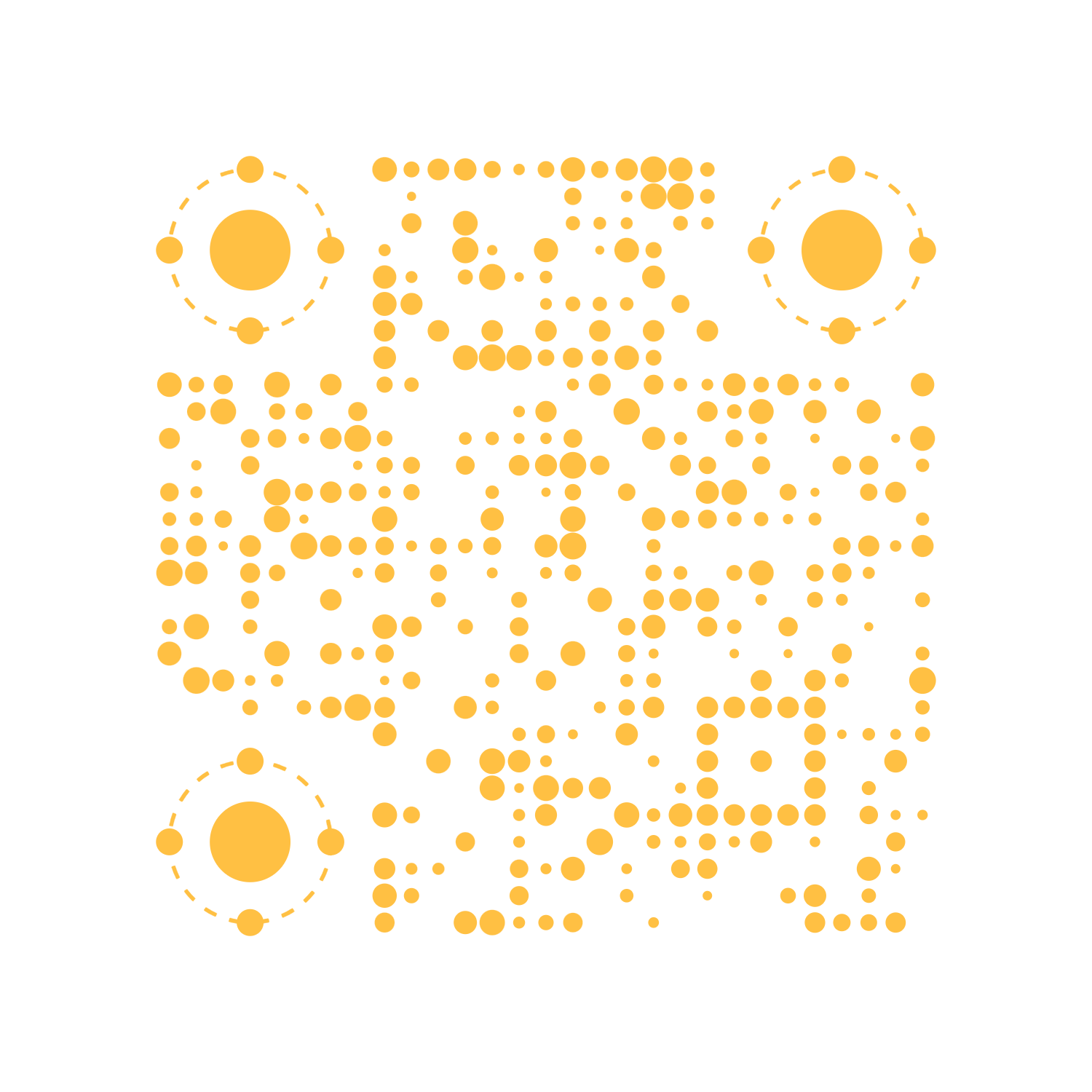


 # License
This project is licensed under the [MIT License](https://github.com/any-tdf/stdf/blob/main/LICENSE). Feel free to enjoy and contribute to this open-source project.
# Star History
# License
This project is licensed under the [MIT License](https://github.com/any-tdf/stdf/blob/main/LICENSE). Feel free to enjoy and contribute to this open-source project.
# Star History

 一般 label1、label3、label4、label6 用 Icon Props,label2 与 label5 用文字。
当然,如果这些配置项不能满足需求,它们也都支持使用 Snippet 渲染,请参考示例。
## textarea
textareaMaxlength、rows、autosize 三个参数只在 type 为 'textarea' 时生效,而且当 autosize 为 true 时 rows 将失效。
## CJK 输入
输入中日韩文等各种包含【选字】环节的文字过程中,组件内部在对输入长度、内容等信息处理时,是在**内容上屏后**才做校验。
================================================
FILE: docs/mds/components/input/guide_en.md
================================================
> Input uses the icon ri-close-circle-fill. Please ensure this icon is included in your project's symbol.svg file. For detailed information, please refer to [STDF-Guide-Icon](https://stdf.design/guide/icon).
## title and placeholder
If title is provided but placeholder is not, the Input component internally uses "Please enter + title" as the default placeholder. **At least one of title or placeholder must be provided**.
## type and inputmode
For inputmode, please refer to [MDN](https://developer.mozilla.org/zh-CN/docs/Web/HTML/Global_attributes/inputmode).
Considering mobile interaction characteristics, the Input component is mainly used for text input. Native input tag type values like file, radio, date, etc. have other component support or interaction methods. Additionally, type and inputmode have high overlap, with type adding password and number options on top of inputmode's base values. **Generally, you only need to pass type, though you can set inputmode separately if needed.**
Because the component internally processes input content, when rendering the final input to the page, all type values except password will be converted to text. Please convert the return value type as needed.
## Listening to Key Events
The Input component internally listens to keyboard events. When any key is pressed, it triggers the onkeydown event, returning a `value` representing the pressed key (Note: keyCode is deprecated, refer to [MDN](https://developer.mozilla.org/zh-CN/docs/Web/API/KeyboardEvent/keyCode)). You can handle this value for special processing. See examples.
## Configuration Options
All configurable items of the Input component are shown in the image below.
一般 label1、label3、label4、label6 用 Icon Props,label2 与 label5 用文字。
当然,如果这些配置项不能满足需求,它们也都支持使用 Snippet 渲染,请参考示例。
## textarea
textareaMaxlength、rows、autosize 三个参数只在 type 为 'textarea' 时生效,而且当 autosize 为 true 时 rows 将失效。
## CJK 输入
输入中日韩文等各种包含【选字】环节的文字过程中,组件内部在对输入长度、内容等信息处理时,是在**内容上屏后**才做校验。
================================================
FILE: docs/mds/components/input/guide_en.md
================================================
> Input uses the icon ri-close-circle-fill. Please ensure this icon is included in your project's symbol.svg file. For detailed information, please refer to [STDF-Guide-Icon](https://stdf.design/guide/icon).
## title and placeholder
If title is provided but placeholder is not, the Input component internally uses "Please enter + title" as the default placeholder. **At least one of title or placeholder must be provided**.
## type and inputmode
For inputmode, please refer to [MDN](https://developer.mozilla.org/zh-CN/docs/Web/HTML/Global_attributes/inputmode).
Considering mobile interaction characteristics, the Input component is mainly used for text input. Native input tag type values like file, radio, date, etc. have other component support or interaction methods. Additionally, type and inputmode have high overlap, with type adding password and number options on top of inputmode's base values. **Generally, you only need to pass type, though you can set inputmode separately if needed.**
Because the component internally processes input content, when rendering the final input to the page, all type values except password will be converted to text. Please convert the return value type as needed.
## Listening to Key Events
The Input component internally listens to keyboard events. When any key is pressed, it triggers the onkeydown event, returning a `value` representing the pressed key (Note: keyCode is deprecated, refer to [MDN](https://developer.mozilla.org/zh-CN/docs/Web/API/KeyboardEvent/keyCode)). You can handle this value for special processing. See examples.
## Configuration Options
All configurable items of the Input component are shown in the image below.
 Typically, label1, label3, label4, and label6 use Icon Props, while label2 and label5 use text.
Of course, if these configuration options don't meet your needs, they all support Snippet rendering. Please refer to the examples.
## textarea
The parameters textareaMaxlength, rows, and autosize only take effect when type is 'textarea', and when autosize is true, rows will be ineffective.
## CJK Input
When inputting Chinese, Japanese, Korean, or other text that involves a character selection process, the component internally validates input length, content, and other information **only after the content is committed to the screen**.
================================================
FILE: docs/mds/components/input/version.md
================================================
## 1.0.6
- [!tag|B|3|]修复切换亮暗模式时,输入框 placeholder 字体颜色不跟随变化的问题。
## 1.0.5
- [!tag|B|3|]输入数字时不允许小数点开头。
## 1.0.4
- [!tag|B|3|]触发 `onclear` 同时也触发 `onchange`。
- [!tag|A|0|]通过 `negative` 属性允许输入负数 [Issue#37](https://github.com/any-tdf/stdf/issues/37) [PR#38](https://github.com/any-tdf/stdf/pull/38)。[!issue|sbscan|] [!contribute|rizmyabdulla|]
- [!tag|O|0|]输入数字时不允许小数点开头且只允许一个小数点。
## 0.3.2
- [!tag|B|2|]修复 textarea 回车无法换行的问题。
## 0.3.1
- [!tag|A|0|]新增监听键盘事件 keydown。
## 0.0.11
- [!tag|O|0|]垂直间距 py 默认值改为 2,并新增 3 与 6 两个可选值。
- [!tag|O|0|]标题与输入框增加一点间距。
================================================
FILE: docs/mds/components/input/version_en.md
================================================
## 1.0.6
- [!tag|B|3|] Fix the problem that the input box placeholder font color does not follow the change when the light and dark mode is switched.
## 1.0.5
- [!tag|B|3|] Do not allow decimal points to start when entering numbers.
## 1.0.4
- [!tag|B|3|] Trigger `onclear` also triggers `onchange`.
- [!tag|A|0|] Allow negative numbers through the `negative` property [Issue#37](https://github.com/any-tdf/stdf/issues/37) [PR#38](https://github.com/any-tdf/stdf/pull/38). [!issue|sbscan|] [!contribute|rizmyabdulla|]
- [!tag|O|0|] Do not allow decimal points to start and only allow one decimal point when entering numbers.
## 0.3.2
- [!tag|B|2|] Fixed the problem that textarea cannot wrap when pressing enter.
## 0.3.1
- [!tag|A|0|] Added keydown event listener.
## 0.0.11
- [!tag|O|0|] The default vertical spacing of py has been changed to 2, and two optional values of 3 and 6 have been added.
- [!tag|O|0|] A little extra spacing has been added between the title and input box.
================================================
FILE: docs/mds/components/loading/api.md
================================================
## Loading Props
| 名称 | 类型 | 默认值 | 必传 | 说明 |
| ------------- | ---------------------------------------------------------------------------------------------- | ------- | ---- | ---------------------------------- |
| type | `string` | `'1_0'` | N | 类型编号。 |
| height | `'2'\|'4'\|'6'\|'8'\|'12'\|'16'\|'20'\|'28'\|'36'\|'48'\|'56'\|'64'\|'72'\|'80'\|'96'\|'full'` | `'8'` | N | 容器高度。 |
| width | `'2'\|'4'\|'6'\|'8'\|'12'\|'16'\|'20'\|'28'\|'36'\|'48'\|'56'\|'64'\|'72'\|'80'\|'96'\|'full'` | `'8'` | N | 容器宽度。 |
| theme | `boolean` | `false` | N | 是否使用主题色,仅单色生效。 |
| inverse | `boolean` | `false` | N | 是否使用反差色,仅单色与双色生效。 |
| customColor | `string[]` | `[]` | N | 自定义颜色数组。 |
| lazyAnimation | `boolean` | `true` | N | 是否开启懒动画。 |
| speed | `number` | `1` | N | 动画速度,基数为 1。 |
================================================
FILE: docs/mds/components/loading/api_en.md
================================================
## Loading Props
| Name | Type | Default | Required | Description |
| ------------- | ---------------------------------------------------------------------------------------------- | ------- | -------- | --------------------------------------------------------------- |
| type | `string` | `'1_0'` | N | Type number. |
| height | `'2'\|'4'\|'6'\|'8'\|'12'\|'16'\|'20'\|'28'\|'36'\|'48'\|'56'\|'64'\|'72'\|'80'\|'96'\|'full'` | `'8'` | N | Container height. |
| width | `'2'\|'4'\|'6'\|'8'\|'12'\|'16'\|'20'\|'28'\|'36'\|'48'\|'56'\|'64'\|'72'\|'80'\|'96'\|'full'` | `'8'` | N | Container width. |
| theme | `boolean` | `false` | N | Whether to use theme color, only works for monochrome. |
| inverse | `boolean` | `false` | N | Whether to use contrast color, only works for mono/dual colors. |
| customColor | `string[]` | `[]` | N | Custom color array. |
| lazyAnimation | `boolean` | `true` | N | Whether to enable lazy animation. |
| speed | `number` | `1` | N | Animation speed, base value is 1. |
================================================
FILE: docs/mds/components/loading/FAQ.md
================================================
================================================
FILE: docs/mds/components/loading/FAQ_en.md
================================================
================================================
FILE: docs/mds/components/loading/guide.md
================================================
## 类型
Loading 目前支持四种类型,分别是单色、双色、四色和其他,通过 type 的第一个值来区分,如 `1_0`、`2_0`、`4_0`、`o_0`,第二个值表示此类型的编号。
更多的 Loading 将会在后续版本中逐步增加,也欢迎参与开发。
## 尺寸
Loading 的容器大小由 height 与 width 决定,除了少数几个需要固定尺寸,大多数 Loading 都会自动铺满给定的容器,请根据自己的需求调整大小。
## 主题色
当使用单色模式时,可以通过 theme 来控制是否使用主题色,颜色会自动适配亮暗模式,请参考示例。
## 反差色
通常情况下,页面颜色是浅色系颜色,Loading 会使用深色系颜色。但在一些场景,比如 Toast 组件内背景色与页面颜色深浅恰好相反,比如默认按钮背景色偏深色等情况,在这些组件内部使用 Loading 时,可以通过 inverse 来控制颜色,使其恰好与页面的亮暗模式相反,请参考示例。
## 自定义颜色
当需要传入自定义颜色时,可以通过 customColor 来传入颜色数组,数组长度与 type 的第一个值相同,如 `1_0` 需要传入一个颜色,`2_0` 需要传入两个颜色,`4_0` 需要传入四个颜色,请参考示例。
注:当使用自定义颜色时,theme 和 inverse 会失效。
## 四色默认颜色
当使用四色模式时,Loading 内部默认的四个颜色分别是红色(#DA1414)、绿色(#11BB8D)、紫色(#7356BF)、黄色(#FFC043),对应 STDF 颜色系统的 error、success、purple、yellow,如果需要自定义颜色请传入长度为 4 的 customColor,请参考示例。
## 动画速度
Loading 的动画速度可以通过 speed 来控制,基数为 1 表示正常速度,speed 的值越大,动画速度越快。请使用大于 0 的数值,但不建议使用过大的数值,否则可能会导致动画过快,徒增功耗还影响用户体验。
部分 Loading 因为动画的特殊性,当 speed 的值会影响元素之间连贯性时,会忽略 speed 的值,使用默认值。
## 懒动画
Loading 自带了一系列过渡动画,极端情况下,当页面同时有大量过渡效果时,考虑到设备性能与动画帧率等问题,Loading 通过 lazyAnimation 默认开启了懒动画,即 Loading 组件**不在页面可视范围内时会暂停动画**,当然你也可以单独设置。
## 感谢
部分动效灵感来自 [德育处主任](https://gitee.com/k21vin/front-end-data-visualization/tree/master/src/views/Native/PureCSS/pages/Loading/components) 与 [LDRS](https://uiball.com/ldrs), 感谢他们的分享。
================================================
FILE: docs/mds/components/loading/guide_en.md
================================================
## Type
There are currently four types of Loading, which are monochrome, bicolor, quadricolor, and other. They can be distinguished by the first value of the `type`, such as `1_0`, `2_0`, `4_0`, `o_0`. The second value represents the identification number of this type.
More Loading types will be gradually added in future versions, and your feedback is welcome.
## Size
The size of the Loading container is determined by `height` and `width`. Most Loading components will automatically fill the given container, except for a few that require a fixed size. Please adjust the size according to your needs.
## Theme Color
When using the monochrome mode, the `theme` can be used to control whether to use the theme color. The color will automatically adapt to light and dark mode. Please refer to the example.
## Contrast Color
Usually, the color scheme of the website is light, and Loading will use dark colors. However, in some scenarios, such as toast components where the background color is opposite in light and dark mode, or default button background colors that are darker, you can use `inverse` to control the color scheme to make it opposite to the light and dark mode of the website. Please refer to the example.
## Custom Color
When you need to pass in custom colors, you can use `customColor` to pass in an array of colors. The length of the array is the same as the first value of the Loading `type`. For example, `1_0` requires passing in one color, `2_0` requires passing in two colors, and `4_0` requires passing in four colors. Please refer to the example.
Note: When using custom colors, `theme` and `inverse` will not take effect.
## Default Colors for Quadricolor
When using the quadricolor mode, the default colors used inside Loading are red (#DA1414), green (#11BB8D), purple (#7356BF), and yellow (#FFC043), which correspond to the STDF color system's error, success, purple, and yellow respectively. If you need to customize the colors, please pass in a `customColor` array of length 4. Please refer to the example.
## Animation Speed
The animation speed of Loading can be controlled by `speed`, with a base of 1 indicating normal speed. The larger the value of `speed`, the faster the animation speed. Please use a value greater than 0, but it is not recommended to use a too large a value, otherwise it may cause the animation to be too fast, which will increase power consumption and affect the user experience.
For some Loading animations that have special continuity between elements, the value of `speed` may be ignored and use the default value.
## Lazy Animation
Loading comes with a series of transition animations. In extreme cases, when there are a large number of transition effects on the page, considering device performance and animation frame rate issues, Loading uses `lazyAnimation` to enable lazy animation by default, which means that the Loading component **will pause the animation when it is not in the visible range on the page**. Of course, you can also set it individually.
## Acknowledgments
Some of the animation inspirations are from [德育处主任](https://gitee.com/k21vin/front-end-data-visualization/tree/master/src/views/Native/PureCSS/pages/Loading/components) and [LDRS](https://uiball.com/ldrs). Special thanks go to them.
================================================
FILE: docs/mds/components/loading/version.md
================================================
## 0.4.7
- [!tag|O|0|]去除 Loading 容器默认大小。
## 0.4.6
- [!tag|A|0|]新增 32 种 Loading 类型(1_22 - 1_53)。
## 0.0.6
- [!tag|A|0|]新增 8 种 Loading 类型(1_18、1_19、1_20、1_21、2_2、2_3、2_4、2_5)。
================================================
FILE: docs/mds/components/loading/version_en.md
================================================
## 0.4.7
- [!tag|O|0|]Remove default size of Loading container.
## 0.4.6
- [!tag|A|0|]Add 32 Loading type(1_22 - 1_53).
## 0.0.6
- [!tag|A|0|]Add 8 Loading type(1_18, 1_19, 1_20, 1_21, 2_2, 2_3, 2_4, 2_5).
================================================
FILE: docs/mds/components/mask/api.md
================================================
## Mask Props
| 名称 | 类型 | 默认值 | 必传 | 说明 |
| ------------ | -------------------------------------------------------------------- | -------- | ---- | ---------------------------- |
| visible | `boolean` | `false` | N | 是否显示。 |
| opacity | `'0.1'\|'0.2'\|'0.3'\|'0.4'\|'0.5'\|'0.6'\|'0.7'\|'0.8'\|'0.9'\|'1'` | `'0.5'` | N | 遮罩透明度。 |
| duration | `number` | `150` | N | 出现动画过渡时长,单位:ms。 |
| outDuration | `number` | `0` | N | 消失动画过渡时长,单位:ms。 |
| inverse | `boolean` | `false` | N | 遮罩背景是否反色。 |
| clickable | `boolean` | `false` | N | 遮罩是否可点击穿透。 |
| backdropBlur | `'none'\|'xs'\|'sm'\|'md'\|'lg'\|'xl'\|'2xl'\|'3xl'` | `'none'` | N | 背景模糊度。 |
| zIndex | `number` | `500` | N | z-index。 |
## Mask Events
| 名称 | 类型 | 参数 | 描述 |
| ----------- | ------------ | ---- | --------------------------------------------------- |
| onclickMask | `() => void` | - | 点击遮罩时触发,注意 clickable 为 true 时不会触发。 |
## Mask Snippets
| 名称 | 类型 | 参数 | 说明 |
| -------- | ------------------------------------------------------------------- | ---- | ---------- |
| children | [`Snippet`](https://svelte.dev/docs/svelte/snippet#Typing-snippets) | - | 遮罩内容。 |
================================================
FILE: docs/mds/components/mask/api_en.md
================================================
## Mask Props
| Name | Type | Default | Required | Description |
| ------------ | -------------------------------------------------------------------- | -------- | -------- | -------------------------------------------- |
| visible | `boolean` | `false` | N | Whether to show the mask. |
| opacity | `'0.1'\|'0.2'\|'0.3'\|'0.4'\|'0.5'\|'0.6'\|'0.7'\|'0.8'\|'0.9'\|'1'` | `'0.5'` | N | Opacity of the mask. |
| duration | `number` | `150` | N | Duration of the show animation in ms. |
| outDuration | `number` | `0` | N | Duration of the hide animation in ms. |
| inverse | `boolean` | `false` | N | Whether to invert the mask background color. |
| clickable | `boolean` | `false` | N | Whether the mask is click-through. |
| backdropBlur | `'none'\|'xs'\|'sm'\|'md'\|'lg'\|'xl'\|'2xl'\|'3xl'` | `'none'` | N | Backdrop blur level. |
| zIndex | `number` | `500` | N | z-index value. |
## Mask Events
| Name | Type | Parameters | Description |
| ----------- | ------------ | ---------- | ----------------------------------------------------------------------- |
| onclickMask | `() => void` | - | Triggered when clicking the mask. Not triggered when clickable is true. |
## Mask Snippets
| Name | Type | Parameters | Description |
| -------- | ------------------------------------------------------------------- | ---------- | ------------- |
| children | [`Snippet`](https://svelte.dev/docs/svelte/snippet#Typing-snippets) | - | Mask content. |
================================================
FILE: docs/mds/components/mask/FAQ.md
================================================
================================================
FILE: docs/mds/components/mask/FAQ_en.md
================================================
================================================
FILE: docs/mds/components/mask/guide.md
================================================
## 使用
Mask 组件一般是用来结合 BottomSheet、Toast、Popup 等组件使用,用于遮挡下层内容,突出弹出层内容,或防止用户操作。
## 动画
遮罩动画效果为 fade,可参考 [svelte/transition/fade](https://svelte.dev/docs/svelte/svelte-transition#fade) 。
遮罩一般是放置于其他交互式组件下层,考虑到出现与消失不会太突兀,遮罩出现时有一个较短的动画(默认 150ms),一般与内容时长一样;而内容信息展示完后一般需要迅速关闭,所以退出动画默认为 0ms,当然也可以通过 `outDuration` 属性设置退出的动画时间。
## 点击穿透
Mask 可以通过 `clickable` 属性设置是否可点击穿透,当设置为 `true` 时,点击遮罩不会触发 `onclickMask` 事件。
## inverse
通常情况下,页面颜色是浅色系颜色,Mask 会使用黑色背景色,当页面使用暗模式时 Mask 会使用白色背景色。但在一些特殊场景可能会使用恰好相反的背景色,可以通过 inverse 来控制颜色,使其恰好与页面的亮暗模式相反,请参考示例。
Mask 可以通过 `inverse` 属性设置是否反色,当设置为 `true` 时,遮罩背景色为白色。
## zIndex
遮罩层是相对于浏览器窗口通过 fixed 定位的,默认的 `z-index` 为 500,可以通过 `zIndex` 属性设置。
使用到 Mask 的组件包括 BottomSheet、Toast、Popup 等,这些组件也有默认的 z-index,见下表。如果同时显示这些组件时请注意层级关系。
使用到 Mask 组件的默认 `z-index` 如下:
| 组件 | zIndex |
| ----------- | ------ |
| BottomSheet | 600 |
| Popup | 600 |
| Toast | 1000 |
================================================
FILE: docs/mds/components/mask/guide_en.md
================================================
## Usage
The Mask component is usually used in combination with other components such as Toast, BottomSheet or Popup to block out the underlying content, highlight the pop-up content or prevent user interaction.
## Animation
The animation effect of the mask is fade, which can be referred to [svelte/transition/fade](https://svelte.dev/docs/svelte/svelte-transition#fade).
Normally, the mask is placed below other interactive components, so considering the smoothness of appearance and disappearance, there is a short animation (default 150ms) when the mask appears, generally the same length as the content. After the content is displayed, it is generally necessary to close quickly, so the exit animation is 0ms by default, but of course, the exit animation time can also be set through the `outDuration` attribute.
## Click-through
The Mask can be set whether it can be clicked through by the `clickable` attribute. When it is set to `true`, clicking the mask will not trigger the `onclickMask` event.
## Inverse
Usually, the page color is in light color scheme, and the Mask uses a black background color. When the page uses a dark mode, the Mask will use a white background color. However, in some special scenarios, the background color is precisely opposite to the page (light/dark). The color can be controlled via `inverse` attribute to make it exactly opposite to the page's light/dark colors. Please refer to the example for details.
The Mask can be set whether to invert the color by using the `inverse` attribute. When it is set to `true`, the mask background color is white.
## zIndex
The mask layer is positioned fixed relative to the browser window, and the default `z-index` is 500, which can be set via the `zIndex` attribute.
The components that use the Mask include Toast, Popup, BottomSheet, etc., and these components also have default z-index as shown in the table below. If these components are displayed at the same time, please pay attention to the layer relationship.
The default `z-index` of components that use the Mask are as follows:
| Component | zIndex |
| ----------- | ------ |
| BottomSheet | 600 |
| Popup | 600 |
| Toast | 1000 |
================================================
FILE: docs/mds/components/mask/version.md
================================================
================================================
FILE: docs/mds/components/mask/version_en.md
================================================
================================================
FILE: docs/mds/components/modal/api.md
================================================
## Modal Props
| 名称 | 类型 | 默认值 | 必传 | 说明 |
| ---------- | ------------------------------------------------------------- | ------------------------ | ---- | -------------- |
| visible | `boolean` | `false` | N | 是否显示。 |
| title | `string` | 当前语言的 modal.title | N | 标题。 |
| titleAlign | `'left'\|'center'\|'right'` | `'center'` | N | 标题对齐方式。 |
| content | `string` | 当前语言的 modal.content | N | 内容。 |
| showIcon | `boolean` | `false` | N | 是否显示图标。 |
| icon | [`Icon`](https://stdf.design/components?nav=dialog&tab=1) | `{}` | N | 图标参数。 |
| showBtn | `boolean` | `true` | N | 是否显示按钮。 |
| btnText | `string` | 当前语言的 modal.btnText | N | 按钮文字。 |
| button | [`Button`](https://stdf.design/components?nav=dialog&tab=1) | `{}` | N | 按钮参数。 |
| popup | [`Popup`](https://stdf.design/components?nav=dialog&tab=1) | `{}` | N | 弹出层参数。 |
## Modal Events
| 名称 | 类型 | 参数 | 描述 |
| ------- | ------------ | ---- | ---------------- |
| onclose | `() => void` | - | 弹框关闭时触发。 |
## Modal Snippets
| 名称 | 类型 | 参数 | 描述 |
| ------------ | ------------------------------------------------------------------- | ---- | ------------------------- |
| contentChild | [`Snippet`](https://svelte.dev/docs/svelte/snippet#Typing-snippets) | - | 传入时渲染 content 内容。 |
================================================
FILE: docs/mds/components/modal/api_en.md
================================================
## Modal Props
| Name | Type | Default | Required | Description |
| ---------- | ------------------------------------------------------------- | ------------------------------ | -------- | -------------------------- |
| visible | `boolean` | `false` | N | Whether to show the modal. |
| title | `string` | Current language modal.title | N | Title text. |
| titleAlign | `'left'\|'center'\|'right'` | `'center'` | N | Title alignment. |
| content | `string` | Current language modal.content | N | Content text. |
| showIcon | `boolean` | `false` | N | Whether to show icon. |
| icon | [`Icon`](https://stdf.design/components?nav=dialog&tab=1) | `{}` | N | Icon props. |
| showBtn | `boolean` | `true` | N | Whether to show button. |
| btnText | `string` | Current language modal.btnText | N | Button text. |
| button | [`Button`](https://stdf.design/components?nav=dialog&tab=1) | `{}` | N | Button props. |
| popup | [`Popup`](https://stdf.design/components?nav=dialog&tab=1) | `{}` | N | Popup props. |
## Modal Events
| Name | Type | Parameters | Description |
| ------- | ------------ | ---------- | ---------------------------- |
| onclose | `() => void` | - | Triggered when modal closes. |
## Modal Snippets
| Name | Type | Parameters | Description |
| ------------ | ------------------------------------------------------------------- | ---------- | ---------------------------------------- |
| contentChild | [`Snippet`](https://svelte.dev/docs/svelte/snippet#Typing-snippets) | - | Render the content when it is passed in. |
================================================
FILE: docs/mds/components/modal/FAQ.md
================================================
================================================
FILE: docs/mds/components/modal/FAQ_en.md
================================================
================================================
FILE: docs/mds/components/modal/guide.md
================================================
## 使用
Modal 弹框组件一般用于展示一些需要用户明确知悉的内容或步骤,为避免误触,点击遮罩默认不会关闭。相比 Toast 用户感知度会更强,相比可以完成特定交互操作的 Dialog 又更简单一些。
## 说明
Modal 弹框组件是在 Popup 基础上封装的,通过预先定义一些 Popup 的 Props 实现,因此可以通过传入 Popup 的属性来实现不同的效果。比如示例中通过设置 popup 的 easeType 换了一种缓动效果。
而 Modal 内部又使用了 Icon 和 Button 组件,可以通过传入 Icon 和 Button 的 Props 来实现不同的效果。比如示例中通过设置 Button 的 radius 自定义按钮的圆角风格。
## contentChild
Modal 的内容可以通过 contentChild 传入,当需要显示复杂内容时,可以通过 contentChild 渲染,此时 content 会失效。
## 关闭
Modal 默认不会自动关闭,需要通过点击内部按钮来关闭,当不显示按钮时默认点击遮罩也会关闭,或者通过改变外部的 visible 来关闭。当然这些参数都可以通过传入的 Props 来控制。
================================================
FILE: docs/mds/components/modal/guide_en.md
================================================
## Usage
The Modal dialog component is generally used to display important information or steps that users need to be aware of. To avoid accidental clicks, clicking on the mask does not close the dialog by default. Compared to Toast, users will have a stronger sense of awareness, and compared to Dialog, it is simpler to implement specific interactive operations.
## Description
The Modal dialog component is based on Popup and is implemented by defining some of Popup's Props in advance. Therefore, different effects can be achieved by passing in Popup's attributes. For example, in the example, a different easing effect is achieved by setting the easeType of popup.
Modal also uses the Icon and Button components internally, and different effects can be achieved by passing in the Props of Icon and Button. For example, in the example, the radius of the Button is customized to achieve a custom button style.
## ContentChild
The content of the Modal can be passed in through the contentChild property. When complex content needs to be displayed, it can be rendered through contentChild, at this time content will be invalid.
## Close
The Modal by default will not automatically close and needs to be closed by clicking the internal button. When the button is not displayed, clicking the mask will close the Modal by default, or you can close it by changing the visible property externally. Of course, these parameters can be controlled through the Props passed in.
================================================
FILE: docs/mds/components/modal/version.md
================================================
================================================
FILE: docs/mds/components/modal/version_en.md
================================================
================================================
FILE: docs/mds/components/navBar/api.md
================================================
## NavBar Props
| 名称 | 类型 | 默认值 | 必传 | 说明 |
| ---------- | ------------------------------------------------------------------------- | ----------------------- | ---- | ---------------------------------------------------------- |
| title | `string` | 当前语言的 navBar.title | N | 标题。 |
| titleAlign | `'left'\|'center'\|'right'` | `'left'` | N | 标题对齐方式。 |
| left | `'back'\|null`\|[`Icon`](https://stdf.design/components?nav=icon&tab=1) | `'back'` | N | 左侧内容,`'back'` 返回图标,`null` 无内容,否则渲染图标。 |
| rights | [`Icon[]`](https://stdf.design/components?nav=icon&tab=1) | `[]` | N | 右侧内容,Icon Props 组成的数组,建议不超过三个。 |
| line | `boolean` | `true` | N | 是否显示底部分割线。 |
| injClass | `string` | `''` | N | 注入 CSS 名称。 |
| love | `boolean` | `false` | N | 是否开启关爱版。 |
## NavBar Events
| 名称 | 类型 | 参数 | 说明 |
| ------------ | ------------------------- | ---------------------- | ------------------ |
| onclickLeft | `() => void` | - | 点击左侧图标触发。 |
| onclickRight | `(index: number) => void` | index - 点击图标索引值 | 点击右侧图标触发。 |
## NavBar Snippets
| 名称 | 类型 | 参数 | 说明 |
| ---------- | ------------------------------------------------------------------- | ---- | -------------------- |
| titleChild | [`Snippet`](https://svelte.dev/docs/svelte/snippet#Typing-snippets) | - | 传入时渲染标题区域。 |
| leftChild | [`Snippet`](https://svelte.dev/docs/svelte/snippet#Typing-snippets) | - | 传入时渲染左侧区域。 |
| rightChild | [`Snippet`](https://svelte.dev/docs/svelte/snippet#Typing-snippets) | - | 传入时渲染右侧区域。 |
================================================
FILE: docs/mds/components/navBar/api_en.md
================================================
## NavBar Props
| Name | Type | Default | Required | Description |
| ---------- | ------------------------------------------------------------------------- | ----------------------------- | -------- | ----------------------------------------------------------------------------------- |
| title | `string` | Current language navBar.title | N | Title text. |
| titleAlign | `'left'\|'center'\|'right'` | `'left'` | N | Title alignment. |
| left | `'back'\|null`\|[`Icon`](https://stdf.design/components?nav=icon&tab=1) | `'back'` | N | Left content, `'back'` for back icon, `null` for no content, otherwise render icon. |
| rights | [`Icon[]`](https://stdf.design/components?nav=icon&tab=1) | `[]` | N | Right content array of Icon Props, recommend no more than 3 icons. |
| line | `boolean` | `true` | N | Whether to show bottom divider line. |
| injClass | `string` | `''` | N | Inject CSS class name. |
| love | `boolean` | `false` | N | Whether to enable care version. |
## NavBar Events
| Name | Type | Parameters | Description |
| ------------ | ------------------------- | -------------------------- | ----------------------------------- |
| onclickLeft | `() => void` | - | Triggered when clicking left icon. |
| onclickRight | `(index: number) => void` | index - Clicked icon index | Triggered when clicking right icon. |
## NavBar Snippets
| Name | Type | Parameters | Description |
| ---------- | ------------------------------------------------------------------- | ---------- | ------------------------------- |
| titleChild | [`Snippet`](https://svelte.dev/docs/svelte/snippet#Typing-snippets) | - | Renders title area when passed. |
| leftChild | [`Snippet`](https://svelte.dev/docs/svelte/snippet#Typing-snippets) | - | Renders left area when passed. |
| rightChild | [`Snippet`](https://svelte.dev/docs/svelte/snippet#Typing-snippets) | - | Renders right area when passed. |
================================================
FILE: docs/mds/components/navBar/FAQ.md
================================================
================================================
FILE: docs/mds/components/navBar/FAQ_en.md
================================================
================================================
FILE: docs/mds/components/navBar/guide.md
================================================
> NavBar 使用了图标 ri-arrow-left-s-line,请确保项目的 symbol.svg 文件中包含这些图标。详细信息请参考 [STDF-指南 - 图标](https://stdf.design/guide/icon)。
## 说明
移动端的 NavBar 一般用于页面顶部显示当前页面与路由跳转操作。STDF 的 NavBar 由左中右三个部分组成,且每个部分都支持 Snippet 渲染,而最外层元素的 Class 支持 injClass(class 注入)。
## 拓展
现有参数已经能满足绝大部分业务场景,比如根据页面上下滚动实时改变 NavBar 背景透明度与文字颜色这种常用场景,就可以通过 injClass 实现。如果还不满足你的需求,结合 Snippet 与 injClass,理论上 NavBar 可以定制为你想要的任何样式,甚至不仅仅把它作为顶部的导航栏来使用。
需要提醒的是,此处的拓展只是提供一种方法与思路,过多的自定义可能已经比自己写一个组件显得更加复杂,反而失去了使用组件库的意义。
================================================
FILE: docs/mds/components/navBar/guide_en.md
================================================
> NavBar uses the icon ri-arrow-left-s-line, please ensure that the symbol.svg file in your project includes this icon. For details, please refer to [STDF-Guide-Icon](https://stdf.design/guide/icon).
## Explanation
On mobile devices, the NavBar is generally used to display the current page and to perform routing operations at the top of the page. STDF's NavBar consists of three parts: left, center, and right, and each part supports Snippet rendering. The class of the outermost element also supports injClass (class injection).
## Extension
The existing parameters are sufficient to meet most business scenarios. For example, the common scene of changing the transparency of the NavBar background and text color based on the scrolling of the page can be achieved through injClass. If you are still not satisfied with your needs, combining Snippet and injClass, theoretically the NavBar can be customized to any style you want, not only for use as a top navigation bar.
It should be noted that this extension only provides a method and idea. Too much customization may already be more complex than writing a component yourself, and may lose the meaning of using a component library.
================================================
FILE: docs/mds/components/navBar/version.md
================================================
## 1.0.3
- [!tag|A|0|]新增 titleAlign 属性。
================================================
FILE: docs/mds/components/navBar/version_en.md
================================================
## 1.0.3
- [!tag|A|0|]Add titleAlign property.
================================================
FILE: docs/mds/components/noticeBar/api.md
================================================
## NoticeBar Props
| 名称 | 类型 | 默认值 | 必传 | 说明 |
| --------- | ----------------------------------------------------------------- | --------- | ---- | ----------------------------- |
| textList | `string[]` | `[]` | Y | 通告内容组成的数组。 |
| leftIcon | `null`\|[`Icon`](https://stdf.design/components?nav=icon&tab=0) | `{}` | N | 左侧内容。 |
| rightIcon | `'close'`\|`'arrow'`\|`null` | `'close'` | N | 右侧内容。 |
| fontSize | `'xs'\|'sm'\|'base'\|'lg'` | `'sm'` | N | 通告字体大小。 |
| space | `number` | `100` | N | 通告间距,单位是 px。 |
| speed | `number` | `30` | N | 横向滚动速度,单位是 px/s。 |
| vertical | `boolean` | `false` | N | 是否垂直滚动。 |
| duration | `100`\|`300`\|`500`\|`700`\|`1000` | `500` | N | 垂直滚动过渡时间,单位是 ms。 |
| interval | `number` | `4` | N | 垂直滚动间隔时间,单位是 s。 |
| injClass | `string` | `''` | N | 注入 CSS 名称。 |
## NoticeBar Events
| 名称 | 类型 | 参数 | 描述 |
| ------------ | ------------ | ---- | ------------------ |
| onclickRight | `() => void` | - | 点击右侧区域触发。 |
## NoticeBar Snippets
| 名称 | 类型 | 参数 | 说明 |
| ---------- | ------------------------------------------------------------------- | ---- | ------------------------ |
| leftChild | [`Snippet`](https://svelte.dev/docs/svelte/snippet#Typing-snippets) | - | 传入时渲染左侧内容区域。 |
| rightChild | [`Snippet`](https://svelte.dev/docs/svelte/snippet#Typing-snippets) | - | 传入时渲染右侧内容区域。 |
================================================
FILE: docs/mds/components/noticeBar/api_en.md
================================================
## NoticeBar Props
| Name | Type | Default | Required | Description |
| --------- | ----------------------------------------------------------------- | --------- | -------- | --------------------------------------------- |
| textList | `string[]` | `[]` | Y | Array of announcement contents. |
| leftIcon | `null`\|[`Icon`](https://stdf.design/components?nav=icon&tab=0) | `{}` | N | Left content. |
| rightIcon | `'close'`\|`'arrow'`\|`null` | `'close'` | N | Right content. |
| fontSize | `'xs'\|'sm'\|'base'\|'lg'` | `'sm'` | N | Font size of the announcement. |
| space | `number` | `100` | N | Space between announcements in px. |
| speed | `number` | `30` | N | Horizontal scrolling speed in px/s. |
| vertical | `boolean` | `false` | N | Whether to scroll vertically. |
| duration | `100`\|`300`\|`500`\|`700`\|`1000` | `500` | N | Vertical scrolling transition duration in ms. |
| interval | `number` | `4` | N | Vertical scrolling interval time in seconds. |
| injClass | `string` | `''` | N | Injected CSS class name. |
## NoticeBar Events
| Name | Type | Params | Description |
| ------------ | ------------ | ------ | ------------------------------------- |
| onclickRight | `() => void` | - | Triggered when right area is clicked. |
## NoticeBar Snippets
| Name | Type | Params | Description |
| ---------- | ------------------------------------------------------------------- | ------ | ------------------------------------- |
| leftChild | [`Snippet`](https://svelte.dev/docs/svelte/snippet#Typing-snippets) | - | Renders left content area if passed. |
| rightChild | [`Snippet`](https://svelte.dev/docs/svelte/snippet#Typing-snippets) | - | Renders right content area if passed. |
================================================
FILE: docs/mds/components/noticeBar/FAQ.md
================================================
================================================
FILE: docs/mds/components/noticeBar/FAQ_en.md
================================================
================================================
FILE: docs/mds/components/noticeBar/guide.md
================================================
> NoticeBar 使用了图标 ri-volume-down-line 和 ri-close-line,请确保项目的 symbol.svg 文件中包含这些图标。详细信息请参考 [STDF-指南 - 图标](https://stdf.design/guide/icon)。
## 说明
当横向放置时,不论内容有几条,只要所有内容加上内容之间的间隔长度之和超过容器宽度,NoticeBar 将会自动横向滚动,否则不滚动。
垂直放置时,内容超过一条时将会自动垂直滚动,单条内容过长将会溢出显示。
## leftIcon 与 rightIcon
左侧区域 leftIcon 除了默认的小喇叭图标,可以传入 Icon Props 实现其他图标显示,还可以自定义任何内容,通过 leftChild 这个 Snippet 实现,而右侧区域 rightIcon 只允许关闭、箭头、不显示三种情况,也可以通过 rightChild 这个 Snippet 实现自定义内容,请参考示例。
## onclickRight 事件
当点击右侧区域时,如果 rightIcon 为 close 会关闭当前通告栏;而 rightIcon 无论是 close 还是 arrow 都会派发 onclickRight 事件,可以通过监听该事件来实现自定义的业务逻辑。
## CSS 注入
通过 injClass 参数可以向组件内部最外层元素注入 CSS 名称(不仅限于 Tailwind CSS),这将使组件样式有更多自定义可能性,示例中通过 injClass 实现了自定义背景色与文字颜色。
若注入的 class 没生效,请在注入的 class 名称前添加“!” ,可参考 [Tailwind Important modifier](https://tailwindcss.com/docs/configuration#important-modifier)。
================================================
FILE: docs/mds/components/noticeBar/guide_en.md
================================================
> NoticeBar uses icons ri-volume-down-line and ri-close-line. Please ensure these icons are included in your project's symbol.svg file. For more details, please refer to [STDF-Guide-Icon](https://stdf.design/guide/icon).
## Description
When placed horizontally, regardless of the number of content items, NoticeBar will automatically scroll horizontally if the total length of all content plus the spacing between them exceeds the container width. Otherwise, it will not scroll.
When placed vertically, it will automatically scroll vertically if there is more than one content item. Single content items that are too long will overflow.
## leftIcon and rightIcon
The left area (leftIcon), besides the default speaker icon, can display other icons by passing Icon Props. It can also be customized with any content through the leftChild Snippet. The right area (rightIcon) only allows three states: close, arrow, or hidden. It can also be customized through the rightChild Snippet. Please refer to the examples.
## onclickRight Event
When clicking the right area, if rightIcon is set to close, it will close the current notice bar. Whether rightIcon is set to close or arrow, it will dispatch the onclickRight event, which can be listened to implement custom business logic.
## CSS Injection
Through the injClass parameter, you can inject CSS class names (not limited to Tailwind CSS) into the component's outermost element. This provides more possibilities for custom styling. In the example, injClass is used to implement custom background and text colors.
If the injected class doesn't take effect, please add "!" before the class name. You can refer to [Tailwind Important modifier](https://tailwindcss.com/docs/configuration#important-modifier).
================================================
FILE: docs/mds/components/noticeBar/version.md
================================================
================================================
FILE: docs/mds/components/noticeBar/version_en.md
================================================
================================================
FILE: docs/mds/components/numKeyboard/api.md
================================================
## NumKeyboard Props
| 名称 | 类型 | 默认值 | 必传 | 说明 |
| ------------ | ----------------------------------------------------------- | ---------------------- | ---- | -------------------- |
| value | `string` | `''` | N | 输入内容。 |
| type | `'button'`\|`'block'` | `'button'` | N | 键盘样式类型。 |
| visible | `boolean` | `false` | N | 是否显示键盘。 |
| height | `'8'\|'10'\|'12'\|'14'\|'16'\|'20'` | `'12'` | N | 按键高度。 |
| space | `'0'\|'1'\|'2'\|'3'\|'4'` | `'2'` | N | 按键间距。 |
| p | `'0'\|'1'\|'2'\|'3'\|'4'` | `'2'` | N | 键盘内边距。 |
| reverse | `boolean` | `false` | N | 数字是否上下反向。 |
| done | `boolean` | `true` | N | 是否显示完成按钮。 |
| dot | `boolean` | `true` | N | 是否显示小数点。 |
| close | `boolean` | `false` | N | 是否显示关闭按钮。 |
| doneText | `string` | 当前语言的 common.done | N | 完成按钮文案。 |
| doneDisabled | `boolean` | `false` | N | 完成按钮是否禁用。 |
| radius | `'none'\|'sm'\|'md'\|'lg'\|'xl'\|'2xl'\|'3xl'\|'full'` | `'sm'` | N | 按键圆角。 |
| clear | `boolean` | `false` | N | 打开时是否清空内容。 |
| panelClass | `string` | `''` | N | 键盘面板注入 Class。 |
| keyClass | `string` | `''` | N | 按键注入 Class。 |
| doneClass | `string` | `''` | N | 完成按键注入 Class。 |
| popup | [`Popup`](https://stdf.design/components?nav=popup&tab=1) | `{}` | N | 弹出层参数。 |
## NumKeyboard Events
| 名称 | 类型 | 参数 | 描述 |
| ------- | -------------------------- | ------------------------ | ---------------------- |
| onclick | `(key: string) => void` | key - 本次点击的键盘 key | 每次点击任意按键触发。 |
| onopen | `(height: number) => void` | height - 键盘高度 | 键盘打开时触发。 |
| onclose | `() => void` | - | 键盘关闭时触发。 |
================================================
FILE: docs/mds/components/numKeyboard/api_en.md
================================================
## NumKeyboard Props
| Name | Type | Default | Required | Description |
| ------------ | ----------------------------------------------------------- | ------------------------------ | -------- | ----------------------------------- |
| value | `string` | `''` | N | Input content. |
| type | `'button'`\|`'block'` | `'button'` | N | Keyboard style type. |
| visible | `boolean` | `false` | N | Whether to show keyboard. |
| height | `'8'\|'10'\|'12'\|'14'\|'16'\|'20'` | `'12'` | N | Key height. |
| space | `'0'\|'1'\|'2'\|'3'\|'4'` | `'2'` | N | Key spacing. |
| p | `'0'\|'1'\|'2'\|'3'\|'4'` | `'2'` | N | Keyboard padding. |
| reverse | `boolean` | `false` | N | Whether to reverse number order. |
| done | `boolean` | `true` | N | Whether to show done button. |
| dot | `boolean` | `true` | N | Whether to show decimal point. |
| close | `boolean` | `false` | N | Whether to show close button. |
| doneText | `string` | Current language's common.done | N | Done button text. |
| doneDisabled | `boolean` | `false` | N | Whether to disable done button. |
| radius | `'none'\|'sm'\|'md'\|'lg'\|'xl'\|'2xl'\|'3xl'\|'full'` | `'sm'` | N | Key border radius. |
| clear | `boolean` | `false` | N | Whether to clear content when open. |
| panelClass | `string` | `''` | N | Inject class for keyboard panel. |
| keyClass | `string` | `''` | N | Inject class for keys. |
| doneClass | `string` | `''` | N | Inject class for done button. |
| popup | [`Popup`](https://stdf.design/components?nav=popup&tab=1) | `{}` | N | Popup parameters. |
## NumKeyboard Events
| Name | Type | Parameters | Description |
| ------- | -------------------------- | -------------------------- | ---------------------------------- |
| onclick | `(key: string) => void` | key - Clicked keyboard key | Triggered when any key is clicked. |
| onopen | `(height: number) => void` | height - Keyboard height | Triggered when keyboard opens. |
| onclose | `() => void` | - | Triggered when keyboard closes. |
================================================
FILE: docs/mds/components/numKeyboard/FAQ.md
================================================
================================================
FILE: docs/mds/components/numKeyboard/FAQ_en.md
================================================
================================================
FILE: docs/mds/components/numKeyboard/guide.md
================================================
> NumKeyboard 使用了图标 ri-delete-back-2-line 和 ri-skip-down-line,请确保项目的 symbol.svg 文件中包含这些图标。详细信息请参考 [STDF-指南 - 图标](https://stdf.design/guide/icon)。
## 说明
NumKeyboard 组件是一个虚拟的数字键盘,一般用于输入整数或小数。内部使用了网格布局,布局方式只有 3\*4 或 4\*4 两种,当不显示完成按键时,就只有 3 列,否则就是 4 列。
## 按键
NumKeyboard 组件的按键有 5 种类型,分别是 0-9 数字、删除、小数点、完成、关闭,其中 0-9 数字、删除是必须的,完成、删除、关闭是非必须的。
非必须按键的优先级为:完成 > 小数点 > 关闭,所以当同时需要显示小数点和关闭时,由于关闭的优先级低于小数点,所以关闭按钮将不会显示,如果需要强制显示关闭按钮,只能关闭小数点的显示。请参考示例。
## reverse
通常情况,我们在移动设备上习惯的数字键盘布局是从上到下的顺序,但是在传统物理键盘上数字键盘是按照从下到上的顺序排列的,考虑部分特殊行业人群的使用习惯,NumKeyboard 组件提供了 reverse 参数,当 reverse 为 true 时,数字键盘将会按照从下到上的顺序排列。
## doneDisabled
当 doneDisabled 为 true 时,完成按钮将会被禁用,此时完成按钮的文案将会变成灰色,且不可点击。可用于根据输入内容动态控制业务流程。
## 按键文字大小
按键文字大小会动态地跟随按键的高度变化。
## 键盘高度
移动端使用到键盘的地方需要注意键盘的高度,因为键盘可能会遮盖掉页面上需要显示输入内容的区域,所以 NumKeyboard 组件在打开的时候会自动计算键盘的高度,通过 onopen 事件派发出去,开发者可以根据这个值来处理键盘遮挡的问题。
## CSS 注入
通过 injClass 参数可以向 NumKeyboard 的三个地方注入 CSS 名称(不仅限于 Tailwind CSS),这将使组件样式有更多自定义可能性,示例中通过 injClass 实现了自定义背景色与文字颜色。
panelClass 注入后作用到键盘面板,keyClass 注入后作用到所有按键,doneClass 注入后作用到完成按键。
若注入的 class 没生效,请在注入的 class 名称前添加“!” ,可参考 [Tailwind Important modifier](https://tailwindcss.com/docs/configuration#important-modifier)。
## popup
NumKeyboard 是在 Popup 的基础上封装的,通过预先定义一些 Popup 的 Props 实现,因此可以通过传入 Popup 的属性来实现不同的效果。比如示例中通过设置 popup 改变了过渡动画和背景透明度。
================================================
FILE: docs/mds/components/numKeyboard/guide_en.md
================================================
> NumKeyboard uses the icons ri-delete-back-2-line and ri-skip-down-line, please ensure that the symbol.svg file in your project includes these icons. For details, please refer to [STDF-Guide-Icon](https://stdf.design/guide/icon).
## Description
The NumKeyboard component is a virtual numeric keyboard used for inputting integers or decimals. It uses a grid layout, with two layout options: 3\*4 or 4\*4. If the completion key is not displayed, there will only be 3 columns; otherwise, there will be 4 columns.
## Keys
The NumKeyboard component has 5 types of keys: digits 0-9, delete, decimal point, completion, and close. Digits 0-9 and delete are required, while completion, delete, and close are optional.
The priority of optional keys is as follows: completion > decimal point > close. Therefore, if both the decimal point and close keys need to be displayed, the close button will not be shown, as the close key has a lower priority than the decimal point. If the close button needs to be forcibly shown, the display of the decimal point will need to be disabled. Please refer to the example.
## Reverse
Normally, on mobile devices, we are accustomed to the layout of the numeric keyboard being arranged from top to bottom. However, on traditional physical keyboards, the numeric keypad is arranged from bottom to top. To accommodate the usage habits of certain industries, the NumKeyboard component provides a reverse parameter. When reverse is set to true, the numeric keyboard will be arranged from bottom to top.
## doneDisabled
When doneDisabled is set to true, the completion button will be disabled. In this case, the completion button will appear grayed out and cannot be clicked. This can be used to dynamically control the business flow based on the input content.
## Key Text Size
The key text size will dynamically adjust according to the height of the key.
## Keyboard Height
When using the keyboard on a mobile device, it is important to consider the height of the keyboard. The keyboard may cover the area where input content needs to be displayed on the page. Therefore, the NumKeyboard component automatically calculates the height of the keyboard when it is opened and dispatches it through the onopen event. Developers can use this value to handle the issue of keyboard covering content.
## CSS Injection
The injClass parameter can be used to inject CSS class names (not limited to Tailwind CSS) into three parts of the NumKeyboard. This allows for more customization possibilities for the component's style. In the example, custom background color and text color are achieved through injClass.
After the panelClass is injected, it will affect the keyboard panel. After the keyClass is injected, it will affect all keys. After the doneClass is injected, it will affect the completion key.
If the injected class does not take effect, please prepend "!" to the class name being injected. You can refer to the [Tailwind Important modifier](https://tailwindcss.com/docs/configuration#important-modifier) for more information.
## Popup
The NumKeyboard is built on top of the Popup component. Different effects can be achieved by passing in Popup properties. For example, in the example, the transition animation and background transparency are changed by setting popup.
================================================
FILE: docs/mds/components/numKeyboard/version.md
================================================
## 1.0.3
- [!tag|A|0|]新增 `value` 与 `clear` 属性,关联 Issue [#36](https://github.com/any-tdf/stdf/issues/36)。[!issue|sbscan|]
- [!tag|O|0|]输入值不再通过 `onclick` 事件获取,而是通过 `value` 绑定。
================================================
FILE: docs/mds/components/numKeyboard/version_en.md
================================================
## 1.0.3
- [!tag|A|0|]Add `value` and `clear` properties, related to Issue [#36](https://github.com/any-tdf/stdf/issues/36). [!issue|sbscan|]
- [!tag|O|0|]Input value is no longer obtained through the `onclick` event, but through the `value` binding.
================================================
FILE: docs/mds/components/pagination/api.md
================================================
## Pagination Props
| 名称 | 类型 | 默认值 | 必传 | 说明 |
| ---------------- | ---------------------------------------- | ---------------------------------------- | ---- | -------------------- |
| total | `number` | `0` | Y | 总条数。 |
| pageSize | `number` | `10` | N | 每页条数。 |
| current | `number` | `1` | N | 当前页。 |
| maxShowPage | `5\|7\|9\|11` | `7` | N | 最大显示页码数。 |
| radius | `'none'\|'sm'\|'md'\|'lg'\|'xl'\|'full'` | `'md'` | N | 圆角风格。 |
| type | `'border'\|'block'\|'bold'` | `'bold'` | N | 高亮页码类型。 |
| pageCol | `number` | `3` | N | 省略页码列数。 |
| showNextOmitPage | `boolean` | `false` | N | 是否显示后省略页码。 |
| showPreOmitPage | `boolean` | `false` | N | 是否显示前省略页码。 |
| injClass | `string` | `''` | N | 注入 CSS 名称。。 |
| noDataText | `string` | 当前语言的 common.noData | N | 无数据显示文本。 |
| onePageText | `string` | 当前语言的 pagination.defaultOnlyOnePage | N | 仅一页显示文本。 |
| continuous | `boolean` | `false` | N | 是否是连续模式。 |
## Pagination Events
| 名称 | 类型 | 参数 | 描述 |
| -------- | --------------------------- | ------------------ | ------------------ |
| onchange | `(current: number) => void` | current - 当前页码 | 页码变化时触发。 |
| onnext | `(current: number) => void` | current - 当前页码 | 点击下一页时触发。 |
| onpre | `(current: number) => void` | current - 当前页码 | 点击上一页时触发。 |
================================================
FILE: docs/mds/components/pagination/api_en.md
================================================
## Pagination Props
| Name | Type | Default | Required | Description |
| ---------------- | ---------------------------------------- | ------------------------------------------------ | -------- | -------------------------------------------- |
| total | `number` | `0` | Y | Total number of items. |
| pageSize | `number` | `10` | N | Number of items per page. |
| current | `number` | `1` | N | Current page number. |
| maxShowPage | `5\|7\|9\|11` | `7` | N | Maximum number of page numbers to display. |
| radius | `'none'\|'sm'\|'md'\|'lg'\|'xl'\|'full'` | `'md'` | N | Border radius style. |
| type | `'border'\|'block'\|'bold'` | `'bold'` | N | Highlighted page number style. |
| pageCol | `number` | `3` | N | Number of columns for omitted page numbers. |
| showNextOmitPage | `boolean` | `false` | N | Whether to show omitted page numbers after. |
| showPreOmitPage | `boolean` | `false` | N | Whether to show omitted page numbers before. |
| injClass | `string` | `''` | N | Inject CSS class name. |
| noDataText | `string` | Current language's common.noData | N | Text to display when no data. |
| onePageText | `string` | Current language's pagination.defaultOnlyOnePage | N | Text to display when only one page. |
| continuous | `boolean` | `false` | N | Whether to use continuous mode. |
## Pagination Events
| Name | Type | Parameters | Description |
| -------- | --------------------------- | ----------------------------- | -------------------------------------- |
| onchange | `(current: number) => void` | current - Current page number | Triggered when page number changes. |
| onnext | `(current: number) => void` | current - Current page number | Triggered when clicking next page. |
| onpre | `(current: number) => void` | current - Current page number | Triggered when clicking previous page. |
================================================
FILE: docs/mds/components/pagination/FAQ.md
================================================
================================================
FILE: docs/mds/components/pagination/FAQ_en.md
================================================
================================================
FILE: docs/mds/components/pagination/guide.md
================================================
> Pagination 使用了图标 ri-more-line 和 ri-more-fill,请确保项目的 symbol.svg 文件中包含这些图标。详细信息请参考 [STDF-指南 - 图标](https://stdf.design/guide/icon)。
## 设计思路
私以为,分页不应该是上滑加载下一页,这种交互会让用户无心理预期而产生不适,所以 STDF 的分页组件交互默认满足以下几个条件:
- 页码变化事件必须是用户主动触发。
- 无论何时都须同时显示上一页、下一页、首页、尾页、当前页,用户对全部数据有预期且可直接点击跳转到这些关键页码。
- 移动端横向显示区域有限,即便如此,也可以通过点击省略页码跳转到任意页码。
当然,你也可以配置为**连续模式**,即只允许点击上一页、下一页,比如一些后端接口必须根据上一页数据查询下一页数据的情况。但这样无疑会降低用户体验。
> To be in charge, the user must be informed. When, for example, the user initiates an operation, immediate feedback confirms that the operation is being carried out, and (eventually) then it’s finished… This communication should be brief, direct, and expressed in the user’s vocabulary rather than the programmer’s. (Apple Human Interface Guidelines)
## 事件监听
Pagination 组件对外暴露了三个事件:onchange、onnext、onpre,分别对应页码变化、下一页、上一页。onnext 和 onpre 事件都会触发 onchange 事件,请按需监听。
## total
Pagination 组件内将不显示 total 数据,请根据具体业务决定是否在页面内显示。
## current
current 为当前页码,内部默认从 1 开始计数,外部也可传入一个初始页码。
## maxShowPage
maxShowPage 表示最大显示页码数,即算上首页、尾页、显示页、省略号等在内一起算的数量,可选值为 5、7、9、11。此数值越大同时显示的页码越多,但也会导致单项宽度变小,影响用户操作,请根据具体业务决定。
## 省略页码
当总页码数大于 maxShowPage 时,就会有省略页码,省略页码分为前省略页码和后省略页码。当总页码数不是很多时,同时只会省略前后页码中的一个,当总页码数很多时,同时会省略前后页码。
所有省略的页码都可以通过点击省略号展开,展开区域支持上下滚动,且支持通过 pageCol 属性控制每行显示的页码数量。**并支持点击任意页码跳转到该页码。**
如果担心用户首次使用时无法知晓此交互,可以根据具体业务,比如用户首次使用时且总页码数大于 maxShowPage 时,通过传入 showNextOmitPage 默认将后省略页码展开,加以引导。
## type
type 表示高亮页码类型,可选值为 border、block、bold。border 表示高亮页码为边框,block 表示高亮页码为块,bold 表示高亮页码加粗且弱化其他页码。
## CSS 注入
通过 injClass 参数可以向组件内部外层注入 CSS 名称(不仅限于 Tailwind CSS),这将使组件样式有更多自定义可能性,示例中通过 injClass 实现了自定义圆角风格、两边间距、阴影等。
若注入的 CSS 没生效,请在注入的 CSS 名称前添加“!” ,可参考 [Tailwind Important modifier](https://tailwindcss.com/docs/configuration#important-modifier)。
================================================
FILE: docs/mds/components/pagination/guide_en.md
================================================
> Pagination uses the icons ri-more-line and ri-more-fill, please ensure that the symbol.svg file in your project includes these icons. For details, please refer to [STDF-Guide-Icon](https://stdf.design/guide/icon).
## Design Concept
In my opinion, pagination should not be based on scrolling up to load the next page. This interaction can cause user uncomfortable as there is no psychological expectation. Therefore, the STDF pagination component meet the following conditions by default:
- The page change event must be triggered by the user.
- The previous page, next page, first page, last page, and current page must always be displayed, and the user can directly click to jump to these key page numbers.
- On mobile devices, the horizontal display area is limited. Nevertheless, users can still click on the ellipsis to jump to any page number.
Of course, you can also configure it to **continuous mode**, that is, you are only allowed to click on the previous page and the next page. For example, some backend APIs must query the next page of data based on the previous page. But this will undoubtedly reduce the user experience.
> To be in charge, the user must be informed. When, for example, the user initiates an operation, immediate feedback confirms that the operation is being carried out, and (eventually) then it’s finished… This communication should be brief, direct, and expressed in the user’s vocabulary rather than the programmer’s. (Apple Human Interface Guidelines)
## Event Listening
The Pagination component exposes three events to the outside: onchange, onnext, and onpre, corresponding to page number changes, next page, and previous page, respectively. The onnext and onpre events will also trigger the onchange event, so listen as needed.
## total
The total data will not be displayed inside the Pagination component, so decide whether to display it on the page based on specific business requirements.
## current
Current represents the current page number, which is counted from 1 internally by default. An initial page number can also be passed in from the outside.
## maxShowPage
MaxShowPage represents the maximum number of displayed page numbers, including the first page, last page, displayed page, ellipsis, and so on. The optional values are 5, 7, 9, and 11. The larger the value, the more page numbers will be displayed at the same time, but the width of each item will be smaller, affecting user operations. Decide based on specific business requirements.
## Ellipsis Page Number
When the total number of pages is greater than maxShowPage, there will be ellipsis page numbers, which are divided into front ellipsis page numbers and back ellipsis page numbers. When the total number of pages is not very large, only one of the front and back ellipsis page numbers will be omitted at the same time. When the total number of pages is very large, both the front and back ellipsis page numbers will be omitted at the same time.
All omitted page numbers can be expanded by clicking on the ellipsis, and the expandable area supports scrolling up and down. The number of page numbers displayed per row can be controlled by the pageCol property. **And clicking on any page number in the expanded area will jump to that page number.**
If you are concerned that users may not understand this interaction when they use it for the first time, and the total number of pages is greater than maxShowPage, you can pass in showNextOmitPage by default to expand the back ellipsis page numbers and guide them.
## Type
Type represents the type of highlighted page numbers, with optional values of border, block, and bold. Border represents that the highlighted page number is the border, block represents that the highlighted page number is the block, and bold represents that the highlighted page number is bold and the other page numbers are weakened.
## CSS Injection
The injClass parameter can be used to inject a CSS class name (not limited to Tailwind CSS) into the outer layer of the component, which will provide more possibilities for customizing the component style. In the example, custom rounded corners, spacing on both sides, shadows, and other styles are achieved through injClass.
If the injected CSS does not take effect, add "!" in front of the injected CSS class name, as shown in the [Tailwind Important modifier](https://tailwindcss.com/docs/configuration#important-modifier).
================================================
FILE: docs/mds/components/pagination/version.md
================================================
## 0.4.7
- [!tag|B|1|]修复总页码数没有实时响应的问题。
## 0.4.5
- [!tag|B|1|]修复页码显示错乱问题,关联 [#22](https://github.com/any-tdf/stdf/pull/22) 。[!contribute|lemonTree345|]
## 0.1.3
- [!tag|A|0|]支持是否使用连续模式,即只允许点击上一页、下一页。
## 0.1.2
- [!tag|O|0|]细节优化。当 type 为 bold 且展开此省略页码时,省略号 Icon 也会加粗,使其与高亮页码文字样式逻辑匹配。
================================================
FILE: docs/mds/components/pagination/version_en.md
================================================
## 0.4.7
- [!tag|B|1|]Fixed total page number not updating in real time.
## 0.4.5
- [!tag|B|1|]Fixed the problem of incorrect page number display. Related to [#22](https://github.com/any-tdf/stdf/pull/22). [!contribute|lemonTree345|]
## 0.1.3
- [!tag|A|0|]Supports whether to use continuous mode, that is, only allows clicking the previous page and the next page.
## 0.1.2
- [!tag|O|0|]Fine-tune details. When type is set to bold and the ellipsis page numbers are expanded, the ellipsis icon will also be bold, matching the style logic of the highlighted page number text.
================================================
FILE: docs/mds/components/picker/api.md
================================================
## Picker Props
| 名称 | 类型 | 默认值 | 必传 | 说明 |
| ------------------ | ----------------------------------------------------------- | -------------------------------- | ---- | ------------------------------------------ |
| visible | `boolean` | `false` | N | 是否显示。 |
| datas | `PickerDatas[]\|PickerDataChild[]` | `[]` | Y | 所有列数据,参考 Picker datas Props。 |
| autoScrollToLast | `boolean` | `true` | N | 是否自动滚动到上次的选中项。 |
| cancelText | `string` | 当前语言的 picker.defaultCancel | N | 取消选项文本。 |
| confirmText | `string` | 当前语言的 picker.defaultConfirm | N | 确定选项文本。 |
| title | `string` | 当前语言的 picker.defaultTitle | N | 中间标题文本。 |
| isLinkage | `boolean` | `false` | N | 是否多级联动。 |
| linkageInitIndexs | `number[]` | `[]` | N | 多级联动时,设置初始选中项。 |
| linkageShowRows | `number[]` | `[]` | N | 多级联动时,设置每列显示行数。 |
| linkageFlexs | `number[]` | `[]` | N | 多级联动时,设置每列的宽度。 |
| linkageAligns | `('left'\|'center'\|'right')[]` | `[]` | N | 多级联动时,设置每列的对齐方式。 |
| linkageLabelKeys | `string[]` | `[]` | N | 多级联动时,自定义每列 label 的 Key。 |
| linkageChildrenKey | `string` | `'children'` | N | 多级联动时,自定义上下级 children 的 key。 |
| popup | [`Popup`](https://stdf.design/components?nav=popup&tab=1) | `{}` | N | 弹出层参数。 |
## Picker Events
| 名称 | 类型 | 参数 | 描述 |
| --------- | ---------------------------------------------------------------- | --------------------------------------------------------------------------- | -------------------- |
| onclose | `() => void` | | 关闭时触发。 |
| oncancel | `() => void` | | 点击左侧取消时触发。 |
| onconfirm | `(items: { [key: string]: string }[], indexs: number[]) => void` | items - 选定多列数据组成的数组;
Typically, label1, label3, label4, and label6 use Icon Props, while label2 and label5 use text.
Of course, if these configuration options don't meet your needs, they all support Snippet rendering. Please refer to the examples.
## textarea
The parameters textareaMaxlength, rows, and autosize only take effect when type is 'textarea', and when autosize is true, rows will be ineffective.
## CJK Input
When inputting Chinese, Japanese, Korean, or other text that involves a character selection process, the component internally validates input length, content, and other information **only after the content is committed to the screen**.
================================================
FILE: docs/mds/components/input/version.md
================================================
## 1.0.6
- [!tag|B|3|]修复切换亮暗模式时,输入框 placeholder 字体颜色不跟随变化的问题。
## 1.0.5
- [!tag|B|3|]输入数字时不允许小数点开头。
## 1.0.4
- [!tag|B|3|]触发 `onclear` 同时也触发 `onchange`。
- [!tag|A|0|]通过 `negative` 属性允许输入负数 [Issue#37](https://github.com/any-tdf/stdf/issues/37) [PR#38](https://github.com/any-tdf/stdf/pull/38)。[!issue|sbscan|] [!contribute|rizmyabdulla|]
- [!tag|O|0|]输入数字时不允许小数点开头且只允许一个小数点。
## 0.3.2
- [!tag|B|2|]修复 textarea 回车无法换行的问题。
## 0.3.1
- [!tag|A|0|]新增监听键盘事件 keydown。
## 0.0.11
- [!tag|O|0|]垂直间距 py 默认值改为 2,并新增 3 与 6 两个可选值。
- [!tag|O|0|]标题与输入框增加一点间距。
================================================
FILE: docs/mds/components/input/version_en.md
================================================
## 1.0.6
- [!tag|B|3|] Fix the problem that the input box placeholder font color does not follow the change when the light and dark mode is switched.
## 1.0.5
- [!tag|B|3|] Do not allow decimal points to start when entering numbers.
## 1.0.4
- [!tag|B|3|] Trigger `onclear` also triggers `onchange`.
- [!tag|A|0|] Allow negative numbers through the `negative` property [Issue#37](https://github.com/any-tdf/stdf/issues/37) [PR#38](https://github.com/any-tdf/stdf/pull/38). [!issue|sbscan|] [!contribute|rizmyabdulla|]
- [!tag|O|0|] Do not allow decimal points to start and only allow one decimal point when entering numbers.
## 0.3.2
- [!tag|B|2|] Fixed the problem that textarea cannot wrap when pressing enter.
## 0.3.1
- [!tag|A|0|] Added keydown event listener.
## 0.0.11
- [!tag|O|0|] The default vertical spacing of py has been changed to 2, and two optional values of 3 and 6 have been added.
- [!tag|O|0|] A little extra spacing has been added between the title and input box.
================================================
FILE: docs/mds/components/loading/api.md
================================================
## Loading Props
| 名称 | 类型 | 默认值 | 必传 | 说明 |
| ------------- | ---------------------------------------------------------------------------------------------- | ------- | ---- | ---------------------------------- |
| type | `string` | `'1_0'` | N | 类型编号。 |
| height | `'2'\|'4'\|'6'\|'8'\|'12'\|'16'\|'20'\|'28'\|'36'\|'48'\|'56'\|'64'\|'72'\|'80'\|'96'\|'full'` | `'8'` | N | 容器高度。 |
| width | `'2'\|'4'\|'6'\|'8'\|'12'\|'16'\|'20'\|'28'\|'36'\|'48'\|'56'\|'64'\|'72'\|'80'\|'96'\|'full'` | `'8'` | N | 容器宽度。 |
| theme | `boolean` | `false` | N | 是否使用主题色,仅单色生效。 |
| inverse | `boolean` | `false` | N | 是否使用反差色,仅单色与双色生效。 |
| customColor | `string[]` | `[]` | N | 自定义颜色数组。 |
| lazyAnimation | `boolean` | `true` | N | 是否开启懒动画。 |
| speed | `number` | `1` | N | 动画速度,基数为 1。 |
================================================
FILE: docs/mds/components/loading/api_en.md
================================================
## Loading Props
| Name | Type | Default | Required | Description |
| ------------- | ---------------------------------------------------------------------------------------------- | ------- | -------- | --------------------------------------------------------------- |
| type | `string` | `'1_0'` | N | Type number. |
| height | `'2'\|'4'\|'6'\|'8'\|'12'\|'16'\|'20'\|'28'\|'36'\|'48'\|'56'\|'64'\|'72'\|'80'\|'96'\|'full'` | `'8'` | N | Container height. |
| width | `'2'\|'4'\|'6'\|'8'\|'12'\|'16'\|'20'\|'28'\|'36'\|'48'\|'56'\|'64'\|'72'\|'80'\|'96'\|'full'` | `'8'` | N | Container width. |
| theme | `boolean` | `false` | N | Whether to use theme color, only works for monochrome. |
| inverse | `boolean` | `false` | N | Whether to use contrast color, only works for mono/dual colors. |
| customColor | `string[]` | `[]` | N | Custom color array. |
| lazyAnimation | `boolean` | `true` | N | Whether to enable lazy animation. |
| speed | `number` | `1` | N | Animation speed, base value is 1. |
================================================
FILE: docs/mds/components/loading/FAQ.md
================================================
================================================
FILE: docs/mds/components/loading/FAQ_en.md
================================================
================================================
FILE: docs/mds/components/loading/guide.md
================================================
## 类型
Loading 目前支持四种类型,分别是单色、双色、四色和其他,通过 type 的第一个值来区分,如 `1_0`、`2_0`、`4_0`、`o_0`,第二个值表示此类型的编号。
更多的 Loading 将会在后续版本中逐步增加,也欢迎参与开发。
## 尺寸
Loading 的容器大小由 height 与 width 决定,除了少数几个需要固定尺寸,大多数 Loading 都会自动铺满给定的容器,请根据自己的需求调整大小。
## 主题色
当使用单色模式时,可以通过 theme 来控制是否使用主题色,颜色会自动适配亮暗模式,请参考示例。
## 反差色
通常情况下,页面颜色是浅色系颜色,Loading 会使用深色系颜色。但在一些场景,比如 Toast 组件内背景色与页面颜色深浅恰好相反,比如默认按钮背景色偏深色等情况,在这些组件内部使用 Loading 时,可以通过 inverse 来控制颜色,使其恰好与页面的亮暗模式相反,请参考示例。
## 自定义颜色
当需要传入自定义颜色时,可以通过 customColor 来传入颜色数组,数组长度与 type 的第一个值相同,如 `1_0` 需要传入一个颜色,`2_0` 需要传入两个颜色,`4_0` 需要传入四个颜色,请参考示例。
注:当使用自定义颜色时,theme 和 inverse 会失效。
## 四色默认颜色
当使用四色模式时,Loading 内部默认的四个颜色分别是红色(#DA1414)、绿色(#11BB8D)、紫色(#7356BF)、黄色(#FFC043),对应 STDF 颜色系统的 error、success、purple、yellow,如果需要自定义颜色请传入长度为 4 的 customColor,请参考示例。
## 动画速度
Loading 的动画速度可以通过 speed 来控制,基数为 1 表示正常速度,speed 的值越大,动画速度越快。请使用大于 0 的数值,但不建议使用过大的数值,否则可能会导致动画过快,徒增功耗还影响用户体验。
部分 Loading 因为动画的特殊性,当 speed 的值会影响元素之间连贯性时,会忽略 speed 的值,使用默认值。
## 懒动画
Loading 自带了一系列过渡动画,极端情况下,当页面同时有大量过渡效果时,考虑到设备性能与动画帧率等问题,Loading 通过 lazyAnimation 默认开启了懒动画,即 Loading 组件**不在页面可视范围内时会暂停动画**,当然你也可以单独设置。
## 感谢
部分动效灵感来自 [德育处主任](https://gitee.com/k21vin/front-end-data-visualization/tree/master/src/views/Native/PureCSS/pages/Loading/components) 与 [LDRS](https://uiball.com/ldrs), 感谢他们的分享。
================================================
FILE: docs/mds/components/loading/guide_en.md
================================================
## Type
There are currently four types of Loading, which are monochrome, bicolor, quadricolor, and other. They can be distinguished by the first value of the `type`, such as `1_0`, `2_0`, `4_0`, `o_0`. The second value represents the identification number of this type.
More Loading types will be gradually added in future versions, and your feedback is welcome.
## Size
The size of the Loading container is determined by `height` and `width`. Most Loading components will automatically fill the given container, except for a few that require a fixed size. Please adjust the size according to your needs.
## Theme Color
When using the monochrome mode, the `theme` can be used to control whether to use the theme color. The color will automatically adapt to light and dark mode. Please refer to the example.
## Contrast Color
Usually, the color scheme of the website is light, and Loading will use dark colors. However, in some scenarios, such as toast components where the background color is opposite in light and dark mode, or default button background colors that are darker, you can use `inverse` to control the color scheme to make it opposite to the light and dark mode of the website. Please refer to the example.
## Custom Color
When you need to pass in custom colors, you can use `customColor` to pass in an array of colors. The length of the array is the same as the first value of the Loading `type`. For example, `1_0` requires passing in one color, `2_0` requires passing in two colors, and `4_0` requires passing in four colors. Please refer to the example.
Note: When using custom colors, `theme` and `inverse` will not take effect.
## Default Colors for Quadricolor
When using the quadricolor mode, the default colors used inside Loading are red (#DA1414), green (#11BB8D), purple (#7356BF), and yellow (#FFC043), which correspond to the STDF color system's error, success, purple, and yellow respectively. If you need to customize the colors, please pass in a `customColor` array of length 4. Please refer to the example.
## Animation Speed
The animation speed of Loading can be controlled by `speed`, with a base of 1 indicating normal speed. The larger the value of `speed`, the faster the animation speed. Please use a value greater than 0, but it is not recommended to use a too large a value, otherwise it may cause the animation to be too fast, which will increase power consumption and affect the user experience.
For some Loading animations that have special continuity between elements, the value of `speed` may be ignored and use the default value.
## Lazy Animation
Loading comes with a series of transition animations. In extreme cases, when there are a large number of transition effects on the page, considering device performance and animation frame rate issues, Loading uses `lazyAnimation` to enable lazy animation by default, which means that the Loading component **will pause the animation when it is not in the visible range on the page**. Of course, you can also set it individually.
## Acknowledgments
Some of the animation inspirations are from [德育处主任](https://gitee.com/k21vin/front-end-data-visualization/tree/master/src/views/Native/PureCSS/pages/Loading/components) and [LDRS](https://uiball.com/ldrs). Special thanks go to them.
================================================
FILE: docs/mds/components/loading/version.md
================================================
## 0.4.7
- [!tag|O|0|]去除 Loading 容器默认大小。
## 0.4.6
- [!tag|A|0|]新增 32 种 Loading 类型(1_22 - 1_53)。
## 0.0.6
- [!tag|A|0|]新增 8 种 Loading 类型(1_18、1_19、1_20、1_21、2_2、2_3、2_4、2_5)。
================================================
FILE: docs/mds/components/loading/version_en.md
================================================
## 0.4.7
- [!tag|O|0|]Remove default size of Loading container.
## 0.4.6
- [!tag|A|0|]Add 32 Loading type(1_22 - 1_53).
## 0.0.6
- [!tag|A|0|]Add 8 Loading type(1_18, 1_19, 1_20, 1_21, 2_2, 2_3, 2_4, 2_5).
================================================
FILE: docs/mds/components/mask/api.md
================================================
## Mask Props
| 名称 | 类型 | 默认值 | 必传 | 说明 |
| ------------ | -------------------------------------------------------------------- | -------- | ---- | ---------------------------- |
| visible | `boolean` | `false` | N | 是否显示。 |
| opacity | `'0.1'\|'0.2'\|'0.3'\|'0.4'\|'0.5'\|'0.6'\|'0.7'\|'0.8'\|'0.9'\|'1'` | `'0.5'` | N | 遮罩透明度。 |
| duration | `number` | `150` | N | 出现动画过渡时长,单位:ms。 |
| outDuration | `number` | `0` | N | 消失动画过渡时长,单位:ms。 |
| inverse | `boolean` | `false` | N | 遮罩背景是否反色。 |
| clickable | `boolean` | `false` | N | 遮罩是否可点击穿透。 |
| backdropBlur | `'none'\|'xs'\|'sm'\|'md'\|'lg'\|'xl'\|'2xl'\|'3xl'` | `'none'` | N | 背景模糊度。 |
| zIndex | `number` | `500` | N | z-index。 |
## Mask Events
| 名称 | 类型 | 参数 | 描述 |
| ----------- | ------------ | ---- | --------------------------------------------------- |
| onclickMask | `() => void` | - | 点击遮罩时触发,注意 clickable 为 true 时不会触发。 |
## Mask Snippets
| 名称 | 类型 | 参数 | 说明 |
| -------- | ------------------------------------------------------------------- | ---- | ---------- |
| children | [`Snippet`](https://svelte.dev/docs/svelte/snippet#Typing-snippets) | - | 遮罩内容。 |
================================================
FILE: docs/mds/components/mask/api_en.md
================================================
## Mask Props
| Name | Type | Default | Required | Description |
| ------------ | -------------------------------------------------------------------- | -------- | -------- | -------------------------------------------- |
| visible | `boolean` | `false` | N | Whether to show the mask. |
| opacity | `'0.1'\|'0.2'\|'0.3'\|'0.4'\|'0.5'\|'0.6'\|'0.7'\|'0.8'\|'0.9'\|'1'` | `'0.5'` | N | Opacity of the mask. |
| duration | `number` | `150` | N | Duration of the show animation in ms. |
| outDuration | `number` | `0` | N | Duration of the hide animation in ms. |
| inverse | `boolean` | `false` | N | Whether to invert the mask background color. |
| clickable | `boolean` | `false` | N | Whether the mask is click-through. |
| backdropBlur | `'none'\|'xs'\|'sm'\|'md'\|'lg'\|'xl'\|'2xl'\|'3xl'` | `'none'` | N | Backdrop blur level. |
| zIndex | `number` | `500` | N | z-index value. |
## Mask Events
| Name | Type | Parameters | Description |
| ----------- | ------------ | ---------- | ----------------------------------------------------------------------- |
| onclickMask | `() => void` | - | Triggered when clicking the mask. Not triggered when clickable is true. |
## Mask Snippets
| Name | Type | Parameters | Description |
| -------- | ------------------------------------------------------------------- | ---------- | ------------- |
| children | [`Snippet`](https://svelte.dev/docs/svelte/snippet#Typing-snippets) | - | Mask content. |
================================================
FILE: docs/mds/components/mask/FAQ.md
================================================
================================================
FILE: docs/mds/components/mask/FAQ_en.md
================================================
================================================
FILE: docs/mds/components/mask/guide.md
================================================
## 使用
Mask 组件一般是用来结合 BottomSheet、Toast、Popup 等组件使用,用于遮挡下层内容,突出弹出层内容,或防止用户操作。
## 动画
遮罩动画效果为 fade,可参考 [svelte/transition/fade](https://svelte.dev/docs/svelte/svelte-transition#fade) 。
遮罩一般是放置于其他交互式组件下层,考虑到出现与消失不会太突兀,遮罩出现时有一个较短的动画(默认 150ms),一般与内容时长一样;而内容信息展示完后一般需要迅速关闭,所以退出动画默认为 0ms,当然也可以通过 `outDuration` 属性设置退出的动画时间。
## 点击穿透
Mask 可以通过 `clickable` 属性设置是否可点击穿透,当设置为 `true` 时,点击遮罩不会触发 `onclickMask` 事件。
## inverse
通常情况下,页面颜色是浅色系颜色,Mask 会使用黑色背景色,当页面使用暗模式时 Mask 会使用白色背景色。但在一些特殊场景可能会使用恰好相反的背景色,可以通过 inverse 来控制颜色,使其恰好与页面的亮暗模式相反,请参考示例。
Mask 可以通过 `inverse` 属性设置是否反色,当设置为 `true` 时,遮罩背景色为白色。
## zIndex
遮罩层是相对于浏览器窗口通过 fixed 定位的,默认的 `z-index` 为 500,可以通过 `zIndex` 属性设置。
使用到 Mask 的组件包括 BottomSheet、Toast、Popup 等,这些组件也有默认的 z-index,见下表。如果同时显示这些组件时请注意层级关系。
使用到 Mask 组件的默认 `z-index` 如下:
| 组件 | zIndex |
| ----------- | ------ |
| BottomSheet | 600 |
| Popup | 600 |
| Toast | 1000 |
================================================
FILE: docs/mds/components/mask/guide_en.md
================================================
## Usage
The Mask component is usually used in combination with other components such as Toast, BottomSheet or Popup to block out the underlying content, highlight the pop-up content or prevent user interaction.
## Animation
The animation effect of the mask is fade, which can be referred to [svelte/transition/fade](https://svelte.dev/docs/svelte/svelte-transition#fade).
Normally, the mask is placed below other interactive components, so considering the smoothness of appearance and disappearance, there is a short animation (default 150ms) when the mask appears, generally the same length as the content. After the content is displayed, it is generally necessary to close quickly, so the exit animation is 0ms by default, but of course, the exit animation time can also be set through the `outDuration` attribute.
## Click-through
The Mask can be set whether it can be clicked through by the `clickable` attribute. When it is set to `true`, clicking the mask will not trigger the `onclickMask` event.
## Inverse
Usually, the page color is in light color scheme, and the Mask uses a black background color. When the page uses a dark mode, the Mask will use a white background color. However, in some special scenarios, the background color is precisely opposite to the page (light/dark). The color can be controlled via `inverse` attribute to make it exactly opposite to the page's light/dark colors. Please refer to the example for details.
The Mask can be set whether to invert the color by using the `inverse` attribute. When it is set to `true`, the mask background color is white.
## zIndex
The mask layer is positioned fixed relative to the browser window, and the default `z-index` is 500, which can be set via the `zIndex` attribute.
The components that use the Mask include Toast, Popup, BottomSheet, etc., and these components also have default z-index as shown in the table below. If these components are displayed at the same time, please pay attention to the layer relationship.
The default `z-index` of components that use the Mask are as follows:
| Component | zIndex |
| ----------- | ------ |
| BottomSheet | 600 |
| Popup | 600 |
| Toast | 1000 |
================================================
FILE: docs/mds/components/mask/version.md
================================================
================================================
FILE: docs/mds/components/mask/version_en.md
================================================
================================================
FILE: docs/mds/components/modal/api.md
================================================
## Modal Props
| 名称 | 类型 | 默认值 | 必传 | 说明 |
| ---------- | ------------------------------------------------------------- | ------------------------ | ---- | -------------- |
| visible | `boolean` | `false` | N | 是否显示。 |
| title | `string` | 当前语言的 modal.title | N | 标题。 |
| titleAlign | `'left'\|'center'\|'right'` | `'center'` | N | 标题对齐方式。 |
| content | `string` | 当前语言的 modal.content | N | 内容。 |
| showIcon | `boolean` | `false` | N | 是否显示图标。 |
| icon | [`Icon`](https://stdf.design/components?nav=dialog&tab=1) | `{}` | N | 图标参数。 |
| showBtn | `boolean` | `true` | N | 是否显示按钮。 |
| btnText | `string` | 当前语言的 modal.btnText | N | 按钮文字。 |
| button | [`Button`](https://stdf.design/components?nav=dialog&tab=1) | `{}` | N | 按钮参数。 |
| popup | [`Popup`](https://stdf.design/components?nav=dialog&tab=1) | `{}` | N | 弹出层参数。 |
## Modal Events
| 名称 | 类型 | 参数 | 描述 |
| ------- | ------------ | ---- | ---------------- |
| onclose | `() => void` | - | 弹框关闭时触发。 |
## Modal Snippets
| 名称 | 类型 | 参数 | 描述 |
| ------------ | ------------------------------------------------------------------- | ---- | ------------------------- |
| contentChild | [`Snippet`](https://svelte.dev/docs/svelte/snippet#Typing-snippets) | - | 传入时渲染 content 内容。 |
================================================
FILE: docs/mds/components/modal/api_en.md
================================================
## Modal Props
| Name | Type | Default | Required | Description |
| ---------- | ------------------------------------------------------------- | ------------------------------ | -------- | -------------------------- |
| visible | `boolean` | `false` | N | Whether to show the modal. |
| title | `string` | Current language modal.title | N | Title text. |
| titleAlign | `'left'\|'center'\|'right'` | `'center'` | N | Title alignment. |
| content | `string` | Current language modal.content | N | Content text. |
| showIcon | `boolean` | `false` | N | Whether to show icon. |
| icon | [`Icon`](https://stdf.design/components?nav=dialog&tab=1) | `{}` | N | Icon props. |
| showBtn | `boolean` | `true` | N | Whether to show button. |
| btnText | `string` | Current language modal.btnText | N | Button text. |
| button | [`Button`](https://stdf.design/components?nav=dialog&tab=1) | `{}` | N | Button props. |
| popup | [`Popup`](https://stdf.design/components?nav=dialog&tab=1) | `{}` | N | Popup props. |
## Modal Events
| Name | Type | Parameters | Description |
| ------- | ------------ | ---------- | ---------------------------- |
| onclose | `() => void` | - | Triggered when modal closes. |
## Modal Snippets
| Name | Type | Parameters | Description |
| ------------ | ------------------------------------------------------------------- | ---------- | ---------------------------------------- |
| contentChild | [`Snippet`](https://svelte.dev/docs/svelte/snippet#Typing-snippets) | - | Render the content when it is passed in. |
================================================
FILE: docs/mds/components/modal/FAQ.md
================================================
================================================
FILE: docs/mds/components/modal/FAQ_en.md
================================================
================================================
FILE: docs/mds/components/modal/guide.md
================================================
## 使用
Modal 弹框组件一般用于展示一些需要用户明确知悉的内容或步骤,为避免误触,点击遮罩默认不会关闭。相比 Toast 用户感知度会更强,相比可以完成特定交互操作的 Dialog 又更简单一些。
## 说明
Modal 弹框组件是在 Popup 基础上封装的,通过预先定义一些 Popup 的 Props 实现,因此可以通过传入 Popup 的属性来实现不同的效果。比如示例中通过设置 popup 的 easeType 换了一种缓动效果。
而 Modal 内部又使用了 Icon 和 Button 组件,可以通过传入 Icon 和 Button 的 Props 来实现不同的效果。比如示例中通过设置 Button 的 radius 自定义按钮的圆角风格。
## contentChild
Modal 的内容可以通过 contentChild 传入,当需要显示复杂内容时,可以通过 contentChild 渲染,此时 content 会失效。
## 关闭
Modal 默认不会自动关闭,需要通过点击内部按钮来关闭,当不显示按钮时默认点击遮罩也会关闭,或者通过改变外部的 visible 来关闭。当然这些参数都可以通过传入的 Props 来控制。
================================================
FILE: docs/mds/components/modal/guide_en.md
================================================
## Usage
The Modal dialog component is generally used to display important information or steps that users need to be aware of. To avoid accidental clicks, clicking on the mask does not close the dialog by default. Compared to Toast, users will have a stronger sense of awareness, and compared to Dialog, it is simpler to implement specific interactive operations.
## Description
The Modal dialog component is based on Popup and is implemented by defining some of Popup's Props in advance. Therefore, different effects can be achieved by passing in Popup's attributes. For example, in the example, a different easing effect is achieved by setting the easeType of popup.
Modal also uses the Icon and Button components internally, and different effects can be achieved by passing in the Props of Icon and Button. For example, in the example, the radius of the Button is customized to achieve a custom button style.
## ContentChild
The content of the Modal can be passed in through the contentChild property. When complex content needs to be displayed, it can be rendered through contentChild, at this time content will be invalid.
## Close
The Modal by default will not automatically close and needs to be closed by clicking the internal button. When the button is not displayed, clicking the mask will close the Modal by default, or you can close it by changing the visible property externally. Of course, these parameters can be controlled through the Props passed in.
================================================
FILE: docs/mds/components/modal/version.md
================================================
================================================
FILE: docs/mds/components/modal/version_en.md
================================================
================================================
FILE: docs/mds/components/navBar/api.md
================================================
## NavBar Props
| 名称 | 类型 | 默认值 | 必传 | 说明 |
| ---------- | ------------------------------------------------------------------------- | ----------------------- | ---- | ---------------------------------------------------------- |
| title | `string` | 当前语言的 navBar.title | N | 标题。 |
| titleAlign | `'left'\|'center'\|'right'` | `'left'` | N | 标题对齐方式。 |
| left | `'back'\|null`\|[`Icon`](https://stdf.design/components?nav=icon&tab=1) | `'back'` | N | 左侧内容,`'back'` 返回图标,`null` 无内容,否则渲染图标。 |
| rights | [`Icon[]`](https://stdf.design/components?nav=icon&tab=1) | `[]` | N | 右侧内容,Icon Props 组成的数组,建议不超过三个。 |
| line | `boolean` | `true` | N | 是否显示底部分割线。 |
| injClass | `string` | `''` | N | 注入 CSS 名称。 |
| love | `boolean` | `false` | N | 是否开启关爱版。 |
## NavBar Events
| 名称 | 类型 | 参数 | 说明 |
| ------------ | ------------------------- | ---------------------- | ------------------ |
| onclickLeft | `() => void` | - | 点击左侧图标触发。 |
| onclickRight | `(index: number) => void` | index - 点击图标索引值 | 点击右侧图标触发。 |
## NavBar Snippets
| 名称 | 类型 | 参数 | 说明 |
| ---------- | ------------------------------------------------------------------- | ---- | -------------------- |
| titleChild | [`Snippet`](https://svelte.dev/docs/svelte/snippet#Typing-snippets) | - | 传入时渲染标题区域。 |
| leftChild | [`Snippet`](https://svelte.dev/docs/svelte/snippet#Typing-snippets) | - | 传入时渲染左侧区域。 |
| rightChild | [`Snippet`](https://svelte.dev/docs/svelte/snippet#Typing-snippets) | - | 传入时渲染右侧区域。 |
================================================
FILE: docs/mds/components/navBar/api_en.md
================================================
## NavBar Props
| Name | Type | Default | Required | Description |
| ---------- | ------------------------------------------------------------------------- | ----------------------------- | -------- | ----------------------------------------------------------------------------------- |
| title | `string` | Current language navBar.title | N | Title text. |
| titleAlign | `'left'\|'center'\|'right'` | `'left'` | N | Title alignment. |
| left | `'back'\|null`\|[`Icon`](https://stdf.design/components?nav=icon&tab=1) | `'back'` | N | Left content, `'back'` for back icon, `null` for no content, otherwise render icon. |
| rights | [`Icon[]`](https://stdf.design/components?nav=icon&tab=1) | `[]` | N | Right content array of Icon Props, recommend no more than 3 icons. |
| line | `boolean` | `true` | N | Whether to show bottom divider line. |
| injClass | `string` | `''` | N | Inject CSS class name. |
| love | `boolean` | `false` | N | Whether to enable care version. |
## NavBar Events
| Name | Type | Parameters | Description |
| ------------ | ------------------------- | -------------------------- | ----------------------------------- |
| onclickLeft | `() => void` | - | Triggered when clicking left icon. |
| onclickRight | `(index: number) => void` | index - Clicked icon index | Triggered when clicking right icon. |
## NavBar Snippets
| Name | Type | Parameters | Description |
| ---------- | ------------------------------------------------------------------- | ---------- | ------------------------------- |
| titleChild | [`Snippet`](https://svelte.dev/docs/svelte/snippet#Typing-snippets) | - | Renders title area when passed. |
| leftChild | [`Snippet`](https://svelte.dev/docs/svelte/snippet#Typing-snippets) | - | Renders left area when passed. |
| rightChild | [`Snippet`](https://svelte.dev/docs/svelte/snippet#Typing-snippets) | - | Renders right area when passed. |
================================================
FILE: docs/mds/components/navBar/FAQ.md
================================================
================================================
FILE: docs/mds/components/navBar/FAQ_en.md
================================================
================================================
FILE: docs/mds/components/navBar/guide.md
================================================
> NavBar 使用了图标 ri-arrow-left-s-line,请确保项目的 symbol.svg 文件中包含这些图标。详细信息请参考 [STDF-指南 - 图标](https://stdf.design/guide/icon)。
## 说明
移动端的 NavBar 一般用于页面顶部显示当前页面与路由跳转操作。STDF 的 NavBar 由左中右三个部分组成,且每个部分都支持 Snippet 渲染,而最外层元素的 Class 支持 injClass(class 注入)。
## 拓展
现有参数已经能满足绝大部分业务场景,比如根据页面上下滚动实时改变 NavBar 背景透明度与文字颜色这种常用场景,就可以通过 injClass 实现。如果还不满足你的需求,结合 Snippet 与 injClass,理论上 NavBar 可以定制为你想要的任何样式,甚至不仅仅把它作为顶部的导航栏来使用。
需要提醒的是,此处的拓展只是提供一种方法与思路,过多的自定义可能已经比自己写一个组件显得更加复杂,反而失去了使用组件库的意义。
================================================
FILE: docs/mds/components/navBar/guide_en.md
================================================
> NavBar uses the icon ri-arrow-left-s-line, please ensure that the symbol.svg file in your project includes this icon. For details, please refer to [STDF-Guide-Icon](https://stdf.design/guide/icon).
## Explanation
On mobile devices, the NavBar is generally used to display the current page and to perform routing operations at the top of the page. STDF's NavBar consists of three parts: left, center, and right, and each part supports Snippet rendering. The class of the outermost element also supports injClass (class injection).
## Extension
The existing parameters are sufficient to meet most business scenarios. For example, the common scene of changing the transparency of the NavBar background and text color based on the scrolling of the page can be achieved through injClass. If you are still not satisfied with your needs, combining Snippet and injClass, theoretically the NavBar can be customized to any style you want, not only for use as a top navigation bar.
It should be noted that this extension only provides a method and idea. Too much customization may already be more complex than writing a component yourself, and may lose the meaning of using a component library.
================================================
FILE: docs/mds/components/navBar/version.md
================================================
## 1.0.3
- [!tag|A|0|]新增 titleAlign 属性。
================================================
FILE: docs/mds/components/navBar/version_en.md
================================================
## 1.0.3
- [!tag|A|0|]Add titleAlign property.
================================================
FILE: docs/mds/components/noticeBar/api.md
================================================
## NoticeBar Props
| 名称 | 类型 | 默认值 | 必传 | 说明 |
| --------- | ----------------------------------------------------------------- | --------- | ---- | ----------------------------- |
| textList | `string[]` | `[]` | Y | 通告内容组成的数组。 |
| leftIcon | `null`\|[`Icon`](https://stdf.design/components?nav=icon&tab=0) | `{}` | N | 左侧内容。 |
| rightIcon | `'close'`\|`'arrow'`\|`null` | `'close'` | N | 右侧内容。 |
| fontSize | `'xs'\|'sm'\|'base'\|'lg'` | `'sm'` | N | 通告字体大小。 |
| space | `number` | `100` | N | 通告间距,单位是 px。 |
| speed | `number` | `30` | N | 横向滚动速度,单位是 px/s。 |
| vertical | `boolean` | `false` | N | 是否垂直滚动。 |
| duration | `100`\|`300`\|`500`\|`700`\|`1000` | `500` | N | 垂直滚动过渡时间,单位是 ms。 |
| interval | `number` | `4` | N | 垂直滚动间隔时间,单位是 s。 |
| injClass | `string` | `''` | N | 注入 CSS 名称。 |
## NoticeBar Events
| 名称 | 类型 | 参数 | 描述 |
| ------------ | ------------ | ---- | ------------------ |
| onclickRight | `() => void` | - | 点击右侧区域触发。 |
## NoticeBar Snippets
| 名称 | 类型 | 参数 | 说明 |
| ---------- | ------------------------------------------------------------------- | ---- | ------------------------ |
| leftChild | [`Snippet`](https://svelte.dev/docs/svelte/snippet#Typing-snippets) | - | 传入时渲染左侧内容区域。 |
| rightChild | [`Snippet`](https://svelte.dev/docs/svelte/snippet#Typing-snippets) | - | 传入时渲染右侧内容区域。 |
================================================
FILE: docs/mds/components/noticeBar/api_en.md
================================================
## NoticeBar Props
| Name | Type | Default | Required | Description |
| --------- | ----------------------------------------------------------------- | --------- | -------- | --------------------------------------------- |
| textList | `string[]` | `[]` | Y | Array of announcement contents. |
| leftIcon | `null`\|[`Icon`](https://stdf.design/components?nav=icon&tab=0) | `{}` | N | Left content. |
| rightIcon | `'close'`\|`'arrow'`\|`null` | `'close'` | N | Right content. |
| fontSize | `'xs'\|'sm'\|'base'\|'lg'` | `'sm'` | N | Font size of the announcement. |
| space | `number` | `100` | N | Space between announcements in px. |
| speed | `number` | `30` | N | Horizontal scrolling speed in px/s. |
| vertical | `boolean` | `false` | N | Whether to scroll vertically. |
| duration | `100`\|`300`\|`500`\|`700`\|`1000` | `500` | N | Vertical scrolling transition duration in ms. |
| interval | `number` | `4` | N | Vertical scrolling interval time in seconds. |
| injClass | `string` | `''` | N | Injected CSS class name. |
## NoticeBar Events
| Name | Type | Params | Description |
| ------------ | ------------ | ------ | ------------------------------------- |
| onclickRight | `() => void` | - | Triggered when right area is clicked. |
## NoticeBar Snippets
| Name | Type | Params | Description |
| ---------- | ------------------------------------------------------------------- | ------ | ------------------------------------- |
| leftChild | [`Snippet`](https://svelte.dev/docs/svelte/snippet#Typing-snippets) | - | Renders left content area if passed. |
| rightChild | [`Snippet`](https://svelte.dev/docs/svelte/snippet#Typing-snippets) | - | Renders right content area if passed. |
================================================
FILE: docs/mds/components/noticeBar/FAQ.md
================================================
================================================
FILE: docs/mds/components/noticeBar/FAQ_en.md
================================================
================================================
FILE: docs/mds/components/noticeBar/guide.md
================================================
> NoticeBar 使用了图标 ri-volume-down-line 和 ri-close-line,请确保项目的 symbol.svg 文件中包含这些图标。详细信息请参考 [STDF-指南 - 图标](https://stdf.design/guide/icon)。
## 说明
当横向放置时,不论内容有几条,只要所有内容加上内容之间的间隔长度之和超过容器宽度,NoticeBar 将会自动横向滚动,否则不滚动。
垂直放置时,内容超过一条时将会自动垂直滚动,单条内容过长将会溢出显示。
## leftIcon 与 rightIcon
左侧区域 leftIcon 除了默认的小喇叭图标,可以传入 Icon Props 实现其他图标显示,还可以自定义任何内容,通过 leftChild 这个 Snippet 实现,而右侧区域 rightIcon 只允许关闭、箭头、不显示三种情况,也可以通过 rightChild 这个 Snippet 实现自定义内容,请参考示例。
## onclickRight 事件
当点击右侧区域时,如果 rightIcon 为 close 会关闭当前通告栏;而 rightIcon 无论是 close 还是 arrow 都会派发 onclickRight 事件,可以通过监听该事件来实现自定义的业务逻辑。
## CSS 注入
通过 injClass 参数可以向组件内部最外层元素注入 CSS 名称(不仅限于 Tailwind CSS),这将使组件样式有更多自定义可能性,示例中通过 injClass 实现了自定义背景色与文字颜色。
若注入的 class 没生效,请在注入的 class 名称前添加“!” ,可参考 [Tailwind Important modifier](https://tailwindcss.com/docs/configuration#important-modifier)。
================================================
FILE: docs/mds/components/noticeBar/guide_en.md
================================================
> NoticeBar uses icons ri-volume-down-line and ri-close-line. Please ensure these icons are included in your project's symbol.svg file. For more details, please refer to [STDF-Guide-Icon](https://stdf.design/guide/icon).
## Description
When placed horizontally, regardless of the number of content items, NoticeBar will automatically scroll horizontally if the total length of all content plus the spacing between them exceeds the container width. Otherwise, it will not scroll.
When placed vertically, it will automatically scroll vertically if there is more than one content item. Single content items that are too long will overflow.
## leftIcon and rightIcon
The left area (leftIcon), besides the default speaker icon, can display other icons by passing Icon Props. It can also be customized with any content through the leftChild Snippet. The right area (rightIcon) only allows three states: close, arrow, or hidden. It can also be customized through the rightChild Snippet. Please refer to the examples.
## onclickRight Event
When clicking the right area, if rightIcon is set to close, it will close the current notice bar. Whether rightIcon is set to close or arrow, it will dispatch the onclickRight event, which can be listened to implement custom business logic.
## CSS Injection
Through the injClass parameter, you can inject CSS class names (not limited to Tailwind CSS) into the component's outermost element. This provides more possibilities for custom styling. In the example, injClass is used to implement custom background and text colors.
If the injected class doesn't take effect, please add "!" before the class name. You can refer to [Tailwind Important modifier](https://tailwindcss.com/docs/configuration#important-modifier).
================================================
FILE: docs/mds/components/noticeBar/version.md
================================================
================================================
FILE: docs/mds/components/noticeBar/version_en.md
================================================
================================================
FILE: docs/mds/components/numKeyboard/api.md
================================================
## NumKeyboard Props
| 名称 | 类型 | 默认值 | 必传 | 说明 |
| ------------ | ----------------------------------------------------------- | ---------------------- | ---- | -------------------- |
| value | `string` | `''` | N | 输入内容。 |
| type | `'button'`\|`'block'` | `'button'` | N | 键盘样式类型。 |
| visible | `boolean` | `false` | N | 是否显示键盘。 |
| height | `'8'\|'10'\|'12'\|'14'\|'16'\|'20'` | `'12'` | N | 按键高度。 |
| space | `'0'\|'1'\|'2'\|'3'\|'4'` | `'2'` | N | 按键间距。 |
| p | `'0'\|'1'\|'2'\|'3'\|'4'` | `'2'` | N | 键盘内边距。 |
| reverse | `boolean` | `false` | N | 数字是否上下反向。 |
| done | `boolean` | `true` | N | 是否显示完成按钮。 |
| dot | `boolean` | `true` | N | 是否显示小数点。 |
| close | `boolean` | `false` | N | 是否显示关闭按钮。 |
| doneText | `string` | 当前语言的 common.done | N | 完成按钮文案。 |
| doneDisabled | `boolean` | `false` | N | 完成按钮是否禁用。 |
| radius | `'none'\|'sm'\|'md'\|'lg'\|'xl'\|'2xl'\|'3xl'\|'full'` | `'sm'` | N | 按键圆角。 |
| clear | `boolean` | `false` | N | 打开时是否清空内容。 |
| panelClass | `string` | `''` | N | 键盘面板注入 Class。 |
| keyClass | `string` | `''` | N | 按键注入 Class。 |
| doneClass | `string` | `''` | N | 完成按键注入 Class。 |
| popup | [`Popup`](https://stdf.design/components?nav=popup&tab=1) | `{}` | N | 弹出层参数。 |
## NumKeyboard Events
| 名称 | 类型 | 参数 | 描述 |
| ------- | -------------------------- | ------------------------ | ---------------------- |
| onclick | `(key: string) => void` | key - 本次点击的键盘 key | 每次点击任意按键触发。 |
| onopen | `(height: number) => void` | height - 键盘高度 | 键盘打开时触发。 |
| onclose | `() => void` | - | 键盘关闭时触发。 |
================================================
FILE: docs/mds/components/numKeyboard/api_en.md
================================================
## NumKeyboard Props
| Name | Type | Default | Required | Description |
| ------------ | ----------------------------------------------------------- | ------------------------------ | -------- | ----------------------------------- |
| value | `string` | `''` | N | Input content. |
| type | `'button'`\|`'block'` | `'button'` | N | Keyboard style type. |
| visible | `boolean` | `false` | N | Whether to show keyboard. |
| height | `'8'\|'10'\|'12'\|'14'\|'16'\|'20'` | `'12'` | N | Key height. |
| space | `'0'\|'1'\|'2'\|'3'\|'4'` | `'2'` | N | Key spacing. |
| p | `'0'\|'1'\|'2'\|'3'\|'4'` | `'2'` | N | Keyboard padding. |
| reverse | `boolean` | `false` | N | Whether to reverse number order. |
| done | `boolean` | `true` | N | Whether to show done button. |
| dot | `boolean` | `true` | N | Whether to show decimal point. |
| close | `boolean` | `false` | N | Whether to show close button. |
| doneText | `string` | Current language's common.done | N | Done button text. |
| doneDisabled | `boolean` | `false` | N | Whether to disable done button. |
| radius | `'none'\|'sm'\|'md'\|'lg'\|'xl'\|'2xl'\|'3xl'\|'full'` | `'sm'` | N | Key border radius. |
| clear | `boolean` | `false` | N | Whether to clear content when open. |
| panelClass | `string` | `''` | N | Inject class for keyboard panel. |
| keyClass | `string` | `''` | N | Inject class for keys. |
| doneClass | `string` | `''` | N | Inject class for done button. |
| popup | [`Popup`](https://stdf.design/components?nav=popup&tab=1) | `{}` | N | Popup parameters. |
## NumKeyboard Events
| Name | Type | Parameters | Description |
| ------- | -------------------------- | -------------------------- | ---------------------------------- |
| onclick | `(key: string) => void` | key - Clicked keyboard key | Triggered when any key is clicked. |
| onopen | `(height: number) => void` | height - Keyboard height | Triggered when keyboard opens. |
| onclose | `() => void` | - | Triggered when keyboard closes. |
================================================
FILE: docs/mds/components/numKeyboard/FAQ.md
================================================
================================================
FILE: docs/mds/components/numKeyboard/FAQ_en.md
================================================
================================================
FILE: docs/mds/components/numKeyboard/guide.md
================================================
> NumKeyboard 使用了图标 ri-delete-back-2-line 和 ri-skip-down-line,请确保项目的 symbol.svg 文件中包含这些图标。详细信息请参考 [STDF-指南 - 图标](https://stdf.design/guide/icon)。
## 说明
NumKeyboard 组件是一个虚拟的数字键盘,一般用于输入整数或小数。内部使用了网格布局,布局方式只有 3\*4 或 4\*4 两种,当不显示完成按键时,就只有 3 列,否则就是 4 列。
## 按键
NumKeyboard 组件的按键有 5 种类型,分别是 0-9 数字、删除、小数点、完成、关闭,其中 0-9 数字、删除是必须的,完成、删除、关闭是非必须的。
非必须按键的优先级为:完成 > 小数点 > 关闭,所以当同时需要显示小数点和关闭时,由于关闭的优先级低于小数点,所以关闭按钮将不会显示,如果需要强制显示关闭按钮,只能关闭小数点的显示。请参考示例。
## reverse
通常情况,我们在移动设备上习惯的数字键盘布局是从上到下的顺序,但是在传统物理键盘上数字键盘是按照从下到上的顺序排列的,考虑部分特殊行业人群的使用习惯,NumKeyboard 组件提供了 reverse 参数,当 reverse 为 true 时,数字键盘将会按照从下到上的顺序排列。
## doneDisabled
当 doneDisabled 为 true 时,完成按钮将会被禁用,此时完成按钮的文案将会变成灰色,且不可点击。可用于根据输入内容动态控制业务流程。
## 按键文字大小
按键文字大小会动态地跟随按键的高度变化。
## 键盘高度
移动端使用到键盘的地方需要注意键盘的高度,因为键盘可能会遮盖掉页面上需要显示输入内容的区域,所以 NumKeyboard 组件在打开的时候会自动计算键盘的高度,通过 onopen 事件派发出去,开发者可以根据这个值来处理键盘遮挡的问题。
## CSS 注入
通过 injClass 参数可以向 NumKeyboard 的三个地方注入 CSS 名称(不仅限于 Tailwind CSS),这将使组件样式有更多自定义可能性,示例中通过 injClass 实现了自定义背景色与文字颜色。
panelClass 注入后作用到键盘面板,keyClass 注入后作用到所有按键,doneClass 注入后作用到完成按键。
若注入的 class 没生效,请在注入的 class 名称前添加“!” ,可参考 [Tailwind Important modifier](https://tailwindcss.com/docs/configuration#important-modifier)。
## popup
NumKeyboard 是在 Popup 的基础上封装的,通过预先定义一些 Popup 的 Props 实现,因此可以通过传入 Popup 的属性来实现不同的效果。比如示例中通过设置 popup 改变了过渡动画和背景透明度。
================================================
FILE: docs/mds/components/numKeyboard/guide_en.md
================================================
> NumKeyboard uses the icons ri-delete-back-2-line and ri-skip-down-line, please ensure that the symbol.svg file in your project includes these icons. For details, please refer to [STDF-Guide-Icon](https://stdf.design/guide/icon).
## Description
The NumKeyboard component is a virtual numeric keyboard used for inputting integers or decimals. It uses a grid layout, with two layout options: 3\*4 or 4\*4. If the completion key is not displayed, there will only be 3 columns; otherwise, there will be 4 columns.
## Keys
The NumKeyboard component has 5 types of keys: digits 0-9, delete, decimal point, completion, and close. Digits 0-9 and delete are required, while completion, delete, and close are optional.
The priority of optional keys is as follows: completion > decimal point > close. Therefore, if both the decimal point and close keys need to be displayed, the close button will not be shown, as the close key has a lower priority than the decimal point. If the close button needs to be forcibly shown, the display of the decimal point will need to be disabled. Please refer to the example.
## Reverse
Normally, on mobile devices, we are accustomed to the layout of the numeric keyboard being arranged from top to bottom. However, on traditional physical keyboards, the numeric keypad is arranged from bottom to top. To accommodate the usage habits of certain industries, the NumKeyboard component provides a reverse parameter. When reverse is set to true, the numeric keyboard will be arranged from bottom to top.
## doneDisabled
When doneDisabled is set to true, the completion button will be disabled. In this case, the completion button will appear grayed out and cannot be clicked. This can be used to dynamically control the business flow based on the input content.
## Key Text Size
The key text size will dynamically adjust according to the height of the key.
## Keyboard Height
When using the keyboard on a mobile device, it is important to consider the height of the keyboard. The keyboard may cover the area where input content needs to be displayed on the page. Therefore, the NumKeyboard component automatically calculates the height of the keyboard when it is opened and dispatches it through the onopen event. Developers can use this value to handle the issue of keyboard covering content.
## CSS Injection
The injClass parameter can be used to inject CSS class names (not limited to Tailwind CSS) into three parts of the NumKeyboard. This allows for more customization possibilities for the component's style. In the example, custom background color and text color are achieved through injClass.
After the panelClass is injected, it will affect the keyboard panel. After the keyClass is injected, it will affect all keys. After the doneClass is injected, it will affect the completion key.
If the injected class does not take effect, please prepend "!" to the class name being injected. You can refer to the [Tailwind Important modifier](https://tailwindcss.com/docs/configuration#important-modifier) for more information.
## Popup
The NumKeyboard is built on top of the Popup component. Different effects can be achieved by passing in Popup properties. For example, in the example, the transition animation and background transparency are changed by setting popup.
================================================
FILE: docs/mds/components/numKeyboard/version.md
================================================
## 1.0.3
- [!tag|A|0|]新增 `value` 与 `clear` 属性,关联 Issue [#36](https://github.com/any-tdf/stdf/issues/36)。[!issue|sbscan|]
- [!tag|O|0|]输入值不再通过 `onclick` 事件获取,而是通过 `value` 绑定。
================================================
FILE: docs/mds/components/numKeyboard/version_en.md
================================================
## 1.0.3
- [!tag|A|0|]Add `value` and `clear` properties, related to Issue [#36](https://github.com/any-tdf/stdf/issues/36). [!issue|sbscan|]
- [!tag|O|0|]Input value is no longer obtained through the `onclick` event, but through the `value` binding.
================================================
FILE: docs/mds/components/pagination/api.md
================================================
## Pagination Props
| 名称 | 类型 | 默认值 | 必传 | 说明 |
| ---------------- | ---------------------------------------- | ---------------------------------------- | ---- | -------------------- |
| total | `number` | `0` | Y | 总条数。 |
| pageSize | `number` | `10` | N | 每页条数。 |
| current | `number` | `1` | N | 当前页。 |
| maxShowPage | `5\|7\|9\|11` | `7` | N | 最大显示页码数。 |
| radius | `'none'\|'sm'\|'md'\|'lg'\|'xl'\|'full'` | `'md'` | N | 圆角风格。 |
| type | `'border'\|'block'\|'bold'` | `'bold'` | N | 高亮页码类型。 |
| pageCol | `number` | `3` | N | 省略页码列数。 |
| showNextOmitPage | `boolean` | `false` | N | 是否显示后省略页码。 |
| showPreOmitPage | `boolean` | `false` | N | 是否显示前省略页码。 |
| injClass | `string` | `''` | N | 注入 CSS 名称。。 |
| noDataText | `string` | 当前语言的 common.noData | N | 无数据显示文本。 |
| onePageText | `string` | 当前语言的 pagination.defaultOnlyOnePage | N | 仅一页显示文本。 |
| continuous | `boolean` | `false` | N | 是否是连续模式。 |
## Pagination Events
| 名称 | 类型 | 参数 | 描述 |
| -------- | --------------------------- | ------------------ | ------------------ |
| onchange | `(current: number) => void` | current - 当前页码 | 页码变化时触发。 |
| onnext | `(current: number) => void` | current - 当前页码 | 点击下一页时触发。 |
| onpre | `(current: number) => void` | current - 当前页码 | 点击上一页时触发。 |
================================================
FILE: docs/mds/components/pagination/api_en.md
================================================
## Pagination Props
| Name | Type | Default | Required | Description |
| ---------------- | ---------------------------------------- | ------------------------------------------------ | -------- | -------------------------------------------- |
| total | `number` | `0` | Y | Total number of items. |
| pageSize | `number` | `10` | N | Number of items per page. |
| current | `number` | `1` | N | Current page number. |
| maxShowPage | `5\|7\|9\|11` | `7` | N | Maximum number of page numbers to display. |
| radius | `'none'\|'sm'\|'md'\|'lg'\|'xl'\|'full'` | `'md'` | N | Border radius style. |
| type | `'border'\|'block'\|'bold'` | `'bold'` | N | Highlighted page number style. |
| pageCol | `number` | `3` | N | Number of columns for omitted page numbers. |
| showNextOmitPage | `boolean` | `false` | N | Whether to show omitted page numbers after. |
| showPreOmitPage | `boolean` | `false` | N | Whether to show omitted page numbers before. |
| injClass | `string` | `''` | N | Inject CSS class name. |
| noDataText | `string` | Current language's common.noData | N | Text to display when no data. |
| onePageText | `string` | Current language's pagination.defaultOnlyOnePage | N | Text to display when only one page. |
| continuous | `boolean` | `false` | N | Whether to use continuous mode. |
## Pagination Events
| Name | Type | Parameters | Description |
| -------- | --------------------------- | ----------------------------- | -------------------------------------- |
| onchange | `(current: number) => void` | current - Current page number | Triggered when page number changes. |
| onnext | `(current: number) => void` | current - Current page number | Triggered when clicking next page. |
| onpre | `(current: number) => void` | current - Current page number | Triggered when clicking previous page. |
================================================
FILE: docs/mds/components/pagination/FAQ.md
================================================
================================================
FILE: docs/mds/components/pagination/FAQ_en.md
================================================
================================================
FILE: docs/mds/components/pagination/guide.md
================================================
> Pagination 使用了图标 ri-more-line 和 ri-more-fill,请确保项目的 symbol.svg 文件中包含这些图标。详细信息请参考 [STDF-指南 - 图标](https://stdf.design/guide/icon)。
## 设计思路
私以为,分页不应该是上滑加载下一页,这种交互会让用户无心理预期而产生不适,所以 STDF 的分页组件交互默认满足以下几个条件:
- 页码变化事件必须是用户主动触发。
- 无论何时都须同时显示上一页、下一页、首页、尾页、当前页,用户对全部数据有预期且可直接点击跳转到这些关键页码。
- 移动端横向显示区域有限,即便如此,也可以通过点击省略页码跳转到任意页码。
当然,你也可以配置为**连续模式**,即只允许点击上一页、下一页,比如一些后端接口必须根据上一页数据查询下一页数据的情况。但这样无疑会降低用户体验。
> To be in charge, the user must be informed. When, for example, the user initiates an operation, immediate feedback confirms that the operation is being carried out, and (eventually) then it’s finished… This communication should be brief, direct, and expressed in the user’s vocabulary rather than the programmer’s. (Apple Human Interface Guidelines)
## 事件监听
Pagination 组件对外暴露了三个事件:onchange、onnext、onpre,分别对应页码变化、下一页、上一页。onnext 和 onpre 事件都会触发 onchange 事件,请按需监听。
## total
Pagination 组件内将不显示 total 数据,请根据具体业务决定是否在页面内显示。
## current
current 为当前页码,内部默认从 1 开始计数,外部也可传入一个初始页码。
## maxShowPage
maxShowPage 表示最大显示页码数,即算上首页、尾页、显示页、省略号等在内一起算的数量,可选值为 5、7、9、11。此数值越大同时显示的页码越多,但也会导致单项宽度变小,影响用户操作,请根据具体业务决定。
## 省略页码
当总页码数大于 maxShowPage 时,就会有省略页码,省略页码分为前省略页码和后省略页码。当总页码数不是很多时,同时只会省略前后页码中的一个,当总页码数很多时,同时会省略前后页码。
所有省略的页码都可以通过点击省略号展开,展开区域支持上下滚动,且支持通过 pageCol 属性控制每行显示的页码数量。**并支持点击任意页码跳转到该页码。**
如果担心用户首次使用时无法知晓此交互,可以根据具体业务,比如用户首次使用时且总页码数大于 maxShowPage 时,通过传入 showNextOmitPage 默认将后省略页码展开,加以引导。
## type
type 表示高亮页码类型,可选值为 border、block、bold。border 表示高亮页码为边框,block 表示高亮页码为块,bold 表示高亮页码加粗且弱化其他页码。
## CSS 注入
通过 injClass 参数可以向组件内部外层注入 CSS 名称(不仅限于 Tailwind CSS),这将使组件样式有更多自定义可能性,示例中通过 injClass 实现了自定义圆角风格、两边间距、阴影等。
若注入的 CSS 没生效,请在注入的 CSS 名称前添加“!” ,可参考 [Tailwind Important modifier](https://tailwindcss.com/docs/configuration#important-modifier)。
================================================
FILE: docs/mds/components/pagination/guide_en.md
================================================
> Pagination uses the icons ri-more-line and ri-more-fill, please ensure that the symbol.svg file in your project includes these icons. For details, please refer to [STDF-Guide-Icon](https://stdf.design/guide/icon).
## Design Concept
In my opinion, pagination should not be based on scrolling up to load the next page. This interaction can cause user uncomfortable as there is no psychological expectation. Therefore, the STDF pagination component meet the following conditions by default:
- The page change event must be triggered by the user.
- The previous page, next page, first page, last page, and current page must always be displayed, and the user can directly click to jump to these key page numbers.
- On mobile devices, the horizontal display area is limited. Nevertheless, users can still click on the ellipsis to jump to any page number.
Of course, you can also configure it to **continuous mode**, that is, you are only allowed to click on the previous page and the next page. For example, some backend APIs must query the next page of data based on the previous page. But this will undoubtedly reduce the user experience.
> To be in charge, the user must be informed. When, for example, the user initiates an operation, immediate feedback confirms that the operation is being carried out, and (eventually) then it’s finished… This communication should be brief, direct, and expressed in the user’s vocabulary rather than the programmer’s. (Apple Human Interface Guidelines)
## Event Listening
The Pagination component exposes three events to the outside: onchange, onnext, and onpre, corresponding to page number changes, next page, and previous page, respectively. The onnext and onpre events will also trigger the onchange event, so listen as needed.
## total
The total data will not be displayed inside the Pagination component, so decide whether to display it on the page based on specific business requirements.
## current
Current represents the current page number, which is counted from 1 internally by default. An initial page number can also be passed in from the outside.
## maxShowPage
MaxShowPage represents the maximum number of displayed page numbers, including the first page, last page, displayed page, ellipsis, and so on. The optional values are 5, 7, 9, and 11. The larger the value, the more page numbers will be displayed at the same time, but the width of each item will be smaller, affecting user operations. Decide based on specific business requirements.
## Ellipsis Page Number
When the total number of pages is greater than maxShowPage, there will be ellipsis page numbers, which are divided into front ellipsis page numbers and back ellipsis page numbers. When the total number of pages is not very large, only one of the front and back ellipsis page numbers will be omitted at the same time. When the total number of pages is very large, both the front and back ellipsis page numbers will be omitted at the same time.
All omitted page numbers can be expanded by clicking on the ellipsis, and the expandable area supports scrolling up and down. The number of page numbers displayed per row can be controlled by the pageCol property. **And clicking on any page number in the expanded area will jump to that page number.**
If you are concerned that users may not understand this interaction when they use it for the first time, and the total number of pages is greater than maxShowPage, you can pass in showNextOmitPage by default to expand the back ellipsis page numbers and guide them.
## Type
Type represents the type of highlighted page numbers, with optional values of border, block, and bold. Border represents that the highlighted page number is the border, block represents that the highlighted page number is the block, and bold represents that the highlighted page number is bold and the other page numbers are weakened.
## CSS Injection
The injClass parameter can be used to inject a CSS class name (not limited to Tailwind CSS) into the outer layer of the component, which will provide more possibilities for customizing the component style. In the example, custom rounded corners, spacing on both sides, shadows, and other styles are achieved through injClass.
If the injected CSS does not take effect, add "!" in front of the injected CSS class name, as shown in the [Tailwind Important modifier](https://tailwindcss.com/docs/configuration#important-modifier).
================================================
FILE: docs/mds/components/pagination/version.md
================================================
## 0.4.7
- [!tag|B|1|]修复总页码数没有实时响应的问题。
## 0.4.5
- [!tag|B|1|]修复页码显示错乱问题,关联 [#22](https://github.com/any-tdf/stdf/pull/22) 。[!contribute|lemonTree345|]
## 0.1.3
- [!tag|A|0|]支持是否使用连续模式,即只允许点击上一页、下一页。
## 0.1.2
- [!tag|O|0|]细节优化。当 type 为 bold 且展开此省略页码时,省略号 Icon 也会加粗,使其与高亮页码文字样式逻辑匹配。
================================================
FILE: docs/mds/components/pagination/version_en.md
================================================
## 0.4.7
- [!tag|B|1|]Fixed total page number not updating in real time.
## 0.4.5
- [!tag|B|1|]Fixed the problem of incorrect page number display. Related to [#22](https://github.com/any-tdf/stdf/pull/22). [!contribute|lemonTree345|]
## 0.1.3
- [!tag|A|0|]Supports whether to use continuous mode, that is, only allows clicking the previous page and the next page.
## 0.1.2
- [!tag|O|0|]Fine-tune details. When type is set to bold and the ellipsis page numbers are expanded, the ellipsis icon will also be bold, matching the style logic of the highlighted page number text.
================================================
FILE: docs/mds/components/picker/api.md
================================================
## Picker Props
| 名称 | 类型 | 默认值 | 必传 | 说明 |
| ------------------ | ----------------------------------------------------------- | -------------------------------- | ---- | ------------------------------------------ |
| visible | `boolean` | `false` | N | 是否显示。 |
| datas | `PickerDatas[]\|PickerDataChild[]` | `[]` | Y | 所有列数据,参考 Picker datas Props。 |
| autoScrollToLast | `boolean` | `true` | N | 是否自动滚动到上次的选中项。 |
| cancelText | `string` | 当前语言的 picker.defaultCancel | N | 取消选项文本。 |
| confirmText | `string` | 当前语言的 picker.defaultConfirm | N | 确定选项文本。 |
| title | `string` | 当前语言的 picker.defaultTitle | N | 中间标题文本。 |
| isLinkage | `boolean` | `false` | N | 是否多级联动。 |
| linkageInitIndexs | `number[]` | `[]` | N | 多级联动时,设置初始选中项。 |
| linkageShowRows | `number[]` | `[]` | N | 多级联动时,设置每列显示行数。 |
| linkageFlexs | `number[]` | `[]` | N | 多级联动时,设置每列的宽度。 |
| linkageAligns | `('left'\|'center'\|'right')[]` | `[]` | N | 多级联动时,设置每列的对齐方式。 |
| linkageLabelKeys | `string[]` | `[]` | N | 多级联动时,自定义每列 label 的 Key。 |
| linkageChildrenKey | `string` | `'children'` | N | 多级联动时,自定义上下级 children 的 key。 |
| popup | [`Popup`](https://stdf.design/components?nav=popup&tab=1) | `{}` | N | 弹出层参数。 |
## Picker Events
| 名称 | 类型 | 参数 | 描述 |
| --------- | ---------------------------------------------------------------- | --------------------------------------------------------------------------- | -------------------- |
| onclose | `() => void` | | 关闭时触发。 |
| oncancel | `() => void` | | 点击左侧取消时触发。 |
| onconfirm | `(items: { [key: string]: string }[], indexs: number[]) => void` | items - 选定多列数据组成的数组; - 已开启懒轮播,同时只有 3-4 组过渡动画在进行时的性能监视图。
 ================================================
FILE: docs/mds/components/swiper/guide_en.md
================================================
## data
The type field in the input data supports 'img' and 'component'. For 'img' type, you need to provide an image URL. For 'component' type, you need to provide a single-file component. The Swiper will render corresponding content based on the type.
## interval && duration
For convenience, note that the interval time is in seconds while the transition duration is in milliseconds. Also note that the transition duration must be less than the interval time.
## indicateStyle
This parameter configures the indicator style. When `indicateStyle` is set to `longLine`, the active indicator will show the interval progress during the Swiper's dwell time. Please refer to the examples.
## indicateInjClass
This parameter allows you to inject CSS class names (not limited to Tailwind CSS) into the indicator area. For example, you can remove the default gradient background with transparency as shown in the examples.
If the injected class doesn't take effect, add "!" before the class name. Please refer to [Tailwind Important modifier](https://tailwindcss.com/docs/configuration#important-modifier).
## aspectRatio && containerWidth && px && py
If containerWidth is not provided or set to 0, the Swiper will use the page width as the component area width by default. The height of this area will be calculated using containerWidth and aspectRatio.
Note that aspectRatio only determines the container's aspect ratio. The aspect ratio of the inner display area will match aspectRatio only when px and py are equal.
## Inactive Container Offset and Rotation
By setting offset values in X and Z directions and rotation angles around X, Y, and Z axes, inactive containers can be offset and rotated along corresponding axes to achieve special transition effects. Please refer to the examples.
Note that offset values are in pixels (px) while rotation angles are in degrees (deg).
## activeInjClass && notActiveInjClass
By injecting classes into active and inactive containers, you can apply different styles to containers in different states.
## radius && innerInjClass
These parameters control the border radius and class injection for the inner container area. Please refer to the examples.
## onclick Event
Click events only work when images are provided. For components, events are determined by the provided component itself.
## Swipe Events
When a finger or other touch device finishes sliding within the Swiper container, the Swiper will determine whether to trigger a switch based on the sliding distance and velocity. If triggered, it will switch to the previous or next container according to the sliding direction.
- When the sliding distance is less than a certain threshold, switching will never be triggered.
- When the sliding distance is greater than a certain threshold, switching will always be triggered.
- When the sliding distance is between these two thresholds, switching will be determined by the sliding velocity - if the velocity exceeds a certain coefficient, switching will be triggered.
The thresholds and velocity coefficient for these three scenarios can be customized through triggerLong, notTriggerLong, and triggerSpeed parameters. Both triggerLong and notTriggerLong are percentages representing the sliding distance as a percentage of container width; triggerSpeed is a decimal between 0-1 representing the velocity coefficient.
## lazyplay
When Swiper auto-plays, there are a series of transition animations. Considering device performance and animation frame rate issues when there are many simultaneous transitions on a page, Swiper enables lazy playback by default - meaning the Swiper component **will pause auto-play when not in the viewport**. Of course, you can configure this individually.
The following two images show performance monitoring comparisons in an extreme case where 30+ Swipers are playing simultaneously on the same page in a desktop browser.
- Performance monitor when lazy playback is disabled, showing 30+ sets of transitions occurring simultaneously.
================================================
FILE: docs/mds/components/swiper/guide_en.md
================================================
## data
The type field in the input data supports 'img' and 'component'. For 'img' type, you need to provide an image URL. For 'component' type, you need to provide a single-file component. The Swiper will render corresponding content based on the type.
## interval && duration
For convenience, note that the interval time is in seconds while the transition duration is in milliseconds. Also note that the transition duration must be less than the interval time.
## indicateStyle
This parameter configures the indicator style. When `indicateStyle` is set to `longLine`, the active indicator will show the interval progress during the Swiper's dwell time. Please refer to the examples.
## indicateInjClass
This parameter allows you to inject CSS class names (not limited to Tailwind CSS) into the indicator area. For example, you can remove the default gradient background with transparency as shown in the examples.
If the injected class doesn't take effect, add "!" before the class name. Please refer to [Tailwind Important modifier](https://tailwindcss.com/docs/configuration#important-modifier).
## aspectRatio && containerWidth && px && py
If containerWidth is not provided or set to 0, the Swiper will use the page width as the component area width by default. The height of this area will be calculated using containerWidth and aspectRatio.
Note that aspectRatio only determines the container's aspect ratio. The aspect ratio of the inner display area will match aspectRatio only when px and py are equal.
## Inactive Container Offset and Rotation
By setting offset values in X and Z directions and rotation angles around X, Y, and Z axes, inactive containers can be offset and rotated along corresponding axes to achieve special transition effects. Please refer to the examples.
Note that offset values are in pixels (px) while rotation angles are in degrees (deg).
## activeInjClass && notActiveInjClass
By injecting classes into active and inactive containers, you can apply different styles to containers in different states.
## radius && innerInjClass
These parameters control the border radius and class injection for the inner container area. Please refer to the examples.
## onclick Event
Click events only work when images are provided. For components, events are determined by the provided component itself.
## Swipe Events
When a finger or other touch device finishes sliding within the Swiper container, the Swiper will determine whether to trigger a switch based on the sliding distance and velocity. If triggered, it will switch to the previous or next container according to the sliding direction.
- When the sliding distance is less than a certain threshold, switching will never be triggered.
- When the sliding distance is greater than a certain threshold, switching will always be triggered.
- When the sliding distance is between these two thresholds, switching will be determined by the sliding velocity - if the velocity exceeds a certain coefficient, switching will be triggered.
The thresholds and velocity coefficient for these three scenarios can be customized through triggerLong, notTriggerLong, and triggerSpeed parameters. Both triggerLong and notTriggerLong are percentages representing the sliding distance as a percentage of container width; triggerSpeed is a decimal between 0-1 representing the velocity coefficient.
## lazyplay
When Swiper auto-plays, there are a series of transition animations. Considering device performance and animation frame rate issues when there are many simultaneous transitions on a page, Swiper enables lazy playback by default - meaning the Swiper component **will pause auto-play when not in the viewport**. Of course, you can configure this individually.
The following two images show performance monitoring comparisons in an extreme case where 30+ Swipers are playing simultaneously on the same page in a desktop browser.
- Performance monitor when lazy playback is disabled, showing 30+ sets of transitions occurring simultaneously.